Sarah Sze & Frank Lloyd Wright: A Match For The Ages

This site is Free & Ad-Free! If you find this piece worthwhile, please donate via PayPal to support it & independent Art writing. You can also support it by buying Art & books! Details at the end. Thank you.

Written & Photographed by Kenn Sava.

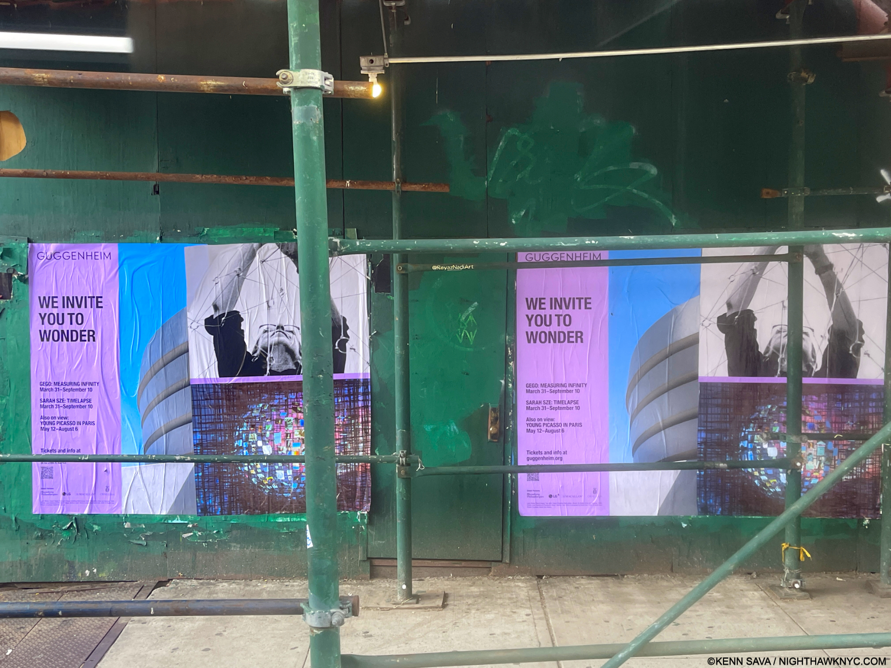
Show seen: Sarah Sze: Timelapse @ The Guggenheim Museum. This is Part 1, an overview. Part 2 looks at details from the show here.

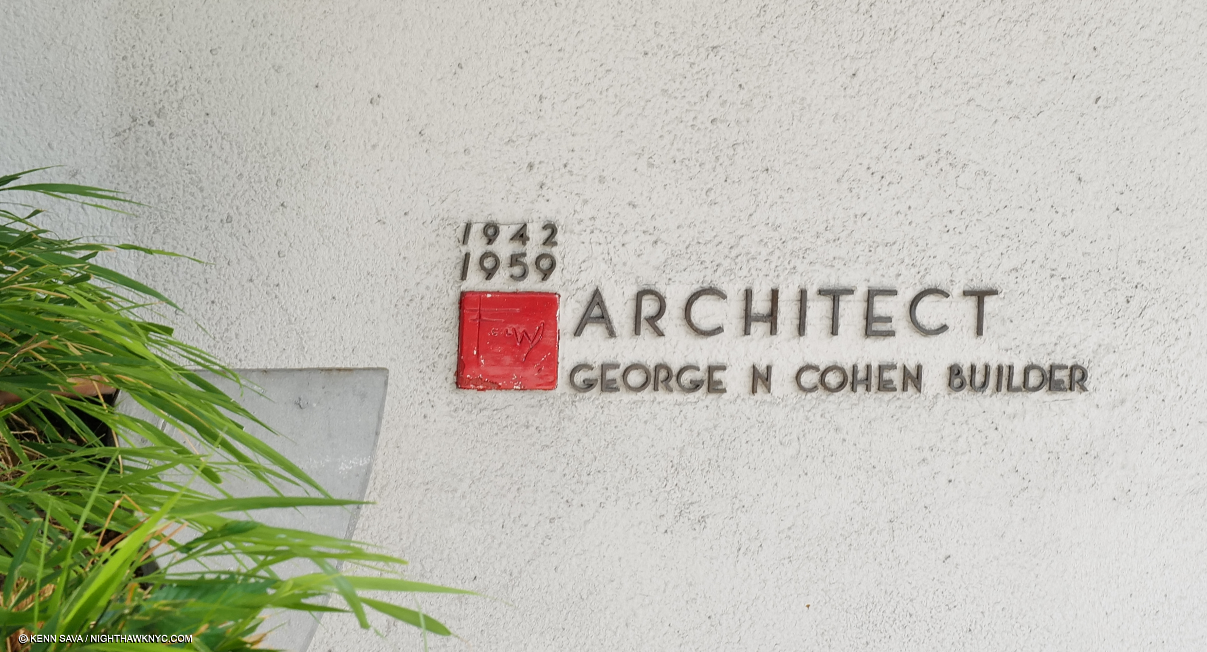
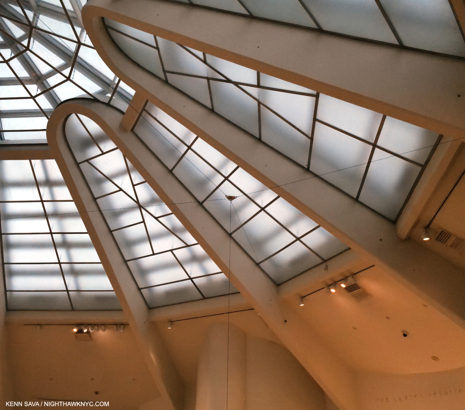
Written on my soul. Frank Lloyd Wright’s signature adorning his trademark red square “cornerstone” on his round building. The dates attest to how long it took to get this building approved & completed, which every other of his many NYC projects weren’t. Seen September 5, 2023. Click any image for full size.

Those who have seen elements of Architectural design in some of the fantastic structures Sarah Sze includes in her impossible to categorize shows over the past few decades might be left with a sneaking suspicion the Artist has a desire to be an Architect. She would actually come by that honestly. Her father was an Architect, and Sarah, who began as a Painter, studied Painting & Architecture in school before graduating with degrees in both from Yale in 1991. After shows and Public Art installations all over the world, this past summer she met her match. To create work that holds its own in Frank Loyd Wright’s iconic Guggenheim Museum has been a standing challenge for Artists since it opened 65 years ago.

“It’s really a building that frames a void….How do you take on the most incredible void created in recent time in Architecture and talk to it in the slightest way?” Sarah Sze.

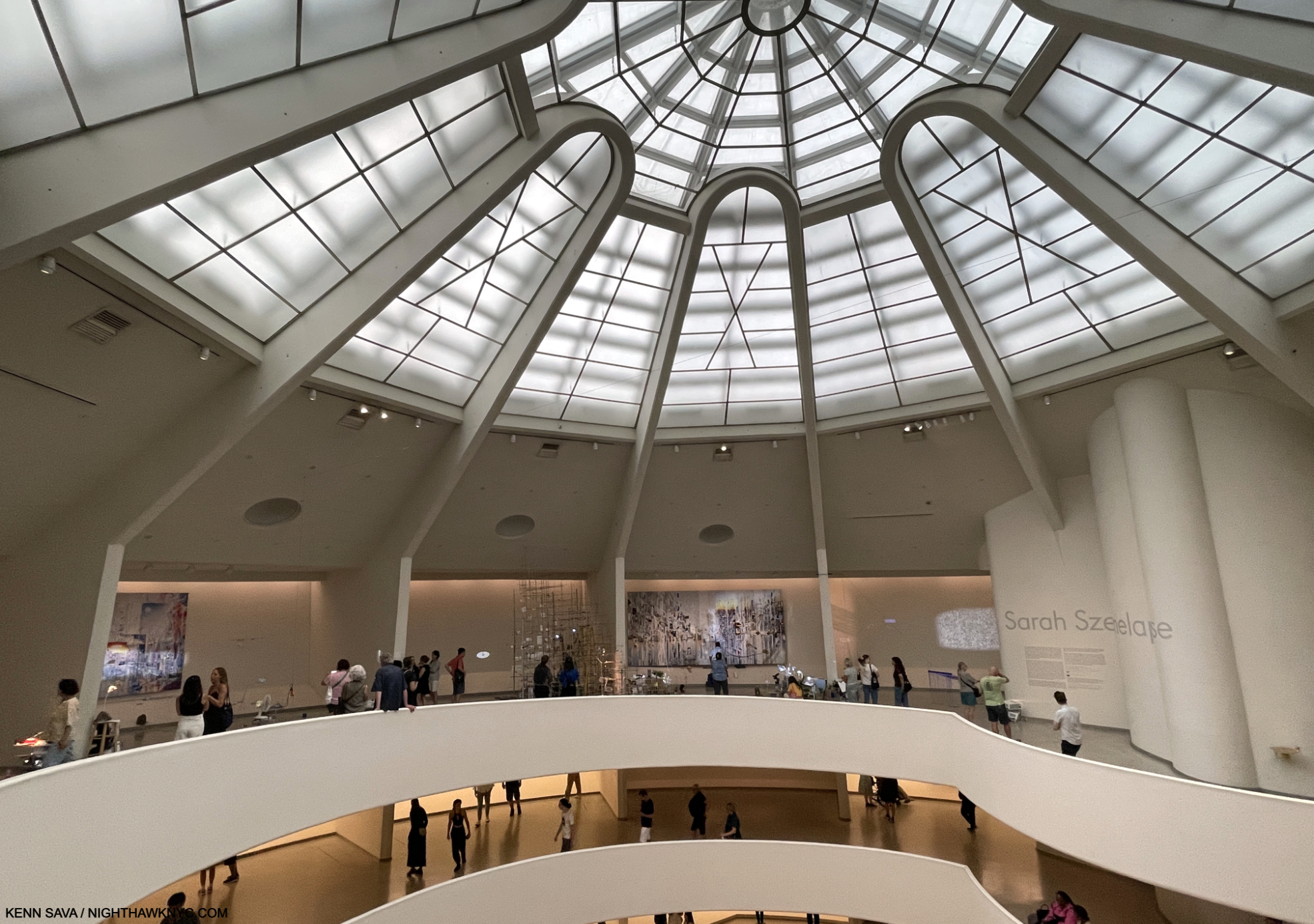
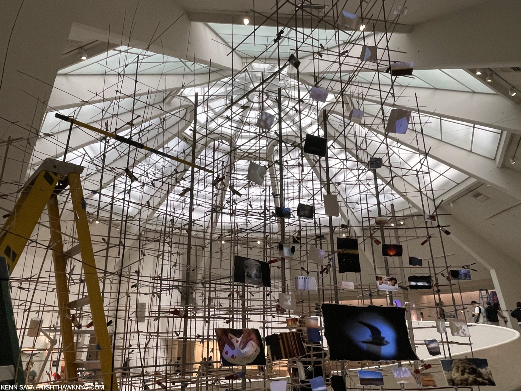
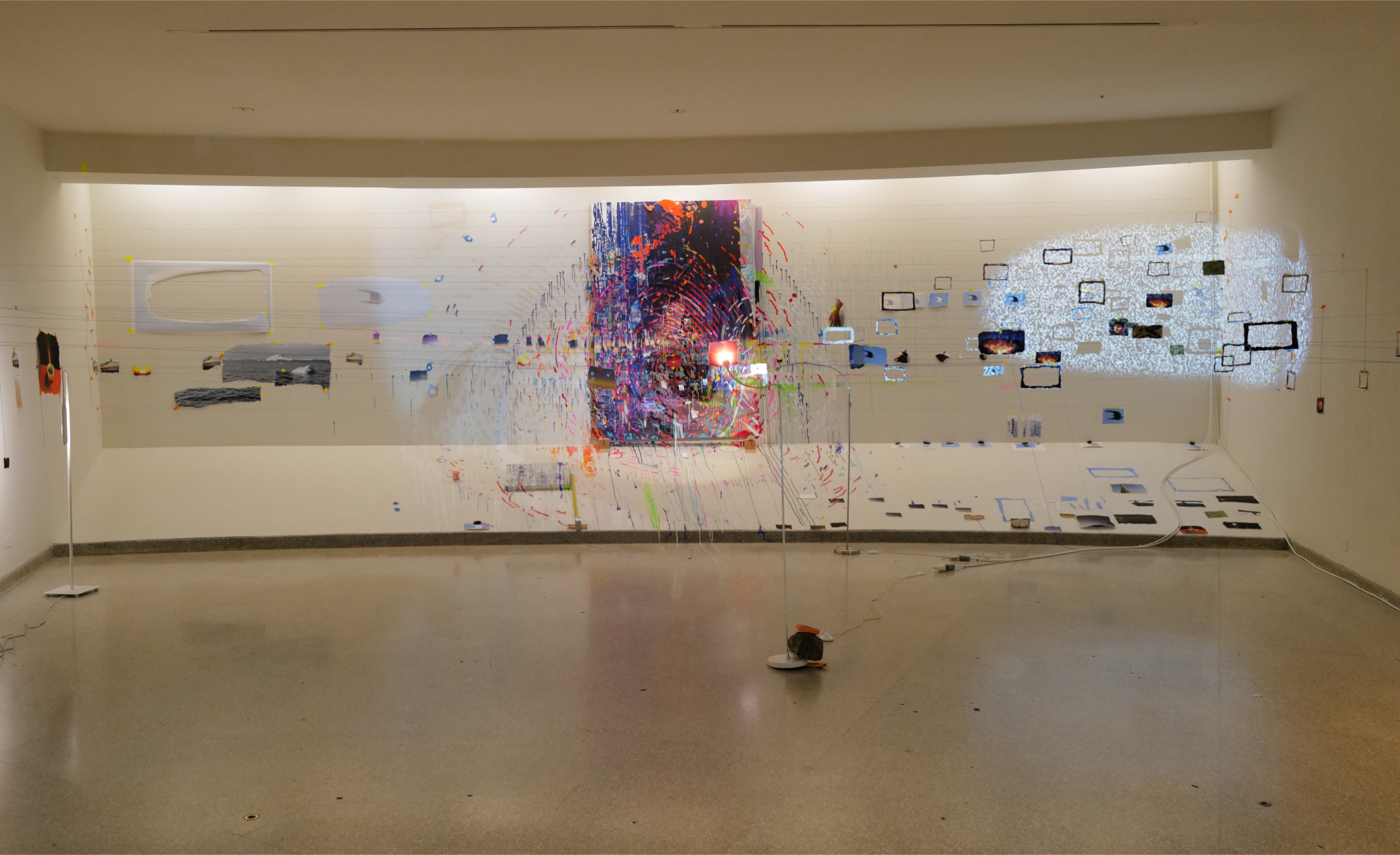
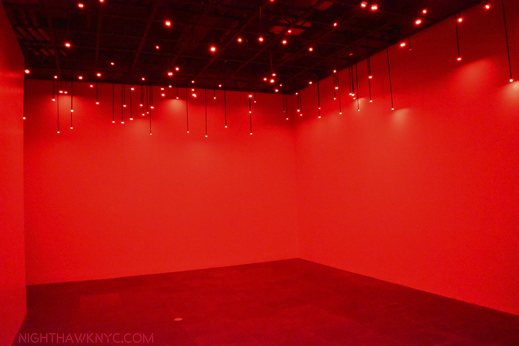
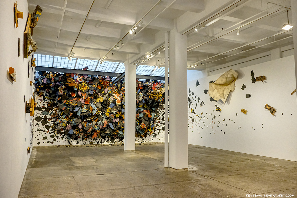
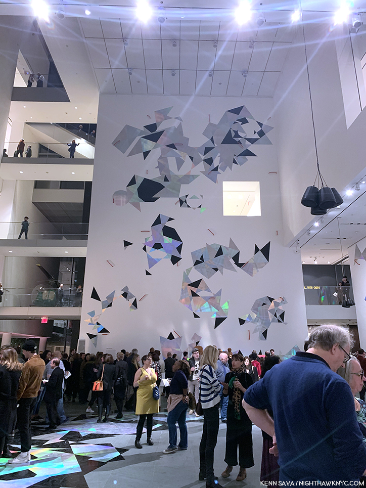
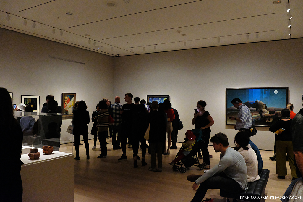
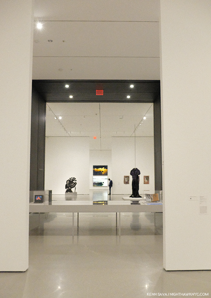
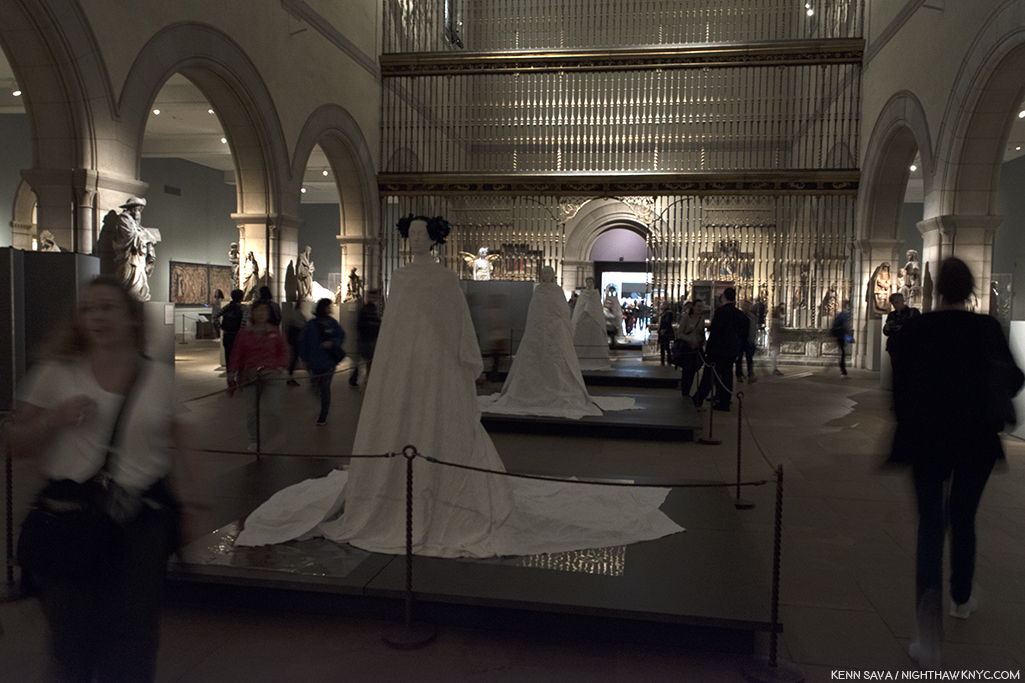
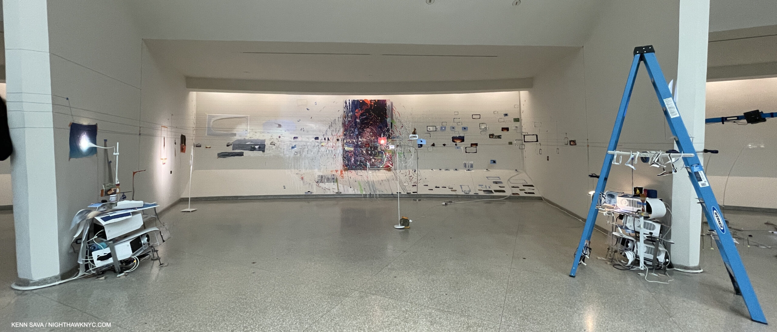
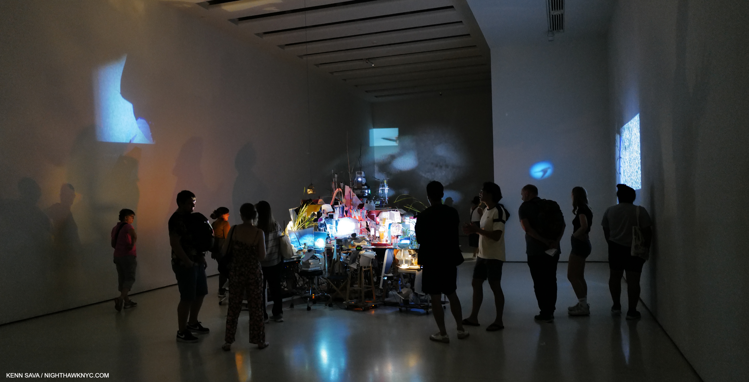
Installation view of 4 of the 8 Bays that made up the main section of Timelapse on the 6th (top) floor, September 5, 2023. Extra points if you see the very faint black string running from right to left against Wright’s Oculus (the skylight). It’s a unifying element of the show, though I’m not sure how many visitors spotted it as such. I’ll explain.

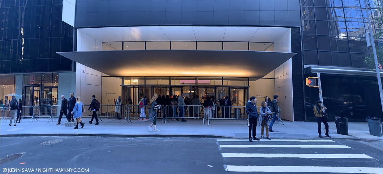
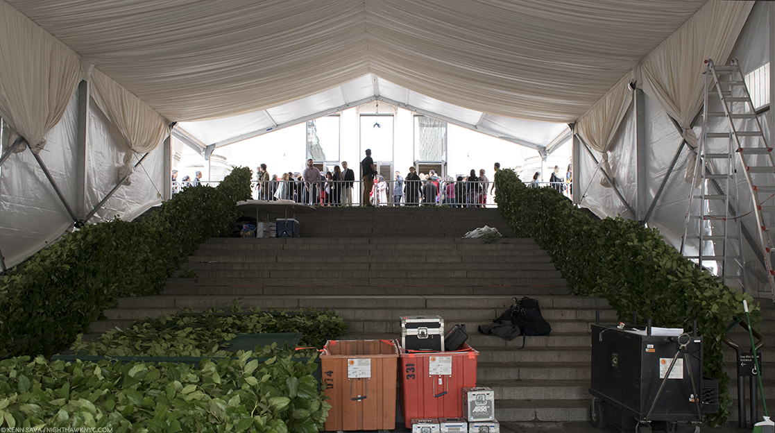
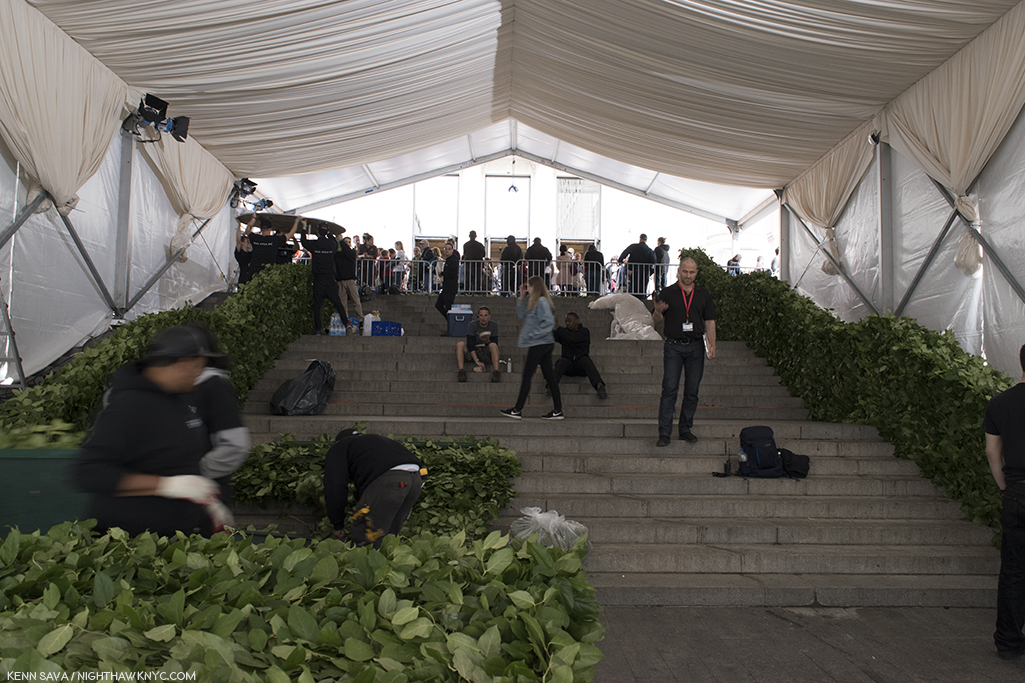
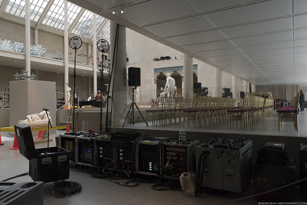
In Timelapse, Sarah Sze’s Art was installed outside and inside Wright’s masterpiece, the last major work of the Architect’s 7-decade career, and one that stands completely apart from everything else the he created, at least to my eyes. In it, she “dialogues” with Wright in the most innovative ways I’ve seen mounted in the Guggenheim, at least since Danh Vo’s spectacular show in 2018. Though the show “only” consists of projections on the building’s exterior, an installation in the ground-floor pool, 8 more installations in as many Bays on the Rotunda’s top floor, the freight elevator ramp, and the large rear gallery, I was told by a Guggenheim Staff Member it took five and a half weeks to install! That’s a long time for a significant part of the Museum to be closed. I can’t imagine the deinstallation was all that much quicker. Though it was up for only as many months (March 31 through September 10, 2023), it’s a show that’s hard to stop thinking about. Hence, it’s taken this long to complete this piece, which marks where I’m at in pondering it to this point.

“What I love myself about the experience of art is the sense of this moment of discovery when I’m seeing a work of art. And actually, that can happen a year after you see a work of art. You don’t always know how good a work of art is until you see it and you remember it in retrospect.” Sarah Sze.

Time is a river that flows on and on, through our lives. It may be that for most of us images mark time in our lives in any number of ways. We may remember our childhood & youth through a handful of images taken in the distant past, as we do so many significant events in our lives since. As time goes on, the pile of internal images gets edited down to those we feel are most significant. In a sense, this is something akin to “timelapse” Photography or Film/Video by which a succession of images are taken at intervals to record change over a given period, resulting in a simultaneously accelerated and collapsed sense of time. Timelapse considers “how we mark and measure time- constructing our own personal timelines of memory through images and fragments of experiences that are constantly evolving…a contemplation on how we mark time and how time marks us.” Sarah Sze (quoted in the press kit).

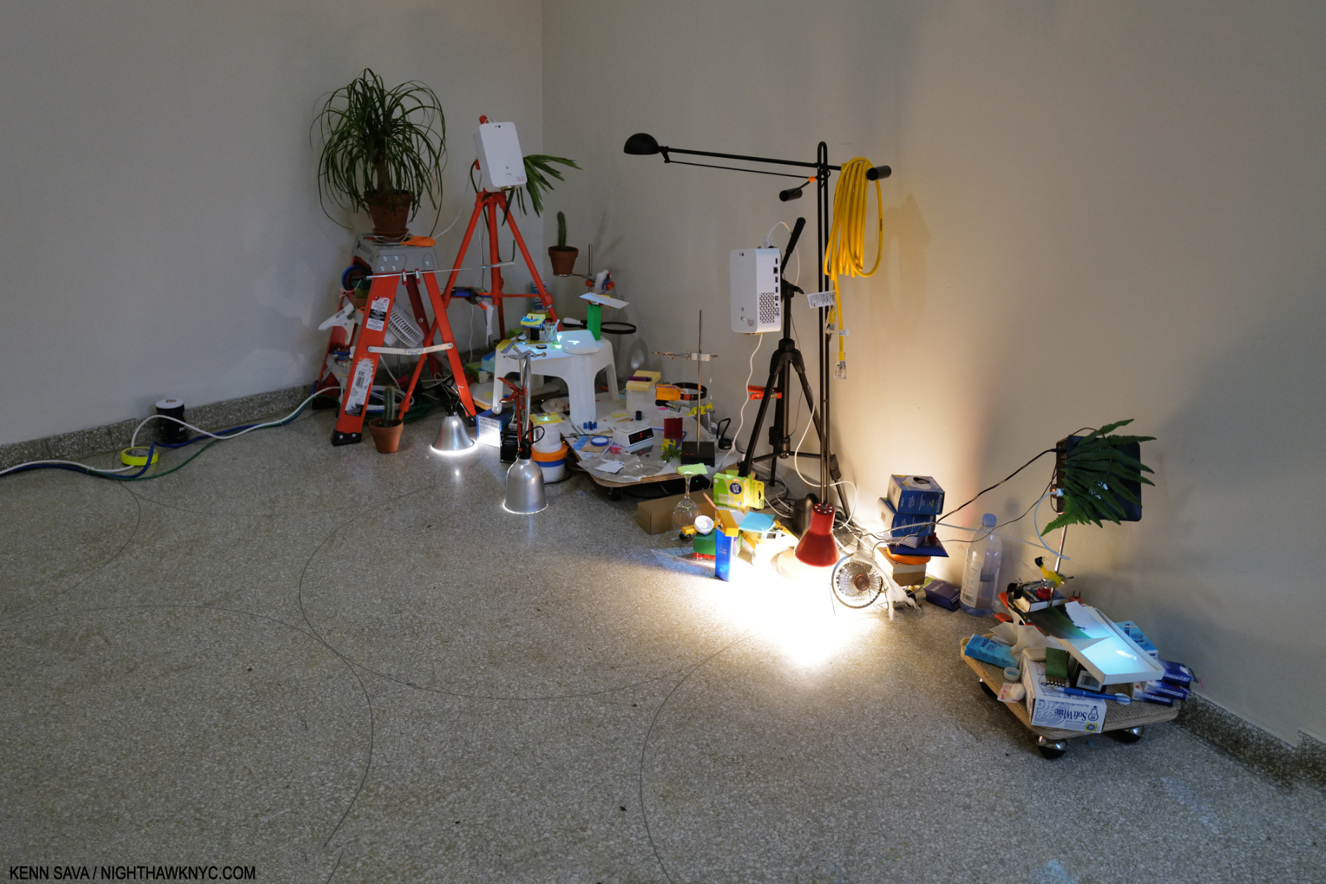
Media Lab, 1998, Mixed Media, installed along the wall adjacent to the freight elevator.

As such, it’s a show of Art that is focused on images. That marks an extraordinary transformation in the Art of Sarah Sze over her career. Early on, her work was object based and seemed to qualify as “Sculpture” to many people. Gradually, beginning with Media Lab, 1998, now in the Guggenheim’s collection, and almost hidden here in a corridor for the freight elevator, her work has come to include and feature images more and more, as I saw in her last NYC gallery show in 2019. The images start right away.

Cards without walls. The “wall card” for the video projections on the outside of the Guggenheim.

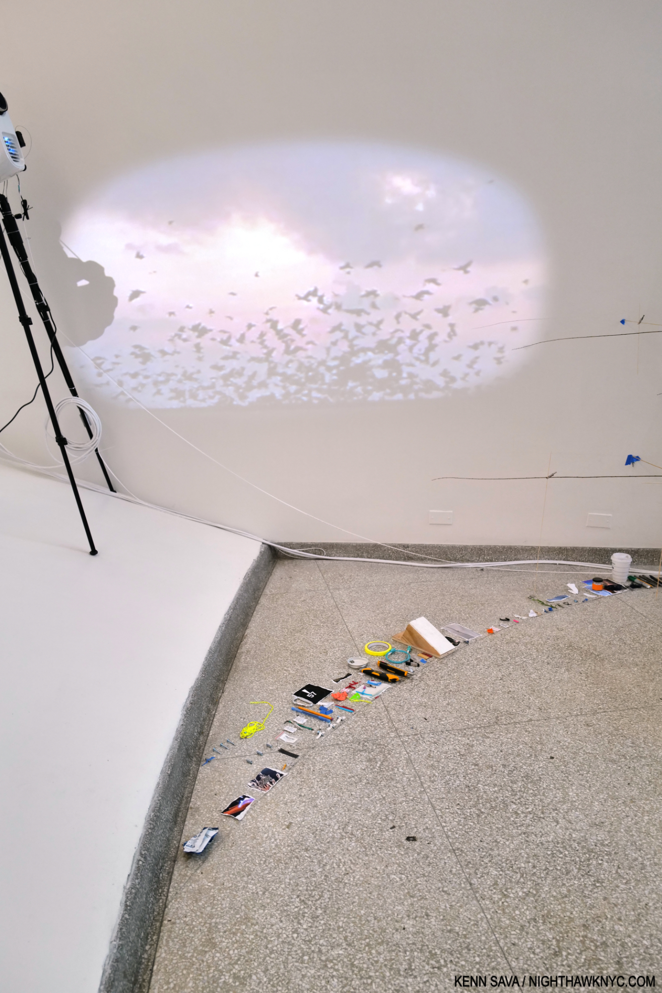
Timelapse begins with 2 video projections on the Museum’s exterior walls which I missed because the Museum closed at 6 and the sun wasn’t setting until 8 at the time. So, Timelapse started for me inside on the ground floor. The exterior projections turned out to be the first sign that images flow continually through all of Timelapse, showing how central they are to Sarah Sze’s work today. “Sculptor?” Good luck boxing her now!

  “The Renaissance, the Baroque, everyone was doing painting, architecture, sculpture that was Bernini, Michelangelo, that was par for the course,” Sarah Sze1.

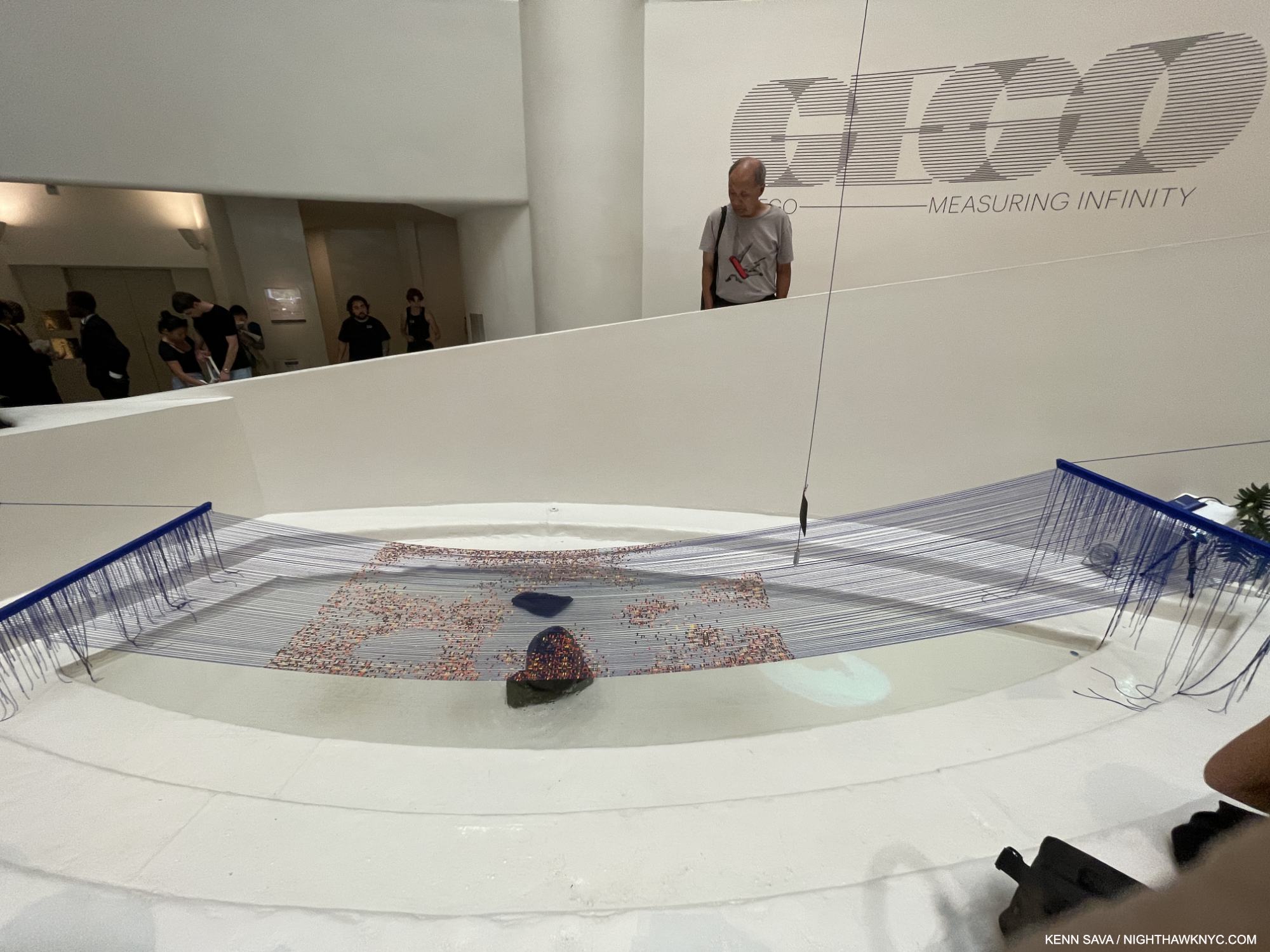
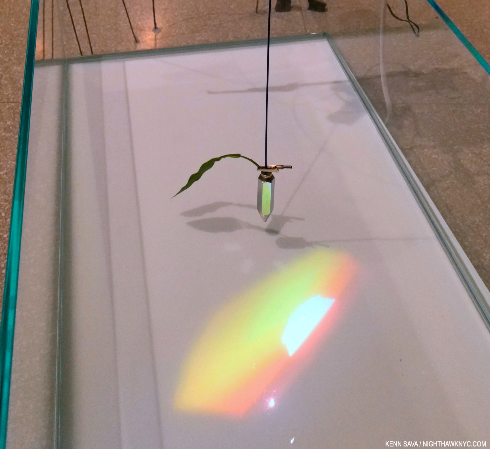
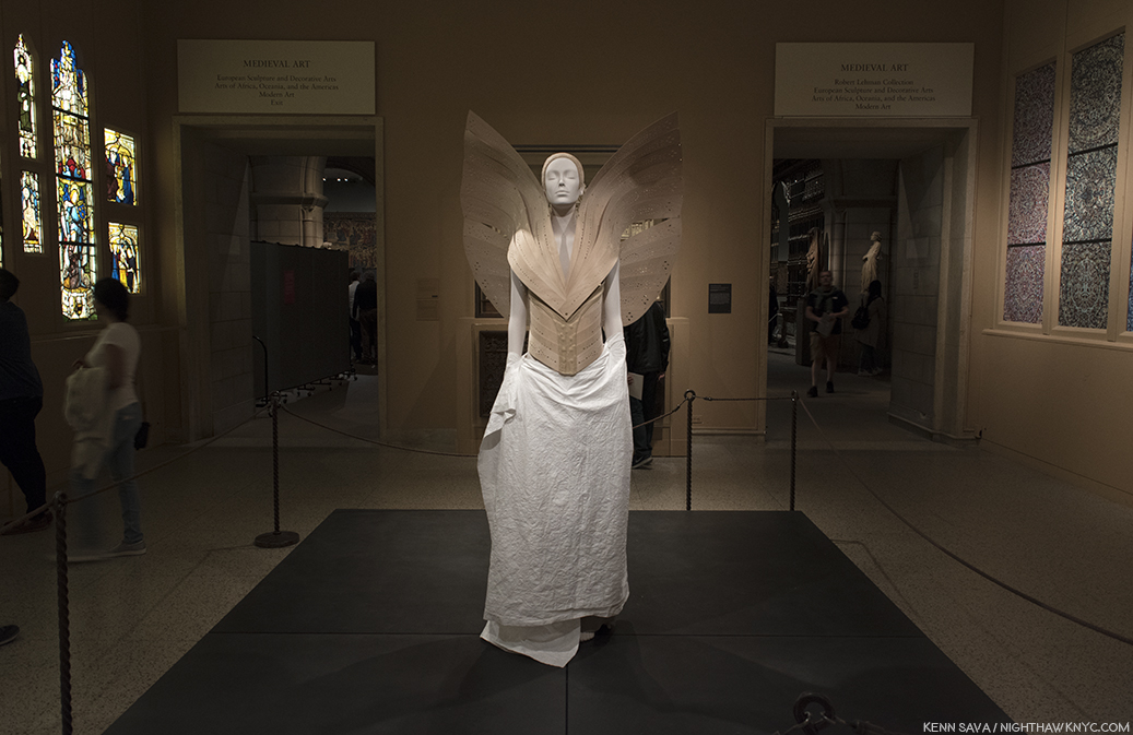
“When is there water in a museum?,” the Artist asks on the audio guide. Inside, Timelapse begins in Wright’s pea-pod shaped ground level pool. Diver, 2023, First of two parts, Multimedia installation, and The Night Sky is Dark Despite the Vast Number of Stars in the Universe, 2023, First of two parts, Acrylic paint, string, paracord, and wood. A pendulum hovers over the hammock & the pool with a video projected onto it of Sarah Sze’s finger stroking water (in blue above). Note the string extending up from the pendulum extending into the void. (Gego: Measuring Infinity filled the rest of the Rotunda.)

Installed over Wright’s pool, the “hammock” looks like a restful place from which to ponder the river of images playing continually in your mind. The first video inside is a projection on the pool of Sarah Sze’s hand stroking water, taking “dialoguing” with Frank Lloyd Wright literally and with sublime subtlety! A pendulum “points” to this area, beckoning the viewer to look at it.  The pendulum is attached to a black string that extends up into the void, all the way to the top! Using this simple means of measuring with a plumb line, Sarah Sze at once measures the void, interacts with it, and leads the viewer to the main part of the show.

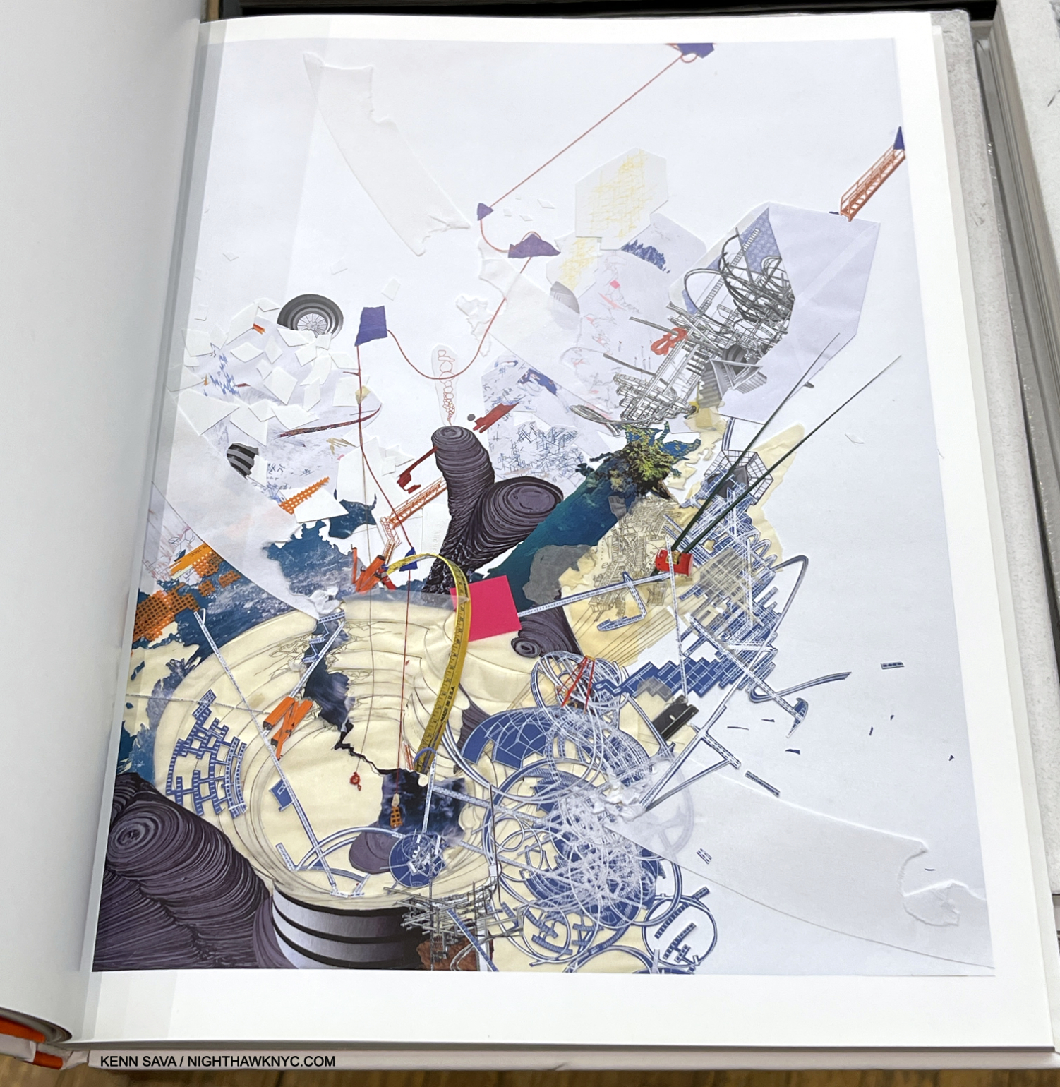
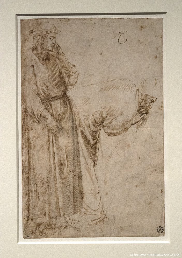
Sarah Sze, Guggenheim as a Ruin(!), 2009, Ink, string, collage on paper, 50 x 32 inches. (Exclamation mark mine.) An indication that Sarah Sze has been thinking about the Guggenheim for a long time. Notice the red string coming down from the top! It splits in two, and the right part seems to wind up over the ground floor pool, which has spilled on to the floor. Seen in the book Sarah Sze: Infinite Line. Not in the show.

“There is fragility in drawing a line through space; with this one simple powerful gesture, you can occupy an entire space.” Sarah Sze on the wall card.

The more I thought about it, though a mere speck compared to Wright’s huge open space, the string has come to “occupy” it in my mind.

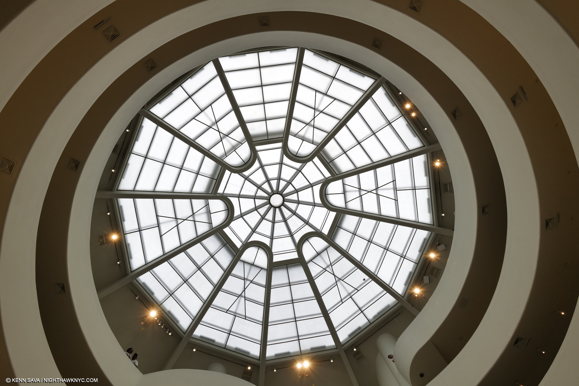
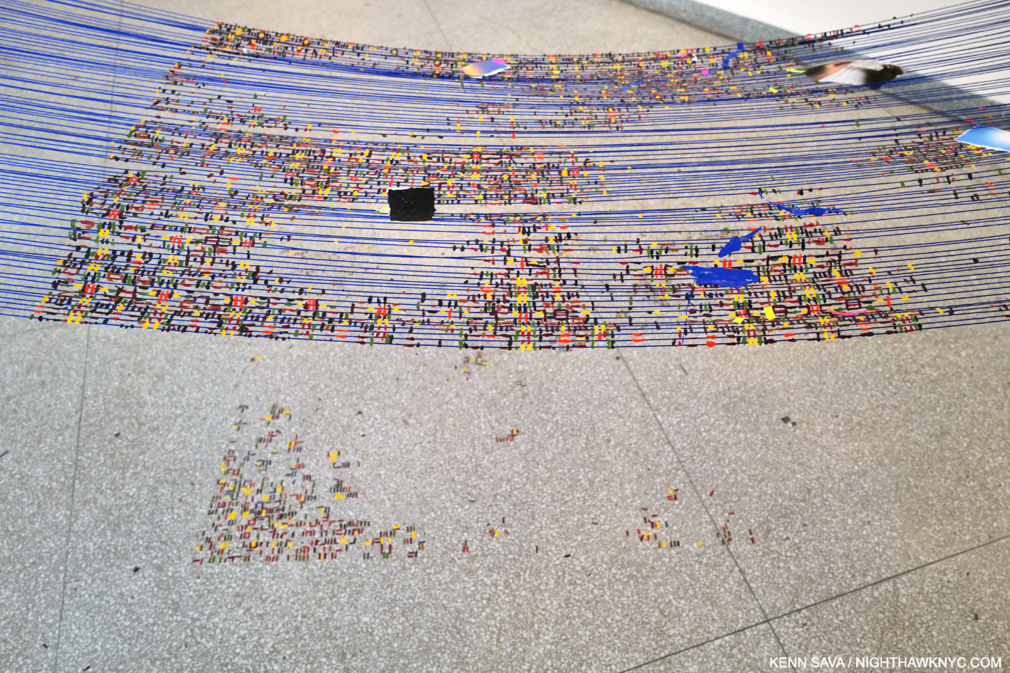
While you’re lying on your back in the hammock, here’s your (approximated) view of Wright’s Oculus. See that small speck just south of 5 o’clock on the white glass (and the faint line running down from it to the right)? That’s the hub where the black string’s rise culminates before sending it off across the void to the main installation of Timelapse on the other side, (as shown in the 2nd picture). There are countless amazing details everywhere you look in the show. Therefore, I’ve decided to present an overview of the show in this piece and show details in a Part 2.

Taking Wright’s unique elevator to the top (as he intended visitors to do) and walking down, (usually, actually up in this case), visitors find the black string already there waiting in front of them. Following it still higher, I noticed it was anchored to a hub that sent it to multiple points all the way across the void to the other side of the 6th floor.

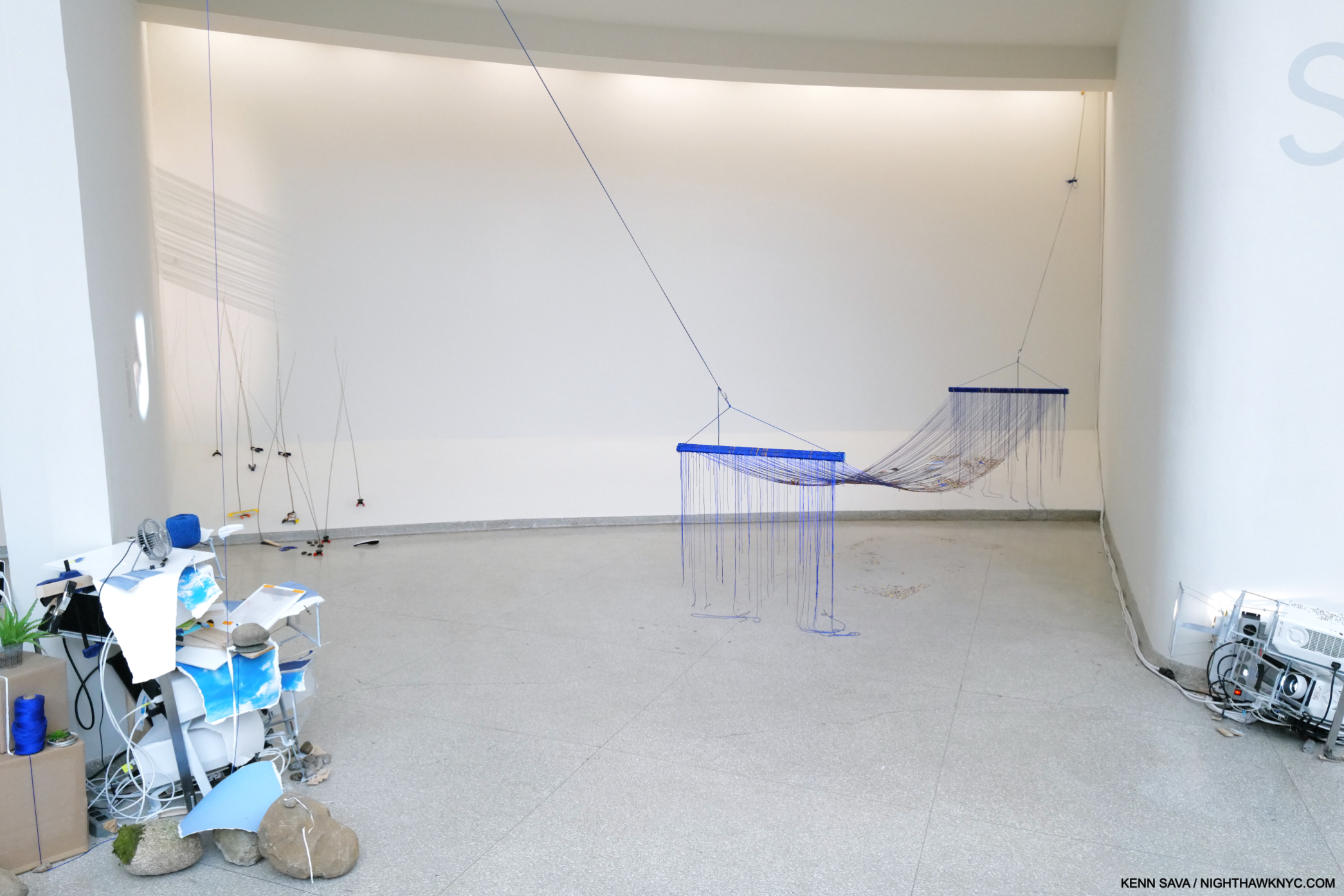
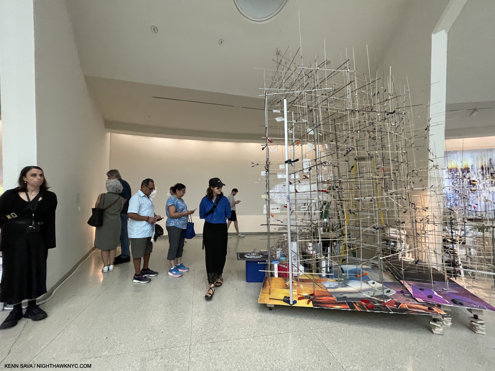
Bay 1. The Night Sky is Dark Despite the Vast Number of Stars in the Universe, 2023, Second of two parts, Acrylic paint, string, paracord, and wood and River of Images, Part two (white circle on the left). The near string holding the hammock is the continuation, and terminus, of the black string from the pea pod pool.

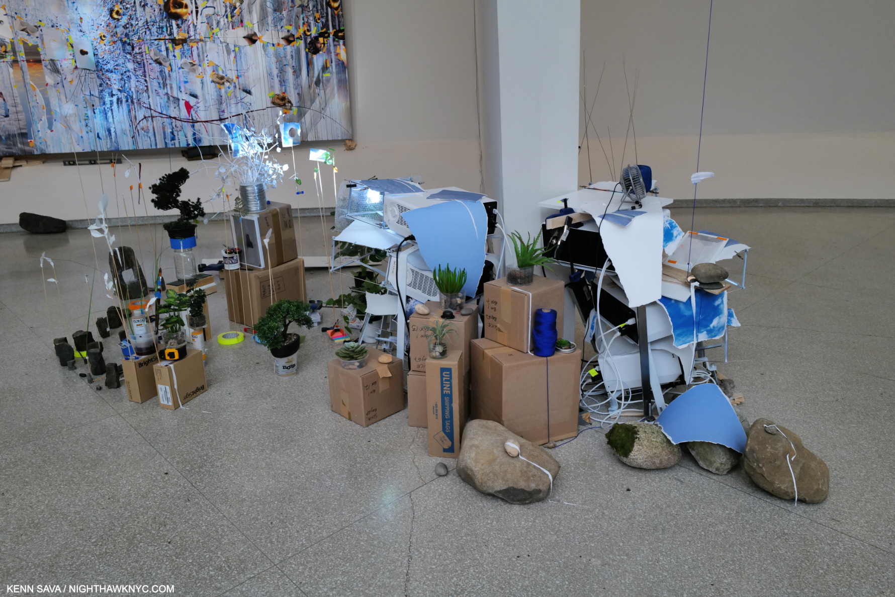
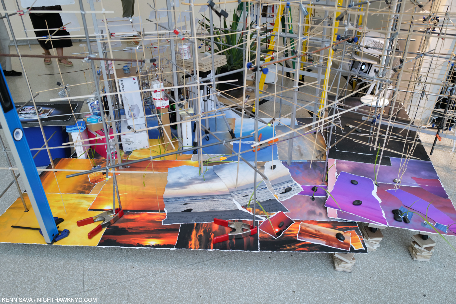
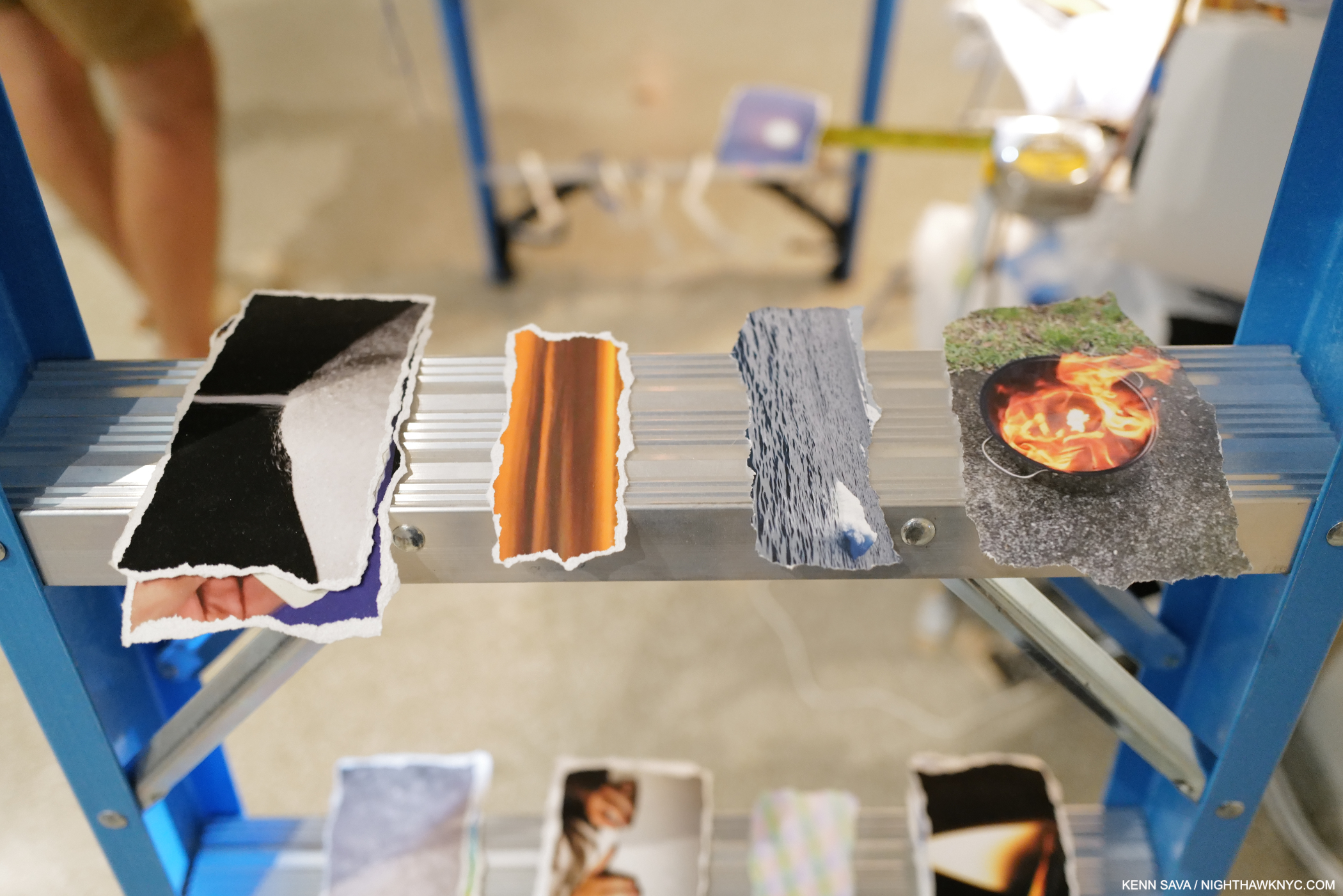
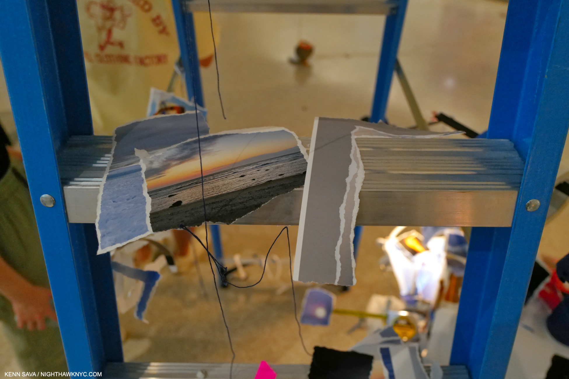
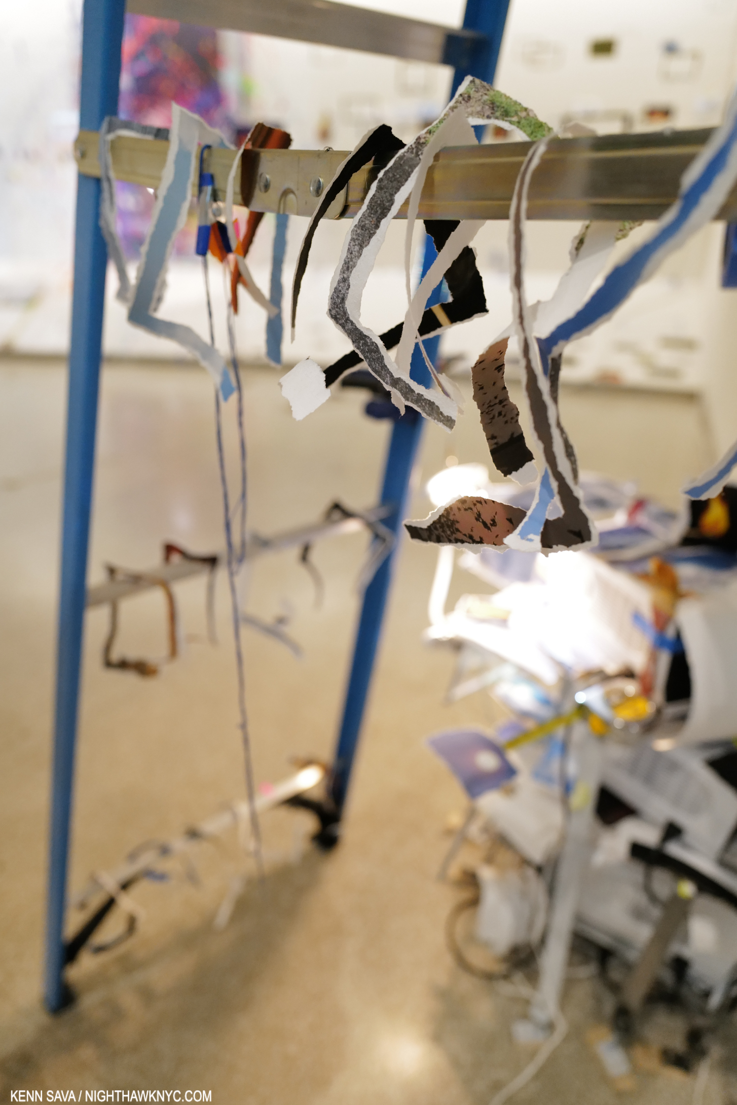
Walking to the beginning of Timelapse on 6, I had the deja vu experience of seeing another blue hammock, one end of which was anchored to the black string. Though dated 2023, the hammock and the one in the pea-pod pool are very similar to one she created in 2015 titled Hammock, down to the “confetti” on top of it (and similar to the one installed on the pool as we saw). Along side is a pile of A/V equipment, “enhanced” with torn analog Photographs, and a wide range of objects that make the viewer think, “Ah, this is not just A/V equipment, it’s part of the piece.” These equipment installations are to be seen at the beginning and end of each Bay, in varying degrees of complexity, and typically, with an inventory of a staggering number of items- generally her trademark common items, seen in most of her pieces, but also small, often very complex “Sculptures.” Since every Bay has a variety of these, they add a sense of unity and continuity to the entire floor as the viewer moves from Bay to Bay. 

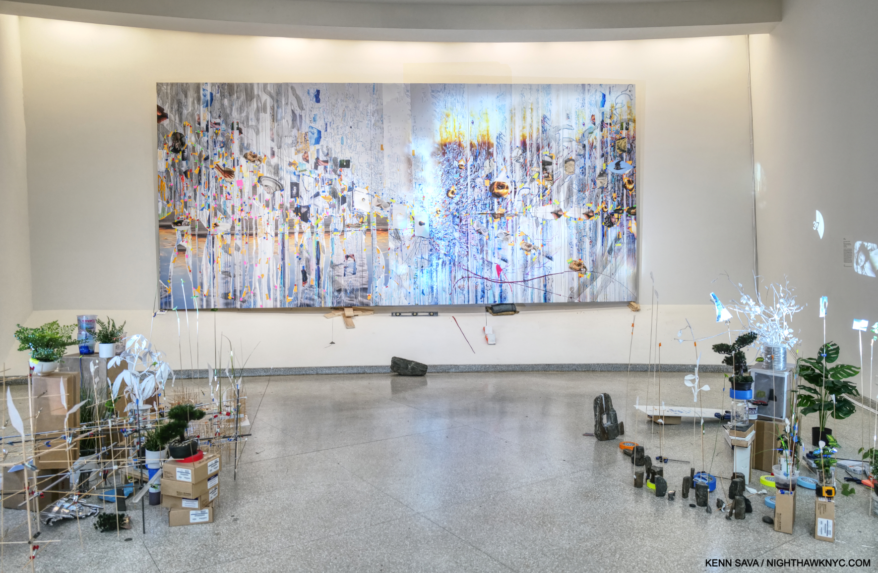
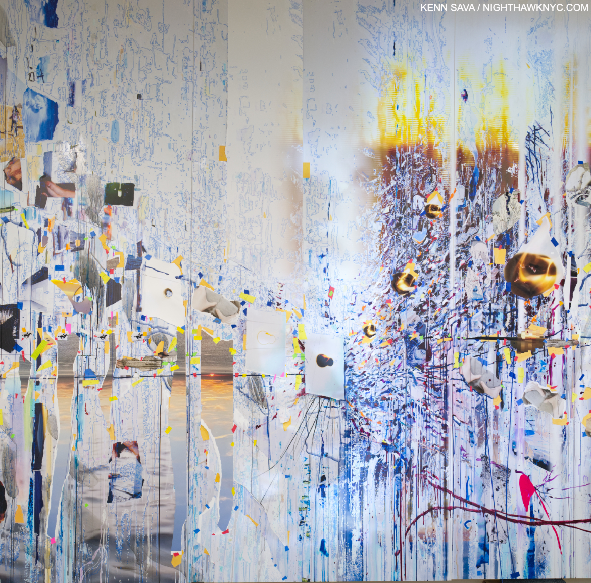
Bay 2, Travelers Among Streams and Cascades, 2023, Oil paint, acrylic paint, inkjet prints, acrylic polymers, string, and ink on Dibond, aluminum, wood and paper on 6 panels, 114 x 245 inches. All the pieces on the 6th floor are dated 2023- including the Paintings! Since the show started going in around April, that means Ms. Sze must have been unimaginably busy earlier this year. More than likely, the show was in the works during the pandemic.

In an interview, Ms. Sze hoped that Timelapse would inspire a “I didn’t know you could do that in a museum,” reaction in viewers (especially young Artists)1. Meanwhile, River of Images (Part two), a continuation of the exterior projection, moved along each wall on 6, flowing from Bay to Bay and across all the Art as you stood and looked at it.

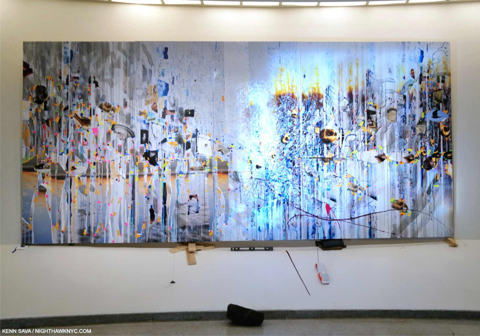
Closer to the extraordinary 20 1/2 foot Travelers Among Streams and Cascades, “mounted” on shims and a level, further reinforcing the “off-balance” experience of seeing Art in the Guggenheim. I wondered- Would Wright smile at this, or be offended?

Speaking of its focus on images, one thing I was extremely happy to see was that Sarah Sze has included four of her remarkable Paintings in Timelapse, each of which was dated 2023. Her style seems to have evolved since those seen in her landmark 400-page book, Sarah Sze: Paintings (a NighthawkNYC NoteWorthy Art Book of 2023). Though each Painting in Timelapse was quite strong, Travelers Among Streams and Cascades, in particular, struck me of attaining yet another level.

“The paintings for me are more about how I actually see in my head.” Sarah Sze1.

I was stunned when I heard her say that. In another interview, the Artist spoke of having them be a portal to the world beyond the walls. Given each piece in the show is newly created and site specific, it’s fascinating to ponder that when looking at the Paintings and how they’re installed. Each Painting is displayed in an exceptionally unique way. In fact, over the countless Paintings that have been exhibited in the entire, 65-year, exhibition history of Frank Lloyd Wright’s Guggenheim I seriously doubt that ANY of these installation scenarios have been seen before.  

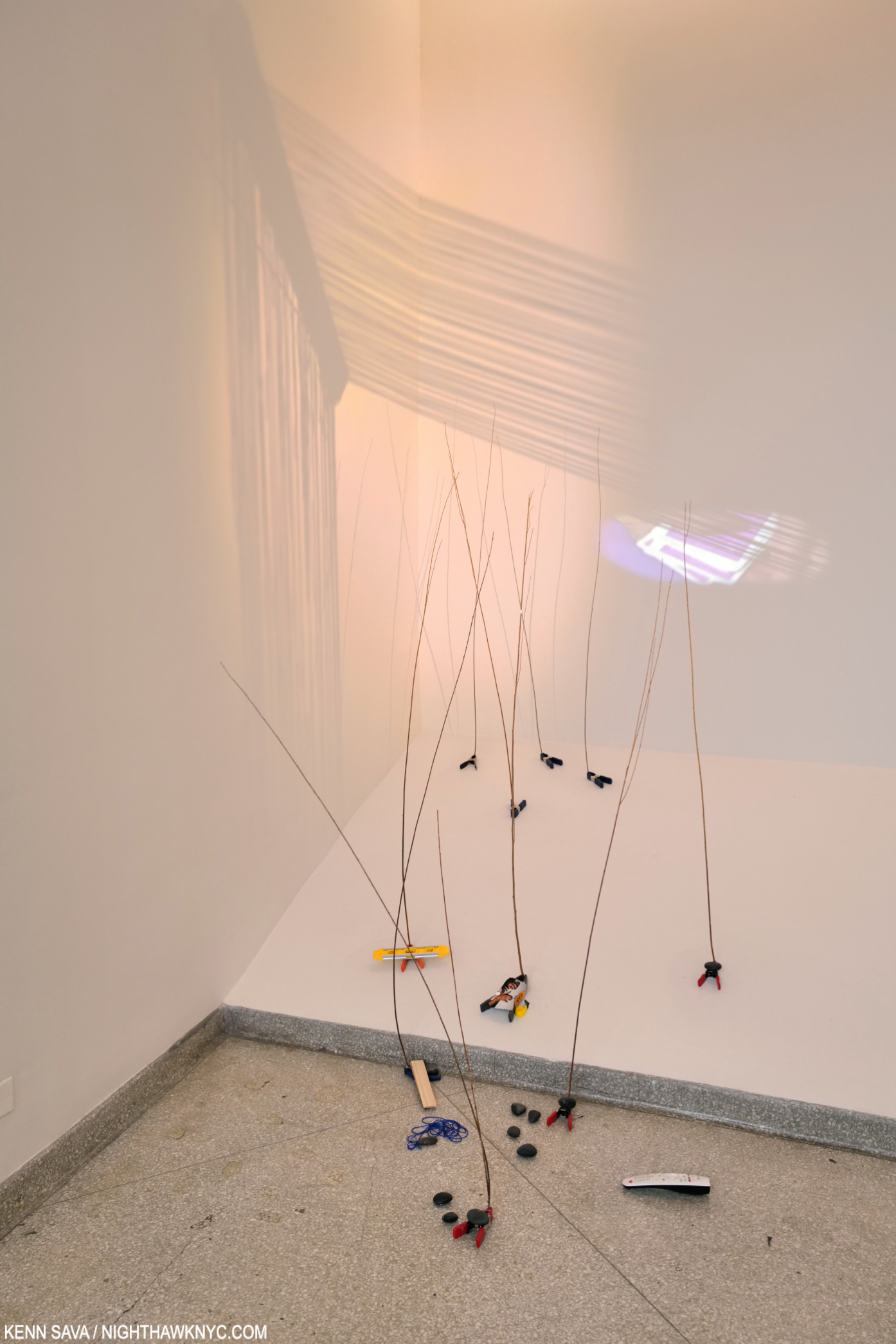
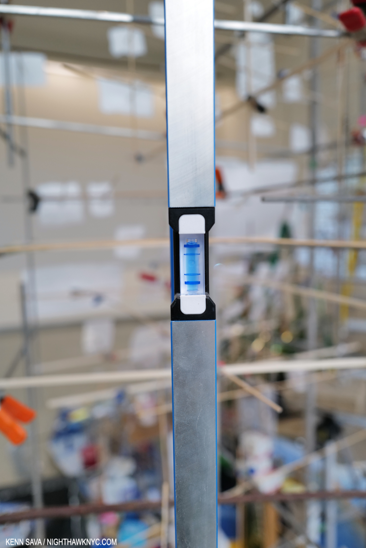
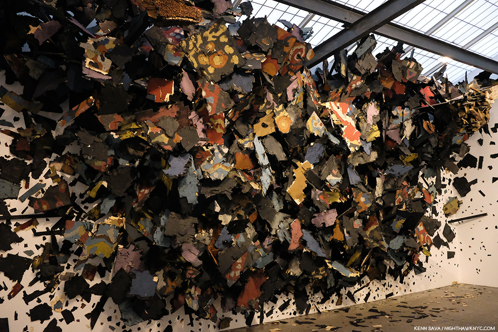
Bay 3. “Elements of Architectural design,” as I wondered in the first sentence? The massive and incredibly intricate Slice, approached from what turned out to be the back. In Timelapse, Ms. Sze continually plays on the “off-balance” feeling viewers have walking up and down Wright’s angled ramp. Here, notice the “shims” she’s placed under Slice to level it, which she’s chosen to leave visible for emphasis. Another way of dialoguing with Wright. Elsewhere, actual levels are seen are various points in the show. As in the prior picture, and as I show in Part 2.

Speaking of the installation, in spite of the numerous delicate assemblages and many small items installed on the floor, Sarah Sze reported during the run of the show that nothing had been broken, even after a weekend of 15,000 visitors. She attributed this to viewers moving slowly through the show.

Ms. Sze’s Art dialogues with Wright in numerous fascinating ways, while advancing her themes of time and memory in images. For one thing, as anyone who has been to the Guggenheim knows, the Rotunda’s Ramp is on a continual slope. Upward going up, and downward going down, creating a sense of being off-balance. Tripping and catching yourself-a central idea of the Baroque1,” she said. Sarah Sze makes a point of showing the viewer how this affects her work, adding shims under parts of the huge Slice, or filling a large tank part way, making the fairly steep angle of the floor’s slope obvious . She equates this with creating a sense of being “off-balance” for the viewer who also often can’t tell if an image is digital or analog. “Equilibrium” is also reinforced by her use of 3 pendulums hanging from the black string at various points along its journey.


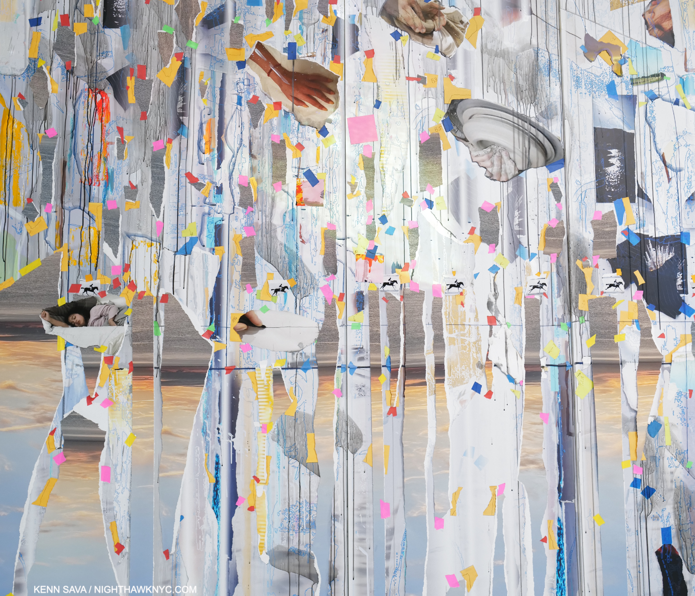
Slice, from its “front,” in dialogue with Wright’s Oculus. Barely visible behind the first step of the near ladder is her model of Slice in this Bay (which I show close-up in Part 2). I found the piece transcendent, and it wasn’t the only one that was. Timekeeper, 2016, installed in the large rear gallery, and displayed for the first time in NYC, seems to mark time on a grand scale. Here, the Artist dialogues with the building while giving us a “slice of time.”

As she has done in a number of recent works (like Crescent (Timekeeper), in her 2019 Tanya Bonakdar show), many of the images in Slice were actually miniature video screens so many of the images changed independently(!) as you watched. As for the images themselves, nowhere in the exhibition catalog, the check list, or the accompanying materials does it specify whose Photography we’re looking at. I’m assuming they’re by Sarah Sze.  

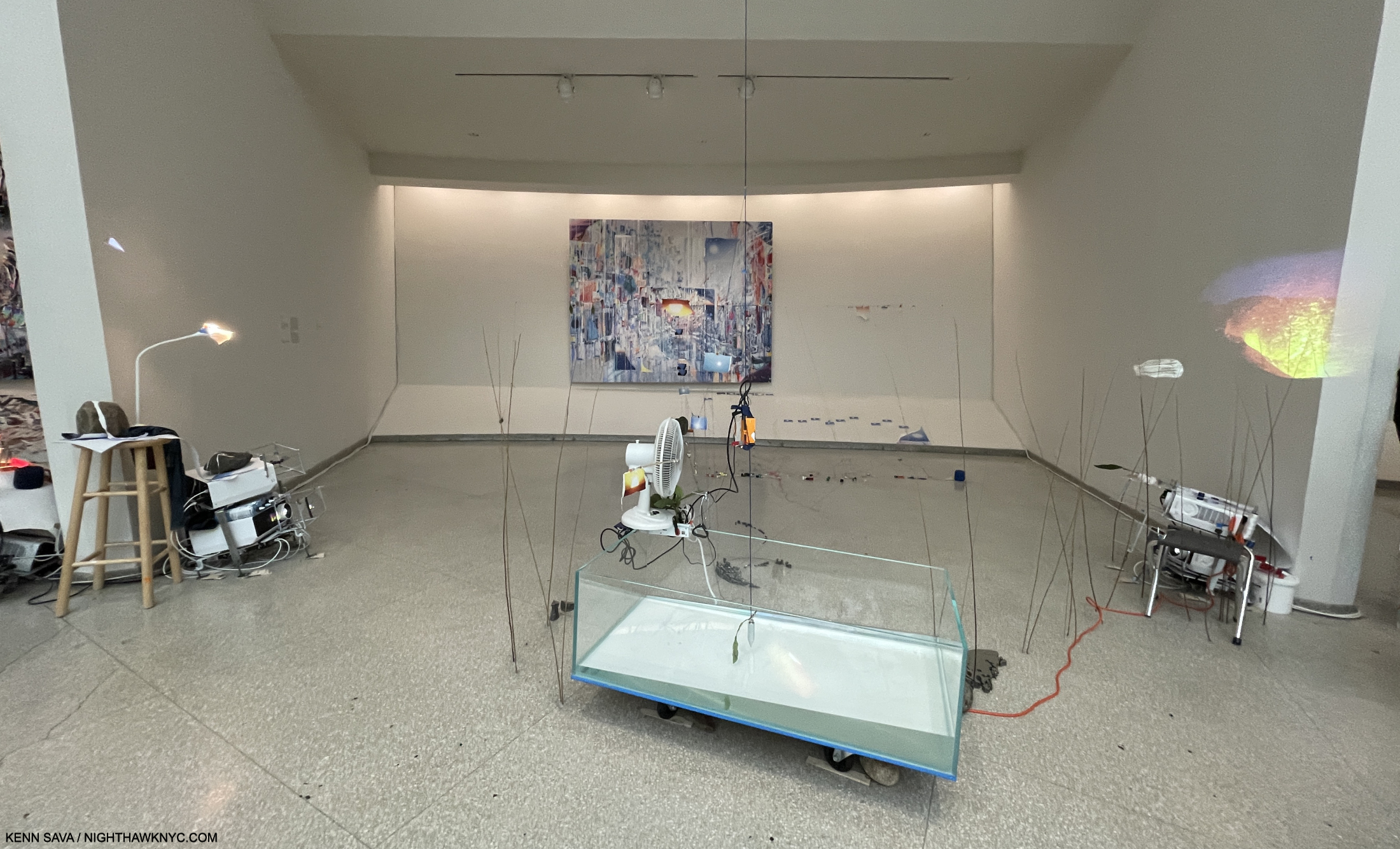
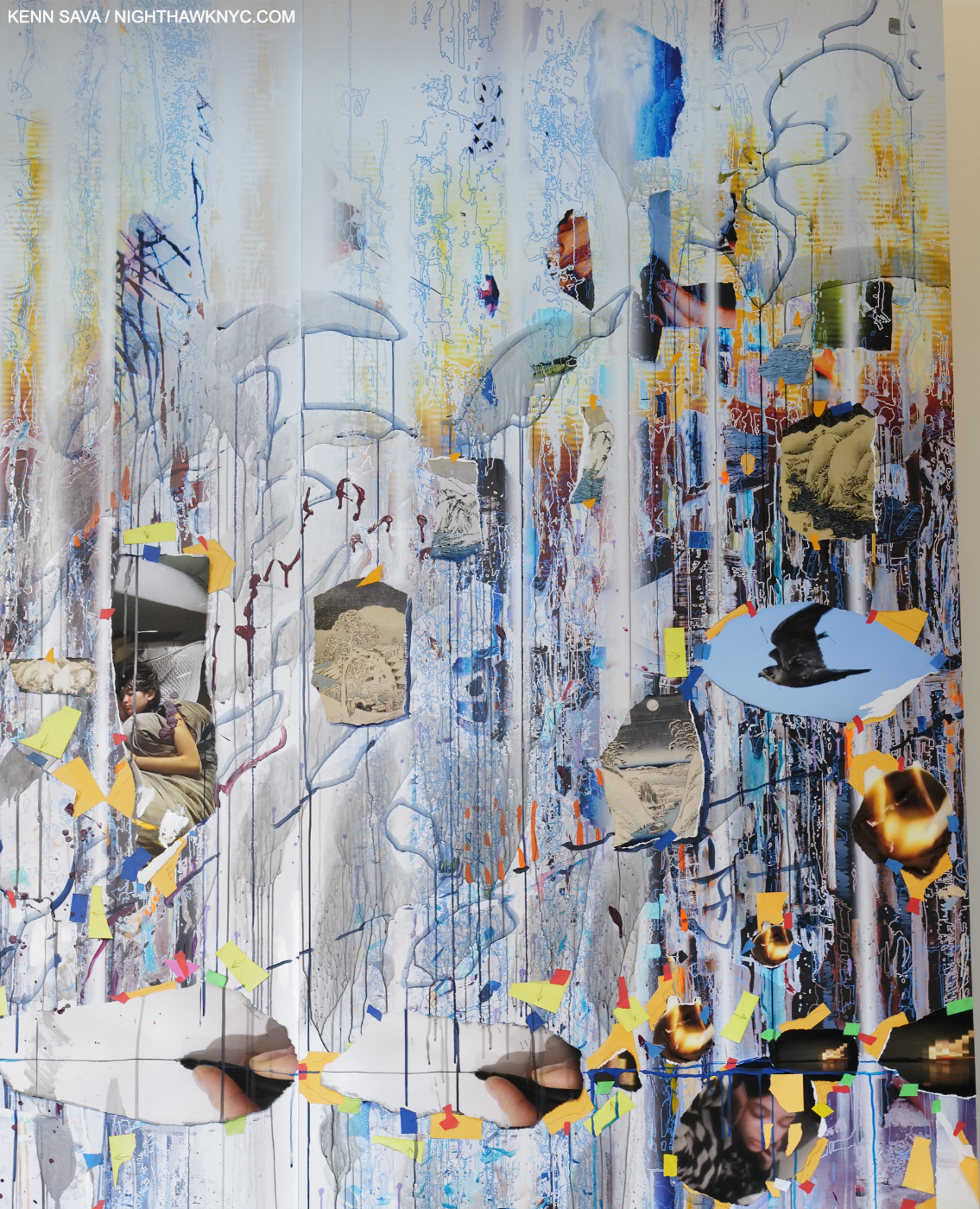
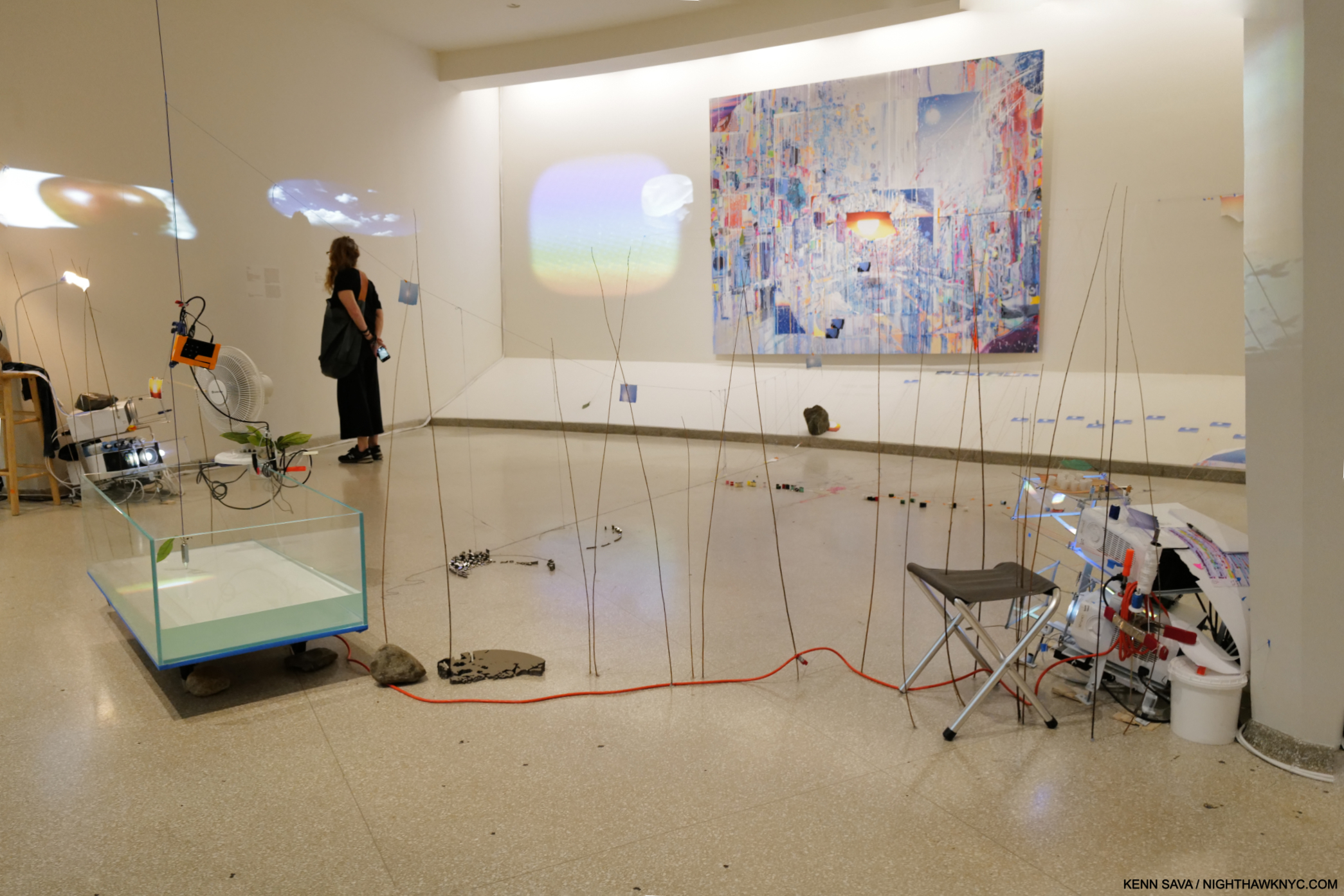
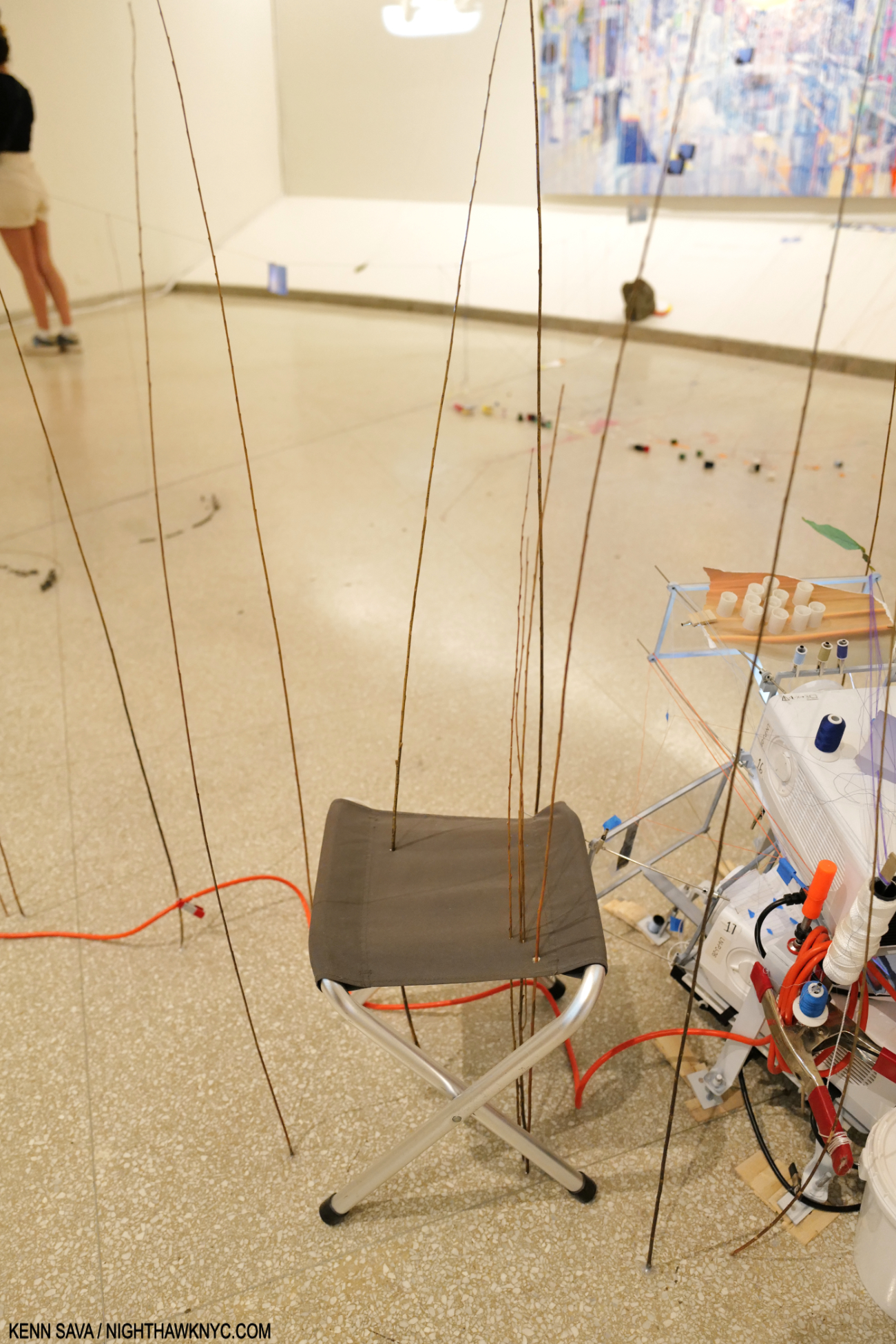
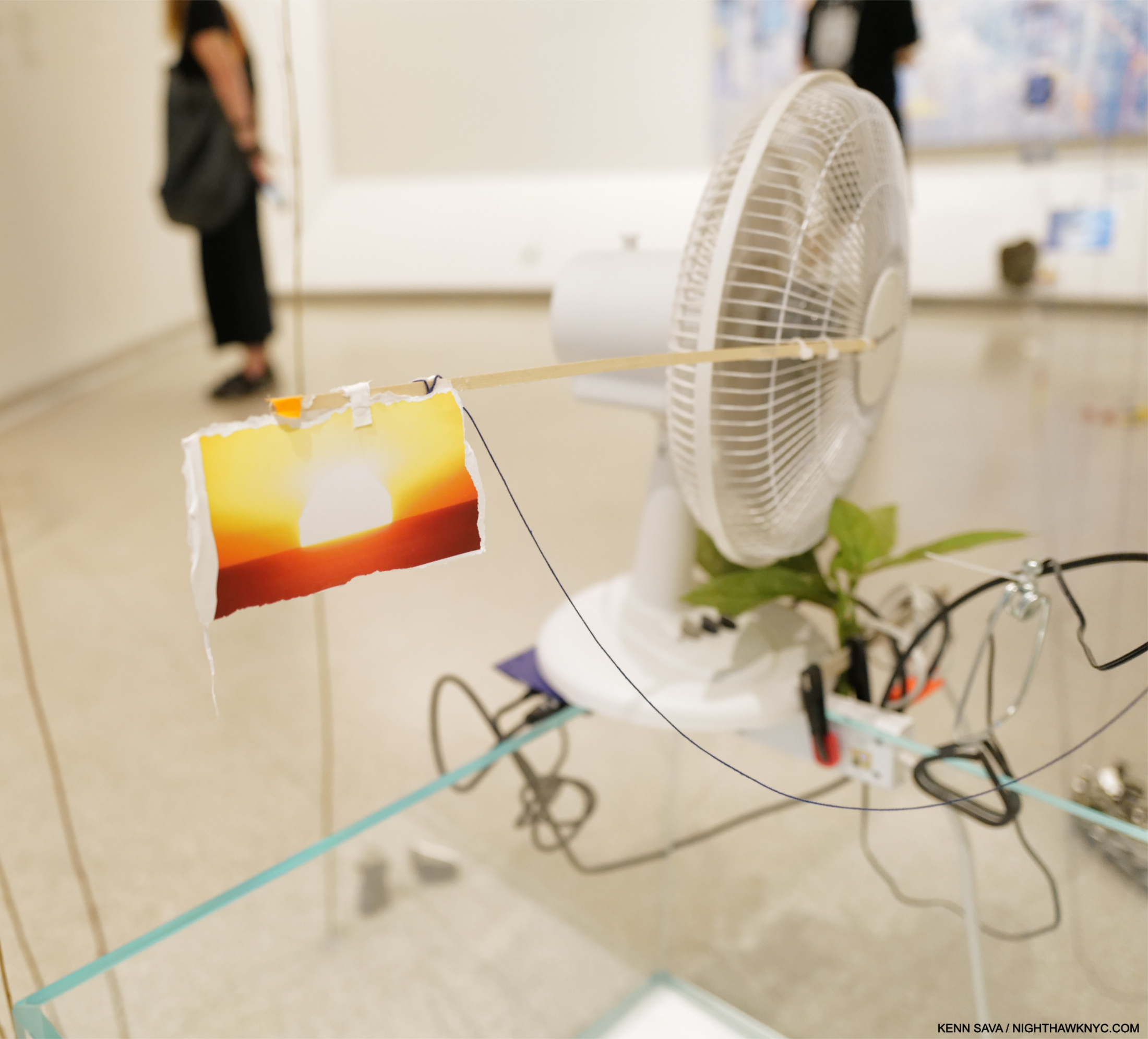
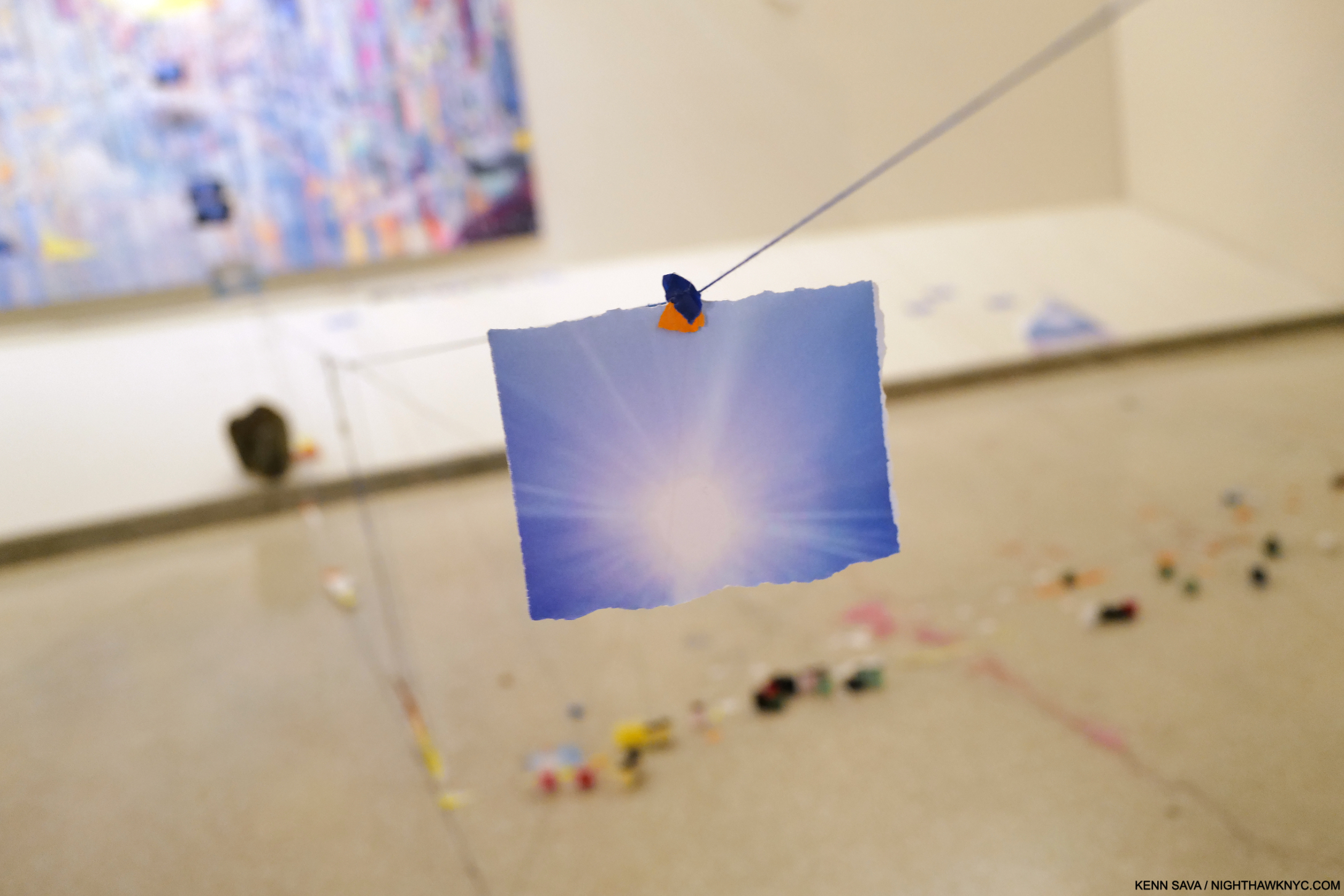
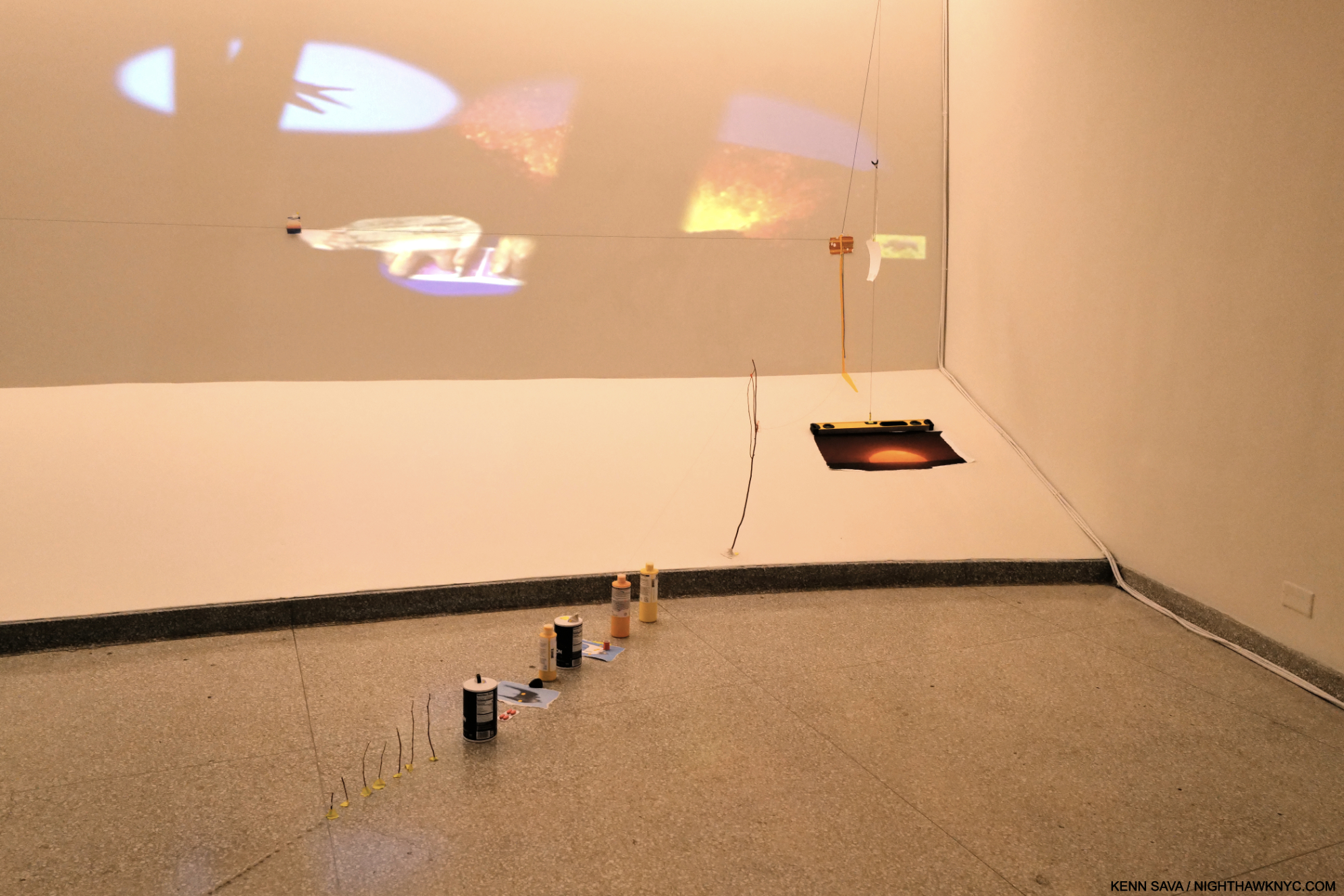
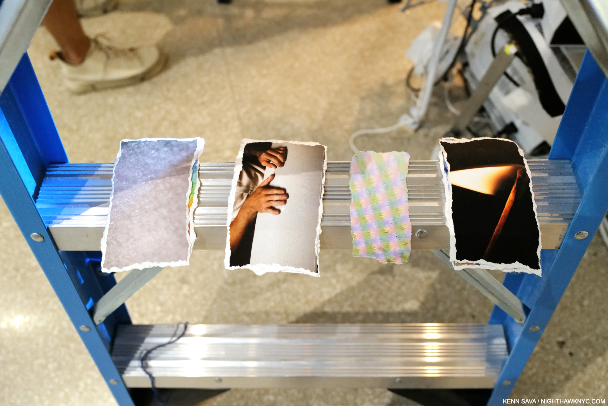
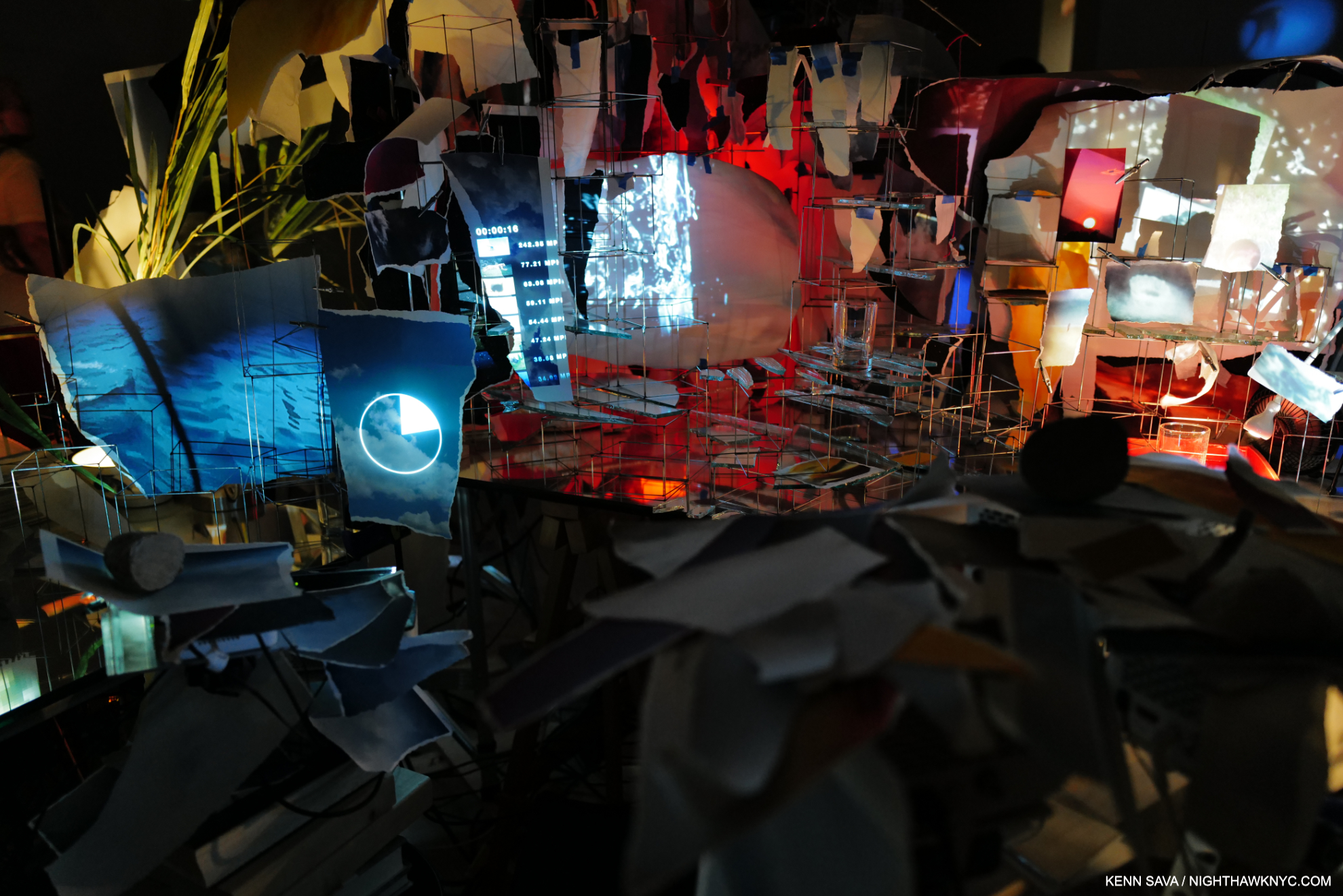
Bay 4, Diver, Second of two parts and Images That Images Beget on the back wall. In this work, there is a torn Photograph of the Sun, attached to the oscillating fan (shown close-up in Part 2). This image is followed by other images of the Sun on a a string  that make a trail to Images That Images Beget, which has a Sun in its center, as you can see below. Note the slope of the water in the tank. “Water in a museum,” part deus. In her Drawing for this piece, the Artist had the water in the tank right up to the top on the right.

All four Paintings were installed uniquely in my experience of 43 years of going to Painting shows. Bay 6 was one of two Bays that used strings with Photos mounted on them as a compositional device that either led to the Painting on the back wall, or referenced it. Installing them this way created an entirely new way of experiencing a Painting as you can see here-

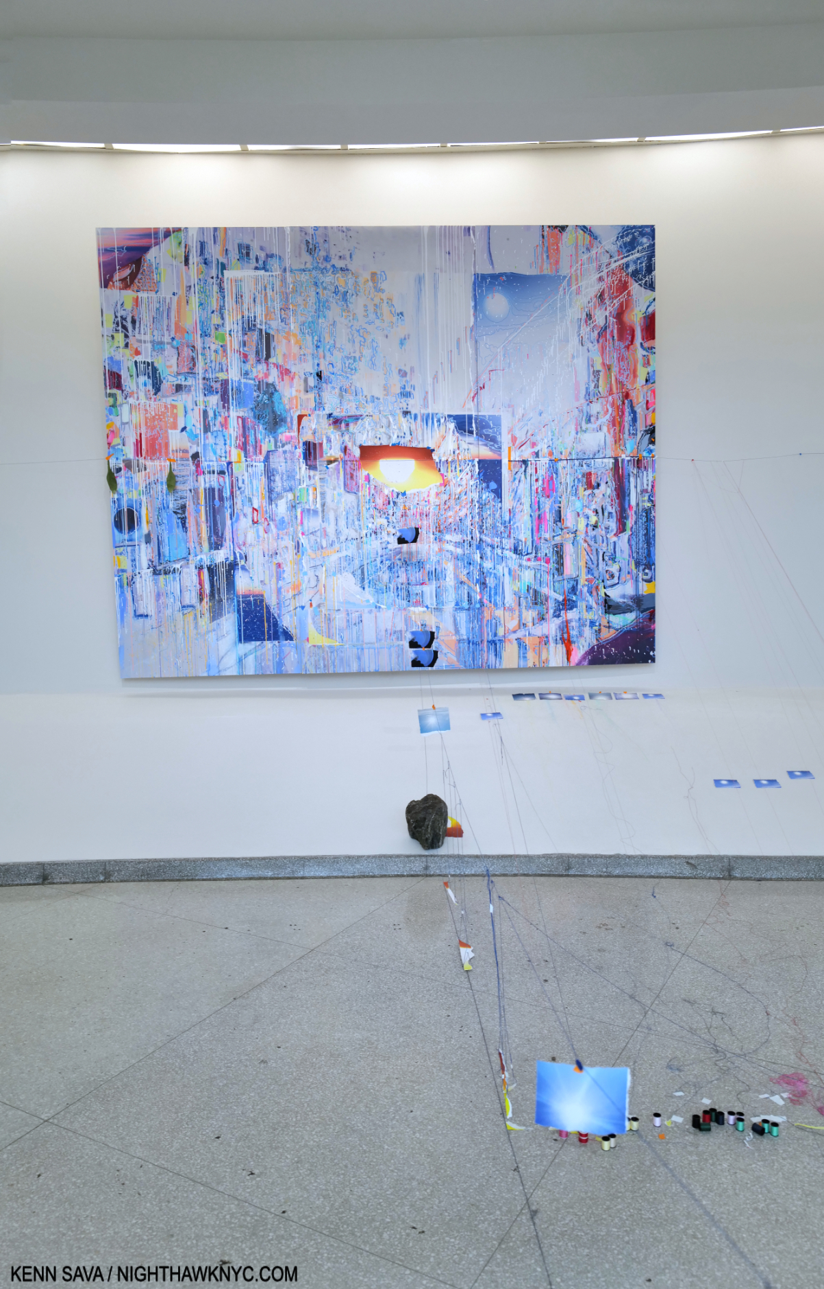
Following the Suns. Images That Images Beget, 2023, 129 x 103 inches, Oil paint, acrylic paint, inkjet prints, acrylic polymers, and ink on Dibond, aluminum, wood and paper, on 4 panels, with a string, containing Photos, leading to it from the tank.

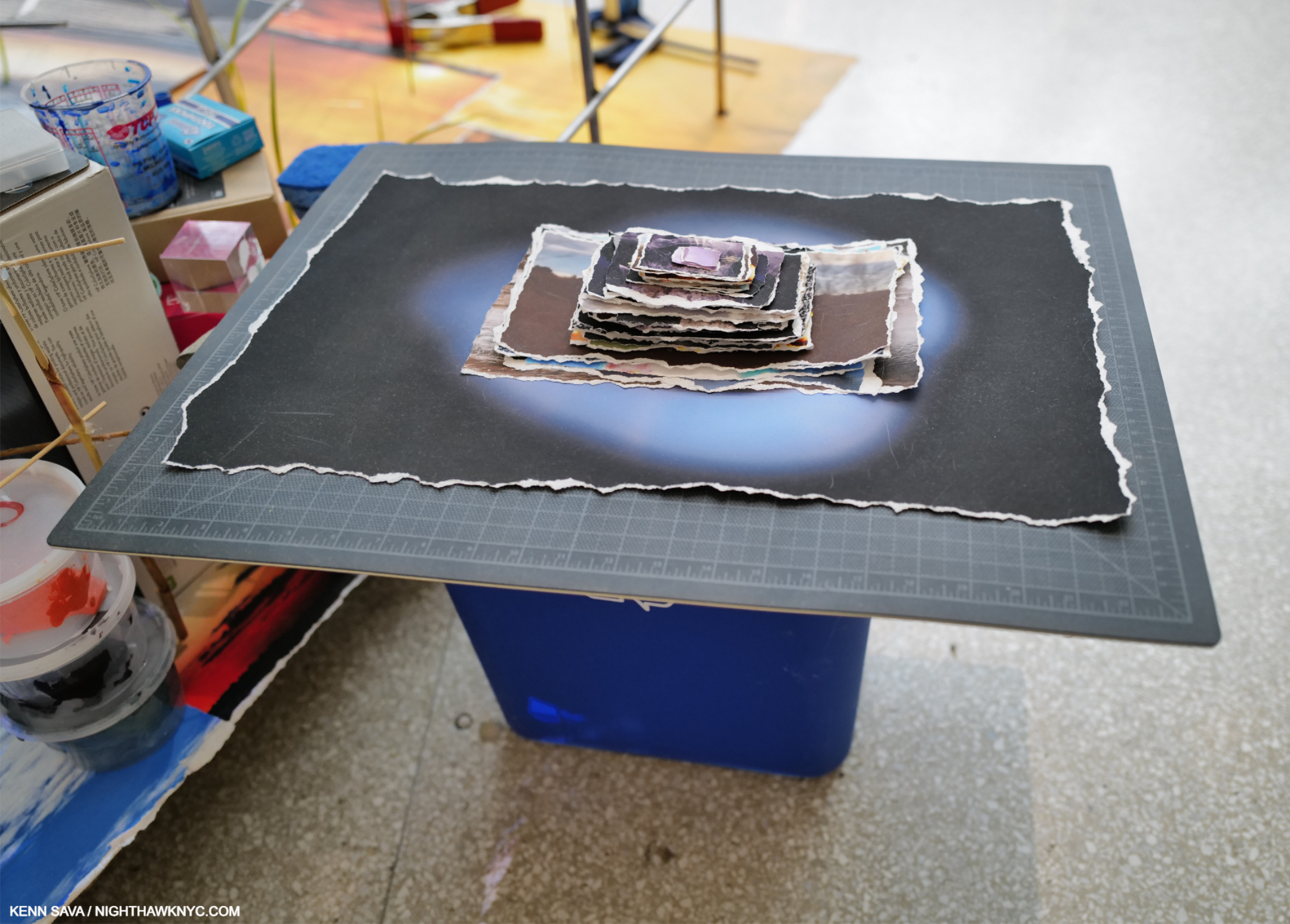
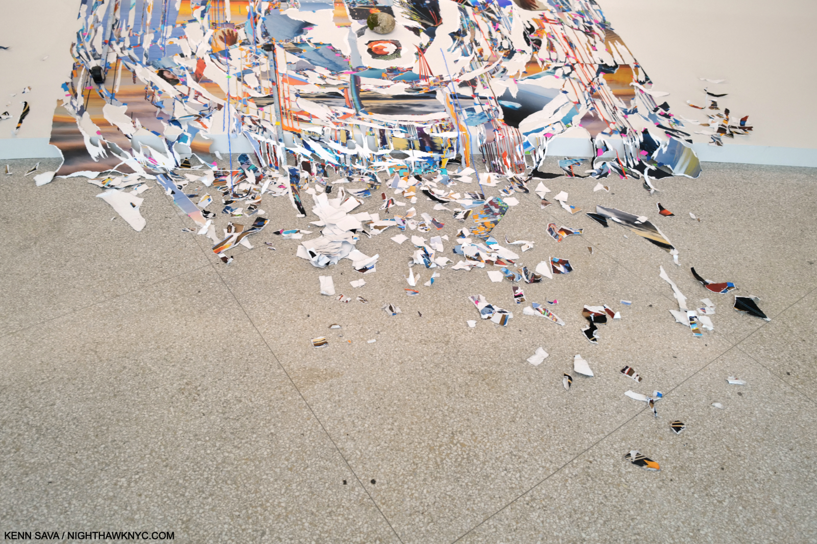
I found this a fascinating way of drawing the viewer into the space and making him or her consider individual elements, like the Sun, and countless small objects installed on the floor, along the way to seeing the Painting. It also occurred to me that it’s a way of both measuring the space, occupying the space, as she said, and dialoguing with Wright. The whole idea of installing objects on the floor, which has been done many times, is taken to a new level here with countless small, even tiny, objects lying on the floor, some you can see in this picture (and more in Part 2). I wonder if that’s been done here before.

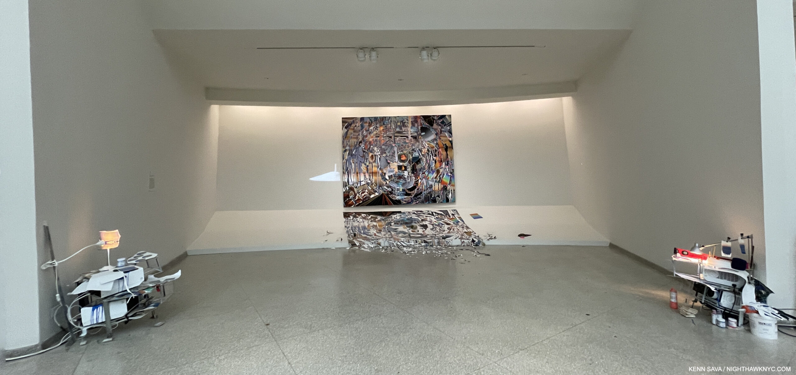
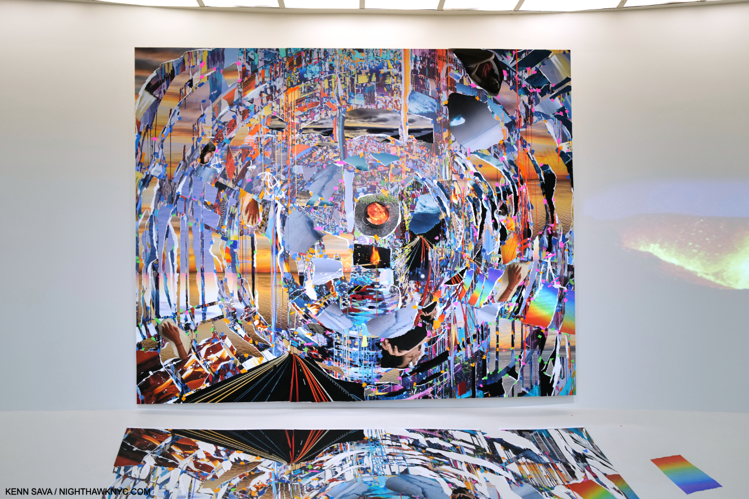
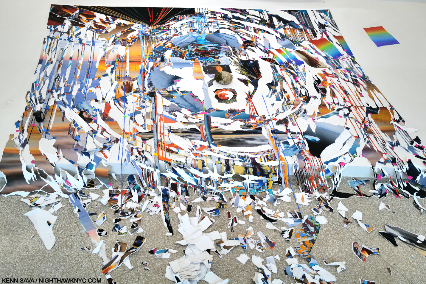
Bay 5, Times Zero, 2023, Oil paint, acrylic paint, inkjet prints, acrylic polymers, and ink on Dibond, aluminum, wood and paper, on three panels. Total dimensions, 97 × 120 1/2 × 3 inches.

Regarding the Paintings in Timelapse, and specifically about Times Zero, the exhibition catalog says, “The paintings in this exhibition were created in Sze’s studio in New York, where the artist meticulously replicated the museum’s Bays in 1:1 scale, allowing her to work quasi-in situ. In the case of Times Zero, Sze was struck by the angle at which paint dripped on the sloping shelf that runs from the wall to the floor (familiarly referred to as the “apron”).”

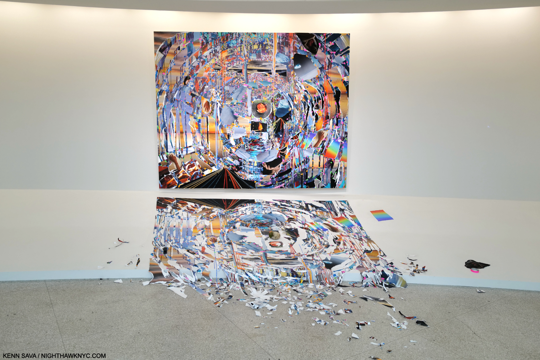
Here the Painting itself is destabilized by having its mirror likeness begin to come apart. The catalog continues, “She later photographed the work and digitally manipulated it in perspective to the incline of the apron. The resulting full-scale print was then ripped and the shards arranged below the painting itself, like a reflection in water or an imprint; the debris was left to overflow at the edge like liquid5.” She will revisit this “overflowing” effect in a subsequent Bay.

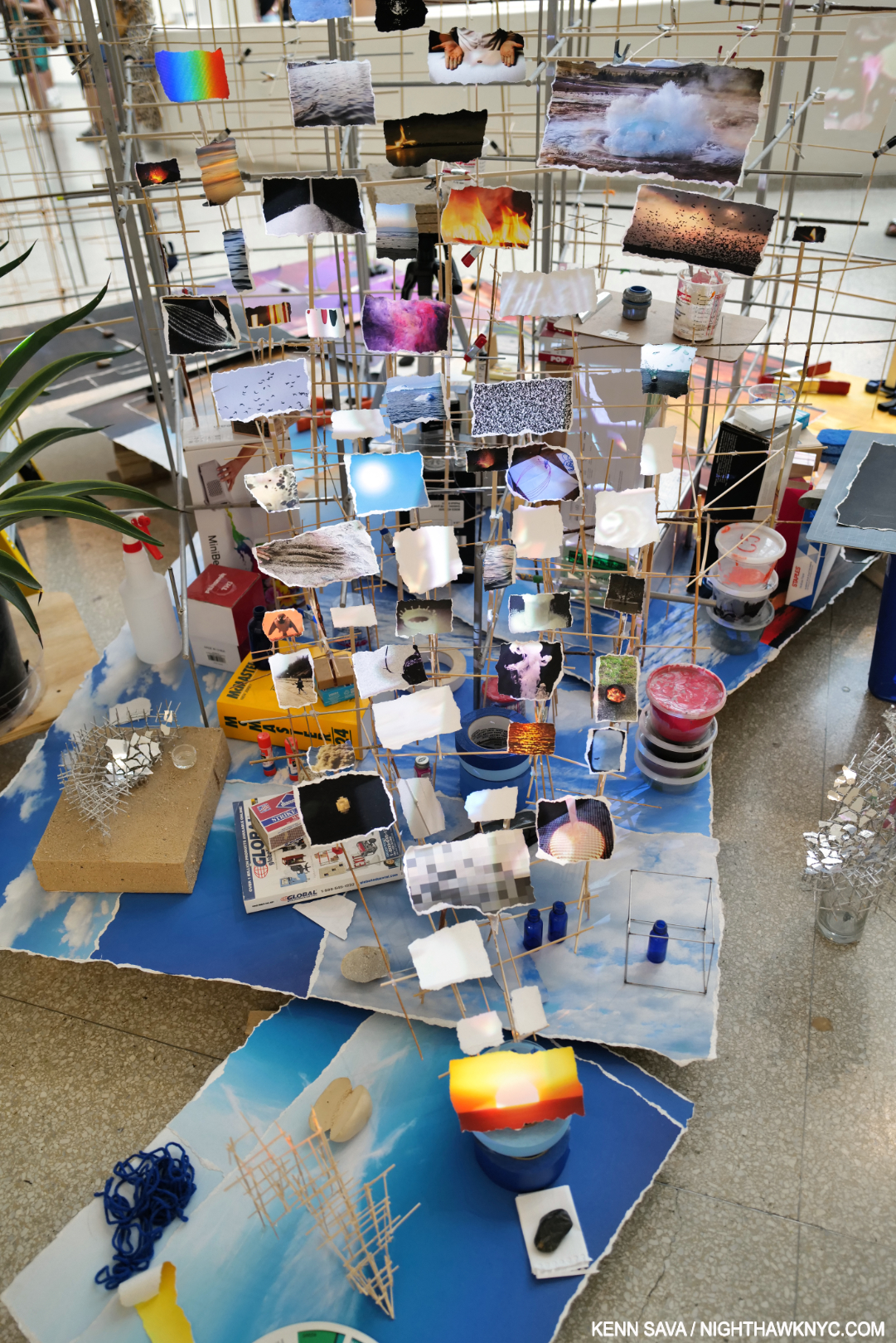
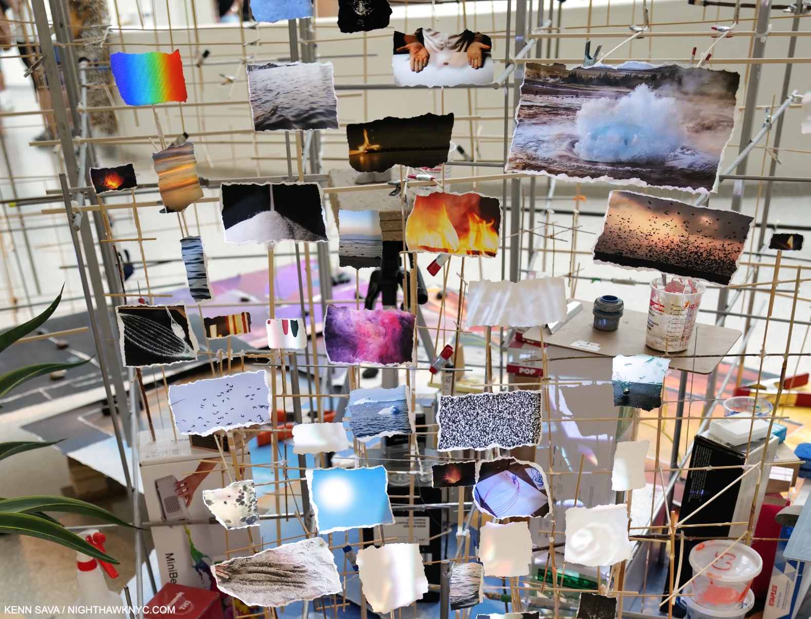
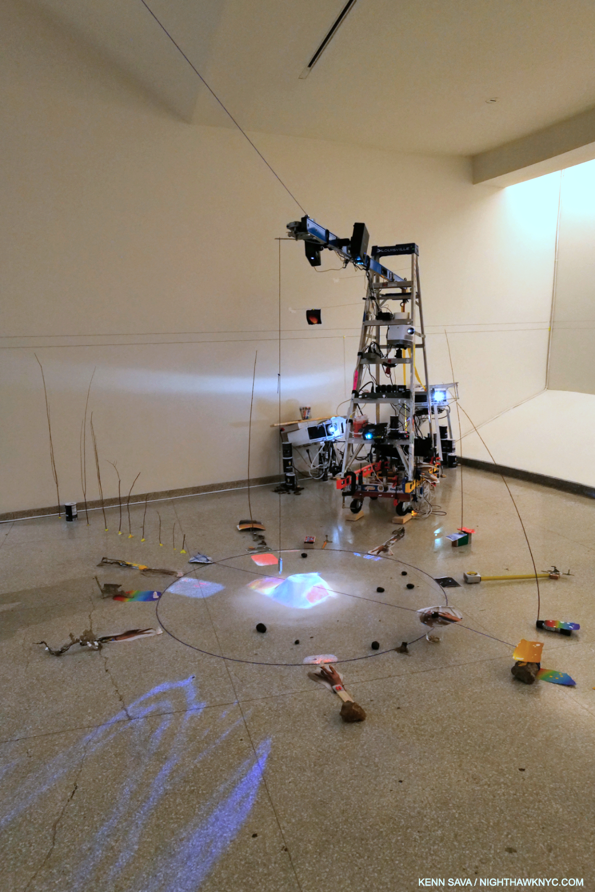
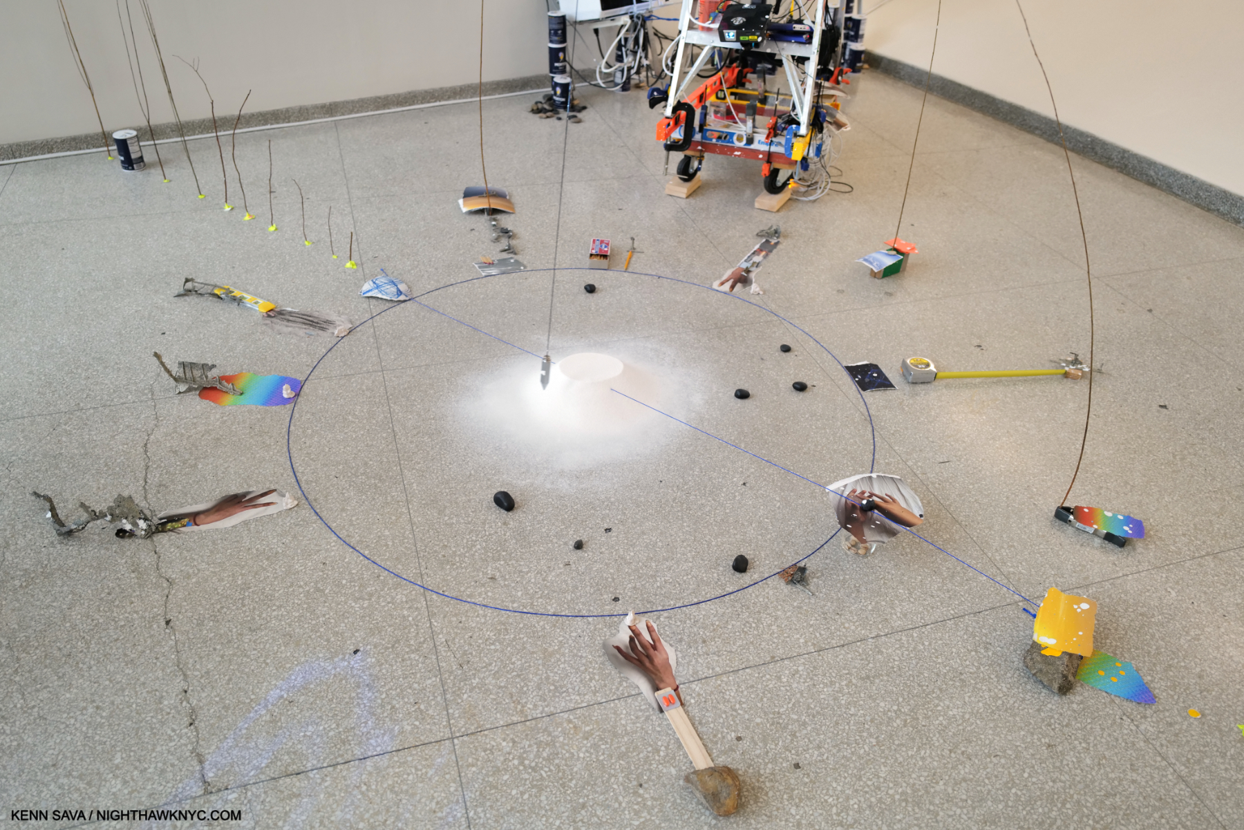
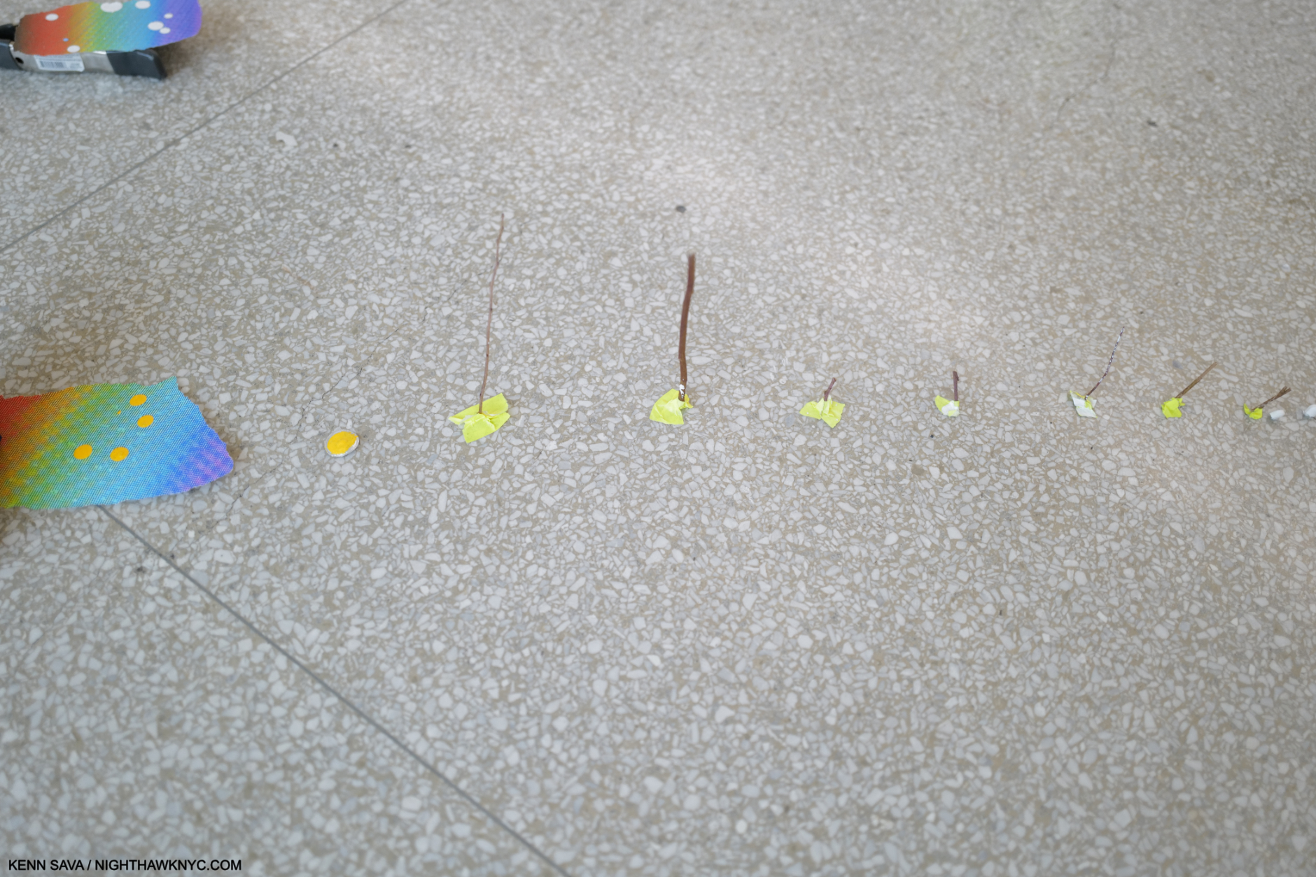
Bay 6, A Certain Slant, 2023, Multimedia installation, including two-channel color video projection, with sound, various durations; video projectors; inkjet prints; and metal pendulum. A number of the torn analog Photos lying around the circle are of hands and forearms, as I show close-up in Part 2. Hands being a running theme.

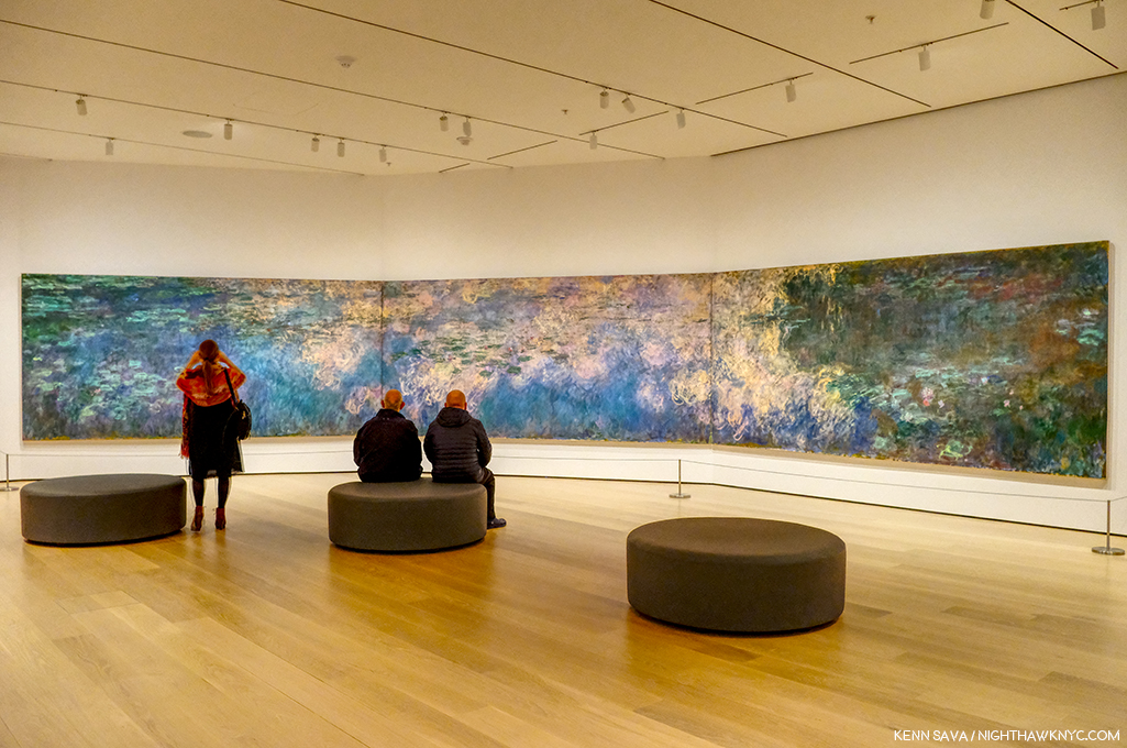
A Certain Slant reminded me of Sarah Sze’s piece Triple Point, which I saw at MoMA a few years back, in that it has a center pendulum suspended over a pile of unspecified material. In Triple Point, however, the pendulum makes a much wider arc seeming to threaten the surrounding objects. In A Certain Slant, it confines its arc to the area of the salt mound.

Sarah Sze, Triple Point, Multimedia, 2013, seen at the opening of the latest “new” MoMA, October 21, 2018. A work that represented the U.S. at the Venice Biennale that year. The title is a reference to the “triple point of water,” a state where it exists simultaneously as steam, ice and a liquid.

Seeing Triple Point at MoMA left me amazed that Sarah Sze’s work can be installed (in Venice in the case of Triple Point), disassembled and reassembled (at MoMA and elsewhere). Given that Timelapse is site-specific for the Guggenheim, however, it would seem extremely unlikely it will ever be reassembled in full again.

Bay 7. Last Impression (on the back wall), 2023, Oil paint, acrylic paint, inkjet prints, acrylic polymers, and ink on Dibond, aluminum, wood and paper
84 × 56 1/4 × 2 inches.

In Bay 7, one of the highlights of the show for me, the strings were installed across the Bay, preventing the viewer from moving past a certain point, as seen below. Along the series of strings, numerous empty frames were hung, which is interesting since the Painting is not framed. This continued on a unique installation on the large blue ladder nearby to the right, which I show in detail in Part 2.

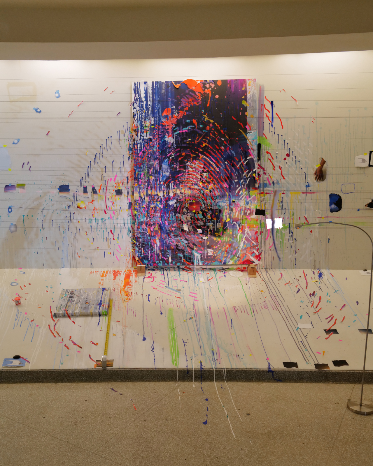
Closer. The strings strung across the bay limit how close the viewer can get to the Painting, which looks like it could contain an enlarged fingerprint. I’ve also never seen a Painting installed on/lying on the ramp, as the small one to the left is.

The Painting, installed on the back wall, was also accompanied by numerous drips and marks that appear to be on the wall, again mimicking a studio situation as in Bay 6. Unlike the “overflow” seen in Bay 5, Times Zero, this time it appears paint runs down the apron and on to the floor. It made me wonder if Ms. Sze was allowed to Paint on the walls and apron, or if this is part of the installation as well, though that is paint on the floor.

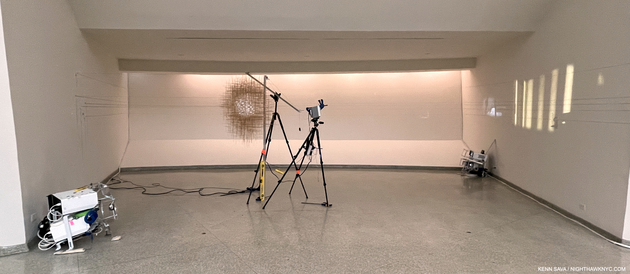
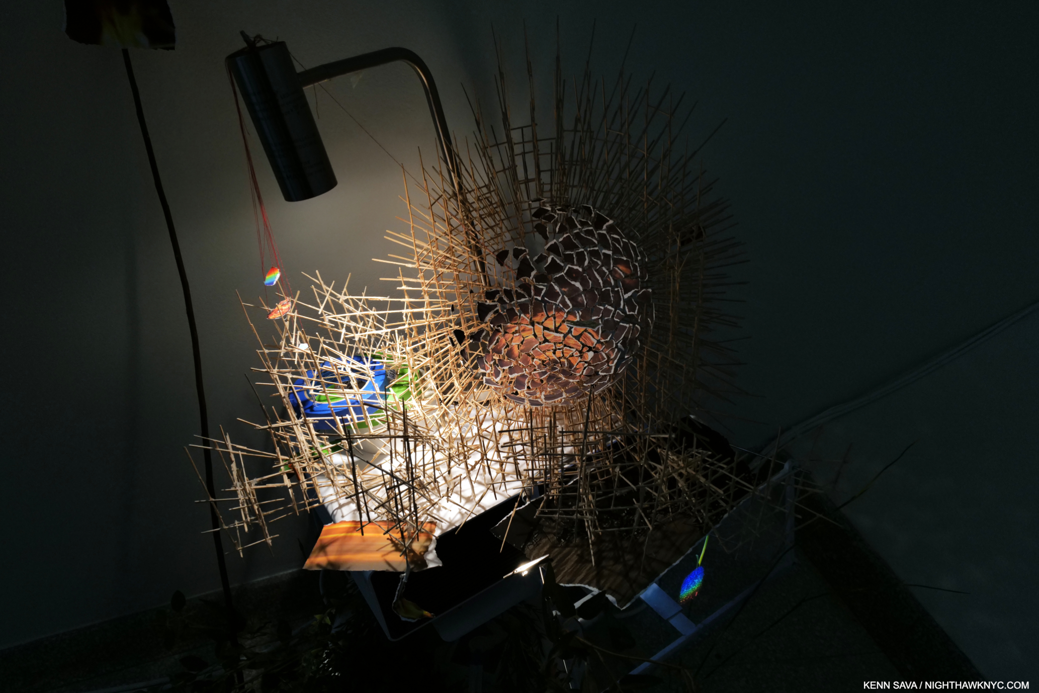
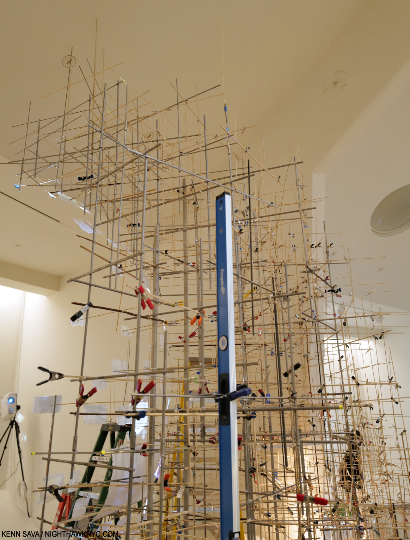
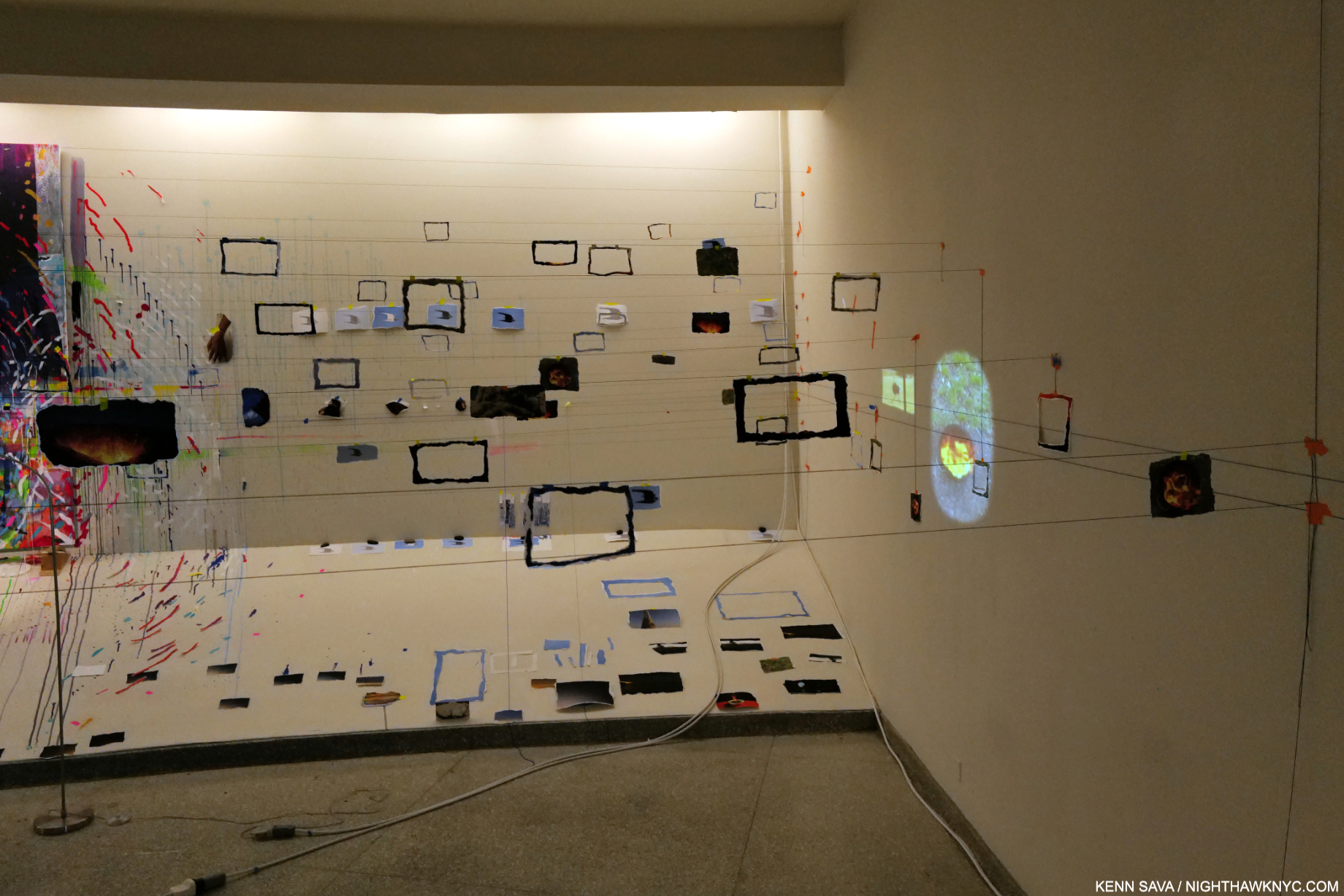
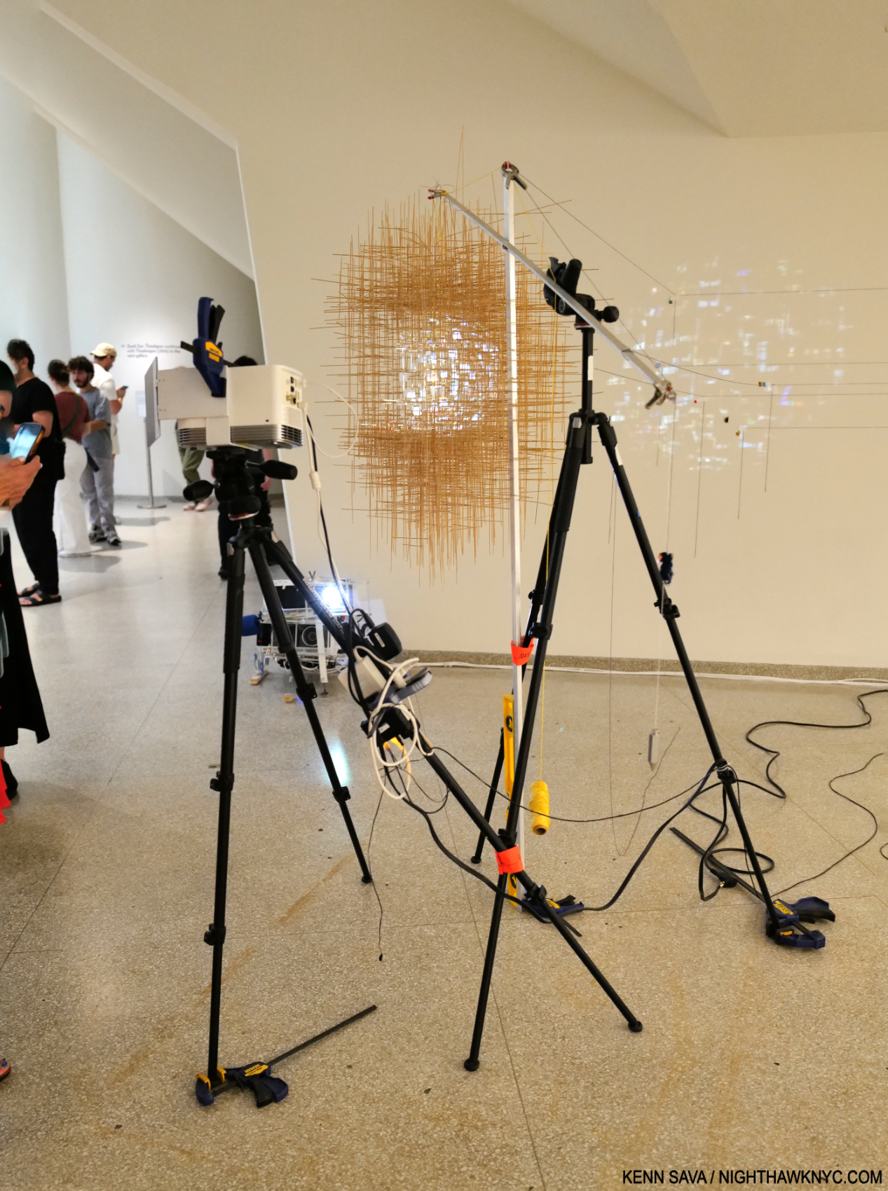
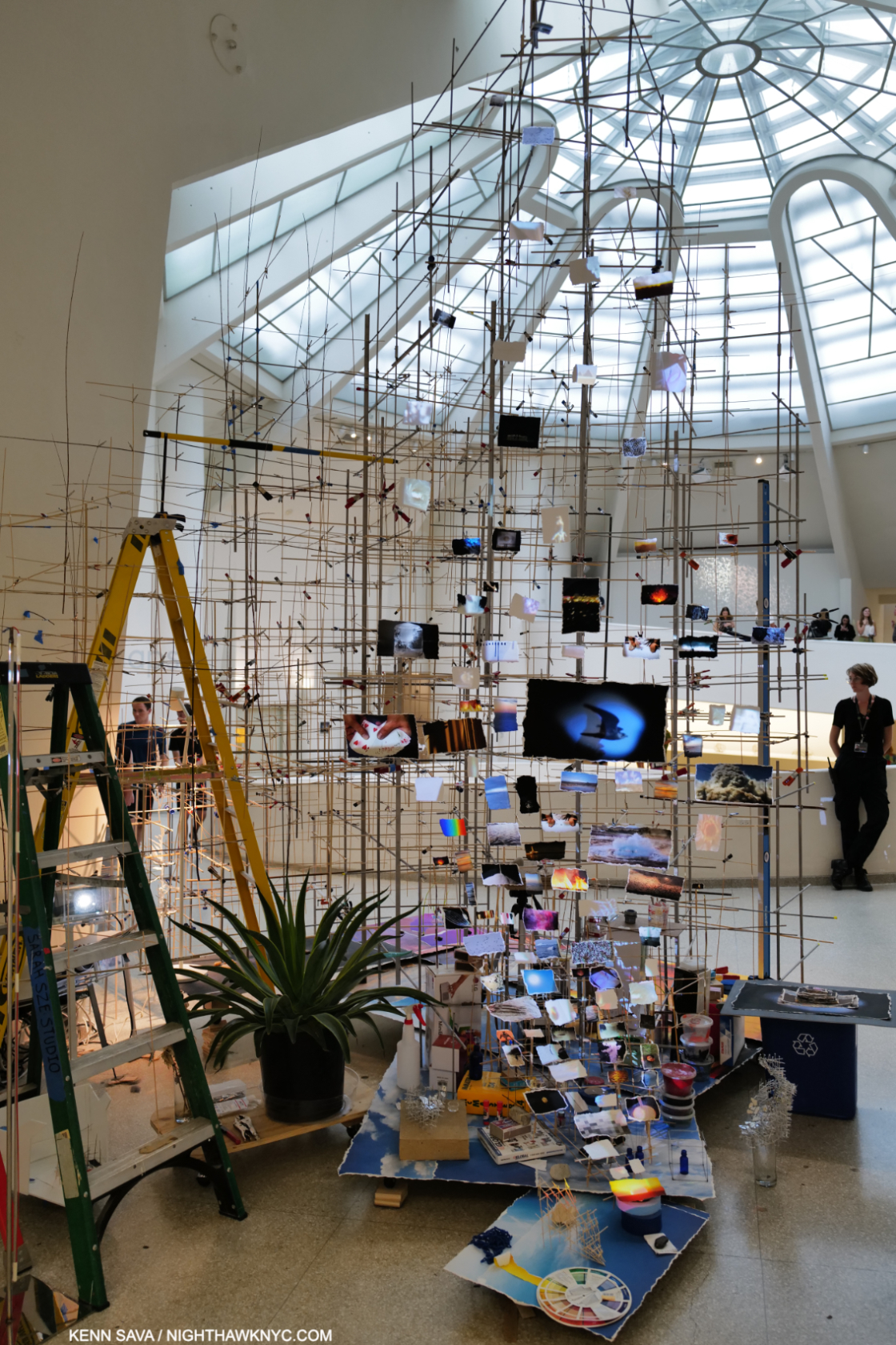
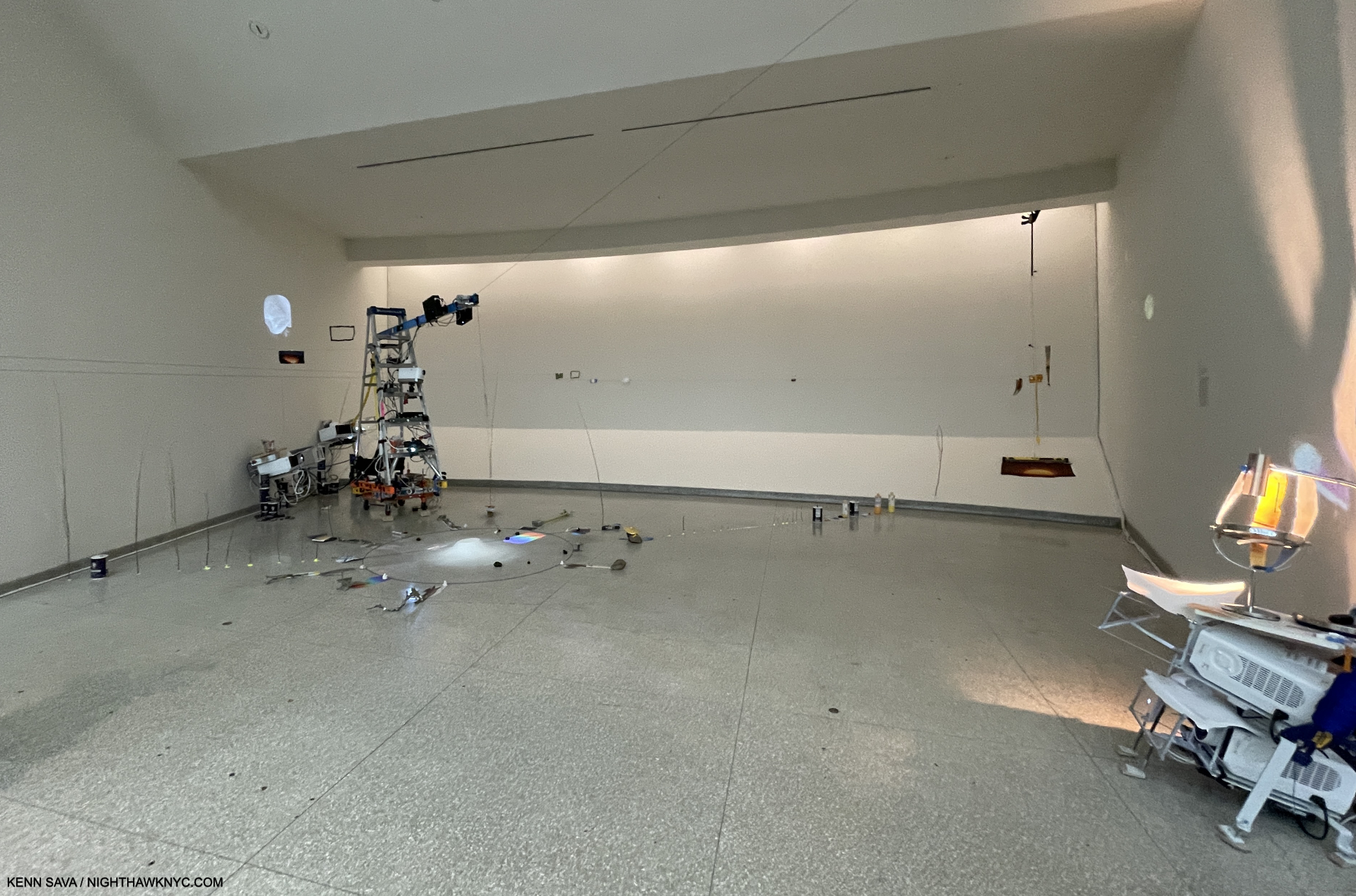
The final Bay, 8, Things Caused to Happen (Oculus), 2023, Multimedia installation, including color video projection, with sound, various durations; video projectors; wood; stainless steel; inkjet prints; toothpicks; clamps; ruler; and tripods. The natural light obscures the light from the projection which shines on the central structure then leaks on to the wall on the left, with strings running to it, indicating the breaking up of digital images. I show this in Part 2.

The showstopper was Things Caused to Happen (Oculus), installed in Bay 8, the final Bay on the 6th floor. Seen from a distance, above, it looked like an alien craft hovering in the space surrounded by cameras.

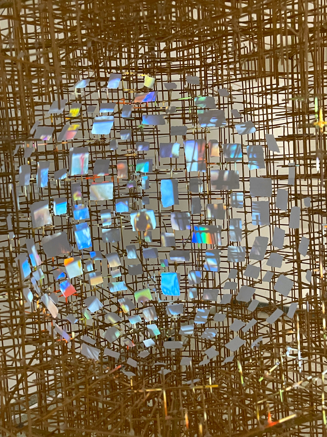
Close up. Each little square and rectangle appears to be a screen with images projected on each independently! How, I don’t know. I show a short video clip of this in Part 2.

Closer up, it seemed to mimic a human head, possibly imitating a number of images continually playing inside of one. I don’t know about you, but I only have one screen playing in my head at any given time. Once again, as in Slice, somehow, these tiny images changed as you watched- independently. Some appeared to be slide shows, some appeared to be video.

In the large rear gallery, which became a gallery as part of the non-Frank Lloyd Wright expansion, Sarah Sze’s monumental and monumentally complex Timekeeper, 2016, was on view.

Also included in the show were two older pieces; Media Lab, the Artist’s first piece to include video was kind of hidden on the ramp of the freight elevator, shown earlier, and the large Timekeeper, 2016, making its NYC debut. It was installed in the large rear gallery off the 6th floor, a space not designed by Wright to be a gallery, and like all the other spaces added in the controversial expansion (which I fought at the time, resulting in my first published Art writing in The New York Times, and which I remain no fan of), I find seriously lacking as gallery spaces. Her huge Timekeeper, now a part of the Guggenheim’s collection, was installed in the center of the darkened room and its video projections moved across all four walls. Between Media Lab, 1998, to Timekeeper, 2017, to Timelapse, 2023, the viewer can trace how long Sarah Sze has been interested in time, how images mark time, and memories, how long she has featured images in her work, and how her work has evolved.

Timekeeper, detail.

When Timekeeper was installed in Brandeis University’s Rose Art Museum in 2016, their Press Release said that it, “blurs the line between organic and mechanical structure, its lifecycle marked by clicking and whirring and flickering images. It keeps a form of eccentric time that is entirely its own, remembering moments over and over again as time slips by. In this sense, Timekeeper has no relationship to the mechanical devices we use to mark the literal passing of time, but instead to the way we recall and replay our lives, in selected fragments that, strung together, account for the passage of years.”

In my February, 2020 piece on her most recent NYC gallery show, I called Sarah Sze a “genius,” the only time I’ve used that term on a living Artist in the 8 1/2 years of NighthawkNYC.com. I should point out that this was BEFORE I saw the Sarah Sze: Paintings book, OR her spectacular recent Laguardia Airport installation. Exactly 4 years since I wrote that, I’ve seen nothing to change my mind.

“I didn’t know you could do that in a museum,” she said, thinking of how viewers, particularly young Artists, might react to Timelapse, before adding, “now you take that ball and run.”

Part 2 of my look at Timelapse looks at some of the countless details in the show, here

*-Soundtrack for this piece is “I’ve Seen It All” by Bjork, another of the world’s most gifted Artists. If I were to use that “g” word on a living Musician, she might well be the one I use it on. She performs it here in Dancer in the Dark

For Lana, whose favorite is building the Guggenheim Museum, and for Ben, a passionate lover & student of Wright’s Art.

NighthawkNYC.com has been entirely self-funded & ad-free for over 8 years, during which 300 full-length pieces have been published! If you’ve found it worthwhile, PLEASE donate to allow me to continue below. Thank you, Kenn.

You can also support it by buying Art, Art & Photography books, and Music from my collection! Art & Books may be found here. Music here and here.

Written & photographed by Kenn Sava for nighthawknyc.com unless otherwise credited. To send comments, thoughts, feedback or propositions click here. Click the white box on the upper right for the archives or to search them. Subscribe to be notified of new Posts below. Your information will be used for no other purpose.

  1. from her interview with Great Women Artists Podcast
  2. from her interview with Great Women Artists Podcast
  3. from her interview with Great Women Artists Podcast
  4. from her interview with Great Women Artists Podcast
  5. Guggenheim Museum, Timelapse Exhibition Catalog, P.129

Sarah Sze: Timelapse- Freeze Frame

This site is Free & Ad-Free! If you find this piece worthwhile, please donate via PayPal to support it & independent Art writing. You can also support it by buying Art & books! Details at the end. Thank you.

Written & Photographed by Kenn Sava

This is Part 2 of my look at Sarah Sze: Timelapse at the Guggenheim Museum. Part 1 is here.

Slice detail with Wright’s Oculus.

As I said in Part 1, there were so many amazing details in Timelapse I decided to devote a separate piece to them. I’m showing 40 as thumbnails. Click on any image for full size. There’s also a short video clip.

…and wonder about Timelapse I continue to…Show posters behind appropriate scaffolding, Seen on 10th Avenue, June 5, 2023.

The hub for the black string.

Following are Photos of details in the 8 Bays on the 6th floor. Please refer to the overall shots of each installation in Part 1 for orientation and where they are installed in each piece.

The following are details from Bay 1, The Night Sky is Dark Despite the Vast Number of Stars in the Universe

Detail of the Hammock in Bay 1. The Hammock over the ground floor pool and the Hammock Sarah Sze created in 2015 had a similar overlay. I believe the material on the floor is part of the installation, and hasn’t fallen through.

Detail of the far left corner of Bay 1, with a shadow from the Hammock and an image from River of Images.

The following are details from Bay 2, Travelers Among Streams and Cascades

Three details from the Painting, Travelers Among Streams and Cascades. This one from the left section…

Detail of the center section…

Detail of the right section.

The following are details from Bay 3, Slice.

Slice. Detail of the front.

Slice. Close up of the front. Shown here are a number of the recurring image “themes”: hands, birds, the Sun, fire, the sky and other aspects of nature.

Detail behind Slice with River of Images.

One of many levels and rulers.

Looking over a rung of a ladder to see the model of Slice in its Bay installed under it displayed next to the final piece.

Throughout Timelapse lamps were used apparently to draw the viewer’s attention to specific images or objects.

The following are details from Bay 4, Diver, Second of two parts and Images That Images Beget

The following are details from Bay 5, Times Zero

Times Zero, 2023.

The following are details from Bay 6, A Certain Slant,

Detail of the center surrounded by images of hands and objects.

Detail of the far right corner looking to the right from the image above. I imagine the salt from those blue containers is what is in the center of the circle.

Detail of part of the installation on the floor further to the right in the previous picture.

The following are details from Bay 7, Last Impression

An alternate, slightly closer view of Bay 5 from what I showed in Part 1. As you can see in the full size image, the empty frames to the right are attached to the strings that run across the gallery.

Some details of the ladder at the right side, front, of the Bay.

The following detail is from Bay 8, Things Caused to Happen (Oculus)

Short clip of Things Caused to Happen (Oculus).

The Artist points out that in the end, the digital images beamed on to Things Caused to Happen (Oculus) break up on the far wall.

*- Soundtrack for this piece is “I’ve Seen It All” by Bjork. This time in the version with Thom Yorke.

NighthawkNYC.com has been entirely self-funded & ad-free for over 8 years, during which 300 full-length pieces have been published! If you’ve found it worthwhile, PLEASE donate to allow me to continue below. Thank you, Kenn.

You can also support it by buying Art, Art & Photography books, and Music from my collection! Art & Books may be found here. Music here and here.

Written & photographed by Kenn Sava for nighthawknyc.com unless otherwise credited. To send comments, thoughts, feedback or propositions click here. Click the white box on the upper right for the archives or to search them. Subscribe to be notified of new Posts below. Your information will be used for no other purpose.

A Look Back At The Met Breuer

Written & Photographed by Kenn Sava

First part of a series. 

I was there when it opened (to Members) March 8, 2016, and now I find I was there when it closed on March 12, 2020.

First look. Approaching The Met Breuer for Member’s Preview, March 8, 2016.

With the calendar turning to July, what had been a “temporary” closing due to the pandemic has become permanent with the turning over of The Met’s lease on the building Marcel Breuer designed at 945 Madison Avenue at East 75th Street to The Frick Collection. Originally commissioned by The Whitney Museum, who occupied it for almost 50 years after it opened in September, 1966, The Met (TM, henceforth) rechristened it “The Met Breuer,” (I promptly christened it TMB). The Frick Collection will now move in.

There was no press release or official announcement when The Met’s (TM) turned the Breuer building over to The Frick Collection, effective July. There was a mention on TM’s Instagram page, and now only this on the Visitors page on TM’s website.

In mid-July, the status of Gerhard Richter: Painting After All, which was had been open for just 9 days, and which I saw March 12th, its last day, was clarified when its listing along with those of the two other shows that were open at the time of the “temporary” closing, were moved to the “Past Exhibitions” section of The Met’s website.

After checking every day since March, the show appeared on the “Past Exhibitions” page on July 17th. I’ve enlarged the date section for legibility and added the red text to their listing.

So, with the status of its final chapters finally clarified, the book is now closed on The Met Breuer. It’s time to begin to assess it and its legacy. In Part 1 of my look back, I’ll look at the beginning and the end of TMB. Part 2 will look at some of the highlights of the intervening four years. Part 3 will include some thoughts on the “bigger picture” and what it may “mean.”

Back to the future. March 7, 2015

After trying to get approval for a remodeling of the Breuer Building failed1, the Whitney then decided to build a new building downtown in the Meatpacking District, and so moved out of the Breuer Building in October, 2014. It’s seen here empty in March, 2015, almost exactly a year before The Met Breuer would open here.

The Met announced it would take over the Breuer Building as it’s “outpost” for Modern & Contemporary Art in 2011. Seen here on December 18, 2015. I was told that the silver circles on the windows were meant to echo the ceiling lighting of the lobby inside shown further below.

Looking down at the lower level, December 18, 2015. See the next picture.

The same window. March 8, 2016, Member’s Preview Opening Day. The white wall on the lower level is in front of a bar that had not been completed. The circular ceiling lights are partially seen upstairs.

Member’s Preview, March 8, 2016. Close-up of the sign to the right follows.

On the sign are the two inaugural shows that are both now legendary in my book- Nasreen Mohamedi and Unfinished: Thoughts Left Visible both unseen when I took this shot before going in.

The original Marcel Breuer lobby lighting seen in October, 2018.

The building remained largely unchanged by The Met, except for extensive renovations to the lower level, where they installed the Flora Bar and Cafe. Over the years, I’ve warmed up a bit to the design of this building, which is generally described in unattractive terms, including “brutalist.” I’ve always wondered how Marcel Breuer felt about this term being applied to his work. I characterize the building as “overly cold.” To me, now, it feels like it’s keeping a secret close to its vest, one that even an exploration of all its floors does not reveal. There are some details of the design I’m quite fond of- the windows, particularly the large front facing window, and the lobby ceiling lighting. Both of which strike me as “warm” touches in the midst of the unrelenting cold stone inside and out. Even the seating is stone.

“Wake Up over there on the right!” It’s MacArthur “genius” grant recipient, Vijay Iyer, in the shadows, left, on piano, performing with his Trio for Members during their preview in the first floor Gallery, March 8, 2016.

Being in this space, listening to Vijay Iyer’s Trio, reminded me that my very first exposure to the work of the great Joseph Cornell was the Joseph Cornell: Cosmic Travels show, 1995-96 I saw in this space when it was the Whitney2. I’ve been a big fan ever since.

A rare shot of Tatsuo Miyajima’s Arrow of Time, on view in TMB’s first floor gallery seen in 2016. The only show to take place there before it became the gift shop.

The same space seen in October, 2018, soon after it became the Store, as it would remain.

After various attempts at showing Art in this space, it became the gift shop.

Nasreen Mohamedi, lobby installation view.

The first two shows got TMB off to an “auspicious” start, as I called my piece on Unfinished: Thoughts Left Visible. I had no idea the impact Nasreen Mohamedi would have on me, creating an open and closed case for her place among the great Artists of the 20th century. I returned to see it thirteen times, and I still walk around it in my mind.

Chairs in the final room of Nasreen Mohamedi with one of Marcel Breuer’s unique windows.

Unfinished: Thoughts Left Visible, installation view that first day.

Scenes from The Last Day of The Met Breuer…

Back for what turned out to be the last time, March 12, 2020.

The Met 150th Anniversary banners flying on the corner on what would turn out to be the last day of The Met Breuer strike me as being quite ironic. Unfortunately, they have not had much to celebrate this year. The Met Breuer was closed on the 150th Anniversary of The Met’s founding, April 13th, and then permanently when the calendar turned to July. Losing a branch is a memorable event, but (considerable financial savings aside) not something to celebrate. What it was, is, in my view.

Last call. The sign on the final day lists three very good shows, the other two open for a bit longer than the scant 9 days Gerhard Richter: Painting After All was.

Three very good shows were up that final day, including Gerhard Richter: Painting After All, which will be remembered among all the Artist’s many shows, I believe. I saw all three that day. My look at the Gerhard Richter show that final day is here. At the time, NYC had little idea about the virus that would soon devastate us, how it was spread and what precautions to take. I wasn’t wearing a mask, March 12th. I didn’t have one. A number of the guards were. I didn’t realize then how big a risk I was taking going to The Met Breuer that day, or seeing the other shows I ran around to see just before the March 13 shutdown.

Gerhard Richter, 4,900 Colors, 2007, Enamel paint on aluminum.

A number of pieces I saw that day also spoke to the conditions looming in the City, and the world. Looking at Mr. Richter’s 4,900 Colors it was hard not to feel that the future was fuzzy and out of focus. It still is.

A final look at the lobby counter before leaving for the last time.

I stood outside for a few minutes as the clock approached the 6pm closing, just taking in the scene. When would TMB reopen? There were no thoughts, then, that it wouldn’t, though of course I had TM’s announcement of the summer hand off to The Frick in the distant back of my mind. Summer was a long way off in late winter. As I was leaving, I overheard two staff members say to each other “See you June 1st,” and I wondered if they knew something I didn’t. June 1st? Wow. They’ll be closed for TWO AND A HALF MONTHS! It would turn out to be four and a half months, and never reopen. The Met announced in early July “tentative plans” to reopen at 1000 Fifth Avenue on August 29th. By then, it will be five and a half months.

Last look. It’s 5:50pm, March 12, 2020, as I’m leaving. The Met Breuer is “temporarily closing” in 10 minutes, yet this intrepid staff member is busy cleaning the front doors. It would never reopen to the public, and so this remains my last memory of it.

I’m left with the feeling that when The Met Breuer’s doors closed March 12th, something else may have closed with them. I’ll address that in Part 3. Next, I’ll look at what I saw between March 8, 2016 and March 12, 2020.

*- Soundtrack for this post is “Soundwalk 9:09” by John Luther Adams, commissioned by The Met for The Met Breuer’s opening, that takes its title from the amount of time it takes to walk from 1000 Fifth Avenue to The Met Breuer, in two parts. “Uptown” for listening while walking from TMB uptown to TM, and “Downtown” for the reverse. Both pieces may be heard here.

NighthawkNYC.com has been entirely self-funded and ad-free for over 6 years, during which over 250 full length pieces have been published. If you’ve found it worthwhile, you can donate to keep it going & ad-free below. Thank you!

Written & photographed by Kenn Sava for nighthawknyc.com unless otherwise credited.
To send comments, thoughts, feedback or propositions click here.
Click the white box on the upper right for the archives or to search them.
For “short takes” and additional pictures, follow @nighthawk_nyc on Instagram.

Subscribe to be notified of new Posts below. Your information will be used for no other purpose.


  1. I was active in trying to get it, and the proposed Guggenheim Museum expansion at the time, stopped, with mixed results, as I recounted here.
  2. For some reason the Whitney doesn’t list this show on their site. Though I don’t have pictures of it, I know it was there- I still have the exhibition brochure, and so do these folks.

“Best” Doesn’t Exist In The Arts

For The Record #3. 

Third- I don’t believe in qualitatively comparing Artist or works of Art. There is no such thing as “Best” in the Arts. Qualitatively comparing Artists or Artworks is pointless. Whatever criteria you use are subjective. In my view, awards and “halls of fame” are pointless. Turn those halls of fames into museums.

Stanley Kubrick, seen here in his 1946 Photograph with “showgirl” Rosemary Williams, at the entrance to the Museum of New York show of his Look Magazine Photographs  never won a “best director” oscar. Neither did Charlie Chaplin. Neither did Alfred Hitchcock. Neither did Orson Welles. Neither has every black, female, Hispanic, or Asian director, ever.

For every award “winner” there are countless others who can also be said to “deserve” to have “won.” I wish all awards would cease. For every “hall of fame” member there are countless others who could have been included. I think they should all be closed and museums opened in their place. All of this being said, I have no problem with those who win awards enjoying them. As contradictory as that may sound, acknowledgement of Artists in any form in this country, particularly, is very hard to come by. It’s not their “fault” they “won.” History shows that all of these awards have missed many others as deserving, and also shows that some of the most important Artists in their fields never won any award- until someone decided late in their career that they better try and “fix” their oversight. The hype and marketing surrounding awards and award winners is meant to make you feel theirs is the final word on the subject. There is NO such thing!

Experience the work for yourself and make up your own mind. See if it speaks to you, or not. At the end of the day, or of the year? That’s ALL that matters.

So, I’ve preferred to use the term “NoteWorthy,” to refer to Art, shows, and books that have lingered with me, have had the most impact, and which I think others should know about so they can make up their own minds about. I also use the term “favorite,” which does not mean “best,” to connote something I personally like, whether or not I think it’s “important” or “NoteWorthy.” We all have what I call “guilty pleasures”- like a song we know is going to be forgotten as soon as we can get it out of our heads!

Screencap from The Metropolitan Opera’s broadcast of Alban Berg’s Lulu, with production design by the great William Kentridge, in 2015.

If something doesn’t speak to you…? Well, if something doesn’t speak to me I try and keep an open mind about it and revisit it one day, sometimes years later. I try and not say “I don’t like it.” I just let it lie with me, continue to think about it, and revisit it later, even years later. At that time, it still may not speak to me, but sometimes it does. In some of those cases the work and the Artist became very important to me. Like Alban Berg and his opera Lulu, which on first hearing may sound completely chaotic. As I listened to more and more Music in more and more styles, my ears opened up. Now, I only hear Mozartean beauty in Lulu, which has become my favorite opera. At other times, I’ve wrestled with Art or Music I just didn’t get. This involved digging deeper into the background of the work and looking or listening harder. Yes, harder. So, I try and always keep an open mind. That being said, there are some things I admit I will NEVER like or appreciate. Hitler was a painter (small ”p” intended), remember? It’s too bad he wasn’t able to get into school, become an Artist, and make a good contribution to the world, instead.

Instead of awards, perhaps give an Artist a grant, a commission, or buy their work, if you want to help them.

*-Soundtrack for this Post is “Award Tour” by A Tribe Called Quest from their immortal Midnight Marauders, 1993.

For The Record is a series of pieces that are about key/core subjects & beliefs that underly everything else I’ve written here. The first two parts are here

NighthawkNYC.com has been entirely self-funded and ad-free for over 6 years, during which over 250 full length pieces have been published. If you’ve found it worthwhile, you can donate to keep it going & ad-free below. Thank you!

Written & photographed by Kenn Sava for nighthawknyc.com unless otherwise credited.
To send comments, thoughts, feedback or propositions click here.
Click the white box on the upper right for the archives or to search them.
For “short takes” and additional pictures, follow @nighthawk_nyc on Instagram.

Subscribe to be notified of new Posts below. Your information will be used for no other purpose.


Art- With A Capital “A”

For The Record #1. First part of a series.

Written & Photographed by Kenn Sava

Back at The Met, May 6, 2018. The Museum, as it’s referred to, is one of the world’s great repositories of Art with a capital “A” with collections covering 5,000 years of it from all cultures in all its forms. It’s also one of the very best things about living in NYC. No. It’s THE best thing in my opinion. 1,700+ visits in since August 1, 2002, every time I turn the corner and see the building looming in front of me, I still get a chill down my spine. I touch the corner as I go in each time as a way of saying “Hello” to an old friend and to give thanks for each and every opportunity I get to do so.

To mark the 4 and a half year Anniversary of NighthawkNYC, during which I’ve published 225 pieces in 240 weeks (Phew…), I thought I’d take the opportunity to set the record straight on a few things that I feel are at the core of what I believe, and what I’ve written here. Perhaps I should have “explained” them at the beginning instead of letting those who’ve read these pieces (for which I Thank You) wonder, “What the heck?” Well, better late than never. Herewith the first installment in a brief series called For The Record. Consider them “footnotes” or “addendums” to every piece I’ve written.

Michelangelo’s Sistine Chapel Ceiling reproduced as part of The Met’s staggering Michelangelo: Divine Draftsman & Designer, 2017-8, one of the sublime experiences of my life.

First- Art is of one of man and womankind’s supreme accomplishments in my view. I believe there should be some distinction between the Art of someone like Michelangelo and, say, the art of someone learning (said with all due respect).

Various young artists, unknown titles. A display of children’s art beautifying an NYC public school under renovation.

That’s why I capitalize Art and its associated terms (Artist, Painter, Sculptor, Musician, Painter, Photographer, et al.). It’s my way of showing these people the respect I think they’ve earned and deserve. I’ve done this here since Day 1- July 15, 2015, and I’m sure there are some who frown at me for doing it, and some who disagree with me for doing it. Along the way, I’ve seen a few others doing it this way and frankly, I’m surprised it hasn’t become more widely adopted. I hope it does soon.

The terrific, and terrifically overlooked, Honore Sharrer’s, Workers and Paintings, 1943, Oil on board, seen at MoMA. Some of the Art she includes are Grant Wood’s American Gothic, Picasso’s Girl before a Mirror, and others by Jean-Francois Millet and Diego Rivera. Though this work and the originals of most of what she includes in it are 100 years old, +/-, for me, this and all of them are Art. Will the future agree? Time will tell…

“What makes a work of art? I don’t know. There are lots of people who tell you they are making art. Maybe some of them are, but I’m not sure that’s true for all of them. Perhaps I’m old fashioned, but that’s not a phrase I would use. I’d prefer to say I’m making pictures – depictions.” David Hockney, A History of Pictures, with his capitalization, eBook P.2.

I’ve held David Hockney’s writings, and ideas, in the highest regard since his revolutionary, and eternally controversial, book Secret Knowledge came out in 2001, but I find it cumbersome to use the word “pictures” here in place of “Art.” Regarding what “makes a work of art?,” as he asks, it seems to me that it takes hundreds of years for the dust to settle on what’s being created in our time and for something, a “picture,” as Mr. Hockney says, to be considered “Art” (IF it continues to speak to people). None of us will be around when that bell rings. So, in the meantime, I’ve opted to use the term Art, capital “A,” respectfully, applying it to all working Artists, present or past.

Thanks, Twyla. I couldn’t have said it better. And so, this scene has appeared in my Banner, sans moving truck, for the past year. If that truck is waiting for me, it may have a long wait. I haven’t been out of Manhattan overnight since February 4, 2012. The Joyce Theater, December, 2019.

The other reason I do it is because Art is my religion. Frank Lloyd Wright, who I consider to be an “ultimate Artist,” capitalized Nature since it was his religion. Art is mine.

Reach out and touch faith. For me, going to The Met is going to church, as I said early on. At this point in my life, it feels like Home. Back Home, again, late on December 22, 2018. Weather be damned. It’s always beautiful inside.

*-Soundtrack for this Post is ”Personal Jesus” by Martin L. Gore of Depeche Mode, from their 1990 album Violator. They perform it here on Letterman

For The Record is a series of pieces that are about key/core subjects & beliefs that underly everything else I’ve written here.

NighthawkNYC.com has been entirely self-funded and ad-free for over 6 years, during which over 250 full length pieces have been published. If you’ve found it worthwhile, you can donate to keep it going & ad-free below. Thank you!

Written & photographed by Kenn Sava for nighthawknyc.com unless otherwise credited.
To send comments, thoughts, feedback or propositions click here.
Click the white box on the upper right for the archives or to search them.
For “short takes” and additional pictures, follow @nighthawk_nyc on Instagram.

Subscribe to be notified of new Posts below. Your information will be used for no other purpose.


A Year of Art: 2019

Written & Photographed by Kenn Sava

Detail of Leonardo Drew’s Public Art project, City in the Grass, 2019, seen in August in Madison Square Park, where it was on view from June through December. In conversation, Mr. Drew spoke of the influence of Indian Stupas, though the Empire State Building 10 blocks behind, might be one as well.

A strange year in Art in NYC ended a few weeks ago. A year that saw one of Manhattan’s “Big 5” museums (MoMA) close for four months, including the entire summer, while it remodeled, then reopen to mixed reviews (mine among them), while another one (The Whitney) faced an Artist revolt mid-Biennial, another (The Met) had what seemed to me to be a fairly “quiet” year on the show front as it adapted to the first full year under its new Director, Max Hollein, while the other two, the New Museum and particularly the Guggenheim, chugged along presenting top notch show after top notch show. Meanwhile, no less than 5 shows of the work of Jean-Michel Basquiat were mounted around town, and though I wrote a series of pieces on them I still don’t know “Why now?” While I’ve written about a number of other shows I found particularly NoteWorthy in 2019, already, there were some other excellent shows that linger in my mind, in the space freed up by the plenty of others that do not. If I were to sum of the year in Art seen, I will remember it as a year where Sculpture, long a very overlooked medium, though not here, struck back and broke through.

NoteWorthy Sculpture Shows-

Lingering closest to the front of my mind is the incredible Sarah Sze at Tanya Bonakdar Gallery, which I just wrote about, along with Jean-Michel Basquiat at The Brant Foundation, the most unforgettable shows I saw in 2019.

Leonardo Drew poses in front of Number 217, 2019, Wood, plaster and paint, on the last day of his show at Galerie Lelong, August 2, 2019

Leonardo Drew at Galerie Lelong and City in the Grass at Madison Square Park. Mr. Drew has achieved substantial success around the world, with work in the Permanent Collections of any number of museums, including The Met’s, yet he still seems to be something of a “well-kept secret” to the larger Art public. One of the most original, interesting and visionary Sculptors working today, I thought his show at Galerie Lelong was close to perfect.

Number 215, 2019, Wood, paint and sand.

As with Sarah Sze, the show marked the introduction of Painting by the Artist, though not in the “traditional” sense. The Artist told me Number 215 began as a Painting (his), which he then deconstructed as if it had exploded.

Detail. The show also introduced color into Leonardo Drew’s work.

One monumental work in the large gallery accompanied by five others in the remaining space, each one selected with supreme taste to provide a wonderful group. While his show was up, Mr. Drew also debuted his first Public Art piece, a work commissioned for Madison Square Park.

City in the Grass seen on a day when the lawn was closed to be rested from the non-stop traffic it had been receiving. At the base of each of the three “Stupa”-like structures were wooden “cities” rendered in Mr. Drew’s typically extensive detail to the point that, up close, you could literally spend hours moving through them with your eyes.

In all my years of living in the City, and living here with Public Art, I’ve never seen a piece that was so quickly adopted by the public. Kids endlessly climbed all over it while their parents and other adults languished on other parts of the gigantic piece, as can be seen in the first picture above. Mr. Drew appeared in the Park at least twice to speak about the work and proved to be an extremely thoughtful speaker.

Such was the public acceptance of City in the Grass that even one of the Park’s permanent residents came by to hear the Artist speak about it in a public talk, with renowned writer (and Miles Davis Autobiography co-author) Quincy Troupe, right, on September 11, 2019.

In terms of precedents or influences, Thornton Dial and Jack Whitten (who rented space to Mr. Drew early on the Artist told me) come to mind, but not really. Leonardo Drew is an original. Before he’s done, many decades hence, I believe his work is going to wind up in as many museum as just about any other Sculptor of his generation. 

Nari Ward, Homeland Sweet Homeland, 2012, Cloth, plastic, megaphones, razor wire, feathers, chains and silver spoons, 96 x 60 inches. Along with everything else going on in this, the detail is incredible.

Nari Ward: We The People at the New Museum- Since the 1990s Nari Ward has been repurposing a very wide range of mundane, even humble, materials, often in staggering amounts, in new, surprising and exciting ways. We The People was another long overdue retrospective of the work of this exceedingly creative Artist.

Installation view of part of one of the three floors the show filled.

Occupying multiple floors of the building each work was strong, different from the one before, and shared an uncommon ability to linger in the mind. Another blockbuster show mounted by the terrific team of Massimiliano Gioni and Gary Carrion-Murayari for the New Museum, which continues to rise in stature in my eyes.

Installation view of the 2nd of 3 galleries.

John Chamberlain: Baby Tycoons (with Eva Hesse Drawings) at Hauser & Wirth, East 69th Street- Lesser known work by two ground breaking, unique Artists/Sculptors, both no longer with us were paired in a beautifully installed show at Hauser & Wirth’s uptown outpost. While Ms. Hesse’s Drawings provided a fascinating insight into her career and process, Mr. Chamberlain’s gorgeous small works completely enthralled me.

While his classic larger pieces can look completely “accidental,” his smaller work shows the incredible attention to detail that he brought to bear in all of them. 

Wangechi Mutu, The NewOnes, will free Us, The Facade Commission outside The Met, 5th Avenue- The 5th Avenue Richard Morris Hunt Facade has long been a sore point for me. We’ve been living with it as it is for so many of its 117 years that most visitors fail to realize it remains unfinished! Being Landmarked, having neighbors and being in Central Park has kept TM from finishing what was started back 150 years ago and reached this form in 1902. I pray that one day they’ll be allowed to. It’s not like sticking a brand new pyramid in front of it! It’s just completing the existing facade. So, this year I was pleasantly shocked to see they found an extremely creative and Artful partial workaround. The Facade Commission as they call it bring us 4 terrific bronze Sculptures by Wangechi Mutu titled The NewOnes, will free Us that look superb in the heretofore empty niches outside facing 5th Avenue. On view 24/7 through this June 8th, don’t miss them on your next visit. 

As the year ended, all of this left me wondering- Are we in a “Golden Age of Contemporary Sculpture”?

Elsewhere, among the shows I haven’t written about-

NoteWorthy Painting Shows-

Lorna Simpson, Darkening, 2018, Ink and screen print on gessoed wood, 108 x 96 inches.

Lorna Simpson: Darkening at Hauser & Wirth, West 22nd Street- To this point I’ve been familiar with Ms. Simpson’s Photographs, works on paper and collages, but these Paintings came as a shock. Innovative, fresh, haunting, beautiful, the show felt like it came out of the blue, but I’m sure it didn’t. It struck me as a breakthrough. I returned to see it a few times and when it was over I was surprised it hadn’t received more attention than it got, and left me very much looking forward to see where she’s taking this next.

Jasper Johns, After Larry Burrows, 2014, India ink and water-soluble encaustic on plastic, 32 x 24 inches, one of a series of terrific works by the Artist based on this Photograph.

Jasper Johns: Recent Paintings & Works on Paper at Matthew Marks- Though he turns 90 in May, and a Retrospective is on the Whitney calendar, don’t begin to think Jasper Johns is done. One of the last Artists left to us (along with Susan Weil) from his group that included Robert Rauschenberg, Cy Twombly, Merce Cunningham, John Cage, Willem deKooning, et al, I didn’t know what to expect when I walked into Matthew Marks to see this show of recent works. I left determined to return as often as I could before it closed. I’ll admit that I haven’t followed Mr. Johns career as closely as I followed his one time close associate Robert Rauschenberg, who has had a major influence on the way I see the world, but it sure seems his work has continued to evolve and I, for one, found new surprises in this remarkable show. Too old to be drafted for the Vietnam War he was nonetheless deeply effected by it, as everyone living in this country at the time couldn’t help but be. A number of the works Mr. Johns showed were based on an extraordinary Photograph taken by Larry Burrows in Vietnam, a war that tragically produced too many indelible images, called Farley Breaks Down. Among countless others, Larry Burrows, also, lost his life in the war in 1971. While Photography has been the basis of countless Paintings, in these it was most subtle, almost like a memory, complete with the “haze” of camouflage-like coloring, yet its power was undiminished. Seeing these brought to my mind that one of the things that brought Mr. Johns wide attention early on were his Flag Paintings in the late 1950s.

Henry Taylor’s Mural at Blum & Poe, September 24th- before he modified it.

Henry Taylor: NIECE COUSIN KIN LOOK WHO LONG IT’S BEEN at Blum & Poe- It’s been 2 years since Mr. Taylor’s “New York Moment,” as I called it, when his mural debuted on the High Line concurrently with his being one of the “stars” of the 2017 Whitney Biennial, given both his prominent placement with a large work in the lobby on the 6th floor and an entire gallery he shared with his friend, Deana Lawson. His first solo show since showed that not even hip trouble, which sounded serious, could keep the Artist from traveling and continuing to work.

Henry Taylor uses my pen to modify his mural seen above, September 24, 2019.

The opening was highlighted, for me, by meeting Mr. Taylor, who proceeded to borrow my pen to modify the largest works in the show right in front of my eyes, and later proceeded to inscribe a message on the wall in the garden. Mr. Taylor seemed in fine form, not showing any lingering effects of his ailment and the work on view was classic Henry Taylor. A number of visitors approached Mr. Taylor asking for him to sign his recent monograph. I couldn’t help notice that he seemed to Draw in each book, something that indicated to me he’s another Artist who can’t stop Drawing. Of course, in my copy, he appended a sketch of my pen.

The social revolution… Installation view.

Meleko Mokgosi The social revolution of our time cannot take its poetry from the past but only from the poetry of the future and Pan-African Pulp at Jack Shainman Gallery, West 20th, West 24th Street, and The School, Kinderhook, NY- The now Brooklyn-based Artist is so prolific his latest work occupies no less than THREE of Jack Shainman’s spaces, including the entirety of The School in Kinderhook, NY, out of reach for this writer.

Pan-African Pulp installation view. In this series, Mr. Mokgosi uses source images from the 1960s South African photo-novel Lance Spearman “to examine the history of pan-Africanism.”

The two Chelsea shows I was able to see are marked by remarkable, continued, growth leading me to feel that Mr. Mokgosi is yet another Jack Shainman Artist, like Kerry James Marshall before him, on his way to museum collections. 

Lucian Freud: Monumental at Acquavella Gallery and Francis Bacon’s Women at Ordovas- Two shows that barely made the cut, with both ending in early January, served as a reminder that I didn’t really need of the fact that both Painters, one time friends, are towering figures in 20th century Art who’s influence remains strong. I couldn’t help wonder how the Freud show benefitted by the presence of legendary former Metropolitan Museum Director, Philippe de Montebello, now a Director of Acquavella Gallery, right across the street from his former and long-time 1000 Fifth Avenue home.

The show featured Mr. Freud’s nudes, emphasizing his extraordinary way of Painting flesh, the aspect of his work that has long fascinated me as much as any other. Here, the only clothed figure in the show.

Regardless, it was an exemplary, concise, museum quality gallery show of the work of an Artist who hasn’t had a show here in too long.

Among many other things, Francis Bacon reintroduced the Triptych to Painting.

Nearby, Bacon’s Women, a subject I can’t say I’ve ever heard broached before, was a revelation. The surprising concept was beautifully executed and mounted in Ordovas’ classic East 77th Street townhouse. Francis Bacon has proved to be an Artist who’s accomplishment has only grown more and more interesting and relevant as time has passed, and so, the rare chance to see some of his lesser seen work was not to be missed.

NoteWorthy Drawings Shows-

Installation view.

William Kentridge: Second-hand Reading at Marian Goodman- The legendary South African Artist returned to NYC with what seemed to me to be more innovations in his unique and powerful Drawings, along with a selection of his equally unique Sculpture, and Film, shown in the room behind his Projector Sculpture, above.

Installation view of 3 of the 7 monumental charcoal Drawings, yes Drawings, in the show by a contemporary master of the medium. Mr. Longo  told me it took 6 months to create the one on the right, 8 months for the one on the left.

Robert Longo: Fugitive Images at Metro Pictures- During his Artist’s talk in the gallery on January 11th, Mr. Longo broke down discussing one of his pieces with Nancy Spector, Artistic Director of the Guggenheim Museum. I came away even more impressed with the Artist, who’s work I already hold in high esteem.

Robert Longo in conversation with Nancy Spector, Artistic Director of the Guggenheim Museum in front of a Drawing of North Korean soldiers.

Not one to miss a perfect segue…If I had to single out one person who had a great year in NYC Art in 2019, it would be Nancy Spector, who, along with her team, produced a steady string of very good shows at the Guggenheim, continuing their run these past few years, a number of which I’ve written about.

NoteWorthy Photography Show

Vik Muniz: Surfaces Installation View. These are called multimedia. A close look reveals the numerous layers of each work in which Mr. Muniz reinterprets 20th century abstract Paintings to fascinating effect. Garden Design, after Roberto Burle Marx, Pierrot, after Willys de Castro, Composition/Space, after Cicero Dias, Surfaces, 2019, Multimedia, left to right.

Vik Muniz: Surfaces and Museum of Ashes at Sikkema Jenkins & Co- Looking through the two volume Vik Muniz Catalogue Raisonne, the first thing that strikes me is that it’s arranged in sections according to the technique he used, something I can’t say I’ve seen before, and something even more remarkable when you consider that a good number of these techniques he invented. Along the way, he’s already created a substantial body of memorable pieces, which have gained him worldwide recognition.

Detail of the layers of Garden Design, after Roberto Burle Marx. As a result, each piece is unique.

He was at it, again, adding yet two more innovations, in his remarkable two part show at Sikkema Jenkins & Co. Beyond his endless inventiveness, technique being a means to an end, the results have continued to resound. No mean feat when you consider that one part of his show was based on famous masterpieces of Painting, above, in the Surfaces section of the show, the other based on “resurrecting” Art works lost in a fire, turning their very ashes into recreations, in the Museum of Ashes section. Surfaces was based on Paintings by Arthur Dove, Hans Hoffman, Stuart Davis, Carmen Herrera, Ellsworth Kelly, Marsden Hartley and Romare Bearden, among others, adding a new dimension to the perception of each of these works. Daring!

Vik Muniz recreated works from the Museu Nacional from their very ashes! Here he recreates its facade. Museu Nacional, Museum of Ashes, 2019, Archival inkjet print.

On September 2, 2018, the entire Museu Nacional in Rio de Janeiro burned to the ground, including all its collections amassed over the past 200 years. The museum was Muniz’ favorite cultural institution in the city, a place he visited often with his children. On the wall card to this section, Mr. Muniz said, “I cried upon learning of the fire as if I had lost something personal, some kind of string that held the insanity of my present together.”  The Artist proceeded to work with the archeologists sifting the ashes of the building and its contents and was provided with ashes and the exact location they were found.

Beetle, Museum of Ashes, 2019, Archival inset print.

He proceeded to reconstruct some of the objects that had been lost- in ash, which he then Photographed. The results speak for themself, and, amazingly, echo what has been lost.

As 2020 gets underway, there would seem to be a bit more stability on the horizon, but not entirely. Change, after all, is the only constant in the universe. The protests at the Whitney resulted in board resignations, and MoMA plans to be open for the full year, as far as I know now. Art in NYC, 2020, however, will already be remembered for two memorable events. The Met marks the 150th Anniversary of the opening of its iconic 5th Avenue location this year- with a closing. 2020 will also be remembered as the year the short-lived Met Breuer closed.

*- Soundtrack for this Post is “Restless Farewell” by Bob Dylan from the timeless The Times They Are A-changin’, 1964.

NighthawkNYC.com has been entirely self-funded and ad-free for over 6 years, during which over 250 full length pieces have been published. If you’ve found it worthwhile, you can donate to keep it going & ad-free below. Thank you!

Written & photographed by Kenn Sava for nighthawknyc.com unless otherwise credited.
To send comments, thoughts, feedback or propositions click here.
Click the white box on the upper right for the archives or to search them.
For “short takes” and additional pictures, follow @nighthawk_nyc on Instagram.

Subscribe to be notified of new Posts below. Your information will be used for no other purpose.


The “New” MoMA, And The Gorillas In The Room

Written & Photographed by Kenn Sava (except *)

MoMA, 1st floor lobby sign, October 19, 2019. I’ve been through this before. The last time, it was a nightmare. How would this “new” MoMA be?

MoMA and I go a long way back. It’ll be 40 years next year. 

I can remember this like it was yesterday…The entrance to Pablo Picasso: A Retrospective at MoMA, 1980. My Art show attending career began when I walked through that entrance. *MoMA Photo.

I first went to The Museum of Modern Art in 1980 for their incomparable Pablo Picasso: A Retrospective that took over the whole museum. I was on the road with a band at the time and I flew back to NYC twice to see it. Though it was not my first trip to a museum to see Art, it began my career of seeing Art shows and is burned indelibly in my mind since. While I came away feeling the late works were underappreciated, the earliest works which were new to me, like Science and Charity, 1897, Painted at age 15, seen through the entrance, above, particularly astounded me, and it never let up from there. An almost impossibly high bar had been set. I wasn’t able to attend MoMA regularly until after the 1984 renovation, which I call MoMA, 1984. Looking back on that MoMA now, I have quite fond memories of the building. I’ll never forget being in the gallery the museum dedicated to Claude Monet’s Water Lilies, 1914-26, long a very important bridge between representational Art and abstraction for me. As I recall, it was a small room, with a bench along the window overlooking West 53rd Street. You entered the room where panel 1 met panel 2, at about 10 o’clock as you faced it. You sat there and the three huge panels surrounded  you, making you feel like you were inside it. It was one of the greatest feelings I’ve ever had looking at Art. I didn’t think MoMA, 1984 was anything special at the time, but given how lacking MoMA, 2006, the most recent MoMA was, which of course, is still with us in the partially new MoMA, 2019, I now feel quite nostalgic for a building that was “adequate” at best, overall.

The heart of Art darkness. Construction for MoMA, 2019 in progress at the famous main entrance, behind the arrows pointing visitors to the temporary entrance, December 20, 2018.

I saw Matisse-Picasso at MoMA Qns in 2003, where MoMA was temporarily as MoMA, 1984 became MoMA, 2006, which I went to innumerable times (and have written about a number of its shows here on NYNYC), from it’s earliest days. MoMA, 2006, which opened that November, was terrible, in my opinion (I replaced a stronger negative). I remember standing in utter shock looking at Monet’s Water Lilies installed around the base of the huge, open space, they called the “atrium,” where they had no sense of their compositional continuity or unity. Barnett Newman’s Broken Obelisk, 1963-9, installed in the center of the space looked better there than anything I’ve seen there that came after it, which is not really saying anything all that positive.

The newly renovated main entrance. Opening day, October 21, 2019.

“The Shopping Mall of Modern Art,” I took to calling MoMA, 2006, the one we’ve been living with these past 13 years. I don’t live in the suburbs partially because I hate malls, yet, here we were given one. The Architect, Yoshio Taniguchi, said1 “The model for MoMA is Manhattan itself.“ He spoke about how Central Park is like MoMA’s Sculpture Garden in his concept. Apparently he felt the rest of Manhattan is one giant shopping mall, cause that’s the design we got- a department store, nothing more, nothing less, who’s floors/departments are connected by an escalator, as they always are. If MoMA had decided to move to an entirely new location instead of turning MoMA, 2006 into MoMA, 2019, whoever would have come into the building would have a virtual turnkey Macy’s II ready to go. “Contemporary on 2,” “This way to the Permanent Collection, and home fixtures…I mean Design”…

That brings me to the Gorillas in the room…Both of them.

“There’s a hole
In my life
There’s a hole
In my life”*

The “atrium,” Member’s Preview” for the “new” MoMA, October 19, 2019.

The first is that 110 foot tall gorilla in the building officially or unofficially called the “atrium.“ For some reason that I have not for the life of me been able to figure out over a few hundred visits these past 13 years, the Architect decided to drop a 110 foot tall atrium, (the “hole” I call it), smack dab in the middle of the building that, apparently, even some of the world’s great curators haven’t found a defining use for in almost one and a half decades2. I don’t blame them. I blame the Architect and whoever else thought this space was a good idea. I’ve never seen them use any more than the first 20 feet or so of its 110 until they mounted a decal-like iridescent work, seen above, on one of its walls for the opening of MoMA, 2019. And, I blame those who decided not to remove it in MoMA, 2019.  MoMA created MoMA, 2019, partially, because they “needed more space.” Well, guess what? You’ve got 7,700 square feet, or so, of completely useless space right smack dab in the middle of the building3, right in the middle of some of the most expensive real estate on earth. Instead of extending each of the floors as they should have been originally and filling that hole, they tore down an existing, good, museum, The American Folk Art Museum, formerly at 45 West 53rd Street next door!

Construction of the new building for MoMA, 2019, where the American Folk Art Museum stood, seen on December 20, 2018.

“Shadow in my heart
Is tearing me apart
Or maybe it’s just something
In my stars”*

Frankly, all of this galls me.

“Soaring…””Majestic…””One of NYC’s great interior spaces…” Oh, sorry. I was reading about the Guggenheim. I can’t find anyone saying that about this.

Because of the atrium, the flow of every floor in MoMA, 2006 is broken up, causing headaches for visitors and curators. This goes right to the heart of the museum’s purpose- showing Art. A good number of the galleries in MoMA, 2006 felt strangely shaped, small, or lost. In this case, small doesn’t add “intimacy.” Instead, it serves to actually minimize the effect of the Art being shown in them, in my experience. The Brancusi show mounted before the summer, 2019 closure, and the new Betye Saar show both suffer from this, in my opinion, both being mounted in the same 2nd floor gallery, tucked off to the south side of the hole, behind sliding glass doors (which I also think are an annoying idea and an energy drain), unchanged between Moma, 20o6 and MoMA, 2019.

Apparently, given it’s still here in MoMA, 2019, MoMA is in denial that the atrium is a problem. For me, visiting MoMA, 2006 gives me the unmistakable feeling that I’m continually walking around, and working my way around, the hole, instead of the whole experience just flowing.

MoMA’s floor plan for part of the “new” 2nd floor. I’ve added notations in dark blue- a label for the atrium to point out where it is and how it needs to be navigated around. I’ve also labelled where MoMA, 2006 was (below the added blue line) and labelled where MoMA, 2019 is now (above the blue line) in the margin. Not shown- the other galleries on this floor, located in what MoMA now calls the “South” section (to the left and lower left.). All are effected by the “atrium.” Bear in mind- this is only ONE floor!

In fact, in MoMA, 2019, they’ve decided to double down. Keeping the hole, they’ve opted to extend the existing 2nd, 3rd, 4th and 5th floors the other way- to the west. I take this as an admission that the floors needed to be extended. We differ on how. You can see this in the 2nd floor floor plan, above. I’ve drawn a blue line to the left from gallery 205 and everything above that is the new building, what I call MoMA, 2019, below is what I call MoMA, 2006. It almost works. It does serve to minimize the “interference”/inconvenience of the hole, unless you’re in a section where you have to navigate around it. Alas, as soon as you are back in the “old” building, the MoMA, 2006 part, there it is, rearing its ugly head again, sending you to a floor plan trying to find your way. But, it also dramatically effects MoMA’s curators, and no doubt, every single show they mount in these spaces. WHY they just didn’t remove the atrium and extend the floors and make the 2nd, 3rd, 4th, and 5th floors full floors? (The 6th floor is a different matter, I believe due to the heights of the buildings. It already is a full, raw, space in the MoMA, 2006 building and a cafe has been installed on 6 on the MoMA, 2019 side (which I have not seen as yet. You can walk through from MoMA 2006 to MoMA 2019 on 2, 3, 4 and the 5th floor, but you can’t on 6. If you’re on 6 in MoMA 2006, you have to go down to 5, walk over to MoMA, 2019, and then go up to 6 on that side, or vice versa). That they didn’t remove the atrium is another, huge, mistake in my view. Alas, it’s too late for tears. And having been sad about MoMA’s building since MoMA, 2006 opened, I’m about cried out. Yes, MoMA, 2006 was so bad it actually kept me from going at times.

Where the heck am I going? Before going anywhere, it’s a good idea to check the “central scoreboard,” as I call it. West? North? South? What? Look quick! Those listings next to each floor change to show other things going on on that floor. Seen on the official opening day, October 21, 2019.

Another question for me is HOW do you redesign the building into MoMA, 2006, spending over 850 million dollars doing so, and not early on in the game ask, “WHERE are we going to put our most popular works?” Apparently, no one asked. Over the subsequent 13 years of the building, Monet’s Water Lilies and Van Gogh’s Starry Night, to name two, were continually moved, and never once looked to have found THE place for them. I lost count of how many places I saw the Water Lilies in MoMA, 2006, all the while with that indelible memory I recalled earlier in my mind.

The brand new elevator doors open on my first visit to MoMA, 2019’s 2nd floor, October 19, 2019.

SURELY someone would ask that question when it came to designing MoMA, 2019! Two visits in? The answer is a decided…I’m not sure.

Home? At last? Monet’s Water Lilies, 1914-26, in a gallery devoted to his Water Lily Paintings (yes, they have others). We’ll see how long these stay here.

The Water Lilies seem to have been given some thought. They are decently situated in a gallery that contains only Monet Water Liliy works on an angled wall, similar to one of the installations they had in MoMA, 2006. You can scan the whole work continuously but it doesn’t give you a “wrap around” feeling. Starry Night fares far less well. It’s stuck in a corner(!?) at the end of a long gallery. I was shocked when I walked in and saw this. It’s just terrible.

Cornered! Vincent van Gogh’s beloved Starry Night, 1889 can be barely seen (as usual), though it’s now stuck in a corner. Seen on the official opening day, October 21, 2019

In this large gallery one other Van Gogh is installed half way down the wall to the left. I didn’t get the feeling of connection with the other works shown near Starry Night. Munch, who I greatly admire, is seen on the left hand wall, and while many pair him with Vincent, he gives me a completely different feeling, though l’ve wondered if Vincent may have been an influence on the Artist who was a decade younger. MoMA may have felt that putting other Van Goghs next to Starry Night might have created too big a crowd. I can live with seeing Munch next to Van Gogh’s. As seen in this gallery, due to the new arrangement of the galleries, multiple works by the same Artist are spread out, often across galleries.

Picasso, Les Demoiselles d’Avignon, 1907.

That means that if you want to see, say, the Picassos, you have to plot a path to a number of rooms, where you might see one, or you might see 3 or 4. If you have multiple Artists on your hit list of pieces to see? You’re going to need a good chunk of time- just to plan your routes. Especially if they’re installed over multiple floors. I have mixed feelings so far about this arrangement, but I’ve been living with this collection for decades, and while I prefer seeing it chronologically so you can see how Art has evolved over time, mixing it up can be a nice change of pace and reveal new synergies. This “theme” strategy, which is more like that of a special exhibition, feels geared to people like me who have lived with the collection for a while and might welcome being surprised (if that’s what they feel). First time visitors, or those here with limited time, may feel differently.

Picasso, The Charnel House, 1944-5. The iconic Guernica is a work Picasso Painted in 1937, in the early days of World War II. The Charnel House was Painted at the end of the War, bookending Guernica, though far less well-known. Guernica was part of MoMA’s collection until Picasso died. He stipulated in his will it be returned to Spain. So, including it in the 1980 Picasso Retrospective, where I was able to see both of them, was something of a farewell before Guernica went to Spain.

Picasso seems to fare better than Starry Night. At least three of his major works (Les Demoiselles d’Avignon, 1907, Three Musicians, 1921, and The Charnel House, 1944-5) get walls all to themselves- in different galleries.

The upper left corner of Dali’s, The Persistence of Memory, 1931 (aka the “Soft Watches”). Picasso watch- Girl before a Mirror, 1932, is partially seen in the rear to the right.

As for other works on the most popular list, one was easier to find. Dali’s The Persistence of Memory, 1931 (aka the “Soft Watches”) gets a pillar to itself front and center in gallery 517. And on the opposite side of the same wall is Frida Kahlo’s Self-Portrait with Cropped Hair, 1940. That was easy. I only had to ask once to find it. (The Water Lilies? I asked 3 times. I saw another visitor seeking them ask twice.)

I found the galleries to be well lit, as readers well know, lighting is one of my long standing peeves in most spaces I see Art. One gallery of 2 Hopper Paintings accompanied by a good many Photographs was a bit dark, I presume this was intentional for conservation purposes. The consistency of the lighting across the museum that I’ve seen thus far is to be commended.

Lower level gift & book shop. One of at least 2 in the museum.

The first floor lobby felt like being in any of the faceless, large Times Square hotels nearby. It felt that a lot of money was spent here. Yet, I can never recall asking someone “How was your visit to such and such museum?” and getting the response, “Oh, the lobby was amazing!” I believe “sinking” the gift shop/book store is a mistake. Getting anywhere in MoMA, 2019 requires taking stairs and elevators. The last thing people may feel like doing is taking MORE stairs just to visit a shop. We shall see.

Not listed on the floor plan, the previous cafe has been replaced by a Brancusi gallery on 5 (gallery #500). Behind it, we now get free access to the outside patio overlooking the Sculpture Garden.

“There’s something missing from my life
Cuts me open like a knife
It leaves me vulnerable
I have this disease
I shake like an incurable
God help me please”*

Jean-Michel Basquiat, Glenn, 1985, left, Keith Haring, Untitled, 1982, right.

Then there’s the other gorilla in the room at the “new” MoMA, 2019. My feeling is that MoMA, The Museum of Modern Art, is dangerously close (if it hasn’t happened already) to remaining just that, indefinitely. It’s not THE Museum of Modern & Contemporary Art many think it is. Their collection of the most important Contemporary Art is nowhere to the level of it’s preeminent collection of Modern Art (the period I consider to be approximately from Edouard Manet’s Le Dejeuner sur l’herbe, 1862, through 1979), or the collections of important Contemporary Art in LA, SF or Chicago, in the US. MoMA (and all the NYC museums) have fallen hopelessly behind in collecting important Contemporary Art. Jean-Michel Basquiat (J-MB) is a classic case, but he’s not alone. As they admitted, they didn’t collect his work early on and now it’s too late. I recently recounted MoMA’s history (or lack thereof) with J-MB in my series on the J-MB shows going on in NYC this year. Revealingly, only one of the 5 shows in NYC was mounted in a museum- The Guggenheim. Then, when I walked into the member’s preview for MoMA, 2019 on October 19th, low and behold there was a Basquiat front and center in the second gallery, above. It turns out they borrowed it from a private collection. This seemed to me to be a classic case of “smoke and mirrors,” of trying to hide this large hole in their Contemporary Art collection- and, after all these years (40 next year), possibly an admission they were “wrong” about Jean-Michel Basquiat.

Louise Lawler’s Does Andy Warhol Make  Your Cry?, 1988, above, and a group of 24 Untitled Film Stills, by Cindy Sherman.

Elsewhere on the 2nd floor, the entire first gallery, titled “Public Images,” was made up of work by women Artists, as if to immediately counter the oft mentioned fact that a very small number of women Artists have been given retrospectives by MoMA. They have also installed a Betye Saar show, The Legends of Black Girl’s Window, across the atrium, centered around a recent acquisition by the museum of earlier work by Ms. Saar. It doesn’t include any of her more recent, powerful, work, some of which were presented in Washboards, 1997-2017, presented earlier this year at the New York Historical Society. While nothing will detract from her overdue appearance in a substantial show in another NYC museum, I was left wondering why they didn’t mount the long overdue full Betye Saar Retrospective, who is still going strong at 93, while she’s alive to enjoy it. Looking at MoMA’s permanent collection online, time and again, I found either a lack of any works by important Contemporary Artists (Ai Weiwei? Robert Frank’s Photographs? Leonardo Drew? Rod Penner? Gregory Halpern? Petra Collins?…None by any of them. The most recent work by Betye Saar, who was born in 1926, is from 1972- 47 years ago!), a lack of their important work, or a lack of depth of these works (2 works, each, by Henry Taylor, Francesca Woodman, 1 Painting and 10 Prints by Richard Estes, 2 Paintings, 2 Studies and 22 Drawings by Kerry James Marshall and Jean-Michel Basquiat– 0 Paintings, 2 Prints, 10 Drawings). A close look at what is installed in the Contemporary galleries on 2, which makes a point of being inclusive, strikes me as an attempt to rewrite MoMA’s perception in the face of criticism, and, some smoke and mirrors- how much will require more than 2 visits. In the meantime, go and make your own study.

Before the crowds. Parts of 4 galleries, Contemporary Art, 2nd floor. Member’s preview, October 19, 2019.

Tourism is a big deal for MoMA, the other NYC museums, and NYC. If the Art going public begins to perceive the reality that NYC is not the place to go see important Contemporary Art, one of the most popular periods of Art there is at the moment, this would be a disaster, especially after having just spent over 450 million dollars on MoMA, 2019. Smoke and mirrors might buy them some time, but whether they can overcome the self-inflicted damage they’ve already done remains to be seen. MoMA was incalculably helped to become THE Museum of Modern Art by a visionary curator, Alfred Barr, during its formative years. More recently, those in charge didn’t believe in the work of these Contemporary Artists at the time, didn’t have the vision and foresight Mr. Barr did, and so they missed the boat.

Mark Bradford, James Brown is Dead, 2007, Torn-and-pasted printed paper, 47 3/4 x 267 inches. I’ve made no secret of my admiration for Mr. Bradford, who I consider one of today’s most important Artists. In fairness, since I’ve mentioned some of the Artists omitted from their collection, MoMA owns 4 of Mr. Bradford’s larger works, 1 Sculpture, 1 Video and about 17 Multiples. So, I find it interesting they chose this work for display.

They, and their counterparts at the other NYC museums, may well have cost NYC it’s world leading status as THE Art capital of the world, we shall see. It’s too late now. Only mass, and massive, donations will help to close that gap now.

Though I am a paying member, I dreaded going to see the “new” MoMA, 2019. Such is the level of disdain I have for MoMA, 2006, which I consider to be the worst major museum building I’ve ever been in, it actually keeps me from going to see the Art! Maybe I’m just too used to MoMA, 2006 that MoMA, 2019 actually feels “not so bad.” Well Let’s see. MoMA, 2006 cost 858 million dollars according to The Times. I’ve seen 450 million as the cost of MoMA, 2019. That’s at least 1.3 BILLION dollars to make something I just said was “not so bad.”

Well, in 10 years, when MoMA decides that they “need more space,” which you know they will, I know where they can get 7,700 square feet of it, without tearing down anyone else’s building. Let’s say by then it will cost another 500 million to create MoMA, 2029. Then, they’ll have a chance at actually making the building “decent.”

Gee…Wait a minute. Between MoMA, 2006 and MoMa, 2019, they’ve spent 1.3 billion dollars? If they spent that on Art back when MoMA decided to build MoMA, 2006? You might actually have a collection of important Contemporary Art on the level with MoMA’s collection of Modern Art.

Instead? We got one of the biggest Architectural design mistake in NYC in my lifetime, right up there with not allowing the world’s greatest Architects, beginning with Frank Lloyd Wright, who’ve tried to build here a chance to build more than one building each. More? That the powers that be at MoMA thought putting a gigantic hole in the middle of the most expensive real estate on earth was a good idea, and then less than 10 years later tear down an actually good museum saying they “need more space” is plain hubris.

On second thought, maybe that hole does signify something about Manhattan after all. It signifies the hole in the collections of Contemporary Art at MoMA, and the other Big 4 NYC Museums. Smoke and mirrors aren’t going to be able to cloud that realization from many for very much longer.

“Be a happy man
I try the best I can
Or maybe I’m just looking for too much?”*

*-Soundtrack for this Post is “Hole In My Life” from Outlandos d’Amour by The Police, performed live in Paris in 1979, here-

NighthawkNYC.com has been entirely self-funded and ad-free for over 6 years, during which over 250 full length pieces have been published. If you’ve found it worthwhile, you can donate to keep it going & ad-free below. Thank you!

Written & photographed by Kenn Sava for nighthawknyc.com unless otherwise credited.
To send comments, thoughts, feedback or propositions click here.
Click the white box on the upper right for the archives or to search them.
For “short takes” and additional pictures, follow @nighthawk_nyc on Instagram.

Subscribe to be notified of new Posts below. Your information will be used for no other purpose.


  1. In the same New York Magazine piece, the author, Alexandra Lange, concluded that MoMA, 2006, “…is a question, sublimely unanswered.” 13 years later, I’ve still got a few questions, which I ask in this piece. Living with them has been painful, not “sublime.”
  2. Yes, the Tate Modern in London did something a little similar, but dissimilar enough to make the difference, and they’ve continually found good uses for it since it opened around the same time as MoMA, 2006.
  3. Where did I get 7,700 square feet from as the size of this space? I’ve been unable to find out the official square footage of the atrium (interesting, no?). It hasn’t been published anywhere and those I asked at the museum didn’t know or wouldn’t tell me. So? I took it upon myself to calculate it. 110 feet is the published (known) height. I stepped off 35 paces from wall to wall and each of my paces is 24 inches. That’s 70 feet, and 7,700 square feet in total by my guesstimation.

What The Met Is Wearing To It’s Gala

“I would go out tonight
But I haven’t got a stitch to wear”*

Sorry. I care not one iota for “celebrities,” but I do care deeply about my second home, 1000 Fifth Avenue, NYC, aka The Metropolitan Museum of Art. So, while the rest of the world is ooohhhhinng and ahhhhhing over who’s wearing what (or not wearing what), I’m much more interested in what the building is “wearing” to tonite’s “Met Gala,” formally called the “Costume Institute Gala.” So? I thought I’d give you a look at it during the last moments the public was allowed in late Sunday, May 6th, as preparations for what is still widely called “the fashion event of the year” were winding up. The Met was closed today to allow for finishing touches…you know…nails and hair…

I don’t plan on covering this year’s Met Fashion Show, “Heavenly Bodies: Fashion and The Catholic Imagination.” I’ll leave that to my friend, the incomparable Magda. But, wow, the signage sure strikes me as being “loaded.” Click any Photo for full size.

After 1,600 visits these past 15 years, I still get goose bumps when I turn the corner and see this in front of me. Oh, look! They finally built me an apartment out front! Yes, the satellite trucks were there 24 hours before “opening step off.”

The view of the world famous stairs under the tent.

The view in Gallery 300, just south of the Grand Staircase, (aka Byzantium South). Yes, the “real” outfits are being hidden, but I do love how carefully so many of them are draped. Well? It’s The Met.

Gallery 304- Medieval Europe, with the figures going all the way back into the next galleries.

Gallery 305- Medieval Sculpture Hall. The Met’s famous Christmas Tree is installed right in front of the Spanish Choir Screen. The figures go all the way back, almost to the Robert Lehman Collection.

Alexander McQueen, partially seen in Gallery 306- Medieval Treasury.

The American Wing Courtyard seems to be the focal point of the evening’s festivities.

The riser with the chairs is over what is now the American Wing Courtyard Cafe. Before that, it used to be a Sculpture Court. I spent countless hours Drawing here in the ever-changing light, with Central Park to the immediate right, often spending Friday nights, Saturday and Sunday here. The Sculpture has been moved to the center of the Courtyard, or upstairs in the remodeled American Wing.

Looking towards the center of the Courtyard from the American Wing.

Gallery 305 Medieval Sculpture Hall

Gallery 300 now closed.

Gallery 301- Late Roman

Exiting the building at closing heading north.

As always, watch out for the fashion police! Even the concrete blocks were protected with shrink-wrap.

I wonder how many Gala attendees will opt to head to “Bar & Grille,” instead.

*- Soundtrack for this Post is “This Charming Man,” by Morrissey and Johnny Marr from “The Smiths,” 1984.

On The Fence, #19 . The Met Gala Edition”

This Post is dedicated to MQD and NSS.

NighthawkNYC.com has been entirely self-funded & ad-free for over 7 years, during which over 275 full length pieces have been published!
I can no longer fund it myself. More on why here.
If you’ve found it worthwhile, PLEASE donate to keep it online & ad-free below.
Thank you, Kenn.

Written & photographed by Kenn Sava for nighthawknyc.com unless otherwise credited.
To send comments, thoughts, feedback or propositions click here.
Click the white box on the upper right for the archives or to search them.
Subscribe to be notified of new Posts below. Your information will be used for no other purpose.

700,000 Michelangelo Fans Can’t Be Wrong

Take that, Elvis, who’s 1959 album title, and cover, I just borrowed. Michelangelo was the “King” of a different kind of rock. Old school rock.

Marble.

So “old school,” his work is proving to be timeless. Good luck outlasting him, Mr. Presley. No, they didn’t call him “The King.” Such were his skills as a Sculptor, Painter, Architect and Poet, they called him “Il Divino” during his lifetime. “The Divine One.”

Met Curator Carmen C. Bambach deserves a medal. Nine years in the making, she now joins the ranks of The Museum’s “superstar” curators, like Andrew Bolton. After curating the Leonardo da Vinci, Master Draftsman Blockbuster, in 2003, Michelangelo: Divine Draftsman & Designer is her crowning masterpiece. In her superb catalog for this show she points out that Michelangelo, himself, was quite fond of this rendering of his profile in this Portrait Medal of Michelangelo, c.1561, one of which was given to him by its creator, Leone Leoni. Click any Photo for full size.

Since Art is my religion, “Il Divino” works in my book, too, these 542 years after his birth. For me, Michelangelo is not “Divine,” as in “more” or “other than human.” His talent is “Divine”- Merriam-Webster definition 2a “supremely good: superb.” It is in that sense I relate to him as “Il Divino.” While qualitatively comparing creative people or their work is meaningless, I will say that if there is a “greater” Artist than Michelangelo? I haven’t found him, or her. Michelangelo was Art’s first “reality” superstar. He was the first Artist to have a biography written about him during his lifetime. In fact, there were three 1. Such was his renown that people came from all over Europe hoping to simply see him, or in hopes of acquiring something from his hand (like a Drawing).

Met fun fact- If you look over the banner, one of the largest I’ve ever seen hung outside, into the corner alcove on the right, that’s Michelangelo’s circular portrait permanently part of the wall of The Museum. It’s a “Badge of Honor” now. Though, I don’t think he’d be thrilled at having to face his rival Raphael, left alcove, in perpetuity. By accounts Michelangelo wasn’t fond of the younger Artist because of his “borrowing” from/being influence by him, and then having to compete with him for work. But? He can smirk now. Raphael is still waiting for his Met blockbuster show.

Yet, a good deal of the “Il Divino” cult that has surrounded him ever since his passing in 1654, at 88, was his own doing in creating. The third of those biographies, A Life of Michelangelo, 1553, by Ascanio Condivi, has been seen by many/most Michelangelo scholars as being ghostwritten by Michelangelo as a means of giving the world his story the way he wants it to be seen and known. The recent birth of the printing press served to help make it “go viral.” Ok. Widely read by many more than had ever been possible. That theory also holds that it was created as a “response” to the story of his life as told in Giorgio Vasari’s 1550 edition of The Lives of the Artists. For instance, in Michelangelo’s view (per Condivi), he burst on the Art world fully formed- i.e. without having studied Art. If this had been true, it would have been highly unlikely Pope Julius II would have entrusted him with Painting the Sistine Chapel ceiling, the most important church in Christiandom, a surface that amounts to about 10,000 square feet, if he had not been trained in Painting2. Vasari’ “replied” with a revised version of his Life of Michelangelo in 1568, four years after Michelangelo’s passing3. The revised version includes documentary proof, that Michelangelo was, indeed, apprenticed to Domenico Ghirlandaio. Nonetheless, the legend took root, including fact and fiction, and thanks to popular novels and movies, has lived on.

I’ll be seeing this in my dreams for the rest of my life. The show’s sign in Gallery 1 covers the faux scaffolding in the large Gallery 7 behind it devoted to the Sistine Chapel ceiling.

It doesn’t end with his life. There are all sorts of myths about Michelangelo’s works as well, and this show, along with recent scholarship, is slowly bringing the truth to light, even though it takes some darkened rooms to do so. Works by Michelangelo in the Western Hemisphere are about as rare as Leonardo da Vinci’s are. His Drawings (the only works in this part of the world besides one Sculpture and one Painting- both of which are included in this show) appear every once in a while, but given they are going on 500 years old and done in the days before acid-free or archival papers, their sensitivity to light means they’ll be shown briefly and in the darkened galleries, seen throughout this show. So, I’ve waited my whole life to see more than one or two Michelangelos in one place, let alone upwards of about ONE HUNDRED FORTY (I got chills typing that) by Il Divino among 250 items the catalog lists. The closest I’ve come to this point was when I last left Manhattan overnight, exactly six years ago in early February, 2012 to see the once in a lifetime Leonardo da Vinci: Painter at the Court of Milan, on its closing day, at London’s National Gallery, then stayed 3 more days solely to see the rest of the National Gallery, including their two, strange, Michelangelo Paintings (Photos were not allowed). So, to say I’ve been eagerly anticipating Michelangelo: Divine Draftsman & Designer since The Met announced it, is as big an understatement as I’ve yet made on this site.

When I finally turned the corner to see it, I was stopped in my tracks. I’ve said before in these pages that sometimes I don’t feel like I’m alive anymore. Here was one of those moments. How else to explain THIS?-

Art Heaven? No. It’s just one part of The Met’s 2nd floor. From far right to left- 1- Rodin In The Met, 2- Michelangelo, in the darkened room, 3- David Hockney, straight ahead, 4-  Joseph Cornell & Juan Gris seen in this 270 degree view. It’s so big, it’s seen better if you click to enlarge it.

Being The Met, the “once in a lifetime” (to quote their own press release) Michelangelo show, apparently, isn’t “enough.” Not only was that going on, right NEXT to it on one side, the David Hockney 80th Birthday Retrospective was going on in 8 large galleries, on the other side, “Rodin in The Met, was going on, AND down the hall, the Joseph Cornell/Juan Gris show, Birds of a Feather, had opened!  Just amazing. The run of the four shows overlapped for 8 days. I don’t know what’s on view now in Heaven’s Art Museum, and I’m not in a hurry to find out, but can it be any better? I hear they don’t allow Photos, either.

Welcome to New York. At the back of the line in the gallery now occupied by the Joseph Cornell/Juan Gris show, “4”, above, on December 29th, with a long way to go to get in.

Over the holidays there was a waiting line that snaked all the way down that long hall, to the left in the panorama, around the corner and through the Modern Art galleries, including the one now occupied by the Joseph Cornell/Juan Gris show, Birds of a Feather, “4” in the panorama, above. Still, I managed 10 visits, and I was there when the show ended at 9pm on February 12th. The Met staying open that late on a Monday is unheard of in my experience. After its first month, it was continually crowded right to the end, amazing given the show’s huge size (see my floor plan further below). On February 13th, The Museum announced 702,506 other visitors attended (702,516 all told), making it the 10th most visited exhibition in Met history.

“It’s full of stars.” Stanley Kubrick was right. It really was. Before Michelangelo, the Sistine’s ceiling was a Painted blue sky with stars until a structural collapse in 1504 necessitated it be repainted after being repaired. Michelangelo’s rivals wanted the Pope to select him because they were sure he couldn’t possibly Paint as well as he could Sculpt. I would laugh out loud at them if I weren’t eternally in their debt.

Michelangelo: Divine Draftsman and Designer is a dream come true. Wandering the 20 sections in the 12 galleries, a number of them large, all of them densely lined with 250 pieces, including 133 Drawings by Michelangelo, 3 of his sculptures and one Painting, the largest Michelangelo show in this country during our lifetimes (regardless of when you were born), I was left to wonder if anything like this will ever be mounted on this side of the pond again. Only the 1980 Picasso Retrospective, which took over all of the old MoMA, is comparable among shows I’ve seen in NYC.

My Drawing of the show’s floor plan.

“It’s overwhelming…” was the comment I heard visitors say most often as they passed me. Most said it in the affirmative4. Yes, there is a lot to take in. The detail in the Drawings is staggering- on a number of levels. First, Michelangelo’s technical mastery of Drawing provides an endless amount to admire and study. Second, since many of the Drawings here are details of large compositions (like the Sistine Chapel’s ceiling and The Last Judgement), the show presents a rare chance to study how these details fit into his grand vision for both of those incomparable works, as well as to appreciate how much Artistry is packed into them. (A Note- Michelangelo’s immortal Vatican Pieta, and David are omitted here. In the show’s catalog, page 69, Carmen Bambach says no Drawings for the former survive. He, possibly, worked from a model, which may, or may not, have been found. I remain to be convinced by it. Michelangelo, famously, burned many of his Drawings right before he died, as Vasari theorized, so nothing remaining by him would appear to be less than perfect5.) Out of the 140 works by him on view, complete works (i.e. whole compositions) by Michelangelo are in the minority. Studies of details for huge compositions are what most of these Drawings are. They are, often, the Artist working out on paper exactly how to realize figures, body parts, faces, etc.. There are also Drawings for Architectural works, most of them details, as well. It’s hard not to come away thinking that his large Paintings for the Sistine Chapel were not conceived the way he conceived his Architectural plans. His work on Pope Julius’ Tomb, which occupied him for FORTY YEARS (Seriously!… Don’t get me started.), is something of a “bridge,” it seems to me, between these enormous Paintings and his Architectural works, since the Pope’s Tomb is equal parts Sculptured figures and Architecture. Especially in its early incarnations as a free standing monument, it combines these two of his three core Arts. Painting and Architecture are also, in a sense, combined in the Sistine Chapel, which includes Painted Architectural elements throughout the composition. But, before I get too far ahead, let’s start at the beginning…

The first gallery contains his earliest surviving work, alongside brilliant examples by his teacher, Ghirlandaio (first two works, center), and his fellow student under him, Granacci (large Painting from The Met’s collection, left).

Based on the evidence here, Michelangelo demonstrated his genius for design early on. In the first gallery, we’re treated to masterpieces of Drawing by Ghirlandaio, who Michelangelo was apprenticed to, and a brilliantly executed Painting by Francesco Granacci, Michelangelo’s fellow student under Ghirlandaio, from The Met’s collection.

Saint John the Baptist Bearing Witness, 1506-7, by the “Workshop of Francesco Granacci.” In 2010, Everett Fahy, no less than the former head of European Paintings at The Met, announced that in his opinion, this was really by Michelangelo, not Granacci. Carmen Bambach disagrees, saying that some of the figures may be based on a Michelangelo Drawing6. Looking at it, the work lacks the overall compositional unity seen in, say, Michelangelo’s version of St. Anthony, below. Strangely, at least 6 of the foreground figures are not even paying attention to St. John. The top half of the figure of the Saint’s body doesn’t seem attached to the lower part. Finally, it’s so different stylistically, with none of Michelangelo’s “dash and daring,” combining to make it too hard for me to believe that Michelangelo could have Painted this a mere two years before Painting the Sistine Chapel ceiling, which he began in 1508.

Granacci is an Artist who, nonetheless, deserves closer study, because of his involvement with Michelangelo as well as to fully study and recognize his style, particularly in the Sistine ceiling. About 6 years older, he introduced Michelangelo to Ghirlandaio, and later became the foreman of the assistant Painters for the Sistine Chapel’s ceiling. But, the star of this gallery is The Torment of Saint Anthony, 1487-88, which Met curators determined is Michelangelo’s long lost first painting, after restoring it, and presenting it as such in its own show in 2009, which I saw. Based on a print of the same name the brilliant Martin Schongauer created between 1470-75, shown to him by Granacci, so taken with it was Michelangelo that he decided to create his own version of it- in color! Legend has it he haunted fish stands to learn how to render their skin. Beyond Painting it, in color, which adds another element of realism to it entirely, he recast the composition. Whereas Schongauer’s imagines the scene from “The Golden Legend” by Jacobus de Voragine, 1260, of Saint Anthony beset by various savage beasts, as taking place in mid-air. Michelangelo, does him one-better. He fills out the composition, adding a landscape, with rocky cliffs in the foreground, and a river complete with sailing craft behind. It’s been said that even Ghirlandaio envied it. The Torment of Saint Anthony, 1487-88, is more than “just” astonishingly well-executed for a 13 or 14 year old. It reveals a young Artist of vision, someone able to conceive, and wonderfully execute, a complex, unified, composition. Michelangelo felt something was “lacking” in Schongauer’s original and set out to solve this “problem” for himself. My question is- The Met had the chance to buy it circa 2009. WHY didn’t they? Instead, led by their own brilliant head Conservator, Michael Gallagher, they  gorgeously restored it, and it now resides in the collection of the Art Museum in Fort Worth, Texas, where it remains the only Michelangelo Painting in the country.

A shot across the bow of Art History. Two versions of the The Torment of Saint Anthony. Martin Schongauer’s print, right, which inspired Michelangelo’s astonishing first Painting, left.

Looking at it, I realized his genius for design begins here (among the works that have survived to reach us), and I now see it as nothing less than a “Rosetta Stone” of sorts for much that came after. It’s hard not to remember that both of his most famous later Paintings- the Sistine Chapel’s ceiling and The Last Judgement take place, largely, in mid-air, though both have elements that “attach” them to the Earth. On the ceiling, he does this by including faux Architectural elements he Painted between and among the scenes, and in The Last Judgement, of course, by including Earth, Purgatory and Hell. In fact, there are quite a few interesting similarities between The Last Judgement (seen here, and further below), and The Torment of Saint Anthony, including the landscape, river and sailing craft, and of course, beings suspended in mid-air. As brilliant as the execution of the Painting is, it’s the mind at work in the background creating the overall composition, from Schongauer’s original, in light of its similarities with these later works that proves for me that this IS a Michelangelo.

Michelangelo, The Torment of Saint Anthony.

And so, even in Gallery 1, we see that underlying much of what he created is his mastery of Drawing and his genius for design and compositions. This will be made clearer in every following gallery. As a result, Carmen Bambach serves to rewrite our understanding of Michelangelo as not only a genius of Sculpture, Painting and Architecture, but one of the supreme masters of composition and design.

The first gallery is completed with our first taste of masterpieces of Michelangelo’s Drawings. Drapery studies have been a staple for Art students probably since the advent of Drawing. Having recently seen, and written about a masterpiece of Drapery Drawing by Leonardo da Vinci at MoMA, it’s utterly fascinating to compare it with those of his great rival, Michelangelo. Leonardo’s though “perfect” as it is, is focused solely on the thigh, knee and calf of the subject, leaving much of the rest undone/unfinished, particularly on the fabric that lies on the floor. In this Drawing, a study after Giotto, Michelangelo gives us an almost complete figure, and another in less detail, save for his face and hands. While it is fascinating to compare these two supreme masters of Drawing, some consider this to be Michelangelo’s earliest extant drawing, which might make it unfair to compare with the more mature Leonardo piece.

Michelangelo’s earliest surviving Drawing, Studies after Two Figures in the Ascension of Saint John the Evangelist by Giotto, c.1492. Michelangelo would have been 16 or 17. Notice the standing figure clutching at his robe- something that makes the folds so difficult to draw, you rarely see a student attempt it. Interesting, also, these are two male figures which are not “sculptural.” Rare in Michelangelo’s later figures.

Few people may realize that Michelangelo started out as a Painter. It was only in 1490, when he was all of 15, that he began Sculpting. From Saint Anthony, the Young Archer greets us alongside a few possible influences and examples of other works that bear some similarity to lost early Sculptures by Michelangelo.

Young Archer, c. 1490, when Michelangelo would have been about 15, seen at The Met in 2015. Recognized as an early Michelangelo by Kathleen Weil-Garnis Brandt in 1996, it’s been the only work by the Master regularly on view in NYC since 2009, though, most visitors to The Museum, apparently, don’t realize it given this typical “crowd” I’ve encountered around it every time I’ve seen it- until now.

As if to make up for it’s questionable placement for much of the past decade, The Met placed it smack dab in the middle of the path to the next gallery so you can’t miss it. It’s certainly worth a long look wherever it winds up being displayed in The Museum now that the show has ended, to see if you think it’s the real thing, or…?

After 527 years? The Young Archer’s moment has arrived.

In The Room With Michelangelo.

“In the room the women come and go
Talking of Michelangelo”
T.S. Eliot, “The Love Song of J. Alfred Prufrock”

’Tis no different almost exactly 100 years after T.S. Eliot wrote those immortal words in 1920. At The Met I heard them. More than once. It was hard not to. Visitors were often shoulder to shoulder its last two months.

Rush hour on the A Train? Gallery 3 on February 11th, the day before it ended. I was thrilled to see so many people at this show. Not only that, they looked and they looked hard. That’s particularly amazing given that many of the works were studies of details of large compositions.

Seen without the crowd, Bastiano da Sangallo’s famous, Copy after the Central Episode of the Bathers in Michelangelo’s Battle of Cascina, The only surviving record of Michelangelo’s lost Battle of Cascina, which he was commissioned to do on a wall opposite the also lost Battle of Anghiari, commissioned from Leonardo da Vinci, of which a Drawing by Rubens is it’s only record. Still, so many Artists have been influenced by this work. I always wonder if Gericault’s masterpiece The Raft of the Medusa, is one.

I admit it. I did lean in to hear the details, and FINALLY know what Thomas Stearns Eliot was referring to. Most of the time? There were commenting on Michelangelo’s “unusual” female bodies. Their second most popular topic was his “choice of ‘friends.’” Oh well. Imagine my disappointment. Neither of these topics were news to me.

Sketches of the Virgin, the Christ Child Reclining on a Cushion, and Other Sketches of Infants. Early on, as seen here, and in the immortal Vatican Pieta, Michelangelo’s women seemed much more feminine to my eyes. This beautiful Drawing, which echoes his early Madonna of the Stairs, may have been a model for the Painting Virgin and Child with the Infant Saint John, possibly by Piero d’Argents, that was displayed next to it.

One of his “friends.” One Michelangelo portrait in the aptly titled, staggering, “Divine Heads,” section of Gallery 5, Portrait of Andrea Quaratesi, c. 1532.

A section on his early designs for Pope Julius II’s tomb leads us to a gallery of early Architectural projects, and then to a gallery full of “Divine Heads,” which includes the one above.

Demonstration Drawing for the 1505 Design of the Tomb of Pope Julius II. It’s interesting to me that once again, we see a compositions of multiple levels- like The Last Judgement. In this one, as well, salvation is to be found at the top. This was just one  of the countless incarnations of the design for Pope Julius’ Tomb, as it evolved from free standing monument to the wall tomb it is today, which was FINALLY finished in 1545. The haggling lasted so many years that of course the Pope died (in 1513!) before it was finished…32 years  before it was finished! Michelangelo’s Moses, one of his enduring, greatest, masterpieces, is its central Sculpture, in quite a different design, in the church of San Pietro in Vincoli.

Moving back to figurative Drawings, in Galleries 5 & 6, one card described his style perfectly- “He drew like a Sculptor.” Meaning he drew with a heavy hand, the examples just above notwithstanding. Yes, his outlines are distinct, lyrical, and strong, and yes, his figures are often “Sculptural,” but even beyond all of this, his brilliant composition extends beyond the possibilities of Sculpture. Look at this, for example-

The Archers A work of sublime beauty equalled only by its mystery that starts with the fact that most of the the titular “archers” hold no bows.

The Risen Christ. A fascinating, “simpler,” composition with only one figure that nonetheless reaches to the infinite.

Its wall card. I selected this one as a typically, enlightening, example of the commentary throughout.

Michelangelo presented a design for the Pope’s tomb that included 40 Sculptures, a composition so incredibly ambitious it was impossible for any one man, even one with “divine” skills, to Sculpt during one lifetime. Though he considered himself a “Sculptor,” we can be thankful that he was compelled to Paint the Sistine Chapel ceiling (seen, fully, here). Painting, especially (and Drawing in lieu of a Painting), provided the best means of realizing many of his extraordinarily ambitious and involved compositions. Thankfully, he was able to finish this one- in four years. Sill clouded in drama, fiction and fantasy after 500 years of dirt was removed from it in the 1980s, the real story of the ceiling’s creation is every bit as dramatic as are the incomparable results, which many consider to be the greatest work of Art in the Western world.

“It’s not the real thing.” I heard one visitor comment in Gallery 7. ! No, but it’s 1/4 size of the original. You can take a 360 degree tour of this gallery, with The Met’s brilliant curator, Carmen Bambach, here. By the way, Michelangelo’s scaffolding ingeniously hovered over the floor and was moved as the work progressed. So brilliantly conceived, the 1980 restoration team reconstructed it, in lightweight metals, as STILL the best option to work on the ceiling.

In the heart of the show, Gallery 7 featured a range of studies for the Sistine Chapel ceiling that provide fascinating insights to the individual characters and the overall composition. Full of details who’s meanings have faded over the centuries (like what’s up with all the acorns?), one of the most fascinating and thought-provoking voices about it belongs to Art critic, writer and filmmaker, Waldemar Januszczak, who was one of those to receive permission to observe the restoration up close on the reconstruction of Michelangelo’s ingenious scaffolding in the 1980s. He used the opportunity to launch into a full fledged investigation of the ceiling’s history, and its “meaning.” His resulting book, Sayonara, Michelangelo: The Sistine Chapel Restored And Repackaged, 1990, and documentary, The Michelangelo Code: Lost Secrets of the Sistine Chapel, looks at the history of the Chapel and the “meaning” of both the ceiling and The Last Judgement. More on that in a bit.

Fact versus fiction. Michelangelo’s self-portrait Painting the Sistine Chapel ceiling.

Regarding the infamous “he Painted it lying on his back” story, Mr. Januszczak says, “Its origins can be traced back to a mistranslation of Michelangelo’s first biography, 31 lines written in Latin by Paolo Giovio, Bishop of Nocera, sometime between 1523 and 1527, (which can be read here). Giovio describes Michelangelo’s posture while painting the Sistine ceiling as resupinus. This was assumed to mean ‘on his back’ by various Michelangelo commentators who spent 5 centuries enthusiastically emphasizing his agony at the expense of his ecstasy. A more accurate translation of resupinus would be ‘bent backward7.’” In the show, we see Michelangelo’s own Drawing of the way he worked, above, alongside a sonnet he wrote to a friend about it.

The Met’s caption for the Drawing, above.

Apparently, The Agony & The Ecstasy author Irving Stone, and the film’s director, Carol Reed, haven’t seen this. At The Met, old wives’ tales died hard in the dim light of the darkened galleries.

No. Michelangelo did not paint it lying  on his back. Given how crowded it was, and how many visitors were looking up, it’s a bit amazing he didn’t get stepped on, though the young lady on the left almost got him.

Studies for the Libyan Sibyl in the Sistine ceiling. One of the most amazing things for me in the ceiling, beyond the astounding overall composition, are the postures of the figures- almost all of them. Perhaps none is more extreme than the immortal Libyan Sibyl. In the finished work, this priestess is seen at once stepping down from her throne while apparently preparing to move or close the gigantic book she holds in both hands. So complex are these movements that Michelangelo made studies of this figure in sections so he could closely analyze them, like this well-known example, in which the left hand is slightly higher than the right- the opposite of how they are in the Painting. The Artist possibly realized this would have made the whole pose look extremely unbalanced, not to mention rob the figure of much of its timeless grace.

Jaw dropping. One of the most important Drawings in existence. Every time I went, I had to stop and ponder this. I never knew it existed. Two Studies for an Outstretched Right Arm, Very possibly for God the Father in the Creation of Adam section of the Sistine Chapel. According to Waldemar Januszczak, the celing’s fingers have been REPAINTED by restorers at least twice, including during the most recent restoration in the 1980s8! So? THIS is as close as we may ever get to what Michelangelo intended they look like, from his own hand. Just astounding.

In Gallery 9, viewers were treated to the rarest of the rare- TWO sculptures by Michelangelo (with, or without, assistants), both unfinished. Both remarkable. When was the last time was that THREE sculptures (counting the Young Archer) by Michelangelo were shown in the U.S.A., at the same time? I don’t think it’s ever happened. If you know differently, please drop me a line.

Bust of Brutus, (with “some assistance” from Tiberio Calcagni), My recreation of an iPhone Photo the great Photographer, Stephen Shore, the subject of a terrific retrospective up right now at MoMA, took of it during his visit and posted on his Instagram page.

Last look. The crowd was still heavy around Michelangelo’s stunning, Bust of Brutus, in the final hour of the run of the show on February 12th.

Apollo-David, (Unfinished). Both it, and the Brutus, were on loan from the Museo Nazionale del Bargello, Florence, Italy. I can’t imagine how much the insurance was to ship these…round trip.

The Met’s glorious show goes a long way further to set the record straight about Michelangelo and his accomplishments, in my view. Michelangelo, the somehow “not human” myth, is dead. Long live Michelangelo, the all too human genius of Art & Design. It seems to me that the myth does him a disservice. If he wasn’t human, it would have been easier for him to accomplish Artistic perfection. But, he was very human, as his Poems and letters reveal, as does how hard he worked for a very long time (he died at 88, about 3 weeks short of his 89th Birthday- unheard of in the fifteenth & sixteenth century, when 35 was closer to the norm) to achieve the brilliant results he brought the world. Yes, human. He was continually worried about his finances (as we see in this show, where he uses every square inch of paper, on both sides, to economize), he continually worried about his family and their status, he worried about being paid, often by whichever Pope he was working for (He lived through the reigns of 12 popes and, extraordinarly, worked for 7 of them9.), and his temperament ran hot and cold. If you were out, he could be very hard on you. It seems to me he lived a largely loveless, isolated life. His loves, such as we see in his Drawings and Poems and in his relationships, remained largely unrequited.

Michelangelo, Fragment with a Study for the Virgin for a Crucifixion, left, and Fragment, with a Study for Saint John the Baptist for a Crucifixion, right.

Michelangelo: Divine Draftsman & Designer, serves to revise our perception of Il Divino. To this point, he, and Leonardo, are perceived as geniuses who finished little of what they started. While there are many projects that Michelangelo didn’t complete (as well as others he did finish that are now lost), the bigger picture is that he completed a remarkable number of compositions & designs- some of which were either intended for, or realized by, other Artists, or were completed after his death. During his lifetime, Michelangelo was the only Artist thought to have excelled the revered masters of ancient Greece and Rome (per Vasari), who inspired the Renaissance- perhaps the highest esteem a Renaissance Artist could achieve.

Marcello Venusti, The Crucifixion with the Virgin and Saint John the Evangelist, based on Drawings by Michelangelo, above, shown as one example among many of Michelangelo’s designs adapted by other Artists in this show. I selected Venusti’s because, well, it’s just gorgeous.

In one of the great mysteries in Art History, TWENTY FOUR YEARS after completing the ceiling, Michelangelo returned to the Sistine Chapel to Paint this. Well, almost this, The Last Judgement.

Marcello Vanusti’s copy of The Last Judgement, is a very valuable record of what the work looked like in the mid-sixteenth century, before the addition of the controversial loincloths. However, Venusti took a number of liberties elsewhere, himself, so this is not a verbatim record of what he saw, though important nontheless. Due to its popularity, this was, perhaps, the hardest work to get full frame in the entire show.

WHY? Never before had an Artist returned to the scene of one work to complete another after such a long period. Whereas the ceiling gives us Genesis, the beginning of the universe, and life, on the wall over the altar, Michelangelo now gives us the end of the world, in all of it’s shocking glory. A bit too shocking for the time as it turned out. The beginning, and the end, in one space. In the interest of keeping this piece shorter than it might be, I’m only going to briefly mention something I feel is important, though not addressed in this show- The possible “meaning” of the Sistine Chapel ceiling and The Last Judgement. There seem to be two main theories. First, Waldemar Januszczak believes the Chapel building, itself, is modeled on the plan of the universe laid out by the ancient Christian Cartographer, Cosmas, in his Christian Typography, 547 AD. In it, the universe is rectangular, with a dome, like the Sistine Chapel, and its proportions are the same as the Temple of Solomon’s, which also match the Sistine Chapel’s. The universe is bordered by curtains with heaven and a second earth lying beyond. This is where the Genesis story takes place. So, when we look at the ceiling, we see into the past, through the painted Architectural elements all over the ceiling, in a world that is flat with the Sun revolving around it.

Waldemar Januszczak mentions the long forgotten sixth century Christian Cartographer, Cosmas, as the creator of this model for the universe, which looks shockingly similar to the structure of the Sistine Chapel. Notice, the Sun revolves around the Earth, with God & Christ above. Interestingly, it shows a blue background sky, with stars, which is how the Sistine’s ceiling looked before the collapse led to Michelanglo repainting it.

The second theory is based on the coincidence that Nicolaus Copernicus happened to be in Rome espousing his theory the the Earth revolved around the Sun at the exact moment Michelangelo was painting the ceiling. It believes he, and the Pope, were privy to it, though it had not as yet been published, and they included it in the ceiling and The Last Judgement. In the latter work, Jesus’ left thigh is at the exact center of the composition. Dr. Valerie Shrimplin says, “The most probable source for this choice of a central point on Christ’s thigh, as the pivotal centre of the entire cosmological fresco, seems to be the Book of Revelation 19:16. In a description of the Christ of the Judgment, it reads: ‘And he hath on his vesture and on his thigh a name written, KING OF KINGS AND LORD OF LORDS.’ This text is immediately followed by a reference to the Sun-symbol: ‘And I saw an angel standing in the sun…’ (v. 17). In the Sistine Last Judgment, Christ is thus depicted (theologically, neoplatonically and scientifically) as Michelangelo viewed Him: as King of Kings and Lords of Lords, the Sun, the centre of the Universe.”

Given the lack of anything definitive in Michelangelo’s surviving documents (his Drawings or letters), to support either of these theories, I find Mr. Januszczak’s the more compelling case. Pope Julius was a theological scholar who became a Doctor of Theology before becoming Pope. It makes sense to me that he would have known about Cosmas, and given that his uncle built the Sistine Chapel in the exact same dimensions Cosmas espoused (the building is not mentioned in the other theory), means that TWO Popes were involved in the Sistine Chapel. Nicolaus Copernicus was 2 years old when the Sistine Chapel’s construction, in Cosmas’ proportions, began, which would seem to make it a moot point. These factors tips the balance to Mr. Januszczak’s theory, in my mind.

By the way, Pope Julius II and his uncle, Pope Sixtus IV, were members of the della Rovere family who’s coat of arms include acorns and oak trees, both of which are seen all over the ceiling, and indeed, all over Italy, by way of “marking their turf,” as it has been called.

From all I’ve read, one thing seems certain. Michelangelo was a deeply religious man. An Artist who included himself in his final Pieta, called The Deposition, as well as including his Self-Portrait on his flayed skin that St. Bartholomew holds in The Last Judgement. Some see a self portrait included in the depiction of the Archangel Michael (or “Michelangelo”) on the ceiling. I don’t think he would have done any of these things if he was not deeply religious. It also makes me think that he went back to the Sistine Chapel to Paint The Last Judgement years after Pope Julius’ death because, then in his 60’s, he may have been thinking of his own mortality. Regardless, 506 years after he completed the ceiling, and going on 500 years after he completed The Last Judgement, the discussion remains ongoing about trying to understand these two incomparable masterpieces.

The controversy doesn’t end there. Regarding those “ladies talking of Michelangelo”… Waldemar Januszczak says, “Michelangelo was thus never a fully accepted and fully committed homosexual of the modern kind. He belongs, rather, besides Donatello, Leonardo, Botticelli and the painter nicknamed Sodoma among those homogamous Renaissance artists about whom we have conflicting evidentce of a conflicting sexuality. That he was a homosexual in some form seems certain. that he was not homosexual, in the way we understand the word today, appears equally unarguable10.” And, on the question of his depictions of the female body, he continues, “Given Michelangelo’s obsession with human anatomy, it seems improbable that he never actually saw a naked woman in his life. But he cannot have seen very many. And he does not appear to have looked too closely11.”

Nothing Less than Michelangelo’s model for the vault of the Chapel of the King of France, 1556-57, created under his direction by Fabbrica di San Pietro, Vaticano, Vatican City. The calotte of the dome of the south apse at a scale of 1:30. He would not live to see his designs for St. Peter’s, of which he was chief architect for 17 years,  completed, and those that were were, including its dome, were altered12.

Drawing, Draftsmanship & Design underlie all of his works. As such, they are the key to understanding his genius as a visual Artist. His brilliant Poetry lies on yet another plane of it, a tributary springing from the same font. Regarding his work as an Architect, Camen Bambach summed it up saying, “The physical beauty of the human body, which so deeply inspired Michelangelo’s Drawings, Sculptures and Paintings, also provided some meaningful analogies for his work as an Architect. His sheets with preparatory Drawings often combine ideas for figures and buildings…The human body offered an organizing principle in creating a unity of forms, whether the component parts were symmetrical or in freestyle13.”

Frederico Zuccaro, Portrait of Michelangelo as Moses, showing “Il Divino” in a similar posture to that of his brilliant Sculpture for Pope Julius’ tomb. Michelangelo was not a tall man, and I imagine his arms must have looked not all that different to these after a life of carving stone. The tools of his trade lie on the pedestal beneath his feet. Carmen Bambach says of it, “Much as the prophet (Moses) led the Children of Israel out of Egypt, do did Michelangelo save the Artis, by indicating the true path through a command of disegno and visual judgment..” (Catalog, P.257)

While I continue to love and admire his Sculpture, Painting, Drawing, Poetry, and what I can understand of his Architecture (most of which was unbuilt), I now see him as a genius of design and composition, first and foremost, due to this show. That his Art continues to speak to so many of us 542 years after his birth is the supreme testament to his skill. It makes me wonder why he felt he needed to “pump himself up” to mythic proportions when his work, itself, has done so for him. His real story, as far as is known, makes him much more “human,” than “divine,” and I, for one, find that more compelling. It gives me hope that there may be another “supremely talented” Artist, or perhaps there already has been and he or she remains unknown to us. For the here and now, nearly three-quarters of one million people saw something they’ll never forget. One of the ultimate displays ever mounted of what human Creativity is capable of, and has achieved.

I am thankful I lived to see it.

“Now, speak!,” Michelangelo said after finishing the monumental “Moses” for Pope Julius’ Tomb, according to legend. I muttered it silently when I stood in front of his friend and collaborator Daniele de Volterra”s lifelike bust of him, partially created from Michelangelo’s death mask, at the very end of the final Gallery #12.

“‘Immortality’
Here my fate wills that I should sleep
too early,
but I’m not really dead; though I’ve
changed homes,
I live on in you, who see and mourn
me now,
since one lover is transformed into
the other.
Here I am, believed dead; but I lived for
the comfort
of the world, with the souls of
thousand true lovers.
Although I have been deprived of my
own soul,
I still live on in the souls of all those
who loved and remember me.”*


* * * * * * * * * * * * *

(Happy 543rd Birthday, Michelangelo di Lodovico Buonarroti, born March 6, 1475 in Caprese near Arezzo, Tuscany, since renamed Caprese Michelangelo.)

Michelangelo: Divine Draftsman & Designer is a NoteWorthy show in my life, and for February, 2018.

*-Soundtrack for this Post is “Suite on Verses of Michelangelo Buonarroti,” Op. 145a, by Dmitri Shostakovich in 1974, the year before he died, which includes Michelangelo’s words quoted above in its final section, titled “Immortality.” Shostakovich, one of the great symphonists of the 20th Century, considered it to be his Sixteenth (and obviously, final,) Symphony, as he told his son.

Appendix- Recommended Resources-

-The Exhibition Catalog for Michelangelo: Divine Draftsman & Designer, by Carmen Bambach, is one of the best books on Michelangelo I’ve come across this past year, at least. It’s certainly the first stop for anyone who saw this show and wants to know more about it, and I highly recommend it to those who missed it as all the works displayed are wonderfully reproduced, along with a good many that were not here. Unlike many exhibition catalogs I see that are slapped together quickly, this one was NINE YEARS in the researching and writing (Catalog P.8). It shows on every page. Full of insights, stories and details, I haven’t seen anywhere else, it truly is the next best thing to having been there, and the best record of what it was. Though its focus is on the show and works included in it, Ms. Bambach never forgets to tie the works into the bigger picture, providing a remarkably thorough running biographical picture in the process, plainly sorting facts from fiction as she sees them in a wonderfully no-nonsense way, along with including priceless technical details and insights only a world class curator, who’s spent her life immersed in this work would have. Essential reading for Art History students, Michelangelo collectors (soft smile), and anyone with a passion for Art History, or Michelangelo.

-The best overall current Michelangelo book is Frank Zollner’s Michelangelo, The Complete Paintings, Sculptrues and Architecture, published by Taschen. I’m saying that while also saying there are better books for the Paintings. Better books for the Sculptures, but most are out of print and would require quite a bit of digging. But, if you want one book on Michelangelo, with as many good Photos of the full range of his accomplishment (yes, that means after restoration where they have been done, and I have no problem with any of them I’ve seen thus far), I’d recommend you look at it. Prior to the Taschen book, which originally came in the HUGE, 23 pound, XL size (which I, personally LOVE), look for “Michelangelo: The Compete Sculpture, Painting, Architecture,” by William E. Wallace, who teaches and lectures on the Artist, and has also written a good biography of him.

-The best books on the restored Sistine Chapel is the 2 Volume set, The Sistine Chapel, 1991, featuring the Photographs of Takashi Okamura, very probably the best ever taken of the ceiling and “The Last Judgment,” because he, and NHK TV had exclusive rights to Photograph it in return for NHK Japanese TV putting up 3 million dollars for their restorations. But? Being issued in limited editions, weighing 27 pounds, they’re very expensive now. The good news is there are other books with many of the same Photos, though smaller, and text by the restorers which are currently very cheap, including- “The Sistine Chapel: A Glorious Restoration,” “Michelangelo: The Last Judgement,” and Michelangelo: The Vatican Frescoes” which have all been on my shelf for years.

-As for his Sculpture- There are two ways to go- General overviews, or books that focus on one work. Which way you go depends on how closely you want to look at one particular work. A good number of the specialized books are out of print, but can be found at a decent price used, and of course, depending on age, feature black & white Photos, the older you get. I have the Hartt Frederick book published by Abrams, but it’s out of print, now and pricey. For current overviews, take a look at the Zollner and Wallace books cited earlier and see what you think of them.

-Writings- Michelangelo’s Poems are beautiful. They reveal the depth of his feelings in a way that is surprising at first, while they give a bit of insight to how his mind worked. For the true devotee of Michelangelo, they are essential. The problem is that there has yet to be a “definitive” translation of them into English. You can drive yourself crazy reading different translations of the same Poem. Find one that speaks to you, and don’t read any others…unless you’re THAT obsessed. I have the James M. Saslow paperback, which includes annotations, and more than 300 of his sonnets, madrigals and other poems.

-As for the biographies, Condivi’s or Vasari’s Biographies of Michelangelo both have the issues I outlined earlier. Condivi’s is a bit harder to find currently. Another way to go is to start by reading his letters. There’s a lot of them, and the 2 volume set edited by E.H. Ramsden (the one I have), gives a the largest number of them. They’re presented chronologically, and give you the feeling of his day to day life, which no biography does, and, in my opinion, you also get a sense of some of his values, and what’s important to him. Then, you can read the biographies and sort out for yourself what’s true and what’s “marketing.” Penguin has a paperback of selected poems and letters, which I have not looked at, so I can’t share any thoughts about it. Please, do not read Irving Stone’s books on Michelangelo (or Vincent Van Gogh) as “biography.” You’ll get much closer to the real Michelangelo’s biography reading Carmen Bambach’s catalog for this show, and it’s not, primarily, a “biography.”

-Finally, as I mention in the piece, I find Waldemar Januszczak’s book, Sayonara, Michelangelo: The Sistine Chapel Restored And Repackaged, 1990, and documentary on the Sistine Chapel, “The Michelangelo Code: Lost Secrets of the Sistine Chapel,” to be the most enlightening, and extremely well researched exploration of the ceiling’s history I have found. It also includes a fascinating presentation of a possible “meaning” Mr. Januszczak researched and developed over more than a decade. He may be right about it. Agree with him, or not, it’s well worth seeing for the tour it gives, which includes access to many off-limits areas, as well as for the history lesson. The 2-part film is out of print on DVD, but appears on Public Television’s “Secrets of the Dead” series every once in a while.

The former entrance as seen on February 23rd, thirteen days after it closed. “Sayonara, Michelangelo.”

NighthawkNYC.com has been entirely self-funded & ad-free for over 7 years, during which over 275 full length pieces have been published!
If you’ve found it worthwhile, PLEASE donate to allow me to continue below.
Thank you, Kenn.

Also- I’m pleased to announce I’m curating a selection of Art, ArtBooks & PhotoBooks for sale! All items are from my collection or selected by me in my travels through the Art world. The complete selection of over 370 items is here.

Written & photographed by Kenn Sava for nighthawknyc.com unless otherwise credited.
To send comments, thoughts, feedback or propositions click here.
Click the white box on the upper right for the archives or to search them.
Subscribe to be notified of new Posts below. Your information will be used for no other purpose.

  1. Paolo Giovio’s, brief Michaelis Angeli Vita, circa 1527, which was all of 32 lines, which can be read here, Giorgio Vasari’s “The Lives of the Artists,” 1550, which was revised in 1568, and Ascanio Condivi’s A Life of Michelangelo, 1553.
  2. as Waldemar Januszczak points out in Sayonara, Michelangelo: The Sistine Chapel Restored And Repackaged, 1990, P.22
  3. Varari also designed Michelangelo’s tomb in the Basilica di Santa Croce in Florence, Italy.
  4. One complained, “It’s overwhelming. So many small works, with so much detail…I get it. Let’s go see something big and colorful.” Yikes. The David Hockney Retrospective is right next door.
  5.  The Vatican Pieta, was shipped to NYC for the 1964 World’s Fair, where my parents saw it. Their only experience with Art, as far as I know.
  6. Exhibition Catalog P.37. Henceforth referred to as “Catalog.”
  7. Sayonara, Michelangelo, P.56
  8. Sayonara, Michelangelo P.39
  9. Sayonara P.53
  10. Sayonara, Michelangelo, P.135
  11. Sayonara, Michelangelo, P.139
  12. Catalog, P.237
  13. Catalog, P.237-8

Michelangelo, Rodin, Joseph Cornell & David Hockney: Good Neighbors

In all my years of going to The Met (TM), I can’t ever recall FOUR major or important shows going on at the same time LITERALLY within feet of each other.

Until this moment in one section of The Met’s 2nd Floor.

My cup overfloweth. Part of the southwestern section of The Met’s second floor, Friday evening. To the far left, make a right at the grey wall and you’ve entered the Joseph Cornell & Juan Gris show. David Hockney, straight ahead, Michelangelo, to the right. To the far right, that lady has just emerged from the Rodin show, which starts about 10 feet behind her. Click any image for full size.

While the once in a lifetime “Michelangelo: Divine Draftsman & Designer” is on pace to top 650,000 visitors1, “Rodin At The Met,” “David Hockney” (a retrospective), and the newly opened “Birds of a Feather: Joseph Cornell’s Homage to Juan Gris,” are drawing crowds, too.

At the back of the line in the gallery now occupied by the Joseph Cornell/Juan Gris show on December 29th. That whole, long hallway, seen above, still to go- after I make it to the hallway.

Over the holidays, the line to get in to see the Michelangelo or Hockney shows extended all the way down that long hall in the first Photo, and then all the the way through the gallery where the Cornell/Juan Gris show is now.

I know where they’re going. With one week left to go, it’s too late to beat the crowds. So, um, take a moment and get dressed, first.  The spiffy poster for  “Michelangelo: Divine Draftsman & Designer” seen in the gift shop.

650,000 would put it in the range of the number of visitors who’ve seen The Met’s more popular fashion shows, like “Alexander McQueen: Savage Beauty,” and might even place it in their all-time top 10 most visited shows (3 of which I’ve seen). I’ve now made 10 visits to the Michelangelo show, which closes on Feb. 12th, half as many to Hockney, which will be up two weeks longer (to Feb. 25th). Rodin closed today, Feb 4th, as did the excellent “Edvard Munch: Between the Clock and the Bed,” at The Met Breuer. Phew…

Hi, neighbor.

Each show is so dense, with so much to see in every work that what may be missed is the interesting connections between them. You have two of the greatest Sculptors, ever, born 365 years apart, here separated by mere yards. Then, there are two world renown Arists, who both happen to be, or were, gay, born almost 500 years apart separated by a few more yards. I’ll leave those assessments for someone else. I’m more interested in what this adds to the picture of Michelangelo we have at the moment, and the treasure trove of work that’s never been shown here.

At this point, I will be writing about “Michelangelo: Divine Draftsman & Designer,” which took me 6 trips to see in it’s entirety (12 galleries & 17 sections). Since I’m famous, or at least notorious, for writing about shows after they’ve ended, I’m Posting this as fair warning.

Back in December, I told you this was a great time to join The Met!

You’ve got a week left to see something you’ll never see again.

*- Soundtrack for this Post is “I’ll Miss You” by Ween. Because I will.

NighthawkNYC.com has been entirely self-funded & ad-free for over 7 years, during which over 275 full length pieces have been published! If you’ve found it worthwhile, PLEASE donate to allow me to continue below. Thank you, Kenn.

You can also support it by buying Art, Art & Photography books, and Music from my collection! Books may be found here. Music here and here.

Written & photographed by Kenn Sava for nighthawknyc.com unless otherwise credited. To send comments, thoughts, feedback or propositions click here. Click the white box on the upper right for the archives or to search them. Subscribe to be notified of new Posts below. Your information will be used for no other purpose.

  1. which I extrapolated from The Met’s January 22nd press release, which says they reached 500,000 visitors- 7,000 a day, with 22 days remaining.