Gary Hume and The Long Goodbye

“Is it all in that pretty little head of yours?
What goes on in that place in the dark?
Well I used to know a girl and I would have
sworn that her name was Veronica”*

Too many people can relate to this.

Like cancer, almost everyone knows someone who’s suffering, or has suffered, from dementia or alzheimer’s disease. Gary Hume does. So do I. I mention it because that might make me, perhaps, not the most impartial viewer of Mr. Hume’s new show, Mum, at Matthew Marks Gallery. Mr. Hume’s Mum, Jill Henshaw, has dementia. The 14 works on view relate to his Mum, as seen by the Artist as a child, and as an adult. Mr. Hume said in a New York Times interview, “I just wanted to paint a picture of my mum, and I wanted to do it to honor her.”

Knowing the subject before I walked in, the show still blindsided me with its understated power. Though there is only 1 portrait of his Mum on display, the other works leaving it to the viewer to connect them with her, the real strength of the show comes in its sum effect.

It had me close to tears.

Three Leaves, 2016-17, Enamel paint on paper. Falling as part of the cycle of their life. Falling like tears. Or, they could be floating away on a river of rippled paper…Click any photo for full size.

Mr. Hume is part of the “Young British Artists” group that sprang out of the Freeze Sensation show in 1988, though he’s not as flamboyant as some of its other members who were his classmates, studying for their B.A.’s in Fine Art, at Goldsmiths College, London, at the time. Now 55, his choice of subject has led to Mr. Hume’s work taking something of a radical turn, resulting in his most personal show yet. While Artist’s mothers are certainly not an unusual subject in Art, dementia is, in my experience. In Art, perhaps it’s most been discussed by those wondering if they can “see” Willem de Kooning’s dementia in his work.

“Georgie,”(Mr. Hume’s wife), left, and “Mum on the Couch,” right, both 2017, Enamel paint on aluminum, and a perfect place for a bench.

An initial visit to the show gives the impression that Mr. Hume’s Paintings share the quiet dignity of Ellsworth Kelly’s final Paintings that recently hung on these same walls. They also possibly share a similar technique with Mr. Kelly’s Plant Drawings that hung next door at the same time, both Artists being fond of rendering a plant in outline. (I wrote about both Ellsworth Kelly shows here.) But their apparently simple compositions and minimal palette are deceiving.

Mr. Hume has developed new techniques that he has mastered to the point that he can use them with wonderful subtlety. Raised lines of paint lie on the flat surface, and act like the lines in a Drawing, delineating and detailing shapes. Elsewhere these lines are smudged, possibly with a finger, into the shape of a mouth, or an eye. They are executed in the same color as the shape they appear on, making details hard to see clearly, requiring the viewer to stand close to the work to see them. This remarkable effect adds to the “there/not thereness” of the image. Paintings on paper became crinkled and wavy as the enamel house paint Mr. Hume uses (in colors pre-mixed in a hardware store) dries creating marvelous textures and effects. Other works on aluminum have very flat background surfaces, and reflect light making it even harder to see the detail. Using these techniques, and others, Mr. Hume does a remarkable job of making us feel both presence and absence in the same image. They are, also, a meditation on the nature of memories.

Even standing in front of the bench, the detail is hard to see.

Close-up of “Georgie,” reveals one of the “drawing” techniques Mr. Hume uses to add still nebulous “details” to these works.

The middle room of the show features Paintings of his Mum, and his wife, Georgie, surrounded by Paintings of plants, flowers and gardens, including this one.

Abstraction of another sort. “Grandma Looks at the Garden,” 2017, Enamel paint on aluminum

“Well she used to have a carefree mind of her
own and a delicate look in her eye
These days I’m afraid she’s not even sure if her
name is Veronica”*

The third and final room seemed to be focused on life continuing. It includes a painting of yellow rain against an orange background that struck me as, possibily, a sunshower.

“Rain,” 2017, Enamel paint on paper. A seemingly “simple” idea that in the context of this show takes it entirely elsewhere.

Contrastingly, next to it, is possibly a garden seen at night, where only the outlines of the plants are visible. Together, they emphasize loss, and memory, being something felt day and night, triggered by almost anything, and manifesting themselves in every situation and time.

“No Light,” 2016, Enamel paint on aluminum. Difficult to see clearly, like many memories are…

On an adjacent wall, a bird looks skyward, its beak closed, without a song.

“The Diver,” 2016-17, Enamel paint on paper.

And, finally in this room, one of two Paintings of berries, “Ripe,” below, bursting with life. (Whiter to, from here?)

“Ripe,” 2015, Enamel paint on paper. Bursting with so much life, the paper can barely contain it.

Meanwhile, the flowers in the show are mostly muted. After all, flowers are, often, symbols of beauty, and loss. Seen at both weddings and funerals.

“Mourning,” 2016, Enamel paint on aluminum

In her article about these works in the New York Times, Barbara Pollack said that Mr. Hume “recoils at any interpretation that reduces the work to merely being a response to his visits with his mother. He prefers to think about the relationship to subject matter as a process of ‘permissions.’…” The thing about Paintings, or Art, is that once it’s been created and put on public display, every person who sees it will have their own “interpretation” of it. I doubt these (especially my own) line up with the Artist’s very often.

Perhaps nowhere here is this better summed up than in “Blind,” a 2016 Painting in the first room. Pale flowers are shown against a white background. A nut seems to be falling towards the lower right corner. Every time I see it, it speaks of something else, but it, also, speaks to loss/impending loss of a mother, with the seed, the harbinger of new life, symbolizing the offspring…himself.

“Blind,” 2016, Enamel paint on aluminum, seen in the show’s first room.

These “ridges” appear in a number of works (like the other flower Paintings above), and are interesting to contrast with the more often than the “softer technique he uses in “Georgie,””Mum on the Couch,” and “Rain.” I haven’t found out as yet how he creates them, but they are stunning and add much to the mystery, and beauty, of these works. The Artist has been trying to replicate them in his prints.

As I said, I may well not be impartial when looking at these works. Ironically, my Mom’s dementia first became apparent one Thanksgiving day. Ironically, this show happens to be up from November 4 to December 22. I was drawn back to it 3 times Thanksgiving week. Now, stepping back from myself, and thinking about the beauty and the power of “Mum,” and seeing other works that Mr. Hume has created recently in the show’s catalog, it seems to me that Gary Hume has made a breakthrough both stylistically, and in portraiture.

“Mum in Bed,” 2017, Enamel paint on aluminum, not on view in the show, from the show’s catalog.

“Do you suppose, that waiting hands on eyes,
Veronica has gone to hide?”*

Mr. Hume’s work has greatly evolved in the almost 30 years since the “Sensation” show brought him and the YBA’s to wide attention. For years known as the “quiet one” in that group, it’s hard for me not to feel he’s only now hitting his stride. Though I doubt that many will agree with me at the moment, Gary Hume may yet turn out to be the Artist the YBA’s are remembered for. While each work on view is uniquely beautiful on its own, its as a group where each plays a part in telling a larger story, a story of life, love and impending loss (“the long goodbye,” as it’s called), ironically, in slivers that are almost there…like memories.

Human memories may have a finite lifespan, even under the healthiest of conditions. It’s in translating them to other forms where they have their back chance to live on…indefinitely.

Gary Hume, “Mum,” is my NoteWorthy show for November. 
*- Soundtrack for this Post is “Veronica,” by D.P.A. MacManus (aka Elvis Costello) and Paul McCartney,  from “Spike,” published by Universal Music Publishing Group.

NighthawkNYC.com has been entirely self-funded & ad-free for over 7 years, during which over 275 full length pieces have been published! If you’ve found it worthwhile, PLEASE donate to allow me to continue below. Thank you, Kenn.

You can also support it by buying Art, Art & Photography books, and Music from my collection! Books may be found here. Music here and here.

Written & photographed by Kenn Sava for nighthawknyc.com unless otherwise credited. To send comments, thoughts, feedback or propositions click here. Click the white box on the upper right for the archives or to search them. Subscribe to be notified of new Posts below. Your information will be used for no other purpose.

Exclusive! A Visit to Raymond Pettibon’s Moscow Show

A retrospective of 400 works by controversial American Artist Raymond Pettibon in Moscow, Russia, of all places, in this tempestuous year of 2017?

This I gotta see.

But, since the MTA doesn’t go to Russia, I missed it. Still, the idea of this Artist in this place at this time, what this show could include, and the reaction of local viewers left me scrambling to find out as much as I could. I even ran ads on craigslist in Moscow seeking reactions from show goers. To this point, I’ve found almost nothing about it in the media, save for this one article in the Russian press, in which writer Igor Gulin says, according to translation, that Pettibon is an Artist “who for a long time left the punk aesthetics of his youth, but did not lose a drop of rage.” Finally, my International Art Researcher friends over at the Hattan Group agreed to go and cover the show for me. So, thanks to their kindness, and efforts, I am able to present an exclusive look at what shaped up to be one of the most intriguing shows of the year, through their eyes and Photos.

A ticket for the show. Let’s go in! All Photos courtesy of the Hattan Group. Click any for full size.

Midway through the run of the most recent NYC Pettibon show, “Th’ Explosiyv Shoyrt T” at David Zwirner, which I wrote about here, came word that a retrospective in Moscow called “The Cloud of Misreading” (on the website), or “The Cloyd o’ Misreadyng,” on Pettibon’s hand-painted mural, below, was due to open on June 7 in Moscow’s Garage Museum of Contemporary Art, and would include 400 pieces. Founded in 2008, by Dasha Zhukova and Roman Abramovich, Moscow’s Garage Museum is a fairly new, and rising, star on the global Modern Art scene. That it’s gotten off to a fast start can be seen in NYC, where as I write the show, “Proof: Francisco Goya, Sergei Eisenstein, Robert Longo,” that originated at the Garage in Fall, 2016, is now at the Brooklyn Museum. And, as if Moscow wasn’t enough Raymond Pettibon, the New Museum’s blockbuster retrospective, “A Pen of All Work,”  which I wrote about here, traveled to the Bonnefantenmuseum, in the Netherlands, where it opened on June 1, with 700 pieces. Phew…Raymond Pettibon and the curators are clocking some serious frequent flier miles. We’ll hear from one of them later.

The show’s entrance features one of Raymond Pettibon’s famous hand-painted murals. I hope the Russians are up on their “Pettibon English.”

Given all that’s gone on in the past year the timing of this show is most auspicious. Especially since Raymond Pettibon has never been an Artist to mince words, pull punches, or look at the USA (or anything or anyone else for that matter) through rose colored glasses.

Pettibon’s large, hand-painted mural, seen here and in the following three details, features that most alien of sports to Russia- Surfing.

Pettibon’s murals are painted over at the end of the show they were created for. This one lasted until August 13.

Before it opened, I wondered if some of his “stronger” works, or topics, would be omitted. Certain of Pettibon’s long standing subjects, say, Surfing or Charles Manson (Note- I wrote this piece before word came down today, November 20th, that Manson died earlier today. I also note that Pettibon has been unusually silent on his Twitter page for the past week, so, he’s had no comment on it as yet.), would seem to have little resonance in Russia to this outsider. After the show opened, I was able to “visit” it online through the exhibition brochure, which includes color photos of all 400 works on view, and which can be downloaded here.

The center vitrine contains Pettibon’s early Zines, Record Covers and excerpts from his archives. On the wall to the right are works pertaining to drugs, death/murder, and the hippie sub-culture.

Pettibon’s world famous 4 Bar “Black Flag” logo, seen in the vitrine, speaks a universal language. Of it Igor Gulin says, “In 1977, he painted a logo for his older brother Greg’s Black Flag group. Four black bricks are a constructivist version of an anarchic flag, in which the rage of protest does not flare up, but crumbles. There is no integrity, vigorous unity, but there is a strained friction of the elements, frightening the rhythm between them.  In this seemingly elementary thing, one can see the prototype of Pettibon’s future work.”

The show was curated by Gary Carrion-Murayari, of the New Museum, NYC, & Massimiliano Gioni, Artistic Director of the New Museum, NYC, the team that curated the New Museum’s unforgettable 800 work “Raymond Pettibon: A Pen of All Work,” here, earlier this year. They are rapidly becoming major players in the larger Art World, in addition to raising the standing of the New Museum here in town.

This room features works highlighting abstraction in nature. A wall of Pettibon’s classic Wave works, right, joins other works depicting marble, crystal, rocks. Notice that most of the works on these 3 walls, including the huge Wave piece, right (which may be worth upwards of a million dollars), are not framed, but simply tacked the walls. In the back room, straight ahead, are works pertaining to recent “US foreign policy.” As for Surfing in Russia? Here’s where the surf’s up.

Gumby and Vavoom, two of Pettibon’s alter egos are featured on the wall to the right. To the left are works depicting trains and locomotives.

Works pertaining to Christianity, left, with the other half of the train and locomotives wall, right.

On the back wall are works that include images of fighting, on the right works that include nudes. One visitor commented that the show contained “a lot of sex.”

Mr. Carrion-Murayari introduces Pettibon and the show this way– After becoming an underground legend, beginning with his work in early days of the L.A. Punk scene, he says, “The stark imagery and darkly humorous captions of these works made Pettibon an underground legend long before he came to the attention of the larger art world. By the early 1990s, Pettibon’s vision gradually expanded to encompass the breadth and complexity of American history and culture. The tenor of his work shifted from strident to poetic, with a gradual softening of his graphic style and expansion of his subject matter. In the past thirty years, he has created iconic series of drawings on subjects as varied as surfing, baseball, cartoons, natural history, love, war, and his own artistic aspirations and failings. The title of this exhibition evokes the creative use of language that has evolved in Pettibon’s work over the course of his career.”

“No Title (Nobody Reads Dostoyevsky…),” 1986, Pen and ink on paper. Stalin also appeared in Pettibon’s David Zwirner show, where it looked like it had been used for target practice due to the paint splatters left on the wall from when Pettibon had worked in the gallery space.

Looking at the selection of works, I became fascinated by just which works were chosen and what they might reveal about any “message” in the show. I went through the show’s brochure and created a list of subjects and which works fell into them.What did this exercise tell me? Pettibon in Moscow is full-force Pettibon. No topic was “taboo.” All of the Artist’s, by now, well-known subjects are represented in depth.

Even more fascinated, I asked Mr. Carrion-Murayari what went into selecting the works for this show. He replied-

“In terms of the selection of the works, it was of course impossible to represent more than a small percentage of Raymond’s total oeuvre and even impossible to show all the variety of series or recurring images that he has produced over the years. We focused on three general areas of thought within his work: work on politics, work on the dark side of America and American culture; and work on creativity and the artistic or writerly temperament. We tried to represent some of his most iconic series and also demonstrate the way certain ideas and images pop up again and evolve over the duration of his career. We looked at thousands of drawings just to get to the final 800 or so that we included in the show, but even so, there were a number of early drawings that had appeared in books or zines that we searched for over the course of many months and were never able to track down. It’s entirely possible to imagine a dozen alternative Pettibon shows that would be equally as rich and surprising.”

“No Title (Will you give…),” 2007. Pen and ink on paper.

I then asked him what role Raymond Pettibon played in the selection of works for this show, if any. Mr. Carrion-Murayari said-

“Raymond wasn’t so involved in the selection of the specific works for the show. He pretty much left it to us, as he has done for many of the museum shows he’s done over the years. For the show at the New Museum, he was most focused on creating a number of new drawings specially for the exhibition and then of course on making the fantastic site-specific wall drawings at the New Museum, the Bonnefantenmuseum, and the Garage.”

“No Title (This one reminded…),” 2008, Pen, ink and gouache on paper.

Not to mention that, as I noted in my piece on the Zwirner show, Pettibon was, also, holed up in David Zwirner’s 519 West 19th Street space for the first part of this year creating the works for “Th’ Explosiyv Shoyrt T,” which opened barely 2 weeks after the New Museum show closed. So far in 2017, Raymond Pettibon has had THREE museum shows, that featured 1,900 works, AND a gallery show of a further 100 NEW works, making an even 2 grand. Phew. And on the 7th day…

Here are some of the other works on view at the Garage-

“No Title (I’d rather starve…),” 1987, Pen and ink on paper.

“No Title (We can’t start…),” 2012, Pen and ink on paper.

“No Title (I wanted moreover…),” 1999, left, and “No Title,” 2004, Both pen and ink on paper. Believe it or not, baseball appears to be gaining popularity in Russia.

“No Title (Duly facing myself…),” 2000, Pen and ink on paper

“No Title (It taught, it…),” 2003, Pen and ink on paper.

A closer look at a wall with works pertaining to US “foreign policy,” includes some of the following-

“No Title (The U.S. has…),” 2015, Ink and acrylic on paper.

“No Title (Till the map…),” 2008, Pen, ink and gouache on paper.

“No Title (CCCP, Sputnik, Cosmos…),” 1990, Acrylic on canvas. A rare Pettibon Painting.

“No Title (Advances in medical…),” 2007, Collage, pen and ink on paper.

“No Title (It is normal…).” 2001, Pen and ink on paper.

No Title (To Jill St. John…),” 1985, Pen and ink on paper.

This has been a year that would be extraordinary for any Artist. For the first 10 months of 2017 it was possible to see one, or three, major Raymond Pettibon shows somewhere in the world at any given moment. Since these shows are planned long in advance that they are happening (coincidentally ) at a time of such tumult in the country and in the world makes for one of the most auspicious run of shows in memory.

No matter the location, a highlight in each of these shows for many viewers are Raymond Pettibon’s Wave and Surfer works, which seem to lie at the center of his output these past 40 years. 4 of the 5 highest auction prices (1 million dollars, plus) for a Pettibon work depict one or both, for whatever that’s worth. Yet, they are a very small part of his huge output (numbering over 20,000 works as of earlier this year).

“No Title (Is some one…),” 2013, Pen and ink on paper…and tacked to the wall. Is doing so a remnant of “punk” attitude and street beginnings?

He could sit back and do them indefinitely and, no doubt, sell every single one he does. But, he doesn’t. In the last show of his new work, at David Zwirner, there was only 1 large Wave Drawing out of 100 works. In fact, the biggest one he’s done recently was the one for the wall painting for the Garage’s show, up top, which was painted over when the show came down. It’s far bigger than any of the 4 that sold for a million dollars or so at auction, yet it was done to only be on view for a short time.

It’s now gone…like the waves it depicts- a phenomena of nature, beautiful while it lasted. Like the mural (or the show), you had to be there to see it, and get it’s full effect. If you weren’t? You missed it.

*-Soundtrack for this Post is “Surfin’ USA” by Chuck Berry & Brian Wilson, and recorded by the Beach Boys.

My thanks to Gary Carrion-Murayari and Paul Jackson of the New Museum.
My thanks and gratitude to the Hattan Group for getting to the Garage show and allowing me to publish their photos.

On The Fence, #15 , The Cloyd Woyd.”

NighthawkNYC.com has been entirely self-funded & ad-free for over 7 years, during which over 275 full length pieces have been published! If you’ve found it worthwhile, PLEASE donate to allow me to continue below. Thank you, Kenn.

You can also support it by buying Art, Art & Photography books, and Music from my collection! Books may be found here. Music here and here.

Written & photographed by Kenn Sava for nighthawknyc.com unless otherwise credited. To send comments, thoughts, feedback or propositions click here. Click the white box on the upper right for the archives or to search them. Subscribe to be notified of new Posts below. Your information will be used for no other purpose.

On The Frontiers of Photography: Trevor Paglen, Willa Nasatir, Caslon Bevington

Written & Photographed by Kenn Sava (*-unless otherwise credited)

While I’ve spent much of this year exploring the world of Photography, my focus has largely been on the period beginning with Robert Frank’s universally revered book The Americans, 1958. Most of those I’ve encountered work in fairly “traditional” realms- “Find a subject and shoot it.” Ah…the good old days. Of course, the world isn’t going to stand still for me while I look back, thank goodness, a point brought home by 3 concurrent shows this fall.

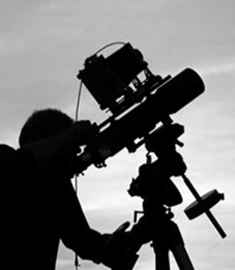
Unprecedented times call for extlraordinary means. Trevor Paglen at work on a prior project using equipment originally designed to see distant galaxies. Photo from his website.

Trevor Paglen (B. 1974), who holds both an MFA from the Art Institute of Chicago’s School and a PhD in geography from Berkley is, perhaps, best known for his Photos of “black sites”- classified defense department/CIA/NSA installations. Those pictures are usually murky, because of the haze from the extreme distances he has to work from because of security, and legal, restrictions to shoot many of these places. He prefers them that way, usually foregoing clearer images because, as he told the New Yorker in 2012, his “aim is not to expose and edify so much as to confound and interest1.” In the same piece, he said that a clearer image would say “a little less, really,” adding “that blurriness serves both an aesthetic and an ‘allegorical’ function2.” “It makes his images more arresting while providing a metaphor for the difficulty of uncovering the truth in an era when so much government activity is covert,” writer Jonah Weiner concluded3. As a result, some of his more “atmospheric” work have been compared to Painters, including J.M.W. Turner and Gerhard Richter, by some.

So, I was somewhat surprised when I walked into his new show, A Study of Invisible Images, at Metro Pictures. Robert Longo’s The Destroyer Cycle had recently been up on these walls, featuring huge charcoal drawings deep with socio-political imagery. I was expecting more of the same from Mr. Paglen given his books of “black site” Photos.

That’s not quite what we get.

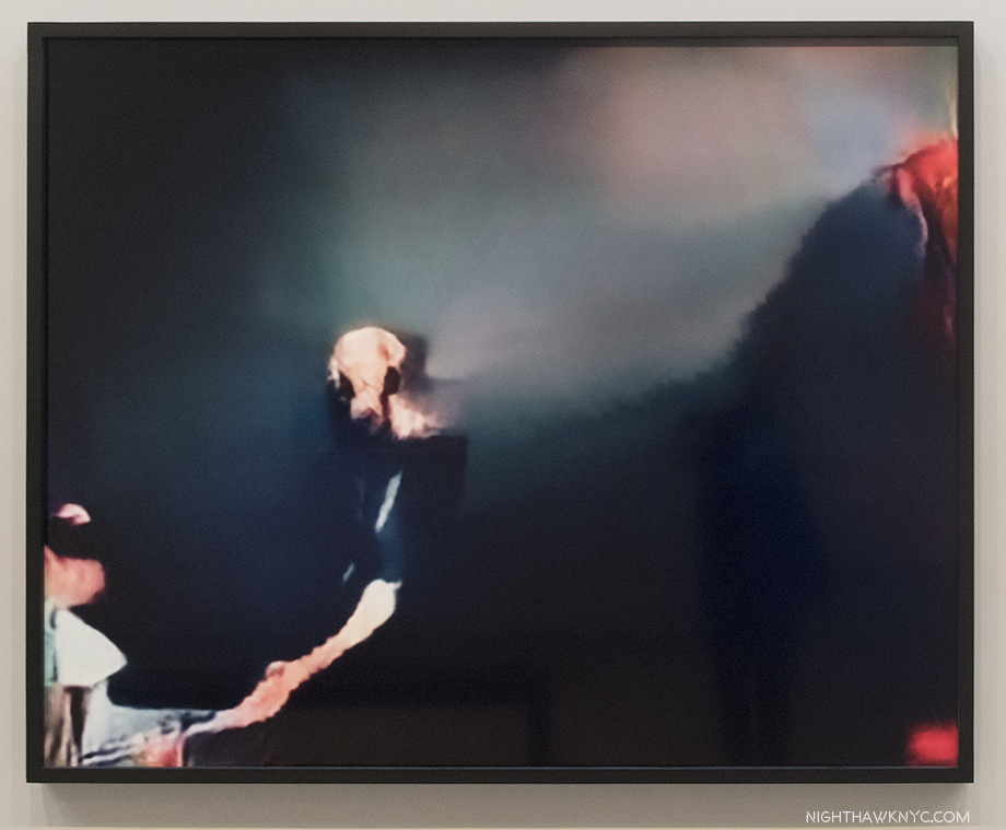
Installation view, with a still from his video, Behold These Glorious Times, 2017. Click any image for full size.

It’s about something different, though not entirely unrelated. It turns out that Mr. Paglen has, also, been deeply involved in studying computer learning, specifically, how computers see the world. As he explains in the “Artist’s Notes” for the show-

 “Over the past decade or so, something dramatic has happened to the world of images: they have become detached from human eyes. Our machines have learned to see. Without us.”

He goes on to talk about how smart airports, smart homes, even smart cities are becoming ubiquitous, with self-driving cars possibly on the way, before adding, “Most images these days are made by machines for other machines, with humans rarely in the loop. I call this world of machine-machine image making ‘invisible images,’ because it’s a form of vision that’s inherently inaccessible to human eyes. This exhibition is a study of various kinds of these invisible images.” They break down to three groups- “machine readable landscapes (landscape images overlaid with marks that show how they’re being interpreted by machines), training images (made by humans for machine eyes), and things that we might call ‘ghosts.'”

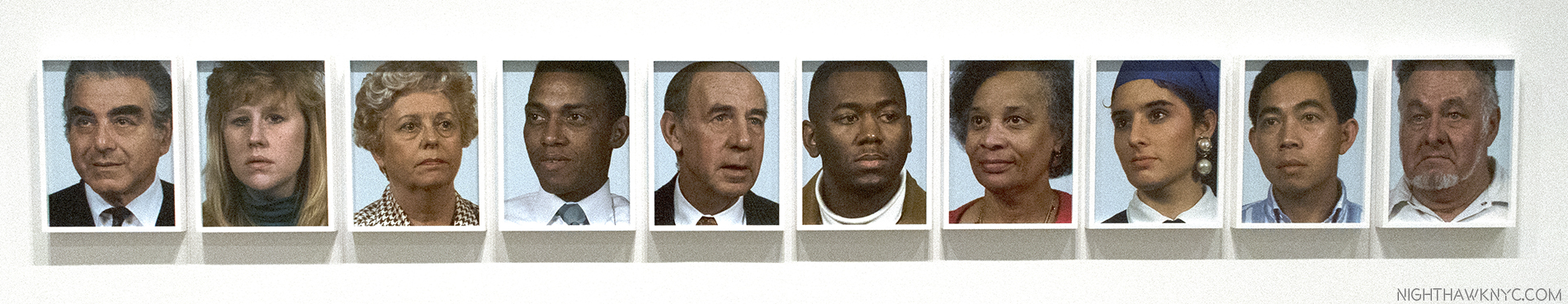
It Began as a Military Experiment, 2017, ten pigment prints

While the new iPhone X uses facial recognition technology instead of passwords or fingerprints, this technology is nothing new. The military wanted it developed back in the mid-1990’s, so the Defense Advanced Research Projects Agency (DARPA) began funding research. They quickly realized they needed to create a gigantic database of facial images and these folks, above, mostly military employees, were among the first of tens of thousands of photos it took and compiled into what was called the FERET database. Mr. Paglen then combed this database to arrive at this selection of faces. He then ran them through an algorithm to locate the key features of their faces. “One of the ways I think about these portraits is as a kind of super-structuralism in the sense that they are images not made for human eyes. They are meant for machine eyes. What’s more, these photos represent the original faces of human facial recognition- the ‘Adam and Eves’ that nearly all subsequent facial recognition research has been built upon,” he says in the “Artist’s Notes.”

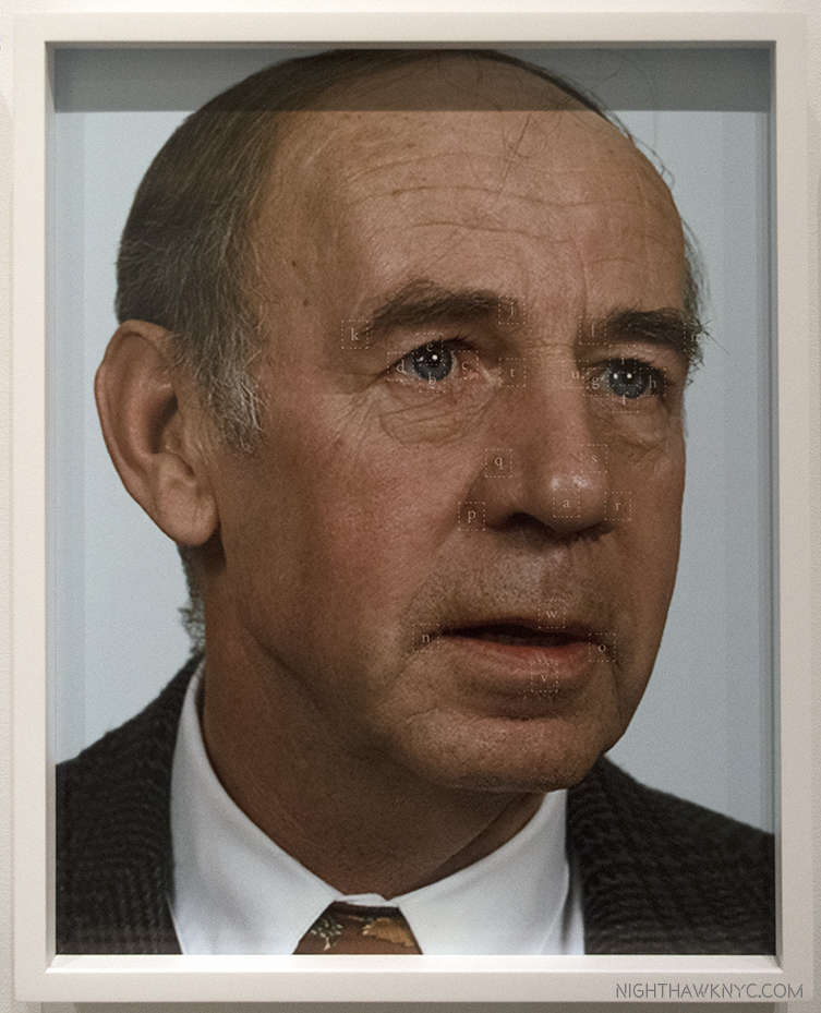
Closeup of the fifth Portrait, shows the key points on his face.

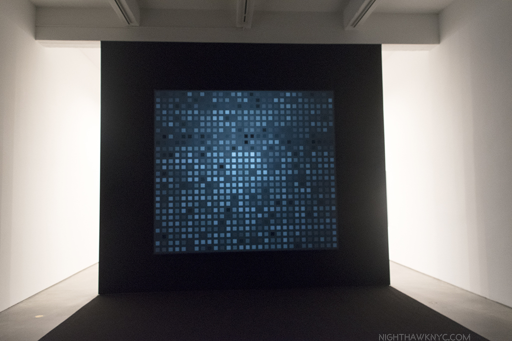
Recognizing one face out of this gigantic database first requires a “faceprint,” made out of all of the faces of a particular subject, aligned so their eyes and mouths are in the same place. Once you “average” them, you subtract the average image of all the other people in the database from the average of your subject. You’ll end up with a faceprint of your subject showing what distinguishes him form everyone else in the group. This portrait translates the faceprint of philosopher Frantz Fanon into an image that looks like a face to human eyes.

We’ve gone from the images seen just above- images that humans would recognize as people and faces, to this, an image constructed from computer to computer images so humans can recognize it as a face. Fanon”(Even the Dead Are Not Safe) Eigenface, 2017, Dye sublimation metal print. The Afro-Carribbean psychiatrist Frantz Fanon is the subject.

It gets stickier from there. The Artist’s Notes continue, “A.I.s (artificial intelligences) are taught how to recognize objects by giving them training sets….(which may) consist of thousands or even millions of images organized into pre-sorted classes that correspond to each of the kind of objects that the A.I. will eventually be able to distinguish. For example, if you want to train an A.I. to recognize all the objects in a kitchen, you might give it a thousand pictures of a fork, a spoon, a knife, a countertop, etc…Once that A.I. is trained, you can give it a picture of a fork it has never seen before and it should be able to recognize it as a fork. ” After mentioning that “every image posted to Facebook or other social media sites undergoes powerful artificial intelligence algorithms that can recognize the identities of people, the objects, the products, and even the place depicted in those images,” Mr. Paglen created his own “massive” training sets, “based on literature, philosophy, folk-wisdom, history, and other ‘irrational’ things, and taught the A.I. to recognize things from those ‘corpuses.'” The last half of the show consists of the results of these experiments, which are much more ethereal and evocative than literal, at least to this human’s eyes.

A Man (Corpus: The Humans) Adversarially Evolved Hallucinations, 2017, Dye sublimation print.

Mr. Paglen has groups this part under the broad heading of Hallucinations, or Adversarilly Evolved Hallucinations. These further break down into the subcategories, or Corpuses, which includes-
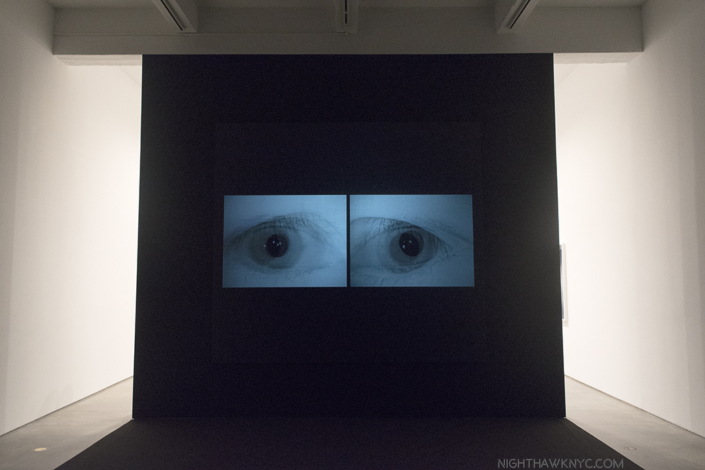
Corpus: Eye Machines (Fittingly)
Corpus: American Predators (The Artist’s notes include Mark Zuckerberg, who he lists as a “predatory machine,” reminding viewers that computers mine every image loaded to his site and are capable of reading a tremendous amount of information from them.)
Corpus: The Humans (As seen in the image above. Porn was included in the training sets, and another image depicts it as seen by a computer…or so the title says.)
Corpus: Omens and Portents
Corpus: Interpretations of Dreams (Examples of both are seen below.)

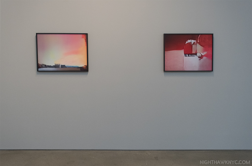
Rainbow (Corpus: Omens and Portents), left, False Teeth (Corpus: Interpretation of Dreams) both from Adversarially Evolved Hallucinations, 2017, Dye sublimation prints.

Trevor Paglen seems to like to push the boundaries of our perception while avoiding the sharp detail most Photographers live by, which, indeed, ventures into the domain of Painting. Now, he has gone beyond what humans can perceive, and into the realm of what is only “seen” by computers to create Art for humans. I wonder how long it will be before computers get around to doing that for us on their own.

Installation view, with another still from his video, Behold These Glorious Times, 2017.

These images are haunting, nightmarish, and beautiful, at the same time. In his Art Basel Conversation with Jenny Holzer, Mr. Paglen said the basis of his work can be summed up as- “How do you see the historical moment that you live in?” This show certainly provides answers to part of that question, though it raises others. Mr. Paglen’s new work is no less unsettling than his “black sites” and drone Photos. Perhaps most unsettling is not what’s in these images. It’s what they portend for the future.

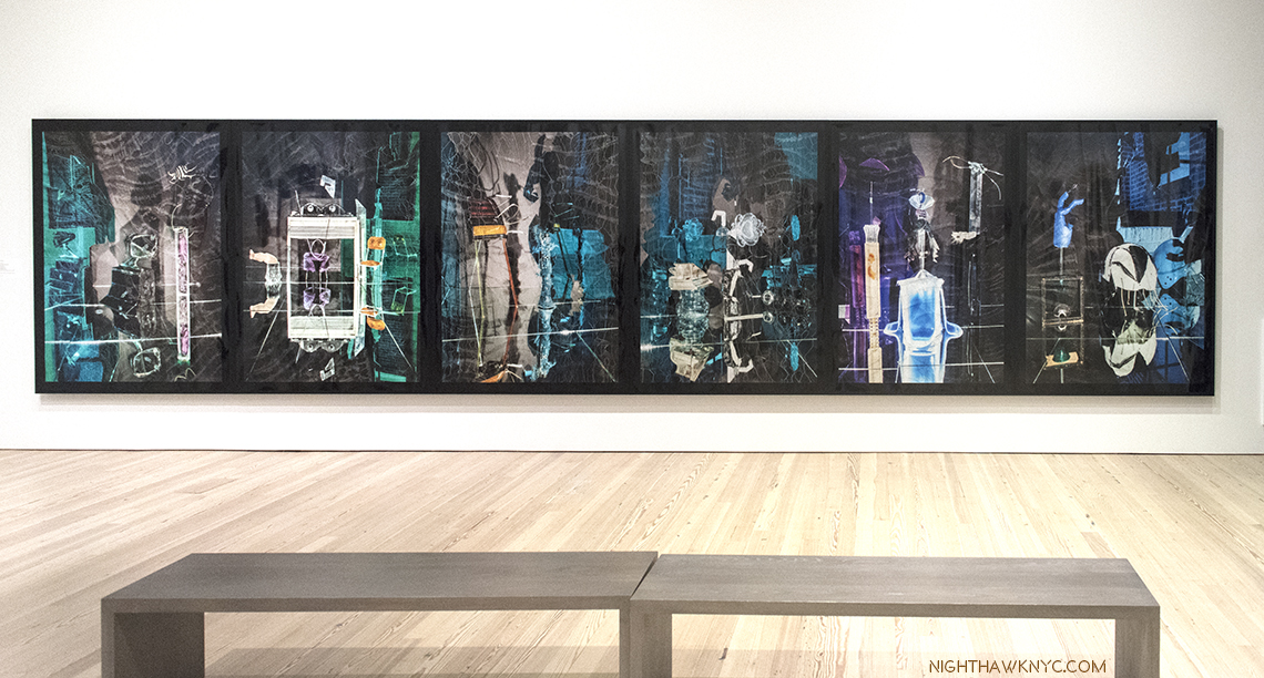
Willa Nasatir,R.V., The Green Room, Bird, Blue Girl, Sunbather, Conductor, 2017, Chromongenic print mounted on wood, from left to right. Installation view, Whitney Museum.

Unlike the other Artists featured in this piece, Willa  Nasatir (B. 1990) doesn’t use digital techniques to create her Photographs. That might be hard to believe after seeing her work. Her analog process involves creating props, often from found objects, shooting them, and then reshooting the resulting Photographs, which has sometimes been modified by fire, water, and any number of other things. The results, as seen in her revelatory Whitney Museum show, “Willa Nasatir,”achieve something of a 3D effect in a 2D work. Fresh from a show at the Knox-Albright Art Gallery, Buffalo, who owns one of her most stunning images, Ms. Nasatir shows herself to be at once a throwback, and a visionary.

The Red Room, 2017, Chromongenic print mounted on wood. The-Albright-Knox Art Gallery owns this one. They chose well.

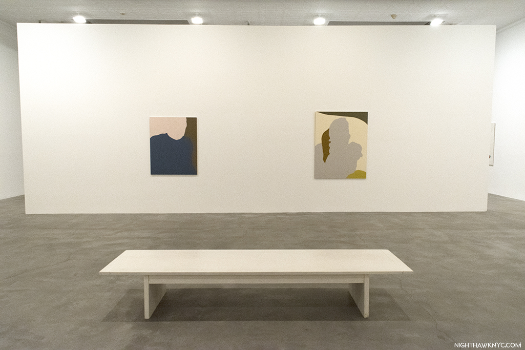
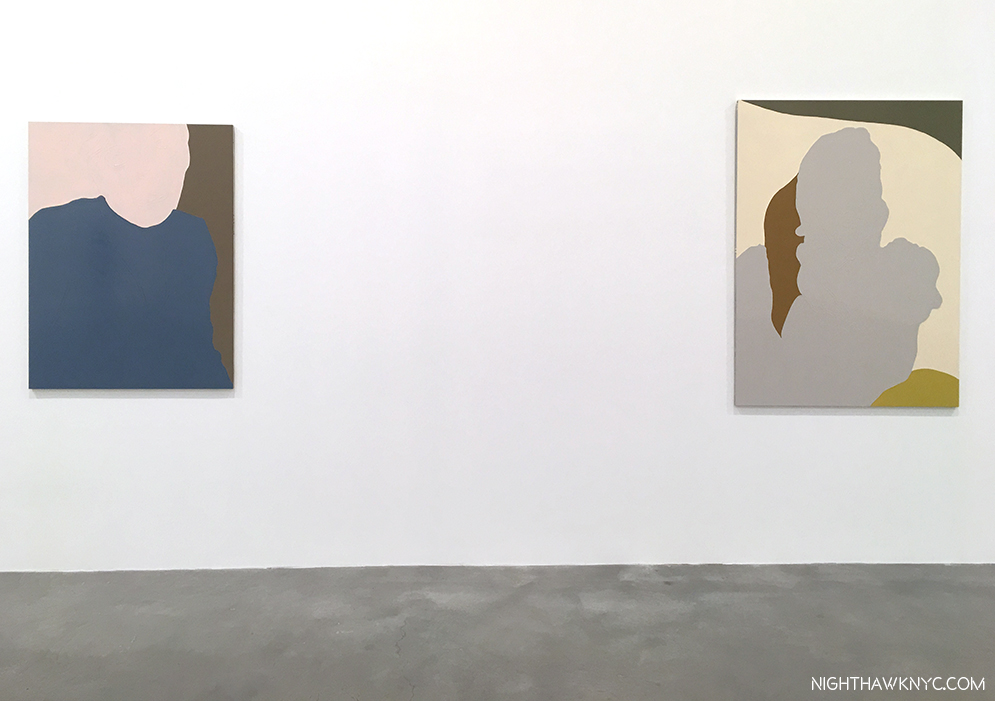
Ms. Nasatir created the 6-part work, shown first in this section, especially for the Whitney’s long gallery wall, the unifying feature of which seems to be the color grey with green or blue. All of the works on view are dated 2017 and show a remarkably consistent unity of style and vision, and a somewhat daring use of color.  As for what’s going on in these, or any of her work? You’re on your own. The Whitney’s introduction to the show says, in part, “The resulting works are hand-manipulated images that become psychologically charged and difficult to discern; the viewer is left to parse out unresolved narratives that the image only implies.”

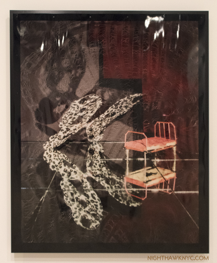
The Green Room, 2017. When I look at this, with it’s mirror reflection, even some of it’s props, I can’t help but recall Samara Golden’s work in this year’s Whitney Biennial.

Hmmm…Where have I heard that recently? Her style shares some similar props and some of the effect of Samara Golden’s work, particularly The Meat Grinder’s Iron Clothes, 2017, which I felt was the show-stopper of this year’s Whitney Biennial. Ms. Golden’s work can look like “sets” that Willa Nasatir might base one of her Photographs on. Whereas I called Ms Golden’s astounding work in this year’s Whitney Biennial “unphotographable,” (as a whole), Ms. Nasatir’s Photographs are often impossible to locate in the real world. Both Artist’s works features elements of the “known world,” but place them in contexts which are unknown, mysterious, ominous.

Samara Golden’s The Meat Grinder’s Iron Clothes, (detail), 2017, at the Whitney Biennial earlier this year.

In thinking about precedents for Ms. Nasatir’s work, Man Ray once again comes to mind. Ray, of course, didn’t use digital techniques, either. He pre-dated them. The Dadaists, Marcel Duchamp, the German Expressionist filmmakers also come to mind, as do Robert Rauschenberg’s found objects. But, as with Samara Golden, it’s what these image stir in the mind, and the mind’s eye, that overcomes any attempt at reference- in the real world, or the historical one.

Willa Nasatir, Street Sweeper, right, Half Heart, Bus Depot, both 2017, Gelatin silver prints.

It all fades away as you ponder “What happened here?” Or, “What is about to happen?,” and then feel resonances in your mind and life. Oh, and by the way, there’s the beauty of her work, which I say as almost an afterthought, though it’s not, to their main impact- mystery.

Butterfly, 2017, Chromongenic print mounted on wood.

With two museums shows to her name by her mid-20’s, Willa Nasatir is an Artist who’s stock is rising pretty quickly. It will be interesting to see how her work evolves from here.

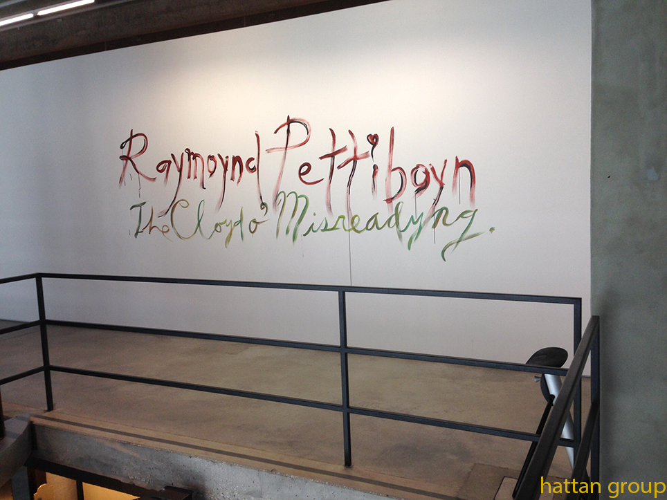
Caslon Bevington (B. 1992) is an up and coming NYC Artist I met during the run of the Raymond Pettibon show at David Zwirner. Her reaction to that show struck me, so I became interested in seeing her work. To this point, I had only seen what’s on view on her gallery’s, Apostrophe NYC’s, website.

One of the earlier pieces by Csalon Bevington I saw on Apostrophe NYC’s site. When I saw it in person, I guesstimated it at 12 feet tall. Photo courtesy of the Artist & Apostrophe NYC

My shock was palpable when I walked into her show, A Home for Formless Creatures: The Charisma of Fragmentation, at Apostrophe NYC’s studio & gallery space at Mana Contemporary in Jersey City, NJ. (Yes…I went to N.J.) to find she had spent the summer creating a new body of work that, at first look seemed quite different from what had come before. When I looked at the show of new work one word summed up the experience.

Qucksilver…

Installation view of Caslon Bevington’s show A Home for Formless Creatures: The Charisma of Fragmentation, shows her new, Translation, series, 2017. Photo by Roman Dean, courtesy of the Artist and ApostropheNYC

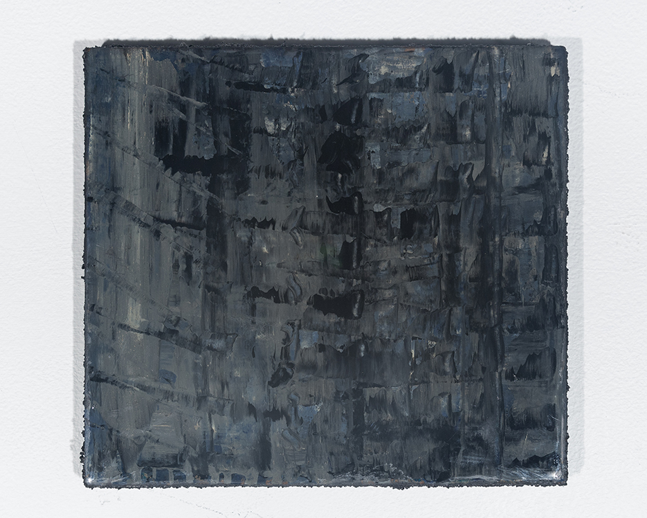
As fast as lightning, her work had altogether changed and, low and behold, there was an entire show of new work that was largely unlike any of her work I’d seen thus far. The show centered on a series of 10 works in which the Artist takes found and original images and processes them using more software programs than she could list for me, including some involving sound waves. The results were outputted to paper and then mounted on wood blocks with resin to create a series of black and white works titled “Translation” that are quite mezmerizing.

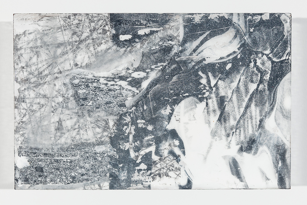
Caslon Bevington, Translation #8,, 2017. Photo by Roman Dean, courtesy of the Artist and Apostrophe NYC

They have the glossy surface of gelatin prints, but the images are mounted on blocks that extend 2 and a half inches out from the wall, jutting into the viewer’s space. Their rectangular shape and size (7 x 11 inches) is different from the usual sizes of Photographs, making them feel like something else. In them, images are juxtaposed- sometimes recognizable images (like fire escapes), with unrecognizable images, or repeating lines or waves, or abstract patterns or circles, leaving the viewer somewhere between reality and…?

Translation #10, 2017. Photo by Roman Dean, courtesy of the Artist and Apostrophe NYC.

They have a presence as a group, like a visit to another world that exists in multiple visual dimensions. Images explode out of some, interrupt others, or dialogue with each other, or mirror each other, while sharing not quite half of the work. There’s an elegance, an other-worldliness, and a haunting presence to these new works, especially, when seen in a group of them.

As for Quicksilver…What are the processes in an Artist’s mind that leads to such radical changes in their direction? Changes that seem “quick” to outsiders?

The Artist’s statement in the lovely catalog she produced, in conjunction with Apostrophe NYC, for the show.

Later, she gave me a tour of her studio, and we looked at, and discussed, her earlier work. I was very surprised at the journey her work has taken. Having studied at the Art Student’s League and Parsons, the drawings she showed me were by no means academic. They explored geometric possibilities of color in abstraction. Later works all around were often complex weaves (literally) of painted cut strips of fabrics and canvas, in a square or rectangular grid. She then explored the possibilities of rope in patterns that freed the composition from the grid, and made the picture plane transparent, including one fascinating and intricate rope work of many layers on a large rectangular frame that looked to me to be about 12 feet tall (shown earlier). Ms. Bevington has also worked in metals bending strips of them onto a frame, delicately weaving each piece, and in fashion, creating a very cool T Shirt for the show.

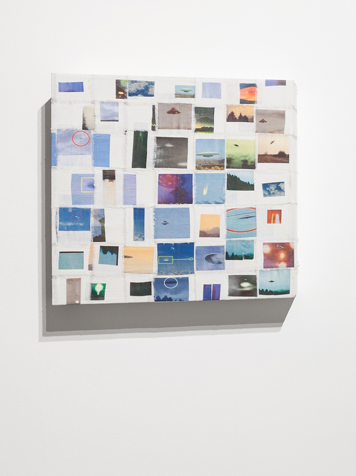
Flying Saucer Archive, 2017, Photo Transfer on Linen. Photo by Roman Dean, courtesy of the Artist and Apostrophe NYC.

Along with these works, were some works, that also involved Photographs, on woven grids, that seem to bridge the woven grids seen in some of her prior work. One features found images of UFO’s, or what might be UFO’s. Two others featured images of sunsets shot from moving vehicles.

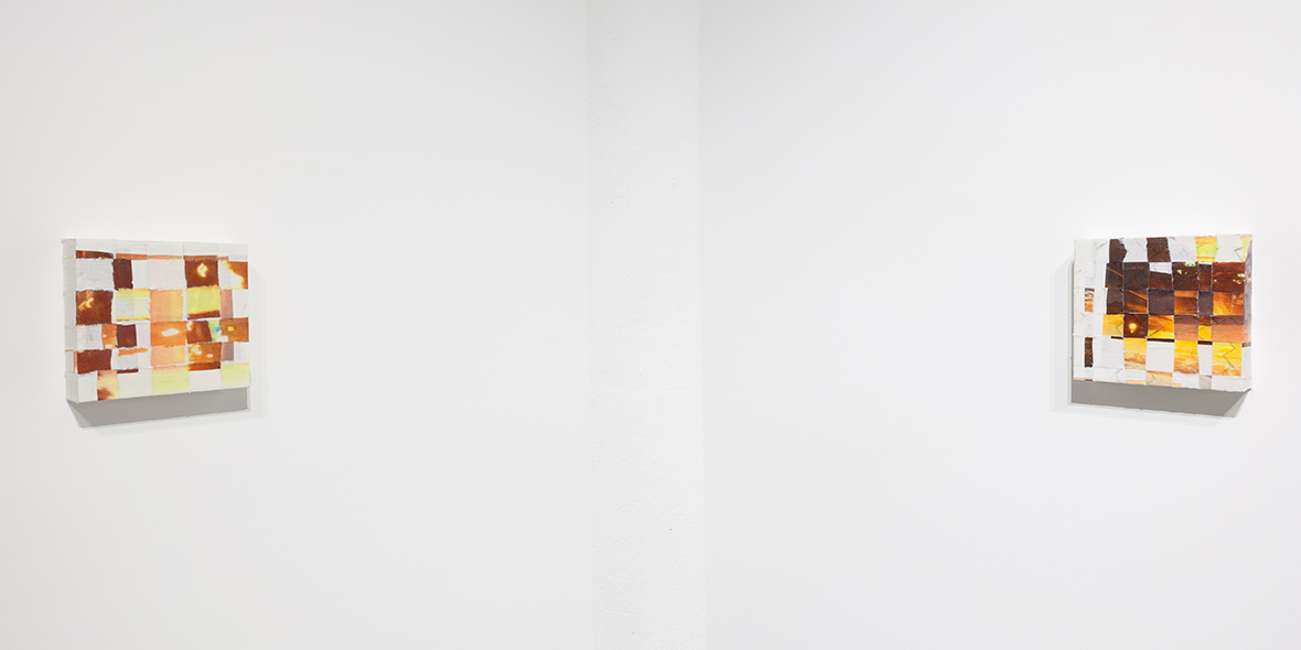
Photos of Sunsets Taken From Moving Cars #1 & 2, 2017, left to right. Photo by Roman Dean, courtesy of the Artist and Apostrophe NYC.

Whereas earlier she took abstract painted canvas cut into strips and imposed “order” on them by subjecting them to being woven into a rectangular or square grid, now she does the same thing using images. Along with these, also on view was an Artist’s Book she created from found images using all kinds of search algorithms- closeups of fabrics, rugs, and she only knows what else. Caslon tried to explain the process of finding and selecting it’s images to me, but I was lost looking at the pages go by as she turned them. Besides, knowing too much often steals some of the mystery. This beautiful object was produced in an edition of 9, while the other works shown were unique.

Yes, there was Painting, too. Static Painting, 2017, Oil on Wood. Photo by Roman Dean, courtesy of the Artist and Apostrophe NYC.

The Translation pieces struck me, among other things,  as creating successful, new, compositions out of the juxtaposition of existing images. Thinking about her new and earlier work, while she makes something “else” out of unexpected combinations (of materials or images), for this viewer, they share the common thread of having a “new order” brought to them.

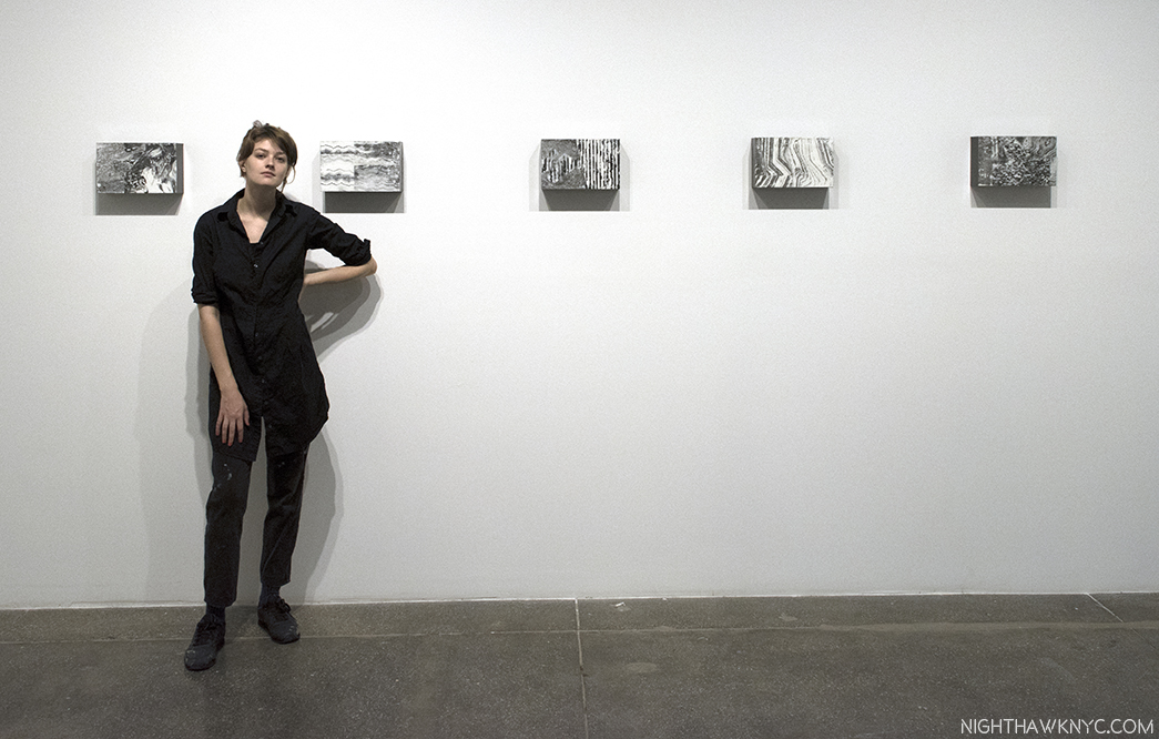
Caslon Bevington seen with Translations #10, 11, 12, 13 and 14, 2017, left to right, at Apostrophe NYC’s gallery at Mana Contemporary, Jersey City.

Caslon Bevington is part of “Base 12,” “an experimental project…(that) groups together 12 emerging artists in a quasi-collective,” represented by Apostrophe NYC, which is run by the brothers Sei and Ki Smith, and has been in residency at Mana Contemporary. Given how rapidly Caslon’s work is evolving, seemingly like quicksilver, she’s an Artist who will be fascinating to watch. It will be interesting to see what she does next, and if she continues to explore this new realm of her work, or moves to another new frontier.

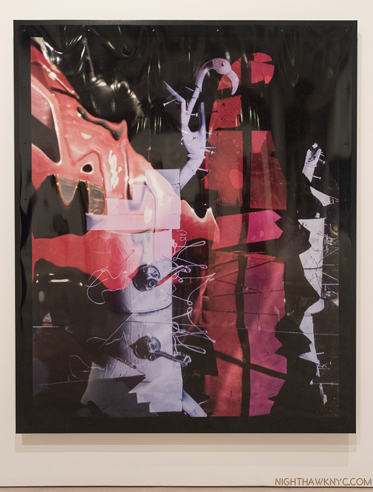
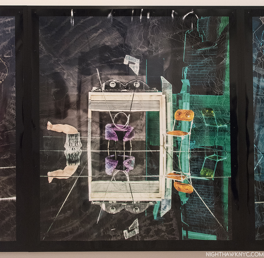
Bonus Show- Lucas Samaras (B. 1936) may be as familiar to many Art lovers as a subject for Chuck Close (like this one) as he is for his own work. At his new show, New York City, No-Name, Re-Do, Seductions, at Pace, 510 West 25th Street, all the works on view were digitally modified Photographs. The show  concluded with a large gallery of what he calls Kastorian Inveiglements, works that began as Photographs that depict “every day objects” subsequently manipulated in Photoshop into symmetrical abstractions.

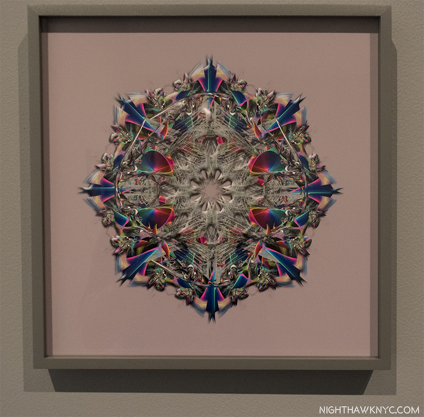
Lucas Samaras, NO NAME (Kastorian Inveiglements), 2017, Pure pigment on paper mounted on Dibond

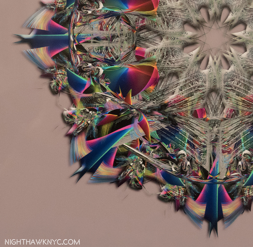
Detail of lower left quadrant.

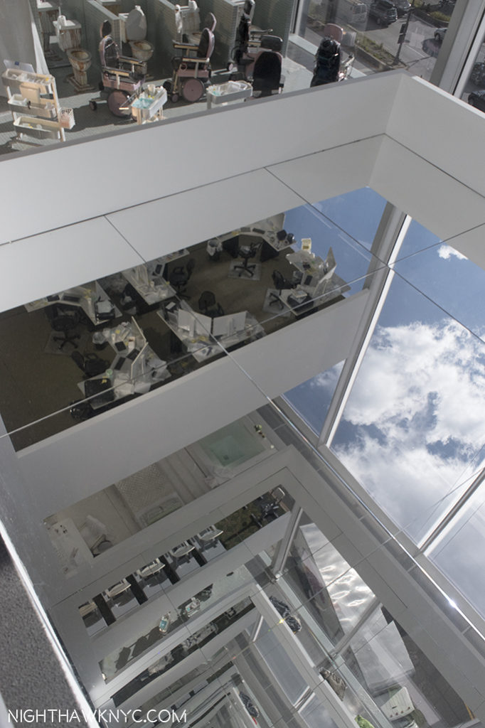
Having seen other Artists experiment with these, though not to this level of complexity or accomplishment, I decided to try one myself to gain an understanding of the process. Here is my first experiment-

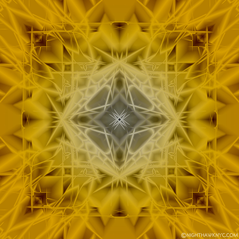
Kenn Sava, Symmetrical Abstraction 1, 2017, based on one of my Photos.

It shows that I’ve got a ways to go to match Mr. Samaras, as I do in getting up to speed on the frontiers of Photography, and Photo-based Art. Before it moves, again.

“Willa Nasatir” is my NoteWorthy show for October, though it ended on October 1.
*- Sundtrack for this Post is “X-Ray Visions,” by Clutch, from the appropriately titled album Psychic Warfare.

NighthawkNYC.com has been entirely self-funded & ad-free for over 7 years, during which over 275 full length pieces have been published!
I can no longer fund it myself. More on why here.
If you’ve found it worthwhile, PLEASE donate to keep it online & ad-free below.
Thank you, Kenn.

Written & photographed by Kenn Sava for nighthawknyc.com unless otherwise credited.
To send comments, thoughts, feedback or propositions click here.
Click the white box on the upper right for the archives or to search them.
Subscribe to be notified of new Posts below. Your information will be used for no other purpose.

  1. New Yorker, October 22, 2012, P.56
  2. ibid P.57
  3. ibid P.56-57