This site is Free & Ad-Free! If you find this piece worthwhile, please donate via PayPal to support it & independent Art writing. You can also support it by buying Art & books! Details at the end. Thank you.
Written & Photographed by Kenn Sava (*unless otherwise credited)
Part 1 of a series looking at the work of Richard Estes in honor of his 90th Birthday, May 14, 2022. The next two parts are below this one.
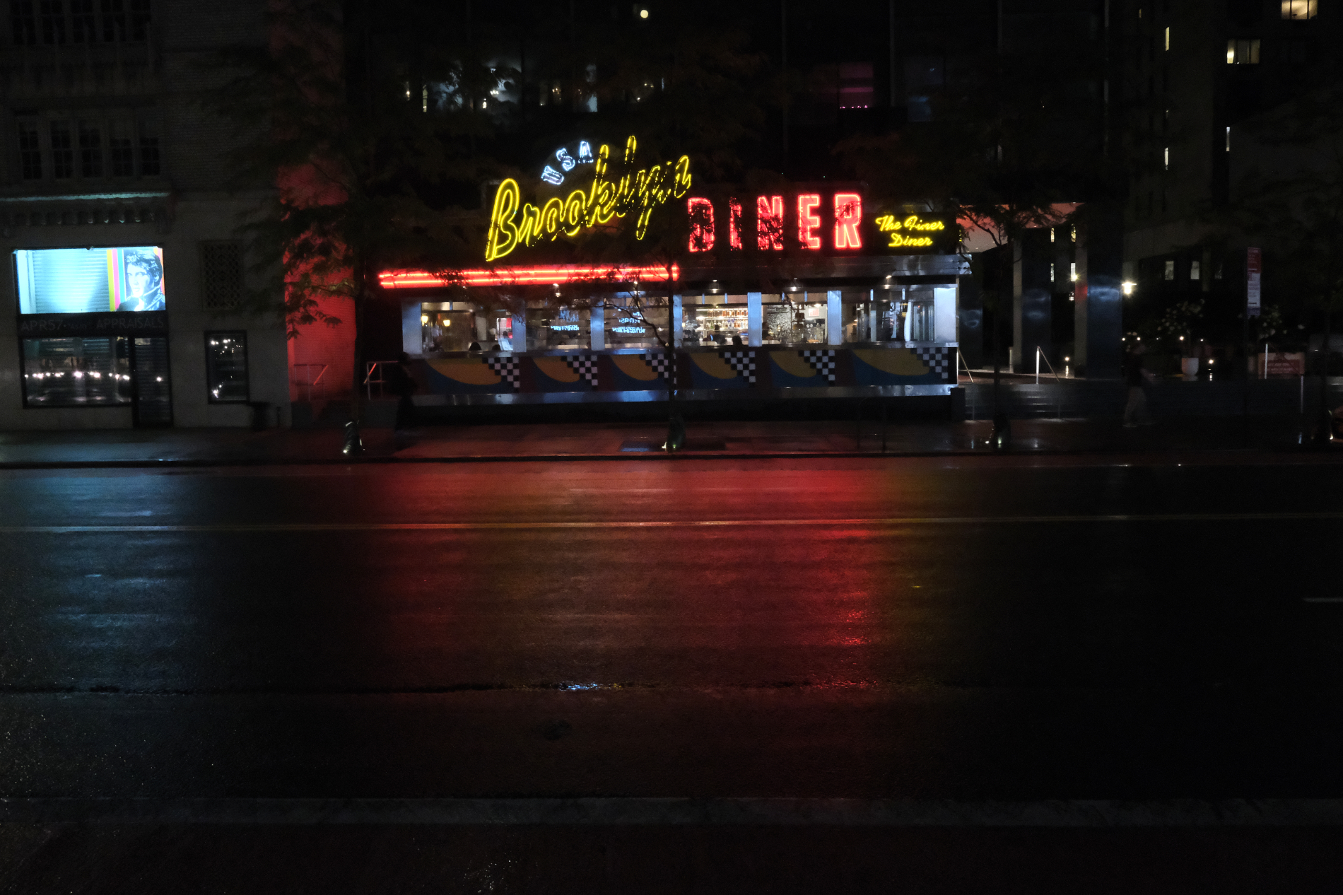
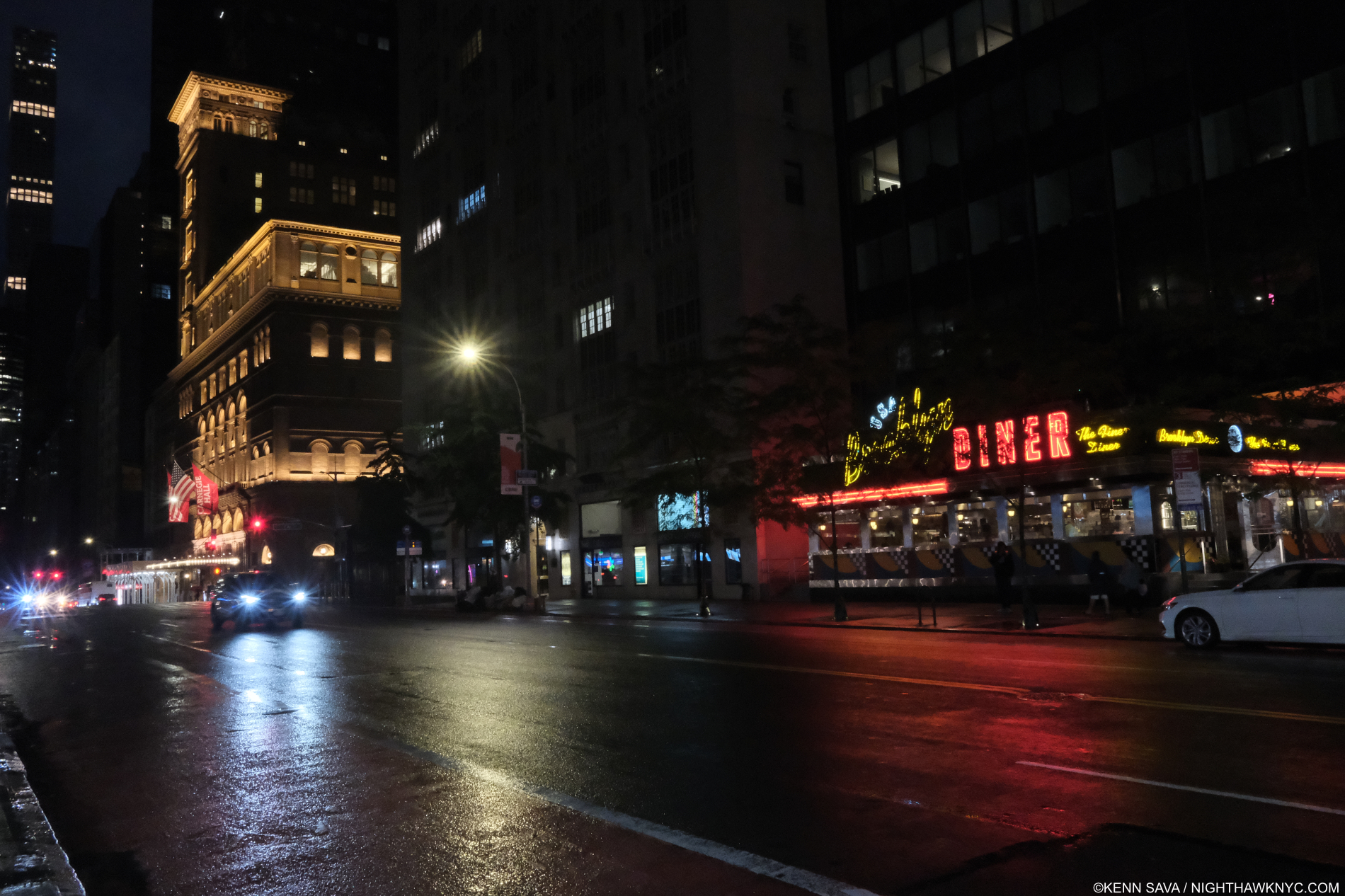
Kenn Sava, Untitled, NYC, May 27, 2020 (Homage to Richard Estes). One example of how Richard Estes has effected how I see the world every day, taken a few days after his 88th Birthday. Click any image for full size.
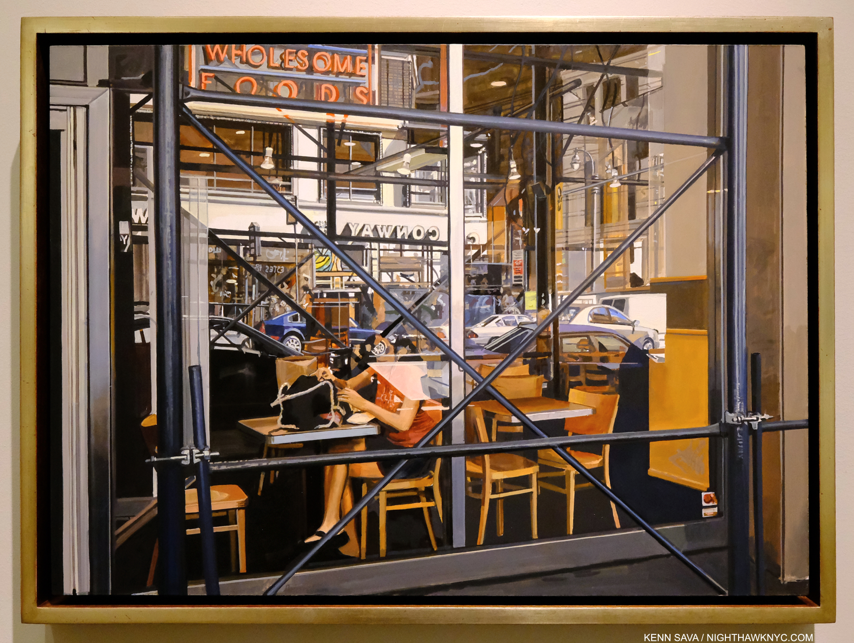
I fell under the spell of Richard Estes’s Paintings of New York City around 1985. In 1989, I bought his Cafeteria, Vatican screenprint from the publisher, Robert Feldman of Parasol Press downtown.
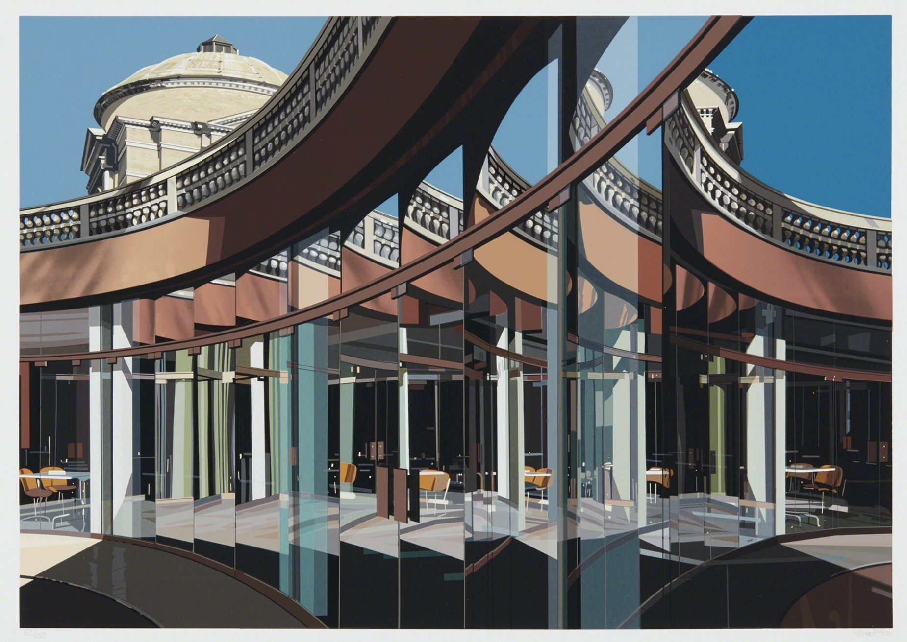
Richard Estes, Cafeteria, Vatican (from Urban Landscapes III), 1981, Screenprint, 14 1/8 x 20 1/8 inches. Over 30 years later, it speaks to me every bit as much as the first moment I saw it. Everyone is free to have their own opinion. Mine is this does not look like a Photograph. In fact, the differences between it and a Photograph are why I like it.
37 years on his work has lost none its hold on me. More importantly, I credit Richard Estes with teaching me how to really see the world around me through his Art. In honor of his 90th Birthday, May 14, 2022, I decided to take a closer look at his entire body of work to date, and, as importantly, the issues surrounding it that have held back its wider appreciation in a 3-Part series, this being Part 1. In this Part, I’ll address some of the issues surrounding his Art that have held back the wider appreciation of it.
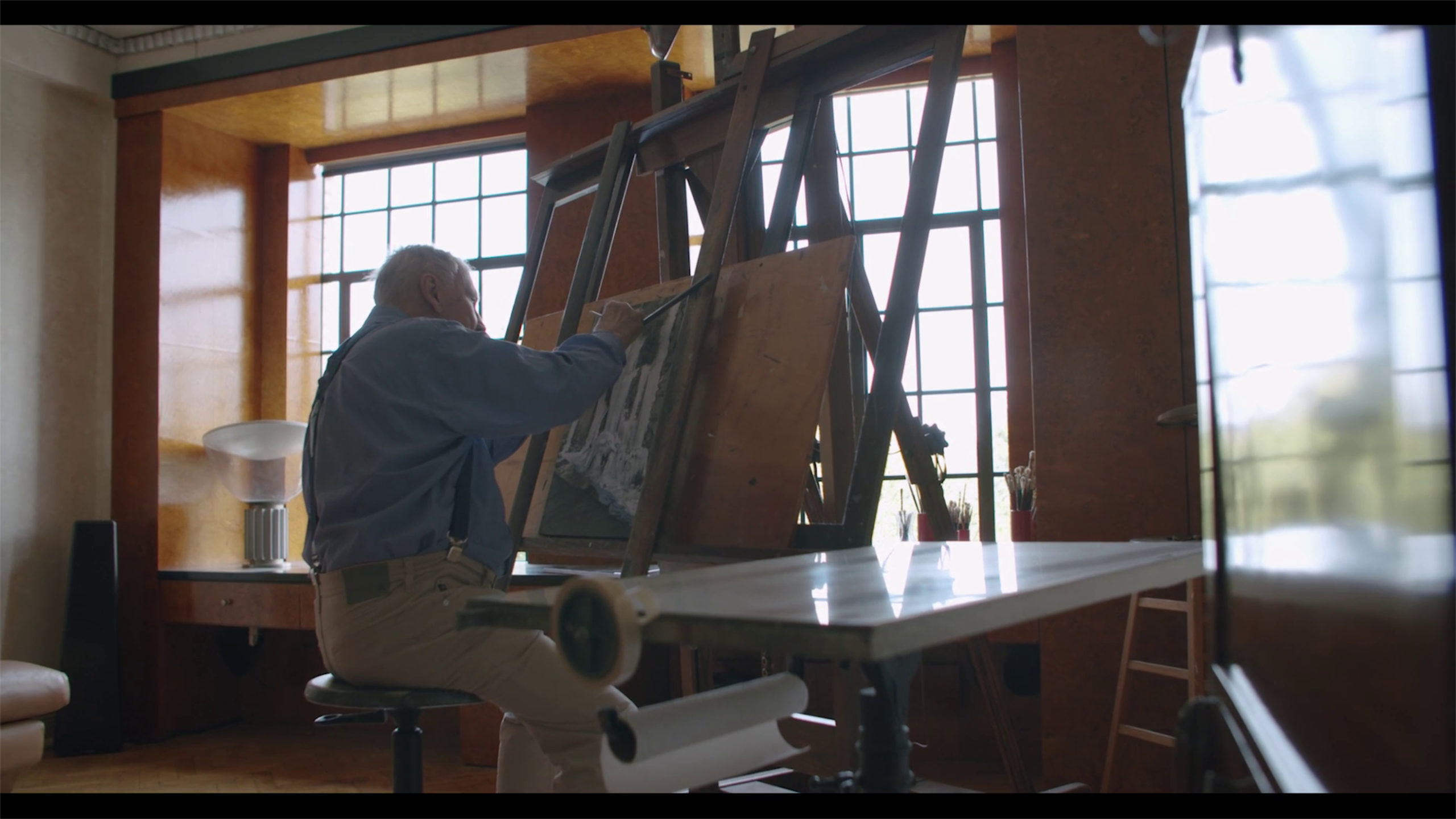
The Master in his workshop. Richard Estes seen at work in his apartment overlooking Central Park. It looks to me like he is working on a Painting with waterfalls, though it’s not one I recognize. Date and *Photographer unknown.
During these 37 years that I’ve been looking at the work of Richard Estes, the incessant hype about him is that he is supposed to be “the leader of the photorealists,” “the standard bearer of photorealism,” or words to that effect culminating with a form of the term, “photorealism.” Increasingly, I’ve been left to wonder…
Did anyone ever bother to ASK Richard Estes if he wants to be the “standard bearer of photorealism?1” Or, even if he even considers himself to be a “photorealist?”
In the book Richard Estes’ Realism, I found this answer-
“Estes dislikes all the titles given the artists working from photographs and thinks of himself strictly as a painter, with no prefixes2.”
“BINGO! Game Over. Please pass your scorecards to the front, and make sure your names are on them…” For what it’s worth, I do, too.
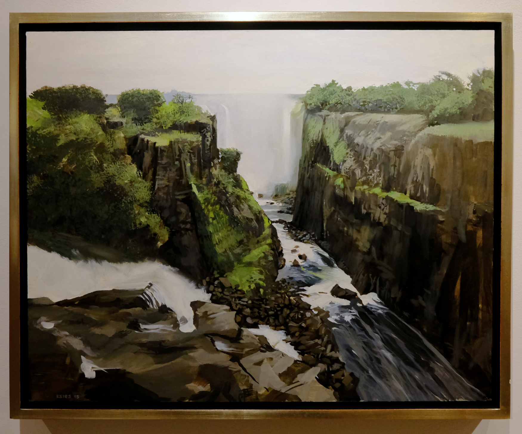
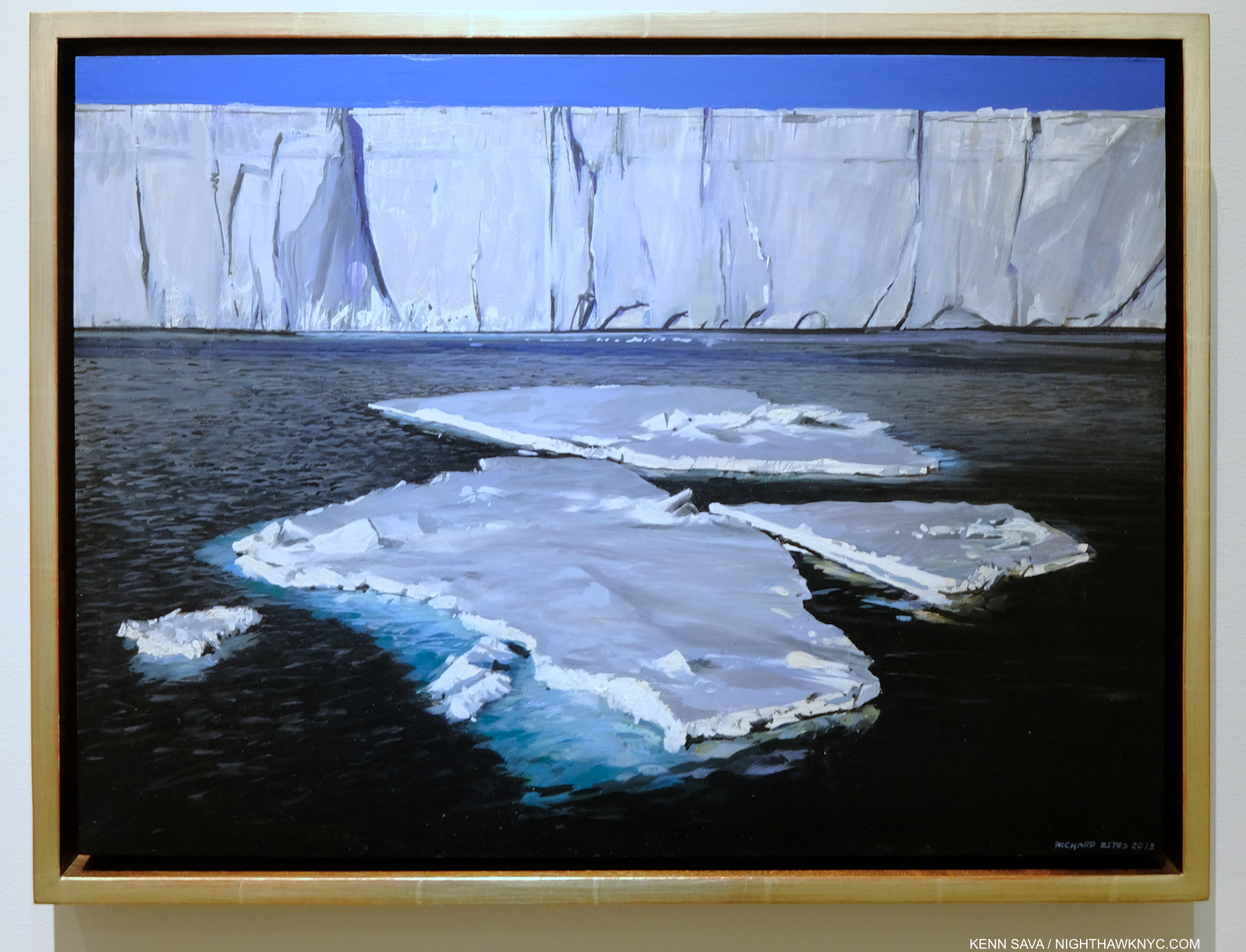
Victoria Falls II, 2015, Oil on panel, 16 x 20 inches. Show me one inch of this that looks like a Photograph. In this piece, I’m featuring examples of his work in “other” styles. Click for a closer look.
It galls me to no end that the Art press continues to ignore the words of Artists about their own Art!
They act like they know better than the Artist! Chuck Close was repeatedly on record stating in no uncertain terms that he did not want his work to be considered “photorealism.” He and I spoke about this twice and I was taken by the passion in his words rejecting it. It was obvious to me that this was something he had fought long and hard about. Yet, when he died last year, almost every obituary I saw, including that in The New York Times itself, where he had previously spoken against it in an interview, used this term in describing his work! Where is the respect? The same fate has befallen Richard Estes, and I believe a good deal of his work doesn’t come anywhere close to fitting into that box! I am featuring some of these Paintings (there are innumerable others) in this piece so you can see for yourself. It begs the question- Are the people who use these terms even looking at the Art?
Ngorongoro Crater II, 2015, Oil on panel, 12 x 22 inches. Is ANYthing in this work sharply detailed?
Why does this matter? It matters for a few reasons. First, I believe Richard Estes mis-association as a so-called photorealist has held back the full appreciation of his Art. That full appreciation reveals he is MUCH more talented than a mere mechanical Photo replicating machine, and he is much more diverse a Painter stylistically than has generally been acknowledged, or appreciated.
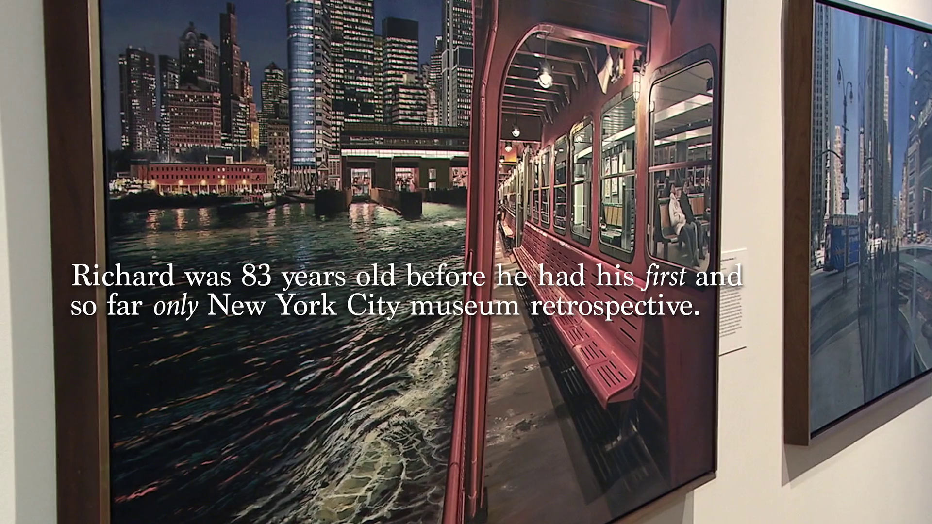
That would be the Museum of Art & Design show, 2015, where I met Mr. Estes at the opening. The show was a “retrospective” of his Paintings with NYC as their subject, only! It would be six years before his next NYC show, at a gallery in 2021. *Still from the Documentary Richard Estes: Actually Iconic.
Second, so-called “photorealism” has been dead for decades, at least to the powers that be in U.S. Art museums. Don’t think so? Ask yourself this- How many shows of Artists so boxed have been mounted in major U.S. museums in the past decade? Richard Estes got two, his first museum shows in multiple decades! (The “big 6” NYC major museums3 have never had an Estes show.) Not many others got any4. It seems to me that most people have stopped looking beyond the technique when they hear or read this term used about the Art they’re looking at. The “content” is something never discussed. Wait! Isn’t THAT what Art is supposed o be “about?” (However you want to define “about.”) Beyond this, putting any Artist, or person, in a box is limiting and just plain wrong, particularly creative people. Do you want to be in a box? I don’t. Putting Artists in boxes without their consent is to possibly damage their careers, and their livelihoods, as Artists have told me. Some are reluctant to speak out about it for fear of “making trouble” or being ostracized. If the public has been led to expect, say, “Cubo-rectilinear-obtustroism” from one Artist and he or she becomes a “Progo-constro-pressionist” the public is suddenly “disappointed!” Yes, I just invented “Cubo-rectilinear-obtustroism,” and “Progo-constro-pressionist” and why not? Non-artists were the first to apply many of these “ism” boxes to Artists. Yes, there are Artists who use terms like photorealism to describe their Art, and that’s perfectly fine, of course. I’m saying it’s wrong to lump Artists into boxes without their consent. In fact, I wouldn’t be surprised if an Artist sues someone who boxed them without their permission one of these days. That’s what the stakes are.
Ngorongoro Crater I, 2015, Oil on panel, 13. 3/4 x 11 7/8 inches.
“…but his (Richard Estes’s) work has never been strictly about the duplication of a photograph or about total adherence to his photographic sources,” Richard Estes’ Realism5.
A keyword for me in that statement is “NEVER.” For those of you not up on your meaningless/pointless Art terms (good for you!), a “photorealist” is, supposedly, an Artist who perfectly renders a Photograph, usually in paint. It seems to me that if Richard Estes wanted to perfectly render a Photograph, or if a Photograph perfectly captured a scene the way he sees it in his mind’s eye, he’d be a Photographer, and not a Painter! Like many of these terms, there is supposed to be a “movement” around it. Yet, I can find no evidence of any of the Artists so branded ever getting together around shared ideals and goals and deciding to begin such a movement! Regarding Richard Estes’s involvement in this imaginary “movement,” Richard Estes’ Realism says,“Before his affiliation with the Allan Stone Gallery in 1968, Estes knew no successful contemporary artists, and until mid-1969 he was unaware of the other contemporary US painters working from photographs who were then independently emerging on both coasts,[2 ibid].” The words “independently emerging” show the lie in the use of the word “movement” in this case. I believe the term “movement” is used by those coining the phrase preceding it to make others feel they’re “not in the know.” In 9 of 10 cases where this word is invoked in Art it has absolutely no other meaning. That’s right. In almost the case of every so-called Art “movement,” there was no group who got together about anything! Don’t believe the hype! Ignore it. Look at the work for yourself. I hope and believe these terms will eventually fade into antiquation and make every book that used them seem out of date, and “not in the know.” “Great grandpa, I’ve never heard this term before. What was a “photo realist?”
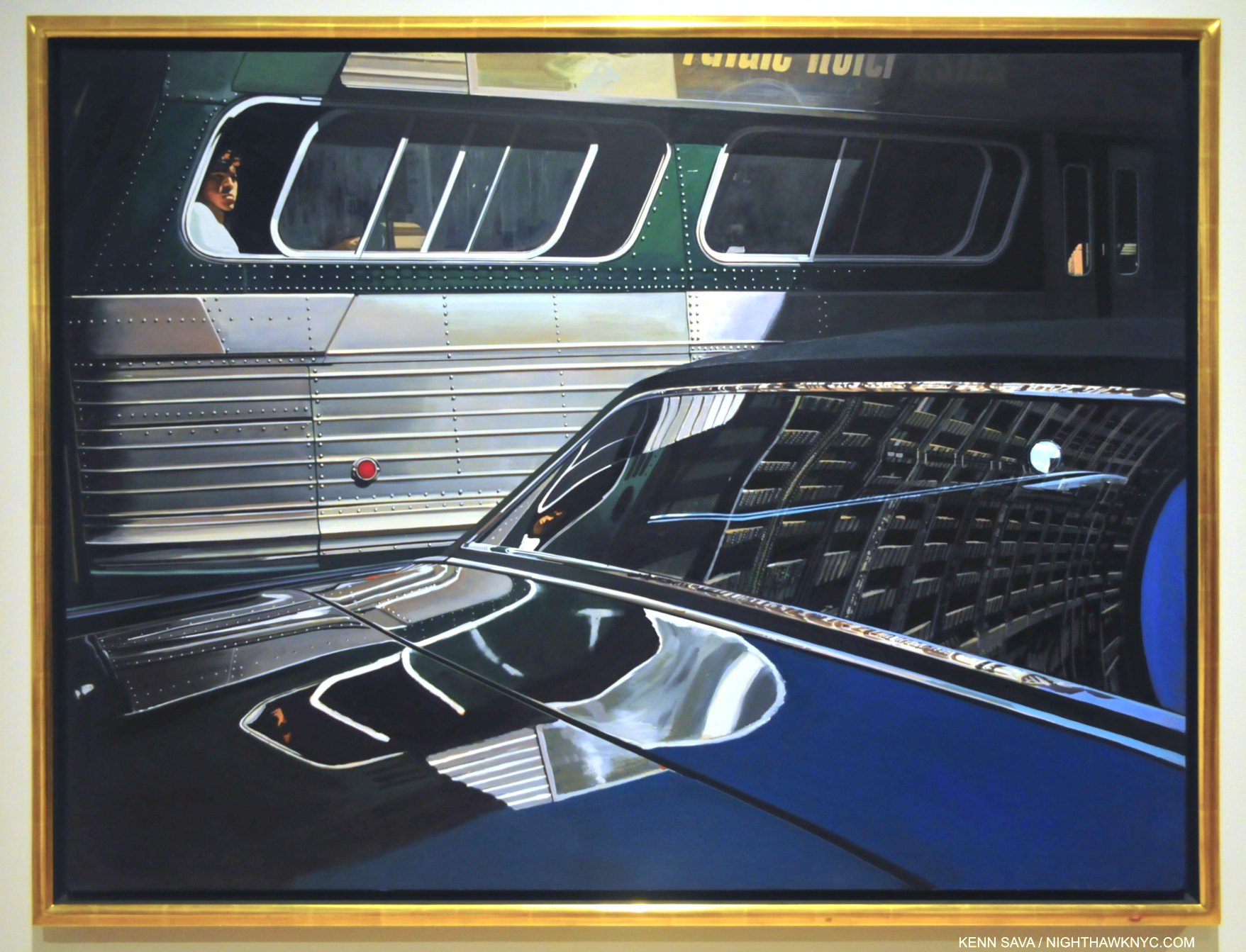
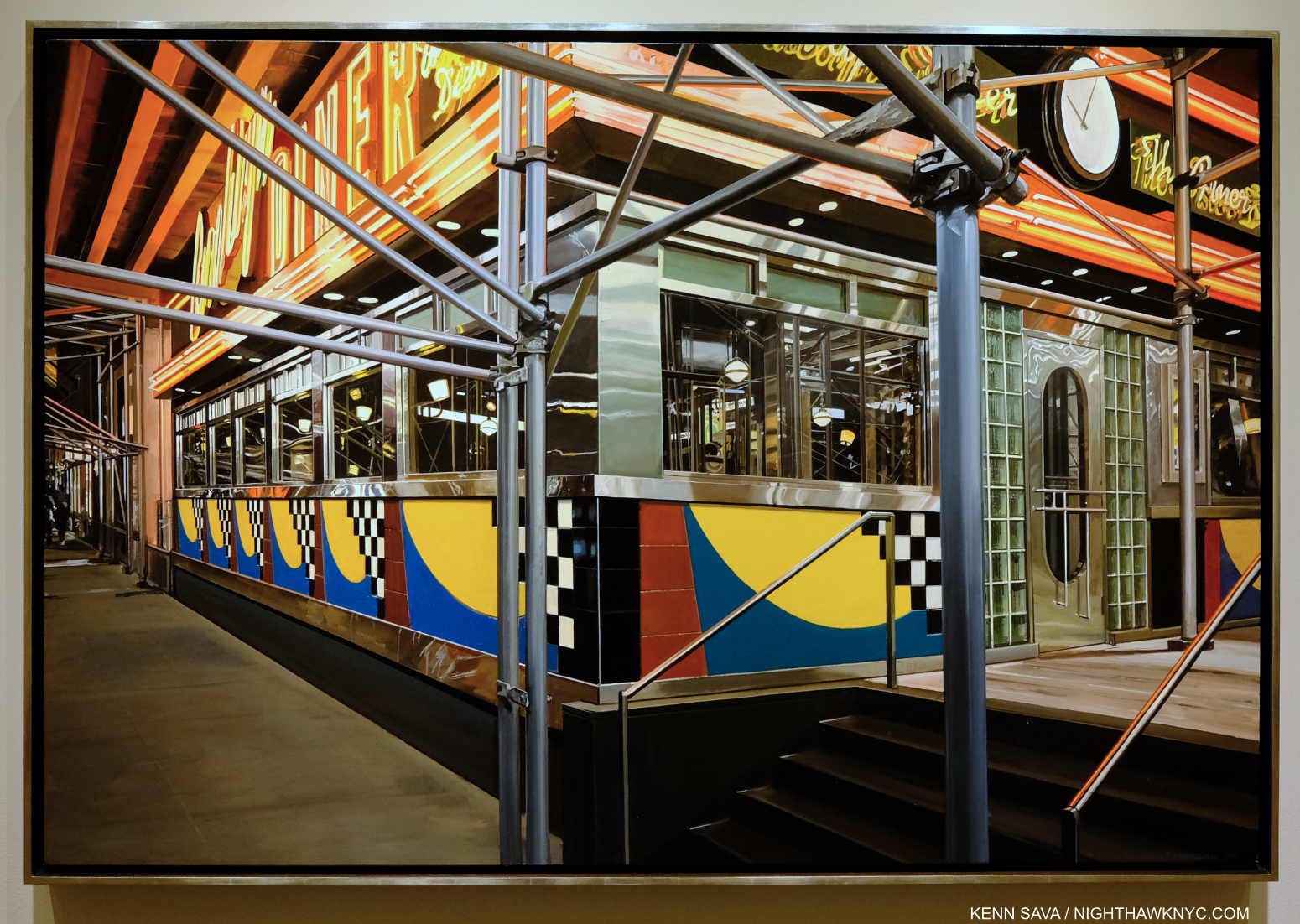
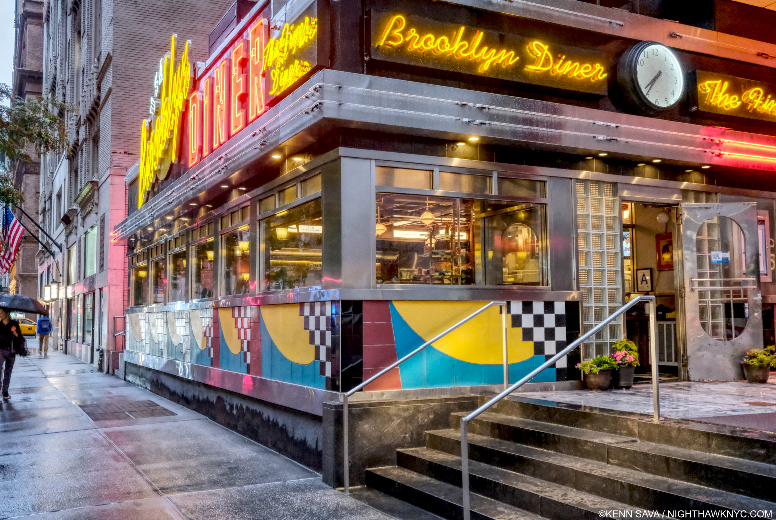
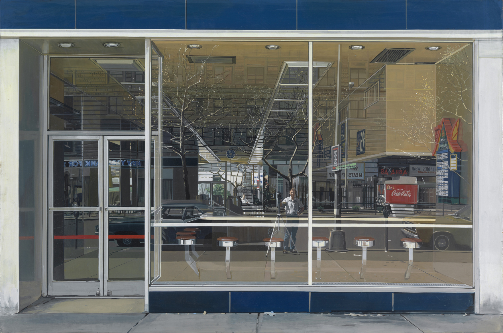
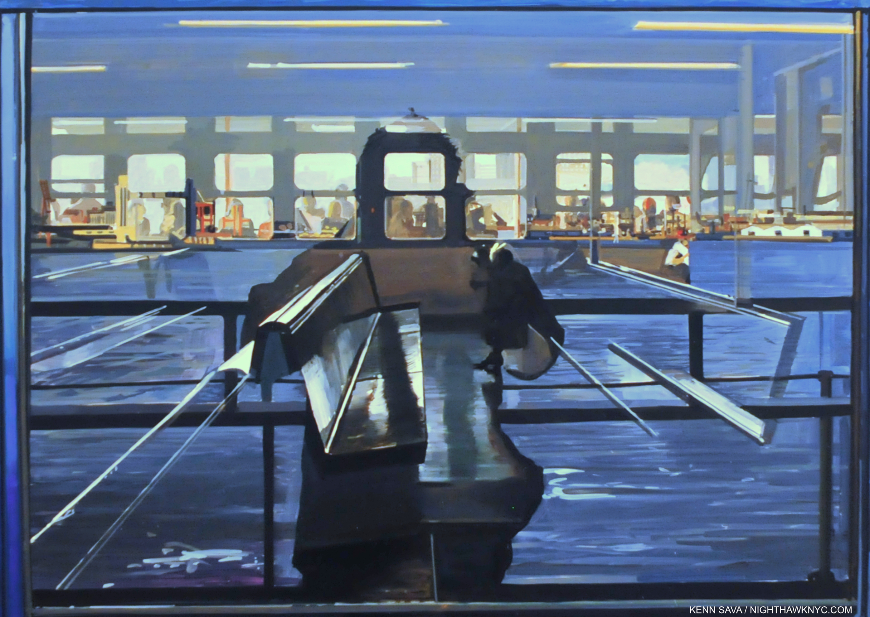
Bus With Reflection of the Flatiron Building, 1966-67, seen at Richard Estes: Painting New York City, in September, 2015. Richard Estes’s “mature” work begins here.
“I think I started using reflections to give more of an abstract quality to the paintings, to make them look less like a photo,” he said.6
Wait! That’s sheer photorealism blasphemy! The “movement” better have a meeting (their first) and pick a new “standard bearer!” Yes, Richard Estes begins with a reference Photograph or Photographs he took, but so what? Painters have been doing that for well over 100 years. That’s NOT the point!
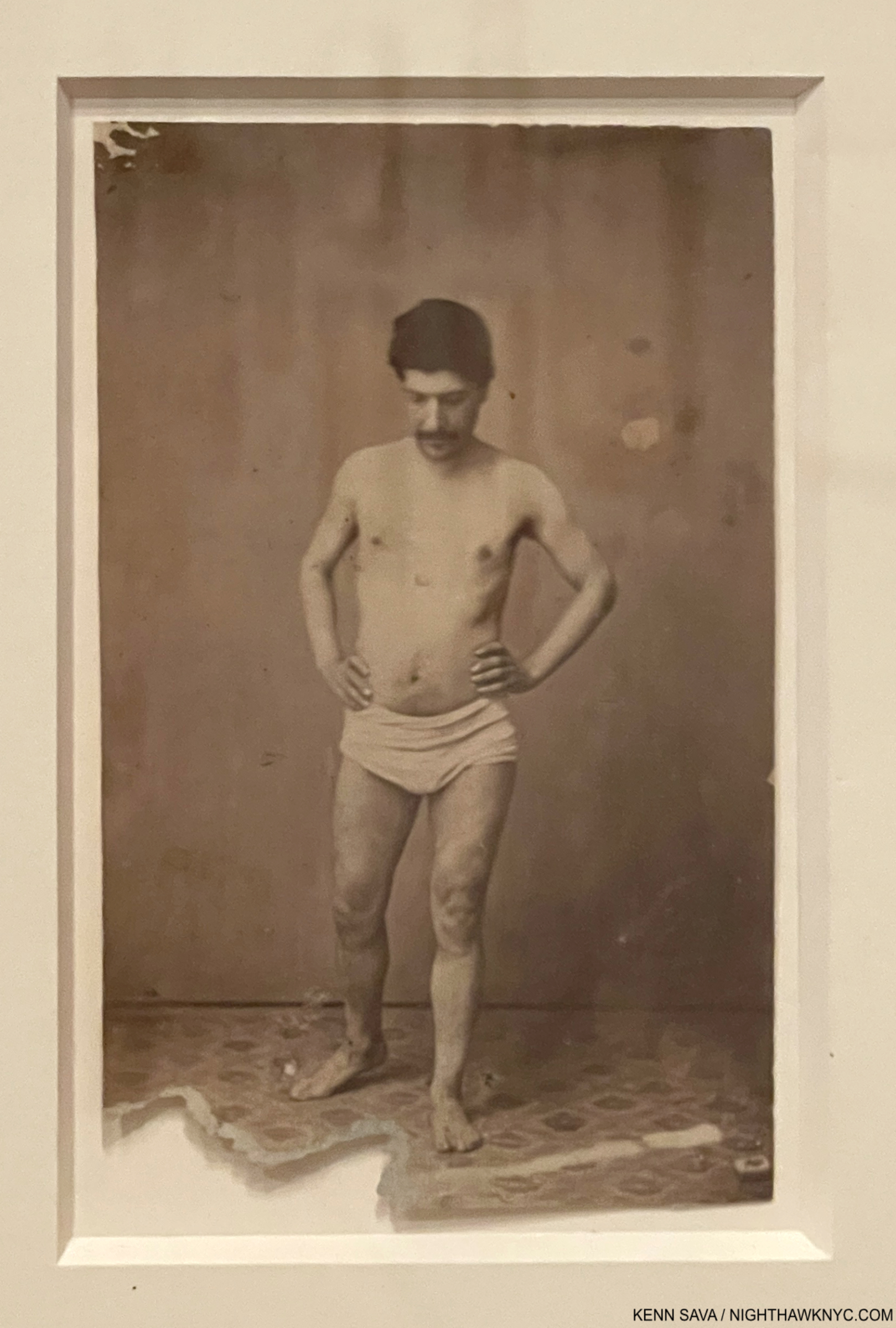
137 years in this case. Unknown Photographer, Untitled, Portrait of the Model apparently used by Cézanne for his Painting, The Bather, 1885(!), now in MoMA’s permanent collection. Seen in my piece on Cézanne Drawing.
Most of them, including Cézanne, Edgar Degas, Thomas Eakins, Charles Sheeler, Ralston Crawford, Francis Bacon, Rod Penner or Jordan Casteel, haven’t been stuck in this box. Richard Estes uses his Photographs as references but always at the service of what he sees in his mind’s eye and what he feels looks “right” on the canvas for his conception of a given scene. As a result, in Tower Bridge, London, 1989, he includes St. Paul’s Cathedral in a scene where it wouldn’t be seen in real life, in Brooklyn Bridge, 1991, Mr. Estes had to enlarge the background skyline from the Empire State Building south to Wall Street to make sure it was even seen, and in Hiroshima he literally moved mountains- those that are right of the city to the background. Once I knew that, I didn’t take anything I saw in his work literally. I threw the “photo baby” out with the bath water.
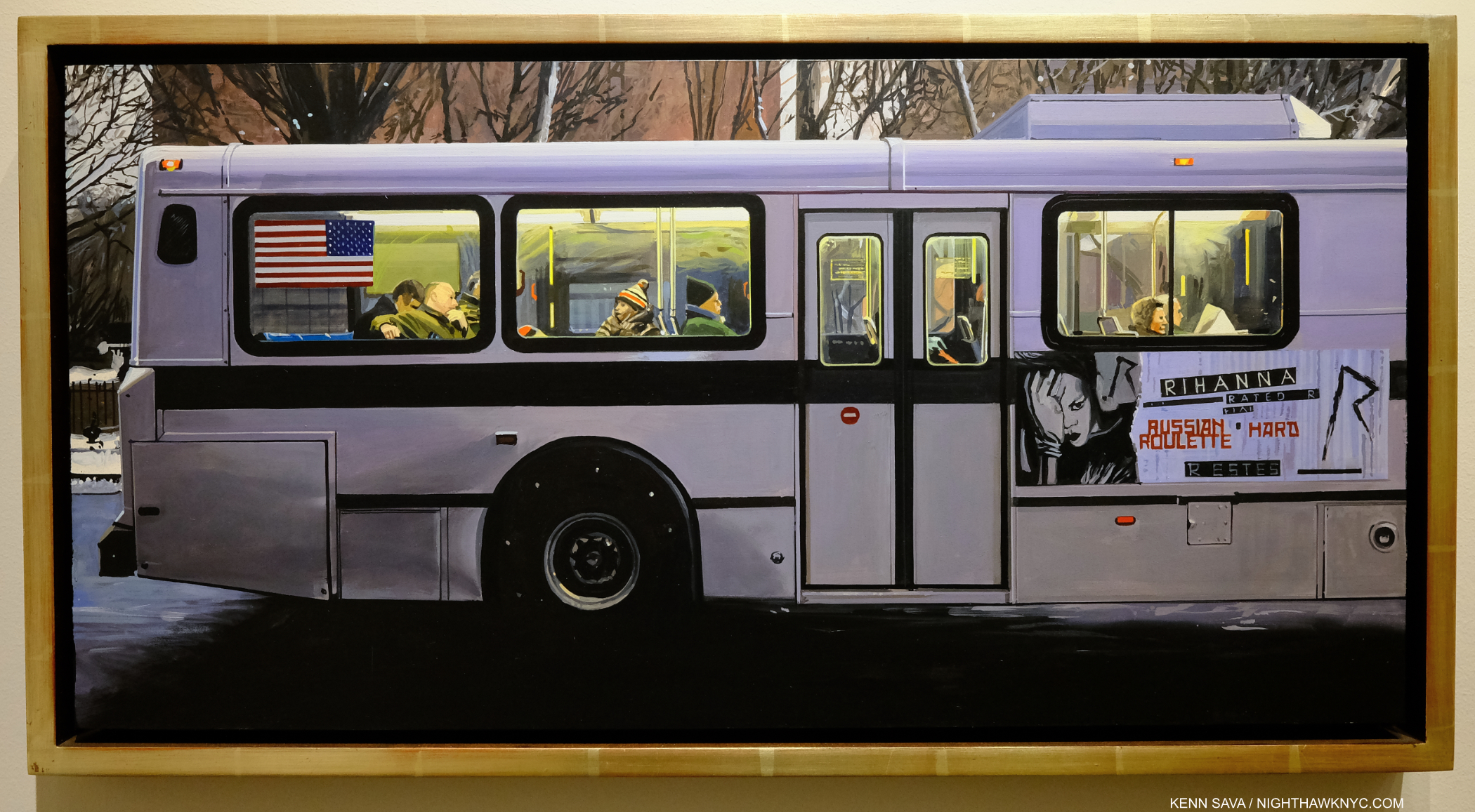
Rhianna, 2012, Oil on panel, 12 x 24 inches. While most of his Urban Landscapes are sharply detailed, this one isn’t. Almost nothing here, save for the lettering on the sign, is in sharp focus.
That helped open my mind, and my eyes, to seeing “more,” to begin to look deeper than his unsurpassed technical mastery. That led me to the unasked question when it comes to any so-called photorealist Art, and to Richard Estes’s Art- What is his Art about? I’ll get to my take on it in Part 2.
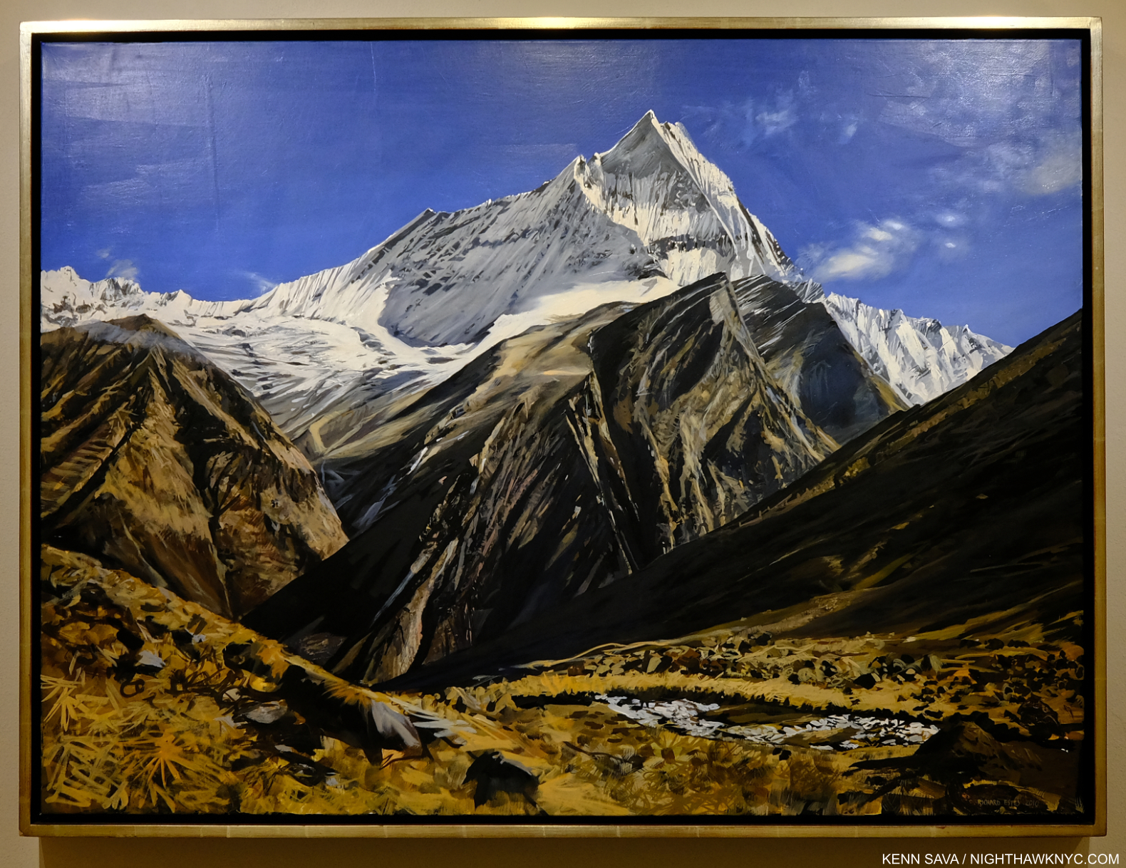
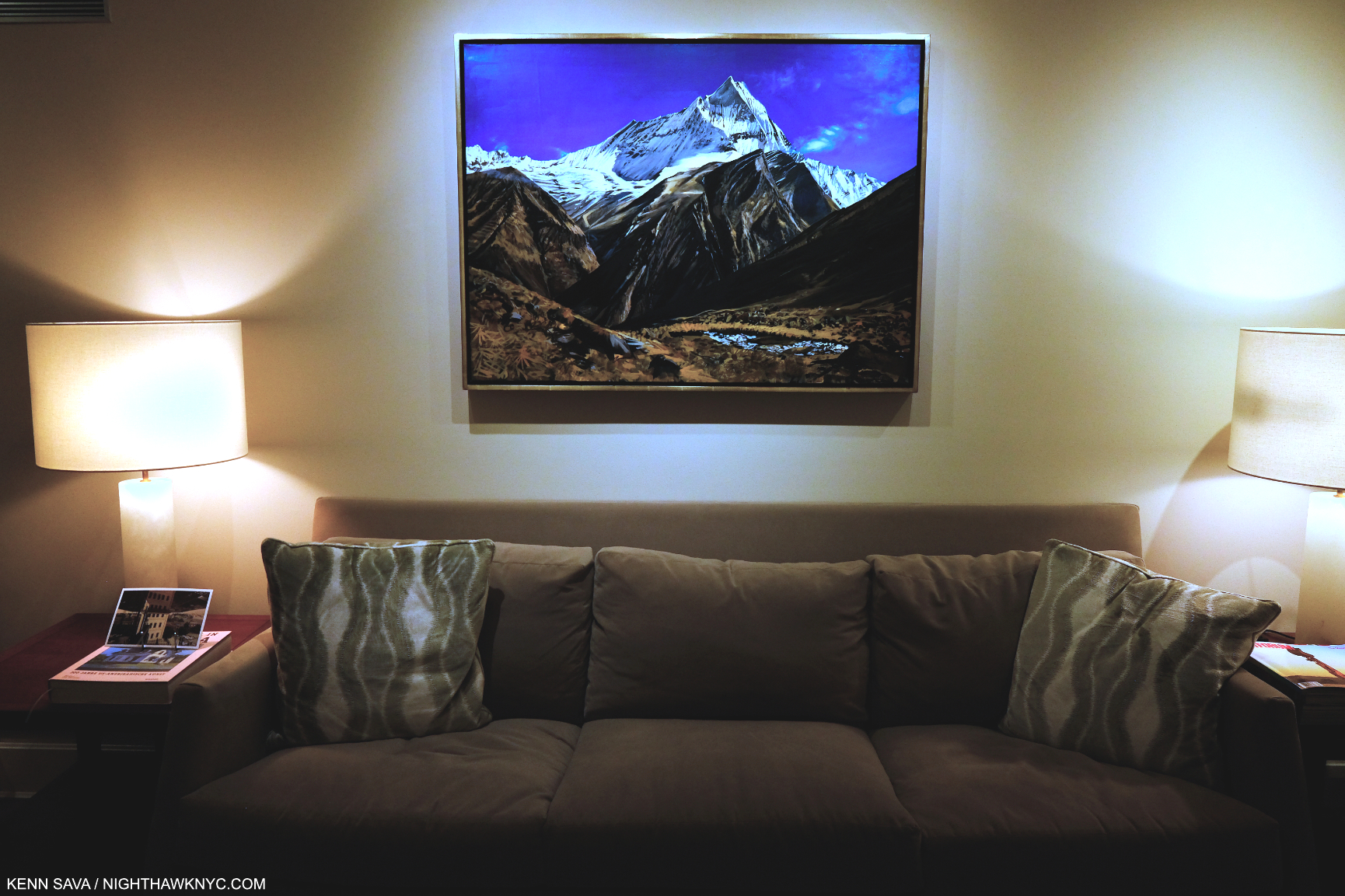
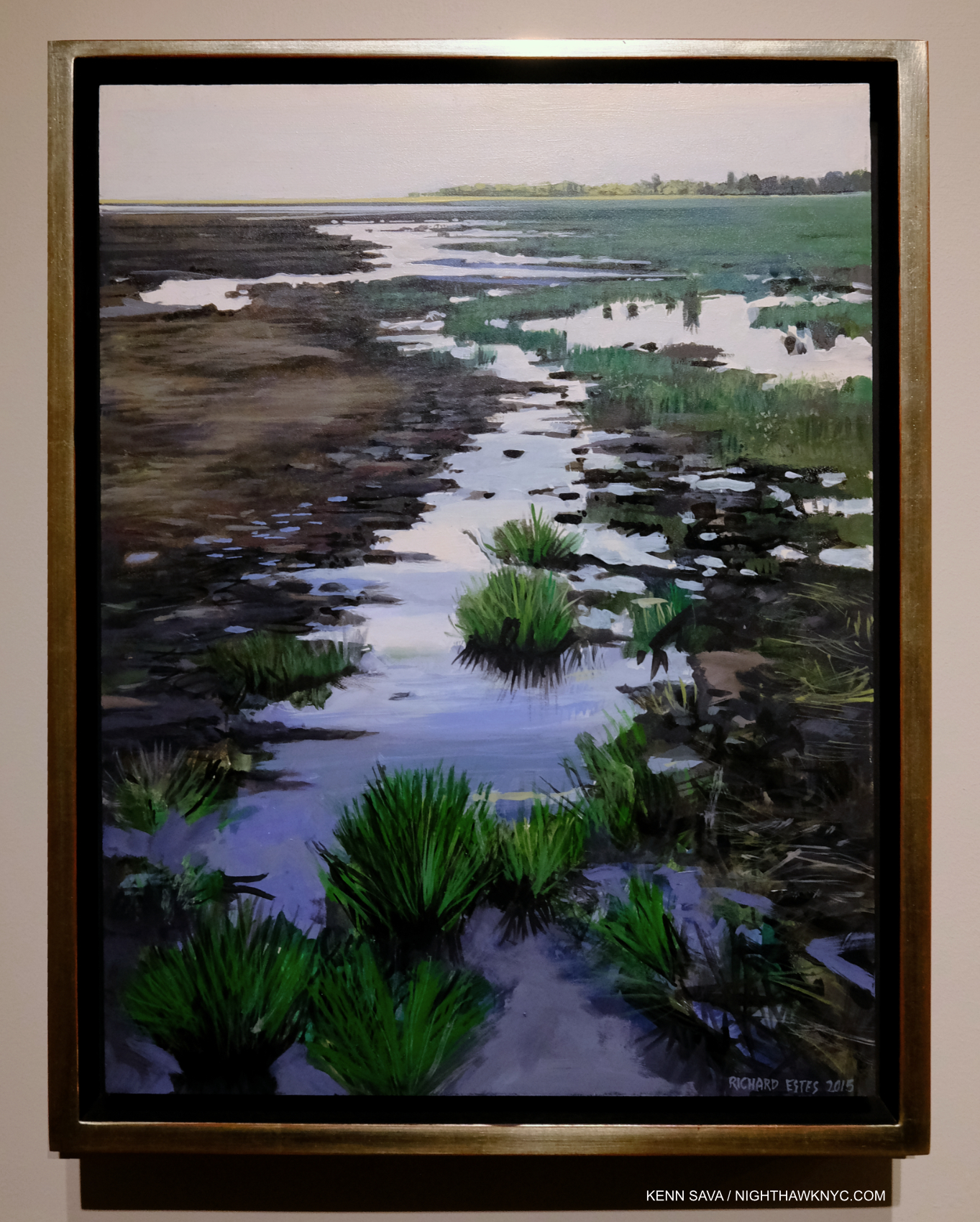
View in Nepal, 2010 Oil on canvas, 32 x 43 inches. This doesn’t look like this in “real life.” In this work, only the snow-capped peak might be in sharp detail. Given this work’s size, I think it was designed to be seen from a distance, assuming the viewer’s attention would be on that central peak. Therefore, it seems to me it’s Painted the way the eye would see the peak, with everything else out of focus. Richard Estes has Painted in this style frequently, ever since he began spending his summers in Maine. It’s completely different from his Urban Landscapes of NYC and elsewhere where everything is in sharp focus. Would anyone call this “photorealist?”
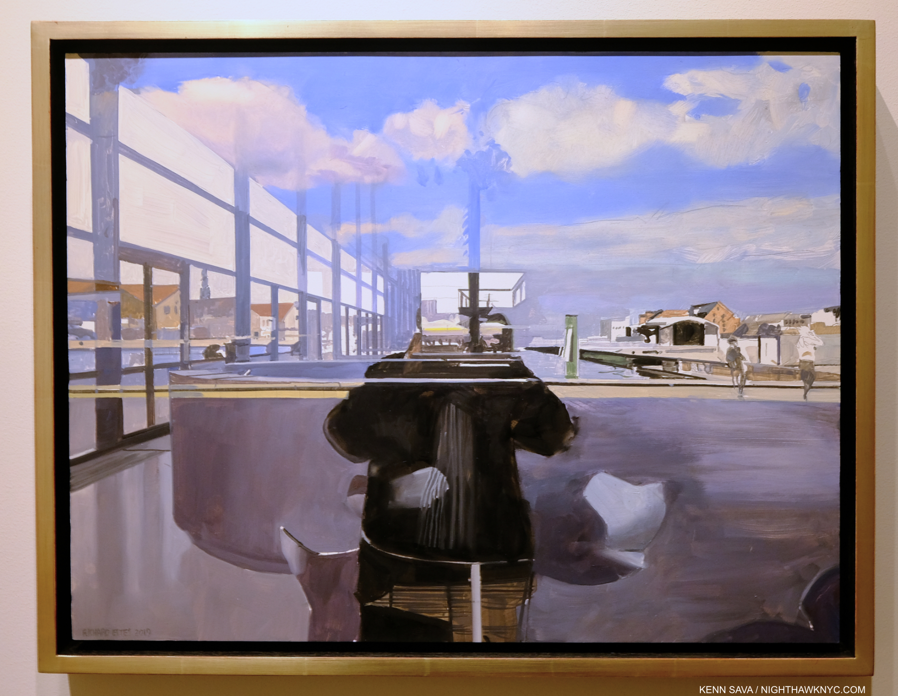
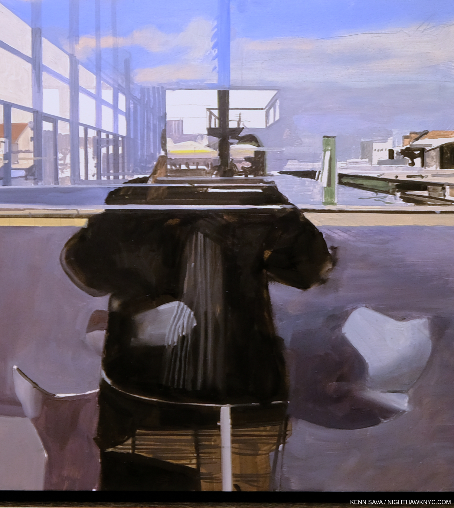
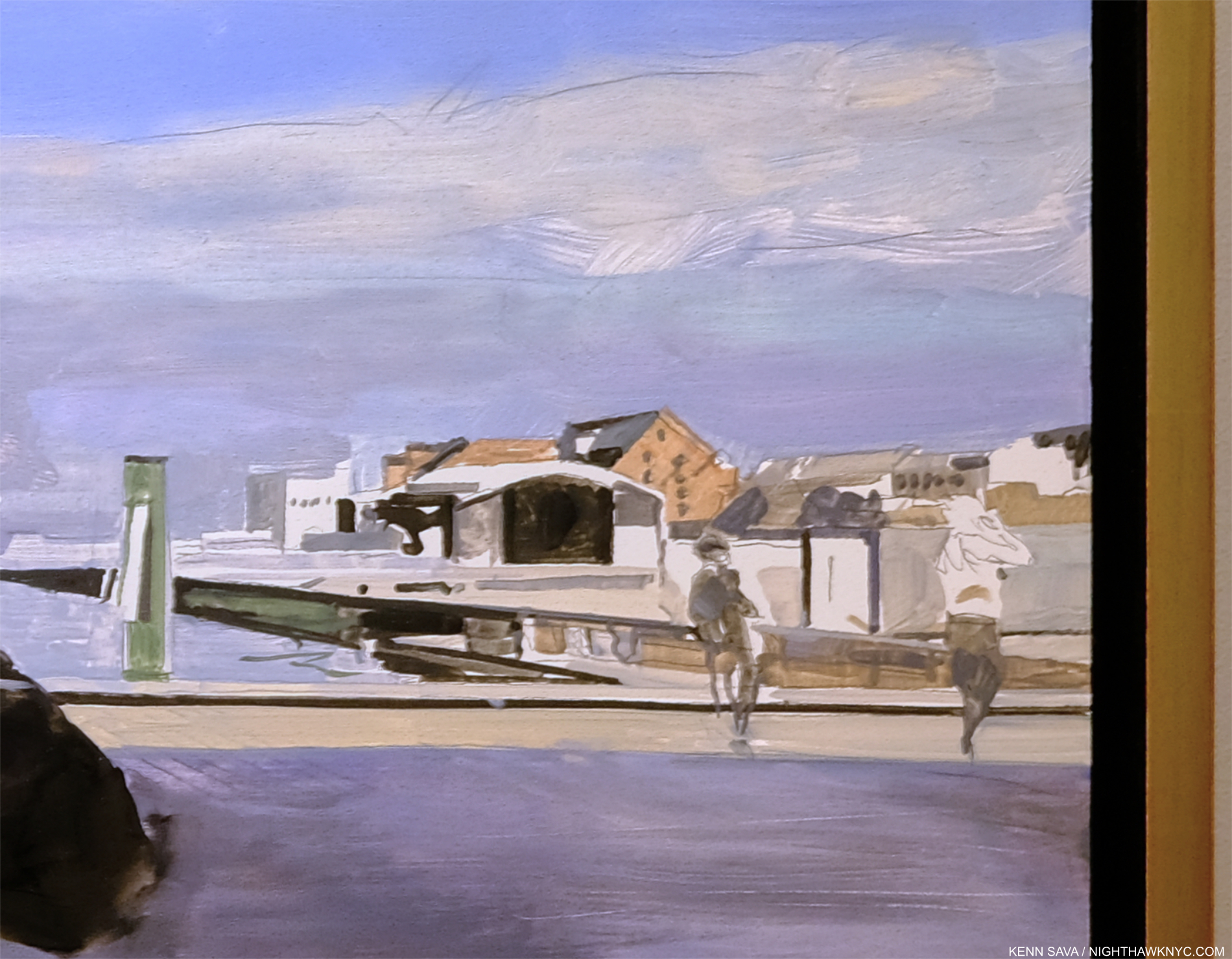
Now, I see an Artist who Paints in a number of different styles- some sharp edged and apparently representational, with everything in focus from the foreground to the very back, other pieces “soft” and down right impressionistic (used as an adjective, not as a form of the word often used to connote a group of French Artists in the 19th century that I’m still not convinced were an actual “movement.” They were grouped together by a writer because they had to sell their work outside of the official Salon which rejected it). And, in a good many of his Paintings there are passages of abstraction- some quite large. What this tells me is that Richard Estes in an extremely talented Painter who maintains the freedom to go stylistically where his muse and the subject at hand takes him, and NOT a mere replication machine who’s a slave to a Photograph. In Part 3, I look at two works that define this, for me.
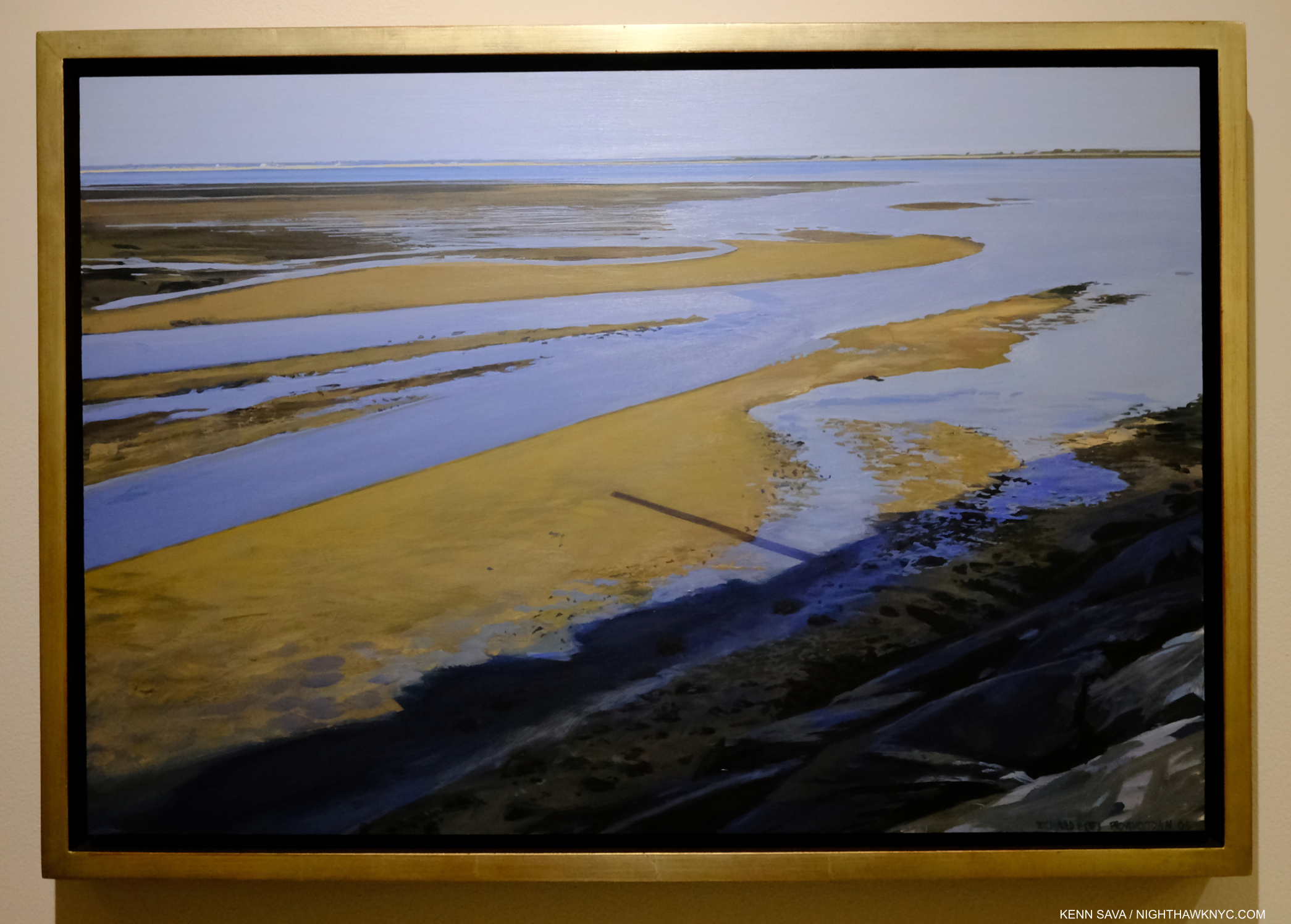
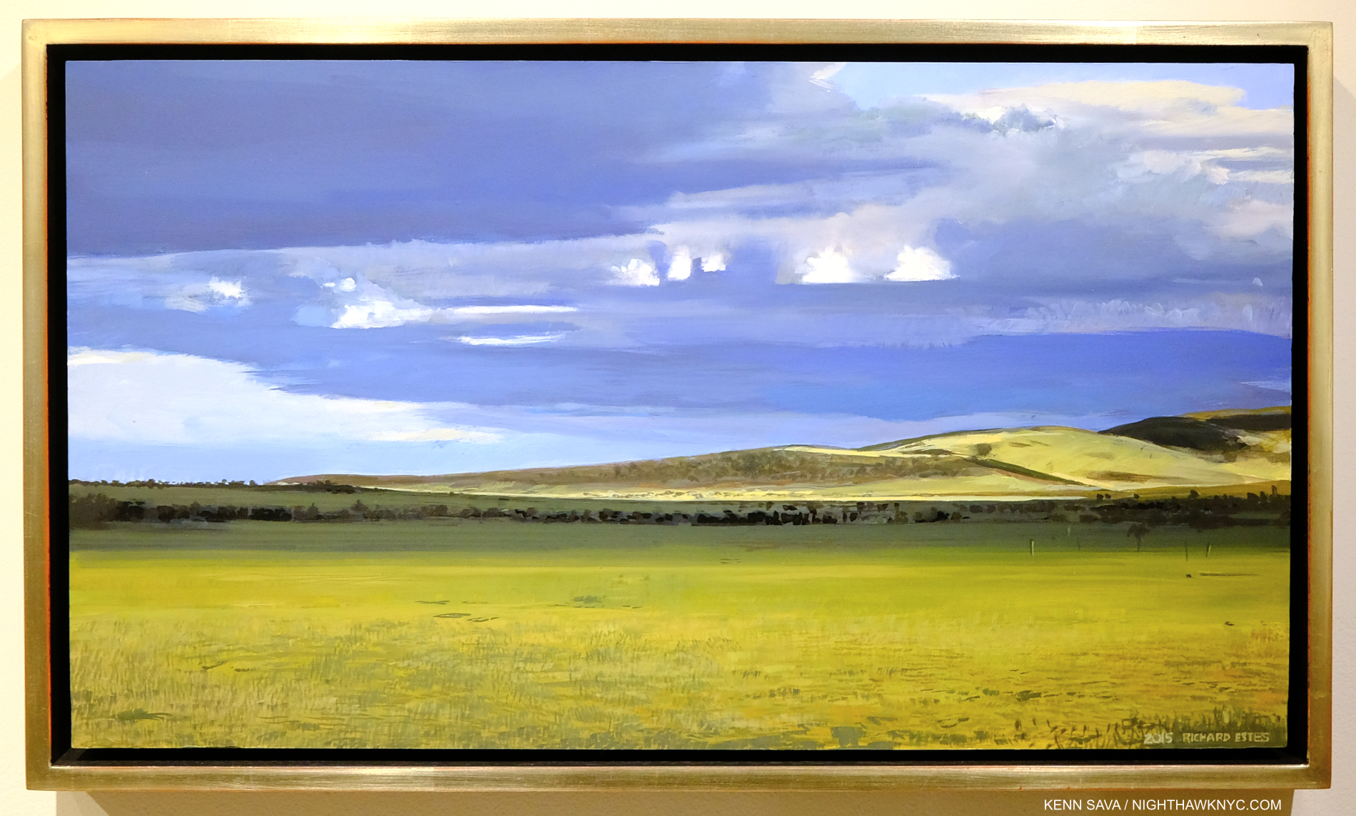
Late Afternoon Tide, Provincetown II, 2006, Oil on panel, 13 1/2 x 20 1/8 inches. When I look at this, I see an Artist under no pressure to create what’s “expected” of him. That’s just me.
Richard Estes gives us work based on Photographs that are translated through something no camera has- his human brain, with his unique intellect, to show what he wants us to see, as rendered through his remarkable hands and unique skill. This is what makes him that most human of terms- an Artist- something no device or machine is, at least to me. In his case, an Artist deserving more serious attention than he has received in his first 90 years. Of course, both his initial Photographs and the end Painting are the product of his eyes, and it is through these that he matches his original intention in taking his source Photographs with the resulting Painting, adding in, or changing, what was not present in the real world to match what he sees and feels inside. This is what differentiates him from a mere replicating machine.
Viva la différence!
-My observations based on 35 years of looking at Richard Estes’s body of work to date as a whole are in Part 2 of this series, below, or here.
-The final Part 3 looks at two more recent Self-Portraits, which I feel stand apart from the rest of his work, here.
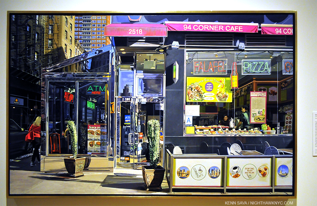
-My piece on Richard Estes’s Corner Cafe, 2013, may be seen here.
–My look at the 2015 Richard Estes: Painting New York City show at the Museum of Art & Design may be seen here.
-My piece “Death to Boxes!” is here.
*-Soundtrack for this Post is “Don’t Believe the Hype” by Chuck D & Public Enemy from It Takes a Nation of Millions to Hold Us Back, 1988.
“Don’t believe the hype
Don’t—
Don’t—
Don’t—
Don’t believe the hype*”
NighthawkNYC.com has been entirely self-funded & ad-free for over 8 1/2 years, during which 320 full-length pieces have been published! If you’ve found it worthwhile, PLEASE donate by PayPal to allow me to continue below. Thank you, Kenn.
You can also support it by buying Art, Art & Photography books, and Music from my collection! Art & Books may be found here. Music here and here.
Written & photographed by Kenn Sava for nighthawknyc.com unless otherwise credited. To send comments, thoughts, feedback or propositions click here. Click the white box on the upper right for the archives or to search them. Subscribe to be notified of new Posts below. Your information will be used for no other purpose.
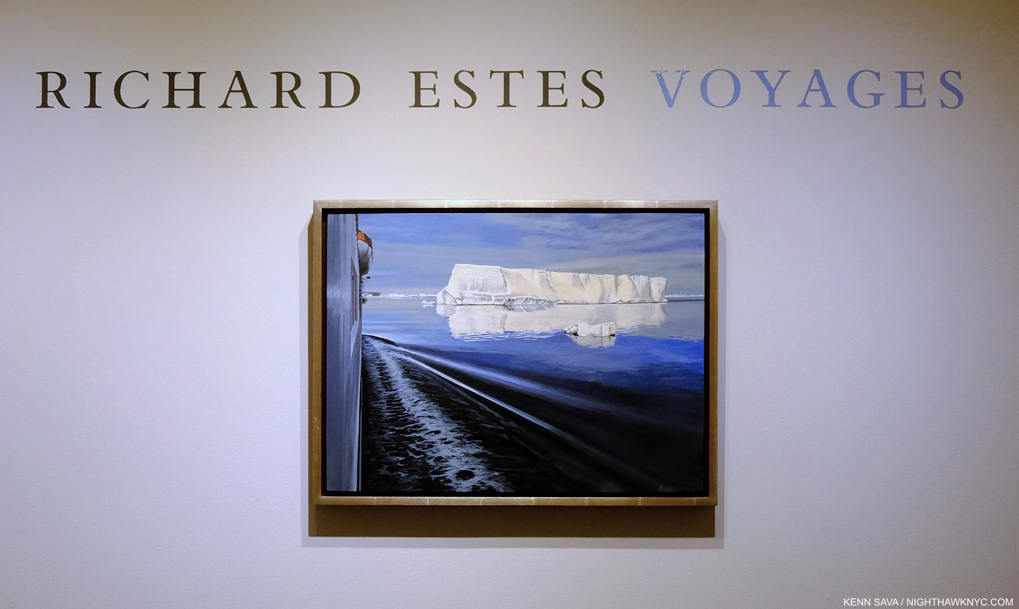
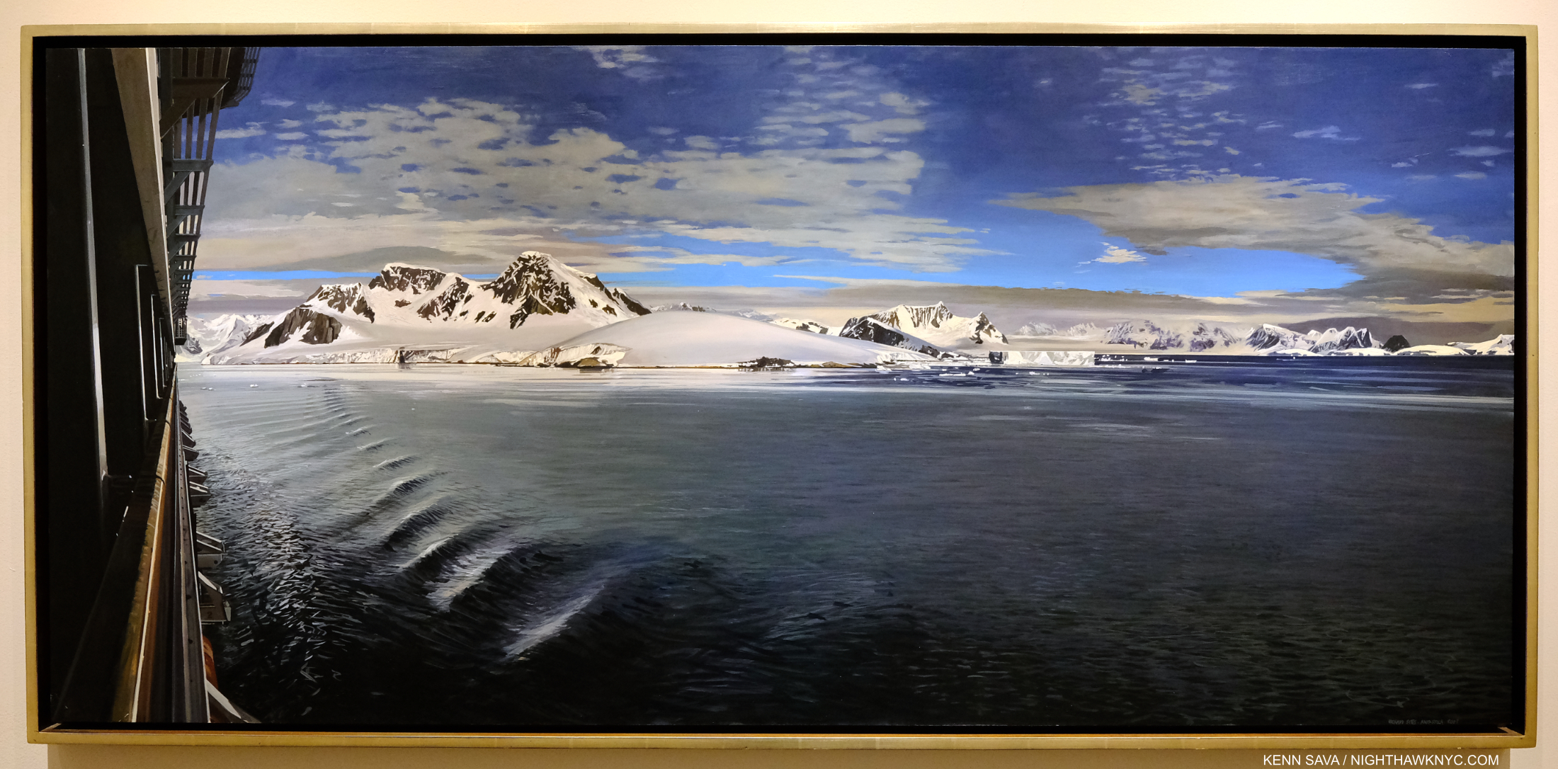
- https://msfineart.com/viewing-room/33-richard-estes-voyages/ ↩
- Patterson Sims, Richard Estes’ Realism, P.10. Mr. Sims was apparently there when Mr. Estes said this. Yet, he calls his work “Richard Estes’ Realism,” substituting one box for another. ↩
- The Met, MoMA, Guggenheim Museum, the Whitney, the New Museum and the Brooklyn Museum. ↩
- I’m not counting Chuck Close for the reasons just stated. ↩
- ibid, p.10 ↩
- New York Times, March 8, 2015 ↩