PhotoBooks Take The L.E.S.

Written & Photographed by Kenn Sava

Report card from the future. Snapshots From the first LES Fotobookfair…

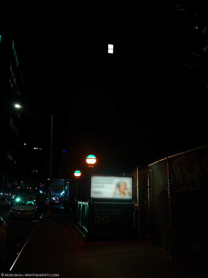
Welcome to the L.E.S.!

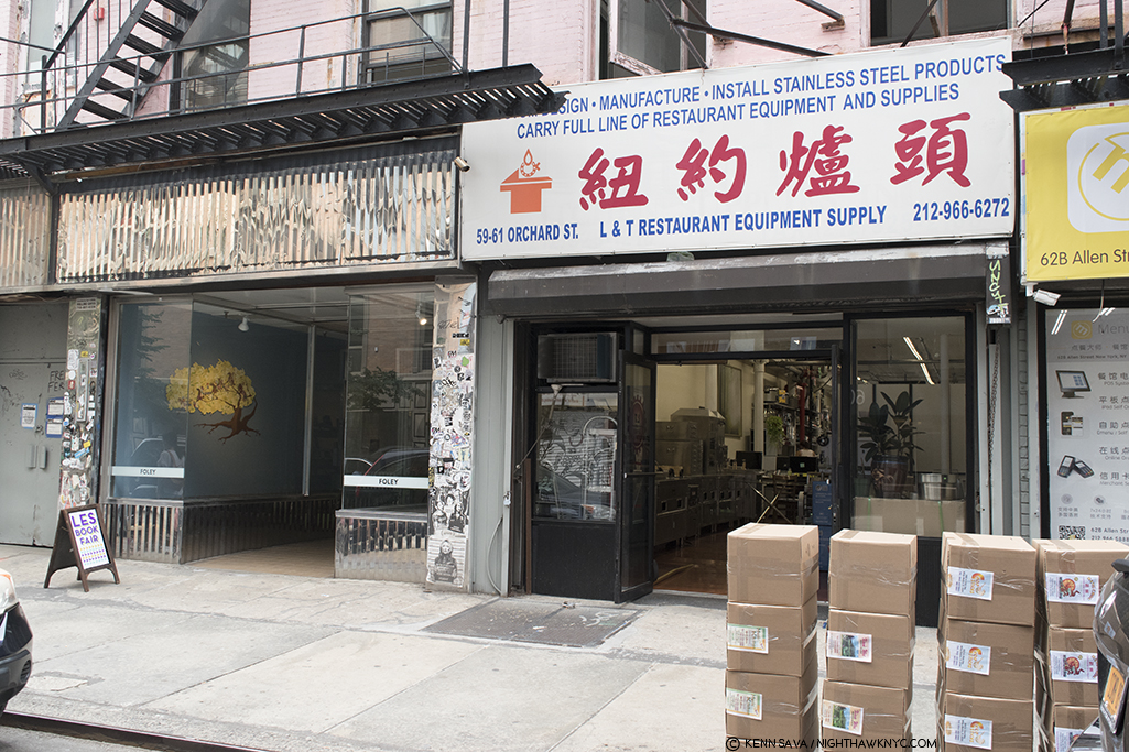
Outside Foley Gallery, left. Those boxes are not PhotoBooks waiting for eager buyers. They are, in fact, full of Chinese Restaurant menus, soon to wind up on all of our doorsteps. Click any Photo for full size.

Where? 

Manhattan’s Lower East Side has, to some extent, inherited the mantel of creativity that moved…no…was forced from the West Village to the East Village, and then to the LES due to rising rents. Yes, some of it moved to the 718- Brooklyn, The Bronx & Queens, and some to New Jersey, but the LES has been more than holding its own with a thriving gallery scene, The New Museum, the I.C.P. (International Center of Photography) and countless Artist-led initiatives and collaborations. 

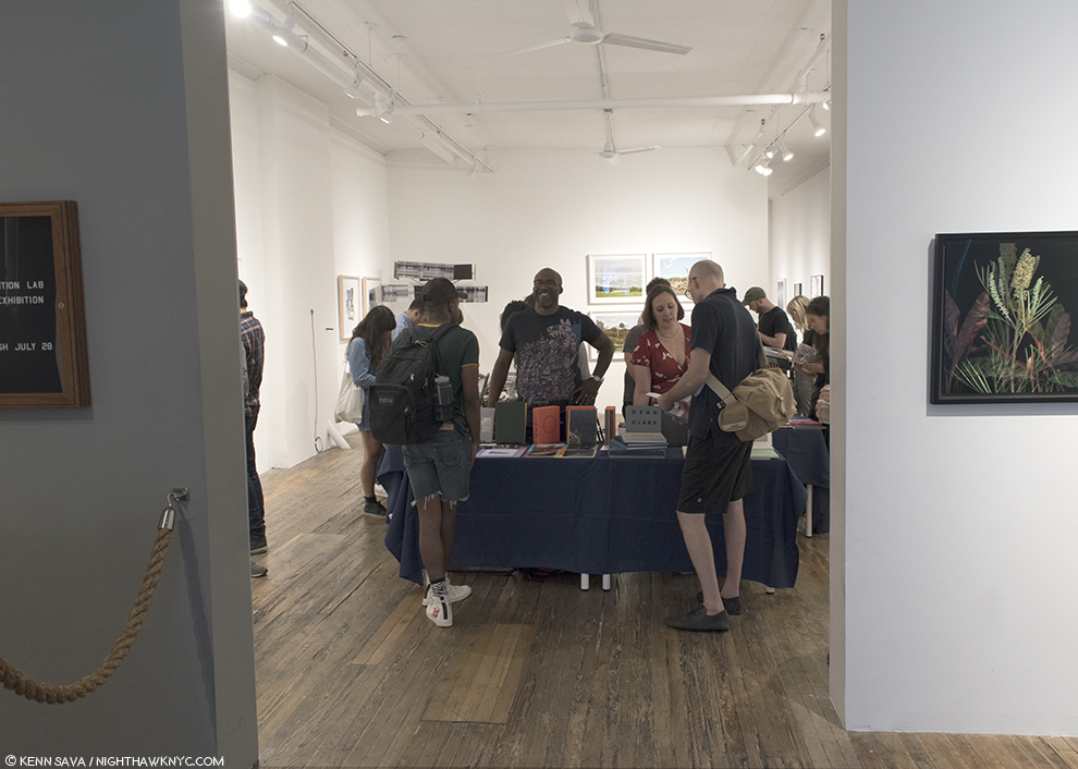
At the entrance. Kris Graves, in the Murakami T, enjoys a conversation with a visitor, while his wife discusses a book at the +Kris Graves Projects table on July 21st.

The newest of these is a collaboration between Michael Foley of Foley Gallery and Photographer Kris Graves and his publishing arm, Kris Graves Projects.  Over the weekend of July 21-22 they mounted the first ever L.E.S. Fotobookfair. No less than 10 Publishers were represented displaying a very impressive selection of books. The exhibitors were-

Aint-Bad
Corey Persia
Conveyor Arts
Drittel Books
Gnomic Book
+KGP (Kris Graves Projects)
Puritan Capital
RITA Books
Roman Nvmerals
TBW Books
TIS Books
Zatara Press

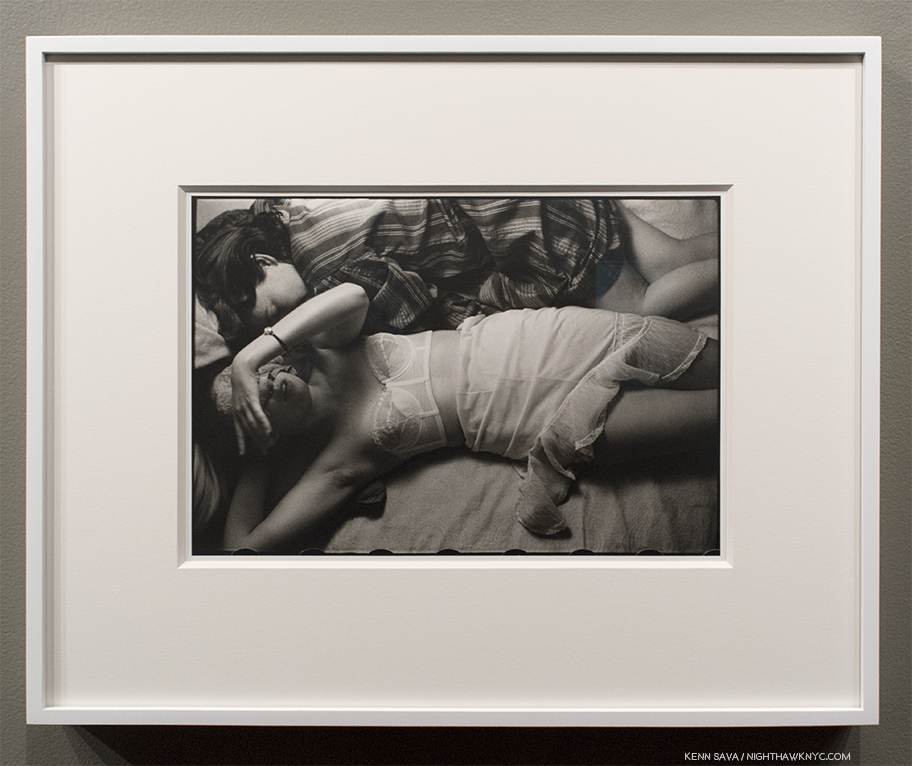
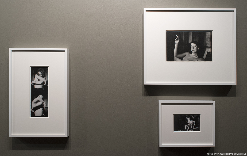
And, host Foley Gallery, which presented “The Exhibition Lab Exhibition” installed surrounding the tables wonderfully complementing both the quality and the range of the books on display.

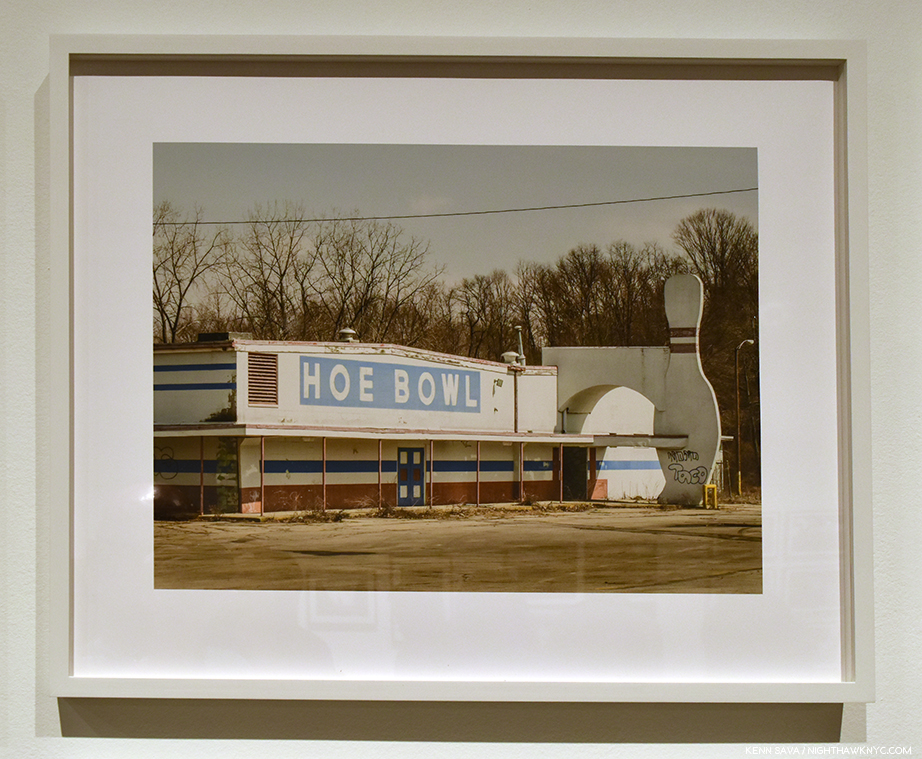
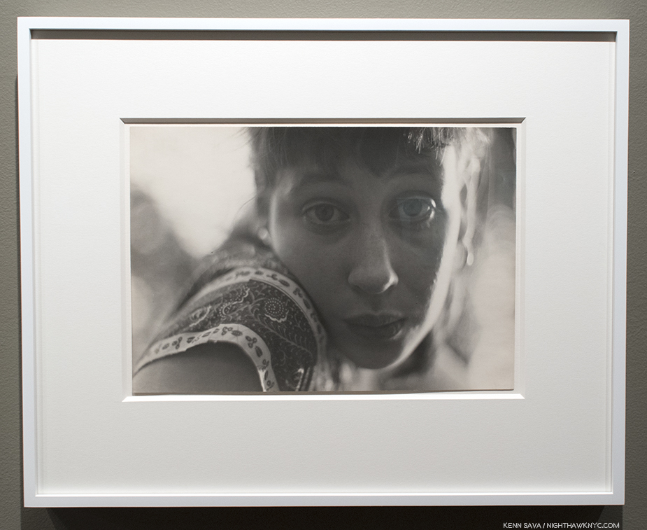
Jennifer Baumann, Hoe Bowl, 2018, part of Foley Gallery’s “The Exhibition Lab Exhibition”

I asked host long time gallerist and faculty member of the School of Visual Arts and the International Center of Photography, Michael Foley, how the idea for the FotoBook Fair came about. He said, “I’ve known Kris for a while now and I know that making photography and publishing photography are two great passions of his. I was impressed with the amount of titles he releases each year and how dedicated he is to getting the work of fellow photographers out there. I love doing events at the gallery…so I suggested we try one here if he felt he could get 10 publishers here. And so he did. He came up with the idea of a “Reading Room” which would give visitors a place to unwind and spend time with the books that they were interested in. Amazingly enough, the Reading Room was silent for the most part with people thumbing through the titles. Each publisher positioned a few of their titles back there, so it really became a library! He also was able to create a lecture series in a very intimate setting. The fair, the reading room and the talks all worked together and supported one another throughout the weekend.”

“The LES Book Fair, provides a more intimate setting, where the financial stakes are a little bit lower for the publishers and visitors can easily meet every one of them and probably look at every book at the fair! You won’t get lost here and you will probably find a few interesting titles to pick up and most importantly, you can take your time looking and looking again.” Organizer Kris Graves added, “(Michael) Foley and I have been thinking of working together on a project like this for a year or so. Michael reached out to me about two months ago and we put it together pretty last minute.”

It didn’t feel that way.

Mr. Graves was a veritable blur while I was there. Such is life when you wear as many hats as he does, with grace and ease. Here, he was Photographer & Artist- represented by his stunning new book “A Bleak Reality,” which opens up to a 20 by 24 inch spread of his series of Photos of eight locations where young black men were murdered by police officers between 2014 and 2016, each one captured on video. Seen so large, their presence is lifelike. Images from “A Bleak Reality” introduced me to Kris’ work at The Photography Show/AIPAD earlier this year.

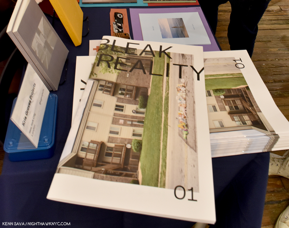
Kris Graves, A Bleak Reality, 2018.

Wearing his publisher’s hat, +KGP (Kris Graves Projects), he told me that so far this year he has done 18 projects!?! (And I thought my 23 2018 pieces in 24 weeks was crazy, and I’m not making them into actual books!) The volumes that haven’t as yet sold out were gloriously on display. Wearing his co-host hat, he introduced speakers for the lectures and discussions in the reading room. Finally, wearing his book fair “manager” hat, he was regularly checking in with the other exhibitors and speaking to visitors. Given how busy Mr. Graves was, his table was in excellent hands, being co-staffed by his lovely and knowledgeable wife, Sarah. In the midst of all of this, he found time to direct me to the beautiful new book, El Libro Supremo De La Suerte, by Rose Marie Cromwell, at the TIS Books table. 

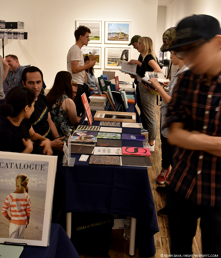
The first thing that struck me about it, something that became a theme with virtually every book at every table I looked at, was the exceptionally high quality of the production. It didn’t take long to realize that every single person involved in these projects cares deeply about the end product. As I moved throughout the fair, I heard all kinds of discussions about the finer points of bookmaking- here the endpapers are well glued, or not well glued…which countries have the best bookbinders…how different bookmakers pack their books for shipment, and the ins and out of having books made in various parts of the world, including the USA. I was even startled to learn that for those publishers who sell through that huge online retailer, notorious for not packing their books (they often just put them in a box with no padding or protection), keep any books that are returned by the customer for being received damaged!

Call me crazy (sorry, you won’t be first), but for a book junky like me, to hear people who live and breathe this stuff, particularly the Artists who’s books these are, discuss these details was enthralling. And reassuring. This care and attention to detail is one of the pleasures of buying physical books from smaller publishers, in addition, of course, to getting the chance to see work from a wider range of Artists. That passion, and the fruits of their labors, was gloriously on display. And the track was fast.

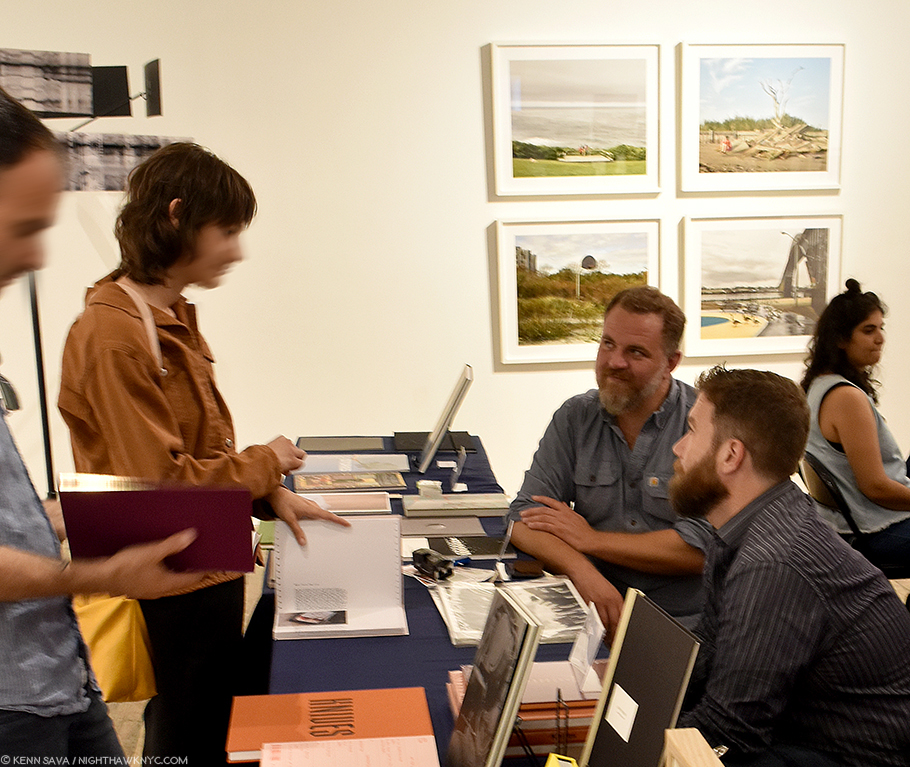
Photographer & Publisher Jason Koxvold, facing with his arms on the table, and Photographer Shane Rocheleau, right, discuss the finer points of their terrific new books at the Gnomic Book table.

Next to TIS was Gnomic Book who were showing three very impressive new books. Two by Photographer & publisher, Jason Koxvold, and one by Photographer Shane Rocheleau.

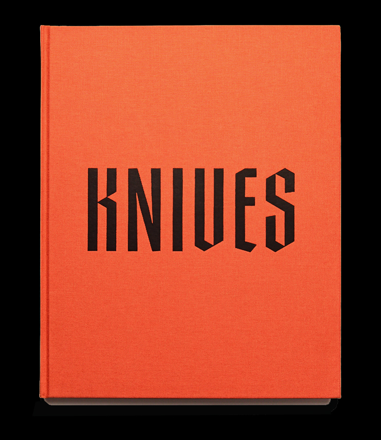
Knives by Jason Koxvold. Kinda hard to miss.

At Gnomic, VERY hard to miss with its stunning bright orange cover and eye-stopping title in bold black type, Knives by Jason Koxvold, a Photographer, creative director and an award winning Filmmaker, was one of the two books (along with Kris Graves’ new A Bleak Reality) I went specifically to see. After all, it’s not often a PhotoBook gets its own tote bag (sold separately). As I looked through it, it struck me that Knives is one of those books that contains a world, in this case an insular community that’s grown up around the Schrade knife factory, part of a 150 year old tradition that backboned its Hudson River Valley community, until it moved to China in 2004, within its covers. Knives documents a world that’s been slipping away. In its portraits, subjects look out at the camera (or not) with a look on their face of not knowing what’s happening, but feeling it happening. Nothing needs to be said. It’s all written on their faces.

At the Fair, Mr. Koxvold was debuting a “companion” book to Knives in the form of a hand-made limited edition of 25 titled You were right all along, or, Y.W.R.A, as it’s also known, a book that “can be thought of as connective tissue between several different projects, made at a unique historical intersection in the United States as we bear witness to the decline of capitalism, the rise of almost constant mass shootings, mistrust of the institutions that have held the country together, and the swollen, invisible power of the military industrial complex,” per the publisher, all tied in, like Knives, to the story of Schrade Knives.

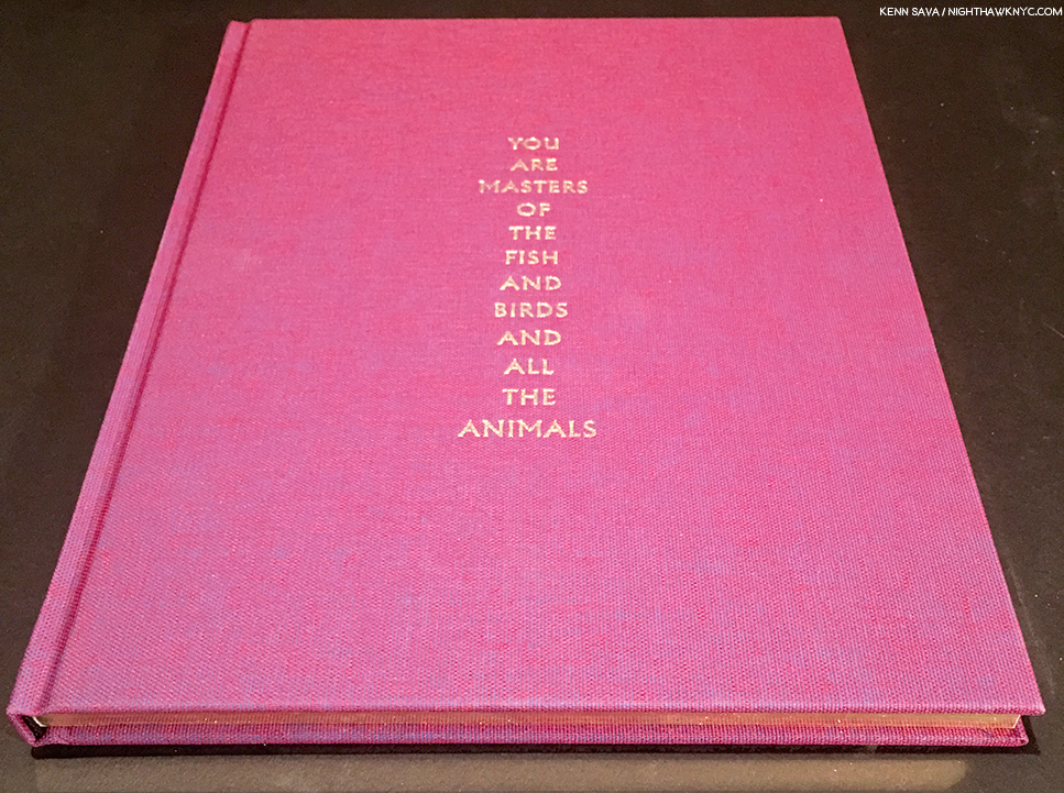
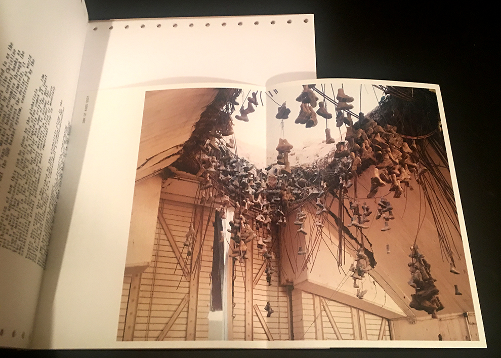
YAMOTFABAATA (or You are the Masters of the Fish and the Birds and all the Animals, from the Book of Genesis) by Shane Rocheleau, just published by Gnomic Book, a beautiful creation. I shot it at an angle to show off its nice gold edges, carrying over the gold on the font, and mimicking the gold edges of bibles.

Shane Rocheleau’s YAMOTFABAATA, or You Are The Masters Of The Fish And Birds And All The Animals, was the surprise of the LES Fotobook Fair for yours truly  A gorgeously produced first book 3 years in the making ostensibly “about white masculinity,” (something it shares with “Knives”- both are centered on masculinity, and in both books white masculinity), Mr. Rocheleau’s with a strong autobiographical thread included. (My Q&A with Shane Rocheleau is here.)

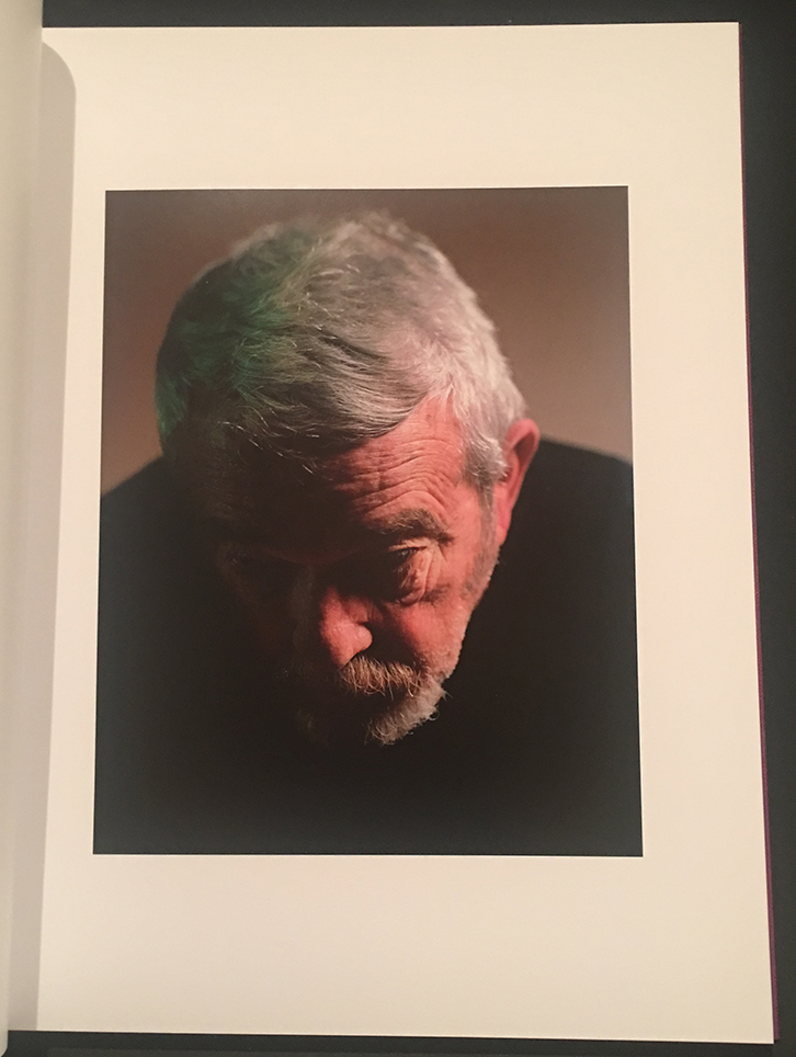
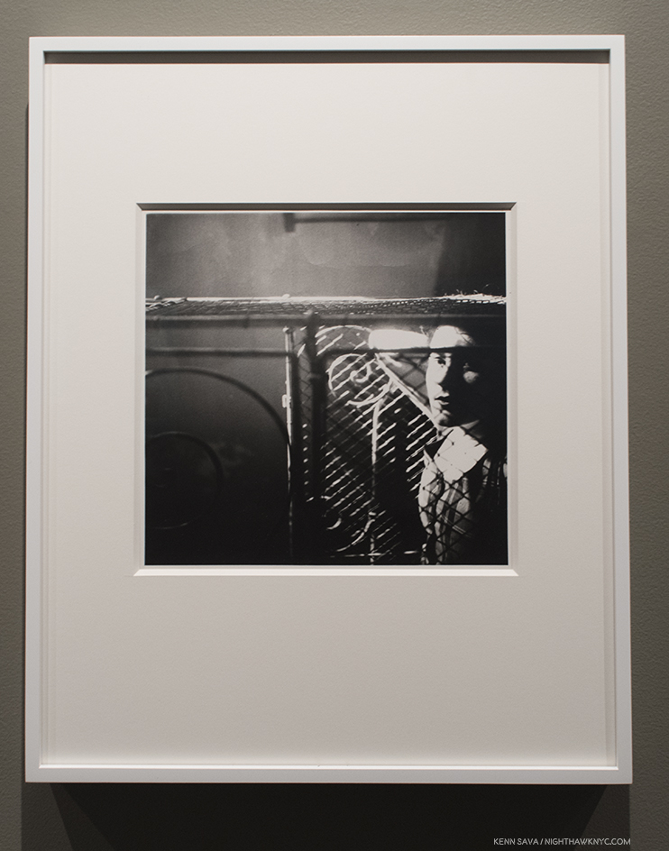
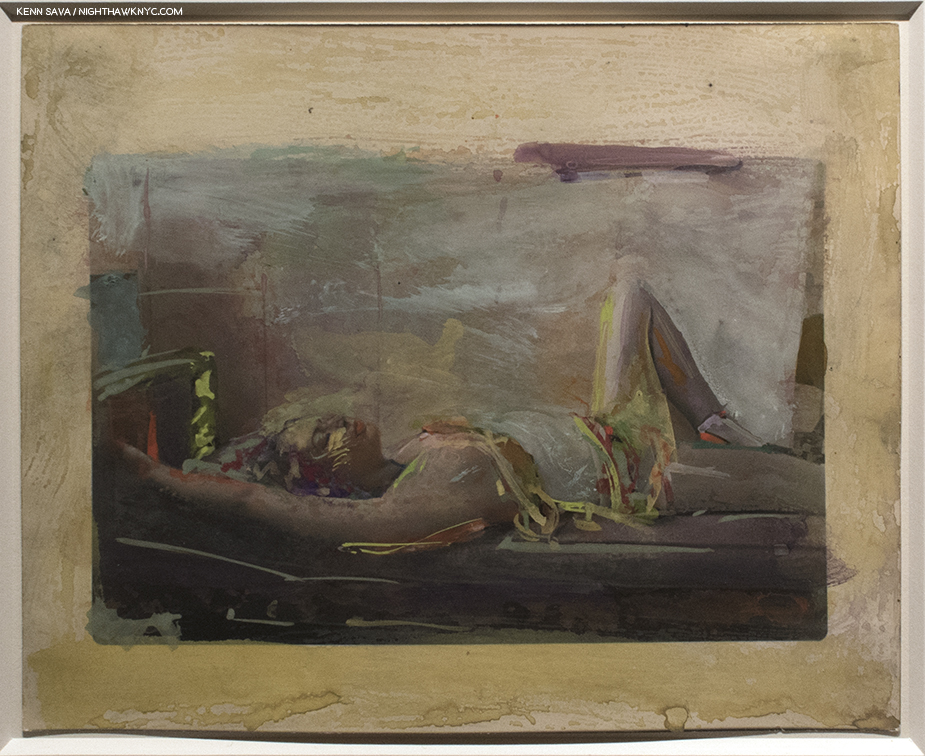
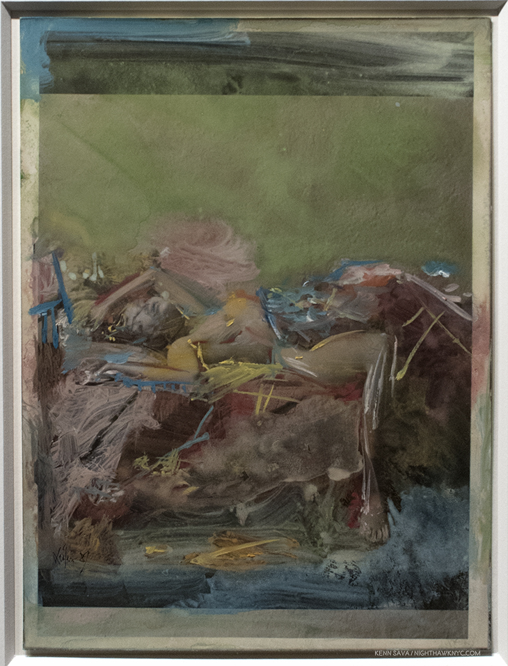
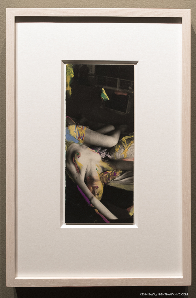
My Dad, from YAMOTFABAATA by Shane Rocheleau.

Its a soul searching book, one that looks inward and outward, all the way to the power of nature, for its “answers.” Some of the images were included in the Artist’s A Glorious Victory series, but here, they’re added to a number of others to form one of those rare cohesive groups that takes a PhotoBook to a different level. Mr. Rocheleau, (like Jason Koxvold), is an accomplished Filmmaker, and it’s obvious when looking through YAMOTFABAATA. The work strikes me not so much cinematic, but rather a movie playing in the mind’s eye, as the terrifically sequenced succession of images take a cumulative toll. The air is mournful. There is a sense of loss, or impending loss. Old ways die hard. In the portraits, many subjects have no eyes- well, we can’t see them. They’e looking away, possibly looking inside. Nature is present, reaching into our world at random times to show us who’s the real boss. The result is one of the finest first PhotoBooks I’ve seen so far this year. 

Being one of the Artists on hand at the BookFair, I asked Mr. Rocheleau how the Fair experience was for him. “I really enjoyed hanging out with all the publishers, some of whom are old friends, and answering and asking questions about work.  The visitors were engaged, and it was great meeting new people.  My publisher, Gnomic Book, did quite well and is excited about the next one!  All in all, I had a great experience.” Jason Koxvold added, “We had a great experience at the LES Fotobook Fair – it was wonderful to make new friends and discover new work. Several people have told us that our work can only really be experienced in person, so an intimate book fair is a great place to let readers spend time with the books, and it was also the perfect place to start taking pre-orders for Romke Hoogwaerts’ new book, Vreugdevuur Scheveningen. I’d absolutely do it again.”

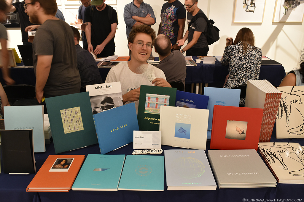
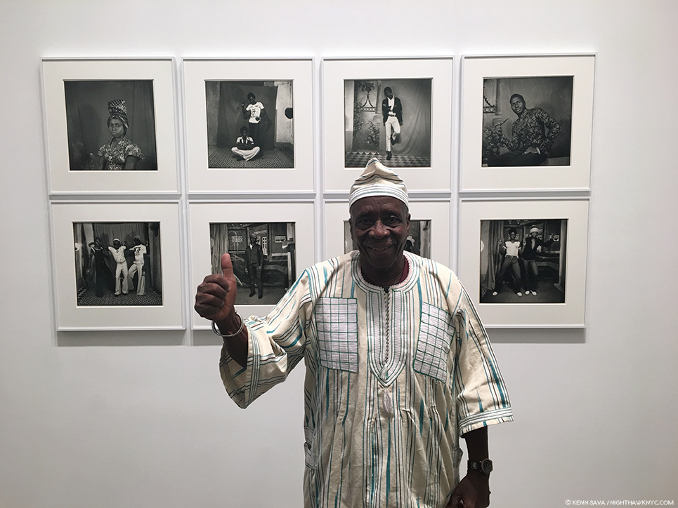
Will Glaser of “Aint-Bad” displays some fancy sleight of hand with their stickers while a full range of their books impresses on the table. Curator’s Choice is the bluish-silver book in the front, just to the right of center.

Up from Savannah, GA, “Ain’t-Bad” is a particularly interesting multi-threat organization that both publishes and promotes new photography. After Kris showed me a copy of their new Curator’s Choice, I immediately ordered it. It’s actually issue No. 12 of their Anti-Bad Magazine, this issue with the stated goal “to put the best contemporary Photography directly in front the eyes of the curators.” Fifteen curators in all showing thirty-one Photographers. Aint-Bad’s Will Glaser was on hand to discuss the impressive range of titles they’ve published, which included a fascinating collection of 7 years of Photo based collage work by Anthony Gerace, titled And Another Thing…, and  On The Periphery, by Sinziana Velicescu, a beautiful look at the man made landscape in and around Southern California that struck me as an echo of the early work of the great Lewis Baltz of The New Industrial Parks near Irvine, California, 1974, albeit in color. In addition to being a meditation on what man has done to and with nature in California, it also brings an element of humor which makes it continually fun to look through. Safely back in Savannah, I asked Mr. Glaser how the show went for him and “Aint-Bad.” He said, “As a previous resident of NYC, I was quickly reminded how amazing the Photography community is in New York. Thanks to the Foley Gallery and Kris Graves, the LES Book Fair was (not only) an amazing place to be, but it showed how a well organized and diverse book fair can bring practitioners of a solitary art form together.”

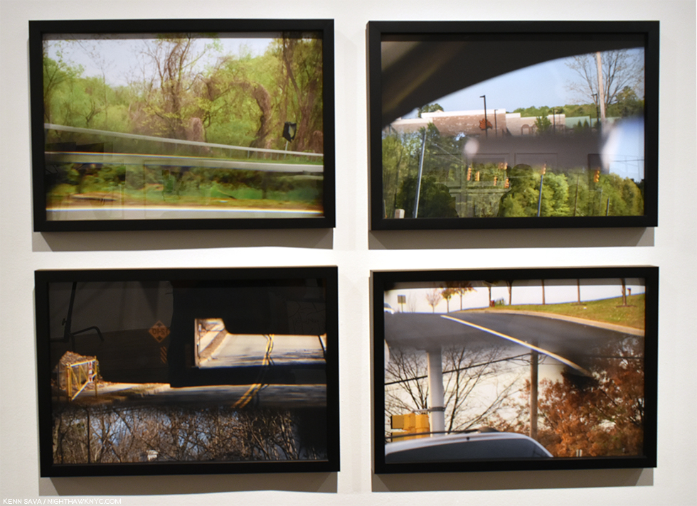
Kerrry Kolenut, Untitled 01-04 (from Rearview Series), 2018, seen as part of Foley Gallery’s “The Exhibition Lab Exhibition”

 Kris Graves’ A Bleak Reality is the newest of those 18 2018 titles by Kris Graves Projects. Its large size and beautiful printing work together to really make the you feel you are right there, in the midst of the spaces it depicts- the places where the 8 black men were murdered by police officers between 2014 and 2016.

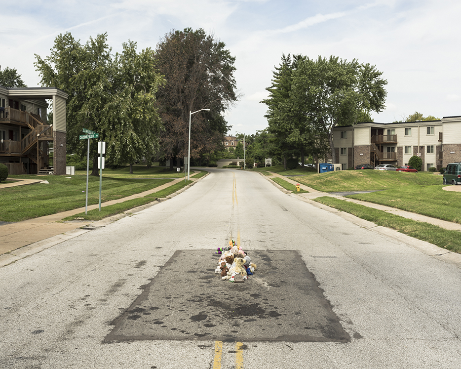
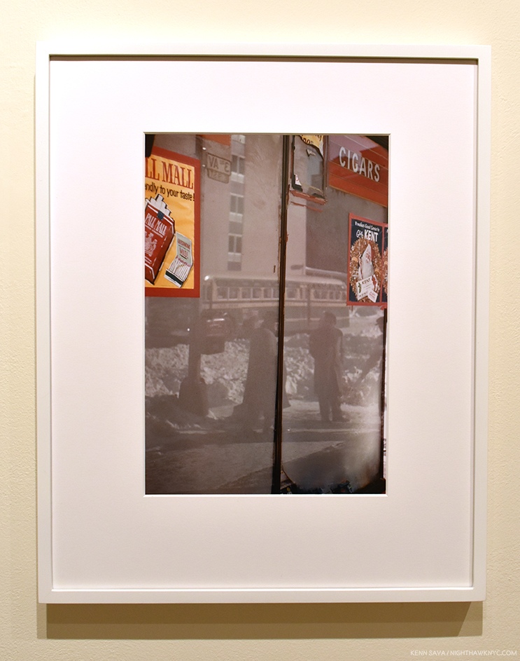
Michael Brown, Ferguson, (12:00pm), taken in 2016, 2018, Photo by Kris Graves, Kris Graves Projects

I asked Kris to tell me about this project, in his words, since the text in the book is by Thomas Chatterton Williams. He said, A Bleak Reality was finished over the course of two long weeks in September 2016. It was released online on Vanity Fair’s Hive blog soon after. The New York locations felt dangerous, but I had an assistant so it went well. I am pretty comfortable traveling alone, the other locations weren’t a big deal. I had to remember that these were all normal places, not usually dangerous. I was shocked by how normal all the scenes felt.”

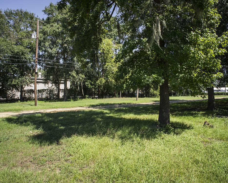
Walter Scott, Charleston 9:30am, 2018, taken in 2016, by Kris Graves. Photo by Kris Graves/Kris Graves Projects.

While all of these places could, literally, be anywhere. This scene really is. It’s downright chilling in its seeming innocence, and so, brought the series to a powerful conclusion in the Hive online piece. This innocent, peaceful, lovely park already hides a deep, dark secret of what happened under that tree. Already, a few years have passed and there’s no sign, or remembrance, of what happened here. My mind went back to Richard McGuire’s 2014 graphic novel, Here (Pantheon Graphic Novels), a book about the history of the corner of one room over hundreds of thousands of years and everything that happened there over the millennia. Having spent the better part of the past year looking at the work of the so-called “New Topographics”, this image, Walter Scott, Charleston 9:30am, suddenly struck me as, both, the ultimate culminating “New Topographic” image, a most horrible possible conclusion to the “movement.” Having seen it, I can’t get it out of my mind. Of it, Thomas Chatterton Williams writes in A Bleak Reality

“Walter Scott was killed in an empty field in an unremarkable suburb north of Charleston. It is nerve-racking to walk into that field, because it is difficult to tell if it is private or public property. It feels terrible to walk in the same line of fire as Scott did in order to make the photographs. The photo shoot was not a long one.”

Unlike the other locations, the only building is in the distance, behind a fence. It’s as if everything in the scene has been stripped away to a bare stage, where the murder takes place. There’s nothing to distract the viewer from thinking about what happened here. A Bleak Reality is highly recommended, and with only 150 copies printed, I wouldn’t wait long to get one. As I write this, virtually every other book of Kris Graves’ work has sold out.

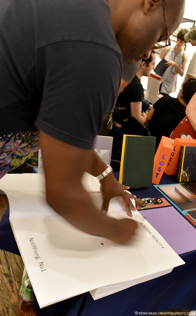
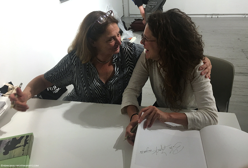
Making history. Kris Graves signs A Bleak Reality. Mr. Graves is really good about making sure as many of his publications as possible get signed by the Artists. It’s a really nice touch buyers and collectors appreciate.

The LES FotoBook Fair also shows how in touch Mr. Graves is with the larger Photo community Will Glaser spoke of. This manifests itself in the talented roster of Artists Kris Graves Projects has published and in the group of publishers he was able to attract to join him and Michael Foley in presenting such an auspicious event.

“Looking forward to the next one,” was the recurring theme I heard from almost everyone I asked about the show. Me, too.

*-Soundtrack for this Post is “Can I Kick It?” by A Tribe Called Quest.

NighthawkNYC.com has been entirely self-funded and ad-free for over 6 years, during which over 250 full length pieces have been published. If you’ve found it worthwhile, you can donate to keep it going & ad-free below. Thank you!

Written & photographed by Kenn Sava for nighthawknyc.com unless otherwise credited.
To send comments, thoughts, feedback or propositions click here.
Click the white box on the upper right for the archives or to search them.
For “short takes” and additional pictures, follow @nighthawk_nyc on Instagram.

Subscribe to be notified of new Posts below. Your information will be used for no other purpose.


Behind Closed Doors With Saul Leiter

Written & Photographed by Kenn Sava (*unless otherwise credited)

One of the few good things about being out on a rainy day is that I use the opportunity to look around and see if I can see a “Saul Leiter.” Maybe the rain is being reflected off the pavement glistening in some unusual shade of neon, or a bright red umbrella will slice through the grey air unexpectedly, or I’ll see shapes abstracted through a misty cab window and try to figure out what they are…the possibilities are seemingly endless…

Outside the galleries…July, 2018.

Given how popular Saul Leiter has become, I doubt I’m the only one who does this.

Street Scene, 1959, by Saul Leiter, seen at the Howard Greenberg Gallery Viewing Room. Saul Leiter started out to be a Painter. To my eyes, works like these brilliantly walk the line between abstraction and realism, showing how abstraction is all around us in the “real world,” in ways, perhaps, only Ernst Haas was doing at the time, among Photographers. Meanwhile the “New York School” of Abstract Expressionists, including his friend, Richard Pousette-Dart, was revolutionizing Painting.

Of course, Saul Leiter (1923-2013) was able to make great Photos in any light, and included among them, he struck me as having a unique way with inclemency. It’s just one way that he’s impacted the way I see the world. For those who love Saul Leiter’s work, too much of it is never enough. So, the chance to see more is an event. Recently, two such chances appeared- a show at Howard Greenberg Gallery, which was accompanied by the release of a new Steidl book, both titled In My Room.

Self-Portrait with Inez. The first Photo in the book and the only time the Artist appears in it. *Photo courtesy the Saul Leiter Foundation and Steidl.

They center around a body of work that almost no one saw during the Artist’s lifetime, a collection of “intimate” Photographs taken of his female friends, often in various stages of dressing/undress. The show adds a second body of seldom seen work, Saul Leiter’s “Painted Nudes,” works that consist of black & white prints from the “intimate” series that he then hand Painted. First shown in the U.S. in 2014, to date they are the only body of Saul Leiter’s Paintings we’ve gotten to see. Having only seen them in the book “Saul Leiter: Painted Nudes,” which was released in 2015, this was my first time seeing some of them in person.

Inez, c.1947. One of the earlier works in this show.

Saul Leiter took thousands of nude Photographs of his friends and lovers between about 1947 through the early 1970s. Perhaps the first thing that’s interesting about them is they’re in black & white, though he worked exclusively in color during most of that period. Why are these then in black & white? The best theory I’ve heard is that he was able to develop and print them in his home darkroom, and could, therefore, keep them private. As a result, almost no one saw them. One of the few who did was his former art director at Harper’s Bazaar, Henry Wolf, who wanted to publish a selection of them as a book in the 1970’s. It didn’t come to pass then. By this point, Saul Leiter had fallen into eclipse. A total eclipse that had him completely out of the view of the public.

“I spent a great deal of my life being ignored. I was always very happy that way. Being ignored is a great privilege. That is how I think I learned to see what others do not see and to react to situations differently. I simply looked at the world, not really prepared for anything1.”

He got his wish, but It wasn’t always so.

The great Photographer Edward Steichen, then Director of Photography at MoMA2, included 5 works by Saul Leiter in his 1953 group show, Always the Young Stranger, the title a line borrowed from Carl Sandburg, who the show was intended as a 75th Birthday tribute to. He subsequently went on to a long career in fashion working for some of the most renowned publications of the time, until one day, he walked away, fed up with the micro-management that had crept into his shoots. He was rarely seen again until Steidl released the instant classic, Saul Leiter: Early Color, in 2006, launching the Saul Leiter renaissance. Now in its 8th edition, Early Color was followed by Early Black & White, in 2014, a year after Saul Leiter passed away, a week short of his 90th birthday. Now, In My Room brings Henry Wolf’s idea full circle. It’s dedicated to him.

Saul Leiter: In My Room, just published by Steidl. 148 pages, 81 images.

Saul Leiter is often referred to as “a pioneer of color Photography.” What, exactly, do they mean? Apparently he, too, was puzzled. “I’m supposed to be a pioneer in color. I didn’t know I was a pioneer….,” he told Time Magazine, in 2013. Fascinated by the history of color in Photography, I’ve spent most of this year researching it, which may help me understand what they mean. The story of color in Fine Art Photography is one that has only gradually, and relatively recently, been coming more to light. So entrenched has black & white Photography been in the Art world, that it seems that many Photographers kept their color work to themselves, when it wasn’t commissioned for magazines. It makes me wonder- if color film had been invented first, would black & white still have dominated? Maybe in media where color printing/reproducing technology hadn’t yet been invented, but in the world of Art? I wonder. In the world of Painting, even going back to ancient times, the Artist was working in color. Interestingly, Drawings (which are most often in pencil, and hence, in black & white) are often seen and still treated as “preliminary works” to something more “finished,” even when they ARE the final work. A preference for black & white imagery exists nowhere else in the world of Art besides the place it held in Photography until the 1970s.

New York City, USA, 1953. It’s got to be by Saul Leiter…right?

Meanwhile, Steichen in Color Portraits, Fashion & Experiments by Edward Steichen shows the aforementioned Edward Steichen’s color images from 1908!, on. Jacques-Henri Lartigue began making color images in 1912. Ansel Adams was making color images in the 1940’s, as was Keld Helmer-Petersen, who’s book Keld Helmer-Petersen: 122 Colour Photographs: Books on Books No. 14, released in 1948, will astound lovers of William Eggleston and Stephen Shore. Eliot Porter was making them in the 1950’s…And then there is Ernst Haas. It was Ernst Haas, and NOT William Eggleston who was given the FIRST show of color Photographs ever at MoMA in 1962, a full 14 years before Photographs by William Eggleston!, and its classic accompanying catalog William Eggleston’s Guide, finally marked the beginning of the acceptance of color Photography into the world of Fine Art Photography. Haas’ abstract works of the 1950’s on were seen in the terrific Steidl book, Ernst Haas: Color Correction: 1952–1986, that reveals another side of the Artist, one who loved abstraction, that stands in contrast to the somewhat staid image many had, and still have, of Ernst Haas. In fact, the image just above is not by Saul Leiter. It’s New York City, USA, 1953, by Ernst Haas, from Color Correction! There are, no doubt, others who will still come to light, as Fred Herzog, who also took color Photos of Vancouver in the 1950’s, has more recently (Mr. Herzog is an admirer of Saul Leiter’s). Helen Levitt Photographed NYC in color in 1958-9, but, unfortunately, most of those images were lost in a fire. She later went back out and shot the images included in the terrific book, Slide Show: The Color Photographs of Helen Levitt.” So? Saul Leiter was one of the first Photographers to take color Photographs on the streets in NYC, and so, he is a pioneer, though he is not a “street Photographer” like Robert Frank or Garry Winogrand3. His was an Artist’s eye, and that’s on view in all of his work, inside and outside of his Apartment, in Photography and in Painting, and, in my view, has a difference effect than street Photography does.

“They’re people who are driven by the notion…they sacrifice everything for success. I didn’t feel that way. I attached more importance to the idea that there might be someone who might love me and who I might love4.”

Both works are titled Soames, c.1960 featuring his long time lover and partner, the Artist Soames Bantry. Perhaps as close as Saul Leiter got to finding that person. A number of these images take advantage of furnishings, windows, or items in the apartment. Here both shots feature the same mirror.

I had those words in my mind as I walked through “In My Room” at Howard Greenberg. I’m not sure there’s really any other way to look at these images. Yes, we see them as “Fine Art” now, but back then they were among the most personal images Saul Leiter ever created, and his statement, above, speaks as much to what may have been one his mind in creating them as anything else I’ve read does. In the new Steidl book, the images are not captioned or dated, and the subject is not identified. And so, the book becomes a sort of scrapbook of intimate moments Saul Leiter shared with these women- lovers, and friends who felt comfortable being nude with him.

Installation view of In My Room.

As such, they’re intimate beyond the nudity. The women, obviously, feel free to be themselves while the Artist approaches taking their pictures in ways that will look familiar to those who know his color work, where it often feels like he is almost eavesdropping on his subject. Here, and in the book, it feels as if he is always watching them. But, it’s not mutual. by my count of the images in the book, out of 81, only in 14 do the women make eye contact with him, in 18 they appear to be asleep, and in a further 11 they’re awake but lying down. In 44 they are nude or topless. Abstraction plays a lesser role here compared with his more familiar color work, but it’s here in the unusual camera angles he uses, and in seeing his subject through doors, furniture, or in mirrors. But posing is never going on here. The natural postures are striking, completely unlike anything you’d find in texts about Drawing or Painting from live models. This is particularly fascinating given that Saul Leiter was, also, a Painter who revered Vermeer5.

Pierre Bonnard, Mirror on the Wash Stand, 1908, Oil on canvas. Early on, Bonnard was a founding member of the avant-garde group Les Nabis. *Unknown Photographer.

Roger Szmulewicz, Director of Gallery Fifty-One, Antwerp, who have represented Saul Leiter, and now his Foundation, since at least 2008 (Howard Greenberg Gallery, who have been showing Saul Leiter since at least 2006, is the other representative of the Saul Leiter Foundation), said, “The influence of his Painting on his Photographs is made apparent when the two are present side by side6.” As they are in this show, though the Paintings are not his “pure” Paintings, but created on existing Photographs. When I look at these works side by side (the Photos and the “Painted Nudes”), it is possible to see the influence of another of his favorite Painters, Pierre Bonnard (1867-1947). Saul Leiter was 24 when Bonnard passed away. There was a posthumous exhibition of Bonnard’s work at MoMA in 1948 with over 150 items, 2 years after Saul Leiter moved to NYC from Pittsburgh to become a Painter, so it’s possible he saw it. Interestingly, these “intimate works” seem to begin around 1947, shortly after he began taking Photographs.

Snow Scene, 1960

Saul Leiter’s color work is renowned for the astonishing way he uses color, but it seems to me that it’s equally impressive for his breaking of the “rules of composition.” His subject will be seen off center, or not complying with the “rule of thirds,” or be in shadows (even partially obscured as above), behind or visible through an object, window or mirror in the foreground. Sometimes, these foreground hindrances act as “curtains,” perhaps, a distant echo of Vermeer’s use of curtains.

Kathy, 1952.. Inscribed on the back- “In the collection of the Museum of Modern Art.”

Most intriguingly for me, Saul Leiter, like William Eggleston, Henri-Cartier Bresson and others, is another great Photographer who was also a Painter. My opinion is that being a Painter played an important role in the impact of their Photography, and is very possibly a reason why their work “looks different” from many other Photographers. When I see a Leiter or an Eggleston, it often feels to me that they are doing things they don’t do with Paint. Focusing on a detail that would seem to be too slight or unimportant for a whole Painting, or capturing a fleeting moment when light, setting and people are aligned for a split second. Or, in his “intimate” indoor work, capturing postures that are rarely seen in Paintings, perhaps, because they can’t be held long enough.

Barbara, 1950, left, Soames, c. 1960, top right, Untitled, 1950s, bottom right.

Saul Leiter is not often thought of as a portraitist, but he did them over his long career7. The portraits included here are beautiful, typically different but wonderfully evocative.

Inez, c.1947.

The lighting in these works is the natural light coming in through the large windows or the electrical lights in his apartment. No flash or extra lights.

All in all, the “intimate” series presents a remarkable tour de force of possibilities, of living in the moment, and of working creatively with whatever that moment presents to you, which is, of course, exactly what we see him capturing outside on the street in Early Color, but minus the personal element, which is entirely absent there. Those subjects are not connected, either to each other or to the Photographer. Here they are.

Barbara and Bettina, c.1950.

We’re told going in that these women are lovers and friends of Saul Leiter, though it might be hard to see that in these works. The Artist appears with one of the women in only two Photos (one in the show, and one in the book). There is no interaction beyond an occasional glance. There is comfort, obviously, but nothing is being done together. There is affection, but no romance or anything more. And so, when all is said and done, the overriding feeling I come away with is a sense of isolation on the part of the subject and the Photographer.

Inez, c.1947, left. Inez c.1947 above, right, and Self Portrait with Inez, c.1947, bottom right.

To outsiders, these Photos show the relaxed, natural beauty of his friends, in studies and portraits of them in the moment, and moment to moment.  Though they are “intimate,” no love or physical intimacy is taking place in them. Maybe it already has, or is about to, and what we’re seeing in a number of these works is the moments after, or before. A number of the Photos in the show are not in the book. Whatever the case may be, since he knew these women, they are momentos of intimacy, and possibly, momentos of moments where that search for “someone who could love me” was close at hand, proof that it WAS possible to find.

Then, there were the “Painted Nudes.”

A selection of works from the “Painted Nudes” group. All of these works are gouache, casein and watercolor on silver gelatin paper.

The “Painted Nudes” are often revelations. They look like nothing else I’ve seen. Here and there one might spot a passage reminiscent of Degas, but the brushwork, and the choice of color, is daring…free and exciting, at times reminiscent of his beloved Pierre Bonnard (particularly his lateSelf Portrait, 1939-42), but always wholly in his own style. The paint bursts with energy…motion…even when the woman is lying at rest. Seeing some of them for the first time, I wondered why the great Richard Pousette-Dart steered Saul Leiter to Photography. Not that I’m questioning the judgement of the most overlooked Abstract Expressionist, not enough of Saul Leiter’s Painting has been placed before the public to form any full sense of his talent and the scope of his achievement.

Untitled, 1970s-90s

Of Painting, Saul Leiter said, “I sometimes thought that maybe I would have been a better photographer if I were not a painter. And then sometimes I thought that maybe if I were not wasting my time doing photography maybe I’d be a better painter. But, in the end, I did both. I enjoy taking a brush and making a mark. Then making another mark. It’s a little bit almost like jazz, you know? You don’t know what you’re going to do8.”

Untitled, 1987. Unprecedented. About as abstract as anything the Abstract Expressionists were doing, but with a Photo added.

Of the group on view at Howard Greenberg, I find the best of these works to be terrific and they left me longing to see Saul Leiter’s “other” Paintings that are not done on top of Photographs. They may well be yet another body of Saul Leiter’s work that has gone under-appreciated for too long. Wouldn’t that be something if Saul Leiter turned out to be a great Photographer AND a great Painter?

Untitled, 1970s-90s.

At the moment, Saul Leiter has rapidly been ascending to his rightful place as one of the Master Photographers of the 20th Century. Having been forgotten for decades of his life, it now seems highly unlikely the world will forget Saul Leiter again.


BookMarks-

Steidl’s series of books share the same book design as Early Color, which was done by Martin Harrison. If it ain’t broke…

Saul Leiter: Early Color” is the place to start exploring the work of Saul Leiter. Just reissued in its 8th edition, in my view, it is one of the “must have” PhotoBooks released thus far this century. For a wider view of his work, pairing “Early Color,” with Steidl’s “Saul Leiter: Early Black and White” provides a good overview of his non-commercial Photography- at least as far as his large body of his work has been reintroduced to us thus far, especially while the latter is still in print. To supplement these, “Saul Leiter – All About Saul Leiter (Japanese and English Edition),” the catalog for a Retrospective in Japan last year, is a gorgeous, small, 300 page volume. Rumor has it that it is to be released in the USA later this year, but the original edition was named one of the 3 best PhotoBooks of the year by no less than Photographer Todd Hido. Two other retrospectives of note are much harder to find, especially at cheaper prices- Saul Leiter (Retrospektive/Retrospective published in 2012 by Kehrer Verlag is a 300 page volume that’s a full 9 by 10 inches. Second, there is the catalog for the show at the Henri Cartier-Bresson Foundation they co-published with Steidl in 2008, simply titled Saul Leiter. At 150 pages it’s a smaller retrospective, but benefits from a beautiful Steidl production. Finally, Saul Leiter: In My Room offers the best look we’re likely to get at Saul Leiter’s “intimate” work and nudes. Just published by Steidl, it includes 81 Photos, with only a few previously seen in Early Black & White. It’s far and away the most intimate and personal collection of Saul Leiter’s work. For the rest of us, who didn’t know these women, it’s something of a classic of the unguarded moment, filled with marvelously unconventional poses and compositions. It fills out our picture of Saul Leiter’s accomplishment, adding a very personal group of works that held a very special place in his life to those, largely impersonal work seen previously. It is another book that will surprise and enthrall his growing number of fans. Finally, Painted Nudes, published by Sylph Editions in 2015 is something of a sleeper. To date, it is the only book length collection of his Painting thus far released. Consisting of  black & white prints of nudes from the “intimate” series the Artist then hand Painted, as I said above, it leaves me yearning to see more of his Painting.

Regarding Ernst Haas, Color Correction is out of print and fine copies are trading for hundreds of dollars on the secondary market. However, if you look hard, there’s a little known French edition that’s still in print and available for about $60. I’ve compared them and they contain the same images, the same number of pages, but the introduction and the essay are in French. Steidl is about to release a new book, Ernst Haas: Abstrakt, which will include 118 of his abstract images and so is certainly a book anyone interested in Mr. Haas should check out.

*-Soundtrack for this Post is “In My Room,” by the Beach Boys, which they wrote during the time Saul Leiter was taking his “intimate” Photos, as performed by the amazing Jacob Collier -an Artist who created this entire recording in his room!

My thanks to Monika Condrea and Steidl.

NighthawkNYC.com has been entirely self-funded and ad-free for over 6 years, during which over 250 full length pieces have been published. If you’ve found it worthwhile, you can donate to keep it going & ad-free below. Thank you!

Written & photographed by Kenn Sava for nighthawknyc.com unless otherwise credited.
To send comments, thoughts, feedback or propositions click here.
Click the white box on the upper right for the archives or to search them.
For “short takes” and additional pictures, follow @nighthawk_nyc on Instagram.

Subscribe to be notified of new Posts below. Your information will be used for no other purpose.


  1. “Saul Leiter,” 2008 Co-published by Steidl and the Foundation Henri-Cartier Bresson
  2. from 1947-61, when he was succeeded by John Szarkowski, who went on to be a major shaper of the world of modern Fine Art Photography, and who he selected for the post.
  3. Saul Leiter is barely mentioned in Joel Meyerowitz & Colin Westerbeck’s Bystander: A History of Street Photography,” Joel Meyerowitz is, also, a Photographer who worked with color early on, beginning in 1962.
  4. Saul Leiter quoted in the introductory video on saulleiterfoundation.org
  5. “My favorite Painter is Vermeer,” Saul Leiter: I just want to be left alone, Published 2015, Interview with Sebastian Piras in 2009
  6. “Saul Leiter Photographs and Works on Paper, Gallery Fifty-One, P.3
  7. Including a fascinating series of Diane Arbus in 1970, in her own space, that (not nude) have an intimacy akin to that seen in these works.
  8. School of Visual Arts interview, 2013

Three Years of NighthawkNYC!

Written & Photographed by Kenn Sava

July 15th, 2018 marks the third Anniversary of NighthawkNYC.com. Almost 200 pieces in (24 full length pieces thus far in 2018 alone!), I feel like a largely different person today- wholly as a result of this site. I’m not talking about the full time job it became early on, one that swallowed my “life” such as it was whole, in one gulp. I’m talking about all the learning that’s happened from assimilating all I’ve seen, read, and heard. It’s time to pause and reflect.

Art Heaven. “Hey, man. Question- How do you get all of those empty gallery shots?” The answer? Patience. That’s right. I pick my spot and wait until I get it. Just go when it’s not likely to be packed! This one of the Grand Staircase at The Met in February might be my favorite. It makes it feel like it’s open just for me.

First, and foremost, my thanks to all of you who take the time to read these pages. Over three years, I’ve heard from many of you, and I appreciate your taking the time to write, offer feedback, comments and support.

Two generations of Magnum Photos. The legendary Susan Meiselas, left, a former Magnum Photos President, and the creating-her-own-legend-as-we-speak, Bieke Depoorter, right, one of Magnum’s newer members, at Aperture, June 15, 2018.

Thanks to the Artists who have taken their valuable time to speak with me as I work on these pieces, and then after to give me their feedback. 

The great Sanle Sory, all the way from Burkina Faso, graciously poses for me at the opening of the terrific show of his studio portraits from the 1960s to the 80s at Yossi Milo Gallery on April 26. He’s every bit as nice as he is talented. And that’s saying something.

After long thought and discussions, I recently added a Paypal Donation button, accessible by clicking the white box at the upper right of the screen to help defray expenses and keep this site ad-free and independent. I want NighthawkNYC to be about Art, Music and Life, and having written for a national Music magazine for 4 years, I relish the independence I now have. Being independent means I get to write about shows that speak to me, and hopefully others, shows that I feel are important.

Yayoi Kusama, Infinity Mirror Room, at David Zwirner, December, 2017. I waited over 2 hours on a frigid day to spend the 60 seconds visitors were permitted in this space. Hmmm…

It also comes with responsibility. As you may have noticed, I don’t write about shows I don’t like, or that don’t speak to me. Why? I don’t believe in being negative. It’s very hard to survive as an Artist or Musician in 2018. I prefer to revisit things that don’t speak to me now in the future and reassess. I’ve discovered a lot of great Artists that way. Part of my goal with this site is to give those who don’t have a chance to see these shows a sense of what they were like. Of course, given the sheer volume of shows going on in Manhattan (let alone the rest of the City and now New Jersey), there’s just no way I can cover all of them. I have to be selective. While I have included Artists who are not “big names” yet but are doing great and/or important work that I feel deserve to be better known, I’d like to ramp this up going forward. I’m always looking for “candidates.”

Photography has taught me to open my eyes and look more carefully at the world around me.

Looking back over these 3 years, it’s obvious that the amount of coverage I’ve given to Painting has been on the decline, while Photography has, almost, taken over. Two years running, I have had the most extensive coverage of The Photography Show/AIPAD anywhere. (2017, here. 2018, here). What can I say? It’s a symptom of my seeing fewer and fewer Painting shows in the galleries that speak to me. Painting remains my favorite Artform, so this pains me very much. On the other hand, given that there are more cameras in the world than people, that people are living and working longer, that Photographic technology has been growing and evolving as never before in this century, it’s all combined to create an almost perfect storm, putting us, it seems to me, in a “golden age” of Photography. A big part of what’s created this moment is that Photography is (often) best seen in PhotoBooks and not on gallery or museum walls.

Dashwood Books in SoHo carries nothing but PhotoBooks.

This has led to an unprecedented explosion of PhotoBooks from famous and unknown Photographers and PhotoBook publishers big, small and D.I.Y. Somewhat remarkably, this is a movement that has almost entirely resisted electronic books (eBooks) in favor of good ole physical books. In fact, the publishers I spoke to at AIPAD this year UNANIMOUSLY told me they have NO intention of going to eBooks! This has brought an unprecedented number of Photographers into the consciousness of the world at large, whereas in the past, great Photographers (like Saul Leiter, Fred Herzog and many others) worked for much of their lives completely ignored. It is now possible to see more Photographs by more Photographers in a visit to a good bookstore than it is to ANY museum or gallery in the world. This is more than a publishing revolution. It’s an indication that the way Artists reach their public is changing, something that could have huge ramifications for the Art World as a whole. Buckle up! It’s going to be utterly fascinating to see how this plays out.

10:26pm at the world famous Strand Bookstore’s Art Book Department. 4 minutes before closing. The last one out, again. I’m here an average of 4 times a week. Some weeks more.

And so, as you may have also noticed, books have come more and more to the fore. I’ve always mentioned them. In response to requests I’ve gotten for recommendations of places to start delving into an Artist, I decided to devote a section at the end of the piece I call “BookMarks” to recommended books. Of course, many Artists have extensive bibliographies (and then there’s Picasso…or Daido Moriyama), so it’s often hard to decide where to start. I decided to share my thoughts since I generally look at as many books as I can find on an Artist I’m writing about, and I wind up living with a good many of them (cough). As far as I know, I was the first one to bring to public attention that Chris Ware’e superb book Monograph comes in a limited, signed, edition. Even the publisher, Rizzoli, made no mention of it. I heard from a number of you who were subsequently able to get a copy. Though “BookMarks” is new, I want to thank Monika Condrea and Steidl, the world’s premier PhotoBook publisher, for their support, and the Guggenheim Museum for their support of my Chinese Contemporary Art & Danh Vo pieces.

Amerika the Stoker, 1993-94, by my late friend, Tim Rollins & K.O.S. seen in American Landscape at Lehmann Maupin in May, 2018.

Three years later, in addition to being fortunate enough to have seen so many amazing shows, meeting so many Artists and speaking to so many art lovers, gallerists and scholars, as it was when I started NHNYC, the main joy for me remains learning- discovering someone new and great I didn’t previously know and/or discovering a new great work by, enlightening fact about, or gaining a new insight into an Artist I do know.

Her shirt reads “Something good is worth finding.” It could be my mantra.

In mulling it all over? If there’s one thing I have learned it’s that there’s A LOT to learn, see, explore and even enjoy. Three years in? As the song, “The Rhythm Changes” says, I’m still here, but I’ve only scratched the surface. 

“Are we there yet?”

*-Soundtrack for this Post is “The Rhythm Changes,” by Kamasi Washington & Patrice Quinn from The Epicgenius.com commenter, Crown_of_the_Barren-Synod said of this track, “While our opinions, beliefs, physical characteristics and even our personality can change with time there is still some being- our self- which transcends all of these characteristics and their transience.”

Special Thanks to Kitty for research assistance.
Special Thanks to Sv for pushing me to begin, and since, for her support.

NighthawkNYC.com has been entirely self-funded and ad-free for over 6 years, during which over 250 full length pieces have been published. If you’ve found it worthwhile, you can donate to keep it going & ad-free below. Thank you!

Written & photographed by Kenn Sava for nighthawknyc.com unless otherwise credited.
To send comments, thoughts, feedback or propositions click here.
Click the white box on the upper right for the archives or to search them.
For “short takes” and additional pictures, follow @nighthawk_nyc on Instagram.

Subscribe to be notified of new Posts below. Your information will be used for no other purpose.