Inside Kris Graves Projects’ Monumental LOST II

Written by Kenn Sava. Photos by Kenn Sava & Kris Graves Projects

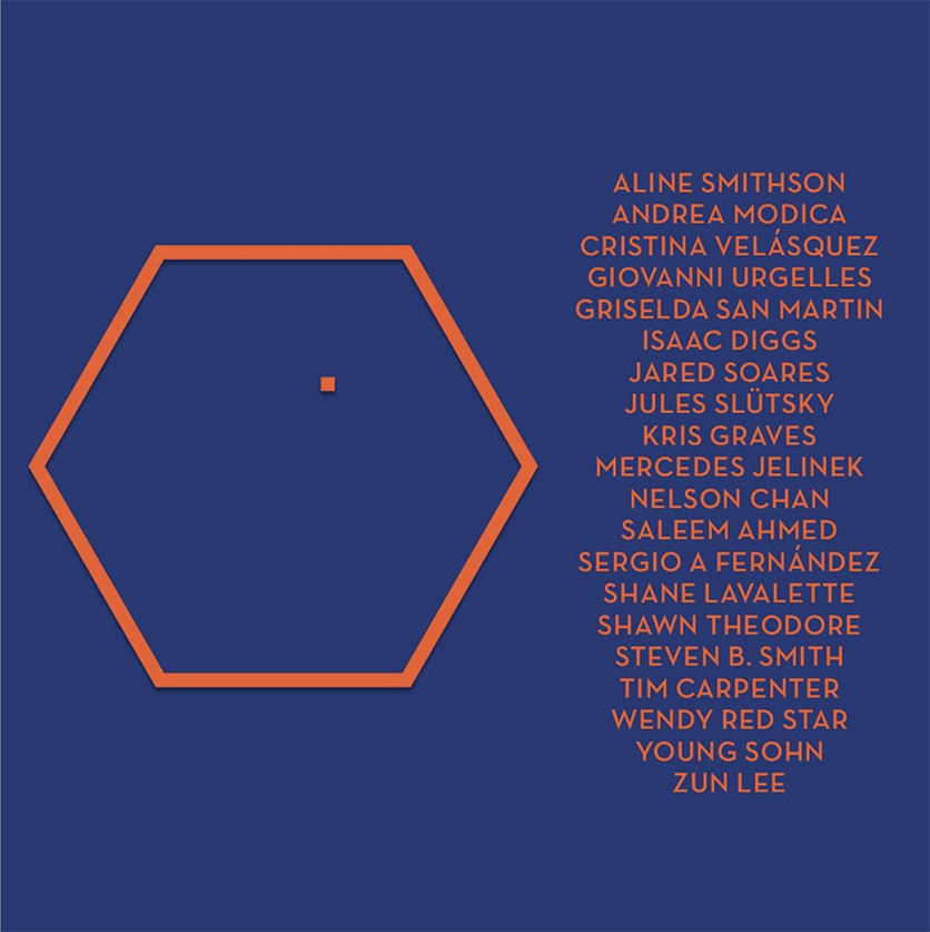
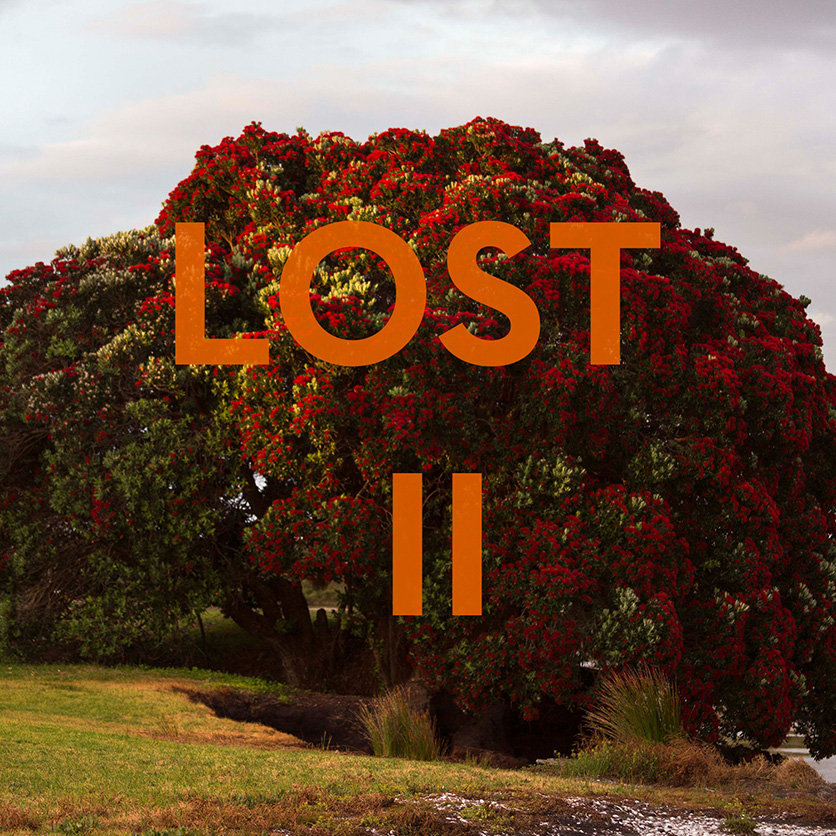
Slipcase Cover for the newly announced 20 volume set, LOST II. Click any Photo for full size.

Kris Graves, and his publishing company, Kris Graves Projects (+KGP), shocked many in the Photography and PhotoBook world when he released the ten-volume set, LOST, almost exactly a year ago. The shock at its size quickly turned to admiration once the quality of the individual books it included set in. I was as impressed by the overall vision that unified the project across those 10 books as I was the work of each of the 10 Photographers it included. Alphabetically by city, LOST consisted of-

The covers of the 10 volumes of LOST, 2018

Beijing by Lois Conner
Berlin by Andreas Gehrke
Boston by Michael Cardinali
Calcutta by Laura McPhee
Chicago by Owen Conway
Long Island City by Kris Graves
New York by Lynn Saville
Omaha by Zora J Murff
San Francisco by Luke Abiol
-and Seattle by Joseph P. Traina

Then, there was the daring of a company that’s not yet one of the “big names” in the PhotoBook world (let alone possessing their resources) the set represented. That +KGP marshalled the wherewithal to pull off such a set was equally stunning. LOST made my NoteWorthy PhotoBooks of 2018 list, and probably some others, for all of these reasons. As memorable as it was and remains, even it didn’t prepare me for the news that Kris Graves Projects was about to release LOST II- consisting of TWENTY VOLUMES! Shaking my head in wonder, this time I was determined to find out- “HOW do they do it?”

I reached out to some of the Artists involved, and I visited Kris Graves at his Long Island City studio, where I found him hard at work putting the finishing touches on the set that he was about to send off to Spain to be printed, under the watchful eyes of +KGP team member, Pablo Lerma.

LOST II Slipcase cover verso.

As a result, this piece marks the first time I’m writing about books I haven’t physically seen. Even without having books in hand, from everything I have seen thus far, it’s apparent to me that LOST II is going to be nothing short of monumental, in ways beyond its 7 1/2 pound size (for the full set in its heavy duty slipcase). For one thing, it’s already apparent that, it’s different from LOST, and that’s as it should be. After all, LOST already stands on its own- why repeat it?  This time, it seems less about the place, per se, and more directly involved in what it’s like for the people who actually live in it. Tough no place is revisited, the basic premise remains- Each of the, now twenty, Photographers contributes a book of Photographs taken in one city around the world. LOST II will include-

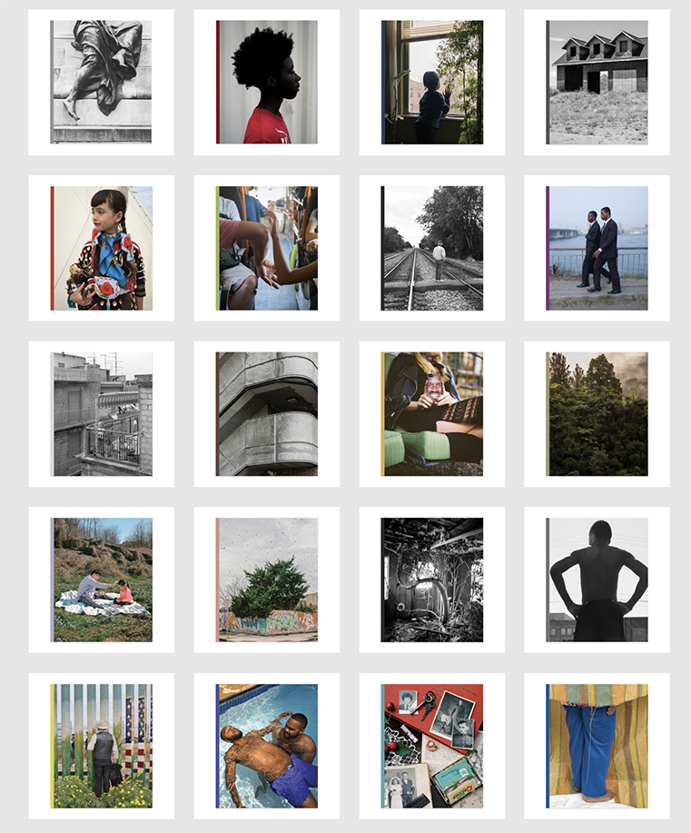
The covers of LOST II. Top row, from left-Washington DC, Birmingham, The Bronx,  Colorado City. Row 2- Crow Country, Hong Kong, Illinois Central, Lagos. Row 3- Lentini, London, Los Angeles, New Zealand. Row 4- Ossining, Philadelphia, Spruce Pine, Syracuse. Row 5- Tijuana, Toronto, Uzhhorod, and Viterbo

A link to a preview of each book is included in the list, below-

Birmingham by Shawn Theodore
The Bronx by Kris Graves
Colorado City by Steven B. Smith
Crow Country by Wendy Red Star
Hong Kong by Nelson Chan
Illinois Central by Tim Carpenter
Lagos by Isaac Diggs
Lentini by Andrea Modica
London by Sergio A. Fernandez
Los Angeles by Aline Smithson
New Zealand by Young Sohn
Ossining by Giovanni Urgelles
Philadelphia by Saleem Ahmed
Spruce Pine by Mercedes Jelinek
Syracuse by Shane Lavalette
Tijuana by Griselda San Martin
Toronto by Zun Lee
Uzhhorod by Jules Slutsky
Viterbo by Cristina Velasquez
Washington DC by Jared Soares

Even though LOST II is BIG, I can feel the world getting smaller. I’ll explain. First a quick recap by way of providing some background for those wondering what it’s all about…

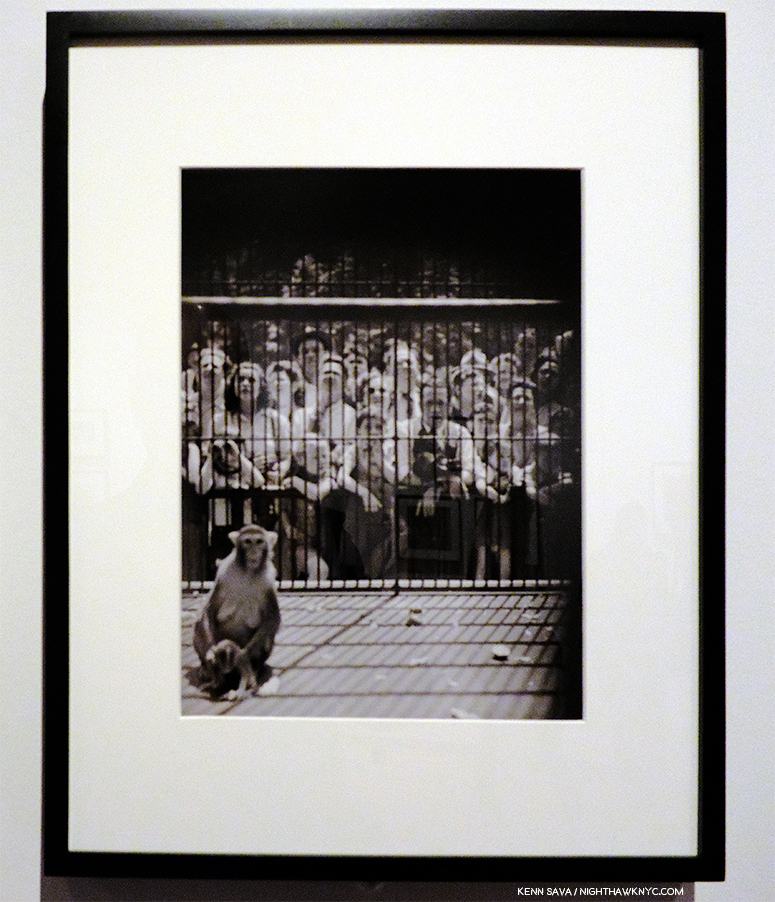
Kris Graves, 4 works from A Bleak Reality, 2018, +KGP

Kris Graves and his work were introduced to me when I came across four of his Photographs in the All Power: Legacies of the Black Panther Party Exhibitionmemorably curated by Michelle Dunn Marsh at The Photography Show (AIPAD) in April, 2018. The work, a series taken at the locations where young black men were murdered by police (since published in his book, A Bleak Reality,+KGP, 2018), stopped me cold. Enquiring at the show’s info desk I discovered that Mr. Graves was ALSO a publisher AND he had a table in the book section.

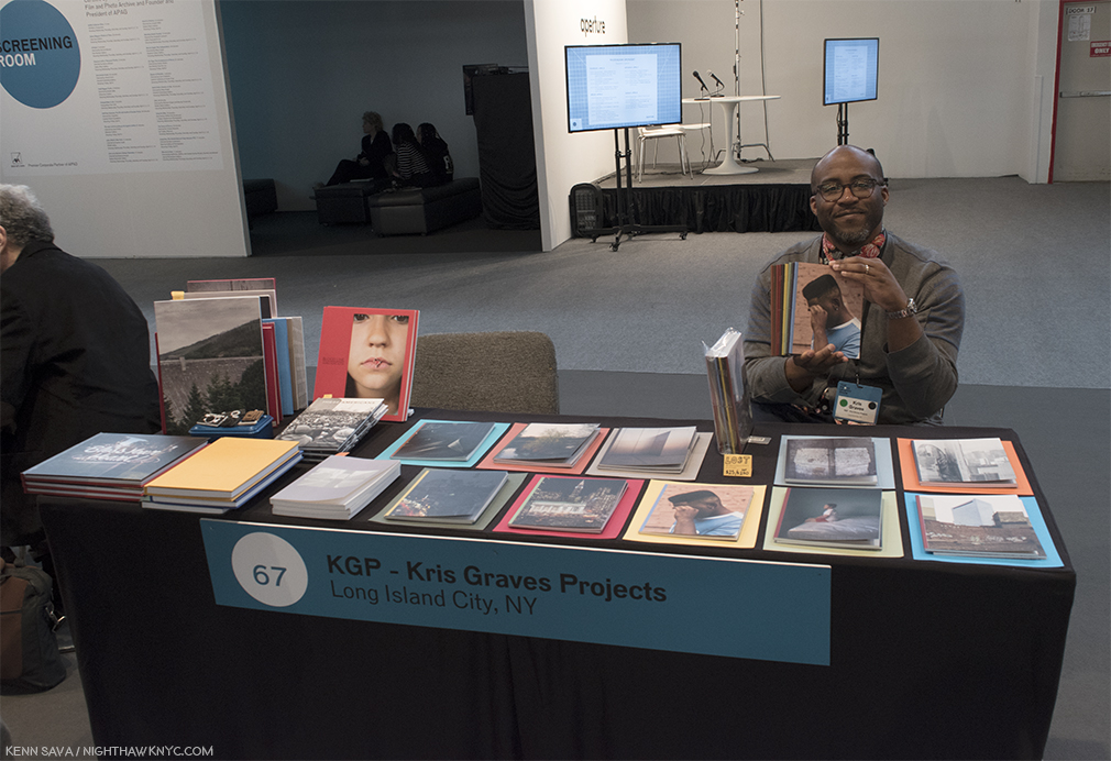
Kris Graves holds a set of LOST, with its individual component volumes displayed in front of him, at the Kris Graves Project table at AIPAD, April, 2018.

Walking over, indeed, there he was. After “Hellos,” I saw the newly announced 10 volumes of his then latest project, LOST, displayed in front of him. Perusing them, as accomplished as his Photography is, I was equally shocked to discover the quality of the books he published. I subsequently wrote about the experience here. One year into following both his own work and the books +KGP has produced my respect and admiration has continued to grow. I went to the LOST book release party shortly after AIPAD, where I met some of the Artists included in the series and bought my own set. LOST quickly sold out and is now something of an Urban PhotoBook Legend given how often I hear it referred to.

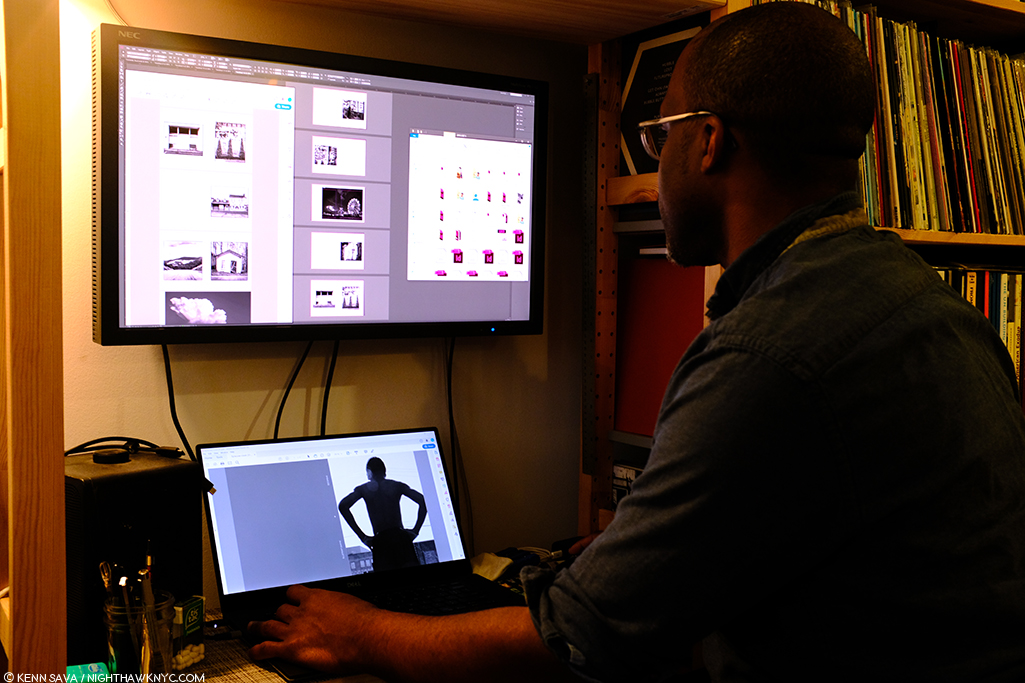
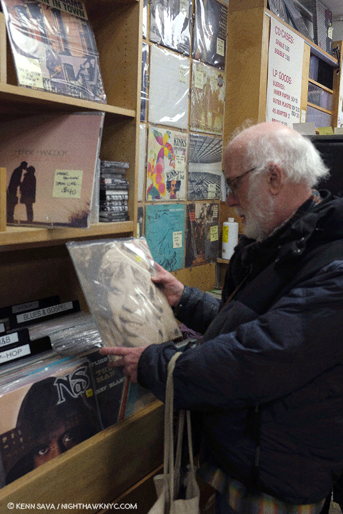
Kris Graves hard at work while talking (and selecting tasty vinyl from his impressive Lp collection), finishing up LOST II before sending it off to be printed in Spain on February 13, 2019.

Curious about how these bodies of work came about, I asked Kris if they were work that the Artists coincidentally happened to have on hand, or if any created them based on discussions with him for LOST II? He said, “I have interest in cities in general and I am always interested in seeing a new place through a strong artist’s point of view. Many of the chosen artists call a few places home, and they had the freedom to show me any work they felt made a good series. Some artists made new work for the project, which is flattering. Most artists have been working on these series’ for a long time, even decades. All of the artists have had the freedom to create these projects. I help with some sequencing suggestions and layout. These are editioned art pieces.” On LOST II’s roster, he added, “…this list of artists is stellar and I am humbled that they trusted me and the project. I’m still in the heart of it and can’t choose a project over another. I can say that Steven B. Smith’s project Colorado City is going to raise some eyebrows and Andrea Modica’s Lentini and the 8 x 10″ view camera work within makes me with these books could be larger in size. And to keep it ultra-real, I keep the project Purchase College strong with the monographs Ossining by Giovanni Urgelles, Uzhhorod by Jules Slutsky, and Spruce Pine by Mercedes Jelinek. I can’t wait for you to see these, I am excited to even talk about them.”

A lovely, early, +KGP promo image for LOST II, now lost, itself. I think it fell into that sink hole in front of the tree.

When I last spoke to Kris about it this past fall, LOST II consisted of nine books with an open call being held to choose an Artist for slot 10. I asked him how the project grew from 10 to 20 books. “I decided sleep wasn’t important. I wanted to cover more ground and also realized that I had more than ten artists in mind that I wanted to work with immediately. Twenty unique projects means we get to cover more of the world.” That made me wonder about the “secret sauce” he uses to determine exactly who and where is going to be in LOST II. So, I asked him- As the publisher, and creative lead on these projects- Do you start with a “hit list” of places you’d like to include, is it more based on available bodies of work by Artists you’d like to include, or a serendipitous mix of the two? He said, “It is a mix of the two but never evenly. I have some talented colleagues and I simply ask people if they wanted to take part. A few got at me to show me work in the last year, and we’ve worked together to make the projects.”

Cover of Viterbo, by Cristina Velasquez. Viterbo is in Columbia.

This has led to one of the things that made LOST memorable and special- its blend of well known and not as well known Artists seamlessly side by side. It’s a testament to LOST, and Kris, that LOST II is something Artists want to be a part of. I learned that no less than 150 submitted portfolios for that open call for that final slot in LOST II! Cristina Velasquez was chosen (by Hamidah Glasgow, Director of the Center for Fine Art Photography, Fort Collins, Mr. Graves pointed out to me), and her book, Viterbo, will leave no doubt why. I reached out to Cristina to congratulate her, and ask about its creation. She said, “Viterbo is a town in the mountains of Colombia where my family and I spent most of our childhood. It is also a generous, infinite studio, where I am able to compose freely and make pictures of the things that I care about, the real and the imagined. By referencing this location, my aim is not to indicate the origin of the pictures or to represent the place in any way. This book is a tribute to its people and to the everyday struggles of working-class families that resist and find joy in the midst of informality and precarious forms of labor. It is also a love letter to my childhood days and memories from Viterbo —the streets, the mountains, the stories—. Their imprint will forever infuse my artwork and the way I experience the world with a sense of dignity, absurdity, and joyous colour.”

“In Syracuse, New York, Interstate 81 separates those who live on the right side of town from those who do not,” per Arthur Flowers in TOPIC. Shane Lavelette’s, Syracuse, who’s cover is seen herelooks at the lives effected.

Among those joining Ms. Velasquez, is Shane Lavelette, the Director of the non-profit, Light Work, one of the country’s most respected Photo organizations, and an accomplished Photographer in his own right, who contributes the haunting Syracuse, his first book solely in black & white. I asked Mr. Lavelette how this body of work came to be, and came to be part of LOST II. He said Syracuse “began as an editorial piece for TOPIC (which can be read here). Since then, the spring of 2017, I’ve continued photographing for this body of work, as the issues/conversation around the highway develops. Essentially, the project explores the ways in which decisions of urban planning can connect or divide communities and the voices that are represented or lost in the process. Kris asked me to be a part of LOST II and I was originally exploring another idea for the publication but returned to this work because I think there’s an urgency to this story. I’m working with him to produce some extra copies of the book, which can be distributed for free to the local community. I don’t believe my own view/voice is very important in this work, but the project is one way to try to use an artistic project as an agent for dialogue in various contexts.”

He’s being modest. Syracuse, is stunningly beautiful and poetic, and is sure to impact all who see it. While this is an issue looming large in Syracuse right now, the bigger question it asks is- In how many other places is this same thing going on?

In that sense, it presents what seems to me to be one of the “themes” of LOST II as a set- revealing national, even, global issues in 2019 from a local perspective, consciously or subconsciously, as also witnessed in Crow Country by Wendy Red Star, Birmingham, by Shawn Theodore or Uzhhorod by Jules Slutsky. Perhaps, nowhere else in the set, is this more apparent than in Tijuana by Griselda San Martin.

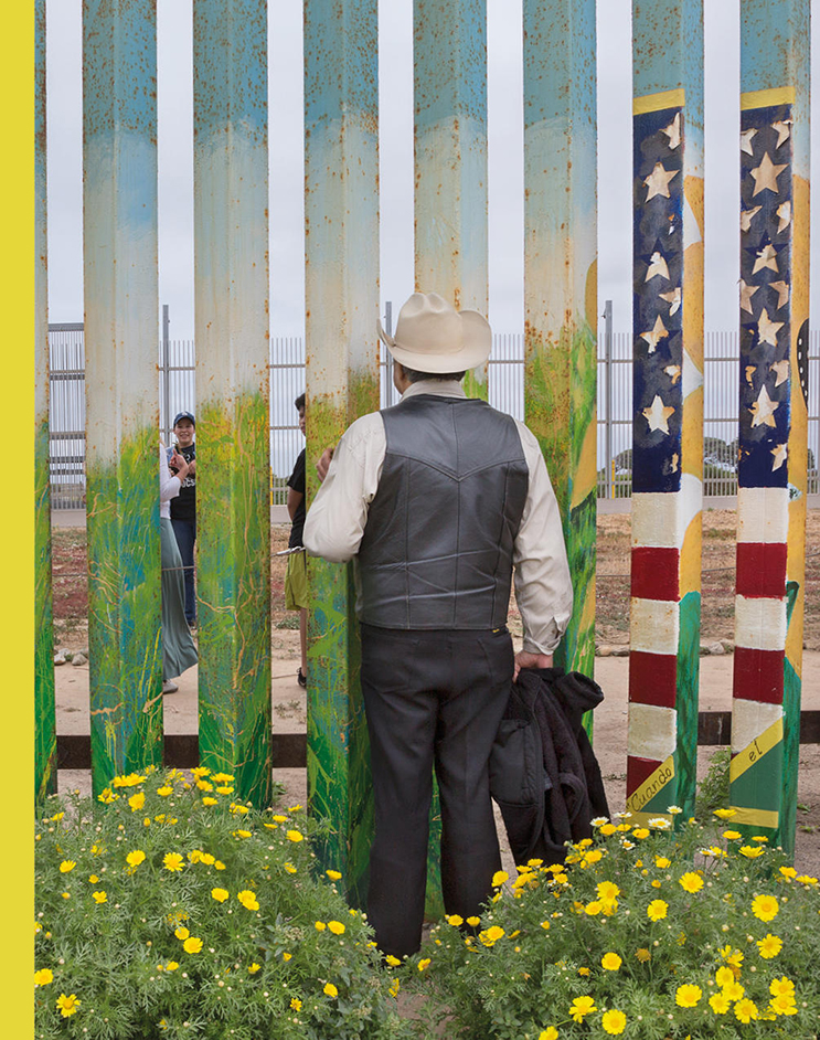
The cover of Tijuana by Griselda San Martin.

Griselda San Martin is a Spanish Documentary Photographer who’s work in Tijuana seems to encapsulate a number of the series she has been working on, each of which a part of her mission statement- “My goal is to represent the immigration issue in all of its complexity, addressing the social, political and economic factors that motivate individuals to leave their homes. I hope to create images that stimulate dialogue and reflection1.” Her work is often up close and personal, yet, she’s equally adroit at stepping back to show the bigger picture. All of this is beautifully rendered in Tijuana, where her twin gifts with color and light are apparent in every image. The documentary elements, as seen on the cover, are powerful and poignant, but the book contains a variety of styles, some more commonly seen in Fine Art Photography, showing off the range of her talent, while keeping Tijuana fresh.

Griselda San Martin, from Tijuana.

About Tijuana, she said- “Contrary to what we are shown in mainstream media, Tijuana is a fascinating place,” she said. “All we hear right now about Tijuana has something to do with the several migrant caravans and Central American immigrants who have arrived in the city during the past few months. My book has nothing to do with that. All the images were taken before the first caravan arrived. The first time I was in Tijuana was during my graduate studies at the school of journalism at the University of Colorado Boulder. My graduation project led me to this border city, where I was captivated by its culture and dynamics, and the complexities (and contradictions) of the border region. For the past six years, I have been going back for different periods of time, working on several projects. Perhaps the most successful one has been The Wall, a photography and video project that documents families separated by their immigration status, who gather at Friendship Park, the only federally established  binational meeting place (currently closed). Through photographs and a short documentary film, the project examines the concept and relevance of a border wall, border security, and the effects of immigration policies on individuals and families affected by them, during a time of rising xenophobic political tensions. I also documented the small but growing Muslim community in the border region.” How did it become part of LOST II? “I met Kris Graves a couple of years ago. We were part of a group exhibition at CPW (Center for Photography at Woodstock). He contacted me directly to invite me to be part of Lost II.

Along with all of this, many of the books are also equally personal.

The cover of Hong Kong by Nelson Chan perfectly captures the mood of its contents.

Take Hong Kong, where Photographer, TIS Books co-founder/co-publisher, and Aperture Foundation staff member, Nelson Chan, has spent quite a bit of his life. “The book came to be quite naturally,” he said. “I grew up in Hong Kong and live there during various parts of the year while I’m overseas printing books for the Aperture Foundation. A lot of the images were made during these travels. Kris knew I photographed in Hong Kong quite a lot and simply asked me if I wanted to take part in his project. I was emphatic about it from the start. One of the things that I did with this book that was a bit unexpected for me was that I actually combine some black and white negatives from some of the very first photos I ever took. Not just in Hong Kong, but as a young budding photographer. You see, the city was what sparked that interest in putting a camera to my eye.” Joining Nelson is his TIS Books partner, Tim Carpenter, who contributes Illinois Central to LOST II. (By the way, TIS Books also made my NoteWorthy PhotoBooks of 2018 list with El Libro Supremo De La Suerte, by Rose Marie Cromwell.)

Cover of Spruce Pine by Mercedes Jelinek

Then there is Spruce Pine by Mercedes Jelinek, which offers an almost meditative approach, sans people, which, I believe, may be  the only book in the set to do so. It’s her eagerly awaited second book after her sold out debut, the powerful, These Americans, (+KGP, 2018). Though its meditative quiet couldn’t be more different in tone from the raucous These Americans, revealing another side of her range, it retains the depth of feeling, even without human subjects. I asked Mercedes how Spruce Pine came to be, and came to be part of LOST II. “I was a resident artist at Penland School of Craft in Penland NC (right next to Spruce Pine),” she said. “Over the three years I lived there, I would go out and explore the area – going down back roads and side roads until I would reach a dead end. I realized I seemed to gravitate towards photographing quiet scenes – something I don’t usually have where I’m from in NYC. Not necessarily boring or mundane scenes but more of absence- and I was attracted to it in the photos… If that makes sense. Over time it grew into a project. Kris Graves Projects published my first book. When I returned to NY, I showed Kris my Spruce Pine images and he invited me to be part of Lost II.”

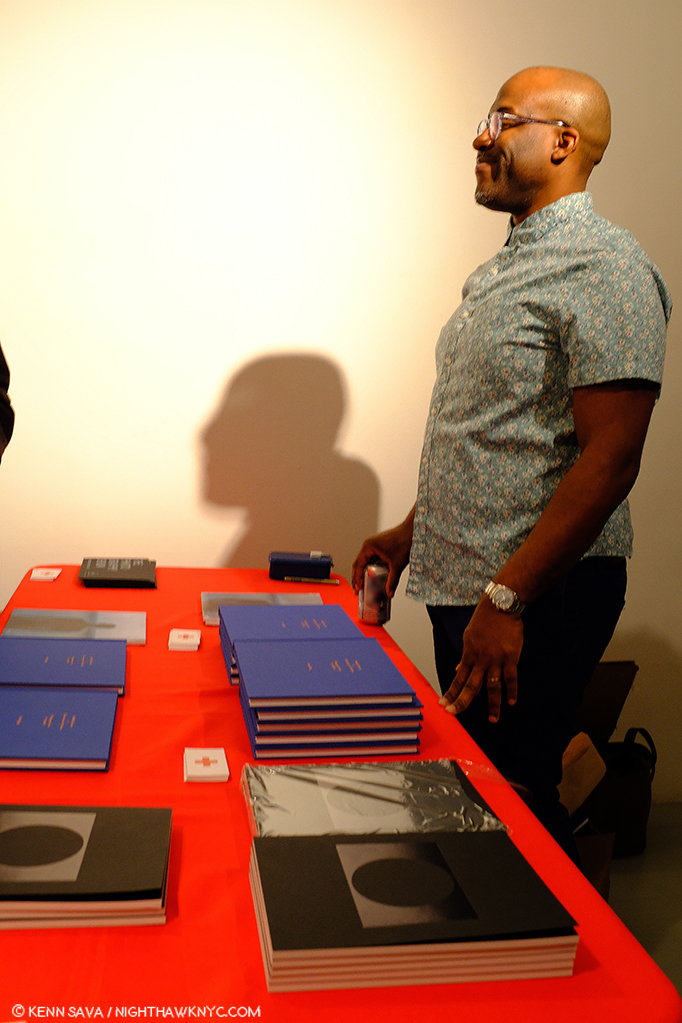
Kris Graves hosting the +KGP Book release for Isaac Diggs/Mikhail Mishin Book Release

On February 22nd, +KGP held a book release & signing for their three newest releases- Isaac Diggs’ Middle Distance,  Mikhail Mishin’s Endless Bridge, and Rana Young’s The Rug’s Typography, with the first two Artists in attendance.

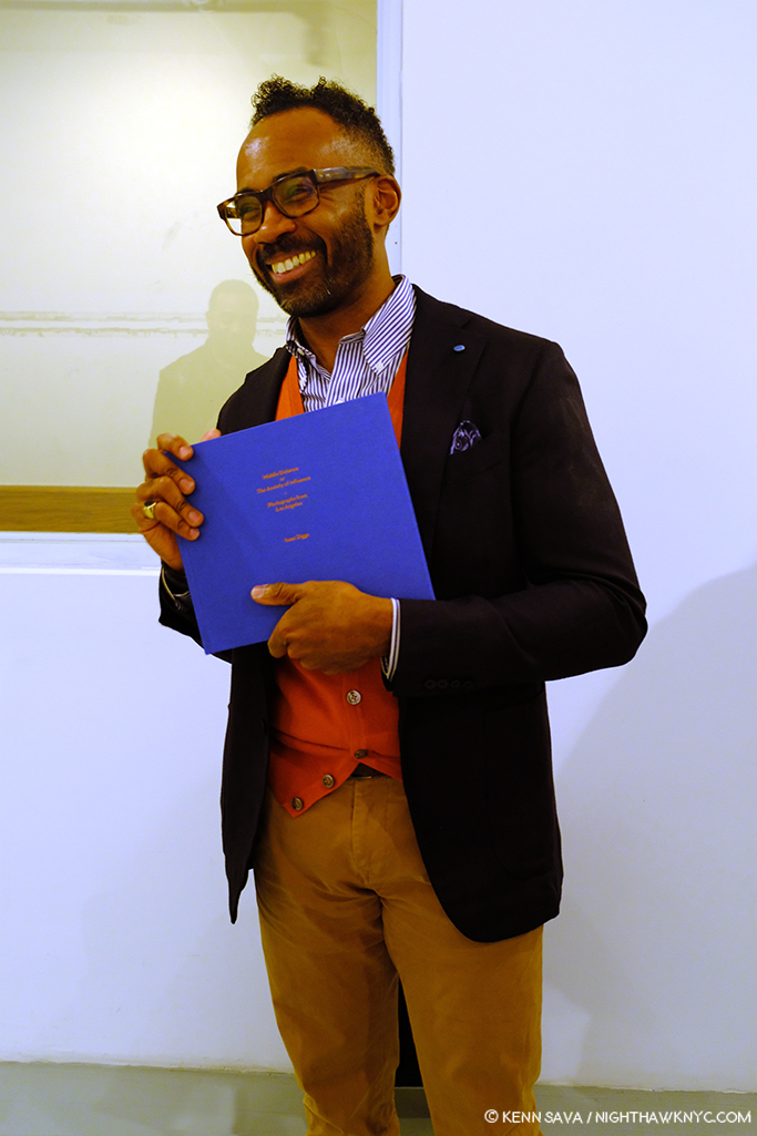
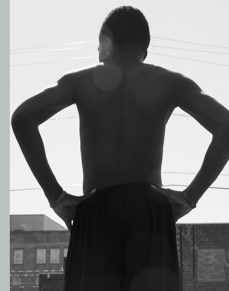
Photographer & educator Isaac Diggs introduces his brand new PhotoBook, Middle Distance on February 22nd. He should be smiling- It’s very good. His Photographs of Los Angeles, “conjure the underlying tension I sense in much of the American urban landscape,” he says on the +KGP site.

I took the opportunity to meet Isaac Diggs, the well-known Photographer and educator at NYC’s School of Visual Arts the past 19 years, and speak to him about how his book, Lagos, in LOST II, came about. He told me that he’s made a dozen trips to Nigeria, his wife’s homeland, since the mid-1990s, with the book consisting of work created during the last half dozen trips. The focus throughout is on the daily lives of its subjects through unexpected glimpses into them. It’s a book that reveals a diversity of lives being lived in views at once close up, and again expansive, in a city that few in this country are familiar with.

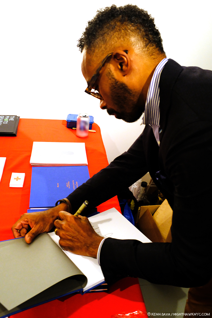
Mr. Diggs personalizing a copy of Middle Distance.

I also perused Middle Distance, which is as exceedingly well done Photographically as it is well produced, again with images taken over time, this time in California. Thinking about it and Lagos, I see the same eye in both books-it’s an eye that works very quickly and very quietly. In photo after photo images are captured while the subject, who’s often close by, does not even appear to know there’s a camera pointed at them which captures them spontaneously, while the background and the entire composition has a carefully considered feel. Mr. Diggs also has a talent for interesting/unusal fleeting moment. Not the “waited for moment” we see wonderfully in the work of, say, Harry Gruyaert or Alex Webb, Mr. Diggs’ moments feel like they required a fast shutter speed to capture, though it was probably his quick mind.

Sharing the book release with Mr. Diggs was Mikhail Mishin, who told me his new book, Endless Bridge, began by culling through his scrapbooks. Looking through it, I then asked him if Kazimir Malevich was an influence. He smiled, and then responded with this photo-op, which could have been a page right out of his book!

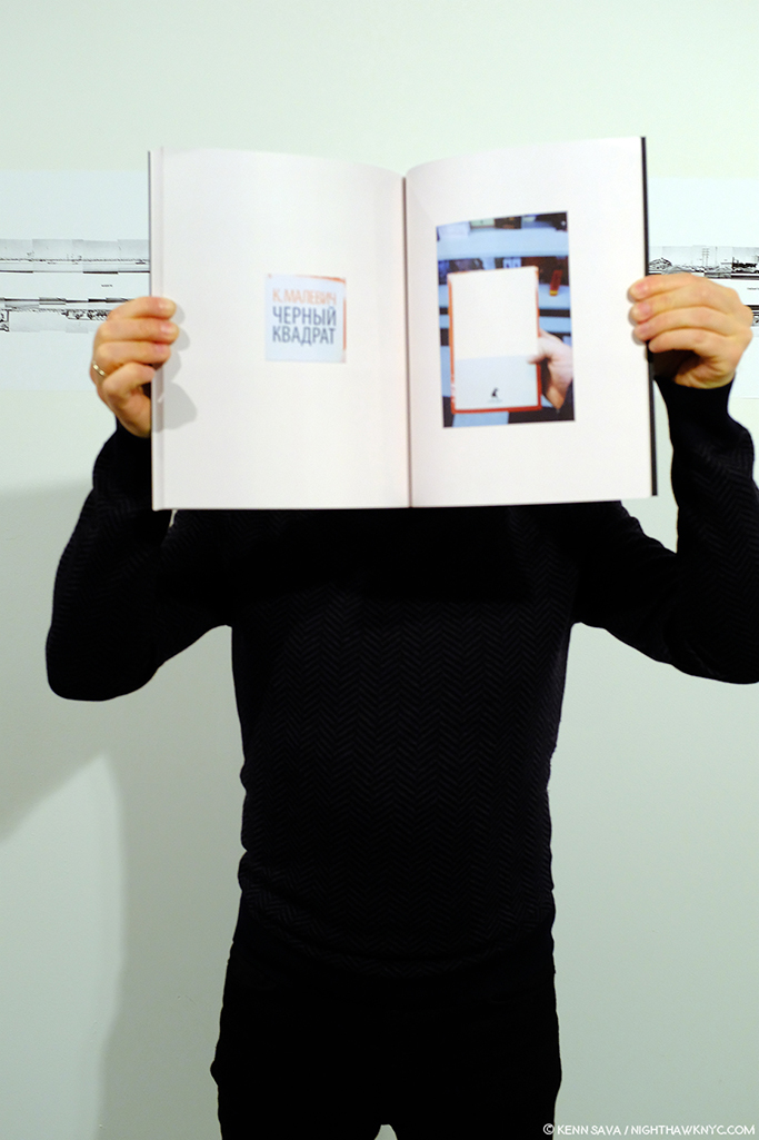
Mikhail Mishin demonstrates the influence of Malevich on his work. The first word in red on the left hand facing page happens to be “Malevich” in Russian.

Though he’s not one of the LOST II Artists, I asked Mikhail what his experience was like having his book published by Kris Graves Projects. “Producing the book with Kris was pretty seamless and pleasant experience and he has an excellent knowledge of, and insight into, the art book industry and in the art world,” he said. “I had my book dummy designed and printed before I was introduced to Kris by our mutual friend. After our initial meeting and discussion Kris was interested in producing this book and we started the process.”

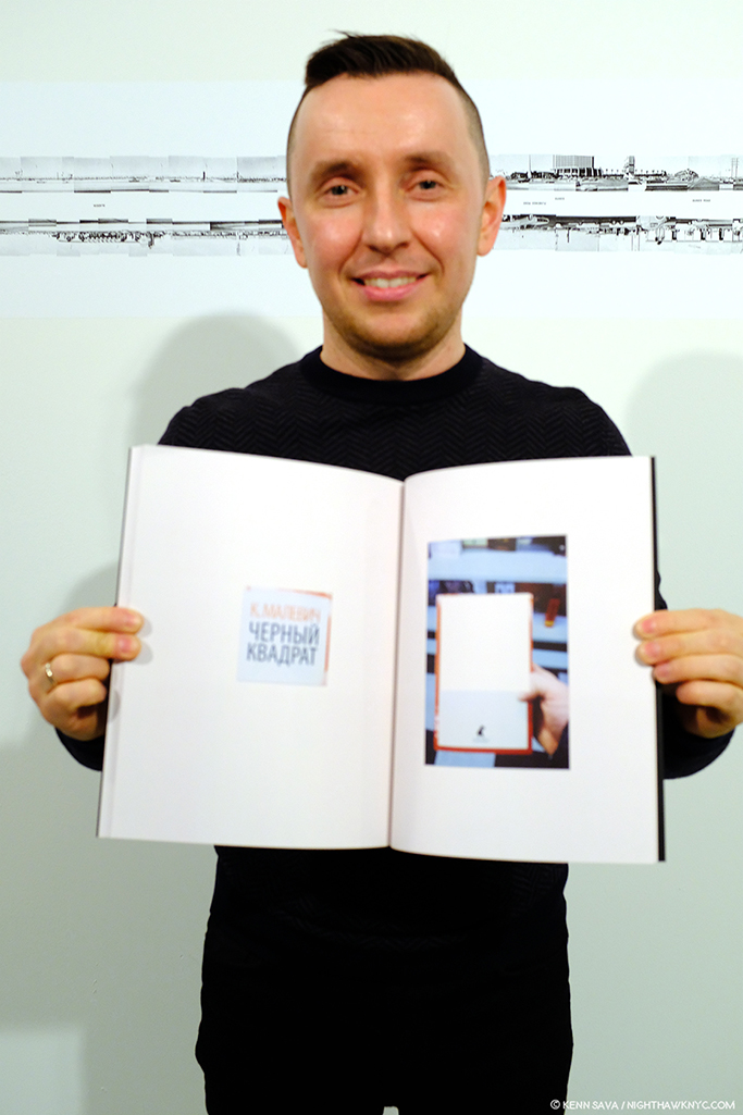
Mikhail Mishin with Endless Bridge, February 22, 2019.

“We had a few sessions after when we discussed edition, choosing the press, paper quality, the cover design and so on. All of that went very smooth as Kris already had pretty good idea where and what to do. Soon after we finalized the files and sent to press in New Hampshire which did a very nice job as you could see in the result.”

While the Isaac Diggs/Mikhail Mishin Book Release was going on, Kris Graves was also checking in on the printing of LOST II happening at that very moment(!) in Spain. February 22, 2019.

Meanwhile, back on the LOST II front, while the book release was going on, Mr. Graves was multi-tasking as ever, checking in on the progress of the printing of LOST II on his phone, which was going on in Spain at that very moment(!) …

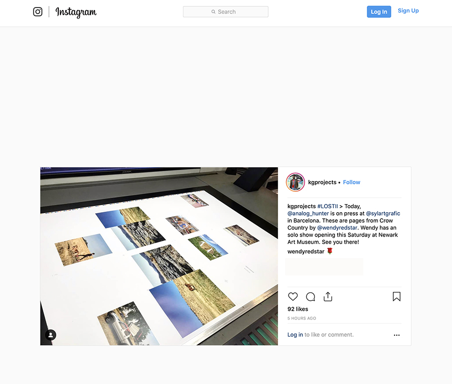
As he posted on Instagram shortly thereafter. Seen here are images from Wendy Red Star’s highly anticipated Crow Country hot off the press. Her show, A Scratch on the Earth, is now open at the Newark Museum.

where Kris Graves Projects’ Pablo Lerma was onsite in Barcelona pulling a 16 hour day overseeing the printing of ALL 20 books!

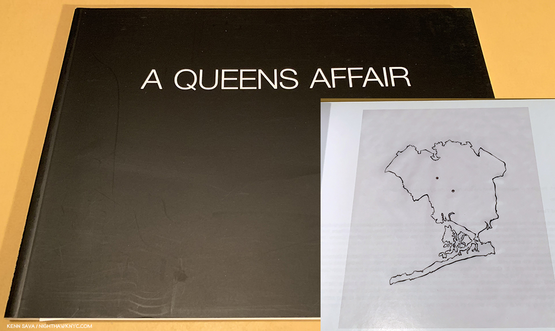
Kris Grave & Eric Hairabedian’s A Queens Affiar, 2010, Kris Graves’ first book, which includes an outline map inside.

Speaking of the bookmaking side, in thinking about the evolution of LOST and LOST II, I was struck when I recently saw a copy of Kris Graves’ first PhotoBook- A Queens Affair, 2010, in which his exterior Photos are wonderfully paired with interiors by Eric Hairabedian. The book has something of the feel of a precursor of LOST, in its unique, capsule, exploration of the borough, right down to the inclusion of an outline map, a staple of LOST & LOST II.

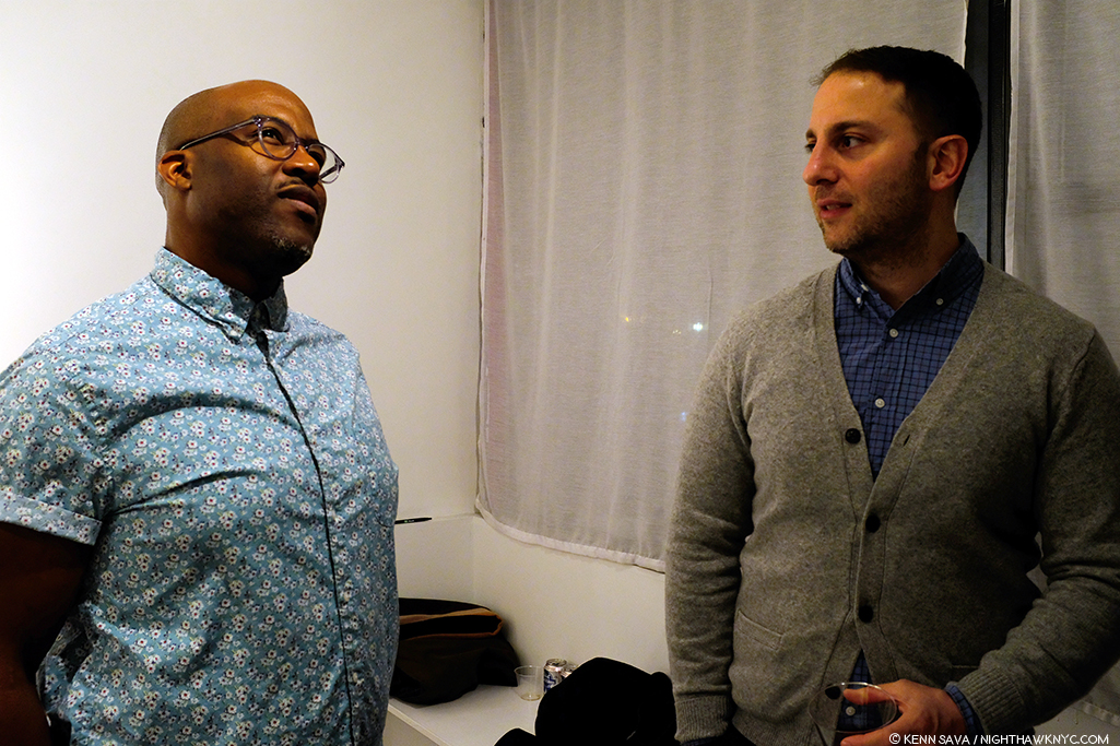
Kris Graves with Eric Hairabedian, February 22, 2019- nine years after they made A Queens Story. His relationships and his network, also, play a part in the success of +KGP and the LOST series.

In the succeeding 9 years, Kris’ publishing has come a long way. I asked him how his bookmaking has changed just between LOST and LOST II. “I produced LOST with a digital offset printer in New Jersey,” he told me. “We loved the quality, and are using those materials for other books. This time, we are working with a press in Barcelona, and making the books in offset, not digital. In addition to the slightly larger size, the books will now be able to be opened further, so book spreads will look a bit better. Since we want to make a better project every time we make a book, we also wanted to splurge on a more expensive process for LOST II. Printing of the books is now complete, the down payment is in (smiles), and the books should set sail from Barca in a week or so, just in time for their AIPAD launch.”

It’s been apparent to me this past year that one of the most remarkable thing about +KGP’s books is their high quality and quite reasonable cost. While a set of the 20 volumes of LOST II is (currently) 350.00, the individual books have a price of 28.00 each. Though his books are affordable, the quality of the work they contain has been noticed at very high levels.  LOST was acquired by The Metropolitan Museum, Guggenheim Museum, Art Institute of Chicago, Museum of Fine Arts, Houston, among other esteemed institutions. I asked Kris what he was most proud of about its success. “Good question. I am proud that this group of artists works as hard as they do. That’s it. Getting into collections is gravy, maybe it means that someone will peep the series 150 years from now. That would be cool. Usually, I’m too busy to feel pride.”

Luckily, we the living won’t have to wait long to see LOST II. It debuts at The Photography Show, 2019 (AIPAD) in early April, where it will be available to the general public, accompanied by a book signing.

However if you’re a Photographer interested in getting a slot in LOST III? I learned it’s going to require a very special distinction- You have to be female.


BookMarks-

Some facts about LOST II known to me as I write-

First- Less than SIXTY complete sets, in a custom LOST II Slip case, were available when it was announced. I bought one. And no, I didn’t ask for, or get a discount. Why not? Let’s do some math. The complete set of LOST II is being released at $350.00- a quite sizable sum by any standards. Considering there’s 20 books in the set? That makes it $17.50 a book, with a free slipcase. For a first rate PhotoBook? That’s on the low end (if not at the very bottom) of the prices I see charged by ANY publisher in the world. Besides that compelling reason, I believe in supporting Artists doing great and/or important work, so they can make more of it.

Second- Regarding individual book sales, Kris told me there will be just 125 first edition/first printing copies available of each title! When you take a look through the +KGP site, you’ll notice the high percentage of recent titles marked “SOLD OUT,” so part of the reason I’m doing this piece is as a community service for my readers who have read my prior Kris Graves Posts, and/or have bought LOST, so they can get LOST II, if they wish, as well as providing some insights into how a unique series like this comes into being.

Third- LOST II is available for pre-order from Kris Graves Projects online here. In the time it’s taken to prepare this Post, I now believe no more than 30 sets are still available. ALSO! I’m pleased to mention that if you mention “Kenn Sava” when you order a set from +KGP, your order will include a signed copy of Kris Graves’ The Bronx. 

Besides LOST II, also recommended are Isaac Diggs just released book, Middle Distance, and be sure to check out Mikhail Mishin’s fascinating new book, Endless Bridge, both of which were moving quickly at the book release.

Finally, a tip- I saw Mercedes Jelinek’s powerful first PhotoBook, These Americans, at AIPAD last year on the +KGP table I showed earlier. While I was busy looking at something else, the last copy was sold. After spending the last year looking for it, I’m happy to report that I just found out that a few copies are STILL AVAILABLE, here, at the Asheville Art Museum! Mine came signed. Highly recommended.

*- Soundtrack for this Post is “The National Anthem” by Radiohead (a band Kris and I both admire) from Kid A, performed here (with horns!) on Later

My thanks to Shane Lavalette, Nelson Chan, Isaac Diggs, Mercedes Jelinek, Cristina Velasquez, Mikhail Mishin, Griselda San Martin, the Asheville Art Museum, and Kris Graves. 

NighthawkNYC.com has been entirely self-funded and ad-free for over 6 years, during which over 250 full length pieces have been published. If you’ve found it worthwhile, you can donate to keep it going & ad-free below. Thank you!

Written & photographed by Kenn Sava for nighthawknyc.com unless otherwise credited.
To send comments, thoughts, feedback or propositions click here.
Click the white box on the upper right for the archives or to search them.
For “short takes” and additional pictures, follow @nighthawk_nyc on Instagram.

Subscribe to be notified of new Posts below. Your information will be used for no other purpose.


  1. She said, here

Robert Dunn’s Revolver

Written by Kenn Sava with Photographs by Kenn Sava & Robert Dunn

When I visited the Manhattan studio of the multi-dimensional Robert Dunn, I was struck by the large poster of The Beatles 1966 classic, Revolver, on his wall. Every Artist has influences. When I’m researching one, it’s always interesting to find out who their influences are, and what they reveal about that Artist’s work, their roots and development-if anything. I learned that Robert Dunn is an aficionado of Bob Dylan, classic Jazz, Blues, The Stones and The Beatles. Does it mean his work is influenced by them? That’s not for me to say. Still, Revolver is an album that shows off an extraordinarily wide range of The Beatles many sides. Hmmm….I asked him if I could snap a Photo of it.

Luckily, he didn’t ask me “Why?”

Robert’s Revolver poster (a copy of the rare original), hangs over a colorful selection of his business cards for Coral Press that feature his Photographs. Seen in his studio, February, 2019. Click any Photo for full size.

Like a six shooter, himself, Robert Dunn’s talent comes at you from all sides, in many media. In his life, thus far, he’s been or currently is-

-A Musician & Songwriter

-A published Author

-A  copy editor at Sports Illustrated for 3 decades, and a typist at The New Yorker, who published one of his Poems(!)

-A Photographer

-A Publisher of PhotoBooks AND Novels

-A Teacher, currently of 2 courses at The New School

BANG!, indeed. Looking at the homepage for his site, RobertDunn.net, I felt like I was in a Department Store!

*Homepage of RobertDunn.net. Enough creativity for any 6 people, and there’s still room left for whatever he turns his talent to next!

Shot dead by too much talent to pack into one Post, I realized I needed to switch my brain from auto to manual to adjust the focus of this piece. So, I opted to narrow the depth of field for closeups on two of those 6 barrels- Robert Dunn: Photographer & Robert Dunn: PhotoBook Publisher. Before you think I’m letting myself off the hook easy, consider this- over the past year I’ve seen a number of Robert Dunn’s PhotoBooks, all of which are published by his own publishing company, Coral Press. Each contained work in a different style! I had to turn back to the cover to make sure the Artist’s name was Robert Dunn, and I was more and more impressed each time I found it was. The man is so positively bursting with creativity you literally need to keep your mind on a swivel to keep up with it.

Robert Dunn’s Author’s page on Amazon where you can buy his novels, many of which are music-related in some way, echoes of his days in his band, Thin Wild Mercury.

Approaching his long, varied and accomplished career from the present, it wasn’t long after I discovered his Photography that I found out he’s also a published Novelist with no fewer than SEVEN Novels currently available on Amazon! AND, in whatever spare time he doesn’t possibly have, he teaches Writing AND Writing the Photobook at The New School1.

I asked Robert to select a group of Photos for this piece as examples of his work in each of his many styles, thinking that together, they would show his range. Unbeknownst to him until he sees this, I was, also, testing a secret hunch I had, born out of that opening Photo. Shhhh….Don’t tell him this, Ok? Before I asked him for the Photographs I had a feeling that whatever images he sent me would connect with The Beatles’ album Revolver.

(Off stage, background. Chime…chime…incoming email chime…”CANCEL MY EMAIL SUBSCRIPTION! I now KNOW you’re certifiable!”) I didn’t know exactly how. I just had a hunch they would. He sent me the batch of Photos you see below. There was no back and forth. No second guessing. And of course, no discussion about “matching” Photo with Song. The rhyme and reasons are purely my own- The blame lies here. I want to emphasize- At no time has Robert told me Revolver had anything to do with his work!

Why did I come up with this crazy concept?

As my long time readers know, every single one of the 200+ Posts I’ve done here on NHNYC.com over the 3 1/2 years of its existence has had its own soundtrack listed at the end- a piece of Music I’ve selected to accompany it, and that seems to fit that particular Post. Never have I selected more than one piece of Music to be the soundtrack of a Post. Until now. Robert’s multiple sides, and countless styles, call for it.

So, here are the Photos Mr. Dunn sent, with a caption listing which of the 34 PhotoBooks the Artist has released to date it appears in, along with a song from Revolver as its soundtrack. I’ve also included a link to the book the Photo appears in on the Coral Press site where you can see more of its contents. Each and every one of his books is well worth exploring. Every one of the 14 songs on The Beatles’ album is here and only appears once. The Beatles video for the track follows each Photo so you can listen to it as you look (all are audio only, except for “Yellow Submarine”). Robert may see this and say “What the heck?” and never speak to me again. I hope not, but here goes!

Please take the time to listen to each track while you look at Robert’s Photo it accompanies and see if you find a connection. (Lyrics for each song may be found here.)

From OWS, Robert Dunn’s very first PhotoBook on the Occupy Wall Street protest. Fittingly, it gets “Taxman,”  the first track on Revolver.

Also from OWS. Its soundtrack is “I’m Only Sleeping”


From New York Street. Its soundtrack is “Tomorrow Never Knows”

From Shibuya Time. Its soundtrack is “Love You To”

From Shibuya Time. Its soundtrack is “She Said She Said”

From Angel Parade 5. Its soundtrack is “For No One”

From New York Street. Its soundtrack is “Yellow Submarine”

From Carnival of Souls. Its soundtrack is”Good Day Sunshine”

From Star of Light. Its soundtrack is “Got to Get You into My Life.”

From Star of Light. Its soundtrack is”Eleanor Rigby”

From All That Is Solid Melts Into Air. (To be published) Its soundtrack is “Dr. Robert”

From New York Street. Its soundtrack is “And Your Bird Can Sing”

From Electrick Spirits. Its soundtrack is “I Want to Tell You”

From Electrick Spirits. Its soundtrack is “Here, There and Everywhere”

Ok…ok…So? Why did I REALLY do this- match up Revolver with these Robert Dunn Photographs? When I look at Robert Dunn’s work and the range of styles he has created in thus far, I see an Artist who’s constantly exploring and reinventing himself, like The Beatles did (as you can hear in a micocosm on Revolver)– even if it takes venturing into an entirely new medium or Artform for him to do so! I find that exciting and, personally, inspiring. And? There aren’t a heck of a lot of other popular Musicians who have as many styles as Bob does- except The Beatles.

Robert Dunn, ALSO, a serious vinyl collector, considers a classic Blues Lp at NYC’s legendary Academy Records, February 16, 2019.

When I lived in Miami, the old cliche was, “If you don’t like the weather, wait 20 minutes. It’ll change.” Robert Dunn’s work only seems to change that often. But, somehow, no matter how much it changes, the “Sunshine” of his creativity always shines through, making it a “Good Day…”

The Photography of Robert Dunn may be explored in full at ecstaticlightphoto.com.

I’ve had my say, so now, it’s only fair to give the Artist a chance. I’m pleased to say that Robert was kind enough to answer some questions for me. These appear in the piece, Tomorrow Never Knows: Q&A With Robert Dunn, below this one. 

My thanks to Robert Dunn, and to Jackson Charles for the introduction.


BookMarks-

A used box set of Robert’s Angel Parade series for sale at The Strand in 2018. Its prior owner looks to have perused it a fair amount. The next time I looked, it was gone, off to a new home. My experience is they don’t last long in stores, but you can still buy them online.

Robert Dunn’s PhotoBooks are available as follows-

-By mail order, or in store, at Dashwood Books.

-By mail order, or in store, at Printed Matter.

or

Directly by mail order from Coral Press.

If you have any questions about obtaining them, feel free to write to Coral Press directly, or contact me and I will forward them for you.

NighthawkNYC.com has been entirely self-funded and ad-free for over 6 years, during which over 250 full length pieces have been published. If you’ve found it worthwhile, you can donate to keep it going & ad-free below. Thank you!

Written & photographed by Kenn Sava for nighthawknyc.com unless otherwise credited.
To send comments, thoughts, feedback or propositions click here.
Click the white box on the upper right for the archives or to search them.
For “short takes” and additional pictures, follow @nighthawk_nyc on Instagram.

Subscribe to be notified of new Posts below. Your information will be used for no other purpose.


  1. During the course of working on this piece, Professor Robert asked me why I capitalize Art, Music, and Photographer. I’ve been expecting this question every day since July, 2015, but he is the first person to ask! The short answer is, as I’ve mentioned in passing previously, that Art is my Religion. Many people create “art.” A select few create “Art.” For me, the work of someone like Michelangelo, and the other Artists I’ve written about here, deserves the respect of capitalization. Frankly? I don’t understand why it is not the norm. He then asked why I write photobook as PhotoBook, etc. The answer is- They’re part of my eccentric style, (like NoteWorthy or BookMarks). For me, a “photobook” like Robert Frank’s The Americans, also, deserves to be referred to differently than a book of photos (i.e. a “photobook”) of snapshots. I’ll get into this more in a future Post. But since among his many talents and extensive accomplishments, Mr. Dunn has 30 years experience as a Copy Editor at Sports Illustrated, I thought I’d better give the short answer now! We both agreed that consistency is key. I’ve been doing it this way since Day 1 of NHNYC.

Tomorrow Never Knows: A Q&A With Robert Dunn

Written & Photographed by Kenn Sava (*unless otherwise credited)

Poor Tomorrow. It has no idea what Robert Dunn will bring to it. Given his versatility and endless inventiveness, all bets are off.

That’s the feeling I get from looking at his Photography. My Post, Robert Dunn’s Revolver, is an overview of the multi-dimensional Robert Dunn’s Photography and PhotoBook Publishing. In preparing it, Robert was kind enough to, somehow, find some time in his busy life to answer some questions for me, thereby giving readers a chance to hear directly from this talented man, who generally “speaks” only through his work, unless you’re among the lucky few who take his classes at The New School on Writing, or “Writing the Photobook.” So, without further adieu, before tomorrow gets here, Robert Dunn-

Robert Dunn on Broadway on the Upper West Side, surveys the scene, camera at the ready, February, 2019.

Kenn Sava (KS)- Bob, You’ve had successful careers as a Musician, Writer and a Teacher. Why did you turn to Photography? Was there a moment, event or influence that triggered its beginning?

Robert Dunn (RD)- Kenn, first off, thanks for letting me talk about my work for your impressive site.

Here’s my artistic, well, arc, I guess. When I was 13, I first heard Bob Dylan, immediately wanted to be him, learned guitar, wrote pretty good songs, and quickly found out I couldn’t sing at all. Turned out my strengths then were with the lyrics, so I got into literature, immediately wanted to be James Joyce, and wrote fiction and some poetry. (Surprisingly, my first publication was a poem in The New Yorker.) For the last few decades all I’ve written are novels.

Back in the ’80s, though, I got really interested in photography—especially color photography, inspired by William Eggleston. I pursued it pretty seriously, up to the point at which to make a good-sized high-end print, I’d either do that or pay the rent in my East Village apartment. So photography fell by the wayside. (One good thing about writing, all you needed to buy then was paper; today, not even that.)

I did purchase a few photobooks back then, and when I got back into studying and collecting photobooks, I was pleased to see the books I’d bought and cherished were Frank’s “Americans,” Eggleston’s “Guide,” Susan Meiselas’s  “Nicaragua,” and Bill Burke’s “I Want to Take Picture.”

But for what I do now, my interest was specifically renewed by a review of the then-new Fuji X100 camera I read in the Times. I immediately said to myself, I used to love taking pictures, and this camera sounds perfect. So after a little this and that, I was able to get one. (They were like new iPhones at first, sold out everywhere.) I went out that weekend to try it out and startled myself with what I was shooting.

Basically, the camera seemed to have a kind of mind of its own, and was taking pictures that captured light and color in a way I could hardly believe—and that I loved.

Coincidentally, I use the Fuji X100F, too, so I was particularly interested in how Mr. Dunn uses his. I’m not sure I was expecting to see this, however.

 So, yes, that’s where it all really started, with that first Fuji camera.    

KS- What’s the connection between your Novels and your Photography, or are they both just outlets for different sides of your creativity?

RD- A very intriguing question. I like to think that if I’m good at photography, it’s because years of writing fiction has taught me a few basic things, perhaps most important how to see as much as possible. I remember a lunch many, many years ago with a Knopf editor, Alice Quinn, who was a mentor back then. (She later was The New Yorker poetry editor.) I told her that day, “I think I’m finally learning how to see not just a person’s front, but behind them, too. See all the way around them.” I think I also meant much deeper inside a character, but in essence my idea was that I was expanding my range and depth of simple sight.

 And that’s what my photography is. Walking around taking in as much of what’s going on as I can, and trying my best to capture what’s most interesting about what’s there. If in the shots I take of people, I can see—and capture—some essence of their personality, their soul, then I think I’ve made a pretty good picture.

Purloined Souls, by Robert Dunn.

Oh, and one unexpected connection between my fiction writing and my first photobook, OWS—pictures I shot at Occupy Wall Street, back in 2011. I initially went down there to donate a few copies of my hippie-chick novel, Look at Flower, to their free library. The thing is, I went to college at UC Berkeley back in the early ’70s, and the air, the ambience, in Zuccotti Park immediately hit me with whiffs of those riotous years at Cal—a vibe I truly hadn’t experienced since. I got jazzed, and started shooting photos, then going back every week. There were a lot of photographers down there, but I made sure I didn’t shoot in any of the directions they were all shooting; I found my own details, moments, etc. OWS came out in 2012, and went into a second printing quickly. And a photo from it was in an ICP show.

KS- Is there something you particularly love about being a Photographer?

RD- Yes, and it ties in with my answer to the last question. I love almost everything about my photographic work, but at bottom I think I’m most psyched about the place my head goes into when I’m out with my camera on the streets, trying to take in everything around me, every telling gesture, every detail, incongruence, hint of something more than just what appears to be there. It’s a little like my fiction writing, when I get so lost in writing that time has no presence, and the story is all I know.

My photo taking, though, is an especially Zen sort of thing, where I’m out walking around totally in the moment, perceiving the whole world moving around me, always looking for a good shot. All the time I’m telling myself, Hmmnn, is that interesting? Nope. How about that? Nope. Is that worth shooting? Nope. Nope. No … oh, wait, that might be worth a click of the shutter.

All this happens in nanoseconds. Being in the world, yet not of it—trying to capture what most interests me in my camera. Losing myself to that, but also being fully there at the same time.

Robert Dunn is ALWAYS aware of his surroundings and the potential for images in the moment. During the no more than 2 minutes we stood outside Academy Records, he was looking everywhere at once, camera in hand. February, 2019.

KS- You seem to be a model of a D.I.Y. Artist, from creating the work to releasing your Photobooks and overseeing their sales through Coral Press. What’s been the hardest part of that for you?

RD- I love making photobooks; indeed, I have books that almost nobody has seen, just because I have an idea, fulfill it, and turn it into a book. Far and away the hardest part of this for me is getting books out there. Into stores, into people’s hands. Every day, I’m happy—no, I need—to take pictures. Not every day do I feel like walking into some place and trying to get them to sell my work.

 That said, things have worked out pretty well. My self-made books are in numerous museum libraries, including MoMA, ICP, the Brooklyn Museum, and the Tokyo Photographic Museum. They’ve been for sale at PS1 MoMA, Dashwood, the Strand, and the ICP bookstore, among other places (Note- See BookMarks at the end for a list of some).

 Funny story about ICP, and selling your own books in general. I took one of my early Angel Parade series there, and the woman in charge said she’d love to take copies, then said that she thought they should be priced at $18. I said, “You take fifty percent of each sale, right?” She nodded. Then I said, “O.K., each book costs me $12 to print, so if you sell one, I’ll get nine dollars from you. That way, hmnnn, I’m only paying people three dollars to own my books.” She shrugged, and I immediately said, “Good deal—hope you sell a lot!” Hey, it was the International Center of Photography. I meant it.

KS- Along the way, did anyone teach you any of this (Photography, digital technology, printing & publishing), or are you entirely self-taught?

RD- Well, nobody taught me anything, as in my taking a class to learn the stuff you ask about. I have been taking over and over, and really enjoying, a Master Printing course at ICP with Ben Gest; but even for that, when the requirement was great facility with Photoshop, I basically didn’t have very much, so I faked it till I got it.

But I never took a How to Photograph–type course. I wanted to learn by doing it myself, studying photographers who move me, and trusting my own intuitive artistic understanding more than anything anyone could tell me.

Same with writing. I never studied writing, though I was a Lit major in college. But I also was fortunate enough to be around some impressive writers back when I was getting going. My first-ever real job was at The New Yorker magazine. While I worked there, I was one of the redoubtable film critic Pauline Kael’s assistants, and for the final three years of the great novelist Bernard Malamud’s life, I was his paid assistant. Indeed, after he passed I was given his desk, and to this day I do all my work at it.

It Talks, It Whispers by Robert Dunn, one of my personal favorites of the books I’ve seen of his yet so far, is in ANOTHER style than those I showed in Revolver.

KS-  How did being a published Novelist help you with your PhotoBooks?

RD- Gave me experience on how books are put together, printed, and distributed. Pretty much the whole thing.

 KS- Your Photobooks (at least the ones I’ve seen) are all in the same size, style and format, which makes them different from those of most others I’ve seen. Why did you choose to make them this way?

RD- I have made books in other sizes. My Angel Parade series (now up to volume 16; I’m planning to get at least to 20) is in a more vertical format, and distinguished in the way that there are two volumes in each book. I was inspired by paperbacks of the 1950s that would put two novels in the same book, with two covers, one upside down on one side. That’s what I do with Angel Parade: volume 1 and volume 2 in the same book, just have to flip it over to read the other one. I liked that because it accentuated the idea of each work being separate, yet together. Each volume tells its own little non-linear or non-literal story.

But the more recent books you mention are the same because I use an online printer to put them out. All I have to do is upload a pdf and the books are mailed quickly back to me. And they look pretty good. As an eminent photobook scholar friend of mine says, “Your books now are kind of like Daido’s Record series—books done quickly, almost like journal entries, to capture what you’re up to and get them out there.”

There’s truth to that, though I also think of each book I do as a standalone work, with its own theme, story, reason for being. I do like the size and format of the books of mine you reference, but I also aspire to do larger, more intricate ones—books that more substantial, less zine-like; perhaps even more an art object than just a “story” in photos. To that end, I’d love to collaborate with somebody with strong bookmaking experience and talent.

Electrick Spirits by Robert Dunn.

KS- I’ve heard from a number of Artists who are interested in learning how to make a Photobook of their work, and then how to distribute them. Do you have any advice for them? 

RD- Well, first off, you can simply do it. That’s key, not to wait around for anyone or anything to tell you how/what to do. Just make a book. Take the pictures, figure out how to lay it out, find somebody to print it, online or at a press … and there it is. You can even make something yourself with a laser printer or Xerox machine and staples. A young friend of mine, Jason Jaworski, is kind of the master of make your own book at home. He prints pages off a regular printer, folds them, makes a cover out of something lying around and cheap, and puts them out. Indeed, our books used to sit next to each other at the ICP Bookstore. I just looked at one. He was selling it for $10, which meant he was probably paying himself $2 an hour, if that.

But he made books, and they got noticed.

In essence, that’s what each of the students in my New School “Writing the Photobook” class do. They simply make their own book.

KS- You’ve used the Fuji X100F exclusively almost since it was released, right? 

RD- Actually, my first serious digital camera was the Fuji X100—no “F.” That was their first X100 model, the one I mentioned above. I used it for years, eschewing further iterations of the camera, until I read a piece on the X100F that said that model was finally the perfection of what the X100 started. So I decided to upgrade.

 But what I love about both X100s I own is foremost that the camera lets you see what the actual photo will look like through the viewfinder. There’s a little switch on the front that flips you from looking through glass in the viewfinder to actually seeing in it what the lens sees.

West 18th Street, NYC, February, 2019.

The latter is all-important in my photography. Easily seeing what the lens sees allows me to see the photo itself, with all its blur, contrast, magic intact. So I use that a lot.

I also like that the camera is pretty small and with a fixed focus. I believe in the maxim that if you want to zoom up on something, just get closer. As you can see from many of my photos, I often get very close.

Further, I like it that I can just throw the camera around, grab shots from my hip, or wherever, without having to look through the viewfinder at all. I do that a lot.

From Demons and Dogs, shortly after Robert got his X100 in 2012.

I’m all about seeing as much as I can on the street, then working to capture it quickly, with full mystery and expressiveness. I’m also about making photobooks in the spirit of: Take lots of photos, all kinds as long as they’re interesting, then sort them out into books later. That’s the novelist in me, I guess. As in the title of my New School class, I want to “write” my photobooks, though personally I never put words into books other than maybe a short preface. By “writing,” I mean giving each book a shape, a logic, a theme, a purpose. That’s what I find in the books I most admire.

KS- To this point, I know that you admire the work of Robert Frank and Daido Moriyama in particular, two Artists who are, it seems, equally celebrated for their Photography and their Photobooks. What is it about each that particularly speaks to you?

RD- My favorite Robert Frank story is told by Garry Winogrand in a Youtube video I watched of Winogrand being interviewed.

*Garry Winogrand, St.Francis Monument on Sunset Boulevard,1955

He talks about the shot in The Americans of the statue of St. Francis at the foot of Sunset Boulevard in L.A. Winogrand says, “There’s a picture in the Frank book of a statue…. (In 1955, before The Americans came out) I shot that goddamned statue. I made a reasonably good picture of it.

*Robert Frank, St. Francis, Gas Station and City Hall, Los Angeles, 1956

And I saw the Frank book, and it killed it. Put me away six ways, you know…. The picture I made was made. And the picture he made happened. It went whoosh right across the page…. It taught me a hell of a lot. Right off the bat, boom.”

Well, that’s one reason why I like Robert Frank so much: his photos still put me away six ways; they go whoosh across the page; and they teach me a hell of a lot. For some reason, Jimi Hendrix and his “Star-Spangled Banner” is popping into my head, as in, Wait, that’s not how we ever sang it before. That’s a great thing about any art form: one person can blow everything wide open, put us all away six ways … at least six ways.

As for Daido Moriyama, I can still remember the exact moment I found him. I was at the old ICP bookstore, and the clerk, Sarah, becoming a friend and guide, asked me if I knew Daido’s work. I said no, she showed me books of his on the shelves, and I immediately bought one—and kept buying them, till now I have first editions of much of his work.

Robert Dunn, From New York Street.

What do I like with Daido? Besides some very strong photos, it’s mostly the freedom to do anything with a photo: have it blurry, scratched, out of focus … everything you’re not supposed to do. Also, that he’s always out on the street prowling for photos, grabbing them everywhere. I have a few photos I’m proud of that are for me just: Look what a strong photo that would make, and, look, I just caught it. One in particular of mine is a photo of a guy in the middle of 125th Street I shot a few years back, in my New York Street book. For some reason he has a long yellow rain slicker over his head and flying back from it, so you can’t see his face. He also has his hands raised high into the air, and in one is a religious tract.

Again, the guy was in the middle of the street. Flash, I saw him, and somehow got my camera around to snap the photo. I like to think my picture, too, wasn’t made. It just happened.

That’s the thing with a lot of Daido’s work, particularly the famous shot of a girl in an alley at night, barefoot in a slip. You know, when you look at any photographer’s work, whoever took the picture was right there. That’s the only way it works. Somebody has a camera, they snap the shutter, they make a picture of what the camera sees. That’s really all it ever is. So it all depends so much on who’s doing the shooting.

*Daido Moriyama, Untitled (Woman in white dress running), 1971

So I imagine Daido seeing the girl, flipping up his camera, and probably (as I would) feeling some pride in having gotten the shot, even though the angle is crooked and the light screwy. Indeed, that’s the lesson of Moriyama: angles, light, focus … it all means nothing unless you’ve snatched a truly interesting photo from the endless stream.

I also like this particular Daido shot because it engenders a huge story: who’s the girl, how did she get there, why is she barefoot in an alley in a slip, where is she going? Same with my guy in the middle of 125th Street. What he hell is he up to? 

KS- Since NHNYC was originally a Painting site, I always ask this: Are there any Painters who’ve influenced you or your Photography, or that particularly speak to you? 

RD- I’m especially interested in the play of color in my photos. Also, flows of energy. And deep mystery and spiritual invocation. So off the top of my head, to those ends I’ve learned things from Vermeer, Rothko, Van Gogh, Rembrandt, El Greco—I’m sure there are many more.

KS- Top 5 favorite albums (if you have favorites)? Or, top 5 albums that have influenced you the most?

RD- Record albums, that is, not my grandmother’s mottled leather photo collections? (Smile.)

Robert checking out the CD’s at Academy Records, February, 2019

KS- Touche. Yes, Lps, since you have such a carefully curated collection of vinyl.

RD- I’ve been inspired at the deepest level by certain musicians; and in my own deepest understanding of what I’m up to photographically, certain records center me and guide me, though I wouldn’t want to try to articulate just how.

Outside of Academy Records, a PhotoBook of Bob Dylan caught his eye We’ll have to wait until “tomorrow” to see what he made of it.

Top Five of those? Dylan’s Blonde on Blonde and Highway 61 Revisited. The Beatles’ Revolver. John Coltrane’s My Favorite Things. Miles Davis’s Bitches Brew. That’s five, right? Oh, and how about a couple classical LPs: Janos Starker’s Complete Bach Cello Suites, and Glenn Gould’s Bach Goldberg Variations, the 1955 recording.

Again, not necessarily my alltime favorites, but definitely the ones that made me take certain turns with my photography, and that center my work all over again every time I listen to them. It’s all about color, complexity, soul, poetry, and transcendence—in whatever form they take.

Robert waits to see what tonite brings, getting the jump on tomorrow.

—-End—

Postscript- A few days later, Bob wrote to tell me he’d seen my Stanley Kubrick A Photographer’s Odyssey Post. “Make sure I tell you how my old East Village apartment ended up as a set in one of his movies – for real!,” he said.

Hmmmm…Not able to resist that bait (or anything Kubrick), I immediately asked, “Was that your former apartment in Eyes Wide Shut? Actually, there were at least 2 in that one, but I thought he recreated NYC in London for that. Maybe it’s another Film…?”

He cleared up the mystery- “Good guess – it was Eyes Wide Shut – the East Village prostitute Cruise has the fling with. Long story, but short version is that I was getting thrown out after not actually living there for years. Guy who was there at the time had a photographer pal doing a series of shots of LES apartments, and she had the Kubrick connection. Kubrick flipped over shots of my place, and since I was being cut off the lease, and the landlord was going to gut the place after I was gone, we all met and cut a deal. The Kubrick woman paid a hundred bucks for all the built-in stuff – sink, stove, bathtub – and I got a hundred for my furniture. Then it was all shipped to Shepperton in London – and the film was (finally) finished. So when I see the movie, it’s my sink, my stove, my tub, everything… but the underwear hanging from the ceiling.”

Unfortunately, we’ll never know what Stanley Kubrick would think of Robert Dunn’s Photography. But, at least we know he could spot a fellow classic New Yorker from his furniture.

*- Soundtrack for this Post is “Spanish Key,” by Miles Davis from the legendary landmark album Bitches Brew, 1970. It’s one of my favorites, too, Bob. My recommended “Miles Davis Shortlist” is here.


BookMarks-

New York Street, a personal favorite, by Robert Dunn.

Robert Dunn’s PhotoBooks are available as follows-

-By mail order, or in store, at Dashwood Books.

-By mail order, or in store, at Printed Matter.

or

Directly by mail order from Coral Press.

If you have any questions about obtaining them, feel free to write to Coral Press directly, or contact me and I will forward them for you.

My thanks to Robert Dunn.

NighthawkNYC.com has been entirely self-funded and ad-free for over 6 years, during which over 250 full length pieces have been published. If you’ve found it worthwhile, you can donate to keep it going & ad-free below. Thank you!

Written & photographed by Kenn Sava for nighthawknyc.com unless otherwise credited.
To send comments, thoughts, feedback or propositions click here.
Click the white box on the upper right for the archives or to search them.
For “short takes” and additional pictures, follow @nighthawk_nyc on Instagram.

Subscribe to be notified of new Posts below. Your information will be used for no other purpose.


Stanley Kubrick: A Photographer’s Odyssey

Written & Photographed by Kenn Sava (*unless otherwise credited)

At first, I was surprised to hear that Through a Different Lens: Stanley Kubrick Photographs  was at the Museum of the City of New York, a first rate institution, though one that doesn’t often show up on my schedule of Art or Photography shows. Yes, Stanley Kubrick was born and raised in the Bronx, so as one of  NYC’s great native sons, it makes historical sense. It turns out it made perfect sense artistically as well. The MCNY is home of part of the Look Magazine Archives. Stanley Kubrick sold Photographs to, and later became a staff Photographer for, the popular Look Magazine from April, 1945 until August, 1950.

“Open the Pod Bay Doors, Stanley.” Click any Photo for full size.

The majority of Look Magazine’s Photo Archives (5,000,000 Photographs) were donated to the Library of Congress. However, those relating to NYC were donated to the Museum of the City of New York. These include approximately 12,000 contact prints, and negatives Stanley Kubrick created for Look over 129 NYC assignments1, the vast majority of them have never been published.

The eyes of a genius. The show’s entrance features this haunting Photograph by Stanley Kubrick in which he shoots himself and the “Showgirl” Rosemary Williams reflected in her large tabletop mirror. The Photo, Stanley Kubrick taking a picture of Rosemary Williams applying lipstick, which is cropped on the sign, is from the unpublished story, “Rosemary Williams- Showgirl,” March, 1949.

Also from the same story, Rosemary Williams Applies Lipstick, March, 1949, a companion piece to the shot above. Stanley was 19 when he took these. I’ve seen the look he has on his face in these two shots in other pictures of Stanley Kubrick, and each time its caption includes the descriptive “intense concentration.” For a number of reasons, this may be the most remarkable Photograph I’ve seen thus far in this body of his work. I picture him having that look as he took every shot in this show.

Stanley Kubrick remains a magnificent mystery to me, akin to the monolith in his classic 2001: A Space Odyssey. His films (all 13 of them) are high on my list of favorites. I can think of no other Director I revere as highly as Stanley Kubrick, other than Charlie Chaplin2. Yet, it’s still not all that well known that before he became a Director, Stanley Kubrick was a professional Photographer. Remarkably, he was 17 years old when he sold his first Photograph to Look Magazine, then one of the most popular magazines in the country, in 1945. Hmmm…who was the last Photographer I wrote about who achieved recognition that mature Photographers yearn for their whole lives at 17? Stephen Shore was 17 when he sold his first Photo to MoMA.

New to this body of his work, I went to see the 130 of his Photographs (though there was no indication, these appeared to be exclusively recent digital prints, not silver gelatin prints) on view in the show to get a sense of SK- the Photographer, but primarily, I went specifically looking for evidence of the later, mature genius Film Director. I found it. It just wasn’t how I was expecting to find it. I’ve seen a number of comments online from people who find these shots “banal,” and terms connoting similar degrees of a tepid response. Perhaps, like some of them, I was hoping to see shots full of brilliant moments filled with that unique mystery and awe every moment of his Films hold, at least for me. Then again, I should have realized that very little about Stanley Kubrick lies where you’d expect to find it.

“Observation is a dying art.” Stanley Kubrick, Stanley Kubrick: Interviews.

Stanley Kubrick’s Graflex Pacemaker Speed Graphic camera as seen in the Stanley Kubrick show at LACMA in 2013 still looks to be in decent condition after seeing heavy use at least between the years 1941-50. *Photo by Seth Anderson

The story begins when Jack Kubrick, a physician and passionate amateur Photographer, gave his son a professional Graflex Pacemaker Speed Graphic camera for his 13th birthday on July 26th, 1941. Stanley’s friend, Marvin Traub, had a darkroom in his house, so after their sojourns around town taking Photos, the two would develop their film there. On or about April 13, 1945, the day after Franklin D. Roosevelt died, Stanley came across this scene at 170th Street & the Grand Concourse, in the Bronx3

17 year old Stanley Kubrick’s FDR Dead, 1945, was the first Photograph he sold to Look Magazine.

Well, sort of. At first he said this shot resulted from “lucky happenstance.” But, he later admitted he “coaxed4” the news seller, surrounded by newspapers declaring President Franklin D. Roosevelt had died, into this pose.

Wait. What?

He went home and developed the film in the darkroom that he had by then installed in his own house and took it into Manhattan to the offices of Look Magazine. There, Helen O’Brian, chief of the Photography Department, saw it and paid him 25 dollars for it.

It ran in the spread above in Look’s June 26, 1945 issue, the last of 36 Photos, and the only enlarged image in the group. Stanley Kubrick was still a High School student at William Howard Taft High School in the Bronx. Think about this- In June, 1945, Stanley Kubrick had not even had his Graflex for 4 years. But, there’s more to it. That he “urged the salesman to look more depressed than he was for dramatic effect5” is “directing”- he’s eliciting a performance for a scene.

Therefore, this is the first instance we have of Stanley Kubrick putting his “directing” skill into practice.

It, also, serves to put the viewer on notice that from here on out his Photographs may not be entirely as they seem. As my research continued (and continues), I found more and more Photographs that curators and researchers say were posed or staged. Not all of them, but a good number. For me, this first revelation turned out to be only one way in which Stanley Kubrick, the Director & Filmmaker, begins to manifest his presence in the work of his younger self. As for that younger self, while he was too old at 17 to be a “child prodigy,” when you take his ability, his eye, and his gift for whatever the composition needed into account, from his work at 17, I think he qualifies as a “prodigy.”

The mothership. The Look Magazine Building, 488 Madison Avenue, around the corner from MoMA, was built in 1948-50, during the last half of Stanley Kurbrick’s employment there. It’s now a landmark building. Seen on February 2, 2019.

“One thing that helped me get over being a school misfit was I became interested in photography at about 12 or 13.” Stanley Kubrick6.

From “How A Monkey Looks to People…How People Look to a Monkey,” Published in Look, August 20, 1946. SK was a $50. a week Apprentice Photographer when he took this classic Photo at 18 years of age.

He sold Photos to Look from time to time until he graduated in January, 1946. Thanks to his frequent truancy cutting class to go see movies at the Loew’s Paradise Theatre near his home (hmmmm….), his 67 grade average was too low to compete for a place in college against the returning G.I.’s7, when a 75 was the floor to even be considered. So, Helen O’Brian hired him for Look as an Apprentice Photographer for $50. a week. He became a full Staff Photographer in October, 1946. Stanley Kubrick grew up fast. Look became his college. “By the time I was 21, I had four years of seeing how things worked in the world. I think if I had gone to college I would never have become a Director8.” It was a unique “college” in that it offered posterity a chance to study the development of the “student” over the 5 years he was there.

“Writing, of course, is writing, acting comes from the theater, and cinematography comes from photography.” Stanley Kubrick9.

Unpublished contact strips depicting people conversing the street, probably shot with a telephoto lens. There’s an undeniable “cinematic” feel to these series, a number of other such sequences were included in the show.

On his way to becoming a great Director, Stanley Kubrick was an accomplished professional Photographer first, skills that never left him, and that he would use constantly in his Films. The component skills he developed being a Photographer (who was already technically proficient)- composition, lighting, setting a scene, working with subjects, would prove invaluable to him. As would observation – that “dying art.” In addition, a number of the assignments he was sent on became experiences that he also used to learn about what would be his later profession.

One of those “other” skills is storytelling. Even besides the strips just shown, there is a strong sense of it throughout the quite sympathetic body of work seen here. Where did it come from? Whatever its origin, it’a already on full display, here, at 19. His unique way of telling a story is certainly a hallmark of his Films. Here are some of the 250 Photos he shot for an unpublished assignment called “Shoeshine Boy,” handed in on October 6, 1947, one of the most fascinating stories I’ve seen, in which he followed the title boy, Mickey, to his job, to school, doing errands, hanging out with his friends and family, and tending his pigeon coop. Mickey was only 7 years younger than Stanley Kubrick at the time.

Stanley’s Photographs are technically accomplished from the first one to the last. Surprisingly so for the viewer new to this work, given his youth and the fact that he was self-taught. His Photographs turn out to be up to any technical challenge thrown his way- day, night, portraits, action, off the cuff, groups- what I’ve seen thus far of his 135 assignments run the full gamut. It doesn’t matter the situation, the environment, the lighting or time of day. Is he the “master” magazine Photographer? No. He’s not. There are times when any one of the innumerable technical elements inherent in Photography seems to let him down, but by and large I came away exceedingly impressed with his technical ability. Stephen Spielberg said that one thing that bonded Stanley Kubrick’s Films together was “the incredible virtuoso that he was with craft10.” I get that sense from looking at his Photography. Unlike Weegee (who ALWAYS seems to get his shot, and 95% of the time does so using flash), Stanley doesn’t shoot one way. He adapts to the situation and what he’s trying to express, which is gutsy for a young Photographer trying to secure his place on a staff of a magazine such as Look, which included some established names, like Arthur Rothstein and John Vachon. The deeper you look into this work, the more there is to say about it. Though only touched on in the books and articles I’ve seen, in my opinion, every single aspect of this work needs to be studied in depth-

From “Rosemary Williams-Showgirl,” unpublished from March, 1949, Rosemary Williams and a man at a candle-lit table, 1949. An early candle-lit Stanley Kubrick Photograph that just might seem to presage the extraordinary lighting & camerawork in his now classic Barry Lyndon, 1975, where, by then, he would master the exposure.

-His technique- Where was it in April, 1945, and how it changes and how it evolved over his Look career. This includes his compositional choices, positioning (love of low angles and overheads), lighting (natural light versus flash), and how all of these may have appeared in his Films.

Stanley Kubrick shot surreptitiously in the Subwary for a piece titled “Life and Love on the New York Subway,” March 4, 1947, using a cable release that ran down his sleeve. He had no way of knowing that Walker Evans had, also, shot secretly in the subway in 1941 because Walker did not publish his series until the book, Many Are Called, was published in 1966, out of fear of lawsuits from his subjects because he did not have releases from them.

-The assignments-  Both published and unpublished. Between the Library of Congress’ and the MCNY’s websites about half of his Photographs appear to be online, as far as I can tell. The complete body of SK’s Photographs needs to be made available. Only then can a proper assessment of his achievement and what it portends for his future work be made.

An unprecedented Photo. Rocky Graziano in an unpublished outtake from the story “Rocky Graziano: He’s a Good Boy Now,” which ran on Valentine’s Day, 1950. It says a lot that Rock Graziano, who was coming back from a scandal, would allow this shot to be taken. Boxing was a subject Stanley Kubrick shot on a number of occasions for Look, and the depth at which he studied this subject, like this and the shot of Willie Beltram, below, paid dividends in the heightened realism he achieved in a few of his later Films.

-The assignments that tie directly into his later Films. These include a number of boxing stories, the Aqueduct Race Track story, the stories involving TV Productions, actors and actresses (ranging from Montgomery Clift, Zero Mostel, and Frank Sinatra, to the unknown Rosemary Williams), and his Naked City shoot.

Stanley Kubrick posed this shot from the “Subway” series in 1947. How do we know this? That’s his future wife, Toba Metz (who he married in May, 1948) on the left, who appears in other shots in the series. More on this shot in BookMarks, at the end.

-Which shots did he pose? (As far as is known).

Why is all of this necessary? While there have been shows like this fine show and others in Europe, they, and the books just scratch the surface. They only reveal part of the story, only presenting a limited glimpse of the whole body of work, due to its size, which Professor Rainer Crone says is 12,000 Photographs. The books that have been published thus far (all but one of them out of print) each contain between 2 and about 400 hundred. Even if you have all of them in front of you (I have three), you still only get to see part of any one story he shot! Stanley, like most staff Photographers at Look, shot a lot of Photographs for their stories to allow the editors the widest leeway in making their selection (I wasn’t able to determine if he ever made the selections himself, or had any say in it. It would appear he did not.). With, say, 250 images for a given story, almost– none of his assignments have been published complete thus far (as far as I can tell). This is incredibly frustrating and, of course, it does not allow a full assessment of his work- even on one assignment.

Willie Beltram, October/November, 1947, from an unpublished story, the first time SK shot boxers, a subject he would return to a few times at Look, and in his early Films, Day of the Fight and Killer’s Kiss. In those films, too, he would get right into the ring and very close to the action. It seems to me it also looks ahead to the carnage he graphically depicted in Paths of Glory and Full Metal Jacket.

Is it practical to release tens of thousands of Photographs? One look at the ten volume(!) set Taschen published of the existing material for Stanley Kubrick’s unmade Film, Napoleon, which includes 15,000 location Photos AND 17,000 “slides of Napoleonic imagery” (though shown at a large thumbnail size) would seem to say- “Where there’s a will? There’s a way.” After being immersed in this work for the better part of the past 4 months, I believe it is important enough that it needs to be done, and I predict someone will do it- one day (and I say that knowing nothing about the politics/legalities involved with, and between, the Kubrick Estate, the Library of Congress, and the MCNY). After pouring over the show, the existing web resources, and the 3 books I have (which together include about 8 or 900 images, though some are duplicated), my desire to see more has only grown. Given the unlikeliness of Stanley Kubrick’s Films diminishing in interest or importance any time soon this need will only remain, if not grow. From my study, I’ll say this-

I’m absolutely convinced there is more to learn about Stanley Kubrick, the Director, in this body of work- his Look Photographs, than there is anywhere else besides his actual Films and his interviews.

Weegee? No. Stanley Kubrick during the prodcution of the Weegee inspired film, Naked City. Speaking of “Street Photography,” it’s interesting to note that both Stanley Kubrick and Garry Winogrand were born in the Bronx in 1928. For perspective, Diane Arbus, who knew Stanley during his Look days, was born in 1923.

Put them all online, perhaps in a joint website. Maybe that’s the most practical way. Arrange them by story assignment-unpublished or not, in chronological order. Reproduce each magazine story, when there is one, follow that with all the Photographs, published and unpublished (uncropped, full size, since they were cropped on occasion in the magazine), in the order they were taken, and also include the contact sheets, would be my suggestion. Whether this all comes out as a book, or series of books, perhaps by year? That’s up to a publisher. I think it would find buyers. Is this going to be a popular series? No. Then again, no “catalog rainsonne” is a best seller. It’s for specialists. It’s for those passionately interested in the Artist’s (Stanley Kubrick’s) work, and for those seeking to learn from his path. It’s probably not for the everyday lover of Photography, though a well produced summary volume might be reasonably popular. (See BookMarks at the end for more on the existing books and some recommendations.)

Four Photographs from the unpublished “Naked City,” assignment,  July 31, 1947. Stanley Kubrick went to shoot the production of the Film Noir movie, which took its name from Weegee’s famous book. Weegee was someone Stanley Kurbrick admired, and years later hired him as Still Photographer on Dr. Strangelove. Here, Stanley got to watch Director Jules Dassin (upper right) work and observe the production. None of this would be lost on him. His early Films, Killer’s Kiss, and the terrific The Killing are both Film Noir and both shot in the city.

Experts, including German Professor Rainer Crone (the first person to research this body of work, with Stanley Kubrick’s personal blessing, mount exhibitions of it and write the first books on it) mention a few stories, in particular, as being springboards to the future career of Stanley Kubrick. Many agree that his Look shoot of the filming of the Film Noir classic Naked City was a key moment, giving him an inside look at a rare movie production going on at the time in a big city. Boxing assignments were also influential. He shot Rocky Graziano and relatively unknown boxer Walter Cartier. In 1951 Stanley Kubrick made a 12 minute documentary short Film entitled Day of the Fight following the same Walter Cartier around from wake up until after the final K.O., veritably recreating his Look story, “Prizefighter,” on Film. In that sense, this marked the beginning of the end for Stanley Kubrick at Look. In addition, late in his career at Look, his assignments brought him more and more often into contact with TV Productions, actors and actresses. All of these experiences proved “educational” for him for where he would go next.

In the article “Prizefighter,” featuring the boxer Walter Cartier, the subtitle of this section is “The Day of a Fight.”

By this point, he had seen what he needed to see to begin making films, down to knowing what equipment he’d need, where to get it and how much it would cost to rent. Long desiring to make Documentaries, he turned the Walter Cartier “Prizefighter” story into one.

Screenshot of the title card of Day of the Fight, 1951, his first film, at age 25, which runs a bit over 12 minutes, and which he Photographed.

Stanley Kubrick’s early films carry this credit-

His credit line in Killer’s Kiss, 1955. He also wrote the story. See the Appendix for more screenshots that are reminiscent of SK’s Look Photos.

“Photographed by Stanley Kubrick.” Today, we would call it “Cinematography.” But, I think the term “Photographed” is telling. Eventually, by the The Killing, 1956, unionization forced him to hire a Cinematographer11. Yet, SK would continue to look through the viewfinder (and there are countless shots of his on his sets doing just that) and the camera, and continue to shoot Film on occasion.

Photographer/Director Shane Rocheleau at the NYABF, September 22, 2018.

Fascinated by the difference between shooting still Photographs and Film, I reached out to a man who has experience creating both- Shane Rocheleau. The subject of a Q&A I did in September, 2018,  I even mentioned Stanley Kubrick in describing his talents in my NoteWorthy PhotoBooks, 2018, saying that his first PhotoBook, You are Masters of the Fish and Birds and All the Animals, or YAMOTFABAATA as it reads on the spine, was “edited like a Stanley Kubrick Film.” I’m not sure there’s a higher invocation I could give someone in Photography or Film. In addition to being an exceptionally talented Photographer, Shane Rocheleau is already proving to be one of the new masters of PhotoBook editing & sequencing. During my research into him, I also discovered that he is a Film Director. I reached out to him, and he confirmed this for me, and sent along this link where his Film, Tide, 2009, that he also wrote, can be seen. I asked him about the differences between shooting still Photographs and Film. He said-

“I can’t pretend to speak for a genius like Kubrick, but I’ll give you a bit of insight into the differences between creating photographs and creating films, for me. To clarify first, though:  I am not a documentary photographer, and I am not an experimental filmmaker. If I were both, my answers below would, maybe, flip-flop. What I know of Kubrick, he, like me, was not a documentary photographer nor an experimental filmmaker.

When I hear the word “conceptual” placed in proximity with “art”, it means something very specific to me. Namely, it means that the artist’s conclusion was rendered before the art was executed. Plans were made. The resulting art product serves to explain, announce, demonstrate, manifest, etc. knowledge or forms the artist has already resolved (The God of Genesis appears to have been a conceptual artist). While when making films I may be unsure of the knowledge I’m attempting to disseminate, but my narratives and forms are usually fairly well determined. Story, arc, shots, and sequences are imagined prior, and props, actors, location, etc. are fairly settled. My film will have some room to grow or morph at every step in the creative process; however, I view the overall arc of its making to be well aligned with my idea of conceptual art:  I imagine the film first, then execute its making.

For me, the photographic process operates in contrast with conceptual art. While I usually begin a photography project with an idea, never in my experience has that idea remained intact through to the end; on the contrary, I always learn I was wrong. The photographic process is inherently about discovery. Even when I presage a photograph, the final product reveals something very new, often even contradictory. Rather than marked by understanding, my ideas are rended by my photographs. Confusion necessarily ensues, and meaning emerges as I let go of certainty, make unexpected pictures, sequence and pair the absurd, and indulge discovery. The final project is a new growth, a new understanding. Contrary to a conceptual process, once I resolve my ideas, I’m done.”

After making 3 short Documentary Films (Day of the Fight, Flying Padre, both 1951, and The Seafarers, 1953), he realized that the only way to make enough money to sustain a career was in making feature Films. By then, he had quit is job at Look and would never look back. He would make his first feature Film, Fear and Desire, later in 1953, which he also “Photographed.”

In order to look a little closer at the similarities between Stanley Kubrick’s early Films and his Look Photographs, I’ve created an Appendix that appears below this piece (or, here) that includes screenshots from the first part of his second feature Film, Killer’s Kiss, 1955, “Photographed” by SK, that look similar to me to some of his Photographs I’ve shown here.

Beyond these similarities, the influence of his still Photography lived on in his later work, even after he was working with other Cinematographers. For one thing, he is often seen holding a still film camera on the set.

Stanley Kubrick on the set of Spartacus– with THREE still cameras around his neck! Mr. Rocheleau thought that he was shooting for pleasure, given the smile on his face. The reason would seem to not be an instant need to see the Photos since the film would need to be developed. *From the Stanley Kurbrick Archives. 

As his vision matured, and his resources (and budget) increased, it largely outstripped what we see in his Look Photographs. One significant remaining holdover was Stanley Kubrick continued to rely on a still camera, now a Polaroid instant camera, to take Photos to see how the scene looked in two dimensions and to check colors, continuity, and for other reasons,. on the sets of many of his films, including the classic 2001: A Space Odyssey


For those looking for evidence of the lasting  effect of Stanley Kubrick’s still Photography career and experience on his Films, this may be the defining image. With his Polaroid Pathfinder 110A on the set of 2001. *From the Stanley Kurbrick Archives. 

I’ve seen estimates that SK shot 10,000 Polaroids during the production of 2001. In the book The Making of Kubrick’s 2001, 1970, Jeremy Bernstein’s 1966 Profile of Stanley Kubrick, originally published in The New Yorker, is reprinted. In it, Mr. Bernstein says, “I asked Kubrick what he needed the Polaroid for, and he explained that he used it for checking subtle lighting effects for color film. He and the director of photography, Geoffrey Unsworth, had worked out a correlation between how the lighting appeared on the instantly developed Polaroid film and the settings on the movie camera12.” He continued to use it, as he does here, on Full Metal Jacket, 1987-

Stanley hands a freshly shot Polaroid print to an associate as it develops on the set of Full Metal Jacket where he appears to still be using his Polaroid Pathfinder 110A, some 20 years after 2001. *From the Stanley Kurbrick Archives. 

Perhaps by his last Film, Eyes Wide Shut, 1999, he was using an early digital camera, or perhaps he still preferred to see the image instantly on a print. A lover of new technologies, who knows what he would have been doing or how he would have been working today. Whatever the means, the value of his early training as a still Photographer would, no doubt, have still been paying off for him.

Given the level of his talent and his vision it probably shouldn’t be a surprise that as we approach the 20th anniversary of his death on March 7, 1999, next month, there is still much to discover about, and in, the work of Stanley Kubrick.

*- Soundtrack for this Post is “My Old School” by Walter Becker & Donald Fagan of Steely Dan, recorded on their second album, Countdown to Ecstasy, 1973. (Yes, it’s on Countdown to Ecstasy. I have no idea why the producers of this video show the cover of Can’t Buy A Thirll.)

The Appendix to this Post, Stanley Kubrick: A Photographer’s Odyssey-Appendix, is below, following BookMarks, or here.


BookMarks-

If you like what you find on NighthawkNYC, I hope you’ll consider supporting it so that I can continue to spend the countless hours and pay the expenses it takes to keep it going these past 3+ years-without ads. If so, you can also make a donation through PayPal by clicking on the box to the right of the banner at the top of the page that will take you to the Donation button. Your support is VERY much appreciated. Thank you!

As I said above, this body of work is vast and covers 5 years. The issue of how to approach it becomes Question One for anyone attempting to make a book about it. To date, all the books I’ve seen have been focused on exploring it. None have attempted to present the complete picture or look at this work in light of what came after (a book with tens of thousands of Photogaphs would be massive, even if it consisted of thumbnails, like Gerhard Richter’s Atlas). The 3 books I’ve seen thus far all take the same approach- an historical look at selected stories and images and only occasionally mention his later Film career13 For a variety of reasons, none of these books is “the” definitive book on Stanley Kubrick’s Look Photographs, in my opinion. The books are-

Stanley Kubrick Photographs: Through a Different Lens, published by Taschen in conjunction with the MCNY, and its curators, Sean Corcoran and Donald Albrecht, in 2018, is the catalog for this show. The only book currently in print on the subject of Stanley Kubrick’s Photographs, it contains about 300 of them, over 332 pages that are split between beautiful full-page and double page reproductions of single Photographs and reproductions of the Look Magazine stories they ran in. Unpublished assignments are also included. After the initial essays, the remainder of the book is arranged by year and assignment.

An outtake from “Life and Love on the New York Subway,” March 4, 1947, beautifully reproduced across 2 pages, which results in an image size of 26 1/2 by 22 inches! Compared with the shot posted earlier (from an online source), the man’s position has changed and the Photographer has moved closer. How do I know this hasn’t been cropped? This image appears on a strip from the contact sheet published in the Stanley Kubrick Archives.

The best thing about this book, in my opinion, is its size- It’s BIG. 10.8 x 13.2 x 1.5 inches and clocking in at 6.6 pounds. Unlike most recent very large PhotoBooks, this one takes continual advantage of its acreage, often going edge to edge14 This presents the opportunity to see selected landscape oriented Photos at the incredible size of 26 1/2 by 22 inches, as seen above!  The chance to see Stanley Kubrick’s Photographs in a large size does not exist, nor has it ever existed, outside of this book. EVEN in the show (save for a handful of wall size blowups, like the sign shown earlier)! Here you get to see many of its 300 images in full page, 10.8 x 13.2 inch, reproductions. Taschen’s history with XL size books is to make them smaller with each succeeding incarnation. So? If you want to see these images big, this may be your only chance to do so. As such, I expect this first edition will retain lasting interest with Kubrickians (did I just coin that term? I doubt it) indefinitely. As for its shortcomings, I am unhappy with some of the assignments included (Guy Lombardo shown at home. Why?) and those left out which have a direct import on his subsequent Film career. Therefore, it seems to me the editors may have intended this book to be a general interest book. Second, the images in this book are reproduced with a depth of blacks I haven’t seen before. The images in the show were also printed similarly as you can see in my piece. Nothing is said in the book (or in the show) about how these prints were made. In the Preface, Whitney Donhauser only states, “The Kubrick Archive has been photographed, scanned and retouched by…” Compare the one above to the other images below, the sources of which are not stated either. Also, the images on the MCNY website are darker than those on the Library of Congress site. I’m not sure what to make of this but it’s something to be aware of. In my opinion, the curators/editors should have addressed and clarified this somewhere. Overall, I recommend this book to anyone with an interest in seeing these Photographs large, and for those interested in this body of work not wanting to spend rare book prices for the out of print titles. Recommended with reservations.

Rainer Crone’s SK: Drama and Shadows, published by Phaidon in 2005

The other books on Stanley Kubrick’s Photographs are all either out of print, not in English, or both. Of these, Professor Rainer Crone is the man behind those I know of. He was the first one to show this work, with Mr. Kubrick’s blessing, and he has produced, I believe, 3 books about it so far. The most well known of these is the hardcover Stanley Kubrick: Drama & Shadows, published (in English) by Phaidon in 2005. Good, or better, copies can be found for 65.00 and up. It is very well done, does not give any evidence of cropping, though the reproductions do not have the depths of blacks the Taschen book has. The supporting texts are quite informative and reveal Mr. Crone’s ongoing interest in, and dedication to, this work. While its selection fills in some of the gaps in the Taschen book, again, I felt frustrated by some of what was left out (as I will be until a way is found to see all of this work).

A sample image, from SK’s “Aqueduct Racetrack: Hope, Despair and Habit” assignment, March, 1947, which I feel is important for its possible influence on his film The Killing, 1956, about a race track heist.

The front flap says it contains 400 Photographs over 240 pages of a good paper stock. Recommended, if you can find a copy in good condition at a reasonable price.

Rainer Crone’s SK Fotographie, the catalog accompanying a 2010 show in Milan.

I have one of Rainer Crone’s other books, Stanley Kubrick Fotographie, 1945-50, a large softcover book, though its text is only in Italian. This is frustrating because it’s the most recent of Rainer Crone’s books (I believe), being the catalog accompanying a show he curated in Milan in 2010. It includes interesting supplements, including a list of published Look articles and Photos of the covers of (all?) of those issues (Stanley Kubrick shot a few of the covers in color, but those are shown in black & white here). I don’t know the total image count over its 255 pages, but it includes more images in some of the series than the Taschen book. It is, however, extremely hard to find- much more so than Drama & Shadows. Recommended for specialists in SK’s Photographs.

A sample image shows another shot from the “How A Monkey Looks to People…How People Look to a Monkey,” assignment, from August, 1946. As you can see, the images here appear darker than in SK: Drama and Shadows. Perhaps it is using the digitized MCNY sources.

The body of literature on Stanley Kubrick and his Films is large and outside the scope of this piece, however one book must be mentioned and singled out from that body for its sheer uniqueness and extraordinary value- The Stanley Kubrick Archives began life as a 2005 Taschen XXL book that came with a filmstrip from Stanley Kubrick’s copy of 2001 that now sells for hundreds of dollars on the rare book market. More recently reissued in one of their small brick books it lists for 19.95. I mention it because it has a very interesting first chapter that discusses Stanley Kubrick’s Photography, along with countless Photographs of Mr. Kubrick at work, and a very large number of rare items from his own collection & archives. All of this makes it an essential book for anyone interested in Stanley Kubrick- Photographer or Filmmaker.

Finally, I have it on good account that some first edition copies of Shane Rocheleau’s first PhotoBook, YAMOTFABAATA, the only First PhotoBook to be listed among my NoteWorthy PhotoBooks of 2018, are still available from Gnomic Book, here.

My thanks to Shane Rocheleau and Mary Flanagan of the Museum of the City of New York.

NighthawkNYC.com has been entirely self-funded and ad-free for over 6 years, during which over 250 full length pieces have been published. If you’ve found it worthwhile, you can donate to keep it going & ad-free below. Thank you!

Written & photographed by Kenn Sava for nighthawknyc.com unless otherwise credited.
To send comments, thoughts, feedback or propositions click here.
Click the white box on the upper right for the archives or to search them.
For “short takes” and additional pictures, follow @nighthawk_nyc on Instagram.

Subscribe to be notified of new Posts below. Your information will be used for no other purpose.


  1. Through a Different Lens: Stanley Kubrick Photographs, published by Taschen in conjunction with this show, henceforth Exhibition Catalog, Preface
  2. “Ive always said the two people who are worthy of film study are Charlie Chaplin and Orson Welles as representing the two most diverse approaches to filmmaking.” Stanley Kubrick: Interviews, P. 79
  3. Jeremy Bernstein Audio Interview, 11/27/1966
  4. The Stanley Kubrick Archives, P.13
  5.  Exhibition Catalog, P.10
  6.  Jeremy Bernstein Audio Interview, 11/27/1966
  7. Jeremy Bernstein Audio Interview, 11/27/1966
  8. Exhibition Catalog, P.9, quoted from Michael Herr, Kubrick, P. 4
  9. //www.brainyquote.com/authors/stanley_kubrick
  10. //www.youtube.com/watch?v=Rd97Og-20Yc&app=desktop
  11. Stanley Kubrick Archives P.110
  12. The Making of Kubrick’s 2001, Edited by Jerome Agel, P.68
  13. The third book is in Italian, so I have no idea what it’s essays discuss.
  14. Since many of these images have never been previously published, I have no way of comparing them, so I don’t know if there is any cropping going on here. I seriously hope not and I am writing this under the assumption there is not. If you can prove differently, please let me know.

Stanley Kubrick: A Photographer’s Odyssey- Appendix

Written by Kenn Sava

As a supplement to my look at the recent show,  Through a Different Lens: Stanley Kubrick Photographs at the Museum of the City of New York, here are a few screenshots from the first part of  Stanley Kubrick’s second feature Film, Killer’s Kiss, 1955, that remind me of some of his Look Magazine Photographs I showed in the piece. Killer’s Kiss is a film noir that revolves around a boxer, a taxi dancer and her boss, and runs 67 minutes.

Killer’s Kiss Title. Shot in the now lost Penn Station, who’s destruction eight years later in 1963, was one of the greatest cultural tragedies in NYC history.

Notice the word “Photographed.” He also wrote the story. As he said in interviews, he “did everything” in his Films at this time to save money, perhaps symbolized by the gent on the right sweeping up.

Boxer Davey Gordon (Jamie Smith) studies his face. It’s hard to look at this and not see the portraits of Show Girl Rosemary Williams applying lipstick at her mirror in 1947, posted in my piece. I think we can imagine from that shot just where SK is standing to shoot this.

Davey feeds his fish. This shot is an interesting “counterpoint” to the “What People Look Like to Monkeys” shots.

Stanley Kubrick extends the metaphor from the fishbowl to the “fishbowl-like” world New Yorkers live in, as Davey looks across the way at his neighbor Gloria. We cut to Gloria who spends 16 seconds looking back after Davey has turned away.

Heading off to the fight, Davey takes the subway, conveniently allowing SK to reprise his Look subway shots. Ahhh…subways with ceiling fans.

Gloria is a taxi dancer, at work she allows SK to use his experience shooting couples dancing in nightclubs, seen in a few Look assignments.

Meanwhile, Davey gets knocked out and loses, allowing SK to shot him as he did Willie Beltram earlier for Look.

All of this takes place in the first 16 minutes of the Film! I stopped here to give you a chance to see the Film for yourself and see what you find. And then? There’s this-

The original poster. Wait one second! Where else have I seen an AXE in a Stanley Kubrick Film? In front of the color “Red” no less…


BookMarks

Killer’s Kiss, 1956, starring Frank Silvera, Irene Kane and Jamie Smith, is highly recommended to Stanley Kubrick aficionados who don’t know it, and to those interested in his Look Photographs.

NighthawkNYC.com has been entirely self-funded and ad-free for over 6 years, during which over 250 full length pieces have been published. If you’ve found it worthwhile, you can donate to keep it going & ad-free below. Thank you!

Written & photographed by Kenn Sava for nighthawknyc.com unless otherwise credited.
To send comments, thoughts, feedback or propositions click here.
Click the white box on the upper right for the archives or to search them.
For “short takes” and additional pictures, follow @nighthawk_nyc on Instagram.

Subscribe to be notified of new Posts below. Your information will be used for no other purpose.