A Year of Art: 2019

Written & Photographed by Kenn Sava

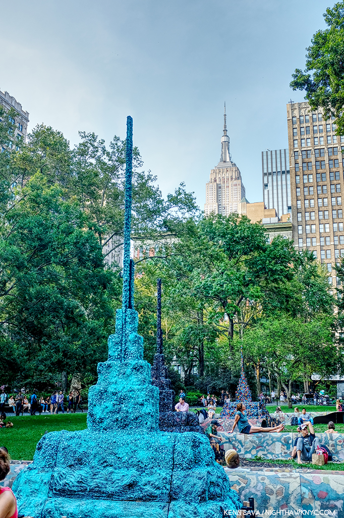
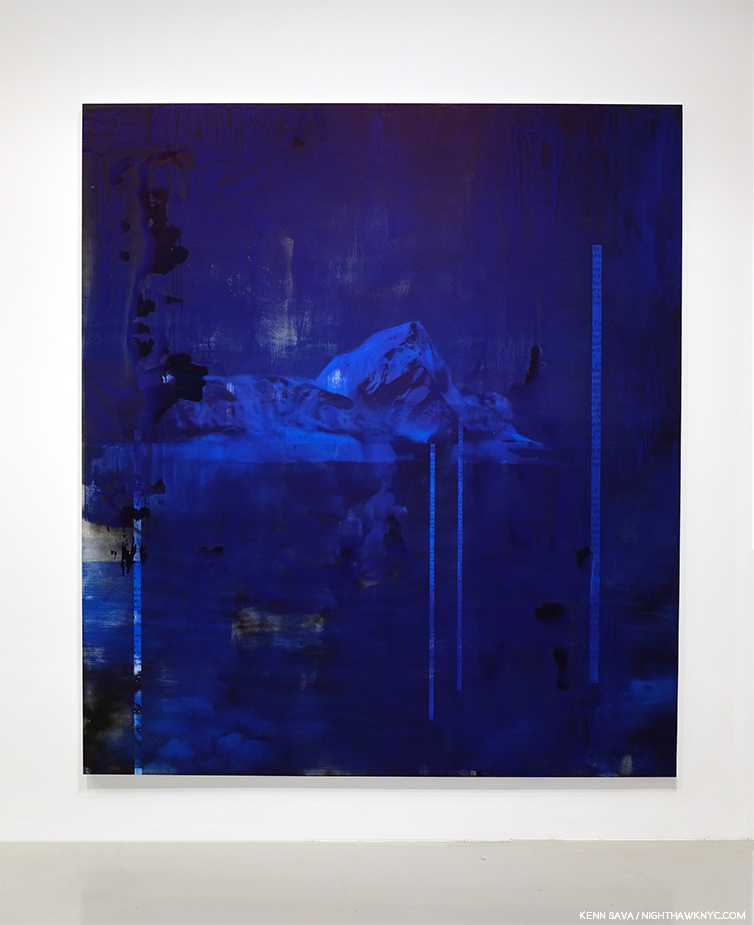
Detail of Leonardo Drew’s Public Art project, City in the Grass, 2019, seen in August in Madison Square Park, where it was on view from June through December. In conversation, Mr. Drew spoke of the influence of Indian Stupas, though the Empire State Building 10 blocks behind, might be one as well.

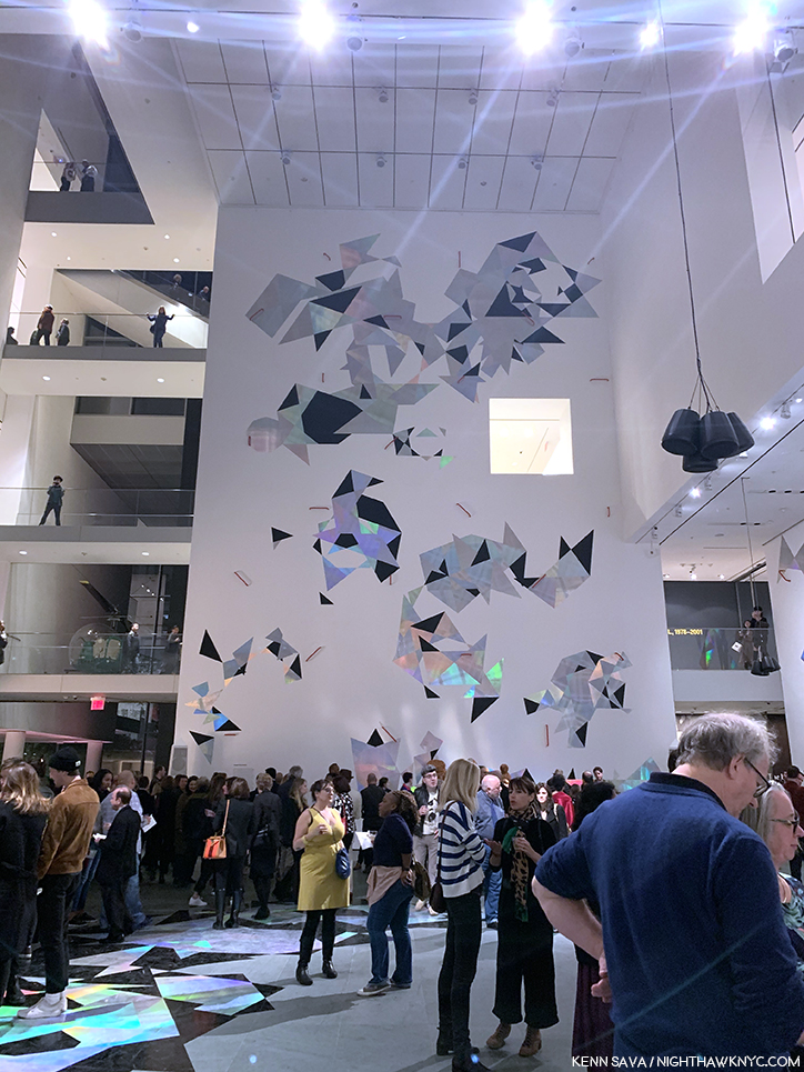
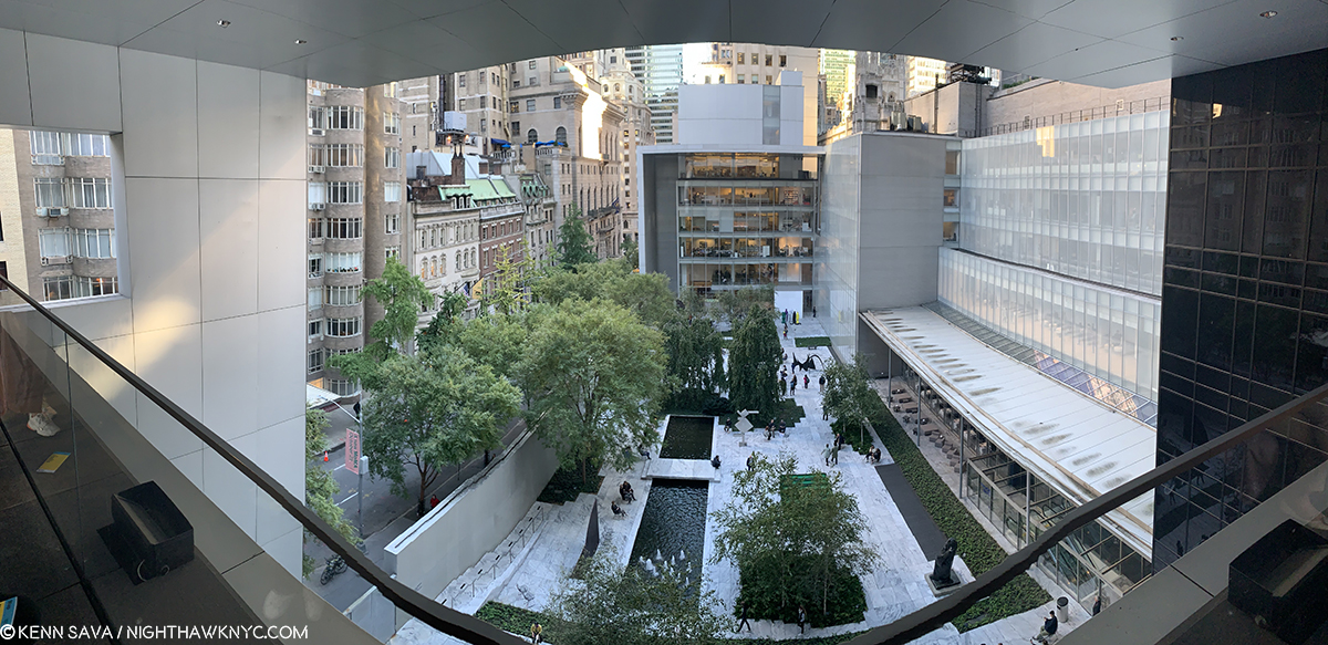
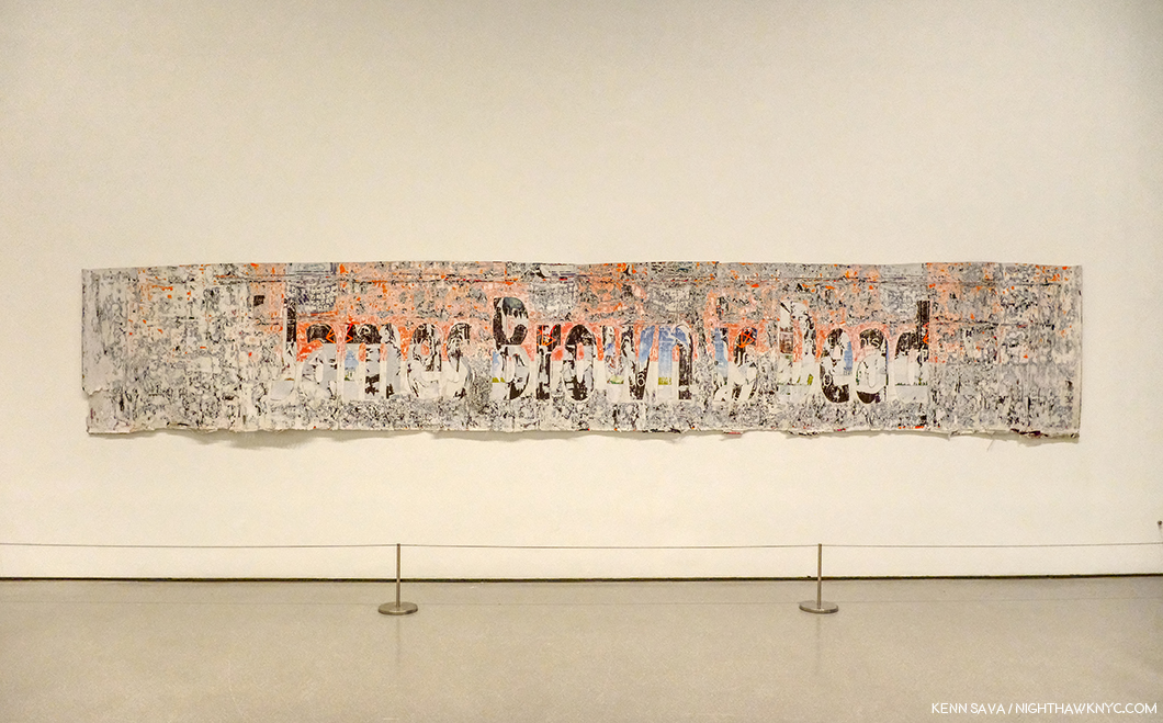
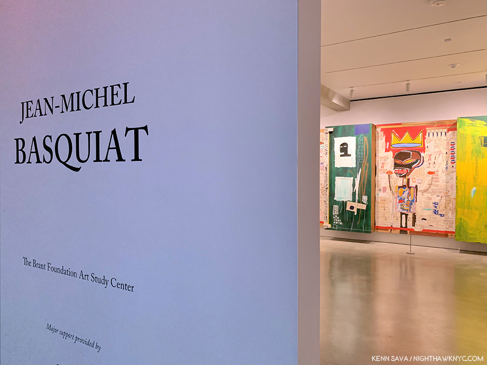
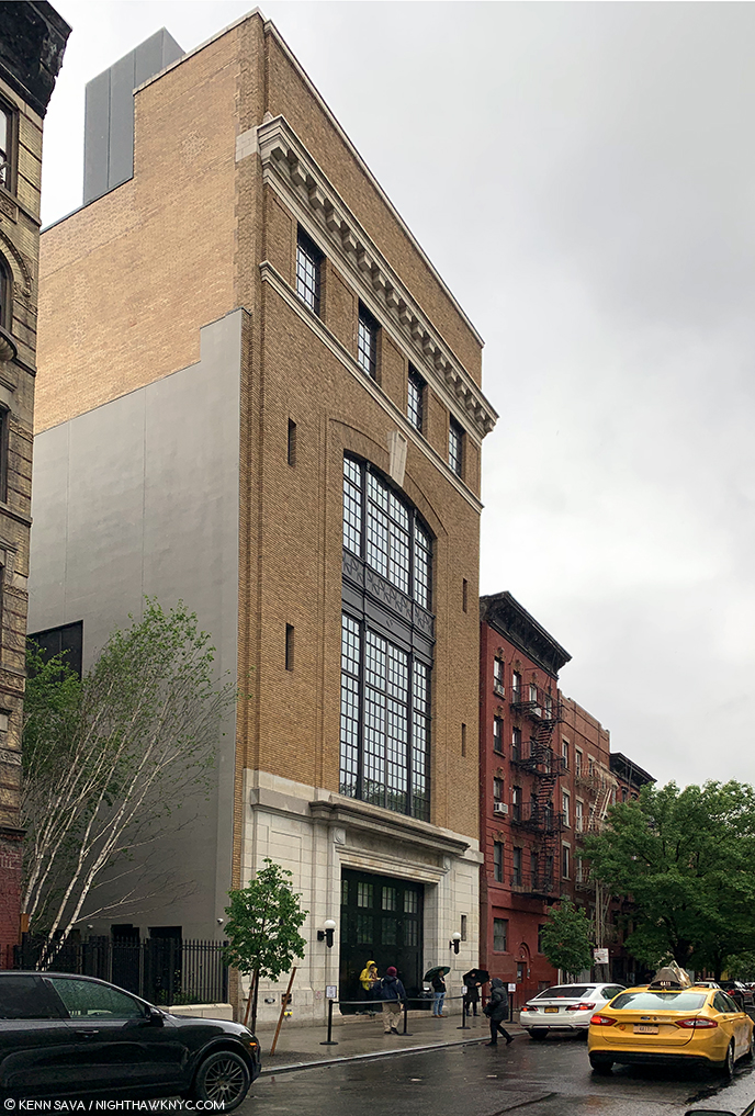
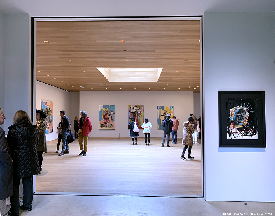
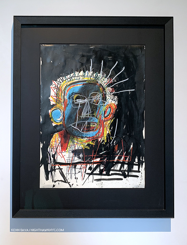
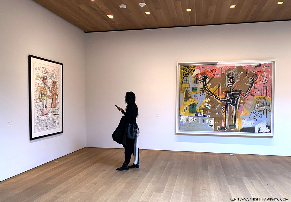
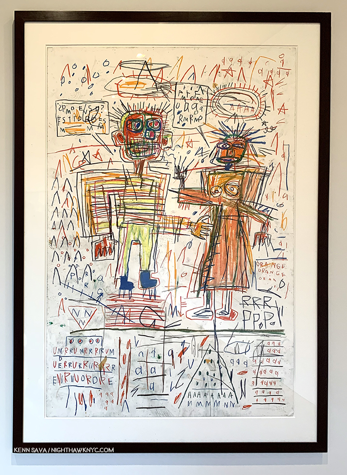
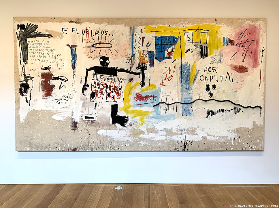
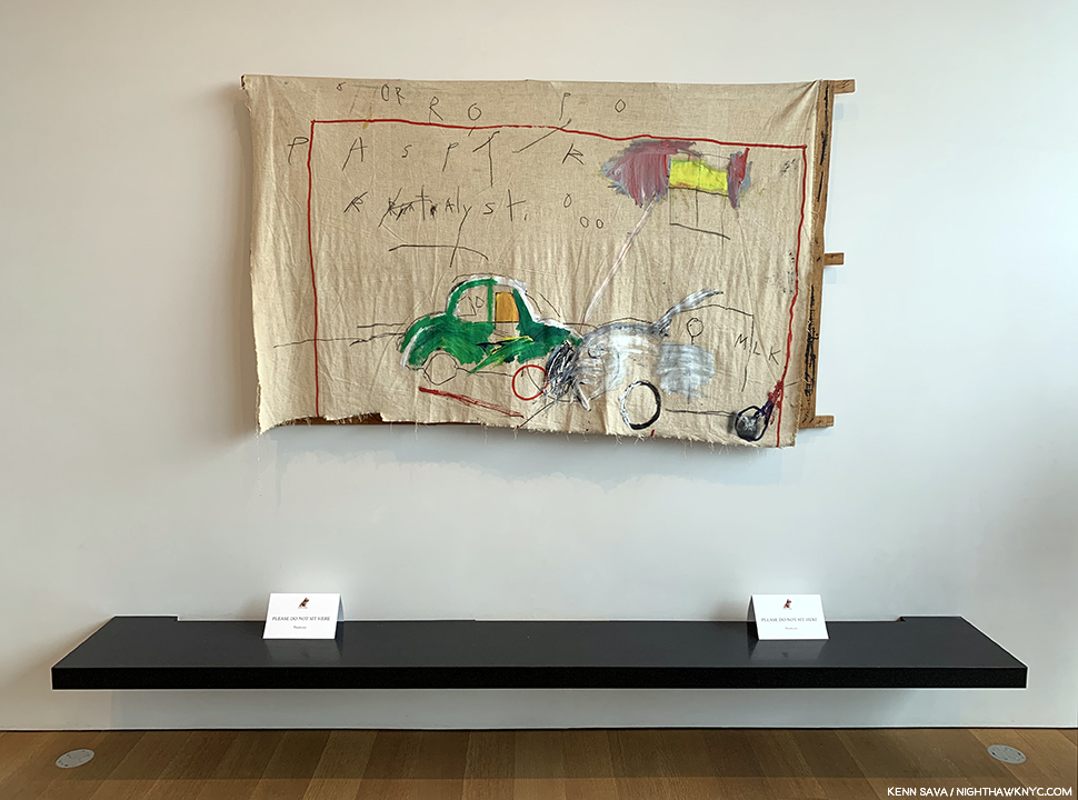
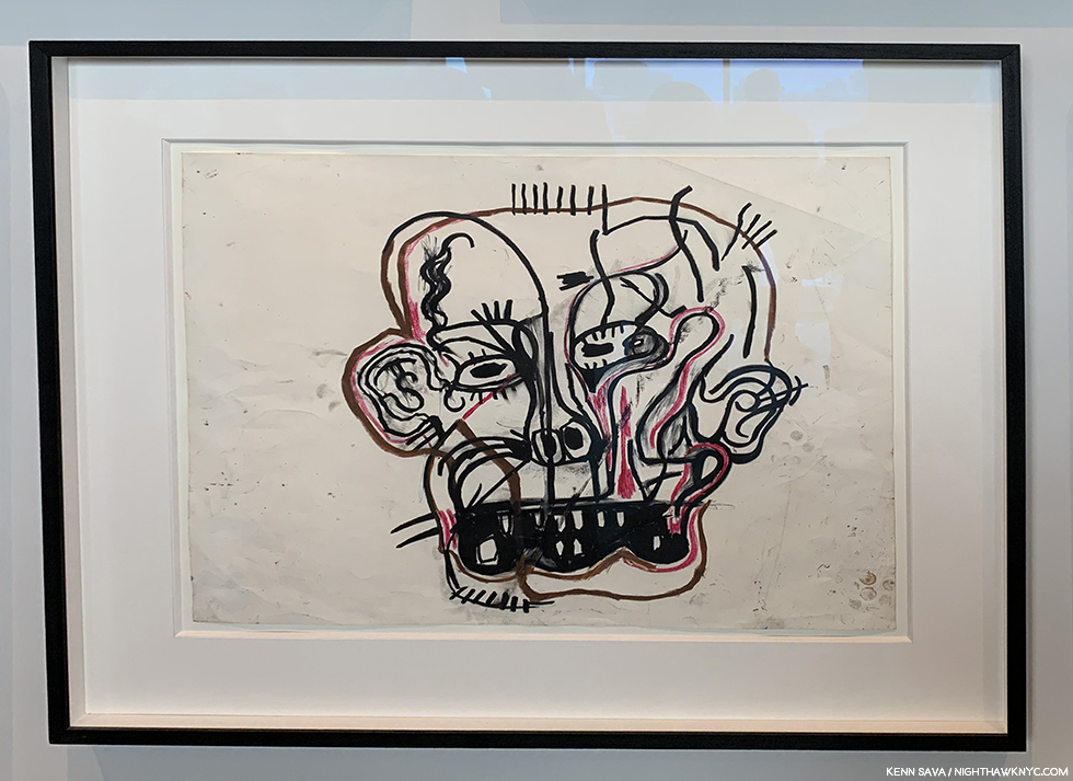
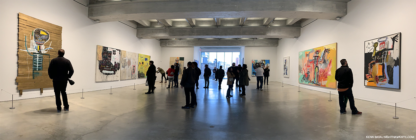
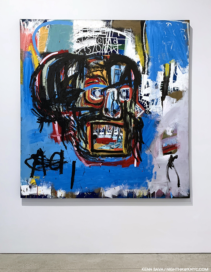
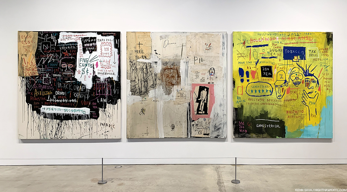
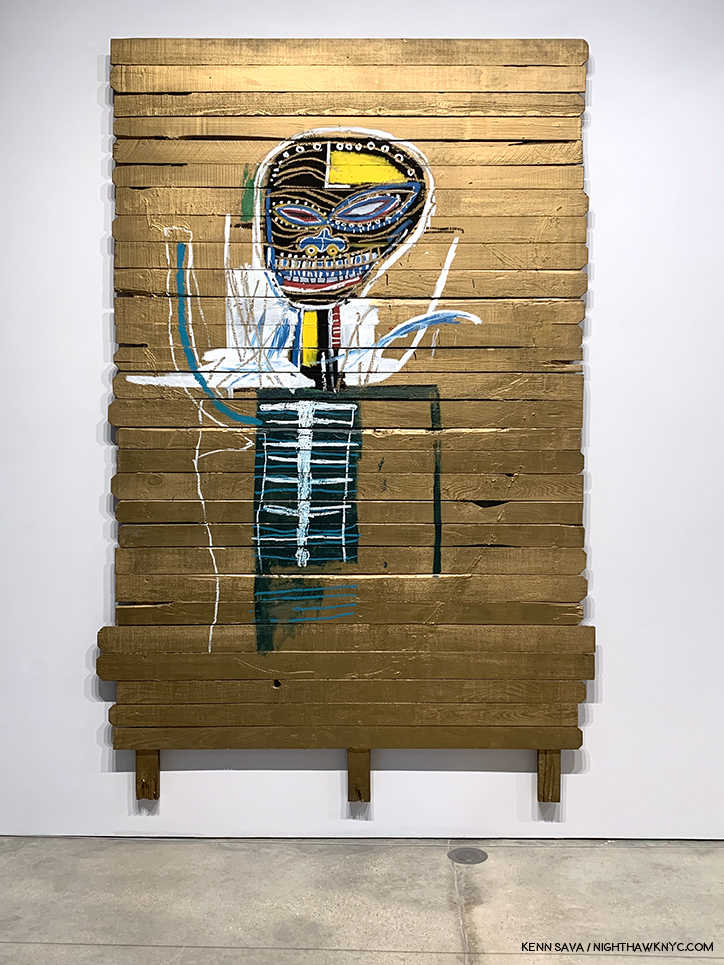
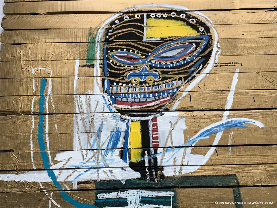
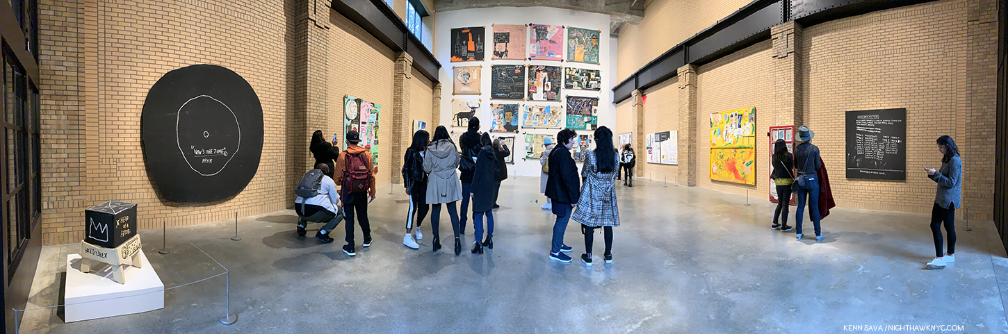
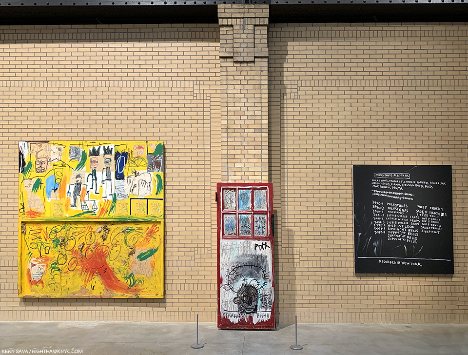
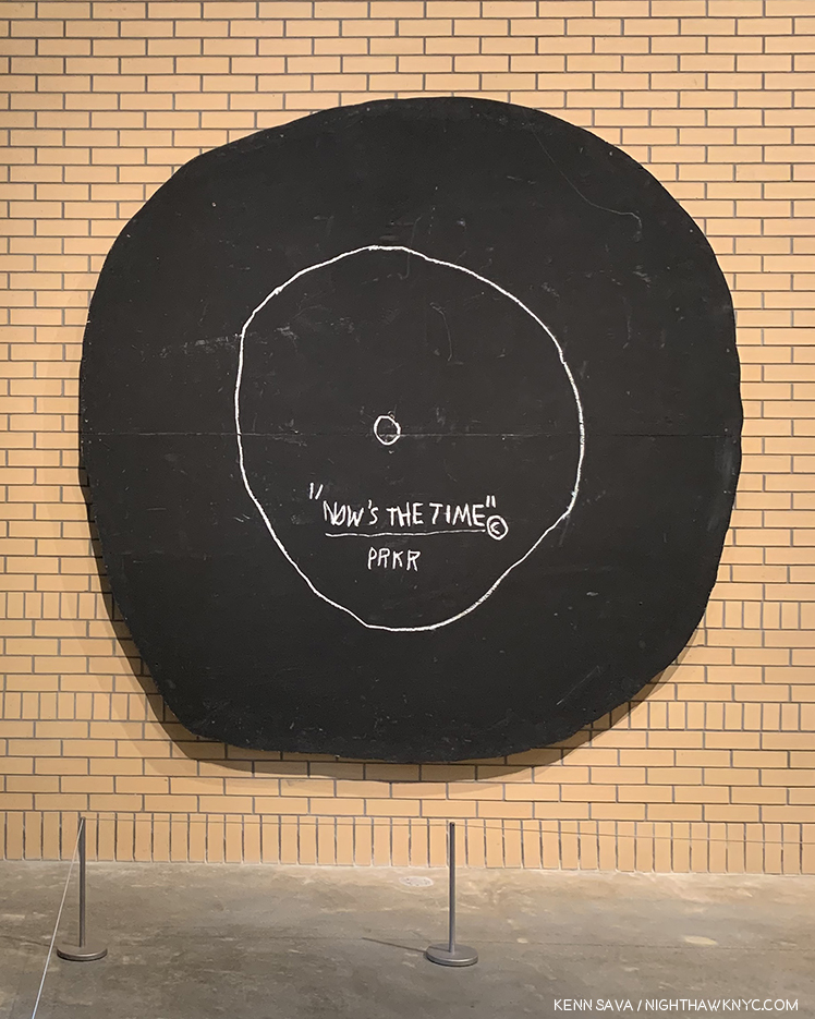
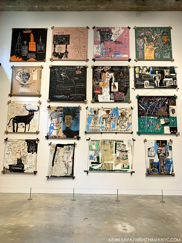
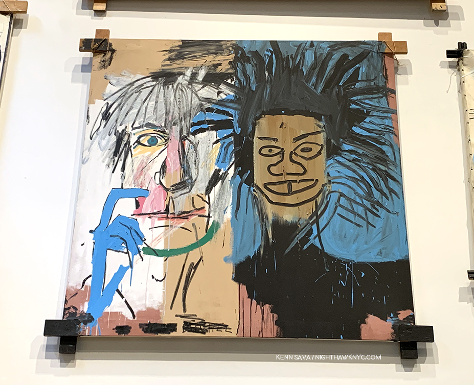
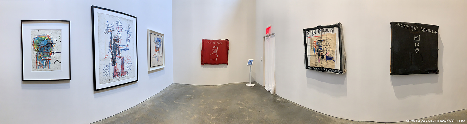
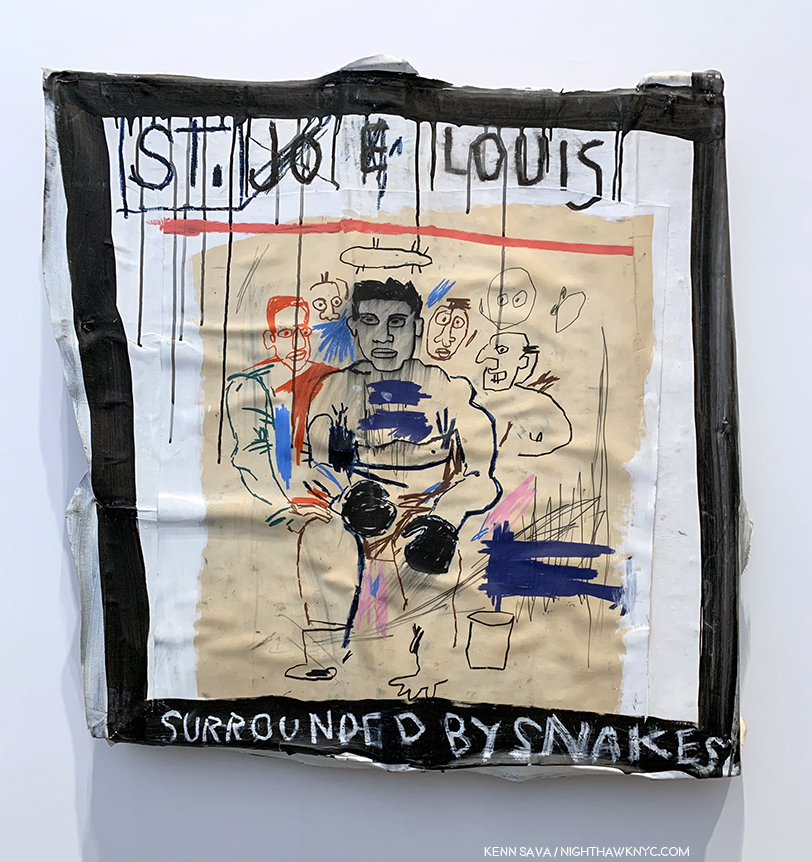
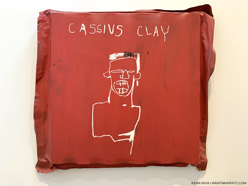
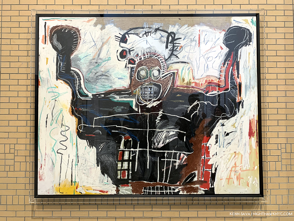
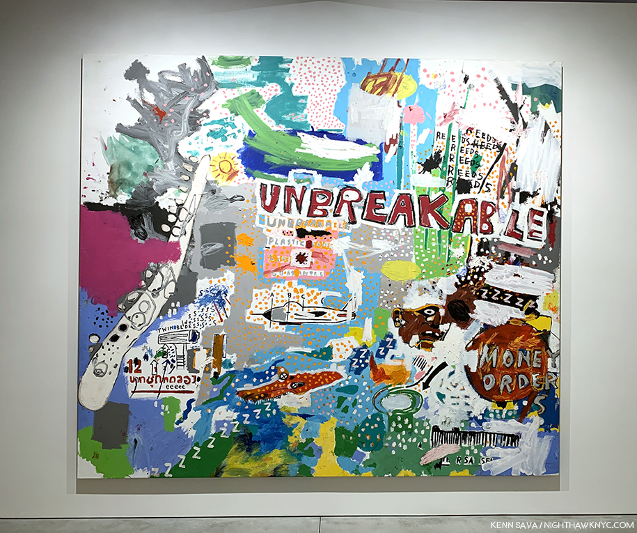
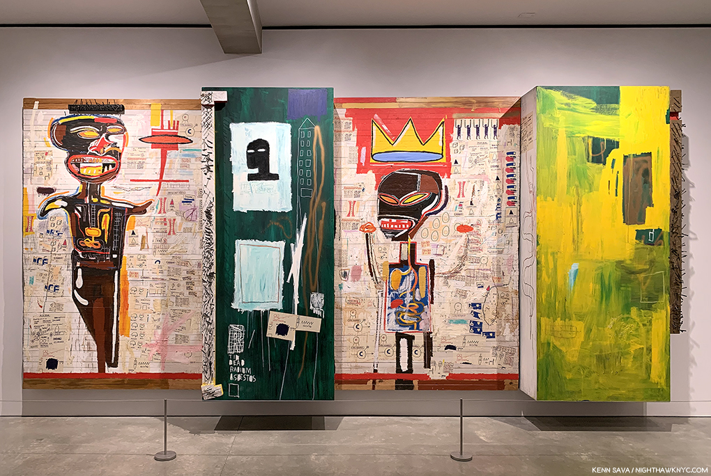
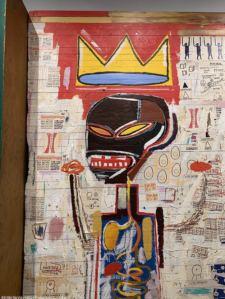
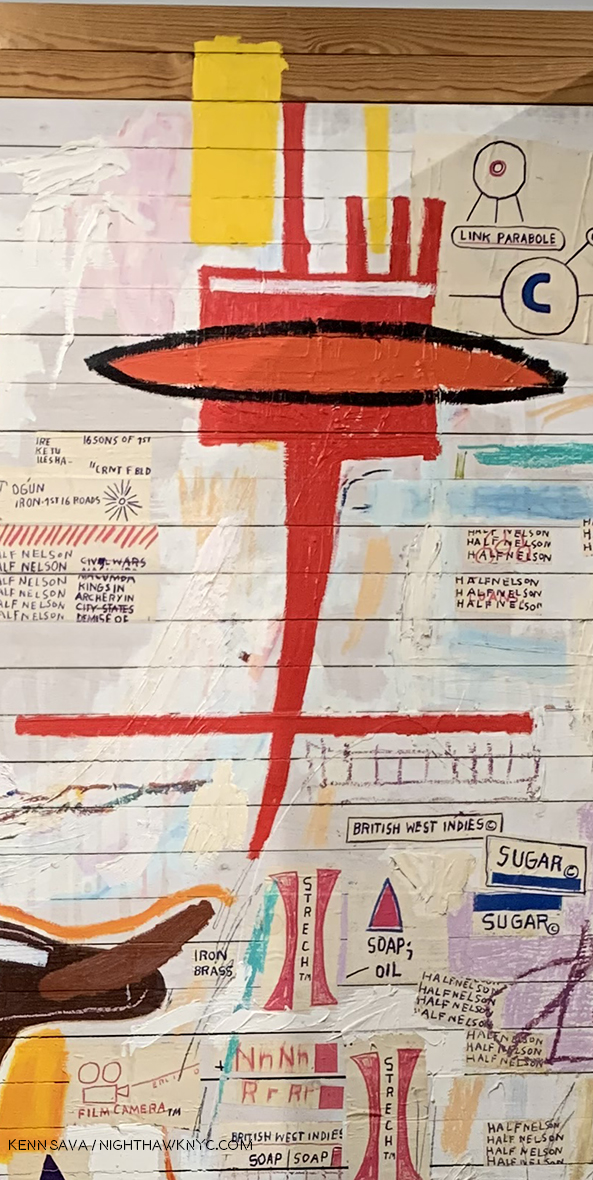
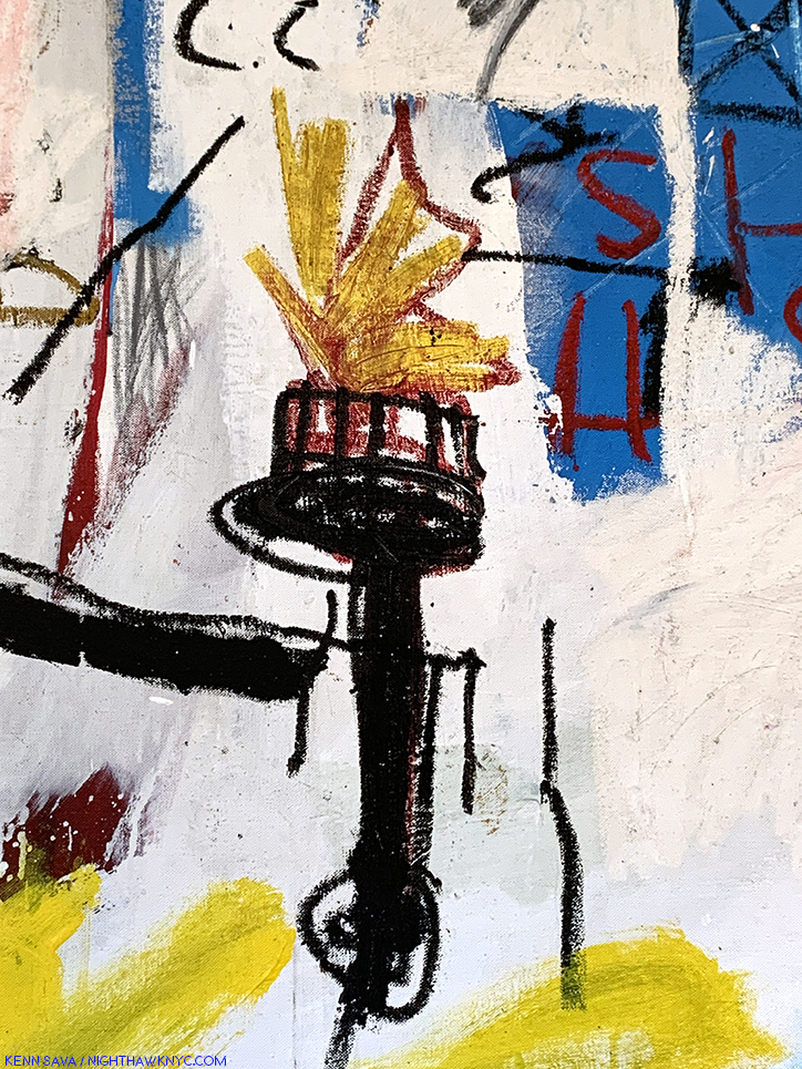
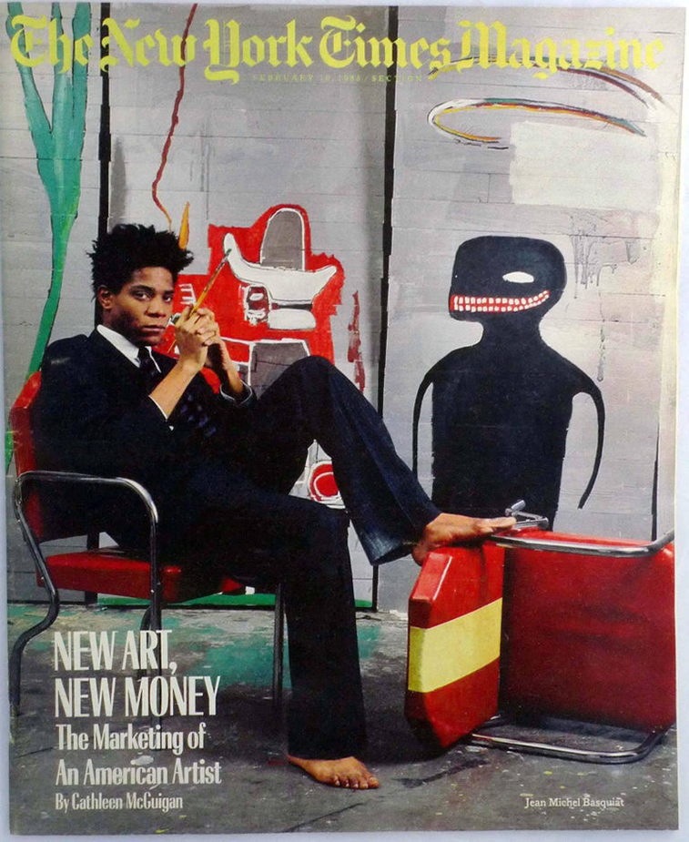
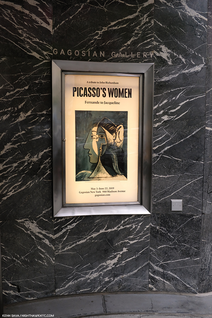
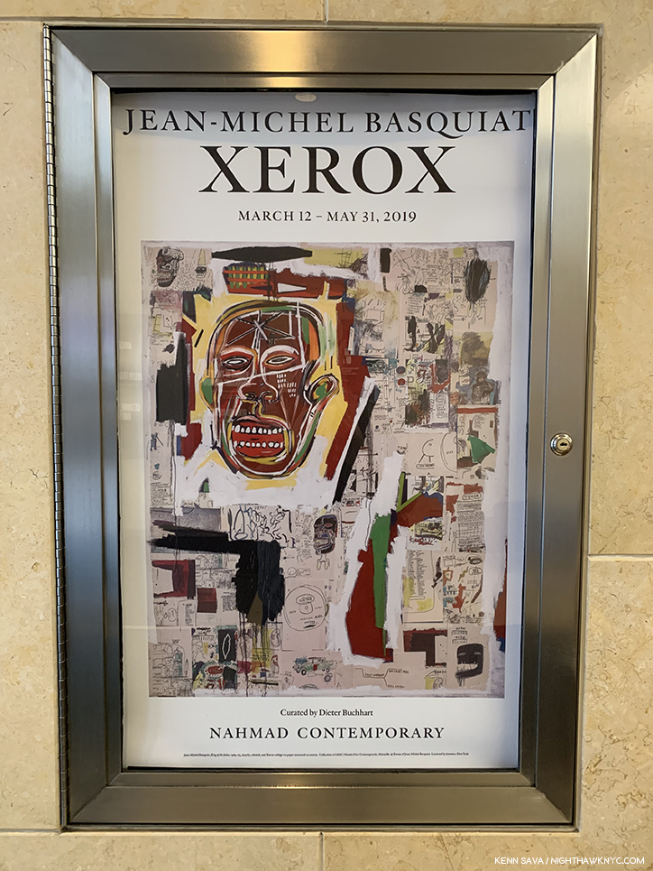
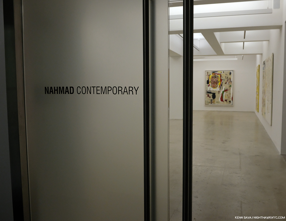
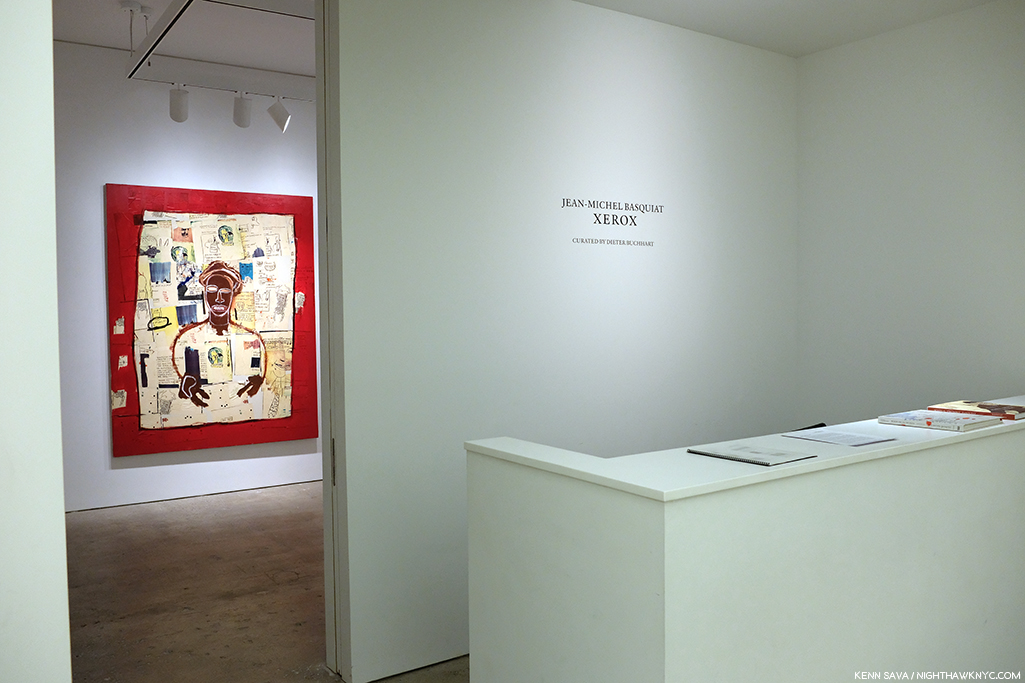
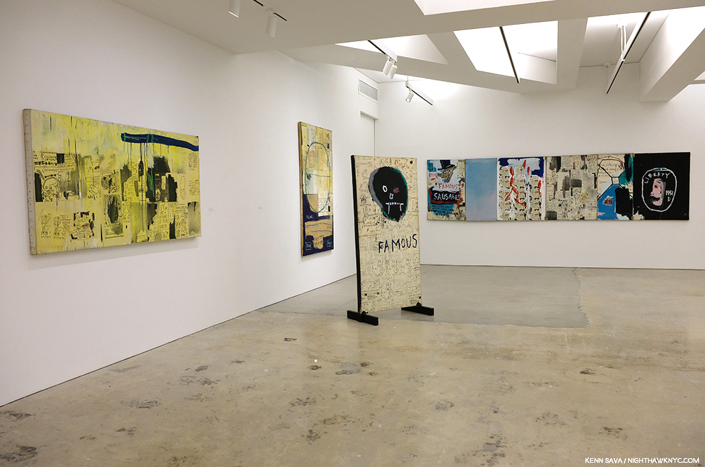
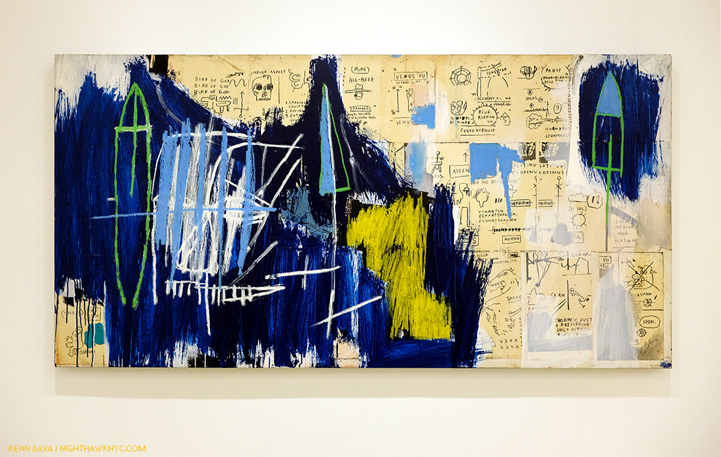
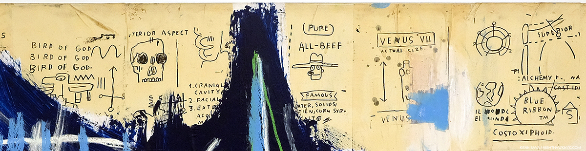
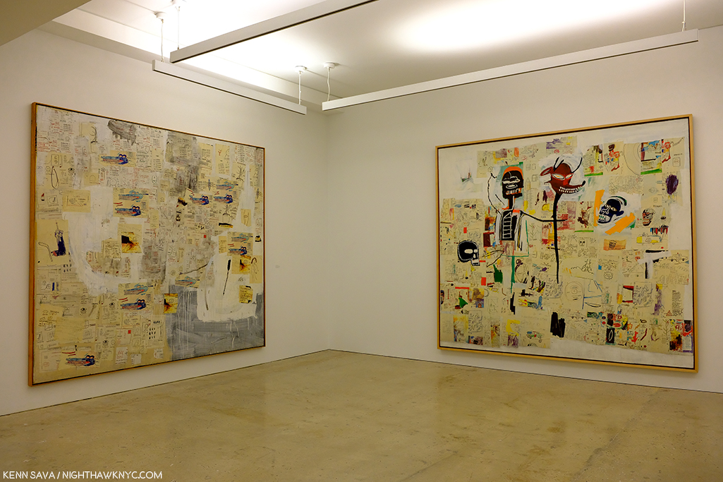
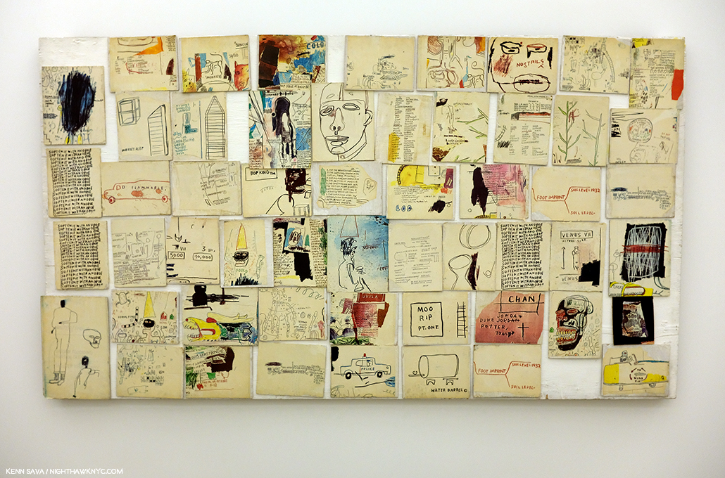
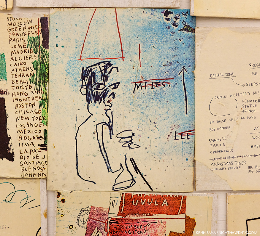
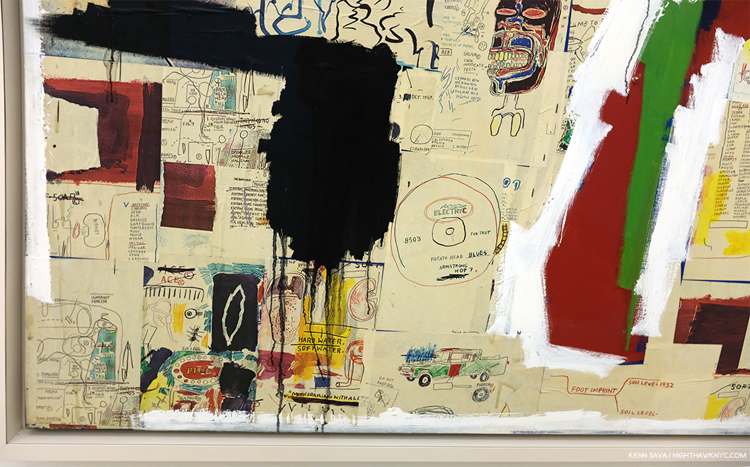
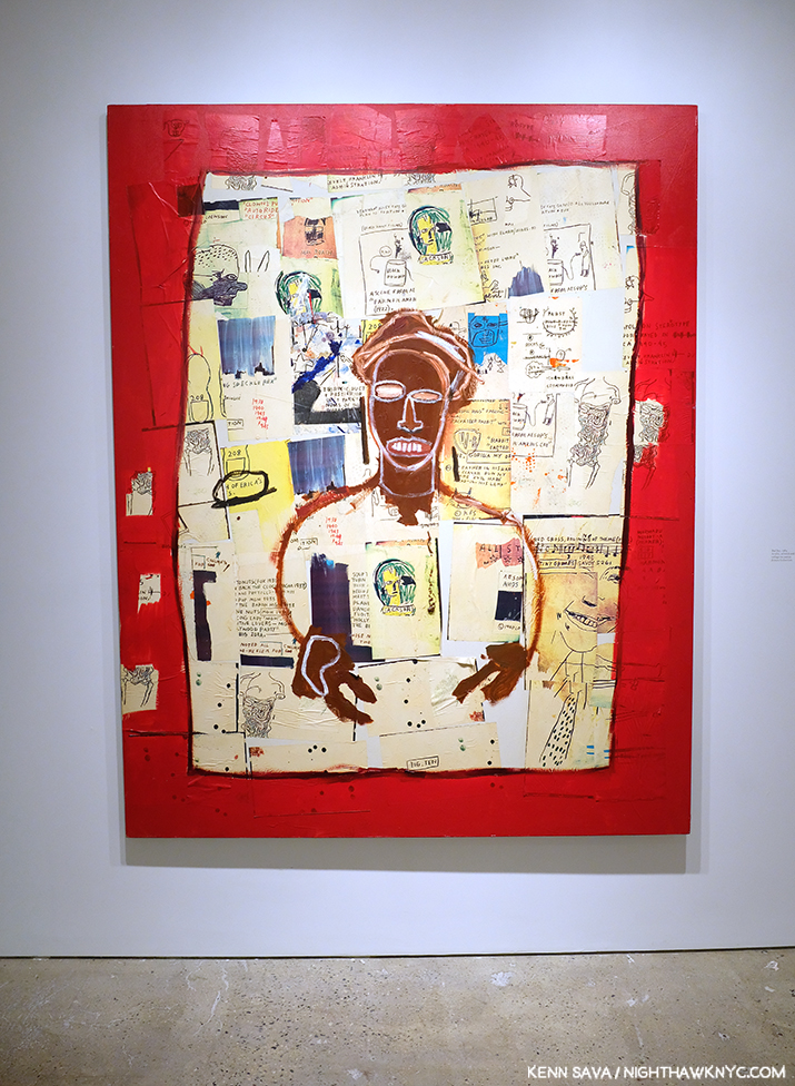
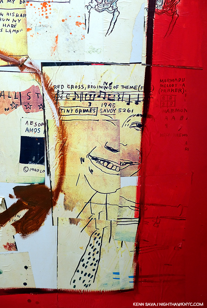
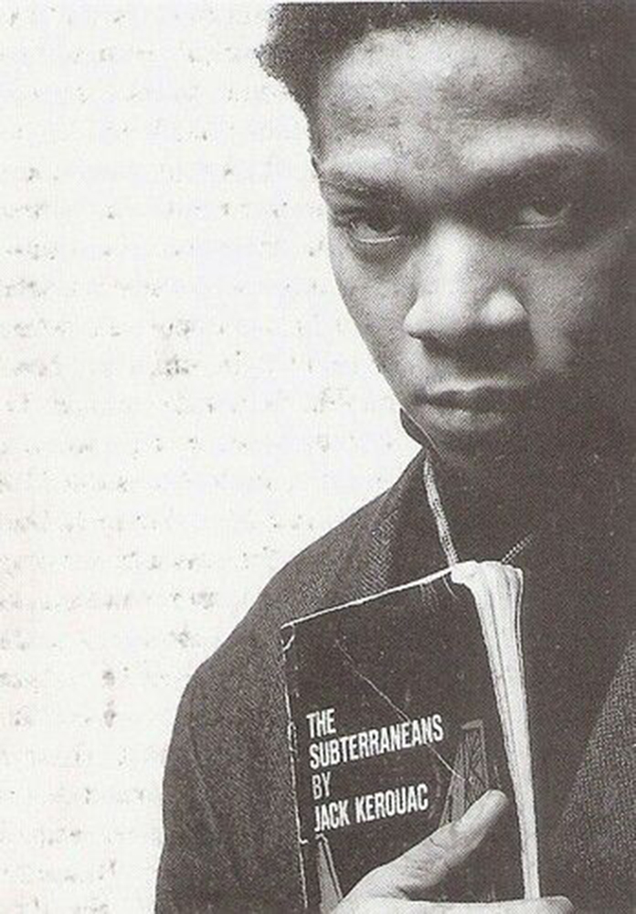
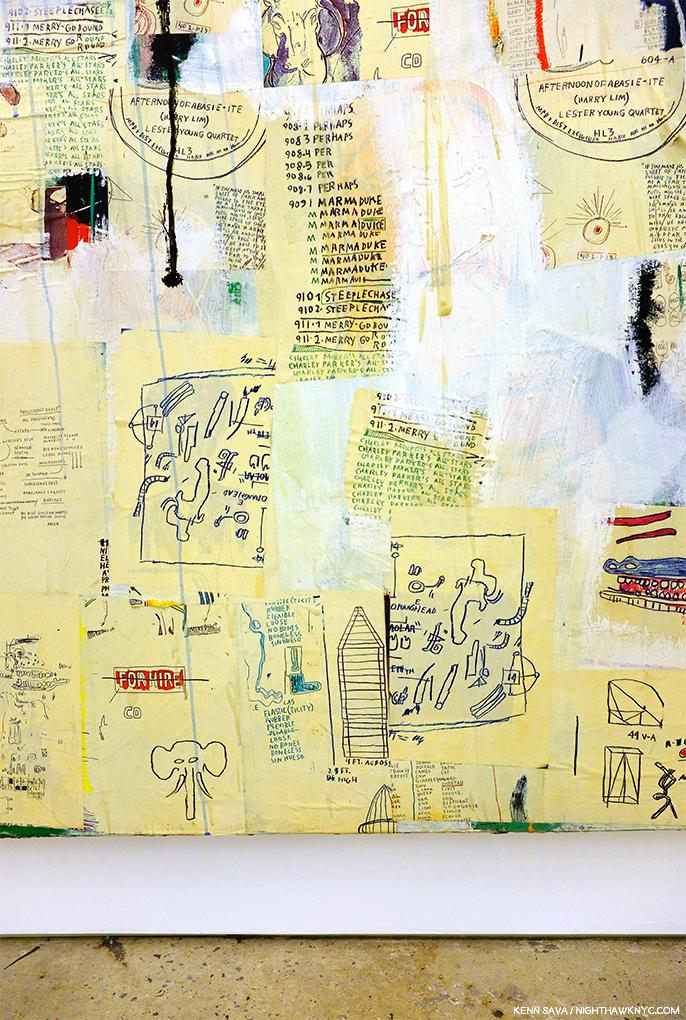
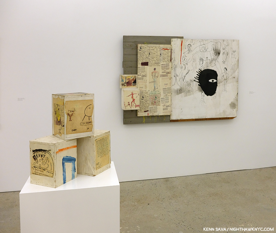
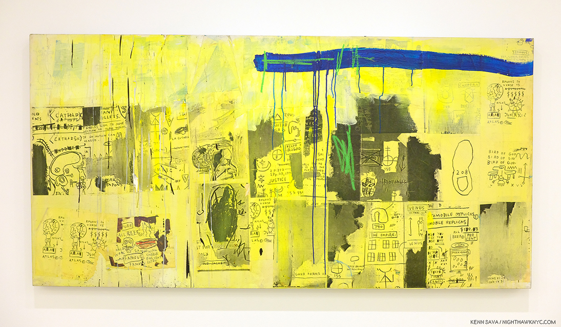
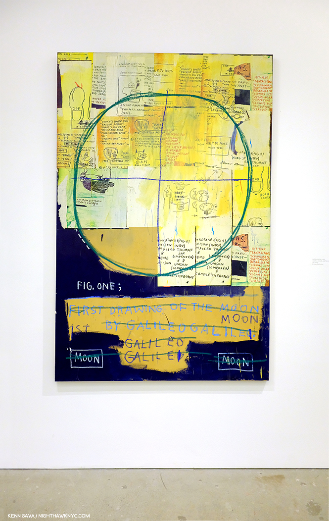
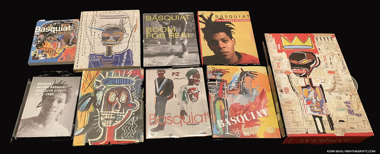
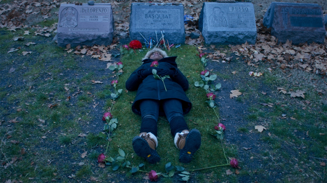
A strange year in Art in NYC ended a few weeks ago. A year that saw one of Manhattan’s “Big 5” museums (MoMA) close for four months, including the entire summer, while it remodeled, then reopen to mixed reviews (mine among them), while another one (The Whitney) faced an Artist revolt mid-Biennial, another (The Met) had what seemed to me to be a fairly “quiet” year on the show front as it adapted to the first full year under its new Director, Max Hollein, while the other two, the New Museum and particularly the Guggenheim, chugged along presenting top notch show after top notch show. Meanwhile, no less than 5 shows of the work of Jean-Michel Basquiat were mounted around town, and though I wrote a series of pieces on them I still don’t know “Why now?” While I’ve written about a number of other shows I found particularly NoteWorthy in 2019, already, there were some other excellent shows that linger in my mind, in the space freed up by the plenty of others that do not. If I were to sum of the year in Art seen, I will remember it as a year where Sculpture, long a very overlooked medium, though not here, struck back and broke through.

NoteWorthy Sculpture Shows-

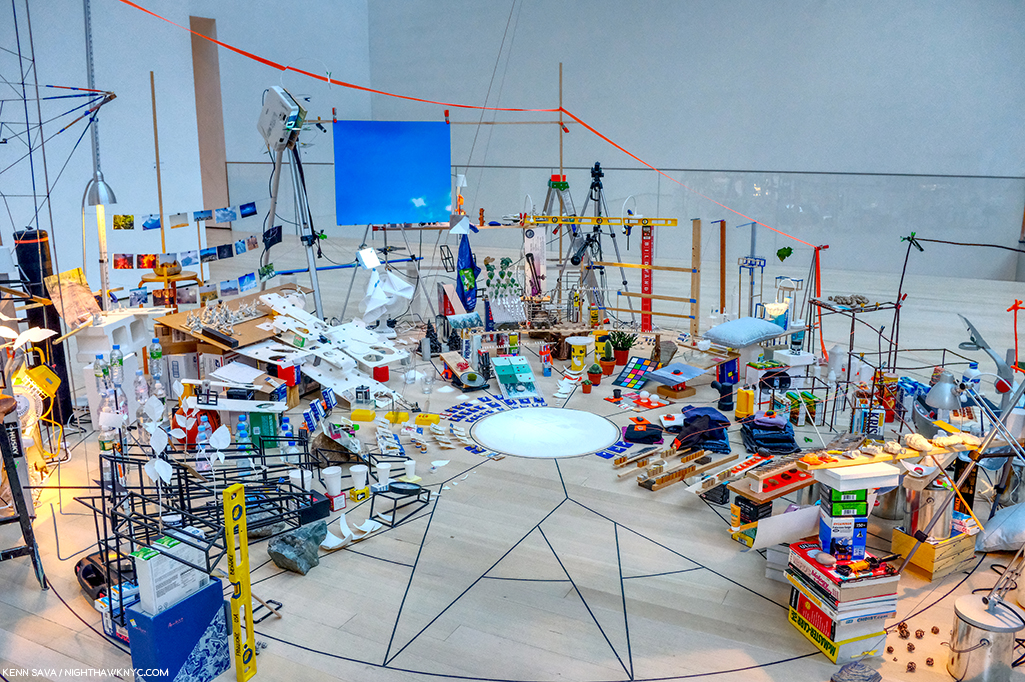
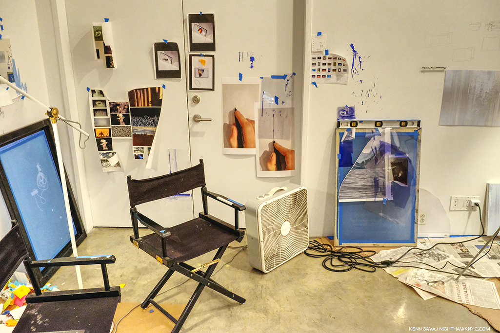
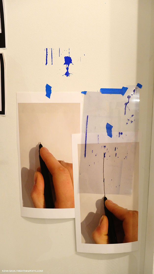
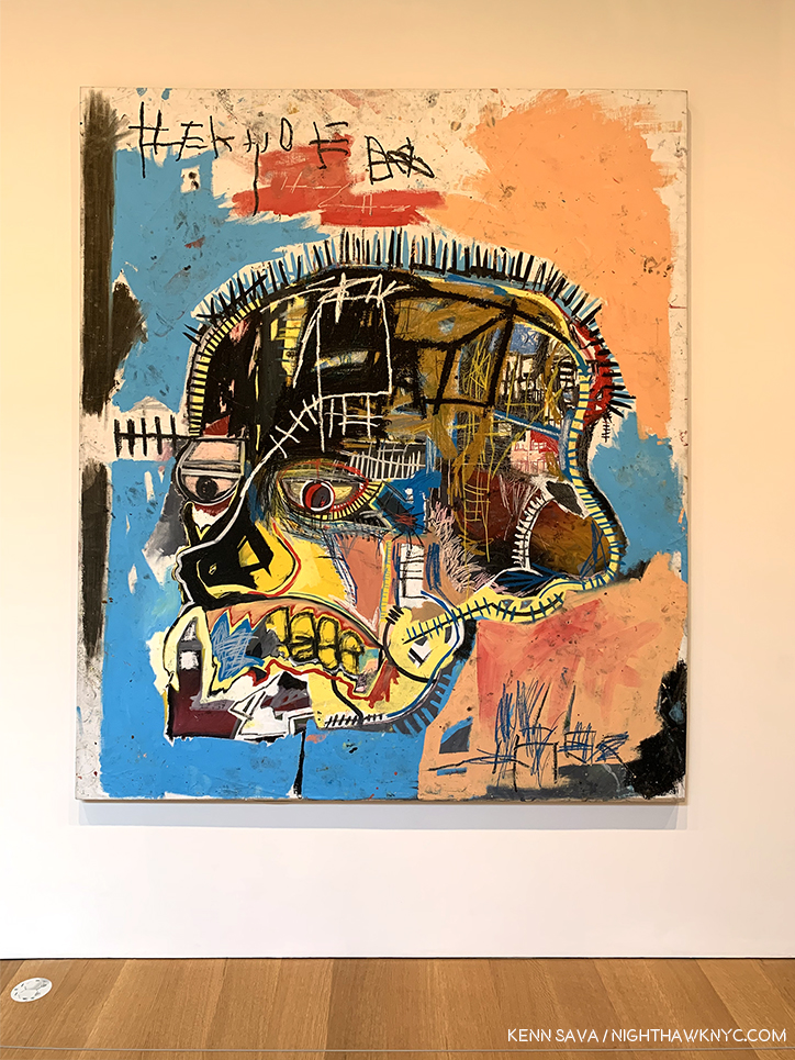
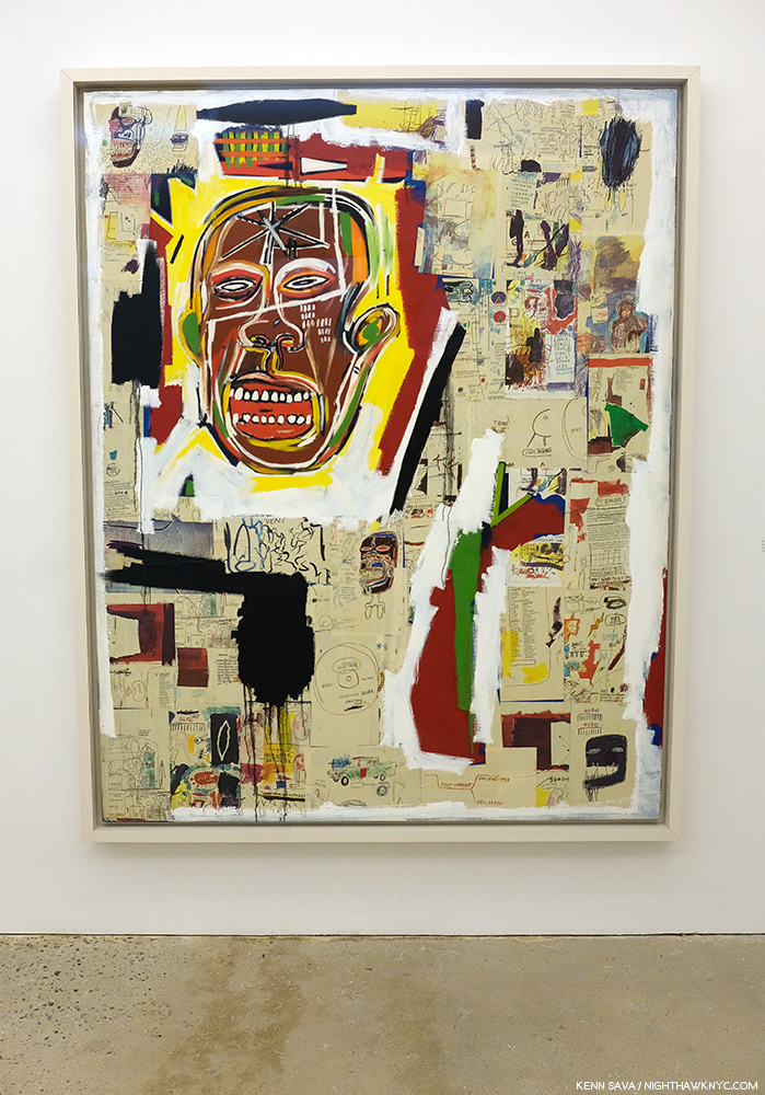
Lingering closest to the front of my mind is the incredible Sarah Sze at Tanya Bonakdar Gallery, which I just wrote about, along with Jean-Michel Basquiat at The Brant Foundation, the most unforgettable shows I saw in 2019.

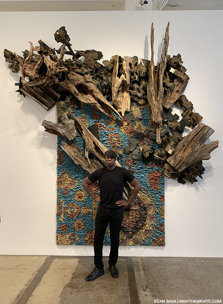
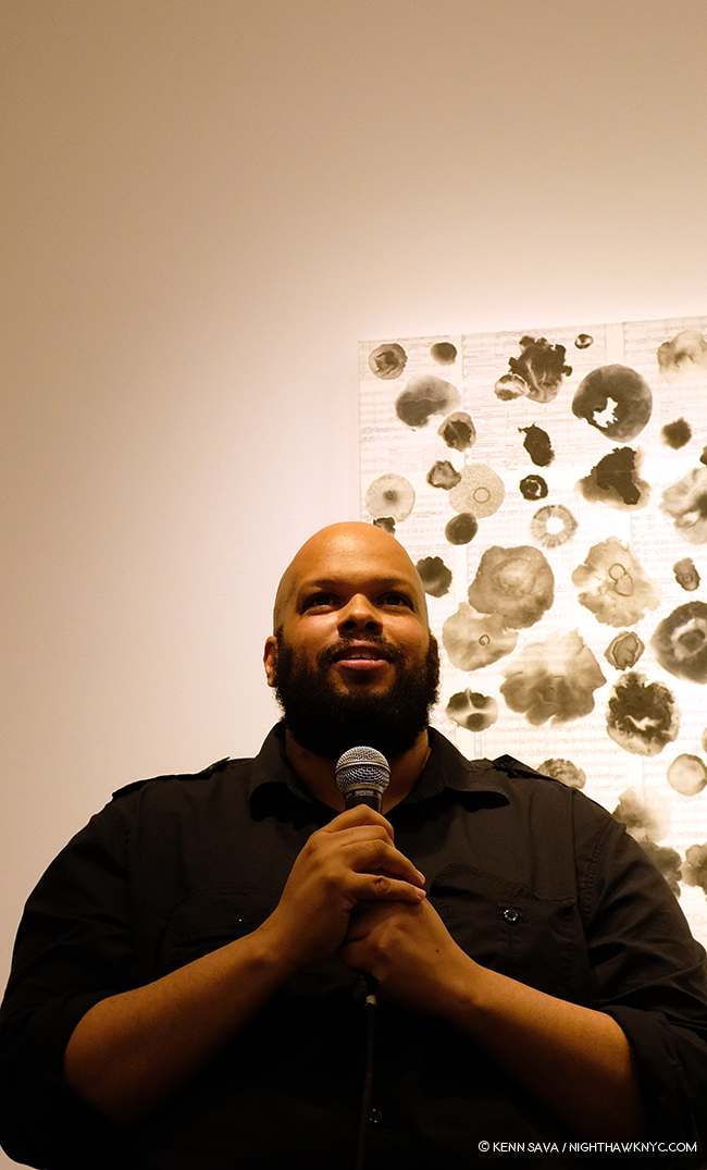
Leonardo Drew poses in front of Number 217, 2019, Wood, plaster and paint, on the last day of his show at Galerie Lelong, August 2, 2019

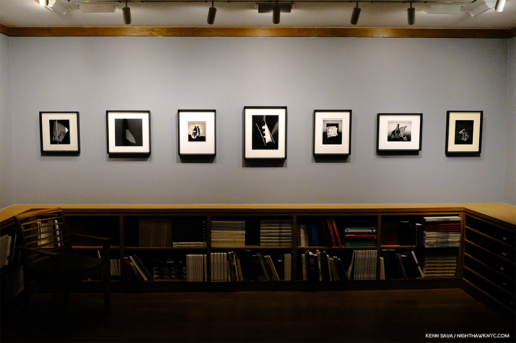
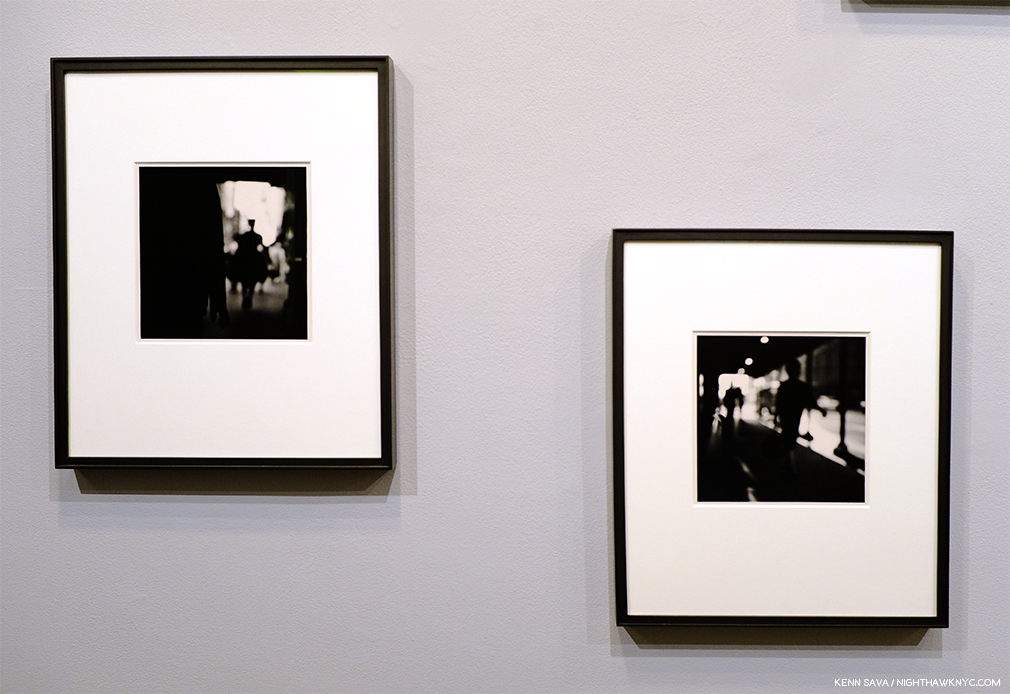
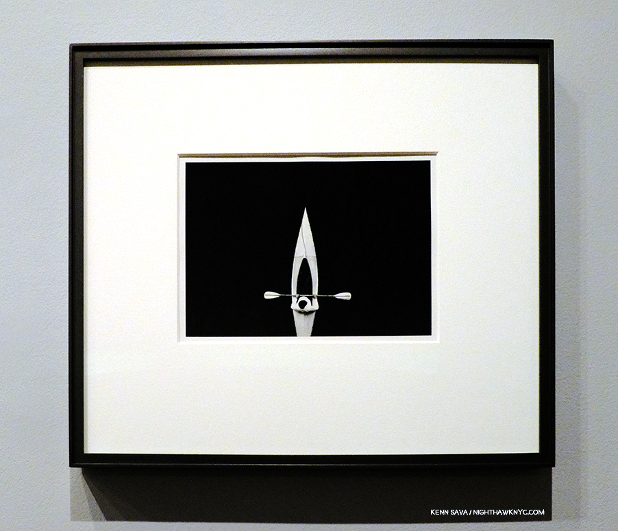
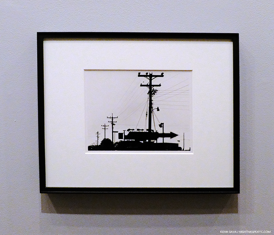
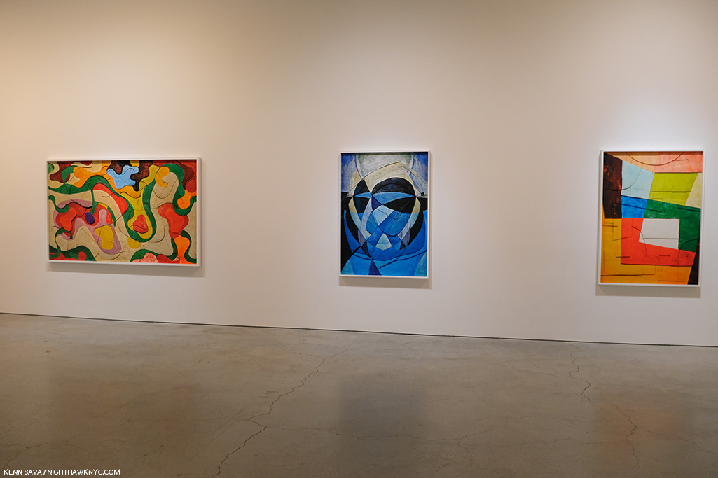
Leonardo Drew at Galerie Lelong and City in the Grass at Madison Square Park. Mr. Drew has achieved substantial success around the world, with work in the Permanent Collections of any number of museums, including The Met’s, yet he still seems to be something of a “well-kept secret” to the larger Art public. One of the most original, interesting and visionary Sculptors working today, I thought his show at Galerie Lelong was close to perfect.

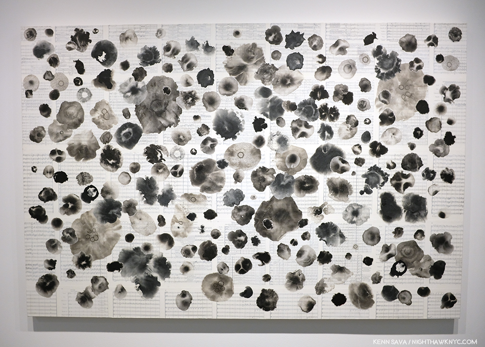
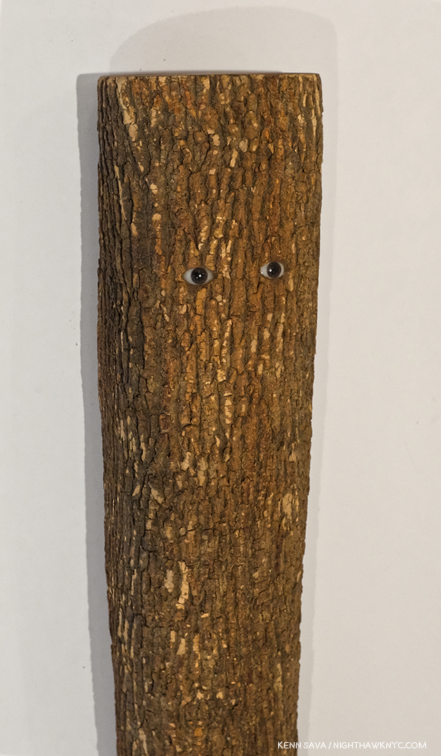
Number 215, 2019, Wood, paint and sand.

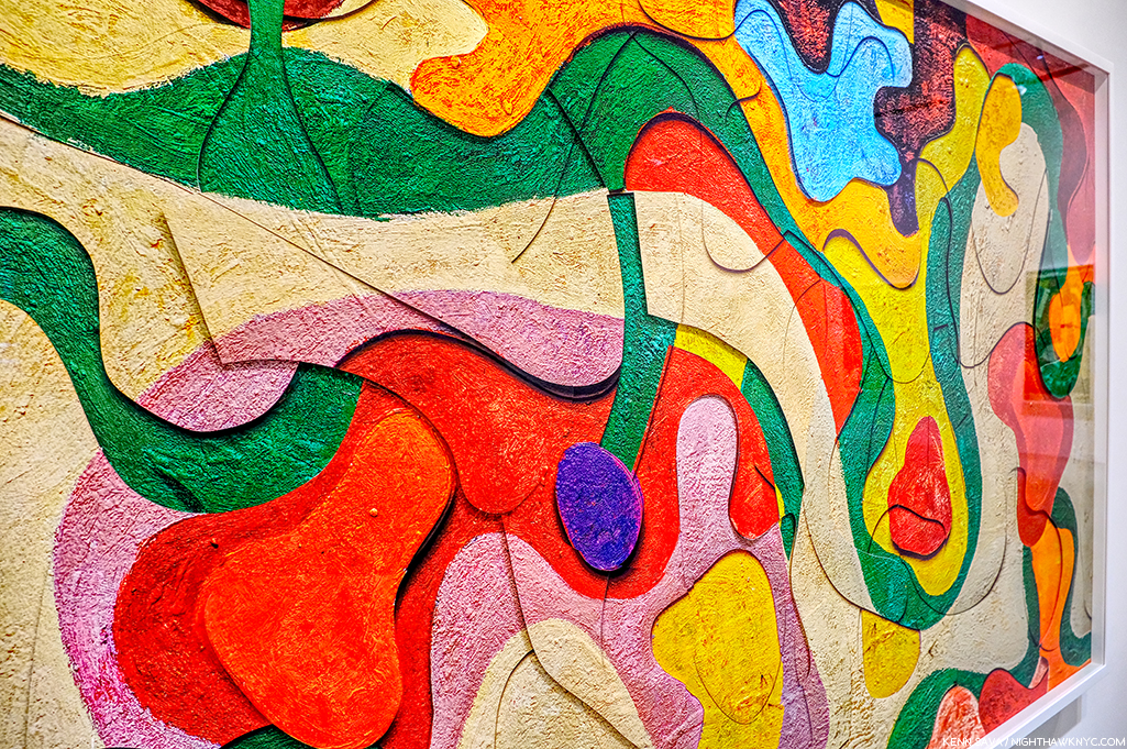
As with Sarah Sze, the show marked the introduction of Painting by the Artist, though not in the “traditional” sense. The Artist told me Number 215 began as a Painting (his), which he then deconstructed as if it had exploded.

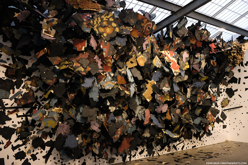
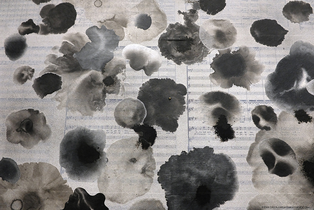
Detail. The show also introduced color into Leonardo Drew’s work.

One monumental work in the large gallery accompanied by five others in the remaining space, each one selected with supreme taste to provide a wonderful group. While his show was up, Mr. Drew also debuted his first Public Art piece, a work commissioned for Madison Square Park.

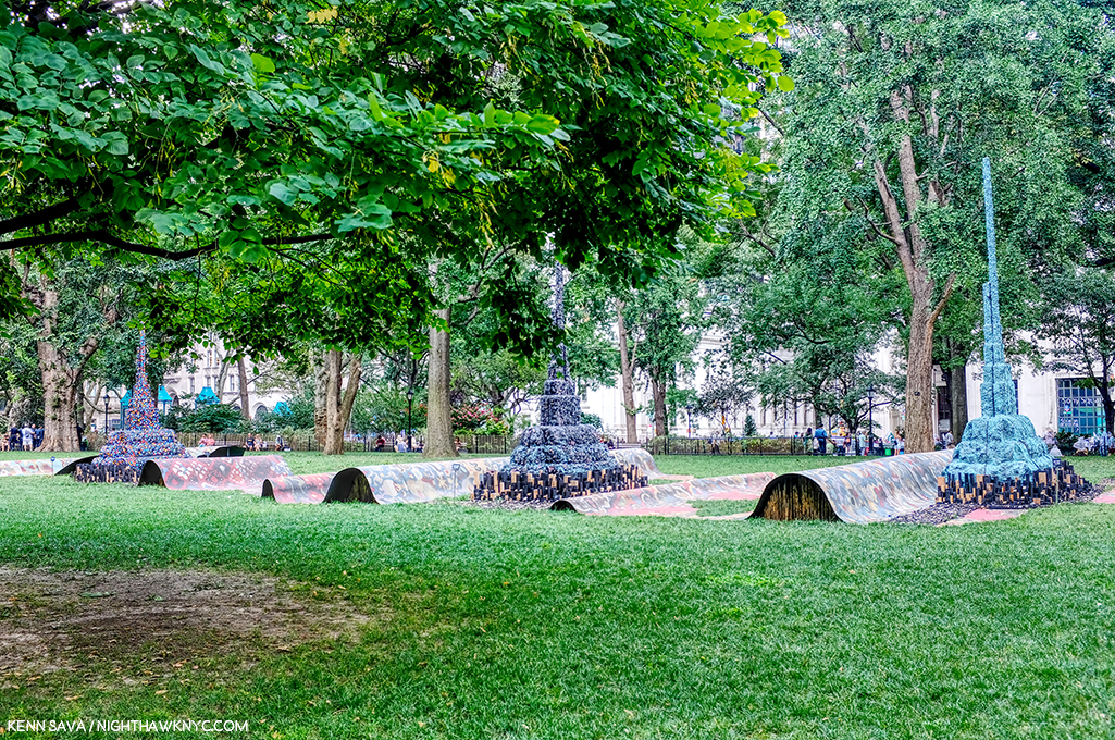
City in the Grass seen on a day when the lawn was closed to be rested from the non-stop traffic it had been receiving. At the base of each of the three “Stupa”-like structures were wooden “cities” rendered in Mr. Drew’s typically extensive detail to the point that, up close, you could literally spend hours moving through them with your eyes.

In all my years of living in the City, and living here with Public Art, I’ve never seen a piece that was so quickly adopted by the public. Kids endlessly climbed all over it while their parents and other adults languished on other parts of the gigantic piece, as can be seen in the first picture above. Mr. Drew appeared in the Park at least twice to speak about the work and proved to be an extremely thoughtful speaker.

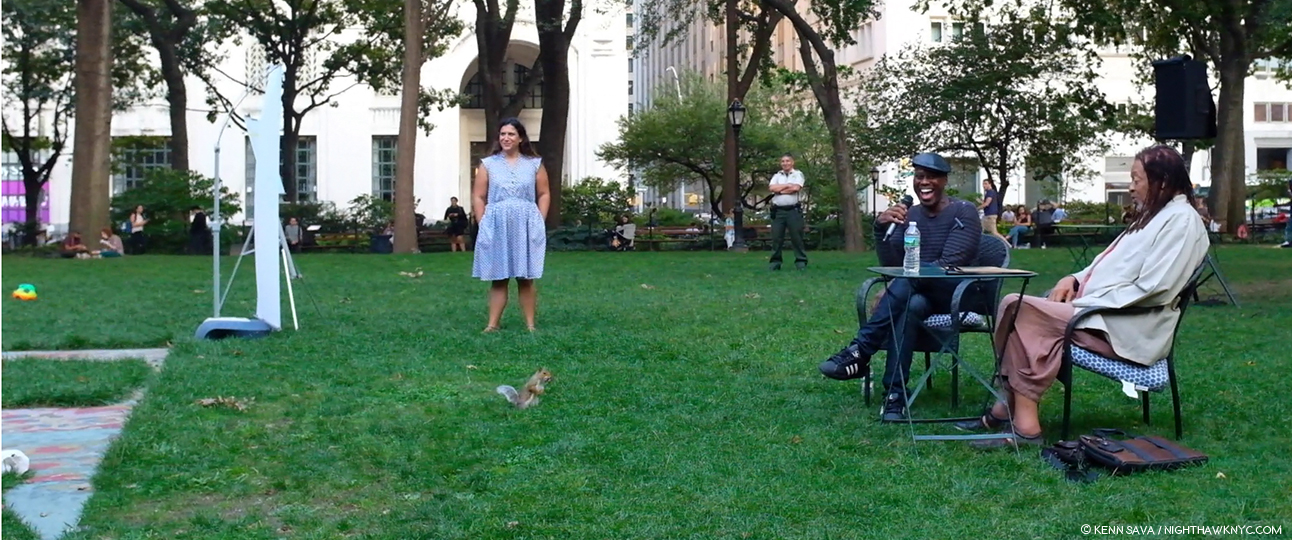
Such was the public acceptance of City in the Grass that even one of the Park’s permanent residents came by to hear the Artist speak about it in a public talk, with renowned writer (and Miles Davis Autobiography co-author) Quincy Troupe, right, on September 11, 2019.

In terms of precedents or influences, Thornton Dial and Jack Whitten (who rented space to Mr. Drew early on the Artist told me) come to mind, but not really. Leonardo Drew is an original. Before he’s done, many decades hence, I believe his work is going to wind up in as many museum as just about any other Sculptor of his generation. 

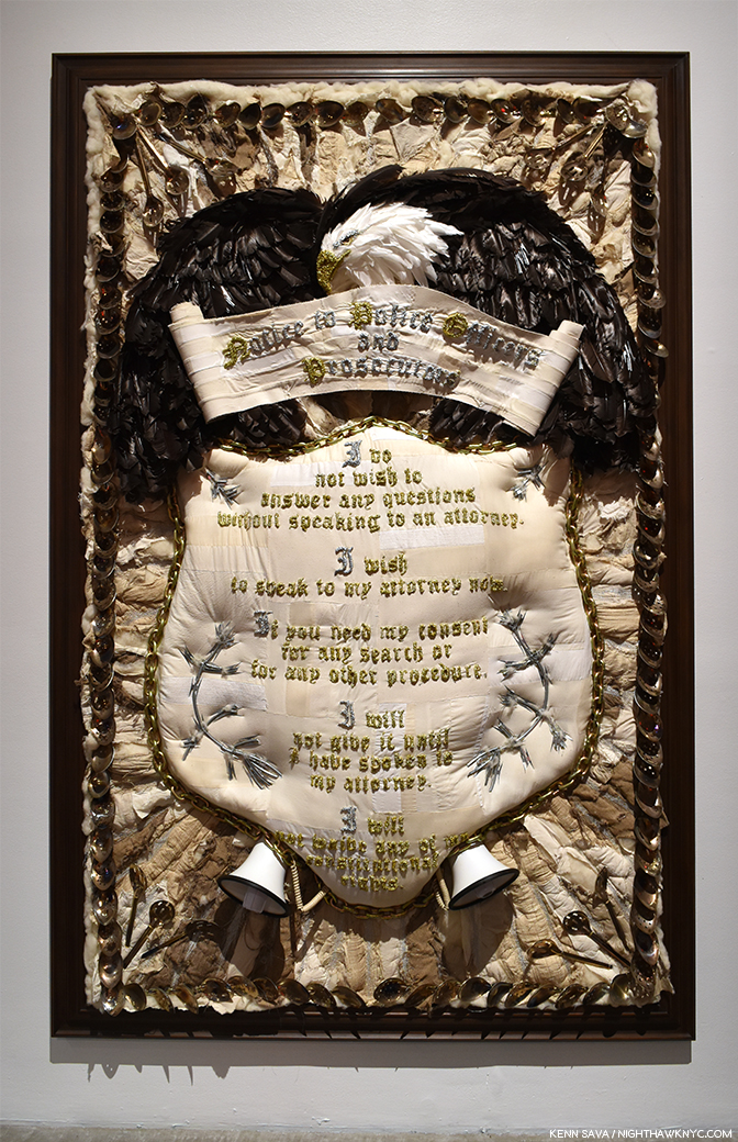
Nari Ward, Homeland Sweet Homeland, 2012, Cloth, plastic, megaphones, razor wire, feathers, chains and silver spoons, 96 x 60 inches. Along with everything else going on in this, the detail is incredible.

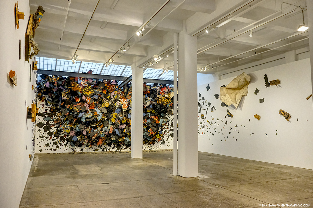
Nari Ward: We The People at the New Museum- Since the 1990s Nari Ward has been repurposing a very wide range of mundane, even humble, materials, often in staggering amounts, in new, surprising and exciting ways. We The People was another long overdue retrospective of the work of this exceedingly creative Artist.

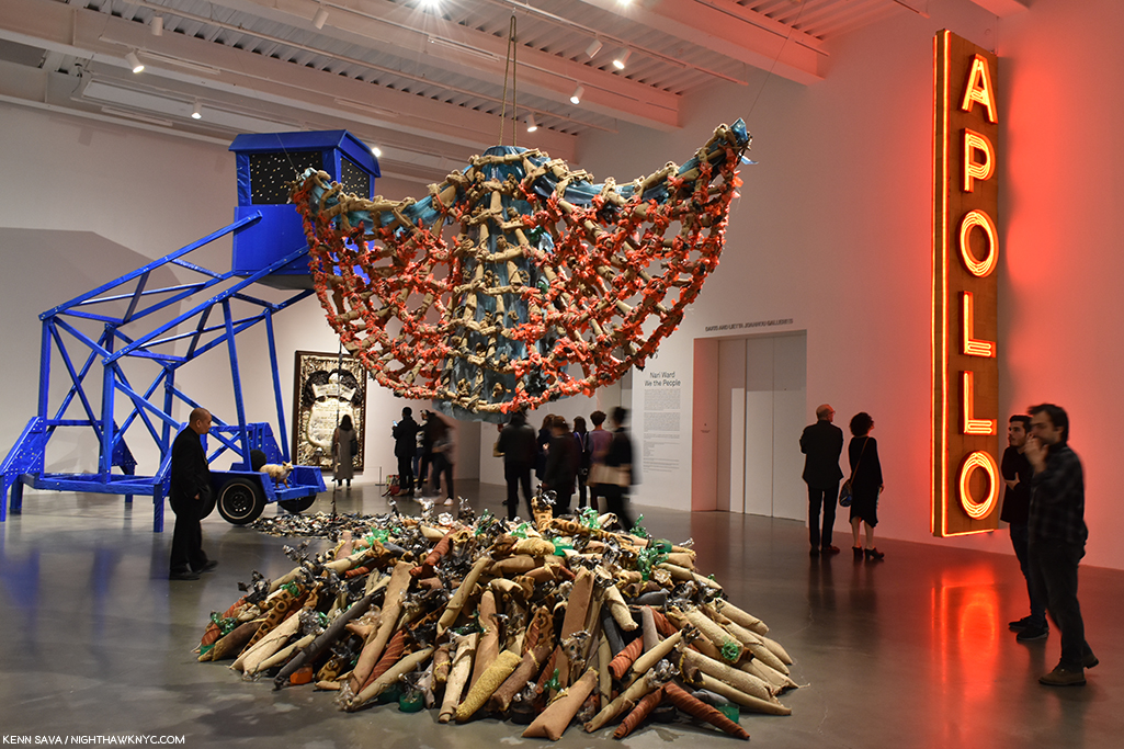
Installation view of part of one of the three floors the show filled.

Occupying multiple floors of the building each work was strong, different from the one before, and shared an uncommon ability to linger in the mind. Another blockbuster show mounted by the terrific team of Massimiliano Gioni and Gary Carrion-Murayari for the New Museum, which continues to rise in stature in my eyes.

Installation view of the 2nd of 3 galleries.

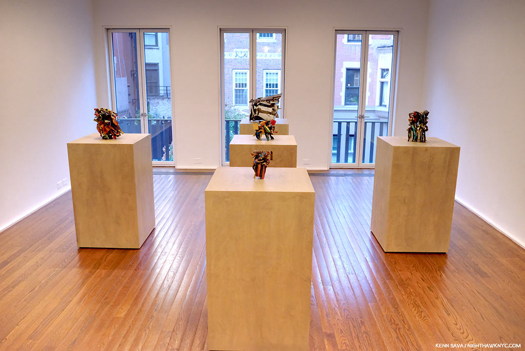
John Chamberlain: Baby Tycoons (with Eva Hesse Drawings) at Hauser & Wirth, East 69th Street- Lesser known work by two ground breaking, unique Artists/Sculptors, both no longer with us were paired in a beautifully installed show at Hauser & Wirth’s uptown outpost. While Ms. Hesse’s Drawings provided a fascinating insight into her career and process, Mr. Chamberlain’s gorgeous small works completely enthralled me.

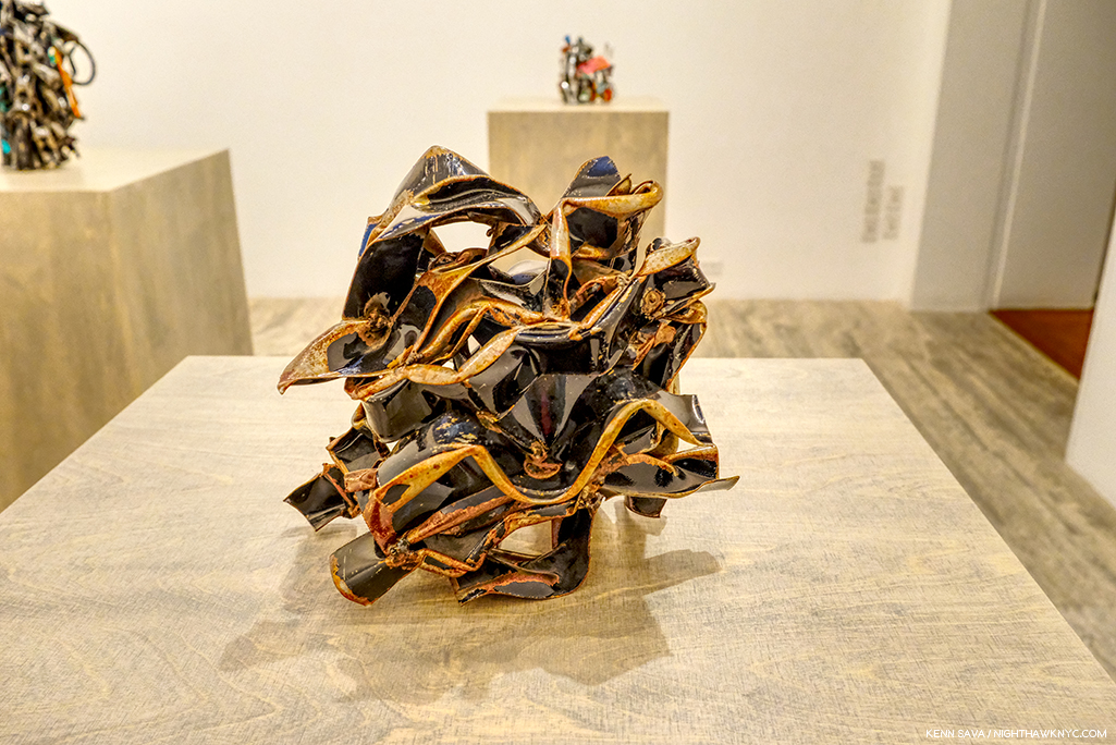
While his classic larger pieces can look completely “accidental,” his smaller work shows the incredible attention to detail that he brought to bear in all of them. 

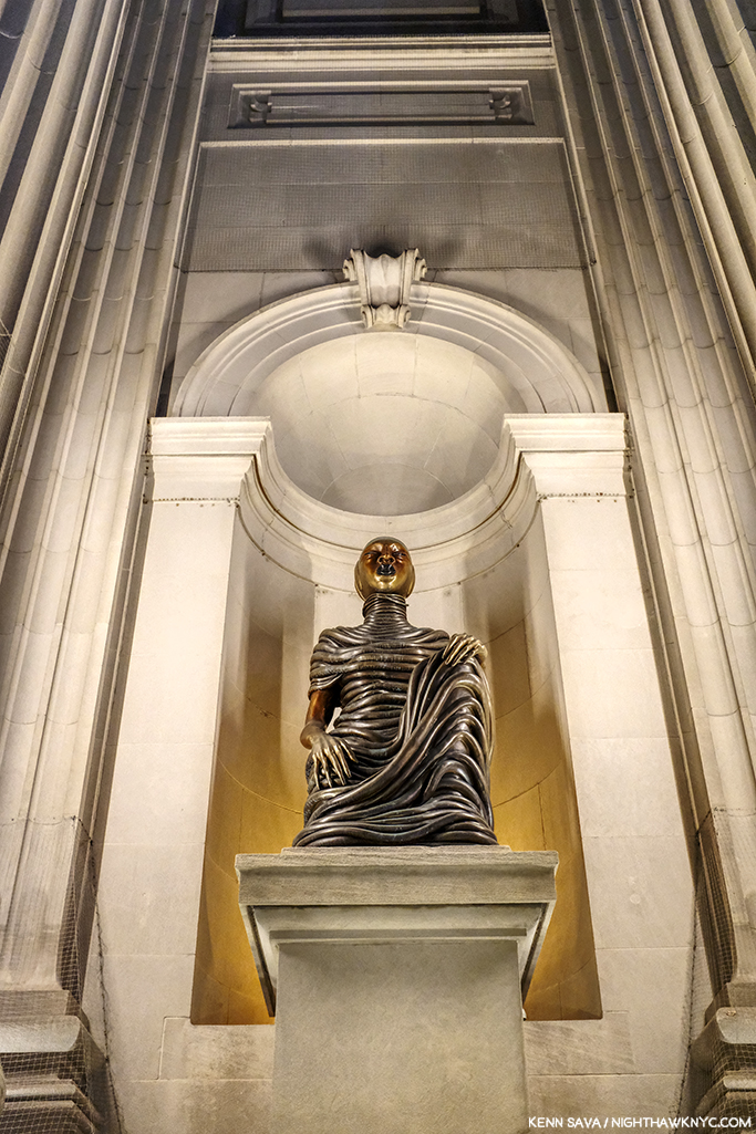
Wangechi Mutu, The NewOnes, will free Us, The Facade Commission outside The Met, 5th Avenue- The 5th Avenue Richard Morris Hunt Facade has long been a sore point for me. We’ve been living with it as it is for so many of its 117 years that most visitors fail to realize it remains unfinished! Being Landmarked, having neighbors and being in Central Park has kept TM from finishing what was started back 150 years ago and reached this form in 1902. I pray that one day they’ll be allowed to. It’s not like sticking a brand new pyramid in front of it! It’s just completing the existing facade. So, this year I was pleasantly shocked to see they found an extremely creative and Artful partial workaround. The Facade Commission as they call it bring us 4 terrific bronze Sculptures by Wangechi Mutu titled The NewOnes, will free Us that look superb in the heretofore empty niches outside facing 5th Avenue. On view 24/7 through this June 8th, don’t miss them on your next visit. 

As the year ended, all of this left me wondering- Are we in a “Golden Age of Contemporary Sculpture”?

Elsewhere, among the shows I haven’t written about-

NoteWorthy Painting Shows-

Lorna Simpson, Darkening, 2018, Ink and screen print on gessoed wood, 108 x 96 inches.

Lorna Simpson: Darkening at Hauser & Wirth, West 22nd Street- To this point I’ve been familiar with Ms. Simpson’s Photographs, works on paper and collages, but these Paintings came as a shock. Innovative, fresh, haunting, beautiful, the show felt like it came out of the blue, but I’m sure it didn’t. It struck me as a breakthrough. I returned to see it a few times and when it was over I was surprised it hadn’t received more attention than it got, and left me very much looking forward to see where she’s taking this next.

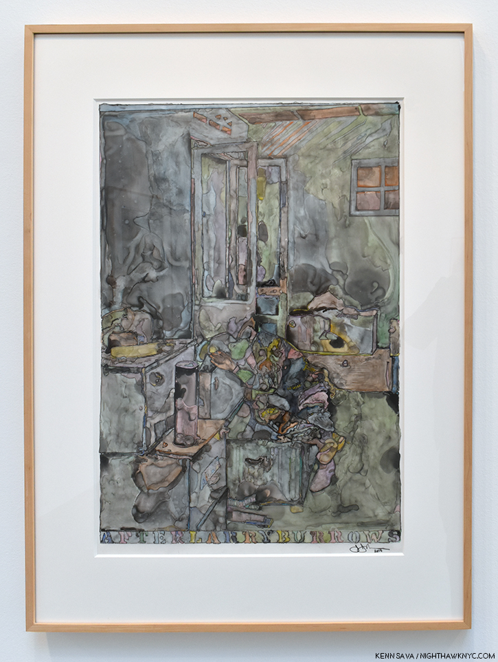
Jasper Johns, After Larry Burrows, 2014, India ink and water-soluble encaustic on plastic, 32 x 24 inches, one of a series of terrific works by the Artist based on this Photograph.

Jasper Johns: Recent Paintings & Works on Paper at Matthew Marks- Though he turns 90 in May, and a Retrospective is on the Whitney calendar, don’t begin to think Jasper Johns is done. One of the last Artists left to us (along with Susan Weil) from his group that included Robert Rauschenberg, Cy Twombly, Merce Cunningham, John Cage, Willem deKooning, et al, I didn’t know what to expect when I walked into Matthew Marks to see this show of recent works. I left determined to return as often as I could before it closed. I’ll admit that I haven’t followed Mr. Johns career as closely as I followed his one time close associate Robert Rauschenberg, who has had a major influence on the way I see the world, but it sure seems his work has continued to evolve and I, for one, found new surprises in this remarkable show. Too old to be drafted for the Vietnam War he was nonetheless deeply effected by it, as everyone living in this country at the time couldn’t help but be. A number of the works Mr. Johns showed were based on an extraordinary Photograph taken by Larry Burrows in Vietnam, a war that tragically produced too many indelible images, called Farley Breaks Down. Among countless others, Larry Burrows, also, lost his life in the war in 1971. While Photography has been the basis of countless Paintings, in these it was most subtle, almost like a memory, complete with the “haze” of camouflage-like coloring, yet its power was undiminished. Seeing these brought to my mind that one of the things that brought Mr. Johns wide attention early on were his Flag Paintings in the late 1950s.

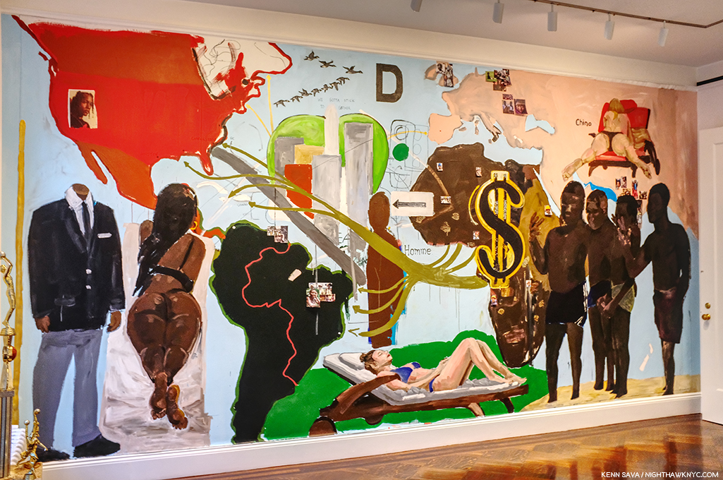
Henry Taylor’s Mural at Blum & Poe, September 24th- before he modified it.

Henry Taylor: NIECE COUSIN KIN LOOK WHO LONG IT’S BEEN at Blum & Poe- It’s been 2 years since Mr. Taylor’s “New York Moment,” as I called it, when his mural debuted on the High Line concurrently with his being one of the “stars” of the 2017 Whitney Biennial, given both his prominent placement with a large work in the lobby on the 6th floor and an entire gallery he shared with his friend, Deana Lawson. His first solo show since showed that not even hip trouble, which sounded serious, could keep the Artist from traveling and continuing to work.

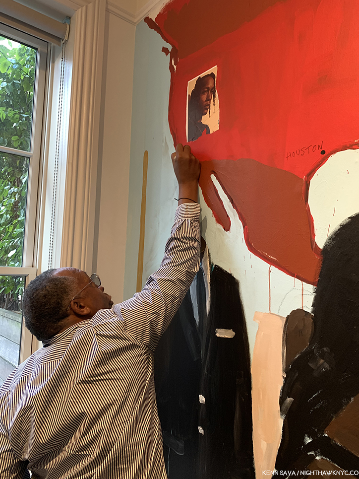
Henry Taylor uses my pen to modify his mural seen above, September 24, 2019.

The opening was highlighted, for me, by meeting Mr. Taylor, who proceeded to borrow my pen to modify the largest works in the show right in front of my eyes, and later proceeded to inscribe a message on the wall in the garden. Mr. Taylor seemed in fine form, not showing any lingering effects of his ailment and the work on view was classic Henry Taylor. A number of visitors approached Mr. Taylor asking for him to sign his recent monograph. I couldn’t help notice that he seemed to Draw in each book, something that indicated to me he’s another Artist who can’t stop Drawing. Of course, in my copy, he appended a sketch of my pen.

The social revolution… Installation view.

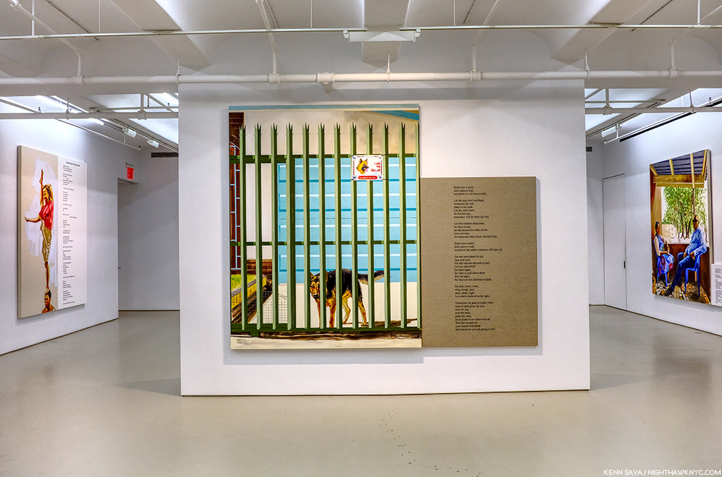
Meleko Mokgosi The social revolution of our time cannot take its poetry from the past but only from the poetry of the future and Pan-African Pulp at Jack Shainman Gallery, West 20th, West 24th Street, and The School, Kinderhook, NY- The now Brooklyn-based Artist is so prolific his latest work occupies no less than THREE of Jack Shainman’s spaces, including the entirety of The School in Kinderhook, NY, out of reach for this writer.

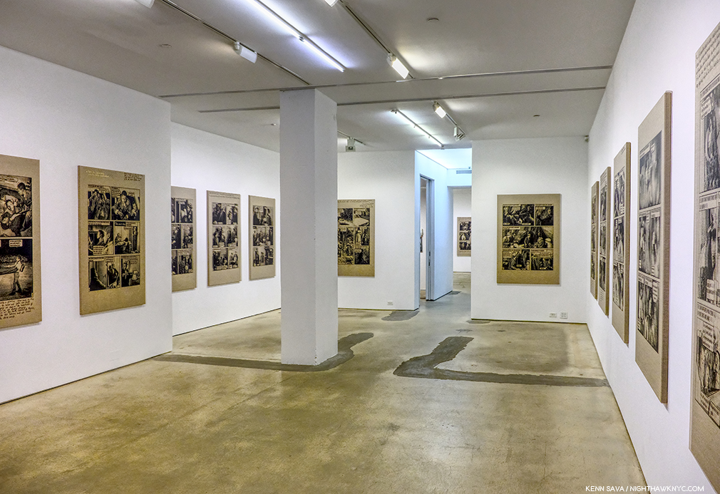
Pan-African Pulp installation view. In this series, Mr. Mokgosi uses source images from the 1960s South African photo-novel Lance Spearman “to examine the history of pan-Africanism.”

The two Chelsea shows I was able to see are marked by remarkable, continued, growth leading me to feel that Mr. Mokgosi is yet another Jack Shainman Artist, like Kerry James Marshall before him, on his way to museum collections. 

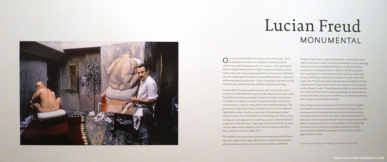
Lucian Freud: Monumental at Acquavella Gallery and Francis Bacon’s Women at Ordovas- Two shows that barely made the cut, with both ending in early January, served as a reminder that I didn’t really need of the fact that both Painters, one time friends, are towering figures in 20th century Art who’s influence remains strong. I couldn’t help wonder how the Freud show benefitted by the presence of legendary former Metropolitan Museum Director, Philippe de Montebello, now a Director of Acquavella Gallery, right across the street from his former and long-time 1000 Fifth Avenue home.

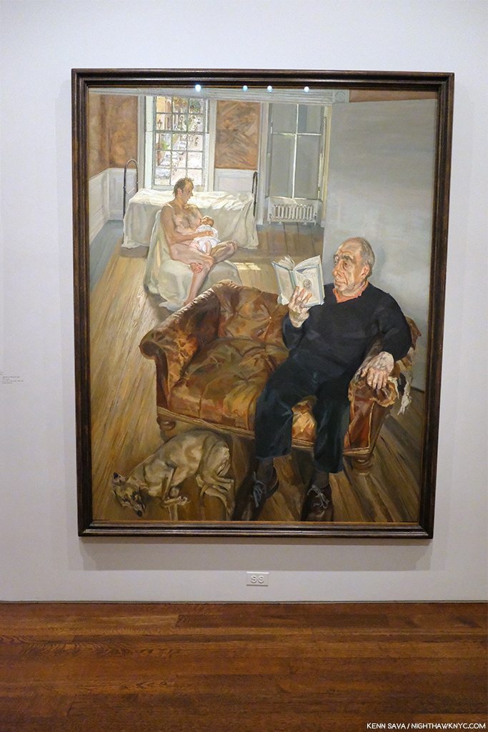
The show featured Mr. Freud’s nudes, emphasizing his extraordinary way of Painting flesh, the aspect of his work that has long fascinated me as much as any other. Here, the only clothed figure in the show.

Regardless, it was an exemplary, concise, museum quality gallery show of the work of an Artist who hasn’t had a show here in too long.

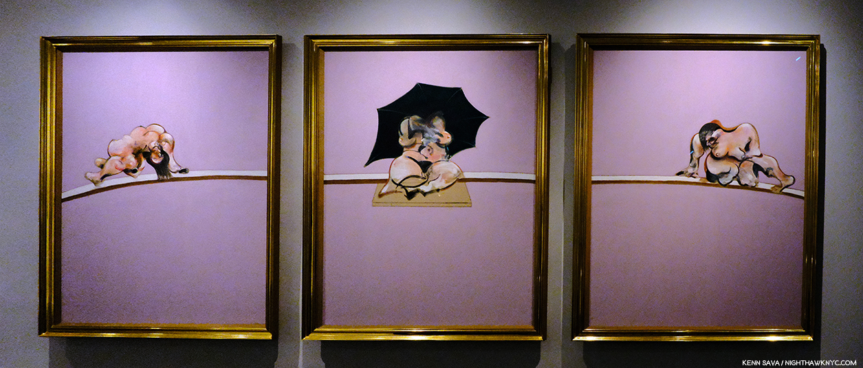
Among many other things, Francis Bacon reintroduced the Triptych to Painting.

Nearby, Bacon’s Women, a subject I can’t say I’ve ever heard broached before, was a revelation. The surprising concept was beautifully executed and mounted in Ordovas’ classic East 77th Street townhouse. Francis Bacon has proved to be an Artist who’s accomplishment has only grown more and more interesting and relevant as time has passed, and so, the rare chance to see some of his lesser seen work was not to be missed.

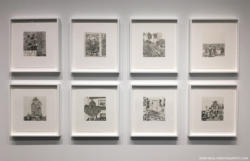
NoteWorthy Drawings Shows-
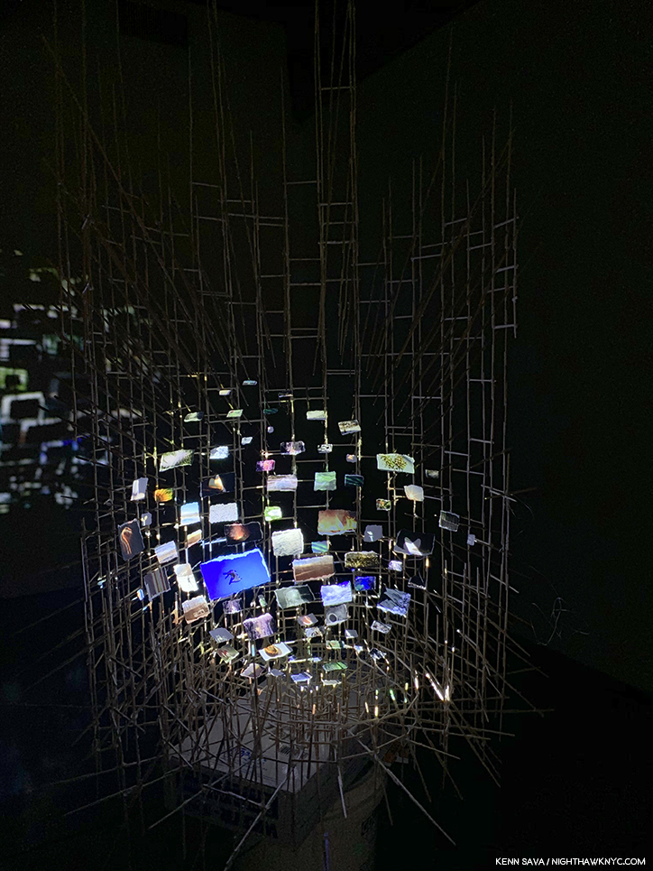
Installation view.

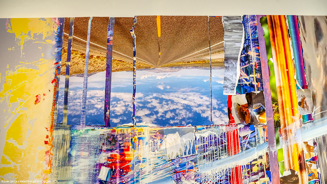
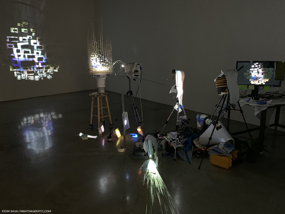
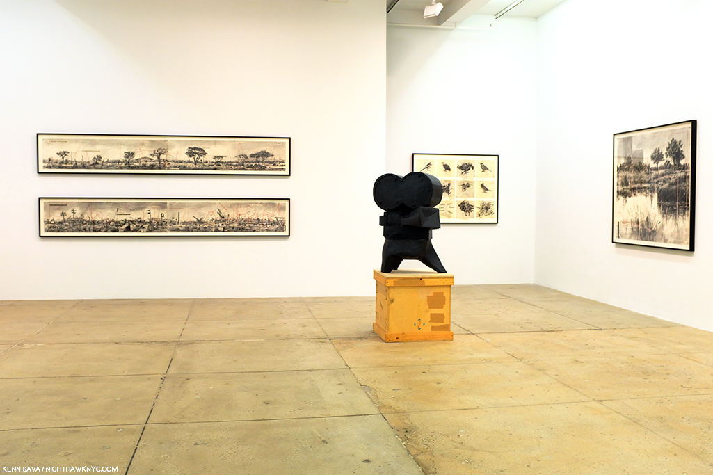
William Kentridge: Second-hand Reading at Marian Goodman- The legendary South African Artist returned to NYC with what seemed to me to be more innovations in his unique and powerful Drawings, along with a selection of his equally unique Sculpture, and Film, shown in the room behind his Projector Sculpture, above.

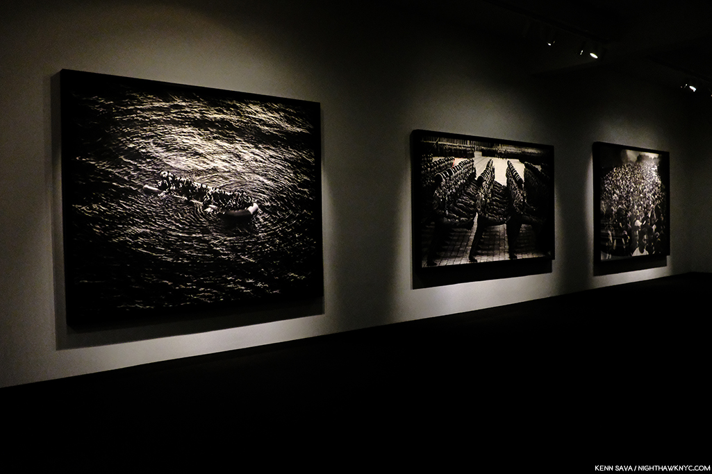
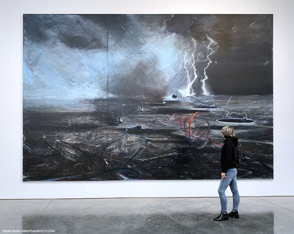
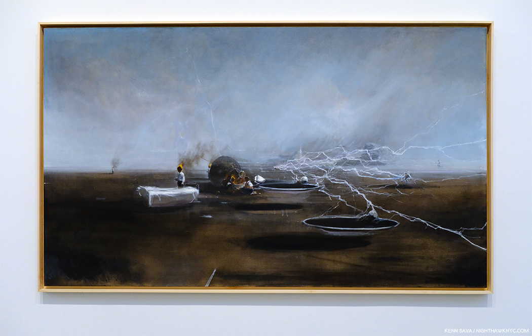
Installation view of 3 of the 7 monumental charcoal Drawings, yes Drawings, in the show by a contemporary master of the medium. Mr. Longo  told me it took 6 months to create the one on the right, 8 months for the one on the left.

Robert Longo: Fugitive Images at Metro Pictures- During his Artist’s talk in the gallery on January 11th, Mr. Longo broke down discussing one of his pieces with Nancy Spector, Artistic Director of the Guggenheim Museum. I came away even more impressed with the Artist, who’s work I already hold in high esteem.

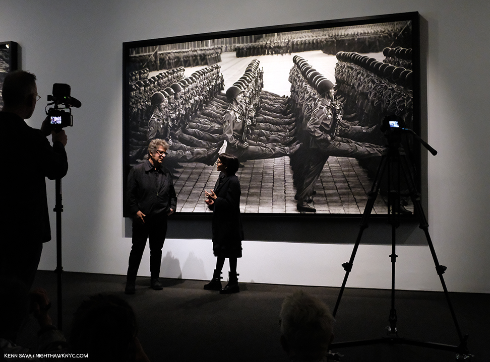
Robert Longo in conversation with Nancy Spector, Artistic Director of the Guggenheim Museum in front of a Drawing of North Korean soldiers.

Not one to miss a perfect segue…If I had to single out one person who had a great year in NYC Art in 2019, it would be Nancy Spector, who, along with her team, produced a steady string of very good shows at the Guggenheim, continuing their run these past few years, a number of which I’ve written about.

NoteWorthy Photography Show

Vik Muniz: Surfaces Installation View. These are called multimedia. A close look reveals the numerous layers of each work in which Mr. Muniz reinterprets 20th century abstract Paintings to fascinating effect. Garden Design, after Roberto Burle Marx, Pierrot, after Willys de Castro, Composition/Space, after Cicero Dias, Surfaces, 2019, Multimedia, left to right.

Vik Muniz: Surfaces and Museum of Ashes at Sikkema Jenkins & Co- Looking through the two volume Vik Muniz Catalogue Raisonne, the first thing that strikes me is that it’s arranged in sections according to the technique he used, something I can’t say I’ve seen before, and something even more remarkable when you consider that a good number of these techniques he invented. Along the way, he’s already created a substantial body of memorable pieces, which have gained him worldwide recognition.

Detail of the layers of Garden Design, after Roberto Burle Marx. As a result, each piece is unique.

He was at it, again, adding yet two more innovations, in his remarkable two part show at Sikkema Jenkins & Co. Beyond his endless inventiveness, technique being a means to an end, the results have continued to resound. No mean feat when you consider that one part of his show was based on famous masterpieces of Painting, above, in the Surfaces section of the show, the other based on “resurrecting” Art works lost in a fire, turning their very ashes into recreations, in the Museum of Ashes section. Surfaces was based on Paintings by Arthur Dove, Hans Hoffman, Stuart Davis, Carmen Herrera, Ellsworth Kelly, Marsden Hartley and Romare Bearden, among others, adding a new dimension to the perception of each of these works. Daring!

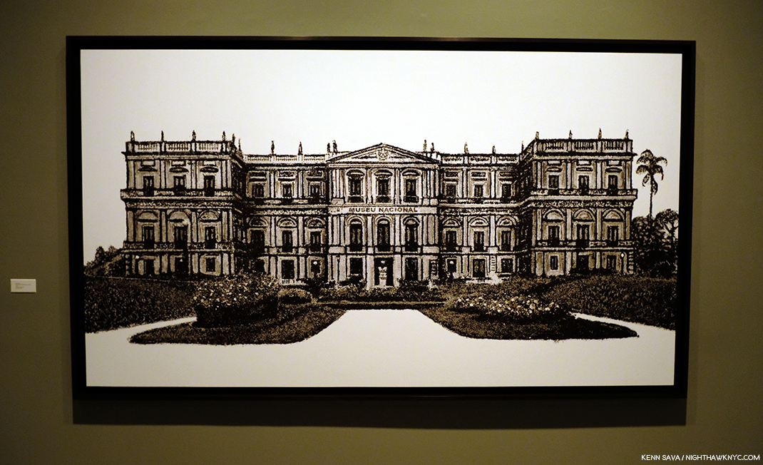
Vik Muniz recreated works from the Museu Nacional from their very ashes! Here he recreates its facade. Museu Nacional, Museum of Ashes, 2019, Archival inkjet print.

On September 2, 2018, the entire Museu Nacional in Rio de Janeiro burned to the ground, including all its collections amassed over the past 200 years. The museum was Muniz’ favorite cultural institution in the city, a place he visited often with his children. On the wall card to this section, Mr. Muniz said, “I cried upon learning of the fire as if I had lost something personal, some kind of string that held the insanity of my present together.”  The Artist proceeded to work with the archeologists sifting the ashes of the building and its contents and was provided with ashes and the exact location they were found.

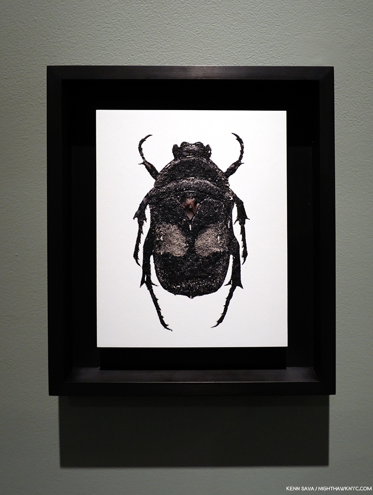
Beetle, Museum of Ashes, 2019, Archival inset print.

He proceeded to reconstruct some of the objects that had been lost- in ash, which he then Photographed. The results speak for themself, and, amazingly, echo what has been lost.

As 2020 gets underway, there would seem to be a bit more stability on the horizon, but not entirely. Change, after all, is the only constant in the universe. The protests at the Whitney resulted in board resignations, and MoMA plans to be open for the full year, as far as I know now. Art in NYC, 2020, however, will already be remembered for two memorable events. The Met marks the 150th Anniversary of the opening of its iconic 5th Avenue location this year- with a closing. 2020 will also be remembered as the year the short-lived Met Breuer closed.

*- Soundtrack for this Post is “Restless Farewell” by Bob Dylan from the timeless The Times They Are A-changin’, 1964.

NighthawkNYC.com has been entirely self-funded and ad-free for over 6 years, during which over 250 full length pieces have been published. If you’ve found it worthwhile, you can donate to keep it going & ad-free below. Thank you!

Written & photographed by Kenn Sava for nighthawknyc.com unless otherwise credited.
To send comments, thoughts, feedback or propositions click here.
Click the white box on the upper right for the archives or to search them.
For “short takes” and additional pictures, follow @nighthawk_nyc on Instagram.

Subscribe to be notified of new Posts below. Your information will be used for no other purpose.


Sarah Sze: Creativity, Unbounded

Written & Photographed by Kenn Sava

“I bring together the materials I find around me. I gather them to try and create immersive experiences that occupy rooms, that occupy walls, landscapes, buildings, but ultimately I want them to occupy memory.” Sarah Sze, TED Talk.

Crescent (Timekeeper), 2019, Mixed media

In the 4 1/2 years of NHNYC I’ve never yet called a Contemporary Artist a genius. Until now. [Drum roll]

Sarah Sze is a genius in my opinion.

As I take stock of the Art I saw in 2019, along with Jean-Michel Basquiat at The Brant Foundation (which I looked at here), the most unforgettable show I saw this past year was Sarah Sze at Tanya Bonakdar Gallery. As I write this three months after it closed, it’s at the front of my memory of everything I saw last year.

Overflowing. Sarah Sze began on the outside(!) of the gallery’s doors and windows.

Detail of part of Images in Refraction (West) on the western part of the facade of Tanya Bonakdar Gallery (to the left in the previous picture) reveals the multimedia nature of what’s on view inside, and the multi-dimensional talent of the Artist. Painting, Sculpture, Collage, Engineering & Architecture, Photography, Film, Installation- you name it. You get it. And then some.

I’ve seen her gallery shows over the past decade, and each time, I left shaking my head. Part sculpture, part installation, part construction project, part hardware store free-for-all, they were always impossible to fully take in at one look. You saw their shape from a distance and admired the overall composition, and then learned the devil was in the detail, and the detail, and the seemingly endless detail. Still, I wasn’t prepared for her expansion into multi-media, including the debut of her Paintings, she presented on West 21st Street this fall where not even two floors, the reception area, the ancillary walls, both sides of the galleries windows, doors, or the space under the stairs were enough to contain her seemingly boundless creativity.


Looking out at the view seen previously of Images in Refraction (West), with installation on the wall, right, leading to the first gallery.

Not to mention 4 galleries filled with her trademark seemingly infinite detail.

Detail of the ever-changing projection that filled the walls surrounding Crescent/Timekeeper.

After the lead-in provided by entering the gallery and passing through the prelude in the reception area, Crescent (Timekeeper), 2019, turned the large gallery into a fully immersive experience from the moment you entered the space and tried to take it all in from about 25 feet away, as may be seen in the very first image above, like some alien craft in a pre-2001:A Space Odyssey 1960s sci-fi movie. “Yes. Something landed…and…it’s glowing! Moving in for a closer look. Tell Lana I love her…” Situated near one far corner allowed embedded rotating projectors to have much of the surrounding walls to themselves engulfing you as you enter the space.

Close up/Details of the center section of Crescent (Timekeeper). Stepladders are a recurring motif in Sarah Sze’s work. As she’s said, “Everything you need to make the piece is in the piece.”

As you approach between two “arms” extending out on the floor, you realize that the center section contains about 50 screens of varying size. Standing there for a few moments reveals each one of those screens contains projected images moving independently of each other. Yet, tracing them back, you find only a few overhead projectors. ? On one visit the work struck me as an almost nostalgic look at life on earth. Suffice it to say, you need to experience it for yourself.

To the stars…Gazing at the top of the “superstructure” of Crescent (Timekeeper), 2019, Mixed media.

With so much to see in just this work, I was somewhat shocked when I realized Crescent (Timekeeper) wasn’t the only “monumental” work on view!

Detail, part of one of 4 walls that makes up After Studio, 2019, with the work Surround Sound (After Studio), 2019, Oil paint, acrylic paint, acrylic polymers, ink, aluminum, archival paper, disband and wood, 103 1/4 x 130 inches, center. No Photo can begin to covey what it was like to be in this work, which is what visitors to this space were, but looking at the piece on the wall, center, the first “Painting” by Sarah Sze I’ve seen, might begin to.

In a smaller, rear, gallery on the first floor, I encountered one of the most amazing things I’ve ever seen in an Art show- what looked to be a complete (re)construction of one of her studios down to the last detail. A work titled After Studio, 2019. It appeared to me to center around a series of Paintings by Sarah Sze, the first I’ve ever seen, though they are as much Collage as Painting. ”In the age of the image, a painting is a sculpture,” Sarah Sze said in 2019.

Details of details from the right of center section of Surround Sound (After Studio) seen above.

That sentiment puts her in the direct line of Picasso & Braque’s Cubism, Marcel Duchamp, Joseph Cornell, Robert Rauschenberg, Jasper Johns, Jack Whitten, Frank Stella and, more recently, Mark Bradford and Julie Mehertu. With everything Sarah Sze includes in her Paintings, two things struck me as particularly interesting- her use of Photography (apparently her own), and her “use” of words. They’re there, if you look closely, but they almost exclusively appear to be “notes to self” rather than to others on “post-it” like notes. I was told that the Artist went back and replaced each one with archival equivalents as she completed the work. Yes Surround Sound (After Studio) is complete, and some very astute museum bought it.

The corner of the opposite and adjacent walls. Remind yourself- You’re in a gallery.

I returned to experience After Studio again and again and it felt to me like I was walking around in the Artist’s mind. Often when I see Art, especially landscapes, I close my eyes to feel the presence of place in the piece in my mind’s eye. Here was one “landscape,” I couldn’t keep my eyes open long enough to drink in. Nary a foot of After Studio, save for the center space to move around it, lacked vision or wonder. When I left if for the last time on October 17th, I was fully in awe1.

Another detail, this one interesting for showing some of the Photographs the Artist may, or may not, use, along with what may happen to them on the way.

On the 2nd floor, the large back gallery contained more Paintings, and a Painted floor. All told, nine Paintings were in the show. I guess I shouldn’t be surprised by the appearance of her Paintings, after all Sarah Sze studied to be a Painter for a decade before turning her attention to “make meaning of the things around us through materials2.” For me, as amazing as the installations are, the Paintings linger with me every bit as much. No small feat.

I am thrilled to see her interest in Painting return in stunning works like this. 12 Landscapes (After Object), 2019, Oil paint, acrylic paint, acrylic polymers, ink, aluminum, archival paper, disband and wood (triptych), 73 1/2 x 110 1/4 inches.

Detail of 12 Landscapes (After Object).

I was told the show took 2 1/2 weeks to install- for a show that only ran for 6 weeks!

Images in Translation, 2019, Mixed media.

Finally, upstairs in the Project Room, Images in Translation, 2019, was installed in the dark, making it very hard to get a shot of that comes close to doing it justice.

Detail.

Time to head downstairs and back outside.

Looking down from 2 flights above at Images in Refraction(East) under the stairs.

I then immediately started scrambling down West 21st Street to find the pieces of my exploded mind that had wound up on the ground. On September 21st, the opening day of the “New” MoMA, two days after Sarah Sze ended, I discovered this installed on the 6th floor-

Sarah Size, Triple Point (Pendulum), 2013, seen at MoMA, Opening day, September 21, 2019

Sarah Sze’s Triple Point (Pendulum), a work that was originally shown at the 2013 Venice Biennale when the Artist represented the USA, was on display, front and center, in the exhibition Surrounds: 11 Installations.

The immersive experience Sarah Sze gives us in Blueprint for a Landscape in the 96th Street 2nd Avenue Station is based on a fantasy of the construction of Hudson Yards, which is no where near it.

Though that show, too, has now ended, New Yorkers are able to see Sarah Sze’s work anytime- 24/7/365. Ms. Sze created the Art in the 96th Street Subway Station on the new 2nd Avenue line, which opened in 2017, making her one of a handful of Artists who’s work was installed during the creation of the brand new Subway Station it will be seen in permanently. I’ve lauded before the taste of those charged with selecting Art for the Subway, and here’s yet another instance of brilliant vision, in my opinion. Here’s a look for readers without a MetroCard. I can’t help thinking that in 100 years, people will treasure this remarkable video of both the construction of the Station and the Artist actually there, giving a walkthrough-

Sarah Sze is moving between Sculpture, Painting, Photography, Film, Installation and collage in new ways, creating results that have never been seen before. Her work is like the city, like the forest, like a home, and filled with elements, reminders, and the detritus of each. And, in a work like Crescent (Timekeeper), it’s full of what will be memories and associations in the form of images. To what end? As in all great Art, that’s left to each viewer to decide.

More details of After Studio

In my view, though the show marks something of a new “period” in her work, it’s seamless with what’s come before. Already a world famous Artist, could it be that she’s only scratched the surface of her talent? A year ago I’d be shocked to have said that about her work. Now? I’m ready to bet on it.

I have no idea how she conceives her pieces, but in each one of Sarah‘s shows- literally, never more than in her most recent show, I felt like I was walking around inside of her brain.

Ah…so this is what it’s like to be a genius…

*Soundtrack for this Post is “Aurora” by Bjork from Vespertine.

NighthawkNYC.com has been entirely self-funded and ad-free for over 6 years, during which over 250 full length pieces have been published. If you’ve found it worthwhile, you can donate to keep it going & ad-free below. Thank you!

Written & photographed by Kenn Sava for nighthawknyc.com unless otherwise credited.
To send comments, thoughts, feedback or propositions click here.
Click the white box on the upper right for the archives or to search them.
For “short takes” and additional pictures, follow @nighthawk_nyc on Instagram.

Subscribe to be notified of new Posts below. Your information will be used for no other purpose.


  1. I returned on October 19th, the show’s closing day, but there was a line to get into After Studio. I passed and left feeling fortunate to have spent a few hours in it by myself over the run of the show.
  2. Ted Talk

The “New” MoMA, And The Gorillas In The Room

Written & Photographed by Kenn Sava (except *)

MoMA, 1st floor lobby sign, October 19, 2019. I’ve been through this before. The last time, it was a nightmare. How would this “new” MoMA be?

MoMA and I go a long way back. It’ll be 40 years next year. 

I can remember this like it was yesterday…The entrance to Pablo Picasso: A Retrospective at MoMA, 1980. My Art show attending career began when I walked through that entrance. *MoMA Photo.

I first went to The Museum of Modern Art in 1980 for their incomparable Pablo Picasso: A Retrospective that took over the whole museum. I was on the road with a band at the time and I flew back to NYC twice to see it. Though it was not my first trip to a museum to see Art, it began my career of seeing Art shows and is burned indelibly in my mind since. While I came away feeling the late works were underappreciated, the earliest works which were new to me, like Science and Charity, 1897, Painted at age 15, seen through the entrance, above, particularly astounded me, and it never let up from there. An almost impossibly high bar had been set. I wasn’t able to attend MoMA regularly until after the 1984 renovation, which I call MoMA, 1984. Looking back on that MoMA now, I have quite fond memories of the building. I’ll never forget being in the gallery the museum dedicated to Claude Monet’s Water Lilies, 1914-26, long a very important bridge between representational Art and abstraction for me. As I recall, it was a small room, with a bench along the window overlooking West 53rd Street. You entered the room where panel 1 met panel 2, at about 10 o’clock as you faced it. You sat there and the three huge panels surrounded  you, making you feel like you were inside it. It was one of the greatest feelings I’ve ever had looking at Art. I didn’t think MoMA, 1984 was anything special at the time, but given how lacking MoMA, 2006, the most recent MoMA was, which of course, is still with us in the partially new MoMA, 2019, I now feel quite nostalgic for a building that was “adequate” at best, overall.

The heart of Art darkness. Construction for MoMA, 2019 in progress at the famous main entrance, behind the arrows pointing visitors to the temporary entrance, December 20, 2018.

I saw Matisse-Picasso at MoMA Qns in 2003, where MoMA was temporarily as MoMA, 1984 became MoMA, 2006, which I went to innumerable times (and have written about a number of its shows here on NYNYC), from it’s earliest days. MoMA, 2006, which opened that November, was terrible, in my opinion (I replaced a stronger negative). I remember standing in utter shock looking at Monet’s Water Lilies installed around the base of the huge, open space, they called the “atrium,” where they had no sense of their compositional continuity or unity. Barnett Newman’s Broken Obelisk, 1963-9, installed in the center of the space looked better there than anything I’ve seen there that came after it, which is not really saying anything all that positive.

The newly renovated main entrance. Opening day, October 21, 2019.

“The Shopping Mall of Modern Art,” I took to calling MoMA, 2006, the one we’ve been living with these past 13 years. I don’t live in the suburbs partially because I hate malls, yet, here we were given one. The Architect, Yoshio Taniguchi, said1 “The model for MoMA is Manhattan itself.“ He spoke about how Central Park is like MoMA’s Sculpture Garden in his concept. Apparently he felt the rest of Manhattan is one giant shopping mall, cause that’s the design we got- a department store, nothing more, nothing less, who’s floors/departments are connected by an escalator, as they always are. If MoMA had decided to move to an entirely new location instead of turning MoMA, 2006 into MoMA, 2019, whoever would have come into the building would have a virtual turnkey Macy’s II ready to go. “Contemporary on 2,” “This way to the Permanent Collection, and home fixtures…I mean Design”…

That brings me to the Gorillas in the room…Both of them.

“There’s a hole
In my life
There’s a hole
In my life”*

The “atrium,” Member’s Preview” for the “new” MoMA, October 19, 2019.

The first is that 110 foot tall gorilla in the building officially or unofficially called the “atrium.“ For some reason that I have not for the life of me been able to figure out over a few hundred visits these past 13 years, the Architect decided to drop a 110 foot tall atrium, (the “hole” I call it), smack dab in the middle of the building that, apparently, even some of the world’s great curators haven’t found a defining use for in almost one and a half decades2. I don’t blame them. I blame the Architect and whoever else thought this space was a good idea. I’ve never seen them use any more than the first 20 feet or so of its 110 until they mounted a decal-like iridescent work, seen above, on one of its walls for the opening of MoMA, 2019. And, I blame those who decided not to remove it in MoMA, 2019.  MoMA created MoMA, 2019, partially, because they “needed more space.” Well, guess what? You’ve got 7,700 square feet, or so, of completely useless space right smack dab in the middle of the building3, right in the middle of some of the most expensive real estate on earth. Instead of extending each of the floors as they should have been originally and filling that hole, they tore down an existing, good, museum, The American Folk Art Museum, formerly at 45 West 53rd Street next door!

Construction of the new building for MoMA, 2019, where the American Folk Art Museum stood, seen on December 20, 2018.

“Shadow in my heart
Is tearing me apart
Or maybe it’s just something
In my stars”*

Frankly, all of this galls me.

“Soaring…””Majestic…””One of NYC’s great interior spaces…” Oh, sorry. I was reading about the Guggenheim. I can’t find anyone saying that about this.

Because of the atrium, the flow of every floor in MoMA, 2006 is broken up, causing headaches for visitors and curators. This goes right to the heart of the museum’s purpose- showing Art. A good number of the galleries in MoMA, 2006 felt strangely shaped, small, or lost. In this case, small doesn’t add “intimacy.” Instead, it serves to actually minimize the effect of the Art being shown in them, in my experience. The Brancusi show mounted before the summer, 2019 closure, and the new Betye Saar show both suffer from this, in my opinion, both being mounted in the same 2nd floor gallery, tucked off to the south side of the hole, behind sliding glass doors (which I also think are an annoying idea and an energy drain), unchanged between Moma, 20o6 and MoMA, 2019.

Apparently, given it’s still here in MoMA, 2019, MoMA is in denial that the atrium is a problem. For me, visiting MoMA, 2006 gives me the unmistakable feeling that I’m continually walking around, and working my way around, the hole, instead of the whole experience just flowing.

MoMA’s floor plan for part of the “new” 2nd floor. I’ve added notations in dark blue- a label for the atrium to point out where it is and how it needs to be navigated around. I’ve also labelled where MoMA, 2006 was (below the added blue line) and labelled where MoMA, 2019 is now (above the blue line) in the margin. Not shown- the other galleries on this floor, located in what MoMA now calls the “South” section (to the left and lower left.). All are effected by the “atrium.” Bear in mind- this is only ONE floor!

In fact, in MoMA, 2019, they’ve decided to double down. Keeping the hole, they’ve opted to extend the existing 2nd, 3rd, 4th and 5th floors the other way- to the west. I take this as an admission that the floors needed to be extended. We differ on how. You can see this in the 2nd floor floor plan, above. I’ve drawn a blue line to the left from gallery 205 and everything above that is the new building, what I call MoMA, 2019, below is what I call MoMA, 2006. It almost works. It does serve to minimize the “interference”/inconvenience of the hole, unless you’re in a section where you have to navigate around it. Alas, as soon as you are back in the “old” building, the MoMA, 2006 part, there it is, rearing its ugly head again, sending you to a floor plan trying to find your way. But, it also dramatically effects MoMA’s curators, and no doubt, every single show they mount in these spaces. WHY they just didn’t remove the atrium and extend the floors and make the 2nd, 3rd, 4th, and 5th floors full floors? (The 6th floor is a different matter, I believe due to the heights of the buildings. It already is a full, raw, space in the MoMA, 2006 building and a cafe has been installed on 6 on the MoMA, 2019 side (which I have not seen as yet. You can walk through from MoMA 2006 to MoMA 2019 on 2, 3, 4 and the 5th floor, but you can’t on 6. If you’re on 6 in MoMA 2006, you have to go down to 5, walk over to MoMA, 2019, and then go up to 6 on that side, or vice versa). That they didn’t remove the atrium is another, huge, mistake in my view. Alas, it’s too late for tears. And having been sad about MoMA’s building since MoMA, 2006 opened, I’m about cried out. Yes, MoMA, 2006 was so bad it actually kept me from going at times.

Where the heck am I going? Before going anywhere, it’s a good idea to check the “central scoreboard,” as I call it. West? North? South? What? Look quick! Those listings next to each floor change to show other things going on on that floor. Seen on the official opening day, October 21, 2019.

Another question for me is HOW do you redesign the building into MoMA, 2006, spending over 850 million dollars doing so, and not early on in the game ask, “WHERE are we going to put our most popular works?” Apparently, no one asked. Over the subsequent 13 years of the building, Monet’s Water Lilies and Van Gogh’s Starry Night, to name two, were continually moved, and never once looked to have found THE place for them. I lost count of how many places I saw the Water Lilies in MoMA, 2006, all the while with that indelible memory I recalled earlier in my mind.

The brand new elevator doors open on my first visit to MoMA, 2019’s 2nd floor, October 19, 2019.

SURELY someone would ask that question when it came to designing MoMA, 2019! Two visits in? The answer is a decided…I’m not sure.

Home? At last? Monet’s Water Lilies, 1914-26, in a gallery devoted to his Water Lily Paintings (yes, they have others). We’ll see how long these stay here.

The Water Lilies seem to have been given some thought. They are decently situated in a gallery that contains only Monet Water Liliy works on an angled wall, similar to one of the installations they had in MoMA, 2006. You can scan the whole work continuously but it doesn’t give you a “wrap around” feeling. Starry Night fares far less well. It’s stuck in a corner(!?) at the end of a long gallery. I was shocked when I walked in and saw this. It’s just terrible.

Cornered! Vincent van Gogh’s beloved Starry Night, 1889 can be barely seen (as usual), though it’s now stuck in a corner. Seen on the official opening day, October 21, 2019

In this large gallery one other Van Gogh is installed half way down the wall to the left. I didn’t get the feeling of connection with the other works shown near Starry Night. Munch, who I greatly admire, is seen on the left hand wall, and while many pair him with Vincent, he gives me a completely different feeling, though l’ve wondered if Vincent may have been an influence on the Artist who was a decade younger. MoMA may have felt that putting other Van Goghs next to Starry Night might have created too big a crowd. I can live with seeing Munch next to Van Gogh’s. As seen in this gallery, due to the new arrangement of the galleries, multiple works by the same Artist are spread out, often across galleries.

Picasso, Les Demoiselles d’Avignon, 1907.

That means that if you want to see, say, the Picassos, you have to plot a path to a number of rooms, where you might see one, or you might see 3 or 4. If you have multiple Artists on your hit list of pieces to see? You’re going to need a good chunk of time- just to plan your routes. Especially if they’re installed over multiple floors. I have mixed feelings so far about this arrangement, but I’ve been living with this collection for decades, and while I prefer seeing it chronologically so you can see how Art has evolved over time, mixing it up can be a nice change of pace and reveal new synergies. This “theme” strategy, which is more like that of a special exhibition, feels geared to people like me who have lived with the collection for a while and might welcome being surprised (if that’s what they feel). First time visitors, or those here with limited time, may feel differently.

Picasso, The Charnel House, 1944-5. The iconic Guernica is a work Picasso Painted in 1937, in the early days of World War II. The Charnel House was Painted at the end of the War, bookending Guernica, though far less well-known. Guernica was part of MoMA’s collection until Picasso died. He stipulated in his will it be returned to Spain. So, including it in the 1980 Picasso Retrospective, where I was able to see both of them, was something of a farewell before Guernica went to Spain.

Picasso seems to fare better than Starry Night. At least three of his major works (Les Demoiselles d’Avignon, 1907, Three Musicians, 1921, and The Charnel House, 1944-5) get walls all to themselves- in different galleries.

The upper left corner of Dali’s, The Persistence of Memory, 1931 (aka the “Soft Watches”). Picasso watch- Girl before a Mirror, 1932, is partially seen in the rear to the right.

As for other works on the most popular list, one was easier to find. Dali’s The Persistence of Memory, 1931 (aka the “Soft Watches”) gets a pillar to itself front and center in gallery 517. And on the opposite side of the same wall is Frida Kahlo’s Self-Portrait with Cropped Hair, 1940. That was easy. I only had to ask once to find it. (The Water Lilies? I asked 3 times. I saw another visitor seeking them ask twice.)

I found the galleries to be well lit, as readers well know, lighting is one of my long standing peeves in most spaces I see Art. One gallery of 2 Hopper Paintings accompanied by a good many Photographs was a bit dark, I presume this was intentional for conservation purposes. The consistency of the lighting across the museum that I’ve seen thus far is to be commended.

Lower level gift & book shop. One of at least 2 in the museum.

The first floor lobby felt like being in any of the faceless, large Times Square hotels nearby. It felt that a lot of money was spent here. Yet, I can never recall asking someone “How was your visit to such and such museum?” and getting the response, “Oh, the lobby was amazing!” I believe “sinking” the gift shop/book store is a mistake. Getting anywhere in MoMA, 2019 requires taking stairs and elevators. The last thing people may feel like doing is taking MORE stairs just to visit a shop. We shall see.

Not listed on the floor plan, the previous cafe has been replaced by a Brancusi gallery on 5 (gallery #500). Behind it, we now get free access to the outside patio overlooking the Sculpture Garden.

“There’s something missing from my life
Cuts me open like a knife
It leaves me vulnerable
I have this disease
I shake like an incurable
God help me please”*

Jean-Michel Basquiat, Glenn, 1985, left, Keith Haring, Untitled, 1982, right.

Then there’s the other gorilla in the room at the “new” MoMA, 2019. My feeling is that MoMA, The Museum of Modern Art, is dangerously close (if it hasn’t happened already) to remaining just that, indefinitely. It’s not THE Museum of Modern & Contemporary Art many think it is. Their collection of the most important Contemporary Art is nowhere to the level of it’s preeminent collection of Modern Art (the period I consider to be approximately from Edouard Manet’s Le Dejeuner sur l’herbe, 1862, through 1979), or the collections of important Contemporary Art in LA, SF or Chicago, in the US. MoMA (and all the NYC museums) have fallen hopelessly behind in collecting important Contemporary Art. Jean-Michel Basquiat (J-MB) is a classic case, but he’s not alone. As they admitted, they didn’t collect his work early on and now it’s too late. I recently recounted MoMA’s history (or lack thereof) with J-MB in my series on the J-MB shows going on in NYC this year. Revealingly, only one of the 5 shows in NYC was mounted in a museum- The Guggenheim. Then, when I walked into the member’s preview for MoMA, 2019 on October 19th, low and behold there was a Basquiat front and center in the second gallery, above. It turns out they borrowed it from a private collection. This seemed to me to be a classic case of “smoke and mirrors,” of trying to hide this large hole in their Contemporary Art collection- and, after all these years (40 next year), possibly an admission they were “wrong” about Jean-Michel Basquiat.

Louise Lawler’s Does Andy Warhol Make  Your Cry?, 1988, above, and a group of 24 Untitled Film Stills, by Cindy Sherman.

Elsewhere on the 2nd floor, the entire first gallery, titled “Public Images,” was made up of work by women Artists, as if to immediately counter the oft mentioned fact that a very small number of women Artists have been given retrospectives by MoMA. They have also installed a Betye Saar show, The Legends of Black Girl’s Window, across the atrium, centered around a recent acquisition by the museum of earlier work by Ms. Saar. It doesn’t include any of her more recent, powerful, work, some of which were presented in Washboards, 1997-2017, presented earlier this year at the New York Historical Society. While nothing will detract from her overdue appearance in a substantial show in another NYC museum, I was left wondering why they didn’t mount the long overdue full Betye Saar Retrospective, who is still going strong at 93, while she’s alive to enjoy it. Looking at MoMA’s permanent collection online, time and again, I found either a lack of any works by important Contemporary Artists (Ai Weiwei? Robert Frank’s Photographs? Leonardo Drew? Rod Penner? Gregory Halpern? Petra Collins?…None by any of them. The most recent work by Betye Saar, who was born in 1926, is from 1972- 47 years ago!), a lack of their important work, or a lack of depth of these works (2 works, each, by Henry Taylor, Francesca Woodman, 1 Painting and 10 Prints by Richard Estes, 2 Paintings, 2 Studies and 22 Drawings by Kerry James Marshall and Jean-Michel Basquiat– 0 Paintings, 2 Prints, 10 Drawings). A close look at what is installed in the Contemporary galleries on 2, which makes a point of being inclusive, strikes me as an attempt to rewrite MoMA’s perception in the face of criticism, and, some smoke and mirrors- how much will require more than 2 visits. In the meantime, go and make your own study.

Before the crowds. Parts of 4 galleries, Contemporary Art, 2nd floor. Member’s preview, October 19, 2019.

Tourism is a big deal for MoMA, the other NYC museums, and NYC. If the Art going public begins to perceive the reality that NYC is not the place to go see important Contemporary Art, one of the most popular periods of Art there is at the moment, this would be a disaster, especially after having just spent over 450 million dollars on MoMA, 2019. Smoke and mirrors might buy them some time, but whether they can overcome the self-inflicted damage they’ve already done remains to be seen. MoMA was incalculably helped to become THE Museum of Modern Art by a visionary curator, Alfred Barr, during its formative years. More recently, those in charge didn’t believe in the work of these Contemporary Artists at the time, didn’t have the vision and foresight Mr. Barr did, and so they missed the boat.

Mark Bradford, James Brown is Dead, 2007, Torn-and-pasted printed paper, 47 3/4 x 267 inches. I’ve made no secret of my admiration for Mr. Bradford, who I consider one of today’s most important Artists. In fairness, since I’ve mentioned some of the Artists omitted from their collection, MoMA owns 4 of Mr. Bradford’s larger works, 1 Sculpture, 1 Video and about 17 Multiples. So, I find it interesting they chose this work for display.

They, and their counterparts at the other NYC museums, may well have cost NYC it’s world leading status as THE Art capital of the world, we shall see. It’s too late now. Only mass, and massive, donations will help to close that gap now.

Though I am a paying member, I dreaded going to see the “new” MoMA, 2019. Such is the level of disdain I have for MoMA, 2006, which I consider to be the worst major museum building I’ve ever been in, it actually keeps me from going to see the Art! Maybe I’m just too used to MoMA, 2006 that MoMA, 2019 actually feels “not so bad.” Well Let’s see. MoMA, 2006 cost 858 million dollars according to The Times. I’ve seen 450 million as the cost of MoMA, 2019. That’s at least 1.3 BILLION dollars to make something I just said was “not so bad.”

Well, in 10 years, when MoMA decides that they “need more space,” which you know they will, I know where they can get 7,700 square feet of it, without tearing down anyone else’s building. Let’s say by then it will cost another 500 million to create MoMA, 2029. Then, they’ll have a chance at actually making the building “decent.”

Gee…Wait a minute. Between MoMA, 2006 and MoMa, 2019, they’ve spent 1.3 billion dollars? If they spent that on Art back when MoMA decided to build MoMA, 2006? You might actually have a collection of important Contemporary Art on the level with MoMA’s collection of Modern Art.

Instead? We got one of the biggest Architectural design mistake in NYC in my lifetime, right up there with not allowing the world’s greatest Architects, beginning with Frank Lloyd Wright, who’ve tried to build here a chance to build more than one building each. More? That the powers that be at MoMA thought putting a gigantic hole in the middle of the most expensive real estate on earth was a good idea, and then less than 10 years later tear down an actually good museum saying they “need more space” is plain hubris.

On second thought, maybe that hole does signify something about Manhattan after all. It signifies the hole in the collections of Contemporary Art at MoMA, and the other Big 4 NYC Museums. Smoke and mirrors aren’t going to be able to cloud that realization from many for very much longer.

“Be a happy man
I try the best I can
Or maybe I’m just looking for too much?”*

*-Soundtrack for this Post is “Hole In My Life” from Outlandos d’Amour by The Police, performed live in Paris in 1979, here-

NighthawkNYC.com has been entirely self-funded and ad-free for over 6 years, during which over 250 full length pieces have been published. If you’ve found it worthwhile, you can donate to keep it going & ad-free below. Thank you!

Written & photographed by Kenn Sava for nighthawknyc.com unless otherwise credited.
To send comments, thoughts, feedback or propositions click here.
Click the white box on the upper right for the archives or to search them.
For “short takes” and additional pictures, follow @nighthawk_nyc on Instagram.

Subscribe to be notified of new Posts below. Your information will be used for no other purpose.


  1. In the same New York Magazine piece, the author, Alexandra Lange, concluded that MoMA, 2006, “…is a question, sublimely unanswered.” 13 years later, I’ve still got a few questions, which I ask in this piece. Living with them has been painful, not “sublime.”
  2. Yes, the Tate Modern in London did something a little similar, but dissimilar enough to make the difference, and they’ve continually found good uses for it since it opened around the same time as MoMA, 2006.
  3. Where did I get 7,700 square feet from as the size of this space? I’ve been unable to find out the official square footage of the atrium (interesting, no?). It hasn’t been published anywhere and those I asked at the museum didn’t know or wouldn’t tell me. So? I took it upon myself to calculate it. 110 feet is the published (known) height. I stepped off 35 paces from wall to wall and each of my paces is 24 inches. That’s 70 feet, and 7,700 square feet in total by my guesstimation.

Jean-Michel Basquiat At The Brant Foundation

Written & Photographed by Kenn Sava

This is Part 2 of my series on the five Jean-Michel Basquiat related shows going on in NYC in 2019. Part 1 is below, or here.

Outside looking in. The most important show in NYC known to me thus far this year was a show I would be extremely fortunate to see.

Jean-Michel Basquiat, the first exhibition at The Brant Foundation’s new East Village location is a NoteWorthy show because it is a major, museum-quality show mounted at a private institution of the work of a single major Artist with more Paintings on view than all the major NYC institutions, combined, could mount- multiplied twelve-fold. This led me to wonder- What other major Artist-Contemporary, Modern, or Old Master- has so much of their work, and so many of their major pieces in private hands?

The East Village, NYC, May 13, 2019. Looking towards the Empire State Building (rear, left of center). Bad weather, no ticket for the show, no sleep, no umbrella. It was going to take more than that to keep me from seeing this show, AND something close to a miracle to allow me to do so.

It’s easy to have mixed feelings about this. I’ve read some complain that it’s another case of the 1% at its worst; that this show is a case of the very rich showing off. On the other hand, it seems to me that there is a stronger case to be made admiring the vision, and the guts, of the collectors who stepped up and bought much of the work of Jean-Michel Basquiat (J-MB henceforth) when he needed it most, not to mention go through the trouble of sharing it with the public, who, in the case of Jean-Michel Basquiat’s Art, are largely dependent on them doing so to be able to see it. Showing off? Yeah. I guess.

Almost every Artist in the early stages of their career needs the support of buyers and collectors to survive and to continue to create. Yet, it’s also easy to forget that most of these  collectors possibly also bought Art by Artists that have long since been forgotten, (which is one reason I strongly believe in only buying Art you love– if it becomes worth less- even substantially less- than you paid for it? You can always display it and enjoy it.) And? As I wrote in part 1 of this series, the NYC museums, except the Whitney, collectively passed on his work at the time- and continue to do so. The only way they’re likely to fix that now is by gift or donation. The affordability train has long ago left the station for anyone else besides that 1%. The Big 41 had their chance. In the case of some institutions- chanceS, as I outlined.

Unnamed on the exterior, in classic East Village cool, The Brant Foundation, 421 East 6th Street, 10am, Monday, May 13, 2019. If I’m up at 10am, and not STILL up, you know there’s a special reason why. That cab exiting stage right is leaving with my umbrella. See ya.

At The Brant Foundation, a show of 70 Paintings and 1 Sculpture was on view, making it the largest show of Basquiat’s Paintings in NYC since the Brooklyn Museum’s Basquiat Retrospective in 2005, which I saw. Combined with the Basquiat work in the other five 2019 shows, the total approximately equals how many were shown in Brooklyn in 2005. The Brant show largely includes work in the collections of Stephanie and Peter Brant, alongside pieces on loan from the Broad Museum, (a private museum of the collection of another early collector, Eli Broad, who own at least of 13 of J-MB’s Paintings), among other significant loans. Since so much of his work is in private hands who knows how long it will be before we see a bigger or similar number of J-MB’s work here again. So, the six Jean-Michel Basquiat related shows in NYC and vicinity this year (counting the Warhol x Basquiat show going on in Kinderhook, NY, which proved too far for me to get to) might be the best chance I’m going to get to reassess and reconsider his work that it’s barely been 40 years since he began creating it.

The first order of business was getting in to The Brant show and actually seeing it. After all my efforts to get a ticket failed, I resorted to drastic measures. I took the unprecedented step of getting up with 3 hours sleep at 9am and going down to The Brant on May 13th, the last day the show was open, or the day before it closed- I’m still not sure. As I got there at 10am, right as it opened and visitors for the the first timed slots were arriving, I quickly realized this was going to take an act of fate. Compounding things, it was raining and I’d left my umbrella in the cab. I decided to take a Zen approach and stand off to the side, where that tree is to the left, above, and see what happened.

About 30 minutes later, Jessie, the on-top of everything Brant staff person manning the entrance, who knew I was casting my lot to fate, called me over from the door. A lady had arrived and told him she had an extra ticket. Really? A real-life Angel of Providence had appeared when I SERIOUSLY needed one. I walked over and met Lisa, and yes, she had an extra ticket that she was willing to let me use. Miracles really do happen. The fact this piece exists is solely due to her generosity. Seeing it over the 3 and a half hours I spent in it allowed me to flesh out the portrait of Jean-Michel Basquiat’s accomplishment that began for me at Xerox, adding the best look at his most important work I’m likely to get. Any assessment of J-MB’s work and achievement begins with his Paintings. I’d seen 100 works in 2005 at the Brooklyn Retrospective, but I hadn’t prepared to see them. Now IS the time. Lisa’s generosity not only enabled me to create this piece, it also permits me to create the multi-part series on 5 of the 6 Basquiat-related shows I wanted to do, now that she made it possible for me to see the “centerpiece” show of the group. I’m also grateful to Jessie for thinking of me. Due to both of their kindness and consideration, I am thrilled to be able to share what I saw with you.

For a while, it looked like I wasn’t going to get to see this. Standing at the entrance to the show- the lobby of the 4th floor, just after exiting the elevator 90 degrees to the right.  You can see the variance in the lighting in the main gallery from here. Outside, to the right of center is Untitled (Self-Portrait), 1982.

The elevator took us to the 4th floor, where everyone starts and then walks down to the floors below, the show being installed on all 4 floors. It should be said that the group of new visitors getting off the elevator each time on 4 was surprisingly small. The galleries were pretty sparsely filled- incredibly so for a major show on either it’s last day or next to last day. Well, there was well over 1 billion dollars of Art on display, so they opted to keep the crowd manageable.

Untitled (Self-Portrait), 1982, Oilstick and ink on paper, 30 x 22 inches. The first work in the show.

Though the urge might have been to hurry into the large, main gallery shown above, I was stopped in my tracks by the work hanging to the right just outside. There was Untitled (Self-Portrait), 1982, one of the most unique Self Portraits I’ve ever seen. I wondered what Picasso would have thought of it. The colors, and then particularly the black background fascinates me as I ponder at what stage J-MB added it. And then I wondered what Clyfford Still would think of it. Like a number of J-MB’s “heads” from 1981-2, he flattens everything to the picture plane, something not seen all that often in Art. 4 floors of J-MB still to go. What an auspicious start!

A real-life Angel of Providence. Lisa studying Self-Portrait with Suzanne, 1982, in the main gallery on 4.

It turns out that Lisa is a school teacher and an Art lover with superb, wide-ranging, taste that runs from Brancusi through Morton Feldman as I found out as we chatted while going in.

Self-Portrait with Suzanne, 1982. The compelling work Lisa studies above shows the artist with Suzanne Mallouk, the subject of Widow Basquiat, in 2010. It’s the only work known to me created by J-MB showing the Artist with one of his lovers. Beyond this, it’s fascinating to study the way he’s rendered himself here compared with the other “heads” and Self-Portraits from 1981-2.

Before I get too far into the show, I’ll say the building looked brand new, the restoration of the former Con Ed Substation being first class from top to bottom. I have mixed feeling about it’s suitability for the display of Art, but honestly, I get some of those feelings almost everywhere I see Art. In my experience, the #1 problem in seeing art is lighting, combined with the scarcity of truly non-glare glass or acrylic. As my friend, Corinne, co-owner of NYC’s legendary City Frame, tells me- currently, it’s expensive. Then again, not all Painting is glazed. Increasingly, Artists, including Raymond Pettibon and Kara Walker, and Photographers, including Gregory Halpern, have shown their work without frames, often just tacking it to the walls at the corners. Still, glazed or not, lighting- artificial or natural, is a problem that rears its head in almost every show I see. The same was the case at The Brant.

I don’t care how rich I was, I don’t think I’d install a pool over irreplaceable Art.

The fourth floor is the top floor and features a skylight, apparently, filled with water- unless this had collected from the rain? I don’t know. They must either have Lloyd’s of London insurance, 8 million tons of confidence in whoever installed it, or both, to hang a few hundred million dollars worth of one of a kind Art underneath it, including more than one of J-MB’s greatest works, in my opinion. But, beyond this, being a cloudy, rainy, day, the large skylight wasn’t letting in as much light as it might have at other times.

Hanging a few feet from the skylight/pool (as you can see in the installation view earlier) is Untitled, 1981, acrylic and oil stick on canvas, 81 x 69 1/4 inches, from The Broad, L.A., the upper half of which was in a shadow during my visit.

Typical of all the works on view in this room, the upper half of Untitled, 1981, on loan from The Broad in LA was in a shadow. Still, the power of seeing this work in person was staggering. I took all of it in from a distance when I first saw it, then walked over to see the other works in the room. Finally, I walked back over to look closely at it at length.

Detail of Untitled, 1981.

The difference in the experiences is remarkable, as you can see. But, no matter how closely I looked, minding the security rope you can see at the very bottom of the picture above, it was still drawing me closer. Like a Rembrandt, or Van Gogh, where I’d like to study each brushstroke for it’s content, here I was being drawn in to look at each detail. The feeling I got was that each small part of it was a world unto itself, yet irrevocably part of the whole. What, exactly, are we seeing? It’s not a skull because there are eyes and there is hair, at least part of a beard, and some teeth, though others are missing. And there are what appear to be stitches and possibly some letters over all of it- a cryptic message, like the figure, in a language no one had ever seen before. (Compare this to the work on view in Xerox that I looked at in the first Part! There, the details were, largely, words.) This is 1981- a year after the first show the work of J-MB appeared in. It’s a work from near the beginning of his post-SAMO© career as an Artist. And, it’s one of the most remarkable shots across the bow in Art history, possibly since Picasso’s Les Damoiselles or Duchamp’s Bride Stripped Bare. When I’ve seen it in books, I haven’t been able to stop looking at it. Seeing it in person it felt like I’d never really seen it. But, even saying that? There’s literally nothing like this in Western Art history to 1981. In his book, The Art of J-MB, Fred Hoffman makes a case for this being among J-MB’s “key” works. I don’t have a list, but I won’t argue with that. I just keep wondering if Francis Bacon, who outlived J-MB, passing away in 1992, saw it and what he thought, or would think, of it.

Per Capita, 1981

Across from Untitled was the incredible Per Capita, also from 1981, with it’s central figure in Everlast boxing trunks, a halo over his head and his outstretched left arm holding a torch that sure looks to me like that of the Statue of Liberty. Over the halo are the words, “E PLURIBUS…,” or, “out of many,” leaving out the equally famous, “UNUM,” or “one.” The title (which may or may not be the Artist’s title- I simply don’t know), “Per Capita,” means, “per unit of population; per person,” in one definition, per American Heritage Dictionary, and “equally to each individual,” in another. Along the left side appears to be the beginning of an alphabetical list of states with the per capita income of its citizen next to them. Even on a partial list, that manages to include states in 3 of the 4 corners of the country, the variance is striking. Fred Hoffman wrote at length about this piece in his essay in the catalog for the 2005 Brooklyn Museum Retrospective, where he also listed it among J-MB’s key works, where he says the central figure is Cassius Clay, as Muhammad Ali was known when he won the gold medal at the 1960 Olympics (The Art of J-MB, P.129.), which could also make that an Olympic torch.

As I looked at this fascinating work, I couldn’t help wonder if the “UNUM,” or “one” E PLURIBUS was seeking with its … was the solitary figure, as in “Out of many, THIS one.” J-MB’s love of boxers is well known and was to be seen in most of an entire gallery on the 2nd floor, as well as in his portrait (in which he wears Everlast boxing trunks) in the famous Warhol*Basquiat poster for their joint show a few years later in 1985 at Tony Shafrazi Gallery, which could also make this a Self-Portrait.

It’s hard to write about this show and not include every work in it- many are major, many others important for any one of a number of reasons, and they all deserve mention.

Untitled (Car Crash), 1980, Acrylic and lipstick on canvas with exposed wood supports. So much of J-MB’s story and his Painting begins in this work where he recreates the accident where he was hit by a car at age 6 that hospitalized him for a month and caused the loss of his spleen. Seen in the small rear gallery on 4.

On 4, there was also a small rear gallery along the rear of the building. Here, too, lighting was a question. The far wall was lined with a floor to ceiling window, which, you guessed it, let in a lot of light- even on this dreary day. I have no idea if they cover it/partially cover it in full sun.

Untitled, 1981, Oilstick on paper. Seen in the small, gallery in the back of the 4th floor. There’s so much that’s revolutionary in this extraordinary work, and at the same time it gives us another take on the two Untitled (Head) Paintings in the show, this time the “head” is seen from the front and not from an angle and has been flattened, like the picture plane. The right side is almost Cubist.

Down on 3, the lighting was better.

3rd floor. Installation view.

The main source of natural light being another picture window, but this time it was at the end of a large rectangular space and didn’t interfere with the most of the large works on view, including this one-

Untitled, 1982, now in the collection of Yusaku Maezawa, while on loan to the Jean-Michel Basquiat exhibition at The Brant Foundation, May 13, 2019.

In May, 2017, this Painting, Untitled, 1982, by Jean-Michel Basquiat sold at Sotheby’s for 110.5 million dollars. As someone who prefers to consider Art for what it is without the shadow of dollars, as much as possible, this fact gives even me pause for thought. Here it was, on a corner wall of the third floor, appearing as another work in the show as opposed to something “special.” I applaud this decision.

Do I think it’s “worth” 110.5 million dollars? Anything is worth only what someone is willing to pay for it (And, there were multiple bidders for it). Given that the question of whether something is, or isn’t “Art” won’t be settled during any of our lifetimes, only hundreds of years hence if the work continues to speak to people, the question of commerce- supply and demand, is what is rearing its head in Contemporary Art auctions, in my view. Jean-Michel Basquiat’s public career as an Artist only lasted a few months over 8 years, from June, 1980 to his death on August 12, 1988. Though he was extraordinarily prolific during that time, creating 1,000 Paintings and 2,000 Drawings2, included in it are only so many major works (a number that I personally feel is larger than some others seem to think), and Untitled, 1982, happens to be one, in my view. Looking at the lists of the highest prices paid at auction for Art reveals that many, if not most, of them are the best works available as most of the major work by established Artists of, say, Picasso’s time or earlier (considering he passed away in 1973), are in museums which are not likely to part with them. The works auctioned are certainly not the most important works by any of the Artists on the list, as I’m sure most would agree (perhaps not the purchasers), though it’s subjective. The $110.5 million for Basquiat’s Untitled, 1982, is for a major Basquiat, in my opinion.

But, the more astonishing thing for me to realize (Hey? It’s not my money) is that at the time of the auction, in May, 2017, Jean-Michel Basquiat would have been 56 years old! Untitled, 1982, is a work he Painted when he was 21 or 22 years old. People talk about this sale marking the highest price ever paid for a work by an African-American Artist. Others mention the highest price ever paid for a work by any American Artist.

They never mention that this sale makes Jean-Michel Basquiat the YOUNGEST Artist in HISTORY to have a work sell for over 100 million dollars- either by age at the time of the sale (56), or age when he created the work(21-22)!

At 56 in 2017, he would be considered to be in “mid-career” as the museums call it. At 58, right now(!), he should still be every bit the vibrant, revolutionary force in Art he was for the 8 short years of his career. That he already feels like such a part of history is indicative of it being already thirty-one years, this August 12th, since his passing.

Museum Security (Broadway Meltdown), 1983, left, Big Shoes, 1983, Hollywood Africans, 1983, right, a work on loan from the Whitney Museum. The two to the left are in private collections. In 1983, after they were created, these three works hung on the same wall (with other works) at Larry Gagosian Gallery, LA, as is shown in the Whitney Retrospective catalog, P.251

Also on 3 was this striking group of three works, each from 1982, which included a work from an NYC museum!- Hollywood Africans, from the Whitney. These were fascinating contrasts to the collaged work on view at Xerox, Museum Security and Hollywood Africans both featuring words more than image, but were done exclusively in paint, as far as I could tell.

Gold Griot, 1984, Acrylic and oilstick on wood, 117 x 73 inches. You can get a sense of how big it is in the installation view, above.

The somewhat monumental Gold Griot is a very well known work and is memorably recalled in Fred Hoffman’s The Art of J-MB (P.63) as having originated from slat fencing (possibly that referred to in Phoebe Hoban’s book, P.140, that his assistant Matt Dike had acquired from a fence behind Larry Gagosian’s LA house). Mr. Hoffman’s book includes a picture of J-MB creating the work where we see the Painted head looks to be about 8 times larger than his own. Mr. Hoffman references Andy Warhol’s Gold Marilyn, 1962, in speaking of the work’s “pop” influence, with the figure isolated from the gold background, before saying, “The figure is as much a divine apparition as a living human being. With its ethereal gold background surface, the figure of Gold Griot pays homage to sculptural representations of the divine in various sub-Saharan African cultures.3.”

Detail of Gold Griot, 1984.

Looking closer, it’s fascinating to see how J-MB’s depiction of the head has evolved in 2 or 3 years. Gold Griot reminds me of the innovations of Robert Rauschenberg and Jasper Johns, when it comes to Painting surfaces, though it’s resolutely its own work.

2nd floor. Installation view. The work on the immediate left is See Plate 3, 1982, Sculpture in two parts, Acrylic and oilstick on wood, canvas, mounted on wood, the only Sculpture displayed in the show.

The second floor is a bit of a strange space for displaying Paintings. A very tall space, which at first it seems more conducive to the work of monumental Sculptures, like Richard Serra’s, and lined with brick walls. The curators made it work, choosing to install the Paintings in a single row on the two side walls, then salon style on the third wall. While this made seeing the works in the top two rows challenging, it did allow for the maximum number of Paintings to be shown. As a result, I learned to live with it. In hindsight, I’d say they made the best use of the available space throughout the building, though I feel the building was less than ideal for this show because of the uneven lighting and the very high walls on the 2nd floor.

Untitled (Yellow Tar & Feathers), 1982, Pork, 1981, Discography II, 1983, left to right.

Along the sides, important works like Untitled (Yellow Tar & Feathers), 1982, were joined by others not as well known. Discography II contains a list of the details of a Miles Davis Allstars recording session which is historically noteworthy because Charlie Parker performed as a sideman for Miles for one of the only times in his career. To that point, Miles was exclusively a sideman for Bird.

Now’s The Time, 1985, Oilstick and acrylic on plywood, 92 1/2 inches in diameter.

While on the opposite wall, the work referencing Jazz continued with the very cool Now’s The Time, 1985, an homage to the 1945 Charlie Parker record hangs. It also compliments the work on the large wall hung salon style, being they all have unique, experimental stretchers holding their canvases.

On the salon style wall, one thing each of its 16 works share are the unusual stretchers. One thing about J-MB’s Paintings that you don’t hear much about today are his unusual mounts. Constructed for J-MB by his assistants, including Stephen Torton and Matt Dike, there were other examples on the upper floors, and they are another thing that makes his work unique.

Jean-Michel Basquiat, Dos Cabezas, 1982, a portrait of Andy Warhol and a Self-Portrait that presaged the Warhol- Basquiat collaborations in 1985.

The 2nd floor also included a rear gallery, which featured 4 portraits of boxers and 3 other very power portraits.

Rear gallery on the 2nd floor installation view.

J-MB had a deep fascination with boxers, and they appear both as Self-Portraits and as homages. Sometimes both. Sometimes it’s hard to tell which.

St. Joe Louis Surrounded by Snakes showed the boxer, one of Basquiat’s heroes, encircled by sharkish white managers. ‘That was Jean-Michel,’ said Suzanne Mallouk.” Phoebe Hoban. Basquiat, P.113. Early on, Paul Simon attempted to buy it for $8,000., but was thwarted by Rene Ricard. According to the iPad next to it, seen in the installation view, which served in lieu of wall cards, it now belongs to the Brants. (ibid, P.114).

Muhammad Ali changed his name from Cassius Clay in 1964. As Cassius Clay, he won the gold medal at the 1960 Olympics, becoming a hero to many, including J-MB, who references it, here, by using his name at the time, in this work from 1982.

Untitled (Boxer), 1982, Acrylic and oilstick on canvas, 76 x 94 inches. Fred Hoffman calls this immensely powerful work, “… the expression of the black man’s physical and spiritual attributes.” (The Art of J-MB, P.133)

I almost missed the works installed on the first floor. Luckily, I spotted the small sign pointing to them right as I was beginning to look for the exit. Thank goodness I didn’t as it included some of his largest and at least one of his most important works.

Unbreakable, 1987, Acrylic on canvas, 98 x 111 3/4 inches.

I’d never seen a J-MB work like Unbreakable prior to seeing it. Given it’s dated 1987, perhaps this is a glimpse into where his work was heading. In it, he synthesizes everything he’s been using- images, words, and color.

Grillo, 1984, Acrylic, oil, paper collage, oilstick and nails on wood, 96 x 211 1/2 inches- close to 20 feet by 8 feet!

What a powerful, stunning, incredible work Grillo is! It’s taken Robert Rauschenberg’s Combine Paintings in an entirely new direction. I love the juxtaposition of the two panels with figures (one left, one right of center) with the panels immediately to each of their right. I do wonder if this piece was meant to sit on the floor or be raised a foot as it is here.

Detail of the right of center panel.

As I looked closer at Grillo, I noticed a good many color Xeroxes collaged on. Yet, the two figures hold the key to it, I think. On the left is a figure holding a torch. Over his head there’s a pice of wood with nails sticking out of it. That sure could be interpreted as a “crown of thorns.” Around him are various repeated words, including- “Soap,” “Oil,””Butter,” Carbon,” and “Stretch,” along with at least two Bebop song titles- “Well You Needn’t,” by Thelonious Monk and “Half-Nelson,” recorded by Bird. What this figure represents I don’t know, but there are elements of the martyr and the heroic included. The other figure, apparently a king, wears a large crown, accompanied by small attendants to its right, and has his hands raised, like the boxers seen upstairs. He appears to be looking towards the left side figure, and both figures have their internal organs shown, perhaps yet another reference to Gray’s Anatomy.

And, there’s this- The left hand figure, how has a board with nails over his/her head, possibly a crown of thorns?, holds a torch…

The work speaks volumes about how J-MB’s Art has evolved in 7 short years, and the unlimited potential the future held for it, and for him.

…which reminds me of the one seen 3 floors up in Per Capita, 1981.

A few days later, Lisa shared her thoughts on the show. “I thought the Basquiat show was quite spectacular. There were so many works that I had never seen before. In particular, I was struck by the great thick black oil slicks. There is something about this sheen, like shoe polish, that you can’t truly appreciate unless you see the paintings in person. They give the works a lot of dimension and texture. They also remind me of Franz Kline – totally dynamic and emotive in gesture. The oil slicks are bold and grimy, like New York. His compositions tend to mimic graffiti on the street – throw ups, wheatpaste posters, and tags on a wall/single canvas.”

There was a bit of the feel that the show was something of an afterthought to the just completed Louis Vuitton show. A “Hey, we’ve got all this work assembled, why don’t we just put it up in NYC?,” kind of thing. I quickly moved past it, the lighting and other questions with the space I’ve mentioned. Nothing dulled the effect of seeing so much work that STILL looks fresh, vital, and contemporary, in spite of countless imitators, commercial “appropriations” of his symbols and the passage of over 30 years since he left. What I saw at The Brant was the work that has defined the legacy of J-MB- in quite a few of his more well known Paintings, works characterized by his characters, in which his words take much more of a back seat than they did over at Xerox. Thinking about J-MB at The Brant four months later, the show has become more monumental in my eyes.

While Peter Brant may represent what many call “the 1%,” so does Jean-Michel Basquiat. For me, J-MB represents that extraordinary, and extraordinarily rare, group of people who are able to overcome unfathomable difficulties- racially, socially, financially, educationally and, apparently, familial, and some difficulties that appear on the outside to have been self-inflicted (though quite possibly resulting from the others- I’m not a doctor or a therapist), then somehow surmount ALL of that and go on to rewrite Art history in about a decade. How many people can this be said of?

How ever many you choose to include? I’m not sure it would even equal 1%.

This Post is dedicated to Lisa, with my undying thanks. My gratitude is due to Jessie for his consideration. Anyone reading this owes them their thanks as well.

*- Soundtrack for this Post is “Bold As Love,” by another brilliant Artist who died at just 27, Jimi Hendrix, which concludes the timeless Axis: Bold As Love.

“Anger he smiles towering in shiny metallic purple armor…
My red is so confident that he flashes
Trophies of war and ribbons of euphoria
Orange is young, full of daring
But very unsteady for the first go around
My yellow in this case is not so mellow
In fact I’m trying to say it’s frightened like me
And all these emotions of mine keep holding me from
Giving my life to a rainbow like you
[Chorus]
But they’re all bold as love
Yeah, they’re all bold as love”

In lieu of the immortal Hendrix original recording here’s a cover to inspire you to seek out the original-

This is Part 2 of my series on the five Jean-Michel Basquiat related shows going on in NYC in 2019. Part 1 is below, or here.
My prior pieces on Painting are here

NighthawkNYC.com has been entirely self-funded and ad-free for over 6 years, during which over 250 full length pieces have been published. If you’ve found it worthwhile, you can donate to keep it going & ad-free below. Thank you!

Written & photographed by Kenn Sava for nighthawknyc.com unless otherwise credited.
To send comments, thoughts, feedback or propositions click here.
Click the white box on the upper right for the archives or to search them.
For “short takes” and additional pictures, follow @nighthawk_nyc on Instagram.

Subscribe to be notified of new Posts below. Your information will be used for no other purpose.


  1. I’m speaking of Manhattan’s museums, only, here and leaving off The New Museum who have no permanent collection.
  2. according to the Brant Foundation.
  3. ibid P.65

Jean-Michel Basquiat: Now’s The Time

Written & Photographed by Kenn Sava (except *)

Part 1 of a series.

It’s hard to believe that not even 40 years have passed since Jean-Michel Basquiat burst upon the Art scene, (after his career as part of the legendary graffiti duo SAMO©), when the month long The Times Square Show opened 39 years ago on June 1, 1980 at 201 West 41st Street. Just eight years, one month and eleven days later, on August 12, 1988, he would be found dead from a heroin overdose at the infamous age of 27 at his home and studio at 57 Great Jones Street.

What appears to be an anonymously applied silhouette of the late Artist looms large here at the one time stable at 57 Great Jones Street, NYC, seen in May, 2019. Back in the day, it was owned by Andy Warhol who rented it to Jean-Michel Basquiat, who lived here from 1983 until he died here on August 12, 1988. His studio was on the ground floor, his living quarters upstairs. By the way? In an interview with Becky Johnston and Tamra Davis, Jean-Michel Basquiat said, “I don’t really consider myself to be a graffiti artist, you know?1” That might surprise those attempting to cover every square inch of the building now.

He didn’t live to see the Art market crash (unrelatedly) the following year, from which it has since recovered and grown many, many fold larger than it was during the bubble of his day, nor did he live to see the end of the controversy around him and his Art. It’s never subsided-

He Was Crazy, 1979, Mixed media on canvas, all of 5 x 3 inches, the earliest and smallest work on view at Jean-Michel Basquiat / Xerox.

-Robert Hughes titled his obituary “Requiem for a Featherweight.”

-“He was essentially a talentless hustler…,” according to Hilton Kramer in a piece titled,  “He had everything but talent” in 1997.

-“Come on…Basquiat? Really? Sort of an art hoax. Just the incoherent rantings of a tortured soul obsessed with drugs and a deluded quest for acknowledgment, which he did achieve. Doesn’t make it good.” A direct quote from the comments more recently here.

Yes, there are still plenty of haters hating on the work on Jean-Michel Basquiat.

The now infamous cover of The New York Times Magazine from February 10, 1985 by Lizzie Himmel shows the Artist in his studio. The article, by Cathleen McGuigan, included a look at the Artist that seems surprisingly balanced today given all the controversy surrounding him at the time.”The extent of Basquiat’s success would no doubt be impossible for an artist of lesser gifts,” she wrote.

On the other hand, there are the countless other members of the Art viewing public for who Jean-Michel Basquiat’s work has continued to speak since he started making it, and Painting that speaks to people over time is what comes to be accepted as “Art” a few centuries on it seems to me. Yet, the Art viewing public is not the only group divided on the work of Mr. Basquiat. On page 44 of the book, The Art of Jean-Michel Basquiat. Fred Hoffman, one of the curators of the 2005 Brooklyn Museum Basquiat Retrospective and a man who produced prints with Jean-Michel Basquiat (J-MB henceforth) for 2 years, writes, “Herbert and Leonore Schorr offered the Museum of Modern Art the opportunity to choose a painting from their collection as a gift. The museum replied that having a painting by Jean-Michel Basquiat was not even worth the cost of the storage.” On May 26, 2017, this quote appears in the New York Times, “‘It’s an artist who we missed,’ said Ann Temkin, the chief curator of paintings and sculpture at the Museum of Modern Art, which does not own a single Basquiat work2. ‘We didn’t bring his paintings into the collection during his life or thereafter3.’”

6 year old Jean-Michel Basquiat’s membership card to the Brooklyn Museum. It’s not well known that J-MB was an avid museum goer, attending the Brooklyn Museum and later, frequenting The Met with his friend Fab5Freddy. Credit 2015 The Estate of Jean-Michel Basquiat/ADAGP, Paris, via ARS, New York; Hiroko Masuike, via The New York Times.

In fact, as I write this? Of NYC’s “Big five” museums, only the Whitney owns a Basquiat Painting- they own 3, according to their online collection catalogue (none are currently on view as of my last visit, this past month. Also, I should note that among the 5 Manhattan museums The New Museum has no permanent collection. By the way, The Brooklyn Museum owns one print, seen below, and a Drawing.)

None of those feelings were mine though I wasn’t a “fan” of the work of Jean-Michel Basquiat. Then, as now, I was focused on Artists I felt were overlooked. My feeling in the 1980s was that too much money was being spent on, and too much attention given to, Contemporary Artists with no track record. Artists whose work hadn’t stood the test of time, hadn’t stood up to critical, and historical, assessment, whose work wasn’t in major museums, and on and on. By default, though not in particular, that included the work of J-MB. Still, I’ve always kept an open mind. There are very very few Artists or Musicians who’s work I will never, ever love- no matter what. But, there are some. Hitler was a painter- lowercase “p” for once- remember?

May 12, 2005. The only picture I was able to get (quickly) just outside the Basquiat Retrospective at the Brooklyn Museum, since pictures were not permitted inside. Back of the Neck, 1983, Screenprint, right, seen in the lobby and the show’s poster to the left. Glare was a problem in 2005, too. You can see the show in official shots, here.

So, on May 12, 2005, I went to that Brooklyn Museum Basquiat Retrospective that Mr. Hoffman was a curator of. When I got home, I wrote, “His work still doesn’t speak to me, beyond the fact that I so admire his freedom. The show was very well done.” I also came away struck by his love of Jazz. Anyone who loves classic Jazz is OK with me. I also remember being surprised at how prolific he was in such a short time, which reminded me of Van Gogh, who’s Painting career lasted only about a year or so longer. Looking back on it now? My head was elsewhere. I was drawing on a daily basis in a representational style, and so I was lost studying Ingres, Hopper, Richard Estes and Rembrandt, who I had recently gone to Chicago to see a show of. But? Having bought one at the show, I began wearing T-shirts with Jean-Michel Basquiat’s Art on them. His work just fits walking around NYC.

Untitled, 1980, the white on yellow original of which is in the Whitney Museum’s collection, is a work that was shown at New York/New Wave in 1981 at MoMA PS1, now appears on a Uniqlo SPRZ NY Women’s T, seen in June, 2019.

Slight digression- I’m not for giving a free ad here, but I must give props to Uniqlo for putting the Art and cover Art of so many great Artists and Musicians4 on their SPRZ NY line of T shirts. Some of the Art line is co-sponsored by MoMA. In turn, Uniqlo pays for the free Friday nights at the MoMA, which countless thousands attend each week. Uniqlo has continually featured J-MB’s work on their clothes, in spite of the problematic history of Basquiat and MoMA. Fred Hoffman in The Art of J-MB (P.175, footnote 2) relates this story about Untitled, 1983, a limited edition print of 10 copies he did with J-MB- “Untitled was given to the Museum of Modern Art in 1984. After it was in the catalogue for the MoMA 1984 exhibition An International Survey of Painting and Sculpture, the work was completely overlooked by the museum, and excluded when the museum first put its collection online. It was not exhibited in the galleries until 2015. Only with the collaboration between MoMA and Uniqlo beginning in 2014, when a cropped image of Untitled was used as the signature image for the marketing of the ‘SPRZ’ collection of iconic artist images applied to clothes, did the museum finally recognize the work as part of its collection.” 2015! To this day? I still wear Uniqlo J-MB T’s, even though I wasn’t a “fan.” End digression.

Jean-Michel Basquiat appears to be admiring  Nick’s Basquiat tattoo in one of Alexis Adler’s Photos of him at Bishop Gallery. Nick is an Art Teacher.

Ok. So, who’s “right?” The haters, the non-believers, and the NYC museums, who, unanimously, minus one, passed on acquiring his Paintings? Or, the incalculable number of members of the Art loving public to who the Art of J-MB speaks, perhaps, like that of few other Artists today, judging by how often I see others wearing his Art and icons, along with the innumerable Artists who’ve been influenced by his work, and those few collectors who bought up the bulk of his best work shortly after he created it?

All I can show you- pictures were not allowed in the show.

Fast forward. On May 7th, 2019, I went to see Picasso’s Women at Gagosian on Madison. It’s one of those shows that, though small, reminds you, as if you need to be, why Picasso was one of the towering creative geniuses of 20th Century Art, in my view. Each and every work is in a different style, and most were masterpieces. Yet, it’s a show that will only live on in the memory of those who saw it as no photos were permitted. I walked out through the building’s lobby, my head spinning. Just before I exited, next to the front door, I spotted this-

Minutes after I saw this poster my mind began to change.

Jean-Michel Basquiat / Xerox. I asked the guard where it was. “On 3,” he replied. Still recovering from Picasso, I pondered if I could clear my head enough for about 5 seconds, then I went back in and went up to Nahmad Contemporary on 3.

3 hours later, I left, realizing I’d never really seen the work of Jean-Michel Basquiat before. I had missed it. In Xerox, the term “Painter,” all of a sudden feels too small, even for an Artist notorious for getting paint everywhere- including on his multi-thousand dollar Armani suits, as can be seen in the infamous cover of The New York Times Magazine shown earlier.

But, this is a show that features his under-known multimedia works that include photocopies- color Xeroxes being one of his favorite tools, one he loved so much, he bought his own color Xerox machine. (I’m sure there are many others, but right now? I can’t think of many Artists who made color Xeroxes as big a part of their work- particularly Painters.) As a result, here images recur- his own images, exclusively, which is down right refreshing in this age of copious “reappropriation.” Drawings or Paintings that the Artist has Xeroxed and pasted onto canvas which he then proceeded to add to and modify in any number of ways, including Paint on.

Installation view. I was completely unprepared for the depth and endless detail in this body of work I had previously not known.

As a result, in Jean-Michel Basquiat / Xerox, we see J-MB the collagist as much as we do the writer, or the Painter. Suddenly, his work looks different. The figures recede, words come to the fore. Many, many words.

Odours of Punt, 1983, Acrylic, oilstick and Xerox collage on canvas, 40 x 83 inches

Odours of Punt, 1983, was one of the first works in Xerox and it was one of the first works to get to me. A “non-fan” up to that moment, something clicked in me when I saw this. In it, J-MB borrows Painting techniques from all over Art History on his way to making something…else. The history of Painting from 1947, on, was staring me in the face, to the left, while something entirely new and different was vying for my attention on the right. On the left, I felt Clyfford Still being channeled underneath Cy Twombly and Jean Dubuffet yet what he created is something distinctly his own- a remarkable thing in itself. And extremely abstract, at least to my eyes. While its right side felt like it was coming from another world, made up of fragmentary images. Neither side would seem to “go” with the other at first glance, yet, somehow, as my eye and brain moved between the two “worlds” of the work, they manage to hold together almost miraculously well. This is something I’ve felt in the presence of the greatest works of Abstraction, including those by, say, Kandinsky, Jackson Pollock from 1947 to 52, Mark Rothko, Jack Whitten, and Mark Bradford today. It’s incredibly hard to do, which is evidenced by the fact that almost none of them (who’s careers have completed), except for Kandinsky, (who was 77 when he passed away, and Painting abstractly for about 35 years), were seemingly able to do it indefinitely. Jackson Pollock seemed “to lose his fastball” in his last few years and his style began to change, and Mark Rothko lost…his life (I’m not saying that’s related to his Art). Perhaps these are only coincidences. J-MB didn’t make it to 30 years of age.

Detail of the upper center.

On the right, equally abstract to me was what seemed to be a new creative language. “BIRD OF GOD,” “VENUS VII,” “COSTOXIPHOID,””BLUE RIBBON,” and on and on, accompanied by innumerable drawings and diagrams. Man, there’s A LOT to see in this! Even now, almost 4 months later? I feel like I’ve only begun to look at it. For only one example- Costoxiphoid is a ligament that connects the ribs. At age 6, J-MB was injured in a car accident. While he was hospitalized (his spleen, i.e. his “filter,” was removed), his mother brought him a copy of Gray’s Anatomy. It would be a sourcebook for his Art for the rest of his life, and possibly here for “1. Cranial Cavity, 2. Facial,…” to the left of center. The title (assuming this is the Artist’s title- many of his works were “named” by others) is also an enigma. “Odours” referring to “any property detected by the olfactory system,” per Merriam-Webster, and “punt” have multiple meanings, including “an open flat bottom boat with squared ends.”

Untitled, left, and Peter and the Wolf, both Acrylic, lipstick and Xerox collage on canvas, both 1985, both 110 x 114 inches, seen from about 15 feet away, the figures in these pieces are almost entirely swallowed up by everything else.

Walking through Xerox, it was impossible not to begin to understand that J-MB‘s work is deep. Deeper than just about anyone has even written about so far. These works contain a staggering, almost obsessive, amount of detail, and details that swallow up the figures, one of the things the Artist is most famous for. Figuring out what’s going on in all of this detail is going to take 2 things- #1, an expert, most likely one who knew the Artist, or #2- A long time.

Not having known Jean-Michel Basquiat, I, like those born after August 12, 1988, can only look at his work and see what it says to me. In a short time, my looking thus far has given rise to some threads that I am going to continue to study.

First among them is Jazz. Being a former Musician, who produced Jazz records and wrote for a national Jazz magazine for 4 years, perhaps I am pre-disposed to spotting them. Fair enough. While many people talk about J-MB and Hip-hop, looking at the work in this show, I failed to see even one reference to it. This struck me, particularly because one thing that stood out to me at Xerox to the point that I couldn’t overlook it was the CONTINUAL, and extraordinary number of, references to Jazz- be it Jazz Musicians, records or song titles. In fact, they were so prevailing, you’d have to look hard to find even one work here without a Jazz reference somewhere in it (which I may, or may not, have).

Untitled, 1985, Xerox collage mounted on panels, 48 x 85 inches.

In Untitled, 1985, a collection of color Xeroxes mounted on panels, the Jazz references are almost overflowing.

Almost right in the middle of Untitled is this portrait of Miles Davis, playing, or holding, his horn.

Fittingly, smack dab in the middle of it is this portrait of trumpeter and bandleader Miles Davis. Which reminds me of this still from a Miles Davis video from the late 1950s-

Miles Davis performing “So What” in a 1958 film called The Sound of Miles Davis in a group that also included the great John Coltrane.

And then there’s the work shown in the Xerox poster, King of the Zulus, 1984-5. “King of the Zulus” is, also, the name of a Louis Armstrong and his Hot Five record from 1926.

The work from the poster seen in the flesh. King of the Zulus, 1984-5, Acrylic, oilstick and xerox collage on paper mounted on canvas, 86 x 68 inches.

Detail of the lower left corner of King of the Zulus. This gives a little idea of the depth of what’s going on in this work.

The lower left corner of King of the Zulus includes a drawing of another Louis Armstrong record, “Potato Head Blues,” which some feel is at the top of the list of his finest recordings (those are some mighty brave folks. Miles Davis once said that Louis played everything you can possibly play on the trumpet. He would know. I’d never dare a guess at “greatest.” It doesn’t exist.). In his 1979 movie Manhattan, Woody Allen (who is also a Jazz Musician) has his character say that “Potato Head Blues” is “one of the reasons that life is worth living.”

Red Joy, 1984, Oilstick and Xerox collage on canvas, 86 x 68 inches.

Later, I came across the transcription of an interview with J-MB by Becky Johnston and Tamra Davis in which Becky Johnston asks him-

“BJ: What music do you like?

J-MB: Bebop’s I guess my favourite music. But I don’t listen to it all the time; I listen to everything. But I have to say bebop’s my favourite.”

Detail of the lower right corner of Red Joy. That’s a portrait of the great saxophonist and composer Charlie “Bird” Parker, with a musical quote from his composition “Red Cross” on the top.

“Bebop” was a revolutionary, new, style of Jazz that Bird, Dizzy Gillespie, Thelonious Monk and Charlie Christian developed in the late 1930s and early 1940s. Louis Armstrong predated and outlived Bebop (which peaked in the 1940s), so it’s obvious that J-MB listened to Jazz from other periods as well as Bebop. Regarding the work that might omit a Jazz reference? Interestingly, look as I might, I didn’t find any Jazz references in Odours of Punt, seen earlier, rare among the works in Xerox. Unless the repeated “BIRD OF GOD,” near the upper left is a reference to Charlie “Bird” Parker. What else could it mean? My guess is that it is- until an expert comes forward. When he died, it’s reported in Pheobe Hoban’s biography that crates of Jazz records belonging to the Artist were thrown out, along with a carton of copies of Ross Russell’s 1973 Parker bio, Bird Lives!5.

Jean-Michel Basquiat holding a copy of The Subterraneans by Jack Kerouac. He was reported seen carrying one around in Pheobe Hoban’s biography of the Artist. *Photographer unknown.

As for the second thread, the proliferation of words in the works included in Jean-Michel Basquiat / Xerox got me to look closer than I ever did before. Then, in my research, I discovered something interesting. Jean-Michel Basquiat had a love of the Beats. At various points he is reported to be continually reading William Burroughs Naked Lunch (a picture of him with a copy of it was taken by Alexis Adler was shown earlier- the picture with Nick’s tattoo, in which Naked Lunch is shown mounted on the wall behind J-MB) and Junky, as is reported in Pheobe Hoban’s Basquiat: A Quick Killing In Art, (eBook P.75). Later on, he is reported to be carrying around Jack Kerouac’s The Subterraneans, as is seen above. These struck me. Then, I discovered something more. J-MB knew both William Burroughs and Allen Ginsberg, and can be seen with both here! He was also Photographed by Allen Ginsberg, a terrific and still somewhat overlooked Photographer in his own right. While others make cases for J-MB being a member of this or that “group,” how crazy is it to make a case for J-MB as a descendant of the Beats? There’s more direct evidence for it than there is for some of the claims I’ve seen. Some have made the case for J-MB the Poet. From his SAMO© days to what we see in his Notebooks, he does have one of the most unique ways with the English language of any writer known to me.

Detail of the lower left section of Untitled, 1987, Acrylic, oil stick, and Xerox collage on canvas, 100 x 114 inches, reveals lists of song titles, under two semi-circular Drawings of record labels.

It’s become apparent to me that the cult of personality surrounding the Artist, and his fame (which, he longed for while he was homeless early on, and chased later, which makes him, at least partially responsible for) has, also, served to delay the serious critical assessment of his work. I’m not saying there isn’t any. There is. There are some very fine essays in the catalogues for the shows done so far, beginning with Richard Marshall’s excellent piece, “Repelling Ghosts,” in the catalogue for the very first J-MB Retrospective, at the Whitney Museum in 1992, and, as I said, Fred Hoffman has done a yeoman’s job of pointing the way to where Basquiat scholarship may be finally going, but the need for this is most urgent in my opinion, before the work is left to those who did not personally know the Artist. From what I’ve read thus far, Jean-Michel Basquiat’s Art was best “understood” by those who knew him. Some of them have already passed away, taking with them whatever they didn’t write down or share in interviews about the Artist and his work. Since the real critical assessment of his work has taken so long to get underway, there is, it seems to me, a real danger that if this continues to happen, J-MB‘s Art will remain an eternal mystery, like say, Vermeer’s, is to us today. Part of this is due to the fact that museums have been slow accepting J-MB‘s work, or even borrowing it to mount shows of it. Museum shows generally result in new scholarship published in the accompanying catalogs. The pace of museum shows has picked up over the past decade, both in the US and in Europe, but, in my opinion, when it comes to actually studying the work, the scholarship has been spotty so far. So? Anyone delving into the work of J-MB for the first time, as I am, is left with a lot of biography and a little Art criticism to fall back on- no matter how many books you see. As a result? I was largely left to make of it what I can- like viewers who weren’t alive in J-MB‘s time are.

Untitled, 1985-6, in front of Embittered, 1986, Graphite, paint and Xerox collage on wood.

Also apparent from some of the pieces written thus far that people fall all over themselves trying to “claim” J-MB for this school or that, from so-called “primitivism” to so-called “expressionism” to so-called “neo-expressionism,” to (more recently) so-called “conceptualism”- none of which J-MB, himself, used for his work, which is the only thing that matters, in my opinion, to hip-hop.

Jay Z, who did not know him, said this in his autobiography, Decoded, published in 2010, on page 95-“…People always wanted to stick B in some camp or another, to past on some label that would be stable and make it easy to treat him like a commodity. But he was elusive. His eye was always on a bigger picture, not on whatever corner people tried to frame him in. But mostly his was probably on himself, on using his art to get what he wanted, to say what he wanted, to communicate his truth. B shook any easy definition. He wasn’t afraid of wanting to succeed to get right, to be famous…”

The visual evidence in the work itself shows me, at least, something different from all the claims I mentioned before Jay Z. Jean-Michel Basquiat belongs in one “box,” and one “box” only- the “Jean-Michel Basquiat box.” Though he definitely belongs to the continuum of Art History, as Richard Marshall lays out in detail in his excellent essay in the Whitney Retrospective Catalogue, which probably surprises many, Jean-Michel Basquiat is unique unto himself. Period.

Kokosolo, 1983, Acrylic, oilstick, and Xerox on canvas, 43.3 x 82.6 inches.

Meanwhile, back at Xerox, I love the use of paint here. Jean-Michel Basquiat’s work is about layers and here it’s hard to know what’s on top and what’s on the bottom layer. J-MB spoke many times about his use of crowding out words and letters and said one of the reasons he did it was to make the viewer look closer. I can’t help wonder if he’s doing the same with the yellow here- making us look closer at what’s under the yellow. 

Galileo Galilei, 1983, Acrylic, oilstick, and Xerox on canvas, 78.75 x 51 inches.

In Galileo Galilei, 1983, I was struck by a number of things, first, from a distance, the circles, ostensibly the outline of the moon. But the circle is quartered, which is not like the moon. It’s something done in graphs and in Drawing. That reminded me- Drawing a circle is something that has a long and legendary history in Art. The great ancient Greek Painter, Apelles, and later the Renaissance master, Giotto, both used their ability to draw perfect circles freehand as calling cards.

Rembrandt, Self Portrait with Two Circles, c.1665, *Kenwood House, London.

I am one of those who believes Rembrandt followed suit, leaving his own “calling card” as their heir in his Self-Portrait with Two Circles.

Detail, or rather, Details. Note the multiple lines that make up the circles and the repeated list. I recognize these part words as being a list of songs from Charlie Parker’s Savoy recordings because I have these records. “Koko Take 1,” and so on. As for everything else going on in this work? I’m hoping someone who knew J-MB will come forward and discuss it.

Here, we happen to have two, or parts of three, drawn circles. Was J-MB aware of the Apelles/Rembrandt circles? 

This body of work is an example of one of the last vestiges of reproduction in Art before the digital age took hold. Seeing this now does really make it feel like more than 35 years have passed, yet, they don’t look dated. Nor do the beginnings of this work, the “(Anti) Product Postcards” he created, many with Jennifer Stein, who speaks about them here.

Early on, J-MB created Postcards, including these, many hand labelled “(Anti) Product” on the verso, which he sold for $1 each. Andy Warhol bought one when J-MB first met him while he was eating at a restaurant with Henry Geldzahler. They are among the earliest examples I’ve seen of J-MB’s collage. Some of these were collaborations with Jennifer Stein.

I returned to see Jean-Michel Basquiat / Xerox twice more since it proved to be a “personal rosetta stone” into the Art of J-MB. It was an extraordinary gallery show in many ways. The 33 works on view that ranged from He Was Crazy from 1979, shown earlier, through 1987, covering all but the final year of his Painting career and his life. Alas, even in three visits, I can only hope to scratch the surface layer of all that lies in these work by Jean-Michel Basquiat. But, there was something else. Alone with the security guard in the show for most of the 7 or 8 hours I spent there over 3 visits, I was struck by something else.

Silence.

A silence that was singing in a way that would bring a smile to John Cage’s face. If there’s been too much of any one thing around the work of Jean-Michel Basquiat to this point, it’s noise. A byproduct of his tragic death far too young is there are no more “Page 6” scandals, no more gossip, no more rumors. Only the work remains, hanging silently in these rooms. That silence said it’s time to let that Art speak for itself. And it’s time that those who knew and/or worked with the Artist to share what they know, and provide whatever insights they have before those, too, are lost forever.

Current and older books on Jean-Michel Basquiat and his work. Of these, the catalogs for the J-MB Retrospectives at the Brooklyn Museum (first, upper left) and the Whitney Museum, 2nd from left, front, were the two I referred to most often. The Unseen Notebooks (4th from the right, top) is also excellent. Fred Hoffman’s books are available for download from his website and are recommended. While it contains images of the most works available in print, I found the new Taschen XL, far right, problematic. A catalog for Alexis Adler’s traveling show, seen bottom left, of her collection is a revelation.

After I left Xerox for the last time, I, too felt the clock ticking. I immediately launched a deep dive into Basquiat monographs, in and out of print, and read everything I could get my hands on. As my research began, I quickly came upon a startling fact- Jean-Michel Basquiat: Xerox (which ran from March 12 through June 1st) is one of no less than SIX shows of Jean-Michel Basquiat’s work, or pertaining to the Artist, going on in the NYC vicinity in 2019!

The other five are-
Jean-Michel Basquiat at The Brant Foundation, March 6 – May 14th
The 12th Street Experiment: Photography of Jean-Michel Basquiat By Alexis Adler at Bishop on Bedford, Brooklyn, May 3 – June 13th
Lee Jaffe: Jean-Michel Basquiat at Eva Presenhuber, June 28th – July 28th
Basquiat x Warhol at The School/Jack Shainman Gallery, Kinderhook, NY, June 1 – September 7th
Basquiat’s Defacement: The Untold Story at the Guggenheim Museum, June 21st – November 6th
and…two Paintings from the collaboration of Jean-Michel Basquiat and Andy Warhol, along with ephemera from their collaboration, were on view in Andy Warhol at the Whitney Museum earlier this year, which I wrote about, here.

First? I wondered- Why six shows now?

Jean-Michel Basquiat was born on December 22, 1960 and died 31 years ago on August 12, 1988. 2020 will be a double anniversary for J-MB- 60 years since he was born, 40 years since The Times Square Show launched his career. 2019? No special significance, as far as I know, four months into my research. The Brant show shares the same curator (and many of the 120 works) with the Jean-Michel Basquiat show at the Foundation Louis Vuitton, Paris, which ended on January 14, 2019. The Brant’s opened on March 6th. So, beyond commemorating a “Basquiat anniversary,” the timing of that show may just have been fortuitous and practical, as in “we’ve got all these works together, why don’t we also show them in the new space in NYC?” As for the timing of the others? I have no idea.

Nola Darling lying on Jean-Michel Basquiat’s grave in She’s Gotta Have It.*

Between these six shows, the total number of works by Basquiat (counting those in collaboration with Andy Warhol) should total slightly more than the 120 shown in that Foundation Louis Vuitton, Paris, show, in addition to Photographs of J-MB by early roommate, Alexis Adler, and Musician and friend, Lee Jaffe. As such, these shows present the opportunity to see the most works by the Artist since the 160 pages from his Notebooks along with other works and some Paintings were shown in the Jean-Michel Basquiat: Unknown Notebooks show at the Brooklyn Museum in 2015, and the most Paintings by the Artist in NYC since that 2005 Basquiat Brooklyn Museum Retrospective. Unlike the “Summer of Rauschenberg,” which I covered extensively in 2017, where the satellite shows “revolved” around MoMA’s Robert Rauschenberg: Among Friends Retrospective, this time, the only museum show in the bunch, Basquiat’s Defacement at the Guggenheim, is a satellite show to the blockbuster Brant Foundation’s (a private organization) first public exhibition- Jean-Michel Basquiat, which included a whopping 70 Paintings and 1 Sculpture, the main act. Given that the vast majority of J-MB‘s best work resides in private collections, this brings home the fact that going forward, unlike with most Artists, the public is going to depend on the generosity of collectors displaying their work to see them, and researchers are going to depend on them to study it.

As a result, I quickly realized after that it might be now or never if I wanted to see a large body of Basquiat’s work and reassess it, and see WHO is “right”- the haters or the believers. With 39 years elapsing since J-MB‘s debut at the Times Square Show, enough time has elapsed to get a bit of perspective. So?

Detail of Now’s The Time, a Painting that looks like the classic 1945 Charlie Parker record of the same name, with “PRKR,” J-MB’s “shorthand” for Bird’s last name.

Now…is INDEED the time. It’s the time for the real assessment of Jean-Michel Basquiat’s Art to take over from the sensational biography. For me? Who knows when I’ll have the opportunity to see this much of his work in NYC again. It might be now, or never. NOW is my time, too.

My thoughts immediately turned to the Brant Foundation’s inaugural show in their new East Village location, Jean-Michel Basquiat, which was up and running and the clock was ticking on its run. NHNYC researcher Kitty, a Basquiat fan since she saw him in person back in the day at the Mudd Clubb, had seen it and gave a glowing report. I began scrambling to get a ticket. No luck online. The show had been completely sold out (though tickets were free) since it opened. Hmmm…HOW to see the most publicized and talked about show in NYC in early 2019? Or, would my glimpse at Xerox of what I had missed remain a lingering tease?

To be continued…

This piece is dedicated to my former friend, grae, who knew J-MB, and to Kitty, who was in the same room with him in the clubs back in the day, and who has patiently accepted his work not speaking to me all these years. My thanks to Nick. 

This is Part 1 of my series on the five Jean-Michel Basquiat shows going on in NYC this year. Part 2 may be found under this one, or here. Part 3 is here

*-Soundtrack for this Post is what else? “Xerox” by Julian Casablancas + The Voidz. If  you’re a Strokes fan, check this out, if you haven’t. Also, it doesn’t sound all that distant from J-MB‘s own band, Grey. Maybe they were an influence.?

NighthawkNYC.com has been entirely self-funded and ad-free for over 6 years, during which over 250 full length pieces have been published. If you’ve found it worthwhile, you can donate to keep it going & ad-free below. Thank you!

Written & photographed by Kenn Sava for nighthawknyc.com unless otherwise credited.
To send comments, thoughts, feedback or propositions click here.
Click the white box on the upper right for the archives or to search them.
For “short takes” and additional pictures, follow @nighthawk_nyc on Instagram.

Subscribe to be notified of new Posts below. Your information will be used for no other purpose.


  1. Here. He repeated this elsewhere as well.
  2. By “work,” I believe they mean a Painting. According to its site, MoMA owns 12 prints and Drawings by Jean-Michel Basquiat. No Paintings.
  3. //www.nytimes.com/1985/02/10/magazine/new-art-new-money.html?searchResultPosition=1
  4. They were the only company in the world to acknowledge the 100th Anniversary of the 1st Jazz record in 2017, though the record in question is not what I call “Jazz,” and featured an astounding array of classic under-known Blue Note Record covers on T shirts.
  5. Both, Pheobe Hoban’s Basquiat: A Quick Killing In Art, eBook P.19

Studio K.O.S. Carries On After Tim Rollins

Written & Photographed by Kenn Sava

I’ll always miss my late friend Tim Rollins who left us at just 62 years of age in January of last year1, but I can’t imagine how his “Kids” feel.

Tim Rollins & K.O.S.: A History. Published in 2009 to accompany the traveling retrospective of 25 years of their work. I’ll never forget seeing Tim with the phone book sized “draft” of this book in 2009, which he let me thumb through, in awe, while it was in preparation.

His Kids, better known as “Kids of Survival,” or K.O.S., a group of at-risk public school students, some barely in their teens, (as you can see in the Photo taken of them, above, by Lisa Kahane in the 1980s that appears on the cover of the retrospective on them), that Tim taught Art to that became the group “Kids of Survival” in 1984. When they began, he told them, “Today, we’re going to make art. We’re also going to make history.” With work in over 87 museums and public institutions (and counting)2, they’ve succeeded on both counts. In 2010, a terrific documentary film on Tim and K.O.S. was released entitled Kids of Survival: The Art and Life of Tim Rollins and K.O.S., which details the unprecedented journey both Tim and the members of K.O.S. took as they forged their own way into Art history. “History” is a word that keeps coming up in discussing Tim and K.O.S. in 2019, which is fitting because this year marks the 35th Anniversary of the founding of K.O.S..

Boys to men. Together, they made history. Tim Rollins & K.O.S. in 2016. Steven Vega, Ricardo Savinon, Robert Branch, Tim Rollins, and brothers Angel & Jorge Abreu, left to right, at Lehmann Maupin Gallery, West 22nd Street. Lehmann Maupin Photo

“To dare to make history when you are young, when you are a minority, when you are working, or nonworking class, when you are voiceless in society, takes courage. Where we came from, just surviving is ‘making history.’
So many others, in the same situations, have not survived, physically, psychologically, spiritually, or socially. We were making our own history. We weren’t going to accept history as something given to us.” Tim Rollins.

Tim even added “and K.O.S.” to his signature. Angel Abreu signed under it. From my collection.

While he taught them Art in school, with the goal of having them get into college, he also began naming everything he and the they created as being by “Tim Rollins & K.O.S.” Giving the students/apprentices equal status with the Artist as collaborators was unprecedented in the history of visual Art, as far as I know, as so much of what he did was unprecedented in Art education. Now, a year after Tim’s passing, K.O.S. have announced that they are going to continue as Studio K.O.S.. “History” becomes “living history.”

Curator Ian Berry, “Thinking about the increasingly important role of what Tim and K.O.S. did together over 30 plus years is so important for us to see now.” Installation view of Tim Rollins and K.O.S.: Workshop at Lehmann Maupin in May.

The past, the present and the future were the subjects of the show Tim Rollins and K.O.S.: Workshop at Lehmann Maupin in May and June, the first by Studio K.O.S. It included a “mini-retrospective” of their work curated by Ian Berry, who said of his selection, “The show’s called Workshop. I was thinking of works that really exemplified the idea of a group of artists sitting together around a table making work together. Sharing ideas. Thinking, reading, talking, seeing together. So each of the works is a very overt example of their hands and the imagery of the individual members on each of the works.”

Amerika (For Karl), 1989, Watercolor on paper mounted on canvas, 97 x 132 inches

He continued, “And then, I’m thinking about the guys being in Studio K.O.S. without Tim, and I’m thinking about the crazy politics that we’re living in, and thinking about the increasingly important role of what Tim and K.O.S. did together over 30 plus years is so important for us to see now. I really value the idea of this show now. It’s so important to see education leading to justice. It’s so important seeing different versions of identity and self-empowerment and speech, that is so needed now. It’s great seeing these images of Pinocchio logs potentially waiting for birth. It’s great to see this really intense room of all black works, which I hope moves you to be engaged, and be active in thinking about what’s going on around you. It’s a history, but it’s also a workshop that we’re all hopefully invited to join in.”

“It’s great to see this really intense room of all black works…” Two works from I see the promised land (after the Rev. Dr. Martin Luther King, Jr.), both 2008, Matte acrylic and book pages on canvas, 108 x 72 inches each.

Walking through the show with as unbiased eyes as I could possibly muster, given my personal connection, I found myself in complete agreement with Mr. Berry when he spoke of “the increasingly important role of what Tim and K.O.S. did together over 30 plus years.” When I’ve seen their work over the years, it’s generally been a piece here or there, as in MoMA’s 2007 show What is Painting: Contemporary Art from the Collection, where the group’s Amerika VIII, 1986-7, was on view.

Installation view of MoMA’s 2007 show, What is Painting: Contemporary Art from the Collection, with Amerika VIII, 1985-6, left. MoMA Photo.

I remember standing in front of it and feeling overcome with joy- the joy of a beautiful work and my sense of all that had gone into, and all that had been overcome, achieving it- let alone having it wind up in the Permanent Collection of the Museum of Modern Art (An aside- To this day, MoMA owns NO Paintings by Jean-Michel Basquiat. That’s another story). Then, I walked over to the label you can barely see to the right of the work in the Photo. My jaw hit the floor. Here’s exactly what it said-

If you know of another Artist in Art history who included the names of his students or apprentices on his work, let me know. MoMA Photo.

I remembered standing there thinking- “Can you imagine being them, having overcome all they did, then seeing not just your work, but YOUR NAME on the wall at the Museum of Modern Art?” Angel Abreu was about 12 years old(!), Ricardo Savinon was about 15(!) when this was made.

Seeing a wonderfully chosen selection of their work today, it looks remarkably prescient. Beyond it being a landmark collaboration that marks fresh paths for Art education, their work doesn’t feel one bit dated, and, even more? I think it’s going to hold up; it’s going to continue to speak indefinitely to viewers, regardless of age. My recommendation is that the other museums & institutions not included in the current list of 87 above step up and acquire a work while they can.

The “Kids” are adults now who have forged their own successful careers in Art, and Tim lived to see it happen, something I’m sure gave him as much joy as anything else he experienced in his life. You can see just that on his face in the Photo of he and K.O.S. from 2016 I showed earlier. While each now has a successful career of their own, the legacy they embody and share is still every bit a vital part of their lives, and it sounds like it will continue to be going forward. There remains much to be done.

The legacy continues. Ricardo Savinon, Robert Branch, Jorge and Angel Abreu, members of Studio K.O.S., joined by curator Ian Berry, from left to right. Lehmann-Maupin Gallery, West 22nd Street, May 3, 2019.

During the run of the show, a panel discussion was held on May 3rd in which Ian Berry was joined by four long standing members of K.O.S.- Ricardo Savinon, Robert Branch, and brothers Angel & Jorge Abreu, men that were very young men when they first met Tim and became members of K.O.S.. Surrounded by Art they created with Tim, each proceeded to tell his story- how he came to be part of the group and the journey they’ve taken over the years, that I’m sure felt like they passed way too quickly. Over the course of 90 minutes, the stories were powerful and joyful, each one a remarkable tale of perseverance and single-minded dedication on the part of students and teacher. Nary a tear was shed, instead laughter was free flowing throughout.

Ricardo Savinon is someone I’ve known for well over a decade. During that time, he was the person I saw most often with Tim. They struck me as having a closeness that truly was on that fine line between family members and close friends along with a very strong level of mutual respect. Rick, as he’s known, was extremely ill, hospitalized, and was reportedly near death himself, when Tim passed away. Thankfully, he recovered, but when I last saw Rick, at Tim’s Public Memorial Service last April, he looked very thin and gaunt. So, I was extremely relieved to see him now back to his usual full of life self, with his ever present sharp wit and even sharper mind in full effect. Rick joined K.O.S. in 1985 at about 14. He went on to study at the School of Visual Arts before becoming the interior designer, Art installer and curator he is today. Angel Abreu, who is about 3 years younger than Rick, met Tim and joined K.O.S. in 1986. He has worked on every major K.O.S. project and exhibition since he joined. Today, he’s a Painter and is on the faculty of the School of Visual Arts, where Tim, himself, studied between 1975 and 1977 and more recently was an SVA faculty member when he passed. His brother, Jorge, joined K.O.S. at age 12 about 1991, as he related in an unforgettable story I relay below. Today, he’s working on a poetry collection around growing up in the golden age of hip-hop. Robert Branch joined Tim and K.O.S. at 16, circa 1993. Today, he holds a BFA from Cooper Union and a masters from Teacher’s College, Columbia University. I had met both Angel and Robert in passing with Tim over the years.

Angel Abreu speaking about participating in a show at Saatchi Gallery in London at age 13, rubbing elbows with Ashley Bickerton and Jeff Koons.

Angel Abreu- “What I’d like to say before we get into this, is that if you can imagine, at 12, 13, 14, or 15 years old, we really didn’t know what was going on. But what we did know, at least I can speak for myself, is that I could not stay away. This was before cellphones, right. And there were many moments when we had, and again, Tim would tell us, ‘There’s no greater motivator than a deadline.’ We are so thankful that we had so many amazing deadlines.”

By any means necessary (Trapped/Caught), 1985-7, Black gesso on book pages mounted on canvas, 21 x 28 inches. From The Autobiography of Malcolm X.

“But we had no idea. It wasn’t really until later until I think we got into high school and into college where we realized how extraordinary this was that we were doing. But, really it was the day to day we’d go into the studio. And he’d say, ‘Ok, by the way, we just got included in the next Whitney Biennial.’ Alright, that’s cool, Tim. I have no idea what that is. Yeah, that’s good.”

Ricardo Savinon, “Tim was Professor X…”

Rick Savinon- “Also, I want to chime in. How impactful that us being part of the group and realizing that we were kind of outsiders with our families joining an outsider group. So, it was almost like the X Men where Tim was Professor X and he got together this group of mutants who didn’t know how to hone in their skills.”

X-Men/Malcolm X (after Marvel Comics and Malcolm X), 1997, Comic book covers on rag board. 1 of 12 parts.

“But in the studio he taught us how. But, in doing so, we impacted so many people, Our peers, our families, our friends. I mean I remember probably after 15 years of being in the group, I have a friend of mine who was walking down the street and said, ‘I was taking Art History class and I saw a picture of you. What the hell’s going on? What are you up to?’ I just said well very calmly, ‘I’m glad that you’re pursuing art. I’m part of this art group for the past 20 years, and this is what we’ve been doing. And he was so proud because we managed to come from a situation where there’s a lot of poverty, violence and we together, we decided to do what was necessary for ourselves. And a lot of others, our peers, our friends that are still friends of mine. I’m very modest. ‘What are you doing right now?’ I’ll say ‘Well, I’m an artist.’ ‘Well, what kind of art, maybe graffiti?’ ‘No, no…’ And so, they’ve always been proud, my family’s been proud. That’s part of the reason my niece is studying engineering at this point because I’ve influenced her. In some subtle way, in the things that I’ve done. Not sitting her down and lecturing her. But just because she’s acknowledging what I’ve been doing. I’m sure that Angel and Jorge and Robert their family does the same…their kids.”

Jorge Abreu, “So, this was a tragedy for my family…”

Jorge Abreu- “Alright, so I’ve got a story to tell. So, just imagine seeing your older brother he’s going off to London (at age 12) and doing all these great things, and you’re home playing Nintendo 64, except it wasn’t Nintendo 64. No. We still had the Commodore. So, obviously this was ground breaking. The way I sort of came into the group was sort of an S.O.S. kind of thing. We had a summer vacation with my dad down to the D.R. We had a terrible car accident, the day before we were supposed to fly back to New York. I was unconscious for 2 weeks. Woke up. Before then I was a kind of straight A student. But, I woke up. Lost my memory. Didn’t recognize who my family was. Ended up staying in the Dominican Republic for a couple months after that rehabbing and recuperating.”

“So, this was a tragedy for my family. We lost my dad at that point, through the accident. Finally get back to New York. I couldn’t walk. One day I woke up. Had to do a whole lot of rehab. My memory was shot. So I went back to school. I believe it was the sixth grade. Really lost. Really intimidated. Really insecure. My mom had some concerns. But, I’d always been a writer as a younger child. I don’t know what happened, sort of a transformation. Now, I wanted to draw. I started drawing and doodling. Obviously my mom was a little concerned for me, so she sort of approached Tim. ‘He’s starting to draw. try to get him involved in the group.'”

Amerika, The Hotel Occidental, 2006, Acrylic and graphite on book pages on canvas, 72 x 59 inches.

“I remember the first day. I had known of Tim. When I went into the studio, I had my portfolio. Alright. And this portfolio consisted of many MLB team logos. Right? So, top notch stuff. So, Tim sort of laughed it off but he gave me a shot. I’m a true believer that this you can take from one of Tim’s great quotes from Amerika when Karl joined the utopian group that took him in right before he was going to leave America. That everyone is an artist. This skill can be developed. If you stick with it. It’s all about just doing it. So, I’m pretty sure Tim was kinda like, ‘This kid’s alright, but he’s not the best.’ But, I continued to come and kept coming and kept coming. I earned my spot. I’m definitely thankful for that. I didn’t know what I was joining. But hey, if it took this guy to London (indicating Angel), I want to be part of it. Next time I want to go, too. “

Robert Branch, “This was my one opportunity and I wasn’t going to let it go.”

Robert Branch- “So, I joined the group later on, I was 16 years old, I was at a High School in the Bronx. JFK. That doesn’t stand for ‘jail for kids.’ The only reason I was going to school was that I had these Dominican working parents. Listen, you either go to school or you get a job or dad’s going to kick your ass. My dad’s bigger than me, so…I was real lucky in that there was a dean who was real tough and he wouldn’t let me skip class.  I really wanted to be a comic book artist. Waiting to be the right age where I could bring my portfolio down to Stan Lee. Luckily, the Art teacher would make sure I attended school, he would call my dad. So, I had this kinda thing where they were really on me and they didn’t want me to fail.”

A Midsummer Night’s Dream (After Shakespeare and Mendelssohn), 2014

“I was really fortunate that the Art teacher brought me to the studio on a trip, walked past the Pinocchio on a freezing cold day, I come all the way down there to the Bronx and I’m like, ‘This is it.’ I’m coming to study here. I’m going to ask as many questions as I can. This is my one shot to figure out what it’s like to be an artist. Because, up to that point, I had not been able to take an art class until my junior year in high school. Think about that. New York City, one of the wealthiest cities in the world, and it had no opportunities to take art classes, and I was in a high school that had some resources, so you know I made the most of it. I was in the studio and I was like ‘What’s this? What do you do with this?’ I asked at least a dozen questions and Tim said, ‘Oh my god, he’s either really into art, or he’s going to come back and rob me.'”

In each work a seed is included- somewhere. In, this detail of A Midsummer Night’s Dream (After Shakespeare and Mendelssohn), as seen above, it’s a a mustard seed visible right in the center of this picture. A beautiful and fitting metaphor.

“So, it was just a wonderful experience because this was my one opportunity and I wasn’t going to let it go. Tim was deeply intuitive and he knew that I had this interest in making art. And that was the beginning of a journey that took me from…my dad…I ended up going to college and I would never have crossed that threshold  if it weren’t for the support and mentorship that Tim gave me. And you know what a college experience can mean to a person’s life. I wouldn’t have gone down that path.”

“Tim wasn’t just my friend, my first white friend, he was an authority figure. I remember dropping something off at his apartment. I had my nephew in the back. My dad drove us. I’m a real city kid- I don’t drive. So, my nephew asks, ‘Who’s that guy?’ My dad said, ‘Well, next to me, that’s the most important man in Robert’s life.’ And that’s the gift that Tim gave me with his friendship and consummate mentorship.”

Believe it or not, out of everything Tim & K.O.S. created thus far, this work, what appears to be simple logs laying on a gallery floor, speaks to me, personally, as much as anything they’ve created.

“Recognize the creative glimmer in others,” Tim said.

When you look closer…Detail of Pinocchio (after Carlo Collodi), as seen above, 1991, Wood, plastic, wax, tung oil, 43 x 6 x 6 inches.

As their work, Pinocchio shows, brilliantly in my opinion, locked inside each of us are whole untapped worlds of possibilities. Tim Rollins even saw mine.

*My thanks to Rick Savinon, Studio K.O.S., and Twice Sold Tales, Seattle, WA. 


BookMarks-

Tim Rollins and K.O.S.: A History by the aforementioned Ian Berry is the standard reference on the group’s work and history, as I mentioned published to accompany the traveling 25th Anniversary Retrospective. 220 pages, full of illustrations, stories and an interview with Tim. Highly recommended to anyone interested in exploring their amazing accomplishments and the even more amazing story of how it all came to be.

Kids of Survival: The Art and Life of Tim Rollins + K.O.S.. is an unforgettable documentary on Tim and the group, a must see for everyone- Art lover or not, in my view. It’s, also, an invaluable look at teaching Art today. Having known Tim and a few members around the time of it’s release, it gave me a “you are there” look at their incredible backstory, into them before I knew them, and even much, much younger. It’s somewhat miraculous that this story exists on film as much as it does, and it leaves me praying that there will be an updated version, given this was released in 2010.

*- Soundtrack for this Post is the X-Men Theme from the 1996 Television show.

NighthawkNYC.com has been entirely self-funded and ad-free for over 6 years, during which over 250 full length pieces have been published. If you’ve found it worthwhile, you can donate to keep it going & ad-free below. Thank you!

Written & photographed by Kenn Sava for nighthawknyc.com unless otherwise credited.
To send comments, thoughts, feedback or propositions click here.
Click the white box on the upper right for the archives or to search them.
For “short takes” and additional pictures, follow @nighthawk_nyc on Instagram.

Subscribe to be notified of new Posts below. Your information will be used for no other purpose.


  1. My Remembrance of Tim Rollins is here.
  2. Per the list, here.

The Jonas Wood Phenomenon

Written & Photographed by Kenn Sava (* unless otherwise credited)

Japanese Garden 3, 2019, Oil and acrylic on canvas, 88 x 98 inches. *Christie’s photo.

A few weeks ago, on May 17th, Jonas Wood’s Japanese Garden 3, 2019, (i.e. a very recently completed work), sold in a benefit “to conserve one of the wettest tropical forests in the Americas” for $4,928,500.00- almost 10 times the low estimate of $500,000.00! The high estimate of $700,000. would, also, seem absurd given the past few years of Jonas Wood’s market history. My estimates would have been $1,500,000. to 2,500,000., which would put him in the price range of some of the biggest names in Art and Art history. I don’t read too much into the prices paid for Art since people buy it (like they do everything else) for any number of reasons (and it was for the benefit of a good cause). Still, the price realized for Japanese Garden 3 is remarkable when one considers that Jonas Wood’s first one man gallery shows were at the Shane Campbell Gallery, Chicago, and at Anton Kern Gallery, here, in 2007.

Jonas Wood at the opening of his latest show at Gagosian, West 24th Street, April 24, 2019.

Already, Jonas Wood’s work is nothing less than a popular phenomenon in the world of Contemporary Painting. While I can understand his work being popular, how popular it is surprises me very much. I began to wonder what I’m missing.

And so, I have gone to each of Jonas Wood’s NYC shows since 2016 to see more and to gain a better understanding.

Anton Kern Gallery’s former West 20th Street, Chelsea location seen on October, 2016, during the run of Jonas Wood Portraits, with Frank Gehry’s gorgeous ICP Building looming in the back. The former Kern Gallery building has since been demolished, this view lost.

Jonas Wood first came to public attention, and may be still most renowned for his “Sports” series, a selection of which was collected in his first monograph, the extremely popular Sports Book in 2009 (See BookMarks following the piece for my List of Jonas Wood monographs & catalogues). In it, he gave us his version of sports cards and created portraits of athletes and venues, mining one of the world’s most popular subjects, which, surprisingly, very few Artists have, Raymond Pettibon being to my eye, the most compelling. Born in Boston, Mr. Wood features a number of Celtics and Boston Garden, though his selection ranges from the famous (Shaquille O’Neal and Yao Ming) to names only die-hard fans have even heard of, let alone are familiar with (Buddy Solomon…? Sherman Corbett?). His inclusion of the unfamiliar reminds me of Mr. Pettibon’s subjects.


To this day, a basketball doodle often accompanies Mr. Wood’s signature on books and posters as something of a personal trademark. Sports as a subject may have been the “hook” that got the attention of the Art loving public beyond those who saw his gallery shows, but his work covers a variety of subjects, with an emphasis on domestic scenes and portraits.

After solo shows at Anton Kern in 2008, 2011, and 2013 (and elsewhere in the US and Europe) followed that first 2007 show, Portraits, opened in September, 2016. By then, the buzz around Jonas Wood, and the show, was substantial.

Robot (Self Portrait), 2013/16, Oil and acrylic on linen, 29 x 22 inches, seen at Portraits in 2016.

On October 19, 2016, I went to see what it was all about. I found a Painter who’s work seemed was not shy in revealing its influences (Alex Katz, David Hockney, Picasso, Matisse), in Paintings with a homey feel- these were works that were as much about place, possibly his home, as portraits of people.

Rosy In My Room With His Cat, 2016, 68 x 68 inches, seen at Portraits in 2016.

They had a decidedly personal and intimate feel to them. They were “portraits” of a lifestyle. Perhaps, that’s what resonates most with his fans. (Perhaps the same can be said of Alex Katz’s and David Hockney’s work as well.) 

The series Four Majors, 2018, Multicolor screen print on Coventry rag paper, each 19 x 13 inches, seen at Prints in 2018.

From there, the buzz around Jonas Wood has only continued to increase. On April 19, 2018, I saw his Prints show at Gagosian, who has continued to represent the Artist.

8 Etchings, 2014, Ink on Japanese paper, each 16 x 14 inches, seen at Prints. One set, of the edition of 10, is in the collection of MoMA, who own 3 Drawings but no Jonas Wood Paintings. The Whitney owns two Paintings and two Drawings. The Met owns none of his work. Sseen at Prints in 2018.

Determined to get a better understanding on what is happening here, on April 24, 2019, I went to the opening of Jonas Wood, his current show at Gagosian, West 24th Street, since I rarely go to openings, primarily to see who his fans are and what I could learn from seeing how they interacted with his Art. I missed some of the “interaction.” Each and every work on view was sold before the show opened.

Jonas Wood was on hand, followed at every turn by a film crew.

A few days later, at the opening of Gagosian’s Jeff Wall show, I met and spoke with Mr. Wood about Drawing in his practice. And, I watched with fascination over multiple visits while others stood and pondered the work wondering, “What is it about Jonas Wood that everything he touches sells, and sells for BIG prices these days-even signed books and posters?”

My guess is that there’s a peace and a quiet in his work that looks good on the walls of his buyers. These days, with so much contention, stress, upheaval and ugliness in the world, Art that reflects peace, calm, beauty, color, harmony and exudes a sense of home, contentment and even happiness, would certainly find a big audience. His work reflects, apparently, his life, interests and people he knows- as legions of Painters have been doing for centuries. The vast majority of them never found buyers for their work.

Red Portrait Pot, 2015, 76 x 74, complete with faux Matisse signature en homage. Pots have been a recurring subject in Jonas Wood’s work. His wife, Shio Kusaka, is a porcelain Artist, who he has collaborated with.

While Jonas Wood’s work bears the influences of David Hockney as well as Alex Katz, as I mentioned, but perhaps no other Artist is more to be seen in it than Henri Matisse.

Detail of Matisse Landscape Pot, 2018, 118 x 76 inches.

Yet, once you look past them, he has developed his own style. His work featured views with unexpected planes (seemingly more often in his earlier work than in the new) that makes it both quirky and fresh. I can’t quite put my finger on a predecessor for this, though Cubism, Stuart Davis and (the incredibly overlooked) Ralston Crawford come to mind.

Kitchen on Palms, 2008, 70 x 72 inches, *Anton Kern Gallery Photo

He loves to play with perspective- removing shadow or any sense of depth, and will add layers that jar the viewer into looking closer to try and understand what’s really being shown (as in the almost Richard Estes-like Ovitz’ Library, 2013).

Ovitz’ Library, 2013, 100 x 132 inches, *Anton Kern Gallery Photo

Closer looking also reveals how much work goes into many of these works, many of which feature an almost obsessive amount of detail, as do their size. Finally, it is his choice of subjects that branches his work out from that of Alex Katz. Even David Hockney, who shares Jonas Wood’s love of color and domesticity hasn’t shown us the scenes Mr. Wood chooses, some of which feel like “interior still lifes.” It’s a bit miraculous, I think, that Jonas Wood has been able to balance so many influences so well and managed to produce work that is instantly recognizable as his own.

A mural seen at Starbucks on 8th Avenue and West 22nd Street, April, 2019.

In fact, that it does so so well makes it susceptible to being ripped off by advertisers and corporations, and I expect we will see it all over soon- if we’re not already.

On top of the (Art) world. Young Architect, 2019, 110 x 78 inches, seen in his current show, in a room “dedicated to a series of new paintings of architectural interiors and exteriors,” to quote the press release, that includes the next work as well.

Yet, the big question, at least in my mind, remains- What does it all “mean?”

Jersey City Apartment, 2019, 104 x 142 inches,

Jonas Wood’s Paintings often play with the existence of space. In some works, there is no perspective- everything is squashed right up against the picture plane (as in Japanese Garden 3), which, frankly, sometimes I find oppressive. In other pieces, there is perspective, but no shadows. This gives those pieces a surreal look. Most interestingly in his current show is Jersey City Apartment, 2019, Oil and acrylic on canvas, 104 x 142 inches, the work selected for the show’s poster. In it we see both perspective and shadows, yet no life, beyond plant life, in spite of the Art on the wall proclaiming “LIFE NEW LIFE” with the Sun over it. The apartment depicted empty, as is the landscape beyond the huge picture window (minus the Sun). On the impossibly balanced coffee table, with dual glass tops, rest seven globular “heads” with varying strange faces and expressions. The work depicts what I imagine to be the setting for a good many of Jonas Wood’s Paintings in the homes of their owners. It’s an interesting work when one considers that almost every other Jonas Wood landscape I’ve seen (partial landscape, here) takes place, apparently, in California. Perhaps? It shows the “life” of Art in the space where it has come to “live” when, possibly, its owners/residents are out working to pay the rent, the mortgage, or? The Art bill. Or, perhaps it’s a commentary of what passes for “life” today- a lonely space in the sky surrounded by steel, concrete and glass. Whatever it is, the Art in this space- the Painting, the sculptural objects on the coffee table, and the table itself, are stuck in this space, like the plants are. Together, they provide the only sign of “life” gong on here.

Jersey City Apartment, Gouache, ink, collage and collored pencil on paper, 24 x 31 inches

The show’s third gallery is full of “corresponding small-scale works on paper,” the press release informs us, one of each work shown in the rest of the show. Jersey City Apartment, for one, is fascinating to compare with the large Painting. In the small work, among other very slight differences, Jonas Wood has included an imitation Roy Lichtenstein portrait of a blonde on the column on the left, which is not included in the large work. Why not? It calls to mind what Richard Estes and Edward Hopper, among others, have said about the inclusion of people in a scene automatically drawing the viewer’s attention to them seeking a narrative reading.

In one sense, Jonas Wood is doing what Andy Warhol and the other so-called “Pop” Artists did- turning the everyday, the things that are parts of Art viewer’s every day lives, into Fine Art. He did this with sports, and he’s continued to do this, expanding into depicting a home life that, apparently, many viewers can relate to, it seems to me, in the process, elevating it to the status of “Fine Art,” as Andy Warhol, et al, did with soup cans, soap pad boxes and celebrities. And so? His is a different kind of “pop” Art. It’s Art based on what’s a part of the (equally familiar) everyday lives of his viewers. Of course, many other Artists do this. With his technique that has a rough, unfinished edge to it, bright colors, and a focus on the essential he picked up from Alex Katz, David Hockney and especially Mattisse, Jonas Wood struck a nerve. To the point that I now believe his work is here to stay. I’m not sure his market is going to stay at the 5 million dollar level (maybe he’ll surprise me), but I don’t see his popularity ending any time soon.

All of that said, how do I feel about the Art of Jonas Wood? It doesn’t speak to me, though I will keep looking. However, I am thrilled to see the work of a Painter being as popular as Jonas Wood’s is in this age of Photography and digital media seemingly taking over the world of Art. I can live with it. And maybe that’s why people buy everything the man Paints- as soon as he does. They can live with it.


BookMarks-

Jonas Wood- A List of Monographs and Catalogues

A few of Jonas Wood’s monographs and catalogues.

Jonas Wood’s books are, also, something of a phenomenon. They remind me of PhotoBooks in some ways- many are focused (sorry) on a specific body of work, they are highly collectible and eagerly sought after on the primary and secondary markets. A few are out of print and most are printed in relatively small numbers given his popularity today. So? It’s hard to calculate the impact they’ve had on the Jonas Wood phenomenon- a good many of those interested in Jonas Wood’s Art may have trouble finding some of these at reasonable prices. Most of these books have 48 pages, succinctly covering the title topic in a thin size, but the only book that could be considered an “overview” to date is one of the most recent- the catalog accompanying his retrospective at the Dallas Museum of Art, which is still “only” 108 pages and only includes 33 works. Into this void will step the ever interpret publishers Phaidon, who will release the first full length volume on Jonas Wood as part of their fine Contemporary Artists Series around Halloween.

Here is an overview of the monographs released thus far, listed chronologically from the date of the first edition. Title, followed by year of publication, followed by publisher, followed by information on subsequent editions. If you know of any details I’ve omitted, please let me know.

Sports Book, 2009, published by PictureBox, 2nd Edition- 2016, published by Anton Kern and David Kordansky Galleries. 

New Plants Los Angeles, 2010, Anton Kern, published for his first one man museums show at the Hammer Museum

A History of the Met: Vol 1, 2010, Paper Chase Press. 2nd Edition- 2013, Jonas Wood and Anton Kern. In speaking with Mr. Wood, he indicated to me there will be a Volume 2.

Pots, 2015, Gagosian

Paintings and Drawings, 2015, David Kordansky

Portraits, 2016, Anton Kern and David Kordansky

Interiors, 2012, PictureBox, 2nd Edition- 2016, Anton Kern and David Kordansky

Paintings & Drawings, 2015. Out of print and rarely seen.

Paintings & Drawings, 2015, David Kordansky (Out of print)

Blackwelder (with Shio Kusaka), 2015, published by Rizzoli and Gagosian. First edition printed by The Avery Group at Shapco Printing, Minneapolis, 2nd Edition- 2017, printed by C&C Offset Printing Co, Ltd, China

Clippings,  2017, Karma (Out of print)

Prints, 2018, Rizzoli and Gagosian

Jonas Wood, 2019, Gagosian Exhibition Catalog for the current show

Shio Kusaka & Jonas Wood, 1st Edition- date & details unknown, 2019, 2nd Edition published by Stichting Voorlinden & Gagosian

Jonas Wood, 2019, Dallas Museum of Art (the catalog accompanying his first museum retrospective)

Prices on all of these range from $40. to about 150.00, with first editions of Sports Book and A History of the Met costing more- unsigned. Of these, I find Portraits and Interiors the two I turn to most. There is a little overlap between them, and the 2nd edition of Interiors seems to suffer from being reproduced. For those looking for an introduction to Jonas Wood, I would recommend they start there, at least until the Phaidon book comes out. Of course, sports fans may find the Sports Book the most interesting. However, it can be a bit harder to find, and more expensive, than the others.

NighthawkNYC.com has been entirely self-funded and ad-free for over 6 years, during which over 250 full length pieces have been published. If you’ve found it worthwhile, you can donate to keep it going & ad-free below. Thank you!

Written & photographed by Kenn Sava for nighthawknyc.com unless otherwise credited.
To send comments, thoughts, feedback or propositions click here.
Click the white box on the upper right for the archives or to search them.
For “short takes” and additional pictures, follow @nighthawk_nyc on Instagram.

Subscribe to be notified of new Posts below. Your information will be used for no other purpose.

Jia Aili’s Transcendental Vision

Written & Photographed by Kenn Sava (*unless otherwise credited)

T-minus two months to 50 years ago human beings first set foot on the moon. I well remember following the trip on TV (though I have a friend who, though alive at the time, doesn’t believe it actually happened). With all the hoopla about to begin commemorating mankind’s greatest scientific achievement, I saw this relatively small Painting hanging on the wall at Gagosian, West 21st Street, and was suddenly struck by a different feeling. A feeling of what life, on earth, is like today.

Jia Aili, Astronaut, 2018. Oil on canvas, 23 1/2 x 19 11/16 inches.

Buckle up!

Watch your step!

Keep an eye on the sky and the other on where you’re about to put you next footstep.

And off you go into the great adventure called life in these increasingly challenging times. Heaven only knows where any of us will wind up. Back safely “home,” or…

But, this isn’t Neil Armstrong, Buzz Aldrin or John Glenn. The uniform is the wrong color. My associate, Lana Hattan, informs me it’s early Soviet space pioneer cosmonaut Yuri Gagarin, 1934-1968, the first human being to go into outer space, and so, ideology aside, a man who has earned his place among the bravest men who ever lived.

Yuri Gagarin in a possible source image. *Photographer unknown. 

Seeing this now, almost exactly 58 years after his flight (April, 1961), I was gripped by the metaphysical aspects of it- as a response to the twin questions of “What is there? What is it like?” Living in an age when technology is ever so gradually pushing us into “brave new worlds,” it takes courage on all of our parts to respond to what’s there and what it’s like, to take the leap of faith life today requires simply to survive. Oh, and make sure you have your pressure suit, gloves and helmet fully secured to survive the increased traffic of all kinds coming at you from all directions on the streets and even the sidewalks!

Untitled, 2012-14, 52 x 37 1/2 inches.

Protection suits…technology…nuclear explosions…lightning storms…apocalypse…desolation. All of these things loom as large in the Paintings of Chinese Contemporary Painter Jia Aili as seen in Jia Aili: Combustion at Gagosian, West 21st Street, as they do in the modern world- all over the world.

And? In the middle of all of this, there are a number of “humanoid” beings with their heads on fire.

Detail from Jia Aili’s Untitled, 2013, Oil on canvas, 47 1/2 x 81 inches.

A Painter at the peak of his or her talent can seem like someone with their head on fire. The wonderful canvases just seem to flow like a molten stream from their hand to the walls of galleries, museums or their collectors. That’s how I felt seeing this show spanning about a decade of Jia Aili’s Paintings. Completely enthralled, as I looked closer, there were so many passages in his Paintings that looked like they could be a work of their own. Combined, it seems to me, these passages create an entirely fresh style of composition. Take a look at this-

The gigantic Sonatine, 2019, 196 x 393 inches- 33 feet long!

Since there is so much to see in any one of these works, I’m going to focus on one in this piece. The huge, new, Sonatine, 2019, strikes me as the Artist’s most compelling work among the pieces I’ve seen on view here or in the monograph Jia Aili: Stardust Hermit, 2019. A sonatine  in Music, is a shorter sonata, both are musical compositions for one or two instruments in three, maybe four, movements, each in a different style, the whole may last about 40 minutes, more or less. Sonatine was also a 1993 Japanese gangster film. Which one of these is referred to here? Your guess is as good as mine, but I’m going with the musical composition definition, particularly because it has four panels and the mood seems to change between them.

“I almost never have a narrative in mind when I’m beginning a work, I start out from pure intuition. But quite a few viewers discover narratives, particularly in the larger-scaled pieces. That made me realize that narrative is about a way of reading-a visual narrative is produced by the order of vision,” Jia Aili1.

Sonatine begins, in my reading, in an unsettling, ominous, quiet in the far left of its four large panels, progressing to otherworldly utter chaos on the right. Along the way, there’s a fascinating mix of styles, references, shapes, images and partial images that take the mind in an any number of directions. First, regarding the huge scale, I’m reminded that Jia Aili studied billboard painting, like another great Painter who worked marvelously in huge scale, James Rosenquist, before changes in advertising in northeastern China brought the end of jobs for them. Yet, the motifs here have more to do with a kind of “personal language” than they do with anything that could be called “pop.”

Detail of Sonatine, its left hand panel.

Nothing I have read indicates Sonatine’s four panels should be considered individually. Yet, the more I looked at it, the more each took on a life of its own in my mind. Your results may differ. (Keep that in front of your mind throughout this.) In the left panel, I get the sense of being in a deserted or abandoned shopping center or commercial parking lot, but the odd triangular shape on the far left, almost seems to be sucking the atmosphere up and out of the Painting’s upper left corner. Looking very closely, I noticed that the line that extends down to the right, looking like a wall in perspective, faintly continues under the triangular shape. Well, whatever this white shape is, it reminds me of a wall. It leads the eye to a mysterious, distant horizon that contains a signpost or totem of sorts, under a threatening dark sky.

Sonatine, detail of the left hand panel.

Two figures appear, one shadowy about half way down the “wall” on the left, the other a dark shape, both possibly mounted on bikes, otherwise disconnected and at purposes unknown. The dark figure in the rear is being struck by lightning, a recurring meteorlogical motif in the skies of Jia Aili’s work. As I walked through the show, and noted more recurring motifs, I came to feel that these elements make up his dramatis personae. In Jia Aili’s case, the way he uses them almost seems like a sort of “code.”

From Jia Aili: Stardust Hermit

Back in the left center panel, another wall comes in diagonally from the right, serving to move the eye to the left panel’s background and then leading the viewer towards the center of the massive work, where things get extremely complicated. Still, i found myself repeatedly drawn back to the mysterious far left panel. I don’t know why,

*Curran Hatleberg, Waiting, 2012, Photograph.

The left hand panel eerily reminds me of this Photograph by Curran Hatleberg, who was selected to appear in the 2019 Whitney Biennial, taken in 2012, seven years before Jia Aili painted Sonatine.

Detail of Sonatine, its center left panel.

The sky suddenly clears at the top of the center left panel. Two figures, at least one who’s head is on fire, appear, shrouded in a triangular shape that almost entirely covers them. It almost looks like a black hole, possibly to another dimension. Is the second figure, which is grey and appears to be wrapping the flaming figure with a boney arm, a skeleton?

Sonatine, Detail of the far left and center left panels.

It’s hard to tell, yet in my reading of the work it is2. From looking at the works in this show featuring flaming figures, I came to regard them as living human beings- the flame represneting life, being alive, like that in a lit candle. From the direction of the flames, I believe the figure on fire is moving towards the center, though it’s main struggle appears to me to be with death, who’s desperately clinging to him, as again, a pair of shapes, this time jagged triangles, frame the two figures.

Sonatine, the center right panel.

In the center right panel things get sticky. It’s hard to tell exactly who is involved or what is going on. A white figure strains in the very center. Why and against what is nebulous at best- at least to me. Just behind him or her, is the figure of a woman holding a large bowl over her head, another recurring motif in the works on view here. Is the figure in white, who appears to be wearing a black helmet with, possibly, a horn protruding from the right top, a threat to her? Immediately to its left is the torso of another figure with a white hat or hood pointed in the same direction, towards the woman with the bowl. What is the woman carrying in the bowl? Life giving water, or food? There’s no way of knowing. She appears to be turned slightly to the left, though there’s no obvious way for her to move there. This makes me feel she’s not an actual “figure,” but a symbol- a piece of Jia Aili’s “code.” These three figures stand on another angled plane, this one seemingly beginning in mid air near the foreground and ending at a point in the mid background. All around them is a cacophony of shapes, colors and partial figures, at least one upside-down, which climaxes in the far right panel.

Sontaine, the right panel.

Dominating the far right panel is a large figure near the top with a naked torso and a mask. he’s sitting on a large white sphere with two horns at each side of the top. This sphere figure also recurs in quite a few places, in varying sizes, throughout the show. It looks to have two nostrils and a mouth with two large teeth extending down. They both appear to be watching what’s going on in the three left hand panels.

Sonatine, detail of the right panel reveals a quote from Edward Hopper’s Girlie Show, 1941.

Hiding near the center of the right panel is a small nude figure. On closer inspection, I realized it’s a quote from Edward Hopper’s Girlie Show, 1941. Why is it here in the midst of all of this chaos? There’s no way of knowing from the evidence before us. But, I wasn’t able to get it out of my mind for a number of reasons. It’s the most literal of any number of influences of other Western Painters that are hinted at in Jia Aili’s work.

Sonatine. Detail of upper center right panel.

The symphony of darkness and chaos reaches Sistine Chapel levels with ominous figures on the right looking down on the seemingly insignificant figures below. Except for one element. Taking flight in the middle of the center right panel, a lone balloon rises into the reappearing sunlight. The only person or thing that appears to be escaping, or having hope of doing so.

As I walked through the show, along with all the recurring motifs, I noticed the theme of “escape” recurring as well. It appears in a variety of means. There’s Astronaut, 2018, which Ms. Hattan believes is Yuri Gagarin. Then, there’s this-

The Engine, 2018. 118 x 157 1/2 inches. The means to escape, landlocked on a cart that needs some other means of moving. Seen from the show’s entrance.

And this angelic being leaving the scene of cataclizmic chaos to the left in Frozen Light, 2017-

Frozen Light, 2017, 125 1//4 by 100 3/4 inches.

Looking at Sonatine, or any work of Art is purely subjective and likely to change the very next time I look at it. See what it says to you.

What do you see? Producer and Art researcher, Lana Hattan, the person responsible for NighthawkNYC existing, pondering Hermit From The Planet, 2015-16, 157 1/2 by 236 1/4 inches on 3 panels, on March 15, 2019.

Part of the joy in looking at the work of Jia Aili is his sheer creativity and how much there is to see in each of his pieces.

Jia Aili, Blues, No. 49, 2018, Acrylic on canvas in 2 parts, 106 1/2 x 165 1/2 inches. The torso in red at the very center reminds me a bit of the anamorphic skull in Hans Holbein the Younger’s The Ambassadors, 1533.

In Sonatine and in Blues, No. 49, I’m continually drawn to thinking they’re autobiographical, “about” being an Artist working with the whole of Art History and dealing with the current condition of humanity. The light skies and bright colors, (which almost look like a Pantone chart in the right side of Blues, No. 49), alternate with dark, desolate landscapes populated sparsely.

This, and the following two stills below, are from the video produced for * Christie’s Shanghai 2015 Spring Auctions: The Art of Jia Aili.

Jia Aili grew up in Dandong, a city in the northeastern Chinese province of Liaoning, which directly borders, and faces, Sinuiju, North Korea(!) across the Yalu River.

Untitled, 2013, 63 x 47 inches. The entire, incredible, work, I showed a detail of early on.

The more I looked at it, I wondered if Untitled, 2013 was a pseudo- “Portrait of the Artist as a Young Man.” At least, that’s the image I have from reading about his upbringing. Frankly, it’s now hard for me not to think of it when I look at his work. But, it doesn’t end there, which is a good thing for someone who has never been to China. Jia Aili has gone to school on Art History as well and as thoroughly as almost any other Contemporary Artist I’ve come across recently. The more I looked at this show, which I returned to numerous times, drawn to its unearthly beauty, it’s universal imagery, and it’s subtle and not so subtle references to a whole plethora of Artists, it became hard not to feel that Jia Aili is “speaking” to, and possibly for, many, many human beings who are living in a nuclear world that’s becoming overwhelmed by technology that is just about beyond the ability of anyone to control. This is interesting because though many of the items he shows are familiar, their reality isn’t. Everything is slightly different, as in an alternate reality.

Of all the influences I saw and continue to see in Jia Aili’s work, perhaps none seems to be more present to me than that of the great Francis Bacon. How else to feel about this-

The earliest work in the show. Jia Aili was about 29 when he painted this. Untitled, 2008, Oil, acrylic, mirror, artist’s tape on canvas in 3 parts, 118 x 236 inches.

Jia Aili was new to me when I walked into Gagosian on March 5th. By the time I had finished the second room, and seen a total of 9 works, I was enthralled. I left kicking myself for having missed the Artist in town from Beijing at the opening the night before. Looking into him further, I discovered that Contemporary Chinese Art specialist, gallerist Eli Klein, of Eli Klein Gallery, was the first to show Jia Ailia in this country. I asked Mr. Klein how he discovered Jia Aili. He said, “I first heard about Jia Aili in speaking with a curator named Eli Zagury. I have a habit of picking the brains (and eyes) of those whom are working in contemporary Chinese art so I asked him which artists he was into. I can’t remember when and where this conversation took place, it must have been sometime in 2008. He may have mentioned a number of artists, but in my subsequent research Jia Aili was the only one who garnered my significant interest. I made it a point to set up a studio visit with Jia Aili the next time I was in Beijing. I met with him there for close to half a day, visiting two of his studios, including one airplane hanger-sized space containing a massive work he was painting which was acquired by the DSL Collection. The visit stuck with me and I kept a dialog open, finally inviting him to exhibit with my gallery in Miami the next December (2009).”

These early works, like Untitled, 2008, above, are particularly fascinating to me now, both to trace the evolution of Jia Aili’s work, to look for continuities, and to place it in his continuum. Much has changed, but not everything. Some of the motifs remain.

Jia Aili, who turns 40 this year, is now high on my list of Contemporary Painters anywhere in the world. I will be keeping an eye on where he and his Art goes from here. He’s already been receiving the attention of others. His Nameless Days 2 sold for 1.3 million dollars in 2015, though as I’ve said many times, auction results are meaningless to me when talking about Art- People buy Art for a lot of reasons. I will say, in his case, I think his work is going to be around. For a while. His work shows just what Painting can still achieve in the face of onslaughts from other Artforms and from technology.

Dust, 2016, 177 1/4 x 315 inches. Exactly what it looks like. From a destroyed world? Note the glass ball hanging near the upper left corner just in front of the canvas.

“What a painting expresses depends on more than its image alone. I don’t think my paintings are born out of the emotion or feeling of a certain moment; I hope their meaning emerges from a more complete level. For me, the action of painting involves facing specific, delicate matters. I rarely make overall cultural assumptions, I prefer to focus on the relativity and absoluteness of painting, on using color, shape, and structure to create transcendental vision.” Jia Aili3

Though Jia Aili comes from a place, and has grown up in an environment, so different from my experience that I can’t even begin to imagine them, his vision and talent is such that they enable the Artist, aided by his extensive knowledge of Western & Eastern Art History & techniques, to cut across space and place to speak to humanity- wherever it is. Jia Aili has achieved a universality that is rare in Contemporary Painting. While we live in a time when so much feels unsettled, contentious and downright terrifying. Jia Aili expresses all of this, while staying true to his roots, his influences and his experience.

It’s hard for me to think of a more exciting, more accomplished and more promising Painter aged 40 or under anywhere.

*- Soundtrack for this Post is “Bob Dylan’s Dream” by Bob Dylan from FreewheelinBob Dylan. When Jia Aili was in town for his show, he spoke to Gagosian Quarterly of being “in New York again, where Bob Dylan, F. Scott Fitzgerald and J.D. Salinger have all lived,” while telling a story of his life in 2007 when he moved to Beijing that reminded me of its lyrics-

[Verse 1]
While riding on a train going west
I fell asleep for to take my rest
I dreamed a dream that made me sad
Concerning myself and the first few friends I had
[Verse 2]
With half-damp eyes I stared to the room
Where my friends and I spent many an afternoon
Where we together weathered many a storm
Laughin and singin till the early hours of the morn
[Verse 3]
By the old wooden stove where our hats was hung
Our words was told, our songs was sung
Where we longed for nothing and were satisfied
Jokin and talkin about the world outside
[Verse 4]
With hungry hearts through the heat and cold
We never much thought we could get very old
We thought we could sit forever in fun
And our chances really was a million to one
[Verse 5]
As easy it was to tell black from white
It was all that easy to tell wrong from right
And our choices, they were few and the thought never hit
That the one road we traveled would ever shatter or split
[Verse 6]
How many a year has passed and gone
Many a gamble has been lost and won
And many a road taken by many a first friend
And each one I’ve never seen again
[Verse 7]
I wish, I wish, I wish in vain
That we could sit simply in that room again
Ten thousand dollars at the drop of a hat
I’d give it all gladly if our lives could be like that

*- My thanks to Lana Hattan, and to Phil Cai and Eli Klein of Eli Klein Gallery. 

NighthawkNYC.com has been entirely self-funded and ad-free for over 6 years, during which over 250 full length pieces have been published. If you’ve found it worthwhile, you can donate to keep it going & ad-free below. Thank you!

Written & photographed by Kenn Sava for nighthawknyc.com unless otherwise credited.
To send comments, thoughts, feedback or propositions click here.
Click the white box on the upper right for the archives or to search them.
For “short takes” and additional pictures, follow @nighthawk_nyc on Instagram.

Subscribe to be notified of new Posts below. Your information will be used for no other purpose.


  1. Interview in Gagosian Quarterly, Spring, 2019, P.138.
  2. This couple is repeated in what may be a study for Sonatine (my conjecture) included in the show, titled Angry Practice, 2018.
  3. Gagosian Quarterly, Spring, 2019, P.138.

Overlooked Masters- Ray K. Metzker

Written & Photographed by Kenn Sava

The camera often draws attention, but infrequently, fame. Ray K. Metzker, 68 G-3, Philadelphia, 1963. Click any Photo for full size.

Fame is a fickle thing. It finds some accidentally, it’s unwanted by others who receive it, heaped ad nauseam on a select few while the rest of the world asks “Huh?” And, it eludes still others that the quality of their work would say deserves greater attention.

Both titled 67 AM 26-27, Double Frame, 1967. All works are Gelatin silver prints, unless noted. Seen on January 23rd. Apparently, these amazing works were created by only partially advancing the film before taking the second Photo (in the bottom half).

I’m sure we all have mental lists of folks, and Artists, who fall into each of these categories. I’ve decided to start giving some attention to some of those who reside on my latter list by including them here. My list, of course, consists mostly of Artists & Musicians, people that qualify as the true “reality stars” in my book.

One of them (I’m not going in any particular order) is the late Photographer, Ray K. Metzker. Well, the timing of my listing him first is helped by the impetus of a very interesting show of his work up at Howard Greenberg, Ray K. Metzker: Black & Light. I’m relatively new to his work myself, so seeing this show came as a thunderbolt.

Thunder, and lightning. 67 AM 26-27, Double Frame, 1967, seen again on visit #3, on March 1st. The curators had flipped them from my first visit (see first Photo). I don’t know which way I like them better. Do you?

His craft, the strength & purity of his vision, right down to the beauty of his prints, combine to create a unique impression. That vision was extraordinarily flexible. He used it to turn seemingly mundane images into more- pairs, series, composites, the likes of which I’d never seen before. Ray Metzker had a gift of making the seemingly commonplace into a magically unique moment.

12 works from the series Pictus Interruptus, 1978-80, Gelatin silver prints.

Ray K. Metzker passed away four years ago on October 9, 2014, after a long and successful career, but  these days his work is something of a well-kept secret. That’s a shame because with his continual innovation, it seems to me that his work has something for everyone- except for those dead set against black & white Photography. Though particularly rich for his fellow Artists & Photographers, it strikes me as for anyone who loves the joy of looking.  After being represented by Laurence Miller for over 30 years during his lifetime, his estate is now represented by Howard Greenberg Gallery. As seen in their first show at Greenberg, Ray K. Metzker: Black & Light, a generous selection of 57 pieces made an air tight case that Ray K. Metzker was one of the masters of his time.

Arrestation 07 06, 2007, Collage of two silver gelatin prints.

Nicely installed in the main gallery, it was possible to look around the room and marvel at all the different techniques on display. Perhaps it was good they were all in the same room so as to reinforce that it was one creative vision behind this extraordinary range. Some of that can be laid at the feet of his teachers, Aaron Siskind and, particularly, Harry Callahan, but I also found a bit of the great Man Ray, who he didn’t study with, in his work. As you move through the show, it quickly becomes apparent that Ray K. Metzker is one of those Artists where you look at his work and immediately start wondering, “Ok. How did he do that?,” soon after give up, and just surrender to the beauty and magic before you.

Six works from the Arrestation Series, 1996-2007- all Collages of two to five gelatin silver prints.

After seeing recent shows of the work of other sadly deceased Photographers printed by others posthumously, it was a real joy to see the Artist’s gorgeous prints, where the mastery of his printing is an essential part of Mr. Metzker’s Art. Ummm…Isn’t it for EVERY Photographer? Hmmm…(Sidestepping rabbit hole…at least for now.)

58 CD-4, Chicago, 1958, left and 58 CH-6, Chicago, 1958, right.

As ever, it’s interesting for me to ponder what was going on in Painting at the time Ray K. was creating many of these works- 1964-2008. His teacher, Aaron Siskind, had gotten the reputation as being the “Abstract Expressionist Photographer,” but though Mr. Metzker uses abstract elements found in the “real world,” they’re miles apart from what Mr. Siskind did (some of which was on view in a smaller side gallery, so you could compare and contrast on the spot). Collage, and the feeling and effect of collage, appears in a good number of these works, which echoes what Robert Rauschenberg, Jasper Johns, Ray Johnson and any number of his contemporary Painters were bringing new life to at the time, beginning in the late 1950s, often using Photographs as an element in their work. In the 12 Pictus Interruptus works seen above, however, it’s only the feeling of collage that’s present. Perhaps most of all, it’s hard to overlook the possible influence of Andy Warhol, particularly in Ray Metzker’s composites, perhaps his most well known works, which were not on view here.

While I’m drawn to everything Ray K. Metzker did, I found myself particularly taken with the gorgeous collection of abstract images on view here.

61 DZ-21, Frankfurt, 1961

One of the remarkable things about Ray Metzker’s work is the old mantra verbalized by Constantine Manos–  “show us something we have never seen before and will never see again.” He does this in work that, as seen here, comes in varying degrees, and types, of abstraction, including some that are only abstract in the unusual way he shows us a scene we recognize, as in 61 DZ-21, Frankfurt, 1961.

63 FO 5, Philadelphia, 1963

While in 63 FO 5, Philadelphia, 1963, we see a work created in the same year that Ed Ruscha, primarily a Painter to this point, published his seminal and revolutionary PhotoBook, Twentysix Gasoline Stations, that takes a somewhat similar but different, more abstract look at the roadside vernacular.

Aaron Siskind, Untitled, 1950, seen in the side gallery.

In them, I see works that hover on the edge between what’s come before, (particularly in Man Ray and Aaron Siskind), that looks ahead to the work of Sara VanDerBeek and Daniel Shea.

Sailor Mix, 1964, Collage of six gelatin silver prints.

Ray Metzker quickly moved beyond the influence of Aaron Siskind, Harry Callahan, W. Eugene Smith and the others, while taking threads they started in new directions, and it seems to me, to new levels. He created images in the days before digital file manipulation that are utterly remarkable- both in their craft, but primarily, in their vision.

Arrestation 96 07 VII, 1996, Collage of two silver gelatin silver prints.

Though Ray K. Metzker has an exceptional gift for black, darkness and shadow in his work, it’s interesting that very few of his Photographs are taken at night, as far as I can tell, generally preferring the extreme contrast of bright against pitch black.

Left to right Whimsy 7, Whimsy A-30,Whimsy 2, each from 1974, each a collage of four gelatin silver prints.

It’s interesting to me that while Ray K. Metzker seems to be in something of an eclipse at the moment, his influence is there to be seen in the work of Artists who are gaining notoriety. This makes me feel that time is beginning to catch up to Ray Metzker and that more people will be looking at his work as we move forward.

67 DH, Philadelphia, 1967, a rare Self-portrait.

That there’s still much to learn from it, enjoy and marvel at, is an obvious take away from Black & Light, but most of all, it serves as a wonderful appetizer that I hope made many people dig deeper into the work of this great, continually surprising, Photographer, as it did for yours truly.


BookMarks- I only list items in BookMarks that I strongly believe in and personally recommend. If you like what you see and read here, I hope you’ll consider donating so I can keep NHNYC.com going, and going ad-free. You can donate by clicking the box at the top of the screen and clicking the Donate link. Your support is VERY much appreciated. Thank you!

A copy of the rarely seen The Photographs of Ray K. Metzker by Keith F. Davis.

Ok, now? It gets sticky. There are two terrific retrospectives of the work of Ray K. Metzker. The problem is both are out of print and expensive on the after market. This is a shame because it restricts the greater Photography world who doesn’t know his work from discovering it, exploring it and appreciating it. They are-

-Ray K. Metzker: Light Lines by William Ewing, Nathalie Herschdorfer and Ray K. Metzker, Steidl, 2008- Light Lines includes the most Ray K. Metzker Photographs yet published in one volume- 180 tritone-printed images, and well over 200 images overall. It also includes an interview with the Artist and what Keith F. Davis in the other book calls, “the most definitive chronology/bibliography to date.” Personally, I find the breaking down of the plates section into categories distracting. If this was the Artist’s choice, I accept it. I don’t like to put any parameter around the work of someone as creative as Ray K. Metzker. Personally? It’s one reason I am very glad the second monograph exists.

-The Photographs of Ray K. Metzker by Keith F. Davis, Nelson-Atkins Museum, 2012. 116 plates, and somewhere over 150 images over 244 pages, issued in an edition of 2,500 copies. It includes the essay “The Photographic Journey of Ray K. Metzker,” by Keith F. Davis, one of the leading Photography curators in the country, (who has important monographs to his name including the classics Harry Callahan: New Color – Photographs, 1978-1987 and Multitude, Solitude: The Photographs of Dave Heath, and the new The Photographs of Ralston Crawford), which breaks down his entire career. As a result, it may be the most important piece yet written on Ray K. Metzker’s Photography. It also includes transcriptions of published pieces written by the Artist and a thorough bibliography. Even though it has fewer plates than Light Lines, they are presented in one continuous section- beautifully rendered- and almost all the same size (unlike Light Lines, which includes some smaller Plates), and chronologically. I find this lets your thoughts run free as you turn the pages. It is the Ray K. book I find most often in my hand.

Ideally, you’d want to look through both and decide. You may be able to do this in a local library (my search showed the NY Public Library has neither). My feeling is they both have things to recommend them and you cannot go wrong. Either way you go, currently, the cheapest copy, in any condition, of Light Lines is $200 and up and Photographs of RKM, the rarer book, $300 and up. Nonetheless, both are highly recommended until a new book comes along. It seems unlikely either will be reprinted, though one never knows with Steidl.

There are a number of other books of Ray Metzker’s work that specialize in selected areas of it, though these are the only two that cover the full range of this incessantly creative Artist.

If Ray K. Metzker’s work is to become better known an in-print & available comprehensive monograph would be essential.

*- Soundtrack for this Post is “Shadows And Light,” by Joni Mitchell from her album of the same name.

NighthawkNYC.com has been entirely self-funded and ad-free for over 6 years, during which over 250 full length pieces have been published. If you’ve found it worthwhile, you can donate to keep it going & ad-free below. Thank you!

Written & photographed by Kenn Sava for nighthawknyc.com unless otherwise credited.
To send comments, thoughts, feedback or propositions click here.
Click the white box on the upper right for the archives or to search them.
For “short takes” and additional pictures, follow @nighthawk_nyc on Instagram.

Subscribe to be notified of new Posts below. Your information will be used for no other purpose.


Stanley Kubrick: A Photographer’s Odyssey

Written & Photographed by Kenn Sava (*unless otherwise credited)

At first, I was surprised to hear that Through a Different Lens: Stanley Kubrick Photographs  was at the Museum of the City of New York, a first rate institution, though one that doesn’t often show up on my schedule of Art or Photography shows. Yes, Stanley Kubrick was born and raised in the Bronx, so as one of  NYC’s great native sons, it makes historical sense. It turns out it made perfect sense artistically as well. The MCNY is home of part of the Look Magazine Archives. Stanley Kubrick sold Photographs to, and later became a staff Photographer for, the popular Look Magazine from April, 1945 until August, 1950.

“Open the Pod Bay Doors, Stanley.” Click any Photo for full size.

The majority of Look Magazine’s Photo Archives (5,000,000 Photographs) were donated to the Library of Congress. However, those relating to NYC were donated to the Museum of the City of New York. These include approximately 12,000 contact prints, and negatives Stanley Kubrick created for Look over 129 NYC assignments1, the vast majority of them have never been published.

The eyes of a genius. The show’s entrance features this haunting Photograph by Stanley Kubrick in which he shoots himself and the “Showgirl” Rosemary Williams reflected in her large tabletop mirror. The Photo, Stanley Kubrick taking a picture of Rosemary Williams applying lipstick, which is cropped on the sign, is from the unpublished story, “Rosemary Williams- Showgirl,” March, 1949.

Also from the same story, Rosemary Williams Applies Lipstick, March, 1949, a companion piece to the shot above. Stanley was 19 when he took these. I’ve seen the look he has on his face in these two shots in other pictures of Stanley Kubrick, and each time its caption includes the descriptive “intense concentration.” For a number of reasons, this may be the most remarkable Photograph I’ve seen thus far in this body of his work. I picture him having that look as he took every shot in this show.

Stanley Kubrick remains a magnificent mystery to me, akin to the monolith in his classic 2001: A Space Odyssey. His films (all 13 of them) are high on my list of favorites. I can think of no other Director I revere as highly as Stanley Kubrick, other than Charlie Chaplin2. Yet, it’s still not all that well known that before he became a Director, Stanley Kubrick was a professional Photographer. Remarkably, he was 17 years old when he sold his first Photograph to Look Magazine, then one of the most popular magazines in the country, in 1945. Hmmm…who was the last Photographer I wrote about who achieved recognition that mature Photographers yearn for their whole lives at 17? Stephen Shore was 17 when he sold his first Photo to MoMA.

New to this body of his work, I went to see the 130 of his Photographs (though there was no indication, these appeared to be exclusively recent digital prints, not silver gelatin prints) on view in the show to get a sense of SK- the Photographer, but primarily, I went specifically looking for evidence of the later, mature genius Film Director. I found it. It just wasn’t how I was expecting to find it. I’ve seen a number of comments online from people who find these shots “banal,” and terms connoting similar degrees of a tepid response. Perhaps, like some of them, I was hoping to see shots full of brilliant moments filled with that unique mystery and awe every moment of his Films hold, at least for me. Then again, I should have realized that very little about Stanley Kubrick lies where you’d expect to find it.

“Observation is a dying art.” Stanley Kubrick, Stanley Kubrick: Interviews.

Stanley Kubrick’s Graflex Pacemaker Speed Graphic camera as seen in the Stanley Kubrick show at LACMA in 2013 still looks to be in decent condition after seeing heavy use at least between the years 1941-50. *Photo by Seth Anderson

The story begins when Jack Kubrick, a physician and passionate amateur Photographer, gave his son a professional Graflex Pacemaker Speed Graphic camera for his 13th birthday on July 26th, 1941. Stanley’s friend, Marvin Traub, had a darkroom in his house, so after their sojourns around town taking Photos, the two would develop their film there. On or about April 13, 1945, the day after Franklin D. Roosevelt died, Stanley came across this scene at 170th Street & the Grand Concourse, in the Bronx3

17 year old Stanley Kubrick’s FDR Dead, 1945, was the first Photograph he sold to Look Magazine.

Well, sort of. At first he said this shot resulted from “lucky happenstance.” But, he later admitted he “coaxed4” the news seller, surrounded by newspapers declaring President Franklin D. Roosevelt had died, into this pose.

Wait. What?

He went home and developed the film in the darkroom that he had by then installed in his own house and took it into Manhattan to the offices of Look Magazine. There, Helen O’Brian, chief of the Photography Department, saw it and paid him 25 dollars for it.

It ran in the spread above in Look’s June 26, 1945 issue, the last of 36 Photos, and the only enlarged image in the group. Stanley Kubrick was still a High School student at William Howard Taft High School in the Bronx. Think about this- In June, 1945, Stanley Kubrick had not even had his Graflex for 4 years. But, there’s more to it. That he “urged the salesman to look more depressed than he was for dramatic effect5” is “directing”- he’s eliciting a performance for a scene.

Therefore, this is the first instance we have of Stanley Kubrick putting his “directing” skill into practice.

It, also, serves to put the viewer on notice that from here on out his Photographs may not be entirely as they seem. As my research continued (and continues), I found more and more Photographs that curators and researchers say were posed or staged. Not all of them, but a good number. For me, this first revelation turned out to be only one way in which Stanley Kubrick, the Director & Filmmaker, begins to manifest his presence in the work of his younger self. As for that younger self, while he was too old at 17 to be a “child prodigy,” when you take his ability, his eye, and his gift for whatever the composition needed into account, from his work at 17, I think he qualifies as a “prodigy.”

The mothership. The Look Magazine Building, 488 Madison Avenue, around the corner from MoMA, was built in 1948-50, during the last half of Stanley Kurbrick’s employment there. It’s now a landmark building. Seen on February 2, 2019.

“One thing that helped me get over being a school misfit was I became interested in photography at about 12 or 13.” Stanley Kubrick6.

From “How A Monkey Looks to People…How People Look to a Monkey,” Published in Look, August 20, 1946. SK was a $50. a week Apprentice Photographer when he took this classic Photo at 18 years of age.

He sold Photos to Look from time to time until he graduated in January, 1946. Thanks to his frequent truancy cutting class to go see movies at the Loew’s Paradise Theatre near his home (hmmmm….), his 67 grade average was too low to compete for a place in college against the returning G.I.’s7, when a 75 was the floor to even be considered. So, Helen O’Brian hired him for Look as an Apprentice Photographer for $50. a week. He became a full Staff Photographer in October, 1946. Stanley Kubrick grew up fast. Look became his college. “By the time I was 21, I had four years of seeing how things worked in the world. I think if I had gone to college I would never have become a Director8.” It was a unique “college” in that it offered posterity a chance to study the development of the “student” over the 5 years he was there.

“Writing, of course, is writing, acting comes from the theater, and cinematography comes from photography.” Stanley Kubrick9.

Unpublished contact strips depicting people conversing the street, probably shot with a telephoto lens. There’s an undeniable “cinematic” feel to these series, a number of other such sequences were included in the show.

On his way to becoming a great Director, Stanley Kubrick was an accomplished professional Photographer first, skills that never left him, and that he would use constantly in his Films. The component skills he developed being a Photographer (who was already technically proficient)- composition, lighting, setting a scene, working with subjects, would prove invaluable to him. As would observation – that “dying art.” In addition, a number of the assignments he was sent on became experiences that he also used to learn about what would be his later profession.

One of those “other” skills is storytelling. Even besides the strips just shown, there is a strong sense of it throughout the quite sympathetic body of work seen here. Where did it come from? Whatever its origin, it’a already on full display, here, at 19. His unique way of telling a story is certainly a hallmark of his Films. Here are some of the 250 Photos he shot for an unpublished assignment called “Shoeshine Boy,” handed in on October 6, 1947, one of the most fascinating stories I’ve seen, in which he followed the title boy, Mickey, to his job, to school, doing errands, hanging out with his friends and family, and tending his pigeon coop. Mickey was only 7 years younger than Stanley Kubrick at the time.

Stanley’s Photographs are technically accomplished from the first one to the last. Surprisingly so for the viewer new to this work, given his youth and the fact that he was self-taught. His Photographs turn out to be up to any technical challenge thrown his way- day, night, portraits, action, off the cuff, groups- what I’ve seen thus far of his 135 assignments run the full gamut. It doesn’t matter the situation, the environment, the lighting or time of day. Is he the “master” magazine Photographer? No. He’s not. There are times when any one of the innumerable technical elements inherent in Photography seems to let him down, but by and large I came away exceedingly impressed with his technical ability. Stephen Spielberg said that one thing that bonded Stanley Kubrick’s Films together was “the incredible virtuoso that he was with craft10.” I get that sense from looking at his Photography. Unlike Weegee (who ALWAYS seems to get his shot, and 95% of the time does so using flash), Stanley doesn’t shoot one way. He adapts to the situation and what he’s trying to express, which is gutsy for a young Photographer trying to secure his place on a staff of a magazine such as Look, which included some established names, like Arthur Rothstein and John Vachon. The deeper you look into this work, the more there is to say about it. Though only touched on in the books and articles I’ve seen, in my opinion, every single aspect of this work needs to be studied in depth-

From “Rosemary Williams-Showgirl,” unpublished from March, 1949, Rosemary Williams and a man at a candle-lit table, 1949. An early candle-lit Stanley Kubrick Photograph that just might seem to presage the extraordinary lighting & camerawork in his now classic Barry Lyndon, 1975, where, by then, he would master the exposure.

-His technique- Where was it in April, 1945, and how it changes and how it evolved over his Look career. This includes his compositional choices, positioning (love of low angles and overheads), lighting (natural light versus flash), and how all of these may have appeared in his Films.

Stanley Kubrick shot surreptitiously in the Subwary for a piece titled “Life and Love on the New York Subway,” March 4, 1947, using a cable release that ran down his sleeve. He had no way of knowing that Walker Evans had, also, shot secretly in the subway in 1941 because Walker did not publish his series until the book, Many Are Called, was published in 1966, out of fear of lawsuits from his subjects because he did not have releases from them.

-The assignments-  Both published and unpublished. Between the Library of Congress’ and the MCNY’s websites about half of his Photographs appear to be online, as far as I can tell. The complete body of SK’s Photographs needs to be made available. Only then can a proper assessment of his achievement and what it portends for his future work be made.

An unprecedented Photo. Rocky Graziano in an unpublished outtake from the story “Rocky Graziano: He’s a Good Boy Now,” which ran on Valentine’s Day, 1950. It says a lot that Rock Graziano, who was coming back from a scandal, would allow this shot to be taken. Boxing was a subject Stanley Kubrick shot on a number of occasions for Look, and the depth at which he studied this subject, like this and the shot of Willie Beltram, below, paid dividends in the heightened realism he achieved in a few of his later Films.

-The assignments that tie directly into his later Films. These include a number of boxing stories, the Aqueduct Race Track story, the stories involving TV Productions, actors and actresses (ranging from Montgomery Clift, Zero Mostel, and Frank Sinatra, to the unknown Rosemary Williams), and his Naked City shoot.

Stanley Kubrick posed this shot from the “Subway” series in 1947. How do we know this? That’s his future wife, Toba Metz (who he married in May, 1948) on the left, who appears in other shots in the series. More on this shot in BookMarks, at the end.

-Which shots did he pose? (As far as is known).

Why is all of this necessary? While there have been shows like this fine show and others in Europe, they, and the books just scratch the surface. They only reveal part of the story, only presenting a limited glimpse of the whole body of work, due to its size, which Professor Rainer Crone says is 12,000 Photographs. The books that have been published thus far (all but one of them out of print) each contain between 2 and about 400 hundred. Even if you have all of them in front of you (I have three), you still only get to see part of any one story he shot! Stanley, like most staff Photographers at Look, shot a lot of Photographs for their stories to allow the editors the widest leeway in making their selection (I wasn’t able to determine if he ever made the selections himself, or had any say in it. It would appear he did not.). With, say, 250 images for a given story, almost– none of his assignments have been published complete thus far (as far as I can tell). This is incredibly frustrating and, of course, it does not allow a full assessment of his work- even on one assignment.

Willie Beltram, October/November, 1947, from an unpublished story, the first time SK shot boxers, a subject he would return to a few times at Look, and in his early Films, Day of the Fight and Killer’s Kiss. In those films, too, he would get right into the ring and very close to the action. It seems to me it also looks ahead to the carnage he graphically depicted in Paths of Glory and Full Metal Jacket.

Is it practical to release tens of thousands of Photographs? One look at the ten volume(!) set Taschen published of the existing material for Stanley Kubrick’s unmade Film, Napoleon, which includes 15,000 location Photos AND 17,000 “slides of Napoleonic imagery” (though shown at a large thumbnail size) would seem to say- “Where there’s a will? There’s a way.” After being immersed in this work for the better part of the past 4 months, I believe it is important enough that it needs to be done, and I predict someone will do it- one day (and I say that knowing nothing about the politics/legalities involved with, and between, the Kubrick Estate, the Library of Congress, and the MCNY). After pouring over the show, the existing web resources, and the 3 books I have (which together include about 8 or 900 images, though some are duplicated), my desire to see more has only grown. Given the unlikeliness of Stanley Kubrick’s Films diminishing in interest or importance any time soon this need will only remain, if not grow. From my study, I’ll say this-

I’m absolutely convinced there is more to learn about Stanley Kubrick, the Director, in this body of work- his Look Photographs, than there is anywhere else besides his actual Films and his interviews.

Weegee? No. Stanley Kubrick during the prodcution of the Weegee inspired film, Naked City. Speaking of “Street Photography,” it’s interesting to note that both Stanley Kubrick and Garry Winogrand were born in the Bronx in 1928. For perspective, Diane Arbus, who knew Stanley during his Look days, was born in 1923.

Put them all online, perhaps in a joint website. Maybe that’s the most practical way. Arrange them by story assignment-unpublished or not, in chronological order. Reproduce each magazine story, when there is one, follow that with all the Photographs, published and unpublished (uncropped, full size, since they were cropped on occasion in the magazine), in the order they were taken, and also include the contact sheets, would be my suggestion. Whether this all comes out as a book, or series of books, perhaps by year? That’s up to a publisher. I think it would find buyers. Is this going to be a popular series? No. Then again, no “catalog rainsonne” is a best seller. It’s for specialists. It’s for those passionately interested in the Artist’s (Stanley Kubrick’s) work, and for those seeking to learn from his path. It’s probably not for the everyday lover of Photography, though a well produced summary volume might be reasonably popular. (See BookMarks at the end for more on the existing books and some recommendations.)

Four Photographs from the unpublished “Naked City,” assignment,  July 31, 1947. Stanley Kubrick went to shoot the production of the Film Noir movie, which took its name from Weegee’s famous book. Weegee was someone Stanley Kurbrick admired, and years later hired him as Still Photographer on Dr. Strangelove. Here, Stanley got to watch Director Jules Dassin (upper right) work and observe the production. None of this would be lost on him. His early Films, Killer’s Kiss, and the terrific The Killing are both Film Noir and both shot in the city.

Experts, including German Professor Rainer Crone (the first person to research this body of work, with Stanley Kubrick’s personal blessing, mount exhibitions of it and write the first books on it) mention a few stories, in particular, as being springboards to the future career of Stanley Kubrick. Many agree that his Look shoot of the filming of the Film Noir classic Naked City was a key moment, giving him an inside look at a rare movie production going on at the time in a big city. Boxing assignments were also influential. He shot Rocky Graziano and relatively unknown boxer Walter Cartier. In 1951 Stanley Kubrick made a 12 minute documentary short Film entitled Day of the Fight following the same Walter Cartier around from wake up until after the final K.O., veritably recreating his Look story, “Prizefighter,” on Film. In that sense, this marked the beginning of the end for Stanley Kubrick at Look. In addition, late in his career at Look, his assignments brought him more and more often into contact with TV Productions, actors and actresses. All of these experiences proved “educational” for him for where he would go next.

In the article “Prizefighter,” featuring the boxer Walter Cartier, the subtitle of this section is “The Day of a Fight.”

By this point, he had seen what he needed to see to begin making films, down to knowing what equipment he’d need, where to get it and how much it would cost to rent. Long desiring to make Documentaries, he turned the Walter Cartier “Prizefighter” story into one.

Screenshot of the title card of Day of the Fight, 1951, his first film, at age 25, which runs a bit over 12 minutes, and which he Photographed.

Stanley Kubrick’s early films carry this credit-

His credit line in Killer’s Kiss, 1955. He also wrote the story. See the Appendix for more screenshots that are reminiscent of SK’s Look Photos.

“Photographed by Stanley Kubrick.” Today, we would call it “Cinematography.” But, I think the term “Photographed” is telling. Eventually, by the The Killing, 1956, unionization forced him to hire a Cinematographer11. Yet, SK would continue to look through the viewfinder (and there are countless shots of his on his sets doing just that) and the camera, and continue to shoot Film on occasion.

Photographer/Director Shane Rocheleau at the NYABF, September 22, 2018.

Fascinated by the difference between shooting still Photographs and Film, I reached out to a man who has experience creating both- Shane Rocheleau. The subject of a Q&A I did in September, 2018,  I even mentioned Stanley Kubrick in describing his talents in my NoteWorthy PhotoBooks, 2018, saying that his first PhotoBook, You are Masters of the Fish and Birds and All the Animals, or YAMOTFABAATA as it reads on the spine, was “edited like a Stanley Kubrick Film.” I’m not sure there’s a higher invocation I could give someone in Photography or Film. In addition to being an exceptionally talented Photographer, Shane Rocheleau is already proving to be one of the new masters of PhotoBook editing & sequencing. During my research into him, I also discovered that he is a Film Director. I reached out to him, and he confirmed this for me, and sent along this link where his Film, Tide, 2009, that he also wrote, can be seen. I asked him about the differences between shooting still Photographs and Film. He said-

“I can’t pretend to speak for a genius like Kubrick, but I’ll give you a bit of insight into the differences between creating photographs and creating films, for me. To clarify first, though:  I am not a documentary photographer, and I am not an experimental filmmaker. If I were both, my answers below would, maybe, flip-flop. What I know of Kubrick, he, like me, was not a documentary photographer nor an experimental filmmaker.

When I hear the word “conceptual” placed in proximity with “art”, it means something very specific to me. Namely, it means that the artist’s conclusion was rendered before the art was executed. Plans were made. The resulting art product serves to explain, announce, demonstrate, manifest, etc. knowledge or forms the artist has already resolved (The God of Genesis appears to have been a conceptual artist). While when making films I may be unsure of the knowledge I’m attempting to disseminate, but my narratives and forms are usually fairly well determined. Story, arc, shots, and sequences are imagined prior, and props, actors, location, etc. are fairly settled. My film will have some room to grow or morph at every step in the creative process; however, I view the overall arc of its making to be well aligned with my idea of conceptual art:  I imagine the film first, then execute its making.

For me, the photographic process operates in contrast with conceptual art. While I usually begin a photography project with an idea, never in my experience has that idea remained intact through to the end; on the contrary, I always learn I was wrong. The photographic process is inherently about discovery. Even when I presage a photograph, the final product reveals something very new, often even contradictory. Rather than marked by understanding, my ideas are rended by my photographs. Confusion necessarily ensues, and meaning emerges as I let go of certainty, make unexpected pictures, sequence and pair the absurd, and indulge discovery. The final project is a new growth, a new understanding. Contrary to a conceptual process, once I resolve my ideas, I’m done.”

After making 3 short Documentary Films (Day of the Fight, Flying Padre, both 1951, and The Seafarers, 1953), he realized that the only way to make enough money to sustain a career was in making feature Films. By then, he had quit is job at Look and would never look back. He would make his first feature Film, Fear and Desire, later in 1953, which he also “Photographed.”

In order to look a little closer at the similarities between Stanley Kubrick’s early Films and his Look Photographs, I’ve created an Appendix that appears below this piece (or, here) that includes screenshots from the first part of his second feature Film, Killer’s Kiss, 1955, “Photographed” by SK, that look similar to me to some of his Photographs I’ve shown here.

Beyond these similarities, the influence of his still Photography lived on in his later work, even after he was working with other Cinematographers. For one thing, he is often seen holding a still film camera on the set.

Stanley Kubrick on the set of Spartacus– with THREE still cameras around his neck! Mr. Rocheleau thought that he was shooting for pleasure, given the smile on his face. The reason would seem to not be an instant need to see the Photos since the film would need to be developed. *From the Stanley Kurbrick Archives. 

As his vision matured, and his resources (and budget) increased, it largely outstripped what we see in his Look Photographs. One significant remaining holdover was Stanley Kubrick continued to rely on a still camera, now a Polaroid instant camera, to take Photos to see how the scene looked in two dimensions and to check colors, continuity, and for other reasons,. on the sets of many of his films, including the classic 2001: A Space Odyssey


For those looking for evidence of the lasting  effect of Stanley Kubrick’s still Photography career and experience on his Films, this may be the defining image. With his Polaroid Pathfinder 110A on the set of 2001. *From the Stanley Kurbrick Archives. 

I’ve seen estimates that SK shot 10,000 Polaroids during the production of 2001. In the book The Making of Kubrick’s 2001, 1970, Jeremy Bernstein’s 1966 Profile of Stanley Kubrick, originally published in The New Yorker, is reprinted. In it, Mr. Bernstein says, “I asked Kubrick what he needed the Polaroid for, and he explained that he used it for checking subtle lighting effects for color film. He and the director of photography, Geoffrey Unsworth, had worked out a correlation between how the lighting appeared on the instantly developed Polaroid film and the settings on the movie camera12.” He continued to use it, as he does here, on Full Metal Jacket, 1987-

Stanley hands a freshly shot Polaroid print to an associate as it develops on the set of Full Metal Jacket where he appears to still be using his Polaroid Pathfinder 110A, some 20 years after 2001. *From the Stanley Kurbrick Archives. 

Perhaps by his last Film, Eyes Wide Shut, 1999, he was using an early digital camera, or perhaps he still preferred to see the image instantly on a print. A lover of new technologies, who knows what he would have been doing or how he would have been working today. Whatever the means, the value of his early training as a still Photographer would, no doubt, have still been paying off for him.

Given the level of his talent and his vision it probably shouldn’t be a surprise that as we approach the 20th anniversary of his death on March 7, 1999, next month, there is still much to discover about, and in, the work of Stanley Kubrick.

*- Soundtrack for this Post is “My Old School” by Walter Becker & Donald Fagan of Steely Dan, recorded on their second album, Countdown to Ecstasy, 1973. (Yes, it’s on Countdown to Ecstasy. I have no idea why the producers of this video show the cover of Can’t Buy A Thirll.)

The Appendix to this Post, Stanley Kubrick: A Photographer’s Odyssey-Appendix, is below, following BookMarks, or here.


BookMarks-

If you like what you find on NighthawkNYC, I hope you’ll consider supporting it so that I can continue to spend the countless hours and pay the expenses it takes to keep it going these past 3+ years-without ads. If so, you can also make a donation through PayPal by clicking on the box to the right of the banner at the top of the page that will take you to the Donation button. Your support is VERY much appreciated. Thank you!

As I said above, this body of work is vast and covers 5 years. The issue of how to approach it becomes Question One for anyone attempting to make a book about it. To date, all the books I’ve seen have been focused on exploring it. None have attempted to present the complete picture or look at this work in light of what came after (a book with tens of thousands of Photogaphs would be massive, even if it consisted of thumbnails, like Gerhard Richter’s Atlas). The 3 books I’ve seen thus far all take the same approach- an historical look at selected stories and images and only occasionally mention his later Film career13 For a variety of reasons, none of these books is “the” definitive book on Stanley Kubrick’s Look Photographs, in my opinion. The books are-

Stanley Kubrick Photographs: Through a Different Lens, published by Taschen in conjunction with the MCNY, and its curators, Sean Corcoran and Donald Albrecht, in 2018, is the catalog for this show. The only book currently in print on the subject of Stanley Kubrick’s Photographs, it contains about 300 of them, over 332 pages that are split between beautiful full-page and double page reproductions of single Photographs and reproductions of the Look Magazine stories they ran in. Unpublished assignments are also included. After the initial essays, the remainder of the book is arranged by year and assignment.

An outtake from “Life and Love on the New York Subway,” March 4, 1947, beautifully reproduced across 2 pages, which results in an image size of 26 1/2 by 22 inches! Compared with the shot posted earlier (from an online source), the man’s position has changed and the Photographer has moved closer. How do I know this hasn’t been cropped? This image appears on a strip from the contact sheet published in the Stanley Kubrick Archives.

The best thing about this book, in my opinion, is its size- It’s BIG. 10.8 x 13.2 x 1.5 inches and clocking in at 6.6 pounds. Unlike most recent very large PhotoBooks, this one takes continual advantage of its acreage, often going edge to edge14 This presents the opportunity to see selected landscape oriented Photos at the incredible size of 26 1/2 by 22 inches, as seen above!  The chance to see Stanley Kubrick’s Photographs in a large size does not exist, nor has it ever existed, outside of this book. EVEN in the show (save for a handful of wall size blowups, like the sign shown earlier)! Here you get to see many of its 300 images in full page, 10.8 x 13.2 inch, reproductions. Taschen’s history with XL size books is to make them smaller with each succeeding incarnation. So? If you want to see these images big, this may be your only chance to do so. As such, I expect this first edition will retain lasting interest with Kubrickians (did I just coin that term? I doubt it) indefinitely. As for its shortcomings, I am unhappy with some of the assignments included (Guy Lombardo shown at home. Why?) and those left out which have a direct import on his subsequent Film career. Therefore, it seems to me the editors may have intended this book to be a general interest book. Second, the images in this book are reproduced with a depth of blacks I haven’t seen before. The images in the show were also printed similarly as you can see in my piece. Nothing is said in the book (or in the show) about how these prints were made. In the Preface, Whitney Donhauser only states, “The Kubrick Archive has been photographed, scanned and retouched by…” Compare the one above to the other images below, the sources of which are not stated either. Also, the images on the MCNY website are darker than those on the Library of Congress site. I’m not sure what to make of this but it’s something to be aware of. In my opinion, the curators/editors should have addressed and clarified this somewhere. Overall, I recommend this book to anyone with an interest in seeing these Photographs large, and for those interested in this body of work not wanting to spend rare book prices for the out of print titles. Recommended with reservations.

Rainer Crone’s SK: Drama and Shadows, published by Phaidon in 2005

The other books on Stanley Kubrick’s Photographs are all either out of print, not in English, or both. Of these, Professor Rainer Crone is the man behind those I know of. He was the first one to show this work, with Mr. Kubrick’s blessing, and he has produced, I believe, 3 books about it so far. The most well known of these is the hardcover Stanley Kubrick: Drama & Shadows, published (in English) by Phaidon in 2005. Good, or better, copies can be found for 65.00 and up. It is very well done, does not give any evidence of cropping, though the reproductions do not have the depths of blacks the Taschen book has. The supporting texts are quite informative and reveal Mr. Crone’s ongoing interest in, and dedication to, this work. While its selection fills in some of the gaps in the Taschen book, again, I felt frustrated by some of what was left out (as I will be until a way is found to see all of this work).

A sample image, from SK’s “Aqueduct Racetrack: Hope, Despair and Habit” assignment, March, 1947, which I feel is important for its possible influence on his film The Killing, 1956, about a race track heist.

The front flap says it contains 400 Photographs over 240 pages of a good paper stock. Recommended, if you can find a copy in good condition at a reasonable price.

Rainer Crone’s SK Fotographie, the catalog accompanying a 2010 show in Milan.

I have one of Rainer Crone’s other books, Stanley Kubrick Fotographie, 1945-50, a large softcover book, though its text is only in Italian. This is frustrating because it’s the most recent of Rainer Crone’s books (I believe), being the catalog accompanying a show he curated in Milan in 2010. It includes interesting supplements, including a list of published Look articles and Photos of the covers of (all?) of those issues (Stanley Kubrick shot a few of the covers in color, but those are shown in black & white here). I don’t know the total image count over its 255 pages, but it includes more images in some of the series than the Taschen book. It is, however, extremely hard to find- much more so than Drama & Shadows. Recommended for specialists in SK’s Photographs.

A sample image shows another shot from the “How A Monkey Looks to People…How People Look to a Monkey,” assignment, from August, 1946. As you can see, the images here appear darker than in SK: Drama and Shadows. Perhaps it is using the digitized MCNY sources.

The body of literature on Stanley Kubrick and his Films is large and outside the scope of this piece, however one book must be mentioned and singled out from that body for its sheer uniqueness and extraordinary value- The Stanley Kubrick Archives began life as a 2005 Taschen XXL book that came with a filmstrip from Stanley Kubrick’s copy of 2001 that now sells for hundreds of dollars on the rare book market. More recently reissued in one of their small brick books it lists for 19.95. I mention it because it has a very interesting first chapter that discusses Stanley Kubrick’s Photography, along with countless Photographs of Mr. Kubrick at work, and a very large number of rare items from his own collection & archives. All of this makes it an essential book for anyone interested in Stanley Kubrick- Photographer or Filmmaker.

Finally, I have it on good account that some first edition copies of Shane Rocheleau’s first PhotoBook, YAMOTFABAATA, the only First PhotoBook to be listed among my NoteWorthy PhotoBooks of 2018, are still available from Gnomic Book, here.

My thanks to Shane Rocheleau and Mary Flanagan of the Museum of the City of New York.

NighthawkNYC.com has been entirely self-funded and ad-free for over 6 years, during which over 250 full length pieces have been published. If you’ve found it worthwhile, you can donate to keep it going & ad-free below. Thank you!

Written & photographed by Kenn Sava for nighthawknyc.com unless otherwise credited.
To send comments, thoughts, feedback or propositions click here.
Click the white box on the upper right for the archives or to search them.
For “short takes” and additional pictures, follow @nighthawk_nyc on Instagram.

Subscribe to be notified of new Posts below. Your information will be used for no other purpose.


  1. Through a Different Lens: Stanley Kubrick Photographs, published by Taschen in conjunction with this show, henceforth Exhibition Catalog, Preface
  2. “Ive always said the two people who are worthy of film study are Charlie Chaplin and Orson Welles as representing the two most diverse approaches to filmmaking.” Stanley Kubrick: Interviews, P. 79
  3. Jeremy Bernstein Audio Interview, 11/27/1966
  4. The Stanley Kubrick Archives, P.13
  5.  Exhibition Catalog, P.10
  6.  Jeremy Bernstein Audio Interview, 11/27/1966
  7. Jeremy Bernstein Audio Interview, 11/27/1966
  8. Exhibition Catalog, P.9, quoted from Michael Herr, Kubrick, P. 4
  9. //www.brainyquote.com/authors/stanley_kubrick
  10. //www.youtube.com/watch?v=Rd97Og-20Yc&app=desktop
  11. Stanley Kubrick Archives P.110
  12. The Making of Kubrick’s 2001, Edited by Jerome Agel, P.68
  13. The third book is in Italian, so I have no idea what it’s essays discuss.
  14. Since many of these images have never been previously published, I have no way of comparing them, so I don’t know if there is any cropping going on here. I seriously hope not and I am writing this under the assumption there is not. If you can prove differently, please let me know.