This site is Free & Ad-Free! If you find this piece worthwhile, please donate via PayPal to support it & independent Art writing!
You can also support it by buying Art & books. Details at the end. Thank you!
Written & Photographed by Kenn Sava. (*- Unless otherwise credited)
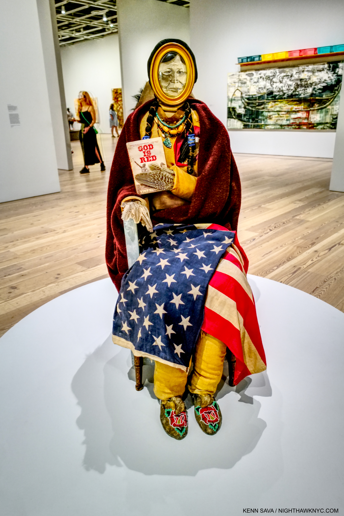
Show seen: Jack Whitten: The Messenger, MoMA, 2025.
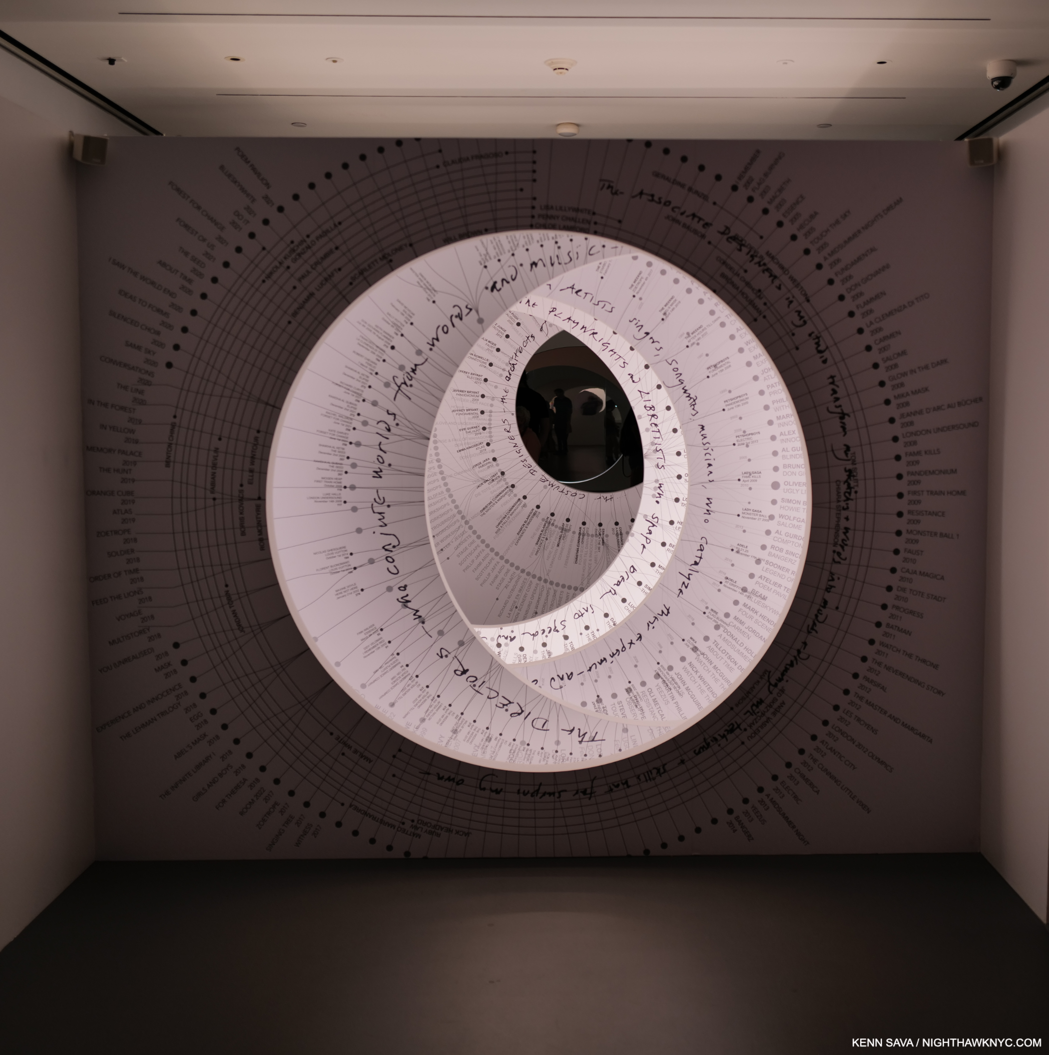
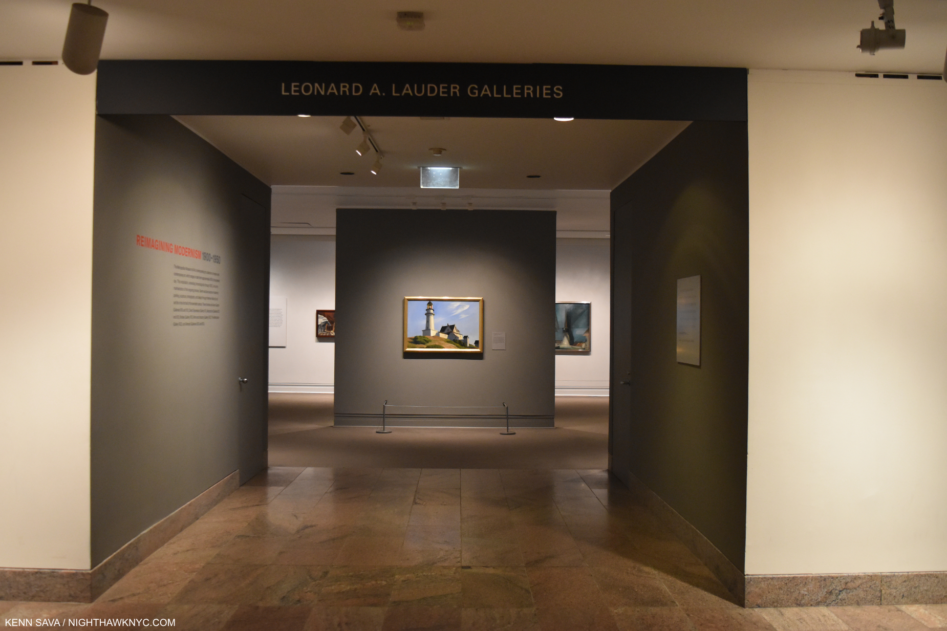
After a quiet Summer, 2024, Summer Blockbusters brought the heat back to Manhattan in 2025. Four shows stood out to me: a pair at the Whitney1 and two at MoMA. Having already written about MoMA’s Hilma af Klint: What Stands Behind the Flowers, here, simultaneously upstairs on 6, Jack Whitten: The Messenger, was the kind of show that made MoMA what it is for many around the world: one of, if not THE, leader in presenting excellent Modern (even Contemporary) Art shows. I’ve written about many of them in these e-pages these past 10 1/2 years.
Few Artists were more Contemporary than Jack Whitten. In fact, he invented some of its language, and a good deal of its emphasis/focus/center.
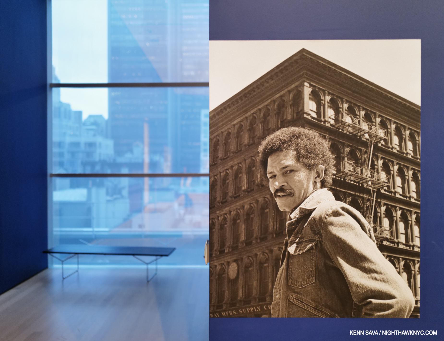
Man about town. Jack Whitten, a transplant from Alabama, was an NYC resident for 58 years, spending most of that time Downtown, before moving to Queens- except when he was “gone fishing,” as he wrote in his Notebooks on his departure for Crete each summer. The Artist is seen here on the corner of Broadway & Broome Street in the early 1970s on the Introductory wall card. When I see this Photo, I’m reminded that later he owned a building on Lispenard Street, a few blocks north of The World Trade Center. I tell the story of Jack Whitten on 9/11 further on.
Still, it left me with a deep sadness that after decades of struggle, Jack Whitten (1939-2018) didn’t live to see it.
Installation view of the first gallery of Odyssey: Jack Whitten Sculpture 1963-2017. The Met Breuer, November 24, 2018
He didn’t live to see the other great show of his work either- Odyssey: Jack Whitten Sculpture 1963-2017, the Retrospective of his Sculpture which he mostly kept from public display, which came to NYC at The Met Breuer in 2018, and which I wrote about here. Together, they make a very compelling case for Mr. Whitten’s extraordinary creative & imaginative range, the extremely wide range of his talent & skill, his accomplishment, and his place as a 20th & 21st century Master.
Installation view of the first gallery of the final Jack Whitten solo show during his lifetime at Hauser & Wirth, February 7, 2017. It was the first time I had seen one of his Sculptures. Quantum Wall (A Gift for Prince), is on the back wall. It can be seen in full in my piece on Jack Whitten: Odyssey, here, an installation view of which is shown above.
Both shows point out a sorry reality for too many great Artists. Jack Whitten is just one of many who waited in vain for their U.S. Retrospective. Meanwhile, numerous deceased Artist receive show after show (I’ve seen ten shows of the work of Jean-Michel Basquiat in NYC since 2012, for example, and written about almost all of them), while too many deserving living Artists go ignored, until years- even decades, after their passing.
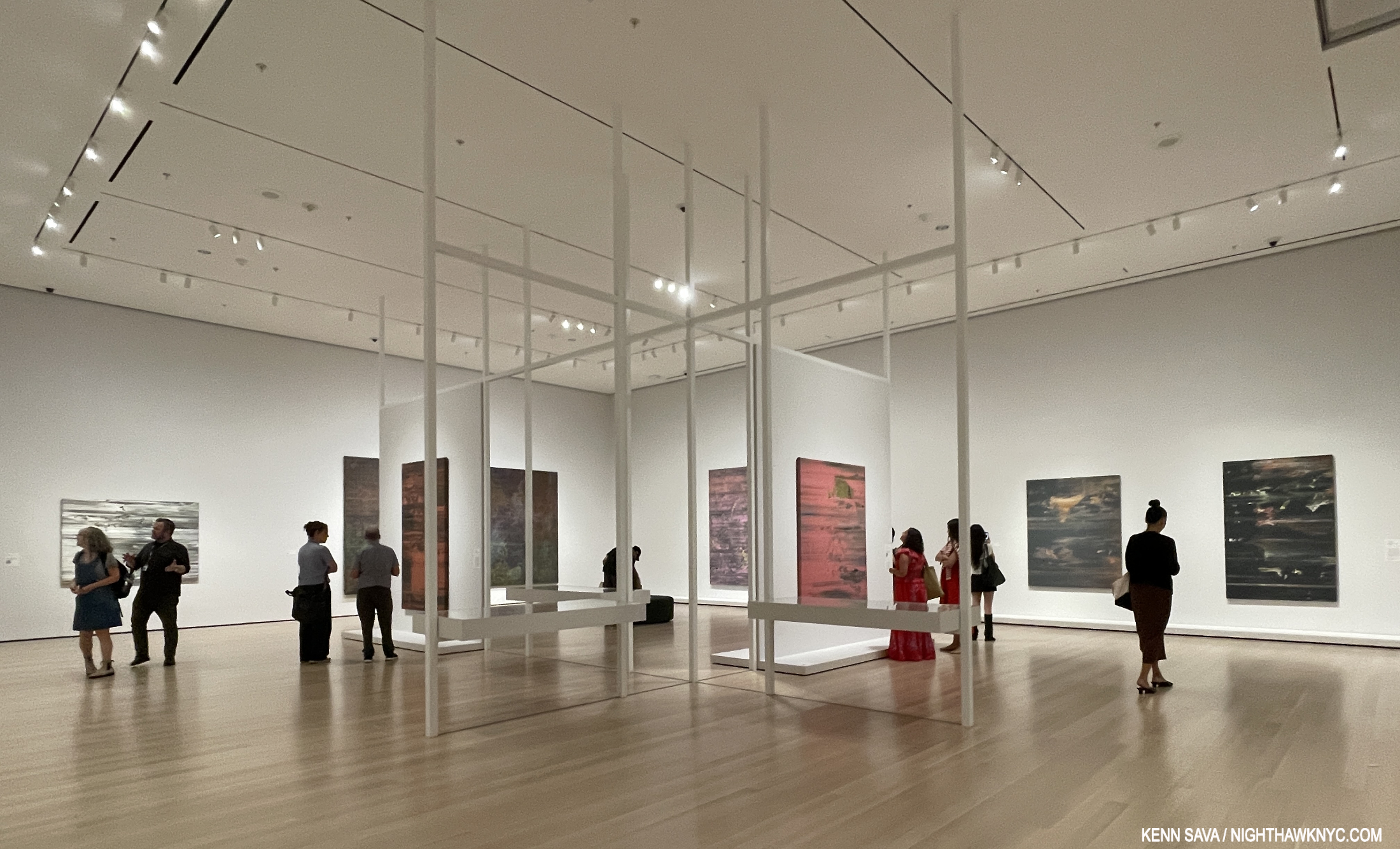
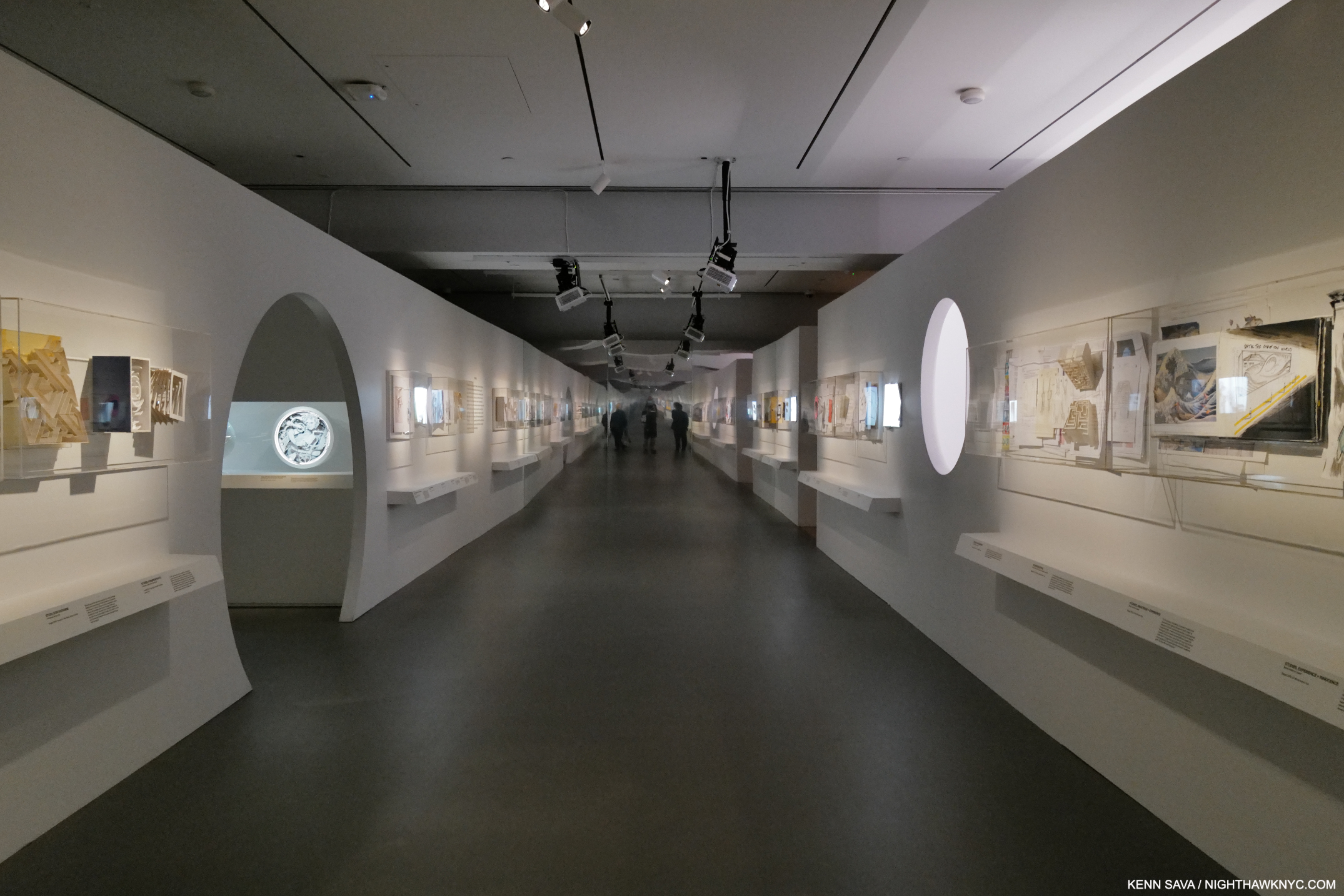
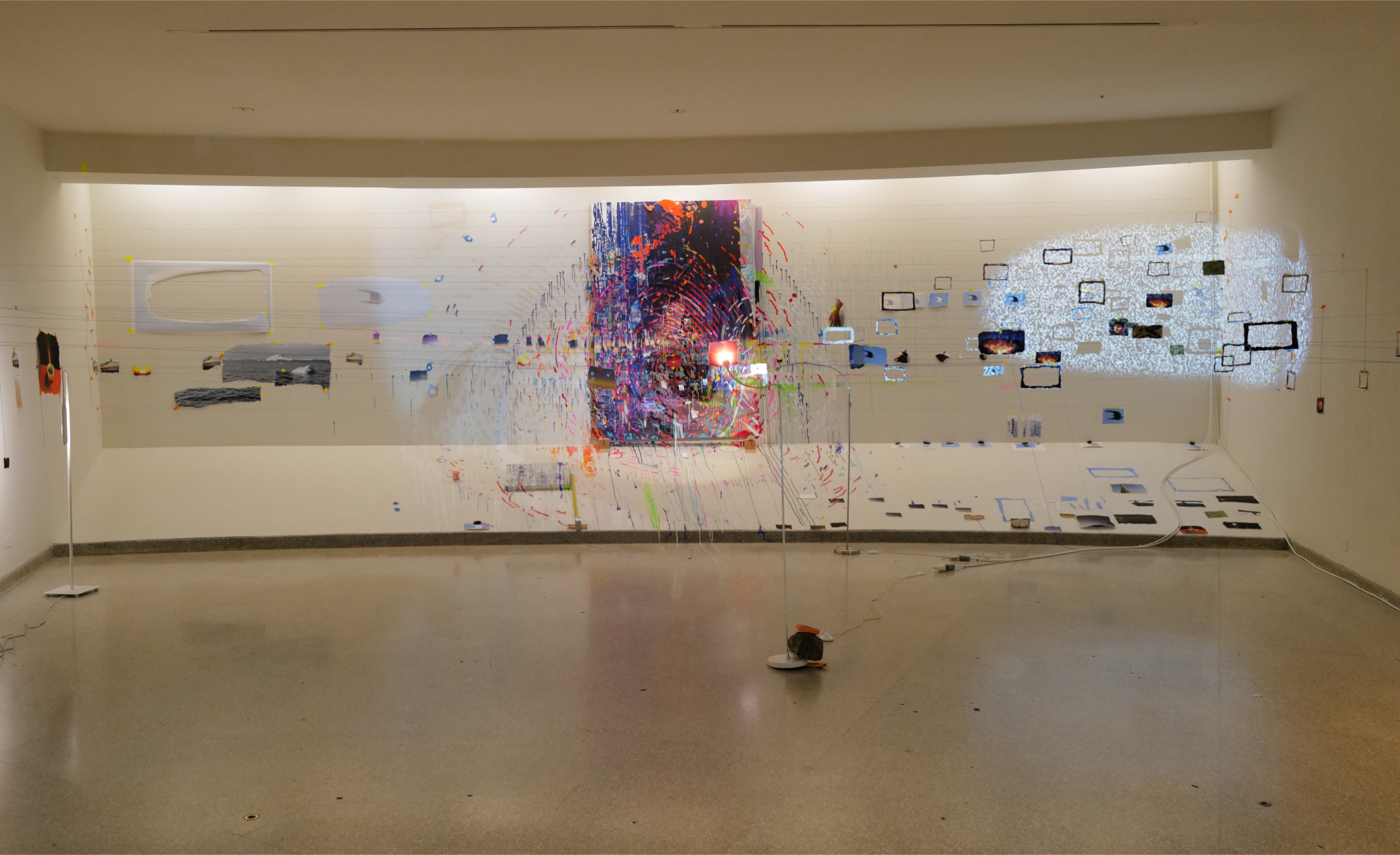
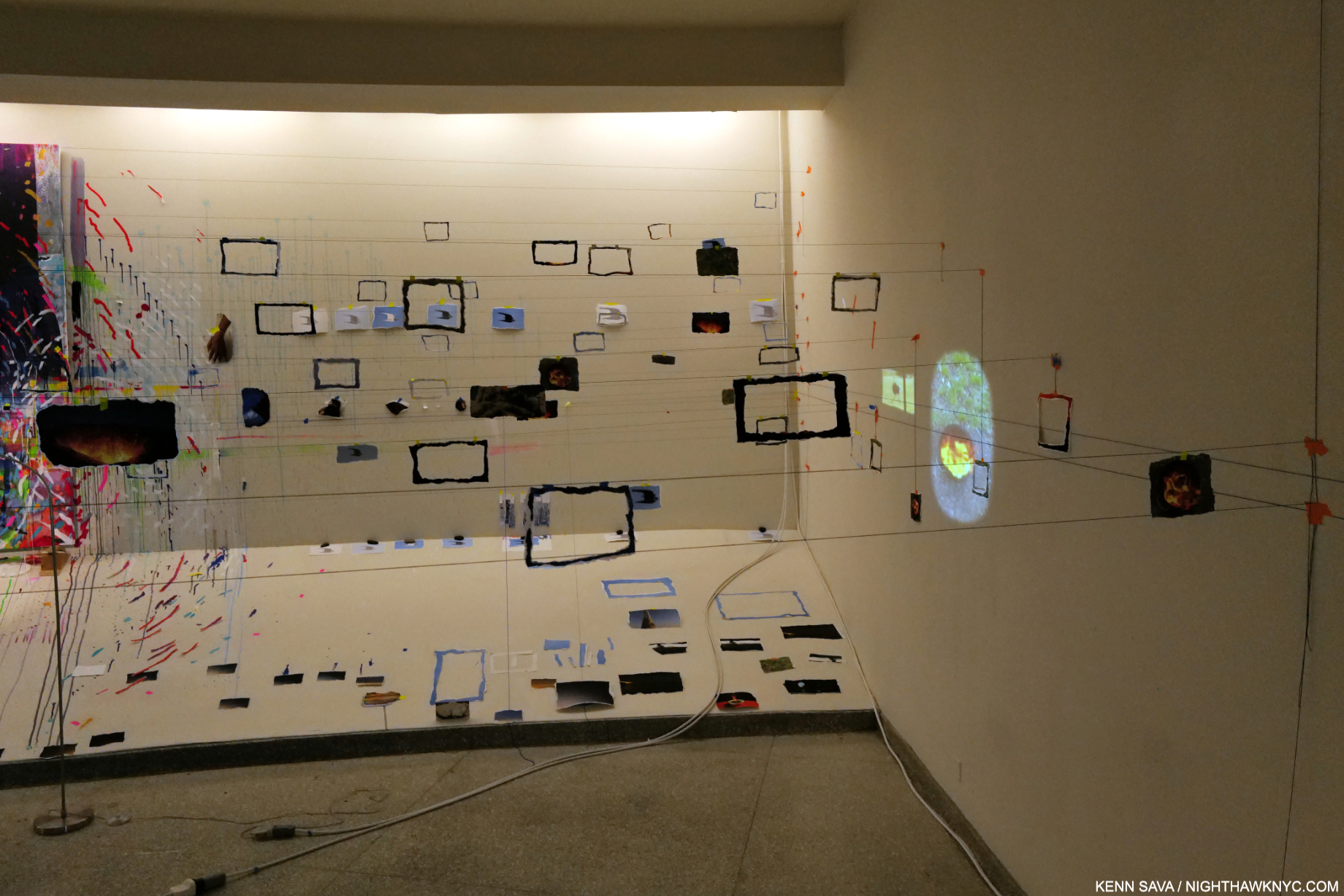
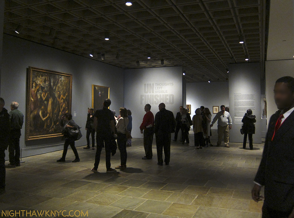
Jack Whitten: The Messenger, Installation view, MoMA, July 31, 2025.
Nonetheless, all the while, his Art continued to ascend the ranks of appreciation and acceptance. It wasn’t always thus. Getting to this point has. been a rough and rocky road. An excerpt from MoMA’s Exhibition Catalogue (which is recommended as the most comprehensive book on Jack Whitten ever, in spite of its cardboard binding) looks back to his beginnings-
“Whitten made some of his earliest images as a teenager, painting hand-lettered signs for local businesses in his hometown of Bessemer, Alabama, in the 1950s. One of his first paid jobs was for a Civil Rights protest on the steps of the county courthouse. These images were meant to travel: to say something, to have reach. Whitten learned the technique using tools left behind by his mother’s first husband, James Monroe Cross, a commercial sign-painter who died before Whitten was born. It was unusual for Cross, a Black man, to have a skilled occupation and own his own business in the deeply segregated Jim Crow South. The artist suggested that Cross was always under threat of suspicion, even violence, for his profession. Making images was a rebellion and a risk… ‘Transmission is the key,’ he said2,'”
The earliest work in the show reveals Jack Whitten’s life long passion for Jazz. The Messenger (For Art Blakey), 1990, left, and Homecoming: For Miles (Davis), 1992 (the year after Miles passed), right. Both Acrylic on canvas.
Reading that, my thoughts turned back to another MoMA blockbuster that was full of “signs,” literal and figurative: Ed Ruscha/Now Then, which occupied these same galleries not long ago, the subject of a 3-part series I wrote. There are surprising similarities, and differecnes, between them. Largely contemporaries, Mr. Ruscha (b. 1937, Mr. Whitten born two years later in 1939), is perhaps best-known for his word Paintings. Though he started with a paying job making protest signs bearing words, Jack Whitten’s Art is almost exclusively wordless, except for its titles. His Art transcended words while honoring his mantra, “Transmission is the key.” Both Artists were born and raised in the South. Jack Whitten in Alabama- “in apartheid,” he said, Ed Ruscha in Tusla, Oklahoma, considered part of the South by some. Both left and attended Art schools, Mr. Whitten at Cooper Union, NYC,3, and Ed Ruscha at CalArts in L.A.. Both stayed put in their new locales for the rest of their lives and their extraordinarily long careers. Both used their Art to regularly comment on the world around them, though Jack Whitten seemed more the Activist. It’s also interesting that both Artist oeuvres are almost entirely devoid of images of people.
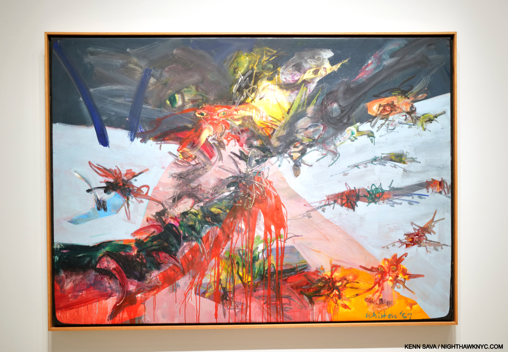
NY Battle Ground, 1967, Oil on canvas
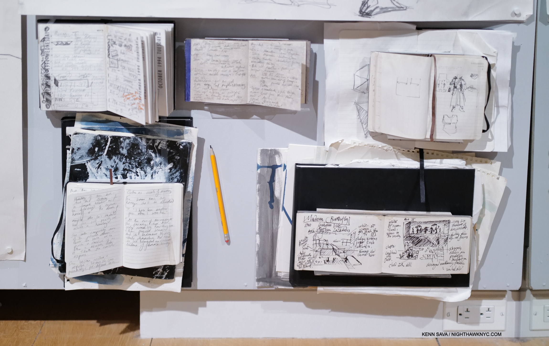
As for their significant differences, Jack Whitten had to survive the 1960s, including the violence that surrounded the Civil Rights Protests. Deeply effected hearing Dr. Martin Luther King speak at the Montgomery Bus Boycott in 1955-56 after Rosa Parks’s arrest, the event that brought Dr. King to prominence (and the event at which Jack Whitten met Dr. King), he soon became fed up with the violence surrounding the Civil Rights Movement, so he moved to NYC in 1960, then graduated from Cooper Union with a bachelor’s degree in 1964, before finding his voice through the influence of the Jazz Musicians he met and the 1st generation Abstract Expressionists who he encountered here. His work would remain abstract his entire career. In spite of all of this history, Jack Whitten skips it and begins his riveting, 568-page collection of his studio notes from 1962 to 2017, Notes from the Woodshed, (the closest thing we have to an autobiography), with the 1960s & with his move to NYC.
Light Sheet I, 1969, Acrylic on canvas
“Never in my wildest dreams did I think that I would reach thirty years of age without self-destructing. . . . The 1960s were coming to an end; I was still alive and in one piece.”
He would go on to live and work for another forty-eight years.
“1970 was the turning point,” he recalled4. At the start of a new decade, the Artist moved to a studio on Broome Street and had a breakthrough. He stopped making figurative art and got rid of his paintbrushes(!), which may be unprecedented among Painters in Western Art history to his time. The studio became a laboratory designed to experiment with acrylic paint5. The medium, a recent innovation made from plastic, offered a vastly expanded range of color, texture, and handling. Seizing the opportunity, Whitten invented tools and techniques that were entirely new to the history of Western art.
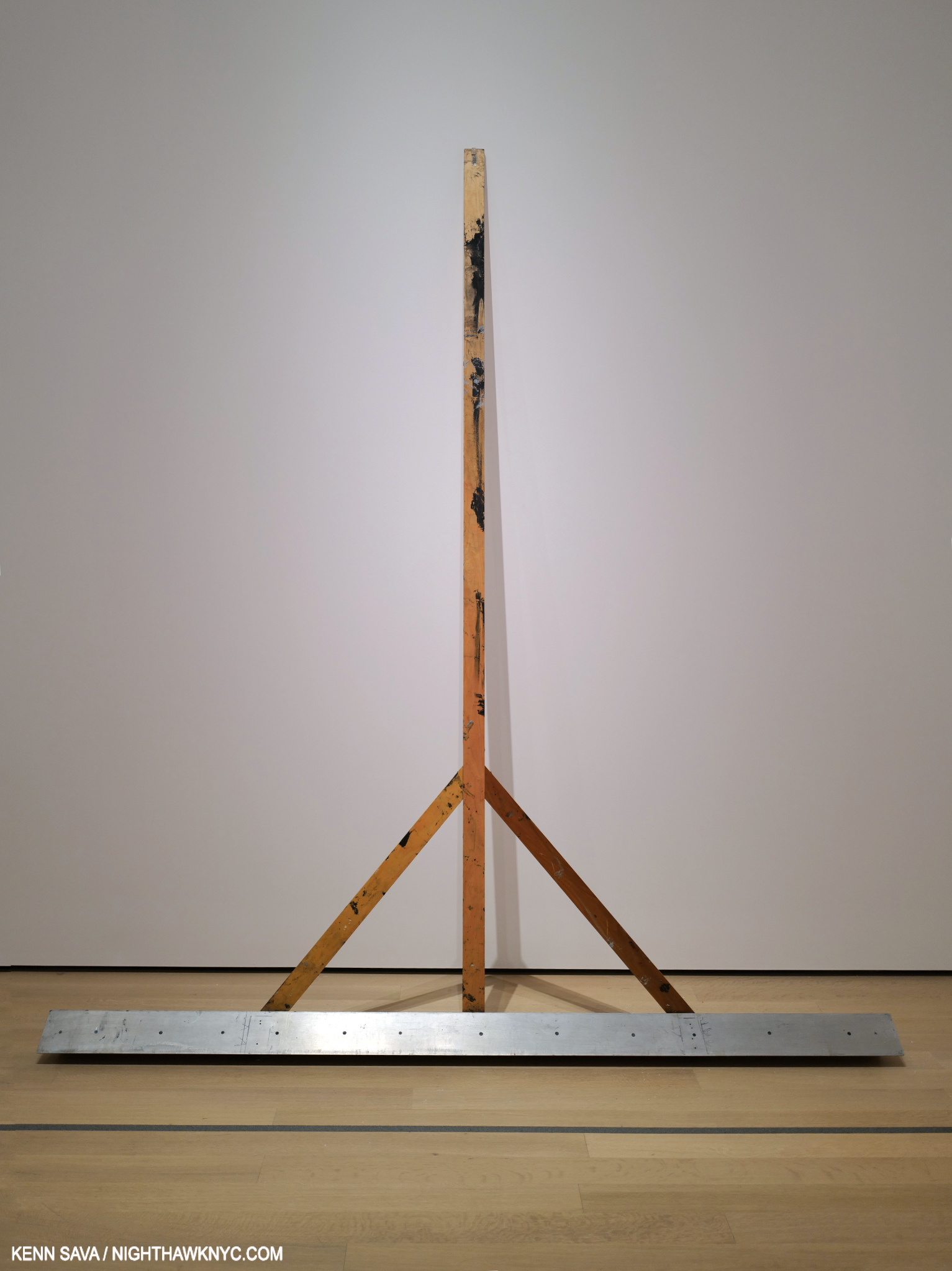
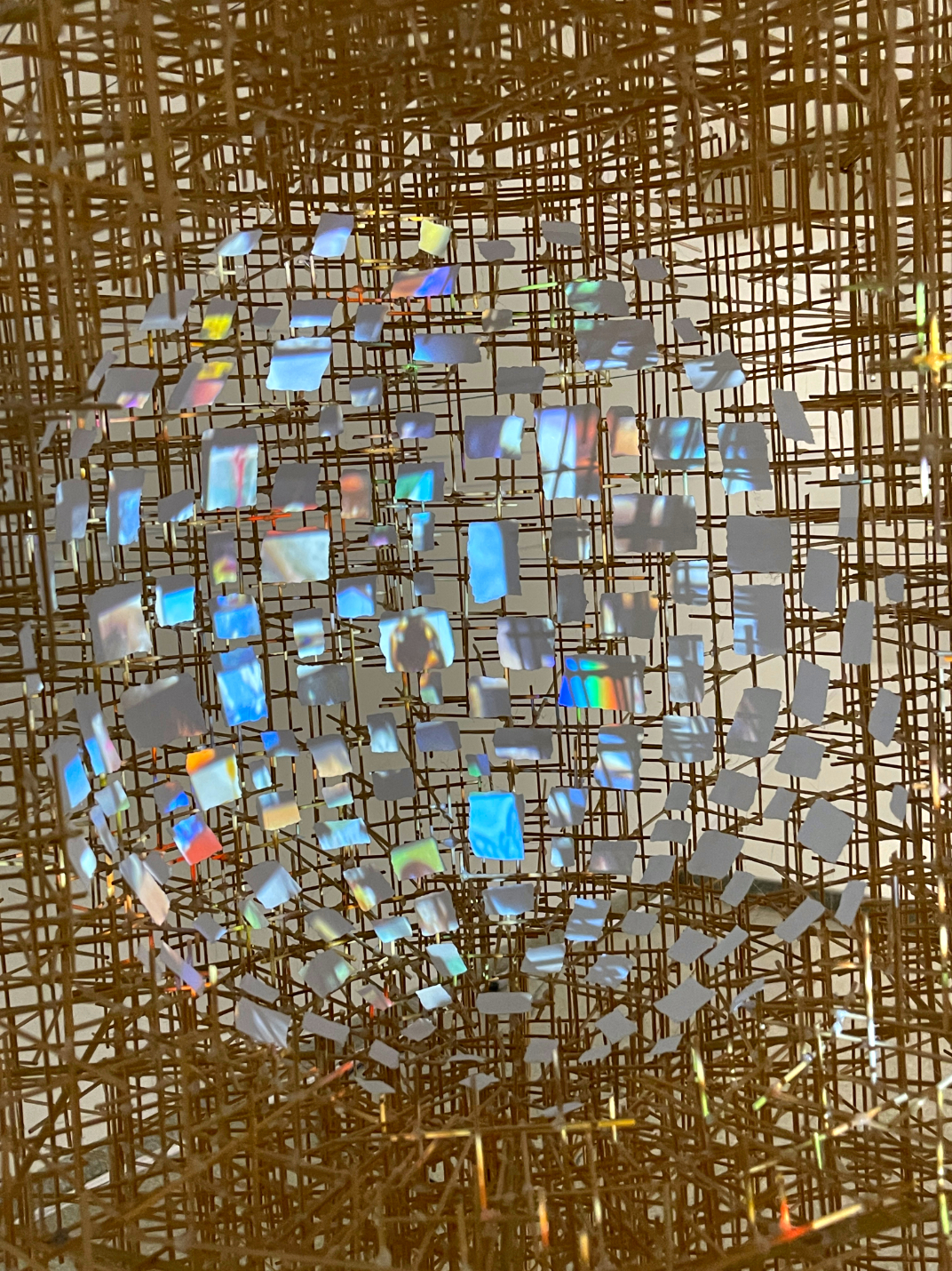
Welcome to Jack Whitten’s post-1970 practice in which he “made” Paintings (he said) without using paint brushes. With this, they were “developed,” akin to how Photographs were. Introducing The Developer. At 12 feet long, creating Art with it is the other part of the equation. Especially since none of the Art I’ve seen that Jack Whitten may have made with The Developer have a dimension of 12 feet. He’s using this on pieces that are smaller than the tool.
From an Afro-comb to a twelve-foot-long wooden rake, which he called The Developer (a reference to photography), novel implements were maneuvered by the artist to pull layers of acrylic paint across canvases laid on his studio floor in one sweeping movement6.” Inventing a technique is impressive. Making Art using it takes mastering it first. Easier said than done with a 12-foot long rake in your hands! In this extraordinary video from 2017, Jack Whitten talks about growing up in “American Apartheid,” as he calls it, meeting Dr. King, and demonstratesThe Developer-
What stands out to me is that Jack Whitten, when faced with violence, met it with non-violence. He turned his anger into Art. Art without words. Abstract Art, at that. Revolutionary for a Black Artist. An Art that continued to represent those he admired and “transmitted” what he experienced in ways never before seen. It seems to me that that says all you need to know about the man.
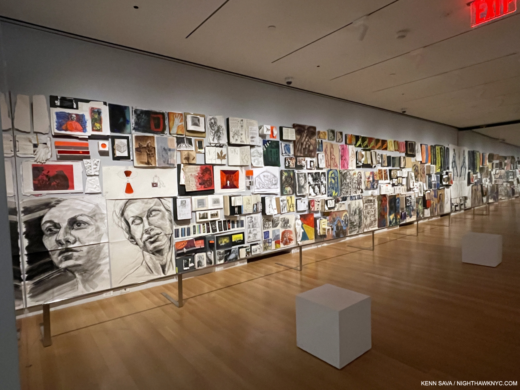
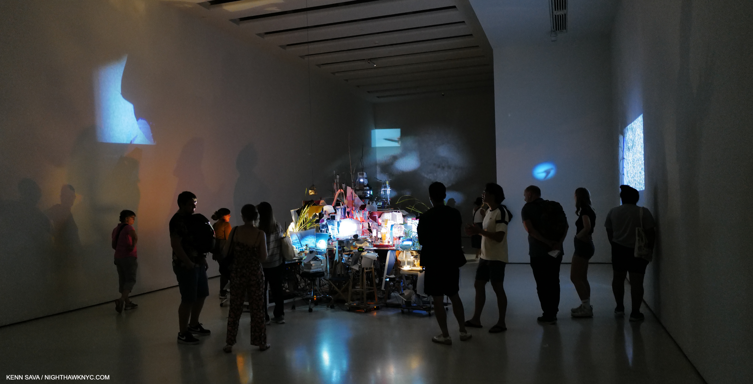
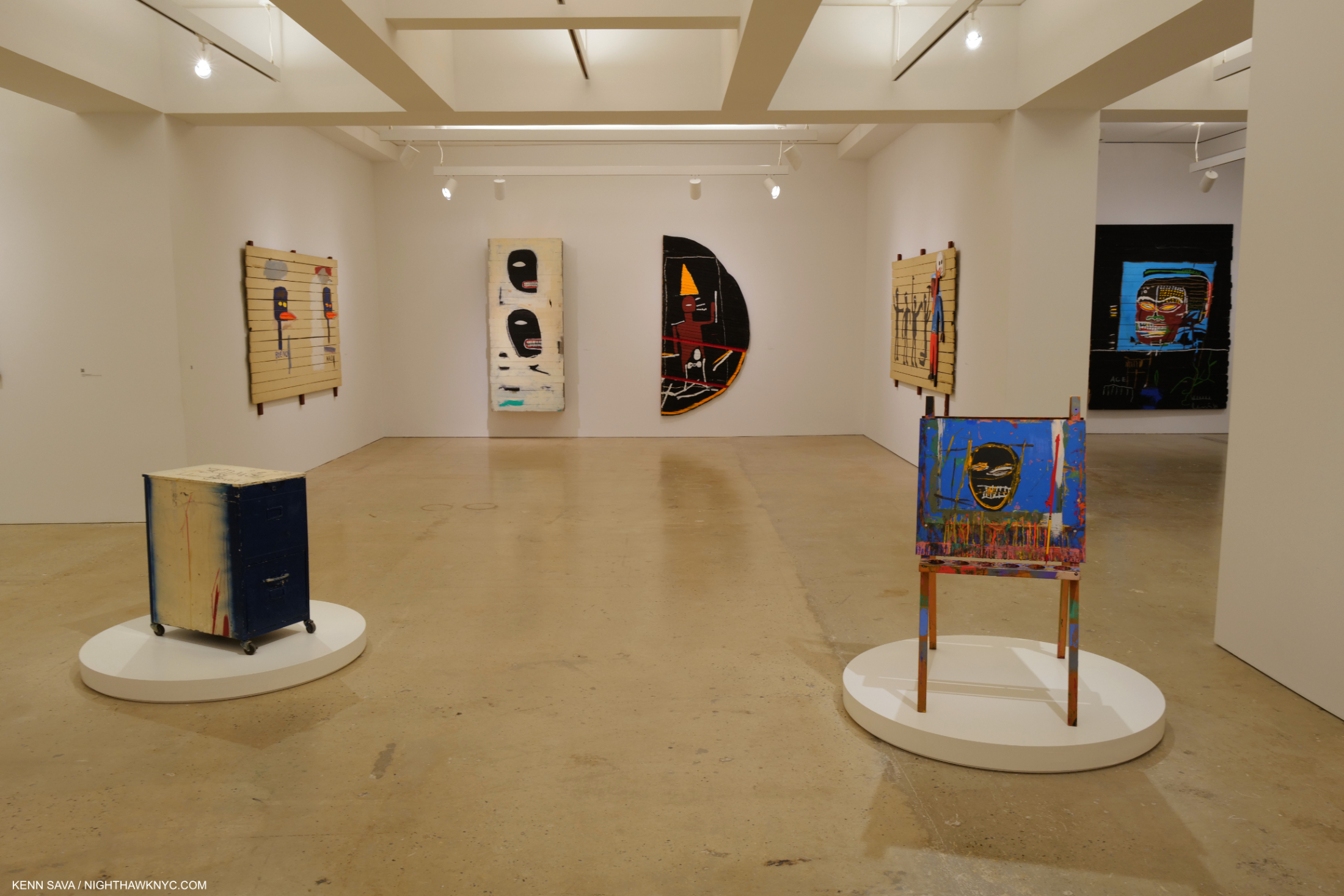
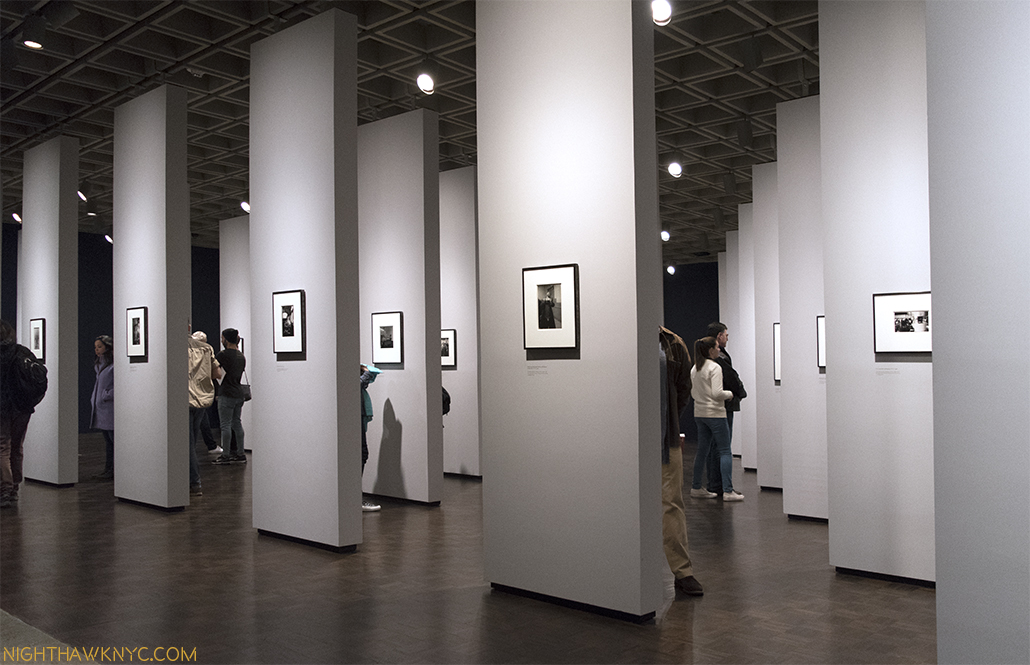
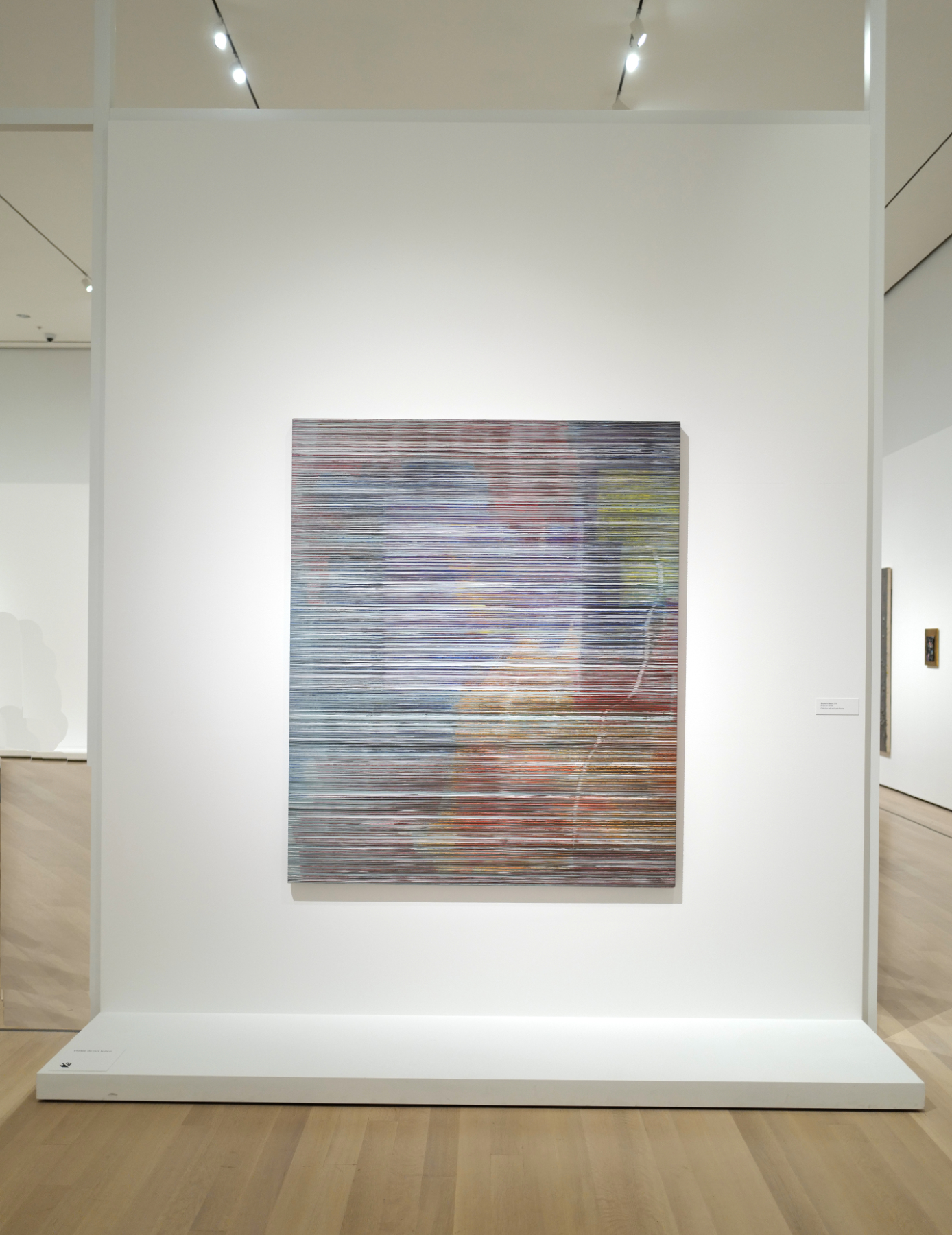
Back at MoMA, the result of all the techniques he invented and perfected and his seemingly endless creativity made Jack Whitten’s work is so unique, and different from itself, that MoMA’s curators chose to install the show with numerous one-work walls. I previously experienced this in diane arbus: in the beginning at The Met Breuer.
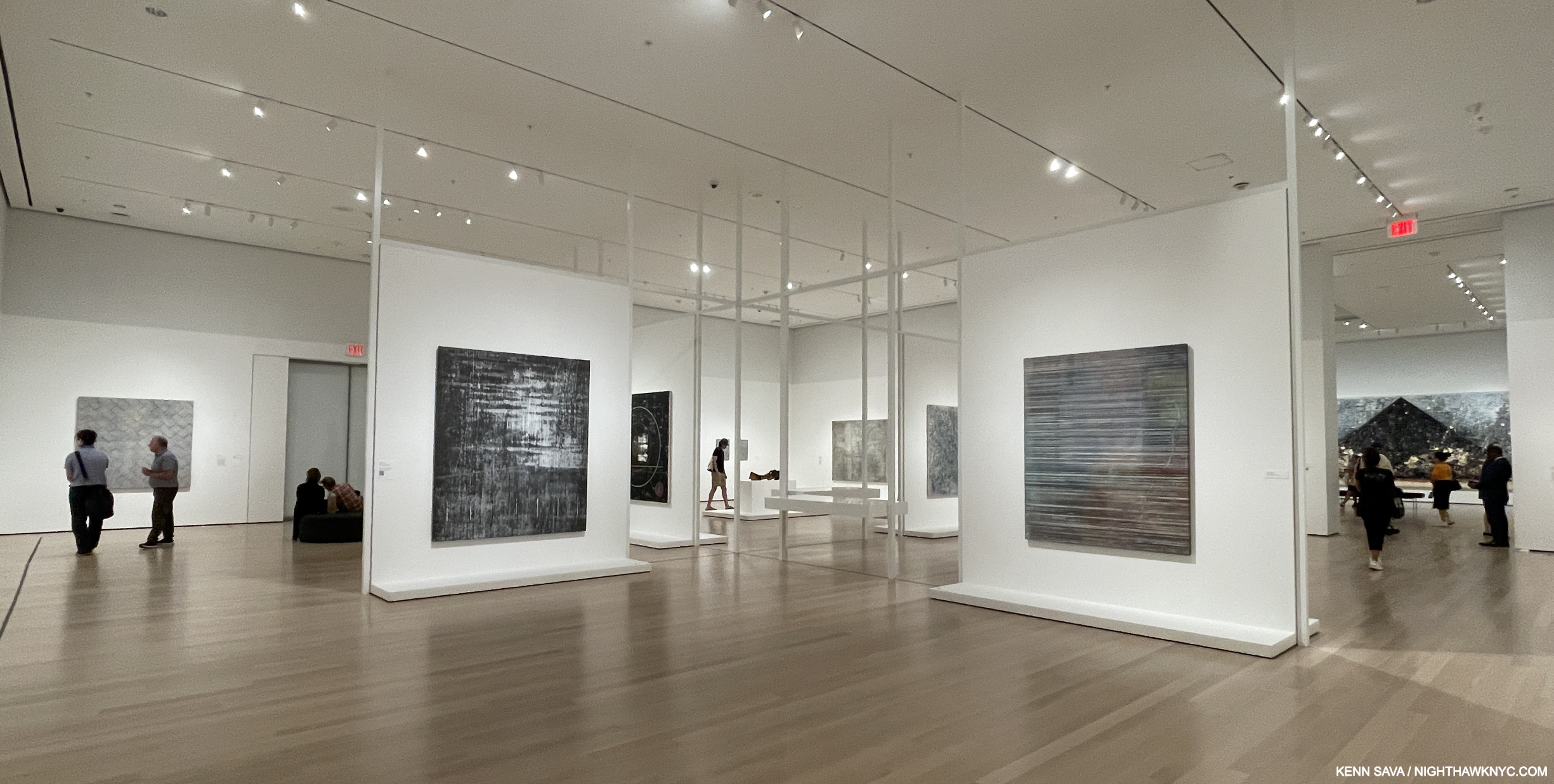
Installation view. Installing one work on a wall is something that works extremely well for Jack Whitten’s work, in my view, since so much of it is so different from everything else. It allowed each piece to be considered singly, and then as the viewer moved around, as part of his whole. It made it very easy to “get lost” in the work & the show, something I went back to it to experience again.
Here, I thought this worked brilliantly and the resulting installation of these walls is one of the features I’ll long think of when I think of Jack Whitten: The Messenger.
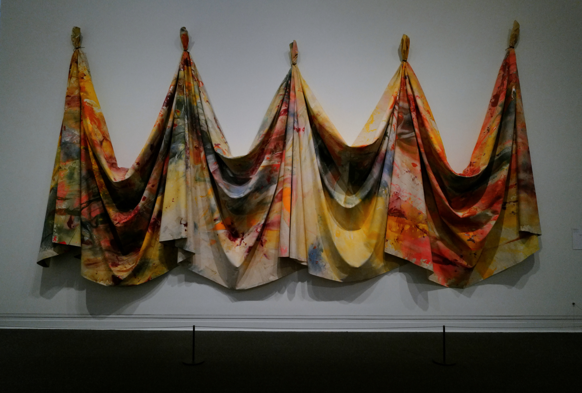
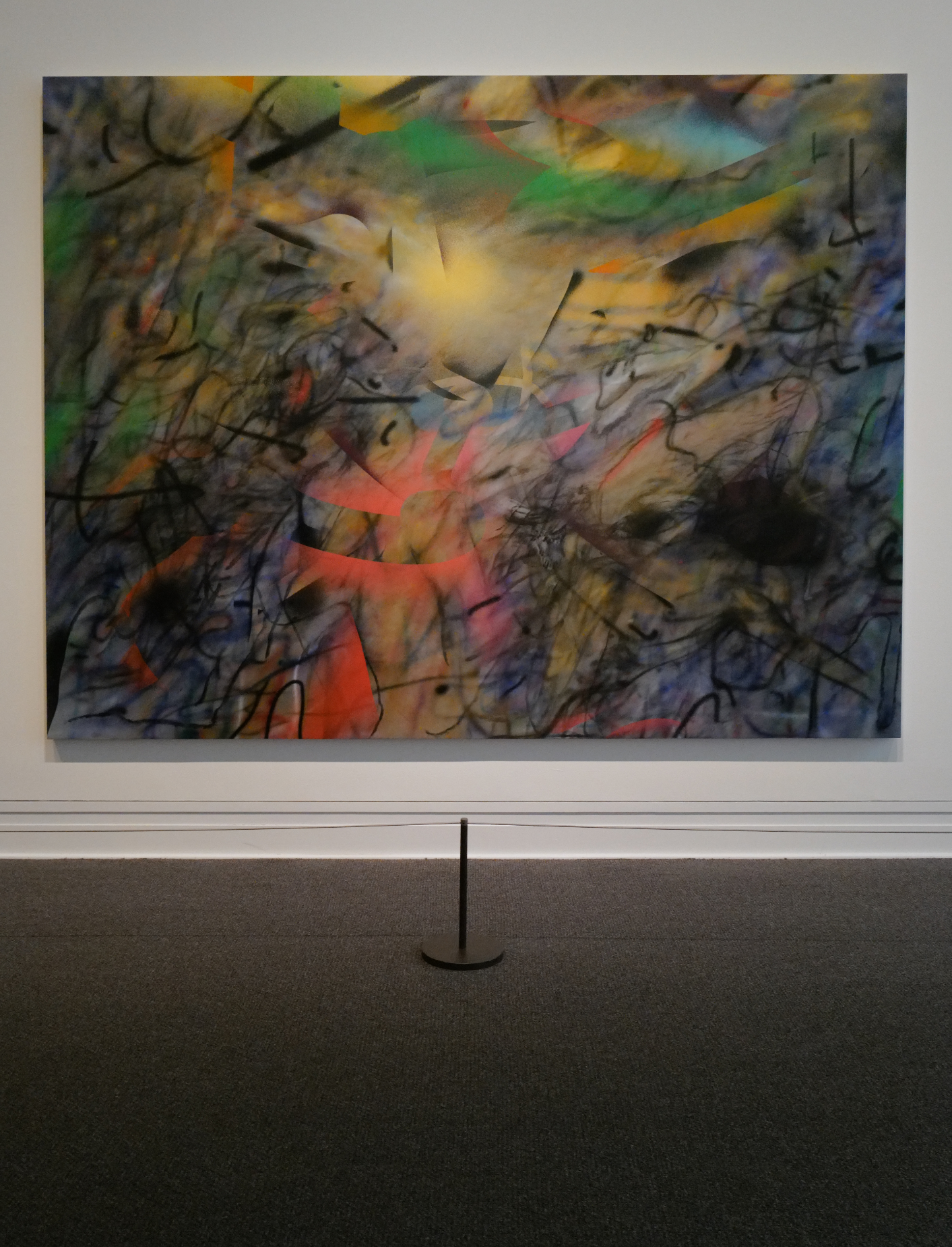
The First Loading Zone, 1973, Acrylic on canvas
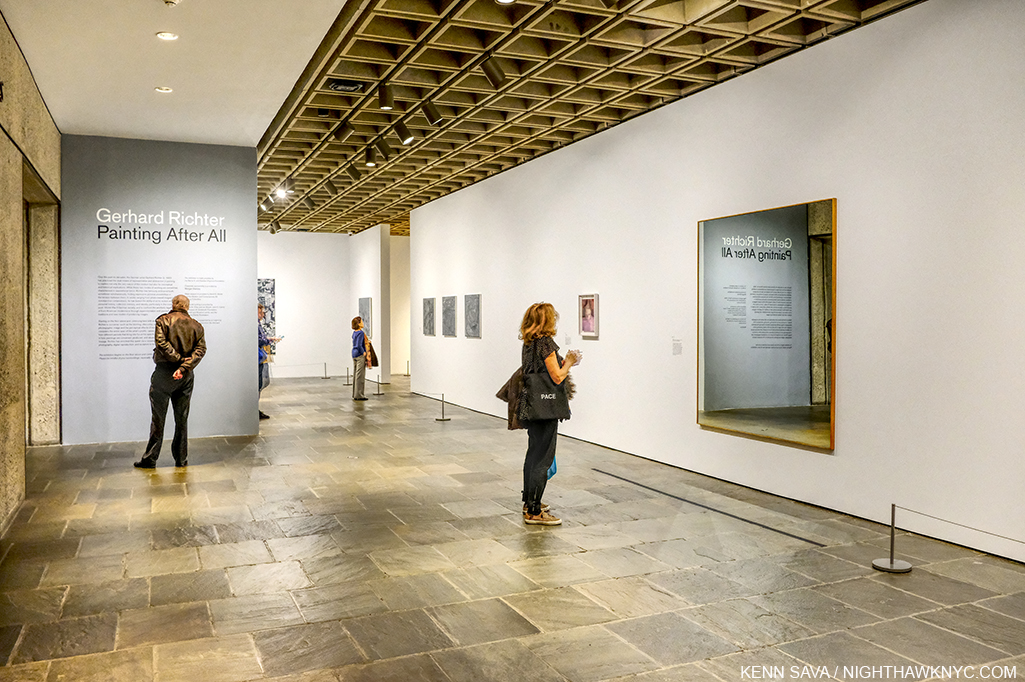
Today, Gerhard Richter gets a lot of notoriety as a “squeegee master,” yet he didn’t begin using the technique until 19857! Still, techniques do not make a work “Art,” with a capital “A,” as I write it. Yet, at least to my eyes, having seen Gerhard Richter: Painting After All on its last day (my look at it here), and the last day of the lost & lamented Met Breuer, what I saw over both shows left me feeling that Jack Whitten’s “Developer” works will continue to rise in esteem & appreciation. Since I believe that comparing Artists or Art works is subjective, I’ll leave it at that.
Chinese Doorway, 1974, All work are Acrylic on canvas unless stated. At 89 1/2 × 43 1/4 inches, it’s hard to say if this was created with The Developer, but if not, it appears he used another of his scraping tools.
But his “Developer” works are just one part of the work Jack Whitten created over his 58 year career, a part that fit in seamlessly with everything else he created as was to be seen in the incredibly rare opportunity to experience a large body of his work. This is in itself, remarkable. I’ve seen countless group exhibitions where different styles didn’t mesh well with each other. Yet, in The Messenger they meshed brilliantly and coalesced into telling one story: his.
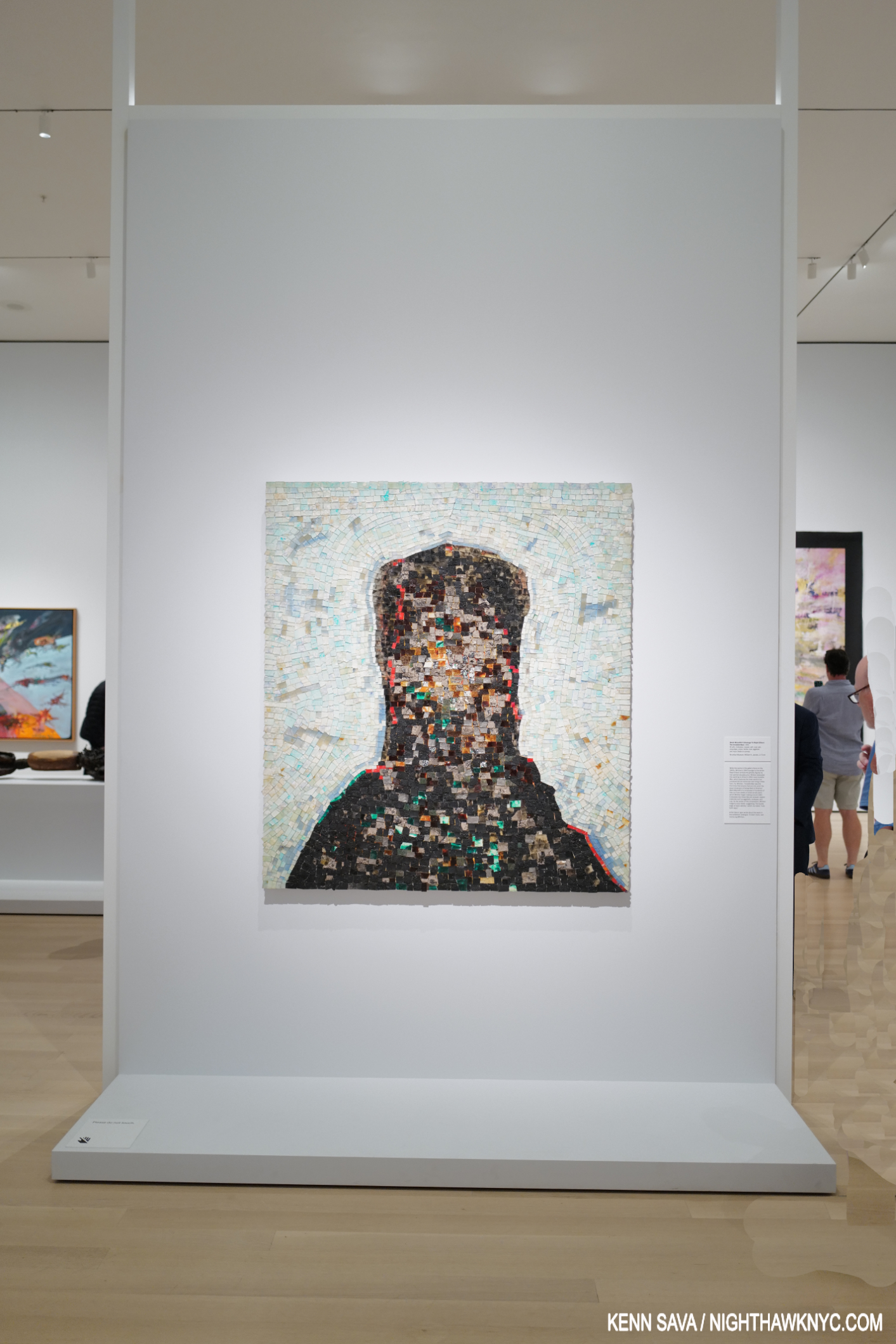
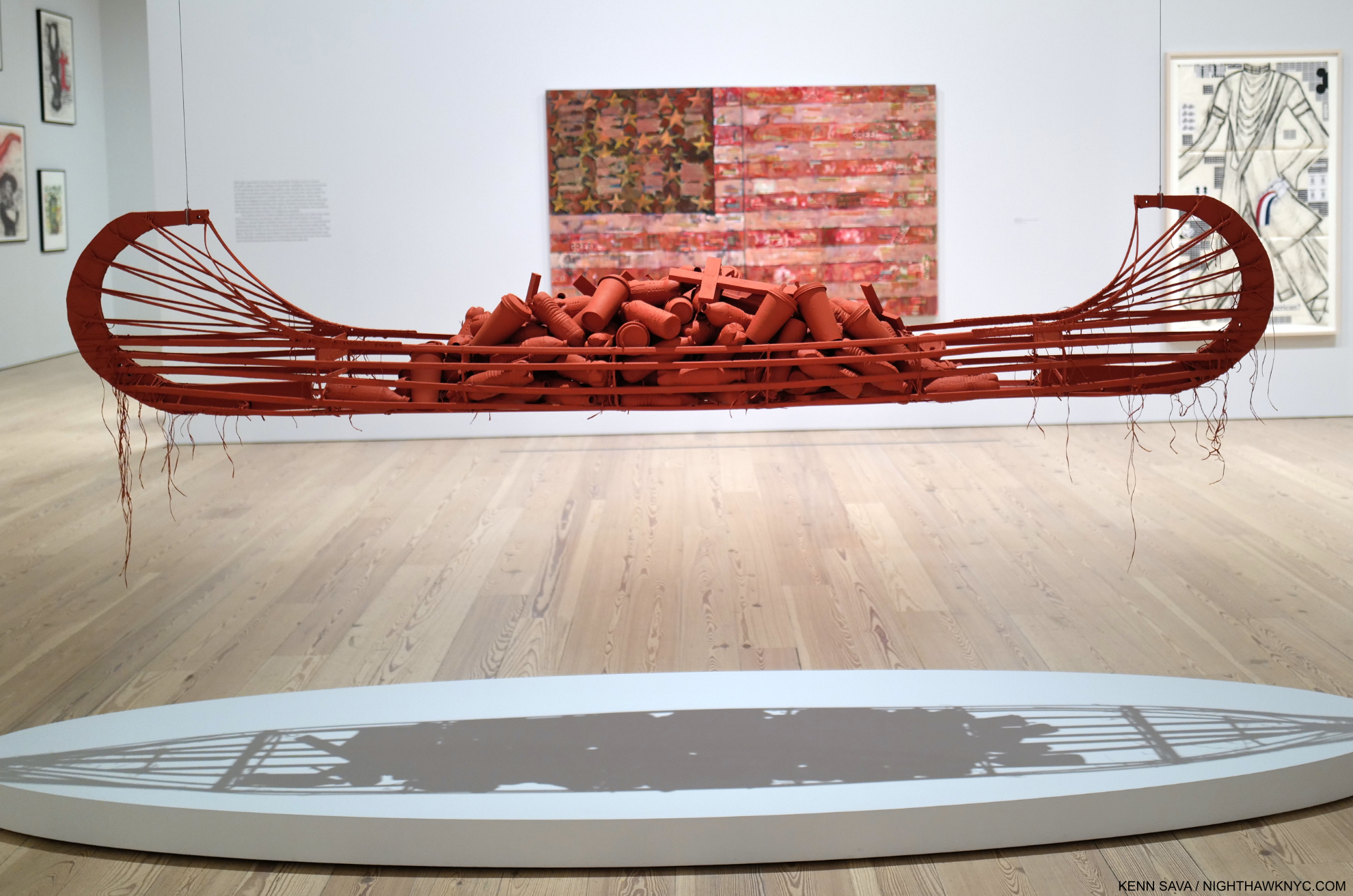
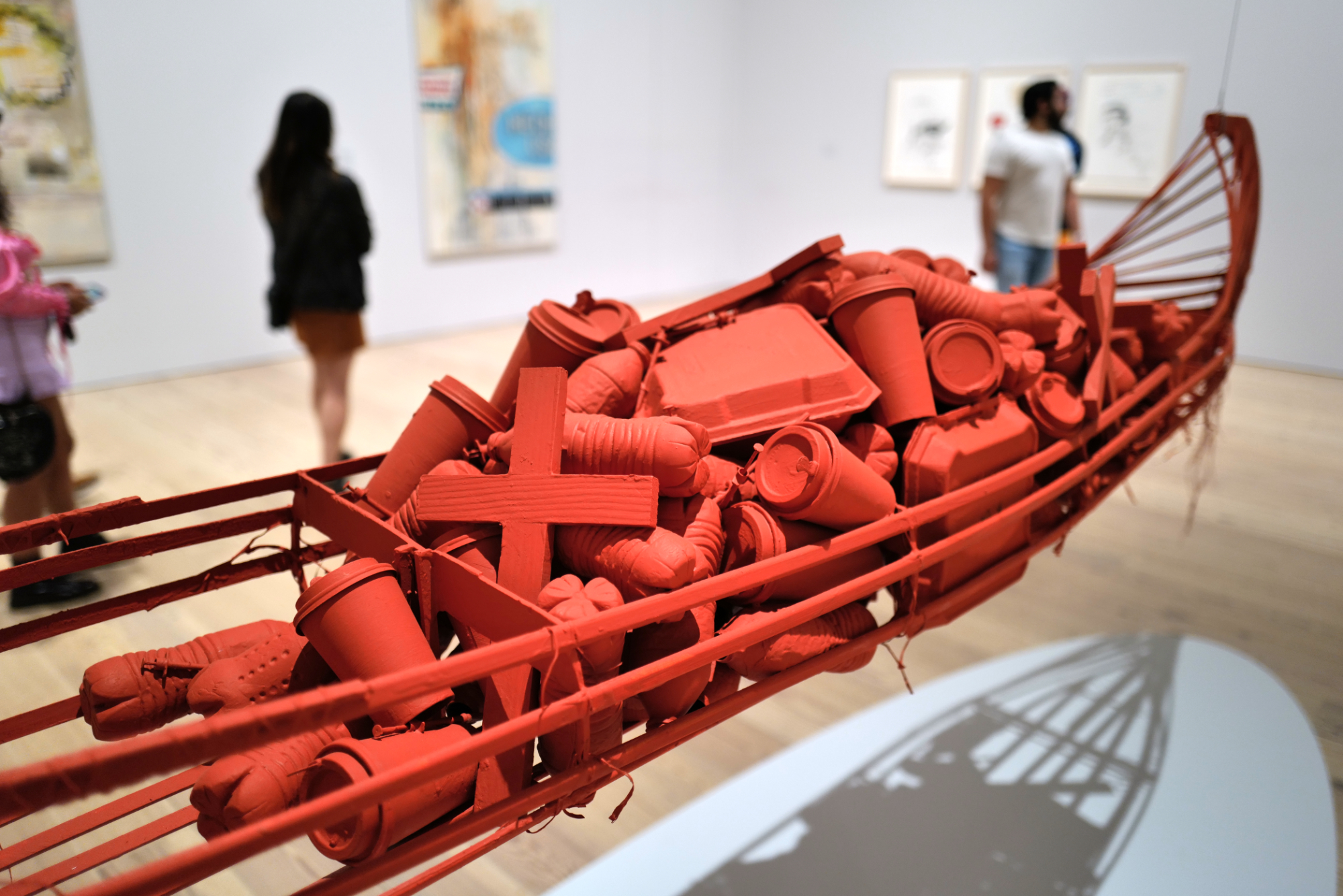
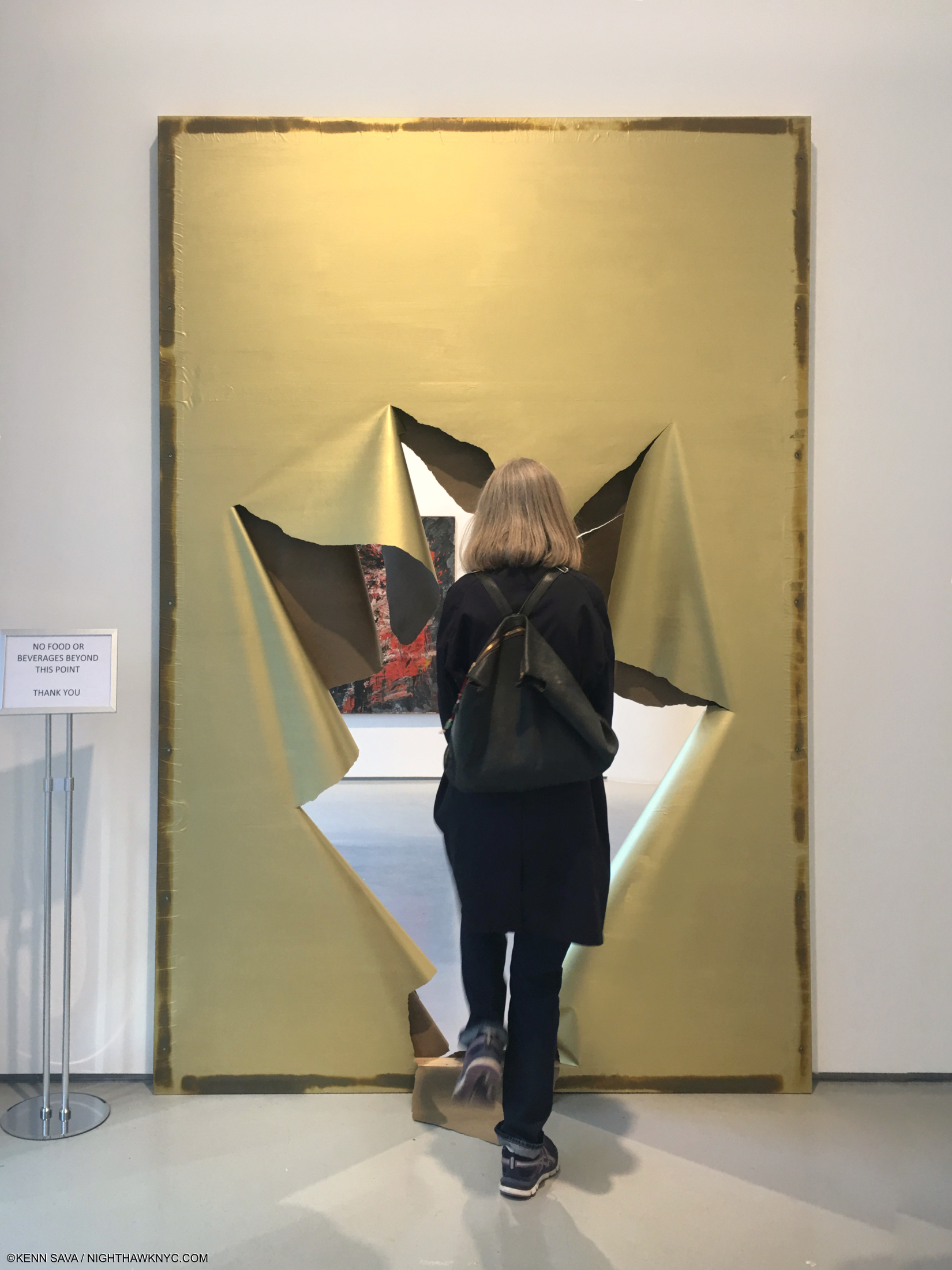
Black Monolith II (Homage To Ralph Ellison The Invisible Man), 1994, Acrylic, molasses, copper, salt, coal, ash, chocolate, onion, herbs, rust, eggshell, with razor blade on canvas. As close as Jack Whitten comes to “traditional Portraiture.”
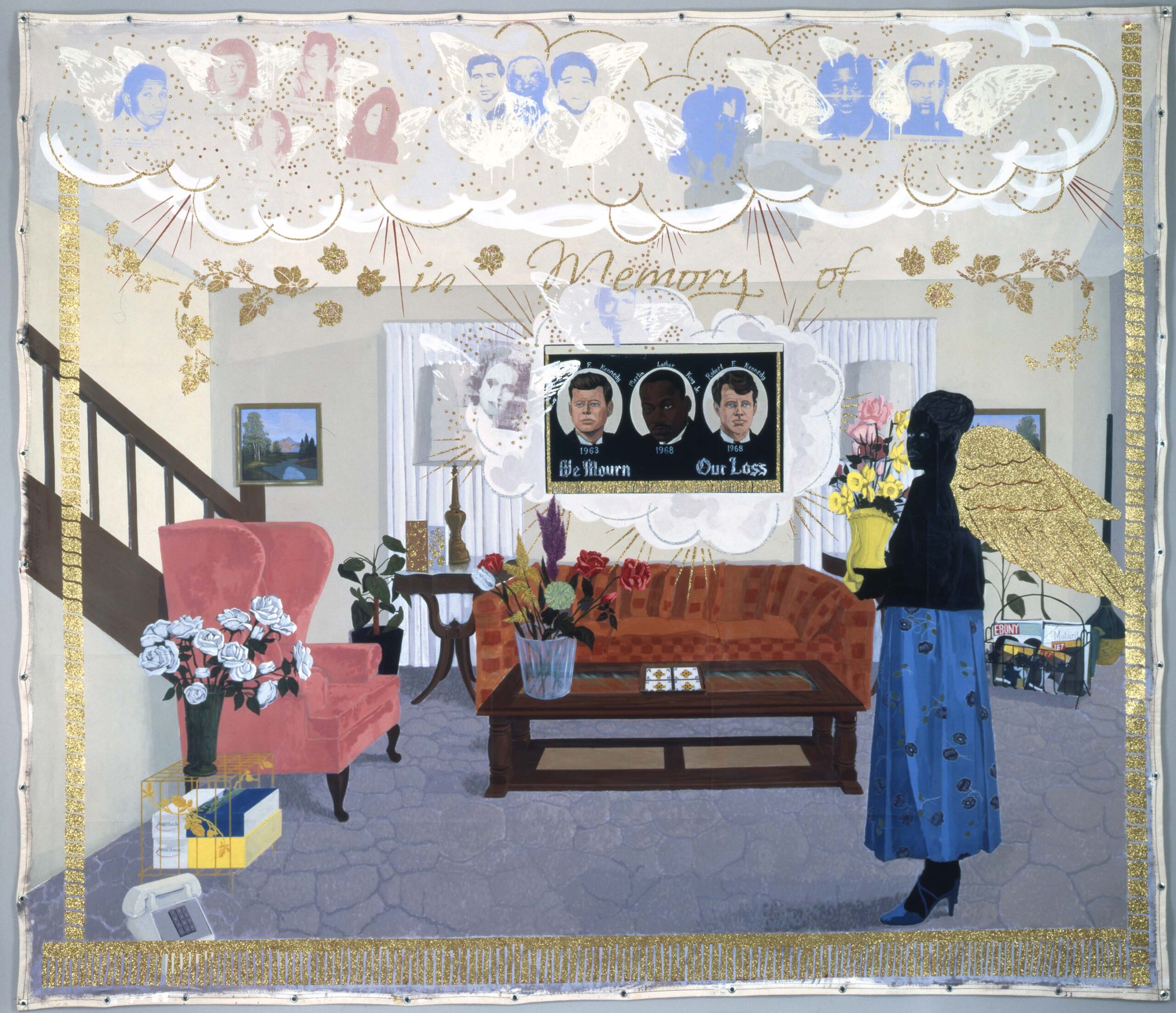
Walking through it left me realizing that it’s hard to think of another Black Artist who captured the times he lived in and so many of its leading figures in her or his Art, besides Charles White. For me, at least, when these works (including his Black Monolith series) are taken as a whole, the result is something of a Self-Portrait of the Artist: a man of his time, in his time, who rose above his time and all the travails he encountered to create something completely new and completely Jack Whitten, leaving echoes & impressions of his experiences.
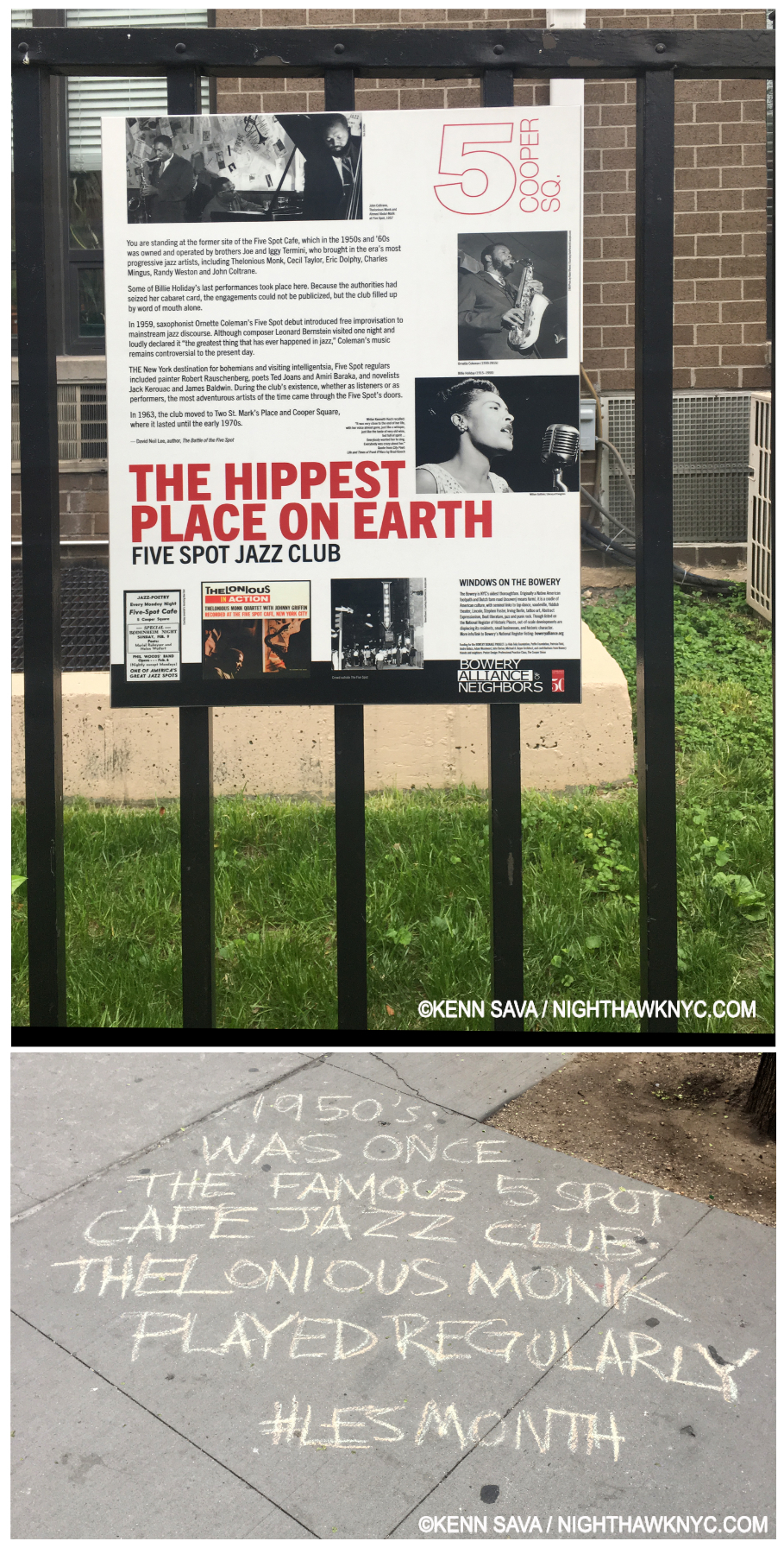
Chalk editor’s note- Insert “This” in front of “was once.” (No, I did not write it.) NYC is “only” 402 years old, still you can be sure that with every step you take here you’re walking on history. So it is here in front of this nondescript residential building. But back in the late 1950s and early 1960s this was the location of “the hippest place on earth”- the now legendary Five Spot nightclub. The list of Jazz immortals who performed here is only matched by the legends of Art, Music, & Literature who hung out here to hear them.
Among the leading, now legendary, figures of his day that Jack Whitten encountered and even spoke with are Jazz Masters Thelonious Monk and John Coltrane, the latter, who was embarking on his own spiritual quest after a period of drug use, had an especially deep and lasting impact on Whitten’s Art.
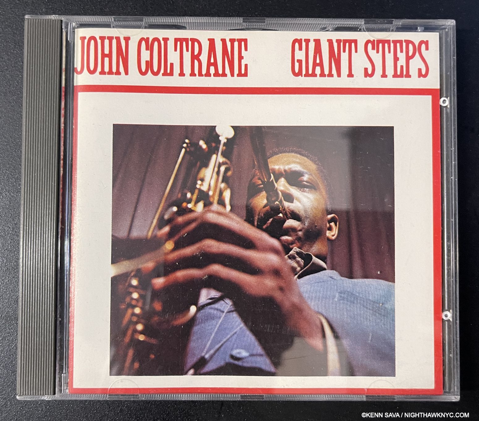
John Coltrane: Giant Steps, 1960. One classic that’s in both of our collections (Jack’s on LP as shown in the catalog. My LP was replaced with this CD after wearing out), John Coltrane is shown here, Photographed on the cover by Lee Friedlander, around the time he was frequenting The Five Spot.
Jack Whitten frequented the legendary Five Spot nightclub on East 5th Street, and came to amass a terrific Jazz record collection.
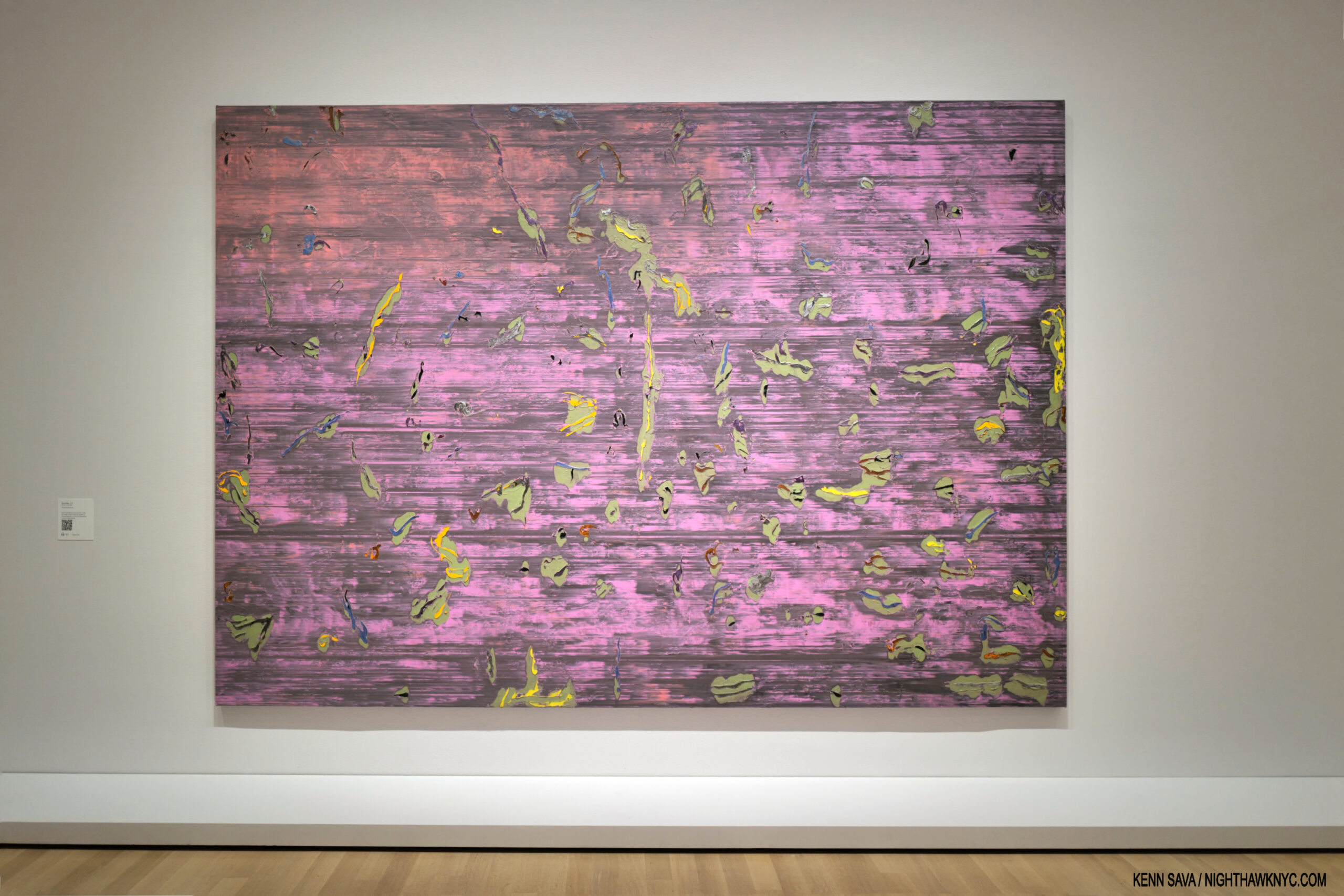
Asa’s Palace, 1973, Acrylic on canvas
Another thing that stands out for me is that Jack Whitten was one of the earliest Black Artists to adopt abstraction, something that has continued in the work of Mark Bradford among quite a few others.
“There are two kinds of abstraction, the abstraction of Pollock and the abstraction of [Piet] Mondrian,” Jack Whitten wrote in 1969. “It is possible to create a third abstraction based on the theory of transcending these two8*
His titles often “ground” the work, but then the viewer is left largely on her or his own, often with a staggering amount of detail to consider. This last puts the lie to theory that abstract Art is “dashed off,” perhaps born of a misunderstanding of Jackson Pollock’s “dripping” technique, or the appearance of Franz Kline’s brushwork. Walking through The Messenger, I was hard pressed to find a single work that looked “dashed off.” On the contrary there were works where Mr. Whitten first had to invent, then perfect, the technique he used before the work could begin!
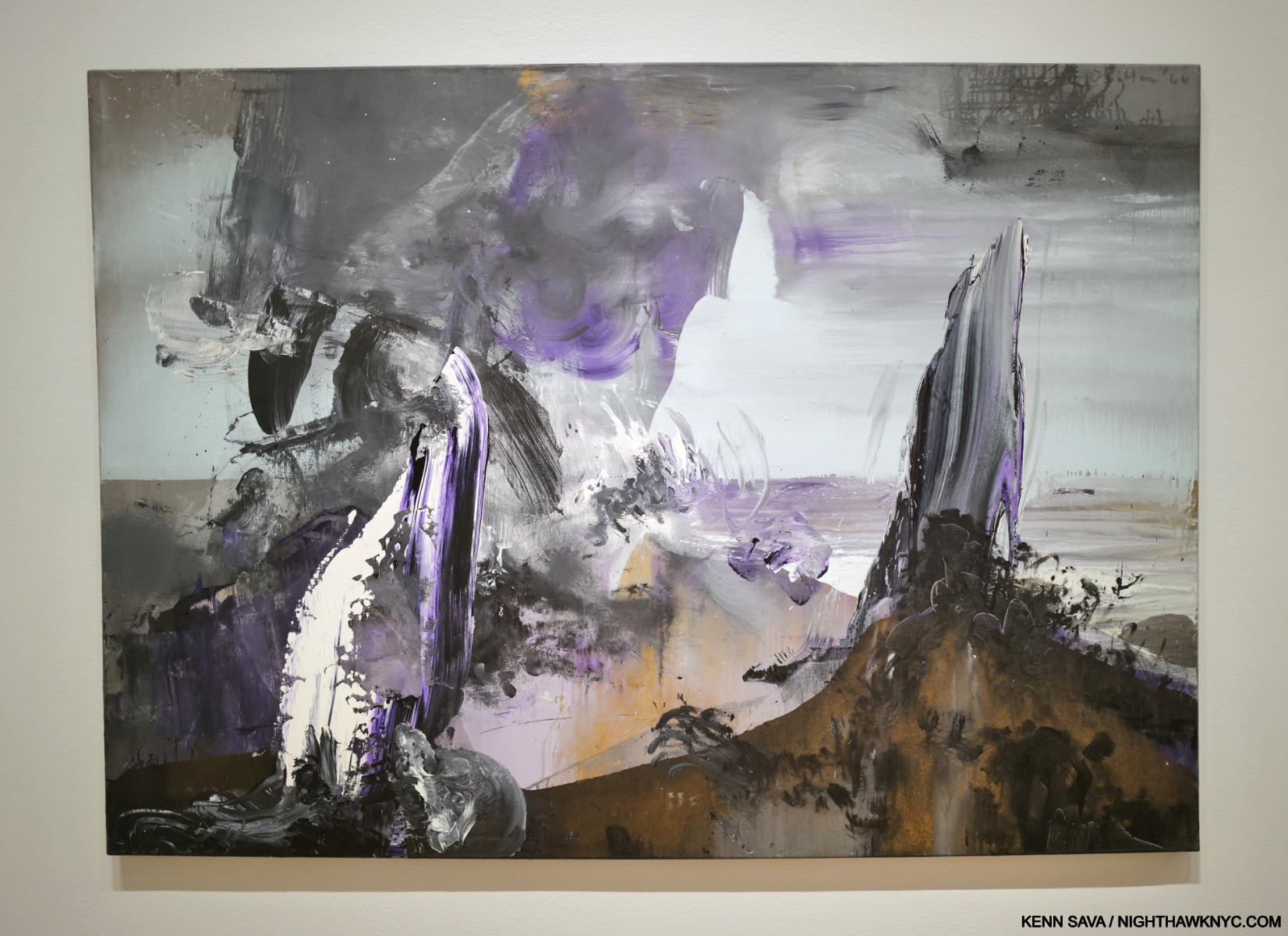
Atlantis Rising, 1966, Acrylic on canvas
Jack Whitten was an eyewitness to the first plane flying into World Trade Center 1 on 9/11 from 14 blocks away! Incredibly, his voice is heard on the only video there is of that plane impacting the North Tower, by the Naudet brothers who were making a documentary on the New York Fire Department. Following them around, that morning they answered a call about a gas leak at the building Jack Whitten owned on Lispenard Street. The Naudets happened to be filming the firemen who were trying to find it when the plane flew right over their heads! Jack Whitten’s voice is the one heard making the expletive as it crashes into the North Tower9. The NYFD immediately jumped in their trucks, accompanied by the French crew under the direction of the Naudet brothers and James Hanlon (making the renowned documentary 9/11) and headed off to Ground Zero. Mr. Whitten-
“I was in the street that morning. This plane came right overhead, and when that sound came overhead, you could feel your flesh crawling, I mean, seriously, rippling. We looked up, this plane was right on top of us. At first you didn’t see any flame, any smoke. You just saw this big gap and hole, and the sky was filled with a chandelier of glass. It was later you saw the smoke and the flames. My gut feeling told me that that was not an accident. This is what I call the particularities of violence—close to 3,000 people were murdered in my neighborhood. People were screaming, crying.”
He stopped making Art, except for this piece, which took him five years to complete-
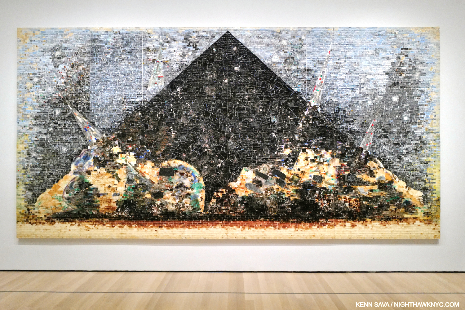
9.11.01, 2006. Acrylic, ash, animal blood, hair, and mixed media on canvas, 120 × 240″ (304.8 × 609.6 cm). In what I think was a brilliant move, the Baltimore Museum sold some of its older masterpieces, inciting an uproar, and used some of those funds to buy it, saddening me that an NYC museum hadn’t stepped up. After five years of agonizing over it, Jack Whitten created one of the most stunning pieces of Art to come out of the tragedy.
“I wanted that painting to be more raw and visceral. A lot of emotional stuff in there. I’ve had people that stand before that painting and cry,” he said10.
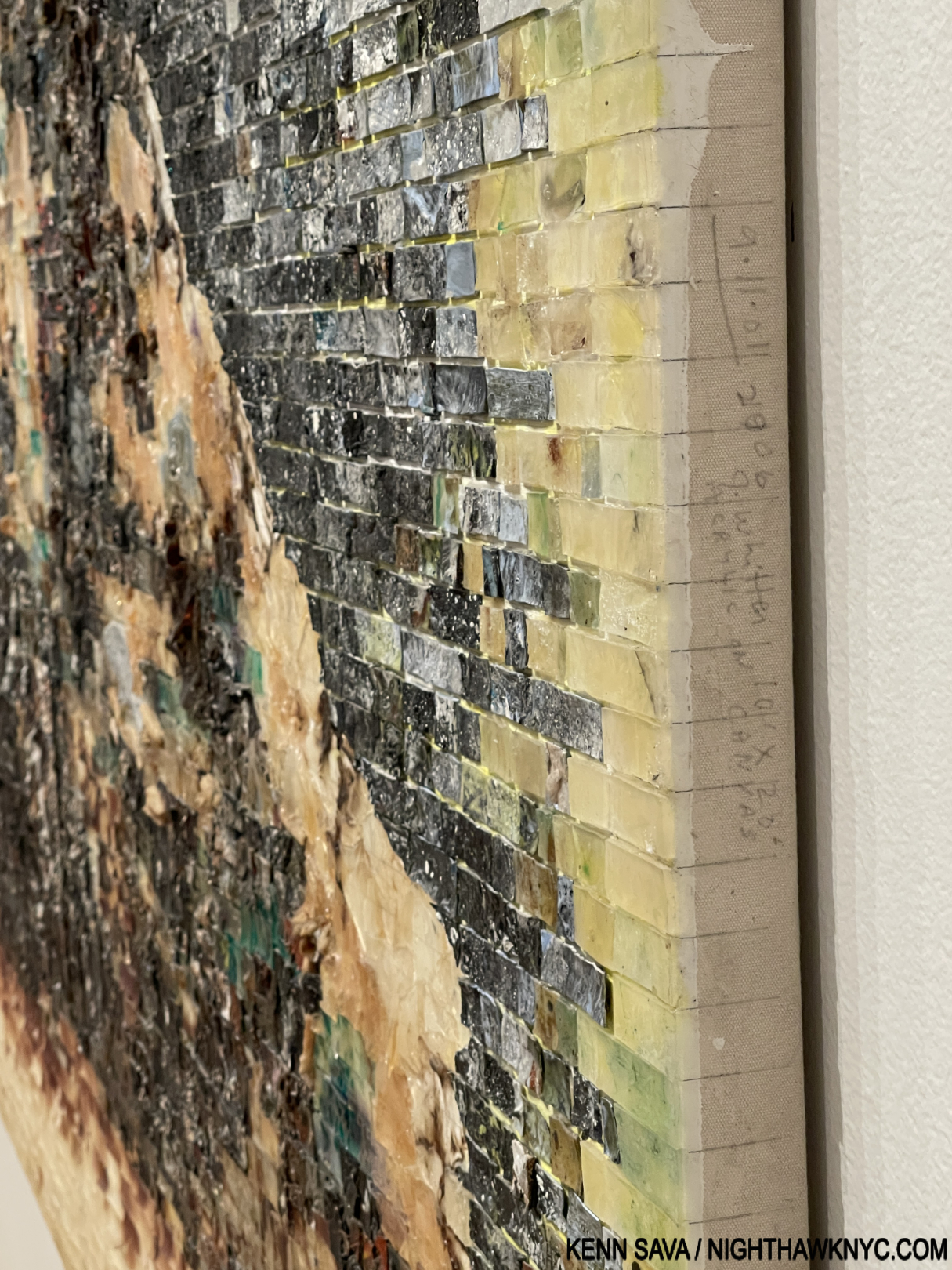
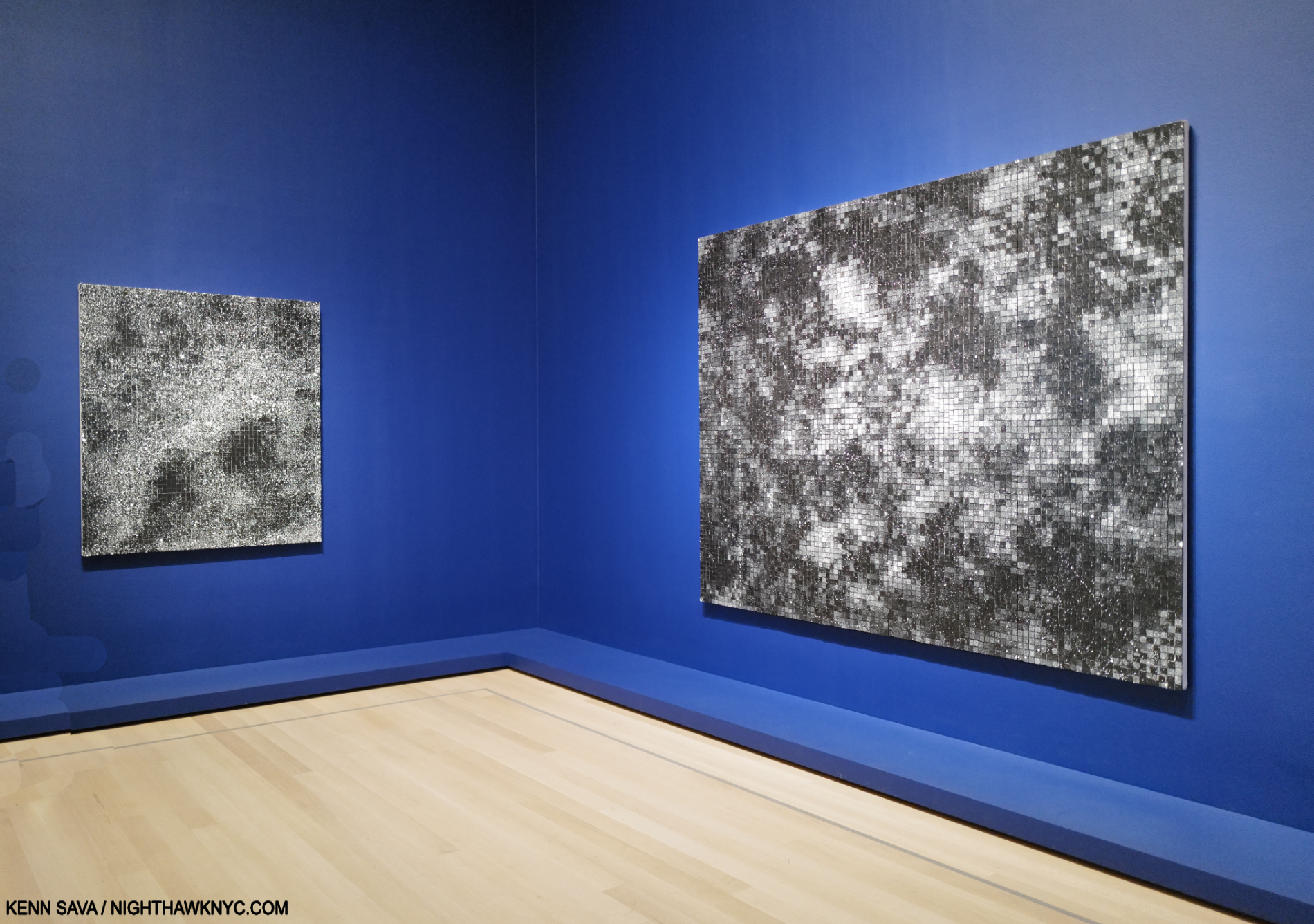
Jack Whitten’s signature and inscription on the right edge of 9.11.01. This also shows a detail of the mosaic tiling the work consists of, each tile hand-crafted.
The work is also created with another technique he invented. Beginning in the 1990s, the Artist cut hardened sheets of acrylic paint into thousands of mosaic tiles that he used to assemble 9.11.01 and other works. In my piece on Jack Whitten: Odyssey, “Jack Whitten: Secretes from the Woodshed,” I show an Art21 video that shows Mr. Whitten actually creating one of his “mosaic” works.
Southern Manor, 1974, Acrylic on canvas
“Perhaps the ideal approach to the work of literature would be the one allowing for insight into the deepest psychological motives of the writer at the same time that it examined all external sociological factors operating within a given milieu. For while objectively a social reality, the work of art is, in its genesis, a projection of a deeply personal process, and any approach that ignores the personal at the expense of the social is necessarily incomplete,” Ralph Ellison speaking of a way of engageing Literature, c.194611.
Though he was here (NYC) during the heyday of Abstract Expressionism, arriving in 1960 on the tail end of the first generations’s success, he doesn’t seem to have been overly influenced by them directly when looking at his work. Their influence seems to me to have been more in freeing the young Artist to explore other ways of communicating in paint. Maybe this can be seen when he said his Paintings weren’t Painted, they were “made.” In fact, it seems to me his attendance at the numerous Jazz clubs that were in a golden age at the time may have had a deeper last effect. In the Music, he found other Artists who were familiar with what he had experienced, whereas the first gen AbEx Artists had not. Their influent may have helped Jack Whitten focus on what was most important for him to express. They were doing it without words. He would do it without representational images using techniques he invented.
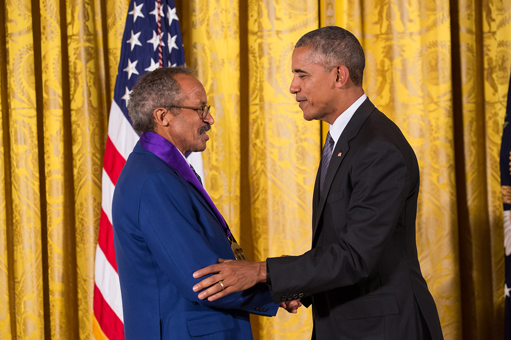
One recognition Jack Whitten did live to receive was the National Medal of Arts by President Obama. “WASHINGTON, DC – On Thursday, September 22, in the East Room of the White House, President Barack Obama awarded the 2015 National Medal of Arts and the National Humanities Medal to distinguished recipients. First Lady Michelle Obama attended the ceremony.” *- Photo by Cheriss May, www.cherissmay.com. White House caption in quotes.
It’s become apparent that Jack Whitten is the spiritual and influential “godfather” of much of what we see today, less than a decade after his passing. He turned his back on so-called representational Art and found a new way of “transmitting” all of what he had witnessed, all he had heard, and all he had inside, in abstraction, forging a new path forward that others have turned into a highway.
For Michael Merriweather.
*- Soundtrack for this piece is “Nutty” by Thelonious Monk, heard here with John Coltrane, recorded live at The Five Spot in 1957-58, with some rare Photos of them performing in the club-
NighthawkNYC.com has been entirely self-funded & ad-free for 10 1/2 years, during which over 340 full-length pieces have been published! If you’ve found it worthwhile, PLEASE donate securely by PayPal below to allow me to continue. Thank you, Kenn.
You can also support it by buying Art, Art & Photography books, and Music from my collection! Art & Books may be found here. Music here and here.
Written & photographed by Kenn Sava for nighthawknyc.com unless otherwise credited. To send comments, thoughts, feedback or propositions click here. Click the white box on the upper right for the archives or to search them. Subscribe to be notified of new Posts below. Your information will be used for no other purpose.
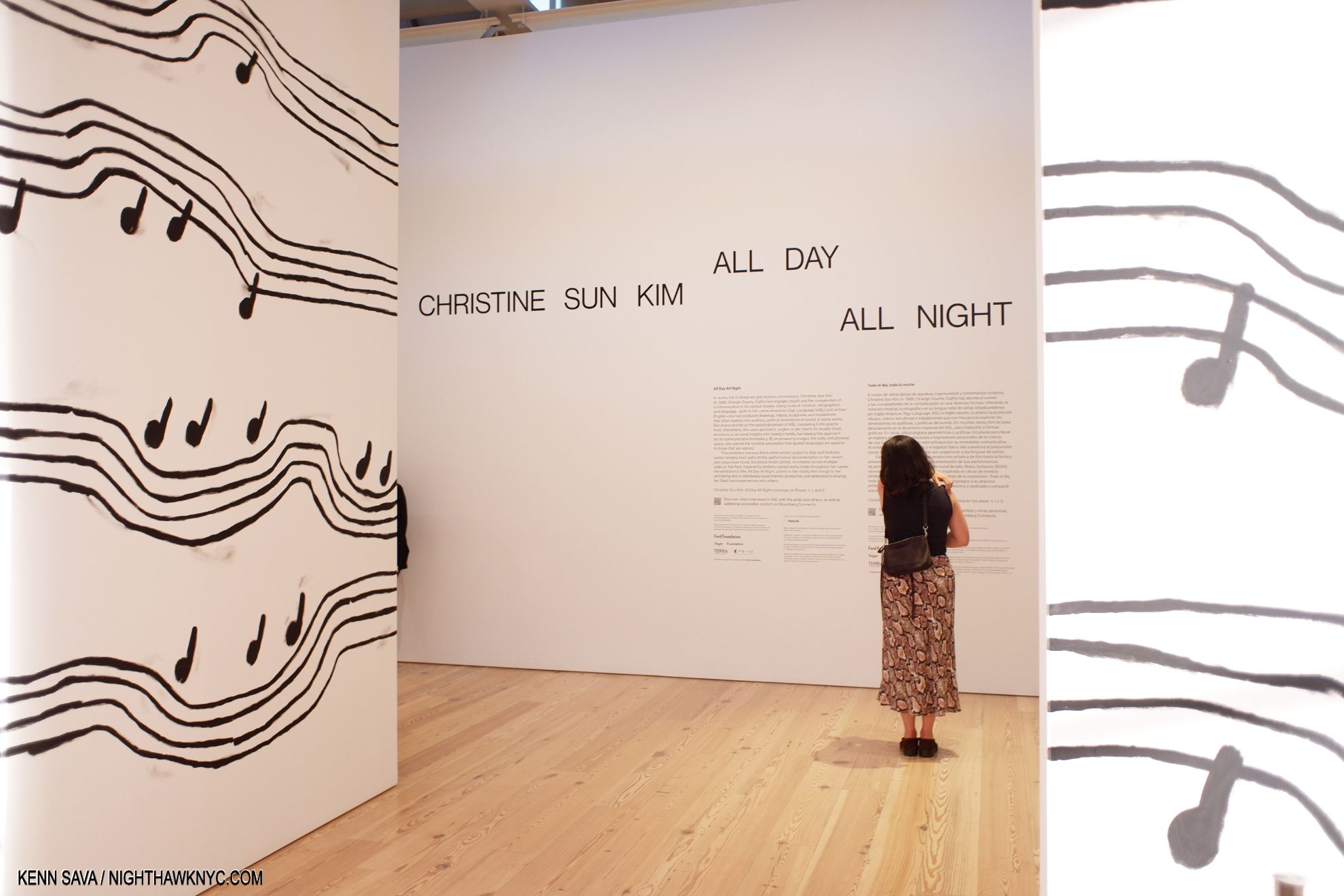
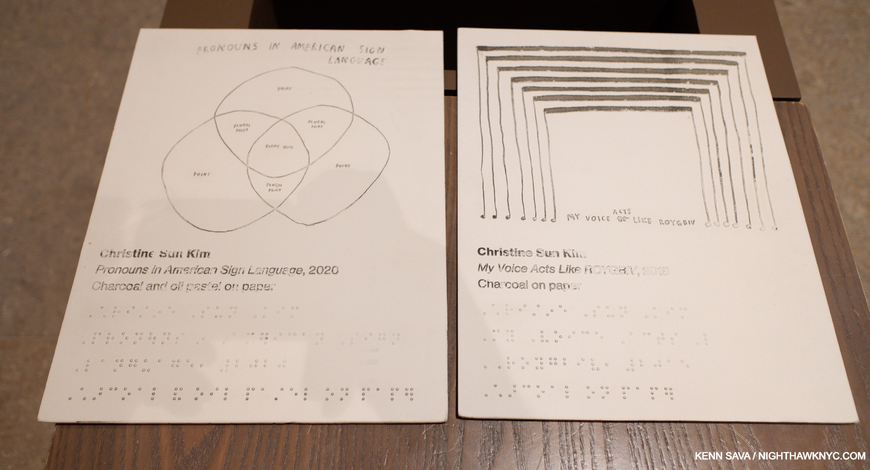
- Amy Sherald: American Sublime, which I wrote about here, and Christine Sun Kim: All Day All Night, which I wrote about here. ↩
- Jack Whitten: The Messenger, Michelle Kuo, P.37. ↩
- After attending Tuskegee Institute as a pre-med student. ↩
- ibid, P.47 ↩
- ibid ↩
- MoMA wall card ↩
- https://www.christies.com/en/artists/gerhard-richter?lotavailability=All&sortby=relevance ↩
- ibid, P.45, 47 ↩
- Jack Whitten: Five Decades of Painting, P.43-4. ↩
- https://www.moma.org/audio/playlist/345/4715 ↩
- Ralph Ellison, “Twentieth-Century Fiction and the Black Mask of Humanity,” in Shadow and Act, 27 n. 1. ↩