Henry Taylor: The Art of Empathy

This site is Free & Ad-Free! If you find this piece worthwhile, please donate via PayPal to support it & independent Art writing. You can also support it by buying Art & books! Details at the end. Thank you.

Written & Photographed by Kenn Sava.

Show seen: Henry Taylor: B Side @ the Whitney Museum

See Alice Jump, 2021, Acrylic on canvas, as are all the Paintings in this piece, unless specified. From the wall card- “The track-and-field legend Alice Coachman, depicted here, set a record in the high jump at the 1948 London games, becoming the first Black woman to win an Olympic gold medal. By altering the photo and positioning Coachman as if she is jumping over houses in a neighborhood, Taylor metaphorically alludes to the social and economic barriers she overcame growing up in the segregated South.” The pictures in this piece are thumbnails. Click any picture for full size.

I’ve had my eye on Henry Taylor since I reported that he was Having a New York Moment,” as I called it in 2017 when he received the High Line Mural Commission simultaneously with being one of the “stars” of the 2016 Whitney Biennial. Okay, both eyes. The Artist returned to NYC in 2019 for a solo show at Blum & Poe, at which I met him.

Henry Taylor modifying/ammending his wall-sized Mural with my Sharpie at Blum & Poe, September 24, 2019.

I lent him my Sharpie which he proceeded to use to modify the large Mural that was the centerpiece of his show as I watched with my mouth open. I then followed him to the terrace where he inscribed his outdoor installation with it. I’d never seen an Artist modify a work (or two) hanging in a show in my 40+ years of show-going before.

Needless to say meeting Mr. Taylor that night was an extraordinary experience made unforgettable by his being quite nice to me, and I don’t think it had to do with the pen. I came away feeling Henry Taylor is one very hard not-to-like man. I wondered if that might have been born in the fact that Henry Taylor is a “30-years in the making overnight sensation.” All this being said, everything I express about his Art here I felt before I met Mr. Taylor. Almost exactly four years to the day later, Mr. Taylor’s Art returned to NYC in Henry Taylor: B Side at the Whitney, his mid-career Retrospective, which only expanded my appreciation of the depth of his accomplishment and filled in the gaps.

Gettin it Done, 2016, at the show’s entrance.

B Side is the most powerful Painting show I’ve seen since Kerry James Marshall: Mastry at the lost and lamented Met Breuer in 2017.

Now, or never! 4:30pm, January 28, 2024. One and one-half hours before Henry Taylor: B Side closed for the last time. Installation view of one of the two, large parallel galleries I mention further below. The other is behind the wall to the left.

This is remarkable because Henry Taylor was so late in getting his Art career started.

Hammons meets a hyena on holiday, 2016. Henry Taylor is a student of Art history and an entire gallery was devoted to works inspired by the work of other Artists. Here, he riffs on Dawoud Bey’s famous Photo of David Hammons selling snow balls one winter day from 1983.

The first thing that might catch a viewer’s eye is his palette. On a number of occasions his colors caught my eye from hundreds of feet away across large rooms. For that reason alone, a full Retrospective of his work over 6 galleries of the Whitney Museum’s 5th floor this winter, was a thing of beauty.

Untitled, 2021, Acrylic on linen. In fitting with the show’s title, here the Artist “covers” a Painting he saw in London’s National Portrait Gallery of King Henry V. This could be a play on his nickname- “Henry the VIII,” being the youngest of 8.

But life is not full of blue skies, roses, or bowls of cherries, and neither is Henry Taylor’s Art. There’s much, much more to be seen in his work. As enchanting as his palette is, it’s the depth of his content and his unique way of presenting it that sets his Art apart.

Untitled, 2022. A Portrait of the Artist’s brother, Randy, a former Black Panther (with a large one looming behind him) and now a dog breeder in Texas, depicted looking like he’s about to give a speech as he did in those earlier days.

That content speaks to a very wide range of subjects. Perhaps, most well-known for his Portraits, which as Antwaun Sargent points out, differ from the work of Kerry James Marshall in his preference for “the outcast,” as he calls them1. This is fitting for a show titled B Side, which is a reference to the other side of a single 45rpm record. The B Side of a hit 45 was almost always something overlooked and rarely played, except by devoted fans. It can also be a collection of lesser known or cover songs (like the album B-Sides, by Oasis). Both seem to fit the show. Yet, along with outcasts, B Side contains numerous Portraits of icons- political, Musical, and athletic. Throughout, it seems to me Henry Taylor Paints his subjects from the inside, out. Something quite remarkable. My impression is that he does it through empathy; from connecting and relating to the person he’s depicting in some way- even if he’s never met them, as in the Portrait of Alice Coachman up top. As good as his Art is, in the end, empathy might be what separates Henry Taylor.

Too Sweet, 2016. This extraordinary Portrait is based on a Photo the Artist took from inside his car as this man approached seeking help from passing motorists. A whopping 132 x 72 inches, its monumentality is furthered by viewing the figure from below. It’s also an example of the Artist selectively blurring facial details, in this case his eyes, which occurs off and on in the show, and which I find endlessly fascinating. I wasn’t a bit surprised to find out that MoMA has acquired it.

B Side complements his Portraits with a wide range of scenes from everyday life, with the specter of racism, and its impact, hovering as the omnipresent horror it is and has been, never far away. Of course, Mr. Taylor is well-acquainted with the reality of racism. Some of his Paintings on the subject of his grandfather hint that his 1933 murder in East Texas may be a continuing influence, as could well be expected. In fact, this was the subject of the large Mural, Ancestors of Genghis Khan with Black Man on Horse, 2015-17, which graced one of the lobbies of the 2017 Whitney Biennial, as I showed here.

Resting, 2011, Acrylic and collage on canvas. Taylor depicts his niece and nephew sitting on a couch at home with a reclining figure behind them. Further back is a Corrections Corporation of America truck, a line of uniformed men, and a wall with “WARNING SHOTS NOT REQUIRED” stenciled on it. Before the couple are Canteen Correctional Services forms for family members to authorize items prisoners can purchase at the commissary.

Most often, but not entirely, his subjects are Black, and with the body of work he has created over the past 30 years, Mr. Taylor has emerged as “one of the most powerful and poignant observers on what it means to be Black in America working today1.”

Wegrett, 2006, Acrylic and cardboard collage on linen. One of the most unique Portraits of an Artist with his mother in Art. The collaged cardboard seems to read “WE REGRET.” The wall card says- “Here, the words may allude to the pain he feels about the hardships his mother faced in her life. As Taylor explained, ‘I painted a picture of myself on my knees in front of my mama, and I don’t know why I painted that, but I just did, and I know I cried on that.'”

To complement his range, the show has been arranged by theme. As a result, B Side is a bit like a story with chapters; beginning with family, moving to his early creative days, and then to the subjects that hold his attention as a mature Artist. His current level of success doesn’t seem to have changed him or his Art one iota. Everything he’s done has that feeling of having been cut from the same cloth.

Untitled, 2016–22. Dr. Martin Luther King plays football with some kids while 3 ominous figures watch from the rear.

The first two galleries are devoted to Portraits, with an emphasis on his immediate and extended family, and some Self-Portraits. It’s hard to think of another Artist who has Painted his extended family so often and so strikingly (as in Untitled, 2022, shown earlier, of his brother, Randy- one example). Throughout B Side, I was fascinated by the Artist’s choices in creating his Portraits. Specifically, his choices of when and which facial details to include (as in Untitled, 2016–22, above, and Too Sweet, 2016, earlier). Are these done to cause the viewer to look elsewhere besides the face, or to make them look closer? This is a bit reminiscent of what Edward Hopper did on occasion, as in his Room in New York, 1932, as I discussed here.

First work. A collection of Henry Taylor’s Portrait Drawings of patients he worked with at Camarillo State Hospital, 1985-95, Graphite on paper. One is Pastel, colored pencil and ink on paper. These date from during his time as a student at Oxnard Community College and then the California Institute of the Arts (aka CalArts).

The third gallery took the viewer back to Henry’s beginnings as an Artist. Born in 1958, he spent the decade from 1984 to 1994 working as a psychiatric technician at Camarillo State Mental Hospital, Camarillo, CA.3. During this time, he created his earliest known work, Drawing and Painting a number of the patients he worked with: adults living with developmental disabilities or mental illness as well as those seeking treatment for substance use disorders, developing close relationships. 

“I learned not to dismiss anybody,” he recalls. “It just made me a little more patient, a little more empathetic. It taught me to embrace a lot of things. A lot of people will avoid a person who doesn’t appear normal, but I’m not like that.” Henry Taylor, in a must-read 2016 interview, here.

Untitled 1992. One of the earliest Paintings in the show. When B Side opened in October, I was buried in my piece on Van Gogh’s Cypresses which I published in November. Cypresses mostly takes place when Vincent was a patient in an insane asylum. Therefore, it was impossible for me not to make a connection between Henry’s experiences and Vincent’s. When I first saw this Painting, I was immediately reminded of Photos of the bath tubs Vincent was assigned to for therapeutic treatment in the San Remy Asylum almost exactly a century earlier.

For the last half of that decade as a psych tech, he was also a student at CalArts where he was at least a decade older than his fellow students, graduating in 1995 (among numerous others, Ed Ruscha was a 1961 graduate). Henry began his Art career at 37. After struggling to find representation and recognition, the world has gradually caught up with him to the point that 30 years on, he’s now one of our more influential and respected Artists, with a blockbuster Retrospective that appeared at the Museum of Contemporary Art (MOCA), L.A. before moving to the Whitney.

Screaming Head, 1999, Oil on canvas. Just wow.

Working with his patients turned out to have a decisive impact that would continue in everything he’s done. Early on in his career after graduating, Paintings, like this one, continued to speak to his Camarillo experiences. 

From there the visitor emerged into two large parallel galleries that lie at the center and heart of the show largely focused on being Black in America. The first one ranges from a 4th of July cookout to incarceration to the show-stopping THE TIMES THAY AIN’T A CHANGING FAST ENOUGH, 2017, depicting the murder of Philandro Castile. On the other side of the wall, the other large gallery features Paintings related to the Black Panthers and a large installation recreating a Black Panther speech with appropriately attired mannequins.

THE TIMES THAY AIN’T A CHANGING FAST ENOUGH, 2017. Per the wall card- “Taylor has said that he was motivated to paint this scene immediately upon learning about it- ‘I don’t even think I thought about ever showing that one when I painted it; it was just something I had to get out of my head.'”

THE TIMES THAY AIN’T A CHANGING FAST ENOUGH is the most powerful Painting I’ve seen this century. It’s hard for me to think that history worn’t regard it as akin to a (Goya’s)  The Third of May 1808  of our time.

“Taylor’s paintings occupy a new and different space within Black radical aesthetics,” Charles Gaines, Artist4.

too much hate, in too many state, 2001. From the wall card: “This painting places the viewer in the vantage point of James Byrd Jr., a Black man who was abducted and murdered on June 7, 1998, in Jasper County, Texas, by three white supremacists who chained his ankles to the back of their pickup truck and dragged him to his death. The brutal murder led to a national outcry, prompting calls for stronger hate crime legislation.”

While it’s front and center in  THE TIMES THEY AIN’T A CHANGING FAST ENOUGH, and too much hate, in too many state, “social criticism” in Henry Taylor’s work is often equally subtle, but always sharply on point. On the other side of the wall was a large gallery centered around the Black Panthers, including this remarkable installation-

Untitled, 2022, Mannequins, leather jackets, and posters, including a Colin Kaepernick 49ers jersey.

The wall card informs us that Mr. Taylor created this installation to honor the Black Panthers and his brother, Randy, who was active in his local branch. Adjacent to it were Photographs of many of those recently killed by police, bringing past and present together. On the other two walls of the gallery were Paintings of former Panthers Huey Newton, and this remarkable rendering of Eldridge Cleaver, looking like you-know-who out of James Mc Neill Whistler.

Eldridge Cleaver, 2007.

Along with the outcast, B Side also showed figures who have gone on to attain and achieve: quite a few of them.

A counterpoint to his Portraits of the overlooked and outcast, was a room of Portraits of celebrities, that included Chuck Berry, Jay Z, and Haile Selassie, were this Portrait of Jackie Robinson, A Jack Move-Proved It, 2011, right, and Michelle & Barak Obama, Untitled, 2020, left, sporting a copy of the Henry Taylor Rizzoli monograph of their coffee table.

And then there was this remarkable pairing-

That Was Then, 2013, left, depicts an older Black man who has probably heard the racist slur surrounding him many times, and Watch Your Back, 2013,

Fresh, exciting, bold, beautiful, direct yet mysterious, subtle and powerful, the Art of Henry Taylor has something for everyone, and I suspect that people many years in the future will continue to find that in it. B Side was a show that honored “outcasts” and the inspiring achievements of icons side-by-side, while pulling no punches about the world both of them, and the rest of us, live in.

For all those reasons Henry Taylor: B Side was a landmark show. A near perfect mid-career Retrospective in my view.

Man, I’m so full of doubt, but I must Hustle Forward, as my daughter Jade would say, 2020. Ladies & gentlemen, the one and only Henry Taylor.

It seems to me that to be able to face ALL of this with dignity and empathy for others is a remarkable thing; something all-too-rare today. As great as Henry Taylor’s Art is, this says even more about Henry Taylor, the man.

*- Soundtrack for this piece is “Sign O’ the Times” by Prince, performed live here in 1987 during Henry Taylor’s Camarillo days-

NighthawkNYC.com has been entirely self-funded & ad-free for over 8 1/2 years, during which 320 full-length pieces have been published! If you’ve found it worthwhile, PLEASE donate by PayPal to allow me to continue below. Thank you,  Kenn.

You can also support it by buying Art, Art & Photography books, and Music from my collection! Art & Books may be found here. Music here and here.

Written & photographed by Kenn Sava for nighthawknyc.com unless otherwise credited. To send comments, thoughts, feedback or propositions click here. Click the white box on the upper right for the archives or to search them. Subscribe to be notified of new Posts below. Your information will be used for no other purpose.

  1. Antwaun Sargent on Artsy in 2018
  2. Antwaun Sargent on Artsy in 2018
  3. Where Charlie Parker was famously sent for six months in 1946, and supposedly immortalized it in “Relaxin’ at Camarillo,” though he hated that title his producer gave it. It’s also rumored to be euphemistically referred to as “Hotel California” in the Eagles song of the same name.
  4. Henry Taylor: B Side Catalog, P.60

Sarah Sze: Timelapse- Freeze Frame

This site is Free & Ad-Free! If you find this piece worthwhile, please donate via PayPal to support it & independent Art writing. You can also support it by buying Art & books! Details at the end. Thank you.

Written & Photographed by Kenn Sava

This is Part 2 of my look at Sarah Sze: Timelapse at the Guggenheim Museum. Part 1 is here.

Slice detail with Wright’s Oculus.

As I said in Part 1, there were so many amazing details in Timelapse I decided to devote a separate piece to them. I’m showing 40 as thumbnails. Click on any image for full size. There’s also a short video clip.

…and wonder about Timelapse I continue to…Show posters behind appropriate scaffolding, Seen on 10th Avenue, June 5, 2023.

The hub for the black string.

Following are Photos of details in the 8 Bays on the 6th floor. Please refer to the overall shots of each installation in Part 1 for orientation and where they are installed in each piece.

The following are details from Bay 1, The Night Sky is Dark Despite the Vast Number of Stars in the Universe

Detail of the Hammock in Bay 1. The Hammock over the ground floor pool and the Hammock Sarah Sze created in 2015 had a similar overlay. I believe the material on the floor is part of the installation, and hasn’t fallen through.

Detail of the far left corner of Bay 1, with a shadow from the Hammock and an image from River of Images.

The following are details from Bay 2, Travelers Among Streams and Cascades

Three details from the Painting, Travelers Among Streams and Cascades. This one from the left section…

Detail of the center section…

Detail of the right section.

The following are details from Bay 3, Slice.

Slice. Detail of the front.

Slice. Close up of the front. Shown here are a number of the recurring image “themes”: hands, birds, the Sun, fire, the sky and other aspects of nature.

Detail behind Slice with River of Images.

One of many levels and rulers.

Looking over a rung of a ladder to see the model of Slice in its Bay installed under it displayed next to the final piece.

Throughout Timelapse lamps were used apparently to draw the viewer’s attention to specific images or objects.

The following are details from Bay 4, Diver, Second of two parts and Images That Images Beget

The following are details from Bay 5, Times Zero

Times Zero, 2023.

The following are details from Bay 6, A Certain Slant,

Detail of the center surrounded by images of hands and objects.

Detail of the far right corner looking to the right from the image above. I imagine the salt from those blue containers is what is in the center of the circle.

Detail of part of the installation on the floor further to the right in the previous picture.

The following are details from Bay 7, Last Impression

An alternate, slightly closer view of Bay 5 from what I showed in Part 1. As you can see in the full size image, the empty frames to the right are attached to the strings that run across the gallery.

Some details of the ladder at the right side, front, of the Bay.

The following detail is from Bay 8, Things Caused to Happen (Oculus)

Short clip of Things Caused to Happen (Oculus).

The Artist points out that in the end, the digital images beamed on to Things Caused to Happen (Oculus) break up on the far wall.

*- Soundtrack for this piece is “I’ve Seen It All” by Bjork. This time in the version with Thom Yorke.

NighthawkNYC.com has been entirely self-funded & ad-free for over 8 years, during which 300 full-length pieces have been published! If you’ve found it worthwhile, PLEASE donate to allow me to continue below. Thank you, Kenn.

You can also support it by buying Art, Art & Photography books, and Music from my collection! Art & Books may be found here. Music here and here.

Written & photographed by Kenn Sava for nighthawknyc.com unless otherwise credited. To send comments, thoughts, feedback or propositions click here. Click the white box on the upper right for the archives or to search them. Subscribe to be notified of new Posts below. Your information will be used for no other purpose.

Mohammed Sami: The Power of Invisibility

This site is Free & Ad-Free! If you find this piece worthwhile, please donate via PayPal to support it & independent Art writing. You can also support it by buying Art & books! Details at the end. Thank you.

Written & Photographed by Kenn Sava (*- unless otherwise credited)

Show seen- Mohammed Sami: Muzzle of Time @ Luhring Augustine

Mohammed Sami’s first U.S. show won’t be his last.

Refugee Camp, 2022, on the far wall and seen further below. All works are Mixed media on linen unless specified. Click any picture for full size.

I don’t know if I’m the first to say that, but I say it with confidence. I walked into Mohammed Sami: Muzzle of Time at Luhring Augustine on September 16th and immediately fell under the spell of his mysterious Paintings. I left realizing I’d “discovered” another rising Painter to be reckoned with. Of course, Mohammed Sami had already been discovered by numerous others before I saw his work. It turns out his Art was selected for the 58th Carnegie International in Pittsburgh, followed in March, 2022 by his first solo show in London. This spring, that city’s Camden Art Centre mounted his first solo institutional show, Mohammed Sami: The Point 0, known to me through its excellent catalog. When it opened on September 8th at Luhring Augustine, one of NYC’s most forward-looking galleries, Muzzle of Time announced his arrival on these shores in full effect in his first solo show here.

Meditation Room, 2022, 110 1/4 by 90 1/2 inches. Note the portrait of Sadam, near the upper right.

His road to this point has been long and grueling for someone not even 40. Born in Baghdad in 1984, where he had the misfortune of being raised during Saddam’s regime, and the resulting wars. As a dyslexic schoolboy, he traded Painting murals and portraits of Sadam (which every house was required to have) for passing grades in school. In fact, during Mr. Sami’s life in Iraq, the country was involved in no less than EIGHT wars!1. Art would prove to be his way out. He studied Drawing and Painting at the Institute of Fine Arts in Baghdad, graduating in 2005, before being granted asylum in Sweden in 2007. He lived there until 2015, leaving to continue his studies in the U.K., which he completed in 2018. He currently lives & works in London.

The Weeping Lines, 2022, 114 5/8 by 135 inches. “‘This is the type of signifier I use to hide the traumatic image behind something entirely different, like a cactus or the carpet on the floor, This helps to distract you from the main subject matter, which is trauma and conflict.’ In Arab culture, he says, euphemism and allegory are used as ‘a delusive strategy to not let the authorities understand what we’re saying.2.'”

Filled with Paintings that played it close to the vest, each revealed enough to be powerfully haunting, lingering in my mind to this moment. Since the show contained just 8 works (6 quite large), I needed to see more to get a feel for his accomplishment to this point. So, I went scurrying to find images of every other Mohammed Sami Painting I could locate. I was equally impressed by what I found, so I undertook this piece. Rendered in a similar style, each reinforced the initial impression though some upped the horror quotient.

A barricade against bombs … 23 Years of Night, 2022, Dimensions not known. Not in the show. *Photo by Robert Glowacki

In A barricade against bombs … 23 Years of Night, the reality of the seemingly innocuous scene is only really revealed in its title. In the process, it also provides a bit of insight into what we are seeing in the rest of his work.

Remnants. Reminders. Hidden scars. His Paintings provide small glimpses into his life that he says are born of “triggers” he came across, randomly, in Sweden, or now in London. The results are Paintings that are more like stills from a Film, leaving it to the viewer to fill in what came before in the story. Instead of hitting them over their heads, his work is characterized by a haunting subtlety that belies exquisite taste, and, it seems to me, supreme confidence in his abilities to communicate..

“The things I articulate in my artwork are memories hidden in the brain cells that are waiting for a trigger. So whenever the trigger is available, then the image comes2.”

Emotional Window II, 2023, 17 3/4 x 17 1/2 inches. Mr. Sami’s work is equally effective in mural size, or in easel size, as seen here.

The Artist Mr. Sami’s work comes closest to, for me, would be Thomas Demand, who constructs uncannily real-life recreations of scenes of historic or notorious import out of paper, leaving it to viewers to figure out what happened in these places. But, Mr Demand (as far as I know), did not grow up and live through, the hell and horror of war.

Moises Saman, A meeting room in an underground bunker used as a command center by Qaddafi’s security forces. Tripoli, Libya, 2011, Color ink-jet print. Not in the show.

As such, he’s, perhaps, closer to a conflict Photographer, like Moises Saman, of Magnum Photos, who covered the conflicts in Iraq, and elsewhere, as in this image he shot in Libya.

Electric Chair I, 2019-20, Acrylic on linen, 74 3/4 x 41 1/8 inches. Not in the show. *- Luhring Augustine Photo.

In fact, a few of his images echo a few of Mr. Sami’s. Im not introducing Mr. Saman here to compare their work. It’s interesting to see how their perspectives are different4.

Refugee Camp, 2022, 114 1/4 x 231 1/4 inches. “Several paintings titled Refugee Camp depict a house set deep within fenced woods, which we might be tempted to read as sinister. Sami, however, describes his stay there as ‘the most beautiful days in my life. It was a school of freedom where you’re free to pick your identity.’ He returns there every month. ‘It was a shock,’ he says. ‘You live in dust and deserts with the sound of bullets. And suddenly you open your eyes to gardens like heaven5.'”

Mohammed Sami had to move thousands of miles to have his life. Though Sadam is gone, the war is over, the scars remain, as they do after every conflict. It’s rare that a survivor expresses him or herself and their experiences in paint. Most History Paintings in Art history were done by Artists who were not eyewitnesses6. Even rarer to do so so subtly, relying on the power of the invisible to tell a visual story. Yet, it seems to me, that it is just this approach that allows him to tap into the collective unconscious. Everyone has things in our pasts that we are suddenly reminded of out of the blue by something we come across in the here and now, though they may not be war-related. In Mr. Sami’s work, we are transported by these triggers into what his experiences felt like, or feels like now, if not always the actual representation of events.

I can’t recall seeing this done, and done so effectively, in Painting before.

One Thousand and One Nights, 2022, 112 5/8 by 219 1/4 inches.

I haven’t been able to get Mr. Sami’s work off my mind these past two months. It haunts me the way I imagine his memories have haunted him. I haven’t read anything about whether these works are “therapeutic” for the Artist in some ways, or not. Having released these demons onto linen, I can only hope they exorcised them and help heal the scars. Still, there’s one thing that becoming apparent: his work is resonating with viewers. Mohammed Sami’s star is rising quickly.

*-Soundtrack for this piece is “Only the Dead See the End of the War” by Acrassicauda from Baghdad, who are, perhaps, best known as the subjects of the documentary Heavy Metal in Baghdad, 2007. One night a few years later, Acrassicauda’s guitarist, Tony Aziz, happened to sit down next to me at East of Eighth, on West 23rd Street- like Cecily Brown had a few years before. After I was introduced to him by my friend, Stephen, we had a fascinating, wide-ranging conversation. He was warm, well-spoken and quick to smile. He would leave the band in 2011. I hope he’s well.

NighthawkNYC.com has been entirely self-funded & ad-free for over 8 years, during which 300 full-length pieces have been published! If you’ve found it worthwhile, PLEASE donate to allow me to continue below. Thank you, Kenn.

You can also support it by buying Art, Art & Photography books, and Music from my collection! Art & Books may be found here. Music here and here.

Written & photographed by Kenn Sava for nighthawknyc.com unless otherwise credited. To send comments, thoughts, feedback or propositions click here. Click the white box on the upper right for the archives or to search them. Subscribe to be notified of new Posts below. Your information will be used for no other purpose.

  1. Here
  2. The Guardian 3.21.2022
  3. The Guardian 3.21.2022
  4. A bit like looking at Matthew Brady’s  or Alexander Gardner’s Civil War Photographs and then Winslow Homer’s Civil War Paintings.
  5. The Guardian, 3.21.2022
  6. Goya may be an exception, though I haven’t seen proof that he was actually present at the events he is sometimes credited with witnessing.

Van Gogh’s Cypresses: Art From Hell

This site is Free & Ad-Free! If you find this piece worthwhile, please donate via PayPal to support it & independent Art writing. You can also support it by buying Art & books! Details at the end. Thank you.

Written & Photographed by Kenn Sava (*- unless otherwise credited)

This new decade promptly brought with it the coronavirus pandemic, then a rolling lockdown in response. Isolation followed worldwide to a degree not seen since the equally devastating Spanish flu pandemic, 1918-20. I imagine most of us experienced isolation, or close quarters living, more than we had in our lifetimes. Still emerging from mine, as others are around the globe, it was somewhat ironic and timely that The Met chose Vincent van Gogh (1853-90) as the subject of its 2023’s summer blockbuster show. I also found it fortuitous. There’s spending a few years alone. Then, there’s spending virtually your entire adult life alone. As a momentous day dawned in my life, one I had dreaded spending alone- Who better to spend it with than Vincent van Gogh?

Perhaps no one I know of was more familiar with isolation and being alone than Vincent was. 

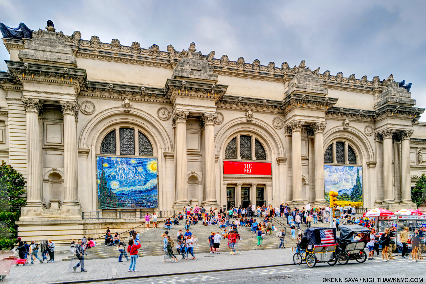
Welcome to The Met! In all my years of going to The Museum as I call it, currently 1,800+ visits since 2002, I’ve never seen TWO banners (left & right) up devoted to the same show. And, as I was soon to find out, it’s not like there weren’t other terrific shows going on! And, after all these years, I still get a tingle up my spine when I see this in front of me. Seen on June 2, 2023. Click any image for full size.

The Met’s Van Gogh’s Cypresses, centered on his depictions of the coniferous tree in his Art from March, 1888 through May, 1890, which the curators compare to his iconic sunflowers in his oeuvre. I, however, couldn’t get the backstory out of my mind. Rarely mentioned on the wall cards, was the utter hell Vincent was living through during the final year and a half covered by the show. In a life marked by struggle & loneliness, perhaps nothing he experienced was as bad as the confluence of hardships Vincent van Gogh faced from December 23, 1888 through May, 1890, when the show ends, 2 months before his death by suicide or murder.

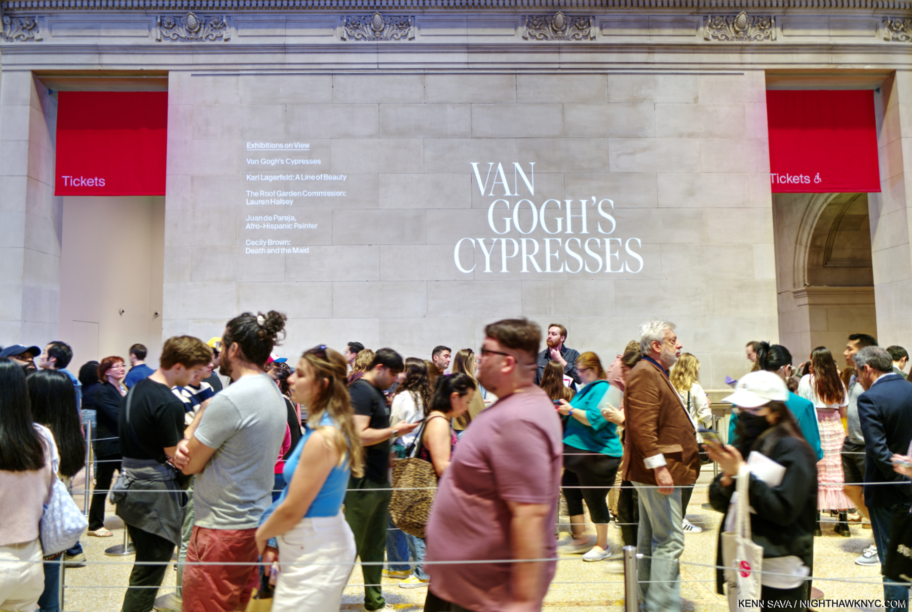
The maze-like ticket line. You buy yours, then get on the “virtual line” and wait for a text…

I saw Van Gogh’s Cypresses three times. Each time, I bought my ticket, then waited on the “virtual line” for 2 hours before it was my turn to go in. Well, if I could pick a place on Earth to be “stuck in” with 2 hours to kill, “Oh, PLEASE let it be The Met!” Suffice it to say that during my waits I saw exceptional shows: Cecily Brown: Death and the Maid; Juan de Pareja, Afro-Hispanic Painter; In Praise of Painting: Dutch Masterpieces at The Met; and Philip Guston: What Kind of Man Am I? ! Two I’ve subsequently written about. PHEW. And then, I then spent close to 3 hours in Cypresses each time. 

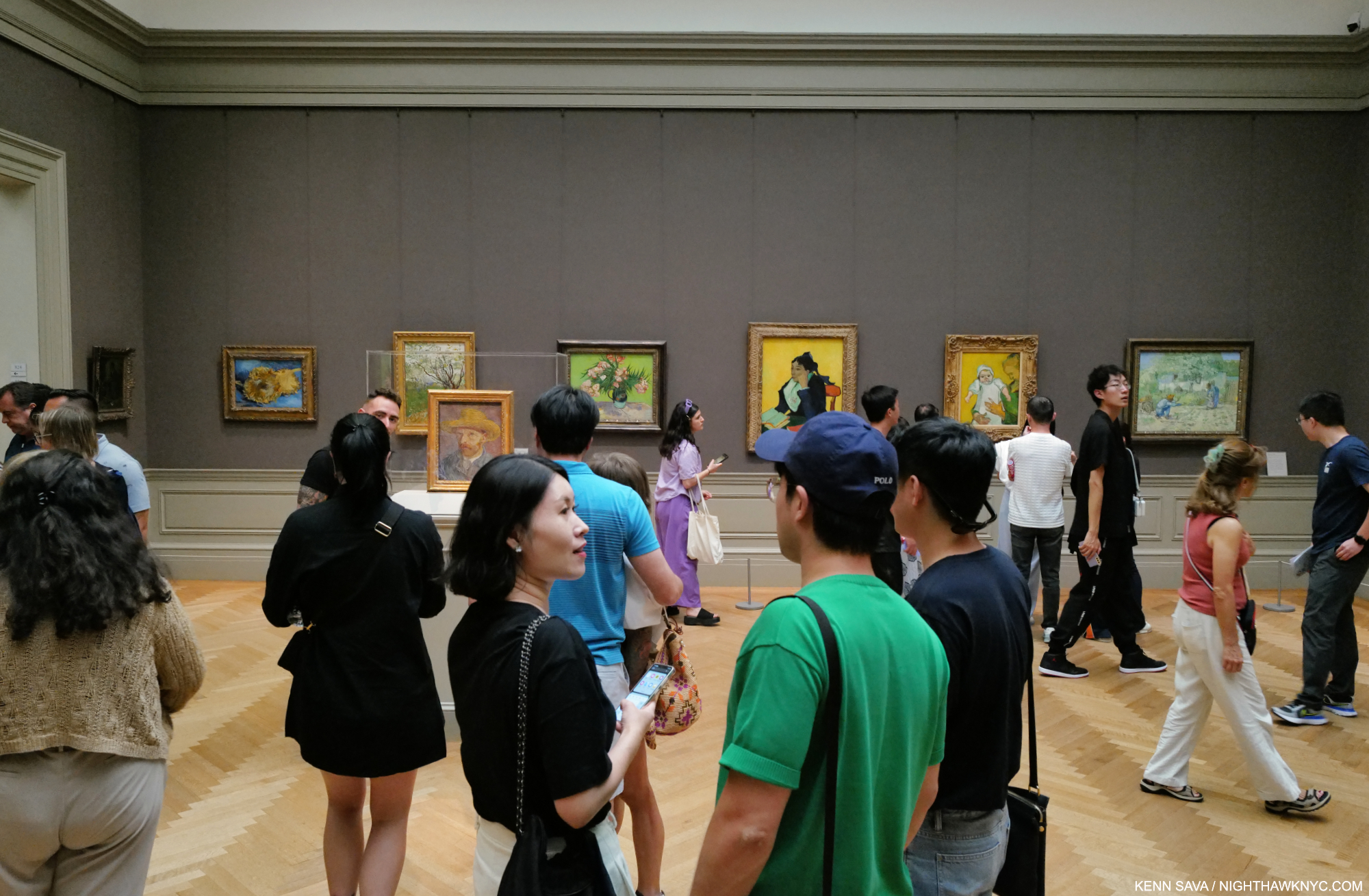
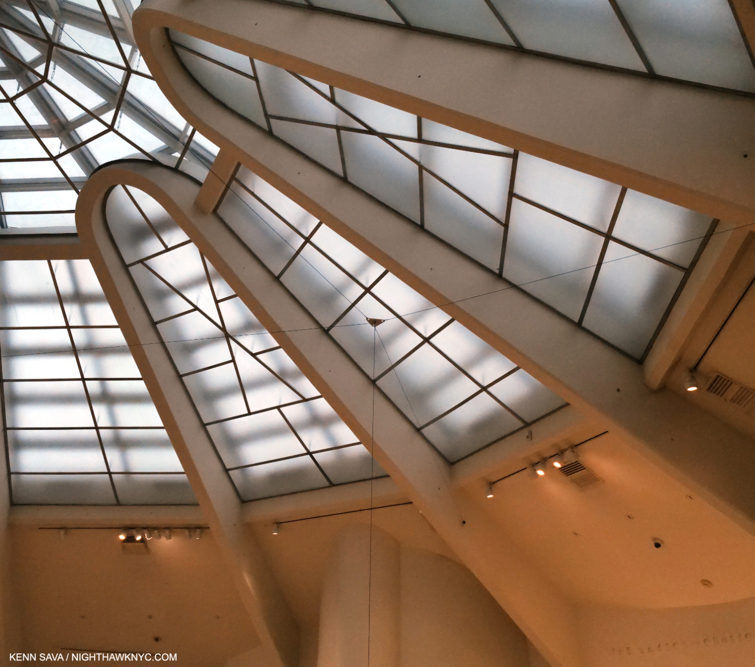
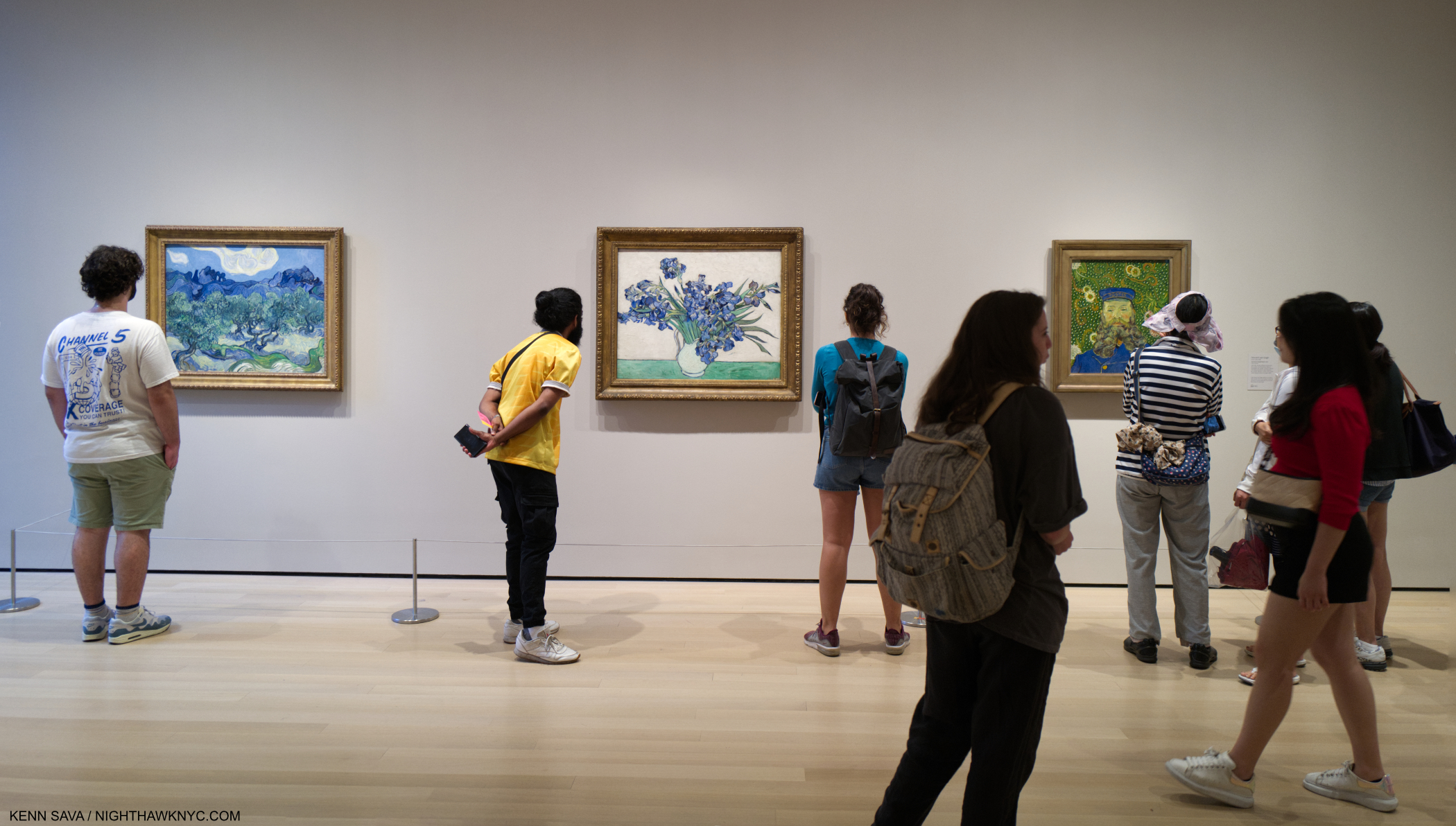
During my wait I also checked out Vincent in the Permanent Collection upstairs to reconnect with his work that wasn’t in the show. I wrote about this gallery in 2018 when they were reinstalled after the skylight project had been completed here. Notice the light coming in from above.

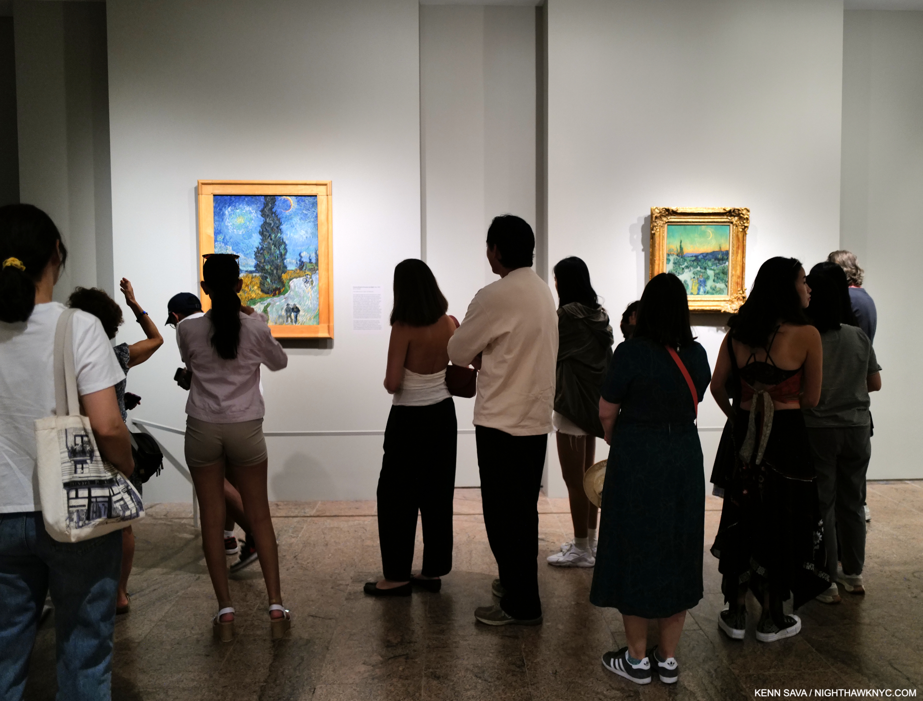
Along the way, I realized I have been looking at Vincent for over 40 years. Van Gogh’s Cypresses is the FOURTH major Met Van Gogh show I’ve seen. In 1984, I saw Van Gogh in Arles. In 1986, Van Gogh in Saint-Rémy and Auvres (which includes the period covered in Cypresses), and in 2005, Vincent Van Gogh: The Drawings. Each one terrific1. The common denominator of each show is Susan Alyson Stein, who was on the staff of the first two, rose to co-curator of The Drawings, and now curator of Cypresses. Her legacy at The Met is approaching that of Carmen Bambach, Met curator of Drawings & Prints, who has given us the landmark Michelangelo: Divine Draftsman & Designer and Leonardo da Vinci: Master Draftsman, among others. HOW Ms. Stein, her team, & The Met ever got MoMA to part with The Starry Night, perhaps MoMA’s biggest single attraction, for the entire summer amazed me.

You may never see this again. MoMA’s Van Gogh wall on July 4, 2023 with The Met’s Irises, center, in the spot previously (and currently as of October 20, 2023) occupied by The Starry Night. Unfortunately, its original pink background has faded and apparently can’t be restored.

On a visit to MoMA this summer, I discovered The Met had “traded”/lent Vincent’s Irises, 1890, for it, which MoMA hung in The Starry Night’s spot. Interestingly, both it, and the work to its left in the picture above, The Olive Trees- Saint Rémy June-July, 1889, were Painted while Vincent was in the Asylum, the subject of the central, Part II of the show, but are not included in Cypresses because neither depict them.

Meanwhile, at The Met, Cypresses begins in somewhat subdued, though beautiful, fashion.

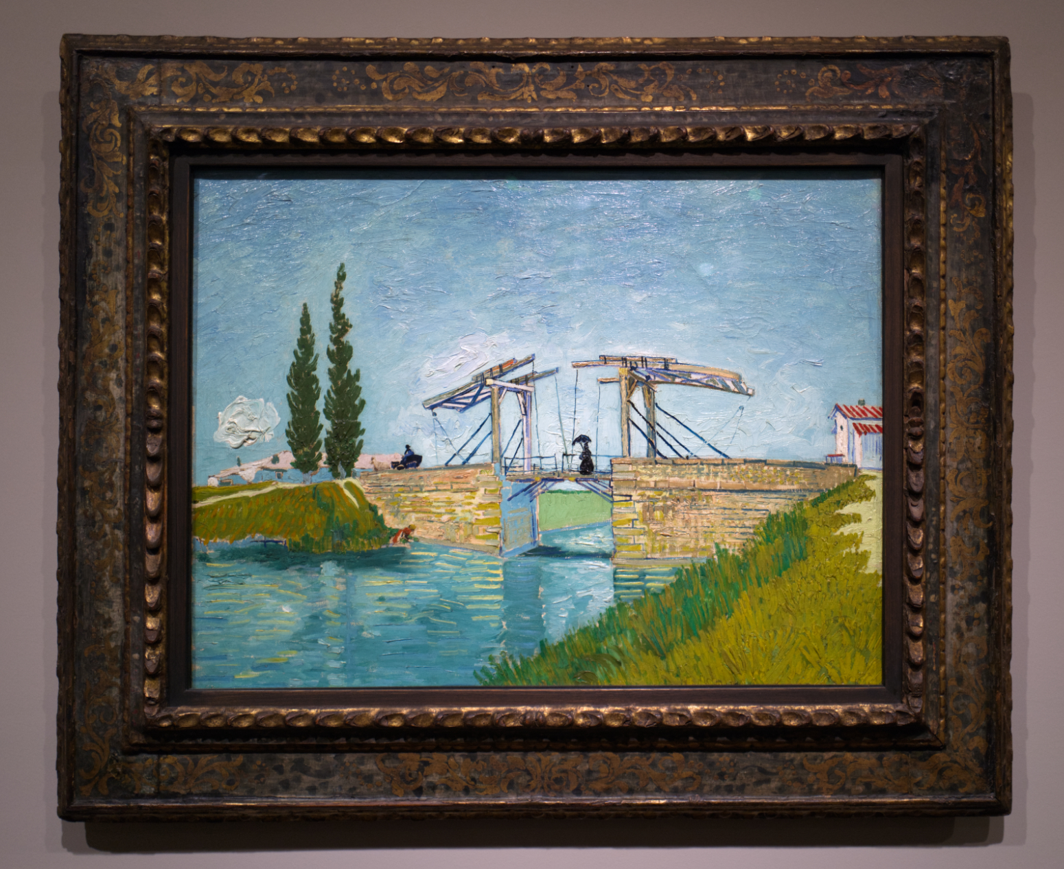
Drawbridge, May, 1888, All Paintings shown are Oil on canvas unless stated. The cypresses stand off to the side.

Arranged in three Parts, Part I of the show takes place in Arles from March, 1888 to early Spring, 1889. Vincent is hard at work trying to build on all he’d seen in his prior 2 years in Paris, a time that saw his work go from the dark, almost monochromatic, earth tones of works like The Potato Eaters to vibrant color. His palette has opened up, his journey to being “the first great colorist. Great…great colorist,” as David Hockney called him2, has begun. Now, he was after a style of his own. Note the very flat sky in Drawbridge, the first Painting in the show.

Installation view of Part I. The entrance is on the far right. Drawbridge straight ahead.

Throughout this period, and for the rest of his life, he juggled the influence of countless Artists, including the so-called Impressionists, the so-called Post-Impressionists and Japanese Woodblock Prints, all of which can be seen in Drawbridge. He had met and been influenced by Georges Seurat3, Paul Gauguin and Claude Monet (who was represented by his Art dealer brother, Theo, for a time), among others. His mission now was to develop his own style and begin to have his work sell, like theirs was beginning to. Totally dependent on Theo for money to survive, the heat was on.

Garden at Arles, July, 1888. Another flat sky, but notice how everything else is different. It has an almost spontaneous feel to it, until you see the Drawing next to it, now below. It’s endlessly fascinating to compare them both. 

Looking at the Paintings and Drawings in Part I, almost no two share entirely the same style. In Drawbridge, and Garden at Arles, above the skies are fairly flat. That would end. Notice the difference in the landscapes in both Paintings, created 2 months apart. In Part 1 we see the state of flux his style was in, indicative of his efforts to meld all he had seen in Paris and in Japanese Prints into a style of his own.

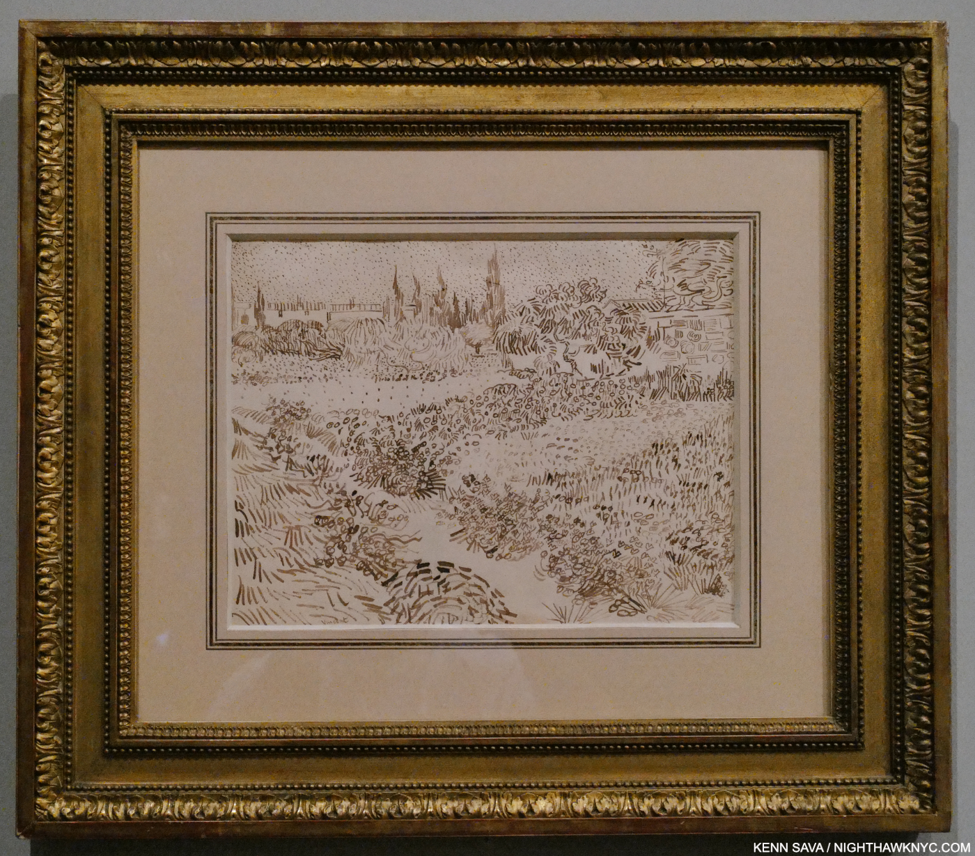
Garden with Flowers, July-August, 1888, Reed pen and ink over graphite on wove paper. Yes, a reed pen, which is made by cutting and shaping a single reed straw or length of bamboo. In Part I, a Drawing is pared with its resulting Painting a few times. Though some of his work, like Garden at Arles, above, has a “spontaneously dashed off” look to it, this is deceiving. Studying both, it’s striking to me how exact Vincent was when it came to translating his work from Drawing to canvas. Close looking reveals that even the smallest details are faithfully copied over from one to the other. After. you’re done studying that, then ponder his choices of color for each part.

By 1888, his Drawings, on the other hand, needed no additional inspiration beyond what he seems to have learned from his passion for Japanese Prints, which he amassed a sizable collection of. At least, that’s the only explanation I can find for them- there is none in Western Art that I know of. His Landscape Drawings from this time, like Garden with Flowers above, were and are, singular. Ever since I saw them in depth at The Met’s Van Gogh: The Drawings show in 2005, I continuously marvel at how he now saw and rendered fields, trees, and skies, especially since earlier on his Landscape Drawings, like this one, were much more “traditional.” His evolution as a Draftsman was as quick and as stunning as that of his as a Painter, and are among the most remarkable things about Vincent’s Art career.

Theo would convince Gauguin to join Vincent in the Yellow House in Arles, after offering him financial assistance to do so. This would FINALLY be the beginning of the realization of Vincent’s dream of establishing the “School of the South.” Arriving in September, the two co-existed for a while, but their personalities were bound to combust at some point. Very little is said in the show about what happened to Vincent next.

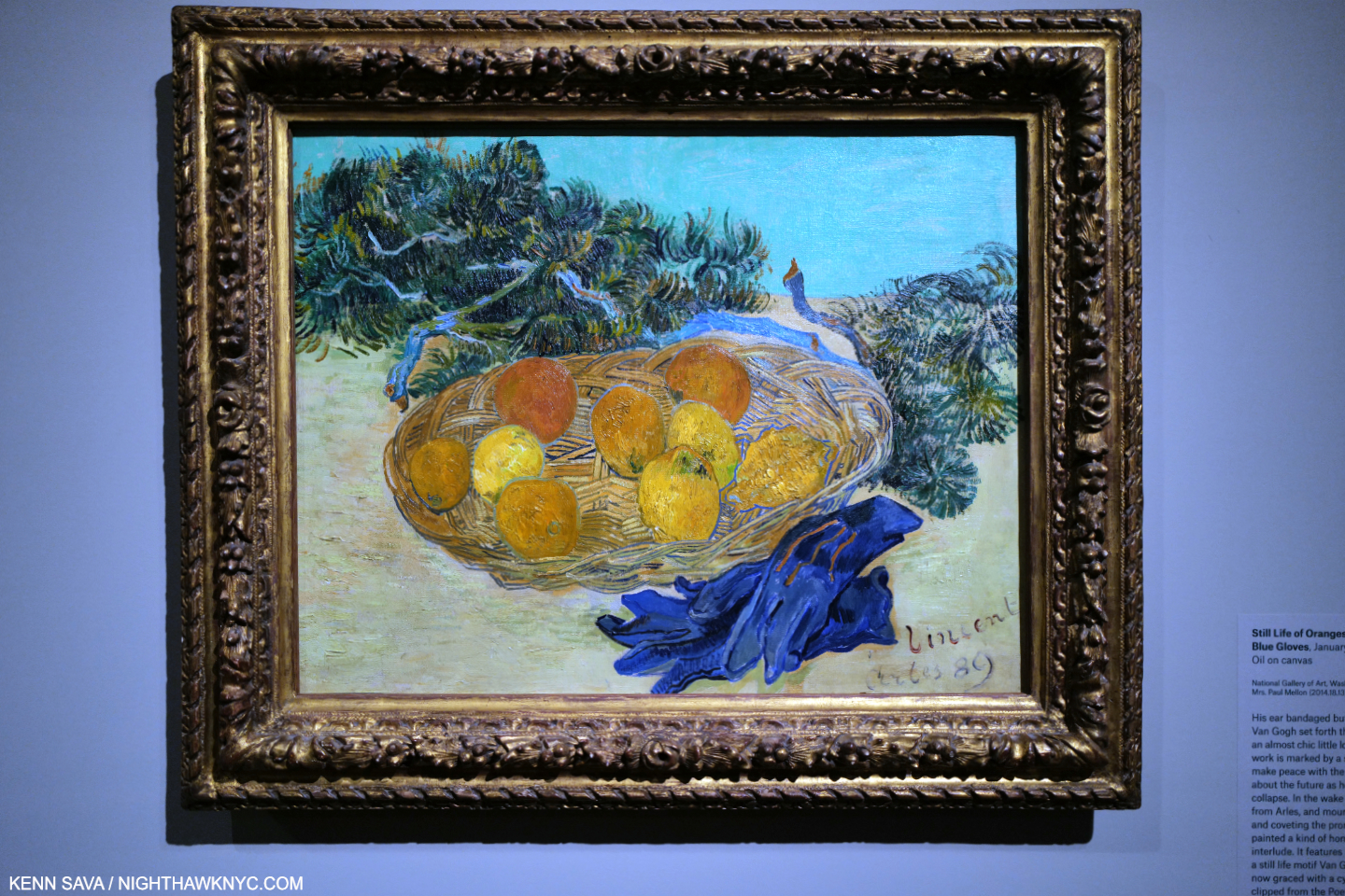
Still Life of Oranges and Lemons with Blue Gloves, January, 1889. The culminating work in Part 1. The prevailing serenity of this work, with cypress branches surrounding the basket, is shattered when you realize that this was Painted a few weeks after the attack that resulted in Vincent cutting off his left ear! In and out of the Arles hospital in January, and caught in an overwhelming fear of another attack (which he would have a few weeks later4)- all of which he was dealing with alone- HOW is it possible he could Paint this?

On that fateful December 23rd, 1888, the stuff hit the fan with Gauguin. Things had been festering while the two passionate & volatile temperaments were largely stuck inside working in close quarters due to the winter weather, until the boiling point made Gauguin announce he was leaving Arles to return to Paris, ending their “experimentation” in the Yellow House and Vincent’s long-standing dream of a “School of the South.” As if this wasn’t upsetting enough, Vincent had just received a Letter announcing that his brother Theo planned to marry, ending his hopes for the two brothers to live & work together. These portents of abandonment, the dashing out of hope (critical for someone as isolated as Vincent was), and the impending Christmas holiday, which reminded the Artist of his horrible falling out with his family one Christmas past, apparently conspired to bring on an attack5. The exact illness Vincent suffered from is still the subject of hot debate 130+ years later. Some say it was due to his drinking. Other theories include syphilis and epilepsy. In the throes of all of this he cut off his left ear, apparently leaving only the earlobe, then wrapped it and took it to a brothel that Gauguin may, or may not, have been in at the time. Barred entrance, he presented it to the “sentry” at the door, then went home and collapsed6. Theo was summoned, but stayed only a few hours before rushing back to Paris(?), with Gauguin! Vincent was hospitalized in Arles, with an initial diagnosis by the 21-year-old medical student on duty as suffering from frontal lobe epilepsy.

Vintage advertisement for the Asylum in Saint-Rémy. Notice the walls around the Asylum. *-Photo from the Van Gogh Museum

He would be in and out of the hospital7 until, steps ahead of his neighbors who had signed a petition to have him removed from their midst, he decided to VOLUNTARILY admit himself  to the insane asylum in nearby Saint-Rémy, in May, 1889, which is the point at which Part II of Van Gogh’s Cypresses begins. Phew…

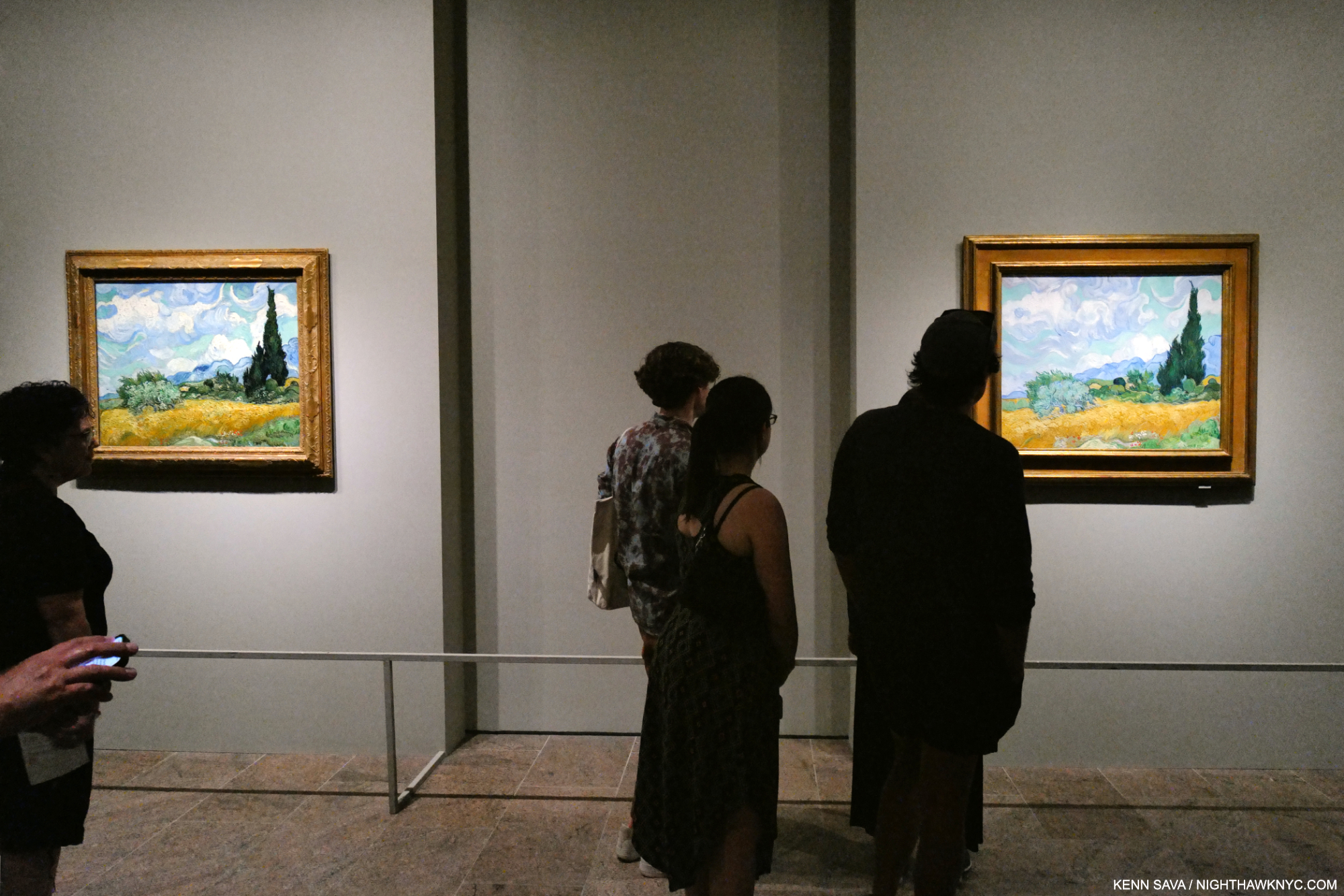
Installation view of Part II, which is centered on a veritable “murder’s row” of 5 Van Gogh Masterpieces, highlighted by The Starry Night, right of center, with the Met’s Wheatfield with Cypresses partially hidden by the column. In my view, these are some of the most unfathomable Paintings in the entirety of Western Art history given the circumstances of their creation. It’s stunning how The Starry Night breaks up the vibrant sunshine in the others as the only nocturnal work among them.

For the next year, in particular, and for the short rest of his life, his fears of another attack proved well founded. He had had smaller attacks before the December, 1888 attack in which he cut off his ear. He would have four serious attacks in the year he spent in the asylum.

“Each time he hoped would be his last. ‘A more violent attack,” he feared, “could destroy my ability to paint for good.’ But instead, the attacks grew longer and fiercer; the intervals between them, shorter; his behavior, more bizarre and violent. Once, while in the garden, he scooped up a handful of dirt and began to eat it. Another time, he assaulted his asylum escort, accusing him of being a spy for the secret police.”

“With each escalation, the misery between attacks deepened and the leash of restrictions tightened. He was confined to the asylum; then to his dormitory; then to his room; then to his bed. He spent almost two months deprived of “open air.” His throat swelled up with sores. He barely ate or spoke, and wrote no letters. At times, he longed for death, if only the next attack would be his last. ‘I hated the idea of regaining my health,’ he later recalled, ‘always living in fear of relapses … I preferred that there be nothing further, that this be the end.’” Van Gogh: The Life, P.772

When Painting was forbidden, that might have been the hardest for him being the only thing he cared about. Painting was all he had left. (I shuttered as I wrote that.)

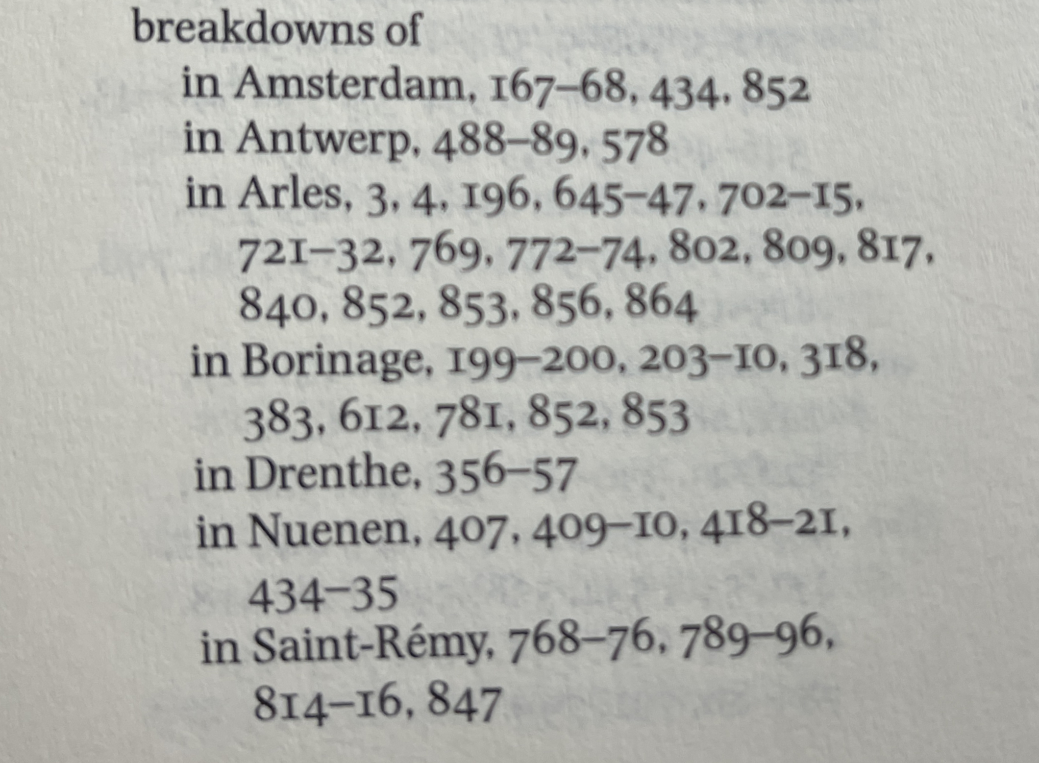
A (partial) list of the breakdowns/attacks Vincent suffered as they appear in the Index of Van Gogh: The Life. Arles is where he was in Part I of the show, where the smaller attacks led to the big “ear-cutting attack”. He was in the Asylum in Saint-Rémy in Part II. Only the major, ear-cutting, attack on December 23, 1888 is even mentioned, in passing, in the show.

But, as horrible as all of that must have been, there were still more levels of hell in store for Vincent. Things got worse. 

“Is there a reason for today?
Do you remember?”
*- Cream “World of Pain”

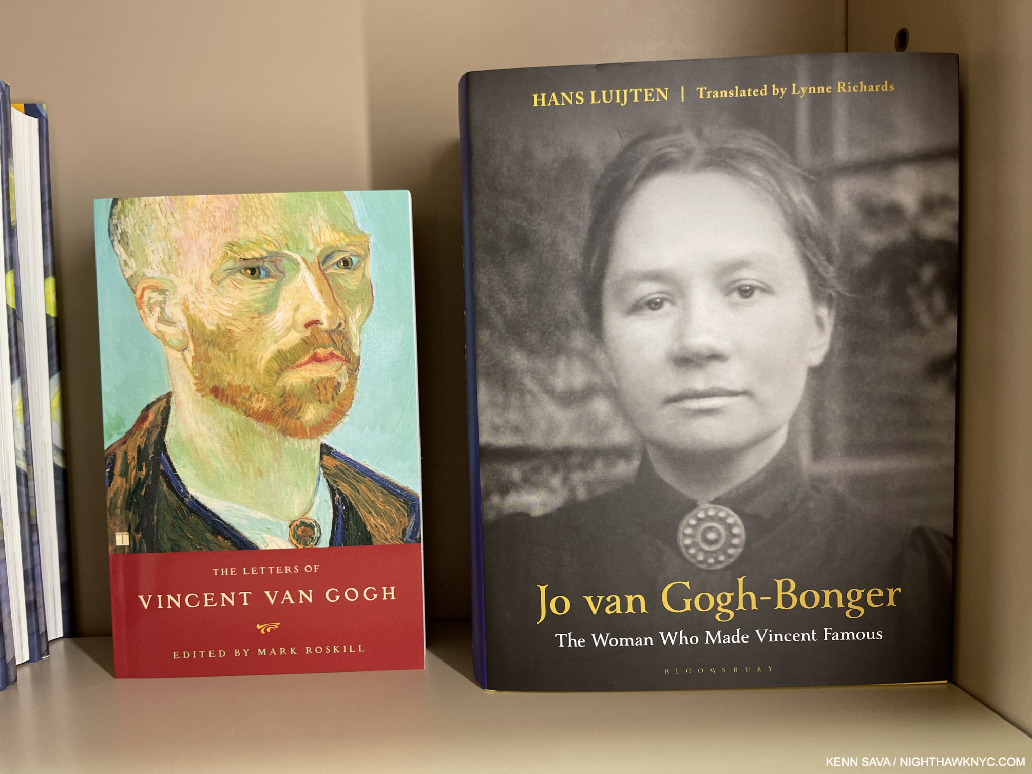
If you love Vincent van Gogh, this woman deserves your thanks. Johanna (Jo) van Gogh-Bonger was Theo’s wife for a year and a half before he died of syphilis, six months after Vincent died. Vincent strongly resented her coming in and “taking” Theo from him. Though she knew nothing about Art she inherited Vincent’s Estate from his brother and went on to make Vincent one of the most popular & beloved Artists in the world today. She did it by realizing Vincent’s Letters were the key to getting people interested in him. She edited & published them, though her edition is out of print, and not the one seen here in The Met’s bookstore, June 2, 2023. Hans Luijten’s biography is extremely detailed and is recommended- after you read Van Gogh: The Life and Vincent’s Letters.

As if his all of that wasn’t enough, during this time, he often went for a month or longer without hearing from Theo, who was busy with his impending marriage to Jo Bonger, finding and preparing an apartment for the new couple, and then for the arrival of their first child- ALL of this pained Vincent greatly, Theo being his lifeline to the world & support in it. As if that wasn’t enough, furthering his intense feeling of abandonment & isolation, Vincent was not allowed to explore the surrounding countryside for the first month in the asylum. A man now regarded among the great Landscape Painters the world has yet seen was forced to settle for the asylum’s enclosed garden and seeing the surrounding countryside from his window- a window with bars on it!

Somehow, NONE of this stopped him from creating masterpieces.

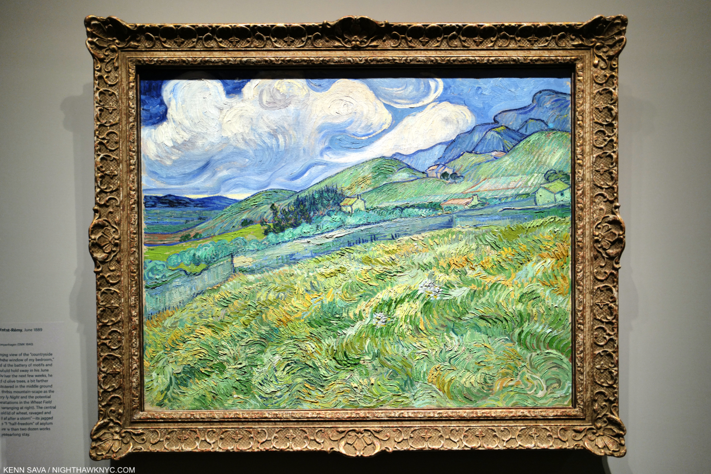
Landscape from Saint-Rémy, June, 1889. June, the month after his arrival, would be the key month in his year at the Asylum.

“I have two landscapes on the go of views taken in the hills. One is the countryside that I glimpse from the window of my bedroom. In the foreground a field of wheat, ravaged and knocked to the ground after a storm. A boundary wall and beyond, grey foliage of a few olive trees, huts and hills.” Letter to Theo (Letter 779, June 9, 1890).

Painted in June, 1889, almost exactly one month after he arrived in the asylum, this is the view from his 2nd floor bedroom window- minus the bars. It’s very interesting to me that he left the bars out. (There is a work in the show of the wall in his studio that shows its window with bars, shown below.) It certainly wouldn’t have been salable at the time if he had included them, but, how much more so is this? This is a Painting about nature- the land (with distant, almost incidental, cypress trees), the hills, the sky- and not a defacto “self-portrait.” Or is it? The wheat has been “ravaged and knocked to the ground after a storm,” confined in a space bordered by “a boundary wall.” Is that an analogy to his condition and situation at the time? There’s nothing more about it in Letter 779, so it would only be my speculation. IF that is not the case, and Vincent’s sole intention is what we see- without the bars that he saw- then I find it utterly transcendent. Note the mountains and the way the huts are situated- they would have another life.

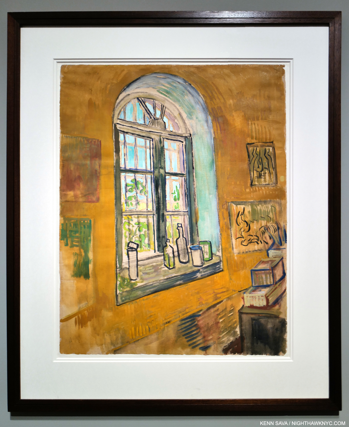
Inside his life in the asylum. Vincent was granted the use of an empty room downstairs from his room as a studio. Window in the Studio, October, 1889, Chalk, brush, oil paint, and watercolor on paper, seen in Part III, shows a window he saw the outside world through- this time with the bars on it. Note the Artwork hanging in the upper right corner.

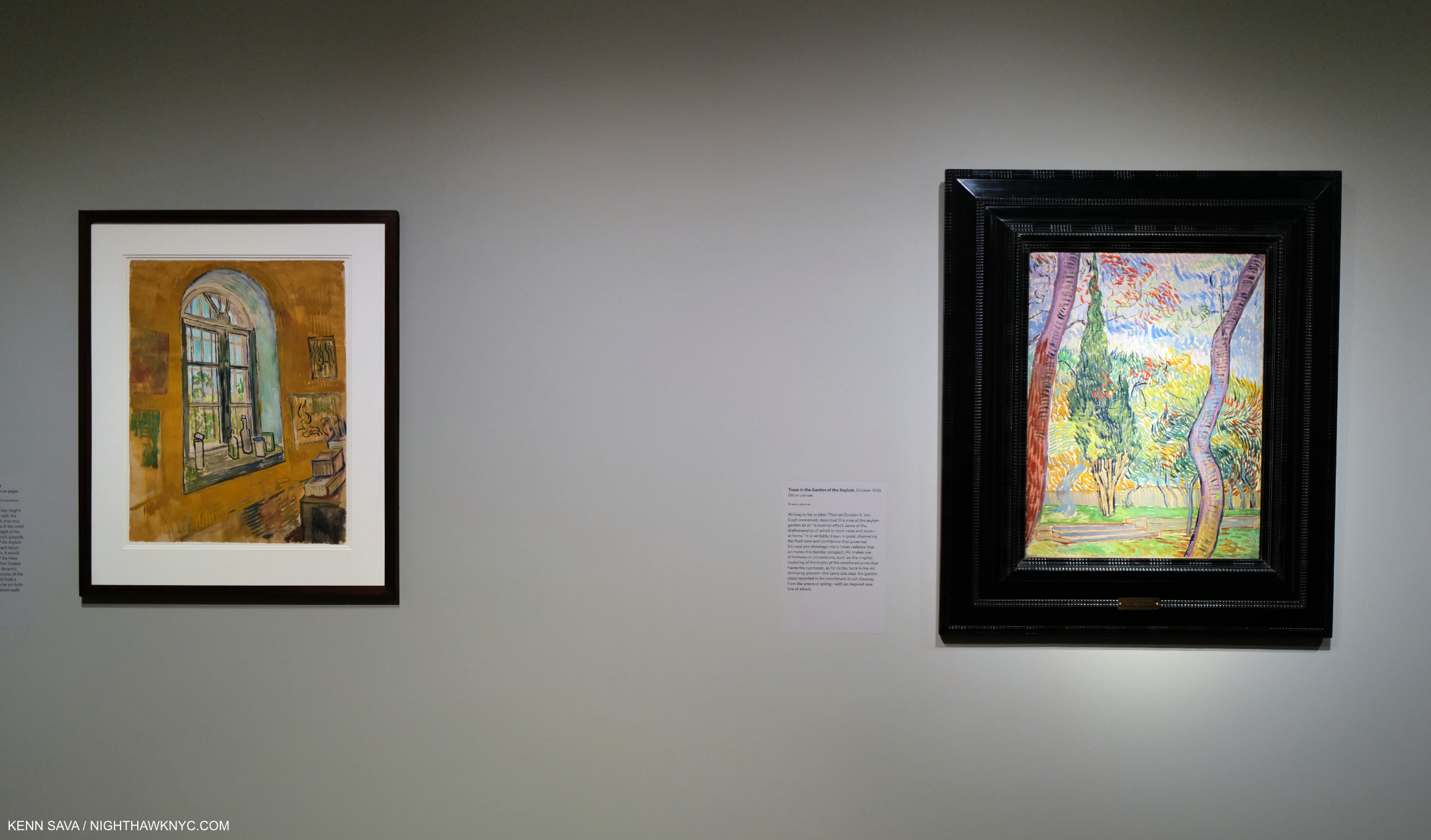
The opening of Part III: Vincent’s window, left, with the actual work he shows in the upper right corner hanging next to it- Trees in the Garden of the Asylum, October, 1889, right. It shocked and almost overwhelmed me when I realized this work hung in his asylum Studio. As such it’s one of the most extraordinary things I’ve ever seen (even beyond Art). Vincent chose this work to look at while he was living a horror show.

“Outside my window is a tree
Outside my window is a tree
There only for me” *

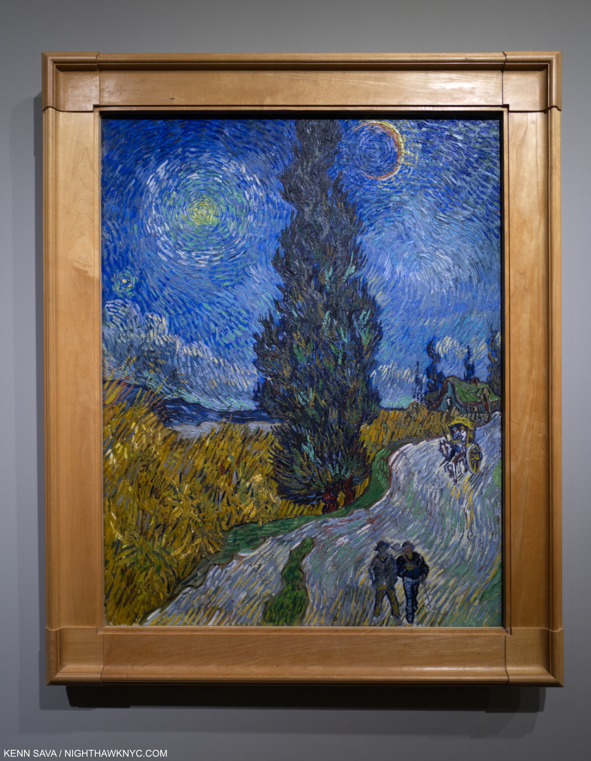
Here he is, having admitted himself to an insane asylum(!) with an ailment that doctors still argue about, entirely alone, surrounded by the insane, and living in fear of suffering another attack. Still, his Letters reveal he put himself under continual pressure to develop his own style AND create work that was salable to justify the expense Theo was incurring and, possibly, support himself. Yet, in spite of ALL of this he SOMEHOW managed to create 150 Paintings, including any number of masterpieces! Among them, what is now, perhaps, the most beloved Painting in the world- The Starry Night– which he Painted that same June- one month after entering the asylum, during a period when he was not allowed outside at night!

“I can hear all the cries of the city
No time for pity
For a growing tree
There is a world of pain
In the falling rain
Around me” *

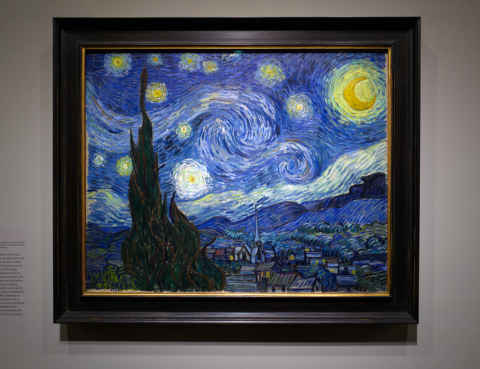
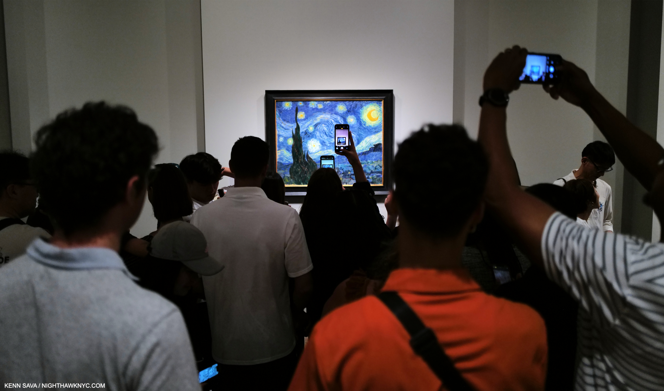
Is this the “greatest” Painting in Western Art? While I don’t believe “best” exists in the Arts, a case can certainly be made for just that. I think an even stronger case can be made that it is the most revolutionary Painting of its time and before. It’s unprecedented. In any event, it certainly must be among the most loved today, if it is not THE most loved Painting in the world. But? It twasn’t always thus! There is no Painting I’ve stood in front of more often in my life than The Starry Night, June, 1889. That’s because MoMA owns it, I live here and I make a point of seeing where they have installed it on each visit8. No matter- Every single time I see it, it thrills me. Seen here during the first time of all those I haven’t seen it at MoMA. The Met, June 2, 2023.

That’s right- Perhaps, the most famous night Painting in Art history was Painted indoors because the Artist was not allowed outside at night. (Read that again. I almost typed it twice it’s so hard to believe.) When you compare it to Starry Night Over the Rhone, September, 1888, which he did Paint outdoors at night, the difference becomes obvious. Stuck inside, to create The Starry Night, he combined a few Paintings he had already created into a night scene. He “borrowed” the horizon of hills from the recently completed Landscape from Saint-Rémy shown earlier. Front left is a large cypress, the tree having arrived as a focus after having lived in the background as seen earlier. The Met’s curators make the case of the numerous meanings the tree has had down through the centuries, death among them, given its frequent appearance at cemeteries. Long life, another, given the 1,000 year life of some. It would be central for a few months that summer, then, it suddenly disappeared from his focus, again relegated to the distance. This makes me wonder if the cypress had a connection with Paul Gauguin, who Vincent was eternally trying to win back after the disaster before Christmas the year before. The sky, the stars and the moon, however, are something else entirely- something not based on an earlier Painting he or anyone else did. Here, in all its glory, we finally see Vincent coming into his own!

After he Painted it, Vincent came to regard The Starry Night as a “failure!” He sent it to Theo, as he did all his Paintings. Theo didn’t know what to do with it. He railed against Vincent exploring stylistically, considering efforts like this to be “unsalable.”

“’it is better to attack things with simplicity than to seek after abstractions’, he confessed to having erred in the past with images like La Berceuse and the second Starry Night (i.e. this one, from June, 1889), both of which he dismissed as ‘failures.’ ‘I allowed myself to be led astray into reaching for stars that are too big,’ he wrote, ‘and I have had my fill of that9.'”

Vincent promised to toe the mark and produce more conventional work. That sound you hear is the wind rustling through the trees caused by countless millions of Art lovers today shaking their heads in disbelief.

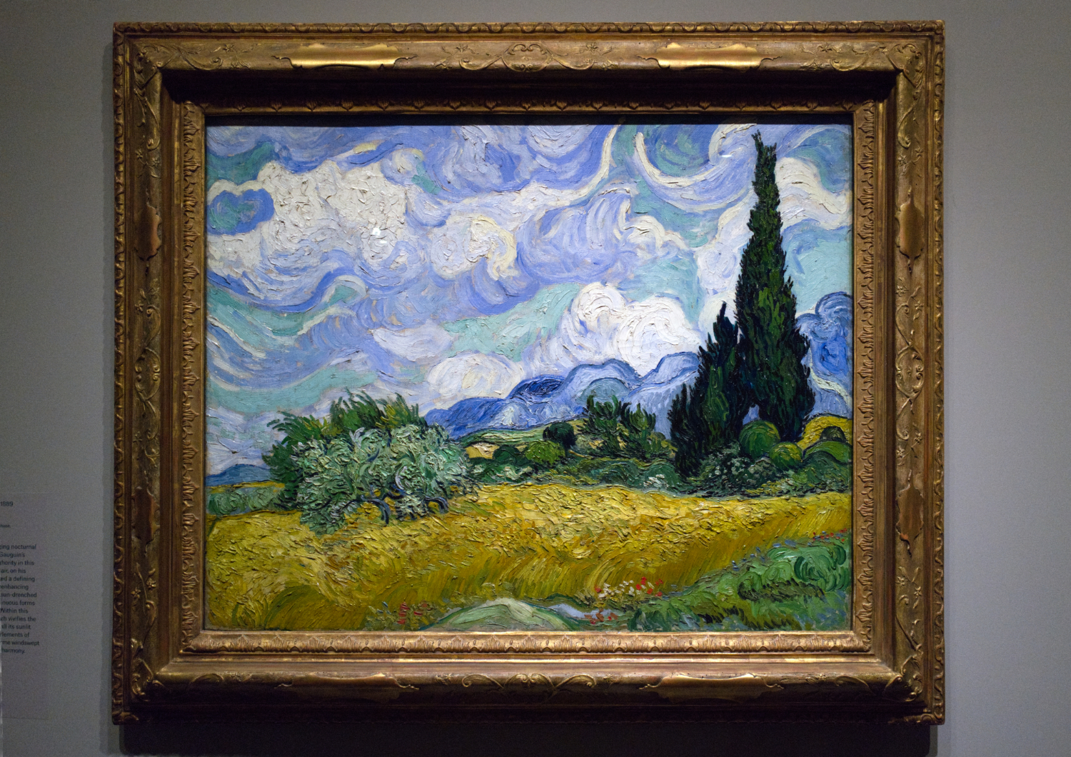
You’re looking at the reason The Met had to get MoMA to lend them The Starry Night. Under the terms of its acquisition, the Met’s Wheatfield with Cypresses, June, 1889, is not permitted to leave the building. In the show, it was displayed immediately following the immortal nocturnal work. Both were Painted in June, 1889, as was Landscape from Saint-Rémy, shown earlier, making June, 1889 one of the most historic months in Art history. Wheatfield with Cypresses is usually displayed on its own wall in The Met’s Permanent Collection Galleries, signifying how The Museum feels about it, though they have 24 Paintings by Vincent! MoMA has 3. Wonder why I heart NYC?

Let’s think about it for a moment. The Starry Night is a one-Painting revolution that no one followed! Almost every other work of daring has inspired imitators or disciples, from Picasso’s Cubism to Seurat’s “chromoluminarism,” as he called his style (others have called it “pointillism”), to Jackson Pollock’s abstractions. Artists who are or were influenced by Van Gogh (like Edvard Munch) seem to me to be “more generally” influenced by him than influenced by The Starry Night specifically. Vincent, himself, infrequently revisited his Starry Night innovations later. Can you imagine what it would have been like if had taken them from the get-go in June, 1889 and ran with them?

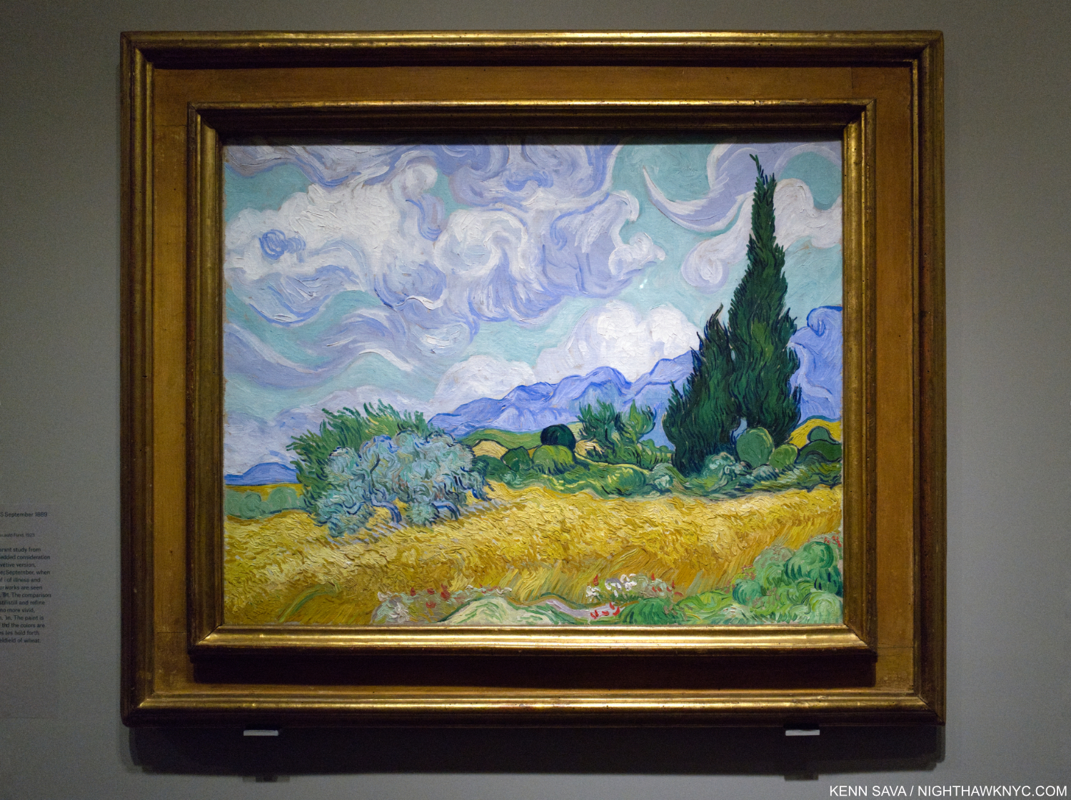
Though it’s a copy of The Met’s Wheatfield with Cypresses, it’s titled A Wheatfield, with Cypresses, September, 1889, now in the collection of the National Gallery, London. The two were hung side-by-side in a once in a lifetime chance to study them together. I spent a few hours over 3 visits just going back and forth between these two masterpieces, comparing a detail in one with that in the other. Vincent’s style at this point bordered on total freedom, yet a close look reveals how amazingly similar these two Paintings are- except for the brushwork (and the clouds). The Met’s Painting is rich with impasto, the London picture is much more refined with a greatly toned down exuberance in the application of paint.

You never hear Vincent mentioned as an “abstract” Painter, yet looking at the “London” version of The Met’s Wheatfield, which Vincent Painted 3 months after the original, it would seem to me the case could be made as elements here border on abstraction. As if The Starry Night wasn’t enough of an indication of it, the two Wheatfields with Cypresses are more examples of how far he was now ahead of his time, in my view, having started out a mere 8 years earlier as a beginner! Just incredible.

One of the very best things about Art shows is the chance to see related pieces now housed in distant corners of the earth reunited for a brief moment, like this.

Yet, despite having this apparent “freedom,” he still stuck to his original composition down to small details, though with modifications. It’s fascinating to notice what he did change and wonder why.

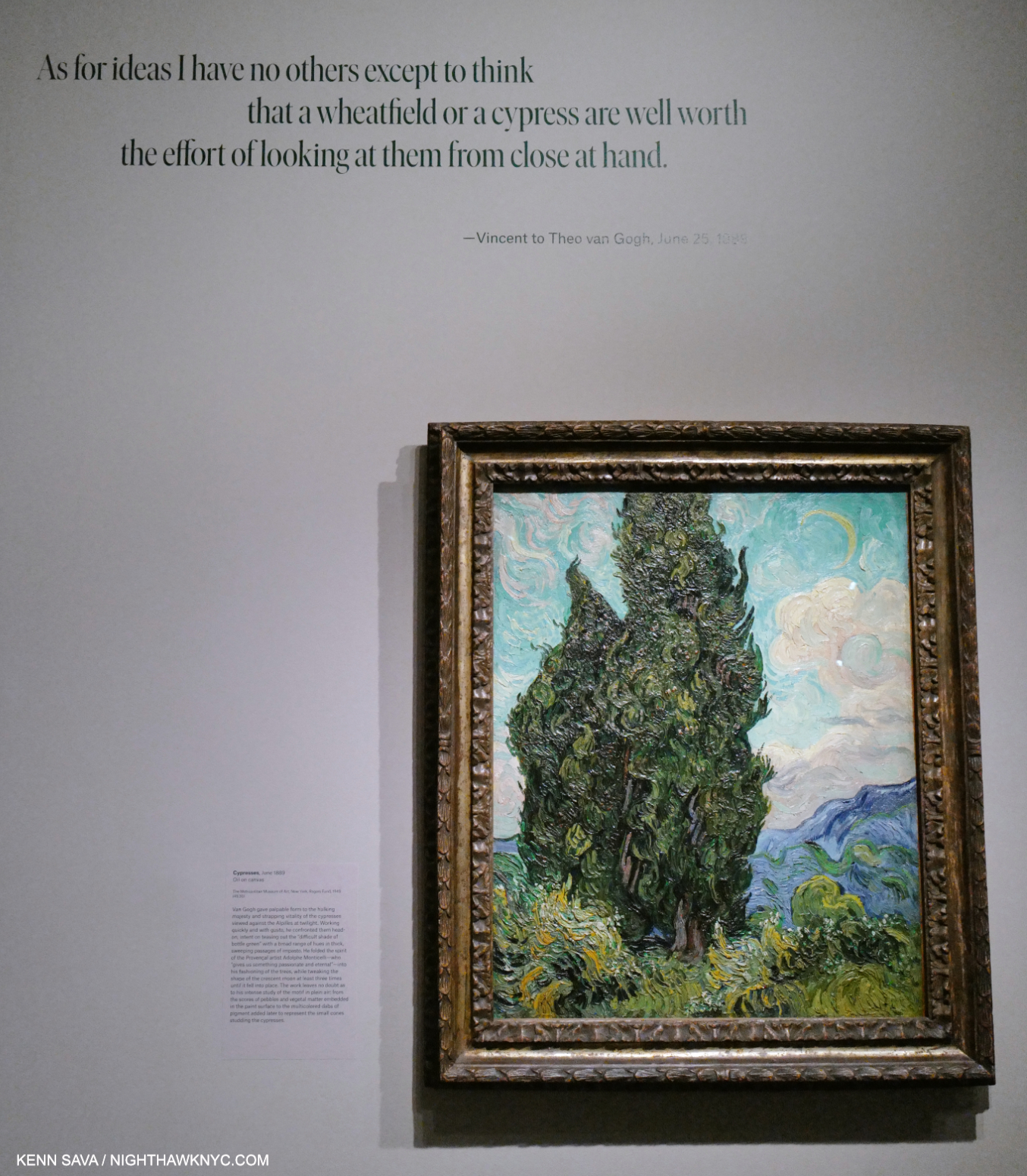
Cypresses, June, 1889. To my eyes, all the forms seem to want to just fly off into what we might call pure abstraction. It’s interesting the taller cypress is cut off.

It seems to me that even more than Seurat, from June, 1889, on, Vincent was pushing the frontier of what would be called “Modern Art” a few years later. I wonder if not having a formal Art education allowed him this freedom to continually break rules he may, or may not, have even been aware of.

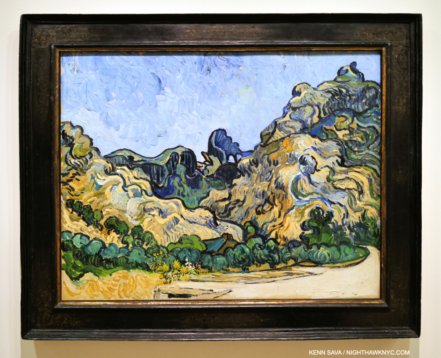
Meanwhile, over at the Guggenheim Museum, I saw this- Vincent’s Mountains at Saint Rémy. While not in the show, I’m including it because it was Painted one month after The Starry Night and Wheatfield with Cypresses in July, 1889. While it doesn’t include cypress trees (as far as I can tell), it says much about the direction Vincent’s style was going.

While many credit Manet as the beginning of Modern Art, a case can be made that what became known as “20th Century Painting” really started in the works we see on this wall that Vincent painted from June to September, 1889- while he was in an insane asylum.

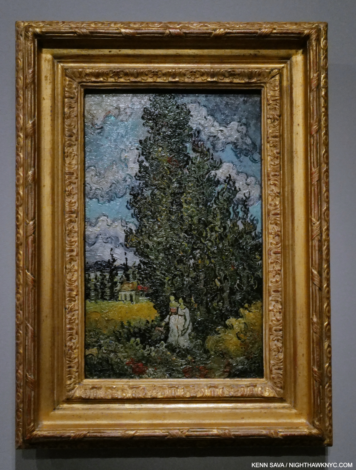
Cypresses and Two Women, February, 1890, Oil on canvas. Vincent is back at work on the cypresses, and it all has changed so much. He intended this Painting to go to Albert Aurier, the author of one of the very first reviews of his work, in January, 1890, in appreciation. In it, he called Vincent a worthy successor to the seventeenth-century Dutch masters10. This work speaks volumes of what that meant to him.

After the June whirlwind, cypresses continued in his work, as we see in the remainder of Part II, then in Part III, they almost completely and suddenly disappear.

The final wall shows that by the end of his time in the asylum, in spite of all he had endured, Vincent had indeed created his own style.

The Landscapes in the final gallery are more varied, before the final work brings it all to a rousing climax.

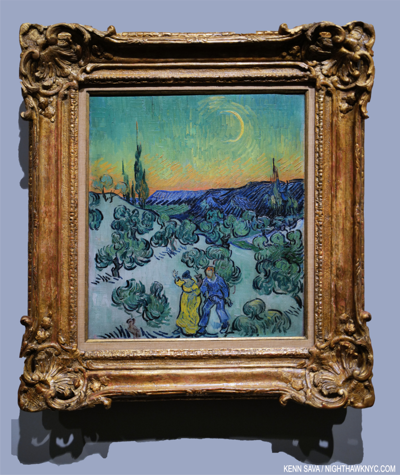
A Walk at Twilight, May, 1890. The penultimate work in the show is a fresh and daring approach to early evening. All the trees, including the cypresses, appear to be vibrating as if trying to shake free of form. The cypresses, though, are now ancillary in the background.

In his Letters while he was there, Vincent speaks about wishing he could stay in the asylum. SOMEHOW, in spite of it everything, he managed to create 150 Paintings, including some of the great masterpieces in Western Art, as I said, while he was there. Then, in May, 1890 he left. Two full months later, he would be dead.

A Walk at Twilight, May, 1890. A cypress stands smack in the middle in an evening work that harkens back to The Starry Night from 11 months earlier, possibly proving that perhaps Vincent didn’t think it was such a “failure” after all. Painted 2 months before his death, it’s a work that can be read in any number of ways. For me, it may be the summation of Vincent’s achievement as a Painter and innovator.

By all accounts Vincent van Gogh was extremely hard to get along with, especially for any length of time. He drank too much. He smoked too much. He was obsessive about everything he cared about and he cared about a good many things. He could be intensely argumentative in defense of what he believed. He had a LOT of trouble finding love, or even real & lasting friendships, and on and on…Then, there’s his Art.

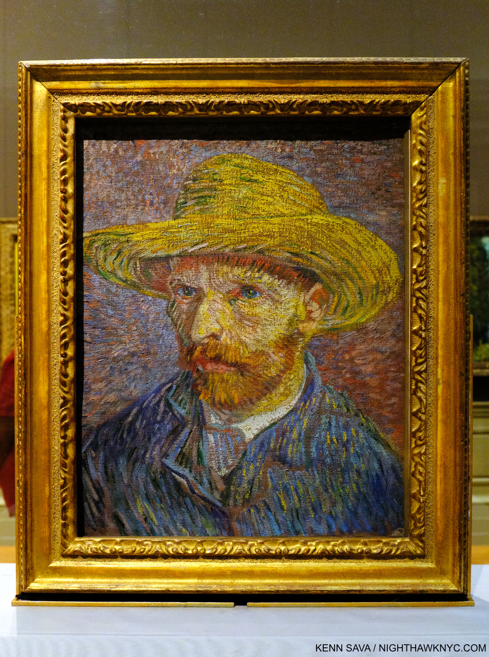
Self-Portrait with a Straw Hat, 1887, my personal favorite work in entirety of The Met, Painted on the raw, unprimed side of the canvas (because he had already Painted on the primed side and apparently couldn’t afford more canvas), which adds to the unique texture of the work. I’ve looked at it countless times over quite a few decades now and every time I see it, I marvel at its unique way of seeing the world. Interestingly, no Self-Portraits are included in the show. This was seen on September 15, 2018 in the Permanent Collection galleries.

“As for himself, he said, ‘as a painter I shall never amount to anything important, I am absolutely sure of it11.”

Vincent was a very astute observer of Art and Artists even before becoming a Painter. So, it’s odd he was so wrong about his own Art. Still, here’s the thing I can NEVER get past-

Beginning at the incredibly late age of 27, Vincent’s Art career lasted exactly TEN YEARS from July, 1880 to July, 1890!12
His entire Painting career lasted barely NINE YEARS, from 1881 to July, 1890!

The fact that one could ask the impossible to answer question “Is The Starry Night the greatest Painting ever?,” as I posited earlier, and have it taken seriously regardless of the outcome, shows me how utterly remarkable what Vincent van Gogh’s accomplished in one decade is. Painters as diverse as Francis Bacon and David Hockney, both astute, lifelong students of Art history, consider him to have been right up there with the very greatest Painters who ever lived! Far be it from me to argue with them, but that they would consider someone who Painted for 10 years in those terms is hard to imagine. The approximately 2,100 Artworks he created, including about 860 Paintings are extraordinary- if only for their stylistic diversity as I’ve found looking at them for 40 years13.

In 2018, I wrote a piece wondering what Vincent would make of his popularity today. For someone who lived without anyone in his life, and so little acceptance & love THIS level of both- worldwide- would have to be both the ultimate irony, and completely overwhelming.

With all he had to face- isolation, loneliness, fights with his parents14, illness, poverty, years of struggle and rejection attempting to find his way in various occupations, and everything else- though a good deal of it (if not all) he brought on himself (could anything make him more human?)- before becoming a beginner Artist at 27(!), HOW is it possible he was able to overcome ALL of it to create many of the most beloved works of Art in the world, including a good many while in an insane asylum?

The only answer I’ve found is that he loved Painting THAT much. No matter what, no matter everything I’ve delineated above, and everything else I haven’t- he overcame ALL of it by Painting.

It just boggles my mind.

*-Soundtrack for his piece is “World of Pain” by Gail Collins & Felix Pappalardi and recorded by Cream on Disraeli Gears, 1967.


(A “Postscript: My Journey to Vincent” follows below, or may be seen here.)

NighthawkNYC.com has been entirely self-funded & ad-free for over 8 years, during which 300 full-length pieces have been published! If you’ve found it worthwhile, PLEASE donate to allow me to continue below. Thank you, Kenn.

You can also support it by buying Art, Art & Photography books, and Music from my collection! Art & Books may be found here. Music here and here.

Written & photographed by Kenn Sava for nighthawknyc.com unless otherwise credited. To send comments, thoughts, feedback or propositions click here. Click the white box on the upper right for the archives or to search them. Subscribe to be notified of new Posts below. Your information will be used for no other purpose.

  1. Each lives on in terrific catalogs, which are all highly recommended.
  2. David Hockney on Vincent van Gogh.
  3. Vincent’s time with Seurat, Paul Signac, Emile Bernard and Charles Angrand in Asnières, a Parisian suburb, which directly precedes the period of Cypresses, was the subject of a fascinating show at the Art Institute of Chicago concurrent with, but otherwise not connected to, Van Gogh’s Cypresses
  4. on February 4, 1890, per vangoghletters.org
  5. In Van Gogh: The Life, the authors, Stephen Naifeh and Gregory White Smith, correlate Vincent’s attacks with the level of stress & strain he was under.
  6. Van Gogh: The Life, P.704
  7. and having the 3rd attack since December on February 26, 1890 per vangoghletters.org
  8. As I’ve written, it’s endlessly puzzling how MoMA can spent 2 BILLION dollars on renovations this century and apparently never consider where they are going to display their most popular pieces- particularly The Starry Night, which has continually been relocated often without ever finding the “perfect” spot.
  9. Van Gogh: The Life, P. 784
  10. Here
  11. Van Gogh: The Life, P.743
  12. Like that of Jean-Michel Basquiat.
  13. Just page through a copy of Van Gogh: The Complete Paintings, one of my Desert Island Art Books, to see for yourself, the “Brick” edition is about $25. new.
  14. His mother, Anna Carbentus, who had Painted and gave him his first Drawing lessons, and who survived him by about 17 years to 1907, 2 years after the first big Van Gogh show mounted by Jo, never warmed to his Art (Van Gogh: The Life, P.795).

Cecily Brown At The Met: Bold, As Love

This site is Free & Ad-Free! If you find this piece worthwhile, please donate via PayPal to support it & independent Art writing. You can also support it by buying Art & books! Details at the end. Thank you.

Written & Photographed by Kenn Sava

Show seen- Cecily Brown: Death and the Maid @ The Metropolitan Museum through December 3, 2023.

The show’s opening brought me to a dead stop. Click any image for full size.

Over the course of its generous run, from April 4th through December 3rd, Cecily Brown: Death and the Maid  has had some VERY serious competition among great Art shows up in NYC’s museums for Art lover’s attention this year. Consider- MoMA had the excellent Georgia O’Keefe: To See Takes Time (April 9th through August 12th), and now the equally excellent Ed Ruscha / Now Then (September 10th through January 13, 2024). The Whitney has Henry Taylor: B Side (October 4th through January 28, 2024). In addition to Death & The Maid, The Met had its summer blockbuster, Van Gogh’s Cypresses (May 22- August 27), and the just opened Manet/Degas (September 24th through January 7, 2024). Phew! While all of them deserve mention as “Show of the Year” candidates, in my opinion, Cecily Brown: Death and the Maid is the biggest breakthrough Painting show in a NYC museum since Jennifer Packer: The Eye Is Not Satisfied With Seeing, 2021-2, which I wrote about here. It provided the first opportunity we’ve had to see an overview of her work outside of books. Seeing 50 of her Paintings, Drawings, and Monotypes in person left me feeling that the show is a game-changer that will rewrite the Art world’s appreciation of Cecily Brown’s Art & her standing in Art– even though both are well-established. Her diligence and continual hard work over the past 25 years has paid off in spades. The fruits of her labors explode on the walls.

Time passes slowly. Painted during the initial outbreak of the pandemic, the stunning Selfie, 2020, Oil on linen, kept me transfixed at the entrance as minutes passed, mirroring in a small way the time the Artist spent creating it. In fact, mirrors are a key, recurring, element in the show. Anchored by the reclining figure to the right, and the vanity with the round mirror to the right rear, the whole has a feeling of claustrophobia, from too much time spent in the same place that every last detail becomes all-too-familiar. It’s perfectly chosen to begin the show in my view (or, end the show, depending on which end of the show you enter from) as it sets the stage for (or culminates) a show that covers about 25 years and includes very recent work.

One night in 2004, I met Cecily (who was born in London in 1969) when she and a date happened to sit down next to me at East of Eighth, the now-lost Chelsea bar/restaurant/Mother Ship on West 23rd Street a few doors west of the legendary Hotel Chelsea. At that point, the buzz around her was just forming. Days earlier, I had read an article about her in the Art press intrigued by the fact that she is David Sylvester’s daughter. Mr. Sylvester will always be remembered by Art history for being the interviewer in what is, perhaps, the most important Artist interview book yet- Interviews with Francis Bacon, (one of my Desert Island Art Books). A book that helped form my long-standing obsession with Mr. Bacon. It was right in the middle of my decade of drawing (small “d”) daily, which I was when she sat down. Recognizing her from the article, I quickly put my sketchbook away. I told her I had read the article and we chatted briefly, then I let her get back to her date.

No You For Me, 2013, Oil on linen. The viewer looks into the mirror on a vanity at a figure in a room. It appears there’s a spanking going on. Perhaps as close as Cecily Brown comes to the realm of Francis Bacon isn’t that close at all.

I regret I didn’t get a chance to ask her if she met Bacon. Cecily’s Art has been influenced by his, I’ve read, and they both seem to me to be on the cutting edge of “abstracting” the portrait, yet the influence might be in spirit as opposed to a direct visual or stylistic influence as far as I can see. As many have pointed out, Cecily Brown lives on the edge between abstraction and figuration, more or less. Whereas “pure abstraction” leaves nothing “familiar” for the viewer to hold on to, Cecily Brown usually does, even if it’s just the title. In the work included in the show I felt there were “handles,” so to speak, in virtually all of the pieces that lead the viewer into her world.

Francis Bacon, Seated Woman, 1961, Oil on canvas, which sold for $28 million in 2015, Oil on canvas, seen at Skarstedt, June 24, 2022.

In Bacon, the world (through his eyes) is represented to an apparent larger extent, but then the figure or figures are rendered with a selective fluidity that allows the Artist to mould them to his intentions. This often makes them seem out of place in their settings. In Cecily Brown’s work, even though many of her works depict interiors, there is no stylistic difference. Everything is rendered as part of the whole.

The moment I realized Cecily Brown had arrived as a Painter to be reckoned with. A Day! Help! Another Day!, 2016, Oil on linen, 109 x 397 inches (that’s just over 33 FEET long!) seen in Cecily Brown, A Day! Help! Help! Another Day!, Paula Cooper Gallery, October 31, 2017.

Since 2004, as I’ve followed her career and gone to her shows, her work has grown, and grown on me, continually. The record shows I’m not alone in that. Though she quickly gained major gallery representation, and shows in European museums, it seems to me the Art world has been slow to fully “get” her, like here, as incongruous as that may be to say for an Artist who has achieved her stature.

Sketchbook, 2004, Oil pastel, ballpoint pen and pencil on paper, from the year I met her. The image on the left is at the heart of the show. A woman embraces a skeletal figure, whose knee is between hers. Possibly a copy of Edvard Munch’s Death and the Woman, 1894-5, a Print in The Met’s collection, here, this motif appears in Cecily’s recent Painting Death & The Maid, 2022, shown below, revealing how long this subject has been on the Artist’s mind.

Early on, her work was quite sexually oriented, then it steadily opened up. As it did, more and more people began to see the breadth of her talent. The real turning point for me came on October 31, 2017l, when I walked into Paula Cooper Gallery and was face to face with A Day! Help! Another Day!, seen earlier, in Cecily Brown: A Day! Help! Help! Another Day!

Death & The Maid, 2022, Oil on linen. The title of the famous String Quartet #14 by Franz Schubert, “Death & The Maiden,” is shortened here to “Maid,” possibly as a reference to Ms. Brown’s time working as a maid to pay for Art school. The center of her Painting shows the titular figures embracing and Death’s leg extending to the left, climaxing the influence of Munch’s Death and the Woman, as seen above. “Death & The Maiden” is also the title of a Painting by Albrecht Dürer’s remarkable student & friend, Hans Baldung, from 1517, which can be seen here. That might be the earliest use of the title.

In April, almost exactly 19 years after I met her, Cecily Brown: Death and the Maid opened in the hallowed halls of The Metropolitan Museum, in the same gallery I saw Louise Bourgeois: Paintings in, an interesting coincidence (two European-born women Artists who settled in NYC for good a half-century+ apart). Having moved to NYC in 1994, after winning a plane ticket, it’s the first show she’s been given by an NYC museum. I think she might say the wait was worth it.

Installation view with The Picnic, 2006, Oil on linen in three parts, center, on the wall.

Brilliantly selected from the past three decades and installed (with the involvement of the Artist), it all hangs together seamlessly. Though her style has evolved over the years of her still-young career, the show really does all look like part of a whole. This is aided to no end by the continuity of themes- vanity, death, interiors, and influences & dialogues with Art history.

Full of Face, Full of Woe, 2008, Oil on canvas in three parts. With a title that comes from the “Monday’s Child” nursery rhyme, it’s the first Cecily Brown Painting in The Met’s Permanent Collection. It captivated me when I first saw it last year in the Modern & Contemporary Galleries, and again in the show. Note what appears to be a woman looking in a vanity mirror in the left panel.

The first thing that was apparent to me is how her work looks like no one else’s. She has achieved a style instantly recognizable as Cecily Brown. A major achievement in its own right. The second thing that stands out for me is how deeply and continually she mines Art history. There are references to Munch, Bruegel, Manet, Rubens, Hogarth, Gilbert, Frans Snyders, Dutch & Flemish Still Lifes, among others here, but the resulting work is completely her own no matter the origin, and provides for an interesting “conversation” over time. Filtered through a different viewpoint, experiences and century into nothing less than a striking personal vision, one that strikes me as unprecedented, though I do see a kinship to the work of her teacher, Maggi Hambling and occasional echoes of the late-50s work of Janice Biala.

Blood, Water, Fruit and Corpses, 2017, Oil on linen.

“My red is so confident he flashes trophies of war
And ribbons of euphoria
Orange is young, full of daring
But very unsteady for the first go ’round
My yellow in this case is not so mellow
If fact, I’m trying to say it’s frightened like me
And all of these emotions of mine keeps holding me from
Giving my life to a rainbow like you.” *-  Jimi Hendrix, “Bold as Love”

The third thing that’s instantly apparent is her color. For the past eight & 1/4 years, I’ve posted a piece of Music as the “Soundtrack” for each piece I’ve written here. As I walked through Death & The Maid, one song screamed at me from the walls: “Bold as Love” by Jimi Hendrix.

“Bold” sums up much of Cecily Brown’s work for me. In her daring and boldness lies energy and excitement.

As for “Bold as Love,” Hendrix “paints a vivid picture of the spectrum of human emotion using colors,” as genius.com puts it. Virtually every color Jimi writes about is powerfully featured at one point or other in the show. I’m not saying this is a literal interpretation, of course. It’s a reflection of the power of color as a language. The choice is not as arbitrary as it might seem. In the early years of the past decade, Ms. Brown was so taken with the cover image for Jimi’s 3rd album, Electric Ladyland, the last album he completed in his lifetime, that she did a series of Paintings based on the original cover Photo for the U.K. release that was banned for its U.S. release.

All is Vanity (After Gilbert), 2006, Monotype

Cecily Brown’s color strikes me as being that of life. Of being alive. As Adrian Piper pointed out in her brilliant MoMA show, A Synthesis of Intuition, in 2018, “Everything will be taken away.” In death, the colors of life are one the of the first things taken away. Here, it runs as a consistent and compelling counterpoint to the theme of death. It’s interesting that in some of the work that seems to be more centered on death (not all), the color is washed out.

Untitled (Vanity), 2005, Oil on linen

The other thread is the the face/the temporality of youth/and the body (which takes many forms, including the frequent “looking in a mirror” works). Of course, any living body must confront the idea and the reality of death. In the show, it’s the central focus, but it has been one of her central themes, among others, virtually all along. This makes her unique among major Contemporary Painters. While many address it, I can’t think of anyone who makes it a main focus. The show is also interesting for a virtually complete absence of her earlier sexual work.

Vanity Shipwreck, 2021-2, Oil on linen

On the technical side, her compositions, she says, come together in the making. In a number of pieces, figures are in the center, and everything else happens around them. The same feeling occurs in Selfie, though the figure is in the lower corner, and in pieces like Carnival and Lent, below, where bits of figures pop up all over, virtually awash in all that surrounds them. “Abstraction?” What could be a more realistic representation of the chaos of contemporary life where everyone is continually bombarded from all sides, by everything?

“You start with something that’s say, a day old, and then you look at the different directions it can go. And in a way, you can argue that you’re never losing anything, because you try and always keep those things in mind. You have to be willing to lose it all. And that really does happen all the time in painting. And I always want to keep that possibility, just to go back to what kind of painter I am. That’s what I call being a painterly painter, and what’s kind of old-fashioned about it is that attitude that you can lose it all….the paint itself telling the story. The idea that paint can carry or contain a sort of life of its own. Paint traps energy1.”

Carnival and Lent, 2006-8, Oil on linen. Cecily Brown’s take on Pieter Bruegel the Elder’s Fight Between Carnival and Lent, 1559.

I’m struck by the fact that Jackson Pollock could only do his so-called “drip” Paintings from 1947-1952. Ms. Brown has been working in, and developing her style for almost 30 years. Then, there’s her technique, her brushwork. Whereas she said that “Paint traps energy,” her brushwork brings it. 

Detail.

It seems to me that the recent pieces included in Death and the Maid (particularly Selfie, the titular work shown earlier, and A Year on Earth, below) show her reaching a new level. Though her work probably looks very abstract to many viewers, including this one, almost all of them have titles that ground them in the “known world,” separating her from many abstract Artists (though she is not one. Cecily Brown’s work only belongs in the Cecily Brown “box“) who use “Untitled” most often. Titles which function as one of the “handles” I referred to earlier,

A Year on Earth, 2020-21, Oil on linen. Begun in the early months of the pandemic.

Mounted near the end of the show, it could be just me and my life these past 4 years, but I found her Painting BFF incredibly moving.

BFF, 2006-15, Oil on linen.

The wall card explains that Cecily’s teacher, the Artist Maggi Hambling, “once told her to make painting her best friend, as it would always be there for her.” It seems to me that’s not only true for the act of Painting for Painters, but also in the act of looking: Painting is always there for everyone!

There’s a feeling Cecily Brown: Death and the Maid gave me that made me just not want to leave it. I’ve thought about what that feeling is and why I had it since I did leave (to go see the gigantic Manet/Degas show- about 12 galleries worth!). One thing I can say is that it’s a feeling I live for. It’s not only being in the presence of great Painting- there’s plenty of that on view in Manet/Degas as well as everywhere in The Met. It’s the excitement of being in the presence of something alive, pulsing with energy and color with a vibrancy that jumps off the wall- and a lot of it! In Death and the Maid we get a first chance here to play catch up and take stock of 25 years of Cecily Brown’s Art and accomplishment, while getting set up to watch where she goes from here. That’s exciting, too.

This May, I ran into Cecily, again, when we were both leaving the opening of Rosa Loy’s wonderful new show (separately, of course), though I didn’t get the chance to speak to her. It said a lot to me that she was out and about seeing Art, even while her own show was up on the walls at 1000 5th Avenue. I took it as a sign she’s not slowing down or resting on her laurels; she remains fully engaged in the Art world around her, which has inspired her all along.

In the end, you just never know when that person who happens to sit down right next to you one night is going to wind up being one of the world’s major Painters less than 20 years later.

*- Soundtrack for this piece is “Bold As Love,” by Jimi Hendrix from his immortal album Axis: Bold As Love.

NighthawkNYC.com has been entirely self-funded & ad-free for over 8 years, during which 300 full-length pieces have been published! If you’ve found it worthwhile, PLEASE donate to allow me to continue below. Thank you, Kenn.

You can also support it by buying Art, Art & Photography books, and Music from my collection! Art & Books may be found here. Music here and here.

Written & photographed by Kenn Sava for nighthawknyc.com unless otherwise credited. To send comments, thoughts, feedback or propositions click here. Click the white box on the upper right for the archives or to search them. Subscribe to be notified of new Posts below. Your information will be used for no other purpose.

  1. Cecily Brown, Phaidon Contemporary, P.38

Gregory Halpern In NYC

This site is Free & Ad-Free! If you find this piece worthwhile, please donate via PayPal to support it & independent Art writing. You can also support it by buying Art & books! Details at the end. Thank you.

Written & Photographed by Kenn Sava

Shows seen- Impressions @ Fotografiska, July 20, 2023 and
Immersion: Gregory Halpern, Raymond Meeks and Vasantha Yogananthan @ ICP, through January 8, 2024

Gregory Halpern, right, giving a brief overview of his career to date as an introduction to his work including this well-known image from his PhotoBook,  ZZYZX, with Magnum Photos President, Photographer, and fellow exhibitor, Cristina de Middel, center, and narrator Jessica Nabongo at Impressions @ Fotografiska, July 20, 2023. Click any image for full size.

Two shows featuring the work of Gregory Halpern provided all-too-rare opportunities to see his work here in what were the NYC debuts of both his newest work, and his most recently published work. While familiar to most from his remarkable series of PhotoBooks this past decade as a “book Artist,” the shows provided the chance to see him as a “wall Artist.” Though neither was a Gregory Halpern solo show, they proved revelatory1.

 Immersions installation view

On September 26th, Immersion opened at ICP, where I was last for William Klein: YES. Immersion is the name of a commission program involving an amalgamation of French and American organizations awarding selected Photographers, called laureates, a sponsorship to create a body of work either in France or the US. Gregory Halpern was a laureate in 2018. Raymond Meeks and Vasantha Yogananthan are the other two laureates included in the show. For his part, Mr. Halpern decided to go to Guadeloupe, a former French colony, a daring and somewhat ground-breaking choice (Raymond Meeks chose two regions in France, and Vasantha Yogananthan chose New Orleans).

So, why Guadeloupe?

 Immersions installation view.

“I think I knew I would find a certain form of Surrealism there,” Mr. Halpern explained in an interview with Curator Clément Chéroux2.

The stage set, after research and a number of trips to Guadeloupe to take the Photographs, he undertook the rigorous selecting and arranging process he outlined during a talk when I saw him last at The Strand Bookstore in September, 2019. Aperture published the resulting body of work, indeed perhaps his most surreal, in Let the Sun Beheaded Be (a NighthawkNYC Noteworthy PhotoBook of 2020). In Immersion NYC finally gets to see the work as Photographs.

The show was concise, typically open-ended, and bookended by the Artist’s first foray into Video(!) and a stunning, leaning, Sculpture3. It opens with one of the most compelling images in the book.

Untitled, as all the images are in the book, is described by Mr. Chéroux- “Shot in a former slave prison in the town of Petit-Canal, northwest of Grande-Terre, it shows the tentacular development, right inside the building, of a tree commonly known as a strangler fig because the strength of its wide roots destroys everything on which it grows4.”

Christ Columb, 2023, Marble, cement, stainless steel, wood and cinderblock. An “exact replica of a bust of Christopher Columbus that currently stands in Guadeloupe,” per the wall card. “Exact” in that it even mirrors the vandalism to the real bust’s face.

It serves to define his terms. In these Photos, Mr. Halpen consciously avoided tourist trappings, saying in the book’s conversation with Stanley Wolukau-Wanambwa that after seeing how the tourists acted and treated the locals, he realized his burden as another white outsider with a camera would be even heavier, especially because he wasn’t fluent in either French or creole. He chose instead to focus on the stormy history, the place, the human, the animal, and the vernacular, in what are the five unofficial “chapters” of the book.

History/the place, the human…”The tattoo is a replica of the 1848 decree abolishing chattel slavery in Guadeloupe (the second, final abolition, after Napoleon reneged on his 1815 abolition,” from the wall card regarding the work on the right.

Surrealism runs throughout all of them, yet in Let the Sun it’s, perhaps, an overriding mood as much as it is actually on view. Possibly, this is due to the inherent surrealism Mr. Halpern said he was expecting to find, or perhaps it was also due to his reading material during his visits. The title “Let the Sun Beheaded be” comes from Soliel cou coupé (or Solar Throat Slashed) by Martinican poet Aimé Césaire, who was influenced by the concluding lines of “Zone,” the first poem in Guillaume Apolliinaire’s Alcools, 1913, “Adieu Adieu / Soliel cou coupé” (Farewell, farewell / Let the Sun beheaded be). Apolliinaire coined the term “surrealism” circa 1917. Césaire’s earlier work found its way into the hands of André Breton, one of the leading surrealist theorists, and the two became long-time friends. Speaking of Solar Throat Slashed curator Clément Chéroux points out in his essay the numerous connections between the guillotine, which was brought to Guadeloupe with the French after the French Revolution and put to extensive use in the colony, and Photography- down to the “guillotine shutter.” Thankfully, the guillotine shutter is the only use of the notorious device in the work, though death takes many forms.

Stills from Triangulation, 2-channel video(!), duration 4:20.

Yet, after finishing his Photography, he subsequently returned to make a 2-channel Video titled Triangulation, which meditates on the coming and going of the cruise ships and their cargo. The Video, his first to be shown in public, startled me for having a different approach than his Photography does! Whereas he goes to great length to speak with his Photographic subjects, even collaborating with them to an extent in his Photo Portraits, in Triangulation, he’s an observer. Highlighting the risks of this, at one point, staged or not, a cruise ship employee with “Photographer” emblazoned on his shirt, ironically moves towards the camera making a “STOP” signal . The Video added a counterpoint to the show. At once showing that side of Guadeloupe most known to the outside world, but showing it not from the standpoint of the tourists, but almost from the viewpoint of the locals if and when they watch these foreigners arriving & disembarking on their island. 

Appropriately hung near the floor. Seeing it this size created a completely different impression than the image in the book.

Another thing that struck me seeing this work was size. Images have a tendency to live in our minds in the size they appear in in a book. Unlike a Painting or Drawing, we may tend to forget Photographs can be printed larger or smaller. I heard from readers when I named Mr. Halpern’s Omaha Sketchbook a NoteWorthy PhotoBook of 2019 who disagreed, saying they were unhappy with the size of all the images in it- each a reproduction of a Photo cut from a medium format contact sheet, done to remain true to his original mockup- a “sketchbook.” Let the Sun returned to full page images to stunning effect (I happened to love the daring in the design of Omaha and the sizes of the Photos therein). At ICP, the Prints ranged from slightly larger than page size to very large, probably 40 inches or larger. The added real estate enabling the images to begin to attain a “life-size” presence. 

“In Guadeloupe, slavery memorials are everywhere, so the weight of that history is much more perceptible than in the United States.” Gregory Halpern in the Conversation.

In my 2019 overview of his work, “Gregory Halpern’s America,” I wrote about his work’s hold on me. I still can’t think of any other living Photographer whose work speaks to me as much as his continues to. Given that his instant classic book ZZYZX is now in its 4th printing, and his three subsequent books have sold out, I’m apparently far from the only one it speaks to. I went in to Immersions believing that Let the Sun is somewhat underappreciated compared to his U.S. based books (i.e. all of his previous books). I came out feeling I may have underestimated it. Let the Sun is a book that could inspire change on a number of levels- from opening the eyes of people who’ve never been to Guadeloupe (like myself), to increased possibilities for the Photographic Portrait, to publishers who have neglected the Caribbean (& it’s Artists) to this point in Art & PhotoBooks, to the shame that the history of slavery in this country has been so ignored. For those reasons, it’s something of a landmark book in my view.

On the road, again. Gregory Halpern looking for subjects in Oklahoma City as he talks in the voice-over about his Instagram announcement seeking Portrait subjects. Still from a fascinating video short about his week in OKC at Fotografiska, July 20, 2023.

A few weeks earlier, at Fotografiska in the Flatiron on July 20th, Mr. Halpern was joined by 3 Magnum Photos Photographers, of which he is now also a full member, in a show sponsored by a hotel chain titled Impressions. The Photographers were ensconced in separate hotels around the world and asked to document what they experienced. Mr. Halpern went to Oklahoma City, and exhibited 4 Photos (as did each of the others- Cristina de Middel, Jonas Bendiksen, and Alessandra Sanguinetti) in what is the first new work I’ve seen of his since Let the Sun Beheaded Be, 2020.

Here is Mr. Halpern’s presentation-

I find the arrangement particularly interesting. We see animals, a Portrait of a young man in a barber’s cloth, some sort of structure, and a torso bearing a tattoo. Looking at these, yes, Let the Sun came back to me. Each of the four images “represents” one of its unofficial themes- animals, a human, the evidence of the land/history, and another human. The surreal is also represented in all four (at least for me).

It would be easy to say they “harken back” to what we saw in Omaha Sketchbook. That book featured images of masculinity (along with images of animals, the land & history and other themes), like Douglas, Army Jurnior Reserve Officer Training Corps, Bellevue, 2005-18, to cite one example out of many; the young man getting a haircut harkens back to those societal expectations and traditions. Ostensibly, it’s a straight-ahead image of an event that parents are fond of documenting during childhood. Yet, there’s an air of mystery around it. The young man stares at the camera with a somewhat stoic look that gives away little. The barber cloth hiding anything the might tell us more about him. His haircut appears to be finished and he’s ready to face the world again. Yet, I’m reminded of Clément Chéroux’s essay in Let the Sun when he speaks about the guillotine, Guadeloupe, and the mechanics of Photography. He mentions Photographers refer to Portraits as “cutting heads.” Here we see just that twice- once with only the head (in a Print mounted on a red background), and once of a torso sans head. Notice how the Print of the young man is mounted higher than the others- at a height where the young man’s head just about “completes” the Portrait of the tattooed torso on the right.

Detail of the far right Photo, showing the tattoo. Speaking of recurring themes, t’s interesting to contrast this with the very first image in this piece from ZZYZX.

It reminds me of some of the games the Surrealists used were fond of playing, like the one Kerry James Marshall based his recent show on.

Mr. Halpern discussing two other images from his OKC series.

Of course, this is only my reading of it- your results may differ, as Mr. Halpern’s intentions may as well. In the end, I’m lucky I never have to leave NYC to find Surrealism. It finds its way here from all over the world.

*- Soundtrack for this piece is “Captains and Cruise Ships” by Owl City.

NighthawkNYC.com has been entirely self-funded & ad-free for over 8 years, during which 300 full-length pieces have been published! If you’ve found it worthwhile, PLEASE donate to allow me to continue below. Thank you, Kenn.

You can also support it by buying Art, Art & Photography books, and Music from my collection! Art & Books may be found here. Music here and here.

Written & photographed by Kenn Sava for nighthawknyc.com unless otherwise credited. To send comments, thoughts, feedback or propositions click here. Click the white box on the upper right for the archives or to search them. Subscribe to be notified of new Posts below. Your information will be used for no other purpose.

  1. As far as I know, there has not been a Gregory Halpern solo show in NYC since the auspicious Gregory Halpern: A at Clamp Gallery from January 5th to February 11th, 2012, as hard as that is to believe. If you know of one subsequently, please let me know.
  2. From 2019, per Clément Chéroux, “GH/971” in Let the Sun Beheaded Be.
  3. Which is not his first. He showed Sculpture for the first time earlier this year in Gregory Halpern: 19 Winters/7 Springs at Transformer Station, Cleveland.
  4. ibid

Rod Penner’s America: Small Town Nation

This site is Free & Ad-Free! If you find this piece worthwhile, please donate via PayPal to support it & independent Art writing. You can also support it by buying Art & books! Details at the end. Thank you.

Written & Photographed by Kenn Sava

Show Seen- Rod Penner: Small-Town Meditations – Traveling exhibition seen in NYC @ Meisel Gallery

“America: A Nation of Small Towns”
Title of the 2020 United States Census Report.

Small towns in the big town. The opening, NYC, March 18. 2023.

I’ve already written as much, and maybe more, than anyone else has about Rod Penner’s Art over the past six years. Most recently, I wrote my fifth Penner piece, an extensive look and the first anywhere, at the first full-length book on his work, Rod Penner: Paintings, 1987-2022. If Mr. Penner’s work speaks to you and you haven’t seen a copy, make a point to. It accomplishes the rare double feat of being equal parts long-awaited full-length Monograph and Catalogue Raisonne, containing everything he’s Painted through 2022, in one volume. All of this being said, my pieces on his Art were based on seeing one show of smaller Paintings in 2017 and two works in a prior group show. This spring, I finally had a chance to see a show with a more representative overview of his work going back to 1998. I came away feeling I saw much in his work I hadn’t seen before.

My only previous Rod Penner solo show, in 2017, consisted solely of 6 by 6 inch and 5 by 7 inch Paintings, each jam-packed with detail. Though Sands Hotel & Cafe/Vaughn, MN, 2019, Acrylic on canvas, is a huge 31 by 64 inches (almost 5 1/2 feet long!), the detail is every bit as stunning, representing a staggering amount of work. I continually get lost looking at the fore and mid-ground in what strikes me as a bit of an unusual composition. But, of course, there’s much more to it. Click for full size.

Rod Penner: Small-Town Meditations consisted of a group of 17 Paintings that establish Mr. Penner as the foremost Painter of small town America working today, inheriting the mantle from John Salt, and Charles Sheeler & Edward Hopper before the late Mr. Salt (1937-2021).

John Salt, Red Mailbox #2, 2015, Casein on linen, 45 x 65 inches. Seen in 2018 in the same space occupied by Rod Penner: Small-Town Meditations. Casein is a water soluble medium that derives from milk casein, and is used masterfully here to create such a rich, yet mysterious, atmosphere.

Rod Penner was born & raised in Canada before marrying his wife, Debbie, and relocating to Texas in 1988, where the majority of his work is set. In the Q&A I did with him in 2017, the Artist said this about the beginning of his Painting career-

“Shortly after arriving in the Lone-Star State, I rediscovered the work of John Salt and felt an instant connection. I couldn’t drive past a trailer home (and there are many in Texas) without thinking “Salt.” At this point, I wanted to spend more time in the studio and less time searching out subjects to paint, so I started driving around the town we lived in and took photos of these tract houses that were everywhere. I found them visually interesting. As with all the streets and buildings that I paint, these homes, under certain weather and lighting conditions, became transformed. I painted my first tract house in 1989 and it sparked a series of paintings that were later shown at O.K. Harris in NY.”

614/House with Daffodils, 1998, 10 1/4 x 15 inches, Acrylic on board.

While people appear in very few of his Paintings, right from the beginning, virtually every piece he’s created is rich with their presence. First, there’s what people have built on the land that signifies them. Then there’s the condition of these structures, which are steeped in individual modifications and adornment. Some are in need of attention; perhaps a new coat of paint or repairs. It seems that the occupants are too busy living in them to do them right now. In addition to the building, we often see the evidence of human habitation: toys, tools or lawn implements in the yard; though vehicles are not seen nearly as often as they are in John Salt’s homestead works where they are one of his trademarks. Combined with the lived-in condition of the house all of this makes for a de facto “Portrait” of its inhabitants, in my view. His work is rich in character, one thing that sets him apart. Character adds an incalculable amount of depth to his Paintings. In a larger sense, his work is a “Portrait” of how, and where, many Americans lived in the last half of the 20th and early parts of the 21st centuries.

212/House with Snow, 1998, 36 by 54 inches, From here on, all works shown are Acrylic on canvas unless noted.

The idea of “home” looms large in Rod Penner’s oeuvre, striking me as one of his main themes, be it in actual houses or motels (temporary homes), like Sands Hotel & Cafe/Vaughn, MN, 2019, shown earlier. None of his homes are palatial. Rather, they are all well lived-in. The roofs and paint look weather-worn, as if they’ve survived countless storms or harsh winters. It’s easy to make this fit the “Portrait” analogy. A number of his Texas scenes include snow- something the rest of us may have trouble associating with one of America’s southern-most states, but the terrible storms they’ve had these past years are changing that. Snow makes these scenes look they could have been seen in many other places in the country. Yet, in spite of it all, they’re still standing, and much of the same can no doubt be said of whoever lives in them.

212/House with Snow, 1998, a masterpiece in my view, sums up so much about the broad and vague idea of “home.” For me, that doesn’t necessarily mean a place; A person could be “home” for someone, and much of what I see here, and the feelings it generates, would still apply. Like virtually all of Rod Penner’s Paintings 212 cries out to be seen up close.

How much you see in a Rod Penner Painting is only limited by how long you look at it.

A number of his House Paintings are set during the Holidays. In this detail from 212/House with Snow, we see the Christmas tree lying diagonally in front ready to go out with the trash & recycling. A poignant image by itself. It’s been there a little while given it’s snowed since it was put there. A toy bus (maybe a Xmas present?) pokes out from a red box with an intricate logo on it- all in this stunning little section, which is typical of all of Rod Penner’s Paintings. Oh! That’s before you get around to admiring the incredible detail on the Christmas tree branches, the tree trunk behind it, or the condition of the paint on the house and garage! Then, there’s the ground…

Yet here, as in all Rod Penner’s work, in my opinion, he puts the detail at the service of Art. The detail is revelatory, like a well-turned sentence in a great novel, or like the floor in Jan van Eyck’s The Annunciation in Washington. It never preaches. It never gives too much away, leaving it all to the viewer. In fact, when I first met Mr. Penner, he was reluctant to speak about his Art. He told me he wanted his Art to speak for itself. Personally, I’m glad he has softened that stance a bit and has spoken about his work, especially in his Artist’s Statement in his book. I only wish the Art media respected what the Artist says about his/her own work more than what anyone else says about it.

Bar-B-Q/Marble Falls, TX, 2022, 12 x 18 inches. The latest in a long and memorable series of roadside eateries and gas stations. Those foreshortened signs to the left must have been fun to Paint.

Another theme in his work is life on the move: gas stations and roadside eateries loom large here, in addition to motels.. This makes it apparent that the Artist gets around since every scene he renders he has visited in person. Sometimes, it’s hard to look at these and not smile. What may be Mr. Penner’s subtle sense of humor can be at once poignant, and again tack sharp. In person, the Artist is quick to smile, so it’s hard not to see that coming across in his work at times. At the March opening, two visitors were present who had traveled all the way from Marble Falls, TX for it. Well-familiar with the real-life Bar-B-Q back home, it must have been a strange, but welcoming, feeling to see its likeness hanging on the wall in a SoHo gallery thousands of miles from home.

Buy Pecans Here/San Saba, Tx, 2021, 31 by 52 inches.

Buy Pecans Here/San Saba, Tx, 2021 marks Rod Penner’s return to large Painting after his series of small San Saba pieces I saw in his last NYC solo show. When I look at this, I see an early 21st century “History Painting.” The Old Masters famously rendered scenes from history, usually in suitably large scale. Here, Rod Penner shows a number of stages of San Saba’s history in one scene in the recent past (2021). In the back, San Saba County Courthouse, 1911, peaks out of the trees and rooftops, surrounded by what man has built in the area in the following 110 years, including telephone poles and power wires, which may now carry the internet, including NighthawkNYC. San Saba is known as the “Pecan Capital of the World,” so the appropriately sized Pecan store sits stolidly on the earth occupying much of the right side as if anchoring that reputation. Further down the block on that side is G&R Grocery, behind the white pickup. Across the street in the rear the red brick of “Station” peaks out- that’s the only word left on its sign. Mr. Penner featured both of these buildings in his San Saba Series of small Paintings in 2016-7, which I showed here. Buy Pecans Here also got its own Painting. In the front left is another one, the former San Saba Butane Co., which he immortalized in a show-stopping small Painting of the same name, looking a bit more the worse for wear than it does even here. Yet, it’s still standing, seemingly waiting for what’s coming next. The ground weather and the skies add incalculably to the mood. An unfathomable amount of work must have gone into this Painting.

Like San Saba Butane, a number of the places he Paints are out of business. I don’t have to tell anyone how prevalent that is, wherever you are, in the age of the pandemic, before and “after.” Yet, it’s something rarely seen in Painting. Businesses opening, being active, and going out of business are part of the business cycle. That is the “history” I see in Buy Pecans Here/San Saba, Tx.

Bertram Supply Co., 2015-6, 31 by 52 inches.

Rod Penner Paints democratically. I’m not referring to politics. I’m using the word in its original meaning. That is that Rod Penner Paints everything he shows us with equal weight. Virtually everything, front to back, is in focus, like it is in many of Richard Estes’s Paintings. Everything is shown at the hyperlocal distance, as Photographers say1. Therefore, it’s up to each viewer to decide what’s important to the narrative they weave in their mind. It also allows for different scenarios at each viewing with different things standing out each time.

Compositionally, it seems to me that many, if not most, of Mr. Penner’s Paintings, and all those shown here, consist of three horizontal “bands” or areas. He presents the sky in a top band, the buildings/main subjects in the center band, and the ground weather in the lower/foreground band. One of the subtler joys of Rod Penner’s work is that he is a master of rendering the ground effects of weather (i.e. rain, snow, graupel, mud, or the baked naked earth), a bit like JMW Turner was a master or rendering skies (in a completely different way, of course). The ground weather is a unique, and often stunning, part of most of his Paintings, easy to overlook, but not to be missed. The detail they contain is astonishing and in addition to adding so much to the “narrative,” they also hint at how much time and thought went into every inch of his Paintings- regardless of size.

Welcome to PennerVille. A close look at Bertram Supply Co., reveals the Artist’s name on the street sign, with “Rod E.” foreshortened for the cross street sign under it, indicative that he’s put his name on this scene. It’s becoming his genre.

Rod Penner: Small-Town Meditations sums up in capsule form Rod Penner’s accomplishment. To me, that is nothing less than preserving the lives that countless Americans have lived these past 40 years in paint. Rod Penner is creating a body of work that defines and preserves what a good deal of America- small town America (which most of America consists of)- is and has been like these past 4 decades as much, if not more, than any other Artist has.

Having said that, I would also add that I’m not sure that that’s his point! It may be. Or, it may simply be what I’m seeing in his work. His Art is open-ended enough so that everyone is free to see in it what they will.

Rod Penner discussing how he created some of the detail in Yellow Light/Brenham, TX, 2004-5, 15 x 25 inches with a visitor behind him at the opening, March 18, 2023.

Saying all of this would seem to overlook the most obvious characteristic of Rod Penner’s Paintings: his world-class technique. His technical skill (readily seen in the details from Bertram Supply Co., or 212/House with Snow, above) approaches the level of the Old Masters. Yet, technique, by itself, does not make Art. In Rod Penner’s case, his technique is only the beginning of the story. Every time you look at his work, you get to write your own ending for it. 

*- Soundtrack for this piece is “Small Town” by John Mellencamp.

My prior pieces on Rod Penner are-

The Vermeer of Marble Falls, Texas,”April 28, 2017

“Rod Penner: Brilliance, Under Cloudy Skies,” June 10, 2017

Q&A With Master Painter Rod Penner,” June 14, 2017

Rod Penner’s Neighborhood,” August 3, 2017

and- “NoteWorthy Art Books- Rod Penner: Paintings, 1988-2022,” April 7, 2023.

NighthawkNYC.com has been entirely self-funded & ad-free for over 8 years, during which 300 full-length pieces have been published! If you’ve found it worthwhile, PLEASE donate to allow me to continue below. Thank you, Kenn.

You can also support it by buying Art, Art & Photography books, and Music from my collection! Art & Books may be found here. Music here and here.

Written & photographed by Kenn Sava for nighthawknyc.com unless otherwise credited. To send comments, thoughts, feedback or propositions click here. Click the white box on the upper right for the archives or to search them. Subscribe to be notified of new Posts below. Your information will be used for no other purpose.

  1. The focus distance at a given aperture on a lens where everything after that point is in focus, and somethings before are as well, depending on the settings and the lens.

Jaune Quick-to-See Smith’s Survival Map

This site is Free & Ad-Free! If you find this piece worthwhile, please donate via PayPal to support it & independent Art writing. You can also support it by buying Art & books! Details at the end. Thank you.

Written & Photographed by Kenn Sava

Show Seen: Jaune Quick-to-See Smith: Memory Map @ The Whitney Museum

Indian Madonna Enthroned, 1974, Mixed-media.

It took 83 years for Jaune Quick-to-See Smith to get her first NYC retrospective. As if that’s not notable enough, Jaune Quick-to-See Smith: Memory Map is also the “largest and most comprehensive show of her work to date,” the Whitney says of its installation of 130 of her Paintings, Drawings, Prints, and Sculptures covering almost 5 decades of her career on its 5th floor, where it follows Edward Hopper’s New York, and 3rd floors.

Self-Portrait, 1974, Pastel, graphite pencil and charcoal on paper. The Artist showing herself with 6 arms.

Born in 1940, a citizen of the Confederated Salish and Kootenai Nation, the show reveals Jaune Quick-to-See Smith to be an Artist of her time, one that is fluent with contemporary Art styles and techniques. An Artist, and a person, passionate about the well-being of her people and the world in which they, and we all, live. Yet, she’s also been ahead of her time in bringing many issues her people face to the Art world, which has only recently begun to be more open to Indigenous Artists.

Homeland, 2017, Oil and acrylic on canvas, radiates from the Confederated Salish and Kootenai Nation’s Flathead Reservation in Montana.

Indian Map, 1992, Oil, paper, newspaper and fabric on canvas.

Survival Map, 2021, Acrylic, ink, charcoal, fabric, and paper on canvas

As a result, it seems to me that her work has been on the line between being of its time and ahead of its time throughout her career, both in terms of style and content. She proves herself fluent in moulding the language developed by her peers to her purposes over her career while also creating as many of her own innovations.

Jasper Johns, Flag, 1954-55, Encaustic, oil, and collage on fabric mounted on plywood, three panels, seen at MoMA, 2017.

McFlag, 1996, Oil, paper and newspaper on canvas with speakers and electrical cord

Among the numerous Artists she references, including Magritte and Picasso, two names repeatedly came to mind, both at the forefront of the developments in American Contemporary Art of her time. Maps and Flags play a central role in the work on view, echoing Jasper Johns (B. May 15, 1930). Whereas Mr. Johns’s intentions for using the flag and maps remains, like most of his work, ambiguous, Ms. Quick-to-See Smith uses them to powerfully present the lives and issues faced by Indigenous People. 

Robert Rauschenberg, Gull (Jammer), 1976, Sewn silk, rattan poles, and twine, 1976, seen at MoMA in 2017.

Other works echo Robert Rauschenberg (Oct 22, 1925- May 12, 2008).

Ronan Robe #4, 1977, Oil, beeswax, charcoal and soot on canvas with lodgepole.

In 1985, the Artist got involved in efforts to save Petroglyph Park in New Mexico, creating what would become her Petroglyph Park Series, 1985-7, and marking the beginning of the appearance of current events in her Art.

Trade (Gifts for Trading Land with White People), 1992, Oil, paper, newspaper, and fabric on canvas with found objects on a chain. Perhaps a history of exploitation with “trinkets” being exchanged for land. A number of the sports teams whose ephemera hangs above the Painting, have subsequently changed their names, some have not. Other items shown remain in production, including children’s toys which cheaply knock-off Native American culture.

Historic events don’t escape her attention, either.

9 Monotypes from the Custer Series, 1993. The work next to the lower right is after Magritte. The text reads, “This is not a peace pipe.”

Wall card for the Custer Series.

The Confederated Salish and Kootenai Nation’s Flathead Reservation is located in Montana, site of the Little Bighorn. Canoes, often labelled “Trade Canoes” (except for the one above), are a recurring theme, each one rendered strikingly differently.

Trade Canoe: Making Medicine, 2018, Mixed media, foreground, Green Flag, n.d., on the back wall.

Detail.

Trade Canoe: Forty Days and Forty Nights, 2015, Oil, acrylic, oil crayon, paper and charcoal on canvas, introduces the show, and is seen to the left in the picture of the show’s lobby, seen further below.

In addition to having her eye on what’s going on around her, her Art also has a wonderful way of looking back to the rich history of her culture. Messages of protest are side by side with sage wisdom. Her Chief Seattle Series (or C.S. Series), 1989-91, does this wonderfully and adds a timeless element to her work. The Wall Card says-

The Garden (C.S. 1854), 1989, Oil, rubber hose, crushed tin and aluminum cans, and nails on canvas. C.S. is Chief Seattle and The Garden is part of Chief Seattle Series from 1989-91. It reads, “WE are part of the EARTH and it is PART of US, C.S., 1854.”

Jaune Quick-to-See Smith has created an important, innovative and powerful body of work that somehow all manages to remain of the moment no matter when she created it. On the one hand, that’s a sign the country hasn’t evolved faster and how much remains to be done. 

Memory Map shares the 5th floor with Josh Kline: Project for a New American Century, which is compelling in its own right. The shows overlap as both express concern over climate change and the impact of social, economic and technological change on the labor force.

On the other hand, it’s a testament to the Artist’s range, humanity, and perhaps above all, her perseverance. 

Celebrate 40,000 Years of American Art, 1995, Collagraph. A reminder that the ancient, original Art of our land has yet to be fully appreciated.

In some ways, the case of Jaune Quick-to-See Smith reminds me of Alice Neel, who didn’t see her first full-length monograph published until she was 83, the year before she died. Shows of, and books on, her work have increased ever since. I expect Ms. Quick-to-See Smith to also receive increasing attention as time goes on, and hopefully, she will still be around to see, and enjoy, it. Memory Map proves she deserves every bit of it. 

*- Soundtrack for this piece is “Now That the Buffalo’s Gone” by Buffy Sainte-Marie, who was born on the Piapot 75 Reserve in Saskatchewan, Canada. She announced her retirement from live performance earlier this month after 60 years of performing.

NighthawkNYC.com has been entirely self-funded & ad-free for over 8 years, during which 300 full-length pieces have been published! If you’ve found it worthwhile, PLEASE donate to allow me to continue below. Thank you, Kenn.

You can also support it by buying Art, Art & Photography books, and Music from my collection! Art & Books may be found here. Music here and here.

Written & photographed by Kenn Sava for nighthawknyc.com unless otherwise credited. To send comments, thoughts, feedback or propositions click here. Click the white box on the upper right for the archives or to search them. Subscribe to be notified of new Posts below. Your information will be used for no other purpose.

NoteWorthy Art Shows: Spring, 2023

This site is Free & Ad-Free! If you find this piece worthwhile, please donate via PayPal to support it & independent Art writing. You can also support it by buying Art & books! Details at the end. Thank you.

Written & Photographed by Kenn Sava.

As I celebrate the 8th Anniversary of NighthawkNYC.com on July 15th, my thoughts turn to some excellent shows I saw but didn’t get a chance to write about! I’ll take a brief look at a few I call NoteWorthy here…

Robert Rauschenberg: Spreads and Scales @ Gladstone Gallery-

Robert Rauschenberg has been one of my favorite Artists since I discovered his work in the 1980s. In 2017, I wrote an extensive series on the plethora of shows going on around town then during what I termed “The Summer of Rauschenberg.” Spreads and Scales was a concise but very interesting show of work I’ve never seen before reinforcing my belief that no matter how much of his work you’ve seen, even 15 years after his passing in 2008, there’s work of his that you more than likely still haven’t seen.

William Christenberry & RaMell Ross: Desire Paths @ Pace-

RaMell Ross, Sleepy Church, 2014, left,  and William Christenberry, Church, Sprott, Alabama, 1981, both Pigment print mounted on dibond.

An interesting, unexpected paring of the work of the late Photographer, William Christenberry, perhaps best known for his association with William Eggleston, and the Academy Award Nominated Filmmaker & Artist, RaMell Ross, who I last saw in a solo show at Aperture Foundation in June, 2018. Interesting became compelling in its final gallery.

RaMell Ross, Return to Origin, 2021. From the upper left- the Artist working away while in transit, sealed in the box; two video stills- the truck after unloading the box, simultaneous shot of RaMell inside; one of the panels showing the Artist’s inscriptions during transit; the box labelled “DRY GOOD.”

There, sitting on the floor was a very large box cryptically labelled “DRY GOODS” in a large stencil on the exterior, I looked at it, noticed there was writing all around the inside and then when I was about to move on I saw the accompanying video. It turns out RaMell Ross created & used the box to reenact Henry Brown’s legendarily daring act of mailing himself out of slavery to freedom in 1849! Mr. Ross shipped himself, sealed in this box, from Rhode Island to Hale County, Alabama. The trip took 59 hours, all the while the contents were unknown to the contracted truck driver whose gooseneck rig was carrying the crate. The journey, captured on the video, was being shown on that nearby monitor. In addition to reminding today’s viewers of Mr. Brown’s incredible feat (in a smaller box), it also reminds me of the preciousness of freedom. Something not fully appreciated, until it’s gone.

Uta Barth @ Tanya Bonakdar-

Frozen poetry. …and to draw a bright white line with light (Untitled 11.10), 2011, Inkjet Prints.

Compositions 5, 12 & 7, left to right, each Inkjet Prints from 2011, seen next to a street-facing picture window. Uta Barth’s work has had me deeply under its spell for the past three years.

Sundial (07.6), 2007, Mounted color Photographs.

In my opinion, Uta Barth is one of the most under-appreciated Photographers working today. I came across a copy of her retrospective The Long Now a few days before the pandemic shutdown and its poetry captivated me. With empty streets and empty rooms everywhere for the following months on end, I saw “Uta Barths” everywhere. Her spell has continued ever since. Artists who change the way I see the world are few and far between.

Installationv view of one section of ...from dusk to dawn, 2022, Mounted color Photographs with single-channel video monitor, includes an embedded video on one of these pieces that changes frames so subtly you may not see it change.

Finally having a chance to see her work in person @ Tanya Bonakdar Gallery, Uta Barth presented one, large, new piece, …from dusk to dawn, 2022, in multiple sections that nearly wrapped around the entirety of the downstairs main gallery and a curated selection of “classic” Uta everywhere else in the gallery. The new piece showed one location of Richard Meier’s Getty Center, L.A., over the course of a year, as it changed with time. Being in California, we don’t see the variety of weather we might in some other place, but with Uta Barth it’s always about the light. 

Tauba Auerbach: Free Will @ Paula Cooper Gallery-

One of the rising stars of the Art world, Tauba Auerbach’s latest, her first NYC show since her acclaimed early mid-career retrospective S v Z @ SF MoMA, 2021, didn’t disappoint while offering the usual surprise.

Foam, 2023, Acrylic on dibond. One of a series of Paintings(!) of foam as seen through a microscope.

“The exhibition is an expression of curiosity about spontaneously emergent structure, tendency and habit, and their intersection with the notion of free will. The work brings together historical rendering techniques like pointillism and midtone drawing with microscopy, algorithmic image processing, off-loom weaving, spraying techniques and mathematical surface modeling,” per the Press Release.

Org, 2023, Glass, nylon coated steel cord, 2 x 80 1/2 x 41 3/8 in.

New were incredibly detailed “pointillistic” (her term) Paintings accompanied by tables of intricate objects and a number of equally interesting sculptural works in the adjoining gallery. Both the objects in the main gallery and these “sculptures” reminded me that Tauba Auerbach has her own publishing company, Diagonal Press, which produces fascinating and intricate books and multiples.

Spontaneous Lace, 2023, Kiln-formed glass in aluminum

It might be premature for me to say this, but Tauba Auerbach reminds me a bit of Frank Lloyd Wright, to me one of the great Artistic geniuses of all time. Ms. Auerbach is not an Architect, as far as I know, but her work reminds me of the brilliance of Wright’s “ancillary” designs for his buildings: his fabric designs, dishwear, furniture and rugs. Frank Lloyd Wright continually pursued “building the way nature built,” i.e. “organically,” as he called it. Much of Tauba Auerbach’s work is inspired by nature and carries forward some of its techniques, as seen here in Free Will. Barely in her 4th decade, the high esteem attached to her name is well-deserved in my view, and she is definitely an Artist to keep a close eye on.

Ruby LaToya Frazier @ Gladstone Gallery-

Steadily, Ruby LaToya Frazier has been building a remarkable oeuvre, equal parts documentary and Art, in her own, unique, way. Her latest show, Ruby LaToya Frazier at Gladstone consisted of one major work– More Than Conquerors: A Monument for Community Health Workers of Baltimore, Maryland 2021-22, 2022 made up of 66 archival inkjet prints mounted on 18 stainless steel I.V. poles, which amounted to stations.

At each stop her Photographs were accompanied by personal statements from the subject that were every bit as riveting as Ms. Frazier’s work- no small feat. The show was a wonderful table-setter for Ms. Frazier’s mid-career retrospective set to open shortly at MoMA. An Artist & Activist who has focused so much of her work on groups and communities deserving wider attention it’s my hope the show will do just that for her work and career.

Nicole Eisenman Prince @ Print Center New York-

Beer Garden, 2012-7, Etching, acquatint, and drypoint with chine colle, A stunning 44 3/8 by 51 3/4 inches!

A fascinating and insightful retrospective of yet another side of her work: her seldom-seen prints. A wonderful presentation of 40 works, including new and rare works. A plethora of unique styles and compositions kept the show fresh and exciting, and I imagine would prove new even to those who know her Painting and Sculpture, which were seen to terrific effect in her New Museum survey in 2016, for which this show offered a marvelous, if delayed, addendum.

Machine Learning Kiss, 2018 Collagraph, 19 3⁄4 × 20 inches. *-unknown Photographer.

NighthawkNYC.com has been entirely self-funded & ad-free for over 8 years, during which 300 full length pieces have been published! If you’ve found it worthwhile, PLEASE donate to allow me to continue below. Thank you, Kenn.

You can also support it by buying Art, Art & Photography books, and Music from my collection! Art & Books may be found here. Music here and here.

Written & photographed by Kenn Sava for nighthawknyc.com unless otherwise credited. To send comments, thoughts, feedback or propositions click here. Click the white box on the upper right for the archives or to search them. Subscribe to be notified of new Posts below. Your information will be used for no other purpose.

Edward Hopper: The Last Traditionalist Faces Change

This site is Free & Ad-Free! If you find this piece worthwhile, please donate via PayPal to support it & independent Art writing. You can also support it by buying Art & books! Details at the end. Thank you.

Written & Photographed by Kenn Sava (*-unless otherwise credited)

Show seen: Edward Hopper’s New York @ The Whitney Museum, Part 2. (Part 1 is here.)

Edward Hopper in his New York. With his wife, Jo, strolling the Museum of Modern Art’s Sculpture Garden in 1964. In this Photo, by Eve Arnold, Edward is glimpsed unawares like a good number of his subjects were. *-Photo by Eve Arnold, Magnum Photos. Thanks to Lana for finding it. Click any picture for full size.

Change is the only constant in the universe. For those, like me, for who New York City IS the universe, every day brings change. During Edward Hopper’s time here (1900-67), the City of continual change metamorphosized more than it ever had.

Screencap from the short Film, A Ride on the 6th Ave El, 1916. Edward Hopper frequently rode NYC’s elevated trains, and he was located closest to the 6th Avenue el, which he no doubt rode before, during and after 1916. He glimpsed more than one scene he turned into a Painting while riding one. *-Ford Motor Company video.

The advent of the tall building & skyscrapers (facilitated by the development of elevators with safety brakes), first in Chicago and then here, along with the ongoing spate of bridge building (Brooklyn Bridge, then Manhattan Bridge and others), the advent of the elevated train, the subway, electric lights, movies, and the rest, ushered in with them what we know as modern urban life. All of these inventions & developments brought side effects. Edward Hopper’s New York reveals that the Artist may not have been a fan of some of these changes.

Edward Hopper’s Art: What I See

As I said in Part 1, having the chance to see 58 Hopper Paintings from early through late in his career 14 times, Edward Hopper’s New York completely changed how I see his work. This is shocking to me because I’ve been looking at his work almost as long as I have anyone else’s- well over 40 years. To this point, I saw his work as one of the ultimate (and perhaps unsurpassed) expressions of modern loneliness and isolation in the Art of the 20thy century. But, this is a theme that requires human subjects (like the vast majority of his NYC work has, though he Painted these scenes with people elsewhere as well). What about the rest of his oeuvre; all the other scenes he Painted that don’t include people? These include landscapes he Painted in Maine, Cape Cod, and elsewhere in the U.S., and Paintings he made on, or inspired by, trips to Europe and Mexico. Some of the non-peopled landscapes include houses, buildings, bridges or other man-made structures. Some of them are pure landscapes. (An overview of the range of his work can be seen in any comprehensive book on Hopper. I particularly recommend seeking out Edward Hopper: The Art & The Artist, by Gail Levin, the catalog of the last U.S. Hopper Retrospective, at the Whitney in 1981.)

As a result of considering the whole, I’ve come to believe there are two primary threads, intentional, or not. that run through almost all of Edward Hopper’s work.

First, the “man-altered landscape,” i.e. what man has done with and to nature.

The man-altered landscape. Apartment Houses, East River, 1930. It seems fairly obvious what Edward Hopper thought of this waterfront development. All works are Oil on canvas, unless specified.

In Photography circles, this is what is called “New Topographics” in honor of the legendary Photo show of the same name at the Eastman House, Rochester, in 1975-6, eight years after Edward Hopper’s passing. The subtitle of the show was “Photographs of a Man-Altered Landscape.” What man has done to and with nature, as in Apartment Houses, East River, is a theme I now see in more of Edward Hopper’s work than I see any other theme.

Room in Brooklyn, 1932

Yes, I even see the “what man has done with and to nature” theme in works like the sedately charming Room in Brooklyn, where “nature” is reduced to flowers in a vase. It’s interesting that Hopper’s flowers are higher than the background buildings.

Automat, 1927. Edward Hopper spent a lot of time in Horn & Hardart’s extremely popular Automat Restaurants in the 1920’s, so much that Jo worried he was drinking too much 5-cent coffee. It was worth it because he produced this, another of his show stoppers. Jo chided him for not being able to Paint beautiful women, but Automat certainly puts the lie to that. Its stripped-down composition is a masterpiece of including only the essential. I still wonder about that fruit bowl in the back, though. Is this an instance of “what man has done with nature,” along the lines of Room in Brooklyn?  The reflected receding lights are a master stroke.

A byproduct of what man has done with nature in cities, in Hopper’s time and everywhere since, which some call “progress,” is the effect of what man has built on those who live and work in these places. So, I now include all of Edward Hopper’s work that includes human subjects under this man-altered landscape theme, including his New York work (though not all of them include people- like Apartment Houses, East River, shown earlier).

Office in a Small City, 1953. Life in the cube. An example of what I call the “Hopper fish bowl.”

Many may see Edward Hopper as the “king” of depicting the isolation and loneliness that was endemic in 20th century modern life, and feels increasingly so in the 21st century, but after seeing it as his primary theme for so long, myself, I now believe he is depicting side-effects of this new modern urban life in the man-altered landscape to “turn up the volume” on his feelings about these changes. Therefore, when he depicts it, in my view, he’s also “commenting” on what man has wrought on his fellow man through altering the world so. All of this also makes me wonder about the melancholy that permeates his Art. Is it indicative of “the inner state of the Artist” (as I quoted Hopper saying in Part 1), or is it solely being used to depict the state of his subjects in the man-altered environment? Gail Levin’s Edward Hopper: An Intimate Biography certainly provides fodder for the former-

“Raphael Soyer, for whom Hopper posed for a portrait…observed: ‘There is a loneliness about him, a habitual moroseness, a sadness to the point of anger1.'”

That makes me wonder if the effects of this new, modern world ON HIM is a good deal of what we’re seeing in his work/or, that he’s recognizing in people he sees.

Intermission, 1963. Edward & Jo Hopper were avid movie & theater goers, and Edward Hopper’s New York dedicated a gallery to his movie/theater work making interesting observations of how some theater sets and Films may have influenced the settings of some of his Paintings. Others, like this, are set in these venues. Intermission presents a “basic” idea in a theater environment, yet it makes me wonder- People have been going to concerts and theaters for many hundreds of years. Why haven’t I seen it done like this before?

The man-altered world’s effects on the population, then and now, run deep. So deeply, in fact, I’d been living with these symptoms for 40 years myself before I realized that they are what I was seeing them in Hopper’s work! ”

Was mankind meant to live this way?” may be another question his Art asks.

Nature. In all its natural glory. Blackhead, Monhegan, 1916–19. Edward Hopper in Maine. *-Whitney Museum Photo. Not in the show.

The second theme that I see in his Art is the unaltered natural landscape. These exclusively depict locations outside of NYC.

  “If you look at landscape painting from that time in America, there isn’t anyone close to him (Edward Hopper) in technique.” Alex Katz, Artist, and designer of the installation of Edward Hopper’s Maine at the Bowdoin College Museum of Art in 2011 on Hopper’s landscapes.

I’ve come to believe his unaltered natural landscapes, like Blackhead, Monhegan, remain very under-appreciated. Though they are beyond the scope of this piece, I will say that it’s fascinating to me to consider that this one was done after Cézanne & Monet’s innovations; two of the “earlier French Artists” I referenced in Part 1. I don’t see their direct influence, though indirectly, his unaltered natural landscapes, like this, also strike me as “impressions,” as I called his New York Paintings there.

“There is a sort of elation about sunlight on the upper part of the house. You know, there are many thoughts, many impulses, that go into a picture … I was more interested in the sunlight on the buildings and on the figures than in any symbolism.” Edward Hopper2.

Landscape with Building, c.1900, Watercolor and graphite pencil on paper. *-Whitney Museum Photo. Not in the show.

As I mentioned in Part 1,  Edward Hopper’s New York sent me back to the beginning of his Art looking to see how his themes began and evolved. This non-NYC work from the year he started Art school strikes me as an early example of the man-altered landscape theme. At various points in his life, Hopper professed an interest in rendering “sunlight on buildings,” and he had a love of Architecture. You can say he’s expressing both here. But the building, rendered in a predominance of grey, certainly doesn’t look to be basking in the sunlight. It’s almost like he’s using the grey wash  (instead of simply leaving the paper a bare white) to downplay the effects of the sunlight. What strikes me is how forlorn and seemingly out of place the building looks in the peaceful landscape. 30 years later, Hopper Painted East River Apartments, shown earlier, again rendering the buildings in grey. The only sunlight in that Painting is playing on the buildings in the back. If he is not showing his love of “sunlight on the buildings,” in these, what is he showing us? Is he being Edward Hopper: Architectural critic? The encroachment of man into nature seems plausible to me. The unspoken question he may be asking is “What do you think of this?” A question I feel being asked in any number of his man-altered landscapes. Given what he said about no “symbolism,” is what I see a coincidence? A coincidence that runs through most of his work is most likely not a coincidence.

Remember how this looked on opening day in Part 1? Here’s the opening section on closing day, March 5, 2023.

What we call modern city life now only existed in Chicago, the birthplace of the tall building, and New York when Edward Hopper began to Paint here in the first third of the 20th century. Since, of course, it has spread everywhere, all around the world. There are countless millions more people living in these environments now than when he began rendering these places. In some ways, Edward Hopper was reporting from the front lines on the change that was happening around him in NYC. Change that was soon to happen in those countless other places around the world.

Early Sunday Morning, 1930. Edward Hopper is not going to hit you over the head with it. Instead, his subtlety is front and center here, in my view. The Whitney paid $3,000. for it in 1931, then featured it when the Whitney Museum opened to the public for the first time in November, 1931. 91 years later, it’s featured again.

For a long time I looked at Hopper’s famous Early Sunday Morning, 1930 as a charming Manhattan street view, one that depicts a block in my neighborhood 93 years ago. Now, I see it as something more ominous. I can attest that as 7th Avenue, shown here, runs North/South, the Sun, which rises directly behind the viewer, has never shone as Mr. H. has depicted it here- see the Photo of the site now in Part 1. Why did he do so? For me, the long shadows mimic the subtle dark rectangle extending off the canvas to the upper right. That’s part of the newer, tall building you can see in my recent Photo of this scene in Part 1, which was just going up when he Painted it. It’s the only building in this Painting that is still standing. The charm of the old human-scale neighborhood is evidenced by the barber pole, shown in full sunshine just to the right of the center of the composition, which emphasizes the human scale of the buildings. This is about to be lost as it is already being ominously encroached upon (if not engulfed) by “progress” (i.e. new tall buildings) while the City sleeps, i.e. while the public was helpless to stop it. This scene is about to be lost, which it was, as I showed. This idyllic, peace hides the loss of a world the Artist knew and loved, and the helplessness to do anything about it.

For me,  Early Sunday Morning is a work that encapsulates Edward Hopper’s melancholy as he was about to lose the City he loved, and a  “wake-up call” to those “sleeping” through what was happening around them. Now, it’s a reminder that there are always things happening most people aren’t all that aware of that will change their lives. Is he saying here, “Wake up, before it’s too late”?

The City, 1927. Change comes to Edward Hopper’s front door.

In The City, Hopper’s home, 3 Washington Square (see my picture of it from November, 2022 in Part 1), is seen in the row of buildings in the mid-distance. For me, everything about this screams distaste. This is Edward Hopper’s neighborhood; the block he lived on, on Washington Square Park in Greenwich Village. From the vantage point of a new taller building to the east, the people now look like ants. Two, new, taller buildings are unceremoniously chopped off. Edward Hopper Painted, virtually exclusively, in the landscape format. I take this as another instance of holding on to his values and refusing to compromise by Painting tall buildings in the portrait format. Eventually, change would come up and knock right on his apartment door. In 1946, NYU, which was in the act of swallowing up much of the area, bought 3 Washington Square and proceeded to try to evict its residents. The Hoppers publicly fought NYU for a few years before winning permission to stay. They would both live out their lives here.

The show made me think about the locations he Painted, and those he didn’t Paint. The latter is easier- it’s interesting that in spite of living and working here for so long, he never Painted NYC’s most iconic landmarks- Brooklyn Bridge, the Empire State, the Chrysler Building, The Metropolitan Museum (or ANY New York museum), and on and on. Instead, he found his meat in “second-tier landmarks” and everyday locations. Still, in each work, it seems to me that the notoriety of the building or bridge included isn’t his point. He down plays it or presents it as an element in a man-altered landscape composition, again asking, I believe, “What do you think of what man has done here?” Again and again, the takeaway for me was it was all about change: rapid change, or change over time.

Queensborough Bridge, 1913. All of Hopper’s bridge Paintings (including Macomb’s Dam Bridge, 1935, which has much in common with Queensborough Bridge) strike me as man-altered landscape works.

Bridges were a favorite subject for Edward Hopper going back to his time in Paris (I showed Le Pont des Arts, which he Painted there in 1907, in Part 1). Back in NYC, he Painted Queensborough Bridge in 1913, just 4 years after it opened in 1909! It has a few things in common with most of his other bridge Paintings. Most of them show the bridge from underneath, reminding us of human scale, and giving the viewer the sense he must have felt at the time of suddenly being VERY small. In this one, the first tower is chopped off by the top of the canvas- like he does with the new tall buildings. A sign of distaste? Also typical, the structure is cropped oddly and ends suddenly just past the right of center. This gives me the feeling that it’s not the sole focus of the composition. We also see East River and what is now Roosevelt Island with a colonial style (i.e. older) house. The house is in a bit shaper focus and is just to the right of center. The bridge draws the eye along until it suddenly trails off right over the house. Human scaled, it looks puny next to the huge bridge. The juxtaposition of size between these two man-made objects is jarring. Given the water in the foreground, which with the strip of land, represent nature, I see this as both an example of the man-altered landscape and how man changed it, first with the colonial style house, and again later with the bridge. The island looks fairly deserted, but it wouldn’t be for much longer as “progress” marched on inexorably.

Manhattan Bridge Loop, 1928. The lone figure, dwarfed by a wall in the Loop part of the Bridge, who adds so much, might have been a late addition to the composition. He does not appear in the Drawn Study on view in another gallery. Perhaps my favorite Painting in the show.

In the wonderful Manhattan Bridge Loop we aren’t seeing the bridge from underneath as he usually shows. We’re on a little known and now lost part of the Manhattan Bridge that was called the “Loop.” Built in 1906, Manhattan Bridge, which connects Lower Manhattan at Chinatown with Brooklyn across the East River, was another bringer of change to the City. It’s hard for us to imagine this now, but for several years after it opened in 1883, Brooklyn Bridge at 272 feet tall, remained the tallest structure in the Western hemisphere for a few years3! Walking across it, when you reach the middle of the Bridge, you suddenly find yourself out in the open, its structure having magically disappeared due to the genius of its design. Every time I stand there I try and imagine what it must have felt like to those who stood here in 1883 when, as far as the eye could see, nothing was higher than you were. What a feeling that must have been! It still is. At 336 feet in height, Manhattan Bridge was even taller. These tall bridges presaged the era of tall buildings, and the effect of these immense structures that dwarfed human scale must have had a profound effect on the populace. I get that feeling looking at Queensborough Bridge, in particular, the newness of suddenly feeling so very small in the presence of the new bridge. Perhaps this is also Edward Hopper’s motif for Manhattan Bridge Loop- with a twist Behind the wall the man walks in front of, which dwarfs him, and under the gantry, which mimics a bridge tower, is a trolley that ran on a loop from one side of the bridge to the other giving the work its title. In  Manhattan Bridge Loop, Edward Hopper finds a new way to express the size of the bridge versus the human scale world he knew. And guess what would happen to those buildings along the back.

Change continued after Hopper. The approach to the Manhattan Bridge (seen in the far distance under the arch) on May 18, 2023. That’s the Confucius Plaza complex on the right. The Loop Hopper Painted was located to the right behind the arch. The only way to access it now is to walk around the center arch on the Bridge roadway(!) and hope it happens to be as deserted as it is here, which it almost never is. No, thank you.

Not willing to risk life and limb as I did further below, I shot this from in front of the arch (part of which is seen at the upper right across the busy two-way roadway on May 18, 2023. This is approximately the scene of Manhattan Bridge Loop . Human scale was lost in a big way. Unlike Hopper, I’m using the portrait format to show just how tall the Confucius Plaza complex, which is where the buildings in the Hopper stood, is.

As in Early Sunday Morning, as time progressed, the beginnings of the loss of human scale in Manhattan Bridge Loop would only dramatically increase as time went on.

Approaching a City, 1946. Perhaps not one of NYC’s more scenic locations. The Artist visited the site, at Park Avenue at East 97th Street, the point where above ground trains become underground trains (and vice versa) going to and from Grand Central Terminal 55 blocks south, multiple times in 1945 to Draw it. Interestingly, the first work in Edward Hopper’s New York, my research reveals it was the last work shown in the Whitney’s 1950 Edward Hopper Retrospective catalog. I’ve been unable to find out if that means it closed the show. 

After the introductory wall of early works I showed in Part 1, Approaching a City, 1946, showing another bridge, is the first work in Edward Hopper’s New York, proper after the introductory wall. I was surprised by this choice, but the more I studied it, I’ve come to see it as a commentary on change in the City over time. First, I was interested that Hopper chose this site, given how far it is from his apartment (and mine). As a result, it’s a bit of an outlier among all the subjects of his NYC Paintings. That made me wonder if this, too, was another scene he initially glimpsed while a passenger on a train, particularly given its low vantage point, and then decided to go back and Draw it. I was so puzzled by the Painting and why he chose this location that I visited the site to see what the real thing would reveal.

Park Avenue & East 97th Street, February 15, 2023 with the area shown in the Painting centered. What strikes me is that factory Hopper shows in the center & left of the Painting. Was it really there in 1946, right across East 97th Street from an apartment building? I didn’t crop this picture to the area showing in the Painting to show that the entire surrounding neighborhood is residential, and these building look to me to be 100 years old, if not older.

Today, it’s not possible to get down low enough to recreate the angle he shows- unless you’re on a train coming or going from Grand Central Terminal, 55 blocks to the south. Standing above, I took considerable risk taking this photo, my back danger close to the traffic zipping by on Park Avenue behind me. Vintage Photos in the City’s archive from the early 1940s show there was no factory where Hopper Painted it. The neighborhood was, and is, residential, and I believe the buildings I saw there now were there then.

I spotted this fleeting scene in the Film, The Band Wagon, 1953, showing the scene Hopper Painted just 7 years after he did! It’s highly unlikely the buildings in the background had changed that much.

Instead, Hopper chose to show a range of Architectural styles from Colonial, far right, to brownstone, to its left, to the modern factory, center, which could be taken as a comment, or a lament, on change in the City over time (a bit like Queensborough Bridge, and Early Sunday Morning do for me). The evidence would seem to show that he modified the background buildings to suit his purposes. So, what does modifying an actual place in a Painting mean? It means the Artist is using “Artistic license,” and putting it at the service of his or her intentions. (So much for so-called “realism.”) He or she may also want to remove the distraction of the place from the “point” they are trying to make. In the case of Approaching A City, Edward Hopper replaced a residential building with a factory and placed it among other residential buildings. He also changed the Architectural styles of the other buildings. It’s up to the viewer to read this as he or she will. For me, it shows that if he did so once, he would do so again. And he did.

Therefore, when I look at the places he shows, whether or not they are actual places is now a secondary consideration, said the guy who spent decades looking for the “actual site” of Nighthawks. I was driven by the fact that Hopper had Painted actual sites. But, as time went on, he moved away from doing so because it no longer served his purposes, or he modified them as he did here. (For those interested in knowing more about the actual sites Hopper did Paint, and comparing them with his Paintings, Hopper authority, Gail Levin, the Whitney’s first Hopper curator, and author of both the Hopper Catalogue Raisonne and the definitive biography, has published a book of Photographs she took traveling in NYC, the rest of the U.S. and Europe of places Hopper Painted appropriately titled, Hopper’s Places.) Finally, the darkness inside the tunnel I find interesting. Is it a comment on where things are heading? Into the unknown4?

The Hopper Fish Bowl

A frame from the 1916 short Film, A Ride on the Sixth Avenue Elevated shows the train approaching a row of windows, which might have provided Edward Hopper, a regular rider, with ample opportunity for fleeting inspiration…

Life in NYC offers little privacy. New Yorkers are forced to adapt, but somewhere in the back of their mind lives the thought that “someone’s always watching.” That was born in the days long before video cameras, helicopter & drone surveillance! That Edward Hopper had his eyes open is seen by the number of his Paintings that look into a window. These strike me as new in Art. Some of these may have been inspired by fleeting, passing moments witnessed while a passenger on a train, others while on one of his walks around town. In any number of his Paintings we see one or more people behind glass. As I said in the caption for Office in a Small City, earlier, I call this the “Hopper fish bowl.” These include the “looking into a window” works, like Night Windows, 1928, which I showed in Part 1, and Nighthawks, which includes 4 figures behind glass.

Office at Night, 1940. A work that has haunted me for over 40 years. I saw it here for only the second time in person.

Office at Night, 1940, is another scene apparently glimpsed through a window. Or is it? In The Art & The Artist, P.60, Gail Levin quotes Hopper saying there are three sources of light for this picture- the overhead light, the desk light and the window. If it was a scene glimpsed while on a passing train there would need to be 4- with another window in the front. I think people who have seen many Hoppers will immediately assume this is another “glimpsed in passing” scene, as I have until I read that. Who else Painted something like this before 1940? I grew up being forced to work in an old office that looked a bit like this one as a child, so it always gives me the chills to see it. The quiet drama at work here speaks volumes, and says everything about what has become “life in the cube.” It seems to me that Edward Hopper owns the genre of Painting office interiors (including Office in a Small City, shown earlier), and the next one, all showing the effects of the man-altered landscape on those who live in these places.

 Edward Hopper’s New York, Now

New York Office, 1962. With a change in telecommunication equipment, this could be now in Downtown, NYC. In 500 years, if people make it that far, it’s hard for me to imagine this won’t still be speaking to them. Hopefully, it will have a better frame by then.

Beyond changing my thinking about his work, Edward Hopper’s New York made me realize that sooner or later, everyone who lives in NYC (and perhaps most other cities) for a period of time winds up lamenting the loss of what it “used to be.” Early Sunday Morning is, perhaps, the epitome of this, but I think it’s there in many of his works. I miss the NYC of the 1970s and the 1990s. The pandemic has changed the City dramatically, too. It’s still hard for me to believe that 45, 215 irreplaceable people have died in NYC from covid as of June 1, 20235. Building and renovation (i.e. “progress”) continues as robustly as ever- for better or for worse. Rarely has there been an Artist who documented change in the City as Edward Hopper did. In spite of all these changes, he never changed. He kept working in the landscape format until the end. There were only a handful portrait formatted Paintings in Edward Hopper’s New York, notably his Self-Portraits and his Portrait of Jo, and a few in the square format, like Office at Night. It’s easy for me to relate to his angst at losing part of what he loved. It’s obvious how much he cared. As we venture into this new time of change, Edward Hopper’s New York can also be seen as lessons to us now- before, during and after change.

What I’m saying here is what Edward Hopper’s Art says to me. As with all Art, it’s up to each of his viewers to take from it what they will.

Edward Hopper’s final Painting, Two Comedians, 1965. He and Jo taking a bow in front of a dark blue sky(?) background with a landscape prop to the right. At first glance, it seems a straight-ahead Painting. I now also see it as showing a man-made setting (the backdrop and prop) depicting the “natural world,” thus “flipping the narrative” from what man has done with and to nature in his final work. Or, is it a reminder that everything he’s shown us was created by by him, assisted by Jo, in paint?

Back at home, Edward Hopper always struck me as being somewhat out of place in Greenwich Village. It became the home of the beatniks and then the hippies as his life came to a close. He died on May 15, 1967- right at the dawn of the “Summer of Love.” Throughout his 84 years, Edward Hopper held on to his traditional values and way, as I discussed in Part 1. He never went with fads, changing styles, or trends. At times this made him seem “old-fashioned,” particularly in the face of Abstract Expressionism and then Pop, but he’s having the last laugh now. The crowds that flock to see his work wherever it’s displayed around the world are proof positive that his Art is speaking to more people right now than it ever has before. People everywhere have seen the modern, man-altered world that was new in his time in New York up close and personal where they live and have been effected by it- for better, for worse, or some of both.


Last look at Automat. Closing day, March 5,2023.

Another big take away from Edward Hopper’s New York came from observing my fellow show-goers. It struck me that that for many others, as it does for me, it serves as a confirmation of what they’re feeling wherever they’re living. That makes me wonder- was Edward Hopper a visionary, too? Did he foresee that what was going on around him in NYC between 1910 and 1950 would become a world-wide phenomenon? I tend to think he was NYC-centric, like I am. He was worried about what he saw going on around him in a place he loved and loved living in. He noticed the effects these changes had on his friends and neighbors and on total strangers he happened to glimpse for a fleeting moment as he moved around town. He froze those moments in oil paint where they have become frozen in many of our minds. That front line moved further and further until it covered much of the world in the following 100 years since he started.

Ending this series with the same piece I began Part 1 with: Edward Hopper’s Self-Portrait, 1925-30, begun 98 years ago. Seen on March 1, 2023. In 2022, I also featured it here, where you can see it close up.

“I saw the Edward Hopper exhibition at the Whitney Museum in the fall of 1995 and I was amazed at the number of people there and how they reacted to the paintings….Hopper seems to reach more people than any other American artist.” Alex Katz, Looking at Art with Alex Katz, P.88-9.

Since that show Alex Katz refers to in 1995, Edward Hopper’s star has continued to rise- both here and especially around the world, If Edward Hopper isn’t THE most popular American Painter world-wide right now (and he may be), the inexorable rise in popularity his work has seen these past 100 years tells me he will be just that one day soon.

Closing Day, March 5, 2023

For me, in the end, the very good thing about that would be that his popularity is not due to a fad, sex appeal, a glamorous lifestyle, or the trappings of celebrity. It’s solely due to his Art speaking to people! In this modern day & age, with all the trappings of 21st century life that Edward Hopper couldn’t begin to dream of…imagine that.

A Postscript that looks at some serious issues involving & surrounding the Art of Edward Hopper at the Whitney Museum is here

*- Soundtrack for this piece is “Rhapsody in Blue” by George Gershwin, who returns from Part 1. Feeling “blue” may be a symptom of the man-altered environment. Gershwin was the ultimate interpreter of his own Music, of course. After his early death, the charge of performing Gershwin authentically fell on his friend, the extraordinary Oscar Levant. Best known as a somewhat sarcastic actor in An American in Paris, and other Films, lesser known is as one of the great pianists of the 20th century he was the highest paid concert artist for quite a while. (If you want to be blown away, check out this segment from the Film, which may be the first Music video.) Here, he powerfully performs “Rhapsody in Blue” with Eugene Ormandy conducting. It is posterity’s eternal loss that the record companies never sat Mr. Levant down in front of state-of-the-art studio recording equipment and had him record every note George Gershwin wrote that included a piano part. I cherish what we have.

<

NighthawkNYC.com has been entirely self-funded & ad-free for over 8 years, during which 300 full length pieces have been published! If you’ve found it worthwhile, PLEASE donate to allow me to continue below. Thank you, Kenn.

You can also support it by buying Art, Art & Photography books, and Music from my collection! Art & Books may be found here. Music here and here.

Written & photographed by Kenn Sava for nighthawknyc.com unless otherwise credited. To send comments, thoughts, feedback or propositions click here. Click the white box on the upper right for the archives or to search them. Subscribe to be notified of new Posts below. Your information will be used for no other purpose.

  1. Gail Levin’s Edward Hopper: An Intimate Biography, Expanded Edition, P. 722.
  2. Quoted in Sheena Wagstaff, “The Elation of Sunlight,” in Edward Hopper, Tate Exhibition Catalog, 2004, P.12
  3. https://www.history.com/topics/landmarks/brooklyn-bridge
  4. Compare it with this from 1906.
  5. Source and updated total, here.