Written & Photographed by Kenn Sava.
I started NighthawkNYC.com on July 15, 2015. During almost all of these past 10 years, the thought of reaching the Milestone of Ten Years was something that seemed as far away as Mars. Long-term isolation, sudden fainting spells that hospitalized me, heart problems, hearing damage, foot problems, the specter of going broke, and oh yeah, that little thing called the pandemic, the 2020s have been hard for me, as they have been for many of you, I’m sure.
So, as I sit here at 6:30 am on July 15, 2025, I’m partially here to see & celebrate this day I didn’t think I’d actually get this site to arrive. As the improbable started to become a real possibility it dawned on me that I HAD to write something to honor getting to this point, and ALL the work that has gone into getting it here, even though I’m supposed to be taking a break (which didn’t stop me from writing the two biggest pieces I’ve ever written!). My one-time neighbor, Joni Mitchell, from decades before my time here, says it best about being here this morning in her circa-1969 song “Chelsea Morning.” (We’ll keep it between us that I haven’t been to bed yet!)
“Woke up, it was a Chelsea morning
And the first thing that I heard
Was a song outside my window
And the traffic wrote the words”-*
Since Joni hasn’t shared how to get the traffic to write my words, I decided to use this occasion to reflect on where I’ve been, where I am, and to try and look a bit ahead.
Part 1-
A)- Where I’ve Been
Some Highlights, in my opinion anyway, from the past 10 Years…
“Oh, won’t you stay
We’ll put on the day
And we’ll wear it ’till the night comes.”-*
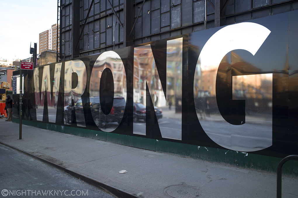
1)- “My Search For Edward Hopper’s Nighthawks Diner,” published July 29, 2019. Decades in the making, it’s hands-down my most read, most discussed piece.
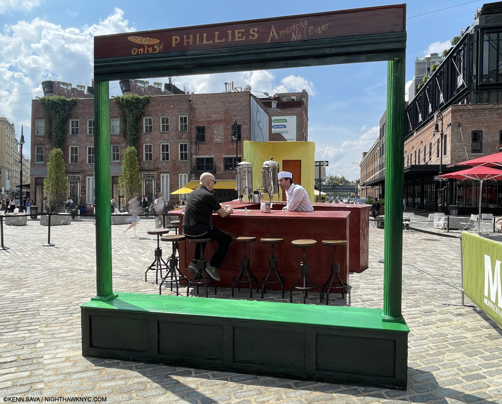
Update- On July 21, 2024, I finally found it! Meatpacking District, NYC. Kenn Sava, left, reenacting his Painted alter-ego, Logan, right. Photo by Nilo for NighthawkNYC.com. Continual Thanks to all involved & Kevin Callahan. Click any image for full size.
2)- “Vincent van Gogh: Home at Last,” published October 8, 2018. Preparing this piece on the reinstalled Van Gogh Masterpieces in the Permanent Collection of The Met suddenly took on an unexpected life of its own.
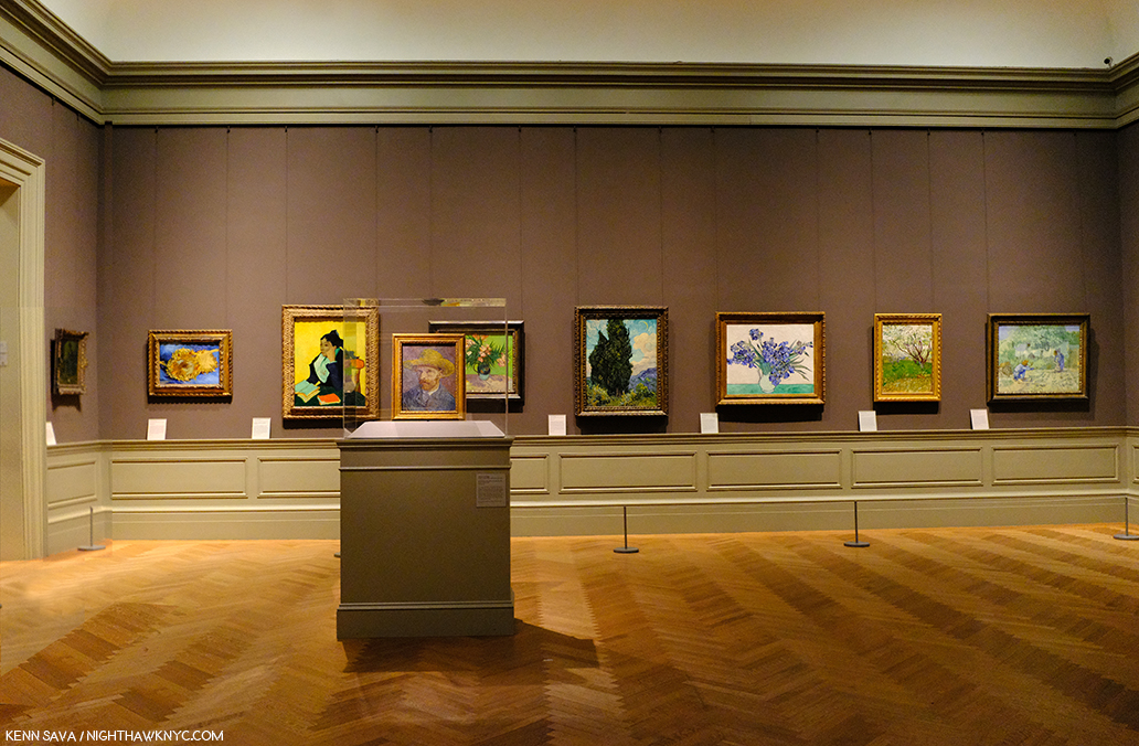
HOW great is it to be able to walk into a room and see THIS? For me, it’s one of the great joys of life in NYC. One part of the newly reinstalled Gallery 825 showing 9 of the 10 Van Goghs in this room. #10 is on the other side of the Self-Portrait with Straw Hat in the vitrine. This shot was available for literally one second over 3 visits and 3 hours I spent here. In the piece, you’ll see why.
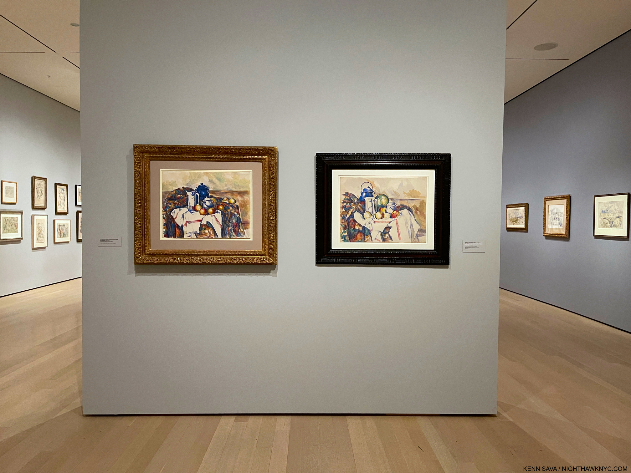
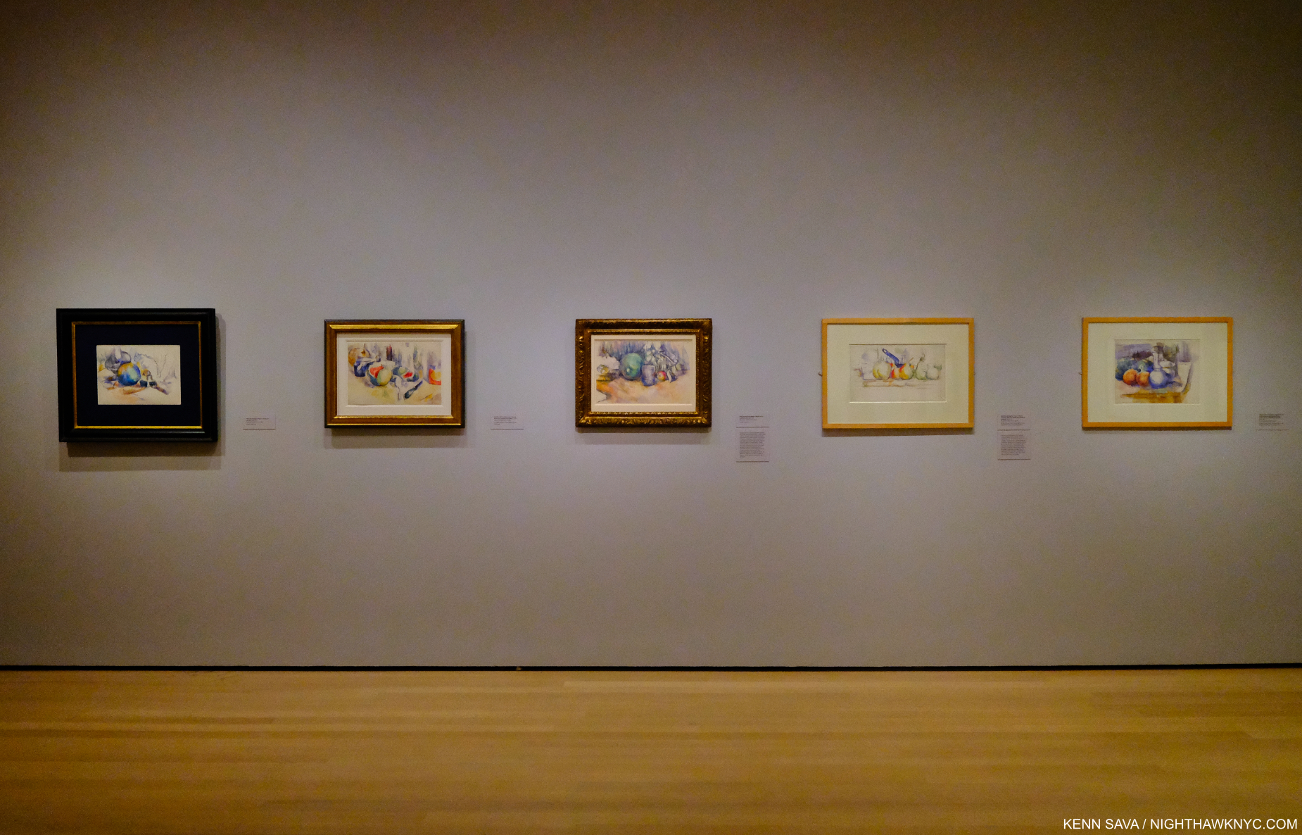
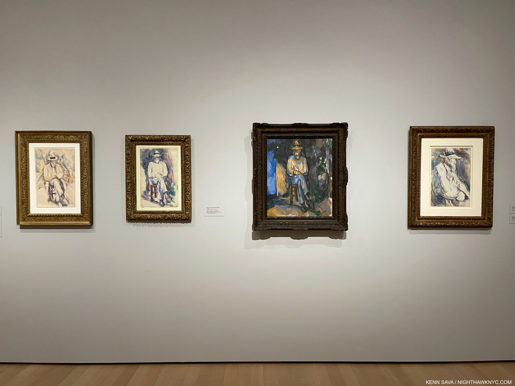
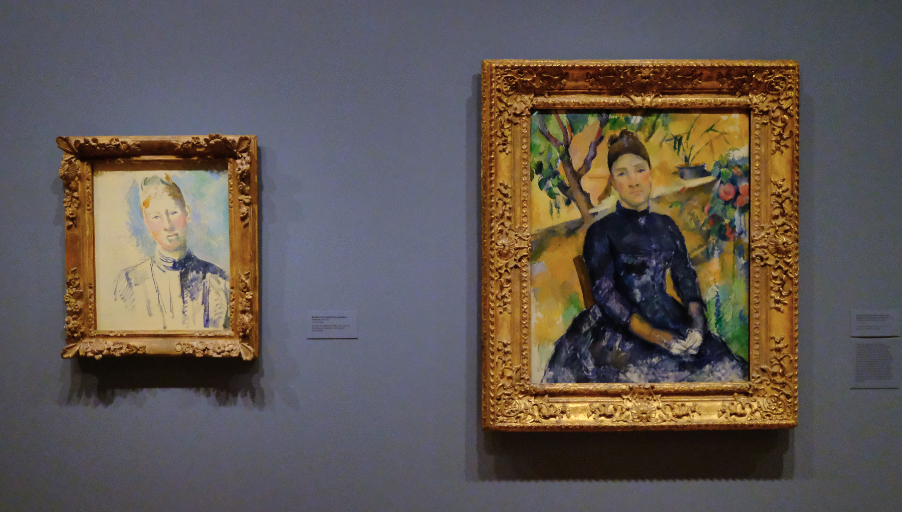
3)- “Van Gogh’s Cypresses: Art From Hell,” published November 10, 2023. With all due respect to The Met’s great curators, I saw their blockbuster Van Gogh’s Cypresses completely differently than they did, apparently.
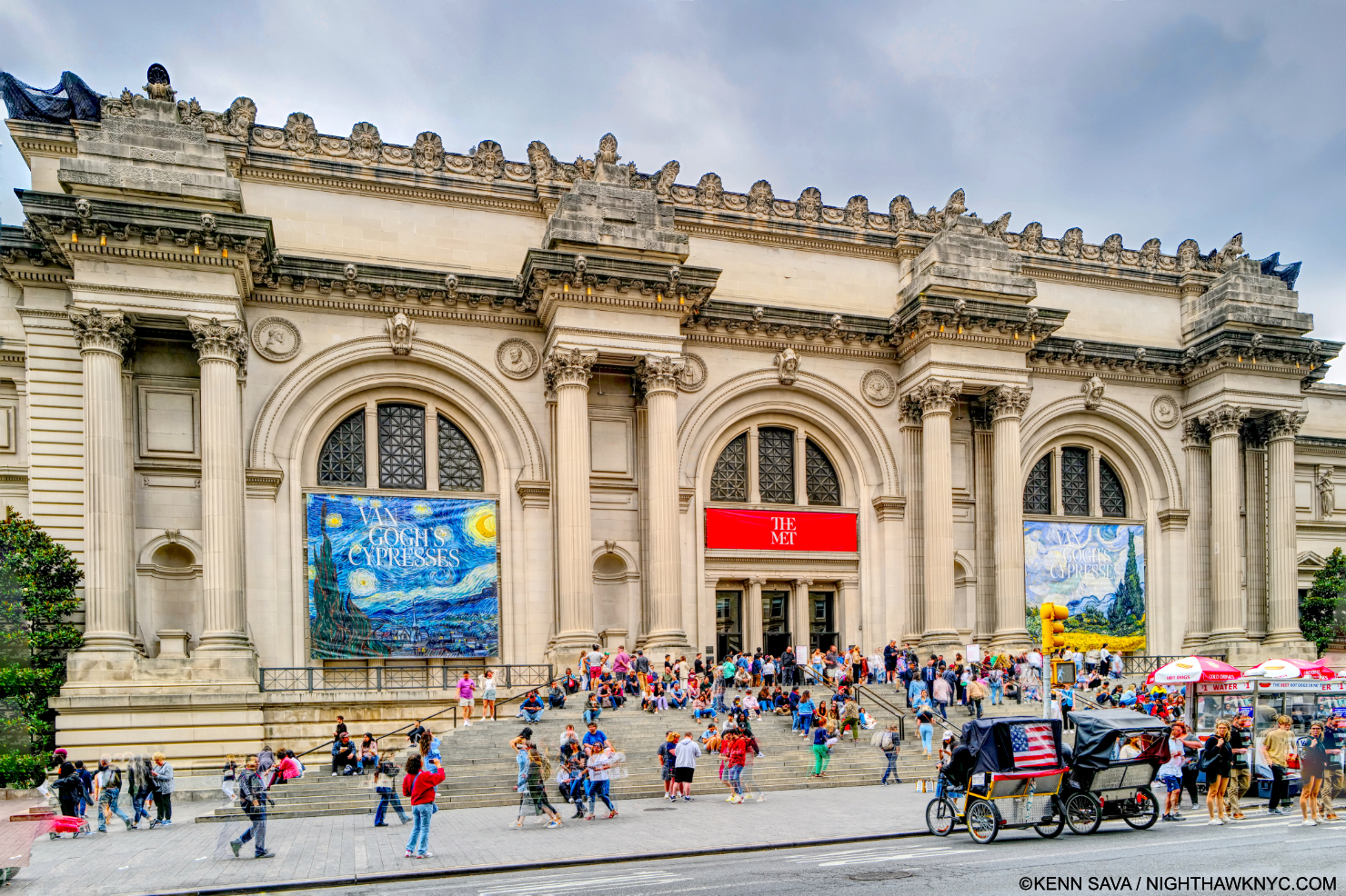
Welcome to The Met! In all my years of going to The Museum, as I call it currently 1,900+ visits since 2002, I’ve never seen TWO banners (left & right) up devoted to the same show. And, as I was soon to find out, it’s not like there weren’t other terrific shows going on! Seen on June 2, 2023.
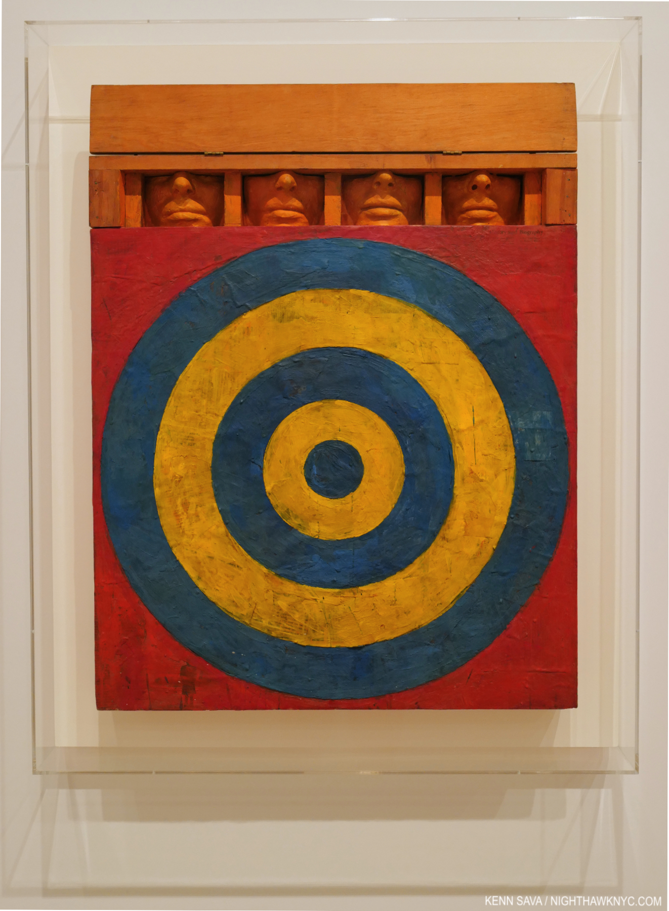
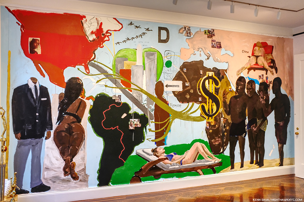
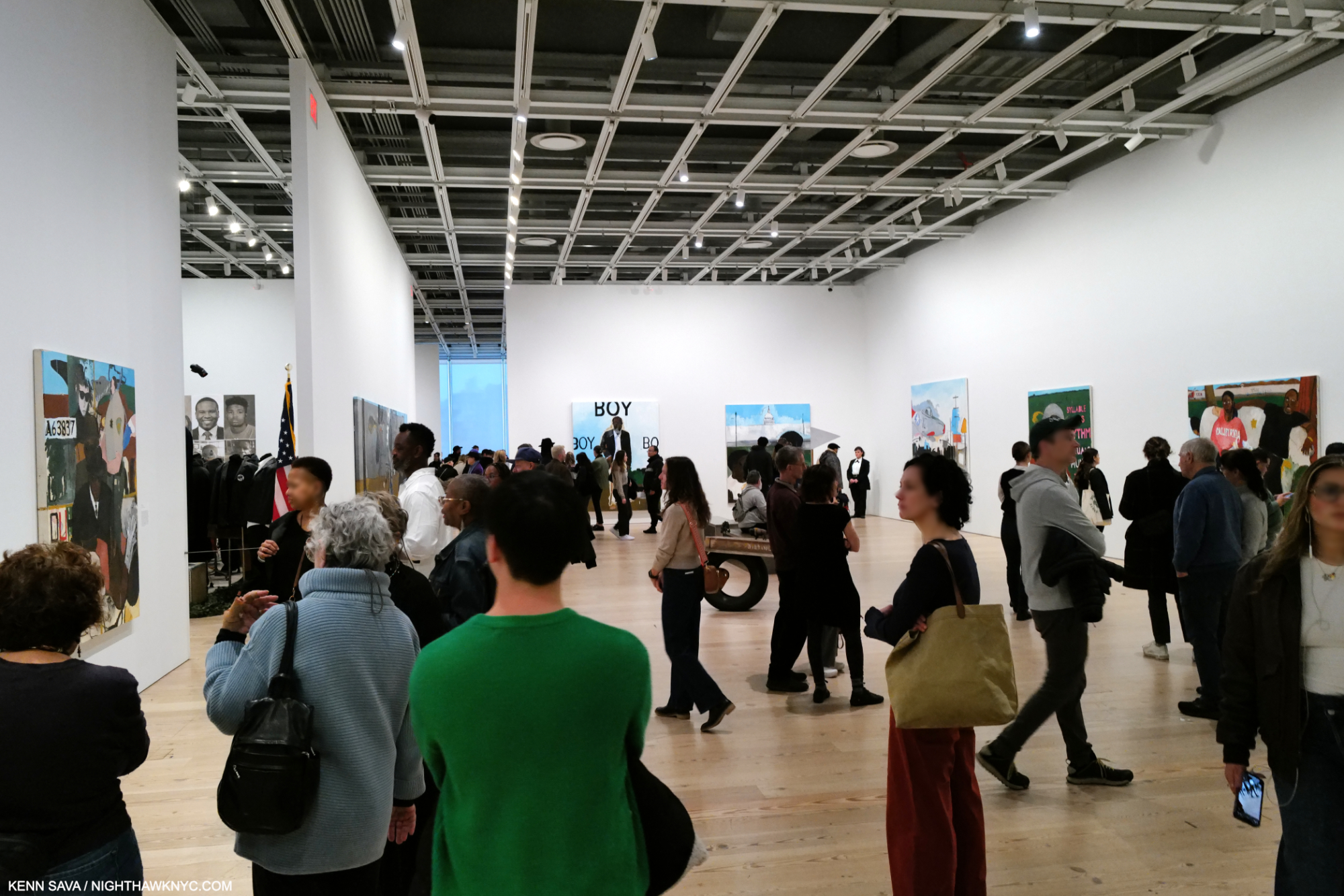
4)- “Kerry James Marshall: The Revolution Was NOT Televised,” published March 1, 2017. THE most everything Painting show I saw in NYC in the 2010s. Along with Hima af Klint: Paintings for the Future, the two most important Painting shows mounted here in the prior decade.
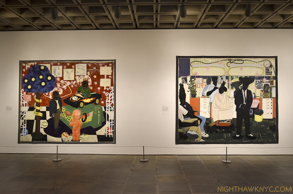
The finest moment, among many fine moments, in the all-too-short life of The Met Breuer. Installation view of Kerry James Marshall: Mastry. “De Style,” 1993, KJM’s barbershop, right, drips of life, fun, culture, individuality and style. On the left, his “The Lost Boys,” from the same year, a title borrowed from Peter Pan, is an homage to two children lost to gun violence, and all the boys who were “lost” to a variety of causes.
5)- “A Conversation with Photographer Harry Gruyaert,” Published September 22, 2018. Consistently among my most popular pieces, the renowned Belgian Photographer, and long-time Magnum Photos Member, discovered me through my “Saul Leiter: In My Room” piece and let his gallerist know he would be interested in speaking with me. A fan of his work, we spoke extensively via transatlantic phone. I discovered later how few interviews he has given.
Subsequently, I met Harry Gruyaert, far right, in 2020 at the opening of his first American show since 1990!
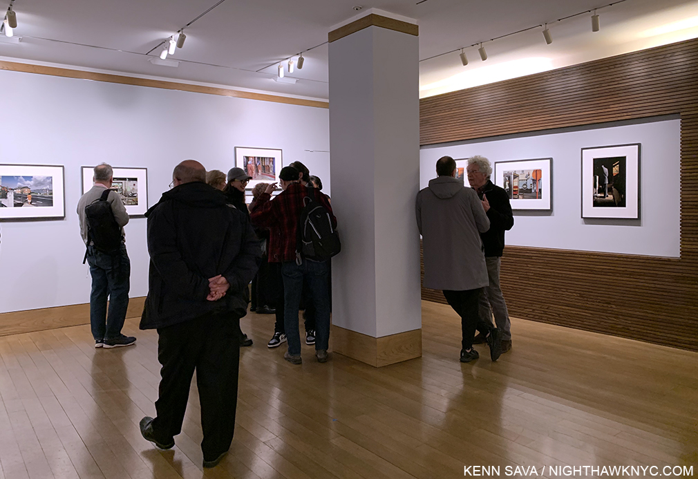
6)- “Rod Penner’s America: Small Town Nation,” published August 22, 2023. This piece, based on his most recent NYC show which continued to solidify Mr. Penner as one of the foremost Painters of small-town America working today, continued my coverage of the Texas-based Artist’s NYC shows, with my prior pieces linked at the bottom of it. At one point, I had written more about Rod Penner than anyone else had. Maybe I still have. Rod was also kind enough to do a Q&A with me in 2017.
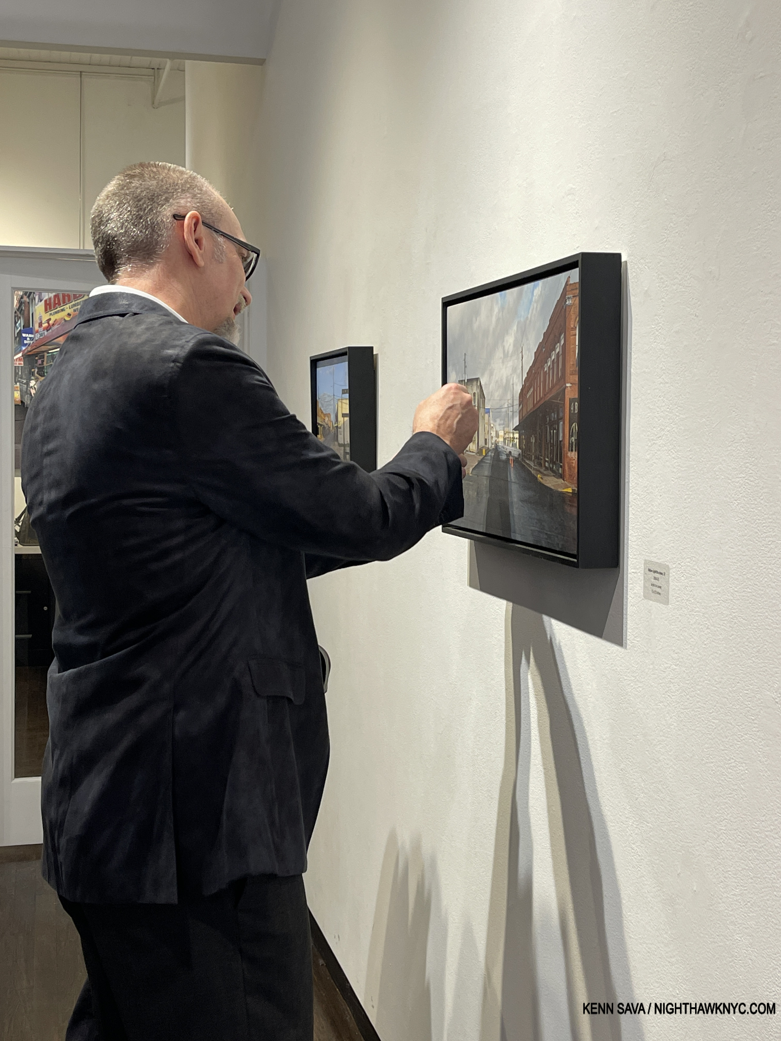
HOW does he do it? Rod Penner discussing one the very, very fine points of his Yellow Light/Brenham, TX, 2004-5, 15 x 25 inches, at his opening, March 18, 2023.
7)- “Henry Taylor: The Art of Empathy,” published March 8, 2024. Born of my unforgettable encounter with Mr. Taylor at the opening of his 2019 solo show.
Installation view, an hour and a half before Henry Taylor: B Side closed for the last time, Whitney Museum, January 28, 2024.
7)- “Gregory Halpern’s America,” published November 8, 2019. Perhaps my biggest discovery during my 8 3/4-year “deep dive” into Modern & Contemporary Photography, my look at all of Mr. Halpern’s books through Omaha Sketchbook (2019), includes a look at its NYC book release in 2019, later the same night of my encounter with Henry Taylor!
The very first work I saw by Gregory Halpern, “Untitled,” from his Buffalo series, seen at Aperture’s Booth at AIPAD: The Photography Show, April, 2017, I liked so much it’s been hanging on my wall since.
8)- “Raymond Pettibon: Artist Americanus,” published July 20, 2017. I was very fortunate to meet Mr. Pettibon and have him give me a tour of his Zwirner show, which I was thrilled about but also felt bad about because he was suffering from a quite damaged foot that caused him to sit the entire rest of the time he was at his opening. The show was also memorable as during its run I met Artist Caslon Bevington, whose work I’ve subsequently written about twice.
Playin’ hurt. The great Raymond Pettibon enters his show at the opening, April 29, 2017, with a cane. That small figure running in the distance is his son, Bo. Zwirner lent Raymond this space which he used to created the work you see on display. Quite a few paint splotches were to be found on the floor, leading me to think it must have been something to watch him creating these pieces.
9)- “Table for One: Patti Smith’s 18 Stations,” published April 17, 2016. I made about a dozen trips to Patti’s extraordinary Photography show and was shocked to walk in on the show’s last day to find the legend, herself, seated at the famous table she sits at on the cover of M Train signing books alone. She looked up, and realizing I was about to take her picture, cooperated. I then spoke with her, and wound up meeting her daughter as well. As the show closed, I found myself in the gallery with her as she walked through it one last time, trying to imagne what was going through her mind at each stop. I eternally regret not buying one of her Photographs. One of the Top 5 most-read and most-discussed pieces I’ve written.
What becomes a Legend most? The one and only Patti Smith sits at her famous table.
B)- “Community Service”
1)- “Art” With a Capital “A,” published February 26, 2020. I should have written it sooner.
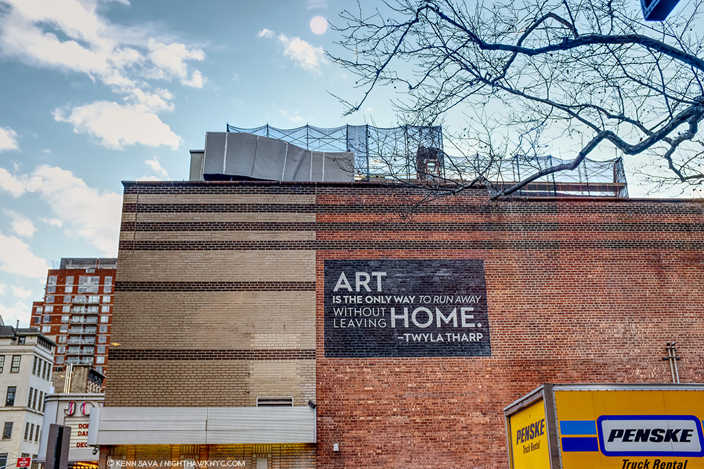
Thanks, Twyla! I couldn’t have said it better. And so, this scene has appeared in my Banner, sans moving truck, a number of times over the years. A look at ALL 41 of my banners this past decade is here. The Joyce Theater, December, 2019, as seen continually staring me in the face from my favorite seat in my beloved Starbucks on West 19th Street, the best SB in NYC. Another loss during the pandemic.
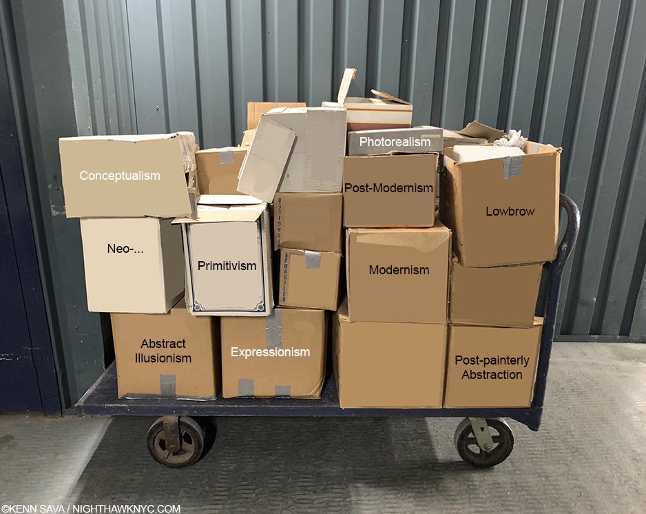
2)- “Death to Boxes!,” published on April 7, 2020. Another I should have written sooner. The problem has only gotten worse.
3)- “On Buying Art,” published on July 11, 2017. One I did write early on.
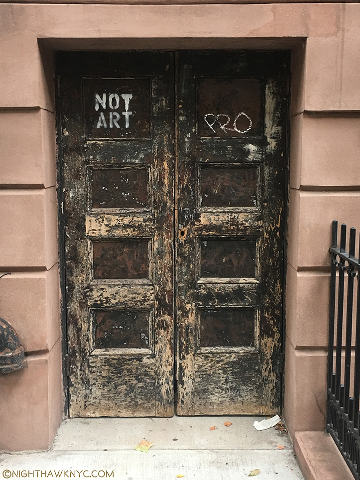
Knowing what not to buy is rarely THIS obvious.
C)- Milestones
“Oh, won’t you stay
We’ll put on the day
There’s a sun show every second”-*
1)- “Welcome to the Night,” published July 15, 2015. My very first piece!
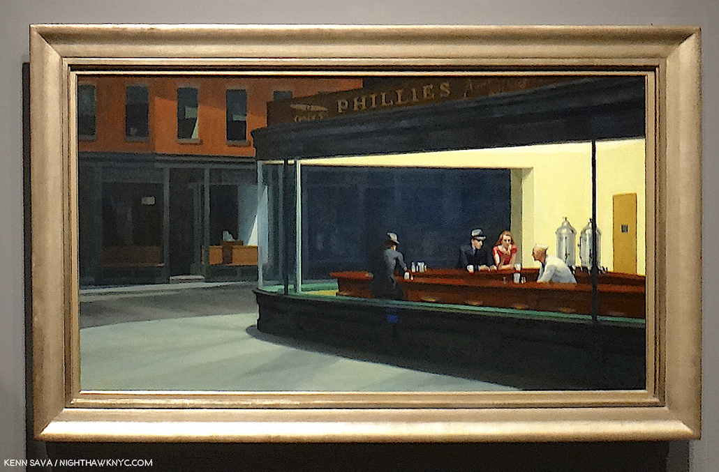
The last time I stood in front of Nighthawks, with my Painted alter-ego, dead center. August 28, 2013, at Hopper Drawing at the old Whitney Museum. Fun fact– I “borrowed” its frame for the frame you see in my banner! Shhhh…Don’t tell anyone.
2)- “Cancer Saved My Life,” published February 7, 2017, on the 10th Anniversary of my cancer treatment. My passion to share what I’ve seen & learned in the Art world comes from surviving with a 20% chance of making it through Year 1 post-treatment without needing more treatment. I’m happy to say 8 Anniversaries have followed- 18 in all! Miraculous.
Every cancer patient’s worst nightmare. During my search for cancer treatment, after much research and agonizing, I settled on a treatment. My life was saved by a Doctor who patiently explained why it was the wrong choice for me moments before I was to begin it. Unfortunately, there wasn’t a sign this big to guide me.
3)- “Kenn Sava Named a Finalist…,” published November 25, 2023. I was, and am, honored to be named a Finalist for the 2023 Andy Warhol Foundation Arts Writers Award out of the 500 writers they said they considered.
D)- Journeys
1)- Goya: In Boston & NYC, published January 20, 2016. In January, 2015, I made a day trip to the Museum of Fine Arts, Boston to see their exceptional Goya: Order and Disorder show. A few months later, I saw a show of his complete Los Caprichos at the National Arts Club, here.
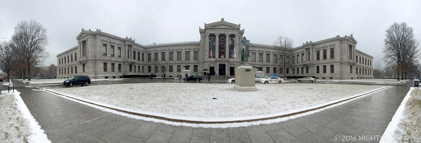
The Museum of Fine Arts, Boston in January, 2015, the last time I went out of town to see an Art show. Of course, I was back in my own bed that night.
2)- “13 Year At The Metropolitan Museum,” a 2-part series, the first part published on July 26, 2015. Though I’m in Manhattan, The Met is not exactly nearby. Nonetheless, I’ve managed to get there over 1,900 times since August 1, 2002. Some thoughts on it from 2015.
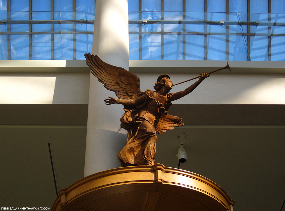
Hark! A Met Angel Beckons me to the Light. To not hear her call is my loss.
3)- “The Met Breuer: Hail, and Farewell,” published on August 1, 2020. I was there on March 8, 2016, the first Member’s Preview Day, and I was there the moment it closed for the final time on March 12, 2020. In between, I saw more great shows there than anywhere else, largely due to The Met’s terrific Contemporary Chairperson, Sheena Wagstaff, who I’ve also written about at length more than once.
March 12, 2020. I’m about to enter The Met Breuer for what I didn’t know would turn out to be the last time, on what would turn out to be its last day ever.
4)- “Exclusive! A Visit to Raymond Pettibon’s Moscow Show!,” published November 20, 2017. Lana Hattan was able to get an associate to go The Garage and shoot Raymond Pettibon’s 400-piece Moscow Retrospective, Raymond Pettiboyn: The Cloyd o’ Misreadyng,” for me! Though this was before the cessation of relations between the U.S. and Russia, I was unable to make it. Raymond Pettibon made it, though, and created another of his classic Hand-Painted Murals for the show. Given there have been very few large Raymond Pettibon shows since, I’m very thankful to the Hattan Group, who did a terrific job as you can see, for doing this for me, and enabling me to write about the show for NighthawkNYC readers! It’s the only show I’ve written about without actually seeing in person! It’s something you can’t see anywhere else.
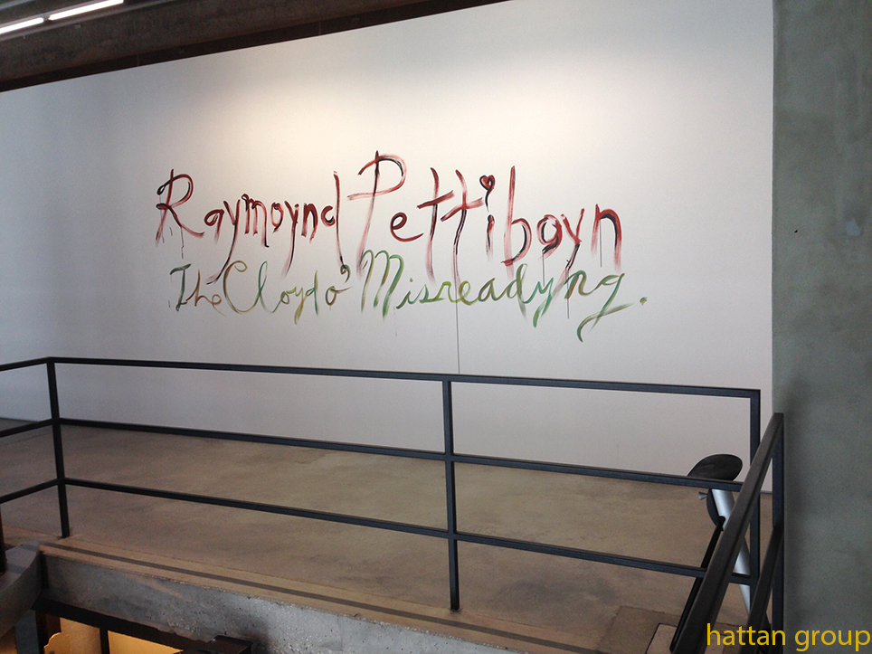
Live, from Moscow’s Garage! The show’s entrance features one of Raymond Pettibon’s famous hand-painted murals, around the corner from this sign. I hope the Russians are up on their “Pettibon English!” Photo by The Hattan Group for NighthawkNYC.com.
4)- “Antoine de Saint-Exupéry: Artist,” published on March 21, 2023. I’m self-taught at everything besides reading/writing and basic math thanks to a terrible school system and not being permitted to go college. As a result, I had never read The Little Prince, as hard as that is to believe, until Lana, whose favorite book it is, insisted I do. Of course, I immediately got hooked, like hundreds of millions of others have. We were lucky enough to attend the wonderful show of his work at the Morgan Library, and I returned there in 2023 for their show on the Art of Saint-Exupéry. The piece took on a life of its own after the French Ambassador to the U.S saw it and invited me to Washington, D.C. for a dinner he was hosting in honor of the 80th Anniversary of the publication of the book.
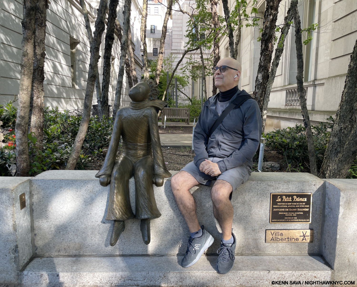
I join Saint-Ex’s most beloved creation in waiting for the return of his Asteroid. Hurry up, already! May 10, 2025. My thanks to the kind lady who took this.
E)- Epics
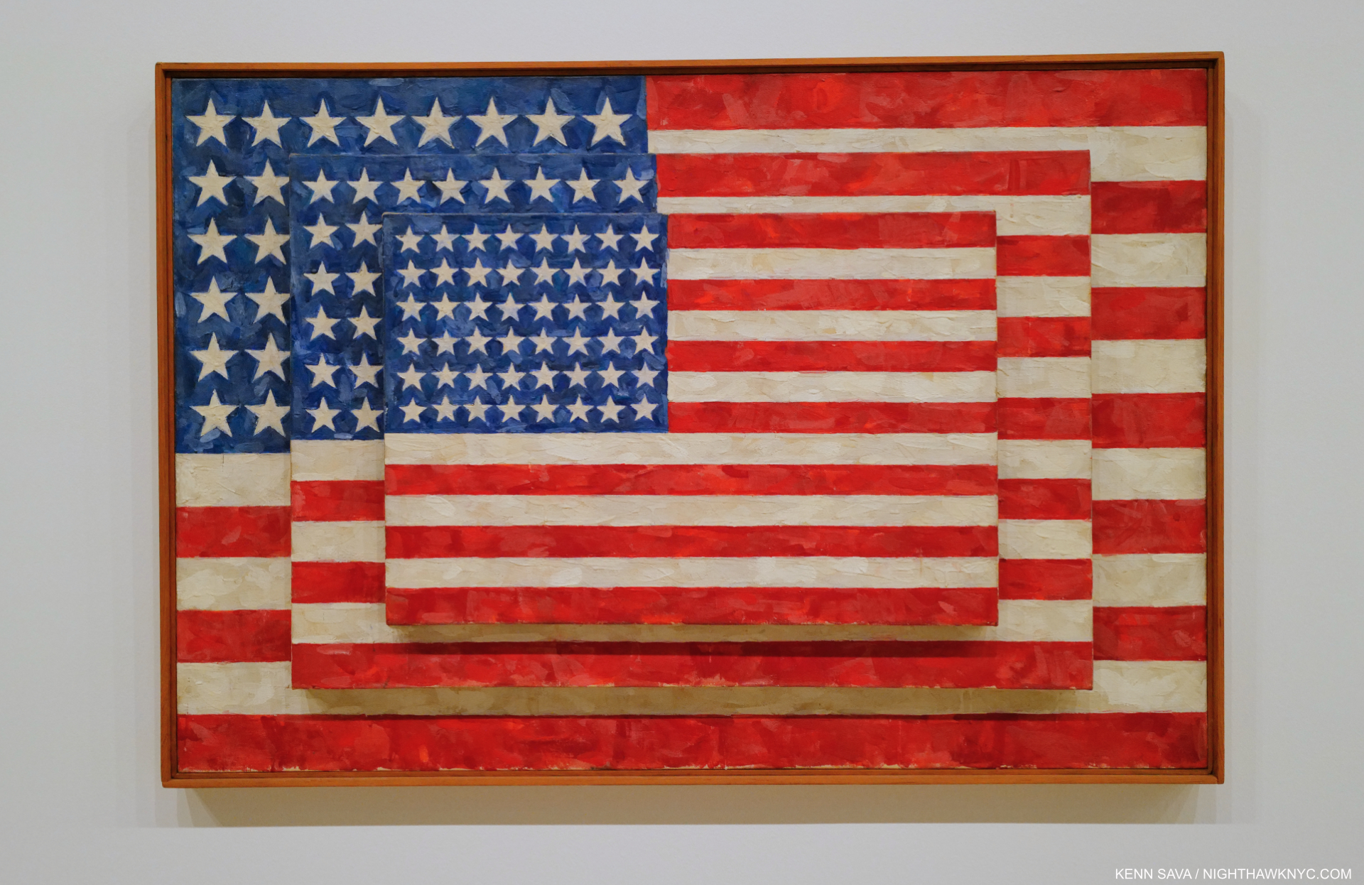
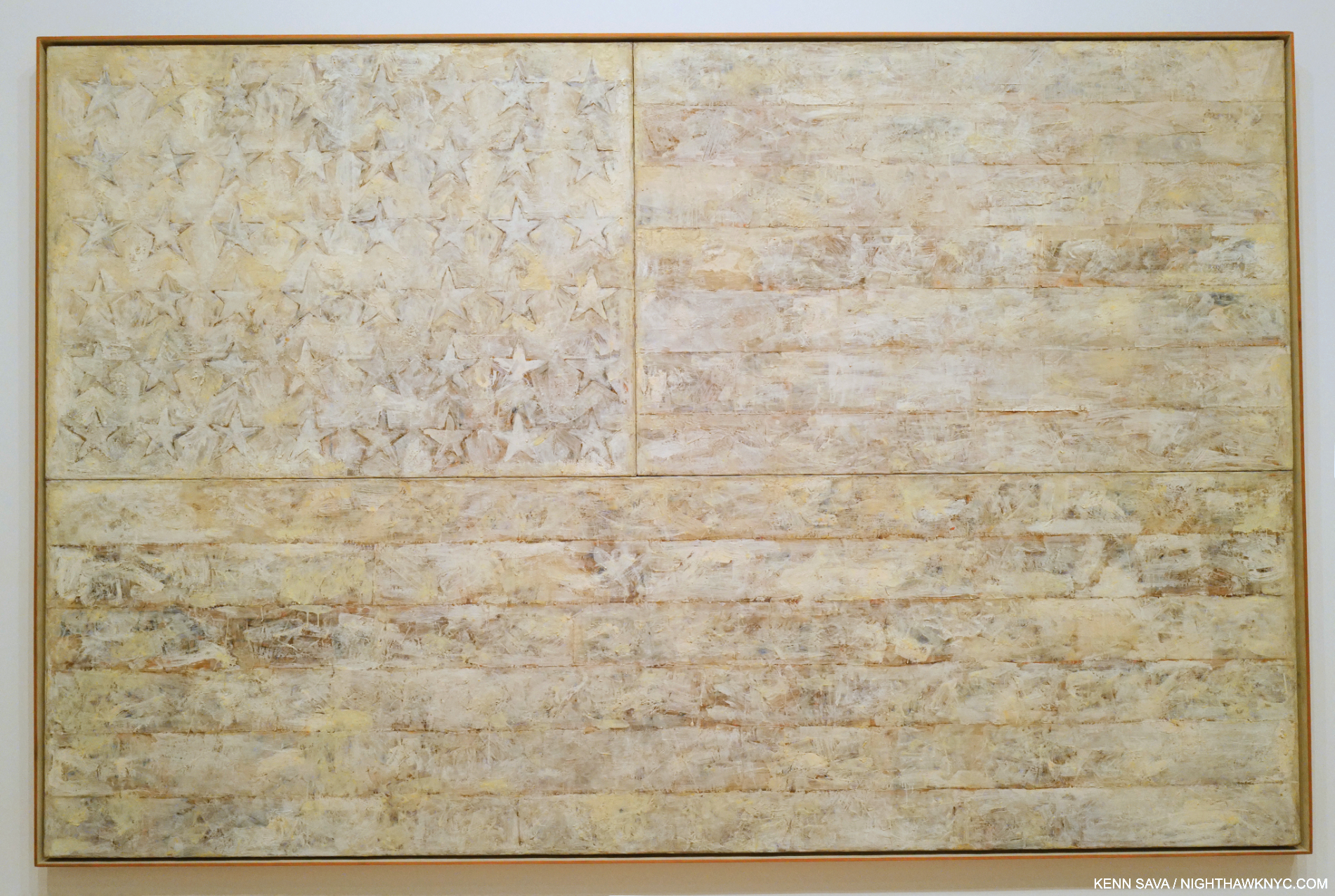
1)- “The New Whitney Museum: The Roofdeck of American Art,” published August 1, 2016. I worked on my look at the “new” Whitney Museum for over a year after having been a voice against the expansion of the old building. Now that it’s 10 years old, nothing has changed anything I said about it.
Nothing has changed except the Department of Sanitation complex in front of the museum, seen here in 2015, has been replaced with a park.
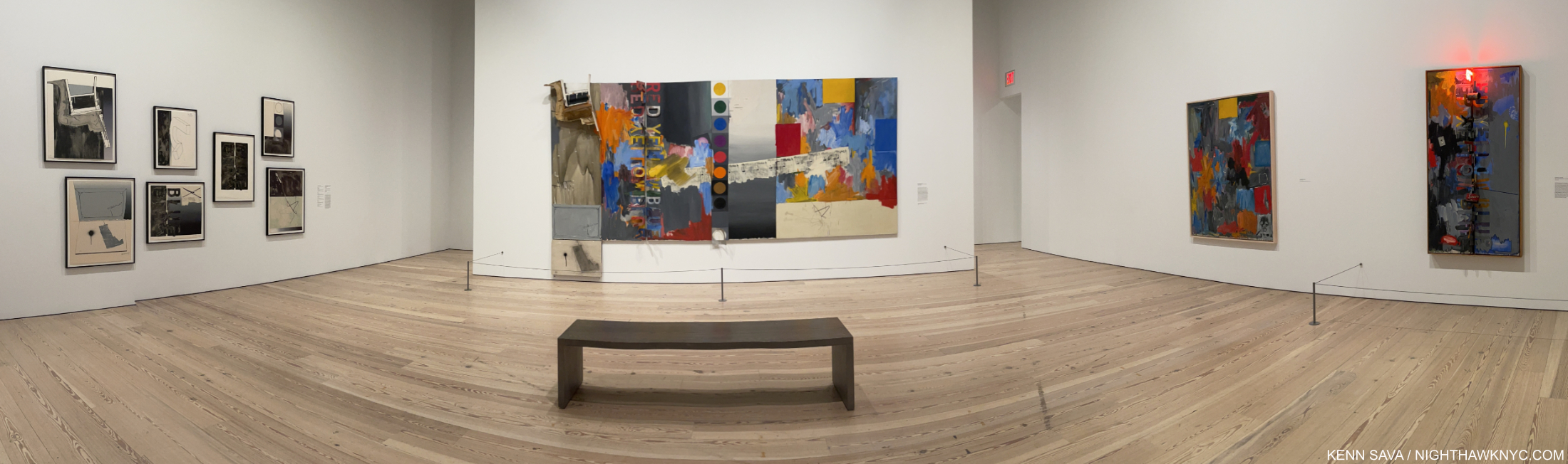
2)- “This Summer In ‘The Era of Rauschenberg,'” published September 19, 2017. I spent my summer going to MoMA’s Robert Rauschenberg: Among Friends (24 times) and the 4 Rauschenberg satellite shows going on around town. The Rauschenberg Foundation was impressed to the point that they invited me down for a private tour of their entire facility, his former studio, which was beyond an amazing experience for this long-time fan.
One nice note- The Rauschenberg Foundation informed Sue Weill, Aritst (and collaborator with him on Untitled (Double Rauschenberg), c.1950, Monoprint; Exposed blueprint paper, center) & former Rauschenberg girlfriend, about my inclusion of her in this piece and others, and told me she was pleased to hear it. Partial installation view of the first gallery of Robert Rauschenberg: Among Friends.
3)- “Richard Estes: Painter. With No Prefixes,” published May 22, 2022. I was surprised to see nothing else printed on the occasion of Richard Estes’s 90th Birthday, which I take as another reminder that the Art associated with “photorealism” is still not of interest to almost all of the world’s museums. I agree with them on most of it. Yet, (see my piece on boxes, above), some Artists have been stuck in this box, or other boxes, without their consent. I don’t quite see Richard Estes work the way many others seem to. My 3-part series, built on decades of looking at his work, addresses just this.
Kenn Sava, Homage to Richard Estes, NYC, May 27, 2020. Richard Estes was one of the first Artists to influence how I see the world. i.e. he helped open my eyes to the world around me everywhere!
4)- “Jean-Michel Basquiat at the Brant Foundation,” published October 6, 2019. Basquiat has been THE most popular Contemporary Artist for the entire existence of NighthawkNYC, yet, I didn’t know much about his work going in. When my friend, Kitty, told me about the Brant Foundation show, I decided to go, try and get up to speed on his work, and see what it said to me. As I sit here now, I’ve written more about Basquiat than any other Artist! And, I’ve seen more Basquiat shows since 2012 than I have by any other Artist. Both of those facts shock me. They just happened, primarily out of my desire to give his work as in-depth a look as I could. Along the way, I saw virtually every book ever published on his Art, and met and spoke with both of his sisters. The Brant piece is the first piece I wrote on his work. All the others may be seen doing an Archive search for Jean-Michel Basquiat.
Lisa at the Brant Foundation Basquiat show studying Self-Portrait with Suzanne, 1982. There I was, standing outside in the rain for a solid hour, without my umbrella which had gotten left in the cab, without a ticket on the show’s last day, having failed to get a press pass. A staff member who had tried to help me circled back around and told me a visitor, Lisa, had an extra ticket, which she was kind enough to give to this total stranger. Thank you, Lisa. You set in motion what would become an epic journey of Artistic discovery. And oh, by the way, I subsequently paid $45 to get into Basquiat: King Pleasure, the show mounted by his sisters, even though I was going to write about it for free. Did The New York Times pay to get in, too?
5)- “700.000 Michelangelo Fans Can’t Be Wrong“, published March 4, 2018. A labor of love born out of a dozen visits to The Met’s once-in-a-lifetime blockbuster that 700,000 saw. More an effort of trying to remember as much as possible of what I saw because I knew I’d never see it again.
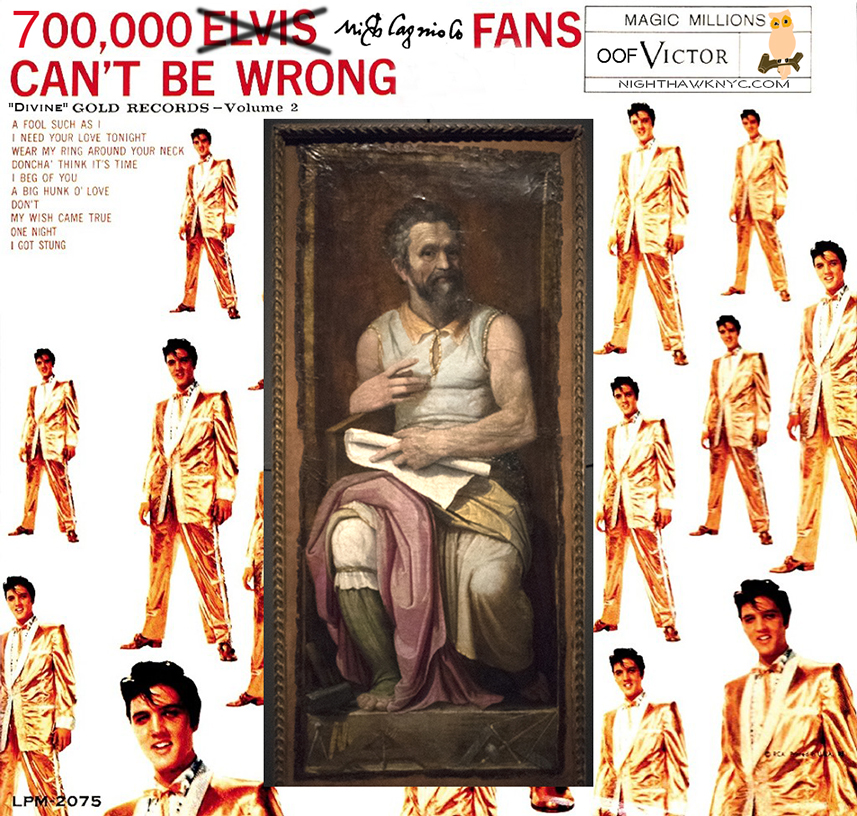
Take that, Elvis, who’s 1959 album title, and cover, I just borrowed. Michelangelo was the “King” of a different kind of rock. Old school rock.
6)- “A Year Without Art,” published May 7, 2021. Never in my wildest dreams did I ever think I’d go an entire year without being able to see Art! Well? In 2020-1, it happened.
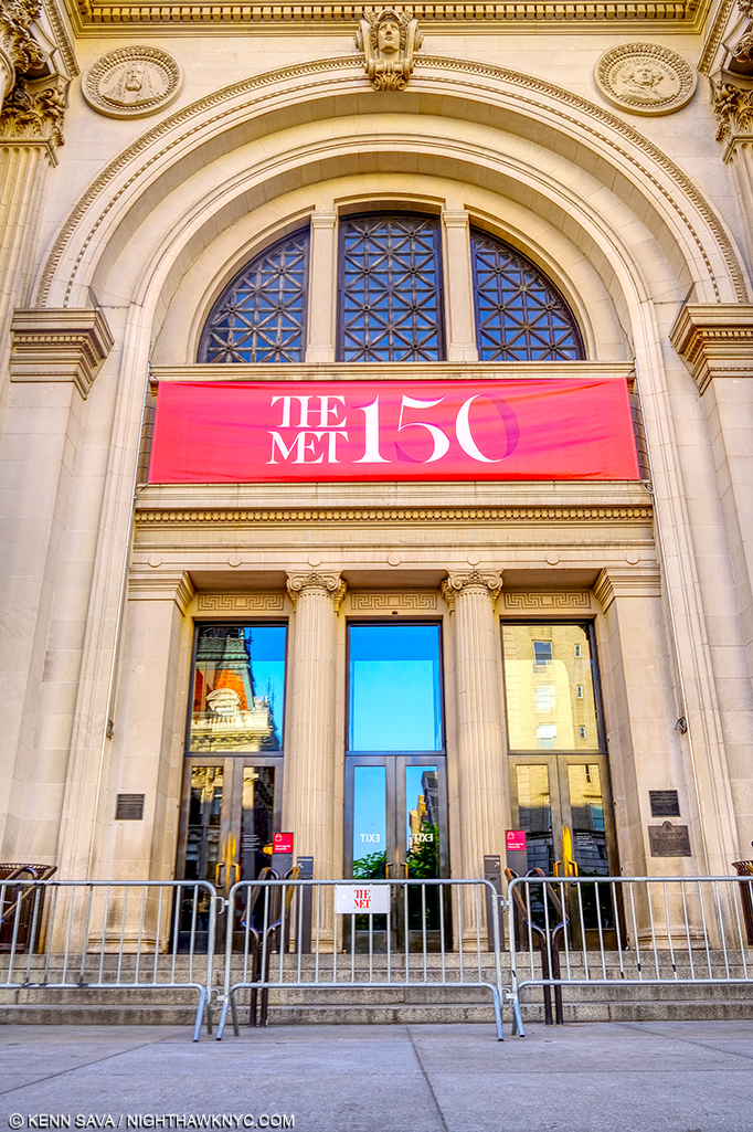
The Met’s famous main entrance, gated, during the 5 months it was closed, on May 21, 2020, unprecedented in my lifetime. Probably not the way they drew up celebrating their 150th Anniversary.
7)- The Photography Show, 2018, published April 23, 2018. I look back in disbelief at how much work I did around AIPAD, The Photography Show in 2018 and 2019. 4 part series on each…countless meetings with Photographers…endless looking all followed by months of work on the pieces. I didn’t make a dime doing it. I hope they appreciated it!
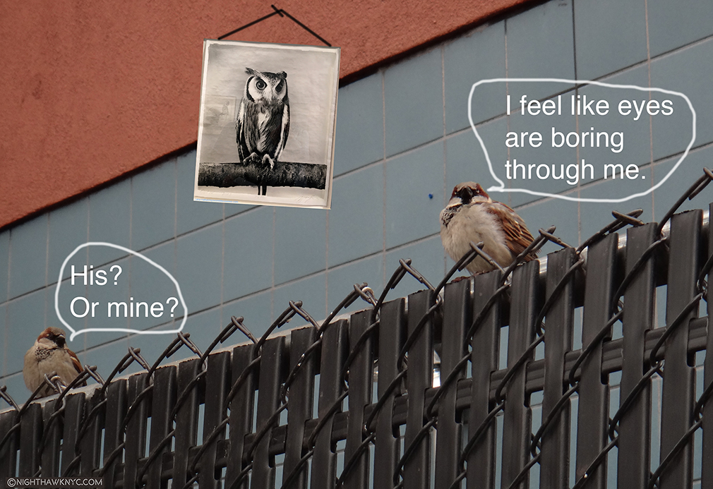
“On The Fence, # “The Wall Has Eyes” Edition. The Birdies, my fine feathered friends from their West 24th Street perch, that ran in my popular occasional featurette, “On The Fence,” for over a year. This one was included in my 2018 Photography Show series. I never replied to the reader who suggested I give up Art writing for “photo funnies” as he called them- until now. I’m still thinking about it…All installments of “On The Fence” are here.
8)- “Ai Weiwei & The Value of One Refugee“, published January 7, 2017. The centerpiece of a group of 4 2016 Ai Weiwei shows, Ai Weiwei: Laundromat was a show unlike any other I saw this past decade, Ai & his team collected clothes, shoes and other artifacts left behind by refugees in the various camps he visited during the European Refugee Crisis and arranged them to compelling effect achieved in concert with countless Photos on the walls he took documenting what he saw and reproductions from media and social media accounts under foot. I wrote about all 4 of the shows, but Laundromat has lingered long in my memory. It was hard to visit the show and not think of Ai’s own experiences, which made him an almost ideal witness.
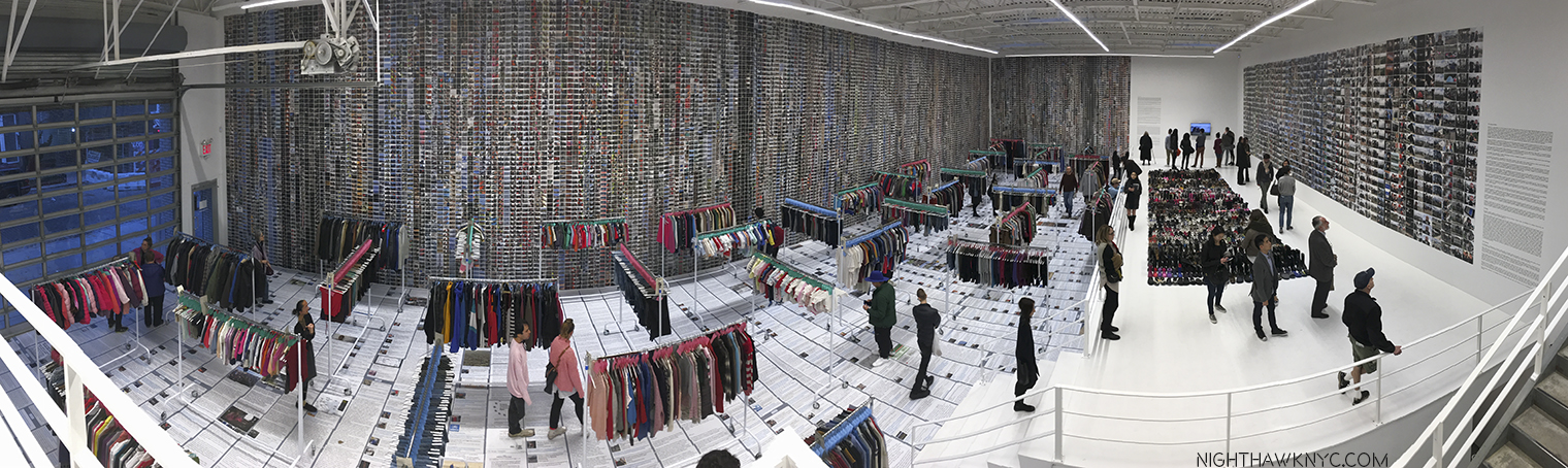
Birdseye view of almost the whole show.
9)- “Edward Hopper’s Impressions of New York,” the first of 3 pieces on the show published May 5, 2023. Wait. Who else has written multiple pieces that look at different aspects of one show? Maybe someone else has. I haven’t seen it. That’s exactly what I did for the blockbuster Edward Hopper’s New York at the Whitney, AND for MoMA’s Ed Ruscha/Now Then.
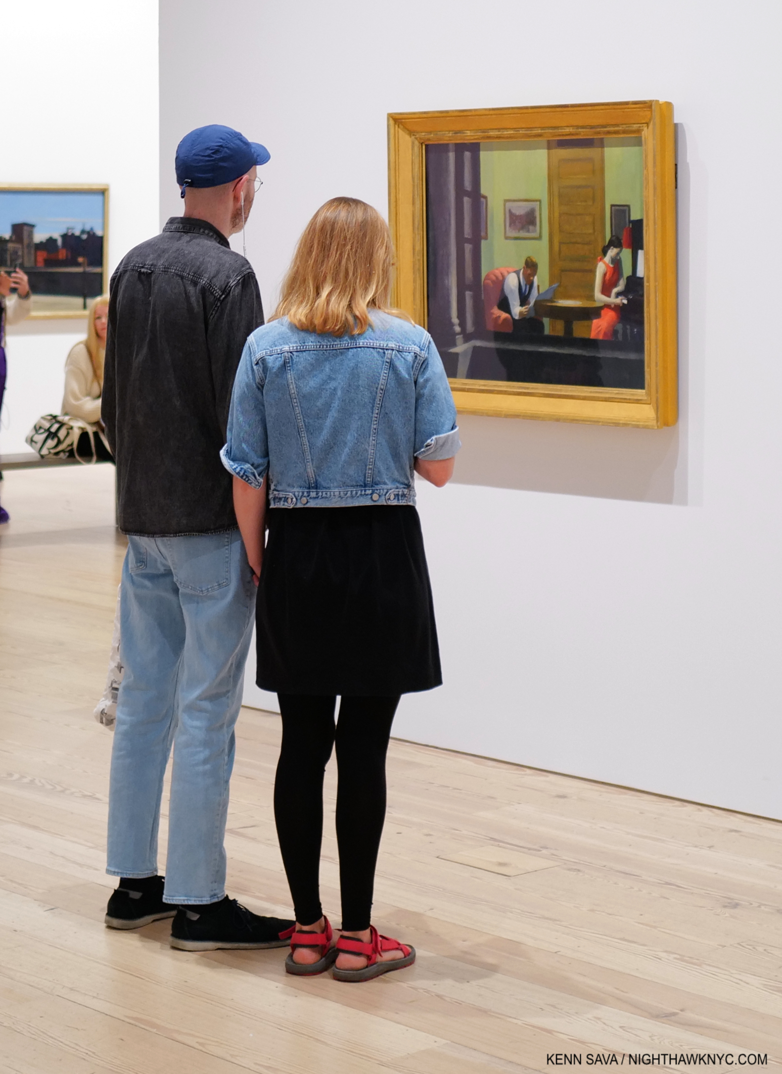
Edward Hopper’s New York, October 27, 2022.
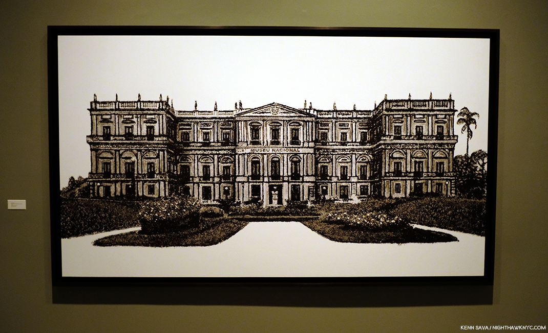
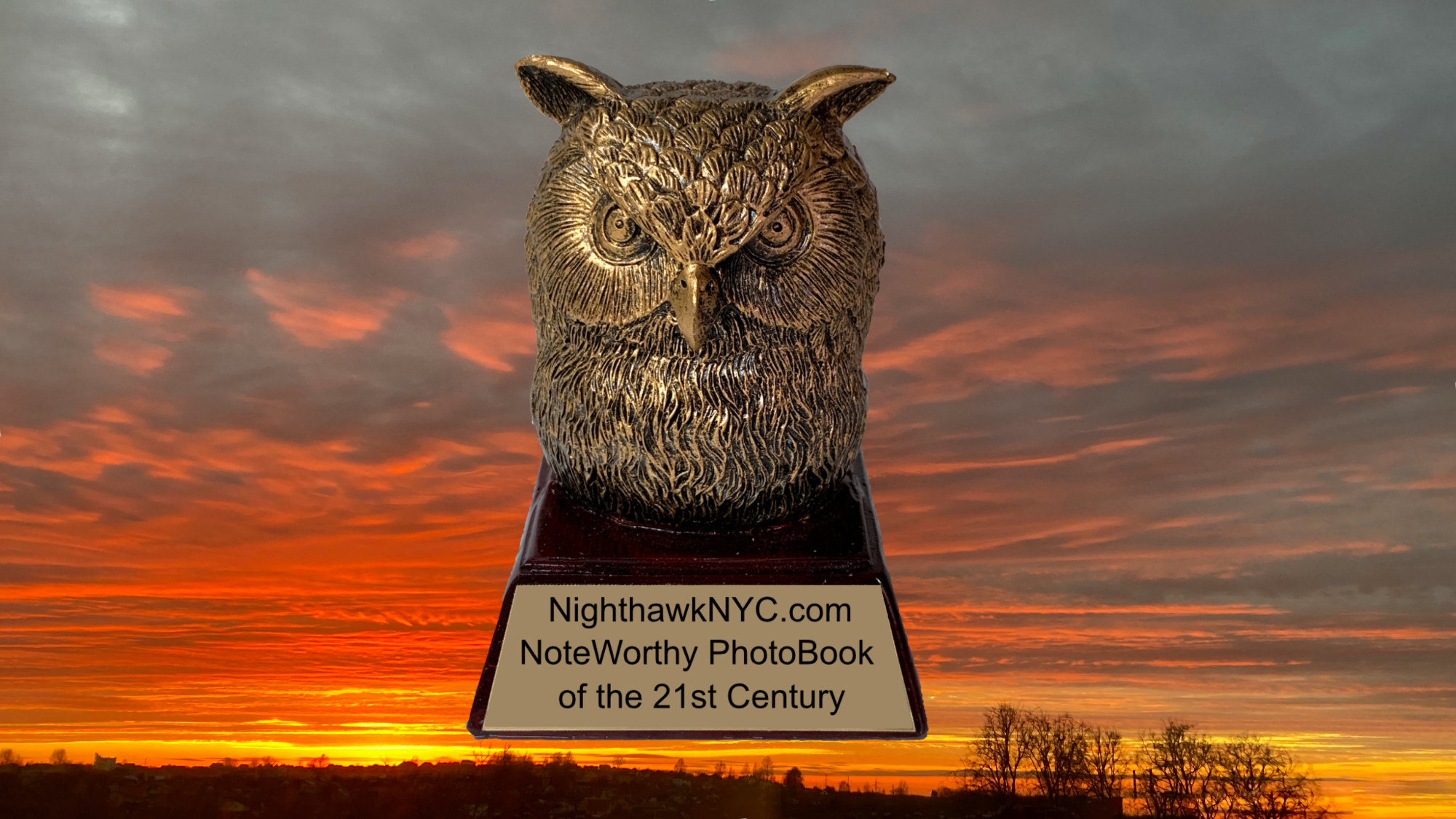
10)- “NoteWorthy Art Books of the 21st Century,” published June 10, 2025. This, and NW PhotoBooks, the two biggest pieces I’ve ever written, represent my sharing what I’ve seen and learned over the past 50 years I’ve spent looking at Art books, and almost a decade of intensively looking at PhotoBooks. Having begun them last September, right before I announced I was taking a break, they kept gnawing at me in a “You HAVE to finish these!” way. The Epics of Epics on this site, an immense amount of looking and consideration went into both pieces. Usually, I worked on up to 4 pieces at a time. I can’t imagine working on anything else in the 10 months it took to write these.
That makes me wonder- Has anyone else (any other single person) written a list of recommended 21st Century Art Books AND a list of 21st Century PhotoBooks?
The Introduction to both pieces is here.
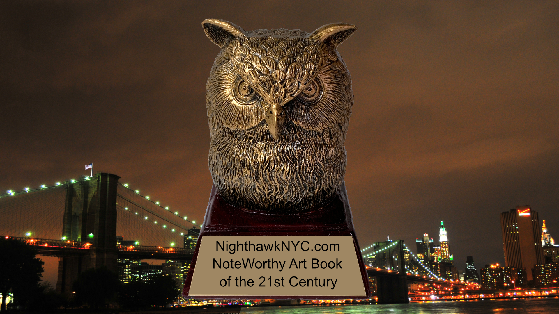
The “Golden Oof,” named for my Avatar.
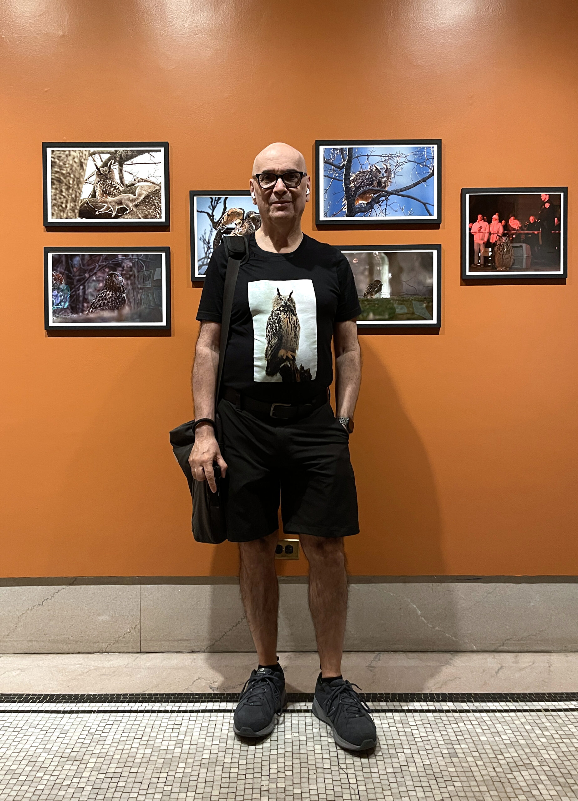
11)- “NoteWorthy PhotoBooks of the 21st Century,” published June 25, 2025. Marks the end of my “deep dive” into Modern & Contemporary Photography that I began in December, 2016- There I just said it.
[A moment of silence.]
What did I learn from all of that? I stand by what I said here in 2019.
This “Painting guy” is going back to focusing on Painting. You heard it first.
NoteWorthy Sunset Photo by Lana Hattan.
Part 2- Where I’m Going
“Oh, won’t you stay
We’ll put on the day
And we’ll talk in present tenses”-*
1)- NighthawkNYC/Kenn Sava’s Art writing
I’m sorry to say that nothing has changed since I announced I was taking a break in September, 2024. There remains no means of support for independent Art writing. Surviving remains my #1 to #10 priority. I continue to work on the site remaining up. If something changes? I’ll let you know.
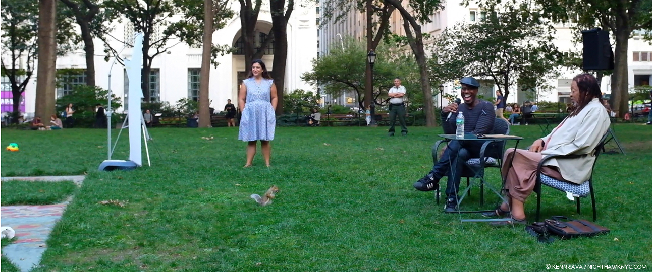
Flaco Lives! Kenn Sava at The Year of Flaco exhibition (in a Flaco T I had made last year), in front of a section of Photos of him early on in his freedom. The picture far right was taken right after he escaped from the Central Park Zoo. After never having been outside in his entire life, he suddenly found himself on Fifth Avenue & 60th Street! Maybe that’s why I’ve never seen a picture of him with his eyes so wide open. New York Historical, July 3, 2025. My piece on Flaco, written about a month and a half before his tragic demise, is here. My Thanks to Marybeth Ihle of the New York Historical.
2)- Kenn Sava, Producer
I’m hoping to re-release The Fuschia by Thomas Chapin, Peggy Stern, Drew Gress and Bobby Previte this year, and also finally release my solo album Strawberry Fields Forever.
Though I produced both projects, releasing and re-releasing them is not about me. Both were recorded in the mid-1990s, and, sadly, since then a number of the great Musicians who participated in them have passed away. I feel a sacred duty to them to get their work out there/back out there. Stay tuned.
Coda- Before I “Go” Anywhere…
I started this site for one reason- To share what I’ve been lucky enough to see & experience in NYC and in Art & books with my fellow Art lovers around the world. I had a lot of passion, but no business plan.
While doing NighthawkNYC has been quite the financial hardship, I’m proud of the fact that readership has gone up each and every single year. Thank You to everyone who’s read one, or all, of my 350+ pieces here this past decade.
I especially want to Thank those of you who have made donations or bought pieces of my collections to help keep me going! For the rest of you, if you find, or have found, what I’ve done here since 2015 worthwhile, YOUR support is needed to keep this site up, and possibly, enable me to write more.
When the curtain closes
And the rainbow runs away
I will bring you incense
OWLS BY NIGHT (Caps mine ; ) )
By candlelight
By jewel-light
If only you will stay
Pretty baby, won’t you
Wake up, it’s a Chelsea morning”-*
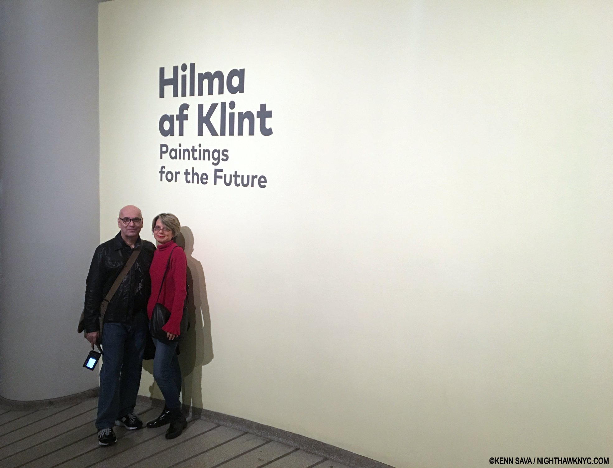
With Lana Hattan at Hilma af Klint: Paintings for the Future, the most recent show we’ve been able to see together at both of our favorite NYC building- The Guggenheim Museum. New Year’s Eve, December 31, 2018. My Undying Thanks to the woman who approached us and insisted she take our picture.
Finally, Thank You to Lana Hattan for pushing me to start writing about Art, and for your continual support through some thick and a lot of thin, every step of the way.
As I’ve said before, if you’ve found ANYTHING I’ve done here worthwhile, she’s the one who deserves your thanks.
As for me? I MADE IT TO 10 YEARS!
Kenn Sava.
July 15, 2025
P.S.- Feel free to drop me a line and let me know if I left out a piece you found particularly NoteWorthy.
For more- Check out my look back at “A Decade of NighthawkNYC.com Banners,” which have uncannily come full circle, here!
*- Soundtrack for this piece is “Chelsea Morning,” by Joni Mitchell, referencing her apartment 5 blocks from where I am writing this, and where I’ve written all of the 350+ pieces on NighthawkNYC. Joni moved here in 1967, before my time here, and proceeded to write a number of her early songs here. Just another of the Legends who’ve lived in my neighborhood, like Patti Smith. She performs it here in 1969-