Jennifer Packer Arrives

Written & Photographed by Kenn Sava

Art in NYC, 2021, Part 2-

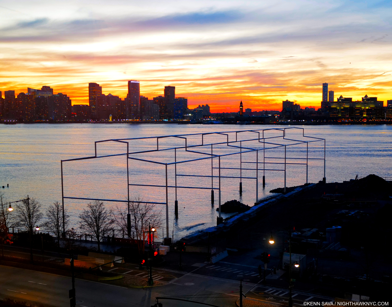
David Hammons, Day’s End, 2021, a permanent installation, which opened in May, 2021 on the Hudson River on the former site of Pier 52, which the great de-constructivist Artist Gordon Matta-Clark once “modified” into a work also called Days End in 1975. Appropriately seen here at day’s end, December 23, 2021.

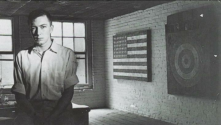
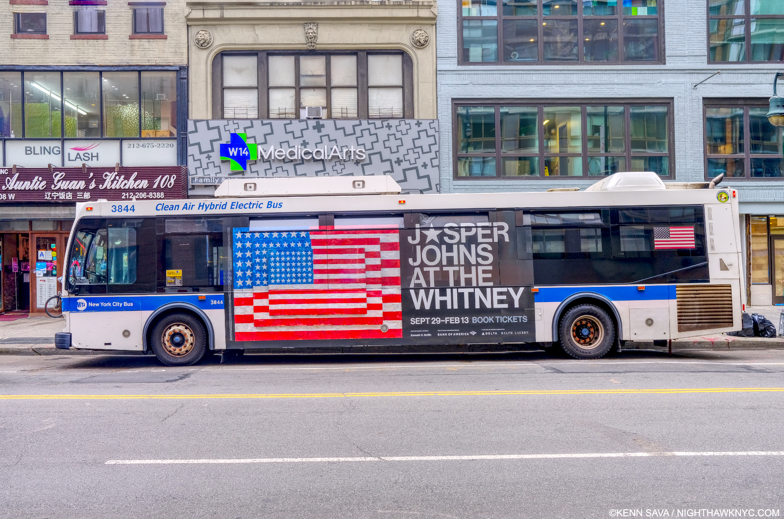
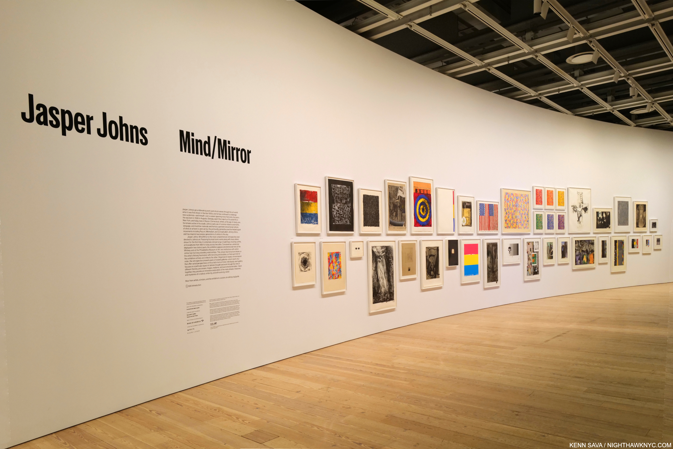
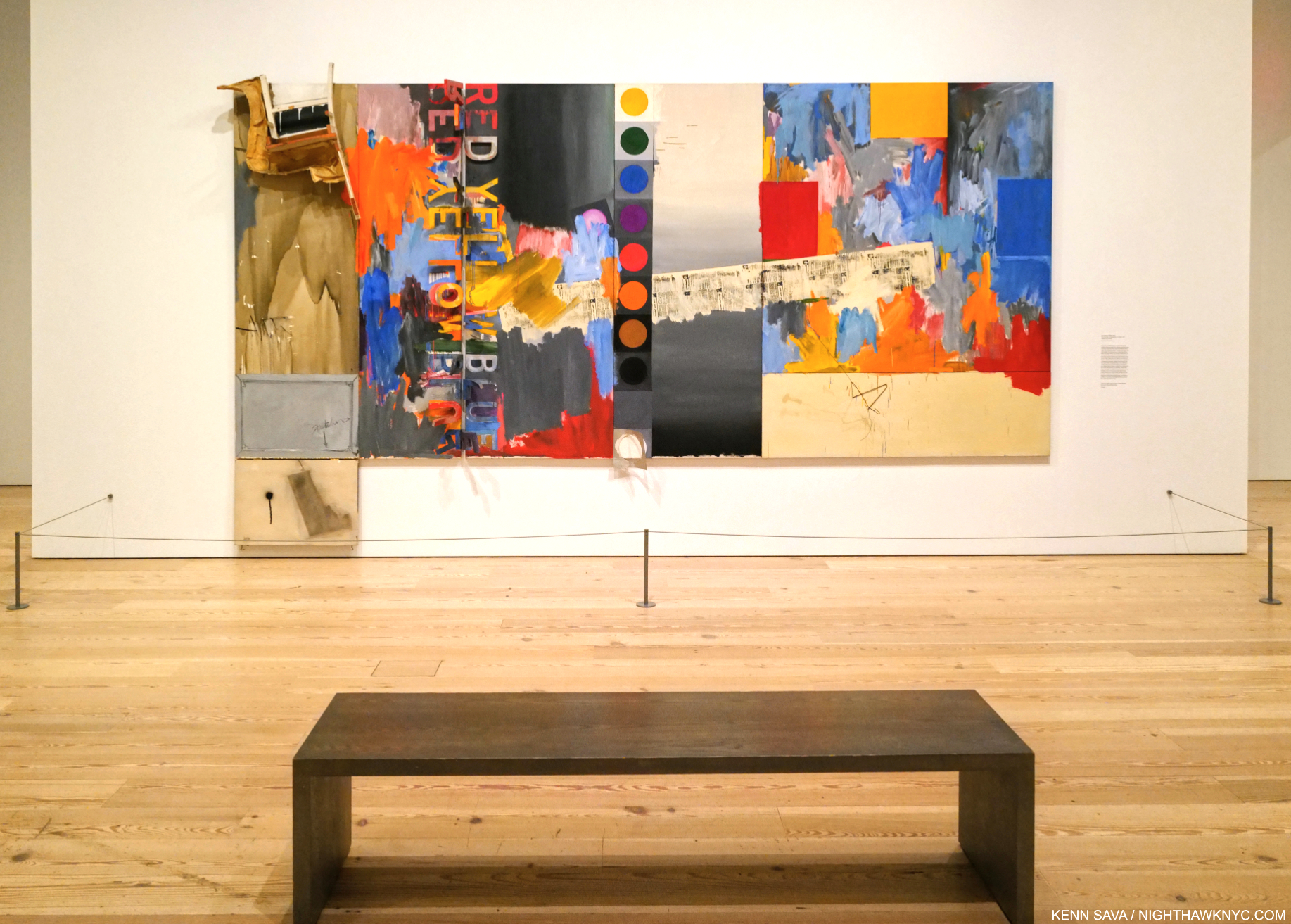
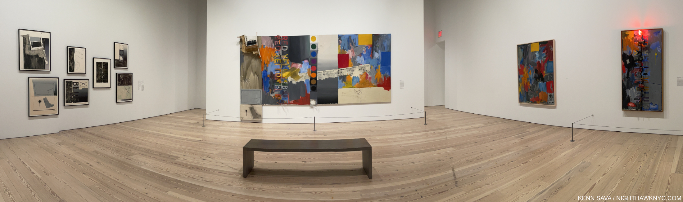
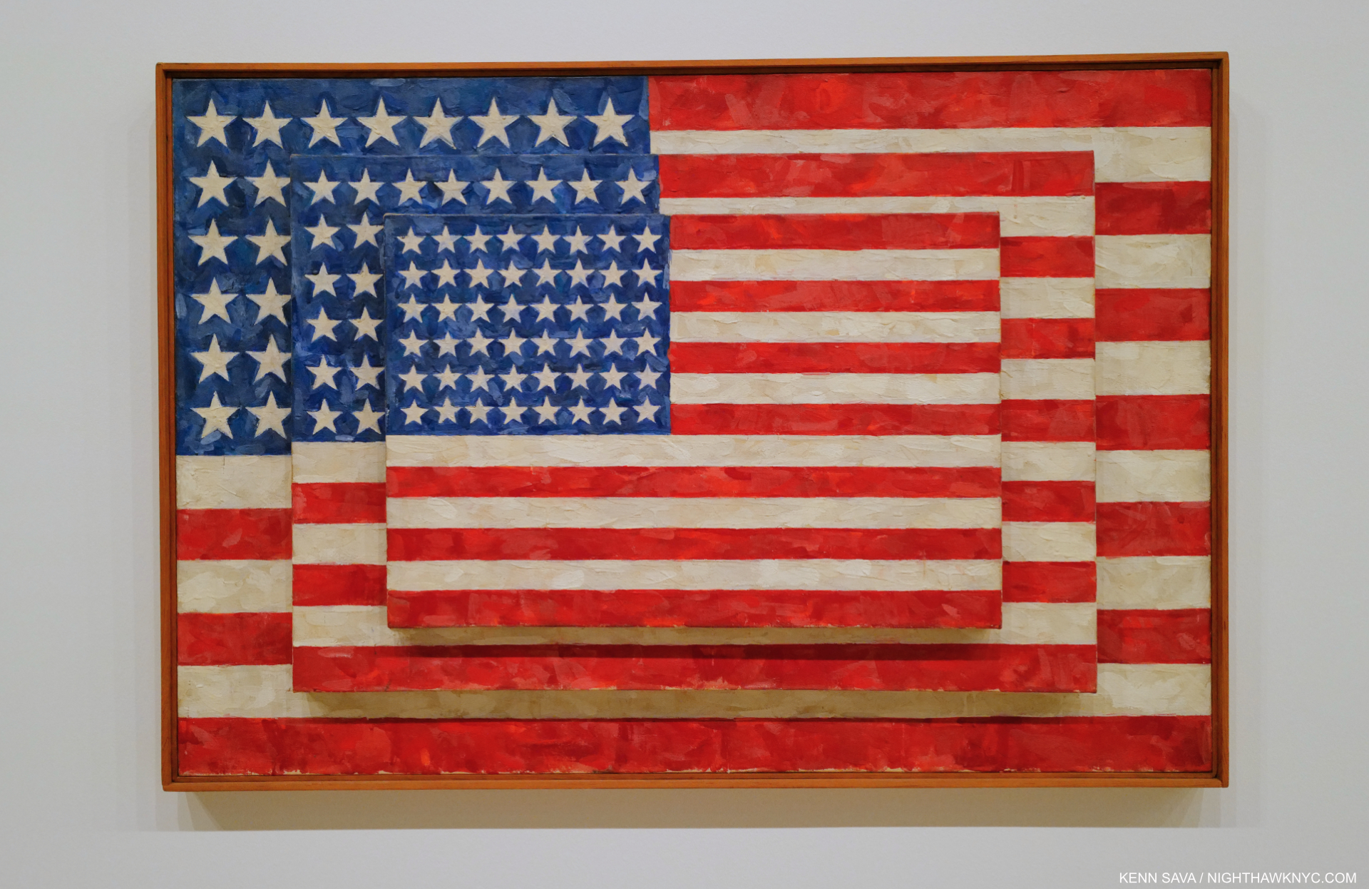
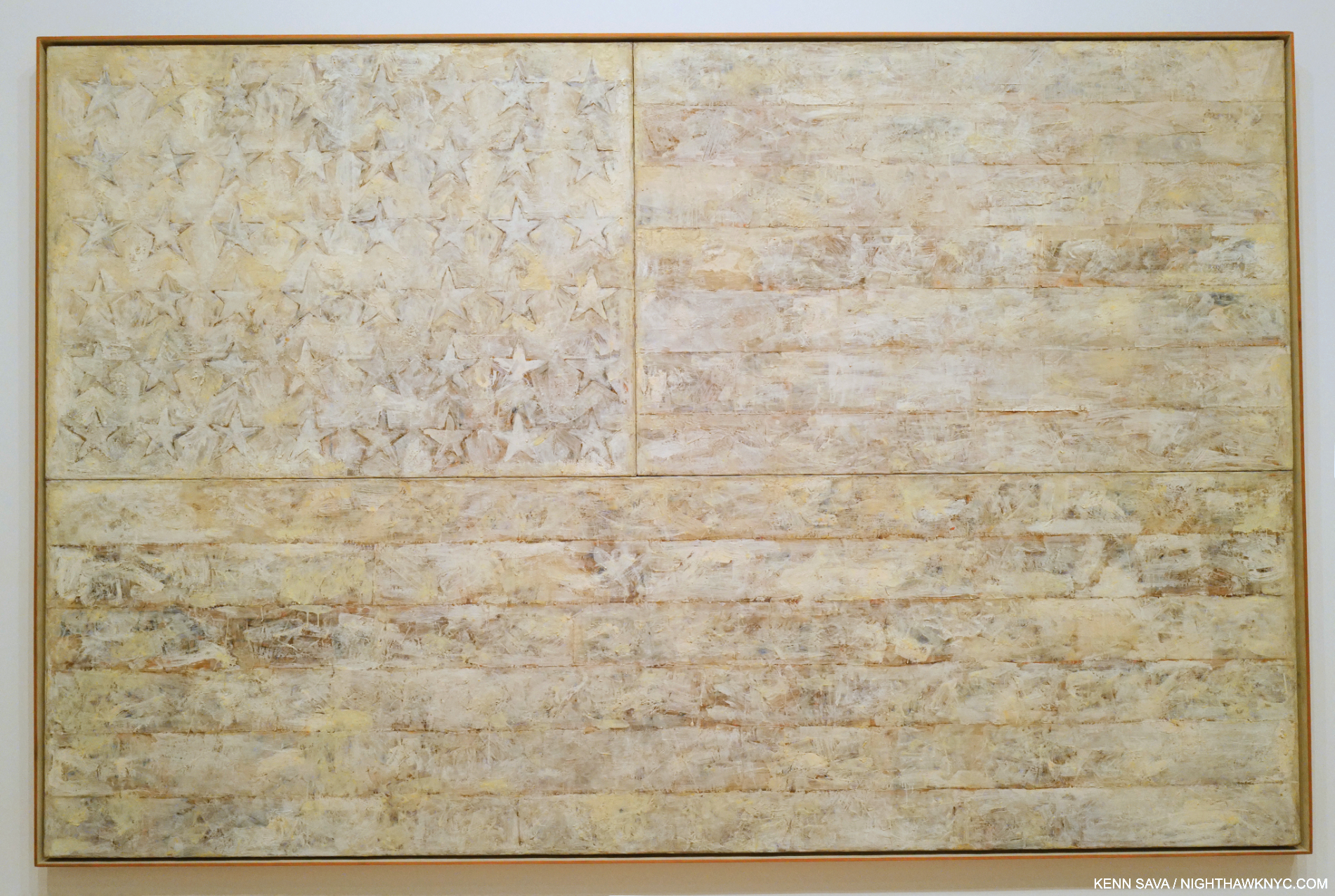
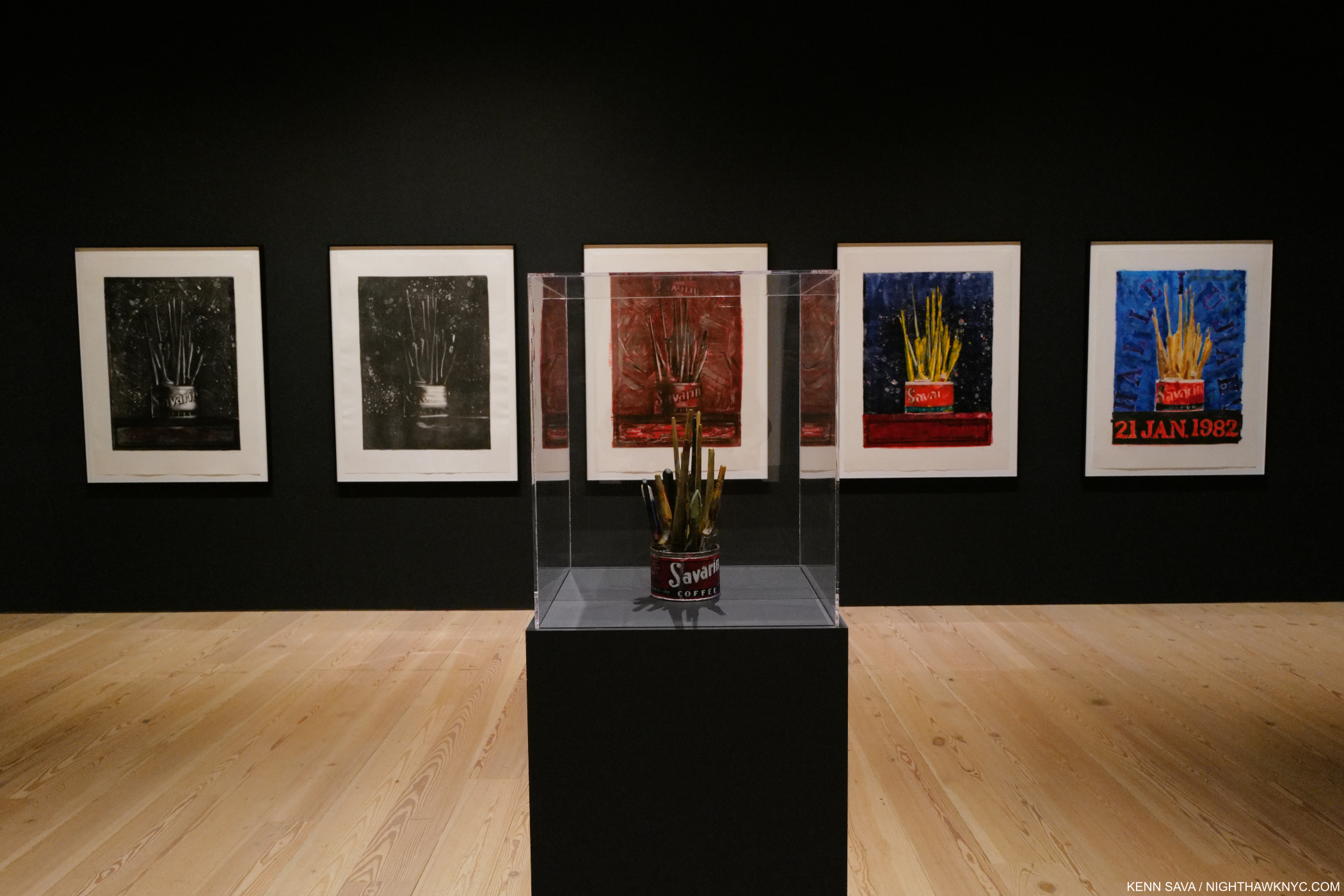
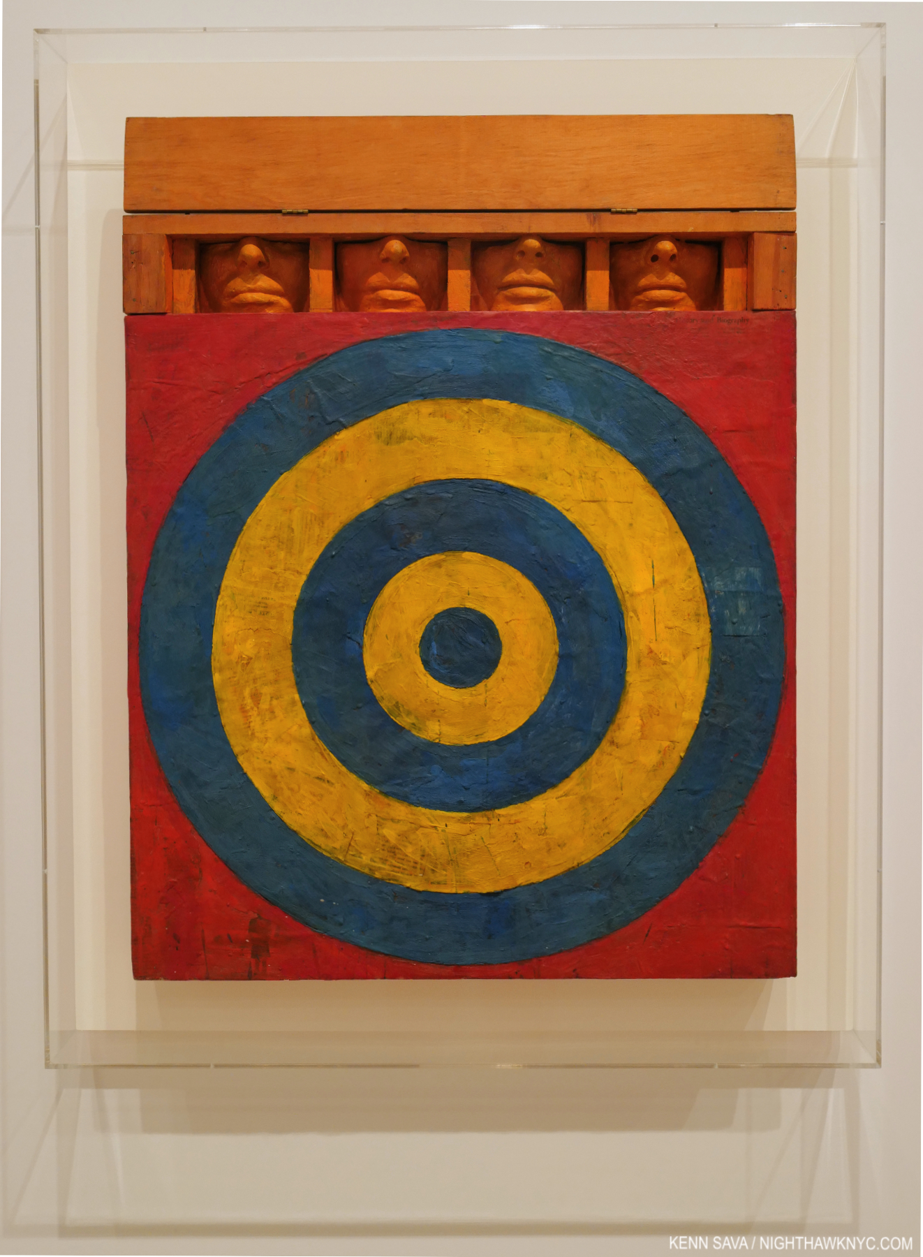
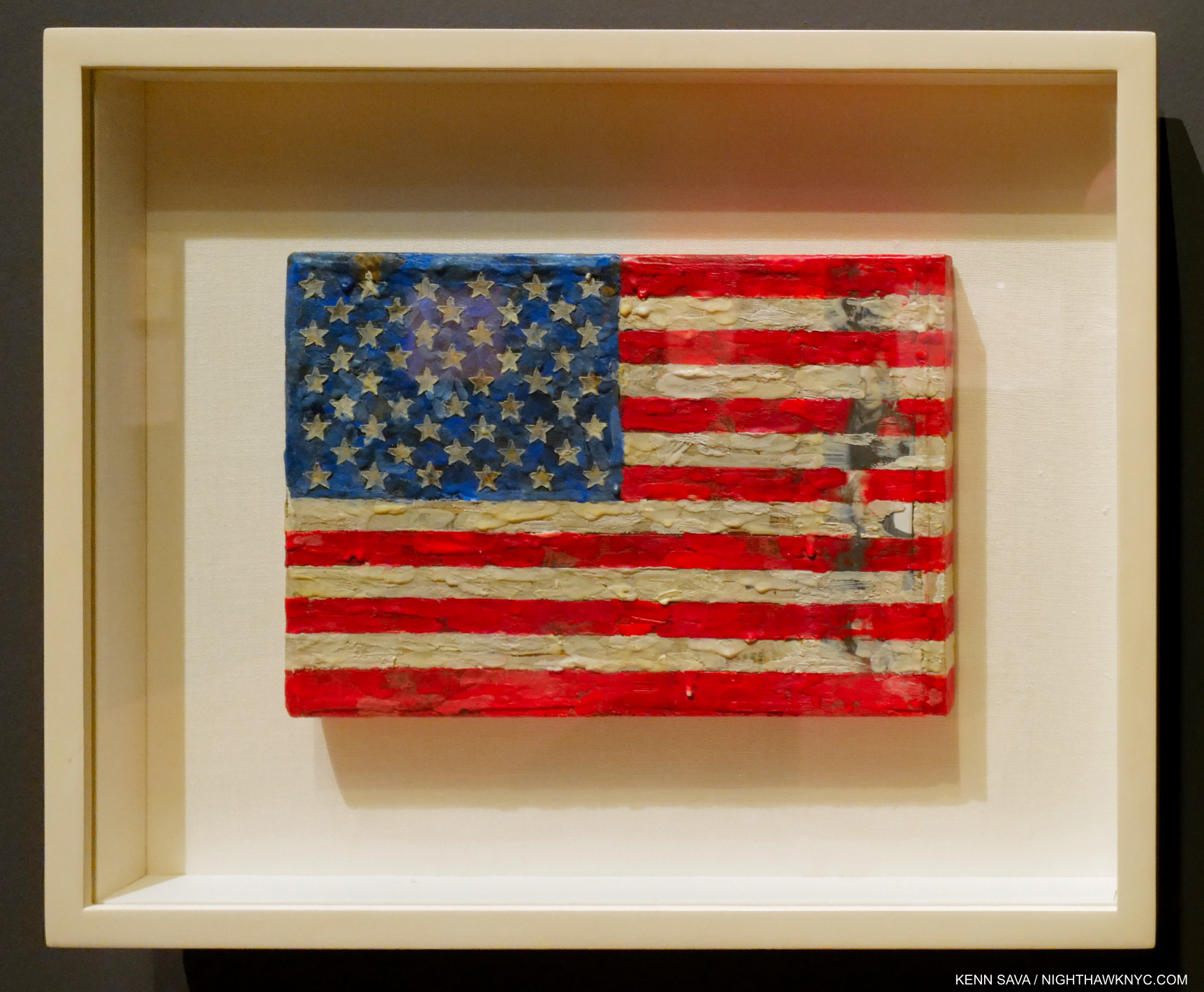
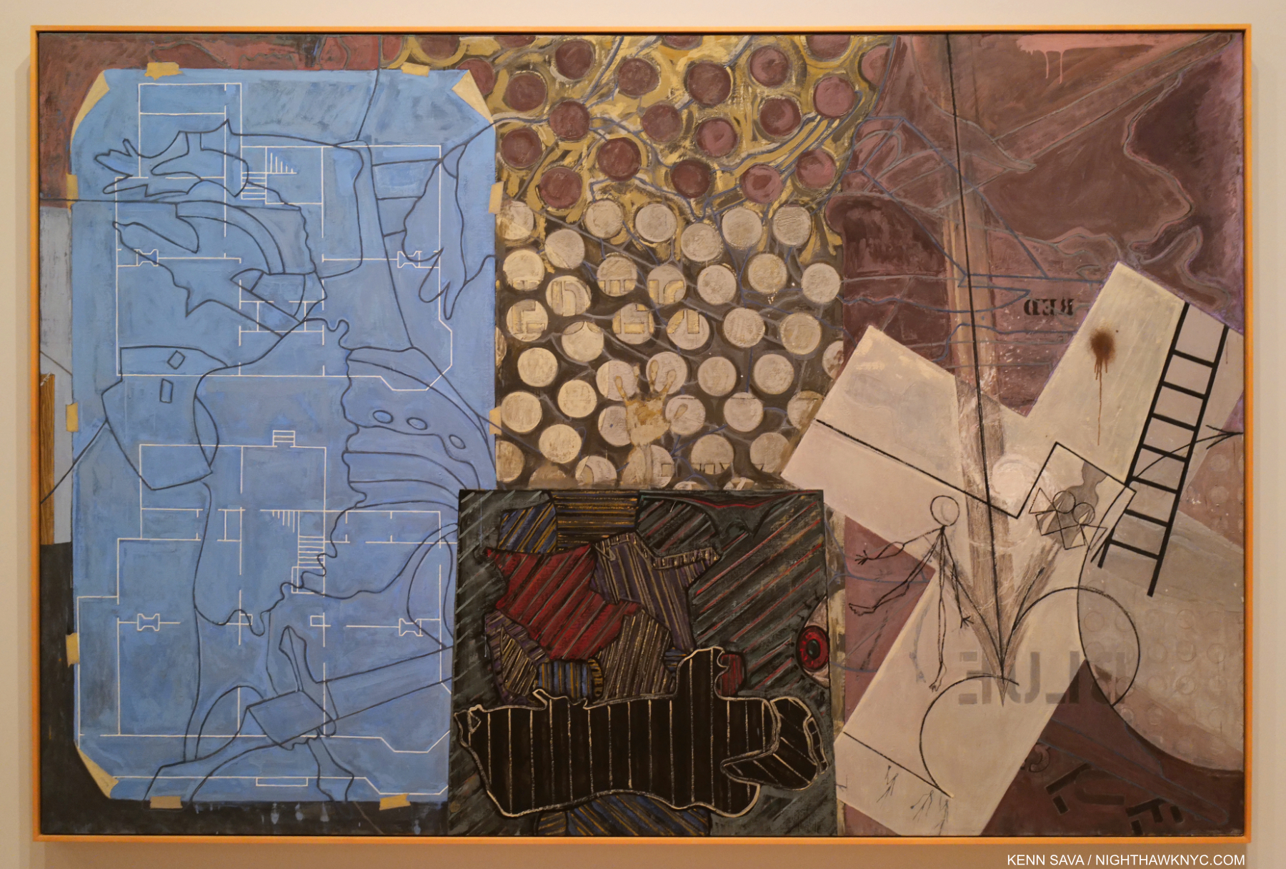
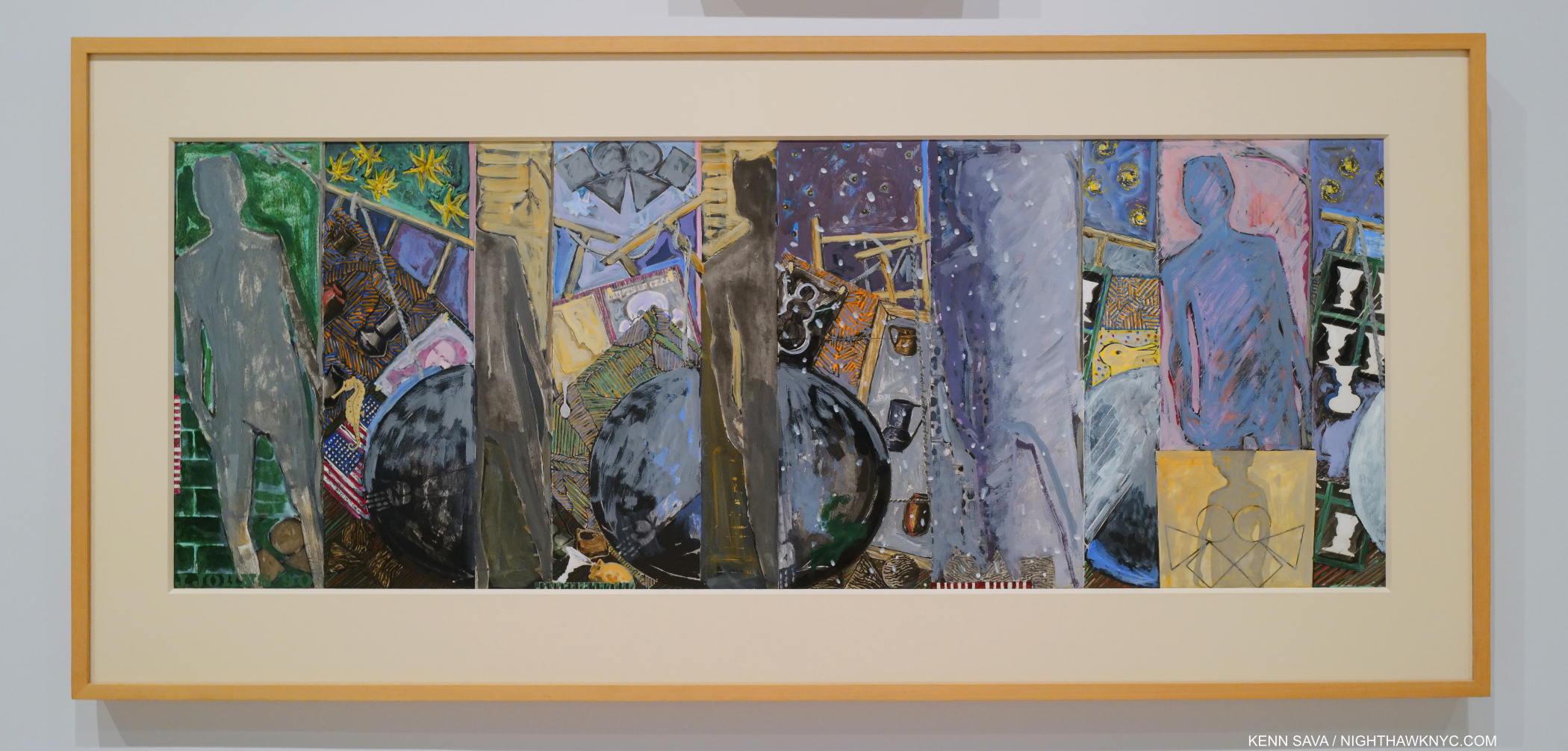
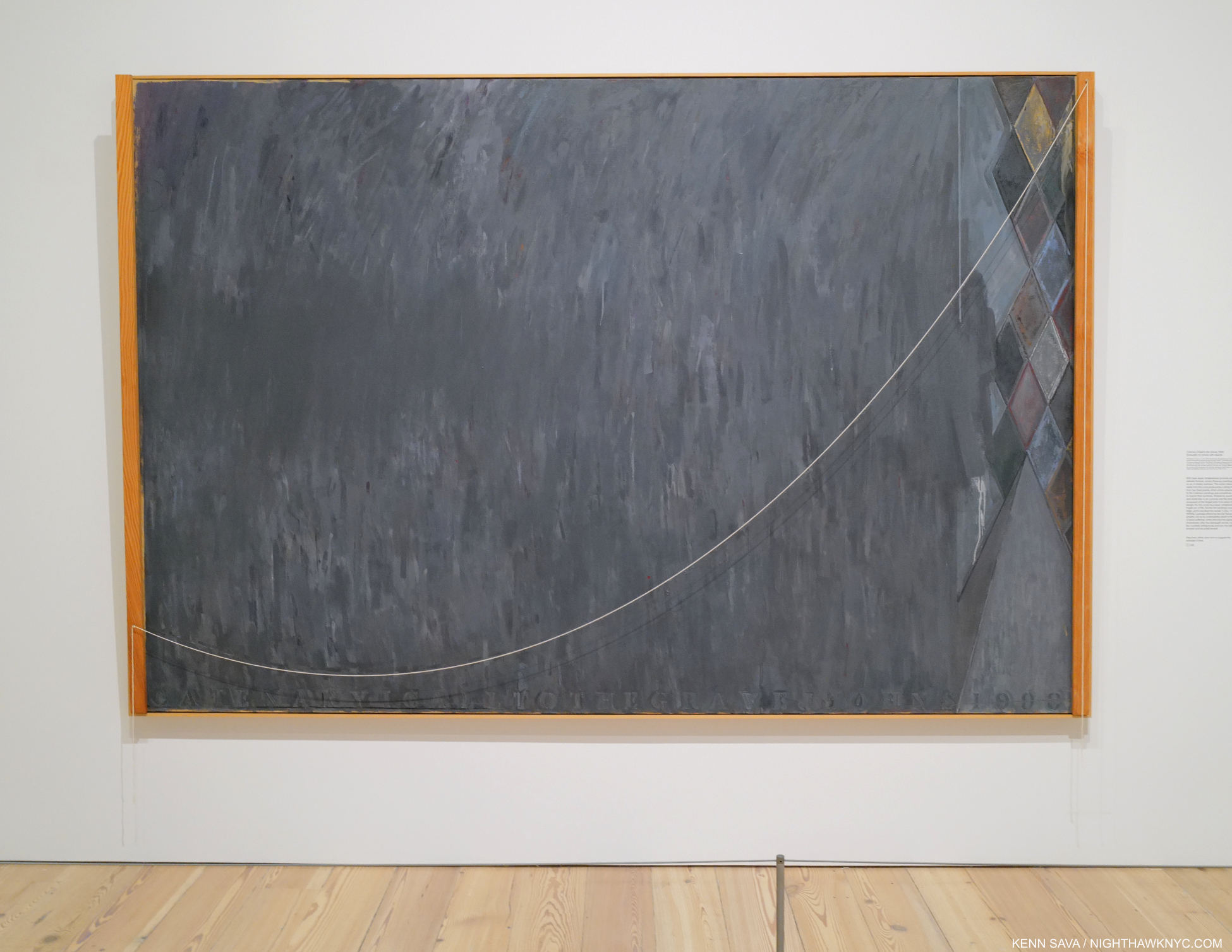
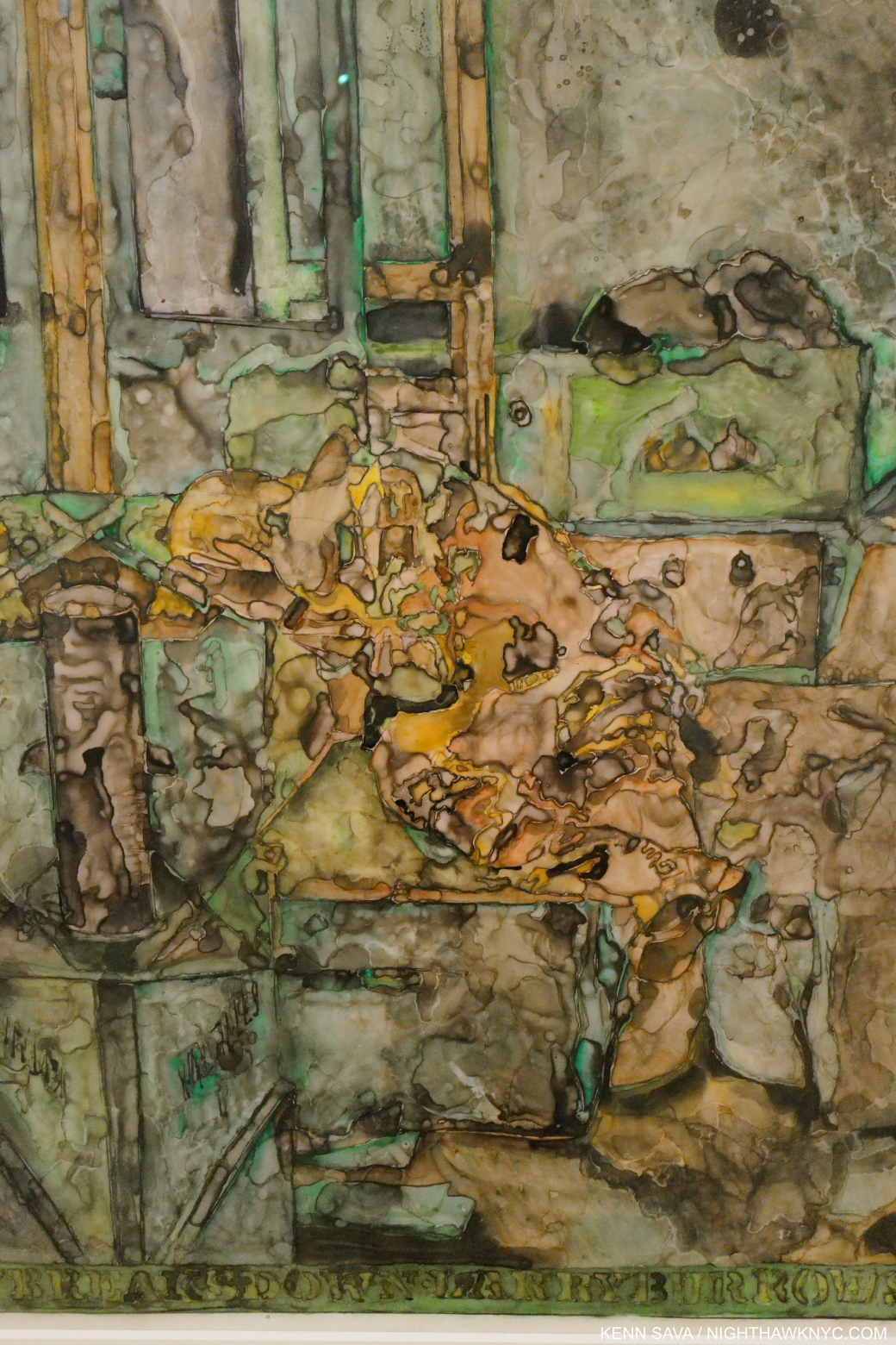
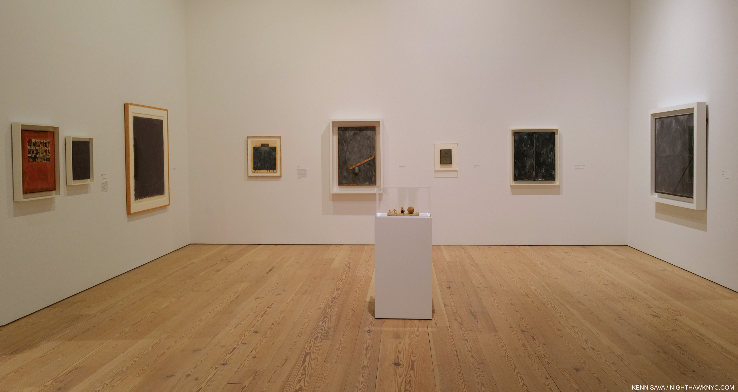
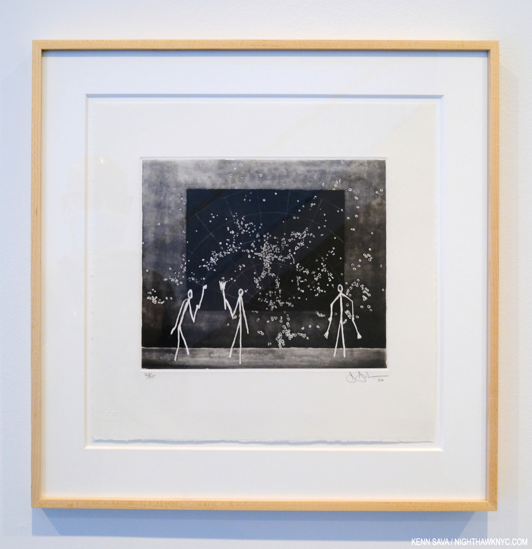
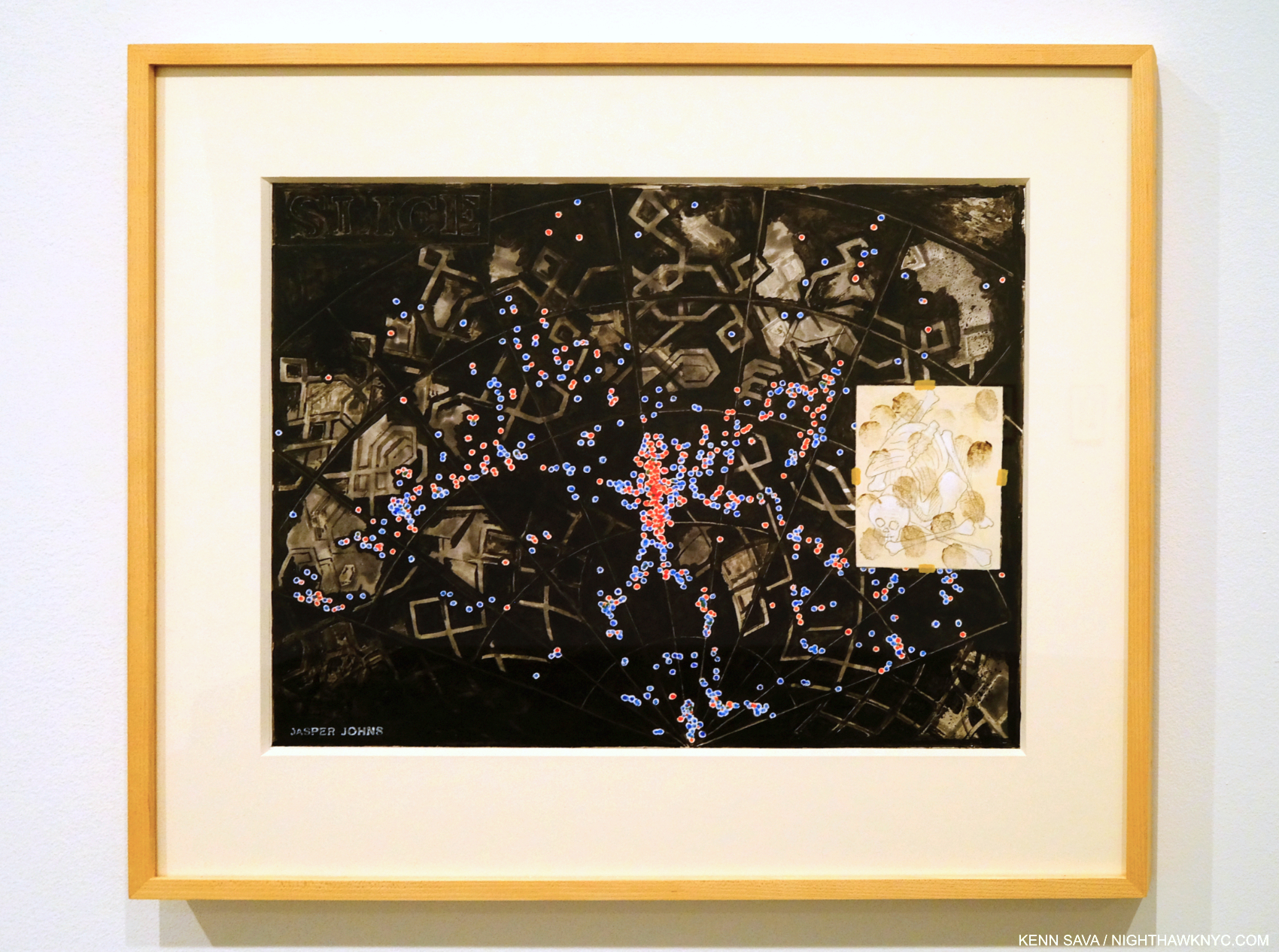
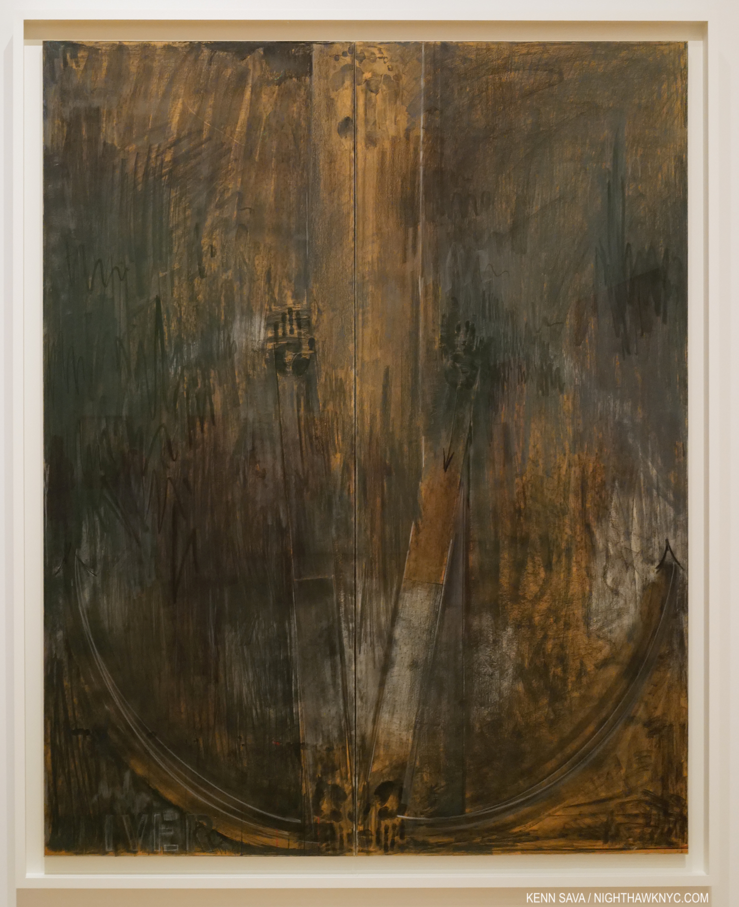
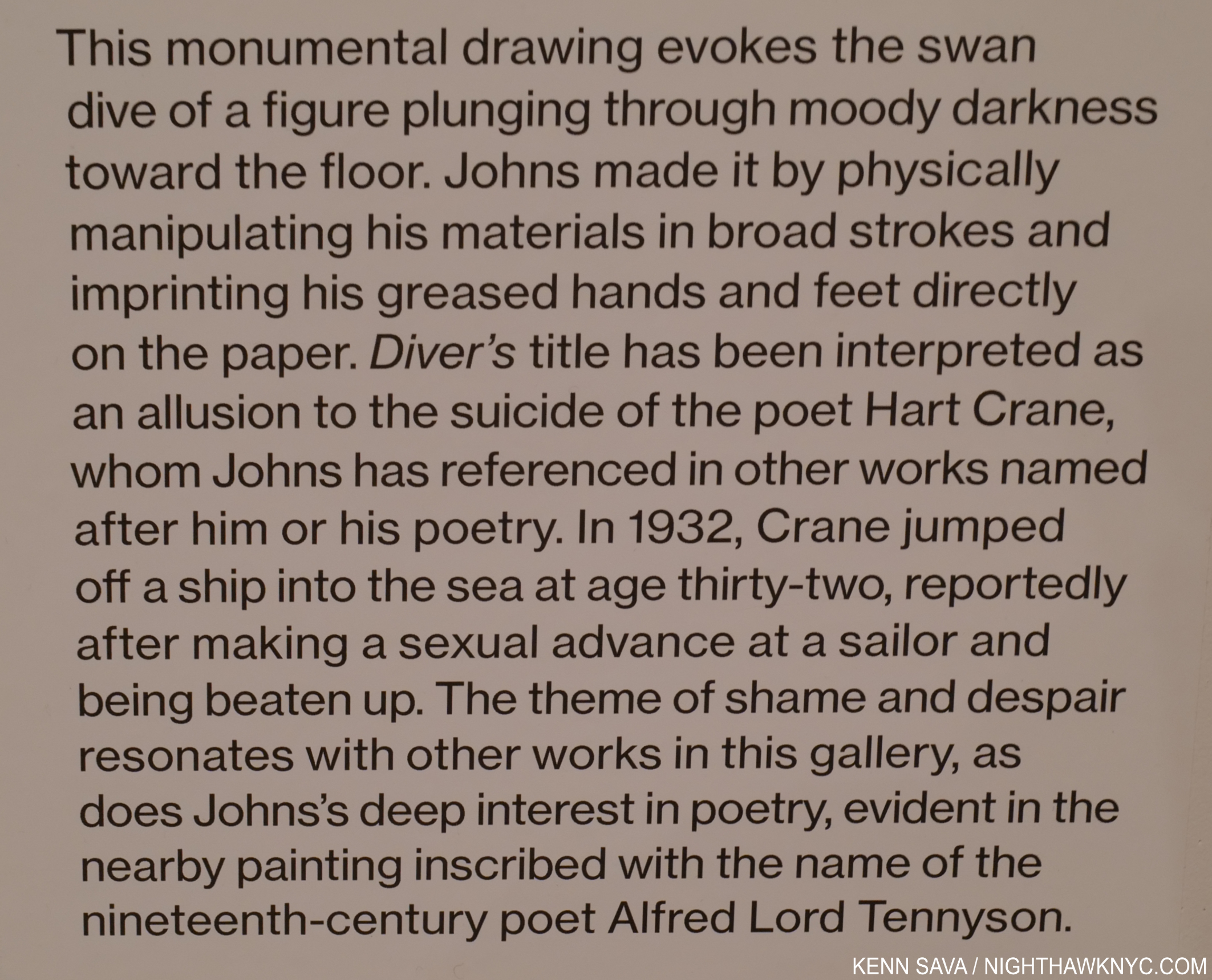
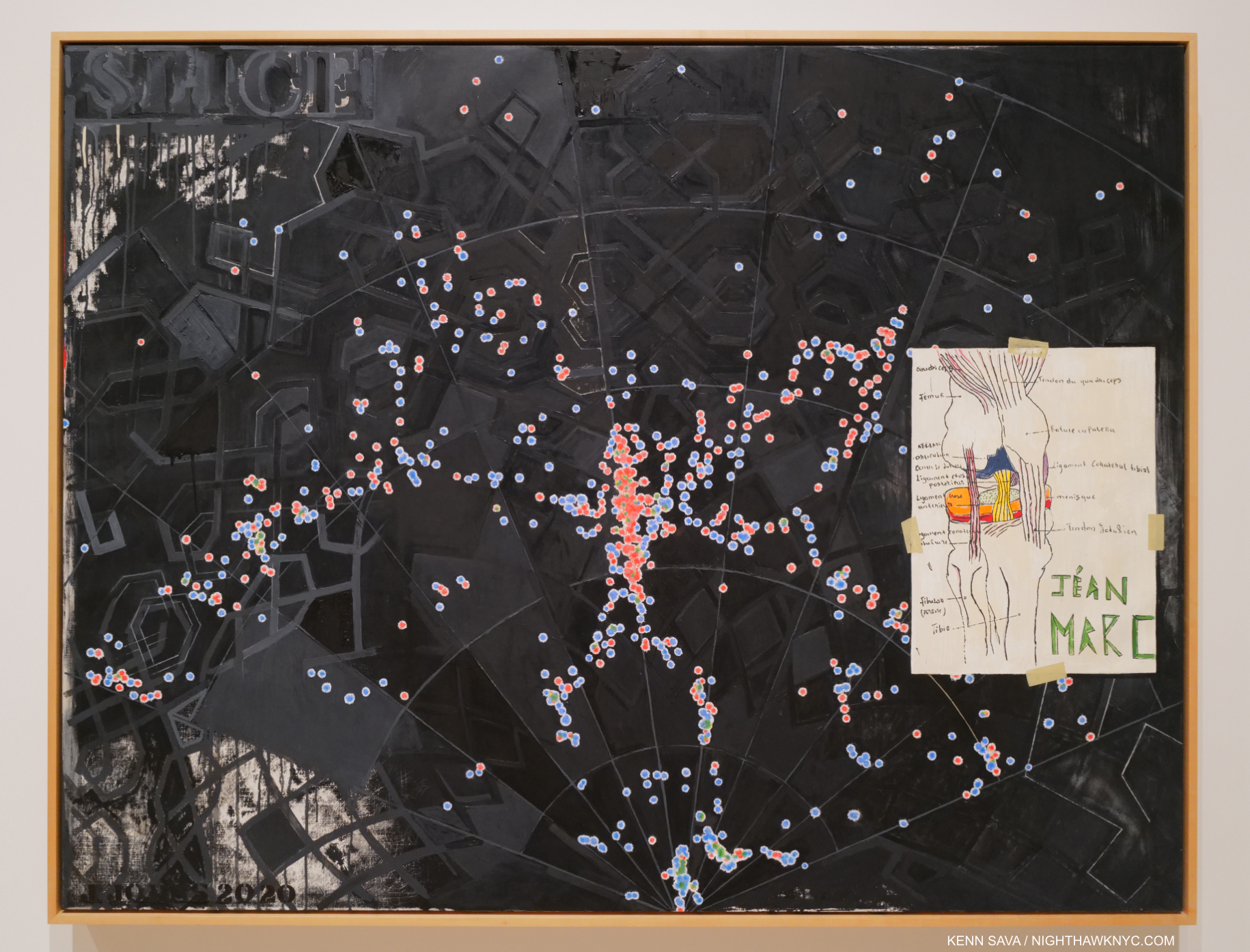
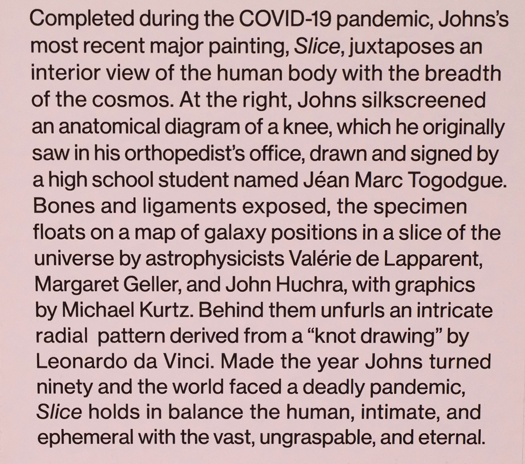
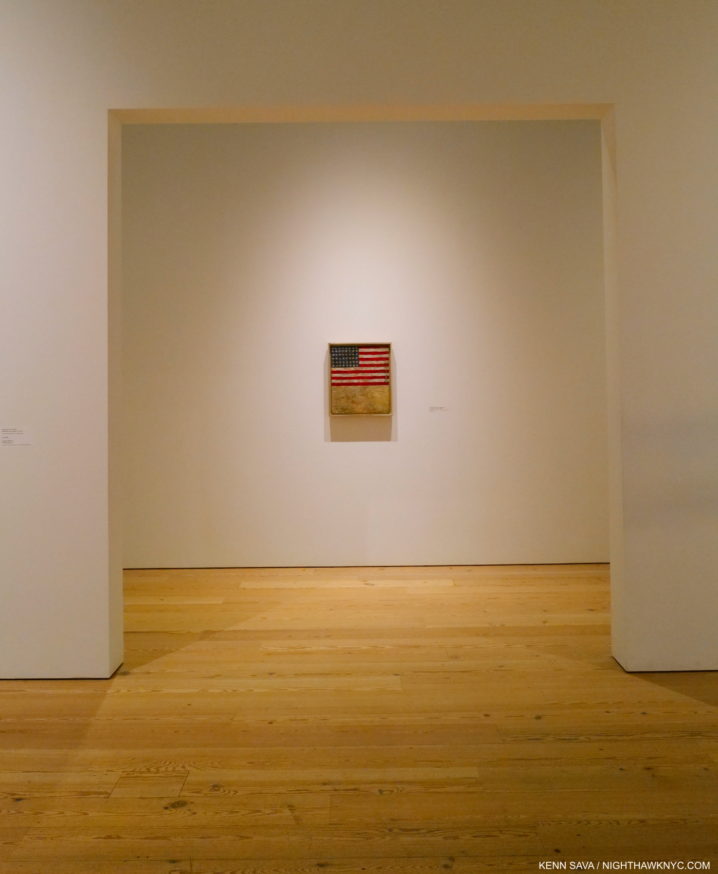
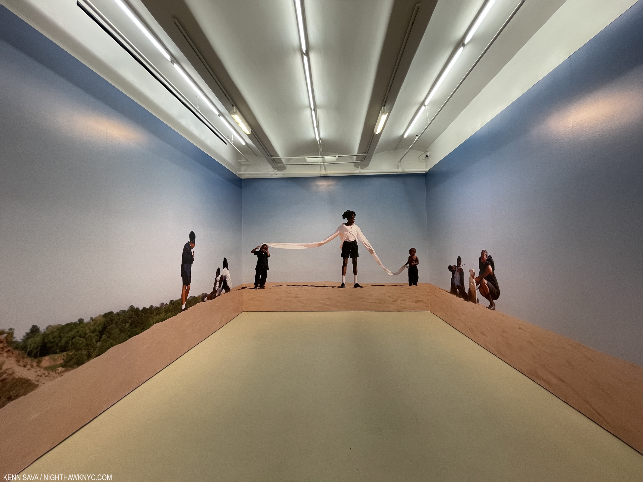
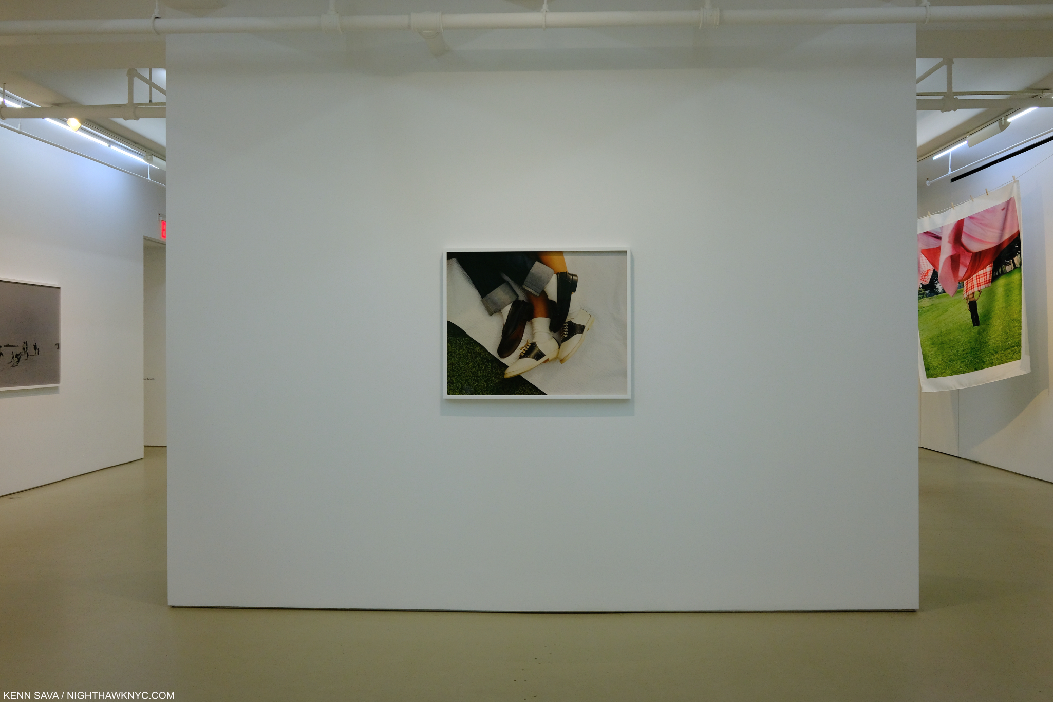
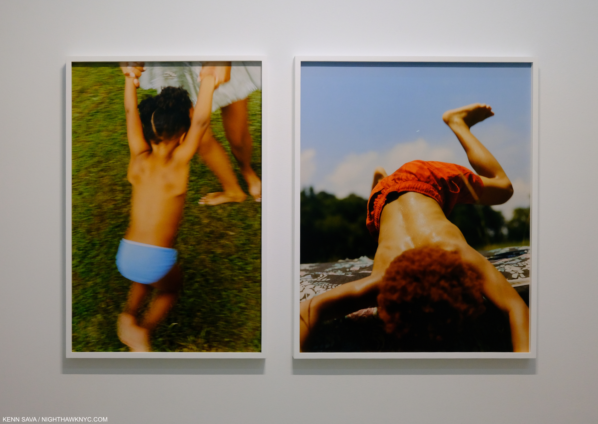
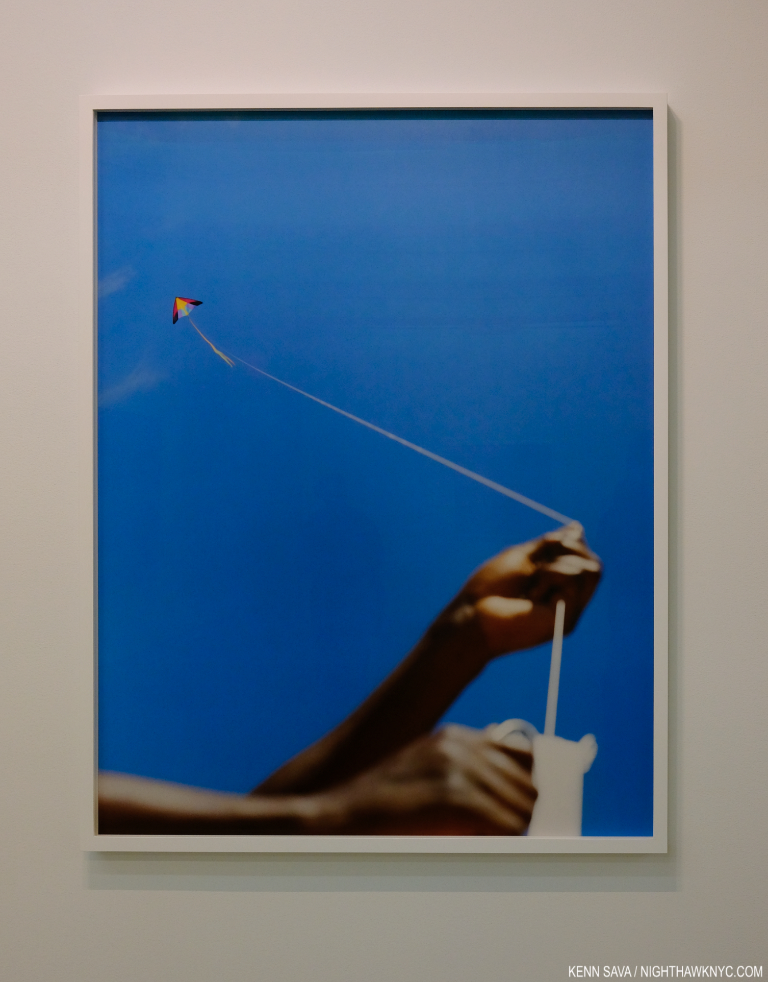
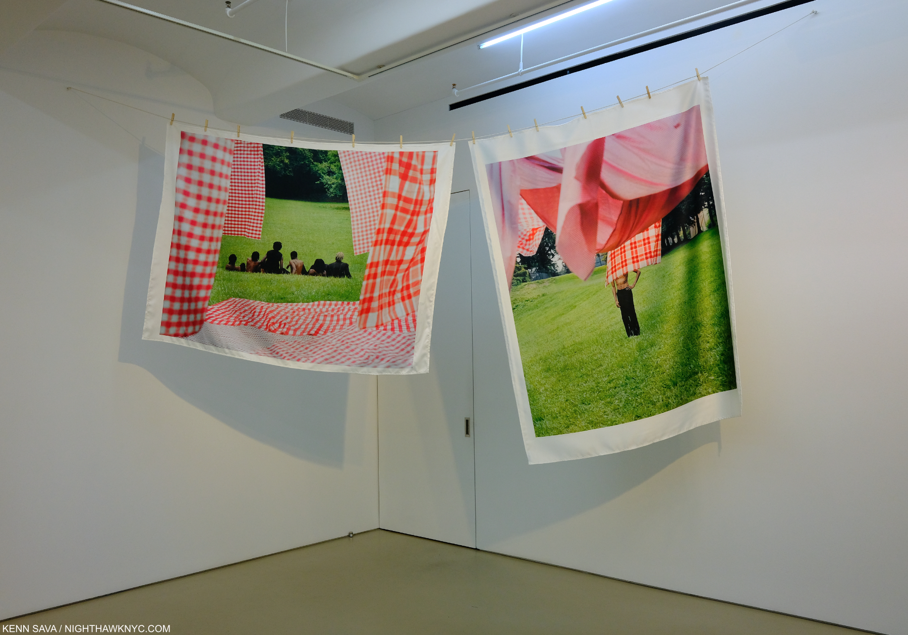
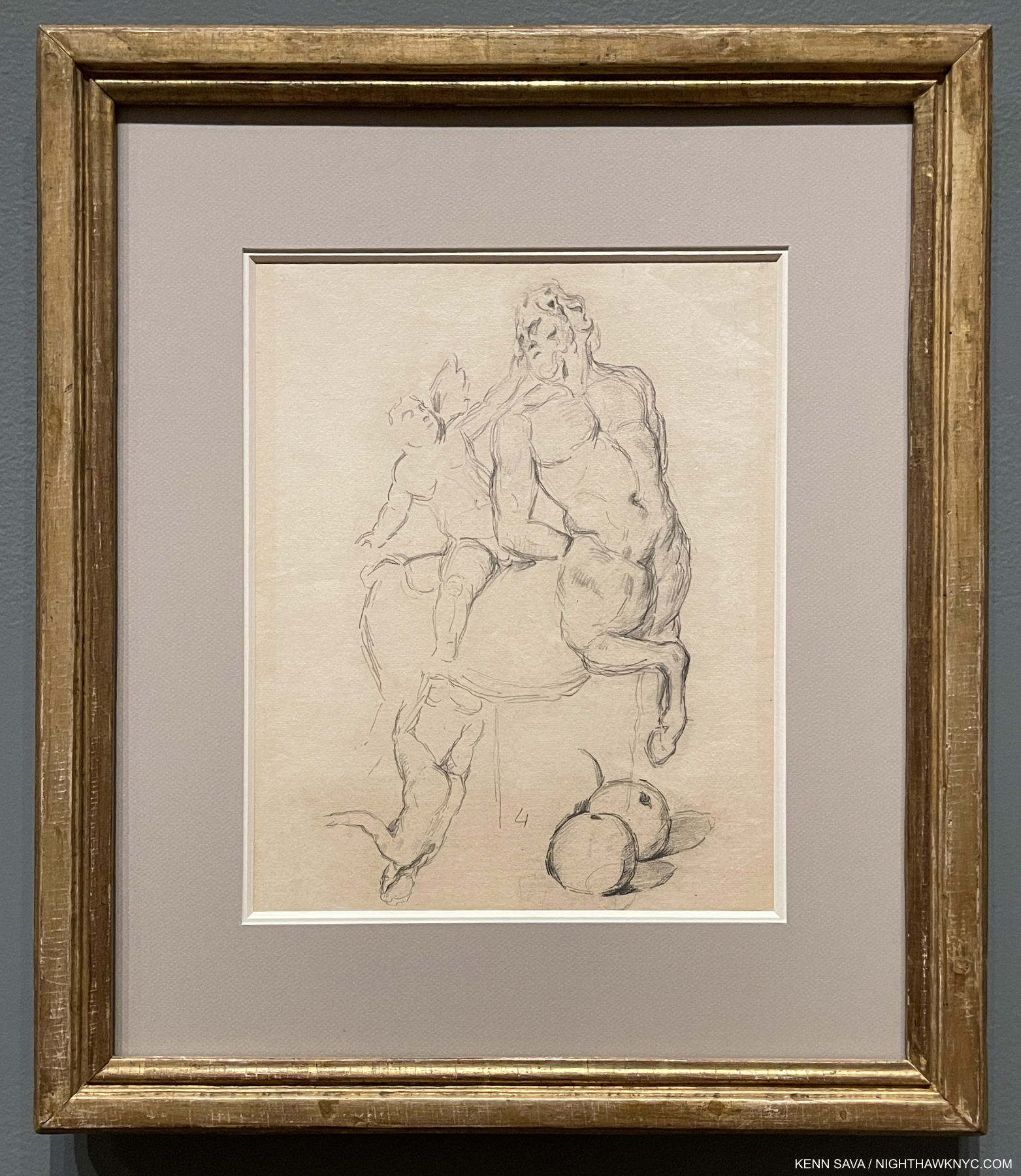
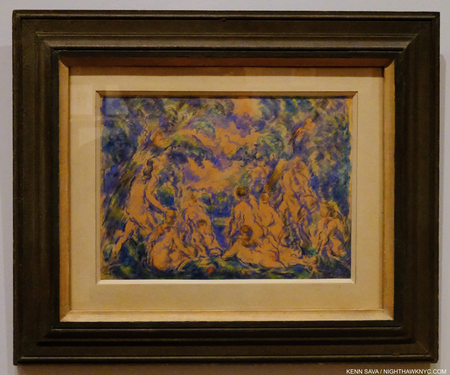
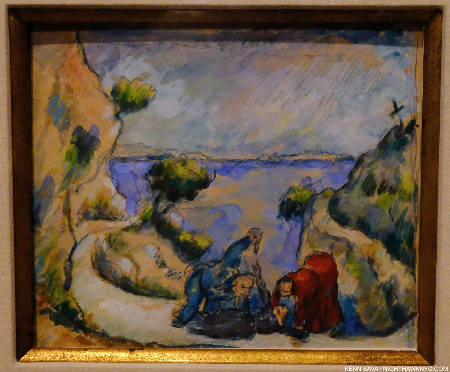
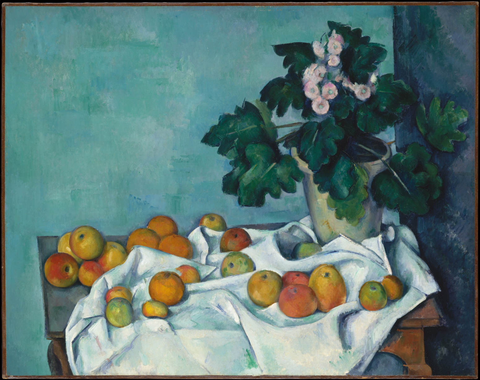
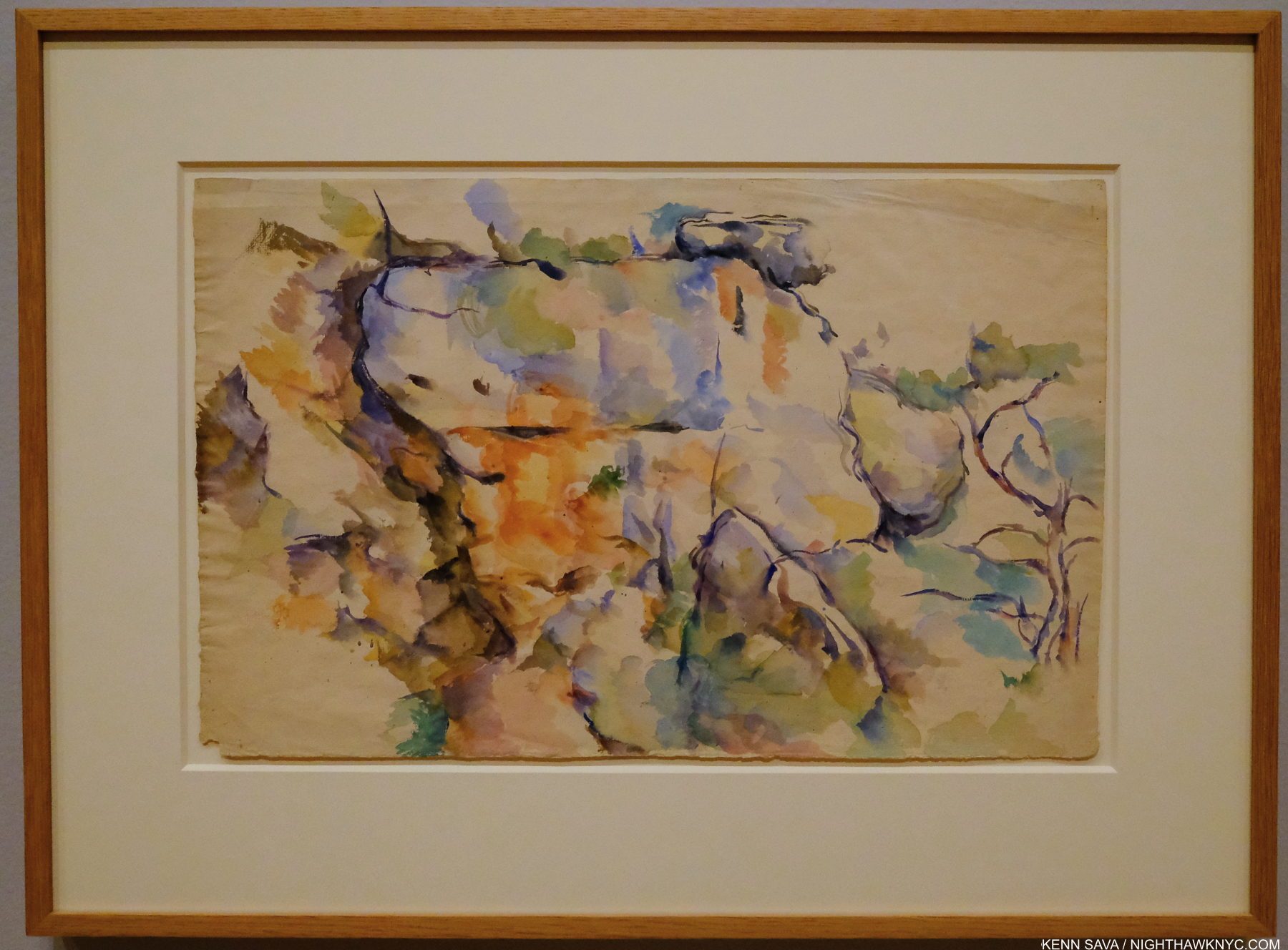
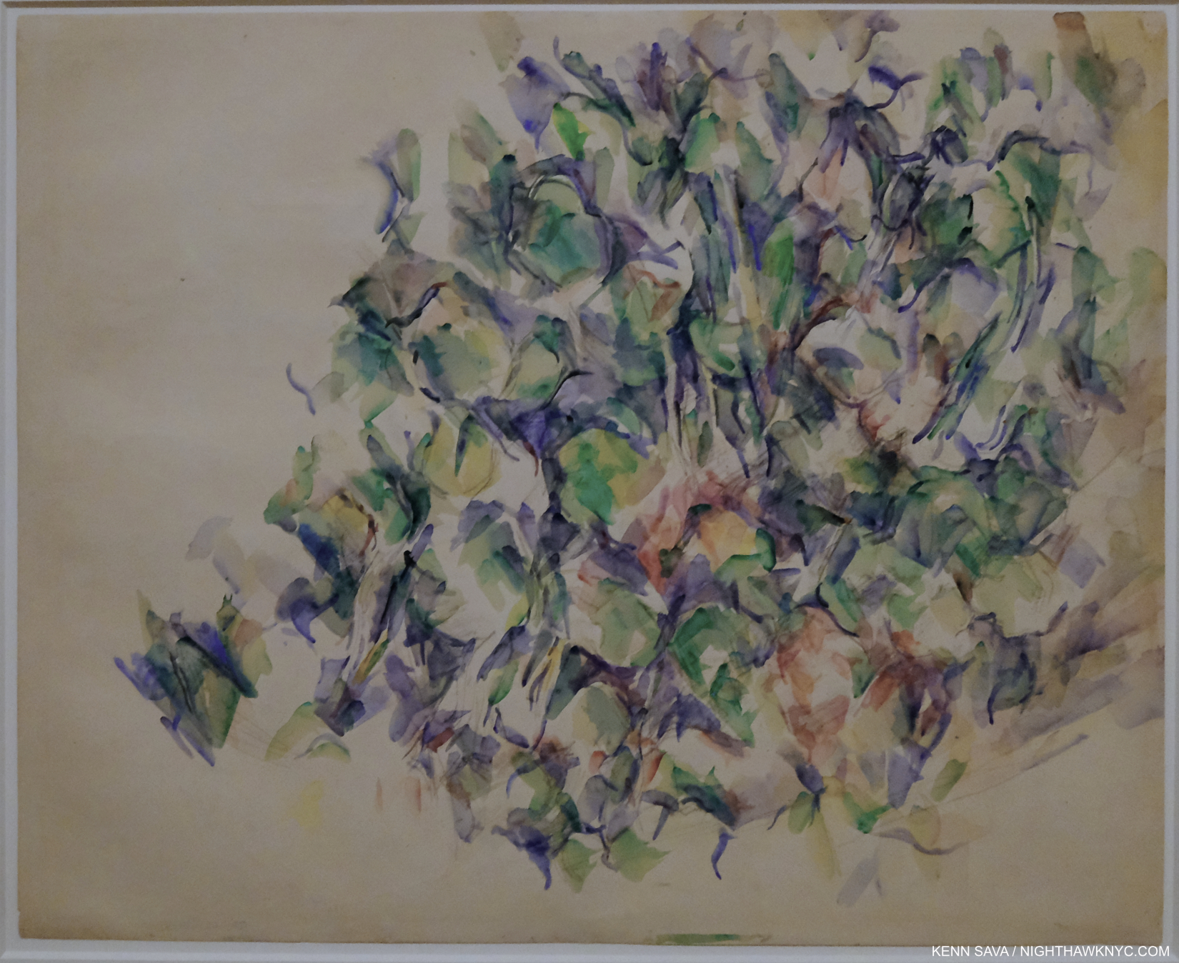
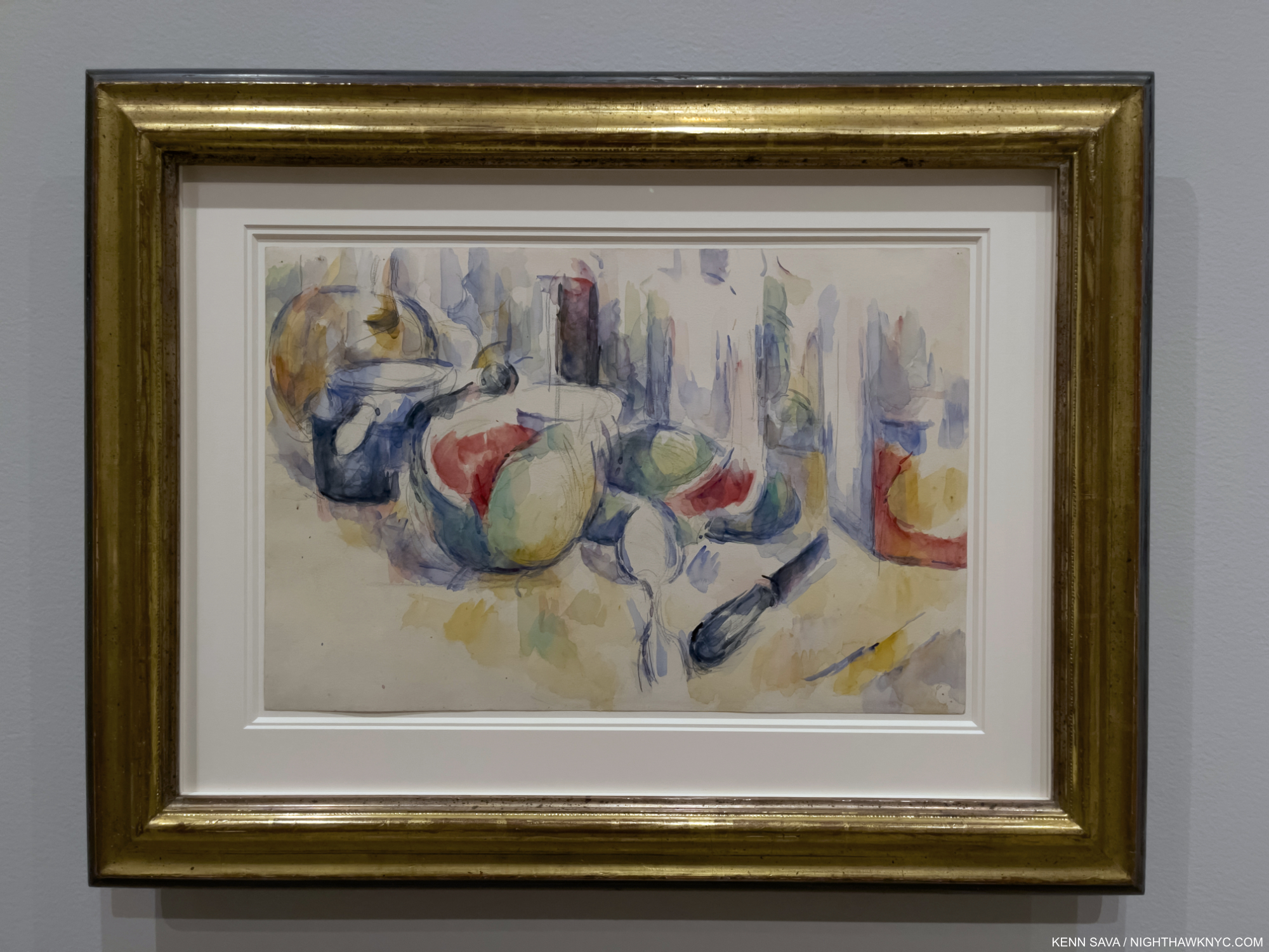
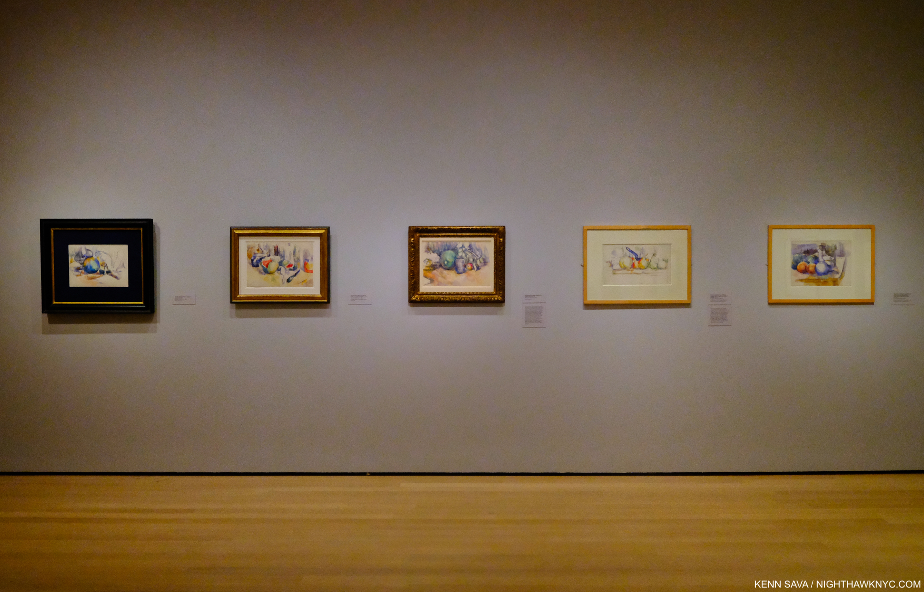
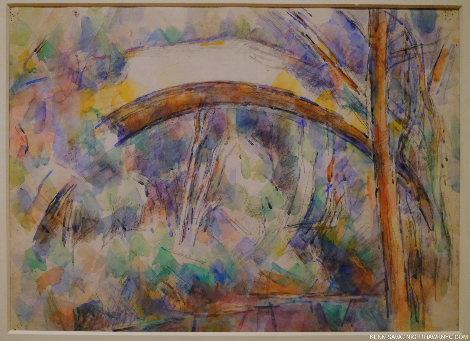
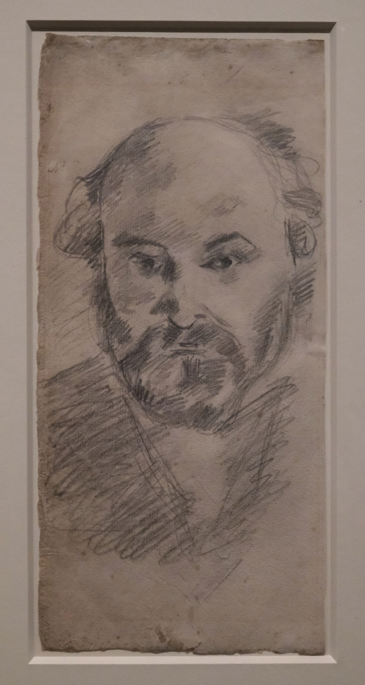
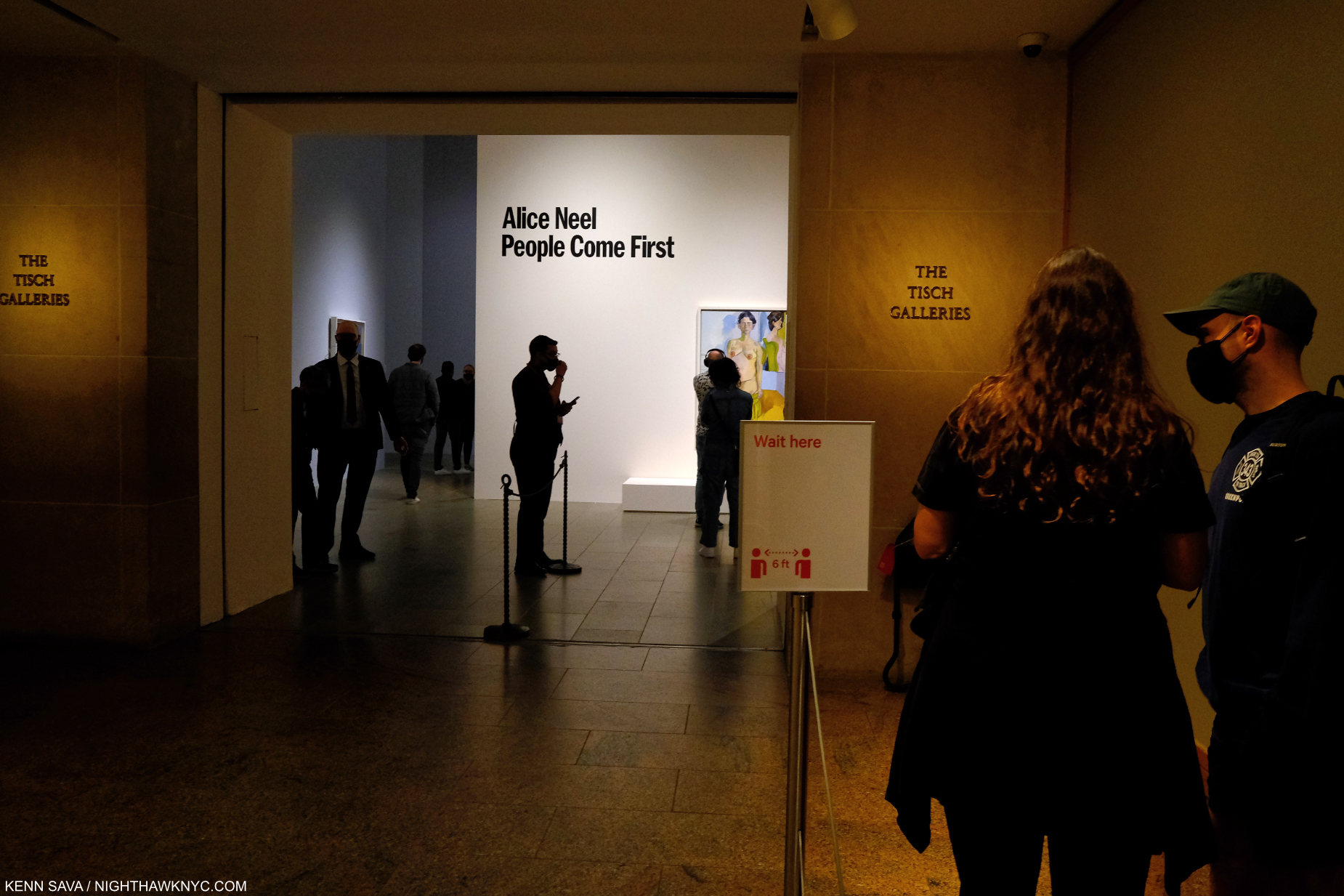
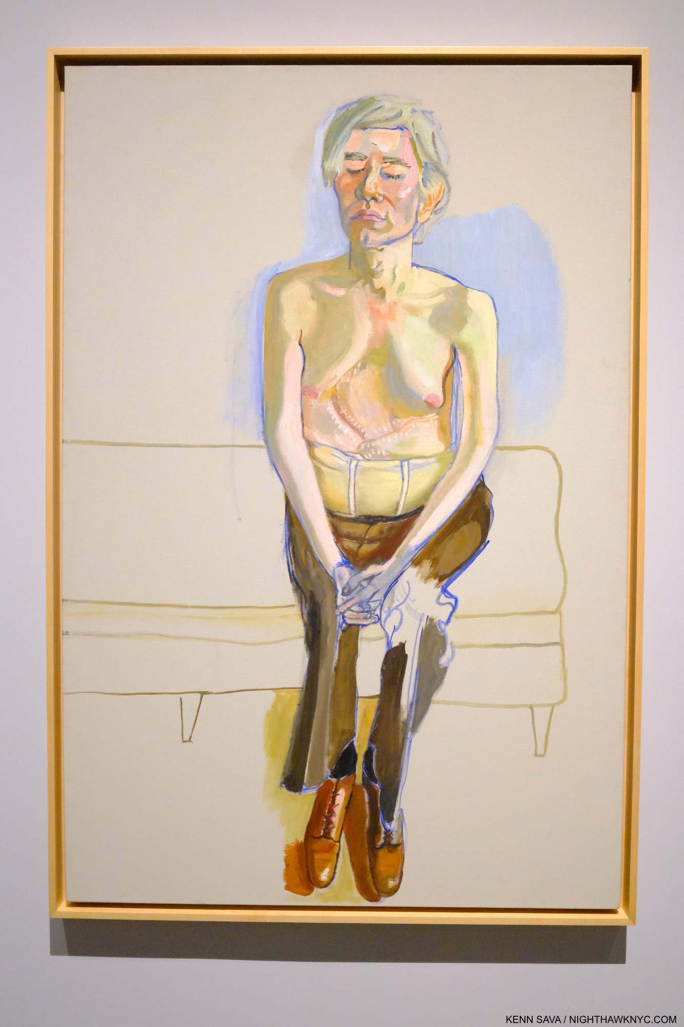
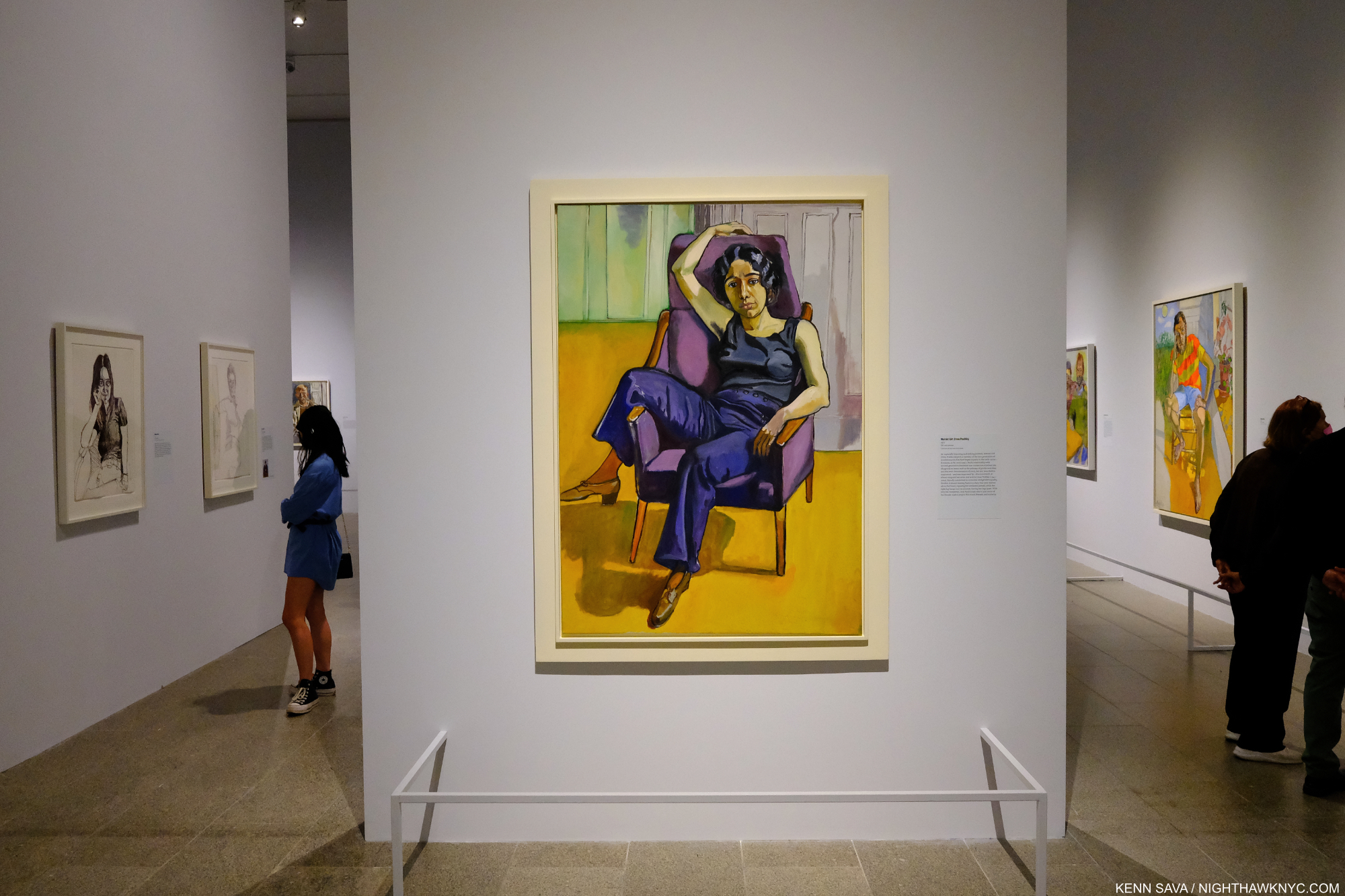
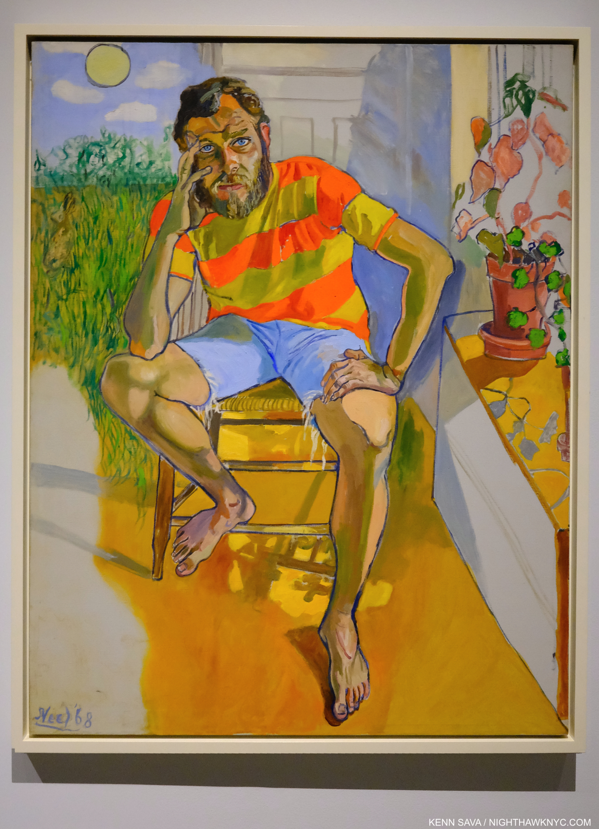
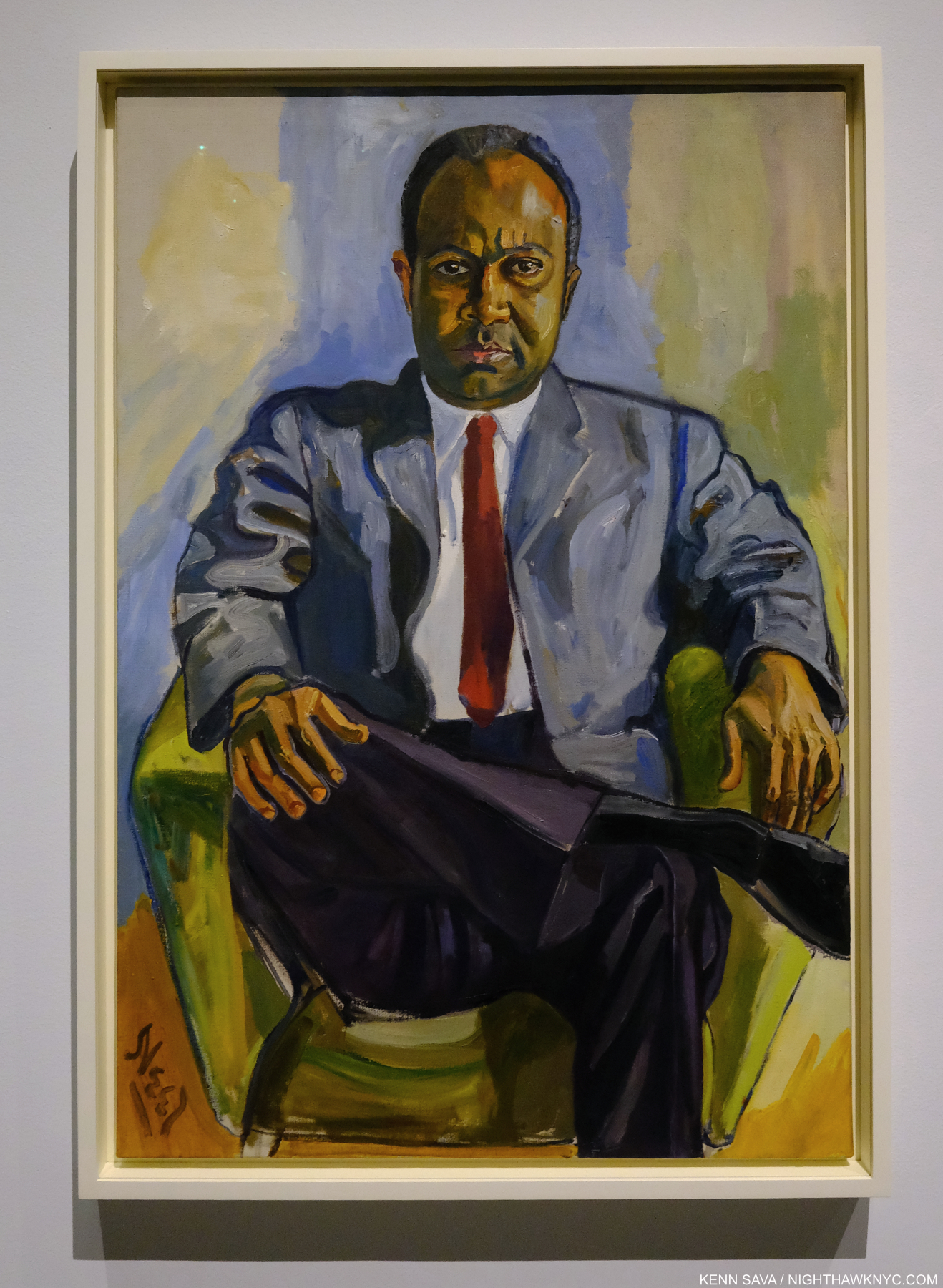
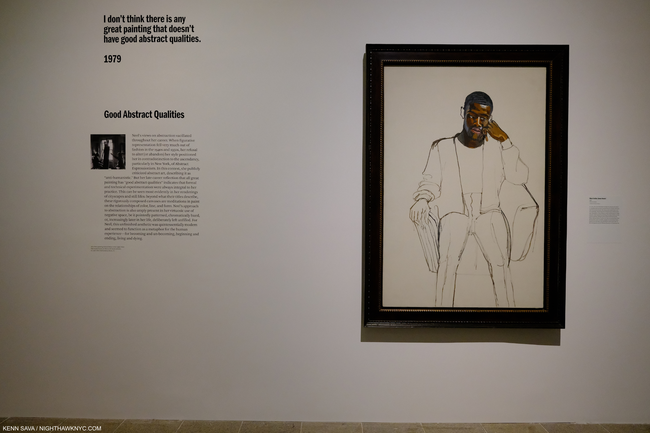
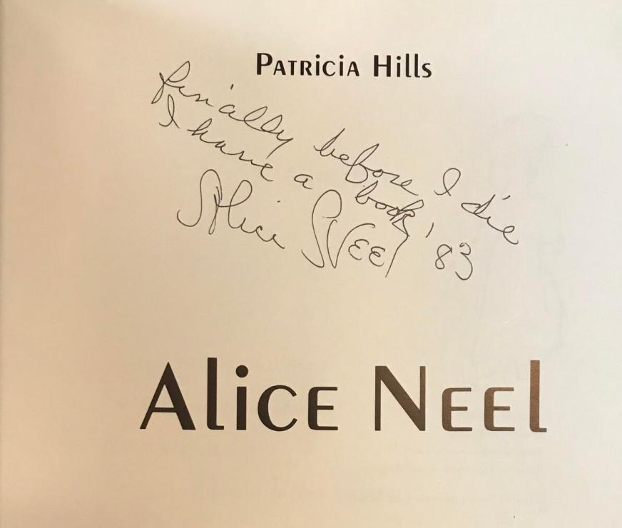
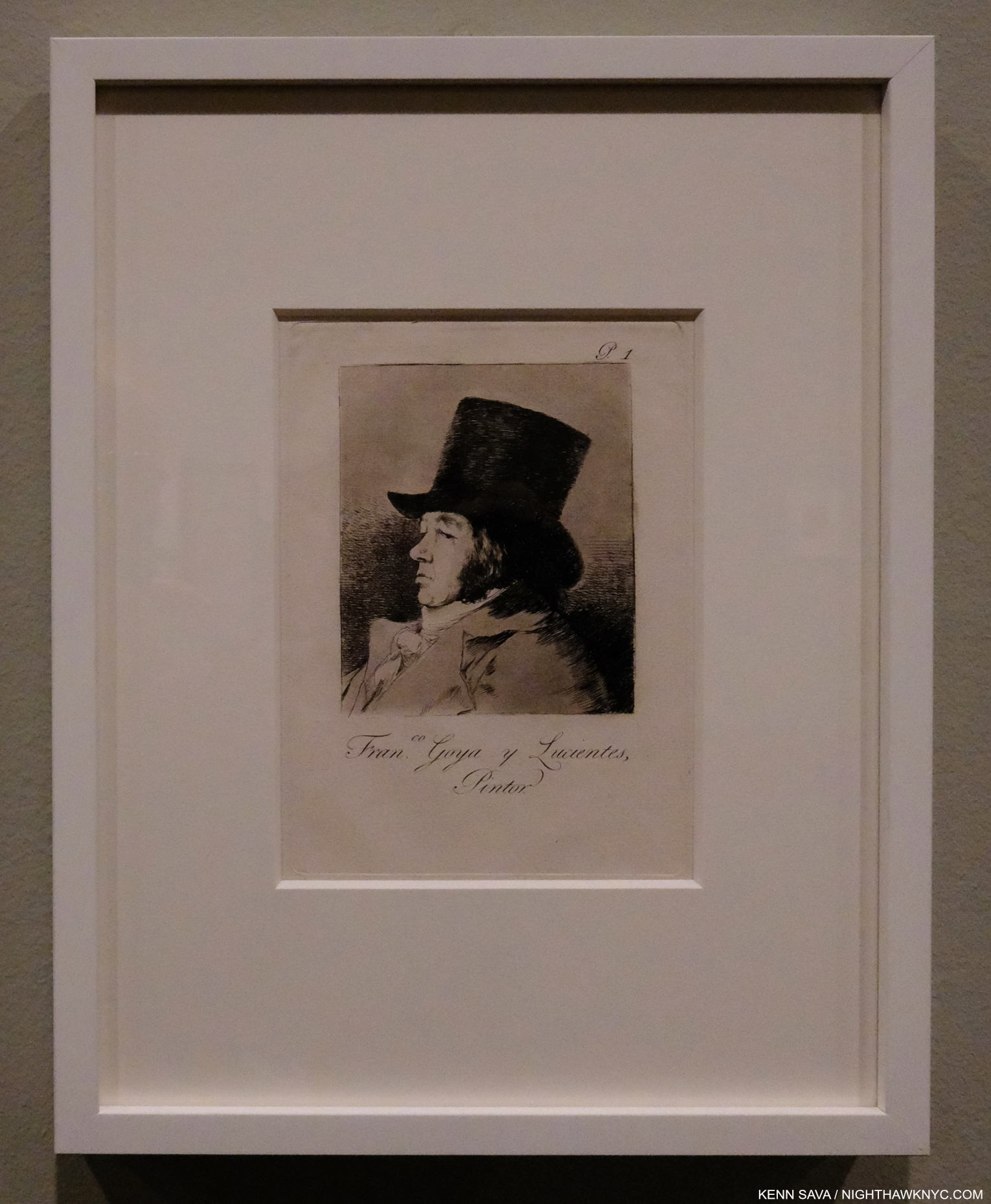
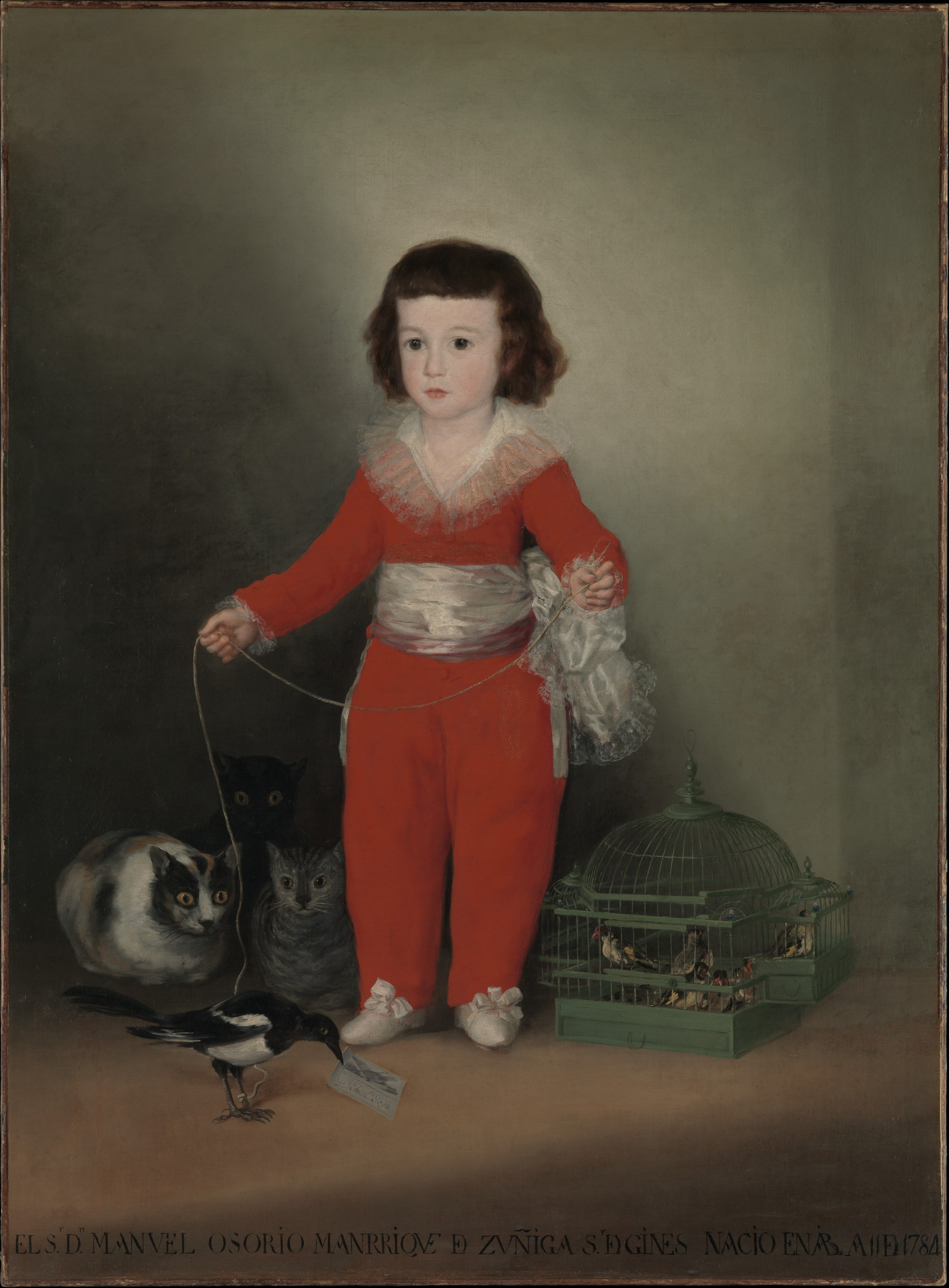
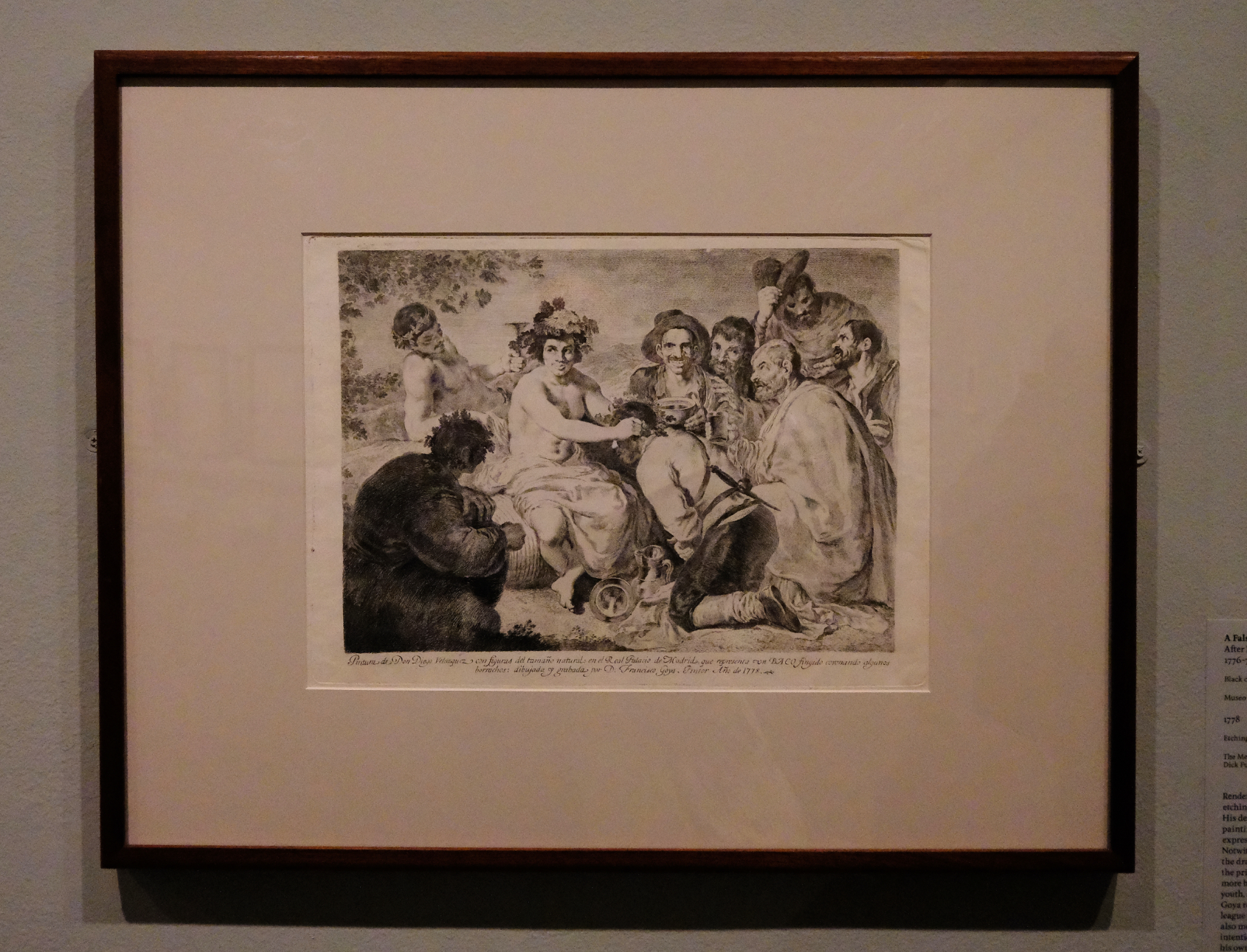
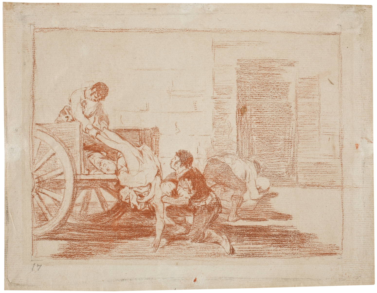
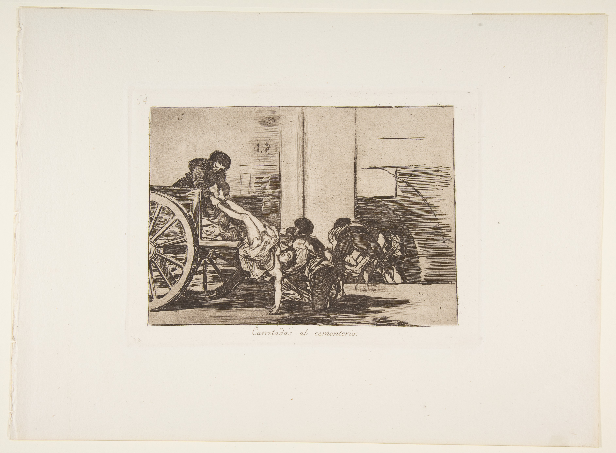
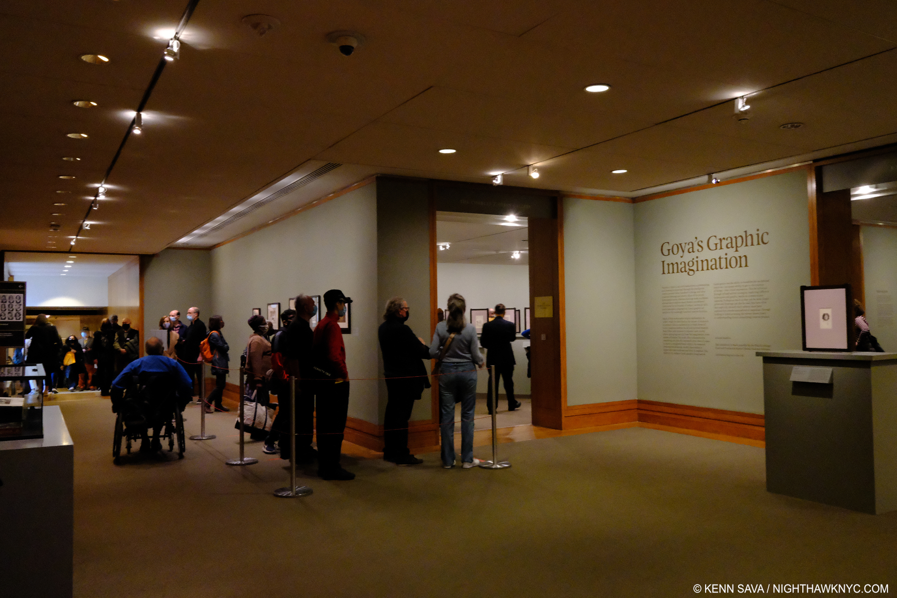
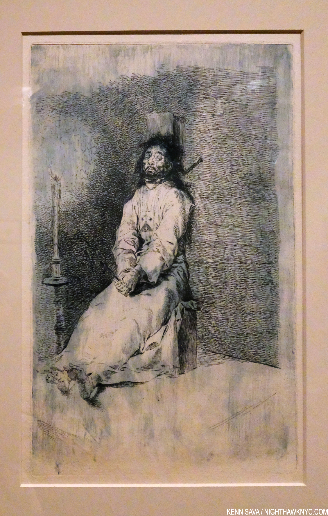
In spite of everything that happened in 2021, particularly the “return to normal” that wasn’t, there were some extremely good shows up here last year. I’ve written about a number of them- Alice Neel: People Come First, Goya’s Graphic Imagination, Cezanne Drawing, and shows of Tyler Mitchell, John Chamberlain, and some others. Having just featured the monumental NYC half of Jasper Johns: Mind/Mirror in Part 1 of this look at Art in NYC, 2021, there was another NoteWorthy show of 2021 going on at the Whitney at the same time.

Of all the shows I saw last year, Jennifer Packer: The Eye Is Not Satisfied With Seeing, was the biggest revelation.

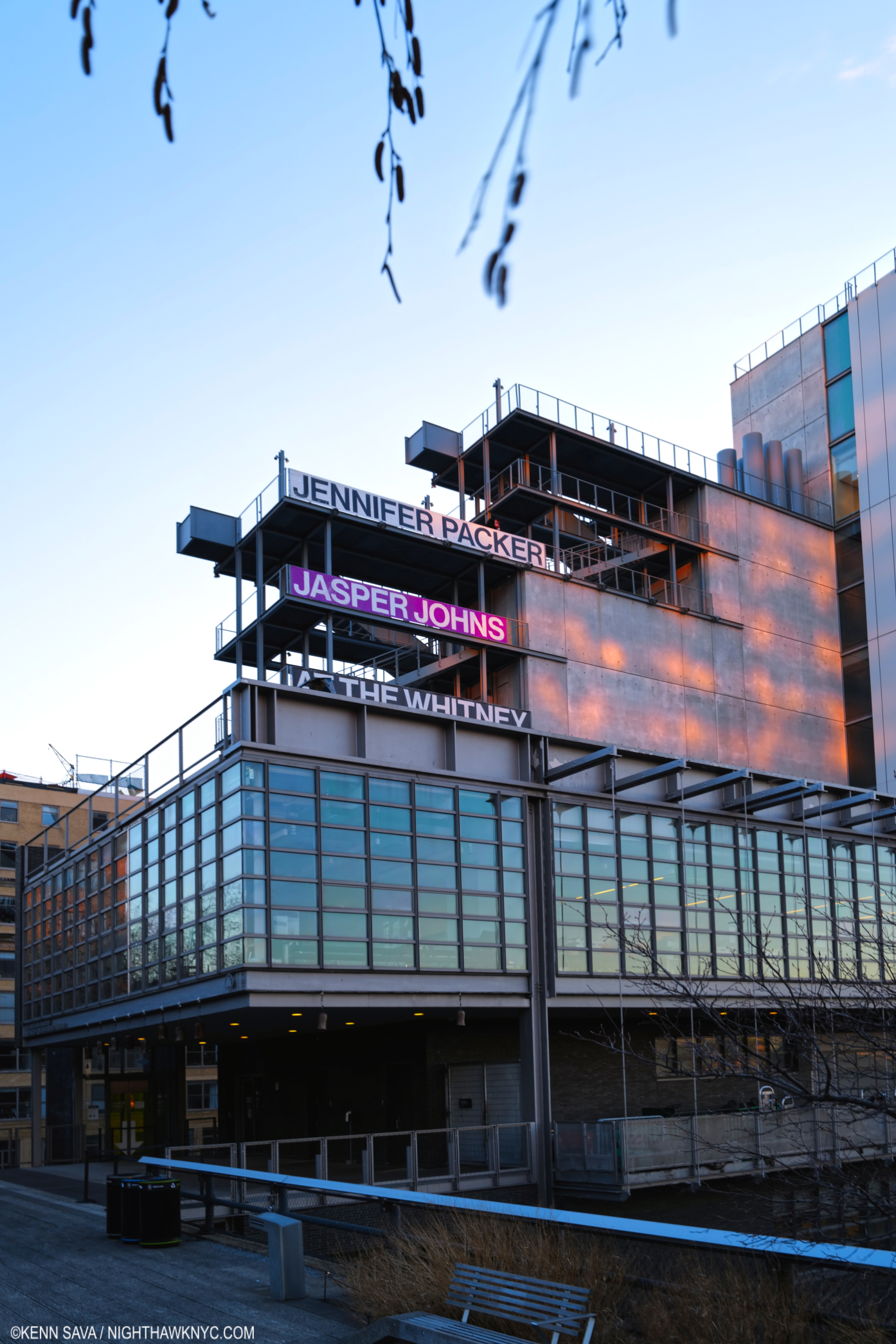
Jennifer Packer gets top billing. That might be reflective of the fact her show is on 8 while Jasper Johns is on the 5th floor?, or her name is longer? 7 years later, I still haven’t warmed up to the architecture of the new Whitney, the east end of it seen here from the High Line. But the shows have dramatically improved, in my opinion. That’s the High Line Admin building to the lower foreground, also designed by Renzo Piano, who designed the Whitney.

The Johns and Jennifer Packer shows are a fitting cap to 2021 for the Whitney Museum, which has had a steady string of excellent shows beginning with Vida Americana in 2020 (which I wrote about here) that continued throughout 2021. The stellar Julie Mehretru and overdue Dawoud Bey shows up from spring through the summer, 2021, continued Vida’s momentum, with Jasper Johns and Jennifer Packer now setting the stage for the next Whitney Biennial in the spring. The Whitney also collaborated with Hudson River Park (which lies across the West Side Highway to its west) on legendary Artist David Hammon’s Day’s End, which opened in May, 2021 directly opposite the Museum. A permanent installation right next to the site of a large public park (to the right in the picture up top) currently under construction (where the Department of Sanitation complex was when I looked at the “new” Whitney Museum Building, here, in 2016). It’s something of a major coup in my view, that with the new park when it opens and the Little Island a few blocks away should bring more people to the area and the Whitney. As hard as I was on them during their early years on Gansevoort Street, in spite of everything, the Whitney had a great year in 2021, and they deserve a lot of credit for it.

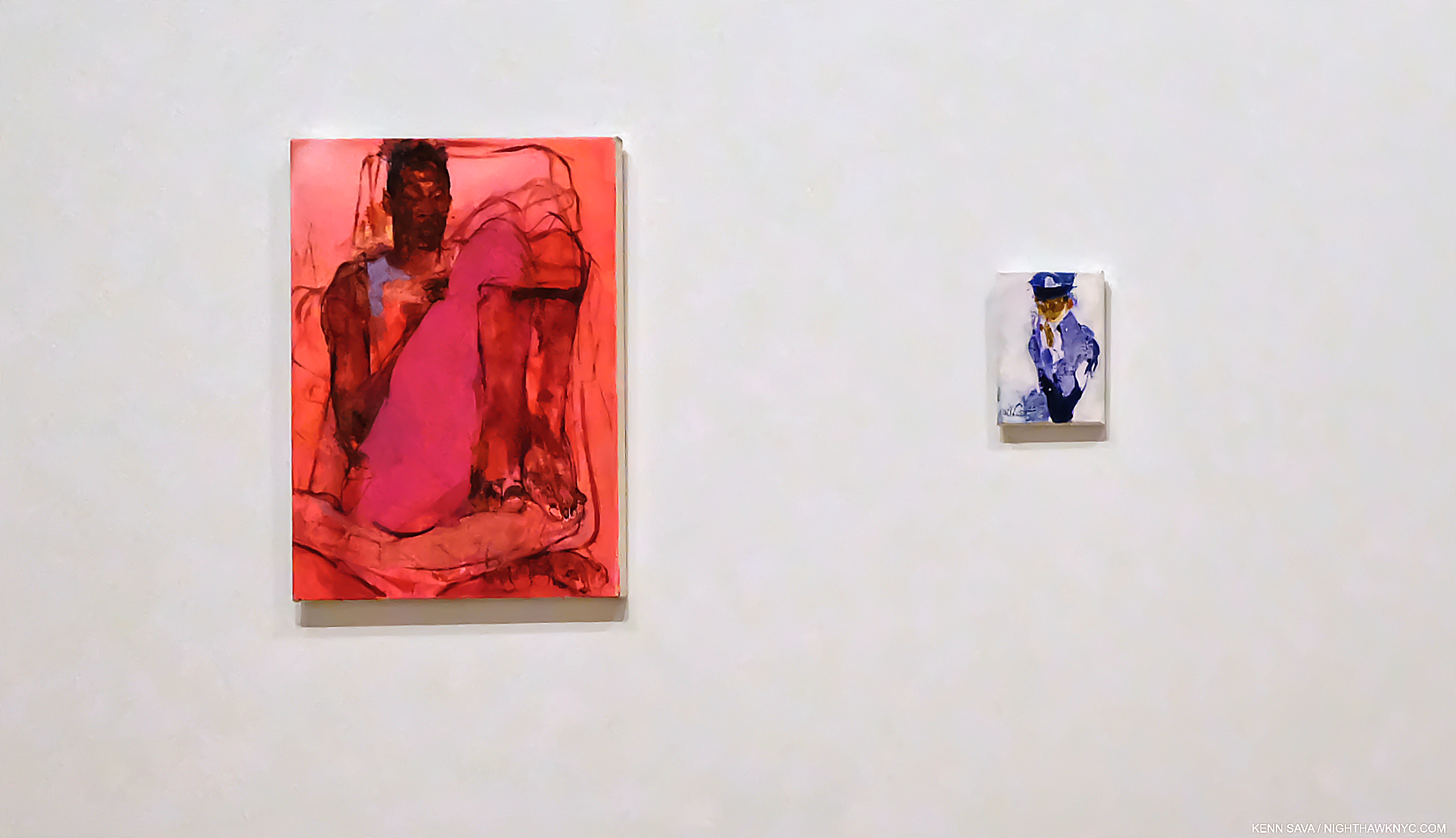
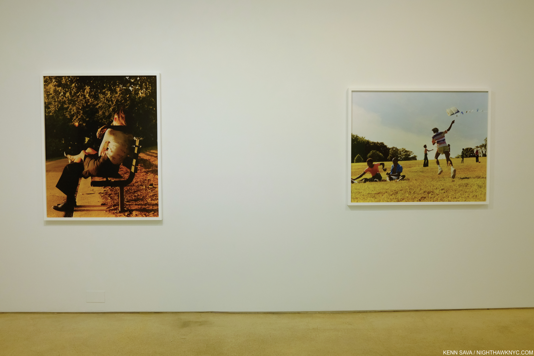
Flashback- May 25, 2019. Two of the four works by Jennifer Packer in the 2019 Whitney Biennial, each in a different size that ranged from letter size (right), to small mural size.

On October 29th, after my 4th visit to Jasper Johns: Mind/Mirror at the Whitney, I headed up to the 8th floor to see the member’s preview of Jennifer Packer: The Eye Is Not Satisfied With Seeing. I had seen 4 of Ms. Packer’s Paintings in the 2019 Whitney Biennial, where they gave me pause. Painting has increasingly become a minor medium in each succeeding Biennial, much to my dismay, and this was true, again, in 2019, so I opted not to write about it, after having written about the 2017 edition. Whereas 2017’s installment was memorable for the marvelous “dialogue” between Henry Taylor, who was already quite established, and Deana Lawson, who was just making her name, it was hard to get a full sense of what Jennifer Packer was about from this selection. I filed her name and the impression. Before that, she had been Artist-in-Residence at the Studio Museum from 2012-13, with a show there, her work was then shown at Sikkema Jenkins in Breathing Room in 2015 and Quality of Life, 2018, the Renaissance Society in Chicago in 2017 in a show titled Tenderheaded. But, it was the debut of Jennifer Packer: The Eye Is Not Satisfied With Seeing at its first stop at the Serpentine Gallery, London, in May through August, 2021, that began the buzz that’s now taking on a life of its own at the Whitney. Simultaneously, there is Jennifer Packer: Every Shut Eye Ain’t Sleep at MOCA, L.A., her first West Coast show. 

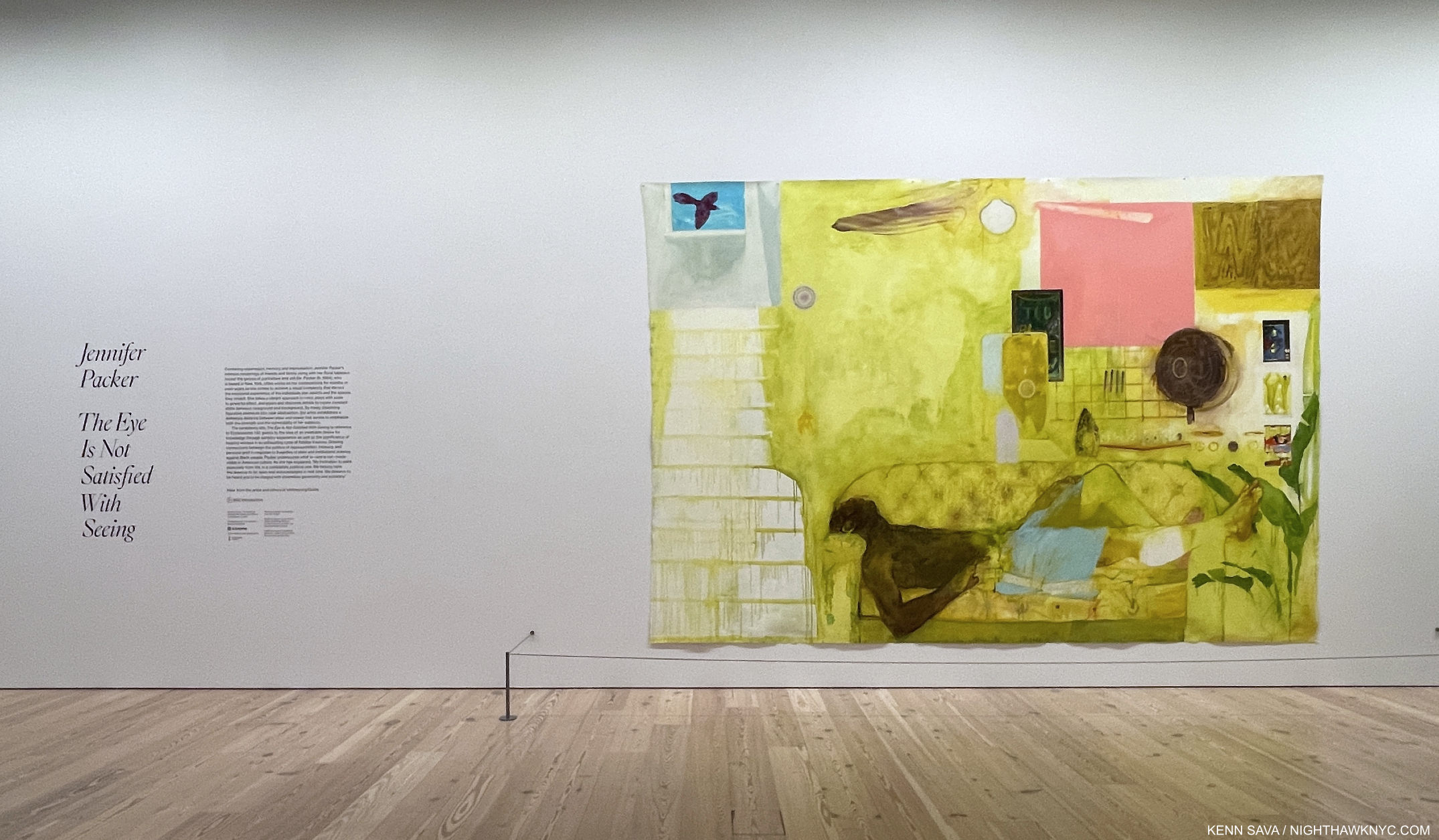
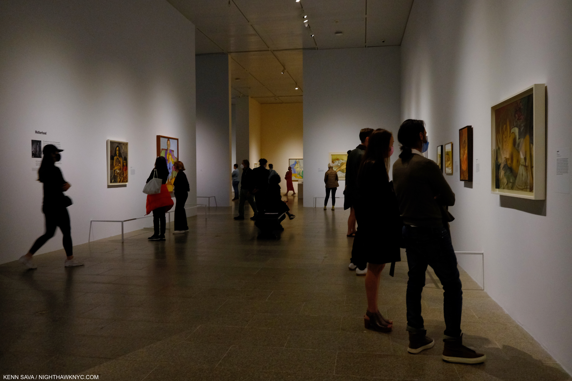
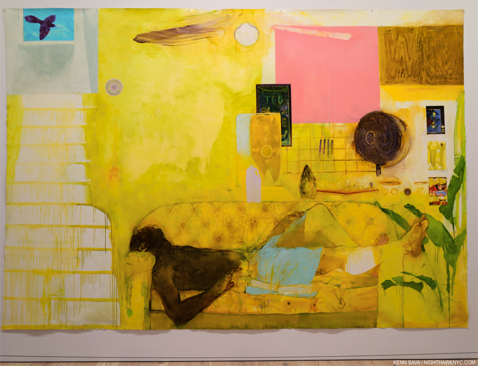
The opening gallery during the early days of the show’s run. Blessed Are Those Who Mourn (Breonna! Breonna!), 2020, Oil on canvas, 118 by 172 inches, her largest Painting to date.

Still, it turns out I had no idea what I was in for when I stepped off that elevator in late October. An hour and a half later, I left awestruck.

Mourning is a central theme of this stunning, meditative, work, and others in the show. Here, in a work that also includes 3 fans, the 2020 violent death of Breonna Taylor is echoed in this reminder that the mourning continues as does the search for justice. I don’t know if Ms. Packer knew Ms. Taylor or not, but the sense of loss here fits right in with the intimacy of her Portraits of her friends and those she does know.

I can’t remember the last time I was in a show of work by an Artist largely unknown to me that left me with the undeniable feeling that I was in the presence of true greatness.

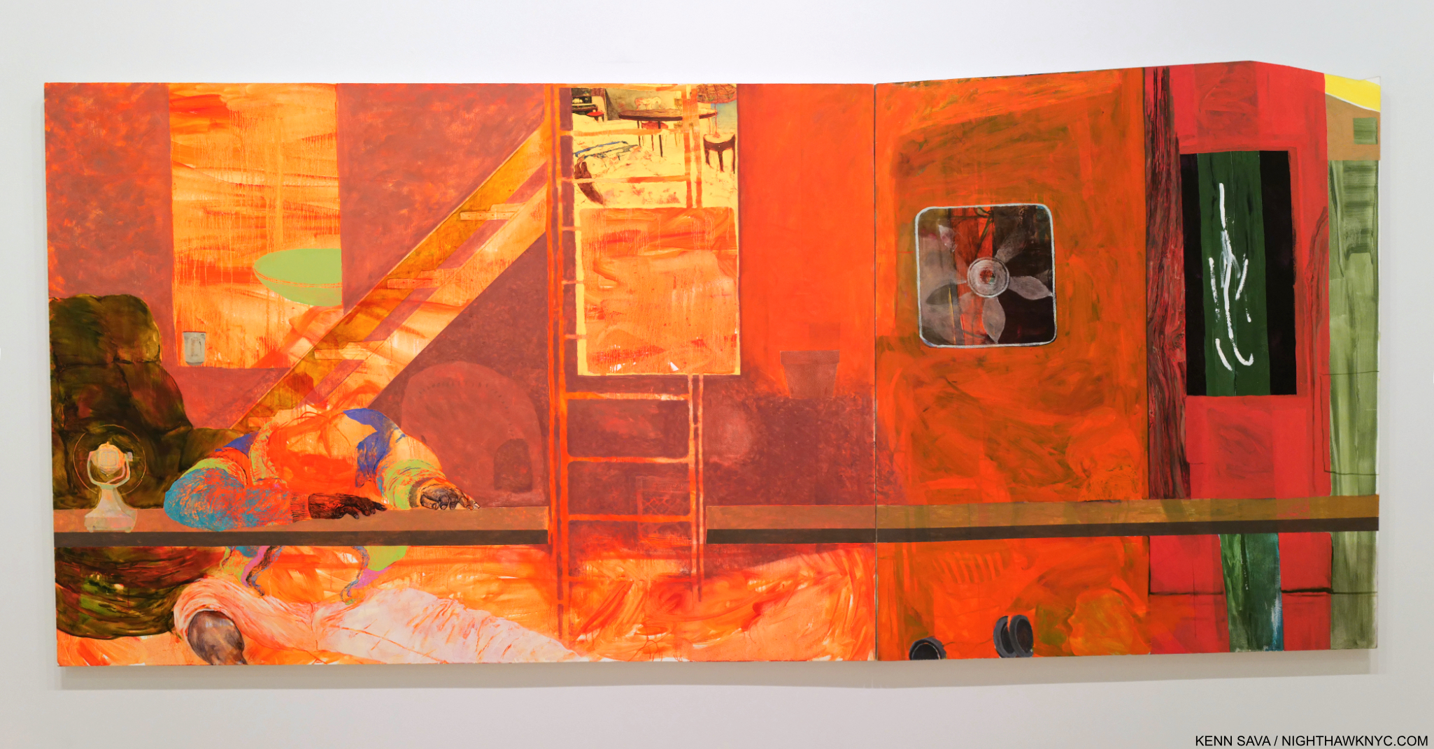
Fire Next Time, 2012, Oil on canvas, 72 x 156 inches. The presence of fans (2), a recurring motif, doesn’t keep this  remarkable large work from literally burning off the canvas. The stairs offering the only way out for the figure slumped to the left.

I did not writing that last sentence lightly. I’ve spent two months thinking about it and letting the dust begin to settle before writing this piece. I started going to Art shows in 1980. The very first show I saw was the 1980 Picasso Retrospective at MoMA. I was on the road with a band and flew back to NYC, twice, just to see it. I could have stopped looking at Art right then. I’ve never seen anything like it- still. In the intervening 41 years I’ve seen thousands of shows, hundreds each year, and I count 1,700+ visits to The Metropolitan Museum among them. I’ve been thinking back trying to recall having had this feeling before… When I first saw a Sarah Sze show in the 1990s that had a similar effect, though, given the large size of the work, there were only a few pieces in the show. Most of the great shows I’ve seen have been of work by Artists very well known to me. It takes years, decades, for an Artist to create a body of truly great work. Jennifer Packer has managed to put together an extremely impressive, even revolutionary, body of work at at the ripe old age of about 37. It’s even more remarkable to consider that some of the major pieces in this show are 10 years old (Fire Next Time, 2012 or Lost In Translation, 2013), or close to it!

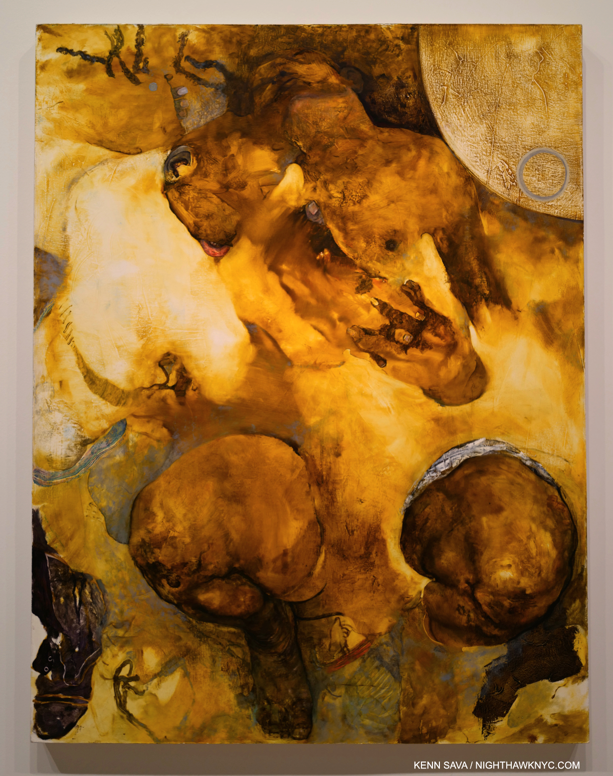
Lost In Translation, 2013, Oil on canvas. One of the most remarkable Paintings I’ve seen in years. One of Ms. Packer’s “trademarks” is the there/not-thereness of her Portrait subjects. Here, in this double Portrait, things get taken to an entirely different level. I under exposed this shot to try to show the gorgeous, subtle, range of tones that are easily lost under bright light.

Revolutionary? How?

In the space of 35 works, Ms. Packer manages to “reinvent,” in a sense, both the Portrait and the Still Life. Portraits have been around for thousands of years, going at least as far back as the Ancient Egyptians. Yet, I can’t recall ever seeing anything like Lost In Translation before. The figures melt into each other in a way that Abstraction overplays and Representational Painting doesn’t attempt. Here, we have something “in between,” leaving it up to the viewers to try and decipher. Well, yes, Picasso managed to reinvent the Portrait any number of times (no comparison of the two Artists is intended). He was about 26 when he Painted Les Demoiselles d’Avignon in 1907, perhaps the beginning of his continual reinvention of the Portrait (though in a group ). Jennifer Packer was about 27 when she Painted Lost In Translation.

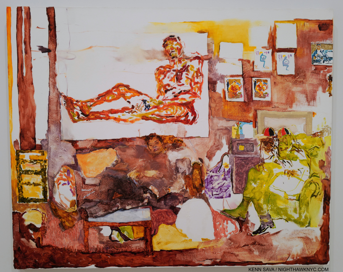
The renowned Painter Jordan Casteel sits in her studio at Yale where Jennifer Painted her in 2014. Jordan, 2014, Oil on canvas, 36 by 48 inches.

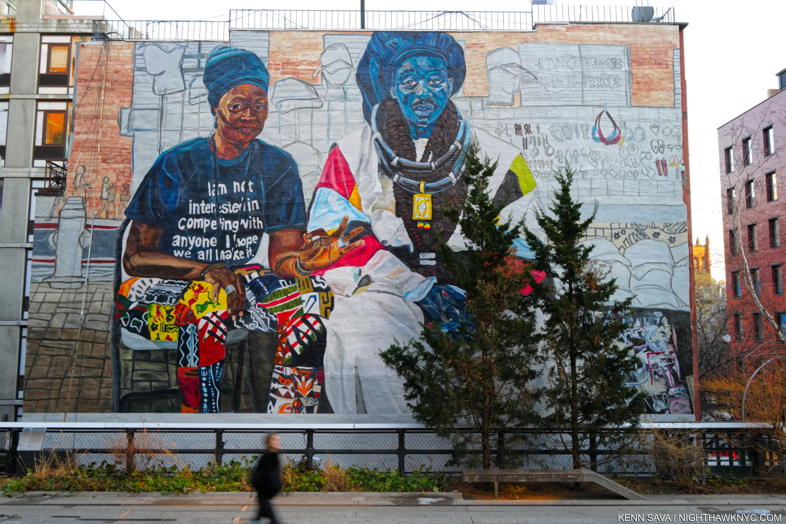
More Art in NYC, in 2021. The same Jordan Casteel was commissioned to Paint this Mural, The Baayfalls,  on the High Line. It should be up until March.

She favors friends, loved ones and those in her circle as subjects, so this there/not-thereness of her subjects in her Paintings is partially a way of “protecting” them she has said. This is achieved through a very wide range of mark-making that magically coalesce into images that are remarkable for both their “thereness” and their nebulosity.

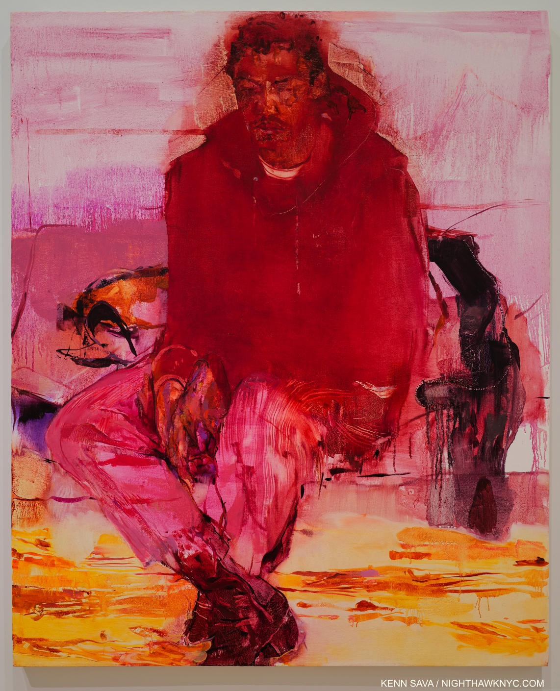
Her use of color is another bombshell. When was the last time you saw a Portrait done in red as she does here (in the face not the hoodie)? The Body Has Memory, 2018, Oil on canvas, 60 x 48 inches, a Portrait of the Artist’s friend Eric N. Mack, a fellow-2019 Whitney Biennal Artist.

The power in her work, for me, lies in her uncanny way of combining opposites- intimacy and nebulosity, presence and absence, color and emptiness, created and enhanced with that extremely wide range of mark making techniques I mentioned that all flow together magically. I haven’t seen anything like her intimacy and nebulosity since Francis Bacon, while other elements, like her settings, echo Kerry James Marshall for me. Jennifer Packer seems to prefer to place her subjects in their surroundings, reminiscent of Mr. Marshall’s marvelous, and intimate, home settings. Her poses have an amazing “comfortable in their own skin”-ness that are a hallmark of Alice Neel’s Portraits. In the end, all of this leaves much for the viewer to ponder for his or herself, and, at least in my case, brings me back again and again to look further.

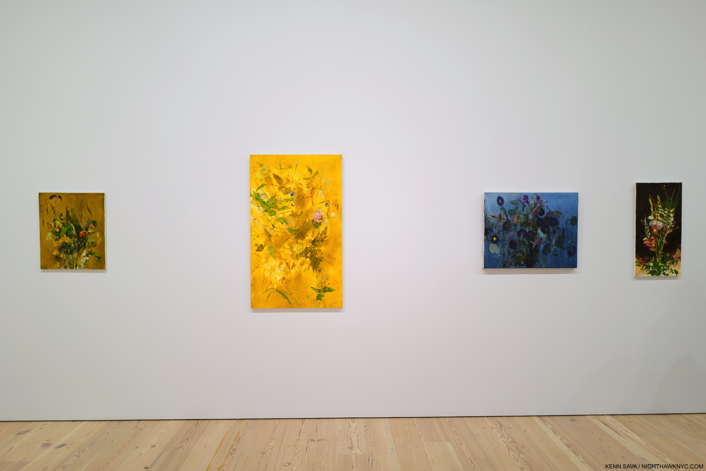
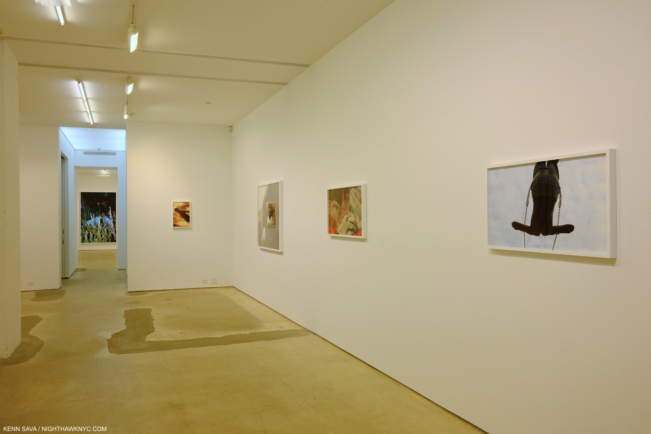
A wall of her Still Lifes in the third gallery.

How has she revolutionized the Still Life?

Say Her Name, 2017, Oil on canvas. Ms. Packer memorialized Sandra Bland, two years after her death in police custody at age 28.

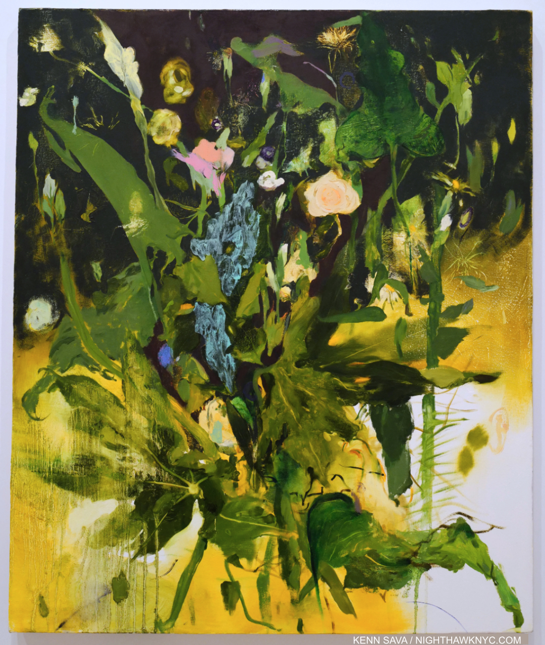
Those on view at the Whitney are freed from their usual setting in a vase or a bowl on a table. In Jennifer Packer’s, the plants seem to float in thin air. Have you ever seen any like them1? Doing this allows her to control the context. All of a sudden, these pieces are not “about” place. They are about something else. They are about what the Artist has on her mind while she’s Painting them, and that’s what the viewer is left to ponder.

Oh, and to those obsessed with putting Artists in boxes, for reasons that continue to escape me (besides laziness), Good Luck boxing Jennifer Packer in anything besides the Jennifer Packer “box!”

In case you’re wondering, she Draws as uniquely as she Paints.

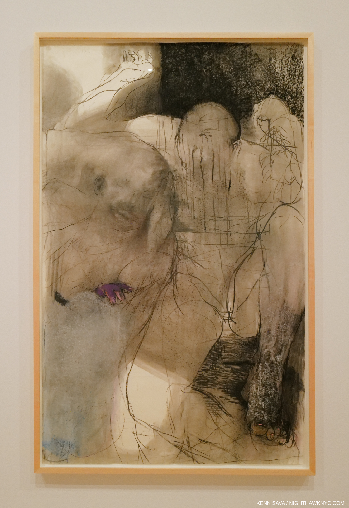
The Mind Is Its Own Place, 2020, Charcoal and pastel on paper.

The Mind Is Its Own Place strikes me as something of a counterpart to Lost In Translation from seven years before, retaining much of the power of the earlier Painting. Her lines carry much of the weight of the color in her Paintings. The Drawings on view here are every bit as mysterious and nebulous as her Paintings, though in different ways, particularly without the colors. And every bit as stunning, which is no mean feat.

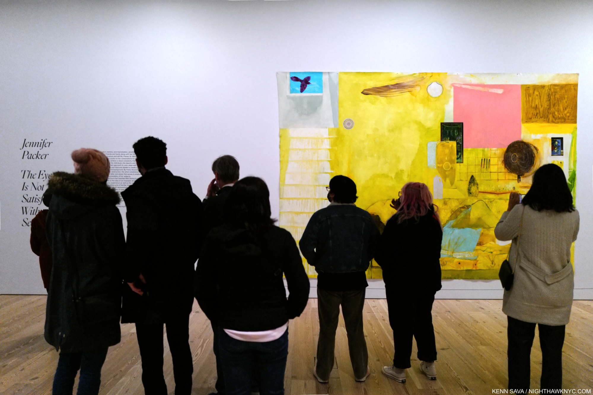
The word is out. The crowds are beginning to show up, the catalog is sold out. December 28, 2021. By the time this show ends in April, I expect there to be a line to see it. And not only because of the virus.

After six visits, two and a half months in as I write this, it astounds me to write that I’m left with the inexorable feeling that we are watching the arrival of an important, major Artist. That’s “major” as in the major Artists who line the galleries of our greatest museums.

Important how?

First, reinventing the Portrait and the Still Life puts her in that discussion. That’s more than a lot of all Painters living or dead have done. Second, as she’s said, “My inclination to paint, especially from life, is a completely political one. We belong here. We deserve to be seen and acknowledged in real time. We deserve to be heard and to be imaged with shameless generosity and accuracy.” Looking at her work, though, one thing that strikes me hard is that in her efforts to imagine “with shameless generosity and accuracy,” many, if not most, of her Portraits have an other world quality that is fresh and haunting. She brings “negative space” into the physical body! Parts of her subject’s bodies are left blank in a different way they are in Egon Schiele’s work, or anyone else’s. It’s almost like she doesn’t want to reveal, or share, too much of the sitter, who are often those close to her. For me, at least, that feels endearing and heightens their intimacy. Those are the qualities I respond to. She accomplishes this using an extremely wide range of mark making. Not since so-called Abstract Expressionism have I seen a Painter who is so free in her technique, but it always just works. It always looks “right.” When I look at her Portraits, they  look to me exactly like what it really is- A sitter who might have been there (i.e. sitting in front of Ms. Packer) once. A temporary state. “It’s not figures, not bodies, but humans I am painting,” she said.

Equally astounding for me is to say that, all of one show in, Jennifer Packer’s name is at the top of my list of important Painters to arrive in the 21st century. Yes, I know. I’m the guy who doesn’t believe “best” exists in the Arts. It doesn’t. Let’s just say that if the conversation turned to “Who are the important Painters to arrive in the 21st century?” She’d be the first one I’d name. It’s a symptom of how much her work is on my mind.

Besides, someone has to be first. ; )

BookMarks-

Going…going…gone….

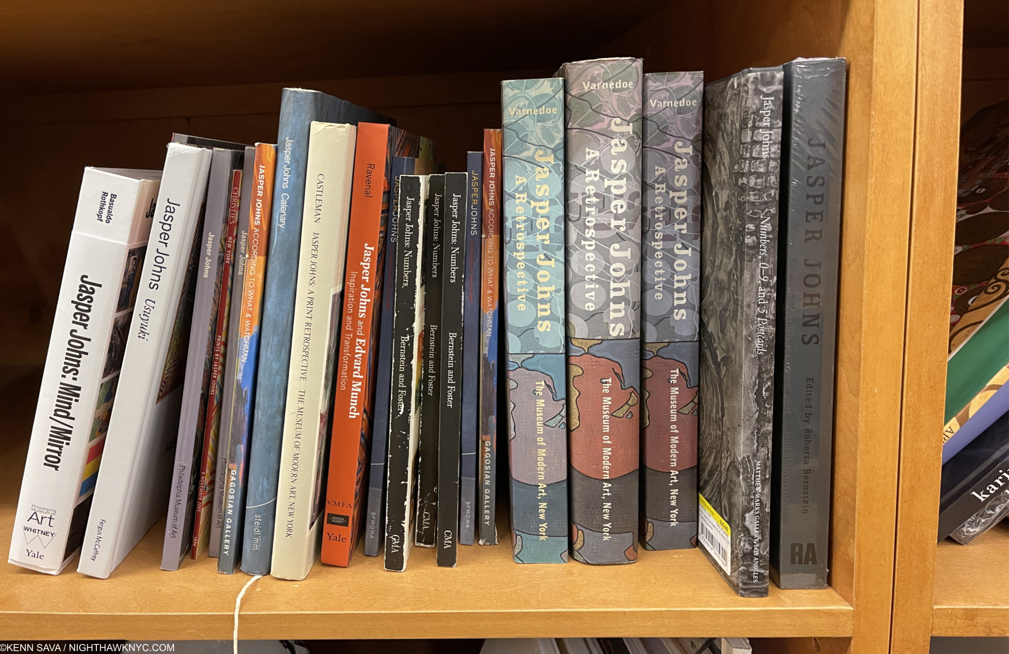
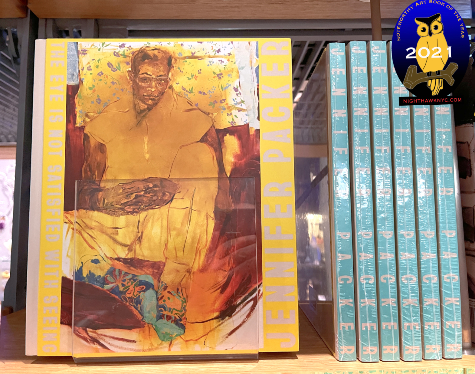
The catalog accompanying the London & Whitney installations of Jennifer Packer: The Eye Is Not Satisfied with Seeing: Serpentine Gallery, London is exceptionally well-done. One of the most beautiful Painting books I’ve seen, it carries over Ms. Packer’s unique color sense to varying colored paper for the text sections. It was easily one of my NoteWorthy Art Books of 2021 among most highly recommended Art Books I saw last year. If you buy it from the link in the book title in this paragraph (only), NHNYC will receive a small commission, with my thanks. 

*Soundtrack for this Post is “Hidden Place” by Björk, the first track on her album Verpertine, 2001, performed here (at 23:04) in 2001 in her extraordinary concert at Riverside Church.

NighthawkNYC.com has been entirely self-funded & ad-free for over 7 years, during which over 275 full length pieces have been published! If you’ve found it worthwhile, PLEASE donate to allow me to continue below. Thank you, Kenn.

You can also support it by buying Art, Art & Photography books, and Music from my collection! Books may be found here. Music here and here

Written & photographed by Kenn Sava for nighthawknyc.com unless otherwise credited. To send comments, thoughts, feedback or propositions click here. Click the white box on the upper right for the archives or to search them. Subscribe to be notified of new Posts below. Your information will be used for no other purpose.

  1. There have been isolated instances, like Fantin-Latour’s White Lilies, 1877, but I have not seen a body of them, and certainly not with Mr. Packer’s intent.

Jasper Johns: Contemporary Art Begins Here

Written & Photographed by Kenn Sava (except *)

Art in NYC, 2021, Part 1-

Robert Rauschenberg and Jasper Johns. Or is it Jasper Johns and Robert Rauschenberg? Who came first? Mr. Johns said, Mr. Rauschenberg “was the first person I knew who was a real artist (i.e. a working artist)1.” At the time, Jasper Johns was working at the Marlboro Bookstore.

Contemporary Art starts here. Jasper Johns seen in his Pearl Street studio in 1955, with two of the most important early works in Contemporary Art- the first Flag Painting, 1954-55, and Target with Four Faces, 1955. At the time, Robert Rauschenberg had an apartment/studio upstairs. *Photo by George Moffet from the MoMA Jasper Johns: A Retrospective catalog, p.125.

Still, it was Jasper Johns who came to acclaim first when in 1957, Leo Castelli visited his Pearl Street studio, seen above, saw his work and offered him a solo show the following January. The rest is history. In 1959, Time Magazine said-

“Jasper Johns, 29, is the brand-new darling of the art world’s bright, brittle avant-garde. A year ago he was practically unknown; since then he has had a sellout show in Manhattan, has exhibited in Paris and Milan, was the only American to win a painting prize at the Carnegie International, and has seen three of his paintings brought for Manhattan’s Museum of Modern Art.” 2.

For my part, I was so taken with Robert Rauschenberg’s work that I was slow in getting to Jasper Johns. Over the years, his work has spoken to me more and more, to the point of shouting to me now. Messers Johns & Rauschenberg eventually became romantically involved only to have it end in 1961. At this point, almost 70 years since the Photo above was taken, all that really matters for the rest of us is that both have created two of the most important bodies of work of our time.

Happy Birthday, Jasper Johns! The Artist cutting an Ale Can Birthday Cake on his 90th birthday, May 15, 2020. *Unknown Photographer.

Jasper Johns: Mind/Mirror is an early candidate for the show of the decade. With around 500 pieces, it’s so vast it’s split between two major museums simultaneously- the Whitney Museum of American Art, and the Philadelphia Museum. Scheduled to coincide with the Artist’s 90th birthday on May 15, 2020, its opening was unfortunately delayed due to covid until September 29, 2021. Still, it’s a stellar 90th Birthday present. Having visited the Whitney half about 10 times, in my opinion, it ranks with the finest shows yet mounted in their new building- Frank Stella, Vida Americana, and Julie Mehretu. It’s brilliantly conceived & laid out and very thoughtfully & intelligently installed.

Roll up! It just so happens this bus, the M14, will take you to the show, among other places…

There have been some important, major, Jasper Johns shows to this point including the 1996 Jasper Johns: A Retrospective at MoMA, Jasper Johns: Something Resembling Truth, at the Royal Academy, London in 2017, and previous large shows at the Whitney & Philadelphia Museums. Yet, given the long-standing relationships Mr. Johns has had with both of those institutions, and the large holdings of his work they each have, I wonder if there will EVER be a more comprehensive look at the work & career of this now legendary Artist, especially with his involvement. As a result, Jasper Johns: Mind/Mirror is something of a perfect storm in an imperfect time of a show. Though I have only seen the Whitney half (and the rest in the fine Jasper Johns: Mind/Mirror catalog, the only place where you can see the entire show) , it still ranks among the great shows I’ve seen in the past decade including Michelangelo: Divine Draftsman & Designer and Kerry James Marshall: Mastry. Also, consider this- Imagine being the curator of the largest Jasper Johns show ever, then being told you only get to mount half of it in your institution! HOW do you divide an Artist’s career in half, and make it cohesive particularly to a discerning Art audience like NYC, while not shorting the equally discerning Philadelphia Art audience?– or vice versa?

Off and running. The exhibition’s lobby contains 39 Paintings, Drawings & Prints that range over his entire career arranged chronologically, and includes a number of very well-known works.

From the evidence I have right now, having seen the NYC half and the Mind/Mirror catalog , they’ve done an extraordinary job. Both halves are full of important pieces and rarely seen supporting works. The show is broken down into themes, which follow the chronological arc of the Artist’s career, which are then divided in half between the two locations and arranged into rooms by theme. Somehow, a visit to one doesn’t leave you with an overriding feeling of missing too much. Yes, if you have followed Mr. Johns career and you go to the Whitney you’ll find yourself looking for his first Flag, 1954-5, or Untitled, 1972, both of which are on view in Philly, but what IS here more than makes up for it. Time and again I found myself surprised that such and such a work WAS here. Not only that, more often than not, it is so thoughtfully displayed that there’s very likely supporting pieces nearby which shed completely new light on it. A good example of this is the wonderful gallery devoted to one of his most fascinating pieces, According to What?, 1964, which was surrounded with three walls of related work that reveal how much each detail in According to What? means to the Artist and how much thought and planning went into it. 

According to What?, 1964, Oil and objects on canvas. This is one of his works that can be seen as a “summing” up of where he was at that point, coming on the heels of Retrospectives at the Jewish Museum, NYC, and the Whitechapel Gallery, London (which would happen, again, after his MoMA Retrospective in 1996. It’s full of objects that he would reference in other works, which surround it in this gallery. It’s also a “tribute” to Marcel Duchamp, with a copy of his Self-Portrait hanging down on the left on the panel that is usually closed when this piece is seen.

Having said all of that, there is a somewhat basic conundrum to consider. Seeing ONE work by Jasper Johns leaves the exact same feeling as seeing, approximately, 250 in each half of this show, or all 500 for that matter: What’s going on? What is it “about?”

Installation view of parts of two of the surrounding and supporting walls. The series of Prints on the left isolate elements of the Painting, which brings the viewer back to study each in the larger work. There is another half of this gallery behind me.

Looking at a few or a few hundred begins to shed light. At the age of 24, in the fall 1954, Jasper Johns destroyed all of his work in his possession 3. He wiped the slate clean (something he would do again, non-destructively, after the MoMA Retrospective in 1996). Right from the earliest work he then created using “things the mind already knows,” he said of the flags, targets, numbers, etc. he featured resulted in pieces the viewing public immediately had a way “in to” at a time of densely personal Abstraction that often lacked one. He created multiple pieces with each object around the same time, then suddenly, one would return years, even decades, later. They became parts of his own language. Symbols. Stand ins. Of what? That’s up to Mr. Johns and each viewer to decide. Thus far, that’s kept viewers and the Art world busy for over 6 decades.

Three Flags, 1958, Encaustic on canvas.

“Jasper Johns is an American painter, sculptor and printmaker whose work is associated with abstract expressionism, Neo-Dada and pop art.” Wikipedia.

There, in one sentence spotted on a search result page is why I avoid Wikipedia. Mr. Johns’s early work is the antithesis of Abstract Expressionism! He and Robert Rauschenberg set out to do their own thing in the face of the all-encompassing tide of AbEx that was at its zenith when they began. To this end, Mr. Rauschenberg even famously erased a Drawing by Willem de Kooning, one of the most prominent of the first wave of AbEx Painters. Jasper Johns’s stated creed was “When I could observe what others did, I tried to remove that from my work. My work became a constant negation of impulses.4” “I was anxious to clarify for myself and others what I was5.” As for “Neo-Dada,” he, like countless others, was influenced by Marcel Duchamp AFTER he saw his work in 1957 and then met him circa 1958-9. But, people “associated” his work with Duchamp’s beginning in 1957, when he had never seen it!

White Flag, 1955, Encaustic, oil, newsprint, and charcoal on canvas. His second and largest flag, on loan from The Met.

Yes, his post-1954 early work center around familiar objects that he has turned into Paintings or Sculpture, his “vocabulary” of elements “the mind already knows” famously include the American Flag, targets, numerals, words, ale cans, Savorin cans and string. yet I don’t see them as “pop,” and I don’t consider Mr. Johns (or Robert Rauschenberg or James Rosenquist for the matter), “pop” Artists, though I know some do. Flags, targets and numbers are not soup cans or Brillo boxes. (His Ale Can Sculpture resulted from a dare, so I read it somewhat tongue in cheek.) His Savorin can Sculpture and Prints are based on the can and brushes in his studio. The wall card makes the case that the Savorin can and paint brushes are “stand-ins” for the Artist. Again, not “pop.” This is interesting because his “object” based work of the 1950s allowed him to remain detached. “I don’t want my work to be an exposure of my feelings,” he said around 1977 6. Over time that has seemed to change, but looking for specifics gets tricky.

A gallery full of his Savorin can Sculpture, 1960, and Monotypes from the 1970s and 80s he made of the object on the 4 surrounding walls. He used a Savorin can as a paint brush holder in his studio. Not sure that makes it “pop.”

As you walk through the show you’ll see expressive passages in Paintings that are a hallmark of AbEx (as in According to What?), but rarely entire Paintings (there are a few), and these were done after the heyday of the first wave Abstract Expressionist Painters. These passages don’t define him or any of his work, in my view, especially given his early work stood diametrically opposed to theirs. It’s really one technique among the very many Mr. Johns uses. As time has gone on, Jasper Johns has shown more interest in Art history, and numerous Artists, like Picasso, Leonardo, Duchamp and Edvard Munch, have “appeared” in his work. As I mentioned in my piece on MoMA’s Cézanne Drawing show, which included a dozen works from Mr. Johns’s collection, he has amassed a world-class Art collection, demonstrating impeccable taste in his acquisitions, that is fascinating in its breadth. Whatever his initial influences were, from the beginning with Flag, 1954-55, Jasper Johns’s work has looked like no one else’s. In my view, that Wikipedia page should read- Jasper Johns’s work is associated with Japer Johns.

One of the most extraordinary works of the 1950s. Target with Four Faces, 1955, Encaustic on newspaper and cloth over canvas surrounded by four tinted-plaster faces in wood box with hinged front.

Another fascinating early work is Target with Four Faces, 1955, which contains 4 heads cut off at just below the eye. They all appear to be male. The piece has a door that can be lowered blocking the faces from view. And, there it was, on loan from MoMA, appropriately on the first wall in the first gallery. A shot over the bow of the Art world in 1955, and today. I came away believing that if Jasper Johns had never made another work after it, Target with Four Faces was enough to seal his stature.

Detail. I was told by a Whitney staffer that the heads were cast from four people in his studio. Note the hinged door above them, which when closed, gives the work an entirely different effect. Also notice the amount of work that went into placing the heads just so. Standing to the side reveals that the tip of the noses must be right up against that door when it’s closed.

Either way, they can’t see what is going on in front of them. Are they present while someone is being targeted, but unseeing? Or, are they the ones with the target on them? It’s easy to read things into them, including Mr. Johns’s fellow gay men being targets, or the public being blind to the “targeting” of others. What about the prominence of their noses, or their closed mouths? Or…..? It’ll say something else the next time I look at it.

One of my favorite elements of Jasper Johns’s early collages are when the underlying material, often newspapers, comes through- either intentionally or through age. In this marvelous very small Flag from 1965, Encaustic and collage on canvas, 7 3/4 by 11 1/4 inches, it’s hard to tell which is the case, particularly with the row of faces to the right. Included in a stunning gallery at the heart of the show of small works from throughout his career.

But, fortunately for the world, he has continued to create. For 68 more years, so far! His Flags raise similar wonder. Does that they were Painted by a gay man in the 1950s living in a country with harsh stereotypes against him and his kind enter into it? A yearning for a Flag that stood for all? For me, anyway, it’s hard to see either of these pieces and not wonder about these things. Of course, as you move through the show one thing becomes quickly apparent. In the Art of Jasper Johns virtually nothing is THAT simple. 

Untitled, 1992-5, Oil on canvas, 78 by 118 inches.

After these early “objects” and object based works, in the early 1960s, Mr. Johns’s work becomes something of a “non abstract form of abstraction,” as the late Kirk Varnedoe, curator of the MoMA Johns Retrospective called it7, where objects and symbols become elements and not the sole subject. Was this done to subvert attempts at “reading” his Art?

The Seasons, 1989-90, Acrylic over intaglio on paper. That figure is reputed to be the Artist’s. On the terrific installation of this show- While this might seem a small detail, I can’t recall ever being in a show where virtually NONE of the pieces suffered terribly from glare. Here, I’m standing directly in front of  The Seasons and there is no reflection. Oh, if only other museums (and galleries) would see what a huge difference it makes it might help persuade them to pay the considerable current cost for glare-free acrylic glazing on pieces with glazing.

In the 1960s his work turned to more private imagery and symbols as opposed to the well-known objects, like Flags and targets. In works like According to What? his use of them reaches a crescendo, and these continued for some years until he wiped the slate clean, again, and began his Cross-hatched period. Things seem to build to another crescendo, like The Seasons, above or Untitled, 1992-94, which led up to his MoMA Retrospective, which would change everything.

Catenary (I Call to the Grave), 1998, Encaustic on canvas with wood and string. After the MoMA Retrospective, Mr. Johns stripped his canvases bare and began to address aging and death in the Catenary series, which numbers 19 Paintings, of which this one never fails to stir me, 55 Drawings and 6 Prints.

The MoMA Retrospective in 1996 caused the Artist to take stock of where he was and led to him drastically changing course. He wiped the slate clean, again. By that time, his work had grown very complex, but now his work emptied. His focus turned to the eventuality of death. This resulted in his extraordinary Catenary series, 1998, and has continued to be (one of) the overriding themes of his work to this day. 

The remarkable Farley Breaks Down 2014, Ink and water-soluble encaustic on plastic. I was stunned when I first saw this in 2019. A work without precedent in Jasper Johns’ enormous output created at 84. The Whitney wisely acquired it.

In 2019 I happened in to Jasper Johns: Recent Paintings & Works on Paper at Matthew Marks Gallery and was frankly overwhelmed when I saw a series of works titled Farley Breaks Down. I’d never seen anything like them, typical of Jasper Johns, yes, but even in his long and productive career they stand alone. I wrote about the show here. Just prior to these there are works in ink and water-soluble encaustic on plastic, but with this subject, Mr. Johns has reached an entirely new level. In 1965, LIFE Magazine Photographer Larry Burrows created a series of Photographs following a helicopter crew, Yankee Papa 13, on a mission in the Vietnam War. During it, one crew member was killed and another wounded. The last Photograph in the series shows Cpl. Farley back at the base breaking down. A few years later Larry Burrows was killed in another of these helicopter missions. It is this image that Jasper Johns chose to interpret. Jasper Johns did 2 years in the Army during the Korean War based in South Carolina and Japan. Still, exactly why he chose to create this series of works in his 80s is up for conjecture.

Detail of “Farley.”

Is it coincidence that over the years, Mr. Johns has lost his entire circle of fellow Artists- Robert Rauschenberg, Merce Cunningham, Morton Feldman and John Cage among them? The series is remarkable both for its incredible power and melancholy (which is not new to his work), as well as it’s stunningly beautiful flowing technique. It’s almost like these pieces are created with colored tears. Yet here, loss is the subject, and for the first time in his work, it’s presented almost nakedly.

A half gallery of dark works created after the breakup with Rauschenberg in 1961 (except for the work on the far left and the sculpture in the middle, including Liar, in the facing left corner.

There is also the pain of another kind of loss. The loss of romantic love. While I have no idea what Jasper Johns’s romantic life has been like, the second part of the first gallery is devoted to the searing works Mr. Johns created after his relationship with Robert Rauschenberg ended in 1961. The visual evidence is overwhelming that it had a devastating effect on him. After these, there is silence in his work where romance might be concerned. He shows deep affection for friends and those he admires, but there is never an expression of romantic love. This, also, is rare in Art8.

Recent Jasper Johns. Untitled, 2020, Intaglio on Magnani Insisioni paper. This piece was on view in both the Matthew Marks & Whitney shows.

As if the Whitney & Philadelphia Museums shows weren’t enough Jasper Johns there was also a remarkable show of his most recent work coinciding with the opening of JJ:M/M, Jasper Johns: New Works on Paper at Matthew Marks Gallery!

Untitled, 2021, Acrylic and graphic over etching on paper. Different, as ever, these works emphasized the cosmology theme which has appeared in some earlier works. The detail in these is both subtle and remarkable. The show consisted of a wall of these, facing a wall of Drawing based works like Untitled, 2020, above with stick figures.

Having seen upwards of 300 of his pieces between the two NYC shows two things stand out for me are- first, Mr. Johns incredible intellect. As you walk through the show you begin to notice that Jasper Johns does nothing- including speak, without very carefully considering what’s going to come out. At first glance some of his pieces look improvised, until you see a carefully crafted Drawing or other supporting pieces in which every detail has been carefully rendered, belying the careful consideration and the large amount of work that went into them. And this is continued over a seemingly endless body of work over 65 years of continually doing something different.

Diver, 1962-3, Charcoal, pastel and paint on two sheets of paper mounted on two adjoining canvas supports, 7 FEET 2 1/2 by 71 3/4 inches!

Second, I haven’t realized how much the anguish of loss is a central theme of his work. This includes the thought of facing one’s own aging and death. For such a private man who’s work is often so dense as to defy understanding, he has repeatedly found his own unique ways of expressing it powerfully. Though each section (of both the NYC & Philly halves ) of Jasper Johns: Mind/Mirror is titled, loss and death are not among them. They are the unstated central themes of a good deal of his work, which continues through his latest work shown at Matthew Marks this past fall.

In the final gallery, along side 4 pieces from the remarkable Farley Breaks Down series, is this Painting, similar to the pieces lining the west wall of the Matthew Marks show, like Untitled, 2021, shown above.

Slice, 2020, Oil on canvas. A close look at this large piece reveals amazing detail and depth, the background reminiscent of End Paper, 1976 and Céline, 1978.

As the wall card says, “…ungraspable…”

Picasso outlived, and outworked, all of the boxes his work was put in- the so-called “Blue Period,” the “Rose Period,” Cubism, etc., etc. He did this by simply being himself. His Art changed as he changed. Jasper Johns, who has outlived all his contemporaries, was, perhaps, the first Artist to be lumped into the “Contemporary Art” box in 1958. Still going strong at 91 in 2022 as the Art world is morphs into whatever is coming next, Mr. Johns career has been one long continuous model for Artists- “When I could observe what others did, I tried to remove that from my work,” which has led to 68+ years of fresh ideas that point the way to the future.

Flag Above White With Collage, 1955, Encaustic and collage on canvas. Mr. Johns has used encaustic (a mixture of hot wax and paint) continuously throughout his career, one of the very few to use it so frequently, if not the only one, among major Artists. It is used in most of the works in the show.

It turns out that Jasper Johns: Mind/Mirror is not the only great and important show currently up in the Whitney this fall/winter! Since I sub-titled this piece “Art in NYC, 2021, Part 1,” Part 2 will look at it.

*-Soundtrack for this Post is “I Don’t Want to Be Your Shadow,” by the Psychedelic Furs, from Forever Now, 1982, or “My Life is a Succession of People Saying Goodbye,” by Morrissey from You Are The Quarry, Extended Edition.

BookMarks-

With a career spanning a whopping 68 years(!), and counting, among the longest in Art history, you’d expect there have been a LOT of books published on Jasper Johns, and you’re right. There are. I see books I”ve never seen before each time I look. The latest being a catalog for a show on Jasper Johns and Edvard Munch (the book with the orange spine, above)! Among them, a few that I’ve seen are particularly recommended-

Jasper Johns: Mind/Mirror, Philadelphia Museum/Whitney Museum/Yale-  Though it’s close to 4 pounds, it’s wonderfully succinct and the best place to get an overview of Jasper Johns’s work over his amazingly long career up to 2020. The text accompanying each chronological section is also concise, remarkably distilling voluminous information down to a few pages, though I found the essays hit or miss. The book is the only way to see the whole show besides traveling to both museums (where it is only up until February 13, 2022). Highest recommendation for those seeking one Jasper Johns book with the most and broadest range of his Art in color.

Jasper Johns: A Retrospective, Museum of Modern Art- The catalog for the landmark Johns show in late, 1996 to early 1997 with a fine essay by curator Kirk Varnedoe, is a thorough look at his work up to 1996. In my opinion, it remains the finest reference on Jasper Johns due to its comprehensive 250 page Chronology and Plates section which goes up to the end of 1995. It’s also of ongoing importance in the history of the Artist when you consider that having this Retrospective had such an impact on the Artist that it caused his work to drastically change after and since. The immediate result was the extraordinary Catenary series, though all of his work since bear the hallmarks of that change. Here is a terrific record of his work up to that point that includes many illustrations. A model exhibition catalog that Mr. Johns designed the endpapers for. Essential for the Jasper Johns fan.

Jasper Johns: Redo an Eye, Wildenstein- A 300+ page look at the work of Jasper Johns that provides a comprehensive look at the Artist’s Art over his entire career up to about 2018, and one of the few to cover his later work. Author Roberta Bernstein says she has spent much time with Mr. Johns over the past 50 years, in addition to focusing on studying his Art. As a result, the book provides numerous insights. The most comprehensive overview currently available, it’s also available as Volume 1 of the Jasper Johns: Catalogue Raisonné of Painting and Sculpture, listed further below. Includes many illustrations, though in smaller sizes then the MoMA Retrospective, above, or the Whitney book, which are meant to illuminate the text since it originally served as the introduction to the Catalogue Raisonné, which has the large size reproductions. Recommended for those who want to dive deeper into Jasper Johns.

Jasper Johns: Catenary, Matthew Marks Gallery- (The book with the blue spine in the bookshelf pic with the string appropriately hanging down from it.) Matthew Marks Gallery has shown the Artist for many years, and has often published very well done and beautiful catalogs for their shows. Each is worth seeking out. Among them, I’ll highlight two here. Published to accompany the show of the same name in 2005, this was the only opportunity to date to survey this exceptional body of 80 later works which was the result of the Artist’s reaction to the aforementioned MoMA Jasper Johns: A Retrospective. They center around aging and death, each of which is illustrated in color here. It includes a fine essay by Scott Rothkopf, the co-curator of Jasper Johns: Mind/Mirror. It’s also beautifully published by Steidl. Out of print but not expensive.

Jasper Johns: Recent Paintings and Works on Paper, Matthew Marks Gallery- Published to accompany the unforgettable show of the same name in 2019, a NoteWorthy Show, which shows yet another new side of the Artist’s work. Featuring the extraordinary Farley Breaks Down series along with a number of other compelling recent works, with over 60 illustrated here. I was stunned when I saw the Farley pieces. They seemed to be without precedent- both in Johns’s work or that of any other. Both books are highly recommended to those interested in John later & current work.

For serious study & research, there is the Jasper Johns: Catalogue Raisonné of Painting and Sculpture, a 5 volume set that currently trade at big discounts from its $1,500.00 list price. I can’t help but wonder if this is because they are already out of date since Mr. Johns has continued to create prolifically since it was published. It only goes to 2014. Then there is the Jasper Johns Catalogue Raisonné of Drawing set published in 2018 and the Jasper Johns: Catalogue Raisonné of Monotypes, collecting his unique prints to about 2018 (like the Savorin can Prints seen above).

NighthawkNYC.com has been entirely self-funded and ad-free for over 7 years, during which over 275 full-length pieces have been published. If you’ve found it worthwhile, you can donate to keep it going & ad-free below. Thank you!

Written & photographed by Kenn Sava for nighthawknyc.com unless otherwise credited.
To send comments, thoughts, feedback or propositions click here.
Click the white box on the upper right for the archives or to search them.
For “short takes” and additional pictures, follow @nighthawk_nyc on Instagram.

Subscribe to be notified of new Posts below. Your information will be used for no other purpose.


  1. Jasper Johns: A Retrospective MoMA Catalog, p.124
  2.  “His Heart Belongs to Dada,” Time, May 4, 1959
  3. Jasper Johns, Mind/Matter, p.29
  4. Quoted in Michael Crichton, Jasper Johns, 1977 Whitney Catalog, p.27. Roberta Bernstein, Jasper Johns: Redo An Eye, p.20, says “While Johns respected many of the Abstract Expressionists, he was committed to establishing a new direction that embraced a more literal subject matter and engaged viewers in a way that was independent of the artist’s personality.
  5. Roberta Bernstein, Jasper Johns: Redo An Eye, p.20
  6. Michael Crichton, Jasper Johns Whitney 1977 exhibition catalog,  p.20
  7. MoMA Retrospective Catalog, p.15
  8. Robert Rauschenberg is, coincidentally or not, another Artist who’s work appears not to reference his romantic life.

Tyler Mitchell: Bringing Joy Back To Art

Written & Photographed by Kenn Sava

Born in Atlanta in 1995, Tyler Mitchell gained recognition when he became the first Black Photographer to shoot the cover of Vogue in 2018. Last year, he released the PhotoBook, I Can Make You Feel Good, one of my NoteWorthy PhotoBooks of 2020, which was, as he has said, his exploration of a “Black visual utopia1.” This fall his work was the subject of no less than two simultaneous shows filling both of Jack Shainman’s Chelsea galleries.

Both galleries were full of work showing people doing things that seemed alien to me, and alien to much of the Art I’ve seen these past many years- People enjoying every day life…living life…and experiencing joy! Both the book and the shows ooze joy.

Perhaps unintentionally, as I continued through the shows, they are also a reminder of what life was like, “before” the pandemic hit, or what life is like at its best. I was struck by how different life looked “before,” and reminded by what it can and should look like, and feel like. A remarkable thing for an Art show or a PhotoBook to do. Yes, I actually had to be reminded of it.

The shows also left me wondering why more Artists don’t express joy in their work. Then again, times are hard everywhere.

Joy may seem very hard to find right now, but is often found in the simple things in life as Mr. Mitchell reminds us. Joy IS a kind of utopia. For anyone.

*-Soundtrack for this post is “Joy To The World,” by Hoyt Axton.

NighthawkNYC.com has been entirely self-funded & ad-free for over 7 years, during which over 275 full length pieces have been published! If you’ve found it worthwhile, PLEASE donate to allow me to continue below. Thank you, Kenn.

You can also support it by buying Art, Art & Photography books, and Music from my collection! Books may be found here. Music here and here

Written & photographed by Kenn Sava for nighthawknyc.com unless otherwise credited. To send comments, thoughts, feedback or propositions click here. Click the white box on the upper right for the archives or to search them. Subscribe to be notified of new Posts below. Your information will be used for no other purpose.

  1. https://www.tylermitchell.co/about

Cézanne’s Other Revolution

Written & Photographed by Kenn Sava

“I will astonish Paris with an Apple,” Paul Cézanne said. And, he did.

What came first? The Artist, or the apple? Many Painted apples & fruit before Cézanne. None created a revolution in Art with them. Self-Portrait and Apple, 1880-84, Pencil on paper. The Cézanne quote above comes from the wall card for this Drawing. It goes on to say the work “establishes an equivalency between the Artist’s head and the fruit he so often depicted.”

Ways of seeing and the Art of Drawing are two of my bigger interests in Art. Both are combined in the landmark Cézanne Drawing show which closed this week at MoMA, and was, most likely, a “once in a lifetime” show. I’ve never heard of anything close to the 250 works on paper on view in it by the French master being exhibited anywhere previously. As big a revolution as his daring approach to Art, most widely known to this point through his hugely influential Paintings, his Drawings and works on paper have been seldom exhibited. Possibly their fragility and light-sensitivity has something to do with that, though the pieces on display seemed to be in remarkably good condition. As a result, they are far lesser well-known even 115 years after the newest of them was created. Yet they take things even further, and reveal more of his remarkable & unique vision, than even his remarkable Paintings, in my view.

One of those shows I’ll long walk around in my mind, continue to think about, and be inspired by. Late masterpieces, Still Life with Blue Pot, left, Still Life with Milk Pot, Melon and Sugar Bowl, right, both 1900-6, Pencil and watercolor on paper.

As a young Musician or Artist, many pupils are taught “Master the rules, first. Then, you can break them.” In Art, the theory is to gain a firm grounding in technique, composition, color, line and form, to have something to build your own style on. In Cézanne Drawing we get to follow his evolution & creative journey over half a century.

Umm…yeah he could Draw. From early on, as seen here. Detail of Standing Male Nude: Academic Study, 1862, Pencil on paper.

Cézanne applied to attend the Ècole de Beaux Arts in Paris, though he was rejected. He proceeded to take lessons at the Atelier Suisse, where they were offered free, a studio Courbet studied at. Early critics, including the great James McNeill Whistler, thought he couldn’t Draw. Evidence of his studies of the classical tradition were on display and show otherwise.

A gallery full of Cézanne’s figure studies contains numerous works taken from his Sketchbooks that belie his daily dedication to the craft & Art of Drawing throughout his life.

He drew every day for much of the rest of his life. In the next gallery, we are treated to numerous examples of his Sculpture studies. Ah…Drawing Sculpture. Something many students, including this one, get caught up in. Its allure never lessened for Cèzanne.

After the Ecorche of Michelangelo, 1881-4, Pencil on paper, from a Sketchbook. Cèzanne kept a plaster cast of this work in his studio.

Per the wall card- “According to a friend…’To the last day of his life, every morning as a priest reads his breviary, he spent an hour drawing Michelangelo’s plaster figure from every angle.”

And here it is-

Cèzanne’s personal plaster cast of Michelangelo’s Ecorche, seen in Cezanne’s Studio in 2017!  Photograph by Joel Meyerowitz from his PhotoBook, Cezanne’s Objects, 2017.

Soon he was Drawing like this-

Page of Studies, including a Centaur after the Antique, Pencil on laid paper, 1897-82. A drastic departure from the academic Standing Male Nude, shown earlier. No part of any of this is defined by the Artist with one line. His future is coming.

He took what he learned, and used it as a jumping off point. He began to loosen up  his approach. Much experimentation followed, as we see as this very large show progresses, until “he had discovered his own personality,” as Cézanne scholar Roger Fry put it 1.

Bathers, 1900-06, Watercolor on wove paper, page from a Sketchbook that measures 7 1/16 by 9 13/16″. This late work shows how far he took his figure Drawing. Though the figures almost seem to dissolve right in front of us, then almost seeming to be vibrating en masse from a short distance. Still, the composition miraculously holds wonderfully together

He developed a style of Drawing the figure that used multiple lines to “hone in” on the form, as seen in the Page of Studies with the Centaur, just shown, and, even more radically, the Bathers, here. He called his style couillarde (ballsy)2, indicative of his “attacking” approach to every aspect of his Art. Like his early subjects seen in the first gallery.

The Murder, 1874-75, Pencil, watercolor, and gouache on paper. In this small work (5 3/4 by 6 7/8 inches), the knife is held high amidst an idyllic landscape based on a real place, with an ominous cross lurking above.

Murder, abduction, rape, orgies, Drawn with passion, or Painted in oils at the time with a palette knife, all seemed created to grab the attention, shock and horrify. His whole career can be seen as one long attack on the rules, tradition and the status quo in Art.

Still Life with Apples and a Pot of Primroses, ca. 1890, Oil on canvas, in The Met, and not included in Cèzanne Drawing. Met Photo.

Along with all of that, there is that eye, the way he sees things, and that unfailing sense for, and mastery of, color he had all along. Over time, his later Paintings achieve an almost surreal polish and finish, and achieve a complete solidity that is utterly convincing. Meanwhile, his Drawings often seem to delve into other dimensions. Objects are placed on seemingly impossible surfaces, or hang in space. The white of the paper becomes a star, an element the equal of any other in many works. These will seem a complete revelation to those who only know his Paintings, like me when I first walked in.

Rocks near the Chateau Noir, 1895-1900, Peincil and watercolor on paper. There is little in the world more solid than rock, but you’d never know it if you had only seen Cézanne’s series of Drawings of them near the Chateau Noir from 1895-1900. To me, they are a revolutionary marvel. Surface and forms dissolve right in front of our eyes.

As he put it all together, a MoMA wall card proved to be a revelation, particularly when thinking about his early training. In learning to draw the human body, one is taught to start by learning anatomy. Cézanne apparently applied this to his landscapes. “In order to paint a landscape well,” he is quoted on a wall card, “I first need to discover its geological structure.” It continues, “Cèzanne explored the relationship between rock and body throughout this series (of Drawings of rocks), in which the slabs take on the appearance of human bones and a cavern resembles the profile of a face.” And in this work, I see just that. The black lines form the “skeleton,” giving the piece a structure. Otherwise, the colors would be hanging in space.

Foliage, 1895, Watercolor and pencil on paper. At first glance it looks like an unfinished jumble of lines and colors with a lot of empty white space. Here, Cezanne is depicting leaves blowing in the wind. in so doing, he’s also blurring the line between representation and abstraction, which was a good decade off. Nearby, a full room of Still Lifes take things to the height of immateriality.

Still Life with Cut Watermelon, c.1900, Pencil and watercolor on paper. Of all the pieces on view, I’ve spent the most time studying this one. The table is “defined” with two brief lines, one a bit faint, on the right. The background is completely invisible and even the bottles in the back seem to be dissolving into space. Then, there’s the split open watermelon. At times it reminds me of an open heart.

His landscapes and his still lifes, with those famous arrangements of fruit on tables, have rightly garnered much of the attention and acclaim. They might originate from the gift of a basket of apple from his friend, Émile Zola in gratitude for Cèzanne’s rising to his defense against critics3, which would shed an entirely different light on them.

Wanna know why I still live in NYC? The chance to see incredible Art like this in shows like this. One of 4 walls in a large gallery of Cèzanne Still Lifes with fruit, including the one shown above, second from left here- some of the most innovative, visionary Drawings I’ve ever seen. (In some questionable frames.)

Seeing a large gallery full of them in 2021, they still seem completely fresh. As timeless as they are, Cézanne Drawing shows us there is much more to marvel at. Like his Portraits.

4 Portraits of the Gardener Vallier, 1904-6, Oil on canvas, 2nd from left, Pencil and watercolor on paper, the others. Endlessly fascinating, these 3 studies show remarkably similar poses to the Painting, yet with different backgrounds. They all share surprisingly undefined, nebulous, faces- unheard of in a traditional “Portrait.”

Though there are not many of them here, what is here makes a powerful impression, especially when seen along side, and in context with, his Drawings. Some years ago (in 2014), there was a show at The Met of Cézanne’s Portraits of his wife, Hortense Fiquet, aka Madame Cézanne, which captivated and mystified me at the same time.

On loan from The Met, Madame Cèzanne in the Conservatory, 1891-2, Oil on Canvas, right, with a Study of her, from 1885-6, on loan from The Guggenheim, NYC, left. Cèzanne was very uncomfortable around female models (especially undressed) and rarely used them. He was very comfortable, however, having his wife pose for him. She patiently sat for him often and he created a fascinating body of work depicting her, these two examples rarely seen together.

The woman we see in those works was inscrutable. Yet the technique and use of color also fascinate, particularly in relation to his other work. I came away finally feeling that his portraits deserve more attention, even though they are “different” from what many expect from a “Portrait,” and not necessarily as accessible as his ever-popular Still Lifes or Landscapes.

Unknown Photographer, Untitled (Portrait of the Model for The Bather), 1885, Albumen silver print.

Also, regarding Cèzanne’s Portraits, the show touches on the Artist’s use of Photographs, particularly as source material for MoMA’s famous Painting, The Bather.

The Bather, 1885, Oil on canvas.

He was far from alone in doing this at this time, yet he and the work he created using them have entirely escaped any sort of negative connotations for doing so that so many more recent Painters have suffered, including the recently passed Chuck Close. Which makes me wonder why it suddenly matters. It doesn’t! Photographs are, and have been for many Painters, something akin to a sketch. It’s plain to see Cèzanne didn’t slavishly copy the Photograph as much as it became a reference.

The Bridge of Trois-Sautets, 1906, Pencil and watercolor on paper. This late work is unlike anything in Art history to its time (even by Kandinsky or Munch), especially his own Oil Paintings. Compare it with Monet’s Footbridges around the same time. Its atmosphere stands diametrically opposed to those of the great Painters of atmospheric skies, Turner or Whistler, and different even from Van Gogh, and strikes me as a work that has much to offer Artists today4.

While his Paintings are seen as the precursors of Cubism, Abstraction and a number of other “isms” I don’t subscribe to, Cézanne’s remarkable Drawings are impossible to simply characterize. Why are they so different than his Oil Paintings? I wonder if it had something to do with his lifelong disappointments in having work accepted by the Salon, the yearly Paris Art show. One observer noted Cèzanne carrying his canvases on his back like Christ carrying the cross to be seen by the judges2. He was rejected by them early and often. So, how would work like these late Watercolors be received by them? Well over 100 years later, they still have yet to have their day, particularly as influences on other Artists. Perhaps, Cèzanne Drawing will turn out to be that day. However, one great Artist has not only already been influenced by these works, he’s put his money into them. No less than 12 of the pieces on view in Cézanne Drawing are somewhat surprisingly labelled “Collection Jasper Johns”! Extraordinarily astute acquisitions that add yet another dimension to our appreciation of this legendary Painter who will be receiving his (covid-delayed) 90th Birthday Retrospective at The Whitney Museum shortly.

Self-Portrait, No date, Pencil on laid paper, One work from the Collection Jasper Johns.

Now that they’ve seen the light of day, perhaps Cézanne Drawing will inspire some to build on the Drawing’s ahead-of-their-time innovations and help them achieve some of the wide-spread influence on Art his Paintings have had. Their time has come.

*-Soundtrack for this Post is “I Remember The Sun” by XTC from The Big Express, 1984.

“Squinting at the sun through eyes
Screwed up by a fireball
Tarmac on the road is soft
Chaff burns in a smoke wall
Yes, I’m weeping, a teardrop attack
I give emotion at the drop of a hat
When I remember days at school
I remember many things
But most of all, I remember the sun
Most of all, I remember the sun
Sun that worked on overtime
Fueled our bodies, kindled fire in our minds”*

NighthawkNYC.com has been entirely self-funded & ad-free for over 7 years, during which over 275 full length pieces have been published! If you’ve found it worthwhile, PLEASE donate to allow me to continue below. Thank you, Kenn.

You can also support it by buying Art, Art & Photography books, and Music from my collection! Books may be found here. Music here and here

Written & photographed by Kenn Sava for nighthawknyc.com unless otherwise credited. To send comments, thoughts, feedback or propositions click here. Click the white box on the upper right for the archives or to search them. Subscribe to be notified of new Posts below. Your information will be used for no other purpose.

  1. Roger Fry, Cèzanne- A Study of His Development, P.3
  2. https://www.smithsonianmag.com/arts-culture/cezanne-107584544/
  3. https://www.smithsonianmag.com/arts-culture/cezanne-107584544/
  4. I must admit, having had glaucoma in both eyes, that in looking at later Cèzanne or Van Gogh I can’t help but wonder if either or both suffered from vision problems. Most likely it was just sheer genius at work. Given how much speculation surrounds Vincent, in particular still, I think we would have heard more about this by now.
  5. https://www.smithsonianmag.com/arts-culture/cezanne-107584544/

The Met’s Alice Neel Love Letter To NYC

Written & Photographed by Kenn Sava
NYC has seen innumerable rough times. Too many for me to list here. Some of them I’ve lived through. During many of the hardest times the past 151 years The Metropolitan Museum of Art, founded in 1870, has stood at 1000 Fifth Avenue where it remained open allowing countless citizens and tourists the opportunity to walk up its famous staircase and take respite in its hallowed halls among its countless masterpieces, a beacon of culture and a repository of some of the greatest achievements of creative mankind over the past 5,000 years.

Until March 12th, 2020, that is.

Home, again, for the first time in over a year. The Met’s Grand Staircase, March 27, 2021. Up to the left. Down to the right, please.

At 6pm that day The Met closed due to the coronavirus pandemic shutdown1. It remained closed until August 29th. Five and one half months. Unprecedented in its history. Unwilling to risk being indoors until I could be vaccinated I missed the shows The Met held during the first six months after its reopening.

When it announced Alice Neel: People Come First, conceived by Sheena Wagstaff, would open on March 22nd, 2021, I thought back to what I had said about Alice Neel: Uptown, one of my NoteWorthy Shows for March-May, 2017- “…the breath of fresh air it provided only hints at how much pent-up longing I think there is to see more of her work. The time has come!”

The entrance. The show opens with a nude. Pretty daring, but given how often Alice Neel asked her sitters to pose nude, fitting.

On March 27th that time did indeed come. Seeing the show a few weeks later once the vaccine kicked in I had one primary reaction-

What a terrific love letter to New York City! At a time when one may never have been needed more.

March 27, 2021.

Fittingly, when I went in March, only fellow New Yorkers were my fellow visitors. In Alice Neel: People Come First’s parade of over 115 works the endless variety of people from all races, colors, orientations, and occupations that makes New York City great and unique is what is REALLY on view in this show.

“For me, people come first. I have tried to assert the dignity and eternal importance of the human being.” Alice Neel2.

Yes, Alice Neel’s place among the Masters of 20th century Art, established, at long last, in her Whitney Museum Centennial Retrospective in 2000, is reaffirmed. Yes, there are facets of her work that have been overlooked and are now getting attention, like her use of abstraction. But, it’s all secondary to the first theme- as she, and the show’s title says, people come first. Alice Neel Painted “pictures of people,” as she said. She spent about 60 years doing just that and the show draws on her entire career in the generous 115 or so works on view.

Carlos Enriquez, 1926, left, and French Girl, 1920s, right. Mr. Enriquez, a legendary Painter in his own right, was Alice Neel’s first husband and father of her first child, Santillana, who died of diphtheria as an infant daughter, and her second child, Isabetta, to whom she would be estranged for much of Isabetta’s short life.

How was she able to have this career? Born and raised in Pennsylvania, after marrying Carlos Enriquez, who went on to become one of the most renowned Cuban Artists of the century, in 1925, Alice Neel moved with him to Cuba from 1926-7, then returned to Pennsylvania, where they broke up. From there she moved to NYC in 1927. Both of these early, marvelous, works strike me as standing apart from typical student efforts, showing the young, mid-20s, Painter breaking free to seek her own style, finding her essence, and achieving success as captivating works. Phillip Bonosky wrote of her in his Journal in 1957, “She’s worked out her own code of behavior, whose cornerstones are two: 1) her freedom to paint; 2) the well being of her 2 boys. For 1, she will surrender everything else, and what other people place high- the sanctity of one’s flesh in bed- she subordinates to this superior law of her life. And the second also comes lower- but higher than anything else but the first. What other people strive for and cannot live without- good furniture, good clothes, a conventional acceptance by society, etc., etc.- she gives up without any sense of loss whatsoever3.”

On this spot, behind the car, a brownstone stood in the 1930s where Alice Neel lived during the Depression, a few blocks from where I am writing this piece. It’s now part of a school building.

“Lived in a brownstone, lived in the ghetto. I’ve lived all over this town,*” as David Byrne wrote in the lyrics for the Talking Heads song “Life During Wartime,” the SoundTrack for this post.

She spent time living in  the Bronx and a few neighborhoods in Manhattan over 54 years here, including one a few blocks from where I am now, before moving uptown for good, first to East Harlem, and finally to West Harlem. She Painted wherever she was. Street scenes, still lifes, and “pictures of people,” related to her and not. No matter when, where or who she Painted, her work has the remarkable quality of both looking of its time and not looking dated now. That said, never fond of discussing possible influences, her style was always wholly her own and it evolved over her career.

“I sleep in the daytime, I work in the nighttime. I might not ever get home,*” from “Life During Wartime,”

Ninth Avenue El, 1935. Night on West 14th Street at Ninth Avenue Painted at the peak of the Depression, the figures seem to carry the weight of the world with them. Looking at this now, and living in this area today, it’s hard for me, or no doubt most of my neighbors, to believe there was an elevated subway train here 90 years ago. It closed in 1940, only 5 years after this was Painted.

Standing on the same spot today in daylight. West 14th Street & Ninth Avenue, July 28, 2021, looking across to the Meatpacking District. The area is undergoing hard times, again. All the stores to my immediate left are For Rent, a large Apple store stands to my right. Today, there is not a hint that an elevated subway was once here.

“There isn’t much good portrait painting being done today, and I think it is because with all this war, commercialism and fascism, human beings have been steadily marked down in value, despised, rejected and degraded,” she explained in 19504.

Elenka, 1936, is a work that shows the way for much the Artist did the rest of her career with its subtle complexity. It’s a daring picture of a strong woman with an intense gaze reinforced by the strong colors and shapes surrounding her, contrasted with the femininity of what she wears. The background is partially nebulous and partially furniture or building. The somewhat straightforward pose gives the feeling of being caught off guard, which of course Elenka wasn’t.

It’s interesting that during her “today,” Artists including Francis Bacon and Lucian Freud, to name two, were Painting portraits, though not nearly as well-known as they would become. Still, no matter what they, or anyone else was doing, Alice Neel, a humanist to the last, remained true to herself.

Futility of Effort, 1930. Alice Neel described this as one of her most “revolutionary” Paintings. Partily inspired by the death of her young daughter Santillana, partly by a news account of another infant death where the child choked on the bars of the crib while her mother ironed in the next room. It was shown on a wall by itself at the far end of a rectangular gallery.

She was also a survivor who persevered as a Painter as a single mother, virtually unprecedented among major Painters of the 20th century, or before, and a mother who lost an infant child,

Alice Neel, Nancy and Olivia, 1967, left, Vincent van Gogh, Madame Roulin and Her Baby, 1888. One of the highlights of the show was a gallery showing Alice Neel’s work in dialogue with Met Museum masterpieces by other Artists including Jacob Lawrence, Helen Levitt, Mary Cassatt, among others including Van Gogh, here. Alice Neel lost an infant daughter, and Vincent longed for a family fruitlessly his entire life. Knowing that, it’s hard not to read both of these works as autobiography, poignantly hung side by side.

But there were other sides to Alice Neel, the woman, besides the mother.  “I’m cursed to be in this Mother Hubbard body. I’m a real sexy person,” she once said[Met Alice Neel: People Come First Exhibition Catalog, P.2]. One way it came out is her penchant for asking her sitters to undress for their “picture.” A good number of them complied- men, women, pregnant women, and couples. Even Andy Warhol.

“This ain’t no party, this ain’t no disco. This ain’t no fooling around. This ain’t no Mudd Club, or C.B.G.B. I ain’t got time for that now,*” from “Life During Wartime,”

Andy Warhol, 1970, Oil and acrylic on linen. Alice Neel is revolutionary for the consciously “unfinished” look of a number of her Paintings, including this one, one of  masterpieces. Done less than 2 years after the assassination attempt on his life, according to Phoebe Hoban, the two Artists discussed doing the picture this way (half undressed) with eyes closed, making it close to an actual collaboration5.

The show featured a number of the nudes, including Alice Neel’s daring nude Self-Portrait, 1980, at age 80! She also trail blazed Painting pregnant women nude, and some of them were on view as well. Finally, there were numerous pictures of children, both hers, and neighborhood kids, as shown earlier.

“We dress like students, we dress like housewives. Or in a suit and a tie. I changed my hairstyle so many times now, I don’t know what I look like,*” from “Life During Wartime.”

Marxist Girl (Irene Peslikis), 1972, all works are Oil on canvas, unless specified. “This captivating portrait …depicts artist and activist Irene Peslikis—a member of a new generation of revolutionary feminists that Neel began to paint in the early 1970s. Alice Neel’s relationship with second-generation feminism was sometimes strained, but she nonetheless supported—and was supported by—the movement.” @metmuseum.

Further to that quote from @metmuseum, I find the piece daring and free with a power that exudes from Ms. Peslikis’s gaze in a pose that is at once natural and ground-breaking, matched by an extraordinarily daring and free background. Alice Neel had gone on record6, powerfully, against Abstract Expressionism in its heyday. Her views changed over time. Here she is, using its techniques to marvelous effect in the background, as she does in a number of other works of the 1970s. She said then, “I don’t think there is any great painting that doesn’t have good abstract qualities.7.” I’ve been thinking about those words since I read that quote…

“I don’t know what you expect to do in the world, Alice. You’re only a girl.” Alice Concross Hartley Neel (1868-1954), Alice Neel’s mother8

Last Sickness, 1953, left, and City Hospital, 1954, Ink and gouache on paper. Alice Neel’s mother, was no fan of her daughter becoming a Painter, as the quote from her, above, shows, yet Alice never turned her back on her. She died of cancer shortly after the Painted picture. City Hospital shows her mother at the bottom with an overworked nurse looking over other patients at her.

Her mother, who took her to cultural events, Alice describes as “intelligent and well read” continued, “None of us will be remembered.” “Well, I am not so sure about Alice,” Alice remembered her father saying9.

Richard Gibbs, 1968- Everything about this work strikes me as daring. The pose looks like a very casual take on Rodin’s The Thinker. Mr. Gibbs’ shirt is a riot of color with lines that go in the opposite direction to the path laid out for the eye to follow from front to back. That path, itself, is an adventure. We are seemingly inside and outside at the same time. Part of a room or building occupies the right part of the piece, a sudden landscape occupies the left, leading to a shining sun high up top. This inside-outness reminds me a bit of Dali or de Chirico, but for Alice Neel, who is known as being a somewhat traditional Painter of portraits, or pictures of people, as she preferred, it’s quite daring. The shadows under the chair leave me wondering, too. What are they of? Then, there’s the skin tones. Marvelously flat on Mr. Gibbs’ legs, feet, arms and hands, and more layered and nuanced on his face.

Many of Alice Neel’s non-family subjects were people fighting for causes, people who lived what they believed, and that is what comes across in her “pictures” of them. Taken as a whole one of the things her work is is a miniature picture of New York during her lifetime. While there are some cityscapes, Alice Neel’s New York City consists of its people in all their ages, sizes, shapes and variety.

“Heard about Houston? Heard about Detroit? Heard about Pittsburgh, PA?,*” from “Life During Wartime10.

James Farmer, 1964. The year this was Painted, the civil-rights leader was among those arrested at the 1964 World’s Fair for protesting segregation and racial violence.

Mostly an outsider to the big NYC museums and larger Art world during most of her lifetime (though she attended them and marched in protests of some of their more controversial shows), Alice Neel fought for her Art most of her life. She had to. She didn’t find a lot of supporters in the Art word until late in her life (the Whitney held a Retrospective in 1974, when she was 74, and the posthumous Centennial show in 2000, her last big NYC museum show before this one). Phoebe Hoban says that between 1927 and 1964 she had about 6 solo shows. From 1964 to 1984, she had over sixty11. The first full-length monograph of her work was finally published in 1983, a year before she passed (see BookMarks, below).

James Hunter- Where are you? Black Draftee-James Hunter, 1965. One of the most compelling works in Alice Neel’s career, Mr. Hunter appeared for one sitting and never returned. Alice Neel declared the work finished and its gone on to spellbind viewers ever since. (Including me, when I saw it last at Unfinished at The Met Breuer in 2015.) Drafted for Vietnam, his name does not appear on the Wall in Washington, DC. To this day, what happened to him remains unknown.

Listening to her recorded interviews she always makes a compelling case for work and anyone interested in her Art should seek them out online and watch or listen to those first before reading anyone else speak about her work. In this interview, I love how she immediately corrects anything the interviewer says about her Art that she doesn’t agree with!

“Transmit the message, to the receiver. Hope for an answer some day,*” from “Life During Wartime,”

The line for Alice Neel: People Come First on March 27th. I imagine it’s significantly longer now.

Standing in line at The Met, in the very halls she frequented, I couldn’t help wonder what she would have felt seeing the line of visitors stretching all the way down the long hallway waiting to see her work. The same work she mostly kept in her archives, as a picture in the show, below, depicts.

The archive of her work lining the walls of her apartment. Alice Neel hated to part with one of her Paintings and was known to Paint a copy when she did.

“The sound of gunfire, off in the distance. I’m getting used to it now,*” from “Life During Wartime.”

Living in Manhattan these past 30 years, it’s easy to relate to the solitary, single-minded sense of purpose her life exudes. “Tough times don’t last. Tough people do,” the age old quote goes. Alice Neel survived a lot of tough times. Now her Art is helping New Yorkers survive this horrible time by reminding us of who we are and what our strength is.

BookMarks-

The poignant inscription in a signed copy of Patricia Hills’ monograph says it all. Alice Neel died the following year. Photographer unknown.

The Alice Neel bibliography is relatively small but growing. Here are a few recommendations based on living for at least a year with each recommended book, each  used in preparing this piece.

Alice Neel: People Come First, Met Museum Exhibition Catalog, is the most up to date monographic overview of her work and career. It features the most current research and has the most images currently (mostly the works in the show which were exceedingly well chosen) in very good quality on good paper, many in a large size. Recommended as a first, or go-to, monograph on Alice Neel until a more complete look at her whole career is published.

Alice Neel, by Patricia Hills, will always be NoteWorthy for being the first full length hard-cover monograph on Alice Neel and the only one released during her lifetime. Many good sized illustrations in color. It was also done with cooperation with the Artist. It holds up well today and copies in Very Good or better condition are still reasonable. Recommended as a 2nd monograph on Alice Neel, it remains a valuable reference book for the reasons I mentioned.

Alice Neel: The Art of Not Sitting Pretty, by Phoebe Hoban is another Art biography from Ms. Hoban. I found this one better than her Jean-Michel Basquiat bio, particularly when it comes to addressing the Art (a serious weakness of the J-M Basquiat book in my opinion). At the moment, there is no other full-length Alice Neel biography. Given Alice Neel’s steadily increasing popularity, and her increasing stature as an Artist, a woman and an influence, I suspect that will not be true indefinitely and a more definitive biography may be still to come. Done after the Artist’s passing it does not have Alice Neel’s input but it does have quotes from family members. Includes 23 pages of small illustrations in color and black & white. The binding is exceptional- rare for a large 500+ page paperback. Recommended, for now.

*-Soundtrack for this Post is “Life During Wartime,” with lyrics by David Byrne by Talking Heads from Fear Of Music, 1979. Regarding the references used above, check out the annotated lyrics on genius.com. Here it is performed live, at The Mudd Club, LA, of all places, on August 13, 1979-

NighthawkNYC.com has been entirely self-funded and ad-free for over 6 years, during which over 250 full length pieces have been published. If you’ve found it worthwhile, you can donate to keep it going & ad-free below. Thank you!

Written & photographed by Kenn Sava for nighthawknyc.com unless otherwise credited.
To send comments, thoughts, feedback or propositions click here.
Click the white box on the upper right for the archives or to search them.
For “short takes” and additional pictures, follow @nighthawk_nyc on Instagram.

Subscribe to be notified of new Posts below. Your information will be used for no other purpose.


  1. The PBS series Inside The Met shows behind the scenes leading up to, during and after the shutdown.
  2.  Mike Gold, “Alice Neel Paints Scenes and Portraits from Life in Harlem,” Daily Worker, December 27, 1950, p.11
  3. Phoebe Hoban, Alice Neel: The Art of Not Sitting Pretty, P.236
  4. Mike Gold, ibid, p.11
  5. Phoebe Hoban, ibid, P.310
  6.  “I am against abstract and non-objective art because such art shows a hatred of human beings. It is an attempt to eliminate people from art, and as such it is bound to fail.” Mike Gold, ibid, p.11
  7. Met Alice Neel catalog, P. 104
  8. Met Exhibition Catalog, P.12
  9. Met Exhibition Catalog, P.18.
  10. See the annotated lyrics, here.
  11. Phoebe Hoban, ibid, P 254

Francisco Goya: Modern Art & Photography Begin Here

Written & Photographed by Kenn Sava

The seemingly all-seeing eye. Francisco Goya, Los Caprichos, Plate 1, 1799, Etching, aquatint, drypoint, burin. The wall card reads- “In the first plate from the Caprichos, Goya presents himself as a sardonic observer of contemporary society.” Exactly what we’ll see in the rest of The Met’s Goya’s Graphic Imagination.

Francisco Goya’s Paintings are on the “must-see” lists of many museum goers, particularly the 200 or so portraits he did of royal, aristocratic or upper-class patrons over his 39 years as a court Painter1. Like this one-

Francisco Goya, Manuel Osorio Manrique de Zuñiga (1784–1792), 1787-8, Oil on canvas. One of the most charming Paintings in The Met for many. I can’t help but think it’s also more. An allegory about the end of  innocence? On the right, small birds in a protective cage. On the left, a magpie is eyed by cats. Any wonder this was the last Goya portrait commissioned by the child’s father, the Count of Altamira? Herein lies a hint of what lurks in Goya’s Graphic work. Its young subject died at age eight, 4 years after posing for it. A final touch- the magpie holds Goya’s card with his signature in his beak. Met Museum Photo of the work unframed.

But, to get the full picture of Goya’s Art, I believe his graphic work deserves every bit as much attention. Yet, chances to see his Drawings & Prints in depth are rare due to the fragility and light sensitivity of the originals. In 2015, a complete set of Goya’s timeless Print series Los Caprichos (the Caprichos) was shown at The National Arts Club in Gramercy Park, which I wrote about here. 2015 also saw the last large Goya Retrospective in the U.S., Goya: Order and Disorder, at the Museum of Fine Arts, Boston, which I actually made a day trip out of town to see and wrote about in the same piece. 

Goya after Velazquez, A False Bacchus Crowning Drunkards, 1778, Etching. Goya achieved, and demonstrated, his mastery of of the challenging medium of Etching copying the earlier Spanish master as in this remarkable Print done when Goya was about 32. And, he had the confidence to modify the composition of one of the greatest Painters of all time.

In the intervening 4 1/2 years, I’ve been preoccupied, if not obsessed, with exploring Photography & PhotoBooks, so when I finally got to see Goya’s Graphic Imagination at The Met in April with about 118 Drawings & Prints, I wondered if I might be able to spot Goya’s influence on Photographers and Photography, and on Modern Art in general for that matter.

“Both types of works on paper are closer to one another than they are to Goya’s painting. Paintings are a public expression. By contrast, an album of drawings is intimate and personal. These smaller-scale works served as a platform for Goya to think through his most private ideas.” Mark McDonald, Met Curator of Goya’s Graphic Imagination.

Goya’s eye, which seems to look askance at us in the Self-Portrait that opens Los Caprichos, up top, apparently never rested. He recorded much of what he saw in his Sketchbooks, which have largely survived. Over time, his beliefs ran in and out of sync with those of the powers that be, so he became adept at keeping his opinions to himself. It is in the privacy of these Sketchbooks that he gave full reign to what he felt about all he saw around him while keeping his position at court. He eventually rose to the exalted position of First Chamber Painter in 1799.

Title page to the first edition of Los Desastres de la Guerra (The Disasters of War), 1863, 24 years after the invention of chemical Photography. Met Museum Photo. Due to the low lighting in the show I was unable to take satisfactory pictures of much of the show without a tripod, so in those cases, I am using The Met’s Photos. This page was not included in the show.

A number of his Drawings became the basis of his Prints, including  Los Caprichos and later, inspired by the Peninsular War, 1807-14 and the Madrid Famine, 1811-12, Los Desastres de la Guerra (The Disasters of War). It was the 10 or so Prints from this series, equal parts “graphic” and revolutionary, on view in The Met’s show I looked forward to seeing most. Due to those ever-changing political winds, it wasn’t until 1863, thirty-five years after Goya’s death, that the world got to see his Fatal Consequences of Spain’s Bloody War with Bonaparte, and Other Emphatic Caprices, as he had originally titled a set of 85 Prints that he gave to an associate during his lifetime, when it was finally published under the title Los Desastres de la Guerra with 80 Prints2.

Plate 15 from Los Desastres de la Guerra (The Disasters of War): ‘And there is nothing to be done.’ (Y no hai remedio.) Met Museum Photo.

“Every figure in Los Desastres de la Guerra plays a specific role, defined by gesture, expression and costume. Nothing is superfluous.” Janis A. Tomlinson, Goya’s War: Los Desastres de la guerra, P.17

The series shows things never before seen in Art to that time, including graphic depictions of the horror of war, imprisonment and famine. About two hundred thirty years earlier, circa 1633,  Jacques Callot published his Print series Les Grandes Miseres de la guerre or The Miseries and Misfortunes of War. Of them, the Art Gallery of NSW, Australia, which owns a set, says– “Callot’s series is less an indictment of war than a moral tale about the unhappy consequences that befall the undisciplined soldier.” Callot’s Prints are in a long landscape format, and show what they depict at a distance. It is thought Goya owned a set of them, and they may have been an inspiration for him. In his series, Goya puts the action full frame presaging the words of Robert Capa, famed for his 20th century war & conflict Photographs, “If your photographs aren’t good enough, you’re not close enough.”

Plate 1 from Los Desastres de la Guerra (The Disasters of War): Sad foreboding of what is going to happen (Tristes presentimientos de lo que ha de acontecer), ca. 1815 (published 1863), Etching, burin, drypoint and burnisher. Met Museum Photo.

As powerful & profound as they are, there’s an element of them that is particularly puzzling. In more than one work, Goya’s caption gives the viewer the idea that what he’s showing are things he actually witnessed. DID Goya see the things he shows us?

DID he? Or, didn’t he actually see this happen? The title says he did. Plate 44 from Los Desastres de la Guerra (The Disasters of War): ‘I saw it.’ (Yo lo vi.). Met Museum Photo.

There is some debate around this. Wikipedia says repeatedly that he went around and saw the battles of the Peninsular War- without quoting a source for these statements I have seen no where else. While it seems it would have been hard for him to miss the daily effects of the Madrid Famine going on around him, the Artist going to battle scenes is harder for me to imagine. He was in his 60s and had suffered a serious illness that left him completely deaf. If he didn’t actually go to them, he could have been inspired by news accounts or from the accounts those closer to the action.

Preperatory Drawing for Plate 64 from Los Desastres de la Guerra (The Disasters of War): ‘Cartloads to the cemetery.’ (Carretadas al cementerio.) Prado, Madrid Photo.

Plate 64 from Los Desastres de la Guerra (The Disasters of War): ‘Cartloads to the cemetery.’ (Carretadas al cementerio.). Here an extremely rare opportunity to compare the Drawing, above, with the final Print. Met Museum Photo.

At this point, it’s unlikely we’ll ever know for certain how much of what we’re shown, if any of it, the Artist actually personally witnessed first hand. I’ve come to feel that thinking about this is a waste of time. Goya was an Artist- not a Photographer. He was working before the invention of chemical Photography and setting down his ideas by hand on paper, stone or canvas. With all due respect to the skill of Artists who Drew and Painted down through history, Drawing & Paintings done from life or memory are incapable of showing us the real world as it existed. Time is a key element in Drawing & Painting and in the time it takes to make one the world has changed. The people in it have moved. The light has changed. Things have happened and finished. In war, particularly, things happen way too fast to be captured accurately in a Drawing, let alone a Painting. They can give us a sense of what happened. What Goya is showing us is “something else” than the full reality of the moment- even if he did see it happen right in front of him. It’s his vision of things. If he tried to render it accurately to the scene in front of him, it’s still only an approximation. We’re seeing it through his eyes, and, as becomes apparent as you look at his Drawings & Prints, he does have a point of view.

The line for Goya extends further down the hall to the left than you can see here. April, 2021.

After seeing them in the show, it’s hard for me to think that these unprecedented images are not precursors of so-called war and conflict Photography. After the show I began to look to see if the Photographers, themselves, acknowledged this. In 2005, the renowned British Photographer Don McCullin, renowned for his coverage of the Vietnam War, among numerous other conflicts over his long & eventful career, told the BBC “When I took pictures in war I couldn’t help thinking of Goya.” Elsewhere he said, “…if what happened in front of my eyes was like a scene out of Goya. I wasn’t there to make icons. I had to bring back information that could possibly prevent other such miseries.” In those words I feel a simpatico with what Goya might have been trying to accomplish in Los Desastres de la Guerra .

Garroted Man, 1776-78, Etching. Done at about age 30, Goya’s second etching! A forerunner of Los Desastres, is also one of his most unforgettable images. According to Janis Tomlinson, Garroting “was considered one of the more humane forms of execution3.”

If a Drawing is incapable of showing us the complete “reality” of a scene, then it is what some might call today, “conceptual.” I was struck by some similarities of Goya’s Prints with so-called “conceptual” Photographers, who modify or create scenes from scratch that they then Photograph, like Duane Michals, Jeff Wall, Gregory Crewdson or Deana Lawson. Goya, too, may have been creating a scene on paper to make it express what he saw in his mind’s eye (keyword= may).

Plate 30 from The Disasters of War’ (Los Desastres de la Guerra). Proof, without caption. Without the titles makes them infinitely harder to decipher. According to the wall card, here, people fall to the ground after a building explodes.

Yet, no writing about these work exists in Goya’s hand besides the captions on the plates.

“It is important to emphasize that the inscriptions are not titles. They are captions that encourage a potential understanding. The captions do not explain the work for us. The meanings are often unclear, but this isn’t because Goya was being obtuse. He was thinking through drawings and prints for his personal purposes, and as such, there is no need for him to explain their significance to himself. His works on paper are so internal and layered that they would have sparked multiple associations, even for Goya.” Mark McDonald, Met Curator of Goya’s Graphic Imagination.

So, the captions add another layer of mystery to what we’re seeing! Duane Michals captions many of his Photographs right on the print itself. Robert Frank wrote directly on the image as his career went on, and so does Jim Goldberg, among others. Coincidences? Possibly.

Jim Goldberg, Ron E., Milwaukee, Wisconsin, USA, 2014, Magnum Photos Print.

During the lockdown I read Believing is Seeing by Errol Morris. Among Photos taken from 1855 until very recently, Mr. Morris examines the work of the 1930s Farm Services Administration (F.S.A.) Photographers, including Walker Evans and Dorothea Lange, and the evidence that they may have modified the scenes of some of their most iconic F.S.A. images from the 1930s. Modifying a scene to make it closer to what the Artist or Photographer is seeing in his or her mind’s eye would make them kin to what we see in Goya’s Drawings & Prints. So, it doesn’t really matter all that much if Goya was actually present when the events he shows us were happening. “The FSA collection (in the Library of Congress) therefore offers scholars an unparalleled opportunity to place masterworks, such as Dorothea Lange’s Migrant Mother (1936), in the context of companion images taken on the same day. This visual evidence offers a much more reliable guide to the photographer’s original intent than the artist’s recollections recorded decades after the fact,” James Curtis, the author of Mind’s Eye, Mind’s Truth: FSA Photography Reconsidered, said here. (The other images Dorothea Lange took that day in the archive may be seen here.) In my view, it doesn’t matter if the F.S.A. Photographers, “posed” subjects or modified scenes as Mr. Morris’ and Mr. Curits’ books suggest. Like it doesn’t matter if Goya saw “I saw it.” Even if, say Dorothea Lange, did modify the scene somehow4, she did not change the woman’s situation, which is the real and lasting point of the Photograph. At the end of the F.S.A. chapter in his book, Errol Morris concludes, “It is the idea that the photograph captures that endures 5.” It seems to me, regardless of their genesis, it’s exactly the same with Goya’s Prints & Drawings.

“The demise of Goya’s fortunes at Court has been attributed to his objections to the repressive nature of the restoration regime. Yet he had long survived within politically charged surroundings, and it seems likely he would have kept his political opinions to himself.” Janis A. Tomlinson, Francisco Goya y Lucientes: 1746-1828P.221

Goya, Self-Portrait, c.1796, Brush and point of brush, carbon black ink, on laid paper, seen at the show’s entrance.

After escaping trouble for his views after the Peninsular War, it finally caught up to him leading to his leaving Spain and becoming an exile in France near the end of his life, where he died at 82 in 1828. His remains were later exhumed and reburied in Madrid in 1919. As far as being the possible “Father of Modern Art” goes, I think a great case can be made for his nomination. Goya’s extremely wide range of subjects, from the royals to the incarcerated preshadowed the work of many Artists & Photographers of the past century. And he never minced the Drawn line, or words, when calling out those he felt were wrong. When I say “Modern Art & Photography Begins Here,” I’m not so much referring to the stylistic innovations though they are there for all to see, and his later Paintings were certainly ahead of their time, I’m referring to the content, and the depicting of what was not seen in Art to that point. Goya’s Drawings & Prints, and his Paintings, like the 2nd & 3rd of May, 1802, break away from the chains of Pontifical or Royal commissions. They show us a world that is all too familiar to us today. A world that has seen no end of man’s inhumanity to his fellow man.

In considering Goya’s candidacy as the “first modern,” it feels that he lived too long ago to be considered. Yet, it’s interesting to realize that Goya was born in 1746 and died in 1828. J.M.W. Turner, who’s work is often seen as “modern” lived from 1775 to 1851. Charles Dickens, who’s novels captured the “modern world” as soon as anyone else’s, lived from 1812-1870. Edouard Manet, often mentioned as one of the first moderns lived from 1832, only 4 years after Goya’s passing, to 1883.  James McNeill Whistler 1834-1903 and Vincent van Gogh, 1853-1890, was born 25 years after Goya’s passing. Chemical Photography was introduced to the world in 1839- eleven years after Goya’s death. Goya seems perfectly situated chronologically.

The Custody of a Prisoner Does Not Call for Torture (La seguridad de un reo no exige tormento)
ca. 1815; published ca. 1859. While not a part of the posthumous La Guerre set, Goya included a number of Prints of prisoners in the set he gave a friend during his lifetime. I’m also including this as an example of the show’s low, protective, lighting. This may be seen with better lighting in a Met Museum Photo, here.

Between his Paintings, his Drawings and his Prints, taken as a whole, Goya shows the full range of people, from all layers of society, from those of privilege to prisoners without privilege. People living in the utmost splendor to people starving to death, extending on what Rembrandt had done. Some of it was timely, referring to people and events only known to specialists and historians now. Much of it is timeless since human nature hasn’t changed. Met Curator McDonald sums this up-

“Not much changes. The same idiocy, cruelty, and violence take new shapes, but Goya captured those universal anxieties. So much of what we are dealing with now can be identified in Goya’s art—there’s politics, conflict, bloodshed, and ignorance of the impact of our actions fueled by stupidity and bad choices—the same old problems.” Mark McDonald, Met Curator of Goya’s Graphic Imagination.

Plate 79 from Los Desastres de la Guerra (The Disasters of War): Truth has died. (Muriola verdad). 1814–15, published 1863. The penultimate Print in the series. Met Museum Photo.

It was interesting to me that Goya’s Graphic Imagination. was on view a few hundred feet away from another major show of the work of another Artist who was focused on people: the famous and the already forgotten- Alice Neel: People Come First. It’s also interesting that both shows were up during the pandemic: our own 21st century horror show. As big a test of the resilience of New York as I hope to ever see.

*-Soundtrack for this Post is “Outside of Space & Time” by David Byrne & St. Vincent from their classic album Love This Giant.

BookMarks-
The Met’s catalog for Goya’s Graphic Imagination is exceptional. It features large, often full page plates of all the works on view on very nice stock and includes very insightful text from the show’s curators. These texts include numerous insights that weren’t included on the wall cards in the show. And so, it’s one of the better books on the subject of Goya’s Drawings & Prints and a very good place to start for those who want to know more about the show or the subject. Highly recommended.

The best overview of the work of Goya known to me is Janis A. Tomlinson’s Francisco Goya y Lucientes : 1746-1828 , published by Phaidon, which is my go-to book for all things Goya. In fact, I’ve relied so heavily on it that I am now on my second copy. Beware of nebulous listings on Amazon! This is a large book- in both hard & soft cover editions. There is apparently a subsequent smaller softcover edition I have not seen. For studying the Art, the large edition, which has over 250 images, is the one you want. Out of print, but quite inexpensive in Very Good condition, the hardcover is the way to go especially since it is really no more expensive than the softcover and its binding should last longer. 

The best overview on Goya’s Drawings is called simply that- Goya Drawings. Published by the Prado Museum, Madrid, who hold the world’s greatest collection of Goya’s work. It was one of my NoteWorthy Art Books of 2020. It also contains a few Prints but most of its 250 reproductions are of his Drawings, sectioned from all through his career with insightful text in English in a nice, smaller size.

Janis Tomlinson has also written two books about the prints.Graphic Evolutions The Print Series of Francisco Goya (Columbia Studies on Art) and Goya’s War: Los Desastres de la Guerra. Both are excellent and recommended, the latter the most comprehensive book on Los Desastres available. They are a bit harder to find in very good condition, but worth seeking out. Goya’s War contains reproductions of the all 80 published Prints in Los Desastres. It was only published in softcover. 

Photography Related-

Errol Morris’Believing Is Seeing: Observations on the Mysteries of Photography is a fascinating deeper look at iconic Photographs starting with Roger Fenton’s Photographs of the Crimean War, 1855, to current events, causing the reader to question his or her beliefs about just what these images say and what they conceal. Extremely wide-ranging it’s an essential book for Photographers, Art lovers, Art writers and anyone who cares about images.

James Curtis’ Mind’s Eye, Mind’s Truth: Fsa Photography Reconsidered (American Civilization) is lesser known and a ground-breaking look at the work of the Farm Services Administration Photographers, including Walker Evans, Russell Lee and Dorothea Lange. It puts their most famous images into the context of the Photographer’s work that day and analyzes them in a bigger picture way revealing much that is not apparent in the one, famous, Photograph that was widely circulated.

NighthawkNYC.com has been entirely self-funded and ad-free for over 6 years, during which over 250 full length pieces have been published. If you’ve found it worthwhile, you can donate to keep it going & ad-free below. Thank you!

Written & photographed by Kenn Sava for nighthawknyc.com unless otherwise credited.
To send comments, thoughts, feedback or propositions click here.
Click the white box on the upper right for the archives or to search them.
For “short takes” and additional pictures, follow @nighthawk_nyc on Instagram.

Subscribe to be notified of new Posts below. Your information will be used for no other purpose.


  1.  Janis Tomlinson, Francisco Goya y Lucientes: 1746-1828, P.1
  2. Also, as Janis Tomlinson points out- “For if, as the artist himself admitted, only twenty-seven sets of Los Caprichos had sold in much better times, how could he hope to find buyers in a capital devastated by war for these images of brutality, sadistic indifference, and tragic resignation?” Janis A. Tomlinson, Goya’s War: Los Desastres de la guerra, P.17
  3. Janis Tomlinson, Francisco Goya y Lucientes: 1746-1828, P.44
  4. James Curtis interview with Errol Morrisin Morris’, Believing is Seeing, P.138
  5. Errol Morris, Believing Is Seeing, p.185

William Buchina’s Stream

Written & Photographed by Kenn Sava

“What’s the matter with me
I don’t have much to say
Daylight sneakin’ through the window
And I’m still in this all-night café
Walkin’ to and fro beneath the moon
Out to where the trucks are rollin’ slow
To sit down on this bank of sand
And watch the river flow”*

William Buchina, Low Information Settings #1. 48 x 72 inches. Redacted documents, things being dug up, cryptic symbols, protest signs, places that almost look familiar (Is that a WWII Berlin Flak Tower upper left?), welcome to just some of the mysterious recurring images in Mr. Buchina’s work. All works 2020, Acrylic on canvas, unless specified.

Roaming your eye over one of William Buchina’s pieces feels a bit like watching an image stream. There’s so much going on in any of them, as seen in William Buchina: Low Information Setting, at Hollis Taggart, on West 26th Street, Chelsea, it’s a daunting task to unpack it all. His ideas seem endless, and they look back as much as they seem to look at “now” (well, it sure feels like now), or a time undetermined. While you look, there’s also a stream of names that run through your mind as possible “influences” for such work. For me, they range from Max Ernst to Bruce Conner to R. Crumb and Neo Rauch. Then, the next time you look, all of that starts all over again.

Low Information Settings, #7, 24 x 36 inches. Deserted stores or malls are another recurring element. All too real-world right now.

I’ve only been looking, and looking again, for about 2 months so I’m not going to claim any special insight into what his work “means,” but I will say it certainly resonates with the moment. This led me to look at his prior work, and see if to see if he had found serendipity in 2020-21. His website shows work going back to 2012 and a fascinating evolution. I found similar intrigue, complexity and depth. A soft touch for an Artist who Draws well, judging from what he shows there, Drawing has been central to William Buchina’s Art for quite a long time. His older works, like Lust, Crime & Holiness #30, 2013, shown further below, are every bit as complex, if not even more so. The stream of images that populate his older pieces, too, has now become a river.

Installation view. Low Information Settings #10, 2021, 96 x 72 inches, center, features a composition that reminds me of the ground-breaking layouts of George Herriman, Charlotte Salomon and Chris Ware.

Detail of the lower two thirds of L.I.S. #10. Unlike the Artists just mentioned, Mr. Buchina’s horizontal sections seem to add more mystery to the work. Looking at this section, the death and mouring (and lack of mourning in some quarters) of Princess Diana came to mind.

At first glance, his pieces often seem to be a chaotic jumble of people, places & things, but order is miraculously achieved through a number of compositional devices, brilliantly handled, the horizontal layers in this composition being only one. In pieces this complex they become fascinating to spot. How they hold the work’s wildly disparate images and multiple sections together is something of a tour de force.

Low Information Settings #3, 2020, 75 x 48 inches.

Though his images are often fantastic, unique amalgamations, the unexpected melded to something seemingly mundane, their inspiration appears to be more surrealistic than the fantastic work from the drug saturated 1960s as seen in Robert Williams or the early R. Crumb of Zap Comics. Yet, among the Surrealists, Mr. Buchina is closer to the Max Ernst of La Femme 100 Tetes (The Hundred Headless Women) or Duchamp than to Dali or Miro. Behind the curtain, it turns out that Mr. Buchina keeps a trove of found Photographs and other images, some of which he displayed in a prior show, that serve as inspiration/jumping off points for the streams of images he shows us that have a habit of looking vaguely familiar but you just can’t quite place it, or he adds other, usually unexpected elements to it, making it his own. Regardless the source, the imagination is his. It’s stunning and it never lets up.

Mask up! Detail of Low Information Settings #5. Full work is 72 x 48 inches.

Heightening this, remarkably, the times have caught up with some of what he has shown us. Though masks are seen regularly in the Low Information Settings pieces, as in the detail from #5 from 2020, above, the viewer might take it for granted these are covid19 pandemic references, until you realize masks have appeared in his work for years as his archive shows.

Lust, Crime & Holiness #30, 2013 India ink on paper 72 x 108 inches (hexaptych) shows a wide variety of masks 7 years before covid, and is just one of his pieces that show them pre-2020. Photo from williambuchina.com

Going back in time to look at work like this, I was struck by how the new works (Low Information Settings & the Scenery series) seem to be set in large buildings, complexes, or malls, which serves to provide a setting and a unifying element. The earlier works are more “free form,” with sections often hanging in pictorial space. Low Information Settings strikes me as a real breakthrough for Mr. Buchina. Not better. Different.

As for echoes of the recent political and social past in his work? According to the show’s catalog, “Mr. Buchina never views his imagery as overtly political.” Words to bear in mind, particularly when looking at a work like this-

Low Information Setting #6, 2021, 72 x 96 inches.

Detail. According to the show’s catalog, this work was finished days before the Washington insurrection. When I look at this work, I wonder if the setting isn’t a museum given all the Art on view in the background and on the upper levels, as seen in the prior image. After all, 2019 was a year when museum boards came under intense scrutiny, and 2020 a year when the museums came under fire for inequality, predjudice and exclusion.

“People disagreeing everywhere you look
Makes you wanna stop and read a book
Why only yesterday I saw somebody on the street
That was really shook
But this ol’ river keeps on rollin’, though
No matter what gets in the way and which way the wind does blow
And as long as it does I’ll just sit here
And watch the river flow”*

It doesn’t end there. In William Buchina: Low Information Setting, unrest, protests (of an unspecified kind), deserted/abandoned stores & malls, and any number of other things that are to be seen on a walk through any city probably anywhere in the world in 2020-21, appear in almost all of the pieces on view. The only thing missing are ambulances rushing people to treatment centers.

Low Information Settings #8, 2021, 24 x 36 inches. While the colors are exaggerated to an almost Day-Glo extent, these three complementary colors (red-yellow-blue based)harmonize a number of other works and set an atmospheric tone for the series.

But, then it was the surreal colors, the reds, yellows and blues particularly, that stopped me. What if you didn’t take all of this literally?

Scenery in Blue #8, 2021, Ink on paper, 30 x 44 inches.

Who was it who first said that all Art is really Self-Portraiture? These could all be inner portraits. Could they be scenes from the inner life of the Artist as he navigates both his world and the world of Art & image history? Could these be portraits of an imagination that’s image based and has a gift for stringing together disparate snippets that somehow manage to not only hold together, but do something far more difficult in today’s image oversaturated world- hold the viewer’s attention, and hold it long enough to get them to think about what they’re seeing?

Low Information Settings #2, 2020, 44 x 44 inches.

Then, of course, they could all “mean” nothing. But where’s the fun in that? Personally, I doubt it. Perhaps William Buchina’s Art strikes the raw nerve of navigating and surviving a “new norm” that’s anything but “normal.” The world in 2021 feels surreal in so many ways. Even things we thought we knew well are different or changed (like waiting in lines to buy food). And, there are a lot of people fed up with that “old norm” that are demanding to be heard. It’s possible to read all kinds of things into these works, but 2 months in, it seems you might have to look long and hard for specific references. And that leaves me continuing to think about them.

The moment I discovered William Buchina. 7pm, March 6, 2021. I was walking up West 26th Street when I saw this in the almost dark (closed) Hollis Taggart Gallery through their window. That was all it took. Immediately intrigued, it would be a month before I could go back and actually see the show.

At Hollis-Taggart, the show was rapidly selling out by the time I finally got to see it after being vaccinated. That’s evidence that some images in the endless stream still have the power to stick for longer than the moment they take to flash by.

Detail of Low Information Settings #5. The full piece, seen above, is 72 x 48 inches.

“Wish I was back in the city
Instead of this old bank of sand
With the sun beating down over the chimney tops
And the one I love so close at hand
If I had wings and I could fly
I know where I would go
But right now I’ll just sit here so contentedly
And watch the river flow”*

*-Soundtrack for the Post is “Watching The River Flow” by Bob Dylan from Bob Dylan’s Greatest Hits Volume II

NighthawkNYC.com has been entirely self-funded and ad-free for over 6 years, during which over 250 full length pieces have been published. If you’ve found it worthwhile, you can donate to keep it going & ad-free below. Thank you!

Written & photographed by Kenn Sava for nighthawknyc.com unless otherwise credited.
To send comments, thoughts, feedback or propositions click here.
Click the white box on the upper right for the archives or to search them.
For “short takes” and additional pictures, follow @nighthawk_nyc on Instagram.

Subscribe to be notified of new Posts below. Your information will be used for no other purpose.