Written & Photographed by Kenn Sava
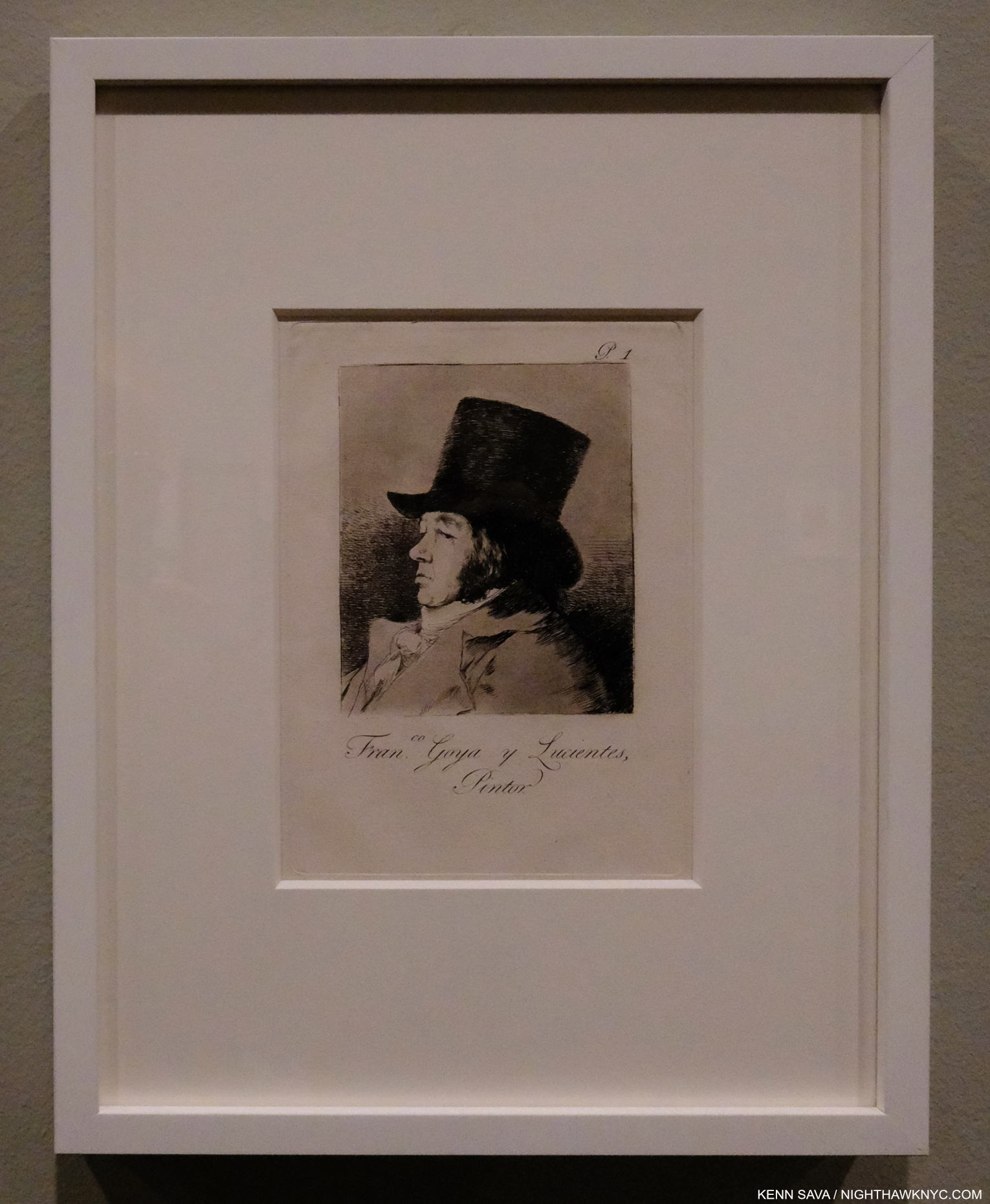
The seemingly all-seeing eye. Francisco Goya, Los Caprichos, Plate 1, 1799, Etching, aquatint, drypoint, burin. The wall card reads- “In the first plate from the Caprichos, Goya presents himself as a sardonic observer of contemporary society.” Exactly what we’ll see in the rest of The Met’s Goya’s Graphic Imagination.
Francisco Goya’s Paintings are on the “must-see” lists of many museum goers, particularly the 200 or so portraits he did of royal, aristocratic or upper-class patrons over his 39 years as a court Painter1. Like this one-
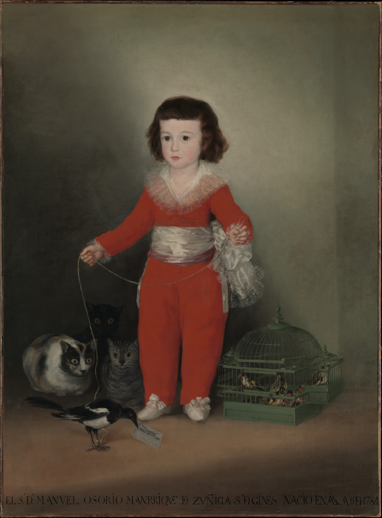
Francisco Goya, Manuel Osorio Manrique de Zuñiga (1784–1792), 1787-8, Oil on canvas. One of the most charming Paintings in The Met for many. I can’t help but think it’s also more. An allegory about the end of innocence? On the right, small birds in a protective cage. On the left, a magpie is eyed by cats. Any wonder this was the last Goya portrait commissioned by the child’s father, the Count of Altamira? Herein lies a hint of what lurks in Goya’s Graphic work. Its young subject died at age eight, 4 years after posing for it. A final touch- the magpie holds Goya’s card with his signature in his beak. Met Museum Photo of the work unframed.
But, to get the full picture of Goya’s Art, I believe his graphic work deserves every bit as much attention. Yet, chances to see his Drawings & Prints in depth are rare due to the fragility and light sensitivity of the originals. In 2015, a complete set of Goya’s timeless Print series Los Caprichos (the Caprichos) was shown at The National Arts Club in Gramercy Park, which I wrote about here. 2015 also saw the last large Goya Retrospective in the U.S., Goya: Order and Disorder, at the Museum of Fine Arts, Boston, which I actually made a day trip out of town to see and wrote about in the same piece.
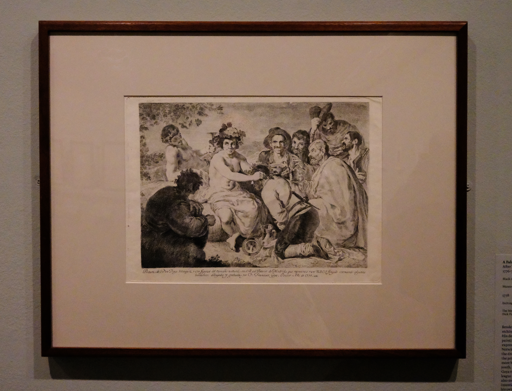
Goya after Velazquez, A False Bacchus Crowning Drunkards, 1778, Etching. Goya achieved, and demonstrated, his mastery of of the challenging medium of Etching copying the earlier Spanish master as in this remarkable Print done when Goya was about 32. And, he had the confidence to modify the composition of one of the greatest Painters of all time.
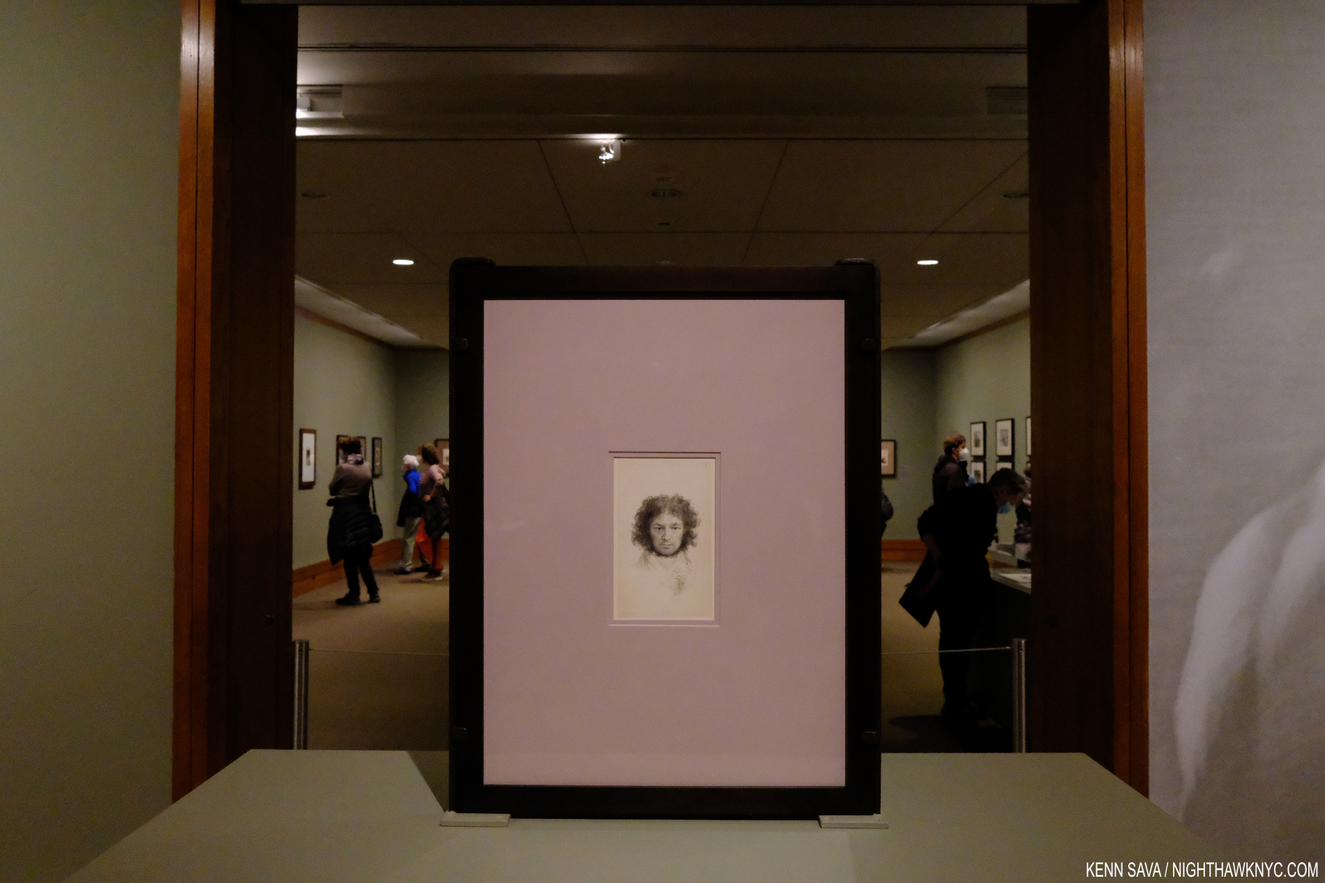
In the intervening 4 1/2 years, I’ve been preoccupied, if not obsessed, with exploring Photography & PhotoBooks, so when I finally got to see Goya’s Graphic Imagination at The Met in April with about 118 Drawings & Prints, I wondered if I might be able to spot Goya’s influence on Photographers and Photography, and on Modern Art in general for that matter.
“Both types of works on paper are closer to one another than they are to Goya’s painting. Paintings are a public expression. By contrast, an album of drawings is intimate and personal. These smaller-scale works served as a platform for Goya to think through his most private ideas.” Mark McDonald, Met Curator of Goya’s Graphic Imagination.
Goya’s eye, which seems to look askance at us in the Self-Portrait that opens Los Caprichos, up top, apparently never rested. He recorded much of what he saw in his Sketchbooks, which have largely survived. Over time, his beliefs ran in and out of sync with those of the powers that be, so he became adept at keeping his opinions to himself. It is in the privacy of these Sketchbooks that he gave full reign to what he felt about all he saw around him while keeping his position at court. He eventually rose to the exalted position of First Chamber Painter in 1799.
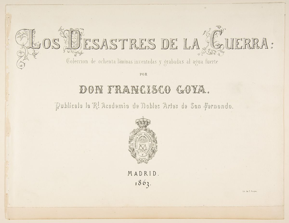
Title page to the first edition of Los Desastres de la Guerra (The Disasters of War), 1863, 24 years after the invention of chemical Photography. Met Museum Photo. Due to the low lighting in the show I was unable to take satisfactory pictures of much of the show without a tripod, so in those cases, I am using The Met’s Photos. This page was not included in the show.
A number of his Drawings became the basis of his Prints, including Los Caprichos and later, inspired by the Peninsular War, 1807-14 and the Madrid Famine, 1811-12, Los Desastres de la Guerra (The Disasters of War). It was the 10 or so Prints from this series, equal parts “graphic” and revolutionary, on view in The Met’s show I looked forward to seeing most. Due to those ever-changing political winds, it wasn’t until 1863, thirty-five years after Goya’s death, that the world got to see his Fatal Consequences of Spain’s Bloody War with Bonaparte, and Other Emphatic Caprices, as he had originally titled a set of 85 Prints that he gave to an associate during his lifetime, when it was finally published under the title Los Desastres de la Guerra with 80 Prints2.
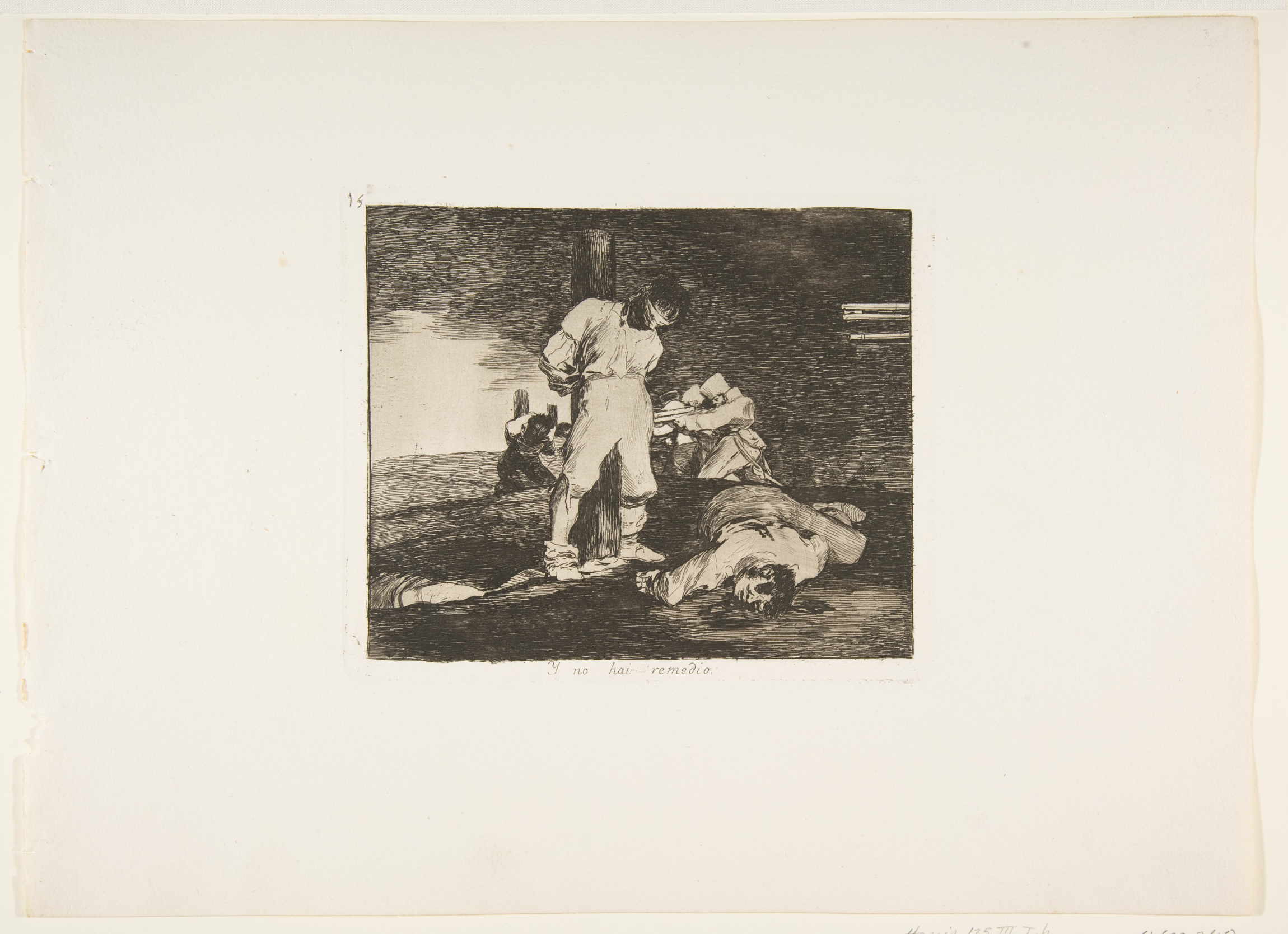
Plate 15 from Los Desastres de la Guerra (The Disasters of War): ‘And there is nothing to be done.’ (Y no hai remedio.) Met Museum Photo.
“Every figure in Los Desastres de la Guerra plays a specific role, defined by gesture, expression and costume. Nothing is superfluous.” Janis A. Tomlinson, Goya’s War: Los Desastres de la guerra, P.17
The series shows things never before seen in Art to that time, including graphic depictions of the horror of war, imprisonment and famine. About two hundred thirty years earlier, circa 1633, Jacques Callot published his Print series Les Grandes Miseres de la guerre or The Miseries and Misfortunes of War. Of them, the Art Gallery of NSW, Australia, which owns a set, says– “Callot’s series is less an indictment of war than a moral tale about the unhappy consequences that befall the undisciplined soldier.” Callot’s Prints are in a long landscape format, and show what they depict at a distance. It is thought Goya owned a set of them, and they may have been an inspiration for him. In his series, Goya puts the action full frame presaging the words of Robert Capa, famed for his 20th century war & conflict Photographs, “If your photographs aren’t good enough, you’re not close enough.”
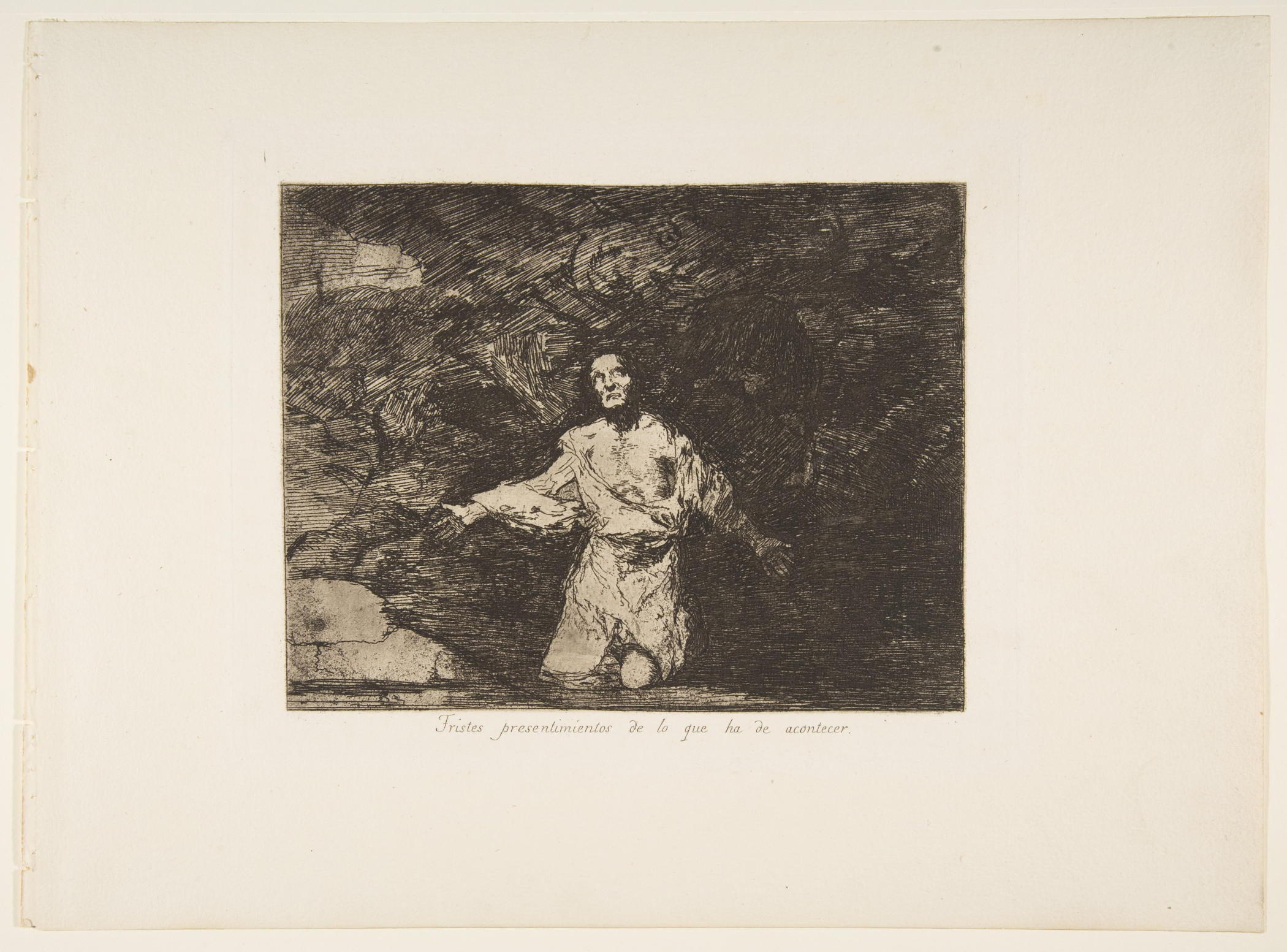
Plate 1 from Los Desastres de la Guerra (The Disasters of War): Sad foreboding of what is going to happen (Tristes presentimientos de lo que ha de acontecer), ca. 1815 (published 1863), Etching, burin, drypoint and burnisher. Met Museum Photo.
As powerful & profound as they are, there’s an element of them that is particularly puzzling. In more than one work, Goya’s caption gives the viewer the idea that what he’s showing are things he actually witnessed. DID Goya see the things he shows us?
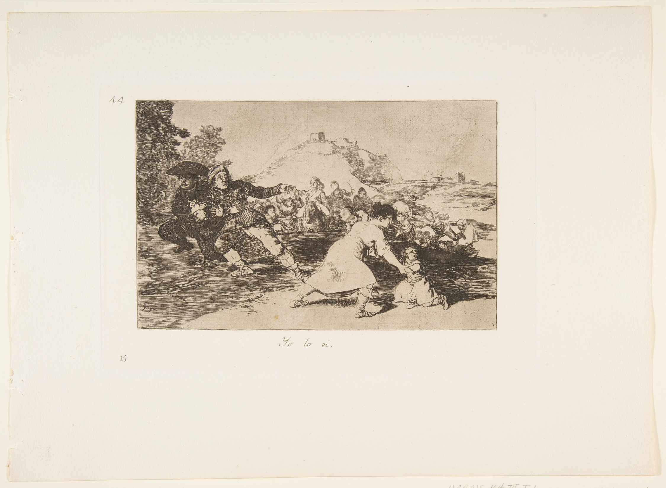
DID he? Or, didn’t he actually see this happen? The title says he did. Plate 44 from Los Desastres de la Guerra (The Disasters of War): ‘I saw it.’ (Yo lo vi.). Met Museum Photo.
There is some debate around this. Wikipedia says repeatedly that he went around and saw the battles of the Peninsular War- without quoting a source for these statements I have seen no where else. While it seems it would have been hard for him to miss the daily effects of the Madrid Famine going on around him, the Artist going to battle scenes is harder for me to imagine. He was in his 60s and had suffered a serious illness that left him completely deaf. If he didn’t actually go to them, he could have been inspired by news accounts or from the accounts those closer to the action.
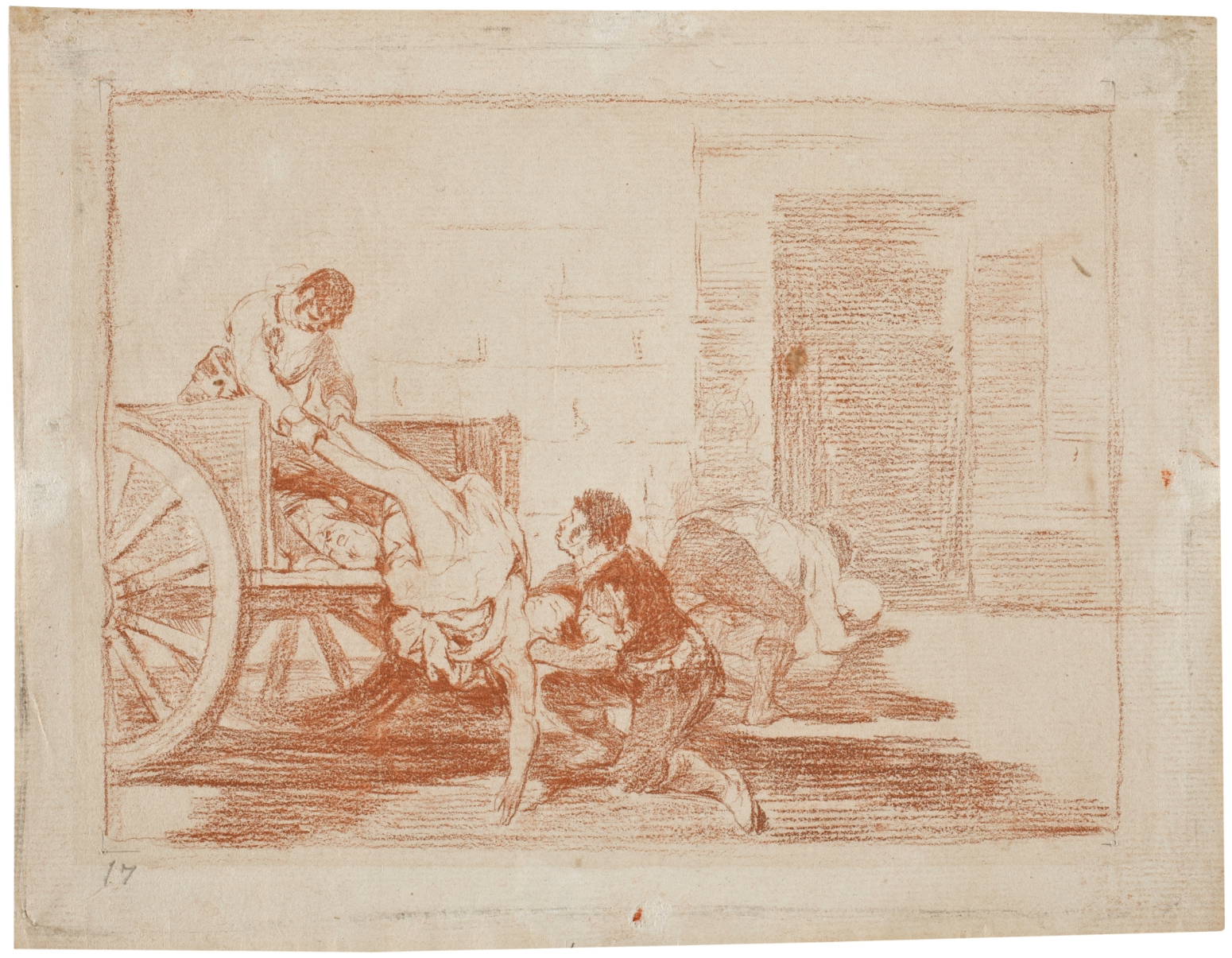
Preperatory Drawing for Plate 64 from Los Desastres de la Guerra (The Disasters of War): ‘Cartloads to the cemetery.’ (Carretadas al cementerio.) Prado, Madrid Photo.
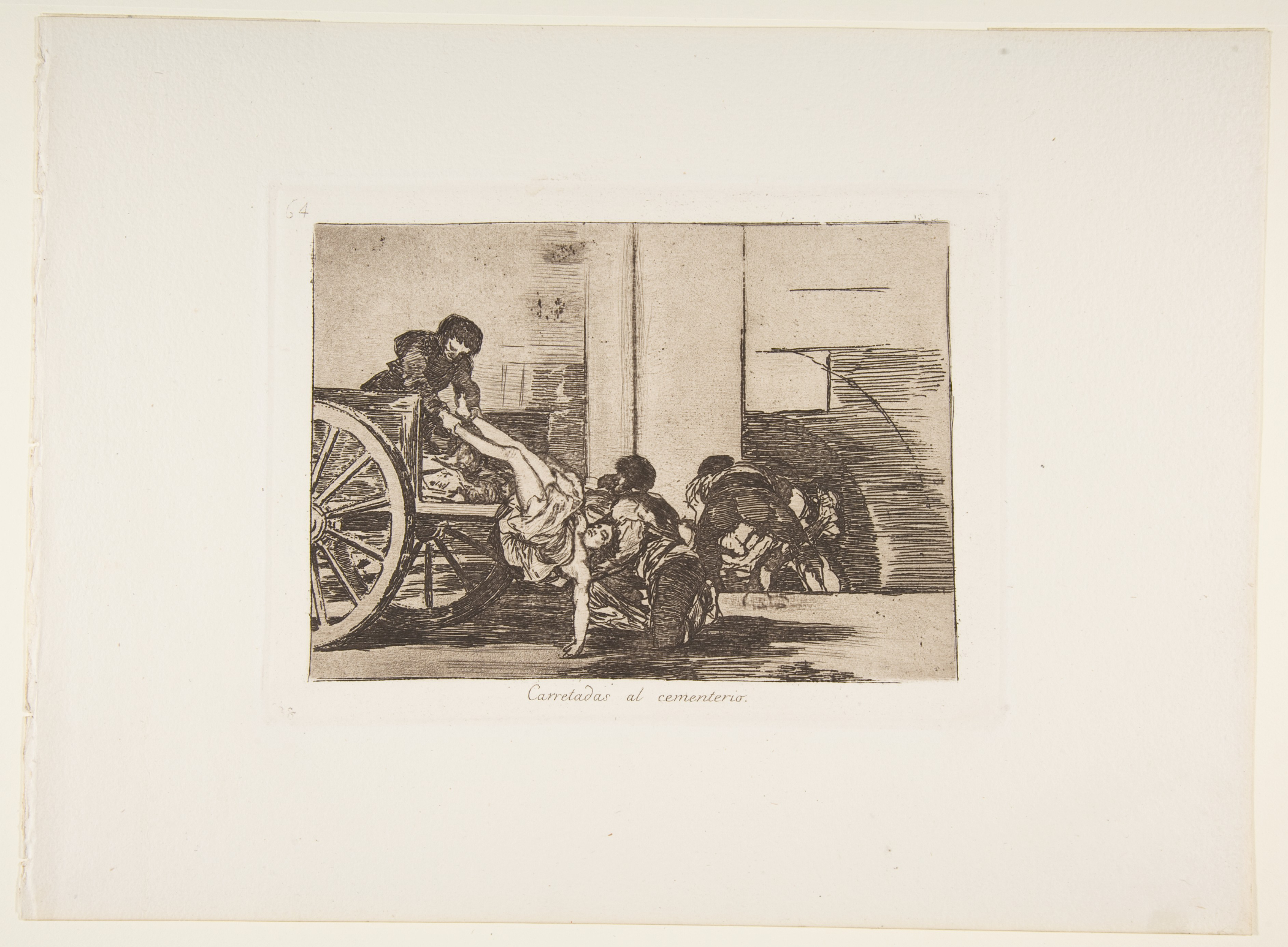
Plate 64 from Los Desastres de la Guerra (The Disasters of War): ‘Cartloads to the cemetery.’ (Carretadas al cementerio.). Here an extremely rare opportunity to compare the Drawing, above, with the final Print. Met Museum Photo.
At this point, it’s unlikely we’ll ever know for certain how much of what we’re shown, if any of it, the Artist actually personally witnessed first hand. I’ve come to feel that thinking about this is a waste of time. Goya was an Artist- not a Photographer. He was working before the invention of chemical Photography and setting down his ideas by hand on paper, stone or canvas. With all due respect to the skill of Artists who Drew and Painted down through history, Drawing & Paintings done from life or memory are incapable of showing us the real world as it existed. Time is a key element in Drawing & Painting and in the time it takes to make one the world has changed. The people in it have moved. The light has changed. Things have happened and finished. In war, particularly, things happen way too fast to be captured accurately in a Drawing, let alone a Painting. They can give us a sense of what happened. What Goya is showing us is “something else” than the full reality of the moment- even if he did see it happen right in front of him. It’s his vision of things. If he tried to render it accurately to the scene in front of him, it’s still only an approximation. We’re seeing it through his eyes, and, as becomes apparent as you look at his Drawings & Prints, he does have a point of view.
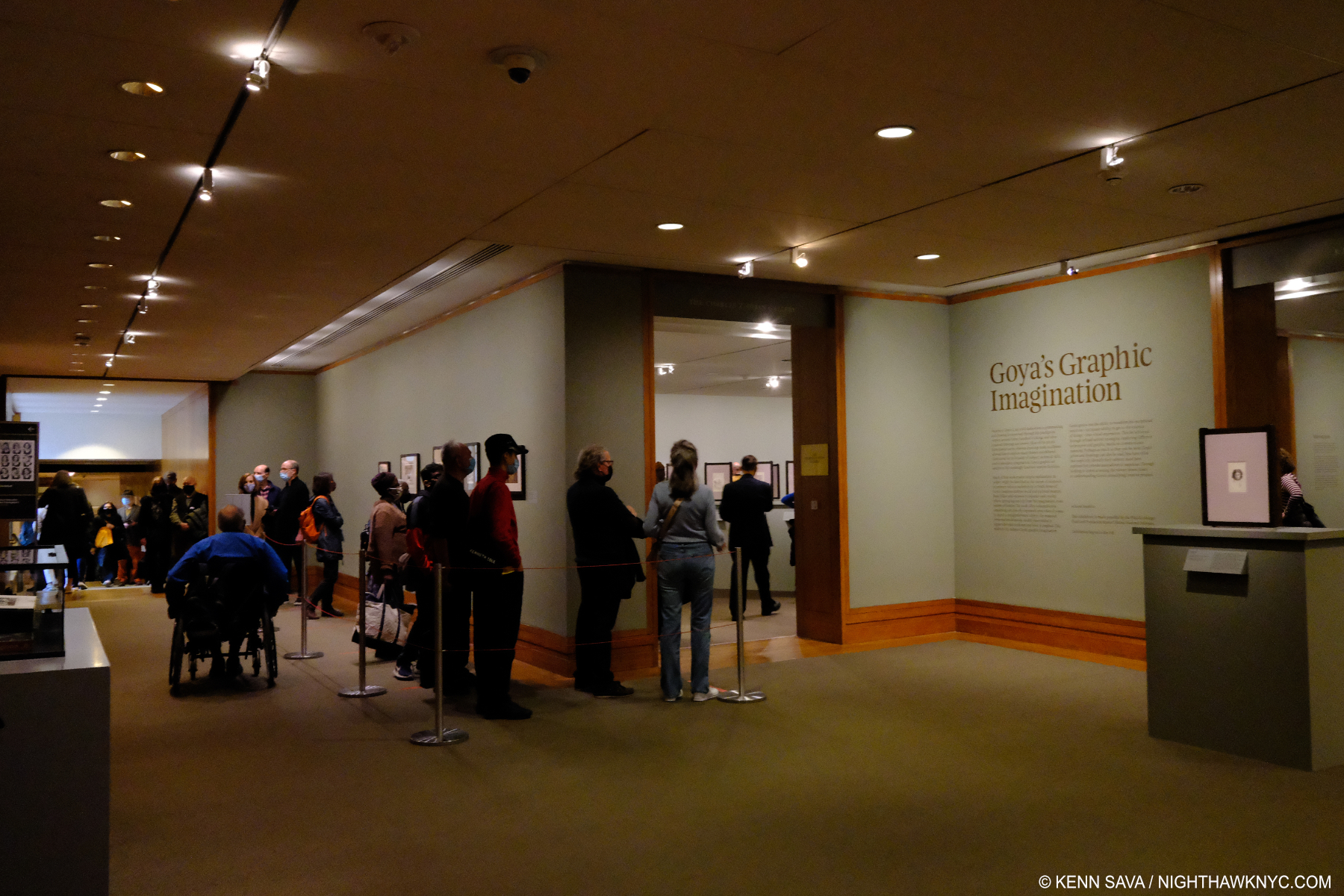
The line for Goya extends further down the hall to the left than you can see here. April, 2021.
After seeing them in the show, it’s hard for me to think that these unprecedented images are not precursors of so-called war and conflict Photography. After the show I began to look to see if the Photographers, themselves, acknowledged this. In 2005, the renowned British Photographer Don McCullin, renowned for his coverage of the Vietnam War, among numerous other conflicts over his long & eventful career, told the BBC “When I took pictures in war I couldn’t help thinking of Goya.” Elsewhere he said, “…if what happened in front of my eyes was like a scene out of Goya. I wasn’t there to make icons. I had to bring back information that could possibly prevent other such miseries.” In those words I feel a simpatico with what Goya might have been trying to accomplish in Los Desastres de la Guerra .
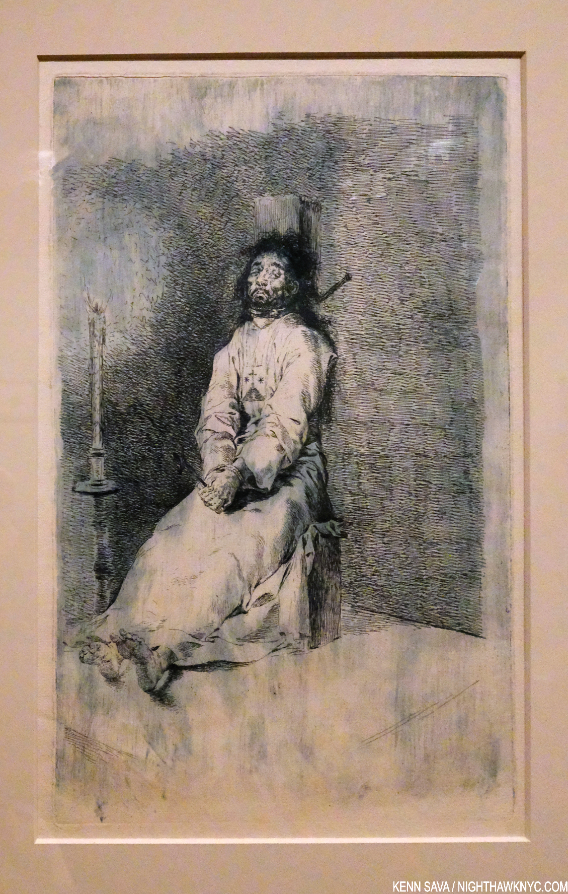
Garroted Man, 1776-78, Etching. Done at about age 30, Goya’s second etching! A forerunner of Los Desastres, is also one of his most unforgettable images. According to Janis Tomlinson, Garroting “was considered one of the more humane forms of execution3.”
If a Drawing is incapable of showing us the complete “reality” of a scene, then it is what some might call today, “conceptual.” I was struck by some similarities of Goya’s Prints with so-called “conceptual” Photographers, who modify or create scenes from scratch that they then Photograph, like Duane Michals, Jeff Wall, Gregory Crewdson or Deana Lawson. Goya, too, may have been creating a scene on paper to make it express what he saw in his mind’s eye (keyword= may).
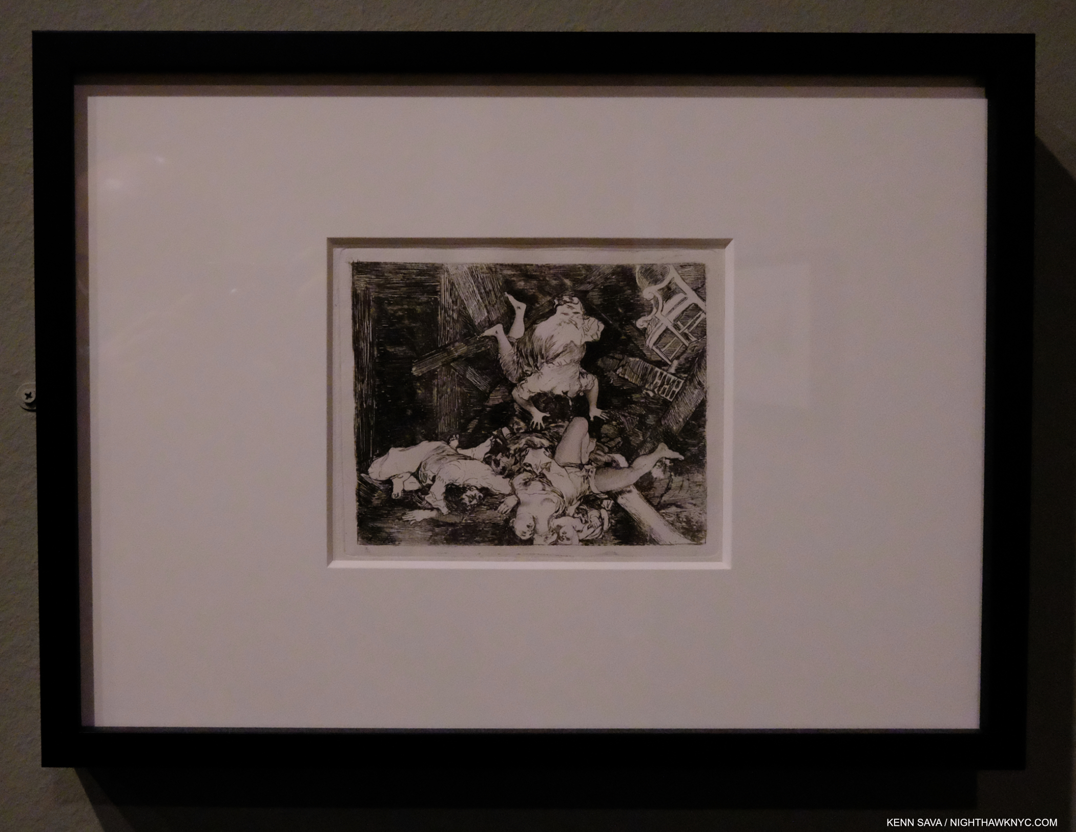
Plate 30 from The Disasters of War’ (Los Desastres de la Guerra). Proof, without caption. Without the titles makes them infinitely harder to decipher. According to the wall card, here, people fall to the ground after a building explodes.
Yet, no writing about these work exists in Goya’s hand besides the captions on the plates.
“It is important to emphasize that the inscriptions are not titles. They are captions that encourage a potential understanding. The captions do not explain the work for us. The meanings are often unclear, but this isn’t because Goya was being obtuse. He was thinking through drawings and prints for his personal purposes, and as such, there is no need for him to explain their significance to himself. His works on paper are so internal and layered that they would have sparked multiple associations, even for Goya.” Mark McDonald, Met Curator of Goya’s Graphic Imagination.
So, the captions add another layer of mystery to what we’re seeing! Duane Michals captions many of his Photographs right on the print itself. Robert Frank wrote directly on the image as his career went on, and so does Jim Goldberg, among others. Coincidences? Possibly.
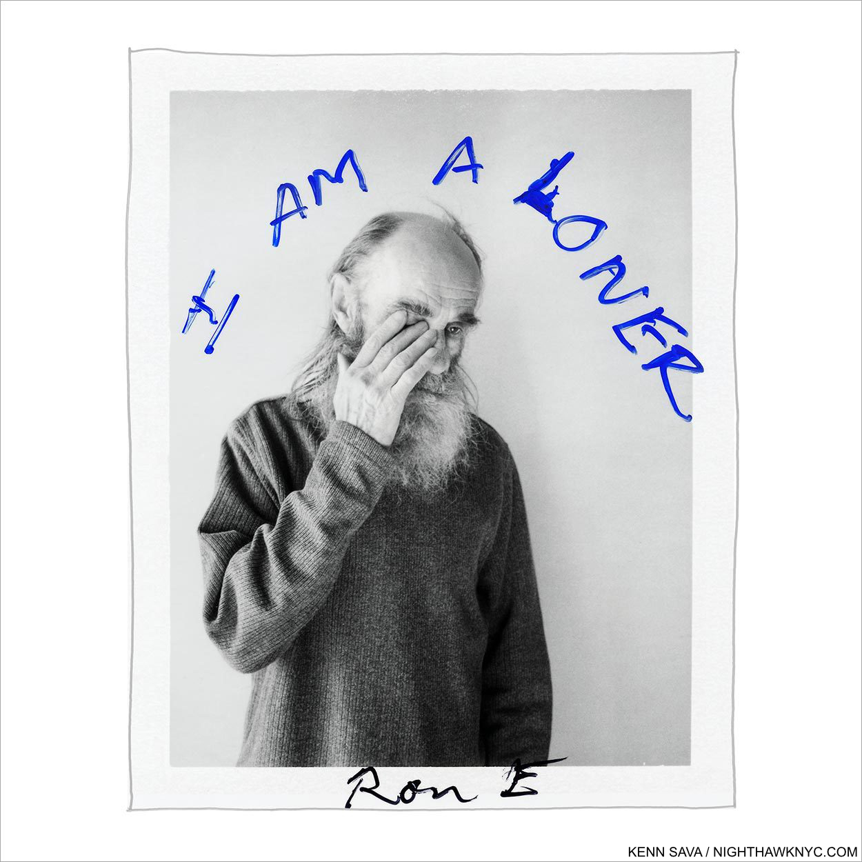
Jim Goldberg, Ron E., Milwaukee, Wisconsin, USA, 2014, Magnum Photos Print.
During the lockdown I read Believing is Seeing by Errol Morris. Among Photos taken from 1855 until very recently, Mr. Morris examines the work of the 1930s Farm Services Administration (F.S.A.) Photographers, including Walker Evans and Dorothea Lange, and the evidence that they may have modified the scenes of some of their most iconic F.S.A. images from the 1930s. Modifying a scene to make it closer to what the Artist or Photographer is seeing in his or her mind’s eye would make them kin to what we see in Goya’s Drawings & Prints. So, it doesn’t really matter all that much if Goya was actually present when the events he shows us were happening. “The FSA collection (in the Library of Congress) therefore offers scholars an unparalleled opportunity to place masterworks, such as Dorothea Lange’s Migrant Mother (1936), in the context of companion images taken on the same day. This visual evidence offers a much more reliable guide to the photographer’s original intent than the artist’s recollections recorded decades after the fact,” James Curtis, the author of Mind’s Eye, Mind’s Truth: FSA Photography Reconsidered, said here. (The other images Dorothea Lange took that day in the archive may be seen here.) In my view, it doesn’t matter if the F.S.A. Photographers, “posed” subjects or modified scenes as Mr. Morris’ and Mr. Curits’ books suggest. Like it doesn’t matter if Goya saw “I saw it.” Even if, say Dorothea Lange, did modify the scene somehow4, she did not change the woman’s situation, which is the real and lasting point of the Photograph. At the end of the F.S.A. chapter in his book, Errol Morris concludes, “It is the idea that the photograph captures that endures 5.” It seems to me, regardless of their genesis, it’s exactly the same with Goya’s Prints & Drawings.
“The demise of Goya’s fortunes at Court has been attributed to his objections to the repressive nature of the restoration regime. Yet he had long survived within politically charged surroundings, and it seems likely he would have kept his political opinions to himself.” Janis A. Tomlinson, Francisco Goya y Lucientes: 1746-1828, P.221
Goya, Self-Portrait, c.1796, Brush and point of brush, carbon black ink, on laid paper, seen at the show’s entrance.
After escaping trouble for his views after the Peninsular War, it finally caught up to him leading to his leaving Spain and becoming an exile in France near the end of his life, where he died at 82 in 1828. His remains were later exhumed and reburied in Madrid in 1919. As far as being the possible “Father of Modern Art” goes, I think a great case can be made for his nomination. Goya’s extremely wide range of subjects, from the royals to the incarcerated preshadowed the work of many Artists & Photographers of the past century. And he never minced the Drawn line, or words, when calling out those he felt were wrong. When I say “Modern Art & Photography Begins Here,” I’m not so much referring to the stylistic innovations though they are there for all to see, and his later Paintings were certainly ahead of their time, I’m referring to the content, and the depicting of what was not seen in Art to that point. Goya’s Drawings & Prints, and his Paintings, like the 2nd & 3rd of May, 1802, break away from the chains of Pontifical or Royal commissions. They show us a world that is all too familiar to us today. A world that has seen no end of man’s inhumanity to his fellow man.
In considering Goya’s candidacy as the “first modern,” it feels that he lived too long ago to be considered. Yet, it’s interesting to realize that Goya was born in 1746 and died in 1828. J.M.W. Turner, who’s work is often seen as “modern” lived from 1775 to 1851. Charles Dickens, who’s novels captured the “modern world” as soon as anyone else’s, lived from 1812-1870. Edouard Manet, often mentioned as one of the first moderns lived from 1832, only 4 years after Goya’s passing, to 1883. James McNeill Whistler 1834-1903 and Vincent van Gogh, 1853-1890, was born 25 years after Goya’s passing. Chemical Photography was introduced to the world in 1839- eleven years after Goya’s death. Goya seems perfectly situated chronologically.
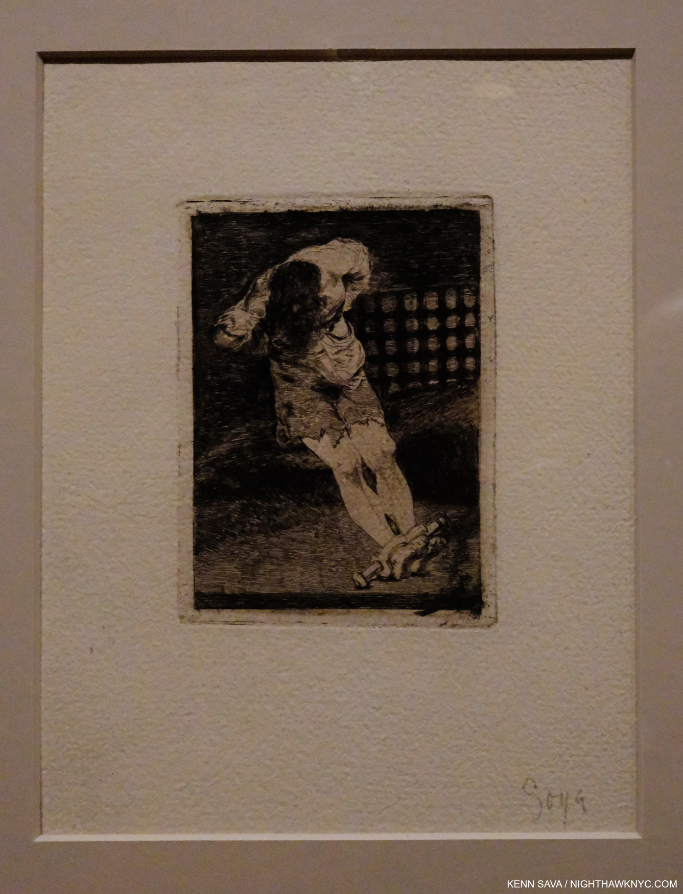
The Custody of a Prisoner Does Not Call for Torture (La seguridad de un reo no exige tormento)
ca. 1815; published ca. 1859. While not a part of the posthumous La Guerre set, Goya included a number of Prints of prisoners in the set he gave a friend during his lifetime. I’m also including this as an example of the show’s low, protective, lighting. This may be seen with better lighting in a Met Museum Photo, here.
Between his Paintings, his Drawings and his Prints, taken as a whole, Goya shows the full range of people, from all layers of society, from those of privilege to prisoners without privilege. People living in the utmost splendor to people starving to death, extending on what Rembrandt had done. Some of it was timely, referring to people and events only known to specialists and historians now. Much of it is timeless since human nature hasn’t changed. Met Curator McDonald sums this up-
“Not much changes. The same idiocy, cruelty, and violence take new shapes, but Goya captured those universal anxieties. So much of what we are dealing with now can be identified in Goya’s art—there’s politics, conflict, bloodshed, and ignorance of the impact of our actions fueled by stupidity and bad choices—the same old problems.” Mark McDonald, Met Curator of Goya’s Graphic Imagination.
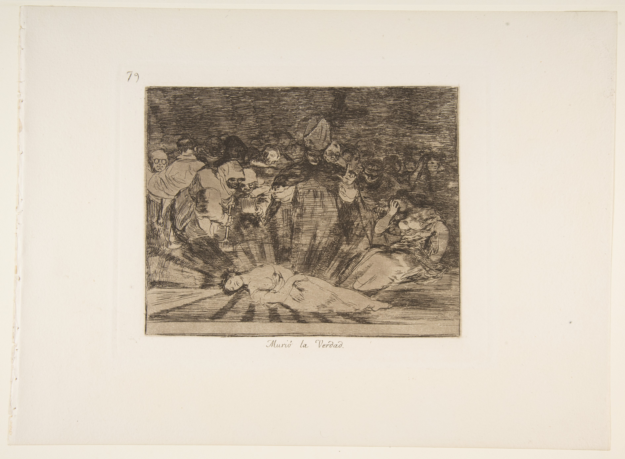
Plate 79 from Los Desastres de la Guerra (The Disasters of War): Truth has died. (Muriola verdad). 1814–15, published 1863. The penultimate Print in the series. Met Museum Photo.
It was interesting to me that Goya’s Graphic Imagination. was on view a few hundred feet away from another major show of the work of another Artist who was focused on people: the famous and the already forgotten- Alice Neel: People Come First. It’s also interesting that both shows were up during the pandemic: our own 21st century horror show. As big a test of the resilience of New York as I hope to ever see.
*-Soundtrack for this Post is “Outside of Space & Time” by David Byrne & St. Vincent from their classic album Love This Giant.
BookMarks-
The Met’s catalog for Goya’s Graphic Imagination is exceptional. It features large, often full page plates of all the works on view on very nice stock and includes very insightful text from the show’s curators. These texts include numerous insights that weren’t included on the wall cards in the show. And so, it’s one of the better books on the subject of Goya’s Drawings & Prints and a very good place to start for those who want to know more about the show or the subject. Highly recommended.
The best overview of the work of Goya known to me is Janis A. Tomlinson’s Francisco Goya y Lucientes : 1746-1828 , published by Phaidon, which is my go-to book for all things Goya. In fact, I’ve relied so heavily on it that I am now on my second copy. Beware of nebulous listings on Amazon! This is a large book- in both hard & soft cover editions. There is apparently a subsequent smaller softcover edition I have not seen. For studying the Art, the large edition, which has over 250 images, is the one you want. Out of print, but quite inexpensive in Very Good condition, the hardcover is the way to go especially since it is really no more expensive than the softcover and its binding should last longer.
The best overview on Goya’s Drawings is called simply that- Goya Drawings. Published by the Prado Museum, Madrid, who hold the world’s greatest collection of Goya’s work. It was one of my NoteWorthy Art Books of 2020. It also contains a few Prints but most of its 250 reproductions are of his Drawings, sectioned from all through his career with insightful text in English in a nice, smaller size.
Janis Tomlinson has also written two books about the prints.Graphic Evolutions The Print Series of Francisco Goya (Columbia Studies on Art) and Goya’s War: Los Desastres de la Guerra. Both are excellent and recommended, the latter the most comprehensive book on Los Desastres available. They are a bit harder to find in very good condition, but worth seeking out. Goya’s War contains reproductions of the all 80 published Prints in Los Desastres. It was only published in softcover.
Photography Related-
Errol Morris’Believing Is Seeing: Observations on the Mysteries of Photography is a fascinating deeper look at iconic Photographs starting with Roger Fenton’s Photographs of the Crimean War, 1855, to current events, causing the reader to question his or her beliefs about just what these images say and what they conceal. Extremely wide-ranging it’s an essential book for Photographers, Art lovers, Art writers and anyone who cares about images.
James Curtis’ Mind’s Eye, Mind’s Truth: Fsa Photography Reconsidered (American Civilization) is lesser known and a ground-breaking look at the work of the Farm Services Administration Photographers, including Walker Evans, Russell Lee and Dorothea Lange. It puts their most famous images into the context of the Photographer’s work that day and analyzes them in a bigger picture way revealing much that is not apparent in the one, famous, Photograph that was widely circulated.
NighthawkNYC.com has been entirely self-funded and ad-free for over 6 years, during which over 250 full length pieces have been published. If you’ve found it worthwhile, you can donate to keep it going & ad-free below. Thank you!
Written & photographed by Kenn Sava for nighthawknyc.com unless otherwise credited.
To send comments, thoughts, feedback or propositions click here.
Click the white box on the upper right for the archives or to search them.
For “short takes” and additional pictures, follow @nighthawk_nyc on Instagram.
Subscribe to be notified of new Posts below. Your information will be used for no other purpose.
- Janis Tomlinson, Francisco Goya y Lucientes: 1746-1828, P.1 ↩
- Also, as Janis Tomlinson points out- “For if, as the artist himself admitted, only twenty-seven sets of Los Caprichos had sold in much better times, how could he hope to find buyers in a capital devastated by war for these images of brutality, sadistic indifference, and tragic resignation?” Janis A. Tomlinson, Goya’s War: Los Desastres de la guerra, P.17 ↩
- Janis Tomlinson, Francisco Goya y Lucientes: 1746-1828, P.44 ↩
- James Curtis interview with Errol Morrisin Morris’, Believing is Seeing, P.138 ↩
- Errol Morris, Believing Is Seeing, p.185 ↩