NoteWorthy PhotoBooks, 2018

Written & Photographed by Kenn Sava (*except as credited)

Let’s go book shopping! As I list PhotoBooks I consider NoteWorthy, let’s remember the Bookstores that are still left where you can actually see these books. The Strand Bookstore, NYC, is one of those I frequent. I hope there is at least one near you. Click any Photo for full size.

Another day. Another chance to look at PhotoBooks, to see life, and the world, through someone else’s eyes, to learn something and just maybe have a revelation. I look at A LOT of PhotoBooks (and Art Books). Nary a day passes that I don’t see one/some somewhere. In bookstores, used bookstores, museum stores, galleries, book fairs, pop-up shops, garage sales, online- you name it. Both, just released PhotoBooks and those I’ve only known through legend. I’m getting close to eating, sleeping and breathing Photo & ArtBooks. Why? I use them to research my pieces, to learn about Artists known & unknown to me, and to explore that fascinating phenomenon that is the PhotoBook- which, in its ultimate form, is a work of Art unto itself. A third of those I see I never look at, or think about, a second time. About 40% I do either look at again or think about again. And, far too many of them I purchase. (For the record- Yes, I’ve put my money where my mouth is. I bought every book on this list.)

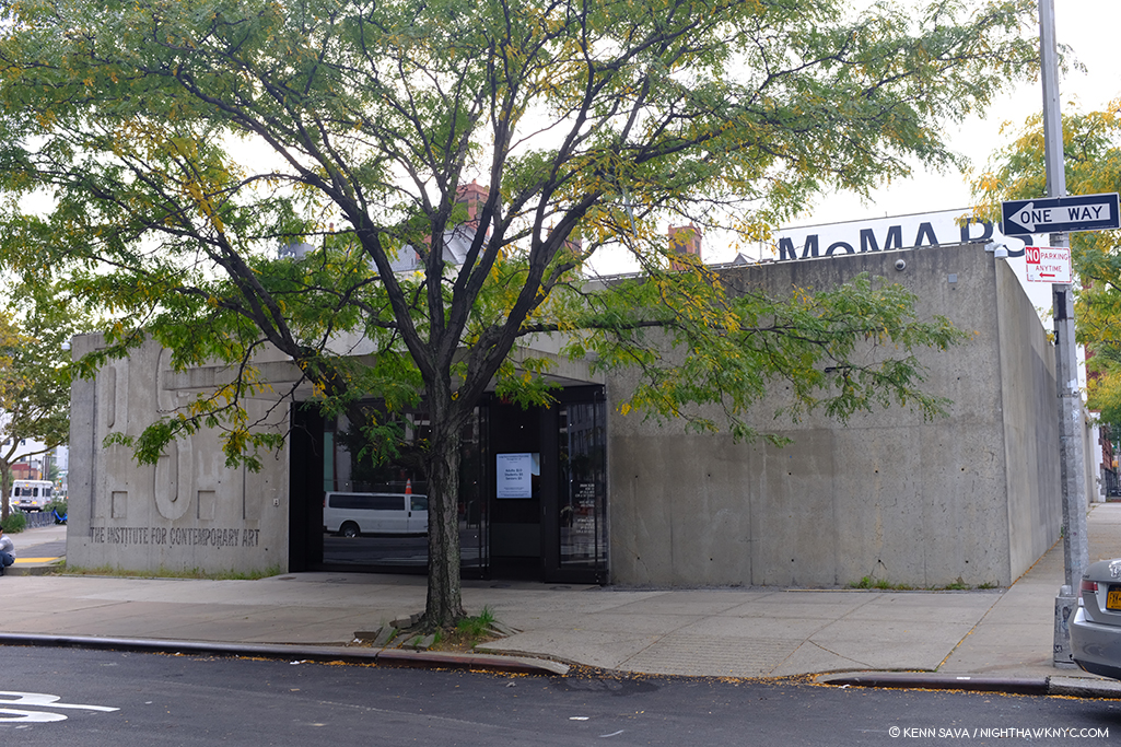
MoMA PS1, Long Island City, scene of the recent New York Art Book Fair. In case you don’t know, there’s a quite good full time Art & PhotoBook store tucked inside, in addition to the excellent magazine shop off the lobby, right behind that grey wall to the right.

So, after all of this looking, I’ve decided to share a few of those here that have turned out to be especially memorable, or “NoteWorthy,” as I’m fond of saying (There’s no such thing as “best” in the Arts, in my view. I don’t believe in comparing Artists or creative work). Compiling this has been very hard.

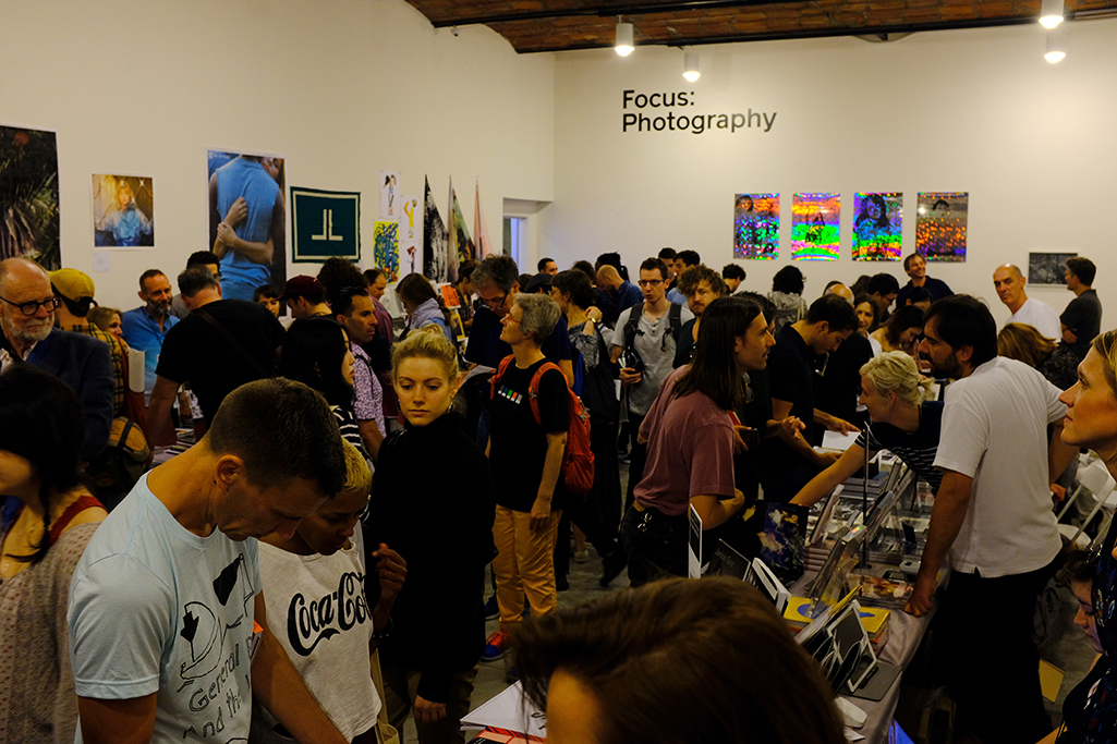
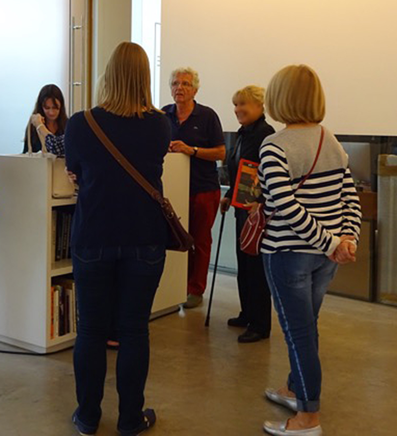
Depth of Field. The scene in just one of the many rooms at the New York Art Book Fair (NYABF) @ MoMA PS1, Long Island City, September 21, 2018. I handed my camera to Kris Graves who took this Photo with it from behind his table.

First, we live at a moment when there are more PhotoBooks being produced than ever before. It seems there are an incalculable number of publishers and Artists creating books at a speed I doubt anyone can keep up with. So, as many PhotoBooks as I look at represents only a small percent of those released. Hey, I really tried!

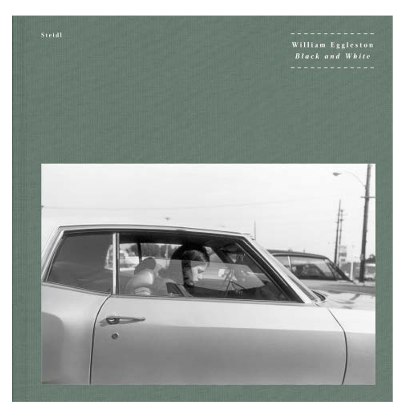
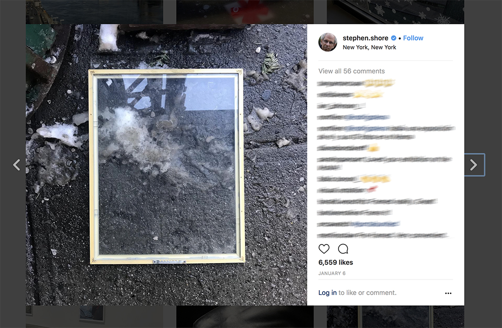
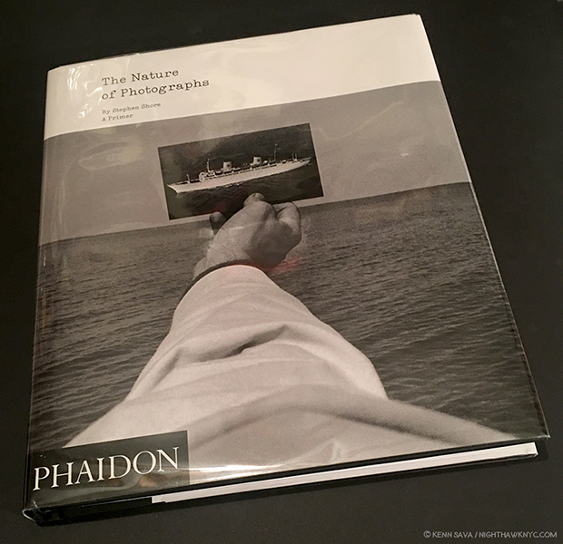
William Eggleston: Black & White. The cover image shown on pages 82-3 of Steidl’s Fall/Winter 2017/2018 Catalogue. I was very much looking forward to seeing what revelations this might hold  in 2018 after the showing of Eggleston’s black & white work at The Met a few months back. Where are you? Phone home. *Steidl Photo. 

Another thing is a bit complicated. Publication dates have become hard to figure. Some of the bigger PhotoBook publishers announce books and show them in their catalogs up to one year before they ever show up in stores here (physical bookstores). The brand new hardcover version of Steidl’s Fall/Winter 2018/19 catalogue now even contains a section featuring “Previously Announced” Books (i.e. books originally scheduled to have been out this year)! Some “Previously Announced” books never do show up (Steidl now completely omits the “Previously Announced” William Eggleston: Black and White. ?). And then, a book that appears as a newly released book in a bookstore here may have come out to the rest of the world in 2016 or 2017. How to treat those books? Do they “count” as eligible for 2018 lists? After mulling this over the past few months, I’ve decided to give lesser priority to publication dates and go by when I first saw the book appear in stores. So, one or two of these may have been released over the past few years, though most of them say “2018” in them. For me, the date of the book isn’t as important as the impact its had on me. That’s my criteria. Maybe, you’ll agree, maybe you won’t. Either way, I encourage you to make your own list.

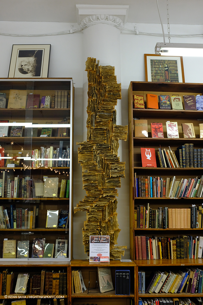
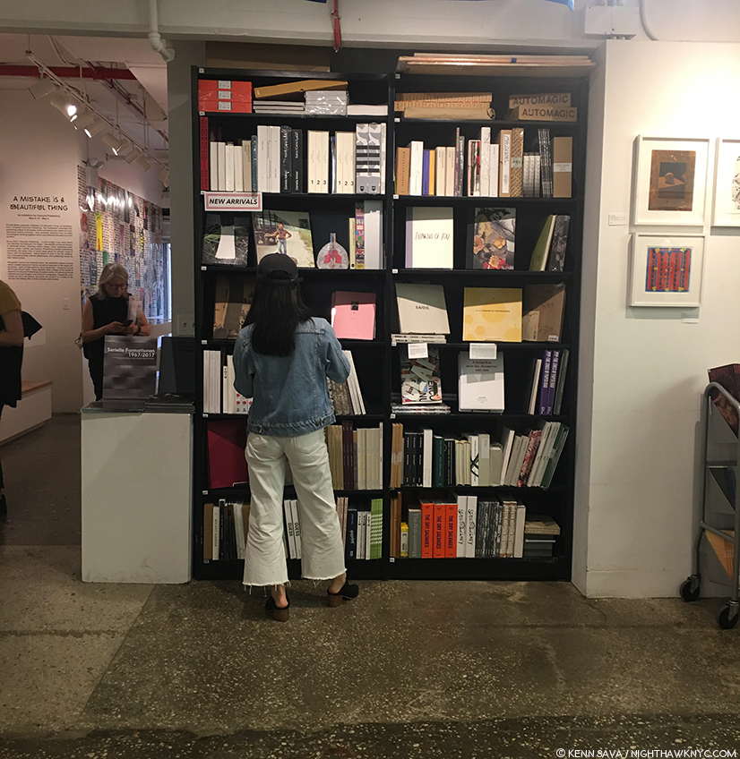
The Rare Book Room at Strand Bookstore. How many books released this year will end up here?

Ok. With all of that out of the way, here they are, listed in no particular order, in a special edition of my regular BookMarks feature. (First, a special note-If you like what you find on NighthawkNYC, I hope you’ll consider supporting it so that I can continue to spend the countless hours and pay the expenses its taken to keep it going these past 3 years- without running ads. If you would like to, you can make a donation through PayPal by clicking on the box to the right of the banner at the top of the page that will take you to the Donation button. Your support is VERY much appreciated.)

***NoteWorthy PhotoBooks, 2018***

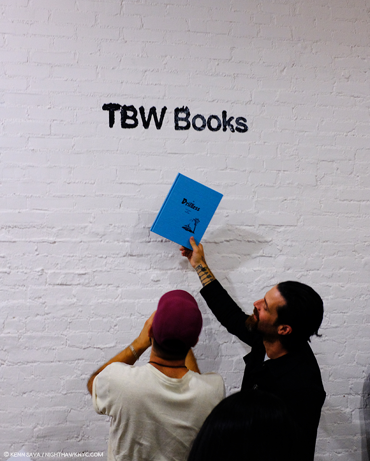
How do they do it? Teamwork. Lester Rosso, left with Paul Schiek, the creative masterminds behind TBW Books, and in front of their sign, reveal one of the secrets of their magic that, it seems to me, a number of others are now trying to emulate. Good Luck with that! Their secret? They consistently make excellent books with top Artists. NYABF, September 21, 2018.

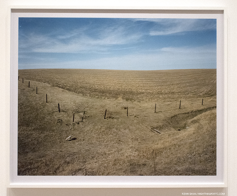
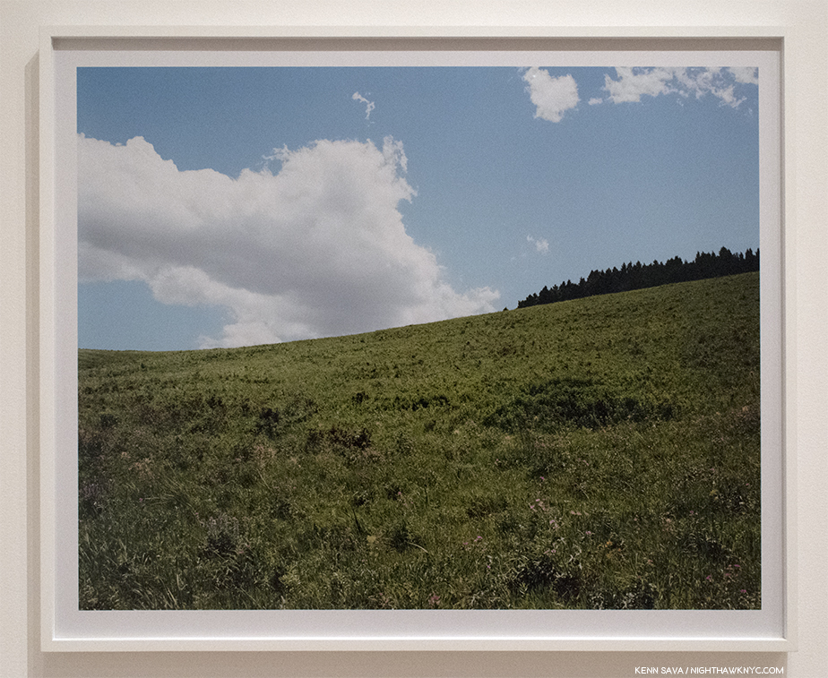
-Gregory Halpern, Confederate Moons with Jason Fulford’s Clayton’s Ascent, Viviane Sassen’s Heliotrope and Guido Guidi’s Dietro Casa, part of TBW’s excellent Annual Series 6. If I were to recommend one new book this year, Gregory Halpern’s would be it. When I look at it, I see a frozen moment in life in America, 2017, seen in the shadows of the solar eclipse, an instant when nature reminds us that everything we stress out about or fight about pales alongside the power IT holds. My look at Confederate Moons is here

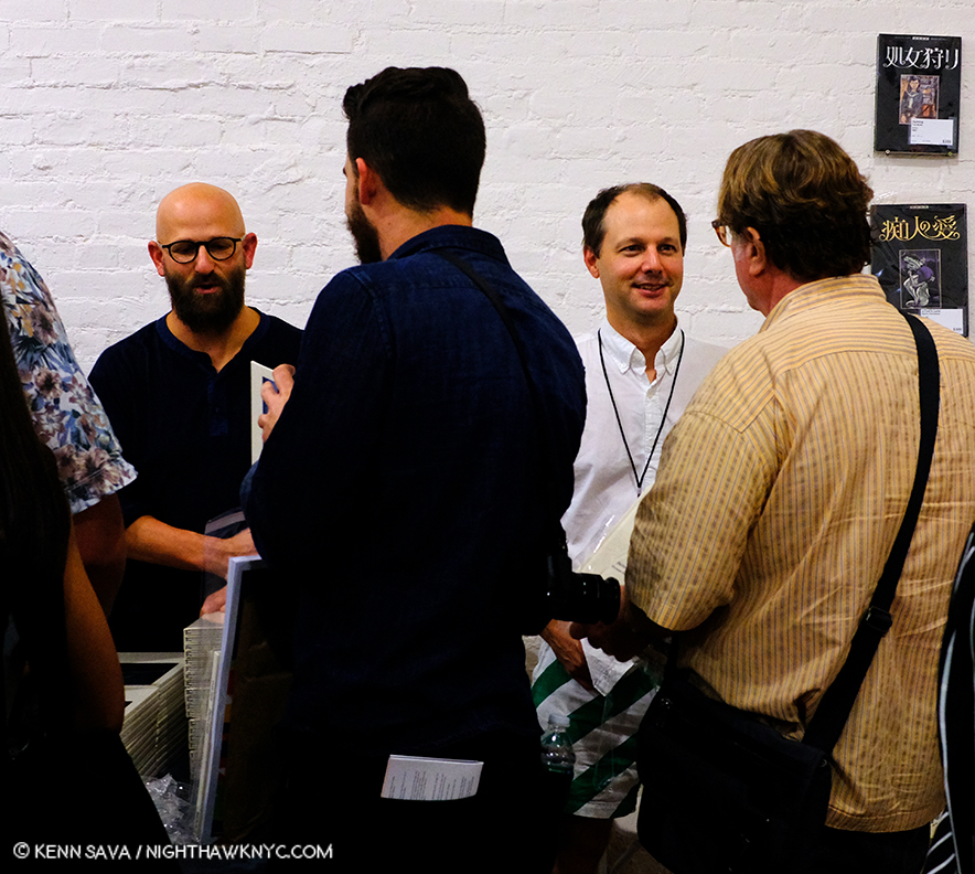
Gregory Halpern, left with the beard and the glasses, and Jason Fulford, right, in the green striped shorts, authored two of the four volumes in this year’s TBW Annual Series here sign them at TBW’s booth, NYABF, September 21, 2018. PhotoBook Business 102- You know you’re doing something right when Artists like these two want to work with you. Mr. Fulford has his own respected publishing house, J&L Books. Mr. Halpern, the 2016 Paris Photo-Aperture PhotoBook of the Year Award Winner, is fresh off his nomination to join Magnum Photos.

Diane Arbus: A box of ten photographs, Aperture. The only portfolio Diane Arbus produced during her lifetime is beautifully reproduced from the only set in a public collection, which happens to be the only one with 11, not 10, Photographs. This is one of the books that will be essential for anyone interested in Diane Arbus henceforth. Aperture says “it will never be reprinted.” Nuff said.

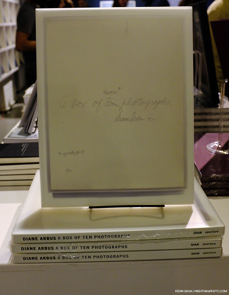
Instant classic. Diane Arbus: A box of 10 photographs. Seen at Aperture Gallery & Bookstore, an NYC Photo mecca.

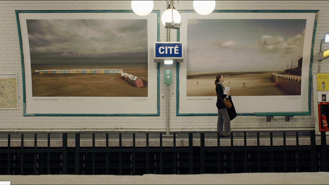
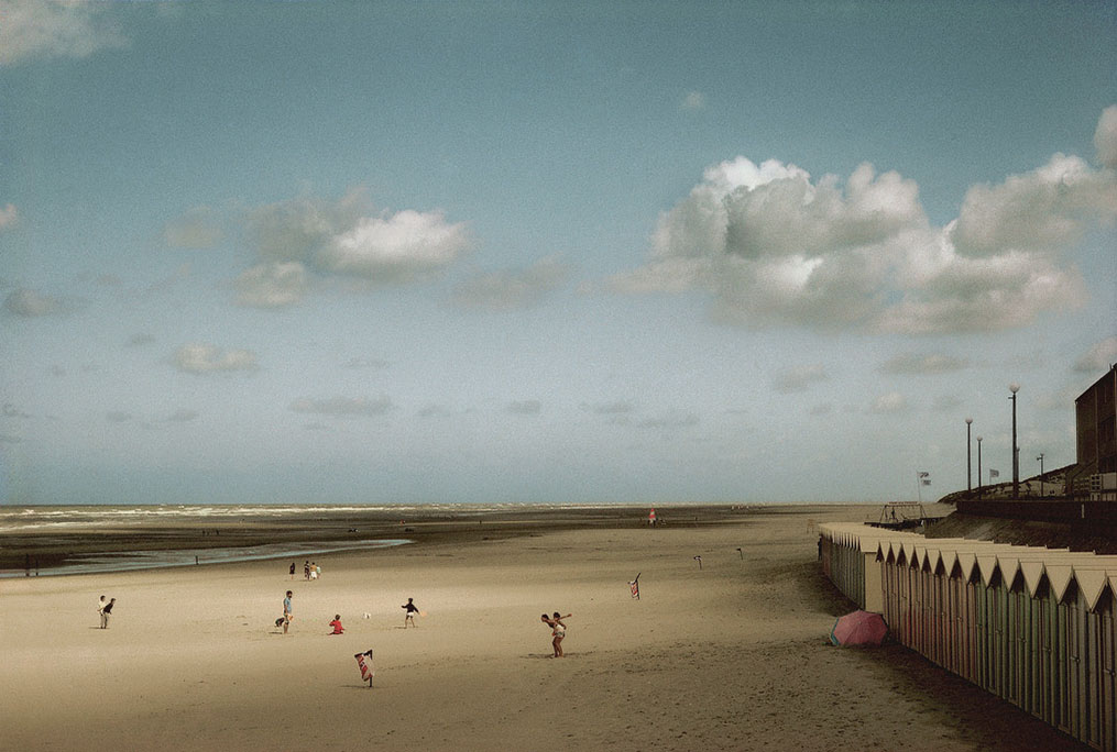
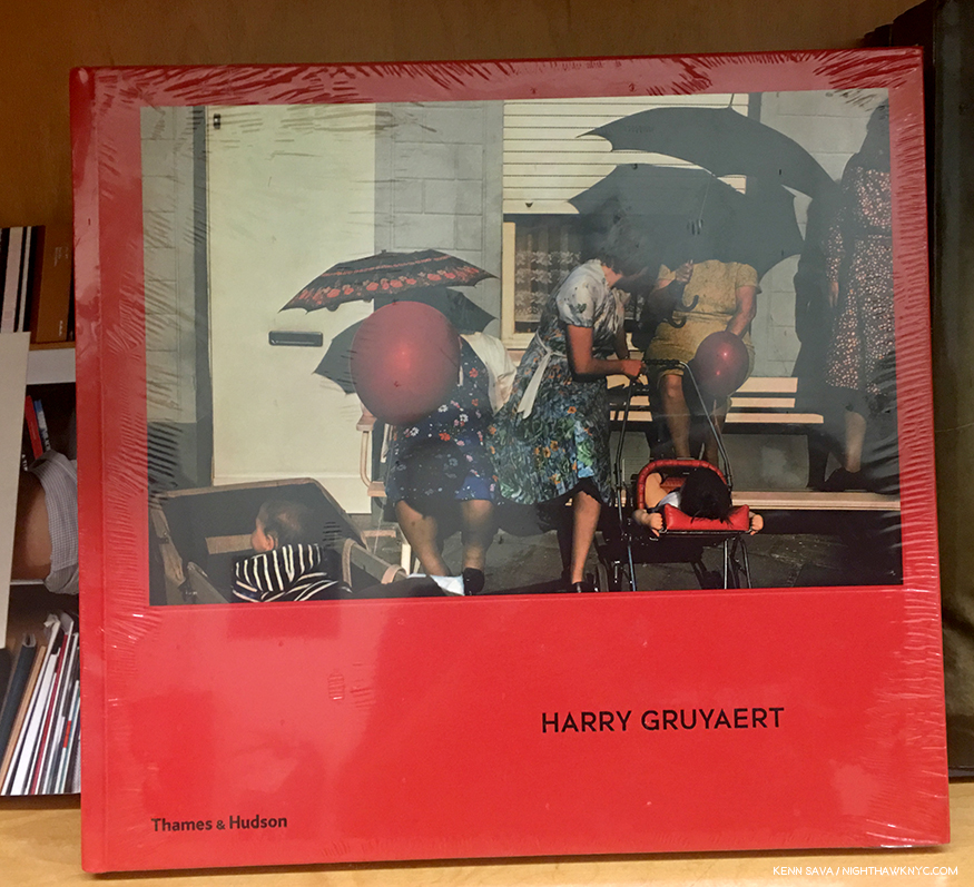
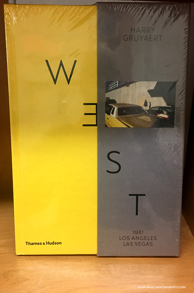
-Harry Gruyaert, Harry Gruyaert (Retrospective with the red cover), and Harry Gruyaert: East/Westboth Thames and Hudson- Two books that solidify the Belgian-born Photographer’s place alongside the better-known “early masters of modern & contemporary color Art Photography,” including Eggleston, Stephen Shore, Saul Leiter, et al. (A term that puzzles me since color in fine Art Photography can be traced back to, at least, Sarah Angelina Ackland, circa 1900). More on both books in my recent conversation with Harry Gruyaert, here.

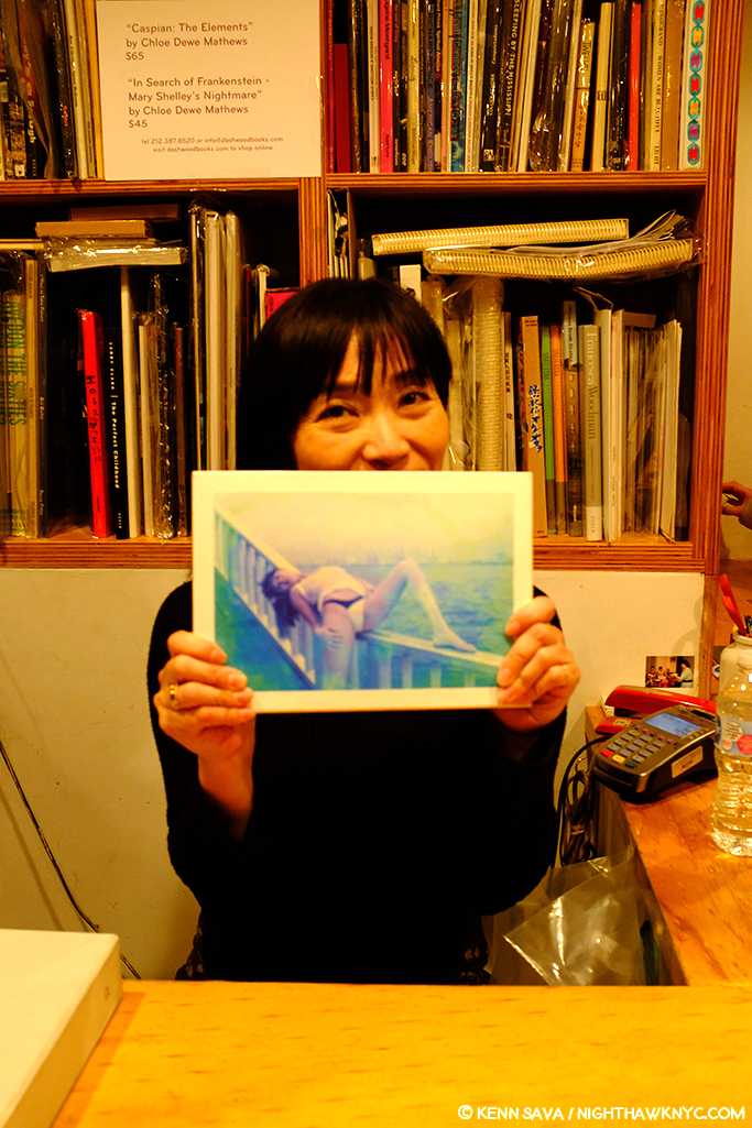
One of the irreplaceable things about physical book stores are its people, like Miwa Susuda of Dashwood Books, seen here. Miwa is, also, a writer and a PhotoBook publisher with her Session Press. In 2017, Session Press and Dashwood Books released the fine Blue Period / Last Summer by the legendary Japanese Photographer, Nobuyoshi Araki, a copy of which she holds. Seen at Dashwood on October 24, 2018.

-Cristina de Middel– The Perfect Man. Cristina de Middel is an Artist who should win an MTV Video Vanguard award. Huh? What I mean is that I can think of no other Photographer who’s books are consistently pushing the boundaries of what a PhotoBook is and can be. This is just the latest in her series of compelling books, most of which are built around subjects that only the most imaginative would say “There’s a PhotoBook in this!” While that certainly wins her major points in my book, if she wasn’t, also, a world class Photographer, she would just be a curiosity. She is. But, you don’t have to take my word for it- Magnum Photos nominated her to join the world’s leading Photographic collective in 2017. The Perfect Man starts with looking at the largest Charlie Chaplin impersonator festival (with many of its subject posed in scenes reminiscent of Mr. Chaplin’s immortal “Modern Times”), and winds up being a broad look at Indian masculinity, and then a look at social customs Indian women are faced with interacting with them. It’s another book that surprises, and another book, like her classic The Afronauts1, that shows the new and old worlds colliding at full speed in unexpected ways.

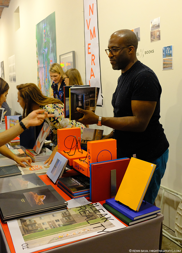
Kris Graves holding the contents of LOST, which comes as a set in the spiffy orange box with blue lettering under his hand at his +Kris Graves Projects booth at the NYABF, September 22, 2018. His newly released A Bleak Reality is seen in the foreground.

-Kris Graves, et al, LOST +Kris Graves Projects. A ground-breaking (sorry!) work in a number of ways. First, it’s a daring, TEN volume box set by a smaller publisher featuring the work of a number of established Artists (including Lois Conner and Lynn Saville) along side that of others who are on the way up (like Zora J. Murff, Joseph P. Traina and Owen Conway), each contributing a PhotoBook on a different city around the world. Second, typically for +KGP, the cost is quite reasonable, for both the individual books or the set. And last, taken as a whole it’s a stunning example of what a well-run, Artist-run publishing house can achieve. Did I mention that each component book stands, and stands out, on its own? Also in 2018, A Bleak Reality by Kris Graves from +KGP is a powerful look at 8 sites where young black men were murdered by police officers, a collection of his work that first brought Kris to my attention at AIPAD this past April, as I wrote about here.

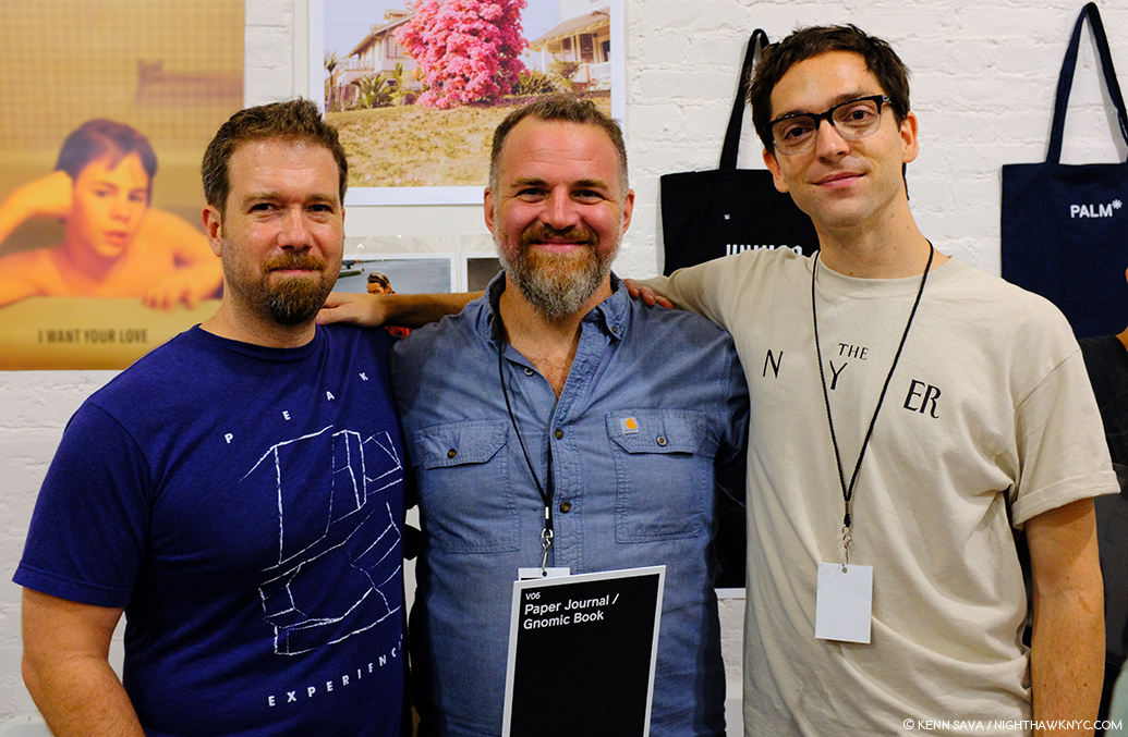
Multi-talented Artist & Gnomic Book publisher, Jason Koxvold, center, with Gnomic Book Artists Shane Rocheleau, left, and Romke Hoogwaerts, right at the Gnomic Book booth at the NYABF, September 22, 2018.

-Shane Rocheleau, You are Masters of the Fish and Birds and All the Animals (or, YAMOTFABAATA as it reads on its spine), Gnomic Book. A book that looks at the legacy of being white and male in America, quickly expands in scope to include any number of related effects, artifacts and institutions. It also reveals that the words “think small” apparently do not exist in Mr. Rocheleau’s vocabulary. The results are a first PhotoBook that’s extremely ambitious in its scope, biblical in its effect, gorgeously shot with a magical combination of subtlety and abstraction, edited like a Stanley Kubrick film, and exquisitely produced down to the smallest detail- (like its beautiful, hypnotic, and seductive to the touch, cover)…Phew! Along the way, it’s also chock full of indelible images that combine to make it linger and linger on in the mind later. A remarkable achievement, particularly for a first PhotoBook- the only first PhotoBook in this Noteworthy PhotoBooks, 2018 section. Limited edition of 500 copies. My recent Q&A with Shane Rocheleau is here

Rosalind Fox Solomon, Liberty Theater, MACK. Something of a marvel, another entry in this Post of a book that consists of a body of work decades in the making, this one is special. Culled from 400 Photographs taken in the 1970s, 80s and 90s, across the south, these 77 show a wide range of glimpses into the complex issues of race and racism, class and gender divisions that could be pivotal moments from 77 films that each stand on their own while provoking a world of feelings and reactions. Except comfort. The title speaks to a performance, and her website says the images are “poised between act and reenactment…” Now 88, Rosalind Fox Solomon, who like Diane Arbus, studied with Lisette Model in the 1970s, shares something of Ms. Arbus’ mystery and power in images that demand repeat viewing, here, in a tightly edited volume that quietly stuns as often as it shocks, aided by yet another powerful essay by Stanley Wolukau-Wanambwa, who’s first PhotoBook also appears on this list.

***Noteworthy First PhotoBooks***

Shahrzad Darafsheh- Half-Light, Gnomic Book. Iranian Photographer Shahrzad Darafsheh was diagnosed with cancer at age 36. But? She hasn’t let it stop her creativity or her work! It seems to me that anyone who’s been through cancer, or knows someone who has, can relate to her new first PhotoBook, Half-Light. It’s, at once both intimately personal, and universal, a book that looks inwards and outwards at the same time. Designed to be read either in western style left to right, or right to left, the custom in Farsi, one time I went through it it felt like an out of body experience. Cancer changes your life- forever, and it also changes how you see life, forever. Here is a Photographic record of the early days of this very talented young Artist’s cancer experience, seeing the world anew and turning her lens on herself, and her surroundings with wondering eyes. Its 300 copies are far too few to reach the audience this book deserves, so don’t wait long. It’s somewhat miraculous that Gnomic’s Jason Koxvold somehow found this work and overcame all the layers of problems inherent in working with an Artist living in Iran to produce such a beautiful and important book.

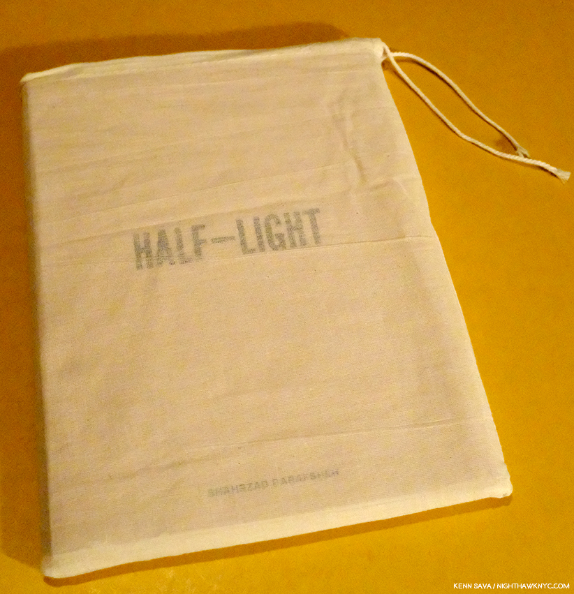
Shahrzad Darafsheh’s Half-Light.

-Stanley Wolukau-Wanambwa – One Wall A Web. Stanley Wolukau-Wanambwa has been one of the most astute and urgent voices writing about Photography and PhotoBooks for some time now. His writing has appeared in a wide range of places, including in a number of PhotoBooks, like Jason Koxvold’s excellent Knives. With One Wall a Web the world gets to see his first collection of his Photographic work. Born in Uganda  and living here for a number of years, One Wall is a far ranging look at American life, culture and society with a focus on the black reality in this country in two sets of original Photographs surrounding a section of appropriated vintage archival Photographs. It’s so wide-ranging it even masterfully weaves Allen Ginsberg’s classic poem Howl in. It’s already clear to me that One Wall a Web is one of those books that define this moment, as his friend’s Shane Rocheleau’s does in its way. It’s a book people will be discussing, referring to and looking at for many years to come. As I write this, about 70 copies remain of the first edition.


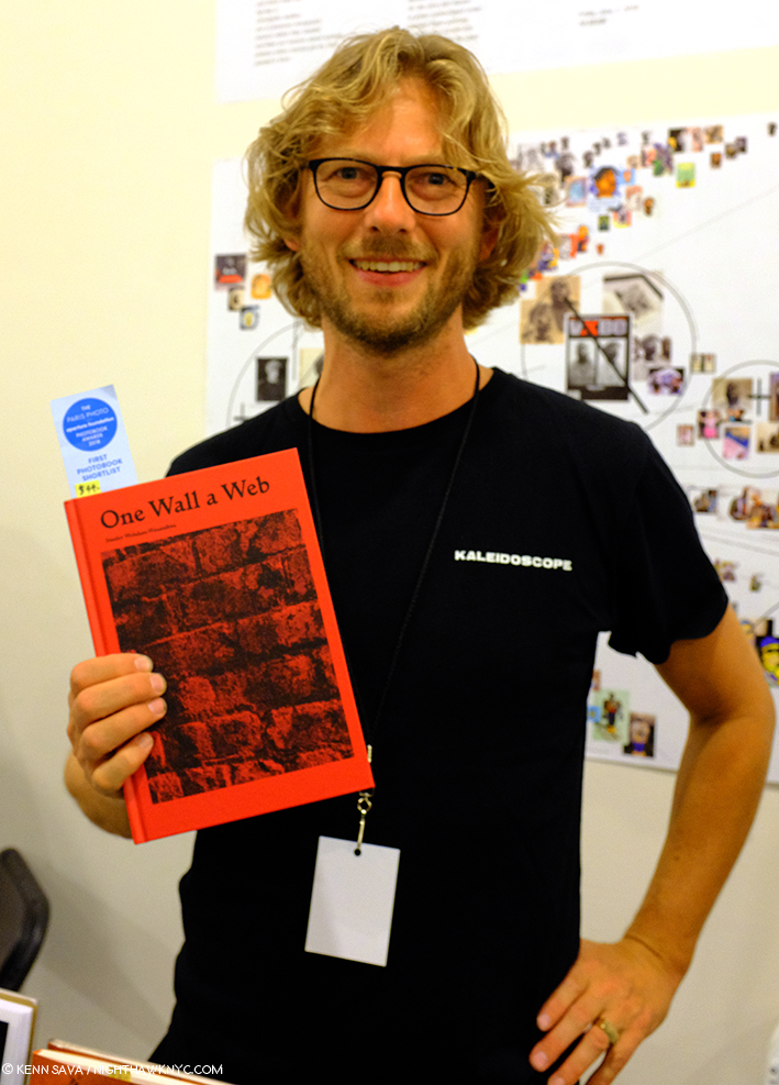
Roma Publications co-founder Roger Willems holds a copy of One Wall a Web, by Stanley Wolukau-Wanambwa at Roma’s booth at the NYABF, September 22, 2018.

-Jo Ann Walters- Wood River Blue Pool, ITI Ithaca  Named after a river and a pool near her hometown of Alton, Illinois, a journey through its 120 pages it makes it quickly apparent that yes, still waters run deep. A book over 30 years in the making, it’s a veritable time capsule of people and places, seen with a strong and singular eye, here largely cast on women and girls around her hometown, and elsewhere from Minnestoa to Mississippi cry out for extended pondering- on the women and/or children depicted, their situations and surroundings, and the moment. Coincidentally, Ms. Walters also teaches at Purchase College on the same Photography faculty with Stanley Wolukau-Wanambwa. My thanks to Kris Graves for  making me aware of this book. He did so purely on the book’s exceptional merit as something I should see. Modestly, he did so without mentioning that he was once one of her students, which I found out later. Jo Ann Walters’ tree has many branches. Now? We finally get to sit under another one with wonder at her achievement. I’ve found it makes an interesting pairing with the following-

-Petra Collins- Coming of Age, Rizzoli. A minor sensation when it was released, causing first printing copies to instantly vaporize, surprising no one more than its publisher, Rizzoli, who scrambled to produce a second printing, which finally materialized after a few months absence. Coming of Age, (a perfect title in more ways than one), touched a nerve with its subject generation, and with the esteemed Artist, Marilyn Minter, who interviews Ms. Collins inside. It’s easy to see why. Petra Collins Photographs her subjects the way they would like to be seen, and shows sides of them and their lives the rest of us never see. While other Photographers have garnered more attention for more contrived work in this genre, Petra Collins is the one to watch, in my view.

-Rose Marie Cromwell, El Libro Supremo de la Suerte, TIS Books/LightWork. I lived in Miami and South Florida, where it’s impossible to escape the flavor and influence of nearby Cuba. Here’s, an amazing look at the real thing, shot over 8 years while the Artist lived in Havana. It’s a thunderbolt, filled with color, as  you’d expect, but it’s also full of a poignant intimacy that surprises. Another book with an instant buzz that saw copies flying out the door, and a long line for signed examples at TIS’ Booth at the NYABF. El Libro Supreme de la Suerte (The Supreme Book of Luck) supremely deserves it.

If you are able to pick only one book from that group? You are a better man or woman than I am.

PhotoBooks are all we sell! One wall of titles at Dashwood Books.

***NoteWorthy Photo Related Book without Photos***

In this “decisive moment,” the foreshortening got the better of my auto-focus.

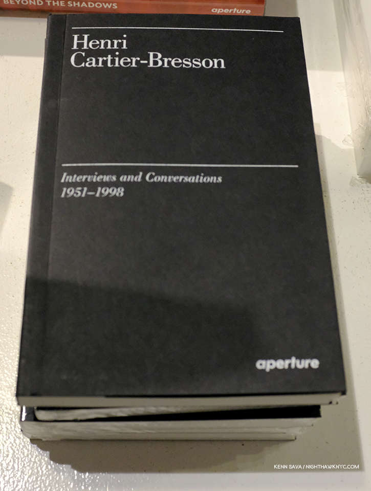
-Henri Cartier-Bresson- Interviews and Conversations, 1951-98, Aperture. I picked up The Mind’s Eye, Cartier-Bresson’s writings on Photography and Photographers, which didn’t have the insights I was looking for. Interviews and Conversations does. On every single page. Essential. A reference book for the ages.

***NoteWorthy Reissues***

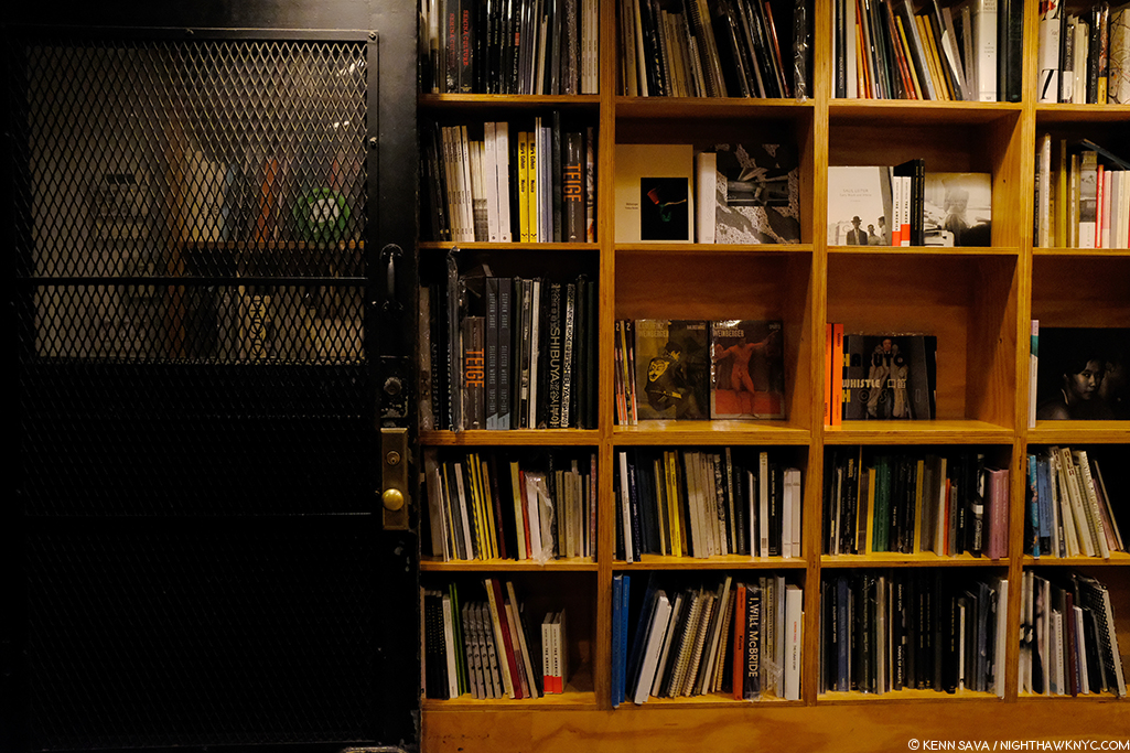
The New Arrivals wall at Printed Matter, presenters of the New York Art Book Fair. An amazing store that contains multitudes of worlds in the form of Artist’s books by umpteen thousand Artists and Writers. How do they know where all of them are? I never bother to try to find something- I just ask. Extra credit if you can spot the next book to appear on this list.

-Masahisa Fukase Ravens, MACK. (Pictured almost smack dab in the middle, above, in its grey slip case). Believe the hype. Shot in the aftermath of a divorce, this is an unforgettable masterpiece, one of the great achievements in PhotoBook history in my view. It says 2017 inside. I don’t care. I’m listing it here as a public service announcement. After being first published in 1986, it was out of print for the better part of 30 years! The word is copies are running low. Get it before it goes out of print. Again. I’m listing Ravens, also, to acknowledge MACK’s excellent series of reissues that has seen Alec Soth’s classic Sleeping By The Mississippi and Niagara, among a number of others reissued, making them affordable to students and Photography lovers, again, after long absences that has made them available only at very high prices on the rare book market. Bravo! The next selection is another one…

Paul Graham, center, with Lesley A. Martin of Aperture, left, discuss a shimmer of possibility at its re-release. AIPAD, April 13, 2018.

-Paul Graham, a shimmer of possibility, MACK. Though reissued once before, as a one volume paperback, MACK has finally released the book Paris Photo-Aperture gave their “The Best PhotoBook of the Last 15 Years” award to in 2012, in its original 12 volume format (which sold out in less than 3 months in 2012). A revolution when it was first released, its influenced countless books that have come since. Including a few on this list. Limited edition of 500 hand signed sets.

-Daido Moriyama: Record, Thames & Hudson, A selection from Nos 1-30, beginning in June 1972 of the magazine, Record, that the great Japanese Photographer continues to release to this very day. At age 80, he’s now up to No. 39. When I added them up, Numbers 1-30 would cost a thousand or so dollars, IF you could find them all. This beautiful selection from them sells for about 50.00, and is sure to bring many more eyes to the work of one of the most admired, and influential, living masters of Street Photography.

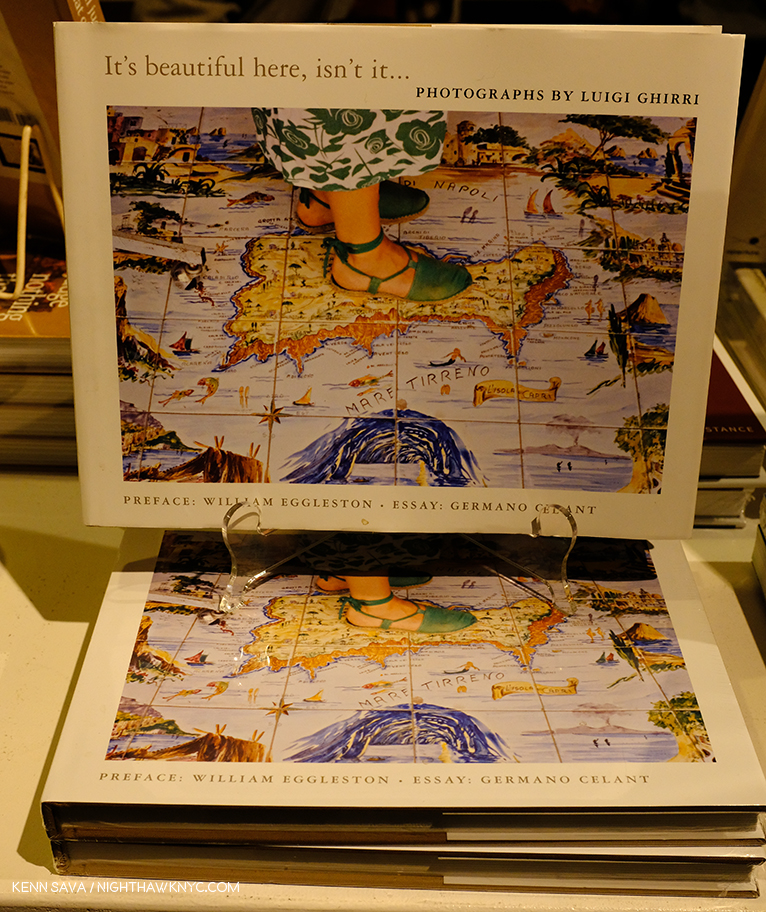
-Luigi Ghirri- It’s Beautiful Here, Isn’t It… Aperture. With 2008 1st Printings selling for over 300.00 per, my thanks to Aperture for issuing a 2nd printing this year otherwise I would have never seen it! Ghirri’s Kodachrome is the place to start exploring his work (especially in MACK’s gorgeous reissue, which seems to be disappearing), but this is a very nice selection of works from throughout his career. Intro by William Eggleston.  

Roy DeCarava & Langston Hughes- Sweet Flypaper of Life, First Print Press/David Zwirner Books. Roy DeCarava is one of the unsung masters of contemporary Photography, who is quietly undergoing a renaissance that’s seen a few of his books reissued at long last in honor of the Photographer’s 100th birthday in 2019. First published in 1955, it features 141 DeCarava Photographs chosen by Langston Hughes who then supplied an accompanying narrative. His aim, he said, “We have so many books about how bad life is. Maybe it’s time to have one showing how good it is.” It’s that, and more, as it shows life “Uptown” in the mid-1950s in a way unlike that seen in any other book. 

***NoteWorthy Catalog of the Year**

-Sally Mann- A Thousand Crossings. It’s going to be a while before another book coming along surpassing this as a one volume reference/summary/monograph of Ms. Mann’s work to date. Beautiful. Throughout.

-Saul Leiter- All About Saul Leiter– It came out in Japan last year, and has just been released here. I’d still recommend Early Color as the place to start exploring Saul Leiter, but this is an excellent second choice and provides more of a complete sense of the man’s work over his career. With all due respect to his black & white work- Saul Leiter is a supreme Photographic Artist with color and the effects of light, and that is the work of his I will always be drawn to, and there’s a lot of it in this beautiful volume. My look at the recent Saul Leiter: In My Room show and book is here.

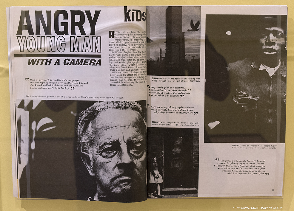
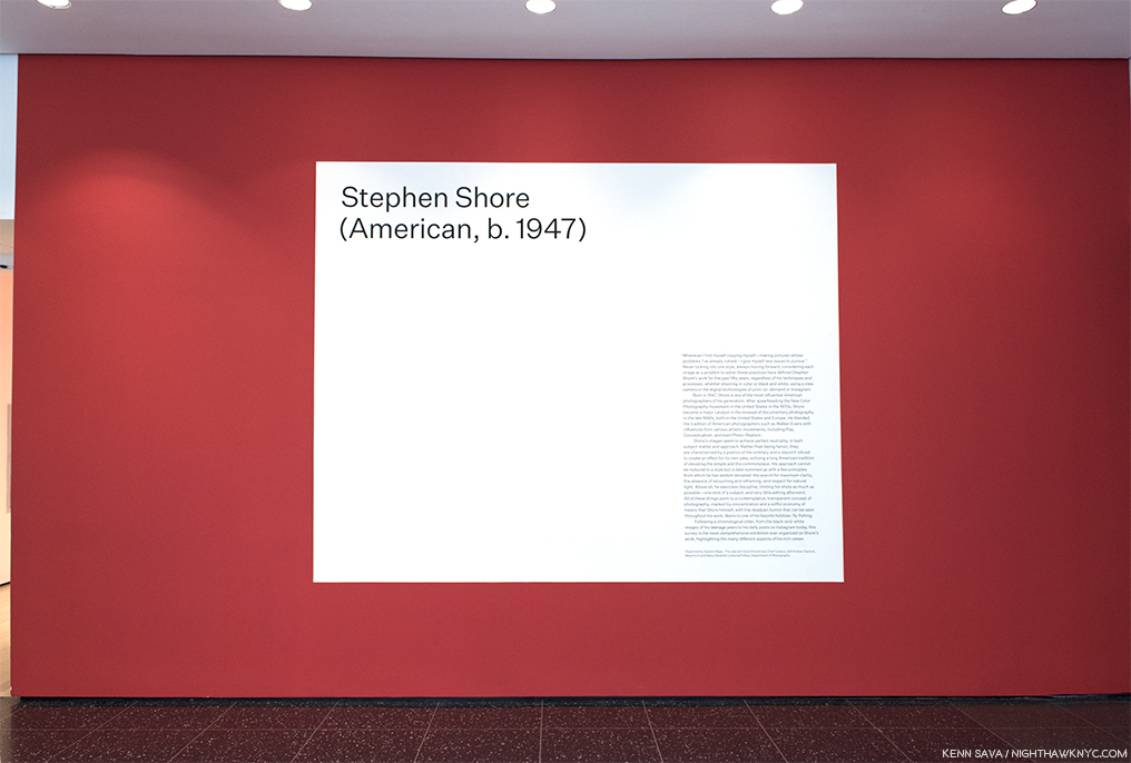
-Luigi Ghirri- The Map and the Territory, MACK. Focused on his work from 1970s and 1980s this is a beautiful almost 400 page look at a visionary Photographer, who, was the only name Stephen Shore mentioned when I asked who he felt deserved more attention. He told me Luigi Ghirri was the Artist he used to recommend, before the internet did away with little known Artists. Which brings me to…

***NoteWorthy “Non-PhotoBook” of the Year/ Holiday gift of the Year***

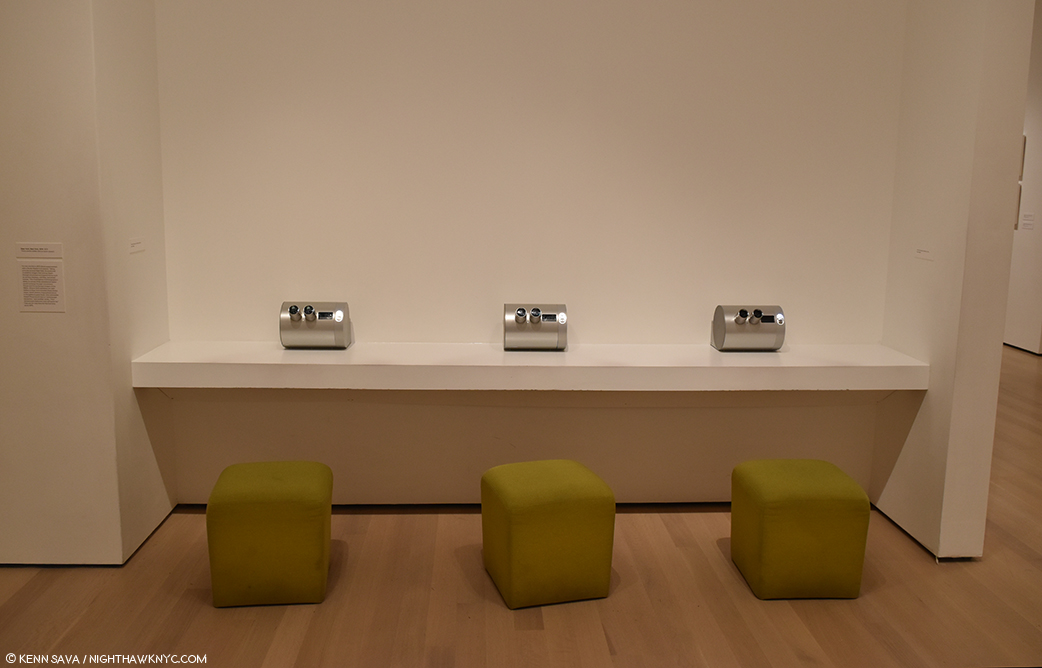
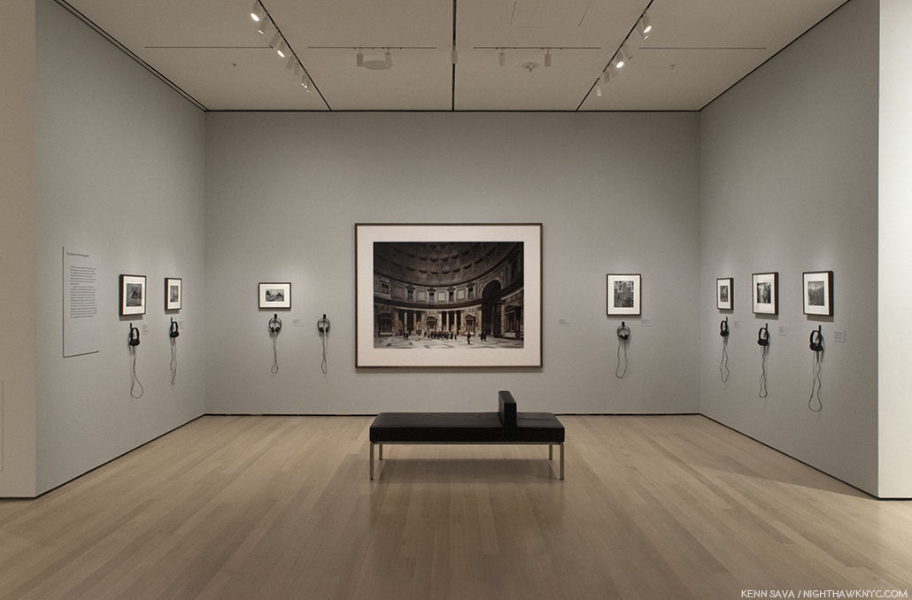
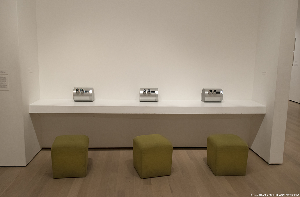
The 3 Stereograph viewing stations, each containing 10 different stereo Photographs of New York, 1974, at the Stephen Shore Retrospective at MoMA, May 23, 2018.

Stephen Shore, Stereographs, New York, 1974, Aperture. Hey, it counts- its got an ISBN number…and 30 Stereo Photographs! I don’t know how many other visitors to the Stephen Shore Retrospective at MoMA were thinking, “Wow. This is COOL!,” when they sat at one of the 3 stations, each containing 10 of Mr. Shore’s Stereographic Photographs. Well, I was. Now, you can have your own! Hurry. Aperture only produced 400 sets each containing a “Stephen Shore” signature model viewer (cool!) and all 30 of the works seen at MoMA (ditto). Each set includes a card hand signed by Mr. Shore. Don’t sleep on it. I hear they’re going fast. All of those who already own it that I’ve spoken with said they hoped more images would be made available. Hear, hear. My piece on the monumental Stephen Shore Retrospective at MoMA is here

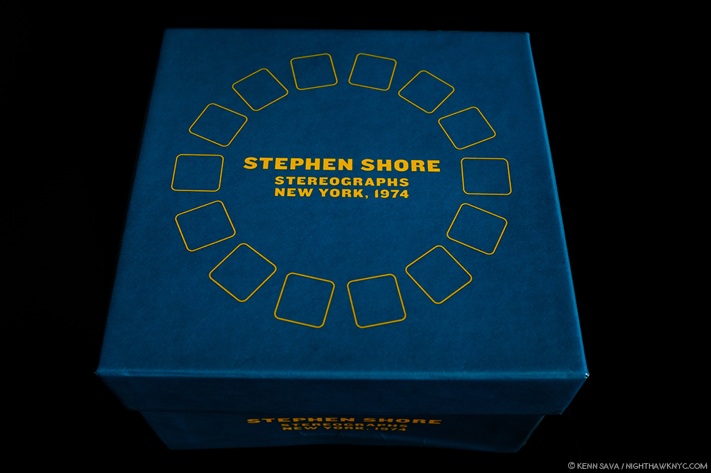
Stephen Shore: Stereographs, New York, 1974, published by Aperture.

***PhotoBook Discovery of the Year (Regardless of Publication Date)***

-Lewis Baltz, WORKS, Steidl, 2010. WORKS is THE most extraordinary box set I have yet seen. Period.

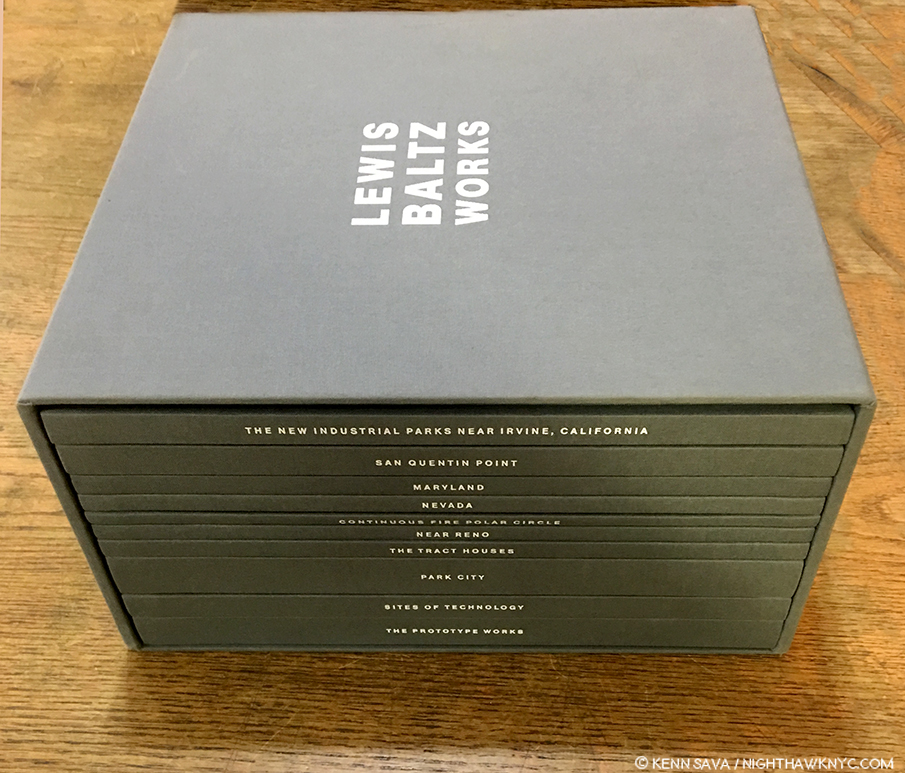
When you look at it like this, it could have been called “MONUMENT.” Note- There are two editions of WORKS. Mine is the first edition, 2010. the later WORKS- Last Edition edition adds the subsequent Candlestick Point (2011) and Texts (2013), which they just lay on top of this box. Both of those books are available separately, so you can create your own Last Edition. Their Last Edition also comes with a booklet containing Lewis Baltz’ Last Interview, which, unfortunately, is not available elsewhere.

Since discovering WORKS, Lewis Baltz has become one of the few Artists who have effected the way I see the world, and one of even fewer to effect how I think about what I see. Mr. Baltz passed away in 2014 at 69 and this was a project he worked on when he, apparently, knew the end was coming. The result is that WORKS is the complete 10 volume edition of his Photography as the Artist wanted it to be seen. The care and attention to detail he brought to this edition, matched by Gerhard Steidl and his team, make it the definition of “definitive.” It houses the career work of an Artist who’s work expanded from the so-called “New Topographic” approach to Photography to including how the forces that control man’s uses of the land have extended into virtually every realm of human life. Inside, the entire journey can be taken in one place, where its continuity and interconnectedness can be fully appreciated as it can be nowhere else, in drop-dead beautiful quality printing. Lewis Baltz was an Artist who while producing Art based in what he saw around him created a body of work that, also, warns about where this was (and is) all heading. In my view, this makes him one of the most important Photographers of our time. Each of the 1,000 copies is hand signed by the Artist!

For those not wanting to make the investment in WORKS (currently 600.00 and up), there is the one volume Lewis Baltz– the catalog published in 2017 to accompany the first posthumous retrospective of Mr. Baltz’ work in Madrid, and so another entry for NoteWorthy Catalog, 2018. (It reached me in January, 2018.) The best one volume survey of his work is a great way to get the feel of both his accomplishment and the interconnectedness of the various series he produced, (and yes, they are interrelated). Even more than A Thousand Crossings, it’s very hard for me to see another book surpassing Lewis Baltz as a one volume monograph, especially given its particularly beautiful Steidl production and superb essays by Urs Stahel and, particularly, Artist Walead Beshty.

And so, in my book, there are no “winners,” no “losers” among Artists. ALL Artists who have created a PhotoBook (since that’s what we’re talking about here) this year are Winners in my book! CONGRATULATIONS! Seeing so many books and speaking with so many Artists & publishers has given me a real sense of how hard it is to produce a book today, particularly in this country.

For the rest of us? Get out there, look at some PhotoBooks and see what speaks to you. For me? I look forward to seeing what’s coming next. And? I will be looking for it…

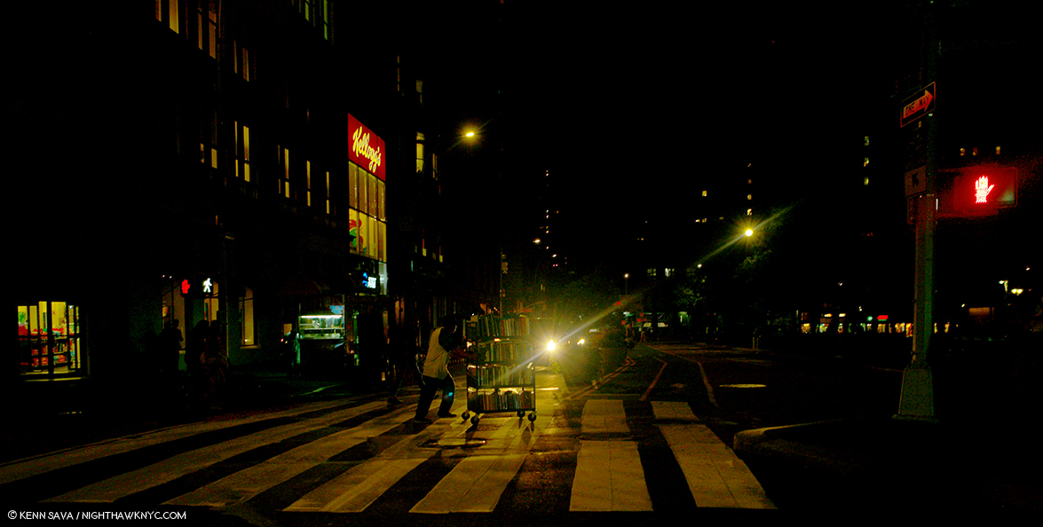
11pm, East 17th Street @ Union Square. It can be a lonely road seeking PhotoBooks in the dead of night, which I actually was. But, wait! “Hey, man. Got any PhotoBooks there I should know about?”

*-Soundtrack for this Post is Impossible Year by Panic! at the Disco from Death of a Bachelor.

My previous pieces on Photography are here.

NighthawkNYC.com has been entirely self-funded and ad-free for over 6 years, during which over 250 full length pieces have been published. If you’ve found it worthwhile, you can donate to keep it going & ad-free below. Thank you!

Written & photographed by Kenn Sava for nighthawknyc.com unless otherwise credited.
To send comments, thoughts, feedback or propositions click here.
Click the white box on the upper right for the archives or to search them.
For “short takes” and additional pictures, follow @nighthawk_nyc on Instagram.

Subscribe to be notified of new Posts below. Your information will be used for no other purpose.


  1. Both Ms. de Middel and Vivienne Sassen, mentioned earlier, have come under controversy for their work in, and about, Africa.

A Conversation With Photographer Harry Gruyaert

Written by Kenn Sava. Photographs by Harry Gruyaert.

Harry Gruyaert is a mystery to me.

I wonder…HOW does he get such miraculous, beautifully atmospheric Photographs, over and over, again? It doesn’t matter what time of day,

Los Angeles, California, USA, 1981. Photo by Harry Gruyaert/Magnum Photos. I came across a print of this work in June and realized that I hadn’t done a deep dive into Harry Gruyaert’s work. Well? It’s summer. Into the pool!  Three months later, I’m still immersed in the sheer joy of looking. Click any Photo for full size.

or night it is.

Launderette. Town of Antwerp, Flanders Region, Belgium 1988. Photo by Harry Gruyaert/Magnum Photos.

What the weather is,

Ostende, Belgium, 1988. Photo by Harry Gruyaert/Magnum Photos.

or even what’s going on.

Commemoration of the Battle of Waterloo, 1981, Village in the Province of Brabant, Belgium. Photo By Harry Gruyaert/Magnum Photos.

And, he’s been doing it for going on 50 years now.

His Photographs will make you stop and wonder- What’s going on here?

Rue Royale, 1981. Brussels, Belgium. Photo by Harry Gruyaert/Magnum Photos.

Or, marvel at the almost magical combination of elements coming together in a split second of time,

Parade, 1988.Flanders region, Province of Brabant, Belgium. Photo by Harry Gruyaert/Magnum Photos.

any time,

Galway, Ireland, 1988. Photo by Harry Gruyaert/Magnum Photos.

any where.

National Communist party congress, Trivandrum, India, 1989. Photo by Harry Gruyaert/Magnum Photos.

But, the biggest mystery of all, for me, is WHY is he still so relatively little known in the USA?

His name is heard nowhere nearly as often as his fellow contemporary Masters of color Photography- William Eggleston, Saul Leiter, Stephen Shore, and the rest. As I write this, there are only TWO books of his work in print here (see BookMarks at the end). Yet, I find, his work has a richness and subtlety, those gorgeous colors he’s legendary for, all in the service of a mystery, like an untitled still from a movie (sorry, Cindy), that brings me back to have another look, again and again. His work can stand right alongside that of his peers, and it will hold its own alongside any of them. Even beyond contemporary Photography, Harry Gruyaert’s work, also, speaks to the lover of Painting in me. His is that rarest of work that touches some of the same nerves that Edward Hopper is, perhaps, most renowned for- the insular loneliness that defines modern life.

Covered market, Bairritz, France, 2000. Photo by Harry Gruyaert/Magnum Photos.

Born in Antwerp, Belgium in 1941, he joined Magnum Photos in 1981, as admittedly, and somewhat controversially, the first and only, non-PhotoJournalist in the legendary group. 37 years later, he’s still a member, and is it only a coincidence that the current roster may be the most diverse in its 71 year history? Still going strong, 2018 is turning out to be a big year for Harry. First, the Harry Gruyaert – Retrospective at FOMU Foto Museum in Antwerp, Belgium, from March 9th to June 9th, 2018, while the feature length documentary, Harry Gruyaert Photographer, premiered this summer. Meanwhile, this past Saturday, September 8th, saw the opening of his new show at Antwerp’s renowned Gallery Fifty One. The show is titled Roots, and features work Mr. Gruyaert created in his native Belgium, where his “roots” are.

I’m thrilled to say I had the privilege of speaking with Mr. Gruyaert in France after he just returned home from attending the opening of Roots, and in a far ranging interview, I was fortunate to ask him every question I could think of that I have yet to see asked of him thus far. What follows is not a blow by blow biography. It’s meant to fill in the gaps in what’s been written about Harry Gruyaert thus far. And so, it’s meant to intrigue, to inspire you to delve further into his long and rich career. I quickly discovered that he is not one to mince words. Hold on to your seats, and prepare to meet a living legend, who’s bursting with passion in his mid-70s. Ladies and gentlemen, my conversation with Harry Gruyaert on September 11th, 2018…

Before I could get a word out, he said…

Harry Gruyaert- I liked what you did on Saul Leiter, so…

Kenn Sava- Oh, you did? Thank you very much. It’s interesting…I notice there’s a couple of things you seem to have in common with Saul. Early on, his father, also, was adamantly against his becoming a Photographer, and eventually disinherited him. He was also really loved Pierre Bonnard, as I mentioned. I note that you are as well. Saul who was known for his color work, did most of his intimate work in black & white, as you have.

Pierre Bonnard, View of the Old Port, Saint-Tropez, 1911, oil on canvas, seen at The Met.

Pierre Bonnard is not somebody who comes up all that often, I’ve had him come up twice with such great Photographers recently. What is it about Bonnard that particularly speaks to you?

Pierre Bonnard, The House of Misia Sert, 1906, Oil on canvas.

HG- It’s extremely sensual, you know. It’s amazing. His cropping is really amazing. I really like so much the feeling he has towards his life, and his wife. It’s quite amazing.

Town of Jaisalmer, State of Rajasthan, India, 1976. Photo by Harry Gruyaert/Magnum Photos. I couldn’t resist pairing this with Bonnard’s House above, without any input from Mr. Gruyaert. The more I look at them, the more I find coincidentally in common. Down to the animals just inside each door.

A funny thing about Saul Leiter. When I arrived in Paris in April, 1962, I went to Elle Magazine, which is a fashion magazine, and I showed my work to the art director, Peter Knapp, and he said, “Oh, you are the little Saul Leiter. “ I had no idea who Saul Leiter was. It took me 40 years to realize who was Saul Leiter, and strangely enough in the last Paris Photo, my work was hanging next to his in the booth of Gallery Fifty One, run by Roger Szmulewicz, and  believe it or not, who walks by as I was standing in the booth ? Peter Knapp ! It’s amazing. So I asked him, “Why did you tell me that all those years ago?” He said, “It’s because of the way you work with color, obviously.” I really find it exciting  when things like that happen. 

KS- So, his work had no influence on you. You weren’t aware of it.

HG- No. No. I found out much later when his first Steidl book came out and when I saw his show at the Foundation Cartier-Bresson in Paris, which was only a couple of years ago.

KS- This has been a big year for you with the FOMU Retrospective, the Documentary Harry Gruyaert Photographer, and now the Gallery Fifty One show, Roots, I wanted to congratulate you on all of that.

Harry Gruyaert, in the red slacks facing the camera, at the opening for his new show, Harry Gruyaert: Roots, September 8th. Photo by Gallery Fifty One..

HG- Thank you. 

KS- I came across your work in the Magnum Square Print sale and realized I hadn’t done a deep dive into your career. Part of the reason is there aren’t a lot of books of your work in print here. The Retrospective, with the red cover, and East/West being two. It seems that you’re slowly reissuing your books, right?

HG- Sure. You know I accumulated so much work. And the good thing about making books now, is that you have much more control than before. The quality of printing is much better and my new books look better than the ones I published before.

Moscow, Russia, USSR, 1989. From East in the 2 volume set, East/West. Photo by Harry Gruyaert/Magnum Photos.

KS- East/West is a fascinating book in that regard. I’m interested in why you chose to group the two books together. I know you’ve said many times you’re not a journalist, but looking at this work now from so many years later, it almost has a journalistic feel to it- A commentary about the materialism in America and the fall of the USSR at the time you were taking the pictures. Was that any part of the intention in issuing them together now in a slipcase? 

Freemont Street. Las Vegas, Nevada, USA, 1982. From West in East/West. Photo by Harry Gruyaert/Magnum Photos.

HG- Yes, that was part of the idea of publishing these two series of pictures together. Don’t forget, I’m a documentary Photographer, and in that sense I feel quite close to somebody like Cartier Bresson whose work is always about a particular place at a particular time. We have both travelled a lot and taken pictures in many different countries and share that same openness to different world and different cultures. Though I am a great admirer of american photographers, I sometimes feel that the work they have done in the states is more interesting than their work in other countries. I don’t know why that is. 

KS- You were involved with Henri Cartier-Bresson and I read the story of him asking you to color his prints. For everyone who wasn’t able to know him, what would you like them to know about him? Is there any one thing that particularly stands out?

Henri Cartier-Bresson, Hyeres, France, 1932

HG- (Laughs)…Oh boy. I was very lucky to have known him. He was very provocative. He was full of energy. Very provocative, and at the same time, he wanted to be a zen buddhist. (Laughs) Very interesting person. Complex. It’s such a lesson that he gave up Photography and went back to his old passion, Painting and Drawing, when he felt he had nothing more to say through photography. It was not on the level of what he did before, but it’s such a lesson. Then, he’d come and ask you, “What do you think of my Painting or Drawing?” He started all over again, questionning himself instead of relying on his reputation.

Shaded streets of the medina (old district), Near “Jemma el Fna” square, Marrakech, Morocco, 1986. Photo by Harry Gruyaert/Magnum Photos.

KS- That’s quite a compliment to you that he’d ask you to Paint his prints. 

HG- It all started when he came to see my first show about Morocco at the Delpire Galerie in Paris. My C. prints were far from perfect and he started making comments. He took bits of paper or little objects and put them on my prints to explain to me what he meant.Amazing. Then he sent me his book about Andre Lhote, who was his teacher in Painting and  called me up two weeks later, and said «  I have a suggestion to make.I will send a couple of my prints and I will send you a big box of pastels and you can try and color them.” I said, “Henri, it’s nice to think about it, but I’m not a Painter. I can’t even make a drawing.”

He had a problem with color photography. He felt it was only used for commercial reasons and was not really interested. And I think he really didn’t like the fact that many Magnum Photographers moved to color because that’s what magazines were asking for when they were better doing black & white. But some became very good magazine photographers and were very successful. 

In 2017, 174 Harry Gruyaert Photographs were on view in 11 stations of the Paris Metro at the invitation of RATP, the Paris public transport operator. Seen here are two images from his beach series, “Rivages,” (shores, or “Edges” as it’s called here), images that speak of the insignificance of man in the scope of nature, the Artist has said, while at the same time, showing a sense of humor, particularly on the left. Seen here in a still from the Harry Gruyaert Photographer Documentary.

KS- Was there a single moment or an event that got you first interested in Photography?

HG-Different things…I wanted to travel. I went to an exhibition in ’58 at the World’s Fair in Brussels. I saw the different pavilions : America, Russia, Japan, India… I was looking at the globe which I had at home. And I thought, I want to go to all these places. And I was also interested in fashion. I loved  Fashion magazines which were much better at the time, like Harper’s Bazar and Vogue, and photographers like Avedon and Irving Penn. And there were all these beautiful girls…

KS- So, it came out of your desire to travel.

Still from Harry Gruyaert Photographer.

HG- To travel, to discover things…I was always interested in Paintings. I always went to Museums. 

I never even thought about doing anything else. I was Director of Photography for a couple of television Film. I had a big admiration for the directors of photography who worked with  Italians film directors like Antonioni, I through they were really fantastic. I could have made a profession out of that, but I wanted to do my own stuff, my own Films and it meant working with a large crew of people and you needed a lot of money. The good thing about photography is that you can work on your own. If the digital small cameras of the quality we have now had existed at the time, things might have been different.

KS- When I look at your work I see elements of both- they seem like stills from a movie but then when it comes to printing, it’s some of the same techniques that come to bear that Painters would use, so you’ve almost married the two. Do you see it that way at all?

HG- Yeah, sure. The funny thing is that the directors I know in Paris, I’m friendly with some of them, have told me they’ve been inspired by some of my photographs…So it’s wonderful that it works both ways. 

Edward Hopper, New York Movie, 1939, Oil on canvas.

KS- I’ve read a couple of your interviews over time talking about Edward Hopper. I think in one interview you said you didn’t really look at his work early on, but you can kind of see what people say when they talk about the similarities in the loneliness and isolation in your work. Since it didn’t come from Hopper, that sense that is in some of your work, where do you think that came from? Those isolated figures, that sense of loneliness and isolation that occurs in your work? 

Trans-Europe-Express, 1981. Belgium. Photo by Harry Gruyaert/Magnum Photos.

HG- I don’t really know. It’s not the person that interests me most. It’s the person in its environment. To me, all the elements are important. I don’t have any particular intention. It’s just what I see.

Bay of the Somme River in the town of Fort Mahon, Picardie, France, 1991. Photo by Harry Gruyaert/Magnum Photos.

I think humans have such a great idea about ourselves but nature is so much more powerful.

The Flemish House, by George Simenon. Cover Photo by Harry Gruyaert/Magnum Photos.

Talking about loneliness in the city…A funny thing that came up. Do you know (Georges) Simenon, the Belgian Writer of detective stories ? Inspector Maigret is the name of the detective. They translated them into english and they had trouble finding covers for them. Peter Galassi said to them, “Look at Harry’s work. I think you can find something there.” So, the guy from the publishing company sent me some lay-outs and I didn’t think it could work because the cover is vertical and 90% of my work is horizontal. But, the way he cropped it, it was really quite interesting and I asked him to print the full frame image on the back cover. 

The full frame source Photo for the cover. Bar, Antwerp, Belgium. Photo by Harry Gruyaert/Magnum Photos.

Then, Penguin Books in London picked it up. Believe it or not, we’ve done 65 covers.

KS- You’ve done 65 covers for them?

HG- Yes. Just from my archive. My archives are not only Magnum, only a small percentage is Magnum. So, she comes to Paris and looks through mainly my old work. When I did my show at FOMU at Antwerp, there was a big wall with all the covers of the books and small pictures of the full frame.

The strange thing is Simenon is Belgian. He’s from Liege. I’m from Antwerp. I met his son and he showed me some Photographs that Simenon did himself, and you find this kind of thing of a small figure in an urban landscape. With a certain lonelieness. Which you find often in my work. It’s really quite funny.

KS- You’ve spoken about a number of the places you’ve worked- Moscow, Belgium, California & the American West. How do you feel about New York?

It’s a small world. New York City. USA, 1996. The 23rd Street Subway station, across from the Met Life Building. It’s immediately recognizable to me because it’s in my neighborhood. Photo by Harry Gruyaert/Magnum Photos.

HG- Extremely exciting. I’ve done lots of work in New York. The first time I came to New York was in ’68. I was friends with people like Gordon Matta-Clark. All those Artists were important to me, in terms of the energy, in terms of what they were doing. 

National Road 1,near Mechelen, Antwerp Province, Belgium, 1988

Pop Art taught me to look at a certain banality with interest, a visual interest and a certain sense of humor.That changed the nature of the work I was doing in Belgium at the time.  In the beginning it was only in black & white. For two years, I didn’t see any color there. But Pop Art taught me to look at things in a different way and then I started to work in color.

So for two years there I only shot black & white.

Near Bruges, Belgium, 1975. Photo by Harry Gruyaert/Magnum Photos.

KS- I don’t really consider Robert Rauschenberg a Pop Artist but he was obviously very important at that time, and since. Has he had any influence on you at all?

Robert Rauschenberg, Black Market, 1961, seen at MoMA’s Robert Rauschenberg: Among Friends show, 2017.

HG- Oh, I love his work. I mean the personality… the openness, trying other things. There’s more sensuality in Rauschenberg. It’s more fun as well. 

KS- In looking at someone like Robert Rauschenberg, and there’s others, too, who were Painters, but also were Photographers, it seems to me that their Photography doesn’t get any attention at all. Have you seen Rauschenberg’s Photography, and if so, what do you think of it?

Robert Rauschenberg, Anchor, from Studies for Chinese Summerhall, China, 1983. Photo by Graphicstudio, USF.

HG- Oh, sure. It’s interesting. Sometimes it takes time to discover things. So many Photographers are being discovered…look at Saul Leiter.

Excerpts from T.V. Shots, Photos taken between 1969 and the early 1970s. From the publisher- “Gruyaert’s break from television wasn’t all peaceful, though: his first serious body of work contained photographs of distorted TV images. By following events such as the 1972 Munich Olympics from home, he created a distressed parody of the current-affairs photo-story. The work caused controversy, both for its disrespectful assault on the culture of television and for its radical challenge (both formally and in terms of content) to the conventions of press photography. Gruyaert views it as the closest thing to journalistic photography he has ever made.” Photos by Harry Gruyaert/Magnum Photos, as seen in the 2007 Steidl book of the same name.

Imitation is the sincerest form of flattery, someone said. This is NOT by Harry Gruyaert. NYC Subway ad for Maniac, September, 2018

KS- Speaking of that…another Photographer who is also a Painter, is William Eggleston. You were able to see the legendary 1976 show at MoMA, Photographs by William Eggleston, and you spoke about being impressed with his dye-transfer prints. I’m wondering- What did you think of his work when you first saw it?

HG- It was amazing to see that, especially the quality of the printing. The first book is one of his best and one of my favorites. 

KS- So you think William Eggleston’s Guide would be among his best work?

HG- Sure. Yes. Definitely. There are other good things too. But the problem now is that publishers want to publish too many books. Some are good, some are not so good. Banality can be interesting, but sometimes, it’s just banal!

KS- In the Gallery Fifty One show you have 41 works in black & white and 19 works in color, though they are large. I notice there seems to be more surrealism in the black & white works, where it’s more subtle in the color work. Does that seem to be the case for you?

Belgium, Hofstade, Carnival (Superimposition), 1975, is included in the Gallery Fifty One show. Photo by Harry Gruyaert/Magnum

HG- Black and white and color are two different approaches. I took pictures of my daughters in black & white because I felt I got closer to them. Shooting in black and white I feel less preoccupied by the way people dress, the background or things that could distract me. I concentrate on the human quality of the person. Color is more complex. With color, the color really has to be the main thing…the most important thing…

A normally very busy street deserted by citizens for the first meal of the day. During the Ramadan. Cairo. Egypt, 1987. Photo by Harry Gruyaert/Magnum Photos.

KS- It’s said that Roots was, at one point, basically a “farewell” to Beligum, after your difficulties with your father…

HG- That was not so much the problem as the lack of a cultural environment.

“Midi” train station district, Brussels, Belgium, 1981, is included in the Gallery Fifty One show. Photo by Harry Gruyaert/Magnum Photos.

KS- But, it seems that you’ve made peace with Belgium. Have you done work in Belgium since Roots? 

HG- I do all the time. At the show I gave Roger (Gallery Fifty One’s Director) about 15 prints I did very recently, to show whoever’s interested that things change. Nothing stays the same. The colors are different now. The mentality’s different. Belgium is more like the rest of Europe, I guess…the same clothing…the same advertisements. It’s actually much more colorful, but in a more capitalistic driven way. It’s more fashionable somehow, and It’s more alike. Before, in Holland and Belgium, which are very near to each other, things were very different in the color aspect and all that. And now, things have become much more the same, like in the States.

KS- So you were saying that some of the American Photographers influenced you more than the Europeans. Who were those American Photographers who influenced you?

HG- (Lee) Friedlander, definitely. (Irving) Penn, (Richard) Avedon. Helen Levitt is wonderful, sure, Bruce Davidson and others…

Stephen Shore, Merced River, Yosemite Park, CA, 1974, Seen at the Stephen Shore Retrospective at MoMA, 2018

When I look at Stephen Shore’s work, I have the feeling that I am traveling with him. It’s really important in Photography to get to the person and have the feeling of being with him. That’s really important. Stephen Shore, but other Photographers as well. It’s physical. It’s the experience they have that appeals to me. It’s a physical thing. That’s why I don’t care much for conceptual work. It comes from the brain. For me, it has to come more from the stomach. It’s physical. It’s experience, which someone has at a given time, and through the experience I get contact with the person who did it.

A visitor spends quality time with Rembrandt(s). At The Met, February, 2015.

To me, Art is…When I look at Rembrandt, I’m with Rembrandt. When I look at Bonnard, I’m with Bonnard. When I look at conceptual work, I’m with the brain of somebody. If they have to write a lot of stuff before we’re able to understand what it’s all about, I’m not interested in the exhibition. I have to first look at the work and it should mean something. It has to appeal to me visually. 

KS- Have there been any Directors or Painters that have spoken to you more recently?  Anyone that’s come along since Antonioni, Magritte? Anything that’s more contemporary? Anything that you’ve really been impressed with?

HG- Recently? I’m a movie fan. I go to movies all the time. In the past I went to the cinema every day. I learned more from movies than anywhere else…movies and paintings…

About Antonioni. What’s really interesting…In 2009, 10 Magnum Photographers had a show at the Cinematheque Francaise in Paris, exploring  the relationship between still Photography and Film. My part was to show how much I was inspired by Film, and mainly, by Antonioni. So, I did a projection, which lasts about 25 minutes, with extracts of his movies – l’Avventura, The Eclipse and the Red Desert –  and some of my Photographs next to them.

Province de Brabant, Belgium, 1981. One of my personal favorite Harry Gruyaert Photos reminds me of the scene in Antonioni’s La Notte when Jeanne Moreau sits in the car in the rain. Photo by Harry Gruyaert/Magnum Photos.

There are three Antonioni Films I was limited to1. So, I was able to use certain things. …. But, when they saw the thing produced, the review were very happy about it.

KS- I would love to see that. You have a new book, Rivages about to come out, (to be released in the USA as Edges later this year). I’ve read that you’ve been enjoying using today’s technology to make better prints. Are you also involved with the selecting of the images for the books and the way they are sequenced, or does somebody else do that?

HG- Completely. It’s team work. I’m the first person, obviously. I’ve been working with the same people the past 4 or 5 books. It’s like teamwork. 

The English edition of Rivages (Edges) is coming out at the end of September. The French edition is earlier. I’m very happy with them. The printing and everything. 

KS- So, you’re selecting the images for the books. 

HG- Sure. There’s some discussions, obviously…yeah, teamwork.

KS- Are you working on another version of Morocco?

HG- No plans for the moment, but everything is sold out. 

I want to do a book about street photography in the different cities I’ve been to. You know like New York, Brussels, or whatever And also a book on India and Egypt, a book about my industrial work, about airport, about my daughters… So many things… I also want to redo It’s not about cars, which was first published with  Roger Smulewicz of Gallery 512, but in a larger and more complete version. 

KS- Was Luigi Ghirri an influence?

HG- I discovered him later. I like some of his work…I think lots of his …He’s more of an intellectual. He has a real concept, I think. And I’m kind of… I think more in terms of color and I don’t think that’s his main interest. We have a very different approach

KS- There’s a couple of images that kind of remind me of yours. The shot of Versailles from the distance…

HG- Those are the ones I prefer. 

Still from the Harry Gruyaert Photographer Documentary showing the Artist on the corner of West 42nd Street and 7th Avenue.

KS- What did you think of the final documentary, Harry Gruyert Photographer? Did you have a chance to see it?

HG- Sure.

KS- What was your reaction? Were you pleased with it?

HG- I’m pleased with it. It’s not my Film. Well, it’s the Film of the director. It became very personal. You know, the thing is my father had about 25 hours of family films. The director knew that and he used a lot of that in the Film, comparing what my father did and what I did, and talking about my upbringing, so it became a very family kind of Film, which is fine, I think it’s a bit over done…it’s his Film.

Harry Gruyaert in action in Times Square, NYC. He has spoken about how taking Photos is like a “dance” for him, which is obvious, here, in this shot from the Harry Gruyaert Photographer Documentary website. While other Photographers bring full Hollywood movie making gear to bear in making their Photos look “cinematic.” Mr. Gruyaert does it the old fashioned way, as you can see.

KS- Are there any plans to release it in America? Are we going to get to see it over here?

HG- Who knows. It’s just the beginning. 

Gallery Fifty One, Antwerp, Belgium.

KS- You just returned form Gallery Fifty One and the opening of your show in Antwerp. How did you feel about the show? How did the installation look to you?

HG- We tried something I had never done before. We set two screens, one on top of the other, very close. On one we showed black and white photographs and on the other color photographs.

Installation view of Roots at Gallery Fifty One showing dual video monitors. Photo by Gallery Fifty One.

Sometimes the relationship between them worked, sometimes it did not. But it was an an interesting experience. There’s much more black and white stuff (included in the show) than I have ever showed. The color photographs are the ones published in the new edition of Roots.

The Gruyaert family at dinner in a peaceful moment. Harry’s father, left, worked for the AGFA Film Company. His feelings about his son becoming a Photographer have been written about elsewhere. Still from Harry Gruyaert Photographer.

KS- Did your father ever come to accept you being a Photographer? Did he come to appreciate your work at all?

HG- Oh yes. He became very proud. (laughs) Once I was vice-president of Magnum, that was it for him. I think it was more about my position at Magnum than about my work.. 

KS- No one’s ever mentioned that anywhere. They always talk about how adamant he was against your becoming a Photographer. They never mention that he did finally come to accept it. Unlike Saul Leiter, who’s father disinherited him. So, at least, that’s good to hear.

HG- No, no no. My father was very proud at the end. He was. Whenever he would tell others how great his son was, it was special for him.

Our conversation ended there. A few days later in an email, Harry added this-

“I am just a photographer. If people look at my work and think it’s art, I am happy about it. But it is not for me to decide.”

Count me in that group of “people.”

While the mystery in Harry Gruyaert’s work will enthrall me for years to come, I hope the mystery surrounding his lack of recognition here will be history in the near future. After all, I’d rather leave the mystery writing to Simenon.


BookMarksMorocco is Harry Gruyaert’s most renowned book, winning the 1975 Kodak Prize. As he said, it’s been out of print since the last French edition, Maroc, published by Textuel in 2013. At the moment, two books are in print in the USA, Harry Gruyaert, with a red cover, a retrospective, published by Thames & Hudson in 2015, is likely to remain the most comprehensive overview of his work for the foreseeable future, particularly because, as he said, it has the Artist’s direct involvement.

It’s gorgeous, in my view, and the place to start exploring Harry Gruyaert’s work and achievement among books currently in print in the USA.

Harry Gruyaert: East/West, a two volume set in a slipcase, contains East, Photos taken in Moscow near the very end of the USSR in 1989, and West, Photos taken in the American West (including Los Angeles and Las Vegas) in 1981, was published in 2017 by Thames & Hudson. It’s a fascinating look at both places decades ago, and intentionally, or not, provides a powerful visual contrast between capitalism and communism.

East/West

Equally compelling is how much Mr. Gruyaert’s color palette changes between the two bodies of work.

Just released by Editions Xavier Barral this past May (2018) is the new edition of Harry Gruyaert – Roots, a book “about” the Artist’s relationship with his native country, Belgium. It adds over 20 additional Photos to the 2012 edition, which quickly went out of print. As the Artist said in the conversation, he finds today’s printing far superior to what he was able to achieve in the past, making this the edition to get.

Coming soon will be Edges (or Rivages in French), another new edition of an out of print beautiful collection. In visual poetry, Mr. Gruyaert explores the relationship of man to nature, the land to the sea, and the earth to the sky in 144 pages. Soon to be published by Thames & Hudson.

While I recommend starting with the red Retrospective, all of these books are excellent and recommended.

Cover image cropped from an original by Harry Gruyaert/Magnum Photos.

And, for lovers of detective novels, Harry’s images appear as covers on 65 Simenon novels published by, and available in the USA through, Penguin Books.

*- Soundtrack for this Post is “I Should Watch T.V.” by David Byrne & St. Vincent from “Love This Giant.” Lyrics, here. Video, here-

My thanks to Harry Gruyaert and Gallery Fifty One.

My prior Posts on Photography may be found here.

NighthawkNYC.com has been entirely self-funded and ad-free for over 6 years, during which over 250 full length pieces have been published. If you’ve found it worthwhile, you can donate to keep it going & ad-free below. Thank you!

Written & photographed by Kenn Sava for nighthawknyc.com unless otherwise credited.
To send comments, thoughts, feedback or propositions click here.
Click the white box on the upper right for the archives or to search them.
For “short takes” and additional pictures, follow @nighthawk_nyc on Instagram.

Subscribe to be notified of new Posts below. Your information will be used for no other purpose.


  1. In 2009 the Cinematheque Francaise presented Images to Come, an exhibition exploring Magnum photographer’s take on the relationship between cinema and photograhy. The works are displayed alongside still from L’Avventura, The Eclipse and the Red Desert.
  2. Harry Gruyaert: It’s Not About Cars, published by Gallery Fifty One in 2017.

Stephen Shore: Beneath The Surfaces

Written & Photographed by Kenn Sava (except El Paso Street, El Paso, Texas, July 5, 1975 )

Let’s play “Curriculum Vitae Roulette.”

First, make a list of ages going down the left side of the page. Next, write down some amazing feats, then slice them up individually, put them in a hat and mix them up.

No cheating! Blindfold, please. Begin!

Pull them out one at a time and lay them in a row going down, one next to each age. Repeat step 5 until the hat is empty. We’ll start with a given- the birth year. Let’s say…”Born 1947.” Ok. Let’s see what we have.

Born- 1947
Age 6- Gets a gift of a darkroom kit. Proceeds to develop and print his family photos.
Age 8- Gets a 35mm camera. “I started photographing seriously. Before that, my real interest was darkroom work,” he would later say.
Age 10- Receives a copy of Walker Evans’ American Photographs, the catalog for Walker’s legendary 1938 MoMA show, perhaps, the first important American PhotoBook, which has a powerful and lasting impact on him. He would later call Evans “a kindred spirit1.”

Our subject. Self Portrait, 1957. He was ten. TEN!! Click any Photo for full size. (See- “A Note About Glare In My Photos” in this footnote-2.

Age 11- Has a Leica and a Nikon. Begins doing street photography.
Age 14- 1962- Legendary Photographer, then Director of Photography at MoMA, Edward Steichen, acquires 3 of his Photographs for MoMA. They ask him what his personal philosophy is. “None,” he replies. “I’m only 14.”
Age 15- First article about his Photography is published.

Angry Young Man With A Camera, U.S. Camera Magazine, 1963.

Age 16 & 17- Takes Photos like these-

Untitled, New York, 1964. A forerunner of similar images to come in the next decade, and beyond.

Untitled, 1965. I can’t look at this without thinking of Richard Estes’ now classic reflections from the 1970’s, like Central Savings.

Age 17- Meets Andy Warhol and begins to frequent, and Photograph, Warhol’s Factory. Of how this came about, he later said- “I made a film Elevator, which is shown in this gallery (see below), and it was shown the same night that Andy Warhol showed a film called The Life of Juanita Castro, and I had the opportunity then to meet him. And I asked if I could come to the Factory and take pictures. He said, “yes3.”

Ivy Nicholson, Chuck Wein, Peter Knoll, Danny Fields and Andy Warhol, the Factory, New York, 1965-67. I spent an evening hanging out with Ivy Nicholson, left in the white, in the early 2000’s. After a few drinks, she sold me one of her CD’s.

Age 24- 1971- First living photographer to have a one-man show at The Metropolitan Museum of Art.

Ok…I’m ROFLAICGU! (Rolling on the floor laughing, and I can’t get up!) Yeah…I know. Dumb exercise. NO ONE would believe that could actually happen, right?

But…Um? It did. It really did. ALL of it4! To ONE person. That’s actually the short list of the early life and career of Master Photographer Stephen Shore. REALLY!

Once I got over the staggering accomplishments Stephen Shore achieved by age 24, which I’m not sure I still have (bearing in mind that William Eggleston didn’t start seriously taking Photographs until he was 185!), I could start actually beginning to assess what the man’s achieved, and is still achieving. The former was gloriously on display in MoMA’s retrospective. The latter was, also, gloriously on display at 303 Gallery on West 21st Street earlier this year, in two shows simply titled Stephen Shore. In between, and every day since, there’s his Instagram page which is a veritable one Artist iPhone Photo Museum, that’s amended daily. As he passes age 70, Stephen Shore is one of the most respected, and influential, Photographers of our time.

He got there the hard way- by continually forging his own way, even though those often lay outside of the “accepted mainstream,” like color Photography was in the world of “Fine Art Photography” in 1972 when he started using it, as he has relentlessly sought new ways to solve “Photographic problems.”

Stephen Shore at MoMA was a terrific chance to get the big picture. Taking full advantage of its very generous six month run, I learned more than I have from any Photography show since William Eggleston: The Democratic Forest at David Zwirner in late 2016 led to a deep dive into the world of contemporary Photography.

Many, even most, of those familiar with his work know American Surfaces” or Uncommon Places long considered his classics, (the resulting PhotoBooks of each were cited in Martin Parr and Gerry Badger’s The Photobook: A History, Volume II). They may not be familiar with his earlier, or later work. Over such a long career, it’s impossible to cover everything Mr. Shore has done, but MoMA has done an exemplary job of hitting a good many of the high notes along the way, including many of his most familiar Photographs surrounded by a good many that are not so well known. Along the way, it seemed to me, the show manages to tie his many and varied projects into a running thread. For an Artist who’s work has continued to evolve for going on 60 years, that’s an accomplishment, and for work that some may look at and not understand, it’s a valuable insight, and perhaps a “way in.”

The first room features Stephen Shore’s earliest work, arranged counterclockwise. Which means that after you enter the gallery, to the right, you are presented with the latest works in the room, and you work your way to the earliest, on the left. Shouldn’t it have been the other way around? In the center of the room, Mr. Shore’s 16mm film, Elevator, 1964, the film Andy Warhol saw that led to him Photographing the Factory, is featured.

Fittingly, the first room begins with early work, and ends with his Photographs of Warhol’s Factory, while his short film, Elevator, 1964, plays in the middle of the gallery. It’s the film Warhol saw the led to Stephen Shore being invited to Photograph at the Factory. He would spend large parts of the next three years, from 1965-67 documenting it. It’s only recently that Stephen Shore has chosen to exhibit his Warhol/Factory work. “I rejected my Factory period for a long time. For so many of the others involved, it was the pinnacle of their lives. For me it just wasn’t. It was the beginning6.”

Marcel Duchamp, 1966, Photographed at Warhol’s Factory. With its evocative lighting, this unusual portrait was the final work displayed in the first gallery, though it’s actually the first Photograph viewers see after entering the show.

Lately, he’s seemed to come to terms with this work, as was seen in the 2016 Phaidon collection he was involved with, “Factory:Andy Warhol Stephen Shore.” Though different from all that came after that Stephen Shore has done, to my eyes, this is not only historically important work that documents the Factory as well as it has been. Each image brings unique elements- particularly the arrangement of the figures. Through it all, there is an intimacy on view that only a personal knowledge of the subjects can bring. It’s work that belies the youth of its creator and it more than holds its own as an historically important body of work that also holds up as Stephen Shore’s first “mature” body of work. At 17.

Detail of July 22-23, 1969, 1969. Stephen Shore Photographed a friend every 30 minutes for 24 hours. Even while his friend slept.

From there, Stephen Shore looked for new realms to explore, new problems to solve. He explored Conceptual and Serial Photography, which we see in the second gallery. The great Painter and Photographer, Ed Ruscha, had broken ground with his book Twentysix Gasoline Stations, 1963, a series of Photographs Mr. Ruscha took of gas stations from L.A. to Oklahoma City, which, influenced Stephen Shore deeply. As I walked through the rest of the show, I couldn’t escape the feeling that Conceptual and Serial Photography continues to influence his work- to this day. Ever since, most of the work he has done has been in series, whether in personal projects or commissions.

“Mick-a-Matic” Camera. Believe it or not, Stephen Shore used a Mick-a-Matic in 1971  to take his first color Photos, (some on view at MoMA, in the All The Meat You Can Eat section). He used it to get a “snapshot” feel, a pursuit he continued using a Rollei 35mm camera in his first landmark series, American Surfaces, in 1972-73.

In the 3rd gallery, we re-visit a show that Mr. Shore curated called All The Meat You Can Eat, 1971. On display were examples of the vernacular uses of Photography, with a few shots by Stephen Shore (apparently taken with the  “Mick-a-Matic”), but most taken by others. About it, he said, “I was just fascinated by how photography was used. I was interested, also, in the meaning conveyed by how it was used—that we see a snapshot differently than we see an art photograph, that we see an advertisement differently than we see a postcard7.” It was around this time that he became interested in color Photography. “Because postcards and snapshots, in 1971, were all in color, I had to begin examining color photography. In fact, most photography that an average person encountered at the time was color. While art photography, the photography that would be found in galleries, was almost always in black and white. That convention bothered me8.” Regarding his interest in the snapshot, he spoke about a certain quality that some of them had- “…it’s very hard to find the quality of the unmediated image(3. As quoted here. I amended the quote to “unmediated” with the input of Mr. Shore.].” All of this combined to lead him further down the road of Conceptualism, though with a better camera (a Rollei 35mm), and take him, literally on the road.

Installation view of 219 images from the over 300 that comprise American Surfaces as displayed in the 4th gallery at MoMA, recreating how they were first displayed.

He returned with American Surfaces, 1972-73. In keeping true to the snapshot model, he even sent his film to Kodak in New Jersey for processing, like every other snap shooter at the time was doing9. “It began as a road trip. My idea was to keep a visual diary of meals I ate, people I met, televisions I watched, motel rooms I slept in, toilets I used, as well as the towns I would drive through, and, through this visual diary and series of repeated subjects, build a kind of cultural picture of the country at the time10.”  The resulting series of over 300 35mm prints are in the familiar 3 1/16 by 4 5/8 inch snapshot size, though it’s debatable how many of them have that “unmediated” feel. Looking at them now, is a fascinating example of the impact of the passing of time. While the series was met with less than stellar reviews, most notably from the legendary head of MoMA’s Photo Department, John Szarkowski, The Metropolitan Museum of Art bought the entire series. It’s already hard for us to see them as they looked in 1973, but it’s not hard to find the innumerable examples of influence of this series in the work of others since…like in countless people’s social media feeds of every meal they eat, every place they visit, etc, etc. 40-odd years later? Stephen Shore has said that he found Robert Frank’s The Americans “too pointed11. That certainly cannot be said of American Surfaces, though the influence of Walker Evans, Ed Ruscha and Bernd and Hilla Becher, along with Andy Warhol, are to be found, if anything, it’s remarkably open.

Excerpts from American Surfaces, 1972-73, Stephen Shore’s now a classic groundbreaking first series, a visual diary of a road trip . Taken with a 35mm Rollei camera.

Mr. Szarkowski’s criticism of whether the semi-automatic Rollei had created the results, rather than Mr. Shore’s abilities, led the Artist to double down on his intentions. Realizing he couldn’t make 8 x 10 prints from the small negatives without too much grain, he decided to go on another road trip, with bigger cameras. He tried a 4 x 5 camera made famous by press Photographers like Weegee before settling on an 8 x 10 inch camera, which required a large tripod and for the Photographer to shoot under a black hood. The results were worth it. Uncommon Places retains every bit of its majesty and mystery. Though it reprises many of the themes familiar from American Surfaces- meals, motel rooms, architecture, and portraits, the results have a magic that have more than held up since Aperture first published them in 1982. They remain THE series people are referring to when they say something “looks like a Stephen Shore.”

U.S. 97, South of Klamath Falls, Oregon, July 21, 1973. Ahh…the wide open spaces…that only an 8 x 10inch camera can provide.

Both American Surfaces and Uncommon Places are personal and impersonal at the same time. Personal because these are his trips. These are the meals he ate, the rooms he slept in, the people he met, the places he saw. Impersonal because the Artist himself is not seen, nor do we get any indication of what meaning any of these places, people or things have for him. In that sense, they are different from most tourist’s snapshots. The shots of places are like the Paris of Atget, or many of Walker Evans shots of America. The difference I see between American Surfaces and Uncommon Places is the former is marked by Photos that say “look at this,” whereas the latter creates “a little world that a viewer can move their attention through without (his) directing it12.”

Lookout Hotel, Ogunquit, Maine, July 16, 1974, 1974.

It’s up to the viewer to piece them together- individually and as a group, like William Eggleston’s “Los Alamos,” 1965-74, which is also a travelogue of sorts, who’s period partially overlaps.

Merced River, Yosemite National Park, California, 8/13/79, 1979. The only work in the show to hang on a wall by itself would seem to lie at the heart of the show.

Merced River, Yosemite National Park, California, 8/13/79, 1979, strikes me as a bit of a rosetta stone when looking at much of Stephen Shore’s work. Intriguingly, it hangs on a wall by itself at something of the heart of the show. At first glance, it appears to be a fairly ordinary landscape view with some folks (perhaps a family) frolicking on the beach in the mid foreground. “…what I realized is that it renders the world in such detail that I don’t have to move into something close to make it clear in a picture. I can let it be a small part of a larger, more complex picture. And so, rather than the picture being, in a way, a view through my eyes, it becomes something else. It becomes a complex world where the viewer can move their attention13.”

The gallery of Print on Demand books, with a row of iPads displaying Stephen Shore’s Instagram page, right.

He demonstrates this in the gallery to its left, in a room full of hanging books, print-on-demand titles he created in the early 2000’s. Of the 20 books hanging in this gallery, one is devoted to Merced River.

The complete contents of Merced River, Yosemite National Park, California, 8/13/79, 1979, one of the print on demand books seen above.

In it, the Artist presents the master image as a series of sectioned images, showing us that each one could be a stand alone Photograph. While each proves fascinating on its own, for me, most interesting is the bottom left Photograph, in which we see a side view of the scene Ansel Adams shows us in his famous Photographs, Monolith, Face of Half Dome, 1927, and Moon And Half Dome, 1960.  Stephen Shore was one of the Artists included in the ground breaking 1975 exhibition titled New Topographics: Photographs of a Man-Altered Landscape, at the George Eastman House in Rochester. Mr Shore, along with Lewis Baltz, Robert Adams, Joe Deal and 4 other American Photographers were shown turning away from the classic landscapes of Ansel Adams and Edward Weston’s time and showing the American Landscape as it now existed- altered by man.

This gallery of landscapes taken in the Montana, Texas, Upstate New York and Scotland was something of a beautiful revelation. Complete with landscapes hanging in mid-air.

There’s a “calmness” that overrides almost everything I’ve seen by Stephen Shore. There’s very little “action.” Even in his commissioned Photographs of the New  York Yankees in Spring Training, not much is going on. Players sit in a group, or stand at the plate, motionless. What we’re almost always given to look at is a “surface” of some kind. But, what strikes me about Stephen Shore’s work is that it almost always leaves me pondering what’s under that surface.

Gallatin County, Montana, April 18, 1981. The second time I met him, I asked Stephen Shore about Painters he liked. He replied, “Anselm Kiefer.” Then added, “I don’t think of Painters when I’m working.” That doesn’t stop me from thinking about them. Looking at this work, I’m reminded of Van Gogh’s immortal Wheatfield With Crows. Minus the crows.

Gallatin County, Montana, August 2, 1983. Again in the gallery that I came to call “The Hall of Landscapes,” this one struck me as being a non-“New Topographic” landscape, and so is rare in his work. Here, there is no evidence of man altering the landscape. Instead, we see an image almost split in two between land and sky, though it’s hard to tell exactly how far off the crest of the hill is, and so it reminds me of Holden Street, North Adams, Massachusetts, July 13, 1974, from Uncommon Places, as a work in which distance and perspective are key elements. Along with the peaceful beauty.

I met Stephen Shore twice during the show’s very generous six and a half month run. I asked him how he felt about the show. “I’m thrilled,” he replied. Well, that might not sounds like an earth-shaking, newsworthy response. But, then I thought about Stephen Shore’s career, and how the initial reaction to his work was not always positive (see below). At MoMA, all these years later, with glories around every corner in every gallery, he’s been “proven right,” so to speak. The show is an unmitigated triumph.

The central gallery devoted to his book, The Nature of Photographs, about looking at Photographic prints, features his work and the work of others he uses as examples in the book, like Thomas Struth, center.

Add to that, he’s been the Director of the Photography Program at Bard College since 1982, as well as the author of the highly respected primer on looking at Photographs, The Nature of Photographs,  which was first published in 1998 (See the “BookMarks” section at the end for my recommended Stephen Shore books…though you really can’t go wrong.). His influence on other Photographers is everywhere and already incalculable, and seems likely to continue indefinitely. There’s certainly a lot in 2018 for Stephen Shore to be “thrilled” about.

3 Stereoscopic viewers each containing 10 different Stereo Photographs Stephen Shore took in 1974 with a Studio-Realist 3-D camera.

Stephen Shore’s Instagram page, January 6, 2018.

Stephen Shore has been posting virtually daily on Instagram since 2014. Of his approach, and some of the comments he’s received he wrote this on February 18, 2018-

  • stephen.shore “Shore seems intent on proving that anyone can photograph as well as he can, and I must admit he’s building an airtight case. The specific concept behind this exhibit is not readily apparent to me, which would make me feel old-fogeyish as all get-out if I weren’t still young enough to not give a fuck.” This is from a review (in the Village Voice) of a show of mine in 1972. This is how some people viewed the very work of mine that you now respect and perhaps view as “iconic” at the time it was made. It sounds very much like the criticism I’m hearing today – except you all are more polite and respectful. Every now and then I write about my use of Instagram and this seems like an appropriate time. Some photographers refer to their feed as their “gallery”; they see it as a means to make public their best work. There are also well known photographers who have an assistant go into their archives and post one of their best known images each day. My own approach is to post almost every day a picture I made with my phone with Instagram in mind. I see the pictures as a kind of visual jotting – similar to the way Walker Evans used the Polaroid SX-70 camera when he was about the same age as I am now. I’m definitely not defining how Instagram should be used, just stating my intentions. I want to thank all of you for taking the time to express your views. You might find this article of interest: http://stephenshore.net/press/Photograph_Dec_17.pdf

(One of) Stephen Shore’s iPhones. When I met him in January, as seen below,, he was holding a different one. Still, this one was most likely used for his Instagram page. Your results may differ.

While countless social media feeds now look eerily similar to American Surfaces when he first showed them in the fall of 1972, the show was “totally baffling then to almost everyone who saw it14.” Now, Stephen Shore uses Instagram in his own way, and after 4 years of doing so, with an iPhone, its influence can be seen in his other new work. In addition to the MoMA show, 2018 began with a show of new work by Stephen Shore at Cheslea’s 303 Gallery, his long time dealer. On view were recent Photographs taken with his new Hassleblad Digital  X1D camera, which features a touchscreen, much like an iPhone.

Stephen Shore arrives at the opening of his show at 303 Gallery, January 11, 2018. Moments later, this room was packed.

His recent work may look familar to anyone who’s seen his Instagram page. Mr. Shore explained that while he was out walking his dogs he did a lot of looking at the ground. He became interested in “details” he’d see of the ground or the street. More surfaces, yes, but looking through his past, pre-Instagram work, reveals the occasional image similar to these. Using the 50 megapixel Hasselblad X1D Medium Format Mirrorless Digital Camera, he’s able to take images that he can print at sizes of 5 feet, that are, he says, “more highly resolved than work from my 8 x 10 camera15.”

New York, New York, May 19, 2017, seen at 303 Gallery, January, 2018.

I find the results enthralling. Some of the 9 works on view at 303 reminded me of Aaron Siskind, but in the level of detail Mr. Shore brings to bear, they’re completely and entirely something else. Seeing details printed in such a scale presented a small world, where only an occasionally recognizable object, like a matchstick, would give a sense of scale.

New York, New York, May 19. 2017, left, and London, England, June 9, 2017, right, both seen at 303 Gallery, January, 2018.

New York, New York, May 19.2017, seen at 303 Gallery, January, 2018.

New York, New York, May 19.2017 seen at 303 Gallery, January, 2018.

New York, New York, May 20.2017, seen at 303 Gallery, January, 2018.

Without that familiar object, some almost look like a Photograph of the Earth, or some other planet, seen from space. In these works, he’s gotten closer to the surface than ever, about as close to it as possible.

Detail of New York, New York, May 19, 2017. Kinda, sorta looks like North America, no?

For most of his career he seemed to be striving to make big scenes big, possibly to have the impact of being there. These seems to be striving to also make small scenes big. In his latest work, he brings the viewer so close it’s almost as if he’s trying to see under the surface.

Back over at MoMA, there is a small room of works in which he has actually gone under the surface.

Ashkelon, Israel, 1996, at MoMA.

In 1990s Stephen Shore became fascinated by archeology. After reading extensively on the subject, he undertook projects at excavation sites, beginning with some ancient sites in Israel. Once again, as in a good deal of his earlier and later work, the images are without people. What he shows us here are ancient objects dug out from under the surface. In this case Stephen Shore shows us the surface and what literally lives under it. What we see are the remnants of human activity, life…their presence. In this case the remnants of a lost civilization.

Beitin, West Bank, January 13, 2010, at MoMA.  It almost looks like the side of a large hill, with eons of geological strata facing us, with the current civilization on top, though it’s most likely a flat road or open space leading to the town in the distance.

While thousands of years have past since humans created and used these objects and places, in Ashkelon, Israel, and the other sites he Photographed, are they really all that different from what he shows us in American Surfaces, from 46 years ago? I’m sure a good number of those places are gone now, too. The main difference is that American culture is still here. What lies on the surface eventually gets covered over or is lost to time. One day there may be archeological digs going on here. “American Surfaces” is an unintentional piece of our cultural past, as are any vintage Photographs. In its case, it’s an artfully done series of over 300 works that taken together gives us a bigger sense of our culture in 1972. Much of the same can be said for Uncommon Places, since it continues many of the same themes. The larger 8 x 10 format is, perhaps, shown to best effect in the landscapes. In these, we see the effect that humans have had on the land- constructing buildings of various kinds, or otherwise modifying the land- the very crux of what was meant by “New Topographics,” Photographs of the man-altered landscapes.

“Lately I’ve been paper thin
So, why can’t I fly?
Why can’t I move with the wind on a whim?”*

Photographs are two dimensional representations on the surface of Photographic paper, of course. There is no “going underneath” the surface of a Photograph. Stephen Shore has long been something of an Archeologist Photographer, showing us our world as he finds it, a world teaming with evidence and artifacts of human presence, and so the resulting Photographs are often packed with so much information the temptation arrises to ponder what it “means,” what lies “under” the surface.

El Paso Street, El Paso, Texas, July 5, 1975 from Uncommon Places. This is one image I’ve literally spent hours looking at and thinking about. MoMA Photograph, and included in the Nature of Photographs section of the show.

Until, I came across this that he, himself, said. “…I was fascinated by what the world looks like when you pay attention to it, and I’m still interested in this act of attention. And so the pictures are reflective of the condition of a self, paying attention.”

Remember that game we played in the beginning? Stephen Shore’s real life C.V., now approaching book length, gets even more impressive every day. Exploring it serves to show me that one of the great lessons, and examples, of both shows is that over such a long and fruitful career, Stephen Shore has continually resisted repeating himself. There are other Photographers who have made a career out of attempting Uncommon Places-style work, but Mr. Shore has relentlessly moved forward, seeking new Photographic problems to solve and continuing to evolve as an Artist. Think about how few Artists have been able to do this. Among Musicians,  The Beatles, weren’t able to last more than 10 years before they broke up, and even among individual Musicians or Artists there are very few who have a similar track record. When considering Stephen Shore’s ongoing accomplishment, I look over this already long piece and the first thing I think about is how much I’ve left out. But, the joy of delving deeply into any great Artist’s work is that of discovery. I don’t claim to have “discovered” all that there is to discover in Stephen Shore’s work in 6 months. Particularly because- He’s going to surprise me, again, tomorrow.


BookMarks- (A series that looks at books related to the subject of this Post.)-

A copy of the Phaidon edition of Stephen Shore’s The Nature of Photographs: A Primer.

PhotoBooks have been a big part of Stephen Shore’s career. If you want to explore Stephen Shore’s work, the excellent Aperture Foundation has 2 books available that are both essential, in my view. Uncommon Places: The Complete Works, updates the original 1982 Aperture classic, Uncommon Places, (now out of print with first edition/first printing copies selling for about $900.00 at the moment). I recommend the Aperture’s 2015 update, Uncommon Places: The Complete Works, which lists for $65.00, because Mr. Shore added 20 rediscovered images, in what is now, as Aperture says, the “definitive edition,” of this unique and endlessly influential series.

Second, last year, Aperture released Stephen Shore: Selected Works, 1973-1981, which was one of my choices for the PhotoBook of the Year. Though a bit too large (note all the white space around the Photos), the concept of this book is brilliant. Aperture explains- “Over the past five years, Shore has scanned hundreds of negatives shot between 1973 and 1981. In this volume, Aperture has invited an international group of fifteen photographers, curators, authors, and cultural figures to select ten images apiece from this rarely seen cache of images. Each portfolio offers an idiosyncratic and revealing commentary on why this body of work continues to astound; how it has impacted the work of new generations of photography and the medium at large; and proposes new insight on Shore’s unique vision of America as transmuted in this totemic series.” Check out the list of the 15 contributors- Wes Anderson, Quentin Bajac, David Campany, Paul Graham, Guido Guidi, Takashi Homma, An-My Lê, Michael Lesy, Hans Ulrich Obrist, Francine Prose, Ed Ruscha, Britt Salvesen, Taryn Simon, Thomas Struth, Lynne Tillman.

American Surfaces, first released in 1999 with 77 Photographs, was reissued in an expanded, 300 Photograph edition, in 2005 by Phaidon, that came in a reproduction of a 1970’s Kodak film processing bag. it’s currently available (without the nifty bag) in a very good paperback edition that lists for 39.95, and is still essential for anyone interested contemporary Photography.

Stephen Shore has been Director of the Photography Program at Bard College, NY, since 1982, and The Nature of Photographs: A Primer, first published in 1998, and now republished by Phaidon, is as close as we have to his “textbook” on the subject. Not a “how to take great Photos” book, it’s more a study of looking at the end result- prints. Mr. Shore believes that aspiring Photographers should spend at least some time working with film, and that includes its end product- the print. As the world of Photography becomes more and more digital, and fewer Photographers have experience working with film and printing in a darkroom, this book becomes an ever-more valuable document from a master of the darkroom for over 64 years. In it, Mr. Shore talks about “the physical and formal attributes of a Photographic print that form the tools a Photographer uses to define and interpret…content,” such as flatness, frame, time and focus, each accompanied by classic images, the choice of which is fascinating on its own. Rembrandt never wrote a book about “The Art of the Print.” Ansel Adams did in the 1960s. Stephen Shore has for our time.

Finally, an under the radar book I recommend is Winslow Arizona: Stephen Shore (English and Japanese Edition),” 2014, published by Amana. It’s a collection of Photographs Mr. Shore took in one day in 2013 in the titular town he had first seen in 1972. The series was created for for a slideshow which was recreated at MoMA. I find it a beautiful collection of first rate later Stephen Shore images. Being that the entire collection was taken in one day may be intimidating for some who aspire to become Photographic Artists, it’s remarkable for the rest of us.

*- Soundtrack for this Post is “Surface” by Bonobo
*- Stephen Shore at MoMA is my NoteWorthy Show for May, 2018.
My thanks to Stephen Shore.
My previous Posts about Photography are here.

NighthawkNYC.com has been entirely self-funded and ad-free for over 6 years, during which over 250 full length pieces have been published. If you’ve found it worthwhile, you can donate to keep it going & ad-free below. Thank you!

Written & photographed by Kenn Sava for nighthawknyc.com unless otherwise credited.
To send comments, thoughts, feedback or propositions click here.
Click the white box on the upper right for the archives or to search them.
For “short takes” and additional pictures, follow @nighthawk_nyc on Instagram.

Subscribe to be notified of new Posts below. Your information will be used for no other purpose.


  1. MoMA Catalog, P.92
  2. “A Note About Glare in my Photos- Yes, I know. It’s annoying. It makes it very hard to see the Art or the Photo being displayed. I try very hard to minimize it in my Photos, even leaving out works where the glare is insurmountable (this was an especially BIG problem with MoMA’s great Frank Lloyd Wright show. For a while I thought I’d have no Photos to run of it.). Most galleries and museums don’t glaze their Art with non-reflective acrylic. For one thing, it’s quite expensive. For another, lighting in museums, particularly, is often less than ideal in spite of the efforts of some of the world’s best museum staffs. This is almost always an issue for any Art with glass or acrylic in front of it. Time and again I’ve pointed this out to curators who, much to my surprise, have actually agreed with me. Um? Then why isn’t it better? Add to this the proximity of other Art that is lit, and this is a problem for me in preparing these Posts. But? It’s also a problem for any show visitor. WHOEVER goes to the show is going to experience it- THIS is what they are going to see. So…I’ve thought about this problem long and hard in regard to the Photos I Post here. What I’ve decided, for better or worse, is that instead of using Photos of the Art from galleries or other sources, I’m running Photos of the Art as it actually appears in the show because this is how show attendees would most likely see it. My purpose is to give a sense of what the show was like and what it was about. To this end? I think this makes the most sense. In the “Self Portrait” Stephen Shore took at age 10, the glare was insurmountable, particularly in the large dark area to the lower left. I tried over numerous visits to minimize the glare, even trying different cameras, but given the yellow room, the bright lights and the proximity of the other frames reflected in it, it was just not possible. I decided that the reflections seem to auger the work to come in Mr. Shore’s illustrious future, and to “let it be.”
  3. MoMA Exhibiton AudioGuide https://www.moma.org/audio/playlist/45/706
  4. References for the list- UO Interview, and P.2 Tony Hiss/John Szarkowski stephenshore.net
  5. Thomas Weski, William Eggleston: From Black and White to Color, P. 177
  6. wallpaper July 26, 2007  https://wallpaper.com/art/Stephen-Shore-interview
  7. MoMA Exhibition AudioGuide https://www.moma.org/audio/playlist/45/715
  8. MoMA Exhibition AudioGuide https://www.moma.org/audio/playlist/45/715
  9. The first edition of the 2005 expanded version of “American Surfaces,” even comes in a recreation of a 1972 Kodak film processing bag.
  10. MoMA Audio Guide
  11. http://issuemagazine.com/a-ground-neutral-and-replete/8/#/
  12. http://www.tate.org.uk/whats-on/tate-liverpool/exhibition/sky-arts-ignition-doug-aitken-source
  13. MoMA Exhibition AudioGuide https://www.moma.org/audio/playlist/45/709
  14. https://newrepublic.com/article/115243/stephen-shore-photography-american-surfaces-uncommon-places
  15. Source for this paragraph is a video Stephen Shore made about the X1D https://www.youtube.com/watch?v=1BplS1MmZXk