Ed Ruscha’s Head Scratchers

This site is Free & Ad-Free! If you find this piece worthwhile, please donate via PayPal to support it & independent Art writing. You can also support it by buying Art & books! Details at the end. Thank you.

Written & Photographed by Kenn Sava (*- unless otherwise credited)

Show seen: Ed Ruscha/Now Then @MoMA

Who doesn’t like the Art of Ed Ruscha?

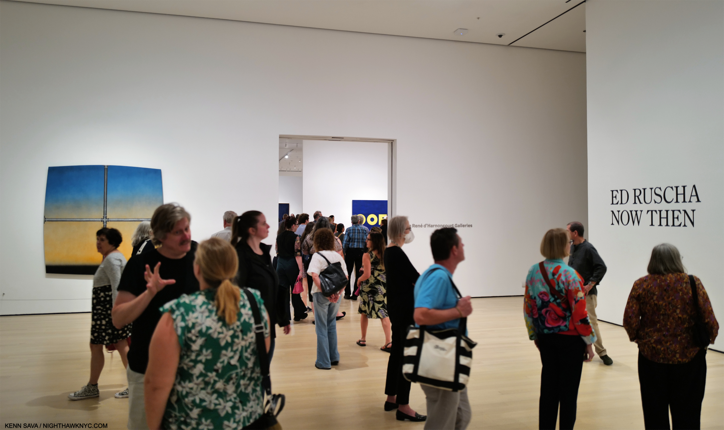
Installation view of the entrance, September 14, 2023. Images in this piece are thumbnails. Click any picture for full size.

Walking through the crowds at MoMA’s winter blockbuster, Ed Ruscha/Now Then over my six long visits bookending a terrible, six-week illness, I saw smiles as visitors moved from piece to piece, yet I couldn’t help but wonder how many of them felt they “understood” his Art. While humor undoubtedly plays a part in the craft of an Artist who knows you catch more flies with honey than vinegar, however they appear at first glance, his work usually leaves me scratching my head.

Returning to look at it again and again, that his work says something different to me every time I look at it has kept Ed Ruscha among my favorite Contemporary Artists. Judging from the turnout at MoMA, I’m far from alone in that. Having the chance to explore, and be mystified by, 200 pieces of his Art in Now Then from the, approximately, SIXTY-SEVEN YEARS(!) he’s been making it proved an all-too-rare chance to take a good hard look and try to get to the bottom of the mystery.

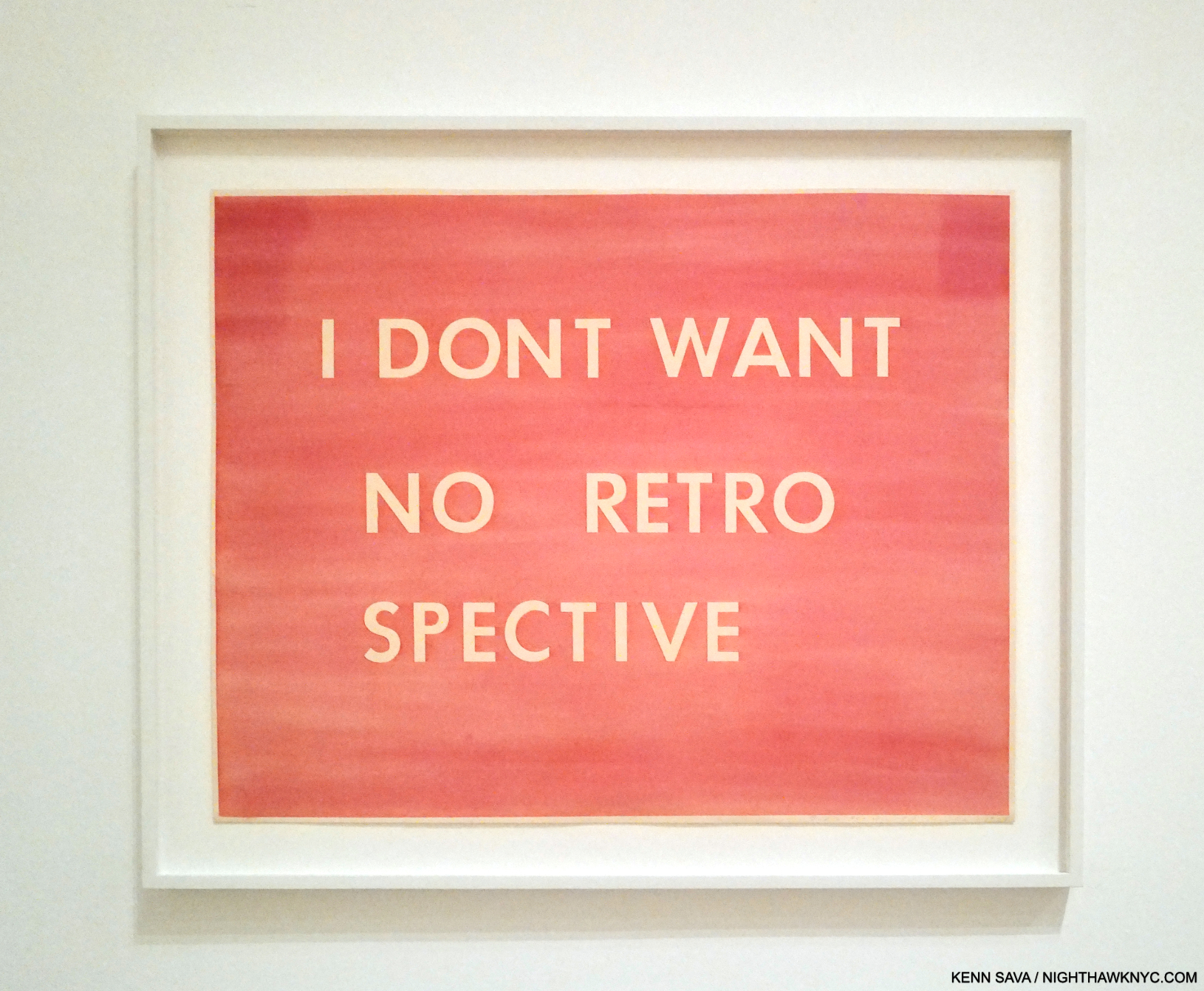
I Don’t Want No Retro Spective, 1979, Pastel on paper. The catalog for the last Ed Rusha Retrospective in 1982(!) is also known by the Ruscha on the cover of its catalog, I Don’t Want No Retro Spective, though the show’s title was THE WORKS OF ED RUSCHA

“All too rare,” as in Now Then is the first Ed Ruscha Retrospective here since 1982, (and so mine, too): over FORTY YEARS ago!1 The gap between them is another head scratcher given how popular Ed Ruscha’s Art is. The title Ed Ruscha/Now Then can be taken as a reference to the Artist’s penchant for revisiting his subjects over time, as well as the fact the show includes old and recent work, or a chance to see his older work now. It’s also a rare Retrospective of a West Coast Artist who came to prominence in the 1960s mounted on the East Coast. Bruce Conner didn’t live to see his at MoMA like Ed Ruscha has. Ed Kienholz, and Mr. Conner’s friend, Jay DeFeo, among others, are still waiting for their East Coast Retrospective.

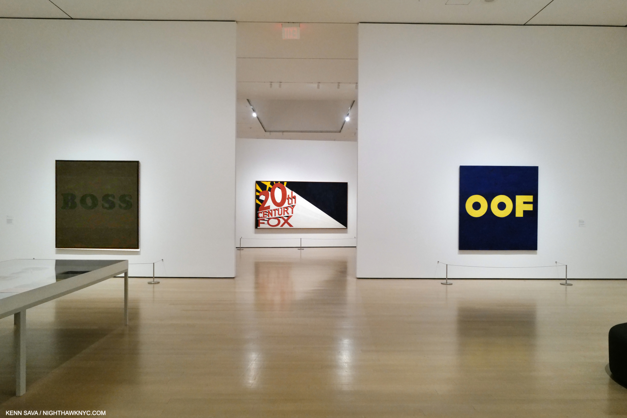
Installation view from just inside the entrance of the first gallery looking into the second. Boss, 1961, the famous Large Trademark with Eight Spotlights, 1962, and the infamous OOF, 1962-3, left to right, all oil on canvas.

Walking through it, I became particularly fascinated by how his style(s) developed, and how Edward Joseph Ruscha IV became Ed Ruscha, one of the most influential Artists in the world among Modern & Contemporary Artists, if not THE most influential at this point in time.

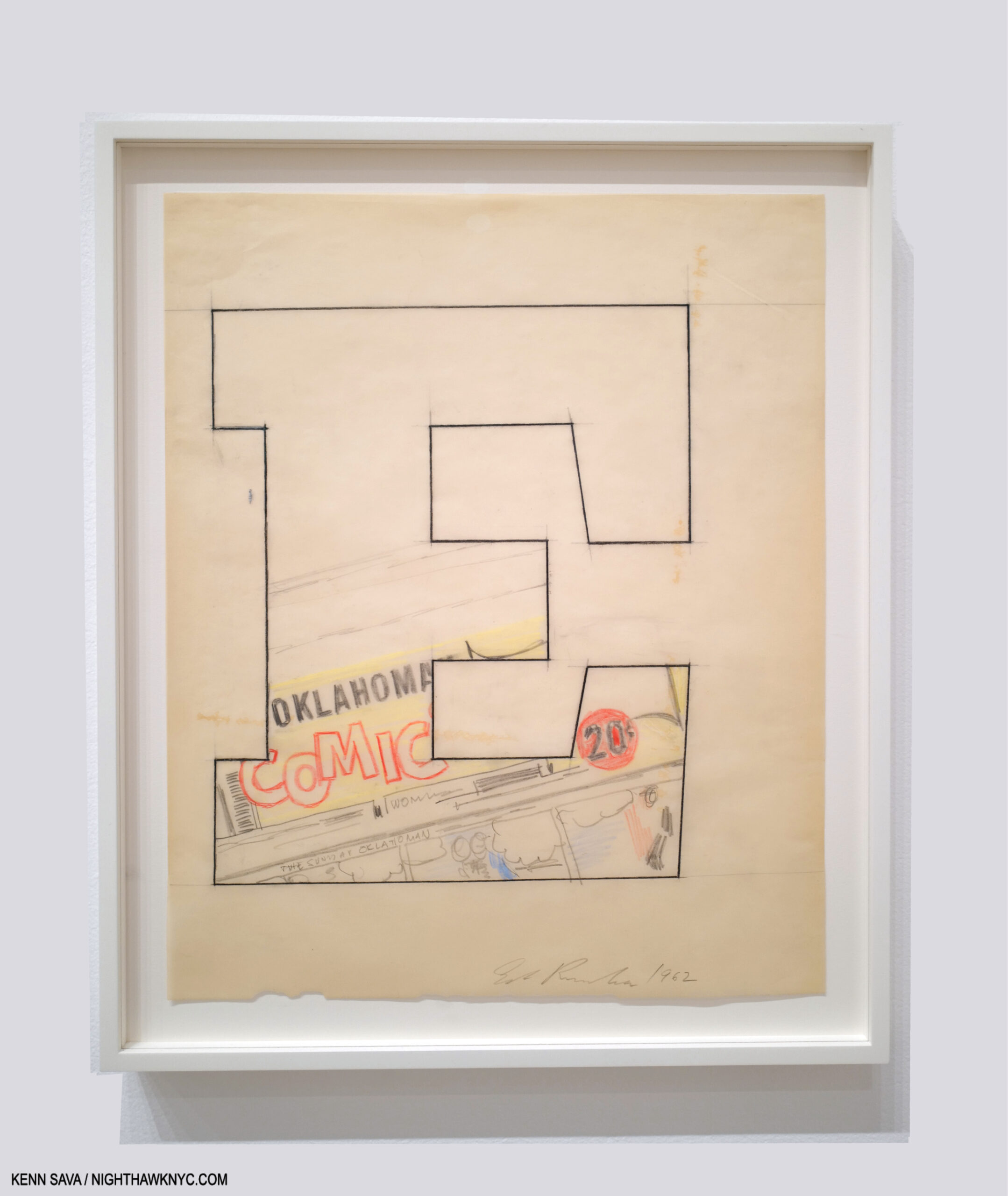
Oklahoma-E, 1962, Pencil, colored pencil and charcoal on paper

Born in Omaha in 1937, his family moved to Oklahoma City when Ed was 5. Early on, he had a passion for comics and a love of typography, particularly as it appeared in commercial publications. All of these are combined in Oklahoma-E from 1962, a seminal year in his early career. His initial desire was to become a Commercial Artist, and it was towards that end that he left OKC after graduating high school to head to L.A. with a friend in a lowered 1950 Ford, to study it. He chose to go west rather than east because of the energy, glamour of it, and its “hot rods and custom cars2.” Unable to get into his chosen school, he was accepted at Chouinard Art Institute (later Cal Arts, where Henry Taylor would study in the 1990s). His teachers, disciples of Abstract Expressionism, “wanted to collapse the whole art process into one act3.’’ “It (Abstract Expressionism) was, in his opinion, ‘a solid way of thinking…If you think about the paintings that were done in the 1950s, I find them overwhelming, nothing but quality…It was a very powerful time in art.’ However, ‘…within AbEx there was no room for my ideas4.'” While this frustrated him, they did succeed in getting him to change his focus from Commercial Art to Fine Art, which we can all be grateful for. After Now Then, I wonder if they accomplished more.

While in school in 1957 he had an epiphany.

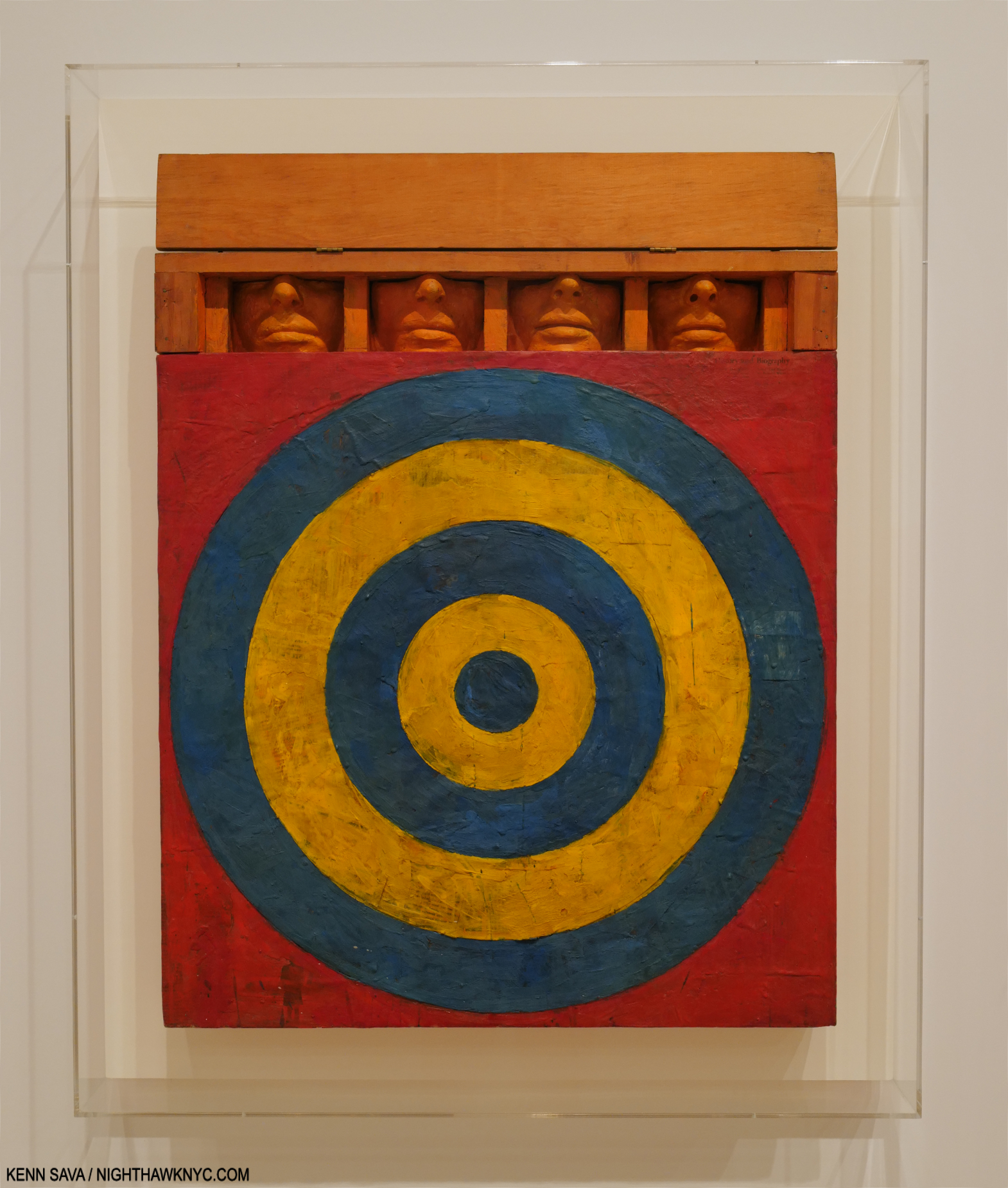
One of the most extraordinary works of the 1950s. Jasper Johns, Target with Four Faces, 1955, Encaustic on newspaper and cloth over canvas surrounded by four tinted-plaster faces in wood box with hinged front. Seen in Jasper Johns: Mind/Mirror at the Whitney in 2021.

“The breakthrough he sought came in 1957, when he spotted a small black-and-white repro of Jasper Johns’s 1955 Target with Four Faces in the Feb/Mar 1957 issue of Print Magazine. Encountering Johns’s painting was, he said, an ‘atomic bomb’ in his training, ‘a stranger fruit’ that he ‘saw as something that didn’t seem to follow the history of art. My teachers said it was not art. ‘I didn’t need to see the colors or the size…’ ‘I was especially taken with the fact that it was symmetrical, which was just absolutely taboo in art school- you didn’t make anything symmetrical…Art school was modernism, it was asymmetry, it was giant brush strokes…it was all these other things that were gestural rather than cerebral. So I began moving to things that had more of a premeditation5.’”

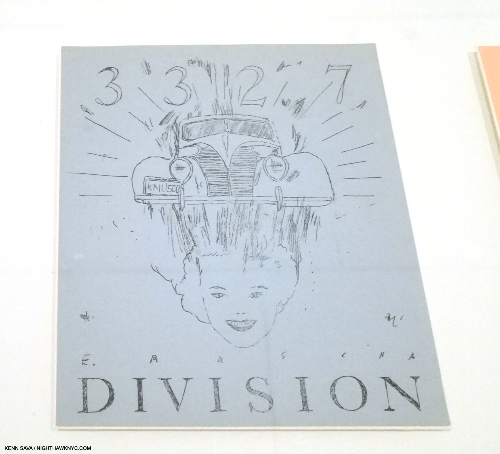
Dvision, 1962, Mimeograph on paper, One of five Prints by five Artists in the Portfolio issued in conjunction with the New Painting of Common Objects show.

That has continued to this day. Along the way, he and others (including Andy Warhol, Roy Lichtenstein and James Rosenquist), built on what Johns, Rauschenberg and Marcel Duchamp had started: the “next thing” after Abstract Expressionism, an Art based in the recognizable, the familiar, the every day. Some called it “pop.” Personally, I see nothing but danger in trying to box Ed Ruscha (who has consistently eschewed boxes).

In fact, one word comes to my mind over and over again as I look at his Art over time: abstract. If I were going to use two words to describe it they would be “premeditated abstraction.” Look at Division, above. It contains what would become Ed Ruscha trademarks- text, typography, and images, combined in a way that are next to impossible for most viewers to “read.” If that’s not “abstract?” What is? Maybe his teachers would be proud after all. It was only through delving into his history, I found that 3327 Division Street was the address of his first L.A. studio6. The car might have been his. Does that mean there’s more of a backstory to it? I haven’t found it. In the end, for me this says there may, or may not, be personal meaning to some/many/even all of his Art, but, 60+ years on, they haven’t come to light. So, with Division, as with all his Art, the viewer is left to make of them what they will.

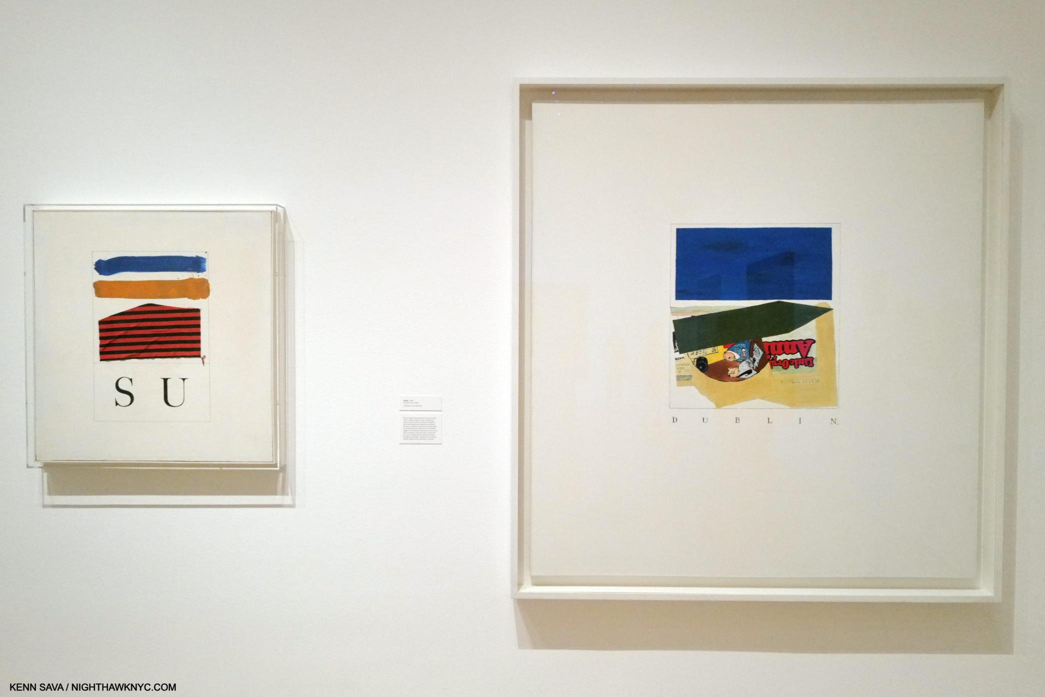
The two earliest piece in the show, SU, 1958, Oil, ink and fabric on canvas, (sixty-six years old!), left, with Dublin,, 1960, Oil and ink on canvas, right. Yes, a comma is part of the title.

Before graduating, he took hitchhiking trips that he immortalized in some of the earliest works in the show. the mysterious SU, 1958, the earliest, strikes me as a forerunner of what would come later. Even in these early works, text and imagery appear, though separately, as different elements that seem to stand apart from each other until the viewer brings them together, or creates a narrative around them, in his or her mind. These elements have continued in his work to this day, though he would soon start layering them. SU is, also, one of the relatively few of his works that refers to an actual person, the title referring to Su Hall, his girlfriend at the time.

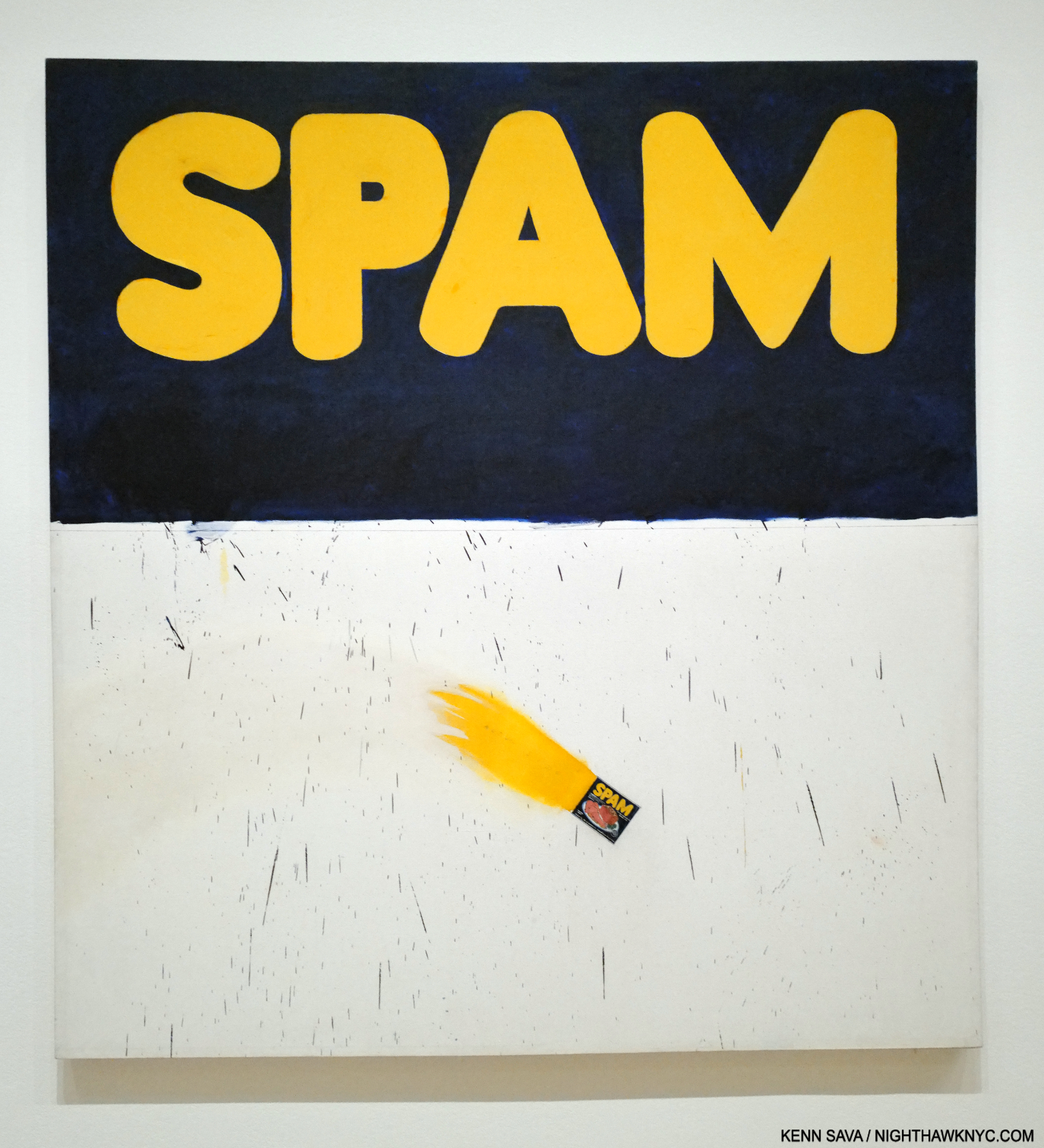
Actual Size, 1962, Oil on canvas, 67 1/16 x 72 1/16 inches. His breakthrough work when it was included in the landmark New Paintings of Common Objects show. A Painted, flaming, “actual size” can of Spam in its lower section is accompanied by some brush marks that might be associated with Abstract Expressionism. In fact, a number of his early pieces, like Three Standard Envelopes, 1960, also include them. Given his prodigious technique, on display in this, I don’t see how these marks can be considered accidental. Jennifer Quick7 surmises these connote AbEx’s commercialization. I see them as Ruscha making this technique his own, using it in a way none of the AbEx Artists did. I also see it as an early example of the many forms that abstraction would take in his work.

A number of his early works are quite edgy, daring and ripe with a surprisingly loose use of the brush. Were these done for class to please his teachers, or…? In fact, even some later pieces, like his Stains portfolio, contains marks that seem right out of AbEx. These stands at the other end of the technical spectrum for an Artist who possesses a superb Painting technique, something he doesn’t get nearly enough credit for in my view. They also make me wonder if his AbEx disciple teachers had a bigger effect on their student than it might seem.

The rest of the gallery includes highlights of his early 1960s Word Paintings. We watch as he continued to strip away excess and refine his concept. Eventually, single words appeared alone on solid backgrounds This is interesting because he has said of his recent phrase Paintings that the backgrounds are simply that. Early on, as in Actual Size, they appear to be more.

Vienna, Austria, 1961. This striking Photo was in a vitrine in the show, which prevented my getting a decent picture. This image of it comes from the book Ed Ruscha and Photography, P.48

After  he graduated college, Ed spent 10 months on an extensive tour of Europe. While he reports not being impressed with the museums (among other things, he was disappointed by the lack of Contemporary Art), he took note of quite a bit of what he saw while out and about, particularly the street signs, with their foreign words, different design & typographies. He Drew and Painted a number of these, but he also put the new Yashica twin-lens reflex camera he was required to get in one of his classes to good use, taking a number of interesting Photos, beginning a revolutionary career in the medium in the process. Back home in fall, 1961, he set to work. Less than a year later his work was included in the landmark show, New Paintings of Common Objects at the Pasadena Art Museum, along with that of Andy Warhol, Roy Lichtenstein, Wayne Thiebaud and others, and so-called “pop” Art was born. Ed Ruscha has consistently rejected being boxed, though he rode on the coattails of the “movement,” and the word is still used in describing his work, ignoring the visual evidence.

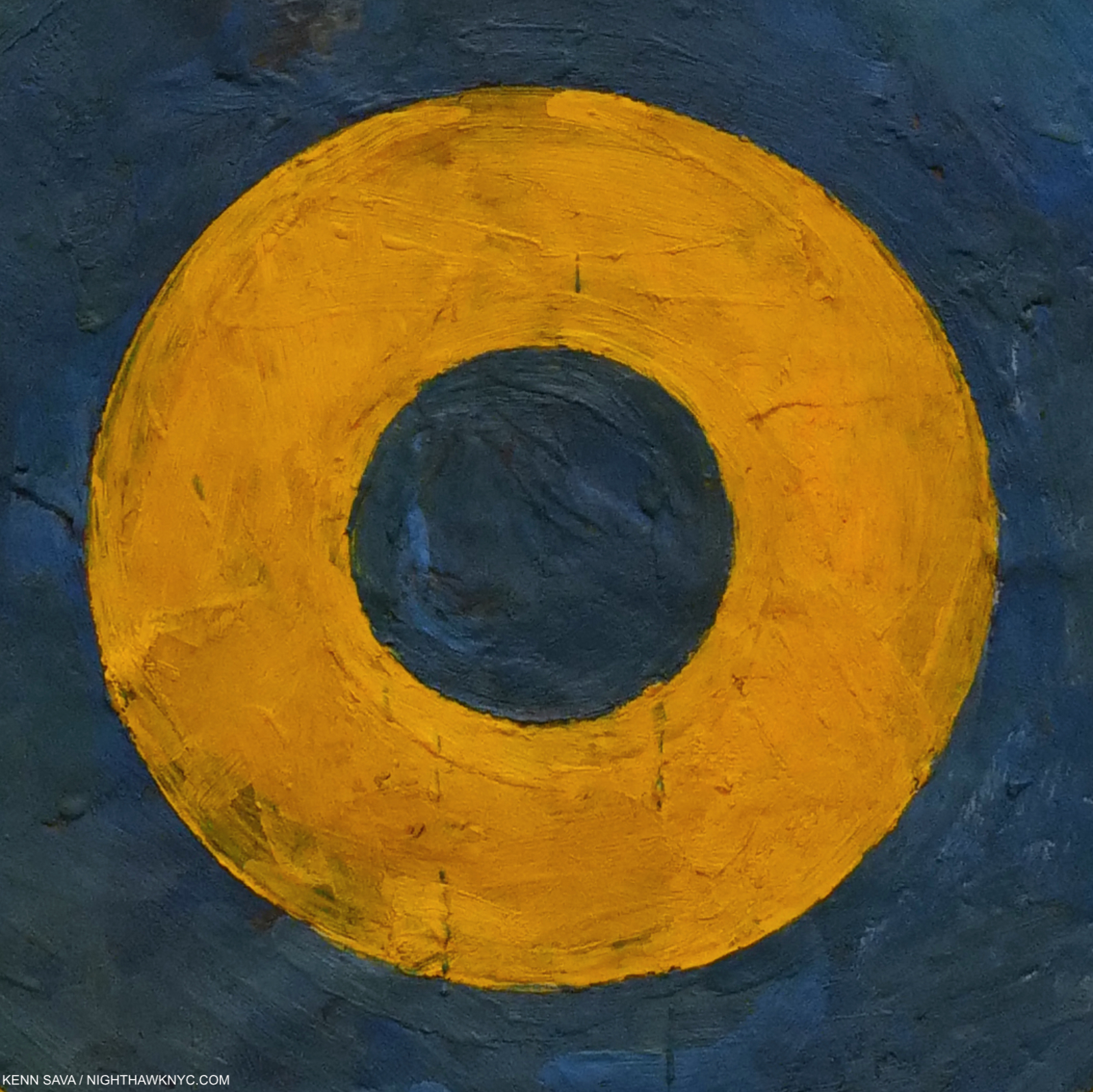
The first gallery concludes with an infamous work. Does this look familiar?

Ummm…It might not be what you might think it is. It’s a detail of the center of the target in Jasper Johns’s, Target with Four Faces, 1955, shown earlier. Now, look at this-

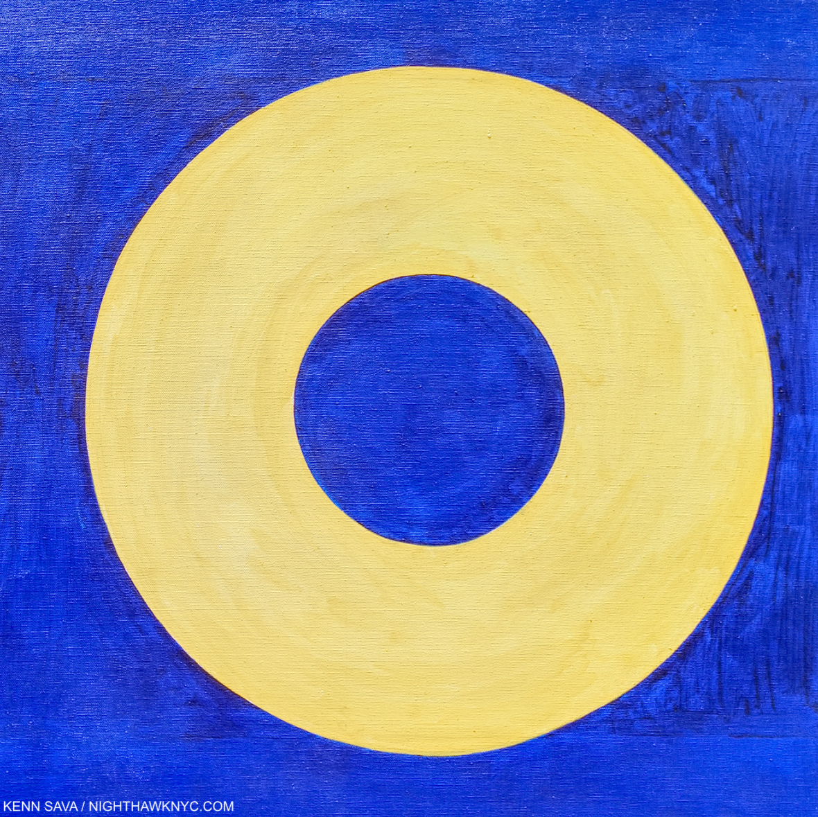
Yes! One of the two “Os” in Ed Ruscha’s OOF, 1962 (reworked 1963). Just five years after he saw Target with Four Faces, Ed Ruscha Painted the above. Coincidence? Homage? Fallout from that “atomic bomb going off in my training?” My feeling is the visual evidence is pretty strong for making a case for any or all three.

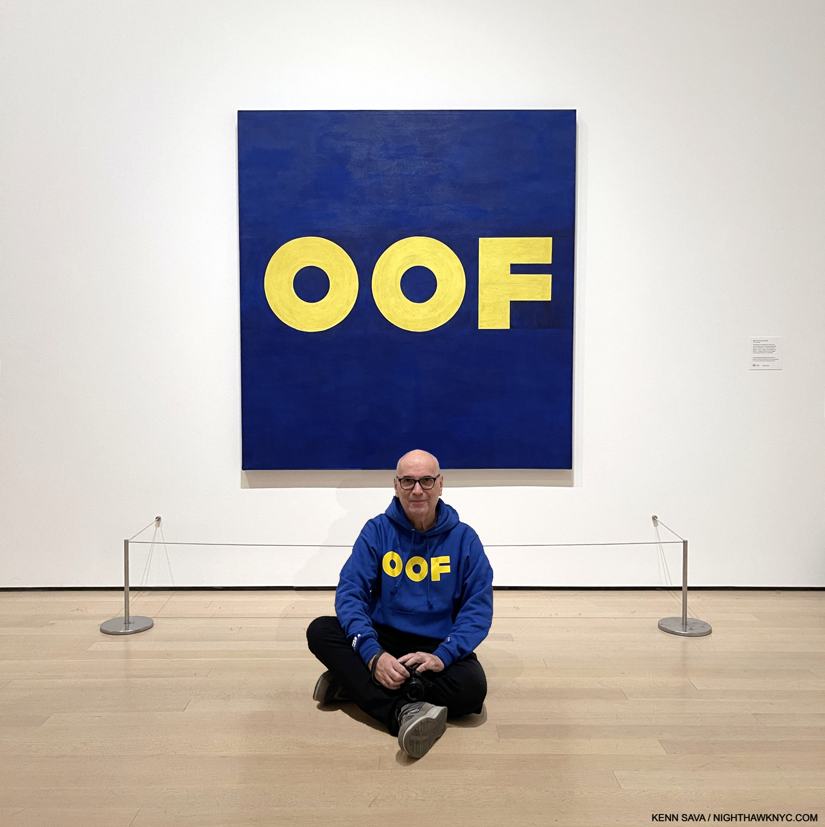
Hello! I’ve never appeared on NighthawkNYC over its 8 1/2 years, except in my self-portrait in the Banner (and a picture in my last piece, here, from the distant past). Until now. I’m introducing myself to NHNYC readers in front of a Painting I have a personal connection to: OOF, 1962-3, Oil on canvas, 71 1/2 x 67 inches on Ed Ruscha/Now Then’s final day, January 15, 2024. As for my “personal connection” to OOF? Very, very few know. My thanks to the lady who graciously agreed to take this.

Personally, it’s hard for me not to think there’s an influence; in the colors, the shape of the circle/”Os.” Even if it’s subconscious. Looking at both of these works now, they’re both revolutionary in their way. The Johns has been discussed at length over the past 60 years. Does anyone else think OOF is a revolutionary work, let alone a masterpiece? I believe it’s both. Revolutionary? It’s possibly the first time (as far as I know) that a Painting features a “word” that Merriam-Webster categorizes as an “interjection,” and not an actual “word” per se. I also believe it’s an “alt masterpiece.” Seriously. The composition, colors, font, placement of the text are all perfect, belying Ed Ruscha’s mastery of typography and graphic design with sublime taste. OOF stands as the pinnacle of his early word Paintings in my view. Oof is a word, if it is one, that defies concrete understanding, making it a perfect (unofficial) conclusion of sorts to the series. Merriam-Webster says Oof is an interjection “used to express discomfort, surprise, or dismay8.” They point out “the first known use of the word was in 1777,” which I find hilarious. How do they know? Did they consult an Oofologist? They further define an interjection as “an ejaculatory utterance usually lacking grammatical connection9.”

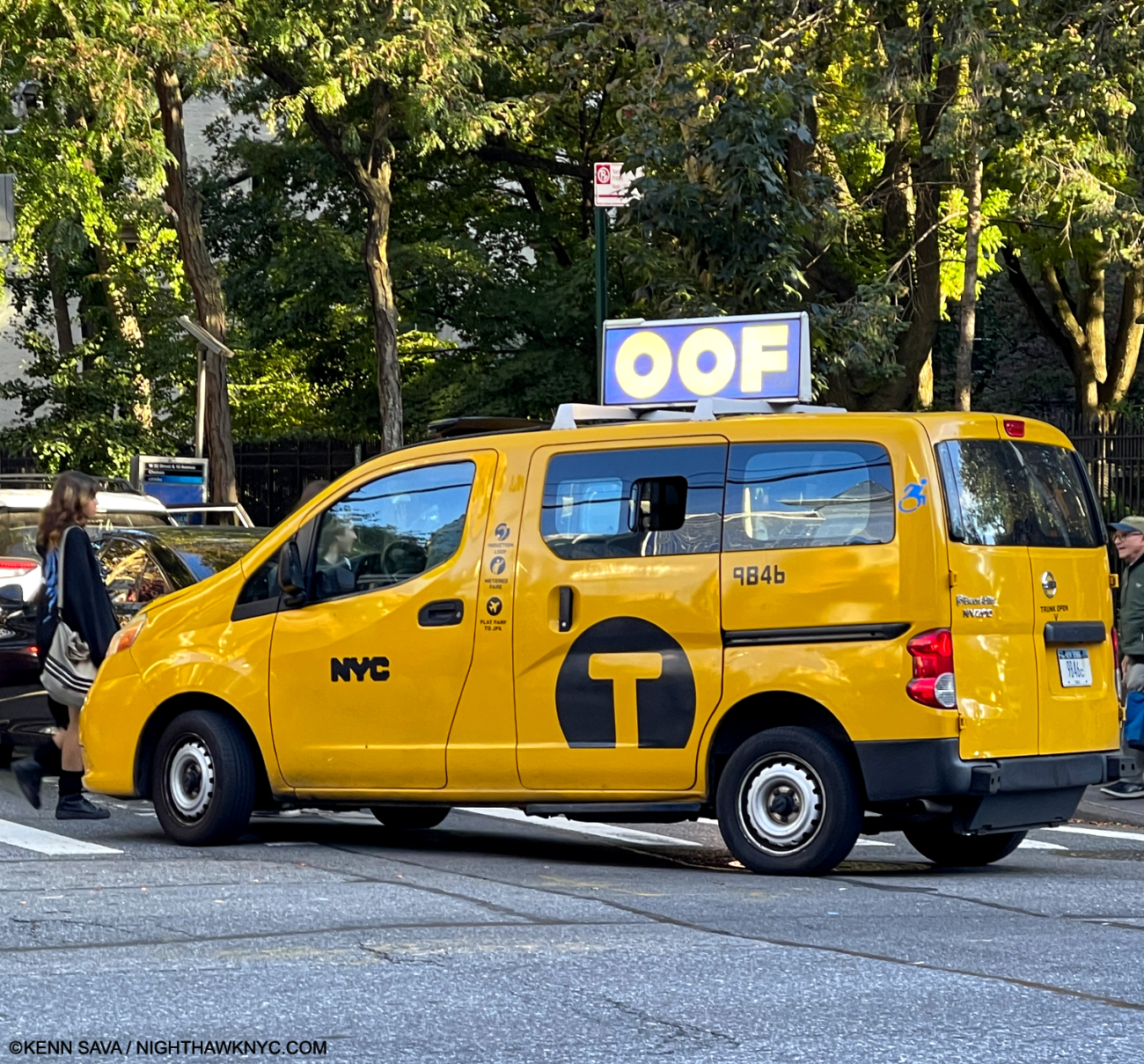
Oof!

OOF everywhere around town. A first step to a better world! I yelled “OOF,” but he didn’t stop.

As such it seems to me that OOF stands as an outlier among the single words Ed Ruscha chose as the subjects of his early 1960s Word Paintings (BOSS, HONK, ACE, SMASH, FLASH and NOISE, shown below, et al) because it is quite abstract. I wish I had asked viewers what the Painting said to them. Having owned it for 61 years, MoMA is well aware of its mysterious appeal. No doubt that is why the museum chose to emblazon OOF all around town as the focus of their show marketing.

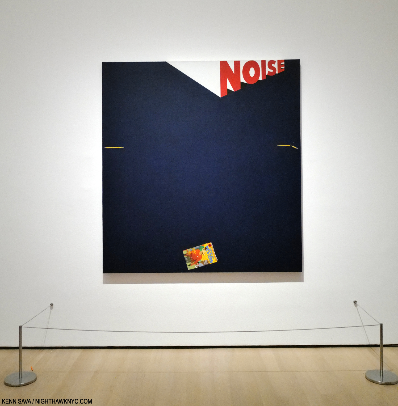
Noise, Pencil, Broken Pencil, Cheap Western, 1963, Oil and wax on canvas, 71 1/4 x 67 inches. There are two Painted pencils in the piece, and lo and behold someone left another one on the floor, behind the left stanchion. I resisted the urge to move it for effect for this picture. Maybe, I should have…

Along with abstraction, it seems to me there are surreal elements in his work. Perhaps no single word Painting has these abstract/surreal qualities than Noise, Pencil, Broken Pencil, Cheap Western, 1963, which also represents an evolution. Ed Ruscha has long considered it one of his best Paintings[3, Per the wall card.]. In it, the mystery of the word is added to with three very realistic images, close to its own edge. Unusual for a Painting, or Art, it leaves the center, the focus of most Art, empty except for the background color. Most of the previous Word Paintings centered the featured word. As such, it’s both unique and a precursor of other works that combine words and images. It’s also both abstract, thought it depicts realistic objects, and surreal. If I read it from the left, the whole pencil lies quietly seemingly in mid-air. The word “NOISE,” another monosyllabic word, grows until it reaches the right side (again, like a speeding train) where it hovers above the broken pencil. The cheap western seems to be hovering in the air, too, like the left-hand pencil, where it wouldn’t make noise until it lands, which it might be close to doing. The Artist has created “action” from three still objects and a word.

In the catalog for that last major Ruscha Retrospective there’s this-

“The broken pencil calls to mind the incident Ruscha has referred to a number of times in interviews when as a child in parochial school he was regularly rapped on the knuckles with a pencil by a nun who caught him misbehaving in class. Is the pencil, then, simultaneously a symbol of expression and repression10?”

If this is the case, though Mr. Ruscha has not said that this incident is what’s depicted here, my reading of it wonders if the “Cheap Western,” i.e. the comic book which appears to be reaching the bottom of the piece, was struck from his hand when he was caught reading it in class, being a big fan of comics at this age, the broken pencil having been cracked over his hand. It’s also, simultaneously, an abstract and a surreal composition. As many have pointed out, it also leaves the center bare. It carries forward his use of the single word, while also taking it on a new tangent.

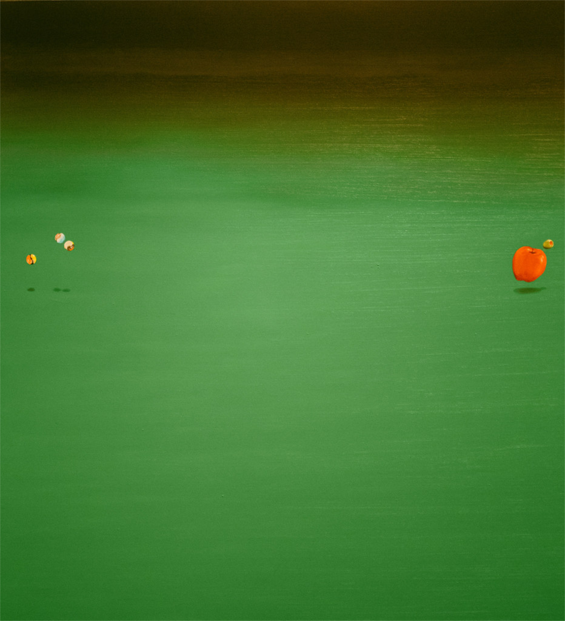
Bouncing Marbles, Bouncing Apple, Bouncing Olive, 1969, (not in the show) has much in common with Noise, Pencil, Broken Pencil, Cheap Western from six years earlier. One of countless Ed Ruschas that feel surreal to me. Here, he “sugar coats” the surrealism by using harmless objects like marbles and an apple on a welcoming green background. Leaving the olive, the looming black, and the fact that the marbles & apple are bouncing to stir up our imaginations, making the work decidedly not a “still life.” *- Photographer unknown.

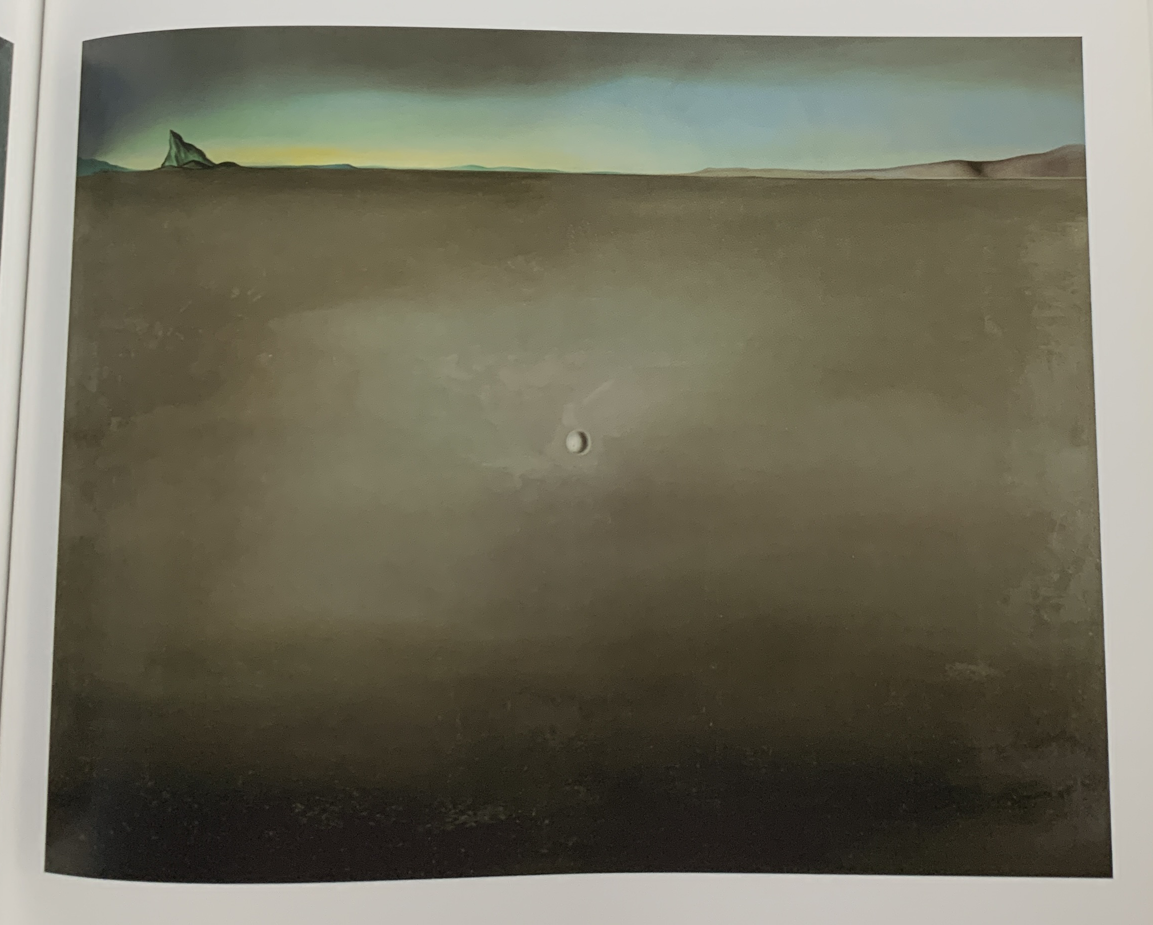
Noise, Pencil, Broken Pencil, Cheap Western is another one-Painting revolution, like OOF was. Though both were only followed-up indirectly, as in Bouncing Marbles, Bouncing Apple, Bouncing Olive, 1969. Now, look at this-

Salvador Dali, the legendary Surrealist, Open Field with Ball in Centre and Mountains in Rear, Study for the Disney film Destino, 1946, Oil on masonite. Influence? Seen in MoMA’s catalog for their show Dali & Film.

Works like Noise, Pencil, Broken Pencil, Cheap Western and Bouncing Marbles, Bouncing Apple, Bouncing Olive (and other works that include marbles and olives) are so different from anything that’s come before in his work. Yet, as time went on, they are joined by many works that while they depict recognizable objects are very abstract, even surreal, including his recent Tom Sawyer Paintings. Most of them have no words, and taken as a group they now form a sizable part of his oeuvre. For my part, I trace them all back to Noise, Pencil, Broken Pencil, Cheap Western from 1963.

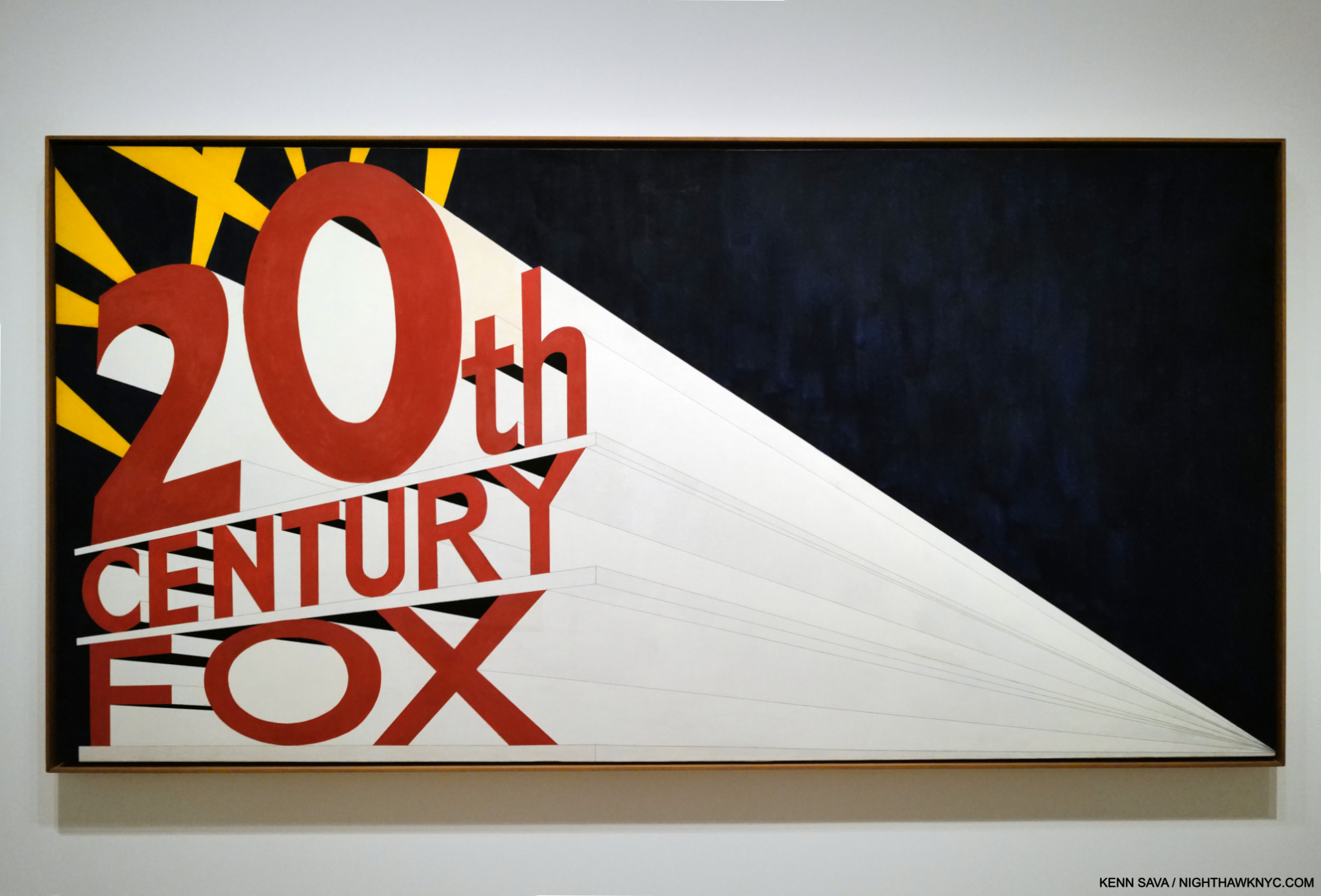
Large Trademark with Eight Spotlights, 1962, Oil on canvas 66 9/10 x 133 1/10 inches. An early L.A.-inspired work, like most of Ed Ruscha’s work its “meaning” is nebulous. At the time he Painted this, the famous Film studio was in decline and going through layoffs. One reading might be a comment on fleeting fame about to fade out, or like his PhotoBook, Every Building on the Sunset Strip, 1966, possibly a hard realization for the Artist who relocated from Oklahoma City, that glamour is not all it appears to be from afar. It’s also a work that is reminiscent of a speeding, approaching train, a compositional device he would use again. Though it’s described as “Oil on canvas,” those are graphite lines leading to or from the vanishing point.

In 1962, L.A./Hollywood, its sites and culture began appearing in Ed Ruscha’s Art, as in Large Trademark with Eight Spotlights, which is also a precursor to his multi-word and phrase Paintings. Over the succeeding 60+ years, few if any, Artists would become more associated with Los Angeles than Ed Ruscha is and has been. From then to now, he would continue to Paint the city, and words and image would coexist in his Art, while single words largely became multiple words and, beginning in 1973, short phrases that he has continued to create to this day.

By the beginning of the second gallery of Now Then, some of the core themes of his work have been created and have already metamorphosized. This revealed the development of a working process based in an endlessly restless creative drive that would not let Ed Ruscha stay in one place for very long Artistically. What lay ahead over the next six plus decades(!) has been nothing if not the continually unexpected.

*-Soundtrack for this piece is “Down the Highway,” by a Musician who has been creating and performing for about as long as Ed Ruscha has: Bob Dylan, born May 24, 1941, 3 1/2 years after Ed Ruscha. Bob released “Down the Highway” the same year Mr. Ruscha created a number of the Paintings in this piece, on 1963’s The Freewheelin’ Bob Dylan.

NighthawkNYC.com has been entirely self-funded & ad-free for over 8 years, during which 320 full-length pieces have been published! If you’ve found it worthwhile, PLEASE donate by PayPal to allow me to continue below. Thank you, Kenn.

You can also support it by buying Art, Art & Photography books, and Music from my collection! Art & Books may be found here. Music here and here.

Written & photographed by Kenn Sava for nighthawknyc.com unless otherwise credited. To send comments, thoughts, feedback or propositions click here. Click the white box on the upper right for the archives or to search them. Subscribe to be notified of new Posts below. Your information will be used for no other purpose.

  1. The traveling Retrospective, THE WORKS OF ED RUSCHA, came to the Whitney Museum in 1982, one of five museum stops it made, when the Artist was about 45.
  2. ER, Tate, P. 9
  3. Alexandra Schwartz, Ed Ruscha’s Los Angeles, P.17
  4. Alexandra Schwartz, Ed Ruscha’s Los Angeles, P.15
  5. Alexandra Schwartz, Ed Ruscha’s Los Angeles, P.15
  6. E.R. Tate, P.100
  7. in her book, Ed Ruscha: Art & Design in the 1960s
  8. Here
  9. Here
  10. I Don’t Want No Retrospective- The Works of Ed Ruscha, P.15

NoteWorthy Art Book, 2024- Es Devlin…Lady Gaga, Kiss & Me

This site is Free & Ad-Free! If you find this piece worthwhile, please donate via PayPal to support it & independent Art writing. You can also support it by buying Art & books! Details at the end. Thank you.

Written & Photographed by Kenn Sava (*-unless otherwise credited)

Though I just teased some big names, I begin with the least known. There I was, in year 2 of my 5 on the road with a band, refugees from the disco mania which was sweeping all live Music and Musicians aside, all the way down in the Cutler Ridge section of Miami, FL. We pulled into the parking lot outside of this good sized venue, the Esquire Club, went it, met Al the owner, and began bringing in our gear. As we set up for what would be an extended stay, the assistant club manager came up, saw our stage clothes and my platform boots (Handmade by Jumpin’ Jack Flash, NYC, who had made Kiss’s legendary boots. Mine were a half-size too small, leading to permanent foot damage, an ever-increasing problem. Another Rock n’ Roll suicide.). Realizing that we were something different from what they had been presenting, he chatted me up about our “stage show.” Then, he suggested we add “flash pots” to our presentation.

Flash pots? 

He went away and came back with 3 pieces of wood, each about a foot and a half long by about 3 inches wide and 2 inches deep, some electrical cord and a few plugs. First, a rectangular cup about 3 or 4 inches long by a little less than 2 inches wide was cut into the top center of the wood. Next, he attached the the wire so the stripped bare end was in the hole. Then, he had me cut one side of the wire and install an on/off switch. Electricity, with a bare wire on a dark stage? Hmmmm… Then he showed me a grey, cylindrical container. Gunpowder. 

Gulp.

He scooped some of it and put it in the cutout. Plug in the wire and when I flip the switch? WHAM. Flash pot! The band covered by a cloud of smoke, and hopefully, only smoke! Ooohs and aahhs all around.
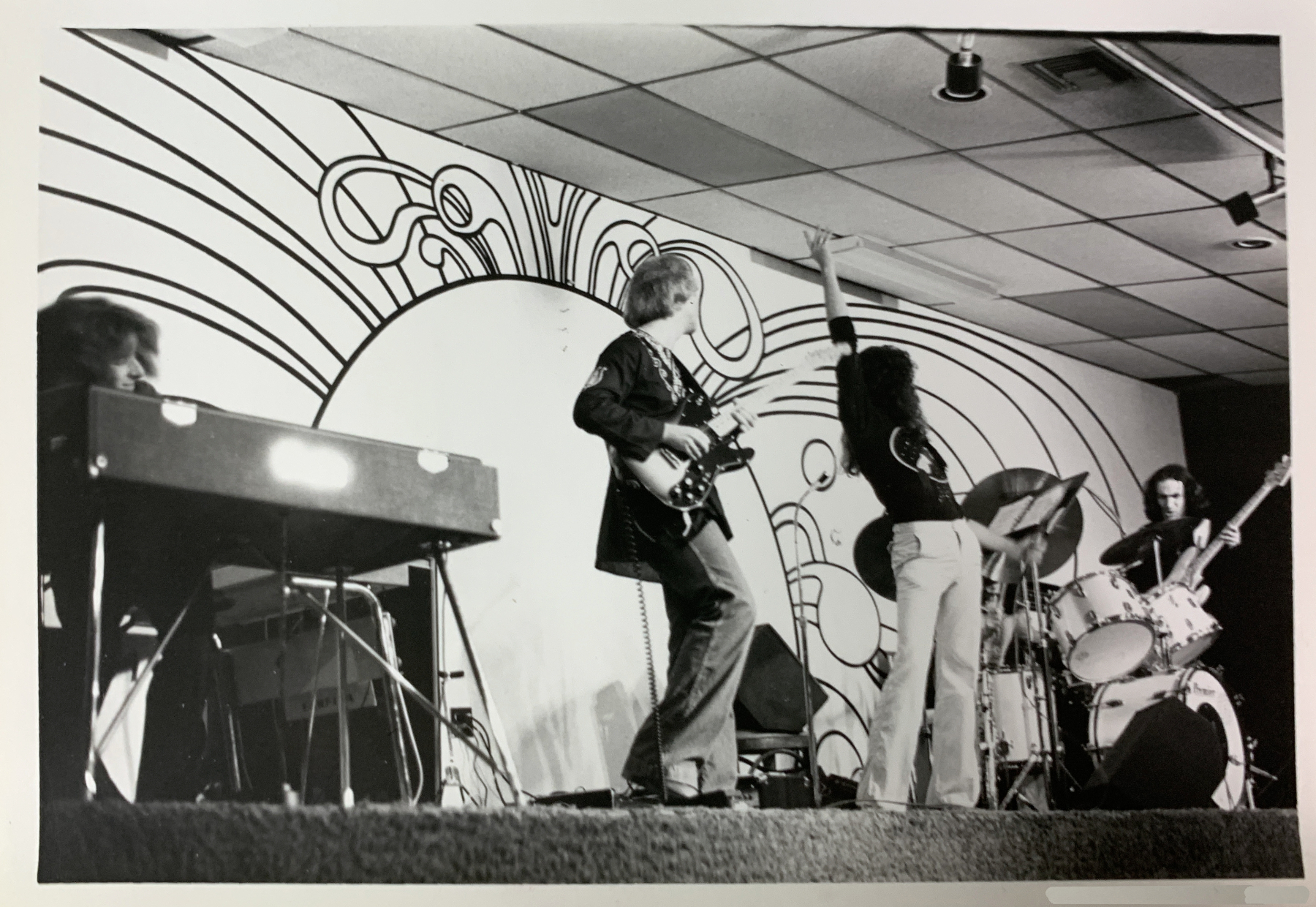
“Messiah,” Live at the Esquire Club, Miami, 1977. Left to right, T. Lavitz, keyboards, who would go on to fame after he joined The Dixie Dregs (aka The Dregs) the year after this was taken, before launching a successful solo career, Steve Smith, guitar, Bob Donzella, sax & vocals, Mark Smith, drums & vocals, and yours truly, Kenn Sava, bass & vocals. It’s about at this moment that I’d be tripping the flash pots. Gee, I wonder if that carpeting was fireproof… *-Photographer unknown. The pictures in this piece are thumbnails. Click any for full size.

We made three of them, each laid 1/3 of the way across the stage, all under my control, to be tripped at particularly “dramatic” moments during our set. Needless to say, never having done anything like this, especially while playing, it was a bit unnerving. Luckily, I managed to set them off a few times, without disastrous result. Phew! After a week or so, the regulars had gotten to know us, and everybody relaxed, so we dispensed with the “special effects,” or, they ran out of gunpowder, I forget. (The Esquire Club was destroyed by Hurricane Andrew in August, 1992.)
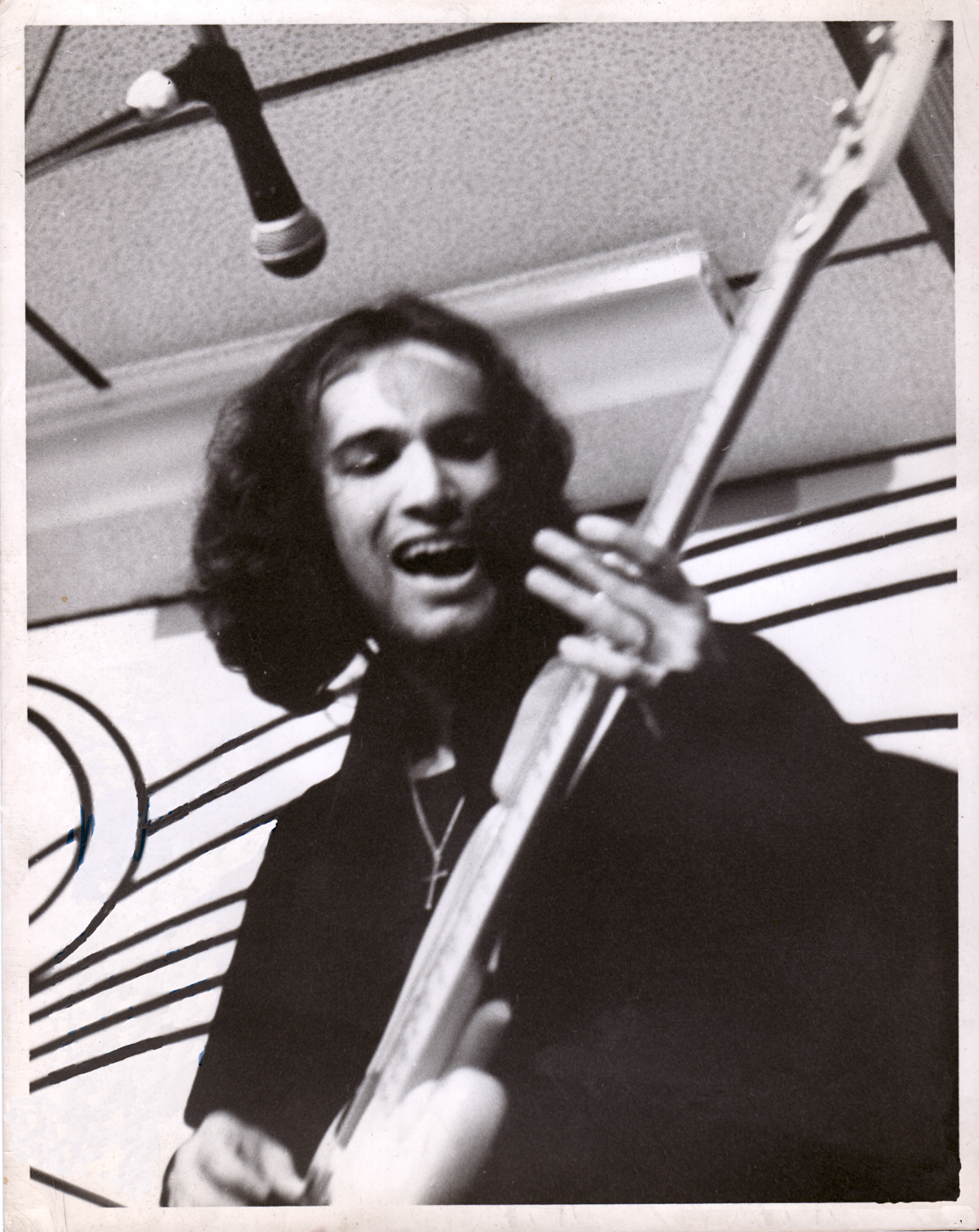
Yours truly, Kenn Sava, lve at the Esquire Club, Miami, FL. This is the first time I, or a former I, have appeared in the pages of  NighthawkNYC.com in its 8 1/2 years! *-Photographer unknown- a friend of Mark’s. I’ve grown quite fond of this picture as it shows me about as happy as I’ve ever been in my life, in spite of all we were dealing with at the time, including the poverty typical of bands like ours.

Such was “stage craft” in prehistoric times. Fast forward to January 20th, 2010.  
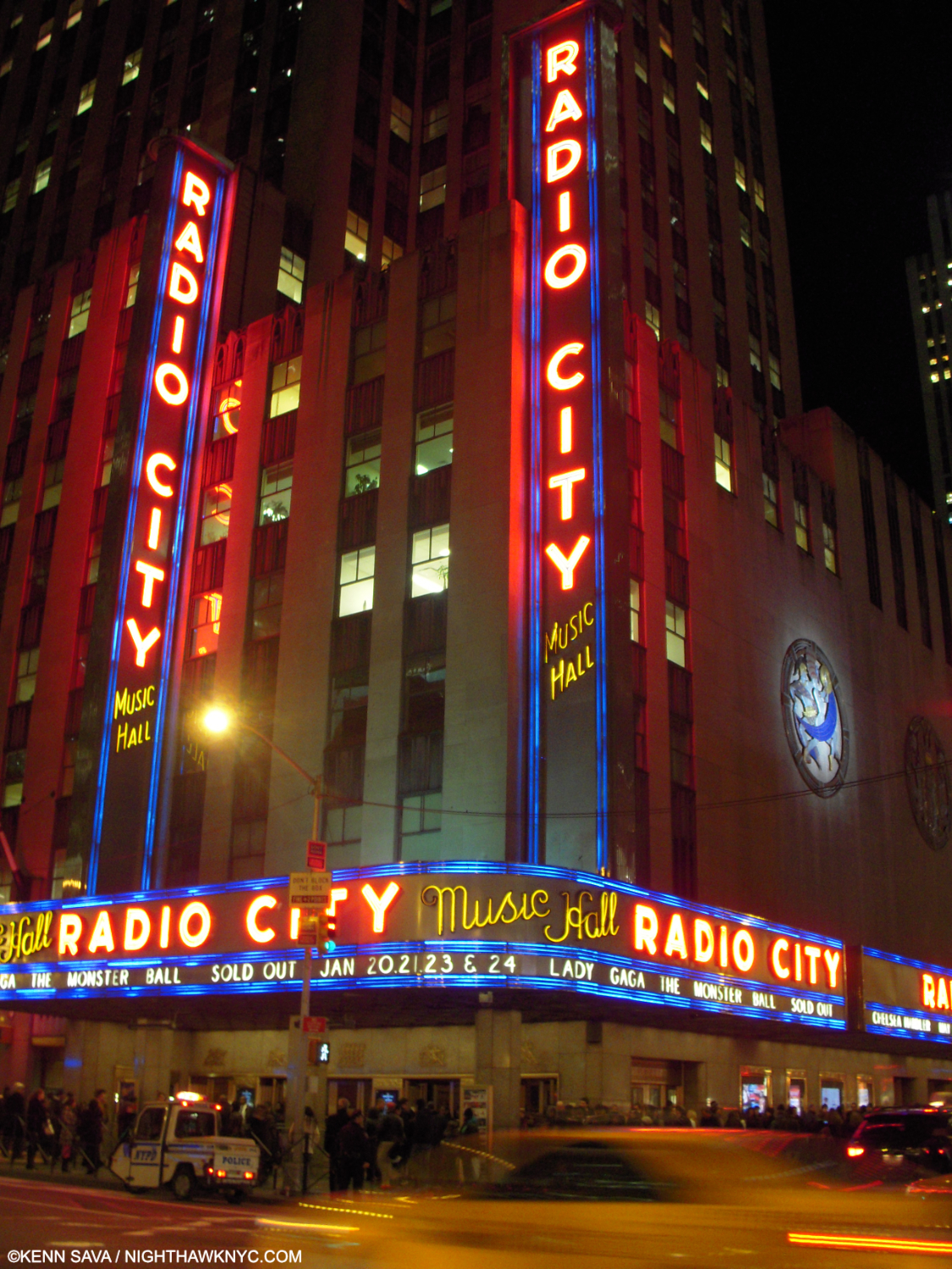
The Big Time. Radio City Music Hall, NYC, January 20, 2010. The night of Lady Gaga’s homecoming; her first NYC concert. Prior to this, she’d performed in clubs & bars, like I did.

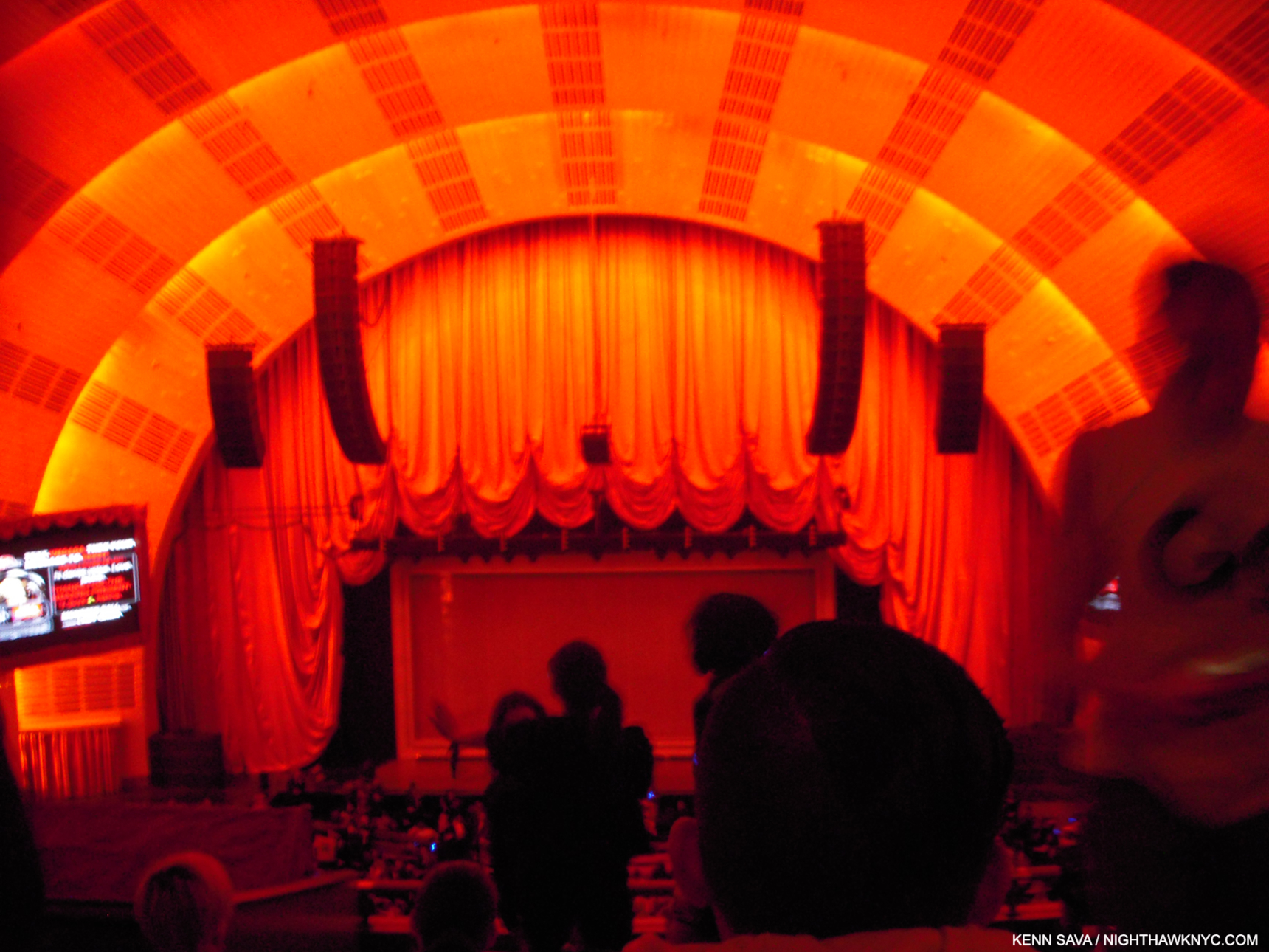
There I am in the balcony for the NYC concert debut of an up and coming Artist who’s new hit singles, “Just Dance” and “Poker Face,” were all the rage, and her album, The Fame, was screaming up the charts. Intrigued, I managed to get a ticket for Lady Gaga’s New York homecoming show of her Monster Ball Tour at Radio City Music Hall, January 20, 2010, her first concert in her hometown1.

Down in front! Seated as far away as I was wasn’t ideal for picture-taking. Before it started, I took this because I was fascinated by the stage. Looking around the standees, you’ll notice a box-like frame and there’s a screen in front of it. Both things I hadn’t seen to that point. Something told me at that moment that this was going to be “different.”

As far as I know there hasn’t been an officially released video of what was the Monster Ball Tour, 1.0 that this show was a part of. I can only find pictures and videos shot by my fellow concert-goers, like this one of the opening. Poor quality, but it gives you a sense of it. ( Someone has posted a complete video of another stop on the tour. Again, it’s a far from ideal audience recording, but until something better appears, it’s the only record I know of of the complete show.)

The show began with a matrix-like grid on that screen shown earlier with a filmed Lady Gaga (LG) projected on it revolving while warping time and space, apparently free of gravity, along with a 1 minute countdown clock to the show’s beginning. As it ticked down, the crowd amped up by the second. 00:00:00:00, and there she was behind the matrix screen, live, alone on the big stage in her hometown, wearing an outfit with lights on it and performing her classic, “Dance in the Dark.” Quite a moment. “Find your Kubrick,” indeed. Stefani Germanotta had escaped the clubs & bars and arrived in the big time, in full effect. 
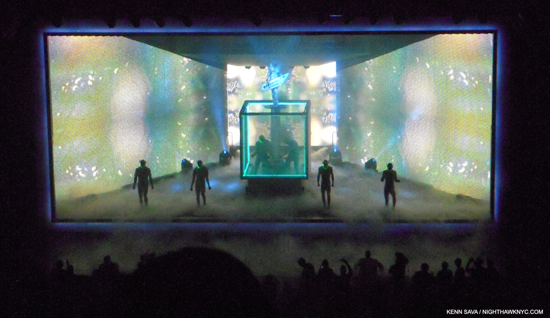
“Just Dance.” LG performs with a Roland Shoulder Synth (I believe) on a riser extending to about 10 feet over the base of a rotating cube. The area around the black disc she’s standing on is open. Watch your step! Note the frame-like border.

“Dance in the Dark” segued into her mega-hit, “Just Dance,” without pause. The screens on the sides seen above covered the band, something I’d never seen before, leaving a large performing area. Looking back from 2024, it might be easy to look at this show and not see it as all that “revolutionary” given what’s come since. At the time, I’d seen nothing remotely like what I saw that night. It still remains a unique experience. Meanwhile, the irresistible “Just Dance” got the balcony moving up and down so wildly as hundreds of concert goers jumped in time that I was worried it might well come down! How do they test for that kind of stress? When the show ended without catastrophe, as I was walking to the subway to the sound of my fellow concert-goers bursting out in spontaneous chants of “Oh oh oh oh oh…Caught in a bad romance,” over and over and over from near and far…the one thought on my mind was “SOMEONE involved in staging that show has a DEEP knowledge of Art history!”
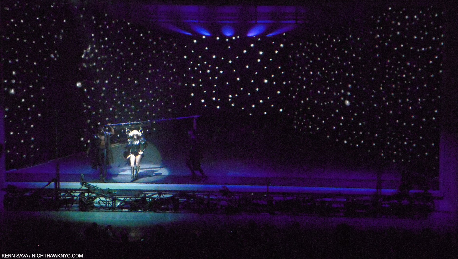
“Paparrazzi” with LG’s hair fastened to the overhead pole on both sides by rings while two dancers hold the ends of the pole.

Time and again, I felt the influence of numerous Artists and Paintings. First, and foremost, the great Joseph Cornell was channeled as the entire stage was framed creating a box-like setting for the performance, as I show in “Just Dance.” Mr. Cornell, a revolutionary in a number of Artforms, is, perhaps, best known for his “Boxes.” The Cornell references continued during “Paparazzi” where Gaga’s hair was fastened to a horizontal pole with rings(!) while the dancers holding the ends moved/danced in step with the slightly helpless LG as she sang, right out of numerous Cornells that include a horizontal pole with rings attached, like Lunar Level #1, and Sun Box, below, among others. Joseph Cornell at a Lady Gaga show? Dali, Giorgio de Chirico, Magritte and Leonardo da Vinci also came to mind as the show went on. Of course, being Lady Gaga’s show, first and foremost, the credit goes to her.
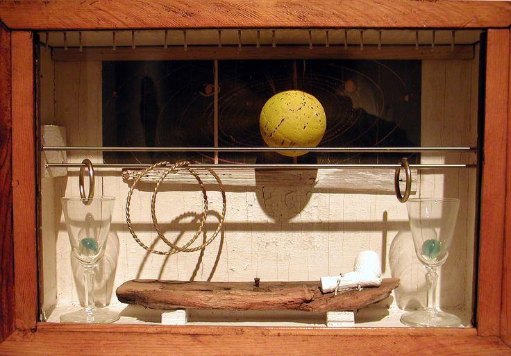
Sun Box, (1956) by the incomparable Joseph Cornell, 1903-1972. One of many Cornell Boxes that include a horizontal bar (or two) with rings attached. Lady Gaga’s entire show felt to me like it was taking place inside a box.

Then, I saw her,  again, in July, 2010, at her Monster Ball Tour 2.0 at Madison Square Garden (her first MSG show); another big deal. It was a completely different show! It was very nice, very effective, but minus all the Art references. I assume that having a stage in a huge indoor arena called for a completely different presentation. Still, I missed the show I saw at Radio City, and at that point it made me realize how special it was. I was determined to find out more about it.
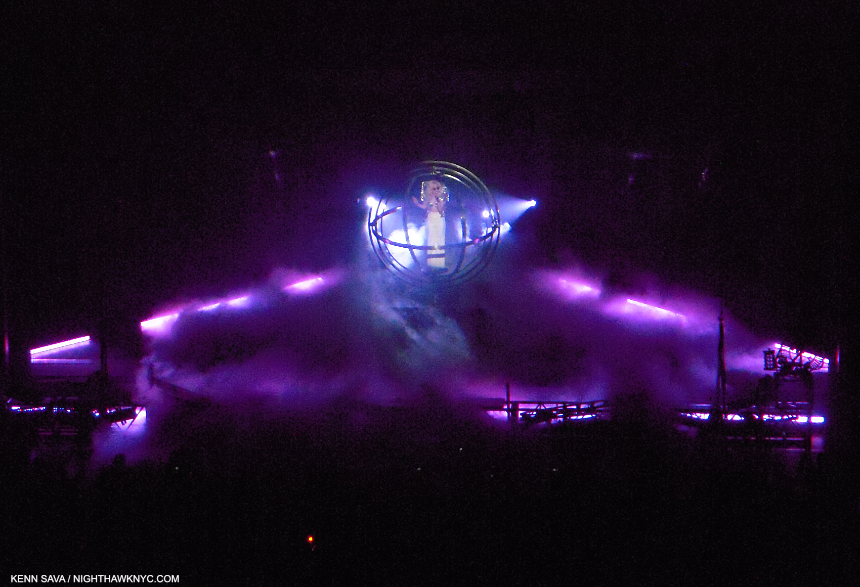
“Eh, Eh (Nothing Else I Can Say),” at Radio City. LG in a quasi-“gyroscope.” All those bars were continually in motion around her. A bit like Leonardo’s Vitruvian Man?

I found out that Lady Gaga had worked on the Radio City show, and her Monster Ball 1.0 Tour it was a part of, with a stage designer named Es Devlin. 

Who?

It tuns out that Esmeralda (“Es”) Devlin, born in London in 1971, is nothing short of a polymath, who, apparently, never sleeps. While I had been sleeping on her, in the interim, her reputation grew, then exploded. Meanwhile, the press had upped the hype quotient to seemingly impossible levels-

“Modern Britain’s answer to Leonardo da Vinci,” The Sunday Times (of London).

Leonardo?? I can’t say that in all my years of looking at and studying Art and Art history I’ve ever heard that said of ANY Artist.

Perusing her website, I discovered the roster of world-famous Musicians, bands, opera companies, playwrights, and corporations who have entrusted her with their stages is about as “A List” as it gets, and extraordinarily long. Oh, and the Super Bowl Halftime and the Olympics are on it, too. As for those Artistic deep waters, she’s staged a number of Shakespeare’s plays, including Hamlet, and a few of Mozart’s operas, including Don Giovanni, perhaps his ultimate opera. Snippets of all of these and more can be seen on esdevlin.com. I also discovered that Ms. Devlin did not do the stage design for that 2010 Lady Gaga Monster Ball Tour 2.0 MSG show. Hmmm…

But, Leonardo? One of the supreme geniuses in Art and world history, and one of my personal “Ultimate Artists?”
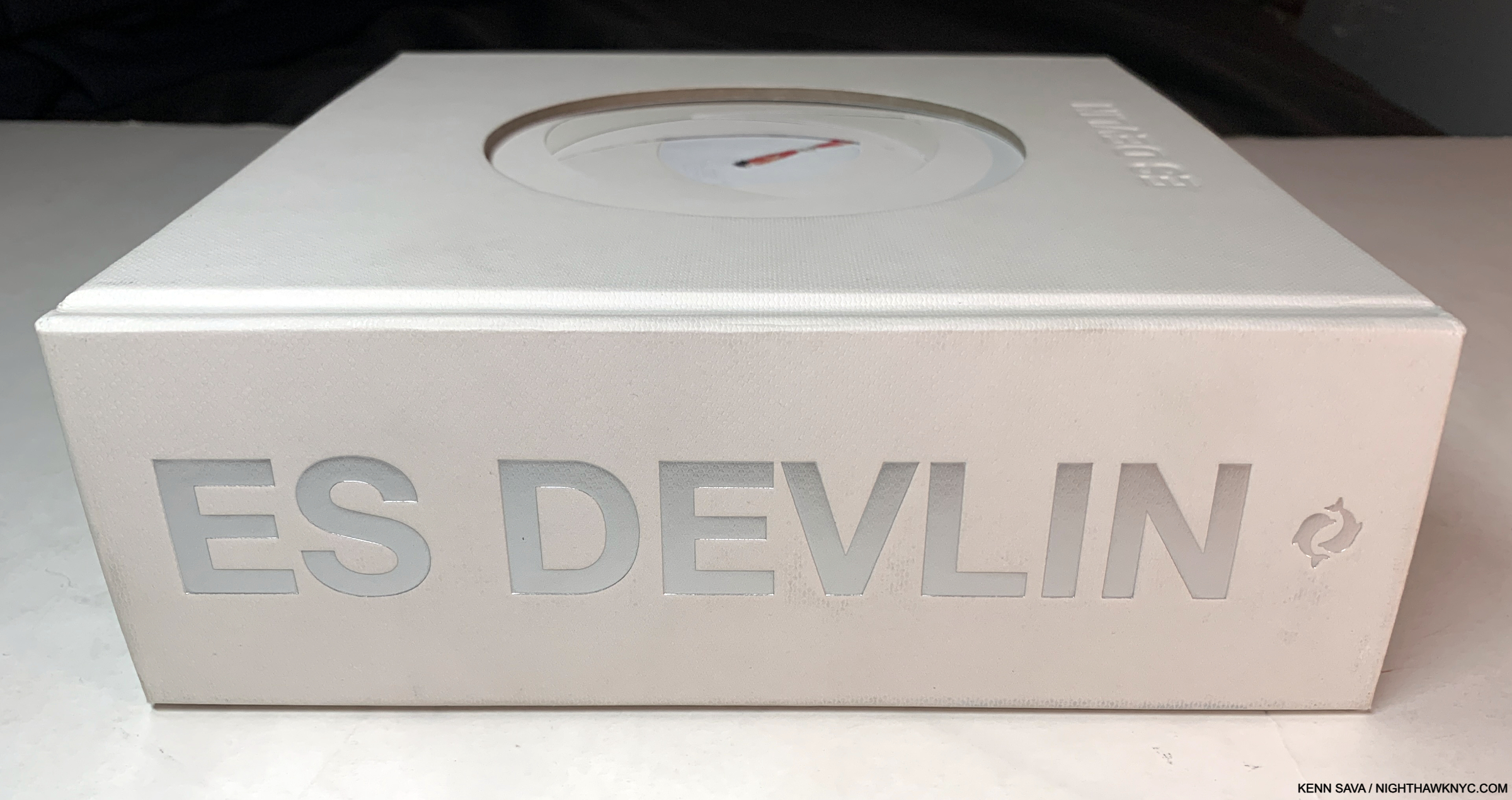
Back into the fast forward machine to 2024, Es Devlin is now the subject of a mid-career Retrospective at NYC’s Cooper Hewitt, Smithsonian Museum of Design. To accompany it, she, Cooper Hewitt and Thames & Hudson have combined to use the show as an opportunity to publish her first book, An Atlas of Es Devlin. When I first spotted a copy on a shelf with only “ES DEVLIN” in silver on its 2 1/2 inch thick(!?) white spine, I felt a tingle of anticipation. Suffice it to say, given all I’ve seen- in person and via research, and the weight of that Leonardo reference, my expectations couldn’t have been higher.
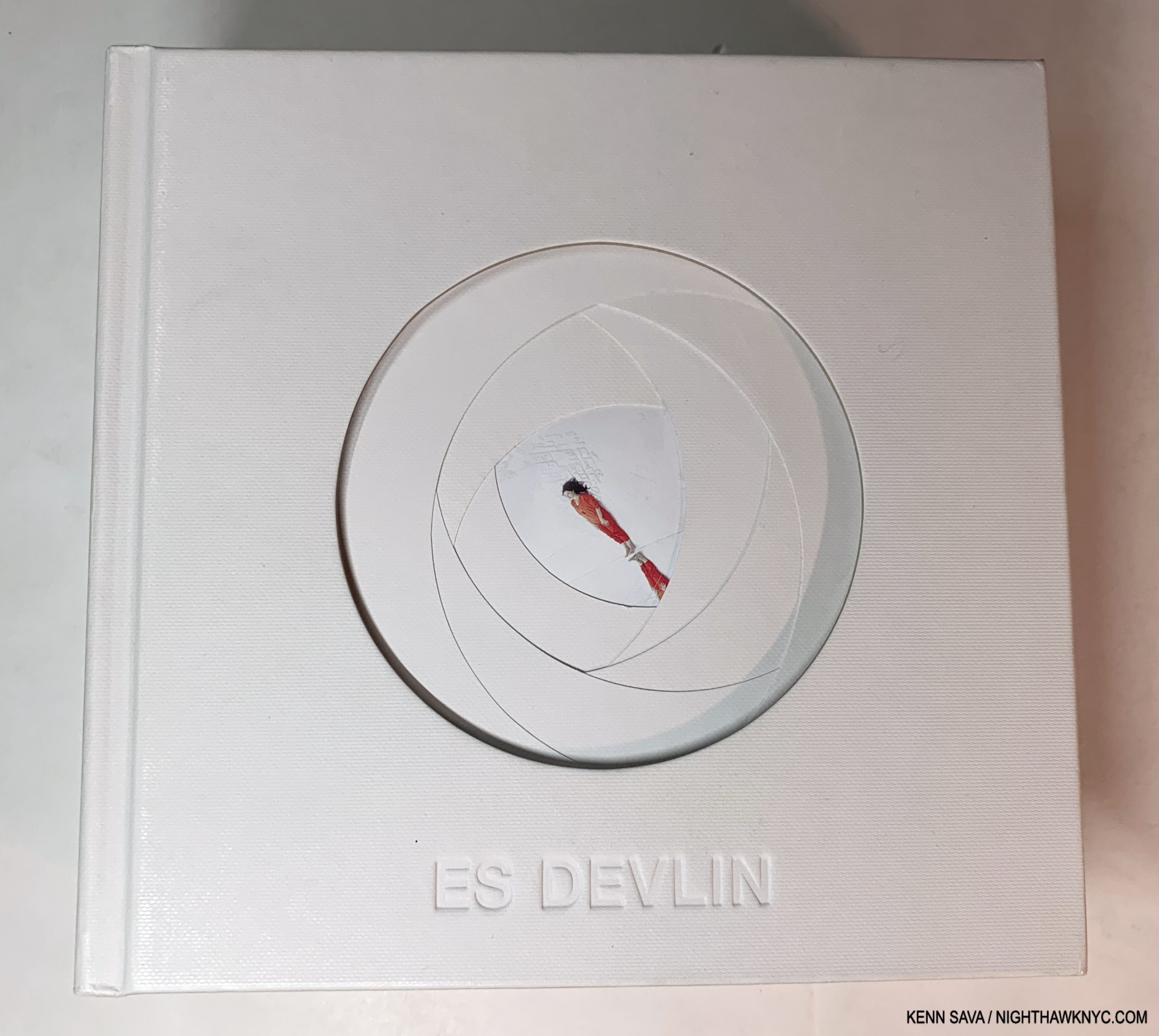
What we have is, well… I’ll let the Thames & Hudson PR staff tell you-

An Atlas of Es Devlin is a unique, sculptural volume of over 900 pages, including foldouts, cut-outs, and a range of paper types, mirror and translucencies, with over 700 color images documenting over 120 projects spanning over 30 years, and a 50,000 word text featuring the artist’s personal commentaries on each art work as well as interviews with her collaborators including Hans Ulrich Obrist, Bono, Benedict Cumberbatch, Pharrell Williams, Carlo Rovelli, Brian Eno, Sam Mendes, Alice Rawsthorn, and Abel “The Weeknd” Tesfaye. Each book is boxed and includes a die-cut print from an edition of 5,0002.”

PHEW!

HERE was the moment of truth. Will her body of work hold up to the close scrutiny such a comprehensive book provides?

“The instinct to fill a void with art is, to me, fundamental.” Es Devlin, hand-written reproduction inside the cover.
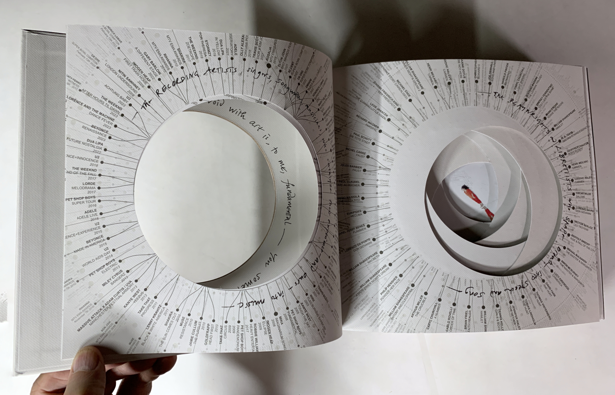
Ever see a resume like this? Inside the cover, the list of Musicians she’s worked with, left, and Playwrights & Librettists, right, surrounding Es in the middle after more pages of credits and thank yous.

Holding a copy in my hand, it was immediately obvious that the book is a duality. At once it feels crafted with care at every turn, mirroring the personal feel of a very limited edition, yet it’s a mass-produced object published by a big publishing company. The cover, shown earlier, and the first 8 pages are die-cut to look like we’re peering into a camera lens. On each of these the opening is surrounded by credits, and there are many of them. They lead to a picture in the center (the aperture) of the Artist, herself, on the 9th page, standing obliquely between a white cityscape and white clouds, dressed in red; the “focus” of her own show, for once!
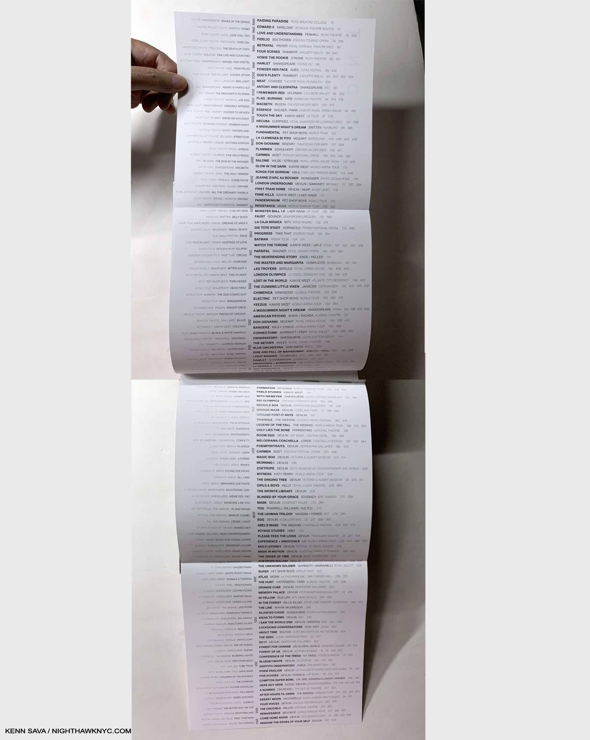
The Table of Contents opens up to the 4 page list of projects arranged chronologically- 1995 at the top, 2023 on the bottom. Those in the center in black are included in the book. Others, to the left in grey, are omitted. It’s shocking how many projects are listed. It took two pictures to get them all in.

Then we get the title page, the table of contents, which opens to a double gatefold listing her projects from 1993-2023. (Has she really been creating for THIRTY YEARS already?) Moving forward into the book proper, I quickly realized that the design was, yes, unique, and yes, stellar. Impressive for a first book, but, I’m here for more.
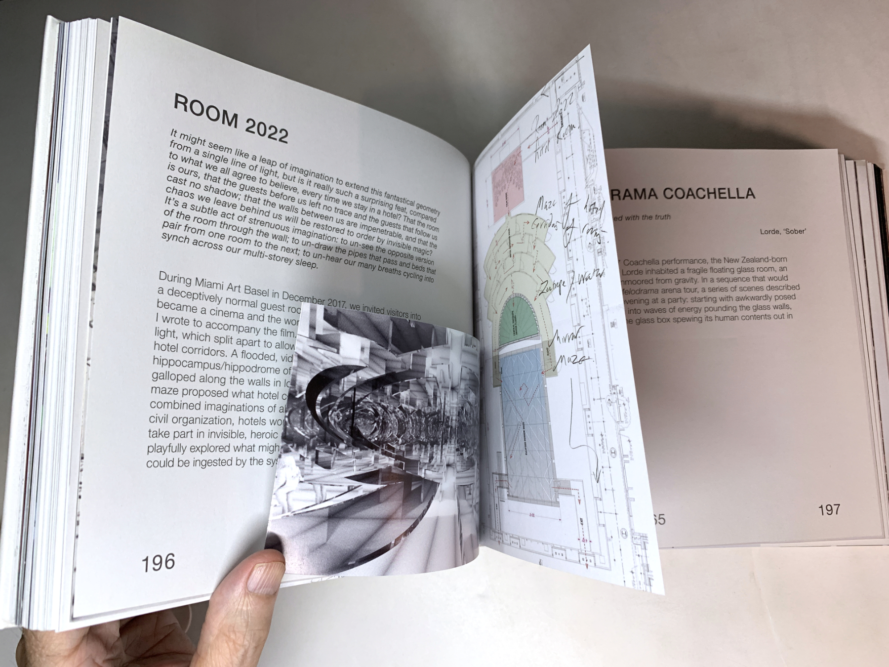
Each project typically gets 2 full pages delineating its genesis, though many have inserts that range between 2 and 40 additional pages.

Her innumerable projects get small chapters of their own (small because there are A LOT of them), and many feature a variety of half pages, fold outs, inserted booklets, and what have you, making them different and fresh from each other. Then, there is a large section of color Photos of the actual performances, followed by the texts mentioned by Thames & Hudson earlier.
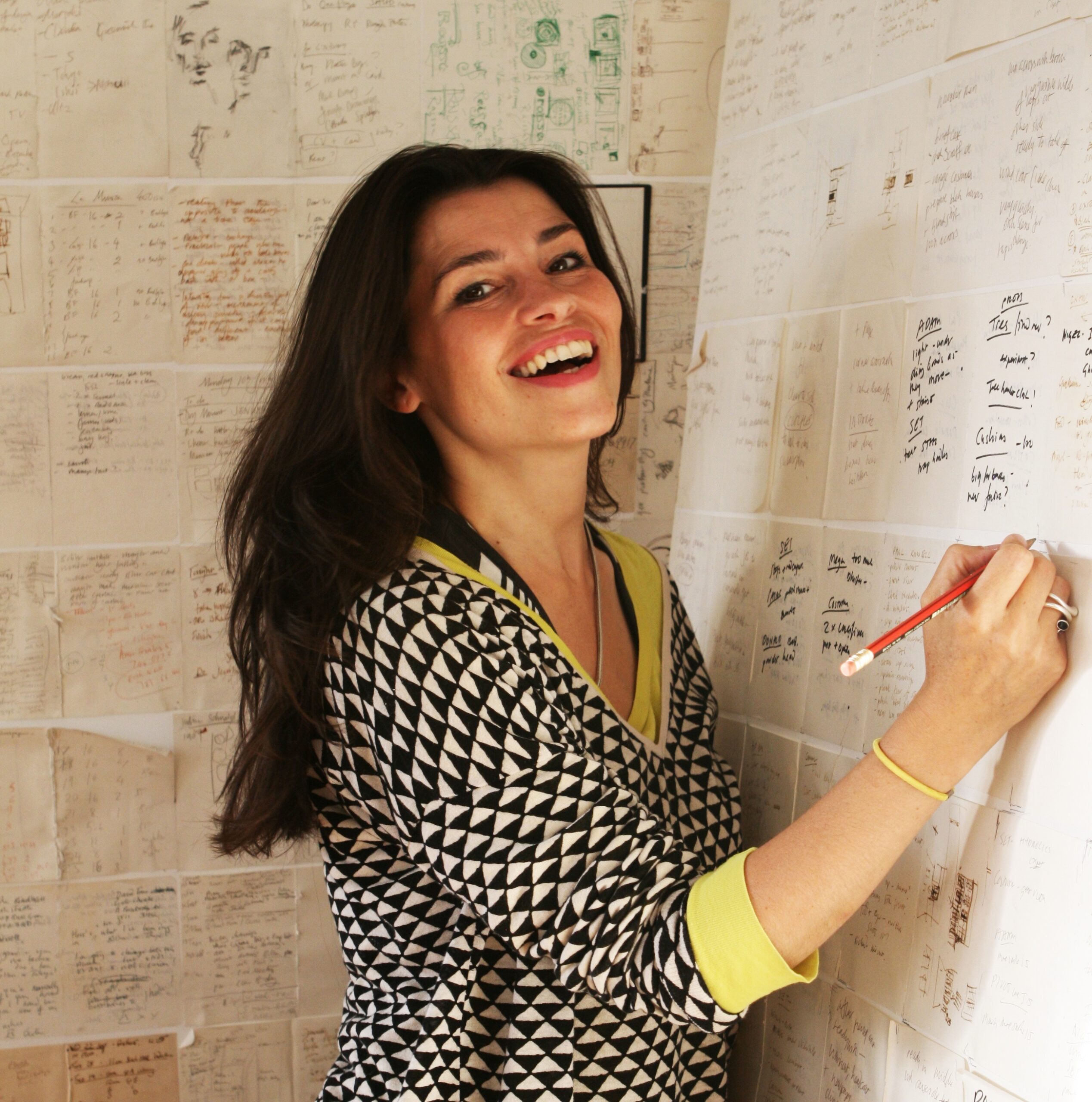
One of the world’s most remarkable Artists. What srtikes me about this Photo of Es Devlin in her studio is that she’s virtually surrounded by hand-written notes & Drawings. *-Photo by Tibby762

I was shocked to see that reproductions of countless Drawings on paper are included, which showed me that even Artists who’s work involves cutting-edge and innovative technologies continue to rely on Drawing on paper (something I have long considered to be an essential life-skill for everyone- whether it be on paper or digitally. I’m serious.) Then, another reveal- she relies on handwritten notes, which also fascinates me. When Sheena Wagstaff, the former Chair of Modern & Contemporary Art at The Met sat down next to me during a Nareen Mohammedi Symposium, I couldn’t help but notice that she, too, was taking notes by hand. Both commit their important notes and sketches to paper- not to a digital medium. (This is not mentioned as a criticism in any way of either highly esteemed lady.)
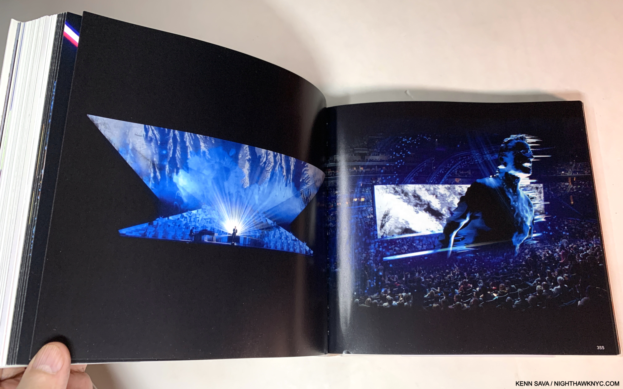
That’s not all. In addition to her devotion to Drawing, another pillar of her craft is reading. Page after page of An Atlas references something she read inspiring that project in some way. Reading this, I was struck with one overriding question-

“The woman is so incredibly prolific, creating project after seemingly impossible project steeped in infinitely complex details (in addition to having a family and a life): WHERE DOES SHE FIND THE TIME TO READ, and read so much?”
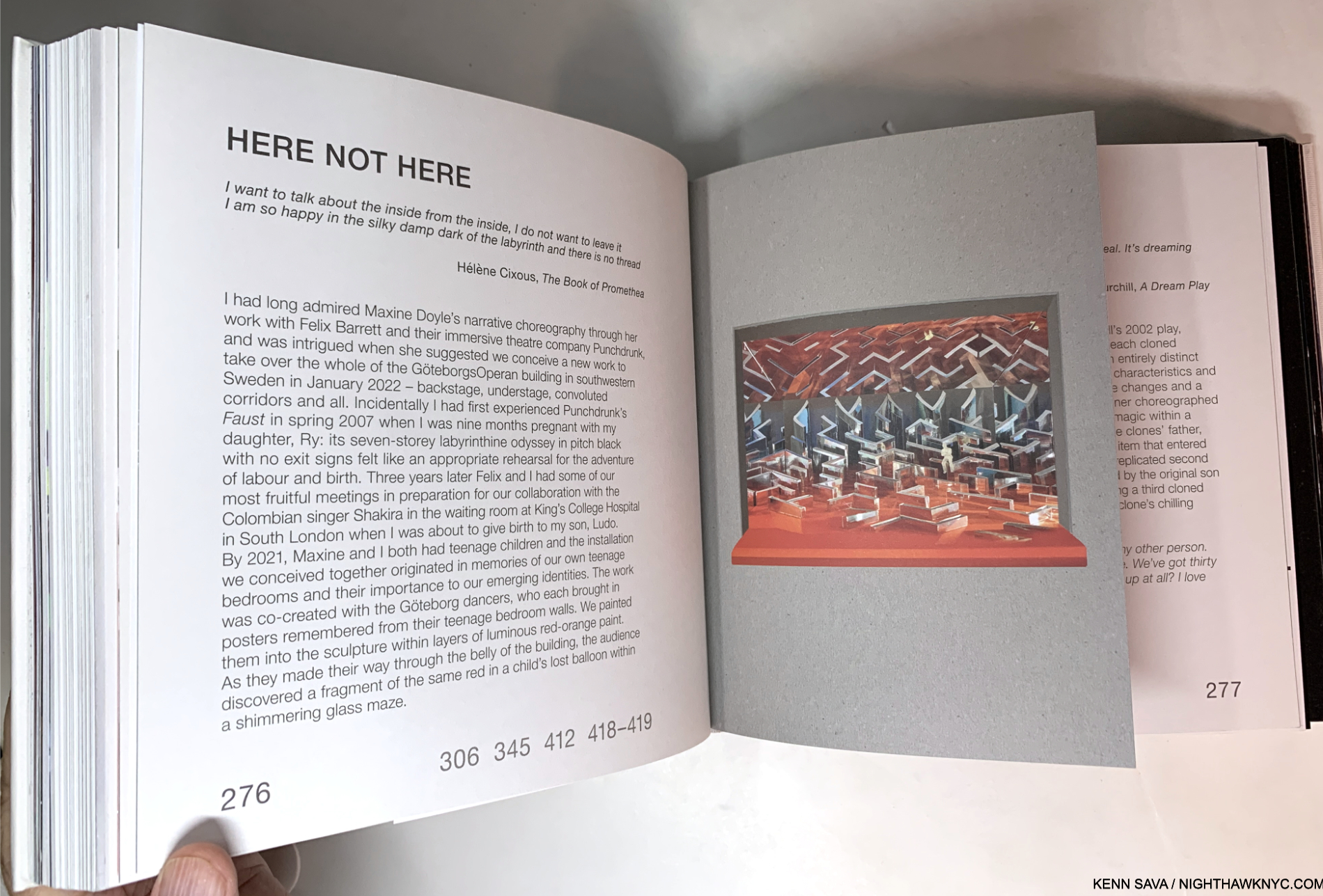
 

In the projects section inserts of all kinds are the norm, as in a hand-made book. The numbers “306 345 412 418-9” reference pages in the color Photos section where the realized project is pictured in its live performance.

Deep into the concept section, titled “A Selection of Works, 2012-2022,” as my mind is melting over as each project passes in the form of sketches, models or in-progress images as I page turn, I begin to wonder- “Did she really get this made? What did this look like for real?” After the concepts, the large section of color photos shows each project as it was realized. Historic proof each existed. Oh! And get this- MOST of the Photographs included in this NINE HUNDRED page magnum opus are by, you guessed it: Es Devlin, herself.
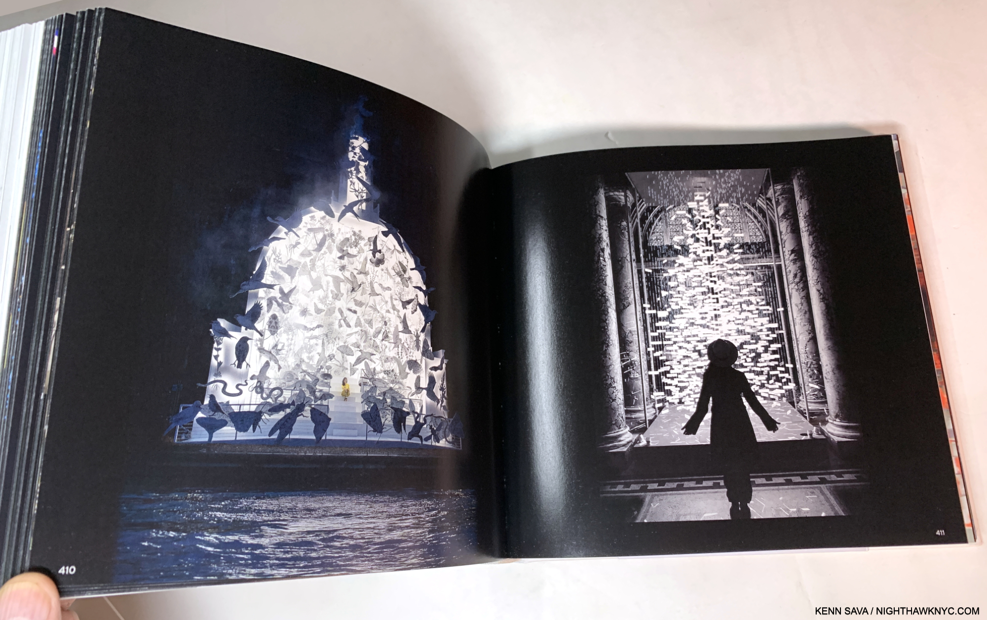
Taking it all in, the thing that strikes me is that stage design is fleeting. It takes an immense amount of work to conceive, design, and create, but once the performance is over, it’s gone, probably for good, living on in the memory of those, like me, who witnessed one of her productions. There aren’t even that many videos circulating of them! In creating An Atlas, Es Devlin has struck back against this impermanence with a lasting record of her process in creating these works and their singular results.

Taken as a whole, An Atlas of Es Devlin is a staggering achievement- like many of her productions are. Es Devlin has burst forth onto the Art Book world with a debut monograph that will be hard to top: on many levels. It’s destined to find itself on the reference book shelves of Artists, Playwrights, Authors, Opera Directors, Stage Designers, Graphic Designers, Book Designers, as well as Art historians and her fans, for years to come.
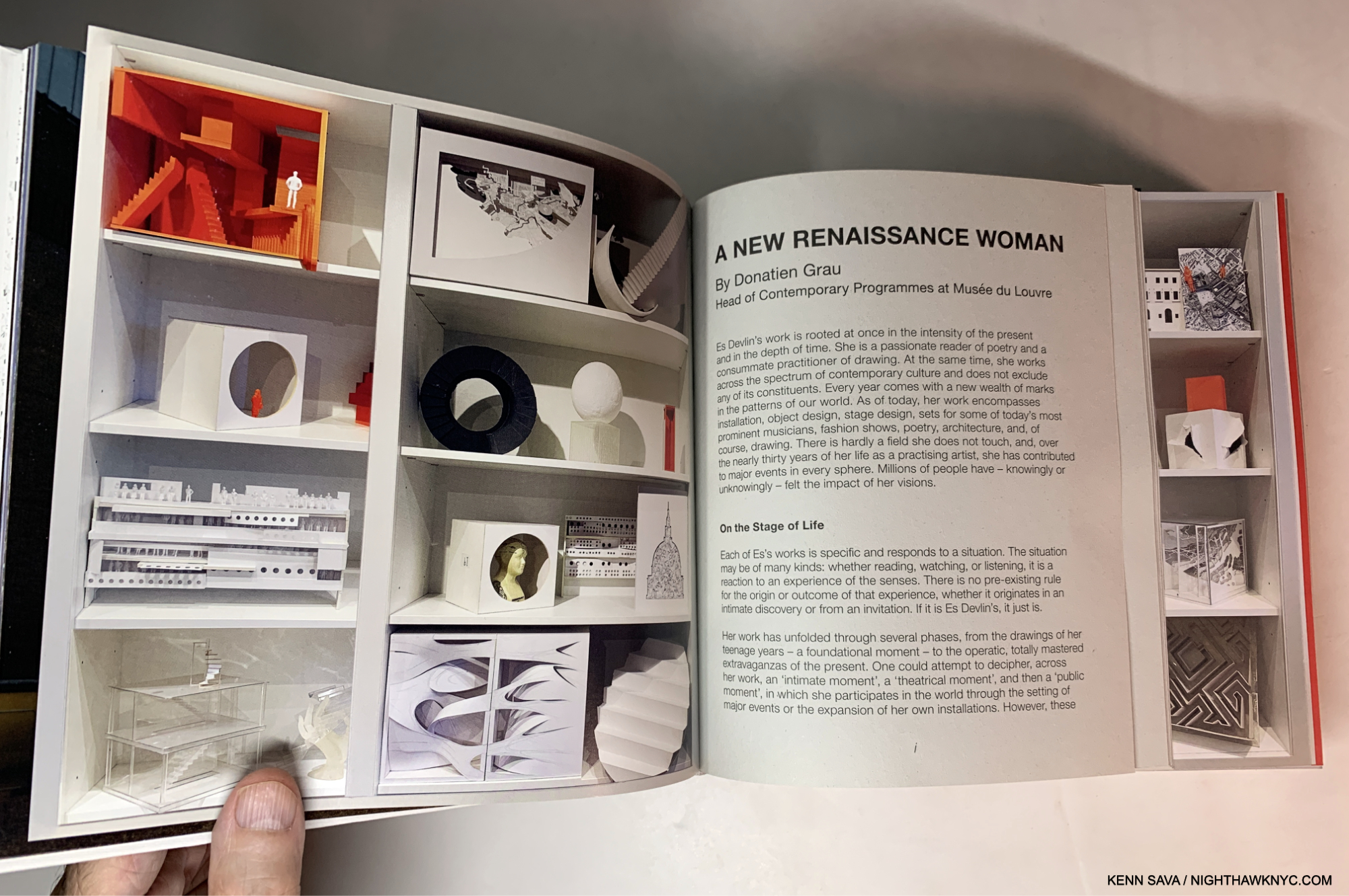
“A New Renaissance Woman.” Donatien Grau of the Louvre, no less, is on to something, I think.

Of his almost innumerable areas of exploration and invention, stage design was not one of Leonardo’s skills (as far as I know. Far be it from me to put ANYthing past him!). So, I wonder what he would make of Ms. Devlin and the Sunday Times’s comparison. We’ll never know. But, I can make this comparison- Leonardo did leave us some of the most astounding books any human ever created: his Notebooks. Though unpublished in his time, and no doubt created for his own use, they have subsequently become eternally important, extraordinarily prophetic and endlessly influential. Es Devlin has now published her Atlas. While I would never compare Arists, or say one is “greater” than any one else (such comparisons are meaningless), it would be endlessly fascinating to have Leonardo’s Notebooks next to a copy of Es’s Atlas, so one could page through both. While you would certainly feel the passage of time going back and forth, I have a feeling that you might still find some commonalities between Leonardo’s “books” and Es’s book. Endless imagination, endless creativity, the fruits of handmade marks on paper, and endless beauty, to name four; each steeped in a study of the craft of Art making and an insatiable curiosity to know more, to explore what’s possible and to take that next step forward. For those reasons, instead of Leonardo, if I were to compare Es Devlin to any Artist, living or dead, it would be Robert Rauschenberg. Each of her creations is THAT unique, one work from the next (and from what anyone else has done), and also THAT endlessly creative and innovative.

So, how’s THAT for a first book?
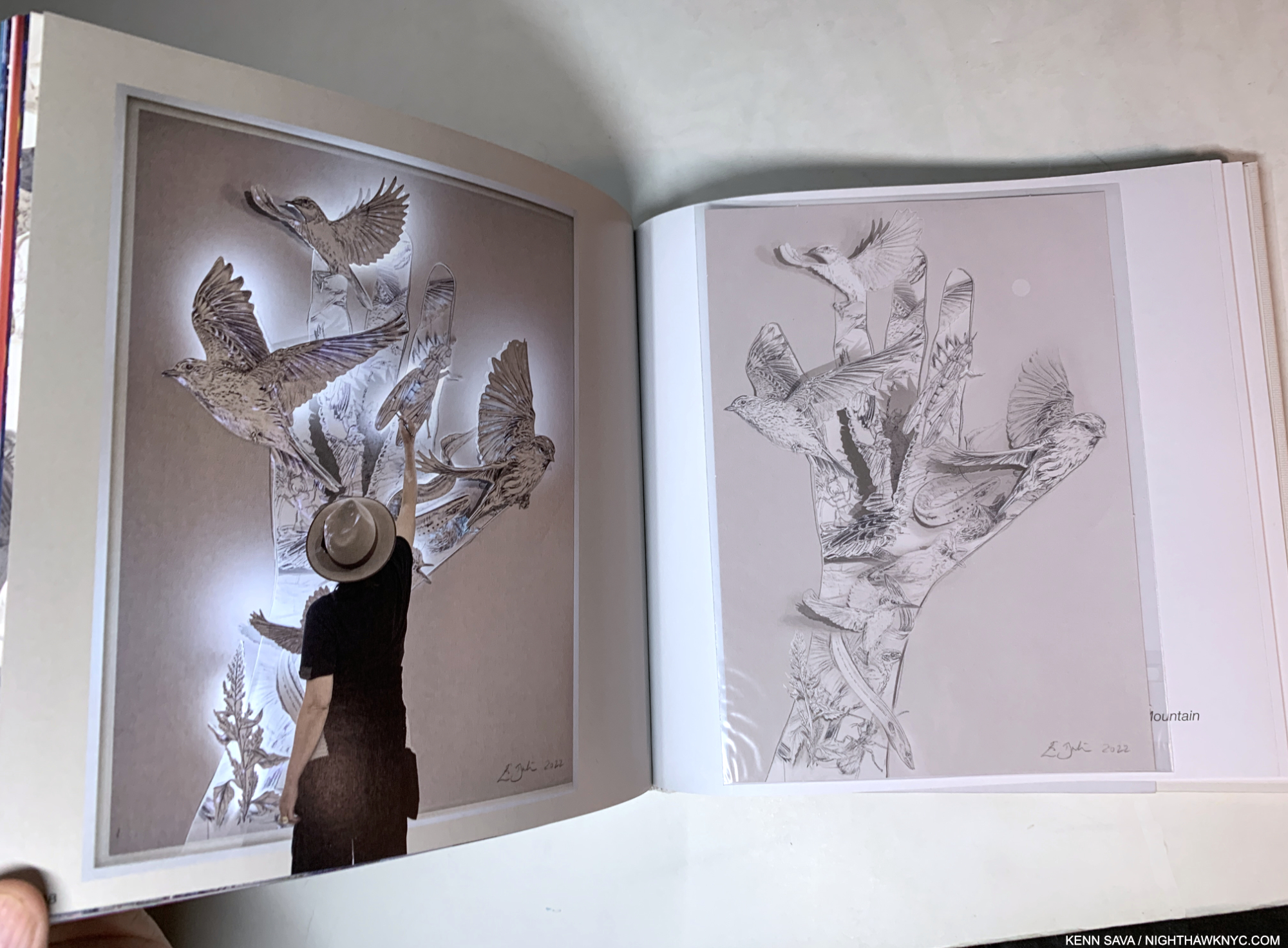
Es Devlin in the midst of creating, left, and a sealed Die-cut Print seemingly based on it, or a similar work, included with the first edition, right.

And, oh? The Lady Gaga show I saw at Radio City 14 years ago that wowed me so barely gets 4 pages of coverage out of the 900 in the book. THAT’S how vast Es Devlin’s work and achievement is. And she’s only in her mid-career.

Watch out, Leo!

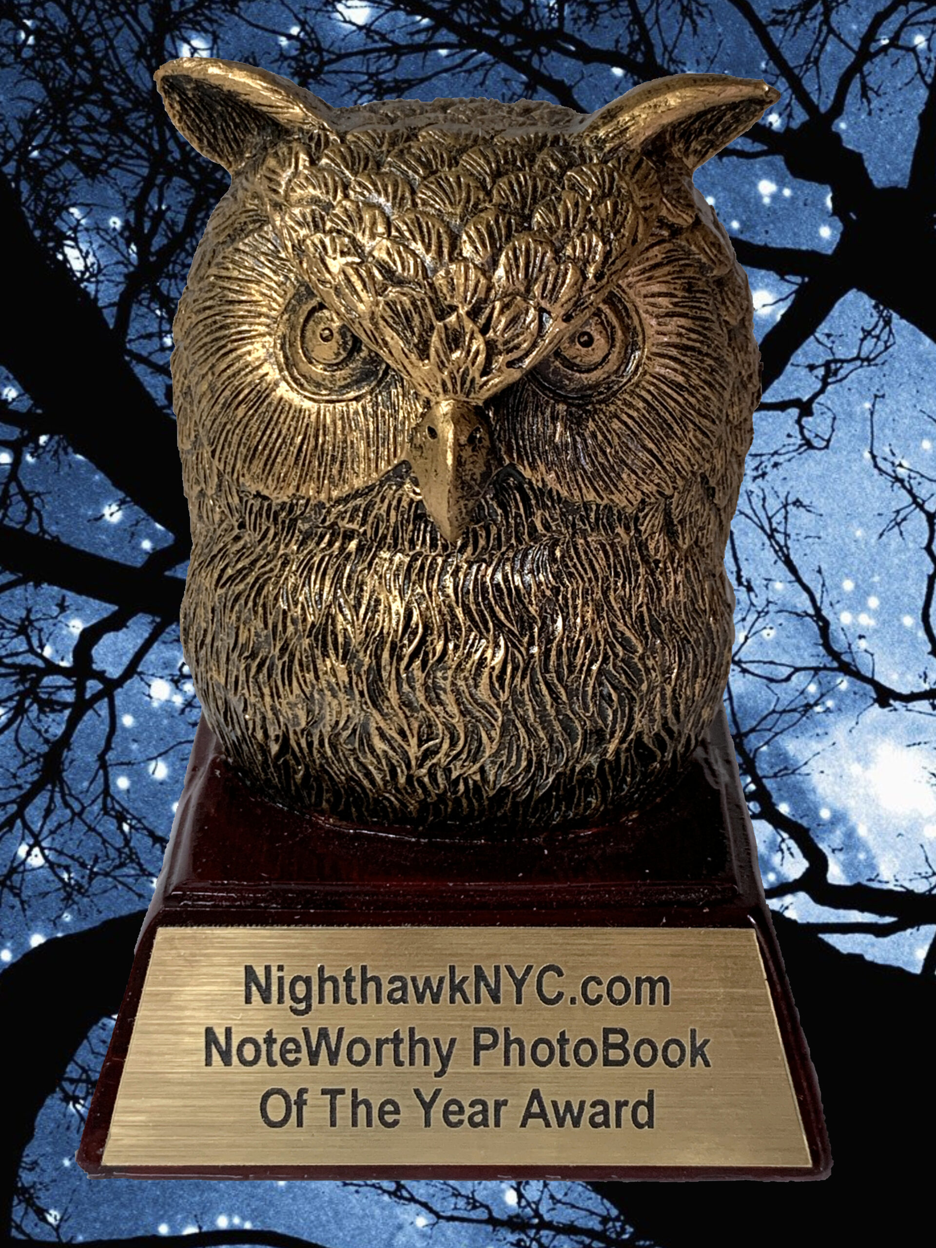
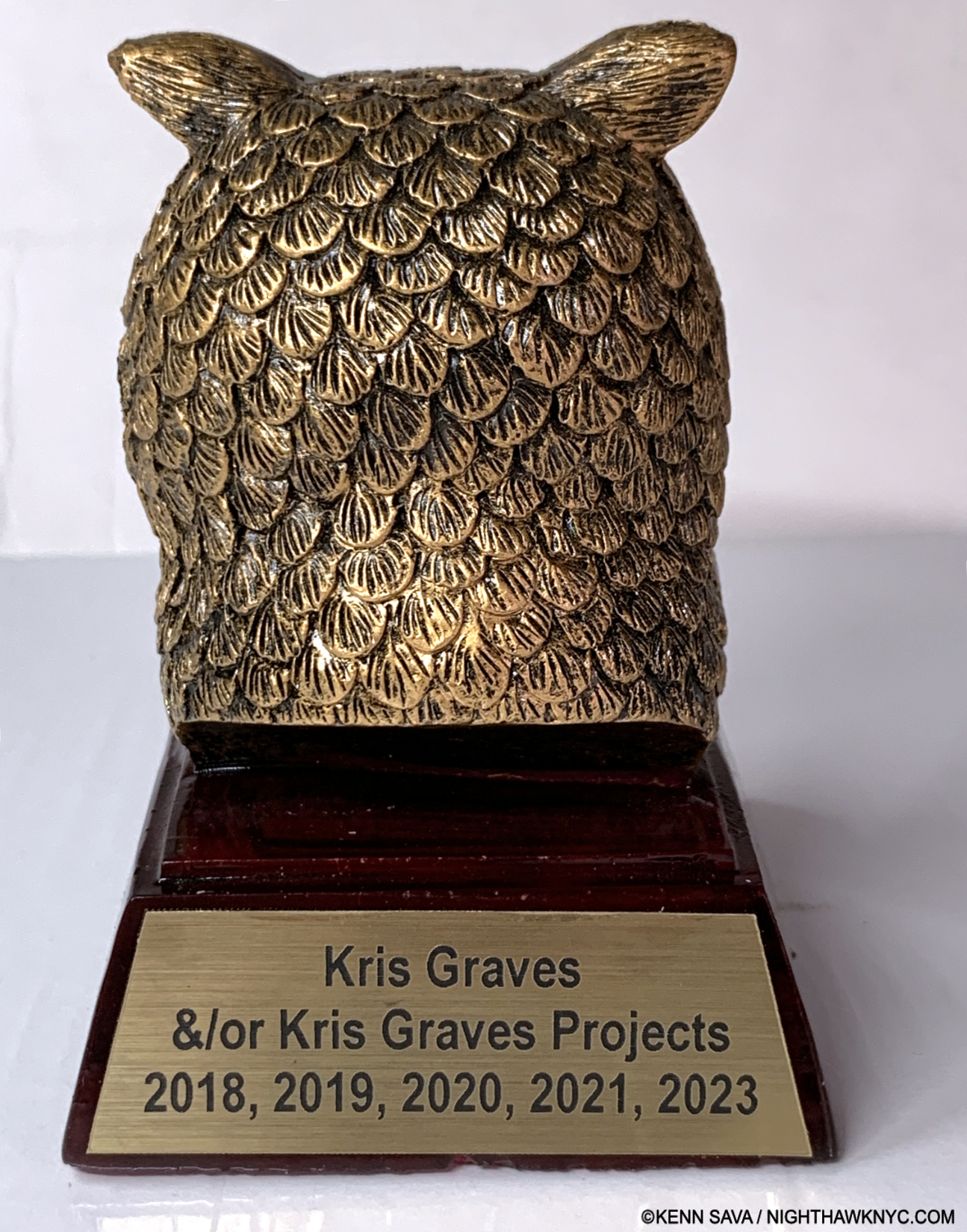
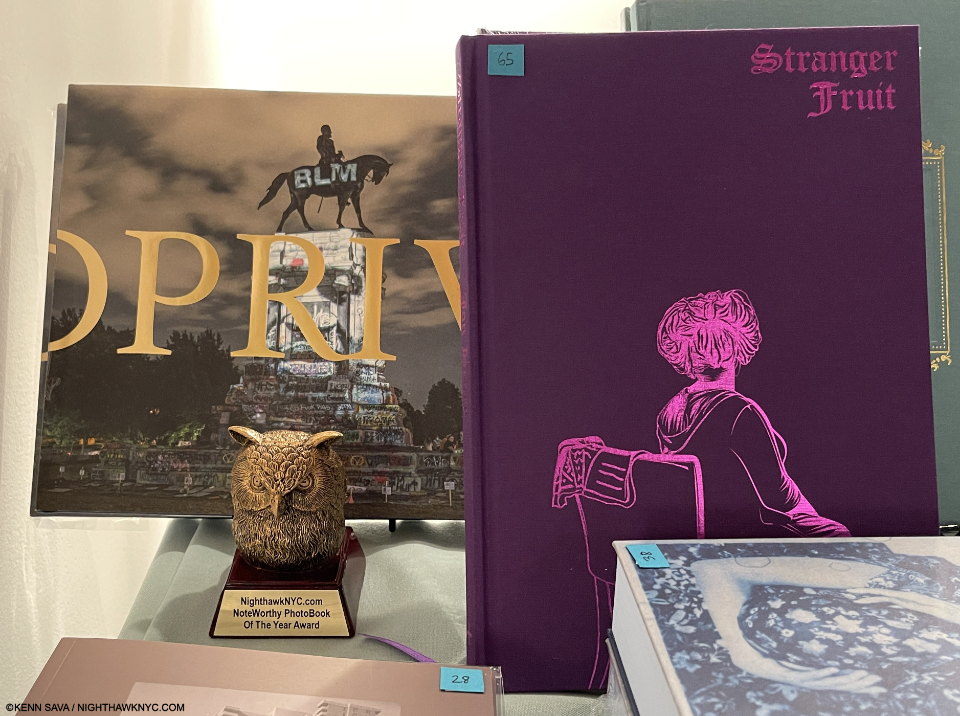
An Atlas of Es Devlin is a NighthawkNYC.com NoteWorthy Art Book of 2024.

NighthawkNYC.com has been entirely self-funded & ad-free for over 8 1/2 years, during which 320 full-length pieces have been published! If you’ve found it worthwhile, PLEASE donate by PayPal to allow me to continue below. Thank you, Kenn.

You can also support it by buying Art, Art & Photography books, and Music from my collection! Art & Books may be found here. Music here and here.

Written & photographed by Kenn Sava for nighthawknyc.com unless otherwise credited. To send comments, thoughts, feedback or propositions click here. Click the white box on the upper right for the archives or to search them. Subscribe to be notified of new Posts below. Your information will be used for no other purpose.
  1. Prior to this, her two 2009 shows at Terminal 5 were her largest NYC shows
  2. Apparently, two printings of it have now sold out, so the total edition size remains unknown to me. It’s also to be re-released in the USA in May so put those edition size numbers down in pencil.