This site is Free & Ad-Free! If you find this piece worthwhile, please donate via PayPal to support it & independent Art writing. You can also support it by buying Art & books! Details at the end. Thank you.
Written & Photographed by Kenn Sava (*- Unless otherwise credited.).
This is the third and final part of my look at Ed Ruscha/Now Then. Part 1 is here. Part 2 is here.
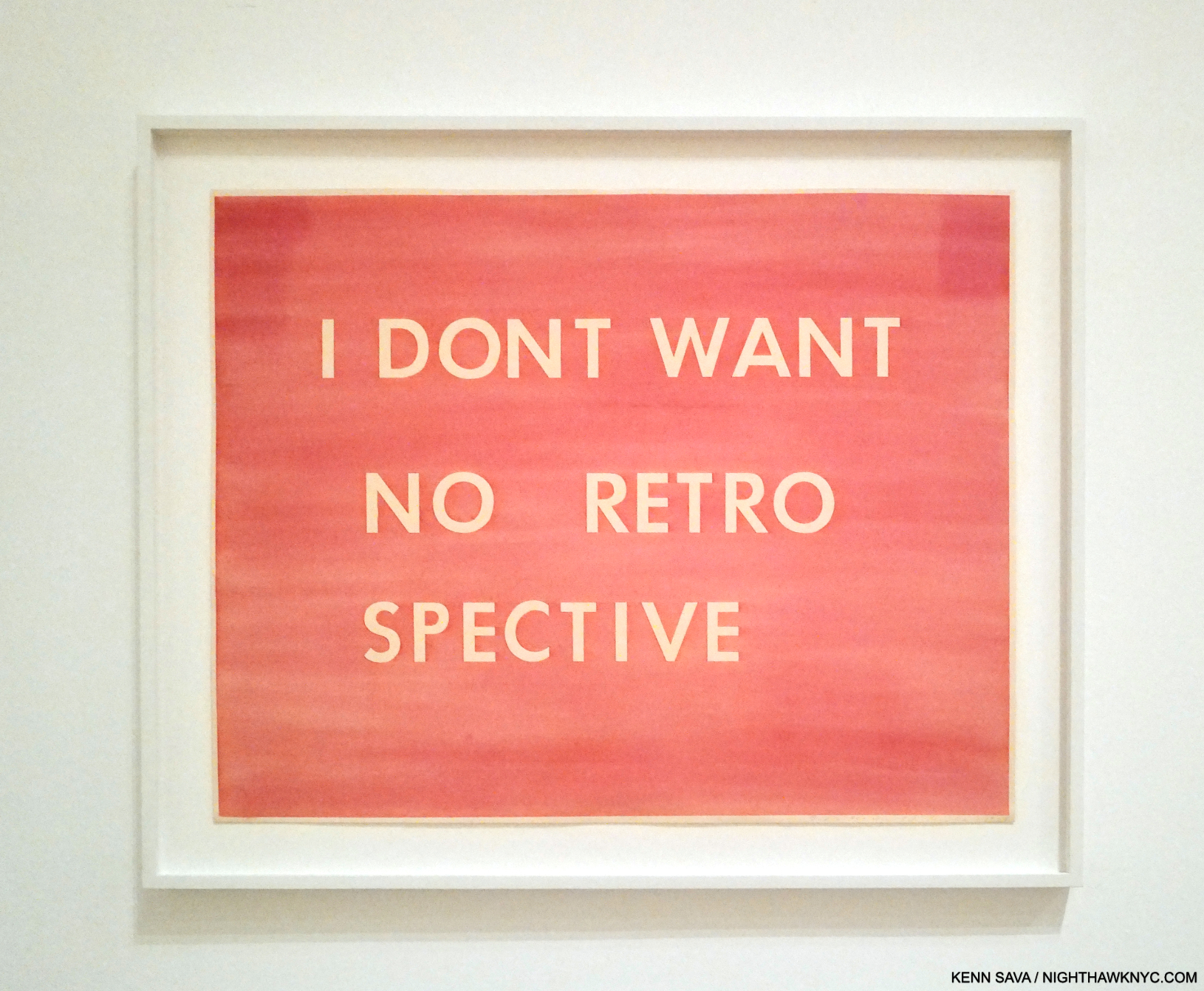
1- Heads

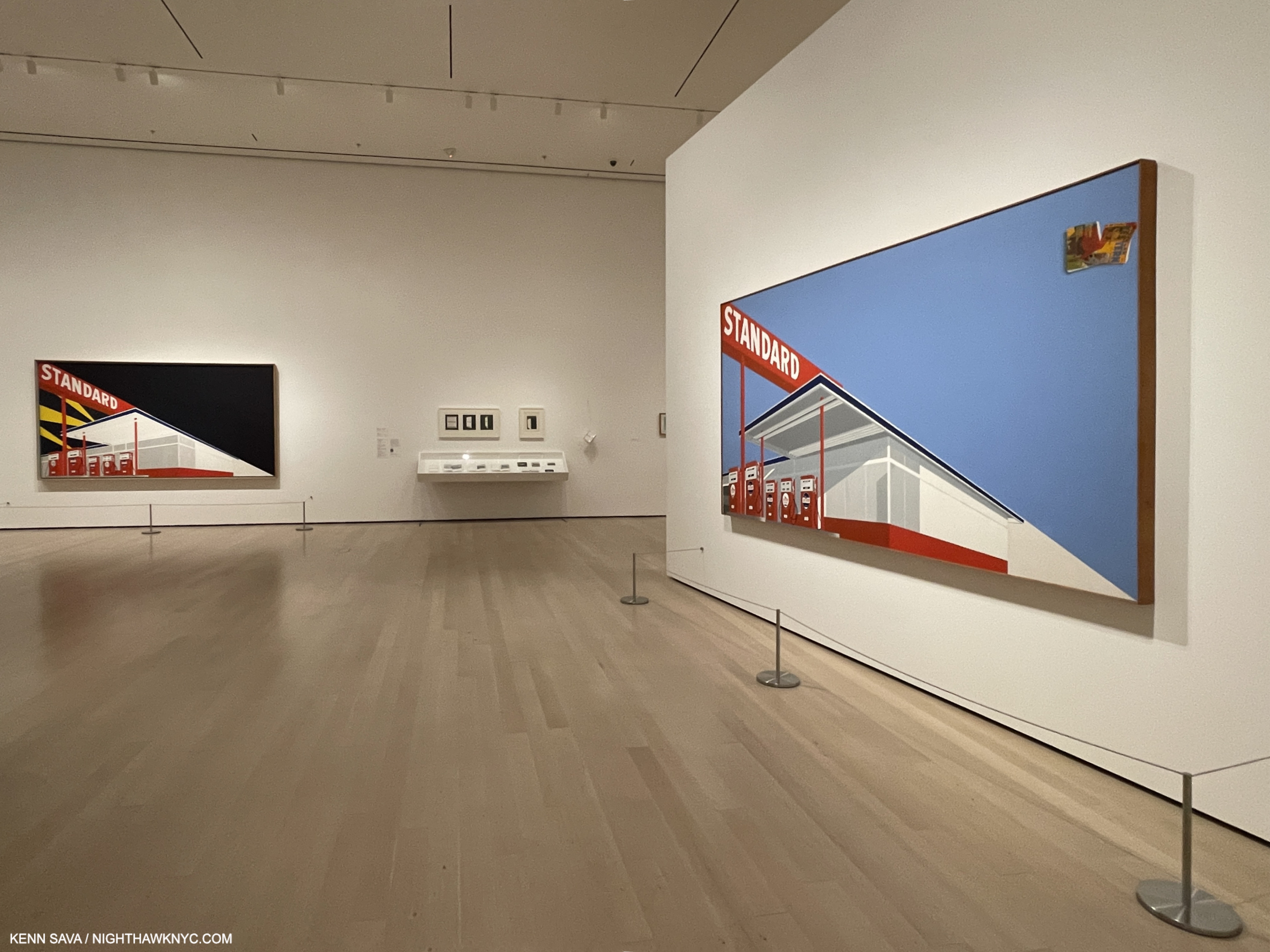
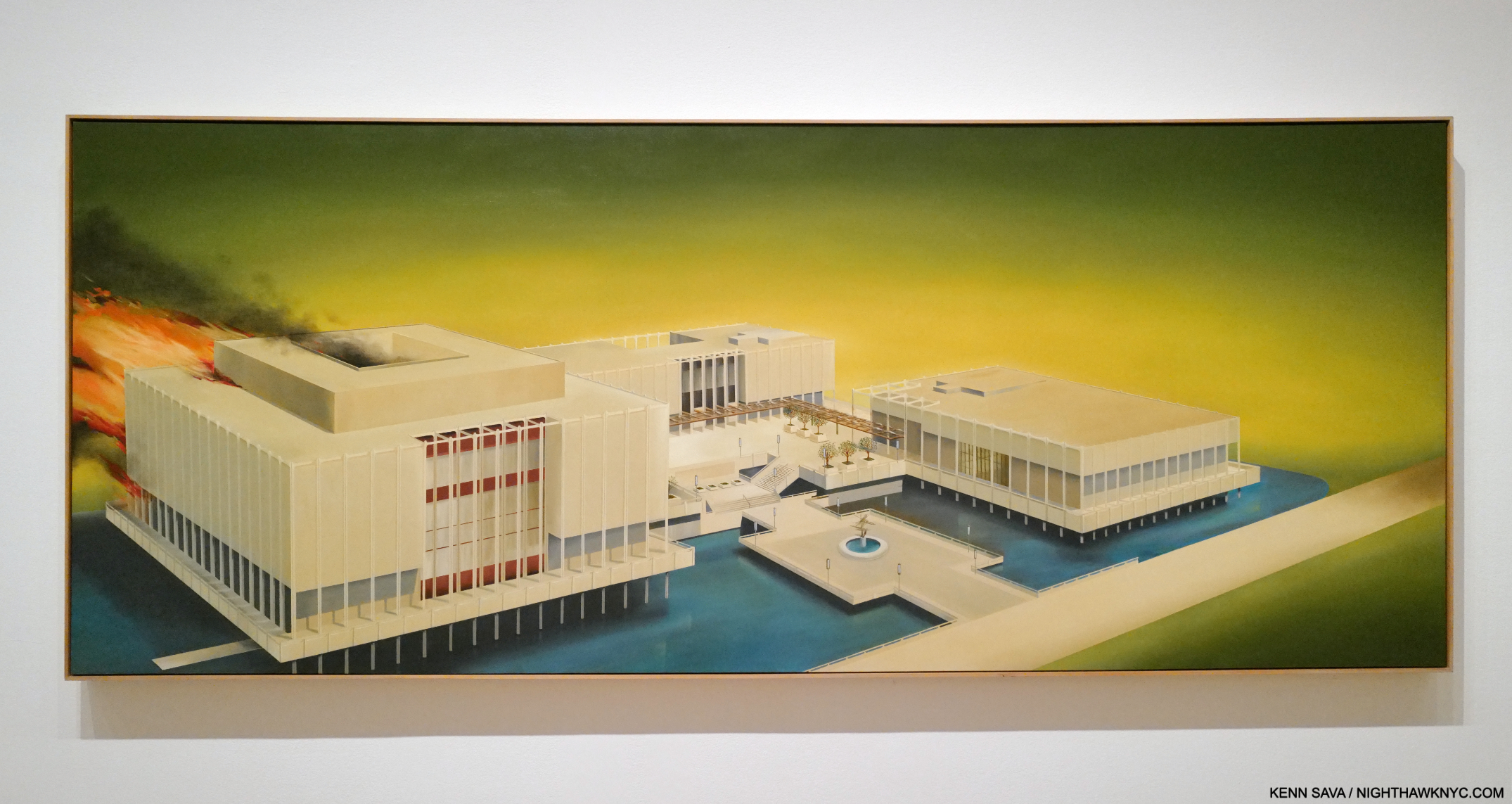
One door closed, another opened. Los Angeles County Museum on Fire, 1965-8, Oil on canvas, seen at MoMA. Ed Ruscha/Now Then is now open there. Pictures in this piece are thumbnails. Click any for full size.
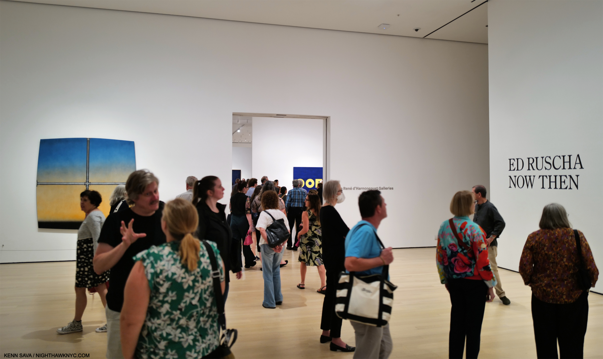
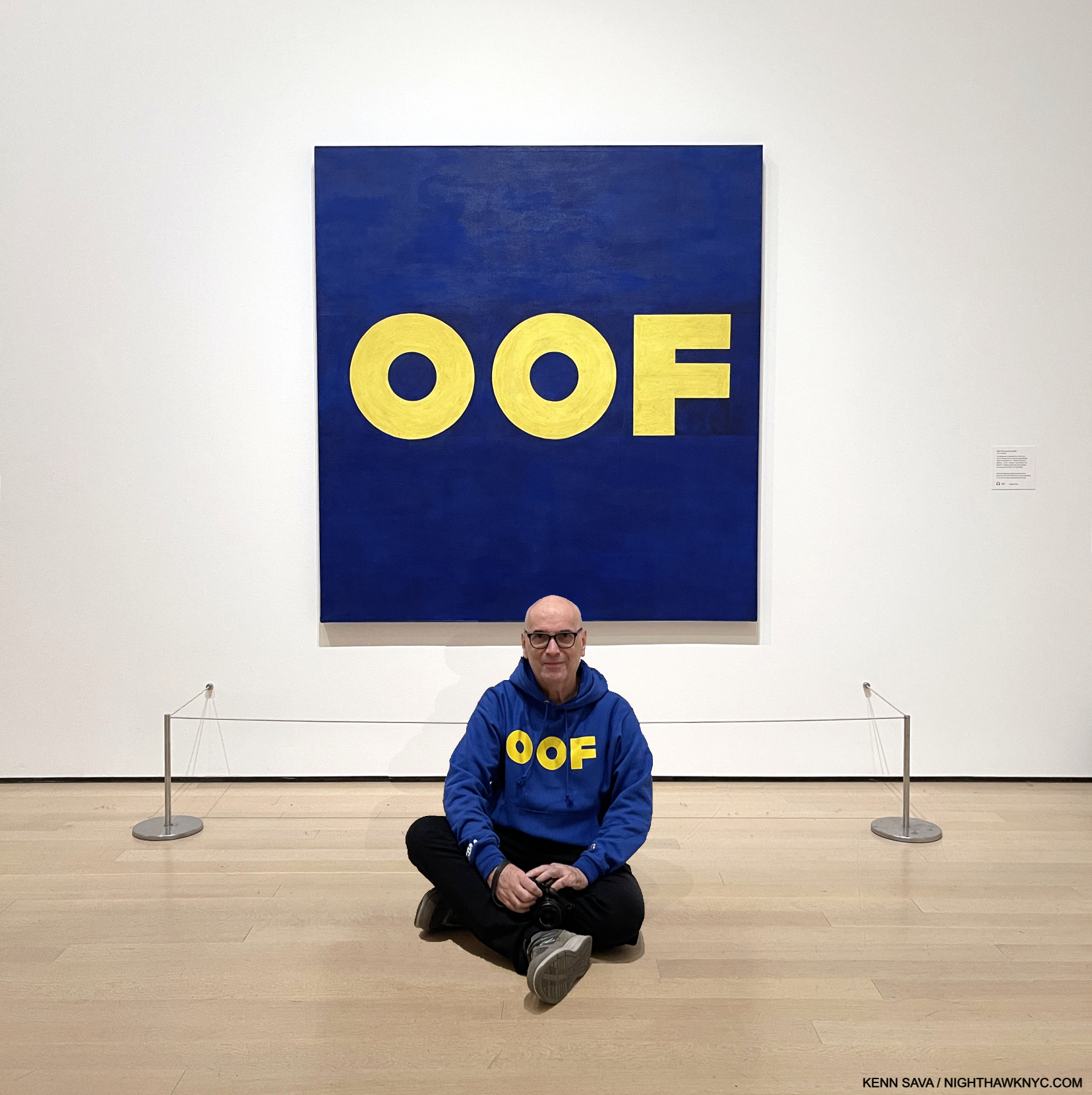
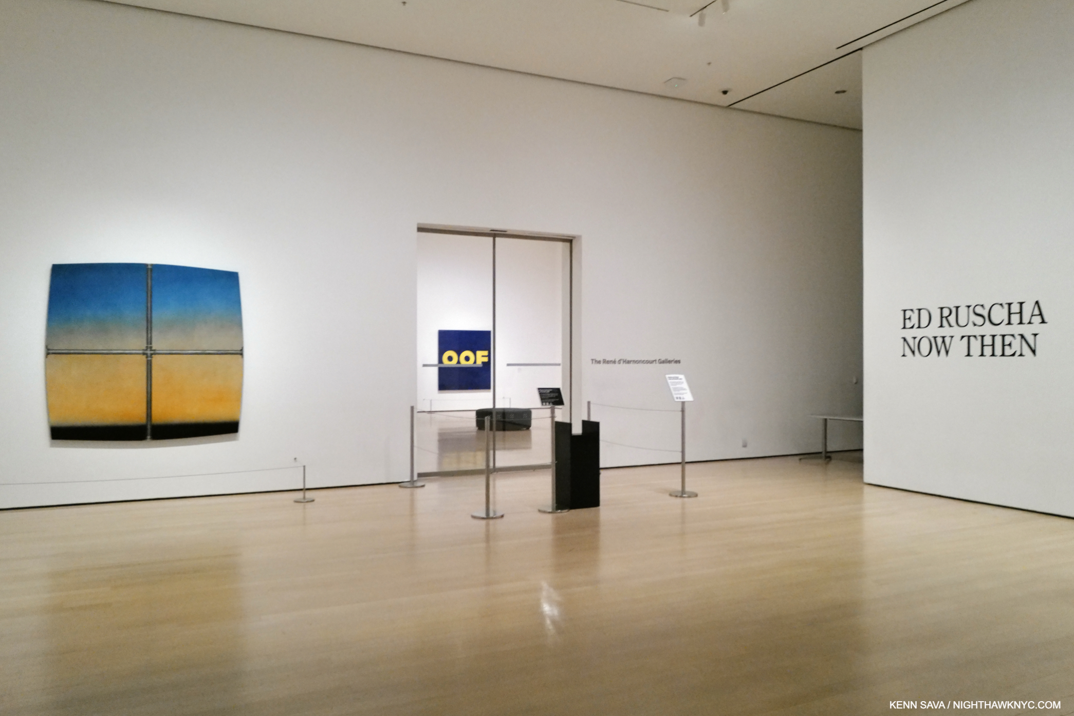
Ed Ruscha/Now Then is a memory for those of us who saw it at MoMA from September 10, 2023 to January 15th of this year. It’s a memory in the making for those who are seeing it now at LACMA, seen above in Ed Ruscha’s 1965-8 nebulous “portrait” of it (which I discussed in Part 1), or will be seeing it until it closes there on October 6th. They’ll be pleased to know it’s a show with staying power, a show I continue to relive and think about on a daily basis, six months after it closed here. After following the trail of his devlopment in Part 1, “Ed Ruscha’s Head Scratchers,” seeing some echoes of the work of Artists past, I began to wonder… Every Artist I’ve come across has had influences. Who influenced Ed Ruscha? As the show was up, and now after it ended here, that question lingered.
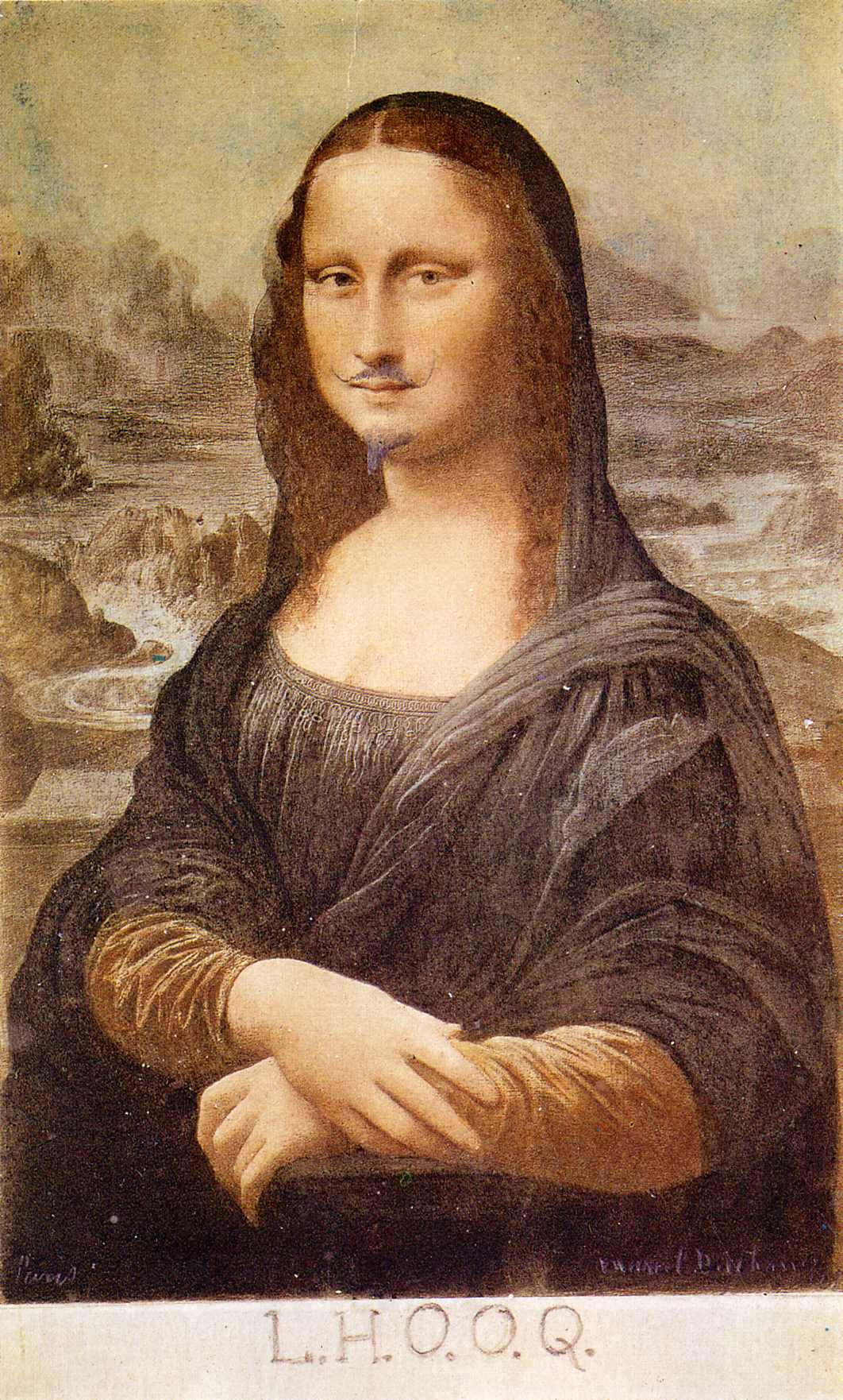
Marcel Duchamp, L.H.O.O.Q., 1919, or later. One Artist Ed Ruscha has repeatedly expressed his admiration for is Duchamp, who he met in the early 1960s. There are numerous version of L.H.O.O.Q. since the 1919 original. I chose this one because t contains all the elements of the original, which I cannot find (if you have let me know)- the mustache, the goatee, and the famous letters all of which Duchamp added to a Mona Lisa postcard. Duchamp once said that L.H.O.O.Q. means “there is fire down below,” though I’ve seen other definitions. *- Photographer unknown.
“Duchamp had quite a sizable influence on me from a pictorial standpoint and from an emotional standpoint,” Ed Ruscha (Ed Ruscha, Leave Any Information After the Signal, P.324).
Ed Ruscha has not written an autobiography, so his book, Leave Any Information After the Signal, a collection of “Writings, Interviews, Bits, Pages” from 1960 to 2000 is the closest thing we have to a primary written source. In addition to just looking, I turned to it, along with the numerous other interviews he’s given over his six-decade plus career, for insights.
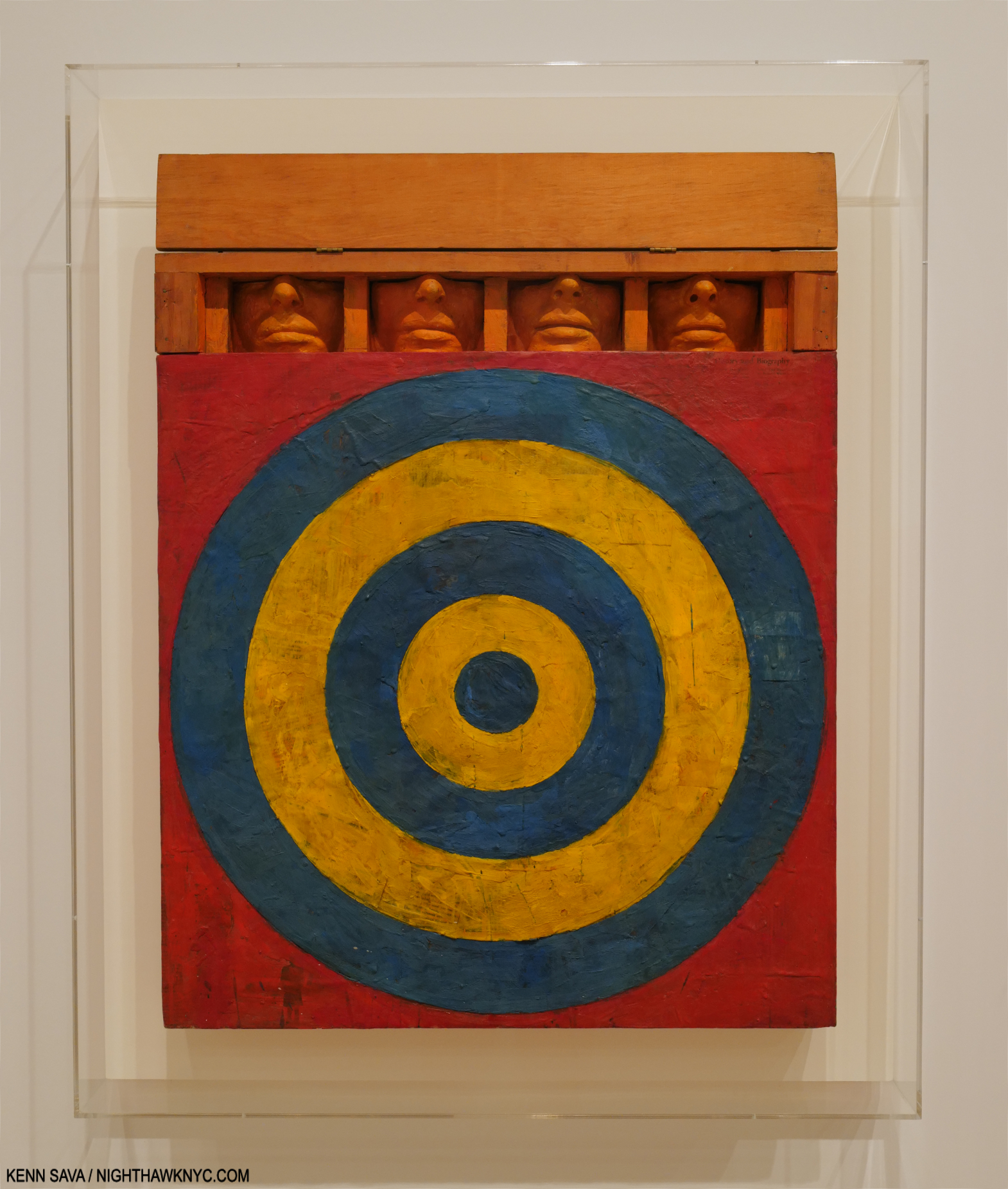
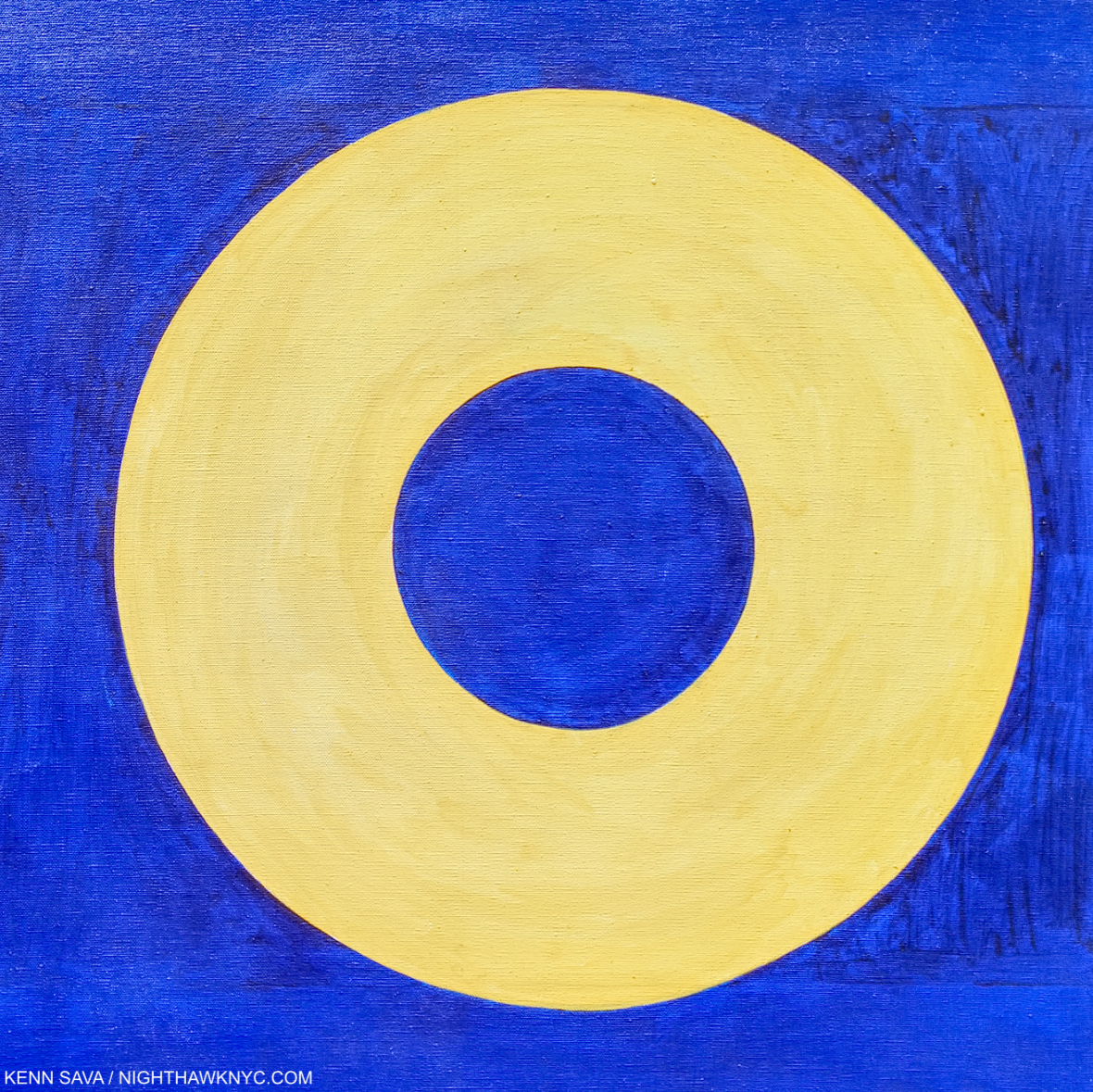
As seen in Part 1– Encountering Johns’s Target with Four Faces in a black & white reproduction in a 1957 magazine was, he said, an ‘atomic bomb’ in his training, ‘a stranger fruit’ that he ‘saw as something that didn’t seem to follow the history of art. My teachers said it was not art. ‘I didn’t need to see the colors or the size…’ ‘I was especially taken with the fact that it was symmetrical, which was just absolutely taboo in art school- you didn’t make anything symmetrical…Art school was modernism, it was asymmetry, it was giant brush strokes…it was all these other things that were gestural rather than cerebral. So I began moving to things that had more of a premeditation1.’” Jasper Johns, Target with Four Faces, 1955, Encaustic on newspaper and cloth over canvas surrounded by four tinted-plaster faces in wood box with hinged front. Seen in Jasper Johns: Mind/Mirror at the Whitney in 2021.
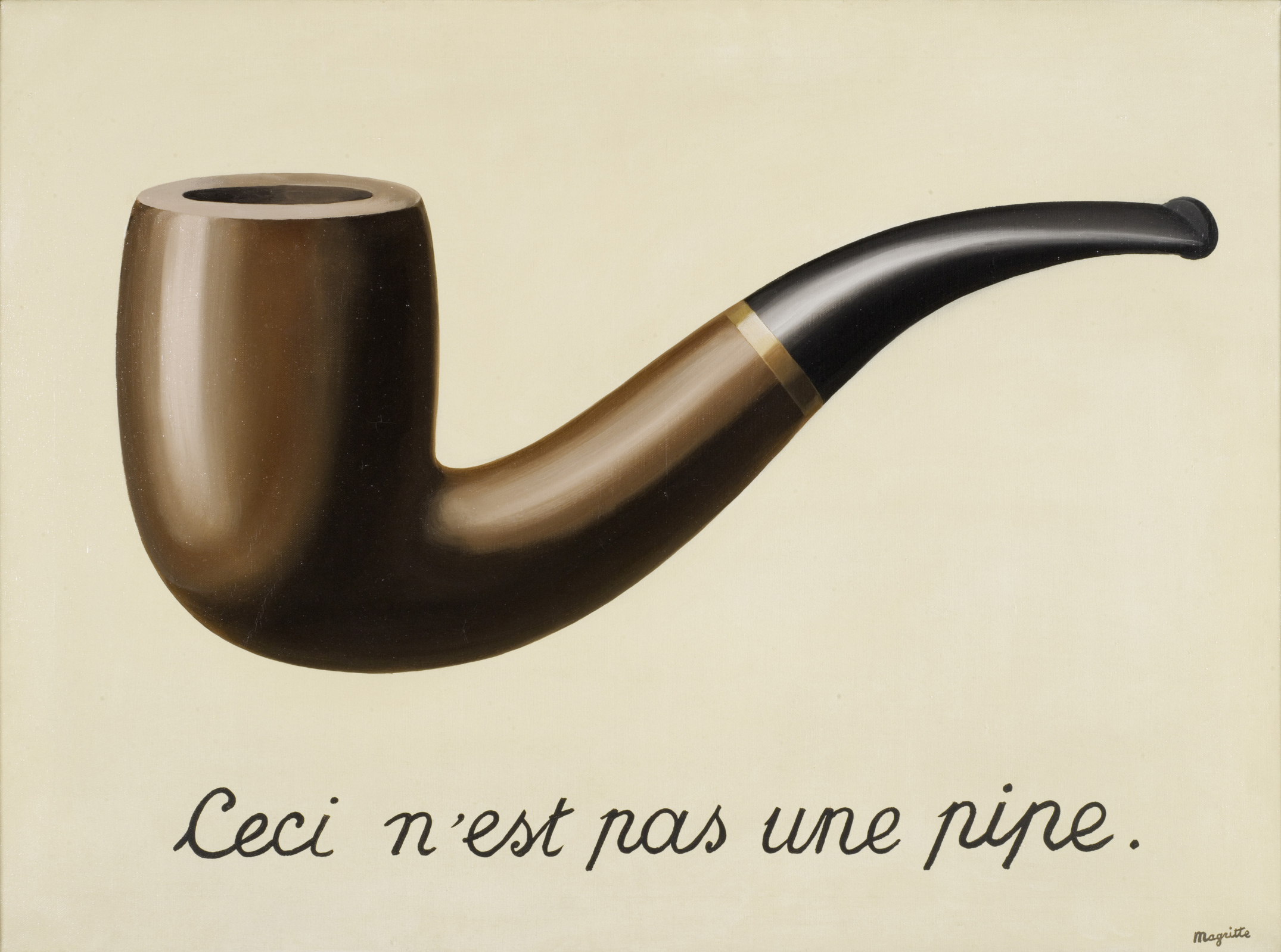
René Magritte, The Treachery of Images (This is Not a Pipe), 1929, Oil on canvas. (Not in the show.) *-LACMA Photo
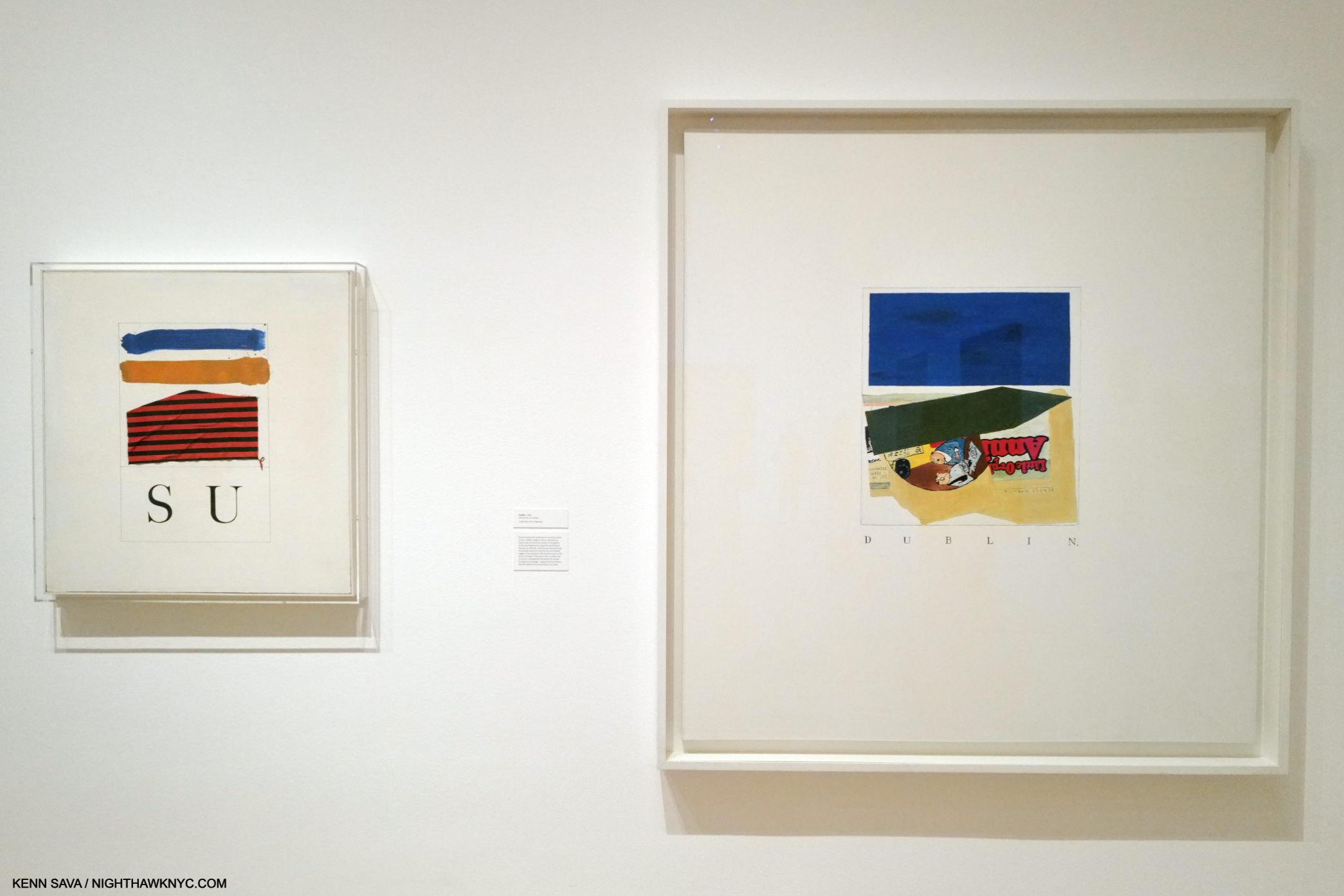
Pondering the visual evidence, the first name that came to mind was Rene Magritte, 1898-1967, a well-known Belgian Artist who also had a long career and touched on a number of subjects Ed Ruscha has, while sharing his fondness for taking the familiar out of context (which Mr. Ruscha does with words, objects and places). He also incorporated words. Though often labelled a “Surrealist,” his work touches on any number of other realms and styles of Painting, which made him ahead of his time. As a result, his influence is extraordinary and ongoing. Time and again, I’d look at an Ed Ruscha, or a section of one, and think “Magritte,” beginning with Actual Size, 1962, which I showed in Part 1, which echoes Magritte’s The Treachery of Images, 1929 better known by the famous words it includes, “This is Not a Pipe2.” The Magritte seems to echo his contemporary, Duchamp’s L.H.O.O.Q., from 1919.
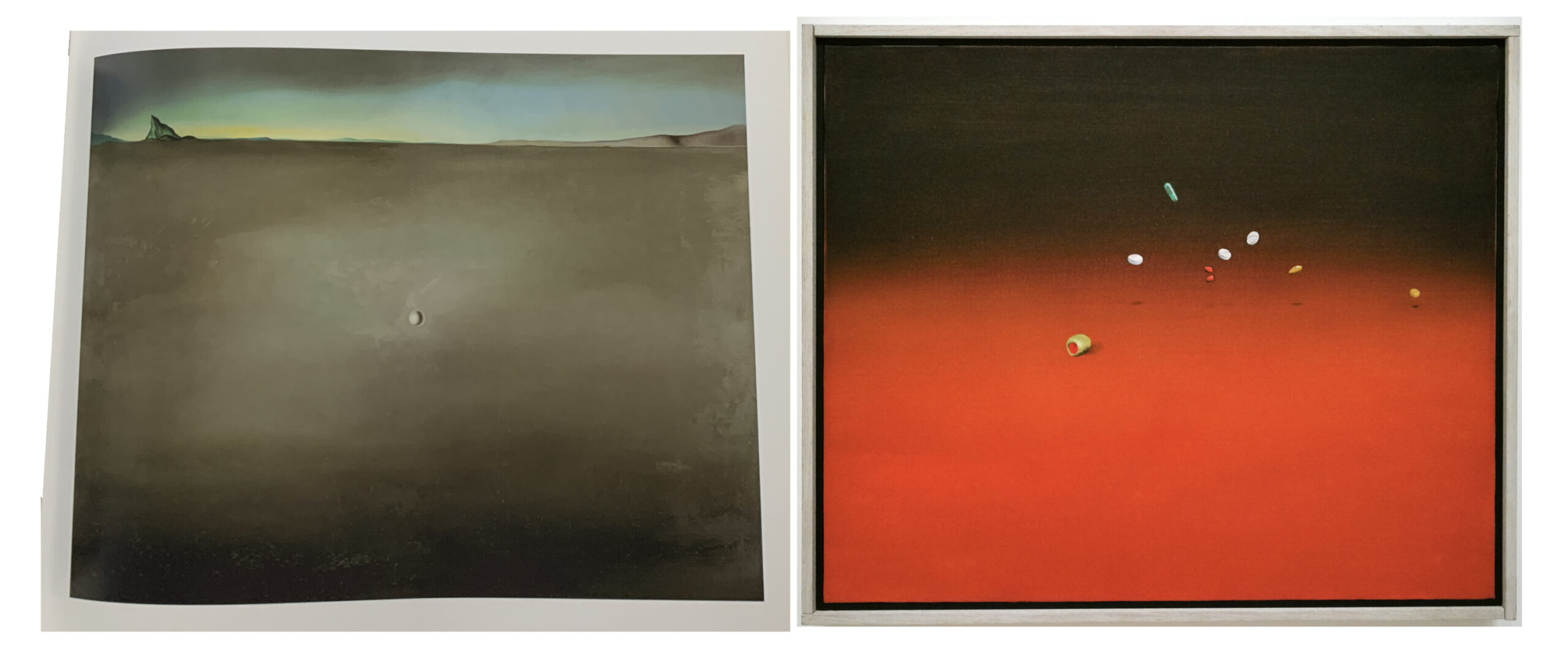
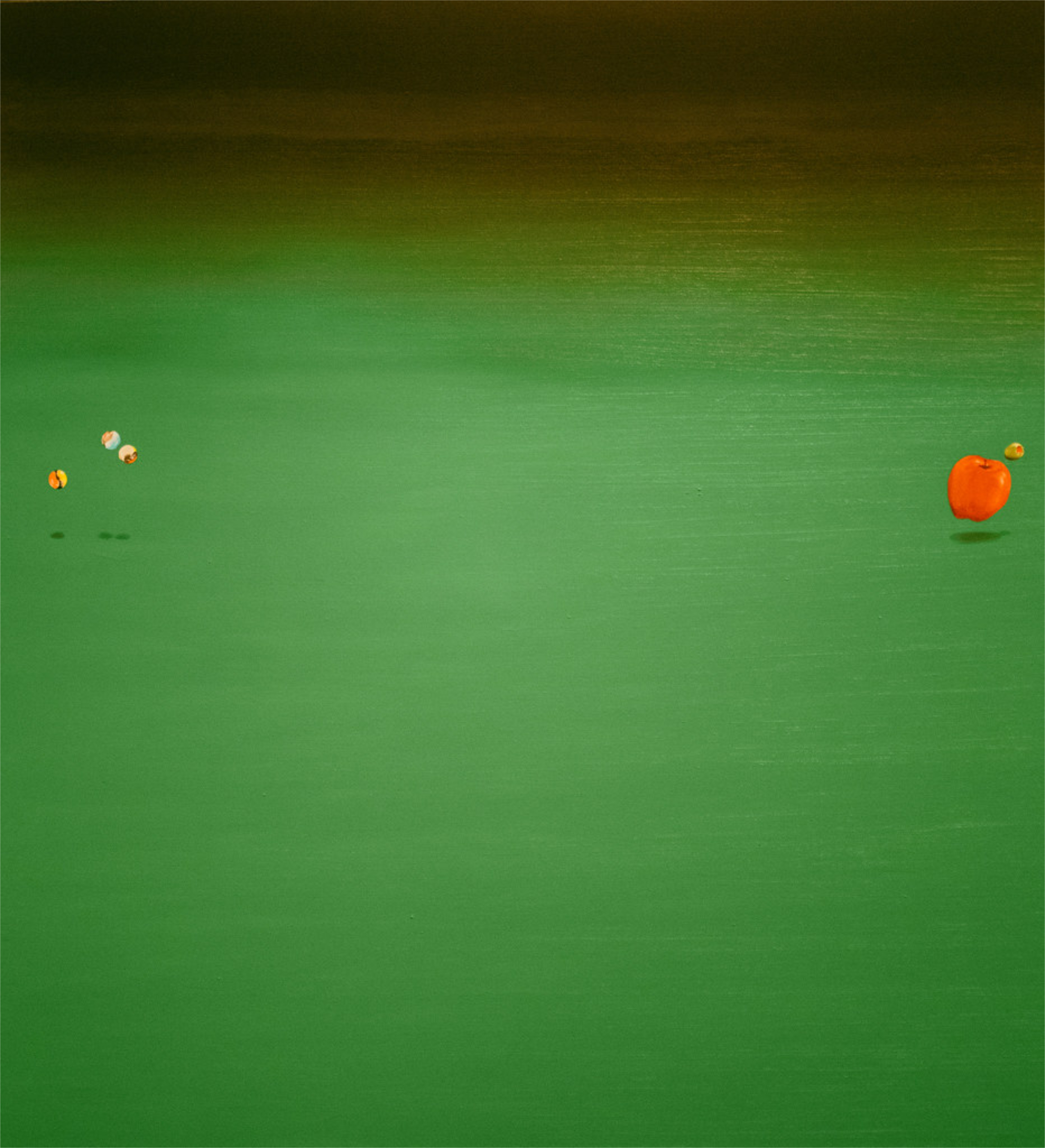
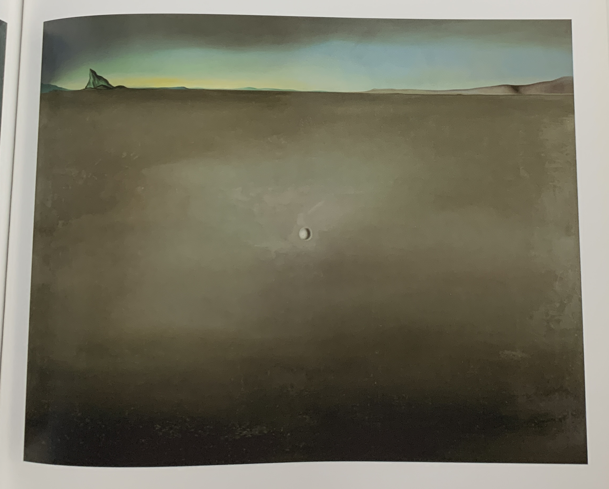
Salvador Dalí, Open Field with Ball in Centre and Mountains in Rear, Study for the Walt Disney film Destino, 1948, Oil on masonite, left. Ed Ruscha, Painkillers, Tranquilizers, Olive, 1969, right. (*- Dali from the Dalí & Film MoMA catalog. Ed Ruscha as I saw it in the show.)3.

Surrealism Soaped and Scrubbed, Ed Ruscha’s cover design for Artforum 5, No. 1, Special Issue: Surrealism, September, 1966.
What about “Surrealism’s” influence, that of the group of European Artists so labelled?
Ed Ruscha was Art Director for Artforum Magazine from 1966-19724. His cover for the September, 1966 “Surrealism” Special Edition I find fascinating, particularly in regards to Ed Ruscha’s Art, overall. While this image has almost nothing to do with “historical Surrealism,” I find it ripe with the “kind” of surrealism (small “s,” which he also uses here) I see in Ed Ruscha’s work, while also being another of his trademarked play on words. There is nothing in “historical Surrealism” that influenced this (as far as I know), and so it’s another work that makes me wonder what, if anything, inspired it. On page 349 of Leave Any Information After the Signal, Mr. Ruscha denies the influence of the Surrealists handling of light on his work. That’s all he has to say about it.
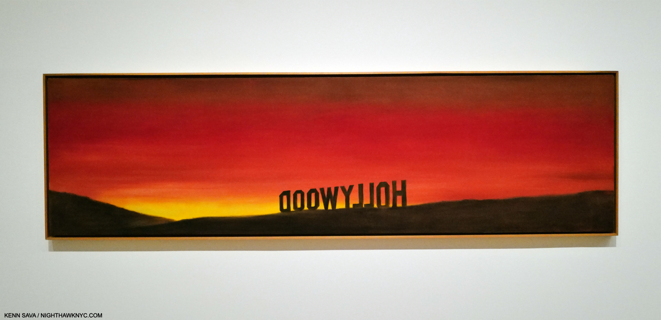
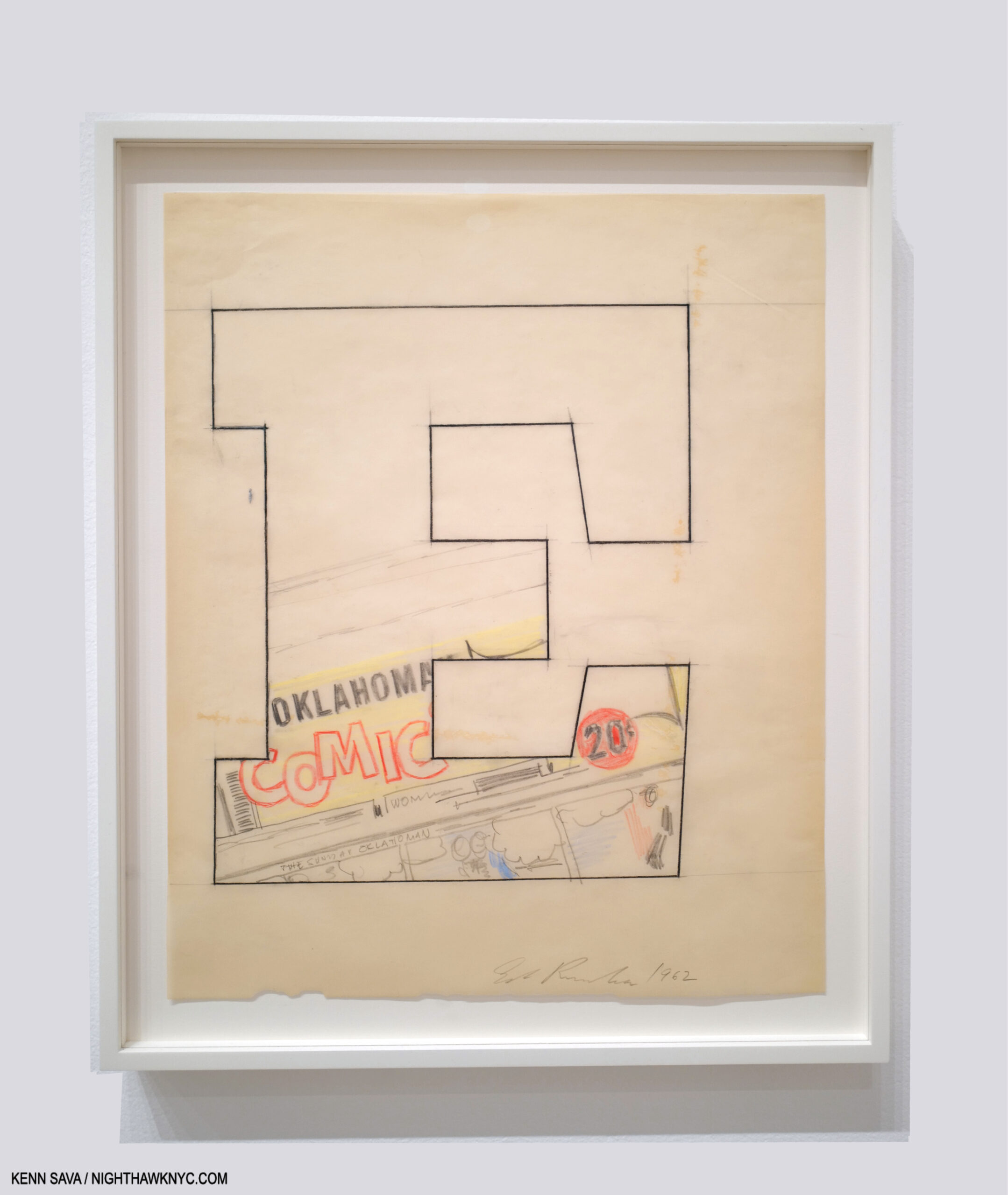
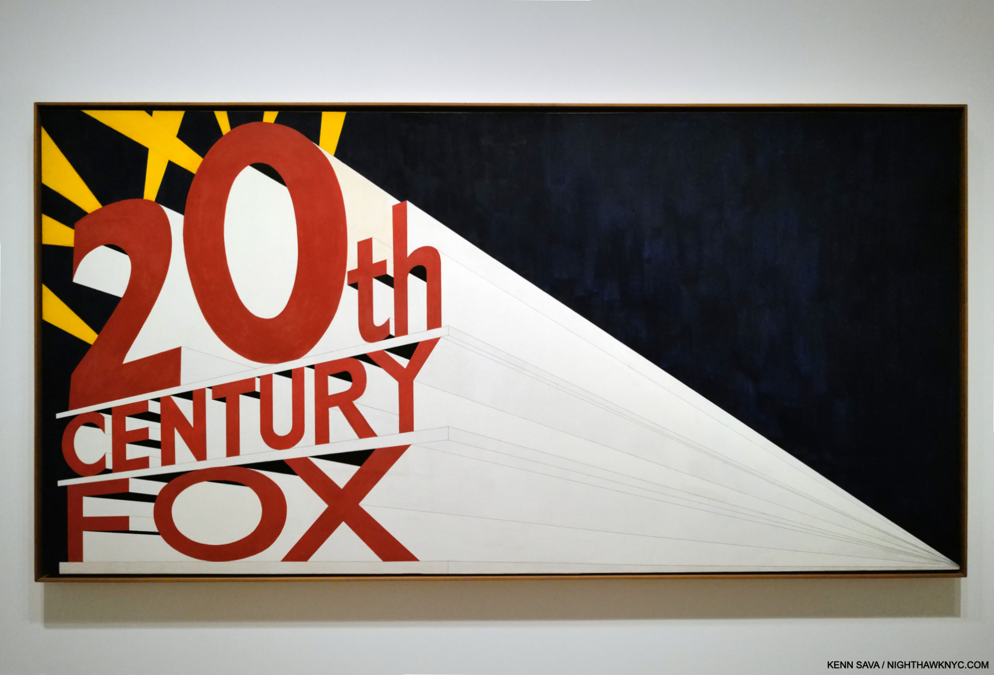
The Back of Hollywood, 1977, Oil on canvas. Was Ed Ruscha the first to Paint words backwards? Probably not.
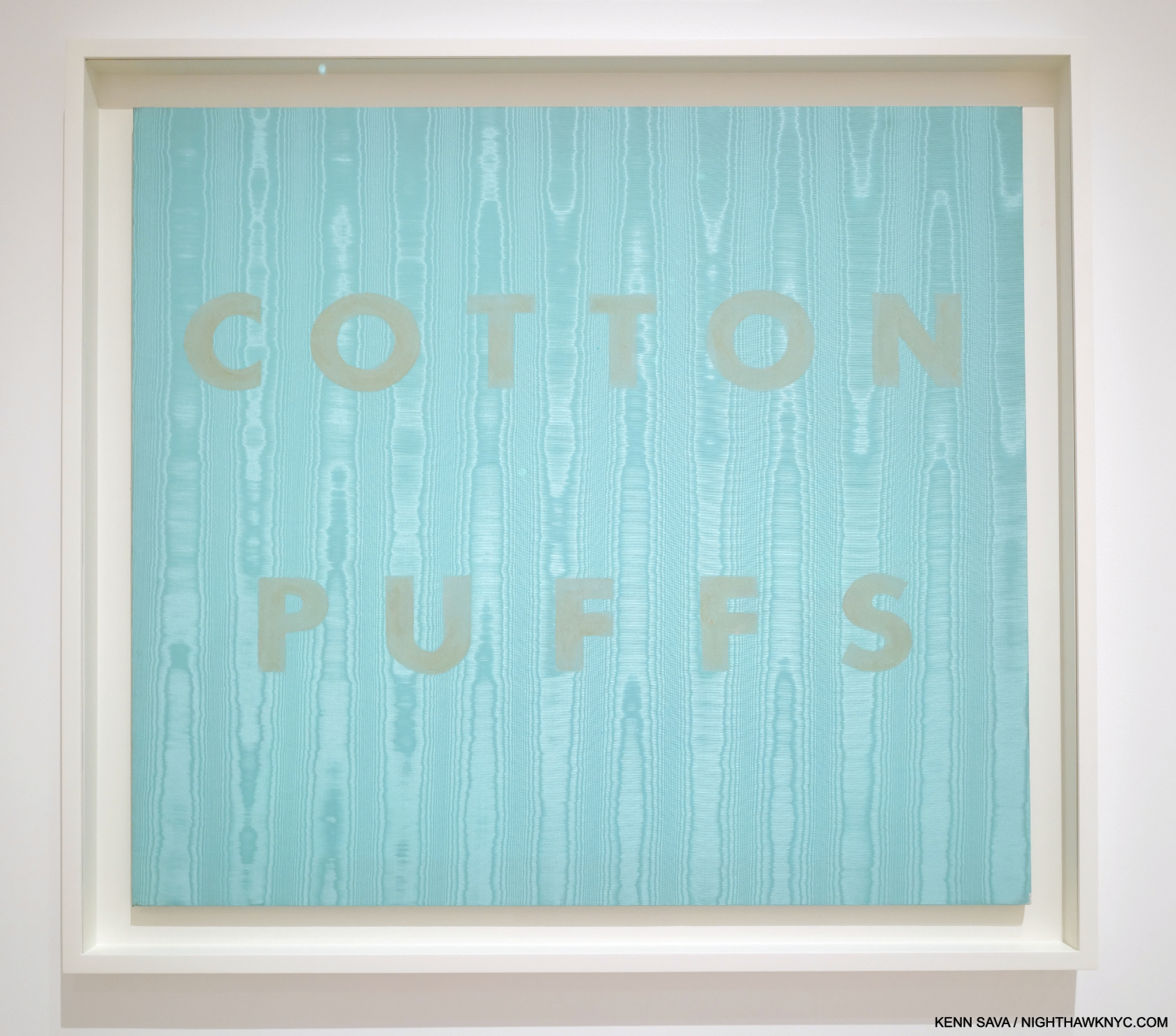
What about influences on his Word Painting? In After the Signal, he said, “Well, there’ve been so many artists who have used words throughout the centuries really, but the ones I enjoy are mostly from the twentieth century. Say, Kurt Schwitters. [. . .] 5” On page 115, Paul Karlstrom directly asks Mr. Ruscha, “Who were your heroes then, your role models?” He replied, “Well, I guess de Kooning was, and Franz Kline. Franz Kline had a lot to say at that particular time, and so they were more or less the passwords. You just emulated them, almost automatically. Then if you couldn’t emulate them you weren’t really on the right track. I still think that. But the work of Johns and Rauschenberg marked a departure in the sense that their work was premeditated.” It sounds like he was referring to his early days as a student under the Abstract Expressionist influenced Chouinard faculty in the late 1950s, as once again, it’s hard for me to see the influence of de Kooning or Kline in Ed Ruscha’s work.
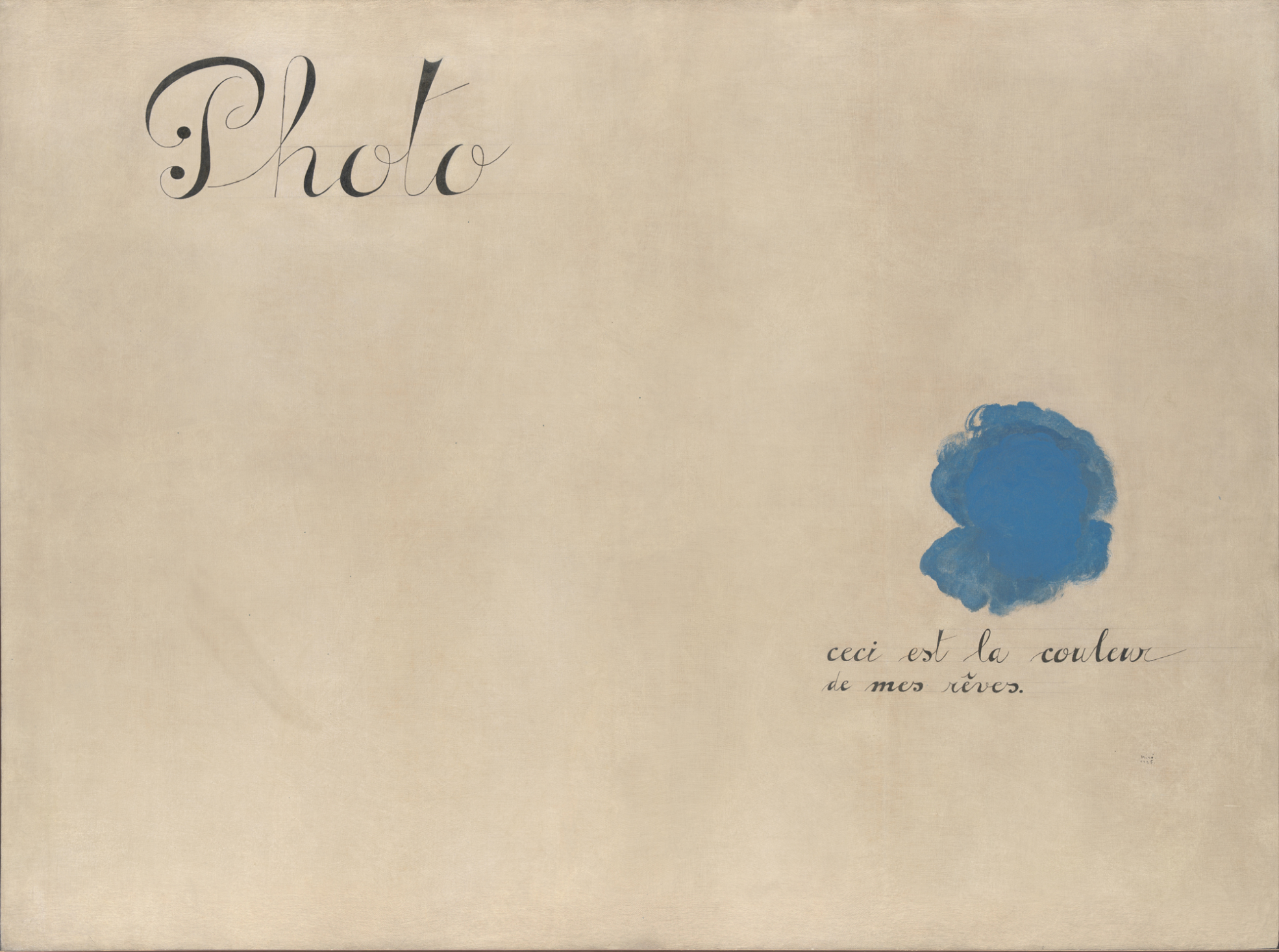
Joan Miró, Photo: This is the Color of My Dreams 1925, Oil on canvas. *- Met Museum Photo
The Surrealists began as a literary “movement,” that experimented with “automatic writing.” Later, their influence spread to Painting. In Miró’s Photo: This is the Color of My Dreams, it comes full circle. Part of the Artist’s “peinture-poésie” (painting-poetry) series, this strikes me as a forerunner or precursor to the Word Paintings of Ed Ruscha. Yet, I have no idea if he saw it, or other works in Mirós series, or when.
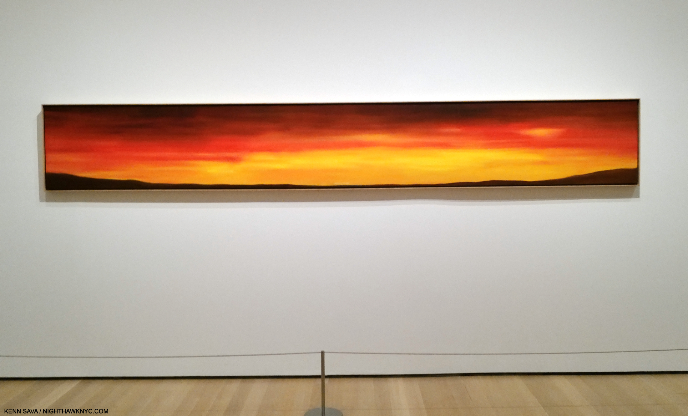
America’s Future, 1977, Oil on canvas. The title is shown in the next picture.
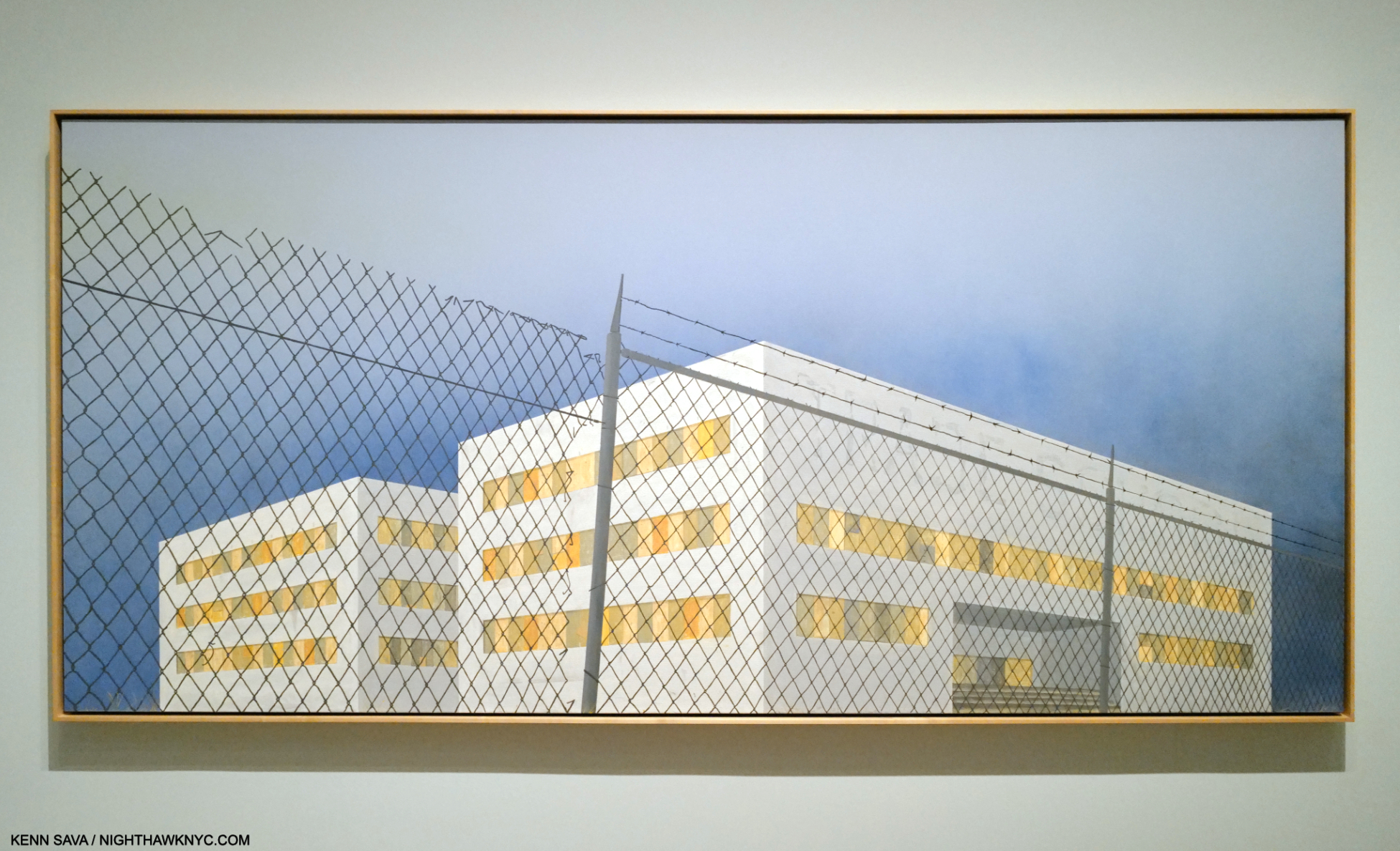
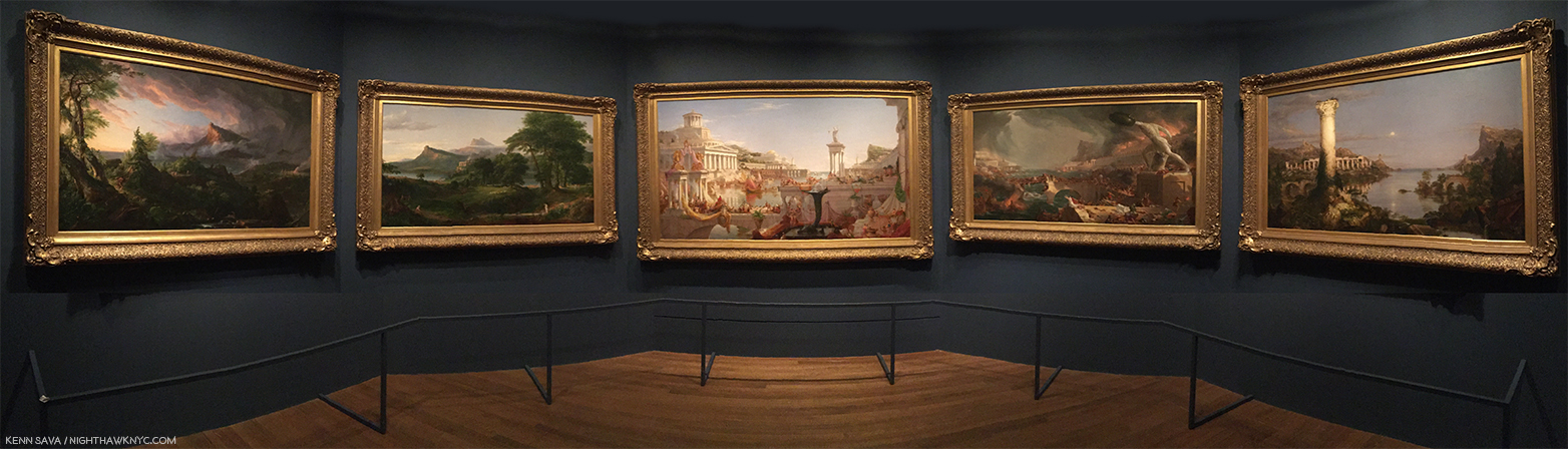
The feeling I’m left with is that these Artists “effected” him in ways outside of a direct visual influence. They are, what I call, “echoes.” What Ed Ruscha called “360 degree” influences. As for the stated influences, in Part 2, I mentioned that Thomas Cole was the influence on Mr. Ruscha’s Course of Empire series, from who he borrowed the name of the series. It seems to me the rest of his influences, if any, remain up for conjecture. Still, taking him at his work on possible influences would leave Ed Ruscha remarkably original.
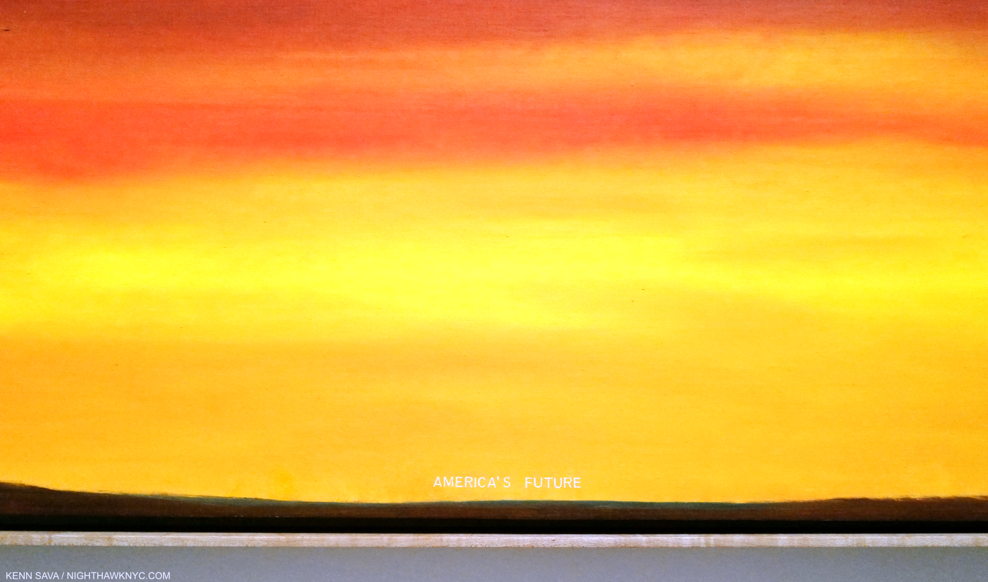
Detail. Though Painted 18 years before he began his Course of Empire series I showed in Part 2, seeing this made me wonder if this work should be appended to the end of the series, i.e. the final outcome of it.
2- Tails
Turning the influence coin over, however, 67 years, and counting, into one of the most remarkable careers in American Art history, at this moment in time it’s hard to think of another Modern & Contemporary Artist, let alone an American Artist, who is more influential than Ed Ruscha is. In fact, it’s impossible for me to list here all the realms in which his influence can be seen. Those that come to mind the quickest include-
-His role in furthering the breaking of the strangle hold of Abstract Expressionism in Painting in the early 1960s.
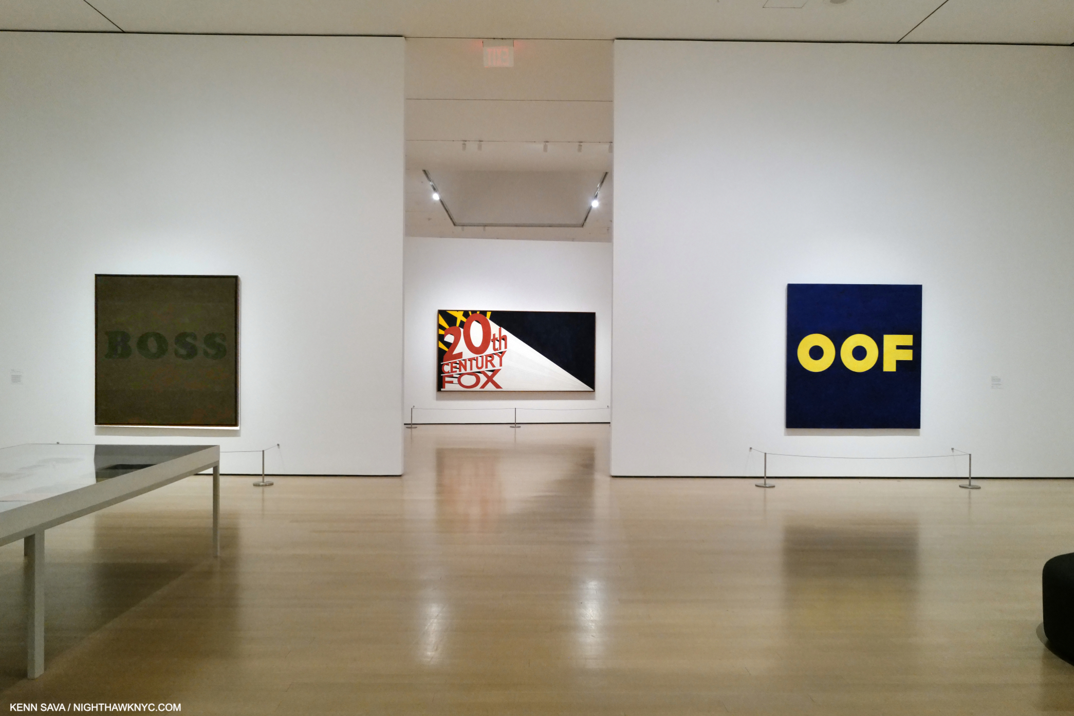
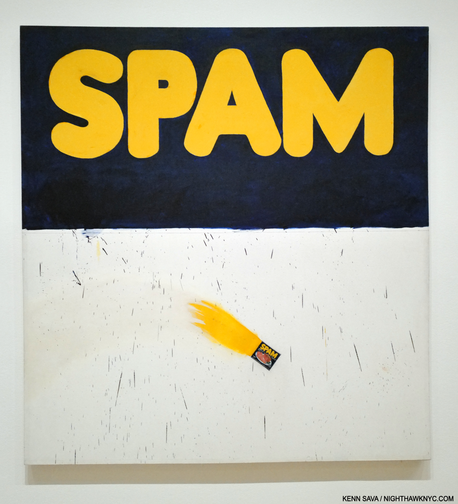
-His unique way of incorporating words and typography into his Art.
-His Paintings of L.A. and the American West6.
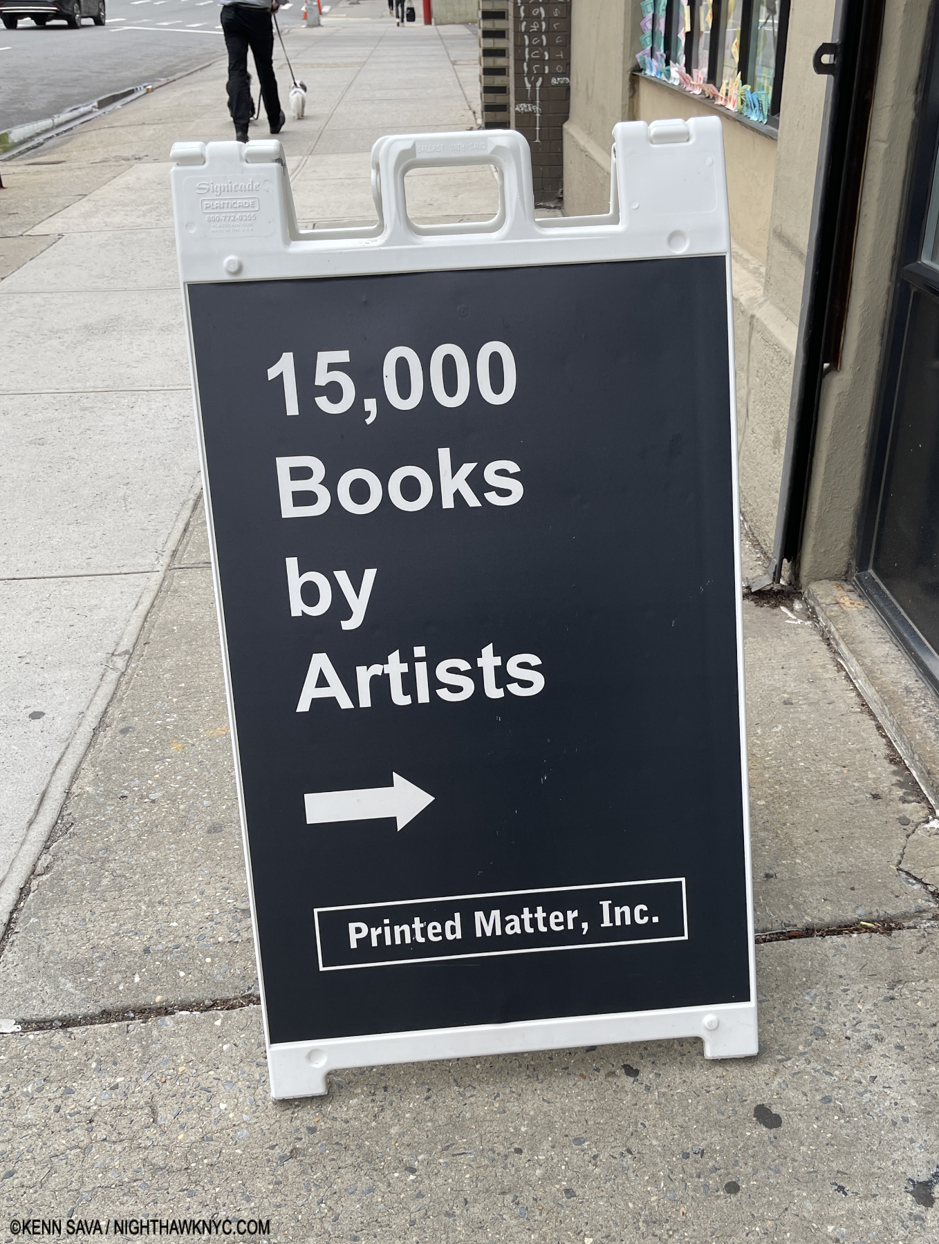
No place on the planet has more Artist’s books than NYC’s Printed Matter, home of 15 ,000 books they’ve created. How many are/were inspired in part or wholly by Ed Ruscha? I don’t know the total but I keep finding more every time I go in. May 6, 2024.
-His ground-breaking Artist’s books/PhotoBooks. (Is it a stretch to say he’s played a defining role in the Contemporary Artist’s Book & PhotoBook phenomenon? I don’t think so.)
-His style of nonjudgmental roadside and aerial Photography.
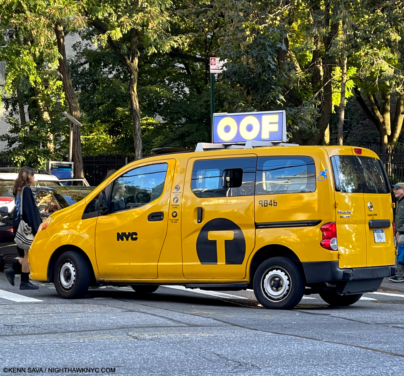
-Entire genres of Painting, Photography and books have sprung up around his work.
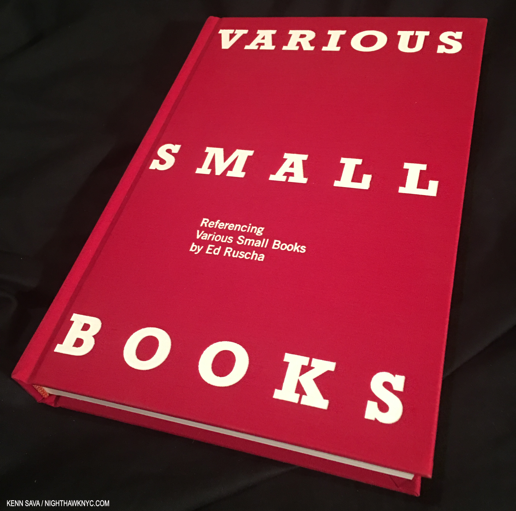
Jeff Brouws, Various Small Books Referencing Various Small Books by Ed Ruscha, 2013. 288 pages of books, and just books, by other Artists influenced by Ed Ruscha, and it’s now 11 years old!
To this point, at least two substantial books, including the book above, have been published focused solely on his influence! All of this is even more impressive (or mind-boggling) when you consider Ed Ruscha is still with us and going strong at 86. Usually, the influence of Artists is something referred to in the past tense.
-His unique way of incorporating words and typography into his Art.
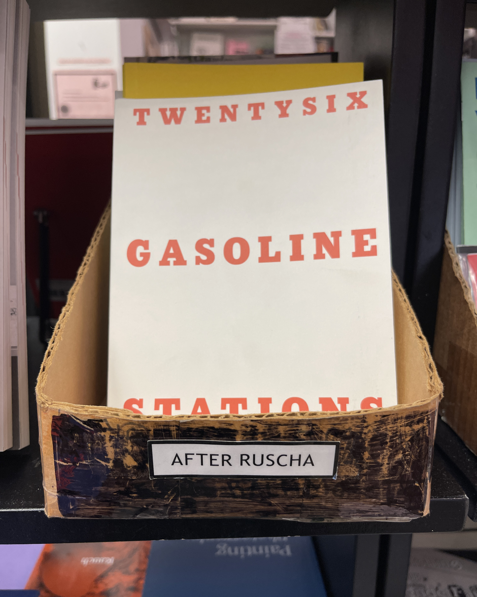
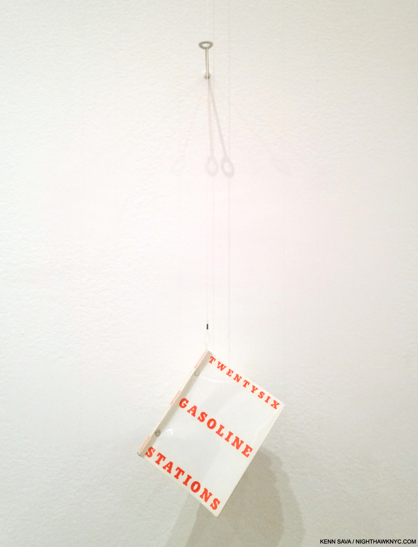
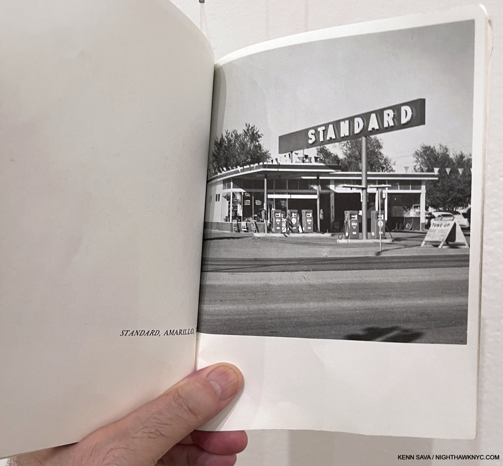
Ed Ruscha’s presence is so pronounced at Printed Matter, they even have a well-worn box just for books he’s influenced. ‘Nuff said. No, that’s not a copy of Mr. Ruscha’s very rare Twentysix Gasoline Stations. It’s Michalis Pincher’s 2009 homage to it, which “borrows” Ruscha’s cover verbatim.
All of this, also, makes it harder to fathom that Ed Ruscha/Now Then was the first large Ed Ruscha show here in 41 years7, and his first show at MoMA! That makes the extent of his influence that much more impressive. Suffice it to say it’s a lot easier to see Ed Ruscha’s influence than it might be to see the influence of others on his work.is so pronounced.
The saddest moment of the entire 4 month run of Ed Ruscha/ Now Then: the show’s entrance, moments after it closed for the last time on January 15, 2024. I saw it on its first preview day, and I was there when it closed for good. Shows are fugacious events. The ending of a great show is always sad; like saying “goodbye” to a friend. One you’ll never see again.
-Takeaways
In addition to providing an opportunity to ponder the scope of his influence, Now Then provides the chance to assess his achievement and his place among the important Artists of both the 20th and 21st centuries. Ed Ruscha strikes me as an Artist who is continually moving forward to the point that he is a seemingly endless innovator. Ed Ruscha/Now Then provided a rare chance to see the craft behind the mystery his work evokes; to watch the Artist move on an almost step-by-step basis from his beginnings though each of his phases, with a focus on his recurring themes and his innovations.
Yet, he’s also an Artist who’s extremely aware of his, and our, pasts, and his Art stays in touch with it often in surprising ways. Ed Ruscha has never stood still long enough to have any box his work gets put in fit for very long. The Ed Ruscha box is the only one that fits an Artist as extraordinarily diverse as Mr. Ruscha has been and continues to be. Ed Ruscha/Now Then is a show that will live long in memory, and no doubt, influence.
Part 1 of my look at Ed Ruscha/Now Then is here. Part 2 is here.
*- Soundtrack for this piece is “Goodnight My Love,” as performed by Paul Anna. In 2017, MOCA commissioned a short documentary on two themes in Ed Ruscha’s work (the text of which is here). In the resulting piece, Ed Ruscha says, “I’m gonna play this tune called ‘Goodnight My Love’ and this represents everrything I felt about California when I first came out here…” Because he doesn’t specify which recording he’s going to play, I chose the Paul Anka version from 1969.
NighthawkNYC.com has been entirely self-funded & ad-free for 9 years, during which 330 full-length pieces have been published! If you’ve found it worthwhile, PLEASE donate by PayPal below to allow me to continue. Thank you, Kenn.
You can also support it by buying Art, Art & Photography books, and Music from my collection! Art & Books may be found here. Music here and here.
Written & photographed by Kenn Sava for nighthawknyc.com unless otherwise credited. To send comments, thoughts, feedback or propositions click here. Click the white box on the upper right for the archives or to search them. Subscribe to be notified of new Posts below. Your information will be used for no other purpose.
For “short takes,” my ongoing “Visual Diary” series, and outtakes from my pieces, be sure to follow @nighthawk_nyc on Instagram!
- Alexandra Schwartz, Ed Ruscha’s Los Angeles, P.15 ↩
- I cannot think of Rene Magritte without thinking of the singular Photographer, Duane Michals. When I met him, I quickly shifted the chat from Photography to Painting. He rightly gloated over the fact that he had met and Photographed his three favorite Painters- Balthus, Giorgio de Chirico, and Rene Magritte, with who he did a terrific PhotoBook, that he graciously signed for me. All three are under-appreciated in my book, and remain among my favorites, too. ↩
- In spite of being among the best known, in my view, Dalí may be the most under-appreciated Artist of the 20th century, as anyone who saw the incredible Salvador Dalí Centennial Exhibition at the Philadelphia Museum in 2005 knows. It’s partially his own fault, as the endless fantastic stunts he put on overshadows the appreciation of his Art in my opinion. History will eventually fix that, I believe. ↩
- Alexandra Schwartz, P.35 ↩
- Ed Ruscha, Leave Any Information After the Signal, P. 324 ↩
- Along with those of, and quite different from,Georgia O’Keeffe. ↩
- As I mentioned in Part 1, the last big Ed Ruscha show here was the traveling retrospective, The Works of Ed Ruscha, which came to the Whitney Museum in 1982! ↩