Winterlude: Ai Weiwei’s “Good Fences Make Good Neighbors”

Written & Photographed by Kenn Sava.

Outdoor public Art in the winter anyone? In February, 2005, Christo & Jeanne Claude presented “The Gates” in Central Park, which combined the 24/7/365 beauty of the Park with a unique vision featuring a gorgeous use of the color saffron. It drew millions of visitors in the dead of winter, and I spent three solid weeks in the Park pondering and documenting it in daylight, at night, in rain and in snow, eventually seeing all of it’s 26 miles. I met the Artists before the show, which consummated a 25 year labor of love, opened, and I was there as they watched the final sunset from a hill in the Park on it’s closing night. Now, 12 years later, another visionary Artist, Ai Weiwei, has chosen the winter for another huge show, this one so big it’s spread out over all 5 of NYC’s boroughs. Luckily, this time, I had 4 months to see it.

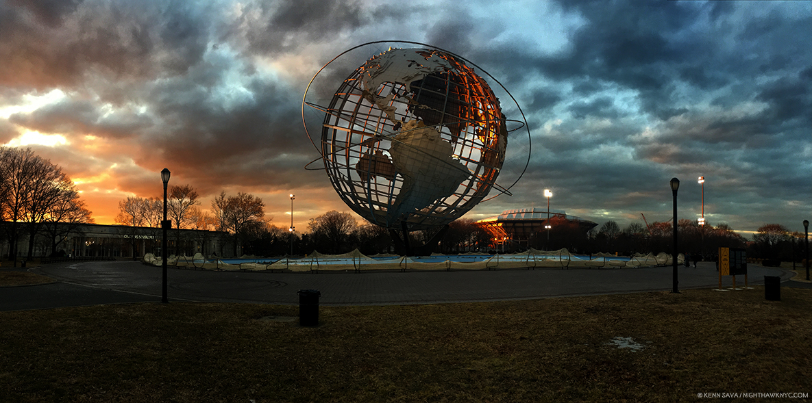
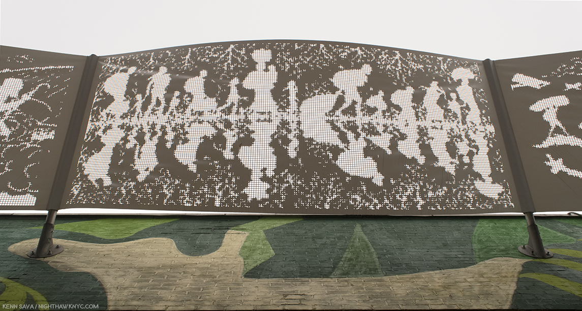
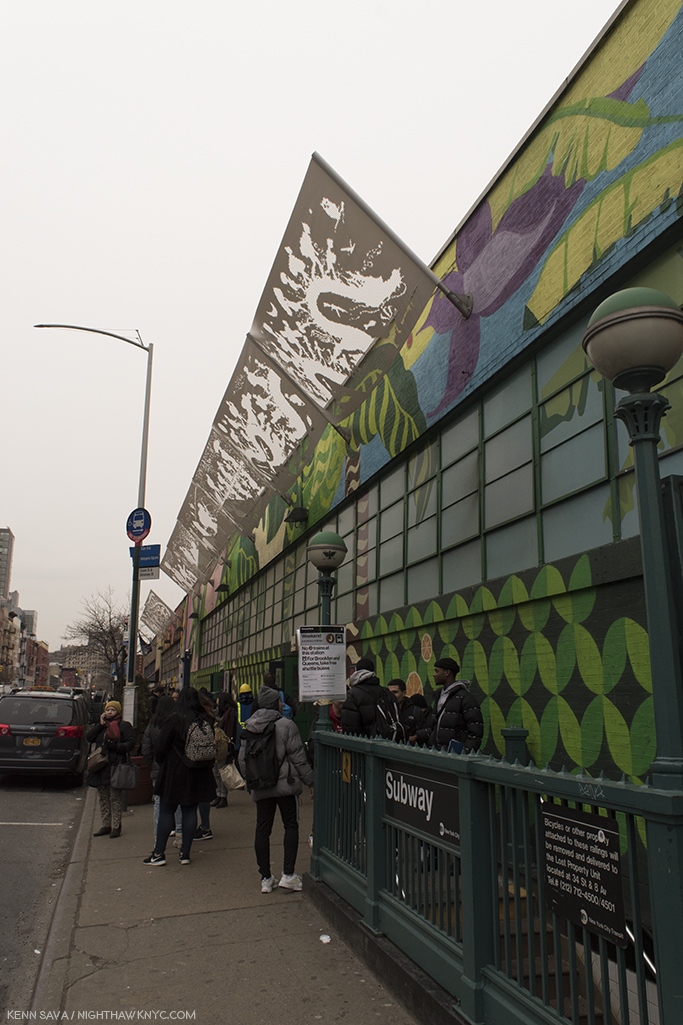
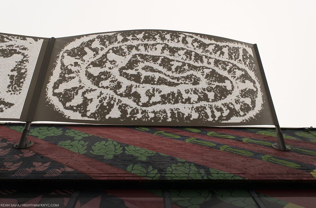
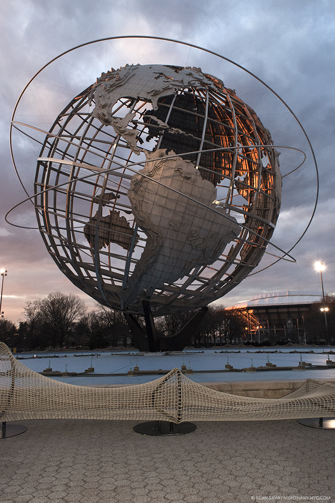
“Circle Fence,” “The Hemisphere,” Flushing Meadows, Queens, “The Hemisphere,” built for the 1964 World’s Fair, “as an aspirational image of global unity at the height of the Cold War. During our own period of increasing nationalism and anti-immigrant sentiment, Ai draws renewed attention to its symbolism. His 1,000 foot long Circle Fence uses a series of metal frames with interconnected netting to surround the site, creating a global border that can be seen as both playful and sobering.” Click any Photo for full size.

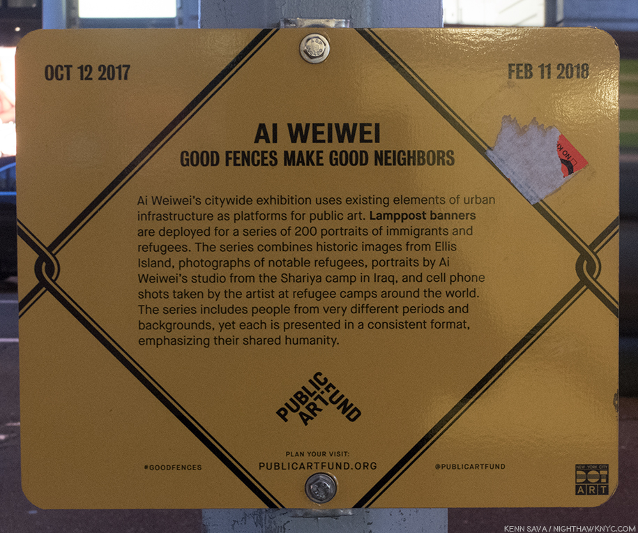
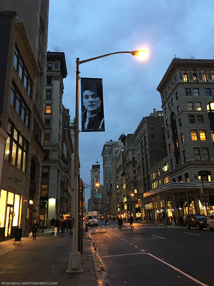
February has also become a special month for me, the month I celebrate being “reborn.” Last February, I marked the 10th Anniversary with my first “Winterlude” Post, “Remembering ‘The Gates'” in a series of Photos I took on the High Line, where the “Art show” mother nature put on was evocative of the saffron of “The Gates.” The other reason I chose it was it was a look at life in hibernation, on it’s way to being reborn. This year, I’ve chosen to take a meditative look at Ai Weiwei’s show for the Public Art Fund, “Good Fences Make Good Neighbors,” the largest NYC outdoor Art show of 2017, which ended on February 11th, exactly 4 months after it opened. Numbering over 300 pieces, divided into “Structures” (numbering 8), “Bus Shelters” (10), “Ad Platforms” (over 100), and “Lamppost Banners,” (200), they were spread over all five boroughs. I made it to Queens(!), above, but I wound up spending the 4 months focusing on seeing as many of the Manhattan works as I could.

I’ve decided to let the resulting Photos, and the words of the Public Art Fund website, do most of the talking. So, please note- All quotations in the captions to the Photos are from the Public Art Fund.

About the show, they said-

“Ai Weiwei conceived this multi-site, multi-media exhibition for public spaces, monuments, buildings, transportation sites, and advertising platforms throughout New York City. Collectively, these elements comprise a passionate response to the global migration crisis and a reflection on the profound social and political impulse to divide people from each other. For Ai, these themes have deep roots. He experienced exile with his family as a child, life as an immigrant and art student in New York, and more recently, brutal repression as an artist and activist in China….“Good fences make good neighbors” is a folksy proverb cited in American poet Robert Frost’s Mending Wall, where the need for a boundary wall is being questioned. Ai chose this title with an ironic smile and a keen sense of how populist notions often stir up fear and prejudice.”

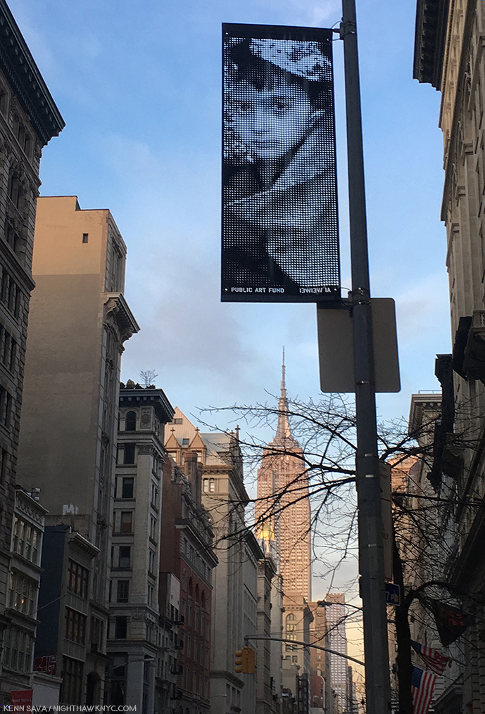
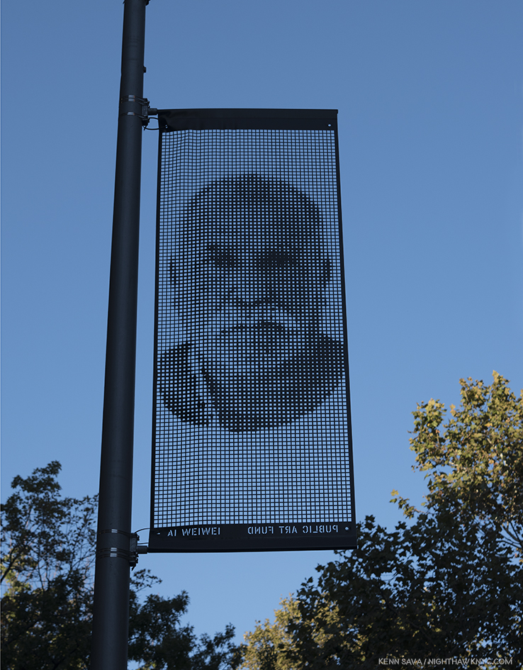
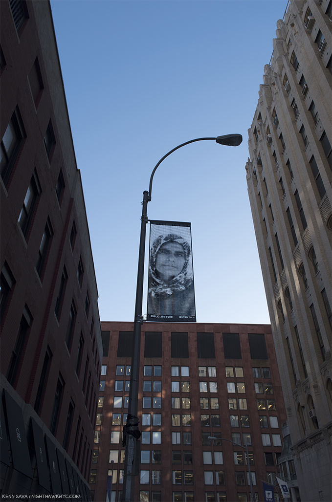
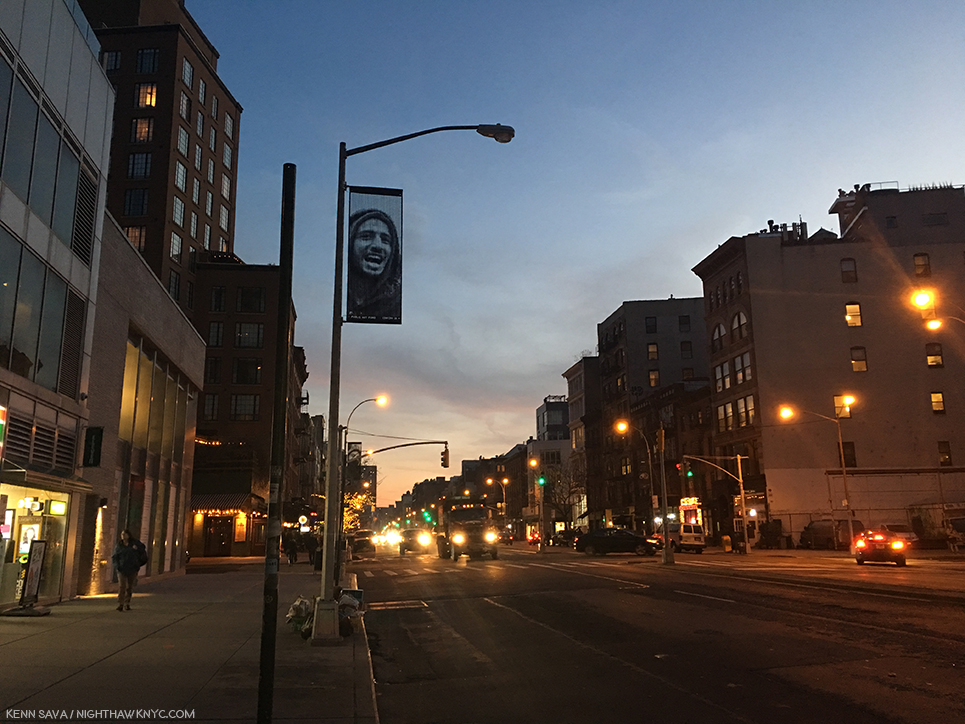
Lamppost Banner 136, 5th Avenue btw West 17 & 18th Streets. “This portrait depicts a refugee on the island of Lesvos, Greece, which has served as the entry point into Europe for hundreds of thousands of refugees fleeing Afghanistan, Iraq, Pakistan, Senegal, Syria, Somalia, Cameroon and elsewhere. Nearly all have attempted to reach Lesvos by crossing the narrow strait that separates the island from Turkey in overcrowded boats often without lifejackets or with defective ones. Hundreds of migrants, including many children, have drowned while making this perilous journey.” All quotes in these captions are from the Public Art Fund.

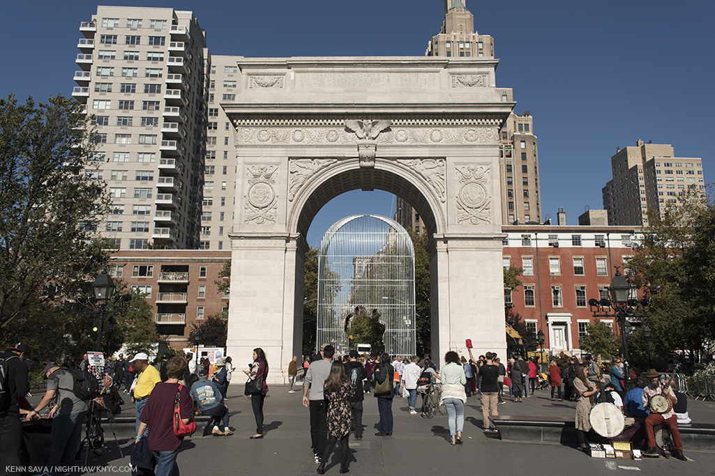
“Arch,” Washington Square Park, Washington Square North & 5th Avenue. “Ai opens a passageway through its center in the silhouette of two figures. Their outline takes its form from Marcel Duchamp’s 1937 Door for Gradiva, created to frame the entrance to Andre Breton’s art gallery in Paris. This is fitting to the immigrant conceptual Artist since Duchamp used to play chess in Washington Square Park, and once notoriously made his way to the top of the park’s arch with a group of other bohemian Poets and Artists. There, they spread out blankets, hung Chinese lanterns, tied red balloons to the arch’s parapet, declaring it the “Free and Independent Republic of Washington Square…It is also a fitting tribute to the figure who has had an enormous impact on many immigrant Artists in the years since, who have in turn made New York the hub of world culture that it is today.”

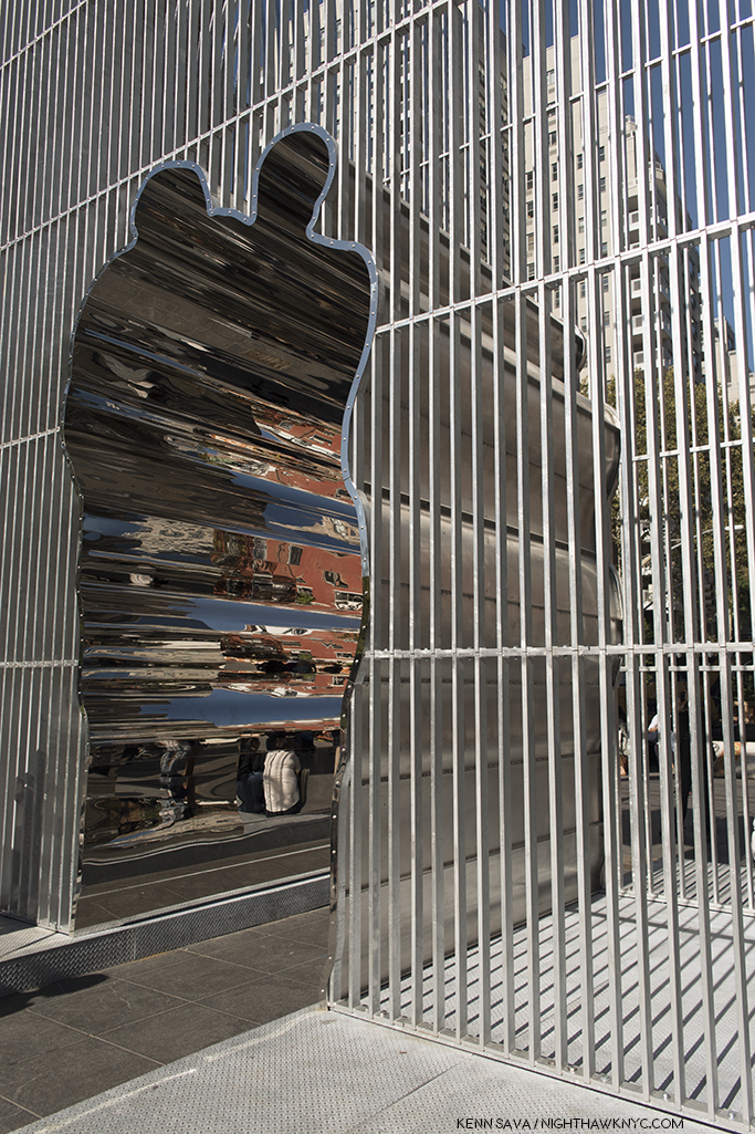
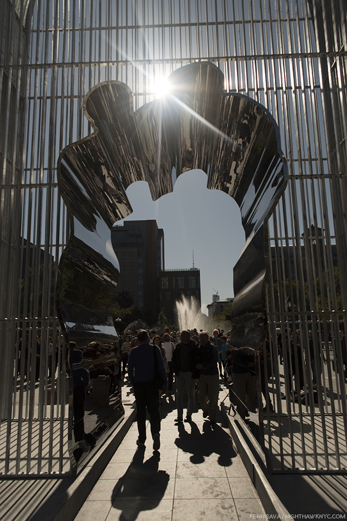
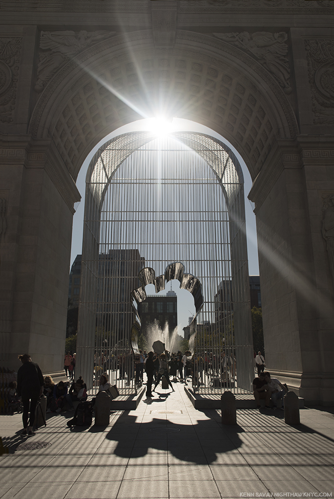
“Ai often visited Washington Square Park when he lived nearby in the 1980’s, drawn to its vitality as a hub for creative and political expression. His 27 foot tall steel cage echoes the iconic form of the marble arch, which commemorates George Washington leading the nation toward democracy. While seeming to create an obstruction, Ai opens a passageway through its center…”

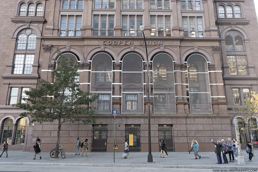
“Five Fences,” Cooper Union, 7 East 7th Street. “The five arch-filling security fences…do not disrupt or confine the customary use of the portico. Yet, they do form a new physical- and metaphorical- barrier. ‘Five Fences’ suggests that the logic of social division is often opportunistic and incremental, emerging from and adapting itself to existing conditions.”

Banner 70. Sullivan St btw West 3rd & Washington Sq. “Ai created this portrait from an image taken during one of the artist’s team’s visits to the Shariya Camp in Iraq, where displaced Christian, Yezidi, Shia’ Turcomen, Arab and Shabak ethnic minority communities and religious groups have been forced to flee after being targeted by ISIS.”

Banner 58, Washington Place btw Washington Sq West & 6th Avenue.”This banner depicts Tina Modotti (1896-1942 b.Udine, Italy), the Photographer, model, actress and revolutionary who immigrated to the United States as a teenager from Italy. She moved to Mexico with her partner Edward Weston to join the Artistic community of Mexico City around Frida Kahlo and Diego Rivera. Photographer: Edward Weston”

Banner 81, MacDougal St btw Washington Sq N and West 8th Street. “Ai created this portrait from an image taken during one of the artist’s team’s visits to the Shariya Camp in Iraq, where displaced Christian, Yezidi, Shia’ Turcomen, Arab and Shabak ethnic minority communities and religious groups have been forced to flee after being targeted by ISIS.”

Banner 194, West 3rd St btw LaGuardia & Mercer Sts. “This portrait depicts a refugee from the Gaza Strip, home to a population of approximately 1.9 million people, including 1.3 Palestine refugees.”

Banner 104, Greene St btw West 4th & Washington. “Ai created this portrait from an image taken during one of the Artist’s team’s visits to the Shariya Camp in Iraq, where displaced Christian, Yezidi, Shi’a, Turcomen, Arab, and Shabak ethnic minority communities and religious groups have been forced to flee after being targeted by ISIS.”

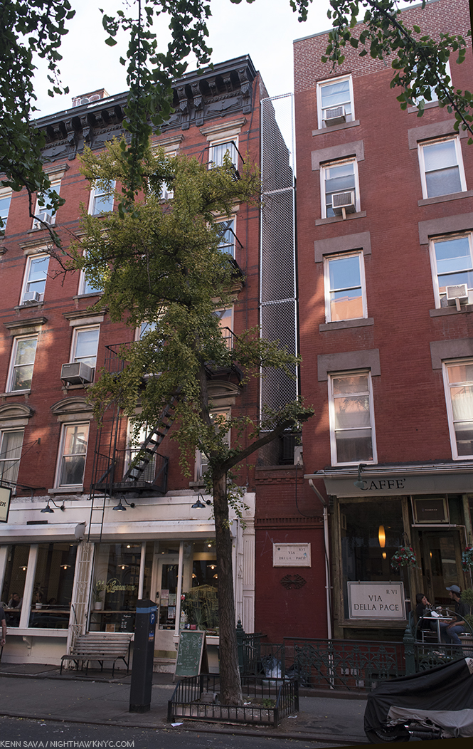
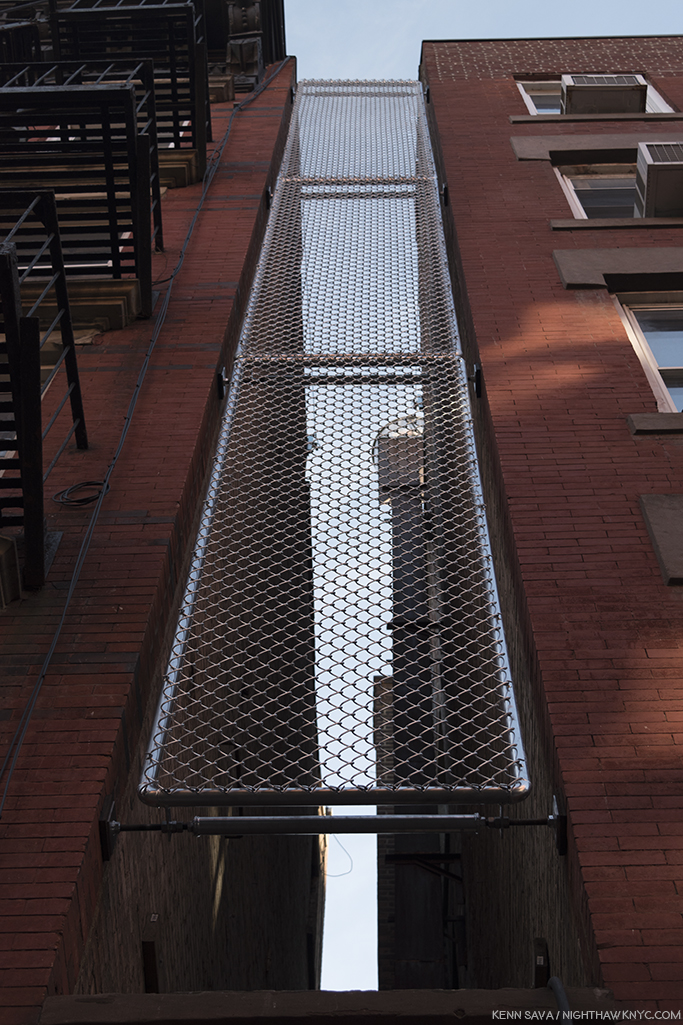
“7th Street Fence,” 48 East 7th Street.”Since the 19th century, successive waves of immigrants have settled on the Lower East Side. Many who landed at Ellis Island made it there home.”

Banner 43, 5th Avenue btw East 18th & 19th Streets. “This banner depicts Marc Chagall (1887-1985, b.Liozana, Belarus), a Jewish-Russian Artist famed for integrating folk culture into his Art, who first emigrated to France to escape the Soviet Union and then in 1941 fled Nazi occupied France to the United States. Photograph by Pierre Choumoff, 1920.”

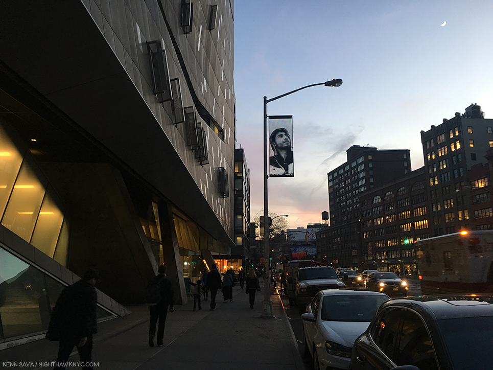
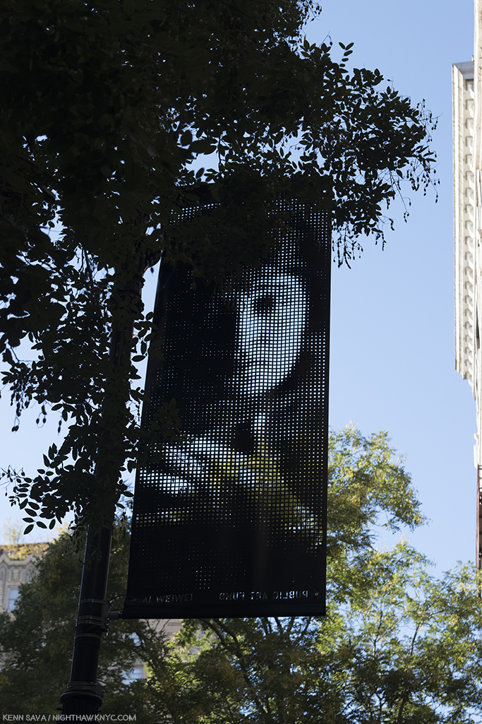
Banner 145, 3rd Avenue btw East 6th & 7th Street. “This portrait depicts a refugee on the island of Lesvos, Greece, which has served as the entry point into Europe for hundreds of thousands of refugees fleeing Afghanistan, Iraq, Pakistan, Senegal, Syria, Somalia, Cameroon , and elsewhere. Nearly all have attempted to reach Lesvos by crossing the narrow strait that separates the island from Turkey in overcrowded boats, often without life jackets…Hundreds of migrants, including many children, have drowned while making this perilous journey.” Before anyone asks…yes, the moon was really there.

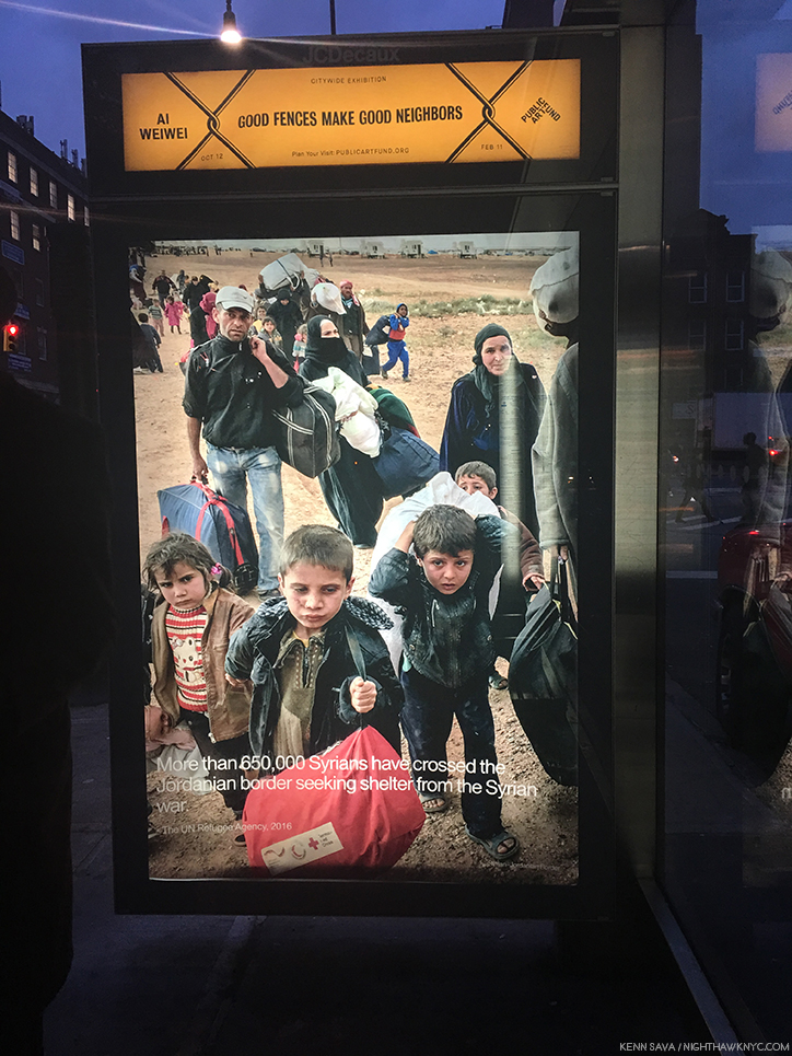
Good Neighbors 76, 14th Street & 1st Avenue. “Location- Syrian-Jordanian Border. The Artist has co-opted spaces city-wide that are generally reserved for advertising on bus shelters…Here, he displays the new Photographic series Good Neighbors, taken during his visits to refugee camps and national borders, where fences are used to divide people and define them as different. These striking images are paired with related information from prominent humanitarian organizations, poetic excepts from writing about these issues, or quotations by the Artist to call our attention to the plight and humanity of the millions of displaced people across the planet.”

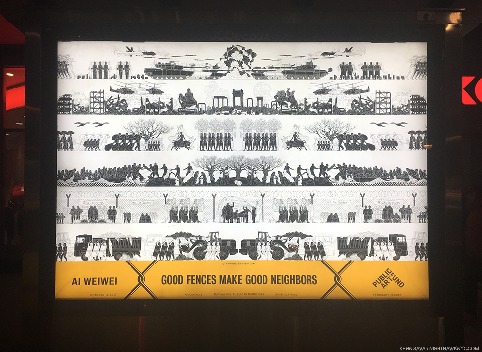
Odyssey 3, 14th Street at University Place. “Here, he displays an illustrated Greek-style frieze depicting the many forms of the contemporary global refugee crisis. In a mash-up of historical references, its stylized imagery evokes black-figure vase painting, Ancient Egyptian symbolism, classical Chinese motifs, and Ai’s own iconic imagery to represent a contemporary epic of war, ruins, perilous migration journeys, sea crossings, refugee camps with restrictive fencing, and protest demonstrations. Its compelling imagery highlights the struggle and stark conditions that millions of people worldwide face as they are uprooted and forced to flee their homes.” This work is an excerpt of the wallpaper for Ai Weiwei’s 2016 “Roots and Branches,” show at Lisson Gallery, as can be seen here.

Banner 169, East 18th Street & Broadway. “Location: Nizip Camp, Gaziantep, Turkey”

Banner 149, Bowery btw East 3rd & 4th Streets. “This portrait depicts a refugee from the Idomeni makeshift camp on the Greek-Macedonian border, which was Greece’s largest unofficial camp….the camp was populated by more that 14,000 refugees at its peak. In late May, 2016, the camp was evacuated and the refugees were relocated to other camps.”

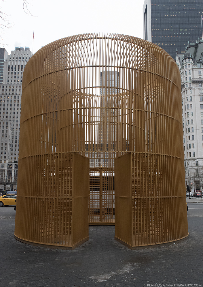
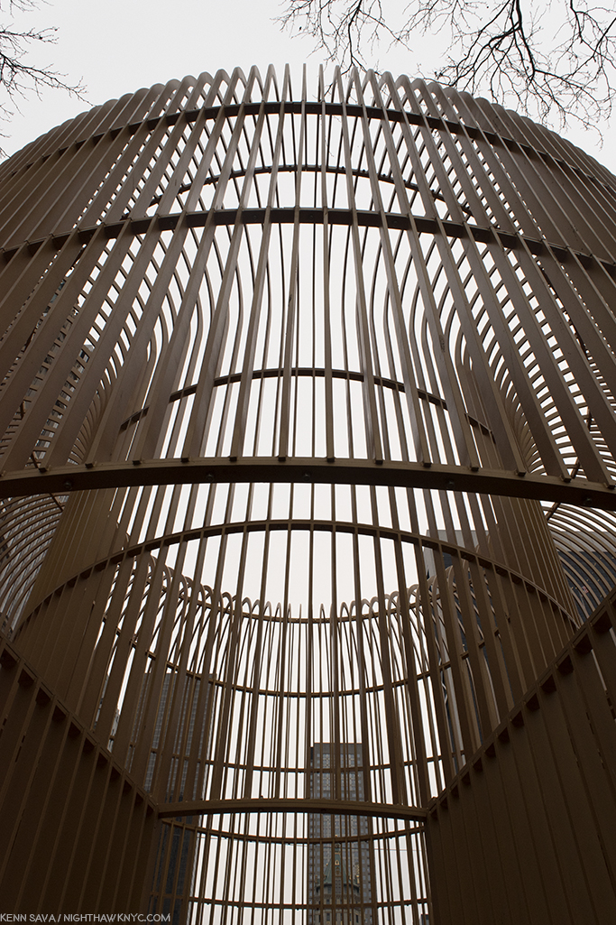
“Gilded Cage,” 60th Street & 5th Avenue. “For the entrance to Central Park, Ai has created a giant gilded cage that simultaneously evokes the luxury of Fifth Avenue and the privations of confinement. Visitors are able to enter its central space, which is surrounded by bars and turnstiles. Function as a structure of both control and display, the work reveals the complex power dynamics of repressive architecture.”

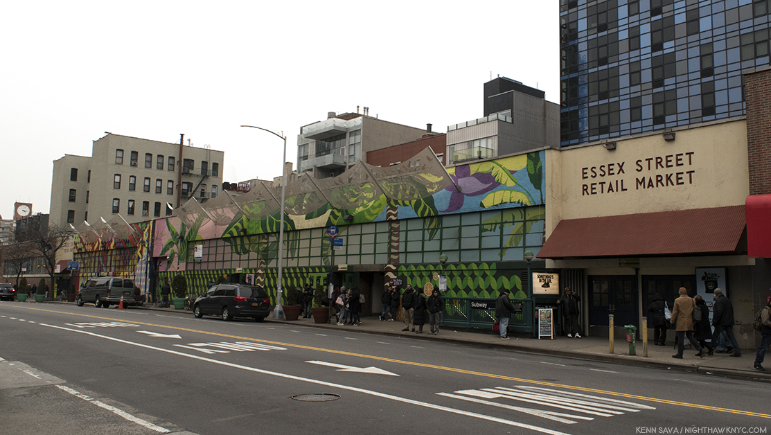
“Exodus,” Essex Street Market, 120 Essex Street. “Spanning the flagpoles of Essex Street Market, ‘Exodus’ is a narrative series of banners depicting the flight of refugees. They are depicted escaping warfare and devastation, carrying what they can over vast distances…Since the 19th century, successive waves of immigrants have settled on the Lower East Side. Many who landed at Ellis Island made it there home.”


In addition to the portraits I’ve shown here, the following well-known persons had Lamppost Banner portraits included in the show. The number in parenthesis is their Banner Number, which you can see, and get more information about, on the show’s interactive map

Bela Bartok (Hungarian Composer who fled the Nazis to NYC) (39)
Josephine Baker (38), who emigrated to Paris at 19
Nina Simone (64)
Arnold Schoenberg (63)
Max Born (40)
Robert Capa (42)
Frederic Chopin (44)
Joseph Conrad (45)
His Holiness, The 14th Dalai Lama (46)
Marlene Dietrich (47)
Albert Einstein (48)
Anne Frank (49)
Sigmund Freud (50)
Walter Gropius (52)
Victor Hugo (53)
Wassily Kandinsky (54)
Andre Kertesz (55)
Thomas Mann (56)
Karl Marx (57)
Laszlo Moholy-Nagy (59)
Piet Mondrian (60)
Pablo Neruda (61)
Leon Trotsky (66)
Elie Wiesel (67)
Billy Wilder (68)

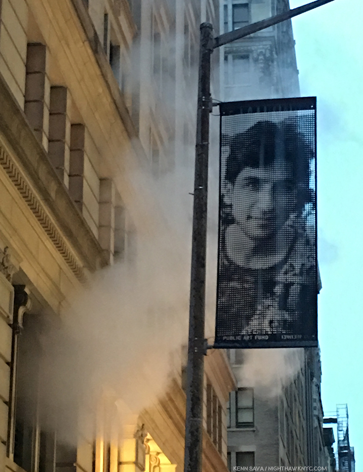
One former refugee who’s portrait is conspicuous by it’s absence is Ai Weiwei’s, who grew up in exile after Mao Zedong banished his father, the Poet Ai Qing, a former friend and close ally, to exile. (More on that here.) But, Ai has not forgotten his father, or his horrible experience as a refugee in his own country, beginning 6 months after Ai Weiwei was born. I made a special pilgrimage on a rainy, freezing day just to see this one lamppost, with Ai Qing’s Banner, near Avenue C in the far East Village, a neighborhood where Ai Weiwei lived for 10 years as an immigrant. The weather was somehow fitting.

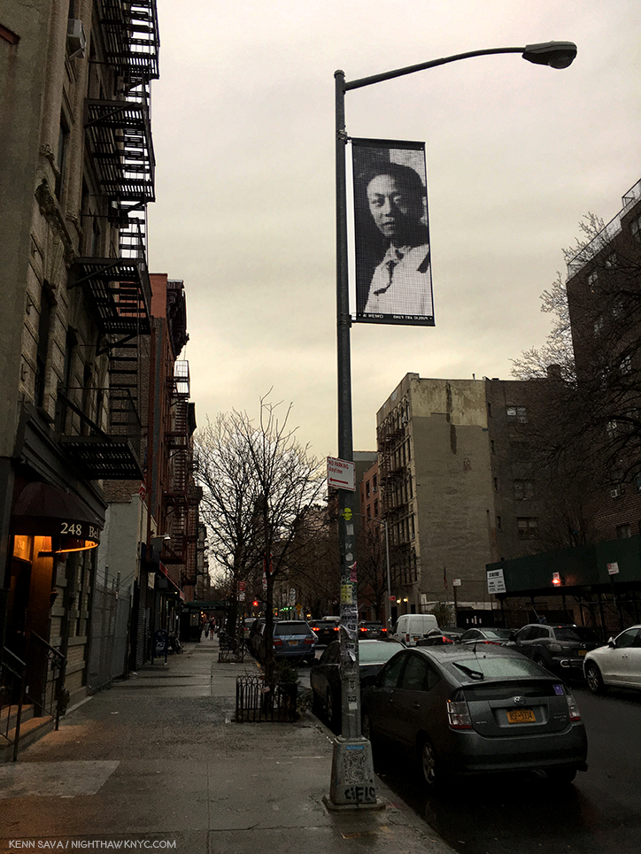
Banner 69, East 3rd Street btw Avenue B & Avenue C. “The banner depicts Ai Qing (1910-1996, b. Jiang Zhenghan), one fo the foremost Chinese modernist poets who was exiled with his family (including his son, Ai Weiwei) to Shihezi, Zinjiang Province, in northwestern China. During the Cultural Revolution (1966-76), Ai Qing was forced to undertake hard labor and made to clean public toilets.”

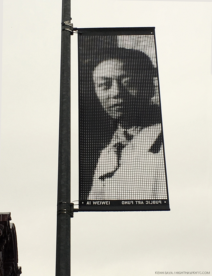
Ai Weiwei’s father, Ai Qing. “Photographer: Unknown, Date: 1929”

“And I
-Lying on the river of time,
The waves of bitterness
Have for several times swallowed and involved me-
Vagrancy and imprisonment
Have deprived me
Of my best days of my youth,
My life, too
Wan and sallow
As your lives.”
from “Snow Falling on China’s Land,” by Ai Qing (original Chinese & English translation, here)

Fittingly, Ai Weiwei has chosen to install his father’s portrait on the nearest lamppost to NYC’s legendary Nuyorican Poets Cafe.

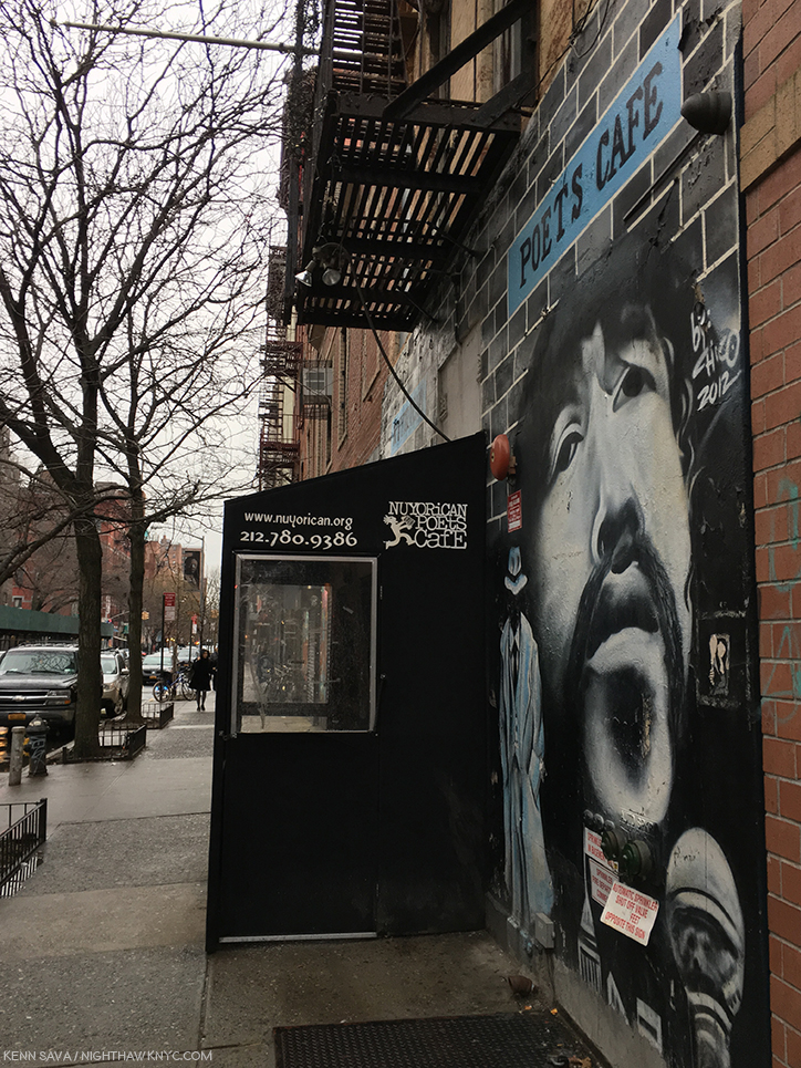
Ai Qing, down the street about 200 feet, looks out on the Nuyorican Poets Cafe, a cultural landmark in the East Village since 1973. One of the last remaining bastions of cutting edge creativity left from the days when Ai Weiwei lived in the area.

*- Soundtrack for this Post is “Don’t Fence Me In,” by Cole Porter and performed here by David Byrne-

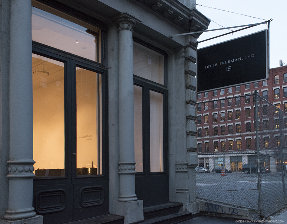
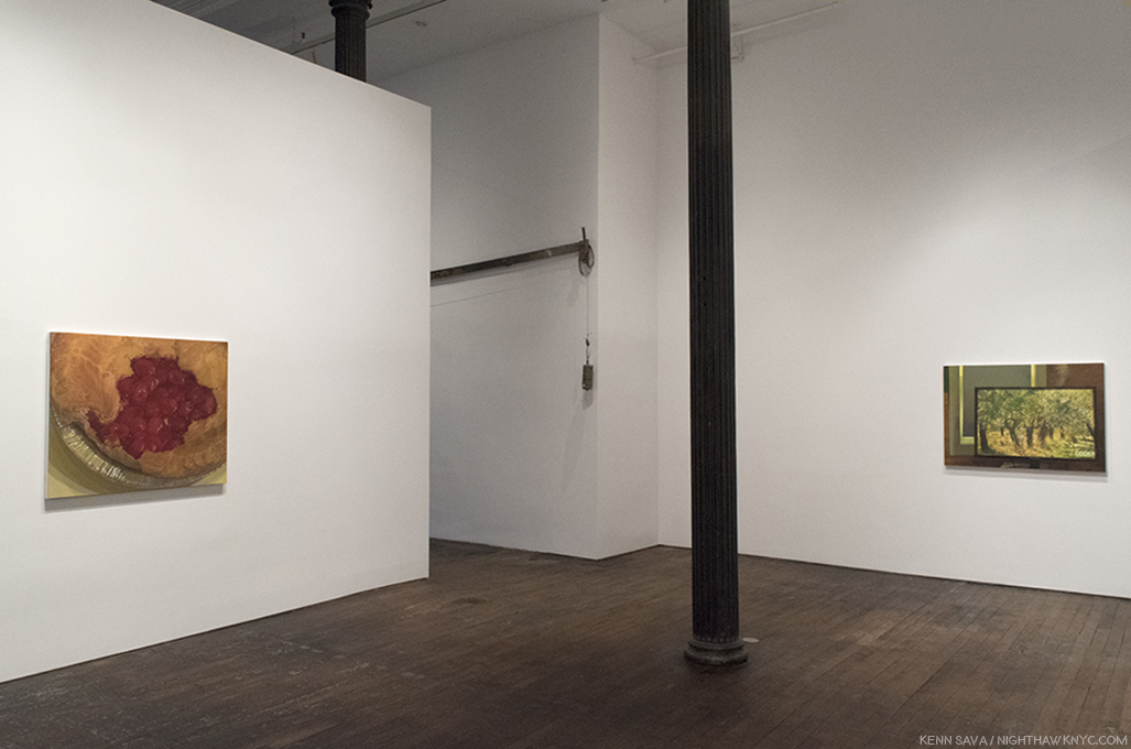
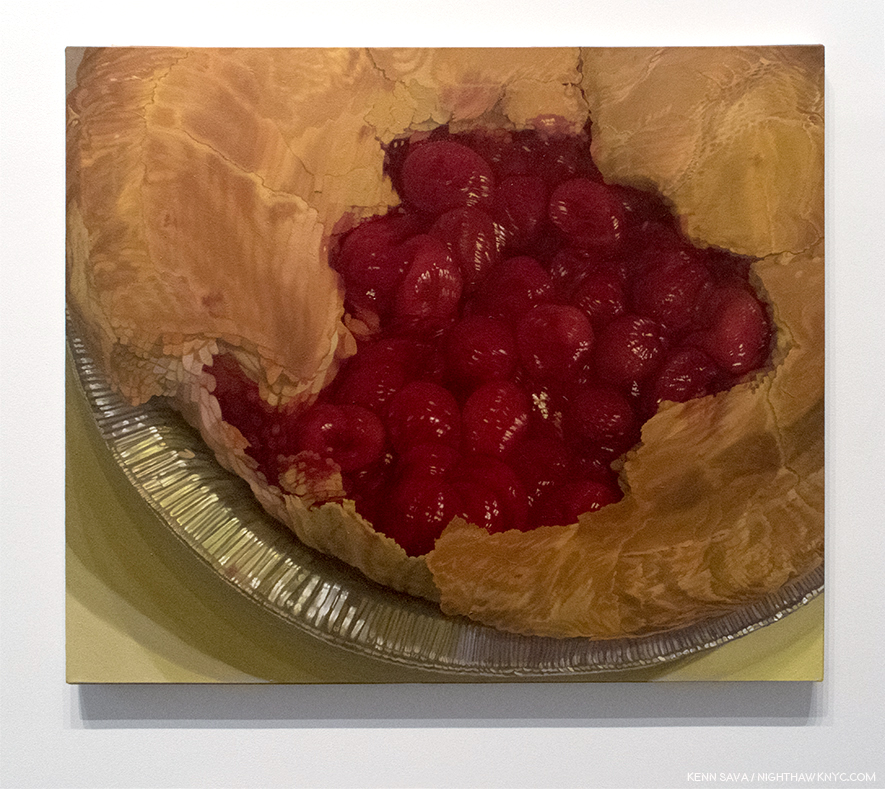
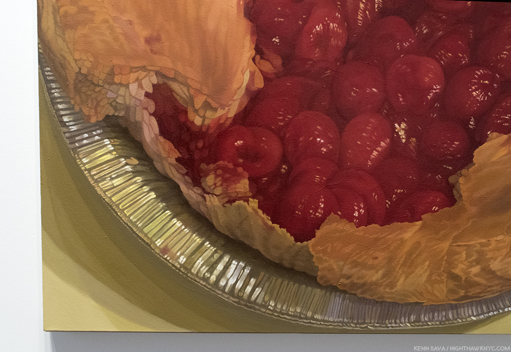
Ai Weiwei’s “Good Fences Make Good Neighbors” is my NoteWorthy show for January. 

My previous Posts on Ai Weiwei may be found here.

NighthawkNYC.com has been entirely self-funded and ad-free for over 7 years, during which over 275 full length pieces have been published. If you’ve found it worthwhile, PLEASE donate to keep it up & ad-free below. Thank you!

Or-
I’M PLEASED TO ANNOUNCE I’M CURATING A SELECTION OF ART, ARTBOOKS & PHOTOBOOKS FOR SALE! All items are from my collection or specially selected in my travels through the Art world for my readers. The initial selection of over 400 items is here. Either way, all proceed go to support the site. With my thanks.

Written & photographed by Kenn Sava for nighthawknyc.com unless otherwise credited.
To send comments, thoughts, feedback or propositions click here.
Click the white box on the upper right for the archives or to search them.
For “short takes” and additional pictures, follow @nighthawk_nyc on Instagram.

Subscribe to be notified of new Posts below. Your information will be used for no other purpose.

Catherine Murphy’s Dreams

After months of Photography shows…Hark! I see a flag and a light that portends some State of the Art American Painting & Drawing in 2018 within.

Fellow lovers of Painting, fear not. I’ve surfaced from my year long deep-dive into the world of Contemporary Photography, finding equilibrium just as the New Year is continuing the holiday spirit, bearing Art gifts of it’s own. First, there were the unexpected wonders of “Edvard Munch: Between The Clock and the Bed,” at The Met Breuer, the fascinating “Figuratively Speaking” at Michael Rosenfeld Gallery, and now with “Catherine Murphy,” the long awaited show of recent Paintings & Drawings by the singular and influential Artist and Educator1 at Peter Freeman, Inc., I can positively feel the wind of great Painting blowing through my hair once again. Well, at least my eyebrows. “Long awaited” as Ms. Murphy’s last show, “Catherine Murphy: Working Drawings” at Sargent’s Daughters, was in 2016, but the last show of her Paintings and finished Drawings, also at Peter Freeman, Inc., was back in 2013.

Over a career that now extends more than 50 years, though her style, focus, and her choice of subjects have evolved, there is one constant- an extraordinarily high level of accomplishment. It’s hard to think of another Artist who’s Paintings AND Drawings are among the finest created in each medium over that time. Both bodies of work are marvels. And, at least her more recent pieces are inspired by her dreams. Her new show, which focuses on this more recent work, is a visual tour de force- in more ways than one. No less than Artist Rod Penner told me in the Q&A I did with him last year that, in his opinion, Catherine Murphy “is in a class of her own,” among Artists he feels have been overlooked and/or are “important” today.

Installation view of part of the first gallery. All Photos by Kenn Sava, courtesy of the Artist and Peter Freeman, Inc. Click any Photo for full size.

As I moved through the galleries I was struck by something I hadn’t noticed as a focus of her work before. Unlike, say, her early landscapes, many of the pieces on view shared the common theme of seeing & perception. Take for example the first Painting in the show, “Cherry Pie,” from 2104. It’s obviously a pie, yet even a quick look reveals it’s a Painted pie, not a “photorealistic” pie.

“Cherry Pie,” 2014, Oil on canvas, 38 x 45 1/4 inches

No matter how close, or far, you stand from it, the work remains just out of focus, as if seen at a glance or in a slightly blurry photograph, but the level of artistry brought to bear in the entire work is staggering. The crust is open, missing one section. Strange. You’d expect a slice to be missing. Looking closer I was enraptured by what I saw.

The cherries, for instance, seem to have taken Cezanne’s immortal still lives to a different level. (Not “better,” I don’t believe in those kinds of comparisons. Different.) Look at how finely the highlights and the shading are done on each one. Then look at the broken edge of the pie crust to the left- each flake is carefully and sharply delineated in a way that is positively surreal. When have you seen real pie crust look like this? Their sharpness is in contrast to the overall blurriness, as if they are the point of focus for the absent camera. Then, there’s the pie tin. It’s countless folds appear to be almost individually colored as the light plays off them so magnificently, echoed in the wonderfully realized cast shadows underneath. If we take the pie tin for a “ground,” the work strikes me as a Painting that strives to go beyond two dimensions. It wants to, at once, lie above the surface, on it, and under it- all while drawing us inside of it. These questions of seeing (What do you see? What do you expect to see?) and looking into, though a painting is a flat, thin surface, recur repeatedly in this show.

“Shift,” 2016, Oil on canvas in two parts, each 37 7/8 x 45 1/8 inches.

Directly across the room from it is another pie-related work, in two parts. This time, what is apparently the top of the crust is an entirely separate work, displayed next to the empty pie crust. If these were hung separately, Would we think they are a pie crust and it’s top? They could be one of Edward Burtynsky’s aerial landscape Photographs of some distant land and an aerial shot of a crater in an icy land. Still, even in this context, shown together, it seems strange. It’s hard to not see the apparent top being on a pie. I kept thinking about what’s under it. Nothing but the surface it’s laid on. As for the pie crust, itself, we’re left to imagine what’s going to go inside, while we ponder the top now being a surface instead of a top and the empty space of the pie drawing us into a space, which is in reality, flat.

“Flat Screen,” 2016, Oil on canvas, 35 1/2 x 19 1/4 inches.

Adjacent to the previous two works is “Flat Screen,” a work that depicts a lovely, Painted, sunny, outdoor scene on the titular flat screen monitor. Perhaps, it’s a screen saver given the partial text on the lower right. The window behind it is blank being mostly covered by what appears to be a window shade. The light that does come through around the shade mimics the black border around the monitor’s screen. I wonder…wouldn’t we expect see the reverse- a blank, or grey, computer screen, and the sunny outdoor scene outside of the window?  It might be technology taking the place of experiencing nature via a live feed from outdoors, except that we see it’s a Painting. Is it the scene outside the window? We’ll never know. Continuing the spacial relationships, it also reminds us a monitor is flat and presents us with the illusion of 3 dimensions, like a Painting does.

“Float,” 2015, left, “Becalmed,” 2017,  right, both Oil on canvas, 72 x 54 inches and 54 x 72 inches ,

In the main gallery, are two works that might seem descendants of late Monet- both depict scenes taking place on bodies of water with trees nearby. In both, we are left to ponder, and admire, the surface, what’s on top of it, and what’s being reflected on it- all handled masterfully.

“Float,” 2015, Oil on canvas, 54 x 72 inches.

The one above, “Float,” 2015, is over the top, literally and figuratively. It continues the line of her early landscapes, which were painted outdoors. In 2013, she said, “Any Painting that you see is outdoors is a really slow Painting. Because I have to wait for the sun. I have to wait for the weather…2” “I got very interested in things that look spatial, but are not spatial,” she said in 2014. As you look at “Float,” it’s a bit like looking down the rabbit hole. I almost wondered if I was underneath the water looking up at the surface and the foliage above it, but the yellow leaves would seem to indicate we’re looking down on it. The floats and the leaves floating on the water provide a fulcrum between the two worlds- outer and inner. Again, she has created a scene of extraordinary depth on a simple, flat canvas, a bit like the feeling I got from “Cherry Pie.”

Don’t fall in. It’s only an inch or so “deep” and there’s a concrete wall behind it.

Then, “…I started dreaming Paintings, and thinking about Paintings differently. It was the beginning of a whole thing, giving myself permission to do it in a new way. that is really what stops everyone in the world: because of an idea of who you are you’re afraid to break your rules3.” So, more recently, she’s moved to scenes that are “smaller” closer, or more intimate, like those seen in most of this show. She says that after being inspired by her dreams, she then sets up the scene in her studio.

Half the show is devoted to Catherine Murphy’s amazing Drawings, all of which are these indoor scenes. And, I mean amazing. Like this one-


“Studio Floor,” 2015, Graphite on paper, 28 3/4 x 31 3/16 inches.

Again, the mastery of rendering surfaces is just stunning- the shading of each wire mezmerizes. Then, there’s the beautiful wooden floor- all Drawn in graphite. Once again, the feeling of depth is present. We can’t tell how high the pile of wire is from that floor. Is it one insanely long cable, or more? If it’s more, despite the yards of spare cable lying around, those two ends are never going to reach each other. It’s a very daring piece. If you want to test your technique, and your eye? Take a shot at Drawing something like this.

Catherine Murphy, long seen as a champion of figurative/representational Art, surprisingly said she’s “a compulsive Abstract Expressionist.” While I think she may have been referring to the technique of applying paint, I filed that in the back of my mind, though yes, there are passages here and there in this show that do qualify. Perhaps, none more so than “Studio Wall,” 2014, Graphite on paper. Without it’s title or the name of the Artist, one might think it’s by Cy Twombly. The more I looked at it the more I couldn’t believe it’s ONLY graphite on paper.

“Studio Wall,” 2014, Graphite, yes, Graphite on paper, 32 3/8 x 34 3/8 inches.

Standing in front of it for the longest time, it looked for all the world to have been Painted. So, I asked Catherine Murphy through the gallery how the background was done. She said, “I just keep adding graphite until the tone is correct.  There is not much actual “white” (although the wall I was drawing from was painted white).  What “white” there is, is the paper.” The fact that there is so little white of the paper left is what amazes me. The shading is so brilliantly done that no matter how close you get to it, the background looks like Paint.

Since she said that her dreams inspire many of her works these days, I asked her if she dreams in color, or black & white, as the resulting works are in both. She replied, “In the dreams the color suggests itself, but I could be dreaming color for all I know. Some things have to be in color and some things have to be in black and white.  But one way or another they are both about color.” Her Drawings are unique, whole works unto themselves that have nothing to do with her Paintings. They stand alongside her Paintings as “different but equal,” so to speak. Well? Except for this one-

“Painting Drawing Painting,” 2017, Oil on canvas, 51 x 72 inches.

In “Painting Drawing Painting,” 2017, she seems to be playing with that, though, blurring the boundaries between the two medium. Again, making us question what we’re seeing- What’s “Drawn?” What’s Painted?” Being oil on canvas, it’s all Painted, but much of it “looks” Drawn. It’s also fascinating that she’s left part of it, apparently, unfinished, while another part, along the right white border, appears to have been erased or removed, something she doesn’t do in her “real” Paintings.  My takeaway was that in this work, she’s giving Drawing the same “status” as Painting, which is traditionally the more valued medium, which also serves to reinforce their importance in her oeuvre as equals.

“Stacked,” 2017, Oil on canvas, 60 x 60 inches.

“Stacked,” 2017, one of the three newest Painting on view (“Painting Drawing Painting” being another, “Becalmed,” seen further on, the third), creates the optical illusion that the stacks of books are suspended in mid-air. When I saw this, I wondered if Catherine Murphy had seen my apartment in her dreams. Then, alas, mine haven’t levitated. Yet.

“Floribunda,” 2015, Oil on canvas, 66 1/16 x 41 1/8 inches.

“I’m avoiding the comfort of realism. The pillow you know. The bottle you know. The landscape you know…I want to confront,” she said in 2013. The masterful, knock-out, “Floribunda,” 2015, is a classic example of that. It also speaks to what we see. What, exactly, are the broken dishes lying on, or seen against? The two patterns of whatever it is and the dishes are so similar it takes effort to see where one ends and the other begins as the eye moves across the canvas. It’s almost M.C. Escher-esque. Yes, they, positively confront each other. A detail that caught me in this, among so many others, is the “marrow” of the broken yellowish cup in the lower left corner.

Catherine Murphy has always followed her own star, regardless of what the rest of the Art world was doing or favoring. Marketing ploys, like “photorealism,” have proved to be an albatross around the necks, and careers, of any number of Artists, which has only served to delay (hopefully not permanently) the proper assessment of their work and accomplishment. Modern & Contemporary Realistic, Representational and Figurative Art has been slowly coming back, mostly in the galleries, and in museums elsewhere, but not the NYC museums, beyond, Kerry James Marshall in late 2016, early 2017.

Looking at their websites, Catherine Murphy is in, at least, 3 of NYC’s “Big Five” Museums (as I called them recently). The Met’s site shows 2 Paintings (acquired in 1986 and 1991), The Whitney’s shows 1 Painting (acquired in 1973), and 2 Drawings (acquired in 1993), and MoMA’s shows 2 Drawings, (acquired in 1987 and 2004). It’s a start, but one that hasn’t been followed up on in 14 years, plus. Of those three, only MoMA lists Catherine Murphy’s work as having appeared in an exhibition, both times in group shows, once when she was selected by Artist Vic Muniz, the show’s curator.

“Studio Floor,” 2015, left, “Chairback,” 2016, Graphite on paper, center, “Studio Wall,” 2014, right.

Yes, many have put her in the category of “Realism,” “Representational” and “Figurative” Art, I know, but Catherine Murphy’s work seems to me to stand aside of all of those categories because there are bits and pieces of any number of influences, periods, and styles going on in her work. Interestingly, she said in 2013 that there isn’t a style of Art she doesn’t like, because there is always someone doing something good in it. Elsewhere she has shown a familiarity with contemporary Photographers Jeff Wall and Gregory Crewdson (both of whom meticulously set up their shots, as Catherine Murphy sets up the scenes she Paints). I have a feeling along with not being afraid “to break your own rules,” as she said, it’s that range that helps her stand apart.

While shows like the Whitney Biennial and the New Museum “Triennial” are major events in the Art world that draw big crowds and gain instant recognition for a number of their younger participants, it seems to me that the time has come for such a show that features established Artists that have, as yet, not received their due in a major Museum show. The point is not to “shame” the Museums, but to give these Artists some of the exposure, attention and recognition, I for one, feel is long overdue.

Casting around for recommendations to be included in such a show (not to mention a Retrospective of her own), you need to look no further than Catherine Murphy.

*-Soundtrack for this Post is “Time Passes Slowly,” by Bob Dylan from “New Morning.” Catherine Murphy has said that her Paintings are about the passing of time. In lieu of the album version I would like to include, Mr Dylan may be seen and heard performing an early version of it, with George Harrison, here.

My thanks to Catherine Murphy, and Alexander Whitehead of Peter Freeman, Inc.

The Archive of previous Posts related to Painting & Drawing may be found here.
NighthawkNYC.com has been entirely self-funded & ad-free for over 7 years, during which over 275 full length pieces have been published! If you’ve found it worthwhile, PLEASE donate to allow me to continue below. Thank you, Kenn.

You can also support it by buying Art, Art & Photography books, and Music from my collection! Books may be found here. Music here and here.

Written & photographed by Kenn Sava for nighthawknyc.com unless otherwise credited. To send comments, thoughts, feedback or propositions click here. Click the white box on the upper right for the archives or to search them. Subscribe to be notified of new Posts below. Your information will be used for no other purpose.

  1. Catherine Murphy was the Senior Critic in Painting & Printmaking at Yale’s School of Art for 22 years, followed by being the Tepper Family Endowed Chair in Visual Arts at Rutgers Mason Gross School of the Arts, where she was followed by Kara Walker.
  2. Here.
  3. Here.

Michelangelo, Rodin, Joseph Cornell & David Hockney: Good Neighbors

In all my years of going to The Met (TM), I can’t ever recall FOUR major or important shows going on at the same time LITERALLY within feet of each other.

Until this moment in one section of The Met’s 2nd Floor.

My cup overfloweth. Part of the southwestern section of The Met’s second floor, Friday evening. To the far left, make a right at the grey wall and you’ve entered the Joseph Cornell & Juan Gris show. David Hockney, straight ahead, Michelangelo, to the right. To the far right, that lady has just emerged from the Rodin show, which starts about 10 feet behind her. Click any image for full size.

While the once in a lifetime “Michelangelo: Divine Draftsman & Designer” is on pace to top 650,000 visitors1, “Rodin At The Met,” “David Hockney” (a retrospective), and the newly opened “Birds of a Feather: Joseph Cornell’s Homage to Juan Gris,” are drawing crowds, too.

At the back of the line in the gallery now occupied by the Joseph Cornell/Juan Gris show on December 29th. That whole, long hallway, seen above, still to go- after I make it to the hallway.

Over the holidays, the line to get in to see the Michelangelo or Hockney shows extended all the way down that long hall in the first Photo, and then all the the way through the gallery where the Cornell/Juan Gris show is now.

I know where they’re going. With one week left to go, it’s too late to beat the crowds. So, um, take a moment and get dressed, first.  The spiffy poster for  “Michelangelo: Divine Draftsman & Designer” seen in the gift shop.

650,000 would put it in the range of the number of visitors who’ve seen The Met’s more popular fashion shows, like “Alexander McQueen: Savage Beauty,” and might even place it in their all-time top 10 most visited shows (3 of which I’ve seen). I’ve now made 10 visits to the Michelangelo show, which closes on Feb. 12th, half as many to Hockney, which will be up two weeks longer (to Feb. 25th). Rodin closed today, Feb 4th, as did the excellent “Edvard Munch: Between the Clock and the Bed,” at The Met Breuer. Phew…

Hi, neighbor.

Each show is so dense, with so much to see in every work that what may be missed is the interesting connections between them. You have two of the greatest Sculptors, ever, born 365 years apart, here separated by mere yards. Then, there are two world renown Arists, who both happen to be, or were, gay, born almost 500 years apart separated by a few more yards. I’ll leave those assessments for someone else. I’m more interested in what this adds to the picture of Michelangelo we have at the moment, and the treasure trove of work that’s never been shown here.

At this point, I will be writing about “Michelangelo: Divine Draftsman & Designer,” which took me 6 trips to see in it’s entirety (12 galleries & 17 sections). Since I’m famous, or at least notorious, for writing about shows after they’ve ended, I’m Posting this as fair warning.

Back in December, I told you this was a great time to join The Met!

You’ve got a week left to see something you’ll never see again.

*- Soundtrack for this Post is “I’ll Miss You” by Ween. Because I will.

NighthawkNYC.com has been entirely self-funded & ad-free for over 7 years, during which over 275 full length pieces have been published! If you’ve found it worthwhile, PLEASE donate to allow me to continue below. Thank you, Kenn.

You can also support it by buying Art, Art & Photography books, and Music from my collection! Books may be found here. Music here and here.

Written & photographed by Kenn Sava for nighthawknyc.com unless otherwise credited. To send comments, thoughts, feedback or propositions click here. Click the white box on the upper right for the archives or to search them. Subscribe to be notified of new Posts below. Your information will be used for no other purpose.

  1. which I extrapolated from The Met’s January 22nd press release, which says they reached 500,000 visitors- 7,000 a day, with 22 days remaining.

Cig Harvey- The Miracle of A Moment

In 1952, Henri Cartier-Bresson famously gave us the “decisive moment1.” It’s a term that’s been variously interpreted in the intervening 65+ years by countless Photographers, (Cartier-Bresson, himself, re-interprets it, here). Magnum Photographer Stuart Franklin sums it up saying, “all the elements come together: timing, composition, geometry and the situation as I wanted to remember it.” I’ll go with that until I understand it better. As seen in her latest show, You an Orchestra You a Bomb, at Robert Mann, Cig Harvey gives us such “decisive moments,” and a few that almost seem “miraculous.”

Sky Lantern, 2017, Chromogenic dye coupler print. Photo- Cig Harvey/Robert Mann Gallery. Click any Photo for full size.

“I hear babies cry
I watch them grow
They’ll learn much more
Than I’ll ever know.”*

 We live our lives never knowing when a moment is going to be “miraculous,” though, if you think about it- EVERY moment is a miracle. How many do we have out of the millennia of existence? As we go through our lives seeing each moment with the “camera” of our eyes and brain, these moments get recorded as memories, which you are free to hold on to and revisit them as you will. You can’t see someone else’s memories, or tap into their “live stream” (Yet. Thank goodness. Well, as far as I know.), unless that person is a Photographer who captures the moment and then prints the results. Luckily, Cig Harvey is one such Photographer, and beautiful moments abound in this show.

A first walk through of Cig Harvey’s show leaves the impression you’ve walked into a dream. It’s the most personal of dreams, especially since the subject of choice in a number of her Photos is her young daughter, Scout, seen in Sky Lantern, above. A muse for the Artist, who, in turn is creating a unique love letter to her daughter the likes of which few children of Artists have received. But, the images are much more.

Each moment, fixed with chemicals on paper, hangs in the air suspended in the ether of being, now given a “life” of it’s own in physical form, ripe with poignancy. In the act of capturing the moment, printing it and hanging it, the moment becomes lasting for as long as you choose to look at it. Ahhh….if only life were like this!

Alas, life, of course, is made up with all kinds of moments. Good, bad, neither good nor bad, some that are portentous, some who’s import is unknown…until later. Looking further, the work has the “deceptive simplicity” seen in her earlier books. Then, I realized it was another case of what Jerry L. Thompson wrote about Walker Evans2, “…he worked hard to make pictures that show deceptively simple facts.” In Cig Harvey’s case, she said that does not mean using Photoshop. Along with these Photos, Ms. Harvey’s writing is brought to the fore, in the book for this show, and on the walls of the gallery where they provide insight and counterpoint.

Both word and image show Cig Harvey is still in touch with being a girl, being a young woman, while being a mother. She’s also well aware of what’s going on in the world, and right around her. Though her work features the gorgeous moments in life, this body of it was born out of another type of moment.

“I see skies of blue
And clouds of white
The bright blessed day
The dark sacred night
And I think to myself
What a wonderful world.”*

Blizzard on Main Street, 2017, Chromogenic dye coupler print. Photo- Cig Harvey/Robert Mann Gallery.

Cig’s decisive moment happened on Aug 15, 2015 at 7:40. “Somebody drove into me. I was absolutely fine, physically,” she said on January 27th. “The ideas of what could have been sort of played on my mind.” Her car was totaled but, miraculously, only her outlook has been bent/refracted.

Cig Harvey’s Artist Talk, January 27th.

I wasn’t aware of what had occurred in 2015 when I first looked at this work. Being a “survivor,” myself, I was drawn to the celebration of the moment I see in her work. In this show, Cig Harvey’s love for life is to be seen everywhere you turn, and that comes across more than anything else. Surviving teaches, I believe, not taking life for granted any longer. Even if you think you didn’t. You realize how lucky you are to have a beautiful moment…a good friend…love…a healthy daughter…life. You feel like a different person. And, you don’t see the world the same way any more. In her Artist’s Talk at Robert Mann on January 27th, she said much the same thing as the genesis for this body of work.

Sparks, Lake Meguntacook, Maine, 2016, Chromogenic dye coupler print. Photo- Cig Harvey/Robert Mann Gallery

This was printed on the wall under Sparks,  which Ms. Harvey singled out as being one influenced by her accident.

While they are certainly a celebration of youth, beauty, being a girl, being a mom…being alive. The body of work she calls You an Orchestra You a Bomb, may, also, be Cig Harvey’s way of holding the “other” kind of moments- the “bad” ones, at bay. Fill your life with the beautiful moments and memories of them and how they made you feel. Yes, moments can bring beauty, or they can bring disaster. Hold on to the good ones, for as long as possible.

A Photograph helps.

*- Soundtrack for this Post is “What A Wonderful World,’ performed by Louis Armstrong, written by Bob Thiele, George Weiss and George Douglas. Speaking of beautiful moments, Louis performs it here in 1967-

My Posts on Photography may be found here.

NighthawkNYC.com has been entirely self-funded & ad-free for over 7 years, during which over 275 full length pieces have been published! If you’ve found it worthwhile, PLEASE donate to allow me to continue below. Thank you, Kenn.

You can also support it by buying Art, Art & Photography books, and Music from my collection! Books may be found here. Music here and here.

Written & photographed by Kenn Sava for nighthawknyc.com unless otherwise credited. To send comments, thoughts, feedback or propositions click here. Click the white box on the upper right for the archives or to search them. Subscribe to be notified of new Posts below. Your information will be used for no other purpose.

  1. What’s the “decisive moment?” In his classic book of the same name, Henri Cartier-Bresson says, “To take photographs means to recognize—simultaneously and within a fraction of a second—both the fact itself and the rigorous organization of visually perceived forms that give it meaning. It is putting one’s head, one’s eye, and one’s heart on the same axis.” Cartier-Bresson was a founder of Magnum Photos, and you can read more from them on this ambiguous term, here.
  2. in Walker Evans At Work, 1982, P.10