There are NO ADS or Affiliate Links in this piece!
If you find it worthwhile, PLEASE donate securely via PayPal so I can continue writing. You can also support me by buying Art & books from my collection. Details at the end.
Thank you.
A BookMarks Special. The “Introduction to NoteWorthy Art Books & Photobooks of the 21st Century” is here.
Written & Photographed by Kenn Sava
(*- unless otherwise credited)
What’s a NoteWorthy Art or PhotoBook? As I’ve explained here, I don’t believe such a thing as “best” exists in the Arts, in comparing Artists, works of Art, or books. Whatever criteria you use is subjective. So, I’m using “NoteWorthy” to denote books I feel are important; books that more people should know about and consider adding to their libraries. Therefore, the following are my most highly recommended Art books among all those I know about published thus far this century.
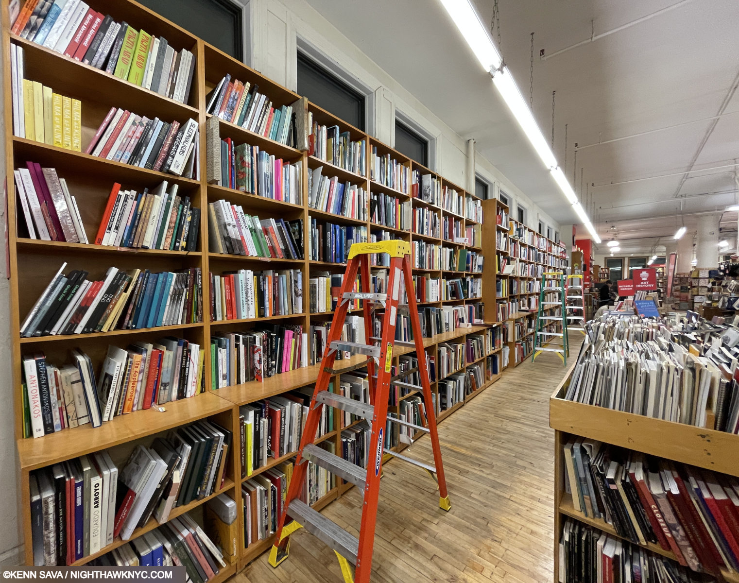
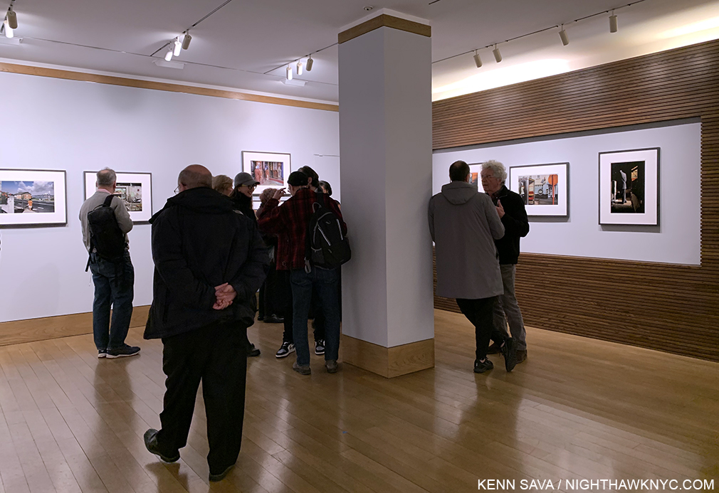
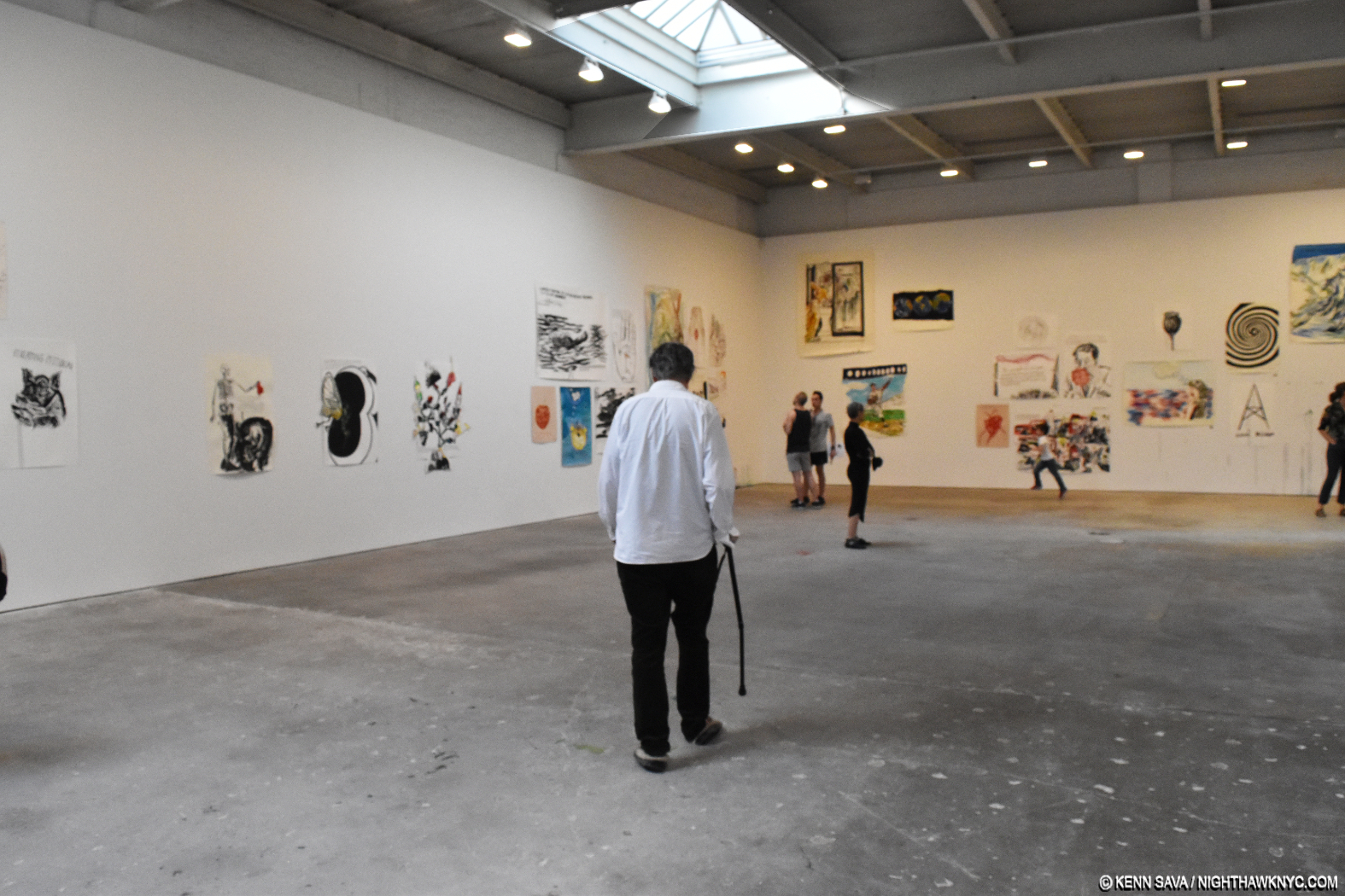
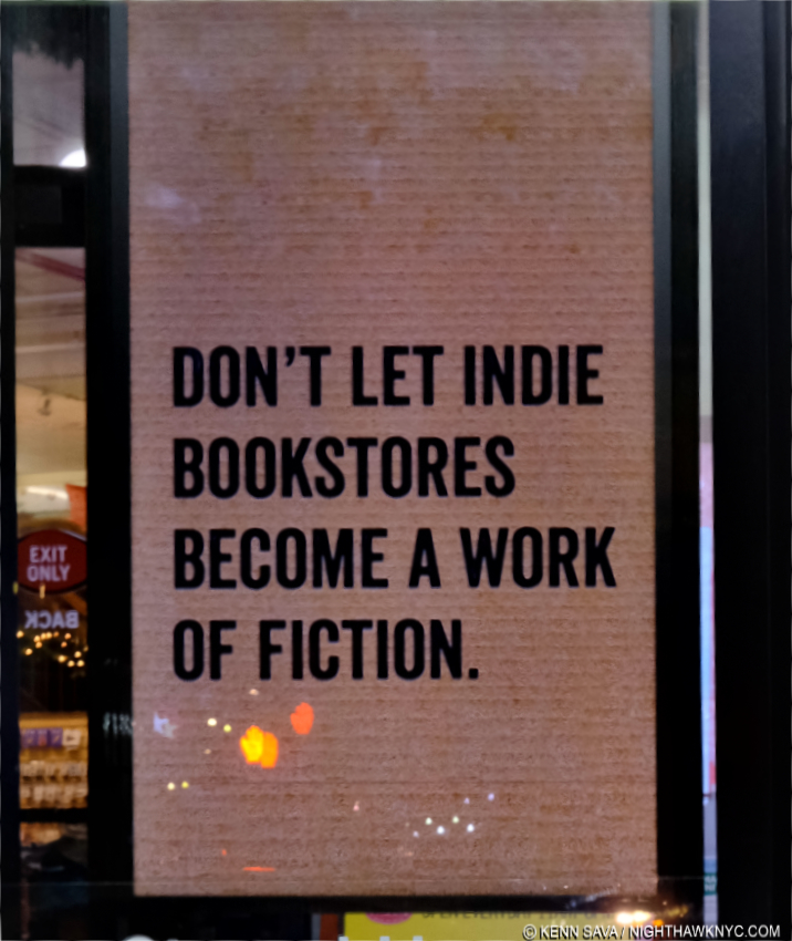
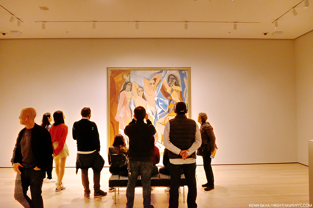
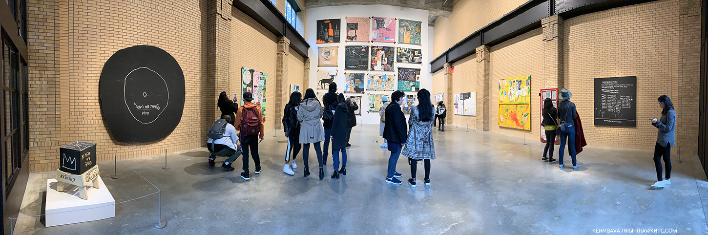
Welcome to my world. While I see shows as often as I can, I’m in bookstores much more often. Seen in January, 2025, The Strand Bookstore has an excellent selection of new & used Art books. Here, Art monographs are shelved along the wall to the left by Artist’s last name- “A,” left, to “O,” next to the third ladder (about 1/3 of an entire City block down). Your mission, should you decide to accept it- go through these and choose 50, or so, published this century as NoteWorthy- about two books a year. When you get to that third ladder, you’re half done! (In case you’re wondering, PhotoBooks are elsewhere.)
Though the research has been ongoing, unfortunately I no longer have the time to write the kind of pieces I have here for 9 1/2 years, so this piece took longer than it would have. Still, some books lack pictures, and there are no ISBN numbers- sorry. You should be able to locate the listed books by title, publisher and date of publication (i.e. of the first edition) included. The books are listed in no particular order. Note- If anyone else has done such a list, I haven’t seen it.
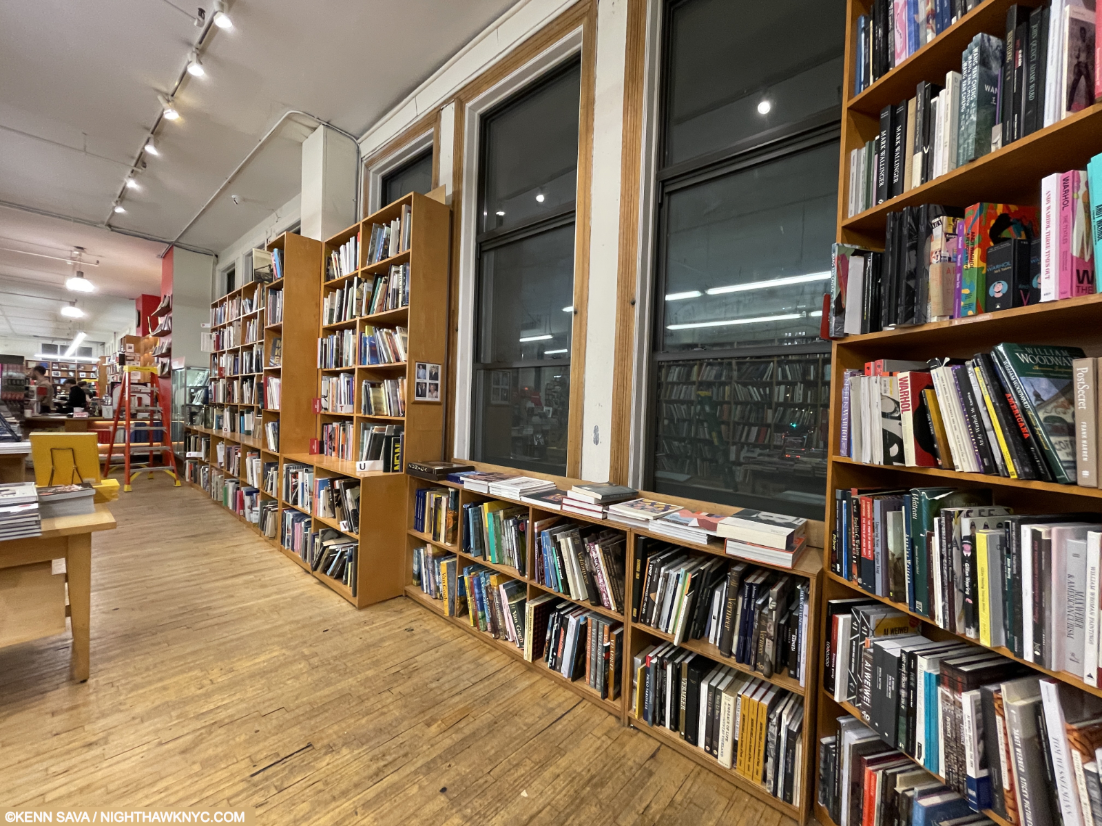
Further down the wall are Art monographs shelved by Artist’s last name- “P,” left by ladder, to “Z” immediate right. Take a break ’cause you’re not done. PhotoBooks await! My list of NoteWorthy PhotoBooks of the 21st Century follows this piece.
What am I looking for? Great Art, alone, isn’t enough to qualify. Why not? Over time (in my lifetime in particular), Art books have gotten better and better on all counts from the quality of the reproductions, to the paper (the proliferation of acid-free paper and the incredible range of paper now available), the materials used in bookmaking, to the entire process of printing. So, great work in a great book, sums up the books I’ve listed here. A “great book?” Insightful & informative- with, or without, essays. Design that doesn’t get in the way, and hopefully adds to the presentation. Excellent production (design & layout, paper, binding, covers, finish), and of course, high-quality reproductions in a useful size, or larger. Let’s face it, in the end, virtually all Art books are PhotoBooks since they contain Photographs of the Art. Price is a consideration for most (me, too!), but it’s not a consideration for a book making this list. Finally, in spite 25 years of looking this century at and living with Art books, and 6 months of work that has gone into this piece, I have no doubt I missed at least one.
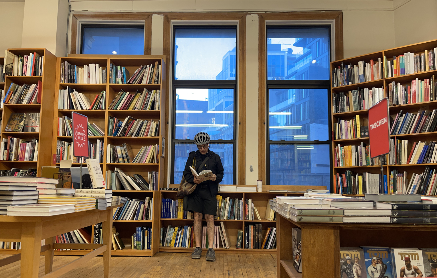
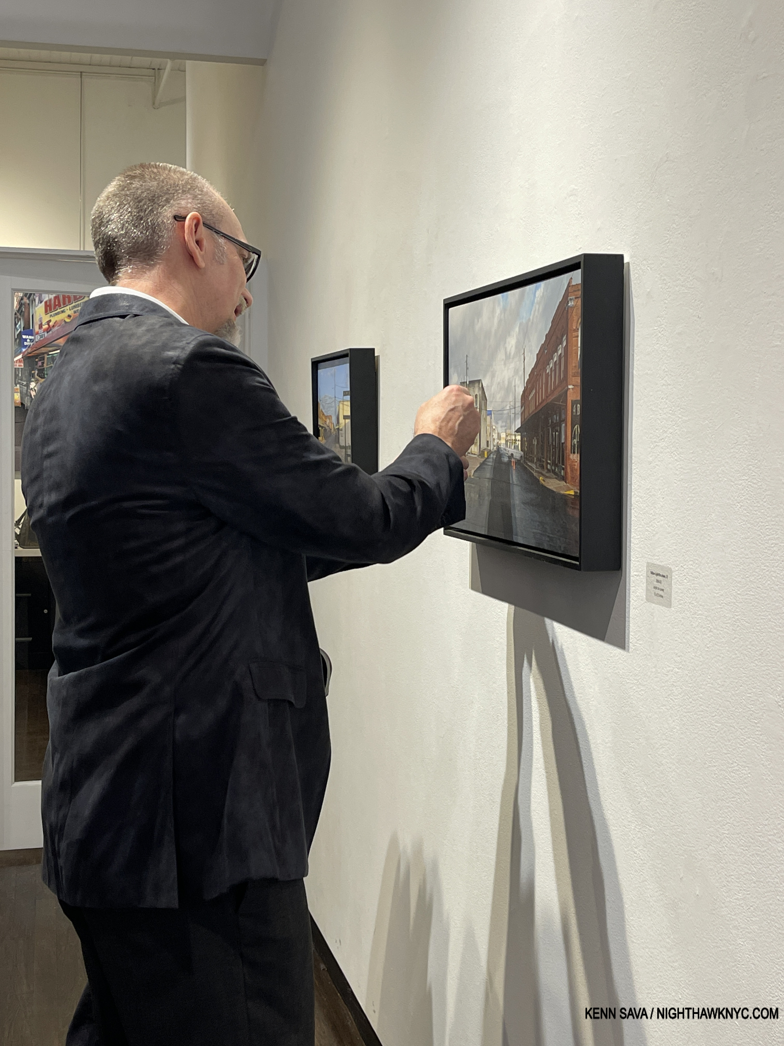
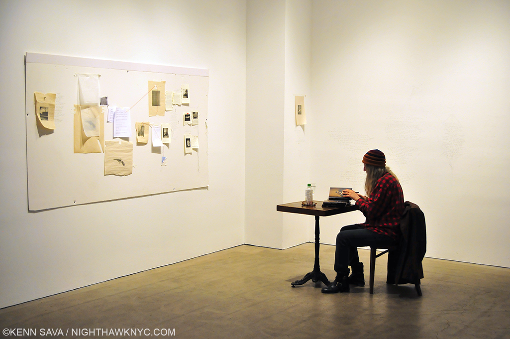
The author hard at work. I started this piece in September, early fall. I finished it six months later in early spring. My thanks to a new friend I had a book discussion with only to get home and find this in my inbox. Strand Bookstore, April 15, 2025. *-Photographer’s name withheld by request.
If you find this piece worthwhile, I NEED YOUR HELP! There are no ads or affiliate links in this piece! Imagine THAT in 2025! So please donate securely via the Paypal link above if you discover a book here, or you find this piece useful. Oh! And NO ONE has given me any of the books on this list!
NoteWorthy Art Books of the 21st Century-
The “Golden Oof,” named for my Avatar perched in front of Brooklyn Bridge. Note- If you are listed below and would like a Golden Oof Statuette, please contact me via the link at the end for info.
Format= Artist, Title, Publisher, Date published- Kenn’s comment. (NoteWorthy books are also in bold type in the body of the piece to distinguish them from other books I mention.)
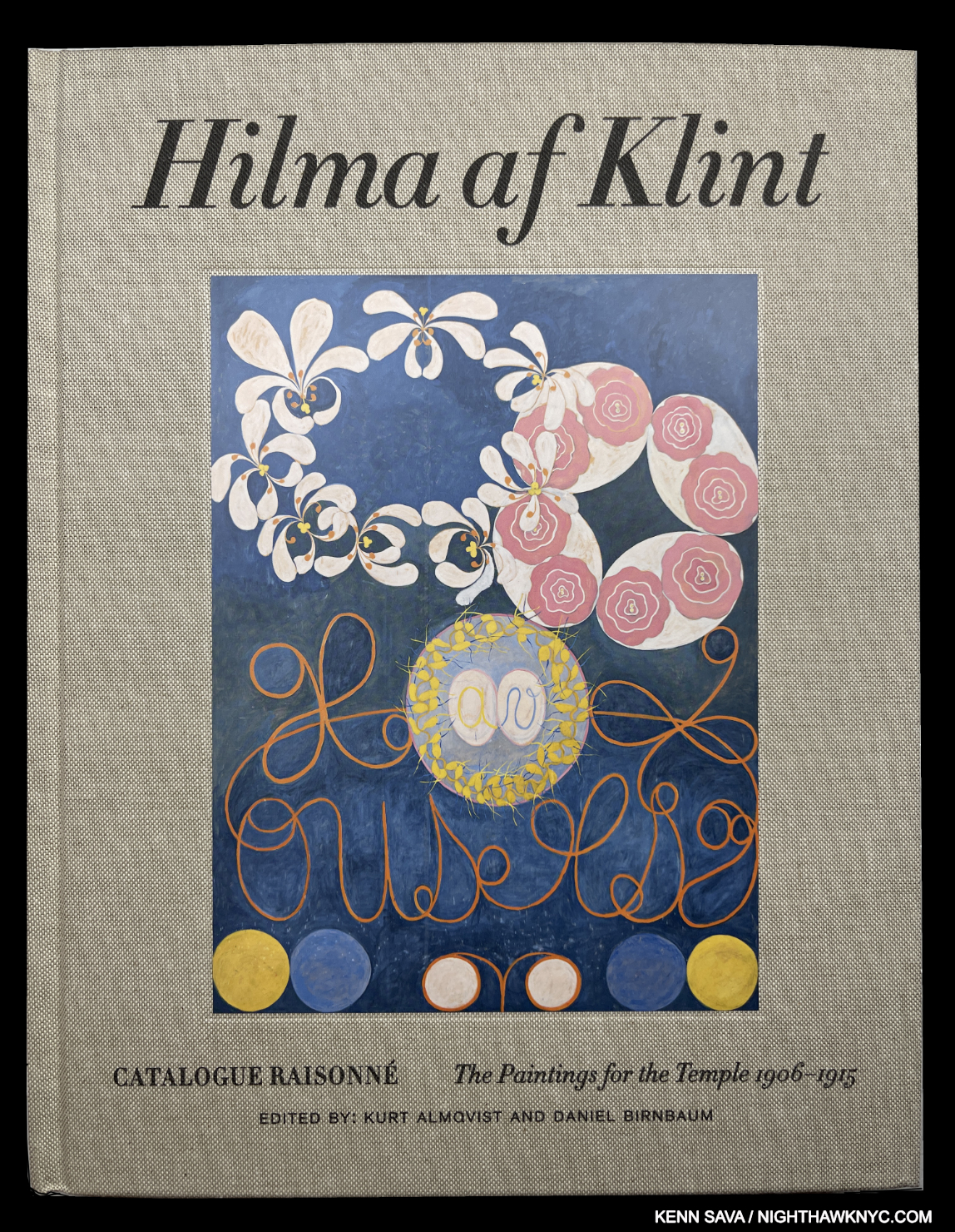
Hilma af Klint, Hilma af Klint Catalogue Raisonne, Volume II: Paintings for the Temple, Okförlaget Stolpe, 2023 and
Hilma af Klint: A Biography by Julia Voss, University of Chicago Press, 2022
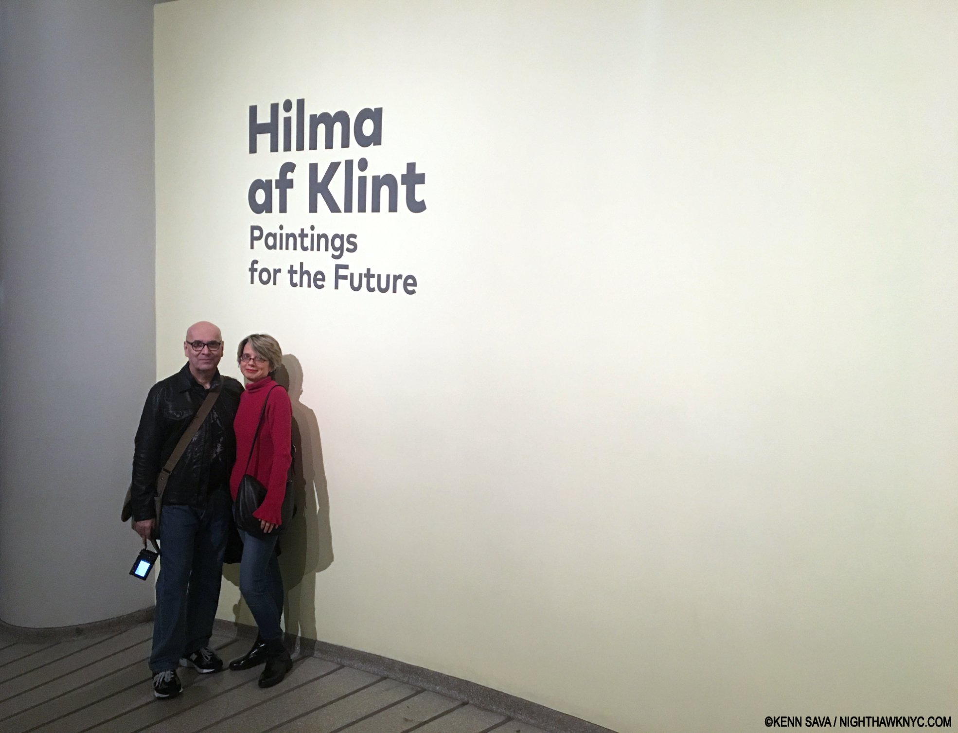
A 100+ years in the making overnight sensation, after 500,000 people joined me in 2018 in seeing the unforgettable Hilma af Klint: Paintings for the Future in Frank Lloyd Wright’s Guggenheim Museum Rotunda, the most people ever to attend a show there(!) in what was a brilliant paring of two visionaries. This led to an explosion of Hilma books. Of these, the 7-volume Hilma af Klint Catalogue Raisonne, published by Okförlaget Stolpe in 2023, will remain definitive henceforth, but it’s overkill for most. So, from the set, since they’re all available individually, Volume II: Paintings for the Temple is my choice as a Noteworthy Art Book of the 21st Century (thus far). It contains all 190+ of her Paintings for the Temple series, which she felt were her “most important work.” There are no essays and only a 2-page overview; it’s beautifully produced with large illustrations, and can be had quite reasonably as I write.
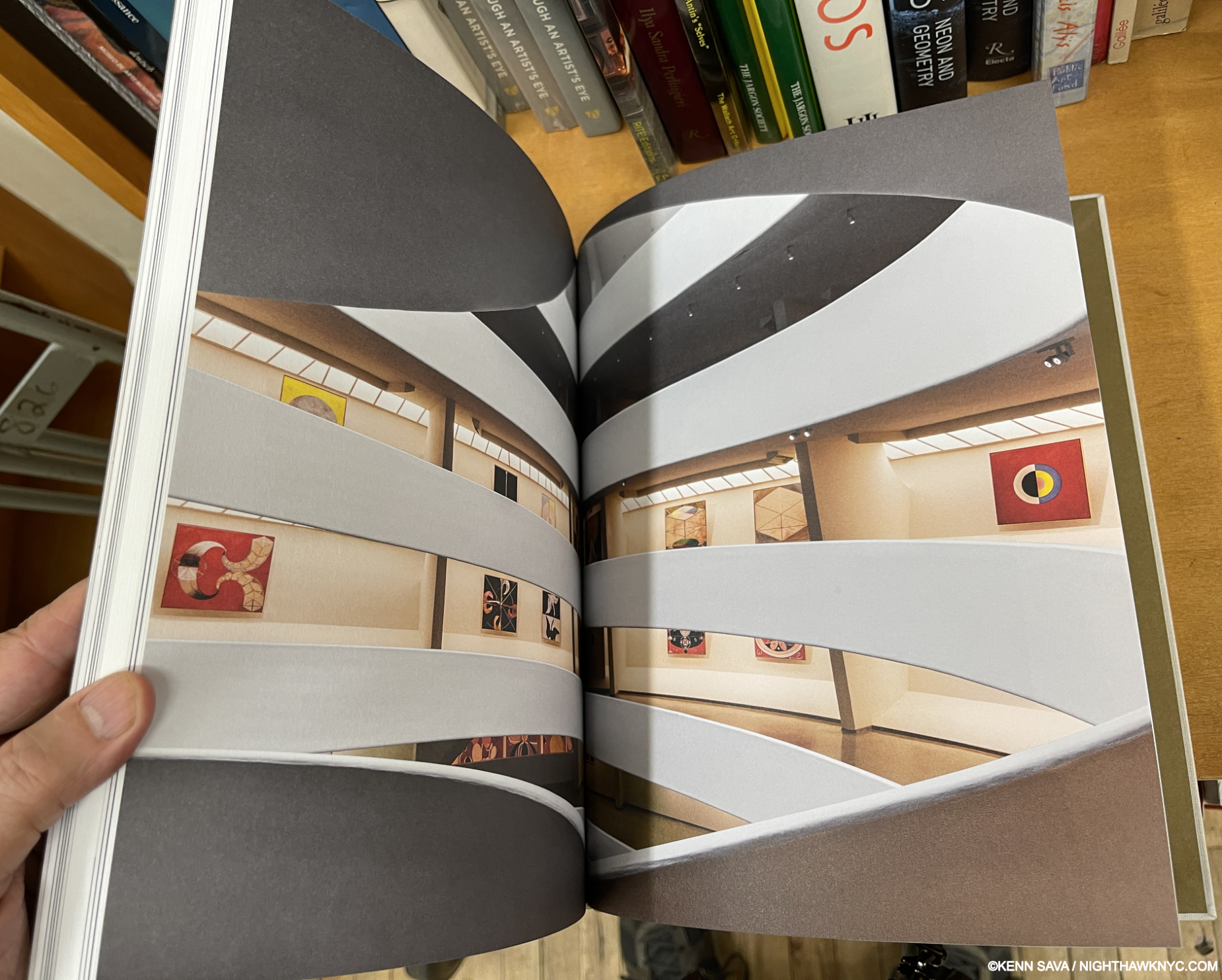
Installation view of the unforgettable blockbuster/landmark show, Hilma af Klint: Paintings for the Future, 2018, as seen in the Guggenheim’s catalog of the same name. When I stood on this spot at the show I felt that Wright’s Guggenheim was, perhaps, the perfect extant place to install her work.
While I’m on the subject of Hilma, among books on her work (though not included on this list), the best one-volume overview, in my view, is a toss-up between the Guggenheim’s Paintings for the Future catalog for that 2018 show, which reproduces everything that was in it, save 3 works by my count, and the more expansive Hilma af Klint- Artist, Researcher, Medium catalog published by Hatje Cantz in 2020 with 227 images (versus the Guggenheim’s 165, by my counts). I find the Guggenheim’s Paintings for the Future more concise and it gives those that missed the show, their bast chance to get a sense of it. The Hatje book is more comprehensive, with mostly smaller images, though I prefer its essays. Either one will provide a good introduction and leave a good deal to ponder well into her future.
My copy of Julia Voss’s Hilma after Klint.
Julia Voss’s Hilma af Klint biography (the only one so far) is engrossing for someone new to Hilma, and riveting for anyone with a real interest in her, Make that “a real interest in her work,” because though the Artist left 22,000 pages of writing, NONE of them are about her personal life! Her love life? We don’t know. What her daily life was like? Forget about it.. Yet Julia Voss has done a terrific job of following her trail and digging into her archives (with the cooperation of her foundation) to create a meticulously researched picture of Ms. af Klint’s life and time. Being the first biography on a great Artist brings with it a lot of pressure. Yet, Julia Voss’s book has already been accepted by every museum staff member who’s writing on Hilma af Klint has passed in front of me in the barely 3 years its been available, as their footnotes reveal. For the rest of us, she’s created an extremely accessible, down-to-earth book (aided by its wonderful English translation by Anne Posten), no mean feat considering the rarified air to be found in that realm where the spirit world meets ours (if it does) that many of Hima’s projects, and the Artist herself, inhabited. Essential.
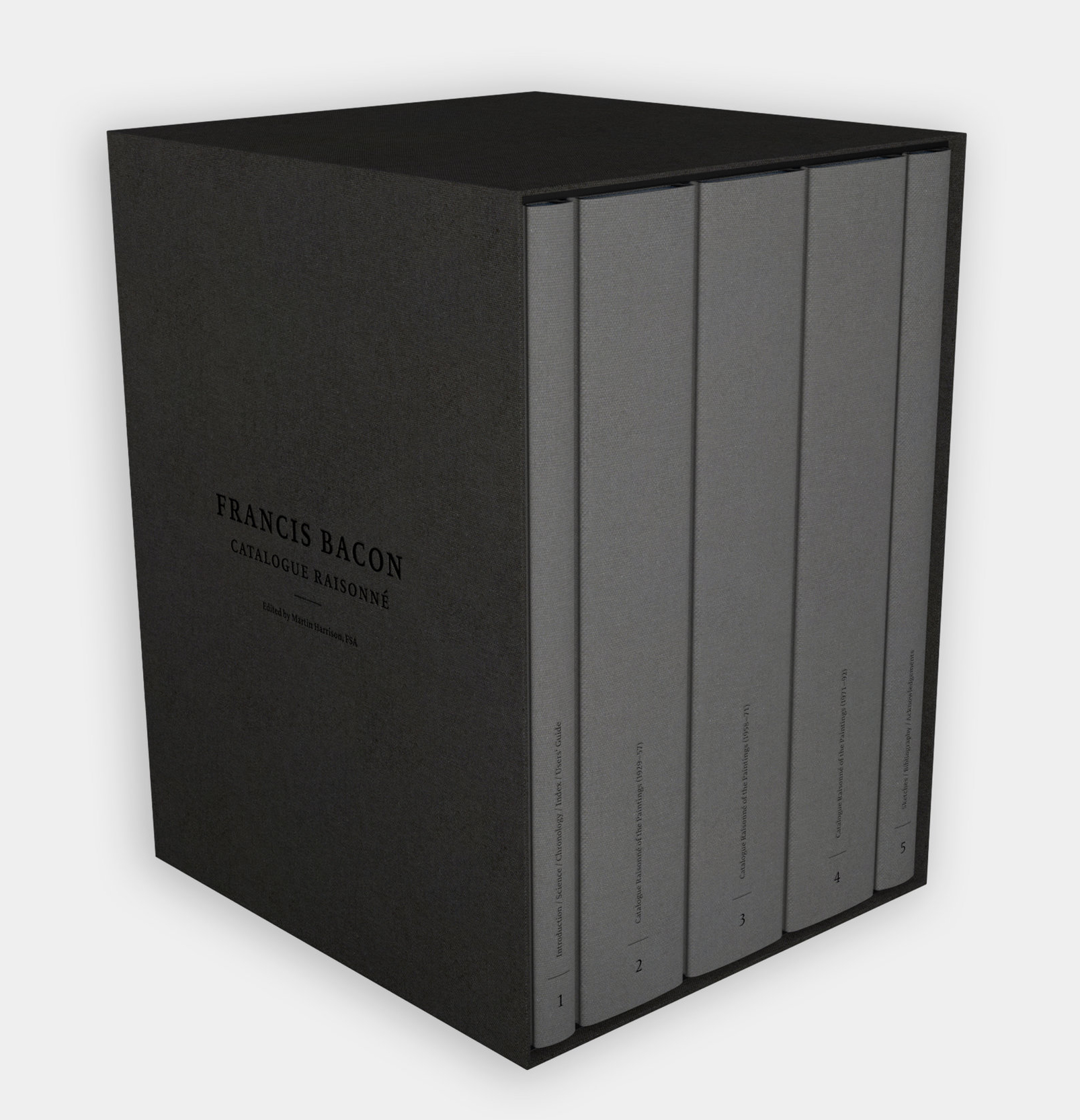
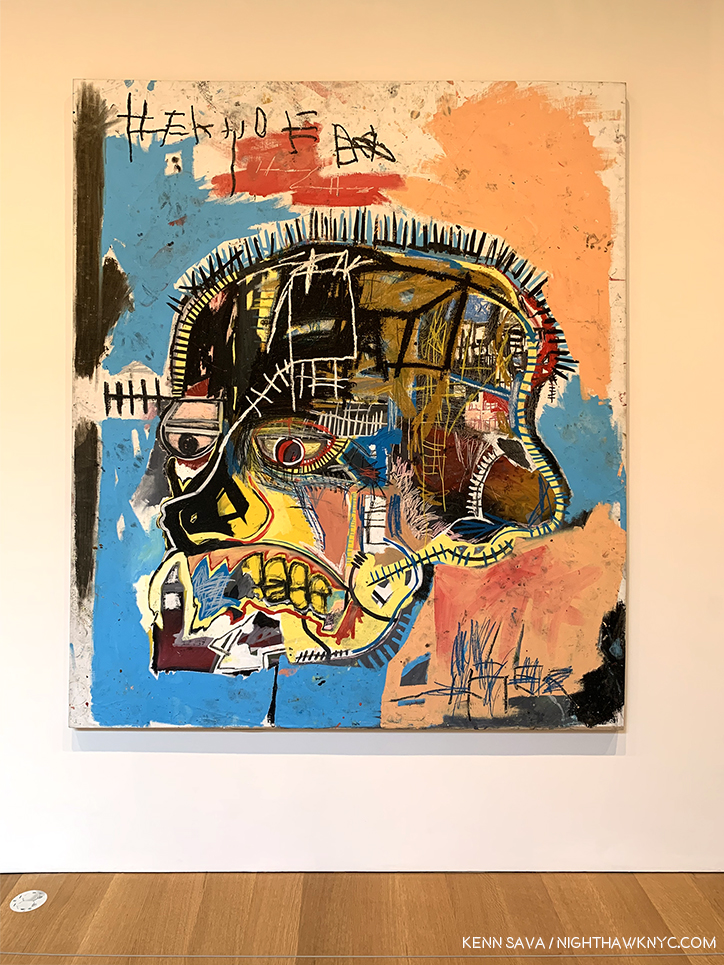
Also Sprach Zarathustra, as heard in 2001, is playing somewhere…*- Estate of Francis Bacon Photo because I don’t own a set, though if someone would like to gift me one…
Francis Bacon, Francis Bacon Catalogue Raisonne, The Estate of Francis Bacon, 2016
Upon publishing this astounding set in 2016, the Bacon Estate said 8 words that sent a chill down my spine. “Once sold out, it will never be reprinted.” In 100 years, or whenever it’s sold out (which will, no doubt, come first) this set will be living in light, climate & humidity controlled cases among the most important Art books ever published. Still available as I write, at 35 pounds, find a VERY strong shelf for it, and TAKE CARE OF IT. (Support the spines and handle it with gloves on. Seriously.) Word.
Forging a new path for Portraiture in the 21st century.
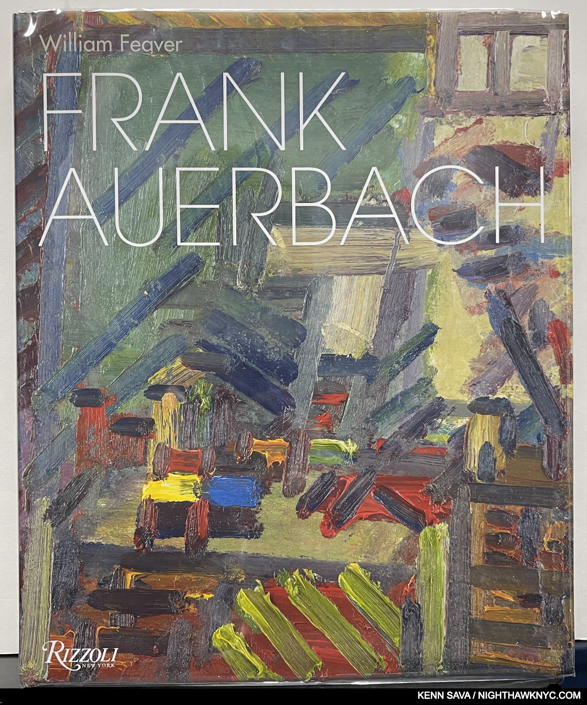
Frank Auerbach, Frank Auerbach: Revised and Expanded, Rizzoli, 2022
Francis Bacon’s contemporary and fellow Londoner, I shake my head in disbelief over HOW I didn’t see the Art of the late Frank Auerbach, who passed away at 93 in November, sooner than when I first saw this book. What was I doing? Obviously, I just didn’t get out enough as I missed two stunning and important recent Frank Auerbach shows at Lurhing Augustine here. As a result, Frank Auerbach: Revised and Expanded hit me like 432 thunderbolts, one for each of its pages. I just kept muttering “I can’t believe it….” as I went through it the first time until the customers around me at Pret A Manger were ready to call 911. I assured them I was just having one of those “moments of future regret” the infomericals incessantly warned me about. “CLAP ON!” Now, I know that Frank Auerbach was not only one of the major Artists of the 20th century, he’s one of the first major Artists of the 21st! Here you can see more of his work (in a whopping 1,200 images- 300 more than the 2009 original edition!) than you’re ever likely to see anywhere else. A desert island book.
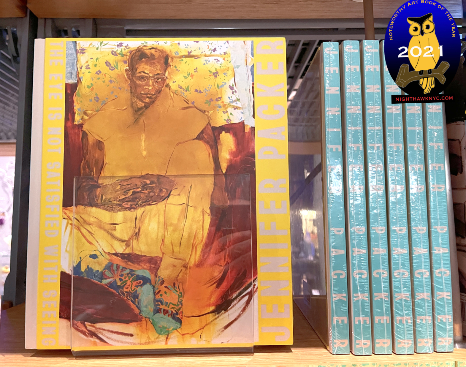
The incredibly rare Jennifer Packer- The Eye Is Not Satisfied With Seeing seen in the Whitney’s Bookstore on the show’s opening day. It’s highly unlikely you’ll ever see this many copies of this book in one place again. With my NoteWorthy Art Book, 2021 designation.
Jennifer Packer, Jennifer Packer- The Eye Is Not Satisfied With Seeing, Serpentine Gallery, 2021
Perhaps THE overnight sensation of the decade thus far (along with her friend, Jordan Casteel), rocked me as much as it did just about everyone else who saw her traveling show of the same name. My piece on the show documented the ever-increasing crowds as the show’s run here went on. I “got it” on a member’s preview and immediately bought the book. It disappeared as quickly as any Art book has this century and currently goes for $500 in Very Good (VG) condition. Beautifully done on all counts, it’s an instant classic. Nothing has been seen of Jennifer since. Will its promise lead to Ms. Packer securing a place as one of the world’s more important living Painters? The world waits, and watches…
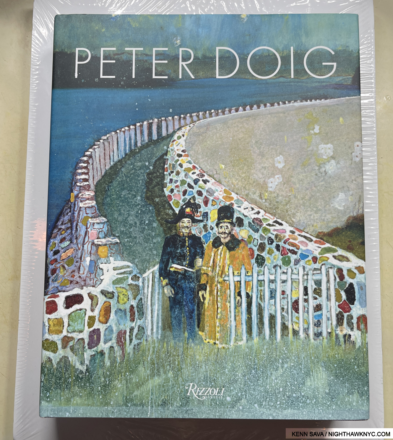
Peter Doig, Peter Doig, Rizzoli, 2017
The most comprehensive of the books published on the Scottish Painter who has made his mark working in other places, including Canada, to stunning effect. The first of three books on this list that are either authored by, or include an essay by (as this book does), curator & historian Catherine Lampert, the only non-Artist (as far as I know) who makes three appearances here. The second of six Rizzoli books on this list, this one features a “rule-breaking” design (unsurprisingly, in collaboration with the Artist). Most of the Art is pictured in landscape format to keep them from going over the gutter. This requires the reader to turn the book sideways! The customer reviews I’ve seen have been, surprisingly, uniformly approving of this.
As for the work itself, born of, and steeped in memory (a bit like Mohammed Sami’s work), I agree with Richard Shiff, who writes on page 357, “Doig’s art leaves memory caught between versions of itself: memory in formation, memory fading in and out. We will think that we remember whatever reality his pictures shows, but the picture itself- ‘through the materiality of pant and the activity of painting’- induces the sense of reality remembered, an abstraction of a memory already abstract.”
Eight years old, already, I’d guarantee an updated edition at some point, if I was a guaranteeing man. Still, with 432 pages in this one, there’s more than enough here to keep anyone busy for a while.
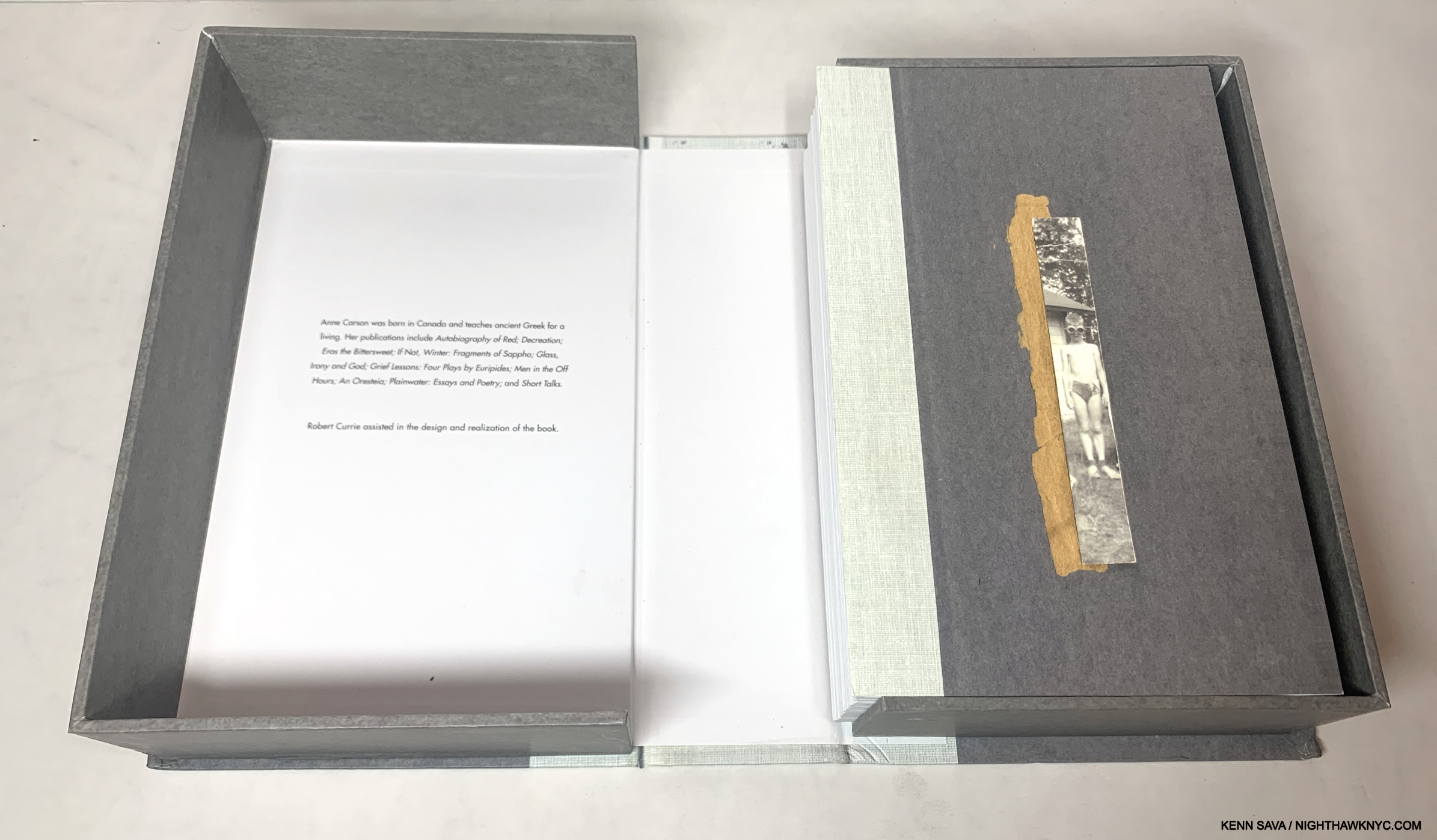
Nox, after opening the box it comes in. We should all be so lucky to have an epitaph like this.
Ann Carson, Nox, New Directions, 2010
The most unique book on this list didn’t start out as a book, or “Art book,” per se. Of it, the world-renowned Poet, Ms. Carson, says on the back cover- “When my brother died, I made an epitaph for him in the form of a book. This is a replica of it, as close as we could get.” Ms. Carson’s tribute is an accordion-fold-in-a-box multi-dimensional multimedia tribute that moves quickly beyond Poetry into the realm of Art, in my view. A personal tribute not conceived for the mass market, it’s the most personal and the closest book to a true “Artist’s book” on this list. While, for me, it helps shine a fond light on many aspects of loss, even for the rest of us who never met Nox, his book serves as a repository of memories, and through them, a powerful portrait of the man emerges, leaving him someone who will never die as long as copies of his book survive.
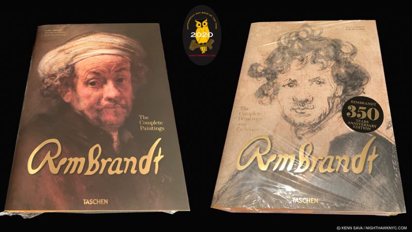
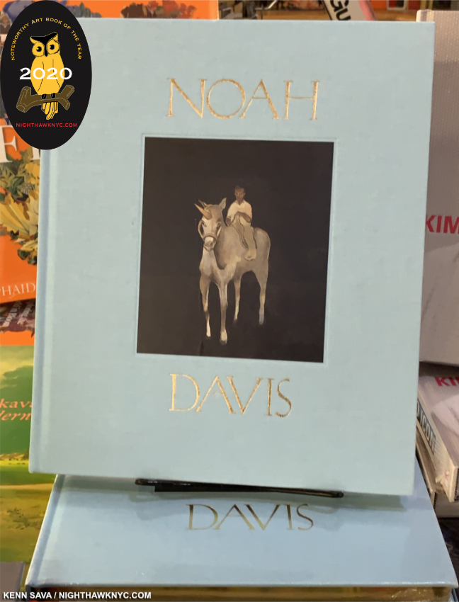
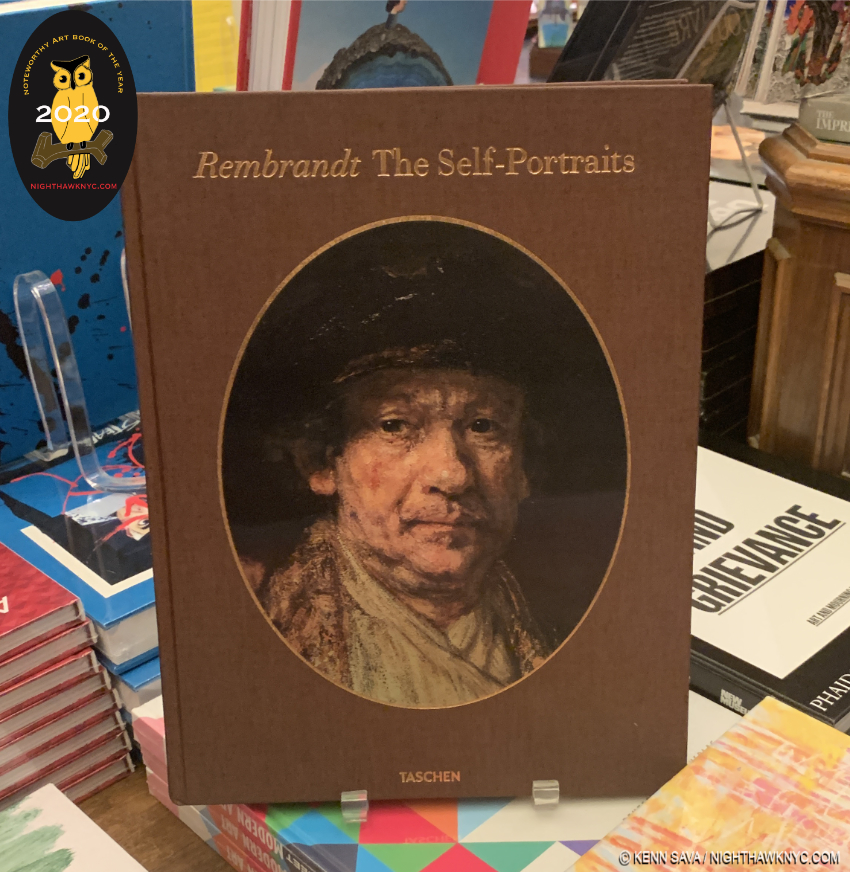
Rembrandt: The Complete Pantings XXL, left and The Complete Drawings and Etchings XXL, right. Fifteen pounts- each! With their NighthawkNYC NoteWorthy Art Books of 2020 designation.
Rembrandt, Rembrandt: The Complete Pantings XXL, 2019, and
Rembrandt: The Complete Drawings and Etchings XXL, 2019, and
Rembrandt: The Self-Portraits XL, 2017, or “Mini Brick,” 2023, all Taschen, and
The Rembrandt Book, Gary Schwartz, Abrams, 2006
In the early 1970s, Bob Haak’s classic Rembrandt: His Life, His Work, His Time, with its tipped-in color plates, was the first Art book to show me the possibilities of a truly comprehensive Art book. All these years later, and leaving aside the fact these books “celebrate” the 350th Anniversary of the master’s horribly sad death, I was one of those waiting with bated breath for the release of Taschen’s Rembrandt: The Complete Pantings. And wow, what a book! While each work is beautifully pictured, exactly WHAT deserves to be included in The Complete Pantings (i.e. exactly which Paintings are from Rembrandt’s hand) will be the subject of heated debate until the next edition. Twas ever thus. Published on the heels of the Rembrandt Research Project’s findings into just that (published in their 6-volume Corpus of Rembrandt’s Paintings series in 2015), Taschen’s Art XXLs remain the best way for the passionate Art lover, or the serious researcher, to see the most work by the subject Artist in the largest size. They are as close as we have to the experience of seeing the Art close-up for yourself in person, until more Art becomes available like this. Don’t think so? Well, good luck seeing all of these Rembrandt Paintings this close-up in person! Forget about seeing most of his Drawings & Etchings- they’re too light sensitive to be on display often. In these books, the Photography is uniformly excellent, the binding, paper and attention to detail, first rate. The works are uniformly reproduced at a good size, in some cases, the Drawings & Etchings are larger than actual size. Though The Complete Paintings got the headlines, sleeping on The Complete Drawings and Etchings would be a huge mistake. Or was. It’s already out of print. It’s 755 pages of unspeakably incredible Art- literally cover to cover. Any number of Artists felt and feel Rembrandt was the greatest etcher ever. His Drawings are every bit as engrossing. What he was able to express with 3 or 4 lines, in some cases, is awe inspiring. Though I am parting with my beloved Art book library to fund my writing (details at the end), these two books will be among the very last I part with. ‘Nuff said.
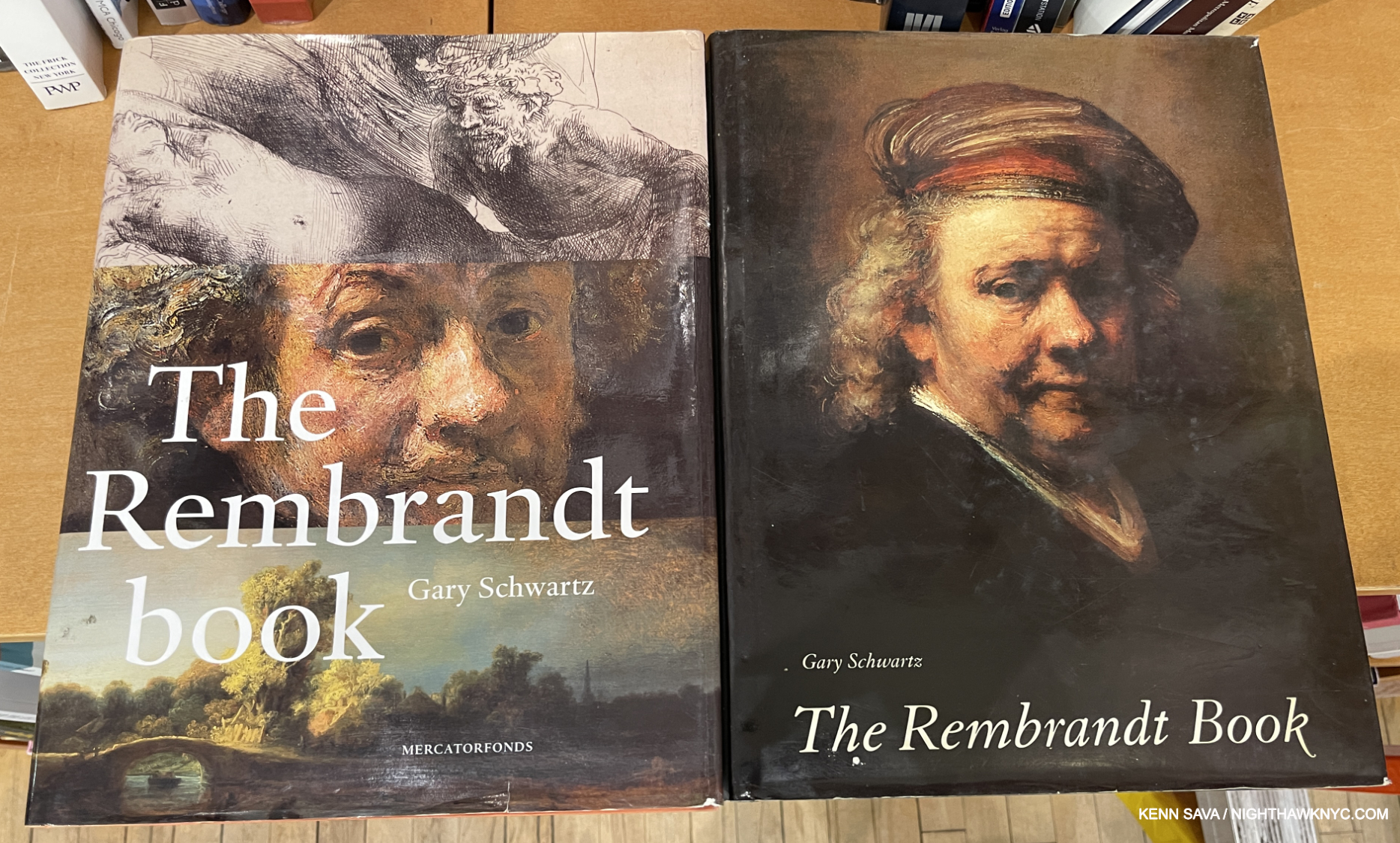
The European edition of The Rembrandt Book by Gary Schwartz, left, and the American edition, right. Choose one. Choose them both. Mine is the American.
With all due respect to the authors of the text in The Complete Paintings, it would be perfect, in my view, if it had a contribution from Gary Schwartz, for my money “THE” Rembrandt historian. Still, the authors can’t be too mad at me. Being named a Book of the Century (thus far) isn’t too shabby, right? To supplement TCP & TCD & E, I highly recommend Mr. Schwartz’s essential overview, The Rembrandt Book, which has been just that, with a capital “THE” for me since it came out (His earlier Rembrandt: His Life, His Paintings, from 1986, too early for this list, is every bit as good, and completely different! The Rembrandt Book was reissued in 2016 as Rembrandt’s Universe in England.)
“If one wishes to discuss Rembrandt’s life and art as a whole, the first thing to do is close the rift between the documents and the works,” Gary Schwartz.
For some reason, before Gary Schwartz published his prior monograph, Rembrandt: His Life, His Paintings, in 1986, no one had done it. Much of the material had been ignored and the resulting avalanche of books on Rembrandt are, primarily, work focused. Gary Schwartz brings Rembrandt to life with an Art historian’s eye in the person of an expert Art writer able to express himself succinctly to both Rembrandt newbies and scholars. Coincidentally, his life-based-in -the-documents is the approach the two other biographies on this list further on (on Shakespeare and Van Gogh), share!
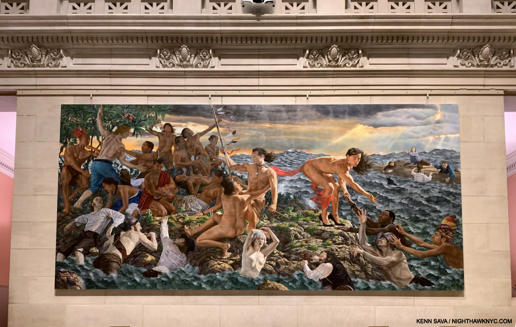
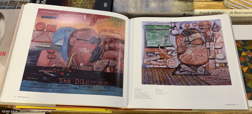
Kent Monkman, mistikôsiwak (Wooden Boat People): Welcoming the Newcomers, Both 2020, Acrylic on canvas, 11 x 22 feet. One part of a diptych seen in the Great Hall of The Met, January 17, 2020.
Kent Monkman, Revision and Resistance: mistikôsiwak (Wooden Boat People) at The Metropolitan Museum of Art, Art Canada Institute, 2020, and
The Memoirs of Miss Chief Eagle Testickle: A True and Exact Accounting of the History of Turtle Island, Volumes 1 & 2, with Giselle Gordon, both McClelland & Stewart, 2023 (Reissued as boxed set of paperbacks, 2025),
and Kent Monkman: History is Painted by the Victors, DelMonico, 2025
“Subversive, bold, unapologetic, and unforgiving, the work of Kent Monkman (b.1965) has left an unmistakable mark on contemporary Canadian art. Since the early 2000s, Monkman, accompanied by his time-travelling, shape-shifting, gender-fluid alter ego, Miss Chief Eagle Testickle, has redefined the Canadian cultural landscape. Riffing on techniques of the Old Masters, Monkman first found fame by recreating notable landscape paintings and populating them with Indigenous visions of resistance,” Shirley Madill, Kent Monkman: Life and Work.
I came very close to creating a stand-alone category titled NoteWorthy Extraordinary Accomplishment in Art Books in the 21st Century for an Artist I consider to be, perhaps, the most ground-breaking Artist of the century thus far- Interdisciplinary Cree visual Artist, Kent Monkman, a member of Fisher River Cree Nation in Treaty 5 Territory (Manitoba, Canada). Singlehandedly reinventing the History Painting and using them, along with his work in other mediums, to begin to attempt to counter the historical narrative surrounding Indigenous Peoples in Art history, along with other Artists working to rewrite it. Shirley Madill, director of the Kitchener-Waterloo Art Gallery, says (with her caps), “KENT MONKMAN IS A VISUAL STORYTELLER. For more than two decades he has subverted art history’s established canon through the appropriation of works that tell stories of European domination and the obliteration of North American Indigenous cultures. Monkman challenges the accuracy of such representations by repopulating and correcting settler landscapes in a transgressive manner. He reimagines well-known paintings in order to provide a contemporary, critical point of view-and often his agent of disruption and change is one Miss Chief Eagle Testickle (a play on “mischief” and “egotistical”), or Miss Chief for short.” According to the just-released book (the most recent book on this list), Kent Monkman: History is Painted by the Victors, DelMonico, 2025, “Taking inspiration from Western artists such as George Catlin, as well as from the Old Masters, Monkman’s monumental history paintings feature white colonizers in violent conflict with Indigenous people. The depictions range from early colonial encounters to modern and contemporary clashes between Indigenous communities and uniformed police or clergy. In borrowing the visual language of his oppressors, Monkman reclaims the narrative written by Western art history about the brutalization and cultural genocide carried out against Indigenous North American communities,”
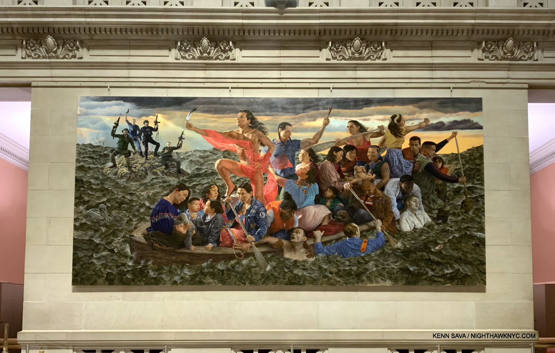
The other part of the mistikôsiwak (Wooden Boat People) diptych: Resurgence of the People seen in the Great Hall of The Met, January 17, 2020.
I discovered Mr. Monkman’s work on one of my 1,900 visits to The Metropolitan Museum in January, 2020, my last visit to The Museum before it was closed for months due to covid, when two monumental (11 x 22 feet, each) Paintings of his diptych, mistikôsiwak (Wooden Boat People) were mounted in the Great Hall, making them impossible to miss, and absolutely stunning in effect. They stopped me in my tracks and completely hijacked my visit. One of the few Contemporary works installed there to that time, they proved an ideal introduction to so much that characterizes Kent Monkman’s work, before and since. Aiding him in his mission (as outlined in the previous para) is Kent’s alter ego, Miss Chief Eagle Testickle (aka “mischief,” and “egotistical”), “who appears prominently in both paintings (in red), personifying Cree values and embodying the Indigenous Two Spirit tradition, which embraced a third gender and nonbinary sexuality,” per Art Canada Institute, who published the catalog for the show. Though The Met’s Max Hollein, Sheena Wagstaff and Randall Griffey were responsible for the commission, I’m left to wonder WHY The Met didn’t publish it. In any event, that gorgeous catalog, Revision and Resistance: mistikôsiwak (Wooden Boat People) at The Metropolitan Museum of Art is a lasting testament to the work, now in The Met’s Permanent Collection, in one of the most unforgettable installations I’ve seen this decade, which was, frankly, a two-Painting revolution.
The Memoirs of Miss Chief Eagle Testickle: A True and Exact Accounting of the History of Turtle Island, Volumes 1 & 2, in addition to being best-sellers, are books that are hard to describe, but of course, the publisher tries to: “For decades, the singular and provocative paintings by Cree artist Kent Monkman have featured a recurring character—an alter ego of sorts, a shape-shifting, time-travelling elemental being named Miss Chief Eagle Testickle. Though we have glimpsed her across the years in films and on countless canvases, it is finally time to hear her story, in her own words. And, in doing so, to hear the whole history of Turtle Island (the traditional name for North America) anew. The Memoirs of Miss Chief Eagle Testickle: A True and Exact Accounting of the History of Turtle Island is a genre-demolishing work of genius, the imagined history of a legendary figure through which profound truths emerge—a deeply Cree and gloriously queer understanding of our shared world, its past, its present, and its possibilities.” “Genius,” they said. I realize I’m gushing, but I’m not quite ready to go there- yet. The aforementioned Kent Monkman: History is Painted by the Victors, just published to accompany his first major U.S. solo exhibition (up at the Denver Art Museum as I write. The Met having shown only two works), seems to me they realized going in how high the Kent Monkman book bar has been set. Another beautiful, endlessly fascinating book. I have a strong feeling there are yet more Kent Monkman books I’d add here, but most of his other books were published in Canada, with virtually no U.S. distortion, making them harder to see.
In addition to his stunning Art, each of his books is marked by terrific design. Though I find it hard to believe the Artist did not play a hand in them, the level of his involvement in these books is nowhere stated. Whatever it is, kudos are due Underline Studios of Toronto, who designed Revision and Resistance, and the excellent and beautiful Kent Monkman: Being Legendary, both published by Art Canada Institute.
Kent Monkman is already marketed as an “Art superstar,” even before his work has received wide exposure in the U.S. An exceptionally prolific Painter, who’s work is already in the Whitney and the Morgan Library, in addition to The Met, here in town, MoCA in Chicago, the Walker, the Denver Museum, and the National Museum of the American Indian, Smithsonian Institution. As History is Painted by the Victors is about to open, I fully expect that his work is going to continue to make inroads into the collections of the very institutions who’s narratives the Artist is helping to rewrite. Stay tuned.
While I’m at it, R.I.P to Juane Quick-to-See Smith, who passed away in January. My look at her terrific Whitney Museum Retrospective is here.
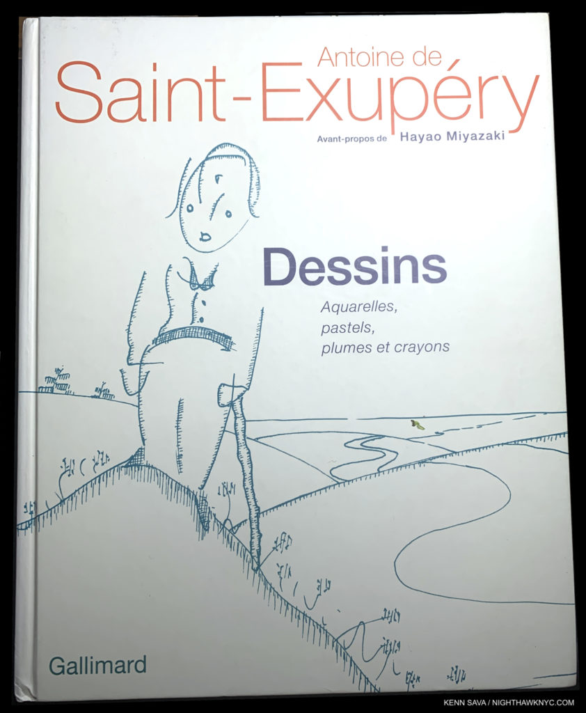
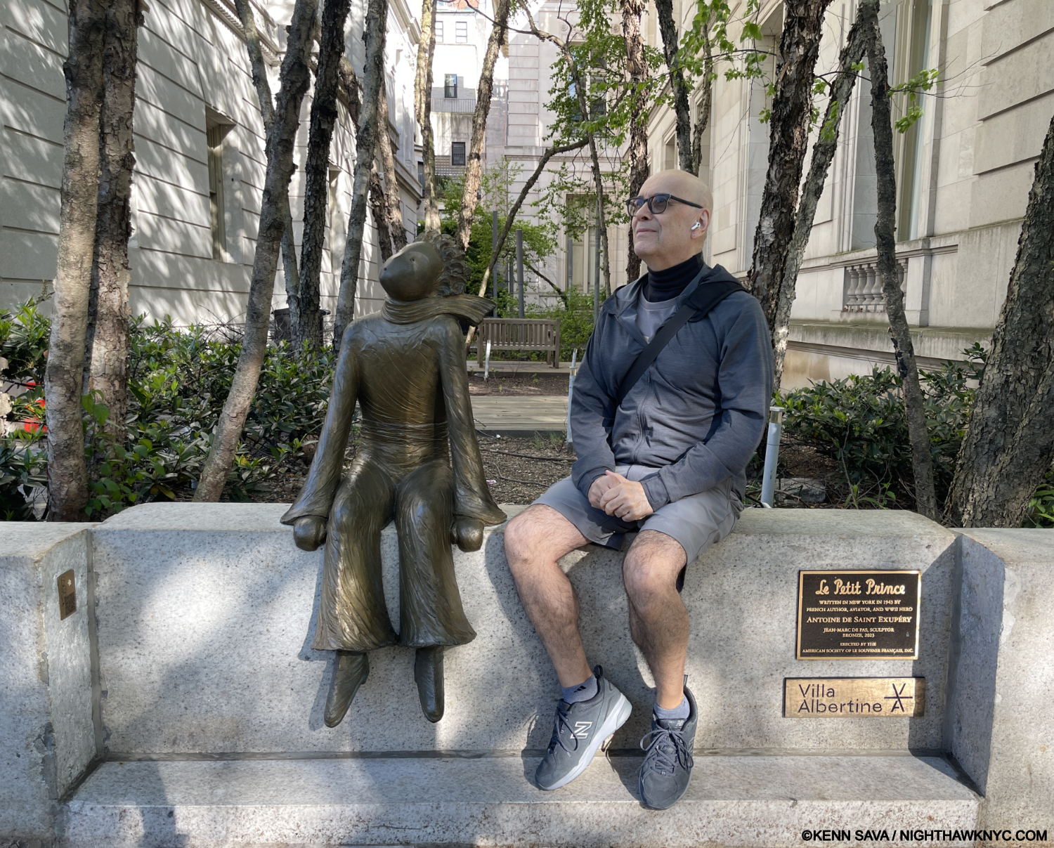
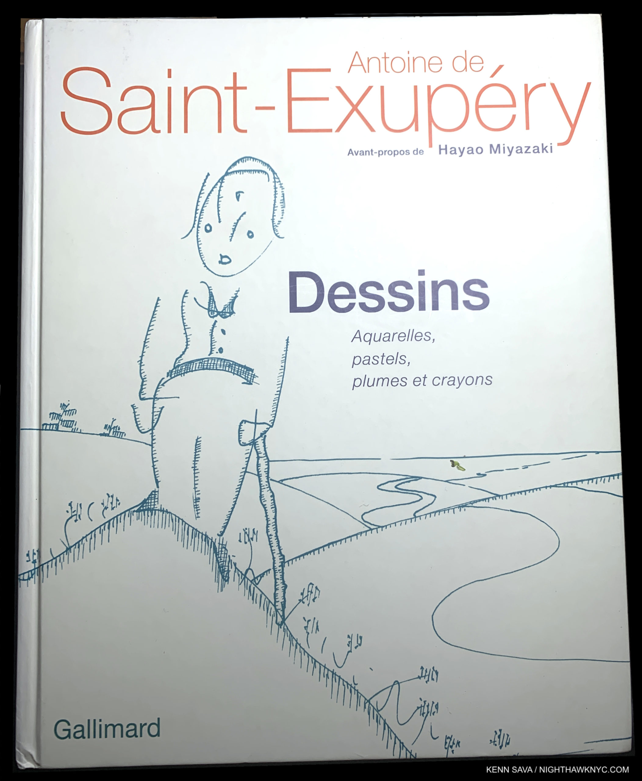
Antoine de Saint-Exupéry, Antoine de Saint-Exupéry:Dessins: Aquarelles, plumes, pastels et crayons, Gallimard, 2012
Hey, wait! Antoine de Saint-Exupéry on an Art book list? Yes! For me, his accomplishments as an Artist have been continuously overlooked. Yes, The Little Prince cries out for visual interpretation, and it has received countless treatments over the past 80 years (including the one, below). Still, for me? I always turn back to his originals. In my view, they are ABSOLUTELY ESSENTIAL to the book! With the COUNTLESS books written about The Little Prince these past 80 years since it was published, this is the ONLY ONE devoted to Antoine de Saint-Exupéry’s Art! It was wroth the wait.
As you remember, right on the very first page of The Little Prince, the Author speaks of his childhood passion for Drawing and how adults promptly discouraged it. Whether or not he received encouragement in real-life, it’s a passion that never left him as numerous friends and acquiantences recall. Here, we finally get to see all of his work in Watercolor, Pastels and Pencil & Ink, including many previously unpublished Drawings from sketches to finished Art work. Dessins seals his accomplishment as a Visual Artis. Do I need to say this book is a treasure for his millions of fans? Why has it taken so long for Saint-Exupéry to receive the credit he deserves as a Visual Artist? I think it might be because of the amazing economy of is designs. He says everything he needs to say in the barest minimum of lines and marks. It’s unassuming quality may disarm some viewers into forgetting their looking at Art. For me, his fresh style shows an awareness of Picasso. Also, as the Author and creator of his characters, only he knows their fine details, which he shows in his Art, and which are often not spelled out in the book. Even though it’s only available in French, if you’re a fan, you know that won’t stop you from digging in and enjoying this rarely seen aspect of his genius over 328 pages. In his hands Art truly is a Universal Language.

With Saint-Ex’s most famous creation, that he Wrote about, Drew, and Painted, waiting for the return of his Asteroid. This Sculpture is by Jean-Marc de Pas, May 10, 2025. My thanks to the kind lady who took this.
June 29, 2025 marks Antoine de Saint-Exupéry’s 125th Birthday. It’s about time this side of his talent receives more attention. My look at just this, “Antoine de Saint-Exupéry: Artist,” from 2023 is here. My thanks to Lana Hattan for introducing me to The Little Prince, and Saint-Exupéry, and reminding of his Birthday!
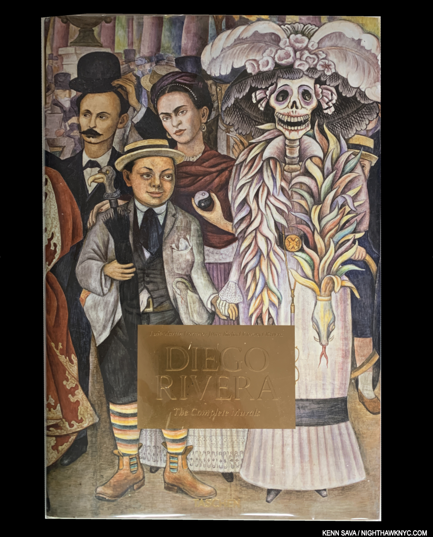
My copy of Diego Rivera: The Complete Murals shows the happy couple up front and left of center. Such is my respect for this book that I took it and had a custom Archival book jacket made for it. Alas, I wound up selling it over the holidays to fund my writing.
Diego Rivera, The Complete Murals XXL (Out of Print), 2007, or XL, 2018, Taschen, and Frida Kahlo: The Complete Paintings XXL, 2021, or Brick, 2023, both Taschen
The greatest love story in Modern Art (for better or worse), so, HOW could I name one, and not the other? Hell, HOW could I ever choose one of these books over the other? Diego’s book is one of the finest Art books Taschen has ever published in my opinion- and that’s saying something. First, somehow, they got access to all of his extant Murals and came away with superb images of each of them. Second, the incredible amount of detail in his work is wonderfully rendered in the generous XXL or XL size. The XXL is already out of print, so you may want to act quickly to find it. Taschen says the XL size is still in print. Getting ALL of that detail in to a Brick-sized edition one day might be possible, but you’ll need great eyesight to see it all!
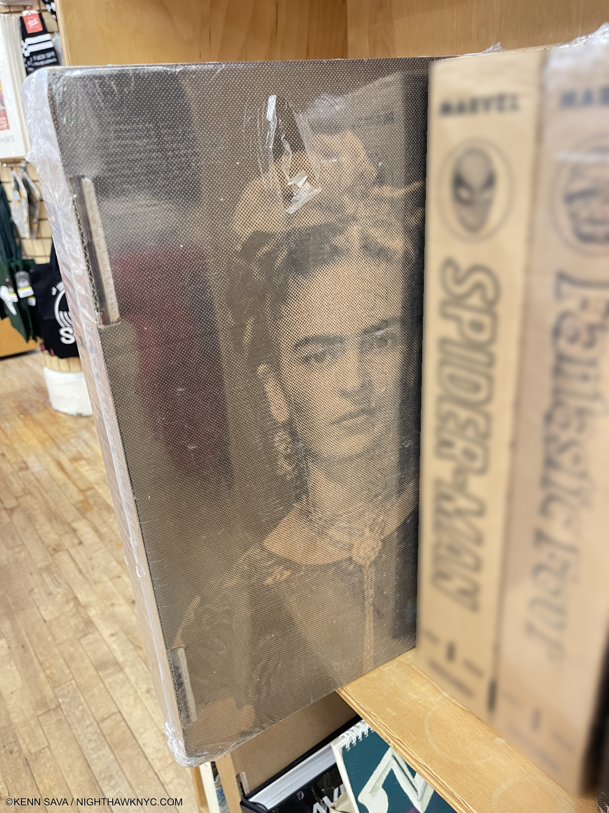
You’re looking at an heirloom. Frida Kahlo, The Complete Paintings XXL sealed in its shipping box. Quick quiz- Who was the first person to buy one of Frida’s Paintings? Answer below.
Excuse the repetition, but the point is that important- you’ll NEVER get the chance to see ALL of Frida’s immortal work as close up as you can see it in the Taschen XXL Complete Paintings– a good many of them are in private hands. Still, the Brick, which I have, is a VERY good option for those without the space for the full-strength XXL edition, or the (currently) $200.00 (versus $30 list for the Brick) asking price. Either or. IF I had the space and the funds, I’d immediately upgrade to the XXL before it goes out of print. Hear here.- To this point, XXL editions HAVE NOT been reprinted! Quiz answer- the actor Edward G. Robinson bought 4 of her Paintings directly from her, which she credited with “showing her how to be free.”
My look at the Whitney’s Vida Americana, which included work by both Frida & Diego is here.
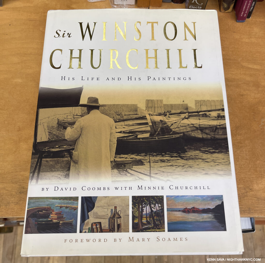
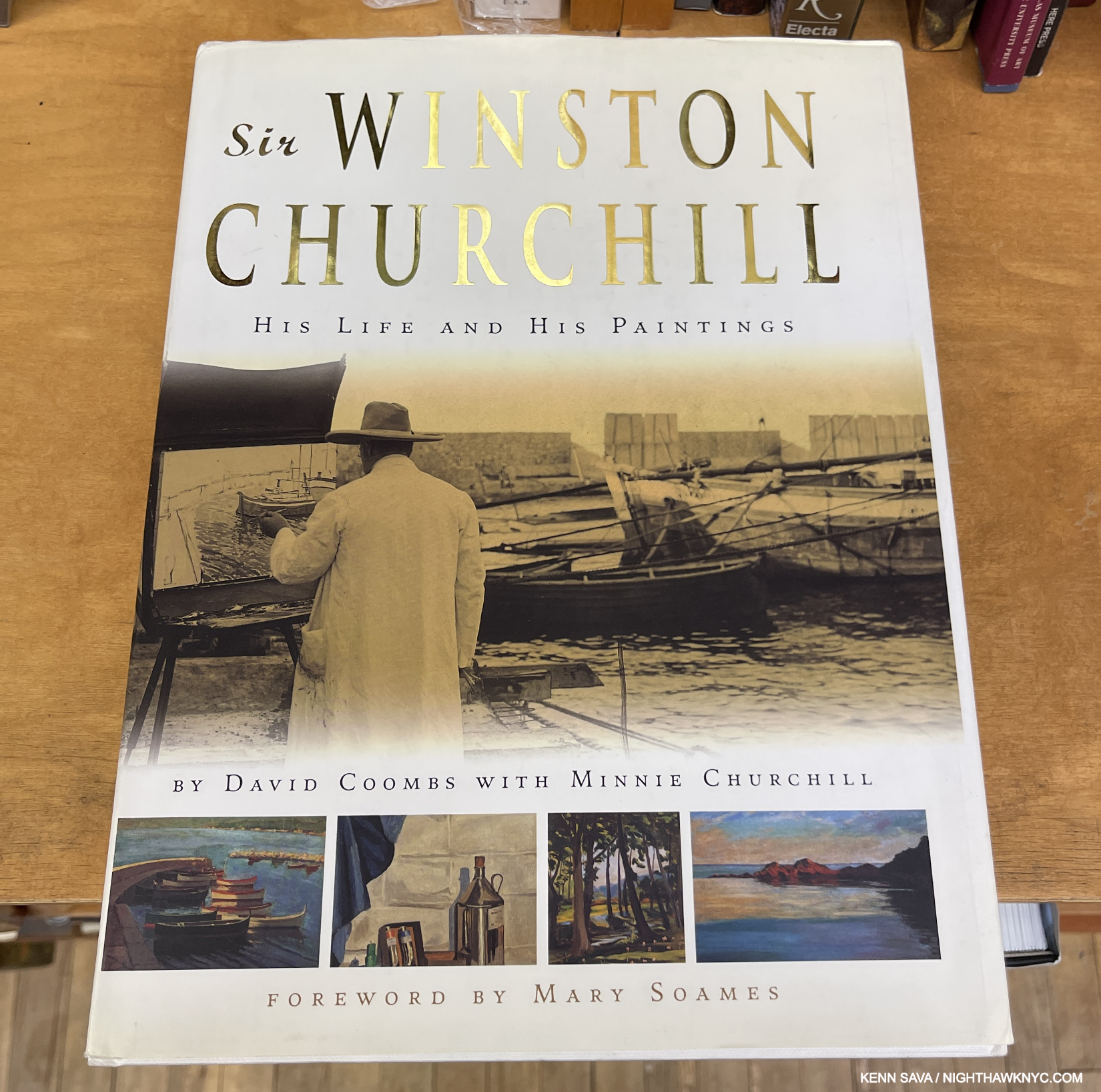
Winston S. Churchill, Winston S. Churchill: His Life & His Paintings, Running Press, 2005
I don’t believe in qualitatively comparing Artists or Artwork, so I’m not getting into a discussion about where Mr. Churchill “deserves” to be on this list, I’ll just say I think he does. I’m not alone- (from the publisher) “‘Had he signed his pictures ‘Jones,’ the critic would still find himself pausing in front of them,’ noted one Sunday Times of London art critic in 1949. Another opined that ‘At least a dozen of these pictures will stand against any of the best impressionists.'” Winston was a devoted Painter after he came to it at age 40(!) in 1915 while deeply depressed at being forced to resign from the WWI British government. He continued to Paint for the rest of his life. Considering that also included the 2nd World War, during which he was solely tasked with saving Western Civilization for a good deal of it, his Paintings will have permanent historic importance. I find they reward close study as Art, too. Whether you do, or not, they are unlikely to ever receive display in such a fine a book as this one, that includes most of his 500 Paintings, published with the full cooperation of Winston Churchill’s family. It’s a lasting testament to the personal power of Art, which is something unique in a world where every single piece of Art is valued only by its price tag.
Copies are currently trading very cheaply. I paid $1 for mine in VG condition.
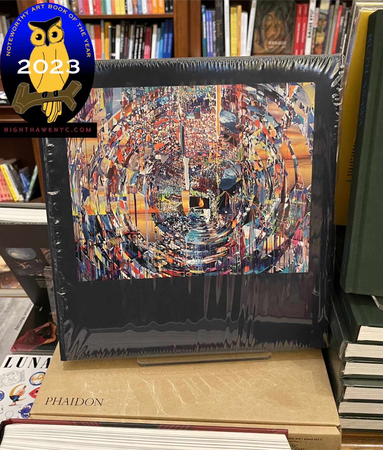
Sarah Sze Paintings sitting on top of its shipping box, as seen when I named it a NoteWorthy Art Book of 2023.
Sarah Sze- Paintings, Phaidon, 2023
A book that almost seemed to come from nowhere, Sarah Sze was already world-renowned as a Sculptor and Multi-media Installation Artist, who had begun to include Painting in her shows (as I showed in my piece on her stunning 2020 Bonakdar Gallery show, here). I don’t know which shocked me more- that her book of Paintings totaled 400-pages, or that their style was unprecedented. To my mind, they are every bit as memorable as anything else she’s done, and that is no small feat. As a sign of how important this book is to her, she’s signed every copy.
For more, see my piece naming it a NoteWorthy Art Book of 2023, here. My 2 pieces on Ms. Sze’s Guggenheim Museum show are here.
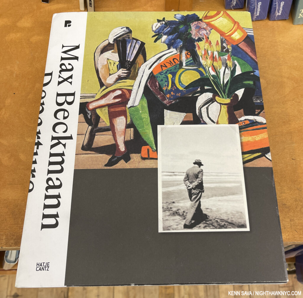
Max Beckmann, Max Beckmann: Departure, Hatje Cantz, 2023
There are a number of books on Max Beckmann, including some relating to shows in the U.S. (ex- MoMA, 2003, The Met, 2016, Neue Gallery, 2023), yet it seems to me he’s still a bit overlooked here. Max Beckmann: Departure published for a 2022-3 show at Pinkothek de Moderne, Munich would seem to be the book to help change that. Wonderfully blending Art with a copious amount of material from the Beckmann Archive, Max Beckmann: Departure is the most personal look at this most expressive Artist’s work and life. With 350 pages, 200 exhibits that include over 90 Artworks, many shown in a large size, among its 393 pictures, it’s certainly a feast for the eye, aided by very nice design. It might not be as comprehensive in terms of the number of Art works included as I might wish, but the Archival material makes up for it, and adds much more depth than one generally gets in Art monographs. This starts with the cover, which shows the Artist strolling a shoreline lost in thought.
One thing I admire most about Mr. Beckmann’s Art is that he defied being boxed at a time when boxes were rampant. That, and that many of his major work, including his Triptychs, were created while he was in exile from the Nazis in Amsterdam between 1937-47 (before coming to NYC).
The one caveat for me is the “Lay-Flat” binding does not hold up well to regular use, which is a shame because the spreads actually mininize the downside of going over the gutter while it holds up.
Max Beckmann: Departure seems to be a bit hard to find here for some reason. It’s not out of print, but few stores seem to have it. Perhaps being 2 years old has something to do with that, or, as I mentioned he’s not as popular here as he is in Europe. In any case, it’s a book to keep an eye on before it does go out of print.
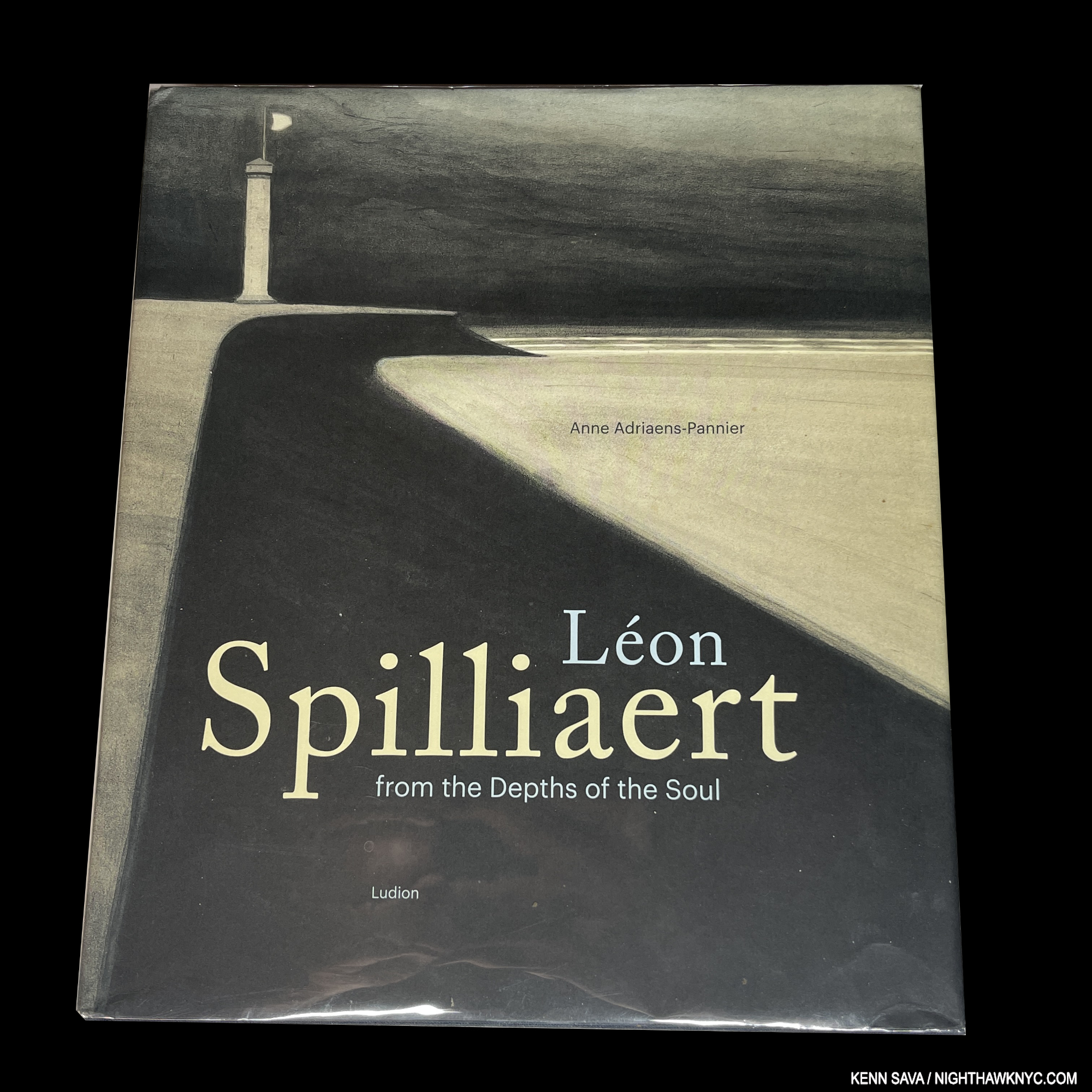
If any book on this list needs a black background, it’s this one. Almost none of his works take place in broad daylight.
Léon Spilliaert, Léon Spilliaert: From the Depths of the Soul, Ludion, 2019
I know, I’m drawn to Artists who are or were loners. Michelangelo, Shakespeare, Rembrandt, Van Gogh, Hopper and on and on. Loners, even thought Hopper & Shakespeare were married, Hopper for 50 years. Léon Spilliaert was married, too. I discovered him in 2021, during that universal isolation known as the pandemic, when I was captivated by the cover of the 2020 Royal Academy, London, exhibition catalog for the first U.K. solo show of his work (a virtual tour of it is still on youtube). I would have been sorely tempted to go to London to see it save for the lockdown. However, the aptly titled From the Depths of the Soul is the one-stop book for anyone looking to explore, or further explore, the one-of-a-kind Belgian Artist’s work that I’m putting on this list. There are so many unique, and ground-breaking, aspects to his work (like very few pieces are oil on canvas- most of its on paper, much of it incorporates colored pencils, before light-fastness) and a good deal of his oeuvre seems to presage the work of much more well-known Artists, like Giorgio de Chirico and Magritte. Comparisons abound between Spilliaert, Munch, his countryman James Ensor, and others, but for me, with all due respect to all of them, he stands apart- like so many of his figures do, in a world of his own making. As always, with a book like this that has over 400 illustrations, some will quibble over this or that image size. I hear you. I’m sure any number of them would be larger if they weren’t accompanied by a seemingly all-knowing text by Anne Adriaens-Panner of the Royal Museum of Fine Arts, Brussels, who was requested by Spilliaert’s family to compile the Spilliaert Catalogue Raisonne. She maintains a virtual running commentary woven into a fascinating whole covering his entire life and career that makes me forgive the occasional image I wish was larger (for them I turn to that 2020 RA catalog). It’s a price I’m more than willing to pay, and speaking of price, From the Depths can still be found quite reasonably for what it is.
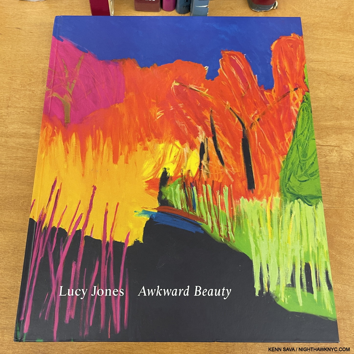
Lucy Jones, Awkward Beauty, Elephant/Flowers Gallery, 2019
“If people with disabilities were a formally recognized minority group, at 19% of the population, they would be the largest minority group in the United States,” (emphasis mine) the University of New Hampshire’s Institute on Disability 2011 report. UPDATE- In 2024, 70 million, or 1 in 4 people in the U.S., reported having a disability according to the C.D.C.
Since 1989, Art has become more and more inclusive. Yet, outside of a few big names who are and were disabled (like Frida Kahlo- listed above, Chuck Close, Yayoi Kusama- listed below), the disabled remain virtually invisible in the Art world! Why? If there were more books on disabled Artists, there would be more books to consider. But, there aren’t.
Lucy Jones is a British Painter who was born with cerebral palsy, yet she has gone on to create work that is in the collection of The Met (4 works) and the National Portrait Gallery, London. Her Portraits have the disarming directness and freshness reminiscent of Alice Neel though wholly hers, while her landscapes seem to take David Hockney’s as a jumping off point before exploding with color in ways I’ve never seen (as in the detail of one on the cover, above). Perhaps not surprising for an Artist who lists Rothko, Pollock and Matisse among her influences. Here, in Awkward Beauty, the first monograph devoted to her work, we get to experience the full range of her accomplishment over 25 years, along with excellent essays that reveal the Artist’s remarkable journey in getting to this point.
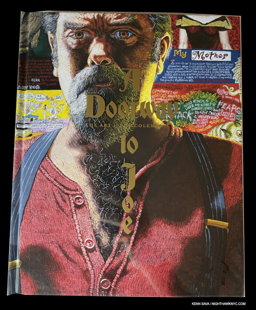
Joe Coleman, A Doorway to Joe, Fantagraphics, 2023
Joe Coleman has spent his life creating a unique body of Art that just can’t resist being “more.” “More” than Portraits, the Artist almost always adds text that reveals the backstory. In each one, the Artist’s passion for the subject comes through. There’s A LOT to look at in each of Mr. Coleman’s extremely intricate Paintings each executed with a stunning attention to detail in colors that stab the eye like a bolt of neon in the dead of night. A 450-page book of 150 Paintings (and an Introduction by Tom Waits, who not much has been heard from these past number of years) created over the past five decades is a powerful experience, on multiple levels by an Artist dubbed, “a walking ghost of old America.”
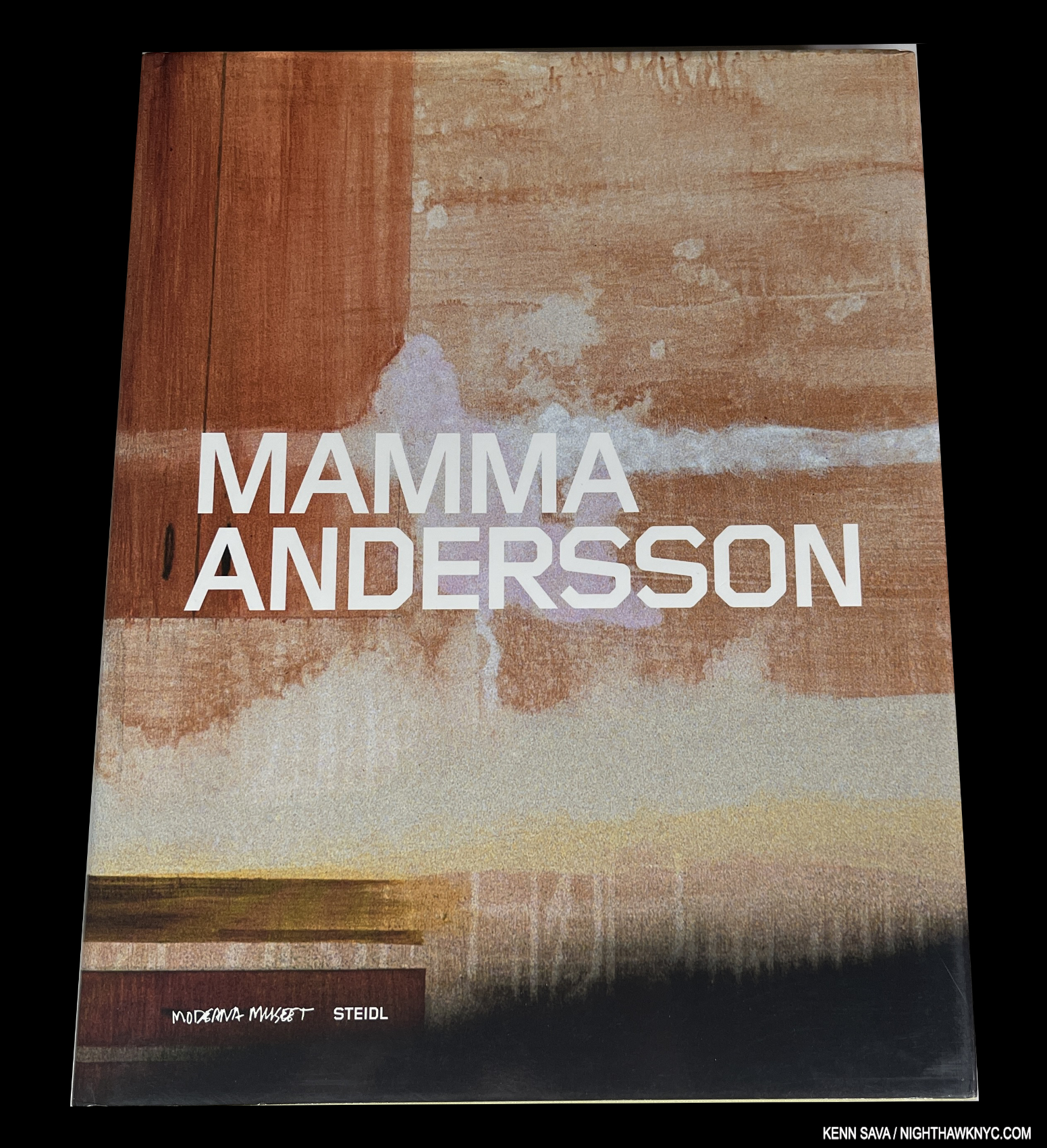
Mamma Andersson, Mamma Andersson, Steidl, 2005
A GORGEOUS book that’s on the shortlist for the most beautiful Art book of the century thus far. It seemed that Steiidl, and their designers, pulled out all the stops on this one. Innovative in ways that fit Mamma Andersson’s unique Art to a “t” in my view, it uses the Artist’s trademark mystery as a jumping-off point that only enhances it, and the overall effect of her work. I lost count of how many gatefolds are incorporated as a way of minimizing the dreaded “work over the gutter,” one of the biggest complaints I hear about Art books from my fellow Art book lovers. Out of print due to its popularity and now rare, VG copies begin around $175.
Mark Bradford, Mark Bradford, Yale University Press 2010
One of THE breakthrough Artist of the century thus far, Mark Bradford exploded on the scene and has never looked. back. The exceptional curator, Christopher Bedford, currently Director of SFMoMA, was one of the key figures who brought Mark Bradford to national attention, and he authored the first major monograph on his work. Though a number of books have follwed, I still find it the best book on him, and the best introduction to his work. Currently out of print, reasonably priced copies are still to be had.
I think they found the right cover image.
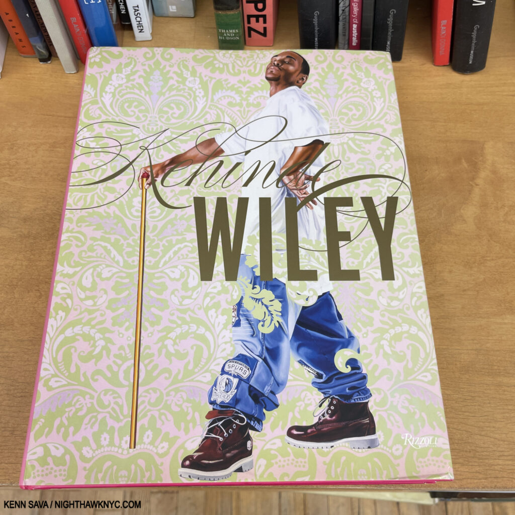
Kehinde Wiley, Kehinde Wiley, Rizzoli, 2012
Believe the hype. Kehinde Wiley is here to stay, in my view. His monumental work is matched by this oversized beauty. Heck, his Art is beautiful, deftly combining elements of his influences with the here and now, so ALL his books are beautiful! This is the most comprehensive collection to date, but it could use an update. Given Rizzoli has updated & revised their overviews on Frank Auerbach, above, and Helen Frankenthaler (which didn’t qualify for this list), among others, with superb results, I bet a Revised & Expanded edition of Kehinde will be coming one of these days.
Plant the seed.
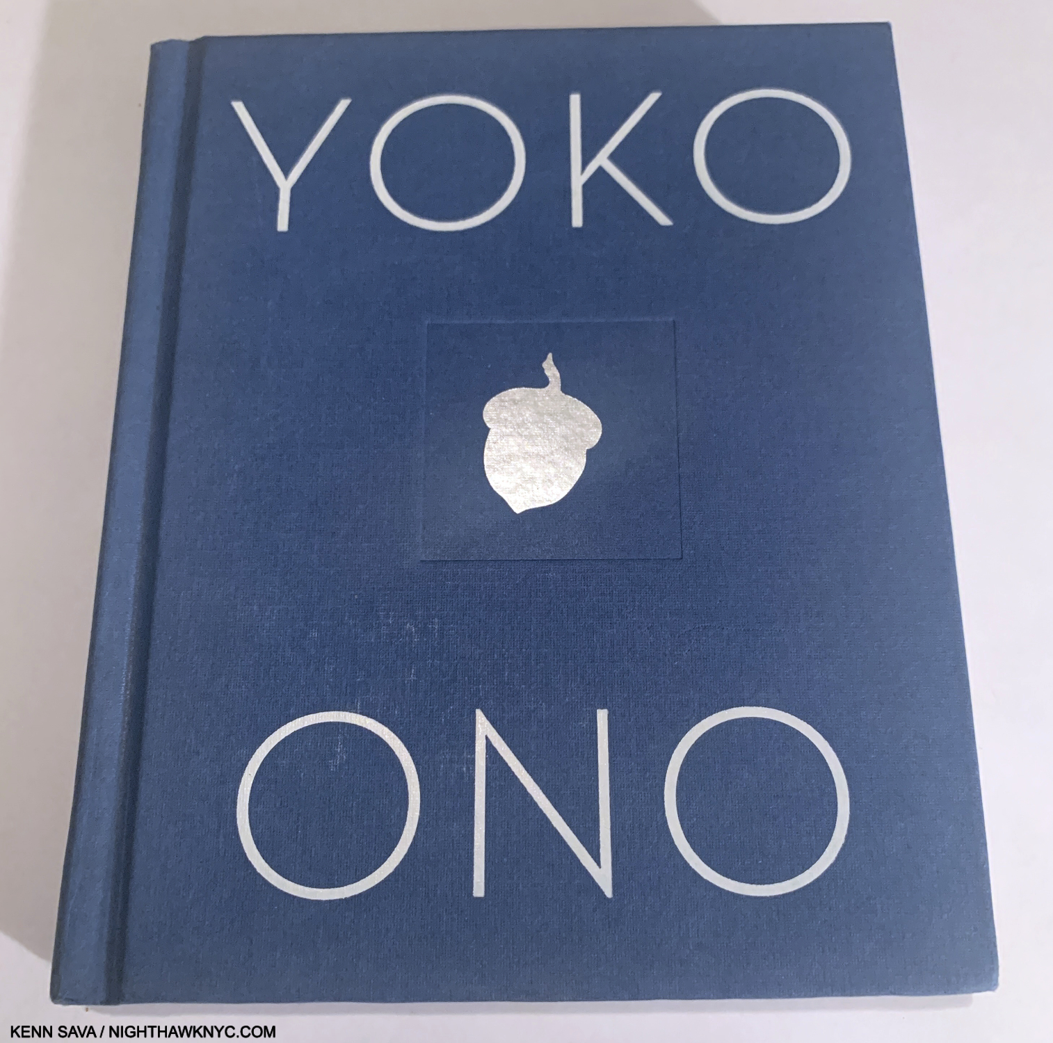
Yoko Ono, Acorn, Algonquin Books, 2013
My admiration, love and respect for Yoko Ono knows no bounds. Being one of the great PEACE activists of our time, the term ‘avant-garde” is frequently applied to her ground-breaking Art. Good luck with that! Acorn, it seems to me, throws a monkey wrench into those attempts to box this ethereal spirit. 100 incredible “Dot Drawings,” as she calls them, accompanied by texts that continue the “instructions” she gave us in her earlier classic book, Grapefruit (which Acorn is meant to follow, she says in it), and some are “meditations,” often taken from her life. At 5 1/4 by 6 1/4 inches (with 216 pages), Acorn is, also, one of the most effective smaller Art books I’ve ever seen. Hey, publishers- We don’t all live in 1,000+ square feet of space. Remember SMALL(ER) books?
A good number of the instructions in Grapefruit begin with “Imagine…,” which inspired the immortal song by John Lennon, one of my personal anthems (me, and millions of others…). As a result, Yoko was belatedly given co-writer status. “Imagine” starts a few of these as well.
Acorn remains the book I’ve most given to others. A head’s up! It’s becoming harder to find. If you see it new for its $18.95 list price, grab it. PEACE!
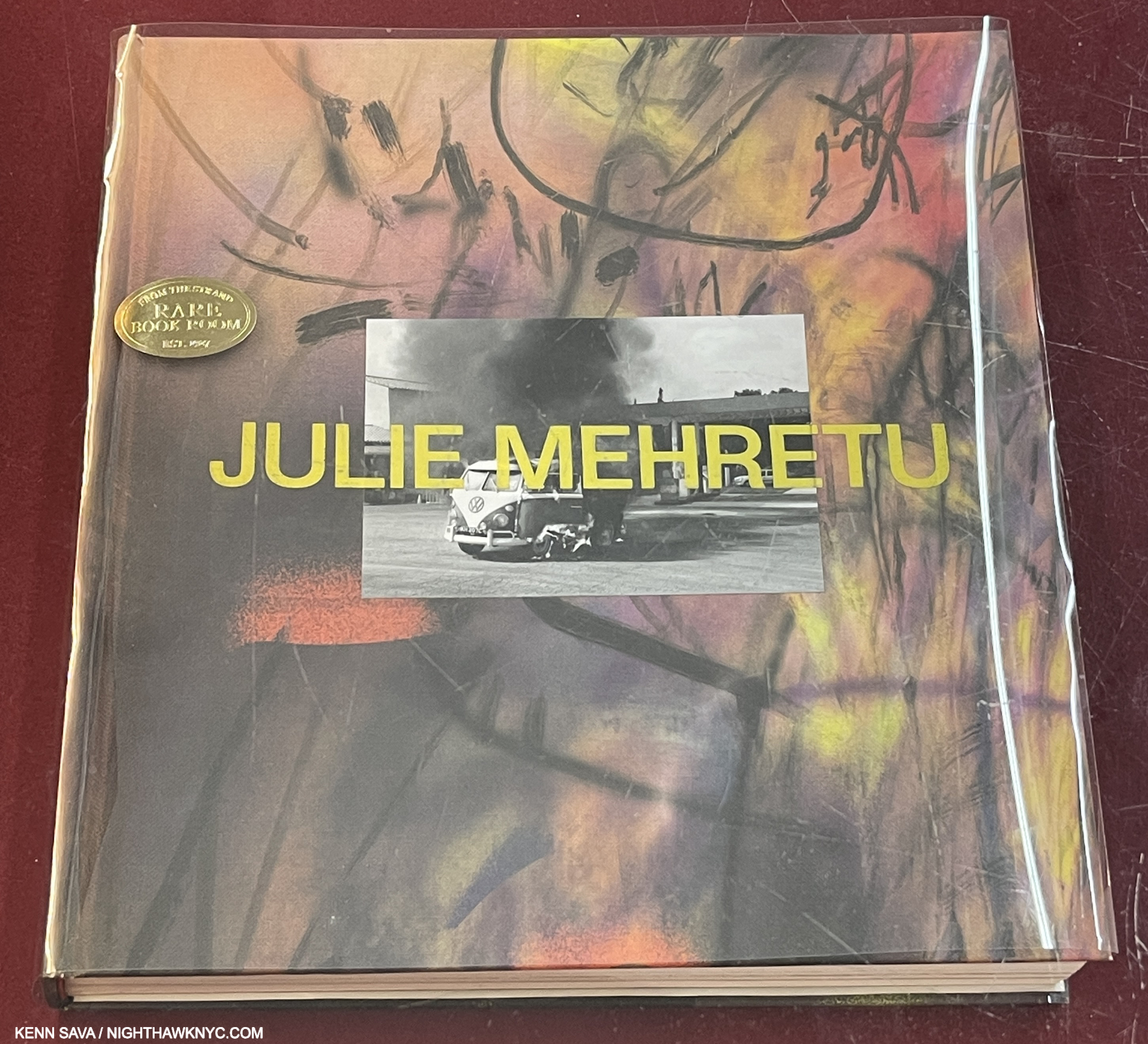
Julie Mehretu, Julie Mehretu, Prestel, 2019
If you blinked, you missed this ground-breaking book. Though far from the first book on her work (though the first full-length monograph), it’s like very few had seen the earlier books on her work given the lightning bolt effect the release of Julie Mehretu had. Her style is unique and revolutionary. Part Architectural Drawing, part seemingly based in Abstract Expressionism, and part Photo re-envisioning, it’s unprecedented. Ms. Merehtu is now an Art “superstar,” with shows all over the world, but this book remains a great place to get up to speed (through 2018). While her work is already vastly influential, I’m not sure how many will be able to copy her incredibly intricate style. VG copies trade for $250-300, now.
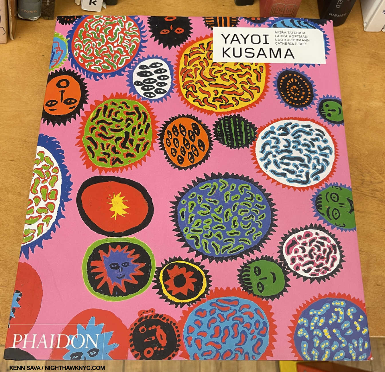
Yayoi Kusama, Yayoi Kusama, Phaidon Contemporary, 2017
Phaidon has released a steady stream of books on Contemporary Artists under their Phaidon Contemporary imprint, a most welcome thing. As time has gone on, however, I’ve been disappointed by some of these books, which pains me because in many cases their books are the most comprehensive on their subject Artist. Luckily, Yayoi Kusama is one of the best in the series, in my view, it’s, also, the best overview on her work published to date, no small thing considering the many books that have been published on one of the world’s most popular Artists. It includes a rare interview with Yayoi and a number of essays that look at her life and all she’s had to overcome along on remarkable journey that’s just at the beginning of its 96th year on March 22nd. Highly recommended for those new to her work, or for those looking to delve further into one of the most remarkable, and remarkably long, careers in 20th & now 21st century Art.
*- Capivara Editions Photo
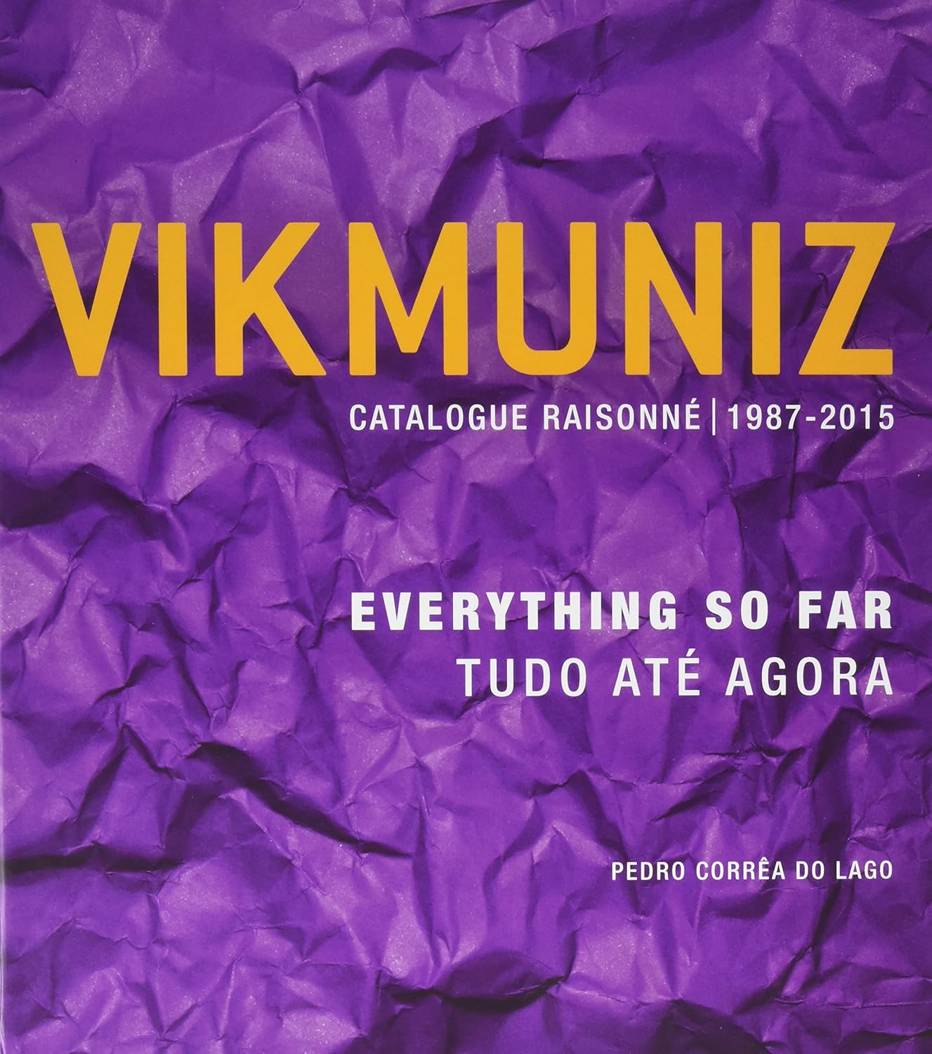
Vik Muniz, Vik Muniz – Everything So Far, Catalogue Raisonne: 1987-2015, Capivara Editions, 2016
Quoting myself, in my piece on his 2022 show, it surprises me that Vik Muniz is not one of the world’s Art “superstars.” It seems to me that his Art has everything required to make him hugely popular with Art lovers worldwide (not that he’s not already quite successful & accomplished, here, and around the world). In the 2-volume set, Everything So Far, you get to see just that, well everything the Artist created over the first 28 years of his incredibly prolific career. TEN YEARS old already, I imagine Mr. Muniz has AT LEAST another volume of work to add to these two already.
Another reason this set is on this list- along with the high quality of the work and the beauty of the set’s production, is that as you look through it, and move from chapter to chapter, you become ever more impressed (if not amazed) that ALL of this creativity, in a seemingly endless range of styles and mediums, a good number of which he invented, comes from one Artist. Topping it off, though it seems to me that though Vik Muniz’s work has that element of mass accessibility, it doesn’t come at the expense of content.
My look at Vik’s 2022 NYC show is here.
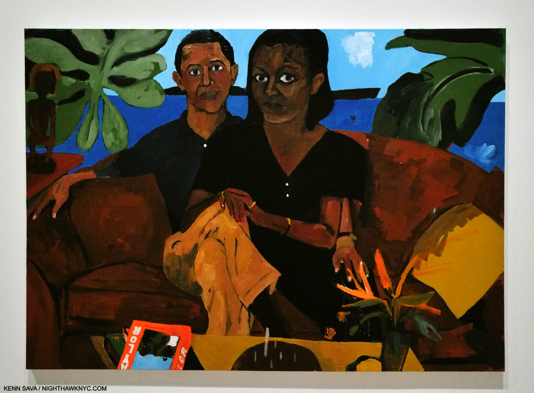
Henry Taylor, Untitled, 2020, Acrylic on canvas. The Obamas with a copy of Henry Taylor conspicuously displayed on their table. Artistic license? Or does the Artist know they have a copy. As seen in Henry Taylor: B Side at the Whitney Museum, January 26, 2024.
Henry Taylor, Henry Taylor, Rizzoli, 2018
Henry Taylor? Who? This book was a shock to those, like me, who were unfamiliar with the work of this California-based Artist when it was released, leading to it quickly selling out. Such are the joys of being a 30-years-in-the-making overnight success. Henry Taylor shows he was BUSY during all that time, and the fault is ours for sleeping on him. It’s is a book that still looks fresh revealing that though his work has a charm to it that belies its depth it also, already, has staying power. His work is full of surprises, but his love of Painting shines through everything he applies his brush to, which is impossible for me to resist. Reprinted, it’s currently available.
My look at Henry Taylor in the 2019 Whitney Biennial, and elsewhere around town, is here. My look at Henry’s 2019 Blum & Poe Gallery show, during which he borrowed my Sharpie and amended works in the show as I watched, mouth agape, is here, and my look at Henry’s stunning mid-career Retrospective, Henry Taylor: B Side at the Whitney is here.
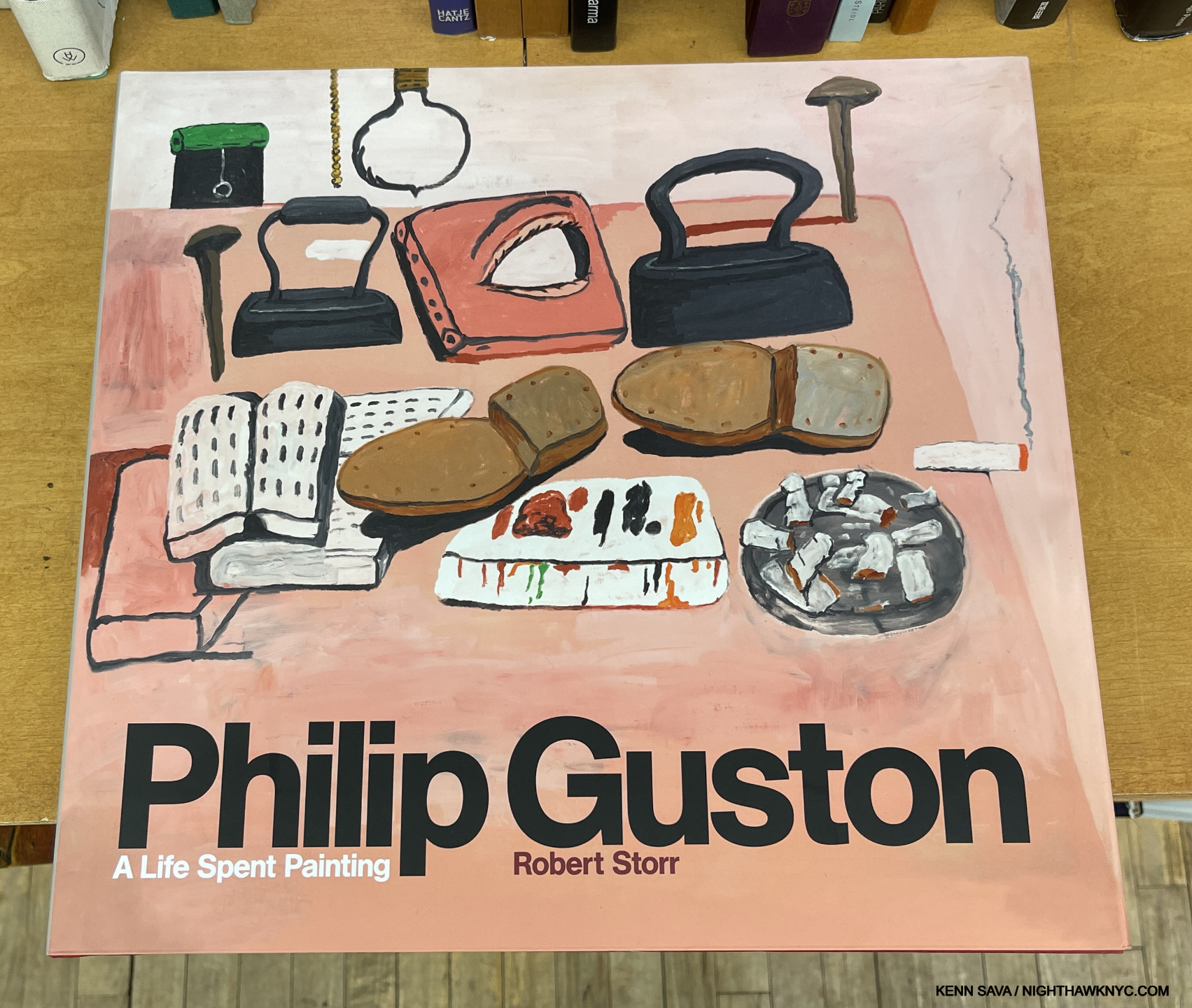
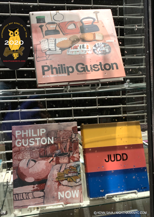
Philip Guston, Philip Guston: A Life Spent Painting, by Robert Storr, Laurence King, 2020
One of my NoteWorthy Art Books of 2020, A Life Spent Painting is a MASSIVE tome of 348, 12.6 by 14 inch, pages with more than 850 images, and weighing almost 8 pounds! I don’t know which is longer- How long Philip Guston’s work has been deserving of a book like this, or how long Robert Storr spent working on it (30+ years)!
Phitip Guston has proved to be every bit, if not more, influential since his passing in 1980 as he was in his life. Not surprising with a career that broke so much ground, there is much to appreciate. In spite of the controversy around some of his late work, which as I’ve said I believe is misunderstood, it’s good to see that long overlooked period of his Art get the attention it deserves. Also overlooked, in my view, is his 1940s work.
My look at a few NYC Philip Guston shows is here.
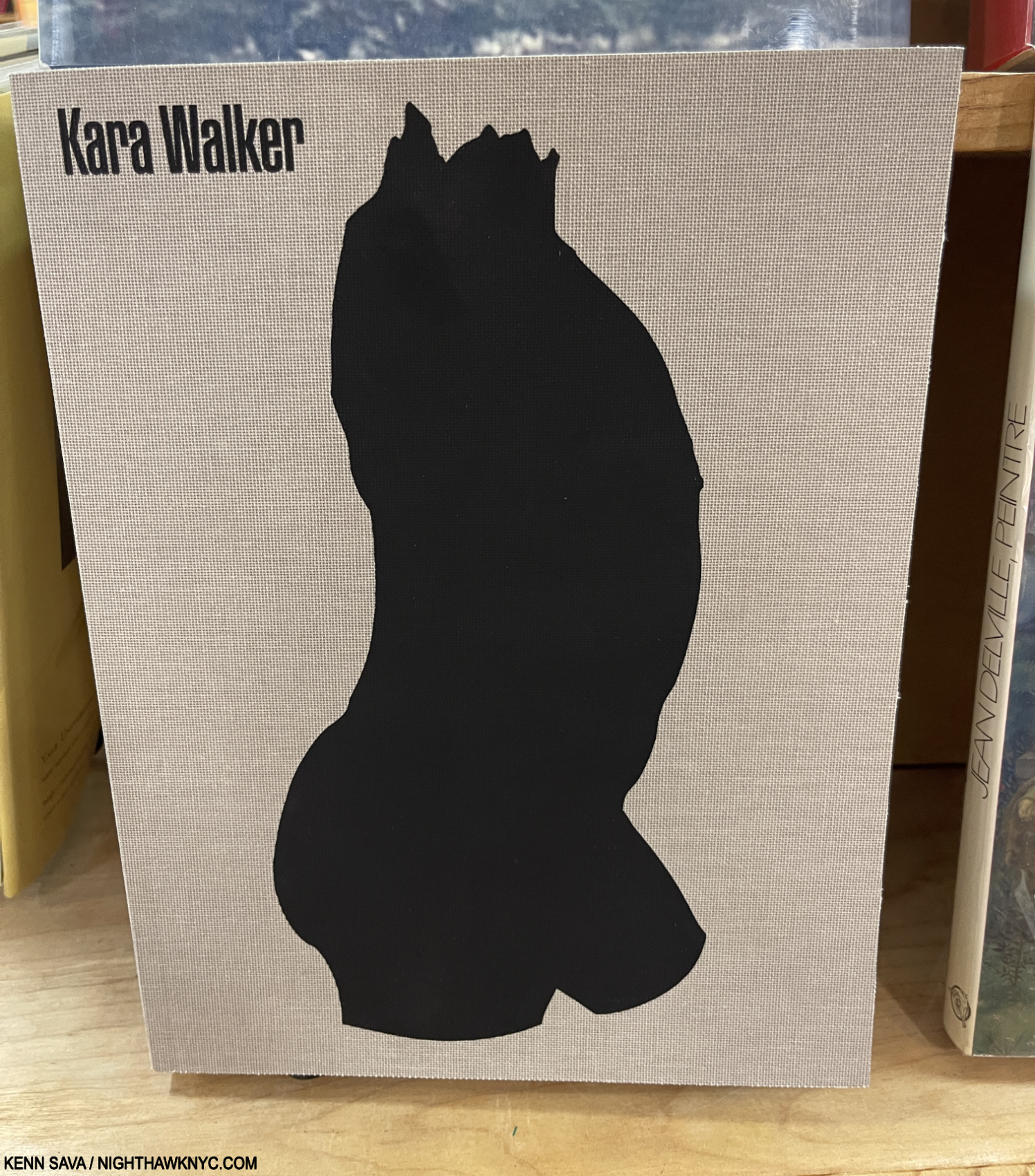
Kara Walker, A Black Hole Is Everything a Star Longs to Be, JRP Editions, 2021
This 600-page marvel firmly established Ms. Walker’s Drawings and works on paper as important as her already classic Silhouettes. 4 years old, I wouldn’t wait long to get a copy of A Black Hole, one of the Art books of the decade.
My piece naming this a NoteWorthy Art Book of 2021 is here. My look at her 2017 show is here.
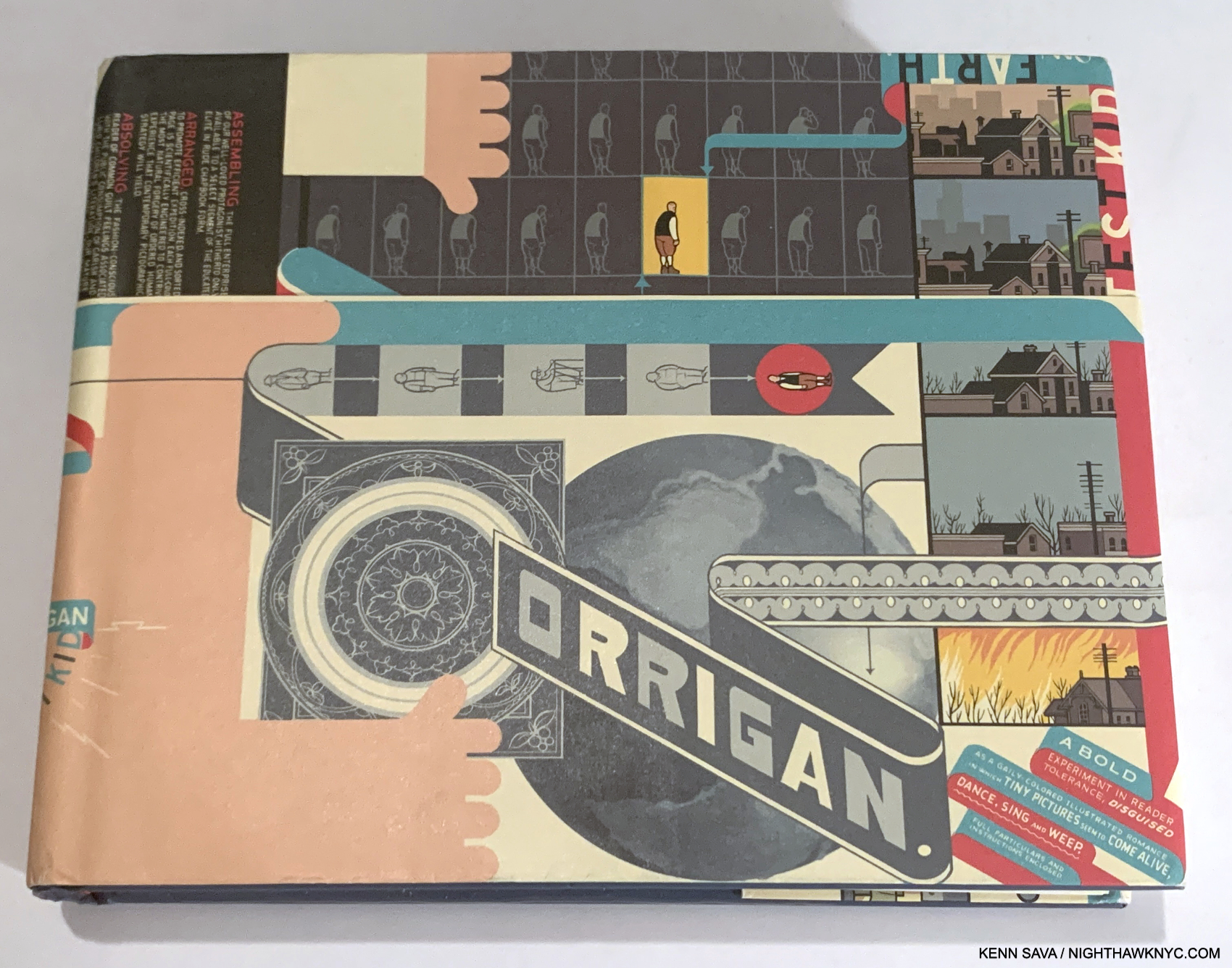
A First Edition copy of Chris Ware’s landmark Jimmy Corrigan: The Smartest Kid on Earth. Right from its amazingly intricate double-sided fold-out poster/cover, you know you’re in for something you’ve never seen before. “A bold experiment in reader tolerance…,” the lower right reads. That echoes what the incredibly self-effacing Artist told me when I bought Art from him in 2001- “It’s easily disposable.” Note- If ANYONE is throwing out Chris Ware Art, please contact me first!
Chris Ware, Jimmy Corrigan: The Smartest Kid on Earth, Pantheon Books, 2000
The ground-breaking classic that ushered in the current era of the Graphic Novel, and made a good many people sit up and take them seriously, including The Guardian, who gave it their 2001 First Book Award, the first time a Graphic Novel won it. Jimmy is a book born of Chris Ware’s own experience with his estranged father, shrouded in what has become to be known as his signature melancholy style turned into Fine Art in the hands of one of the most innovative and ground-breaking Artist/designers of our time.
My look at the debut show for the work from his now-classic 2nd book, Building Stories, is here.
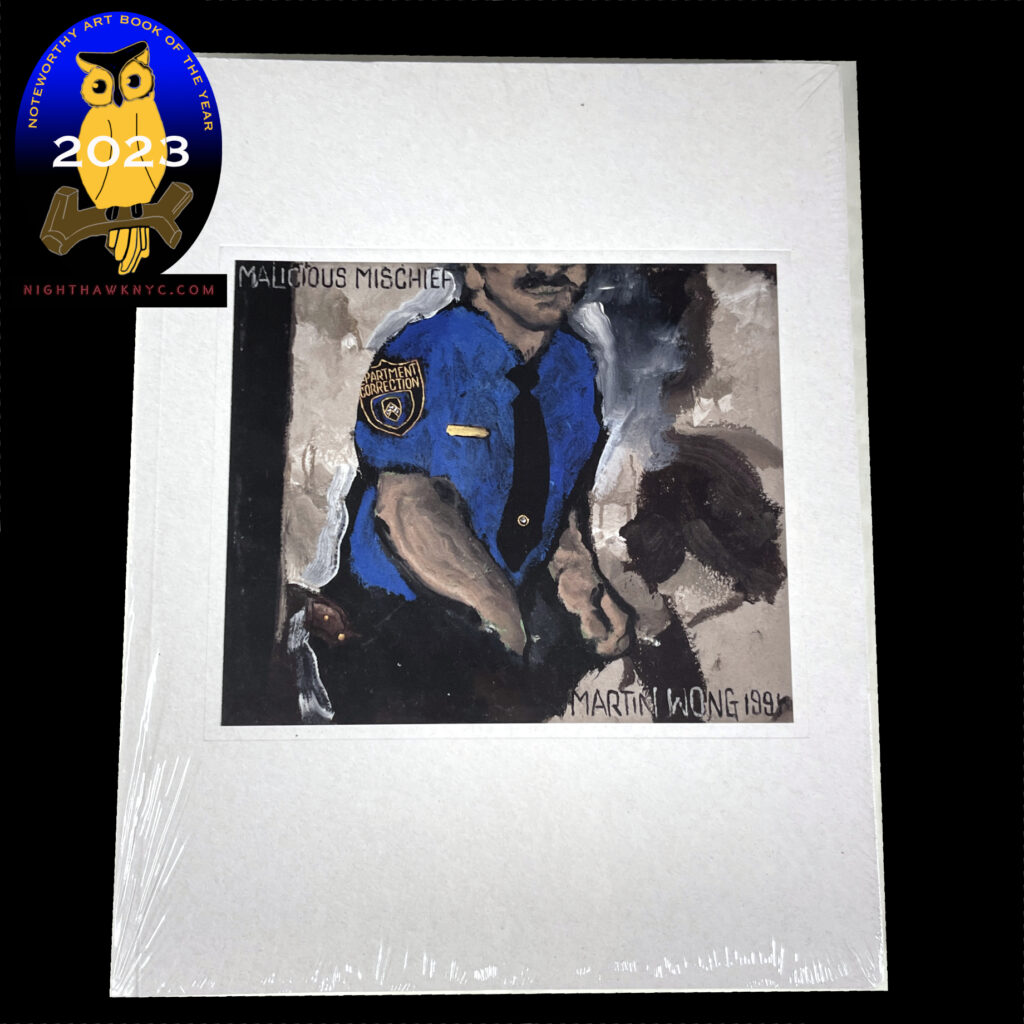
With its NoteWorthy Art Book of 2023 designation.
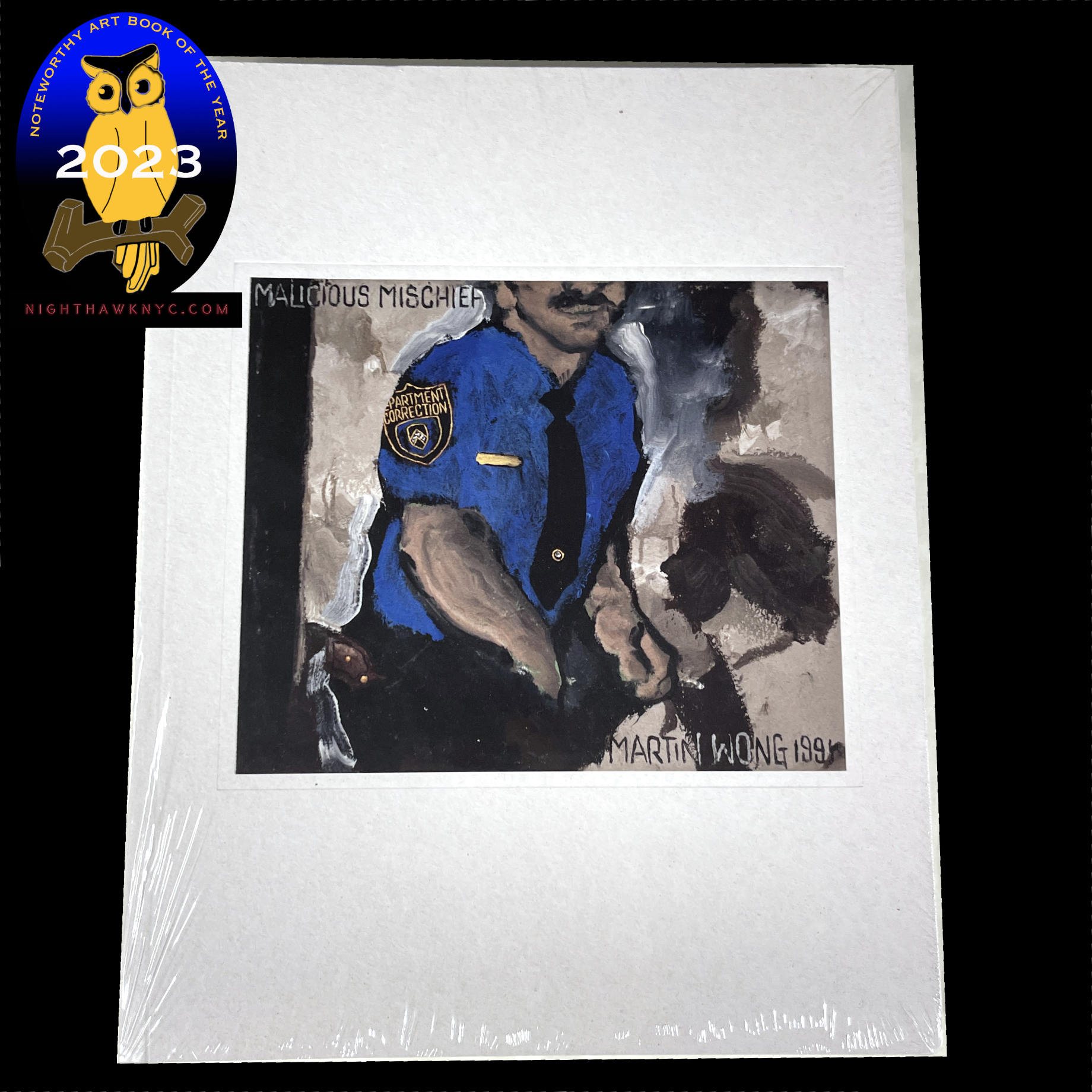
Martin Wong, Martin Wong: Malicious Mischief, 2022, Walther Konig
Little by little Martin Wong’s star has continued to rise this century, though the publication of Malicious Mischief coincided with what looks to have been a superb exhibition that made a number of stops in Europe, I’m calling this a monograph because it goes far beyond an exhibition catalog to be the most comprehensive book on this extremely talented Artist who died in 1999 at just 53. The Met, MoMA and the Whitney, among others in the U.S., own his work. So, WHERE is his American Retrospective? Until it happens, the beautifully designed (though I wish it was a hardcover) Malicious Mischief is THE place to see the most Martin Wong Art, in a nice size, to boot. Out of print, VG copies start around $195.00.
My piece naming it a NoteWorthy Art Book of 2023 is here.
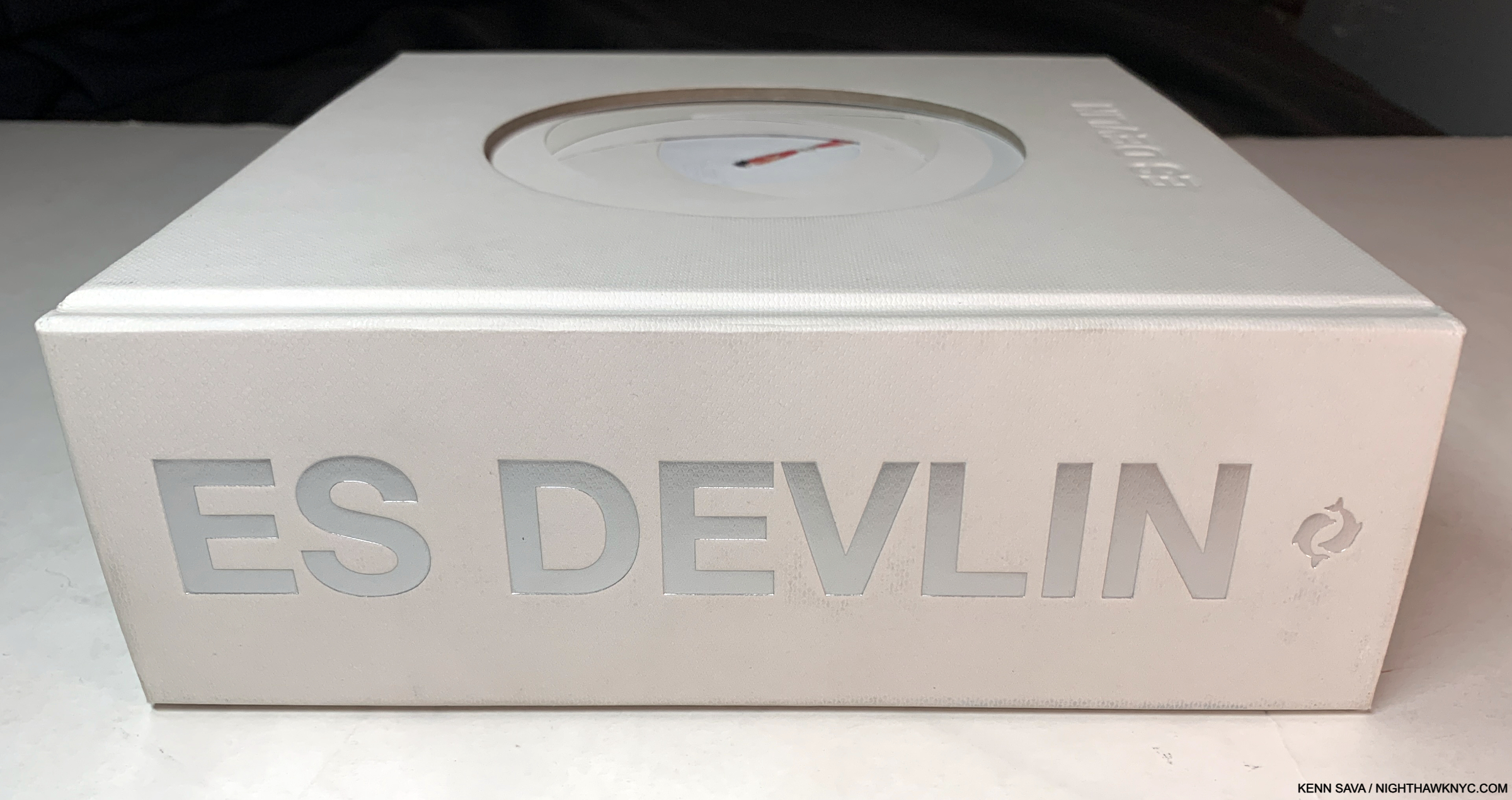
Es Devlin, An Atlas of Es Devlin, Thames & Hudson, 2022
Even if her Art wasn’t NoteWorthy (IT IS!) this book would still be on the shelves of countless designers for reinvisioning and expanding the possibilities of the Art book, and of Artists for Ms. Devlin’s seeming endless imagination. For me, it’s wonderful that such a cutting-edge creator still relies on “old-fashioned” pencil on paper, and Drawing! Remember Drawing?
My piece naming it a 2024 Noteworthy Art Book of the Year is here. My look at her Museum of Design show of the same name, which accompanied the publication of this book, is here.
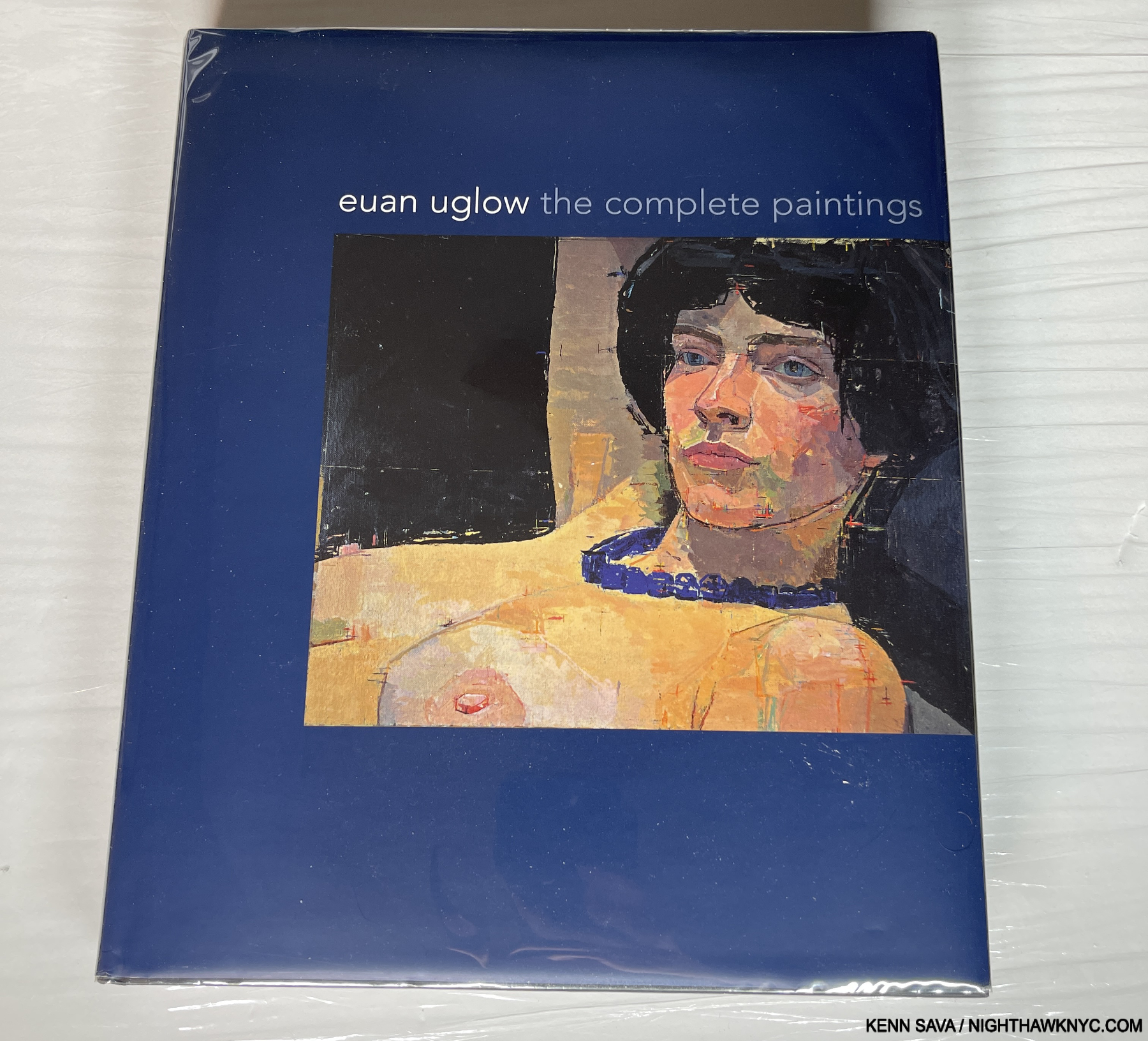
Euan Uglow: The Complete Paintings. Perhaps the sleeper book on this entire list, remarkably still in print, 18 years later. That says a lot about it lasting import.
Euan Uglow, Euan Uglow: The Complete Paintings, Yale University, 2007
“Nobody has ever looked at you as intensively as I have.” Euan Uglow to one of his models in 1998.
And it shows.
Euan Uglow: The Complete Paintings is a Painting book that melds Catalogue Raisonne (a book that shows all known work) with a monograph (something more common of late), and does it so well it’s a model for how the two can work together in one book. Traditionally, Catalogue Raisonnes were aimed at museums, dealers or collectors looking to buy or sell a work by an Artist (where they served as the definitive reference), and so they can be very dry affairs with small images (sometimes in black & white), which disappoint Art lovers looking to see more work by the subject Artist. Euan Uglow: The Complete Paintings is a book that will edify specialists, yet one that I think many Art lovers interested in knowing more about Mr. Uglow’s work will be quite happy with.
I was completely unaware of the late Mr. Uglow (1932-2000) until I began researching Art historian Catherine Lampert’s other books besides Frank Auerbach: Speaking and Painting (which is on this list further on), and discovered she authored this one. A somewhat legendary book, particualarly among figurative Painters, I was immediately mesmerized. Some have quibbled about the image size of some reproductions. Well, with 532 works pictured on 244, 10 by 12 inch pages, some compromises had to be made (Note- The publisher lists this book as 244 pages. Well, the Cat Rai totals 244 pages. There are an additional 79 pages of essays by Richard Kendall and Ms. Lamper twith roman numerals! 323 pages total). Catherine Lampert also contributes the Catalogue of all known Uglow works. The wonderful thing about this is that she annotates most of the entries with her special insights born of knowing the Artist for so long (she’s pictured with him in 1978, and she modeled for him, as she did for Frank Auerbach), as well as innumerable obscure quotes from the Artist, which forms a running narrative, something I’ve never seen before in a Catalogue Raisonne, And so, she goes well beyond the standard info a C.R. usually provides (i.e. title/date/medium/dimensions/ownership history with maybe a published citation included alongside an image that might be a thumbnail or medium-sized). In my opinion, Euan Uglow: The Complete Paintings reinvents the Cat Rai.
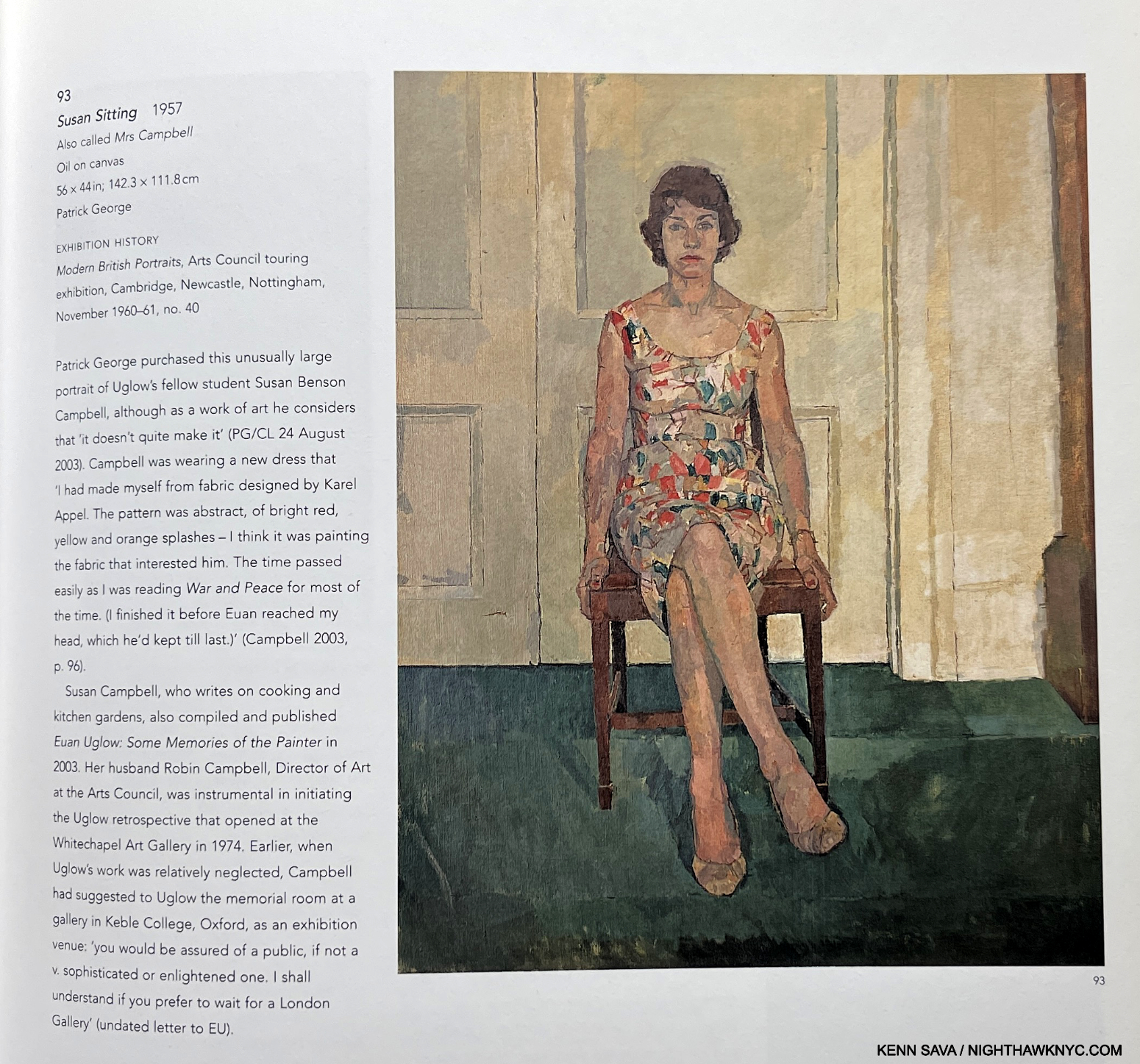
Here’s one example. Page 35. Click for full size.
Being able to see an Artist’s work from the beginning to the end has enthralled me since I was a kid, when I discovered Bob Haak’s Rembrandt, as I said earlier. It’s like a “different kind” of “autobiography” in a way. In Euan Uglow: The Complete Paintings you get to watch the Artist become just that by building on his early education with William Coldstream, and the influence of Cézanne, to developing something uniquely his. As his work becomes more and more popular and respected (both of which I expect to continue), this book will remain the essential volume on it. Though it lists for $120. new, the price has not stopped people from buying it, witnessed by the fact that, 18 years after its publication, it’s in its 8th printing! I agree with what one Artist reviewer said after saving up for it, “It’s worth every penny.”
The cover of Volume 1. And here, an epic journey begins. One that would last for 28 years.
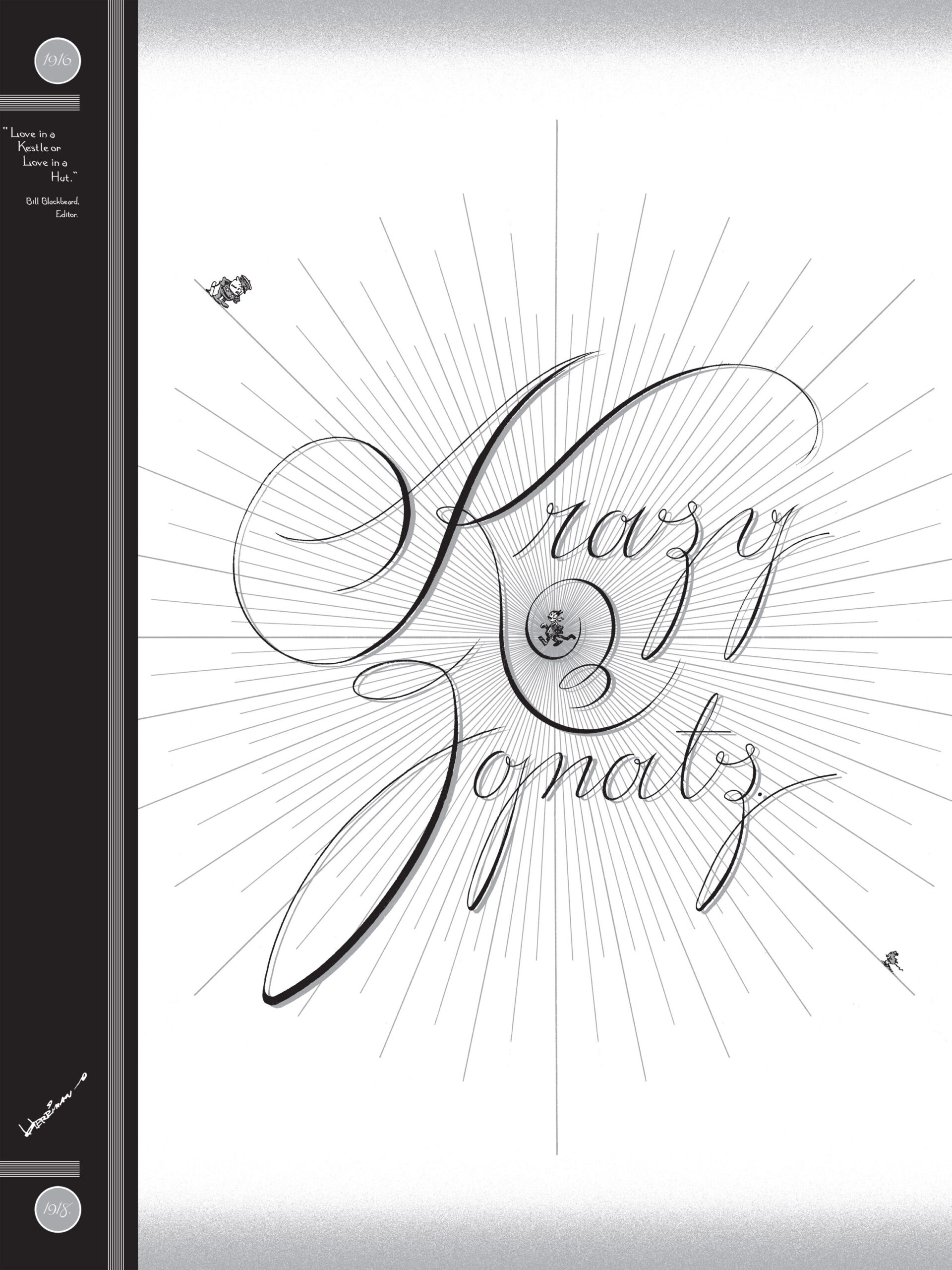
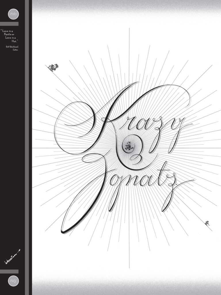
George Herriman, Krazy & Ignatz, 1916-44, Fantagraphics, 2002-2012, 13 Volumes
An astounding achievement, George Herriman’s Krazy Kat comics revolutionized comics, and showed countless Artists just what was possible in the medium. Among those influenced by Mr. Herriman is Chris Ware, cited elsewhere in this piece, who designed each and every volume of the series wonderfully melding his unique style, which has roots in that of his illustrious predecessor, with that of Mr. Herriman. Here we get it all, from his the beginning, right through his fascinating and beautiful color pieces (1935-44). Though the series has since been reissued in a large set of handsome hardcovers, this is the set I will keep returning to because of the justice Chris Ware, who has become a major contributor to the history of comics and the graphic novel himself, does to it. What’s it all about?-
“At the center of the strip is an inter-species love triangle: Krazy, the black cat, loves Ignatz, the white mouse. Ignatz (though they would swap colors from time to time!), however, hates Krazy and takes delight in boping him/her with a brick. Krazy, with a charming naiveté, interprets these bricks as symbols of love. Offisa Bull Pupp, the white police dog who is secretly in love with Krazy, has a clearer view of the matter and tries to jail Ignatz. Krazy of course is perfectly indifferent to Pupp but enjoys the way “like lil innisint childrens they[Ignatz and Puppl play togeda.
Yes, Krazy Kat takes place in an “absurdist universe,” yet it seems to me it can also be seen as a veiled saga of different species getting along and actually loving each other (a cat loves a mouse; a dog loves at cat) written at a time when racism in the U.S. was at its peak. But that’s just scratching the surface. I think it’s the fact that Mr. Herriman is an Artist on multiple levels that has kept Krazy Kat preeminent among comics for so long. You can focus on any aspect of it- from the black and white, bisexual characters, to the (hopeful) ironies mentioned earlier, to the ground-breaking graphic design and the Art present in every panel, to the tale of unrequited love that twists and turns seemingly endlessly, indefinitely. Over 100 years have now passed since he began Krazy, and he has gotten more and more well-deserved attention for creating a masterpiece that pulled no punches- visually or in its writing, characters or stories. It’s hard to say just how many boundaries Mr. Herriman broke with Krazy, and he did it with carte blanche from publisher William Randolph Hearst, himself, who was just one of his fans, along with the likes of Gertrude Stein, e.e. summings, F. Scott Fitzgerald, Pablo Picasso, James Joyce, US President Woodrow Wilson, Jackson Pollock, Charlie Chaplin, Frank Capra, P.G. Wodehouse, Willem de Kooning, to name but a few.
My worn copy of Taschen’s Neo Rauch is never far from where I can reach it.
Neo Rauch, Neo Rauch, Taschen, 2013
There are now many books on Neo Rauch, including some very good ones, and though I have, or have seen, almost all of them. I keep going back to this one, as I continue to wrestle with his eternally mysterious work, even though it’s now 12 years outdated. Its generous XL size suits his often huge works wonderfully, and so gives me the best fighting chance of getting there, aided by very insightful commentary. Among my very favorite Contemporary Art books, and long out of print, VG copies can be had for $200. I live in continual hope Taschen will update it and reissue it one day soon. When I asked Mr. Rauch about just that last year, he wistfully shook his head. Well, I can dream, can’t I?
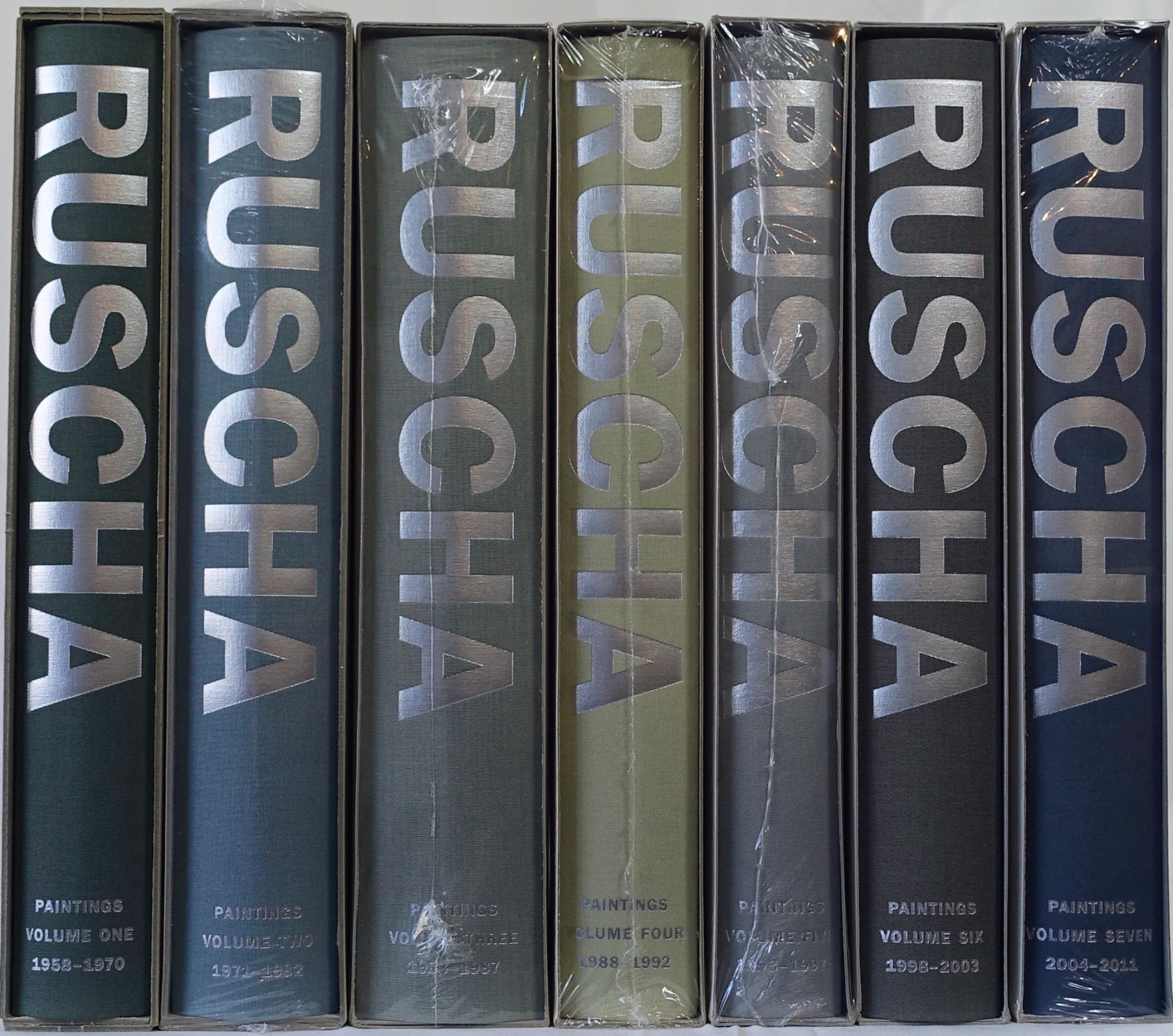
All seven of them. So far. Though handsome, I wonder why they chose these colors for the covers. It’s not like they’re so different as to make telling one from the other easy at a glance. And they each come in the same grey cardboard slipcase with no labelling on it
Ed Ruscha, Ed Ruscha: Catalogue Raisonne of the Paintings, Seven Volumes (so far), Steidl, Volume One published in 2004
Ed Ruscha’s Paintings are finally getting the Cat Rai treatment they’ve been crying for for most of the past SEVENTY YEARS(!) he’s been making them. By the time it’s completed it will be an unprecedented set for any Contemporary Artist. Beginning in 1958, when the Artist was still in school, Ed Ruscha has continued to fascinate, mystify, and bring a smile to the face of countless viewers ever since. If there’s one major revelation these seven large, handsome, books provide it’s that Mr. Ruscha NEVER sits still! Every subject he’s revisited over his long career he’s done so with a difference, and it takes such a voluminous set that delineates each and every “thing” (often literally- like blood, gunpowder, chocolate, and on and on and on…) he’s used in creating each work to appreciate all of them, and all the innovations that have gone into them. Good thing, too. Otherwise HOW would we know such and such Standard Gas Station piece was made using a different one of his seemingly endless technical innovations than that other one was?! These discoveries add exponentially to the appreciate of Mr. Ruscha’s accomplishment. Volume One has been out of print for a few years, so expect some of the others to follow. My one caveat is the amount of repeated material in the back of each book. Shouldn’t this have been saved for the end of the final volume when it will be the most current info? Volume Seven, published in 2017, “only” goes up to 2011, so expect a few more as the Artist continues to work full speed ahead as he approaches his 88th birthday. Many more, Ed!
My 3-part series on Ed Ruscha/Now Then at MoMA is here.
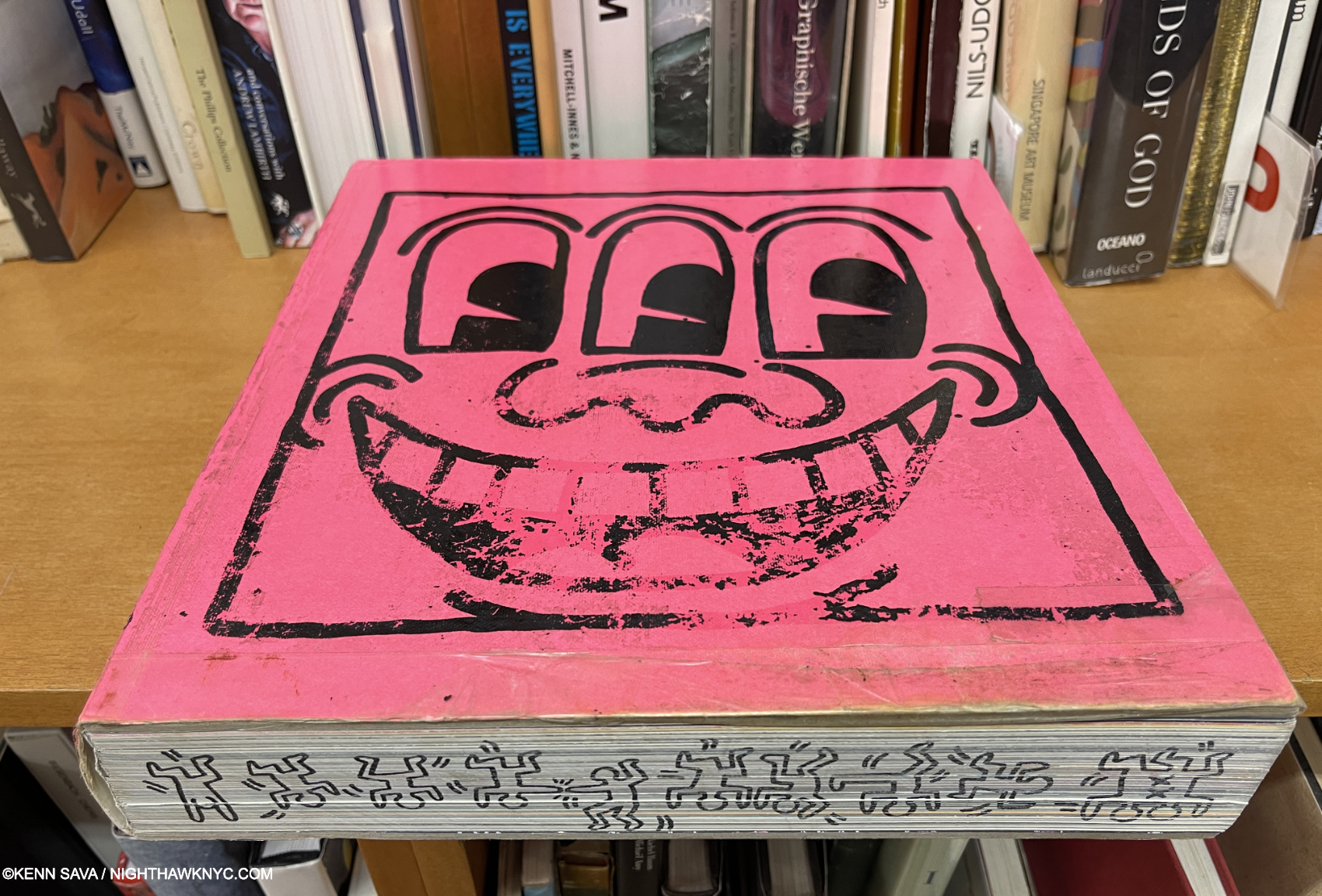
A copy of the larger first edition of Keith Haring showing it’s (quite rightly) been handled a fair amount. I imagine that had he lived to design it, Keith may well have created Art for the edges, and who knows what else.
Keith Haring, Keith Haring, Rizzoli, 2008
Jean-Michel Basquiat said he wasn’t a graffiti Artist, though it seems few have paid any attention to that, sadly. Out of everyone else who’s written on walls, buildings, and everything else, it seems to me that, so far, only Keith Haring among “graffiti Artists” has achieved a lasting place in the museums. There may be a lesson in that, but I’m not getting into that now. Meanwhile, this book is a knock-out, a glorious 528-page testament to Mr. Haring’s incessant ability to make a line dance that always surprises the eye, and his tireless dedication to causes that continue to be important. Page through this book, and when you’re done marveling at how much work Keith Haring did, shake your head at the fact that he tragically died of AIDS-related complications at just 31 in 1990. The original 2008 edition, pictured, was a beautiful 12-inch square providing lots of landscape for the Art. It’s been reprinted at smaller sizes since, still very nice, which can still be had quite reasonably.
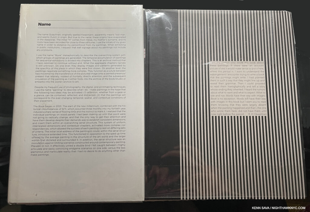
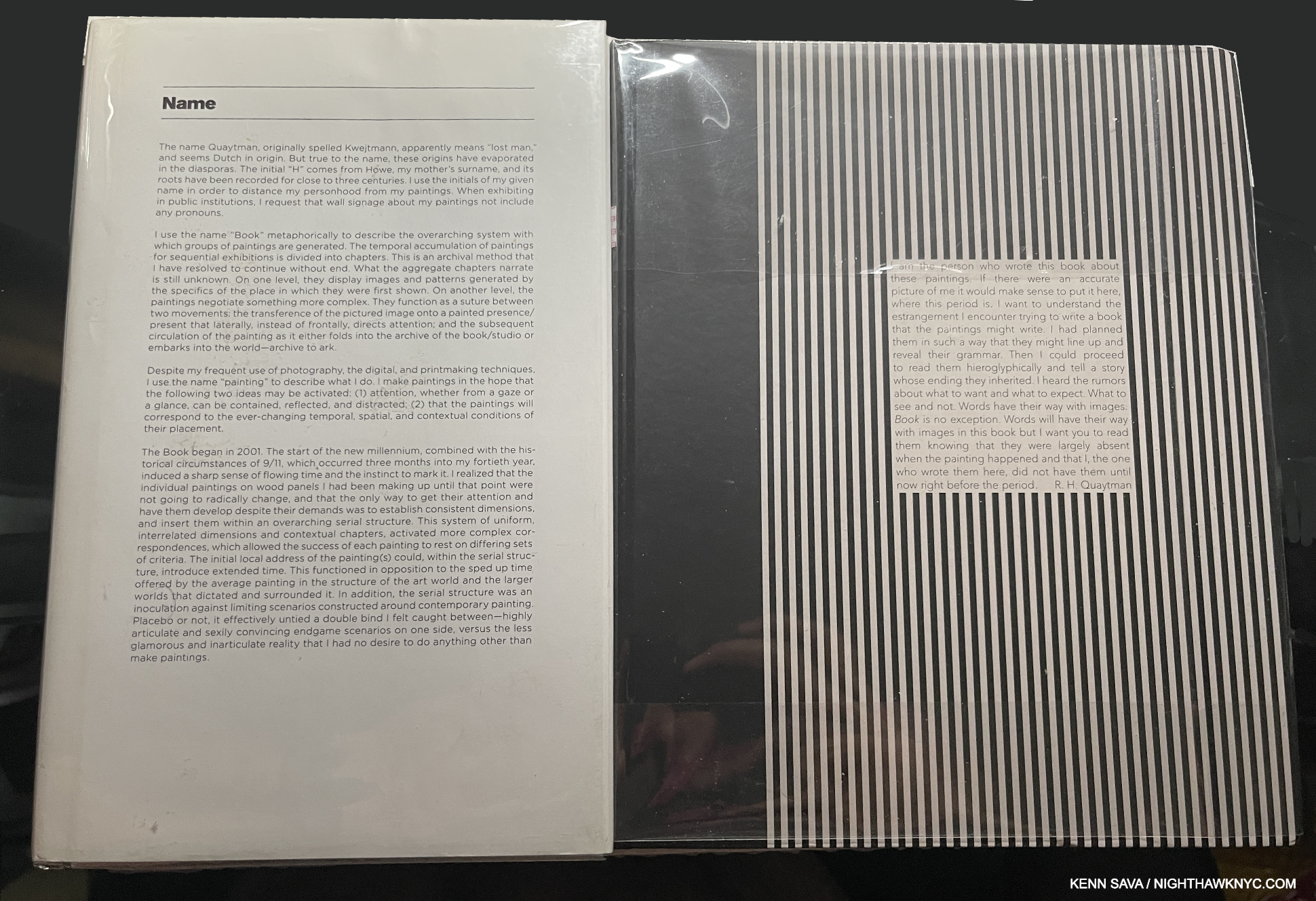
Spine, left, now quite rare, and the newly released Book, right, are two unique Catalogue Raisonnes covering all of R.H. Quaytman’s “Chapters,” as she calls her work, from 2001 to date.
R.H. Quaytman, Spine, Sternberg Press, 2011 and
Book, Glenstone, 2025
Slowly and surely R.H. Quaytman’s work has grown in institutional recognition and appreciation. Albeit too slowly! While we wait the long-overdue mid-career Retrospective of her work, there is no better way, or place, to experience ALL of it than in her two spectacular books, Spine (2011), and now Book (2025), which form Volume 1 (Book) and Volume 2 (Spine) of her Catalogue Raisonne. One thing that makes them both different is that they are a rare instance of an Artist largely designing their own Catalogue Raisonnes, and that greatly enhances the results.
The parts of a book resonate throughout Ms. Quaytman’s work. Paintings exist in Chapters, and her two books are named Spine and Book. Spine (2011), collects the Artist’s Paintings from 2001 to 2010 over 616 pages in “Chapters,” as she defines her work. Ms. Quaytman has stated that she will continue to work in Chapters until she dies. As interest in her work grew in the 2000s, copies of Spine became harder and harder to find. It struck a chord with many of those fortunate enough to see it, that it has gone on to achieve legendary status. Long out of print, VG copies currently begin at $160. The newly published Book, the most recent book on this list, picks up in 2011 where Spine ends and covers her work to 2020. Together, they clock in at 1,032 pages, but between the design and the content, then seem to fly by. Her work has a toe in many realms and mediums, making her impossible to box (Yay!).
Ms. Quaytman is also a longtime admirer and supporter of Hilma after Klint (more on Hilma & R.H. Quaytman, here). She curated the very first NYC Hilma af Klint show at MoMA PS1 in 1989!- the only solo Hilma af Klint show in the U.S. until the Guggemheim’s blockbuster, Hilma af Klint: Painting for the Future (which I wrote about here). Fittingly, a show of her work occupied the upper floor of Frank Lloyd Wright’s Guggenheim Rotunda during its run.
Two essential books, in my view, for anyone interested in Contemporary Painting. Grab Book before it becomes as scarce as Spine!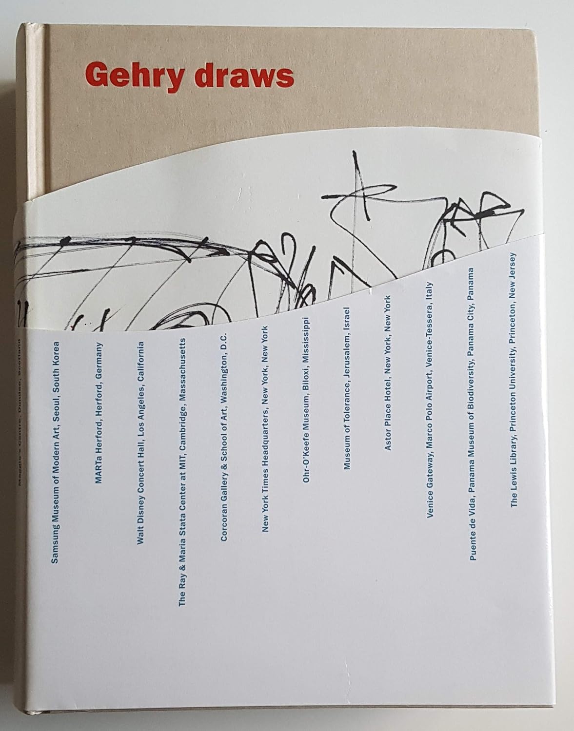
Frank Gehry, Gehry Draws, MIT Press, 2004
If 100 people who had never heard of Frank Gehry and were shown the Mr. Gehry’s Drawings in this book, I wonder how many of them would guess these were designs for buildings. On their own, they’re Art in my book, and the chance to see how a visionary Architect’s mind works, and how his structures begin is just extraordinary. With all the books published on the finished buildings, this is one of the few that speaks to their genesis, and containing the work of one of the great masters of Architecture of the 20th and now 21st centuries makes it even more important.
Out of print, copies remain reasonably priced. At least for now.
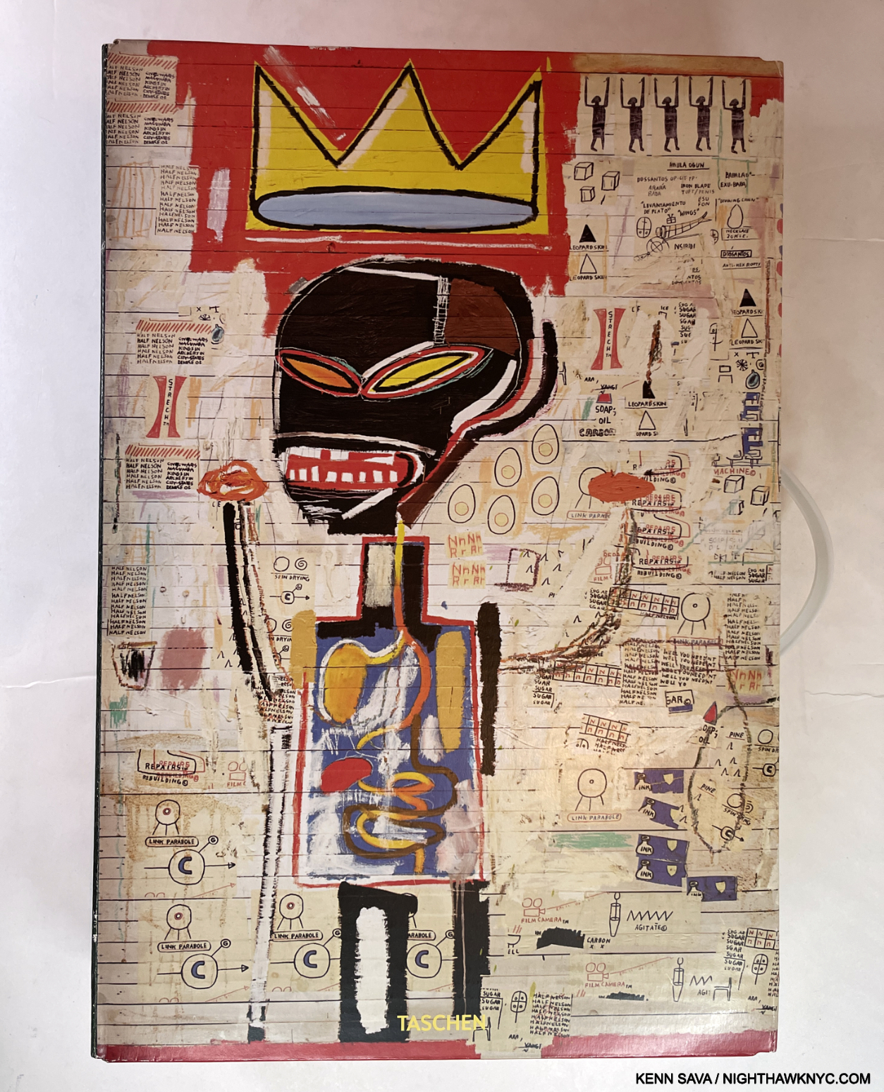
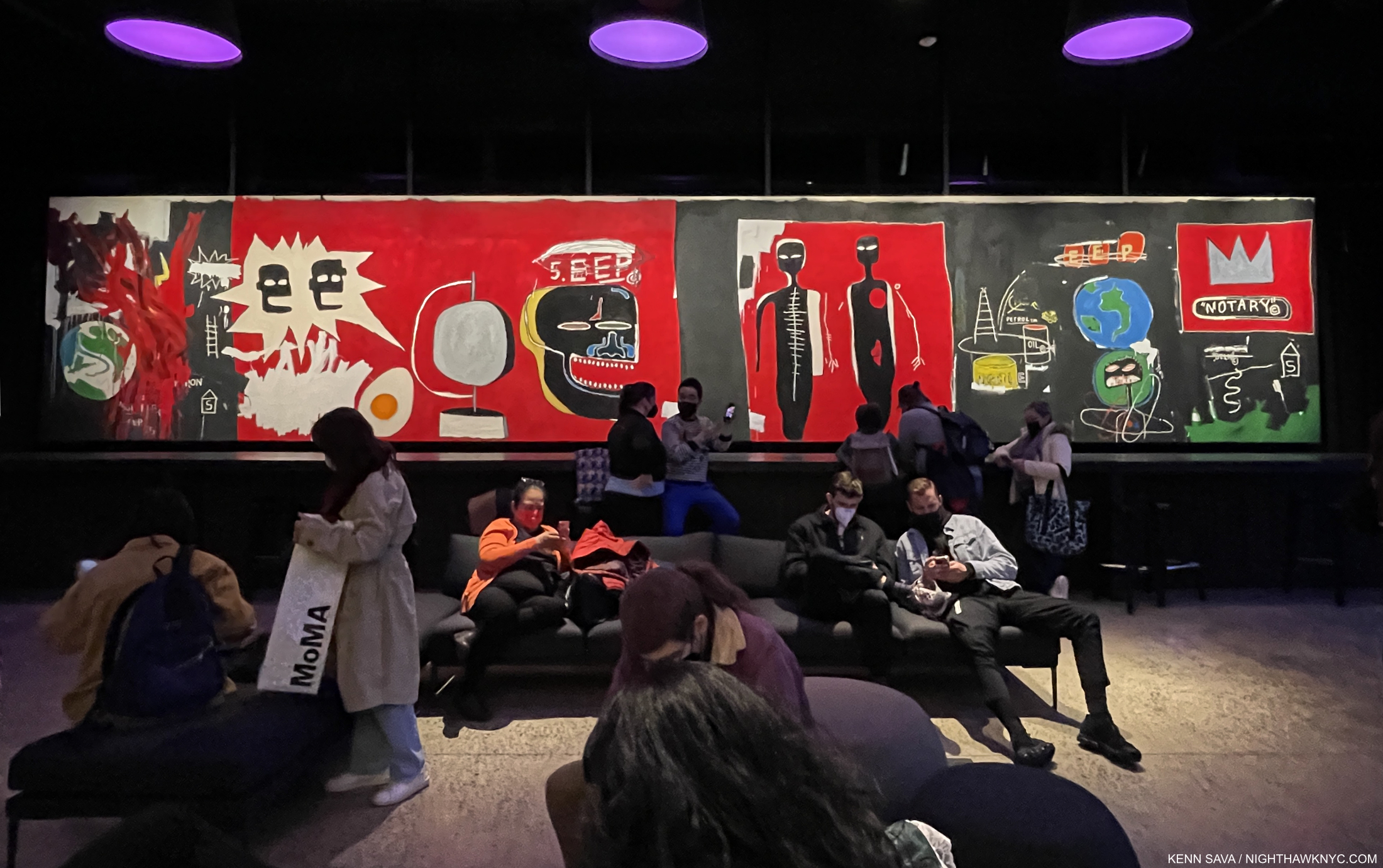
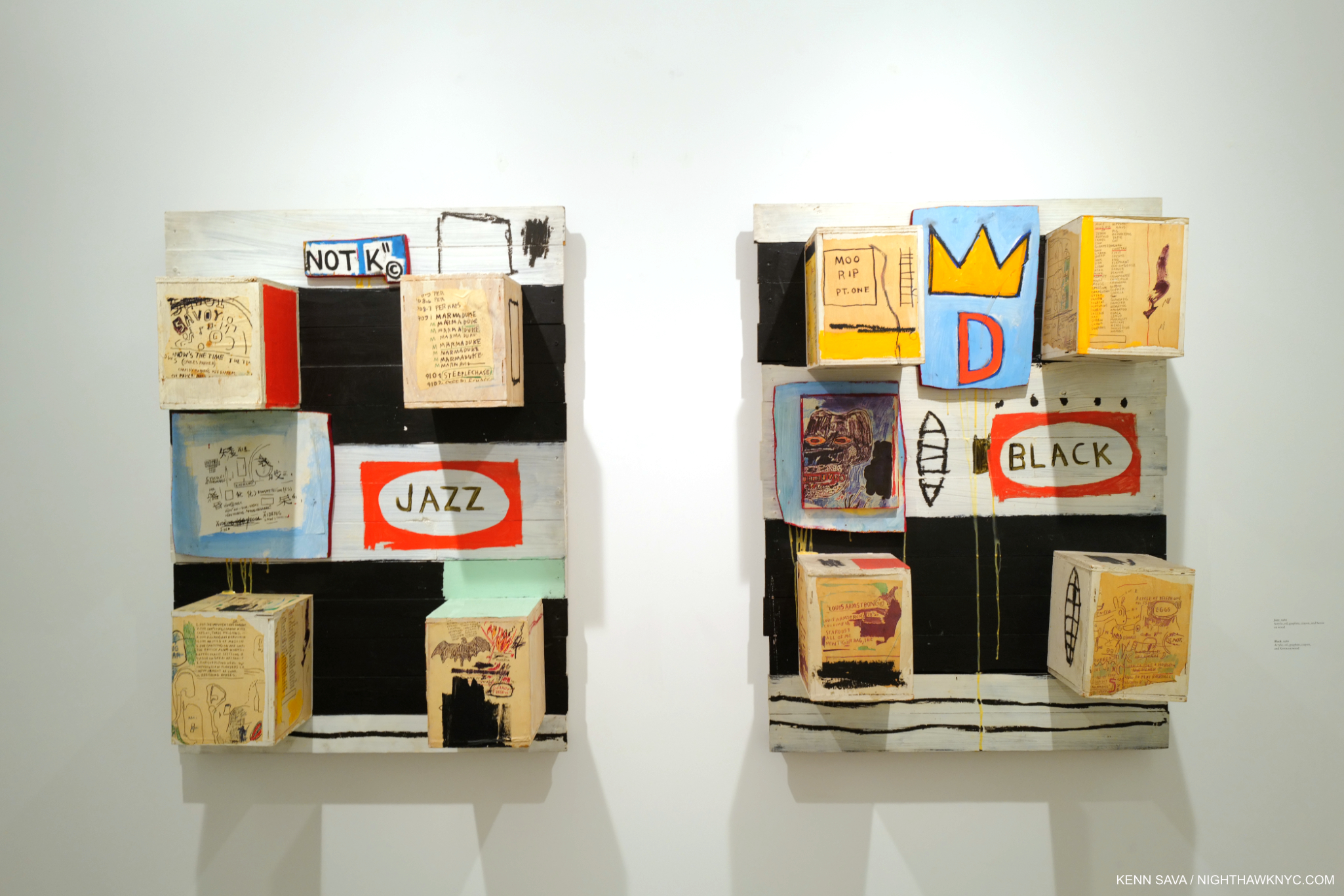
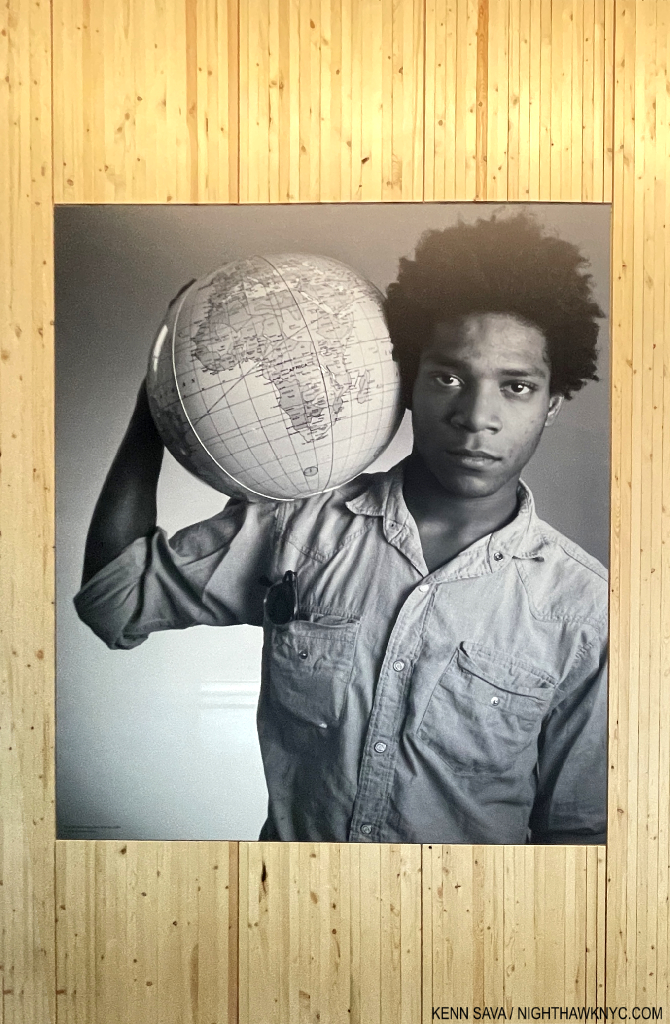
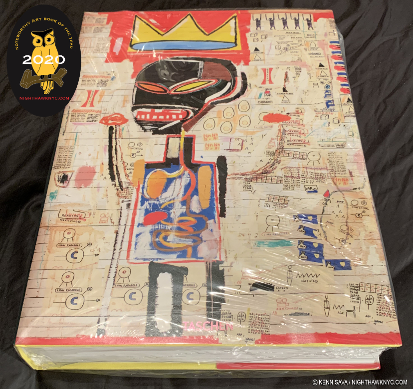
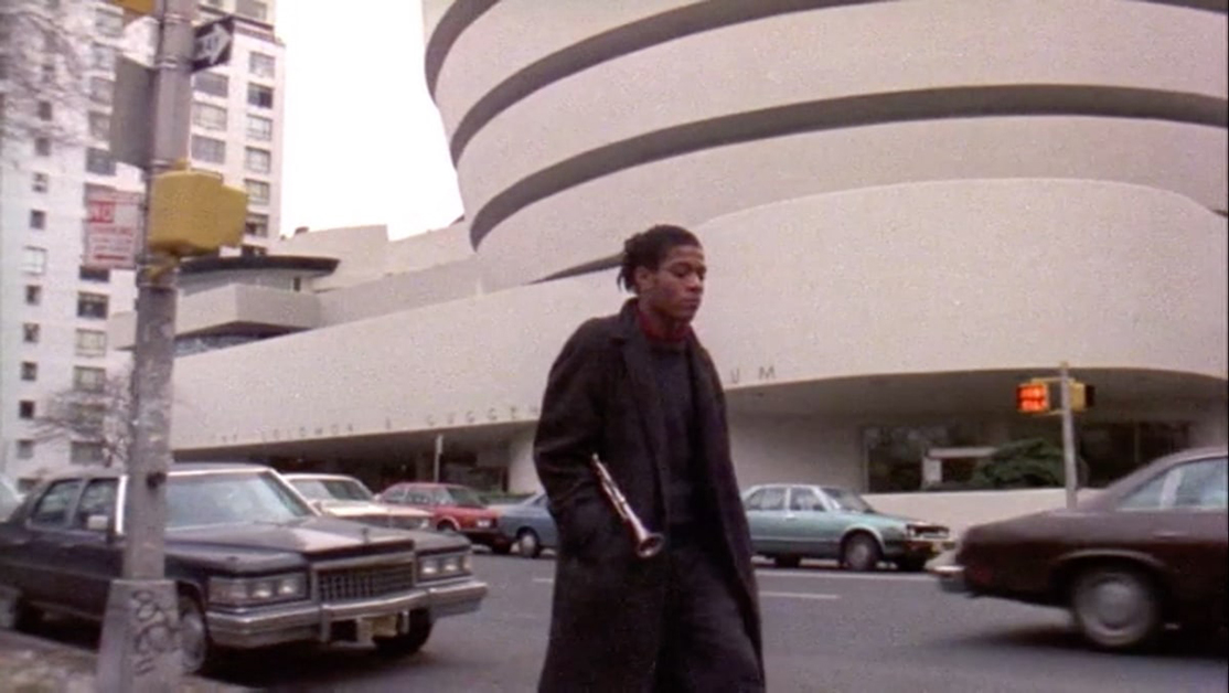
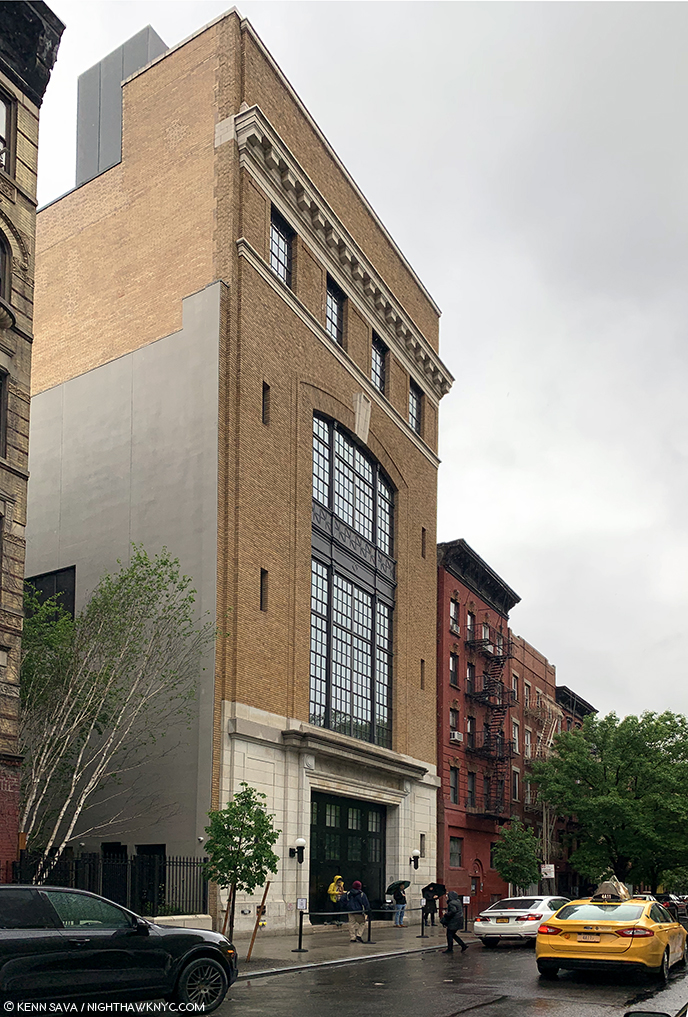
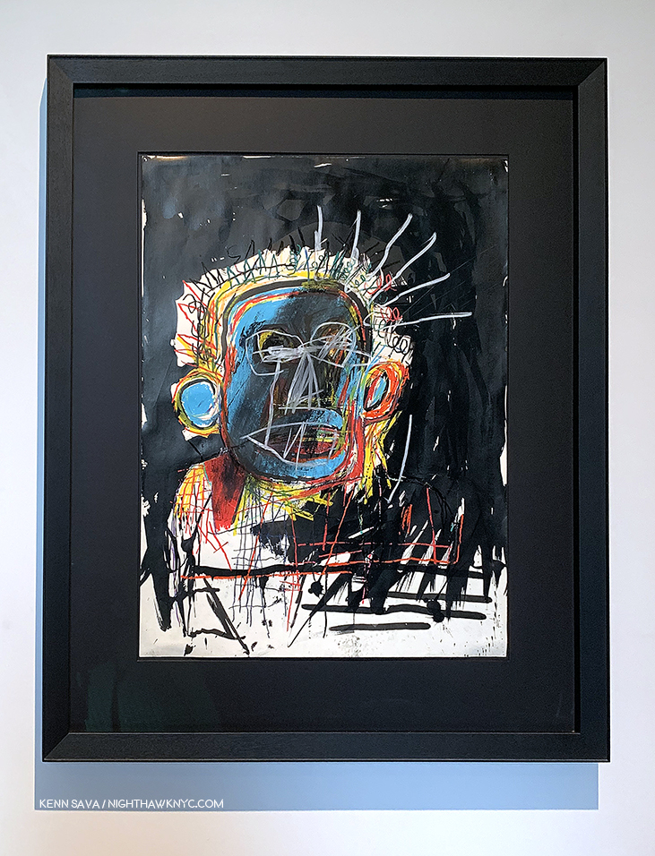
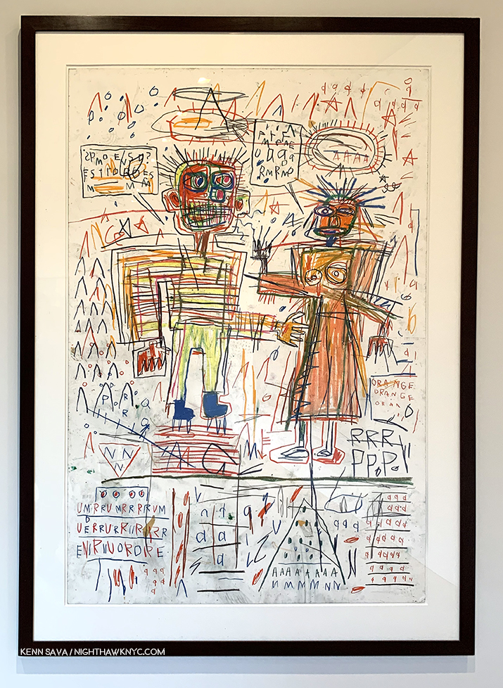
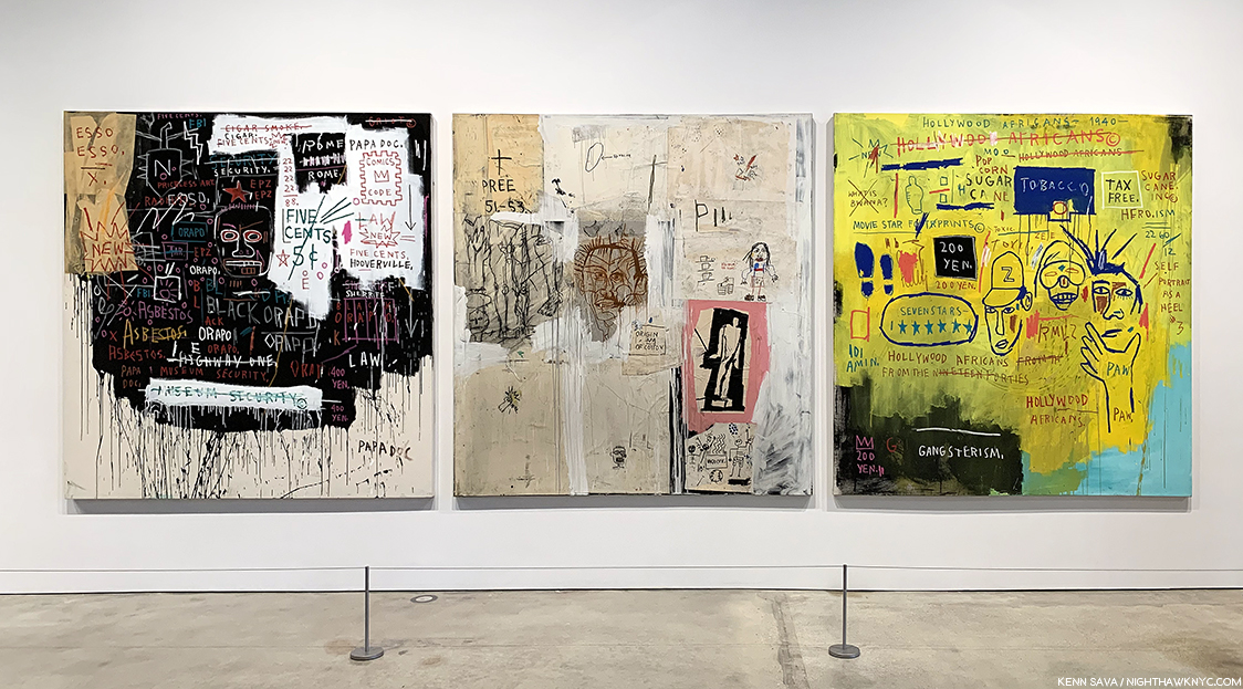
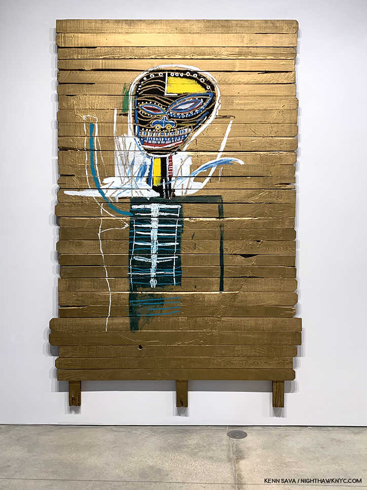
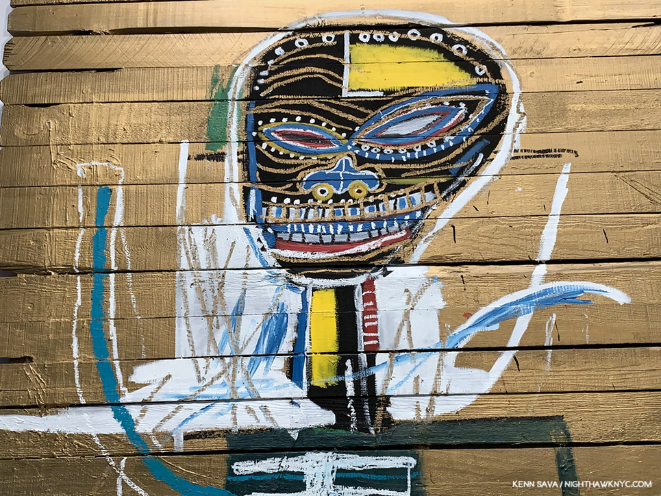
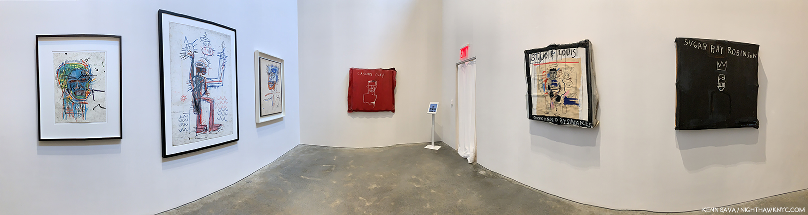
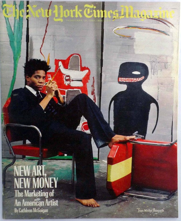
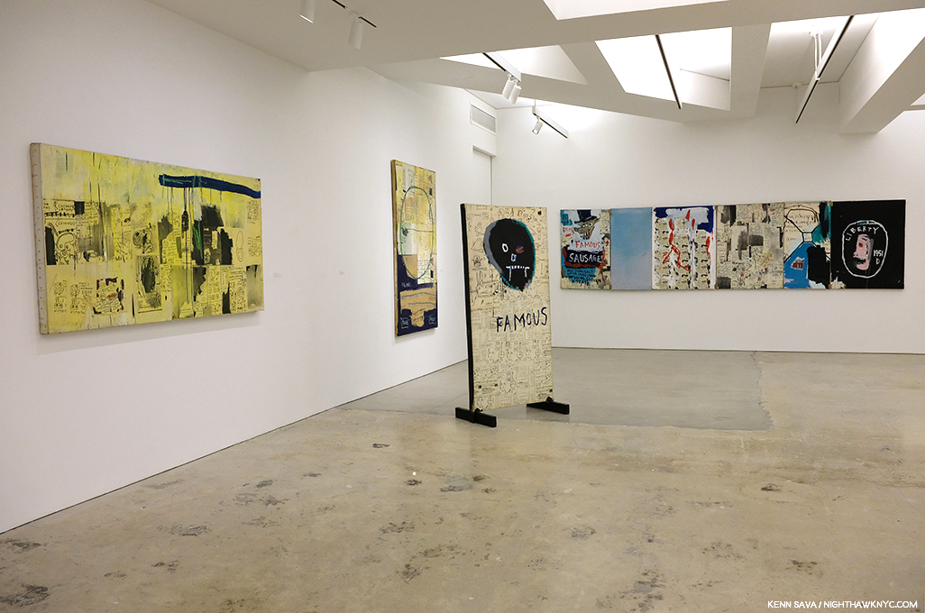
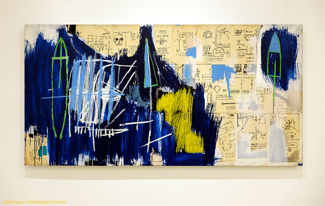
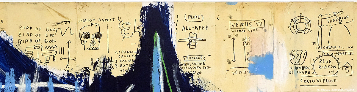
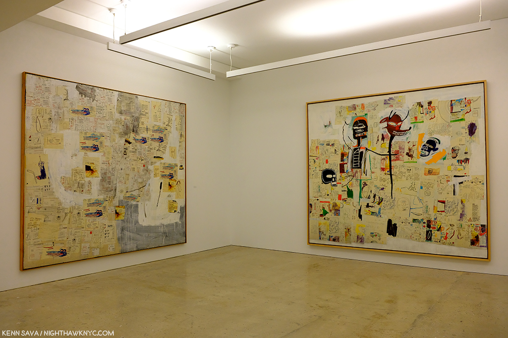
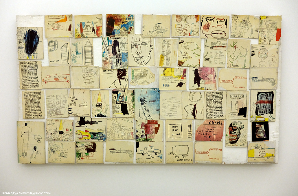
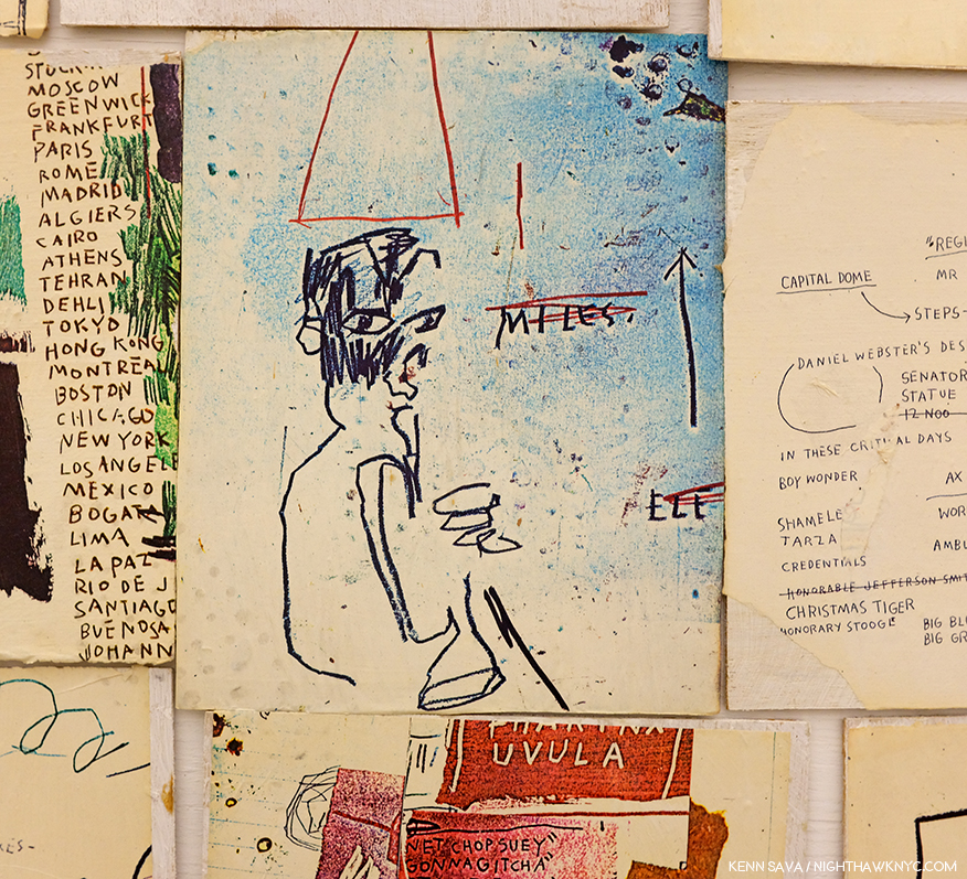
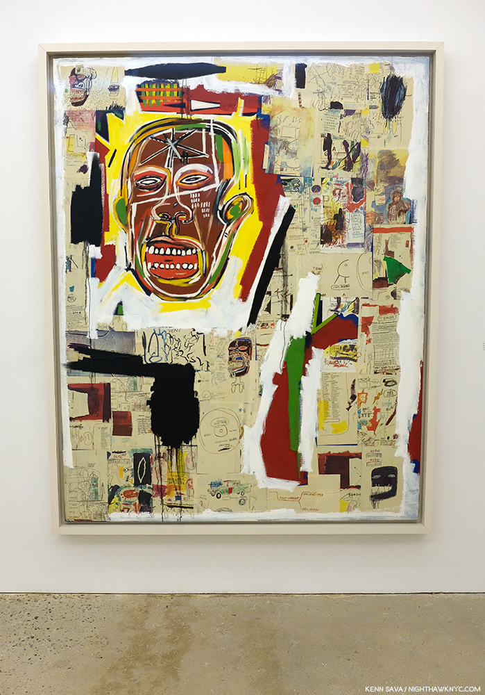
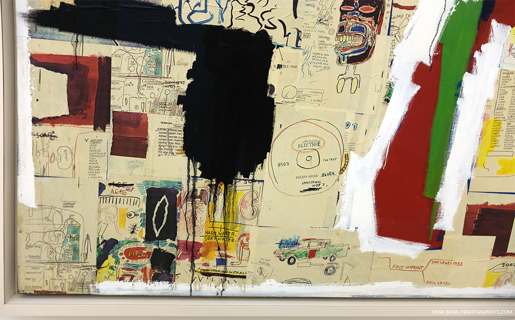
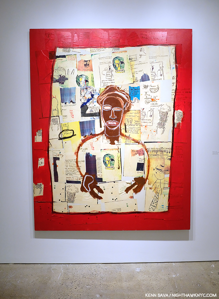
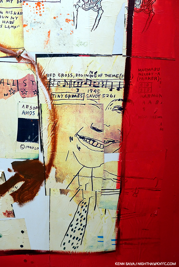
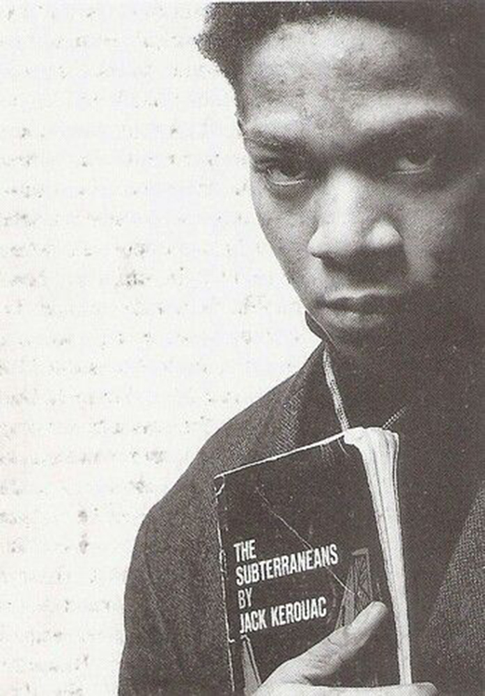
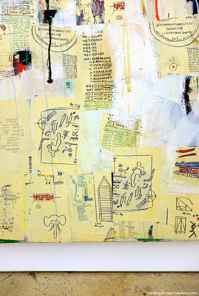
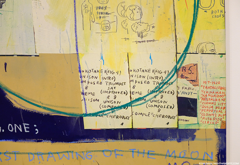
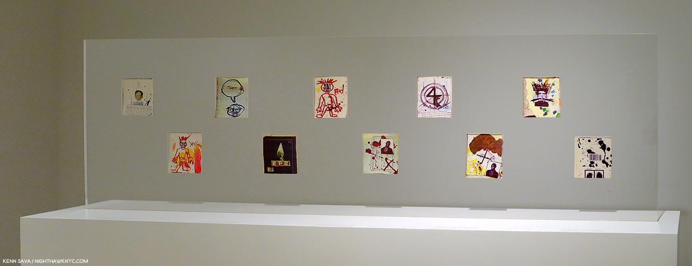
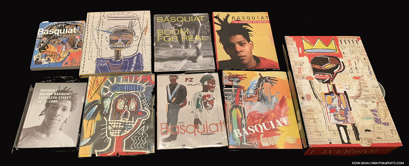
The first printing of the Basquiat XXL came in this pictorial shipping box. Subsequent printings came in a brown box with black type, and new copies I’ve seen in 2025 have NO shipping box at all. My copy shown, which I sold in my ongoing struggle to keep writing.
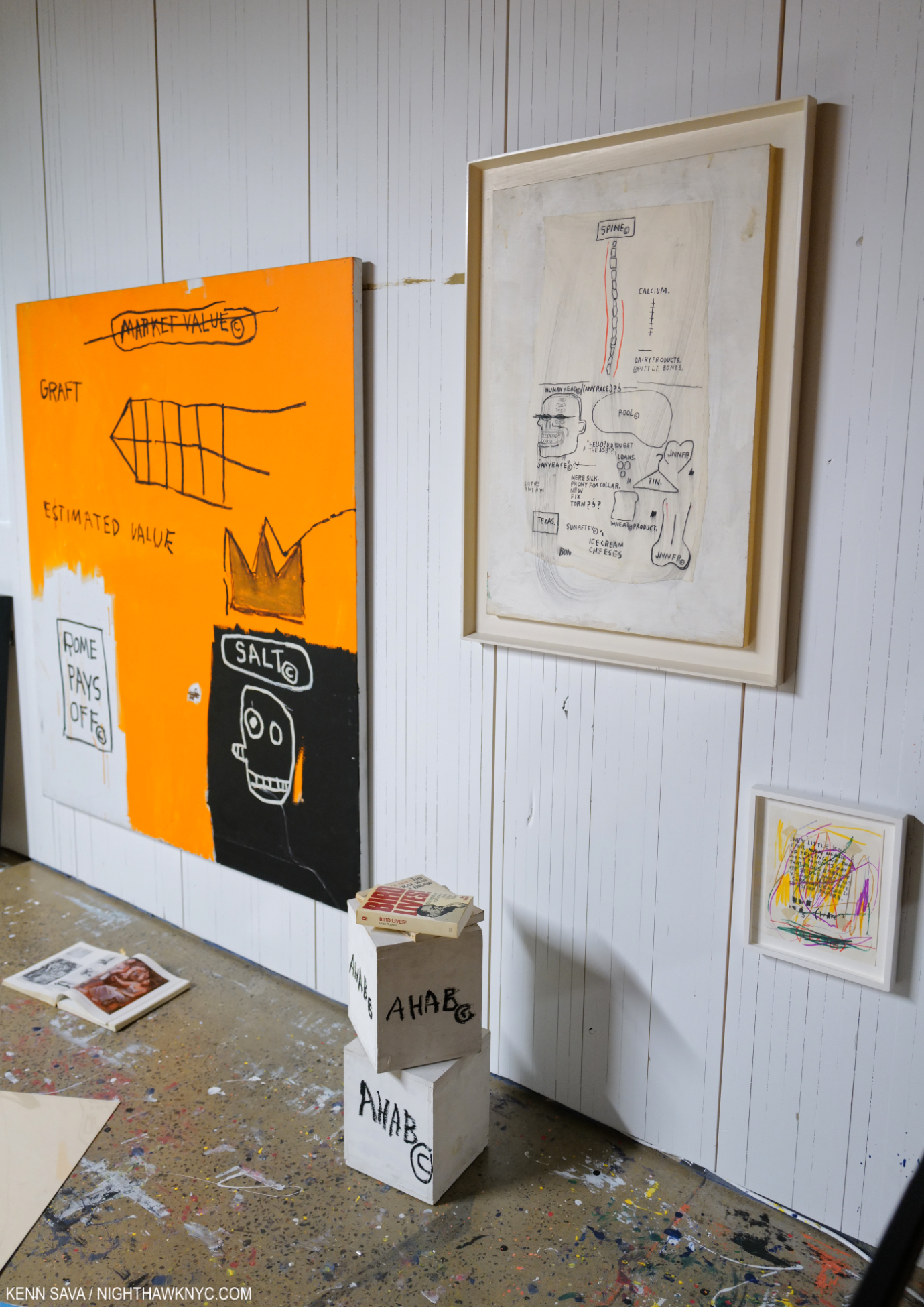
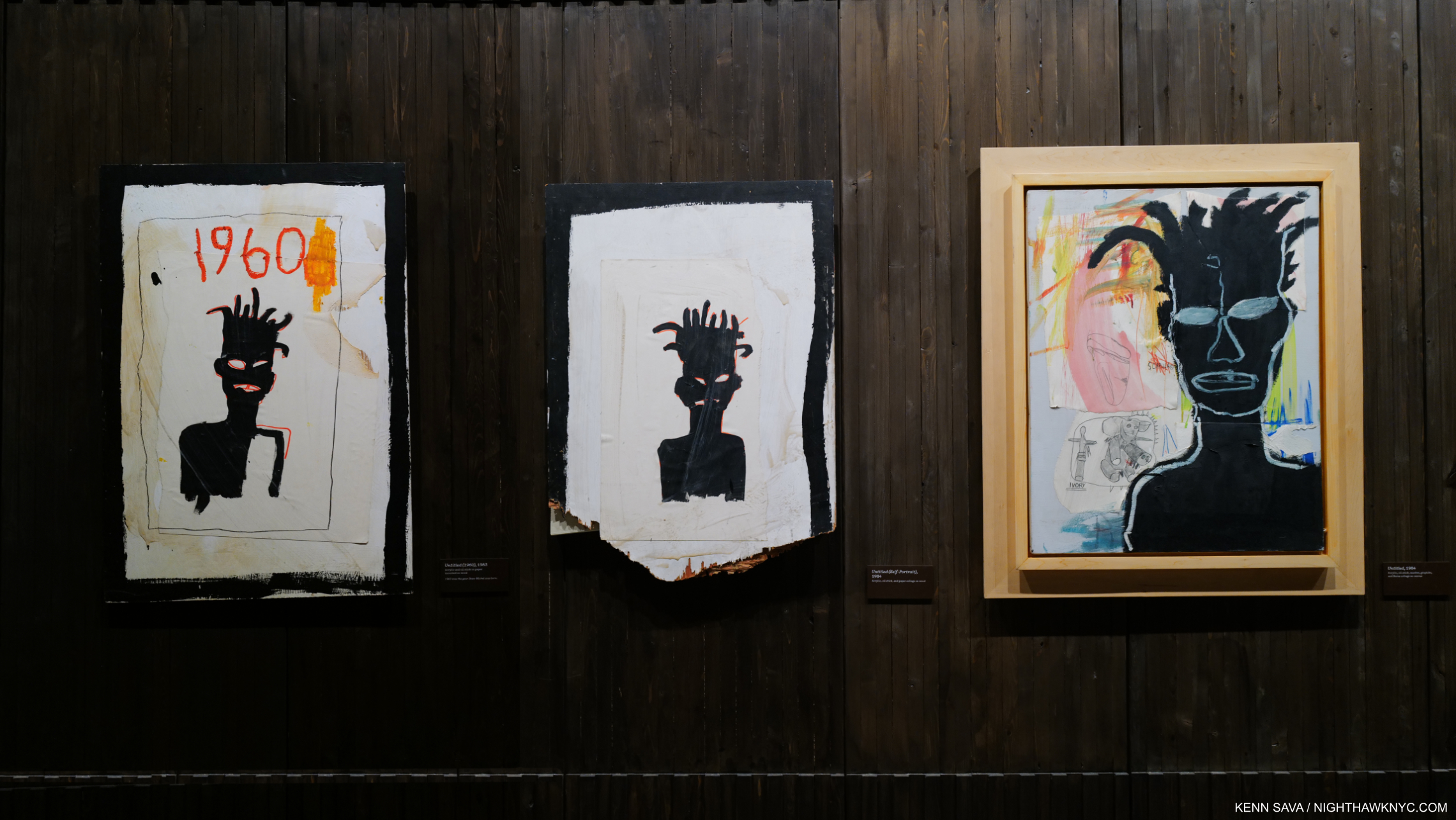
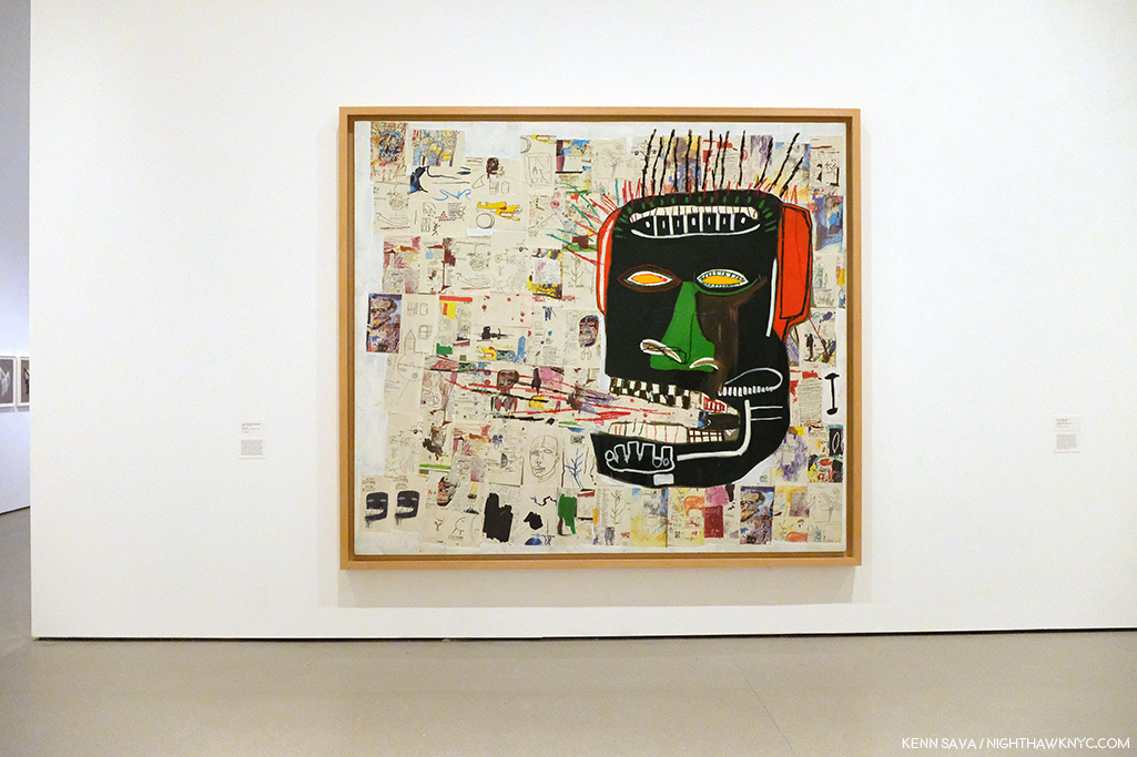
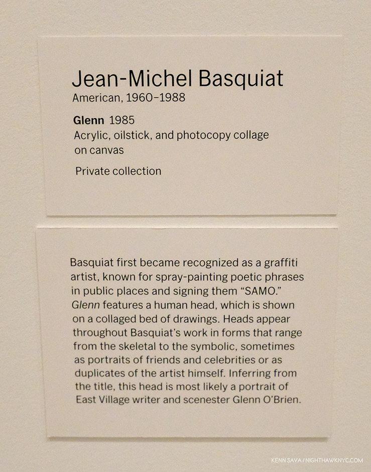
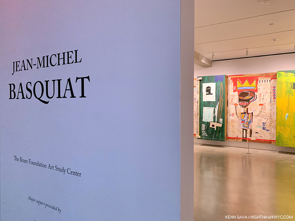
Jean-Michel Basquiat, Basquiat, Taschen XXL, 2018, or Brick, 2020
It surprised me when I realized that I’ve written about Jean-Michel more than any other Artist over the 9 1/2 years of NighthawkNYC. Well, he’s certainly been the world’s most popular Contemporary Artist over that time. As a result, in researching all the pieces I’ve done on him, I acquired a very large Basquiat library. To all those who’ve asked me which one book I’d recommend on him, I say this one. It’s got the most Art, and in the XXL size, in the largest reproductions anywhere. Most of his Art is in private hands. Meaning, your ONLY shot at seeing the most Basquiat for the foreseeable future is in Taschen’s Basquiat! If you want to see it in the largest size anywhere, choose the XXL. If you want to see his work and not spend the $200. list for the XXL, choose the Brick, which lists for $30. It’s almost identical in content, but smaller.
Though not on this list, my choice for the “sleeper” book on Basquiat is a toss-up between Richard Marshall’s excellent work in the catalog for the Whitney Retrospective mounted shortly after the Artist’s death, The Art of Jean-Michel Basquiat by Fred Hoffman, and Basquiat’s Notebooks, published to accompany the excellent show of the same name at the Brooklyn Museum.
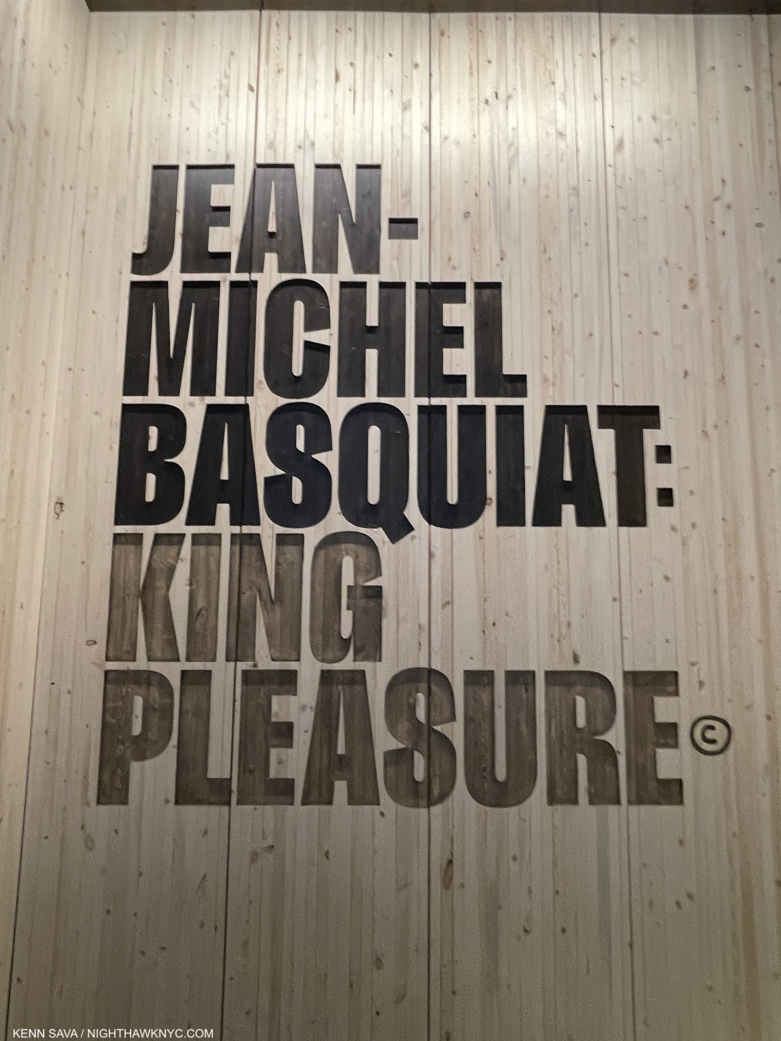
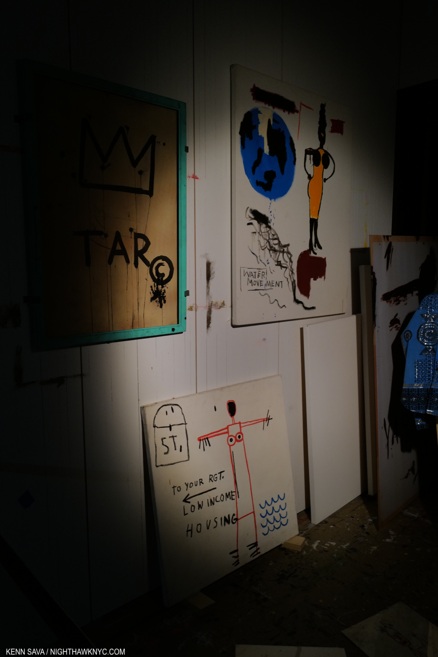
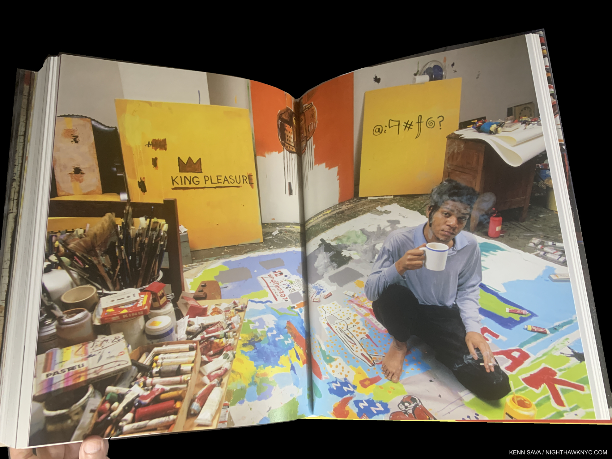
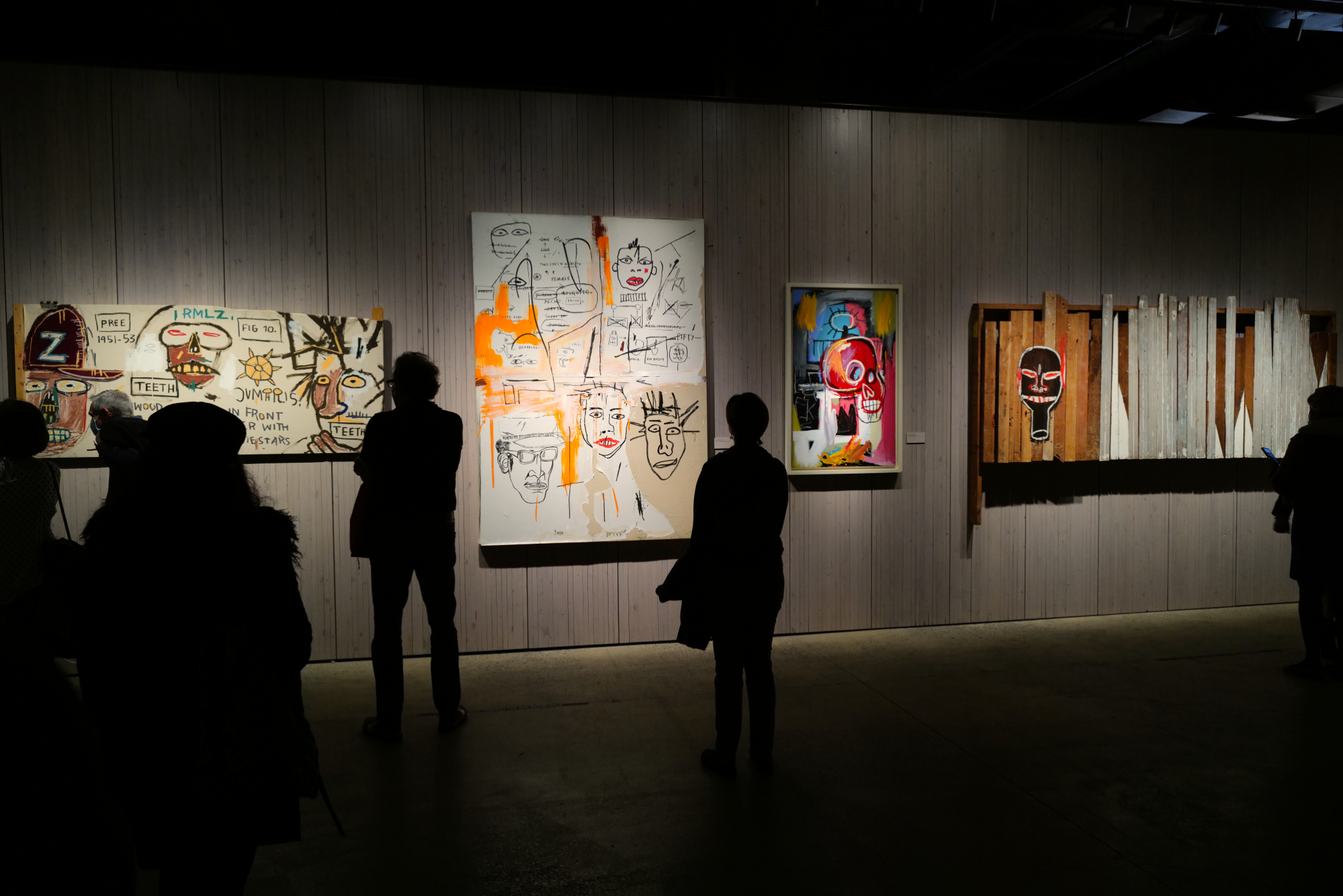
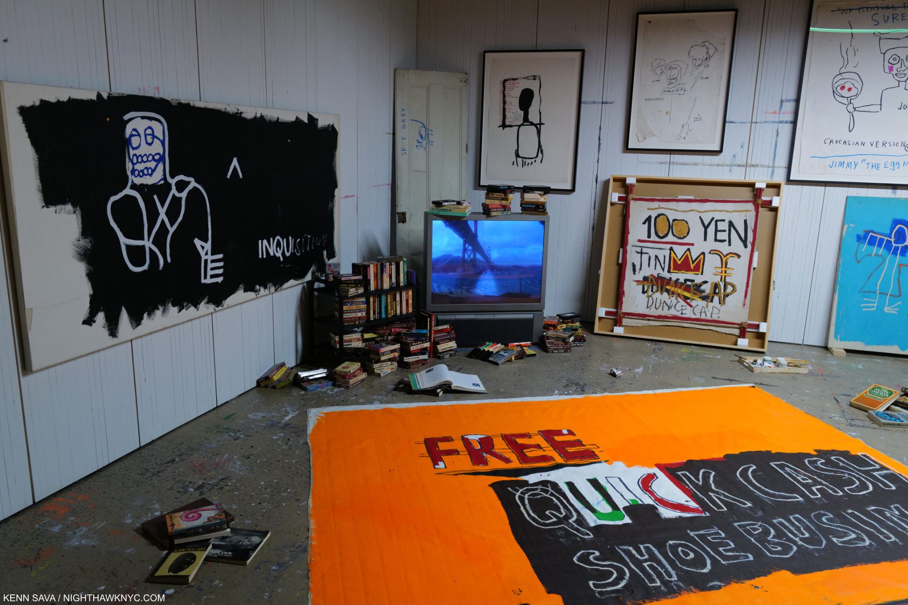
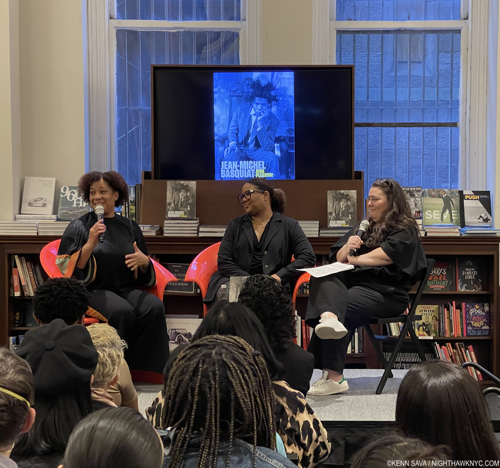
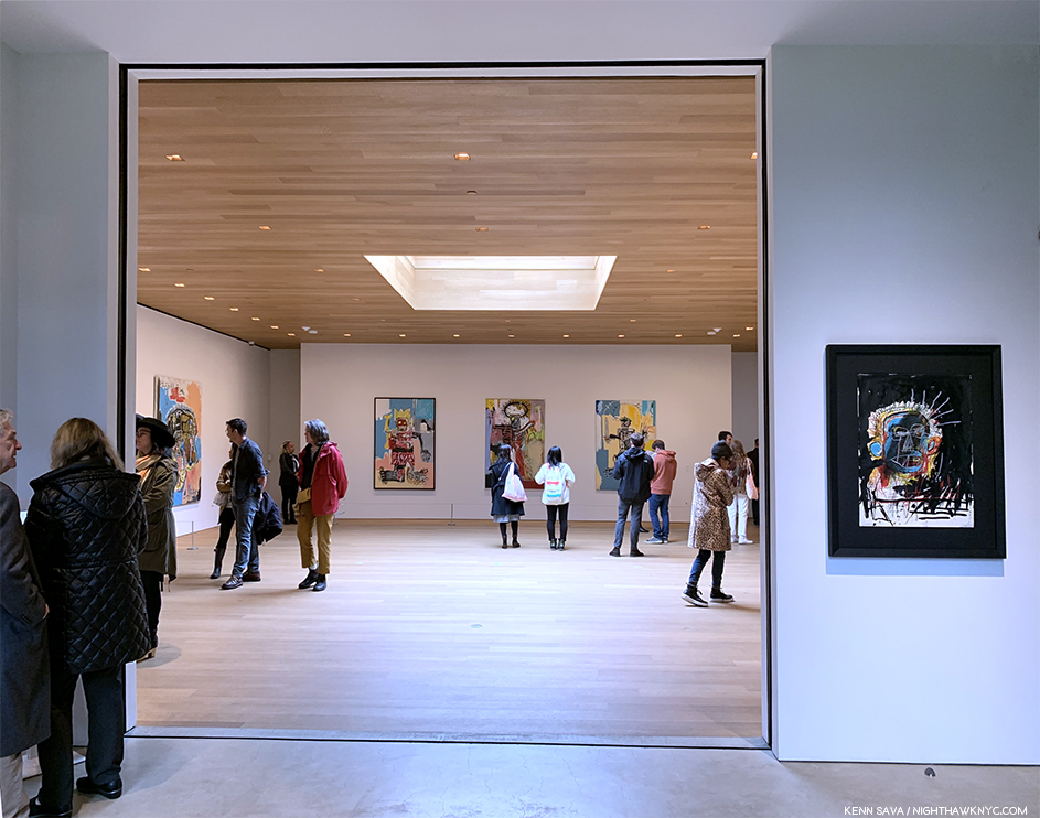
My extensive coverage of all the Basquait shows in NYC since 2019 begins with the legendary Brant Foundation show here, includes gallery shows, and the popular King Pleasure show, mounted by his family, during the run of which, I met and spoke with both of his sisters.
NoteWorthy Exhibition Catalogs of the 21st Century-
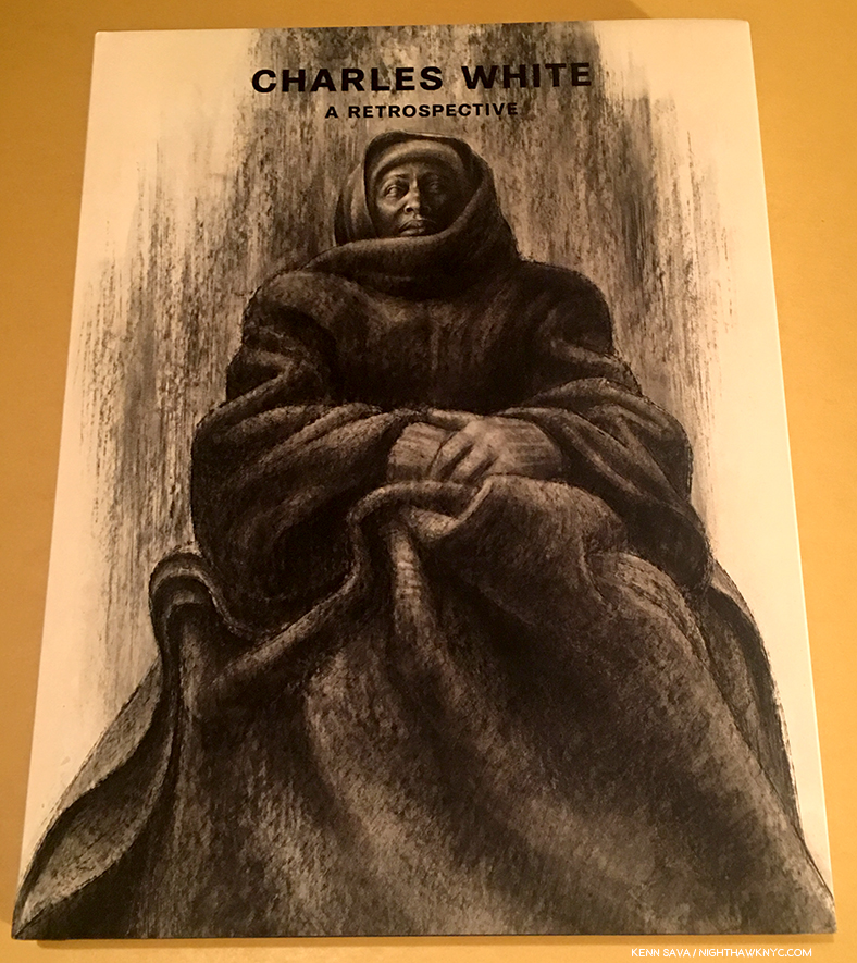
Charles White, A Retrospective, 2018
Charles White: A Retrospective, Museum of Modern Art, 2018
These 25 years have been characterized by Great Black Art finally beginning to get the attention and appreciation it deserves. Unfortunately, it happened too late for Charles White, who’s work was and is so good it should have inspired just that on its own (or, along with his equally worthy contemporaries Horace Pippin, Jacob Lawrence and Romare Bearden, among others.) But, he had to wait until 2018 for the Museum of Modern Art to mount the Retrospective he deserved. Others are still waiting…
My look at the show is here.
A very rare sealed copy.,
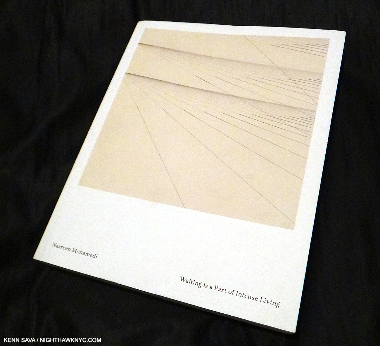
Nasreen Mohamedi, Nasreen Mohamedi: Waiting is a Part of Intense Living, Museo Nacional Centro de Arte Reina Sofía, 2015
I had never heard of Nasreen Mohamedi, when I walked into The Met Breuer for its opening day in 2015, where this show (titled Nasreem Mohamedi) and Unfinished: Thoughts Left Visible shared the building. I quickly fell under the spell of the Indian Artist who passed away in 1990 at about 52, and I wound up writing extensively about the show I saw about a dozen times, here. Waiting is a Part of Intense Living is by far the most comprehensive book on this fascinating Artist who remains under known in the U.S. and was published to accompany the show’s first stop in Spain.
Copies were available, here, during the run of The Met Breuer show, but have steadily dwindled since. It’s now extremely hard to find, with used copies beginning at $200. in iffy condition, unfortunately. I hope someone will undertake an even more comprehensive look at Nasreen’s career. Her Art is not going away.
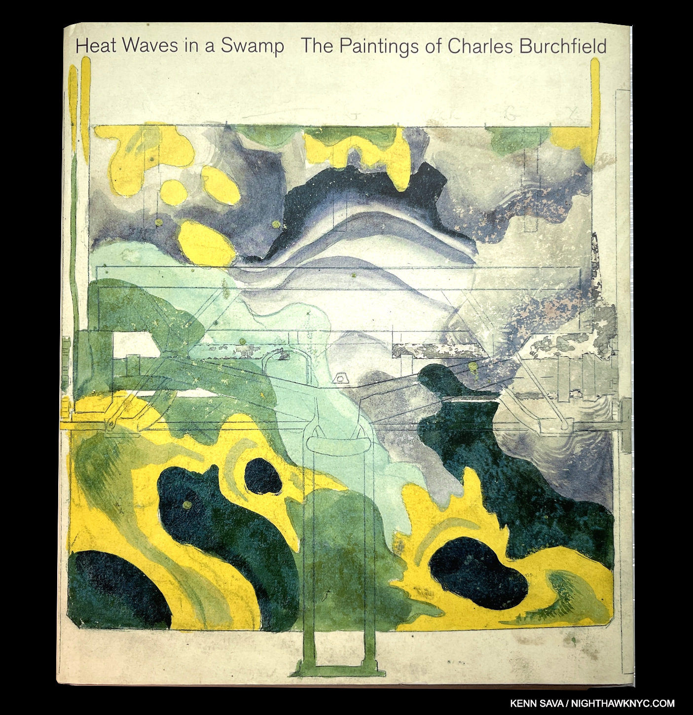
Charles Burchfield, Heat Waves in a Swamp: The Paintings of Charles Burchfield, Prestel, 2009
Edward Hopper’s favorite Painter needs more fans! I’ve heard Gregory Halpern is one, and before curating what looks to have been a revelatory traveling show that came to the Whitney in 2010, Artist Robert Gober became another in the process of doing a deep dive into “all things Burchfield,” as he says, before curating this show. What might seem to be an unusual choice for the curator of Heat Waves turns out to have been s stroke of brilliance by whoever chose him. The mystery that has made Mr. Gober a world-wide phenomenon is featured in Mr. Burchfield’s work allowing viewers to get real insights into the work of the Artist’s dual-nature. At once, his work’s feet are firmly planted in the ground (usually near his Buffalo, NY home), before suddenly being transported by marvelous visions seem to carry him to worlds unknown. At times his work (especially his Drawings) seems akin to the mysticism of Hilma af Klint. Added to all of this, Charles Burchfield chose to make Watercolors his medium of choice, and he remains one of the unsung masters of it in American Art. Here’s your chance to experience his brilliance in all its glory.
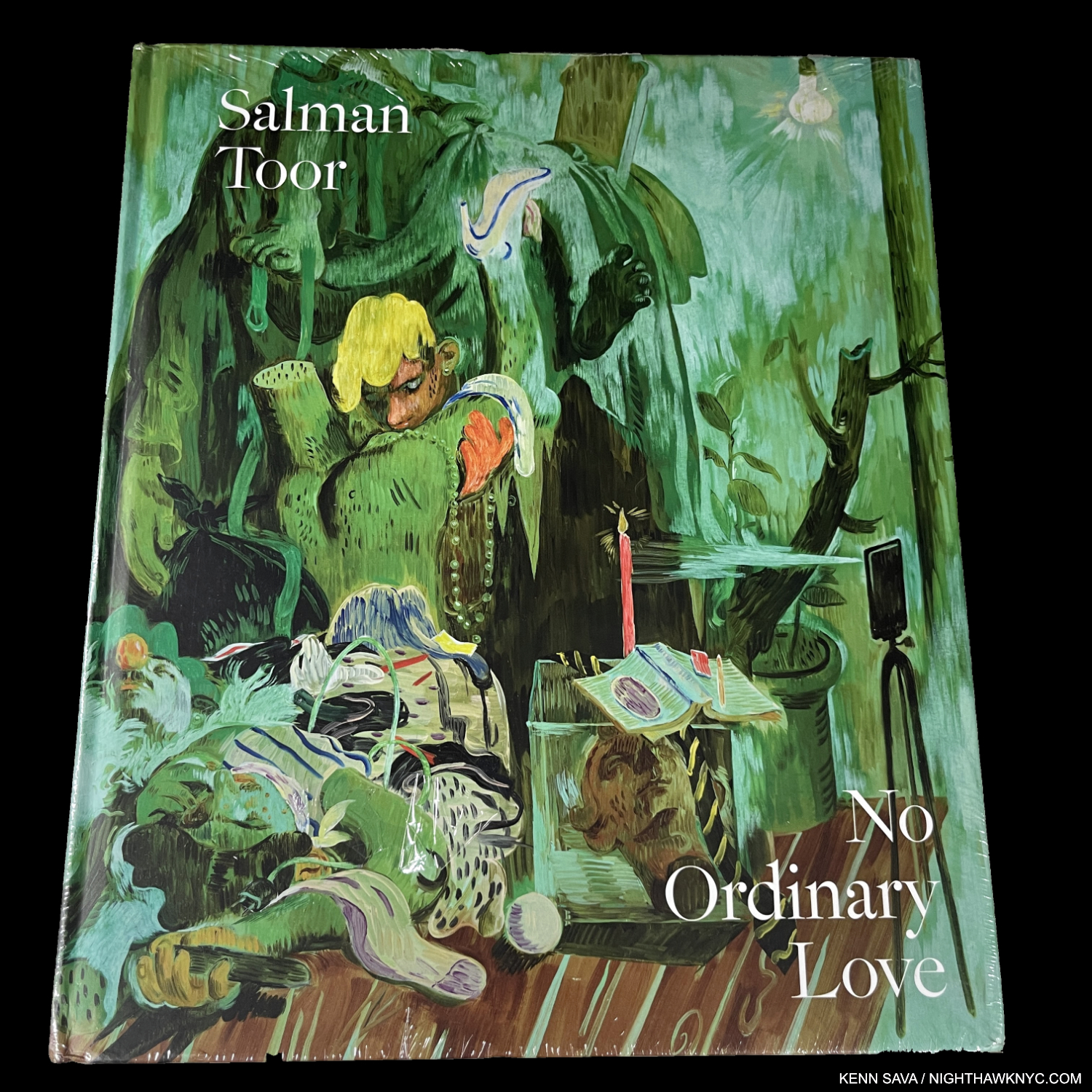
Salman Toor, Salman Toor: No Ordinary Love, Gregory R. Miller/Baltimore Museum of Art, 2022
A strong case can be made that No Ordinary Love is THE ground-breaking Art book of the 21st century thus far. It qualifies in so many ways, beginning with marking the first time a Contemporary Pakistani/American Painter has achieved U.S. museum recognition, with work in The Met, the Whitney and the Morgan Library collections, as well as the museums in Dallas, Baltimore (which mounted the show), the Walker and MoCA, Chicago in this country. I saw his first museum show at the Whitney in 2021, so it’s utterly remarkable how quickly Salman’s work has gained such wide acceptance. Remarkable. Not surprising. Why not? As the curator says in the introduction, Mr. Toor’s work mines “the complexities of being an immigrant, queer and human.”
It didn’t take long for No Ordinary Love to sell out. VG copies begin at $400.00.
My piece naming it a NoteWorthy Art Book of 2022 is here.
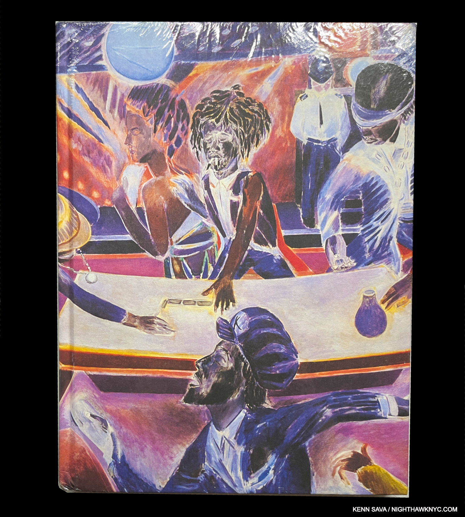
Denzil Forrester, Denzil Forrester: Duppy Conqueror/We Culture, Kemper Art Museum/Institute of Contemporary Art, Miami, 2024
One of the newest books on this list (chronologically), it took almost 40 years for Mr. Forrester to get the book his work deserves. His work is a riot of color (in the best possible way), emblematic of the passion and joy Music has brought out of him to an extent greater than that of any other Artist I’ve seen this side of the great Romare Bearden. Like Mr. Bearden, however, there’s much more to be seen and experienced in Denzil Forrester’s work. Life. No less than Peter Doig (listed earlier) and Sheena Wagstaff (who curated a recent NYC show of his) have championed Mr. Forrester’s work, and it seems that after years of toiling with a lack of attention the wheel has finally turned. Duppy Conqueror presents 45 years of his work.
Much more than an exhibition catalog, Duppy Conqueror (a 1973 song by Bob Marley), is a retrospective of 45 years of Denzil Forrester’s work, accompanied by fascinating essays that relate the history of post-war racism in Britain and how Mr. Forrester, along with Musicians and Poets worked to bring the injustices to wide attention in powerful fashion. At the height of the racism, Music and dance halls were one of the few escapes left. References to them continue in his work like a musical refrain. Duppy Conqueror strikes me as being everything a book on this list should be. It packs an incredible amount into a 408-page volume, and like the Jennifer Packer book, earlier, uses multiple papers to wonderful effect, beginning with its opening “blackout” pages (which perhaps mimic the Drawings the Artist did in those near-dark dance halls early on) which set the stage, to the wonderful design by Scott Vander Zee, to the essays, and Poems by the legendary dub Poet, Reggae Musician and activist, Linton Kwesi Johnson (one of those Musicians & Poets I mentioned who joined Mr. Forrester in the struggle), to the work, which a bit like Kent Monkman’s, serves to call attention to decades of pain, suffering and survival. Born in Grenada in 1956, Denzel moved to London at 10 or 11, and proceeded to receive a BA and MA in Fine Art. He was awarded an MBE in 2020. It took the Institute of Contemporary Art, Miami, and the Kemper Art Museum in Kansas City, in collaboration with the Mr. Forrester, to give this very important Artist his first U.S. Retrospective in 2024, and this, the most comprehensive book yet published on his Art.
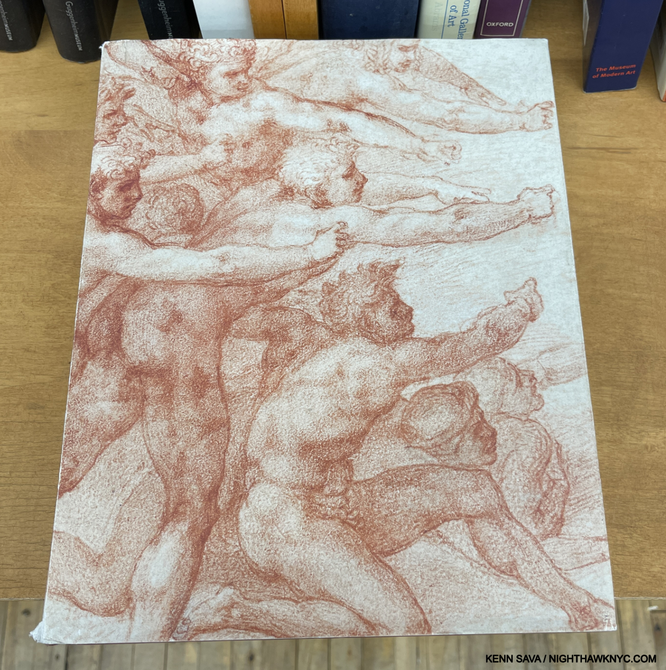
The catalog for The Met’s once-in-a-lifetime Michelangelo: Divine Draftsman and Designer, features a detail of his Drawing known as “The Archers.”
Michelangelo: Divine Draftsman and Designer, Carmen Bambach, Metropolitan Museum, 2017, and
Leonardo da Vinci Rediscovered, published by Yale University, 2019
Meanwhile, 30 blocks north, and not to be outdone…As if mounting and curating one of the greatest Art shows I’ve seen in 45 years of museum going wasn’t enough, Met Museum treasure Carmen Bambach has authored one of the finest books on Michelangelo I’ve seen to accompany it. Saying it’s a book every bit as worthy as her once-in-a-lifetime show I went to 10 times is the best compliment I can give it. It also singlehandedly led to my purging my Michelangelo book collection, as it rendered so many other books unnecessary or outdated.
Ms. Bambach is also responsible for the extraordinary Leonardo da Vinci: Master Draftsman, and Unfinished: Thoughts Left Visible Met Museum and Met Breuer shows respectively this century and their catalogs. As if ALL of that isn’t enough- Carmen Bambach has authored what looks to be an extraordinary book I haven’t seen-Leonardo da Vinci Rediscovered,published by Yale University, 2019. With 2,200 pages with 1,500 images over 3-volumes weighing 28 pounds, it’s rumored to include “numerous discoveries.” Such is my admiration and respect for the lady that is one of those who makes The Met one of the world’s greatest museums, I’m including it on this list, sight unseen!
My extensive look at Ms. Bambach’s unforgettable Michelangelo show, that 700,000 saw, is here. My look at her Unfinished: Thoughts Left Visible at the lost and lamented Met Breuer is here.
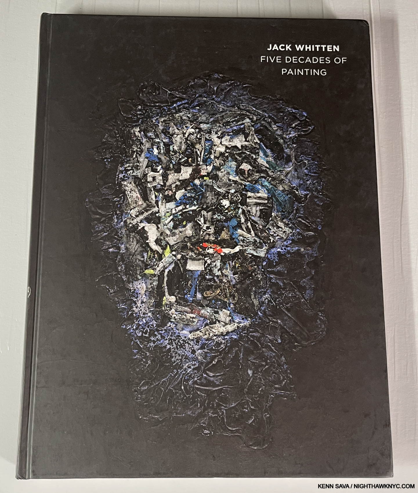
Jack Whitten, Five Decades of Painting, MOCA, SD, 2015 and
Jack Whitten: Odyssey: Sculpture 1963-2017, Gregory R. Miller, 2018
With the opening of his Retrospective at MoMA late last month, featuring six decades of his work, it’s very fair to wonder- What took so long? Since he passed in 2018, at 78, t’s terrible Mr. Witten didn’t live to see it. What a body of work he gave to the world! In my view, his status as a great Painter is still underappreciated. Though there have been a recent spate of publications on Mr. Whitten’s work, Five Decades of Paintings, published to accompany the 2015 show of the same name at the Museum of Contemporary Art, San Diego, remains the best overview I’ve seen. Out of print, and getting harder to find all the time.
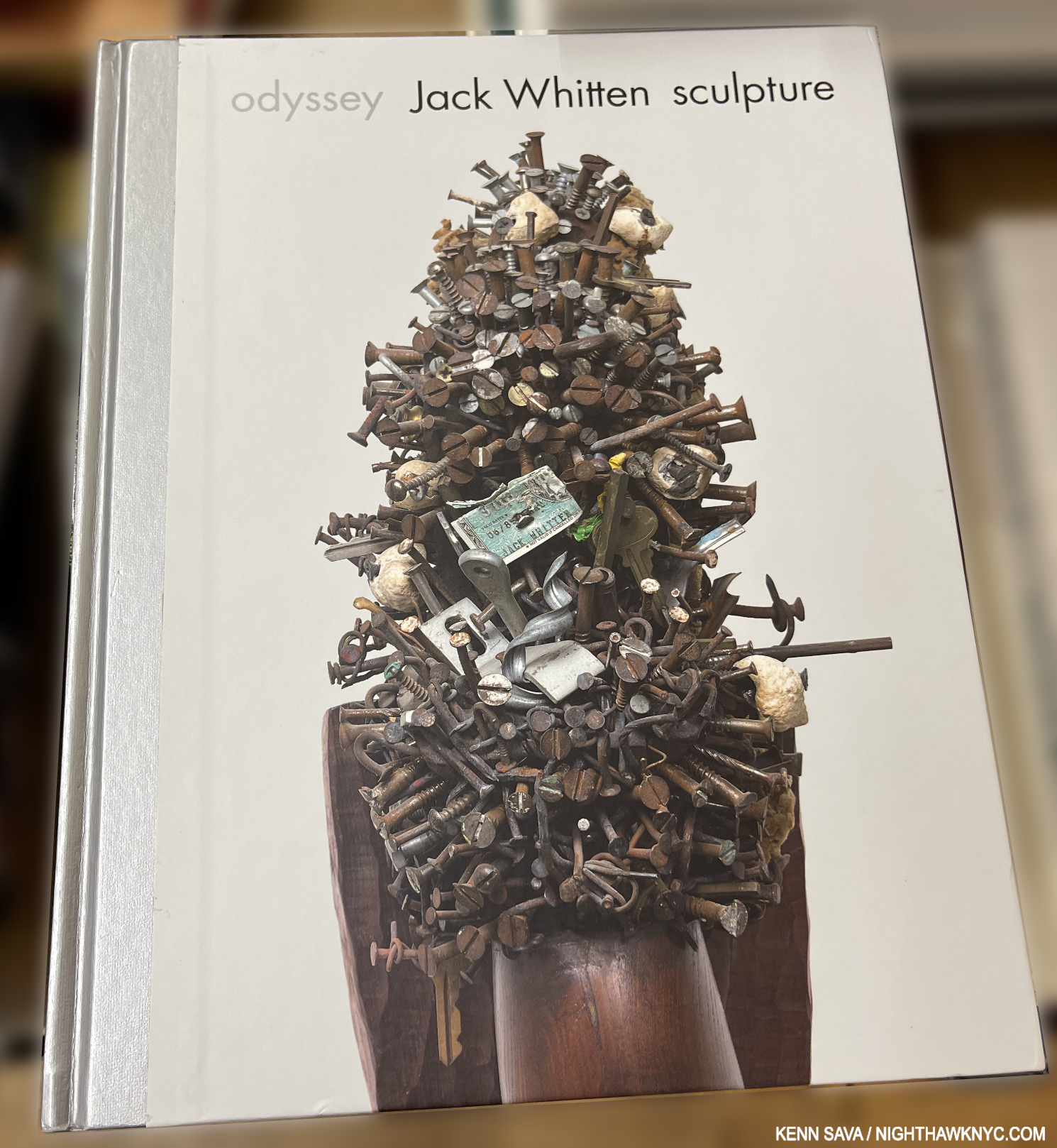
Very few people knew the great Painter Jack Whitten was also a great Sculptor during his lifetime, until the posthumous show, Jack Whitten: Odyssey opened at the Baltimore Museum before moving to NYC. I got a hint of it when I saw one Sculpture included in the last show of his work (in 2017) before he passed, which I showed here. It failed to prepare me for the utter shock I experienced when I walked into Jack Whitten: Odyssey at The Met Breur in 2018 that this gorgeous book accompanied. A lifelong expert woodworker, it’s still a bit of a mystery to me why Mr. Whitten didn’t show this amazing and amazingly accomplished work earlier. Even Picasso didn’t envious a good deal of what is to be found in its pages, and that’s saying a lot. For me, it’s just one reason I fully expect Jack Whitten’s star to keep rising in the estimation of Art historians indefinitely. Odyssey is currently available reasonably.
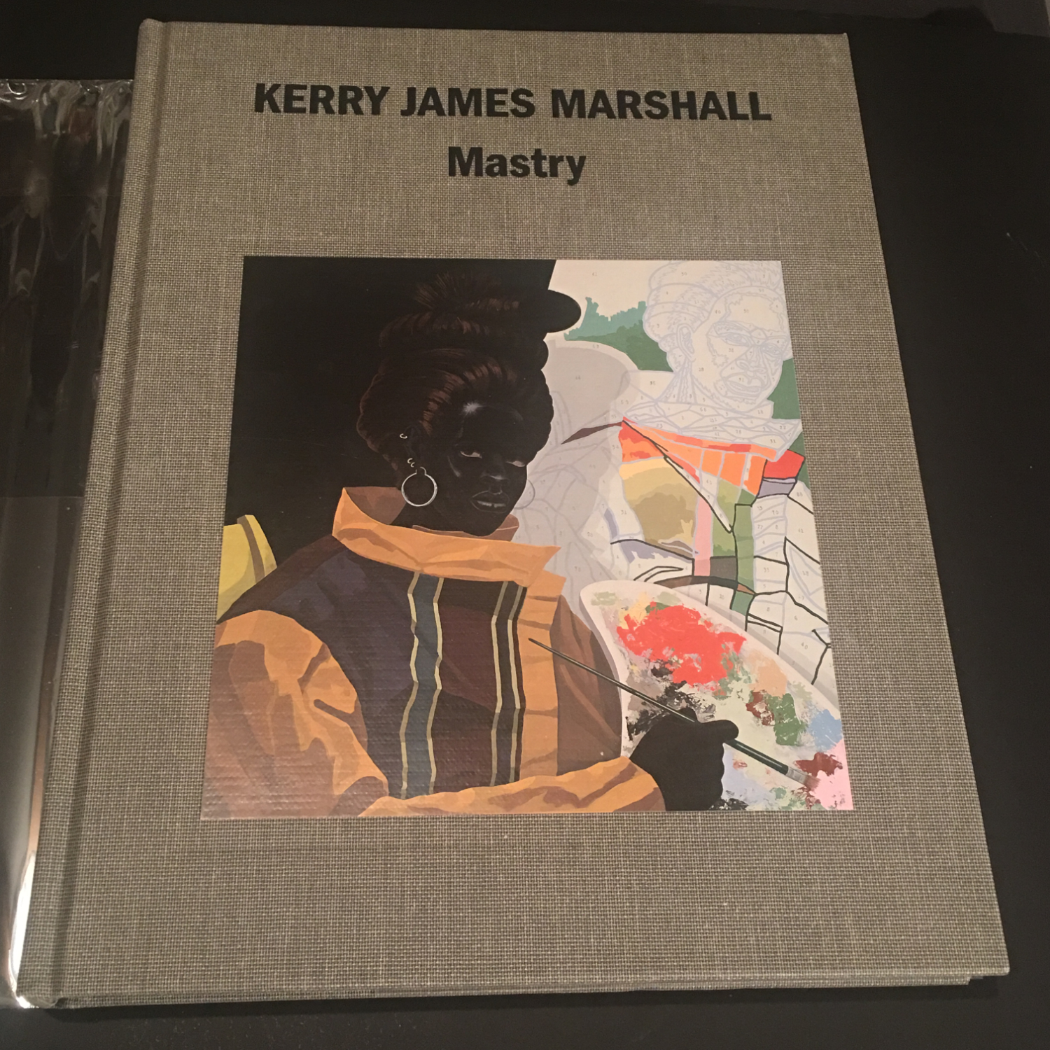
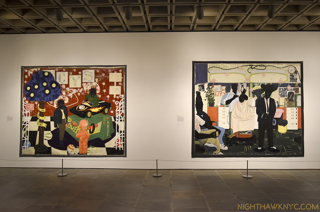
Kerry James Marshall, Kerry James Marshall: Mastry, Skira Rizzoli, 2016
Another 35-years in the making overnight sensation, Charles White’s student, Kerry James Marshall’s blockbuster, Mastry, at The Met Breuer was the most important Painting show I saw in the 2010s, and wrote about here (under what one reader told me what the best title I’ve come up with in almost 10 years). This book sold out immediately and has been reprinted a number of times since. A book worthy of Mr. Marshall’s great Art. Mastry remains THE place to start exploring his work, or to continue to. Approaching 10 years old, I’d grab it while it’s still in print. Copies in VG condition traded for $150. when it went out of print the first time.
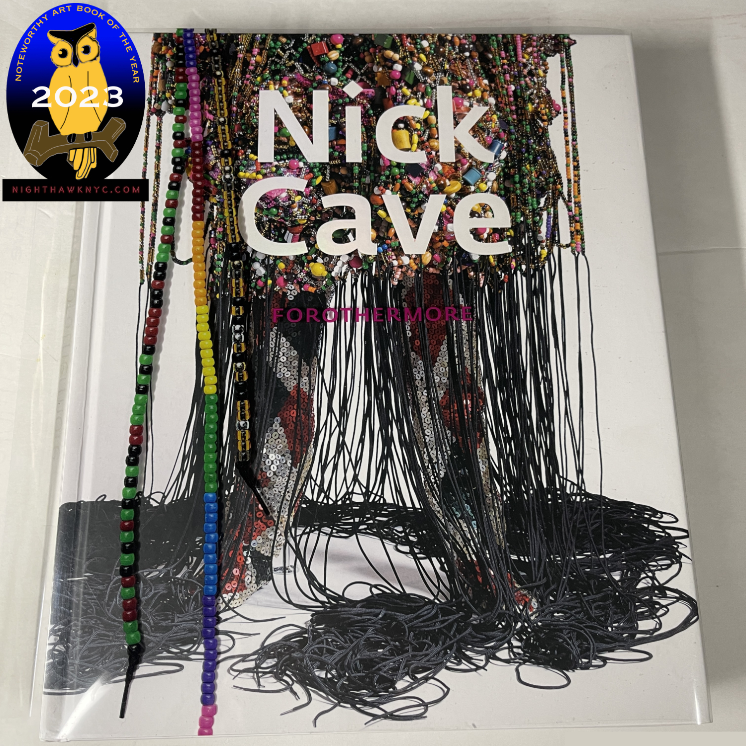
Nick Cave, Nick Cave: Forothermore, Del Monico Books, 2022
A number of Artists have done extremely elaborate, Artful outfits, yet it seems to me that Nick Cave’s Soundsuits are unprecedented. “Protection” from the outside world that didn’t accept the young Black Artist he was, they’ve now received acceptance virtually everywhere in the Art world, and even in the NYC Subway, as I showed here. Incredibly detailed, the amount of work that goes into one of these pieces boggles the mind, as does the variety of the designs. All of Nick Cave’s books are beautiful and beautifully done. Therefore, choosing one is very hard. I picked Forothermore for being the most recent, and published to accompany his stunning traveling mid-career Retrospective, the most comprehensive.
My look at Forothermore at the Guggenheim Museum is here.
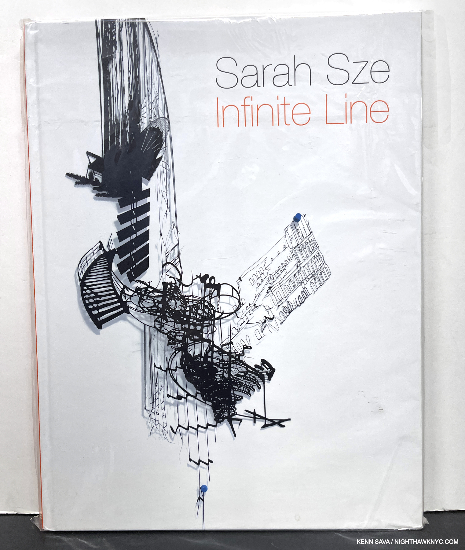
There are a number of exceedingly well-done books on Sarah Sze’s work and a number of fine exhibition catalogs. Infinite Line stands apart.
Sarah Sze, Sarah Sze: Infinite Line, Asia Society, 2011
A stunning overview of the Installation/Sculpture/Multi-media work of the Artist through 2010 remains my choice to see this aspect of her oeuvre even over more recent books. Published to accompany her show of the same name at the Aisa Society, NYC, it’s hard to find, but worth looking for. Sarah Sze joins Rembrandt and Kent Monkman as the three Artists, and Bob Dylan, among Musicians, with multiple books on this list.
Before moving on to the next section, I should mention that I agonized about whether to include Matthew Barney’s incredible The Cremaster Cycle Exhibition Catalogue published by the Guggenheim Museum in 2003 on this list. Art books are nothing if not feats for the eyes, and very few surpass The Cremaster Cycle in that regard, or for its stellar design. I decided not to include it here because even though the show (which I saw, and which spellbound me) & the book included Drawings & Sculpture, The Cremaster Cycle is a series of Films, which is beyond the scope of this piece.
NoteWorthy Art Autobiography & Biography of the 21st Century-
Autobiography-
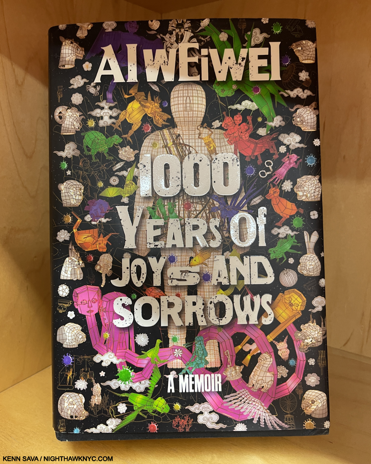
Ai Wei Wei, 1000 Years of Joys and Sorrows: A Memoir, Crown, 2021
Ai is a wonderful Writer with a talent for bringing the reader right into his stories that Agatha Christie might envy. Even better, signed copies can be had for a song.
My look at Ai Wewei’s 2015 show at the Brooklyn Museum, one of my very first pieces, is here. My look at Ai Weiwei: Laundromat is here. My look at Ai Weiwei at Paula Cooper and Lisson Gallery is here.
Autobiography & Biography-
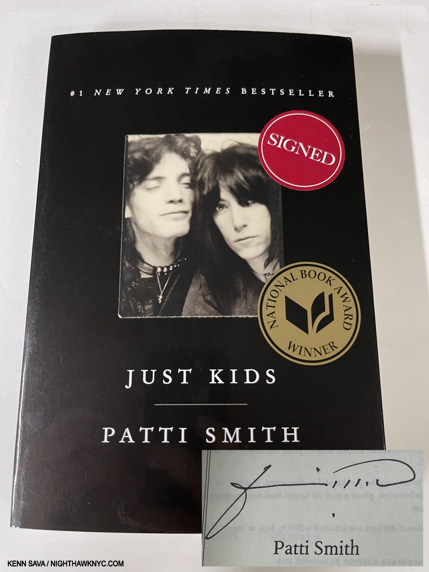
A copy with her beautiful signature.
Patti Smith, Just Kids, Ecco, 2010
Just read it.
My look at Patti’s most recent NYC Photography show, during the run of which I met her, Photographed her, and spoke with her, is here.
Biography –
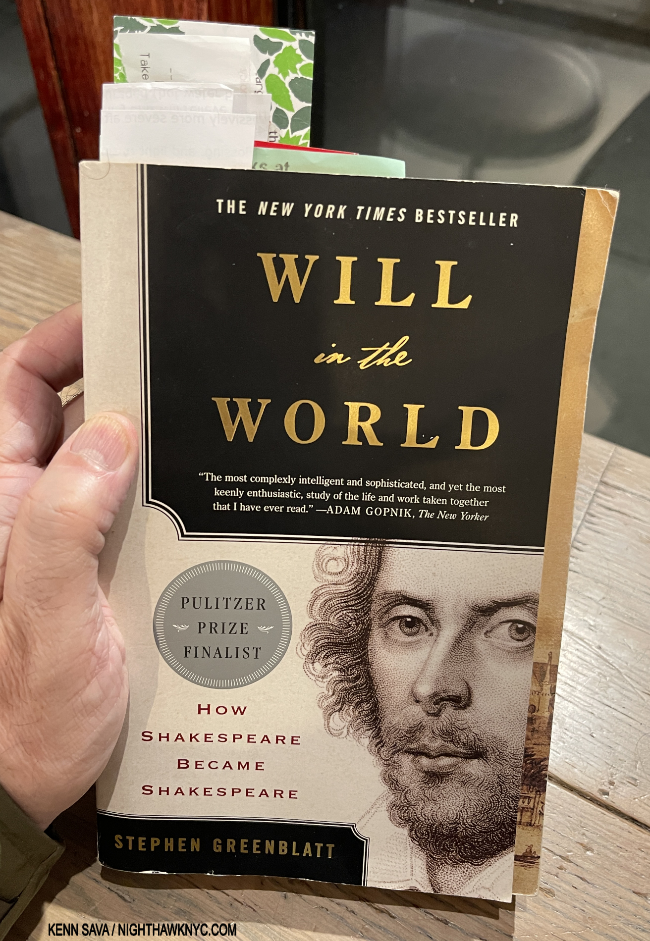
It rarely leaves my hand. My $4 (including shipping) used paperback copy with my bookmarks. The red one you can barely see is a Virgin Atlantic London to NYC Boarding Pass the previous owner left inside. I use scrap paper bookmarks because I leave them in at key points, and, unlike those of stiff materials, the book still flexes. But, that’s just me.
Shakespeare, Will in the World, by Stephen Greenblatt, Norton, 2004
You have Shakespeare questions? I finally have, too. Harvard Professor Stephen Greenblatt has the answers. And a hell of a lot more. 400+ years of distilled Shakespeare scholarship and a lifetime of research & learning have combined to give us the Shakespeare book many have been waiting for given how long it was on the NY Times Bestseller List. A former Pulitzer Prize and National Book Award Winner for Non-Fiction, he was also a finalist for both for this book. It puts so many questions surrounding the immortal Bard to bed, as far as I’m concerned (“Good night, sweet Prince,” indeed), and allows readers to be just that- readers of Shakespeare, most likely knowing quite a bit more then they did before. One of the most important for me is “Why does it matter who wrote Shakespeare?” Professor Greenblatt’s book is all about how much his life may be in his work. The “Will” in the title is a giveaway to the author’s approach to humanizing the Playwright & Poet credited with “inventing humanity” (per Harold Bloom). He puts us inside what he may have been thinking and feeling while he lived his daily life, and outlines just how “Will” may have brought an incredible amount of that scarcely documented existence into his immortal work, “proving” it to be his “other” source, along with all the works of his predecessors he “poached.” (He addresses the legendary “pouching” story, too.)
Will is a book I literally have to force myself to put down. I have a beat up, $4 used paperback, the eBook AND the audiobook versions! I can’t say that for any other book I’ve ever owned. With my notes from the book totaling over 170 pages, having multiple editions is essential for me to transcribe and annotate it (there are no page numbers in audiobooks when I re-listen on the go, and those in eBooks are not reliable, and THIS SITE USES FOOTNOTES! (As you can see in my recent piece on my road to Shakespeare, which features this book, here.)
Full of “Oh my gosh” and “Wow” moments, and drama worthy of, well, Shakespeare, Will in the World is, possibly, the most well-done, impeccably edited, biography I’ve ever read (along with the book that follows on this list). Can you tell yet that I LOVE THIS BOOK. Will is a book I’ll take with me to that desert island- IF I can figure out which version to take!
The hardcover (the two copies, right) is beautifully produced and feels wonderful in your hand, enhanced by a paper that’s just lovely to touch. To help make it that way, they offloaded the footnotes! The first edition has a very nice, somewhat haunting, translucent dust jacket, too. I have no experience with the paperback (the two copies, left), for two reasons- 1) this book is a keeper, and the hardcover is more durable, and 2) I’m always leery of very large books in paperback. This one has 976 pages! That’s a lot of stress to put on most paperback bindings, especially with repeated handling over time. Add to that, the covers on paperbacks don’t hold up well, in too many cases. This being said, of course paperbacks have their place.
Vincent van Gogh, Van Gogh: The Life, Steven Naifeh and Gregory White Smith, Random House, 2011
Having grown up with the Van Gogh fiction of Irving Stone’s Lust for Life, Van Gogh: the Life came to me like one of Vincent’s brilliant suns through a sky of clouds. Essential reading, in my opinion, for anyone who wants to know more about Vincent. Don’t we all? Though Messers Naifeh & Smith won the Pulitzer for their DeKooning biography, which I have not read, it’s hard to imagine a biography of an Artist who lived before 1900 being better than this one, and this one was sorely needed when it was published. Read it along with his immortal Letters, which it provides context for (the Taschen Van Gogh: The Complete Paintings remains my choice for the best book on his Art). As well researched (if not better) than any Vincent bio to date, the authors have a way of putting you inside his life, and particularly inside his decisions. A good many of them are hard (i.e. painful) to watch unfolding, but no matter what he gets himself into, the reader comes away with something Vincent has not always received- a better understanding. The authors also append their fascinating theory that Vincent DID NOT commit suicide- he may have been murdered! To top it off, the book is accompanied by its own website for the voluminous footnotes. All I can say is that I hope someone tops The Life in my lifetime, because we’ll always want to know more, but good luck trying to!
Those taken with The Life should take a look at Mr. Naifeh’s very nice follow-up book Van Gogh and the Artists He Loved in 2021.
My look at Vincent van Gogh in The Met’s Permanent collection is here. My piece on The Met’s Van Gogh’s Cypresses show, “Van Gogh’s Cypresses: Art From Hell,” is here.
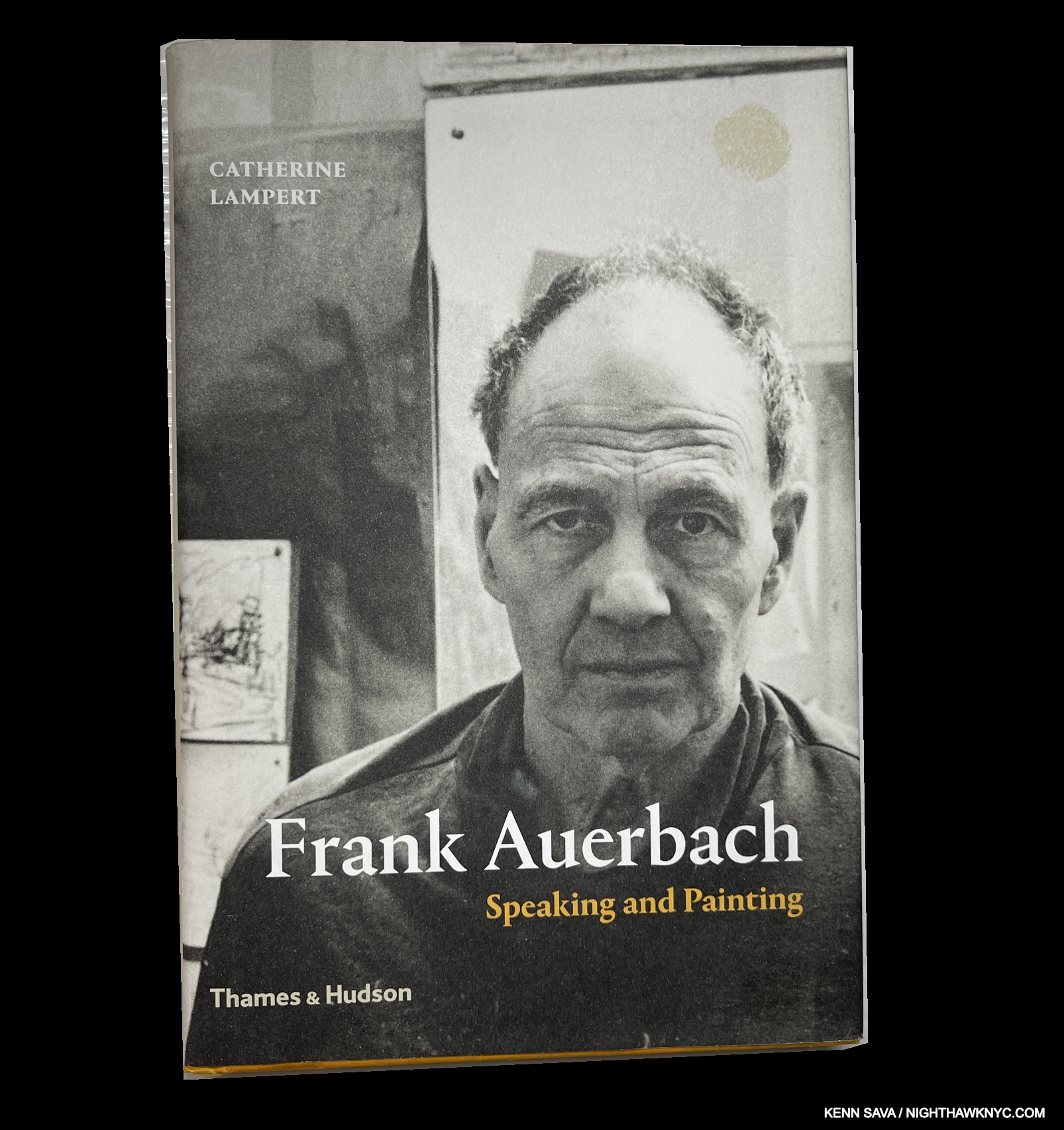
Frank Auerbach, Frank Auerbach: Speaking and Painting, Catherine Lampert, Thames & Hudson, 2015
I can’t say I’ve ever seen an Art book written by a long-term model of the Artist, who also happens to be a very accomplished Art historian and curator. Wow! What a unique book it yields! Catherine Lampert first sat for Mr. Auerbach in 1978! She curated the major Frank Auerbach Retrospective at Tate Britain in 2001 and has written extensively and authoritatively on the Artist (and other Artists) since (like her Euan Uglow: The Complete Paintings, listed earlier). If that’s not enough to intrigue you, it’s also superbly written, and so well done that Mr. Auerbach joined Ms. Lampert for dual booksignings, making it as close as we have to an “Artist approved” biography of Mr. Auerbach, unless and until Frank’s son, Jake, the Auerbach Documentarian, writes one.
Catherine Lampert is, then, one of two authors with more than one book on this list, joining The Met’s Carmen Bambach- both curators.
NoteWorthy Art History Book of the 21st Century-
A first edition copy. The book was later revised & expanded in a paperback edition.
David Hockney, Secret Knowledge, Viking Books, 2001
Love his work, or not, you have to grant that David Hockney is one of the most remarkable figures in Modern & Contemporary Art. Ceaselessly prolific for 65+ years, it seems to me he doesn’t get enough credit for his innovations, like his “Joiners” (his amazing Photo montages), or being the first major Artist to explore the creative possibilities of the iPhone and then the iPad. In addition to everything else he’s done, his 2001 book, Secret Knowledge, rattled a lot of windows and cages of Art historians when it came out, asking the question- Did the “old masters” use optics in creating their Paintings? It spawned a BBC TV 2-part documentary AND a BBC TV series. Aided by the double-gatefold filling “Great Wall” of postcards of great Paintings chronologically arranged from Jan van Eyck’s 1400 to the early 20th century, Mr. Hockney proceeds to make a most compelling case that they may well have. Over time, his theories have gained more acceptance (or is it less resistance), making this book something of a landmark in the ever-evolving road of Art history’s evolution. It also changed the way a lot of people look at Paintings. Which of those two is more important? You decide.
My look at his Met Museum Retrospective is here. Also: A personal favorite I am going to make a general recommendation for (though not including on this list)- David Hockney: The Arrival of Spring, Normandy, 2020 (Royal Academy of Arts, 2021), is a book that helped me get through the pandemic. Completely devoid of people, Mr. Hockney depicts (mostly with iPad Paintings, as he calls them), an almost day-by-day chronicle of spring arriving in his new Normandy home. Living in a place where signs of spring can be hard to find, it’s a book I look through often. Beautifully done. Available cheaply as I write.
NoteWorthy Overview Art Book of the 21st Century-

Jeffrey Gibson (ed), An Indigenous Present, DelMonico, 2023
Thank goodness this book exists, and who better to have edited it than the brilliantly talented Jeffrey Gibson, he of what looks to have been a spectacular installation at the Venice Biennale in 2024. Full of wonderful Artists I wasn’t familiar with, I have a feeling a lot of galleries bought copies and are scouring them relentlessly looking for talent to sign, and this is a great place for that, and the best book for getting up to speed on the wondrous world of Contemporary Indigenous Artists for the rest of us.
My look at the most recent Jeffrey Gibson NYC solo show is here.
NoteWorthy Art Education Book of the 21st Century-
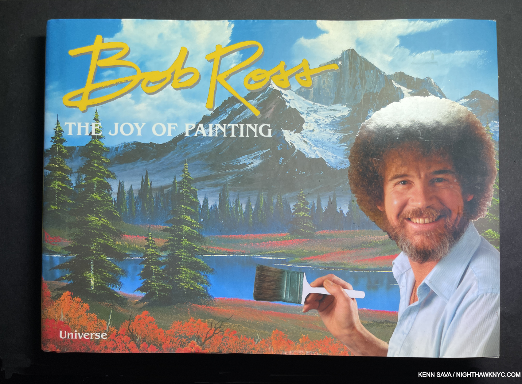
With his trademark large flat brush. Happy trees and happy clouds abound.
Bob Ross, Bob Ross: The Joy of Painting, Universe, 2017
Wait. What? Bob Ross on a NoteWorthy Art Book of the Century list? Say what you want about Bob Ross, love or hate his work, you HAVE to give him this- NO ONE in the history of the world has taught Painting to more people than Bob Ross has. And, he did it with joy! I’m sorry, as someone who considers himself first and foremost “a Painting guy,” it’s impossible for me to argue with that- or forget it. Ok, he taught oil Painting with a wet-on-wet technique, but much of what he taught can be adapted to acrylics. The point is to paint for enjoyment and/or the love of Painting. This book has an overview of his work, in Part 1, and then a number of step by step how-to’s in Part 2, which is great at a time when his show appears to be off the air (at least here). (Personally, I love watching him Paint clouds.) If that’s true everywhere right now, then this book is more important for keeping his message alive, out there, and inspiring even more people to paint. That message? Get some paint, some brushes, some canvas or paper and ENJOY yourself! Maybe you’ll create work that will be on this list when whoever does it in 2050. Maybe not. The Joy of Painting is the point. Bob Ross paid it forward.
NoteWorthy Music Books of the 21st Century-

Paul McCartney, Paul McCartney: The Lyrics, Norton, 2021
A book for the ages, this one has been published in huge numbers and so is unlikely to be as rare as the Francis Bacon set will be. Perhaps the best compliment I can give it is that it’s full of so much great, new information, that it practially FORCES you re-listen to the songs! The slip-cased hardcovers are beautiful, and the absolutely preferred edition. The paperback, not so much. AT ALL COSTS, AVOID THE eBOOK VERSION!
My piece naming it the NoteWorthy Music Book of 2021 is here.
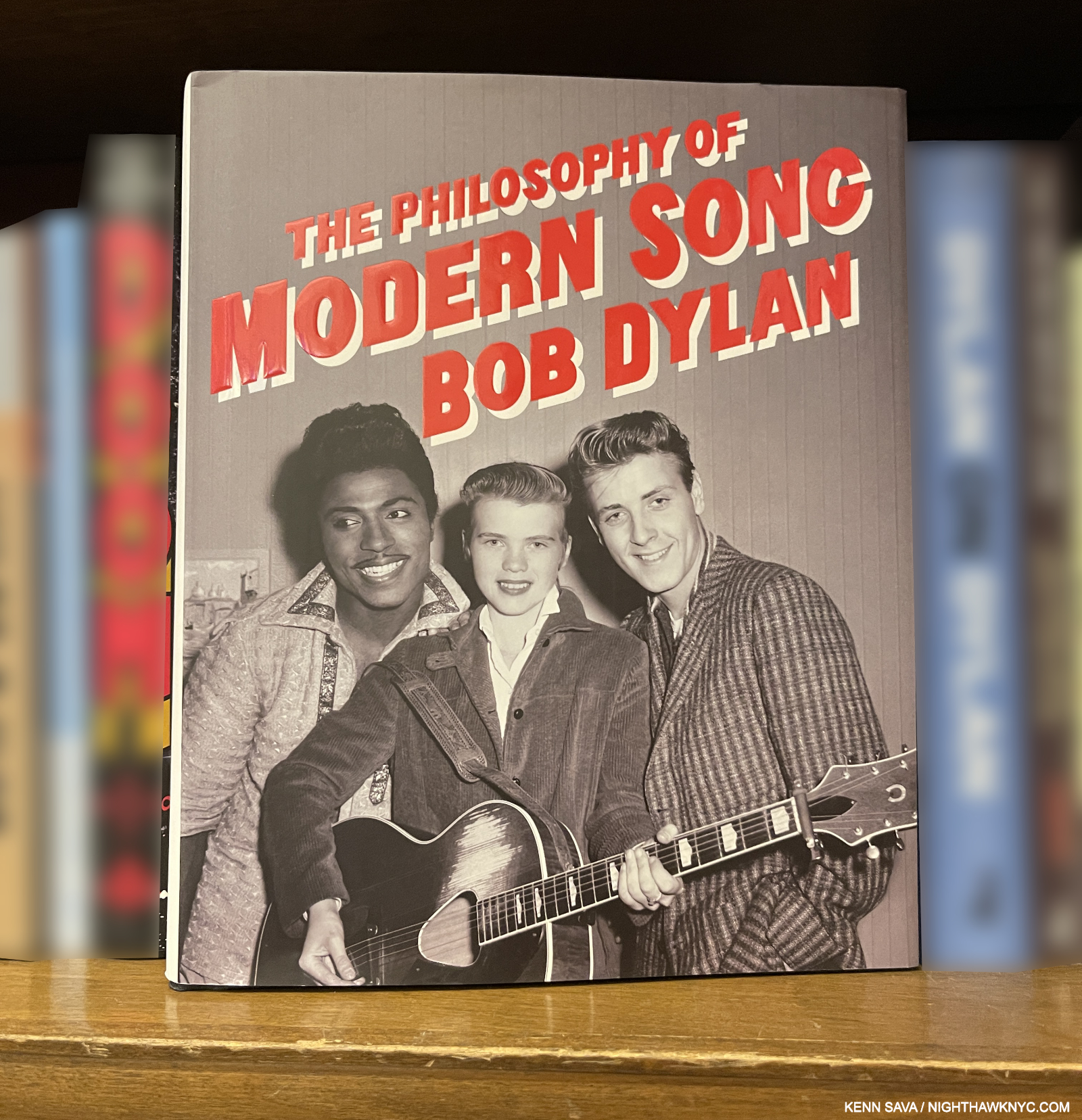
Bob Dylan, Chronicles, Volume 1, 2004, and
The Philosophy of Modern Song, 2022, both Simon & Schuster.
After countless biographies written by innumerable others, Chronicles, Volume 1, is, FINALLY, the first volume in what (I, and many others, hope) will be as many as it takes for Bob to tell his story as only he can. And, what a book it is! Beginning right at the beginning of Bob’s recording career, Bob’s prose style here is a marvel of total recall. Like Patti Smith’s immortal Just Kids, we’re instantly transported back in time, this time to the turn of the 1950s into the 1960s NYC, able to feel the biting cold of an NYC winter before global warming, down to the smallest details of rooms Mr. Dylan was in at the time. WHAT A BREATH OF FRESH AIR Chronicles V1 was when it came out after ALL the 2nd hand, unauthorized Dylan bios! It’s miraculous, in my view (a word that applies to Mr. Dylan’s other book on this list, The Philosophy of Modern Song). So much of what went on in the first part of Bob Dylan’s career is still impacting the world, the way The Beatles did. We FINALLY get to see and hear it from the inside, from behind those iconic dark glasses. Chronicles, Volume 1 left me with one overriding question- 21 years later, WHERE IS VOLUME 2????
It seems to me that Philosophy of Modern Song is written in a completely different style! Whereas Chronicles, V 1 gives us Bob, the consummate storyteller, every sentence of Philosophy of bursts with passion, nuance and depth, belying how long Bob has lived with and thought about each and every one of the 60 songs he includes- each with its own essay. Passion, especially, flows from his pen like blood from a bullet wound. His first new book since said Chronicles, WHO better to write a book titled The Philosophy of Modern Song than Bobby D.? Hard at work crafting the greatest body of songs…maybe ever, since 1959, or so, songs with a depth that few (anyone?) can match. Filled with unexpected choices among the 60 songs he discusses, the choices are as unexpected as each accompanying essay is unpredictable. 12 years in the making, there’s a “freewheeling” (sorry!) spontaneity to his prose that packs so much information and linguistic gymnastics into each line as to leave the reader feeling like she or he has to cut back on the caffeine. Some of these songs I never gave a second listen to, or switched off when they came on. But here, in Mr. D’s hands, they get the due of their dreams.
Among all the surprises- in the choices and Bob’s essays, I was shocked to see “Pump it Up,” by Elvis Costello & The Attractions here(!), and even more shocked to read that what Mr. D. has to say about it sums up exactly how I felt about it at the time, but few who weren’t fans would listen. But, he takes it to another level only he can. This is how his look at it begins (CAPS his, for a change)-
“THIS SONG SPEAKS NEW SPEAK. It’s the song you sing when you’ve reached the boiling point. Tense and uneasy, comes with a discount—with a lot of give-a-way stuff. And you’re going to extend that stuff till it ruptures and splits into a million pieces. You never look back you look forward, you’ve had a classical education, and some on the job training. You’ve learned to look into every loathsome nauseating face and expect nothing.”
Philosophy of is a thrilling, one-of-a-kind ride into the world of songwriting, a world that seems to be getting lost today, and the fear of just that is what I sense may really be at the beating heart and soul of this book from one of the Art’s ultimate maters. (If you want to get an even fuller idea of Bob Dylan’s seemingly encyclopedic knowledge of modern song, look for his radio series, “Theme Time Radio Hour with Bob Dylan,” which ran for about 100 episodes over two seasons.)
And? Get this- Bob is on the road RIGHT NOW as I write this barely 2 months shy of his 84th Birthday! Just LOOK at that itinerary- FIFTY-SEVEN SHOWS between March 11 and September 19th!!! And, he also Paints and makes Prints and Sculpture. PHEW! I’d like to write about his Art, but….. The man is a world treasure. So is Sir Paul. Generations yet unborn will be lucky to have these books.
NoteWorthy Art Book Publisher of the 21st Century-
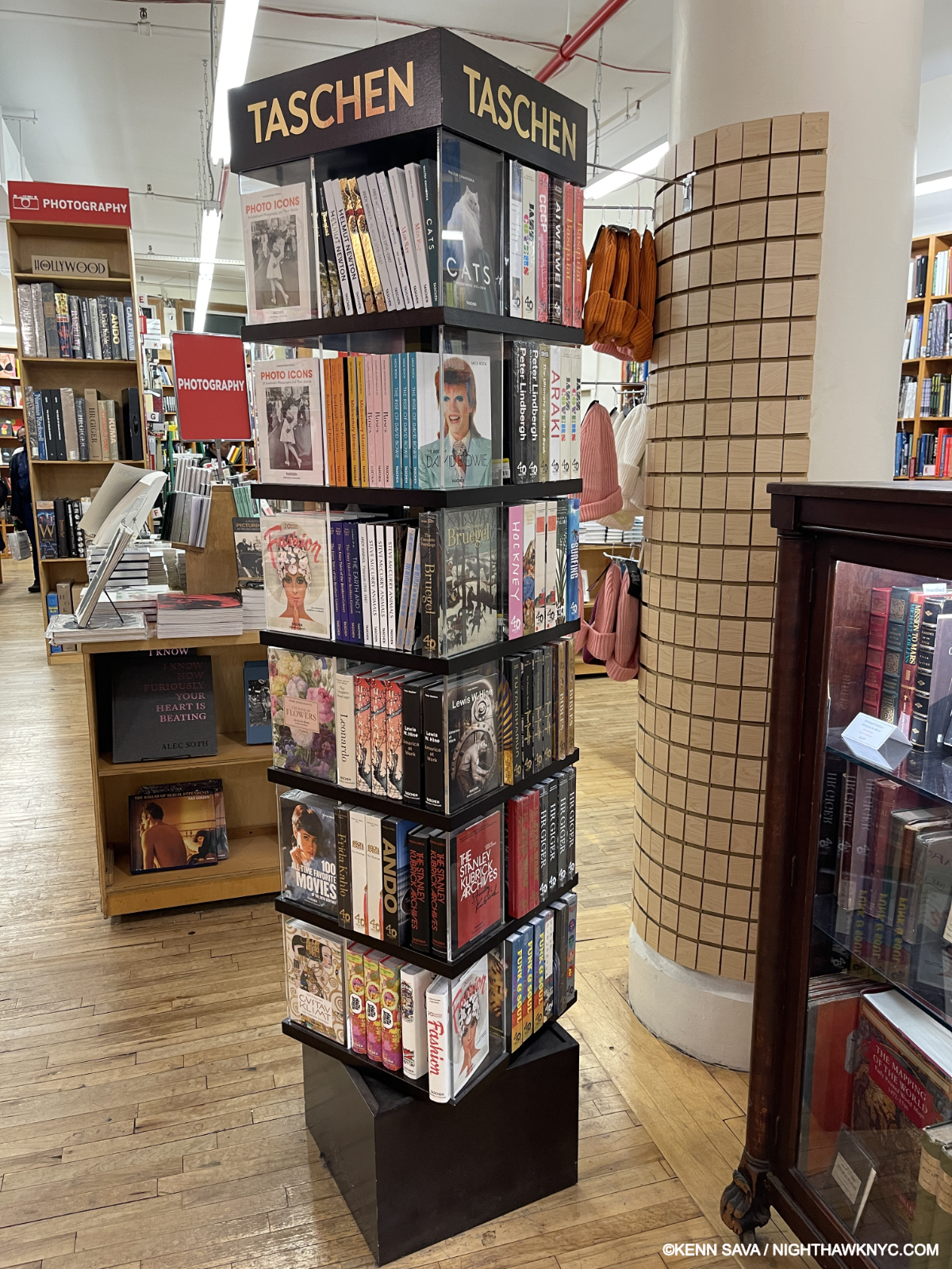
A tower of “Bricks.” Not leaning, yet, but that Fashion book on the bottom looks ready to bust out.
Taschen, Cologne, Germany
With SEVEN books on this list, more than any other publisher, HOW could I not give them the nod. Though some of their books leave me wanting (which I won’t go into now), their production values are consistently the highest and provide real value you can see and feel in the vast majority of their many publications. Originally, the Bricks, as I call their small books which are about the size of a brick, listed for $20.00(!), which earned them my NoteWorthy Art Book award in 2021. Then, someone got the idea of releasing them in a slightly larger size under a “40th Anniversary” moniker, for the equally larger price of $30. list (meanwhile, the smaller Bricks that remained in print were bumped to $25.). Taschen continues to find new ways to monetize almost exactly the same content. Nonetheless, I’ll say it yet again- TASCHEN’S BRICKS ARE (still) THE BEST VALUE IN ART BOOKS TODAY! The “Bricks” remain essential books for me on virtually every Artist included in the series. With usually upwards of 500 pages with countless color illustrations, you still can’t go wrong with them. Taschen has been very busy, of course, publishing Art (& PhotoBooks) in other sizes, too. Most of their books that get reissued in other sizes are on Artists from before 1900. Their Contemporary Art books (except those on David Hockney and Jean-Michel Basquiat) seem to come out in their XL size, but once they go out of print, like their Christopher Wool and Neo Rauch books (Neo listed earlier), they are not reissued in another size. So, get them while you can (Note- One Brick I would pass on is their Hiroshige: One Hundred Famous Views of Edo. Look for Andreas Mark’s “definitive” edition, which has much better, and slightly larger, plates, at about the same price).
My piece naming Taschen the Art book publisher of 2021, when their Bricks were TWENTY DOLLARS a copy, is here. Read it and don’t say I didn’t tell you.
Honorable Mention- The Museum of Modern Art, New York

Some love for a Photographer in an Art book piece! And, not just any Photographer. The great LaToya Ruby Frazier graciously holds her NighthawkNYC NoteWorthy PhotoBook of the Year, 2024, for me at its release at her stunning show of the same name. MoMA, May 10, 2024.
The Museum of Modern Art gets the NoteWorthy Art Book Publisher of the Century Honorable Mention for the steady stream of excellent exhibition catalogs they have published this century. There are actually too many to list; Charles White: A Retrospective is on this list, two others (Dorothea Lange: Words and Pictures, and Luigi Ghiri: Cardboard Landscapes) have been on my NoteWorthy Art Book Lists, a few others (Adrian Piper: A Synthesis of Intuitions, 1965-2016, Ed Ruscha / Now Then, Robert Rauschenberg: Among Friends, Robert Gober: The Heart Is Not A Metaphor, Käthe Kollwitz: A Retrospective,) easily could have been. If that’s not enough, MoMA’s LaToya Ruby Frazier: Monuments of Solidarity was my NoteWorthy PhotoBook of 2024, AND Taryn Simon’s Expanded edition of The Innocents is on my NoteWorthy PhotoBooks of the 21st Century list! PHEW! These books join a long list of excellent MoMA publications from the 20th century (going back to their now classic catalog for the very first show I ever saw- Picasso: A Retrospective in 1980) that continues to make MoMA a first stop when researching any Modern & Contemporary Artist.
All told, 68 books are listed (counting the Ed Ruscha & George Herriman sets as one title).
This piece is dedicated to all my fellow Art book lovers, everywhere, and especially to those who’ve written to me about Art books since 2015.
*- Soundtrack for this piece is “This is Radio Clash,” by The Clash, since I’m, apparently, about as underground as it gets. “Please save us, not the whales,” (their words, not mine), are words I can relate to. Hey, save us both!
NighthawkNYC.com has been entirely self-funded & ad-free for 9 1/2 years, during which over 340 full-length pieces have been published! If you’ve found it worthwhile, PLEASE donate securely by PayPal below to allow me to continue. Thank you, Kenn.
You can also support it by buying Art, Art & Photography books, and Music from my collection! Art & Books may be found here. Music here and here.
Written & photographed by Kenn Sava for nighthawknyc.com unless otherwise credited. To send comments, thoughts, feedback or propositions click here. Click the white box on the upper right for the archives or to search them. Subscribe to be notified of new Posts below. Your information will be used for no other purpose.