Jasper Johns: Contemporary Art Begins Here

Written & Photographed by Kenn Sava (except *)

Art in NYC, 2021, Part 1-

Robert Rauschenberg and Jasper Johns. Or is it Jasper Johns and Robert Rauschenberg? Who came first? Mr. Johns said, Mr. Rauschenberg “was the first person I knew who was a real artist (i.e. a working artist)1.” At the time, Jasper Johns was working at the Marlboro Bookstore.

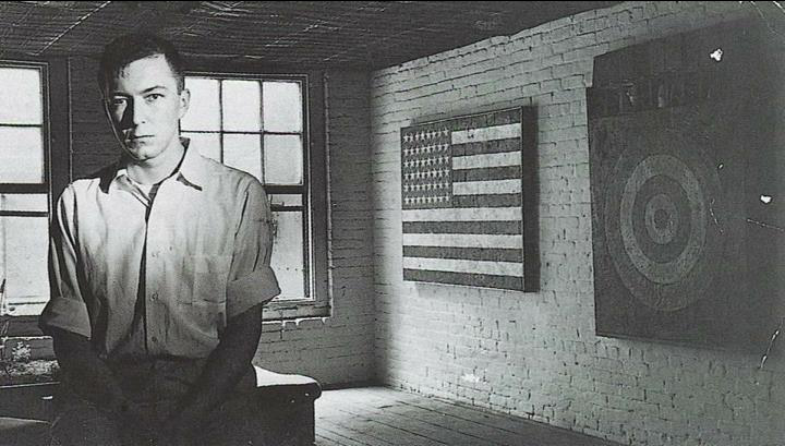
Contemporary Art starts here. Jasper Johns seen in his Pearl Street studio in 1955, with two of the most important early works in Contemporary Art- the first Flag Painting, 1954-55, and Target with Four Faces, 1955. At the time, Robert Rauschenberg had an apartment/studio upstairs. *Photo by George Moffet from the MoMA Jasper Johns: A Retrospective catalog, p.125.

Still, it was Jasper Johns who came to acclaim first when in 1957, Leo Castelli visited his Pearl Street studio, seen above, saw his work and offered him a solo show the following January. The rest is history. In 1959, Time Magazine said-

“Jasper Johns, 29, is the brand-new darling of the art world’s bright, brittle avant-garde. A year ago he was practically unknown; since then he has had a sellout show in Manhattan, has exhibited in Paris and Milan, was the only American to win a painting prize at the Carnegie International, and has seen three of his paintings brought for Manhattan’s Museum of Modern Art.” 2.

For my part, I was so taken with Robert Rauschenberg’s work that I was slow in getting to Jasper Johns. Over the years, his work has spoken to me more and more, to the point of shouting to me now. Messers Johns & Rauschenberg eventually became romantically involved only to have it end in 1961. At this point, almost 70 years since the Photo above was taken, all that really matters for the rest of us is that both have created two of the most important bodies of work of our time.

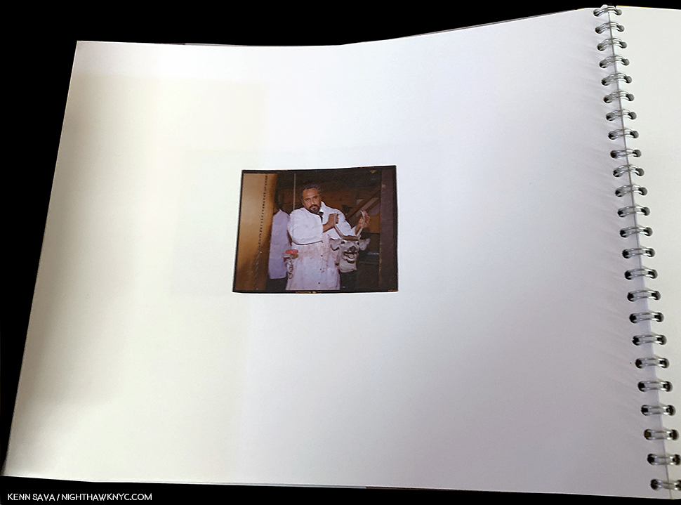
Happy Birthday, Jasper Johns! The Artist cutting an Ale Can Birthday Cake on his 90th birthday, May 15, 2020. *Unknown Photographer.

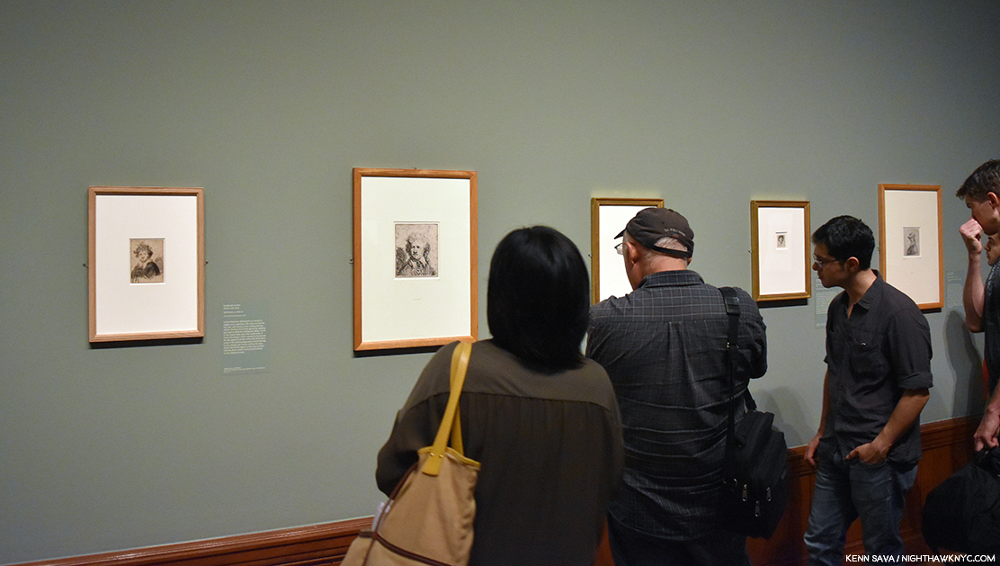
Jasper Johns: Mind/Mirror is an early candidate for the show of the decade. With around 500 pieces, it’s so vast it’s split between two major museums simultaneously- the Whitney Museum of American Art, and the Philadelphia Museum. Scheduled to coincide with the Artist’s 90th birthday on May 15, 2020, its opening was unfortunately delayed due to covid until September 29, 2021. Still, it’s a stellar 90th Birthday present. Having visited the Whitney half about 10 times, in my opinion, it ranks with the finest shows yet mounted in their new building- Frank Stella, Vida Americana, and Julie Mehretu. It’s brilliantly conceived & laid out and very thoughtfully & intelligently installed.

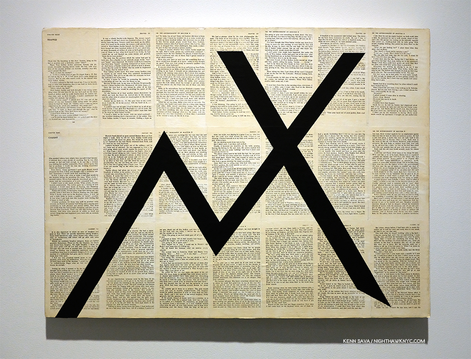
Roll up! It just so happens this bus, the M14, will take you to the show, among other places…

There have been some important, major, Jasper Johns shows to this point including the 1996 Jasper Johns: A Retrospective at MoMA, Jasper Johns: Something Resembling Truth, at the Royal Academy, London in 2017, and previous large shows at the Whitney & Philadelphia Museums. Yet, given the long-standing relationships Mr. Johns has had with both of those institutions, and the large holdings of his work they each have, I wonder if there will EVER be a more comprehensive look at the work & career of this now legendary Artist, especially with his involvement. As a result, Jasper Johns: Mind/Mirror is something of a perfect storm in an imperfect time of a show. Though I have only seen the Whitney half (and the rest in the fine Jasper Johns: Mind/Mirror catalog, the only place where you can see the entire show) , it still ranks among the great shows I’ve seen in the past decade including Michelangelo: Divine Draftsman & Designer and Kerry James Marshall: Mastry. Also, consider this- Imagine being the curator of the largest Jasper Johns show ever, then being told you only get to mount half of it in your institution! HOW do you divide an Artist’s career in half, and make it cohesive particularly to a discerning Art audience like NYC, while not shorting the equally discerning Philadelphia Art audience?– or vice versa?

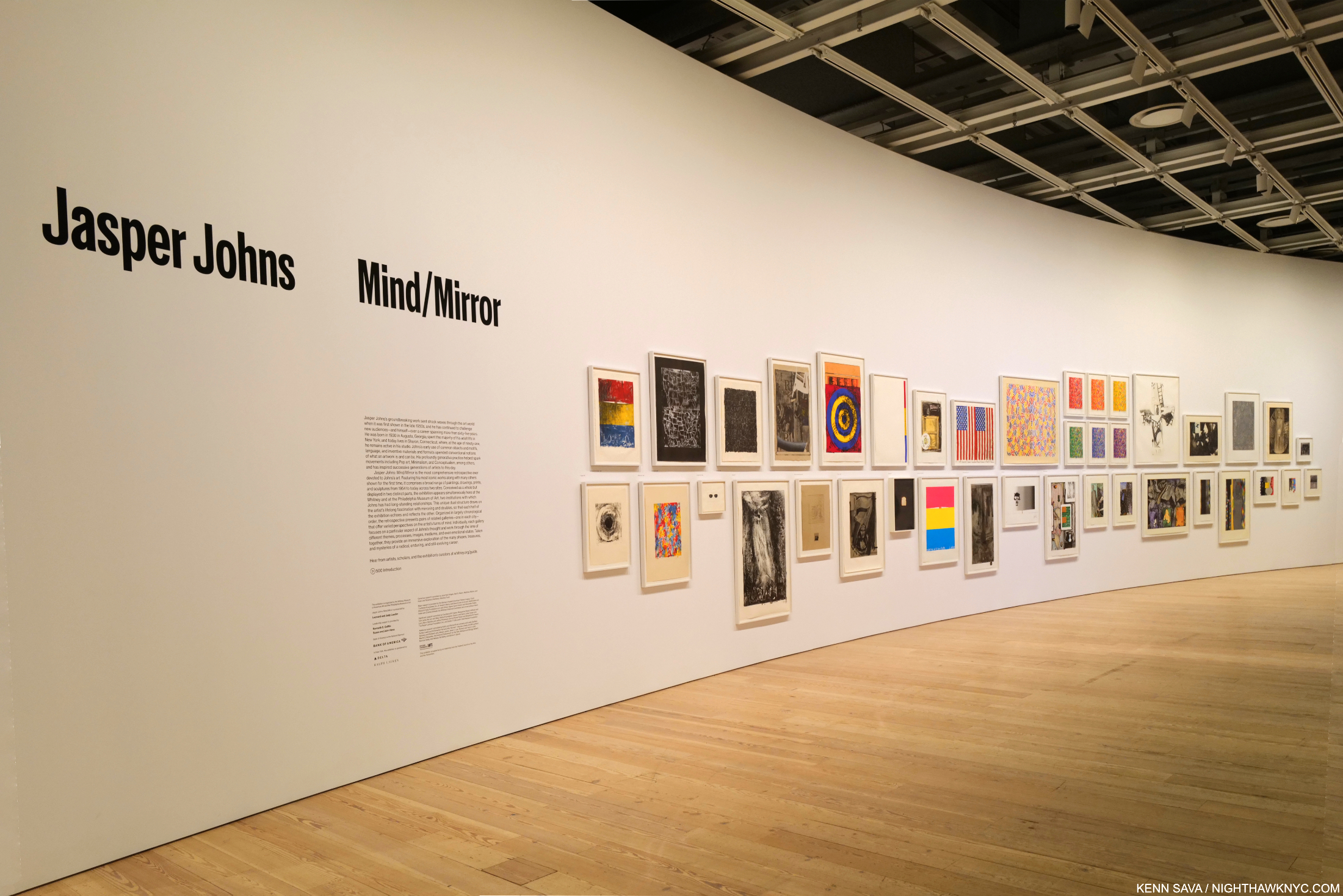
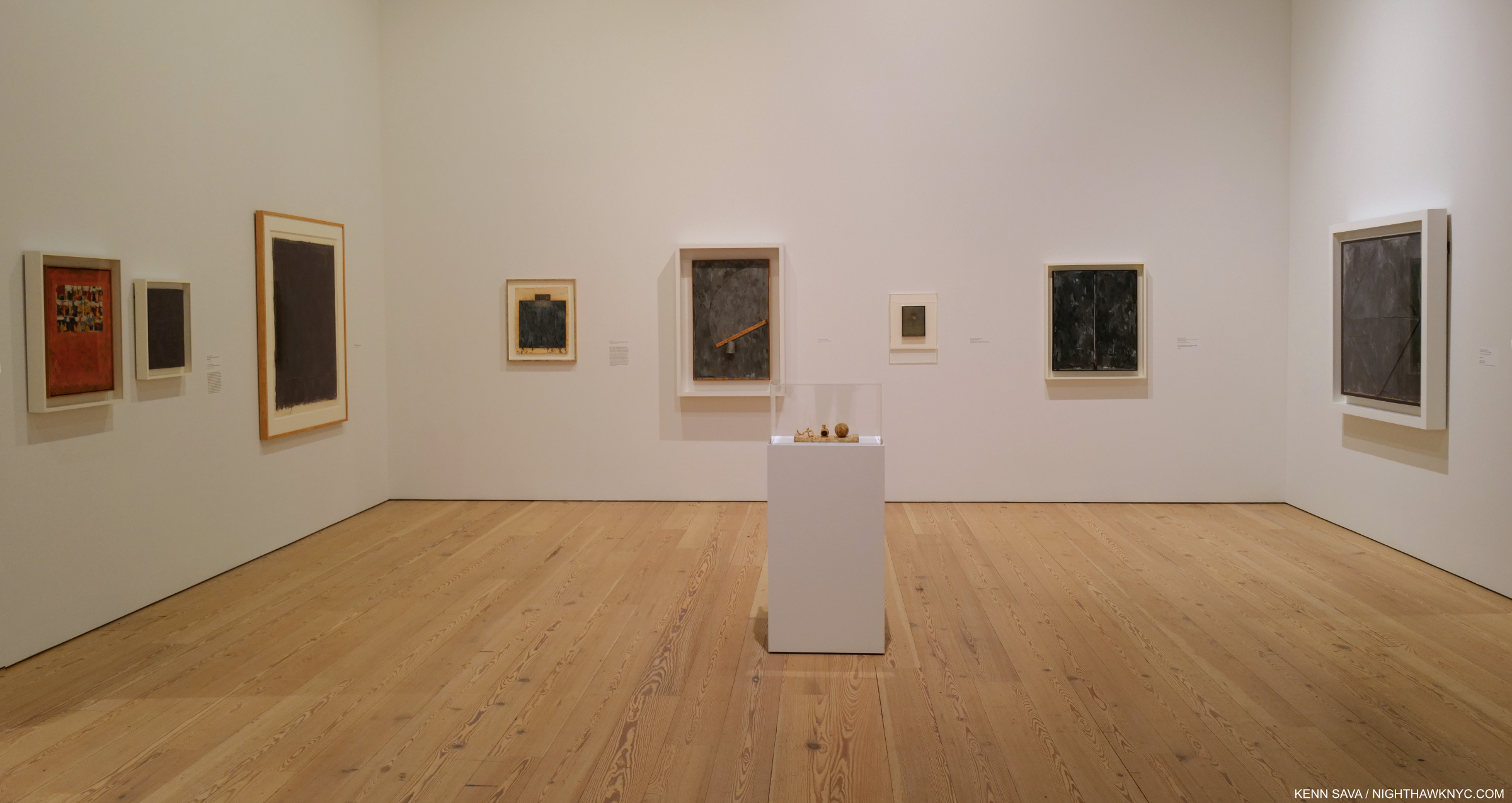
Off and running. The exhibition’s lobby contains 39 Paintings, Drawings & Prints that range over his entire career arranged chronologically, and includes a number of very well-known works.

From the evidence I have right now, having seen the NYC half and the Mind/Mirror catalog , they’ve done an extraordinary job. Both halves are full of important pieces and rarely seen supporting works. The show is broken down into themes, which follow the chronological arc of the Artist’s career, which are then divided in half between the two locations and arranged into rooms by theme. Somehow, a visit to one doesn’t leave you with an overriding feeling of missing too much. Yes, if you have followed Mr. Johns career and you go to the Whitney you’ll find yourself looking for his first Flag, 1954-5, or Untitled, 1972, both of which are on view in Philly, but what IS here more than makes up for it. Time and again I found myself surprised that such and such a work WAS here. Not only that, more often than not, it is so thoughtfully displayed that there’s very likely supporting pieces nearby which shed completely new light on it. A good example of this is the wonderful gallery devoted to one of his most fascinating pieces, According to What?, 1964, which was surrounded with three walls of related work that reveal how much each detail in According to What? means to the Artist and how much thought and planning went into it. 

According to What?, 1964, Oil and objects on canvas. This is one of his works that can be seen as a “summing” up of where he was at that point, coming on the heels of Retrospectives at the Jewish Museum, NYC, and the Whitechapel Gallery, London (which would happen, again, after his MoMA Retrospective in 1996. It’s full of objects that he would reference in other works, which surround it in this gallery. It’s also a “tribute” to Marcel Duchamp, with a copy of his Self-Portrait hanging down on the left on the panel that is usually closed when this piece is seen.

Having said all of that, there is a somewhat basic conundrum to consider. Seeing ONE work by Jasper Johns leaves the exact same feeling as seeing, approximately, 250 in each half of this show, or all 500 for that matter: What’s going on? What is it “about?”

Installation view of parts of two of the surrounding and supporting walls. The series of Prints on the left isolate elements of the Painting, which brings the viewer back to study each in the larger work. There is another half of this gallery behind me.

Looking at a few or a few hundred begins to shed light. At the age of 24, in the fall 1954, Jasper Johns destroyed all of his work in his possession 3. He wiped the slate clean (something he would do again, non-destructively, after the MoMA Retrospective in 1996). Right from the earliest work he then created using “things the mind already knows,” he said of the flags, targets, numbers, etc. he featured resulted in pieces the viewing public immediately had a way “in to” at a time of densely personal Abstraction that often lacked one. He created multiple pieces with each object around the same time, then suddenly, one would return years, even decades, later. They became parts of his own language. Symbols. Stand ins. Of what? That’s up to Mr. Johns and each viewer to decide. Thus far, that’s kept viewers and the Art world busy for over 6 decades.

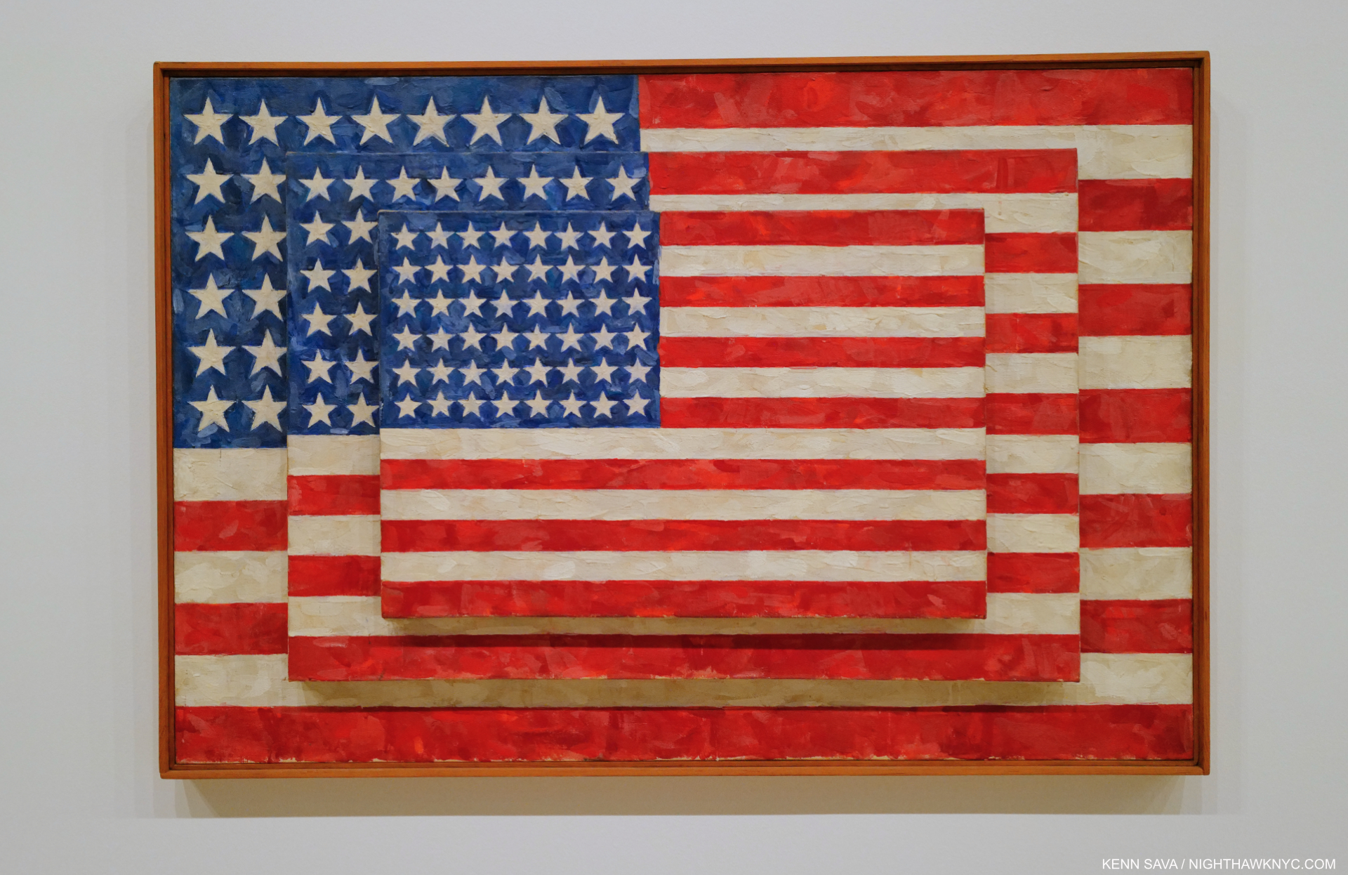
Three Flags, 1958, Encaustic on canvas.

“Jasper Johns is an American painter, sculptor and printmaker whose work is associated with abstract expressionism, Neo-Dada and pop art.” Wikipedia.

There, in one sentence spotted on a search result page is why I avoid Wikipedia. Mr. Johns’s early work is the antithesis of Abstract Expressionism! He and Robert Rauschenberg set out to do their own thing in the face of the all-encompassing tide of AbEx that was at its zenith when they began. To this end, Mr. Rauschenberg even famously erased a Drawing by Willem de Kooning, one of the most prominent of the first wave of AbEx Painters. Jasper Johns’s stated creed was “When I could observe what others did, I tried to remove that from my work. My work became a constant negation of impulses.4” “I was anxious to clarify for myself and others what I was5.” As for “Neo-Dada,” he, like countless others, was influenced by Marcel Duchamp AFTER he saw his work in 1957 and then met him circa 1958-9. But, people “associated” his work with Duchamp’s beginning in 1957, when he had never seen it!

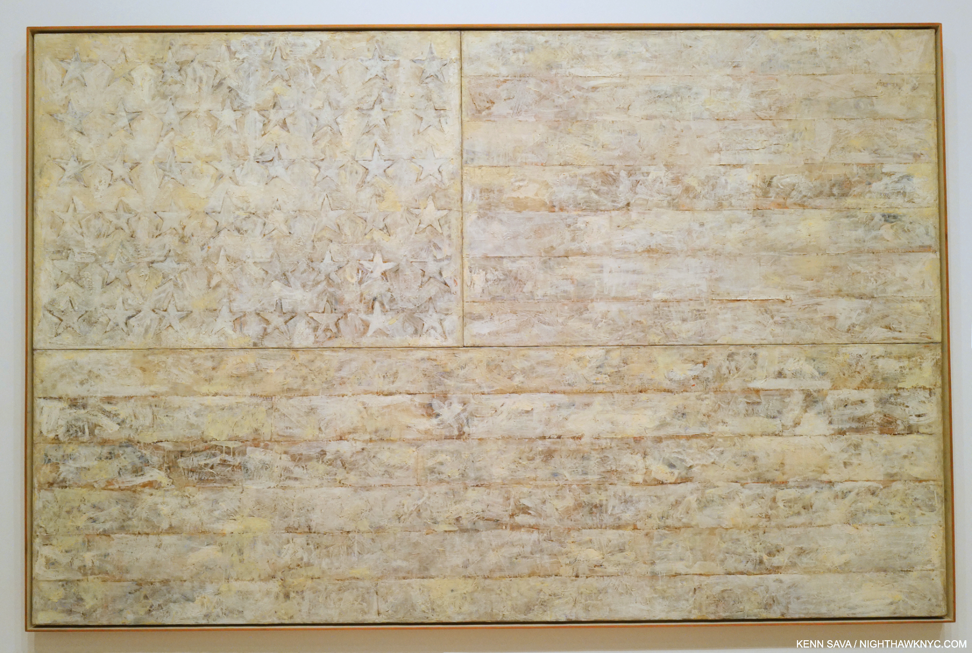
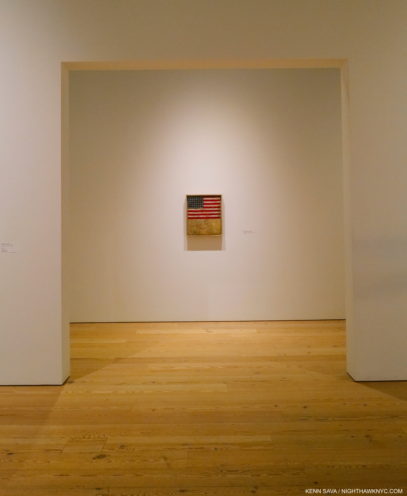
White Flag, 1955, Encaustic, oil, newsprint, and charcoal on canvas. His second and largest flag, on loan from The Met.

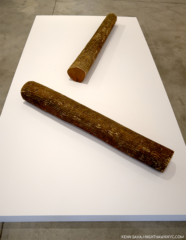
Yes, his post-1954 early work center around familiar objects that he has turned into Paintings or Sculpture, his “vocabulary” of elements “the mind already knows” famously include the American Flag, targets, numerals, words, ale cans, Savorin cans and string. yet I don’t see them as “pop,” and I don’t consider Mr. Johns (or Robert Rauschenberg or James Rosenquist for the matter), “pop” Artists, though I know some do. Flags, targets and numbers are not soup cans or Brillo boxes. (His Ale Can Sculpture resulted from a dare, so I read it somewhat tongue in cheek.) His Savorin can Sculpture and Prints are based on the can and brushes in his studio. The wall card makes the case that the Savorin can and paint brushes are “stand-ins” for the Artist. Again, not “pop.” This is interesting because his “object” based work of the 1950s allowed him to remain detached. “I don’t want my work to be an exposure of my feelings,” he said around 1977 6. Over time that has seemed to change, but looking for specifics gets tricky.

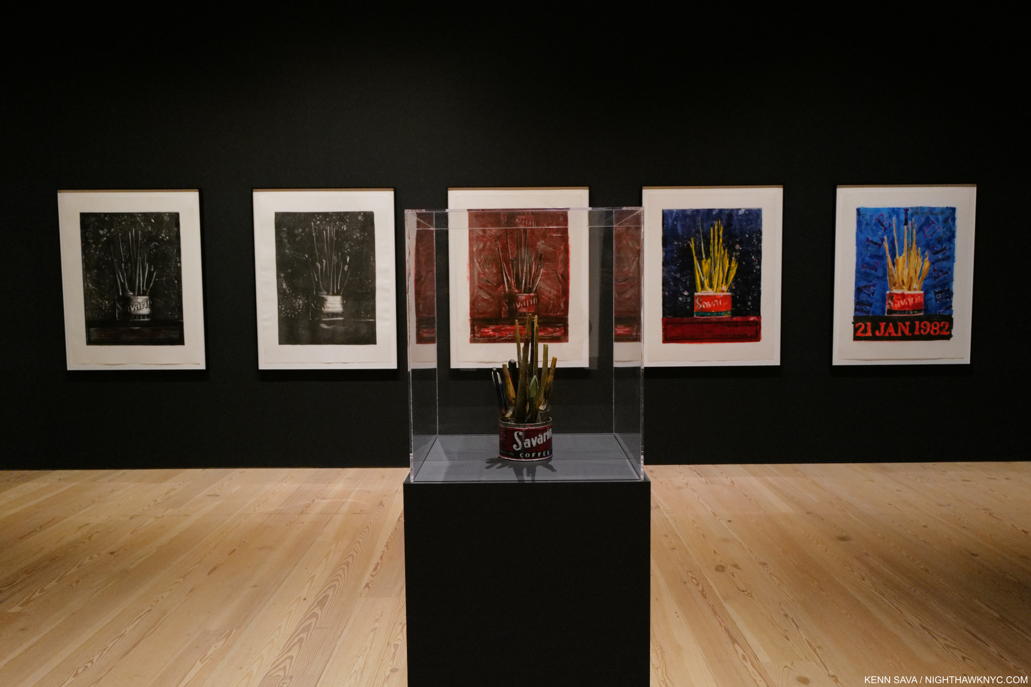
A gallery full of his Savorin can Sculpture, 1960, and Monotypes from the 1970s and 80s he made of the object on the 4 surrounding walls. He used a Savorin can as a paint brush holder in his studio. Not sure that makes it “pop.”

As you walk through the show you’ll see expressive passages in Paintings that are a hallmark of AbEx (as in According to What?), but rarely entire Paintings (there are a few), and these were done after the heyday of the first wave Abstract Expressionist Painters. These passages don’t define him or any of his work, in my view, especially given his early work stood diametrically opposed to theirs. It’s really one technique among the very many Mr. Johns uses. As time has gone on, Jasper Johns has shown more interest in Art history, and numerous Artists, like Picasso, Leonardo, Duchamp and Edvard Munch, have “appeared” in his work. As I mentioned in my piece on MoMA’s Cézanne Drawing show, which included a dozen works from Mr. Johns’s collection, he has amassed a world-class Art collection, demonstrating impeccable taste in his acquisitions, that is fascinating in its breadth. Whatever his initial influences were, from the beginning with Flag, 1954-55, Jasper Johns’s work has looked like no one else’s. In my view, that Wikipedia page should read- Jasper Johns’s work is associated with Japer Johns.

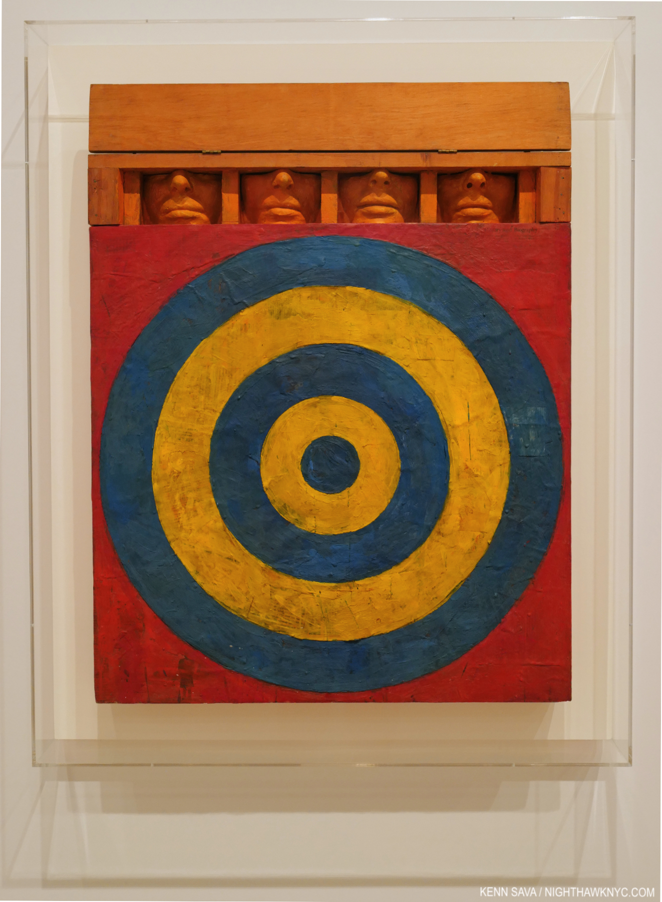
One of the most extraordinary works of the 1950s. Target with Four Faces, 1955, Encaustic on newspaper and cloth over canvas surrounded by four tinted-plaster faces in wood box with hinged front.

Another fascinating early work is Target with Four Faces, 1955, which contains 4 heads cut off at just below the eye. They all appear to be male. The piece has a door that can be lowered blocking the faces from view. And, there it was, on loan from MoMA, appropriately on the first wall in the first gallery. A shot over the bow of the Art world in 1955, and today. I came away believing that if Jasper Johns had never made another work after it, Target with Four Faces was enough to seal his stature.

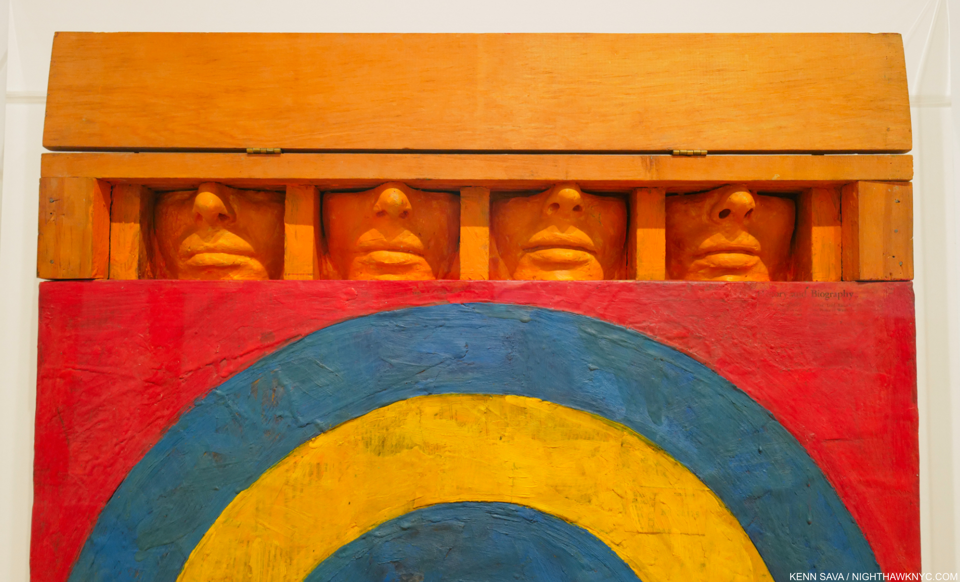
Detail. I was told by a Whitney staffer that the heads were cast from four people in his studio. Note the hinged door above them, which when closed, gives the work an entirely different effect. Also notice the amount of work that went into placing the heads just so. Standing to the side reveals that the tip of the noses must be right up against that door when it’s closed.

Either way, they can’t see what is going on in front of them. Are they present while someone is being targeted, but unseeing? Or, are they the ones with the target on them? It’s easy to read things into them, including Mr. Johns’s fellow gay men being targets, or the public being blind to the “targeting” of others. What about the prominence of their noses, or their closed mouths? Or…..? It’ll say something else the next time I look at it.

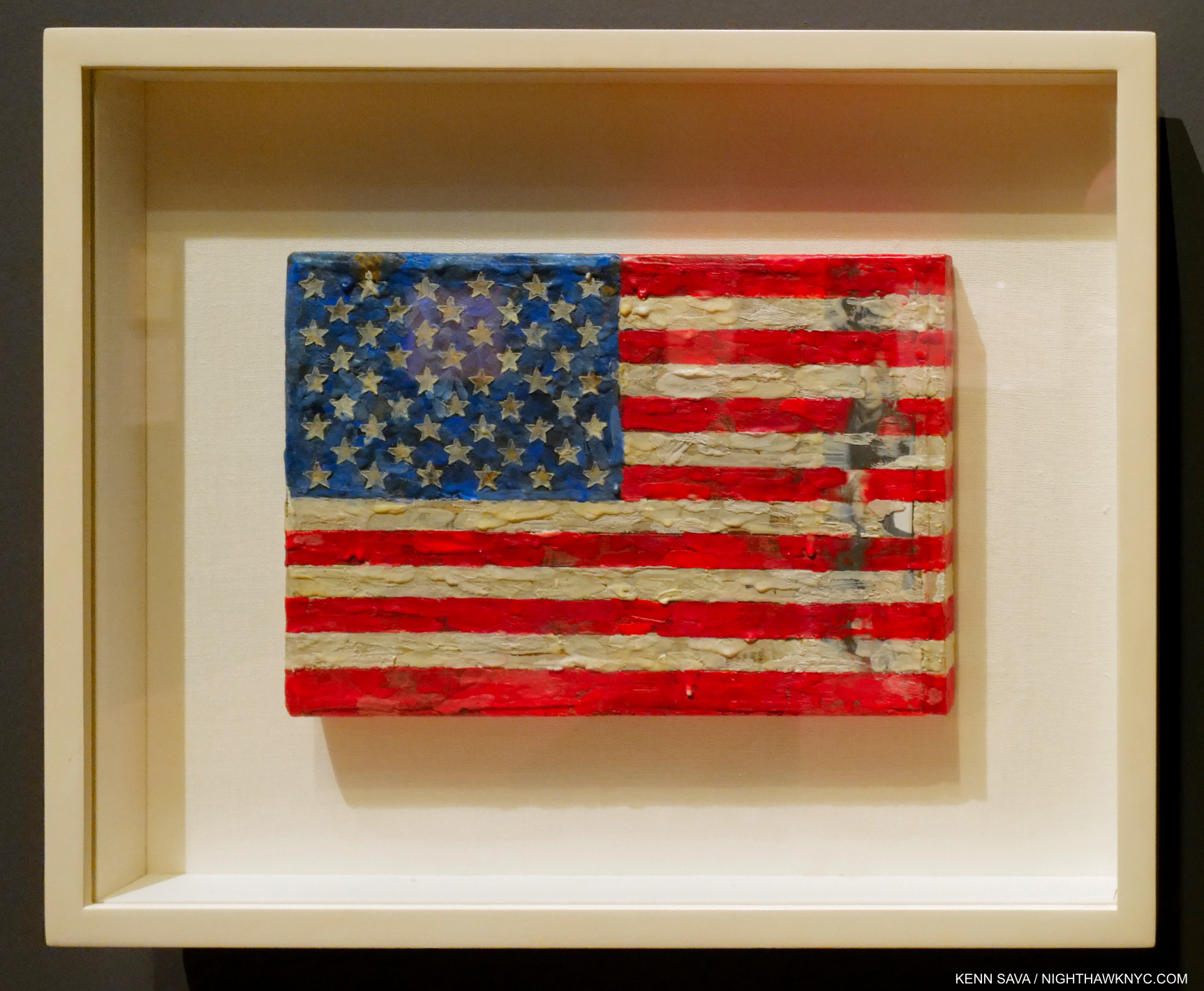
One of my favorite elements of Jasper Johns’s early collages are when the underlying material, often newspapers, comes through- either intentionally or through age. In this marvelous very small Flag from 1965, Encaustic and collage on canvas, 7 3/4 by 11 1/4 inches, it’s hard to tell which is the case, particularly with the row of faces to the right. Included in a stunning gallery at the heart of the show of small works from throughout his career.

But, fortunately for the world, he has continued to create. For 68 more years, so far! His Flags raise similar wonder. Does that they were Painted by a gay man in the 1950s living in a country with harsh stereotypes against him and his kind enter into it? A yearning for a Flag that stood for all? For me, anyway, it’s hard to see either of these pieces and not wonder about these things. Of course, as you move through the show one thing becomes quickly apparent. In the Art of Jasper Johns virtually nothing is THAT simple. 

Untitled, 1992-5, Oil on canvas, 78 by 118 inches.

After these early “objects” and object based works, in the early 1960s, Mr. Johns’s work becomes something of a “non abstract form of abstraction,” as the late Kirk Varnedoe, curator of the MoMA Johns Retrospective called it7, where objects and symbols become elements and not the sole subject. Was this done to subvert attempts at “reading” his Art?

The Seasons, 1989-90, Acrylic over intaglio on paper. That figure is reputed to be the Artist’s. On the terrific installation of this show- While this might seem a small detail, I can’t recall ever being in a show where virtually NONE of the pieces suffered terribly from glare. Here, I’m standing directly in front of  The Seasons and there is no reflection. Oh, if only other museums (and galleries) would see what a huge difference it makes it might help persuade them to pay the considerable current cost for glare-free acrylic glazing on pieces with glazing.

In the 1960s his work turned to more private imagery and symbols as opposed to the well-known objects, like Flags and targets. In works like According to What? his use of them reaches a crescendo, and these continued for some years until he wiped the slate clean, again, and began his Cross-hatched period. Things seem to build to another crescendo, like The Seasons, above or Untitled, 1992-94, which led up to his MoMA Retrospective, which would change everything.

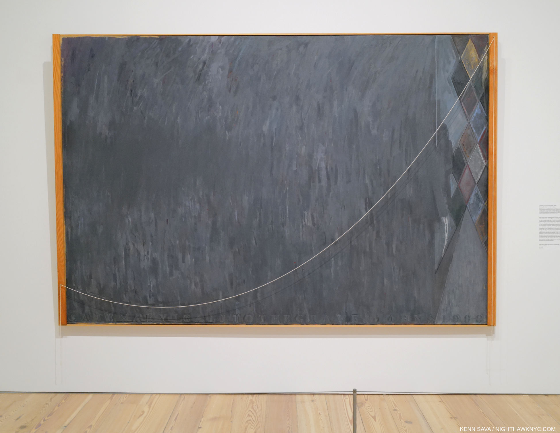
Catenary (I Call to the Grave), 1998, Encaustic on canvas with wood and string. After the MoMA Retrospective, Mr. Johns stripped his canvases bare and began to address aging and death in the Catenary series, which numbers 19 Paintings, of which this one never fails to stir me, 55 Drawings and 6 Prints.

The MoMA Retrospective in 1996 caused the Artist to take stock of where he was and led to him drastically changing course. He wiped the slate clean, again. By that time, his work had grown very complex, but now his work emptied. His focus turned to the eventuality of death. This resulted in his extraordinary Catenary series, 1998, and has continued to be (one of) the overriding themes of his work to this day. 

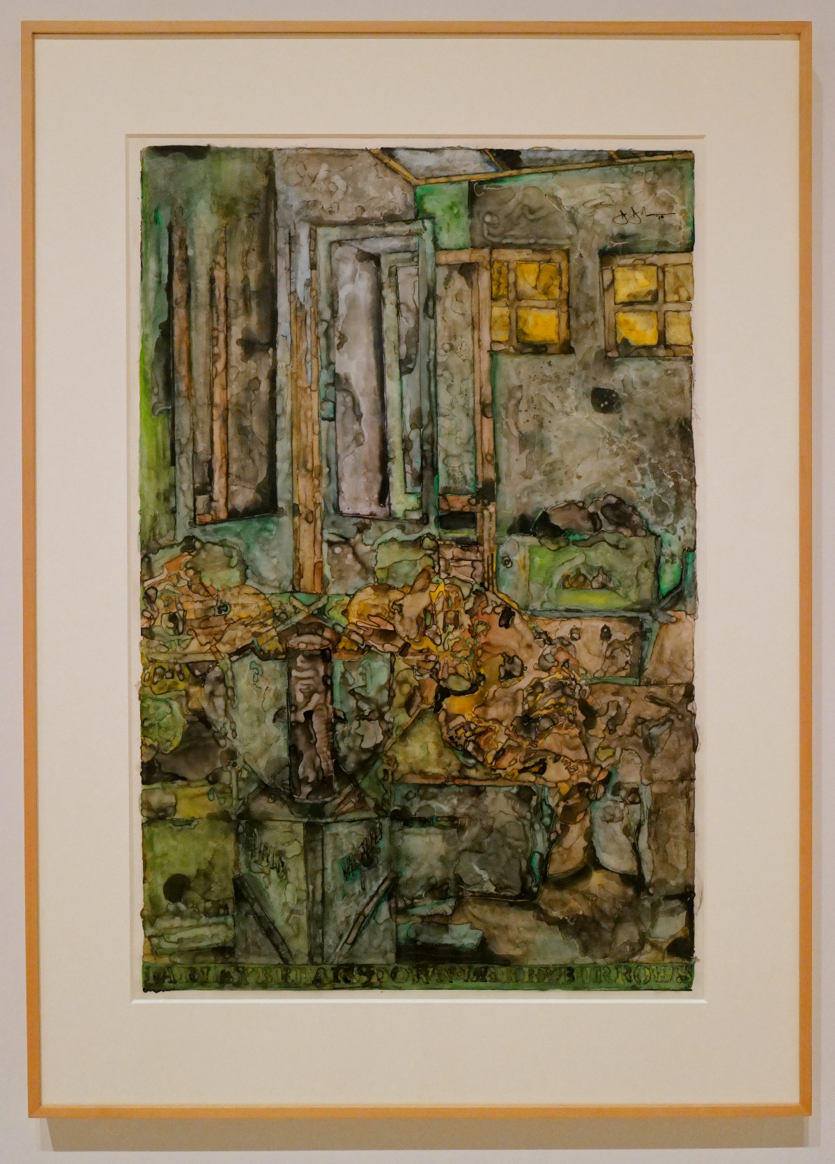
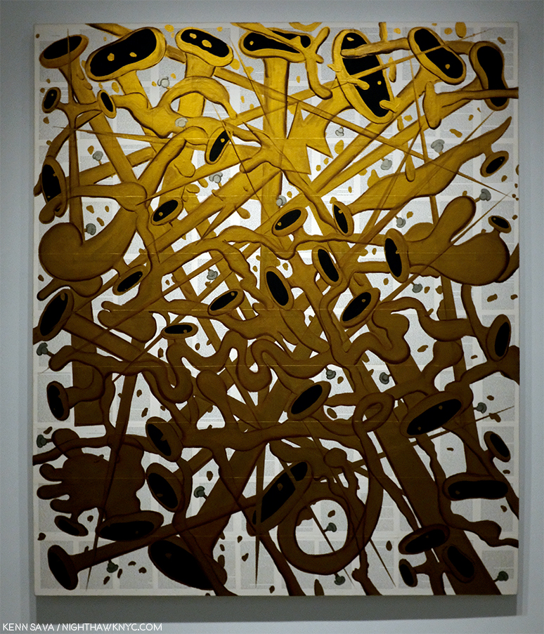
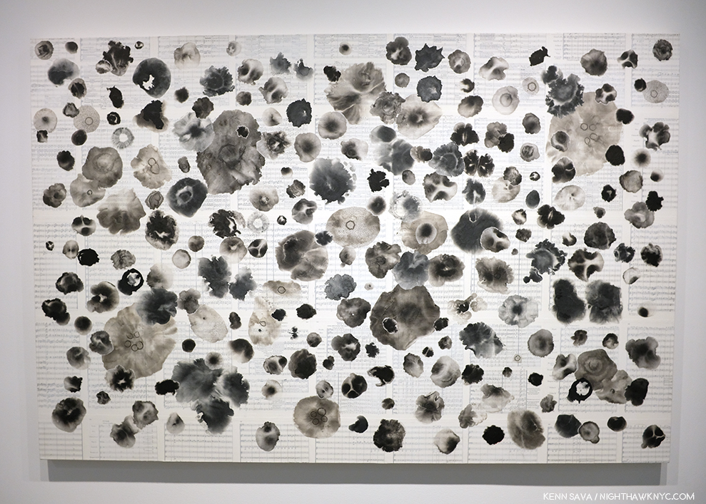
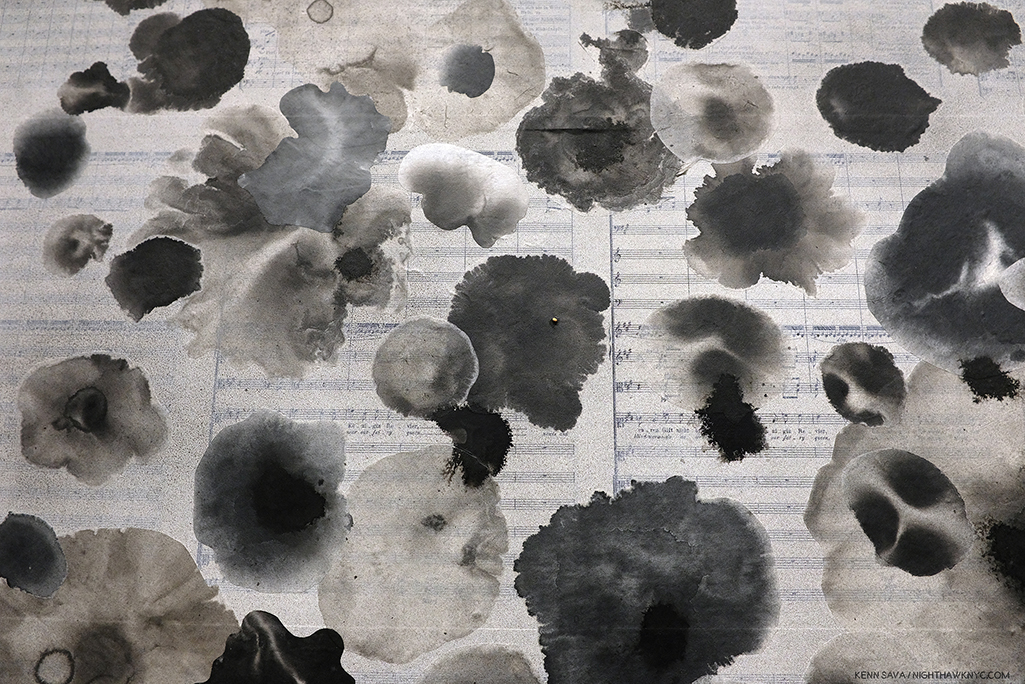
The remarkable Farley Breaks Down 2014, Ink and water-soluble encaustic on plastic. I was stunned when I first saw this in 2019. A work without precedent in Jasper Johns’ enormous output created at 84. The Whitney wisely acquired it.

In 2019 I happened in to Jasper Johns: Recent Paintings & Works on Paper at Matthew Marks Gallery and was frankly overwhelmed when I saw a series of works titled Farley Breaks Down. I’d never seen anything like them, typical of Jasper Johns, yes, but even in his long and productive career they stand alone. I wrote about the show here. Just prior to these there are works in ink and water-soluble encaustic on plastic, but with this subject, Mr. Johns has reached an entirely new level. In 1965, LIFE Magazine Photographer Larry Burrows created a series of Photographs following a helicopter crew, Yankee Papa 13, on a mission in the Vietnam War. During it, one crew member was killed and another wounded. The last Photograph in the series shows Cpl. Farley back at the base breaking down. A few years later Larry Burrows was killed in another of these helicopter missions. It is this image that Jasper Johns chose to interpret. Jasper Johns did 2 years in the Army during the Korean War based in South Carolina and Japan. Still, exactly why he chose to create this series of works in his 80s is up for conjecture.
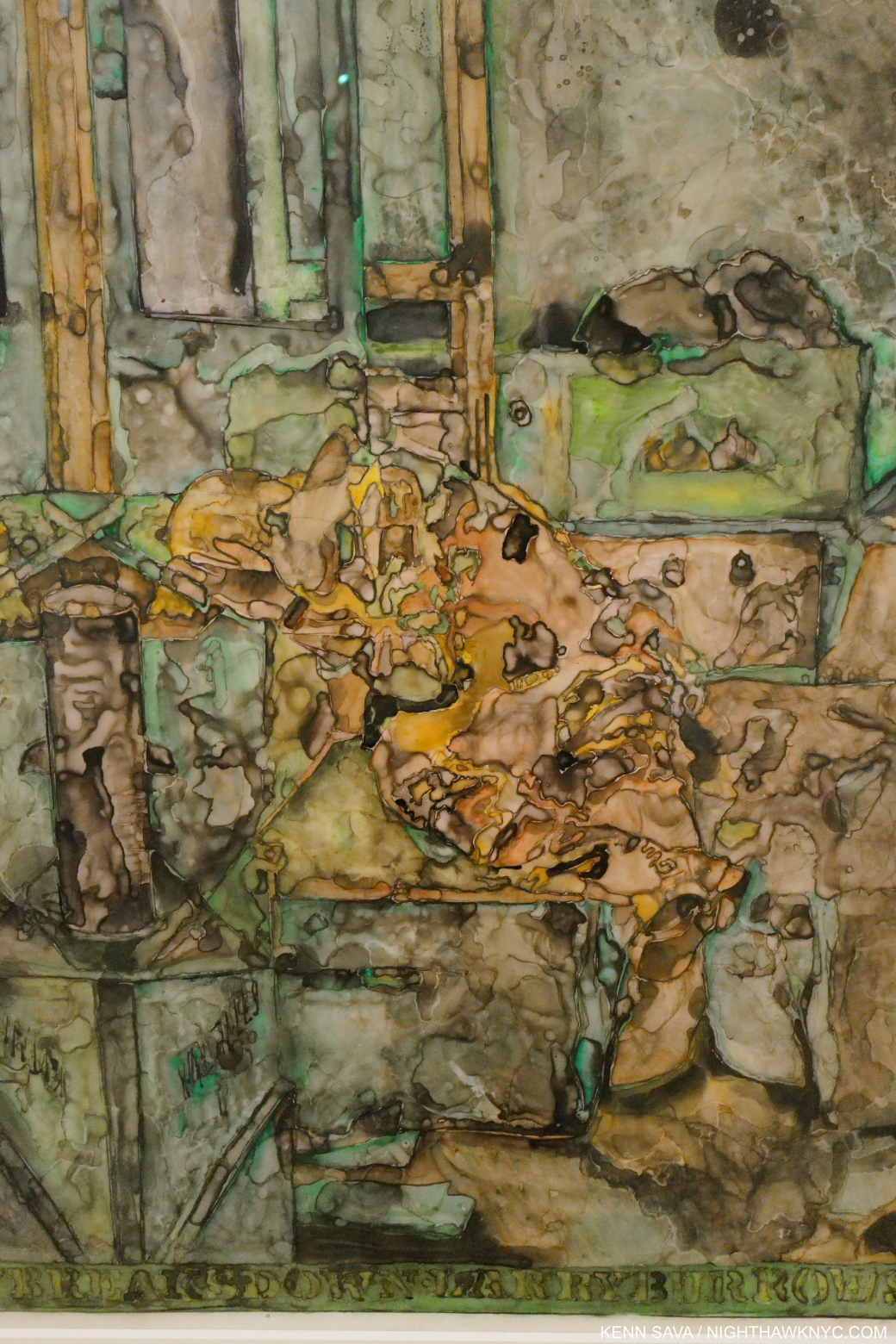
Detail of “Farley.”

Is it coincidence that over the years, Mr. Johns has lost his entire circle of fellow Artists- Robert Rauschenberg, Merce Cunningham, Morton Feldman and John Cage among them? The series is remarkable both for its incredible power and melancholy (which is not new to his work), as well as it’s stunningly beautiful flowing technique. It’s almost like these pieces are created with colored tears. Yet here, loss is the subject, and for the first time in his work, it’s presented almost nakedly.

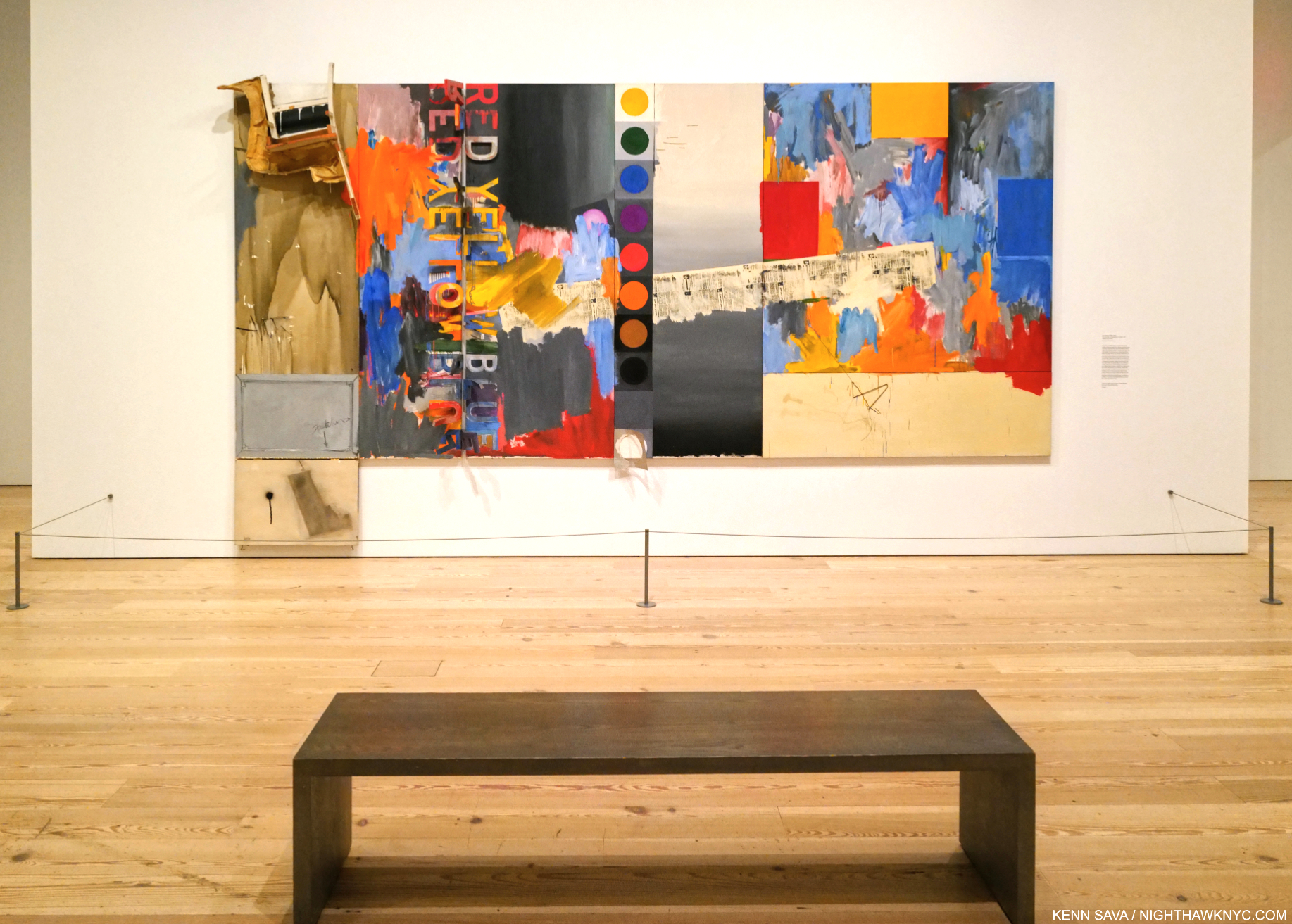
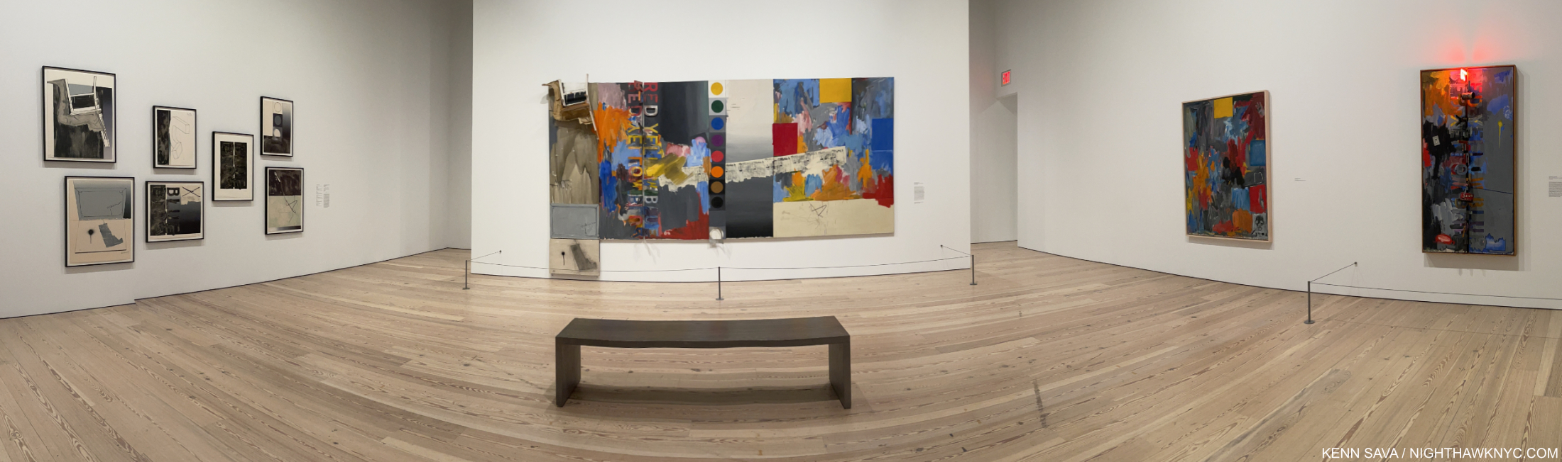
A half gallery of dark works created after the breakup with Rauschenberg in 1961 (except for the work on the far left and the sculpture in the middle, including Liar, in the facing left corner.

There is also the pain of another kind of loss. The loss of romantic love. While I have no idea what Jasper Johns’s romantic life has been like, the second part of the first gallery is devoted to the searing works Mr. Johns created after his relationship with Robert Rauschenberg ended in 1961. The visual evidence is overwhelming that it had a devastating effect on him. After these, there is silence in his work where romance might be concerned. He shows deep affection for friends and those he admires, but there is never an expression of romantic love. This, also, is rare in Art8.

Recent Jasper Johns. Untitled, 2020, Intaglio on Magnani Insisioni paper. This piece was on view in both the Matthew Marks & Whitney shows.

As if the Whitney & Philadelphia Museums shows weren’t enough Jasper Johns there was also a remarkable show of his most recent work coinciding with the opening of JJ:M/M, Jasper Johns: New Works on Paper at Matthew Marks Gallery!

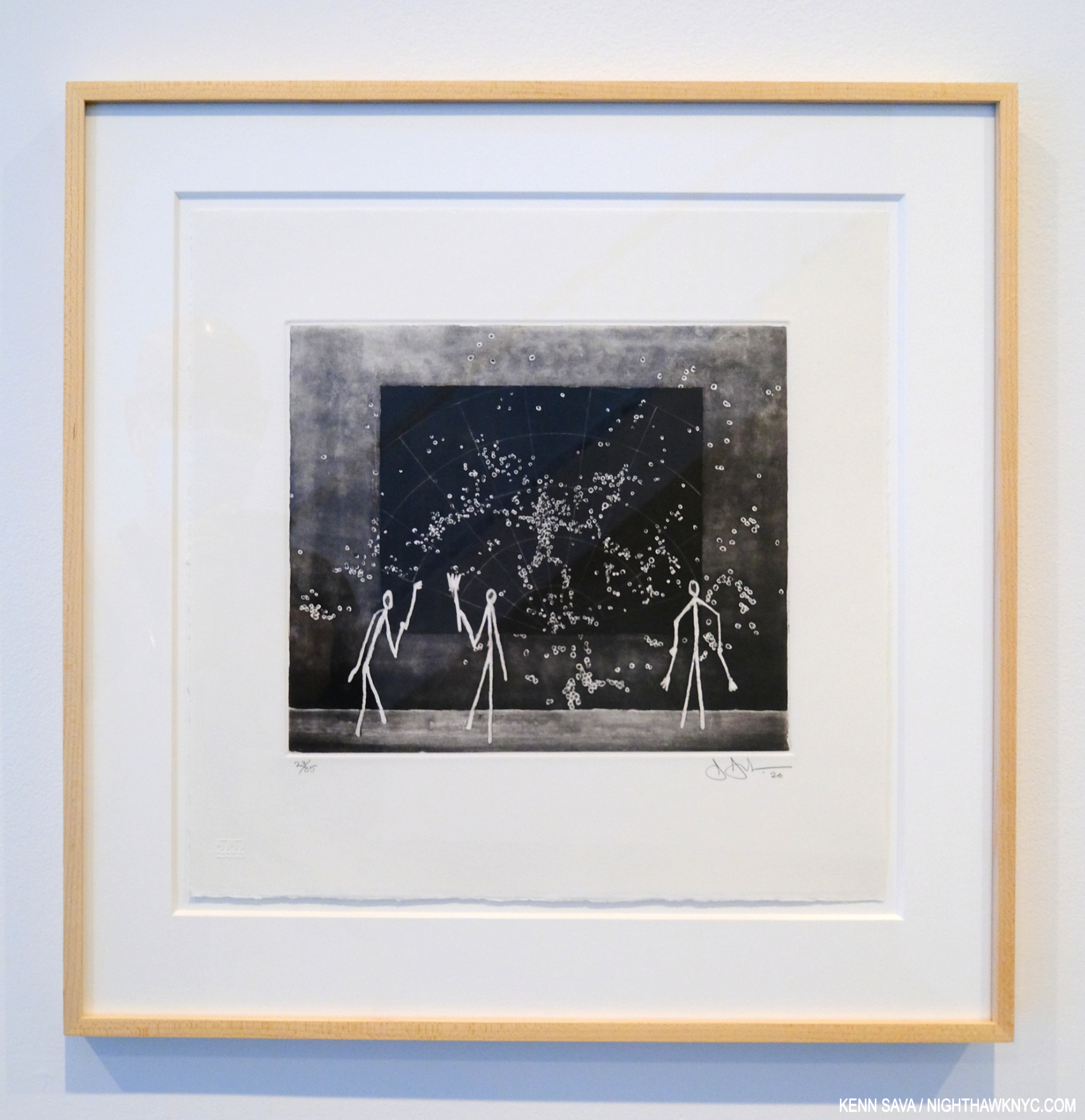
Untitled, 2021, Acrylic and graphic over etching on paper. Different, as ever, these works emphasized the cosmology theme which has appeared in some earlier works. The detail in these is both subtle and remarkable. The show consisted of a wall of these, facing a wall of Drawing based works like Untitled, 2020, above with stick figures.

Having seen upwards of 300 of his pieces between the two NYC shows two things stand out for me are- first, Mr. Johns incredible intellect. As you walk through the show you begin to notice that Jasper Johns does nothing- including speak, without very carefully considering what’s going to come out. At first glance some of his pieces look improvised, until you see a carefully crafted Drawing or other supporting pieces in which every detail has been carefully rendered, belying the careful consideration and the large amount of work that went into them. And this is continued over a seemingly endless body of work over 65 years of continually doing something different.

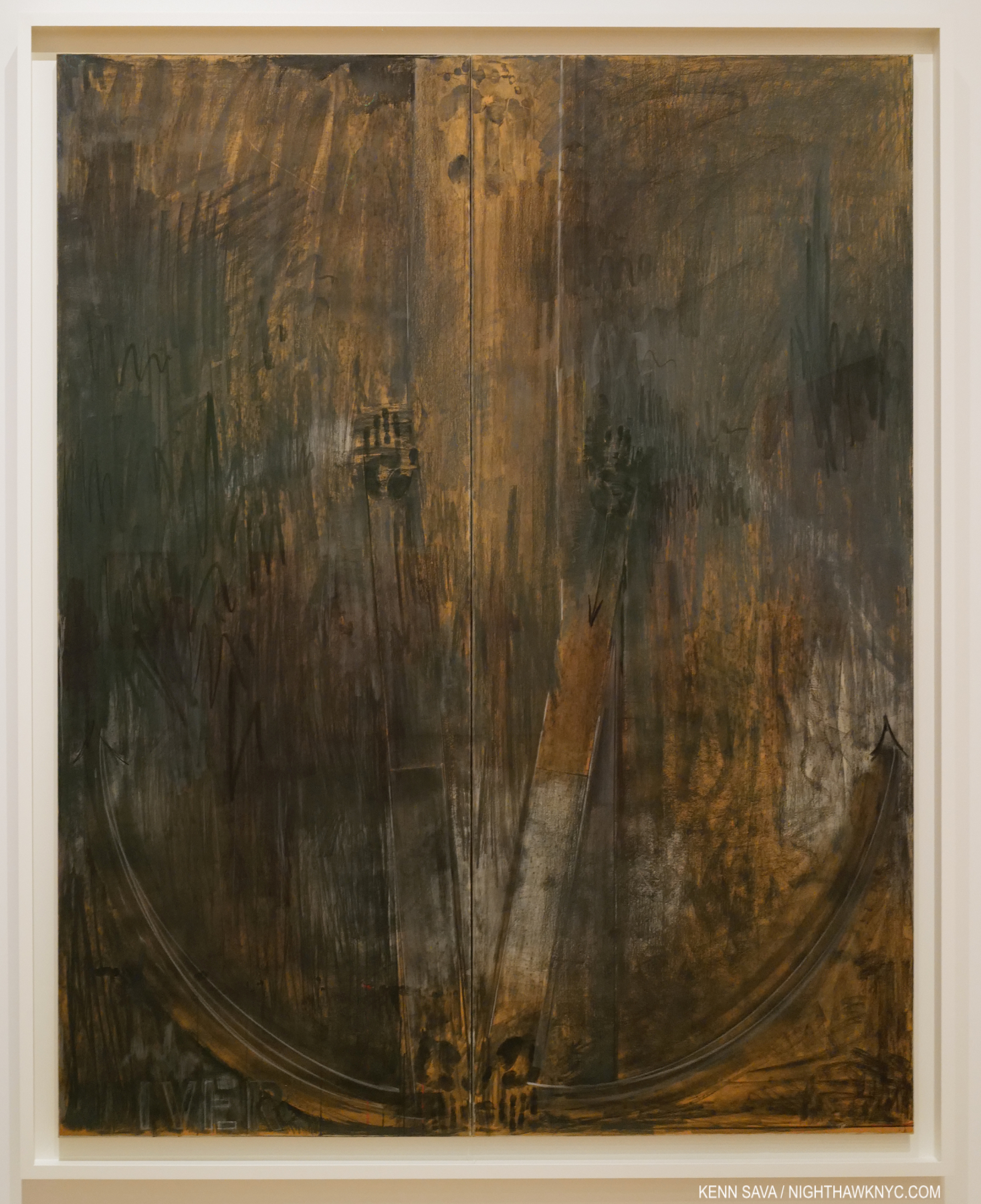
Diver, 1962-3, Charcoal, pastel and paint on two sheets of paper mounted on two adjoining canvas supports, 7 FEET 2 1/2 by 71 3/4 inches!

Second, I haven’t realized how much the anguish of loss is a central theme of his work. This includes the thought of facing one’s own aging and death. For such a private man who’s work is often so dense as to defy understanding, he has repeatedly found his own unique ways of expressing it powerfully. Though each section (of both the NYC & Philly halves ) of Jasper Johns: Mind/Mirror is titled, loss and death are not among them. They are the unstated central themes of a good deal of his work, which continues through his latest work shown at Matthew Marks this past fall.

In the final gallery, along side 4 pieces from the remarkable Farley Breaks Down series, is this Painting, similar to the pieces lining the west wall of the Matthew Marks show, like Untitled, 2021, shown above.

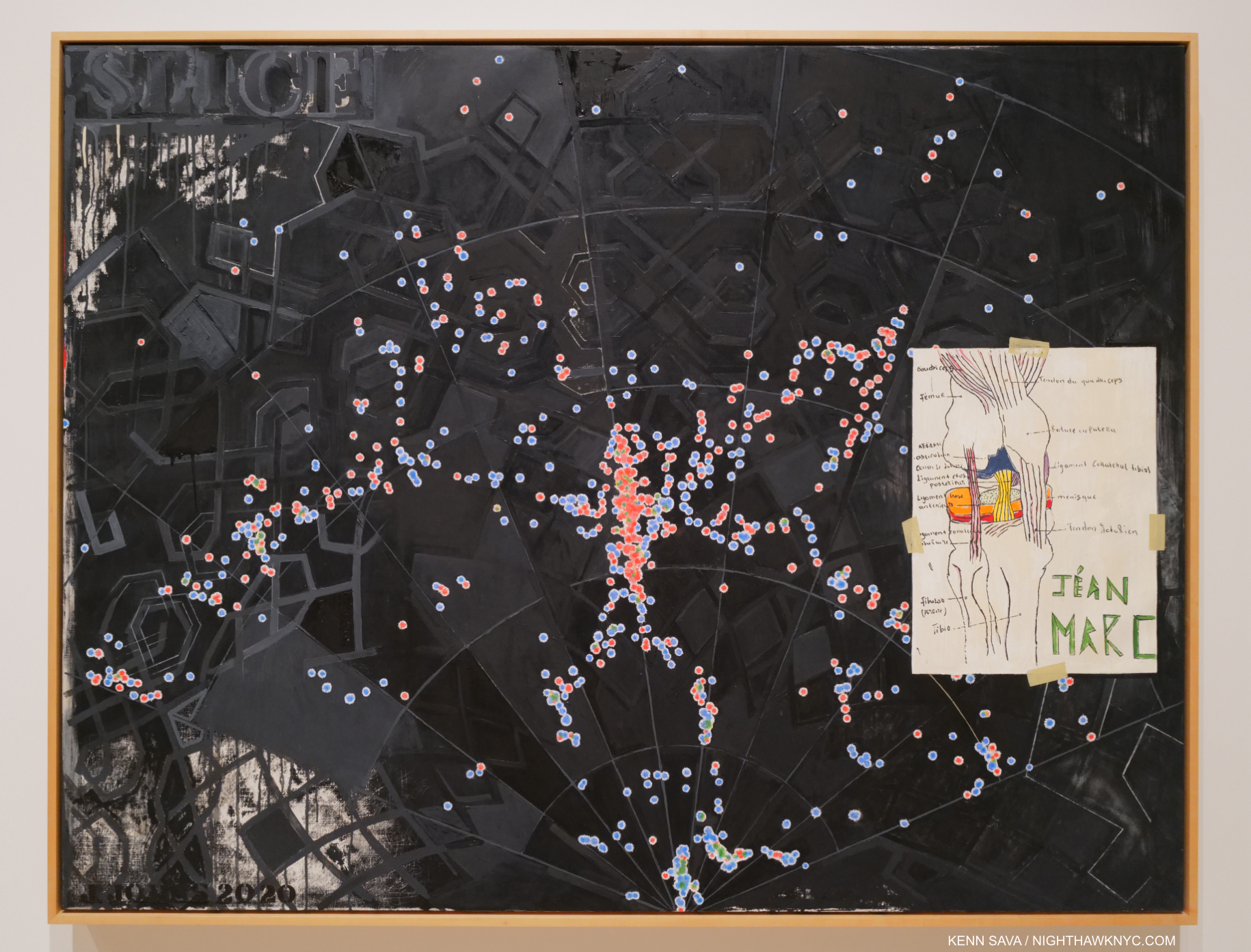
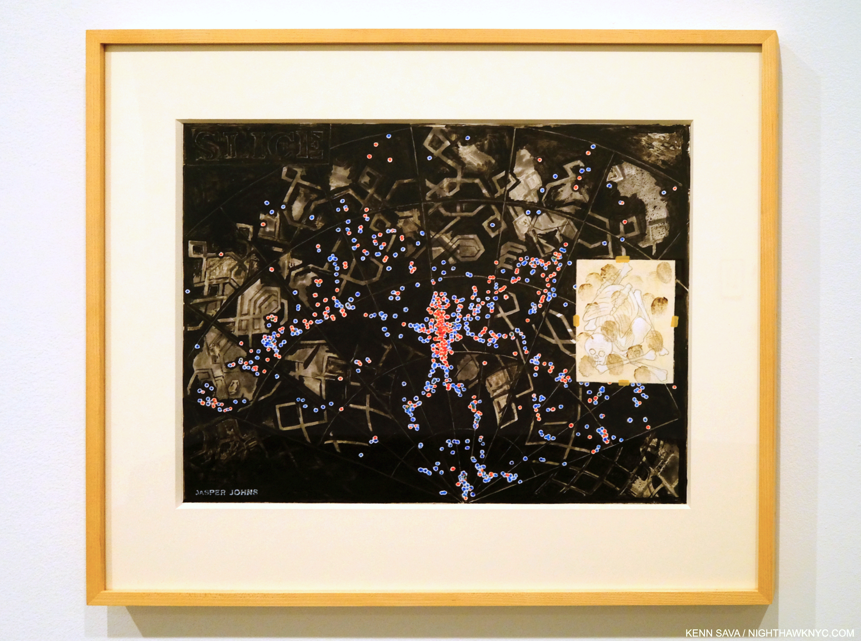
Slice, 2020, Oil on canvas. A close look at this large piece reveals amazing detail and depth, the background reminiscent of End Paper, 1976 and Céline, 1978.

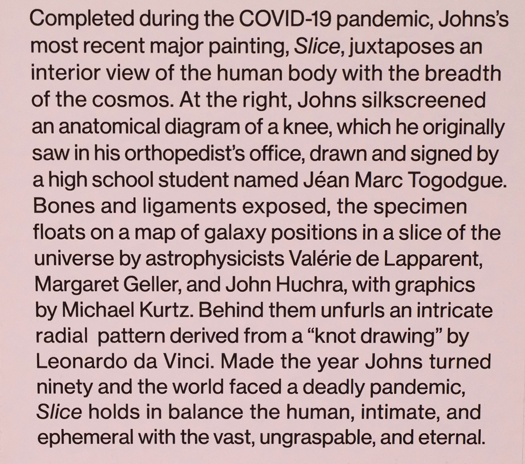
As the wall card says, “…ungraspable…”

Picasso outlived, and outworked, all of the boxes his work was put in- the so-called “Blue Period,” the “Rose Period,” Cubism, etc., etc. He did this by simply being himself. His Art changed as he changed. Jasper Johns, who has outlived all his contemporaries, was, perhaps, the first Artist to be lumped into the “Contemporary Art” box in 1958. Still going strong at 91 in 2022 as the Art world is morphs into whatever is coming next, Mr. Johns career has been one long continuous model for Artists- “When I could observe what others did, I tried to remove that from my work,” which has led to 68+ years of fresh ideas that point the way to the future.

Flag Above White With Collage, 1955, Encaustic and collage on canvas. Mr. Johns has used encaustic (a mixture of hot wax and paint) continuously throughout his career, one of the very few to use it so frequently, if not the only one, among major Artists. It is used in most of the works in the show.

It turns out that Jasper Johns: Mind/Mirror is not the only great and important show currently up in the Whitney this fall/winter! Since I sub-titled this piece “Art in NYC, 2021, Part 1,” Part 2 will look at it.

*-Soundtrack for this Post is “I Don’t Want to Be Your Shadow,” by the Psychedelic Furs, from Forever Now, 1982, or “My Life is a Succession of People Saying Goodbye,” by Morrissey from You Are The Quarry, Extended Edition.
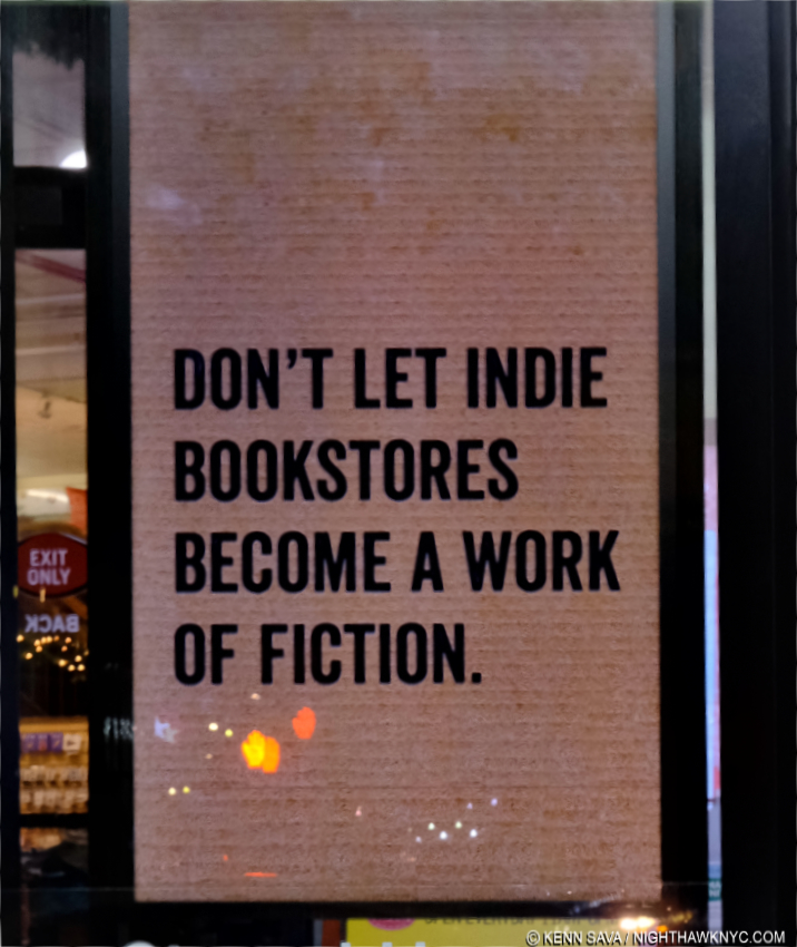
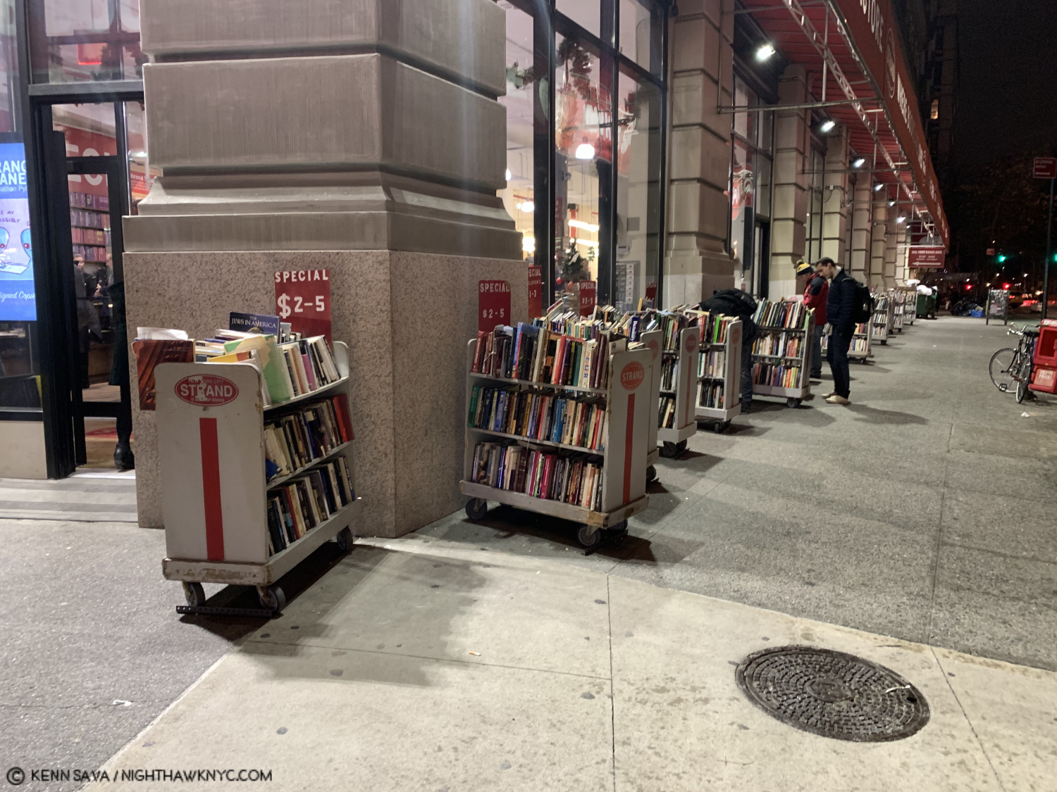
BookMarks-

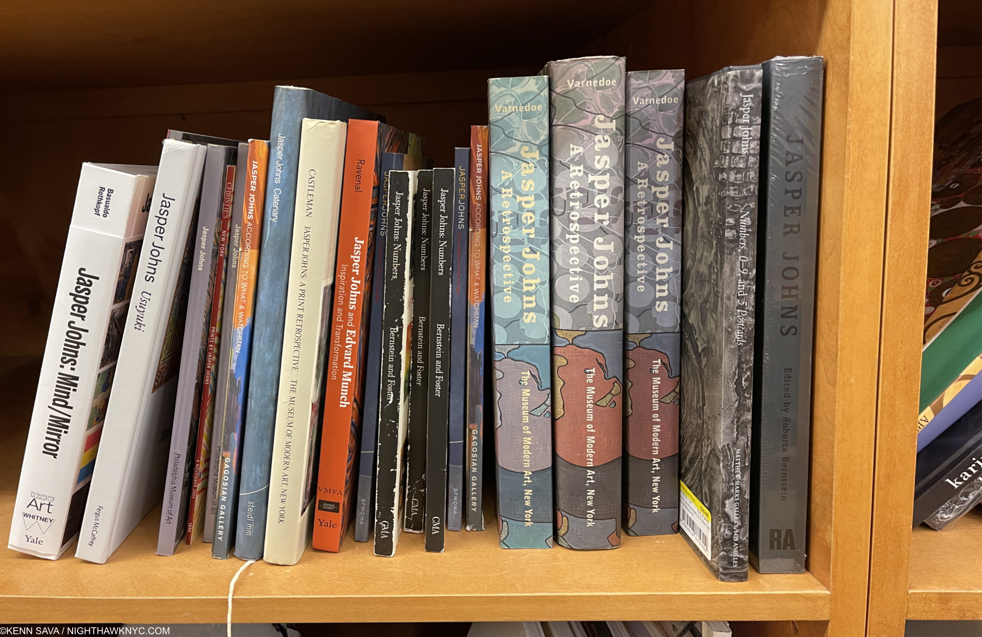
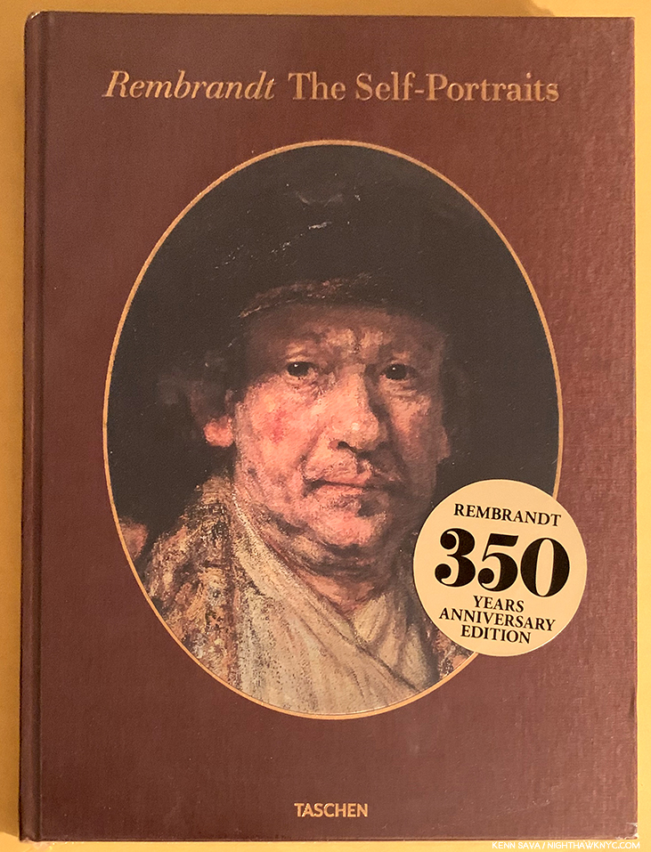
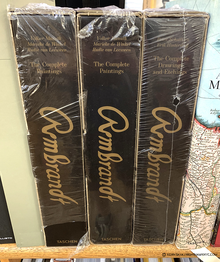
With a career spanning a whopping 68 years(!), and counting, among the longest in Art history, you’d expect there have been a LOT of books published on Jasper Johns, and you’re right. There are. I see books I”ve never seen before each time I look. The latest being a catalog for a show on Jasper Johns and Edvard Munch (the book with the orange spine, above)! Among them, a few that I’ve seen are particularly recommended-

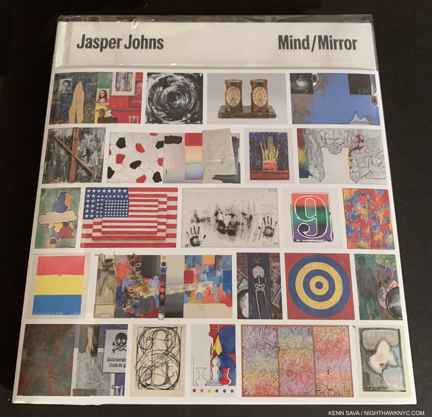
Jasper Johns: Mind/Mirror, Philadelphia Museum/Whitney Museum/Yale-  Though it’s close to 4 pounds, it’s wonderfully succinct and the best place to get an overview of Jasper Johns’s work over his amazingly long career up to 2020. The text accompanying each chronological section is also concise, remarkably distilling voluminous information down to a few pages, though I found the essays hit or miss. The book is the only way to see the whole show besides traveling to both museums (where it is only up until February 13, 2022). Highest recommendation for those seeking one Jasper Johns book with the most and broadest range of his Art in color.

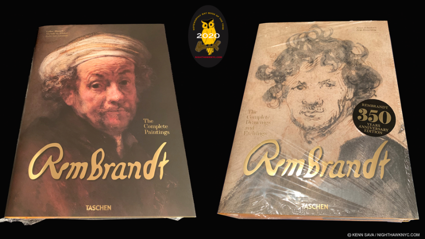
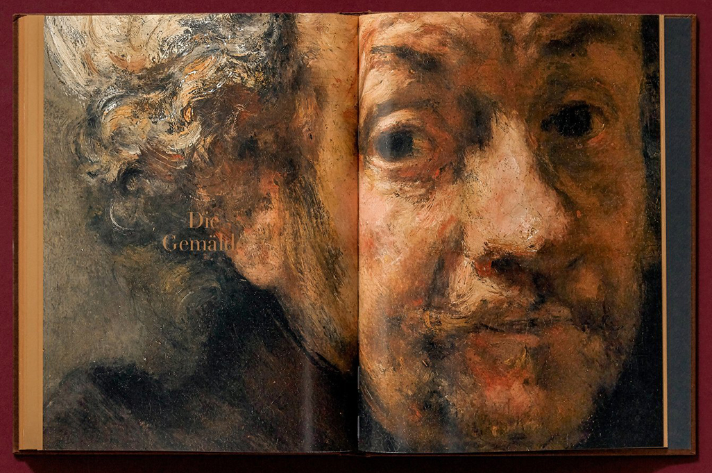
Jasper Johns: A Retrospective, Museum of Modern Art- The catalog for the landmark Johns show in late, 1996 to early 1997 with a fine essay by curator Kirk Varnedoe, is a thorough look at his work up to 1996. In my opinion, it remains the finest reference on Jasper Johns due to its comprehensive 250 page Chronology and Plates section which goes up to the end of 1995. It’s also of ongoing importance in the history of the Artist when you consider that having this Retrospective had such an impact on the Artist that it caused his work to drastically change after and since. The immediate result was the extraordinary Catenary series, though all of his work since bear the hallmarks of that change. Here is a terrific record of his work up to that point that includes many illustrations. A model exhibition catalog that Mr. Johns designed the endpapers for. Essential for the Jasper Johns fan.

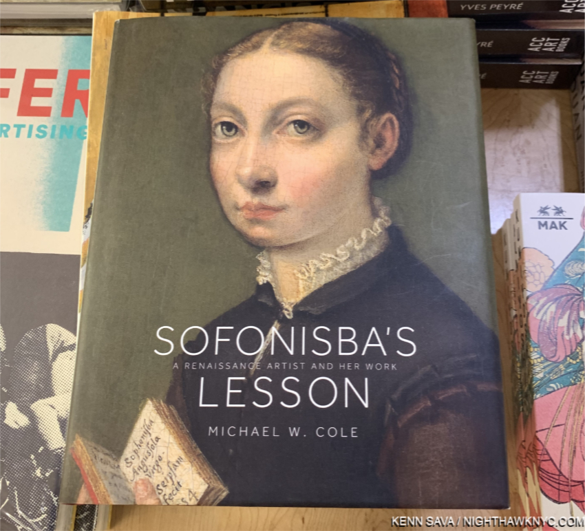
Jasper Johns: Redo an Eye, Wildenstein- A 300+ page look at the work of Jasper Johns that provides a comprehensive look at the Artist’s Art over his entire career up to about 2018, and one of the few to cover his later work. Author Roberta Bernstein says she has spent much time with Mr. Johns over the past 50 years, in addition to focusing on studying his Art. As a result, the book provides numerous insights. The most comprehensive overview currently available, it’s also available as Volume 1 of the Jasper Johns: Catalogue Raisonné of Painting and Sculpture, listed further below. Includes many illustrations, though in smaller sizes then the MoMA Retrospective, above, or the Whitney book, which are meant to illuminate the text since it originally served as the introduction to the Catalogue Raisonné, which has the large size reproductions. Recommended for those who want to dive deeper into Jasper Johns.

Jasper Johns: Catenary, Matthew Marks Gallery- (The book with the blue spine in the bookshelf pic with the string appropriately hanging down from it.) Matthew Marks Gallery has shown the Artist for many years, and has often published very well done and beautiful catalogs for their shows. Each is worth seeking out. Among them, I’ll highlight two here. Published to accompany the show of the same name in 2005, this was the only opportunity to date to survey this exceptional body of 80 later works which was the result of the Artist’s reaction to the aforementioned MoMA Jasper Johns: A Retrospective. They center around aging and death, each of which is illustrated in color here. It includes a fine essay by Scott Rothkopf, the co-curator of Jasper Johns: Mind/Mirror. It’s also beautifully published by Steidl. Out of print but not expensive.

Jasper Johns: Recent Paintings and Works on Paper, Matthew Marks Gallery- Published to accompany the unforgettable show of the same name in 2019, a NoteWorthy Show, which shows yet another new side of the Artist’s work. Featuring the extraordinary Farley Breaks Down series along with a number of other compelling recent works, with over 60 illustrated here. I was stunned when I saw the Farley pieces. They seemed to be without precedent- both in Johns’s work or that of any other. Both books are highly recommended to those interested in John later & current work.

For serious study & research, there is the Jasper Johns: Catalogue Raisonné of Painting and Sculpture, a 5 volume set that currently trade at big discounts from its $1,500.00 list price. I can’t help but wonder if this is because they are already out of date since Mr. Johns has continued to create prolifically since it was published. It only goes to 2014. Then there is the Jasper Johns Catalogue Raisonné of Drawing set published in 2018 and the Jasper Johns: Catalogue Raisonné of Monotypes, collecting his unique prints to about 2018 (like the Savorin can Prints seen above).

NighthawkNYC.com has been entirely self-funded and ad-free for over 7 years, during which over 275 full-length pieces have been published. If you’ve found it worthwhile, you can donate to keep it going & ad-free below. Thank you!

Written & photographed by Kenn Sava for nighthawknyc.com unless otherwise credited.
To send comments, thoughts, feedback or propositions click here.
Click the white box on the upper right for the archives or to search them.
For “short takes” and additional pictures, follow @nighthawk_nyc on Instagram.

Subscribe to be notified of new Posts below. Your information will be used for no other purpose.


  1. Jasper Johns: A Retrospective MoMA Catalog, p.124
  2.  “His Heart Belongs to Dada,” Time, May 4, 1959
  3. Jasper Johns, Mind/Matter, p.29
  4. Quoted in Michael Crichton, Jasper Johns, 1977 Whitney Catalog, p.27. Roberta Bernstein, Jasper Johns: Redo An Eye, p.20, says “While Johns respected many of the Abstract Expressionists, he was committed to establishing a new direction that embraced a more literal subject matter and engaged viewers in a way that was independent of the artist’s personality.
  5. Roberta Bernstein, Jasper Johns: Redo An Eye, p.20
  6. Michael Crichton, Jasper Johns Whitney 1977 exhibition catalog,  p.20
  7. MoMA Retrospective Catalog, p.15
  8. Robert Rauschenberg is, coincidentally or not, another Artist who’s work appears not to reference his romantic life.

NoteWorthy Art Books (and Bricks), 2021

Written & Photographed by Kenn Sava

As it was for PhotoBooks, 2021 was a challenging year to see as many newly published Art Books as in years past.

Still, the companies kept releasing them, and there were some terrific ArtBooks released this past year. Since there is no such thing as “best” in the Arts, here are those I most highly recommend, which I call NoteWorthy.

MoMA’s Endless Wall of Art Books is at least 30 feet high and twice as wide. I’ve given up seeing Yoko Ono: Lumiere de L’aube under the sleeping cat sculpture about 20 feet above the lady’s outstretched arm!

NoteWorthy Art Books, 2021

Following on the heels of Jordan Casteel’s terrific New Museum show, Jordan Casteel: Within Reach, accompanied by the now classic book of the same name, 2021 was the year of terrific and important Art Books by Black Women Painters, known, and on the verge of becoming much more well known. I’ll celebrate them first-

An early nominee for Art Book of the Decade.

Kara Walker: A Black Hole Is Everything A Star Longs To Be, JRP Editions- Kara Walker has never been one to mince a line, a word or a cut image, and in A Black Hole Is Everything, her raw power is seen in full effect in page after page (600 in all!) of stunning Drawings in this catalog for a show of the same name at Schirn Kunsthalle Frankfurt, which she has said was born of “an excavation of my archives.” For those who missed the show, it serves as an excellent retrospective of her Drawings. As anyone who has seen her Drawing shows at Sikkima Jenkins & Co. over the past few years can attest, her Drawings are often timely, and then will surprise by referencing Art history in equally fresh, unique, even humorous, ways. 700 of them created between 1992 and 2020 are included here, with only a small number I saw in her shows, allowing the reader to trace the evolution of this vital side of the Artis’s creativity. Most have never been published. While her huge installations and cut paper pieces often have an all-encompassing effect, her Drawings, which feature immediacy and intimacy, show another side of her range. A number of Kara Walker’s earlier books are now quite hard to find. Given the size of A Black Hole is Everything and the fact that it’s imported, don’t wait long before grabbing yours. An early nominee for one of the most important Art Books of the decade.

Lynette Yiadom-Boakye: Fly In League With The Night, DAP & Tate- A big year for the British Artist is captured in full effect in this fine book ostensibly published for her exhibition at the Tate, London. It also serves as a fine introduction to her work for those who didn’t see it. I saw her debut NYC solo show in 2019, which the Artist attended, and was immediately impressed with how she made the influence of the masters, like Velazquez and Goya, entirely her own. Her figures are always strong, set against subtle backgrounds, though the overall tone is dark, which is something of a trademark of the Artist, she occasionally offsets them with vibrant color. In this regard, they affect me like some of Hopper’s urban portraits, but Ms. Yiadom-Boakye’s work is even darker. A Painter just beginning to receive world-wide acclaim. I don’t see that ending any time soon.

Toyin Ojih Odutola: The UmuEze Amara Clan and the Hour of Obafemi, Rizzoli Electa- I can’t remember when the last time was I was so blown away by a Painter’s debut monograph. And this is after I had seen her terrific Whitney Museum show in 2017, and her work included in an equally wonderful group show at Jack Shainman Gallery in September, 2018. So, her work was not new to me when I picked up The Umueze Amara Clan. Still, I was just mesmerized by it as I paged through and every single time I pick it up since that feeling returns. Her unique style reminds me of a touch of Lucian Freud or Kathe Kollwitz, with larger touches of Charles White and Kerry James Marshall, but, in the end, comparisons are utterly pointless. I’m sure some will pick this up and say Ms. Odutola is “on her way to becoming a great Painter.” Ummm…no. She is one right now. An important book. Not to be missed.

Jennifer Packer: The Eye Is Not Satisfied With Seeing Serpentine Gallery Most recently, I’ve been completely lost in Jennifer Packer’s work and the exceptional book, Jennifer Packer: The Eye Is Not Satisfied With Seeing, one of the most beautifully designed Painting books I’ve seen- in a year of exceptionally beautifully designed Painting books. Jennifer Packer is another Painter I was introduced to at the Whitney Museum- first in 4 Paintings in the 2019 Whitney Biennial, and now in her spectacular Whitney solo show of the same name as this book, which I saw the day it opened on October 30th, and is currently up as I write this. I’ll have more to say about her soon.

Mickalene Thomas, Phaidon- The newest book on this list was published just in time to make it, and I attended its release just this week. It, too, is one of the most beautifully designed Art Books of 2021, and a fitting overview of the work of this important and ground-breaking Artist & Activist who’s work is Photography based. It’s an overdue collection that was worth every bit of the wait. It joins Aperture’s excellent overview of her Photography, Muse, as an essential book on Ms. Thomas’s work.

Pick one of them? I can’t. I don’t think you can go wrong with whichever one you choose. All are Artists who will only be more and more important as time goes on, yet each of their books sticks a flag in the ground for their Art, and their vision, while making stunning cases for their work right now. 

Hito Steyerl, I Will Survive, Spector Books- Though a catalog for a European retrospective covering 30 years of her work, I’m moving this book out of the Retrospective or Exhibition Catalog category this year because her work is that important and this book is just so well done (like Paolo Pellegrin: Un’Antologia was among NoteWorthy PhotoBooks I looked at in 2020). Ms. Steyerl is probably better known in Europe where she famously turned down a top German honor, akin to British knighthood, because of her country’s pandemic response, so this book will hit Americans like it did me- a jolting wake up call to her work, her career, her ideas and how of-the-moment they seem today. (See Sara Cwynar in my NoteWorthy PhotoBooks, 2021 piece). Primarily a filmmaker (like Ms. Cwynar and Arthur Jaffa), theoretician and writer, her work centers on the circulation of images. As images take over our lives, in every realm besides Art, Hito Steyerl has been pointing out the dangers and the damages of this for a very long time. If her time isn’t now, it’s never going to be her time. The loss will be to the rest of us it’s all happening to who haven’t checked her work out. 

NoteWorthy Art Book/Autobiography, 2021

Ai Weiwei, 1000 Years of Joys and Sorrows– A few years ago I wondered if Ai Weiwei was the Artist of the Decade. Now that the 20 teens are over, it’s hard to think of anyone else who had the impact on both Art, and the world, as the former New Yorker, who finally left China behind for Germany, had between 2010 and 2019. His Autobiography couldn’t be more down to earth or matter of fact but that takes nothing away from how riveting page after page is. His journey is legendary, and I’ve written about it before, but to hear him lay it all out, in detail, makes for one of the most compelling Artist’s Autobiographies in the history of Art in my view. An essential document- on Art, on life, on growing up in China, and on living in the world today. 

NoteWorthy Exhibition Catalogs, 2021

Hung Liu: Portraits of Promised Lands, Yale – A gorgeous book and terrific overview of the work of the late Chinese-American Artist who based some of her Paintings on the work of Dorothea Lange. Not unlike Ai Weiwei, Hung Liu lived with her family in exile during her childhood in China after Mao banished them to the hinterlands for “re-education.” Hung Liu came to know the hardships Dorothea Lange showed personally and spent the rest of her life expressing that in her work showing the disenfranchised of both her countries. Published to accompany the first museum retrospective of her work at the Smithsonian’s Portrait Gallery, the Artist died as it was about to open. (My look at a simultaneous Fall, 2021 NYC show she also worked on before she passed is here.) The book serves as a terrific introduction to the work of an Artist who’s work I believe is going to be with us for the long haul. 

The Painter I’ve been looking at, and obsessed with, longer than any other FINALLY gets a book with text & images worthy of him & his Art.

Van Eyck– A “once in a lifetime” show of the work of the Artist I’ve been looking at longer than any other that I missed seeing in person due to the virus. The accompanying book gave me a second chance for which I am very grateful. Overflowing with the latest scholarship on Jan and his mysterious brother Hubert, two Artists who have been largely overlooked in the explosion of Art monographs this past decade. In my opinion, you buy this book for the text. Though a very large book, it does have numerous full page illustrations, which in my view are best seen in the context of supporting points made in the text. All of that said, it is the finest “coffee table” Van Eyck book available1. No Van Eyck book can hope to top the images available for free online at closertovaneyck.org, which I wrote about here, where you can zoom in as close as you want, seeing Art in entirely new ways, which I believe will soon become the norm (issues of print quality vs screen image quality aside). Jan van Eyck has been (rightly, in my view) honored for his unsurpassed technical mastery. Yet, there is far more going on in his work than just brilliant Painting. The man was an equally extraordinary thinker as well, leaving as much to think about in his work as there is to look at. Van Eyck is the state of the art of Van Eyck scholarship and is likely to remain so for a while, though I am very happy to see that scholars all over the world are continuing to explore his life and work. Don’t stop now!

NoteWorthy Art Book Publisher, 2021

A selection of Taschen’s huge XXL books that weigh 16-22 pounds each. Many are the best way to see the most works by the given Artist in the largest size. They generally run about $200, before they go out of print, which is considerably cheaper than it would cost to go and see these works in person. Frida Kahlo is their newest XXL and immediately goes to the top of the class of Kahlo books as THE best place to see her work. The Rembrandt on the far right was a NoteWorthy Art Book of 2020.

Taschen. It’s just impossible for me not to single out the longstanding, large German publisher for special notice. In particular, I want to make readers aware of the fact that they publish some of the great bargains in new Art Books in a series I call “the bricks.” They’re about the same size and weight as a brick, but they are packed from cover to cover with high quality illustrations and photos and, usually, very good text. At $20 to $25 each, the bricks are the biggest bargain in Art books known to me. ANYone interested in Art should know about them and check them out.

Pick your size. Top to bottom (left to right), Van Gogh in the old, smaller, brick, on top of Basquiat in the new larger brick, on top of The Charlie Chaplin Archives XL and The Charlie Chaplin Archives XXL, bottom, which comes in a brown shipping box.

The subjects, usually monographs, cover a surprisingly wide range of styles from the Old Masters to Basquiat and David Hockney. This past year saw Taschen release their incredible $200 Basquiat XXL 20 pound behemoth in a brick. Yes, the entire book is here, and yes the reproductions are reduced. Still, for $25. list price and over 500 pages, it’s an impossible- to-beat bargain. That’s the thing with Taschen. They release extremely well done Art Books in various sizes over time. First, the huge XXL edition, which usually clock in at about 20 pounds or so and are upwards of 2 feet tall for about said $200. They are, often, the last word on their subject Artist. Then, a year or so later comes the XL size. Substantially smaller and lighter, but still larger than most Art Books, for about $80. Still, at about 3/4 the size of the XXL, I think it’s a very good deal.

THE greatest bargain in Art books known to me. A row of “bricks” show how Taschen has slightly changed their size over the past decade. The newer releases, part of their 40th Anniversary series, like Egon Schiele and the Basquiat, are the bigger ones. The older bricks list for $20(!), the newer books list for $25. This entire row of 8 books lists for $175., less than the cost of one XXL!

And finally, a few years after the XL comes the brick. So, the buyer has choices. 3 sizes, priced accordingly, for the exact same book. You can build an excellent Art library with only the bricks. They’re handy, excellent overviews that hold up regardless of whatever other books come out, and any work you want to see larger can generally be found elsewhere or online.  I’ve been buying the bricks since they began releasing them, and while I prefer the XXL for some books (like the Rembrandt Complete Paintings), I generally wind up with the brick as time goes on. For me, the best thing about these Taschen books (in XXL, XL or brick size) is a good number of them feature “The Complete Works” or “The Complete Paintings,” something that you really can’t see anywhere else in contemporary Art books which make them an essential resource in which ever size you choose.

NoteWorthy Older Art Book Discovered in 2021- Mea Culpa!

Charlotte Salomon looks out at us in a Self Portrait from 1940 when the Artist was about 23, about two years before she was murdered. This Self Portrait is not part of Life? or Theatre? This is a copy of the 1981 first English edition, published by Gary Schwartz through Viking,  the first book to publish the complete Life? or Theater? It’s large size makes it the one to look for among sub-$100 versions.

Charlotte Salomon- Life? or Theatre? As I wrote about the incomparable Photographer & Artist Francesca Woodman a few years ago in my NoteWorthy PhotoBooks piece for 2019, I am equally unable to pick up a copy of Life? or Theatre? and not break into tears. Charlotte Salomon, 1917-42,  is one of the most remarkable Artists in Art history, an Artist who achieved something no other Artist known to me has- ever. She recreated her life’s story, and that of her family, in over 900 Paintings, which tell one continuous story that she completed just before being arrested by the Nazis and then executed at about 25 years of age. Equal parts cinema, opera and passion-play, each work is also accompanied by Music! Even more remarkably, each Painting has a velum overlay with text and Drawing on it that creates something of a different experience than seeing the Painting alone. Stylistically, it’s hard for me to look at Lotte’s work and not think of the great Marc Chagall (who, by some reports “was amazed by them” when he was shown them), but she definitely has her own style, one that she executed with just 3 colors!

The great Art writer Gary Schwartz should get the credit for rescuing her work from the archives where her parents donated it, putting together the first publication of the complete Life? or Theater? in 1980. Since, it’s been reprinted a number of times, all of which have gone in and out of print. There are good and not so good things about each edition. Just make sure to get a complete edition (in spite of what I just said above, I’d avoid the Taschen brick edition since it’s incomplete. The edition pictured above is about the same size and is complete). It’s the only series of Paintings ever created that can be “read” as a book! And, it’s also the ultimate revenge of the young Jewish girl who created a body of work that will be seen for as long as people have eyes to look with and will continue to gain her new admirers all the while. After all is said and done, in my eyes, as Life? or Theater? proves, great Art doesn’t only live today. I’m not interested in any other kind.

*Soundtrack for this Post is “Future People” by Alabama Shakes. Full lyrics, here.

NighthawkNYC.com has been entirely self-funded & ad-free for over 7 years, during which over 275 full length pieces have been published! If you’ve found it worthwhile, PLEASE donate to allow me to continue below. Thank you, Kenn.

You can also support it by buying Art, Art & Photography books, and Music from my collection! Books may be found here. Music here and here

Written & photographed by Kenn Sava for nighthawknyc.com unless otherwise credited. To send comments, thoughts, feedback or propositions click here. Click the white box on the upper right for the archives or to search them. Subscribe to be notified of new Posts below. Your information will be used for no other purpose.

  1. Ghent Altarpiece: Art, History, Science and Religion, 2019, is an excellent book focused on that one work, based around its ongoing restoration.

NoteWorthy PhotoBooks, 2021

Written & Photographed by Kenn Sava

Oh, what would my life have been like these past almost 2 years without books? In a world without people, social events, or much else that most people considered regular parts of daily life “before,” I, like everyone else, was left to make the most out of what we had left, and make no mistake about it- I was, and am, grateful for what was left.

Though things returned to a semblance of what used to be called “normal” in the PhotoBook world in 2021, it was only that- a semblance. While the publishers somehow managed to hold up their end with the bigger houses announcing ambitious release plans with about the same amount of books as seen before 2020, things were a bit rockier elsewhere. The bigger book shows in NYC and the rest of the US were cancelled for 2021, so once again, retailers were the best way to actually see books in person, carefully. Things were still challenging for retail, and a number of independents I visited had cut down on their purchases, hours of operation, even whole departments, in order to survive. Hard to argue with that. So, it was still hard to see anywhere near as many new PhotoBooks as in years past. (Standard Disclaimer- As in years past, I have seen no one else’s list or reviews of books.)  Speaking of past years, I should mention that I have now been doing this list for four years. You can see the the prior installments for 2018 here, 2019 here, and 2020 here (I also looked at NoteWorthy Art Books in 2020 here and 2021 here). None of my pieces have sales links. As in past years, please note that publication dates are one thing, but I go by the dates I actually saw a book available for purchase- online or at retail, to include it in a specific year. Of those I saw this past year, these stood out as those I’d most highly recommend, which I call “NoteWorthy,” since there is no such thing as “best” in the Arts.

NoteWorthy Photobooks, 2021- Most Highly Recommended-

Gilles Peress, Whatever You Say, Say Nothing and the accompanying Annals of the North. Modified Steidl Photo

Gilles Peress, Whatever you say say nothing, Steidl- After 30 years in his archive, Mr. Peress has collaborated with Gerhard Steidl and the brilliant book designer Yolanda Cuomo on a book that many have already hailed as a PhotoBook for the ages. Indeed it is, but it also strikes me as a book for right now. At a time of so much strife here at home, it’s hard for me, for one, not to see elements of that in Mr. Peress’s strife filled work from a distant place and a another time.

Are there lessons from the “Troubles” in Northern Ireland in 1972 and 1980 when Mr. Peress took these Photographs we can use now? That’s for others to say. What I am sure of is that those killed remain dead. Does anything change? Well, there has been peace for almost 15 years now. While some might want to see more conflict documented among these 1,295 images, it is the images of courage to continue daily life in the midst of a world gone mad, to keep calm and carry on, as the catchphrase originally meant, that strike me just as much. Then there’s the Artistry.

Whatever you say is a master class in composition, street Photography/conflict Photography and immediate reaction, even though Mr. Peress was only in the early days of his illustrious career. So many times it seems that he anticipated an image the way Wayne Gretzky knew where the puck or his teammates would be seconds before they were. At close to 30 pounds with a wingspan when open close to 29 inches(!), it might not find its way into many homes, but every serious or institutional Art or Photography library needs it, and the accompanying 900 page annals of the north, on their sturdiest shelf.

Sara Cwynar, Glass Life, Aperture- In the world of surveillance capitalism we live in (but not here!), Sara Cwynar’s book looks and feels like a report card from the future, but it’s really a snap shot of the right now and recent past. Remember the marketing hubbub around the debut of the “Rose Gold” iPhone? Sara Cwynar made a film inspired by it called Rose Gold that’s now in MoMA’s Permanent Collection. Most of us are living in “Glass Life,” where much of our information, and some/many/most/all of our “personal connections” come from something with glass on it, which takes a good deal of our privacy in the process, providing a poor substitute for real intimacy. Her work has been most notably seen in a series of films (Soft Film, 2016, Rose Gold, 2017, and Red Film, 2018) that have been shown at MoMA and elsewhere. Stills from the films, and some of her portraits are collected in Glass Life. “But I now consider photography more of a tool in my work than a medium that I am totally devoted to,” she explained1. Though not a traditional “PhotoBook” per se, I find Glass Life stunning and ground-breaking.  

Sara Cwynar has been busy cataloging and connecting the various ways beauty and desirability are used by those in power to maintain or grow it, building a substantial image archive that, along with images she takes herself, she mines for her pieces. She first came to prominence for her eye-catching designs for the New York Times T Magazine, and has progressively built a major Art career this past decade with her Films and shows all over the world. As she approaches 10 years of solo shows, Ms. Cwynar has arrived as a doer and shaker in the Art world. Glass Life is a major, seminal, work of this young decade. 

Arthur Jafa, MAGNUMB, Louisiana Museum of Modern Art, Denmark- Another Artist mostly known for his work in realms other than Photography, though in Mr. Jafa’s case, he works in a very wide range of mediums. MAGNUMB is an overview of his work with revealing interviews with the Artist included. From his sculpture of Ex-Slave Gordon on the cover, every page inside feels like it’s on fire.

Stills from his Films, and works in other medium, including his Photographs are included in one of the most important books of the year. After being called to work with Stanley Kubrick (on Eyes Wide Shut) and Spike Lee (he shot Crooklyn), Arthur Jafa has finally garnered recognition for his own work, something I don’t see that ending any time soon.

Unboxing my copy of American Geography

Matt Black, American Geography, Thames & Hudson- Magnum Photos Member Matt Black (B. 1950) has been visiting & documenting American centers of poverty for the past six years, beginning with those around him in central California, where 1/3 of the population lives in poverty. During this time he has logged over 100,000 miles traveling to places with a poverty rate over 20% in 46 states and Puerto Rico. What he has brought back is body of work that is nothing short of comparable with that of the legendary Farm Security Administration (FSA) Photographs of Walker Evans, Dorothea Lange, Russell Lee, Arthur Rothstein, Marion Post Wolcott and the rest in the 1930s, in my view, which are now icons of Photography and history.

Many of Mr. Black’s images are so stunning visually and Artistically they might be accused of distracting from their point- to show the rest of us how too many of us live. For me, it’s too hard to deny their status as Fine Art, but Mr. Black’s skill is such that he drives his point home in spades no matter the stunning Art of his craft. Lauded as a “future classic of photography” by the publisher, I’ve been watching this body of work being built the past five years and have been both stunned and mesmerized by each succeeding black & white image he has presented, so I knew this book would be a classic, without their words, the moment I learned of it. It’s not only a “future classic of photography,” it’s a classic right now.

NoteWorthy PhotoBooks, 2021- Excellent & Under The Radar-

Elliott Verdier from Reaching for Dawn. Elliott Verdier Photo.

Elliott Verdier, Reaching for Dawn, Dunes- After bringing the world A Shaded Path in 2019 on Kirghizistan, the French documentarian who has been featured in the New York Times (including this recent historic event he covered), among other outlets, turned his large format camera on the rarely seen country of Liberia in 2019, scene of a horrific civil war from 1989 to 2003. Mr. Verdier spent two years traipsing the country far and wide creating two different bodies of work- one, of landscapes in black & white, the other of color portraits. The results are published by Dune, the imprint he co-founded, in a book in a few different kinds of paper, and some pages in silver ink, like the books of that other great documentarian, Richard Mosse. The images are accompanied by texts by singer/songwriter Gaël Faye and 2011 Liberian Nobel Peace Prize Laureate Leymah Gbowee. Reaching for Dawn makes a powerful counterpoint to Whatever you say, showing how the scars of war never really go away even though the conflict may be no longer seen. A remarkable PhotoBook and accomplishment on every level, that conveys a portrait of the land and the stoic resolve and dignity of the people who call it home.

Rosalind Fox Solomon, The Forgotten, Mack Books- Another Artist who has been on my list before- for her last book. In 2018, the instant classic Liberty Theater appeared here. This one is exceptional as well. It’s so easy to get caught up in imaginary narratives as you move from page to page to not fully appreciate how remarkable the passing Photos are. The Forgotten is another book in what is now an exceptional string of PhotoBooks by Rosalind Fox Solomon published by Mack Books, joining Them, in 2014, Got to Go, 2016, and the aforementioned Liberty Theater in 2018, each of which is highly recommended. At 91, it’s hard to think of any other Photographer who’s created so many excellent books the past 5-7 years besides Ms. Fox Solomon and Gregory Halpern. Find them while you can.

A sealed copy of Electronic Landscapes. Something that is going to be very rarely seen in the future, unless it’s reprinted.

Isaac Diggs and Edward Hillel, Electronic Landscapes, +Kris Graves Projects- I live in a city where great Music was has a long and storied history. Maybe you do, too. I bet for both of us, and probably almost every other place where great Music was made, almost no documentation of it exists, particularly of its beginnings. Isaac Diggs and Edward Hillel have seen to it that when people look back and want to know more about the beginnings of Detroit’s house, techno and hip-hop resurgence in 20 or 30 years the documentation will be there. And blessed they will be to have such a well-done and extremely well-organized book to refer to. +KGP was my NoteWorthy PhotoBook Publisher for 2020, when in spite of the pandemic and the worldwide shutdown, Kris Graves & Co. managed to publish 18 books! AND Mr. Graves created work, himself, that found him on the cover of National Geographic’s Photos of the Year Issue. This is Mr. Diggs third excellent book with +KGP. Only one, his equally excellent Middle Distance, is still available. Electronic Landscapes is just about sold out as I write this.

NoteWorthy 1st PhotoBooks, 2021-

Rahim Fortune, I can’t stand to see you cry, Loose Joints- Mr. Fortune’s debut is centered around his trip home to care for his ill father. The resulting book is a poignant meditation on life and its fleeting moments captured in black & white. Having had a parent who was sick for 6 years before passing, I am unfortunately acquainted with this. Mr. Fortune’s images don’t hide the worry, but his images are full of dignity and strength, while they meditate on life, death, love and loss. A remarkable debut.

Philip Montgomery: American Mirror, Aperture. 2021 saw a number of fine books that looked back at America either the past two years, or over the past few decades, by Mitch Epstein (Property Rights), Ken Light (Course of Empire), Robert Adams (American Silence) and Peter Van Agtmael (2020 and Sorry About The War), and others. For me, Philip Montgomery: American Mirror stood out for me among them, particularly because it’s a first PhotoBook. Mr. Montgomery’s style is stark, economical and direct all the while being beautiful, regardless of his subject. At just 33, his work has already been featured in the world’s most prestigious publications from The New York Times & The New York Times Magazine, to The New Yorker, and Vanity Fair, among many others. Here you can see why. While he Photographs other subjects, it only takes one look at American Mirror to see that Mr. Montgomery has all the makings of a major voice in what used to be called “Documentary Photography.” American Mirror screams “auspicious.” It’s one of those books people will be referring to while others will be desperately trying to find if it goes out of print.

NoteWorthy Retrospective, 2021-

Michael Schmidt: Photographs 1965-2014- The late German (1945-2014) is another of the many excellent Photographers who are not nearly as well known in the USA as they are in Europe. Michael Schmidt had a show, Michael Schmidt: U-NI-TY (EIN-HEIT), in 1996 at MoMA. It featured one of his most important bodies of work, created in response to the fall of the Berlin Wall and the reunification of the two Germanys. It’s not the only excellent book Michael Schmidt produced. Waffenruhe (Ceasefire) is widely recognized as a 20th century classic. The fine softcover reprint is gradually disappearing, so be forewarned to get it soon. Michael Schmidt: Photographs 1965-2014 provides a very well done look at all of his books and his entire career, much of which will be new to PhotoBook aficionados in the USA. Check it out and don’t wait long if you want it. It will be very expensive after it goes out of print.

Eikoh Hosoe, Mack BooksLargely a contemporary of Michael Schmidt, though on the other side of the world, Eikoh Hosoe (B.1933) is something of a well-kept secret outside of his native Japan. Inside Japan, he’s known for his fine work over a 65 year career as a Photographer in helping to create post-war Japanese Photography, and as a teacher, who counts the world-famous Photographer, Daido Moriyama, among his students. For those looking to see where Mr. Moriyama’s signature high-contrast style came from, Eikoh Hosoe will prove most illuminating. Mack has outdone themselves with this excellent, 400 page, retrospective in which everything (the layout, the covers, the inclusion of a chronology, the quality of the binding and the printing) is first rate, especially the content. It’s now possible for those of us outside Japan to get up to speed on Mr. Hosoe’s accomplishment and follow his career step by step in this beautiful book, which is likely to stand as “definitive” for at least the near future.

NoteWorthy Reissued PhotoBook, 2021-

Jason Ezkenazi, Wonderland, Red Hook Editions- I’d given up hope of seeing this book, which quickly sold out, after achieving near legendary status. Then, earlier this year Jason Ezkenazi reissued his classic, in a larger size, and I immediately jumped on the chance to get it. Now, I come to it backwards, Wonderland being Book 1 of a trilogy. I was able to get the excellent Black Garden, Book 2, and Departure Lounge, Book 3 (see NoteWorthy PhotoBooks, 2020) last year, which only served to heighten my desire to see Book 1, Wonderland. It certainly holds up to both its reputation and the passage of time. Don’t miss it this time.

NoteWorthy Exhibition Catalog, 2021-

Zanele Muholi, Tate- The renowned Photographer, Painter & Activist received a Retrospective at the Tate, London this past year that included about 260 pieces covering her entire career. The only thing missing were her Paintings, who’s debut I recently looked at. For those of us not able to see the show, the Tate’s catalog is an essential book especially when you consider that some of her earlier books, like the excellent Faces & Phases 2006-14 and Only Half The Picture, are out of print and hard to find reasonably priced. At the moment, it’s the only way to see her early work and an overview of her whole accomplishment to this point.

NoteWorthy Photobook of 2018 I Missed- Mea Culpa!-

A word of warning- New, sealed copies, like this one, are getting quite hard to find.

Zanele Muholi, Zanele Muholi: Somnyama Ngonyama, Hail the Dark Lioness, Aperture, 2018- Speaking of Ms. Muholi, HOW did I not include this in my 2018 NoteWorthy PhotoBooks, 2018 piece?

Zanele Muholi, from Brave Beauties and Somnyama Ngonyama (‘Hail, the Dark Lioness’), at Yancey Richardson, October, 2017

I had seen some of the work included in it at Yancey Richardson in 2017 and been stunned by it. The answer- the first printing sold out before I could get a copy. Suffice it to say that it is one of the masterpieces of the PhotoBook genre published this past decade. Though she has done other books and they are all worth seeking out, if she had only done this book, it would be sufficient to secure her place among the world’s great living portraitists- in any medium. Still, that only enhances the value of her ground-breaking work as an activist documenting over-looked and at risk communities.

NoteWorthy PhotoBook After My Own Heart, 2021-

Ahndraya Parlato, Who is Changed and Who is Dead, Mack Books- Parents aren’t supposed to leave their kids. At least that’s what their kids believe. Even into adulthood. So, few kids think about the death of their parent, none are prepared to lose one, or both. In my experience, even after a long terminal illness, the passing comes as a big shock. When one’s parent commits suicide, it can feel like abandonment. The “victim” in this case is NOT the deceased. It is those Mom or Dad left behind. Being an offspring of one parental suicide, I am one of those victims, like Ahndraya Parlato is. No one has spoken for us- writer, novelist, or Artist, until Ms. Parlato braved this minefield, accompanied by her children, to create a book that is at once extremely personal, yet expresses the permanence of loss that all parental suicide victims live with. Her wonderful Photography (most recently seen in 2016’s excellent A SPECTACLE AND NOTHING STRANGE), is here accompanied by her writing, the two dialoging with, and enhancing, the other at every turn of the page. The loss is tinged with a longing I know too well, in the form of a light from a distant star, or creating work with her mother’s ashes.

Her children provide another dimension, and something more- hope. Had they been absent, the book might have been darker, but more narrowly focused. Instead, they show that Ms. Parlato is not alone in this struggle to survive and overcome the past that never ends. Yet, with them comes fear. While all of us live with fear in our daily lives (my big one is being hit by an ever-present bike on the sidewalks or streets of Manhattan). In both our cases, it is the unexpected sudden and life-altering event that would seem to lie underneath them. I have no idea what it’s like to have and to raise kids. I’ve never even held a child. Yet, I can’t help but wonder if both our fears are born in the wake of the trauma of losing a parent so suddenly and horrifically. Ahndraya’s book is THE most personal PhotoBook I saw in 2021. I applaud her courage wholeheartedly, and if creating Who is Changed… was, in part at least, an act of therapy, I only hope it helps. 

NoteWorthy PhotoBook Issued Before 2021 First Seen in 2021-

The seven volumes of Robert Frank’s Visual Diaries, 2010-17, six in a similar design- a softcover in a slipcase. The seventh is Household Inventory Record, 2013, right, designed to look like the original which was created in an actual Household Inventory Record book, so it looks different.

Robert Frank, “The Visual Diaries,” Steidl- As I wrote in my piece, The “Other” Robert Frank, I was one of the many who best knew Robert Frank from The Americans (though I had London/Wales, Moving Out, and Looking In, the latter two are not “by” Mr. Frank), before launching into trying to see as many of his “other” books as possible during the shutdown, like most of the books on this list, thanks to the USPS! The Visual Diaries is not an official title but the title the publisher, Steidl, refers to the group of seven books Mr. Frank created between 2013 and 2017 by. Now having seen about 20 of his “other” books, they each have a good deal to recommend them, and they are essential for Photographers or anyone who is trying to get an overview of Modern & Contemporary Photography, post-the publication of Mr. Frank’s The Americans in 1958 and 1959. And oh yeah, anyone trying to get a more complete picture of Robert Frank’s seminal career & accomplishment. These are as personal as one would expect from a “diary.” Filled with unpublished and familiar images over Mr. Frank’s long and productive life (he never stopped creating, which will come as news to many Americans fans), they are master classes in “How to make a great PhotoBook,” from their arrangement, page layout, and of course, the uncompromising Photos, which often seem to go out of their way to break every rule anyone else holds dear. And, unlike 99% of the other PhotoBooks I saw in 2021, the images are marvelously chosen and beautifully sequenced. None are superfluous. None weaken, or even bring down, the whole. If there is one thing most PhotoBooks I see continually fall short in, that’s it.

*- Soundtrack for this Post is “Diggin The New” by Joe Strummer & The Mescaleros as heard on their album Rock Art & The X-Ray Style.

The Old Chelsea Post Office, May 29, 2020, fittingly half in shadow, during the height of the pandemic in NYC and during the height of the discussion about cutting the funding of the USPS. Yet, through it all, Manager Miss Lloyd and her staff showed up almost every day and persevered throughout.

This Post is dedicated to Miss Lloyd & the Staff of the Old Chelsea Post Office, NYC, which not only got books to me, but also were my first source of masks and alcohol, when there were none to be found anywhere locally. Miss Lloyd, the overall manager of this Post Office, recently retired, but not before getting her staff and her customers through the worst of the very, very dark days of the early pandemic. Thank you for your service, Miss Lloyd & Staff!

November 26, 2021- I started this post in better times and have worked on it all year. I mysteriously fell ill in September and I have been in and out of the E.R. and the hospital since. While the 21 doctors I’ve seen thus far are still trying to get to the bottom of it, some progress has been made, and my life altered as a result. I’m being monitored 24/7 as I write this, (but Sara Cwynar might remind me that we all are. ; ) ) I want to extend my thanks to everyone involved with my treatment and the staff of Mount Sinai’s Emergency Room & Hospital for their truly amazing care. Yes, even to the nurse who chastised me for working on this piece while I was hospitalized!

NighthawkNYC.com has been entirely self-funded & ad-free for over 7 years, during which over 275 full length pieces have been published! If you’ve found it worthwhile, PLEASE donate to allow me to continue below. Thank you, Kenn.

You can also support it by buying Art, Art & Photography books, and Music from my collection! Books may be found here. Music here and here

Written & photographed by Kenn Sava for nighthawknyc.com unless otherwise credited. To send comments, thoughts, feedback or propositions click here. Click the white box on the upper right for the archives or to search them. Subscribe to be notified of new Posts below. Your information will be used for no other purpose.

  1. https://bombmagazine.org/articles/sara-cwynar/

Francisco Goya: Modern Art & Photography Begin Here

Written & Photographed by Kenn Sava

The seemingly all-seeing eye. Francisco Goya, Los Caprichos, Plate 1, 1799, Etching, aquatint, drypoint, burin. The wall card reads- “In the first plate from the Caprichos, Goya presents himself as a sardonic observer of contemporary society.” Exactly what we’ll see in the rest of The Met’s Goya’s Graphic Imagination.

Francisco Goya’s Paintings are on the “must-see” lists of many museum goers, particularly the 200 or so portraits he did of royal, aristocratic or upper-class patrons over his 39 years as a court Painter1. Like this one-

Francisco Goya, Manuel Osorio Manrique de Zuñiga (1784–1792), 1787-8, Oil on canvas. One of the most charming Paintings in The Met for many. I can’t help but think it’s also more. An allegory about the end of  innocence? On the right, small birds in a protective cage. On the left, a magpie is eyed by cats. Any wonder this was the last Goya portrait commissioned by the child’s father, the Count of Altamira? Herein lies a hint of what lurks in Goya’s Graphic work. Its young subject died at age eight, 4 years after posing for it. A final touch- the magpie holds Goya’s card with his signature in his beak. Met Museum Photo of the work unframed.

But, to get the full picture of Goya’s Art, I believe his graphic work deserves every bit as much attention. Yet, chances to see his Drawings & Prints in depth are rare due to the fragility and light sensitivity of the originals. In 2015, a complete set of Goya’s timeless Print series Los Caprichos (the Caprichos) was shown at The National Arts Club in Gramercy Park, which I wrote about here. 2015 also saw the last large Goya Retrospective in the U.S., Goya: Order and Disorder, at the Museum of Fine Arts, Boston, which I actually made a day trip out of town to see and wrote about in the same piece. 

Goya after Velazquez, A False Bacchus Crowning Drunkards, 1778, Etching. Goya achieved, and demonstrated, his mastery of of the challenging medium of Etching copying the earlier Spanish master as in this remarkable Print done when Goya was about 32. And, he had the confidence to modify the composition of one of the greatest Painters of all time.

In the intervening 4 1/2 years, I’ve been preoccupied, if not obsessed, with exploring Photography & PhotoBooks, so when I finally got to see Goya’s Graphic Imagination at The Met in April with about 118 Drawings & Prints, I wondered if I might be able to spot Goya’s influence on Photographers and Photography, and on Modern Art in general for that matter.

“Both types of works on paper are closer to one another than they are to Goya’s painting. Paintings are a public expression. By contrast, an album of drawings is intimate and personal. These smaller-scale works served as a platform for Goya to think through his most private ideas.” Mark McDonald, Met Curator of Goya’s Graphic Imagination.

Goya’s eye, which seems to look askance at us in the Self-Portrait that opens Los Caprichos, up top, apparently never rested. He recorded much of what he saw in his Sketchbooks, which have largely survived. Over time, his beliefs ran in and out of sync with those of the powers that be, so he became adept at keeping his opinions to himself. It is in the privacy of these Sketchbooks that he gave full reign to what he felt about all he saw around him while keeping his position at court. He eventually rose to the exalted position of First Chamber Painter in 1799.

Title page to the first edition of Los Desastres de la Guerra (The Disasters of War), 1863, 24 years after the invention of chemical Photography. Met Museum Photo. Due to the low lighting in the show I was unable to take satisfactory pictures of much of the show without a tripod, so in those cases, I am using The Met’s Photos. This page was not included in the show.

A number of his Drawings became the basis of his Prints, including  Los Caprichos and later, inspired by the Peninsular War, 1807-14 and the Madrid Famine, 1811-12, Los Desastres de la Guerra (The Disasters of War). It was the 10 or so Prints from this series, equal parts “graphic” and revolutionary, on view in The Met’s show I looked forward to seeing most. Due to those ever-changing political winds, it wasn’t until 1863, thirty-five years after Goya’s death, that the world got to see his Fatal Consequences of Spain’s Bloody War with Bonaparte, and Other Emphatic Caprices, as he had originally titled a set of 85 Prints that he gave to an associate during his lifetime, when it was finally published under the title Los Desastres de la Guerra with 80 Prints2.

Plate 15 from Los Desastres de la Guerra (The Disasters of War): ‘And there is nothing to be done.’ (Y no hai remedio.) Met Museum Photo.

“Every figure in Los Desastres de la Guerra plays a specific role, defined by gesture, expression and costume. Nothing is superfluous.” Janis A. Tomlinson, Goya’s War: Los Desastres de la guerra, P.17

The series shows things never before seen in Art to that time, including graphic depictions of the horror of war, imprisonment and famine. About two hundred thirty years earlier, circa 1633,  Jacques Callot published his Print series Les Grandes Miseres de la guerre or The Miseries and Misfortunes of War. Of them, the Art Gallery of NSW, Australia, which owns a set, says– “Callot’s series is less an indictment of war than a moral tale about the unhappy consequences that befall the undisciplined soldier.” Callot’s Prints are in a long landscape format, and show what they depict at a distance. It is thought Goya owned a set of them, and they may have been an inspiration for him. In his series, Goya puts the action full frame presaging the words of Robert Capa, famed for his 20th century war & conflict Photographs, “If your photographs aren’t good enough, you’re not close enough.”

Plate 1 from Los Desastres de la Guerra (The Disasters of War): Sad foreboding of what is going to happen (Tristes presentimientos de lo que ha de acontecer), ca. 1815 (published 1863), Etching, burin, drypoint and burnisher. Met Museum Photo.

As powerful & profound as they are, there’s an element of them that is particularly puzzling. In more than one work, Goya’s caption gives the viewer the idea that what he’s showing are things he actually witnessed. DID Goya see the things he shows us?

DID he? Or, didn’t he actually see this happen? The title says he did. Plate 44 from Los Desastres de la Guerra (The Disasters of War): ‘I saw it.’ (Yo lo vi.). Met Museum Photo.

There is some debate around this. Wikipedia says repeatedly that he went around and saw the battles of the Peninsular War- without quoting a source for these statements I have seen no where else. While it seems it would have been hard for him to miss the daily effects of the Madrid Famine going on around him, the Artist going to battle scenes is harder for me to imagine. He was in his 60s and had suffered a serious illness that left him completely deaf. If he didn’t actually go to them, he could have been inspired by news accounts or from the accounts those closer to the action.

Preperatory Drawing for Plate 64 from Los Desastres de la Guerra (The Disasters of War): ‘Cartloads to the cemetery.’ (Carretadas al cementerio.) Prado, Madrid Photo.

Plate 64 from Los Desastres de la Guerra (The Disasters of War): ‘Cartloads to the cemetery.’ (Carretadas al cementerio.). Here an extremely rare opportunity to compare the Drawing, above, with the final Print. Met Museum Photo.

At this point, it’s unlikely we’ll ever know for certain how much of what we’re shown, if any of it, the Artist actually personally witnessed first hand. I’ve come to feel that thinking about this is a waste of time. Goya was an Artist- not a Photographer. He was working before the invention of chemical Photography and setting down his ideas by hand on paper, stone or canvas. With all due respect to the skill of Artists who Drew and Painted down through history, Drawing & Paintings done from life or memory are incapable of showing us the real world as it existed. Time is a key element in Drawing & Painting and in the time it takes to make one the world has changed. The people in it have moved. The light has changed. Things have happened and finished. In war, particularly, things happen way too fast to be captured accurately in a Drawing, let alone a Painting. They can give us a sense of what happened. What Goya is showing us is “something else” than the full reality of the moment- even if he did see it happen right in front of him. It’s his vision of things. If he tried to render it accurately to the scene in front of him, it’s still only an approximation. We’re seeing it through his eyes, and, as becomes apparent as you look at his Drawings & Prints, he does have a point of view.

The line for Goya extends further down the hall to the left than you can see here. April, 2021.

After seeing them in the show, it’s hard for me to think that these unprecedented images are not precursors of so-called war and conflict Photography. After the show I began to look to see if the Photographers, themselves, acknowledged this. In 2005, the renowned British Photographer Don McCullin, renowned for his coverage of the Vietnam War, among numerous other conflicts over his long & eventful career, told the BBC “When I took pictures in war I couldn’t help thinking of Goya.” Elsewhere he said, “…if what happened in front of my eyes was like a scene out of Goya. I wasn’t there to make icons. I had to bring back information that could possibly prevent other such miseries.” In those words I feel a simpatico with what Goya might have been trying to accomplish in Los Desastres de la Guerra .

Garroted Man, 1776-78, Etching. Done at about age 30, Goya’s second etching! A forerunner of Los Desastres, is also one of his most unforgettable images. According to Janis Tomlinson, Garroting “was considered one of the more humane forms of execution3.”

If a Drawing is incapable of showing us the complete “reality” of a scene, then it is what some might call today, “conceptual.” I was struck by some similarities of Goya’s Prints with so-called “conceptual” Photographers, who modify or create scenes from scratch that they then Photograph, like Duane Michals, Jeff Wall, Gregory Crewdson or Deana Lawson. Goya, too, may have been creating a scene on paper to make it express what he saw in his mind’s eye (keyword= may).

Plate 30 from The Disasters of War’ (Los Desastres de la Guerra). Proof, without caption. Without the titles makes them infinitely harder to decipher. According to the wall card, here, people fall to the ground after a building explodes.

Yet, no writing about these work exists in Goya’s hand besides the captions on the plates.

“It is important to emphasize that the inscriptions are not titles. They are captions that encourage a potential understanding. The captions do not explain the work for us. The meanings are often unclear, but this isn’t because Goya was being obtuse. He was thinking through drawings and prints for his personal purposes, and as such, there is no need for him to explain their significance to himself. His works on paper are so internal and layered that they would have sparked multiple associations, even for Goya.” Mark McDonald, Met Curator of Goya’s Graphic Imagination.

So, the captions add another layer of mystery to what we’re seeing! Duane Michals captions many of his Photographs right on the print itself. Robert Frank wrote directly on the image as his career went on, and so does Jim Goldberg, among others. Coincidences? Possibly.

Jim Goldberg, Ron E., Milwaukee, Wisconsin, USA, 2014, Magnum Photos Print.

During the lockdown I read Believing is Seeing by Errol Morris. Among Photos taken from 1855 until very recently, Mr. Morris examines the work of the 1930s Farm Services Administration (F.S.A.) Photographers, including Walker Evans and Dorothea Lange, and the evidence that they may have modified the scenes of some of their most iconic F.S.A. images from the 1930s. Modifying a scene to make it closer to what the Artist or Photographer is seeing in his or her mind’s eye would make them kin to what we see in Goya’s Drawings & Prints. So, it doesn’t really matter all that much if Goya was actually present when the events he shows us were happening. “The FSA collection (in the Library of Congress) therefore offers scholars an unparalleled opportunity to place masterworks, such as Dorothea Lange’s Migrant Mother (1936), in the context of companion images taken on the same day. This visual evidence offers a much more reliable guide to the photographer’s original intent than the artist’s recollections recorded decades after the fact,” James Curtis, the author of Mind’s Eye, Mind’s Truth: FSA Photography Reconsidered, said here. (The other images Dorothea Lange took that day in the archive may be seen here.) In my view, it doesn’t matter if the F.S.A. Photographers, “posed” subjects or modified scenes as Mr. Morris’ and Mr. Curits’ books suggest. Like it doesn’t matter if Goya saw “I saw it.” Even if, say Dorothea Lange, did modify the scene somehow4, she did not change the woman’s situation, which is the real and lasting point of the Photograph. At the end of the F.S.A. chapter in his book, Errol Morris concludes, “It is the idea that the photograph captures that endures 5.” It seems to me, regardless of their genesis, it’s exactly the same with Goya’s Prints & Drawings.

“The demise of Goya’s fortunes at Court has been attributed to his objections to the repressive nature of the restoration regime. Yet he had long survived within politically charged surroundings, and it seems likely he would have kept his political opinions to himself.” Janis A. Tomlinson, Francisco Goya y Lucientes: 1746-1828P.221

Goya, Self-Portrait, c.1796, Brush and point of brush, carbon black ink, on laid paper, seen at the show’s entrance.

After escaping trouble for his views after the Peninsular War, it finally caught up to him leading to his leaving Spain and becoming an exile in France near the end of his life, where he died at 82 in 1828. His remains were later exhumed and reburied in Madrid in 1919. As far as being the possible “Father of Modern Art” goes, I think a great case can be made for his nomination. Goya’s extremely wide range of subjects, from the royals to the incarcerated preshadowed the work of many Artists & Photographers of the past century. And he never minced the Drawn line, or words, when calling out those he felt were wrong. When I say “Modern Art & Photography Begins Here,” I’m not so much referring to the stylistic innovations though they are there for all to see, and his later Paintings were certainly ahead of their time, I’m referring to the content, and the depicting of what was not seen in Art to that point. Goya’s Drawings & Prints, and his Paintings, like the 2nd & 3rd of May, 1802, break away from the chains of Pontifical or Royal commissions. They show us a world that is all too familiar to us today. A world that has seen no end of man’s inhumanity to his fellow man.

In considering Goya’s candidacy as the “first modern,” it feels that he lived too long ago to be considered. Yet, it’s interesting to realize that Goya was born in 1746 and died in 1828. J.M.W. Turner, who’s work is often seen as “modern” lived from 1775 to 1851. Charles Dickens, who’s novels captured the “modern world” as soon as anyone else’s, lived from 1812-1870. Edouard Manet, often mentioned as one of the first moderns lived from 1832, only 4 years after Goya’s passing, to 1883.  James McNeill Whistler 1834-1903 and Vincent van Gogh, 1853-1890, was born 25 years after Goya’s passing. Chemical Photography was introduced to the world in 1839- eleven years after Goya’s death. Goya seems perfectly situated chronologically.

The Custody of a Prisoner Does Not Call for Torture (La seguridad de un reo no exige tormento)
ca. 1815; published ca. 1859. While not a part of the posthumous La Guerre set, Goya included a number of Prints of prisoners in the set he gave a friend during his lifetime. I’m also including this as an example of the show’s low, protective, lighting. This may be seen with better lighting in a Met Museum Photo, here.

Between his Paintings, his Drawings and his Prints, taken as a whole, Goya shows the full range of people, from all layers of society, from those of privilege to prisoners without privilege. People living in the utmost splendor to people starving to death, extending on what Rembrandt had done. Some of it was timely, referring to people and events only known to specialists and historians now. Much of it is timeless since human nature hasn’t changed. Met Curator McDonald sums this up-

“Not much changes. The same idiocy, cruelty, and violence take new shapes, but Goya captured those universal anxieties. So much of what we are dealing with now can be identified in Goya’s art—there’s politics, conflict, bloodshed, and ignorance of the impact of our actions fueled by stupidity and bad choices—the same old problems.” Mark McDonald, Met Curator of Goya’s Graphic Imagination.

Plate 79 from Los Desastres de la Guerra (The Disasters of War): Truth has died. (Muriola verdad). 1814–15, published 1863. The penultimate Print in the series. Met Museum Photo.

It was interesting to me that Goya’s Graphic Imagination. was on view a few hundred feet away from another major show of the work of another Artist who was focused on people: the famous and the already forgotten- Alice Neel: People Come First. It’s also interesting that both shows were up during the pandemic: our own 21st century horror show. As big a test of the resilience of New York as I hope to ever see.

*-Soundtrack for this Post is “Outside of Space & Time” by David Byrne & St. Vincent from their classic album Love This Giant.

BookMarks-
The Met’s catalog for Goya’s Graphic Imagination is exceptional. It features large, often full page plates of all the works on view on very nice stock and includes very insightful text from the show’s curators. These texts include numerous insights that weren’t included on the wall cards in the show. And so, it’s one of the better books on the subject of Goya’s Drawings & Prints and a very good place to start for those who want to know more about the show or the subject. Highly recommended.

The best overview of the work of Goya known to me is Janis A. Tomlinson’s Francisco Goya y Lucientes : 1746-1828 , published by Phaidon, which is my go-to book for all things Goya. In fact, I’ve relied so heavily on it that I am now on my second copy. Beware of nebulous listings on Amazon! This is a large book- in both hard & soft cover editions. There is apparently a subsequent smaller softcover edition I have not seen. For studying the Art, the large edition, which has over 250 images, is the one you want. Out of print, but quite inexpensive in Very Good condition, the hardcover is the way to go especially since it is really no more expensive than the softcover and its binding should last longer. 

The best overview on Goya’s Drawings is called simply that- Goya Drawings. Published by the Prado Museum, Madrid, who hold the world’s greatest collection of Goya’s work. It was one of my NoteWorthy Art Books of 2020. It also contains a few Prints but most of its 250 reproductions are of his Drawings, sectioned from all through his career with insightful text in English in a nice, smaller size.

Janis Tomlinson has also written two books about the prints.Graphic Evolutions The Print Series of Francisco Goya (Columbia Studies on Art) and Goya’s War: Los Desastres de la Guerra. Both are excellent and recommended, the latter the most comprehensive book on Los Desastres available. They are a bit harder to find in very good condition, but worth seeking out. Goya’s War contains reproductions of the all 80 published Prints in Los Desastres. It was only published in softcover. 

Photography Related-

Errol Morris’Believing Is Seeing: Observations on the Mysteries of Photography is a fascinating deeper look at iconic Photographs starting with Roger Fenton’s Photographs of the Crimean War, 1855, to current events, causing the reader to question his or her beliefs about just what these images say and what they conceal. Extremely wide-ranging it’s an essential book for Photographers, Art lovers, Art writers and anyone who cares about images.

James Curtis’ Mind’s Eye, Mind’s Truth: Fsa Photography Reconsidered (American Civilization) is lesser known and a ground-breaking look at the work of the Farm Services Administration Photographers, including Walker Evans, Russell Lee and Dorothea Lange. It puts their most famous images into the context of the Photographer’s work that day and analyzes them in a bigger picture way revealing much that is not apparent in the one, famous, Photograph that was widely circulated.

NighthawkNYC.com has been entirely self-funded and ad-free for over 6 years, during which over 250 full length pieces have been published. If you’ve found it worthwhile, you can donate to keep it going & ad-free below. Thank you!

Written & photographed by Kenn Sava for nighthawknyc.com unless otherwise credited.
To send comments, thoughts, feedback or propositions click here.
Click the white box on the upper right for the archives or to search them.
For “short takes” and additional pictures, follow @nighthawk_nyc on Instagram.

Subscribe to be notified of new Posts below. Your information will be used for no other purpose.


  1.  Janis Tomlinson, Francisco Goya y Lucientes: 1746-1828, P.1
  2. Also, as Janis Tomlinson points out- “For if, as the artist himself admitted, only twenty-seven sets of Los Caprichos had sold in much better times, how could he hope to find buyers in a capital devastated by war for these images of brutality, sadistic indifference, and tragic resignation?” Janis A. Tomlinson, Goya’s War: Los Desastres de la guerra, P.17
  3. Janis Tomlinson, Francisco Goya y Lucientes: 1746-1828, P.44
  4. James Curtis interview with Errol Morrisin Morris’, Believing is Seeing, P.138
  5. Errol Morris, Believing Is Seeing, p.185

NoteWorthy Art Books, 2020

Written & Photographed by Kenn Sava

While PhotoBooks have been an all-encompassing passion of mine these past four+ years (though of course I had some earlier), Art Books have been a passion ever since I first saw one, or, for over half a century. Before I could go to a gallery or museum, here was a way to see all, or a selection of, the work of an Artist or a group of Artists- in one portable package. I was instantly fascinated by that, and I still am. Yes, physical books because Art, or Photo, eBooks are few and far between- still. The quality of the physically printed Photo, or Photo of a Painting, is still unsurpassed. In 2020, museums and galleries were closed for much of the year all over the world. For me, and perhaps innumerable others, Art Books were there, 24/7, to provide a means of exploring, seeing and studying Art. Fittingly, as they were for me before I was able to go to shows in person, this year, in my world entirely without any other people for 11 months, Art & PhotoBooks were my sole companions.

Having presented my NoteWorthy PhotoBooks, 2020, (as well as in 2019, and 2018), this year,  I’ve decided to also present my thoughts on the Art Books I’ve seen in 2020 that I most highly recommend for the first time. All of these books, I highly recommend, so I’m not picking one out of them as “most highly recommended.” Here they are-

NoteWorthy Art Books of the Year, 2020

Philip Guston Now, DAP/National Gallery of Art, and
Philip Guston: A Life Spent Painting

After a gap of 15 years between retrospectives of his work, two excellent overviews of Philip Guston’s remarkable oeuvre are published in one year. Deciding which one to get is hard. Both have a lot going for them. For someone looking for one book with the most images in the largest size, along with one of the finest texts of Robert Storr’s career, Philip Guston: A Life Spent Painting is the choice. For someone looking for the only place to see the most controversial show of 2020, now postponed to 2024, along with an equally excellent text, Philip Guston Now is an excellent choice. For the serious Guston aficionado, the only choice is to buy both. For someone already familiar with Philip Guston’s work who wants to learn more about his work, either book will provide countless fresh insights.

Philip Guston: A Life Spent Painting may be the finest achievement in the long career of author Robert Storr. Yet, I give special credit to Philip Guston Now for being one of the most remarkable exhibition catalogs I’ve ever seen. Personally, I find its text by co-curators Mark Godfrey, Alison de Lima Greene and Kate Nesin, to be nothing short of brilliant both in its content and how it flows seamlessly from period to period through the Artist’s long career, treating the whole in a fresh way. This, alone, would be enough for a high recommendation, but the book is taken to another level by the addition along the way of pieces by 10 Contemporary Artists- William Kentridge, Glenn Ligon, Tacita Dean, Peter Fischli, Trenton Doyle Hancock, David Reed, Dana Schutz, Amy Sillman, Art Spiegelman and Rirkrit Tiravanija. Most provide unique insights into specific works by Philip Guston and a number of them directly address the “hooded”/klan works, the focus of the controversy around the show the book was published to accompany.

Dana Schutz’ Essay in Philip Guston Now.

The show, also titled Philip Guston Now, was first postponed due to covid to July, 2021, then  controversially postponed, again, to 2024 by the National Gallery of Art, Washington; the Museum of Fine Arts, Boston; the Museum of Fine Arts, Houston; and Tate Modern, London, where it is scheduled to be mounted. “We are postponing the exhibition until a time at which we think that the powerful message of social and racial justice that is at the center of Philip Guston’s work can be more clearly interpreted.1.” Like many others, I am at a loss to understand that statement. On the one hand, it denigrates the intelligence of visitors. On the other, what if 2024, isn’t that nebulous “time” the message speaks of under whatever unmentioned criteria they’re using to determine it? However, the show’s catalog did come out this year in anticipation of the originally scheduled opening. Its inclusion of the featured pieces by those 10 Contemporary Artists is exactly the kind of thing Art monographs need more of, in my view, as they struggle to remain relevant- given how many other books already exist on most Artists, and the large expense involved in creating them in what may be increasingly challenging times for museums who, largely, publish these books.

The reproductions of the Art in Philip Guston Now only adequate in terms of quality, in my opinion, are best used for reference to the points large and small being made throughout the text. Some of the Art is reproduced one image on a page with a copious border, others are 4 to a page. It does include new Photos taken in Philip Guston’s studio, which appears to be largely as he left it. The other big reason for getting this book is to see the works in, and to have a record of,  this important show, so you can prepare yourself to see it, IF it ever opens. Also important to note- many works will not appear in each of the four scheduled stops the show will make. So, the catalog is the only place to “see” the whole show.

The large 13.35 by 11.5 inch pages create an almost 27 inch spread making the images in Philip Guston: A Life Spent Painting the largest in any Guston book to date, and with over 850, the most images in any Guston book as well. This will make it a slam dunk choice for many, but take a look at both.

The illustrations are better and more numerous (850) in Philip Guston: A Life Spent Painting, whose 13 1/2 by 11 1/2 inch size is more accommodating close study. Get that book for the best current overview of the Art. As for its text, Robert Storr contributes one of his finest efforts, apparently the results of many years of work. As good as the text in Philip Guston Now is, Mr. Storr’s doesn’t take a back seat to any Guston book I’ve seen to date, which is why a recommendation for both books is the only one I can give at this point. They join Philip Guston: Retrospective, published by the Modern Art Museum of Fort Worth in 2003, to accompany the last major retrospective of his work and now out of print, my go-to Guston book to this point, as standard references to the work of this enduringly contemporary Master.

Drawing for Conspirators, 1930, Graphite pencil, pen and ink, colored pencil, and wax crayon on paper, seen at the Whiney Museum in July, 2015, in America Is Hard To See, the most recent showing of this work. A number of the essays in Philip Guston Now reference this work.

Before continuing, I feel I must briefly address the controversy centered around the show’s inclusion of Philip Guston’s klan Paintings. I’ve been somewhat surprised that the attention seems to focus on his late klan pieces. I think it’s important to remember that they go back to when the Painter was about 18. In Philip Guston Retrospective, the backstory is relayed on pages 16 & 17. It begins by quoting Mr. Guston-

I was working at a factory and became involved in a strike. The KKK helped in strike breaking so I did a whole series of paintings on the KKK. In fact I had a show of them in a bookshop in Hollywood, where I was working at that time. Some members of the klan walked in, took the paintings off the wall and slashed them. Two were mutilated. That was the beginning.”

(The text then continues) “The Ku Klux Klan, also known as the Invisible Empire, had a significant membership in California in the 1930s and 1940s, and Los Angeles County was its most active Klavern. Guston and several other of his friends also painted portable murals for the John Reed Club on the theme of ‘The American Negro.’ Guston’s submission was particularly volitile. Based on the Scottsboro case, in which nine black men were sentenced (many said on false and circumstantial evidence) to life in prison for raping a white girl. Guston’s mural depicted a group of hooded figures whipping a black man. The murals were eventually attacked and defaced by a band of ‘unidentified’ vandals. The experience of seeing the effect of art on life and life on art never left Guston, and the unsettling image of the hooded figure was branded into his visual imagination.”

In the 1930s, in addition to strike breaking, the klan also targeted Jews. Philip Guston, originally Philip Goldstein, was Jewish. Of course, their main target were Blacks.

Artists don’t live in the nebulous times those 4 museum directors speak of in their postponement statement. They live, work, and often respond to, the times of their lives. Philip Guston lived long enough to see that racism was deeply embedded in the fabric of American life, possibly even in his own life. I believe those are things that may have influenced his later hooded figure/klan works, though they are for each viewer to interpret for his or herself. If this ins’t the time for all of us to look inside at ourselves and see how we can be better, how do we know 2024 will be a better time to do so?

NoteWorthy Art Book of the Year, 2020

Noah Davis, David Zwirner Books. An early candidate for the most important new Art monograph of the new decade might be hard to top for that title in the next 9 years. Noah Davis passed away of cancer at the very young age of 32 on August 29, 2015. Still, the amount he accomplished and the work he created in such a short life will live on indefinitely. Editor Helen Molesworth was Mr. Davis’ personally chosen curator, and she curated the show that opened earlier this year in NYC, which  I wrote about before it moved to The Underground Museum, L.A.., which Noah Davis founded with his wife, the Artist Karon Davis. The text includes interviews with those who knew Mr. Davis, including legendary Painter Henry Taylor, Deana LawsonLindsay Charlwood, Dagny Corcoran, Daniel DeSure, Thomas Houseago, and Venus X by Ms. Molesworth. Only the second book on his work thus far, it will remain the standard reference for the time being, and a standard reference regardless of what else comes out on one of the most important Artists of  our time. It’s only too bad Mr. Davis didn’t live to see it. Noah Davis was not only an extraordinary Painter, he was one of the Artistic visionaries of our time. He showed it was possible to succeed as an Artist without gallery representation, and then he audaciously founded his own museum to serve audiences he felt were being left out by the existing museums. Generations to come will be influenced and inspired by his Art. Generations of Artists will be, also, influenced by his example. 

From 2020, let’s set the wayyyyy back machine back to the very first Art Book to captivate me when I was a kid was Rembrandt: His Life, His Work, His Time, by Bob Haak, published by Abrams in 1969. A large (13.5 by 11 inch), 348 page hardcover, with 612 illustrations including 109 hand-tipped color plates, it had these words on the front flap-

“There emerges, in this book, a Rembrandt who is human, fallible, majestic- a man who went through all the common vicissitudes of life and yet was determined to remain true to himself as an artist.”

I’d never seen anything like it. Here was an entire world, the entire life and work of an Artist that just exploded in front of me, singeing my mind as I turned each page, as Rembrandt’s wondrous turned painfully sad life went on, accompanied by the Artist turning his hand from Painting to Drawing to Prints, and back, each among the supreme works done in the medium by anyone, before or since. Most of all, it was the incredible humanity in his Art that has stayed with me to this day. He rendered everyone, from beggars to the exalted, babies and the very old, and foremost among them, he rendered himself, continually throughout his career, from early on, until near the end, creating a body of Self-Portraits, the like of which the world had never seen. Those words on the flap turned out to be the key! As the years went by, I began to understand where that unequalled humanity in Rembrandt’s work came from. Such is the power of a truly great Art Book.

Fast forward a half century to 2020 and the release of 3 great books on the Master, each one of my NoteWorthy Art Books, 2020…

The heavyweight champions. The Complete Paintings weighs in at 17.78 pounds, The Complete Drawings & Etchings at 14.99 pounds.

Rembrandt. The Complete Paintings, Taschen XXL Series
Rembrandt. The Complete Drawings & Etchings, Taschen XXL Series
Rembrandt. The Self-Portraits. Taschen XL Series. Nothing more needs to be said- These will remain THE standard visual reference books for Art lovers on the work of the foremost Painter of humanity in this house for the foreseeable future or until the experts change their minds, yet again, on what is, and what is not, from the hand of the Master and deserves to be included. And you know they will (though not the last WORD, for that Gary Schwartz’ amazing books on Rembrandt will retain their prominence in this household). Again. In the meantime, bliss out in peace. Even Mr. Schwartz approves in an Amazon review2. With all due respect to the esteemed authors, in my opinion, these books would be closer to “perfect” if they had his contributions. Photography, paper, binding, finish are first rate all around. 

After all these years, well into the age of the selfie, this first body of Self-Portraits still remain at the top of my list of favorite Art works.

It’s a bit bold of Taschen to publish these books given the still in-flux state of what exactly is a Rembrandt, and given that the esteemed publishers have not yet issued a revised version of any of the XXL books. My guess is they felt the completion of the Rembrandt Research Project’s work, published in a six volume set, the last in 2014, provided an opportunity for a collection. I’ve recently heard of at least one change to the accepted canon, but for better or worse, anyone wanting to see the most Rembrandt in a large size will be left with these three books as the best option for the foreseeable future.

Jean-Michel Basquiat, Taschen XXL Series
As I just got through saying about the original Dutch Master, if you want to see as much of the work of the late New York Master, Jean-Michel Basquiat as possible in one volume, as LARGE as possible, Taschen’s XXL Jean-Michel Basquiat is the only book for you. Yes, another Taschen XXL on this list this year. Look at the $200. list price (for this and for each of the Rembrandt Paintings and Drawings books) this way- You’d have to spend a large fortune to travel to the world to see all the Art contained in one of these, IF the work happened to be on view. Even then, you won’t get to see it this close up in what is usually, very good to excellent Art Photography. And consider that much of the key work of Jean-Michel Basquiat is in private hands because the museums were slow to accept and buy his work. They missed the boat. Private collections rarely show or lend their work making the chances to see more than 5 Basquiat Paintings anywhere at any time extremely rare! That’s exactly why I spent so much time running around seeing the 5 Basquiat shows mounted here in NYC last year. My pieces on them are here. In all that effort, I still only saw about 130 or so pieces!

David Hockney: Drawing From Life, National Portrait Gallery, London
The incredibly prolific Mr. Hockney has had a life long obsession with Drawing. That alone makes him a man after my own heart. I’ve followed along with his Drawing evolution with empathy. He’s often spoken of the challenges of Drawing and man, could I relate to them, as I spent 3 days every week Drawing at The Met for about a decade. Sometimes, I’d look at his Drawings and I could see my own efforts. But, most times I looked, he was light years beyond me. His use of an incredibly wide range of Drawing tools and media is unprecedented among major Artists 0in Art History- everything from chalk to graphite to the iPhone and iPad. With each new tool he found his own way, and achieved remarkable results (like his huge, multi page iPad Yosemite Drawings) that are all the more remarkable for being instantly recognizable as David Hockneys. He’s also been proflic in the number of books published on his Art. Yet here is the first collection of part of his Drawing oeuvre this century (the David Hockney: A Drawing Retrospective, 1996, the last overview I can recall). It’s wonderfully done and ingeniously designed, with chapters following the Artist’s evolution of a single subject each, culminating in his Self-Portraits. Published to accompany the show of the same name at the National Portrait Gallery, London, it’s a remarkable book that due to its ingenious concept has an unexpectedly personal feel to it- as you turn the pages, you begin to feel you know each subject. It’s particularly recommended to Drawing students and lovers of the endangered Art of Drawing.

Francis Bacon or The Measure of Excess by Yves Peyre, a friend of Mr. Bacon’s, stands in front of the new monograph on Cecily Brown. Cecily’s father, David Sylvester, was also a long time friend of Bacon’s and gave us the enduring classic Interviews with Francis Bacon.

Francis Bacon or the Measure of Excess, Yves Peyre, ACC Art Books.
Slowly, steadily and continually, the late, great British Artist has now established himself in the upper echelon of Artists I am absolutely obsessed with. To the point that the LAST thing I need is ANOTHER Francis Bacon book. I’d never heard of Yves Peyre, though the cover says he “was a close friend of the artist.” He’s also a poet and has authored a book on Henri Michaux. Well, some of Mr. Bacon’s other friends have already given us books on Mr. Bacon, from David Sylvester (Cecily Brown’s dad, who’s Interviews with Francis Bacon remains most essential) and Michael Peppiatt, down, including another poet, Michel Leiris, and most of them are quite good and have held up for a few decades already. Some of them also offer quite good collections of reproductions of Mr. Bacon’s Art (something EVERY Francis Bacon books seems to need to give us). Yet, as a one volume overview of Francis Bacon’s career with excellent, full 11.73 by 9.83 inch page reproduction, Francis Bacon or the Measure of Excess is my current recommendation and personal choice as a one volume visual reference. The texts of the earlier books remain important, and recommended, summing in a nutshell why it’s VERY hard to have only one Francis Bacon book. Even if you have other books, Mr. Peyre shines the new light of a fresh approach to Bacon, which is somewhat remarkable given how many others have chimed in on his work already, during his life and since his passing in 1992. Of course, if you want THE Francis Bacon publication, the 5 volume Catalog Raisonne is still in print at 1,000 British Pounds a copy, plus shipping. I’ve seen it, and it is exceptionally, even remarkably well done, with Martin Harrison, the foremost authority on Bacon today, astoundingly uncovering 100 previously unseen works (Oh! To find just ONE in a flea market…). The Bacon Estate says it will never be reprinted, and so likely will never be “cheaper.”

Sofonisba’s Lesson, Michael Cole, Princeton University.
Wait. What? Who? Sofonisba Anguissola, 1532-1635, was a female Painter & educator in the Renaissance. Believe it or not, a female Painter in the Renaissance. And a great one, in my view. To say her work has been in eclipse since would be an understatement. I, for one, was unfamiliar with her or her work until I saw this incredible, irresistible face staring out at me from the cover. I doubt I’m alone in that. The Met appears to have nothing by her. Neither does The Frick. Ah, but one person who immediately saw her talent was Il Divino himself, Michelangelo, who informally gave her advice! Nuff said. There is no possible higher recommendation in the Art world than that. Into the gap of knowledge for the rest of us mere mortals steps Michael Cole’s beautifully done, concise, monograph that goes a very long way towards putting her back on all of our maps, where she belongs to stay, in my view, henceforth, as the true Master Artist she was.

As you can see both of these Portraits are first rate, but look at the table covering, left, and the collars and cuffs on the right. For me, there are number of different techniques, even styles, on views in each work and that speaks volumes about the depth of her skill.

At 2.5 pounds, it’s not as big in size or as weighty as the Rembrandt or Basquiat XXLs on this list, yet I admire this book so much that if it weren’t for Noah Davis being released this year, it might well be my NoteWorthy Art Book for 2020. A lesson for all those Artists struggling for recognition today- Sofonisba’s Lesson comes 12 years before the 500th Anniversary of her birth in Lombardy in 1532. Better late, than never.

Goya Drawings, Thames & Hudson/Prado Museum.
Back in the day before Photography with chemicals ruled the world, Drawing & Painting were the primary means by which events of the day were recorded or, along with those past, recreated. Primary among the great Artists who recorded the events of their day remains Francisco Goya. While his The 3rd of May, 1808, is perhaps, his most well-known such work, though we have no way of knowing if the Artist actually witnessed this scene personally. He also created a large body of Drawings the scope of which, and the humanity of which, only Rembrandt’s can equal in my mind. Like the original Dutch Master, Goya’s Drawings magically capture a pose or an expression in an almost impossible economy of line, while looking for all the world like they were done quickly, without second thought. Ahh…Drawing at its most sublime. 

2020 saw the release (or at least the availability in this country) of two excellent Goya Drawings monographs, both of which are published by no less than the Prado Museum, home of the world’s finest & most comprehensive Goya collection, one of which is a NoteWorthy Art Book for 2020. Goya Drawings immediately becomes the choice resource for the lay reader, the Drawing or Painting student or Artist, and for the serious Goya student. A remarkable overview that does not scrimp on detail, insights, or the number of color images, in manages to stay concise and succinct. I picked it and didn’t know what to make of it from very generic front cover. “Goya Drawings”? That’s a huge subject for such a small book. Once I opened it I could not put it down. Sure enough, his Drawings over his entire career are covered, period by period in depth, and while not each and every one is covered, the overview is broad enough to convey the big picture  but can be dipped in to at any point for a closer study of any one work, which is written about on the page with its illustration- quite rare in a comprehensive book like this, and an indication of its superb design.

Finally, along with the other Goya Drawings book they published this year, Francisco de Goya: Cuaderno C (or Sketchbook C), which reproduces in facsimile one of his sketchbooks, both books are part of the Prado’s continued effort to make its Goya riches available to the public, online for free, and in these two modestly priced and superb books, Goya Drawings was released in honor of it’s 200th Anniversary in November, 2019. Bravo!

I Am Still Learning, c.1825-8, Lithographic crayon on grey laid paper,  on the next to final page. Goya was about 80 when he Drew this symbolic Self-Portrait. A fitting culmination to an immortal career, …and to this piece as words to live by.

Afterword/Forward to 2021

We’re not out of the pandemic woods yet. It might be a while before we are. I hope and pray not a long while. We shall see. Still, many smaller businesses have permanently left us. Many others are hanging on. I have been staying to myself this year, which means living in complete isolation for all of 2020. Yup. You read that right. I will only go into an enclosed space if I have to. Still, I have made very brief journeys into local bookstores, and peered in the window from the street of others, to see how busy they were. Frankly, what I’ve seen is very scary. Throughout the week, you could roll a bowling ball down the aisle of almost any bookstore here and hit no one. On the weekends, they’ve been closer to normal. Part of that is, no doubt, early holiday shopping. Still, the big takeaway for me is that the time is now- today and 2021, to support independent bookstores if you want them to survive. Many of the books and Artists I discover each year (and have my entire life) I’ve discovered browsing books in bookstores- including Rembrandt: His Life, His Work, His Time, by Bob Haak, shown earlier, 40 years ago. You can’t do that online. I’ve been waiting for eBooks to begin to replace physical Art & PhotoBooks for many years now. As 2020 closes, it doesn’t seem that we’re any closer to that than we were 5 or 10 years ago. A high quality eBook could replace most Art books published today- IF the image quality was comparable. They’re not. Screen image quality is nowhere near that of printed image quality. Then, there are Artist’s Books and PhotoBooks. Many of both are painstakingly crafted in every single detail, down to each material used, which no cyber experience can match. These books are often works of Art in themselves, and for many Artists & Photographers who don’t have gallery representation, they provide a primary focus for having their work seen on their terms, the way they intend it to be seen. Physical books in general have a charm and provide a tactile experience no eBook can match. If you value books, like I do, consider supporting your favorite local indie bookstore in person or online. While you can.

*-Soundtrack for this Post is “Better Days Ahead,” by Gil Scott-Heron & Brian Jackson from the album Secrets, 1978…

NighthawkNYC.com has been entirely self-funded and ad-free for over 6 years, during which over 250 full length pieces have been published. If you’ve found it worthwhile, you can donate to keep it going & ad-free below. Thank you!

Written & photographed by Kenn Sava for nighthawknyc.com unless otherwise credited.
To send comments, thoughts, feedback or propositions click here.
Click the white box on the upper right for the archives or to search them.
For “short takes” and additional pictures, follow @nighthawk_nyc on Instagram.

Subscribe to be notified of new Posts below. Your information will be used for no other purpose.


  1. Here.
  2. With a caveat on the Drawings volume, so he went ahead and created a concordance to ease referencing the new Schatborn reference numbers Taschen’s behemoth uses to refer to the work to the standard Benesch numbers, available here!

NoteWorthy PhotoBooks, 2019. And others

Written & Photographed by Kenn Sava

Three years in to my “deep dive” into the world of Modern & Contemporary Photography and PhotoBooks, I find myself at a crossroads. I’ve seen thousands of books, hundreds of Photography shows. I’ve answered most of the questions I had going into this exploration about Photography and its place in the larger Art world. Of course, there will always be more to see and more to learn. The joy of discovering a new (i.e. one previously not known to me) and terrific Artist continues to drive me. Though this past year this was balanced with something else. Frustration. Increasingly, I’m left with one inescapable feeling-

There are too many books!

Time and time again, I find myself holding a book with only one thought in my mind before I finish paging through it. “WHY was this book published??”

Paging through one of these becomes a mind-numbing blur…

99.5% of the time this happens to me with a “name” Photographer. The net result is wonder- I wonder what the process was that got this project to the point where I’m holding it in my hand. What was the publisher thinking? Who edited this material? Did anyone give ANY thought to the fact that at the end of the day, in many of these cases, only the historians are going to remember this book and they are going to use it when they assess said Photographer’s larger body of work, and it’s then going to serve to diminish his/her overall accomplishment.

With this looming on my mind, early this fall I had a dream. I dreamt the large PhotoBook publishers in the world took a year off during which they released no new books. Instead, they focused their efforts on making the public more aware of their existing, already published, PhotoBooks…particularly the really good ones that come out and quickly become afterthoughts when their next batch comes out.

But, wait. A REALLY good PhotoBook doesn’t have an expiration date! It continues to speak to those who pick it up indefinitely.

Before the crush. Early Saturday, September 21st in one of countless rooms at the New York Art Book Fair at MoMA PS1. In the afternoon, this room was so crowded I wouldn’t have been able to move my arms to get this shot.

Meanwhile, back in the hard light of the day, none of what I’ve said above applies to smaller PhotoBook publishers. For most Photographers, getting a PhotoBook published is the only way their work can be seen beyond their immediate circle. As a former (and soon to be again) independent Jazz record producer, I can relate to their realities. Some live from book to book, hoping to break even so they can release their next book. Others, like Michelle Dunn Marsh & Minor Matters, are using new models to realize books by making sure readers want them. And? A good many of the small PhotoBook publishers, like Kris Graves Projects, routinely sell out of their titles. This spring, during a chat with one of the most respected European PhotoBook publishers, he bemoaned to me the conditions in bookstores there, speaking of table after table of deeply discounted books that weren’t selling. Since I haven’t been out of NYC overnight since 2012, I’ll have to take his word for that, and I don’t know which books are sitting on those tables. But I can’t help wonder if that’s an indication that we’re reaching a tipping point…

NYC, Fall, 2019

Yet, of course there are still really good PhotoBooks being released.

As I’ve repeatedly said, I don’t believe in “winners” or “losers.” There is no such thing as “best” in the Arts. Whatever criteria you use, it seems to me, the results are subjective. So? Look for yourself and see what speaks to you. As it was last year, this piece is born out of a common question- “Which books would you most highly recommend of all those you’ve seen this year?” For those with limited funds, or those who don’t have space for a collection of PhotoBooks, these are books that have held up for me, that continually draw me back to them, and have left a strong impression that will continue after the year is over. For the record- I bought every book I write about (this year, like last year, I did receive one as a gift). No one sponsors me. As always, I have not read anyone else’s reviews or looked at anyone else’s list.

NoteWorthy PhotoBooks, 2019

In the approximate order of their release-

Mari Katayama, Gift, United Vagabonds
Petra Collins, Miert Vage Te, Ha Lehetsz en is? or Why be u, when u can be me?, Baron Magazine
Gregory Halpern, Omaha Sketchbook, MACK Books

In Hungarian, where her family is from, Miert Vage Te, Ha Lehetsz en is? or in her English translation, Why be u, when u can be me?, Petra Collins’ latest is unique.

All three books break new ground. The first two, personally, the third both as a PhotoBook and for the way it looks at its subject. Gregory Halpern’s Confederate Moons was my most highly recommended book last year, when Petra Collins’ Coming of Age made my NoteWorthy First PhotoBook list. I recently looked at Gregory Halpern’s Omaha Sketchbook when I looked at Mr. Halpern’s body of PhotoBooks, and I deeply admire what Petra Collins is doing in helping to reclaim the world of imagery of women, particularly young women, in a male dominated world. Her work is even more remarkable when you consider she only picked up a camera for the first time in 2009. In 2019’s Why by u…? her work has grown so much it’s hard to believe it’s only been a year since Coming of Age, was published. And she’s taken her talents in multiple directions, including advertising, Music video and film. Yet, unlike many Photographers who have delved into those fields, so far, no matter what she’s turned her hand to it all feels like part of the whole to me, as can be seen in the second book she released in 2019, OMG! I’m being killed for Super Labo in Japan, which consists of unused (i.e. “killed”) advertising work. Why be u…? continues the threads she wrote about in Coming of Age– it’s deeply personal and startlingly revealing. I spoke with Ms. Collins twice this year and I asked her about the possible influence of Ralph Eugene Meatyard on Why be u…? She instantly, and firmly, said no. Instead she pointed to the opportunity to collaborate with the Artist & Sculptor Sarah Sitkin. The resulting Why be u when u can be me? is one of the most unique and remarkable Self-Portraiture projects of recent times, if not longer, in which she gives models, and herself the opportunity to pose wearing amazingly life-like masks of her face and other body parts. As she approaches one million followers online, I only hope the demons she’s written about so powerfully are in her past. The world needs her.

Mari Katayama is an Artist who’s barely known in the USA, thanks to a solo show this fall at the University of Michigan Museum. I have yet to find her terrific book, Gift, for sale here, so I spent the better part of the year seeking a copy. It so far exceeded my expectations and revealed one of the most remarkable Artists in the known world. Like Ms. Collins’ Why be you…?, it’s another utterly unique book of Self-Portraits. Her site says- “Suffering from congenital tibial hemimelia, Katayama had both legs amputated at age of 9. Since then, she has created numerous self-portrait photography together with embroidered objects and decorated prosthesis, using her own body as a living sculpture. Her belief is that tracing herself connects with other people and her everyday life can be also connected with the society and the world, just like the patchwork made with threads and a needle by stitching borders.” Mari Katayama (like my friend Magdalena Truchan, Christine Sun Kim and others), continue to show the world that disabled does not mean unable, particularly when it comes to Art. Gift leaves me wondering- While we live in a time that’s supposedly about inclusion, particularly in the Arts, why do so few disabled Artists reach the larger public?

NoteWorthy Photobook Publisher of 2019

Red Hook Books-
Sebastian Meyer, Under Every Yard of Sky
Jason Eskenazi, Departure Lounge, and Black Garden
Ben Brody, Attention Servicemember

After a long wait, we got the last 2 parts of Jason Eskenazi’s trilogy this year. The wait was worth it.

As the year went on and more books came out from Red Hook, instead of singling out one of these, I opted to take the easy way out and cite them for their body of work this year. Red Hook is giving Artists who may not otherwise be heard from a voice and they’re executing each project with power. This became very apparent when I heard Sebastian Meyer discuss his book and the difficulties he faced getting magazine publishers to run some of this work. His new, first, PhotoBook serves a double purpose- it documents a decade’s worth of work he created in Iraqi Kurdistan, while it also tells the story of his best friend and associate, the Photographer Kamran Najn, who was captured/abducted by ISIS, and remains missing. With his two books, Jason Eskenazi has finally completed the trilogy of books he began with the now legendary Wonderland: A Fairytale of the Soviet Monolith, 2008. It turns out to be worth the wait, and with copies of Wonderland changing hands for 2 to 3 hundred dollars per these days in any condition, I wouldn’t wait long to buy its two brothers. My “Sleeper Recommdation of the Year” is Attention Servicemember by Ben Brody, a servicemember when he created this remarkable book, which, being a first PhotoBook, will be mentioned again.

NoteWorthy, no, Amazing Accomplishment in PhotoBook Publishing

This view of a full set of Lost II in its slipcase shows the location on the left, which doubles as the title of each book, and the Photographer on the right. .

Various Artists, LOST II, Kris Graves Projects. Last year, Kris Graves Projects had 2 titles on my NWPH, 2018 List- LOST and A Bleak Realty, a total of 11 books. Pretty remarkable. Particularly for an Artist-run smaller company. This year, Mr. Graves Projects has one title, but a total of 20 books on this list! LOST II may be unique in the annals of PhotoBook history. Show me the other 20 volume set that is as consistently terrific as LII is. Chock full of established ”names” and soon to be “names,” each book in the series digs deeply beneath the surface to give the viewer a look at a place you couldn’t get even if you were there. I was privileged to get a look at the making of this series I called “monumental” before it had even been published. Now actually having it, I feel it’s a landmark set people are going to continue to reference indefinitely. Published in a ridiculously low number of complete sets (under 100). If you can find one, don’t wait. I doubt it’s ever going to be cheaper than it is right now.

NoteWorthy First PhotoBook

Mari Katayama, Gift, United Vagabonds- For the second year in a row a book is listed under NW 1st PhotoBook and NW PhotoBook of 2019. It is both. I have no words for the beauty, power, courage shown on every page of this book. Unless that word is transcendental.

Jack Davison, Jack Davison, Loose Joints- The first printing just vaporized and it’s easy to understand why. Mr. Davison is, perhaps, best known on this side of the pond for his stunning work in the New York Times Magazine (most recently in his cover piece for the current, December 15th, issue), but his eponymous first PhotoBook will shock those expecting those haunting portraits with something else again. A tiny bit Saul Leiter, a tiny bit Ralston Crawford, a tiny bit….virtually every image seems to almost recall someone else, but not really. Jack Davison is the real deal and one of the most exciting new voices in Photography in the recent past known to me.

Ryan Vizzions, No Spiritual Surrender, Self-published- Here is a case of someone who finds a cause and is so taken with that cause that he sells all his stuff and moves clear across the country to document it. WOW! WHO does that these days? His cause was documenting indigenous power at Standing Rock, and the book is a collaboration with 6 women of the Oceti Sakowin, with over 100 of his Photographs from the 6 months he spent witnessing the NODAPL resistance.

Ryan Vizzions poses for me in front of a selection of his terrific work at Monroe Gallery’s booth at AIPAD on April 6, 2019 with his book on the shelf to the right.

Amazing work by a remarkable man I had the pleasure of meeting and speaking with this April that deserves to be much more widely seen. Mr. Vizzions announced on December 10th that all 2,200 copies have now been sold, and, he signed every single one of them. He didn’t have to. You can feel how personal this is for him on every single page.

Ben Brody, Attention Servicemember- Mentioned earlier, this is one of the most exceptional books depicting the US wars in Iraq and Afghanistan known to me. An extraordinary thing for a first PhotoBook who’s generous 304 pages still don’t feel like enough.

NoteWorthy Retrospective

Kwame Brathwaite, Black Is Beautiful, Aperture

Kwame Brathwaite, Black Is Beautiful, Aperture
AND
Dawoud Bey, Seeing Deeply, University of Texas Press- WHY did it take SO long for retrospectives on these important Artists? There are other books with selections of Mr. Bey’s work, but none (known to me) of Mr. Brathwaite’s! Aperture and the University of Texas Press have both done terrific jobs with these making it worth the wait, but there’s no forgiveness (to the whole publishing world) for the delay.

Thomas Demand, The Complete Papers, MACK Books A remarkable book documenting a remarkable body of work that’s equal parts Sculpture and Photography. No. It’s more Sculpture, given how much work goes into creating each of his works- in paper! Beautifully rendered and realized in a majestic book that is only going to be more and more sought after as this unique Artist becomes better known in the USA.

NoteWorthy Exhibition Catalog

Dave Heath: Dialogues with Solitude

Dave Heath, Dialogues With Solitudes, Steidl- PLEASE don’t tell me this terrific book is already out of print! That’s what Steidl’s site says. So, RUN, don’t walk, and find a copy. It’s the best recent overview of the work of this wonderful Artist who has been in eclipse since his passing. This book was published in conjunction with the show at Le Bal, Paris last year. In my view, Dave Heath is one of the timeless masters of Photography. That he was, also, a master printer was proved for the ages when no less than the late Robert Frank asked him to make the prints for Mr. Frank’s first solo show at the Art Institute of Chicago after The Americans was released. Nuff said.

Richard Mosse The Castle, MACK Books- I saw Mr. Mosse’s show Heat Maps which included much of the work in The Castle at the renowned Jack Shainman Gallery in 2017 and it was mind-blowing- on any number of levels. For one thing, the pieces were SO big you could ponder them from a distance of 30 or more feet away, and then spend minutes, yes, minutes, walking along them at about arm’s length to inspect and appreciate the endless detail. Of course, the subject Mr. Mosse is addressing is the refugee crisis, and here it’s done using military grade technology in the aim of Art, instead of harm, and Art with the intent of bringing this gigantic crisis to wider attention in a book that includes 28 DOUBLE gatefolds. Each spread is preceded with a brief paragraph recapping the story of the place depicted and accompanied by large details on the outer panels.

The Castle.

This work is beautifully rendered in MACK’s edition of The Castle, who’s first edition promptly sold out. MACK used the opportunity of a second edition to bring Mr. Mosse in to fine tune the highlights. When I first heard this I wondered if it was a marketing ploy to get buyers to buy both editions. I had a chance to compare edition 1 and edition 2 side by side and yes, there is a difference. It struck me that the black point was brought down in the second printing, giving more emphasis to the silver highlights. Personally, I prefer the first printing, yet, it seems to me, that here is a case where you can’t go wrong with whatever edition you get. If you get the first, well then you have an out of print “collectible” by one of the more important Artists working today. If you get the second, you have a version that was overseen by the Artist. All of this is secondary to the fact that The Castle is one of the great achievements in PhotoBooks I saw in 2019.

Most NoteWorthy Book of 2018, Seen in 2019

Daniel Shea, 43-35 10th Street, Kodoji Press- PhotoBooks are a phenomenon and many of the best ones are published in such small quantities that once the word gets out the demand overwhelms the supply and they become impossible for the rest of us to see. Such was the case with 43-35 10th Street. It took me until February, 2019 to track down a copy, and I had to go to the titular address on the coldest day of the year to do so. I froze my butt off on the streets of Long Island City walking to and fro, but it helped me get a feel (once the feeling in my extremities returned) for the subject of this singular and gorgeous book, which is partially set there, a book that is so good had I seen it last year it would have been singled out with Gregory Halpern’s Confederate Moons as my most highly recommended. A year+ later, 43-35 10th Street is seen offered for sale increasingly less and less often. You can preview it on Daniel Shea’s site, and if you decide to go for it, don’t wait any longer.

NoteWorthy PhotoBook Designer, 2019

Morgan Crowcroft-Brown, MACK Books Head Designer- Richard Mosse’s The Castle. Gregory Halpern’s Omaha Sketchbook. Thomas Demand’s The Complete Papers. What do all three of these remarkable, and NoteWorthy, PhotoBooks have in common? Each one was published by MACK Books, and each one was designed by MACK Books Head Designer, Morgan Crowcroft-Brown. EACH of their designs is a significant part of the book’s effect, impact, and in the end, success. Bravo, Morgan!

NoteWorthy Overlooked Group of Photographers…Still!

Painters who Photographed.

Ralston Crawford- The Photographs of Ralston Crawford, and Ralston Crawford Torn Signs– The great Undiscovered Land for the Fine Art Photography world is the work of Painters who were also Photographers. There are more of them than anyone seems to realize and ALL of them have been SERIOUSLY overlooked by the Fine Art Photography world. The list is long and getting longer all the time. Ralston Crawford (1906-78) is just the latest case in point to receive long overdue attention and I’m using the fact that two excellent books on his work were released this year to make the larger point.

NoteWorthy Photographer I Only Discovered This Year

Ok, this is a tough one. Francesca WoodmanOn Being An Angel, Koenig Books (2016)- Well? She is one now, and has been, tragically, for going on 40 years. But, oh my gosh. Every single time I pick up a book of her work, I break down in tears.

Every. Single. Time.

What incredibly beautiful work! What a talent! What an unfathomable loss at just 22 years of age!

Now? It lasts for about 5 minutes, then, thankfully, it passes, and I’m able to continue looking at her impossible work that feels like a message from another world. Thank goodness she created as much she did in 8 or 9 all too short years, between the ages of 13(!) and 22. There are other books on Francesca, and a very good one came out this year, but I’m singling out this one for a few reasons. First, it’s just gorgeous. The kind of book you can get lost in. The collection of her work is excellent. Second, it’s a nice, smaller size (Hey, Publishers? Remember how to make a great, smaller book? We don’t all live in more than 500 square feet.) It’s perfect for someone new to Ms. Woodman, or someone who wants to delve into it on the train. When I first discovered her and her work, I thought “This is the greatest natural Photographic talent I’ve ever seen.” Then, I thought I was doing her skill a disservice saying that. Finally, I realized that she knew exactly what she was doing, what she wanted, and how to get it, so her technique became invisible. I read things that people write diminishing her saying we’ve only seen part of her archives, but I could care less. Isn’t that true of every Artist & Photographer? Michelangelo, “El Divino,” is reported burning Drawings shortly before his death so that nothing by him would be left that was less than perfect. Francesca Woodman didn’t live long enough to have a career, let alone edit it. Even if not one decent image exists in everything else she created that has not yet been seen (which I doubt), her position is unassailable, undiminishable. Perhaps some are so threatened by an Artist who created so fearlessly, so “maturely,” so young? I don’t know. Ignore them and look at her work for yourself. In my opinion, her work will live for as long as humans have eyes with which to see.

On Being An Angel may be one of the most daring titles ever given by an Artist or a Photographer to a Self-Portrait (in this case, a series of them). In the case of Francesca Woodman, there is, of course, no more fitting title. Art is my religion. That’s why I capitalize it, and its associated terms. I believe there should be some distinction between the Art of someone like Michelangelo and art created by someone learning. In my own, personal, “church” of Art, Francesca Woodman is an Angel.


*-Soundtrack for this Post is “Ask The Angels,” by Patti Smith, (a terrific Photographer in her own right, who released an Illustrated Edition of the book that won the NYC One Book Award this year, Just Kids, about her time with Photographer Robert Mapplethorpe this past year),  the first song on her album Radio Ethiopia. She gives it a wild reading here in 1977, while showing off some snazzy pants.

NighthawkNYC.com has been entirely self-funded and ad-free for over 6 years, during which over 250 full length pieces have been published. If you’ve found it worthwhile, you can donate to keep it going & ad-free below. Thank you!

Written & photographed by Kenn Sava for nighthawknyc.com unless otherwise credited.
To send comments, thoughts, feedback or propositions click here.
Click the white box on the upper right for the archives or to search them.
For “short takes” and additional pictures, follow @nighthawk_nyc on Instagram.

Subscribe to be notified of new Posts below. Your information will be used for no other purpose.


Gregory Halpern’s America

Written & Photographed by Kenn Sava (except *)
Late one March afternoon, winding up a long day of looking at The Photography Show/AIPAD, 20171, having seen thousands of Photographs and almost as many PhotoBooks, I was stopped in my tracks when I saw this at Aperture Foundation’s booth-

Gregory Halpern, Untitled (from Buffalo), 2017 *Gregory Halpern/Magnum Photos Photo

Who is Gregory Halpern, I wondered? That night I researched him and saw about 30 of his Photographs. While it’s not unusual to see 1, 2 even 5 pieces by an Artist unknown to me that catch my eye, once it gets to more than 10, the Artist has my attention. Here, were threefold that many and I hadn’t seen one that didn’t speak to me. I went back to AIPAD the next day and bought the piece. Mr. Halpern happened to be there and I got a chance to meet him and speak with him. Living with the work for almost 3 years now, I find myself as intrigued by it as I was the first moment I saw it. Everything about it compels me. But something nagged me about the composition. I must have seen this elsewhere, right? It’s ostensibly such a simple subject- what appears to be a man eats a meal at a table- it’s one of the more common subjects in Art History, and any number of Painters and Photographers have mined it. Then something a bit remarkable happened. Try as I might, to this moment, I haven’t found a direct predecessor for it in Art or Photo history.
There’s this by Edgar Degas-

Edgar Degas, The Absinthe Drinker, 1876, Oil on canvas *Photographer unknown

This by Edward Hopper-

Edward Hopper, Chop Suey, 1929, Oil on canvas *Photographer unknown

Though, perhaps these two Photographs by Constantine Manos of Magnum Photos (of which Mr. Halpern became a Nominee Member of in 2018) come closest of those known to me-

Constantine Manos, Fort Lauderdale, Florida, USA, 2000, Photograph *Constantine Manos/Magnum Photos

Constantine Manos, Miami Beach, Florida, USA, 2003, Photograph *Constantine Manos/Magnum Photos

A similar thing has happened to me with innumerable Photographs by Gregory Halpern since. Somehow, he manages to skate through Art history without repeating what’s already been done2. I’ve come to think this isn’t by accident. When I’ve spoken to him or read his interviews, I’ve found that he has a veritable encyclopedic knowledge of Photographers and PhotoBooks, and is an avid student of Art History as well.

15 years of work in Omaha, edited down to 150 images. Now? Sequence and arrange these into a classic PhotoBook.

While I was introduced to him as a “wall Artist,” he’s said the PhotoBook is the best medium for his work- “It definitely is. I love the space between images. The things that happen when you turn the page, when you are looking at a new image with the ghost of the previous image lingering in your mind… I love the feel of being swept up, as if by a stream, by a book of photographs.” So, after my introduction to Gregory Halpern, as a “wall Artist,” it was time to explore his PhotoBooks. I’ve spent the past two and a half years doing so.

Gregory Halpern, front right, in his element, discussing a PhotoBook. Here, he happens to be introducing the limited “Book Edition” of his brand new Omaha Sketchbook, while publisher Michael Mack, behind him, unwraps copies of it for waiting customers during a signing at The Strand Bookstore, September 21, 2019.

His latest PhotoBook, the MACK Books edition of Omaha Sketchbook, was released in September, completing a 15 year project that was initially published in a book of the same title in 2009 in an edition of just 35 copies by Jason Fulford’s J&L Books. As it was released, I was ready to dig into Omaha Sketchbook when a chance sighting at The Strand Bookstore got me thinking a bit more broadly.

Strand Bookstore, September 25, 2019.

It was the day after Mr. Halpern had been back to the Strand speaking to an audience about the new MACK Books edition of Omaha Sketchbook, the timing of its September release was a bit unfortunately coincidental coming a few weeks after the passing of Robert Frank. There in front of me was an appropriately well worn display copy of Mr. Frank’s landmark PhotoBook, The Americans, next to The Photographer’s Playbook, edited by Mr. Halpern and Jason Fulford. It got me thinking about the last five PhotoBooks Gregory Halpern has now released3 particularly because the new MACK Edition of Omaha Sketchbook happens to bookend this (unofficial) body of five Photobooks, that includes A(2011), ZZYZX (2016), Confederate Moons (2018), and the original, 2009 J&L Books edition, of Omaha Sketchbook.

“Let us be lovers, we’ll marry our fortunes together
I’ve got some real estate here in my bag
So we bought a pack of cigarettes and Mrs. Wagner pies
And walked off to look for America.”^

A dog stands watch silhouetted on the first spread in Gregory Halpern’s latest PhotoBook, Omaha Sketchbook, 2019, MACK Books. Interestingly, this was the final image in the J&L Books edition in 2009. If that’s not the definition of “open-ended,” I don’t know what is. Note the color of the paper, which changes with each turn of the page.

Pondering them, his five most recent PhotoBooks do have some things have in common with The Americans. Both Mr. Frank’s and Mr. Halpern’s books resulted from extensive travel through the country, though Mr. Frank’s is a concise look at America as a whole, in his inimitable style, and each of Mr. Halpern’s more local, and even taken in toto, doesn’t cover the country. A close comparison is not the intent of this piece. Besides, it’s dangerous to read too much into this. Mr. Halpern has said “there aren’t honestly any specific ‘models’ I could point to“ for Omaha Sketchbook, specifically referring to The Americans. Leaving aside any question of influence then, particularly after the exercise I undertook with Untitled (from Buffalo), above, I will say I find it utterly fascinating to look through The Americans and then look through each of Gregory Halpern’s books. Sixty years have passed since Robert Frank created the work in his classic book4, and yes, times have indeed changed, but how much has America, or Americans, changed? Have we gone forward, stayed in the same place, or gone backwards since the late 1950’s? This is one question I ask myself as I go back and forth between The Americans and Mr. Halpern’s books, particularly since his body of books now covers 15 years of work. 15 is one of those nice round numbers I like to use as a signpost to consider where we’ve been.

“Greg” Halpern, Harvard Works Because We Do, 2003, his first PhotoBook predates the books under discussion here. It features words(!) and Photos by Mr. Halpern for a cause. Harvard Works is an important book in my view, sadly, every bit as relevant today, Filled with excellent, black & white(!) portraits, like the one on the cover, Don’t miss it if you are interested in his work, or the cause.

Actually, it’s worthwhile to go back one book further, to Mr. Halpern’s first PhotoBook, Harvard Works Because We Do, published by Quantuck Lane Press in 2003, which addressed the issue of the lack of a living wage for University food workers, custodians and security guards. For those who only know his later books, Harvard Works is a fascinating look at Mr. Halpern’s beginnings, one that holds up every bit today, including unfortunately, the importance of the issue he’s addressing, as can be seen in the fact that others, like the fine Artist Ramiro Gomez, have been focusing on the same subject. The book includes transcripts of interviews conducted by Mr. Halpern and edited down into concise statements accompanying the pictured subject. (By the way, I’m taking this as an opportunity to mention that Gregory Halpern is, also, one of the finest writers on Photography today known to me.)

“The work itself sucks, all right?,” so begins the statement of Carol-Ann Malatesta, accompanying her portrait in Harvard Works

For this overview of his work to date, the Photographic portraits are strong, straight forward, though, to my eyes, there are a number that show signs of the Artist within. It’s a significant book, both for the situation and conditions it documents, and centrally, those struggling with them it portrays, as well as for being Gregory Halpern’s first PhotoBook, and for both reasons, it’s a book that will remain important. “Greg” Halpern, as he is listed on the book, came away from Harvard Works feeling he wanted to take a more Artful, open-ended approach that would allow the viewer to react to the image in his or her own way. And this is what we see in each book he’s created since.

“‘Kathy,’ I said as we boarded a Greyhound in Pittsburgh
Michigan seems like a dream to me now
It took me four days to hitchhike from Saginaw
I’ve come to look for America”^5

An extremely rare pristine copy of the first iteration of Omaha Sketchbook, published in 2009 by J&L Books. *Photo from @Gregoryhalpern

Moving forward to 2009, with the publication of the original Omaha Sketchbook by J&L Books,  the stage was set for all that has come after in Mr. Halpern’s PhotoBooks. At The Strand on September 24th with Jason Fulford, he spoke about the genesis of the projectAfter winding up a teaching job in California, he cast around for residencies, finding one at the Bemis Center for Contemporary Art in Omaha. And so began a what would become a body of work that would take 15-years to complete.

Gregory Halpern, left, explains his working process and the creation of the original, large, construction paper book dummy for Omaha Sketchbook, which Jason Fulford holds. Note the spots on the pages from prints being mounted and removed as the Artist assessed them and possible arrangements. Strand Bookstore, September 24, 2019.

A few years in, after deciding to make a book dummy of the work he’d done, he went to an art supply store and looked at paper. Failing to find inspiration in the sterile white acid-free paper that was de rigueur, then and now, he discovered some faded construction paper in an abandoned school he was shooting in, and in a flash of inspiration realized he could use its rainbow of colors in a myriad of ways. He constructed a large book and mounted his prints- hand-cut from medium format contact sheets(!) with various sticky media that allowed him to place and remove the images and see how they “reacted to each other, for lack of a better word,” he said at The Strand. I find this whole idea ingenious.

Omaha Sketchbook, 2019, MACK Books edition, front cover.

He discovered that when he removed an image after a few days, a “ghost” of that image remained on the paper. Over a decade later, that effect would be recreated on the cover of the new MACK Books edition. After making his book dummy on the colored construction paper, he showed it to publisher Jason Fulford who decided to publish it through his J&L Books imprint. The J&L edition was produced a short time later, on white paper for expediency’s sake, with the 2009 New York Art Book Fair looming. Though it only sold “a few copies,” at the show, Mr. Halpern spoke of his pride at having created an actual book. He hasn’t looked back. But, he’s gone back. Though three other excellent books followed over the next 9 years, he kept returning to Omaha. I find this absolutely remarkable when you consider that along with this, Gregory Halpern is married (to the terrific and terrifically underknown Photographer, Ahndraya Parlato), he’s a father with young children, a professor at Rochester Institute of Technology, a Nominee Member of Magnum Photos, the co-editor (with Jason Fulford) of The Photographer’s Playbook, a contributor to The New York Times, The New Yorker, California Sunday Magazine and Aperture Magazine (among others), an exhibiting Artist who’s mounted shows on two continents, has a “mid-career” Retrospective coming in 2020 at no less than SFMoMA (Hello, NYC Museums? Is this on?)- ALL while creating 3 of the most memorable PhotoBooks of recent years along the way (A in 2011, ZZYZX in 2016 and Confederate Moons, 2018)- each of which involved extensive travel, two took a number of years. My fingers got tired just typing that list. Time for a paragraph break.

Eventually, Gregory and Jason got what was about 4 years of work at the time down to the 37 images I counted on the 44 pages of the original Omaha Sketchbook (OS, 2009, henceforth) when I was lucky to be able to look through an extremely rare copy for a few minutes. There should be a term for “rarer than rare ” when you’re dealing with something THIS rare. I counted 18 images (about 50%) that do not appear in the MACK edition. That OS, 2009 is remarkably concise becomes apparent when you see the new MACK Books edition (which I call OS, 2019). I found the overall effect of the two books remarkably similar, even though we now get over 100 additional images and Mr. Halpern has been Photographing in Omaha for a further 10 years. How to feel about this? Is the place and its residents, apparently, so little changed? Even though we’re looking at 15 years in the new edition, both books feel like time capsules.

This startling image taken inside a meat plant is the only image in OS, 2009 taken indoors, one of 23 portraits I counted in this edition. Note the white paper.

OS, 2009‘s first 5 images include a house or apartment building, but there’s no “domestic” feel- we don’t go inside them. The feel is we’re visiting, passing through. Instead, the only interior shot in the book is in a meat processing plant. One thread I note in OS, 2009 that continues from Harvard Works– Gregory Halpern is a master portraitist. By my count no less than 23 Photos in OS, 2009 (more than half of the 37) are (or include) portraits, dual portraits, group portraits or “portraits” of animals.

“Laughing on the bus
Playing games with the faces
She said the man in the gabardine suit was a spy
I said “Be careful his bowtie is really a camera”^

A, published in 2011 by J&L Books. A look at the “Rust Belt” in images taken from 2008-11.

This continued in his next book, A, also published by J&L Books, in 2011, consisting of work created in the American Rust Belt in cities like Baltimore, Cincinnati and Detroit, from 2008-11. Here, over 96 pages of large Photographs on its 9 1/2 by 11 3/4 inch pages, we see people and places who have seen better days, alongside some gleaming office buildings- greatly simplifying. A number of the portrait subjects look right into the camera, almost seeming to confront the viewer for a reaction.

From A, 2011. *Gregory Halpern/Magnum Photos

And, speaking of “confronting,” the animal “portraits” continue, too, like this memorable one, the first Photograph in the book.

The first image in A, 2011 *Gregory Halpern/Magnum Photos Photo

In my view, A is an overlooked classic. Perhaps, it’s only “overlooked” because its 1,000 copies have long since disappeared and those who have one aren’t parting with it because they appreciate how good it is So, the masses have yet to experience it. As a result, it’s a prime candidate among important contemporary Photobooks to be reissued. What began with OS, 2009, was furthered exponentially in A, before being carried even further, reaching a crescendo of sorts, with Mr. Halpern’s next book, the instant classic, ZZYZX, a look at Los Angeles and its vicinity shot between 2008 and 2015, published in 2016 by MACK Books.

“Toss me a cigarette, I think there’s one in my raincoat”
“We smoked the last one an hour ago”
So I looked at the scenery, she read her magazine
And the moon rose over an open field”^

ZZYZX, 2016, one of the most influential PhotoBooks of the decade, now in its 3rd printing in 3 years.

Is it only 3 years since ZZYZX was published? For a book I hear mentioned and referred to so often, it feels as if it’s been around much longer. Today, I can’t tell which is bigger- its influence or its popularity. From the incredibly succinct editing and tight sequencing, to the beauty of its images, it’s a true epic in the Hollywood sense, mirroring the time it took to create. (Speaking of Hollywood- A ZZYZX fun fact- There’s a film named ZZYZX, that’s directed by a gentleman named Halpern. Richard Halpern.)

From ZZYZX, 2016 *Gregory Halpern/Magnum Photos Photo

ZZYZX features more of Mr. Halpern’s memorable portraits, unexpected moments, like the one above, and something I can only describe with one word-

From ZZYZX. “And the moon rose over an open field”^*Gregory Halpern/Magnum Photos Photo

“Magic.”

There are any number of Gregory Halpern’s images that have a “magical” quality for me, including both of these shown above. I know. I was about to agree with you in questioning my own sanity, when I came across this image by his wife, Ahndraya Parlato-

Gregory Halpern, youngster in tow, admiring Charles E. Burchfield’s Moonlight in a Flower Garden, 1961, Watercolor and charcoal on paper at the Burchfield Penney Art Center in his hometown of Buffalo, NY. *Photo by @ahndraya_parlato

Charles E. Burchfield (1893-1967), was an Artist Edward Hopper greatly admired, perhaps as much as any other contemporary, and said so when he was asked6. Mr. Burchfield was “best known for his romantic, often fantastic depictions of nature,” according to the Burchfield Penny Art Center site. Other words used to describe him are “visionary,””one of the most inventive American artists of the 20th century,” “fantastic,” mystically poetic.” It’s easy to imagine Mr. Halpern being influenced by Artists like Charles E. Burchfield, and Ms. Parlato’s image would seem to provide an insight as I try to understand these “fantastical” elements in his work.

Like this one on the cover of Confederate Moons, 2018, TBW Books  Charles E. Burchfield might be proud of this shot. Incredibly beautiful, ethereal, and equally daring- he’s shooting directly into the sun, a professor “breaking the rules,” which he’s said film has the latitude to allow him to.

These images are even more present in his next PhotoBook, Confederate Moons, TBW Books, 2018, which I singled out as the one PhotoBook I’d recommend for 2018 in my roundup of books for last year, a year of very strong PhotoBooks. Issued as part of the 4-volume TBW Annual Series 6 in a limited edition of 1,000, it’s now sold out which may explain why I feel it’s a bit overlooked, too. Unlike his other three books, Confederate Moons was shot in North and South Carolina in just one month, August, 2017, the month of the solar eclipse.

From Confederate Moons. *Gregory Halpern/Magnum Photos

While created in a shorter span, and a shorter book than the others, don’t let its brevity fool you. It has every one of the elements that make his 2 preceding books classics and a good deal of experimentation to boot. Living with it since April, 2018, it’s every bit as open-ended as his other books. One time, I read it as a “reminder” that nature, in the form of the sun, is a much more powerful “controller” of life than anyone’s hopes, wishes, or agenda, coming at a time when the nation was as divided as it had been in years. Then, the next time through, I just marveled at how busy Mr. Halpern must have been during those few minutes of the eclipse! Still, it’s another important, and beautiful, book in my opinion, and one I wouldn’t want to be without.

Gregory Halpern and Jason Fulford, with the wrist band, and a selection of the cut up contact sheet prints that appear in Omaha Sketchbook laid out for a talk on the book at The Strand on September 24th.

So, the stage was set for this unofficial set of books to be completed and come full circle when MACK Books announced a new edition of Omaha Sketchbook, now with a whopping 152 images. Also in my NoteWorthy PhotoBooks of 2018 piece, I singled out MACK Books for praise for their excellent series of reissues, which enables PhotoBook lovers to buy new editions of classic and now incredibly rare (prounced “expensive”) PhotoBooks in beautifully produced new editions at regular prices. Omaha Sketchbook is the poster boy of this program, given that only 35 or so people got to see it the first time around. Michael Mack and MACK Books Head Designer Morgan Crowcroft-Brown have done a beautiful job from A to Z with OS, 2019, leaving me with only one caveat- I page through it so often, I wish it was a hardcover. But, that would probably add $10. to its $50. list price…MACK’s limited “Book Edition” of OS, 2019, takes the influence of Mr. Halpern’s book dummy literally, hand mounting the 152 prints into a handmade book, in the spirit of the original. (100 signed/numbered copies, $750. per as I write).

Another spread from the MACK Omaha Sketchbook. *MACK photo.

Immediately apparent as you dig into OS, 2019 are its revolutionary aspects- First, the ever-changing color of the pages, like the original book dummy shown earlier. I asked Morgan Crowcroft-Brown what we’re seeing here as I was curious about the paper in the regular edition. She told me, “They are actually scans of US construction paper. The paper was imperfect, covered with scuff marks and sun fading, but it made for an interesting backdrop to the contact prints. So these backgrounds were scanned then printed onto a textured offset paper, in an attempt to mimic the construction paper.” She, MACK and Mr. Halpern have given us the book as close as possible to what it was originally in the early days of the project, now at its completion with 152 images. It brings the project full circle in more ways than one. Given that they take up so much of the page relative to the images, the color is an element that’s impossible to ignore. It’s used in a wide variety of ways. First, to pick up a color in the Photograph, at other times a color that’s in a very small part of it. At still other times it reinforces or contrasts the mood of the Photo. Then there is the way OS, 2019 appears to be in sections- on light color paper in the beginning of the book, followed by a center section in red, leading to a gradual darkening in the last part. This gives the book a flow that reminds me of a Musical composition.

Projected overhead view of the table seen previously, with my ever-present nemesis, glare. During the talk Jason and Gregory created their own spontaneous 3 image arrangement from the pile and assessed how they “reacted” to each other, providing fascinating insight into their editing and sequencing processes. Mr. Halpern added that he would leave 2 and 3 image arrangements up on small shelves for, maybe, a week or a month to see how they worked.

Second- While there are numerous books of contact sheets, try as I might I can’t find another PhotoBook done using prints cut out of contact sheets! If you know of one, please let me know. If you look closely, you can see evidence of the prints being hand cut in their margins in things like uneven borders, which add to the “handmade” feel (the trade edition is, of course, not handmade). While some may prefer larger prints, I’m fine with them at this, smaller, size. Having just spent 5 months researching Jean-Michel Basquiat for a series of pieces on the 5 shows of his work going on around town this year, I recall he once said that he crossed out words to get people to look closer. I get the same feeling here. The small prints make you look closer.

Mr. Halpern has said the diptych on the right “exemplifies” the MACK Omaha Sketchbook for him. *MACK photo.

Another fascinating thing about OS, 2019 is though there are over 100 additional Photos, and though the body of work took 15 years to shoot, it’s impossible for me to tell when the Photos were taken. The only way I’ve found to tell if an image is earlier so far is if it appears in OS, 2009! In fact, if you didn’t know this was 15 years of work, I doubt you’d be able to tell that these weren’t all taken at the same time. Even more remarkably, as I’ve shown a taste of above, Mr. Halpern’s Photographic style has “changed” with each of his books, reaching its most experimental so far (to my eyes) in his most recent book, Confederate Moons. Yet, here, we are right back squarely in the same style he used in OS, 2009! All of these things add to the many levels in the book. Only a few weeks in, I’m sure there are more waiting to be discovered.

“Kathy, I’m lost,” I said, though I knew she was sleeping
I’m empty and aching and I don’t know why
Counting the cars on the New Jersey Turnpike
They’ve all come to look for America
All come to look for America
All come to look for America”^

From A. Taken in the American Rust Belt, this image has haunted me since I first saw it. Today, I find it extraordinarily beautiful, a subject countless Painters might dream of.

In the end, all of those levels help create a different experience, with new discoveries, each time you look at it. Yet, each time I page through it, one thing hasn’t changed. As an Art lover, I find beauty in his work, as I’ve said, in the “picturesque” images as well as in the “grittier” ones. There’s a good deal of both here. No matter what his subject is- portrait, landscape, building or object, I find a full range of beauty in his work, that calls me back to look at and ponder again and again. And yes…there’s that “Magic.”

I was about to look for the French Painter who created something like this when I stopped remembering this was done by an American, and not Monet, or the Camilles- Pissarro or Corot. Though in bright sunlight, it has an air that makes some of its exceptional beauty subtle, down to the way the left side of the roof is framed by the two trunks.

In the now three years this month of my “deep dive” into Modern & Contemporary Photography, which I define as being the period after the publication of The Americans, I have yet to find another Photographer who’s work speaks to me like Gregory Halpern’s does.

Some discuss whether or not he’s a “documentary” Photographer, and I’m blessed to have come to Photography years after that discussion was rampant. I’m glad I missed it. As always, I prefer to let the work speak for itself. Gregory Halpern is an Artist, one of the most compelling working today, in my view, so I approach his work the same way I would that of any other Artist- without the baggage of any “boxes” in the way. Though each of his books stand on their own, considered as a “body” they paint a fascinating picture of where he’s been so far- literally and creatively, where you can already see the growth and the amazing things the man has accomplished already, in 15 short years.

Omaha Sketchbook, now available in the “Nature Photography” section of your favorite store. ? Over 450,000 people live in Omaha. Looks like someone else, besides me, needs to get out of town and “discover America.” On behalf of whoever did this…Sorry, Omaha!

Whether it be Robert Frank, Paul Simon, Gregory Halpern, or any number of the rest of us. People have been “looking for America” for a long time. It seems to me that if it were that easy to find? “America” would have been “found” long ago. In The Americans, as well as in A, ZZYZ, Confederate Moon, and Omaha Sketchbook, you get the sense that it’s here. Hiding in plain sight.

^-Soundtrack for this Post is “America” by Paul Simon and recorded by Simon & Garfunkel from their classic album Bookends, released in 1968.

My thanks to Gregory Halpern, Kellie McLaughlin of Aperture Foundation and Morgan Crowcroft-Brown of MACK Books. 

My prior pieces on Photography are here.
You can now follow @nighthawk_nyc on Instagram for news and additional Photos!

NighthawkNYC.com has been entirely self-funded and ad-free for over 6 years, during which over 250 full length pieces have been published. If you’ve found it worthwhile, you can donate to keep it going & ad-free below. Thank you!

Written & photographed by Kenn Sava for nighthawknyc.com unless otherwise credited.
To send comments, thoughts, feedback or propositions click here.
Click the white box on the upper right for the archives or to search them.
For “short takes” and additional pictures, follow @nighthawk_nyc on Instagram.

Subscribe to be notified of new Posts below. Your information will be used for no other purpose.


  1. My complete coverage of AIPAD, 2017 is here, which includes more on Gregory Halpern.
  2. Yes, there are “echoes” in his work. In his new Omaha Sketchbook, I note works that show the influence of The Bechers’ isolated Water Towers, Walker Evans’ Main Street of Pennsylvania Town, 1936, Robert Adams and his former teacher, Todd Hido, among others. I take these as conscious referencing- echoes, as I like to call them.
  3. Not counting East of the Sun, West of the Moon, which he did with his wife, Photographer Ahndraya Parlato, since it is a collaboration.
  4. The Americans was first published by Robert Delpine in France in 1958, and in the USA by Grove Press in 1959.
  5. On the bootleg album entitled Village Vanguard, a collection of live recordings, in their performance of “America” in 1969, Simon & Garfunkel changed this line from “I’ve gone to look for America,” to “I’ve come to look for America,” which I opted to use here.
  6. Gail Levin, Edward Hopper: An Intimate Biography, P.265.

On Painting & Photography

Written & Photographed by Kenn Sava (except *)

Note- Robert Frank has been mentioned in many of my pieces over the past 3 years of my “deep-dive” into Modern & Contemporary Photography, a realm that he had a seminal role in creating with the publication of  The Americans. When the sad news came that he had passed away at 94 on September 9th, I was finishing yet another piece that he is a part of- one that summarizes some of my thoughts on Painting & Photography these past three years, and also marks the 60th anniversary of the American publication of The Americans. Too far along to change, I’ve left it as it was, and added this as my “R.I.P.”  That Robert Frank was, and remains, one of the most influential figures in Art of our time was already testified to within.

Subtitle- “On Rembrandt’s 350th, and Robert Frank’s 60th”

Rembrandt, Self-Portrait, 1660. The Artist is seen here in the last decade of his life. Seen on March 26, 2015 in The Met’s former European Paintings galleries.

When I look at Art, sooner or later, my thoughts involve Rembrandt for any one of a myriad of reasons. I do my best, however, to keep my thoughts about his death to a minimum, so this is going to be purposely short. Rembrandt was pretty poor the last decade of his life. His prior fame had deserted him as if he were a fad, or a “mania,” like tulips were in 1637 when he was 30, and combined with an extravagant lifestyle1 that he could no longer maintain, he lived in housing for the poor at the end2. When he died, at just 63, he was buried in an unmarked pauper’s grave. 20 years later, his bones were destroyed, as was the custom with the remains of such unfortunates. The church, where his unmarked grave was, finally got around to erecting a plaque, inside, in 1909. It redeemed itself some 30 years later when a young Jewish girl who was in hiding nearby from the Nazis took solace in the sound of the church’s bells. Today, there’s a statue of Anne Frank outside the church. His Art largely fell into eclipse, except for a few artists he influenced, for about 100 years, as hard as that is for us to imagine today. October 4, 2019, happens to be the 350th anniversary of his death.

Seen in situ. One of the glories of New York. Five of The Met’s Rembrandts seen in the European Paintings Galleries on June 10, 2017, before the current skylight renovations caused their relocation to the Robert Lehman Collection galleries. When I think of “home,” this gallery comes to mind.

I’ve remained passionate about the work of Rembrandt van Rijn since I was in my early teens and he is one of very very few Artists I can say that about. Almost no where else have I found the humanity, and the depth and range of humanity, I find in Rembrandt. Because of this, I find his Self-Portraits particularly fascinating. In the end, they show me that the Artist, himself, was every bit as human as anyone he ever depicted.

Rembrandt after Leonardo da Vinci, The Last Supper, ca.1634-5, Red chalk, 14 x 18 inches, From The Met’s Lehman Collection. Seen in 2016.

Few other Artists I’ve seen have the power to say as much with just a few strokes as can be seen time and time again in his Drawings- like this one, in which Rembrandt manages to capture the entirety of Leonardo’s masterpiece (and add some additional elements that may have come from a print of the Painting he saw- Rembrandt never left Holland) in so few strokes, you can almost count them.

Self-Portrait in a Soft Hat, 1631, Etching completed with black chalk. The Artist was about 25 at this point at the beginning of his career. Seen at the Morgan Library in September, 2016.

Today, he’s honored as Holland’s favorite son. Public places have been renamed in his honor. (“Rembrandt Square,” etc., etc.). In 2015, the country paid a record price for 2 portraits by the Master, 180 million dollars, splitting the cost with France (for the Louvre and the Rijksmuseum), partially (largely?) because of their value to tourism, (i.e. so they can continue to cash in on him). Pretty ironic given how he was treated near and at the end of his life.

The most Rembrandt Self-Portraits in one place I’ve yet been in were these five etchings seen at Rembrandt’s First Masterpiece at the Morgan Library in September, 2016. I was shocked to see them when I walked in. I had no idea they were included.

So, to me, his end is one of the most unfortunate, and saddest, chapters in Art history. I’m not so sure it’s a cause for all that much celebrating. The world of Art seems to agree. There’s only one museum (as far as I know) anywhere in the world mounting a show of Rembrandt’s work that might be construed as honoring/memorializing it anytime close to that date, with that one actually opening on October 4th3.

Nonetheless, the chance to put a big round number on the front of a marketing campaign seems to be all that’s required for Taschen to leap into the breach with three new volumes in their XL (aka “HUGE!”) series of books. Well? In 87 years, for the 400th anniversary of his birth in 2106, actual physical paper books may be a thing of the past4 Whether they arrive as physical books, ebooks, or whatever form books will take in 87 years, I won’t be here to see them. As I write this, the first of Taschen’s “trilogy,” Rembrandt: The Self-Portraits (R:TSPs, henceforth) is out and in wide distribution. It’s a handsome volume, with a nifty cover image that displays one of 6 different Rembrandt Self-Portraits depending on the angle you look at it. I picked it up in a store and passed, even though nothing Rembrandt did has held me more spellbound for so long as his Self-Portraits have. So, why did I pass on this complete collection of them?  I was extremely disappointed that the great Rembrandt scholar Gary Schwartz wasn’t involved in it, and from what I understand isn’t involved in the other two volumes either. That statement will serve as my protest since I subsequently bought R:TSPs. With all due respect to the scholars chosen, no one will replace Gary Schwartz for me when it comes to Rembrandt- or any other Artist he turns his unique skillset to (Dear Mr. Schwartz, If you happen to see this? Jan van Eyck, Please?). Suffice it to say that the renowned Professor, Simon Schama, host of the PBS series, The Power of Art, dedicated his own Rembrandt biography, Rembrandt’s eyes, to Gary Schwartz.

“I regard Rembrandt’s self-portraits less as assertions of a strong personal identity than as a means to help the artist, like Saint Paul, become more like other people. Behind them lies a man who depended on his art to offset imbalances in his life and his relations with others.” Gary Schwartz.

Focusing on what we do get, the book itself is large, oversized as they say in the trade, a full 10 x 13.5 inches and weighs about 4 1/2 pounds, very light for a true Taschen XL which generally weigh in around 20 pounds. Its 176 pages contain a succinct essay and the rest of the book is Rembrandt, in my view, at his best. The reproductions are very good5, with many being reproduced in actual size.

A publicity shot by Taschen. Rest assured the copies sold in the USA are in English.*

Rembrandt was the first Artist to create a body of Self-Portraits. Yes, the cheap headline is “Rembrandt Invented The Selfie,” which, without looking, I’m sure has already been used to death. That’s not true. He was not the first to do a Self-Portrait, just to create a body of them among Artists known to us today. And what a body of work they are! We don’t have his diary, but, though it’s dangerous to read too much into the SPs (unless you want to), they are not really “pure” autobiography beyond the fact that yes, they do indeed depict the Artist, and we get to see his famous visage evolve as the years and decades go by. Exactly what is going on in each of them has been the subject of much conjecture, and I suspect will continue to be for as long as people look at them. He created them in oil, in ink, and with an etching needle (in Paintings, Drawings and Etchings). Though I love everything the man did, for me, they have been THE supreme body of Art since I saw my first one, shown up top, at The Met way back when. If I had to live the rest of my days only being allowed to look at one work of Art (oh jeez), it would be a Rembrandt Self-Portrait. But, please don’t ask me which one. Right now, I would select his Self-Portrait with Two Circles in England, but that choice is often a factor of which one I’ve looked at last. I’d take any of them- Painted, Drawn or Etched. And in R:TSPs, we get to see every one of them (they say).

Two pre-release copies of Rembrandt: The Complete Paintings, left, flank a copy of Rembrandt: The Complete Drawings & Etching, which complete Taschen’s “trilogy.” As close as I’ve gotten- so far.

While I am very much looking forward to seeing Rembrandt: The Complete Paintings (TCP, henceforth), it should be mentioned that though The Rembrandt Research Project issued its latest volume of what it calls the “Corpus” of the Master’s Paintings in 2016, the controversy around what that body “should” consist of shows no signs of ending, and so? Buyer beware! What’s agreed upon as his complete Paintings will, very possibly, change in the near future. So, even 350 years after his sad demise, this will most likely not be the “final word” on the subject.

Still, there’s so much of what RvR has accomplished in his other work that can be seen in his Self-Portraits. You can trace a good deal of his development as an Artist in this work. And then? There is the incredible Painting! No matter how much Painting I’ve seen in the 40 year (next year6 I’ve been going to shows, my mind always comes back, for a variety of reasons, to “how Rembrandt Painted it.”

Ok. So, you’re wondering- What does all of this have to do with Robert Frank?

Robert Frank: The Americans, my copy of Steidl’s 50th Anniversary edition, 2008.

Questionable timing aside, for me, the real value of RvR:TSPs coming out now has been the bath of the icy cold water of “reality” it’s thrown on my deep dive into Modern & Contemporary Photography, by which I mean post-Robert Frank’s The Americans, the most seminal PhotoBook of our time. 2019 marks the 60th Anniversary of American publication of The Americans (and there’s been almost no fanfare about that- as far as I’ve seen thus far)7. This fall/winter marks 3 years of my “deep dive” into this realm of M&C Photography that I consider The Americans the first bookmark in, a beginning of, in a sense. I started from the place of believing that Photography had not, as yet, earned its place with Painting, Drawing and Sculpture. Looking at R:TSPs? I realized that after everything I’ve seen, I can’t say my mind has been changed all that much. For one thing, though, it’s still a very young medium- particularly when compared to thousands of years of Painting. After all, they’re marketing the 350th anniversary of Rembrandt’s passing, and he’s thousands of years after Artists started Painting. Jan van Eyck was one of the first to use oil paint in the early 1400’s. Photography (with chemicals) has been around since Sir John F.W. Herschel coined the word in his paper “On the Art of Photography; or the Application of the Chemical Rays of Light to the Purpose of Pictorial Presentation,” on March 14, 18398– 180 years. But, the more I look at both, there’s one thing that strikes me as a major difference between Painting and Photographs-

Time.

It takes time to create a Painting. Even if the Artist does one quickly. In most Paintings, it takes longer to apply one brushstroke than it does to create most Photographs.

I think I can see that. And, I think it’s telling.

I’m not the only one.

David Hockney, Don & Christopher, Los Angeles, 1982, Polaroid collage “Joiner.” Seen at David Hockney, The Met, January, 2018.

Earlier this year, while I was formulating my thoughts on this subject, before I saw R:TSPs, I came across 2 books by David Hockney, Cameraworks, 1984, and Hockney on ‘Art,’ conversations with Paul Joyce, published in 1999. In both of them, Mr. Hockney 9, a man who has created both Paintings and Photographs (since 196710), and innovated in both realms, put into words much of what I was thinking- uncannily. “During the last several months I’ve come to realize that it has something to do with the amount of time that’s been put into the image. I mean, Rembrandt spent days, weeks, painting a portrait. You can go to a museum and look at a Rembrandt for hours and you’re not going to spend as much time looking as he spent panitng- observing, layering his observations, layering the time.” “My main argument was that a photograph could not be looked at for a long time. Have you noticed that?,” David Hockney, Cameraworks, P.9. There. He just said it for me.

Recently, in these very pages, without any question from me or the knowledge that I was working on this piece, the Photographer Fred Cray said– “One of the concerns I’ve always had with photography is the way it holds up on the wall with paintings and other media. Photography often seems thin and quick compared to painting.”

Anytime I see a Photographic portrait, my mind (at times, unconsciously) always turns to Rembrandt’s Self-Portraits (though, much of what I’m saying here could also be said for almost all of his portraits, as Mr. Hockney inferred). Not as a way of qualitatively comparing them. As a means of gauging the impact. They are the benchmark for me. Most of the time, the impact of the Photography in question isn’t the same. I wondered why for most of the first two years of this dive. Early in 2019, it hit me. Time. Time is a key element in Painting. In so many ways. From the time each stroke takes to apply, to how long it takes to complete the work to the rendering of time, itself, in the work. These are not questions most Photographers have to face. They deal with questions of light and setting before the fact, then they’re finished- unless they modify it later in printing, or digitally.

Unknown Artist seen Painting on 7th Avenue, NYC, September, 2019. Yes, he got a parking ticket. Many Street Photographers would have been done long before this gentleman got set up.

Of course, Painters have ways of dealing with this question to ensure whatever level of consistency in the lighting they want. They can work in their studio, or they can work from a live subject, a still life, a Photograph, a Drawing, or what have you. Even au plain air, as the Artist above, is doing. Time is effecting the result in other ways. My feeling is it’s this passing of time, in this multiplicity of ways, that it takes the Artist to create the work that is manifesting itself in the work in subtle ways, maybe some of them are so subtle as to be subconscious, but that are nonetheless part of what the viewer experiences. With each brush stroke, time is passing, and in a real way, time is being layered on to the canvas. Time is absolute in a Photograph- it’s the same time at the top as it is at the bottom, unless you’re shooting with a time lapse, like Stephen Wilkes.

All of this also serves to remind me, again, of possibly why great Contemporary Painters, like Richard Estes, John Salt, Rod Penner, and David Hockney as well, among many others, use their own Photographs as part of their working process, but the reason they are Painters and not Photographers is because of what they find lacking in Photography- what it can’t present of their vision that Painting can. They’re not alone. The list of great Painters who also took Photographs at some point is long- ranging from Thomas Eakins, Edgar Degas and Edvard Munch, through Ralston Crawford and Robert Rauschenberg, and even Picasso. I find it telling that not a single one of them identified himself as a “Photographer.” Only Charles Sheeler was dually identified and that might be because his Photography earned him money to support his Painting.

Then, in the midst of all of these thoughts, a terrific new book was released by Steidl, Dave Heath: Dialogues With Solitude, the catalog for a show at LE BAL, Paris in 2018. It gave me pause for thought.

My copy of Dave Heath: Dialogues With Solitude, Steidl, 2019.

WHO is Dave Heath?

From Dave Heath: Dialogues With Solitude, Steidl, 2019. *Photo courtesy of Steidl.

It turns out that Mr. Heath was, not is, unfortunately, but his work struck me every bit as hard as any I’ve seen in this 3 year deep dive. Particularly, his portraits, and specifically his portraits of one subject not looking at the camera.

Dave Heath’s earliest body of work are Photographs he took while serving in Korea in 1953-4, including this one. From Dave Heath: Dialogues With Solitude, Steidl, 2019. *Photo courtesy of Steidl.

It turns out that he was not only a master with a camera- a master of the Portrait, he was, also, a master printer. To the point that no less than the aforementioned, esteemed, Robert Frank paid Mr. Heath to print his work for what I believe was his first solo show at no less than the Art Institute of Chicago in April, 1961, a byproduct of The Americans’ release here two years earlier. That says it all.

My copy of Dave Heath’s A Dialogue With Solitude in the 2000 Lumiere Press edition. The books is on the right. The print is in the sleeve to the left.

Captivated by what I’d seen in the Steidl book, which is very well printed, in my opinion, though, unfortunately, Mr. Heath, who passed away in June, 2016, was not involved in it, I learned that Dave Heath’s “masterpiece” is the PhotoBook, A Dialogue With Solitude, 1965, a subject I am quite familiar with. I hunted down a “reasonably” priced copy of the 2000 Lumiere Press limited edition reprint with a signed & numbered print. The reprinted edition includes a letter from Robert Frank. The print in my set is “Washington Square, New York City, 1958.”

Washington Square, New York City, 1958. A Photograph that leaves me speechless, and turns my thoughts to Rembrandt.

It’s one of the very greatest accomplishments in PhotoBooks I’ve yet seen. Given what I said about his printing, the inclusion of a signed & numbered print in the Lumiere Press edition is a key. When I saw it for the first time I had a feeling that was closest of any Photograph I can think of to that I get while looking at a Rembrandt Portrait. Of course, as always, your results may differ.

For some reason that I can’t fathom, the word is that “Mr. Heath’s work went out of style.” Well? Rembrandt, too, “went out of style,” for well over a century, as hard as that might seem to believe to us now. Now, with Steidl’s Dave Heath: Dialogues With Solitude, it seems to me that a show or a book that returns a great, overlooked or forgotten Artist to the world has done that world a great cultural service. I can’t think of a higher purpose for either.

David Hockney, Perspective Is Tunnel Vision, Outside It Opens Up, 2017, Acrylic on two canvases. David Hockney shows how the camera sees in “tunnel vision,” single point perspective,” versus how humans see with what he calls “reverse perspective,” with infinite vanishing points, born of driving through a 10 mile long tunnel in Europe then suddenly coming into the great outdoors in 198511.

Reading David Hockney further, which I highly recommend to anyone interested in Photography, he speaks time and again that cameras, while being great at reproducing two dimensional objects12, do not see the way humans do. He has devoted much of his subsequent Painting career (as seen in his fascinating recent shows) to challenging traditional perspective and exploring the innovations of both Renaissance masters and the masters of Cubism.

David Hockney, Grand Canyon I, 2017, Acrylic on canvas, 48 x 96″ hexagonal, seen in April, 2018. Outside, it, indeeds, “opens up.” The Artist has also begun cutting the corners off his canvases to reinforce his ideas.

In 1999, Mr. Hockney asked, “How many truly memorable pictures are there? Considering the millions of photographs taken, there are few memorable images in this medium, which should tell us something. There have been far more images made this way than the sum of all previous images put together.” (Paul Joyce, Hockney on ‘Art’, P.43.) One thing that’s changed since Mr. Hockney said those words is that there are now more cameras in the world then there are people. It seems to me that that’s going to be a factor in this. The sheer number of Photographers versus Painters is, and is likely to remain indefinitely, skewed incredibly. Incalculably. It makes the odds of a “great” Photograph out of the billions being taken incrementally greater. “Quality only comes with quantity,” legendary Photographer Daido Moriyama said explaining why he takes so many Photos, in How I Take Photographs, page 7313.

I’ve noticed that the rise of Photography has coincided with a relatively ”quiet period” in Painting, in some ways. While this has lasted a few decades, more recently, I don’t have to look any further than my own 200+ piece Archive. I’ve said a number of times that one of the reasons I decided to focus on Photography the past three years was the lack of Painting shows that spoke to me sufficiently to undertake the work these pieces require. I wonder how much longer this will last- Is this an anomaly, or is this the beginning of the way things are going to be? Will we see the number of painters going forward that we’ve seen for the past 500 years? Of course, sheer numbers, or the lack of them, don’t guarantee masterpieces or geniuses. Greater numbers only serve to increase the odds.

At the three year mark, I’m still not convinced that Photography will come to be seen as Art in hundreds of years when that question is decided, IF anyone still cares about Art then. But? If they do, my bets are that Rembrandt’s will still be among the work most highly appreciated.

A work like Dave Heath’s Washington Square, New York City, 1958, gives me hope that Photography may still get there. Is it, as Mr. Hockney said, an image in a billion? Or is it an indication of what might be possible in the medium? I will continue to look…

Meanwhile, on October 4th? I’ll just light a candle. To go with the one in memory of Robert Frank. While I continue my dialogue with Davids Hockney and Heath…

*-Soundtrack for this Post is “Grace,” written by Jeff Buckley and Gary Lucas from Jeff’s immortal album, Grace. I worked with Mr. Lucas, and I booked Music into the now legendary NYC Music Club/Cafe, Sin-E in 1993, shortly after Jeff had played and recorded there. And then? He was suddenly…gone. I never met him or heard him perform in person. One of the great regrets of my life.

BookMarks

My copy of The Rembrandt Book, (THE Rembrandt Book, or TRB, as I call it), by Gary Schwartz. In my opinion, it’s a model of everything a truly great Art monograph should be.

In addition to the books I referred to above, if someone were to ask me to pick one book on Rembrandt? I would choose The Rembrandt Book, by the aforementioned Gary Schwartz. It’s a book designed for readers both new to Rembrandt or expert on the Dutch Master, and so, it’s a book for a lifetime of enjoyment and research. Published in 2006 by Harry N. Abrams, it’s the SECOND full length monograph on Rembrandt by Gary Schwartz, and they couldn’t be more different (In a world where ANYone else would be thrilled to write one magnificent book on Rembrandt? HOW incredible is that?) or compliment each other better. TRB is oversized at 10 x 13 and weighs 6 pounds, but it is my bible on Rembrandt, and if I can’t find what I’m looking for there? I go to his prior monograph, the equally highly regarded, Rembrandt: His Life, His Paintings, 380 pages and 3.6 pounds, published by Viking in 1985 (and I believe this book has been reissued at least once). Both books can be found very reasonably (for less than they were originally published for) in very good condition. Along with my Sister Wendy books, they are the foundations of my Art library.

Another book that’s very relevant to this discussion, and has been essential for me- one I don’t see recommended nearly often enough, is Believing Is Seeing (Observations on the Mysteries of Photography) by the renowned Errol Morris. 

My prior pieces on PhotoBooks are here

NighthawkNYC.com has been entirely self-funded and ad-free for over 6 years, during which over 250 full length pieces have been published. If you’ve found it worthwhile, you can donate to keep it going & ad-free below. Thank you!

Written & photographed by Kenn Sava for nighthawknyc.com unless otherwise credited.
To send comments, thoughts, feedback or propositions click here.
Click the white box on the upper right for the archives or to search them.
For “short takes” and additional pictures, follow @nighthawk_nyc on Instagram.

Subscribe to be notified of new Posts below. Your information will be used for no other purpose.


  1. You can still visit the beautiful, large, expensive house he bought at Jodenbreestraat 4, in Amsterdam.
  2. Excuse me for seeing a lesson for today’s Art world in this, but I do. If this could happen to one of the greatest Artists who ever lived? It can happen to anyone.
  3. The Wallfar-Richartz-Museum, Cologne, Germany is having a show of Rembrandt’s Graphic Work that opens on, yes, October 4, 2019. The Rijksmuseum, Amsterdam, is hosting a Rembrandt-Velazquez show that opens a week later.
  4. Gary Schwartz says there are some documents that raise the possibility that Rembrandt may have actually been born in 1605 or 1607  (Gary Schwartz, The Rembrandt Book, P.15). I don’t think a year on either side of 2106 is going to make a difference regarding my being around to see it.
  5. My one caveat being that they chose to reproduce only the detail of the early works in which RvR Painted himself as an onlooker in a crowd, denying the viewer the full context and setting.
  6. I consider the incomparable 1980 Picasso Retrospective at MoMA the real beginning of my “looking career” at shows. Looking at Art books predates that by about a decade.
  7. The Americans was first published in 1958 in France by Robert Delpire, and in 1959 by Grove Press in the USA.
  8. //iphf.org/inductees/sir-john-frederick-william-herschel/
  9. Who, in addition to being a world-famous Painter, has also authored two important books on Art & Art History- Secret Knowledge and A History of Pictures
  10. David Hockney, Something New Exhibition Catalog, 2018, P.6
  11. David Hockney, Something New Exhibition Catalog, 2018, P.5
  12. Afterall, what we have in Rembrandt: The Self-Portraits, and every other mass produced book of Paintings, are Photographs of Paintings.
  13. For much more on how Daido Moriyama feels about whether Photography is Art, see P.205-6 in the chapter titled “The Real Daido Moriyama,” in this same book, How I Take Photographs.

Louie Palu’s Tools of Remembrance

Written by Kenn Sava. Photos as credited.

“Another day in Kandahar
I must focus now
Think of the frame
Think of each side of the rectangle


Focus on the frame
Stay calm under fire
Focus your mind
Acknowledge the danger
And work
Everything happens so fast
I must control my mind
Relax
and get the shot”
Louie Palu in the opening voiceover in his documentary film, with a screenshot from, Kandahar Journals, 2015

US Marine Lance Corporal Damon Connell, age 20, one of the series of soldier portrait cards included in Front Towards Enemy, by Louie Palu

A few years ago I met Rickey Rogers, as he was about to relocate to London to begin his new role as Global Photo Editor for Reuters. As we spoke, I was struck by his passion for what he called “conflict Photographers.” Though I’ve long had an interest in the work of Matthew Brady, Roger Fenton, Robert Capa, Don McCullin, Larry Burrows and Susan Meiselas among others, after meeting Mr. Rogers, I began looking closer at the work of  the contemporary Photographers who are putting their lives on the line to show us what’s going on in the world- even when it’s very hard to look at what they show us. It’s crucial we do.

Louie Palu is part of that rare breed.

A Canadian soldier walks up a narrow path in what is known as “Route Nightmare” in a village in Kandahar, Afghanistan. The mud paths allow for easy planting of mines and road side bombs by insurgents. This image appears in the newsprint publication included in Front Towards Enemy.

Today, at a time when it’s possibly never been harder to do this job, which has never been “easy,” I’m often reminded of the fact that these Photographers have often turned their lenses to other subjects. Basically, they’ve turned them everywhere their lives took them, capturing a very broad range of the human experience in the process. Robert Capa also Photographed Picasso frolicking on the beach, Susan Meiselas captured Carnival Strippers and the secret world of an NYC S&M club, Mr. Palu’s fellow Canadian, Larry Towell, Photographed the Mennonites, and so on. Yet, because they were, also, present in war, and somehow managed to capture remarkable Photographs in the heat of those moments, their conflict images have become part of history- they are the ones these great Photographers have, largely, become best known for.

The caption reads, “An Afghan police officer who was wounded by gunfire sings to birds at an outpost in Pashmul, Zhari District, Kandahar Province,” from Front Towards Enemy. There is a timeless quality to this image that, save for the arm badge, could have been taken in any war.

Though Louie Palu spent five grueling years in Afghanistan covering the war from 2006-10, which resulted in the thousands of Photographs and the award winning documentary, Kandahar Journals, he’s also created important work on a number of subjects away from war. That might be why Mr. Palu refers to himself, simply, as a “photographer.”

Front Towards Enemy is published in an edition of 750 copies by Yoffy Press, it contains about 60 Photographs and an essay by Rebecca Senf.

Still, I was unfamiliar with Mr. Palu until PhotoBook guru Jackson Charles pulled my coat to the Yoffy Press table in the PhotoBook Publisher’s area at AIPAD in April telling me I “HAD to see” Louie Palu’s latest two books, which Yoffy had just published. As usual, he was right. I was immediately engrossed in his Front Towards Enemy and A Field Guide to Asbestos.

A Field Guide to Asbestos

The design of each may gain your immediate attention (the former, which comes in a slip case/wrap that when opened reveals a variety of elements inside to be explored in any order the reader chooses, (a bit like Chris Ware’s Building Stories).

Front Towards Enemy’s slipcase opened to reveal its four components- a packet of soldier portraits, top,, an accordion fold image set, next, staple-bound zine and a newsprint publication, under. The entire publication can also exist as a pop-up exhibition. This copy is signed on upper left of the inside flap.

And the latter who’s front and back covers suddenly reappear in the center of a book that tells the rending story of two Canadian brothers who each died from mesothelioma after years of working in asbestos mines), but it is the depth of the dedication to the stories each contain that makes them unique & powerful. The first printing of A Field Guide to Asbestos almost immediately sold out.

In addition to being an extremely moving account of the lives of its two subjects, it’s, unfortunately, one of the very rare books (let alone PhotoBooks) about the epic and continuing Asbestos crisis.

Mr Palu happened to be sitting a few feet away at Yoffy’s table, so my first impression of his work was still flooding my brain as I spoke with him. In the succeeding weeks, he graciously found time in a very busy schedule and full life to answer some questions for me. Given that not nearly enough has appeared in the media about Front Towards Enemy and A Field Guide to Asbestos– two of the more compelling and important PhotoBooks of the past year in my view, I’m happy to be able to bring my Q&A with Louie Palu to you here.

Louie Palu, standing left, at the Yoffy Press table in the PhotoBook Publishers section of AIPAD, April, 2019.

Though I always do my own research, here is one time I find it hard to top Wikipedia’s first line as a succinct introduction to Louie Palu- “Louie Palu, RCA, (born 1968) is a Canadian documentary photographer and filmmaker known for covering social-political issues, including war and human rights,” it reads. The RCA is Royal Canadian Academy of Arts, to which Mr. Palu was inducted in 2014. His work has appeared extensively in publications throughout North America and Europe including The Globe and Mail, Toronto (where he was on staff for 6 years) to The New Yorker, The Wall Street Journal, USA Today, The Washington Post, The New York Times, Newsweek and The Atlantic.

A screen shot of the “In Print” tab on Louie Paul’s site shows only a few of Mr. Palu’s images in print. As you scroll down the page, the powerful images just keep loading…

So, it’s highly likely his work is familiar to you even if his name is not. He’s been  exhibited by the Canadian War Museum and was included in the important show War/Photography: Images of Armed Conflict and Its Aftermath at the Museum of Fine Arts, Houston that travelled to Los Angeles, Washington and the Brooklyn Museum in 2012. He’s been honored with the Hasselblad Masters Award and Canadian Photojournalist of the Year Awards, both in 2008, a 2013 Pictures of the Year International Award and has received a Pulitzer Center for Crisis Reporting grant and a 2016 Guggenheim Foundation Fellowship.

The front cover of Cage Call by Louie Palu and Charlie Angus

His dedication and commitment to the issues he’s covered can be seen in the fact that a number of the projects he’s undertaken have lasted over a decade. To date, he’s focused on five- The Canadian Hard Rock Mining Belt, Guantanamo Bay, the Mexican Drug War, Kandahar, Afghanistan, and Asbestos. Counting the two new releases I mentioned, he has now released five PhotoBooks, with, first, Industrial Cathedrals of the North; second, Mirrors of Stone: Fragments from the Porcupine Frontier, and third, Cage Call: Life and Death in the Hard Rock Mining Belt (all three with Charlie Angus), preceding his two new books. In 2015, after a very successful kickstarter campaign, he released the documentary Kandahar Journals, in which he is featured, as well as co-directed and produced.

That’s not blood. The caption on this photo when it appeared in Front Towards Enemy reads, “An Afghan soldier warming his henna stained hands…” The poster for Kandahar Journals, 2015, featuring, co-directed by and produced by Louie Palu.

In Kandahar Journals, Louie spoke about what inspired him to cover war. “My reason for covering the war is related to my family history,” he said. “As a child my parents told me many stories about the war (in Italy in World War II) around the kitchen table. Their traumatic experiences have shaped who I am. One of the stories my father told me was watching his own father being taken away by soldiers at gunpoint. I needed to understand what he understood.” Louie went to Afghanistan, following US, Canadian and Afghan troops and American Medics (including going on 150 medevac missions with the 101st Airborne in 2010). He decided to take a different approach than those reporters who spent short periods there. Instead, he spent five years.

From Kandahar Journals.

Why did he chose this approach, and stay that long? He explained in an interview last year-

“I think there probably isn’t a single person in this room who wasn’t effected by 9/11 and I think that that was sort of the foundation of it, but it didn’t drive me to want to go there yet. When I got there I realized I couldn’t cover the war in the way I thought it should be covered (staying there for a short period)…I wanted to do a long term study. I wanted to keep looking at something over and over and over and over again because I think that things reveal themselves if you look at them over time.” He decided to leave his staff job, go out on his own, and return there. “I’m gonna stay here,” he continued. “When I figure out the story, then I’ll report it. I did sell stuff sort of on a per story basis. But over the years as the pictures started coming together, they started telling a new story, they started explaining things more than just the bombings and the bodies, they started explaining the culture, the place, its history, and I really think it became a unique story, a unique dialog about the place.”

From Kandahar Journals.

The pictures and the story did come together, in Kandahar Journals, and in the PhotoBook, Front Towards Enemy, released last fall, after many of his images from the war had appeared in numerous news outlets. Kandahar Journals is described as “the story of a photojournalist who reflects on the events behind his psychological transformation,” according to its site. It won the Dziga Vertov Award for Best Documentary Feature, 2017. When I saw it, I was struck by stylistic echoes of Apocalpyse Now. Mr. Palu’s voiceover, often reading from his journals, are reminiscent of Martin Sheen’s Captain Willard’s voice in the Francis Ford Coppola epic, but the whole effect of Mr. Palu’s documentary is also a journey into “the heart of darkness” not unlike that taken by Sheen’s Captain Willard, though here also we see him return from the war. Whereas Francis Ford Coppola was showing us a drama based on Joseph Conrad’s Heart of Darkness, Mr. Palu’s doesn’t have a fictional moment in it. The film wonderfully alternates Mr. Palu’s still Photographs, often seen in montage, with moving images, many taken in active combat situations. Known to this point for his still work, his and his team’s filmmaking show a flair for editing that is both taught and spontaneous. It deserves the kudos it’s received, and more viewers.

Seen at work in Kandahar Journals.

This fall, his work on the Arctic will appear in National Geographic, and his work has been selected to be included in the upcoming PhotoBook, On Death, by Jon Feinstein, Roula Seikaly in collaboration with the Humble Arts Foundation and published by Kris Graves Projects.

Kenn Sava (KS)- You’ve been involved in books about Canadian Mining and Miners, a book about the horrors of asbestos- a deadly product that just won’t go away, and, more recently, a film and book about your experiences in Afghanistan covering the war. What drives you? Where does it come from?

Louie Palu (LP)- All my drive comes from my emotional reaction to hearing my parents oral histories about the Second World War, poverty, workers and the experience of immigrants and refugees. My entire childhood neighborhood in the West side of Toronto is filled with a rich mix of migrant workers from the West Indies (mostly Jamaica), Italian, Bosnian, Crotian, Serbian, Indian, Irish and many more nationalities who came to Canada for a new start.

Louie Palu signs Front Towards Enemy, AIPAD, April, 2019.

KS- The public sees the books and the films- the end results of mountains of long, hard effort. The tip of the iceberg. What’s it like being you? Can you give us a bit of a sense of what goes in to being able to make these projects and then make them into a book or film?

LP- I don’t look at what I do as a job. There are conventional work and job-like tasks, but I take it on as a way of living, thinking and feeling about the world and the people around me. These projects are all very hard, no matter how long I have done this (28 years since college). When I start them it’s a real challenge, like the Cage Call project on the mines, that was like being out of breath non-stop because I was young and did not know what I was doing. I failed so many times, but that is how I got to where I am now, that helped me set the bar higher and higher. The difference from my first 20 years at this, and now, is I have the experience and confidence to clearly understand my process and not be afraid of failure now. I enjoy the process more. I was also lucky to have a few mentors come along and show me the way. I can’t say enough postive things about everyone finding a mentor.

On being me… I like being alone. Though work can be very consuming at times, I have found the places I fit in and exist in when I am not doing photography are usually places and events that have nothing to do with photography. Some of these actitvities involve extreme music like hard core punk and death metal. Additionally, alternative versions of theater, music and art are also therapeutic. I love cruising used book stores, actually I love books and places that sell vinyl, comic books and seeing art house films. I am also very active, I run bike, bike and fish. I like being in the woods alot alone and camping.

From Kandahar Journals.

KS- Was it hard to get the permissions you needed to be at the front documenting the war in Afghanistan for five years? Once you were there, was it hard to gain the acceptance of you and your cameras from the soldiers?

LP- It is hard to get access anywhere and always has been. My first project when I was 16-years old was on homelssness in the 1980’s in the East end of Toronto. I recall getting hit in the face by someone who did not want to be photographed on my first day on the street, I got some hard lessons early on. It can be hard to get access to politicians. Actually, that’s probably harder than getting access to a war zone. I have always figured out access and built relationships well with who I was photographing. Many of my indirect teachers for my values, after my parents, were the work of photographers like Peter Hujar, Mary Ellen Mark, Don McCullin, Susan Meiselas, Eugene Smith and many more.

Louie Palu on his way home. From Kandahar Journals.

KS- How did your years in Afghanistan change you? Did you suffer any of what many soldiers have coming back to Canada and United States in adjusting?

LP- Afghanistan was life changing. Everyday I wake up I am pretty positive. Afghanistan set a bar for me, which is if there are no suicide bombings, land mines to step on and I still have my legs I have nothing to complain about. I certainly struggled hard when I got home, but I rallied because I had good friends who made me go to therapy. Helping people can give you a sense of purpose, being a good person can help you help yourself.

KS- Front Towards Enemy is certainly a unique concept for a “photobook.” Why did you decide to make it this set of multiple parts, in different formats and on different papers, so the reader could put it together however they wished? 

LP- FTE is a deconstructed book, it can be taken apart and re-edited by the viewer. I think its good for readers of the news to understand process and editing. Photo editing is a key part of what we see and don’t see, thats what FTE is after, which is participation of the reader. FTE came out in the wake of and is part of a series of self published newspapers on the same concept. They are Mira Mexico (Mexican drug war) 2013, Guantanamo Operational Security Review 2014, Federal City (political identity in Washington DC) 2017. They can all be seen on the Photoeye website.

KS- With Kandahar Journals, released in 2015, you’ve added film to your photographs. Images from the film appear, also, in Front Towards Enemy. When did your film work begin? It seems like it must be hard to know in advance which camera to pick up since you can only guess what is about to happen, and the unexpected certainly happens all the time. Is this where your experience comes in, or do you prefer to stick with still photography for some things and film for others? 

Louie Palu at work on Capitol Hill, Washington, DC. From Kandahar Journals.

LP- I have always been interested in the moving image. I obssessed over several films as a child and felt that cinematography has an experiential quality that still photos do not, neither is better than the other. I think I watched Apocalypse Now fifty times (the original version is still the best), mostly because Vittorio Storaro and the soundtrack created this psychological space for Francis Ford Coppola’s directing that was rare in films. I never have a problem with which camera to use, I go by what I feel I should use. I have since made a short film on Ukraine and am now making a feature version of it among 3 films in development.

From A Field Guide to Asbestos.

KS- A Field Guide to Asbestos is one of the most grimly intense, and, unfortunately, still timely books I’ve seen recently. With reports this month in the NY Times and elsewhere about asbestos possibly making a comeback, it’s a book more people need to know about right now. How did it come about? What’s it going to take for the world to finally get rid of it, once and for all? 

LP- Sadly asbestos still exists and is used in homes and many other materials around the world. If you all only knew what I know, you would be horrified how this material is still very much everywhere. I think bans can be overturned, because they are usually writing. But photos of horrors are tools of remembrance. If we have books, photos and documents that are artifacts and evidence of what it does and people see them enough it will be hard to forget. This book came about because I began to hear the talk amongst some US policy makers that asbestos could be something that could be used again in construction.

The caption, which reads in part, “U.S.soldiers under rocket and small arms fire from insurgents…” neglects to mention that the Photographer, Louie Palu was, as well. From the newsprint publication in Front Towards Enemy.

KS- We live in a time where the truth is under attack, as the essay in Front Towards Enemy points out, and it’s, also, increasingly hard to do what you do- be a journalist/photojournalist/documentarian. What can readers do to help you and the others?

LS- Go to the website for the Commmittee to Protect Journalists and read the stories of journalists being jailed, murdered or attacked just for reporting the news. Help yourself understand and imagine what your mind would be like without a free press so that you could be informed on everyting from vaccinations to human rights or simply even a warning that some of the food you purchased has a serious health related issue or there is a rapist in your community. We would all be blind and worse off.

I met a person at a film festival recently who did not know what D-Day was, imagine if we start forgetting about the Bill of Rights and the Constitution? We would be a nation with no moral compass. The press is a key tool of oversight and a platform so that we don’t lose our way entirely, or at all.

Q&A Ends.

Can a PhotoBook change the world? It seems to me that Photographers like Louie Palu can make the pictures, get them published, and once in a while make PhotoBooks of them. It’s up to those who see them to take things from there.


BookMarks-

From Front Towards Enemy– the soldier portrait cards, the accordion fold image set and exhibition suggestion card, left to right. Photos by Yoffy Press.

Front Towards Enemy, was published by Yoffy Press in October, 2017 in an edition of  750 copies. Inside it’s cardboard slipcase are four components- a set of soldier portrait cards, an accordion fold image set, a newsprint publication, and a staple-bound zine. The entire publication can also exist as a pop-up exhibition, per the enclosed “exhibition suggestions.” It includes about 60 images and an essay by Rebecca Senf. It may be purchased here.

The first edition of A Field Guide to Asbestos sold out after its publication in April, 2019. A second edition is currently available. It’s a softcover of 72 pages, and is available here. You can get a $15 discount if you buy both, as I did, here.

Kandahar Journals is a first hand look at Louie Palu’s experiences in Afghanistan. What more need I say about it?

Lesser known (and not counted in the five books I mentioned earlier) are two additional newsprint publications self-published by Louie Palu, Mira Mexico, 2012, and Federal City, 2017, both 32 pages. The former consists of a group of his Photographs on the Mexican drug war, while Federal City, a haunting publication that looks at the “other Washington,” those who have no direct connection with the Federal government. Since they are not bound or stapled, both publications may be pulled apart and perused in any order the viewer chooses. Personally, I find both compelling and Federal City exceptional. As I write this, both are available through Photo-eye.

For further reading, Photojournalists on War: The Untold Stories from Iraq, by Michael Kamber, though about the war in Iraq, not Afghanistan, is an unprecedented collection of interviews with some of the other leading Photojournalists of our time, including two who were killed in conflicts after being interviewed. It’s a book I find impossible to put down after I pick it up, and its large size brings the words home with full size photographs reproduced throughout. An extraordinary, highly recommended book. I bought mine from Quinn and Tom of Housing Works Bookstore, who I thank.

*-Soundtrack for this Post is “I Believe In Miracles” by The Ramones from Brain Drain, 1989-


My thanks to Louie Palu and Jackson Charles.

My previous pieces on AIPAD 2019 are here, and on Photography are You can

NighthawkNYC.com has been entirely self-funded and ad-free for over 6 years, during which over 250 full length pieces have been published. If you’ve found it worthwhile, you can donate to keep it going & ad-free below. Thank you!

Written & photographed by Kenn Sava for nighthawknyc.com unless otherwise credited.
To send comments, thoughts, feedback or propositions click here.
Click the white box on the upper right for the archives or to search them.
For “short takes” and additional pictures, follow @nighthawk_nyc on Instagram.

Subscribe to be notified of new Posts below. Your information will be used for no other purpose.


Studio K.O.S. Carries On After Tim Rollins

Written & Photographed by Kenn Sava

I’ll always miss my late friend Tim Rollins who left us at just 62 years of age in January of last year1, but I can’t imagine how his “Kids” feel.

Tim Rollins & K.O.S.: A History. Published in 2009 to accompany the traveling retrospective of 25 years of their work. I’ll never forget seeing Tim with the phone book sized “draft” of this book in 2009, which he let me thumb through, in awe, while it was in preparation.

His Kids, better known as “Kids of Survival,” or K.O.S., a group of at-risk public school students, some barely in their teens, (as you can see in the Photo taken of them, above, by Lisa Kahane in the 1980s that appears on the cover of the retrospective on them), that Tim taught Art to that became the group “Kids of Survival” in 1984. When they began, he told them, “Today, we’re going to make art. We’re also going to make history.” With work in over 87 museums and public institutions (and counting)2, they’ve succeeded on both counts. In 2010, a terrific documentary film on Tim and K.O.S. was released entitled Kids of Survival: The Art and Life of Tim Rollins and K.O.S., which details the unprecedented journey both Tim and the members of K.O.S. took as they forged their own way into Art history. “History” is a word that keeps coming up in discussing Tim and K.O.S. in 2019, which is fitting because this year marks the 35th Anniversary of the founding of K.O.S..

Boys to men. Together, they made history. Tim Rollins & K.O.S. in 2016. Steven Vega, Ricardo Savinon, Robert Branch, Tim Rollins, and brothers Angel & Jorge Abreu, left to right, at Lehmann Maupin Gallery, West 22nd Street. Lehmann Maupin Photo

“To dare to make history when you are young, when you are a minority, when you are working, or nonworking class, when you are voiceless in society, takes courage. Where we came from, just surviving is ‘making history.’
So many others, in the same situations, have not survived, physically, psychologically, spiritually, or socially. We were making our own history. We weren’t going to accept history as something given to us.” Tim Rollins.

Tim even added “and K.O.S.” to his signature. Angel Abreu signed under it. From my collection.

While he taught them Art in school, with the goal of having them get into college, he also began naming everything he and the they created as being by “Tim Rollins & K.O.S.” Giving the students/apprentices equal status with the Artist as collaborators was unprecedented in the history of visual Art, as far as I know, as so much of what he did was unprecedented in Art education. Now, a year after Tim’s passing, K.O.S. have announced that they are going to continue as Studio K.O.S.. “History” becomes “living history.”

Curator Ian Berry, “Thinking about the increasingly important role of what Tim and K.O.S. did together over 30 plus years is so important for us to see now.” Installation view of Tim Rollins and K.O.S.: Workshop at Lehmann Maupin in May.

The past, the present and the future were the subjects of the show Tim Rollins and K.O.S.: Workshop at Lehmann Maupin in May and June, the first by Studio K.O.S. It included a “mini-retrospective” of their work curated by Ian Berry, who said of his selection, “The show’s called Workshop. I was thinking of works that really exemplified the idea of a group of artists sitting together around a table making work together. Sharing ideas. Thinking, reading, talking, seeing together. So each of the works is a very overt example of their hands and the imagery of the individual members on each of the works.”

Amerika (For Karl), 1989, Watercolor on paper mounted on canvas, 97 x 132 inches

He continued, “And then, I’m thinking about the guys being in Studio K.O.S. without Tim, and I’m thinking about the crazy politics that we’re living in, and thinking about the increasingly important role of what Tim and K.O.S. did together over 30 plus years is so important for us to see now. I really value the idea of this show now. It’s so important to see education leading to justice. It’s so important seeing different versions of identity and self-empowerment and speech, that is so needed now. It’s great seeing these images of Pinocchio logs potentially waiting for birth. It’s great to see this really intense room of all black works, which I hope moves you to be engaged, and be active in thinking about what’s going on around you. It’s a history, but it’s also a workshop that we’re all hopefully invited to join in.”

“It’s great to see this really intense room of all black works…” Two works from I see the promised land (after the Rev. Dr. Martin Luther King, Jr.), both 2008, Matte acrylic and book pages on canvas, 108 x 72 inches each.

Walking through the show with as unbiased eyes as I could possibly muster, given my personal connection, I found myself in complete agreement with Mr. Berry when he spoke of “the increasingly important role of what Tim and K.O.S. did together over 30 plus years.” When I’ve seen their work over the years, it’s generally been a piece here or there, as in MoMA’s 2007 show What is Painting: Contemporary Art from the Collection, where the group’s Amerika VIII, 1986-7, was on view.

Installation view of MoMA’s 2007 show, What is Painting: Contemporary Art from the Collection, with Amerika VIII, 1985-6, left. MoMA Photo.

I remember standing in front of it and feeling overcome with joy- the joy of a beautiful work and my sense of all that had gone into, and all that had been overcome, achieving it- let alone having it wind up in the Permanent Collection of the Museum of Modern Art (An aside- To this day, MoMA owns NO Paintings by Jean-Michel Basquiat. That’s another story). Then, I walked over to the label you can barely see to the right of the work in the Photo. My jaw hit the floor. Here’s exactly what it said-

If you know of another Artist in Art history who included the names of his students or apprentices on his work, let me know. MoMA Photo.

I remembered standing there thinking- “Can you imagine being them, having overcome all they did, then seeing not just your work, but YOUR NAME on the wall at the Museum of Modern Art?” Angel Abreu was about 12 years old(!), Ricardo Savinon was about 15(!) when this was made.

Seeing a wonderfully chosen selection of their work today, it looks remarkably prescient. Beyond it being a landmark collaboration that marks fresh paths for Art education, their work doesn’t feel one bit dated, and, even more? I think it’s going to hold up; it’s going to continue to speak indefinitely to viewers, regardless of age. My recommendation is that the other museums & institutions not included in the current list of 87 above step up and acquire a work while they can.

The “Kids” are adults now who have forged their own successful careers in Art, and Tim lived to see it happen, something I’m sure gave him as much joy as anything else he experienced in his life. You can see just that on his face in the Photo of he and K.O.S. from 2016 I showed earlier. While each now has a successful career of their own, the legacy they embody and share is still every bit a vital part of their lives, and it sounds like it will continue to be going forward. There remains much to be done.

The legacy continues. Ricardo Savinon, Robert Branch, Jorge and Angel Abreu, members of Studio K.O.S., joined by curator Ian Berry, from left to right. Lehmann-Maupin Gallery, West 22nd Street, May 3, 2019.

During the run of the show, a panel discussion was held on May 3rd in which Ian Berry was joined by four long standing members of K.O.S.- Ricardo Savinon, Robert Branch, and brothers Angel & Jorge Abreu, men that were very young men when they first met Tim and became members of K.O.S.. Surrounded by Art they created with Tim, each proceeded to tell his story- how he came to be part of the group and the journey they’ve taken over the years, that I’m sure felt like they passed way too quickly. Over the course of 90 minutes, the stories were powerful and joyful, each one a remarkable tale of perseverance and single-minded dedication on the part of students and teacher. Nary a tear was shed, instead laughter was free flowing throughout.

Ricardo Savinon is someone I’ve known for well over a decade. During that time, he was the person I saw most often with Tim. They struck me as having a closeness that truly was on that fine line between family members and close friends along with a very strong level of mutual respect. Rick, as he’s known, was extremely ill, hospitalized, and was reportedly near death himself, when Tim passed away. Thankfully, he recovered, but when I last saw Rick, at Tim’s Public Memorial Service last April, he looked very thin and gaunt. So, I was extremely relieved to see him now back to his usual full of life self, with his ever present sharp wit and even sharper mind in full effect. Rick joined K.O.S. in 1985 at about 14. He went on to study at the School of Visual Arts before becoming the interior designer, Art installer and curator he is today. Angel Abreu, who is about 3 years younger than Rick, met Tim and joined K.O.S. in 1986. He has worked on every major K.O.S. project and exhibition since he joined. Today, he’s a Painter and is on the faculty of the School of Visual Arts, where Tim, himself, studied between 1975 and 1977 and more recently was an SVA faculty member when he passed. His brother, Jorge, joined K.O.S. at age 12 about 1991, as he related in an unforgettable story I relay below. Today, he’s working on a poetry collection around growing up in the golden age of hip-hop. Robert Branch joined Tim and K.O.S. at 16, circa 1993. Today, he holds a BFA from Cooper Union and a masters from Teacher’s College, Columbia University. I had met both Angel and Robert in passing with Tim over the years.

Angel Abreu speaking about participating in a show at Saatchi Gallery in London at age 13, rubbing elbows with Ashley Bickerton and Jeff Koons.

Angel Abreu- “What I’d like to say before we get into this, is that if you can imagine, at 12, 13, 14, or 15 years old, we really didn’t know what was going on. But what we did know, at least I can speak for myself, is that I could not stay away. This was before cellphones, right. And there were many moments when we had, and again, Tim would tell us, ‘There’s no greater motivator than a deadline.’ We are so thankful that we had so many amazing deadlines.”

By any means necessary (Trapped/Caught), 1985-7, Black gesso on book pages mounted on canvas, 21 x 28 inches. From The Autobiography of Malcolm X.

“But we had no idea. It wasn’t really until later until I think we got into high school and into college where we realized how extraordinary this was that we were doing. But, really it was the day to day we’d go into the studio. And he’d say, ‘Ok, by the way, we just got included in the next Whitney Biennial.’ Alright, that’s cool, Tim. I have no idea what that is. Yeah, that’s good.”

Ricardo Savinon, “Tim was Professor X…”

Rick Savinon- “Also, I want to chime in. How impactful that us being part of the group and realizing that we were kind of outsiders with our families joining an outsider group. So, it was almost like the X Men where Tim was Professor X and he got together this group of mutants who didn’t know how to hone in their skills.”

X-Men/Malcolm X (after Marvel Comics and Malcolm X), 1997, Comic book covers on rag board. 1 of 12 parts.

“But in the studio he taught us how. But, in doing so, we impacted so many people, Our peers, our families, our friends. I mean I remember probably after 15 years of being in the group, I have a friend of mine who was walking down the street and said, ‘I was taking Art History class and I saw a picture of you. What the hell’s going on? What are you up to?’ I just said well very calmly, ‘I’m glad that you’re pursuing art. I’m part of this art group for the past 20 years, and this is what we’ve been doing. And he was so proud because we managed to come from a situation where there’s a lot of poverty, violence and we together, we decided to do what was necessary for ourselves. And a lot of others, our peers, our friends that are still friends of mine. I’m very modest. ‘What are you doing right now?’ I’ll say ‘Well, I’m an artist.’ ‘Well, what kind of art, maybe graffiti?’ ‘No, no…’ And so, they’ve always been proud, my family’s been proud. That’s part of the reason my niece is studying engineering at this point because I’ve influenced her. In some subtle way, in the things that I’ve done. Not sitting her down and lecturing her. But just because she’s acknowledging what I’ve been doing. I’m sure that Angel and Jorge and Robert their family does the same…their kids.”

Jorge Abreu, “So, this was a tragedy for my family…”

Jorge Abreu- “Alright, so I’ve got a story to tell. So, just imagine seeing your older brother he’s going off to London (at age 12) and doing all these great things, and you’re home playing Nintendo 64, except it wasn’t Nintendo 64. No. We still had the Commodore. So, obviously this was ground breaking. The way I sort of came into the group was sort of an S.O.S. kind of thing. We had a summer vacation with my dad down to the D.R. We had a terrible car accident, the day before we were supposed to fly back to New York. I was unconscious for 2 weeks. Woke up. Before then I was a kind of straight A student. But, I woke up. Lost my memory. Didn’t recognize who my family was. Ended up staying in the Dominican Republic for a couple months after that rehabbing and recuperating.”

“So, this was a tragedy for my family. We lost my dad at that point, through the accident. Finally get back to New York. I couldn’t walk. One day I woke up. Had to do a whole lot of rehab. My memory was shot. So I went back to school. I believe it was the sixth grade. Really lost. Really intimidated. Really insecure. My mom had some concerns. But, I’d always been a writer as a younger child. I don’t know what happened, sort of a transformation. Now, I wanted to draw. I started drawing and doodling. Obviously my mom was a little concerned for me, so she sort of approached Tim. ‘He’s starting to draw. try to get him involved in the group.'”

Amerika, The Hotel Occidental, 2006, Acrylic and graphite on book pages on canvas, 72 x 59 inches.

“I remember the first day. I had known of Tim. When I went into the studio, I had my portfolio. Alright. And this portfolio consisted of many MLB team logos. Right? So, top notch stuff. So, Tim sort of laughed it off but he gave me a shot. I’m a true believer that this you can take from one of Tim’s great quotes from Amerika when Karl joined the utopian group that took him in right before he was going to leave America. That everyone is an artist. This skill can be developed. If you stick with it. It’s all about just doing it. So, I’m pretty sure Tim was kinda like, ‘This kid’s alright, but he’s not the best.’ But, I continued to come and kept coming and kept coming. I earned my spot. I’m definitely thankful for that. I didn’t know what I was joining. But hey, if it took this guy to London (indicating Angel), I want to be part of it. Next time I want to go, too. “

Robert Branch, “This was my one opportunity and I wasn’t going to let it go.”

Robert Branch- “So, I joined the group later on, I was 16 years old, I was at a High School in the Bronx. JFK. That doesn’t stand for ‘jail for kids.’ The only reason I was going to school was that I had these Dominican working parents. Listen, you either go to school or you get a job or dad’s going to kick your ass. My dad’s bigger than me, so…I was real lucky in that there was a dean who was real tough and he wouldn’t let me skip class.  I really wanted to be a comic book artist. Waiting to be the right age where I could bring my portfolio down to Stan Lee. Luckily, the Art teacher would make sure I attended school, he would call my dad. So, I had this kinda thing where they were really on me and they didn’t want me to fail.”

A Midsummer Night’s Dream (After Shakespeare and Mendelssohn), 2014

“I was really fortunate that the Art teacher brought me to the studio on a trip, walked past the Pinocchio on a freezing cold day, I come all the way down there to the Bronx and I’m like, ‘This is it.’ I’m coming to study here. I’m going to ask as many questions as I can. This is my one shot to figure out what it’s like to be an artist. Because, up to that point, I had not been able to take an art class until my junior year in high school. Think about that. New York City, one of the wealthiest cities in the world, and it had no opportunities to take art classes, and I was in a high school that had some resources, so you know I made the most of it. I was in the studio and I was like ‘What’s this? What do you do with this?’ I asked at least a dozen questions and Tim said, ‘Oh my god, he’s either really into art, or he’s going to come back and rob me.'”

In each work a seed is included- somewhere. In, this detail of A Midsummer Night’s Dream (After Shakespeare and Mendelssohn), as seen above, it’s a a mustard seed visible right in the center of this picture. A beautiful and fitting metaphor.

“So, it was just a wonderful experience because this was my one opportunity and I wasn’t going to let it go. Tim was deeply intuitive and he knew that I had this interest in making art. And that was the beginning of a journey that took me from…my dad…I ended up going to college and I would never have crossed that threshold  if it weren’t for the support and mentorship that Tim gave me. And you know what a college experience can mean to a person’s life. I wouldn’t have gone down that path.”

“Tim wasn’t just my friend, my first white friend, he was an authority figure. I remember dropping something off at his apartment. I had my nephew in the back. My dad drove us. I’m a real city kid- I don’t drive. So, my nephew asks, ‘Who’s that guy?’ My dad said, ‘Well, next to me, that’s the most important man in Robert’s life.’ And that’s the gift that Tim gave me with his friendship and consummate mentorship.”

Believe it or not, out of everything Tim & K.O.S. created thus far, this work, what appears to be simple logs laying on a gallery floor, speaks to me, personally, as much as anything they’ve created.

“Recognize the creative glimmer in others,” Tim said.

When you look closer…Detail of Pinocchio (after Carlo Collodi), as seen above, 1991, Wood, plastic, wax, tung oil, 43 x 6 x 6 inches.

As their work, Pinocchio shows, brilliantly in my opinion, locked inside each of us are whole untapped worlds of possibilities. Tim Rollins even saw mine.

*My thanks to Rick Savinon, Studio K.O.S., and Twice Sold Tales, Seattle, WA. 


BookMarks-

Tim Rollins and K.O.S.: A History by the aforementioned Ian Berry is the standard reference on the group’s work and history, as I mentioned published to accompany the traveling 25th Anniversary Retrospective. 220 pages, full of illustrations, stories and an interview with Tim. Highly recommended to anyone interested in exploring their amazing accomplishments and the even more amazing story of how it all came to be.

Kids of Survival: The Art and Life of Tim Rollins + K.O.S.. is an unforgettable documentary on Tim and the group, a must see for everyone- Art lover or not, in my view. It’s, also, an invaluable look at teaching Art today. Having known Tim and a few members around the time of it’s release, it gave me a “you are there” look at their incredible backstory, into them before I knew them, and even much, much younger. It’s somewhat miraculous that this story exists on film as much as it does, and it leaves me praying that there will be an updated version, given this was released in 2010.

*- Soundtrack for this Post is the X-Men Theme from the 1996 Television show.

NighthawkNYC.com has been entirely self-funded and ad-free for over 6 years, during which over 250 full length pieces have been published. If you’ve found it worthwhile, you can donate to keep it going & ad-free below. Thank you!

Written & photographed by Kenn Sava for nighthawknyc.com unless otherwise credited.
To send comments, thoughts, feedback or propositions click here.
Click the white box on the upper right for the archives or to search them.
For “short takes” and additional pictures, follow @nighthawk_nyc on Instagram.

Subscribe to be notified of new Posts below. Your information will be used for no other purpose.


  1. My Remembrance of Tim Rollins is here.
  2. Per the list, here.