This site is Free & Ad-Free! If you find this piece worthwhile, please donate via PayPal to support it & independent Art writing. You can also support it by buying Art & books! Details at the end. Thank you.
Written & Photographed by Kenn Sava (*- unless otherwise credited)
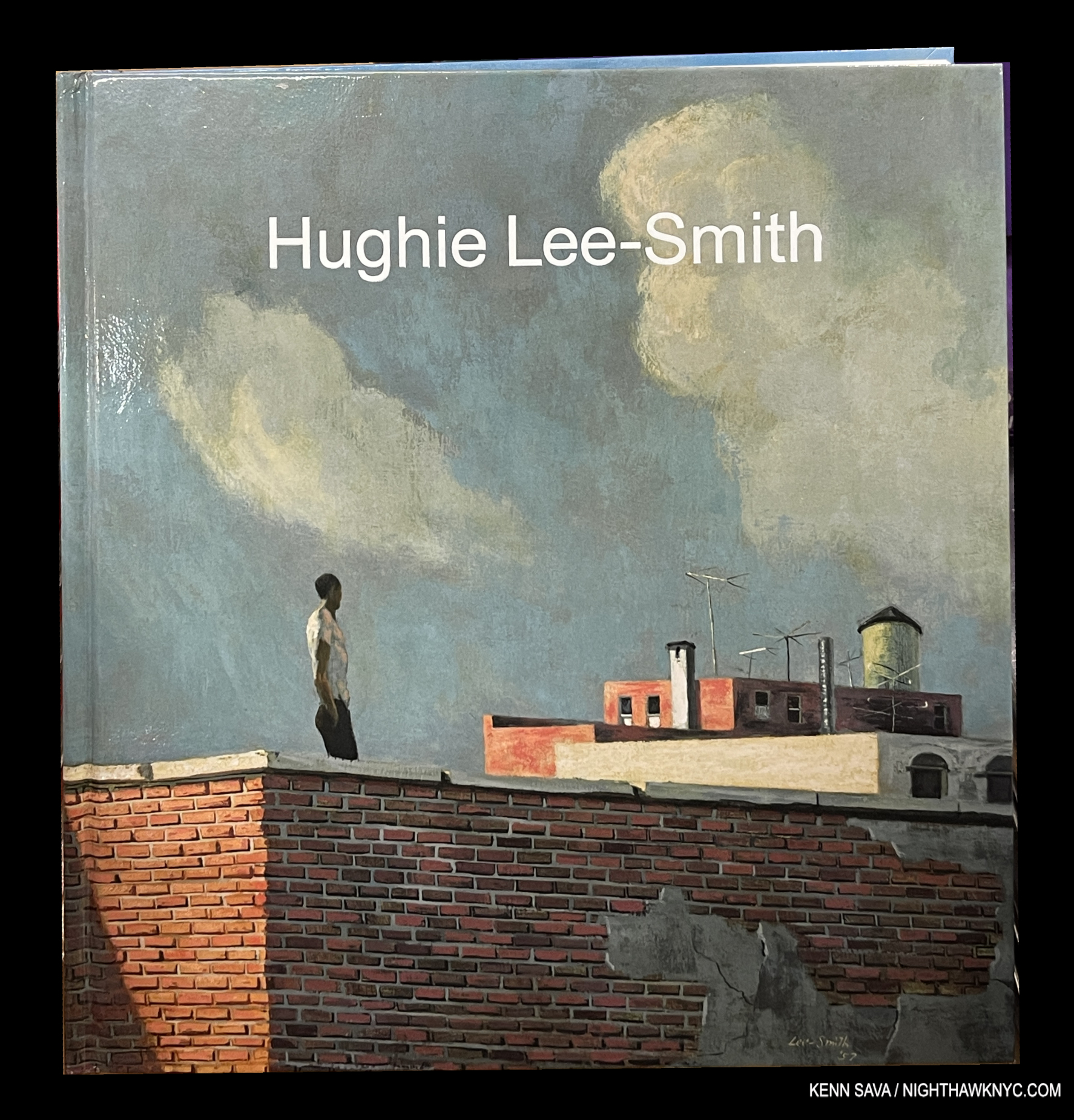
Hughie Lee-Smith, published by Karma, 2023, is an Also Recommended NoteWorthy Art Book for 2023. The rest of my list may be seen here.
Hughie Lee-Smith’s work was new to me when I walked into Karma in the East Village in August, 2022, where 34 of his Paintings ranging from early to late in the Artist’s six-decade long career were on display. Taken by what I saw, I wrote about the show in a piece titled “Hughie Lee-Smith: Leaving History Behind,” highlighting my feeling that “…time is going to be kind to Hughie Lee-Smith’s work,” as I said concluding it. Still, as good as the show was, it was hard to get a feel for his overall accomplishment. In the end, the show was an appetizer, instilling a desire to see more.
Click any picture for full size.
A year later isn’t the kind of “time” I was referring to, given it can take a hundred years1 or quite longer2 for the dust to settle on exactly what posterity considers to be “Art,” with a capital “A.” Yet, a little over a year later, the main course has arrived in the form of Karma’s massive six-plus pound, 400-page, Hughie Lee Smith monograph. It leaves me with the inescapable feeling that the late Mr. Smith (1915-1999) deserves to be in the ranks of the significant Painters of a 20th century that doesn’t realize it.
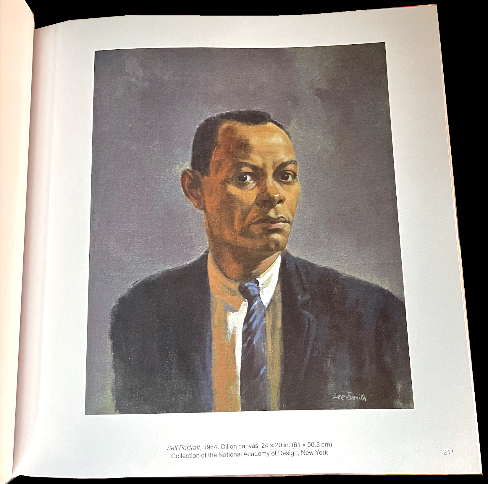
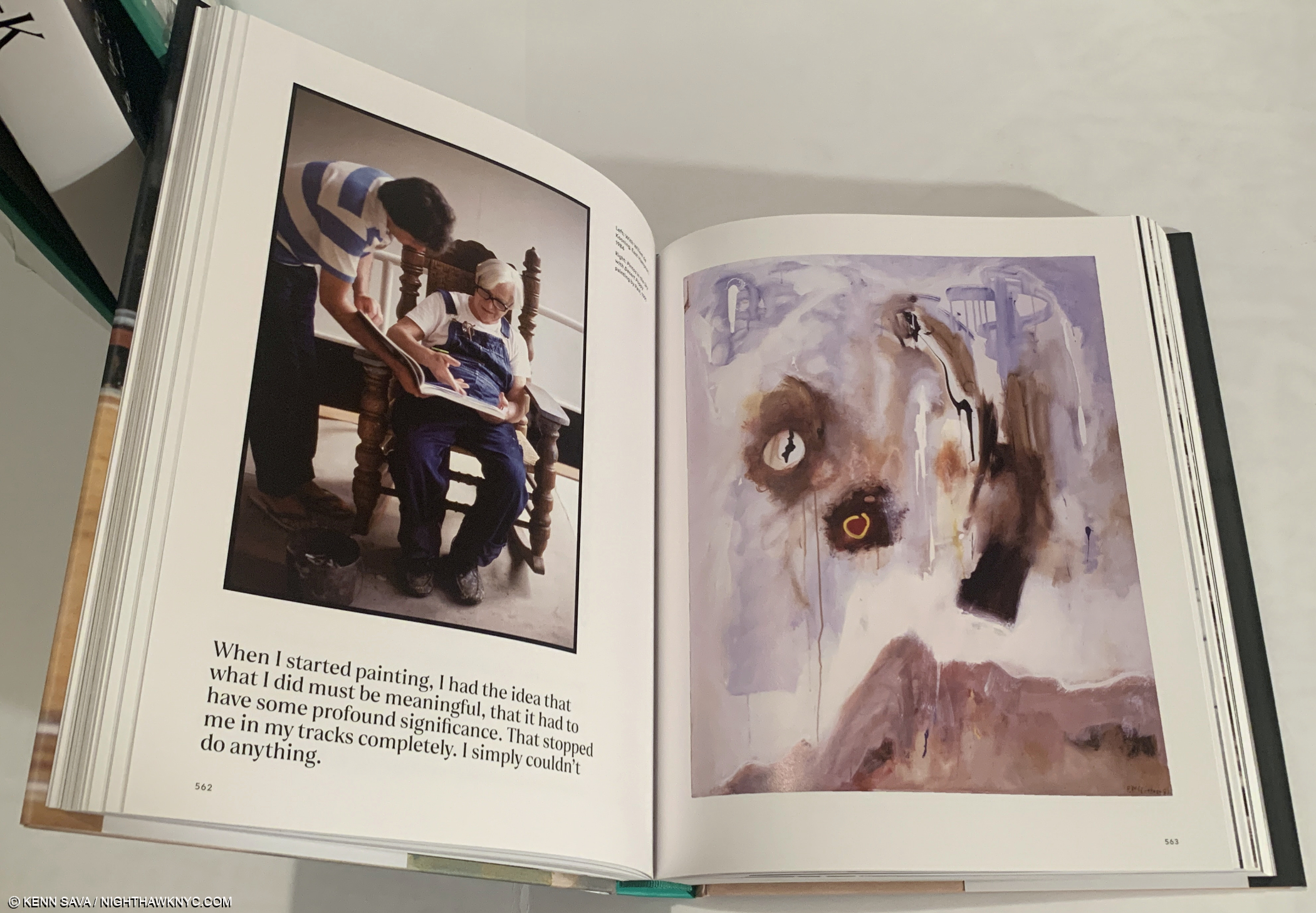
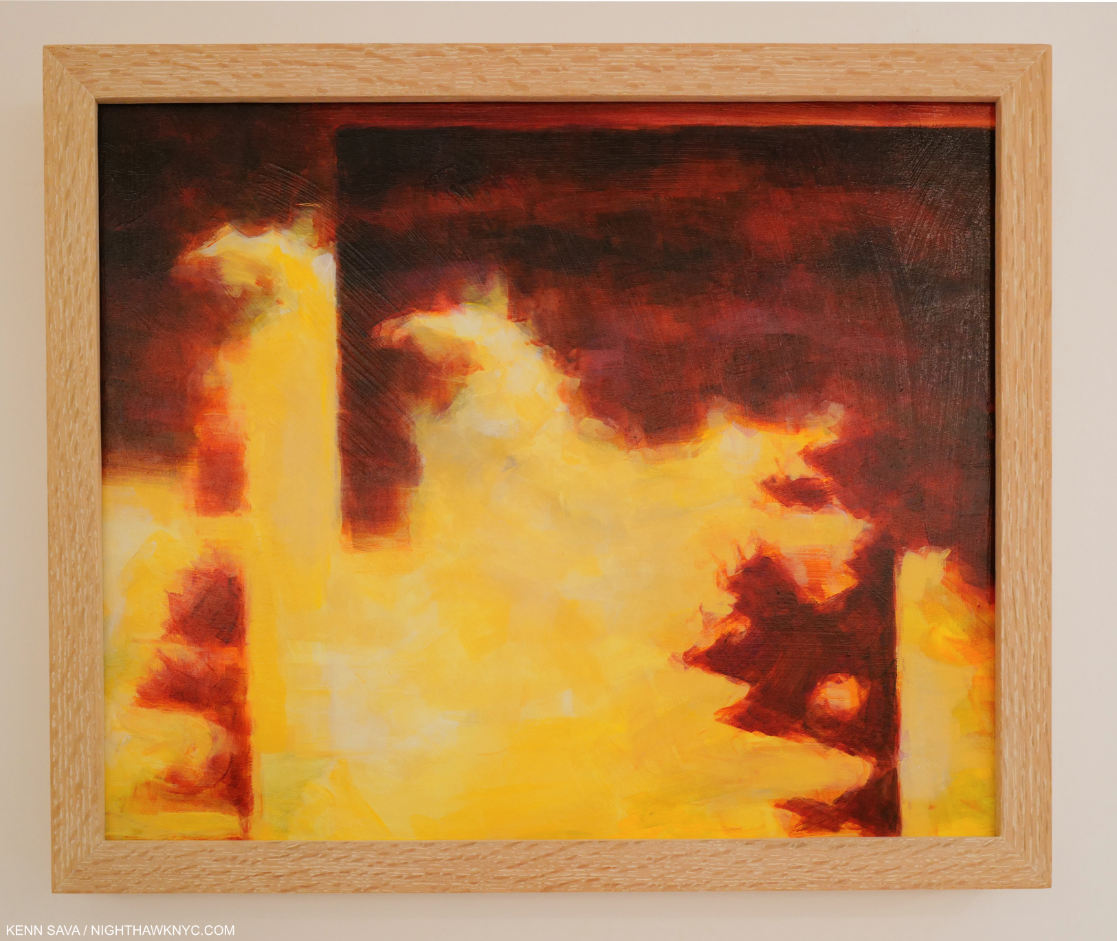
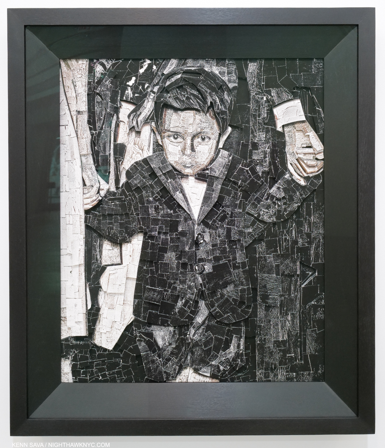
HIs 1964 Self-Portrait has a starkness that echoes that seen in much of his other work.
Well, the century’s only been over for 23 years. It’s still too early to write a definitive history of 20th century Art, in my view. In fact, I guarantee that someone still unknown or under-known to us will yet come to light and make his or her case for inclusion like the case being made for Mr. Lee-Smith is.
Hughie Lee-Smith is the third book known to me on the Artist, and the most comprehensive look yet at his larger body of work, and therefore important: qualities I’m featuring in my other NoteWorthy Art Books this year. The book itself is a bit less than ideal, but more on that later. The real point here is Hughie Lee-Smith shows the consistent high quality the Artist achieved and maintained over 6+ decades, in the process, making the most compelling case for his importance and place in Art history.
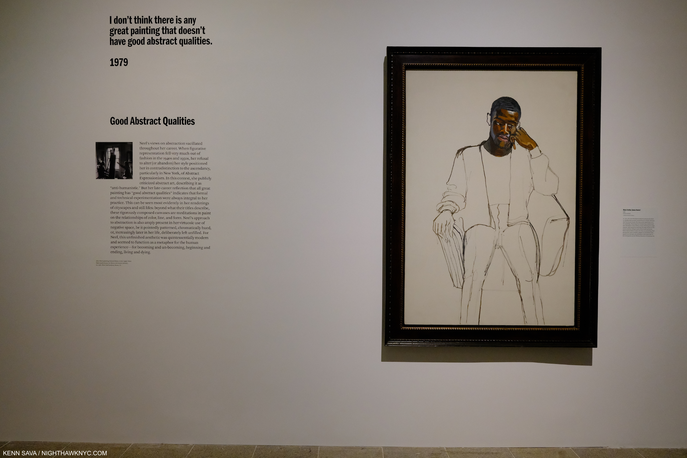
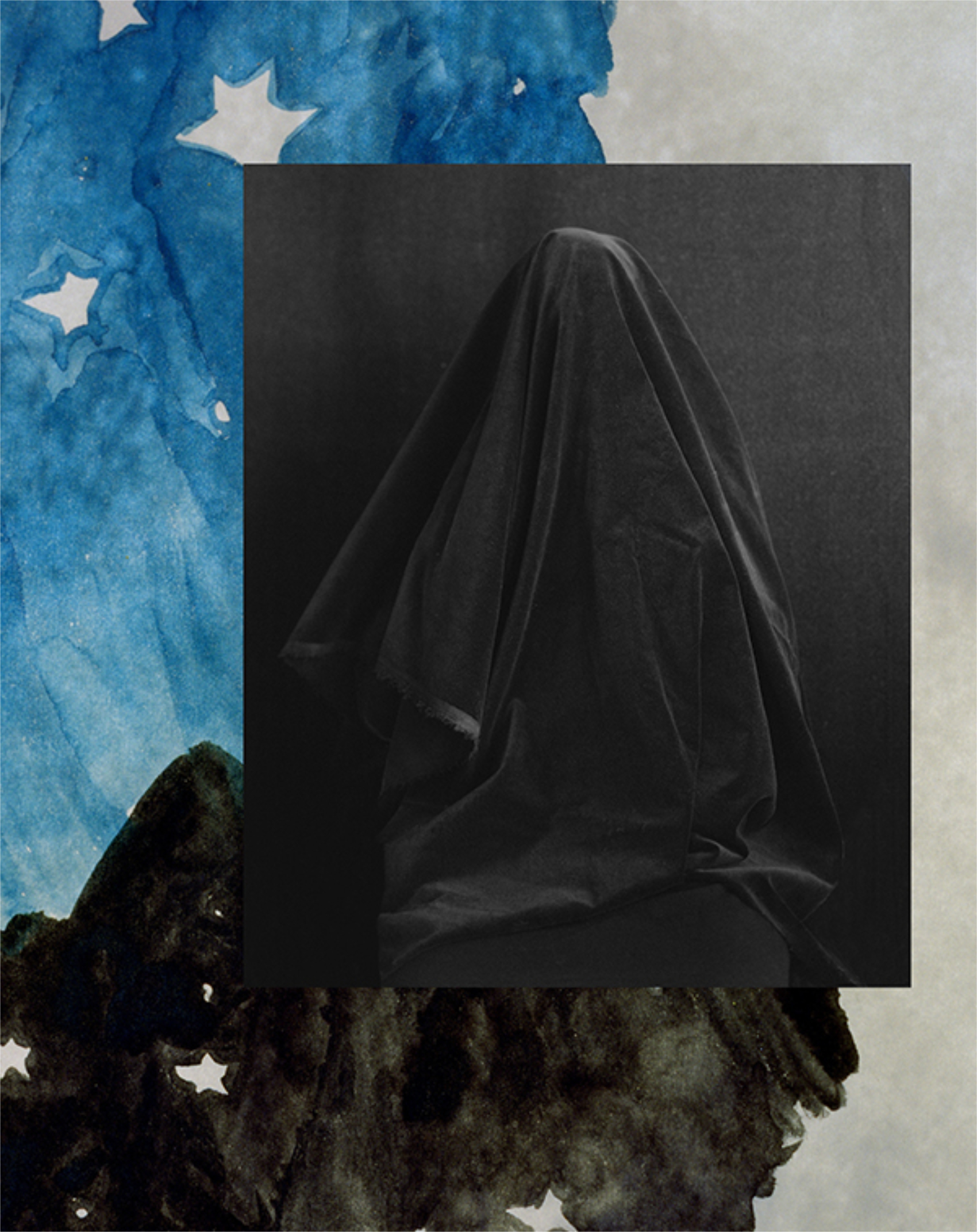
Hughie Lee-Smith’s work is many things, and probably many different things to the people who’ve seen it, as I glean from reading the essays. Among those things, I have yet to see the work of another Artist that can hit some of the same notes that Edward Hopper (1882-1967) is, perhaps, most famous for; what people call the “loneliness, “isolation” and “melancholy” of modern life (which I saw differently earlier this year). I think that’s remarkable in its own right, but it’s not the sum total of Mr. Lee-Smith’s Art.
Hughie Lee-Smith was in no way “doing” Edward Hopper. He was his own man. He Painted completely for himself, through his experiences and the way he saw the world, in a style distinctly his own. That’s plenty compelling enough and his work deserves to be seen on its own merits.
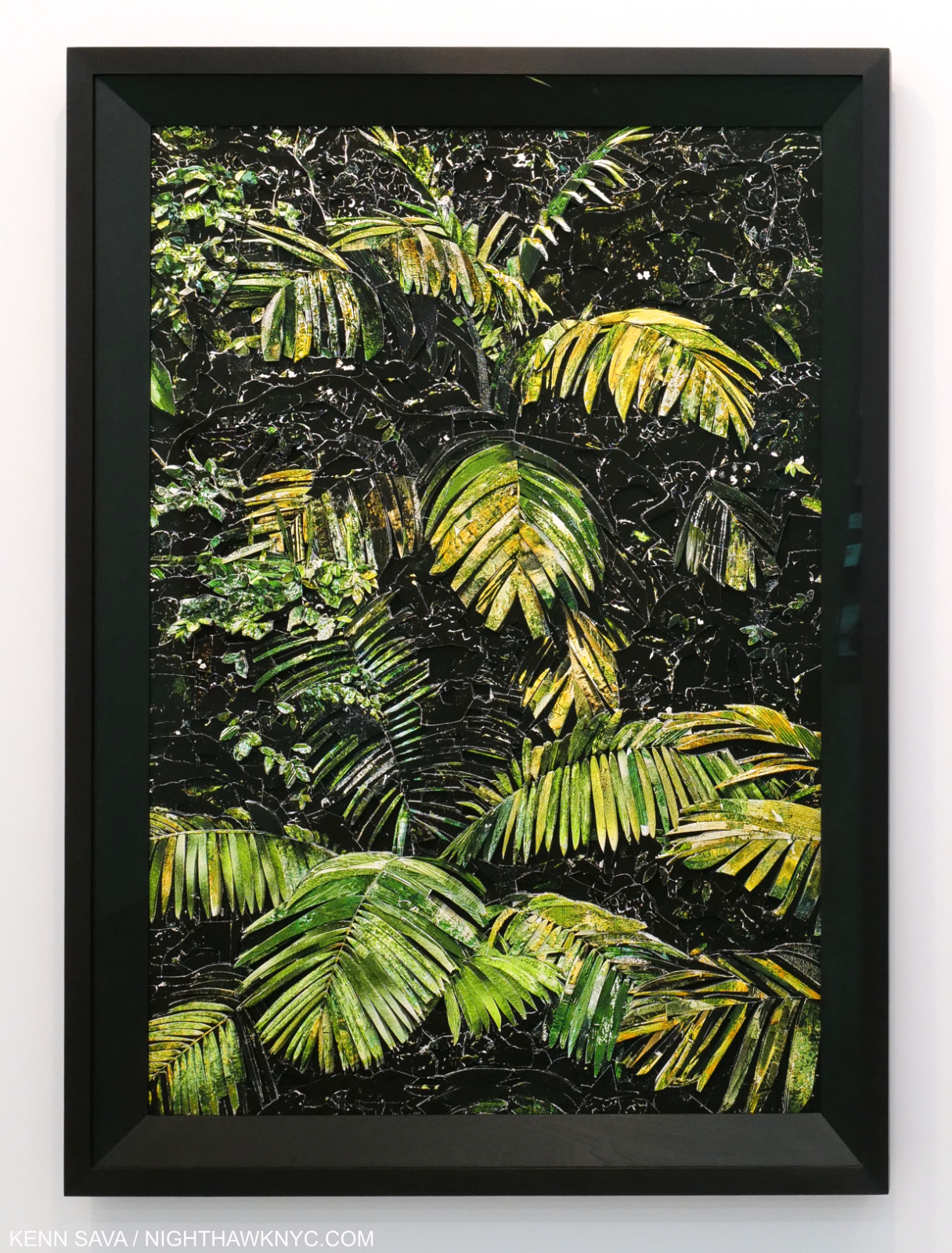
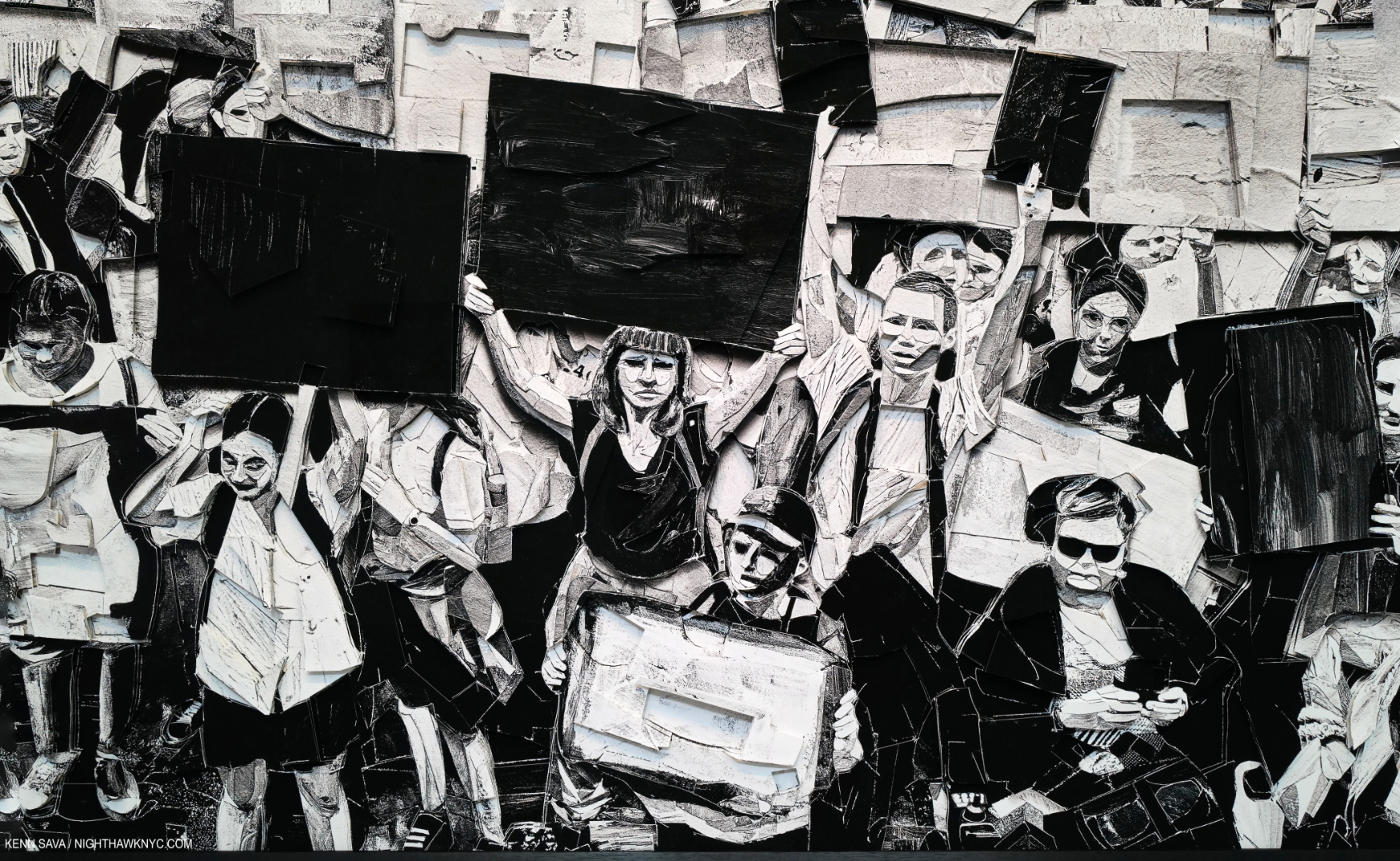
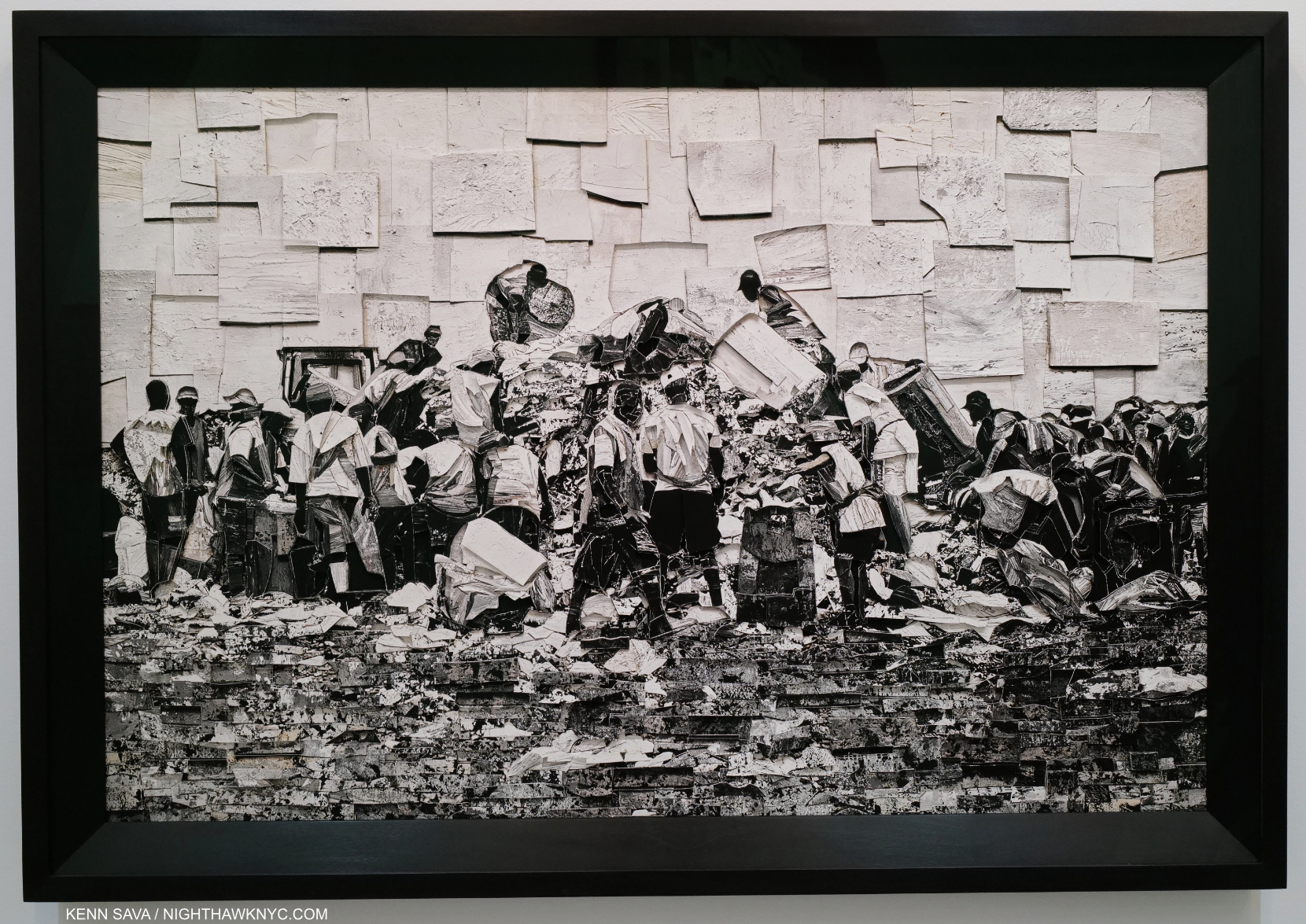
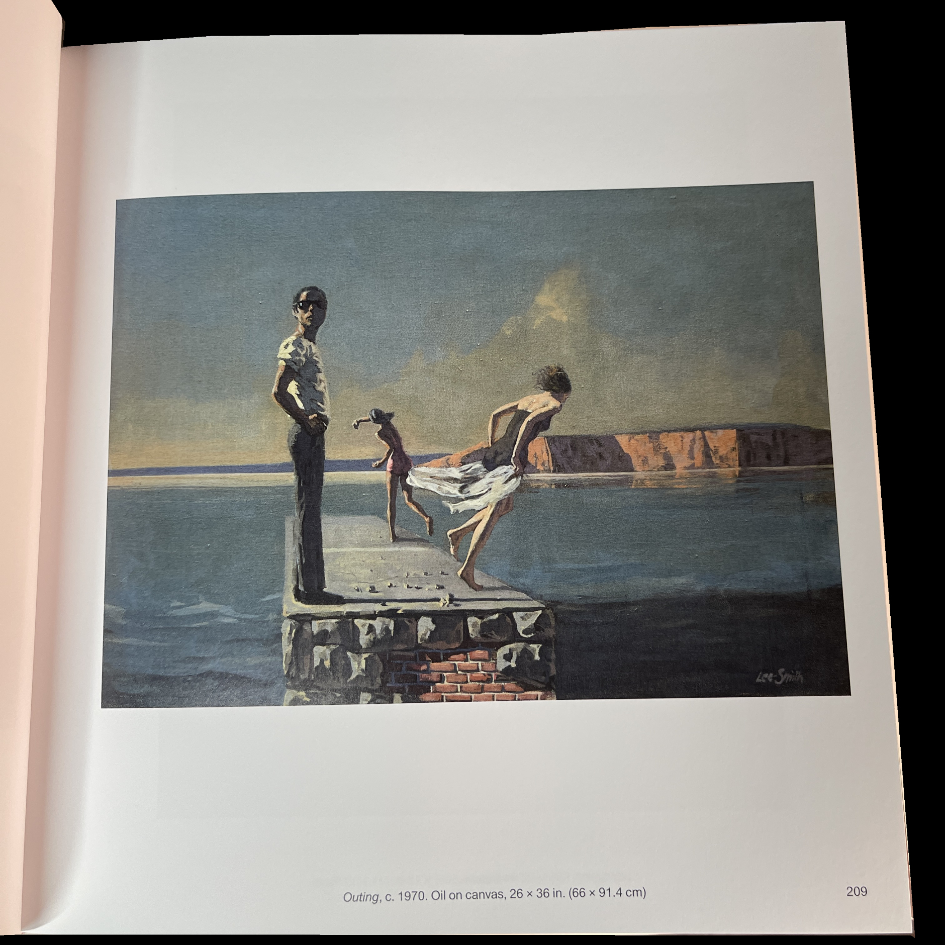
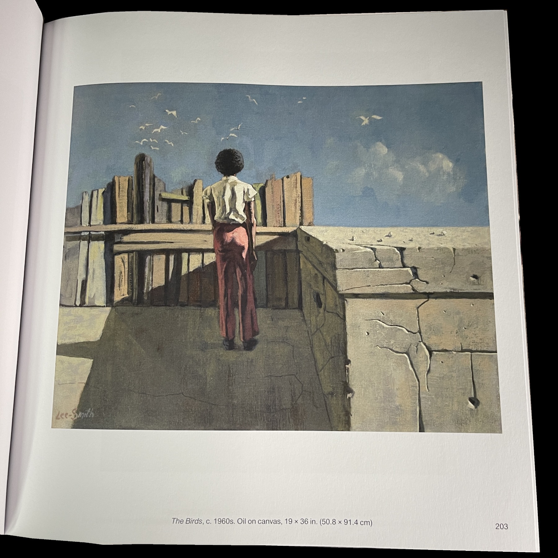
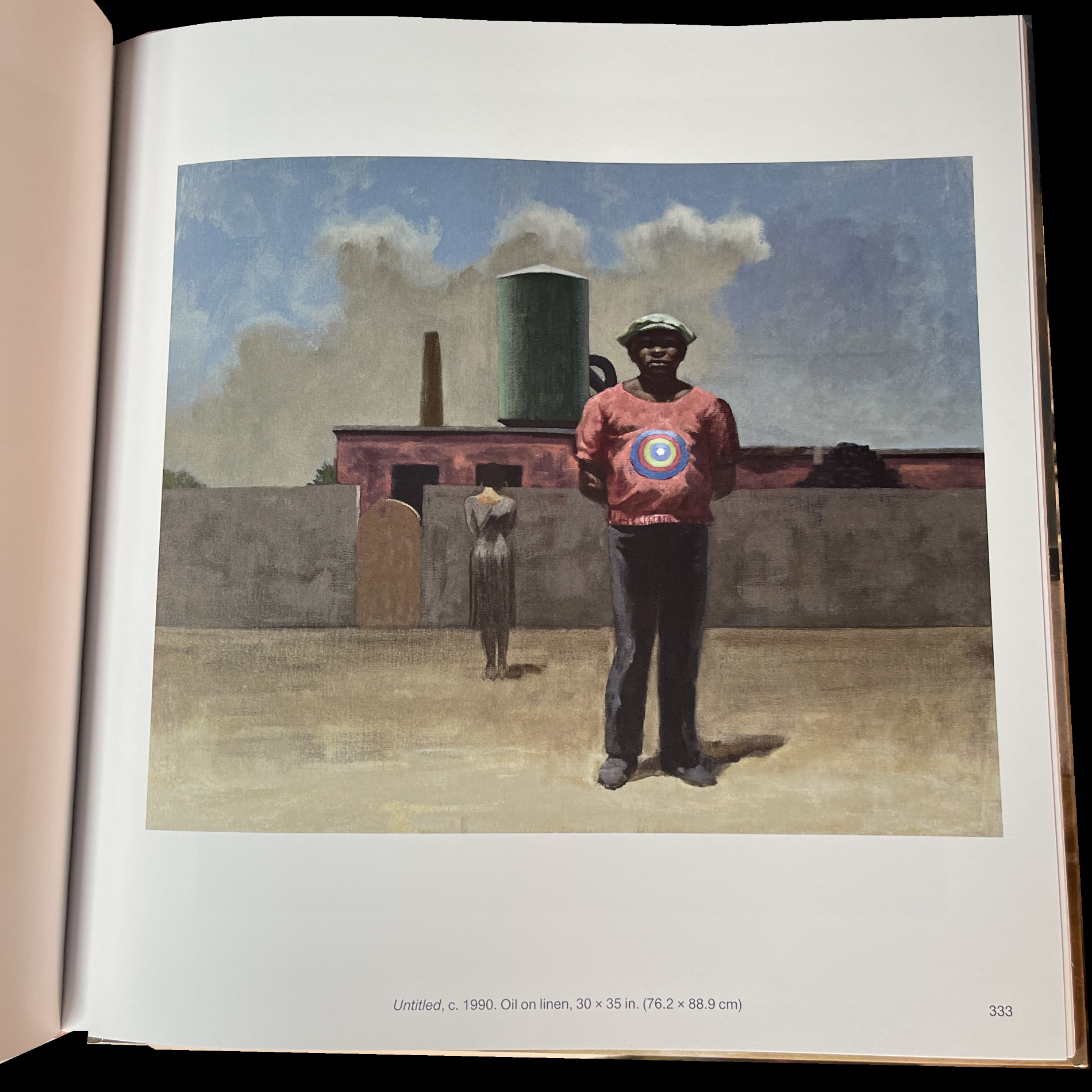
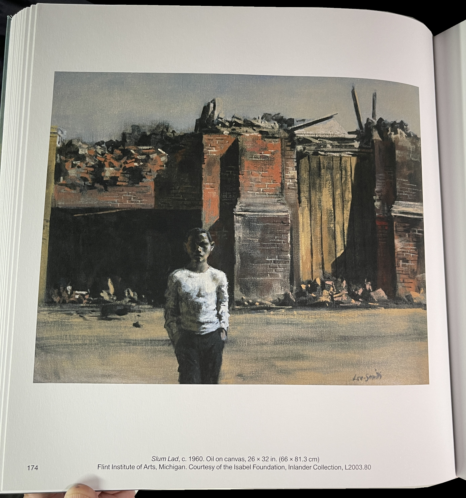
Though it’s not stated what percentage the included work represents of his total oeuvre, it must be a very substantial part. Seeing so many of his Paintings spanning sixty years, from 1938 to 1998, is revelatory. First, the quality of his work over those six decades, as shown here, never lets up, though his style evolves and solidifies into what becomes his trademark blend of urban realism, theater and character study. His figures often seem locked inside themselves, their own interior world, inside a world that looks like ours. Hopper’s figures seem to be locked inside of our world, or a world much like it to the point that so many viewers, apparently, can related to it to the point that he is now one of the most popular Artists in the world. Like Hopper, Mr. Lee-Smith’s figures are on the line between representational and nebulous in the just the right degree. As in Hopper, facial details can get softened adding to their mystery. Most of them are solitary- even when there are others present, then they’re all solitary, doing their own thing or experiencing place and time for themselves, as in Outing, c.1970 shown above. Has anyone else done this?, or done this so often? Balthus’s The Street comes to mind (save for that “problematic” interaction on the left side). In fact, this “alone togetherness” seems to me to be a continual running theme through Mr. Lee-Smith’s very long career right to the very last works shown.
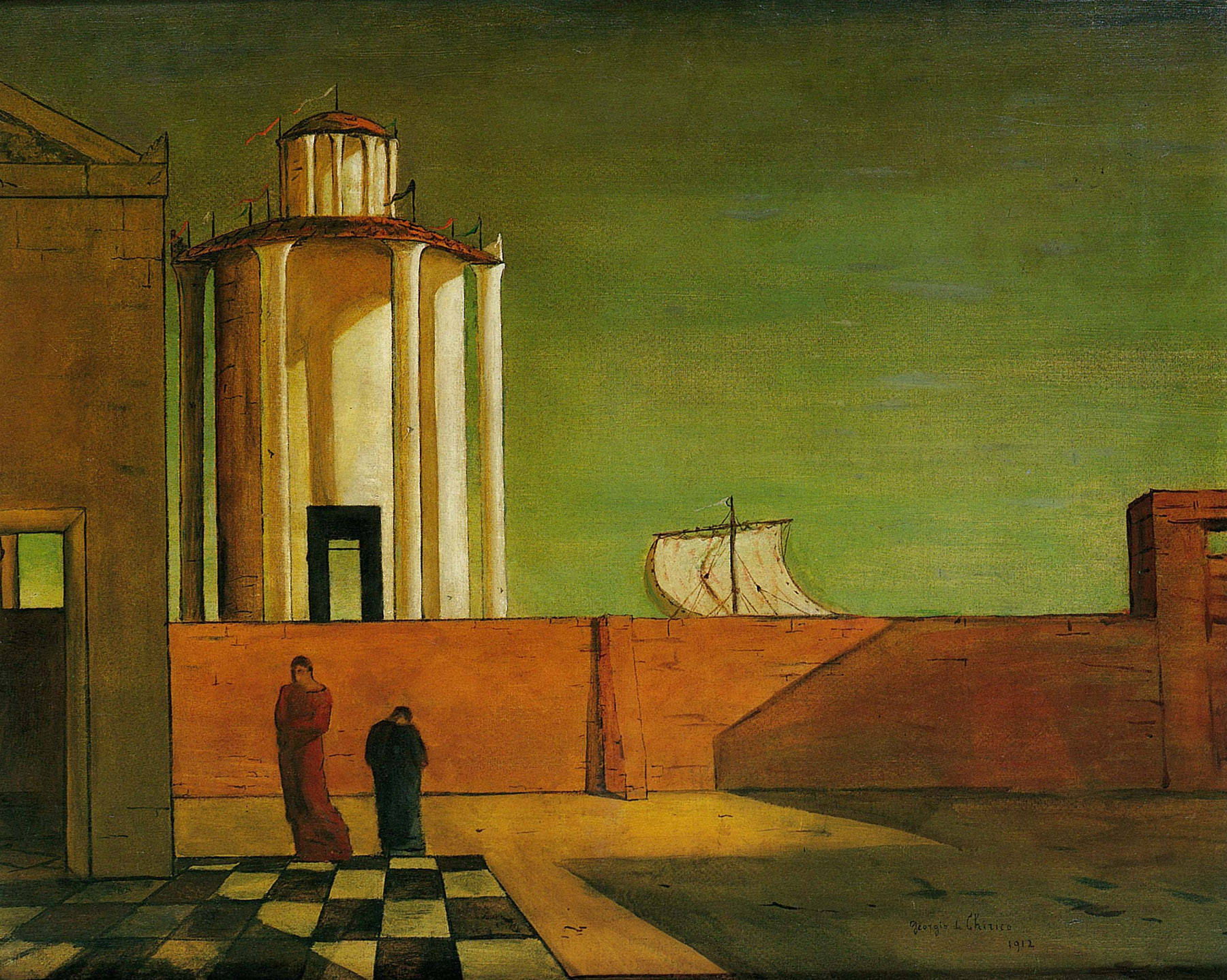
Giorgio de Chirico, The Enigma of Arrival and the Afternoon, 1912, Oil on canvas. To this point, de Chirico is most discussed for his so-called “Metaphysical” Paintings to about 1922. Rarely mentioned is that he lived another 56 years and continued to Paint at a high level until his death.
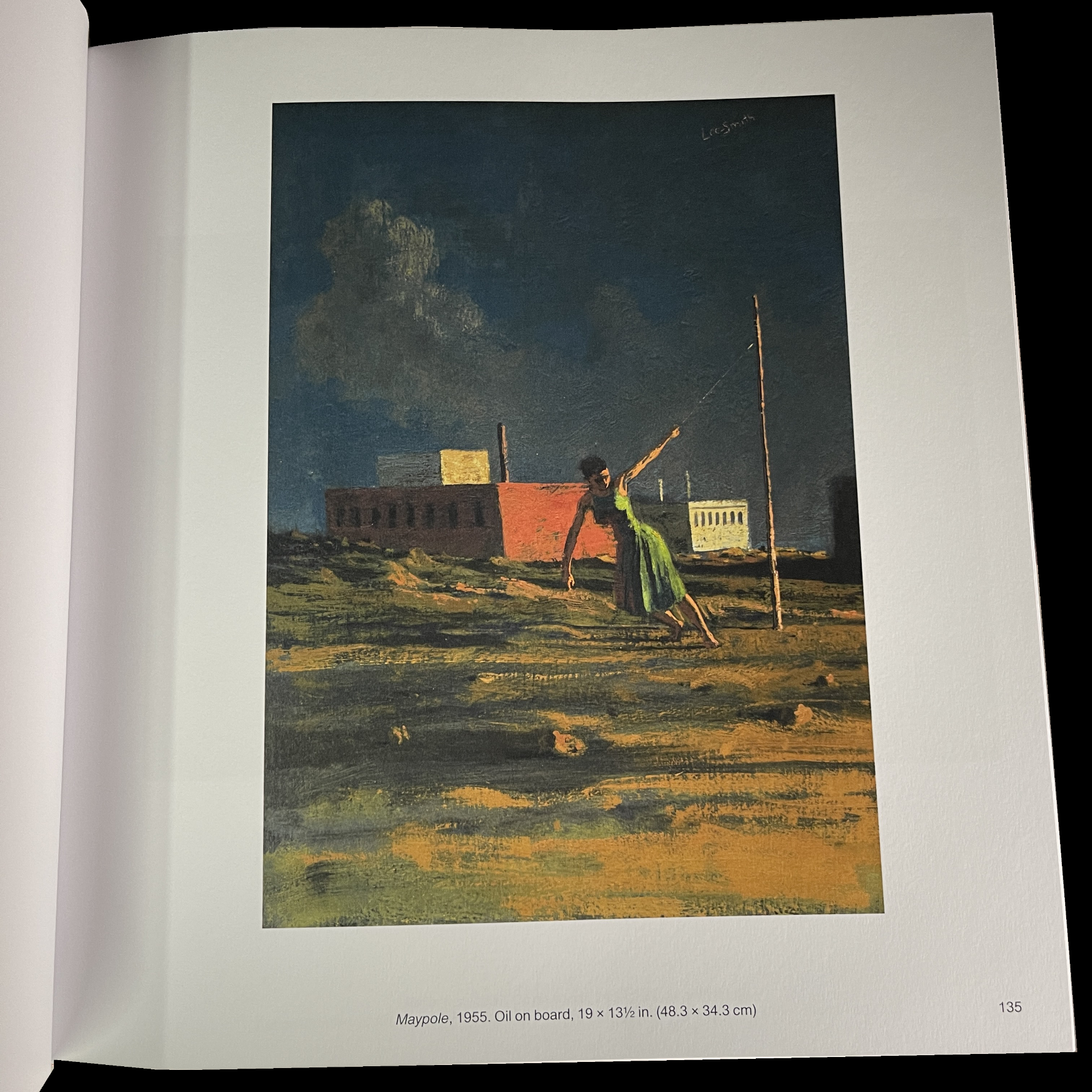
While Hopper may or may not be an influence, it seems harder to deny that Georgio de Chirico (1888-1978) wasn’t one. His possible influence feels continual. Figures isolated, or in small groups, in urban or suburban settings, and, perhaps, even more, the enigmatic atmosphere most of them share. It’s also interesting that a number of de Chico’s Paintings have streamer, pendants or flags flying, like the one above.
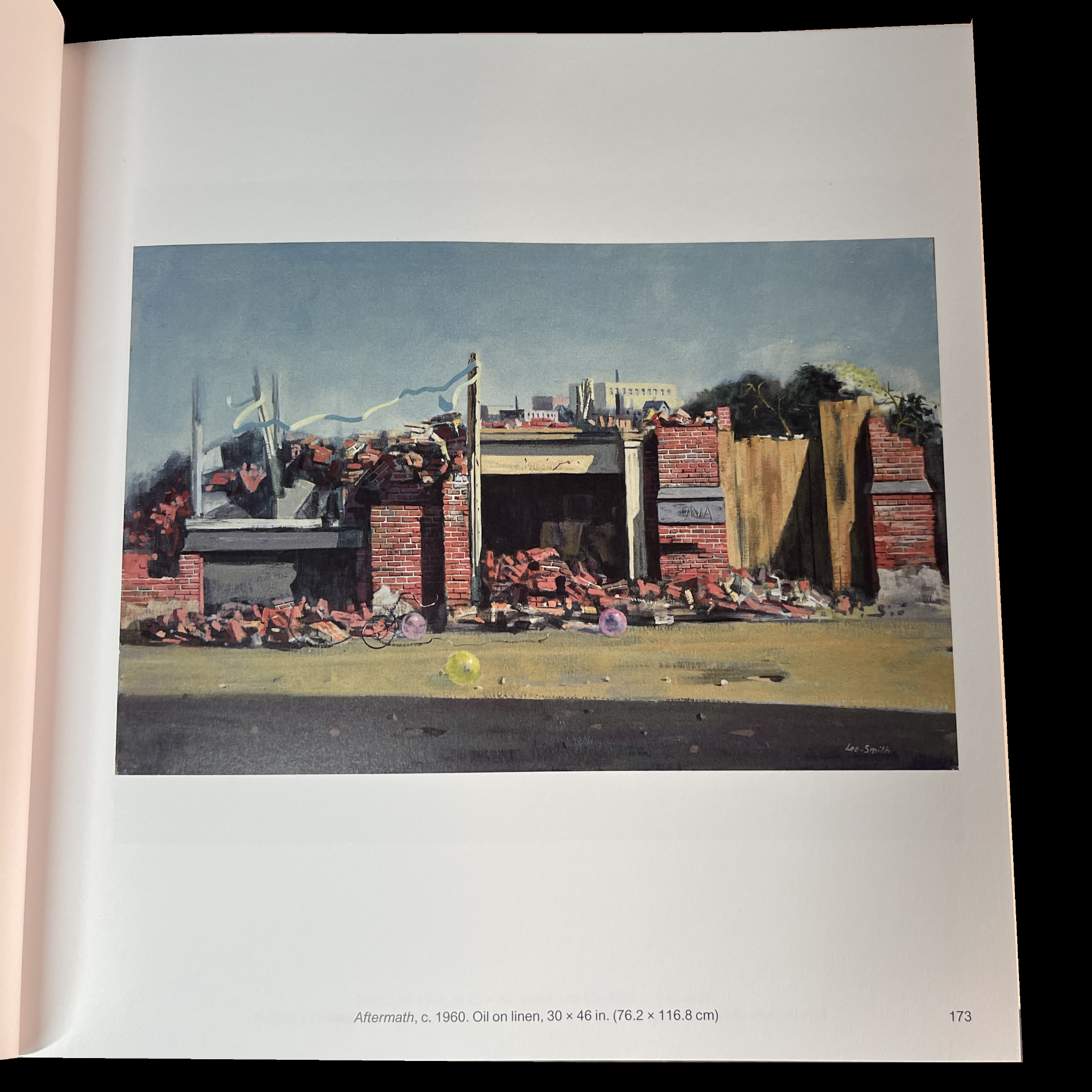
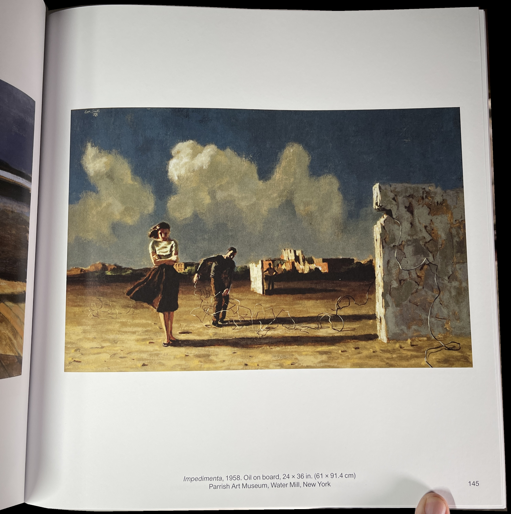
3 balloons on the ground, a long streamer up top…Aftermath…of what?
For someone new to his work, these seem a bit incongruous. Yet, they appear so often, it’s the kind of thing that makes one wonder why they’re there and what they “mean.” In this instance, their appearance may go back to his childhood.
“During the years Lee-Smith lived with his grandmother in Atlanta, a visiting carnival would set up every year in a field across from his grandmother’s house. Although he was never allowed to attend, the carnival would have a lasting impact on his work. About the carnival, the artist said:
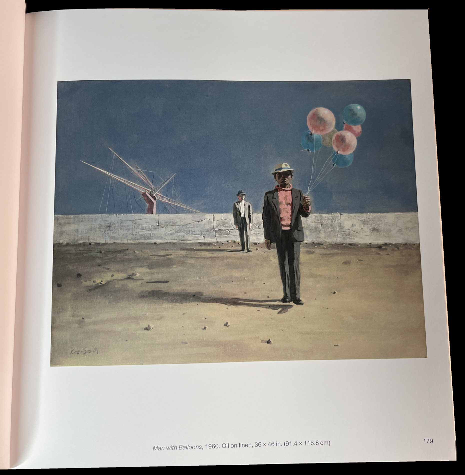
‘I was fascinated by the hauntingly dissonant sound of the calliope and the profusion of colorful ribbons, balloons, and pennants. However it was the denial of the pleasure of ever attending that carnival, owing to my grandmother’s perception of it as iniquitous, that established in my unconscious a life-long fascination with carnival life: some of the accouterments of which were to become characteristic elements of my painting many years later.'”3
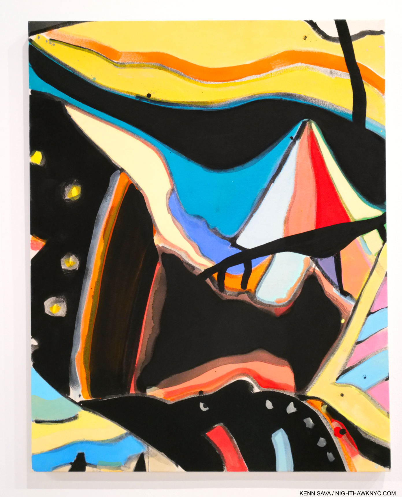
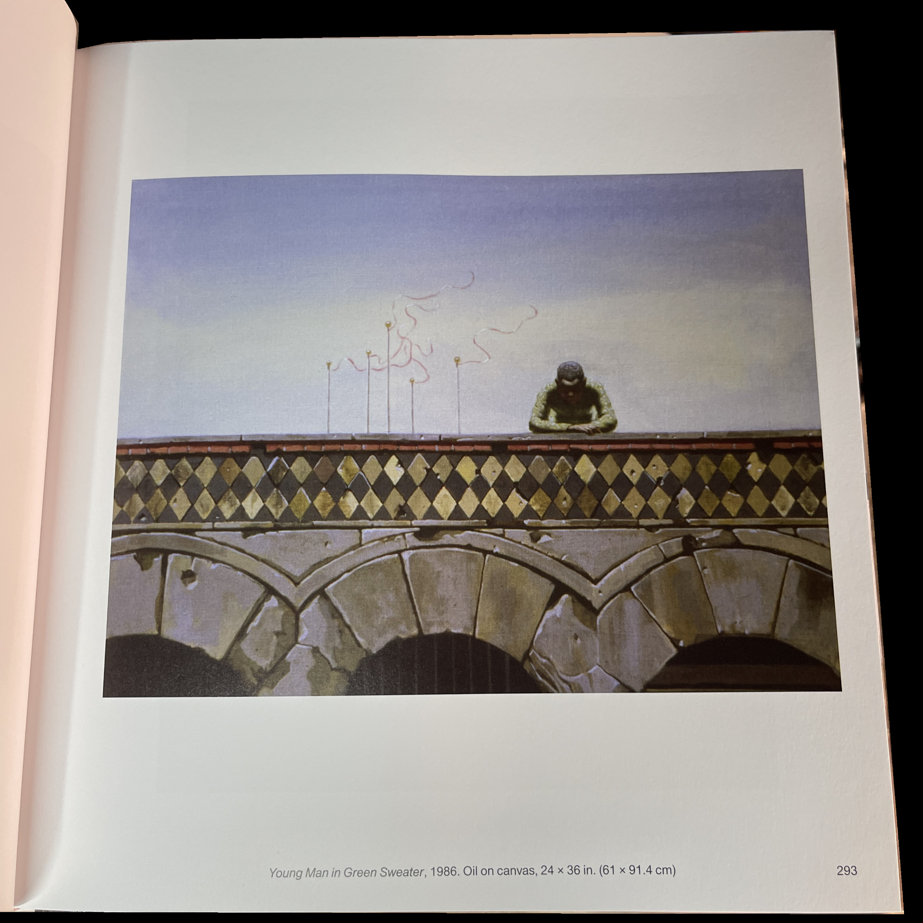
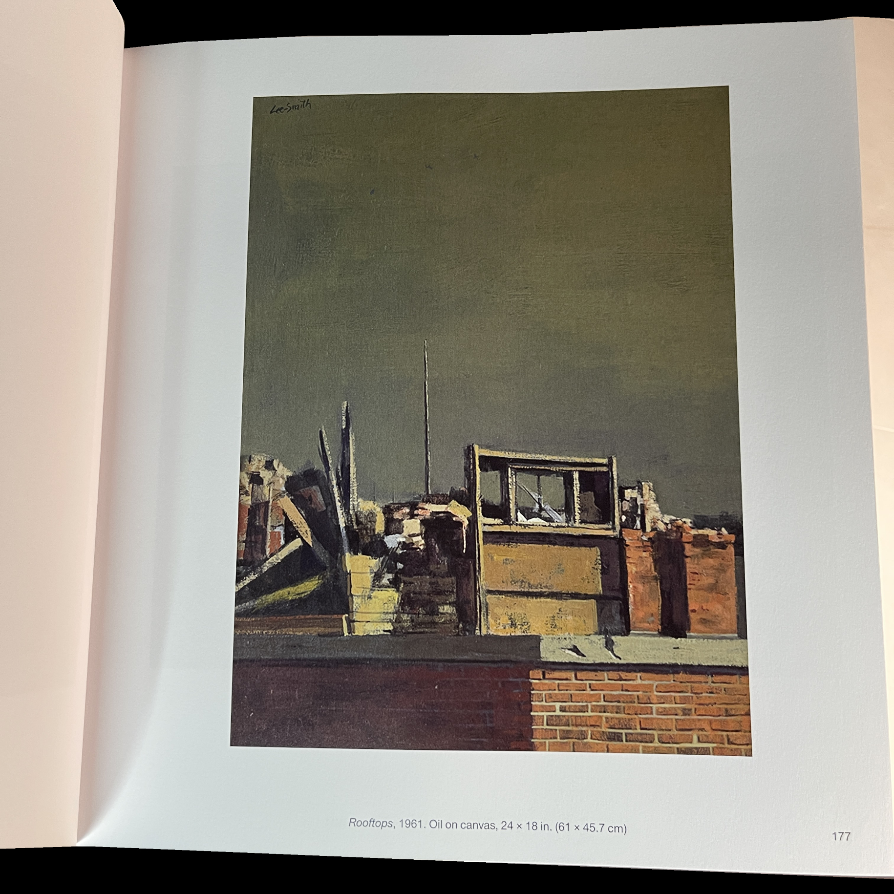 The longer I look at them I wonder if his Landscapes without figures are all that different from his Landscapes with figures. They’re something of a tour de force in the sense that the Artist may still be expressing some of the same things as his Paintings with figures do. In these, the buildings look like individuals, who seem to be locked into themselves in a different sense than simply closing or locking a door. There’s often, though not always, an element of “other” in them: like a colored streamer, a balloon. Indicative, perhaps, of life going on in these places, or leftover memories of the Artist’s earlier days. Innocence hanging on in a time of new realities.
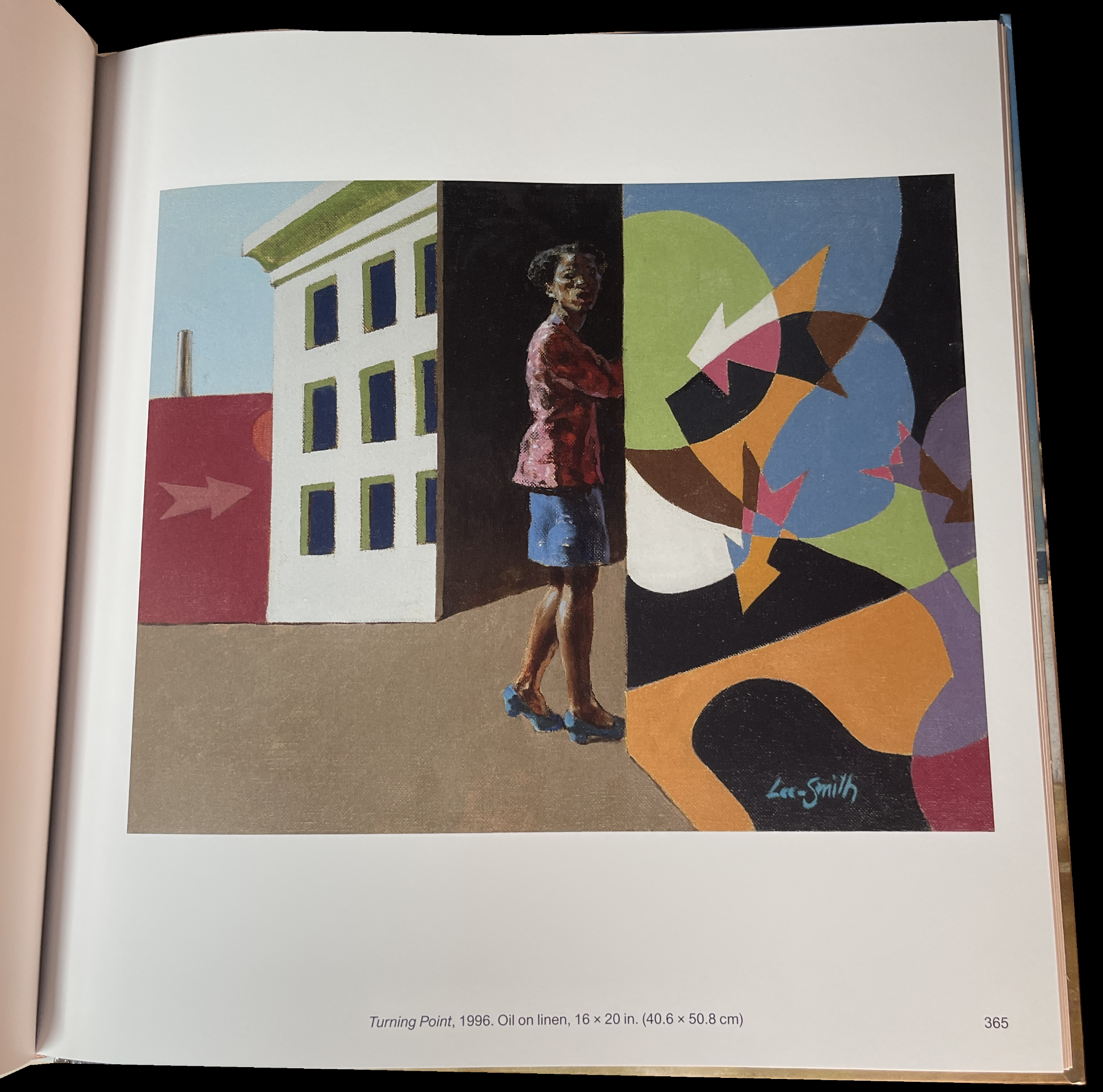
Then, his late period shows the world something different, though not entirely: a different world. The settings are more imaginary, almost theatrical, yet the feeling remains meditative, the characters still inward looking. It all makes for a compelling whole of a very high quality throughout. Of so many Paintings, very, very few struck me as being “lesser,” and those only by comparison to the rest that are very strong.
A future “icon?”
It seems to me that Mr. Lee-Smith’s oeuvre contains a number of images that have the potential to become “iconic”: images that that have universal appeal they are seen often to the point of too often. The highlights are, frankly, too many to mention.
All of this came as a shock to me as someone who had only seen 34 of his Paintings in the show last year. With every turn of the page, I felt the increased weight (heft) of his accomplishment adding up, and adding up, and adding up.
Though I’ve already published my NoteWorthy Art Books, 2023 list, I am amending it to add Hughie Lee Smith as a book I am “Also Recommending.” It’s likely to remain the most comprehensive book on his Art there is, and given what I feel will be his increasing importance and popularity, will be sought-after indefinitely. (The first edition is of 1 thousand copies, which will disappear if his star does continue to rise as I expect.) The production values are solid. Good paper, decent binding and boards, but this is not a perfect book. A number of the reproductions are blurry. Nothing is said in the book about this, so I don’t know why. Is this an artifact of the fact that his was work created over six decades and quality reproductions of some pieces were not available? Were some low resolution images that don’t enlarge well? Still, this shouldn’t dissuade anyone from checking Hughie Lee-Smith out. It’s likely to remain the best and only place to see most of his work. A good number of the Paintings included are in museums. It seems to me an increasing number will be.
All of this tells me that the time is here for a full-blown Hughie Lee-Smith Retrospective. Along with this book, such a show will go a long way to establishing his place once and for all.
*-Soundtrack for this piece is “Time Has Come Today,” by The Chambers Brothers, released in 1967, 3 years after Mr. Lee-Smith’s Self-Portrait, shown earlier, was Painted, and during the height of the Civil Rights Movement and the Vietnam War, though neither is directly referenced, performed here on the Ed Sullivan show in a truncated version-
NighthawkNYC.com has been entirely self-funded & ad-free for over 8 years, during which 300 full-length pieces have been published! If you’ve found it worthwhile, PLEASE donate to allow me to continue below. Thank you, Kenn.
You can also support it by buying Art, Art & Photography books, and Music from my collection! Art & Books may be found here. Music here and here.
Written & photographed by Kenn Sava for nighthawknyc.com unless otherwise credited. To send comments, thoughts, feedback or propositions click here. Click the white box on the upper right for the archives or to search them. Subscribe to be notified of new Posts below. Your information will be used for no other purpose.