This site is Free & Ad-Free!
If you find this piece worthwhile, please donate securely via PayPal so I can continue writing. You can also support me by buying Art & books! Details at the end. Thank you.
“Introduction to NoteWorthy Art & PhotoBooks of the 21st Century” is here.
Written & Photographed by Kenn Sava
(except for 5 Photos marked *)
PhotoBooks are THE Art publishing phenomenon of the 21st century. The explosion in their popularity has revolutionized the Art book business. Aided by the snowballing advances in technology that had given birth to digital Photography, the expansion of computer image processing capabilities, and innovations in printing followed (Of course, there are still Photographers who work with film.). Today, the ability to publish a book of photos is within the reach of even the most casual photographers, who can now take a batch of phone photos and have them made into a book for about $25.00. In the realm of Art Photography, another byproduct of all of this has been the explosion in the number of small, independent, PhotoBook publishers, including a number of Artist-owned houses. The end result is there’s been a veritable flood of new PhotoBooks from all over the world to the point that it’s virtually impossible for any one person to see all those published each year. Their number has seemed to grow with each passing year this century. Part of the reason for that is that PhotoBooks also provide a way for Photographers to show their work to the world, since very, very few have gallery representation
After I devoted 15,000 words(!) to NoteWorthy Art Books of the 21st Century, it’s time to put the focus on PhotoBooks released this century! I’m “only” employing the following 10,000 words on them. ; )
Though Art books remain one of my earliest passions that’s every bit as strong today as ever, a December, 2016 visit to William Eggleston: The Democratic Forest at Zwirner left me realizing I needed to get up to speed on what I call Modern & Contemporary Photography (i.e. the period since the publication of Robert Frank’s The Americans in 1958-9). I immediately dove in, beginning what I’ve been calling my “deep dive” into M&C Photography on these epages. I’ve spent the succeeding 8 1/2 years doing little else. I’ve seen every PhotoBook I could get my hands or eyes on (countless thousands) in bookstores, galleries, museums, libraries, numerous book shows, attended hundreds of Photography shows in galleries & museums, and numerous Photo conventions, and on and on, to even the few Photo eBooks that exist. I’ve shared much of what I’ve seen here on NHNYC. As I write in May, 2025, Photography (108 pieces) & PhotoBooks (48) make up a sizable percentage of the 350 pieces I’ve published on NHNYC.
This piece may, therefore, be seen as a summation of all I’ve seen and learned in that time, published here to share it with the world.

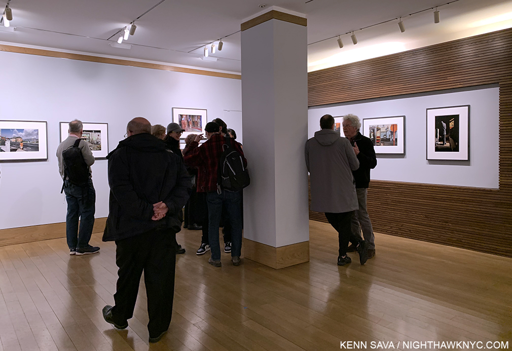
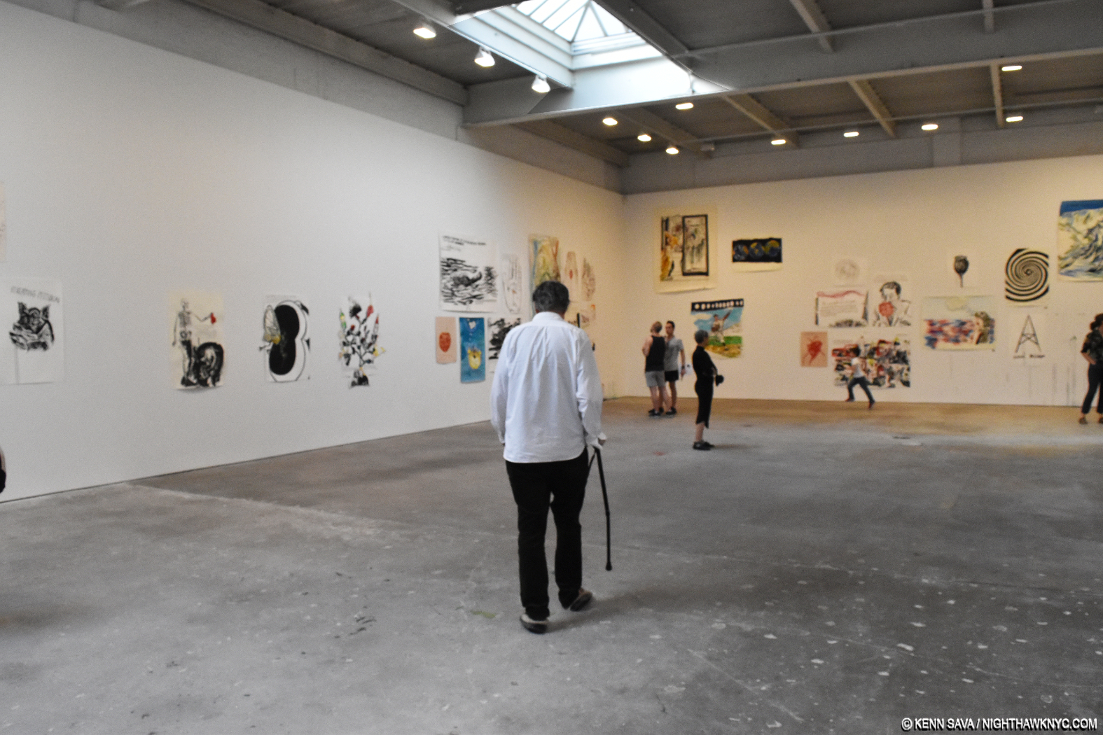
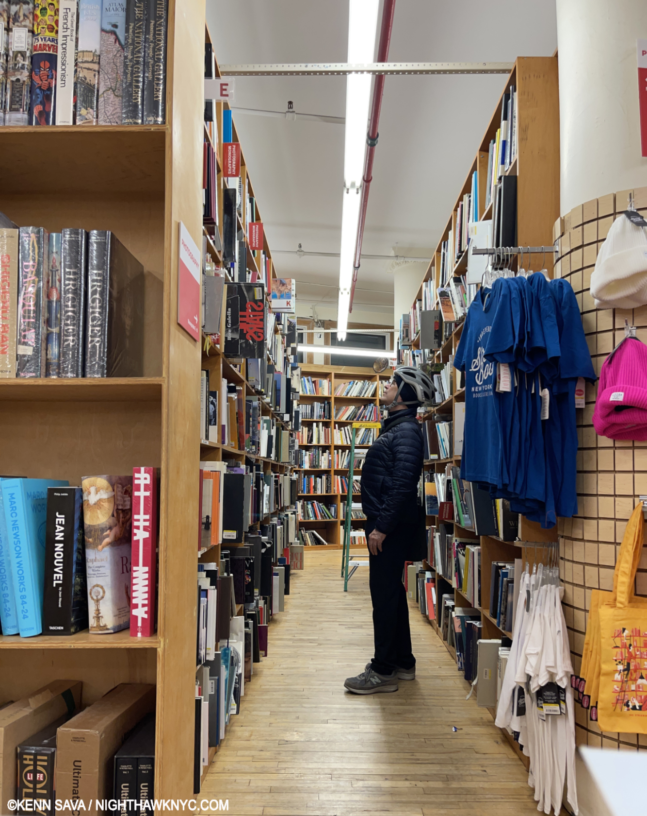
Another day, another bookstore. The author looking for the next PhotoBook on this list. March 5, 2025.
As I said in the Introduction, though my history with Art books is far longer than that of mine with PhotoBooks, my NoteWorthy PhotoBook lists actually predate my NoteWorthy Art Book lists by 2 years! An immense amount of research has gone into this list. Yet, there are NO ADS or affiliate links in this piece! Imagine THAT in 2025. If you find this piece worthwhile PLEASE DONATE securely via PayPal via the link up top so I can continue to write and to help keep this site up.
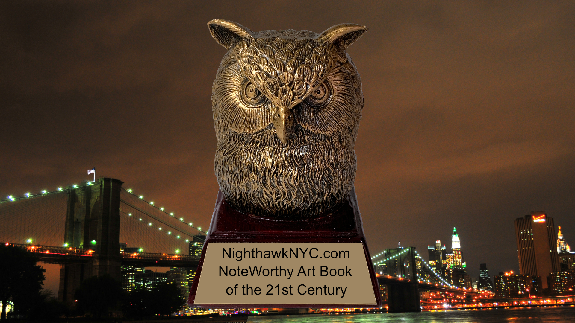
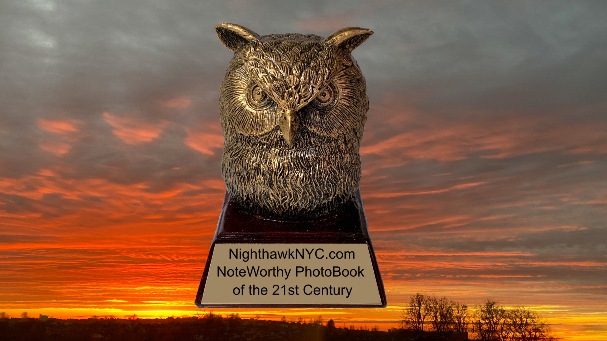
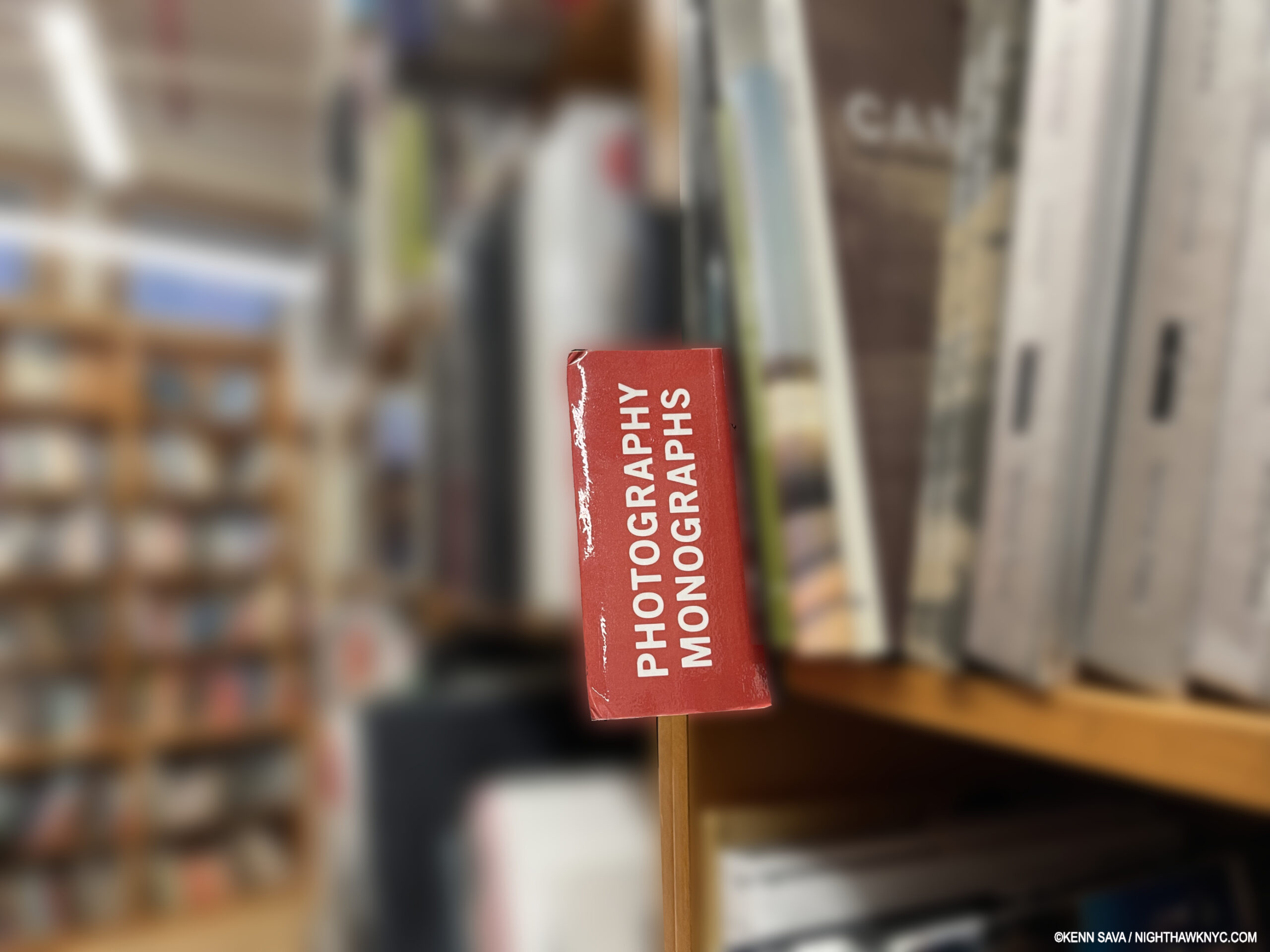
NoteWorthy PhotoBooks of the 21st Century
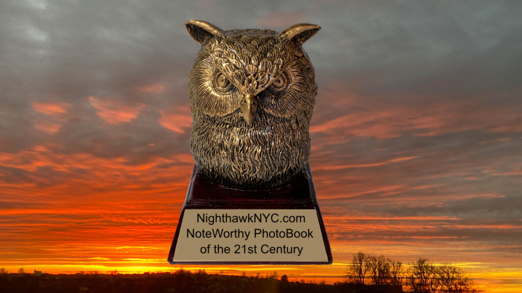
“Nature is the best Painter,” Lana Hattan. The “Golden Oof,” named for my Avatar, flies over an amazing fiery sunset by my Muse, Lana Hattan. Note- If you are listed below and would like a Golden Oof Statuette, contact me via the link at the end for info.
The books are listed in no in particular order. Books published before 2000 that were reissued in the 21st century are excluded from consideration as are books published in fewer than 200 copies because too few can see them.
Format= Artist, Title, Publisher, Year, Kenn’s comment
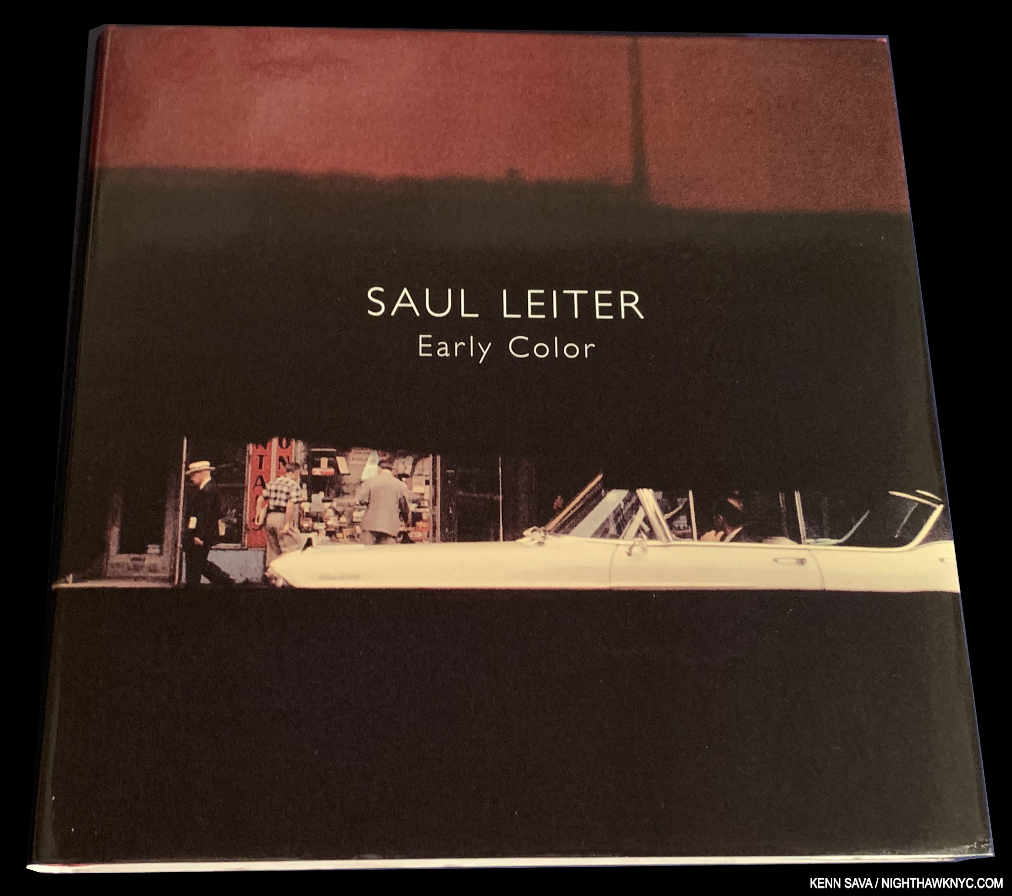
There’s no such thing as a “perfect book.” Early Color is as close as I’ve seen a PhotoBook come.
Saul Leiter, Early Color, Steidl, 2006
THE book that launched the “PhotoBook phenomenon,” it seems to me, is as close to “perfect” as I’ve seen a PhotoBook come-in all regards, from the minimal, yet wonderfully tasteful, design by Martin Harrison, to the state of the art Steidl printing, the superb Artist-overseen editing and sequencing, and oh yeah, it’s sublimely unique Photos in the most godsmack naturally beautiful colors imaginable. A book for the ages that I fully expect will be on it when whoever does this list for the entire century in the year 2100. Impossible (spelled VERY EXPENSIVE) to find now, my advice is to wait for another reprint, and assuming they haven’t changed it, buy it IMMEDIATELY because it won’t stay available for long!
My look at the Saul Leiter: In My Room show is here.
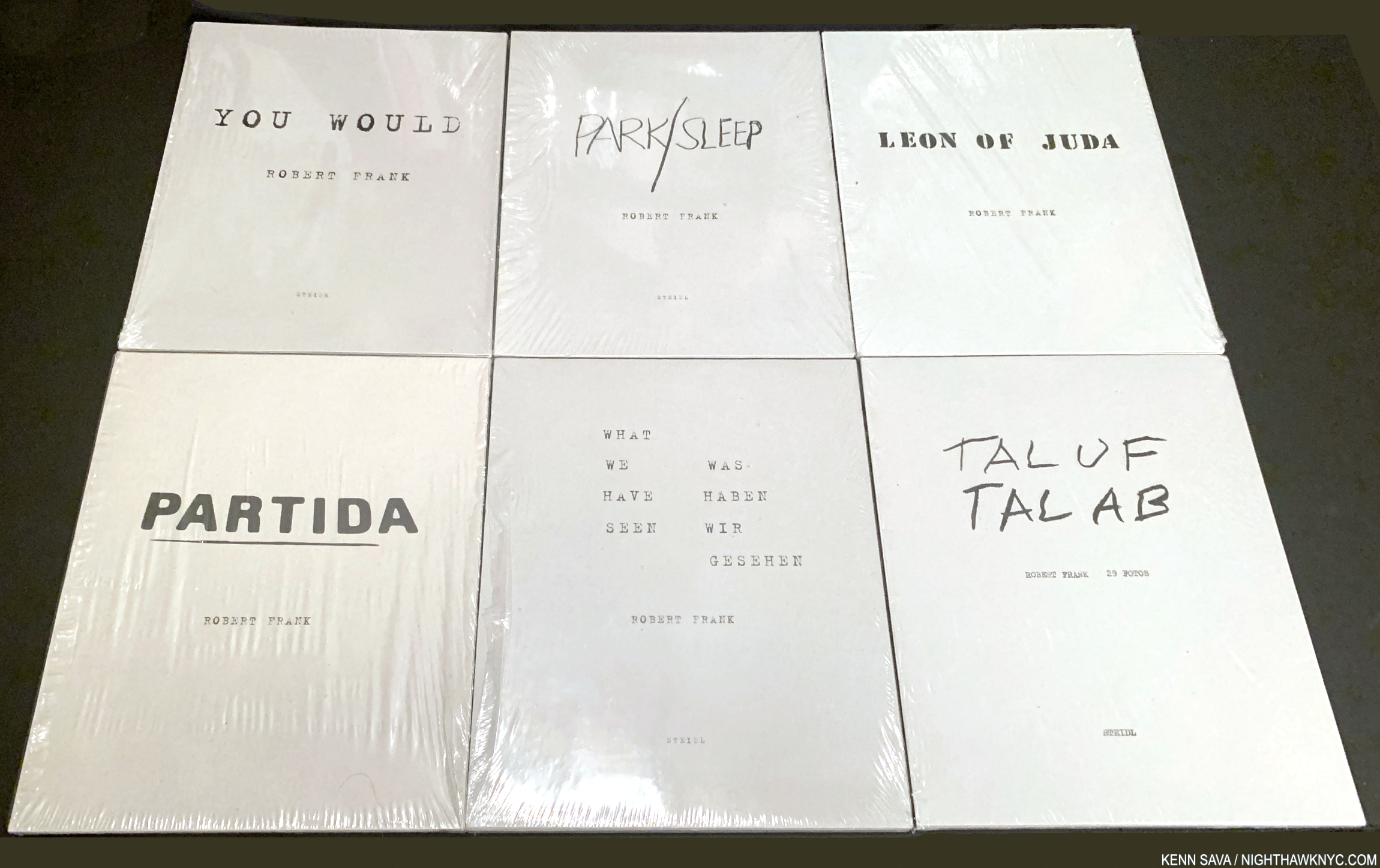
All six volumes of Robert Frank’s Visual Diary series. Steidl has announced they will be reissued as a set this year.
Robert Frank, Visual Diaries, Steidl, 6 volumes published between 2010-17, reissued as a set in 2025
The most overlooked PhotoBook series of the century to date gets a reissue in mid-2025 (too late for me to see it before publishing this list). One way or the other, this is an essential series. People think of The Americans when they think of Robert Frank. I get it. Many don’t realized he lived and worked for another 50 years, and continued to create great, ground-breaking, work that looks inside rather than out. Beyond that, he continued to explore new techniques that put him ahead of his time. Still.
Often called the most important Photographer of the past 50 years, and/or the most influential, he may well be both. The thing is, most of his post-Americans work remains relatively under-known compared to The Americans, and that leaves a lot of room for his influence to be all that much greater once it becomes better known. The Visual Diaries from the last part of the Artist’s life and career may not be the best place to start exploring his work after The Americans, but they show Mr. Frank was at the top of his game right up to the end.
My look at Robert Frank’s “other” PhotoBooks (besides The Americans), including these, is here. Interestingly, MoMA’s show on the “other” Robert Frank: Life Dances On just closed on January 11th. Previously, their bookstore featured both of my NoteWorthy PhotoBooks of 2023. Hmmmm…Are MoMA and its store, NHNYC readers?
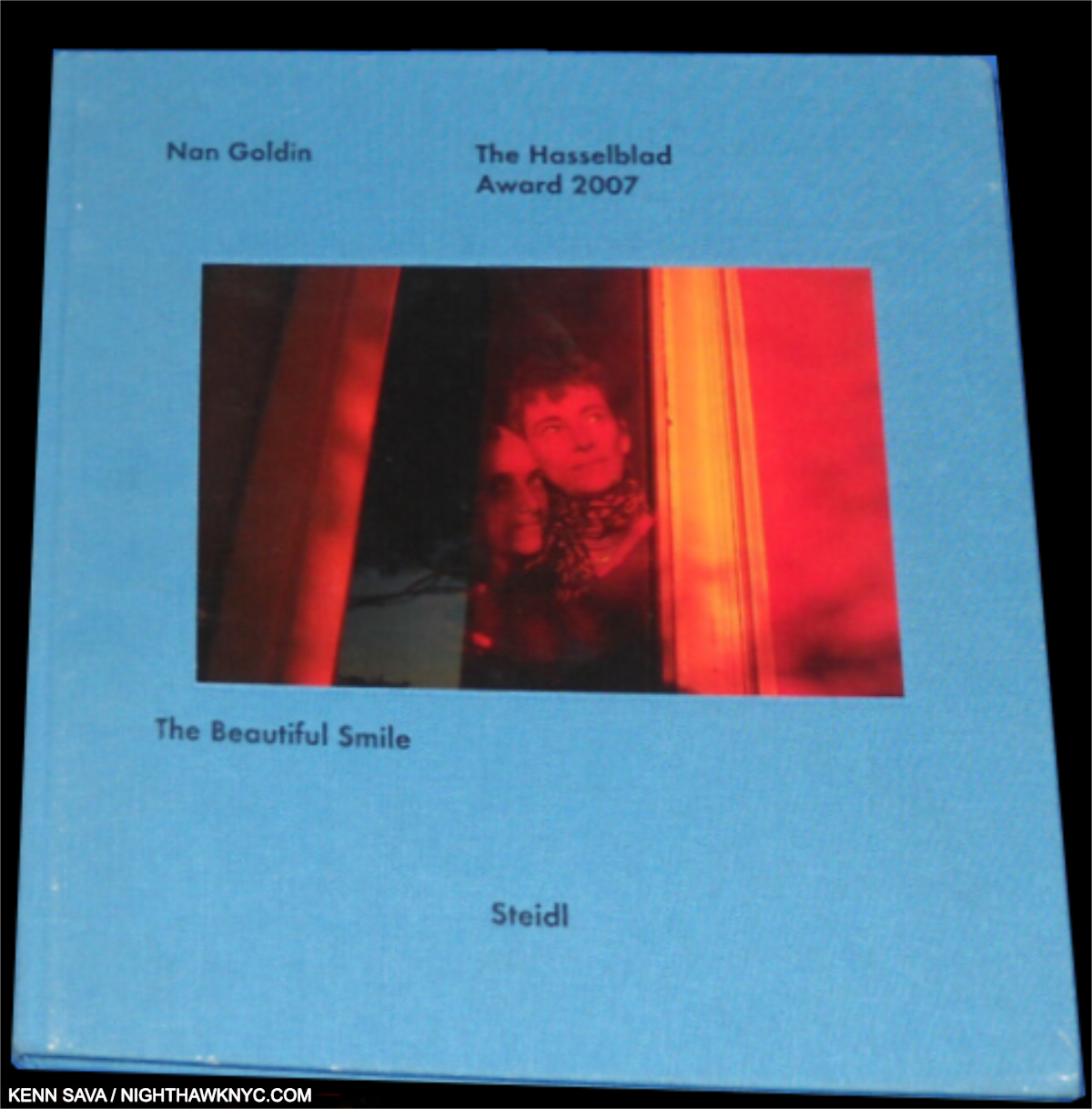
The 1st edition of The Beautiful Smile bore “The Hasselblad Award, 2007“as the title/subtitle on the cover. The 2nd did not. Both are now rare.
Nan Goldin, The Beautiful Smile, Steidl, 2008
Long out of print, even in the 2017 reprint, The Beautiful Smil is Nan’s favorite among her own books. I’m not going to argue with that. There’s no such thing as a “weak” Nan Goldin book (among those I’ve seen, which I believe is just about all of them, including catalogs), though, of course, The Ballad of Sexual Dependency is the place most choose to start. This is another great Nan book that not as many people seem to know about, possibly because it promptly sold out the 2 times it was issued. Hopefully, Steidl will reissue it again soon. My guess is that since they have been publishing Nan’s new books, and some of her other out of print Steidl titles have come back, The Beautiful Smile will one of these days, too.
My piece naming Nan’s most recent This Will Not End Well one of my NoteWorthy PhotoBooks of 2022 is here.

Mike (now Michael) Brodie, Tones of Dirt and Bones, Twin Palms, 2014
A sensation when it came out, it had the rawness of life lived- the hard way. Hopping trains sounds like something straight out of Kerouac and Neal Cassidy, but they weren’t packing cameras (as far as I know). Luckily, Mike Brodie was, and his resulting work has a rough poetry that makes it hard to compare it with anything of the time (maybe Jim Goldberg’s Raised by Wolves, 1995?). Mr. Brodie promptly dropped out of the Photography world though he was becoming a “big name” at the time. He got married and went into engineering. Suddenly, nine years later, he released Polaroid Kid, 2023, and in February, 2025, Failing marks his return to Photography in a big way. Photography, and the PhotoBook, has missed him. 11 years later, Tones has lost none of its freshness or power.
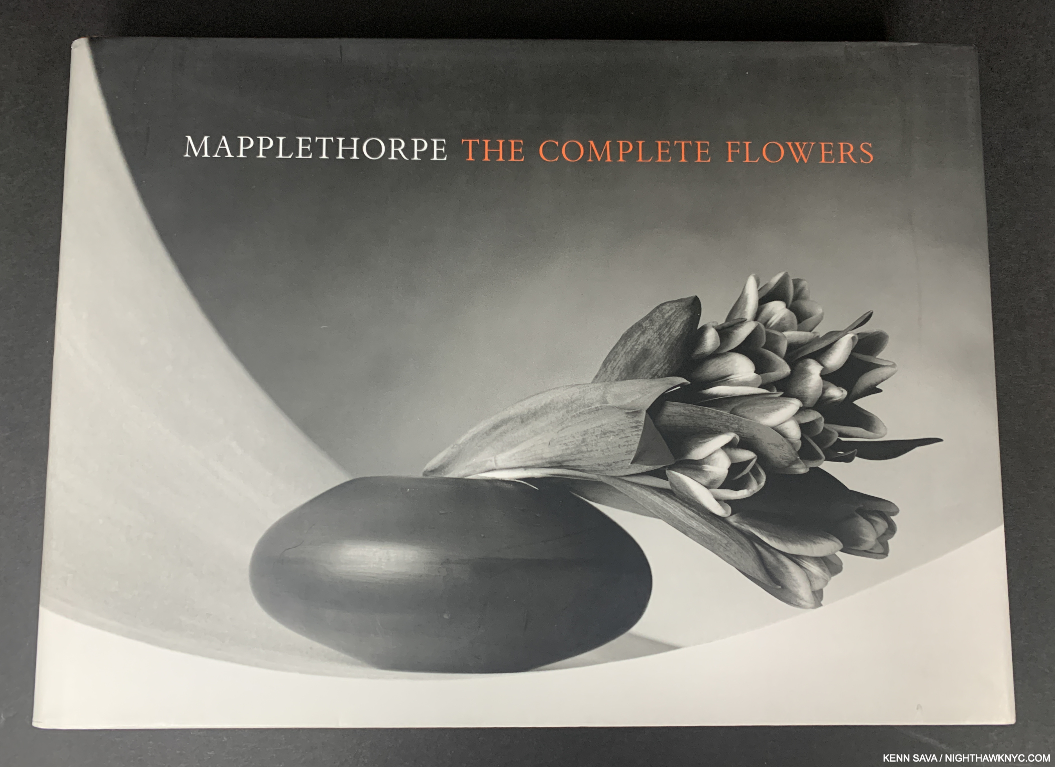
In spite of more recent editions, the tesNeues Mapplethorpe Complete Flowers remains my preferred edition. One of the most beautiful books on this list.
Robert Mapplethorpe, Robert Mapplethorpe: The Complete Flowers, texNeues, 2006
There are some who are not fans of some of Robert Mapplethorpe’s work, but everyone seems to agree on the beauty of his Flowers. Containing “all known examples” in color or black & white as the Artist shot them over 256 pages, this is a book sure to bring beauty any where it’s viewed.
NOTE– This is NOT the more recent Rober Mapplethorpe- Flora published by Phaidon in 2024! This is the large 15 1/2 by 11 3/4 inches, rectangular (landscape format), book published by tesNeues in 2006, still my preferred edition. Why? The format works better for the work, in my opinion.
I took pictures of images in my 2006 tesNeues Complete Flowers and then compared them side-by-side with a physical copy of the 2024 Flora. Unfortunately, the printing just doesn’t measure up to the older edition. In some cases, the larger sizes seem be the problem (perhaps they were working with smaller originals in some cases?), in other images that retain the same size across both books, details are fuzzy in the Phaidon. And this was comparing my iPhone pictures on an A17 iPad mini to the physical Flora! I expect the difference to be more pronounced with both books present. Also, though both books are large, I find the rectangular shape of the tesNeues more manageable. The powers that be running the Mapplethorpe Estate seem to be unsure about what format works best for these 278 or 279 Photographs- having published them in first, landscape, and then portrait. Their 2006 first attempt, though not ideal, works best for me.
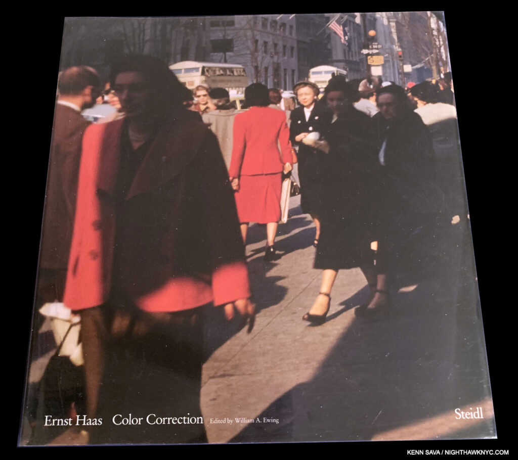
Ernst Haas, Color Correction, Steidl, 2011
An enormous shock, Color Correction, stood to “correct” the incomplete picture of Ernst Haas’ ground-breaking color work. Ground-breaking? It was Ernst Haas, and NOT William Eggleston who received the first one-woman or one-man solo show of color Photography at MoMA! Since that show, Mr. Haas’ more commercial work solidified an image of his work being technically excellent, but dry. Color Correction wears its edge on its sleeve, to marvellous effect. A case could be made that is the most essential PhotoBook on this list since Early Color, but for most mainstream Photography lovers or Photographers it may not be their cup of tea. It certainly is mine, and the esteem I hold it in is unmatched when I think of the few other PhotoBooks that I can compare it to, like Aaron Suskind: 100 (though black & white).
Out of print and now VERY expensive, the “Early Color rule” applies here as well- wait for another Steidl reprint. I heard rumors of just that, but then, out of nowhere, Ernst Haas: Abstract appeared last year from Prestel containing a recreation of a slideshow of personal work Mr. Haas created. I’m still betting Color Correction will eventually see another printing.
My piece naming Ernst Haas: New York in Color, 1952-62 (the period Saul Leiter owned), a NoteWorthy PhotoBook of 2020 is here.

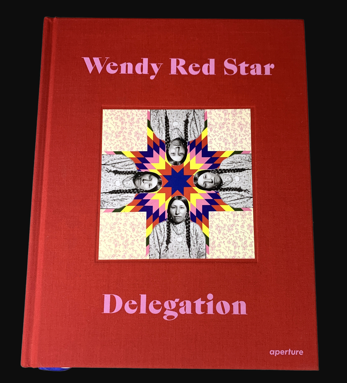
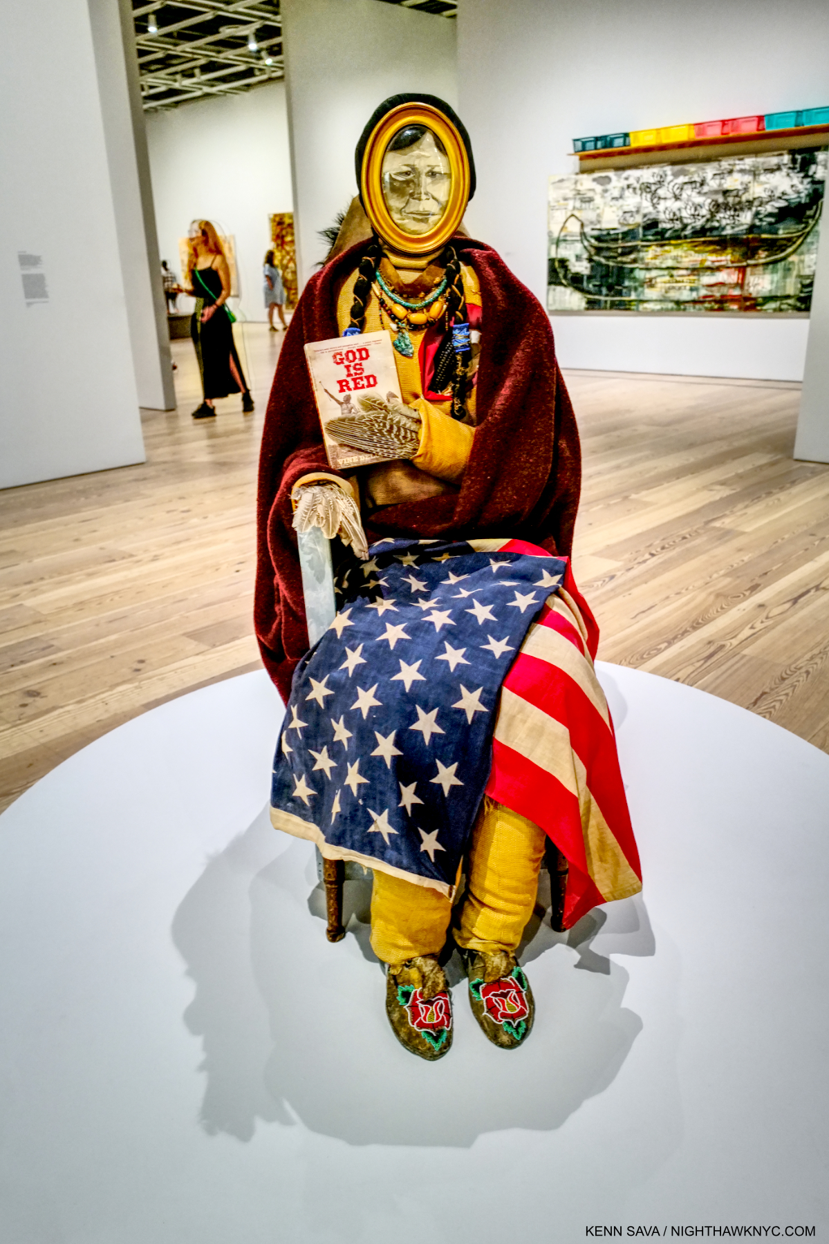
Wendy Red Star, Delegation, Aperture, 2022
“PhotoBook” is too small a category for Delegation because Wendy Red Star is much more than a Photographer (like some others on this list are). I think it’s a great thing that Aperture, the world-leading Photography crusader, decided to include the full scope of her work in what is a ground-breaking book. The first “PhotoBook” from a major Photography publisher on an Indigenous Artist/Photographer is something that is long overdue. Delegation is destined to be more than a landmark in that sense, it’s an eye-opening, no-holds-barred look at history from the side of those who haven’t been given a voice to write it thus far (like Kent Monkman, who I featured in NoteWorthy Art Books of the 21st Century).
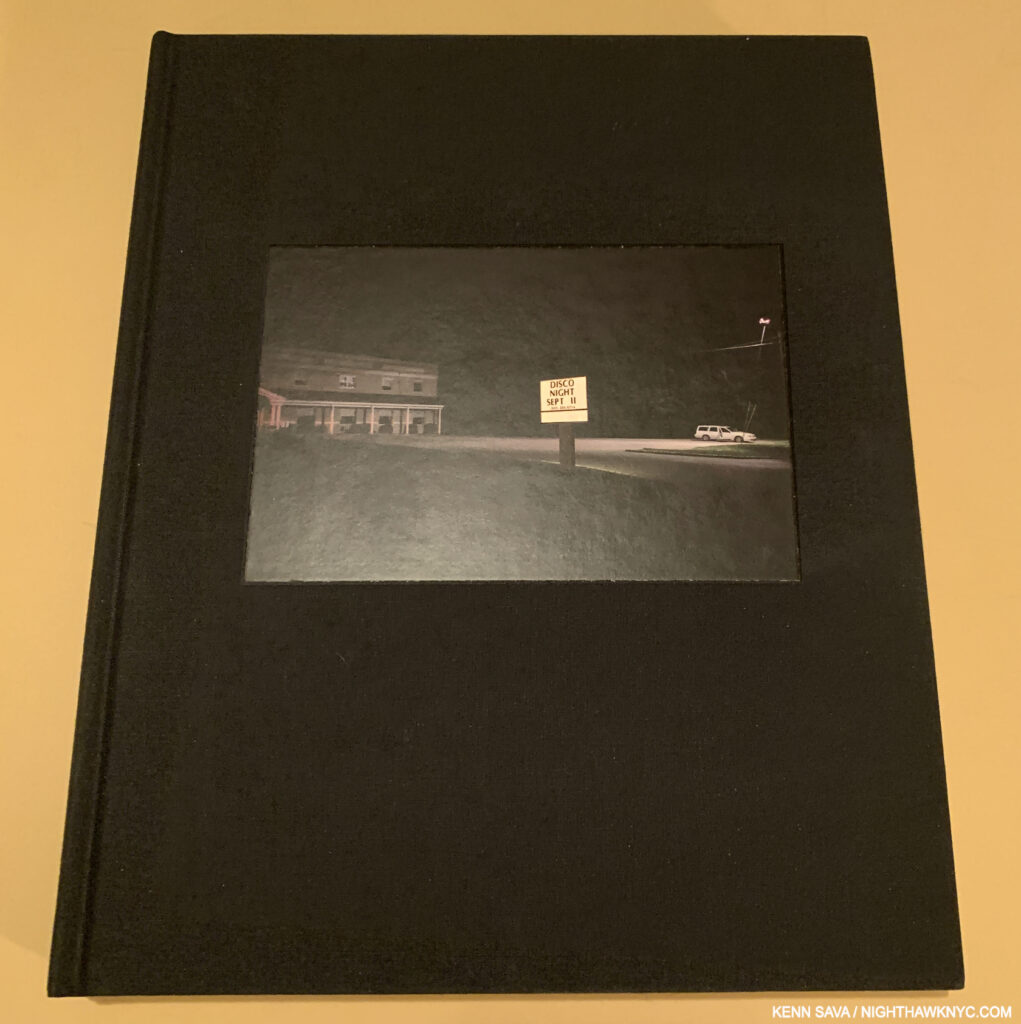
The classic cover Photo, with the sign that apparently gave the book its title, sums up perfectly the dual threads of the images inside.
Peter van Agtmael, Disco Night Sept 11, Red Hood Editions, 2014
The first of Peter van Agtmael’s fine PhotoBooks, Disco Night Sept 11’s generous 276 pages revealed something we’ve come to know well about Mr. van Agtmaels’s work- a penchant for being in the right place for poignant and powerful Photos that cast a piercing eye on humanity in revealing, and sometimes, even decisive, momenta. An important witness to so much history this past decade, Disco Night juxtaposes scenes from the wars the U.S. fought in Iraq and Afghanistan from 2006 to 2013 with scenes from life at home. Each page brings unexpected, often chilling, moments that either just happened, or literally unfold before our eyes across numerous gatefolds. Accompanied by text that fills in some of the gaps, a decade on, Disco Night has lost none of its power. Today it stands as the most compelling record of this fractured era in U.S. history. Something Mr. van Agtmael has continued to document in a series of powerful PhotoBooks released this past decade.
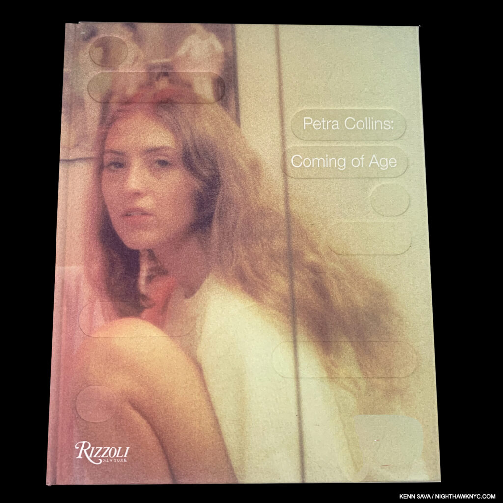
Petra Collins, Coming of Age, Rizzoli, 2017
I’ll long remember two incredibly long lines I’ve stood in: first, for the signing at the NYC book release of Petra Collins’ Coming of Age, and the second for her signing of Fairy Tales, her book with Alexa Demie. WOW! Both felt like we were camped there. (For Fairy Tales, though the store closed at 8pm. I was told they stayed open until 11pm to accommodate all those waiting! Unheard of.) When I finally got inside the actual store, I realized why. Petra was having a moment with each and every person in line! I was shocked. Who does that? In all my years of going to signings, I’d never seen an Artist do that. And not one single person was heard complaining about the wait.
Coming of Age seemed to launch a whole stream of PhotoBooks by new women Photographers that began to bring some balance to a male dominated field. While I admire her eye and skill as well as her originality, I was also taken by how comfortable she made, and continues to make, her subjects feel- that’s why I mentioned my standing in line experiences. I believe that leads to a good bit of the freshness of her work. I’m not one bit surprised Petra Collins has become as successful as she has. Frankly, I had a feeling it was going to happen the first time I opened Coming of Age.
My piece naming Coming of Age a Noteworthy PhotoBook of 2018 is here. My piece naming her second book, Miert Vage Te, Ha Lehetsz en is? or Why be u, when u can be me?, a NoteWorthy PhotoBook of 2019 is here. My look at the Music Video she directed for Olivia Rodrigo’s “Brutal” is here.
Christian Patterson, Redheaded Peckerwood, Mack Books, 2011
A sensation when it was released, Christian Patterson’s debut book still feels fresh, innovative and chilling. Its subjects, the teen murderers Charles Starkweather and Carol Ann Fugate, and their 1958 3-day murder spree has spawned a number of Films, including Badlands, 1973. For me it’s Peckerwood’s images that linger in the mind longest, like the wire photo of the duo on the cover. The viewer is often left to wonder what the connection is between the images and the “story,” or if there is one. This is compounded by the extraordinary depth of the Artist’s involvement in his project that he actually uncovered related materials that he presents here for the first time.
Calling Redheaded Peckerwood a “unique book” doesn’t sum it up. It’s a book that breaks any number of boxes, categories and boundaries, not the least of which is what the possibilities are for a PhotoBook. Mysterious and horrifyingly vivid, like Stanley Kubrick’s The Shining, or the work of David Lynch, much of the horror is in the mind. Designed by the Artist, Redheaded Peckerwood raised the bar quite high for PhotoBooks, and the Aritst’s subsequent work.
Copies of this very rare book currently change hands for $300., and up.

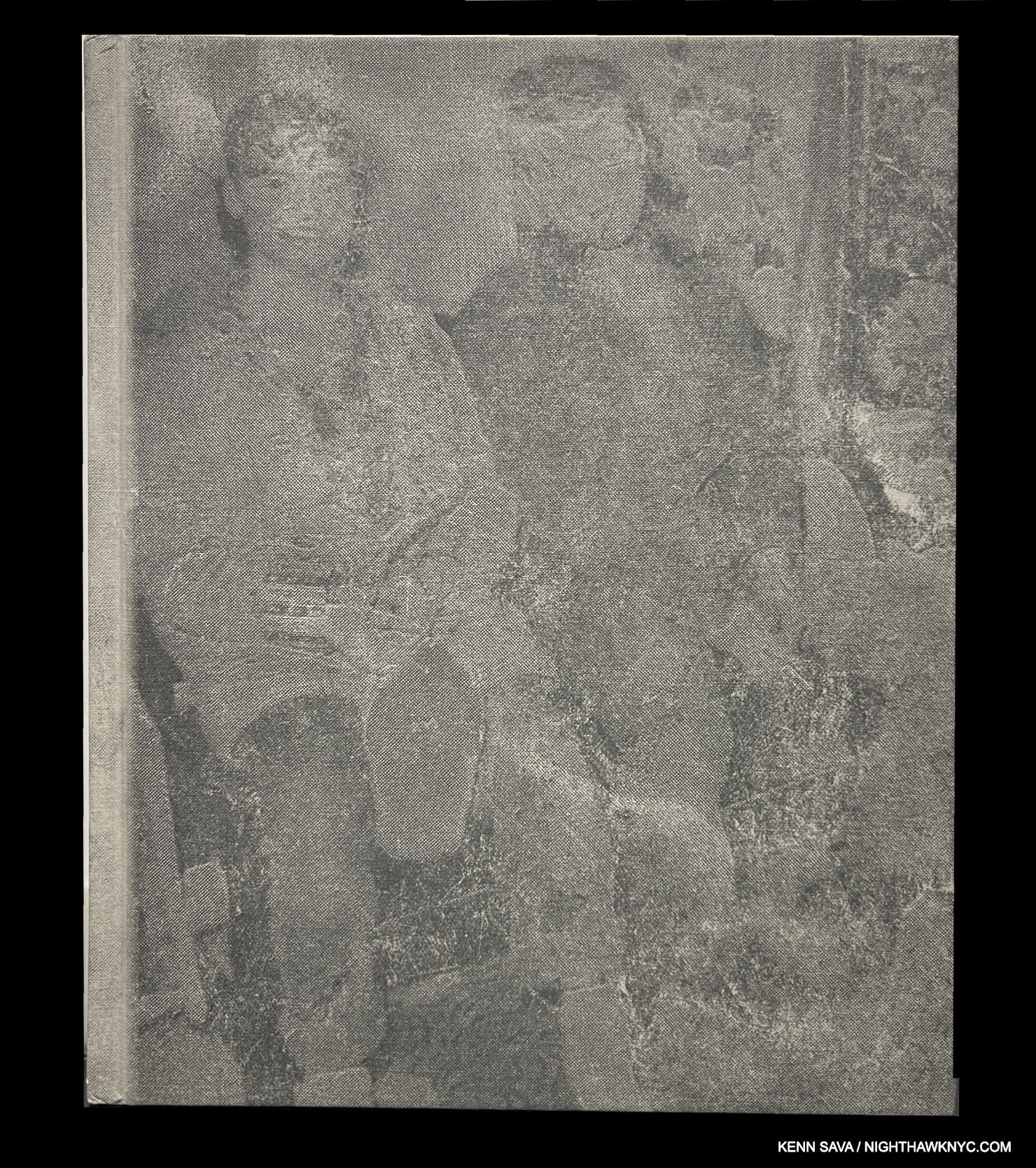
Taryn Simon, Taryn Simon: The Innocents – Revised & Expanded Edition, Museum of Modern Art, 2022
Taryn Simon has released a steady stream of important and challenging PhotoBooks, and this is one that strikes a bit of a dual nerve. Depicting people who served time for violent crimes they did not commit, it serves to bring attention to these victims (how many books have done that?), while also serving to put the viewer on her or his guard. “There, but by grace, go I.” Both editions are stunning and endlessly engrossing, that the 2022 edition is TRIPLE in size (at 440 pages, versus 148 page in the 1st edition) hints at just how big the problem is. The Innocents is a book that was crying out for someone to do (individual stories have been done). We can thank our lucky stars that someone was Taryn Simon, whose gifts with unifying diverse materials has been manifested time and again, never more powerfully, to my eyes, than in The Innocents.
A copy of the 2004 Steidl first edition/first printing.
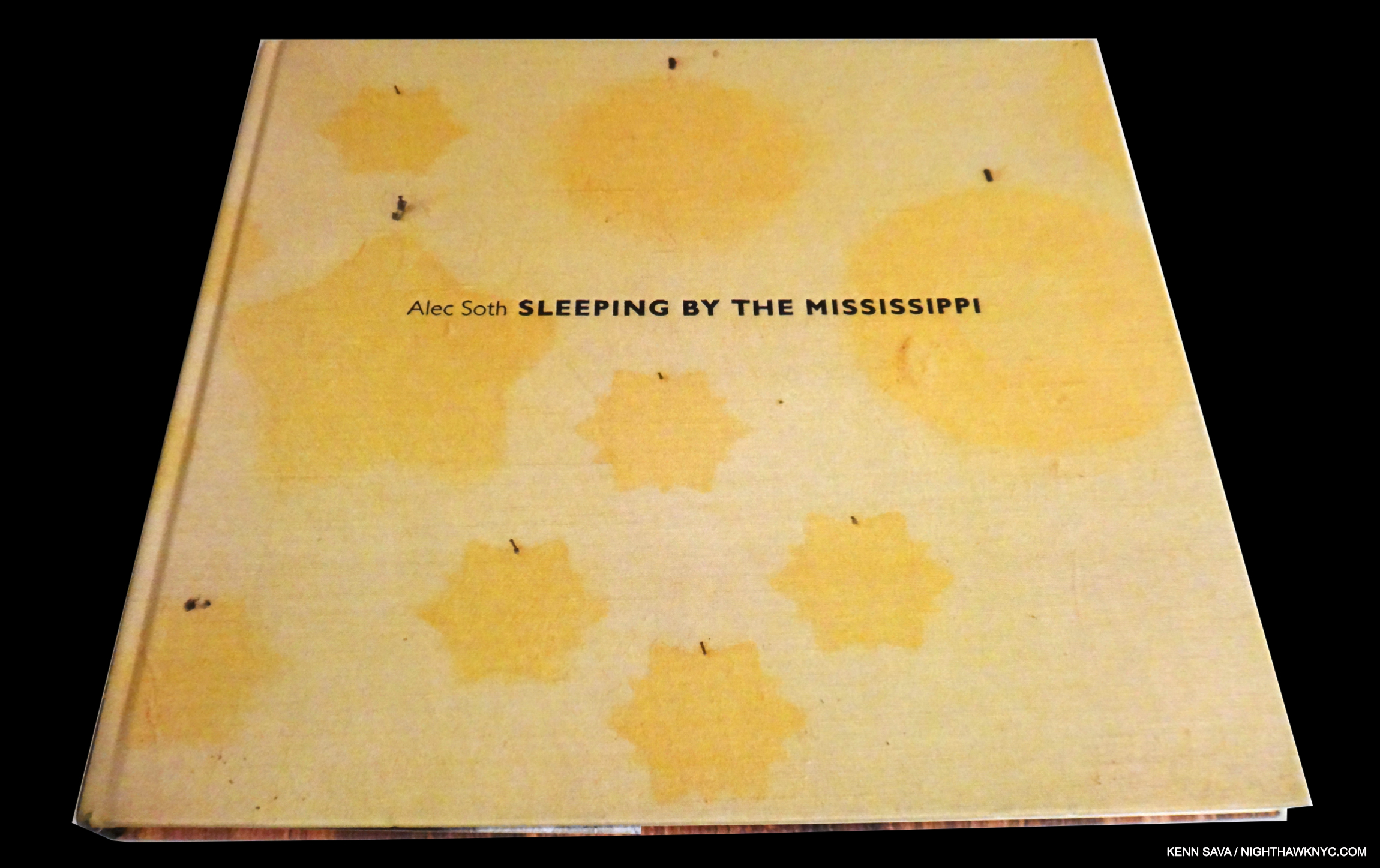
Alec Soth, Sleeping by the Mississippi, Steidl, 2004
The many comparisons to Robert Frank’s The Americans Sleeping by the Mississippi has gotten seem to me to sell Alec Soth’s book, and his accomplishment, short. Yes, they both are the product of road trips, and I have no doubt that Mr. Soth, a well-known PhotoBook aficionado, well knew The Americans at that point, but the freshness of both his approach and the resulting work speak for themselves, in my view. Mr. Soth’s essential book was out of print for a number of years after 3 Steidl printings until Mack Books printed a new edition, which is still available.
My look at Alec Soth’s show accompanying his 2022 book A Pound of Pictures is here.
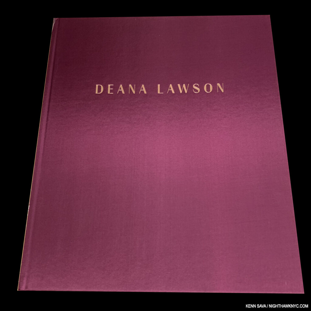
Deana Lawson, Deana Lawson: An Aperture Monograph, Aperture, 2018
It’s hard to imagine that Deana Lawson’s Aperture Monograph is just 6 years and 3 months old. It feels like she’s been an established fixture as a major Photographer for much longer. Her unique Portraits quickly became all the rage when this beautifully produced book came out, leading to almost immediate museum acceptance, building on her “starring” appearance in the 2017 Whitney Biennial in a large gallery where her work was shown alongside that of her friend, Henry Taylor, to unforgettable effect. Only one book of her work has been published since, that accompanying her 2021 show at the ICA/Boston. I wonder if publishers feel An Aperture Monograph is hard to top.
After the first printing sold out, Aperture has kept it in print since, so, right now, there is no reason to pay big prices for a copy.
My look at “Deana Lawson’s Rising Star,” as I called it in 2018, is here.

Published by at least 3 houses that I know of, this is the Aperture edition, the most readily available one in the U.S. Or, it was. The Aperture is in English, the language varies between the others, but so does the printing quality of the images.
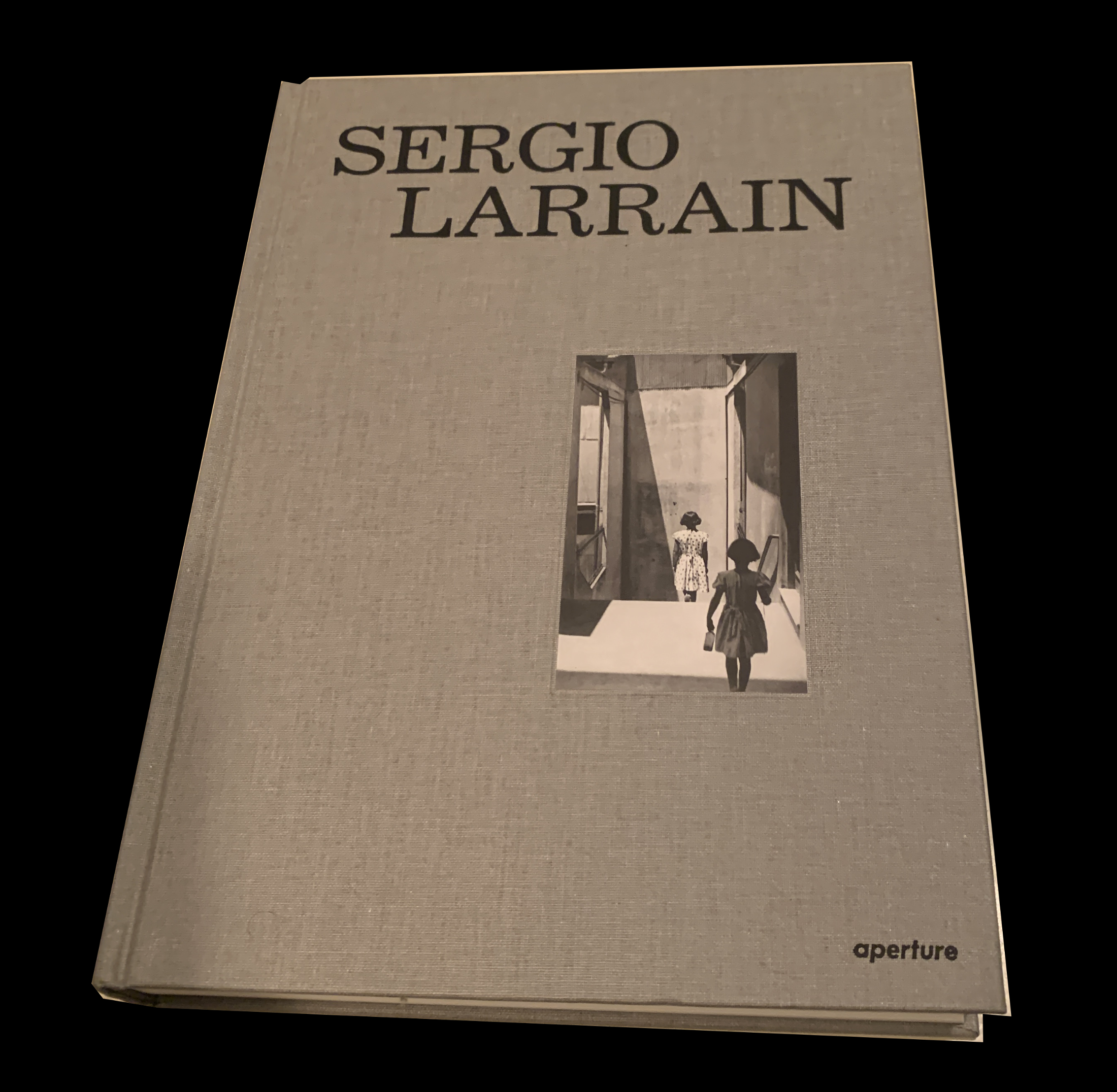
Sergio Larrain, Sergio Larrain, Aperture, or Hatje Cantz or Aetelier EXB, 2014
The most comprehensive book to date (200 images) on the work of this most haunting Chilean Photographer. It seems to me that Mr. Larrain’s work is striking for his gift with perspective. His camera’s location provides a good deal of the interest in his images, as he continually finds just the right, often unexpected, angle. The remarkable thing abut this is that it somehow also manages to provide a good deal of poignancy to his images. Struck by this, I find myself ofter looking back at them and wondering how he was able to accomplish this in work that appears so charmingly straightforward, seemingly without guile or tricks. A testament to the “old days” of Photography before the kind of manipulation that has overrun Photography today. More than anything, though, it’s a testament to the skill of this overlooked Artist. An invaluable lesson for students, or anyone trying to get better (i.e. the rest of us).
Also excellent are his Londres 1959 and Valparaiso, both reissued in fine Aperture editions, but Sergio Larrain is my choice as a NoteWorthy PhotoBook of the 21st Century thus far.
A masterpiece. Very hard to find now, it’s worth looking for.
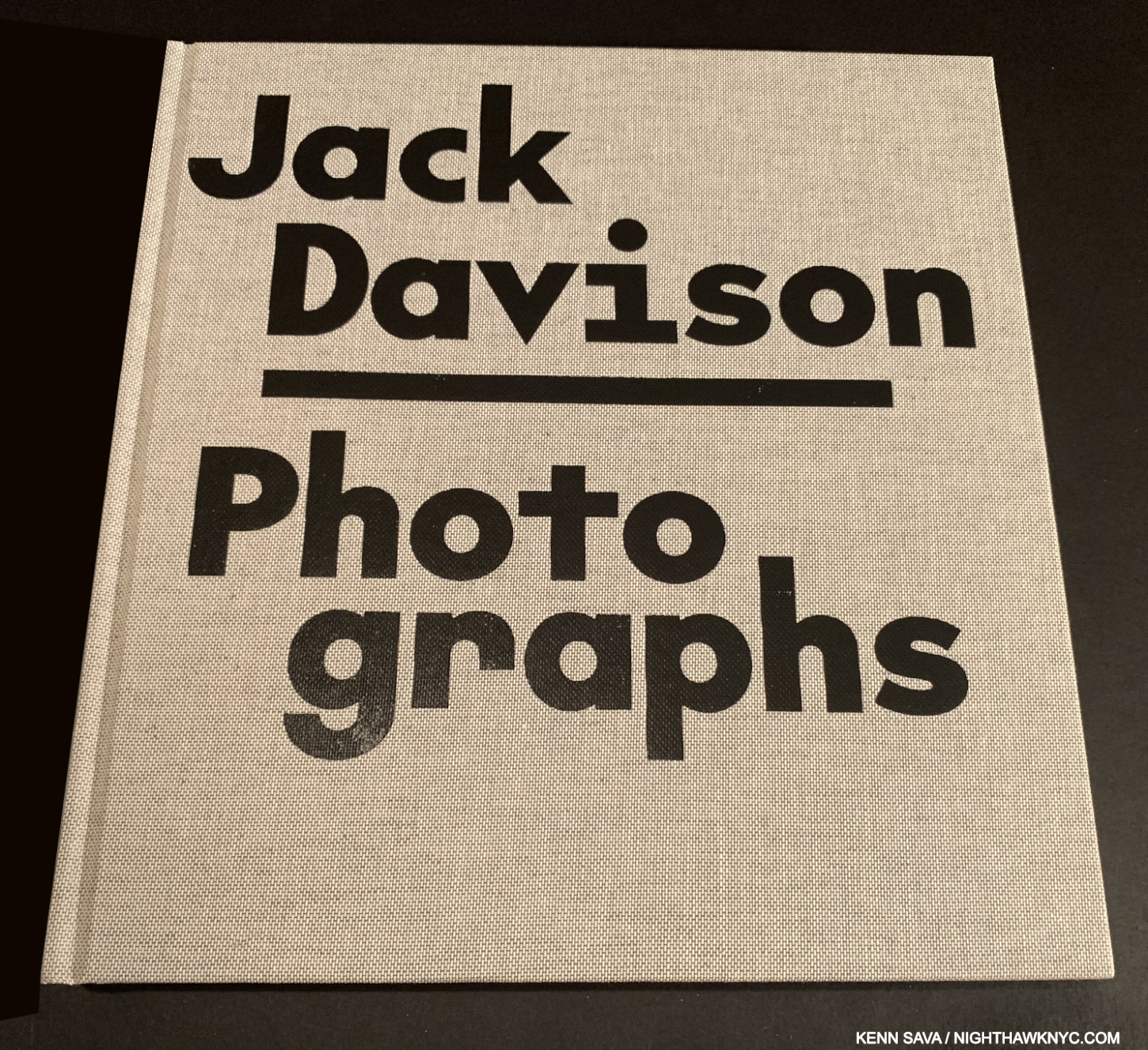
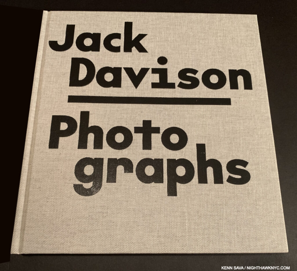
Jack Davison, Jack Davison: Photographs, Loose Joints, 2019
It’s dangerous to use superlatives, but it’s hard to not use them when speaking of Jack Davison: Photographs (one of my NoteWorhty PhotoBooks of 2019). The one book that keeps going to mind when I think of it is (gasp) Saul Leiter: Early Color, a book I have endless respect for. Both books are concise, extremely well selected and arranged and marked by design that knows enough to just stay out of the way. Mr Davison is, perhaps, most familiar from his numerous Portraits in the New York Times Magazine, so I, and countless others, owe a debt of gratitude to the Magazine’s stellar Photo Editor, Kathy Ryan, for introducing us to him (and many others). His book shows his range, and the depth of it. Every subject he turns his eye and his lends to appears to be something you’ve never seen before- even if it’s the most common of everyday objects. His skill is the stuff that computers, AI and LIDAR might be jealous of, but it always reminds me of just what a camera can do in the hands of an Artist.
Long out of print, it’s a seller’s market for VG to NF copies.
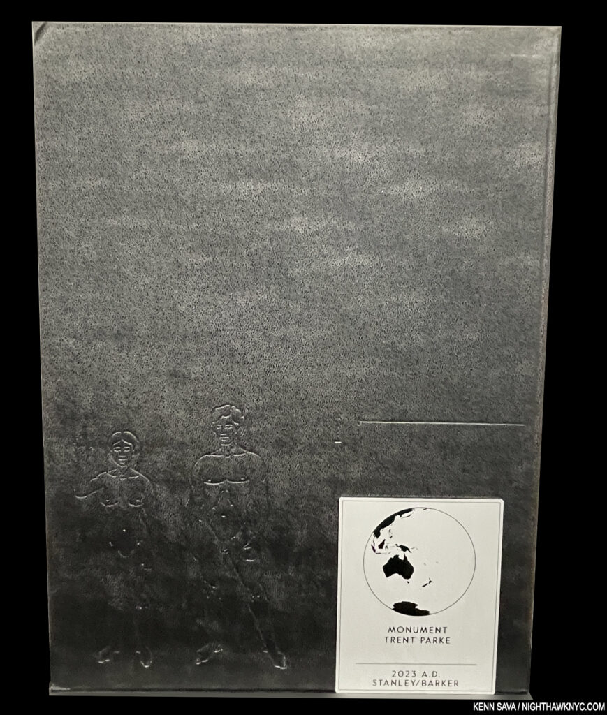
Trent Parke, Monument, Stanley Barker, 2023
There are no words for me to express to you how amazing this book is, and that’s fitting because Trent Parke chose to include no words in the book! Hang on to that unattached metal name plate that comes with it, or you might not remember what book it is. So, leave it to the publisher to chime in, “Trent Parke’s landmark publication Monument is a portal through which we bear witness to the disintegration of the universe over 294 expertly printed pages.” “Expertly printed pages,” indeed. The printing and paper are GORGEOUS. Black & white may look as good elsewhere (as in Dave Heath’s or Roy DeCarava’s work), but it’s never looked better. Everyone involved seems to know they were in on something very special, and that’s what the end result is. Aptly titled, it’s a monument to Mr. Parke’s creative vision, long-exposure wizardry, and life in this century. 3 printings have sold out, so beg, borrow or, umm… ask nicely, to see it.
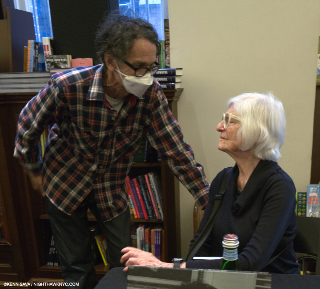
Rosalind Fox Solomon, seated, with Paul Graham at a Mack Books event, May 13, 2023.
Rosalind Fox Solomon, Liberty Theater, Mack Books, 2018
I stand by what I wrote about Liberty Theater when I named it a NoteWorthy PhotoBook of 2018, here– “Something of a marvel, Liberty Theater is a book that consists of a body of work decades in the making, this one is special. Culled from 400 Photographs taken in the 1970s, 80s and 90s, across the south, these 77 show a wide range of glimpses into the complex issues of race and racism, class and gender divisions that could be pivotal moments from 77 films that each stand on their own while provoking a world of feelings and reactions. Except comfort. The title speaks to a performance, and her website says the images are “poised between act and reenactment…” Now 88 (about 95 in 2025), Rosalind Fox Solomon, who like Diane Arbus, studied with Lisette Model in the 1970s, shares something of Ms. Arbus’ mystery and power in images that demand repeat viewing, here, in a tightly edited volume that quietly stuns as often as it shocks, aided by yet another powerful essay by Stanley Wolukau-Wanambwa, who’s first PhotoBook also appears on this list.”
Rosalind Fox Solomon remains an Artist who is somewhat overlooked in spite of a steady stream of fine books published by Mack. This one remains my favorite.
Out of print, VG copies begin at $150.
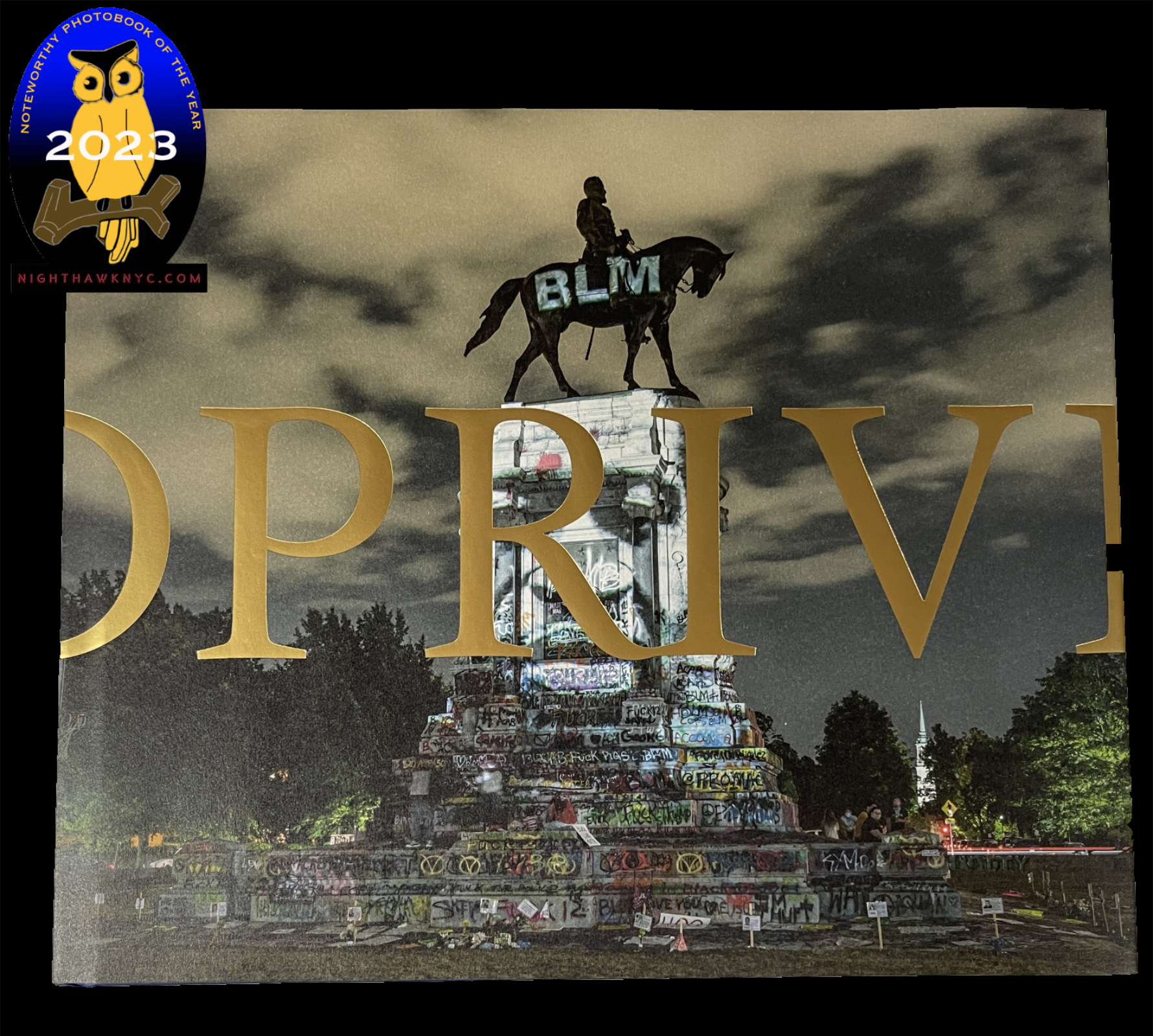
Privileged Mediocrity with its NoteWorthy PhotoBook of 2023 designation.
Kris Graves, Privileged Mediocrity, Kris Graves Projects & Hatje Cantz, 2023
Driving around endlessly visiting innumerable poignant sites and Photographing during the worst world-wide pandemic in 100 years, in the middle of more unrest than we’ve seen since the 1960s? Neither stopped Kris Graves from producing a book that is a masterpiece, in my view. Wonderfully designed by Caleb Cain Marcus, it’s a book that covers so much ground- literally and figuratively, it’s hard to sum up. Emotionally it ranges from powerful to raw to contemplative, while including some of the most defining images of the time. In fact, National Geographic chose one as it Photos of the Year cover image. Robert Frank’s The Americans started the Modern & Contemporary Photography era, to my mind. I can’t help wonder if Privileged Mediocrity is a cap on it.
My piece naming this a NoteWorthy PhotoBook of 2023 is here. My other pieces on Kris Graves are here.

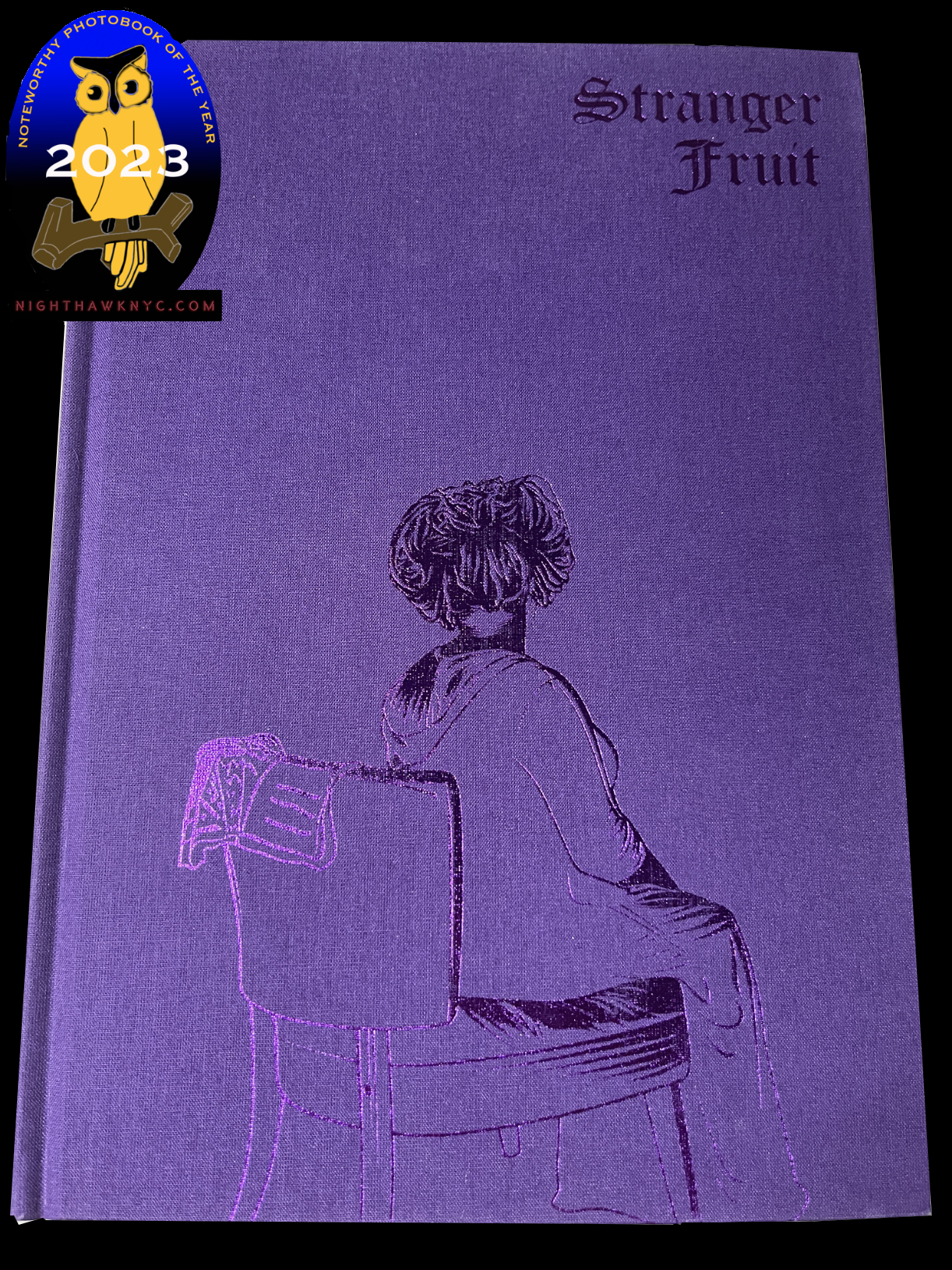
Stranger Fruit with its NoteWorthy PhotoBook of 2023 designation.
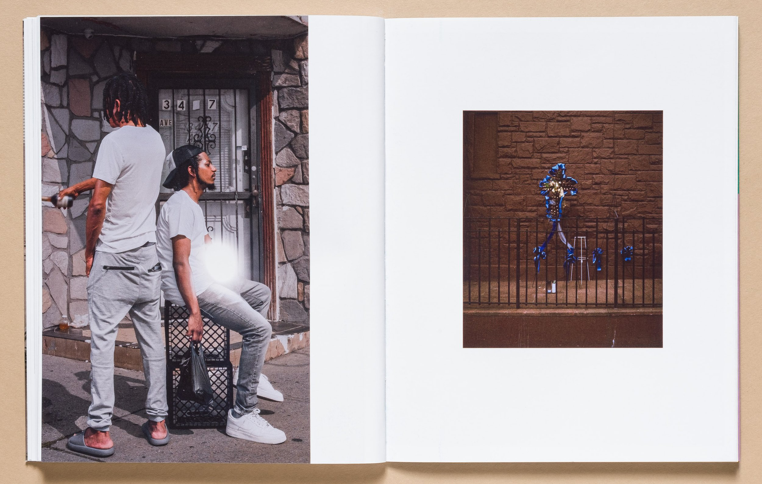
Jon Henry, Stranger Fruit, Kris Graves Projects, 2023
A book whose power is just overwhelming. During my first viewing of Stranger Fruit, I felt the echo of Michelangelo’s Pieta and a number of pieces by Caravaggio. I can’t say either have come to my mind previously when I’ve perused a PhotoBook. After some years without one, Stranger Fruit was the second PhotoBook released in 2023 I consider a masterpiece. Both were published by Kris Graves Projects. ‘Nuff said.
My piece naming Stranger Fruit a NoteWorthy PhotoBook of 2024 is here. Note- Both Privileged Mediocrity and Stranger Fruit feature NoteWorthy design by Caleb Cain Marcus of Luminosity Lab.
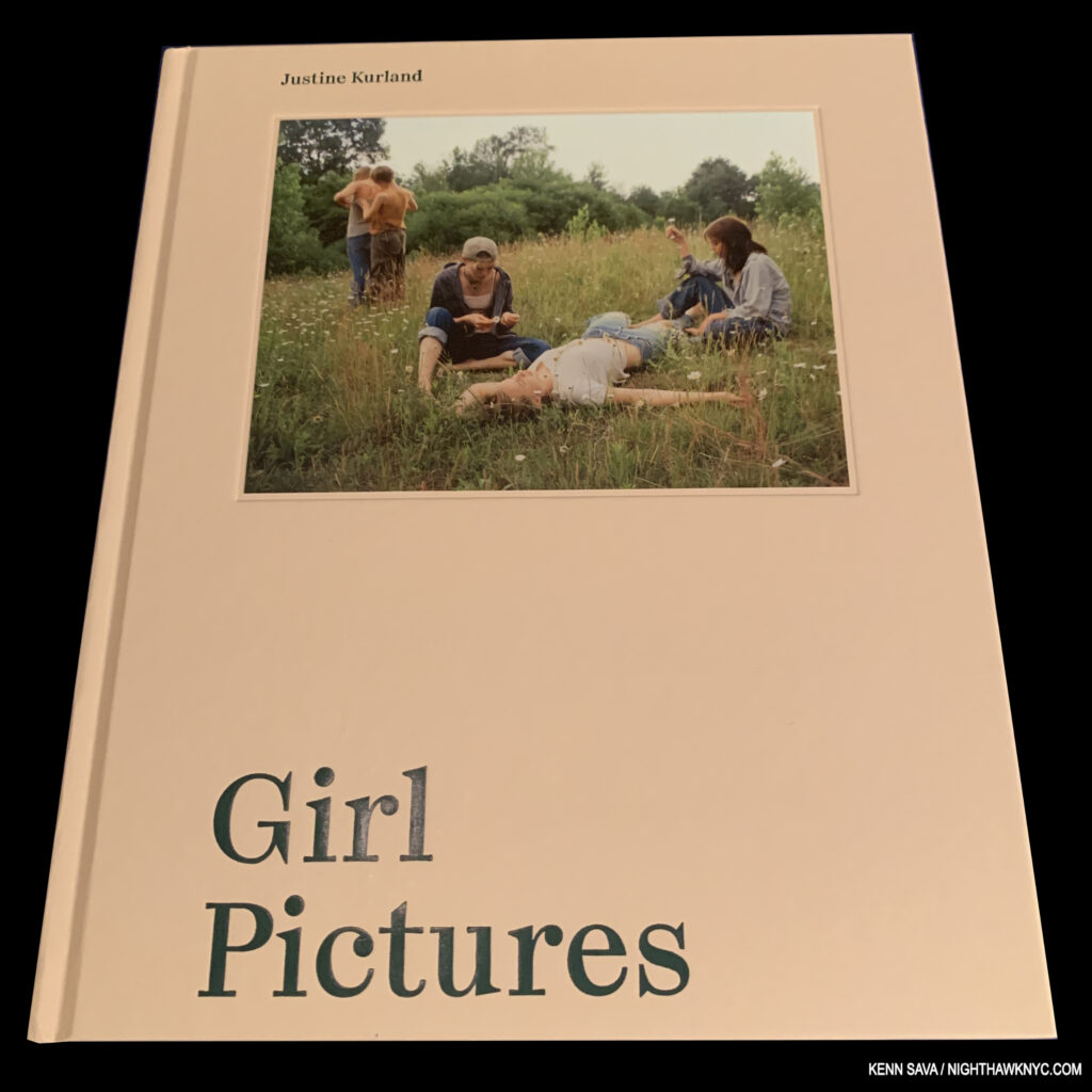
Justine Kurland, Girl Pictures, Aperture, 2020
Countless others have lauded this book, and I added my 1 cent to that chorus naming it a NoteWorthy PhotoBook of 2020. Since the dark days of the peak of the pandemic, it’s a book that’s stayed in the mind, and something of a benchmark for any number of books that have come since, seemingingly under its influence to a lesser or greater extent.

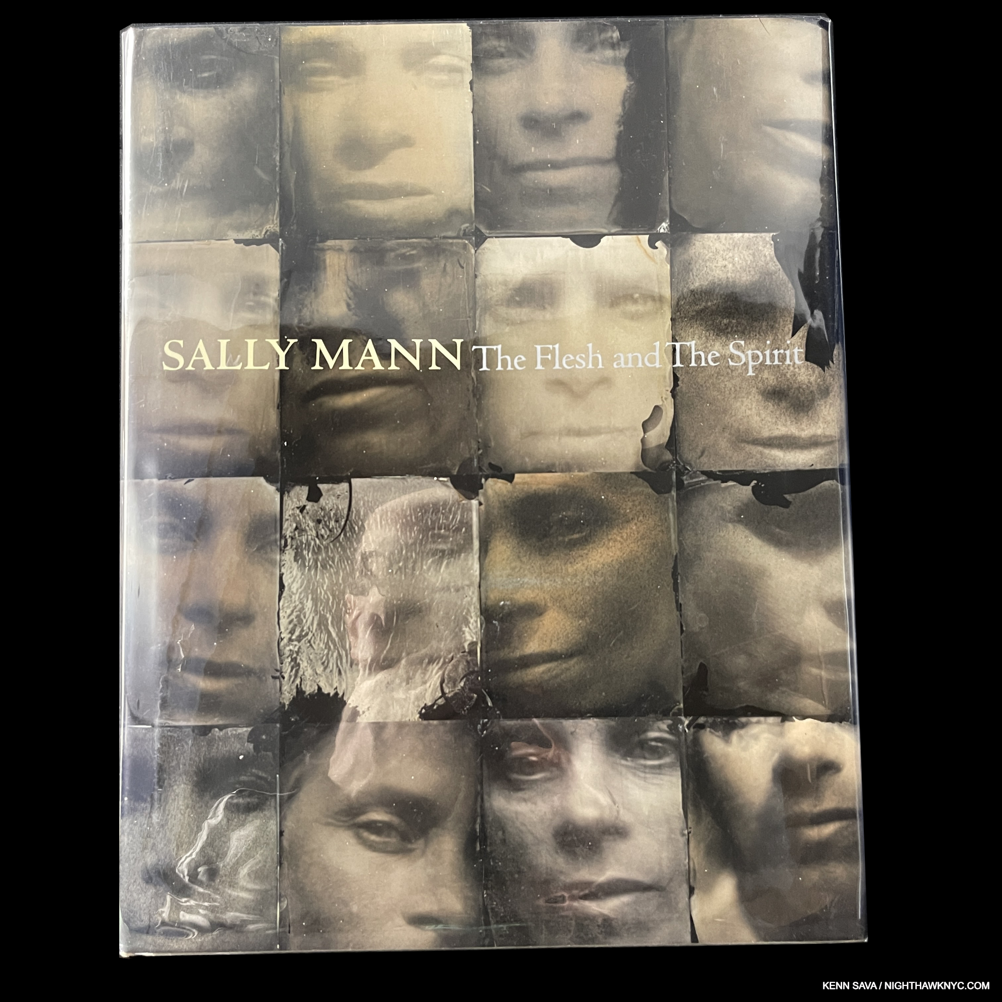
Sally Mann, Sally Mann: The Spirit and The Flesh, Aperture/Virginia Museum of the Arts, 2010 and
Hold Still, Little, Brown, 2015
An absolutely gorgeous book, the first Retrospective of the work of Sally Mann covers all the many bases of her career. Even if you have some of her other books, you’ll see work here you probably haven’t seen before. The effect of her work borders on “Painterly” for me as the Artist deftly blends a unique “classic” look that her Cibrachromes and collodion wet-plate process provide with contemporary, and cutting-edge, sensibility. An essential contemporary PhotoBook.
Though out of print, very good copies are still to be found reasonably.
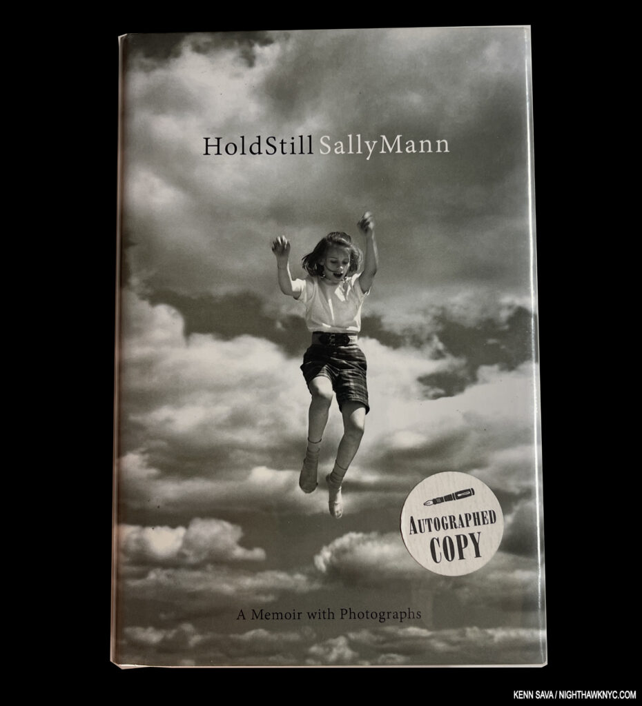
Sally’s Autobiography, Hold Still, is one of the most compelling autobiographies written by an Artist this century. A finalist for the National Book Award, it’s full of life-lessons that are particularly relevant for up and coming Artists, particularly women. “Standing on the shoulders of giants,” is a phrase I hear appiied to great Artists of the past. Here, you get to stand on those of a living legend.
By the way, I have a Signed first edition copies of each of these books currently available. Contact me for info.
Michael Christopher Brown, Libyan Sugar, Twin Palms, 2016
I still shake my head over the fact that Mr. Brown shot this entire book on his cellphone at a time when cellphone cameras were not all that advanced. Though the only “negative” side effect of this is that the Photos are reproduced at a smaller size because of their small file size, the results don’t look like cellphone Photos at all. Instead, we get a crystal-clear picture of just what was going on in the 2011 Libyan Revolution as we witness Mr. Brown “go to war” for the first time. The Photos are accompanied by a running series of texts, emails, social media posts that turn Libyan Sugar into a diary of sorts. This framework, along with excellent image selection & sequencing, makes Libyan Sugar a powerful whole. Still available at reasonable prices, get it while you can.

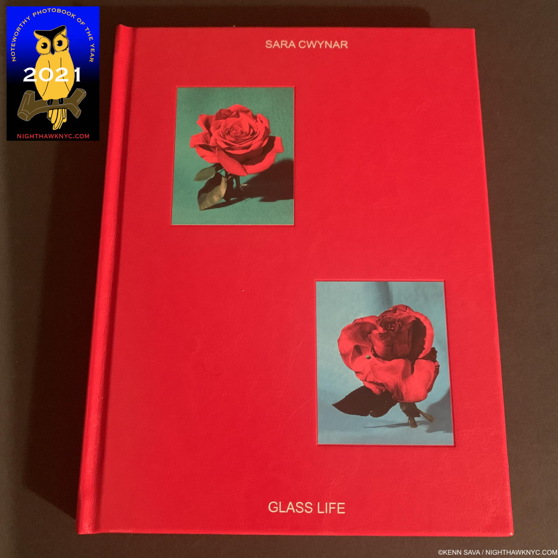
Sara Cwynar, Glass Life, Aperture, 2021
Two PhotoBooks and an exhibition catalog into it, Sara Cwynar is on her way to creating one of the most unique bodies of PhotoBooks I’ve seen. While only a few saw Sara’s Kitch Encyclopedia: A Survey of Unusual Knowledge, Glass Life has received wide distribution thanks to it being published by Aperture. Its riotous color may seduce the eye on first glance, it’s the depth of its content occupies the mind as it lingers, where color masks the seductive power at work in consumer culture. One of the most well-designed books on this list, like Kitch Encyclopedia, it’s an extremely well thought-out and realized book. Still in print, it’s not to be missed.
My piece naming Glass Life a NoteWorthy PhotoBook of 2021 is here.
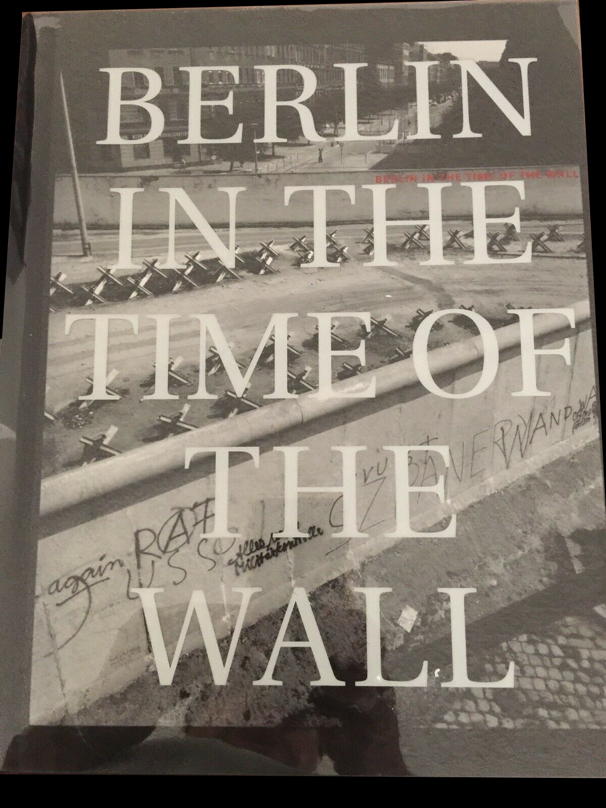
John Gossage, Berlin in the Time of the Wall, Stephen Daiter Contemporary, 2004 and its companion book, Putting Back the Wall, Loosefire Editions, 2007
It seems to me that not that many people know about these books, particularly Berlin in the Time of the Wall, and some who do have expressed disappointment in it. Perhaps, they wanted to see crowds of people tearing down the Wall? I don’t know. Well, there are no crowds here (besides, others have done that). What we have here is a masterful meditation on just what the title says- Berlin at the time. When I first saw Berlin, I was immediately taken by the Art of it, and that drew me back to look again and again at everything else these Photographs reveal, and hide. First seeing it in 2020, I couldn’t help but think about how much of the feeling Mr. Gossage’s book gave me was echoed right then around me in the deserted Manhattan during lockdown (which I documented here), of course with major differences. Mr. Gossage has released a string of very fine books published by Steidl over the past decade. Berlin in the Time of the Wall (and its companion, Putting Back the Wall), remain my favorites, and the two I most highly recommend.
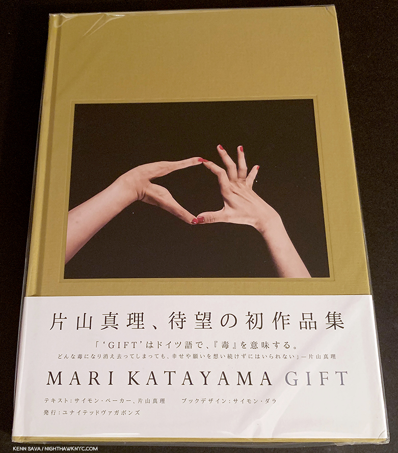
Mari Katayama, Gift, United Vagabonds, 2019
I’m embarrassed to say that, as far as I know, Mari Katayam is the only disabled Artist on this list. Maybe I haven’t looked hard enough? Maybe there’s not enough disabled Artists & Photographers who get the chance to made a book? Maybe the answer lies in the middle.
Her site says- “Suffering from congenital tibial hemimelia, Katayama had both legs amputated at age of 9. Since then, she has created numerous self-portrait photography together with embroidered objects and decorated prosthesis, using her own body as a living sculpture. Her belief is that tracing herself connects with other people and her everyday life can be also connected with the society and the world, just like the patchwork made with threads and a needle by stitching borders.” Including Gift as one of my NoteWorthy PhotoBooks of 2019, I wrote– “While we live in a time that’s supposedly about inclusion, particularly in the Arts, why do so few disabled Artists reach the larger public?” SIX YEARS later, not much has changed!

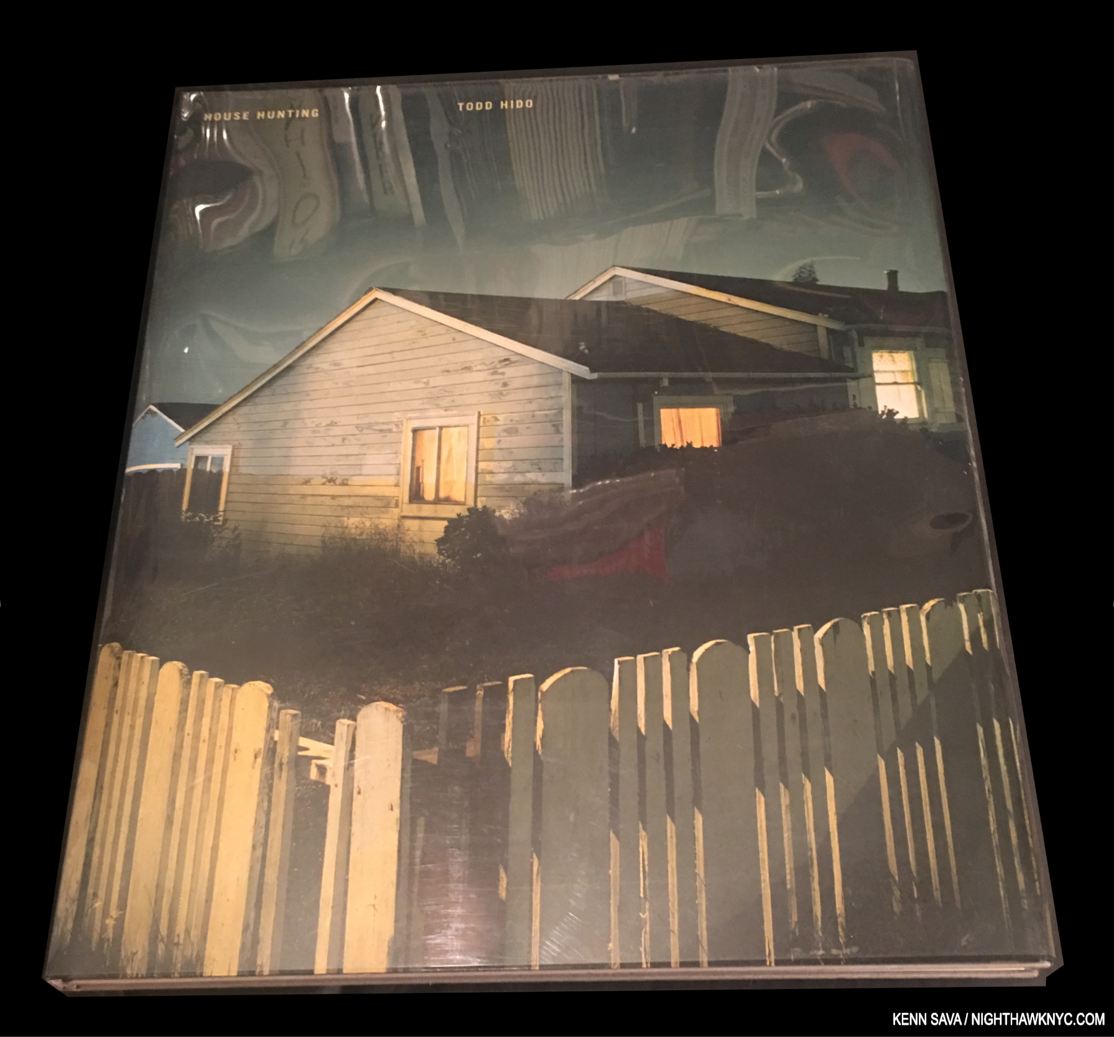
A rare first edition copy.
Todd Hido, House Hunting, Nazraeli Press, 2001
Perhaps in the tradition of Robert Adams’ Summer Nights, Walking, House Hunting struck a nerve with both viewers and Photographers. Its popularity has continued unabated for virtually the entire century thus far, seeing the book go out of print, then reprinted to popular acclaim. As a night owl, it was a de-facto purchase for yours truly and a book I continue to relate to, even though there are no “houses” anywhere near me here in Manhattan.
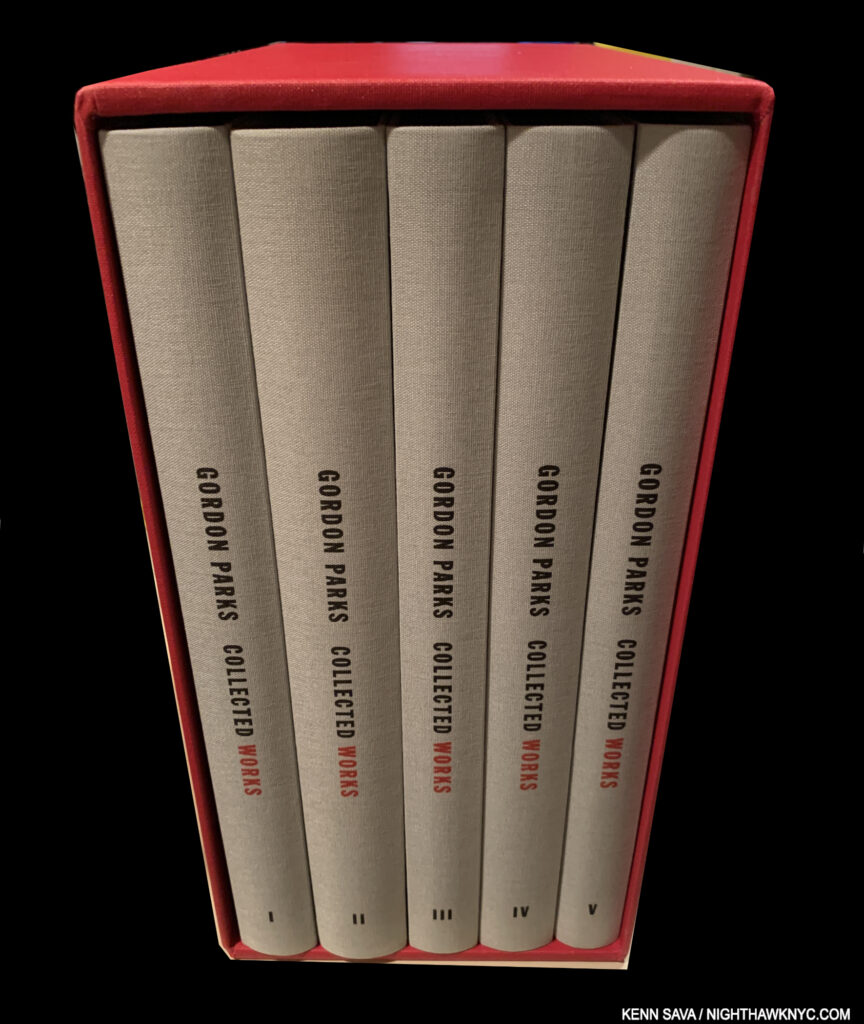
Gordon Parks, Collected Works, Steidl
The key publication among the excellent series of books on Gordon Parks’ work published by his Foundation and Stedil this century. You can make a very good case for a number of the other individual books being on this list.
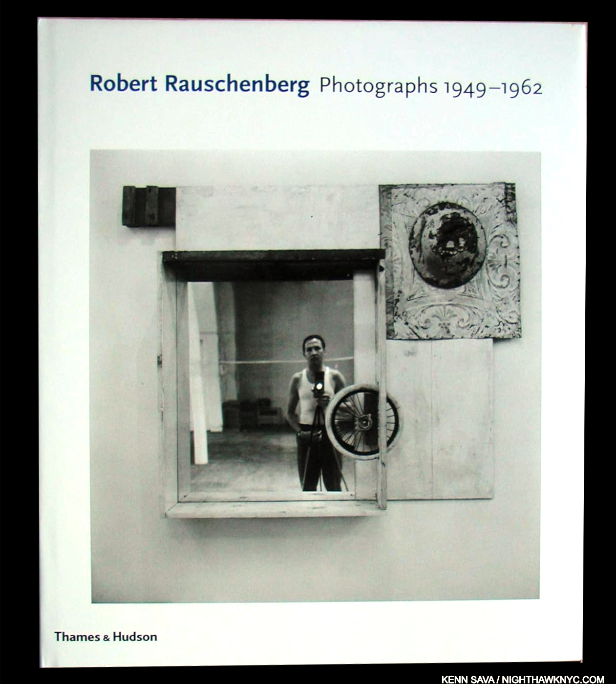
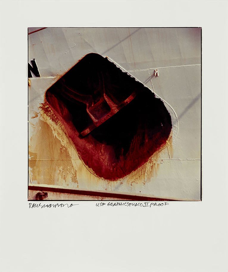
Robert Rauschenberg, Robert Rauschenberg: Photographs, 1949-62, Thames & Hudson, 2011
A long-time admirer of the work of the creative dynamo, I’ve long felt his Photography (like that of any number of other Painters who were, or are, also Photographers) has remained the most overlooked aspected of his work. FINALLY, a book devoted to just that begins to show just how important his Photography was. The only downside about this book for me is that it “only” goes up to 1962! Robert Rauschenberg would continue to work, and take Photographs, for another 46 years! I live in hope that additional volumes will set that right, but in the meantime, this is a great place to start.
My look at the”Summer of Rauschenberg,”as I called the NTC summer of 2017 is here.
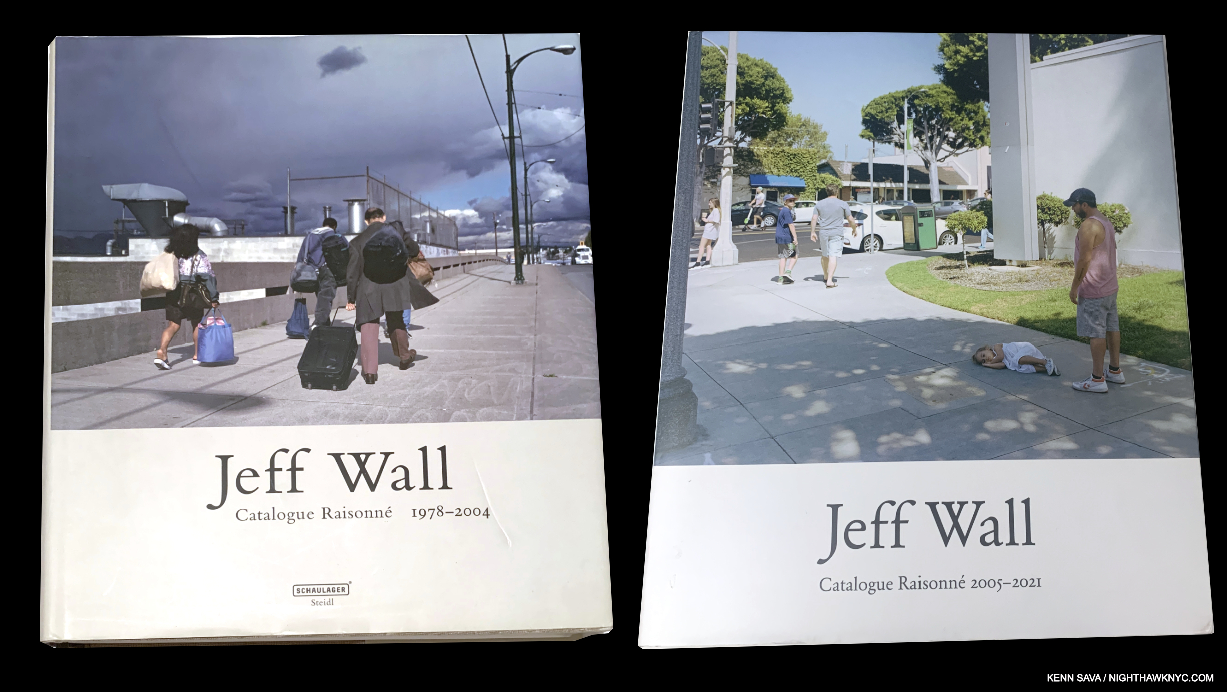
Jeff Wall, Jeff Wall: Catalogue Raisonne, 1978-2004, published in 2005, and
Jeff Wall: Catalogue Raisonne, 2005-21, published in 2022, both Steidl
I admit I was slow to warm to Jeff Wall’s work, until I saw the first volume of his Catalogue Raisonne, which revealed a mystery more often seen in Painting. I’ve been interested since. When I met him in 2019, Mr. Wall told me Volume 2 would be coming. It has, and it’s equally full of mystery, and equally stunning in, largely, the same design, which elegantly and unobtrusively presents the work in excellent fashion. A first-rate Photography Cat Rai, as one would expect from Steidl, comparable to their Ed Ruscha Cat Rai series of 7 volumes, included on my NoteWorthy Art Book list. When I met him, again, in 2024, I saw no signs of his slowing down, and while I didn’t ask him if there would be a Volume 3, I’d bet on it, and I look forward to it.
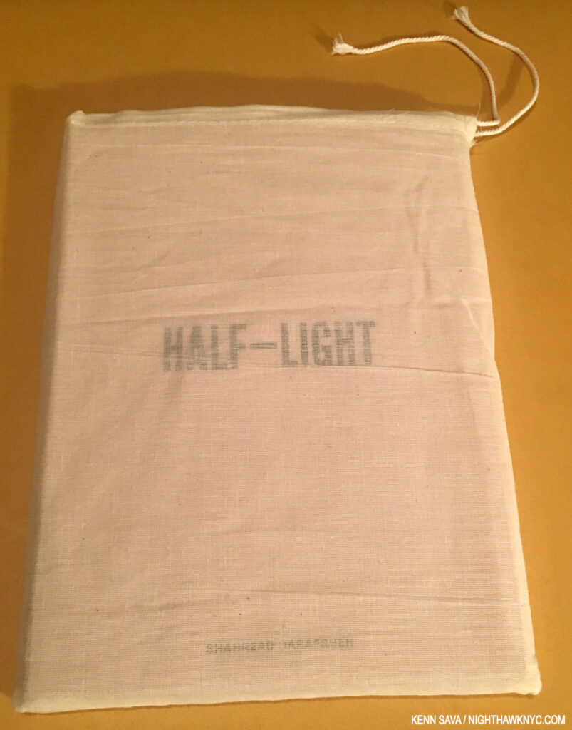
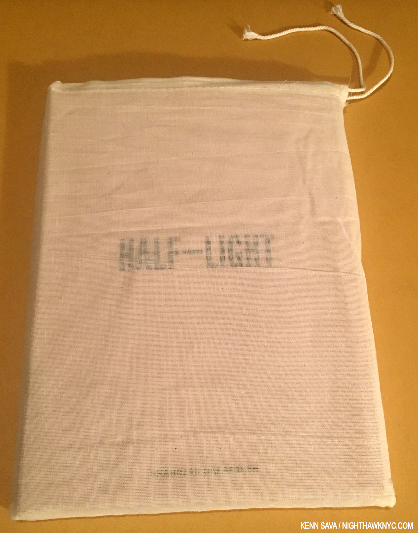
Seen in its bag, which sets the stage for the design inside which includes opaque materials between pages, creating different opacities, while adding to the multiple ways the viewer can “read” the book.
Shahrzad Darafsheh, Half-Light, Gnomic Book, 2018
Not to take one thing away from Shahrzhad Darafsheh’s work, Half-Light strikes me as a veritible miracle of collaboration, the kind of book only an Artist-run PhotoBook publisher could achieve. Remarkably, Gnomic founder and chief, Jason Koxvold (who released his own fine Kinvces in 2017), discovered Shahrzhad’s work online. Being based in Iran made person-to-person collaboarion nearly impossible. Dealing with a devastating cancer diagnosis in her early 30s, the basis for this body of work, made things exponentially more difficult all around.
Mr. Koxvold brought in Photographer/Filmmaker/Educator Shane Rocheleau (who’s equally fine Gnomic book, known as YAMOTFABAATA, was a NoteWorthy PhotoBook of 2018), as a collaborator, completing the team. Along with its Photos that move between poignant and poetic, Half-Light is a model of a brilliantly edited and sequenced PhotoBook, a book that lives in that space where each moment hangs in the air, pregnant with the fear, and hope, for what the next moment might bring. Yet, through it all, there’s a serenity in her work that, in the end, remains the most compelling part for me.
MUCH better than getting a book on my list is that 7 years later, I’m very happy to say, Shahrzad has left cancer behind her! She continues to work and grow as an Artist, and enjoy life with her family.
My Q&A with Shahrzad Darafsheh is here. My piece naming Half-Light a NoteWorthy First PhotoBook of 2018 is here. My Q&A with Shane Rocheleau is here.
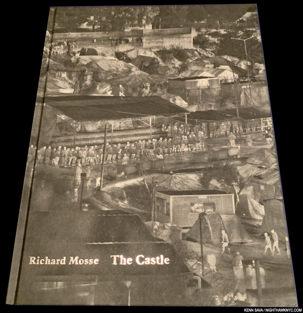
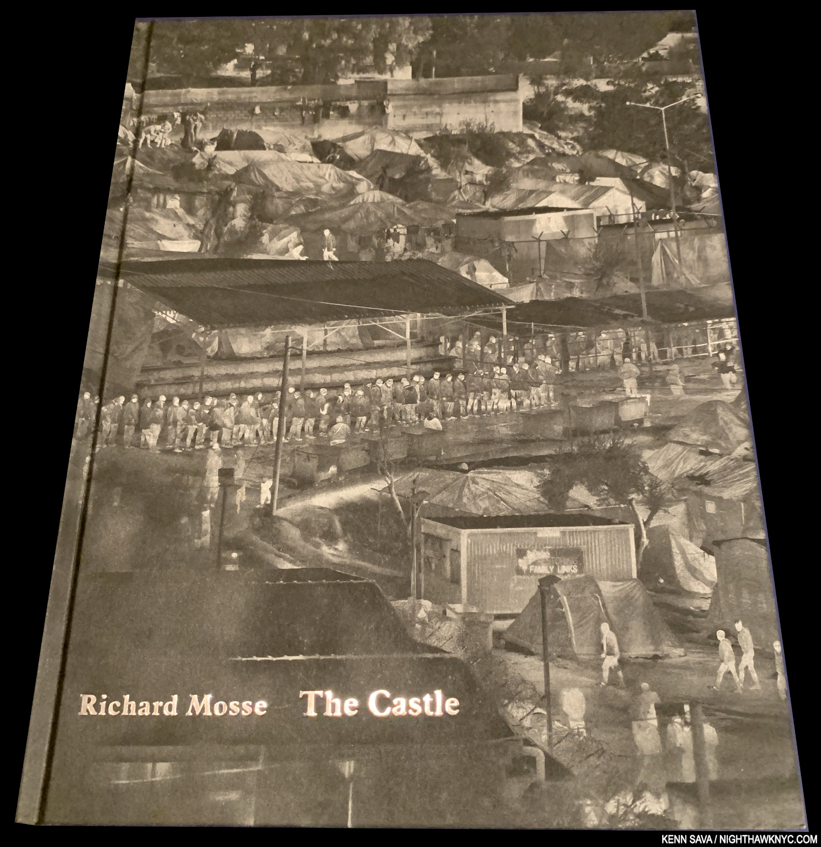
A book that held me so spellbound that I bought a copy of both printings of it so I could compare how the tonal adjustments they made for the 2nd printing differed from the 1st.Richard Mosse, The Castle, Mack 2019
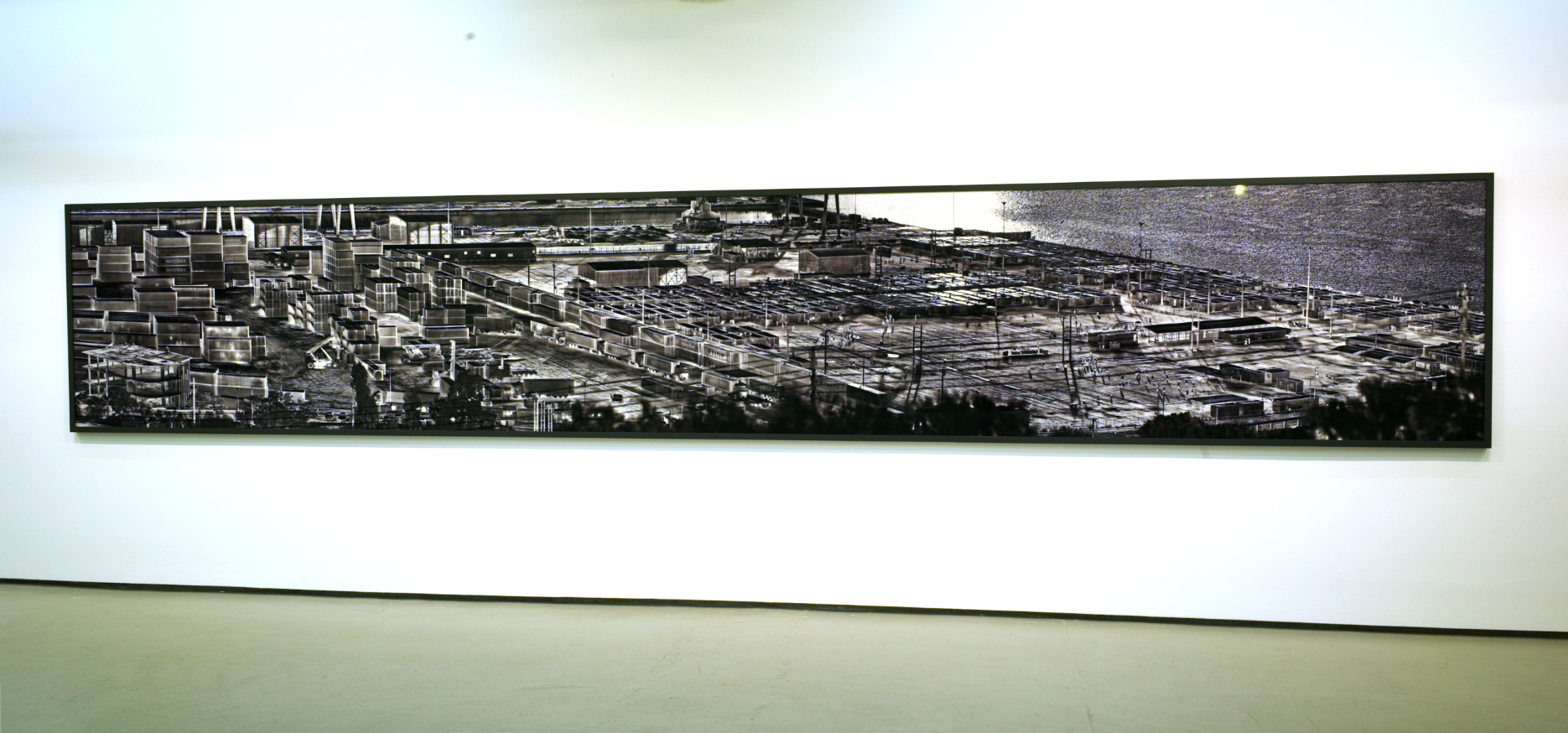
Perhaps, the most remarkable among Richard Mosse’s remarkable PhotoBooks, The Castle is a unique visual experience. According to the publisher, “Using a thermal video camera intended for long-range border enforcement, Mosse films the camps (i.e. European Refugee Camps in Greece, Italy and Germany) from high elevations to draw attention to the ways in which each interrelates with, or is divorced from, adjacent citizen infrastructure. His source footage is then broken down into hundreds of individual frames, which are digitally overlapped in a grid formation to create composite heat maps.” Released in two printings (the second having its black point adjusted), it’s a book that retains the searing power of seeing these huge Photographs in real-life, which I did when they were shown in 2017. Equally compelling either way, it’s hard to imagine the book being more well-realized, through the work of Mr. Mosse, Mack and their designer, Morgan Crowcroft-Brown.

Skaramaghas Camp, Athens, Greece, 2016. At 288 x 50x 2 inches(!), it’s one of the largest Landscape Photographs I’ve ever seen. The Refugee Camp is in the lower right quadrant, surrounded by water on one side and an industrial area on the other three. Seen at Richard Mosse: Heat Maps, at Sikkema Jenkins, March, 2017. To replicate these very large images, The Castle contains 28 double gatefolds!
My piece naming The Castle a NoteWorthy PhotoBook of 2019 is here.

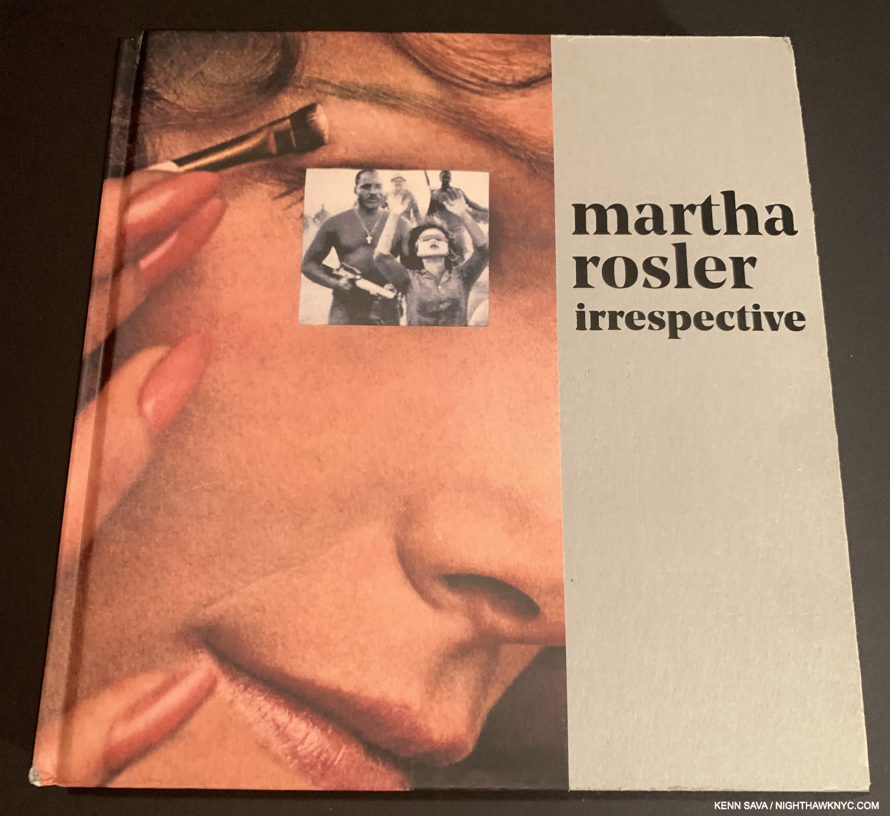
Martha Rosler, Martha Rosler: Irrespective, Yale University Press/Jewish Museum, 2018
Irrespective is, according to the publisher, “…the only survey of the artist’s vital and enduring work, examining it across media,” making it all the more important for an Artist who is not as well-known as Barbara Kruger or Jenny Holzer, but who has been working hard on important issues in her own way for just as long.

From House Beautiful, Bringing the War Home, New Series, 2003,2004,2008, Photomontages. Seen at Irrespective at the Jewish Museum, Christmas Day, 2018, the show the book accompanied. Yes, I spent Christmas, 2018, at a show.
Though she works in multiple media, Irrespective features her Photo-based works to stunning effect. An Artist who deserves much wider attention.
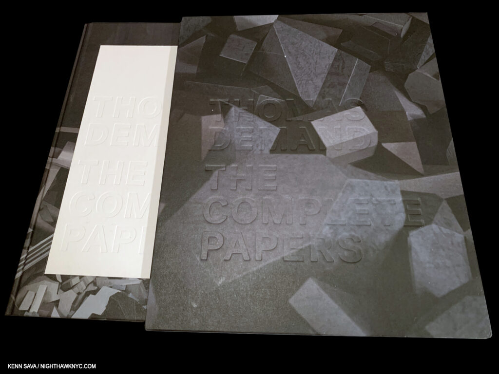
Thomas Demand: The Complete Papers, Mack Books, 2020
Thomas Demand creates, and recreates, scenes that were either well-known, or not as well-known, stunningly realistically in paper! Then, he Photographs them, and the Photographs are his work. What I said in naming this a NoteWorthy PhotoBook of 2019 still holds- “Thomas Demand, The Complete Papers, MACK Books– A remarkable book documenting a remarkable body of work that’s equal parts Sculpture and Photography. No. It’s more Sculpture, given how much work goes into creating each of his works- in paper! Beautifully rendered and realized in a majestic book that is only going to be more and more sought after as this unique Artist becomes better known in the USA.” He’s still not as well known here as I think he should be.
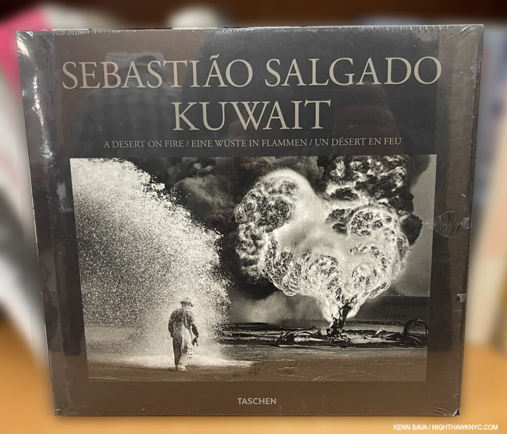
Sebastião Salgado, Kuwait: A World on Fire, Taschen, 2016
Just one of the monumental books Sebastião Salgado released this century (and before) dealing with social issues, the natural environment and those struggling to survive in our world. I could have chosen Genesis, 2013, “My love letter to the planet,” Mr. Salgado called it, or Gold, 2019, or Africa, 2007, Taschen sets the stage for Kuwait– “In January and February 1991, as the United States-led coalition drove Iraqi forces out of Kuwait, Saddam Hussein’s troops retaliated with an inferno. At some 700 oil wells and an unspecified number of oil-filled low-lying areas they ignited vast, raging fires, creating one of the worst environmental disasters in living memory.” Another manmade disaster continues an ongoing, long-time, theme in the Photographer’s work. Another Photographer was killed while Mr. Salgado was shooting this work, and one of his own lenses melted. Needless to say, the results are intense, which makes Kuwait a bit different from his other books, its monumental fires incredibly vivd- even in black & white! Epic in scope with some of the most incredibly powerful moments of man against nature, and inhumanity published this past decade.
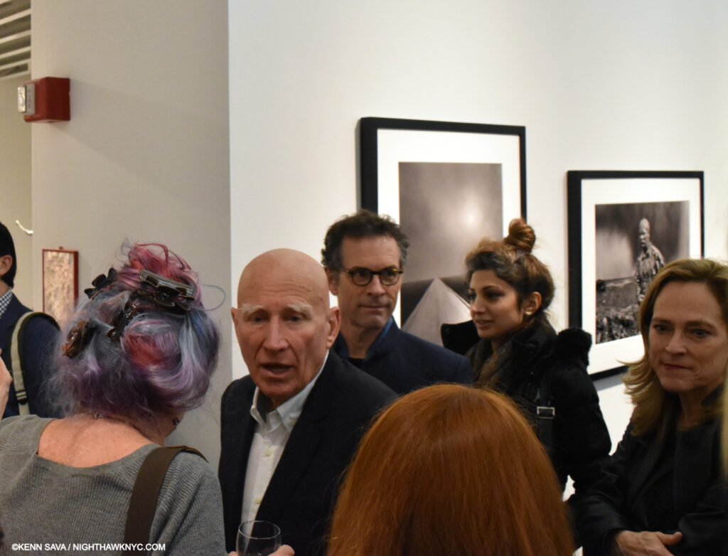
Sebastião Salgado at the opening of his Kuwait series, March, 2017. The world will sorely miss him.
I was saddened by the news that Mr. Salgado had passed away in late May of complications from Malaria he contracted while working over a decade before. I was lucky enough to be in his presence once, at the opening for Kuwait in 2017. The world is lucky his work has been so widely, and so beautifully, published, largely, by Taschen, my NoteWorthy Art Book Publisher of the 21st Century.
A paperback copy. It was also issued in hardcover.
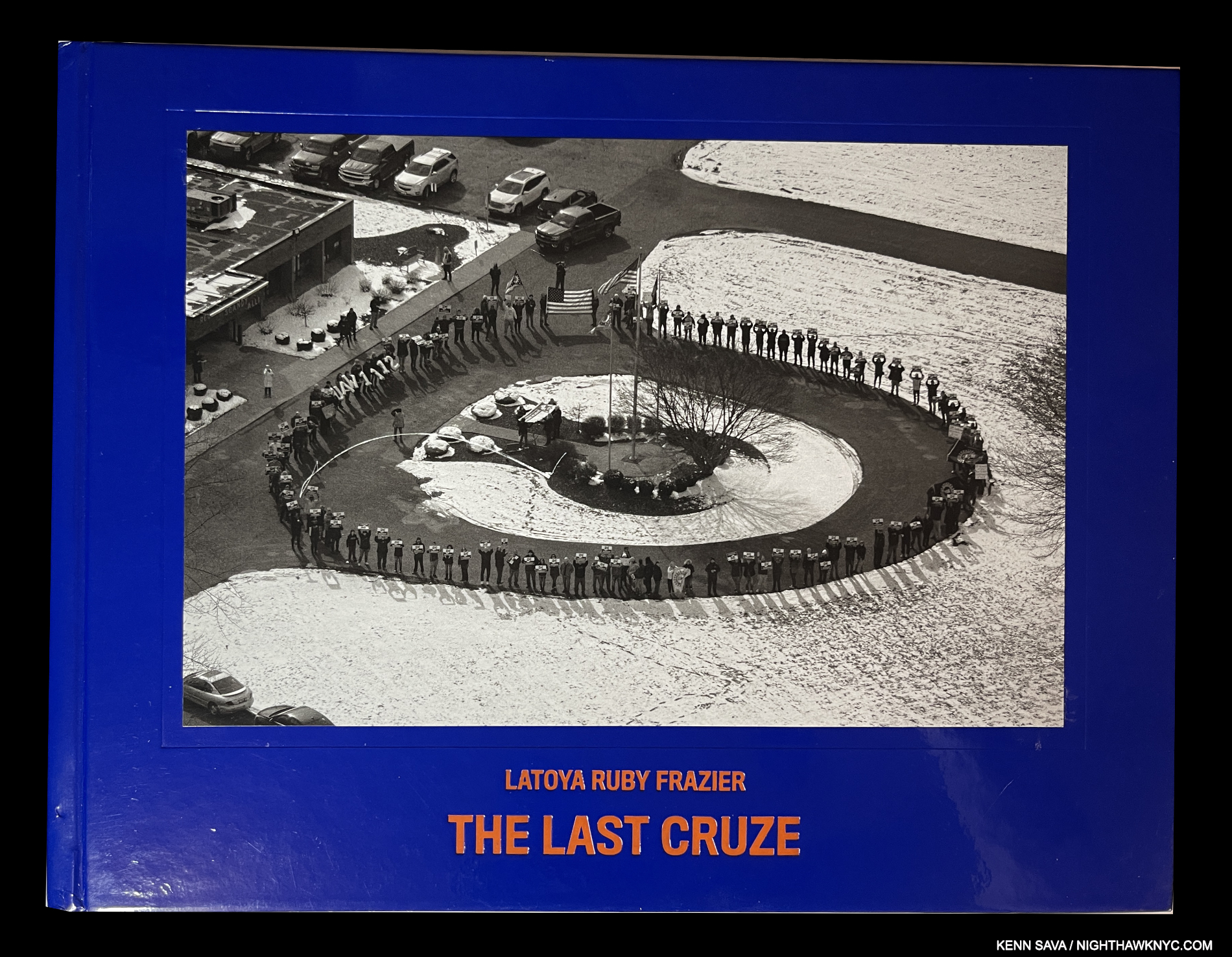
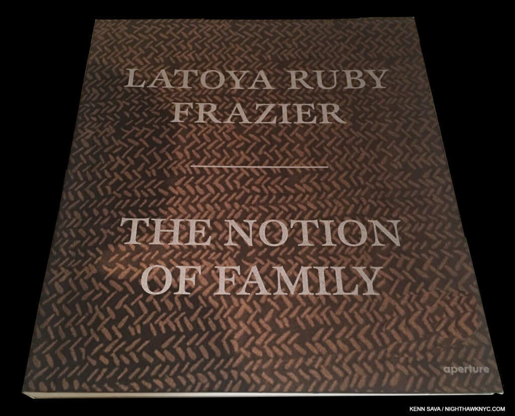
LaToya Ruby Frazier, LaToya Ruby Frazier: The Notion of Family, Aperture, 2016, and
The Last Cruze, Renaissance Society, 2019,
“Family” has played a central role in LaToya Ruby Frazier’s work since its beginning in published form, 2016’s The Notion of Family, focused on her own immediate family and their life in Braddock, PA, where LaToya grew up. That has continued, in my view, ever since in the sense that her subsequent projects often focus on small groups that she looks at big issues with (literally) and through their experiences. The Notion of Family, then, is the touchstone of all that’s come after for one of the world’s most dedicated advocates. Throughout, though, it’s an extremely personal book. The Artist speaks of her love for and devotion to her grandmother, Ruby, as well as that for her mother, both of who endured extreme hardships. We watch as the former passes away amid the crisis of the town’s hospital being closed and then demolished. One of the most extraordinary first PhotoBooks so far this century, it contains both, some of her earliest work, and also introduces the theme of family facing extreme hardship in the world, which has continued in her subsequent books.
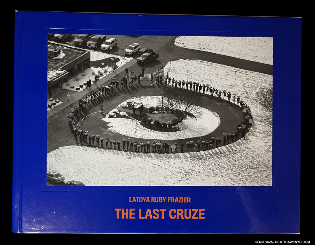
Both are powerfully on display in her monumental, 340-page, The Last Cruze, her look at the closing of the General Motors plant in Lordstown, Ohio, throwing all its workers out of work. As is what appears to be her standard working method, she brings her subjects into the book beyond their Portraits in the text, making The Last Cruze, at once, that much more personal, and multi-dimensional, and bringing another kind of “family” to the book.
As if these aren’t enough, my piece naming her 2024 early mid-career Retrospective, Monuments of Solidarity, my NoteWorthy PhotoBook of 2024 is here. My look at her spring, 2023 Gladstone Gallery show, featuring her work on the Baltimore Health Community, is here.
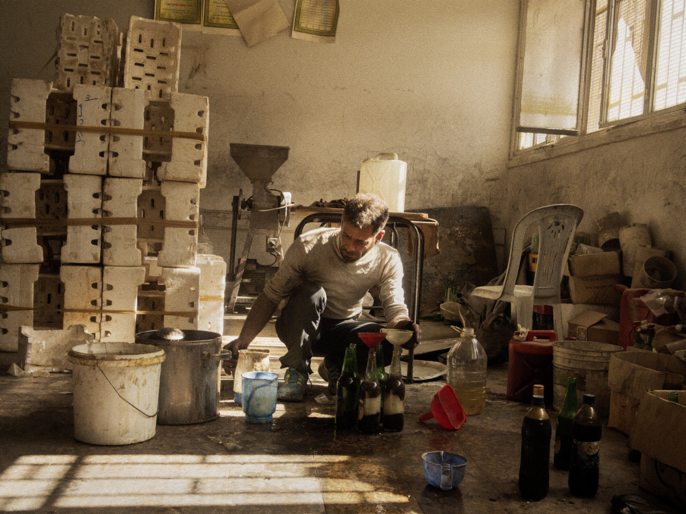
Moises Saman, Discordia, Grafiche Antiga, 2016
A stunning document of the Revolution in Iraq and the Arab Spring, Discordia is now a classic. A book that puts the letter to “first-person account,” to the point of downplaying Mr. Saman’s injury when a helicopter he was in crashed. The most chilling image for me is the 2-page spread of a bomb maker AT WORK! Now, if someone said to you, “Hey, want to come with me and watch while I build a bomb?,” are you down? Mr. Saman was.

Moises Saman, A bombmaker working for the rebels mixes chemicals in a makeshift bomb factory in a rebel-held district, Aleppo, Syria, 2013.
He not only survived, thankfully, he got a heart-stopping Photo from it. When I met, Moises, after communicating with him by email while buying a copy of Discordia, I was impressed by how down-to-earth, and considered, he is. He’s not some hellion itching to risk life and limb to get a daring shot. Instead, his Photo reflects this consideration, from its composition and lighting to what’s included. It’s taken from a low level- the same as the bomb-maker’s, who’s squatting over his chemicals- the camera is not looking down on him, which might be judgemental or give a sense of being ready to flee. I come away feeling that Mr. Saman was in for an ounce, and in for a pound.
It’s no surprise that he has earned a lot of respect from his peers, as I’ve found in numerous conversations when his name came up without prompting. Discordia is now out of print, and, unfortunately, it’s a seller’s market for any copy that becomes available.
My look at Discordia is here.
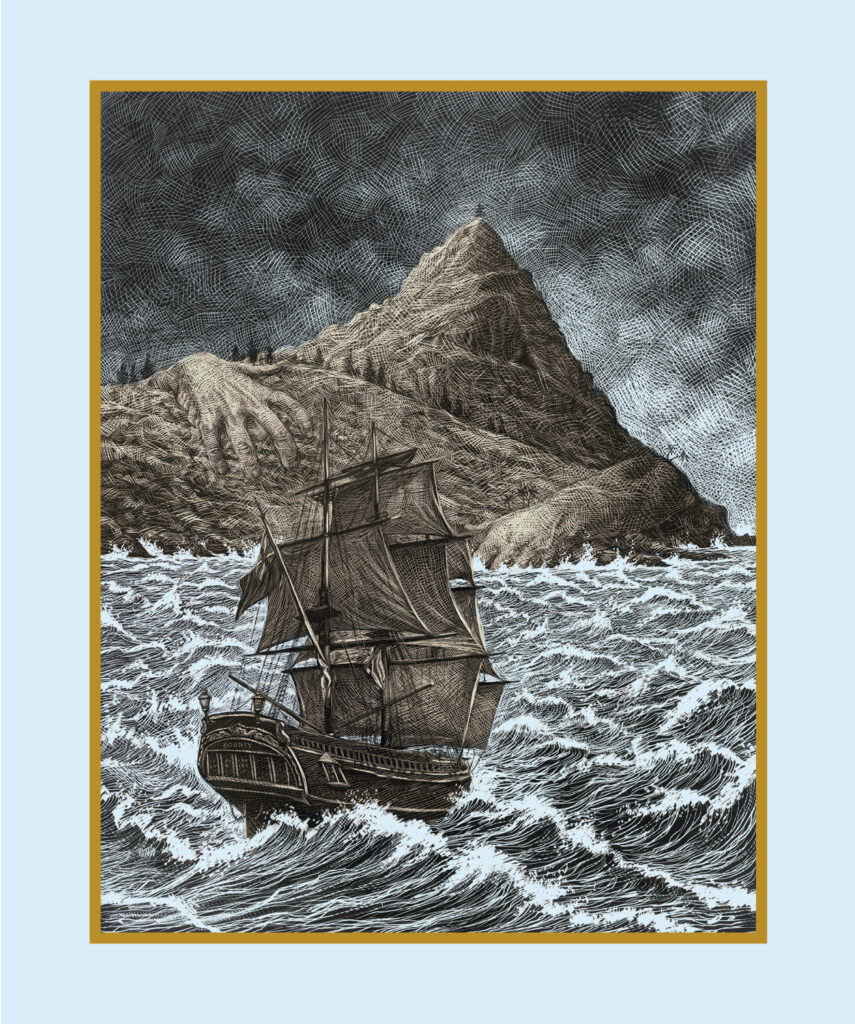
Big Fence/Pitcairn Island cover Drawing by Ricardo Martinez Ortega. Does this look like the kind of place you’d want to be trapped on for 96 days with a number of convicted sex offenders and no way out? Rhiannon Adam was. *-Rhiannon Adam Photo
Rhiannon Adam, Big Fence/Pitcairn Island, BLOW UP PRESS, 2022
I don’t know what’s more remarkable about this book- the extreme risk the Photographer took realizing this project or the resulting Photographs she made. Pitcairn Island is one of the most isolated places on Earth that is not snow-bound. A British Colony located in the South Pacific founded by Fletcher Christian and the other mutineers of the legendary “Mutiny of the Bounty,” it measures a scant 2 miles by 1 mile! It’s home to about 50. While the setting might seem idyllic to some, bringing fantasies of white beach and swaying palm trees, Rhiannon’s Photos reveal an island made of volcanic rock that suddenly juts out of the sea. “In 2004, this façade slipped, when a series of child sexual abuse allegations emerged. The British investigation, Operation Unique, uncovered decades of abuse. Abuse that had been festering in plain sight. The Pitcairn trials led to the convictions of eight Pitcairn men, including several former island officials and the then-mayor Steve Christian, whose home, ‘Big Fence’, forms the title of this project. In 2015, Rhiannon Adam, inspired by a childhood gift of The Mutiny on The Bounty and a desire to capture the island’s fragility on expiring analogue film, made the long journey to Pitcairn Island. Due to the quarterly shipping schedule, she remained trapped on the island for 96 nights. Naturally suspicious of ‘journalists’, Pitcairners were, on the whole, reluctant to be involved in Adam’s project. Throughout the book, subjects mostly appear alone, photographed in solitude and away from prying eyes,” per the publisher. Ms. Adam used their reluctance to focus on other evocative sites, which opened up new possibilities for the end product, and the book’s design was born. Including all sorts of related materials from her archive that conspire to create a book that is close to being as impenetrable as its subject yet stunningly beautiful.
Rhiannon has been a renowned Polaroid authority since the publication of her book, Polaroid: The Missing Manual, The Complete Creative Guide, 2022. Here, she shows the viewer just what the instant format can do in the hands of a visionary Artist complemented by a very innovative design by Aneta Kowalczyk and the Artist. In case you’re worried, Rhiannon made it out safely. When I met and spoke with her last spring, she had moved on to another very compelling project, after a trip to the moon she had been selected for(!) fell through, in yet another faraway land. Stay tuned!

A huge 15 by 11 inches.
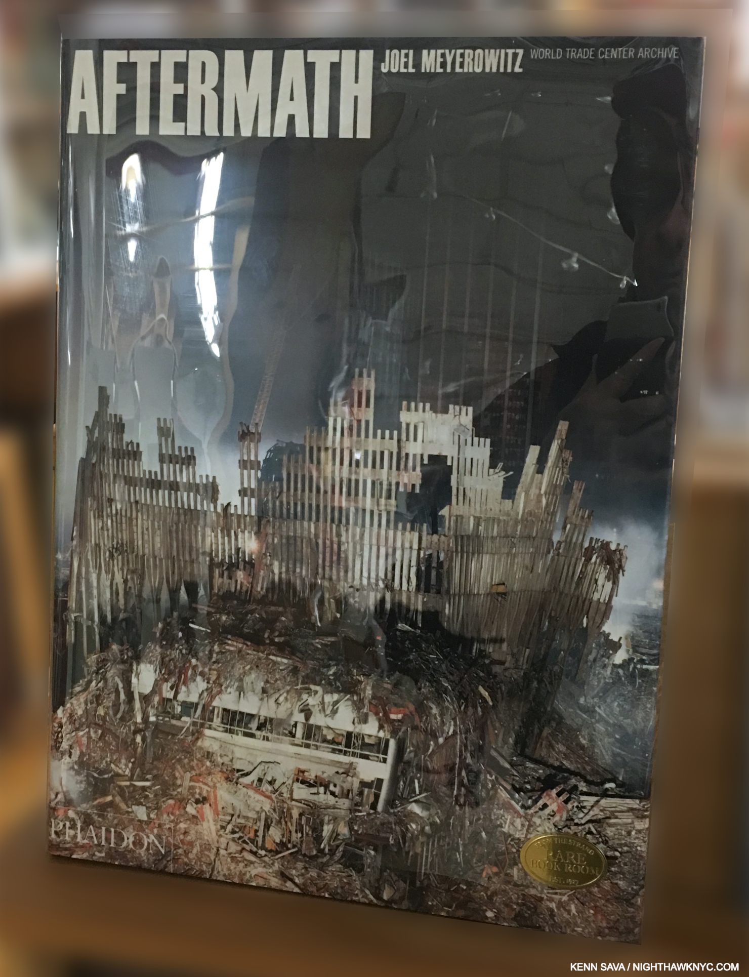
Joel Meyerowitz, Aftermath, Phaidon, 2006
HOW I could have lived here during 9/11, watched it going on with my own eyes from the street, and experienced all that came later (as I wrote about here) and not include this book? The only Photographer permitted complete access to Ground Zero, Mr. Meyerowitz has given us the essential Photographic record of just what the title says- the aftermath of the indescribably horrific attacks. Looking at the destruction, which only those working on the site could see close-up, is still hard, like looking through Robert Pillodori’s After the Flood, on the aftermath of Hurricane Katrina. In those Photos, the houses are largely still standing. Here, there is total destruction, which is STILL hard for me to wrap my brain around, having spent time in the buildings experiencing HOW massive each of them was. I think it’s impossible for anyone who was never inside the World Trade Center to get how MASSIVE each was. Each floor was an acre! An acre! Times 110. Times two. As time goes on, and the events drift further and further into the past (it’s hard to believe it’s 23 1/2 years ago already), Aftermath will remain the definitive record of this part of the tragedy.
A rare shrink wrapped copy of the book in its slipcase.
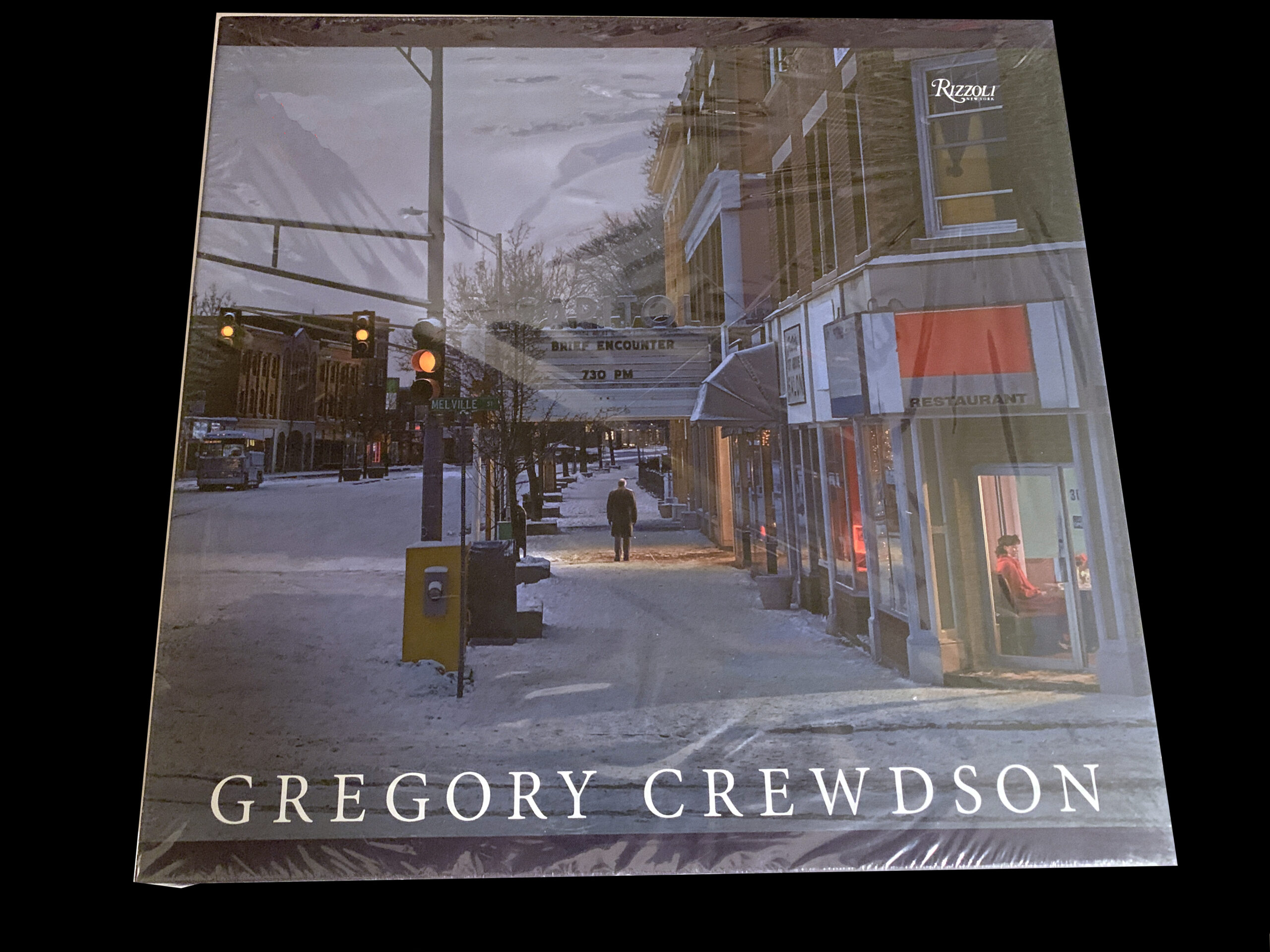
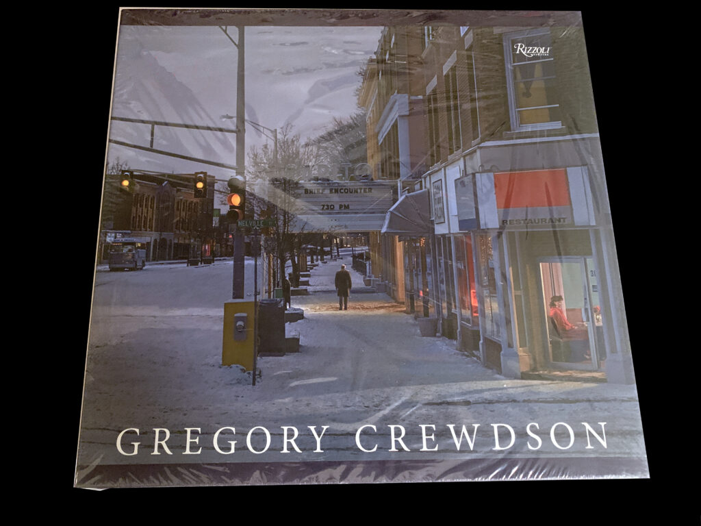
Gregory Crewdson, Gregory Crewdson, Rizzoli, 2013
A model mid-career Retrospective, the attention to detail in Rizzoli’s Gregory Crewdson is matched only by that Mr. Crewdson and his teams put into making the work.
This is NOT the set listed! This is the set it was created from. With only seven sets produced (and 3 Artist’s proofs), I’m including this instead of the set I’ve listed because you’ll likely never see it again. Each of the boxes contain 15 Dye=transfer prints. This set, in pristine condition, is a promised gift to The Metropolitan Museum, who showed the 75 Dye-transfer prints it contains, complete, for the first time ever, in 2018.
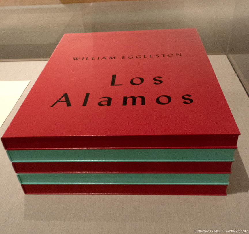
William Eggleston, Los Alamos Revisited, Steidl, 2012
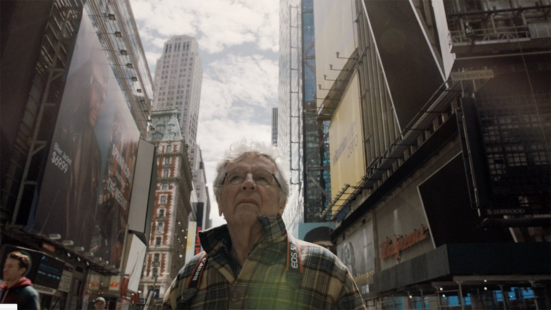
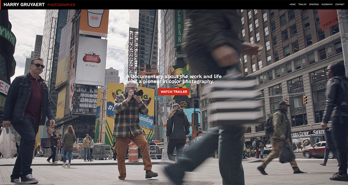
When I interviewed him in 2018, the renowned Photographer Harry Gruyaert said he felt the number of books Steidl has printed on William Egglieston was excessive (my paraphrase). Love them, or not, this 3-volume set is the best of the sizable bunch, in my opinion, a fact the show of the same name at The Metropolitan Museum in 2018, which I wrote about here, reinforced. Out of print now, I fully expect Steidl will reprint it one day as they did Chromes after a long absence. The absence of Chromes seems to have made many hearts grow fonder, but Los Alamos Revisited is the more important set, in my view, and a terrific place to experience the beauty of Eggleston’s legendary dye-transfer prints.
My look at William Eggleston: The Democratic Forest, show at Zwirner in 2016, the show that launched my “deep dive” into M&C Photography 8 1/2 years ago is here.
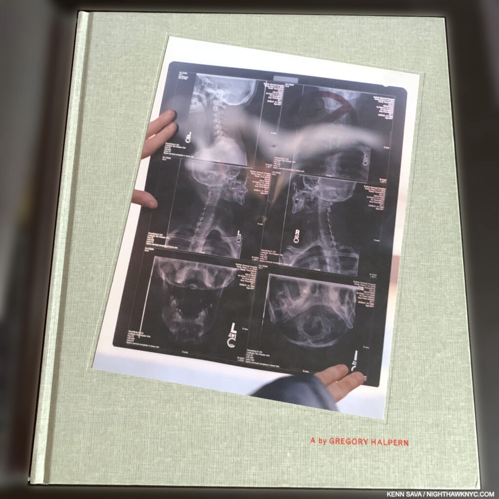
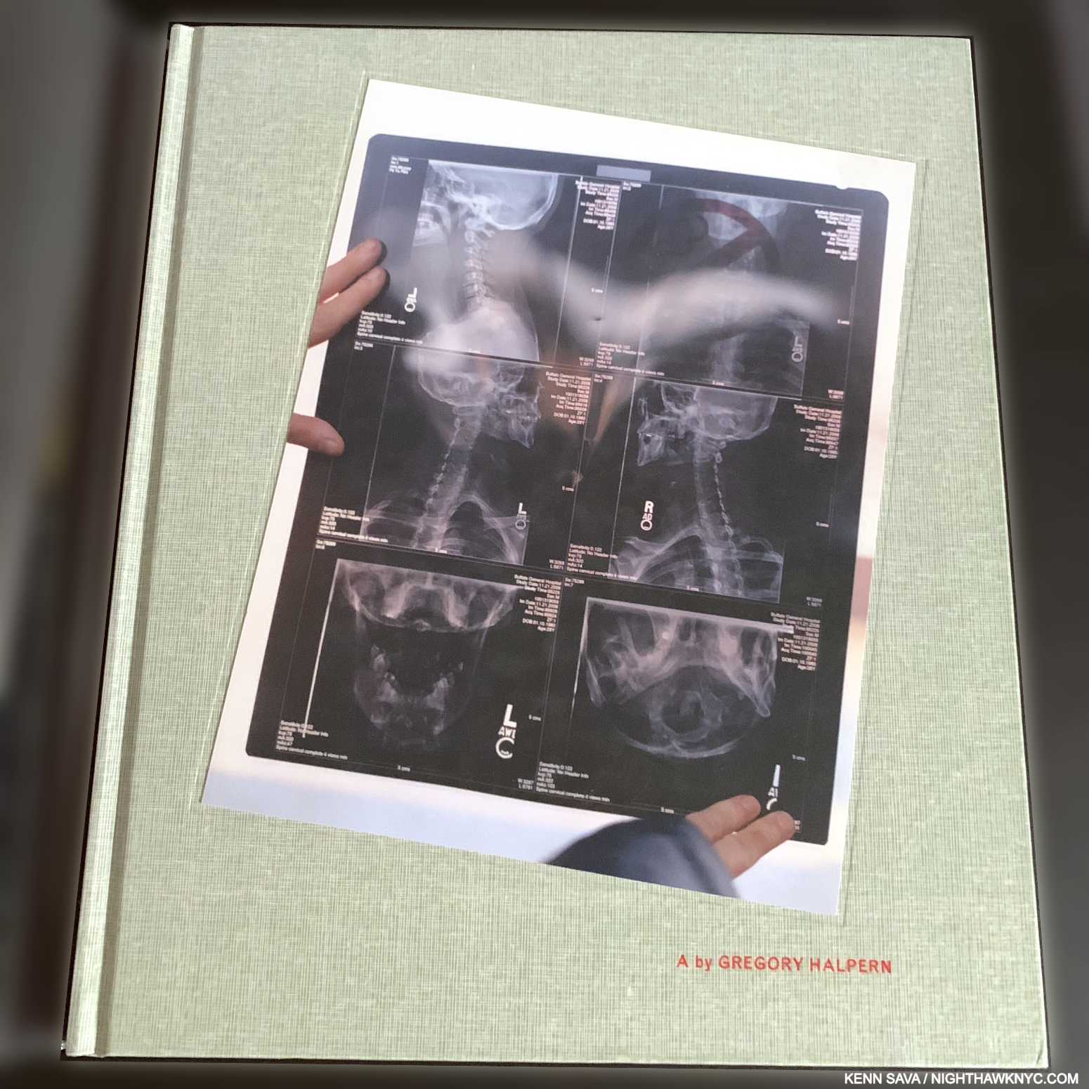
A by Gregory Halpern, 2011, may not be as familiar as his two other books on this list.
Gregory Halpern, A, J&L Books, 2011, and
ZZYZX, 2016, and
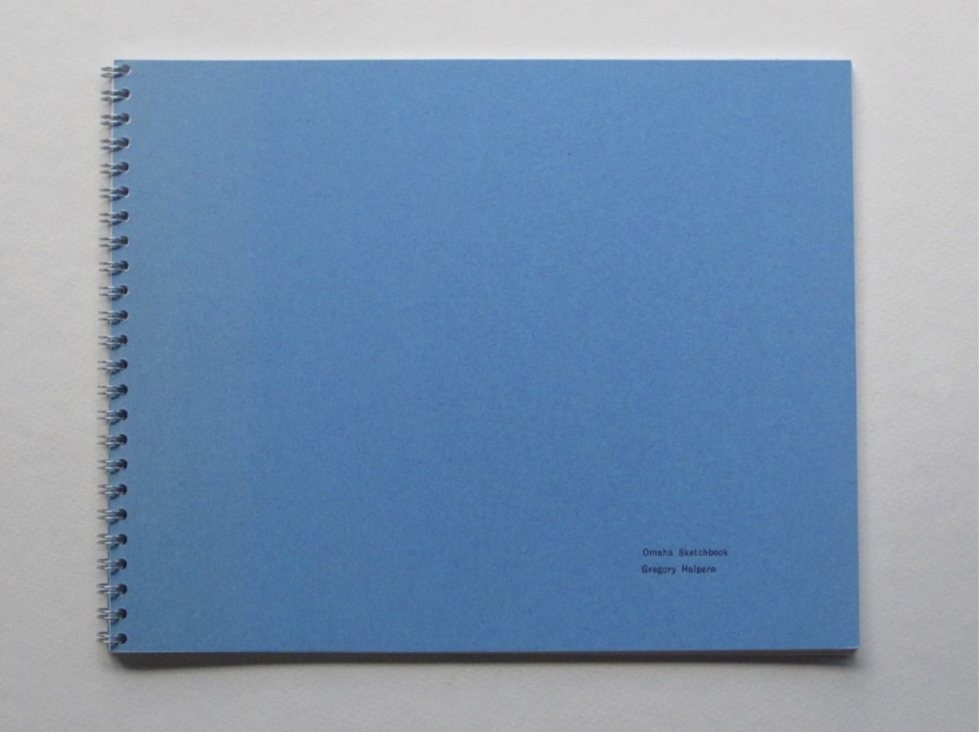
Omaha Sketchbook 2019 (reissued and expanded in 2025), the latter two both Mack Books
A’s edition size of 1,000 left many of the fans Gregory Halpern gained after ZZYZX struck a nerve and became a sensation five years later unable to see it. That’s a shame because it’s equally remarkable and full of strong images that linger in the mind after the cover’s been closed. There are Photographers who are “book Artists,” and those who are “wall Artists.” I don’t know which camp Mr. Halpern feels he’s in (my bet would be a book Artist), but I’d hate to have to live on the difference; his work succeeds remarkably well in both camps. Taken as a book, A has a “freshness” to it, a feeling of something new (which it was being his first full-length PhotoBook), and the “edge” ZZYZX has.
Mr. Halpern’s strength as a book Artist can be seen in one small way- each of his books beginning with ZZYZX has been on my NoteWorthy PhotoBook lists. The only other Photographer who shares such a long-running string on my lists is Rosalind Fox Solomon.

ZZYZX
Of all the books I’ve seen since, more of them have been seemingly influenced by ZZYZX than any other book besides The Americans. That’s just one reason ZZYZX is THE PhotoBook of the 2010s, in my view, and an instant classic. Omaha Sketchbook had been originally published in 2009 in an edition of 35 copies. Mr. Halpern graciously showed me his copy of it at the NYC book release for the 2019 Mack edition and it was absolutely riveting to see both of them.
The first iteration of Omaha Sketchbook, published in 2009 by J&L Books in an edition of 35 copies. Photo from @Gregoryhalpern
A succinct look at a large place turned more expansive, yet more nuanced. It, too, struck a nerve with a lot of folks since it sold out quickly. I received quite a bit of mail regarding Omaha Sketchbook after I named it a NoteWorthy PhotoBook of 2019. Some reader/Photographers wanted to see larger images, some complained about the book being a paperback. Personally, I love the unique “sketchbook” concept, with images reproduced from medium format contact sheets, however, I will say that in my experience the paperback didn’t wear well. I saw copies in stores that looked like used phone books. Buckle up! The 2025 edition, with 35 additional images, will be a paperback. Don’t let that stop you from experiencing a PhotoBook that is truly ground-breaking in many ways, especially being a look at a place unlike any I’ve seen. Along the way, it reveals Mr. Halpern’s excellence as a Portraitist, something he still doesn’t get enough credit for, it seems to me.

Omaha Sketchbook, first Mack edition. When I went to the NYC book release in 2019, rushing from Henry Taylor’s opening, I passed a couple on the stairs. One turned to the other and said, “Hey, I want to check out the Omaha Steakbook event.” I just kept going before he took my seat!
My overview of the PhotoBooks of Gregory Halpern, “Gregory Halpern’s America,” is here. My piece naming Omaha Sketchbook a NoteWorthy PhotoBook of 2019 is here. My Halpern’s other recent PhotoBooks (Confederate Moon and Let The Sun Beheaded Be have each been a NoteWorthy PhotoBook of the Year- in 2018 and in 2020, respectively. I didn’t do a list before 2018.
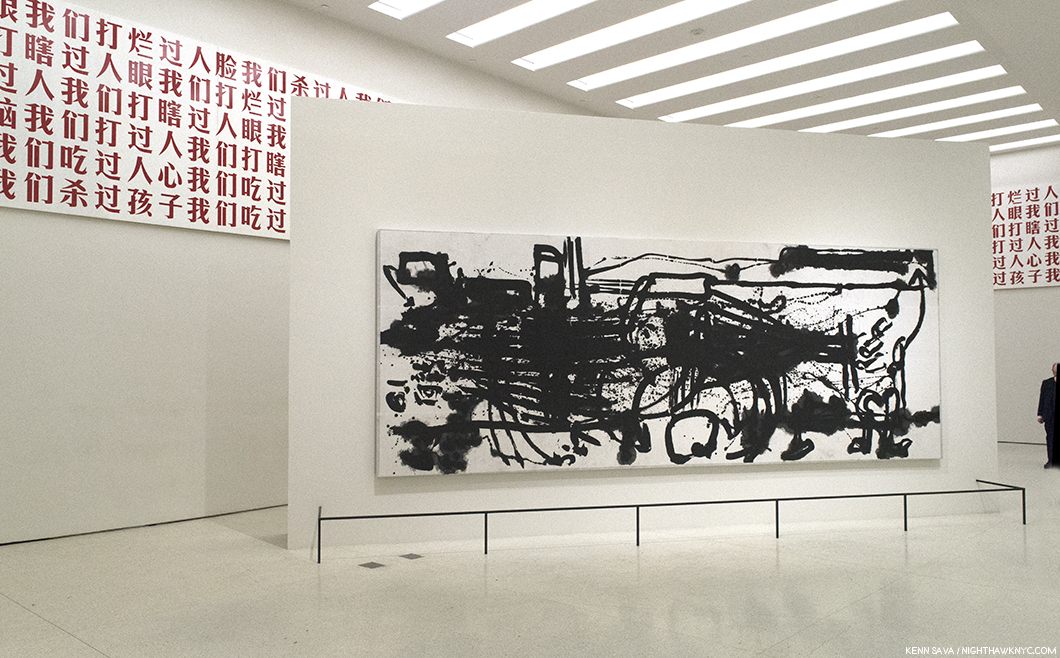
NoteWorthy Photography Exhibition Catalogs of the 21st Century-

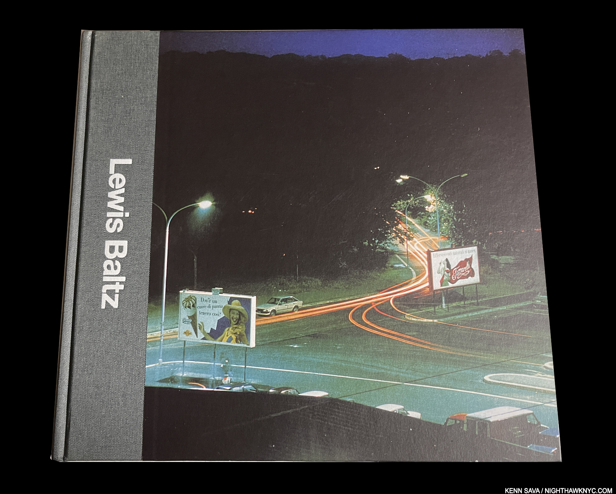
Lewis Baltz, Lewis Baltz, Steidl, 2017
Lewis Baltz seems to have fallen into eclipse since his passing, which is beyond a shame. A good many of his terrific Steidl books and the collected set, titled Works, are out of print. So is this excellent Retrospective, published in 2017 by Steidl and MAPFRE, Madrid, to accompany the first large Retrospective of his work following his passing. I don’t know why it didn’t come to U.S., but that’s another shame. WHERE is his U.S. Retrospective? Thank goodness for this excellent catalog. 330 pages and over 600 images reveal that Lewis Baltz has much to teach us and say to us in 2025. Of course I’d recommend Works, which Mr. Baltz personally oversaw, as the definitive resource on his singular, hugely influential work. If you have the funds? That’s the way to go, but being composed of reissues, it’s ineligible for this list. Short of them, this one-volume overview is the best resource and most essential, in my view. Reasonably priced copies are still around-at least at the moment.
*- Fundación MAPFRE Photo
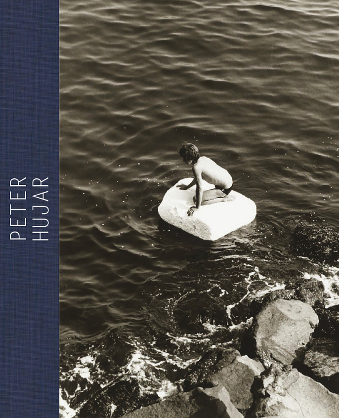
Peter Hujar, Peter Hujar: Speed of Life, Aperture/Fundación MAPFRE/Morgan Library, 2017
It’s fascinating to me how ahead of his time, yet of our time, Peter Hujar’s work looks to me, and apparently a good many others. The crowds that saw this excellent show in its Morgan Library incarnation certainly felt it, and I imagine those did in the show’s three other stops over 2017 and 2018. Why his work fell into eclipse so long and so deeply is a shame, but since Speed of Life, a few excellent Peter Hujar books have appeared. In my opinion, this is a great place to start. 50 pages of essays are followed by a 160 plate section of work from all through his career. Mr. Hujar worked in a wide range of realms, though he may be most highly regarded for his Portraits. All of his work features his trademark high contrast mastery of 256 shades of grey, and his gifts for composition. Looking at his Portraits, I’m reminded of the quote I included in my listing of Euan Uglow: The Complete Paintings in NoteWorthy Art Books of the 21st Century– “Nobody has ever looked at you as intensively as I have,” Mr. Uglow told one of his models in 1988, while Mr. Hujar was hard at work 3,500 miles away. I don’t know if he felt that way, but his results reveal an uncanny insight. Among Photographers, his Portraits have a similar effect on me as the great Dave Heath’s do.
While Robert Mapplethorpe went on to Art superstardom, it’s hard to look through Speed of Life and wonder why Peter Hujar hasn’t. Slowly, but surely, his work is rising in attention and stature, though it still has a ways to go, in my view, to reach the level of acceptance it deserves.
Currently out of print, I have it on authority that it is being reprinted, so wait for the next printing before buying.
Takuma Nakahire, Yutaka Takanashi, Takahiko Okada, Daido Moriyama, and Kôji Taki, collectively known as PROVOKE, PROVOKE: Between Protest and Performance: Photography Japan 1960-75, Steidl, 2016
The late William Klein was a huge influence on much of the earlier Modern & Contemporary Japanese Photography I saw, until PROVOKE. Published from November, 1968 to August, 1969, as a magazine that totaled 3 issues by critic & publisher Kôji Taki, it’s very likely been the most influential Japanese PhotoBook ever, and the beginning of the incredible wave of talent and creativity that has emerged from Japan since. Now 85, Mr. Moriyama is still going strong. Inspired by a wave of protests in Japan in the 1960s, Takuma Nakahire, Yutaka Takanashi, Takahiko Okada, and Daido Moriyama (who joined them in volumes 2 & 3) brought an edgy, avant style that captured the energy and the feeling of the time, in aesthetics that were mocked when they were released, a bit like Ed Ruscha’s first PhotoBooks in the U.S. were. In 2017, the Art Institute of Chicago was the U.S. stop for a traveling, in-depth, show on PROVOKE that was accompanied by this amazing 680-page book, itself perhaps, the most important show on Japanese Photography & PhotoBooks in the U.S. to date.
The rare exhibition catalog that has seen multiple printings. Seen here is a first edition copy. Later editions have a different color cover.
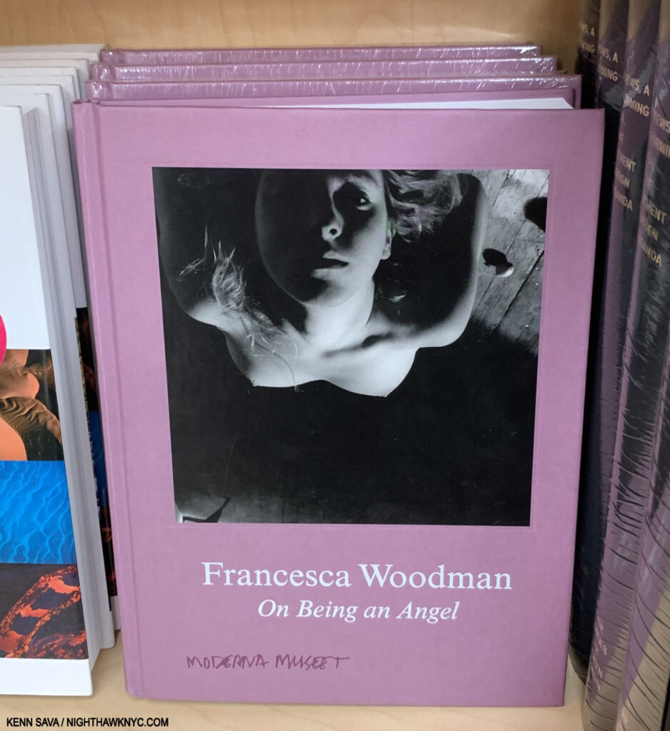
Francesca Woodman, Francesca Woodman: On Being an Angel, Moderna Museet, 2016
My favorite title for ANY Art or PhotoBook- ever. The tears I mentioned I had every time I looked at the work of Francesca Woodman in 2018 have (mostly) subsided, but OMG, what a gorgeous, smaller, book this remains. Published to accompany the show of the same name at the Moderna Museet in 2016-17, it remains a great place to begin exploring the work of this Artist who even now, 44 years after her tragic death at just 21, remains ahead of her time AND extremely influential. An Artist who made innovation meaningful. WHAT a talent! What a vision.
My piece naming this one of my NoteWorthy PhotoBooks of 2019, through the tears, is here.

A sealed copy of the Random House first edition.
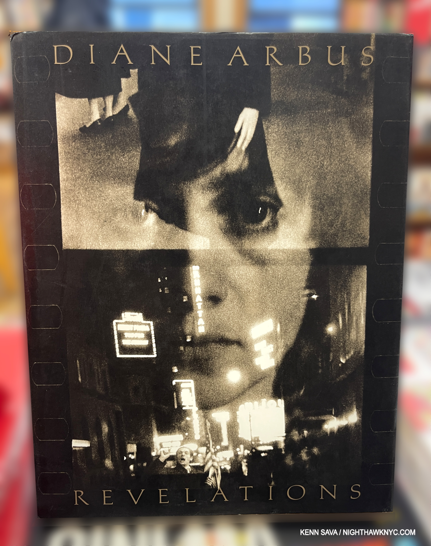
Diane Arbus, Diane Arbus: Revelations, Random House, 2003
A book that pre-dates my “deep-dive” into Modern & Contemporary Photography (which began in December, 2016), that didn’t stop me from seeing Revelations at The Met in 2005- one of the great Photography shows I’ve seen. Its catalog remains to my mind the most important book on her work, including the Aperture Monograph (which Ms. Arbus did not live to work on). The title of this book fits, it’s full of revelations, and contains more of the brilliant late Artist’s work than any other book published on her to date. 180 pieces were in the show, making it a serious contender for the Photography show of the Century thus far. The first edition is long sold out (though I’ve seen copies around at less than list price.) Aperture reissued it in a very similar edition in 2022. The Chronology published herein was subsequently excerpted and issued as a stand-alone book.

With its NoteWorthy PhotoBook of 2021 designation.
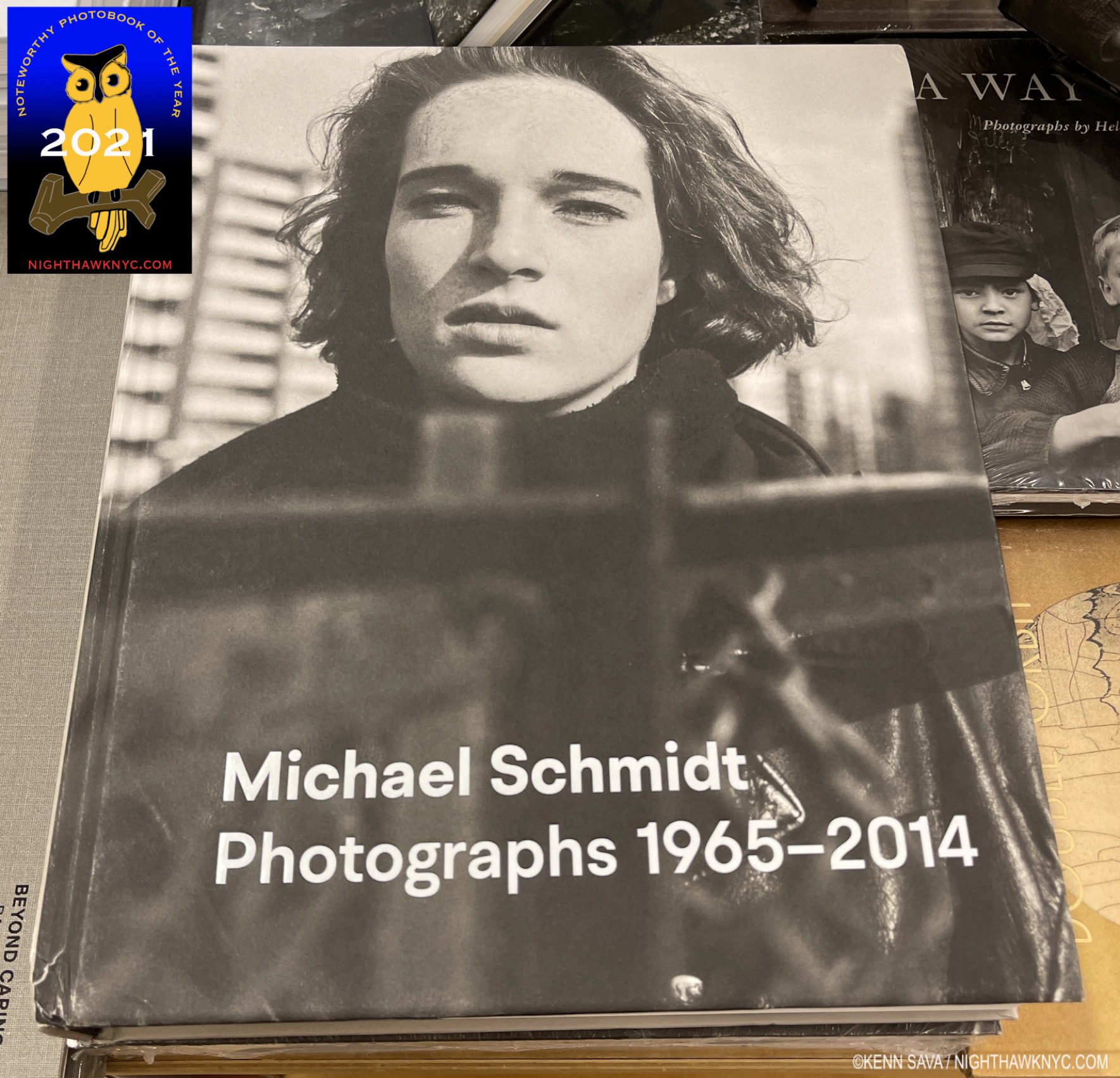
Michael Schmidt, Michael Schmidt: Photographs, 1965-2014, Walther Konig, 2020
My words when I named it a NoteWorthy PhotoBook of 2021 still hold, and the ending was prophetic- “The late German (1945-2014) is another of the many excellent Photographers who are not nearly as well known in the USA as they are in Europe. Michael Schmidt had a show, Michael Schmidt: U-NI-TY (EIN-HEIT), in 1996 at MoMA. It featured one of his most important bodies of work, created in response to the fall of the Berlin Wall and the reunification of the two Germanys. It’s not the only excellent book Michael Schmidt produced. Waffenruhe (Ceasefire) is widely recognized as a 20th century classic. The fine softcover reprint is gradually disappearing, so be forewarned to get it soon. Michael Schmidt: Photographs 1965-2014 provides a very well done look at all of his books and his entire career, much of which will be new to PhotoBook aficionados in the USA. Check it out and don’t wait long if you want it. It will be very expensive after it goes out of print.” In 2025, it IS out of print with VG copies going for under $200..
Ming Smith, Ming Smith: An Aperture Monograph, Aperture, 2020.
I was no stranger to the work of Ming Smith when Aperture published the first monograph of her work in 2020, having first encountered her on the cover of Jazz Musician David Murray’s now classic album Ming in 1980, where a lovely Portrait of her (by Trevor Brown) graced the front, while her Portraits of the Musicians graced the back.
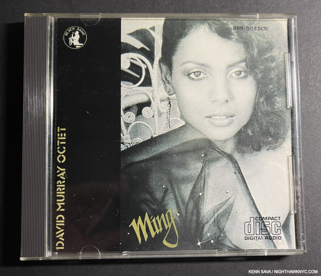
David Murray Octet, Ming, Black Saint, 1980. My introduction to Ming Smith was when the vinyl LP of Ming was released in 1980, with a Portrait of her on the front and her Portraits of the Musicians on the back cover. Seen here on the CD version.
She became a fixture as the Photographer on the succeeding dozen of his albums, and in his life as his wife at the time. Other Musicians then enlisted her for their albums. Though she was one of the overlooked Artists who documented the NYC creative scene, Music is just one aspect of her range, and her beautiful Aperture Monograph wonderfully covers all of them. No matter how innovative her work gets, humanity is almost always her focus. One of the most creative Photographers working today, her work is full of surprises as she refuses to be confined to one style.
With its NoteWorthy PhotoBook of 2020 designation.
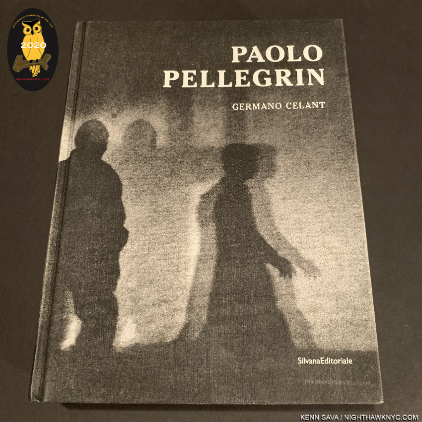
Paolo Pellegrin, Un’Antologia, Silvana Editoriale, 2019 (Also called simply Paolo Pellegrin)
A book that feels like a full life’s Retrospective until you realize Mr. Pellegrin is only in mid-career! Stunningly designed by Yolanda Cuomo, who masterfully weaves its 1,000 images(!) into a very informative design, it’s a model Retrospective in my opinion. Mr. Pellegrin has a way of bringing poetry to the most heart-rending scenes, and everything else he points his camera at. Published to accompany the show of the same name in Italy, another show that unfortunately didn’t make it here. Still, this beautiful catalog serves to supply a comprehensive look at Mr. Pellegrin’s accomplishment.
Out of print at this point, VG copies are trading for around $180.00.
My piece naming this book a NoteWorthy PhotoBook of 2020 is here.
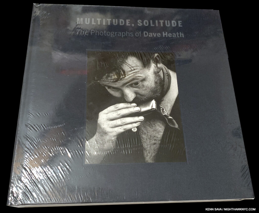
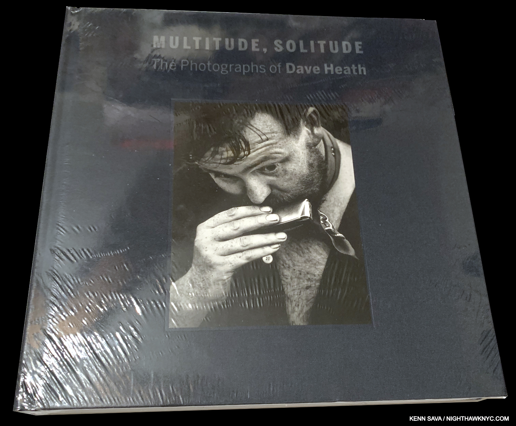
Dave Heath, Solitude, Multitude- The Photographs of Dave Heath, Nelson Atkins Museum, 2015
Masters of Photography don’t come much more overlooked than Dave Heath, and this is the best place to see the most of his work. The best of a whole series of terrific books Keith F. Davis did on overlooked Photographers (including Ralston Crawford, overlooked, in my view as a Painter, first, and a Photographer), its beautiful, high-quality production will hold up, which is vitally important given how few books there are on Dave Heath. Mr. Heath may not be well-known to the general public, but among is fellow Photographers the respect he was held in can be seen by the fact that when Robert Frank was asked to mount a show at the Art Institute of Chicago after the success of The Americans, he got Dave Heath to make the prints. ‘Nuff said.
My piece that includes Dave Heath is here.
*Nelson-Atkins Photo
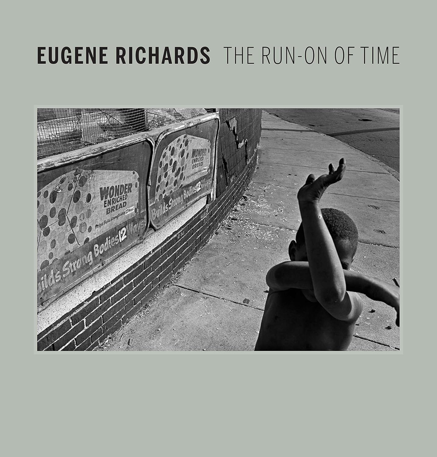
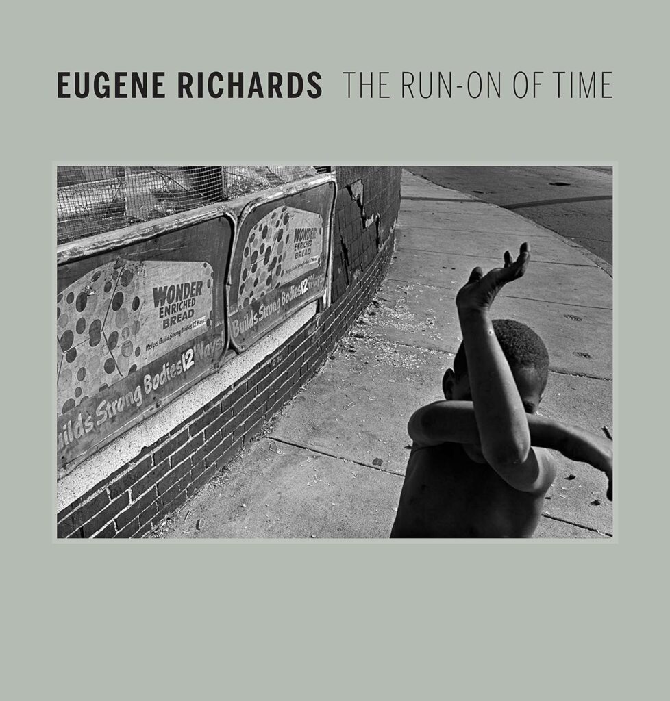
Eugene Richards, Eugene Richards: The Run-on of Time, Nelson Atkins Museum, 2017
Keith Davis’s second book on this list (he also has one mentioned on my NoteWorthy Art Books of the 21st Century list), and with good reason. His books are universally excellent (also check out his excellent book on the very overlooked Ray K. Metzker, which I wrote about here). The Nelson Atkins publications feature beautifully uncluttered design, in handsome covers and solid bindings that should last for years. Mine have. Very few Photographers more richly deserve the lasting book treatment than Mr. Richards does. His work mines areas seen in the work of Bruce Davidson, Gordon Parks, Jim Goldberg, Dorothea Lange and Jerome Sessini, but it feels even more immersive (if that’s possible) here. A life’s time of witnessing with a poet’s eye, this collection is a powerful distillation, though it doesn’t take the place of Mr. Richard’s own fine books.
C0-NoteWorthy PhotoBook Publishers of the 21st Century-

Aperture Foundation, New York
No American publisher has continuously released as many important PhotoBooks, by legendary or new Photographers than Aperture has. Having done so going back to their Diane Arbus Aperture Monograph in 1972, they ramped up their efforts this century under the editorship of Leslie A. Martin to a fairly remarkable extent. One of my pet peeves about the PhotoBook world is that new books come out so often I wonder if the buying public has a chance to see and digest them before the books are pushed aside by the next wave. Nonetheless, in spite of the worldwide pandemic, nothing has slowed Aperture from continuing to release high quality PhotoBooks, including a number that have been on my NoteWorthy PhotoBook lists, including Gregory Halpern’s, Let the Sun Beheaded Be, Sara Cwynar’s Glass Life, Ming Smith, and An Aperture Monograph, among them.

The offices of Steidl, the legendary PhotoBook publisher, whose books appear TEN times on this list (and once on NW Art Books)- more than that of any other PhotoBook publisher. Dustere Strasse 4, Gottingen, Germany. *- Photo from Steidl.de.
Steidl
Twas ever thus. The more things change, the more they stay the same. Though there are now thousands of PhotoBook publishers no one matches Steidl’s quality, still, in virtually every aspect of publishing a book. I can quibble with some of the books they release, some of their designs, but when they nail it (Early Color, Los Alamos, the 7-volume Ed Ruscha: Catalogue Raisonne of the Paintings- each a NoteWorthy Art or Photo Book of his century), the results are timeless. If you won’t take my word for it, look closely at the colophon on some PhotoBooks you like. You may see one publishing company’s name as the publisher, but the fine print might well say, “Printed by Steidl in Gottingen.” Steidl has FIFTEEN books on this list (and one on my NoteWorthy Art Book list, counting the Robert Franks & Jeff Wall books individually since they have separate publishing dates). Three times as many as any other publisher.
NoteWorthy Artist-Owned PhotoBook Publisher of the 21st Century-
Kris Graves hard at work while talking (and selecting tasty vinyl from his impressive collection, right), finishing up the 20-volume(!) LOST II set he published before sending it off to be printed in Spain on February 13, 2019. Once he finished it, my piece on the set called it “monumental.”
Kris Graves Projects
The rise in popularity of PhotoBooks this century has led to a number of Photographers starting their own imprints, as I said earlier. Jason Koxvold’s Gnomic Book, Paul Schiek’s TBW Books, Nelson Chan & Tim Carpenter’s TIS Books, Cristina de Middel’s This Book Is True, are among Artist-led houses creating excellent books for themselves and others, each of who has had a book on my NoteWorthy PhotoBook lists. Over the 9 years I’ve been doing the lists, no one has had more Artist-published books on my lists than Kris Graves Projects (leaving aside the collective Magnum Photos). It’s hard enough to survive creating, let alone running a publishing house, and raising a family to boot. Oh! And if that’s not enough, look above. In addition to being just that- a creator, a head of a publishing company (with two divisions- KGP and Monolith), a husband and father, Mr. Graves has a book OF HIS WORK on this list. How remarkable is that? (Hmmm…WHAT did I do today?)
In addition to his book and Jon Henry’s Stranger Fruit listed above, KGP’s other NoteWorthy publications this century include the remarkable 20-volume Lost II, and Electronic Landscapes, by Isaac Diggs and Edward Hillel. While KGP and his new imprint, Monolith, boast an impressive roster of Artists, including many discoveries, the best part may be that they publish books at very reasonable prices, proving that Yes! PhotoBooks can be affordable! It also means most of those books they’ve published since 2011 are long sold out. The man has a lot of fans from collectors, to other Artists, to the museums & libraries of note who collect his books. Add my name to that list: Kris Graves Projects books have been on my NoteWorthy PhotoBook lists in 2018, 2019, 2020 (when Kris Graves Projects was the NoteWorthy PhotoBook Publisher of the Year), 2021 and 2023, and again here! In recognition of these achievements up to 2024, I presented him with the very first NoteWorthy PhotoBook Golden Oof Statuette last year.
NoteWorthy Sleeper PhotoBook of the 21st Century (& NoteWorthy Kenn Sava PhotoBook Buying Experience of this century)
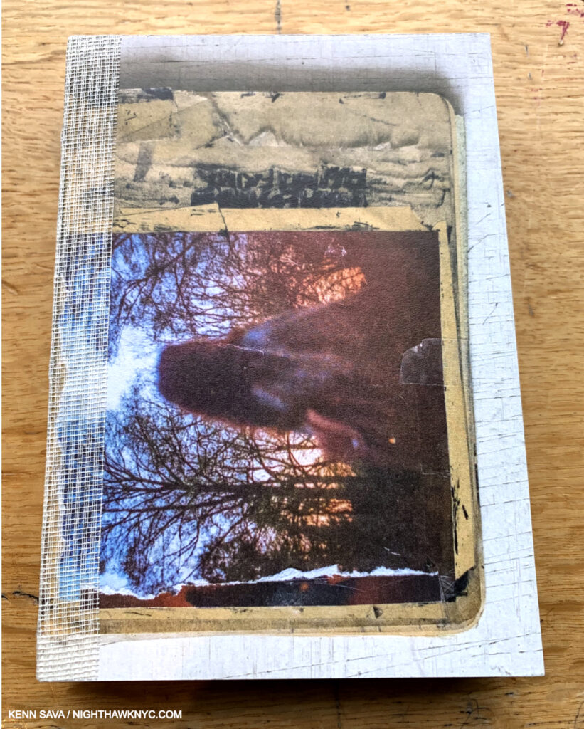
Josh Kern, Fuck me, 2018, about 4 by 6 inches.
Josh Kern, Fuck me, Dienacht, 2018
I believe I was the first person in the U.S. to discover Josh Kern and his first PhotoBook, Fuck me, in early 2019. At the time, Josh was a German college student(!), studying with the renowned Photographer, PhotoJournalist, and author of War Porn, Christoph Bangert. When I reached him there by email, Josh kindly agreed to do a Q&A with me, which remains one of my more popular pieces. I also took the unprecedented gamble of buying 25 copies of Fuck me(!), the first, and only time, I’ve bought a quantity of a book. Such was my level of belief in this first book by a complete unknown, which was unavailable in the U.S..
Not being a book retailer, I offered the book to the two biggest PhotoBook specialist resellers in the U.S.. Both (WHO ONLY SELL PHOTOBOOKS) rejected it outright. Two staff members at the first seller told me it was an almost laughable product. The other seller just kept turning it over and over in their hand between talking to other people on the phone. They finally opened it, looked through it, and said, “No, thanks.” The following month, word came that all 1,200 copies of Fuck me had sold out in Europe- an unbelievable number for a first PhotoBook by a college student! I wasn’t surprised. The book struck the same nerve with viewers it had struck with me. I was suddenly left with the only copies in the world, and no retailer in the U.S. wanted them! Thankfully, Josh’s many fans who couldn’t get them in Europe emailed me after seeing my article desperately trying to find it. Suffice it to say it worked out much better than if those two resellers had bought them from me!
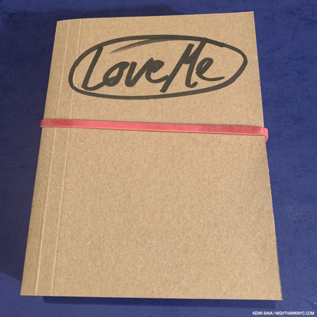
Josh’s 2nd book, Love Me, 2020, with its rubber band.
And oh yeah- BOTH of those U.S. booksellers carried Josh’s 2nd book, Love Me!!! I guess they came to terms with Josh’s innovative book design! HA! “He who laughs last…” Even unintenionally!
The Moral
The “moral” is that this experience mirrors a bit of what I imagine every Photographer who publishes a book of their Photos goes through (and what I went through as an independent Jazz record producer in the late 1990s): After creating a body of work that they passionately believe in, they then invest the time, money and resources into getting a book made- a sizable and laudable feat in itself. Then they have to deal with the world’s acceptance of their work. Or not. The lucky ones wind up with a hit on their hands. The rest wind up with a stock of books. And, as we’ve seen, that “hit” can come from anyone, at any time. Josh Kern’s Fuck me is one of my NoteWorthy PhotoBooks of the 21st Century (thus far).
My Q&A with Josh Kern, “Shy No More! Josh Kern Breaks Through” is here
63 books are on my list. Slightly more than 2 per year over these 25 years.
“NoteWorthy Art Books of the 21st Century” is here. Both are BookMarks Specials.
*- Soundtrack for this piece is “Otherside” by The Red Hot Chili Peppers from their classic Californication, 1999. “I heard your voice through a photograph, I thought it up and brought up the past. Once you know, you can never go back. I gotta take it on the otherside.”