Stephen Shore: Beneath The Surfaces

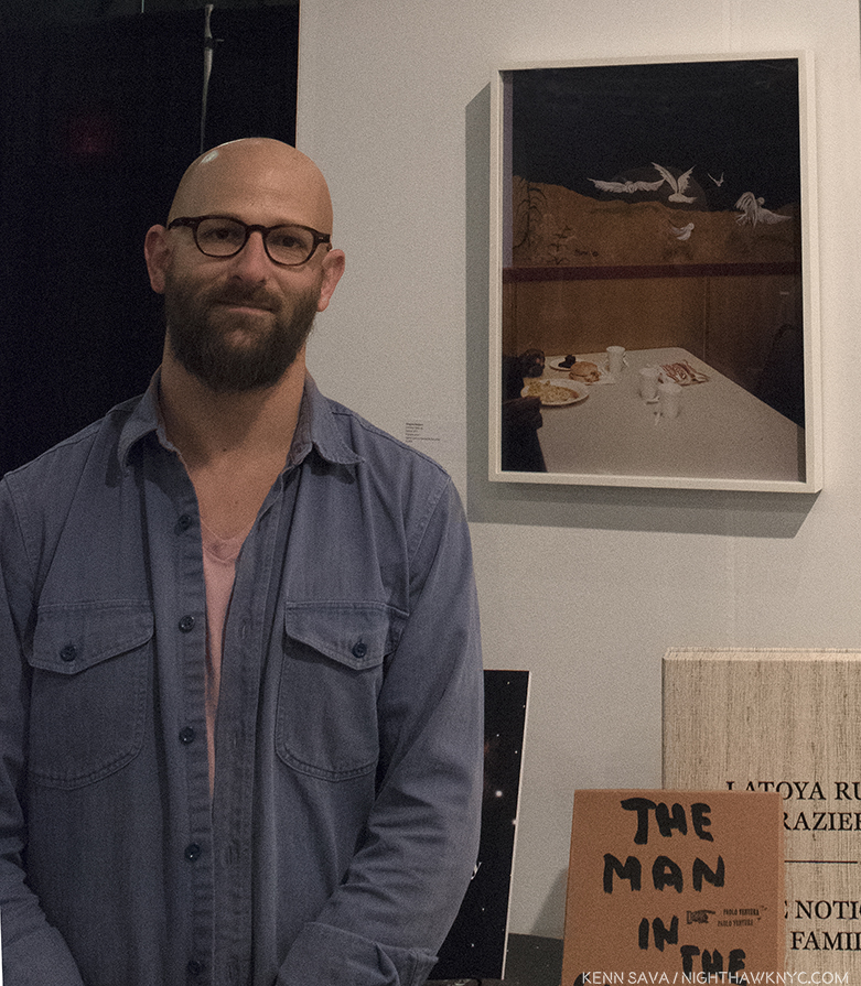
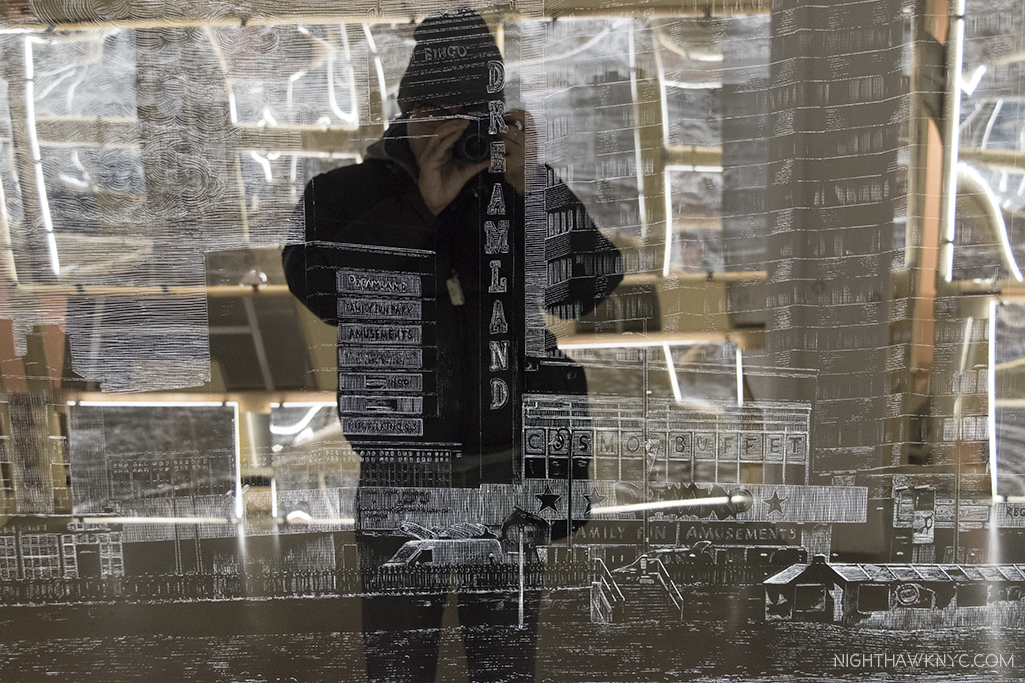
Written & Photographed by Kenn Sava (except El Paso Street, El Paso, Texas, July 5, 1975 )

Let’s play “Curriculum Vitae Roulette.”

First, make a list of ages going down the left side of the page. Next, write down some amazing feats, then slice them up individually, put them in a hat and mix them up.

No cheating! Blindfold, please. Begin!

Pull them out one at a time and lay them in a row going down, one next to each age. Repeat step 5 until the hat is empty. We’ll start with a given- the birth year. Let’s say…”Born 1947.” Ok. Let’s see what we have.

Born- 1947
Age 6- Gets a gift of a darkroom kit. Proceeds to develop and print his family photos.
Age 8- Gets a 35mm camera. “I started photographing seriously. Before that, my real interest was darkroom work,” he would later say.
Age 10- Receives a copy of Walker Evans’ American Photographs, the catalog for Walker’s legendary 1938 MoMA show, perhaps, the first important American PhotoBook, which has a powerful and lasting impact on him. He would later call Evans “a kindred spirit1.”

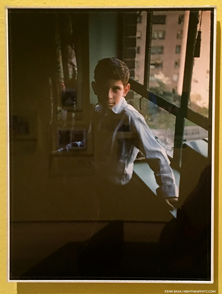
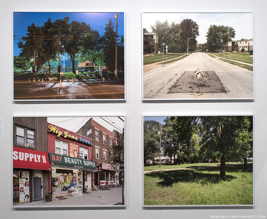
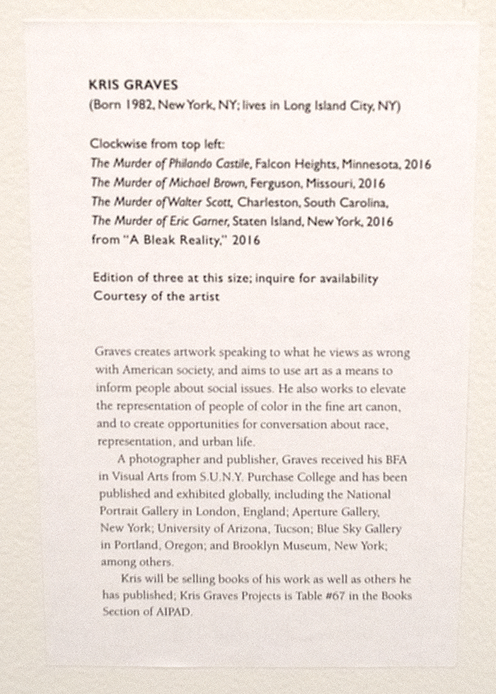
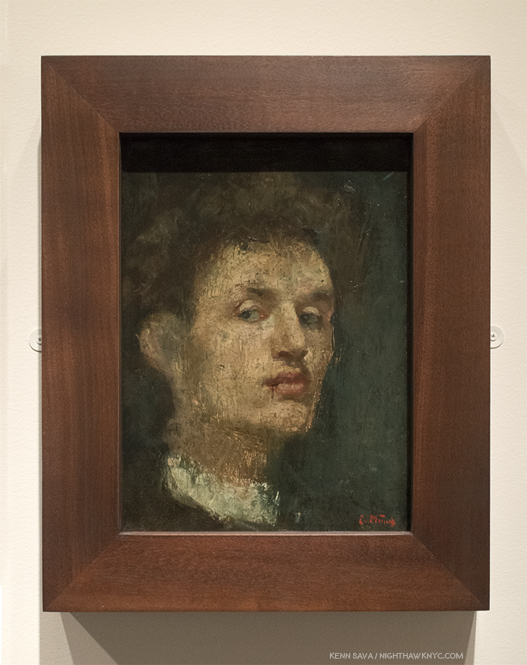
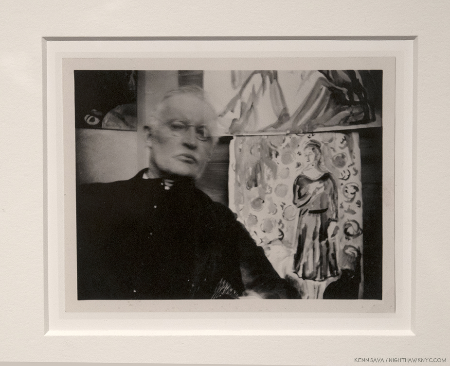
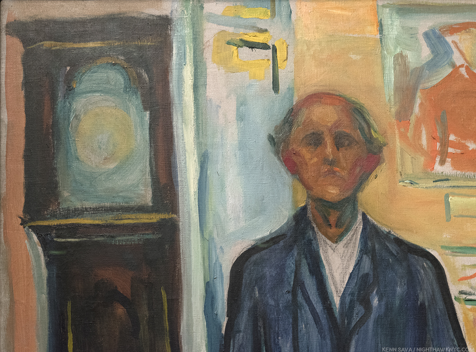
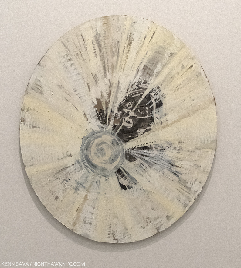
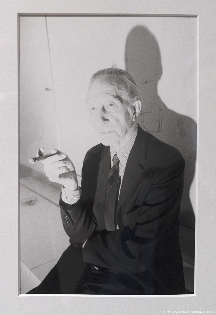
Our subject. Self Portrait, 1957. He was ten. TEN!! Click any Photo for full size. (See- “A Note About Glare In My Photos” in this footnote-2.

Age 11- Has a Leica and a Nikon. Begins doing street photography.
Age 14- 1962- Legendary Photographer, then Director of Photography at MoMA, Edward Steichen, acquires 3 of his Photographs for MoMA. They ask him what his personal philosophy is. “None,” he replies. “I’m only 14.”
Age 15- First article about his Photography is published.

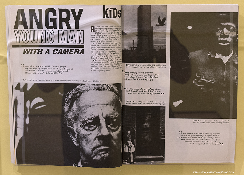
Angry Young Man With A Camera, U.S. Camera Magazine, 1963.

Age 16 & 17- Takes Photos like these-

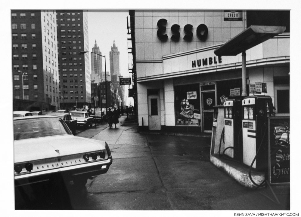
Untitled, New York, 1964. A forerunner of similar images to come in the next decade, and beyond.

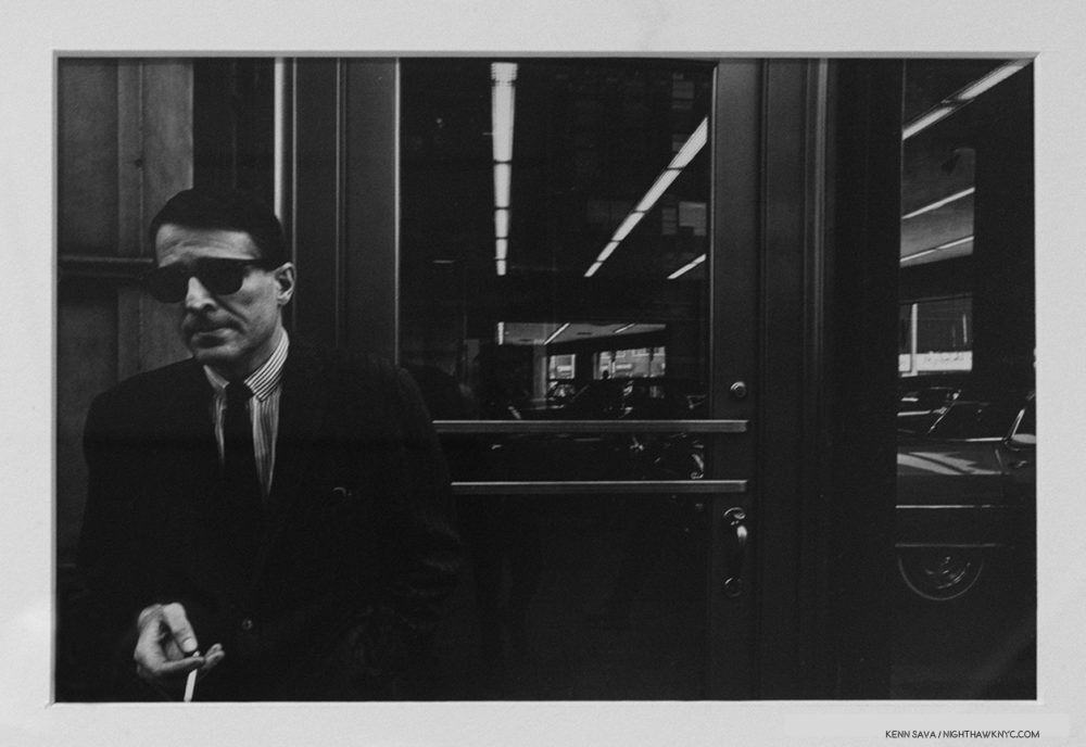
Untitled, 1965. I can’t look at this without thinking of Richard Estes’ now classic reflections from the 1970’s, like Central Savings.

Age 17- Meets Andy Warhol and begins to frequent, and Photograph, Warhol’s Factory. Of how this came about, he later said- “I made a film Elevator, which is shown in this gallery (see below), and it was shown the same night that Andy Warhol showed a film called The Life of Juanita Castro, and I had the opportunity then to meet him. And I asked if I could come to the Factory and take pictures. He said, “yes3.”

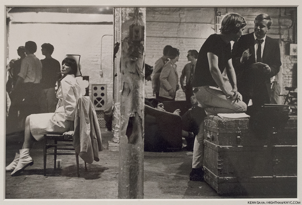
Ivy Nicholson, Chuck Wein, Peter Knoll, Danny Fields and Andy Warhol, the Factory, New York, 1965-67. I spent an evening hanging out with Ivy Nicholson, left in the white, in the early 2000’s. After a few drinks, she sold me one of her CD’s.

Age 24- 1971- First living photographer to have a one-man show at The Metropolitan Museum of Art.

Ok…I’m ROFLAICGU! (Rolling on the floor laughing, and I can’t get up!) Yeah…I know. Dumb exercise. NO ONE would believe that could actually happen, right?

But…Um? It did. It really did. ALL of it4! To ONE person. That’s actually the short list of the early life and career of Master Photographer Stephen Shore. REALLY!

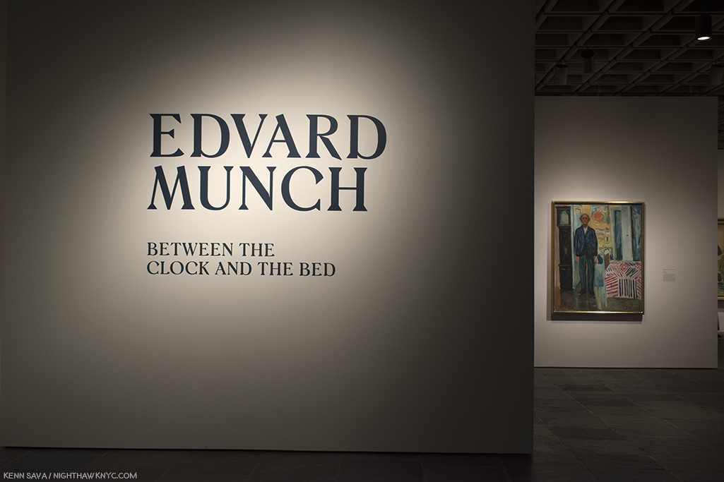
Once I got over the staggering accomplishments Stephen Shore achieved by age 24, which I’m not sure I still have (bearing in mind that William Eggleston didn’t start seriously taking Photographs until he was 185!), I could start actually beginning to assess what the man’s achieved, and is still achieving. The former was gloriously on display in MoMA’s retrospective. The latter was, also, gloriously on display at 303 Gallery on West 21st Street earlier this year, in two shows simply titled Stephen Shore. In between, and every day since, there’s his Instagram page which is a veritable one Artist iPhone Photo Museum, that’s amended daily. As he passes age 70, Stephen Shore is one of the most respected, and influential, Photographers of our time.

He got there the hard way- by continually forging his own way, even though those often lay outside of the “accepted mainstream,” like color Photography was in the world of “Fine Art Photography” in 1972 when he started using it, as he has relentlessly sought new ways to solve “Photographic problems.”

Stephen Shore at MoMA was a terrific chance to get the big picture. Taking full advantage of its very generous six month run, I learned more than I have from any Photography show since William Eggleston: The Democratic Forest at David Zwirner in late 2016 led to a deep dive into the world of contemporary Photography.

Many, even most, of those familiar with his work know American Surfaces” or Uncommon Places long considered his classics, (the resulting PhotoBooks of each were cited in Martin Parr and Gerry Badger’s The Photobook: A History, Volume II). They may not be familiar with his earlier, or later work. Over such a long career, it’s impossible to cover everything Mr. Shore has done, but MoMA has done an exemplary job of hitting a good many of the high notes along the way, including many of his most familiar Photographs surrounded by a good many that are not so well known. Along the way, it seemed to me, the show manages to tie his many and varied projects into a running thread. For an Artist who’s work has continued to evolve for going on 60 years, that’s an accomplishment, and for work that some may look at and not understand, it’s a valuable insight, and perhaps a “way in.”

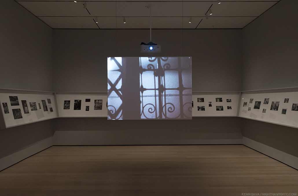
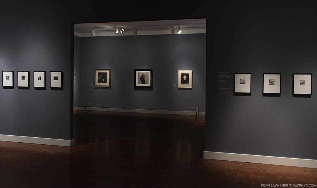
The first room features Stephen Shore’s earliest work, arranged counterclockwise. Which means that after you enter the gallery, to the right, you are presented with the latest works in the room, and you work your way to the earliest, on the left. Shouldn’t it have been the other way around? In the center of the room, Mr. Shore’s 16mm film, Elevator, 1964, the film Andy Warhol saw that led to him Photographing the Factory, is featured.

Fittingly, the first room begins with early work, and ends with his Photographs of Warhol’s Factory, while his short film, Elevator, 1964, plays in the middle of the gallery. It’s the film Warhol saw the led to Stephen Shore being invited to Photograph at the Factory. He would spend large parts of the next three years, from 1965-67 documenting it. It’s only recently that Stephen Shore has chosen to exhibit his Warhol/Factory work. “I rejected my Factory period for a long time. For so many of the others involved, it was the pinnacle of their lives. For me it just wasn’t. It was the beginning6.”

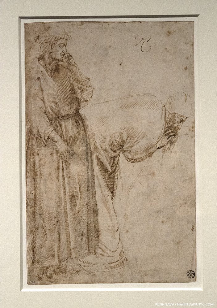
Marcel Duchamp, 1966, Photographed at Warhol’s Factory. With its evocative lighting, this unusual portrait was the final work displayed in the first gallery, though it’s actually the first Photograph viewers see after entering the show.

Lately, he’s seemed to come to terms with this work, as was seen in the 2016 Phaidon collection he was involved with, “Factory:Andy Warhol Stephen Shore.” Though different from all that came after that Stephen Shore has done, to my eyes, this is not only historically important work that documents the Factory as well as it has been. Each image brings unique elements- particularly the arrangement of the figures. Through it all, there is an intimacy on view that only a personal knowledge of the subjects can bring. It’s work that belies the youth of its creator and it more than holds its own as an historically important body of work that also holds up as Stephen Shore’s first “mature” body of work. At 17.

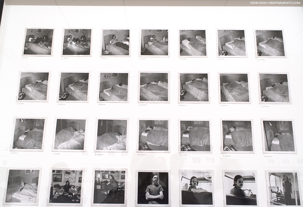
Detail of July 22-23, 1969, 1969. Stephen Shore Photographed a friend every 30 minutes for 24 hours. Even while his friend slept.

From there, Stephen Shore looked for new realms to explore, new problems to solve. He explored Conceptual and Serial Photography, which we see in the second gallery. The great Painter and Photographer, Ed Ruscha, had broken ground with his book Twentysix Gasoline Stations, 1963, a series of Photographs Mr. Ruscha took of gas stations from L.A. to Oklahoma City, which, influenced Stephen Shore deeply. As I walked through the rest of the show, I couldn’t escape the feeling that Conceptual and Serial Photography continues to influence his work- to this day. Ever since, most of the work he has done has been in series, whether in personal projects or commissions.

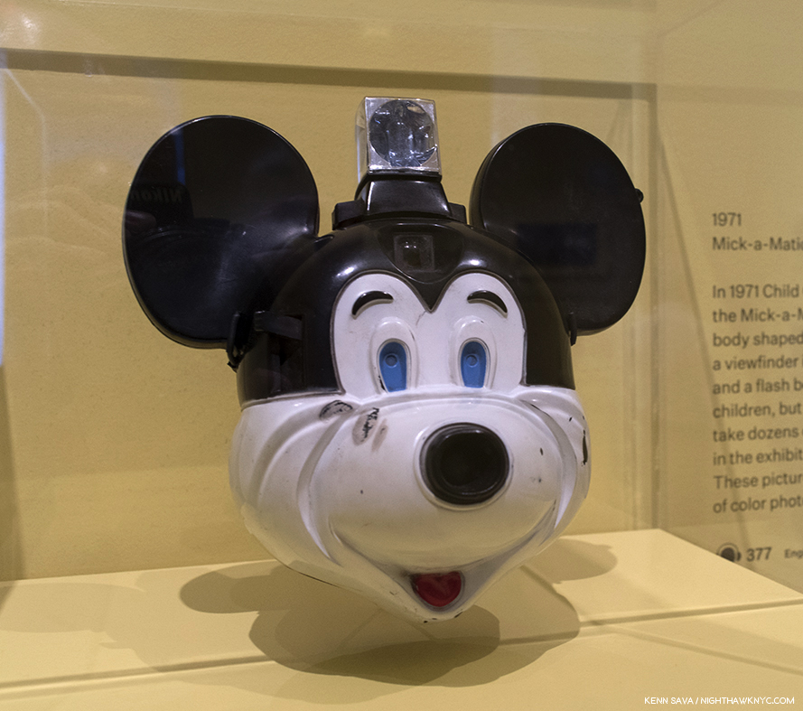
“Mick-a-Matic” Camera. Believe it or not, Stephen Shore used a Mick-a-Matic in 1971  to take his first color Photos, (some on view at MoMA, in the All The Meat You Can Eat section). He used it to get a “snapshot” feel, a pursuit he continued using a Rollei 35mm camera in his first landmark series, American Surfaces, in 1972-73.

In the 3rd gallery, we re-visit a show that Mr. Shore curated called All The Meat You Can Eat, 1971. On display were examples of the vernacular uses of Photography, with a few shots by Stephen Shore (apparently taken with the  “Mick-a-Matic”), but most taken by others. About it, he said, “I was just fascinated by how photography was used. I was interested, also, in the meaning conveyed by how it was used—that we see a snapshot differently than we see an art photograph, that we see an advertisement differently than we see a postcard7.” It was around this time that he became interested in color Photography. “Because postcards and snapshots, in 1971, were all in color, I had to begin examining color photography. In fact, most photography that an average person encountered at the time was color. While art photography, the photography that would be found in galleries, was almost always in black and white. That convention bothered me8.” Regarding his interest in the snapshot, he spoke about a certain quality that some of them had- “…it’s very hard to find the quality of the unmediated image(3. As quoted here. I amended the quote to “unmediated” with the input of Mr. Shore.].” All of this combined to lead him further down the road of Conceptualism, though with a better camera (a Rollei 35mm), and take him, literally on the road.

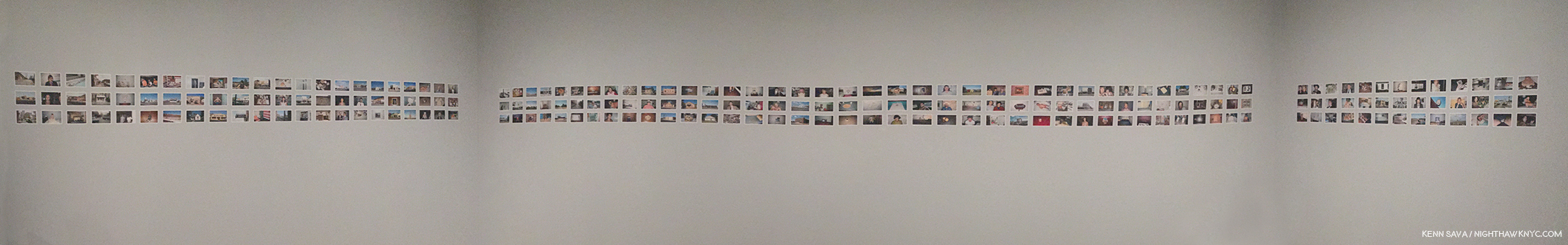
Installation view of 219 images from the over 300 that comprise American Surfaces as displayed in the 4th gallery at MoMA, recreating how they were first displayed.

He returned with American Surfaces, 1972-73. In keeping true to the snapshot model, he even sent his film to Kodak in New Jersey for processing, like every other snap shooter at the time was doing9. “It began as a road trip. My idea was to keep a visual diary of meals I ate, people I met, televisions I watched, motel rooms I slept in, toilets I used, as well as the towns I would drive through, and, through this visual diary and series of repeated subjects, build a kind of cultural picture of the country at the time10.”  The resulting series of over 300 35mm prints are in the familiar 3 1/16 by 4 5/8 inch snapshot size, though it’s debatable how many of them have that “unmediated” feel. Looking at them now, is a fascinating example of the impact of the passing of time. While the series was met with less than stellar reviews, most notably from the legendary head of MoMA’s Photo Department, John Szarkowski, The Metropolitan Museum of Art bought the entire series. It’s already hard for us to see them as they looked in 1973, but it’s not hard to find the innumerable examples of influence of this series in the work of others since…like in countless people’s social media feeds of every meal they eat, every place they visit, etc, etc. 40-odd years later? Stephen Shore has said that he found Robert Frank’s The Americans “too pointed11. That certainly cannot be said of American Surfaces, though the influence of Walker Evans, Ed Ruscha and Bernd and Hilla Becher, along with Andy Warhol, are to be found, if anything, it’s remarkably open.

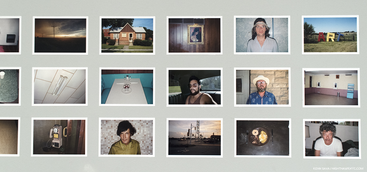
Excerpts from American Surfaces, 1972-73, Stephen Shore’s now a classic groundbreaking first series, a visual diary of a road trip . Taken with a 35mm Rollei camera.

Mr. Szarkowski’s criticism of whether the semi-automatic Rollei had created the results, rather than Mr. Shore’s abilities, led the Artist to double down on his intentions. Realizing he couldn’t make 8 x 10 prints from the small negatives without too much grain, he decided to go on another road trip, with bigger cameras. He tried a 4 x 5 camera made famous by press Photographers like Weegee before settling on an 8 x 10 inch camera, which required a large tripod and for the Photographer to shoot under a black hood. The results were worth it. Uncommon Places retains every bit of its majesty and mystery. Though it reprises many of the themes familiar from American Surfaces- meals, motel rooms, architecture, and portraits, the results have a magic that have more than held up since Aperture first published them in 1982. They remain THE series people are referring to when they say something “looks like a Stephen Shore.”

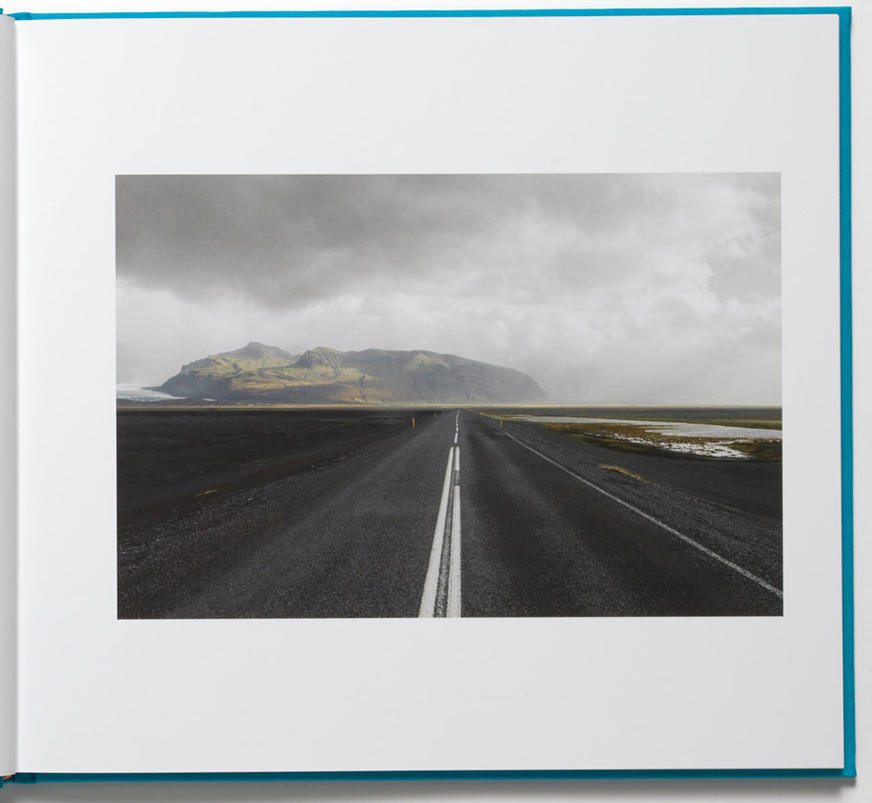
U.S. 97, South of Klamath Falls, Oregon, July 21, 1973. Ahh…the wide open spaces…that only an 8 x 10inch camera can provide.

Both American Surfaces and Uncommon Places are personal and impersonal at the same time. Personal because these are his trips. These are the meals he ate, the rooms he slept in, the people he met, the places he saw. Impersonal because the Artist himself is not seen, nor do we get any indication of what meaning any of these places, people or things have for him. In that sense, they are different from most tourist’s snapshots. The shots of places are like the Paris of Atget, or many of Walker Evans shots of America. The difference I see between American Surfaces and Uncommon Places is the former is marked by Photos that say “look at this,” whereas the latter creates “a little world that a viewer can move their attention through without (his) directing it12.”

Lookout Hotel, Ogunquit, Maine, July 16, 1974, 1974.

It’s up to the viewer to piece them together- individually and as a group, like William Eggleston’s “Los Alamos,” 1965-74, which is also a travelogue of sorts, who’s period partially overlaps.

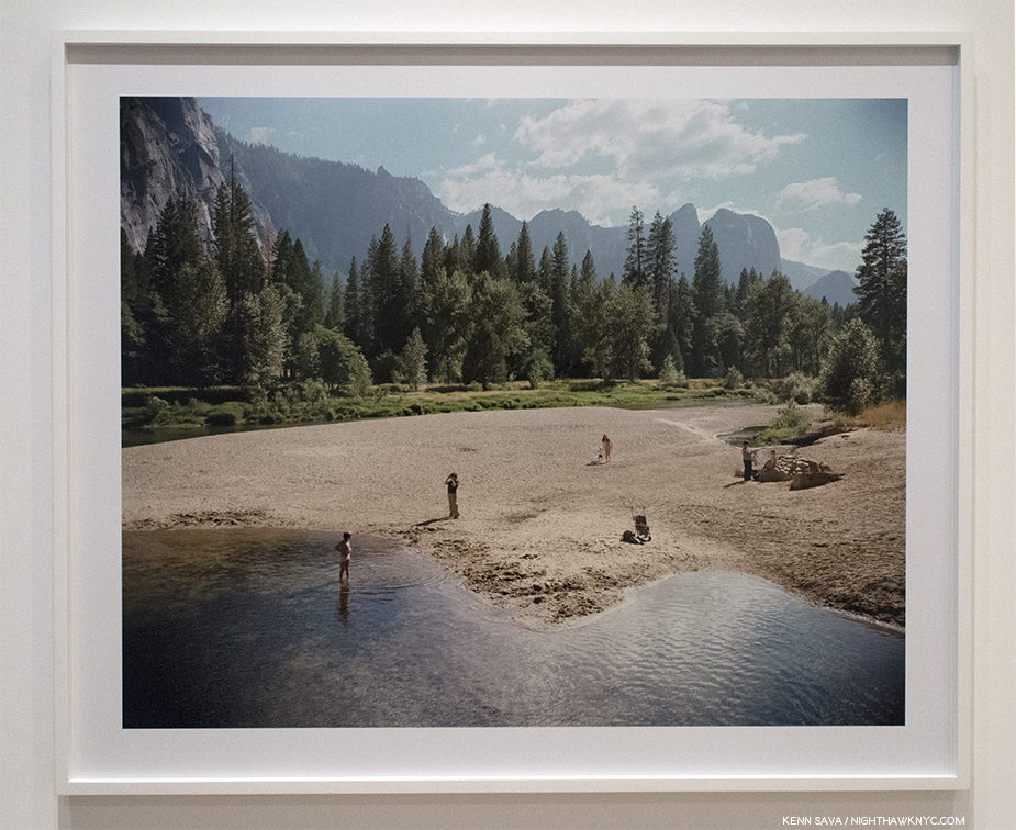
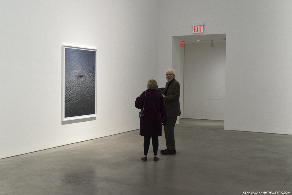
Merced River, Yosemite National Park, California, 8/13/79, 1979. The only work in the show to hang on a wall by itself would seem to lie at the heart of the show.

Merced River, Yosemite National Park, California, 8/13/79, 1979, strikes me as a bit of a rosetta stone when looking at much of Stephen Shore’s work. Intriguingly, it hangs on a wall by itself at something of the heart of the show. At first glance, it appears to be a fairly ordinary landscape view with some folks (perhaps a family) frolicking on the beach in the mid foreground. “…what I realized is that it renders the world in such detail that I don’t have to move into something close to make it clear in a picture. I can let it be a small part of a larger, more complex picture. And so, rather than the picture being, in a way, a view through my eyes, it becomes something else. It becomes a complex world where the viewer can move their attention13.”

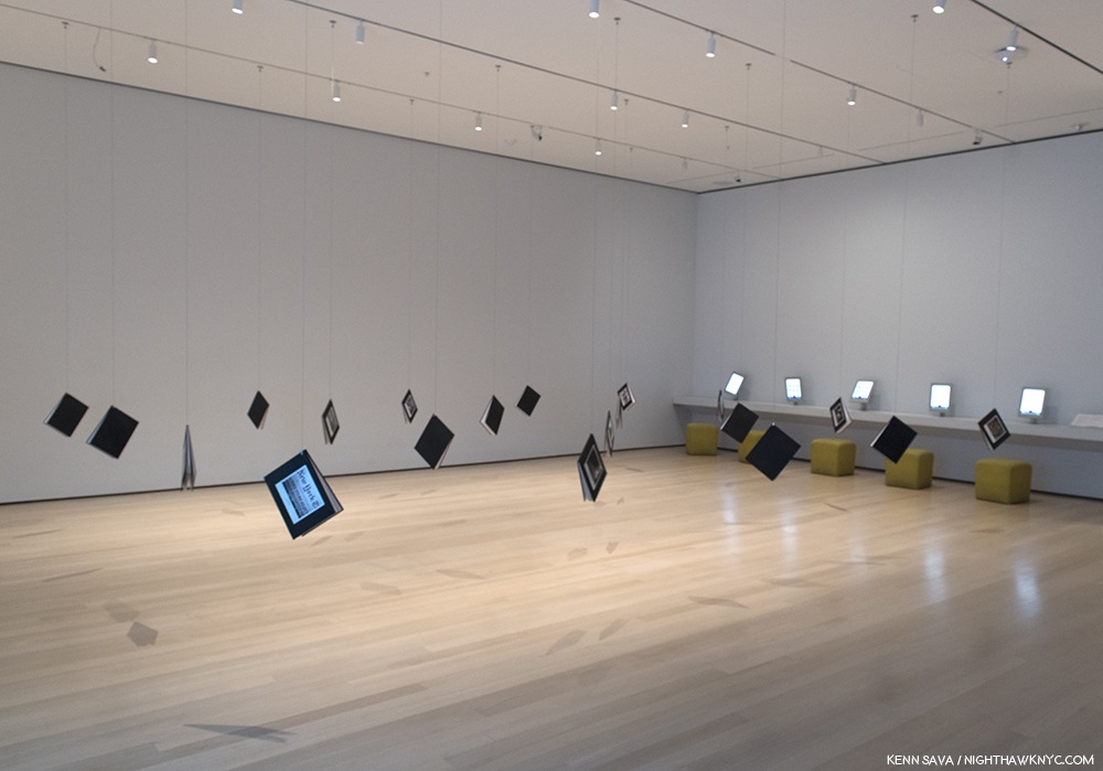
The gallery of Print on Demand books, with a row of iPads displaying Stephen Shore’s Instagram page, right.

He demonstrates this in the gallery to its left, in a room full of hanging books, print-on-demand titles he created in the early 2000’s. Of the 20 books hanging in this gallery, one is devoted to Merced River.

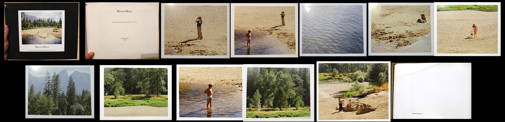
The complete contents of Merced River, Yosemite National Park, California, 8/13/79, 1979, one of the print on demand books seen above.

In it, the Artist presents the master image as a series of sectioned images, showing us that each one could be a stand alone Photograph. While each proves fascinating on its own, for me, most interesting is the bottom left Photograph, in which we see a side view of the scene Ansel Adams shows us in his famous Photographs, Monolith, Face of Half Dome, 1927, and Moon And Half Dome, 1960.  Stephen Shore was one of the Artists included in the ground breaking 1975 exhibition titled New Topographics: Photographs of a Man-Altered Landscape, at the George Eastman House in Rochester. Mr Shore, along with Lewis Baltz, Robert Adams, Joe Deal and 4 other American Photographers were shown turning away from the classic landscapes of Ansel Adams and Edward Weston’s time and showing the American Landscape as it now existed- altered by man.

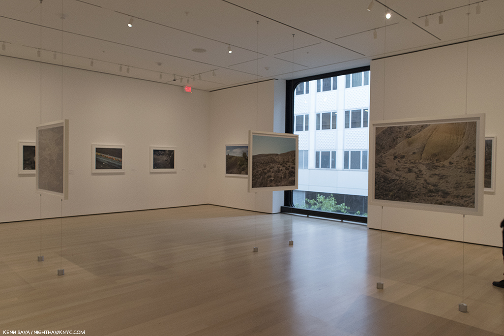
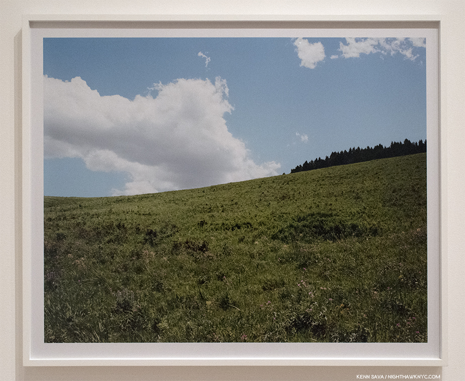
This gallery of landscapes taken in the Montana, Texas, Upstate New York and Scotland was something of a beautiful revelation. Complete with landscapes hanging in mid-air.

There’s a “calmness” that overrides almost everything I’ve seen by Stephen Shore. There’s very little “action.” Even in his commissioned Photographs of the New  York Yankees in Spring Training, not much is going on. Players sit in a group, or stand at the plate, motionless. What we’re almost always given to look at is a “surface” of some kind. But, what strikes me about Stephen Shore’s work is that it almost always leaves me pondering what’s under that surface.

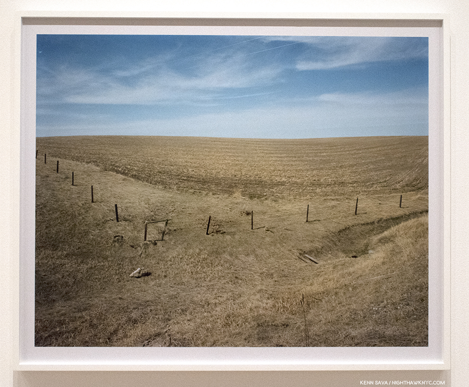
Gallatin County, Montana, April 18, 1981. The second time I met him, I asked Stephen Shore about Painters he liked. He replied, “Anselm Kiefer.” Then added, “I don’t think of Painters when I’m working.” That doesn’t stop me from thinking about them. Looking at this work, I’m reminded of Van Gogh’s immortal Wheatfield With Crows. Minus the crows.

Gallatin County, Montana, August 2, 1983. Again in the gallery that I came to call “The Hall of Landscapes,” this one struck me as being a non-“New Topographic” landscape, and so is rare in his work. Here, there is no evidence of man altering the landscape. Instead, we see an image almost split in two between land and sky, though it’s hard to tell exactly how far off the crest of the hill is, and so it reminds me of Holden Street, North Adams, Massachusetts, July 13, 1974, from Uncommon Places, as a work in which distance and perspective are key elements. Along with the peaceful beauty.

I met Stephen Shore twice during the show’s very generous six and a half month run. I asked him how he felt about the show. “I’m thrilled,” he replied. Well, that might not sounds like an earth-shaking, newsworthy response. But, then I thought about Stephen Shore’s career, and how the initial reaction to his work was not always positive (see below). At MoMA, all these years later, with glories around every corner in every gallery, he’s been “proven right,” so to speak. The show is an unmitigated triumph.

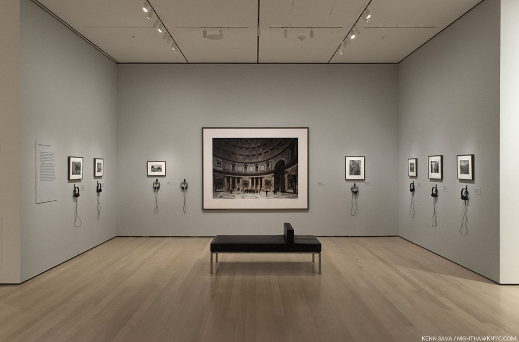
The central gallery devoted to his book, The Nature of Photographs, about looking at Photographic prints, features his work and the work of others he uses as examples in the book, like Thomas Struth, center.

Add to that, he’s been the Director of the Photography Program at Bard College since 1982, as well as the author of the highly respected primer on looking at Photographs, The Nature of Photographs,  which was first published in 1998 (See the “BookMarks” section at the end for my recommended Stephen Shore books…though you really can’t go wrong.). His influence on other Photographers is everywhere and already incalculable, and seems likely to continue indefinitely. There’s certainly a lot in 2018 for Stephen Shore to be “thrilled” about.

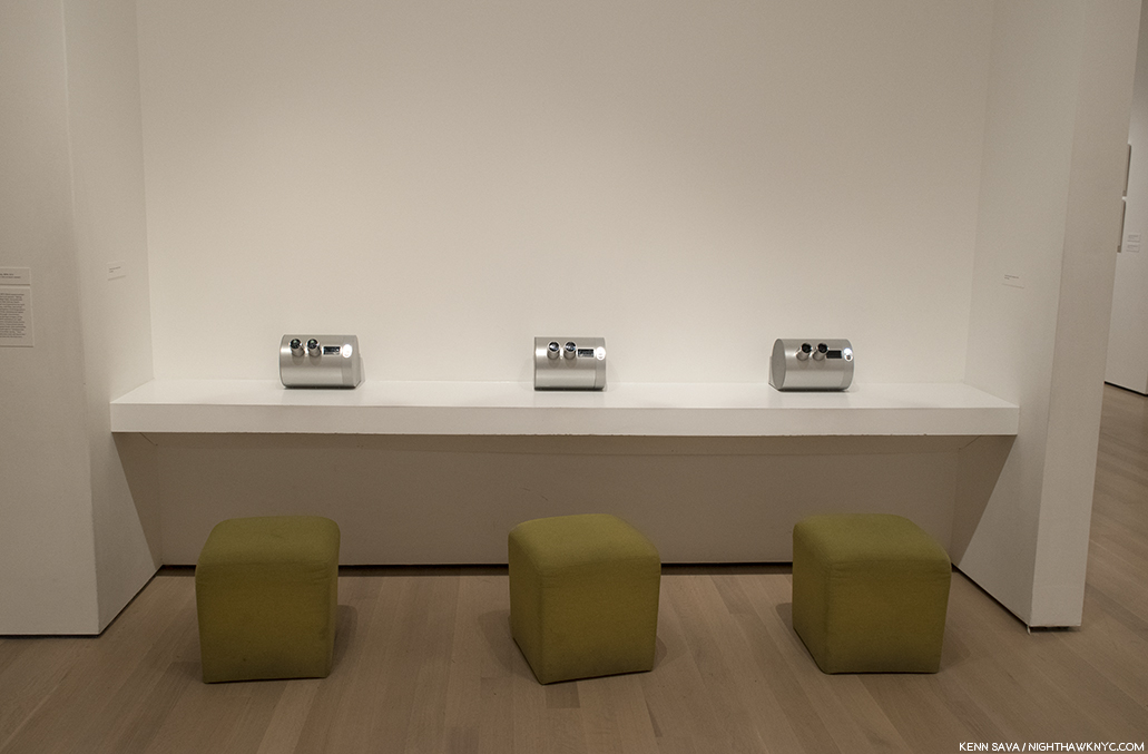
3 Stereoscopic viewers each containing 10 different Stereo Photographs Stephen Shore took in 1974 with a Studio-Realist 3-D camera.

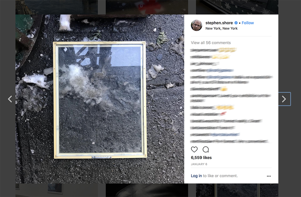
Stephen Shore’s Instagram page, January 6, 2018.

Stephen Shore has been posting virtually daily on Instagram since 2014. Of his approach, and some of the comments he’s received he wrote this on February 18, 2018-

  • stephen.shore “Shore seems intent on proving that anyone can photograph as well as he can, and I must admit he’s building an airtight case. The specific concept behind this exhibit is not readily apparent to me, which would make me feel old-fogeyish as all get-out if I weren’t still young enough to not give a fuck.” This is from a review (in the Village Voice) of a show of mine in 1972. This is how some people viewed the very work of mine that you now respect and perhaps view as “iconic” at the time it was made. It sounds very much like the criticism I’m hearing today – except you all are more polite and respectful. Every now and then I write about my use of Instagram and this seems like an appropriate time. Some photographers refer to their feed as their “gallery”; they see it as a means to make public their best work. There are also well known photographers who have an assistant go into their archives and post one of their best known images each day. My own approach is to post almost every day a picture I made with my phone with Instagram in mind. I see the pictures as a kind of visual jotting – similar to the way Walker Evans used the Polaroid SX-70 camera when he was about the same age as I am now. I’m definitely not defining how Instagram should be used, just stating my intentions. I want to thank all of you for taking the time to express your views. You might find this article of interest: http://stephenshore.net/press/Photograph_Dec_17.pdf

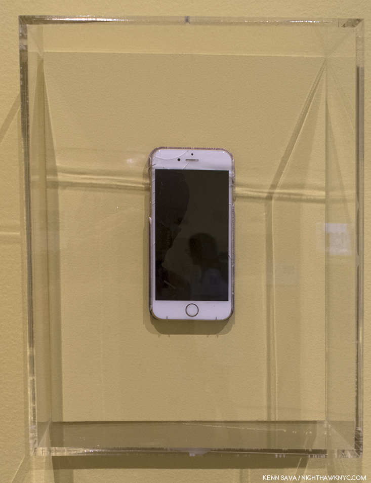
(One of) Stephen Shore’s iPhones. When I met him in January, as seen below,, he was holding a different one. Still, this one was most likely used for his Instagram page. Your results may differ.

While countless social media feeds now look eerily similar to American Surfaces when he first showed them in the fall of 1972, the show was “totally baffling then to almost everyone who saw it14.” Now, Stephen Shore uses Instagram in his own way, and after 4 years of doing so, with an iPhone, its influence can be seen in his other new work. In addition to the MoMA show, 2018 began with a show of new work by Stephen Shore at Cheslea’s 303 Gallery, his long time dealer. On view were recent Photographs taken with his new Hassleblad Digital  X1D camera, which features a touchscreen, much like an iPhone.

Stephen Shore arrives at the opening of his show at 303 Gallery, January 11, 2018. Moments later, this room was packed.

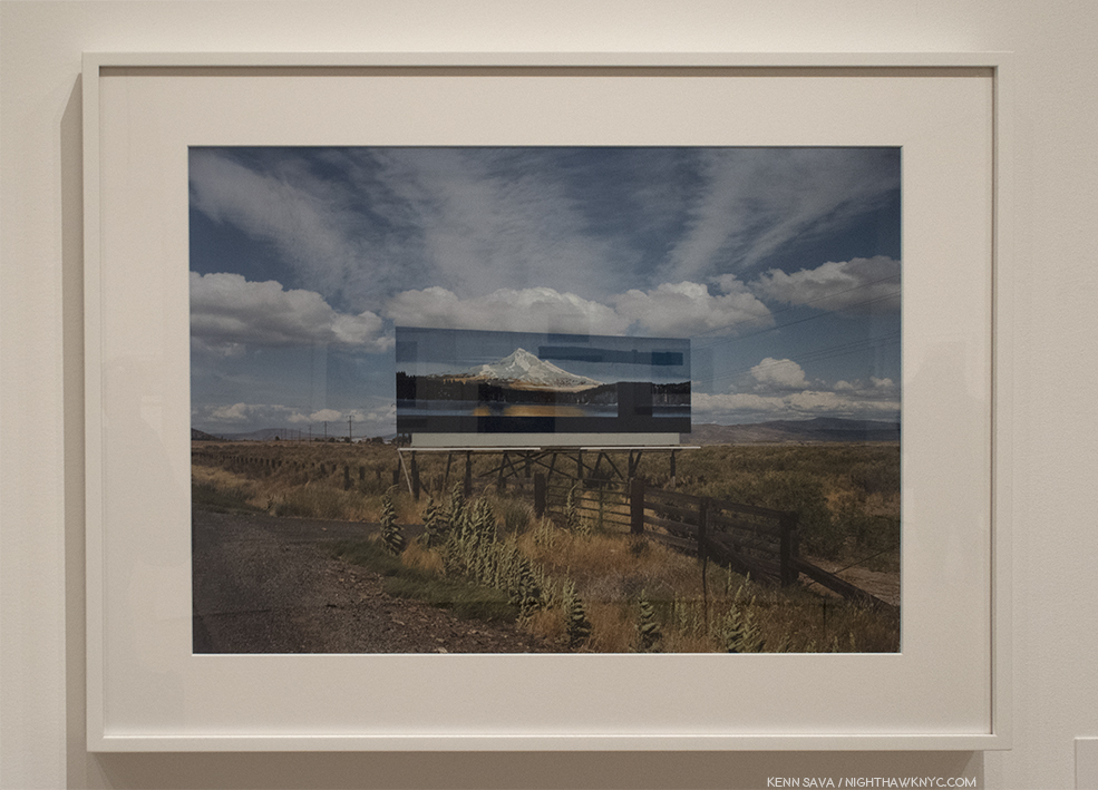
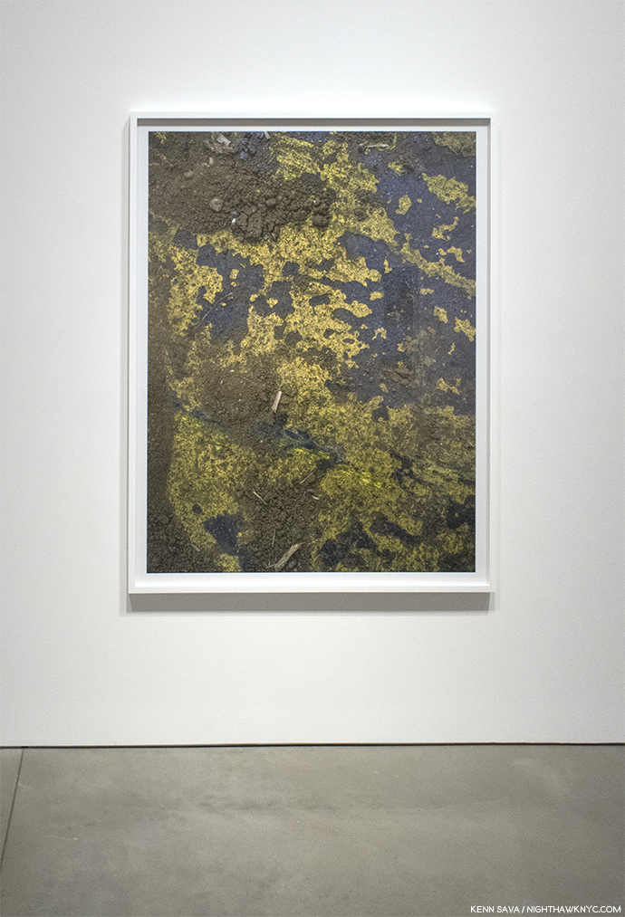
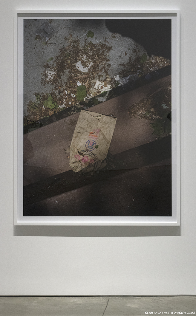
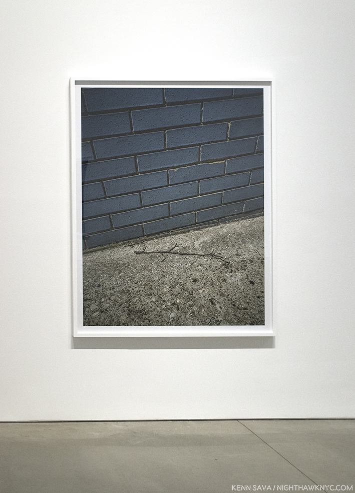
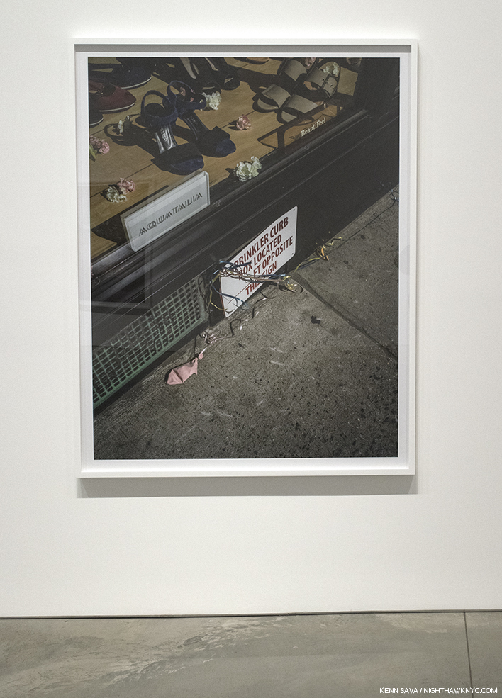
His recent work may look familar to anyone who’s seen his Instagram page. Mr. Shore explained that while he was out walking his dogs he did a lot of looking at the ground. He became interested in “details” he’d see of the ground or the street. More surfaces, yes, but looking through his past, pre-Instagram work, reveals the occasional image similar to these. Using the 50 megapixel Hasselblad X1D Medium Format Mirrorless Digital Camera, he’s able to take images that he can print at sizes of 5 feet, that are, he says, “more highly resolved than work from my 8 x 10 camera15.”

New York, New York, May 19, 2017, seen at 303 Gallery, January, 2018.

I find the results enthralling. Some of the 9 works on view at 303 reminded me of Aaron Siskind, but in the level of detail Mr. Shore brings to bear, they’re completely and entirely something else. Seeing details printed in such a scale presented a small world, where only an occasionally recognizable object, like a matchstick, would give a sense of scale.

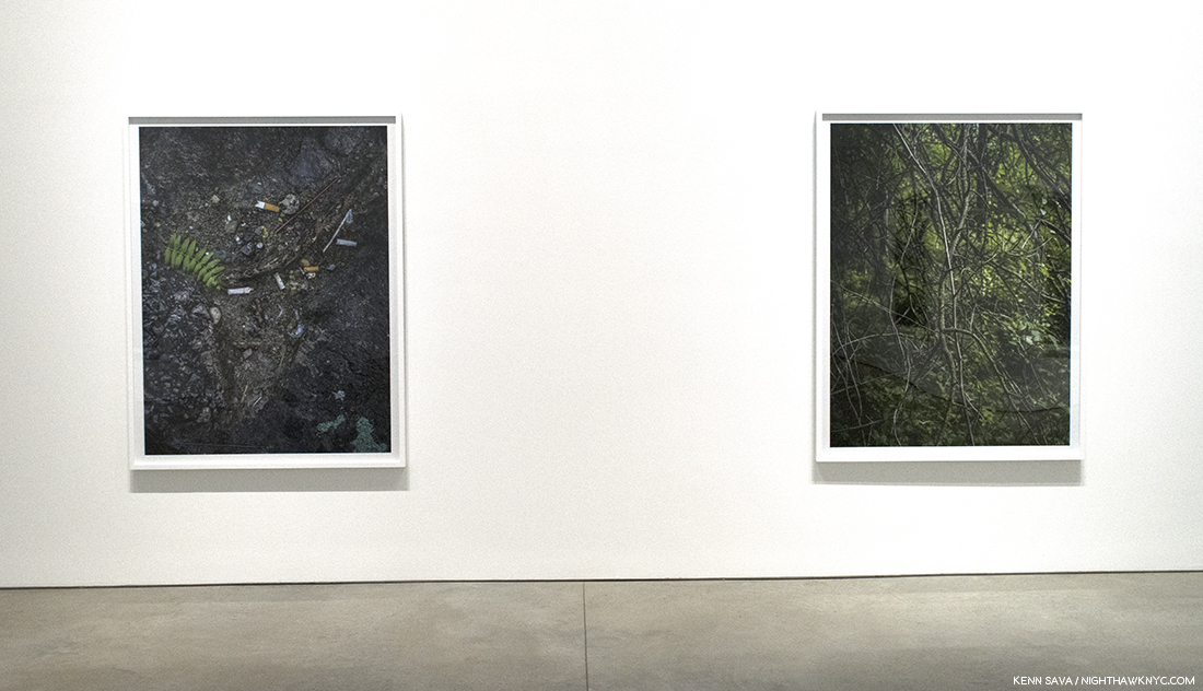
New York, New York, May 19. 2017, left, and London, England, June 9, 2017, right, both seen at 303 Gallery, January, 2018.

New York, New York, May 19.2017, seen at 303 Gallery, January, 2018.

New York, New York, May 19.2017 seen at 303 Gallery, January, 2018.

New York, New York, May 20.2017, seen at 303 Gallery, January, 2018.

Without that familiar object, some almost look like a Photograph of the Earth, or some other planet, seen from space. In these works, he’s gotten closer to the surface than ever, about as close to it as possible.

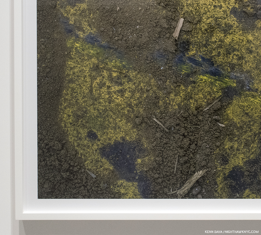
Detail of New York, New York, May 19, 2017. Kinda, sorta looks like North America, no?

For most of his career he seemed to be striving to make big scenes big, possibly to have the impact of being there. These seems to be striving to also make small scenes big. In his latest work, he brings the viewer so close it’s almost as if he’s trying to see under the surface.

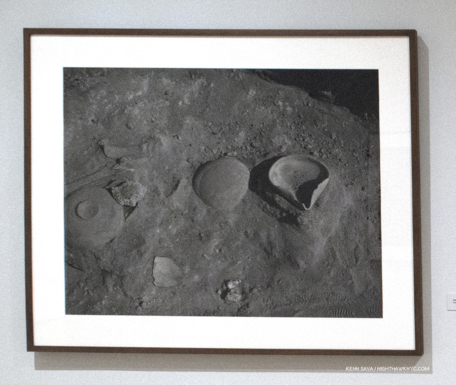
Back over at MoMA, there is a small room of works in which he has actually gone under the surface.

Ashkelon, Israel, 1996, at MoMA.

In 1990s Stephen Shore became fascinated by archeology. After reading extensively on the subject, he undertook projects at excavation sites, beginning with some ancient sites in Israel. Once again, as in a good deal of his earlier and later work, the images are without people. What he shows us here are ancient objects dug out from under the surface. In this case Stephen Shore shows us the surface and what literally lives under it. What we see are the remnants of human activity, life…their presence. In this case the remnants of a lost civilization.

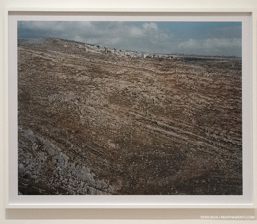
Beitin, West Bank, January 13, 2010, at MoMA.  It almost looks like the side of a large hill, with eons of geological strata facing us, with the current civilization on top, though it’s most likely a flat road or open space leading to the town in the distance.

While thousands of years have past since humans created and used these objects and places, in Ashkelon, Israel, and the other sites he Photographed, are they really all that different from what he shows us in American Surfaces, from 46 years ago? I’m sure a good number of those places are gone now, too. The main difference is that American culture is still here. What lies on the surface eventually gets covered over or is lost to time. One day there may be archeological digs going on here. “American Surfaces” is an unintentional piece of our cultural past, as are any vintage Photographs. In its case, it’s an artfully done series of over 300 works that taken together gives us a bigger sense of our culture in 1972. Much of the same can be said for Uncommon Places, since it continues many of the same themes. The larger 8 x 10 format is, perhaps, shown to best effect in the landscapes. In these, we see the effect that humans have had on the land- constructing buildings of various kinds, or otherwise modifying the land- the very crux of what was meant by “New Topographics,” Photographs of the man-altered landscapes.

“Lately I’ve been paper thin
So, why can’t I fly?
Why can’t I move with the wind on a whim?”*

Photographs are two dimensional representations on the surface of Photographic paper, of course. There is no “going underneath” the surface of a Photograph. Stephen Shore has long been something of an Archeologist Photographer, showing us our world as he finds it, a world teaming with evidence and artifacts of human presence, and so the resulting Photographs are often packed with so much information the temptation arrises to ponder what it “means,” what lies “under” the surface.

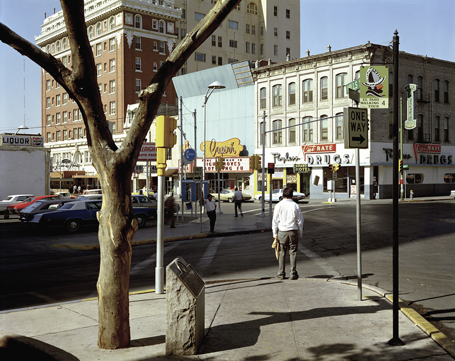
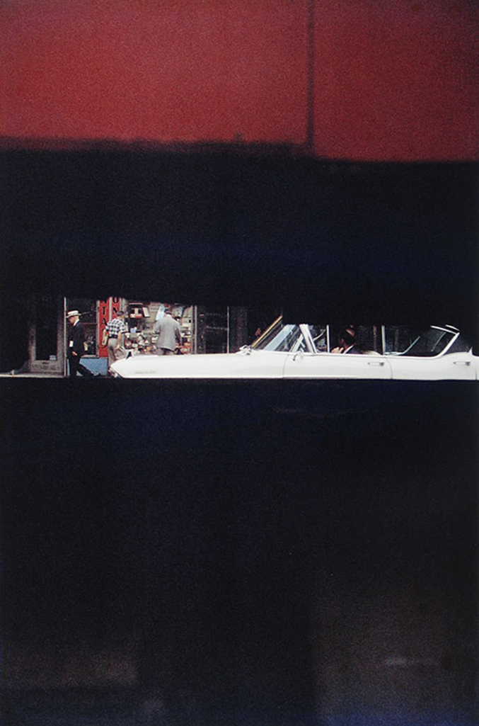
El Paso Street, El Paso, Texas, July 5, 1975 from Uncommon Places. This is one image I’ve literally spent hours looking at and thinking about. MoMA Photograph, and included in the Nature of Photographs section of the show.

Until, I came across this that he, himself, said. “…I was fascinated by what the world looks like when you pay attention to it, and I’m still interested in this act of attention. And so the pictures are reflective of the condition of a self, paying attention.”

Remember that game we played in the beginning? Stephen Shore’s real life C.V., now approaching book length, gets even more impressive every day. Exploring it serves to show me that one of the great lessons, and examples, of both shows is that over such a long and fruitful career, Stephen Shore has continually resisted repeating himself. There are other Photographers who have made a career out of attempting Uncommon Places-style work, but Mr. Shore has relentlessly moved forward, seeking new Photographic problems to solve and continuing to evolve as an Artist. Think about how few Artists have been able to do this. Among Musicians,  The Beatles, weren’t able to last more than 10 years before they broke up, and even among individual Musicians or Artists there are very few who have a similar track record. When considering Stephen Shore’s ongoing accomplishment, I look over this already long piece and the first thing I think about is how much I’ve left out. But, the joy of delving deeply into any great Artist’s work is that of discovery. I don’t claim to have “discovered” all that there is to discover in Stephen Shore’s work in 6 months. Particularly because- He’s going to surprise me, again, tomorrow.


BookMarks- (A series that looks at books related to the subject of this Post.)-

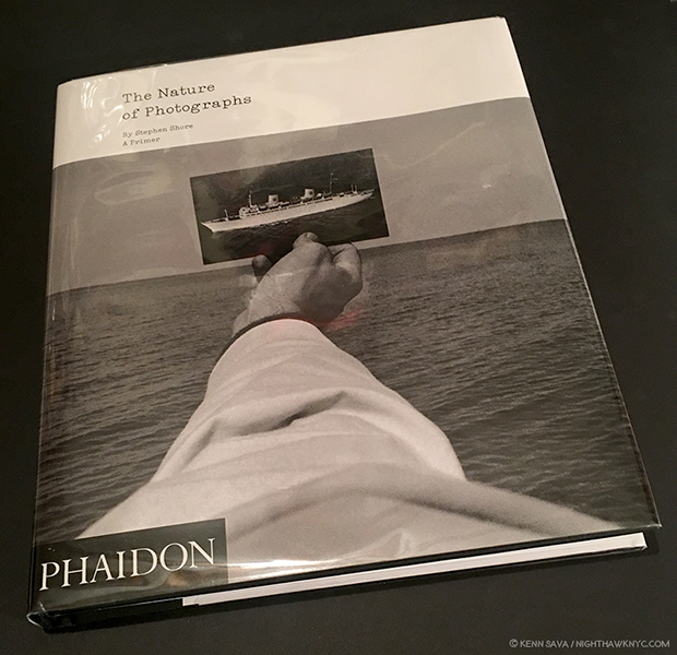
A copy of the Phaidon edition of Stephen Shore’s The Nature of Photographs: A Primer.

PhotoBooks have been a big part of Stephen Shore’s career. If you want to explore Stephen Shore’s work, the excellent Aperture Foundation has 2 books available that are both essential, in my view. Uncommon Places: The Complete Works, updates the original 1982 Aperture classic, Uncommon Places, (now out of print with first edition/first printing copies selling for about $900.00 at the moment). I recommend the Aperture’s 2015 update, Uncommon Places: The Complete Works, which lists for $65.00, because Mr. Shore added 20 rediscovered images, in what is now, as Aperture says, the “definitive edition,” of this unique and endlessly influential series.

Second, last year, Aperture released Stephen Shore: Selected Works, 1973-1981, which was one of my choices for the PhotoBook of the Year. Though a bit too large (note all the white space around the Photos), the concept of this book is brilliant. Aperture explains- “Over the past five years, Shore has scanned hundreds of negatives shot between 1973 and 1981. In this volume, Aperture has invited an international group of fifteen photographers, curators, authors, and cultural figures to select ten images apiece from this rarely seen cache of images. Each portfolio offers an idiosyncratic and revealing commentary on why this body of work continues to astound; how it has impacted the work of new generations of photography and the medium at large; and proposes new insight on Shore’s unique vision of America as transmuted in this totemic series.” Check out the list of the 15 contributors- Wes Anderson, Quentin Bajac, David Campany, Paul Graham, Guido Guidi, Takashi Homma, An-My Lê, Michael Lesy, Hans Ulrich Obrist, Francine Prose, Ed Ruscha, Britt Salvesen, Taryn Simon, Thomas Struth, Lynne Tillman.

American Surfaces, first released in 1999 with 77 Photographs, was reissued in an expanded, 300 Photograph edition, in 2005 by Phaidon, that came in a reproduction of a 1970’s Kodak film processing bag. it’s currently available (without the nifty bag) in a very good paperback edition that lists for 39.95, and is still essential for anyone interested contemporary Photography.

Stephen Shore has been Director of the Photography Program at Bard College, NY, since 1982, and The Nature of Photographs: A Primer, first published in 1998, and now republished by Phaidon, is as close as we have to his “textbook” on the subject. Not a “how to take great Photos” book, it’s more a study of looking at the end result- prints. Mr. Shore believes that aspiring Photographers should spend at least some time working with film, and that includes its end product- the print. As the world of Photography becomes more and more digital, and fewer Photographers have experience working with film and printing in a darkroom, this book becomes an ever-more valuable document from a master of the darkroom for over 64 years. In it, Mr. Shore talks about “the physical and formal attributes of a Photographic print that form the tools a Photographer uses to define and interpret…content,” such as flatness, frame, time and focus, each accompanied by classic images, the choice of which is fascinating on its own. Rembrandt never wrote a book about “The Art of the Print.” Ansel Adams did in the 1960s. Stephen Shore has for our time.

Finally, an under the radar book I recommend is Winslow Arizona: Stephen Shore (English and Japanese Edition),” 2014, published by Amana. It’s a collection of Photographs Mr. Shore took in one day in 2013 in the titular town he had first seen in 1972. The series was created for for a slideshow which was recreated at MoMA. I find it a beautiful collection of first rate later Stephen Shore images. Being that the entire collection was taken in one day may be intimidating for some who aspire to become Photographic Artists, it’s remarkable for the rest of us.

*- Soundtrack for this Post is “Surface” by Bonobo
*- Stephen Shore at MoMA is my NoteWorthy Show for May, 2018.
My thanks to Stephen Shore.
My previous Posts about Photography are here.

NighthawkNYC.com has been entirely self-funded and ad-free for over 6 years, during which over 250 full length pieces have been published. If you’ve found it worthwhile, you can donate to keep it going & ad-free below. Thank you!

Written & photographed by Kenn Sava for nighthawknyc.com unless otherwise credited.
To send comments, thoughts, feedback or propositions click here.
Click the white box on the upper right for the archives or to search them.
For “short takes” and additional pictures, follow @nighthawk_nyc on Instagram.

Subscribe to be notified of new Posts below. Your information will be used for no other purpose.


  1. MoMA Catalog, P.92
  2. “A Note About Glare in my Photos- Yes, I know. It’s annoying. It makes it very hard to see the Art or the Photo being displayed. I try very hard to minimize it in my Photos, even leaving out works where the glare is insurmountable (this was an especially BIG problem with MoMA’s great Frank Lloyd Wright show. For a while I thought I’d have no Photos to run of it.). Most galleries and museums don’t glaze their Art with non-reflective acrylic. For one thing, it’s quite expensive. For another, lighting in museums, particularly, is often less than ideal in spite of the efforts of some of the world’s best museum staffs. This is almost always an issue for any Art with glass or acrylic in front of it. Time and again I’ve pointed this out to curators who, much to my surprise, have actually agreed with me. Um? Then why isn’t it better? Add to this the proximity of other Art that is lit, and this is a problem for me in preparing these Posts. But? It’s also a problem for any show visitor. WHOEVER goes to the show is going to experience it- THIS is what they are going to see. So…I’ve thought about this problem long and hard in regard to the Photos I Post here. What I’ve decided, for better or worse, is that instead of using Photos of the Art from galleries or other sources, I’m running Photos of the Art as it actually appears in the show because this is how show attendees would most likely see it. My purpose is to give a sense of what the show was like and what it was about. To this end? I think this makes the most sense. In the “Self Portrait” Stephen Shore took at age 10, the glare was insurmountable, particularly in the large dark area to the lower left. I tried over numerous visits to minimize the glare, even trying different cameras, but given the yellow room, the bright lights and the proximity of the other frames reflected in it, it was just not possible. I decided that the reflections seem to auger the work to come in Mr. Shore’s illustrious future, and to “let it be.”
  3. MoMA Exhibiton AudioGuide https://www.moma.org/audio/playlist/45/706
  4. References for the list- UO Interview, and P.2 Tony Hiss/John Szarkowski stephenshore.net
  5. Thomas Weski, William Eggleston: From Black and White to Color, P. 177
  6. wallpaper July 26, 2007  https://wallpaper.com/art/Stephen-Shore-interview
  7. MoMA Exhibition AudioGuide https://www.moma.org/audio/playlist/45/715
  8. MoMA Exhibition AudioGuide https://www.moma.org/audio/playlist/45/715
  9. The first edition of the 2005 expanded version of “American Surfaces,” even comes in a recreation of a 1972 Kodak film processing bag.
  10. MoMA Audio Guide
  11. http://issuemagazine.com/a-ground-neutral-and-replete/8/#/
  12. http://www.tate.org.uk/whats-on/tate-liverpool/exhibition/sky-arts-ignition-doug-aitken-source
  13. MoMA Exhibition AudioGuide https://www.moma.org/audio/playlist/45/709
  14. https://newrepublic.com/article/115243/stephen-shore-photography-american-surfaces-uncommon-places
  15. Source for this paragraph is a video Stephen Shore made about the X1D https://www.youtube.com/watch?v=1BplS1MmZXk

The Photography Show Discoveries: Kris Graves

Special Exhibitions have become a welcome part of The Photography Show/AIPAD, and 2018 proved no different. Particularly innovative was “All Power: Legacies of the Black Panther Party,” a show inspired by the 50th Anniversary of the founding of the Black Panther Party branch in Seattle, Washington, terrifically curated by Michelle Dunn-Marsh, Executive Director of Photographic Center Northwest, Seattle.

The entrance sign, listing the Artists included along side the Black Panther logo. Click any Photo for full size.

While I highlighted the marvelous work of LaToya Ruby Frazier, and others, in my first piece in this now 4 part series on AIPAD, 2018, among those unknown to me in this exhibition (and elsewhere in AIPAD for that matter), I was particularly taken by this quartet of Photographs by Kris Graves.

Kris Graves, Clockwise from top left- “The Murder of Philando Castile, Falcon Heights, Minnesota,” “The Murder of Michael Brown, Ferguson, Missouri,” “The Murder of Walter Scott, Charleston, South Carolina”  and “The Murder of Eric Garner, Staten Island, New York” from “A Bleak Reality,” 2016.

The images depict the sites where 4 black men were killed by police officers between 2014 and 2016. The quiet poignancy of these works, a notable, and remarkable, contrast to the high pitch all around us today grabbed me hard. Three of the pieces, “The Murder of Philando Castile,” upper left, “The Murder of Michael Brown,” upper right, and “The Murder of Eric Garner,” lower left, contain visible reminders of what happened here in the form of memorials. “The Murder of Walter Scott,” lower right, does not (as far as I can tell). Though the events are in the past, what remains are the media of the actual events and the memories of them. As such, they fit perfectly into the concept of a show about “legacy.” This series, created after, serves to remind us that what happened in each of these seemingly mundane locations, spread throughout the country, can happen anywhere.

As Photographs of an Artist new to me I was also taken with his approach. It says “look at this,” instead of telling you what to think, but it makes me wonder what the Artist is thinking as we see through his eyes. Instead of close-ups of the exact spots, there is a distance in each shot, that makes them each “landscapes,” I find fascinating and powerful. Stephen Shore, Robert Adams, and others, redefined the genre of American Landscape Photography after Ansel Adams and Edward Weston, et al, defined it earlier in the 20th Century, as they felt their predecessors had taken things about as far as they could in one direction. Since the American landscape was rapidly changing post-World War II, they created something that showed what they then saw around them. Kris Graves is one of those doing it, again now, in works like these1, though he returns the human element, which in these works is utterly profound- even when no people are present in 3 of the 4 Photographs. The absence of people echoes the absence of the murdered and leaves us, seemingly, the only ones there. Witnesses, after the fact.

Obviously, “All Power: Legacies of the Black Panther Party,” is a remarkably well done special exhibition. I reached out to its curator, Michelle Dunn-Marsh, to ask her about Mr. Graves inclusion in the show. She told me, “I met Kris at Photolucida last April having known of his work through Aperture, and in October Terry Novak and I did a studio visit with him. Shortly thereafter I invited him to consider participation in this exhibition, and he told me of the series we had on view at AIPAD. It was powerful in not only content but also adding a landscape dimension to the exhibition, which is predominantly figurative, so his work, Sadie Barnette’s FBI documents, Ouida Bryson’s still life and Christopher Paul Jordan’s collage were additive on multiple levels. I think Kris has received a lot of attention for his portraits so it was also an opportunity to bring awareness to other bodies of work he has created.”

Before I left the exhibition, I noticed the lower part of the nearby info card.


Not only is Mr. Graves an accomplished and formidable Artist, he is ALSO a Book Publisher! AND? He has a booth in the PhotoBook area! It just so happened that the gentleman manning the information table at “All Power” had bought a copy of Mr. Graves latest publication, “LOST Omaha,” and urged me to look at it. I was immediately impressed by its quality, and the quality of the Photographs by Zora J. Murff. It looks and feel different than 90% of PhotoBooks I see, and at 28.00 the gentleman felt it was cheap. Cheap in price is not a term I hear applied often to new PhotoBooks. Hmmm…

“LOST Omaha,” by Zora J. Murff, the first book I saw published by Kris Graves Projects.

Overnight I did my customary “getting up to speed” research after being taken with the work of an Artist I previously didn’t know, (as I did with last year’s AIPAD “Discovery,” Gregory Halpern), and my initial impression was, again, confirmed. On his site, krisgraves.com, I saw an Artist who’s taking new approaches to a wide range of genres, from the portrait to landscapes, as well as someone who’s making real contributions to moving the ball ahead when it comes to representations of people of color in his work, and the resulting gallery and museum shows. I found that “A Bleak Reality” had been commissioned by Vanity Fair, in September, 2016. More of the series may be seen here. More recently, in March of this year, Mr. Graves documented each and every one of NYC’s 77 Police Precincts(!), something I doubt many people who live here, like me, have ever seen more than one or two of. They are, typically, fascinating. As Photographs, some remind me of Bernd & Hilla Becher, but as in all his work, Kris Graves has his own style, and as I looked at more and more of his work, I began to feel the Artist’s preference for observing at a distance present in much of his work.

Kris Graves is someone who sees the big picture.

Kris Graves, “Road to Skaftafell,” 2010, from “Discovered Missing,” 2013. On the road…in Iceland.

Moving over to his publishing site, krisgravesprojects.com, I looked at his 2013 monograph, “Discovered Missing.” Though the Photographs were taken in Iceland the style reminded me of “A Bleak Reality” at AIPAD. After Mr. Graves’ work draws you in to “look at this,” his images retain your attention. Still looking becomes meditating.

“Yellow Hats, Kyoto, Japan,” 2005, from “Permanance,” 2012

His work is beautiful, cerebral, both ethereal and earthy, grounded in the streets, while it reaches beyond, and expresses…well, that’s up to each viewer. His landscapes are often blessed with a feeling of the miraculous moment of discovery- the perfect scene of the empty dollar store parking lot in front of the breathtaking mountains behind, or, we’re on a cliff looking down on a group of Japanese in yellow hats, or the perfect spot to catch a majestic cliff towering over a distant lighthouse, or a two lane blacktop on an open expanse of flat road that seems to be leading to a distant mountain, partially shrouded in clouds. In many of these works, the recurrent element of distance fascinates me.

“Family Dollar, Taos, New Mexico,” 2009, from “Permanence,” 2012

Some are odd juxtapositions, almost like stories with two parts. They’re partially works that could be called “New Topographic,” but they’re not. Boxes don’t fit here (or with any Artwork really). They’re scenes from a near and foreign world, where even what’s seemingly “familiar” seems strange. Kris Graves gets us to look at our surroundings while not allowing us to feel comfortable in our assumptions. Instead, it’s like he’s sharing his observations and making us think about what we’re seeing.

“R.I.P. 5Pointz, Long Island City, 2013,from “LOST LIC.” Courtesy of the Artist and Kris Graves Projects. 5Pointz was a mural space on Davis Street that was demolished in 2014, after efforts to save it failed.

His colors also fascinate. They, too, are characters in what we see. In his landscapes, they serve to convey mood, or to create a dialogue between sections of a work.

“Jessica,” 2016, 11 s 14″ Archival pigment print, from “Testament Project, Volume 03.”

But then, in his innovative series of portraits, “The Testament Project,” the Artist gave control of the lighting to his subjects.

From “Testament Project, Volume 03,” by Kris Graves, essay by Carrie Robbins, PhD.

“By including subjects in the creation of the scene and altering of color, I seek to create Photographs that portray individuality in addition to their blackness,” he’s quoted saying on his site. His portraits also show us another side, of the subject, in a way I’ve never seen attempted before, which given the millennia long history of portraiture is no mean feat. To this point, Artists have had the complete control over their subject’s appearance. In Kris Graves’ “Testament Project,” he emphasizes the individuality of the subject by giving them control of the lighting, which allows him or her to become part of the actual creation of their portrait. This, too, can be said to be observing from a distance.

Photographer & Publisher, Kris Graves here figuratively wearing his Publisher’s hat, proudly displaying the new 10 volume set, “LOST,” his Kris Graves Projects just released at his +KGP table in the book area.

Sunday, April 8th, I headed over to the Kris Graves Projects booth at AIPAD, and lo and behold, there was Mr. Graves, himself, like Gilles Lorin, Stephen Wilkes, and Mr. Tony Vaccaro (as seen in Part 2), patiently answering questions from anyone else who happened by, including a never ending stream of folks who seemed quite familiar with Mr. Graves and his work. While I was standing there, an Artist came by and actually pitched a book project to him.

So, wait. Just who is Kris Graves? He’s an NYC native now based here and in London. He received his BFA from SUNY Purchase and has had his work displayed at the National Portrait Gallery, London, Blue Sky Gallery, Portland (where Kris Graves is now on the Board of Directors. Christopher Rauschenberg, Robert’s son, is President), and the Brooklyn Museum. In 2017, he was among 5 Shortlisted for the prestigious Aperture Portfolio Prize, out of 700 porfolios reviewed. His Art is in the collections of said Brooklyn Museum, the Museum of Fine Arts, Houston, and his Publications are in the collections of the Watson Library at The Metropolitan Museum, the Guggenheim Museum, Yale University Library and the Whitney Museum Library. He has been showing his work since 2006, with his most recent solo show at the University of Arizona, 2017. There are currently 38 Publications on the Kris Graves Projects Online Store, including 6 marked “Sold Out,” as I write. Of the total, “only” 9 are of his Photography.

After my overnight research, I was interested in his monographs, “Discovered Missing,” 2013, consisting of Photographs taken in Iceland, and “Permanence,” 2012, Photographs from 2003-12. Faced with the items on the table, above, I didn’t see them. So? I asked for them. He produced a copy of “Permanence” from the row of standing books on the far left! It’s the red book that’s peeking out, second from the front.

Wait.

WHAT Artist pays for a booth at AIPAD and then doesn’t prominently display his own work? (Ok, yes, his publications are “his work” as well, I grant that. I’m referring to his Photography, which others, like myself, might just be discovering at the show.) The only reason I left with 2 of Mr. Graves books was by knowing I wanted them going in, and I HAD TO ASK FOR THEM! And? In both cases, he told me that they were the very last copies!

Hmmmm…

They’re not prominently on display, but they just sold out. Wow. I’m not the only one taken by Mr. Graves Photography. Late to the party, again. And? I’m about to be as impressed by his publishing. Let’s take a closer look at that Photo of Mr. Graves and exactly what IS on his KGP table at AIPAD, shall we?

A closer look.

Heres’ what I saw. The new 10 volume set, “LOST,” consisting of a series of books, each featuring one city was front and center as it is newly completed and being debuted and offered as a Limited Edition of 25 Box Set at a special price at the show. Mr. Graves is proudly holding a set, with the newest volume, “LOST Omaha,” in the front. He should be proud of it.

“Let’s get LOST,” to paraphrase Chet Baker. By all means, do, but this set is now mine.

As you can see, the 10 volumes of “LOST” are “LOST New York” (with Photos by Lynn Saville), “LOST LIC” (Long Island City)(Photos by Kris Graves), “LOST Berlin” (Photos by Andreas Gehrke), “LOST Calcutta” (Photos by Laura McPhee), “LOST San Francisco” (Photos by Luke A. Abiol), “LOST Chicago” (Photos by Owen Conway), “LOST Boston” (Photos by Michael Cardinali), “LOST Beijing” (Photos by Lois Conner), “LOST Seattle (Photos by Joseph P. Traina), and “LOST Omaha” (Photos by Zora J. Murff)- which completed the series). Each is prominently shown. To the left, with the green lines are other KGP Publications, including “These Americans,” by Mercedes Jelinek, “all that cannot be said,” by Colin Stearns, “Bless Your Heart,” by Grant Ellis, “A Place to Disappear,” by Pablo Lerma and “Blood Line” by Anne-Laure Autin.” The first book in the vertical stack on the right is the last copy of “Provisional Scenery,” 2015 by Kris Graves, his other monograph that I purchased.

Can you match the cover image with the city? Time’s up. Top row, left to right- “LOST Beijing,” “LOST L.I.C.,””LOST Calcutta,””LOST Boston,”and “LOST Berlin.” Bottom row- “LOST Chicago,””LOST San Francisco,””LOST Seattle,””LOST New York,” and “LOST Omaha.”

The Artists he publishes are Photographers Mr. Graves told me he has “known for a while.” In “LOST,” through each Photographer’s work, we visit the subject city as if we’re “lost” in each place, without a GPS. Few famous landmarks are Photographed, yet, the sense of each place is undeniable. Some of what is seen could be seen anywhere. But it’s not. Its all organically specific to the place its in. These images created by 10 individual, poetic, sets of eyes, are brought together and unified under the singular vision of their publisher, and in that sense, they are truly collaborations. I found the results to be uniformly strong throughout all 10 books, As you move from book to book, from city to city, Mr. Graves overall concept of the series combines with the difference in the Artist’s styles, and content, to create the set’s overall impression and make for a wonderful internal dialogue that holds them together as a “set.” As such, it’s the ultimate “anti-travelogue.” No one is going to go to any of these cities looking for most of these sites. As in his Photography, Mr. Graves is something of a “visionary observer,” at a bit of a distance, here, too, in my view.

The Artist told me he named it in honor of how he felt after he left his job at the Guggenheim Museum. It’s a good thing he told me that, because looking at the set, the direction, focus and execution of the entire project is ANYthing BUT “LOST.” It not only feels like he knows EXACTLY what he’s doing, but how to pull it off, how to seamlessly meld such disparate visions into a cohesive, unique whole. Since Mr. Graves said he’s known these Artists for a while, perhaps that familiarity enabled him to know what he was going to get and how that part would fit into the whole. Whatever the case is, the results are remarkable, and highly recommended.

Kris Graves, left, Artist Michael Cardinali author of “LOST Boston,” in the white shirt, right, and Artist Lynn Saville, author of “LOST New York” in black, behind him, at the “LOST” Book Release in LIC on April 14th.

After AIPAD ended, I went to the Book Release for “LOST” in Long Island City, where I bought one of the 25 sets to get the full effect and to familiarize myself with the Artists involved. As good as the individual books are, I now think it really is best experienced as a set. Having had it a week, my feeling is that’s there is a surprisingly high bar that’s maintained throughout, both in the work and its presentation. Having been, briefly, to only 2(!) of the 8 other cities (NYC gets two books), I can only speak about NYC.

Luckily, among the Artists at the Book Release was the accomplished Photographer, Lynn Saville, author of “LOST New York,” who also teaches at both the NYU School of Professional Studies (NYU SPS) and at the International Center of Photography (ICP). Ms. Saville has three monographs published by three major publishers- Rizzoli, Random House and Damiani. I asked her about her involvement in “LOST,” and she said, “He approached me to be a part of his series…and I was intrigued. The timing worked out- and I’m proud to be the “New York” in this series. Another nice thing was the quickness of it – and the other artists – Laura McPhee and Lois Conner and several other photography artists – I really like the off-beat selection of cities and the scope of it…. They are like artist’s books – and the box set is very nice.”

Lost, from “LOST New York.” You now have to look at Lynn Saville’s work to see this view of Grand Central Station and the Chrysler Building along East 42nd Street since the Vanderbilt skyscraper has gone up right in the front. It’s cropped on the cover, but this full image is inside her new “LOST New York.” Courtesy of the Artist and Kris Graves Projects.

In Lynn Seville’s “LOST New York,” there are some familiar sights. Or were. This spot near Grand Central Station on the cover of “LOST New York” is now filled by a gigantic skyscraper that’s gone up in the interim. Its “Lost” in a different way. This view is now lost. Ms Seville told me that person who’s window this is complained about that very fact.

Lynn Saville, from “LOST NYC.” Courtesy of the Artist and Kris Graves Projects.

I asked her what went into her decisions as to what to include in “LOST NYC” and how to sequence them. She told me, “In choosing pictures for and sequencing this book, I sought to include each of the various strands of my past work. Also, I was influenced by my recent commission from the MTA, Arts & Design (her work is being shown in a solo pubic art exhibition at Grand Central Terminal), which involved photographing the western façade of Grand Central Terminal, newly exposed to view by the beginnings of construction at One Vanderbilt Avenue. These pictures, one of which appears on the book’s front cover, recalled my initial interest in the city’s iconic structures. For me, therefore, the book is a polyphonic weaving of my various ways of seeing and engaging with the city.”

Kris Graves signs his out of print “Discovered Missing,” 2013 for another guest at the “LOST” Launch.

When I saw his “A Bleak Reality” works in “All Power,” I noticed the info card, pictured earlier, has his birthdate. Not caring all that much about age I didn’t do the math. I only noticed that Kris Graves is in his 3rd decade and the second number was not a big one. Think about this for one minute-

In a show as big as AIPAD which includes 100 of the world’s leading Photo galleries going toe to toe presenting their finest work, it’s INCREDIBLY hard to be noticed as a young Artist alongside the likes of Diane Arbus, Robert Frank, Gordon Parks, Atget, Ansel Adams, Walker Evans, William Eggleston, Bruce Davidson, Daido Moriyama, Robert Capa, and on and on and on. In a PhotoBook area that includes the likes of Steidl, Mack, Akio Nagasawa, TBW Books, Art Book DAP, Damiani, Minor Matters, and Aperture, a small, independent, Artist-run Publishing company is there, WITH the Artist/Publisher in attendance EVERY DAY, selling out of multiple titles of quality books.

For ONE young person to be doing BOTH of those things, successfully at AIPAD? It’s just unheard of. That’s why Kris Graves struck me as THE Artist & Publisher discovery of AIPAD, 2018.

There will be those who will look at all of this and say. “Wow. Kris Graves has a bright future.”

I look at it and say- The future is now.

*-Soundtrack for this Post is “Let’s Get Lost,” by Chet Baker, which you can hear here.

My thanks to Kris Graves, Lynn Saville, Michelle Dunn-Marsh, and the gentleman manning the “All Power” Booth on Saturday, April 6th.

The Photography Show/AIPAD, 2018, is my NoteWorthy Show for April.

This is the last of my 4 Posts on AIPAD, 2018. Once again, for the second year, I’m proud to bring you THE most extensive coverage of The Photography Show anywhere. The rest of it is here. My 2017 coverage is here.

NighthawkNYC.com has been entirely self-funded & ad-free for over 7 years, during which over 275 full length pieces have been published!
I can no longer fund it myself. More on why here.
If you’ve found it worthwhile, PLEASE donate to keep it online & ad-free below.
Thank you, Kenn.

Written & photographed by Kenn Sava for nighthawknyc.com unless otherwise credited.
To send comments, thoughts, feedback or propositions click here.
Click the white box on the upper right for the archives or to search them.
Subscribe to be notified of new Posts below. Your information will be used for no other purpose.

  1. As I mentioned in Part 1 feeling that one of LaToya Ruby Frazier’s works in the show does as well.

The Photography Show Discoveries: Jeanine Michna-Bales

With so much to see from so many of the world’s leading galleries and Photography organizations it’s virtually impossible not to make a discovery, or two. Last year, Gregory Halpern’s work captivated me and continues to enthrall me. This year, there were two Artists new to me who’s work was remarkable-

  • Jeanine Michna-Bales, and
  • Kris Graves, who will be featured in the following Post

Late Saturday, I happened upon the outer wall of Dallas’ Photographs Do Not Bend (or PDNB) Gallery, when my eye was grabbed by this-

Hmmm…I’ve never seen night photography like this.

I stood and stared at this photo of tree roots, lost in the beauty of the image. It’s the blackest night imaginable, with seemingly no light source anywhere, yet the detail is amazing. So is the color, which is gorgeously subtle. I began to see unexpected things in the shapes…elements of Miro Surrealist landscapes, among them. It’s sculptural, as trees often are, though their roots are rarely seen, especially like this. Trees are, also, objects of meditation in Zen. Then, I pondered HOW it was created. I ran down some possibilities in my mind before realizing- it’s an extremely well done Photograph.

In spite of all this analyzing, little did I realize exactly what I was looking at. Staring at it for a good five minutes this close, I finally took a step back.

Jeanine Michna-Bales, “Eagle Hollow from Hunter’s Bottom, Just across the Ohio River, Indiana,” 2014, Digital C-Print. Seen at PDNB Gallery, Dallas.

I happened to see the Artist speaking with another visitor, so I asked her to tell me about the series. Her name is Jeanine Michna-Bales, and what I was seeing t turned out to be images from her monumental project, “Through Darkness to Light: Photographs Along the Underground Railroad.” She spent FOURTEEN YEARS on this project (2002-16), researching, location scouting and Photographing the route and the sites of the Underground Railroad that an estimated 100,000 escaped slaves used between 1800 and 1865. Since everything about it was secret because most involved were risking their lives, details are still being uncovered, making researching it a very arduous task, before beginning to Photograph. She meticulously researched “fugitive” slaves and the ways they escaped, finally managing to document about 2,000 miles of  the Underground Railroad, crossing through seven states and ending in Canada!  She then scouted actual locations and spent 3 years taking the Photographs that resulted in the 81 the series consists of. The results are nothing less than spectacular, and vitally important as a reminder of this little known part of American history.

Jeanine Michna-Bales created this Timeline of slavery in the U.S. and the history of the Underground Railroad from 1619-1870, a product of her extensive research, see here in full size.

In addition to the wall of Photographs at PDNB Gallery’s booth, a further 10 were displayed at Arnika Dawkins Gallery, Atlanta’s booth, where they were accompanied by related texts in the most striking gallery installation I saw at AIPAD.

“They worked me all de day. Without one cent of pay, So I took my flight in the middle of de night, When de moon am gone away.” Chorus of a George W. Clark Liberty Song, the text below the Photographs read. As seen at Arnika Dawkins Gallery, Atlanta.

The Artist has created a website, througdarknesstolight.com, where you can see some of her research, educational resources and lesson plans for educators, along with an extensive bibliography. It also includes the itinerary for upcoming dates and venues for the traveling exhibition.

This stunning panorama is the largest work in the series. “The River Jordan. Crossing the Ohio River to Indiana,” 2014. 25 x 105 inches

At AIPAD, Ms. Michna-Bales, and both galleries, were debuting the limited edition Portfolio of 15 copies for the project which includes 12 prints. A beautiful trade hardcover book has been published by Princeton Architectural Press.

” I looked at my hands to see if I was the same person now I was free. There was such a glory over everything, the sun came like gold through the trees, and over the field, and I felt like I was in heaven.” Harriet Tubman, the quote reads. The final two Photographs in the series show light coming into the world. Seen at Arnika Dawkins Gallery, Atlanta.

In addition to the historic and educational value of the project, the stunning quality of Ms. Michna-Bales Photography shouldn’t be overlooked. There is quite a bit of audacity in presenting a projects that consists almost entirely of Photographs taken in the darkest of night. Yet, when you stand in front of them, none of the detail in the image is lost- the mood, power, terror, urgency is only enhanced. You begin to imagine a small part of what the experience might have been like, particularly being on the run, which is what the images on view were about. While we don’t see the conditions, or other details from the time, we do see some of the surviving original buildings. That safe house in the distance with a light on must have brought an incredibly wide range of emotions to those trying to reach it. The beauty of her work is essential to the quality and success of this project. A subject this important deserves spectacular Art. Jeanine Michna-Bales has created spectacular work that all who see it will long remember.

Jeanine Michna-Bales poses alongside her amazing work- some of the most beautiful night Photographs I’ve yet seen that, more importantly, pay homage to, and serve as a reminder of, an extraordinary event in American history.

Though new to me, the amount of press coverage seen on the project’s website shows the universal acclaim it’s received. The traveling exhibition is in such demand it’s site currently lists it’s itinerary through January, 2022! If it’s coming near you, don’t miss it.

Jeanine Michna-Bales “Through Darkness To Light” was the gallery presentation of AIPAD, 2018 in my view, and a major project that should be seen by all.

———————————–End————————————

UPDATE- June 3, 2018- Since my Post, above, barely scratches the surface of the gigantic undertaking that “Through Darkness to Light” is, I’m pleased to announce that Jeanine has done a follow-up “Q & A” with me in which she discusses how the project came about, what researching it was like and many other fascinating things that came up during the 14 years it took to complete this project. She also discusses the two new projects she began during this time. It may be seen here.

*-Soundtrack for this Post is “Go Down Moses,” by Louis Armstrong. Sarah Bradford’s biography of Underground Railroad conductor Harriet Tubman quotes her as having used “Go Down Moses” and a coded song to communicate with escaped former slaves fleeing Maryland. You can here him perform it, with different video added, here.

The Photography Show/AIPAD, 2018, is my NoteWorthy Show for April.

As I did in 2017, once again I’m pleased to provide THE most extensive coverage of The Photography Show, AIPAD, 2018, available anywhere. The rest of my coverage is here.

My coverage of The Photography Show/AIPAD, 2017 may be found here..

NighthawkNYC.com has been entirely self-funded & ad-free for over 7 years, during which over 275 full length pieces have been published!
I can no longer fund it myself. More on why here.
If you’ve found it worthwhile, PLEASE donate to keep it online & ad-free below.
Thank you, Kenn.

Written & photographed by Kenn Sava for nighthawknyc.com unless otherwise credited.
To send comments, thoughts, feedback or propositions click here.
Click the white box on the upper right for the archives or to search them.
Subscribe to be notified of new Posts below. Your information will be used for no other purpose.

Edvard Munch: Between The Canvas & The Camera

Edvard Munch (1863-1944) is mostly known in the USA for The Scream, so, Edvard Munch: Between The Clock & The Bed, at The Met Breuer was something of a revelation, an all too rare chance to see a selection of his work, in this case 43 Paintings, and see a bit more of what the Norwegian Artist was all about. The fact that more than half of the works on view remained in his collection until his death gave it a personal feel. Munch, who never married, considered his Paintings to be his children. So, when he passed away in January, 1944, he bequeathed his collection to the city of Oslo- 1,100 Paintings, 4,500 Drawings and 18,000 Prints, now housed in the Munch Museum.

Installation view of the entrance at The Met Breuer.

The personal feeling was heightened by the fact the show included 16 self-portraits, created over the 6 decades he was active. And so, we get to see the changing face of Edvard Munch-

Self-Portrait, 1886, Oil on canvas. Age 23. The first work Munch signed, created using a spatula and by scratching the surface, in some areas, baring the canvas.

Self-Portrait with Cigarette, 1895, Oil on canvas.

The Night Wanderer, 1923-24, Oil on canvas.

Self-Portrait: Between the Clock and the Bed, 1940-43, Oil on canvas. In his last significant “self-scrutiny” as he referred to his self-portraits, he stands before the faceless clock and bed, in front of his Paintings, facing mortality, and immortality.

Munch’s journey saw him experiment with a variety of styles, including Impressionism. But, even early on, as seen in his “Self-Portrait,” 1886, above, he showed signs of breaking out and finding his own way. Once he did, there is a strain in his mature work that is, famously, characterized by a depth of feeling that regularly includes agony and isolation, which he expresses in a style uniquely his own. Those works are what is mostly seen at The Met Breuer, and they proved captivating in one of the best shows thus far in 2018.

Ashes, 1925, Oil on canvas. The anguished man..the sensuous woman, and the log in the rear turning to ashes, it’s flame apparently gone out…

In these works, he’s moved beyond “Impressionism,” and all that’s left is raw emotion, powerfully and poignantly expressed in unusual poses and striking compositions.

Sleepless Night: Self-Portrait in Inner Turmoil, 1920, Oil on canvas

In another Self-Portrait, Sleepless Night: Self-Portrait in Inner Turmoil, 1920, the walls, floors and table surfaces seem to vibrate, and fade into other dimensions, as if the spaces themselves are emoting. Here and in the later Self-Portraits, Munch has also moved past the great self-portraitist, Van Gogh, to reveal himself at seemingly odd and unexpected random moments. The loneliness in these self-portraits as an older man is still somewhat startling, something rarely seen in Art History to that point. Michelangelo’s, apparent, inclusion of himself as Nicodemus in The Deposition aka The Florentine Pieta,” and, of course, Rembrandt’s late Self-Portraits being two that come to mind.

Of course, any discussion of loneliness, pain and agony in Munch must include The Scream.

The Scream, 1895, Lithographic crayon. The inscription near the lower right, reads, “I felt a loud unending scream piercing nature.”

At The Met Breuer,The Scream was included in an 1865 version done in lithographic crayon, Interestingly, he has rendered virtually the entire composition in lines, except for the coats and the sides of the railing. But, the highlight of this show was the chance to see precursors of The Scream, which I had never seen before.

Sick Mood at Sunset: Despair, 1892, Oil on canvas. A precursor to the first version of The Scream, 1983, The wall card says Munch referred to this work as “the first Scream.”

On January 22, 1892, while in Nice, where he painted Sick Mood at Sunset: Despair, Munch recorded in his diary an event that took place years earlier in Norway, “I was walking along the road with two friends. The sun set. I felt a tinge of melancholy. Suddenly the sky became a bloody red. I stopped, leaned against the railing, dead tired and I looked at the flaming clouds that hung like blood and a sword over the blue-black fjord and city. My friends walked on. I stood there trembling with fright. And I felt a loud, unending scream piercing nature.”

Despair, 1894, Oil on canvas.

These two take an opposite, introverted approach to the famous Scream. As such, they seem much more in character with the Edvard Munch seen in the rest of this show (admittedly, a low single digit percentage of his Painted output), and so serve to sharpen the feeling that The Scream is that rare moment of extroverted outburst that so many of his other works keep just below the surface. All three works (counting the Painted “Scream,” not here) are marvelously original, with searingly burning skies that even Van Gogh might have envied. The two above are masterpieces in their own right, in my view.

Photo, circa 1870, showing the Ljaborveien road Munch depicts. Oslo is in the background.

The show also included an 1870 Photo of the Ljaborveien road Munch depicts. It was here that Munch “felt a loud, unending scream piercing nature,” which he would immortalize over two decades later.

Starry Night, 1922-24, Oil on canvas. Even this late in his career, the influence of Van Gogh remains, here as a jumping off point. Note the two shadowy figures.

As I moved through this marvelous show, while bearing in mind that these works are only a tiny percent of his oeuvre, I couldn’t help but feel that after he left Impressionism behind, the influence of Vincent Van Gogh lingered. Of the countless Artists who have been similarly influenced, Edvard Munch is one of the very few who’s work would make an interesting counterpoint if hung along side his.

“The Sick Child,” 1907, Oil on canvas. One of the seminal works in Munch’s career.

Whereas Vincent never shows us pain in an actual event, leaving us to feel it, and everything else, in the “quiet” scenes he shows us after, like in his Self Portrait with Bandaged Ear,or in the garden scenes of the hospital he’s in. Edvard Munch shows us the events, like The Scream, and his terminally ill sister in The Sick Child, 1907, and this seemingly inconsolable woman, below, in Weeping Nude, 1913-14, as if to let us feel what he’s feeling and see why. The deaths of his mother when he was 5, and then that of his beloved sister, Sophie, when Munch was 13, both from tuberculosis (despite the fact that his father was a physician), stayed with him the rest of his life. He created six versions of The Sick Child, (the one above is #3), using a different model, over FORTY years (between 1885 and 1927), such was it’s hold on him. Therefore, it’s hard to think Painting these scenes were “therapeutic” for him.

Weeping Nude, 1913-14, Oil on canvas.

Edvard Munch: Between the Clock and the Bed shows an Artist who stands apart. He found his own way, apart from everything else that was going on in the Art world during his time. In an Art world full of genres, I find it refreshing that his work doesn’t really belong in one, as a reminder that no Artist’s work does. And? As I discovered in an interesting satellite show, Like Edgar Degas, Thomas Eakins, and other Artists of the time who are generally considered Painters, it turns out that Edvard Munch was, also, an avid Photographer.

Edvard Munch, Self-Portrait on the Beach with Brushes and Palette in Warnemunde, 1907, Printed from a collodion contact print. Perhaps channeling Gauguin in Tahiti.

If his Painting is not as well known here as it should be, his Photography is completely unknown. Into the void came the Scandinavian House who mounted a thorough show of these works (along a few graphics, and his experiment with filmmaking), titled Edvard Munch: The Experimental Self, as a satellite to The Met Breuer’s show. Part of the reason his Photography is unknown is that his surviving Photographs are extremely fragile. So much so, they had to be scanned and reproduced to be displayed here.

Edvard Munch strikes what would turn out to be a familiar pose in the introduction to this surprising show of his Photography and Films.

As I’ve been exploring the world of Contemporary Photography intensely since December, 2016, one thing that’s become apparent to me is that a surprising number of Painters have, also, been Photographers of varying degrees of seriousness, and almost none of them have had their Photography taken seriously- either by the Art world or by the world of Photography. Edvard Munch is yet another Painter who explored Photography. In his case, “explored” might be the best term to characterize his approach.

Scandinavian House Installation view. 3 prints in the far gallery, Photographs in the near gallery.

Munch considered himself an amateur as a Photographer, though he was pleased with the results he got and said that he planned on preparing this work for display at some point. It is interesting that none of the Photographs on view were, apparently, studies for subsequent Paintings, even with, as in The Met Breuer show, so many Self-Portraits included.

Self-Portrait wearing glasses and seated, with two Watercolors at Ekely, 1930, Print after an original silver gelatin print. Munch, hauntingly, with parts of two of his works, in, perhaps, a double exposure?

Munch Photographed during two periods. First, between 1902 and 1910, a period that began with the tumultuous end of a relationship during which one of the Artist’s fingers was mutilated by a gunshot, and ended with a rest cure for “emotional turmoil,” and again between 1927 and the mid-1930s, a period that began with the success of retrospectives in Berlin and Oslo and ended with a hemorrhage that temporarily impaired his vision in his right eye.

4 Self-Portraits, all taken in 1930. Munch was, apparently, very fond of this very serious pose, taken by himself with an extended arm, or with a cable shutter release, as it appears over and over again at different times, as seen here.

The “revelations” I found in his Photography was that along with the fact that he was his own preferred model with a camera, his poses are more serious. This may be due to the need to hold still during the long exposure times, but it does offer an interesting counterpoint to the Edvard Munch we see in his Paintings and Prints, where he seems more “natural.” It also appears that Munch was one of the first Artists obsessed with the “selfie,” and given how many variations he made with the same pose makes one wonder if Andy Warhol knew about them.

Courtyard at Pilestredet 30B, 1902, Original contact print on silver gelatin paper. I prefer this interesting shot of one of his childhood homes. He moved the camera while the shutter was opened and he, too, apparently liked the results enough to sign it.

The Photographs don’t portray the isolation and loneliness, nor the depth of emotion and expression his Paintings do. Therefore, it seems to me they will be considered an appendix to his Paintings and Graphic work, of interest, primarily, to Munch specialists.

Detail of Munch and the faceless clock in Between the Clock and the Bed.

All in all, Edvard Munch has been a figure who’s notoriety largely rests on one work, The Scream. It’s a work that speaks to the depth of feeling that characterizes a good many of the rest of his Paintings seen at The Met Breuer. The show proved his Paintings retain their power to speak to us and they reward both close, and repeat, looking. Perhaps even more than the Impressionists, Edvard Munch, working away in isolation in Oslo, created Paintings & Prints that resonates with our time. Like that clock with no hands, the emotions he Paints are timeless.

Edvard Munch: Between the Clock and the Bed is my NoteWorthy show for March, though it ended on February 4th. Edvard Munch: The Experimental Self ended on April 7th.

*- Soundtrack for this Post is “Forlorn,” by Weather Report, which may be heard here.

NighthawkNYC.com has been entirely self-funded and ad-free for over 7 years, during which over 250 full length pieces have been published. As I face high expenses to keep it going, if you’ve found it worthwhile, please donate to keep it up & ad-free below. Thank you!

Written & photographed by Kenn Sava for nighthawknyc.com unless otherwise credited.
To send comments, thoughts, feedback or propositions click here.
Click the white box on the upper right for the archives or to search them.
For “short takes” and additional pictures, follow @nighthawk_nyc on Instagram.

Subscribe to be notified of new Posts below. Your information will be used for no other purpose.

700,000 Michelangelo Fans Can’t Be Wrong

Take that, Elvis, who’s 1959 album title, and cover, I just borrowed. Michelangelo was the “King” of a different kind of rock. Old school rock.

Marble.

So “old school,” his work is proving to be timeless. Good luck outlasting him, Mr. Presley. No, they didn’t call him “The King.” Such were his skills as a Sculptor, Painter, Architect and Poet, they called him “Il Divino” during his lifetime. “The Divine One.”

Met Curator Carmen C. Bambach deserves a medal. Nine years in the making, she now joins the ranks of The Museum’s “superstar” curators, like Andrew Bolton. After curating the Leonardo da Vinci, Master Draftsman Blockbuster, in 2003, Michelangelo: Divine Draftsman & Designer is her crowning masterpiece. In her superb catalog for this show she points out that Michelangelo, himself, was quite fond of this rendering of his profile in this Portrait Medal of Michelangelo, c.1561, one of which was given to him by its creator, Leone Leoni. Click any Photo for full size.

Since Art is my religion, “Il Divino” works in my book, too, these 542 years after his birth. For me, Michelangelo is not “Divine,” as in “more” or “other than human.” His talent is “Divine”- Merriam-Webster definition 2a “supremely good: superb.” It is in that sense I relate to him as “Il Divino.” While qualitatively comparing creative people or their work is meaningless, I will say that if there is a “greater” Artist than Michelangelo? I haven’t found him, or her. Michelangelo was Art’s first “reality” superstar. He was the first Artist to have a biography written about him during his lifetime. In fact, there were three 1. Such was his renown that people came from all over Europe hoping to simply see him, or in hopes of acquiring something from his hand (like a Drawing).

Met fun fact- If you look over the banner, one of the largest I’ve ever seen hung outside, into the corner alcove on the right, that’s Michelangelo’s circular portrait permanently part of the wall of The Museum. It’s a “Badge of Honor” now. Though, I don’t think he’d be thrilled at having to face his rival Raphael, left alcove, in perpetuity. By accounts Michelangelo wasn’t fond of the younger Artist because of his “borrowing” from/being influence by him, and then having to compete with him for work. But? He can smirk now. Raphael is still waiting for his Met blockbuster show.

Yet, a good deal of the “Il Divino” cult that has surrounded him ever since his passing in 1654, at 88, was his own doing in creating. The third of those biographies, A Life of Michelangelo, 1553, by Ascanio Condivi, has been seen by many/most Michelangelo scholars as being ghostwritten by Michelangelo as a means of giving the world his story the way he wants it to be seen and known. The recent birth of the printing press served to help make it “go viral.” Ok. Widely read by many more than had ever been possible. That theory also holds that it was created as a “response” to the story of his life as told in Giorgio Vasari’s 1550 edition of The Lives of the Artists. For instance, in Michelangelo’s view (per Condivi), he burst on the Art world fully formed- i.e. without having studied Art. If this had been true, it would have been highly unlikely Pope Julius II would have entrusted him with Painting the Sistine Chapel ceiling, the most important church in Christiandom, a surface that amounts to about 10,000 square feet, if he had not been trained in Painting2. Vasari’ “replied” with a revised version of his Life of Michelangelo in 1568, four years after Michelangelo’s passing3. The revised version includes documentary proof, that Michelangelo was, indeed, apprenticed to Domenico Ghirlandaio. Nonetheless, the legend took root, including fact and fiction, and thanks to popular novels and movies, has lived on.

I’ll be seeing this in my dreams for the rest of my life. The show’s sign in Gallery 1 covers the faux scaffolding in the large Gallery 7 behind it devoted to the Sistine Chapel ceiling.

It doesn’t end with his life. There are all sorts of myths about Michelangelo’s works as well, and this show, along with recent scholarship, is slowly bringing the truth to light, even though it takes some darkened rooms to do so. Works by Michelangelo in the Western Hemisphere are about as rare as Leonardo da Vinci’s are. His Drawings (the only works in this part of the world besides one Sculpture and one Painting- both of which are included in this show) appear every once in a while, but given they are going on 500 years old and done in the days before acid-free or archival papers, their sensitivity to light means they’ll be shown briefly and in the darkened galleries, seen throughout this show. So, I’ve waited my whole life to see more than one or two Michelangelos in one place, let alone upwards of about ONE HUNDRED FORTY (I got chills typing that) by Il Divino among 250 items the catalog lists. The closest I’ve come to this point was when I last left Manhattan overnight, exactly six years ago in early February, 2012 to see the once in a lifetime Leonardo da Vinci: Painter at the Court of Milan, on its closing day, at London’s National Gallery, then stayed 3 more days solely to see the rest of the National Gallery, including their two, strange, Michelangelo Paintings (Photos were not allowed). So, to say I’ve been eagerly anticipating Michelangelo: Divine Draftsman & Designer since The Met announced it, is as big an understatement as I’ve yet made on this site.

When I finally turned the corner to see it, I was stopped in my tracks. I’ve said before in these pages that sometimes I don’t feel like I’m alive anymore. Here was one of those moments. How else to explain THIS?-

Art Heaven? No. It’s just one part of The Met’s 2nd floor. From far right to left- 1- Rodin In The Met, 2- Michelangelo, in the darkened room, 3- David Hockney, straight ahead, 4-  Joseph Cornell & Juan Gris seen in this 270 degree view. It’s so big, it’s seen better if you click to enlarge it.

Being The Met, the “once in a lifetime” (to quote their own press release) Michelangelo show, apparently, isn’t “enough.” Not only was that going on, right NEXT to it on one side, the David Hockney 80th Birthday Retrospective was going on in 8 large galleries, on the other side, “Rodin in The Met, was going on, AND down the hall, the Joseph Cornell/Juan Gris show, Birds of a Feather, had opened!  Just amazing. The run of the four shows overlapped for 8 days. I don’t know what’s on view now in Heaven’s Art Museum, and I’m not in a hurry to find out, but can it be any better? I hear they don’t allow Photos, either.

Welcome to New York. At the back of the line in the gallery now occupied by the Joseph Cornell/Juan Gris show, “4”, above, on December 29th, with a long way to go to get in.

Over the holidays there was a waiting line that snaked all the way down that long hall, to the left in the panorama, around the corner and through the Modern Art galleries, including the one now occupied by the Joseph Cornell/Juan Gris show, Birds of a Feather, “4” in the panorama, above. Still, I managed 10 visits, and I was there when the show ended at 9pm on February 12th. The Met staying open that late on a Monday is unheard of in my experience. After its first month, it was continually crowded right to the end, amazing given the show’s huge size (see my floor plan further below). On February 13th, The Museum announced 702,506 other visitors attended (702,516 all told), making it the 10th most visited exhibition in Met history.

“It’s full of stars.” Stanley Kubrick was right. It really was. Before Michelangelo, the Sistine’s ceiling was a Painted blue sky with stars until a structural collapse in 1504 necessitated it be repainted after being repaired. Michelangelo’s rivals wanted the Pope to select him because they were sure he couldn’t possibly Paint as well as he could Sculpt. I would laugh out loud at them if I weren’t eternally in their debt.

Michelangelo: Divine Draftsman and Designer is a dream come true. Wandering the 20 sections in the 12 galleries, a number of them large, all of them densely lined with 250 pieces, including 133 Drawings by Michelangelo, 3 of his sculptures and one Painting, the largest Michelangelo show in this country during our lifetimes (regardless of when you were born), I was left to wonder if anything like this will ever be mounted on this side of the pond again. Only the 1980 Picasso Retrospective, which took over all of the old MoMA, is comparable among shows I’ve seen in NYC.

My Drawing of the show’s floor plan.

“It’s overwhelming…” was the comment I heard visitors say most often as they passed me. Most said it in the affirmative4. Yes, there is a lot to take in. The detail in the Drawings is staggering- on a number of levels. First, Michelangelo’s technical mastery of Drawing provides an endless amount to admire and study. Second, since many of the Drawings here are details of large compositions (like the Sistine Chapel’s ceiling and The Last Judgement), the show presents a rare chance to study how these details fit into his grand vision for both of those incomparable works, as well as to appreciate how much Artistry is packed into them. (A Note- Michelangelo’s immortal Vatican Pieta, and David are omitted here. In the show’s catalog, page 69, Carmen Bambach says no Drawings for the former survive. He, possibly, worked from a model, which may, or may not, have been found. I remain to be convinced by it. Michelangelo, famously, burned many of his Drawings right before he died, as Vasari theorized, so nothing remaining by him would appear to be less than perfect5.) Out of the 140 works by him on view, complete works (i.e. whole compositions) by Michelangelo are in the minority. Studies of details for huge compositions are what most of these Drawings are. They are, often, the Artist working out on paper exactly how to realize figures, body parts, faces, etc.. There are also Drawings for Architectural works, most of them details, as well. It’s hard not to come away thinking that his large Paintings for the Sistine Chapel were not conceived the way he conceived his Architectural plans. His work on Pope Julius’ Tomb, which occupied him for FORTY YEARS (Seriously!… Don’t get me started.), is something of a “bridge,” it seems to me, between these enormous Paintings and his Architectural works, since the Pope’s Tomb is equal parts Sculptured figures and Architecture. Especially in its early incarnations as a free standing monument, it combines these two of his three core Arts. Painting and Architecture are also, in a sense, combined in the Sistine Chapel, which includes Painted Architectural elements throughout the composition. But, before I get too far ahead, let’s start at the beginning…

The first gallery contains his earliest surviving work, alongside brilliant examples by his teacher, Ghirlandaio (first two works, center), and his fellow student under him, Granacci (large Painting from The Met’s collection, left).

Based on the evidence here, Michelangelo demonstrated his genius for design early on. In the first gallery, we’re treated to masterpieces of Drawing by Ghirlandaio, who Michelangelo was apprenticed to, and a brilliantly executed Painting by Francesco Granacci, Michelangelo’s fellow student under Ghirlandaio, from The Met’s collection.

Saint John the Baptist Bearing Witness, 1506-7, by the “Workshop of Francesco Granacci.” In 2010, Everett Fahy, no less than the former head of European Paintings at The Met, announced that in his opinion, this was really by Michelangelo, not Granacci. Carmen Bambach disagrees, saying that some of the figures may be based on a Michelangelo Drawing6. Looking at it, the work lacks the overall compositional unity seen in, say, Michelangelo’s version of St. Anthony, below. Strangely, at least 6 of the foreground figures are not even paying attention to St. John. The top half of the figure of the Saint’s body doesn’t seem attached to the lower part. Finally, it’s so different stylistically, with none of Michelangelo’s “dash and daring,” combining to make it too hard for me to believe that Michelangelo could have Painted this a mere two years before Painting the Sistine Chapel ceiling, which he began in 1508.

Granacci is an Artist who, nonetheless, deserves closer study, because of his involvement with Michelangelo as well as to fully study and recognize his style, particularly in the Sistine ceiling. About 6 years older, he introduced Michelangelo to Ghirlandaio, and later became the foreman of the assistant Painters for the Sistine Chapel’s ceiling. But, the star of this gallery is The Torment of Saint Anthony, 1487-88, which Met curators determined is Michelangelo’s long lost first painting, after restoring it, and presenting it as such in its own show in 2009, which I saw. Based on a print of the same name the brilliant Martin Schongauer created between 1470-75, shown to him by Granacci, so taken with it was Michelangelo that he decided to create his own version of it- in color! Legend has it he haunted fish stands to learn how to render their skin. Beyond Painting it, in color, which adds another element of realism to it entirely, he recast the composition. Whereas Schongauer’s imagines the scene from “The Golden Legend” by Jacobus de Voragine, 1260, of Saint Anthony beset by various savage beasts, as taking place in mid-air. Michelangelo, does him one-better. He fills out the composition, adding a landscape, with rocky cliffs in the foreground, and a river complete with sailing craft behind. It’s been said that even Ghirlandaio envied it. The Torment of Saint Anthony, 1487-88, is more than “just” astonishingly well-executed for a 13 or 14 year old. It reveals a young Artist of vision, someone able to conceive, and wonderfully execute, a complex, unified, composition. Michelangelo felt something was “lacking” in Schongauer’s original and set out to solve this “problem” for himself. My question is- The Met had the chance to buy it circa 2009. WHY didn’t they? Instead, led by their own brilliant head Conservator, Michael Gallagher, they  gorgeously restored it, and it now resides in the collection of the Art Museum in Fort Worth, Texas, where it remains the only Michelangelo Painting in the country.

A shot across the bow of Art History. Two versions of the The Torment of Saint Anthony. Martin Schongauer’s print, right, which inspired Michelangelo’s astonishing first Painting, left.

Looking at it, I realized his genius for design begins here (among the works that have survived to reach us), and I now see it as nothing less than a “Rosetta Stone” of sorts for much that came after. It’s hard not to remember that both of his most famous later Paintings- the Sistine Chapel’s ceiling and The Last Judgement take place, largely, in mid-air, though both have elements that “attach” them to the Earth. On the ceiling, he does this by including faux Architectural elements he Painted between and among the scenes, and in The Last Judgement, of course, by including Earth, Purgatory and Hell. In fact, there are quite a few interesting similarities between The Last Judgement (seen here, and further below), and The Torment of Saint Anthony, including the landscape, river and sailing craft, and of course, beings suspended in mid-air. As brilliant as the execution of the Painting is, it’s the mind at work in the background creating the overall composition, from Schongauer’s original, in light of its similarities with these later works that proves for me that this IS a Michelangelo.

Michelangelo, The Torment of Saint Anthony.

And so, even in Gallery 1, we see that underlying much of what he created is his mastery of Drawing and his genius for design and compositions. This will be made clearer in every following gallery. As a result, Carmen Bambach serves to rewrite our understanding of Michelangelo as not only a genius of Sculpture, Painting and Architecture, but one of the supreme masters of composition and design.

The first gallery is completed with our first taste of masterpieces of Michelangelo’s Drawings. Drapery studies have been a staple for Art students probably since the advent of Drawing. Having recently seen, and written about a masterpiece of Drapery Drawing by Leonardo da Vinci at MoMA, it’s utterly fascinating to compare it with those of his great rival, Michelangelo. Leonardo’s though “perfect” as it is, is focused solely on the thigh, knee and calf of the subject, leaving much of the rest undone/unfinished, particularly on the fabric that lies on the floor. In this Drawing, a study after Giotto, Michelangelo gives us an almost complete figure, and another in less detail, save for his face and hands. While it is fascinating to compare these two supreme masters of Drawing, some consider this to be Michelangelo’s earliest extant drawing, which might make it unfair to compare with the more mature Leonardo piece.

Michelangelo’s earliest surviving Drawing, Studies after Two Figures in the Ascension of Saint John the Evangelist by Giotto, c.1492. Michelangelo would have been 16 or 17. Notice the standing figure clutching at his robe- something that makes the folds so difficult to draw, you rarely see a student attempt it. Interesting, also, these are two male figures which are not “sculptural.” Rare in Michelangelo’s later figures.

Few people may realize that Michelangelo started out as a Painter. It was only in 1490, when he was all of 15, that he began Sculpting. From Saint Anthony, the Young Archer greets us alongside a few possible influences and examples of other works that bear some similarity to lost early Sculptures by Michelangelo.

Young Archer, c. 1490, when Michelangelo would have been about 15, seen at The Met in 2015. Recognized as an early Michelangelo by Kathleen Weil-Garnis Brandt in 1996, it’s been the only work by the Master regularly on view in NYC since 2009, though, most visitors to The Museum, apparently, don’t realize it given this typical “crowd” I’ve encountered around it every time I’ve seen it- until now.

As if to make up for it’s questionable placement for much of the past decade, The Met placed it smack dab in the middle of the path to the next gallery so you can’t miss it. It’s certainly worth a long look wherever it winds up being displayed in The Museum now that the show has ended, to see if you think it’s the real thing, or…?

After 527 years? The Young Archer’s moment has arrived.

In The Room With Michelangelo.

“In the room the women come and go
Talking of Michelangelo”
T.S. Eliot, “The Love Song of J. Alfred Prufrock”

’Tis no different almost exactly 100 years after T.S. Eliot wrote those immortal words in 1920. At The Met I heard them. More than once. It was hard not to. Visitors were often shoulder to shoulder its last two months.

Rush hour on the A Train? Gallery 3 on February 11th, the day before it ended. I was thrilled to see so many people at this show. Not only that, they looked and they looked hard. That’s particularly amazing given that many of the works were studies of details of large compositions.

Seen without the crowd, Bastiano da Sangallo’s famous, Copy after the Central Episode of the Bathers in Michelangelo’s Battle of Cascina, The only surviving record of Michelangelo’s lost Battle of Cascina, which he was commissioned to do on a wall opposite the also lost Battle of Anghiari, commissioned from Leonardo da Vinci, of which a Drawing by Rubens is it’s only record. Still, so many Artists have been influenced by this work. I always wonder if Gericault’s masterpiece The Raft of the Medusa, is one.

I admit it. I did lean in to hear the details, and FINALLY know what Thomas Stearns Eliot was referring to. Most of the time? There were commenting on Michelangelo’s “unusual” female bodies. Their second most popular topic was his “choice of ‘friends.’” Oh well. Imagine my disappointment. Neither of these topics were news to me.

Sketches of the Virgin, the Christ Child Reclining on a Cushion, and Other Sketches of Infants. Early on, as seen here, and in the immortal Vatican Pieta, Michelangelo’s women seemed much more feminine to my eyes. This beautiful Drawing, which echoes his early Madonna of the Stairs, may have been a model for the Painting Virgin and Child with the Infant Saint John, possibly by Piero d’Argents, that was displayed next to it.

One of his “friends.” One Michelangelo portrait in the aptly titled, staggering, “Divine Heads,” section of Gallery 5, Portrait of Andrea Quaratesi, c. 1532.

A section on his early designs for Pope Julius II’s tomb leads us to a gallery of early Architectural projects, and then to a gallery full of “Divine Heads,” which includes the one above.

Demonstration Drawing for the 1505 Design of the Tomb of Pope Julius II. It’s interesting to me that once again, we see a compositions of multiple levels- like The Last Judgement. In this one, as well, salvation is to be found at the top. This was just one  of the countless incarnations of the design for Pope Julius’ Tomb, as it evolved from free standing monument to the wall tomb it is today, which was FINALLY finished in 1545. The haggling lasted so many years that of course the Pope died (in 1513!) before it was finished…32 years  before it was finished! Michelangelo’s Moses, one of his enduring, greatest, masterpieces, is its central Sculpture, in quite a different design, in the church of San Pietro in Vincoli.

Moving back to figurative Drawings, in Galleries 5 & 6, one card described his style perfectly- “He drew like a Sculptor.” Meaning he drew with a heavy hand, the examples just above notwithstanding. Yes, his outlines are distinct, lyrical, and strong, and yes, his figures are often “Sculptural,” but even beyond all of this, his brilliant composition extends beyond the possibilities of Sculpture. Look at this, for example-

The Archers A work of sublime beauty equalled only by its mystery that starts with the fact that most of the the titular “archers” hold no bows.

The Risen Christ. A fascinating, “simpler,” composition with only one figure that nonetheless reaches to the infinite.

Its wall card. I selected this one as a typically, enlightening, example of the commentary throughout.

Michelangelo presented a design for the Pope’s tomb that included 40 Sculptures, a composition so incredibly ambitious it was impossible for any one man, even one with “divine” skills, to Sculpt during one lifetime. Though he considered himself a “Sculptor,” we can be thankful that he was compelled to Paint the Sistine Chapel ceiling (seen, fully, here). Painting, especially (and Drawing in lieu of a Painting), provided the best means of realizing many of his extraordinarily ambitious and involved compositions. Thankfully, he was able to finish this one- in four years. Sill clouded in drama, fiction and fantasy after 500 years of dirt was removed from it in the 1980s, the real story of the ceiling’s creation is every bit as dramatic as are the incomparable results, which many consider to be the greatest work of Art in the Western world.

“It’s not the real thing.” I heard one visitor comment in Gallery 7. ! No, but it’s 1/4 size of the original. You can take a 360 degree tour of this gallery, with The Met’s brilliant curator, Carmen Bambach, here. By the way, Michelangelo’s scaffolding ingeniously hovered over the floor and was moved as the work progressed. So brilliantly conceived, the 1980 restoration team reconstructed it, in lightweight metals, as STILL the best option to work on the ceiling.

In the heart of the show, Gallery 7 featured a range of studies for the Sistine Chapel ceiling that provide fascinating insights to the individual characters and the overall composition. Full of details who’s meanings have faded over the centuries (like what’s up with all the acorns?), one of the most fascinating and thought-provoking voices about it belongs to Art critic, writer and filmmaker, Waldemar Januszczak, who was one of those to receive permission to observe the restoration up close on the reconstruction of Michelangelo’s ingenious scaffolding in the 1980s. He used the opportunity to launch into a full fledged investigation of the ceiling’s history, and its “meaning.” His resulting book, Sayonara, Michelangelo: The Sistine Chapel Restored And Repackaged, 1990, and documentary, The Michelangelo Code: Lost Secrets of the Sistine Chapel, looks at the history of the Chapel and the “meaning” of both the ceiling and The Last Judgement. More on that in a bit.

Fact versus fiction. Michelangelo’s self-portrait Painting the Sistine Chapel ceiling.

Regarding the infamous “he Painted it lying on his back” story, Mr. Januszczak says, “Its origins can be traced back to a mistranslation of Michelangelo’s first biography, 31 lines written in Latin by Paolo Giovio, Bishop of Nocera, sometime between 1523 and 1527, (which can be read here). Giovio describes Michelangelo’s posture while painting the Sistine ceiling as resupinus. This was assumed to mean ‘on his back’ by various Michelangelo commentators who spent 5 centuries enthusiastically emphasizing his agony at the expense of his ecstasy. A more accurate translation of resupinus would be ‘bent backward7.’” In the show, we see Michelangelo’s own Drawing of the way he worked, above, alongside a sonnet he wrote to a friend about it.

The Met’s caption for the Drawing, above.

Apparently, The Agony & The Ecstasy author Irving Stone, and the film’s director, Carol Reed, haven’t seen this. At The Met, old wives’ tales died hard in the dim light of the darkened galleries.

No. Michelangelo did not paint it lying  on his back. Given how crowded it was, and how many visitors were looking up, it’s a bit amazing he didn’t get stepped on, though the young lady on the left almost got him.

Studies for the Libyan Sibyl in the Sistine ceiling. One of the most amazing things for me in the ceiling, beyond the astounding overall composition, are the postures of the figures- almost all of them. Perhaps none is more extreme than the immortal Libyan Sibyl. In the finished work, this priestess is seen at once stepping down from her throne while apparently preparing to move or close the gigantic book she holds in both hands. So complex are these movements that Michelangelo made studies of this figure in sections so he could closely analyze them, like this well-known example, in which the left hand is slightly higher than the right- the opposite of how they are in the Painting. The Artist possibly realized this would have made the whole pose look extremely unbalanced, not to mention rob the figure of much of its timeless grace.

Jaw dropping. One of the most important Drawings in existence. Every time I went, I had to stop and ponder this. I never knew it existed. Two Studies for an Outstretched Right Arm, Very possibly for God the Father in the Creation of Adam section of the Sistine Chapel. According to Waldemar Januszczak, the celing’s fingers have been REPAINTED by restorers at least twice, including during the most recent restoration in the 1980s8! So? THIS is as close as we may ever get to what Michelangelo intended they look like, from his own hand. Just astounding.

In Gallery 9, viewers were treated to the rarest of the rare- TWO sculptures by Michelangelo (with, or without, assistants), both unfinished. Both remarkable. When was the last time was that THREE sculptures (counting the Young Archer) by Michelangelo were shown in the U.S.A., at the same time? I don’t think it’s ever happened. If you know differently, please drop me a line.

Bust of Brutus, (with “some assistance” from Tiberio Calcagni), My recreation of an iPhone Photo the great Photographer, Stephen Shore, the subject of a terrific retrospective up right now at MoMA, took of it during his visit and posted on his Instagram page.

Last look. The crowd was still heavy around Michelangelo’s stunning, Bust of Brutus, in the final hour of the run of the show on February 12th.

Apollo-David, (Unfinished). Both it, and the Brutus, were on loan from the Museo Nazionale del Bargello, Florence, Italy. I can’t imagine how much the insurance was to ship these…round trip.

The Met’s glorious show goes a long way further to set the record straight about Michelangelo and his accomplishments, in my view. Michelangelo, the somehow “not human” myth, is dead. Long live Michelangelo, the all too human genius of Art & Design. It seems to me that the myth does him a disservice. If he wasn’t human, it would have been easier for him to accomplish Artistic perfection. But, he was very human, as his Poems and letters reveal, as does how hard he worked for a very long time (he died at 88, about 3 weeks short of his 89th Birthday- unheard of in the fifteenth & sixteenth century, when 35 was closer to the norm) to achieve the brilliant results he brought the world. Yes, human. He was continually worried about his finances (as we see in this show, where he uses every square inch of paper, on both sides, to economize), he continually worried about his family and their status, he worried about being paid, often by whichever Pope he was working for (He lived through the reigns of 12 popes and, extraordinarly, worked for 7 of them9.), and his temperament ran hot and cold. If you were out, he could be very hard on you. It seems to me he lived a largely loveless, isolated life. His loves, such as we see in his Drawings and Poems and in his relationships, remained largely unrequited.

Michelangelo, Fragment with a Study for the Virgin for a Crucifixion, left, and Fragment, with a Study for Saint John the Baptist for a Crucifixion, right.

Michelangelo: Divine Draftsman & Designer, serves to revise our perception of Il Divino. To this point, he, and Leonardo, are perceived as geniuses who finished little of what they started. While there are many projects that Michelangelo didn’t complete (as well as others he did finish that are now lost), the bigger picture is that he completed a remarkable number of compositions & designs- some of which were either intended for, or realized by, other Artists, or were completed after his death. During his lifetime, Michelangelo was the only Artist thought to have excelled the revered masters of ancient Greece and Rome (per Vasari), who inspired the Renaissance- perhaps the highest esteem a Renaissance Artist could achieve.

Marcello Venusti, The Crucifixion with the Virgin and Saint John the Evangelist, based on Drawings by Michelangelo, above, shown as one example among many of Michelangelo’s designs adapted by other Artists in this show. I selected Venusti’s because, well, it’s just gorgeous.

In one of the great mysteries in Art History, TWENTY FOUR YEARS after completing the ceiling, Michelangelo returned to the Sistine Chapel to Paint this. Well, almost this, The Last Judgement.

Marcello Vanusti’s copy of The Last Judgement, is a very valuable record of what the work looked like in the mid-sixteenth century, before the addition of the controversial loincloths. However, Venusti took a number of liberties elsewhere, himself, so this is not a verbatim record of what he saw, though important nontheless. Due to its popularity, this was, perhaps, the hardest work to get full frame in the entire show.

WHY? Never before had an Artist returned to the scene of one work to complete another after such a long period. Whereas the ceiling gives us Genesis, the beginning of the universe, and life, on the wall over the altar, Michelangelo now gives us the end of the world, in all of it’s shocking glory. A bit too shocking for the time as it turned out. The beginning, and the end, in one space. In the interest of keeping this piece shorter than it might be, I’m only going to briefly mention something I feel is important, though not addressed in this show- The possible “meaning” of the Sistine Chapel ceiling and The Last Judgement. There seem to be two main theories. First, Waldemar Januszczak believes the Chapel building, itself, is modeled on the plan of the universe laid out by the ancient Christian Cartographer, Cosmas, in his Christian Typography, 547 AD. In it, the universe is rectangular, with a dome, like the Sistine Chapel, and its proportions are the same as the Temple of Solomon’s, which also match the Sistine Chapel’s. The universe is bordered by curtains with heaven and a second earth lying beyond. This is where the Genesis story takes place. So, when we look at the ceiling, we see into the past, through the painted Architectural elements all over the ceiling, in a world that is flat with the Sun revolving around it.

Waldemar Januszczak mentions the long forgotten sixth century Christian Cartographer, Cosmas, as the creator of this model for the universe, which looks shockingly similar to the structure of the Sistine Chapel. Notice, the Sun revolves around the Earth, with God & Christ above. Interestingly, it shows a blue background sky, with stars, which is how the Sistine’s ceiling looked before the collapse led to Michelanglo repainting it.

The second theory is based on the coincidence that Nicolaus Copernicus happened to be in Rome espousing his theory the the Earth revolved around the Sun at the exact moment Michelangelo was painting the ceiling. It believes he, and the Pope, were privy to it, though it had not as yet been published, and they included it in the ceiling and The Last Judgement. In the latter work, Jesus’ left thigh is at the exact center of the composition. Dr. Valerie Shrimplin says, “The most probable source for this choice of a central point on Christ’s thigh, as the pivotal centre of the entire cosmological fresco, seems to be the Book of Revelation 19:16. In a description of the Christ of the Judgment, it reads: ‘And he hath on his vesture and on his thigh a name written, KING OF KINGS AND LORD OF LORDS.’ This text is immediately followed by a reference to the Sun-symbol: ‘And I saw an angel standing in the sun…’ (v. 17). In the Sistine Last Judgment, Christ is thus depicted (theologically, neoplatonically and scientifically) as Michelangelo viewed Him: as King of Kings and Lords of Lords, the Sun, the centre of the Universe.”

Given the lack of anything definitive in Michelangelo’s surviving documents (his Drawings or letters), to support either of these theories, I find Mr. Januszczak’s the more compelling case. Pope Julius was a theological scholar who became a Doctor of Theology before becoming Pope. It makes sense to me that he would have known about Cosmas, and given that his uncle built the Sistine Chapel in the exact same dimensions Cosmas espoused (the building is not mentioned in the other theory), means that TWO Popes were involved in the Sistine Chapel. Nicolaus Copernicus was 2 years old when the Sistine Chapel’s construction, in Cosmas’ proportions, began, which would seem to make it a moot point. These factors tips the balance to Mr. Januszczak’s theory, in my mind.

By the way, Pope Julius II and his uncle, Pope Sixtus IV, were members of the della Rovere family who’s coat of arms include acorns and oak trees, both of which are seen all over the ceiling, and indeed, all over Italy, by way of “marking their turf,” as it has been called.

From all I’ve read, one thing seems certain. Michelangelo was a deeply religious man. An Artist who included himself in his final Pieta, called The Deposition, as well as including his Self-Portrait on his flayed skin that St. Bartholomew holds in The Last Judgement. Some see a self portrait included in the depiction of the Archangel Michael (or “Michelangelo”) on the ceiling. I don’t think he would have done any of these things if he was not deeply religious. It also makes me think that he went back to the Sistine Chapel to Paint The Last Judgement years after Pope Julius’ death because, then in his 60’s, he may have been thinking of his own mortality. Regardless, 506 years after he completed the ceiling, and going on 500 years after he completed The Last Judgement, the discussion remains ongoing about trying to understand these two incomparable masterpieces.

The controversy doesn’t end there. Regarding those “ladies talking of Michelangelo”… Waldemar Januszczak says, “Michelangelo was thus never a fully accepted and fully committed homosexual of the modern kind. He belongs, rather, besides Donatello, Leonardo, Botticelli and the painter nicknamed Sodoma among those homogamous Renaissance artists about whom we have conflicting evidentce of a conflicting sexuality. That he was a homosexual in some form seems certain. that he was not homosexual, in the way we understand the word today, appears equally unarguable10.” And, on the question of his depictions of the female body, he continues, “Given Michelangelo’s obsession with human anatomy, it seems improbable that he never actually saw a naked woman in his life. But he cannot have seen very many. And he does not appear to have looked too closely11.”

Nothing Less than Michelangelo’s model for the vault of the Chapel of the King of France, 1556-57, created under his direction by Fabbrica di San Pietro, Vaticano, Vatican City. The calotte of the dome of the south apse at a scale of 1:30. He would not live to see his designs for St. Peter’s, of which he was chief architect for 17 years,  completed, and those that were were, including its dome, were altered12.

Drawing, Draftsmanship & Design underlie all of his works. As such, they are the key to understanding his genius as a visual Artist. His brilliant Poetry lies on yet another plane of it, a tributary springing from the same font. Regarding his work as an Architect, Camen Bambach summed it up saying, “The physical beauty of the human body, which so deeply inspired Michelangelo’s Drawings, Sculptures and Paintings, also provided some meaningful analogies for his work as an Architect. His sheets with preparatory Drawings often combine ideas for figures and buildings…The human body offered an organizing principle in creating a unity of forms, whether the component parts were symmetrical or in freestyle13.”

Frederico Zuccaro, Portrait of Michelangelo as Moses, showing “Il Divino” in a similar posture to that of his brilliant Sculpture for Pope Julius’ tomb. Michelangelo was not a tall man, and I imagine his arms must have looked not all that different to these after a life of carving stone. The tools of his trade lie on the pedestal beneath his feet. Carmen Bambach says of it, “Much as the prophet (Moses) led the Children of Israel out of Egypt, do did Michelangelo save the Artis, by indicating the true path through a command of disegno and visual judgment..” (Catalog, P.257)

While I continue to love and admire his Sculpture, Painting, Drawing, Poetry, and what I can understand of his Architecture (most of which was unbuilt), I now see him as a genius of design and composition, first and foremost, due to this show. That his Art continues to speak to so many of us 542 years after his birth is the supreme testament to his skill. It makes me wonder why he felt he needed to “pump himself up” to mythic proportions when his work, itself, has done so for him. His real story, as far as is known, makes him much more “human,” than “divine,” and I, for one, find that more compelling. It gives me hope that there may be another “supremely talented” Artist, or perhaps there already has been and he or she remains unknown to us. For the here and now, nearly three-quarters of one million people saw something they’ll never forget. One of the ultimate displays ever mounted of what human Creativity is capable of, and has achieved.

I am thankful I lived to see it.

“Now, speak!,” Michelangelo said after finishing the monumental “Moses” for Pope Julius’ Tomb, according to legend. I muttered it silently when I stood in front of his friend and collaborator Daniele de Volterra”s lifelike bust of him, partially created from Michelangelo’s death mask, at the very end of the final Gallery #12.

“‘Immortality’
Here my fate wills that I should sleep
too early,
but I’m not really dead; though I’ve
changed homes,
I live on in you, who see and mourn
me now,
since one lover is transformed into
the other.
Here I am, believed dead; but I lived for
the comfort
of the world, with the souls of
thousand true lovers.
Although I have been deprived of my
own soul,
I still live on in the souls of all those
who loved and remember me.”*


* * * * * * * * * * * * *

(Happy 543rd Birthday, Michelangelo di Lodovico Buonarroti, born March 6, 1475 in Caprese near Arezzo, Tuscany, since renamed Caprese Michelangelo.)

Michelangelo: Divine Draftsman & Designer is a NoteWorthy show in my life, and for February, 2018.

*-Soundtrack for this Post is “Suite on Verses of Michelangelo Buonarroti,” Op. 145a, by Dmitri Shostakovich in 1974, the year before he died, which includes Michelangelo’s words quoted above in its final section, titled “Immortality.” Shostakovich, one of the great symphonists of the 20th Century, considered it to be his Sixteenth (and obviously, final,) Symphony, as he told his son.

Appendix- Recommended Resources-

-The Exhibition Catalog for Michelangelo: Divine Draftsman & Designer, by Carmen Bambach, is one of the best books on Michelangelo I’ve come across this past year, at least. It’s certainly the first stop for anyone who saw this show and wants to know more about it, and I highly recommend it to those who missed it as all the works displayed are wonderfully reproduced, along with a good many that were not here. Unlike many exhibition catalogs I see that are slapped together quickly, this one was NINE YEARS in the researching and writing (Catalog P.8). It shows on every page. Full of insights, stories and details, I haven’t seen anywhere else, it truly is the next best thing to having been there, and the best record of what it was. Though its focus is on the show and works included in it, Ms. Bambach never forgets to tie the works into the bigger picture, providing a remarkably thorough running biographical picture in the process, plainly sorting facts from fiction as she sees them in a wonderfully no-nonsense way, along with including priceless technical details and insights only a world class curator, who’s spent her life immersed in this work would have. Essential reading for Art History students, Michelangelo collectors (soft smile), and anyone with a passion for Art History, or Michelangelo.

-The best overall current Michelangelo book is Frank Zollner’s Michelangelo, The Complete Paintings, Sculptrues and Architecture, published by Taschen. I’m saying that while also saying there are better books for the Paintings. Better books for the Sculptures, but most are out of print and would require quite a bit of digging. But, if you want one book on Michelangelo, with as many good Photos of the full range of his accomplishment (yes, that means after restoration where they have been done, and I have no problem with any of them I’ve seen thus far), I’d recommend you look at it. Prior to the Taschen book, which originally came in the HUGE, 23 pound, XL size (which I, personally LOVE), look for “Michelangelo: The Compete Sculpture, Painting, Architecture,” by William E. Wallace, who teaches and lectures on the Artist, and has also written a good biography of him.

-The best books on the restored Sistine Chapel is the 2 Volume set, The Sistine Chapel, 1991, featuring the Photographs of Takashi Okamura, very probably the best ever taken of the ceiling and “The Last Judgment,” because he, and NHK TV had exclusive rights to Photograph it in return for NHK Japanese TV putting up 3 million dollars for their restorations. But? Being issued in limited editions, weighing 27 pounds, they’re very expensive now. The good news is there are other books with many of the same Photos, though smaller, and text by the restorers which are currently very cheap, including- “The Sistine Chapel: A Glorious Restoration,” “Michelangelo: The Last Judgement,” and Michelangelo: The Vatican Frescoes” which have all been on my shelf for years.

-As for his Sculpture- There are two ways to go- General overviews, or books that focus on one work. Which way you go depends on how closely you want to look at one particular work. A good number of the specialized books are out of print, but can be found at a decent price used, and of course, depending on age, feature black & white Photos, the older you get. I have the Hartt Frederick book published by Abrams, but it’s out of print, now and pricey. For current overviews, take a look at the Zollner and Wallace books cited earlier and see what you think of them.

-Writings- Michelangelo’s Poems are beautiful. They reveal the depth of his feelings in a way that is surprising at first, while they give a bit of insight to how his mind worked. For the true devotee of Michelangelo, they are essential. The problem is that there has yet to be a “definitive” translation of them into English. You can drive yourself crazy reading different translations of the same Poem. Find one that speaks to you, and don’t read any others…unless you’re THAT obsessed. I have the James M. Saslow paperback, which includes annotations, and more than 300 of his sonnets, madrigals and other poems.

-As for the biographies, Condivi’s or Vasari’s Biographies of Michelangelo both have the issues I outlined earlier. Condivi’s is a bit harder to find currently. Another way to go is to start by reading his letters. There’s a lot of them, and the 2 volume set edited by E.H. Ramsden (the one I have), gives a the largest number of them. They’re presented chronologically, and give you the feeling of his day to day life, which no biography does, and, in my opinion, you also get a sense of some of his values, and what’s important to him. Then, you can read the biographies and sort out for yourself what’s true and what’s “marketing.” Penguin has a paperback of selected poems and letters, which I have not looked at, so I can’t share any thoughts about it. Please, do not read Irving Stone’s books on Michelangelo (or Vincent Van Gogh) as “biography.” You’ll get much closer to the real Michelangelo’s biography reading Carmen Bambach’s catalog for this show, and it’s not, primarily, a “biography.”

-Finally, as I mention in the piece, I find Waldemar Januszczak’s book, Sayonara, Michelangelo: The Sistine Chapel Restored And Repackaged, 1990, and documentary on the Sistine Chapel, “The Michelangelo Code: Lost Secrets of the Sistine Chapel,” to be the most enlightening, and extremely well researched exploration of the ceiling’s history I have found. It also includes a fascinating presentation of a possible “meaning” Mr. Januszczak researched and developed over more than a decade. He may be right about it. Agree with him, or not, it’s well worth seeing for the tour it gives, which includes access to many off-limits areas, as well as for the history lesson. The 2-part film is out of print on DVD, but appears on Public Television’s “Secrets of the Dead” series every once in a while.

The former entrance as seen on February 23rd, thirteen days after it closed. “Sayonara, Michelangelo.”

NighthawkNYC.com has been entirely self-funded & ad-free for over 7 years, during which over 275 full length pieces have been published!
If you’ve found it worthwhile, PLEASE donate to allow me to continue below.
Thank you, Kenn.

Also- I’m pleased to announce I’m curating a selection of Art, ArtBooks & PhotoBooks for sale! All items are from my collection or selected by me in my travels through the Art world. The complete selection of over 370 items is here.

Written & photographed by Kenn Sava for nighthawknyc.com unless otherwise credited.
To send comments, thoughts, feedback or propositions click here.
Click the white box on the upper right for the archives or to search them.
Subscribe to be notified of new Posts below. Your information will be used for no other purpose.

  1. Paolo Giovio’s, brief Michaelis Angeli Vita, circa 1527, which was all of 32 lines, which can be read here, Giorgio Vasari’s “The Lives of the Artists,” 1550, which was revised in 1568, and Ascanio Condivi’s A Life of Michelangelo, 1553.
  2. as Waldemar Januszczak points out in Sayonara, Michelangelo: The Sistine Chapel Restored And Repackaged, 1990, P.22
  3. Varari also designed Michelangelo’s tomb in the Basilica di Santa Croce in Florence, Italy.
  4. One complained, “It’s overwhelming. So many small works, with so much detail…I get it. Let’s go see something big and colorful.” Yikes. The David Hockney Retrospective is right next door.
  5.  The Vatican Pieta, was shipped to NYC for the 1964 World’s Fair, where my parents saw it. Their only experience with Art, as far as I know.
  6. Exhibition Catalog P.37. Henceforth referred to as “Catalog.”
  7. Sayonara, Michelangelo, P.56
  8. Sayonara, Michelangelo P.39
  9. Sayonara P.53
  10. Sayonara, Michelangelo, P.135
  11. Sayonara, Michelangelo, P.139
  12. Catalog, P.237
  13. Catalog, P.237-8

Winterlude: Ai Weiwei’s “Good Fences Make Good Neighbors”

Written & Photographed by Kenn Sava.

Outdoor public Art in the winter anyone? In February, 2005, Christo & Jeanne Claude presented “The Gates” in Central Park, which combined the 24/7/365 beauty of the Park with a unique vision featuring a gorgeous use of the color saffron. It drew millions of visitors in the dead of winter, and I spent three solid weeks in the Park pondering and documenting it in daylight, at night, in rain and in snow, eventually seeing all of it’s 26 miles. I met the Artists before the show, which consummated a 25 year labor of love, opened, and I was there as they watched the final sunset from a hill in the Park on it’s closing night. Now, 12 years later, another visionary Artist, Ai Weiwei, has chosen the winter for another huge show, this one so big it’s spread out over all 5 of NYC’s boroughs. Luckily, this time, I had 4 months to see it.

“Circle Fence,” “The Hemisphere,” Flushing Meadows, Queens, “The Hemisphere,” built for the 1964 World’s Fair, “as an aspirational image of global unity at the height of the Cold War. During our own period of increasing nationalism and anti-immigrant sentiment, Ai draws renewed attention to its symbolism. His 1,000 foot long Circle Fence uses a series of metal frames with interconnected netting to surround the site, creating a global border that can be seen as both playful and sobering.” Click any Photo for full size.

February has also become a special month for me, the month I celebrate being “reborn.” Last February, I marked the 10th Anniversary with my first “Winterlude” Post, “Remembering ‘The Gates'” in a series of Photos I took on the High Line, where the “Art show” mother nature put on was evocative of the saffron of “The Gates.” The other reason I chose it was it was a look at life in hibernation, on it’s way to being reborn. This year, I’ve chosen to take a meditative look at Ai Weiwei’s show for the Public Art Fund, “Good Fences Make Good Neighbors,” the largest NYC outdoor Art show of 2017, which ended on February 11th, exactly 4 months after it opened. Numbering over 300 pieces, divided into “Structures” (numbering 8), “Bus Shelters” (10), “Ad Platforms” (over 100), and “Lamppost Banners,” (200), they were spread over all five boroughs. I made it to Queens(!), above, but I wound up spending the 4 months focusing on seeing as many of the Manhattan works as I could.

I’ve decided to let the resulting Photos, and the words of the Public Art Fund website, do most of the talking. So, please note- All quotations in the captions to the Photos are from the Public Art Fund.

About the show, they said-

“Ai Weiwei conceived this multi-site, multi-media exhibition for public spaces, monuments, buildings, transportation sites, and advertising platforms throughout New York City. Collectively, these elements comprise a passionate response to the global migration crisis and a reflection on the profound social and political impulse to divide people from each other. For Ai, these themes have deep roots. He experienced exile with his family as a child, life as an immigrant and art student in New York, and more recently, brutal repression as an artist and activist in China….“Good fences make good neighbors” is a folksy proverb cited in American poet Robert Frost’s Mending Wall, where the need for a boundary wall is being questioned. Ai chose this title with an ironic smile and a keen sense of how populist notions often stir up fear and prejudice.”

Lamppost Banner 136, 5th Avenue btw West 17 & 18th Streets. “This portrait depicts a refugee on the island of Lesvos, Greece, which has served as the entry point into Europe for hundreds of thousands of refugees fleeing Afghanistan, Iraq, Pakistan, Senegal, Syria, Somalia, Cameroon and elsewhere. Nearly all have attempted to reach Lesvos by crossing the narrow strait that separates the island from Turkey in overcrowded boats often without lifejackets or with defective ones. Hundreds of migrants, including many children, have drowned while making this perilous journey.” All quotes in these captions are from the Public Art Fund.

“Arch,” Washington Square Park, Washington Square North & 5th Avenue. “Ai opens a passageway through its center in the silhouette of two figures. Their outline takes its form from Marcel Duchamp’s 1937 Door for Gradiva, created to frame the entrance to Andre Breton’s art gallery in Paris. This is fitting to the immigrant conceptual Artist since Duchamp used to play chess in Washington Square Park, and once notoriously made his way to the top of the park’s arch with a group of other bohemian Poets and Artists. There, they spread out blankets, hung Chinese lanterns, tied red balloons to the arch’s parapet, declaring it the “Free and Independent Republic of Washington Square…It is also a fitting tribute to the figure who has had an enormous impact on many immigrant Artists in the years since, who have in turn made New York the hub of world culture that it is today.”

“Ai often visited Washington Square Park when he lived nearby in the 1980’s, drawn to its vitality as a hub for creative and political expression. His 27 foot tall steel cage echoes the iconic form of the marble arch, which commemorates George Washington leading the nation toward democracy. While seeming to create an obstruction, Ai opens a passageway through its center…”

“Five Fences,” Cooper Union, 7 East 7th Street. “The five arch-filling security fences…do not disrupt or confine the customary use of the portico. Yet, they do form a new physical- and metaphorical- barrier. ‘Five Fences’ suggests that the logic of social division is often opportunistic and incremental, emerging from and adapting itself to existing conditions.”

Banner 70. Sullivan St btw West 3rd & Washington Sq. “Ai created this portrait from an image taken during one of the artist’s team’s visits to the Shariya Camp in Iraq, where displaced Christian, Yezidi, Shia’ Turcomen, Arab and Shabak ethnic minority communities and religious groups have been forced to flee after being targeted by ISIS.”

Banner 58, Washington Place btw Washington Sq West & 6th Avenue.”This banner depicts Tina Modotti (1896-1942 b.Udine, Italy), the Photographer, model, actress and revolutionary who immigrated to the United States as a teenager from Italy. She moved to Mexico with her partner Edward Weston to join the Artistic community of Mexico City around Frida Kahlo and Diego Rivera. Photographer: Edward Weston”

Banner 81, MacDougal St btw Washington Sq N and West 8th Street. “Ai created this portrait from an image taken during one of the artist’s team’s visits to the Shariya Camp in Iraq, where displaced Christian, Yezidi, Shia’ Turcomen, Arab and Shabak ethnic minority communities and religious groups have been forced to flee after being targeted by ISIS.”

Banner 194, West 3rd St btw LaGuardia & Mercer Sts. “This portrait depicts a refugee from the Gaza Strip, home to a population of approximately 1.9 million people, including 1.3 Palestine refugees.”

Banner 104, Greene St btw West 4th & Washington. “Ai created this portrait from an image taken during one of the Artist’s team’s visits to the Shariya Camp in Iraq, where displaced Christian, Yezidi, Shi’a, Turcomen, Arab, and Shabak ethnic minority communities and religious groups have been forced to flee after being targeted by ISIS.”

“7th Street Fence,” 48 East 7th Street.”Since the 19th century, successive waves of immigrants have settled on the Lower East Side. Many who landed at Ellis Island made it there home.”

Banner 43, 5th Avenue btw East 18th & 19th Streets. “This banner depicts Marc Chagall (1887-1985, b.Liozana, Belarus), a Jewish-Russian Artist famed for integrating folk culture into his Art, who first emigrated to France to escape the Soviet Union and then in 1941 fled Nazi occupied France to the United States. Photograph by Pierre Choumoff, 1920.”

Banner 145, 3rd Avenue btw East 6th & 7th Street. “This portrait depicts a refugee on the island of Lesvos, Greece, which has served as the entry point into Europe for hundreds of thousands of refugees fleeing Afghanistan, Iraq, Pakistan, Senegal, Syria, Somalia, Cameroon , and elsewhere. Nearly all have attempted to reach Lesvos by crossing the narrow strait that separates the island from Turkey in overcrowded boats, often without life jackets…Hundreds of migrants, including many children, have drowned while making this perilous journey.” Before anyone asks…yes, the moon was really there.

Good Neighbors 76, 14th Street & 1st Avenue. “Location- Syrian-Jordanian Border. The Artist has co-opted spaces city-wide that are generally reserved for advertising on bus shelters…Here, he displays the new Photographic series Good Neighbors, taken during his visits to refugee camps and national borders, where fences are used to divide people and define them as different. These striking images are paired with related information from prominent humanitarian organizations, poetic excepts from writing about these issues, or quotations by the Artist to call our attention to the plight and humanity of the millions of displaced people across the planet.”

Odyssey 3, 14th Street at University Place. “Here, he displays an illustrated Greek-style frieze depicting the many forms of the contemporary global refugee crisis. In a mash-up of historical references, its stylized imagery evokes black-figure vase painting, Ancient Egyptian symbolism, classical Chinese motifs, and Ai’s own iconic imagery to represent a contemporary epic of war, ruins, perilous migration journeys, sea crossings, refugee camps with restrictive fencing, and protest demonstrations. Its compelling imagery highlights the struggle and stark conditions that millions of people worldwide face as they are uprooted and forced to flee their homes.” This work is an excerpt of the wallpaper for Ai Weiwei’s 2016 “Roots and Branches,” show at Lisson Gallery, as can be seen here.

Banner 169, East 18th Street & Broadway. “Location: Nizip Camp, Gaziantep, Turkey”

Banner 149, Bowery btw East 3rd & 4th Streets. “This portrait depicts a refugee from the Idomeni makeshift camp on the Greek-Macedonian border, which was Greece’s largest unofficial camp….the camp was populated by more that 14,000 refugees at its peak. In late May, 2016, the camp was evacuated and the refugees were relocated to other camps.”

“Gilded Cage,” 60th Street & 5th Avenue. “For the entrance to Central Park, Ai has created a giant gilded cage that simultaneously evokes the luxury of Fifth Avenue and the privations of confinement. Visitors are able to enter its central space, which is surrounded by bars and turnstiles. Function as a structure of both control and display, the work reveals the complex power dynamics of repressive architecture.”

“Exodus,” Essex Street Market, 120 Essex Street. “Spanning the flagpoles of Essex Street Market, ‘Exodus’ is a narrative series of banners depicting the flight of refugees. They are depicted escaping warfare and devastation, carrying what they can over vast distances…Since the 19th century, successive waves of immigrants have settled on the Lower East Side. Many who landed at Ellis Island made it there home.”


In addition to the portraits I’ve shown here, the following well-known persons had Lamppost Banner portraits included in the show. The number in parenthesis is their Banner Number, which you can see, and get more information about, on the show’s interactive map

Bela Bartok (Hungarian Composer who fled the Nazis to NYC) (39)
Josephine Baker (38), who emigrated to Paris at 19
Nina Simone (64)
Arnold Schoenberg (63)
Max Born (40)
Robert Capa (42)
Frederic Chopin (44)
Joseph Conrad (45)
His Holiness, The 14th Dalai Lama (46)
Marlene Dietrich (47)
Albert Einstein (48)
Anne Frank (49)
Sigmund Freud (50)
Walter Gropius (52)
Victor Hugo (53)
Wassily Kandinsky (54)
Andre Kertesz (55)
Thomas Mann (56)
Karl Marx (57)
Laszlo Moholy-Nagy (59)
Piet Mondrian (60)
Pablo Neruda (61)
Leon Trotsky (66)
Elie Wiesel (67)
Billy Wilder (68)

One former refugee who’s portrait is conspicuous by it’s absence is Ai Weiwei’s, who grew up in exile after Mao Zedong banished his father, the Poet Ai Qing, a former friend and close ally, to exile. (More on that here.) But, Ai has not forgotten his father, or his horrible experience as a refugee in his own country, beginning 6 months after Ai Weiwei was born. I made a special pilgrimage on a rainy, freezing day just to see this one lamppost, with Ai Qing’s Banner, near Avenue C in the far East Village, a neighborhood where Ai Weiwei lived for 10 years as an immigrant. The weather was somehow fitting.

Banner 69, East 3rd Street btw Avenue B & Avenue C. “The banner depicts Ai Qing (1910-1996, b. Jiang Zhenghan), one fo the foremost Chinese modernist poets who was exiled with his family (including his son, Ai Weiwei) to Shihezi, Zinjiang Province, in northwestern China. During the Cultural Revolution (1966-76), Ai Qing was forced to undertake hard labor and made to clean public toilets.”

Ai Weiwei’s father, Ai Qing. “Photographer: Unknown, Date: 1929”

“And I
-Lying on the river of time,
The waves of bitterness
Have for several times swallowed and involved me-
Vagrancy and imprisonment
Have deprived me
Of my best days of my youth,
My life, too
Wan and sallow
As your lives.”
from “Snow Falling on China’s Land,” by Ai Qing (original Chinese & English translation, here)

Fittingly, Ai Weiwei has chosen to install his father’s portrait on the nearest lamppost to NYC’s legendary Nuyorican Poets Cafe.

Ai Qing, down the street about 200 feet, looks out on the Nuyorican Poets Cafe, a cultural landmark in the East Village since 1973. One of the last remaining bastions of cutting edge creativity left from the days when Ai Weiwei lived in the area.

*- Soundtrack for this Post is “Don’t Fence Me In,” by Cole Porter and performed here by David Byrne-

Ai Weiwei’s “Good Fences Make Good Neighbors” is my NoteWorthy show for January. 

My previous Posts on Ai Weiwei may be found here.

NighthawkNYC.com has been entirely self-funded and ad-free for over 7 years, during which over 275 full length pieces have been published. If you’ve found it worthwhile, PLEASE donate to keep it up & ad-free below. Thank you!

Or-
I’M PLEASED TO ANNOUNCE I’M CURATING A SELECTION OF ART, ARTBOOKS & PHOTOBOOKS FOR SALE! All items are from my collection or specially selected in my travels through the Art world for my readers. The initial selection of over 400 items is here. Either way, all proceed go to support the site. With my thanks.

Written & photographed by Kenn Sava for nighthawknyc.com unless otherwise credited.
To send comments, thoughts, feedback or propositions click here.
Click the white box on the upper right for the archives or to search them.
For “short takes” and additional pictures, follow @nighthawk_nyc on Instagram.

Subscribe to be notified of new Posts below. Your information will be used for no other purpose.

Art In China Since 1989: O Brave New World

Talk about “digging a hole to China.” This one’s right through the Guggenheim’s ground floor! Wang Gongxin, “Sky of Beijing,” 2017, Color video installation with sound.

“MIRANDA:
O, wonder!
How many goodly creatures are there here!
How beauteous mankind is! O brave new world,
That has such people in’t!
PROSPERO:
‘Tis new to thee.”
(Shakespeare, The Tempest, Act 5, Scene 1)

The International world of Chinese Art is a dichotomy, it seems to me. On the one hand you have record prices being paid for Chinese Art all over the planet (particularly in the tightly controlled domestic Chinese market1), to the point that China is now the largest, or second largest, Art market in the world, depending on who you read (as of the latest figures, 12/31/2016). Meanwhile, a large part of the Western world is sitting back with absolutely no idea what is going on, who these Artists, not-named Ai Weiwei, are, and what all the fuss is about. Some of this market explosion may be due to a slumping Chinese stock market, some due to limited investment options in China, and some is good ol’ interest in Art. (Of course, prices being paid for any Art, or anything, are no indication of quality or “importance.” Regarding buying Art, my thoughts are here.)

Chen Zhen, “Precipitous Parturation,” 1999, Rubber bicycle inner tubes, fragments of bicycles, toy cars, aluminum, silicone and paint. Though living in Paris, Chen returned to his native Shanghai in 1999, one year before he passed away, where he saw signs that read “By the year 2000, 100 million people will have their own cars.” In response, he created this huge snaking dragon, largely from bike parts, especially the countless rubber bike tires that form it’s body. It’s pregnant belly is opening to reveal a load of toy cars. One older mode of transportation giving birth to the next.

That crack in the iceberg of the lack of broad Western exposure you heard on October 6th was not another artifact of global warming. It was the opening of the Guggenheim Museum’s monumental, and already historically important, show “Art and China after 1989: Theater of the World,” the long-overdue comprehensive NYC Museum introduction to what’s been going on in the Art of China since that apocryphal year of 1989. It’s the biggest show of Contemporary Chinese Art yet in the U.S.A.

Detail of the “bursting belly” full of tiny toy cars. I can’t help but recall that both Marcel Duchamp and Robert Rauschenberg featured bicycles in their works. They are the two Western Artists I was reminded of the most in this show- whether or not they were influences on the Artists.

“Apocryphal” may be putting it mildly to characterize 1989…Empires fell (the communist’s in Eastern Europe). New ones were born (the first commercial internet service & the first written proposal for the world wide web), and other empires trembled- 1989 was the year of a protest involving 1 million Chinese calling for “government reforms and accountability2” that lasted 6 weeks and 6 days centered in Beijing’s Tiananmen Square, (which means “Gate of Heavenly Peace,” named after the Tiananmen to it’s north, separating the Square from the “Forbidden City”). The protests (Plural. They took place in many cities in China) culminated in the  “Tiananmen Square Massace” (or “June Fourth Incident,” locally), in which 10,000 people are said to have been killed, with many more injured.

“It crystallized the spirit of the revolt,” Stuart Franklin, says on the verso of this 2015 Print issued by Magnum of his 1989 Photo, “Protestor in Tiananmen Square,” which he signed on the front. “It was a movement for freedom of expression, for basic rights, and against the outrage of official corruption,” he added. From my collection.

The iconic “Tank Man” Photo was taken by Magnum’s Stuart Franklin on June 5th. A tragic end to the decade of the relaxed “Reform-era,” begun in 1978, 2 years after the death of Mao Zedong. Marked by the “lifting China’s long-closed borders on the world and allowing for socialism’s planned economy to adapt to limited free-market principles3,” it served to stimulate both experimental and avant-garde Artists as well as students to question the status quo and seek other possibilities. Smack dab in the middle of this period, Robert Rauschenberg arrived in China in 1982, his experience inspired him to return and mount the “ROCI CHINA” show (for Rauschenberg Overseas Cultural Initiative), in the country’s most prestigious venue, Beijing’s National Art Gallery, in 1985, which more than 300,000 people visited in the three weeks between November 15th and December 5th!

Robert Rauschenberg, Poster for “ROCI CHINA,” 1985, Offset lithograph, featuring Photos Rauschenberg took in China, as seen at “Robert Rauschenberg: Among Friends,” at MoMA, 2017 (apologies for the glare). The show moved to Lhasa, Tibet after Beijing.

The exhibition “confounded and inspired viewers, whose exposure to Western Art had been limited to reproductions within catalogs, and whose understanding of art had largely been confined to academic Painting, Sculpture, and Printmaking4.” For me, at least, it’s hard to not see that there may be at least some influence of that show here. At the very least, Robert Rauschenberg (Duchamp, etc.) may have inspired Artists with a broader range of possibilities, as he has countless other Artists in the West. At the same time, however, many Chinese Artists were rejecting the “New Wave,” and all outside influences, focusing on finding their own answers and their own way forward. After June 4th in Tiananmen Square, radical economic reform came in, experimental Art was no longer “sanctioned,” all backed by strong suppression of any mention of what had happened on June 4th in the press, media, online, or in history books, that continues to this day, as do the international sanctions that the rest of the world responded with.

The scene outside the National Art Gallery during “China/Avant Garde,” with it’s famous “No U-Turn” Sign. From this moment on, there would be “no turning back.”

Four months before that horrible end, another event took place that has had lasting impact-inside and outside of China. The “China/Avant-Garde” Art Show opening on February 5th, 1989, which is seen to be the “official” start of Contemporary Chinese Art in some quarters, and marks the beginning of the period covered by this show. “China/Avant-Garde” was “official,” in more ways than one. First, it was officially sanctioned, as hard as it may be for most Westerners to believe, as the “China Modern Art Exhibition,” on one condition- that there would be no performance Art, and second, it was held in the National Art Gallery, Beijing, where Rauschenberg’s show had been 4 years before.

The “Official sanction” didn’t last long. Two hours after it opened, Artist Xiao Lu fired a gun at her own work, “Dialogue,” and the police shut the show down for breaking the ban on performance Art. It opened and closed a few times (once for a bomb scare, which might have been a “performance”), before running it’s scheduled allotted length of time. By then it had made history- Artistically, culturally, historically, and influentially. While many Artists wound up leaving the country after the climate changed, a good deal of that experimental creative spirit and energy remains. Regardless of where the Artists may be now, the range of creativity on view at the Guggenheim was unceasing, eye-opening, and a good deal of it was operating on multiple levels simultaneously.

Xiao Lu fires a pistol at her work “Dialogue,” Custom-made telephone booth, Photograph, red telephone, glass, mirror, on February 5, 1989, 2 hours after “China/Avant-Garde” opened causing the immediate shutting down of the show. Photo from xiaoluart.com

With so many Artist options and so much time to cover (27 years), any number of alternate shows could’ve been mounted, but I think that what made it into Frank Loyd Wright’s rotunda and the two adjoining galleries, was, on the whole, exceedingly well chosen, with the caveats that, yes, that with 71 Artists included there should’ve been more than nine female artists included- a little under 8%, and, it felt to me that there was a plethora of video and installation Art, at the expense of other mediums, like Painting and Photography.

Lead curator Alexandra Munroe sums up the “post-Reform” environment- “Historical turbulence has given rise to an intelligentsia with a profound sense of skepticism towards governing ideologies and a predisposition to pragmatism in the absence of enduring meaning.” This extended to Artists working post-1989. “They produced works that questioned systems of truth and ideological formations…Eschewing Western humanist avant-garde ideals…experimental Artists approached ‘contemporary art’ as a new ‘other’ space outside the Western and Chinese Art words5.”

Ai Weiwei, “Dropping a Han Dynasty Urn,” 1995, 3 Gelatin silver prints and “Han Dynasty Urn with Coca-Cola Logo,” 1993, left, Paint on earthenware.

For me, a classic example of this is Ai Weiwei’s “Dropping a Han Dynasty Urn,” 3 Gelatin silver prints, from 1995, is a prime example of letting go (sorry) of the past, it’s influence, and the “baggage” the past brings with it for Artists to “live up to,” or to continue what has been done before.

Many are undoubtedly familiar with those Ai Weiwei works. Not being able to include everything else on view in this piece, I’m going to focus on what stood out to me in Painting, Drawing & Photography, along with a few other works in other mediums I just have to include. The works are not listed in any particular order.

Huang Yong Ping, “The History of Chinese Painting And A Concise History of Modern Painting Washed in a Washing Machine for Two Minutes,” 1987, reconstructed in 1993, Ink on wooden crate, paper pulp and glass. The original was a work displayed at “China/Avant-Garde,” in 1989.

Huang Yong Ping, “The History of Chinese Painting And A Concise History of Modern Painting Washed in a Washing Machine for Two Minutes,” 1997, Ink on wooden crate, paper pulp and glass, begins this show with a strong statement that the past is over. History, as written in these two Chinese Art History Books, needed to be cleansed. The result is illegible, and so stands as a metaphor. Here is an Artist struggling with the question of how to become “modern” without becoming Western. Will studying Art History lead to something truly new, or will it just be recycling what’s been done? On one hand, the pulp though having been washed, is dirty. But, the slate has, also, been wiped clean since the books are now illegible. As Joe Strummer said, “The future is unwritten.” After this work, (which was shown in the 1989 “China/Avant-Garde” show), it was. As such it stands as an ideal starting point for this show. Let’s see what was “written” after.

Wang Xingwei, “New Beijing,” 2001, Oil on canvas. In this work Wang Zingwei reimagines a well known Associated Press news photo by Liu Heung Shing, “Beijing- Rushing students to hospital,” 1989, taken on June 4th during the Tiananmen Square tragedy, where heroic bicyclists were shown rushing off with some of the wounded/injured, or deceased. Everything is as it is in the Photo, except Wang Xingwei has substituted 2 Emperor Penguins- animals not native to China, and therefore devoid of the political import Painting 2 wounded (or dead?) students would have had, while those helping are pulling together in ways that Chairman Mao espoused.

Wang Guangyi, “Mao Zedong, Red Grid No. 2,” 1988, Oil on canvas. Daring, and shocking, even 12 years after the death of Mao, given the omnipresence and power of his image in China. Unlike Andy Warhol’s “Mao as celebrity” series on the early 1970’s, Wang Guangyi has placed the former Chairman in a grid. It almost looks like he’s behind bars. It looks like it was done by (or influenced by) Chuck Close. The grid being one way Artists, including Close, have traditionally transferred images from one medium to another, but here it feels like there’s a different kind of transferring going on. Wang Guangyi painted this in 1988, 12 years after the subject’s passing, when it’s “meaning” is something else, something less fearful, something almost as neutral as the color he’s painted in, where it looks more like an old black and white Photo, and as such, it’s an image now locked in the past.

Liu Zheng, “The Chinese,” 1994-2002, 120 Gelatin silver prints. Among the Photography on display, these examples from the series of 120 stood out. Having worked on the state-run “Worker’s Daily” newspaper, his images go beyond the social realism they favored into a realm that isn’t quite “Street Photography,” and is significantly different from Robert Frank or Diane Arbus’ work, though the title is reminiscent of Frank’s “The Americans,” 1958. The rawness of the image is matched by the Photographer’s approach, which varies in each memorable shot.

Zhang Xiaogang, “New Year’s Eve, 1990,” Oil on canvas with collage of cloth and playing cards. After being hospitalized due to a bout with alchoholism, Zhang emerged from a dark period in his life in 1985 and joined the New Wave movement. This work has a haunting isolation to it. All we can really see are the figure’s left hand and his head/face. It’s as if he’s disembodied. In front of him lie 2 playing cards an unlit candle and a knife. Has the candle gone out? Is the knife for protection or self harm? This work was Painted after Tiananmen Square and refers to the beginning of the New Year. A black cloth hangs over the subject’s head, like a black cloud, with a red lining, possibly referring to additional raining of blood. The eyes stare straight out from the canvas, but not at the viewer. His glance doesn’t seem to make it out of his eyes.

Zhao Bandi, “Young Zhang,” 1992, Oil on canvas. One of the more popular Paintings in the show, judging by how many selfies I’ve seen taken in front of it online. It’s effect goes beyond it’s unorthodox off center hanging. Zhao shows us a young worker, living in a cramped space with few belongings beyond his embroidered comforter and a TV. Rising from sleep, he puts on his glasses and grabs a cigarette and stretches as he begins his day in his life in post-Reform China, where the economy is now booming, though the fruits of that may be slow to reach all levels of the workers.  This work was painted with a model in the Artist’s small room, on his bed. The title “Young Zhang” could really be “Young Everyman,” with Zhang being one of the most popular surnames in China.

Lin Yilin, “Safely Maneuvering Across Linhe Road,” 1995, Still from Performance video, CITIC Plaza, June 3, 1995

Lin Yilin, “Safely Maneuvering Across Linhe Road,” 1995, Color video with sound 36 minutes 45 seconds. Living in Manhattan, where pedestrian safety is an ever-increasing concern, there was no way I could leave this work out.

].”

Here, the Artist constructs a wall of cinder blocks on a road, then moves it block by block, column by column, across all 4 lanes until he reaches the other side, safely.  At the show, all 36 minutes of it were looped. While I immediately related to the issue of trying to cross any street safely, Katherine Grube, who spoke with the Artist, said “Mr. Lin’s objective was to create a ‘movable wall,’ animated by his own efforts that would interrupt the steady flow of traffic…and call attention to the unnatural, inhuman pace of urbanization and the human dislocations necessary to, and inseparable from such monumental environmental change6.”

Ai Weiwei, “June, 1994,” Gelatin silver print

Ai Weiwei, “June, 1994,” Gelatin silver print- A while back in these pages I called Ai Weiwei the “Artist of the Decade,” even though there were three years left to run in it. I still feel good about my choice. He was named the #1 “Most Influential Photographer in the World,” among 50 selected in 2013, and by now he is, or will soon be, the most Photographed Artist in Art history. Still, it’s now obvious that he’s not the only important Chinese Artist of the past, let’s call it 3 decades. While his works, “Fairytale,” 2007, and “Citizen’s Investigation,” 2009-10, both “multi-media,” for lack of a better term, were also included, I picked this one because Ai Weiwei was in New York in June, 1989, when Tiananmen Square happened. He took this in Tiananmen Square on the 5th anniversary. It features his future wife, Lu Qing, center, while two soldiers walk casually behind her, another woman has her back to her right behind her, and, at the moment Ai shot this, a pensioner driving a powered cart, with his or her crutches visible, drives into the frame. Mao overlooks the whole scene. in the distance. What I haven’t seen mentioned, either on the wall card, or in the show’s catalog is that beginning the next year, 1995, Ai Weiwei began his famous “Study of Perspective” Photograph series, that lasted until 2003, where he flipped off important monuments around the world, including Tiananmen Square. Perhaps, learning from his experience with “June, 1994,” he opted to create a similar “affront” to “power” through means that required less “production,” and therefore, allowed him more control over the final result. Yes, it can be said he, therefore, stripped it down, even further than here, to it’s bare essentials.

Liu Dan’s “Splendour of Heaven and Earth,” 1994-95, Ink on paper. 196 by 75 inches. Photo- Liu Dan, Guggenheim Museum.

Liu Dan, “Splendour of Heaven and Earth,” 1994-95, Ink on paper. Besides Ai Weiwei, Liu Dan is the other Contemporary Chinese Artist that has captivated me since I discovered him at The Met’s “Ink Art: Past as Present in Contemporary China” show in 2013. A close look at the incredible detail in his (often) huge works, reveals the man is a magician. I have since tracked down every book of his work I can find. Each of his larger works have the look and feel of being part of a giant scroll, with no “beginning” and no “end.” They seem to be influenced by ancient Chinese landscape Painting and the study of “Gongshi,” or “scholar’s rocks,” which have the abstract qualities of fantastic 20th Century sculpture. Still, I have absolutely no idea how he creates such incredible Paintings/Drawings, this one is almost 16 1/2 FEET long! Now living in the USA, he is gradually receiving the attention he richly deserves (witness “Ink Unbound: Paintings by Liu Dan,” where he reimagines classics of Western Art, which closes on January 29th at the Minneapolis Institute of Art). It might be too late for latecomers, though. His work already fetches large sums at auction, making it hard for it to find it’s way into public collections.

Liu Xiaodong, Two works from “Battlefield Realism: The Eighteen Arhats,” 2004, Oil on canvas.

Liu Xiaodong, “Battlefield Realism: The Eighteen Arhats,” 2004, Oil on canvas, 18 panels. Liu Xiaodong created a series of 9 diptychs of portraits of soldiers stationed on islands that are contested by China and Taiwan, Painting one soldier in each army in a pair. After Painting each portrait, he asked the subject to Paint their name, age and birthplace on the work. The result makes it hard for outsiders to know which army each soldier represents, and brings home the fact that though the soldier on the left, above, is 20, they all look very young, and the series quickly becomes a powerful meditation on…well, that’s up to you. For me, the two sides look indistinguishable. I can’t tell which side is which. About all that’s obvious is that these are young people with their whole lives ahead of them…unless war cuts them short.

Gu Dexin, 2009-05-02, 2009, Mounted on the top of the surrounding walls, Paint on 72 wood panels, Yang Jiechang, Lifelines I, 1999, On center pillar (and below), Ink and acrylic on paper mounted on canvas, as seen at the Guggenheim.

Gu Dexin, “2009-05-02,” 2009, Paint on wood, (Originally consisting of ) 74 panels, concrete and red lacquer, color video installation. Its’ fitting the show ends with Gu Dexin’s work, “2009-05-02,” At the Guggenheim, it consisted of a frieze surrounding the space who’s panels contain 11 sentences, unbroken, unpunctuated and repeated, which read, “We have killed people we have killed men we have killed women we have killed old people we have killed children we have eaten people we have eaten hearts we have eaten human brains we have beaten people we have beaten people blind we have beaten open people’s faces.” These sentences are said to evoke the revolutionary writer Lu Xun’s “A Madman’s Diary,” from 1918. The work bears the same title as the show at which it debuted, as seen below, where it consisted of three components- a video of white clouds in a blue sky looped on video screens mounted over the gallery’s windows, above the 74 Painted panels. At the center of the gallery’s floor was a concrete plinth bearing a single sentence: “We Can Ascend To Heaven.” The show was up during the 20th Anniversary of the June 4th Incident in Tiananmen Square.

Gu Dexin, “2009-05-02,” installed at it’s premiere, Galleria Continua, Beijing, May, 2002, with the concrete plinth with red lacquer, below, and the video screens, above, from the show’s catalog.

During the run of the “2009-05-02” show, “Gu Dexin declared that ‘2009-05-02’ would be his last Artwork. He then proceeded to retreat entirely from Art and the Art world, which he understands as having become complicit in a political, cultural, and moral system which he refuses to accept. This refusal, more than any single object or image, may be his most enduring work of Art…He is, in singular ways, the conscience of his generation7.”

Yang Jiechang, “Lifelines 1,” 1999, Ink and acrylic on paper mounted on canvas. 236 x 91 inches.

At the Guggenheim, Gu Dexin’s “2009-05-02” panels were installed surrounding Yang Jiechang’s “Lifelines 1,” 1999, in the final gallery at the top of the 6th floor. Of “Lifelines 1,” which Yang Jiechang created for the 10th Anniversary of Tinananmen Square, Alexandra Munroe says, “”It recalls the pathways volunteers made in Tiananmen Square during the demonstrations to ferry hunger-striking students to the hospital8.”

I’ve never been to China so I have to see this show through Western eyes. Overall, I find Chinese Contemporary Art to be one of the most interesting and fresh realms of Contemporary Art anywhere9. I’m not sure exactly why, but it seemed to me that even the most “avant-garde” works were not as obtuse as much of what I see around NYC, and most of what I’ve seen in my lifetime. While I’m not big on Art that meeds to be “explained,” given the differences in language and culture, I took a different approach here in an effort to “meet the work halfway.” Almost every time I did, I found the work not only made sense, I became aware of different levels the Artist was working on. Of course, it should be said that though Shakespeare’s “Tis new to thee” applied to me, with the two noted exceptions, most of these Artists have been long established both in China and Internationally. As I said, however, it would have been possible to mount any number of alternate shows given the universe of Artists to choose from. As a result, the only possible way to look at this show is that it represents “the tip of the iceberg” of Contemporary Chinese Art.

Therefore, trying to sum up this show is as pointless as trying to  sum up China itself. The strength of the show lies in the diversity of its vision, that so many unique, strong voices are at work creating impressive, and interesting, work right now is what counts. At those times when I wonder where the next big breakthrough will come from I see I need to cast a much wider net. It’s out there. And it’s probably going on right now out of the gaze of most of us.

“It’s new to thee,” indeed.

If this work can come out of/be born of repression? There may be more hope for the world than I feared.

“Art and China after 1989: Theater of the World” is my NoteWorthy show for December. 

My previous Posts on Ai Weiwei, covering his NYC shows in Brooklyn in 2014 and four Manhattan shows in 2016 may be found here.
My look at Cai Dongdong’s recent show at Klein Sun Gallery may be found here

*- Soundtrack for this Post is “Brave New World” by Iron Maiden, released in 2000 on the album of the same name, which was inspired by Aldous Huxley’s novel.

NighthawkNYC.com has been entirely self-funded & ad-free for over 7 years, during which over 275 full length pieces have been published!
I can no longer fund it myself. More on why here.
If you’ve found it worthwhile, PLEASE donate to keep it online & ad-free below.
Thank you, Kenn.

Written & photographed by Kenn Sava for nighthawknyc.com unless otherwise credited.
To send comments, thoughts, feedback or propositions click here.
Click the white box on the upper right for the archives or to search them.
Subscribe to be notified of new Posts below. Your information will be used for no other purpose.

  1. diplomat.com “China’s Art Market Is Booming…”
  2. time.com Tiananmen Protester Wang Dan
  3. “Art and China after 1989: Theater of the World,” Exhibition catalog, p. 23. The show’s exceptional catalog is one of the best I’ve seen, for any show, in many years. It’s much more than a guide to this show. It also includes extensive documentation on the history of Contemporary Art in China, including an in-depth look at all previous larger shows of Chinese Contemporary Art, internationally, biographies of Chinese Artists & Artist Groups, and a guide to reference texts on the subject by year, all of which will make it a standard reference on the subject in the USA for the foreseeable future.
  4. UCCA, “Rauschenberg in China,” 2016
  5. Exhibition Catalog P.25
  6. Exhibition catalog, P. 157
  7. Alexandra Munroe, Philip Tinari, Exhibition catalog for this show, P. 286.
  8. Exhibition catalog, P.35
  9. While keeping an eye on Africa.

Art In Manhattan, 2017- And Then There Were Five

It was a year of discovery. A year where I discovered some great Artists I previously hadn’t known, finally caught up with some I knew about but hadn’t gotten to see much of their work, and got lost exploring some remarkable Retrospectives- for Raymond Pettibon and Robert Rauschenberg, both accompanied by memorable satellite shows. Most of these are represented in my monthly NoteWorthy Show selections throughout the year. But? There was more! So, I’m going to take this moment to pause and look back at the revelations of 2017, look at some memorable shows I didn’t write about at the time, and finally, highlight a pair of men who, I feel, had an exceptional 2017 in Manhattan Art.

No doubt about it- the biggest discovery this year was a long overdue deep dive into the world of Contemporary Photography. From seeing well over 100 Photography shows, to spending five long days at “AIPAD: The Photography Show” (with well over 120 galleries from all over the world showing work), to going through hundreds of PhotoBooks, and meeting many Photographers, legendary, famous, or not quite yet, along with the staffs of two of the world’s leading Photography organizations- Aperture and Magnum, both celebrating major anniversaries this year. Rarely did a week pass when Photography wasn’t in the the picture. Of course, in a world were there are now more cameras than people it’s impossible to get to see everyone who’s doing great work. As happens each year, NO matter WHAT I do to prevent it, this year too, there were shows I didn’t find out about until they closed. UGGGH!!!! Along the way, there were quite a few revelations, and a good many other things solidified…at least for the moment.

First, the revelations. In Photography, particularly among those younger than 50 (I say 50 only because I seem to know/have heard of many of those over) and unknown to me, Gregory Halpern was the biggest revelation I had this year. His book “Zzyzx” won the prestigious Aperture Best Book Award for 2016, but I didn’t know that when I discovered his work at Aperture’s booth at AIPAD. I had never heard of him.

Gregory Halpern, “Untitled,” 2016, from his “Buffalo” series. Click any Photo for full size.

The work, “Untitled,” was a Photograph Aperture had run in the Spring, 2017 issues of it’s excellent quarterly magazine, in a pictorial by Mr. Halpern, titled “Buffalo.” I didn’t know that then, either. I simply saw the work, and then couldn’t get it out of my mind. It now hangs a few feet away. Out of everything I saw at AIPAD, particularly by those younger than 50 and unknown to me, this work grabbed me and didn’t let go. I went home that night with one thought on my mind- “WHO is Gregory Halpern?” After researching him most of the night, (including finding his incredibly honest and insightful answer to one very important question), serendipitously, I got to meet him the next day, and spoke to him about his book. It turned out to be a classic case where some things are better left unexamined. Gregory was so forthcoming in his answers about specific images I came too close for comfort to losing some of their mystery.

Gregory Halpern standing next “Untitled,” at Aperture’s Booth at AIPAD, March 31st.

In addition to being, in my eyes, one of the most talented Photographers of his generation, he is, also, one of it’s best writers. He’s the co-author of one of the most popular and respected Photography Manuals of 2017, “The Photographer’s Playbook,” and his occasionally published articles always enlighten and leave me wanting more. A Harvard grad, he’s now a professor in the College of Imaging Arts and Sciences at Rochester Institute of Technology for some very lucky students. As if all of that isn’t enough, his wife, Ahndraya Parlato is, also, one of the revelations of the year as a Photographer. Her Photographs “glow”- in one way or another. Her most recent book, “A Spectacle and Nothing Strange,” is ethereal…mesmerizing…magical.

Leaving aside age or era, the work of Fred Herzog was, also, unknown to me. Early pioneers of color Photography have taken decades coming to the attention they deserve, such was the disdain color held among the Photographic cognoscenti for color Photography. With the publication of “Fred Herzog: Modern Color,” in February, 2017, an Artist who was fairly well-known, and appreciated, in his native Canada finally began becoming wider known in the USA. His work was memorably shown by Equinox Gallery of Vancouver at AIPAD this spring, where, I felt, it stood out.

Fred Herzog, “Main Barber,” 1968, seen at Equinox Gallery’s AIPAD booth.

Fred Herzog considers Saul Leiter THE master of early color Photography, and even with a giant like William Eggleston to consider (who’s 1976 MoMA show, “Photographs by William Eggleston,” which can be “visited” here, is widely credited with making color Photography “acceptable” in the world of “Fine Art”), it’s hard to argue with him. No Photographer new to me, regardless of age or period, had a bigger impact on me this year than Saul Leiter.

Saul Leiter, “Through Boards,” Circa 1957. This image appears (cropped) on the cover of the now classic book, “Saul Leiter: Early Color,” 2006, which launched the “Saul Leiter Renaissance.” It’s, perhaps, my very favorite Photobook. Sadly, now out of print, it would take real diligence to find a very good copy for less than $100. But, there are many worse uses of time. Photo by the Saul Leiter Foundation.

It took until 2006 for Saul Leiter to be recognized- FIFTY EIGHT years after he started taking color photographs. As with William Eggleston, Mr. Leiter was, also, a devoted Painter. I can see it in both of their work, and I believe it’s part of the reason their work speaks to me, perhaps, more than the work of any other Photographer of any period. It was his friend, no less than the great Artist Richard Pousette-Dart (who’s also an under appreciated Photographer), to encouraged him to pursue Photography.

“Walk with Soames,” 1958, This was 20 YEARS before William Eggleston’s ground breaking MoMA show “legitimized” color Photography in the Art world! Photo by Howard Greenberg Gallery.

Mr. Leiter saw and used color in his Photography in ways no one else has, achieving effects that today’s finest digital manipulators can only dream of. Saul Leiter didn’t need Photoshop to get his results. As very good as his Black & White work is, like Turner or Van Gogh, Saul Leiter was a true Poet of color, perhaps the greatest Master of Color in Photography, though it’s, of course, impossible and pointless to qualitatively compare.

“T,” Circa 1950(!).Photo by the Saul Leiter Foundation. Daring. Gorgeous.

A number of established Photographers had terrific shows in NYC in 2017 that I didn’t get to write about here. Among them are Mark Steinmetz, Mike Mandel, Raghubir Singh (though marked by controversy), Richard Avedon, Herman Leonard, Michael Kenna, and Edward Burtynsky. But, I’m going to address one I simply can’t let pass, because I continue to think about it.

Richard Misrach’s Photo, “Effigy #3, near Jacumba, California,” 2009, Pigment print mounted to Dibond, right rear, with Guillermo Galindo’s Musical Instrumet/Sculpure “Effigy,” 2014, center2014. Barely visible are two strings between the forearms. The grey rectangle on the lower left side of the pedestal is where a speaker is mounted.

“Richard Misrach: Border Cantos,” (at Pace, 510 West 25th Street), was an utterly remarkable and serendipitous collaboration between renowned Photographer Richard Misrach & Composer/Sculptor Guillermo Galindo on the subject of our southern border, those protecting it, and those trying to cross it. To accompany Mr. Misrach’s large, atmospheric Photographs, Mr. Galindo created a whole orchestra of Musical Instruments out of objects found along the border, and proceeded to compose and record a 4 hour score that was looped in the show’s back room to meditative effect, ingeniously installed so that the music being played was coming from speakers mounted inside the display of the specific instruments that were playing at any given moment. (The Artists have an excellent website for this show where you can, also, hear these remarkable instruments.)

Instruments, like this. Guillermo Galindo, “Tortillafono/Wall Vibraphone,” 2014, Metal. The discarded metal cap of an electrical box from the failed SBInet (Secure Border Initiative) surveillance program was turned into a mallet and string instrument sits in front of Richard Misrach’s “Artifacts fround from California to Texas between 2013 and 2015,” 2013-5, 86 x 57 inches, Pigment prints mounted to Dibond. Photos of items found along the border.

And this- Guillermo Galindo, “Teclata,” His description- “On this keyboard, empty cans, bottles, and a plastic cup act as piano strings. The surface of the instrument is decorated with Border Patrol ammunition boxes.”

The surround sound effect was like sitting in the middle of a small chamber music group. The instruments, themselves, were beautiful as sculpture, and the music, which sounded to me like a cross between Harry Partch (who, also, made his own instruments) and John Cage, on instruments that looked like Rauschenbergs, had me asking if it had been released on CD. Why not?

Richard Misrach, “Playas de Tijuana #1, San Diego,” 2013, Pigment print mounted to Dibond, 42 x 160 inches.

Mr. Misrach, who has spent forty years working in the American Desert on his renown “Desert Cantos” project, showed a remarkable selection of images taken since 2004, but more intensely since 2009 (the collaboration with Mr. Galindo dates back to 2012), that told the story in slices. The effect of the music, the images and the sculptures (musical and non) was hypnotic, and ultimately meditative on the situation, the people protecting the border, and the refugees, while at the same time, even for those directly untouched by this story, the show spoke to a larger sense of walls, borders and refugees, and resilience. The Artists found, or created, beauty in this situation, reflecting the very perseverance that is at the essence of survival.

Richard Misrach, “Wall, east of Nogales, Arizona,” 2014, 68 x 84 inches, Pigment print mounted to Dibond

On the Painting & Drawing front, the most important Painting/Drawing gallery show I haven’t addressed was Kara Walker (at Sikkema Jenkins and Co.). Before it opened the buildup was downright intense. First, these posters began appearing, which certainly raised eyebrows until you notice (along the lower left side) that the text was written by the Artist. The show was also featured in a cover article in one of the last print issues of the Village Voice. I can’t remember the last time an Art show made the Voice’s cover, but this was the last time one did.

 Kara Walker sounds a bit weary in the poster, and particularly in the “Artist’s Statement” that appears on the show’s page on the Sikkema website.

“Dredging the Quagmire (Bottomless Pit),” 2017 Oil stick and Sumi ink on paper collaged on linen, 18 feet long, seen in the show’s first room. A “bottomless quagmire” is what the history of and current state of race and gender relations does feel like at this moment in time.

In the lower right side, this almost submerged head seemed to echo Ms. Walker’s weariness in her Artist’s Statement. “But frankly I am tired, tired of standing up, being counted, tired of ‘having a voice’ or worse ‘being a role model.'”

After all the anticipation and buildup, at the packed opening, Ms. Walker, herself, was only to be seen for a little while, at least while I was there.

Kara Walker at the opening, September 7, 2017, with part of  “U.S.A. Idioms,” 2017, Sumi ink and collage on paper, almost 15 by 12 feet, in the background.

While she continues to create her signature Silhouettes, showing a gorgeous 2017 work titled “Slaughter of the Innocents (They Might be Guilty of Something),” that’s almost 18 1/2 feet long, the bulk of the show consists on her ink and collage works, that have increasingly come to the forefront of her shows as time has gone on, most recently in her Cleveland Museum show, “The Ecstasy of St. Kara,” 2016, and at MoMA’s “Unfinished Conversations: New Work from the Collection,” which closed on July 30, 2017, where her “40 Acres of Mules,” a Charcoal Drawing on 3 sheets totaling almost 18 feet long that was acquired by the Museum the year before, was on view in what was something of a one-work preview for her Sikkema show.

“Slaughter of the Innocents (They Might be Guilty of Something),” 2017, Cut paper on canvas. For me, one thing Ms. Walker’s Silhouettes all seem to ask is “Why do you see, what you see?”

Whereas it’s hard for me to imagine the care, patience and deliberation it must take for Ms. Walker to create one of her silhouettes, her Drawing & Collages look like they are done in bursts of raw energy and passion. At times the images approach the quality of a caricature of an event. No matter the differences in creation, when you see her Silhouettes and Drawings side by side they’re unmistakably by the same Artist.

While the Silhouettes, mostly, seem to leave quite a bit to the imagination, including the race of each character, her Drawings & Collages do not, especially when it comes to violence. Nothing is held back, hinted at or hidden. In the Drawings and collages, she has taken away the curtain inherent in Silhouettes in depicting racism and gender crimes. We see the faces, skin color, eyes, and what each one is involved in doing.  You can choose to look away, but otherwise, it’s pretty hard to “miss” what’s going on. The results are shocking, though they have precedent going back to Goya’s “Los Caprichos,” and “The Disasters of War,” and Daumier through Warhol, as well as in the work of Photojournalists and “Conflict Photographers” from all over the world. In Kara Walker’s work, though, the time is centered between 1788, when slavery was legalized in the US, through post Civil War “Reconstruction.”  Where the Silhouettes present a shadow of the figure, and the actions, the Drawings shine direct light. In fact, there are almost no shadows in her drawings- there’s no where for the perpetrators to hide.

“The Pool Party of Sardanapalus (after Delacroix, Kienholz,” 2017, Sumi ink and collage on paper, Almost 12 feet long.

Eugene Delacroix, “The Death of Sardanapalus,” 1844, Oil on canvas, Louvre, Paris. Kara Walker is, also, an astute student of Art History. In her work, Sardanapalus lies horizontally near the upper left corner, apparently, taking no interest in the orgy of death going on, as he does, lying arm on elbow on a huge red bed in Delacroix’. Her Ed Kienholz reference is a bit harder to track down, but it might be this one.

In “Christ’s Entry into Journalism,” 2017, the ground is, also, gone. The figures hang in the space of the paper, though some sense of perspective remains- as you get closer to the top of the sheet, they get smaller.

“Christ’s Entry into Journalism,” 2017, Sumi ink and collage on paper, 140 x 196 inches.

In this work, Ms. Walker’s figures cut across time, with some appearing to be contemporary. To the right of center, a figure “rocks the mic.” In the lower center is a figure that appears to be a modern riot trooper, in a helmet with face shield and body armor. He appears to have clubs in each hand. Right next to his left hand is what appears to be a black head, in a hoodie, on a platter, being carried by a woman, who looks away, while others nearby watch, some with shock on their face, some pointing to the scene. Just behind them, an extended arm holds and American flag, while above them a figure gives a Nazi salute with one hand while holding a Rebel flag with the other. Up top, a lynched figure hangs from a tree branch while women on either side of him perform acrobatics, with Klansmen standing next to them. In front of that naked black women are attacked by a group of men, while, again, others see what is going on. In the center of the work, the decapitated hoodied head looks straight across at a Civil War soldier pointing a gun at him, across time. Is this 1863? Or 2016?

“Storm Ryder (You Must Hate Black People as Much as You Hate Yourself),” 2017, Oil stick and Sumi ink on paper collaged on linen.

The primacy of Drawing in her work was reinforced with the recent release of one of Ms Walker’s Sketchbooks from 1999, when the Artist was 29, as a book appropriately titled, “MCMXCIX.” It contains Drawings that, in style and subject, visitors to the Sikkema show will immediatley recognize. Interestingly, as Raymond Pettibon does in his shows (the latest concluding on June 24th, shortly before Ms. Walker’s opened), she prefers her larger works be tacked to the walls.

“Future Looks Bright,” 2017, Oil stick and Sumi ink on paper collaged on linen.

Kara Walker may be growing tired of being a “role model,” of being “a featured member of my racial group and/or my gender niche,” (as she says in her Artist’s Statement referenced above). Of course, I can’t imagine being Kara Walker, but I can understand that it gets to be “too much.” I’m not sure, however, what her other choice is. I mean, I’m sure she COULD do something else if she REALLY wanted to. After seeing all the work and passion she put into this show? I guess I’m just not convinced that she really DOES want to do something else. Yet.

Finally…Looking back on 2017… Last year I wrote that I felt Sheena Wagstaff had the best year in NYC Art. She’s had a very good 2017, too. But, this year, I think that The New Museum’s Massimiliano Gioni & Gary Carrion-Murayari. had special years, highlighted by the truly exemplary, and revolutionary, “Raymond Pettibon: A Pen of All Work” retrospective, which they then remounted simultaneously in Maastricht and Moscow. I feel it was “revolutionary” because totaling an unheard of 800 works, including brand new works created by the Artist for this show (some on the very walls of the New Museum), they gave an exhaustive look at Pettibon’s career, yet the show never slowed, never failed to keep and even raise interest. It even included work Pettibon did as a small child that he has now ammended in his own, unique style. Word has recently come that Gary Carrion-Murayari, who kindly answered my questions on the Pettibon Moscow show he co-curated, has also been named as a co-curator for the New Museum’s 2018 Triennial, so he could be ready to have another “big” year. Stay tuned!

The end result is that Massimiliano Gioni, Gary Carrion-Murayari, and the New Museum have served to put the “Big Four”1 Manhattan Museums on notice that, on their 40th anniversary, we are going to have to get used to saying the “Big Five.”

———————————–
A Special “Thank You!” to all the Artists who gave me their time and shared their thoughts with me in 2017, and to David White & Gina Guy of the Robert Rauschenberg Foundation and Gary Carrion-Murayari and Paul Jackson of the New Museum.
“Thank you!” to the Hattan Group and Kitty for research assistance, and to The Strand Bookstore for being open until 10:30pm seven nights a week. R.I.P. Owner, Fred Bass this week.

*- Soundtrack for this Post is “Heroic Elegy, Op. 36,” (1918), by Ernest Farrar, in honor of the 100th Anniversary of WW1, which was featured in another memorable show, “World War 1 & The Visual Arts” at The Met this year, as a way of honoring it, and all the Artists, and Musicians, lost during it. Shortly after “Heroic Elegy’s” premiere, Second Lieutenant Farrar was ordered to the Western Front. Two days after he arrived there, he was killed at the Battle of Epehy. He was 33. I first heard it while I was driving in Florida on September 11, 2002. The classical station there played it in honor of the first anniversary of 9/11. So taken with it was I that I pulled over and listened to it with my eyes closed, then immediately set about researching it’s composer. Though he wrote other fine works, “Heroic Elegy,” is special. It’s lightning in an 8 minute bottle. As beautiful as it is, there’s a quality, a confidence, in it that seems to promise so much more to come that he, tragically, never got the chance to give us, like the other Artists & Musicians lost far too early in this most senseless of wars.

On The Fence, #17, The Good Riddance” Edition.

NighthawkNYC.com has been entirely self-funded & ad-free for over 7 years, during which over 275 full length pieces have been published! If you’ve found it worthwhile, PLEASE donate to allow me to continue below. Thank you, Kenn.

You can also support it by buying Art, Art & Photography books, and Music from my collection! Books may be found here. Music here and here.

Written & photographed by Kenn Sava for nighthawknyc.com unless otherwise credited. To send comments, thoughts, feedback or propositions click here. Click the white box on the upper right for the archives or to search them. Subscribe to be notified of new Posts below. Your information will be used for no other purpose.

  1. With all due respect to The Frick Collection, who the powers that be that came up with “the Big Four” left out.

Ellen Harvey’s Global Beautification Project

A few weeks back, I walked across West 22nd Street after visiting Gary Hume’s show, “Mum” at Matthew Marks, lost in the whirlwind of emotions, past and present, it elicited, barely cognizant of the traffic, weather, or time. Luckily, Thanksgiving week in NYC tends to be on the quiet side. As I crossed the street, bright lights, like those seen in a carnival, beckoned from inside the front window of Danese/Corey Gallery. Reaching the sidewalk, I could see the lights made a sign that was attached to the frame of a wooden shack. They read “ARCADIA.”

The view from the sidewalk outside Danese/Corey. Click any Photo for full size.

Hmmm…”Arcadia.” A word that evokes simple pleasures. In need of some cheer, I stepped inside. While I can’t say I found “cheer,” I found Art.

Installation view from inside the “shack.” An extraordinarily imaginative vision, stunningly well realized.

The show was “Ellen Harvey: Nostalgia.” Inside the wooden framed shack, the carnival-like atmosphere of the sign outside quickly faded into darkness, pierced with lines of white light. Looking closer, the lines turned out to be etched on mirrors lit from the back. The light they emitted was reflected back by more back lit mirrors on the opposite side of the shack, as was the viewer, which made the design they held frustratingly hard to see. It was like “seeing” through a haze, a bit like walking around Times Square (I hear). Taken by the beauty I knew was there, I wandered around the space, enthralled and puzzled. Scenes of buildings, waves, and sky lined both sides culminating in a large panel showing the moon over the sea. Making my way to the gallery’s desk, I found that the work, titled “Arcade/Arcadia,” 2011, contains 34 hand engraved mirrors mounted on light boxes to form a 360 degree panorama of the town of Margate, England as seen from the beach. Hmmm…

Intentionally hard to see the amazing engraving on the mirrors.

Then same mirror, without anything in front of it. From the show’s catalog.

Unable to get the work out of my mind while I was looking at other shows, I went back to Danese/Corey later and bought the monograph, “ Ellen Harvey: The Museum of Failure1,” which has the backstory and images of the mirrors without reflections, (which, while defeating the point of the installation, allows appreciation of her amazing technique). I learned that the project was commissioned by the Turner Contemporary Gallery in Margate, England for it’s opening in 2011. The shed is a remimagining of JMW Turner’s London gallery (in 3/4 size) and the mirrors are arranged in the way Turner displayed his work- “salon” style, as seen in George Jones  “Interior of Turner’s Gallery: the Artist showing his Works,” 1852. Along with another Painting George Jones did of it after Turner died, they are the only records we have of what JMW Turner’s gallery looked like.

George Jones “Interior of Turner’s Gallery: the Artist showing his works,” 1952, Oil on canvas, Ashmolean Museum.

Turner loved Margate and lauded it’s natural beauty. So inspired, he is believed to have created around 100 Paintings of it, possibly including this one, given that he began using Margate as a second home around 1830.

JMW Turner, “Margate(?), Seen From the Sea,” c.1835-40, on loan from the National Gallery, London and seen in The Met Breuer’s “Unfinished” show in 2016, which I wrote about, here. Possibly one, of hundreds, of works he did depicting Margate.

In addition to finding inspiration, he, infamously, “shacked up” with his landlady there. The town eventually became a tourist mecca which led to it’s (over?) commercialization. When it fell on hard times, the amusement park, called “Dreamland,” (who’s sign Ms. Harvey pays homage to in her “Arcadia” sign, using the same font), closed and became a blight on the natural beauty which led so many to want to come there in the first place. In the piece, Ellen Harvey depicts a more recent view of Margate as seen from the beach, in apparent complete desolation.

The work is like an onion in it’s many layers. There’s the Turner layer, the Margate/nature layer, the Dreamland/commercialization layer, the mirror layer (with it’s funhouse effect, seen earlier), and the layer of light being distorted, which could be a reference to the light that Turner loved, and what’s become of it, with the addition of so many electric lights and buildings blocking sunlight. There’s, also, the layer of the styles of the two Artists, Ellen Harvey and JMW Turner, in dialogue. With the large shadow of no less than Turner looming, this is, certainly, a daring undertaking. Ms. Harvey’s mirrors contain many passages of sky and sea, crescendoing in the large center rear panel, that can’t help but remind today’s viewer of the English Master, though in decidedly her own style. Though “Dreamland” has recently reopened, the metaphor, and the warning, in the work is powerful, and both specific and universal. Experiencing it was a highlight among all the Art I’ve seen in 2017.

The rest of the show impressed me just as much. Adjacent to “Arcade/Arcadia,” was a Painting that depicted what looked to be a rough surface that seemed like it should be in relief, but was, in fact, flat. Hmmm…Is this the same Artist who just gave us all those meticulously engraved lines on those 34 mirrors2? It was closer in style to the Photographs of Aaron Siskind than the style I’d just seen. When I saw the title, I got it. “Crack/Craquelure.” Craquelure is a term referring to the cracking patterns seen in many old Paintings. “Nostalgia,” in another sense.

‘Crack/Craquelure,” 2017, Oil on wood panel.

There are other instances of “nostalgia” for the craft of Art in the show, like “Picture(esque),” 2017, Antique “Claude Glass,” float glass mirror, hook and plywood. A “Claude Glass,” (or “Black Mirror”) is an 18th & 19th century device, which Ms. Harvey is fond of.

“Picture(sque),” 2017. The “Black Mirror” was, also used for magic, particularly for seeing the future. Ellen Harvey’s work often contains images of ruins & destruction…images of a dark future.

They have been used by landscape Artists aiming for that special quality achieved by the great landscape Painter, Claude Lorrain (c.1604-1682), who it’s named after.

Claude Lorrain, “Pastoral Landscape: The Roman Campagna,” 1639, seen at The Met. A classic example of the much admired, and copied, “dark” landscape, which inspired the “Claude Glass.”

Beyond the other themes present in this diverse show, there is the theme of mirrors. Since Robert Rauschenberg, I can’t think of another Artist who uses mirrors as frequently to such wonderful effect. Hand-engraved, without engraving, or with “Black Glass,” above. I asked the Artist about her use of mirrors, and specifically when it started. She replied, “I’ve always loved mirrors — but the first mirror piece I really made was in 2005 for the Pennsylvania Academy — aptly titled “Mirror” because I wanted to show the space and comment on their collection of paintings…and then I got hooked. Before that, I was all about Polaroids.” She’s referring to her monumental installation where she reinvisioned the entrance hall of the landmarked Furness and Hewitt Pennsylvania Academy of Fine Art Building, Philadelphia, as a ruin, using video and four 9 by 12 foot hand-engraved mirrors. Ruins are part of the “dark future” Ellen Harvey believes we are destined for. Rogier van der Weyden’s “The Last Judgement” was the first painting she fell in love with. “That red-hot sword is coming for us all,” she said3, referring to what looms above Christ’s left hand. If it’s coming, I hope it gets here before I have to file my “new” taxes.

Further on, “Nostalgia” takes on more of a traditional meaning in “Ghost of Penn Station,” 2017, Oil on wood panel, where we see the tragically lost Architectural masterpiece, rendered in oil, as if seen through a haze or in a dream. Whereas Ms. Harvey has created a number of works showing existing buildings (even creating an “Alien’s Guide to the (future) Ruins of Washington DC“) in ruins, this is a rare case where a building that was ruined is shown before, in all it’s glory. In the rear gallery, “New Forest (The I.R.S. Office Reforested),” 2013, Gesso, oil, acrylic, and varnish on wood,  about 13 1/2 feet long, shows a part of the I.R.S. offices (speaking of taxes) in a deserted state with the area in the process of being reclaimed by nature. Interestingly, the I.R.S. bought a sister work on the same subject, titled “Reforestation,” that, also, depicts their new offices in ruins, being reclaimed by nature, rendered in mirrors which, now installed, reflect those very offices! Fact is stranger than Art. When I asked Ms. Harvey about this, she replied to the effect that they have a, surprisingly, good sense of humor.

“New Forest (The I.R.S. Office Reforested),” 2013, Black gesso, oil, acrylic, varnish on 20 wooden panels. Overall- 13 1/3 feet long by 7 3/4 feet high. There is a social/political/economic conscience, or awareness that runs through Ellen Harvey’s work that I find most tastefully handled.

Finally, there is another, spectacular, engraved mirror work, the fascinating “On the Impossibility of Capturing a Sunset,” 2017, 16 Hand-engraved plexiglass mirrors, 16 Lumisheets, plywood. Ms. Harvey lets the wires for the light boxes dangle down in front…Yes. In front of the work,  another way of adding an obstacle to the “pure” appreciation of her image. They fall to a jumble of power strips on the floor, where they look as intricate as the engraving above them. Perhaps they’re a metaphor for the huge effort it took to get this close to the “impossible” task she refers to. (In earlier engraved mirror works (like “Destroyed Landscape (Cloudy Moon),” 2012, she scratched over the finished engraving, graffiti-like, making it almost impossible to see the underlying composition.)

“On the Impossibility of Capturing a Sunset,” 2017, 16 Hand-engraved plexiglass mirrors, 16 Lumisheets, plywood.

Close-up.

As I considered “Nostalgia,” over multiple visits, this work became something of a touchstone for me as I learned (and still learn) about her work. In it, her gorgeous technical achievement becomes subservient (in a way) to her “larger point.” Across her career, it seems to me that that “larger point” is her vision. About this, she said-

“What is it that all these viewers might want in this situation? That’s really where all of this work comes from. It comes from my desire to take particular situations, either physical or social, and say, ‘What is it that people want from Art in this situation?  What can Art do here?’ And of course the answers are often completely ridiculous. When you think about it what people dream of, it’s like falling in love with someone, it’s all projection. It’s a sort of mad fantasy that’s very hard to understand.” 4

“495 West 37th Street at Ninth Avenue, Hell’s Kitchen, Manhattan, From The New York Beautification Project,” February, 2001, Oil on Wood(?) Wall. Close-up, right. Photos from ellenharvey.info, which has it’s backstory.

This “What can Art do here?” approach can be seen all the way back in 1999, in her remarkable “New York Beautification Project.” In it, the Artist hand painted 40 five by seven inch oval oil paintings on top of existing graffiti, over the course of 2 years! During the project, she was mugged once, and had encounters with the NYPD. While her remarkable Paintings were influenced by classic (and classical) landscape Paintings (WHAT could be MORE out of place in the world of NYC graffiti?), what floors me is the map of the locations she created them.

Map of locations of the Paintings in Ellen Harvey’s “New York Beautificalion Project,” 1999-2001. From ellenharvey.info

She almost circled the entire City! Ok, she did this without permission, or renumeration, as the works were affixed to non-movable locations, to the displeasure of gallerists, which might make you wonder…”WHY???” I chalk it up as an early sign of the scale of, the dedication to, and persistence of her vision. It was a taste of things to come.

Her “What is it that people want from Art in this situation?” reached, perhaps, it’s ultimate expression when only a short time later she got a chance to do public art “for real.” Actually? Two chances. The NYC MTA commissioned her to create the Art for TWO NYC Subway stations. She is one of the very few (perhaps, the only one?) to have been commissioned to do more than one. In 2005, she created “Look Up, Not Down,” in 2,000 square feet of the Queens Plaza Subway Station. This MTA video provides a look at it, and the backstory, and also includes rare glimpses of the NY Beautification Project’s Paintings, which are now long lost.

Then, in 2009, she was commissioned to do the Art for the (new) Yankee Stadium Metro North Station. Typically, she took a Yankees ad logo, “The Home of the Stars,” and flipped it in a way everyone could relate to- Yankee fan, or not.

Someone once said that mosaics are the most durable medium. There are gorgeous examples in The Met from 200 AD. So, it seems fairly likely that her work in the subway (at least) will last for at least the next 100, if not 1,000 years. I’ve lauded the MTA on their choices of Artists to create Art for the Subway before. Here is another case where I think they made an excellent choice. Both of these works are related to the sky and stars theme that continues in “Nostalgia.” Well? I’m not sure even Ellen Harvey is going to find a bigger stage than the stars.

Regarding her statement about giving the viewers what they want, I remain to be convinced that many, if anyone else, sees the world as Ellen Harvey does. It seems to me that she takes spaces (or materials) and reimagines them in ways visitors might enjoy, but, perhaps, don’t quite expect, and I doubt anticipated. Her work seems to cut across and through periods, schools, styles- abstract or realistic, to speak to people, and so, it “gives the people what they want.” That’s a pretty rare gift. Christo & Jeanne Claude come to mind as Artists who are/were capable of similar things. Her projects often require her to bring an extremely wide range of talents to bear, in an equally wide range of mediums and scale, to create her visions, though like Rauschenberg, she has said she considers herself a Painter. A Painter, who loves Painting dearly, though she has real doubts about it’s ongoing relevance given many of it’s original functions having been replaced by other mediums. For my part, it seems Painting was in trouble in the 90’s, but I’ve seen any number of very good (and relevant) Painting shows recently, especially this past year. Since Painting is, still, my favorite medium, I remain hopeful.

Looking through the 300 plus pages of “Museum of Failure” it’s very hard not to be amazed at the daring of her work, it’s diversity, as well as the consistent quality of it. In two instances she has taken on Painting reproductions of the bulk of the collections of two museums(!)- the Whitney and the nudes in the Bass Museum, Miami, and rendered them exceedingly well- regardless of the style or period. Yet Painting is just one of the many mediums she works, and excels, in.

With “Nostalgia,” one of the best shows of the fall season, you might think that Ellen Harvey would be satisfied. But, no. On December 13, ANOTHER show, including new work, “Ellen Harvey: Ornaments and Other Refrigerator Magnets,” opened at the Children’s Museum of Art downtown.

The CMA show continues her exploration of ornamentation (a subject near and dear to my heart), which, gets it’s own section on her website, showing work going back to at least 2002. It’s a show that, hopefully, will inspire and instill a love of ornament in a young audience that will grow up to bring it back to a world that sorely needs it. In it, another of her themes, seen in her 2014 installation, “The Unloved,” at the Groeninge Museum, Bruges, Belgium, comes to the fore- the forgotten/overlooked/yes, unloved, in Art. These days? Not much is more unloved than ornamentation in Architecture.

“Those days are recalled on the gallery wall
And she’s waiting for passion or humour to strike

[Chorus]
What shall we do, what shall we do with all this useless beauty?
All this useless beauty”*

Appropriately, and prominently, placed around the show were various editions of Austrian Architect Adolf Loos’ essay collection, “Ornament & Crime,” as if saying “Ornament is NOT a crime!”

Adolf Loos’ “Ornament and Crime,”a collection of essays, including the title piece, a lecture given in 1908, appropriately displayed on a lovely, ornate pedestal.

Featured is her 2015 “Metal Paintings for Dr. Barnes,” in which she painted every piece of metal work installed at the Barnes Foundation, Philadelphia, on 826 wood panels with magnets inset then mounted on steel panels so they could be endlessly rearranged, unlike those in the Barnes.

“Metal Paintings for Dr. Barnes,” 2005, Oil on 826 wood panels with inset magnets, steel panels, overall, 25 by 15 feet, left, and “Mass Produced,” 2017, Metal hardware, screws, plywood, and plastic frame.

More recently, much of her work with ornaments has been inspired by her visits to the  American Wood Column Company, in Brooklyn, founded in 1916, and their collection of over 6,000 antique molds. On view was a 48 part visual catalog of samples of their work, which Ms. Harvey had photographed by accomplished Photographer Etienne Frossard, who has been working with her since 2012, in a new work titled “Mr. Lupo’s Collection,” in honor (in a sense) of this man and his company’s devotion to currently unloved work that may be on the verge of being lost.

“Mr. Lupo’s Collection,” 2017, 48 Framed Photographs, individually photographed by Etienne Frossard. (Apologies for the glare in my photo of them.)

Ornaments made by American Wood Column Company were featured in a large, new work that brings them right into the 21st Century. Not being satisfied with creating Art in two Subway stations, here, “Ornaments for the Subway,” 2017, goes further. It attempts to beautify that universal blight of all Subway stations- the ads. The card says, “It used to be that public spaces were covered with architectural ornaments rather than advertising….Here the Artist imagines taking back the public space from which they have been removed.” Bravo.

“Ornaments for the Subway,” 2017, Pressed glue ornaments made by the American Wood Column Co., plywood panels with inset magnets, subway posters and 20 steel panels.

Detail.

I spoke with Ellen Harvey at the opening, and she turned out to be exceedingly gracious, generously walking this complete stranger around her new show, pointing out all kinds of subtle detail that would take me many visits to discover. Here again, some of the themes I’ve seen in her other works are on display- a critique of Art, museums, and the rich, her passion for giving the viewers what they want, more use of mirrors (as mirrors this time!) and yes, “nostalgia,” is a theme, here, too. This work with mirrors includes people I know I’ve seen somewhere before.

“All That Glitters,” 2017. Card and detail below.

Detail of the lower right corner of the right side shows Mr. Putin, right, and Mr. Trump, above to the left of center, who’s wife appears elsewhere.

I titled this piece “Ellen Harvey’s Global Beautification Project,” because looking through her projects to date, they’ve taken place around the world, from California, to Miami to Philadelphia to Ghent, Bruges, Margate, Vienna, Warsaw, and of course, NYC, including the 2008 Whitney Biennial and the two Subway Stations. Together, they make part of a map of the world that will soon start to look like a global version of the map of her New York Beautification Project.

Before I left CMA, I came across “Walk In,” 2005, Oil on plywood and gilded frame, a booth to allow visitors to pose in glamorous surroundings, as if walking into a painting.

“Walk In,” 2005, 005, a work designed to be a background and frame in one for a do it yourself portrait.

Inspired by her work, and her approach, it was at that point that I decided to be a visionary, myself. “Hmmm….What does this picture need? What would the people like to see here?,” I asked myself.

The very gracious Artist graciously poses for yours truly in her “Walk In,” 2005.

And so, “My Portrait of Ellen Harvey” ends…with one.

“Ellen Harvey: Nostalgia” is my NoteWorthy show for November. 

*- Soundtrack for this Post is “All This Useless Beauty,” by Elvis Costello from the 1996 album of the same title, publisher not known to me. It’s rendered here.

NighthawkNYC.com has been entirely self-funded & ad-free for over 7 years, during which over 275 full length pieces have been published! If you’ve found it worthwhile, PLEASE donate to allow me to continue below. Thank you, Kenn.

You can also support it by buying Art, Art & Photography books, and Music from my collection! Books may be found here. Music here and here.

Written & photographed by Kenn Sava for nighthawknyc.com unless otherwise credited. To send comments, thoughts, feedback or propositions click here. Click the white box on the upper right for the archives or to search them. Subscribe to be notified of new Posts below. Your information will be used for no other purpose.

  1. A new edition, which features “Arcade/Arcadia” on it’s cover, is the most complete book on her work and is recommended. Ellen Harvey’s website, ellenharvey.info is, also, a goto resource.
  2. The first question I asked Ellen Harvey was about engraving those mirrors- “What happens when you make a mistake?” “It happens often. I press on,” she said!
  3. “Ellen Harvey: Museum of Failure,” P. 299.
  4.  https://youtu.be/juIqarKNAGY

Gary Hume and The Long Goodbye

“Is it all in that pretty little head of yours?
What goes on in that place in the dark?
Well I used to know a girl and I would have
sworn that her name was Veronica”*

Too many people can relate to this.

Like cancer, almost everyone knows someone who’s suffering, or has suffered, from dementia or alzheimer’s disease. Gary Hume does. So do I. I mention it because that might make me, perhaps, not the most impartial viewer of Mr. Hume’s new show, Mum, at Matthew Marks Gallery. Mr. Hume’s Mum, Jill Henshaw, has dementia. The 14 works on view relate to his Mum, as seen by the Artist as a child, and as an adult. Mr. Hume said in a New York Times interview, “I just wanted to paint a picture of my mum, and I wanted to do it to honor her.”

Knowing the subject before I walked in, the show still blindsided me with its understated power. Though there is only 1 portrait of his Mum on display, the other works leaving it to the viewer to connect them with her, the real strength of the show comes in its sum effect.

It had me close to tears.

Three Leaves, 2016-17, Enamel paint on paper. Falling as part of the cycle of their life. Falling like tears. Or, they could be floating away on a river of rippled paper…Click any photo for full size.

Mr. Hume is part of the “Young British Artists” group that sprang out of the Freeze Sensation show in 1988, though he’s not as flamboyant as some of its other members who were his classmates, studying for their B.A.’s in Fine Art, at Goldsmiths College, London, at the time. Now 55, his choice of subject has led to Mr. Hume’s work taking something of a radical turn, resulting in his most personal show yet. While Artist’s mothers are certainly not an unusual subject in Art, dementia is, in my experience. In Art, perhaps it’s most been discussed by those wondering if they can “see” Willem de Kooning’s dementia in his work.

“Georgie,”(Mr. Hume’s wife), left, and “Mum on the Couch,” right, both 2017, Enamel paint on aluminum, and a perfect place for a bench.

An initial visit to the show gives the impression that Mr. Hume’s Paintings share the quiet dignity of Ellsworth Kelly’s final Paintings that recently hung on these same walls. They also possibly share a similar technique with Mr. Kelly’s Plant Drawings that hung next door at the same time, both Artists being fond of rendering a plant in outline. (I wrote about both Ellsworth Kelly shows here.) But their apparently simple compositions and minimal palette are deceiving.

Mr. Hume has developed new techniques that he has mastered to the point that he can use them with wonderful subtlety. Raised lines of paint lie on the flat surface, and act like the lines in a Drawing, delineating and detailing shapes. Elsewhere these lines are smudged, possibly with a finger, into the shape of a mouth, or an eye. They are executed in the same color as the shape they appear on, making details hard to see clearly, requiring the viewer to stand close to the work to see them. This remarkable effect adds to the “there/not thereness” of the image. Paintings on paper became crinkled and wavy as the enamel house paint Mr. Hume uses (in colors pre-mixed in a hardware store) dries creating marvelous textures and effects. Other works on aluminum have very flat background surfaces, and reflect light making it even harder to see the detail. Using these techniques, and others, Mr. Hume does a remarkable job of making us feel both presence and absence in the same image. They are, also, a meditation on the nature of memories.

Even standing in front of the bench, the detail is hard to see.

Close-up of “Georgie,” reveals one of the “drawing” techniques Mr. Hume uses to add still nebulous “details” to these works.

The middle room of the show features Paintings of his Mum, and his wife, Georgie, surrounded by Paintings of plants, flowers and gardens, including this one.

Abstraction of another sort. “Grandma Looks at the Garden,” 2017, Enamel paint on aluminum

“Well she used to have a carefree mind of her
own and a delicate look in her eye
These days I’m afraid she’s not even sure if her
name is Veronica”*

The third and final room seemed to be focused on life continuing. It includes a painting of yellow rain against an orange background that struck me as, possibily, a sunshower.

“Rain,” 2017, Enamel paint on paper. A seemingly “simple” idea that in the context of this show takes it entirely elsewhere.

Contrastingly, next to it, is possibly a garden seen at night, where only the outlines of the plants are visible. Together, they emphasize loss, and memory, being something felt day and night, triggered by almost anything, and manifesting themselves in every situation and time.

“No Light,” 2016, Enamel paint on aluminum. Difficult to see clearly, like many memories are…

On an adjacent wall, a bird looks skyward, its beak closed, without a song.

“The Diver,” 2016-17, Enamel paint on paper.

And, finally in this room, one of two Paintings of berries, “Ripe,” below, bursting with life. (Whiter to, from here?)

“Ripe,” 2015, Enamel paint on paper. Bursting with so much life, the paper can barely contain it.

Meanwhile, the flowers in the show are mostly muted. After all, flowers are, often, symbols of beauty, and loss. Seen at both weddings and funerals.

“Mourning,” 2016, Enamel paint on aluminum

In her article about these works in the New York Times, Barbara Pollack said that Mr. Hume “recoils at any interpretation that reduces the work to merely being a response to his visits with his mother. He prefers to think about the relationship to subject matter as a process of ‘permissions.’…” The thing about Paintings, or Art, is that once it’s been created and put on public display, every person who sees it will have their own “interpretation” of it. I doubt these (especially my own) line up with the Artist’s very often.

Perhaps nowhere here is this better summed up than in “Blind,” a 2016 Painting in the first room. Pale flowers are shown against a white background. A nut seems to be falling towards the lower right corner. Every time I see it, it speaks of something else, but it, also, speaks to loss/impending loss of a mother, with the seed, the harbinger of new life, symbolizing the offspring…himself.

“Blind,” 2016, Enamel paint on aluminum, seen in the show’s first room.

These “ridges” appear in a number of works (like the other flower Paintings above), and are interesting to contrast with the more often than the “softer technique he uses in “Georgie,””Mum on the Couch,” and “Rain.” I haven’t found out as yet how he creates them, but they are stunning and add much to the mystery, and beauty, of these works. The Artist has been trying to replicate them in his prints.

As I said, I may well not be impartial when looking at these works. Ironically, my Mom’s dementia first became apparent one Thanksgiving day. Ironically, this show happens to be up from November 4 to December 22. I was drawn back to it 3 times Thanksgiving week. Now, stepping back from myself, and thinking about the beauty and the power of “Mum,” and seeing other works that Mr. Hume has created recently in the show’s catalog, it seems to me that Gary Hume has made a breakthrough both stylistically, and in portraiture.

“Mum in Bed,” 2017, Enamel paint on aluminum, not on view in the show, from the show’s catalog.

“Do you suppose, that waiting hands on eyes,
Veronica has gone to hide?”*

Mr. Hume’s work has greatly evolved in the almost 30 years since the “Sensation” show brought him and the YBA’s to wide attention. For years known as the “quiet one” in that group, it’s hard for me not to feel he’s only now hitting his stride. Though I doubt that many will agree with me at the moment, Gary Hume may yet turn out to be the Artist the YBA’s are remembered for. While each work on view is uniquely beautiful on its own, its as a group where each plays a part in telling a larger story, a story of life, love and impending loss (“the long goodbye,” as it’s called), ironically, in slivers that are almost there…like memories.

Human memories may have a finite lifespan, even under the healthiest of conditions. It’s in translating them to other forms where they have their back chance to live on…indefinitely.

Gary Hume, “Mum,” is my NoteWorthy show for November. 
*- Soundtrack for this Post is “Veronica,” by D.P.A. MacManus (aka Elvis Costello) and Paul McCartney,  from “Spike,” published by Universal Music Publishing Group.

NighthawkNYC.com has been entirely self-funded & ad-free for over 7 years, during which over 275 full length pieces have been published! If you’ve found it worthwhile, PLEASE donate to allow me to continue below. Thank you, Kenn.

You can also support it by buying Art, Art & Photography books, and Music from my collection! Books may be found here. Music here and here.

Written & photographed by Kenn Sava for nighthawknyc.com unless otherwise credited. To send comments, thoughts, feedback or propositions click here. Click the white box on the upper right for the archives or to search them. Subscribe to be notified of new Posts below. Your information will be used for no other purpose.