Studio K.O.S. Carries On After Tim Rollins

Written & Photographed by Kenn Sava

I’ll always miss my late friend Tim Rollins who left us at just 62 years of age in January of last year1, but I can’t imagine how his “Kids” feel.

Tim Rollins & K.O.S.: A History. Published in 2009 to accompany the traveling retrospective of 25 years of their work. I’ll never forget seeing Tim with the phone book sized “draft” of this book in 2009, which he let me thumb through, in awe, while it was in preparation.

His Kids, better known as “Kids of Survival,” or K.O.S., a group of at-risk public school students, some barely in their teens, (as you can see in the Photo taken of them, above, by Lisa Kahane in the 1980s that appears on the cover of the retrospective on them), that Tim taught Art to that became the group “Kids of Survival” in 1984. When they began, he told them, “Today, we’re going to make art. We’re also going to make history.” With work in over 87 museums and public institutions (and counting)2, they’ve succeeded on both counts. In 2010, a terrific documentary film on Tim and K.O.S. was released entitled Kids of Survival: The Art and Life of Tim Rollins and K.O.S., which details the unprecedented journey both Tim and the members of K.O.S. took as they forged their own way into Art history. “History” is a word that keeps coming up in discussing Tim and K.O.S. in 2019, which is fitting because this year marks the 35th Anniversary of the founding of K.O.S..

Boys to men. Together, they made history. Tim Rollins & K.O.S. in 2016. Steven Vega, Ricardo Savinon, Robert Branch, Tim Rollins, and brothers Angel & Jorge Abreu, left to right, at Lehmann Maupin Gallery, West 22nd Street. Lehmann Maupin Photo

“To dare to make history when you are young, when you are a minority, when you are working, or nonworking class, when you are voiceless in society, takes courage. Where we came from, just surviving is ‘making history.’
So many others, in the same situations, have not survived, physically, psychologically, spiritually, or socially. We were making our own history. We weren’t going to accept history as something given to us.” Tim Rollins.

Tim even added “and K.O.S.” to his signature. Angel Abreu signed under it. From my collection.

While he taught them Art in school, with the goal of having them get into college, he also began naming everything he and the they created as being by “Tim Rollins & K.O.S.” Giving the students/apprentices equal status with the Artist as collaborators was unprecedented in the history of visual Art, as far as I know, as so much of what he did was unprecedented in Art education. Now, a year after Tim’s passing, K.O.S. have announced that they are going to continue as Studio K.O.S.. “History” becomes “living history.”

Curator Ian Berry, “Thinking about the increasingly important role of what Tim and K.O.S. did together over 30 plus years is so important for us to see now.” Installation view of Tim Rollins and K.O.S.: Workshop at Lehmann Maupin in May.

The past, the present and the future were the subjects of the show Tim Rollins and K.O.S.: Workshop at Lehmann Maupin in May and June, the first by Studio K.O.S. It included a “mini-retrospective” of their work curated by Ian Berry, who said of his selection, “The show’s called Workshop. I was thinking of works that really exemplified the idea of a group of artists sitting together around a table making work together. Sharing ideas. Thinking, reading, talking, seeing together. So each of the works is a very overt example of their hands and the imagery of the individual members on each of the works.”

Amerika (For Karl), 1989, Watercolor on paper mounted on canvas, 97 x 132 inches

He continued, “And then, I’m thinking about the guys being in Studio K.O.S. without Tim, and I’m thinking about the crazy politics that we’re living in, and thinking about the increasingly important role of what Tim and K.O.S. did together over 30 plus years is so important for us to see now. I really value the idea of this show now. It’s so important to see education leading to justice. It’s so important seeing different versions of identity and self-empowerment and speech, that is so needed now. It’s great seeing these images of Pinocchio logs potentially waiting for birth. It’s great to see this really intense room of all black works, which I hope moves you to be engaged, and be active in thinking about what’s going on around you. It’s a history, but it’s also a workshop that we’re all hopefully invited to join in.”

“It’s great to see this really intense room of all black works…” Two works from I see the promised land (after the Rev. Dr. Martin Luther King, Jr.), both 2008, Matte acrylic and book pages on canvas, 108 x 72 inches each.

Walking through the show with as unbiased eyes as I could possibly muster, given my personal connection, I found myself in complete agreement with Mr. Berry when he spoke of “the increasingly important role of what Tim and K.O.S. did together over 30 plus years.” When I’ve seen their work over the years, it’s generally been a piece here or there, as in MoMA’s 2007 show What is Painting: Contemporary Art from the Collection, where the group’s Amerika VIII, 1986-7, was on view.

Installation view of MoMA’s 2007 show, What is Painting: Contemporary Art from the Collection, with Amerika VIII, 1985-6, left. MoMA Photo.

I remember standing in front of it and feeling overcome with joy- the joy of a beautiful work and my sense of all that had gone into, and all that had been overcome, achieving it- let alone having it wind up in the Permanent Collection of the Museum of Modern Art (An aside- To this day, MoMA owns NO Paintings by Jean-Michel Basquiat. That’s another story). Then, I walked over to the label you can barely see to the right of the work in the Photo. My jaw hit the floor. Here’s exactly what it said-

If you know of another Artist in Art history who included the names of his students or apprentices on his work, let me know. MoMA Photo.

I remembered standing there thinking- “Can you imagine being them, having overcome all they did, then seeing not just your work, but YOUR NAME on the wall at the Museum of Modern Art?” Angel Abreu was about 12 years old(!), Ricardo Savinon was about 15(!) when this was made.

Seeing a wonderfully chosen selection of their work today, it looks remarkably prescient. Beyond it being a landmark collaboration that marks fresh paths for Art education, their work doesn’t feel one bit dated, and, even more? I think it’s going to hold up; it’s going to continue to speak indefinitely to viewers, regardless of age. My recommendation is that the other museums & institutions not included in the current list of 87 above step up and acquire a work while they can.

The “Kids” are adults now who have forged their own successful careers in Art, and Tim lived to see it happen, something I’m sure gave him as much joy as anything else he experienced in his life. You can see just that on his face in the Photo of he and K.O.S. from 2016 I showed earlier. While each now has a successful career of their own, the legacy they embody and share is still every bit a vital part of their lives, and it sounds like it will continue to be going forward. There remains much to be done.

The legacy continues. Ricardo Savinon, Robert Branch, Jorge and Angel Abreu, members of Studio K.O.S., joined by curator Ian Berry, from left to right. Lehmann-Maupin Gallery, West 22nd Street, May 3, 2019.

During the run of the show, a panel discussion was held on May 3rd in which Ian Berry was joined by four long standing members of K.O.S.- Ricardo Savinon, Robert Branch, and brothers Angel & Jorge Abreu, men that were very young men when they first met Tim and became members of K.O.S.. Surrounded by Art they created with Tim, each proceeded to tell his story- how he came to be part of the group and the journey they’ve taken over the years, that I’m sure felt like they passed way too quickly. Over the course of 90 minutes, the stories were powerful and joyful, each one a remarkable tale of perseverance and single-minded dedication on the part of students and teacher. Nary a tear was shed, instead laughter was free flowing throughout.

Ricardo Savinon is someone I’ve known for well over a decade. During that time, he was the person I saw most often with Tim. They struck me as having a closeness that truly was on that fine line between family members and close friends along with a very strong level of mutual respect. Rick, as he’s known, was extremely ill, hospitalized, and was reportedly near death himself, when Tim passed away. Thankfully, he recovered, but when I last saw Rick, at Tim’s Public Memorial Service last April, he looked very thin and gaunt. So, I was extremely relieved to see him now back to his usual full of life self, with his ever present sharp wit and even sharper mind in full effect. Rick joined K.O.S. in 1985 at about 14. He went on to study at the School of Visual Arts before becoming the interior designer, Art installer and curator he is today. Angel Abreu, who is about 3 years younger than Rick, met Tim and joined K.O.S. in 1986. He has worked on every major K.O.S. project and exhibition since he joined. Today, he’s a Painter and is on the faculty of the School of Visual Arts, where Tim, himself, studied between 1975 and 1977 and more recently was an SVA faculty member when he passed. His brother, Jorge, joined K.O.S. at age 12 about 1991, as he related in an unforgettable story I relay below. Today, he’s working on a poetry collection around growing up in the golden age of hip-hop. Robert Branch joined Tim and K.O.S. at 16, circa 1993. Today, he holds a BFA from Cooper Union and a masters from Teacher’s College, Columbia University. I had met both Angel and Robert in passing with Tim over the years.

Angel Abreu speaking about participating in a show at Saatchi Gallery in London at age 13, rubbing elbows with Ashley Bickerton and Jeff Koons.

Angel Abreu- “What I’d like to say before we get into this, is that if you can imagine, at 12, 13, 14, or 15 years old, we really didn’t know what was going on. But what we did know, at least I can speak for myself, is that I could not stay away. This was before cellphones, right. And there were many moments when we had, and again, Tim would tell us, ‘There’s no greater motivator than a deadline.’ We are so thankful that we had so many amazing deadlines.”

By any means necessary (Trapped/Caught), 1985-7, Black gesso on book pages mounted on canvas, 21 x 28 inches. From The Autobiography of Malcolm X.

“But we had no idea. It wasn’t really until later until I think we got into high school and into college where we realized how extraordinary this was that we were doing. But, really it was the day to day we’d go into the studio. And he’d say, ‘Ok, by the way, we just got included in the next Whitney Biennial.’ Alright, that’s cool, Tim. I have no idea what that is. Yeah, that’s good.”

Ricardo Savinon, “Tim was Professor X…”

Rick Savinon- “Also, I want to chime in. How impactful that us being part of the group and realizing that we were kind of outsiders with our families joining an outsider group. So, it was almost like the X Men where Tim was Professor X and he got together this group of mutants who didn’t know how to hone in their skills.”

X-Men/Malcolm X (after Marvel Comics and Malcolm X), 1997, Comic book covers on rag board. 1 of 12 parts.

“But in the studio he taught us how. But, in doing so, we impacted so many people, Our peers, our families, our friends. I mean I remember probably after 15 years of being in the group, I have a friend of mine who was walking down the street and said, ‘I was taking Art History class and I saw a picture of you. What the hell’s going on? What are you up to?’ I just said well very calmly, ‘I’m glad that you’re pursuing art. I’m part of this art group for the past 20 years, and this is what we’ve been doing. And he was so proud because we managed to come from a situation where there’s a lot of poverty, violence and we together, we decided to do what was necessary for ourselves. And a lot of others, our peers, our friends that are still friends of mine. I’m very modest. ‘What are you doing right now?’ I’ll say ‘Well, I’m an artist.’ ‘Well, what kind of art, maybe graffiti?’ ‘No, no…’ And so, they’ve always been proud, my family’s been proud. That’s part of the reason my niece is studying engineering at this point because I’ve influenced her. In some subtle way, in the things that I’ve done. Not sitting her down and lecturing her. But just because she’s acknowledging what I’ve been doing. I’m sure that Angel and Jorge and Robert their family does the same…their kids.”

Jorge Abreu, “So, this was a tragedy for my family…”

Jorge Abreu- “Alright, so I’ve got a story to tell. So, just imagine seeing your older brother he’s going off to London (at age 12) and doing all these great things, and you’re home playing Nintendo 64, except it wasn’t Nintendo 64. No. We still had the Commodore. So, obviously this was ground breaking. The way I sort of came into the group was sort of an S.O.S. kind of thing. We had a summer vacation with my dad down to the D.R. We had a terrible car accident, the day before we were supposed to fly back to New York. I was unconscious for 2 weeks. Woke up. Before then I was a kind of straight A student. But, I woke up. Lost my memory. Didn’t recognize who my family was. Ended up staying in the Dominican Republic for a couple months after that rehabbing and recuperating.”

“So, this was a tragedy for my family. We lost my dad at that point, through the accident. Finally get back to New York. I couldn’t walk. One day I woke up. Had to do a whole lot of rehab. My memory was shot. So I went back to school. I believe it was the sixth grade. Really lost. Really intimidated. Really insecure. My mom had some concerns. But, I’d always been a writer as a younger child. I don’t know what happened, sort of a transformation. Now, I wanted to draw. I started drawing and doodling. Obviously my mom was a little concerned for me, so she sort of approached Tim. ‘He’s starting to draw. try to get him involved in the group.'”

Amerika, The Hotel Occidental, 2006, Acrylic and graphite on book pages on canvas, 72 x 59 inches.

“I remember the first day. I had known of Tim. When I went into the studio, I had my portfolio. Alright. And this portfolio consisted of many MLB team logos. Right? So, top notch stuff. So, Tim sort of laughed it off but he gave me a shot. I’m a true believer that this you can take from one of Tim’s great quotes from Amerika when Karl joined the utopian group that took him in right before he was going to leave America. That everyone is an artist. This skill can be developed. If you stick with it. It’s all about just doing it. So, I’m pretty sure Tim was kinda like, ‘This kid’s alright, but he’s not the best.’ But, I continued to come and kept coming and kept coming. I earned my spot. I’m definitely thankful for that. I didn’t know what I was joining. But hey, if it took this guy to London (indicating Angel), I want to be part of it. Next time I want to go, too. “

Robert Branch, “This was my one opportunity and I wasn’t going to let it go.”

Robert Branch- “So, I joined the group later on, I was 16 years old, I was at a High School in the Bronx. JFK. That doesn’t stand for ‘jail for kids.’ The only reason I was going to school was that I had these Dominican working parents. Listen, you either go to school or you get a job or dad’s going to kick your ass. My dad’s bigger than me, so…I was real lucky in that there was a dean who was real tough and he wouldn’t let me skip class.  I really wanted to be a comic book artist. Waiting to be the right age where I could bring my portfolio down to Stan Lee. Luckily, the Art teacher would make sure I attended school, he would call my dad. So, I had this kinda thing where they were really on me and they didn’t want me to fail.”

A Midsummer Night’s Dream (After Shakespeare and Mendelssohn), 2014

“I was really fortunate that the Art teacher brought me to the studio on a trip, walked past the Pinocchio on a freezing cold day, I come all the way down there to the Bronx and I’m like, ‘This is it.’ I’m coming to study here. I’m going to ask as many questions as I can. This is my one shot to figure out what it’s like to be an artist. Because, up to that point, I had not been able to take an art class until my junior year in high school. Think about that. New York City, one of the wealthiest cities in the world, and it had no opportunities to take art classes, and I was in a high school that had some resources, so you know I made the most of it. I was in the studio and I was like ‘What’s this? What do you do with this?’ I asked at least a dozen questions and Tim said, ‘Oh my god, he’s either really into art, or he’s going to come back and rob me.'”

In each work a seed is included- somewhere. In, this detail of A Midsummer Night’s Dream (After Shakespeare and Mendelssohn), as seen above, it’s a a mustard seed visible right in the center of this picture. A beautiful and fitting metaphor.

“So, it was just a wonderful experience because this was my one opportunity and I wasn’t going to let it go. Tim was deeply intuitive and he knew that I had this interest in making art. And that was the beginning of a journey that took me from…my dad…I ended up going to college and I would never have crossed that threshold  if it weren’t for the support and mentorship that Tim gave me. And you know what a college experience can mean to a person’s life. I wouldn’t have gone down that path.”

“Tim wasn’t just my friend, my first white friend, he was an authority figure. I remember dropping something off at his apartment. I had my nephew in the back. My dad drove us. I’m a real city kid- I don’t drive. So, my nephew asks, ‘Who’s that guy?’ My dad said, ‘Well, next to me, that’s the most important man in Robert’s life.’ And that’s the gift that Tim gave me with his friendship and consummate mentorship.”

Believe it or not, out of everything Tim & K.O.S. created thus far, this work, what appears to be simple logs laying on a gallery floor, speaks to me, personally, as much as anything they’ve created.

“Recognize the creative glimmer in others,” Tim said.

When you look closer…Detail of Pinocchio (after Carlo Collodi), as seen above, 1991, Wood, plastic, wax, tung oil, 43 x 6 x 6 inches.

As their work, Pinocchio shows, brilliantly in my opinion, locked inside each of us are whole untapped worlds of possibilities. Tim Rollins even saw mine.

*My thanks to Rick Savinon, Studio K.O.S., and Twice Sold Tales, Seattle, WA. 


BookMarks-

Tim Rollins and K.O.S.: A History by the aforementioned Ian Berry is the standard reference on the group’s work and history, as I mentioned published to accompany the traveling 25th Anniversary Retrospective. 220 pages, full of illustrations, stories and an interview with Tim. Highly recommended to anyone interested in exploring their amazing accomplishments and the even more amazing story of how it all came to be.

Kids of Survival: The Art and Life of Tim Rollins + K.O.S.. is an unforgettable documentary on Tim and the group, a must see for everyone- Art lover or not, in my view. It’s, also, an invaluable look at teaching Art today. Having known Tim and a few members around the time of it’s release, it gave me a “you are there” look at their incredible backstory, into them before I knew them, and even much, much younger. It’s somewhat miraculous that this story exists on film as much as it does, and it leaves me praying that there will be an updated version, given this was released in 2010.

*- Soundtrack for this Post is the X-Men Theme from the 1996 Television show.

NighthawkNYC.com has been entirely self-funded and ad-free for over 6 years, during which over 250 full length pieces have been published. If you’ve found it worthwhile, you can donate to keep it going & ad-free below. Thank you!

Written & photographed by Kenn Sava for nighthawknyc.com unless otherwise credited.
To send comments, thoughts, feedback or propositions click here.
Click the white box on the upper right for the archives or to search them.
For “short takes” and additional pictures, follow @nighthawk_nyc on Instagram.

Subscribe to be notified of new Posts below. Your information will be used for no other purpose.


  1. My Remembrance of Tim Rollins is here.
  2. Per the list, here.

Jia Aili’s Transcendental Vision

Written & Photographed by Kenn Sava (*unless otherwise credited)

T-minus two months to 50 years ago human beings first set foot on the moon. I well remember following the trip on TV (though I have a friend who, though alive at the time, doesn’t believe it actually happened). With all the hoopla about to begin commemorating mankind’s greatest scientific achievement, I saw this relatively small Painting hanging on the wall at Gagosian, West 21st Street, and was suddenly struck by a different feeling. A feeling of what life, on earth, is like today.

Jia Aili, Astronaut, 2018. Oil on canvas, 23 1/2 x 19 11/16 inches.

Buckle up!

Watch your step!

Keep an eye on the sky and the other on where you’re about to put you next footstep.

And off you go into the great adventure called life in these increasingly challenging times. Heaven only knows where any of us will wind up. Back safely “home,” or…

But, this isn’t Neil Armstrong, Buzz Aldrin or John Glenn. The uniform is the wrong color. My associate, Lana Hattan, informs me it’s early Soviet space pioneer cosmonaut Yuri Gagarin, 1934-1968, the first human being to go into outer space, and so, ideology aside, a man who has earned his place among the bravest men who ever lived.

Yuri Gagarin in a possible source image. *Photographer unknown. 

Seeing this now, almost exactly 58 years after his flight (April, 1961), I was gripped by the metaphysical aspects of it- as a response to the twin questions of “What is there? What is it like?” Living in an age when technology is ever so gradually pushing us into “brave new worlds,” it takes courage on all of our parts to respond to what’s there and what it’s like, to take the leap of faith life today requires simply to survive. Oh, and make sure you have your pressure suit, gloves and helmet fully secured to survive the increased traffic of all kinds coming at you from all directions on the streets and even the sidewalks!

Untitled, 2012-14, 52 x 37 1/2 inches.

Protection suits…technology…nuclear explosions…lightning storms…apocalypse…desolation. All of these things loom as large in the Paintings of Chinese Contemporary Painter Jia Aili as seen in Jia Aili: Combustion at Gagosian, West 21st Street, as they do in the modern world- all over the world.

And? In the middle of all of this, there are a number of “humanoid” beings with their heads on fire.

Detail from Jia Aili’s Untitled, 2013, Oil on canvas, 47 1/2 x 81 inches.

A Painter at the peak of his or her talent can seem like someone with their head on fire. The wonderful canvases just seem to flow like a molten stream from their hand to the walls of galleries, museums or their collectors. That’s how I felt seeing this show spanning about a decade of Jia Aili’s Paintings. Completely enthralled, as I looked closer, there were so many passages in his Paintings that looked like they could be a work of their own. Combined, it seems to me, these passages create an entirely fresh style of composition. Take a look at this-

The gigantic Sonatine, 2019, 196 x 393 inches- 33 feet long!

Since there is so much to see in any one of these works, I’m going to focus on one in this piece. The huge, new, Sonatine, 2019, strikes me as the Artist’s most compelling work among the pieces I’ve seen on view here or in the monograph Jia Aili: Stardust Hermit, 2019. A sonatine  in Music, is a shorter sonata, both are musical compositions for one or two instruments in three, maybe four, movements, each in a different style, the whole may last about 40 minutes, more or less. Sonatine was also a 1993 Japanese gangster film. Which one of these is referred to here? Your guess is as good as mine, but I’m going with the musical composition definition, particularly because it has four panels and the mood seems to change between them.

“I almost never have a narrative in mind when I’m beginning a work, I start out from pure intuition. But quite a few viewers discover narratives, particularly in the larger-scaled pieces. That made me realize that narrative is about a way of reading-a visual narrative is produced by the order of vision,” Jia Aili1.

Sonatine begins, in my reading, in an unsettling, ominous, quiet in the far left of its four large panels, progressing to otherworldly utter chaos on the right. Along the way, there’s a fascinating mix of styles, references, shapes, images and partial images that take the mind in an any number of directions. First, regarding the huge scale, I’m reminded that Jia Aili studied billboard painting, like another great Painter who worked marvelously in huge scale, James Rosenquist, before changes in advertising in northeastern China brought the end of jobs for them. Yet, the motifs here have more to do with a kind of “personal language” than they do with anything that could be called “pop.”

Detail of Sonatine, its left hand panel.

Nothing I have read indicates Sonatine’s four panels should be considered individually. Yet, the more I looked at it, the more each took on a life of its own in my mind. Your results may differ. (Keep that in front of your mind throughout this.) In the left panel, I get the sense of being in a deserted or abandoned shopping center or commercial parking lot, but the odd triangular shape on the far left, almost seems to be sucking the atmosphere up and out of the Painting’s upper left corner. Looking very closely, I noticed that the line that extends down to the right, looking like a wall in perspective, faintly continues under the triangular shape. Well, whatever this white shape is, it reminds me of a wall. It leads the eye to a mysterious, distant horizon that contains a signpost or totem of sorts, under a threatening dark sky.

Sonatine, detail of the left hand panel.

Two figures appear, one shadowy about half way down the “wall” on the left, the other a dark shape, both possibly mounted on bikes, otherwise disconnected and at purposes unknown. The dark figure in the rear is being struck by lightning, a recurring meteorlogical motif in the skies of Jia Aili’s work. As I walked through the show, and noted more recurring motifs, I came to feel that these elements make up his dramatis personae. In Jia Aili’s case, the way he uses them almost seems like a sort of “code.”

From Jia Aili: Stardust Hermit

Back in the left center panel, another wall comes in diagonally from the right, serving to move the eye to the left panel’s background and then leading the viewer towards the center of the massive work, where things get extremely complicated. Still, i found myself repeatedly drawn back to the mysterious far left panel. I don’t know why,

*Curran Hatleberg, Waiting, 2012, Photograph.

The left hand panel eerily reminds me of this Photograph by Curran Hatleberg, who was selected to appear in the 2019 Whitney Biennial, taken in 2012, seven years before Jia Aili painted Sonatine.

Detail of Sonatine, its center left panel.

The sky suddenly clears at the top of the center left panel. Two figures, at least one who’s head is on fire, appear, shrouded in a triangular shape that almost entirely covers them. It almost looks like a black hole, possibly to another dimension. Is the second figure, which is grey and appears to be wrapping the flaming figure with a boney arm, a skeleton?

Sonatine, Detail of the far left and center left panels.

It’s hard to tell, yet in my reading of the work it is2. From looking at the works in this show featuring flaming figures, I came to regard them as living human beings- the flame represneting life, being alive, like that in a lit candle. From the direction of the flames, I believe the figure on fire is moving towards the center, though it’s main struggle appears to me to be with death, who’s desperately clinging to him, as again, a pair of shapes, this time jagged triangles, frame the two figures.

Sonatine, the center right panel.

In the center right panel things get sticky. It’s hard to tell exactly who is involved or what is going on. A white figure strains in the very center. Why and against what is nebulous at best- at least to me. Just behind him or her, is the figure of a woman holding a large bowl over her head, another recurring motif in the works on view here. Is the figure in white, who appears to be wearing a black helmet with, possibly, a horn protruding from the right top, a threat to her? Immediately to its left is the torso of another figure with a white hat or hood pointed in the same direction, towards the woman with the bowl. What is the woman carrying in the bowl? Life giving water, or food? There’s no way of knowing. She appears to be turned slightly to the left, though there’s no obvious way for her to move there. This makes me feel she’s not an actual “figure,” but a symbol- a piece of Jia Aili’s “code.” These three figures stand on another angled plane, this one seemingly beginning in mid air near the foreground and ending at a point in the mid background. All around them is a cacophony of shapes, colors and partial figures, at least one upside-down, which climaxes in the far right panel.

Sontaine, the right panel.

Dominating the far right panel is a large figure near the top with a naked torso and a mask. he’s sitting on a large white sphere with two horns at each side of the top. This sphere figure also recurs in quite a few places, in varying sizes, throughout the show. It looks to have two nostrils and a mouth with two large teeth extending down. They both appear to be watching what’s going on in the three left hand panels.

Sonatine, detail of the right panel reveals a quote from Edward Hopper’s Girlie Show, 1941.

Hiding near the center of the right panel is a small nude figure. On closer inspection, I realized it’s a quote from Edward Hopper’s Girlie Show, 1941. Why is it here in the midst of all of this chaos? There’s no way of knowing from the evidence before us. But, I wasn’t able to get it out of my mind for a number of reasons. It’s the most literal of any number of influences of other Western Painters that are hinted at in Jia Aili’s work.

Sonatine. Detail of upper center right panel.

The symphony of darkness and chaos reaches Sistine Chapel levels with ominous figures on the right looking down on the seemingly insignificant figures below. Except for one element. Taking flight in the middle of the center right panel, a lone balloon rises into the reappearing sunlight. The only person or thing that appears to be escaping, or having hope of doing so.

As I walked through the show, along with all the recurring motifs, I noticed the theme of “escape” recurring as well. It appears in a variety of means. There’s Astronaut, 2018, which Ms. Hattan believes is Yuri Gagarin. Then, there’s this-

The Engine, 2018. 118 x 157 1/2 inches. The means to escape, landlocked on a cart that needs some other means of moving. Seen from the show’s entrance.

And this angelic being leaving the scene of cataclizmic chaos to the left in Frozen Light, 2017-

Frozen Light, 2017, 125 1//4 by 100 3/4 inches.

Looking at Sonatine, or any work of Art is purely subjective and likely to change the very next time I look at it. See what it says to you.

What do you see? Producer and Art researcher, Lana Hattan, the person responsible for NighthawkNYC existing, pondering Hermit From The Planet, 2015-16, 157 1/2 by 236 1/4 inches on 3 panels, on March 15, 2019.

Part of the joy in looking at the work of Jia Aili is his sheer creativity and how much there is to see in each of his pieces.

Jia Aili, Blues, No. 49, 2018, Acrylic on canvas in 2 parts, 106 1/2 x 165 1/2 inches. The torso in red at the very center reminds me a bit of the anamorphic skull in Hans Holbein the Younger’s The Ambassadors, 1533.

In Sonatine and in Blues, No. 49, I’m continually drawn to thinking they’re autobiographical, “about” being an Artist working with the whole of Art History and dealing with the current condition of humanity. The light skies and bright colors, (which almost look like a Pantone chart in the right side of Blues, No. 49), alternate with dark, desolate landscapes populated sparsely.

This, and the following two stills below, are from the video produced for * Christie’s Shanghai 2015 Spring Auctions: The Art of Jia Aili.

Jia Aili grew up in Dandong, a city in the northeastern Chinese province of Liaoning, which directly borders, and faces, Sinuiju, North Korea(!) across the Yalu River.

Untitled, 2013, 63 x 47 inches. The entire, incredible, work, I showed a detail of early on.

The more I looked at it, I wondered if Untitled, 2013 was a pseudo- “Portrait of the Artist as a Young Man.” At least, that’s the image I have from reading about his upbringing. Frankly, it’s now hard for me not to think of it when I look at his work. But, it doesn’t end there, which is a good thing for someone who has never been to China. Jia Aili has gone to school on Art History as well and as thoroughly as almost any other Contemporary Artist I’ve come across recently. The more I looked at this show, which I returned to numerous times, drawn to its unearthly beauty, it’s universal imagery, and it’s subtle and not so subtle references to a whole plethora of Artists, it became hard not to feel that Jia Aili is “speaking” to, and possibly for, many, many human beings who are living in a nuclear world that’s becoming overwhelmed by technology that is just about beyond the ability of anyone to control. This is interesting because though many of the items he shows are familiar, their reality isn’t. Everything is slightly different, as in an alternate reality.

Of all the influences I saw and continue to see in Jia Aili’s work, perhaps none seems to be more present to me than that of the great Francis Bacon. How else to feel about this-

The earliest work in the show. Jia Aili was about 29 when he painted this. Untitled, 2008, Oil, acrylic, mirror, artist’s tape on canvas in 3 parts, 118 x 236 inches.

Jia Aili was new to me when I walked into Gagosian on March 5th. By the time I had finished the second room, and seen a total of 9 works, I was enthralled. I left kicking myself for having missed the Artist in town from Beijing at the opening the night before. Looking into him further, I discovered that Contemporary Chinese Art specialist, gallerist Eli Klein, of Eli Klein Gallery, was the first to show Jia Ailia in this country. I asked Mr. Klein how he discovered Jia Aili. He said, “I first heard about Jia Aili in speaking with a curator named Eli Zagury. I have a habit of picking the brains (and eyes) of those whom are working in contemporary Chinese art so I asked him which artists he was into. I can’t remember when and where this conversation took place, it must have been sometime in 2008. He may have mentioned a number of artists, but in my subsequent research Jia Aili was the only one who garnered my significant interest. I made it a point to set up a studio visit with Jia Aili the next time I was in Beijing. I met with him there for close to half a day, visiting two of his studios, including one airplane hanger-sized space containing a massive work he was painting which was acquired by the DSL Collection. The visit stuck with me and I kept a dialog open, finally inviting him to exhibit with my gallery in Miami the next December (2009).”

These early works, like Untitled, 2008, above, are particularly fascinating to me now, both to trace the evolution of Jia Aili’s work, to look for continuities, and to place it in his continuum. Much has changed, but not everything. Some of the motifs remain.

Jia Aili, who turns 40 this year, is now high on my list of Contemporary Painters anywhere in the world. I will be keeping an eye on where he and his Art goes from here. He’s already been receiving the attention of others. His Nameless Days 2 sold for 1.3 million dollars in 2015, though as I’ve said many times, auction results are meaningless to me when talking about Art- People buy Art for a lot of reasons. I will say, in his case, I think his work is going to be around. For a while. His work shows just what Painting can still achieve in the face of onslaughts from other Artforms and from technology.

Dust, 2016, 177 1/4 x 315 inches. Exactly what it looks like. From a destroyed world? Note the glass ball hanging near the upper left corner just in front of the canvas.

“What a painting expresses depends on more than its image alone. I don’t think my paintings are born out of the emotion or feeling of a certain moment; I hope their meaning emerges from a more complete level. For me, the action of painting involves facing specific, delicate matters. I rarely make overall cultural assumptions, I prefer to focus on the relativity and absoluteness of painting, on using color, shape, and structure to create transcendental vision.” Jia Aili3

Though Jia Aili comes from a place, and has grown up in an environment, so different from my experience that I can’t even begin to imagine them, his vision and talent is such that they enable the Artist, aided by his extensive knowledge of Western & Eastern Art History & techniques, to cut across space and place to speak to humanity- wherever it is. Jia Aili has achieved a universality that is rare in Contemporary Painting. While we live in a time when so much feels unsettled, contentious and downright terrifying. Jia Aili expresses all of this, while staying true to his roots, his influences and his experience.

It’s hard for me to think of a more exciting, more accomplished and more promising Painter aged 40 or under anywhere.

*- Soundtrack for this Post is “Bob Dylan’s Dream” by Bob Dylan from FreewheelinBob Dylan. When Jia Aili was in town for his show, he spoke to Gagosian Quarterly of being “in New York again, where Bob Dylan, F. Scott Fitzgerald and J.D. Salinger have all lived,” while telling a story of his life in 2007 when he moved to Beijing that reminded me of its lyrics-

[Verse 1]
While riding on a train going west
I fell asleep for to take my rest
I dreamed a dream that made me sad
Concerning myself and the first few friends I had
[Verse 2]
With half-damp eyes I stared to the room
Where my friends and I spent many an afternoon
Where we together weathered many a storm
Laughin and singin till the early hours of the morn
[Verse 3]
By the old wooden stove where our hats was hung
Our words was told, our songs was sung
Where we longed for nothing and were satisfied
Jokin and talkin about the world outside
[Verse 4]
With hungry hearts through the heat and cold
We never much thought we could get very old
We thought we could sit forever in fun
And our chances really was a million to one
[Verse 5]
As easy it was to tell black from white
It was all that easy to tell wrong from right
And our choices, they were few and the thought never hit
That the one road we traveled would ever shatter or split
[Verse 6]
How many a year has passed and gone
Many a gamble has been lost and won
And many a road taken by many a first friend
And each one I’ve never seen again
[Verse 7]
I wish, I wish, I wish in vain
That we could sit simply in that room again
Ten thousand dollars at the drop of a hat
I’d give it all gladly if our lives could be like that

*- My thanks to Lana Hattan, and to Phil Cai and Eli Klein of Eli Klein Gallery. 

NighthawkNYC.com has been entirely self-funded and ad-free for over 6 years, during which over 250 full length pieces have been published. If you’ve found it worthwhile, you can donate to keep it going & ad-free below. Thank you!

Written & photographed by Kenn Sava for nighthawknyc.com unless otherwise credited.
To send comments, thoughts, feedback or propositions click here.
Click the white box on the upper right for the archives or to search them.
For “short takes” and additional pictures, follow @nighthawk_nyc on Instagram.

Subscribe to be notified of new Posts below. Your information will be used for no other purpose.


  1. Interview in Gagosian Quarterly, Spring, 2019, P.138.
  2. This couple is repeated in what may be a study for Sonatine (my conjecture) included in the show, titled Angry Practice, 2018.
  3. Gagosian Quarterly, Spring, 2019, P.138.

Overlooked Masters- Ray K. Metzker

Written & Photographed by Kenn Sava

The camera often draws attention, but infrequently, fame. Ray K. Metzker, 68 G-3, Philadelphia, 1963. Click any Photo for full size.

Fame is a fickle thing. It finds some accidentally, it’s unwanted by others who receive it, heaped ad nauseam on a select few while the rest of the world asks “Huh?” And, it eludes still others that the quality of their work would say deserves greater attention.

Both titled 67 AM 26-27, Double Frame, 1967. All works are Gelatin silver prints, unless noted. Seen on January 23rd. Apparently, these amazing works were created by only partially advancing the film before taking the second Photo (in the bottom half).

I’m sure we all have mental lists of folks, and Artists, who fall into each of these categories. I’ve decided to start giving some attention to some of those who reside on my latter list by including them here. My list, of course, consists mostly of Artists & Musicians, people that qualify as the true “reality stars” in my book.

One of them (I’m not going in any particular order) is the late Photographer, Ray K. Metzker. Well, the timing of my listing him first is helped by the impetus of a very interesting show of his work up at Howard Greenberg, Ray K. Metzker: Black & Light. I’m relatively new to his work myself, so seeing this show came as a thunderbolt.

Thunder, and lightning. 67 AM 26-27, Double Frame, 1967, seen again on visit #3, on March 1st. The curators had flipped them from my first visit (see first Photo). I don’t know which way I like them better. Do you?

His craft, the strength & purity of his vision, right down to the beauty of his prints, combine to create a unique impression. That vision was extraordinarily flexible. He used it to turn seemingly mundane images into more- pairs, series, composites, the likes of which I’d never seen before. Ray Metzker had a gift of making the seemingly commonplace into a magically unique moment.

12 works from the series Pictus Interruptus, 1978-80, Gelatin silver prints.

Ray K. Metzker passed away four years ago on October 9, 2014, after a long and successful career, but  these days his work is something of a well-kept secret. That’s a shame because with his continual innovation, it seems to me that his work has something for everyone- except for those dead set against black & white Photography. Though particularly rich for his fellow Artists & Photographers, it strikes me as for anyone who loves the joy of looking.  After being represented by Laurence Miller for over 30 years during his lifetime, his estate is now represented by Howard Greenberg Gallery. As seen in their first show at Greenberg, Ray K. Metzker: Black & Light, a generous selection of 57 pieces made an air tight case that Ray K. Metzker was one of the masters of his time.

Arrestation 07 06, 2007, Collage of two silver gelatin prints.

Nicely installed in the main gallery, it was possible to look around the room and marvel at all the different techniques on display. Perhaps it was good they were all in the same room so as to reinforce that it was one creative vision behind this extraordinary range. Some of that can be laid at the feet of his teachers, Aaron Siskind and, particularly, Harry Callahan, but I also found a bit of the great Man Ray, who he didn’t study with, in his work. As you move through the show, it quickly becomes apparent that Ray K. Metzker is one of those Artists where you look at his work and immediately start wondering, “Ok. How did he do that?,” soon after give up, and just surrender to the beauty and magic before you.

Six works from the Arrestation Series, 1996-2007- all Collages of two to five gelatin silver prints.

After seeing recent shows of the work of other sadly deceased Photographers printed by others posthumously, it was a real joy to see the Artist’s gorgeous prints, where the mastery of his printing is an essential part of Mr. Metzker’s Art. Ummm…Isn’t it for EVERY Photographer? Hmmm…(Sidestepping rabbit hole…at least for now.)

58 CD-4, Chicago, 1958, left and 58 CH-6, Chicago, 1958, right.

As ever, it’s interesting for me to ponder what was going on in Painting at the time Ray K. was creating many of these works- 1964-2008. His teacher, Aaron Siskind, had gotten the reputation as being the “Abstract Expressionist Photographer,” but though Mr. Metzker uses abstract elements found in the “real world,” they’re miles apart from what Mr. Siskind did (some of which was on view in a smaller side gallery, so you could compare and contrast on the spot). Collage, and the feeling and effect of collage, appears in a good number of these works, which echoes what Robert Rauschenberg, Jasper Johns, Ray Johnson and any number of his contemporary Painters were bringing new life to at the time, beginning in the late 1950s, often using Photographs as an element in their work. In the 12 Pictus Interruptus works seen above, however, it’s only the feeling of collage that’s present. Perhaps most of all, it’s hard to overlook the possible influence of Andy Warhol, particularly in Ray Metzker’s composites, perhaps his most well known works, which were not on view here.

While I’m drawn to everything Ray K. Metzker did, I found myself particularly taken with the gorgeous collection of abstract images on view here.

61 DZ-21, Frankfurt, 1961

One of the remarkable things about Ray Metzker’s work is the old mantra verbalized by Constantine Manos–  “show us something we have never seen before and will never see again.” He does this in work that, as seen here, comes in varying degrees, and types, of abstraction, including some that are only abstract in the unusual way he shows us a scene we recognize, as in 61 DZ-21, Frankfurt, 1961.

63 FO 5, Philadelphia, 1963

While in 63 FO 5, Philadelphia, 1963, we see a work created in the same year that Ed Ruscha, primarily a Painter to this point, published his seminal and revolutionary PhotoBook, Twentysix Gasoline Stations, that takes a somewhat similar but different, more abstract look at the roadside vernacular.

Aaron Siskind, Untitled, 1950, seen in the side gallery.

In them, I see works that hover on the edge between what’s come before, (particularly in Man Ray and Aaron Siskind), that looks ahead to the work of Sara VanDerBeek and Daniel Shea.

Sailor Mix, 1964, Collage of six gelatin silver prints.

Ray Metzker quickly moved beyond the influence of Aaron Siskind, Harry Callahan, W. Eugene Smith and the others, while taking threads they started in new directions, and it seems to me, to new levels. He created images in the days before digital file manipulation that are utterly remarkable- both in their craft, but primarily, in their vision.

Arrestation 96 07 VII, 1996, Collage of two silver gelatin silver prints.

Though Ray K. Metzker has an exceptional gift for black, darkness and shadow in his work, it’s interesting that very few of his Photographs are taken at night, as far as I can tell, generally preferring the extreme contrast of bright against pitch black.

Left to right Whimsy 7, Whimsy A-30,Whimsy 2, each from 1974, each a collage of four gelatin silver prints.

It’s interesting to me that while Ray K. Metzker seems to be in something of an eclipse at the moment, his influence is there to be seen in the work of Artists who are gaining notoriety. This makes me feel that time is beginning to catch up to Ray Metzker and that more people will be looking at his work as we move forward.

67 DH, Philadelphia, 1967, a rare Self-portrait.

That there’s still much to learn from it, enjoy and marvel at, is an obvious take away from Black & Light, but most of all, it serves as a wonderful appetizer that I hope made many people dig deeper into the work of this great, continually surprising, Photographer, as it did for yours truly.


BookMarks- I only list items in BookMarks that I strongly believe in and personally recommend. If you like what you see and read here, I hope you’ll consider donating so I can keep NHNYC.com going, and going ad-free. You can donate by clicking the box at the top of the screen and clicking the Donate link. Your support is VERY much appreciated. Thank you!

A copy of the rarely seen The Photographs of Ray K. Metzker by Keith F. Davis.

Ok, now? It gets sticky. There are two terrific retrospectives of the work of Ray K. Metzker. The problem is both are out of print and expensive on the after market. This is a shame because it restricts the greater Photography world who doesn’t know his work from discovering it, exploring it and appreciating it. They are-

-Ray K. Metzker: Light Lines by William Ewing, Nathalie Herschdorfer and Ray K. Metzker, Steidl, 2008- Light Lines includes the most Ray K. Metzker Photographs yet published in one volume- 180 tritone-printed images, and well over 200 images overall. It also includes an interview with the Artist and what Keith F. Davis in the other book calls, “the most definitive chronology/bibliography to date.” Personally, I find the breaking down of the plates section into categories distracting. If this was the Artist’s choice, I accept it. I don’t like to put any parameter around the work of someone as creative as Ray K. Metzker. Personally? It’s one reason I am very glad the second monograph exists.

-The Photographs of Ray K. Metzker by Keith F. Davis, Nelson-Atkins Museum, 2012. 116 plates, and somewhere over 150 images over 244 pages, issued in an edition of 2,500 copies. It includes the essay “The Photographic Journey of Ray K. Metzker,” by Keith F. Davis, one of the leading Photography curators in the country, (who has important monographs to his name including the classics Harry Callahan: New Color – Photographs, 1978-1987 and Multitude, Solitude: The Photographs of Dave Heath, and the new The Photographs of Ralston Crawford), which breaks down his entire career. As a result, it may be the most important piece yet written on Ray K. Metzker’s Photography. It also includes transcriptions of published pieces written by the Artist and a thorough bibliography. Even though it has fewer plates than Light Lines, they are presented in one continuous section- beautifully rendered- and almost all the same size (unlike Light Lines, which includes some smaller Plates), and chronologically. I find this lets your thoughts run free as you turn the pages. It is the Ray K. book I find most often in my hand.

Ideally, you’d want to look through both and decide. You may be able to do this in a local library (my search showed the NY Public Library has neither). My feeling is they both have things to recommend them and you cannot go wrong. Either way you go, currently, the cheapest copy, in any condition, of Light Lines is $200 and up and Photographs of RKM, the rarer book, $300 and up. Nonetheless, both are highly recommended until a new book comes along. It seems unlikely either will be reprinted, though one never knows with Steidl.

There are a number of other books of Ray Metzker’s work that specialize in selected areas of it, though these are the only two that cover the full range of this incessantly creative Artist.

If Ray K. Metzker’s work is to become better known an in-print & available comprehensive monograph would be essential.

*- Soundtrack for this Post is “Shadows And Light,” by Joni Mitchell from her album of the same name.

NighthawkNYC.com has been entirely self-funded and ad-free for over 6 years, during which over 250 full length pieces have been published. If you’ve found it worthwhile, you can donate to keep it going & ad-free below. Thank you!

Written & photographed by Kenn Sava for nighthawknyc.com unless otherwise credited.
To send comments, thoughts, feedback or propositions click here.
Click the white box on the upper right for the archives or to search them.
For “short takes” and additional pictures, follow @nighthawk_nyc on Instagram.

Subscribe to be notified of new Posts below. Your information will be used for no other purpose.


Stanley Kubrick: A Photographer’s Odyssey

Written & Photographed by Kenn Sava (*unless otherwise credited)

At first, I was surprised to hear that Through a Different Lens: Stanley Kubrick Photographs  was at the Museum of the City of New York, a first rate institution, though one that doesn’t often show up on my schedule of Art or Photography shows. Yes, Stanley Kubrick was born and raised in the Bronx, so as one of  NYC’s great native sons, it makes historical sense. It turns out it made perfect sense artistically as well. The MCNY is home of part of the Look Magazine Archives. Stanley Kubrick sold Photographs to, and later became a staff Photographer for, the popular Look Magazine from April, 1945 until August, 1950.

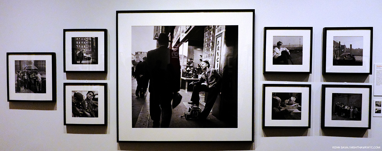
“Open the Pod Bay Doors, Stanley.” Click any Photo for full size.

The majority of Look Magazine’s Photo Archives (5,000,000 Photographs) were donated to the Library of Congress. However, those relating to NYC were donated to the Museum of the City of New York. These include approximately 12,000 contact prints, and negatives Stanley Kubrick created for Look over 129 NYC assignments1, the vast majority of them have never been published.

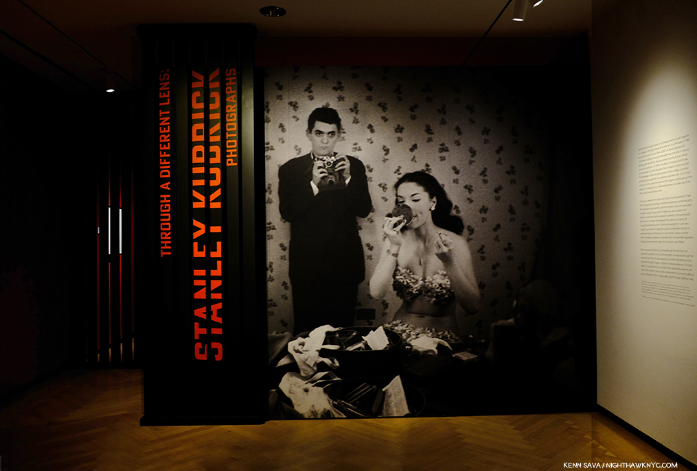
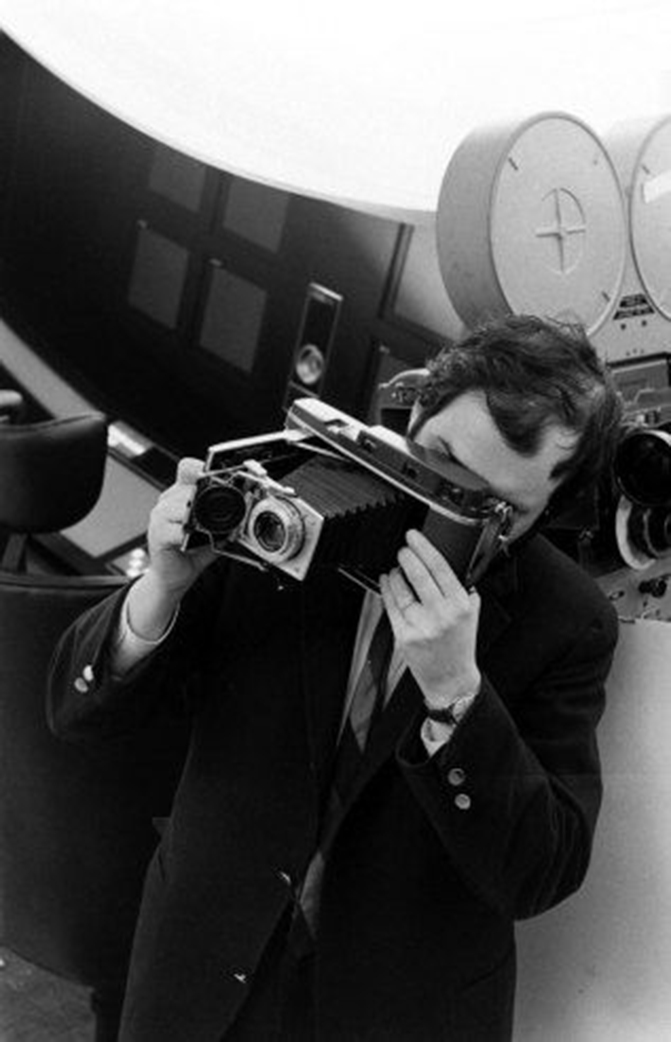
The eyes of a genius. The show’s entrance features this haunting Photograph by Stanley Kubrick in which he shoots himself and the “Showgirl” Rosemary Williams reflected in her large tabletop mirror. The Photo, Stanley Kubrick taking a picture of Rosemary Williams applying lipstick, which is cropped on the sign, is from the unpublished story, “Rosemary Williams- Showgirl,” March, 1949.

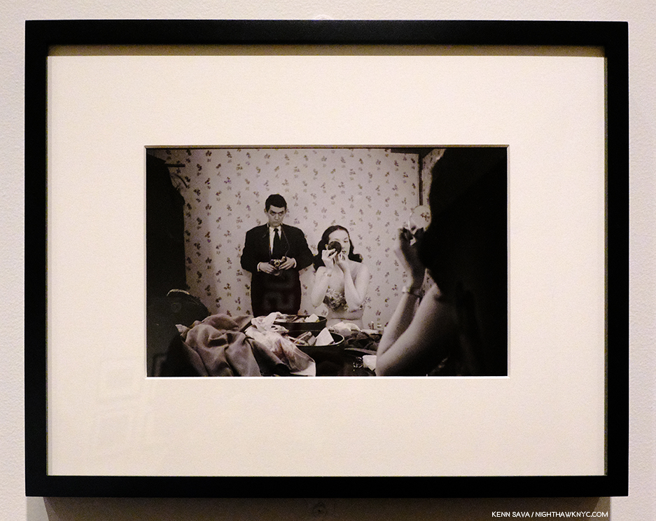
Also from the same story, Rosemary Williams Applies Lipstick, March, 1949, a companion piece to the shot above. Stanley was 19 when he took these. I’ve seen the look he has on his face in these two shots in other pictures of Stanley Kubrick, and each time its caption includes the descriptive “intense concentration.” For a number of reasons, this may be the most remarkable Photograph I’ve seen thus far in this body of his work. I picture him having that look as he took every shot in this show.

Stanley Kubrick remains a magnificent mystery to me, akin to the monolith in his classic 2001: A Space Odyssey. His films (all 13 of them) are high on my list of favorites. I can think of no other Director I revere as highly as Stanley Kubrick, other than Charlie Chaplin2. Yet, it’s still not all that well known that before he became a Director, Stanley Kubrick was a professional Photographer. Remarkably, he was 17 years old when he sold his first Photograph to Look Magazine, then one of the most popular magazines in the country, in 1945. Hmmm…who was the last Photographer I wrote about who achieved recognition that mature Photographers yearn for their whole lives at 17? Stephen Shore was 17 when he sold his first Photo to MoMA.

New to this body of his work, I went to see the 130 of his Photographs (though there was no indication, these appeared to be exclusively recent digital prints, not silver gelatin prints) on view in the show to get a sense of SK- the Photographer, but primarily, I went specifically looking for evidence of the later, mature genius Film Director. I found it. It just wasn’t how I was expecting to find it. I’ve seen a number of comments online from people who find these shots “banal,” and terms connoting similar degrees of a tepid response. Perhaps, like some of them, I was hoping to see shots full of brilliant moments filled with that unique mystery and awe every moment of his Films hold, at least for me. Then again, I should have realized that very little about Stanley Kubrick lies where you’d expect to find it.

“Observation is a dying art.” Stanley Kubrick, Stanley Kubrick: Interviews.

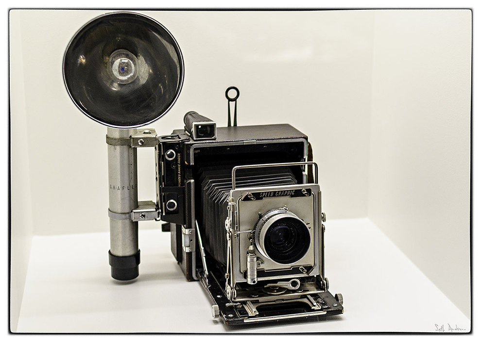
Stanley Kubrick’s Graflex Pacemaker Speed Graphic camera as seen in the Stanley Kubrick show at LACMA in 2013 still looks to be in decent condition after seeing heavy use at least between the years 1941-50. *Photo by Seth Anderson

The story begins when Jack Kubrick, a physician and passionate amateur Photographer, gave his son a professional Graflex Pacemaker Speed Graphic camera for his 13th birthday on July 26th, 1941. Stanley’s friend, Marvin Traub, had a darkroom in his house, so after their sojourns around town taking Photos, the two would develop their film there. On or about April 13, 1945, the day after Franklin D. Roosevelt died, Stanley came across this scene at 170th Street & the Grand Concourse, in the Bronx3

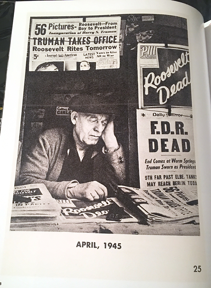
17 year old Stanley Kubrick’s FDR Dead, 1945, was the first Photograph he sold to Look Magazine.

Well, sort of. At first he said this shot resulted from “lucky happenstance.” But, he later admitted he “coaxed4” the news seller, surrounded by newspapers declaring President Franklin D. Roosevelt had died, into this pose.

Wait. What?

He went home and developed the film in the darkroom that he had by then installed in his own house and took it into Manhattan to the offices of Look Magazine. There, Helen O’Brian, chief of the Photography Department, saw it and paid him 25 dollars for it.

It ran in the spread above in Look’s June 26, 1945 issue, the last of 36 Photos, and the only enlarged image in the group. Stanley Kubrick was still a High School student at William Howard Taft High School in the Bronx. Think about this- In June, 1945, Stanley Kubrick had not even had his Graflex for 4 years. But, there’s more to it. That he “urged the salesman to look more depressed than he was for dramatic effect5” is “directing”- he’s eliciting a performance for a scene.

Therefore, this is the first instance we have of Stanley Kubrick putting his “directing” skill into practice.

It, also, serves to put the viewer on notice that from here on out his Photographs may not be entirely as they seem. As my research continued (and continues), I found more and more Photographs that curators and researchers say were posed or staged. Not all of them, but a good number. For me, this first revelation turned out to be only one way in which Stanley Kubrick, the Director & Filmmaker, begins to manifest his presence in the work of his younger self. As for that younger self, while he was too old at 17 to be a “child prodigy,” when you take his ability, his eye, and his gift for whatever the composition needed into account, from his work at 17, I think he qualifies as a “prodigy.”

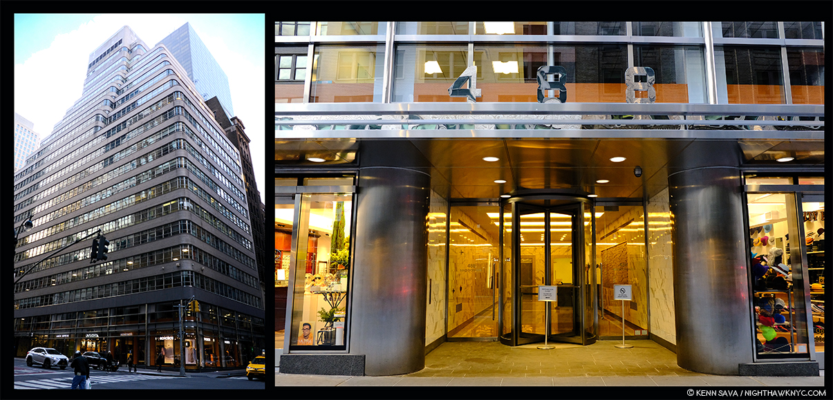
The mothership. The Look Magazine Building, 488 Madison Avenue, around the corner from MoMA, was built in 1948-50, during the last half of Stanley Kurbrick’s employment there. It’s now a landmark building. Seen on February 2, 2019.

“One thing that helped me get over being a school misfit was I became interested in photography at about 12 or 13.” Stanley Kubrick6.

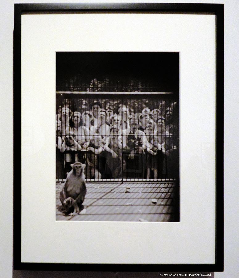
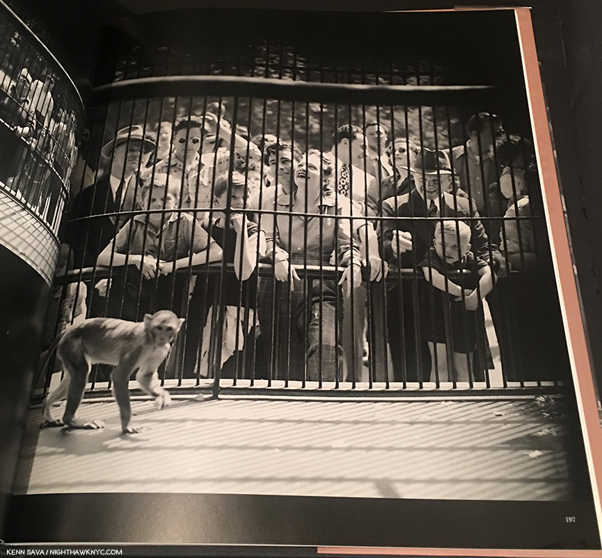
From “How A Monkey Looks to People…How People Look to a Monkey,” Published in Look, August 20, 1946. SK was a $50. a week Apprentice Photographer when he took this classic Photo at 18 years of age.

He sold Photos to Look from time to time until he graduated in January, 1946. Thanks to his frequent truancy cutting class to go see movies at the Loew’s Paradise Theatre near his home (hmmmm….), his 67 grade average was too low to compete for a place in college against the returning G.I.’s7, when a 75 was the floor to even be considered. So, Helen O’Brian hired him for Look as an Apprentice Photographer for $50. a week. He became a full Staff Photographer in October, 1946. Stanley Kubrick grew up fast. Look became his college. “By the time I was 21, I had four years of seeing how things worked in the world. I think if I had gone to college I would never have become a Director8.” It was a unique “college” in that it offered posterity a chance to study the development of the “student” over the 5 years he was there.

“Writing, of course, is writing, acting comes from the theater, and cinematography comes from photography.” Stanley Kubrick9.

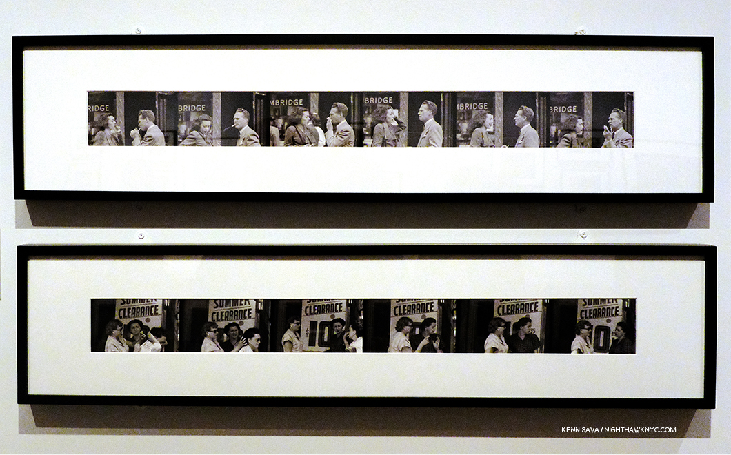
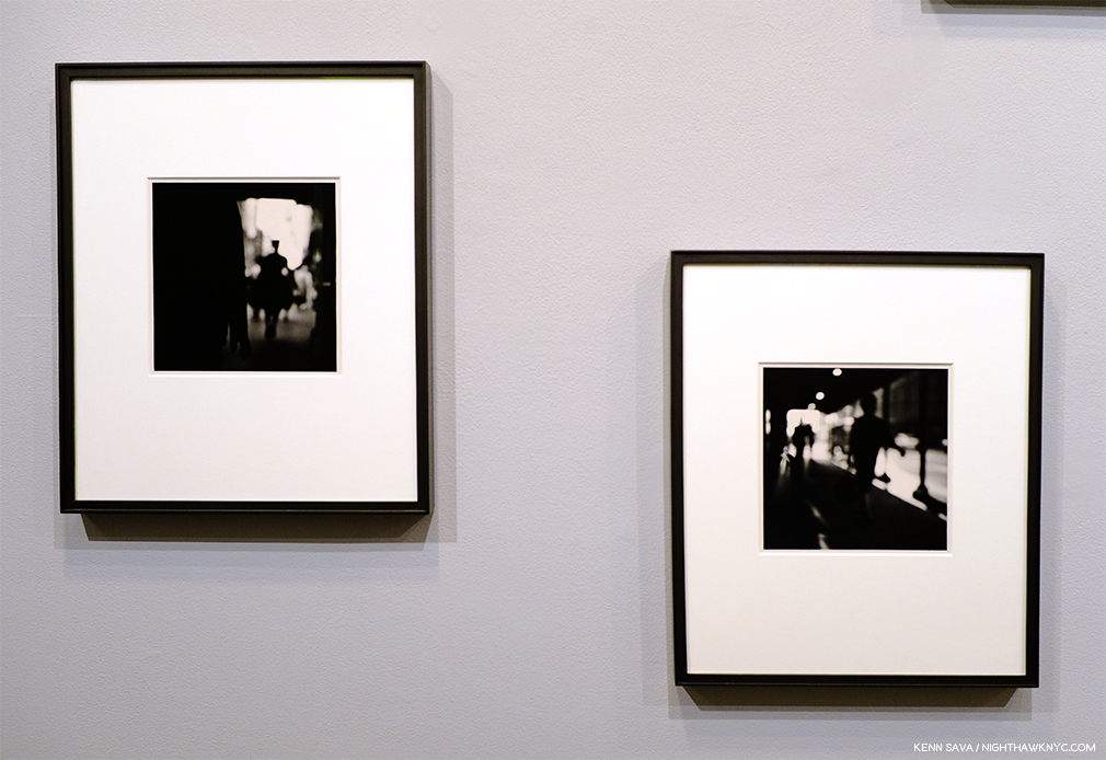
Unpublished contact strips depicting people conversing the street, probably shot with a telephoto lens. There’s an undeniable “cinematic” feel to these series, a number of other such sequences were included in the show.

On his way to becoming a great Director, Stanley Kubrick was an accomplished professional Photographer first, skills that never left him, and that he would use constantly in his Films. The component skills he developed being a Photographer (who was already technically proficient)- composition, lighting, setting a scene, working with subjects, would prove invaluable to him. As would observation – that “dying art.” In addition, a number of the assignments he was sent on became experiences that he also used to learn about what would be his later profession.

One of those “other” skills is storytelling. Even besides the strips just shown, there is a strong sense of it throughout the quite sympathetic body of work seen here. Where did it come from? Whatever its origin, it’a already on full display, here, at 19. His unique way of telling a story is certainly a hallmark of his Films. Here are some of the 250 Photos he shot for an unpublished assignment called “Shoeshine Boy,” handed in on October 6, 1947, one of the most fascinating stories I’ve seen, in which he followed the title boy, Mickey, to his job, to school, doing errands, hanging out with his friends and family, and tending his pigeon coop. Mickey was only 7 years younger than Stanley Kubrick at the time.

Stanley’s Photographs are technically accomplished from the first one to the last. Surprisingly so for the viewer new to this work, given his youth and the fact that he was self-taught. His Photographs turn out to be up to any technical challenge thrown his way- day, night, portraits, action, off the cuff, groups- what I’ve seen thus far of his 135 assignments run the full gamut. It doesn’t matter the situation, the environment, the lighting or time of day. Is he the “master” magazine Photographer? No. He’s not. There are times when any one of the innumerable technical elements inherent in Photography seems to let him down, but by and large I came away exceedingly impressed with his technical ability. Stephen Spielberg said that one thing that bonded Stanley Kubrick’s Films together was “the incredible virtuoso that he was with craft10.” I get that sense from looking at his Photography. Unlike Weegee (who ALWAYS seems to get his shot, and 95% of the time does so using flash), Stanley doesn’t shoot one way. He adapts to the situation and what he’s trying to express, which is gutsy for a young Photographer trying to secure his place on a staff of a magazine such as Look, which included some established names, like Arthur Rothstein and John Vachon. The deeper you look into this work, the more there is to say about it. Though only touched on in the books and articles I’ve seen, in my opinion, every single aspect of this work needs to be studied in depth-

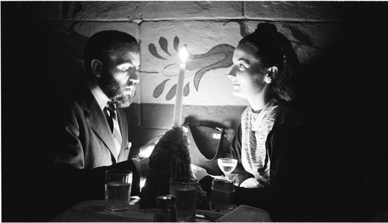
From “Rosemary Williams-Showgirl,” unpublished from March, 1949, Rosemary Williams and a man at a candle-lit table, 1949. An early candle-lit Stanley Kubrick Photograph that just might seem to presage the extraordinary lighting & camerawork in his now classic Barry Lyndon, 1975, where, by then, he would master the exposure.

-His technique- Where was it in April, 1945, and how it changes and how it evolved over his Look career. This includes his compositional choices, positioning (love of low angles and overheads), lighting (natural light versus flash), and how all of these may have appeared in his Films.

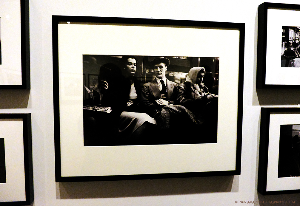
Stanley Kubrick shot surreptitiously in the Subwary for a piece titled “Life and Love on the New York Subway,” March 4, 1947, using a cable release that ran down his sleeve. He had no way of knowing that Walker Evans had, also, shot secretly in the subway in 1941 because Walker did not publish his series until the book, Many Are Called, was published in 1966, out of fear of lawsuits from his subjects because he did not have releases from them.

-The assignments-  Both published and unpublished. Between the Library of Congress’ and the MCNY’s websites about half of his Photographs appear to be online, as far as I can tell. The complete body of SK’s Photographs needs to be made available. Only then can a proper assessment of his achievement and what it portends for his future work be made.

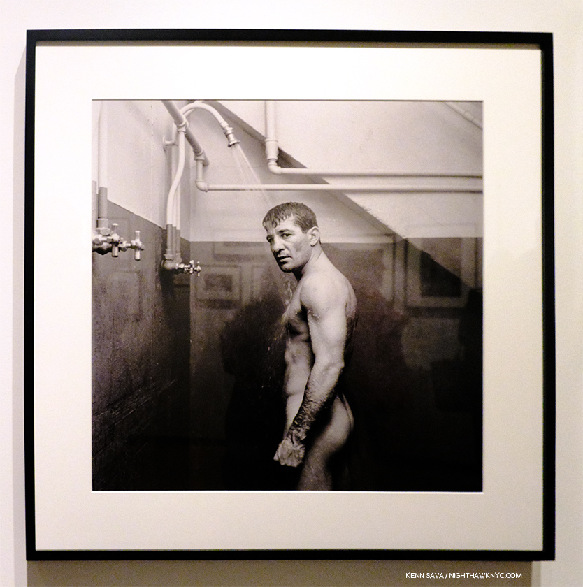
An unprecedented Photo. Rocky Graziano in an unpublished outtake from the story “Rocky Graziano: He’s a Good Boy Now,” which ran on Valentine’s Day, 1950. It says a lot that Rock Graziano, who was coming back from a scandal, would allow this shot to be taken. Boxing was a subject Stanley Kubrick shot on a number of occasions for Look, and the depth at which he studied this subject, like this and the shot of Willie Beltram, below, paid dividends in the heightened realism he achieved in a few of his later Films.

-The assignments that tie directly into his later Films. These include a number of boxing stories, the Aqueduct Race Track story, the stories involving TV Productions, actors and actresses (ranging from Montgomery Clift, Zero Mostel, and Frank Sinatra, to the unknown Rosemary Williams), and his Naked City shoot.

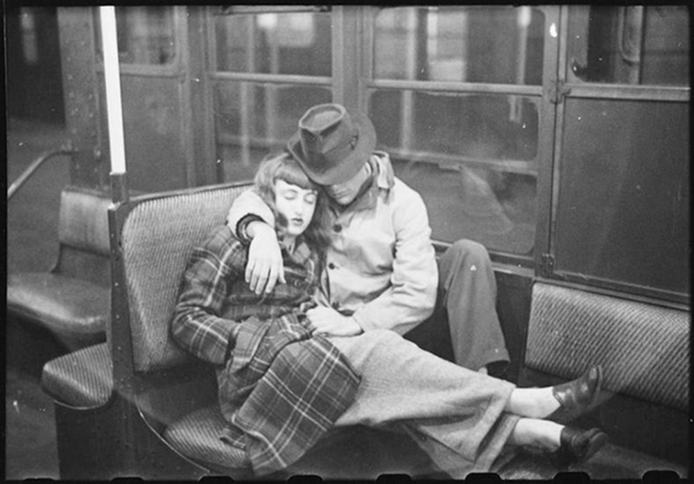
Stanley Kubrick posed this shot from the “Subway” series in 1947. How do we know this? That’s his future wife, Toba Metz (who he married in May, 1948) on the left, who appears in other shots in the series. More on this shot in BookMarks, at the end.

-Which shots did he pose? (As far as is known).

Why is all of this necessary? While there have been shows like this fine show and others in Europe, they, and the books just scratch the surface. They only reveal part of the story, only presenting a limited glimpse of the whole body of work, due to its size, which Professor Rainer Crone says is 12,000 Photographs. The books that have been published thus far (all but one of them out of print) each contain between 2 and about 400 hundred. Even if you have all of them in front of you (I have three), you still only get to see part of any one story he shot! Stanley, like most staff Photographers at Look, shot a lot of Photographs for their stories to allow the editors the widest leeway in making their selection (I wasn’t able to determine if he ever made the selections himself, or had any say in it. It would appear he did not.). With, say, 250 images for a given story, almost– none of his assignments have been published complete thus far (as far as I can tell). This is incredibly frustrating and, of course, it does not allow a full assessment of his work- even on one assignment.

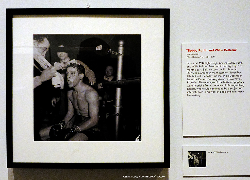
Willie Beltram, October/November, 1947, from an unpublished story, the first time SK shot boxers, a subject he would return to a few times at Look, and in his early Films, Day of the Fight and Killer’s Kiss. In those films, too, he would get right into the ring and very close to the action. It seems to me it also looks ahead to the carnage he graphically depicted in Paths of Glory and Full Metal Jacket.

Is it practical to release tens of thousands of Photographs? One look at the ten volume(!) set Taschen published of the existing material for Stanley Kubrick’s unmade Film, Napoleon, which includes 15,000 location Photos AND 17,000 “slides of Napoleonic imagery” (though shown at a large thumbnail size) would seem to say- “Where there’s a will? There’s a way.” After being immersed in this work for the better part of the past 4 months, I believe it is important enough that it needs to be done, and I predict someone will do it- one day (and I say that knowing nothing about the politics/legalities involved with, and between, the Kubrick Estate, the Library of Congress, and the MCNY). After pouring over the show, the existing web resources, and the 3 books I have (which together include about 8 or 900 images, though some are duplicated), my desire to see more has only grown. Given the unlikeliness of Stanley Kubrick’s Films diminishing in interest or importance any time soon this need will only remain, if not grow. From my study, I’ll say this-

I’m absolutely convinced there is more to learn about Stanley Kubrick, the Director, in this body of work- his Look Photographs, than there is anywhere else besides his actual Films and his interviews.

Weegee? No. Stanley Kubrick during the prodcution of the Weegee inspired film, Naked City. Speaking of “Street Photography,” it’s interesting to note that both Stanley Kubrick and Garry Winogrand were born in the Bronx in 1928. For perspective, Diane Arbus, who knew Stanley during his Look days, was born in 1923.

Put them all online, perhaps in a joint website. Maybe that’s the most practical way. Arrange them by story assignment-unpublished or not, in chronological order. Reproduce each magazine story, when there is one, follow that with all the Photographs, published and unpublished (uncropped, full size, since they were cropped on occasion in the magazine), in the order they were taken, and also include the contact sheets, would be my suggestion. Whether this all comes out as a book, or series of books, perhaps by year? That’s up to a publisher. I think it would find buyers. Is this going to be a popular series? No. Then again, no “catalog rainsonne” is a best seller. It’s for specialists. It’s for those passionately interested in the Artist’s (Stanley Kubrick’s) work, and for those seeking to learn from his path. It’s probably not for the everyday lover of Photography, though a well produced summary volume might be reasonably popular. (See BookMarks at the end for more on the existing books and some recommendations.)

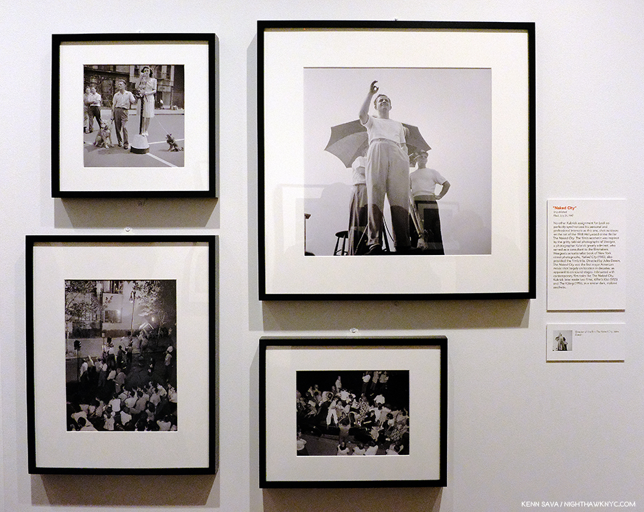
Four Photographs from the unpublished “Naked City,” assignment,  July 31, 1947. Stanley Kubrick went to shoot the production of the Film Noir movie, which took its name from Weegee’s famous book. Weegee was someone Stanley Kurbrick admired, and years later hired him as Still Photographer on Dr. Strangelove. Here, Stanley got to watch Director Jules Dassin (upper right) work and observe the production. None of this would be lost on him. His early Films, Killer’s Kiss, and the terrific The Killing are both Film Noir and both shot in the city.

Experts, including German Professor Rainer Crone (the first person to research this body of work, with Stanley Kubrick’s personal blessing, mount exhibitions of it and write the first books on it) mention a few stories, in particular, as being springboards to the future career of Stanley Kubrick. Many agree that his Look shoot of the filming of the Film Noir classic Naked City was a key moment, giving him an inside look at a rare movie production going on at the time in a big city. Boxing assignments were also influential. He shot Rocky Graziano and relatively unknown boxer Walter Cartier. In 1951 Stanley Kubrick made a 12 minute documentary short Film entitled Day of the Fight following the same Walter Cartier around from wake up until after the final K.O., veritably recreating his Look story, “Prizefighter,” on Film. In that sense, this marked the beginning of the end for Stanley Kubrick at Look. In addition, late in his career at Look, his assignments brought him more and more often into contact with TV Productions, actors and actresses. All of these experiences proved “educational” for him for where he would go next.

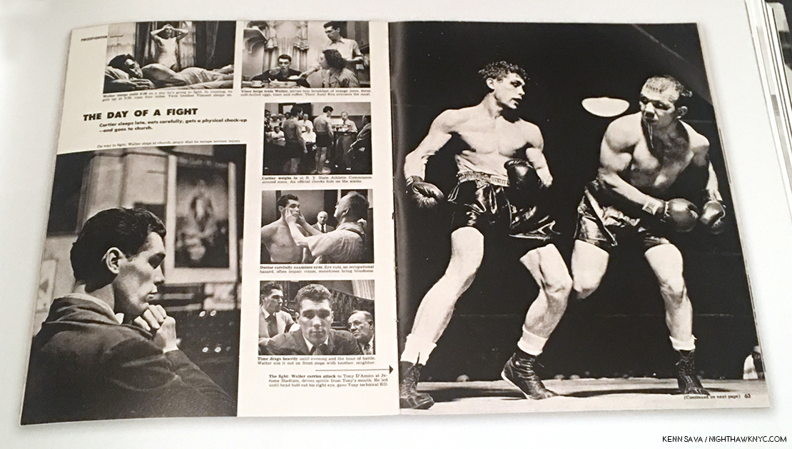
In the article “Prizefighter,” featuring the boxer Walter Cartier, the subtitle of this section is “The Day of a Fight.”

By this point, he had seen what he needed to see to begin making films, down to knowing what equipment he’d need, where to get it and how much it would cost to rent. Long desiring to make Documentaries, he turned the Walter Cartier “Prizefighter” story into one.

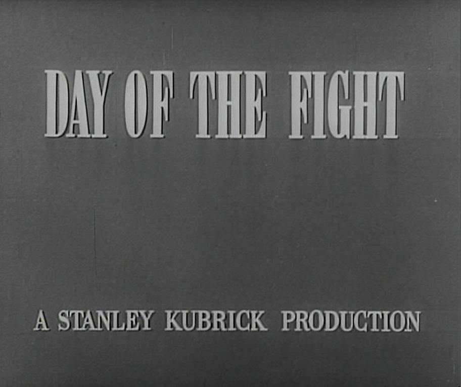
Screenshot of the title card of Day of the Fight, 1951, his first film, at age 25, which runs a bit over 12 minutes, and which he Photographed.

Stanley Kubrick’s early films carry this credit-

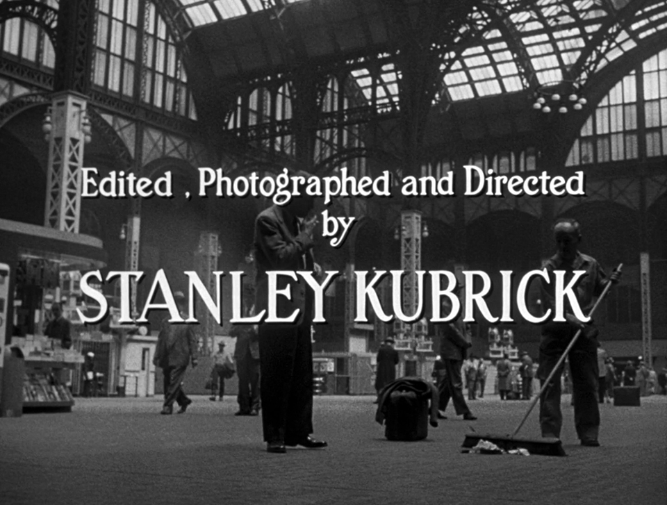
His credit line in Killer’s Kiss, 1955. He also wrote the story. See the Appendix for more screenshots that are reminiscent of SK’s Look Photos.

“Photographed by Stanley Kubrick.” Today, we would call it “Cinematography.” But, I think the term “Photographed” is telling. Eventually, by the The Killing, 1956, unionization forced him to hire a Cinematographer11. Yet, SK would continue to look through the viewfinder (and there are countless shots of his on his sets doing just that) and the camera, and continue to shoot Film on occasion.

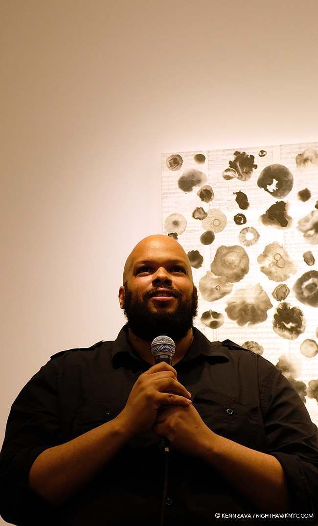
Photographer/Director Shane Rocheleau at the NYABF, September 22, 2018.

Fascinated by the difference between shooting still Photographs and Film, I reached out to a man who has experience creating both- Shane Rocheleau. The subject of a Q&A I did in September, 2018,  I even mentioned Stanley Kubrick in describing his talents in my NoteWorthy PhotoBooks, 2018, saying that his first PhotoBook, You are Masters of the Fish and Birds and All the Animals, or YAMOTFABAATA as it reads on the spine, was “edited like a Stanley Kubrick Film.” I’m not sure there’s a higher invocation I could give someone in Photography or Film. In addition to being an exceptionally talented Photographer, Shane Rocheleau is already proving to be one of the new masters of PhotoBook editing & sequencing. During my research into him, I also discovered that he is a Film Director. I reached out to him, and he confirmed this for me, and sent along this link where his Film, Tide, 2009, that he also wrote, can be seen. I asked him about the differences between shooting still Photographs and Film. He said-

“I can’t pretend to speak for a genius like Kubrick, but I’ll give you a bit of insight into the differences between creating photographs and creating films, for me. To clarify first, though:  I am not a documentary photographer, and I am not an experimental filmmaker. If I were both, my answers below would, maybe, flip-flop. What I know of Kubrick, he, like me, was not a documentary photographer nor an experimental filmmaker.

When I hear the word “conceptual” placed in proximity with “art”, it means something very specific to me. Namely, it means that the artist’s conclusion was rendered before the art was executed. Plans were made. The resulting art product serves to explain, announce, demonstrate, manifest, etc. knowledge or forms the artist has already resolved (The God of Genesis appears to have been a conceptual artist). While when making films I may be unsure of the knowledge I’m attempting to disseminate, but my narratives and forms are usually fairly well determined. Story, arc, shots, and sequences are imagined prior, and props, actors, location, etc. are fairly settled. My film will have some room to grow or morph at every step in the creative process; however, I view the overall arc of its making to be well aligned with my idea of conceptual art:  I imagine the film first, then execute its making.

For me, the photographic process operates in contrast with conceptual art. While I usually begin a photography project with an idea, never in my experience has that idea remained intact through to the end; on the contrary, I always learn I was wrong. The photographic process is inherently about discovery. Even when I presage a photograph, the final product reveals something very new, often even contradictory. Rather than marked by understanding, my ideas are rended by my photographs. Confusion necessarily ensues, and meaning emerges as I let go of certainty, make unexpected pictures, sequence and pair the absurd, and indulge discovery. The final project is a new growth, a new understanding. Contrary to a conceptual process, once I resolve my ideas, I’m done.”

After making 3 short Documentary Films (Day of the Fight, Flying Padre, both 1951, and The Seafarers, 1953), he realized that the only way to make enough money to sustain a career was in making feature Films. By then, he had quit is job at Look and would never look back. He would make his first feature Film, Fear and Desire, later in 1953, which he also “Photographed.”

In order to look a little closer at the similarities between Stanley Kubrick’s early Films and his Look Photographs, I’ve created an Appendix that appears below this piece (or, here) that includes screenshots from the first part of his second feature Film, Killer’s Kiss, 1955, “Photographed” by SK, that look similar to me to some of his Photographs I’ve shown here.

Beyond these similarities, the influence of his still Photography lived on in his later work, even after he was working with other Cinematographers. For one thing, he is often seen holding a still film camera on the set.

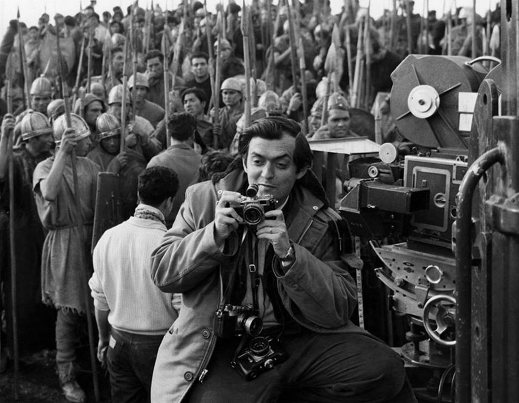
Stanley Kubrick on the set of Spartacus– with THREE still cameras around his neck! Mr. Rocheleau thought that he was shooting for pleasure, given the smile on his face. The reason would seem to not be an instant need to see the Photos since the film would need to be developed. *From the Stanley Kurbrick Archives. 

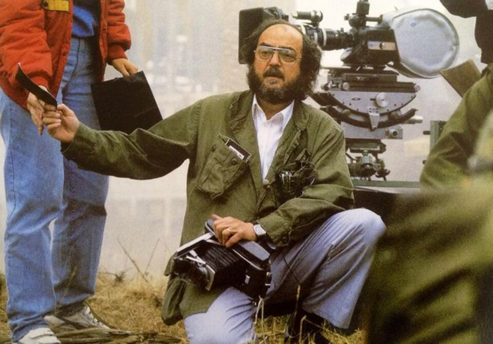
As his vision matured, and his resources (and budget) increased, it largely outstripped what we see in his Look Photographs. One significant remaining holdover was Stanley Kubrick continued to rely on a still camera, now a Polaroid instant camera, to take Photos to see how the scene looked in two dimensions and to check colors, continuity, and for other reasons,. on the sets of many of his films, including the classic 2001: A Space Odyssey


For those looking for evidence of the lasting  effect of Stanley Kubrick’s still Photography career and experience on his Films, this may be the defining image. With his Polaroid Pathfinder 110A on the set of 2001. *From the Stanley Kurbrick Archives. 

I’ve seen estimates that SK shot 10,000 Polaroids during the production of 2001. In the book The Making of Kubrick’s 2001, 1970, Jeremy Bernstein’s 1966 Profile of Stanley Kubrick, originally published in The New Yorker, is reprinted. In it, Mr. Bernstein says, “I asked Kubrick what he needed the Polaroid for, and he explained that he used it for checking subtle lighting effects for color film. He and the director of photography, Geoffrey Unsworth, had worked out a correlation between how the lighting appeared on the instantly developed Polaroid film and the settings on the movie camera12.” He continued to use it, as he does here, on Full Metal Jacket, 1987-

Stanley hands a freshly shot Polaroid print to an associate as it develops on the set of Full Metal Jacket where he appears to still be using his Polaroid Pathfinder 110A, some 20 years after 2001. *From the Stanley Kurbrick Archives. 

Perhaps by his last Film, Eyes Wide Shut, 1999, he was using an early digital camera, or perhaps he still preferred to see the image instantly on a print. A lover of new technologies, who knows what he would have been doing or how he would have been working today. Whatever the means, the value of his early training as a still Photographer would, no doubt, have still been paying off for him.

Given the level of his talent and his vision it probably shouldn’t be a surprise that as we approach the 20th anniversary of his death on March 7, 1999, next month, there is still much to discover about, and in, the work of Stanley Kubrick.

*- Soundtrack for this Post is “My Old School” by Walter Becker & Donald Fagan of Steely Dan, recorded on their second album, Countdown to Ecstasy, 1973. (Yes, it’s on Countdown to Ecstasy. I have no idea why the producers of this video show the cover of Can’t Buy A Thirll.)

The Appendix to this Post, Stanley Kubrick: A Photographer’s Odyssey-Appendix, is below, following BookMarks, or here.


BookMarks-

If you like what you find on NighthawkNYC, I hope you’ll consider supporting it so that I can continue to spend the countless hours and pay the expenses it takes to keep it going these past 3+ years-without ads. If so, you can also make a donation through PayPal by clicking on the box to the right of the banner at the top of the page that will take you to the Donation button. Your support is VERY much appreciated. Thank you!

As I said above, this body of work is vast and covers 5 years. The issue of how to approach it becomes Question One for anyone attempting to make a book about it. To date, all the books I’ve seen have been focused on exploring it. None have attempted to present the complete picture or look at this work in light of what came after (a book with tens of thousands of Photogaphs would be massive, even if it consisted of thumbnails, like Gerhard Richter’s Atlas). The 3 books I’ve seen thus far all take the same approach- an historical look at selected stories and images and only occasionally mention his later Film career13 For a variety of reasons, none of these books is “the” definitive book on Stanley Kubrick’s Look Photographs, in my opinion. The books are-

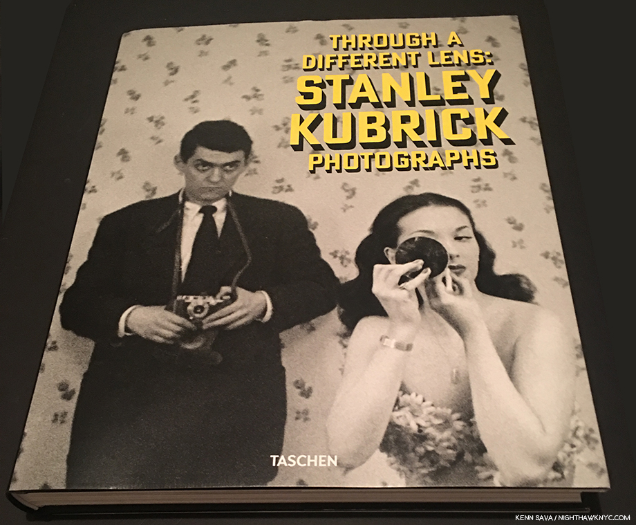
Stanley Kubrick Photographs: Through a Different Lens, published by Taschen in conjunction with the MCNY, and its curators, Sean Corcoran and Donald Albrecht, in 2018, is the catalog for this show. The only book currently in print on the subject of Stanley Kubrick’s Photographs, it contains about 300 of them, over 332 pages that are split between beautiful full-page and double page reproductions of single Photographs and reproductions of the Look Magazine stories they ran in. Unpublished assignments are also included. After the initial essays, the remainder of the book is arranged by year and assignment.

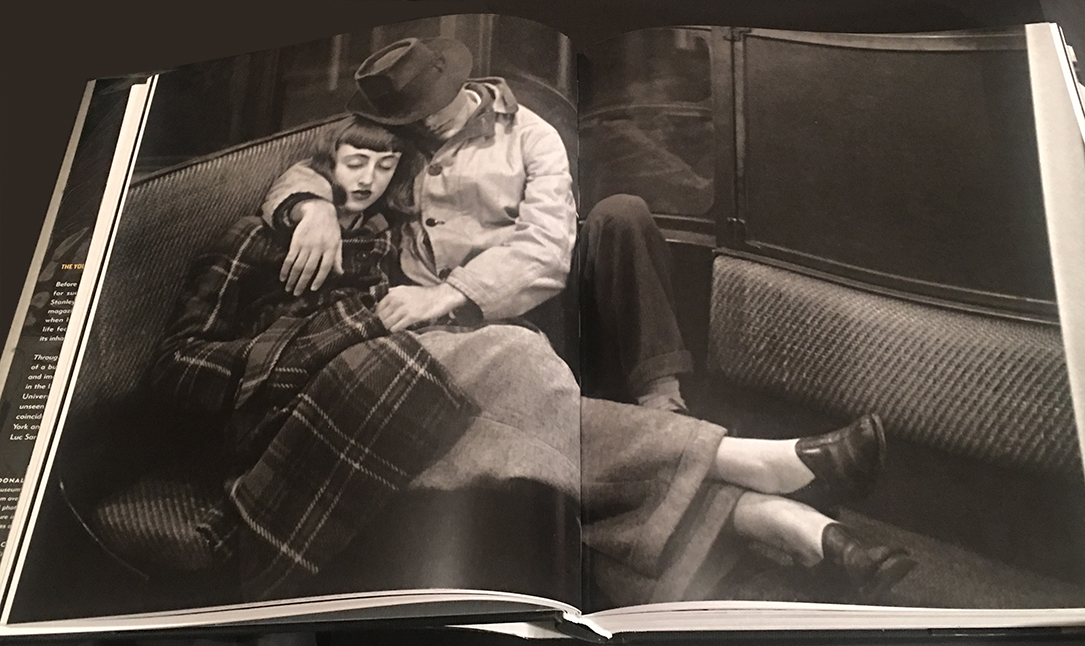
An outtake from “Life and Love on the New York Subway,” March 4, 1947, beautifully reproduced across 2 pages, which results in an image size of 26 1/2 by 22 inches! Compared with the shot posted earlier (from an online source), the man’s position has changed and the Photographer has moved closer. How do I know this hasn’t been cropped? This image appears on a strip from the contact sheet published in the Stanley Kubrick Archives.

The best thing about this book, in my opinion, is its size- It’s BIG. 10.8 x 13.2 x 1.5 inches and clocking in at 6.6 pounds. Unlike most recent very large PhotoBooks, this one takes continual advantage of its acreage, often going edge to edge14 This presents the opportunity to see selected landscape oriented Photos at the incredible size of 26 1/2 by 22 inches, as seen above!  The chance to see Stanley Kubrick’s Photographs in a large size does not exist, nor has it ever existed, outside of this book. EVEN in the show (save for a handful of wall size blowups, like the sign shown earlier)! Here you get to see many of its 300 images in full page, 10.8 x 13.2 inch, reproductions. Taschen’s history with XL size books is to make them smaller with each succeeding incarnation. So? If you want to see these images big, this may be your only chance to do so. As such, I expect this first edition will retain lasting interest with Kubrickians (did I just coin that term? I doubt it) indefinitely. As for its shortcomings, I am unhappy with some of the assignments included (Guy Lombardo shown at home. Why?) and those left out which have a direct import on his subsequent Film career. Therefore, it seems to me the editors may have intended this book to be a general interest book. Second, the images in this book are reproduced with a depth of blacks I haven’t seen before. The images in the show were also printed similarly as you can see in my piece. Nothing is said in the book (or in the show) about how these prints were made. In the Preface, Whitney Donhauser only states, “The Kubrick Archive has been photographed, scanned and retouched by…” Compare the one above to the other images below, the sources of which are not stated either. Also, the images on the MCNY website are darker than those on the Library of Congress site. I’m not sure what to make of this but it’s something to be aware of. In my opinion, the curators/editors should have addressed and clarified this somewhere. Overall, I recommend this book to anyone with an interest in seeing these Photographs large, and for those interested in this body of work not wanting to spend rare book prices for the out of print titles. Recommended with reservations.

Rainer Crone’s SK: Drama and Shadows, published by Phaidon in 2005

The other books on Stanley Kubrick’s Photographs are all either out of print, not in English, or both. Of these, Professor Rainer Crone is the man behind those I know of. He was the first one to show this work, with Mr. Kubrick’s blessing, and he has produced, I believe, 3 books about it so far. The most well known of these is the hardcover Stanley Kubrick: Drama & Shadows, published (in English) by Phaidon in 2005. Good, or better, copies can be found for 65.00 and up. It is very well done, does not give any evidence of cropping, though the reproductions do not have the depths of blacks the Taschen book has. The supporting texts are quite informative and reveal Mr. Crone’s ongoing interest in, and dedication to, this work. While its selection fills in some of the gaps in the Taschen book, again, I felt frustrated by some of what was left out (as I will be until a way is found to see all of this work).

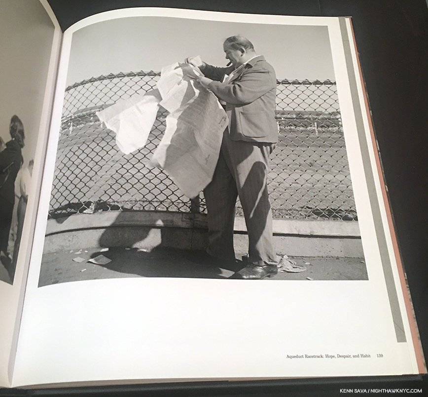
A sample image, from SK’s “Aqueduct Racetrack: Hope, Despair and Habit” assignment, March, 1947, which I feel is important for its possible influence on his film The Killing, 1956, about a race track heist.

The front flap says it contains 400 Photographs over 240 pages of a good paper stock. Recommended, if you can find a copy in good condition at a reasonable price.

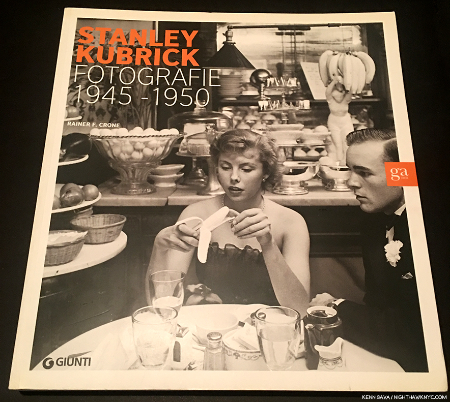
Rainer Crone’s SK Fotographie, the catalog accompanying a 2010 show in Milan.

I have one of Rainer Crone’s other books, Stanley Kubrick Fotographie, 1945-50, a large softcover book, though its text is only in Italian. This is frustrating because it’s the most recent of Rainer Crone’s books (I believe), being the catalog accompanying a show he curated in Milan in 2010. It includes interesting supplements, including a list of published Look articles and Photos of the covers of (all?) of those issues (Stanley Kubrick shot a few of the covers in color, but those are shown in black & white here). I don’t know the total image count over its 255 pages, but it includes more images in some of the series than the Taschen book. It is, however, extremely hard to find- much more so than Drama & Shadows. Recommended for specialists in SK’s Photographs.

A sample image shows another shot from the “How A Monkey Looks to People…How People Look to a Monkey,” assignment, from August, 1946. As you can see, the images here appear darker than in SK: Drama and Shadows. Perhaps it is using the digitized MCNY sources.

The body of literature on Stanley Kubrick and his Films is large and outside the scope of this piece, however one book must be mentioned and singled out from that body for its sheer uniqueness and extraordinary value- The Stanley Kubrick Archives began life as a 2005 Taschen XXL book that came with a filmstrip from Stanley Kubrick’s copy of 2001 that now sells for hundreds of dollars on the rare book market. More recently reissued in one of their small brick books it lists for 19.95. I mention it because it has a very interesting first chapter that discusses Stanley Kubrick’s Photography, along with countless Photographs of Mr. Kubrick at work, and a very large number of rare items from his own collection & archives. All of this makes it an essential book for anyone interested in Stanley Kubrick- Photographer or Filmmaker.

Finally, I have it on good account that some first edition copies of Shane Rocheleau’s first PhotoBook, YAMOTFABAATA, the only First PhotoBook to be listed among my NoteWorthy PhotoBooks of 2018, are still available from Gnomic Book, here.

My thanks to Shane Rocheleau and Mary Flanagan of the Museum of the City of New York.

NighthawkNYC.com has been entirely self-funded and ad-free for over 6 years, during which over 250 full length pieces have been published. If you’ve found it worthwhile, you can donate to keep it going & ad-free below. Thank you!

Written & photographed by Kenn Sava for nighthawknyc.com unless otherwise credited.
To send comments, thoughts, feedback or propositions click here.
Click the white box on the upper right for the archives or to search them.
For “short takes” and additional pictures, follow @nighthawk_nyc on Instagram.

Subscribe to be notified of new Posts below. Your information will be used for no other purpose.


  1. Through a Different Lens: Stanley Kubrick Photographs, published by Taschen in conjunction with this show, henceforth Exhibition Catalog, Preface
  2. “Ive always said the two people who are worthy of film study are Charlie Chaplin and Orson Welles as representing the two most diverse approaches to filmmaking.” Stanley Kubrick: Interviews, P. 79
  3. Jeremy Bernstein Audio Interview, 11/27/1966
  4. The Stanley Kubrick Archives, P.13
  5.  Exhibition Catalog, P.10
  6.  Jeremy Bernstein Audio Interview, 11/27/1966
  7. Jeremy Bernstein Audio Interview, 11/27/1966
  8. Exhibition Catalog, P.9, quoted from Michael Herr, Kubrick, P. 4
  9. //www.brainyquote.com/authors/stanley_kubrick
  10. //www.youtube.com/watch?v=Rd97Og-20Yc&app=desktop
  11. Stanley Kubrick Archives P.110
  12. The Making of Kubrick’s 2001, Edited by Jerome Agel, P.68
  13. The third book is in Italian, so I have no idea what it’s essays discuss.
  14. Since many of these images have never been previously published, I have no way of comparing them, so I don’t know if there is any cropping going on here. I seriously hope not and I am writing this under the assumption there is not. If you can prove differently, please let me know.

Charles White- Now

Written & Photographed by Kenn Sava

“Drawing is [a] particularly exciting medium for me. I just like the feel of it. My whole body is into it when I draw and I think black and white is as effective a medium [as any].” Charles White1

Charles White, Detail of Study for Nat Turner, Yesterday, Today, Tomorrow, 1968, Charcoal and oil wash over pencil on board. Click any Photo for full size.

Ah…the majesty of excellent draftsmanship… Just when you thought it was dead as a doornail, with Photography destroying all previous Artforms in its world dominating wake, along comes a Retrospective of one of the Masters of the craft of Drawing in the 20th Century, the late Charles White (1918-1979), who’s centenary is celebrated in the first major museum survey devoted to his Art in over 30 years. Charles White: A Retrospective, made its second stop at MoMA after debuting at the Art Institute of Chicago and now heads to LACMA beginning February 16th, thus tracing the 3 cities Mr. White lived in- in order. Its magisterial, full of wonders, and long overdue. The only possible caveat could be- MORE!…even bigger, please.

The entrance, divided by a sliding glass door, of one of the great shows of recent years.

By no means a small show, clocking in at 114 items (many of them quite large), over 13 section, the takeaway is that, henceforth, it will be impossible to deny Charles White his place in the pantheon of great Artists of the century. Again.

Charles White was a very successful Artist during his lifetime. He had gallery representation in each city he lived in and his work was collected by museums, nationally and internationally. He was also sought out as a teacher, particularly at Otis College of Art & Design in Los Angeles, from 1965 until his passing in 1979 at only 61. After his death, he fell into something of an eclipse. But, his influence has lived on through the work of his students including Richard Wyatt, Jr, Kent Twitchell (both muralists), and most prominently, Kerry James Marshall (a “representational” Painter) and David Hammons (who has worked in a wide range of media). Mr. Marshall never seems to miss an opportunity to laud Charles White- as a teacher and as an Artist, frequently speaking of him in the highest terms, as he has, again, writing the preface for the excellent Exhibition Catalog. He led me to take a deeper look at Charles White a few years ago. Mr. Hammons paid tribute to Charles White in October, 2017 when he curated the remarkable Leonardo da Vinci-Charles White show at MoMA, that I wrote about here. Judging by the crowds that attended this show, as the MoMA stop of the Charles White Retrospective “tour” ends and Los Angeles prepares to welcome it, I think it’s already safe to say, the Charles White “eclipse” is over.  The other take away, for me, is that Charles White’s influence deserves to be even greater than it already is. With all due respect to his students, Charles White’s Art more than speaks for itself.

Study for Nat Turner, Yesterday, Today, Tomorrow, 1968, Charcoal and oil wash over pencil on board.

When I was a kid, everyone drew. Some, eventually, took lessons and studied Drawing seriously, which is something you can devote your life to and learn something new each and every day. Even for those that didn’t study it, Drawing became a part of many of their lives, whether making doodles, notes, caricatures, or, what have you. That seems to be changing and I think it’s tragic. Drawing is another language, one that is every bit as effective at communicating as writing. I think it’s an essential life skill. Unfortunately, it’s one that I don’t see as many doing as they were 15 or 20 years ago. One look at the work of Charles White will show you what’s possible with Drawing. 

The final Drawing.Nat Turner, Yesterday, Today, Tomorrow, 1968, Drybrush and ink on board, 51 x 78 inches.

As beautiful and technically masterful as it is, Charles White’s work is about expressing ideas. “An artist must bear a social responsibility. He must be accountable for the content of his work. And that work should reflect a deep, abiding concern for humanity. He has that responsibility whether he wants it or not because he’s dealing with ideas. And ideas are power. They must be used one way or the other,” Charles White2. He was speaking in 1978. He could have been speaking yesterday.

Back cover of the Exhibition Catalog.

Those ideas revolved, largely, around his efforts to set the record straight on black history in America in response to the way it was taught when he was growing up. He did this through depicting both the famous and those not so famous in powerful and unique ways that seen over the course of my 4 visits seemed to resonate with visitors in ways I don’t often see. Time and again, I encountered whole families moving slowly from work to work, with the parents patiently explaining fine details of a subject’s life, or very little known cultural details Mr. White had depicted, from what I could gather when they were next to me.

Charles White hit the ground running. He received a scholarship to the School of the Art Institute of Chicago at 13. He drew this at 17-

Self-Portrait, 1935, Black crayon on cardboard.

He then began exploring a wide range of styles over the next few decades, some showing the influence of abstraction, cubism and mannerism, but, remarkably, always remaining his. I found it interesting to trace them in his early murals, for which only studies remain. The first one, Five Great American Negroes was done 4 years after the Self-Portrait, when Charles White was 21.

Charles White, Five Great Americans Negroes, 1939, Oil on canvas. From left to right- Sojourner Truth, Booker T. Washington, Frederick Douglass, George Washington Carver, and Marian Anderson

Here we see Charles White depicting famous figures- living and dead (these were selected by the readers of the newspaper who sponsored the mural), something he would do for much of the rest of his career. The enlarged arms and hands that begin to be seen here remind me of passages in Michelangelo and the Mannerists, like Hendrick Goltzius.  The Mexican Muralists- Diego Rivera, José Clemente Orozco and David Alfaro Siqueiros, who he met on a later trip to Mexico, were an obvious big influence. Artistically and philosophically.

Study for Struggle for Liberation (Chaotic Stage of the Negro, Past and Present), 1940, Tempera on illustration board.

One year later, his Struggle for Liberation (Chaotic Stage of the Negro, Past and Present), a 1940 project for a Chicago Library that was never completed, is known today only through this study and some Photographs taken by Gordon Parks. In this incredibly complex composition, the left side speaks to the past, the right to the present. Both scenes appear to be filled with everyday people, except for John Brown, apparently holding a gun,  in the lower left. According to curator Sarah Kelly Oehler in the Exhibition Catalog, this work can be seen as indication that his ideas were leaning left and towards putting more faith in everyday people to bring change. In the right side, “He depicted capitalism, politics, institutional power, and violence as responsible for the ongoing injustices faced by African Americans as they demanded their rights3.” The work was deemed “inappropriate” for a library, even one that served a black community. Charles White, apparently, finished the left side of it, then moved to New York.

Study for The Contribution of the Negro to Democracy in America, 1943. Tempera on board. Note the row of Civil War soldiers, near the center. Painted during World War II, these were possibly included in support of a campaign to gain equal rights at home and abroad for African American soldiers as a reminder of their contributions during the Civil War.

In the last of Charles White’s three early murals, The Contribution of the Negro to Democracy in America, 1943, the Artist includes at least 14 identified historical figures, in a circular composition. His style, again, is unique and fascinating. Note the hands of the guitar player, possibly Lead Belly (playing a guitar with no strings), in the lower right and the planar nature of the portraits. Again, there seems to be the influence of Diego Rivera, with the machinery in the center echoing his Detroit Industry Murals.

Five portraits, in five styles. Clockwise from top left- Worker, 1944, John Brown, 1949, Gideon, 1951, Untitled (Bearded Man), c. 1949, and Frederick Douglas, 1950.

This wall shows 5 portraits, each in a different style, that includes at least one study for a mural portrait.


Worker, 1944, Linocut on paper. From the Exhibition Catalog. .

When I look at these, and in particular the portraits of the Worker, John Brown, Untitled (Bearded Man) and Frederick Douglas, I’m reminded of the prints of the German Expressionist, Kathe Kollwitz (1967-1945), an Artist who was, also, passionately involved in social causes, increasingly after losing her son, Peter, in World War 1 in 1914. Kathe Kollwitz was influenced by Expressionist Ernst Barlach’s prints, but further stripped them down to their essentials, in stark works like this Frontal Self-Portrait, 1922-23.

Kathe Kollwitz, Frontal Self-Portrait, 1922-23, Woodcut. MoMA Photograph.

Charles White was both an avid Photographer and a collector of Photographs in books and in the media (like Francis Bacon). Charles White’s own Photography is only touched on in the show with this case of 17 Photographs. It’s a subject that warrants closer study.

A selection of Photographs taken by Charles White range from portraits to street scenes to shots of a protest in NYC.

Both his Photos and his collection of media provided him with reference material that he created many of his works from (also like Mr. Bacon). I find this interesting since Charles White was a master of life drawing which he also taught.

As his career went on, and his mature style appeared, particularly in his work after his move to California to help with the lingering side effects of the tuberculosis he got in the Army in 1944, his images are more and more open to interpretation.

Birmingham Totem, 1964, Ink and charcoal on paper, 71 x 40 inches.

Birmingham Totem, 1964, is an amazing work on many levels. First, it stands one inch shy of 6 feet tall, unheard of for a Drawing, except in this show. Second, it’s an “elegy” (per the wall card) to the four girls (one, aged 11, three age 14) that were killed in a KKK bombing of the 16th Street Baptist Church in Birmingham, Alabama on September 15, 1963. In it, a young man sits atop of pile of rubble, rendered in incredible detail. Even more remarkable, the young man holds a plumb line in his right hand, the weight of which is seen about half way down. He would appear to symbolize rebuilding.

J’Accuse #1, 1965, Charcoal and Wolff crayon on illustration board. This series marks the debut of Charles White’s mature style, based in realism. The hands and arms are no longer exaggerated. While the style is more direct, the composition is more open to interpretation, and so, more abstract, which would continue for the rest of his career. According to Ilene Susan Fort in the Exhibition Catalog, the 12 powerful and stunning works in the J’Accuse series “constitute a thematic indictment of the systemic, ongoing disenfranchisement of African Americans4.”

Charles White, master of Drawing, master of depicting the black form (per Kerry James Marshall- “Nobody else has drawn the black body with more elegance and authority.” Exhibition Catalog P.15), is someone who had a strong agenda he manifested in his work. He championed the struggle of African Americans, women (witness his 1951 solo show, Negro Women, where all 15 works on view included a woman), and workers, in Artworks that included both historical figures and every day people. Along the way, he created a body of work that adds another powerful voice telling another side of African American history with unique compositions featuring exquisite execution. Charles White’s compositions were always complex. From the earliest work shown, Kitchenette Debutantes, 1939,

General Moses (Harriet Tubman), 1965, Ink on paper.

Among the women that reappear in Charles White’s work, none is his subject more often than the activist and abolitionist Harriet Tubman (1822-1913). This later work, General Moses (Harriet Tubman), is a striking portrait of her. Then, so is this-

Harriet, 1972, Oil on board.

In what is, perhaps, his finest series, in my eyes, the late Wanted Poster Series, Charles White reimagines “Wanted” posters issued for runaway slaves.

Wanted Poster Series #17, 1971, Oil and pencil on poster board.

A series of 14 works he began in 1969, the images are powerfully direct, yet still retain a fascinating mystery as one ponders the details. The background textures and the stenciled text remind me of Contemporary Art techniques found in the work of, say, Jasper Johns.

Banner for Willie J., 1976, Oil on canvas, memorializes Charles White’s cousin, Willie J., an innocent bystander who was killed in a bar robbery.

Black Pope is the already classic example of late Charles White. Featured in the 2 piece MoMA show in 2017 opposite a Drawing by Leonardo da Vinci, it was also the subject of a fine MoMA book released at the time. It perfectly sums up the experience of looking at it, and late Charles White when it concludes on its final page, “If we today find the work difficult to define, the drawing demands that we try5.” It is this enigmatic approach to realism that may be of lasting influence to those who have come after Charles White, particularly Kerry James Marshall, though it seems to me it may be there in the work of Abstract Artists Jack Whitten and Mark Bradford as well.

Black Pope (Sandwich Board Man), 1973, Oil wash on board.

” I find, in tracing the course of the portrayal  of the Negro subject in art, a plague of distortions, stereotyped and superficial caricatures of ‘uncles’ ‘mammies,’ , and pickaninnies’,” he said6. Charles White is an important Artist because his work accomplished exactly what he set out to do. It does so most artfully, it seems to me. It’s full of life, depth and mystery. Yet, his work has an immediate directness that speaks to everyone as soon as they see it.

Now. And forever. Detail of just one part of the enigma of this endlessly fascinating work.

When I look at that “NOW” in Black Pope, I, too, wonder what the Artist was trying to tell us. Then, I quickly begin wondering what his reaction would be to living in this “NOW” and finding so little has changed. It’s terribly sad on one hand. On the other? It makes Charles White’s Art as relevant as its ever been.

UPDATE- My look at the two satellite Charles White shows concurrently at David Zwirner is here. One show is centered on the mural for Mary McLeod Bethune, Charles White’s last major work.


BookMarks- If you like what you find on NighthawkNYC, I hope you’ll consider supporting it so that I can continue to spend the countless hours and pay the expenses it takes to keep it going these past 3+ years-without ads.  To do so, you can make a donation through PayPal by clicking on the box to the right of the banner at the top of the page that will take you to the Donation button. Your support is VERY much appreciated. Thank you!

Charles White, A Retrospective, 2018

Charles White: A Retrospective, by Sarah Kelly Oehler, Esther Adler and with a preface by Kerry James Marshall, published in 2018 by the Art Institute of Chicago, is the finest book yet published on Charles White and easily the best one in print. It’s a terrific introduction to the Artist that will also serve as a go-to reference for years to come thanks to the depth it goes into on such little-known areas like Charles White’s Photography as well as the inclusion of a full and detailed chronology and exhibition history. The reproductions are gorgeous. Easily recommended.

Fun fact- The inside of the dust jacket folds out to reveal this beautiful detail from Wanted Poster #12, 1970, suitable for hanging.

Charles White: Black Pope by Esther Adler and published by MoMA in 2017, is the other recommended, in print, Charles White book. MoMA curator Esther Adler does a very good job of analyzing Black Pope and relating it’s history, in the process looking at a number of other works from Mr. White’s career. While A Retrospective is the first choice for an introduction, for those looking to go deeper into one of Charles White’s greatest and most mysterious works, this book has the most information we are likely to get anytime soon.

Charles White, Black Pope, MoMA, 2018

* -Soundtrack for this Post is this video of Lead Belly, frequent subject of Charles White, performing. Purportedly the only film ever made of him-

My thanks to Stephanie Katsias of MoMA. 

NighthawkNYC.com has been entirely self-funded and ad-free for over 6 years, during which over 250 full length pieces have been published. If you’ve found it worthwhile, you can donate to keep it going & ad-free below. Thank you!

Written & photographed by Kenn Sava for nighthawknyc.com unless otherwise credited.
To send comments, thoughts, feedback or propositions click here.
Click the white box on the upper right for the archives or to search them.
For “short takes” and additional pictures, follow @nighthawk_nyc on Instagram.

Subscribe to be notified of new Posts below. Your information will be used for no other purpose.


  1. Exhibition Catalog, P.39
  2. Black Pope Exhibition Catalog P.8
  3. Sarah Kelly Oehler, Exhibition Catalog, P. 32
  4. Exhibition Catalog, P. 131
  5. P.51
  6. Exhibition Catalog P.24

2018: The Year In Art Seen, And Met

Written & Photographed by Kenn Sava

Will Art ever be more popular than it is now? On January 4th, 2019,  The Met announced another attendance record was set in 2018 when almost 7.4 million visited The Met Fifth Avenue, The Met Breuer or The Cloisters1.

On this late summer day, I’ll be lucky if I can figure out a way to get up the stairs to get in! Click any Photo for full size.

Simply put, when I think back on 2018, I’ll remember the extraordinary number of truly great shows I saw at The Met and The Met Breuer this past year, among those 7.4 million. While I certainly spent quality time at the other Museums and saw wonderful shows at each of them (not to mention countless galleries and a few Art & Book fairs), it’s almost impossible to top the list of shows The Met, collectively, mounted this year- especially when you consider that I didn’t even see the biggest show of them all- biggest by attendance that is, the show that drew 1,659,647 visitors- Heavenly Bodies: Fashion and the Catholic Imagination (I saw the parts of it that were installed outside of the show proper).

Heavenly Bodies: Fashion and the Catholic Imagination– A view of part of the show installed to the south of the Great Staircase.

I chose to skip it. My friend, the fashion Blogger extraordinaire, Magda, saw it and did a terrific piece on it, here.  As for the Art I saw in 2018? I’ll remember most standing on this spot near the south west corner of the 2nd floor of The Met, and marveling at the sight in front of me in a 270 degree range.

I’ve never seen the likes of this before. A 270 degree panorama from “the spot.” 2nd Floor, Metropolitan Museum.

Before my eyes, there were no less that 4 major and/or historic shows going on within yards of each other AT THE SAME TIME!

A fortnight of heaven. From right to left- 1- Rodin At The Met, 2- Michelangelo: Divine Draftsman & Designer, 3- David Hockney 80th Birthday Retrospective, 4- Birds of a Feather: Joseph Cornell’s Homage to Juan Gris. This photo was taken on February 4th, 2018. The last day all four of these shows were open at the same time.

Behind me, to the far right in the panorama, above, was Rodin At The Met (1, above), which I had just walked through to get to this spot.

Rodin, The Tempest, before 1910, Marble, seen in Rodin In The Met.

Just to my right was the once in a lifetime Michelangelo: Divine Draftsman & Designer (2), containing 133 of the Master’s Drawings and 3 Sculptures. Just to the left of that was the David Hockney 80th Birthday Retrospective (3). Down the hall to the left, Birds of a Feather: Joseph Cornell’s Homage to Juan Gris (4) recently opened. The run of all four overlapped from January 23rd to February 4th, when I took the above, just 13 days.

Had enough? C’mon. This is NYC!

Thomas Cole, The Course of Empire, Oil on canvas, 1833-36, on loan from the New York Historical Society. Installation view of Thomas Cole’s Journey: Atlantic Crossings. 170 years later, they would inspire Ed Ruscha to create a contemporary version that was shown in conjunction with the National Gallery, London, incarnation of this show.

ALSO going on at that very moment down in the American Wing, Thomas Cole’s Journey: Atlantic Crossings was a quite pleasant surprise, AND, over at The Met Breuer, the revelatory Edvard Munch: Between The Clock And The Bed was closing that very day! The Met, typically, has up to 25 shows up at any one given time. But, SIX MAJOR Shows up at the same time is extraordinary. WHERE else in the world does that happen?

Edvard Munch, Self-Portrait: Between the Clock and the Bed, 1940-43, Oil on canvas. His last significant “self-scrutiny” as he referred to his self-portraits, he stands before the faceless clock and bed, in front of his Paintings.

Thus far, I’ve written about 3 of them-

Michelangelo: Divine Draftsman & Designer

Thomas Cole’s Journey: Atlantic Crossings

Edvard Munch: Between The Clock And The Bed

Given all of this, even before January, 2018 was over, I knew nothing was going to top The Met in Art in NYC this year. But? Keep an open mind, right? Let em try! Well, now that the year is over, and I take stock at all that happened, nothing changed my mind. In fact, there were more great shows at The Met as the year unfolded. So much happened that in spite of all of my coverage, there are other shows and Artists I feel the need to show and talk about. I’ve decided to focus on 3 Artists here I encountered or discovered in Met shows in 2018- one, very famous, another, who recently passed without receiving as much acclaim as I feel he deserves, and a third who, I feel, is one of the most important Artists of our time.

First, a spot quiz- Before you read the caption, who is this by?

Tyger Painting No 2, by David Hockney, 1960, when the Artist was about 22, Oil and mixed media on board.

When I saw that David Hockney was installed right next door to all the treasures by no less than Michelangelo, the Artist called “Il Divno,” I couldn’t help but wonder what that initial phone call was like…a Met executive reaching out to Mr. Hockney by phone, saying something like, “David, this is _______ from The Met. We have some good news for you, and, maybe, some not as good news for you. The good news is The Metropolitan is giving you an 80th Birthday Retrospective! Congratulations! The not as good news is it’s being mounted right next to a once in a lifetime Michelangelo show containing 133 of the master’s Drawings and 3 of his Sculptures…” And you say you want to be a famous Artist? Stay humble. Fame is relative, possibly fleeting.

The Met reported 702,516 people visited the Michelangelo show, and 363,877 attended David Hockney.

I haven’t spent much time looking at the Art of David Hockney, but I have with his exceptional books, particularly the now classic, Secret Knowledge, and the fascinating History of Pictures: From the Cave to the Computer Screen. Secret Knowledge, which has made a real contribution to Art History, was nothing less than a bombshell when it was released in 2001. His, and physicist Charles Falco’s, theory that the Old Masters (including Jan van Eyck, my first personal God of Painting) used optics, recently developed in Van Eyck’s time, to get the incredible realism they achieved was deemed heresy. Until you looked at the “evidence” they presented, including a huge wall Hockney created of postcards of Paintings created before 1400 and up to modern times that showed a sudden sharpening of their realism occurring about the beginning of the fifteenth century.

Upon closer look, their theory made perfect sense. I wished it had come years earlier when I was struggling to learn how to draw by “eyeballing” my subjects, which, of course, continues to have its place. Secret Knowledge became a superb BBC TV Documentary, and then a television series, and its impact is being felt to this day. The 2016 Film Tim’s Vermeer shows inventor Tim Jenison using these techniques to “re-create” how Vermeer might have done his Paintings. Of course, Secret Knowledge is a theory, not history, though as I said, it’s one that makes sense. Perusing it and A History of Pictures, released in late 2016, I was led to Cameraworks and his interviews on Photography, which I’ve found equally compelling. So, the David Hockney Retrospective gave me a long-delayed chance to consider his long, prolific and restless Art career. Afterall, since the passing of Lucian Freud and Francis Bacon, he is oft referred to as “England’s foremost living Painter.” 

Arizona, 1964, left, Portrait Surrounded by Artistic Devices, 1965, right.

Though his popularity would be a while coming, requiring a move half way around the world to California, David Hockney showed a remarkable tenacity early on, Painting in styles that were, well, “different” from that of any other Painter of the time. He moved from abstraction to works that were somewhere between abstract and figurative, generally including a figure, before landing on a style that retained his use of color while becoming even more representational.

A Bigger Splash, 1967, Acrylic on canvas. Without the unseen swimmer, the splash becomes a passage out of Abstract Expressionism, jarring the all too peaceful scene.

Moving to LA, his style exploded into color, a sudden taste for representationalism in a style that came to epitomize upper class California living to the point that its now sparked something of a “response,” from Ramiro Gomez, who focuses on the workers maintaining these places-

Ramiro Gomez, No Splash, 2013, 96 x 96 inches, after David Hockney’s A Bigger Splash, 1967, focuses on the pool workers instead of the residents. Photo: Osceola Refetoff for Charlie James Gallery

David Hockney could have continued to paint these ad infinitum and, no doubt, sell every single one he produced. But, he’s far too restless, and curious, to stand in any one spot for too long.

The Twenty-Sixth Very New Painting, 1992. Picasso and Cubism have never been very far from David Hockney’s mind- to this day.

He then revealed his own take on portraiture in single subjects and couples before exploring, and breaking the boundaries of, Photographic perception with his “joiners,” which explored his belief that we don’t see the way the camera sees- with a fixed, single, viewpoint.

In Pearblossom Highway, 11-18th April, 1986, #1, 47 x 64 inches, a “joiner” composed of hundreds of Photographs, David Hockney explores his belief that a camera has a fixed viewpoint and a single vanishing point. So, putting hundreds of Photos together creates many. He’s said he considers this work “a panoramic assault on Renaissance one-point perspective2.”

All along he drew, and he drew and he drew. There were times when I admit looking at his work and wondering how well he could draw but being well acquainted with the difficulties involved in mastering the line, as the show moved through his Drawings, its seminal and central place in his practice becomes clear as he relentlessly forged ahead. As the Drawing section ended, he seemed to me to have finally made peace with Drawing, having taken it from graphite on paper to the use of the Camera Lucida and more recently, to the iPhone and the iPad.

Three iPad Drawings, shown in-progress side by side in the final room.

His painting, too, continually evolved over the years and decades.

A Closer Winter Tunnel, February-March, 2006.

He left LA to return to the home his late mother had lived in and turned his attention to a little known area called the Yorkshire Wolds and created a remarkable series of landscapes, including some multi-panel monumental works, along with multi-channel videos that show this area that no Artist had previously “discovered” to be full of picturesque wonders.

Mr and Mrs Clark and Percy, 1971. The “coolness” here can be partially explained by the fact that this was a rare commission the Artist accepted and so, he didn’t have a personal relationship with them.

Mr and Mrs Ossie Clark, 1970, Photograph. Not mentioned anywhere in the show, and not very well known, is that David Hockney used Photographs, usually his own, as source material for years. Later, he finally created Photographs as stand-alone works. It’s fascinating to see what’s changed in the finished Painting. (From David Hockney on Art, Conversations with Paul Joyce, P.14, hence the curve.)

Personally, I find a cool distance in most of David Hockney’s work (felt most clearly in his double portraits, but present in everything from his landscapes to his single portraits) that the bright colors and the often undeniable beauty do not hide. This works to his advantage during the period he spent immortalizing the Yorkshire Wolds, beginning in 2005, until about 2013, near where he grew up, seen before. It’s hard for me to look at these beautiful works without being a little bit reminded of the work of another of his long time influences, Vincent van Gogh. Particularly because Mr. Hockney chose to largely create these works on the spot, en plein air, during all four seasons, late winter seen above. The passage of time looms large in this series of works, as it has in the intervening years since Mr. Hockney worked in these fields as a  young man. Yet, in them we see everything change- the seasons, the weather, individual trees, everything except the Artist. That we can only see through surveying his work through the years.

Ordinary versus Reverse Perspective.

David Hockney revealed an Artist who doesn’t get enough credit for his progressiveness, the resistance of his work to current fads, and its individuality. From the beginning he turned a deaf ear to trends and norms, rejecting both Abstract Expressionism and Pop while somewhat brazenly, and frankly, featuring homosexuality (which was illegal in England until 1967). After the tragic death of an assistant, Mr. Hockney sold the Yorkshire house in 2015 and returned to L.A. “Reverse perspective,” as he refers to it, has taken full hold in his most recent work, as seen in the final gallery at The Met, and at Pace on West 25th Street in David Hockney: Something New in Painting (and Photography) (and even Printing), in April and May.

Here, in David Hockney: Something New in Painting (and Photography) (and even Printing) at Pace, spring, 2018, Mr. Hockney cleverly manages to include all the works on the surrounding walls in the Pace show in this Photographic Drawing, as he calls it, which forces the eye to move around the work, each stop becoming a new perspective.

Taken to another level, I think, he’s also comparing Photography to Painting. In addition to his fascinating thoughts on perspective and how cameras see versus how humans see, I found he had already put down in print quite a few things I was feeling about Painting versus Photography a year and a half into my deep dive into “post-The Americans” Photography. I’ll save those for another piece.

Mr. Hockney has been first a number of times, so far, in a rage of realms, including Photography. Being first is not something history often rewards. David Hockney’s popularity seems to know no bounds, and his influence is there to be seen in the work of any number of Artists. Yet, as with every other Artist, posterity will decide where David Hockney’s Art belongs, and time will tell if it will be as popular in hundreds of years as it is now, or not. In the meantime? I’m interested to see what this Artist who lives to create does next.

Coincidentally, and fortuitously, 10 days after I took that panorama from “the spot,” The Met’s William Eggleston: Los Alamos opened, giving me a chance to revisit the work of the Artist who’s show at David Zwirner in December, 2016 led to my deep dive into the world of Contemporary Photography. I wrote about Los Alamos here.

Exit/Entrance installation view of History Refused to Die, showing the recto of the titular work, the recto  is seen below, center.

After the six major shows ended, I returned to The Met to see History Refused to Die, a sleeper of a show publicity-wise, that honored the recent gift to The Museum by the Souls Grown Deep Foundation by featuring a selection of 30 Paintings, Sculptures, Drawings and Quilts from it by self-taught contemporary African American Artists, highlighted by a number of truly amazing works by the late Thornton Dial (1928-2016).

Thonton Dial, History Refused to Die, 2004, Okra stalks and roots, clothing, collaged drawings, tin, wire, steel, Masonite, steel chain, enamel and spray paint, front, center. Verso of the work seen above.

Mr. Dial created a body of work after having watched the events of 9/11 on television. It, and the subsequent war were the subjects of a few works seen here, among others.

Thornton Dial, 9/11: Interrupting the Morning News, 2002, Graphite, charcoal, and watercolor on paper.

Thornton Dial, Victory in Iraq, 2004, Mannequin head, barbed wire, steel, clothing, tin, electrical wire, wheels, stuffed animals, toy cars and figurines, plastic spoons, wood, basket, oil, enamel, spray paint and two-part epoxy putty on canvas and wood.

Thonton Dial, The End of November: The Birds That Didn’t Learn How to Fly, 2007, Quilt, wire, fabric, and enamel on canvas on wood.

While I returned a few times to see Mr. Dial’s work again, I was also impressed with that of Ronald Lockett (1965-1995), a cousin of Thornton Dial.

Ronald Lockett, The Enemy Amongst Us, 1995, Commercial paint, pine needles, metal and nails on plywood.

One of the great things about this show was the complete freedom the Artists worked with. It’s hard for me not to believe that that was one of the benefits of being self-taught in their case. Yes, even today, you can be a self-taught Artist and still get in to The Met’s Permanent Collection.

Over my 1,500+ visits to The Met, I’ve spent countless hours sitting there in front of Jackson Pollock’s Autumn Rhythm (Number 30), 1950, Enamel on canvas, 105 x 207 inches, dating back to before I started counting my visits. Seen here on August 31st, at the entrance to what was then the Abstract Expressionist galleries.

Just to the left of one of the two entrances/exits to History Refused to Die, I paused to revisit an old friend.  Almost 30 years ago, I sat on those benches for hours on end staring at and contemplating one of the most remarkable and revolutionary Paintings in Western Art, Jackson Pollock’s Autumn Rhythm (Number 30), 1950, at the time my favorite Painting in The Met (“favorite” does not mean “the best.” I don’t believe in that), and, perhaps, the crown jewel of The Met’s Abstract Expressionism collection. In my opinion, this is a key wall in The Met. Its the entrance to the Abstract Expressionist galleries behind it, and it looks out to visitors passing the “corridor” I’m standing in going to the stairs. Over all these intervening decades, its never been moved from this spot. Little did I know when I took this Photograph on August 31st, it would be the last time I would see it here.

Fall brought the revelation that was Odyssey: Jack Whitten Sculpture 1963-2017, which opened at The Met Breuer just before History Refused to Die closed. Finally, and currently, back at 1000 Fifth Avenue, while the very good Delacroix show was going on down the hall, Epic Abstraction, opened on December 17th, a show I also find somewhat remarkable. It’s an “ongoing” show, meaning it has no end date at this point, largely because it and Reimagining Modernism, downstairs on the first floor, are reinstallations of works from The Met’s Permanent Collection, along with a few loans (in the case of Epic Abstraction).

Immediately adjacent to the sign, mere steps into the show, lookie here! It’s my old friend Autumn Rhythm! 

When I walked in the first time, I was startled to see that the show begins with Autumn Rhythm! Wow. They moved it! While I admired it at the beginning of this “epic” show, questions immediately flooded into my mind. An Abstraction show that BEGINS with Autumn Rhythm? That’s incredibly bold. Talk about throwing down a gauntlet for all that’s come after. Well, the subtitle of the show is Pollock to Herrera, so, chronologically, this is the beginning. That Sheena Wagstaff, Randall Griffey (credited with organizing Epic Abstraction & Reimagining Modernism- kudos) and the Modern & Contemporary Staff chose to move Autumn Rhythm and give it pride of place in this show I take as a “sign” they may agree with me about its importance. While I wondered what is going to maintain this level in the rest of the show to come, my mind then turned to the inevitable question- WHAT did they choose to hang in that prime spot where Autumn Rhythm hung for the past few decades?

Epic. Jackson Pollock, 3 Drawings, each, Untitled, 1938-41, Colored pencils and graphite on paper.

The first room is entirely devoted to the work of Jackson Pollock, except for one work- Kazuo Shiraga’s Untitled, 1958! Highlights, besides the reinstalled Autumn Rhythm include 3 spectacular colored pencil Drawings that should permanently quiet anyone who thinks that Jackson Pollock couldn’t draw. As remarkable as this start was, the second gallery is entirely devoted to Mark Rothko, save for a central sculpture by Isamu Noguchi! This is sure to stagger any long time Met goer. For decades, only 2 or 3 Rothkos have been on view at any given time. What museum on earth, besides the National Gallery in Washington, has enough Mark Rothkos sitting in storage to fill an entire gallery? Talk about an embarrassment of riches. I couldn’t believe it. Instantly, my fears about how they were going to keep the pace of this show going disappeared. Of course. They topped themselves.

Finally, making it through the first two galleries, still in shock, I turned the corner to finally see what was now in the spot Autumn Rhythm occupied. A sharp right turn, and my eyes alighted on this-

Mark Bradford, Duck Walk, 2016, Mixed media on canvas. Taking its title from Chuck Berry’s strut across the stage strumming his guitar, now hangs where Jackson Pollock’s Autumn Rhythm (Number 30) hung for decades.

If you don’t think a lot of thought went into this, Untitled, 1950, by Clyfford Still, one of Mark Bradford’s influences, hangs directly adjacent to it on the wall to the right, with the Sculpture, Raw Attraction, 2001, by Chakaia Booker, Rubber tire, steel, and wood, between them, behind the lady in red, and Tanktotem II by David Smith, barely seen at the far left.

Mark Bradford’s Duck Walk, 2016, a Mixed media on canvas diptych floored me the minute I saw it. It’s every bit as daring as Autumn Rhythm, in my opinion, done in a completely unique way, as Pollock’s was 66 years earlier in 1950. Mark Bradford uses layers of colored paper that he cuts through using a very wide range of techniques. Of course, Mr. Bradford didn’t do it in a vacuum. He’s had influences, including David Joseph Martinez and Clyfford Still, who’s been somewhat overlooked it seems to me among Abstract Expressionists. But not by Mark Bradford.

Detail of the center where the two canvases meet. Interestingly, the two pieces are shown in the opposite configuration on The Met’s website.

“Abstraction for me, I get it-you go internal, you turn off the world, you’re hermetic, you channel something. No. I’m not interested in that type of abstraction. I’m interested in the type of abstraction where you look out at the world, see the horror-sometimes it is horror-and you drag that horror kicking and screaming into your studio and you wrestle with it and you find something beautiful in it. That’s what I was always determined to do. I have never turned away.” Mark Bradford3.

Mrs. N’s Palace, 1964-77, by Louise Nevelson. Notice the black line on the floor going off to the left. That was left by a wall The Met took down to install this monumental work, the back of which is to the left. I’ve never seen this space, the room behind the Mark Bradfordls Duck Walk open like this before.

Now? Four visits in to Epic Abstraction, I can think of no other work in the show that deserves to be hung in this spot more. It not only holds its own with anything else in the show, which is a who’s who of Modern & Contemporary Abstractionists that includes de Kooning, Motherwell, Louise Nevelson, Franz Kline, Carmen Herrera, Cy Twombly, Dan Flavin, Alexander Calder, Joan Mitchell (including some pieces I’ve never seen on view), along with Pollock, Rothko and Noguchi. I was also very pleased to see that The Met managed to get a great work by a great contemporary Artist before the Artist’s prices made it possible only by donation. (Recently, tennis star John McEnroe sold a Painting by Mr. Bradford for over 12 million dollars at auction-to the Eli Broad Museum, in LA). It now joins single Paintings by Kerry James Marshall4 and Jack Whitten in The Met’s Modern & Contemporary Art collection, a collection that, unfortunately, can’t compare with the collections of museums in Chicago, L.A. or San Francisco in works by these Artists, at this point, due to…? I don’t know why. The Met owns 2 Paintings and a set of 6 prints, which are currently on display in the Drawings & Print Gallery, by Mark Bradford, seen below, with the accompanying card-

On the heels of Tomorrow is Another Day (named for the last spoken lines in Gone With The Wind), the show he mounted at the 2017 Venice Biennale after being chosen to represent the USA5, and his current installation, Pickett’s Charge, his largest work to date, currently on view at the Hirshhorn Museum in Washington (well, if and when the government re-opens, through 2021), I believe Mark Bradford is one of the world’s most important living Artists. He is an Artist who has been speaking truth about the reality of the world and the issues it faces from early on in his career and doing so in his own ways, developing unique techniques in a variety of medium. “The world is on fire,” he said in a 2017 interview in the catalog accompanying Pickett’s Charge, “whether we like it or not.” “I do feel there are moments in history when the intensity of the world in which you live comes to your door. We are at that moment now. There’s no way around it. Politically and socially we are at the edge of another precipice. I’m standing in the middle of a question about where we are as a nation6.”

Anselm Kiefer, Bohemia Lies By The Sea, 1996, 75 1/4 inches x 18 feet 5 inches, left, Kerry James Marshall, Untitled (Studio), 2014, Acrylic on PVC panels, 85 5/16 x 119 1/4 inches, right.

It’s also hard for me to not look at the choice of installing Duck Walk in this spot as a statement. Has the baton been passed to the next generation? Mark Bradford was born in 1961, 5 years after Jackson Pollock’s tragic early death. This baton passing might have also be happening downstairs in the Modern & Contemporary Mezzanine, Gallery 915, The Met’s large Anselm Kiefer, Bohemia Lies by the Sea, which for many, many years has occupied an end wall, has been moved to a side wall, and its former spot is now occupied by Kerry James Marshall’s Untitled (Studio). (Note- Anselm Kiefer was the subject of Provocations: Anselm Kiefer at The Met Breuer in early 2018).

If you continue further down the stairs to the first floor, you’ll discover the early Modern Art galleries have, also, been completely reinstalled, as Reimagining Modernism 1900-1950. It’s endlessly fascinating to me to see which pieces have come on display and which have gone into storage, (or loan?)

The signs they are a-changin’

Times are changing at The Met, in the Modern & Contemporary Galleries, and in the rest of the Museum, as new Director Max Hollein now takes charge (though I imagine Epic Abstraction & Reimagining Modernism were being planned prior). Along with The Met as a whole, the Modern & Contempoaray Department had another remarkable year. The list of memorable and/or important shows that have already appeared at The Met Breuer continues to grow. This is the second time in three years I’ve singled out Sheena Wagstaff and her Modern & Contemporary Department for having great years in NYC Art. Yes, the New Museum, who I singled out last year, continue to impress and grow, and yes MoMA had a number of memorable shows this year, including Stephen Shore  and two featuring the work of Charles White, the Guggenheim impressed with Danh Vo and Hilma af Klint, but none of them had the year The Met had, in my view, particularly in Modern & Contemporary Art.

They started from so far behind compared to the other Museums. I wonder how many others are now noticing.


BookMarks- I only list items in BookMarks that I strongly believe in and personally recommend. If you like what you see here, you can make a donation to help keep NHNYC.com ad-free through PayPal by clicking on the box to the right of the banner at the top of the page that will take you to the Donation button. Your support is VERY much appreciated. Thank you!

David Hockney’s Secret Knowledge (New and Expanded Edition): Rediscovering the Lost Techniques of the Old Masters is one of the most revelatory Art History books of the century thus far and is recommended to the Art History buff and the Art student. The Expanded Edition is only available in paperback, but it is the version I recommend. Keep an eye out for the excellent 2 part BBC Documentary, too.

His A History of Pictures: From the Cave to the Computer Screen, is a wider look at Art History, seen from an Artist’s perspective, which makes it somewhat unique, and is recommended for the general Art History student and buff. There is also a version for children.

Hockney’s Cameraworks is a remarkable book, unlike any other Photography monograph I know of. It includes a look at his Photography through 1984, along side a fascinating interview. Currently out of print, it’s highly recommended to Photographers, Hockney fans, and those interested in this sticky debate about perspective in Art, and definitely worth looking for. Copies in very good condition (minimal wear to the book or dust jacket, without marks of any kind or writing) may still be found for less than 100.00.

The best overview of Thornton Dial’s work, currently, is Thornton Dial in the 21st Century published by Tinwood Books in 2006. The time has come for a complete, comprehensive monograph on his life and work, and this, the best we currently have, is recommended until it arrives.

Mark Bradford (Phaidon Contemporary Artist Series) is the best and most current introduction to Mr. Bradford career. After that, it’s a toss up between 2010’s Mark Bradford published by Yale U. Press or Tomorrow Is Another Day, one of Michelle Obama’s “personal favorites.”  The Yale book is the most comprehensive book on his work to 2010, with the best images of his work to that date, while Tomorrow is an in-depth look at the work Mr. Bradford created for the US Pavillion at the 2017 Venice Biennale.

*- Soundtrack for this Post is “Coming Up” by Paul McCartney fromMcCartney II, 1980, seen here performing it with Wings, and Linda McCartney, Live in Kampuchea, 1979-

NighthawkNYC.com has been entirely self-funded and ad-free for over 6 years, during which over 250 full length pieces have been published. If you’ve found it worthwhile, you can donate to keep it going & ad-free below. Thank you!

Written & photographed by Kenn Sava for nighthawknyc.com unless otherwise credited.
To send comments, thoughts, feedback or propositions click here.
Click the white box on the upper right for the archives or to search them.
For “short takes” and additional pictures, follow @nighthawk_nyc on Instagram.

Subscribe to be notified of new Posts below. Your information will be used for no other purpose.


  1. Met attendance numbers quoted in this piece are from this press release.
  2. //www.getty.edu/art/collection/objects/106006/david-hockney-pearblossom-hwy-11-18th-april-1986-1-british-1986/
  3. Mark Bradford: Phaidon Contemporary Artists Series, Interview with Anita Hill, P.18
  4. The Met also owns a woodcut (a print) by Mr. Marshall
  5. Containing work that is now on view at the Baltimore Museum, under its Director, Christopher Bedford, long one of the leading Mark Bradford champions
  6.  //hirshhorn.si.edu/exhibitions/mark-bradford-picketts-charge/

Stephen Shore: Beneath The Surfaces

Written & Photographed by Kenn Sava (except El Paso Street, El Paso, Texas, July 5, 1975 )

Let’s play “Curriculum Vitae Roulette.”

First, make a list of ages going down the left side of the page. Next, write down some amazing feats, then slice them up individually, put them in a hat and mix them up.

No cheating! Blindfold, please. Begin!

Pull them out one at a time and lay them in a row going down, one next to each age. Repeat step 5 until the hat is empty. We’ll start with a given- the birth year. Let’s say…”Born 1947.” Ok. Let’s see what we have.

Born- 1947
Age 6- Gets a gift of a darkroom kit. Proceeds to develop and print his family photos.
Age 8- Gets a 35mm camera. “I started photographing seriously. Before that, my real interest was darkroom work,” he would later say.
Age 10- Receives a copy of Walker Evans’ American Photographs, the catalog for Walker’s legendary 1938 MoMA show, perhaps, the first important American PhotoBook, which has a powerful and lasting impact on him. He would later call Evans “a kindred spirit1.”

Our subject. Self Portrait, 1957. He was ten. TEN!! Click any Photo for full size. (See- “A Note About Glare In My Photos” in this footnote-2.

Age 11- Has a Leica and a Nikon. Begins doing street photography.
Age 14- 1962- Legendary Photographer, then Director of Photography at MoMA, Edward Steichen, acquires 3 of his Photographs for MoMA. They ask him what his personal philosophy is. “None,” he replies. “I’m only 14.”
Age 15- First article about his Photography is published.

Angry Young Man With A Camera, U.S. Camera Magazine, 1963.

Age 16 & 17- Takes Photos like these-

Untitled, New York, 1964. A forerunner of similar images to come in the next decade, and beyond.

Untitled, 1965. I can’t look at this without thinking of Richard Estes’ now classic reflections from the 1970’s, like Central Savings.

Age 17- Meets Andy Warhol and begins to frequent, and Photograph, Warhol’s Factory. Of how this came about, he later said- “I made a film Elevator, which is shown in this gallery (see below), and it was shown the same night that Andy Warhol showed a film called The Life of Juanita Castro, and I had the opportunity then to meet him. And I asked if I could come to the Factory and take pictures. He said, “yes3.”

Ivy Nicholson, Chuck Wein, Peter Knoll, Danny Fields and Andy Warhol, the Factory, New York, 1965-67. I spent an evening hanging out with Ivy Nicholson, left in the white, in the early 2000’s. After a few drinks, she sold me one of her CD’s.

Age 24- 1971- First living photographer to have a one-man show at The Metropolitan Museum of Art.

Ok…I’m ROFLAICGU! (Rolling on the floor laughing, and I can’t get up!) Yeah…I know. Dumb exercise. NO ONE would believe that could actually happen, right?

But…Um? It did. It really did. ALL of it4! To ONE person. That’s actually the short list of the early life and career of Master Photographer Stephen Shore. REALLY!

Once I got over the staggering accomplishments Stephen Shore achieved by age 24, which I’m not sure I still have (bearing in mind that William Eggleston didn’t start seriously taking Photographs until he was 185!), I could start actually beginning to assess what the man’s achieved, and is still achieving. The former was gloriously on display in MoMA’s retrospective. The latter was, also, gloriously on display at 303 Gallery on West 21st Street earlier this year, in two shows simply titled Stephen Shore. In between, and every day since, there’s his Instagram page which is a veritable one Artist iPhone Photo Museum, that’s amended daily. As he passes age 70, Stephen Shore is one of the most respected, and influential, Photographers of our time.

He got there the hard way- by continually forging his own way, even though those often lay outside of the “accepted mainstream,” like color Photography was in the world of “Fine Art Photography” in 1972 when he started using it, as he has relentlessly sought new ways to solve “Photographic problems.”

Stephen Shore at MoMA was a terrific chance to get the big picture. Taking full advantage of its very generous six month run, I learned more than I have from any Photography show since William Eggleston: The Democratic Forest at David Zwirner in late 2016 led to a deep dive into the world of contemporary Photography.

Many, even most, of those familiar with his work know American Surfaces” or Uncommon Places long considered his classics, (the resulting PhotoBooks of each were cited in Martin Parr and Gerry Badger’s The Photobook: A History, Volume II). They may not be familiar with his earlier, or later work. Over such a long career, it’s impossible to cover everything Mr. Shore has done, but MoMA has done an exemplary job of hitting a good many of the high notes along the way, including many of his most familiar Photographs surrounded by a good many that are not so well known. Along the way, it seemed to me, the show manages to tie his many and varied projects into a running thread. For an Artist who’s work has continued to evolve for going on 60 years, that’s an accomplishment, and for work that some may look at and not understand, it’s a valuable insight, and perhaps a “way in.”

The first room features Stephen Shore’s earliest work, arranged counterclockwise. Which means that after you enter the gallery, to the right, you are presented with the latest works in the room, and you work your way to the earliest, on the left. Shouldn’t it have been the other way around? In the center of the room, Mr. Shore’s 16mm film, Elevator, 1964, the film Andy Warhol saw that led to him Photographing the Factory, is featured.

Fittingly, the first room begins with early work, and ends with his Photographs of Warhol’s Factory, while his short film, Elevator, 1964, plays in the middle of the gallery. It’s the film Warhol saw the led to Stephen Shore being invited to Photograph at the Factory. He would spend large parts of the next three years, from 1965-67 documenting it. It’s only recently that Stephen Shore has chosen to exhibit his Warhol/Factory work. “I rejected my Factory period for a long time. For so many of the others involved, it was the pinnacle of their lives. For me it just wasn’t. It was the beginning6.”

Marcel Duchamp, 1966, Photographed at Warhol’s Factory. With its evocative lighting, this unusual portrait was the final work displayed in the first gallery, though it’s actually the first Photograph viewers see after entering the show.

Lately, he’s seemed to come to terms with this work, as was seen in the 2016 Phaidon collection he was involved with, “Factory:Andy Warhol Stephen Shore.” Though different from all that came after that Stephen Shore has done, to my eyes, this is not only historically important work that documents the Factory as well as it has been. Each image brings unique elements- particularly the arrangement of the figures. Through it all, there is an intimacy on view that only a personal knowledge of the subjects can bring. It’s work that belies the youth of its creator and it more than holds its own as an historically important body of work that also holds up as Stephen Shore’s first “mature” body of work. At 17.

Detail of July 22-23, 1969, 1969. Stephen Shore Photographed a friend every 30 minutes for 24 hours. Even while his friend slept.

From there, Stephen Shore looked for new realms to explore, new problems to solve. He explored Conceptual and Serial Photography, which we see in the second gallery. The great Painter and Photographer, Ed Ruscha, had broken ground with his book Twentysix Gasoline Stations, 1963, a series of Photographs Mr. Ruscha took of gas stations from L.A. to Oklahoma City, which, influenced Stephen Shore deeply. As I walked through the rest of the show, I couldn’t escape the feeling that Conceptual and Serial Photography continues to influence his work- to this day. Ever since, most of the work he has done has been in series, whether in personal projects or commissions.

“Mick-a-Matic” Camera. Believe it or not, Stephen Shore used a Mick-a-Matic in 1971  to take his first color Photos, (some on view at MoMA, in the All The Meat You Can Eat section). He used it to get a “snapshot” feel, a pursuit he continued using a Rollei 35mm camera in his first landmark series, American Surfaces, in 1972-73.

In the 3rd gallery, we re-visit a show that Mr. Shore curated called All The Meat You Can Eat, 1971. On display were examples of the vernacular uses of Photography, with a few shots by Stephen Shore (apparently taken with the  “Mick-a-Matic”), but most taken by others. About it, he said, “I was just fascinated by how photography was used. I was interested, also, in the meaning conveyed by how it was used—that we see a snapshot differently than we see an art photograph, that we see an advertisement differently than we see a postcard7.” It was around this time that he became interested in color Photography. “Because postcards and snapshots, in 1971, were all in color, I had to begin examining color photography. In fact, most photography that an average person encountered at the time was color. While art photography, the photography that would be found in galleries, was almost always in black and white. That convention bothered me8.” Regarding his interest in the snapshot, he spoke about a certain quality that some of them had- “…it’s very hard to find the quality of the unmediated image(3. As quoted here. I amended the quote to “unmediated” with the input of Mr. Shore.].” All of this combined to lead him further down the road of Conceptualism, though with a better camera (a Rollei 35mm), and take him, literally on the road.

Installation view of 219 images from the over 300 that comprise American Surfaces as displayed in the 4th gallery at MoMA, recreating how they were first displayed.

He returned with American Surfaces, 1972-73. In keeping true to the snapshot model, he even sent his film to Kodak in New Jersey for processing, like every other snap shooter at the time was doing9. “It began as a road trip. My idea was to keep a visual diary of meals I ate, people I met, televisions I watched, motel rooms I slept in, toilets I used, as well as the towns I would drive through, and, through this visual diary and series of repeated subjects, build a kind of cultural picture of the country at the time10.”  The resulting series of over 300 35mm prints are in the familiar 3 1/16 by 4 5/8 inch snapshot size, though it’s debatable how many of them have that “unmediated” feel. Looking at them now, is a fascinating example of the impact of the passing of time. While the series was met with less than stellar reviews, most notably from the legendary head of MoMA’s Photo Department, John Szarkowski, The Metropolitan Museum of Art bought the entire series. It’s already hard for us to see them as they looked in 1973, but it’s not hard to find the innumerable examples of influence of this series in the work of others since…like in countless people’s social media feeds of every meal they eat, every place they visit, etc, etc. 40-odd years later? Stephen Shore has said that he found Robert Frank’s The Americans “too pointed11. That certainly cannot be said of American Surfaces, though the influence of Walker Evans, Ed Ruscha and Bernd and Hilla Becher, along with Andy Warhol, are to be found, if anything, it’s remarkably open.

Excerpts from American Surfaces, 1972-73, Stephen Shore’s now a classic groundbreaking first series, a visual diary of a road trip . Taken with a 35mm Rollei camera.

Mr. Szarkowski’s criticism of whether the semi-automatic Rollei had created the results, rather than Mr. Shore’s abilities, led the Artist to double down on his intentions. Realizing he couldn’t make 8 x 10 prints from the small negatives without too much grain, he decided to go on another road trip, with bigger cameras. He tried a 4 x 5 camera made famous by press Photographers like Weegee before settling on an 8 x 10 inch camera, which required a large tripod and for the Photographer to shoot under a black hood. The results were worth it. Uncommon Places retains every bit of its majesty and mystery. Though it reprises many of the themes familiar from American Surfaces- meals, motel rooms, architecture, and portraits, the results have a magic that have more than held up since Aperture first published them in 1982. They remain THE series people are referring to when they say something “looks like a Stephen Shore.”

U.S. 97, South of Klamath Falls, Oregon, July 21, 1973. Ahh…the wide open spaces…that only an 8 x 10inch camera can provide.

Both American Surfaces and Uncommon Places are personal and impersonal at the same time. Personal because these are his trips. These are the meals he ate, the rooms he slept in, the people he met, the places he saw. Impersonal because the Artist himself is not seen, nor do we get any indication of what meaning any of these places, people or things have for him. In that sense, they are different from most tourist’s snapshots. The shots of places are like the Paris of Atget, or many of Walker Evans shots of America. The difference I see between American Surfaces and Uncommon Places is the former is marked by Photos that say “look at this,” whereas the latter creates “a little world that a viewer can move their attention through without (his) directing it12.”

Lookout Hotel, Ogunquit, Maine, July 16, 1974, 1974.

It’s up to the viewer to piece them together- individually and as a group, like William Eggleston’s “Los Alamos,” 1965-74, which is also a travelogue of sorts, who’s period partially overlaps.

Merced River, Yosemite National Park, California, 8/13/79, 1979. The only work in the show to hang on a wall by itself would seem to lie at the heart of the show.

Merced River, Yosemite National Park, California, 8/13/79, 1979, strikes me as a bit of a rosetta stone when looking at much of Stephen Shore’s work. Intriguingly, it hangs on a wall by itself at something of the heart of the show. At first glance, it appears to be a fairly ordinary landscape view with some folks (perhaps a family) frolicking on the beach in the mid foreground. “…what I realized is that it renders the world in such detail that I don’t have to move into something close to make it clear in a picture. I can let it be a small part of a larger, more complex picture. And so, rather than the picture being, in a way, a view through my eyes, it becomes something else. It becomes a complex world where the viewer can move their attention13.”

The gallery of Print on Demand books, with a row of iPads displaying Stephen Shore’s Instagram page, right.

He demonstrates this in the gallery to its left, in a room full of hanging books, print-on-demand titles he created in the early 2000’s. Of the 20 books hanging in this gallery, one is devoted to Merced River.

The complete contents of Merced River, Yosemite National Park, California, 8/13/79, 1979, one of the print on demand books seen above.

In it, the Artist presents the master image as a series of sectioned images, showing us that each one could be a stand alone Photograph. While each proves fascinating on its own, for me, most interesting is the bottom left Photograph, in which we see a side view of the scene Ansel Adams shows us in his famous Photographs, Monolith, Face of Half Dome, 1927, and Moon And Half Dome, 1960.  Stephen Shore was one of the Artists included in the ground breaking 1975 exhibition titled New Topographics: Photographs of a Man-Altered Landscape, at the George Eastman House in Rochester. Mr Shore, along with Lewis Baltz, Robert Adams, Joe Deal and 4 other American Photographers were shown turning away from the classic landscapes of Ansel Adams and Edward Weston’s time and showing the American Landscape as it now existed- altered by man.

This gallery of landscapes taken in the Montana, Texas, Upstate New York and Scotland was something of a beautiful revelation. Complete with landscapes hanging in mid-air.

There’s a “calmness” that overrides almost everything I’ve seen by Stephen Shore. There’s very little “action.” Even in his commissioned Photographs of the New  York Yankees in Spring Training, not much is going on. Players sit in a group, or stand at the plate, motionless. What we’re almost always given to look at is a “surface” of some kind. But, what strikes me about Stephen Shore’s work is that it almost always leaves me pondering what’s under that surface.

Gallatin County, Montana, April 18, 1981. The second time I met him, I asked Stephen Shore about Painters he liked. He replied, “Anselm Kiefer.” Then added, “I don’t think of Painters when I’m working.” That doesn’t stop me from thinking about them. Looking at this work, I’m reminded of Van Gogh’s immortal Wheatfield With Crows. Minus the crows.

Gallatin County, Montana, August 2, 1983. Again in the gallery that I came to call “The Hall of Landscapes,” this one struck me as being a non-“New Topographic” landscape, and so is rare in his work. Here, there is no evidence of man altering the landscape. Instead, we see an image almost split in two between land and sky, though it’s hard to tell exactly how far off the crest of the hill is, and so it reminds me of Holden Street, North Adams, Massachusetts, July 13, 1974, from Uncommon Places, as a work in which distance and perspective are key elements. Along with the peaceful beauty.

I met Stephen Shore twice during the show’s very generous six and a half month run. I asked him how he felt about the show. “I’m thrilled,” he replied. Well, that might not sounds like an earth-shaking, newsworthy response. But, then I thought about Stephen Shore’s career, and how the initial reaction to his work was not always positive (see below). At MoMA, all these years later, with glories around every corner in every gallery, he’s been “proven right,” so to speak. The show is an unmitigated triumph.

The central gallery devoted to his book, The Nature of Photographs, about looking at Photographic prints, features his work and the work of others he uses as examples in the book, like Thomas Struth, center.

Add to that, he’s been the Director of the Photography Program at Bard College since 1982, as well as the author of the highly respected primer on looking at Photographs, The Nature of Photographs,  which was first published in 1998 (See the “BookMarks” section at the end for my recommended Stephen Shore books…though you really can’t go wrong.). His influence on other Photographers is everywhere and already incalculable, and seems likely to continue indefinitely. There’s certainly a lot in 2018 for Stephen Shore to be “thrilled” about.

3 Stereoscopic viewers each containing 10 different Stereo Photographs Stephen Shore took in 1974 with a Studio-Realist 3-D camera.

Stephen Shore’s Instagram page, January 6, 2018.

Stephen Shore has been posting virtually daily on Instagram since 2014. Of his approach, and some of the comments he’s received he wrote this on February 18, 2018-

  • stephen.shore “Shore seems intent on proving that anyone can photograph as well as he can, and I must admit he’s building an airtight case. The specific concept behind this exhibit is not readily apparent to me, which would make me feel old-fogeyish as all get-out if I weren’t still young enough to not give a fuck.” This is from a review (in the Village Voice) of a show of mine in 1972. This is how some people viewed the very work of mine that you now respect and perhaps view as “iconic” at the time it was made. It sounds very much like the criticism I’m hearing today – except you all are more polite and respectful. Every now and then I write about my use of Instagram and this seems like an appropriate time. Some photographers refer to their feed as their “gallery”; they see it as a means to make public their best work. There are also well known photographers who have an assistant go into their archives and post one of their best known images each day. My own approach is to post almost every day a picture I made with my phone with Instagram in mind. I see the pictures as a kind of visual jotting – similar to the way Walker Evans used the Polaroid SX-70 camera when he was about the same age as I am now. I’m definitely not defining how Instagram should be used, just stating my intentions. I want to thank all of you for taking the time to express your views. You might find this article of interest: http://stephenshore.net/press/Photograph_Dec_17.pdf

(One of) Stephen Shore’s iPhones. When I met him in January, as seen below,, he was holding a different one. Still, this one was most likely used for his Instagram page. Your results may differ.

While countless social media feeds now look eerily similar to American Surfaces when he first showed them in the fall of 1972, the show was “totally baffling then to almost everyone who saw it14.” Now, Stephen Shore uses Instagram in his own way, and after 4 years of doing so, with an iPhone, its influence can be seen in his other new work. In addition to the MoMA show, 2018 began with a show of new work by Stephen Shore at Cheslea’s 303 Gallery, his long time dealer. On view were recent Photographs taken with his new Hassleblad Digital  X1D camera, which features a touchscreen, much like an iPhone.

Stephen Shore arrives at the opening of his show at 303 Gallery, January 11, 2018. Moments later, this room was packed.

His recent work may look familar to anyone who’s seen his Instagram page. Mr. Shore explained that while he was out walking his dogs he did a lot of looking at the ground. He became interested in “details” he’d see of the ground or the street. More surfaces, yes, but looking through his past, pre-Instagram work, reveals the occasional image similar to these. Using the 50 megapixel Hasselblad X1D Medium Format Mirrorless Digital Camera, he’s able to take images that he can print at sizes of 5 feet, that are, he says, “more highly resolved than work from my 8 x 10 camera15.”

New York, New York, May 19, 2017, seen at 303 Gallery, January, 2018.

I find the results enthralling. Some of the 9 works on view at 303 reminded me of Aaron Siskind, but in the level of detail Mr. Shore brings to bear, they’re completely and entirely something else. Seeing details printed in such a scale presented a small world, where only an occasionally recognizable object, like a matchstick, would give a sense of scale.

New York, New York, May 19. 2017, left, and London, England, June 9, 2017, right, both seen at 303 Gallery, January, 2018.

New York, New York, May 19.2017, seen at 303 Gallery, January, 2018.

New York, New York, May 19.2017 seen at 303 Gallery, January, 2018.

New York, New York, May 20.2017, seen at 303 Gallery, January, 2018.

Without that familiar object, some almost look like a Photograph of the Earth, or some other planet, seen from space. In these works, he’s gotten closer to the surface than ever, about as close to it as possible.

Detail of New York, New York, May 19, 2017. Kinda, sorta looks like North America, no?

For most of his career he seemed to be striving to make big scenes big, possibly to have the impact of being there. These seems to be striving to also make small scenes big. In his latest work, he brings the viewer so close it’s almost as if he’s trying to see under the surface.

Back over at MoMA, there is a small room of works in which he has actually gone under the surface.

Ashkelon, Israel, 1996, at MoMA.

In 1990s Stephen Shore became fascinated by archeology. After reading extensively on the subject, he undertook projects at excavation sites, beginning with some ancient sites in Israel. Once again, as in a good deal of his earlier and later work, the images are without people. What he shows us here are ancient objects dug out from under the surface. In this case Stephen Shore shows us the surface and what literally lives under it. What we see are the remnants of human activity, life…their presence. In this case the remnants of a lost civilization.

Beitin, West Bank, January 13, 2010, at MoMA.  It almost looks like the side of a large hill, with eons of geological strata facing us, with the current civilization on top, though it’s most likely a flat road or open space leading to the town in the distance.

While thousands of years have past since humans created and used these objects and places, in Ashkelon, Israel, and the other sites he Photographed, are they really all that different from what he shows us in American Surfaces, from 46 years ago? I’m sure a good number of those places are gone now, too. The main difference is that American culture is still here. What lies on the surface eventually gets covered over or is lost to time. One day there may be archeological digs going on here. “American Surfaces” is an unintentional piece of our cultural past, as are any vintage Photographs. In its case, it’s an artfully done series of over 300 works that taken together gives us a bigger sense of our culture in 1972. Much of the same can be said for Uncommon Places, since it continues many of the same themes. The larger 8 x 10 format is, perhaps, shown to best effect in the landscapes. In these, we see the effect that humans have had on the land- constructing buildings of various kinds, or otherwise modifying the land- the very crux of what was meant by “New Topographics,” Photographs of the man-altered landscapes.

“Lately I’ve been paper thin
So, why can’t I fly?
Why can’t I move with the wind on a whim?”*

Photographs are two dimensional representations on the surface of Photographic paper, of course. There is no “going underneath” the surface of a Photograph. Stephen Shore has long been something of an Archeologist Photographer, showing us our world as he finds it, a world teaming with evidence and artifacts of human presence, and so the resulting Photographs are often packed with so much information the temptation arrises to ponder what it “means,” what lies “under” the surface.

El Paso Street, El Paso, Texas, July 5, 1975 from Uncommon Places. This is one image I’ve literally spent hours looking at and thinking about. MoMA Photograph, and included in the Nature of Photographs section of the show.

Until, I came across this that he, himself, said. “…I was fascinated by what the world looks like when you pay attention to it, and I’m still interested in this act of attention. And so the pictures are reflective of the condition of a self, paying attention.”

Remember that game we played in the beginning? Stephen Shore’s real life C.V., now approaching book length, gets even more impressive every day. Exploring it serves to show me that one of the great lessons, and examples, of both shows is that over such a long and fruitful career, Stephen Shore has continually resisted repeating himself. There are other Photographers who have made a career out of attempting Uncommon Places-style work, but Mr. Shore has relentlessly moved forward, seeking new Photographic problems to solve and continuing to evolve as an Artist. Think about how few Artists have been able to do this. Among Musicians,  The Beatles, weren’t able to last more than 10 years before they broke up, and even among individual Musicians or Artists there are very few who have a similar track record. When considering Stephen Shore’s ongoing accomplishment, I look over this already long piece and the first thing I think about is how much I’ve left out. But, the joy of delving deeply into any great Artist’s work is that of discovery. I don’t claim to have “discovered” all that there is to discover in Stephen Shore’s work in 6 months. Particularly because- He’s going to surprise me, again, tomorrow.


BookMarks- (A series that looks at books related to the subject of this Post.)-

A copy of the Phaidon edition of Stephen Shore’s The Nature of Photographs: A Primer.

PhotoBooks have been a big part of Stephen Shore’s career. If you want to explore Stephen Shore’s work, the excellent Aperture Foundation has 2 books available that are both essential, in my view. Uncommon Places: The Complete Works, updates the original 1982 Aperture classic, Uncommon Places, (now out of print with first edition/first printing copies selling for about $900.00 at the moment). I recommend the Aperture’s 2015 update, Uncommon Places: The Complete Works, which lists for $65.00, because Mr. Shore added 20 rediscovered images, in what is now, as Aperture says, the “definitive edition,” of this unique and endlessly influential series.

Second, last year, Aperture released Stephen Shore: Selected Works, 1973-1981, which was one of my choices for the PhotoBook of the Year. Though a bit too large (note all the white space around the Photos), the concept of this book is brilliant. Aperture explains- “Over the past five years, Shore has scanned hundreds of negatives shot between 1973 and 1981. In this volume, Aperture has invited an international group of fifteen photographers, curators, authors, and cultural figures to select ten images apiece from this rarely seen cache of images. Each portfolio offers an idiosyncratic and revealing commentary on why this body of work continues to astound; how it has impacted the work of new generations of photography and the medium at large; and proposes new insight on Shore’s unique vision of America as transmuted in this totemic series.” Check out the list of the 15 contributors- Wes Anderson, Quentin Bajac, David Campany, Paul Graham, Guido Guidi, Takashi Homma, An-My Lê, Michael Lesy, Hans Ulrich Obrist, Francine Prose, Ed Ruscha, Britt Salvesen, Taryn Simon, Thomas Struth, Lynne Tillman.

American Surfaces, first released in 1999 with 77 Photographs, was reissued in an expanded, 300 Photograph edition, in 2005 by Phaidon, that came in a reproduction of a 1970’s Kodak film processing bag. it’s currently available (without the nifty bag) in a very good paperback edition that lists for 39.95, and is still essential for anyone interested contemporary Photography.

Stephen Shore has been Director of the Photography Program at Bard College, NY, since 1982, and The Nature of Photographs: A Primer, first published in 1998, and now republished by Phaidon, is as close as we have to his “textbook” on the subject. Not a “how to take great Photos” book, it’s more a study of looking at the end result- prints. Mr. Shore believes that aspiring Photographers should spend at least some time working with film, and that includes its end product- the print. As the world of Photography becomes more and more digital, and fewer Photographers have experience working with film and printing in a darkroom, this book becomes an ever-more valuable document from a master of the darkroom for over 64 years. In it, Mr. Shore talks about “the physical and formal attributes of a Photographic print that form the tools a Photographer uses to define and interpret…content,” such as flatness, frame, time and focus, each accompanied by classic images, the choice of which is fascinating on its own. Rembrandt never wrote a book about “The Art of the Print.” Ansel Adams did in the 1960s. Stephen Shore has for our time.

Finally, an under the radar book I recommend is Winslow Arizona: Stephen Shore (English and Japanese Edition),” 2014, published by Amana. It’s a collection of Photographs Mr. Shore took in one day in 2013 in the titular town he had first seen in 1972. The series was created for for a slideshow which was recreated at MoMA. I find it a beautiful collection of first rate later Stephen Shore images. Being that the entire collection was taken in one day may be intimidating for some who aspire to become Photographic Artists, it’s remarkable for the rest of us.

*- Soundtrack for this Post is “Surface” by Bonobo
*- Stephen Shore at MoMA is my NoteWorthy Show for May, 2018.
My thanks to Stephen Shore.
My previous Posts about Photography are here.

NighthawkNYC.com has been entirely self-funded and ad-free for over 6 years, during which over 250 full length pieces have been published. If you’ve found it worthwhile, you can donate to keep it going & ad-free below. Thank you!

Written & photographed by Kenn Sava for nighthawknyc.com unless otherwise credited.
To send comments, thoughts, feedback or propositions click here.
Click the white box on the upper right for the archives or to search them.
For “short takes” and additional pictures, follow @nighthawk_nyc on Instagram.

Subscribe to be notified of new Posts below. Your information will be used for no other purpose.


  1. MoMA Catalog, P.92
  2. “A Note About Glare in my Photos- Yes, I know. It’s annoying. It makes it very hard to see the Art or the Photo being displayed. I try very hard to minimize it in my Photos, even leaving out works where the glare is insurmountable (this was an especially BIG problem with MoMA’s great Frank Lloyd Wright show. For a while I thought I’d have no Photos to run of it.). Most galleries and museums don’t glaze their Art with non-reflective acrylic. For one thing, it’s quite expensive. For another, lighting in museums, particularly, is often less than ideal in spite of the efforts of some of the world’s best museum staffs. This is almost always an issue for any Art with glass or acrylic in front of it. Time and again I’ve pointed this out to curators who, much to my surprise, have actually agreed with me. Um? Then why isn’t it better? Add to this the proximity of other Art that is lit, and this is a problem for me in preparing these Posts. But? It’s also a problem for any show visitor. WHOEVER goes to the show is going to experience it- THIS is what they are going to see. So…I’ve thought about this problem long and hard in regard to the Photos I Post here. What I’ve decided, for better or worse, is that instead of using Photos of the Art from galleries or other sources, I’m running Photos of the Art as it actually appears in the show because this is how show attendees would most likely see it. My purpose is to give a sense of what the show was like and what it was about. To this end? I think this makes the most sense. In the “Self Portrait” Stephen Shore took at age 10, the glare was insurmountable, particularly in the large dark area to the lower left. I tried over numerous visits to minimize the glare, even trying different cameras, but given the yellow room, the bright lights and the proximity of the other frames reflected in it, it was just not possible. I decided that the reflections seem to auger the work to come in Mr. Shore’s illustrious future, and to “let it be.”
  3. MoMA Exhibiton AudioGuide https://www.moma.org/audio/playlist/45/706
  4. References for the list- UO Interview, and P.2 Tony Hiss/John Szarkowski stephenshore.net
  5. Thomas Weski, William Eggleston: From Black and White to Color, P. 177
  6. wallpaper July 26, 2007  https://wallpaper.com/art/Stephen-Shore-interview
  7. MoMA Exhibition AudioGuide https://www.moma.org/audio/playlist/45/715
  8. MoMA Exhibition AudioGuide https://www.moma.org/audio/playlist/45/715
  9. The first edition of the 2005 expanded version of “American Surfaces,” even comes in a recreation of a 1972 Kodak film processing bag.
  10. MoMA Audio Guide
  11. http://issuemagazine.com/a-ground-neutral-and-replete/8/#/
  12. http://www.tate.org.uk/whats-on/tate-liverpool/exhibition/sky-arts-ignition-doug-aitken-source
  13. MoMA Exhibition AudioGuide https://www.moma.org/audio/playlist/45/709
  14. https://newrepublic.com/article/115243/stephen-shore-photography-american-surfaces-uncommon-places
  15. Source for this paragraph is a video Stephen Shore made about the X1D https://www.youtube.com/watch?v=1BplS1MmZXk

The Photography Show Discoveries: Kris Graves

Special Exhibitions have become a welcome part of The Photography Show/AIPAD, and 2018 proved no different. Particularly innovative was “All Power: Legacies of the Black Panther Party,” a show inspired by the 50th Anniversary of the founding of the Black Panther Party branch in Seattle, Washington, terrifically curated by Michelle Dunn-Marsh, Executive Director of Photographic Center Northwest, Seattle.

The entrance sign, listing the Artists included along side the Black Panther logo. Click any Photo for full size.

While I highlighted the marvelous work of LaToya Ruby Frazier, and others, in my first piece in this now 4 part series on AIPAD, 2018, among those unknown to me in this exhibition (and elsewhere in AIPAD for that matter), I was particularly taken by this quartet of Photographs by Kris Graves.

Kris Graves, Clockwise from top left- “The Murder of Philando Castile, Falcon Heights, Minnesota,” “The Murder of Michael Brown, Ferguson, Missouri,” “The Murder of Walter Scott, Charleston, South Carolina”  and “The Murder of Eric Garner, Staten Island, New York” from “A Bleak Reality,” 2016.

The images depict the sites where 4 black men were killed by police officers between 2014 and 2016. The quiet poignancy of these works, a notable, and remarkable, contrast to the high pitch all around us today grabbed me hard. Three of the pieces, “The Murder of Philando Castile,” upper left, “The Murder of Michael Brown,” upper right, and “The Murder of Eric Garner,” lower left, contain visible reminders of what happened here in the form of memorials. “The Murder of Walter Scott,” lower right, does not (as far as I can tell). Though the events are in the past, what remains are the media of the actual events and the memories of them. As such, they fit perfectly into the concept of a show about “legacy.” This series, created after, serves to remind us that what happened in each of these seemingly mundane locations, spread throughout the country, can happen anywhere.

As Photographs of an Artist new to me I was also taken with his approach. It says “look at this,” instead of telling you what to think, but it makes me wonder what the Artist is thinking as we see through his eyes. Instead of close-ups of the exact spots, there is a distance in each shot, that makes them each “landscapes,” I find fascinating and powerful. Stephen Shore, Robert Adams, and others, redefined the genre of American Landscape Photography after Ansel Adams and Edward Weston, et al, defined it earlier in the 20th Century, as they felt their predecessors had taken things about as far as they could in one direction. Since the American landscape was rapidly changing post-World War II, they created something that showed what they then saw around them. Kris Graves is one of those doing it, again now, in works like these1, though he returns the human element, which in these works is utterly profound- even when no people are present in 3 of the 4 Photographs. The absence of people echoes the absence of the murdered and leaves us, seemingly, the only ones there. Witnesses, after the fact.

Obviously, “All Power: Legacies of the Black Panther Party,” is a remarkably well done special exhibition. I reached out to its curator, Michelle Dunn-Marsh, to ask her about Mr. Graves inclusion in the show. She told me, “I met Kris at Photolucida last April having known of his work through Aperture, and in October Terry Novak and I did a studio visit with him. Shortly thereafter I invited him to consider participation in this exhibition, and he told me of the series we had on view at AIPAD. It was powerful in not only content but also adding a landscape dimension to the exhibition, which is predominantly figurative, so his work, Sadie Barnette’s FBI documents, Ouida Bryson’s still life and Christopher Paul Jordan’s collage were additive on multiple levels. I think Kris has received a lot of attention for his portraits so it was also an opportunity to bring awareness to other bodies of work he has created.”

Before I left the exhibition, I noticed the lower part of the nearby info card.


Not only is Mr. Graves an accomplished and formidable Artist, he is ALSO a Book Publisher! AND? He has a booth in the PhotoBook area! It just so happened that the gentleman manning the information table at “All Power” had bought a copy of Mr. Graves latest publication, “LOST Omaha,” and urged me to look at it. I was immediately impressed by its quality, and the quality of the Photographs by Zora J. Murff. It looks and feel different than 90% of PhotoBooks I see, and at 28.00 the gentleman felt it was cheap. Cheap in price is not a term I hear applied often to new PhotoBooks. Hmmm…

“LOST Omaha,” by Zora J. Murff, the first book I saw published by Kris Graves Projects.

Overnight I did my customary “getting up to speed” research after being taken with the work of an Artist I previously didn’t know, (as I did with last year’s AIPAD “Discovery,” Gregory Halpern), and my initial impression was, again, confirmed. On his site, krisgraves.com, I saw an Artist who’s taking new approaches to a wide range of genres, from the portrait to landscapes, as well as someone who’s making real contributions to moving the ball ahead when it comes to representations of people of color in his work, and the resulting gallery and museum shows. I found that “A Bleak Reality” had been commissioned by Vanity Fair, in September, 2016. More of the series may be seen here. More recently, in March of this year, Mr. Graves documented each and every one of NYC’s 77 Police Precincts(!), something I doubt many people who live here, like me, have ever seen more than one or two of. They are, typically, fascinating. As Photographs, some remind me of Bernd & Hilla Becher, but as in all his work, Kris Graves has his own style, and as I looked at more and more of his work, I began to feel the Artist’s preference for observing at a distance present in much of his work.

Kris Graves is someone who sees the big picture.

Kris Graves, “Road to Skaftafell,” 2010, from “Discovered Missing,” 2013. On the road…in Iceland.

Moving over to his publishing site, krisgravesprojects.com, I looked at his 2013 monograph, “Discovered Missing.” Though the Photographs were taken in Iceland the style reminded me of “A Bleak Reality” at AIPAD. After Mr. Graves’ work draws you in to “look at this,” his images retain your attention. Still looking becomes meditating.

“Yellow Hats, Kyoto, Japan,” 2005, from “Permanance,” 2012

His work is beautiful, cerebral, both ethereal and earthy, grounded in the streets, while it reaches beyond, and expresses…well, that’s up to each viewer. His landscapes are often blessed with a feeling of the miraculous moment of discovery- the perfect scene of the empty dollar store parking lot in front of the breathtaking mountains behind, or, we’re on a cliff looking down on a group of Japanese in yellow hats, or the perfect spot to catch a majestic cliff towering over a distant lighthouse, or a two lane blacktop on an open expanse of flat road that seems to be leading to a distant mountain, partially shrouded in clouds. In many of these works, the recurrent element of distance fascinates me.

“Family Dollar, Taos, New Mexico,” 2009, from “Permanence,” 2012

Some are odd juxtapositions, almost like stories with two parts. They’re partially works that could be called “New Topographic,” but they’re not. Boxes don’t fit here (or with any Artwork really). They’re scenes from a near and foreign world, where even what’s seemingly “familiar” seems strange. Kris Graves gets us to look at our surroundings while not allowing us to feel comfortable in our assumptions. Instead, it’s like he’s sharing his observations and making us think about what we’re seeing.

“R.I.P. 5Pointz, Long Island City, 2013,from “LOST LIC.” Courtesy of the Artist and Kris Graves Projects. 5Pointz was a mural space on Davis Street that was demolished in 2014, after efforts to save it failed.

His colors also fascinate. They, too, are characters in what we see. In his landscapes, they serve to convey mood, or to create a dialogue between sections of a work.

“Jessica,” 2016, 11 s 14″ Archival pigment print, from “Testament Project, Volume 03.”

But then, in his innovative series of portraits, “The Testament Project,” the Artist gave control of the lighting to his subjects.

From “Testament Project, Volume 03,” by Kris Graves, essay by Carrie Robbins, PhD.

“By including subjects in the creation of the scene and altering of color, I seek to create Photographs that portray individuality in addition to their blackness,” he’s quoted saying on his site. His portraits also show us another side, of the subject, in a way I’ve never seen attempted before, which given the millennia long history of portraiture is no mean feat. To this point, Artists have had the complete control over their subject’s appearance. In Kris Graves’ “Testament Project,” he emphasizes the individuality of the subject by giving them control of the lighting, which allows him or her to become part of the actual creation of their portrait. This, too, can be said to be observing from a distance.

Photographer & Publisher, Kris Graves here figuratively wearing his Publisher’s hat, proudly displaying the new 10 volume set, “LOST,” his Kris Graves Projects just released at his +KGP table in the book area.

Sunday, April 8th, I headed over to the Kris Graves Projects booth at AIPAD, and lo and behold, there was Mr. Graves, himself, like Gilles Lorin, Stephen Wilkes, and Mr. Tony Vaccaro (as seen in Part 2), patiently answering questions from anyone else who happened by, including a never ending stream of folks who seemed quite familiar with Mr. Graves and his work. While I was standing there, an Artist came by and actually pitched a book project to him.

So, wait. Just who is Kris Graves? He’s an NYC native now based here and in London. He received his BFA from SUNY Purchase and has had his work displayed at the National Portrait Gallery, London, Blue Sky Gallery, Portland (where Kris Graves is now on the Board of Directors. Christopher Rauschenberg, Robert’s son, is President), and the Brooklyn Museum. In 2017, he was among 5 Shortlisted for the prestigious Aperture Portfolio Prize, out of 700 porfolios reviewed. His Art is in the collections of said Brooklyn Museum, the Museum of Fine Arts, Houston, and his Publications are in the collections of the Watson Library at The Metropolitan Museum, the Guggenheim Museum, Yale University Library and the Whitney Museum Library. He has been showing his work since 2006, with his most recent solo show at the University of Arizona, 2017. There are currently 38 Publications on the Kris Graves Projects Online Store, including 6 marked “Sold Out,” as I write. Of the total, “only” 9 are of his Photography.

After my overnight research, I was interested in his monographs, “Discovered Missing,” 2013, consisting of Photographs taken in Iceland, and “Permanence,” 2012, Photographs from 2003-12. Faced with the items on the table, above, I didn’t see them. So? I asked for them. He produced a copy of “Permanence” from the row of standing books on the far left! It’s the red book that’s peeking out, second from the front.

Wait.

WHAT Artist pays for a booth at AIPAD and then doesn’t prominently display his own work? (Ok, yes, his publications are “his work” as well, I grant that. I’m referring to his Photography, which others, like myself, might just be discovering at the show.) The only reason I left with 2 of Mr. Graves books was by knowing I wanted them going in, and I HAD TO ASK FOR THEM! And? In both cases, he told me that they were the very last copies!

Hmmmm…

They’re not prominently on display, but they just sold out. Wow. I’m not the only one taken by Mr. Graves Photography. Late to the party, again. And? I’m about to be as impressed by his publishing. Let’s take a closer look at that Photo of Mr. Graves and exactly what IS on his KGP table at AIPAD, shall we?

A closer look.

Heres’ what I saw. The new 10 volume set, “LOST,” consisting of a series of books, each featuring one city was front and center as it is newly completed and being debuted and offered as a Limited Edition of 25 Box Set at a special price at the show. Mr. Graves is proudly holding a set, with the newest volume, “LOST Omaha,” in the front. He should be proud of it.

“Let’s get LOST,” to paraphrase Chet Baker. By all means, do, but this set is now mine.

As you can see, the 10 volumes of “LOST” are “LOST New York” (with Photos by Lynn Saville), “LOST LIC” (Long Island City)(Photos by Kris Graves), “LOST Berlin” (Photos by Andreas Gehrke), “LOST Calcutta” (Photos by Laura McPhee), “LOST San Francisco” (Photos by Luke A. Abiol), “LOST Chicago” (Photos by Owen Conway), “LOST Boston” (Photos by Michael Cardinali), “LOST Beijing” (Photos by Lois Conner), “LOST Seattle (Photos by Joseph P. Traina), and “LOST Omaha” (Photos by Zora J. Murff)- which completed the series). Each is prominently shown. To the left, with the green lines are other KGP Publications, including “These Americans,” by Mercedes Jelinek, “all that cannot be said,” by Colin Stearns, “Bless Your Heart,” by Grant Ellis, “A Place to Disappear,” by Pablo Lerma and “Blood Line” by Anne-Laure Autin.” The first book in the vertical stack on the right is the last copy of “Provisional Scenery,” 2015 by Kris Graves, his other monograph that I purchased.

Can you match the cover image with the city? Time’s up. Top row, left to right- “LOST Beijing,” “LOST L.I.C.,””LOST Calcutta,””LOST Boston,”and “LOST Berlin.” Bottom row- “LOST Chicago,””LOST San Francisco,””LOST Seattle,””LOST New York,” and “LOST Omaha.”

The Artists he publishes are Photographers Mr. Graves told me he has “known for a while.” In “LOST,” through each Photographer’s work, we visit the subject city as if we’re “lost” in each place, without a GPS. Few famous landmarks are Photographed, yet, the sense of each place is undeniable. Some of what is seen could be seen anywhere. But it’s not. Its all organically specific to the place its in. These images created by 10 individual, poetic, sets of eyes, are brought together and unified under the singular vision of their publisher, and in that sense, they are truly collaborations. I found the results to be uniformly strong throughout all 10 books, As you move from book to book, from city to city, Mr. Graves overall concept of the series combines with the difference in the Artist’s styles, and content, to create the set’s overall impression and make for a wonderful internal dialogue that holds them together as a “set.” As such, it’s the ultimate “anti-travelogue.” No one is going to go to any of these cities looking for most of these sites. As in his Photography, Mr. Graves is something of a “visionary observer,” at a bit of a distance, here, too, in my view.

The Artist told me he named it in honor of how he felt after he left his job at the Guggenheim Museum. It’s a good thing he told me that, because looking at the set, the direction, focus and execution of the entire project is ANYthing BUT “LOST.” It not only feels like he knows EXACTLY what he’s doing, but how to pull it off, how to seamlessly meld such disparate visions into a cohesive, unique whole. Since Mr. Graves said he’s known these Artists for a while, perhaps that familiarity enabled him to know what he was going to get and how that part would fit into the whole. Whatever the case is, the results are remarkable, and highly recommended.

Kris Graves, left, Artist Michael Cardinali author of “LOST Boston,” in the white shirt, right, and Artist Lynn Saville, author of “LOST New York” in black, behind him, at the “LOST” Book Release in LIC on April 14th.

After AIPAD ended, I went to the Book Release for “LOST” in Long Island City, where I bought one of the 25 sets to get the full effect and to familiarize myself with the Artists involved. As good as the individual books are, I now think it really is best experienced as a set. Having had it a week, my feeling is that’s there is a surprisingly high bar that’s maintained throughout, both in the work and its presentation. Having been, briefly, to only 2(!) of the 8 other cities (NYC gets two books), I can only speak about NYC.

Luckily, among the Artists at the Book Release was the accomplished Photographer, Lynn Saville, author of “LOST New York,” who also teaches at both the NYU School of Professional Studies (NYU SPS) and at the International Center of Photography (ICP). Ms. Saville has three monographs published by three major publishers- Rizzoli, Random House and Damiani. I asked her about her involvement in “LOST,” and she said, “He approached me to be a part of his series…and I was intrigued. The timing worked out- and I’m proud to be the “New York” in this series. Another nice thing was the quickness of it – and the other artists – Laura McPhee and Lois Conner and several other photography artists – I really like the off-beat selection of cities and the scope of it…. They are like artist’s books – and the box set is very nice.”

Lost, from “LOST New York.” You now have to look at Lynn Saville’s work to see this view of Grand Central Station and the Chrysler Building along East 42nd Street since the Vanderbilt skyscraper has gone up right in the front. It’s cropped on the cover, but this full image is inside her new “LOST New York.” Courtesy of the Artist and Kris Graves Projects.

In Lynn Seville’s “LOST New York,” there are some familiar sights. Or were. This spot near Grand Central Station on the cover of “LOST New York” is now filled by a gigantic skyscraper that’s gone up in the interim. Its “Lost” in a different way. This view is now lost. Ms Seville told me that person who’s window this is complained about that very fact.

Lynn Saville, from “LOST NYC.” Courtesy of the Artist and Kris Graves Projects.

I asked her what went into her decisions as to what to include in “LOST NYC” and how to sequence them. She told me, “In choosing pictures for and sequencing this book, I sought to include each of the various strands of my past work. Also, I was influenced by my recent commission from the MTA, Arts & Design (her work is being shown in a solo pubic art exhibition at Grand Central Terminal), which involved photographing the western façade of Grand Central Terminal, newly exposed to view by the beginnings of construction at One Vanderbilt Avenue. These pictures, one of which appears on the book’s front cover, recalled my initial interest in the city’s iconic structures. For me, therefore, the book is a polyphonic weaving of my various ways of seeing and engaging with the city.”

Kris Graves signs his out of print “Discovered Missing,” 2013 for another guest at the “LOST” Launch.

When I saw his “A Bleak Reality” works in “All Power,” I noticed the info card, pictured earlier, has his birthdate. Not caring all that much about age I didn’t do the math. I only noticed that Kris Graves is in his 3rd decade and the second number was not a big one. Think about this for one minute-

In a show as big as AIPAD which includes 100 of the world’s leading Photo galleries going toe to toe presenting their finest work, it’s INCREDIBLY hard to be noticed as a young Artist alongside the likes of Diane Arbus, Robert Frank, Gordon Parks, Atget, Ansel Adams, Walker Evans, William Eggleston, Bruce Davidson, Daido Moriyama, Robert Capa, and on and on and on. In a PhotoBook area that includes the likes of Steidl, Mack, Akio Nagasawa, TBW Books, Art Book DAP, Damiani, Minor Matters, and Aperture, a small, independent, Artist-run Publishing company is there, WITH the Artist/Publisher in attendance EVERY DAY, selling out of multiple titles of quality books.

For ONE young person to be doing BOTH of those things, successfully at AIPAD? It’s just unheard of. That’s why Kris Graves struck me as THE Artist & Publisher discovery of AIPAD, 2018.

There will be those who will look at all of this and say. “Wow. Kris Graves has a bright future.”

I look at it and say- The future is now.

*-Soundtrack for this Post is “Let’s Get Lost,” by Chet Baker, which you can hear here.

My thanks to Kris Graves, Lynn Saville, Michelle Dunn-Marsh, and the gentleman manning the “All Power” Booth on Saturday, April 6th.

The Photography Show/AIPAD, 2018, is my NoteWorthy Show for April.

This is the last of my 4 Posts on AIPAD, 2018. Once again, for the second year, I’m proud to bring you THE most extensive coverage of The Photography Show anywhere. The rest of it is here. My 2017 coverage is here.

NighthawkNYC.com has been entirely self-funded & ad-free for over 7 years, during which over 275 full length pieces have been published!
I can no longer fund it myself. More on why here.
If you’ve found it worthwhile, PLEASE donate to keep it online & ad-free below.
Thank you, Kenn.

Written & photographed by Kenn Sava for nighthawknyc.com unless otherwise credited.
To send comments, thoughts, feedback or propositions click here.
Click the white box on the upper right for the archives or to search them.
Subscribe to be notified of new Posts below. Your information will be used for no other purpose.

  1. As I mentioned in Part 1 feeling that one of LaToya Ruby Frazier’s works in the show does as well.

The Photography Show Discoveries: Jeanine Michna-Bales

With so much to see from so many of the world’s leading galleries and Photography organizations it’s virtually impossible not to make a discovery, or two. Last year, Gregory Halpern’s work captivated me and continues to enthrall me. This year, there were two Artists new to me who’s work was remarkable-

  • Jeanine Michna-Bales, and
  • Kris Graves, who will be featured in the following Post

Late Saturday, I happened upon the outer wall of Dallas’ Photographs Do Not Bend (or PDNB) Gallery, when my eye was grabbed by this-

Hmmm…I’ve never seen night photography like this.

I stood and stared at this photo of tree roots, lost in the beauty of the image. It’s the blackest night imaginable, with seemingly no light source anywhere, yet the detail is amazing. So is the color, which is gorgeously subtle. I began to see unexpected things in the shapes…elements of Miro Surrealist landscapes, among them. It’s sculptural, as trees often are, though their roots are rarely seen, especially like this. Trees are, also, objects of meditation in Zen. Then, I pondered HOW it was created. I ran down some possibilities in my mind before realizing- it’s an extremely well done Photograph.

In spite of all this analyzing, little did I realize exactly what I was looking at. Staring at it for a good five minutes this close, I finally took a step back.

Jeanine Michna-Bales, “Eagle Hollow from Hunter’s Bottom, Just across the Ohio River, Indiana,” 2014, Digital C-Print. Seen at PDNB Gallery, Dallas.

I happened to see the Artist speaking with another visitor, so I asked her to tell me about the series. Her name is Jeanine Michna-Bales, and what I was seeing t turned out to be images from her monumental project, “Through Darkness to Light: Photographs Along the Underground Railroad.” She spent FOURTEEN YEARS on this project (2002-16), researching, location scouting and Photographing the route and the sites of the Underground Railroad that an estimated 100,000 escaped slaves used between 1800 and 1865. Since everything about it was secret because most involved were risking their lives, details are still being uncovered, making researching it a very arduous task, before beginning to Photograph. She meticulously researched “fugitive” slaves and the ways they escaped, finally managing to document about 2,000 miles of  the Underground Railroad, crossing through seven states and ending in Canada!  She then scouted actual locations and spent 3 years taking the Photographs that resulted in the 81 the series consists of. The results are nothing less than spectacular, and vitally important as a reminder of this little known part of American history.

Jeanine Michna-Bales created this Timeline of slavery in the U.S. and the history of the Underground Railroad from 1619-1870, a product of her extensive research, see here in full size.

In addition to the wall of Photographs at PDNB Gallery’s booth, a further 10 were displayed at Arnika Dawkins Gallery, Atlanta’s booth, where they were accompanied by related texts in the most striking gallery installation I saw at AIPAD.

“They worked me all de day. Without one cent of pay, So I took my flight in the middle of de night, When de moon am gone away.” Chorus of a George W. Clark Liberty Song, the text below the Photographs read. As seen at Arnika Dawkins Gallery, Atlanta.

The Artist has created a website, througdarknesstolight.com, where you can see some of her research, educational resources and lesson plans for educators, along with an extensive bibliography. It also includes the itinerary for upcoming dates and venues for the traveling exhibition.

This stunning panorama is the largest work in the series. “The River Jordan. Crossing the Ohio River to Indiana,” 2014. 25 x 105 inches

At AIPAD, Ms. Michna-Bales, and both galleries, were debuting the limited edition Portfolio of 15 copies for the project which includes 12 prints. A beautiful trade hardcover book has been published by Princeton Architectural Press.

” I looked at my hands to see if I was the same person now I was free. There was such a glory over everything, the sun came like gold through the trees, and over the field, and I felt like I was in heaven.” Harriet Tubman, the quote reads. The final two Photographs in the series show light coming into the world. Seen at Arnika Dawkins Gallery, Atlanta.

In addition to the historic and educational value of the project, the stunning quality of Ms. Michna-Bales Photography shouldn’t be overlooked. There is quite a bit of audacity in presenting a projects that consists almost entirely of Photographs taken in the darkest of night. Yet, when you stand in front of them, none of the detail in the image is lost- the mood, power, terror, urgency is only enhanced. You begin to imagine a small part of what the experience might have been like, particularly being on the run, which is what the images on view were about. While we don’t see the conditions, or other details from the time, we do see some of the surviving original buildings. That safe house in the distance with a light on must have brought an incredibly wide range of emotions to those trying to reach it. The beauty of her work is essential to the quality and success of this project. A subject this important deserves spectacular Art. Jeanine Michna-Bales has created spectacular work that all who see it will long remember.

Jeanine Michna-Bales poses alongside her amazing work- some of the most beautiful night Photographs I’ve yet seen that, more importantly, pay homage to, and serve as a reminder of, an extraordinary event in American history.

Though new to me, the amount of press coverage seen on the project’s website shows the universal acclaim it’s received. The traveling exhibition is in such demand it’s site currently lists it’s itinerary through January, 2022! If it’s coming near you, don’t miss it.

Jeanine Michna-Bales “Through Darkness To Light” was the gallery presentation of AIPAD, 2018 in my view, and a major project that should be seen by all.

———————————–End————————————

UPDATE- June 3, 2018- Since my Post, above, barely scratches the surface of the gigantic undertaking that “Through Darkness to Light” is, I’m pleased to announce that Jeanine has done a follow-up “Q & A” with me in which she discusses how the project came about, what researching it was like and many other fascinating things that came up during the 14 years it took to complete this project. She also discusses the two new projects she began during this time. It may be seen here.

*-Soundtrack for this Post is “Go Down Moses,” by Louis Armstrong. Sarah Bradford’s biography of Underground Railroad conductor Harriet Tubman quotes her as having used “Go Down Moses” and a coded song to communicate with escaped former slaves fleeing Maryland. You can here him perform it, with different video added, here.

The Photography Show/AIPAD, 2018, is my NoteWorthy Show for April.

As I did in 2017, once again I’m pleased to provide THE most extensive coverage of The Photography Show, AIPAD, 2018, available anywhere. The rest of my coverage is here.

My coverage of The Photography Show/AIPAD, 2017 may be found here..

NighthawkNYC.com has been entirely self-funded & ad-free for over 7 years, during which over 275 full length pieces have been published!
I can no longer fund it myself. More on why here.
If you’ve found it worthwhile, PLEASE donate to keep it online & ad-free below.
Thank you, Kenn.

Written & photographed by Kenn Sava for nighthawknyc.com unless otherwise credited.
To send comments, thoughts, feedback or propositions click here.
Click the white box on the upper right for the archives or to search them.
Subscribe to be notified of new Posts below. Your information will be used for no other purpose.

Edvard Munch: Between The Canvas & The Camera

Edvard Munch (1863-1944) is mostly known in the USA for The Scream, so, Edvard Munch: Between The Clock & The Bed, at The Met Breuer was something of a revelation, an all too rare chance to see a selection of his work, in this case 43 Paintings, and see a bit more of what the Norwegian Artist was all about. The fact that more than half of the works on view remained in his collection until his death gave it a personal feel. Munch, who never married, considered his Paintings to be his children. So, when he passed away in January, 1944, he bequeathed his collection to the city of Oslo- 1,100 Paintings, 4,500 Drawings and 18,000 Prints, now housed in the Munch Museum.

Installation view of the entrance at The Met Breuer.

The personal feeling was heightened by the fact the show included 16 self-portraits, created over the 6 decades he was active. And so, we get to see the changing face of Edvard Munch-

Self-Portrait, 1886, Oil on canvas. Age 23. The first work Munch signed, created using a spatula and by scratching the surface, in some areas, baring the canvas.

Self-Portrait with Cigarette, 1895, Oil on canvas.

The Night Wanderer, 1923-24, Oil on canvas.

Self-Portrait: Between the Clock and the Bed, 1940-43, Oil on canvas. In his last significant “self-scrutiny” as he referred to his self-portraits, he stands before the faceless clock and bed, in front of his Paintings, facing mortality, and immortality.

Munch’s journey saw him experiment with a variety of styles, including Impressionism. But, even early on, as seen in his “Self-Portrait,” 1886, above, he showed signs of breaking out and finding his own way. Once he did, there is a strain in his mature work that is, famously, characterized by a depth of feeling that regularly includes agony and isolation, which he expresses in a style uniquely his own. Those works are what is mostly seen at The Met Breuer, and they proved captivating in one of the best shows thus far in 2018.

Ashes, 1925, Oil on canvas. The anguished man..the sensuous woman, and the log in the rear turning to ashes, it’s flame apparently gone out…

In these works, he’s moved beyond “Impressionism,” and all that’s left is raw emotion, powerfully and poignantly expressed in unusual poses and striking compositions.

Sleepless Night: Self-Portrait in Inner Turmoil, 1920, Oil on canvas

In another Self-Portrait, Sleepless Night: Self-Portrait in Inner Turmoil, 1920, the walls, floors and table surfaces seem to vibrate, and fade into other dimensions, as if the spaces themselves are emoting. Here and in the later Self-Portraits, Munch has also moved past the great self-portraitist, Van Gogh, to reveal himself at seemingly odd and unexpected random moments. The loneliness in these self-portraits as an older man is still somewhat startling, something rarely seen in Art History to that point. Michelangelo’s, apparent, inclusion of himself as Nicodemus in The Deposition aka The Florentine Pieta,” and, of course, Rembrandt’s late Self-Portraits being two that come to mind.

Of course, any discussion of loneliness, pain and agony in Munch must include The Scream.

The Scream, 1895, Lithographic crayon. The inscription near the lower right, reads, “I felt a loud unending scream piercing nature.”

At The Met Breuer,The Scream was included in an 1865 version done in lithographic crayon, Interestingly, he has rendered virtually the entire composition in lines, except for the coats and the sides of the railing. But, the highlight of this show was the chance to see precursors of The Scream, which I had never seen before.

Sick Mood at Sunset: Despair, 1892, Oil on canvas. A precursor to the first version of The Scream, 1983, The wall card says Munch referred to this work as “the first Scream.”

On January 22, 1892, while in Nice, where he painted Sick Mood at Sunset: Despair, Munch recorded in his diary an event that took place years earlier in Norway, “I was walking along the road with two friends. The sun set. I felt a tinge of melancholy. Suddenly the sky became a bloody red. I stopped, leaned against the railing, dead tired and I looked at the flaming clouds that hung like blood and a sword over the blue-black fjord and city. My friends walked on. I stood there trembling with fright. And I felt a loud, unending scream piercing nature.”

Despair, 1894, Oil on canvas.

These two take an opposite, introverted approach to the famous Scream. As such, they seem much more in character with the Edvard Munch seen in the rest of this show (admittedly, a low single digit percentage of his Painted output), and so serve to sharpen the feeling that The Scream is that rare moment of extroverted outburst that so many of his other works keep just below the surface. All three works (counting the Painted “Scream,” not here) are marvelously original, with searingly burning skies that even Van Gogh might have envied. The two above are masterpieces in their own right, in my view.

Photo, circa 1870, showing the Ljaborveien road Munch depicts. Oslo is in the background.

The show also included an 1870 Photo of the Ljaborveien road Munch depicts. It was here that Munch “felt a loud, unending scream piercing nature,” which he would immortalize over two decades later.

Starry Night, 1922-24, Oil on canvas. Even this late in his career, the influence of Van Gogh remains, here as a jumping off point. Note the two shadowy figures.

As I moved through this marvelous show, while bearing in mind that these works are only a tiny percent of his oeuvre, I couldn’t help but feel that after he left Impressionism behind, the influence of Vincent Van Gogh lingered. Of the countless Artists who have been similarly influenced, Edvard Munch is one of the very few who’s work would make an interesting counterpoint if hung along side his.

“The Sick Child,” 1907, Oil on canvas. One of the seminal works in Munch’s career.

Whereas Vincent never shows us pain in an actual event, leaving us to feel it, and everything else, in the “quiet” scenes he shows us after, like in his Self Portrait with Bandaged Ear,or in the garden scenes of the hospital he’s in. Edvard Munch shows us the events, like The Scream, and his terminally ill sister in The Sick Child, 1907, and this seemingly inconsolable woman, below, in Weeping Nude, 1913-14, as if to let us feel what he’s feeling and see why. The deaths of his mother when he was 5, and then that of his beloved sister, Sophie, when Munch was 13, both from tuberculosis (despite the fact that his father was a physician), stayed with him the rest of his life. He created six versions of The Sick Child, (the one above is #3), using a different model, over FORTY years (between 1885 and 1927), such was it’s hold on him. Therefore, it’s hard to think Painting these scenes were “therapeutic” for him.

Weeping Nude, 1913-14, Oil on canvas.

Edvard Munch: Between the Clock and the Bed shows an Artist who stands apart. He found his own way, apart from everything else that was going on in the Art world during his time. In an Art world full of genres, I find it refreshing that his work doesn’t really belong in one, as a reminder that no Artist’s work does. And? As I discovered in an interesting satellite show, Like Edgar Degas, Thomas Eakins, and other Artists of the time who are generally considered Painters, it turns out that Edvard Munch was, also, an avid Photographer.

Edvard Munch, Self-Portrait on the Beach with Brushes and Palette in Warnemunde, 1907, Printed from a collodion contact print. Perhaps channeling Gauguin in Tahiti.

If his Painting is not as well known here as it should be, his Photography is completely unknown. Into the void came the Scandinavian House who mounted a thorough show of these works (along a few graphics, and his experiment with filmmaking), titled Edvard Munch: The Experimental Self, as a satellite to The Met Breuer’s show. Part of the reason his Photography is unknown is that his surviving Photographs are extremely fragile. So much so, they had to be scanned and reproduced to be displayed here.

Edvard Munch strikes what would turn out to be a familiar pose in the introduction to this surprising show of his Photography and Films.

As I’ve been exploring the world of Contemporary Photography intensely since December, 2016, one thing that’s become apparent to me is that a surprising number of Painters have, also, been Photographers of varying degrees of seriousness, and almost none of them have had their Photography taken seriously- either by the Art world or by the world of Photography. Edvard Munch is yet another Painter who explored Photography. In his case, “explored” might be the best term to characterize his approach.

Scandinavian House Installation view. 3 prints in the far gallery, Photographs in the near gallery.

Munch considered himself an amateur as a Photographer, though he was pleased with the results he got and said that he planned on preparing this work for display at some point. It is interesting that none of the Photographs on view were, apparently, studies for subsequent Paintings, even with, as in The Met Breuer show, so many Self-Portraits included.

Self-Portrait wearing glasses and seated, with two Watercolors at Ekely, 1930, Print after an original silver gelatin print. Munch, hauntingly, with parts of two of his works, in, perhaps, a double exposure?

Munch Photographed during two periods. First, between 1902 and 1910, a period that began with the tumultuous end of a relationship during which one of the Artist’s fingers was mutilated by a gunshot, and ended with a rest cure for “emotional turmoil,” and again between 1927 and the mid-1930s, a period that began with the success of retrospectives in Berlin and Oslo and ended with a hemorrhage that temporarily impaired his vision in his right eye.

4 Self-Portraits, all taken in 1930. Munch was, apparently, very fond of this very serious pose, taken by himself with an extended arm, or with a cable shutter release, as it appears over and over again at different times, as seen here.

The “revelations” I found in his Photography was that along with the fact that he was his own preferred model with a camera, his poses are more serious. This may be due to the need to hold still during the long exposure times, but it does offer an interesting counterpoint to the Edvard Munch we see in his Paintings and Prints, where he seems more “natural.” It also appears that Munch was one of the first Artists obsessed with the “selfie,” and given how many variations he made with the same pose makes one wonder if Andy Warhol knew about them.

Courtyard at Pilestredet 30B, 1902, Original contact print on silver gelatin paper. I prefer this interesting shot of one of his childhood homes. He moved the camera while the shutter was opened and he, too, apparently liked the results enough to sign it.

The Photographs don’t portray the isolation and loneliness, nor the depth of emotion and expression his Paintings do. Therefore, it seems to me they will be considered an appendix to his Paintings and Graphic work, of interest, primarily, to Munch specialists.

Detail of Munch and the faceless clock in Between the Clock and the Bed.

All in all, Edvard Munch has been a figure who’s notoriety largely rests on one work, The Scream. It’s a work that speaks to the depth of feeling that characterizes a good many of the rest of his Paintings seen at The Met Breuer. The show proved his Paintings retain their power to speak to us and they reward both close, and repeat, looking. Perhaps even more than the Impressionists, Edvard Munch, working away in isolation in Oslo, created Paintings & Prints that resonates with our time. Like that clock with no hands, the emotions he Paints are timeless.

Edvard Munch: Between the Clock and the Bed is my NoteWorthy show for March, though it ended on February 4th. Edvard Munch: The Experimental Self ended on April 7th.

*- Soundtrack for this Post is “Forlorn,” by Weather Report, which may be heard here.

NighthawkNYC.com has been entirely self-funded and ad-free for over 7 years, during which over 250 full length pieces have been published. As I face high expenses to keep it going, if you’ve found it worthwhile, please donate to keep it up & ad-free below. Thank you!

Written & photographed by Kenn Sava for nighthawknyc.com unless otherwise credited.
To send comments, thoughts, feedback or propositions click here.
Click the white box on the upper right for the archives or to search them.
For “short takes” and additional pictures, follow @nighthawk_nyc on Instagram.

Subscribe to be notified of new Posts below. Your information will be used for no other purpose.