This site is Free & Ad-Free! If you find this piece worthwhile, please donate via PayPal to support it & independent Art writing. You can also support it by buying Art & books! Details at the end. Thank you.
Written & Photographed by Kenn Sava
Shows seen- Impressions @ Fotografiska, July 20, 2023 and
Immersion: Gregory Halpern, Raymond Meeks and Vasantha Yogananthan @ ICP, through January 8, 2024
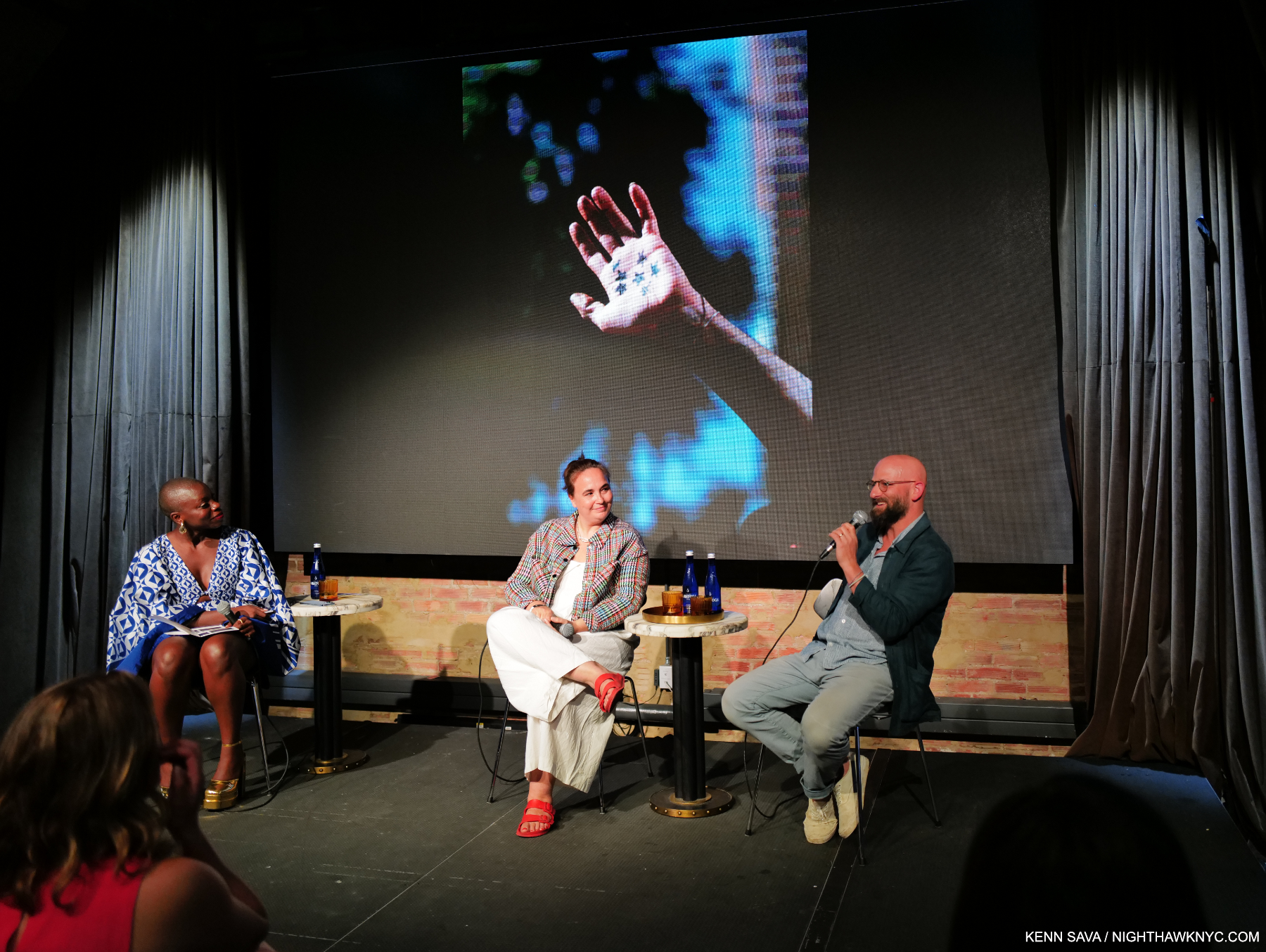
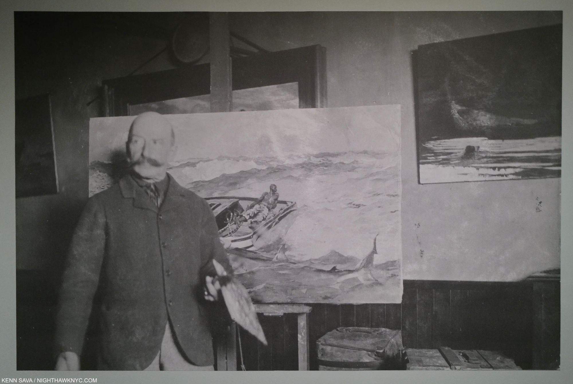
Gregory Halpern, right, giving a brief overview of his career to date as an introduction to his work including this well-known image from his PhotoBook, ZZYZX, with Magnum Photos President, Photographer, and fellow exhibitor, Cristina de Middel, center, and narrator Jessica Nabongo at Impressions @ Fotografiska, July 20, 2023. Click any image for full size.
Two shows featuring the work of Gregory Halpern provided all-too-rare opportunities to see his work here in what were the NYC debuts of both his newest work, and his most recently published work. While familiar to most from his remarkable series of PhotoBooks this past decade as a “book Artist,” the shows provided the chance to see him as a “wall Artist.” Though neither was a Gregory Halpern solo show, they proved revelatory1.
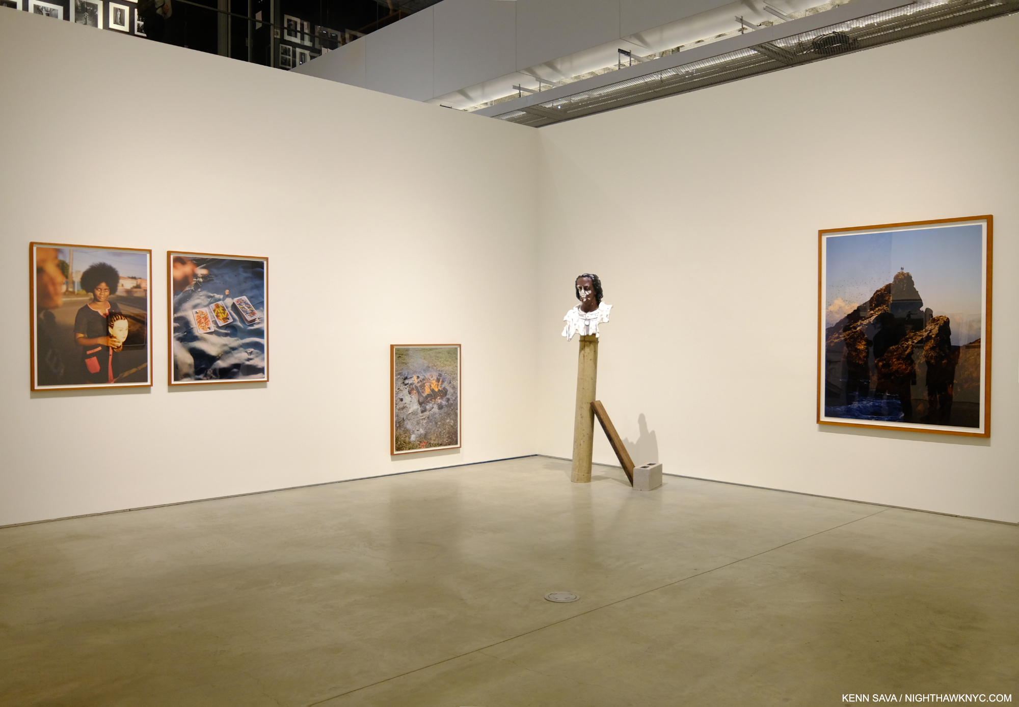
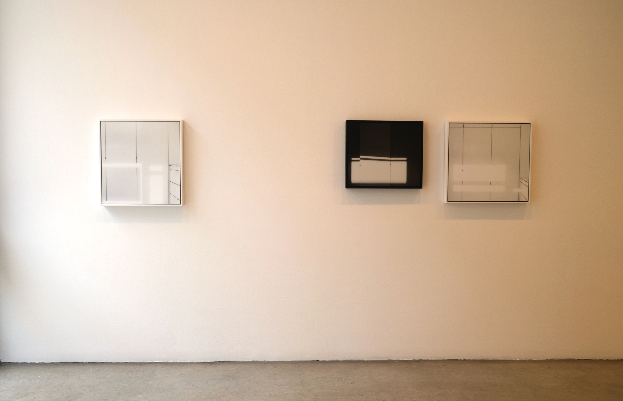
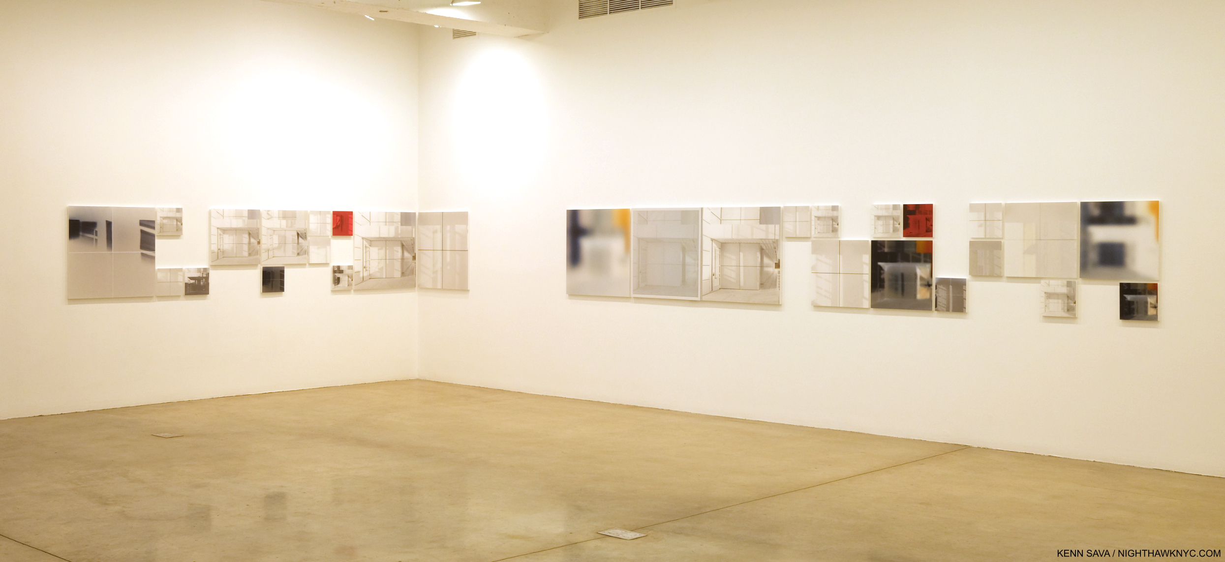
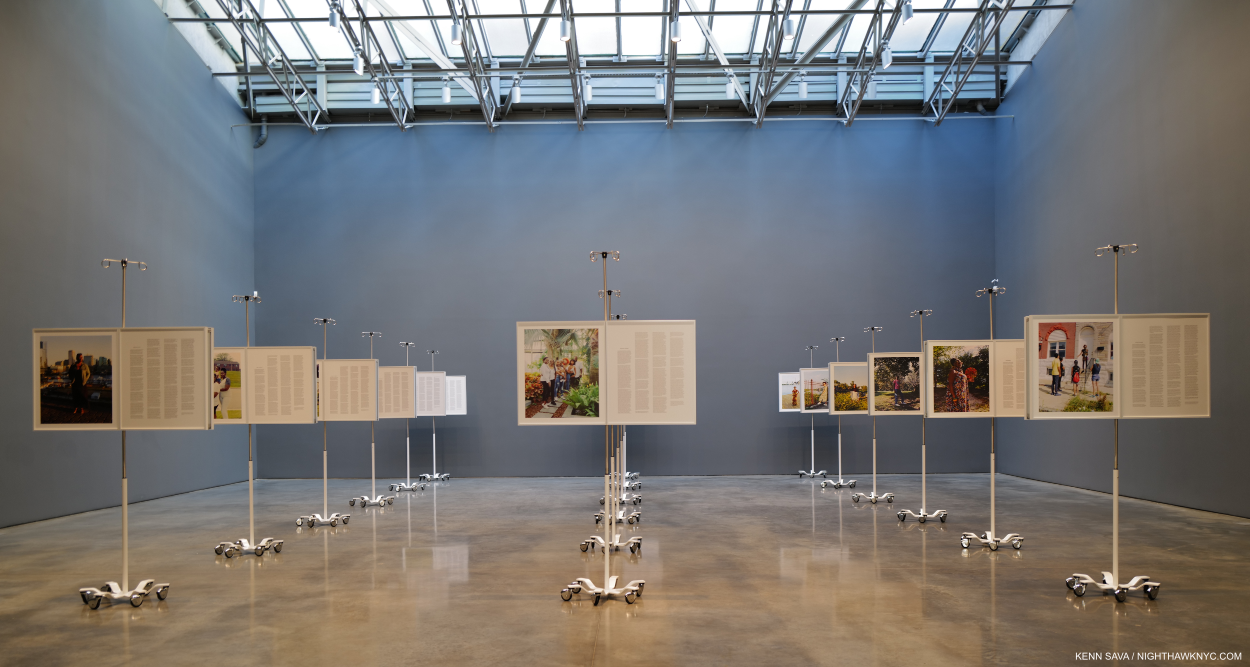
Immersions installation view
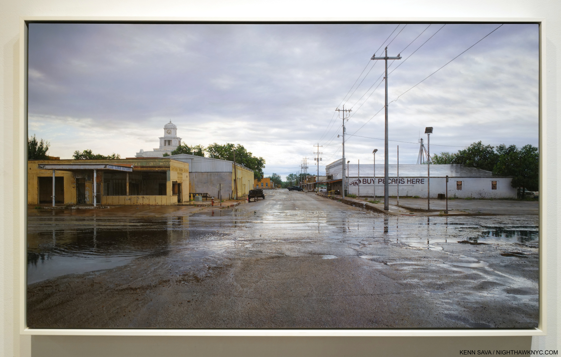
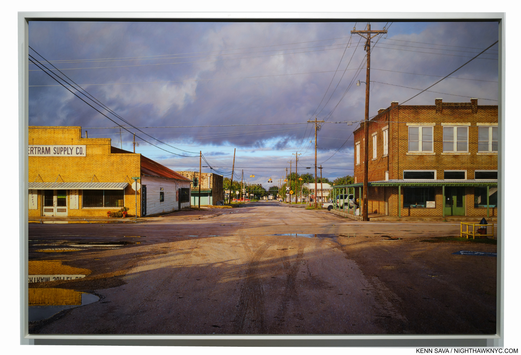
On September 26th, Immersion opened at ICP, where I was last for William Klein: YES. Immersion is the name of a commission program involving an amalgamation of French and American organizations awarding selected Photographers, called laureates, a sponsorship to create a body of work either in France or the US. Gregory Halpern was a laureate in 2018. Raymond Meeks and Vasantha Yogananthan are the other two laureates included in the show. For his part, Mr. Halpern decided to go to Guadeloupe, a former French colony, a daring and somewhat ground-breaking choice (Raymond Meeks chose two regions in France, and Vasantha Yogananthan chose New Orleans).
So, why Guadeloupe?
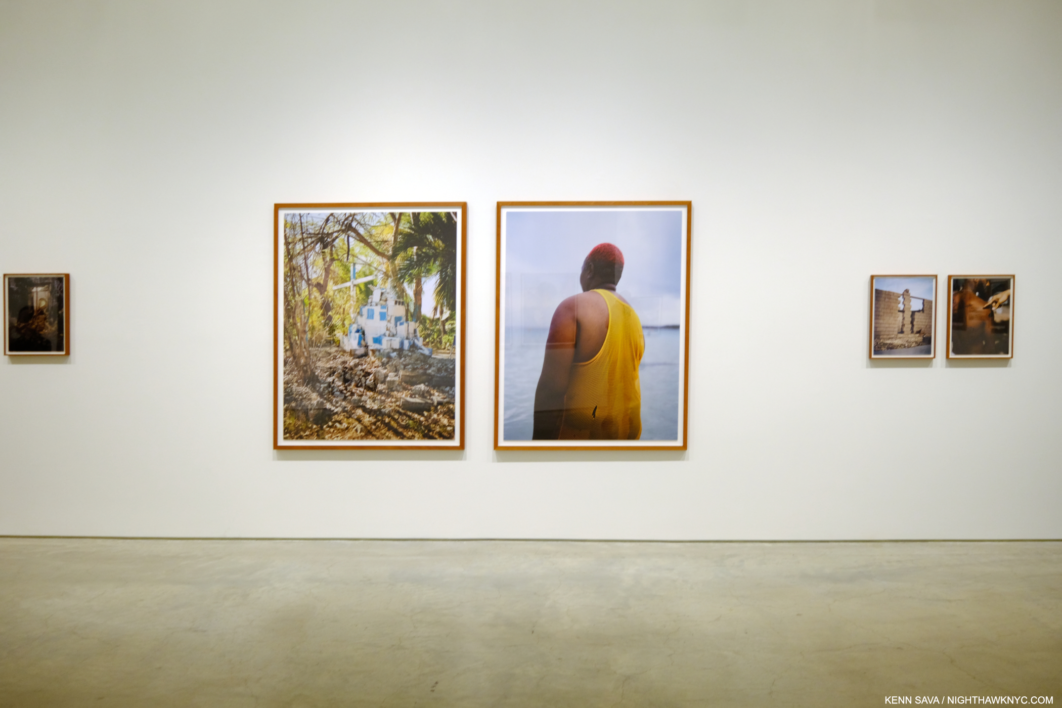
Immersions installation view.
“I think I knew I would find a certain form of Surrealism there,” Mr. Halpern explained in an interview with Curator Clément Chéroux2.
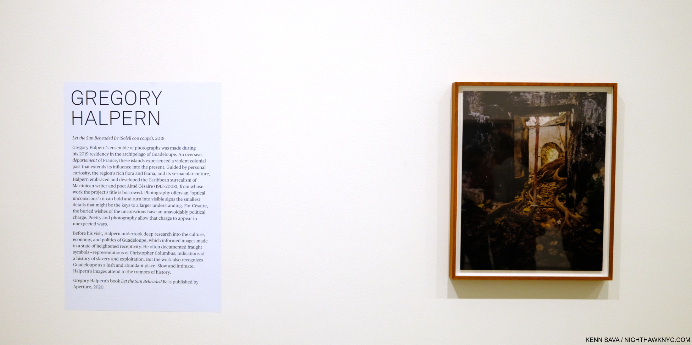
The stage set, after research and a number of trips to Guadeloupe to take the Photographs, he undertook the rigorous selecting and arranging process he outlined during a talk when I saw him last at The Strand Bookstore in September, 2019. Aperture published the resulting body of work, indeed perhaps his most surreal, in Let the Sun Beheaded Be (a NighthawkNYC Noteworthy PhotoBook of 2020). In Immersion NYC finally gets to see the work as Photographs.
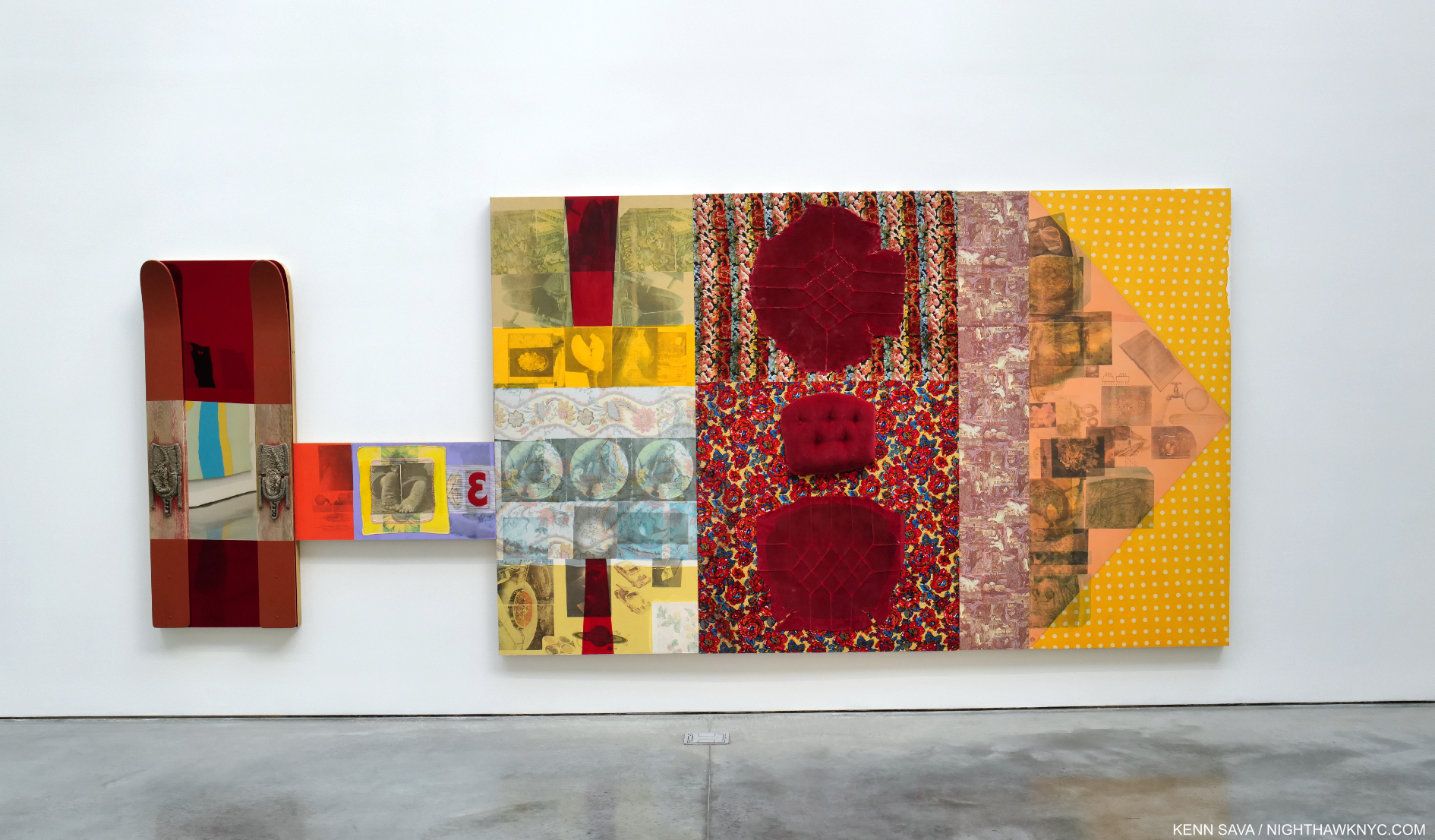
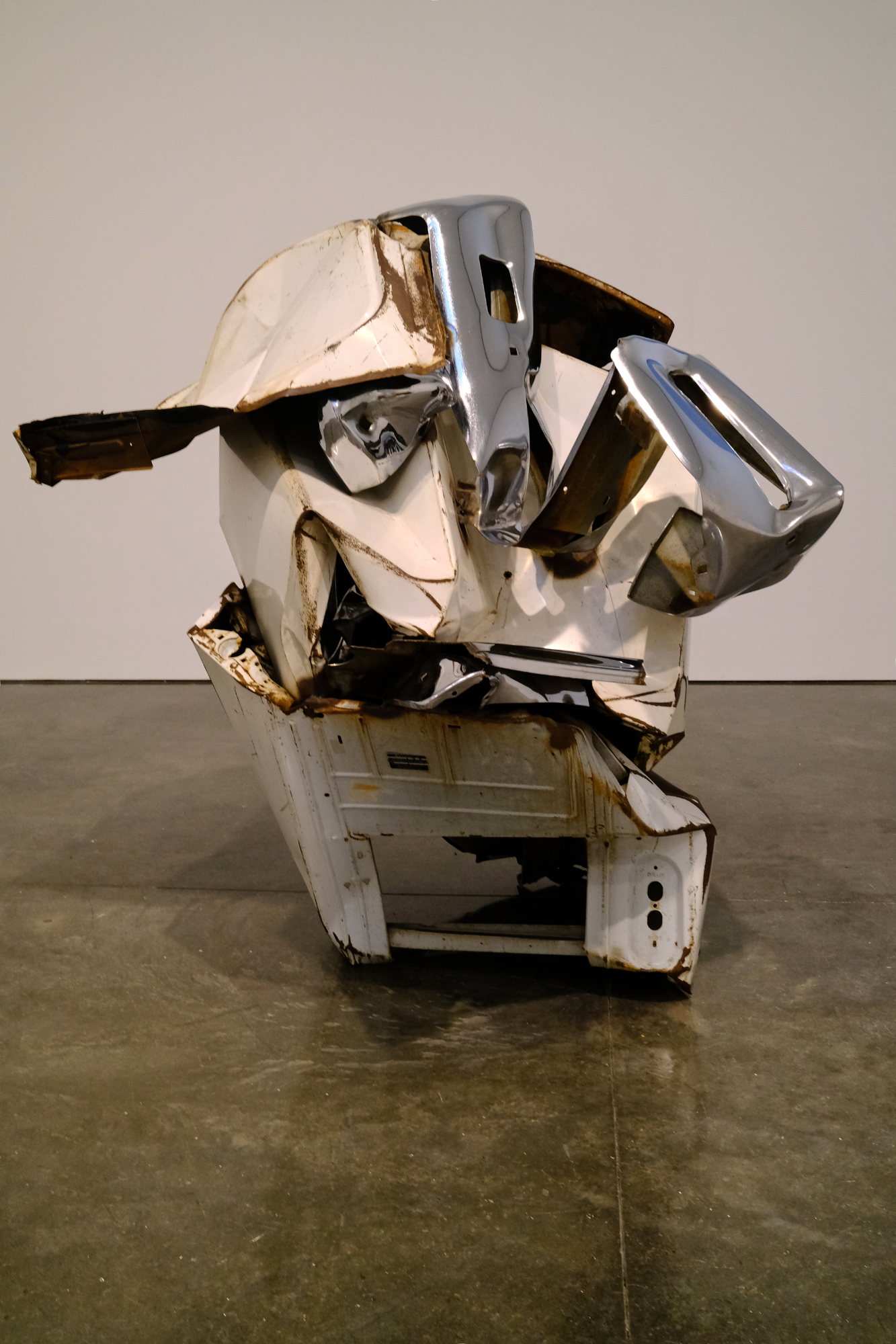
The show was concise, typically open-ended, and bookended by the Artist’s first foray into Video(!) and a stunning, leaning, Sculpture3. It opens with one of the most compelling images in the book. 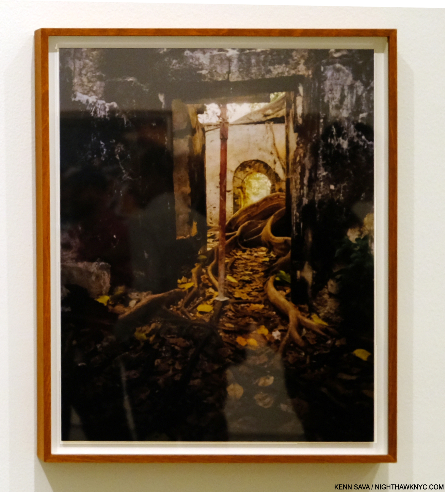
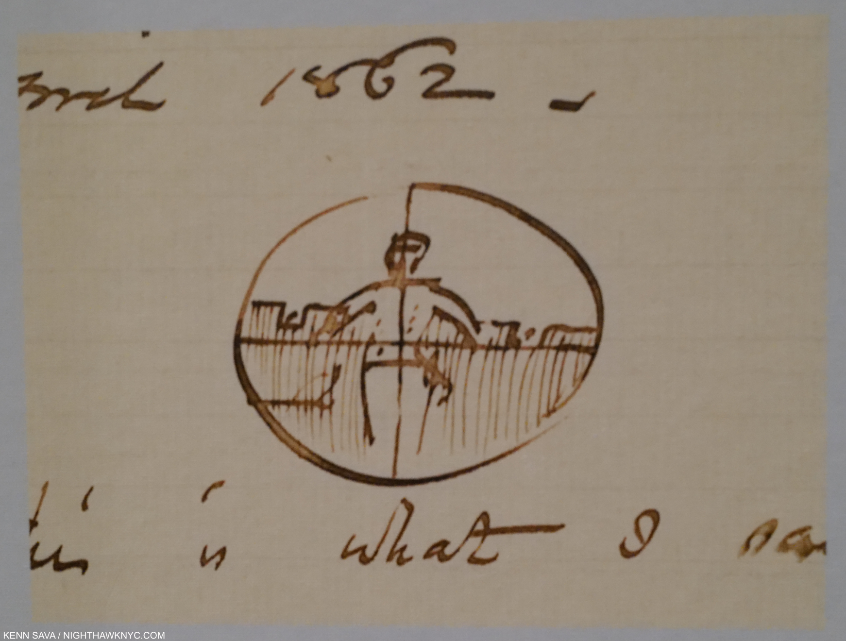
Untitled, as all the images are in the book, is described by Mr. Chéroux- “Shot in a former slave prison in the town of Petit-Canal, northwest of Grande-Terre, it shows the tentacular development, right inside the building, of a tree commonly known as a strangler fig because the strength of its wide roots destroys everything on which it grows4.”
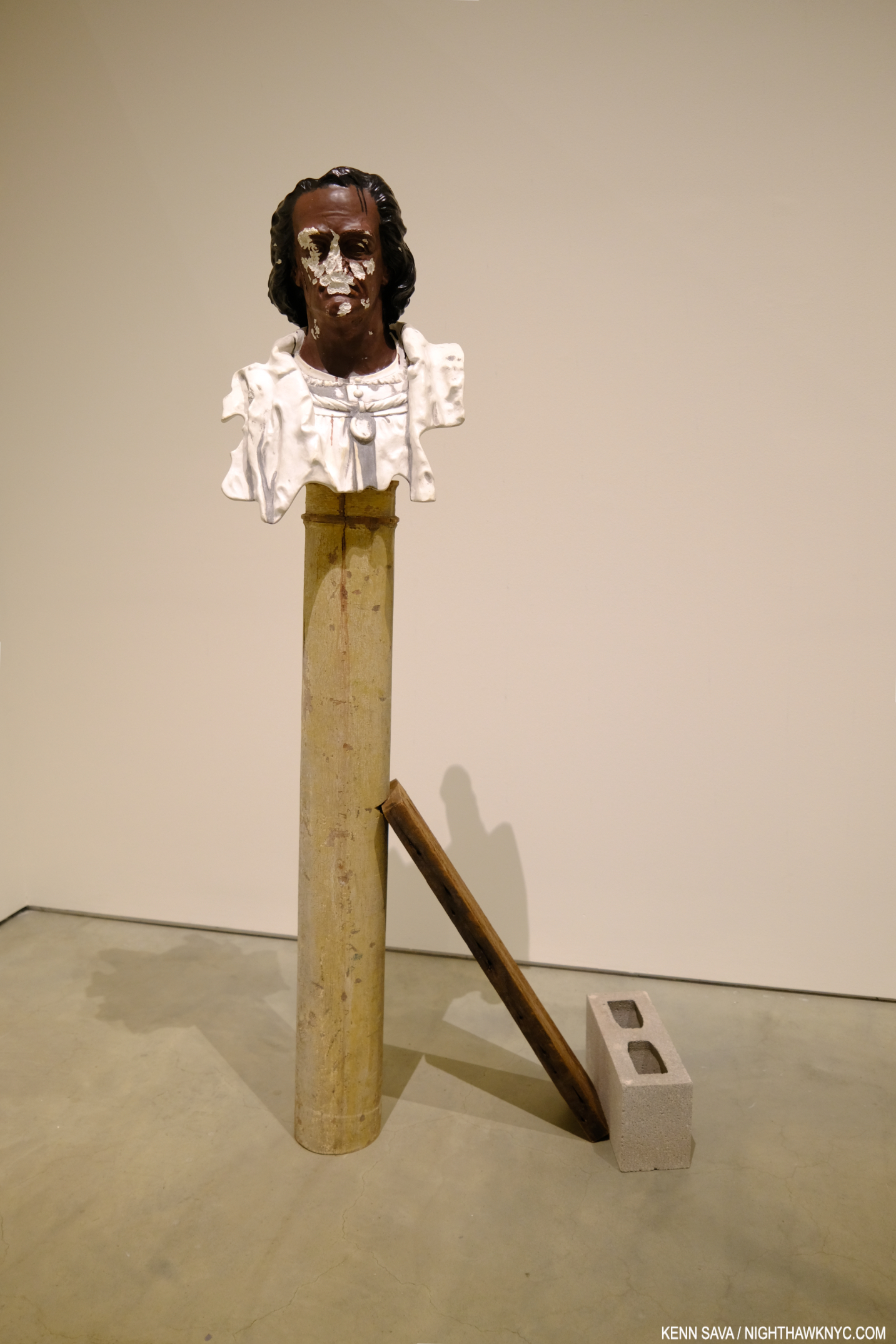
Christ Columb, 2023, Marble, cement, stainless steel, wood and cinderblock. An “exact replica of a bust of Christopher Columbus that currently stands in Guadeloupe,” per the wall card. “Exact” in that it even mirrors the vandalism to the real bust’s face.
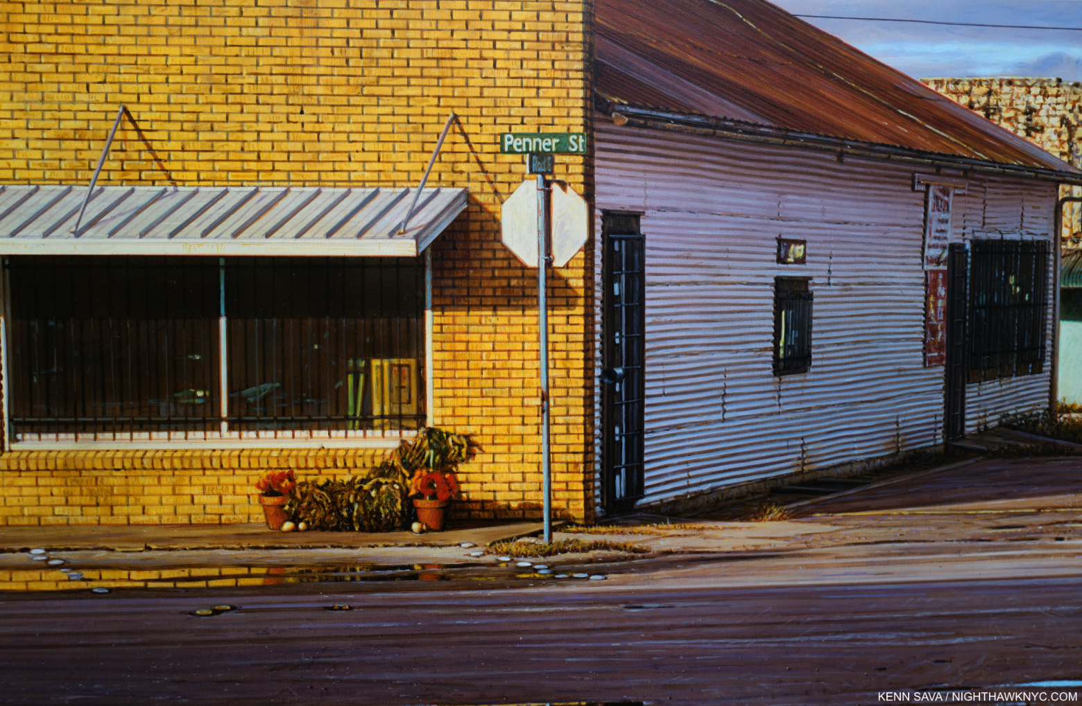
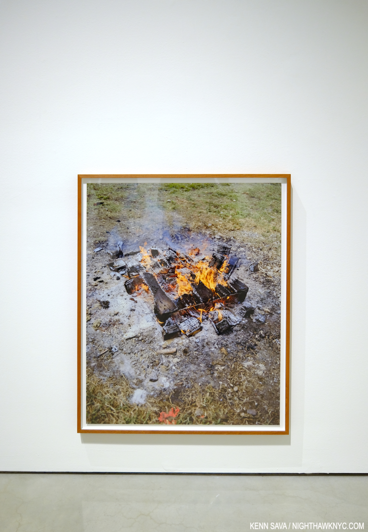
It serves to define his terms. In these Photos, Mr. Halpen consciously avoided tourist trappings, saying in the book’s conversation with Stanley Wolukau-Wanambwa that after seeing how the tourists acted and treated the locals, he realized his burden as another white outsider with a camera would be even heavier, especially because he wasn’t fluent in either French or creole. He chose instead to focus on the stormy history, the place, the human, the animal, and the vernacular, in what are the five unofficial “chapters” of the book.
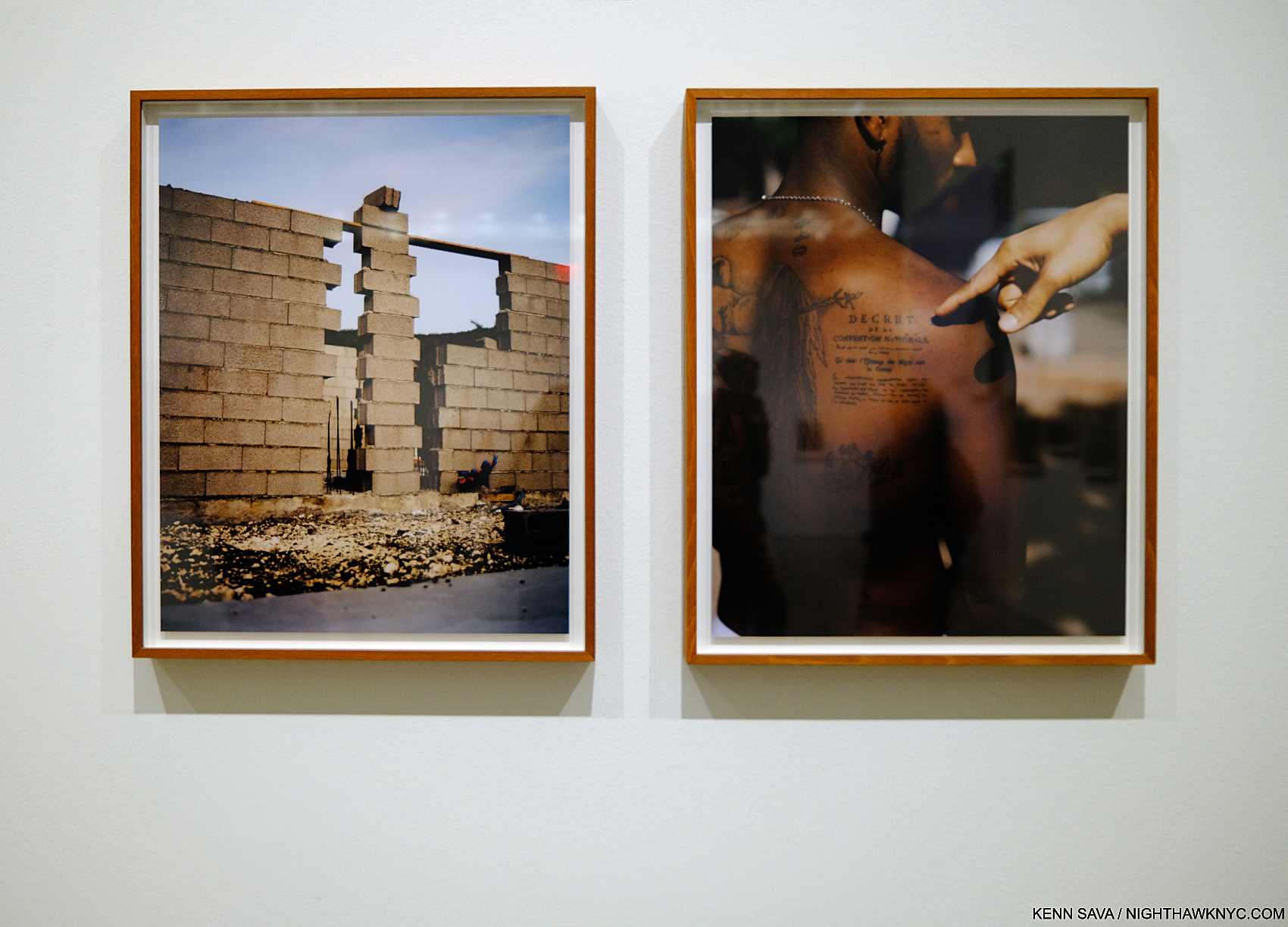
History/the place, the human…”The tattoo is a replica of the 1848 decree abolishing chattel slavery in Guadeloupe (the second, final abolition, after Napoleon reneged on his 1815 abolition,” from the wall card regarding the work on the right.
Surrealism runs throughout all of them, yet in Let the Sun it’s, perhaps, an overriding mood as much as it is actually on view. Possibly, this is due to the inherent surrealism Mr. Halpern said he was expecting to find, or perhaps it was also due to his reading material during his visits. The title “Let the Sun Beheaded be” comes from Soliel cou coupé (or Solar Throat Slashed) by Martinican poet Aimé Césaire, who was influenced by the concluding lines of “Zone,” the first poem in Guillaume Apolliinaire’s Alcools, 1913, “Adieu Adieu / Soliel cou coupé” (Farewell, farewell / Let the Sun beheaded be). Apolliinaire coined the term “surrealism” circa 1917. Césaire’s earlier work found its way into the hands of André Breton, one of the leading surrealist theorists, and the two became long-time friends. Speaking of Solar Throat Slashed curator Clément Chéroux points out in his essay the numerous connections between the guillotine, which was brought to Guadeloupe with the French after the French Revolution and put to extensive use in the colony, and Photography- down to the “guillotine shutter.” Thankfully, the guillotine shutter is the only use of the notorious device in the work, though death takes many forms.
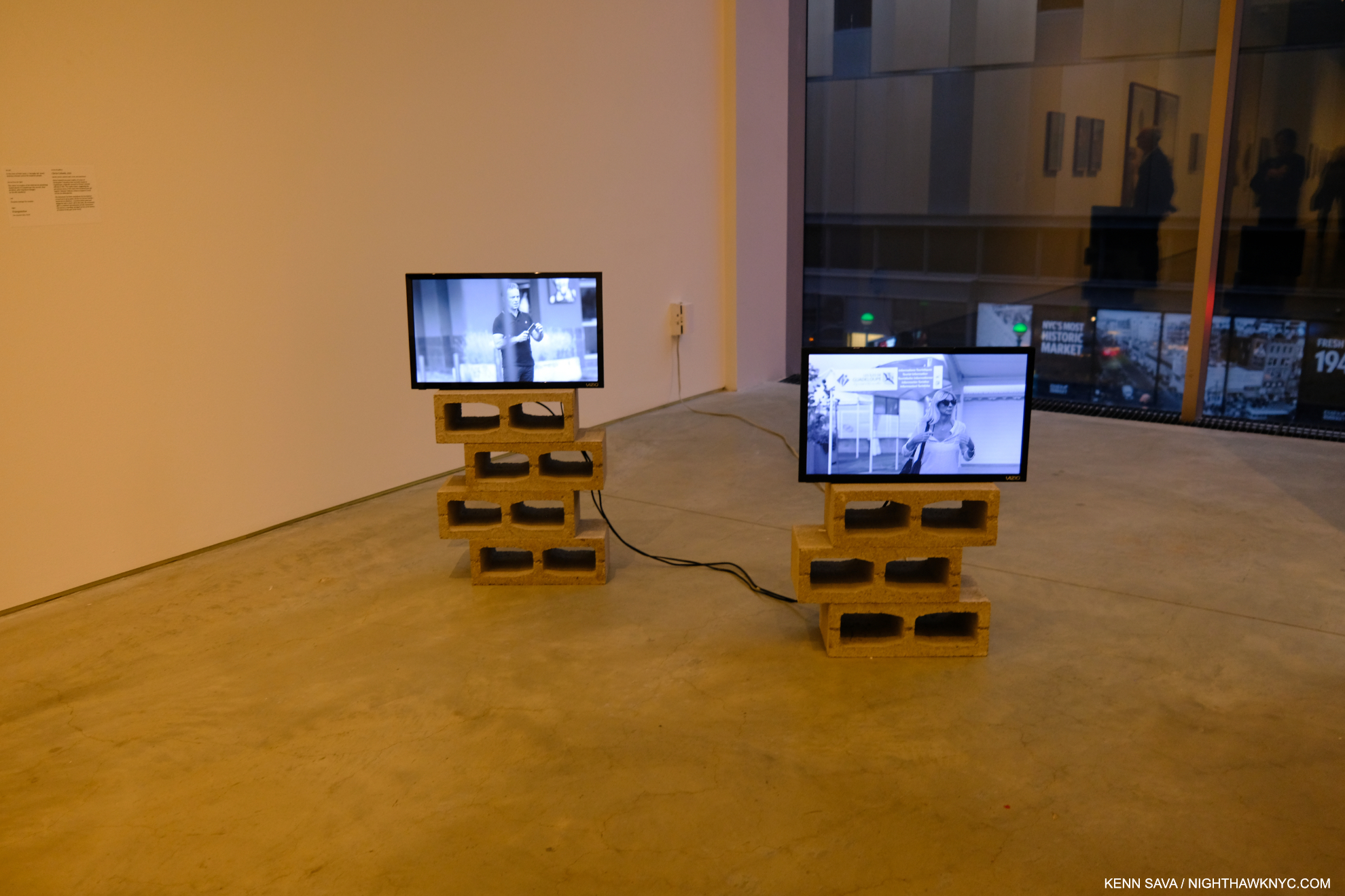
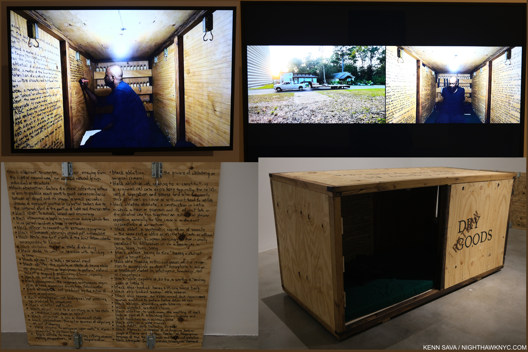
Stills from Triangulation, 2-channel video(!), duration 4:20.
Yet, after finishing his Photography, he subsequently returned to make a 2-channel Video titled Triangulation, which meditates on the coming and going of the cruise ships and their cargo. The Video, his first to be shown in public, startled me for having a different approach than his Photography does! Whereas he goes to great length to speak with his Photographic subjects, even collaborating with them to an extent in his Photo Portraits, in Triangulation, he’s an observer. Highlighting the risks of this, at one point, staged or not, a cruise ship employee with “Photographer” emblazoned on his shirt, ironically moves towards the camera making a “STOP” signal . The Video added a counterpoint to the show. At once showing that side of Guadeloupe most known to the outside world, but showing it not from the standpoint of the tourists, but almost from the viewpoint of the locals if and when they watch these foreigners arriving & disembarking on their island.
Appropriately hung near the floor. Seeing it this size created a completely different impression than the image in the book.
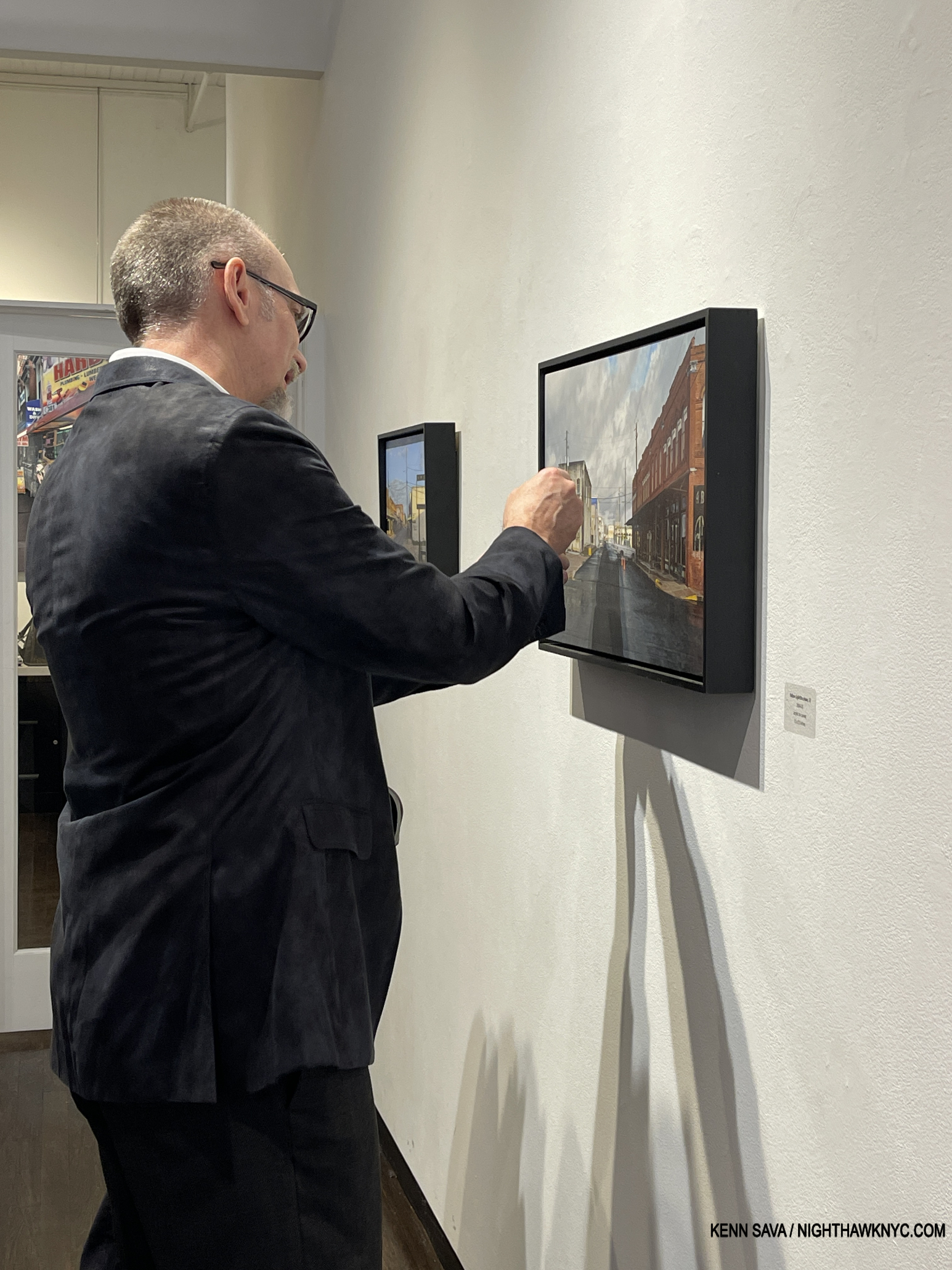
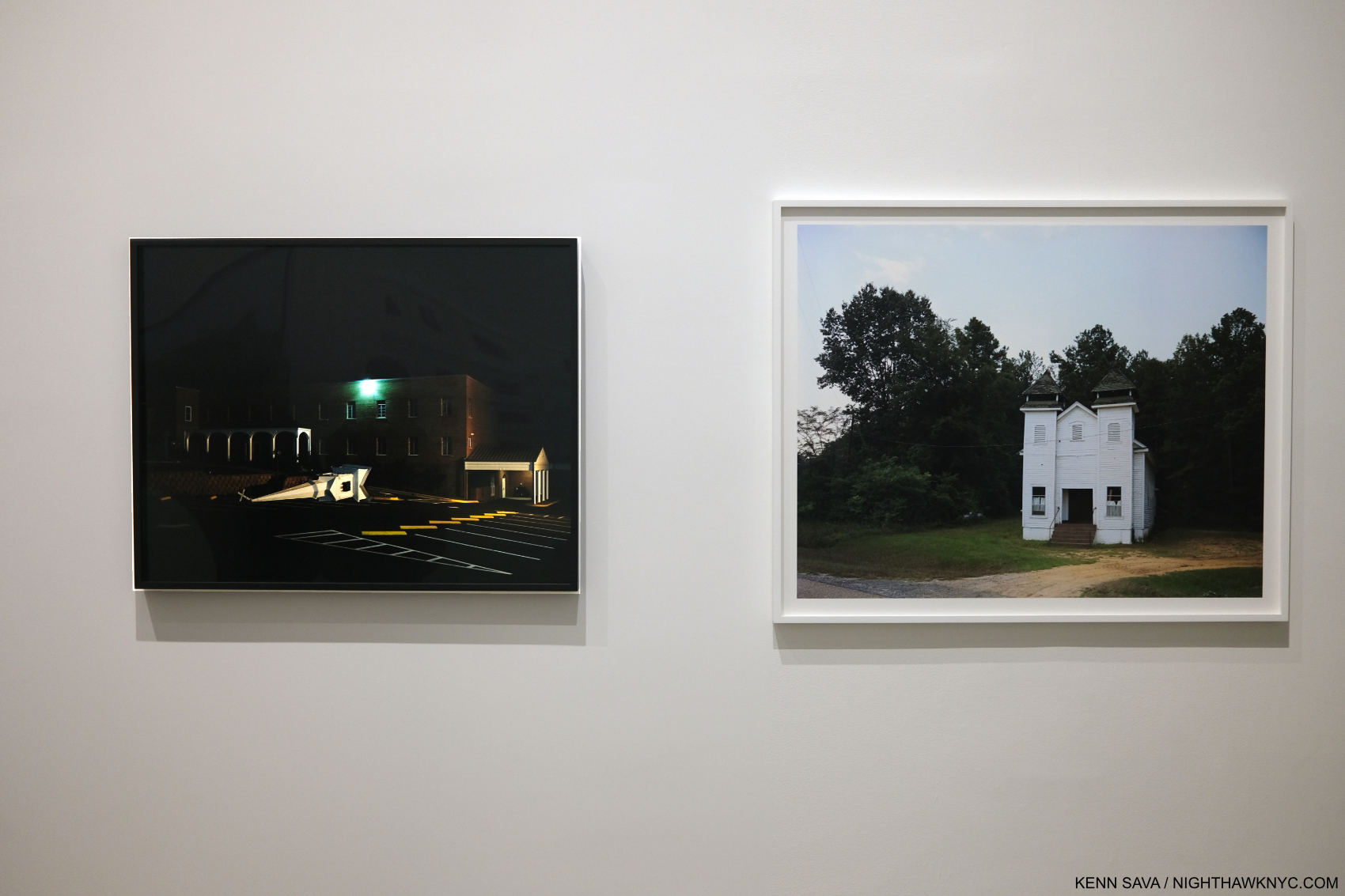
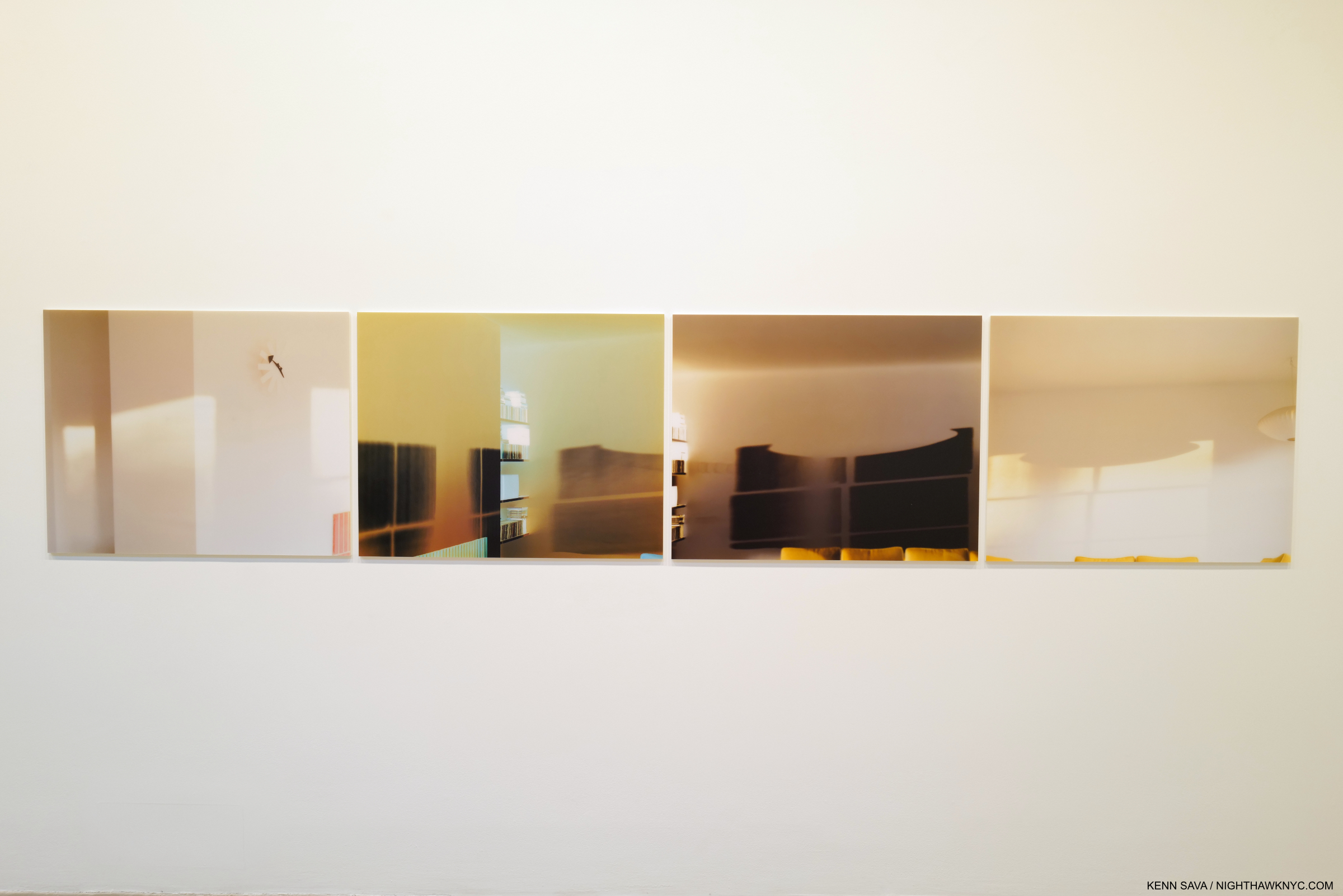
Another thing that struck me seeing this work was size. Images have a tendency to live in our minds in the size they appear in in a book. Unlike a Painting or Drawing, we may tend to forget Photographs can be printed larger or smaller. I heard from readers when I named Mr. Halpern’s Omaha Sketchbook a NoteWorthy PhotoBook of 2019 who disagreed, saying they were unhappy with the size of all the images in it- each a reproduction of a Photo cut from a medium format contact sheet, done to remain true to his original mockup- a “sketchbook.” Let the Sun returned to full page images to stunning effect (I happened to love the daring in the design of Omaha and the sizes of the Photos therein). At ICP, the Prints ranged from slightly larger than page size to very large, probably 40 inches or larger. The added real estate enabling the images to begin to attain a “life-size” presence.
“In Guadeloupe, slavery memorials are everywhere, so the weight of that history is much more perceptible than in the United States.” Gregory Halpern in the Conversation.
In my 2019 overview of his work, “Gregory Halpern’s America,” I wrote about his work’s hold on me. I still can’t think of any other living Photographer whose work speaks to me as much as his continues to. Given that his instant classic book ZZYZX is now in its 4th printing, and his three subsequent books have sold out, I’m apparently far from the only one it speaks to. I went in to Immersions believing that Let the Sun is somewhat underappreciated compared to his U.S. based books (i.e. all of his previous books). I came out feeling I may have underestimated it. Let the Sun is a book that could inspire change on a number of levels- from opening the eyes of people who’ve never been to Guadeloupe (like myself), to increased possibilities for the Photographic Portrait, to publishers who have neglected the Caribbean (& it’s Artists) to this point in Art & PhotoBooks, to the shame that the history of slavery in this country has been so ignored. For those reasons, it’s something of a landmark book in my view.
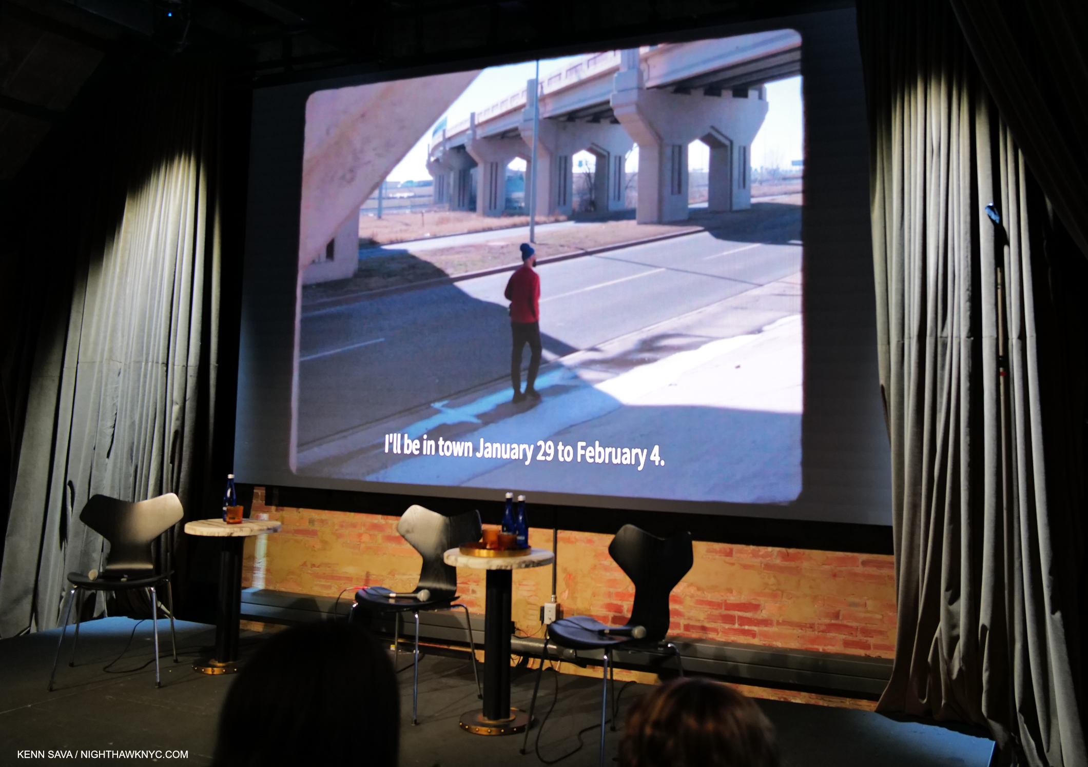
On the road, again. Gregory Halpern looking for subjects in Oklahoma City as he talks in the voice-over about his Instagram announcement seeking Portrait subjects. Still from a fascinating video short about his week in OKC at Fotografiska, July 20, 2023.
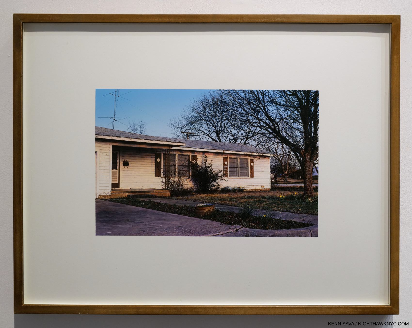
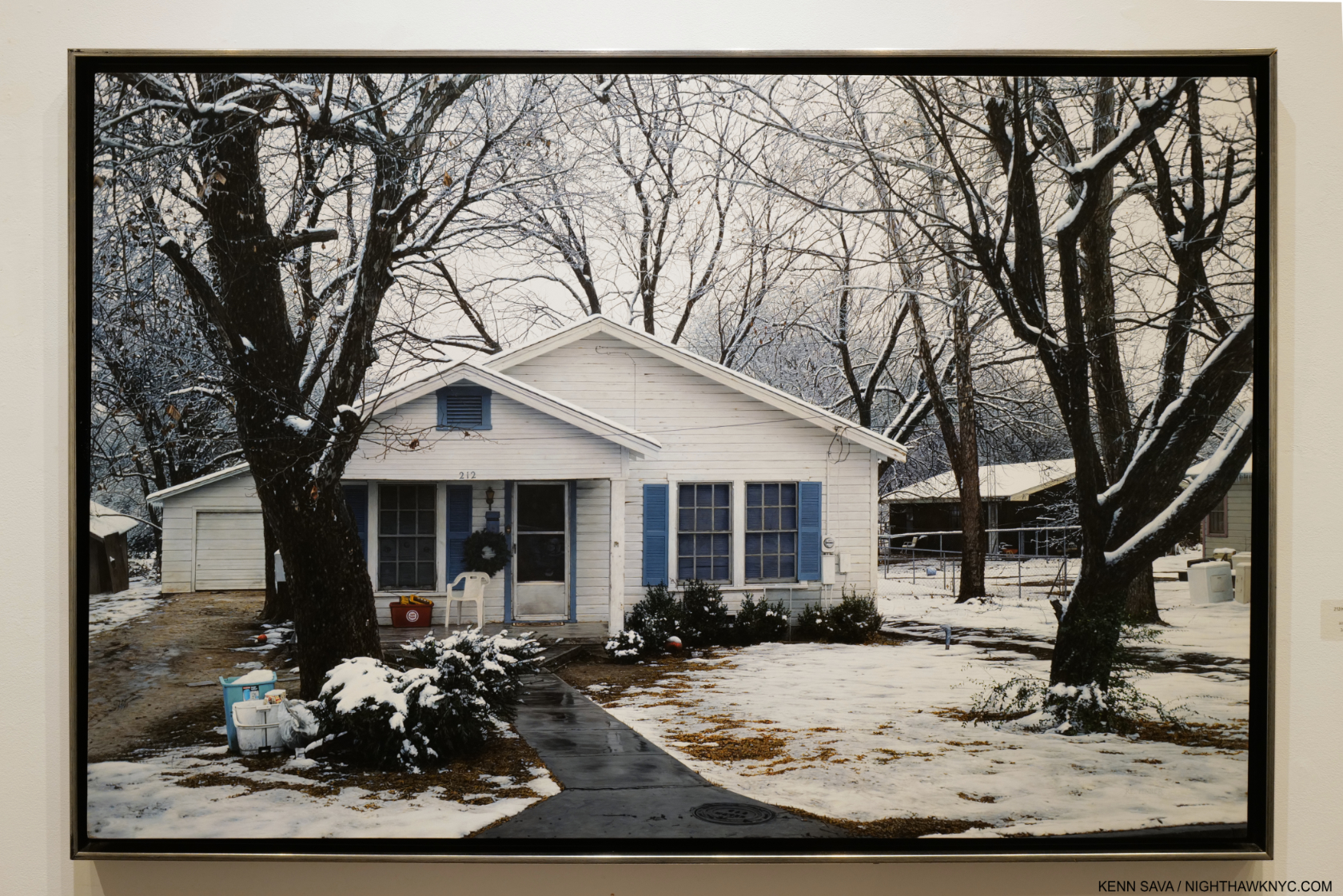
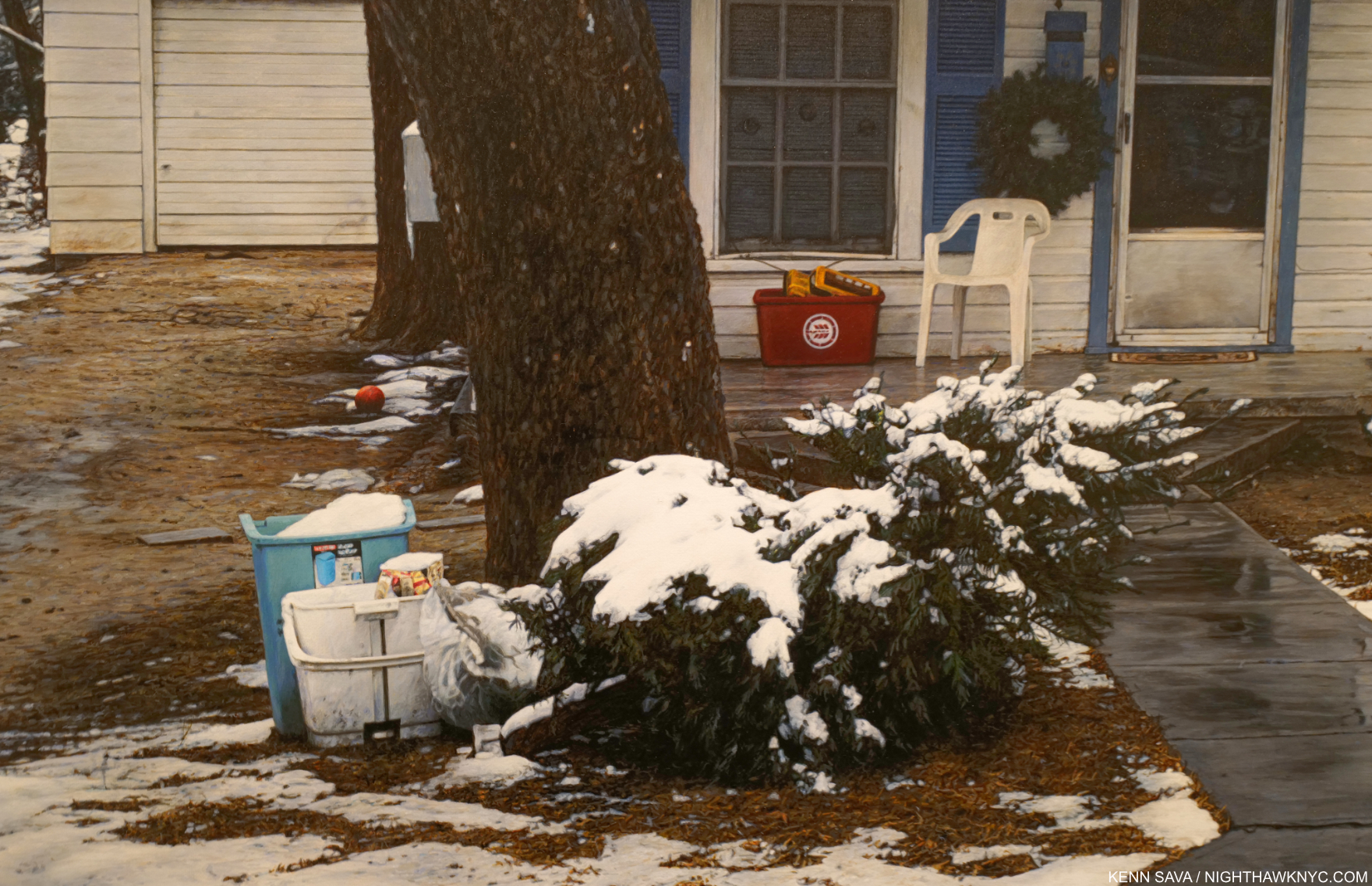
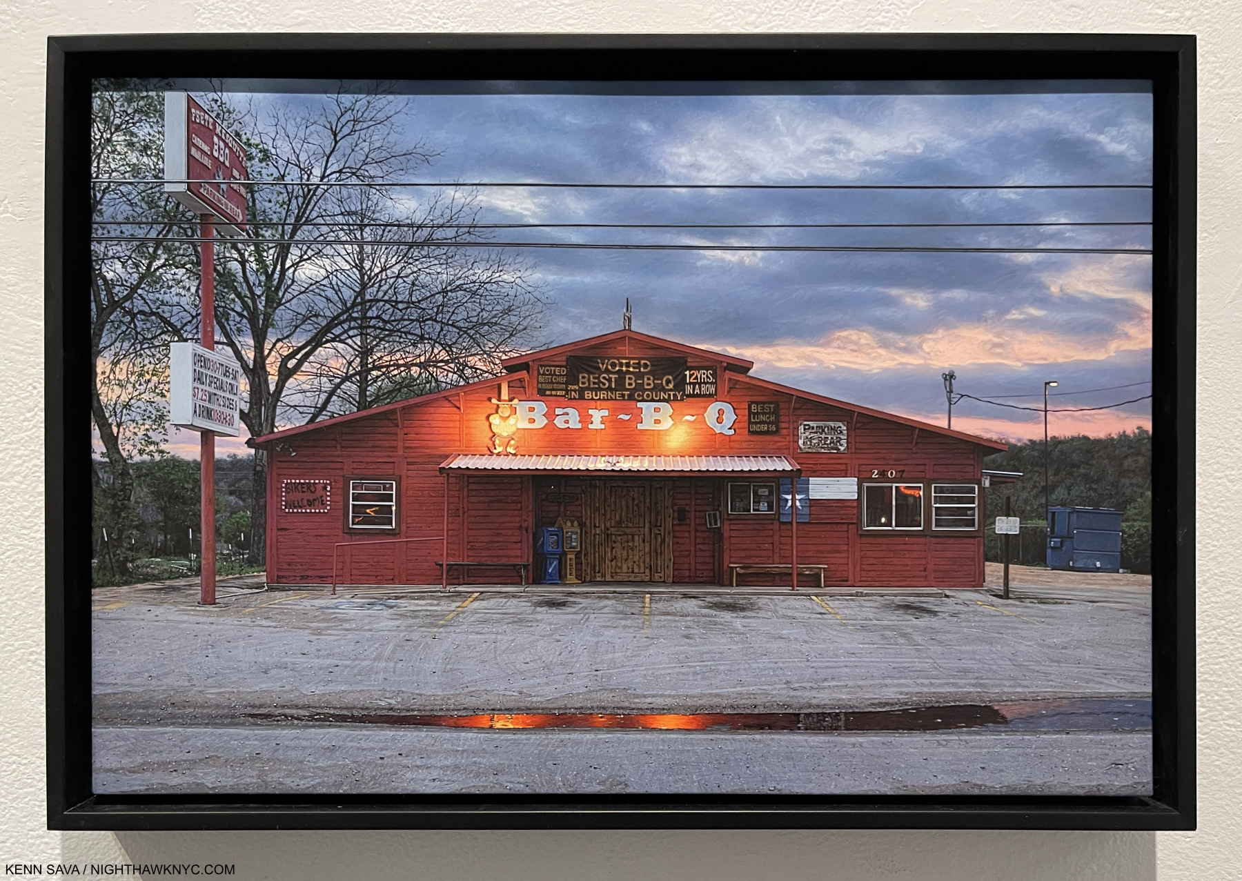
A few weeks earlier, at Fotografiska in the Flatiron on July 20th, Mr. Halpern was joined by 3 Magnum Photos Photographers, of which he is now also a full member, in a show sponsored by a hotel chain titled Impressions. The Photographers were ensconced in separate hotels around the world and asked to document what they experienced. Mr. Halpern went to Oklahoma City, and exhibited 4 Photos (as did each of the others- Cristina de Middel, Jonas Bendiksen, and Alessandra Sanguinetti) in what is the first new work I’ve seen of his since Let the Sun Beheaded Be, 2020.
Here is Mr. Halpern’s presentation-
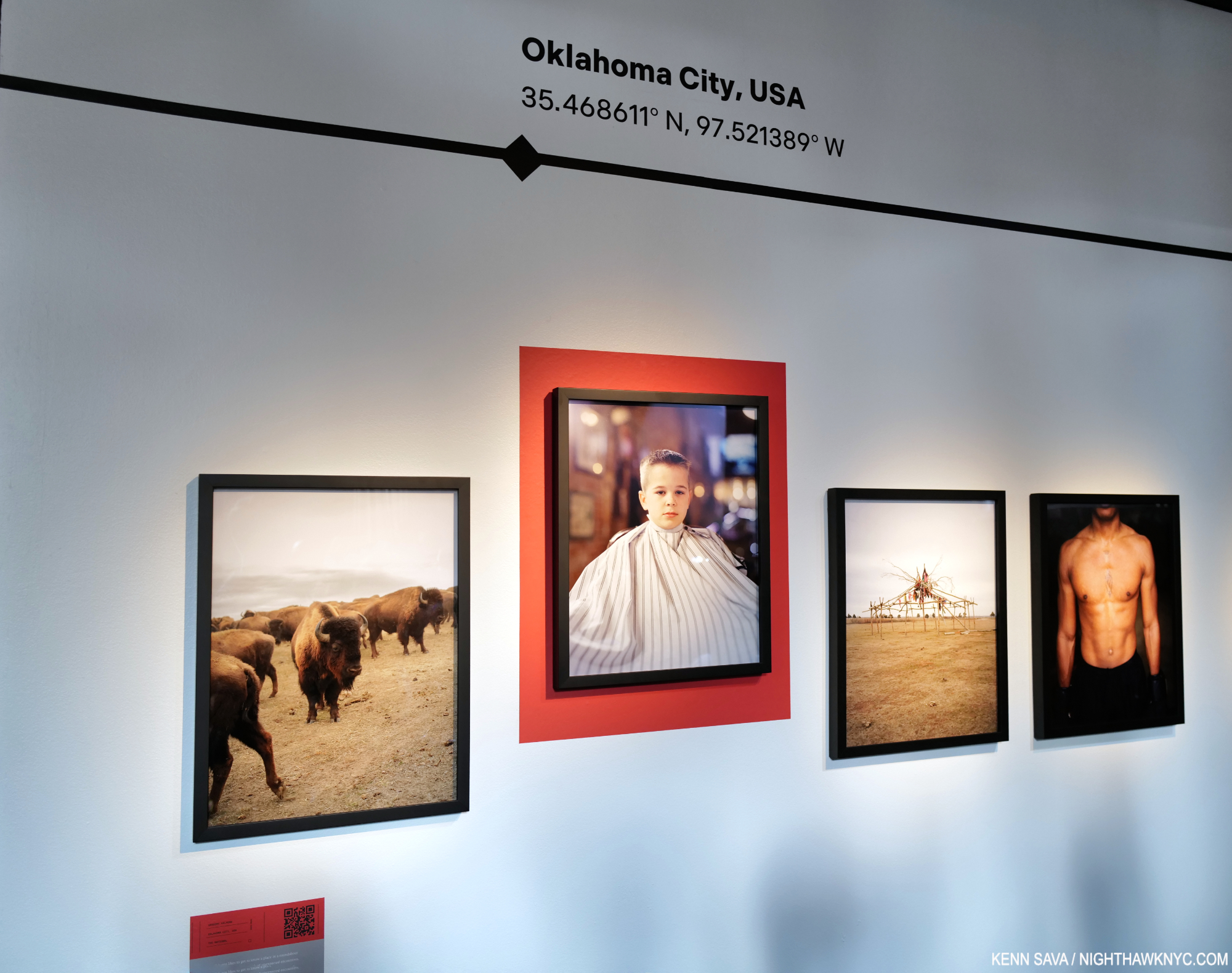
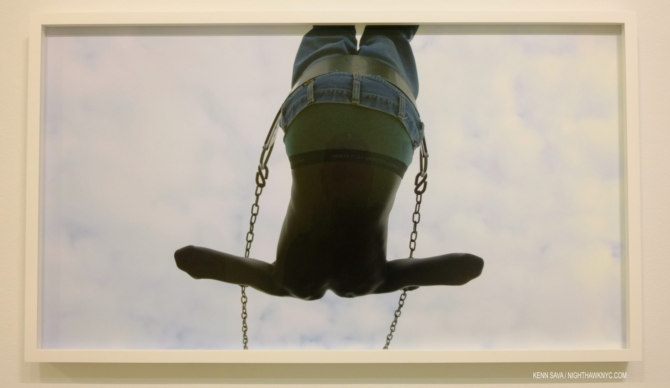
I find the arrangement particularly interesting. We see animals, a Portrait of a young man in a barber’s cloth, some sort of structure, and a torso bearing a tattoo. Looking at these, yes, Let the Sun came back to me. Each of the four images “represents” one of its unofficial themes- animals, a human, the evidence of the land/history, and another human. The surreal is also represented in all four (at least for me).
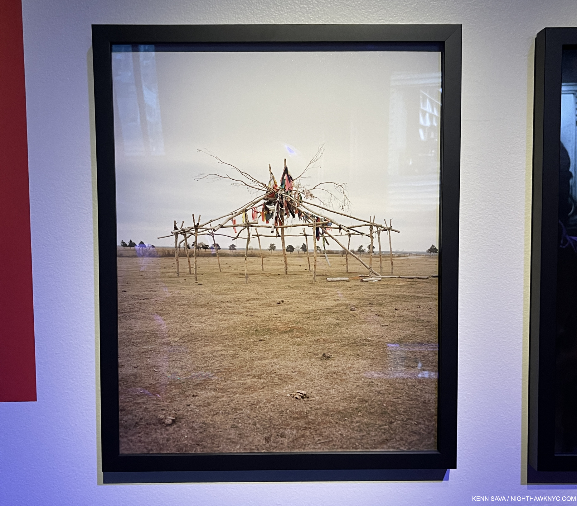
It would be easy to say they “harken back” to what we saw in Omaha Sketchbook. That book featured images of masculinity (along with images of animals, the land & history and other themes), like Douglas, Army Jurnior Reserve Officer Training Corps, Bellevue, 2005-18, to cite one example out of many; the young man getting a haircut harkens back to those societal expectations and traditions. Ostensibly, it’s a straight-ahead image of an event that parents are fond of documenting during childhood. Yet, there’s an air of mystery around it. The young man stares at the camera with a somewhat stoic look that gives away little. The barber cloth hiding anything the might tell us more about him. His haircut appears to be finished and he’s ready to face the world again. Yet, I’m reminded of Clément Chéroux’s essay in Let the Sun when he speaks about the guillotine, Guadeloupe, and the mechanics of Photography. He mentions Photographers refer to Portraits as “cutting heads.” Here we see just that twice- once with only the head (in a Print mounted on a red background), and once of a torso sans head. Notice how the Print of the young man is mounted higher than the others- at a height where the young man’s head just about “completes” the Portrait of the tattooed torso on the right.
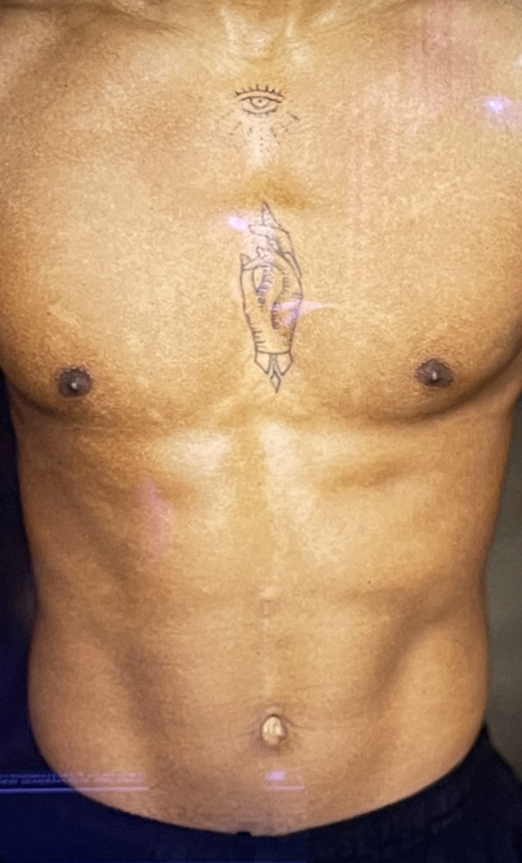
Detail of the far right Photo, showing the tattoo. Speaking of recurring themes, t’s interesting to contrast this with the very first image in this piece from ZZYZX.
It reminds me of some of the games the Surrealists used were fond of playing, like the one Kerry James Marshall based his recent show on.
Mr. Halpern discussing two other images from his OKC series.
Of course, this is only my reading of it- your results may differ, as Mr. Halpern’s intentions may as well. In the end, I’m lucky I never have to leave NYC to find Surrealism. It finds its way here from all over the world.
*- Soundtrack for this piece is “Captains and Cruise Ships” by Owl City.
NighthawkNYC.com has been entirely self-funded & ad-free for over 8 years, during which 300 full-length pieces have been published! If you’ve found it worthwhile, PLEASE donate to allow me to continue below. Thank you, Kenn.
You can also support it by buying Art, Art & Photography books, and Music from my collection! Art & Books may be found here. Music here and here.
Written & photographed by Kenn Sava for nighthawknyc.com unless otherwise credited. To send comments, thoughts, feedback or propositions click here. Click the white box on the upper right for the archives or to search them. Subscribe to be notified of new Posts below. Your information will be used for no other purpose.
- As far as I know, there has not been a Gregory Halpern solo show in NYC since the auspicious Gregory Halpern: A at Clamp Gallery from January 5th to February 11th, 2012, as hard as that is to believe. If you know of one subsequently, please let me know. ↩
- From 2019, per Clément Chéroux, “GH/971” in Let the Sun Beheaded Be. ↩
- Which is not his first. He showed Sculpture for the first time earlier this year in Gregory Halpern: 19 Winters/7 Springs at Transformer Station, Cleveland. ↩
- ibid ↩