Hilma af Klint in the 21st Century: The Spirit vs. The Machine

THIS SITE IS FREE & AD-FREE!
If you find this piece worthwhile, please donate securely via PayPal so I & NighthawkNYC can continue. More ways you can support it at the end. Thank you.

Written & Photographed by Kenn Sava (*- Additional Photographs by Lana Hattan, and others as credited)

Shows seen: Hilma af Klint: Paintings for the Future, Guggenheim Museum, 2018-19.
Georgia O’Keeffe: To See Takes Time, MoMA, 2023, and
Hilma af Klint: What Stands Behind the Flowers, MoMA, 2025

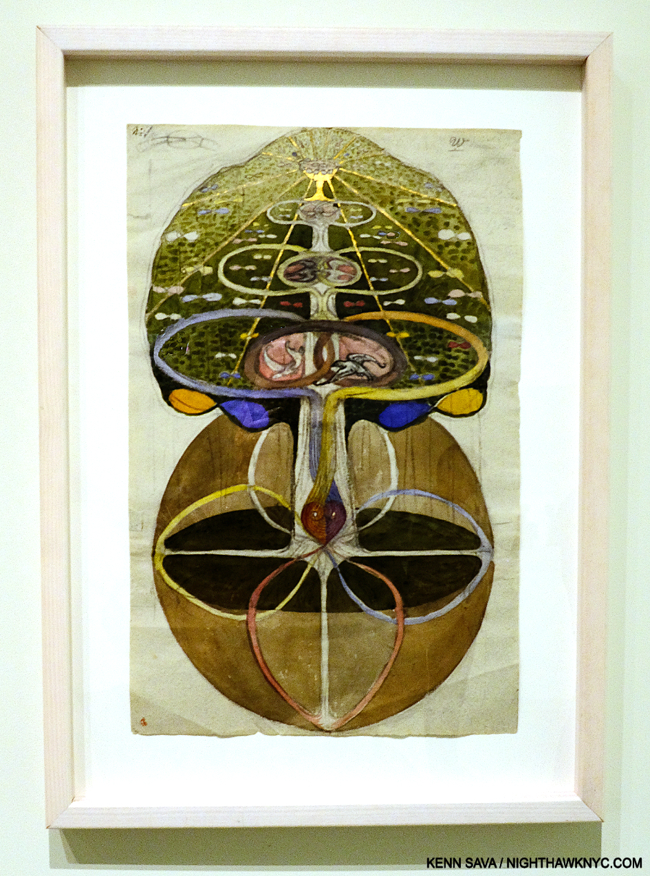
Hilma af Klint, Tree of Knowledge, No. 1,  from The W Series, 1913, Watercolor, gouache, graphite, metallic paint, and ink on paper, Guggenheim Museum, December 31, 2018..

Succinctly put, Hilma af Klint is one of the most remarkable and unique Artists I’ve encountered.

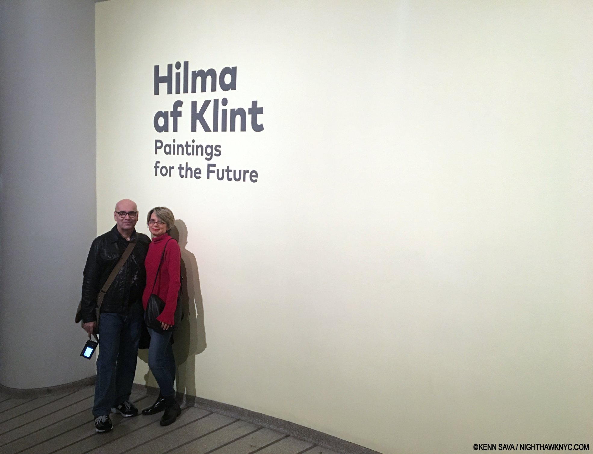
Of the thousands of Art shows I’ve seen in my life, I consider about 10 to be truly monumental. Hilma af Klint: Paintings for the Future is one of them. I’m so grateful I got to experience it with Lana Hattan1, and her Photos are included in this piece. Guggenheim Museum, New Year’s Eve, December 31, 2018. Enduring Thanks to the woman who took this.

Having seen two shows of her work, and most of the books published on it, Hilma’s work continually surprises me. Much of her oeuvre features that rarest of all qualities in Art: it’s unprecedented. I saw Paintings for the Future exactly seven years ago as I write this yet I haven’t written about it to this point for two reasons- 1) I’m still thinking about it and researching Hilma (as my featured entry on Hilma books in my “NoteWorthy Art Books of the 21st Century” piece earlier this year attests). 2) I’ve come to see that boxing Hilma as an “abstract Artist,” as the Art machine has labelled her, does her an immense disservice. I find it at odds with the very nature of her work.

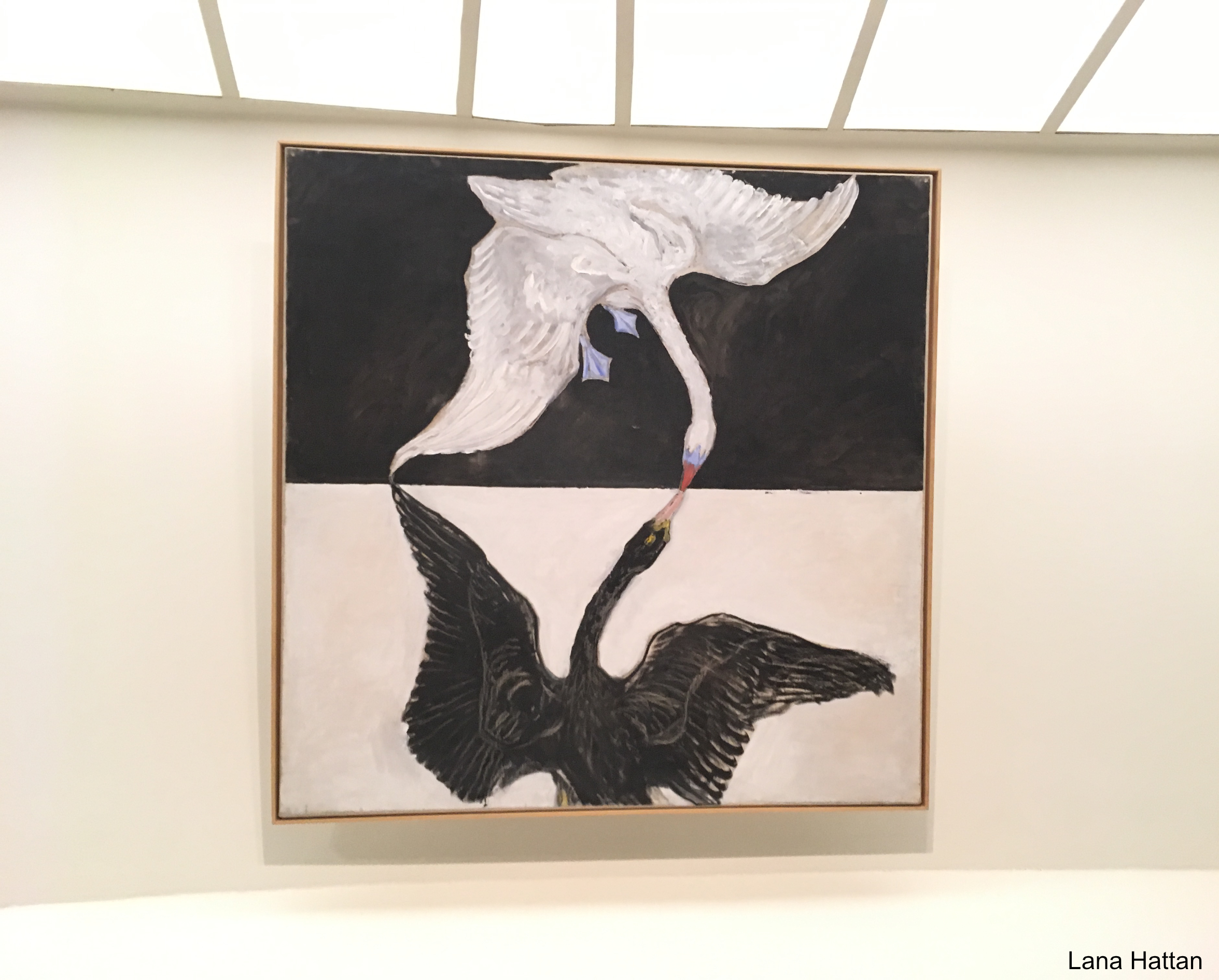
Group IX/SUW, The Swan, No. 1 from The SUW/UW Series, 1915, Oil on canvas. Reaching for the light. Of all the Painting shows I’ve seen at the Guggenheim Museum, the installation of Hilma af Klint: Paintings for the Future was transcendent. More on this later. *- Photo by Lana Hattan, Guggenheim Museum, December 31, 2018. I’m pleased to be able to present this show through her eyes, too.

Beyond all of that, recent developments may make her work “Basquiat hard” (my term for an Artist’s work that is mostly out of pubic view) to see going forward.
That’s a lot to cover. I’ll try to in what follows.

It begins with the flower…

“If your heart is in them flowers, bring ’em on,” Tanya Tucker-*

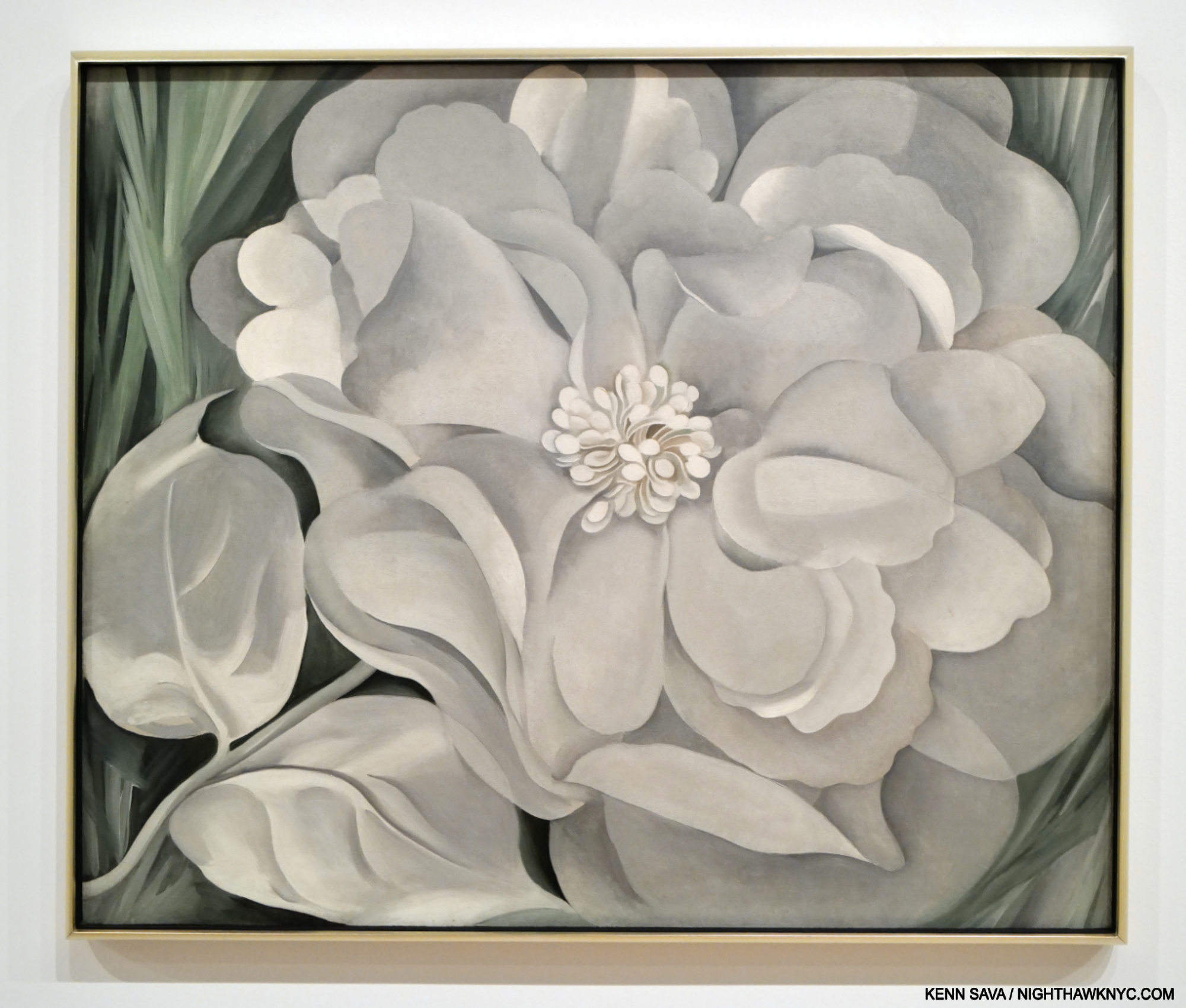
Georgia O’Keeffe, The White Calico Flower, 1931, Oil on canvas, as seen at the Whitney Museum, June 30, 2023

Flower Art was a niche thing, largely reserved for Illustration, until Artists like Georgia O’Keeffe (1887-1986) made viewers sit up and take notice of them. Of course, Vincent van Gogh, and the 17-century Dutch Masters a century before him, among countless others, had Painted wonderful Still-Life bouquets for many years prior, but individual flowers had not received much attention. Earlier last century, that began to change.

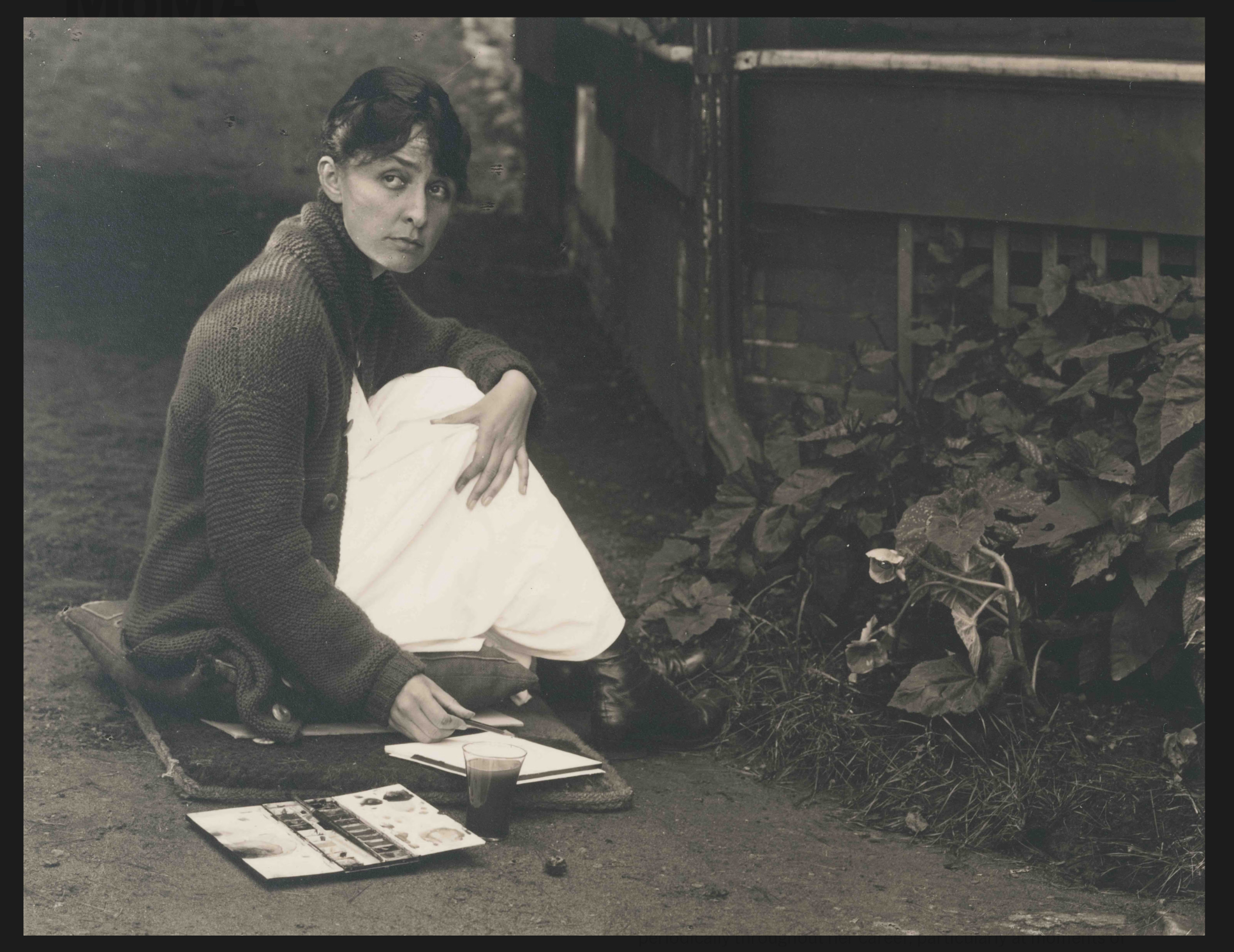
Alfred Stieglitz, Georgia O’Keeffe, 1918. Gelatin silver print. It’s hard to believe Georgia could Draw & Paint flowers like this, and it looks like Mr. Stieglitz found it remarkable, too. Note the year this was taken. *- Georgia O’Keeffe Museum Photo.

“Nobody sees a flower really; it is so small. We haven’t time, and to see takes time- like to have a friend takes time,” Georgia O’Keeffe, paraphrased by MoMA for the title of their 2023 show, Georgia O’Keeffe: To See Takes Time.

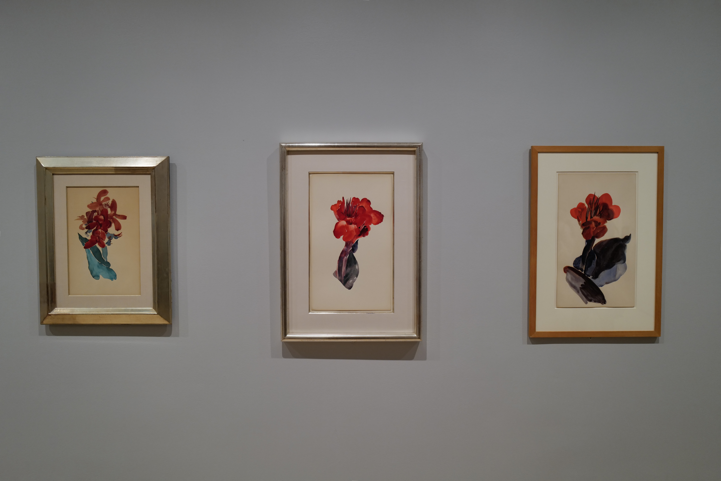
Georgia O’Keeffe, Canna Lily, 1918-20 Watercolor on paper, seen at Georgia O’Keeffe: To See Takes Time., MoMA, July 4 2023. Exactly 2 years later these same gallery walls would display Flower Watercolors by Hilma af Klint Painted at about the same time. (Lights lowered to protect the Art.) MoMA, June 9, 2023.

She continued: “So I said to myself- I’ll paint what I see- what the flower is to me but I’ll paint it big and they will be surprised into taking the time to look at it- I will make even busy New Yorkers take time to see what I see of flowers.” She would eventually give us 200 Paintings of them, a number of which are now iconic. So, it was fitting that MoMA’s Georgia O’Keeffe: To See Takes Time  contained some of her Flowers, including three early Calla Lilies watercolors from 1918-20, right as she was transitioning from Painting in watercolors to oils2.

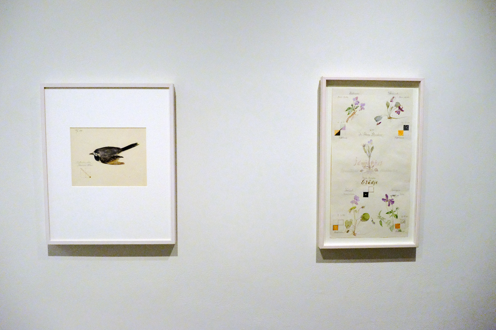
Hilma af Klint, Motacilla Alba: Wagtail with Guidelines, left, Violet Blossoms with Guidelines, both from Series I, 1919, Watercolor, graphite, and metallic paint on paper, right. Tucked away in Paintings for the Future this Flower Watercolor, right, looks like a page from Hilma af Klint’s Nature Studies Portfolio that would become the focus of the next major NYC Museum show of her work seven years later. An interesting realistic(!) harbinger, it’s not part of that Portfolio. Seen at the Guggenheim Museum, December 31, 2018, this sheet was also included in MoMA’s What Stands Behind the Flowers in 2025. MoMA’s wallcard for it speculates that Hilma may have removed it from Nature Studies.

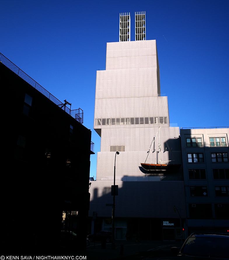
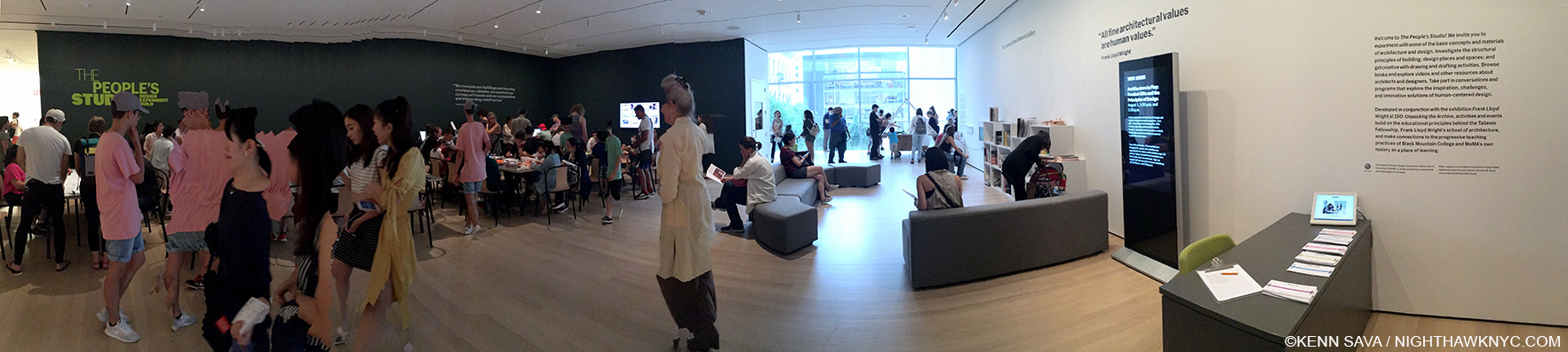
Meanwhile at the same time Georgia was creating her Calla Lilies, across the ocean in Sweden, an almost completely unknown Artist named Hilma af Klint (i.e. HaK, born 25 years before Georgia in 1862) began rendering over 100 Flowers in Watercolors in a Portfolio she titled Nature Studies, 1919. As far as I know, they didn’t know each other (though I wonder if Art astute Hilma came to know of Georgia as the American rose to fame). As far as I can tell, the set remained hidden from public display until May 11, 2025, when MoMA opened Hilma af Klint: What Stands Behind the Flowers, coincidentally in the same galleries that had held Georgia O’Keeffe: To See Takes Time two year before

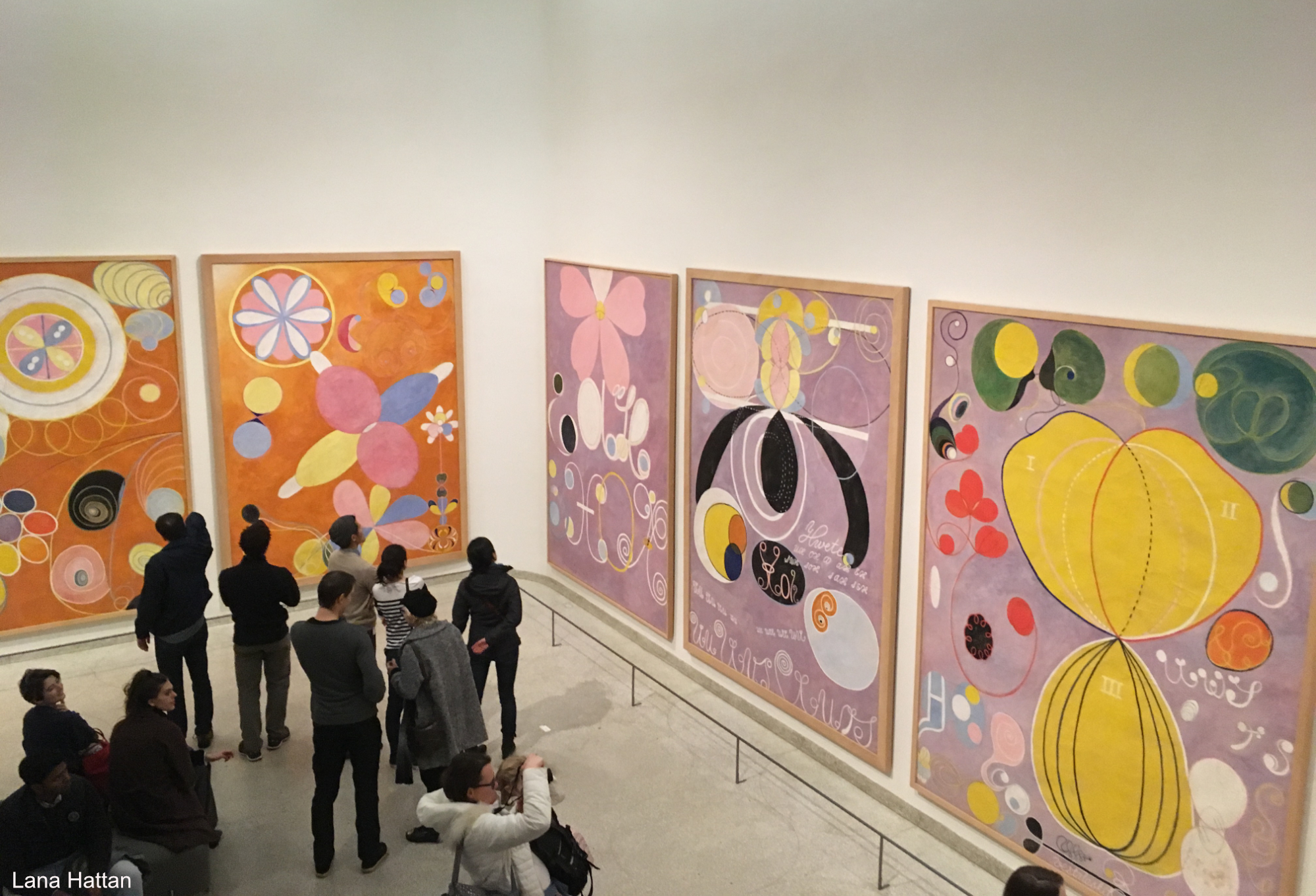
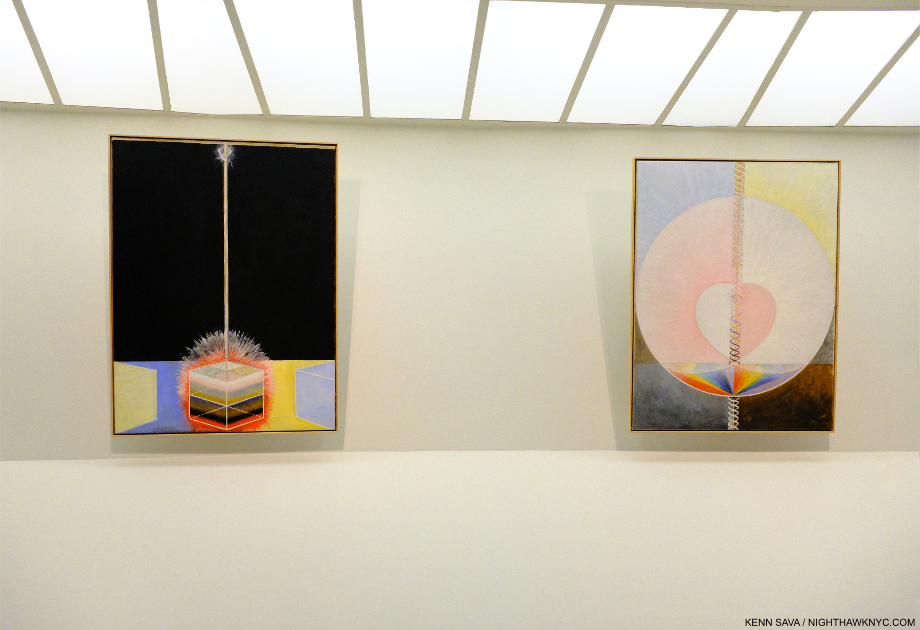
Five of Hilma af Klint’s The Ten Largest, a series devoted to the human lifespan, part of her now-famous Paintings for the Temple series. Note the shapes that seem organic or “flower-like.” Guggenheim Museum, December 31, 2018. *- Photo by Lana Hattan, Guggenheim Museum, December 31, 2018.

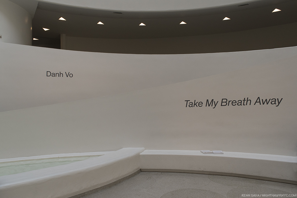
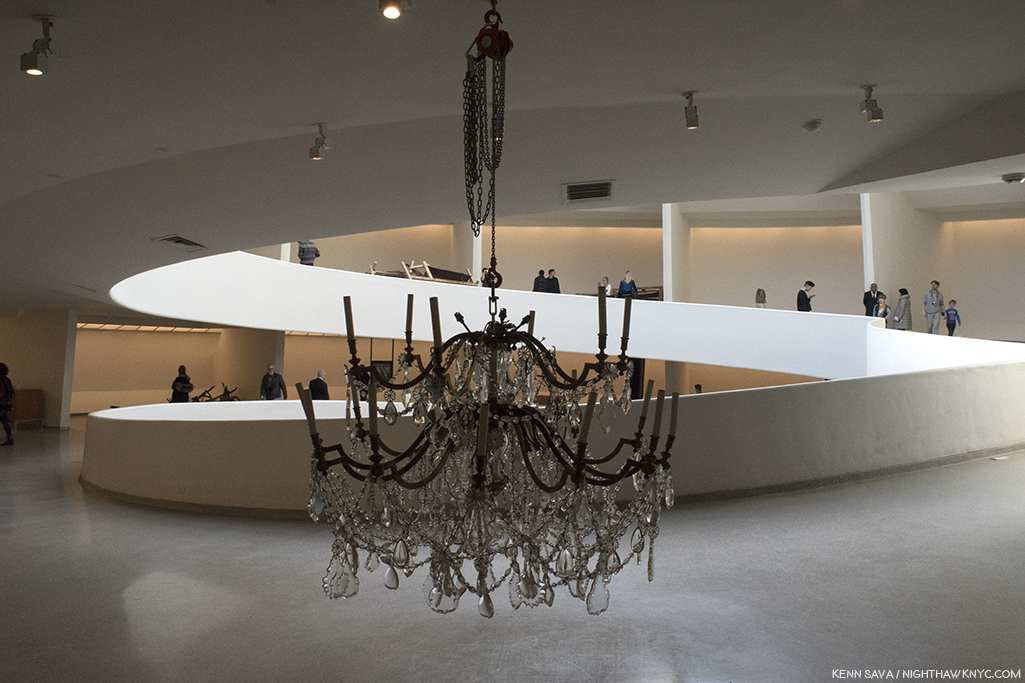
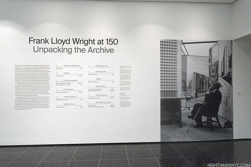
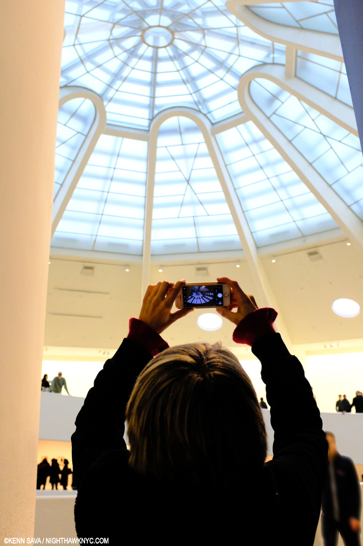
When her Art was last seen in an NYC museum in 2018-19, Hilma af Klint: Paintings for the Future drew a Guggenheim Museum all-time record 600,000 other viewers to Frank Lloyd Wright’s Museum Rotunda. I always walk down the ramp after taking the unique semi-circular elevator to the top of the Guggenheim as Frank Lloyd Wright wanted visitors to do which means I saw Paintings for the Future in reverse chronological order. Preceding it, R.H. Quaytman: +x, Chapter 34, occupied the 6th, or top Ramp. While this might seem incongruous to some, a deep dive into Hilma af Klint’s sparse NYC history reveals that R.H. Quaytman has a long history of championing Hilma af Klint that includes curating the first HaK show in an NYC museum, The Secret Pictures by Hilma af Klint at MoMA PS1 in early 19893. +x, Chapter 34 worked seamlessly with Paintings for the Future in my view.

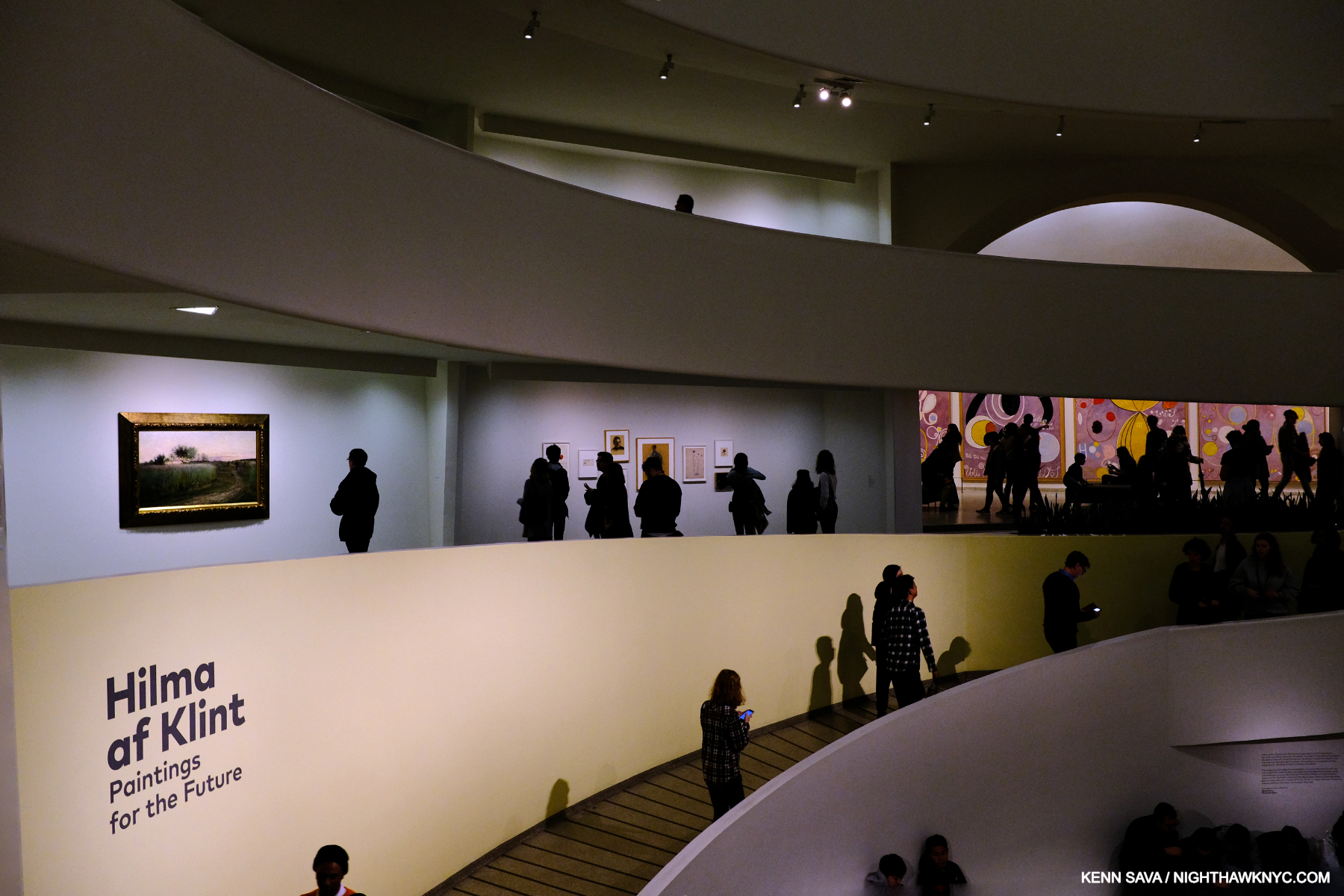
Herein lies a problem (among others) with branding HaK an “abstract Artist.”  To the left, above the sign, on Ramp 1 is Summer Landscape, 1888, Oil on canvas, juxtaposed by parts of three of The Ten Largest, all 10 from 1907, far right, from her landmark Paintings for the Temple series, partially shown in the prior picture, in a completely different style. December 31, 2018.

As we got to Ramp 1 (the lowest ramp), there were two bays containing work that looked pretty representational to me that featured Summer Landscape, 1888, above, left, and 2 Flower Watercolors from the 1890s, center, between the  visitors above, all shown closer below-

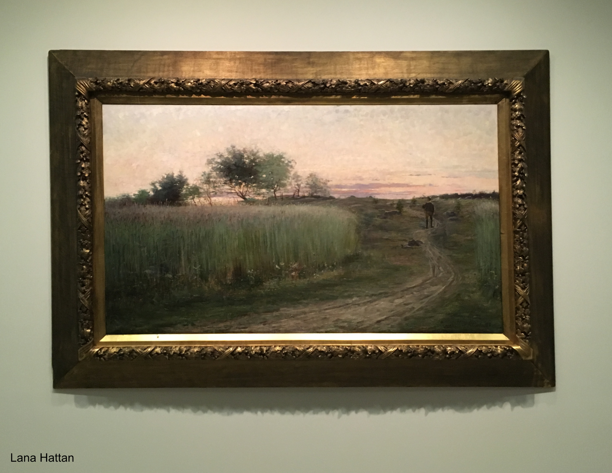
Summer Landscape, 1888, Oil on canvas. Hilma was about 26 when she Painted this in the year she graduated from the Royal Academy of Fine Arts.*- Photo by Lana Hattan, Guggenheim Museum, December 31, 2018.

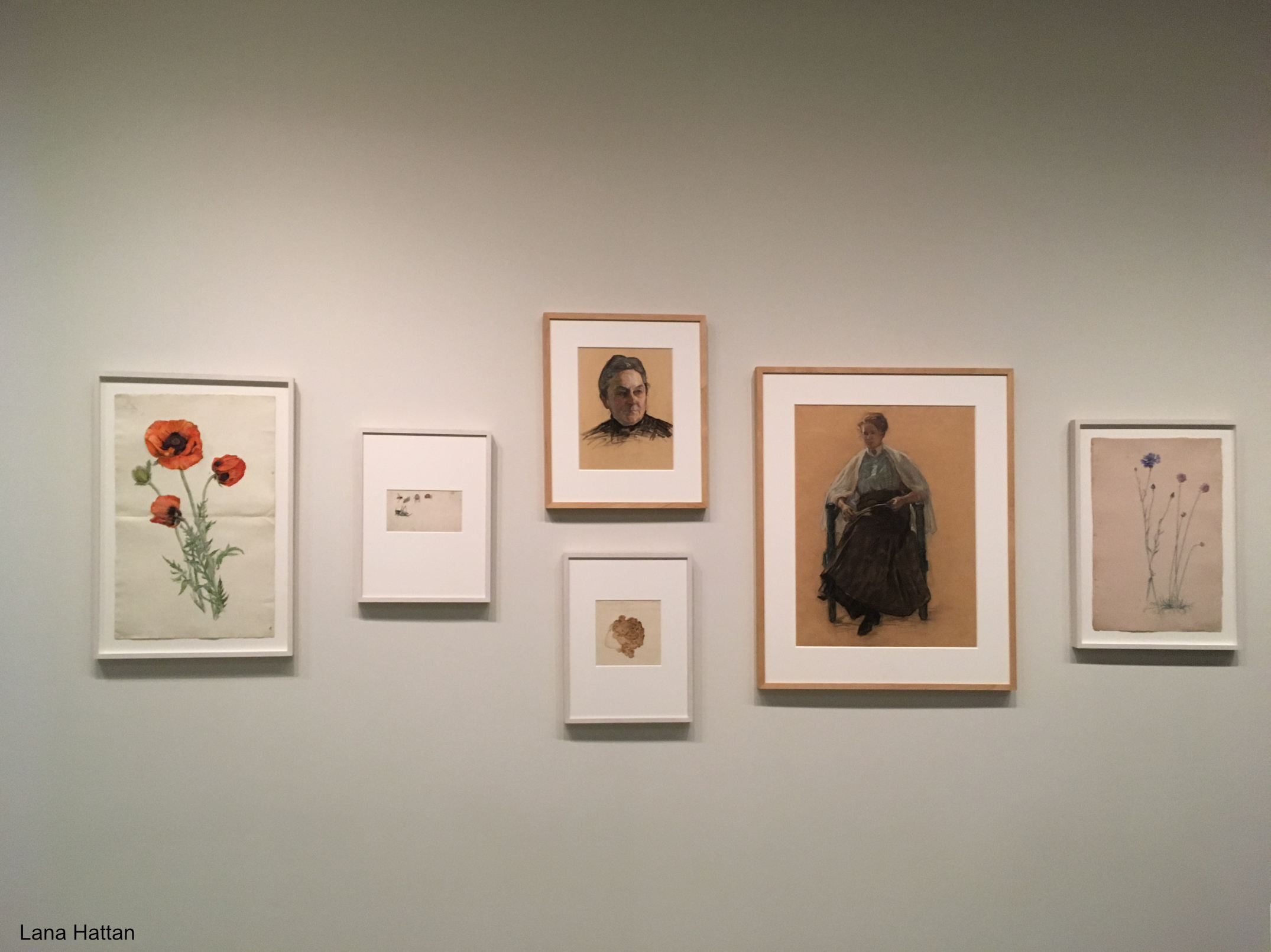
Poppy, 1890s, Watercolor, ink, and graphite on paper, left, Portrait study of the head of a woman, center, and Portrait study of a sitting woman to its right,  both Charcoal, crayon and graphite on paper, both c.1918. Distortion of the frames due to the curved wall. *-Photo by Lana Hattan, Guggenheim Museum, December 31, 2018.

Though early in her career, before the more well-known Paintings they call “abstract,” these revealed an accomplished technique in both oils and watercolors, honed over 6 years at the Royal Academy of Fine Arts in Stockholm (1882-88), where Hilma was one of its first female students. At that moment, I realized there was much more to Hilma af Klint than the Art machine’s limiting marketing hype would have us believe.

“Blue Book” Vol. 10. Hilma painstakingly recreated every one of her Paintings for the Temple (Painted, again, by hand) in a series of blue books on the left-hand page accompanied by a black & white Photo of the piece on the right-hand page, probably because color photography wasn’t yet practical. Guggenheim Museum, December 31, 2018.

Hilma, a devoted, life-long spiritualist,t who attended seances (and believed her “most important work” was the 192-canvas series The Paintings for the Temple, 1906-15, partially shown earlier, which were guided by other beings), came to feel that her time wasn’t THE time for her Art to be seen. Since the entire Temple series is so numerous, and includes 10 very large Paintings, Hilma fastidiously recreated the entire series in 10 remarkable smaller “Blue books,” as they are known, a “portable museum,” which she carried with her to show Rudolf Steiner (in 1920), and others, in hopes of having the originals shown in a spiritual context. That’s how important it was to her.

This makes me wonder- How many “abstract” Artists would be able to exactly recreate 192 of their Paintings? An impressive technical achievement, that she could do it tells me that her compositions were no accident, something I think is important to bear in mind.

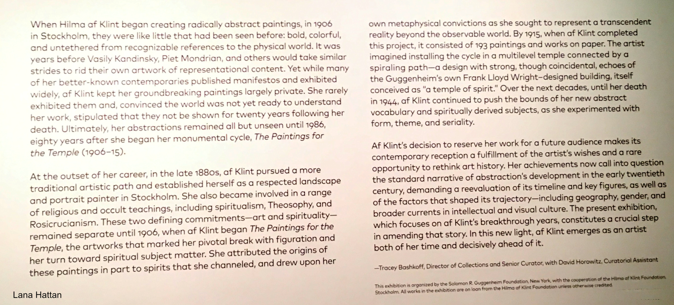
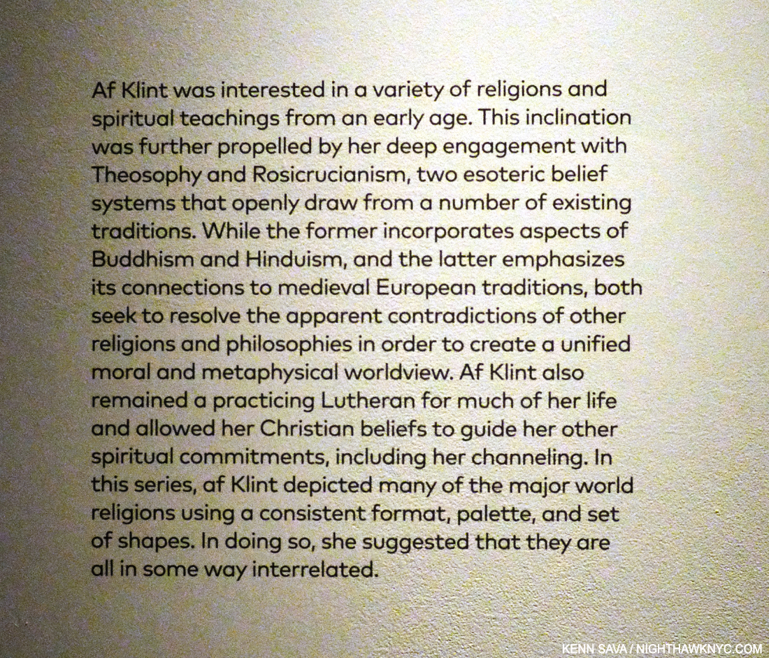
Is THIS the time Hilma envisioned for her work? The introductory wall card for Paintings for the Future on the Guggenheim’s curved wall outlines how the curators saw Hilma’s Art in 2018. I disagree with parts of this. For example, they mention HaK being “a respected landscape and portrait painter,” acknowledging she Painted in other styles, yet they ignore the fact that she returned to Painting representationally in 1919 with Nature Studies, as I show further on. They state her work was “untethered from recognizable references to the physical world.” What about the flowers and other natural elements that appear frequently, as shown in The Ten Largest picture earlier, and in Group VII (further on) and other pieces later on? *- Photo by Lana Hattan, Guggenheim Museum, December 31, 2018. Click for full size.

Failing to achieve this, in 1932, she decreed that none of her Paintings or Drawings should be shown until twenty years after her death in hopes of finding a more accepting time. Her work wound up being out of sight for 45 years. After she was tragically struck by a street car in 1944 and died from her injuries, her will left her entire creative estate to her nephew, Erik. Her work was stored in an attic for two decades before Erik had the Paintings unrolled and Photographed. Those 1,300 Paintings and 26,000 pages of text forms the basis of what is now the Hilma af Klint Foundation, which was created in 19724. The Foundation made a major effort to organize the work and prepare it for public display. Eleven of her Paintings were finally shown in The Spiritual in Art: Abstract Painting 1890-1985 in Los Angeles in 1986, but it wasn’t until 2013 that she finally received a full retrospective (in Europe), in a show titled Hilma af Klint: Pioneer of Abstraction (the catalog for which is also on my list).

Georgiana Houghon, The Love of God, August 3, 1864, Watercolor and gouache on paper, 23.7 x 32.6 cm, An Automatic Painting, Hilma af Klint was about 2 when Georgiana Painted it. *-Victorian Spiritualists’ Union, Melbourne Photo.

That show rode on the hype about Hillma being “the first abstract Artist,” (says the Tate, no less) before Kandinsky, Mondrian, et al., and a woman. The truth is Hilma was not even the first woman in her spiritualist circle to create what they call abstract work- Georgiana Houghton (1814-1884), 48 years Hilma’s senior, who proceeded her in creating Automatic Paintings & Drawings, may be a better candidate for that title. But, boxing HaK as such helped the powers that be draw huge crowds to the 2013 show of a complete unknown. Paintings for the Future (one of the two most important NYC Painting shows I saw in the prior decade, along with this one) took things to an entirely different level. Six years later comes MoMA’s Hilma af Klint: What Stands Behind the Flowers, her first NYC museum show since the Guggenheim blockbuster. Hilma’s work doesn’t need any hype to “sell” it now. The world knows who she is. All the “abstraction” talk has kept people from looking at her work, in my view. It’s time to look at the Art for what it is.

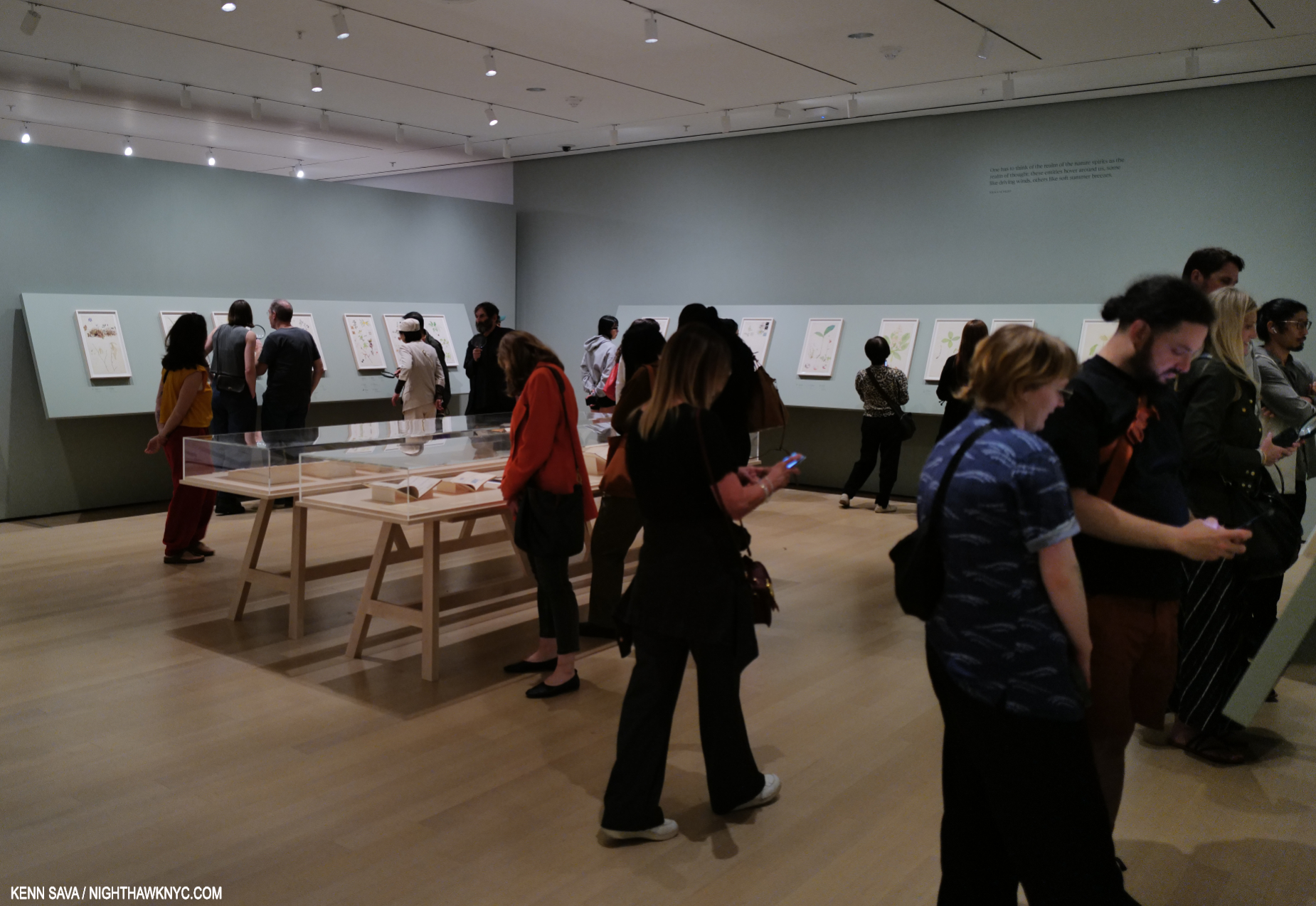
Installation view of the 2nd gallery of Hilma af Klint: What Stands Behind the Flowers at MoMA, which contained the first part of Nature Studies on the walls and a selection of her writings, and books by others on flower studies, in the center vitrine. Opening week, May 18, 2025.

What Stands Behind reveals that AFTER she completed the Paintings for the Temple in 1915, Hilma went back to working “representationally!” I guess no one bothered to tell her she was supposed to be an “abstract” Artist in the future. The more likely case is that HaK was a very talented and creative woman, an Artist more than capable of creating in whatever style she needed to work in for what she was trying to accomplish. It seems to me that THAT is a MORE impressive thing than sticking her in any one limiting box!

“One has to think of the realm of the nature spirits as the realm of thought; these entities hover around us, some like driving winds, others like soft summer breezes,” Hilma af Klint, MoMA wall card.

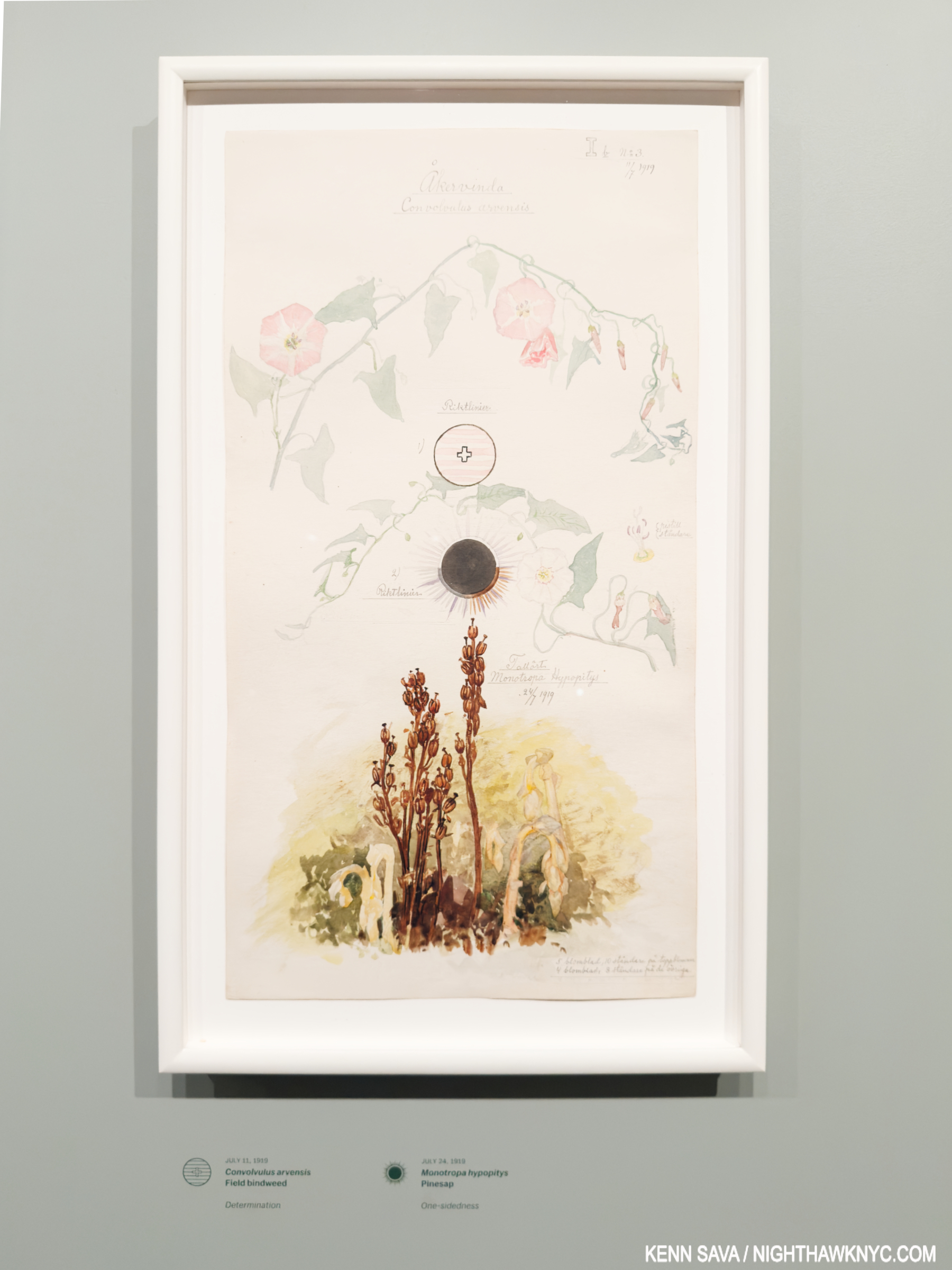
Convolvulus arvensis (Field Bindweed), Monotropa hypopitys (Pinesap). Sheet 20 from the portfolio Nature Studies July 11–24, 1919, Watercolor, pencil, ink, and metallic paint on paper. One of the 46 sheets in watercolor, pencil, ink, gouache and metallic paint on paper included in Nature Studies. Being 19 11/16 by 10 5/8 inches, these sheets would seem too large for Hilma to work on in situ. But that’s purely my conjecture. Unlike Georgia O’Keeffe, HaK didn’t confine herself to one specimen per sheet. Over 100 are included on the Nature Studies! Underneath, the curators translate HaK’s notations of the species name and its character as perceived by the Artist: “Determination” for the Field Blindweed, top, and “One-sidedness” for the Pinesap, bottom. MoMA, September 26, 2025.

She also continued to work on creating a “language” (see Group 2, further below) that included letters, words and diagrams. These are seen in almost all of the series she created in her life (including Nature Studies).

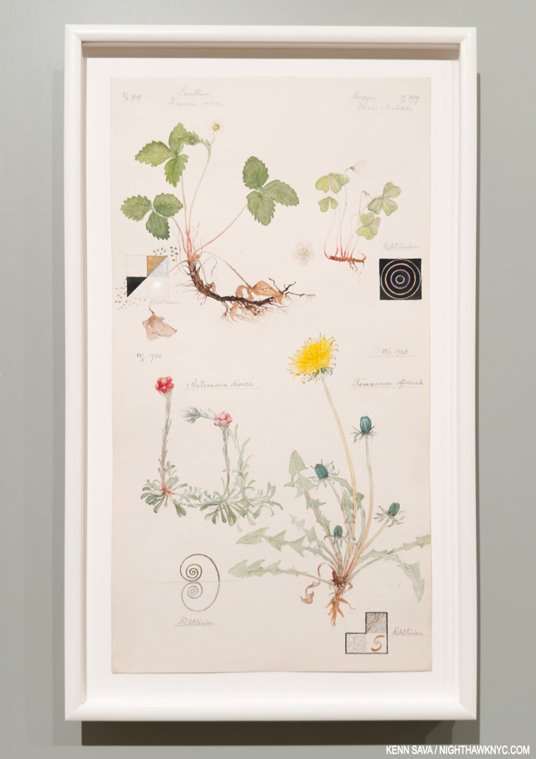
Woodland Strawberry, Hilma’s notation- “Liberator. Longing to produce balance within the blood syntem by expelling either white or red biood cells.” European wood sorrel- “Fragility-submissiveness shyness-humility fear -respect self-loathing-obedience.” Catsfoot– “Peace and harmony.” and Dandelion- “Beginning.”

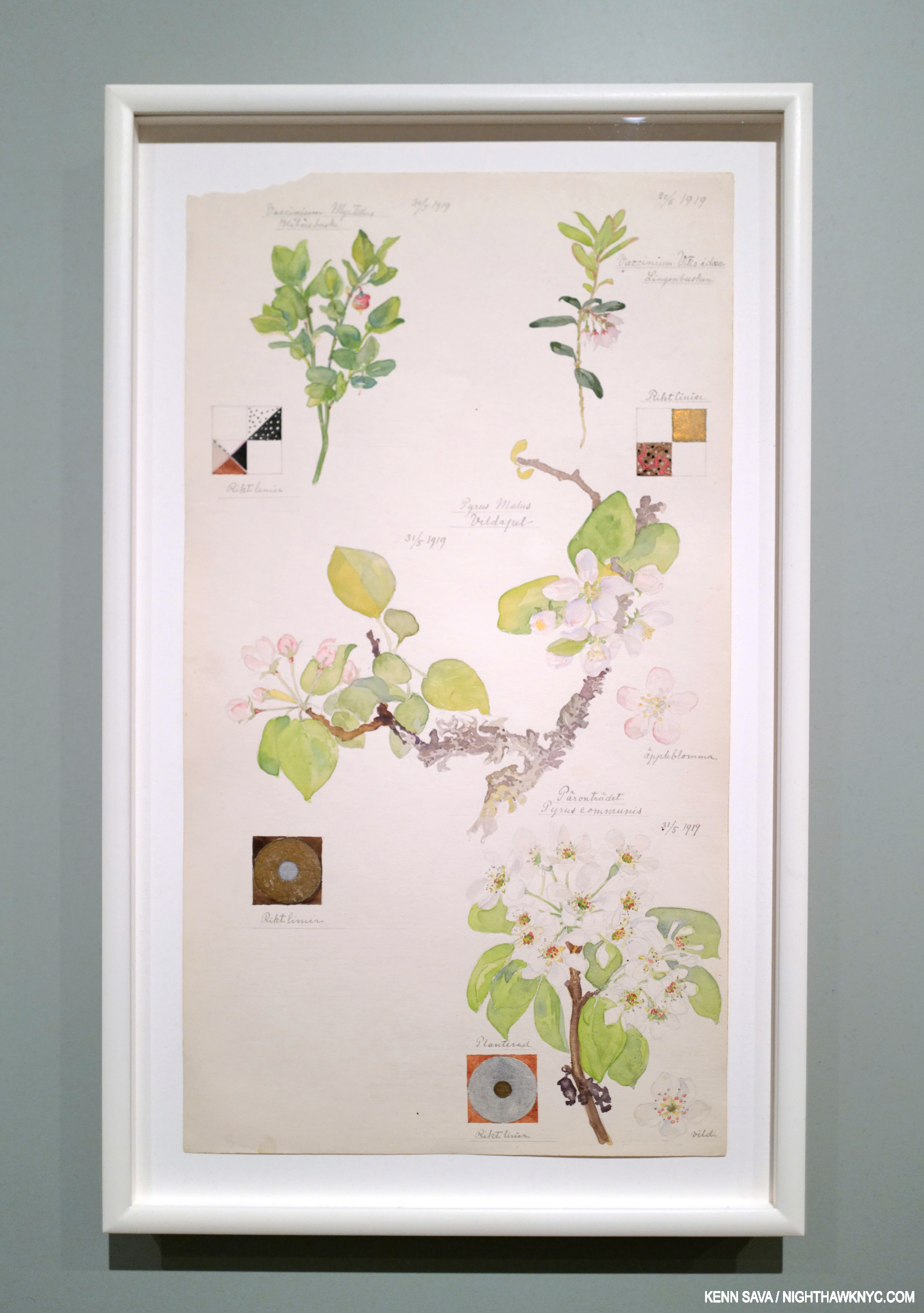
Bilberry, Apple, Common Pear, Lingonberry

Looking at Hilma’s Art is different than looking at the Art of any other Artist I know of. Quite a few of her Paintings for the Temple (as seen in the picture earlier) and other “abstract” works included at MoMA (below) have elements that look organic, including flower shapes. In some of her Temple series, lines of dots connect figures, reminiscent of the af Klint family’s heritage as noted cartographers & mapmakers. Then, any number of her pieces, including almost all her Nature Studies, include diagrams that contain basic geometric shapes- circles, squares, cones, etc. The viewer needs to decide what to make of them, or look to the Hilma’s Notebooks for insights. Finally, there’s the “language” the Artist developed, abetted by her use of letter “codes,” as Julia Voss outlines in her Biography. As a result, it seems to me there is still a long way to go in coming to fully understand Hilma af Klint’s work. Lumping it all into ANY one-word catchphrase box only takes us further away from that point of truly understanding it-if that’s possible.

Group VII, No 1-5, from the US Series, 1908, Watercolor and pencil on paper. 11 years. before the Nature Studies portfolio, what seems to be flower-like shapes abound. Seen at the beginning of  MoMA’s show.

The wall card for Group VII. Installed at the show’s entrance, is a relatively rare instance of the Art world looking beyond Hilma the “abstract Artist” thus far, or hedging their bets on their use of that box. Here, the organic shapes are accompanied by letters that are parts of the “code” Hilma used. See next.

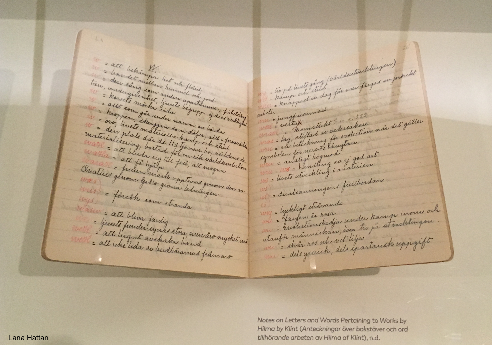
Another piece of the puzzle. Hilma’s original Notebook containing her Key to the mysterious words and omnipresent letter “codes” she used throughout her oeuvre. It’s an essential part of “decyphering” her work. Hilma’s code is detailed in English in the book Hilma af Klint: Notes and Methods. *- Photo by Lana Hattan, Guggenheim Museum, December 31, 2018.

ALL this talk about Hilma’s style misses the point! Hilma was not out to win any “style wars.” All of her work was about something entirely different, and that difference was substance over style.

Apple, no date, Watercolor on paper. Virtually every Art or Drawing class begins with rendering, coloring & shading basic shapes, like the sphere (often an apple, orange or lemon). Here HaK takes it to an entirely different level, and we get to marvel at her powers of observation, especially in the incredibly subtle variance of the local color. It’s also fascinating to me how minimal the shadows are, something you never see taught in how-to books which glory in the different kinds of shadows. In most of her Nature Studies, except the previous one, Hilma leaves out the ground, as she does here, too. In this case, doing so gives her the chance to show more of the bottom detail, again something I can’t say I’ve seen done often.

On the opposite end of that spectrum from the 21st century hype around it, there is something else at the beating heart of her work, something her “abstract” Paintings for the Temple and her representational Nature Studies have in common, and something that is at the core of the recent debate regarding continuing to publicly display her work. Hilma af Klint’s work is centered on the spirit. She created her work for fellow spiritual seekers. The Paintings for the Temple are devoted to the human spirit (with the aid of spirits who have moved on to another level). After completing them in 1915, never one to think small, the Artist turned her attention to an even bigger subject- the spirit of the natural world, commencing with the atom, in works that filled three quarters of the first gallery at MoMA, before moving on to the spirit in nature, beginning with flowers (in Nature Studies), which filled most of the succeeding two large galleries. These were supplemented by her late Flower Watercolors, which reminded me of some of Georgia OKeeffe’s Watercolors that were shown in these galleries at MoMA in 2023. The bottom line is that Spiritual Art is still outré to the Art machine, whatever type it is. They can’t sell it, and Art without monetization does not keep the Art machine going.

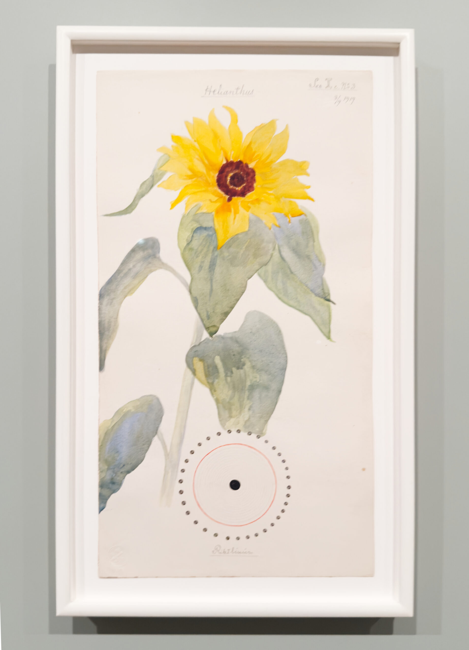
Common Sunflower. To Hilma- “Love is the greatest of all.”

Meanwhile, throughout What Lies Behind, part of the sheer joy in looking at her work, her marvelous technique shines in piece after piece. It’s surprising to me that Hilma has gotten so little credit for it. She came upon it the hard way, through continual hard work and 6 years at the Royal Academy of Fine Arts. This was followed by work as an Illustrator, including illustrating a book on horse surgery by the director of the Veterinary Institute, Stockholm, who kept Hilma’s Drawings for the rest of his life.

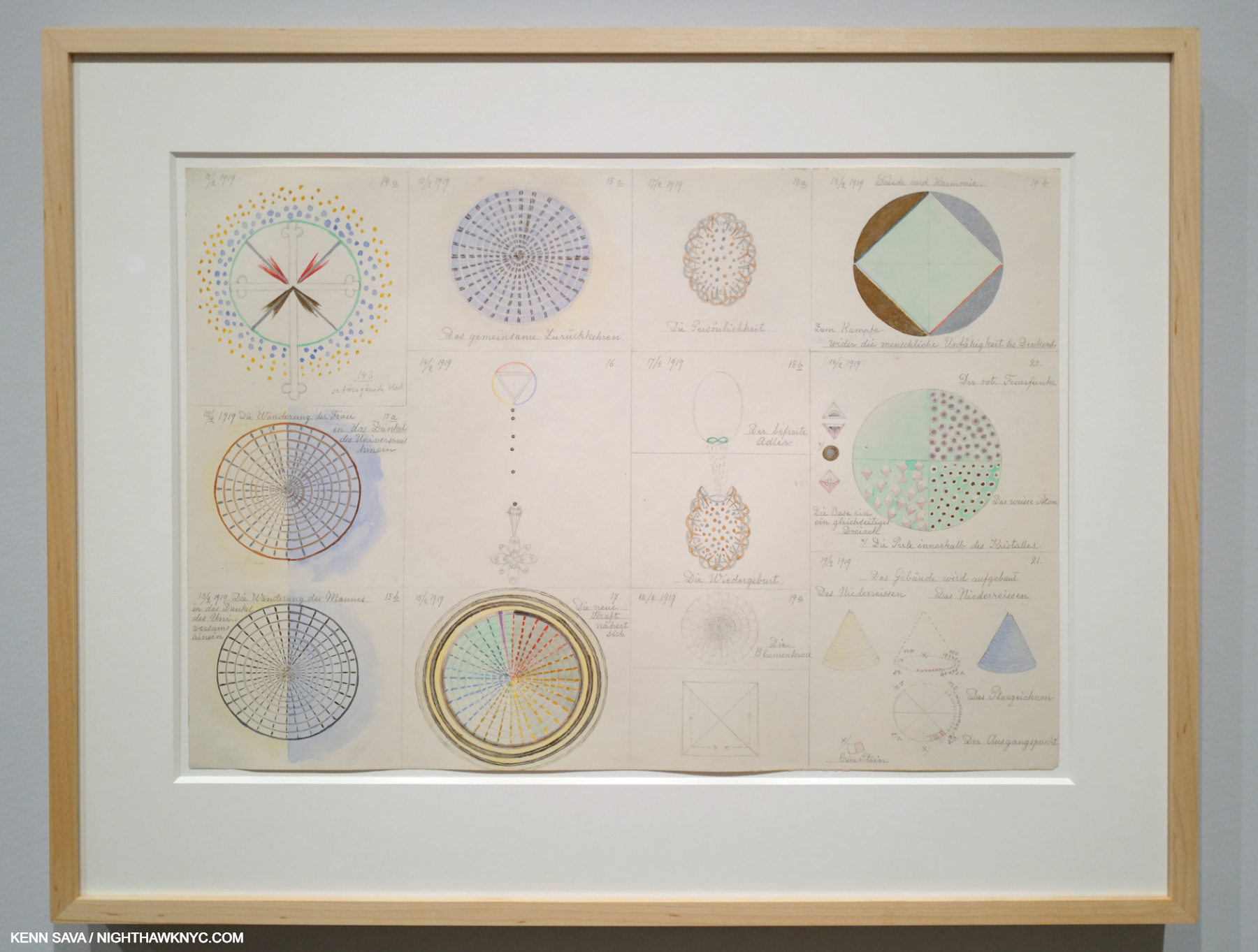
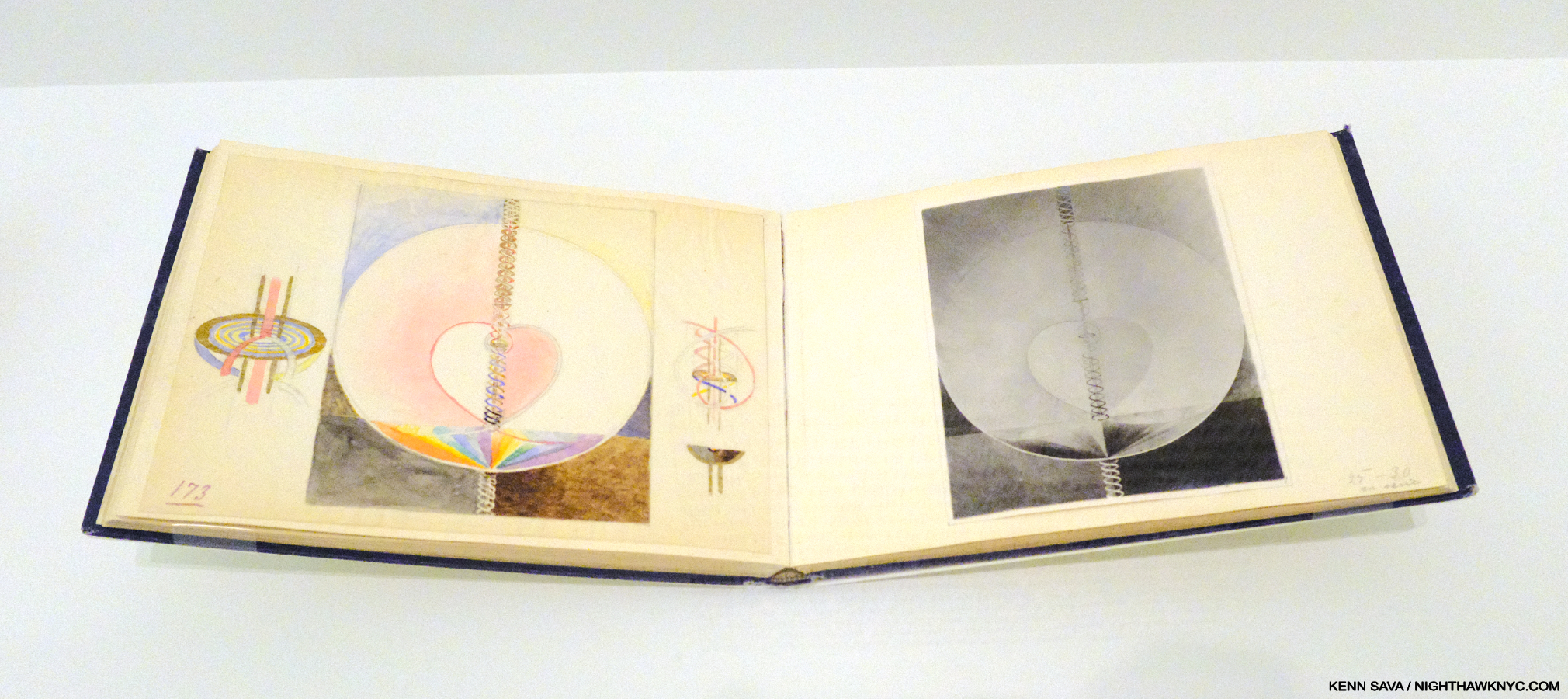
From Group 2 February 12-19, 1919 Watercolor, pencil, and metallic paint on paper. This was one of numerous examples of her technique I could site. Here, we see the Artist working on ideas for herself in a series of sheets titled Group 1, Group 2, Group 3. No matter for public display or her own purposes, Hilma was always meticulous in her execution. Of the Groups, MoMA says- “Together, the drawings form narratives that allude to pollination, reproduction, and evolution. By April 19, 1919, after more than three months of progress, af Klint had established a vast and diverse diagrammatic language. The very next day, she began her Nature Studies portfolio.”

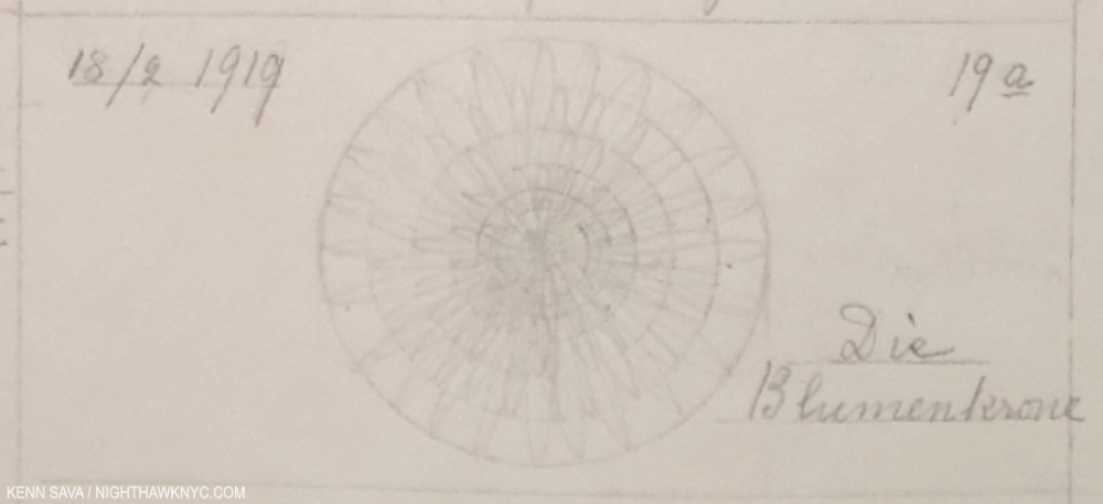
This enlarged detail of the lower center of the previous image perhaps measures 3 or 4 inches wide by an inch and change high (the bounding rectangle). Easy to miss because it’s in pencil and the actual Drawing part seems to have faded,  it’s noteworthy for two reasons. First, its meticulousness, and second for the title- Die Blumenkrone means “The Flower Crown.” Even in the dead of wnter (i.e February 18th as the date reads), Hilma had flowers on her mind.

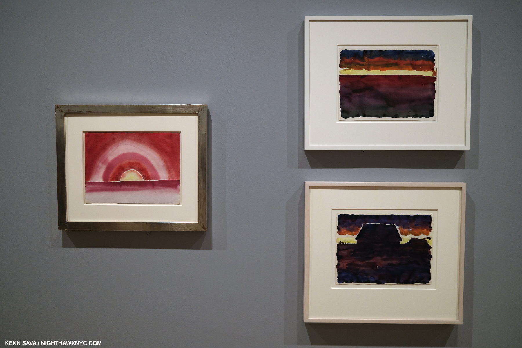
What Stands Behind also makes the case in spades or her accomplishment as a Watercolorist- both in her Flowers and in the later Flower work (not part of the Nature Studies series) shown in the final gallery, in a different style again, as seen below.

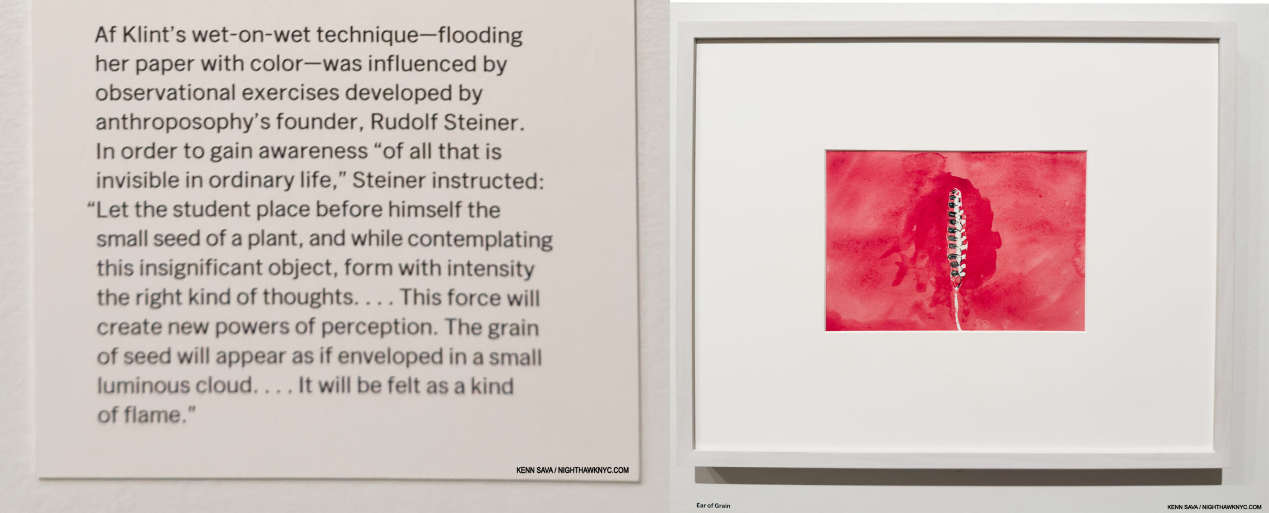
Ear of Grain, 1922, Watercolor on paper, from the series, On the Viewing of Flowers, with a apparetnly relevant section of the wall card, left. MoMA, September 26, 2025.

Georgia O’Keeffe, Morning Sky, left, and Morning Sky, and Morning Sky with Houses, right, 1916, Watercolors on paper. MoMA, September 9, 2023.

I might be the only one to draw parallels between Georgia O’Keeffe & Hilma af Klint, but when I saw the wall of 1922 Watercolors by Hilma in the last gallery, including Ear of Grain, above, I couldn’t help but recall Georgia’s Watercolors that had been hung in these galleries two years previously. It’s fascinating to think about their commonalities, as extraordinary, ground-breaking Artists, and as extraordinary women, at much the same time, on almost opposite sides of the globe. What Stands Behind The Flowers begins some of the heavy lifting on the road to assessing Hilma af Klint’s full accomplishment. In spite of that, I’m not sure THIS is the ideal time Hilma envisioned for her Art to be shown.

MoMA Gift Shop display for the show. More items behind me and to the left. While I’ll reserve comment on the other items, MoMA’s Exhibition Catalogue for the show is highly recommended. May 18, 2025.

In too many (most?) cases today a work of Art is mentioned followed by its price as if that’s the most important thing about it! Then, the rush is on to plaster it on everything from umbrellas to baby onesies. Hilma’s spiritualist Art stands directly at odds with that. She opposed materialism in Art. To this point, it’s largely escaped it (though MoMA, who has come to own Nature Studies, produced a $500.00 Limited Edition of it, as far as I can tell, the first Hilma af Klint Limited Edition, in addition to putting the series on refrigerator magnets, postcards and a poster)5.

Rebel. With a cause.

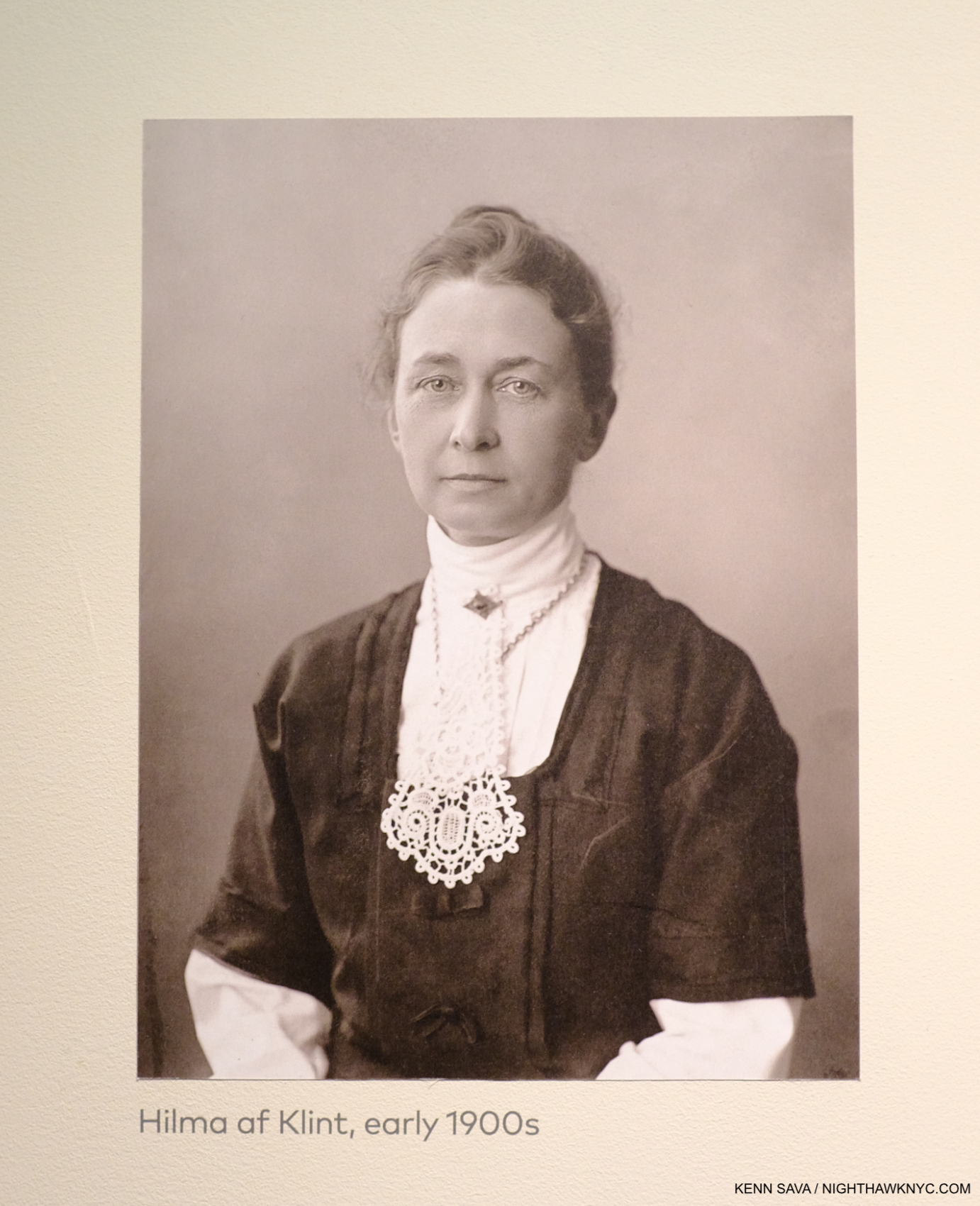
Trapped in the future. But, is this THE future she envisioned for her Art? One of the few Photographs of Hilma af Klint. This one was affixed to a wall at the Guggenheims’s landmark Paintings for the Future in 2018.

Perhaps this experience sounded a warning bell. Earlier this year a struggle broke out inside the Hilma af Klint Foundation about whether or not her work should continue to be exhibited. The Foundation’s chairman of the board, af Klint’s great-grandnephew, who, like his great-grandfather, is also named Erik af Klint, is against it feeling that Hilma wanted her work to be seen in a spiritual context by fellow seekers, i.e. to “keep the work available to those who seek spiritual knowledge or who can contribute to fulfilling the mission that Hilma af Klint’s spiritual principles intended.”

On Hilma’s spiritualism. Guggenheim Museum, December 31, 2018..

Therefore, I think there is a strong case to be made for ending public displays of her work at this point. Perhaps a future time will be more ready to accept, and see her work as she intended it to be seen, and provide the Artist’s full accomplishment with the respect it deserves..

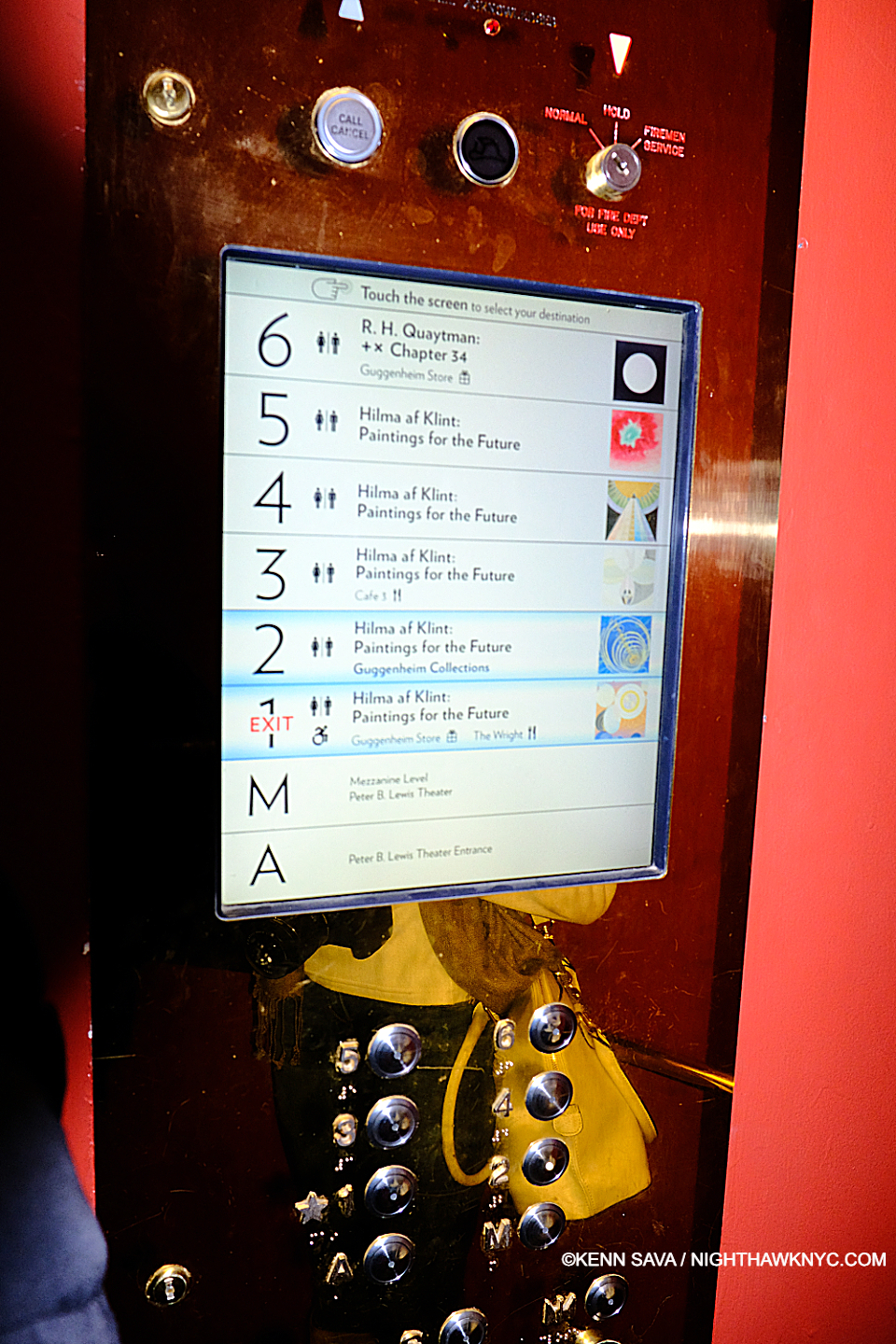
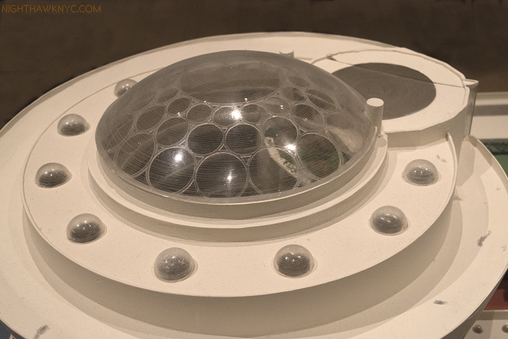
“Beam me up, Frank!” The control panel on Frank Lloyd Wright’s semi-circular Elevator at the Guggenheim. December 31, 2018.

Experiencing Paintings for the Future at Frank Lloyd Wright’s Guggenheim brought home another problematic aspect of experiencing Hilma af Klint’s work today.

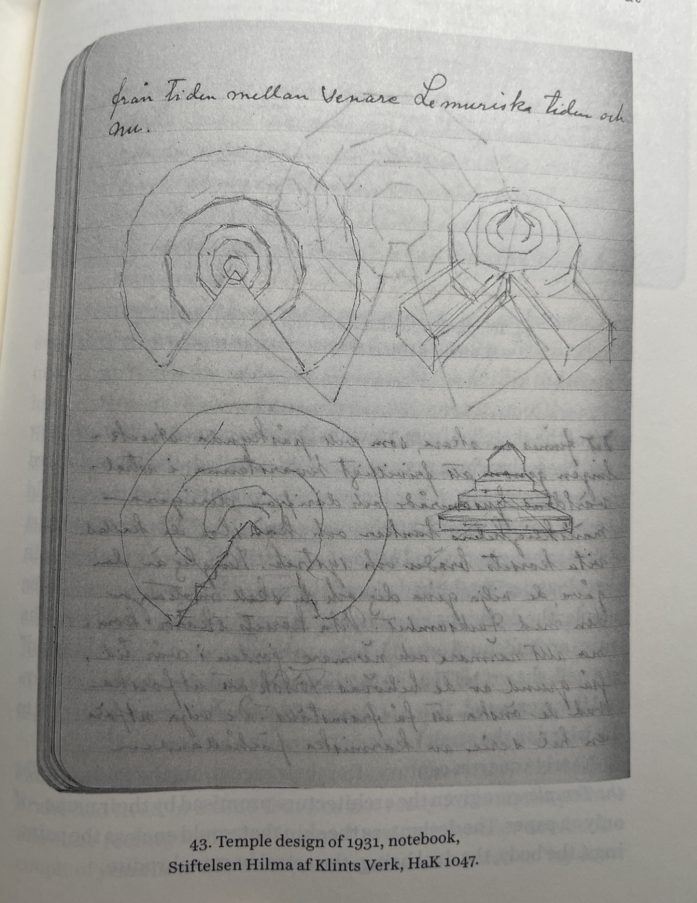
Temple Design, 1931, Notebook in the Hilma af Klint Foundation Collection (*) as seen in Julia Voss, Hilma af Klint.

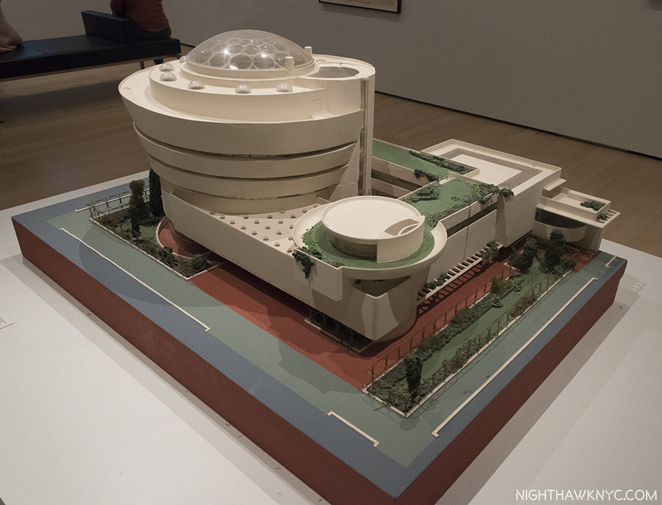
It turns out that Hilma had not only envisioned that “ideal space” for the display of her work, i.e. a “Temple” as she called it (as in her Paintings for the Temple series), she put some of her ideas for it down on paper.

Lana Hattan immediately upon exiting the elevator on the 6th Floor, in both of our favorite buildings, in one of my favorite pictures of her. I thank her for her generosity in allowing me to publish some of the Photos she took that day. December 31, 2018.

Her sketches for it have quite a bit in common with Wright’s masterpiece on 5th Avenue. Both feature circular floors or ramps that rise to a top that opens up to the sky. Also coincidentally, Hilla Rebay, director of the Museum Non-Objective Painting which  preceded the Guggenheim Museum, said she envisioned “people communing with the work in Solomon R. Guggenheim’s collection in a a ‘temple of spirit.6,'” in commissioning Wright to design it.

Group IX/UW, The Dove, No. 3, left, Group IX/UW, The Dove, No. 1, right, both from The SUW/UW Series, 1915, Oil on canvas.The work on the right is the original of the work she reproduced by hand in the Blue Book picture shown earlier. Guggenheim Museum, December 31, 2018..

I didn’t know about her Temple, or her Drawings for it, when I saw the Guggenheim show, yet I came away feeling the Architecture added exponentially to the experience of it. At this point, it leaves me feeling her dream should be realized, though that’s not part of the current discussion (as far as I know). Failing to realize the Temple she had envisioned to hold at least part of her work, it remains in a sort of limbo without it.

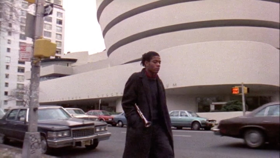
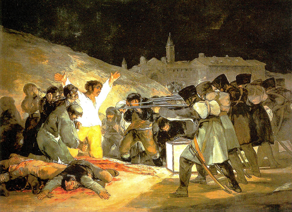
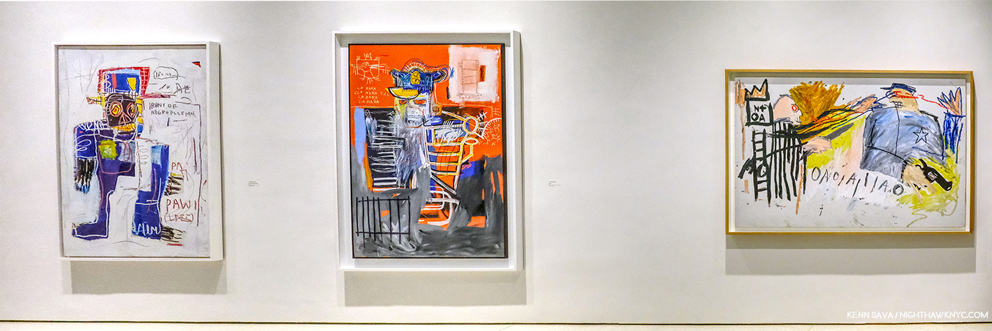
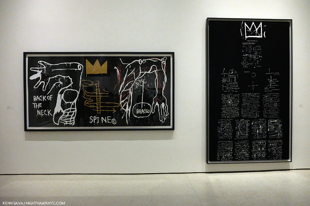
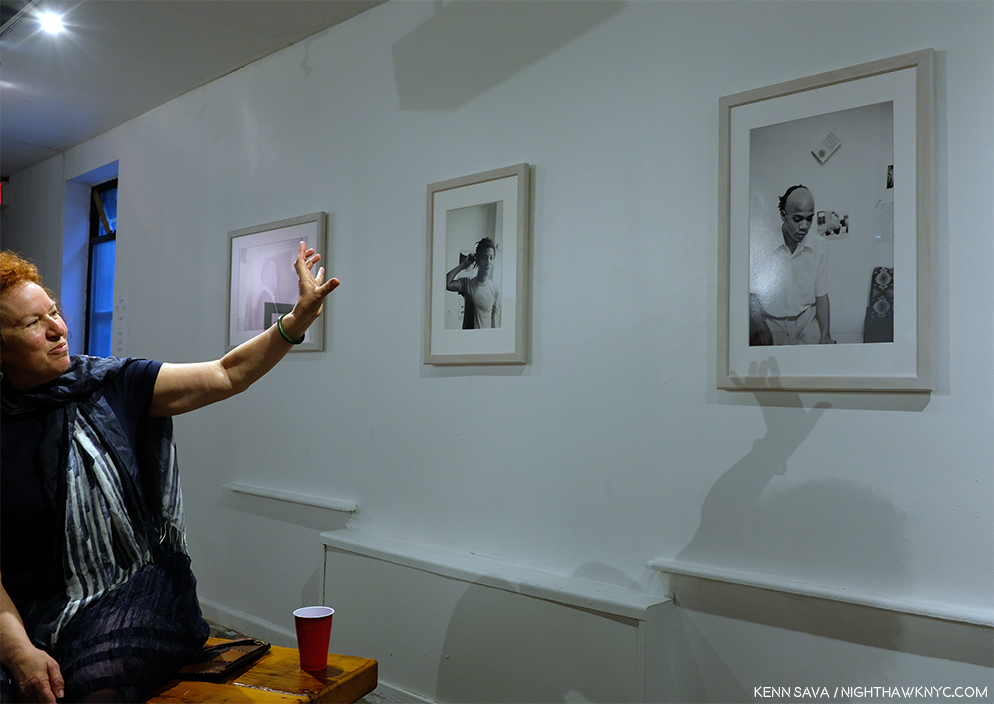
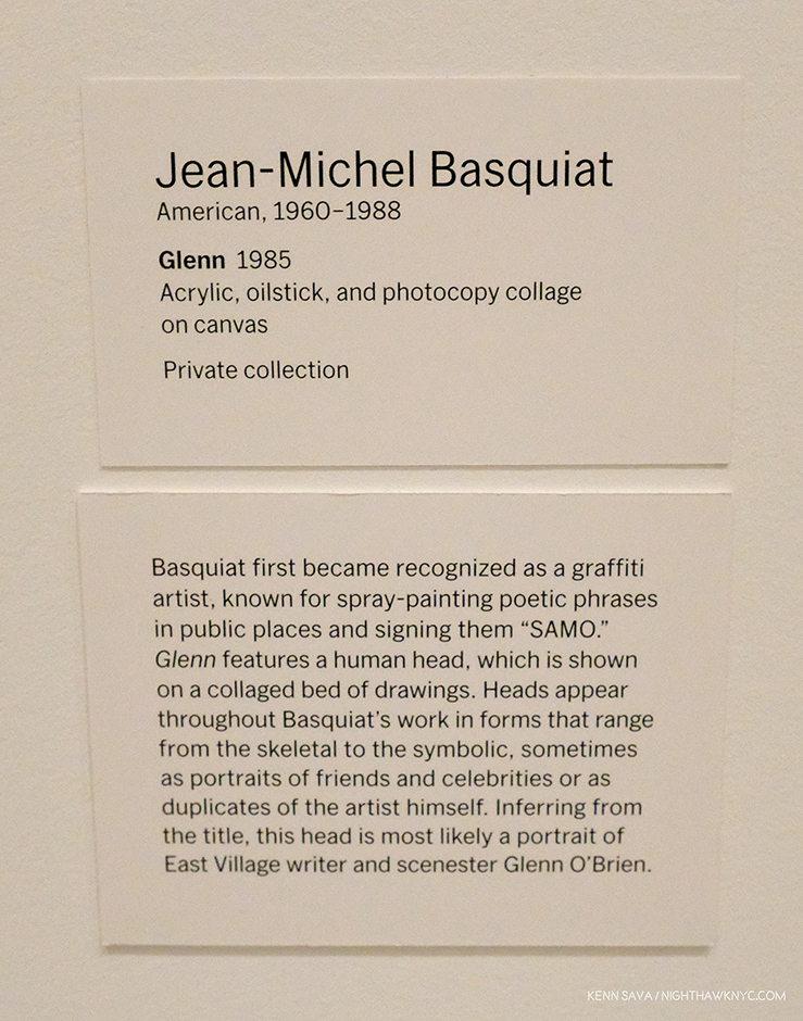
Of course, today’s Art machine is adamantly opposed to Hilma shows ending, seeing a potentially huge marketing opportunity vanish. Her art being for spiritual seekers, is diametrically different than how the Art world sees it now. Spiritual seeking vs dollar signs- I’ll be interested in seeing which way this one turns out, but I’ll be hoping Mr. af Klint succeeds. (Digression for full disclosure- In case anything I write here makes you wonder, I’m not a religious person. I’ll leave it at that and end the digression.) I’ve always believed the Artist’s intentions for her (or his) work should be respected above all else. As for all those who will bemoan not being able to see her work, consider that for most of the past 30 years Jean-Michel Basquiat has been THE most popular Contemporary Artist in the world, and almost none of his work is in the hands of museums or public collections resulting in a paucity of shows, as I discussed here7. Somehow his popularity has continued to increase without direct access to his work.

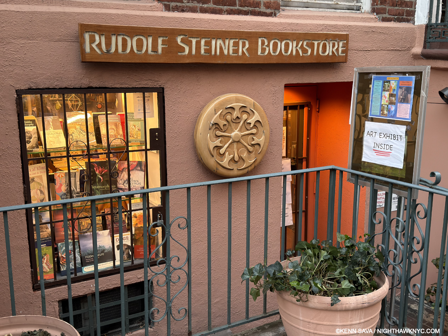
Hilma af Klint books for sale in the window at the Rudolf Steiner Bookstore in Manhattan. A long-time admirer of Mr. Steiner, I think she’d be ok with this. December 11, 2025.

Hilma’s work can be seen by everyone in the excellent seven-volume Catalogue Raisonne her Foundation has published (which I collectively named a NoteWorthy Art Book of the 21st Century), and a number of other books. For those who want to know more about Hilma, Julia Voss’s excellent Hilma af Klint Biography is the current go-to source and a must-read. It reveals an extremely private woman who was solely focused on her spiritual development and her Art to the extent that she wrote virtually NOTHING about herself and her private life in those 26,000 pages she left! But, she did make crystal clear what she was about and what she wanted for her Art.

If Hilma were alive today would she be enamored with the Art world and its machine, an Art world that seems to have no clue how to handle “spiritual Art?” I have my doubts. That future she envisioned in the 1930s still feels like a dream. So, it just might be a good thing if Hilma af Klint shows stop. Some further point in the future may be a better time for her work to be seen & fully appreciated- one without  an Art world in such a hurry to judge it, box it, and associate it solely by the dollar signs it hangs on it.

Wake me up when we get there.

*- Soundtrack for this piece is “Bring My Flowers Now,” by Tanya Tucker, the de facto title track from her 2019 album, While I’m Livin’, which she performs here-

“I know we’re gonna ride again someday…”

NighthawkNYC.com has been entirely self-funded & ad-free for over 10 years, during which over 350 full-length pieces have been published! If you’ve found it worthwhile, PLEASE donate securely by PayPal below to allow me to continue. Thank you, Kenn.

You can also support it by buying Art, Art & Photography books, and Music from my collection! Art & Books may be found here. Music here and here.

Written & photographed by Kenn Sava for nighthawknyc.com unless otherwise credited. To send comments, thoughts, feedback or propositions click here. Click the white box on the upper right for the archives or to search them. Subscribe to be notified of new Posts below. Your information will be used for no other purpose.

  1. The last show we’ve been able to see together.
  2. She would begin Painting flowers in earnest in the mid-1920s.
  3. Ms. Quaytman’s book Spine and her new book, Book, 2025, are on my list of NoteWorthy Art Books of this century.
  4. Julia Voss, Hilma af Klint: A Biography, PP..1,2 & 4. After mentioning I was in the middle of reading it at the time I published my NoteWorthy Art Books of the Century piece, I’ve added A Biography to the list. A marvelous accomplishment with a terrific translation from the original German, it’s essential reading for anyone interested in HaK.
  5. I’m still a bit puzzled by Nature Studies’ Provenance. MoMA’s site says they bought it, but from whom and how that owner came to own it is unspecified. How it didn’t wind up in, or being acquired by, her Foundation puzzles me. I tried to find out, but received no answers.
  6. Here.
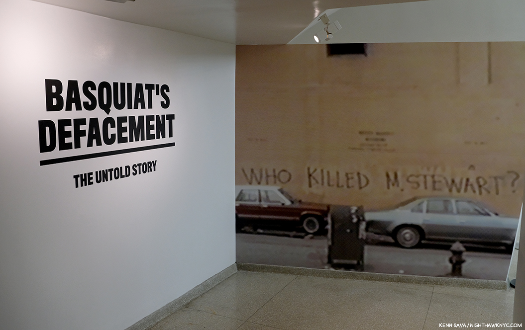
  7. By the way, I have managed to cover almost every single NYC Basquiat show these past 10 years, so you can see a good deal of his work here.

Celebrating Ten Years of NighthawkNYC.com!

Written & Photographed by Kenn Sava.

I started NighthawkNYC.com on July 15, 2015. During almost all of these past 10 years, the thought of reaching the Milestone of Ten Years was something that seemed as far away as Mars. Long-term isolation, sudden fainting spells that hospitalized me, heart problems, hearing damage, foot problems, the specter of going broke, and oh yeah, that little thing called the pandemic, the 2020s have been hard for me, as they have been for many of you, I’m sure.

So, as I sit here at 6:30 am on July 15, 2025, I’m partially here to see & celebrate this day I didn’t think I’d actually get this site to arrive. As the improbable started to become a real possibility it dawned on me that I HAD to write something to honor getting to this point, and ALL the work that has gone into getting it here, even though I’m supposed to be taking a break (which didn’t stop me from writing the two biggest pieces I’ve ever written!). My one-time neighbor, Joni Mitchell, from decades before my time here, says it best about being here this morning in her circa-1969 song “Chelsea Morning.” (We’ll keep it between us that I haven’t been to bed yet!)

“Woke up, it was a Chelsea morning
And the first thing that I heard
Was a song outside my window
And the traffic wrote the words”-*

Since Joni hasn’t shared how to get the traffic to write my words, I decided to use this occasion to reflect on where I’ve been, where I am, and to try and look a bit ahead.

Part 1-
A)- Where I’ve Been
Some Highlights, in my opinion anyway, from the past 10 Years…

“Oh, won’t you stay
We’ll put on the day
And we’ll wear it ’till the night comes.”-*

1)- “My Search For Edward Hopper’s Nighthawks Diner,” published July 29, 2019.  Decades in the making, it’s hands-down my most read, most discussed piece.

Update- On July 21, 2024, I finally found it! Meatpacking District, NYC. Kenn Sava, left, reenacting his Painted alter-ego, Logan, right. Photo by Nilo for NighthawkNYC.com. Continual Thanks to all involved & Kevin Callahan. Click any image for full size.

2)- “Vincent van Gogh: Home at Last,” published October 8, 2018. Preparing this piece on the reinstalled Van Gogh Masterpieces in the Permanent Collection of The Met suddenly took on an unexpected life of its own.

HOW great is it to be able to walk into a room and see THIS? For me, it’s one of the great joys of life in NYC. One part of the newly reinstalled Gallery 825 showing 9 of the 10 Van Goghs in this room. #10 is on the other side of the Self-Portrait with Straw Hat in the vitrine. This shot was available for literally one second over 3 visits and 3 hours I spent here. In the piece, you’ll see why.

3)- “Van Gogh’s Cypresses: Art From Hell,” published November 10, 2023. With all due respect to The Met’s great curators, I saw their blockbuster Van Gogh’s Cypresses completely differently than they did, apparently.

Welcome to The Met! In all my years of going to The Museum, as I call it currently 1,900+ visits since 2002, I’ve never seen TWO banners (left & right) up devoted to the same show. And, as I was soon to find out, it’s not like there weren’t other terrific shows going on! Seen on June 2, 2023.

4)- “Kerry James Marshall: The Revolution Was NOT Televised,” published March 1, 2017. THE most everything Painting show I saw in NYC in the 2010s. Along with Hima af Klint: Paintings for the Future, the two most important Painting shows mounted here in the prior decade.

The finest moment, among many fine moments, in the all-too-short life of The Met Breuer. Installation view of Kerry James Marshall: Mastry. “De Style,” 1993, KJM’s barbershop, right, drips of life, fun, culture, individuality and style. On the left, his “The Lost Boys,” from the same year, a title borrowed from Peter Pan, is an homage to two children lost to gun violence, and all the boys who were “lost” to a variety of causes.

5)- “A Conversation with Photographer Harry Gruyaert,” Published September 22, 2018. Consistently among my most popular pieces, the renowned Belgian Photographer, and long-time Magnum Photos Member, discovered me through my “Saul Leiter: In My Room” piece and let his gallerist know he would be interested in speaking with me. A fan of his work, we spoke extensively via transatlantic phone. I discovered later how few interviews he has given.

Subsequently, I met Harry Gruyaert, far right, in 2020 at the opening of his first American show since 1990!

6)- “Rod Penner’s America: Small Town Nation,” published August 22, 2023. This piece, based on his most recent NYC show which continued to solidify Mr. Penner as one of the foremost Painters of small-town America working today, continued my coverage of the Texas-based Artist’s NYC shows, with my prior pieces linked at the bottom of it. At one point, I had written more about Rod Penner than anyone else had. Maybe I still have. Rod was also kind enough to do a Q&A with me in 2017.

HOW does he do it? Rod Penner discussing one the very, very fine points of his Yellow Light/Brenham, TX, 2004-5, 15 x 25 inches, at his opening, March 18, 2023.

7)- “Henry Taylor: The Art of Empathy,” published March 8, 2024. Born of my unforgettable encounter with Mr. Taylor at the opening of his 2019 solo show.

Installation view, an hour and a half before Henry Taylor: B Side closed for the last time, Whitney Museum, January 28, 2024.

7)- “Gregory Halpern’s America,” published November 8, 2019. Perhaps my biggest discovery during my 8 3/4-year “deep dive” into Modern & Contemporary Photography, my look at all of Mr. Halpern’s books through Omaha Sketchbook (2019), includes a look at its NYC book release in 2019, later the same night of my encounter with Henry Taylor!

The very first work I saw by Gregory Halpern, “Untitled,” from his Buffalo series, seen at Aperture’s Booth at AIPAD: The Photography Show, April, 2017, I liked so much it’s been hanging on my wall since.

8)- “Raymond Pettibon: Artist Americanus,” published July 20, 2017. I was very fortunate to meet Mr. Pettibon and have him give me a tour of his Zwirner show, which I was thrilled about but also felt bad about because he was suffering from a quite damaged foot that caused him to sit the entire rest of the time he was at his opening. The show was also memorable as during its run I met Artist Caslon Bevington, whose work I’ve subsequently written about twice.

Playin’ hurt. The great Raymond Pettibon enters his show at the opening, April 29, 2017, with a cane. That small figure running in the distance is his son, Bo. Zwrner lent Raymond this space which he used to created the work you see on display. Quite a few paint splotches were to be found on the floor, leading me to think it must have been something to watch him creating these pieces.

9)- “Table for One: Patti Smith’s 18 Stations,” published April 17, 2016. I made about a dozen trips to Patti’s extraordinary Photography show and was shocked to walk in on the show’s last day to find the legend, herself, seated at the famous table she sits at on the cover of M Train signing books alone. She looked up, and realizing I was about to take her picture, cooperated. I then spoke with her, and wound up meeting her daughter as well. As the show closed, I found myself in the gallery with her as she walked through it one last time, trying to imagne what was going through her mind at each stop. I eternally regret not buying one of her Photographs. One of the Top 5 most-read and most-discussed pieces I’ve written.

What becomes a Legend most? The one and only Patti Smith sits at her famous table.

B)- “Community Service”
1)- “Art” With a Capital “A,” published February 26, 2020. I should have written it sooner.

Thanks, Twyla! I couldn’t have said it better. And so, this scene has appeared in my Banner, sans moving truck, a number of times over the years. A look at ALL 41 of my banners this past decade is here. The Joyce Theater, December, 2019, as seen continually staring me in the face from my favorite seat in my beloved Starbucks on West 19th Street, the best SB in NYC. Another loss during the pandemic.

2)- “Death to Boxes!,” published on April 7, 2020. Another I should have written sooner. The problem has only gotten worse.

3)- “On Buying Art,” published on July 11, 2017. One I did write early on.

Knowing what not to buy is rarely THIS obvious.

C)- Milestones

“Oh, won’t you stay
We’ll put on the day
There’s a sun show every second”-*

1)- “Welcome to the Night,” published July 15, 2015. My very first piece!

The last time I stood in front of Nighthawks, with my Painted alter-ego, dead center. August 28, 2013, at Hopper Drawing at the old Whitney Museum. Fun fact– I “borrowed” its frame for the frame you see in my banner! Shhhh…Don’t tell anyone.

2)- “Cancer Saved My Life,” published February 7, 2017, on the 10th Anniversary of my cancer treatment. My passion to share what I’ve seen & learned in the Art world comes from surviving with a 20% chance of making it through Year 1 post-treatment without needing more treatment. I’m happy to say 8 Anniversaries have followed- 18 in all! Miraculous.

Every cancer patient’s worst nightmare. During my search for cancer treatment, after much research and agonizing, I settled on a treatment. My life was saved by a Doctor who patiently explained why it was the wrong choice for me moments before I was to begin it. Unfortunately, there wasn’t a sign this big to guide me.

3)- “Kenn Sava Named a Finalist…,” published November 25, 2023. I was, and am, honored to be named a Finalist for the 2023 Andy Warhol Foundation Arts Writers Award out of the 500 writers they said they considered.

D)- Journeys
1)- Goya: In Boston & NYC, published January 20, 2016. In January, 2015, I made a day trip to the Museum of Fine Arts, Boston to see their exceptional Goya: Order and Disorder show. A few months later, I saw a show of his complete Los Caprichos at the National Arts Club, here.

The Museum of Fine Arts, Boston in January, 2015, the last time I went out of town to see an Art show. Of course, I was back in my own bed that night.

2)- “13 Year At The Metropolitan Museum,” a 2-part series, the first part published on July 26, 2015. Though I’m in Manhattan, The Met is not exactly nearby. Nonetheless, I’ve managed to get there over 1,900 times since August 1, 2002. Some thoughts on it from 2015.

Hark! A Met Angel Beckons me to the Light. To not hear her call is my loss.

3)- “The Met Breuer: Hail, and Farewell,” published on August 1, 2020. I was there on March 8, 2016,  the first Member’s Preview Day, and I was there the moment it closed for the final time on March 12, 2020. In between, I saw more great shows there than anywhere else, largely due to The Met’s terrific Contemporary Chairperson, Sheena Wagstaff, who I’ve also written about at length more than once.

March 12, 2020. I’m about to enter The Met Breuer for what I didn’t know would turn out to be the last time, on what would turn out to be its last day ever.

4)- “Exclusive! A Visit to Raymond Pettibon’s Moscow Show!,” published November 20, 2017. Lana Hattan was able to get an associate to go The Garage and shoot Raymond Pettibon’s 400-piece Moscow Retrospective, Raymond Pettiboyn: The Cloyd o’ Misreadyng,” for me! Though this was before the cessation of relations between the U.S. and Russia, I was unable to make it. Raymond Pettibon made it, though, and created another of his classic Hand-Painted Murals for the show. Given there have been very few large Raymond Pettibon shows since, I’m very thankful to the Hattan Group, who did a terrific job as you can see, for  doing this for me, and enabling me to write about the show for NighthawkNYC readers! It’s the only show I’ve written about without actually seeing in person! It’s something you can’t see anywhere else.

Live, from Moscow’s Garage! The show’s entrance features one of Raymond Pettibon’s famous hand-painted murals, around the corner from this sign. I hope the Russians are up on their “Pettibon English!” Photo by The Hattan Group for NighthawkNYC.com.

4)- “Antoine de Saint-Exupéry: Artist,” published on March 21, 2023. I’m self-taught at everything besides reading/writing and basic math thanks to a terrible school system and not being permitted to go college. As a result, I had never read The Little Prince, as hard as that is to believe, until Lana, whose favorite book it is, insisted I do. Of course, I immediately got hooked, like hundreds of millions of others have. We were lucky enough to attend the wonderful show of his work at the Morgan Library, and I returned there in 2023 for their show on the Art of Saint-Exupéry. The piece took on a life of its own after the French Ambassador to the U.S saw it and invited me to Washington, D.C. for a dinner he was hosting in honor of the 80th Anniversary of the publication of the book.

I join Saint-Ex’s most beloved creation in waiting for the return of his Asteroid. Hurry up, already! May 10, 2025. My thanks to the kind lady who took this.

E)- Epics
1)- “The New Whitney Museum: The Roofdeck of American Art,”  published August 1, 2016. I worked on my look at the “new” Whitney Museum for over a year after having been a voice against the expansion of the old building. Now that it’s 10 years old, nothing has changed anything I said about it.

Nothing has changed except the Department of Sanitation complex in front of the museum, seen here in 2015, has been replaced with a park.

2)- “This Summer In ‘The Era of Rauschenberg,'” published September 19, 2017. I spent my summer going to MoMA’s Robert Rauschenberg: Among Friends (24 times) and the 4 Rauschenberg satellite shows going on around town. The Rauschenberg Foundation was impressed to the point that they invited me down for a private tour of their entire facility, his former studio, which was beyond an amazing experience for this long-time fan.

One nice note- The Rauschenberg Foundation informed Sue Weill, Aritst (and collaborator with him on Untitled (Double Rauschenberg), c.1950, Monoprint; Exposed blueprint paper, center)  & former Rauschenberg girlfriend, about my inclusion of her in this piece and others, and told me she was pleased to hear it. Partial installation view of the first gallery of Robert Rauschenberg: Among Friends. 

3)- “Richard Estes: Painter. With No Prefixes,” published May 22, 2022. I was surprised to see nothing else printed on the occasion of Richard Estes’s 90th Birthday, which I take as another reminder that the Art associated with  “photorealism” is still not of interest to almost all of the world’s museums. I agree with them on most of it. Yet, (see my piece on boxes, above), some Artists have been stuck in this box, or other boxes, without their consent. I don’t quite see Richard Estes work the way many others seem to. My 3-part series, built on decades of looking at his work, addresses just this.

Kenn Sava, Homage to Richard Estes, NYC, May 27, 2020. Richard Estes was one of the first Artists to influence how I see the world. i.e. he helped open my eyes to the world around me everywhere!

4)- “Jean-Michel Basquiat at the Brant Foundation,” published October 6, 2019. Basquiat has been THE most popular Contemporary Artist for the entire existence of NighthawkNYC, yet, I didn’t know much about his work going in. When my friend, Kitty, told me about the Brant Foundation show, I decided to go, try and get up to speed on his work, and see what it said to me. As I sit here now, I’ve written more about Basquiat than any other Artist! And, I’ve seen more Basquiat shows since 2012 than I have by any other Artist. Both of those facts shock me. They just happened, primarily out of my desire to give his work as in-depth a look as I could. Along the way, I saw virtually every book ever published on his Art, and met and spoke with both of his sisters. The Brant piece is the first piece I wrote on his work. All the others may be seen doing an Archive search for Jean-Michel Basquiat.

Lisa at the Brant Foundation Basquiat show studying Self-Portrait with Suzanne, 1982. There I was, standing outside in the rain for a solid hour, without my umbrella which had gotten left in the cab, without a ticket on the show’s last day, having failed to get a press pass. A staff member who had tried to help me circled back around and told me a visitor, Lisa, had an extra ticket, which she was kind enough to give to this total stranger. Thank you, Lisa. You set in motion what would become an epic journey of Artistic discovery. And oh, by the way, I subsequently paid $45 to get into Basquiat: King Pleasure, the show mounted by his sisters, even though I was going to write about it for free. Did The New York Times pay to get in, too?

5)- “700.000 Michelangelo Fans Can’t Be Wrong“, published March 4, 2018. A labor of love born out of a dozen visits to The Met’s once-in-a-lifetime blockbuster that 700,000 saw. More an effort of trying to remember as much as possible of what I saw because I knew I’d never see it again.

Take that, Elvis, who’s 1959 album title, and cover, I just borrowed. Michelangelo was the “King” of a different kind of rock. Old school rock.

6)- “A Year Without Art,” published May 7, 2021. Never in my wildest dreams did I ever think I’d go an entire year without being able to see Art! Well? In 2020-1, it happened.

The Met’s famous main entrance, gated, during the 5 months it was closed, on May 21, 2020, unprecedented in my lifetime. Probably not the way they drew up celebrating their 150th Anniversary.

7)- The Photography Show, 2018, published April 23, 2018. I look back in disbelief at how much work I did around AIPAD, The Photography Show in 2018 and 2019. 4 part series on each…countless meetings with Photographers…endless looking all followed by months of work on the pieces. I didn’t make a dime doing it. I hope they appreciated it!

“On The Fence, # “The Wall Has Eyes” Edition. The Birdies, my fine feathered friends from their West 24th Street perch, that ran in my popular occasional featurette, “On The Fence,” for over a year. This one was included in my 2018 Photography Show series. I never replied to the reader who suggested I give up Art writing for “photo funnies”  as he called them- until now. I’m still thinking about it…All installments of “On The Fence” are here.

8)- “Ai Weiwei & The Value of One Refugee“, published January 7, 2017. The centerpiece of a group of 4 2016 Ai Weiwei shows, Ai Weiwei: Laundromat was a show unlike any other I saw this past decade, Ai & his team collected clothes, shoes and other artifacts left behind by refugees in the various camps he visited during the European Refugee Crisis and arranged them to compelling effect achieved in concert with countless Photos on the walls he took documenting what he saw and reproductions from media and social media accounts under foot. I wrote about all 4 of the shows, but Laundromat has lingered long in my memory. It was hard to visit the show and not think of Ai’s own experiences, which made him an almost ideal witness.

Birdseye view of almost the whole show.

9)- “Edward Hopper’s Impressions of New York,” the first of 3 pieces on the show published May 5, 2023. Wait. Who else has written multiple pieces that look at different aspects of one show? Maybe someone else has. I haven’t seen it. That’s exactly what I did for the blockbuster Edward Hopper’s New York at the Whitney, AND for MoMA’s Ed Ruscha/Now Then.

Edward Hopper’s New York, October 27, 2022.

10)- “NoteWorthy Art Books of the 21st Century,” published June 10, 2025. This, and NW PhotoBooks, the two biggest pieces I’ve ever written, represent my sharing what I’ve seen and learned over the past 50 years I’ve spent looking at Art books, and almost a decade of intensively looking at PhotoBooks. Having begun them last September, right before I announced I was taking a break, they kept gnawing at me in a “You HAVE to finish these!” way. The Epics of Epics on this site, an immense amount of looking and consideration went into both pieces. Usually, I worked on up to 4 pieces at a time. I can’t imagine working on anything else in the 10 months it took to write these.
That makes me wonder- Has anyone else (any other single person) written a list of recommended 21st Century Art Books AND a list of 21st Century PhotoBooks?
The Introduction to both pieces is here.

The “Golden Oof,” named for my Avatar.

11)- “NoteWorthy PhotoBooks of the 21st Century,” published June 25, 2025. Marks the end of my “deep dive” into Modern & Contemporary Photography that I began in December, 2016- There I just said it.
[A moment of silence.]
What did I learn from all of that? I stand by what I said here in 2019.
This “Painting guy” is going back to focusing on Painting. You heard it first.

NoteWorthy Sunset Photo by Lana Hattan.

Part 2- Where I’m Going

“Oh, won’t you stay
We’ll put on the day
And we’ll talk in present tenses”-*

1)- NighthawkNYC/Kenn Sava’s Art writing
I’m sorry to say that nothing has changed since I announced I was taking a break in September, 2024. There remains no means of support for independent Art writing. Surviving remains my #1 to #10 priority. I continue to work on the site remaining up. If something changes? I’ll let you know. 

Flaco Lives! Kenn Sava at The Year of Flaco exhibition (in a Flaco T I had made last year), in front of a section of Photos of him early on in his freedom. The picture far right was taken right after he escaped from the Central Park Zoo. After never having been outside in his entire life, he suddenly found himself on Fifth Avenue & 60th Street! Maybe that’s why I’ve never seen a picture of him with his eyes so wide open. New York Historical, July 3, 2025. My piece on Flaco, written about a month and a half before his tragic demise, is here. My Thanks to Marybeth Ihle of the New York Historical.

2)- Kenn Sava, Producer
I’m hoping to re-release The Fuschia by Thomas Chapin, Peggy Stern, Drew Gress and Bobby Previte this year, and also finally release my solo album Strawberry Fields Forever.
Though I produced both projects, releasing and re-releasing them is not about me. Both were recorded in the mid-1990s, and, sadly, since then a number of the great Musicians who participated in them have passed away. I feel a sacred duty to them to get their work out there/back out there. Stay tuned. 

Coda- Before I “Go” Anywhere…
I started this site for one reason- To share what I’ve been lucky enough to see & experience in NYC and in Art & books with my fellow Art lovers around the world. I had a lot of passion, but no business plan.

While doing NighthawkNYC has been quite the financial hardship, I’m proud of the fact that readership has gone up each and every single year. Thank You to everyone who’s read one, or all, of my 350+ pieces here this past decade.

I especially want to Thank those of you who have made donations or bought pieces of my collections to help keep me going! For the rest of you, if you find, or have found, what I’ve done here since 2015 worthwhile, YOUR support is needed to keep this site up, and possibly, enable me to write more.

When the curtain closes
And the rainbow runs away
I will bring you incense
OWLS BY NIGHT (Caps mine ; ) )
By candlelight
By jewel-light
If only you will stay
Pretty baby, won’t you
Wake up, it’s a Chelsea morning”-*

With Lana Hattan at Hilma af Klint: Paintings for the Future, the most recent show we’ve been able to see together at both of our favorite NYC building- The Guggenheim Museum. New Year’s Eve, December 31, 2018. My Undying Thanks to the woman who approached us and insisted she take our picture.

Finally, Thank You to Lana Hattan for pushing me to start writing about Art, and for your continual support through some thick and a lot of thin, every step of the way.
As I’ve said before, if you’ve found ANYTHING I’ve done here worthwhile, she’s the one who deserves your thanks.

As for me? I MADE IT TO 10 YEARS!
Kenn Sava.
July 15, 2025

P.S.- Feel free to drop me a line and let me know if I left out a piece you found particularly NoteWorthy.

For more- Check out my look back at “A Decade of NighthawkNYC.com Banners,” which have uncannily come full circle, here!

*- Soundtrack for this piece is “Chelsea Morning,” by Joni Mitchell, referencing her apartment 5 blocks from where I am writing this, and where I’ve written all of the 350+ pieces on NighthawkNYC. Joni moved here in 1967, before my time here, and proceeded to write a number of her early songs here. Just another of the Legends who’ve lived in my neighborhood, like Patti Smith. She performs it here in 1969-


Sarah Sze: Timelapse- Freeze Frame

This site is Free & Ad-Free! If you find this piece worthwhile, please donate via PayPal to support it & independent Art writing. You can also support it by buying Art & books! Details at the end. Thank you.

Written & Photographed by Kenn Sava

This is Part 2 of my look at Sarah Sze: Timelapse at the Guggenheim Museum. Part 1 is here.

Slice detail with Wright’s Oculus.

As I said in Part 1, there were so many amazing details in Timelapse I decided to devote a separate piece to them. I’m showing 40 as thumbnails. Click on any image for full size. There’s also a short video clip.

…and wonder about Timelapse I continue to…Show posters behind appropriate scaffolding, Seen on 10th Avenue, June 5, 2023.

The hub for the black string.

Following are Photos of details in the 8 Bays on the 6th floor. Please refer to the overall shots of each installation in Part 1 for orientation and where they are installed in each piece.

The following are details from Bay 1, The Night Sky is Dark Despite the Vast Number of Stars in the Universe

Detail of the Hammock in Bay 1. The Hammock over the ground floor pool and the Hammock Sarah Sze created in 2015 had a similar overlay. I believe the material on the floor is part of the installation, and hasn’t fallen through.

Detail of the far left corner of Bay 1, with a shadow from the Hammock and an image from River of Images.

The following are details from Bay 2, Travelers Among Streams and Cascades

Three details from the Painting, Travelers Among Streams and Cascades. This one from the left section…

Detail of the center section…

Detail of the right section.

The following are details from Bay 3, Slice.

Slice. Detail of the front.

Slice. Close up of the front. Shown here are a number of the recurring image “themes”: hands, birds, the Sun, fire, the sky and other aspects of nature.

Detail behind Slice with River of Images.

One of many levels and rulers.

Looking over a rung of a ladder to see the model of Slice in its Bay installed under it displayed next to the final piece.

Throughout Timelapse lamps were used apparently to draw the viewer’s attention to specific images or objects.

The following are details from Bay 4, Diver, Second of two parts and Images That Images Beget

The following are details from Bay 5, Times Zero

Times Zero, 2023.

The following are details from Bay 6, A Certain Slant,

Detail of the center surrounded by images of hands and objects.

Detail of the far right corner looking to the right from the image above. I imagine the salt from those blue containers is what is in the center of the circle.

Detail of part of the installation on the floor further to the right in the previous picture.

The following are details from Bay 7, Last Impression

An alternate, slightly closer view of Bay 5 from what I showed in Part 1. As you can see in the full size image, the empty frames to the right are attached to the strings that run across the gallery.

Some details of the ladder at the right side, front, of the Bay.

The following detail is from Bay 8, Things Caused to Happen (Oculus)

Short clip of Things Caused to Happen (Oculus).

The Artist points out that in the end, the digital images beamed on to Things Caused to Happen (Oculus) break up on the far wall.

*- Soundtrack for this piece is “I’ve Seen It All” by Bjork. This time in the version with Thom Yorke.

NighthawkNYC.com has been entirely self-funded & ad-free for over 8 years, during which 300 full-length pieces have been published! If you’ve found it worthwhile, PLEASE donate to allow me to continue below. Thank you, Kenn.

You can also support it by buying Art, Art & Photography books, and Music from my collection! Art & Books may be found here. Music here and here.

Written & photographed by Kenn Sava for nighthawknyc.com unless otherwise credited. To send comments, thoughts, feedback or propositions click here. Click the white box on the upper right for the archives or to search them. Subscribe to be notified of new Posts below. Your information will be used for no other purpose.

Nick Cave: Beauty Deeper Than Skin

This site is Free & Ad-Free! If you find this piece worthwhile, please donate via PayPal to support it & independent Art writing. You can also support it by buying Art & books! Details at the end. Thank you.

Written & Photographed by Kenn Sava

Show Seen- Nick Cave: Forothermore @ the Guggenheim Museum

No. Not THAT Nick Cave.

THIS Nick Cave. The Artist standing in front of Tondo, 2018, Mixed media including wire, bugle beads, sequined fabric and wood at the opening of Nick Cave: Weather or Not at Jack Shainman May 17, 2018 . Tondo was also on view in Fororthermore.

Nice Cave, the multi-dimensional Artist, that is, who deserves every bit as much notoriety as the other, rightly very well-known Nick Cave, whose work I also admire. This Nick was born in 1959 in Fulton, Missouri, and now lives & works in Chicago, where he has been creating beautiful heart-rending Art for over 30 years. Art, largely created as his response to the world around him marked by racism, profiling and the murders of unarmed Black men and women.

Arm Peace, 2018, Cast bronze, sunburst and vintage tole flowers 85 × 39 × 12 inches. (One of two pieces in the show named Arm Peace.) In my book, this deserves to be “iconic,” as do a number of other pieces in Forothermore.

Even though I had seen a number of his shows at Jack Shainman, his books, and I have been in his presence twice, I was completely unprepared for Nice Cave: Forothermore his mid-career Retrospective at the Guggenheim. I went in believing Mr. Cave is one of the more important Artists working today. I left speechless.

Rescue, 2013, Mixed media including ceramic birds, metal flowers, ceramic Pug, vintage settee, and light fixture 91 × 78 × 54 1/2 inches, front, Nick Cave in collaboration with Bob Faust Wallpaper Near Rescue Works (New Work), 2021, TBC, Dimensions variable, on the back wall.

As a result, I’ve decided to let Mr. Cave, who has a gift for expressing himself in words, to go with his extraordinary gifts for visual expression, do much of the talking in this piece. In Forothermore, a number of the pieces I’d seen over the years, and many others, came together as a startling whole of 49 pieces over three sections: What It Was, What It Is, and What It Shall Be, in 3 locations in the museum. I must admit that I am not a fan of the side galleries the Guggenheim added during their expansion of Frank Lloyd Wright’s masterpiece (which I fought at the time they announced them, and my argument was published in The New York Times, my first published writing). The newer galleries are oddly shaped, because Wright didn’t design these spaces to be galleries. In my view, they detract and distract from Wright’s original intention and design of Art in the Rotunda. That being said, Nick Cave: Forothermore was one of the more important shows in NYC so far this young decade, if not THE most important show I’ve seen. The Guggenheim deserves kudos for bringing it here.

Untitled, 2018, Mixed media including a bronze head and 13 American flag shirts, 23 3/4 × 15 3/4 × 12 inches

At first glance, much of Nick Cave’s Art, particularly his famous Soundsuits, look otherworldly until a close look reveals virtually all of it consists of everyday or found items used in incredibly imaginative ways. Part Sculpture, part Music, part furniture, part Collage, part fashion, and partially created using textile production and jewelry-making techniques, there seems to be no limit to what Mr. Cave’s pieces are or fixed rules about how they’re made. Still, all of what we see now is part of his extraordinary response to the reality of his life and that of other Black men and women.

It started early…

Penny Catcher, 2009, Mixed media including vintage coin toss, suit, and shoes 74 × 23 × 14 inches

“My mother told me when I was, like, eight years old, the complexity of what I would have to deal with. So knowing made me think, ‘I’ve got to build a thick skin. I’ve got to be able to operate in a world…that could work against me as opposed to for me. What do I do with that?'”1

Sea Sick, 2014. Mixed media including oil paintings, ceramic container, cast hands, and plastic ship 96 × 72 × 10 1/2 inches. At 8 feet tall, with 11 Paintings of the kind of 17th century ships slavers used mounted salon-style, each shown in full sails, almost looking to be going back and forth, at angles to inspire sea sickness among those on board, with a striking head and hands in the center, as if screaming “ENOUGH!” The head was a tobacco holder that was later sold as a spittoon!

“I have been racially profiled. I’m walking home with my portfolio from teaching. I am pulled…surrounded by undercover cops saying, ‘Lie down on the floor’– because the convenience store was robbed down the street. That has been my reality. Get it together up here (points to his head). Psychologically, I have to really get it together. And I just have to get quiet–to put it in perspective and to not lash out into rage. And if I do, lashing out for me is creating this (a Soundsuit). All of that becomes the impulse to create.”2

Soundsuit 2012 Mixed media including embroidery, fabric, vintage toys, rug, and mannequin Soundsuit: 127 × 98 × 93 inches

Best known to this point for his ongoing series of Soundsuits– works that combine all the processes listed earlier in an ultimate manifestation of that “thick skin” he referred to, that a performer then wears as one of many in  one of Mr. Cave’s joyous and bombastic performances. For display, the performer is replaced with a mannequin. The range of materials they have included over the years would fill a Sears Roebuck catalog. In spite of the long history of both fashion and theater, I have seen virtually nothing like them3. The Soundsuits brought him immediate fame. Their origin may be lesser known-

“The first Soundsuit was in ’92 in response to the Rodney King incident, the L.A. riots. I was sitting in the park one day  and just sort of thinking about, What does it feel like to be  discarded, dismissed, profiled?
There was this twig on the ground. And I looked at that twig as something discarded. And then I proceeded to just start collecting the twigs in the park. And I brought them all back to the studio. And then I started to build this sculpture. I started to realize that the moment I started to move in it, it made sound. Then it just literally put everything in perspective. I was building this suit of armor, something that I could shield myself from the world and society. And so out of that came this sculpture-performative kind of work.”4

Detail of a Soundsuit made largely from twigs. Soundsuit, 2011, Twigs, wire, upholstery, basket, and metal armature, 83 × 27 × 40 inches. Seen in full from the side in the next picture.

That “discarded” and “forgotten” twig set a precedent for the materials he’s used in his Art since, a collection of objects and materials that seems encyclopedic, some of which speak to Mr. Cave of his childhood, when objects like figurines were cherished family possessions. This creates a duality whereby even though a number of the objects he incorporates are offensive, even disgusting (like the spittoon in Sea Sick), it’s very hard not to see “beauty” and “Art” in Nick Cave’s work, particularly in how masterfully he combines everything in ways that are reminiscent of Duchamp, Rauschenberg and Betye Saar, among others, though in entirely his own way. In so doing, he’s forged a style without having one style. Along with the beauty, there’s an undeniable joy in a good deal of his work, which reaches its zenith, perhaps, in his live performances with dancers performing in his Soundsuits in a communal celebration.

Soundsuits. From left, Soundsuit, 2022 with vintage bunny, Soundsuit, 2015 with synthetic hair, Soundsuit 9:29, 2021-2022, Soundsuit, 2011 shown in the prior picture, Nick Cave, Soundsuit 9:29, 2021, Soundsuit, 2019, and Soundsuit 8:46, 2021, far right.

Yet, in spite of their outward appearance, all is not joy with his Soundsuits. Mr. Cave reveals how he sees them-

“I don’t ever see the “Soundsuits” as fun. They really are coming from a very dark place. The “Soundsuits” hide gender, race, class. And they force you to look at the work without judgment. You know, we tend to want to categorize everything. We tend to want to find its place. How do we, sort of, be one on one with something that is unfamiliar?”5

“I think after the first Soundsuit, I had a different approach to art making. And I realized that I was an artist with a conscience. The moment I did was the moment that  my life literally turned upside-down. I think it’s just me kind of experimenting. It’s like, you know, a scientist  exploring alternative ideas.”6

TM13, 2015. Mixed media including vintage blow molds, pony beads, pipe cleaners, mannequin, and garments, 89 × 48 × 49 inches. The Trayvon Martin Soundsuit.

Trayvon Martin is a new work  that was shown at Cranbrook. It’s made up of a Black mannequin dressed  in a hoodie and sneakers and jeans. And then surrounding its body  is these plastic blow molds. Which are, like sometimes at Halloween, there are these plastic forms  that are set out in yards. And so they are surrounding this  sort of figure almost as guardians. But then over top of the entire structure is  this web that’s constructed out of pony beads. So from a distance, it looks like this amazing sort of gold  sculptural form until you get up close and you realize that there  is someone trapped inside.” 7

Wall Relief, 2013, Mixed media including ceramic birds, metal flowers, afghans, strung beads, crystals and antique gramophone
4 panels: 97 × 74 × 21 in., each. Perhaps the most complex work on view among many very complex pieces.

“The title (“Forothermore”) is a neologism, a new word that reflects the artist’s lifelong commitment to creating space for those who feel marginalized by dominant society and culture—especially working-class communities and queer people of color. The show both highlighted the development of Cave’s singular art practice and interrogated the promises, fulfilled or broken, that the late 20th and early 21st centuries offered to the ‘other,'” the Guggenheim said.

Untitled, 2018, Mixed media including round table, clay head, piano bench, carved head with vintage tole flowers, child pink chair, 19 carved heads, 1 carved eagle, cast polyurethane hands, 52 1/8 × 52 1/8 × 61 inches

“You know, I think at the end of the day,  it’s me giving back to the community  and being this sort of change agent. I want to change our way of  engaging with one another. I want to use art as a form of diplomacy. That’s why I’m in this state of urgency right now. And I don’t know. I just feel so unsettled. I’m doing what I’m doing, but I’m not sure if it’s happening fast enough.”8

Detail of Tondo, 2022, Metal mesh, hardware cloth, bugle beads, wire, sequin fabric and wood.

Nick Cave is rewriting the power of Art, to paraphrase Simon Schama. He’s doing it by channeling horror and pain- both experienced by others, and by himself, into “lashing out” by creating. And, he’s doing so in ways never before seen. I see a lot of Art, and I see a lot of shows. It’s not often that I am awestruck by an Artist’s creativity, but I am by Nick Cave’s. Still, it’s hard to really get a full sense of Mr. Cave’s extraordinary gifts. If Nick Cave can produce such beautiful and powerful work in a world like this, I can’t help but wonder what he’d create in a world without racism.

*- Soundtrack for this piece is “Peace,” by Gil Scott-Heron, a Bonus track from the 2014 reissue of his 1971 album Pieces of a Man.

Thank you, Maddie.

SPECIAL ADDENDUM- The NYC MTA recently completed the installation of Nick Cave’s monumental, 4,600 square feet, 3-part, permanent Public Art piece, Each One, Every One, Equal All, in the subway under Times Square, the latest in their absolutely stellar on-going series of Public Art projects for the NYC subway. It rivals Sarah Sze’s entire subway station installation (which I showed here) for the largest Art work in the NYC subway system. It took multiple trips to fully see the whole thing, and my look at it can be seen here.

NighthawkNYC.com has been entirely self-funded & ad-free for over 8 years, during which 300 full-length pieces have been published! If you’ve found it worthwhile, PLEASE donate to allow me to continue below. Thank you, Kenn.

You can also support it by buying Art, Art & Photography books, and Music from my collection! Art & Books may be found here. Music here and here.

Written & photographed by Kenn Sava for nighthawknyc.com unless otherwise credited. To send comments, thoughts, feedback or propositions click here. Click the white box on the upper right for the archives or to search them. Subscribe to be notified of new Posts below. Your information will be used for no other purpose.

The End Of The Art World…As We Know It

Written & Photographed by Kenn Sava
This is Part 3 of my series on the end of The Met Breuer also concludes my look at what I saw before the March 12th “temporary closing,” Part 1 looked at some of the history of the Breuer building, Part 2 looked at some of the most memorable moments and its legacy. Part 3 looks at where we are now, and wonders about the future…

Forlorn. The Met two months deep into its “temporary closing,” seen on May 21st.

When the clock struck 6pm on March 12th and I walked away from The Met Breuer on my last visit, much was unknown. I didn’t even know it would be the last time I would visit it. Five months later, a few questions have been answered, but the answer to most of them remain unknown. As I wrote in Part 1 and Part 2, March 12th turned out to be the very last day of The Met Breuer, which remained closed until The Met turned the Breuer building over to The Frick Collection in July, ending the Gerhard Richter: Painting After All show, which I saw on its last day, with it. Now, looking back on The Met Breuer (TMB), it’s becoming clearer that more than it has ended. In the ensuing five months, among Manhattan’s Big 5 museums, and the Brooklyn Museum, only The Met has announced plans to “hopefully” reopen on August 29th, (after being closed for five and a half months- unprecedented in my lifetime, and losing TMB along the way, as they “celebrate” their 150th Anniversary). As the fall season in the NYC Art world rapidly approaches, it looks right now to be a non-event.

A number of people I’ve spoken to in the Art business have lost their jobs or are scaling back their operations. I’m sure they are the tip of the iceberg among Art business professionals who have been laid off or furloughed. The rest gamely soldier on, hopefully safely. The Art Fair world (including The Photography Show, which I’ve extensively covered the past three years) ever-increasingly a staple of the Art business, has virtually disappeared overnight world-wide. While some events and shows have moved online, I think most people would agree, it’s not the same. Yes, Art & Photography can be sold online, and it is in large amounts, but it’s not the same as seeing it in person. I look at as much Art as anyone does online, and with rare exceptions, like Closer to Van Eyck, which I wrote about in January, wondering if it was the future of seeing Art, it’s just not the same experience. For me, looking at most Art online can only give one an idea of the piece. 

So, whither to the Art world, and Art in NYC?

The shuttered Matthew Marks Gallery on West 22nd Street, received a small business Paycheck Protection Program loan from the Small Business Administration of between $350,000 and $1,000,000. Note- All loans quoted in this piece are sourced from the Small Business Administration, here. Seen in June, 2020.

Nothing has been heard from any of NYC’s “big 5” museums or the Brooklyn Museum about their plans since March, beyond The Met’s reopening announcement, which is dependent on City and State approval. Some galleries are open. Some galleries are “open by appointment only.” Some galleries here are not open. Some are gone, as in out of business. Email from the Art world has provided little to no additional insight. I began to look elsewhere for answers to some of the countless questions.

The American Alliance of Museums conducted a survey of its member museums and its findings are dated June, 2020. I found the report chilling but not surprising. The result that has gotten the most publicity so far is the answer to-

“Do you believe there is a significant risk of your museum closing permanently in the next 16 months, absent additional financial relief?”

16% of 648 responders answered “YES.” With Art museums making up 20% of responders, doing some extrapolations, I calculate that as being “YES” from 24 out of 152 US Art museums. Since there’s no way of knowing how (or if) the NYC museums responded, we still have no way of knowing how they stand. I, for one, would be very surprised if any of Manhattan’s “big 5” museums or the Brooklyn Museum were to permanently close in the next 16 months, but who knows.

As concerning as the survival question, very surprising to me is the response to the question- “Months of Operating Reserves Remaining?” 56% of all US museums have 6 months OR LESS of operating reserves on hand. 67% of all museums responding have LESS than 1 year on hand (as of June, 2020, presumably). Again, I doubt the “big 5″+ Bklyn are among them. But, I am starting to wonder what their “staying power” is.

Each of them has been spending money like it’s going out of style this century- but not on Art, leaving each of their collections lagging those elsewhere in Modern & Contemporary Art! Consider-

The Brooklyn Museum seen on August 7, 2014, during its terrific Ai Weiwei: According to What? show, 10 years after its new entrance opened.

In 2004, The Brooklyn Museum remodeled at a reported cost of $63,000,000., which included adding this new entrance and outdoor plaza, a new lobby, a boardwalk, and “Vegas-style fountains with jets of water that dance1.”

In 2006, MoMA moved their exhibitions, including the historic Matisse-Picasso show, to their storage facility in Queens, dubbed MoMA Qns, while they undertook an $858,000,000. renovation.

In 2006 the Morgan Library and Museum opened their 90,000 square foot expansion of their 225 Madison Avenue campus designed by Renzo Piano. Cost= $75,000,000[1 Here.]. 

In 2007-8, the Guggenheim Museum spent $29,000,000. renovating their immortal Frank Lloyd Wright building that I tried to help save in 1984 from their dubious expansion2. (Though we’ve been living with it since, yes, I still consider it dubious.) 

The New Museum presents an attention grabbing silhouette that contrasts with the rough and tumble history of the Bowery at the expense of the gallery spaces inside. There are too many odd, small and strangely placed galleries that are easy to miss and must be very problematic for their excellent curators. Seen here in April, 2017.

December 1, 2007, the New Museum opened its new 50,000 square foot building on the Bowery. Cost= $50,000,000.3

The Whitney, seen shuttered on May 27th. What is it with NYC museums and Renzo Piano? And WHY? Five years after this building opened, it still says absolutely nothing to me. Inside, the lobby is useless and the galleries just “Ok” in my opinion. My bet is that over time, the 13,000 square feet of outdoor space will come to be seen as a mistake. The big question so far, beyond the Whitney’s board, is why have so many of its major shows felt truncated or petered out? Vida Americana is the first one that doesn’t

October, 2014, The Whitney Museum’s final show closed at the building Marcel Breuer designed for it at 945 Madison Avenue and that they occupied since September, 1966, almost 50 years. In 2015, they reopened on Gansevoort Street in a building also designed by Renzo Piano. Cost= $442,000,0004.

MoMA’s famous main entrance shuttered during the protests, seen on June 27th.

The second “new” MoMA of this century was open, officially, from October 21, 2019 through March 12th, 2020, at a cost this time of $450,000,000. (400 million for new construction, 50 for renovation of the last “new” MoMA)5. Total cost of 21st century MoMA renovations and expansion= $1.3 BILLION. Though I referred to “the gorillas in the room” in my look at the “newest” MoMA, beyond spending that $1.3B on Art, there is another gorilla they could have spend it on.

The sun is setting on the New Museum building, seen here in April, 2019, in more ways than one. Plans have been announced to expand into the building to its right, once that building is torn down, with a design that has nothing to do with its existing design, and once again, leaves me scratching my head. As we just saw with MoMA- getting it right the first time would have been much smarter. Ever notice how this never happens to The Met, the kings of museum renovations? Nonetheless, the New Museum have had a run of excellent shows, including unforgettable retrospectives of Raymond Pettibon and Nari Ward. For those of you keeping score at home, Renzo Piano has nothing to do with this expansion- as far as I know.

In June, 2019, the New Museum announced plans to expand the building they only opened in 2007. Cost- $63,000,000.6 Their total 21st century building & renovation costs= $113,000,000. Note- The New Museum has no permanent collection. Under the Paycheck Protection Program, The New Museum received $1,000,000. to $2,000,000. in loans.

Fotografiska – New York across Park Avenue, seen on August 15th.

December 14, 2019, the Fotografiska- New York, a new Photography museum opened on Park Avenue South. Cost not known to me. They renovated an entire landmarked six story building, so it wasn’t cheap. They were open for 3 months before the shutdown.

The Met. Not exactly how they drew up celebrating the 150th Anniversary of their founding. They’re probably hoping to get another chance on the 150th Anniversary of the 1000 Fifth Avenue building in another couple of years. Hopefully, they’ll have a better logo then, too. From a distance, this looks like “15C,” no? Seen May 21, 2020.

And, all this while The Met has done countless renovations including the entire Greek & Roman Wing and the entire American Wing. When the closure hit, they were also knee deep in their European Paintings Skylight renovations. In 2011, Thomas Campbell, then Director, announced a renovation to their Modern & Contemporary Wing using TMB as a satellite for shows in the 8 year interim, at a cost of $800,000,000, plus renovations and rent of the Breuer, only to see The Museum fall on financially hard times, in spite of record attendance due to a legal loophole changing the admissions policy. Mr. Campbell resigned, and the plan was scrapped. On September 22, 2018, The Met announced it had made a deal to ‘sublease” the Breuer building to The Frick Collection in July, 2020, so The Frick could renovate their own building. Daniel Weiss, President/CEO. said The Met would save $45 million under the deal7. Cost of renovations to The Frick Collection is reported to be $160 million. It’s unknown if that includes whatever they’re paying to The Met for their “sublease” on the Breuer building8. I don’t think it does since this figure was published before The Met and Frick agreement was made public. 

The Met’s plaza under reconstruction to install fountains seen in May, 2014. Their $65,000,000 cost was paid for by David H. Koch, who’s name was controversially installed in gold letters on both fountains when they opened in September, 2014, to protests.

In November, 2018, Daniel Weiss and new Director Max Hollein announced a $70,000,000. plan to renovate the Africa, Oceania and the Americas Wing and a $600,000,000 dollar plan to renovate their Modern & Contemporary galleries (down from the $800,000,000 original plan,) “now that the museum is on track to balance it’s $320,000,000. annual budget by 2020,” according to the NY Times, November 18, 20189. There has been no word yet on whether their budget will still be in balance this year, or on the status of announced renovation plans. 

Why all of this building, renovating and huge outlays of capital?

2019 Visitors per the Art Newpaper
Metropolitan Museum- 6,479,548
Museum of Modern Art- 1 ,922,121 (MoMA was closed for renovation for 4 months)
Guggenheim Museum- 1,283,209
Whitney Museum- 1.030,945
Other NYC Art museums- less than 1,000,000 each.

The museums were in a race to compete with each other for visitors. It seemed like each and every year new attendance records were set in NYC. The museums felt the need to go bigger and better to keep up and keep drawing record numbers (and to lure donations of money, naming rights, and Art- particularly since they have now been priced out of buying many of the masterpieces of Modern & Contemporary Art they missed when they were new). These seemed to feed on each other in an unprecedented cycle of museum building and renovations this century.

Then, on March 13, 2020, the music suddenly stopped. Only Daniel Weiss, it seems to me, was left with a chair. In September, 2018, a year and a half before the pandemic, he saved The Met $45,000,000. by getting The Frick to sublease the Breuer building. Wait. What? An NYC museum getting OUT of an expensive expansion project? We didn’t know it then, but that may have marked the beginning of the end of these projects. Between that and how deftly he has handled The Met’s precarious finances to this point, he has earned a job for life, in my opinion. Still, looking back on March 13th from the vantage of five months it seems obvious to me that that was the day the Art world, as we knew it10, ended.

The closed front doors of the Whitney Museum, May 27th. It looks like when these doors do reopen, the blockbuster Vida Americana will as well. The Whitney & The Guggenheim each received between $5,000,000 and $10,000,000. in small business loans under the Paycheck Protection Program. The Met and MoMA received nothing under this program.

Five months later, the best that can be hoped for in 2020 is these museums were open for a total of 6 1/2 months- from January 1st through March 12th and September 1st through December 31st (the best case scenario at the moment). If so, they will be EXTRAORDINARILY lucky to reach half of 2019’s numbers. Given a new reality of fewer open days, shorter hours and admissions limits, that would appear to be extremely unlikely. The bigger question is WHEN will the big numbers return to the museums? The biggest question is- What happens if they don’t soon? Or ever?

It’s possible we are heading into dark times. Given scarce public funding, philanthropy fills in the gaps for  the museums. Despite the fact that sources of museum funding has come under closer scrutiny, in the near future there may be too many places in need of funding for those willing to fund. That closer scrutiny may give way to necessity. That before most of them reopen 16% of museums (of all kinds- not only Art museums) say there is a “significant risk” of permanent closure is a number that may or may not rise as things develop. NYC’s Art museums may be a bit more insulated than most, but they have made some huge decisions that may prove to be very shortsighted. 

One building that won’t be open soon is the new Hauser & Wirth behemoth on West 22nd Street towering over and horribly out of place among its residential neighbors. Frankly, it’s already an eyesore. As numerous small galleries go out of business around it, Hauser received $1,000,000.-$2,000,000. in Paycheck Protection Program loans in July. Yet, they have the money to build this?

Of course, ALL of this leaves out one very important group- living Artists. Most Artists (not named Jeff Koons, who received a PPP loan of $1,000,000. to $2,000,000.) are largely left on their own, and, whether they have gallery representation or not, are relying on the internet to sell their work. When you consider the workforce as a whole, they are a bit “lucky” to even have that outlet. Many others have no ability to work or earn without physically going to a  workplace.

Still, I’m sure there are many Artists around the world who are beginning to wonder “If this gallery isn’t showing my work to people in person, what am I paying them for?,” adding even more fuel to the “We NEED a new model!” movement I’ve heard from countless Artists & Photographers these past five years, from which there is no going back. The vast majority of Artists in the world don’t have gallery representation and have been making their own way in the Art world for their entire careers. In my opinion, and in my experience, this movement is only going to continue and grow.

Since no one yet knows how long this is likely to last, it’s also unknown if those loans are sufficient to tie over those who received them. (Full disclosure- Amount given/loaned/granted or donated to NighthawkNYC= $0.) For the rest of the Art world, as it is for the rest of us, it’s “God Bless the child who’s got his own,” as Billie Holiday sang in 1941. Right now, I can’t help but wonder- Will the day come when any or all of the museums who’ve spent tens, hundreds of millions, or billions of dollars on renovations or new buildings come to rue the day they did? As they presumably prepare to enter the “brave new world” we all face, wherever we are, IF  they are among the 34% of museums who told the AAM they have 4 months of Operating Revenue Remaining as of June? They will.

It seems to me in their race to outdo each other, they may be in danger of shortsightedly overlooking the REAL race. The most important race. The race to survive. 

*-Soundtrack for this Post is “It’s the End of the World as We Know It” by R.E.M. from Document, 1987 seen here in their official video, brilliantly Directed by James Herbert-

NighthawkNYC.com has been entirely self-funded and ad-free for over 6 years, during which over 250 full length pieces have been published. If you’ve found it worthwhile, you can donate to keep it going & ad-free below. Thank you!

Written & photographed by Kenn Sava for nighthawknyc.com unless otherwise credited.
To send comments, thoughts, feedback or propositions click here.
Click the white box on the upper right for the archives or to search them.
For “short takes” and additional pictures, follow @nighthawk_nyc on Instagram.

Subscribe to be notified of new Posts below. Your information will be used for no other purpose.


NYC’s Museums Are “Temporarily Closed”- UPDATED

Written & Photographed by Kenn Sava

Tonite, as I write, all of Manhattan’s “Big Five” Art Museums and the Brooklyn Museum are “temporarily closed” due to concerns over the coronavirus, marking the first time this has happened since 9/11.

Gerhard Richter, September, 2005, Oil on canvas. The Artist created this four years after 9/11. Seen at Gerhard Richter: Painting After All on March 12, 2020, the final day The Met Breuer was open before its “temporary closing.”

Extraordinary measures for extraordinary times. 

Unfortunately, this comes at a moment when there are a number of important shows going on including-

Vida Americana: Mexican Muralists Remake American Art, 1925-1945 at the Whitney Museum

Dorothea Lange and Donald Judd at MoMA

Jordan Casteel and Peter Saul at the New Museum

Gerhard Richter: Painting After All at The Met Breuer

each of which only recently opened. 

I was able to see both Vida Americana and the Gerhard Richter this week before their sudden closings, which came without notice, and while I mull them over, I will say it would be a real shame if the closures turn out to be extended and prevent more people from seeing both of these shows, though of course, the health and wellbeing of visitors and staff must come first. In particular, Vida Americana is, perhaps, the most important Painting show I’ve seen in an NYC museum since Kerry James Marshall: Mastry graced The Met Breuer in late 2016 to 2017. 

The Gerhard Richter show, while a terrific feat of curating by Sheena Wagstaff and her team in bringing in major works from all over which are very handsomely hung, offers an opportunity to see his work through the eyes of our time and in light of both what has come since, as well as what has been discovered about what was done before and during his time by Artists who were in eclipse for too long. In my opinion, Mr. Richter, perhaps a bit like Andy Warhol, winds up with quite a few works that don’t seem to have aged all that well and it will be interesting to see if the future finds these works speak to them. There are other works who’s gravitas is plain- like the exceptional Birkenau series, (unforgettably installed adjacent to 4 incredibly rare surviving Photos taking inside Auschwitz II Birkenau by a member of the Sonderkommandos), the beautiful Forest series, and a number of fine works that seem to have been overlooked thus far. This show is a great opportunity for each viewer to assess, or reassess, for themself.

5pm, March 12, 2020. Minutes before closing at The Met Breuer, a staff member is still busy cleaning the doors. When they’ll get opened again to the public is anyone’s guess. I heard one guard say to another, “See you May 1st.” Was that his guess? The Gerhard Richter show is scheduled to open at MOCA, L.A. on August 15th, making it unlikely to be extended in NYC.

Here’s hoping the closings will be brief. But, if they are not, and, with the postponing of a number of Art & Photography shows this past week around the country, how long will it be before the galleries follow suit? In addition to any and all of the other effects it may have, all of this makes me wonder what the effect of the coronavirus may wind up being on the Art world, and the Art market, which has seen an unabated, meteoric, rise over the past three decades. 

In the meantime, stay healthy out there.

Mid Tuesday afternoon, March 17, 2020. Normally, West 24th Street in the gallery district of Chelsea would see a steady stream of foot and vehicular traffic going to the galleries lining both sides of the street from end to end. Today? I could have safely laid down to take this shot.

UPDATE- March 13th, one day later. Many, even most, of the NYC galleries have announced either closures or “open by appointment only.”

Gagosian on West 24th Street, scene of Jonas Wood’s latest NYC show, would normally be open.

While I expect many other non-Art businesses to close temporarily in the near future, a good many, especially smaller, businesses would be in extreme financial peril if they were to close for an extended time, particularly in the never more expensive NYC business environment.

The scene over on West 21st Street. The terrific Sarah Sze show was here late last year. Today, that jogger doesn’t have to worry about running into anyone, and the street looks like it did before the galleries came here.

It’s hard not to think about how that reflects on the “Art business.” It also makes me wonder how these “appointment only” galleries know the health status of whoever they are choosing to let in, among other things.

NighthawkNYC.com has been entirely self-funded and ad-free for over 6 years, during which over 250 full length pieces have been published. If you’ve found it worthwhile, you can donate to keep it going & ad-free below. Thank you!

Written & photographed by Kenn Sava for nighthawknyc.com unless otherwise credited.
To send comments, thoughts, feedback or propositions click here.
Click the white box on the upper right for the archives or to search them.
For “short takes” and additional pictures, follow @nighthawk_nyc on Instagram.

Subscribe to be notified of new Posts below. Your information will be used for no other purpose.


Jean-Michel Basquiat, At 59

Written & Photographed by Kenn Sava (except *)

Part 3 of a series…

In January, 1983, Henry Geldzahler asked Jean-Michel Basquiat- “Is there anger in your work now?
He replied, “It’s about 80% anger1.”

Jean-Michel Basquiat, at about age 20, walks with his clarinet at the intersection of East 88th Street and 5th Avenue across from the Guggenheim Museum, circa 1980-81 in a screenshot from the movie, Downtown ’81, directed by Edo Bertoglio and written by Glenn O’Brien. 39 years later the Guggenheim has mounted a show of work the Artist would create over the next few years. *

The Brant Foundation’s Jean-Michel Basquiat was the largest show of the five going on in NYC this year featuring the work of Jean-Michel Basquiat (J-MB, henceforth), or about him. Though it provided a rare opportunity to see a broad range of his Paintings through most of his career, there was no context to the show, beyond it being an exceptional, diverse, collection of his Paintings. My impression was the attention paid to presenting groups of work by theme consisted of a group of portraits in the rear gallery on the 4th floor, a room half full of Paintings of Boxers and a wall of Paintings with unusual stretchers, both on the second floor. The lack of a theme or themes is mitigated by the fact that in many of his works there are multiple themes present allowing viewers to piece together their own narratives in, and between, pieces. Yet, as time goes on, and the focus of J-MB studies turns away from the well-worn biography and more and more to the “less discovered land,” i.e. his work, some of the themes lying just beneath the surface are starting to finally get the attention they deserve.

In that same interview with Henry Geldzahler, J-MB said that “royalty, heroism and the streets” were his favorite subjects. Over on the sixth floor of the Guggenheim Museum, in Basquiat’s Defacement: The Untold Story, the only museum show of the five J-MB and J-MB related shows going on in NYC this year, all three of those themes were featured, with “the streets” perhaps most front and center. The show’s overriding focus was the death of Michael Stewart, a 26 year old Artist who died of injuries he received “on the streets,” after being arrested by the Port Authority Police on September 25th, 1983, for allegedly drawing or writing in the 14th Street L subway station two weeks earlier on September 15th.

The scene of a crime. The 1st Avenue Brooklyn bound L Subway Station, currently under construction. It’s a narrow platform as subway platforms go with nothing obstructing the view from one end to the other. The only entrance/exit, the one Michael Stewart must have entered and been removed through, is just to my right rear. Seen in October, 2019.

A public outcry and numerous protests ensued. The effect was immediate, deep and lasting, as the show reminds us, bringing us right back to the moment. The downtown community of Artists that Michael Stewart, J-MB, Keith Haring, and many others, were a part of, also responded with their creativity. In his “Chronology” in the Whitney Retrospective catalog, Franklin Sirmans writes, “Basquiat always conscious of racial realities is deeply effected by the death of Michael Stewart on September 15th…Basquiat, perhaps in fear, practices a form of denial. He consciously distances himself from the situation. No matter what his art world status might have been, incidents such as this were a constant part of his life2.” He continues, quoting Keith Haring, “One thing that affected Jean-Michel greatly was the Michael Stewart story…He was completely freaked out. It was like it could have been him. It showed him how vulnerable he was.” He then quotes J-MB as saying, “It could have been me. It could have been me3.” Michael Stewart died 8 months or so after J-MB said his work is “about 80% anger.”

Keith Haring’s Cable Building studio after Defacement was cut from the wall to the right of center, where he created it, 1985. *Keith Haring Foundation Photograph.

The show’s centerpiece is a work that has come to be called Defacement (The Death of Michael Stewart), 1983, that J-MB created on a wall of Keith Haring’s Cable Building studio at some point between September 29th and October 5th, 19834.

Keith Haring’s Bedroom, Greenwich Village, 1989. *Photograph by Nancy Elizabeth Hill, Keith Haring Foundation.

When he moved out of the Cable Building, Mr. Haring had it cut out of the wall and framed. In an indication of how he felt about the work, it hung over his bed, where it remained, apparently, until he died, in February, 1990, almost exactly a year and a half after J-MB.

Along with it, in the first gallery were 6 other Paintings and two limited edition prints by J-MB. In the second gallery, the rest of the show recounts the tragic story highlighted by vintage posters announcing protests, newspaper articles and ephemera, accompanied by Art by Keith Haring, David Hammons, George Condo, Lyle Ashton Harris and Andy Warhol. A moving highlight of the show is the inclusion of very rare examples of Michael Stewart’s work, which I have never seen before, from his family’s collection. At the time of his death, Mr. Stewart was planning his first show. Seeing these works now, the sense of lost possibilities remains undimmed 36 years later. Of him, Fred Brathwaite (aka Fab5Freddy) says- “Michael Stewart was a new artist making moves on the scene and one of the few people of color in the mix downtown at that time. He came from an intellectual educated family and wanted to find a place where he could express himself in a cool way around like-minded people….When he was killed and the police claimed he was writing his name on the wall in the subway-which was surprising and seemed unlikely to us- the media jumped all over the idea that he was a graffiti artist. …It was like a chill going through you, realizing that it could be me- it could be any of a number of people I knew. Even though we all knew that Michael Stewart was not the graffiti artist they were portraying him to be, it could clearly have been any person of color, particularly myself and the numerous others I knew who were making art and would occasionally tag a wall, or had that background. That was frightening5.”

Andy Warhol, Daily News (Gimbels Anniversary Sale), ca. 1983, Synthetic polymer paint on canvas, 24 x 16 inches.

Mr. Brathwaite’s testimonial is excerpted from an interview he gave for the show’s exceptional catalog, which deserves special mention. Informative new essays by curators are followed by almost 60 pages of recollections by Artists, journalists, and other figures were were part of this period in NYC history, each based on new interviews conducted by curator Chaédria LaBouvier in 2018 and 2019 that were edited into concise statements for this publication- an amazing list that includes Mr. Brathwaite (Fab5Freddy), Dianne Brill, Michelle Shocked, Kenny Scharf, Eric Drooker, Lyle Ashton Harris, Jeffrey Deitch, Annina Nosei, George Condo, Tony Shafrazi, ABC-TV reporter Lou Young (who did over 60 pieces on the Michael Stewart story), Ronald Fields (a member of the first grand jury in 1983) and Carrie Stewart, mother of Michael Stewart. Their contributions bring the reader, as the show does, right back to the place and time in the kind of detailed recollections only those who lived it on the front lines could relate. When I’ve spoken in Parts 1 & 2 about the need for those who knew the Artist to step up and speak, this is a shining example of what those with first hand knowledge to bring to the table. Anyone interested in Jean-Michel Basquiat, Michael Stewart and/or his tragic end should find their way to the catalog before it goes out of print. Many exhibition catalogs have a notoriously short shelf life after shows end.

Defacement (The Death of Michael Stewart), 1983, Acrylic and marker on plasterboard, 25 x 30 1/2 inches.

In the first gallery, a long, rectangular space leading to Defacement (The Death of Michael Stewart), 1983, as the work is now known, due to the fact the Artist has written “¿Defacement©? ” in the upper center, are other works by J-MB that revolve around the themes of the police, royalty and the death of kings. Defacement feels like a dream, or nightmare, due to the presence of “clouds” of blue, pinkish and black paint. Painted on a white background, the blue figures, with pink/red skin, of the police frame and tower over the central black figure, apparently seen from the back. There are parts of what appears to be two circles in black around the head of the center figure, who’s hands and feet are not visible. Apparently, some of the marks on the work may have been added by others, like the letters on the right side that appear to be (“ZERLOL”), but it appears these circles are under the blue paint and so may have been done by J-MB. One of the policemen appear to be looking out at the viewer.

Francisco Goya, The Third of May, 1808, Oil on canvas, *Prado Museum.

One thing that stands out to me is the composition in context of Art History, particularly, in works of Goya and Picasso. In Goya’s legendary The Third of May, 1808, the soldiers stand decidedly to the right- the same side as the viewer.

Picasso, Massacre in Korea, 1951, Oil on canvas, *Picasso Museum, Paris.

In Picasso’s Massacre in Korea, 1951, the viewer is placed right in the center, with the soldiers on the right, and the victims on the left, one or two of who look out at the viewer. In Defacement, J-MB has also placed the viewer in the center, between the policemen, and directly behind the black figure/Michael Stewart, who appears without hands or feet. The effect made me feel like being in line to run the gauntlet- like you’re next in line, in line with his reported feeling “It could have been me. It could have been me.” It’s hard not to take the Painted “¿Defacement©?” as a double entendre. Did Michael Stewart really deface the subway station? And, why are the police “defacing” him, removing his face from the world?

La Hara, 1981, Irony of a Negro Policeman, 1981, both Acrylic and oilstick on wood panel, both 72 x 48 inches, Untitled (Sheriff), 1981, Acrylic and oilstick on canvas, 51 1/2 x 74 inches, from left to right.

On the right hand wall are three Paintings featuring policemen. All three are different. One has a white officer, one a black officer, one a grey officer (the two in Defacement appear to be pink-ish red). Two have white backgrounds, one red. All three are extremely nebulous (at least to me), even in the nebulous work of J-MB. All three are terrifying, and so perfectly set the stage for, and compliment Defacement.

The prints Back of the Neck, 1983, 50 1/4 x 102 inches, which I saw 14 years ago at the Brooklyn Museum (See Part 1Part 1), who is is on loan from, and Tuxedo (1982-3), 102 1/4 x 60 inches, both prints are editions of 10.

On a wall facing it are the limited edition print, Back of the Neck, also from 1983, my old friend from the 2005 Brooklyn Museum Retrospective on loan from the museum, and another print, Tuxedo, 1982-3, a work that references kings. As others have pointed out, Back of the Neck could be a reference to the injuries sustained by Mr. Stewart.

CPRKR, 1982, Acrylic, oil stick, and paper collage on canvas, mounted on tied-wood support, 60 x 40 inches, Self-Portrait, 1983, Oil, acrylic and oil stick on two wood doors and wood panel, with graphite and ink on paper, 96 3/4 x 63 3/4 inches, and Charles the First, 1982, Acrylic and oil stick on canvas, three panels, 78 x 65 inches, left to right.

On the 4th wall are a stunning trio centered around the Self-Portrait, 1983, and two works that pay homage to another of J-MB’s “Kings,” Charlie Parker. Both of those relate to (his) death, and the death of kings. To the left is, perhaps, the most poignant work the Artist did referencing Bird, CPRKR. In it, he memorializes his death, listing the place and date, under a crown, with the moniker, “Charles The First” written below. And so, it fits with Defacement. Right next to it is the Self-Portrait, 1983, which in this show is impossible to think about without considering the year it was Painted, particularly since on its right-hand panel, the words “To Repel Ghosts” are Painted. To the right of these is Charles the First, 1982, with it’s equally haunting words “Most Young Kings Get Their Heads Cut Off” written along the bottom. Of the “young kings” referenced in this room, Michael Stewart died at 26, J-MB at 27 and Bird at 34. Charlie Parker turns 100 on August 29, 2020. Michael Stewart would be 61 today. As I pointed out in Part 2, J-MB should be 59 years old RIGHT NOW, in mid-career as the museums call it. Both should be living, vibrant, forces. Not ghosts.

Jean-Michel Basquiat, Untitled, 1987, Andy Warhol, Daly News (Gimbels Anniversary Sale), 1983, Keith Haring, Michael Stewart- USA for Africa, 1985, left to right.

Not mentioned anywhere that I’ve seen, this is the only time Jean-Michel Basquiat, Andy Warhol and Keith Haring, the three figureheads of the Art of their time in NYC ever addressed the same event, (as far as I know). I’m not saying Untitled, 1987, shown in the group above, seen in the second gallery, is a reference to Michael Stewart- I don’t know, but Defacement is. Describing the amazing Keith Haring work, the defunct website basquiatdefacement.com said, “It depicts a black man being strangled while handcuffed to a skeleton holding a key. People from all nations drown in a river of blood below, while others shield their eyes from the scene, and the green hand of big money oversees the scene6.”

Michael Stewart poses for Dianne Brill Menswear, 1983, from the show’s catalog. “Michael was buried in a suit I designed,” Dianne Brill writes in her piece in the catalog (P.107).*

Basquiat’s Defacement: The Untold Story is one of the most powerful, smaller shows I’ve seen in years. Though it depicts events that took place 36 years ago, its relevance was, I’m sure, not lost on a good number of its viewers.

Alexis Adler, Jean-Michel Basquiat (the exact title is unknown to me).

Two other shows, the last two I saw in the group of five7, document little seen sides of J-MB. In The 12th Street Experiment: Photographs of Jean-Michel Basquiat, the Photographs in question are by embryologist and former J-MB girlfriend and roommate, Alexis Adler, who lived with the Artist from 1979-80.

Alexis Adler speaks about Jean-Michel Basquiat and her Photographs of the Artist at The Bishop on Bedford Gallery, Brooklyn, May 18, 2019.

A veritable Portrait of the Artist as a Young Man, this was a show that, along with the items in Ms. Adler’s archive J-MB left behind in, and on, her apartment (on tour in museums shows elsewhere at the time, most recently at the Cranbrook Museum, The Museum of Contemporary Art, Denver and in Europe), form an important and unique collection. In my research, I’ve come to see that J-MB’s formative period after he left home for good has gone largely overlooked and understudied. Alexis Adler has stepped forward, sharing her experiences and her knowledge, in books, essays and traveling around the world speaking about her time with Jean-Michel Basquiat from 1979-80 and his Art, in addition to sharing her collection in the shows I mentioned. As she walked me through the show of her Photographs at The Bishop Gallery on Bedford, Brooklyn, I was amazed at both the J-MB work that Alexis has documented in Photographs and the range of experimentation the young Artist was undertaking- extending down to his continually evolving hairstyles! Lacking funds, he worked with whatever he found, whatever was at hand- including the doors, walls, and floor of the apartment, and whatever he found on the street, making him part of the line that includes Duchamp, Rauschenberg and Jasper Johns, among others.

A Performance piece that involved installing a television set in a refrigerator. J-MB wears one of his hand Painted helmets here in one of a series of Photographs documenting the performance.

There is an element of performance in a number of these Photographs and in the work, which took place at the time he was performing with his band, Grey (and he is seen practicing his clarinet). Personally, I find this work fascinating and remarkable- on its own and for what it anticipates. A good deal of it might surprise many only familiar with his Paintings and Drawings.  This period seems to me to be more than only “early experimentation,” as it contains the roots and beginnings of much that came after, including his Painting. That he was Painting on everything he could find (out of a lack of funds for traditional Art materials, no doubt), presages his later Paintings executed on doors, like Self-Portrait, 1983 in the Guggenheim show, to fence slats, like Gold Griot, seen at The Brant in Part 2, among others.

Alexis Adler, Basquiat in the apartment, 1981. Note the work by Bacon right behind his head. In another of Alexis Adler’s Photos, Burroughs’ Naked Lunch is seen attached to the wall. More evidence of J-MB’s Beat connection I mentioned in Part 1.

In addition, Ms. Adler said that J-MB studied her Art textbooks from the classes she was taking at the time. I found fascinating evidence of this in this Photo of hers, where a work by Francis Bacon is mounted on the wall. I wondered in Part 2 what Francis Bacon would think of J-MB’s Untitled, 1981. Here is the proof that J-MB knew of Francis Bacon’s work that very year.

Alexis Adler, Painted television in the apartment, c.-1979–1980. It’s amazing this Photo of the work exists, but I would love to see it in color because there’s nothing else like this in his subsequent Paintings!

Ms. Adler, who spoke about having her ear to the ground and priding herself on being aware of what was coming next, said she “knew” J-MB was an important Artist almost immediately. “He said he would. I was definitely the first one to believe him. Everyone else was like, ‘Sure Jean.’ He was brilliant. I could tell. His spirit — everything about him. He was an amazing person, a very deep-thinking individual.” It’s only because she acted on that feeling and bought a camera that we have a record of these works which would otherwise be lost to history.

Alexis Adler, Refrigerator in the apartment, ca. 1979-80, Untitled (Famous Negro Athletes), 1980-81, left to right.

Seeing the show, I came to feel that this early period of J-MB should be appreciated as a “period” of his work every bit as much as his later work has been broken down into periods. It stands apart. While it’s formative and precocious and different from what he’s “famous” for, it’s a part of the whole. It has the same spirit of freedom, of experimentation, the unexpected, of seeing new possibilities that characterize all his work.

Lee Jaffe was a Musician at the time who had just recorded and performed with Bob Marley when he met J-MB. The two struck up a friendship and traveled extensively together. In the fifth and last show I saw, Lee Jaffe’s Photographs of J-MB at Eva Presenhuber Gallery, show him in relaxed settings, where the Artist is just being himself. He’s seen as just another tourist, mugging with other tourists, and looking extremely at ease.

Lee Jaffe, Jean-Michel Painting in St. Moritz, 1983-2019, Dye sublimation on aluminum, 60 x 209 inches.

The highlight of Mr. Jaffe’s show for me was this fascinating montage showing J-MB creating a work in St. Moritz, virtually from start to finish, something I don’t recall seeing anywhere else.

Four Untitled works, 1985, far left, with three black & white works from 1984-2019. J-MB, as a real person. About two hundred feet behind that wall on the right, Jean-Michel Basquiat lived from 1983, until he died, on August 12th, 1988.

Somehow, these images felt jarring to me after reading so much drama-soaked biography and anecdote. Compounding this “reality,” ironically, the show was installed at 39 Great Jones Street, just a few doors west of 57 Great Jones Street, where J-MB lived, and died, which I showed at the very beginning of Part 1 of this series, bringing this five-month journey full circle.

Coincidentally, right around the corner from The Brant, on B and East 10th Street, is Charlie Parker Place, where Bird lived from 1950 to 1954, in the building to the right with the woman in white on the stairs. May, 2019.

A few weeks after seeing The Brant show, I took a trip to “Charlie Parker Place,” on Avenue B where Bird lived from 1950 to 1954. Taking stock of everything I’d seen, I sat across the street in Tompkins Square Park and listened to Bird, trying to hear him through J-MB’s ears. The soaring, unexpected majesty, the spontaneous “flights” of imagination, the beauty (much of it created in the sordid world of 1940s nightclubs, rife with drugs, crime and of course alcohol), the daring, the guts to be different, to be yourself…to be free, inside yourself, and then outside. I was sitting a mere 4 blocks from The Brant Foundation, and around the corner from where J-MB lived with Alexis Adler. As such, ironically, I was at a sort of center of this whole journey I’d been on, right across the street from Bird’s former residence, a man who’s been a part of my evolution, too.

I kept thinking back to the fact that J-MB lost his spleen, his (blood) filter, when he was hit by a car at age 6. That’s what his work looks like. It includes everything, everything around him, at the time, or in his experience. So much is going on in modern life, how else can you really depict it? The only “filter” in the work of Jean-Michel Basquiat is that of his unique eye and sensibility.

The Artist @OR1EL poses with his work which includes what appears to be a Portrait of Jean-Michel Basquiat next to his left knee. I note a J-MB Crown on his left shoe. Seen at the 8th Avenue L Station- 4 stations west of the L station Michael Stewart was arrested in, May 28, 2019.

Alas, Jean-Michel Basquiat isn’t 59 right now. He’s a ghost, a spirit. His Art is only 31 to 40 years old. It remains very much alive- speaking to, and moving, an extraordinary number of people. In the 31 years since his own tragic end his influence seems to still be increasing.

Charlie Parker Place, June 7, 2019.

As I left Charlie Parker Place that June day, I was startled to see what someone had written on a newspaper box right on the corner. Downtown 81 is the film that J-MB starred in made in 1980-81, a still from which I showed at the beginning of this piece. In the same style as the Film’s logo, someone had appended “DOWNTOWN 18.” Jean-Michel Basquiat learned from those who came before him, and today others are learning from him.

Portraits of Jean-Michel Basquiat and his associates Keith Haring and Andy Warhol flank Frida Kahlo at 22nd Street & 10th Avenue in Chelsea, looming over the Chelsea Art galleries behind me.

Art history is a continuum. Pass it on.

To answer that question I asked in Part 1– Over these past five months, five shows, all the books, and now three long pieces on his Art, I have come to side with the believers. I’ve come to believe that Jean-Michel Basquiat was, perhaps, the most important Painter known to me to emerge in the 1980s. His work is here to stay.

Postscript-
It turns out I’m not the only one who’s come around to the Art of Jean-Michel Basquiat. Tonight, I went the Preview for the “New MoMA.” And, lo and behold in one of the very first galleries on the 2nd floor, I saw this-

Well? They borrowed it from a “Private Collection.” But, that it’s here is a big statement, and possibly a reversal of their assessment I wrote about way back in Part 1. Now? It appears they feel it’s not only “worth the storage space,” his work is worth giving pride of place to, too. By the way? It’s clear that MoMA’s researchers need to take heed from J-MB’s own words that he was “not a graffiti artist,” which I quoted in Part 1. They also left out that Glenn O’Brien wrote the screenplay for Downtown ’81, which I showed a still from up top. He cast him in the Film after featuring J-MB regularly on his cable access show…which brings this piece full circle, too.

– Soundtrack for this Post is “Donna Lee’ by Charlie Parker as performed by the Charlie Parker All Stars featuring the legendary Bud Powell on piano and that other immortal of Music, Miles Davis, on trumpet. Miles was 21(!) when this recording was made, live, on August 5, 1947. In 1976, when I was coming up as a bassist, another genius, Jaco Pastorius, (to my mind, the “Jimi Hendrix of the bass), blew everyone’s minds by beginning his debut solo album with a performance of “Donna Lee” on his bass. Jaco, who I met and spoke with over the years, was tragically killed in September, 1987 at at 35, less than a year before J-MB’s death. Both performances are pillars of the Art of Music. Here’s Bird & Miles-

*My thanks to to Alexis Adler, May Yeung of the Guggenheim Museum, and to Lisa for pulling my coat to Alexis Adler’s talk.

This is Part 3 of my series on the five Jean-Michel Basquiat and related shows going on in NYC this year. Parts 1 & 2 are under this one, or here and here

NighthawkNYC.com has been entirely self-funded and ad-free for over 6 years, during which over 250 full length pieces have been published. If you’ve found it worthwhile, you can donate to keep it going & ad-free below. Thank you!

Written & photographed by Kenn Sava for nighthawknyc.com unless otherwise credited.
To send comments, thoughts, feedback or propositions click here.
Click the white box on the upper right for the archives or to search them.
For “short takes” and additional pictures, follow @nighthawk_nyc on Instagram.

Subscribe to be notified of new Posts below. Your information will be used for no other purpose.


  1. Henry Geldzahler was the former Curator for American Art at The Met, later Commissioner of Cultural Affairs for NYC. He interviewed J-MB in January 1983, for Andy Warhol’s Interview Magazine, as reprinted in Jean-Michel Basquiat, published by Charta, 1999, P.LIX,
  2. Whitney Retrospective Catalog, P.243
  3. from an interview with Suzanne Mallouk.
  4. Defacement Exhibition catalog, P.19
  5. Defacement Exhibition catalog, P.104
  6. Here, footnote 22.
  7. I wasn’t able to get to the sixth show, Basquiat x Warhol, which was 3 hours outside of NYC.

Danh Vo: Awakening From The Nightmare

“‘History,’ Stephen said, ‘is a nightmare from which I am trying to awake.’”
James Joyce, Ulysses, Episode 2.

Museum Mile, late winter, 2018. Guggenheim Museum ahead on the right. Click any Photo for full size.

A typewriter sits almost alone on the floor of a gallery on the Guggenheim Museum’s 5th floor.

I stood opposite it for a few minutes over multiple visits, considering the installation of this gallery and watching other visitors pass by.

Only a few stopped to read the wall card, above it to the right. For those that didn’t, I couldn’t help wonder what they were thinking. “A typewriter? What? Why? Is this “Art?”

The wall card.

A few days later, about 50 blocks south, I saw another typewriter sitting alone on display.

Tennessee Williams’ Olivetti Typewriter seen at Tennessee Williams: No Refuge but Writing, at The Morgan Library, April, 2018.

This one was one of the great Tennessee Willams’ two most cherished possessions, along with a copy of Hart Crane’s PoemsA typewriter can be a weapon of murder, of Art, and now in both cases, an “Art object,” with completely opposite impacts. At the Guggenheim, Danh Vo’s placing of the Unabomber’s typewriter, (with it’s keyboard turned towards the side, and so, not an invitation to the viewer to use it, but to look at it as an object), is rife with irony, and very subtle power. Seeing both machines reminded me that a typewriter is a typewriter is a typewriter- it’s the person using it that makes it a tool for timeless beauty, or for catastrophic destruction. 

Therein lies the crux of Danh Vo: Take My Breath Away, which fills Frank Lloyd Wright’s iconic rotunda. Along with Art that he (or his calligrapher father) makes by hand, to a large extent Danh Vo’s Art relies on carefully selected actual historical items who’s significance fit the three primary threads that run through his Art- the history of Vietnam (dating back to it’s colonial past), American history, and his personal & family history. The Artist chooses objects for their ongoing power to speak to us through the history they witnessed or participated in. They are now mute witnesses, but like possessions in one’s home, their sum a portrait of where the Artist “lives,” so to speak. Combined, and seen over a large show, these three histories (Vietnamese, American and personal) interweave and dialogue with each other. The national and global becomes personal. For viewers, they are pieces of histories that speak to us still, like events that happened before our birth are “pieces” that have real and lasting effects on our lives many years after.

Then, I moved to the right, and saw what was installed along the intervening gallery wall in the next gallery.

On the wall behind the Unablomber’s Typewriter, left, is part of We The People, 2011-16, Copper, right. Installed (ironically, or coincidentally) so they mirror each other.

It’s a work called We The People,. Well, it’s part of the work called We The People, which totals over 300 pieces in all, each one part of a full size replica of the Statue of Liberty!

Every American “knows” the Statue of Liberty. How many would recognize one of her hands if seen by itself? The front of her left hand, minus her thumb (which is lying on the floor just behind me).

Vo’s parents idolized the U.S. as a land of political freedom and economic power, values their son couldn’t help but pick up, though later he suffered from disenchantment. Danh Vo was inspired after finally visiting the Statue in person to have it painstakingly replicated in copper. Press two pennies together between your fingers. That’s how thick the skin is on both sculptures! He and his team used the same techniques used to craft the original (though in China, instead of France), each of it’s 300 body fragment parts serving as both a reminder of the whole and an autonomous sculpture on it’s own. “In taking the Statue of Liberty as subject, Vo appropriated the definitive symbol of not just America but of the abstract notion of freedom itself. The metaphoric fracturing of the American body politic in the literal body of Liberty not only suggests the fragility of the philosophy she enshrines, it also enacts a profound violence on the fabric of the national consciousness1.”  In the catalog for the show, curator Katherine Brinson speaks of the damage to the American psyche that would be done seeing the actual Statue in pieces, referring to nerve the 1986 campaign to restore the Statue struck in the American public. Showing a replica of it is brings none of that trauma and instead allows the viewer to see it anew.

“I thought it would be interesting to make something that people felt so familiar with, in all the different ways that people project on the sculpture, and try to destabilize your own thinking of it,” the Artist said in 2013.

From the start, Danh Vo never intended to assemble the pieces he made, but rather to distribute them around the world, so it’s effect would be international, allowing no single person or entity to own more than 8 pieces of it. While about 50 parts of We The People, were previously seen locally in a 2014 Public Art Fund show in Brooklyn Bridge Park and City Hall Park, having seen only 6 pieces of it I still found it utterly remarkable- A remarkable concept. Remarkable that someone could do it and do it so well. Remarkable that he or she would choose to recreate all of it and not assemble it. Remarkable that this Artist, Danh Vo, is not now and has never been, an American2.

Two pieces from We The People,, another view of the works seen adjacent to the gallery with Kaczyinski’s Typewriter.

Danh Vo (pronounced yon voh) was born in Ba Rja, Vietnam, 4 months after the Vietnam War ended. Nonetheless, as it does with countless others in innumerable ways, the War casts it’s long shadow over Danh Vo’s life and Art, directly and indirectly. As seen in Danh Vo: Take My Breath Away, the War, which ended 43 years ago this April 30th, occupies the center, a defining event in his life though he wasn’t even alive during it. After he was born, his family was among 20,000 resettled to Phu Quoc in far southwest Vietnam, and then to Ho Chi Minh City, as part of a government “reeducation” program. In 1979, when Vo was 4, his family fled Vietnam in a homemade boat with 117 others, and were rescued at sea by a Danish freighter.

After escaping Vietnam in a homemade boat and being rescued at sea, Vo, age 4, left, and his family were taken to a refugee camp in Singapore. Having left everything behind, they were gifted the items seen in this Photo by Christian missionaries, which the Artist has turned into a “Christmas card” long after the fact. “Untitled,” 2007, Photogravure.

After a winter in a camp in Singapore, the family was eventually resettled in Denmark, where Vo was raised. Today he lives in Berlin and Mexico City. “I don’t really believe in my own story, not as a singular thing, anyway. It weaves in and out of other people’s private stories of local history and geopolitical history. I see myself, like any other person, as a container that has inherited these infinite traces of history without inheriting any direction. I try to compensate for this, I’m trying to make sense of it and give it a direction for myself,” the Artist has said3.

Two pieces of “We The People-

In 2012, he won the Hugo Boss Prize, which resulted in his first show at the Guggenheim Museum, the remarkable I.M.U.U.R.2, (I am you and you are too), which consisted of about 4,000 Artworks and items that belonged to the late Painter, Martin Wong. It says quite a bit that Danh Vo would take his first opportunity of a show in one of NYC’s “Big Five” Museums and devote it to the work of another Artist. Martin Wong is someone who’s work Danh Vo has championed, as he owns at least one his Paintings. In that sense, it’s part of the thread of his personal history that his work continues to explore. It was also  a unique opportunity to walk around in the mind and life of the late Artist while it created an effect not unlike one of Martin Wong’s Paintings.  It also served to expose visitors (including myself) to the work of a terrific Painter, who died in 1999 at age 53. (For further information, I recommend “Martin Wong: Human Instamatic,” which was produced for a 2016 Bronx Museum of Arts show.)

Another piece of We The People, one of the last pieces fabricated. The hand that holds the tablet.

The exhibition catalog for Danh Vo: Take My Breath Away, surprisingly lacks any direct information about it. Instead, it provides excellent background and analysis of the individual Art works, with the bulk of the book consisting of an extensive, complete catalog of Danh Vo’s exhibition history prior to Take My Breath Away, with numerous, fascinating installation views of each show that allows the viewer to this show to consider most of the Art on view here in different combinations and in different installations. This served to heighten my respect for his gift of installation. At almost 350 pages, it’s the first full-length monograph on Danh Vo, and now stands as the go-to reference on the Artist and his work over the first part of his career.

Untitled, 2018. Adds “Fabulous Muscles” to the show’s title, Take My Breath Away, yes, the theme from the 1980’s film “Top Gun,” was etched on the glass window in the Museum’s rotunda floor by the Artist’s father, Phung Vo. It was almost impossible to get a full shot of it. This was as close as I got over innumerable attempts.

As for Take My Breath Away, it’s rare (and wonderful, I find) to walk into a large show and almost all of it feels “different,” unlike almost anything I’ve seen before. A classic case of this was Matthew Barney’s The Cremaster Cycle, in 2003, also, at the Guggenheim, where almost every single object felt like it had been created by beings from another world. Danh Vo uses, mostly, recognizable objects, but he often deconstructs them or combines them in new and totally unexpected ways and then displays them brilliantly in ways that are Zen-like, daringly unexpected, and fresh.

In another gallery, a different “statue” is seen. “Oma Totem,” 2009, consists of items that belonged to the Artist’s grandmother. After deciding to emigrate to Germany in 1980, upon her arrival, she was gifted a washing machine, a television and a refrigerator, by an immigrant relief program, along with a crucifix, gifted by the Catholic Church. Vo has turned them into his work, “Oma Totem.” At the Guggenheim, it/they also sit virtually alone in a gallery, turned sideways. They’re a monument to being a refugee, of leaving one culture behind, while another now stands before you. As the wall card says, “…the sculpture reduces its subject’s harrowing experience of war and exile to the set of archetypes- refugee, convert, and consumer- that were assigned to Vo’s grandmother by her new society.”

Oma Totem, 2009, Philips television set, Gorenje washing machine, Bomann refrigerator, wooden crucifix, and personal casino entrance card, with “Uro,” 2009, Keys on a chain, behind on the wall.

Partially hidden on the wall behind them, is Uro, 2009, which consists of keys left over from a past relationship. The chain that connects them is all that remains of the connection they once shared. 

“If you were to climb the Himalayas tomorrow,” 2006, Rolex watch, Dupont lighter, American military class ring. Three items his father, Phung Vo, cherished as signs of his “success” in his new country. The Artist hd to negotiate with him to get him to give these to him for this work. Displayed in a lit vitrine behind glass, like they would be in a fine jewelry store, the work’s title was taken from a Rolex ad campagin.


Beyond the image of America his parents had while he was growing up, it’s interesting how much American history is in his work. As with the typewriter seen earlier, not all of it pertains to Vietnam.

“She was more like a beauty queen from a movie scene,” 2009, Brass bugle, felt cap with velvet, bayonet sheath, field radio with wood and leather case, sashes, wooden drumsticks, fife, leather sword belt with gold and silver details, and 13-star American flag. The Artist purchased this at auction, exactly as it appears now, adding only the title. It was created to celebrate the 100th anniversary of the Declaration of Independence. It would seem to also stand for America in it’s ascendency to the country Vo’s parents idolized.

Taking his place in the now long line of Artists working with found objects, (primarily, though Danh Vo also makes Art by hand), with Marcel Duchamp appearing to be particularly inspiring for him, he brings new dimensions to this now 100 year old (at least) genre through the use of historic and personal items, his choice to disassemble them or leave them, and in the breathtaking way, in my opinion, that he installs them. .

A chandelier from the Grand Ballroom of the Hotel Majestic, Paris, where the Paris Peace Accords were signed, ending the Vietnam War.

Photo from the Exhibition Catalog, P.XXXIII

Even when these items are literally in pieces their parts are shown in surprising ways.

Untitled, 2009, Carry-on bag, fruitwood St. Joseph (Germany, late 16th century). Danh Vo acquired a wooden sculpture that was too big to transport by plane. So? He cut it into sections and put each into a bag so he could carry them on. At the Guggenheim, they were distributed, in their bags, with at least one also on a handcart.

At other times, the pieces are recombined in extraordinary new ways, as in these sculptures.

(Unpronounceable title uttered by the demon in The Exorcist), Poplar Virgin of the Annunciation, 2nd century, with Greek marble sarcophagus, ca 1350, left. Throughout the show, Vo displays sculpture that has either been broken up into parts (by the Artist or found that way), and displayed them either alone or with parts of a totally different sculpture, as seen here on the left, the lower half of which shows a lion devouring an antelope, “juxtaposing the sacred and the profane4,” though it’s also visually striking and unprecedented to my eyes, the effect only enhanced by it’s installation.

Untitled, 2018, Marble Eros (Western Europe, 2nd century CE) and sandstone eagle (Germany late 19th century). Notice the wooden shims left unpainted underneath it. Museum staff told me that the Artist stopped them from Painting them, something they would always do.

At the Guggenheim, the staff regaled me with stories of how the Artist laid out this show with almost Zen-like techniques. He left shims unpainted, chandeliers uncrated, and left other pieces where the handlers left them. I was told it was “unprecedented.”

16:32, 26.05  Late 19th-century chandelier. “Leave it just like that,” the Artist must have said to the Art handlers. Because they did. Open shipping crate on unpainted blocks and all.

I found the installation completely captivating, a model of taste and restraint, a breath of fresh air. Looking through the catalog (where those responsible for the display of the work in prior shows are not credited), I see a similar brilliance in the design of each show. Whatever one thinks of Danh Vo’s Art, he has a mastery of display that borders on showmanship.

Lady Gaga, live at Radio City Music Hall, January 20, 2010, her first major NYC Concert, in a show designed by the brilliant stage designer, Es Devlin. The stage was set inside a “frame” that goes all the way around it, with a screen in front of it that was never removed. Many of the designs for songs reminded me of Art works. It became obvious to me that either Ms. Devlin, Lady G, or both, were channeling Art history. This one, with the singer’s hair fastened to rings threaded through the pole the dancers hold on each side of her, and then moved around the stage, reminded me of Joseph Cornell.

I said “showmanship,” meant with respect, because the only other instance I can think of where I saw such amazing, beautiful display was at Lady Gaga’s first “big” NYC concert at Radio City Music Hall in January, 2010, in a show designed by the brilliant stage designer, Es Devlin5. At the time, I was completely floored by what I saw, though I immediately knew that whoever was responsible for it had gone to school on Art history. There were elements of Dali, Magritte, and especially Joseph Cornell throughout. Danh Vo, is adding display to the accomplishments of Duchamp, and Rauschenberg, making it an inherent and critical part of his Art.

Lot 20, Two Kennedy Administration Cabinet Room Chairs, 2013, right, and 08:43, 26.05, 2009, Late-19th century chandelier, left, behind Painted screen. At the Guggenheim, Danh Vo turned the museum’s “bays” into stage sets of a sort, some, like this one, behind transparent screens. Vo acquired 2 chairs from John F. Kennedy’s Administration that he proceeded to dismantle. The parts, and the fabric, are shown on their own elsewhere in the show. Here the frame of one chair is juxtaposed with parts of a chandelier, from the room the Vietnam War Paris Peace Accords were signed in a beautiful, haunting display. Like a memory, it’s both there and not there. In front of both is a thin curtain on which a beast, possibly a lion, is shown with an arrow sticking out of his shoulder. A reference to Kennedy being short down in 1963?

Frank Lloyd Wright designed the Guggenheim Museum to be seen from the top, down. He intended for viewers to take the elevator to the top and walk down the gently sloping ramp, something I always do. Yet, I have never seen a show laid out this way. Instead, each one insists visitors walk up the 6 ramps. Well, it is a small elevator. So, this gallery, above and below, was among the first I saw in this show, and created a powerful effect.

Detail showing part of the JFK Administration chair and the transparent screen in front of it.

Danh Vo is an Artist who’s also something of a cultural anthropologist, someone who’s attuned to the deeper significance of historic objects as part of history and histories. Like Ai Weiwei, he’s not bashful about deconstructing them to mine even deeper significance. It helps that he’s also blessed with a terrific sense of reconfiguring these objects and pieces of objects in stunning and fascinating installations that he varies greatly from show to show, creating unique experiences each time. Seen in pieces, they are often completely new experiences which cause the viewer to see them in new ways. From looking at the catalog’s compilation of these past shows, Danh Vo: Take My Breath Away is both a high watermark in the young Artist’s career and a “beacon” of a calling card that he is an Artist to watch. The Guggenheim took a chance with this show, and then took another chance in giving Danh Vo so much leeway in it’s installation. They, and he, have succeeded in creating a show that is rich in layers of meaning and relevance for the moment. The Guggenheim’s commitment to Danh Vo’s Art, going back to I.M.U.U.R.2, is something I believe NYC’s Big Museums should be doing, and doing more of.

At a time when the Vietnam War seems prime to slip from the consciousness of America and the world as it’s survivors age, pass on, and the world moves on, Danh Vo serves to show that the legacy of Vietnam is multi-generational in it’s effect and impact on the world. Something that is not news to anyone who was involved in it.

It also shows us that even Art can come from something so horrific. Art that has much to tell us now, lest we find our selves in another “nightmare of history” one day.

An unexpected Postscript-

It turns out that Danh Vo and I have someone in common. Or, we had.

Danh Vo speaks about his experiences with Tim Rollins at the Tim Rollins Memorial Celebration, SVA Theater, NYC, April 30, 2018, which also happened to be the 43rd Anniversary of the end of the Vietnam War, on April 30, 1975.

On April 30th, I went to the Memorial Celebration at the SVA Theater on West 23rd Street for my late friend, the Artist and educator Tim Rollins. Much to my surprise, Danh Vo was there, and was one of a number of well-known Artists, and friends, who spoke about Tim Rollins during the service! He also generously donated the flowers. Sitting way in the back, in the jam packed auditorium, I was taken by a group of them to the left of the stage.

One group of flowers donated by Danh Vo at the Tim Rollins Memorial Celebration, April 30th, 2018, at the SVA Theater.

The way they were half in the light, and half in shadow perfectly summed up the experience of the evening for me. Was Danh Vo responsible for the lighting? I tend to doubt it because the lights were for what was going on onstage. Such is my respect for his installations, he had me wondering.

*- Soundtrack for this Post is “I Want To Come Home For Christmas,” by Marvin Gaye and Forest Hairston in 1972.

My thanks to Kristina Parker and May of the Guggenheim Museum.

NighthawkNYC.com has been entirely self-funded & ad-free for over 7 years, during which over 275 full length pieces have been published!
I can no longer fund it myself. More on why here.
If you’ve found it worthwhile, PLEASE donate to keep it online & ad-free below.
Thank you, Kenn.

Written & photographed by Kenn Sava for nighthawknyc.com unless otherwise credited.
To send comments, thoughts, feedback or propositions click here.
Click the white box on the upper right for the archives or to search them.
Subscribe to be notified of new Posts below. Your information will be used for no other purpose.

  1. Exhibition Catalog, P. XLII
  2. As far as I know. He has lived here, though he does not now.
  3. Exhibition Catalog, P. XXIII
  4. Ibid P.39
  5. Seen in concert 6 months later, at MSG, all of the avant garde stage design had been replaced by a more traditional, over the top, arena extravaganza documented in an HBO Special. Unfortunately, as far as I know, the Es Devlin production, one of the most amazing concert productions I have ever seen, has not appeared on video.

Art In China Since 1989: O Brave New World

Talk about “digging a hole to China.” This one’s right through the Guggenheim’s ground floor! Wang Gongxin, “Sky of Beijing,” 2017, Color video installation with sound.

“MIRANDA:
O, wonder!
How many goodly creatures are there here!
How beauteous mankind is! O brave new world,
That has such people in’t!
PROSPERO:
‘Tis new to thee.”
(Shakespeare, The Tempest, Act 5, Scene 1)

The International world of Chinese Art is a dichotomy, it seems to me. On the one hand you have record prices being paid for Chinese Art all over the planet (particularly in the tightly controlled domestic Chinese market1), to the point that China is now the largest, or second largest, Art market in the world, depending on who you read (as of the latest figures, 12/31/2016). Meanwhile, a large part of the Western world is sitting back with absolutely no idea what is going on, who these Artists, not-named Ai Weiwei, are, and what all the fuss is about. Some of this market explosion may be due to a slumping Chinese stock market, some due to limited investment options in China, and some is good ol’ interest in Art. (Of course, prices being paid for any Art, or anything, are no indication of quality or “importance.” Regarding buying Art, my thoughts are here.)

Chen Zhen, “Precipitous Parturation,” 1999, Rubber bicycle inner tubes, fragments of bicycles, toy cars, aluminum, silicone and paint. Though living in Paris, Chen returned to his native Shanghai in 1999, one year before he passed away, where he saw signs that read “By the year 2000, 100 million people will have their own cars.” In response, he created this huge snaking dragon, largely from bike parts, especially the countless rubber bike tires that form it’s body. It’s pregnant belly is opening to reveal a load of toy cars. One older mode of transportation giving birth to the next.

That crack in the iceberg of the lack of broad Western exposure you heard on October 6th was not another artifact of global warming. It was the opening of the Guggenheim Museum’s monumental, and already historically important, show “Art and China after 1989: Theater of the World,” the long-overdue comprehensive NYC Museum introduction to what’s been going on in the Art of China since that apocryphal year of 1989. It’s the biggest show of Contemporary Chinese Art yet in the U.S.A.

Detail of the “bursting belly” full of tiny toy cars. I can’t help but recall that both Marcel Duchamp and Robert Rauschenberg featured bicycles in their works. They are the two Western Artists I was reminded of the most in this show- whether or not they were influences on the Artists.

“Apocryphal” may be putting it mildly to characterize 1989…Empires fell (the communist’s in Eastern Europe). New ones were born (the first commercial internet service & the first written proposal for the world wide web), and other empires trembled- 1989 was the year of a protest involving 1 million Chinese calling for “government reforms and accountability2” that lasted 6 weeks and 6 days centered in Beijing’s Tiananmen Square, (which means “Gate of Heavenly Peace,” named after the Tiananmen to it’s north, separating the Square from the “Forbidden City”). The protests (Plural. They took place in many cities in China) culminated in the  “Tiananmen Square Massace” (or “June Fourth Incident,” locally), in which 10,000 people are said to have been killed, with many more injured.

“It crystallized the spirit of the revolt,” Stuart Franklin, says on the verso of this 2015 Print issued by Magnum of his 1989 Photo, “Protestor in Tiananmen Square,” which he signed on the front. “It was a movement for freedom of expression, for basic rights, and against the outrage of official corruption,” he added. From my collection.

The iconic “Tank Man” Photo was taken by Magnum’s Stuart Franklin on June 5th. A tragic end to the decade of the relaxed “Reform-era,” begun in 1978, 2 years after the death of Mao Zedong. Marked by the “lifting China’s long-closed borders on the world and allowing for socialism’s planned economy to adapt to limited free-market principles3,” it served to stimulate both experimental and avant-garde Artists as well as students to question the status quo and seek other possibilities. Smack dab in the middle of this period, Robert Rauschenberg arrived in China in 1982, his experience inspired him to return and mount the “ROCI CHINA” show (for Rauschenberg Overseas Cultural Initiative), in the country’s most prestigious venue, Beijing’s National Art Gallery, in 1985, which more than 300,000 people visited in the three weeks between November 15th and December 5th!

Robert Rauschenberg, Poster for “ROCI CHINA,” 1985, Offset lithograph, featuring Photos Rauschenberg took in China, as seen at “Robert Rauschenberg: Among Friends,” at MoMA, 2017 (apologies for the glare). The show moved to Lhasa, Tibet after Beijing.

The exhibition “confounded and inspired viewers, whose exposure to Western Art had been limited to reproductions within catalogs, and whose understanding of art had largely been confined to academic Painting, Sculpture, and Printmaking4.” For me, at least, it’s hard to not see that there may be at least some influence of that show here. At the very least, Robert Rauschenberg (Duchamp, etc.) may have inspired Artists with a broader range of possibilities, as he has countless other Artists in the West. At the same time, however, many Chinese Artists were rejecting the “New Wave,” and all outside influences, focusing on finding their own answers and their own way forward. After June 4th in Tiananmen Square, radical economic reform came in, experimental Art was no longer “sanctioned,” all backed by strong suppression of any mention of what had happened on June 4th in the press, media, online, or in history books, that continues to this day, as do the international sanctions that the rest of the world responded with.

The scene outside the National Art Gallery during “China/Avant Garde,” with it’s famous “No U-Turn” Sign. From this moment on, there would be “no turning back.”

Four months before that horrible end, another event took place that has had lasting impact-inside and outside of China. The “China/Avant-Garde” Art Show opening on February 5th, 1989, which is seen to be the “official” start of Contemporary Chinese Art in some quarters, and marks the beginning of the period covered by this show. “China/Avant-Garde” was “official,” in more ways than one. First, it was officially sanctioned, as hard as it may be for most Westerners to believe, as the “China Modern Art Exhibition,” on one condition- that there would be no performance Art, and second, it was held in the National Art Gallery, Beijing, where Rauschenberg’s show had been 4 years before.

The “Official sanction” didn’t last long. Two hours after it opened, Artist Xiao Lu fired a gun at her own work, “Dialogue,” and the police shut the show down for breaking the ban on performance Art. It opened and closed a few times (once for a bomb scare, which might have been a “performance”), before running it’s scheduled allotted length of time. By then it had made history- Artistically, culturally, historically, and influentially. While many Artists wound up leaving the country after the climate changed, a good deal of that experimental creative spirit and energy remains. Regardless of where the Artists may be now, the range of creativity on view at the Guggenheim was unceasing, eye-opening, and a good deal of it was operating on multiple levels simultaneously.

Xiao Lu fires a pistol at her work “Dialogue,” Custom-made telephone booth, Photograph, red telephone, glass, mirror, on February 5, 1989, 2 hours after “China/Avant-Garde” opened causing the immediate shutting down of the show. Photo from xiaoluart.com

With so many Artist options and so much time to cover (27 years), any number of alternate shows could’ve been mounted, but I think that what made it into Frank Loyd Wright’s rotunda and the two adjoining galleries, was, on the whole, exceedingly well chosen, with the caveats that, yes, that with 71 Artists included there should’ve been more than nine female artists included- a little under 8%, and, it felt to me that there was a plethora of video and installation Art, at the expense of other mediums, like Painting and Photography.

Lead curator Alexandra Munroe sums up the “post-Reform” environment- “Historical turbulence has given rise to an intelligentsia with a profound sense of skepticism towards governing ideologies and a predisposition to pragmatism in the absence of enduring meaning.” This extended to Artists working post-1989. “They produced works that questioned systems of truth and ideological formations…Eschewing Western humanist avant-garde ideals…experimental Artists approached ‘contemporary art’ as a new ‘other’ space outside the Western and Chinese Art words5.”

Ai Weiwei, “Dropping a Han Dynasty Urn,” 1995, 3 Gelatin silver prints and “Han Dynasty Urn with Coca-Cola Logo,” 1993, left, Paint on earthenware.

For me, a classic example of this is Ai Weiwei’s “Dropping a Han Dynasty Urn,” 3 Gelatin silver prints, from 1995, is a prime example of letting go (sorry) of the past, it’s influence, and the “baggage” the past brings with it for Artists to “live up to,” or to continue what has been done before.

Many are undoubtedly familiar with those Ai Weiwei works. Not being able to include everything else on view in this piece, I’m going to focus on what stood out to me in Painting, Drawing & Photography, along with a few other works in other mediums I just have to include. The works are not listed in any particular order.

Huang Yong Ping, “The History of Chinese Painting And A Concise History of Modern Painting Washed in a Washing Machine for Two Minutes,” 1987, reconstructed in 1993, Ink on wooden crate, paper pulp and glass. The original was a work displayed at “China/Avant-Garde,” in 1989.

Huang Yong Ping, “The History of Chinese Painting And A Concise History of Modern Painting Washed in a Washing Machine for Two Minutes,” 1997, Ink on wooden crate, paper pulp and glass, begins this show with a strong statement that the past is over. History, as written in these two Chinese Art History Books, needed to be cleansed. The result is illegible, and so stands as a metaphor. Here is an Artist struggling with the question of how to become “modern” without becoming Western. Will studying Art History lead to something truly new, or will it just be recycling what’s been done? On one hand, the pulp though having been washed, is dirty. But, the slate has, also, been wiped clean since the books are now illegible. As Joe Strummer said, “The future is unwritten.” After this work, (which was shown in the 1989 “China/Avant-Garde” show), it was. As such it stands as an ideal starting point for this show. Let’s see what was “written” after.

Wang Xingwei, “New Beijing,” 2001, Oil on canvas. In this work Wang Zingwei reimagines a well known Associated Press news photo by Liu Heung Shing, “Beijing- Rushing students to hospital,” 1989, taken on June 4th during the Tiananmen Square tragedy, where heroic bicyclists were shown rushing off with some of the wounded/injured, or deceased. Everything is as it is in the Photo, except Wang Xingwei has substituted 2 Emperor Penguins- animals not native to China, and therefore devoid of the political import Painting 2 wounded (or dead?) students would have had, while those helping are pulling together in ways that Chairman Mao espoused.

Wang Guangyi, “Mao Zedong, Red Grid No. 2,” 1988, Oil on canvas. Daring, and shocking, even 12 years after the death of Mao, given the omnipresence and power of his image in China. Unlike Andy Warhol’s “Mao as celebrity” series on the early 1970’s, Wang Guangyi has placed the former Chairman in a grid. It almost looks like he’s behind bars. It looks like it was done by (or influenced by) Chuck Close. The grid being one way Artists, including Close, have traditionally transferred images from one medium to another, but here it feels like there’s a different kind of transferring going on. Wang Guangyi painted this in 1988, 12 years after the subject’s passing, when it’s “meaning” is something else, something less fearful, something almost as neutral as the color he’s painted in, where it looks more like an old black and white Photo, and as such, it’s an image now locked in the past.

Liu Zheng, “The Chinese,” 1994-2002, 120 Gelatin silver prints. Among the Photography on display, these examples from the series of 120 stood out. Having worked on the state-run “Worker’s Daily” newspaper, his images go beyond the social realism they favored into a realm that isn’t quite “Street Photography,” and is significantly different from Robert Frank or Diane Arbus’ work, though the title is reminiscent of Frank’s “The Americans,” 1958. The rawness of the image is matched by the Photographer’s approach, which varies in each memorable shot.

Zhang Xiaogang, “New Year’s Eve, 1990,” Oil on canvas with collage of cloth and playing cards. After being hospitalized due to a bout with alchoholism, Zhang emerged from a dark period in his life in 1985 and joined the New Wave movement. This work has a haunting isolation to it. All we can really see are the figure’s left hand and his head/face. It’s as if he’s disembodied. In front of him lie 2 playing cards an unlit candle and a knife. Has the candle gone out? Is the knife for protection or self harm? This work was Painted after Tiananmen Square and refers to the beginning of the New Year. A black cloth hangs over the subject’s head, like a black cloud, with a red lining, possibly referring to additional raining of blood. The eyes stare straight out from the canvas, but not at the viewer. His glance doesn’t seem to make it out of his eyes.

Zhao Bandi, “Young Zhang,” 1992, Oil on canvas. One of the more popular Paintings in the show, judging by how many selfies I’ve seen taken in front of it online. It’s effect goes beyond it’s unorthodox off center hanging. Zhao shows us a young worker, living in a cramped space with few belongings beyond his embroidered comforter and a TV. Rising from sleep, he puts on his glasses and grabs a cigarette and stretches as he begins his day in his life in post-Reform China, where the economy is now booming, though the fruits of that may be slow to reach all levels of the workers.  This work was painted with a model in the Artist’s small room, on his bed. The title “Young Zhang” could really be “Young Everyman,” with Zhang being one of the most popular surnames in China.

Lin Yilin, “Safely Maneuvering Across Linhe Road,” 1995, Still from Performance video, CITIC Plaza, June 3, 1995

Lin Yilin, “Safely Maneuvering Across Linhe Road,” 1995, Color video with sound 36 minutes 45 seconds. Living in Manhattan, where pedestrian safety is an ever-increasing concern, there was no way I could leave this work out.

].”

Here, the Artist constructs a wall of cinder blocks on a road, then moves it block by block, column by column, across all 4 lanes until he reaches the other side, safely.  At the show, all 36 minutes of it were looped. While I immediately related to the issue of trying to cross any street safely, Katherine Grube, who spoke with the Artist, said “Mr. Lin’s objective was to create a ‘movable wall,’ animated by his own efforts that would interrupt the steady flow of traffic…and call attention to the unnatural, inhuman pace of urbanization and the human dislocations necessary to, and inseparable from such monumental environmental change6.”

Ai Weiwei, “June, 1994,” Gelatin silver print

Ai Weiwei, “June, 1994,” Gelatin silver print- A while back in these pages I called Ai Weiwei the “Artist of the Decade,” even though there were three years left to run in it. I still feel good about my choice. He was named the #1 “Most Influential Photographer in the World,” among 50 selected in 2013, and by now he is, or will soon be, the most Photographed Artist in Art history. Still, it’s now obvious that he’s not the only important Chinese Artist of the past, let’s call it 3 decades. While his works, “Fairytale,” 2007, and “Citizen’s Investigation,” 2009-10, both “multi-media,” for lack of a better term, were also included, I picked this one because Ai Weiwei was in New York in June, 1989, when Tiananmen Square happened. He took this in Tiananmen Square on the 5th anniversary. It features his future wife, Lu Qing, center, while two soldiers walk casually behind her, another woman has her back to her right behind her, and, at the moment Ai shot this, a pensioner driving a powered cart, with his or her crutches visible, drives into the frame. Mao overlooks the whole scene. in the distance. What I haven’t seen mentioned, either on the wall card, or in the show’s catalog is that beginning the next year, 1995, Ai Weiwei began his famous “Study of Perspective” Photograph series, that lasted until 2003, where he flipped off important monuments around the world, including Tiananmen Square. Perhaps, learning from his experience with “June, 1994,” he opted to create a similar “affront” to “power” through means that required less “production,” and therefore, allowed him more control over the final result. Yes, it can be said he, therefore, stripped it down, even further than here, to it’s bare essentials.

Liu Dan’s “Splendour of Heaven and Earth,” 1994-95, Ink on paper. 196 by 75 inches. Photo- Liu Dan, Guggenheim Museum.

Liu Dan, “Splendour of Heaven and Earth,” 1994-95, Ink on paper. Besides Ai Weiwei, Liu Dan is the other Contemporary Chinese Artist that has captivated me since I discovered him at The Met’s “Ink Art: Past as Present in Contemporary China” show in 2013. A close look at the incredible detail in his (often) huge works, reveals the man is a magician. I have since tracked down every book of his work I can find. Each of his larger works have the look and feel of being part of a giant scroll, with no “beginning” and no “end.” They seem to be influenced by ancient Chinese landscape Painting and the study of “Gongshi,” or “scholar’s rocks,” which have the abstract qualities of fantastic 20th Century sculpture. Still, I have absolutely no idea how he creates such incredible Paintings/Drawings, this one is almost 16 1/2 FEET long! Now living in the USA, he is gradually receiving the attention he richly deserves (witness “Ink Unbound: Paintings by Liu Dan,” where he reimagines classics of Western Art, which closes on January 29th at the Minneapolis Institute of Art). It might be too late for latecomers, though. His work already fetches large sums at auction, making it hard for it to find it’s way into public collections.

Liu Xiaodong, Two works from “Battlefield Realism: The Eighteen Arhats,” 2004, Oil on canvas.

Liu Xiaodong, “Battlefield Realism: The Eighteen Arhats,” 2004, Oil on canvas, 18 panels. Liu Xiaodong created a series of 9 diptychs of portraits of soldiers stationed on islands that are contested by China and Taiwan, Painting one soldier in each army in a pair. After Painting each portrait, he asked the subject to Paint their name, age and birthplace on the work. The result makes it hard for outsiders to know which army each soldier represents, and brings home the fact that though the soldier on the left, above, is 20, they all look very young, and the series quickly becomes a powerful meditation on…well, that’s up to you. For me, the two sides look indistinguishable. I can’t tell which side is which. About all that’s obvious is that these are young people with their whole lives ahead of them…unless war cuts them short.

Gu Dexin, 2009-05-02, 2009, Mounted on the top of the surrounding walls, Paint on 72 wood panels, Yang Jiechang, Lifelines I, 1999, On center pillar (and below), Ink and acrylic on paper mounted on canvas, as seen at the Guggenheim.

Gu Dexin, “2009-05-02,” 2009, Paint on wood, (Originally consisting of ) 74 panels, concrete and red lacquer, color video installation. Its’ fitting the show ends with Gu Dexin’s work, “2009-05-02,” At the Guggenheim, it consisted of a frieze surrounding the space who’s panels contain 11 sentences, unbroken, unpunctuated and repeated, which read, “We have killed people we have killed men we have killed women we have killed old people we have killed children we have eaten people we have eaten hearts we have eaten human brains we have beaten people we have beaten people blind we have beaten open people’s faces.” These sentences are said to evoke the revolutionary writer Lu Xun’s “A Madman’s Diary,” from 1918. The work bears the same title as the show at which it debuted, as seen below, where it consisted of three components- a video of white clouds in a blue sky looped on video screens mounted over the gallery’s windows, above the 74 Painted panels. At the center of the gallery’s floor was a concrete plinth bearing a single sentence: “We Can Ascend To Heaven.” The show was up during the 20th Anniversary of the June 4th Incident in Tiananmen Square.

Gu Dexin, “2009-05-02,” installed at it’s premiere, Galleria Continua, Beijing, May, 2002, with the concrete plinth with red lacquer, below, and the video screens, above, from the show’s catalog.

During the run of the “2009-05-02” show, “Gu Dexin declared that ‘2009-05-02’ would be his last Artwork. He then proceeded to retreat entirely from Art and the Art world, which he understands as having become complicit in a political, cultural, and moral system which he refuses to accept. This refusal, more than any single object or image, may be his most enduring work of Art…He is, in singular ways, the conscience of his generation7.”

Yang Jiechang, “Lifelines 1,” 1999, Ink and acrylic on paper mounted on canvas. 236 x 91 inches.

At the Guggenheim, Gu Dexin’s “2009-05-02” panels were installed surrounding Yang Jiechang’s “Lifelines 1,” 1999, in the final gallery at the top of the 6th floor. Of “Lifelines 1,” which Yang Jiechang created for the 10th Anniversary of Tinananmen Square, Alexandra Munroe says, “”It recalls the pathways volunteers made in Tiananmen Square during the demonstrations to ferry hunger-striking students to the hospital8.”

I’ve never been to China so I have to see this show through Western eyes. Overall, I find Chinese Contemporary Art to be one of the most interesting and fresh realms of Contemporary Art anywhere9. I’m not sure exactly why, but it seemed to me that even the most “avant-garde” works were not as obtuse as much of what I see around NYC, and most of what I’ve seen in my lifetime. While I’m not big on Art that meeds to be “explained,” given the differences in language and culture, I took a different approach here in an effort to “meet the work halfway.” Almost every time I did, I found the work not only made sense, I became aware of different levels the Artist was working on. Of course, it should be said that though Shakespeare’s “Tis new to thee” applied to me, with the two noted exceptions, most of these Artists have been long established both in China and Internationally. As I said, however, it would have been possible to mount any number of alternate shows given the universe of Artists to choose from. As a result, the only possible way to look at this show is that it represents “the tip of the iceberg” of Contemporary Chinese Art.

Therefore, trying to sum up this show is as pointless as trying to  sum up China itself. The strength of the show lies in the diversity of its vision, that so many unique, strong voices are at work creating impressive, and interesting, work right now is what counts. At those times when I wonder where the next big breakthrough will come from I see I need to cast a much wider net. It’s out there. And it’s probably going on right now out of the gaze of most of us.

“It’s new to thee,” indeed.

If this work can come out of/be born of repression? There may be more hope for the world than I feared.

“Art and China after 1989: Theater of the World” is my NoteWorthy show for December. 

My previous Posts on Ai Weiwei, covering his NYC shows in Brooklyn in 2014 and four Manhattan shows in 2016 may be found here.
My look at Cai Dongdong’s recent show at Klein Sun Gallery may be found here

*- Soundtrack for this Post is “Brave New World” by Iron Maiden, released in 2000 on the album of the same name, which was inspired by Aldous Huxley’s novel.

NighthawkNYC.com has been entirely self-funded & ad-free for over 7 years, during which over 275 full length pieces have been published!
I can no longer fund it myself. More on why here.
If you’ve found it worthwhile, PLEASE donate to keep it online & ad-free below.
Thank you, Kenn.

Written & photographed by Kenn Sava for nighthawknyc.com unless otherwise credited.
To send comments, thoughts, feedback or propositions click here.
Click the white box on the upper right for the archives or to search them.
Subscribe to be notified of new Posts below. Your information will be used for no other purpose.

  1. diplomat.com “China’s Art Market Is Booming…”
  2. time.com Tiananmen Protester Wang Dan
  3. “Art and China after 1989: Theater of the World,” Exhibition catalog, p. 23. The show’s exceptional catalog is one of the best I’ve seen, for any show, in many years. It’s much more than a guide to this show. It also includes extensive documentation on the history of Contemporary Art in China, including an in-depth look at all previous larger shows of Chinese Contemporary Art, internationally, biographies of Chinese Artists & Artist Groups, and a guide to reference texts on the subject by year, all of which will make it a standard reference on the subject in the USA for the foreseeable future.
  4. UCCA, “Rauschenberg in China,” 2016
  5. Exhibition Catalog P.25
  6. Exhibition catalog, P. 157
  7. Alexandra Munroe, Philip Tinari, Exhibition catalog for this show, P. 286.
  8. Exhibition catalog, P.35
  9. While keeping an eye on Africa.

Up All Night With Frank Lloyd Wright

“Architects may come
Architects may go
and never change your point of view.
When I run dry
I stop awhile
and think of you.”*

Once, back in the day, I came home from work on a Friday evening and put that Simon & Garfunkel song on. Then, I hit the repeat button. “So Long, Frank Lloyd Wright” played all weekend, non-stop, until I had to go to work on Monday. Even while I slept.

Such was my life under the spell of Frank Lloyd Wright.

The mark of genius. Frank Lloyd Wright’s “symbol” (the red square) and his signature on the corner of one of his Drawings. “The color red is invincible. It is the color not only of blood-it is the color of creation. It is the only life-giving color in nature…1

I guess I hoped that playing this unique song from Bridge Over Troubled Water, with its unusual marriage of Brazilian rhythm and a string quartet under the ethereal vocals, would lend a different perspective on Wright and his work.

In the years after my father passed, Wright, became an all encompassing figure to me, something I didn’t realize until a German Architect I was dating pointed it out to me. She might have been (W)right. Looking back, though, I think it was the discovery of, and the falling in to, the seemingly bottomless pit of creativity that was Frank Lloyd Wright, and the enigma and charisma of the man, his ideas and his accomplishments (including the countless buildings he designed that were never built, or that were built and since lost). This passion took many forms in my life at the time. Along the way, I learned that the man was a great Artist in other ways beyond Architecture- as a Draughtsman and, in my opinion, as a writer. His writings often marry Art & Architecture and philosophy. He was, also, something of a “teacher,” or model, later in his life at his Taliesen Fellowship. His “teaching” seems to have greatly influenced some, and left others unhappy. Beyond all of this work, his personal life? Well…as I’ve said previously about others…is not for me to judge. My interest in is the Art, his creative ideas and the work.

Speaking of teaching & learning…Just outside MoMA’s show, in “The People’s Study,” the public was invited to create and experiment with a range of materials, including blocks, which Wright, himself, created with as a child. Along the windows, they were invited to design their own “Broadacre City,” Wright’s concept for urban/suburban development.

MoMA’s show, Frank Lloyd Wright at 150: Unpacking the Archive is a major event, honoring two major events.  First, it opened on June 12th, four days after Frank Lloyd Wright’s 150th Birthday. Second, it marks the joint acquisition by MoMA and the Avery Architectural & Fine Arts Library of Columbia University of Frank Lloyd Wright’s Archives. It’s a fascinating show, though, of course, it’s a mere sliver of the massive Archive that will keep scholars busy for decades Some of the early fruits of their labors were on view, particularly in short videos on display in each gallery where curators spoke of some of the highlights they’ve found so far. Parts of Wright’s Archives have been known to me through earlier shows at MoMA and the Guggenheim, and through books, most notably In His Renderings, the final volume of  the landmark 12 volume box set published by A.D.A Edita Tokyo in 1984, right in the middle of my Wright obsession2. The 200 Drawings In His Renderings included made the case for Wright’s Drawings being works of Art in themselves, and a good many of them are in MoMA’s show, which totals about 450 items. Indeed, they are right at home on the walls of the great museum.

The show is made up of galleries devoted to individual projects and galleries devoted to aspects of his work. Of course, given his career lasted over 60 years, only selected Wright projects are here and they range from key buildings, like the Imperial Hotel, 1923, to some much less well known, like his design for the Rosenwald School for Negro Children, 1928, as it was labelled, as well as galleries devoted to Wright’s Ornamentation (an almost completely lost art in today’s Architecture), Urban projects, the role of landscaping in his projects, and built, and (mostly) unbuilt projects for NYC. There is also a gallery showing 2 rare videos of Frank Lloyd Wright- one an infamous interview with Mike Wallace in 1957, the other an appearance on the game show, “What’s My Line.” The long central, first gallery includes a range of Drawings, many masterpieces- both as Architecture and as Artworks, from a wide range of periods of Wright’s career, including the Winslow House, 1893, Unity Temple, 1908, Fallingwater, 1935, and the Marin County Civic Center, which opened in 1962.

Frank Lloyd Wright seen at the end of the first gallery as he’s interviewed by Mike Wallace in 1957, at age 90. Still sharp as a tack.

When Wright burst on the scene, after leaving his employer & mentor, the great Louis Sullivan3, the “Father of the Skyscraper,” (who he held in such high esteem, he referred to him as “Lieber Meister,” German for “Dear Master”), and began his own practice, there was no such thing as a truly “American” style of Architecture.

Louis Sullivan’s Bayard-Condict Building, 1898, on Bleecker & Crosby Streets, his only NYC building, was one of the first steel skeleton skyscrapers in NYC. As the columns between the windows rise, they lead to the parapet decorated with angels.

Even half-hidden by scaffolding the genius of Louis Sullivan’s ornament is impossible to miss, here on the entrance.

While Henry Hobson Richardson and Sullivan (both a bit under appreciated today), had taken steps towards creating an American style, Wright completed it with the introduction of his Prairie Style in the first decade of the 20th Century, like the “Unity Temple,” 1908, in Oak Park, IL, below.

Rendering of Unity Temple, Oak Park, IL, 1908, which still stands, an example of his “Prairie Style,” with its low, land-hugging profile. Wright, who’s church was “Nature,” went on to design churches for many religions.

Off the central gallery, the first side gallery is devoted to Wright’s Imperial Hotel, Tokyo. Incredibly, it was dedicated on September 1, 1923, the very day of the devastating Great Kanto Earthquake that killed 100,000 people and leveled almost every other structure in Tokyo, except for Wright’s Masterpiece, which he had designed to withstand such an event. Instant world-wide fame followed. The genius in its floating concrete foundation below was also abundant in the superhuman amount of creativity above it.

Imperial Hotel, 1923, cross section.

Wright designed the furniture, the windows, the lamps, the dishes- all of it. He created a massive building that was one unified composition from top to bottom, down to the smallest detail. I couldn’t get over it. Yet the Imperial Hotel was far from the only building he did this for. No other Wright structure has captured my fascination, and awe, more than the Imperial Hotel (which is saying something), perhaps because, though it was gigantic, so little of it remains- even in photographs, film or books (An amazing online collection of photos and relics of the “Imperial Hotel” I’ve seen is to be found here.). What is left teases the viewer to imagine the rest. I’ve tried to imagine walking around in it…what that must have looked like and felt like. It withstood what Nature (Wright capitalized it, since he said it was his “religion,” my inspiration for capitalizing “Art,” “Music,” “Painting,”etc., since Art is my religion) threw at it, and World War II, but it couldn’t withstand the rising value of Tokyo real estate leading to its tragic demolition in 1958 after standing for a mere 45 years! The facade was saved and reconstructed at Japan’s Meiji Mura Outdoor Architectural Museum, a few pieces of furniture are in The Met (which also has one of the Urns that was out in front of the entrance), and other items are in collections elsewhere.

Frank Lloyd Wright’s First Symphony. The Imperial Hotel, Tokyo. Imagine designing this, AND all the furniture, dishes, windows, lamps, and on an on. For my money, one of mankind’s supreme creative achievements. It’s so large it extends off the frame from across the street. Part of the entrance is barely visible to the right, center.

Fragments of the Imperial Hotel,  The two side chairs are on loan from The Met. The dishes are reproductions.

Wright’s other huge early masterpiece was Chicago’s Midway Gardens, 1914, an indoor/outdoor entertainment complex in the Hyde Park section. Again, Wright designed all of it, and once again, almost nothing remains. Either one of these two buildings would have been enough to secure his name, and his legend. Midway Gardens, stood for FIFTEEN years. The loss of both is a cultural tragedy that will echo on through centuries to come.

Like a vision of the past through a misty glass. Rendering of Midway Gardens, 1913, Chicago. Another early lost masterpiece.

Represented in MoMA’s show by this “Block for Midway Gardens,” 1914. Remnants of it are extremely rare. Photos of, and more about Midway Gardens, can be found here. (Scroll down.)

Gone forever was the chance for young Artists & Architects to experience and be directly influenced by them the way you only can from seeing Architecture, or Art, in person. Wright’s buildings require your presence in their space to fully appreciate them. He was fond of low corridors giving way to large open spaces, and this is just one of the experiences you can’t get from a book. Speaking of books, after one of my visits, I wandered into MoMA’s bookstore. A young couple next to me picked up a book on Wright and one said, “What did he build? Oh! He did the Guggenheim.” I thought everyone knew who Frank Lloyd Wright was. I don’t know if they went up to see the show or not, but I decided then and there to write this Post.

After these early masterpieces, Wright’s style evolved from the Prairie style, through the Mayan and Japanese influence seen in the Imperial Hotel and a number of houses he designed at the time, to his “Usonian”style of the mid-1930’s, to buildings beyond style, like the Johnson Wax Headquarters, Fallingwater, and eventually, The Guggenheim Museum. They would all fall under the umbrella of “Organic Architecture.” The “Usonian” houses began around 1936, and have a style which brings these houses even closer to the land than the “Prairie Style” houses, being almost universally a single storey, while featuring simpler materials, which, Wright believed, would make them more affordable. Though more “popularly priced”, he still designed all the furniture for them as well, and the chair I once owned came from a “Usonain” house. These “Usonian” houses, along with his “Broadacre City,” were part of his vision for urban and suburban landscape design, called “Usonia,” as in “U.S.-onia.”

Rendering of the Johnson Wax Headquarters, 1936. Its innovations are everywhere from the dendriform columns in the great workspace that rise from 9 inch bases to 15 foot “lily-pad” tops (see below), to the design of the furniture to expedite cleaning, to the use of glass tubes to block out the “urban blight” outside while creating a soft light inside. A sideshow of Photos of this incredibly beautiful building are here.

No one believed Wright’s slender columns for the Johnson Wax Headquarters could support enough weight to be practical. So, he staged this demonstration and piled 60 TONS on top of one! Photographer unknown. 81 years later? They’re still standing tall.

The later masterpieces while unique to themselves, still remain true to Wright’s core beliefs. Herbert F. Johnson, president of the S.C. Johnson Company hired Wright to build his company’s corporate headquarters in 1936 in Racine, Wisconsin. The resulting landmark, above, is a sheer wonder- a cathedral of capitalism. Though they encountered some problems, Mr. Johnson was so pleased with Wright that he contracted him to build a research tower on the property and then to design a large house for himself, known as Wingspread.

Within the year, he, also, created what may be the most famous private house ever built. Fallingwater, for Edgar J. Kaufmann, owner of Kaufmann’s department store.

Rendering of Fallingwater, 1935. Legend has it that Wright had put nothing on paper though his client, Edgar Kaufman, was on his way from the airport to see the design of his house. Wright had it all in his head and put it down on paper in time for Mr. Kaufman’s arrival. This is probably not that Drawing.

Perhaps nowhere in Art is there greater harmony of Art & Nature than there is in Fallingwater, which may make it Wright’s ultimate expression of his “Organic Architecture.” In it, the Artist strives to achieve the ultimate- create something worthy of a spectacular natural site, a work that seems to grow out of it, and be integral to it. Mr. Kaufmann was expecting the house to be sited across from the waterfall so he could enjoy looking at it. Instead, Wright put the house directly on top of it, centering the living room on a rock the family liked to picnic on.

As a result of all of this, it shouldn’t come as a surprise that later in his career he spoke defiantly about the Architects of the new “International Style,” with their bland, impersonal boxes of steel and glass, that are about as far from “Nature” as anything could be. Here in NYC, as in many other places, a casual look around reveals they’re already dated, and many (most? All?) are plain eyesores. One thing MoMA’s show reinforces is that Wright’s work has a way of not going out of fashion. Perhaps it’s because it’s so tightly integrated with its surroundings- with nature. It also helps that most of what he built and remains is out in nature, i.e. not in a City. Then again, perhaps it’s because his endless, unique, creativity serves to constantly inspire. Like the song says. For myself, my now long-standing passion for the work of Frank Lloyd Wright leaves me wondering if he is not the greatest Architect who ever lived. I’m lucky. I don’t believe in qualitatively comparing Art or Artists. But if I did? That’s one statement I might actually make. Now, I’m content wondering.

“The tree that escaped the forest.” Like a tree, it looks different from every angle. Originally designed for Astor Place in Manhattan, after it was rejected, it was redesigned and became the only “skyscraper” Wright built during his lifetime, the Price Tower in, you guessed it- Bartlesville, Oklahoma.

Speaking of “not being in the City,” though Wright has only one building in NYC, that’s not because he didn’t try. Though he loathed cities, particularly this one, he did. He designed many structures that he wanted to have built here but he was shot down by the powers that be every single time4! Only when he had a client powerful enough to push through his project did the Guggenheim get built. MoMA’s show serves as a reminder of this nightmare as it shows us some of the projects he envisioned for the City, along with an in-depth look at the Guggenheim’s coming to be. It, therefore, serves to remind us that the travails of that other brilliant Architect named “Frank,”…Gehry, has had getting projects built here are nothing new. To date. Mr. Gehry, who has tried to get countless plans built that would have transformed the City, to date has only two. Between Wright & Gehry? Ohhhh…the City we should have had.

Rendering of the New York Sports Pavilion, for Belmont Park, 1956 , another of the countless structures Wright designed for Manhattan that were never built.

As his only NYC building, the Guggenheim Museum it is still able to inspire with its incredibly bold vision almost 60 years on. It echoes the trees across 5th Avenue in Central Park as a way of bringing a hint of Nature across the street into the City. But, lesser known is the building as we see it now went through quite a metamorphosis on the way. Take a look at this-

The Guggenheim Museum underwent extensive design modifications between this model and the finished building. Looking at it from the 5th Avenue side, very little is the same besides the ramp/rotunda (though here it’s located on the East 89th Street corner, instead of the East 88th Street corner, to the right, as it was built), and the lower overhanging floor. Everything else is different.

This detail fascinates me. It shows Wright’s rarely seen original design for the roof, most notably the skylight over the famous rotunda. The variously sized circles make much more sense to the overall composition than the grid that’s up there now, since so much of the composition involves circles (right down to circles being etched on the sidewalk out front). Of course, the Guggenheim chose to ignore all of this when they put a square building behind it. I wonder why this design was not used. Nor were the surrounding small domes.

The rotunda is now on the right in this rendering, done to demonstrate how it would look in pink. Yes…pink! Still, along with the final color, so much about the building remained to be finalized even here.

The Guggenheim didn’t follow through on all of Wright’s ideas when completing the building (which may, or may not explain the current skylight). So, perhaps, it shouldn’t be a surprise when the Guggenheim was altered in the early 1990’s, terribly in my opinion. I was actively involved in trying to prevent it, and the modification of the Breuer Whitney Museum (now, unmodified, it’s The Met Breuer). To that end, in June, 1987, my letter was published in the New York Times-

My letter in the NY Times Op-Ed page opposing the & Guggenheim & Whitney modifications, June, 1987. I love the very fitting Drawing they added.

“So long, Frank Lloyd Wright.
All of the nights we’d harmonize till dawn.
I never laughed so long.
So long.”*

Today, are there ANY Architects who are also designing the dishes, rugs, windows, lamps & furniture for their buildings on a regular basis? Having owned an original Frank Lloyd Wright chair I can attest to both the ingenuity of the design (though “impractical” most people who saw it said, its 3 legs required you to sit with both feet on the floor, or fall off. Wright teaching proper posture), and to the fact that it was in itself a miniature work of Architecture. When I thought of Wright, I thought of Brahms, Mahler or Anton Bruckner (all of whom were alive during Wright’s lifetime) or his beloved Bach & Beethoven. Wright was building symphonies in the physical world. The extraordinary attention to detail in his work- down to even designing the napkin rings at “Midway Gardens,” is something akin to the musical structure of any of those Composer’s compositions, where every note plays a role in the whole. Wright creates a unified physical structure that is hard to find in any other Architect’s work- before or after. Music was the only analogy I could think of for what he had done. At least for me. I think he may have agreed- music was always central to him, particularly chamber music, which he would have weekly performances of at his Taliesin homes. It was hard for me to understand my fascination & obsession with all things Frank Lloyd Wright until I realized what he was doing was creating buildings the way Bach, Mahler or Bruckner created “edifices in sound.” Wright loved music and the connection is something that needs closer study.

Like Picasso, or Miles Davis, he was not one to stay in the same place for long. They are the only two other 20th Century Masters who had multiple unique “periods.” Wright’s style continually evolved, but it were always true to his principles- using nature as the supreme guide, building in harmony with the site, and building “organically.”

Approaching age 90, Wright unveiled one of his most daring ideas yet- “The Illinois,” perhaps better known as the “Mile High Skyscraper,” because that’s what it was- a mile tall. A number of Drawings related to it were on view at MoMA, five about 8 feet high each.

8 foot tall rendering of The Illinois, 1956. Wright’s “Mile High Skyscraper.” Designed to be made of concrete, some doubt its feasibility. It would have been FOUR times the height of the Empire State Building!

Interestingly, in one Drawing, the “Mile High” shares the sheet with extensive text. The curator’s video in the gallery says this Drawing is his second “Autobiography,” to the book of that title. On it, Wright pays tribute to his influences, and proceeds to list some of his accomplishments. As a result, it’s perhaps the most fascinating Drawing in the show. Its something of a testament. It’s hard for me to look at the “Burj Khalifa” in Dubai and not think its Architect, Adrian Smith of S.O.M., owes a serious debt to The Illinois. It’s “only” 2,722 feet tall, though, half of the proposed height of The Illinois.

Wright’s “salutations,” list of accomplishments, and building stats on the top half of another 8 foot tall Drawing of the “Mile High.”

One striking thing about Frank Lloyd Wright is that at the time of his death on April 9, 1959, Frank Lloyd Wright was exactly half as old as his country. (He was 91, the country was 182 years old.) Remarkable. When Wright started in Architecture, working for Joseph Silsbee in 1872, he did so in a Chicago that was still digging out from the Great Fire the previous year. There were no skyscrapers until his “Lieber Meister” Sullivan began to create them 20 years later. When he passed away in 1959, one of his final masterpieces, the Guggenheim Museum was about to open. Much had changed in the 87 years between. But, given that he stayed true to his core belief in “Organic Architecture,” (“building as nature builds,” he said), I’m not sure that Wright changed all that much as much as he evolved. As a result, in the final analysis, he showed us that his idea was infinitely pliable, and that creativity and imagination had a central role in it, something that seemed to go out of Architecture, increasingly, during that same period. While some of his greatest works are gone, his Archives contain an enormous wealth of materials that can bear witness to them, and the thousand or so projects he undertook (about 400 or so still stand). It was a lot for one life- even one that lasted 91 years.

Frank Lloyd Wright during the “Mike Wallace Interview,” 1957, near the age of 90, two years before he passed away.

“So long, Frank Lloyd Wright.
I can’t believe your song is gone so soon
I barely learned the tune
So soon, so soon”*

As I left this show, filled with that same, familiar, head-shaking amazement, I was reminded of a quote of Wright’s- “The scientist has marched in and taken the place of the poet. But one day somebody will find the solution to the problems of the world and remember, it will be a poet, not a scientist5.” Whether the world will listen to the next poet is a question that remains to be answered. In the meantime, with regard to this poet, there is much still to learn.

“Frank Lloyd Wright at 150: Unpacking the Archive” is my NoteWorthy Show for September.

*- Soundtrack for this Post is “So Long, Frank Lloyd Wright,” by Paul Simon, which is, also, something of his farewell to Art Garfunkel as Garfunkel was about to leave to go to Mexico to shoot Catch 22, which marked the end of Simon & Garfunkel. Garfunkel majored in Architecture at Columbia, admired Wright, and suggested to Simon that he write a song about the Architect. Published by Universal Music Publishing Group.

On The Fence, #14,” the Stair way to Heaven Edition.

You can now follow @nighthawk_nyc on Instagram for news and additional Photos!

NighthawkNYC.com has been entirely self-funded & ad-free for over 7 years, during which over 275 full length pieces have been published! If you’ve found it worthwhile, PLEASE donate to allow me to continue below. Thank you, Kenn.

You can also support it by buying Art, Art & Photography books, and Music from my collection! Books may be found here. Music here and here.

Written & photographed by Kenn Sava for nighthawknyc.com unless otherwise credited. To send comments, thoughts, feedback or propositions click here. Click the white box on the upper right for the archives or to search them. Subscribe to be notified of new Posts below. Your information will be used for no other purpose.

  1. Kliment Timiriazev
  2. Eight of the other eleven volumes are monographs dedicated to period of Wright’s career, the remaining 3 volumes contain preliminary studies, which I assume are part of his Archives. These books were the only way most of us could see these pieces of the Archives, except for occasional shows, until now.
  3. Controversy still surrounds whether he left or was fired by Sullivan for taking freelance commissions on the side.
  4. To read this very sorry tale, in detail, I highly recommend the book “Man About Town,” by Herbert Muschamp, who details Wright’s plans for Manhattan and efforts to overcome the powers that be. i.e Robert Moses.
  5.  As quoted in “The Star,” 1959, and “Morrow’s International Dictionary of Contemporary Quotations,” 1982, by Jonathon Green.