Written & Photographed by Kenn Sava
Oh, what would my life have been like these past almost 2 years without books? In a world without people, social events, or much else that most people considered regular parts of daily life “before,” I, like everyone else, was left to make the most out of what we had left, and make no mistake about it- I was, and am, grateful for what was left.
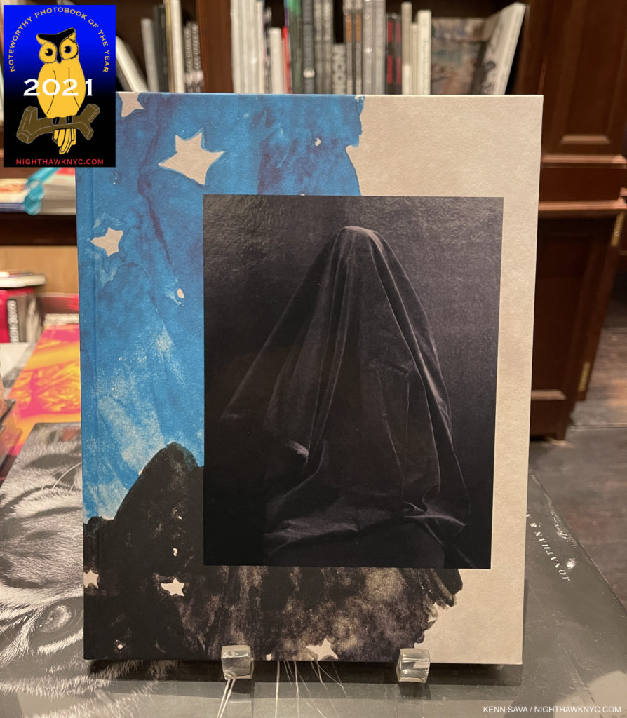
Though things returned to a semblance of what used to be called “normal” in the PhotoBook world in 2021, it was only that- a semblance. While the publishers somehow managed to hold up their end with the bigger houses announcing ambitious release plans with about the same amount of books as seen before 2020, things were a bit rockier elsewhere. The bigger book shows in NYC and the rest of the US were cancelled for 2021, so once again, retailers were the best way to actually see books in person, carefully. Things were still challenging for retail, and a number of independents I visited had cut down on their purchases, hours of operation, even whole departments, in order to survive. Hard to argue with that. So, it was still hard to see anywhere near as many new PhotoBooks as in years past. (Standard Disclaimer- As in years past, I have seen no one else’s list or reviews of books.) Speaking of past years, I should mention that I have now been doing this list for four years. You can see the the prior installments for 2018 here, 2019 here, and 2020 here (I also looked at NoteWorthy Art Books in 2020 here and 2021 here). None of my pieces have sales links. As in past years, please note that publication dates are one thing, but I go by the dates I actually saw a book available for purchase- online or at retail, to include it in a specific year. Of those I saw this past year, these stood out as those I’d most highly recommend, which I call “NoteWorthy,” since there is no such thing as “best” in the Arts.
NoteWorthy Photobooks, 2021- Most Highly Recommended-
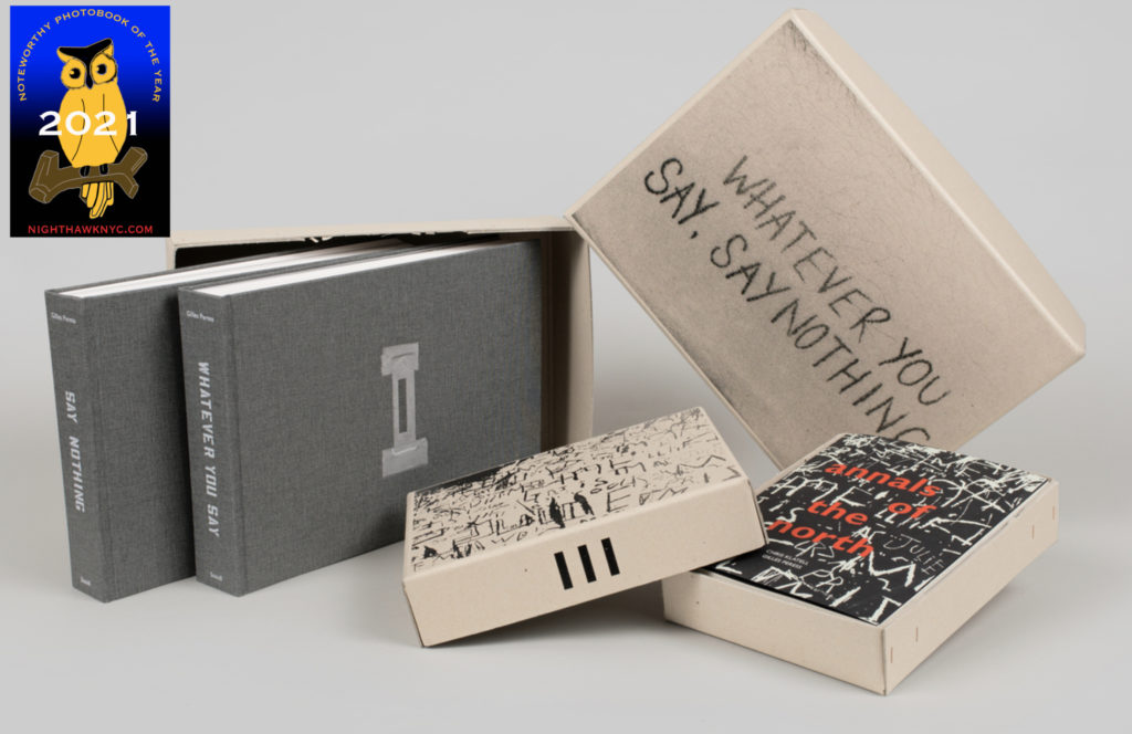
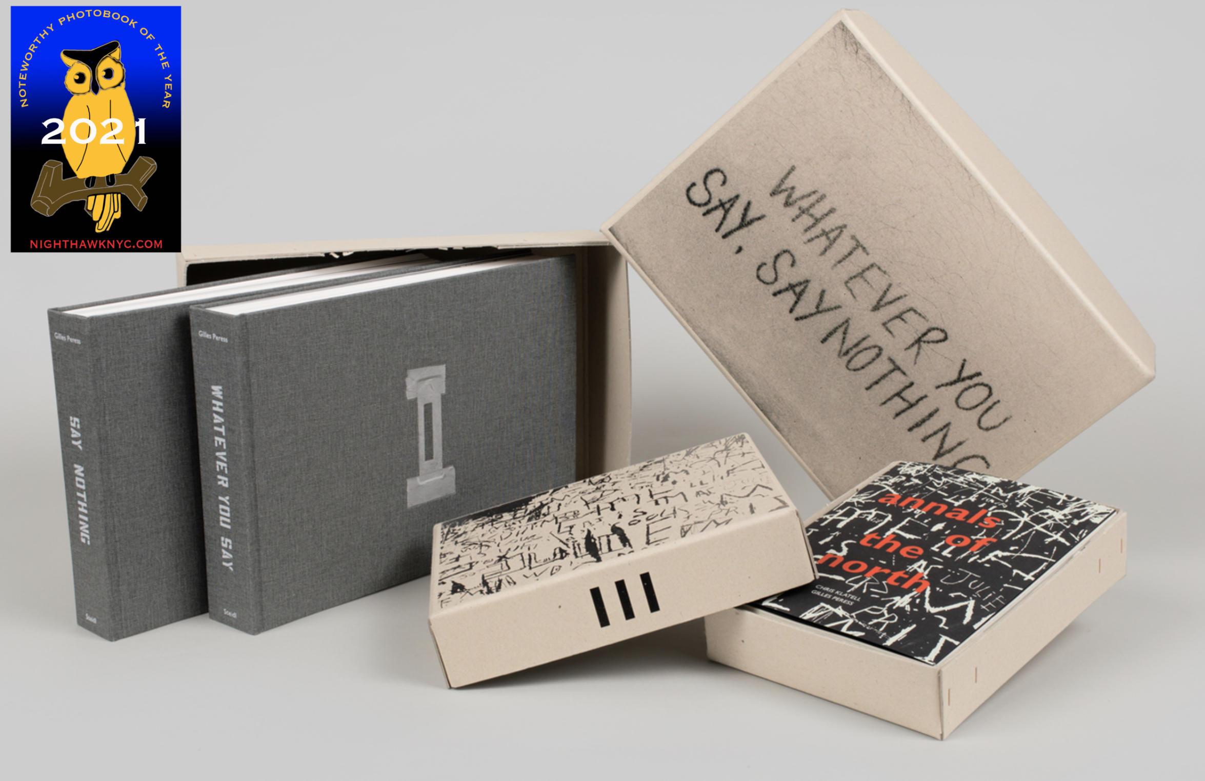
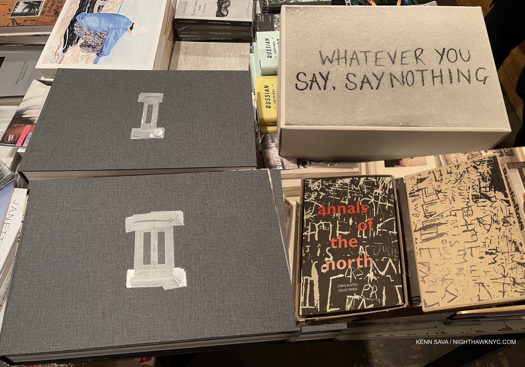
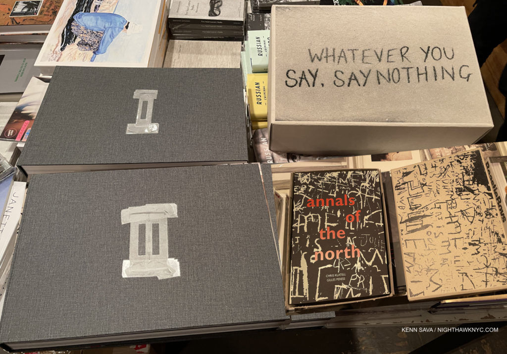
Gilles Peress, Whatever You Say, Say Nothing and the accompanying Annals of the North. Modified Steidl Photo
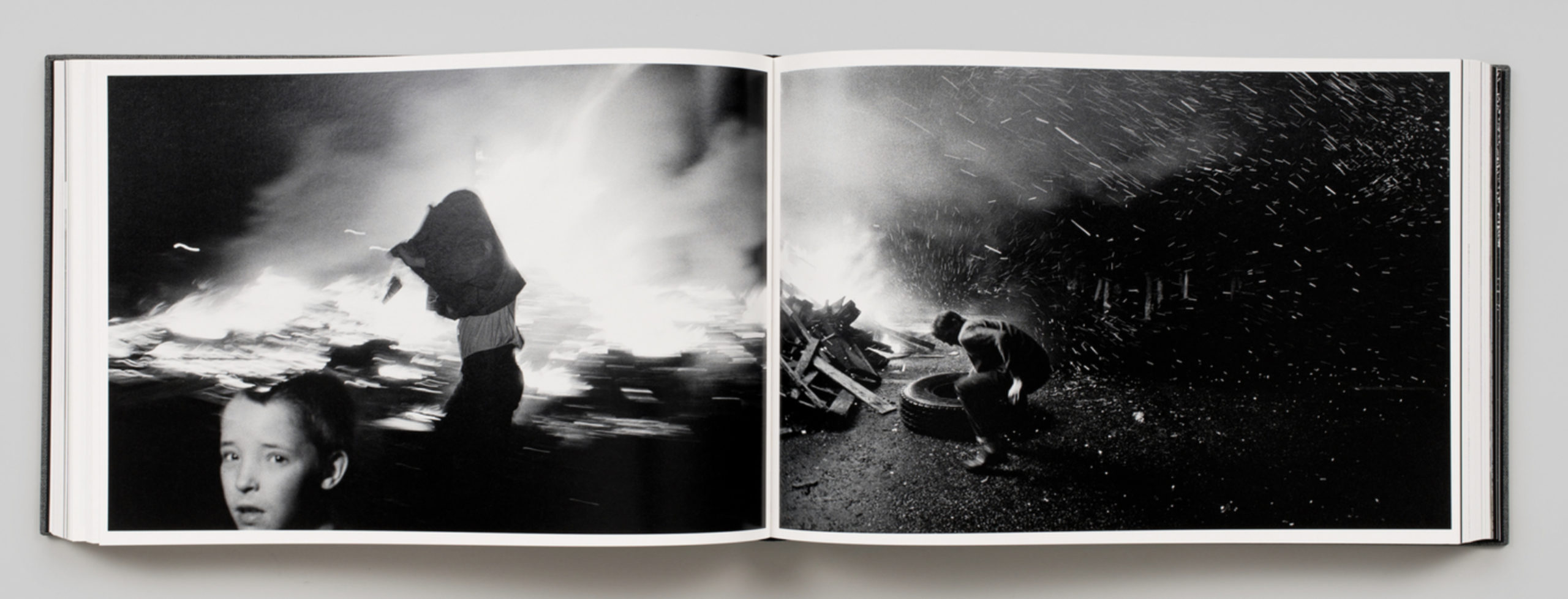
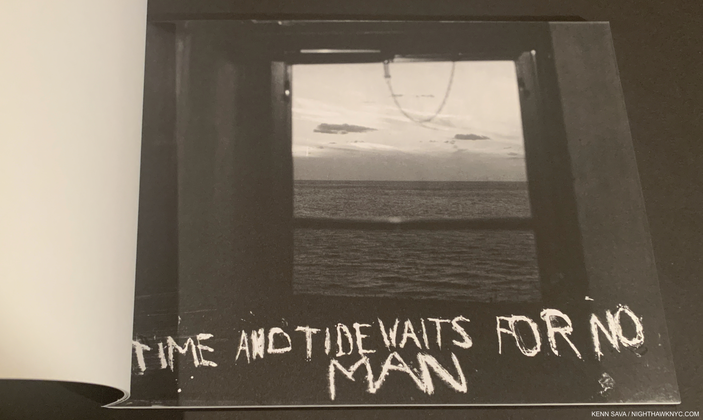
Gilles Peress, Whatever you say say nothing, Steidl- After 30 years in his archive, Mr. Peress has collaborated with Gerhard Steidl and the brilliant book designer Yolanda Cuomo on a book that many have already hailed as a PhotoBook for the ages. Indeed it is, but it also strikes me as a book for right now. At a time of so much strife here at home, it’s hard for me, for one, not to see elements of that in Mr. Peress’s strife filled work from a distant place and a another time.
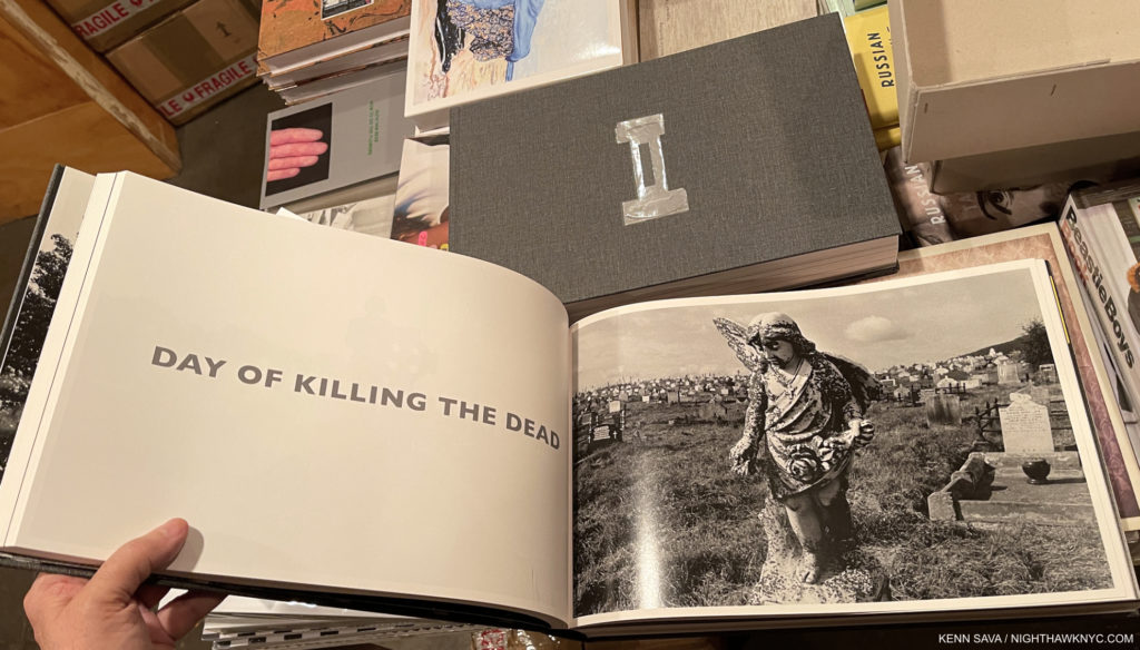
Are there lessons from the “Troubles” in Northern Ireland in 1972 and 1980 when Mr. Peress took these Photographs we can use now? That’s for others to say. What I am sure of is that those killed remain dead. Does anything change? Well, there has been peace for almost 15 years now. While some might want to see more conflict documented among these 1,295 images, it is the images of courage to continue daily life in the midst of a world gone mad, to keep calm and carry on, as the catchphrase originally meant, that strike me just as much. Then there’s the Artistry.
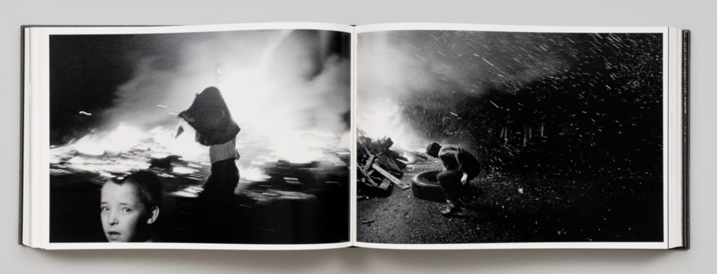
Whatever you say is a master class in composition, street Photography/conflict Photography and immediate reaction, even though Mr. Peress was only in the early days of his illustrious career. So many times it seems that he anticipated an image the way Wayne Gretzky knew where the puck or his teammates would be seconds before they were. At close to 30 pounds with a wingspan when open close to 29 inches(!), it might not find its way into many homes, but every serious or institutional Art or Photography library needs it, and the accompanying 900 page annals of the north, on their sturdiest shelf.

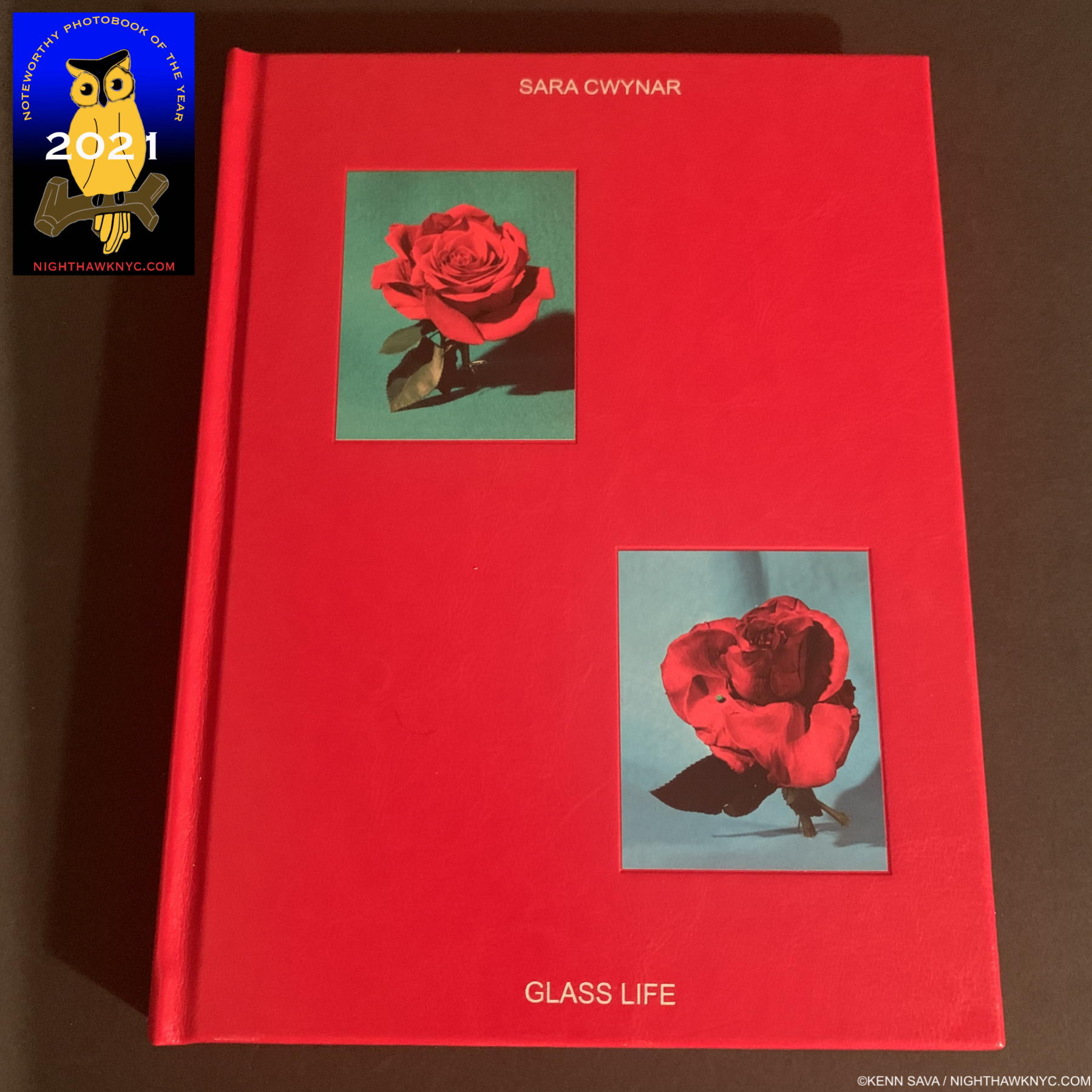
Sara Cwynar, Glass Life, Aperture- In the world of surveillance capitalism we live in (but not here!), Sara Cwynar’s book looks and feels like a report card from the future, but it’s really a snap shot of the right now and recent past. Remember the marketing hubbub around the debut of the “Rose Gold” iPhone? Sara Cwynar made a film inspired by it called Rose Gold that’s now in MoMA’s Permanent Collection. Most of us are living in “Glass Life,” where much of our information, and some/many/most/all of our “personal connections” come from something with glass on it, which takes a good deal of our privacy in the process, providing a poor substitute for real intimacy. Her work has been most notably seen in a series of films (Soft Film, 2016, Rose Gold, 2017, and Red Film, 2018) that have been shown at MoMA and elsewhere. Stills from the films, and some of her portraits are collected in Glass Life. “But I now consider photography more of a tool in my work than a medium that I am totally devoted to,” she explained. Though not a traditional “PhotoBook” per se, I find Glass Life stunning and ground-breaking.
Sara Cwynar has been busy cataloging and connecting the various ways beauty and desirability are used by those in power to maintain or grow it, building a substantial image archive that, along with images she takes herself, she mines for her pieces. She first came to prominence for her eye-catching designs for the New York Times T Magazine, and has progressively built a major Art career this past decade with her Films and shows all over the world. As she approaches 10 years of solo shows, Ms. Cwynar has arrived as a doer and shaker in the Art world. Glass Life is a major, seminal, work of this young decade.
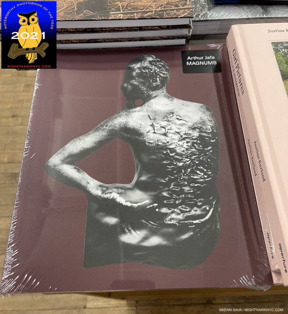
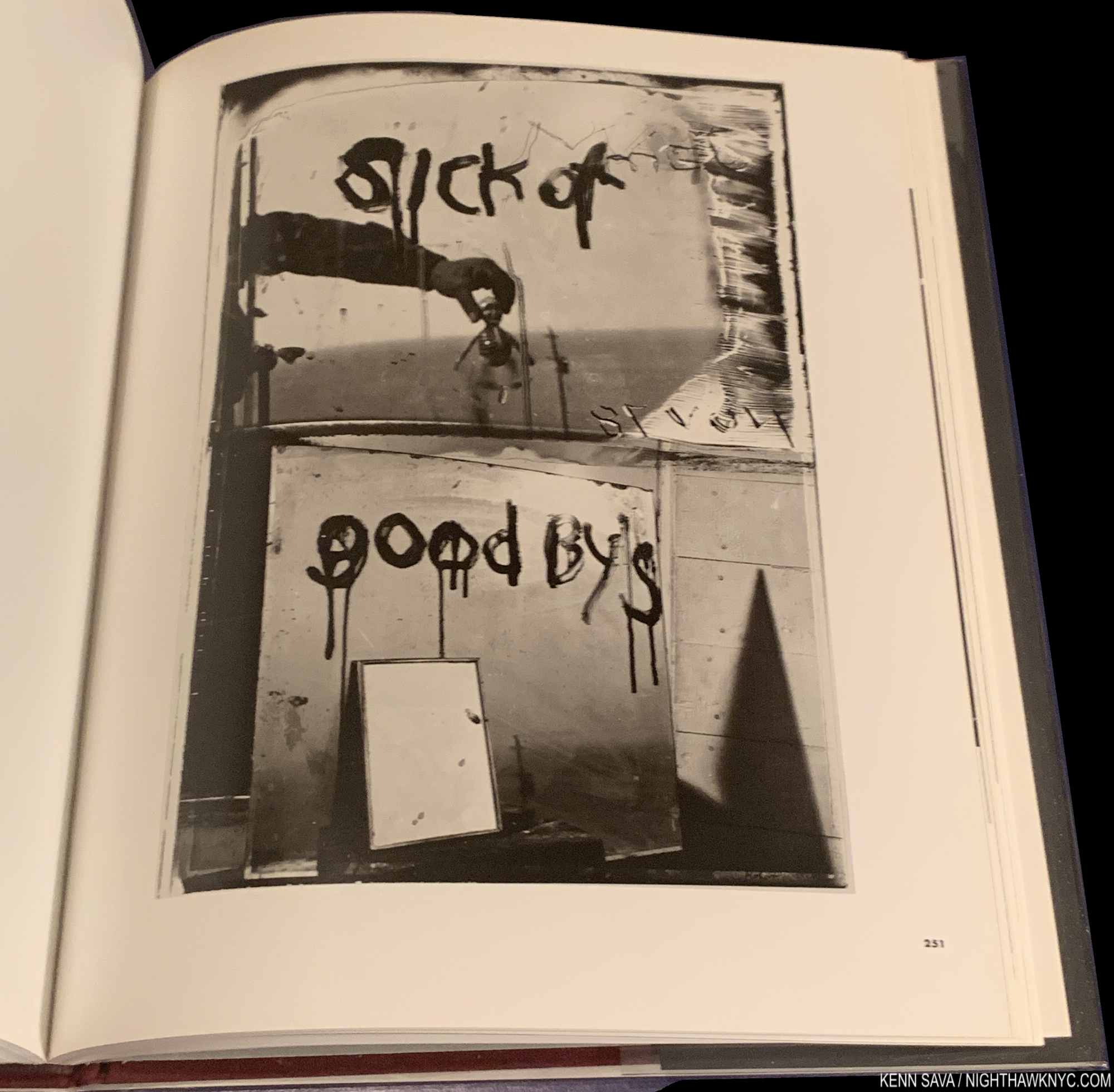
Arthur Jafa, MAGNUMB, Louisiana Museum of Modern Art, Denmark- Another Artist mostly known for his work in realms other than Photography, though in Mr. Jafa’s case, he works in a very wide range of mediums. MAGNUMB is an overview of his work with revealing interviews with the Artist included. From his sculpture of Ex-Slave Gordon on the cover, every page inside feels like it’s on fire.

Stills from his Films, and works in other medium, including his Photographs are included in one of the most important books of the year. After being called to work with Stanley Kubrick (on Eyes Wide Shut) and Spike Lee (he shot Crooklyn), Arthur Jafa has finally garnered recognition for his own work, something I don’t see that ending any time soon.

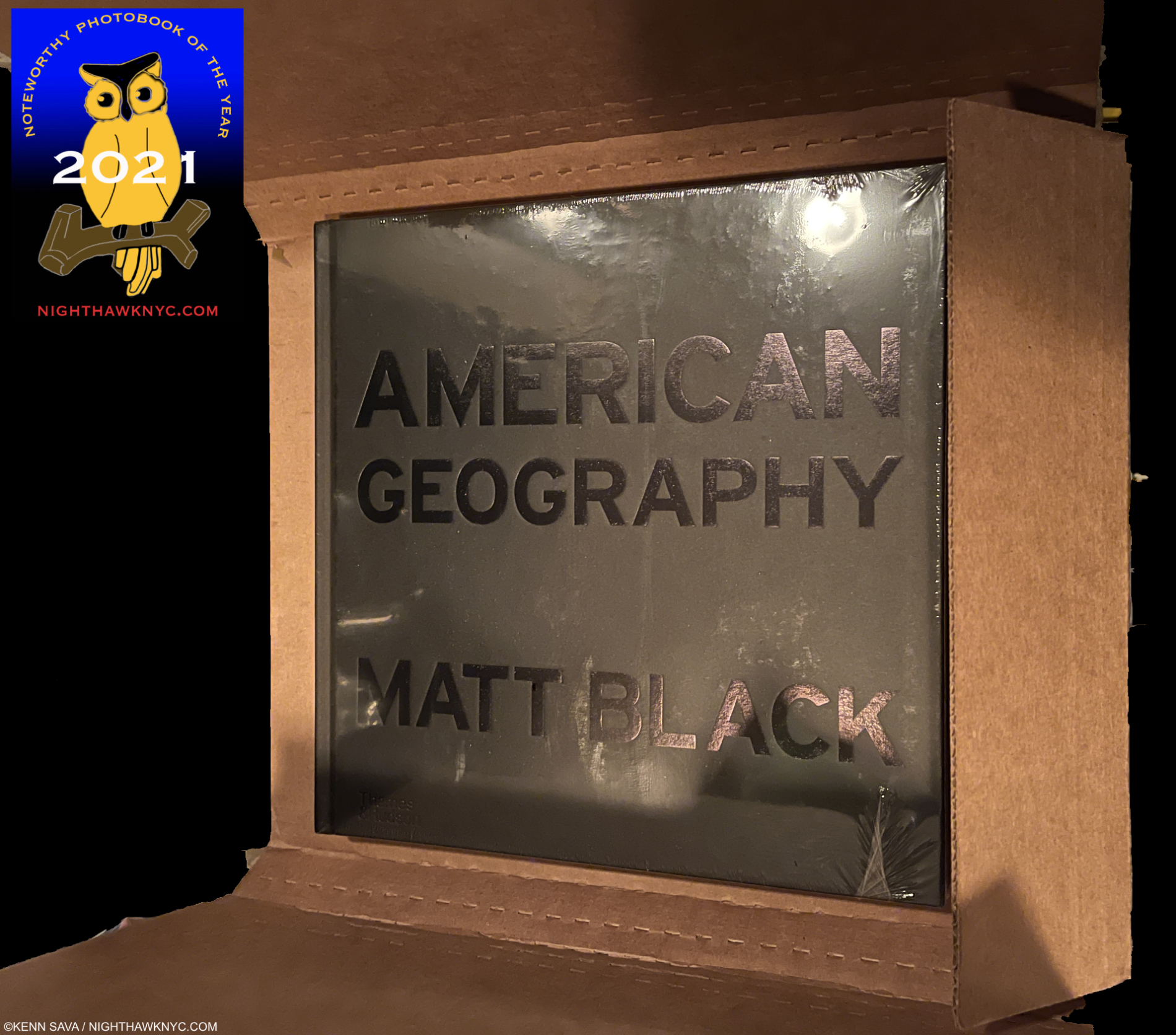
Unboxing my copy of American Geography…
Matt Black, American Geography, Thames & Hudson- Magnum Photos Member Matt Black (B. 1950) has been visiting & documenting American centers of poverty for the past six years, beginning with those around him in central California, where 1/3 of the population lives in poverty. During this time he has logged over 100,000 miles traveling to places with a poverty rate over 20% in 46 states and Puerto Rico. What he has brought back is body of work that is nothing short of comparable with that of the legendary Farm Security Administration (FSA) Photographs of Walker Evans, Dorothea Lange, Russell Lee, Arthur Rothstein, Marion Post Wolcott and the rest in the 1930s, in my view, which are now icons of Photography and history.
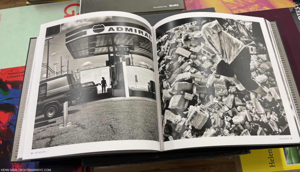
Many of Mr. Black’s images are so stunning visually and Artistically they might be accused of distracting from their point- to show the rest of us how too many of us live. For me, it’s too hard to deny their status as Fine Art, but Mr. Black’s skill is such that he drives his point home in spades no matter the stunning Art of his craft. Lauded as a “future classic of photography” by the publisher, I’ve been watching this body of work being built the past five years and have been both stunned and mesmerized by each succeeding black & white image he has presented, so I knew this book would be a classic, without their words, the moment I learned of it. It’s not only a “future classic of photography,” it’s a classic right now.
NoteWorthy PhotoBooks, 2021- Excellent & Under The Radar-

Elliott Verdier from Reaching for Dawn. Elliott Verdier Photo.
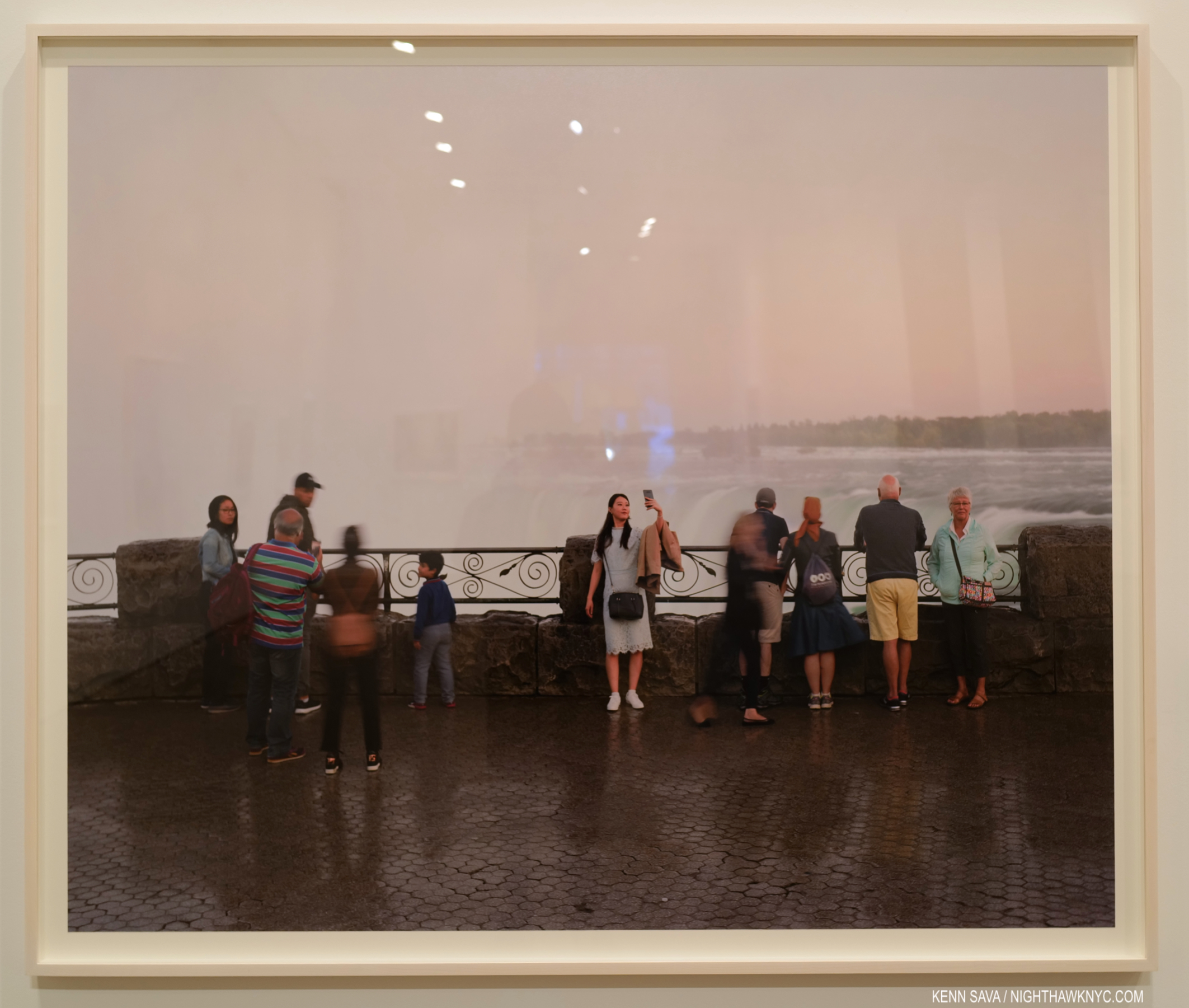
Elliott Verdier, Reaching for Dawn, Dunes- After bringing the world A Shaded Path in 2019 on Kirghizistan, the French documentarian who has been featured in the New York Times (including this recent historic event he covered), among other outlets, turned his large format camera on the rarely seen country of Liberia in 2019, scene of a horrific civil war from 1989 to 2003. Mr. Verdier spent two years traipsing the country far and wide creating two different bodies of work- one, of landscapes in black & white, the other of color portraits. The results are published by Dune, the imprint he co-founded, in a book in a few different kinds of paper, and some pages in silver ink, like the books of that other great documentarian, Richard Mosse. The images are accompanied by texts by singer/songwriter Gaël Faye and 2011 Liberian Nobel Peace Prize Laureate Leymah Gbowee. Reaching for Dawn makes a powerful counterpoint to Whatever you say, showing how the scars of war never really go away even though the conflict may be no longer seen. A remarkable PhotoBook and accomplishment on every level, that conveys a portrait of the land and the stoic resolve and dignity of the people who call it home.
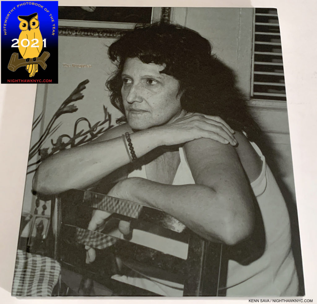
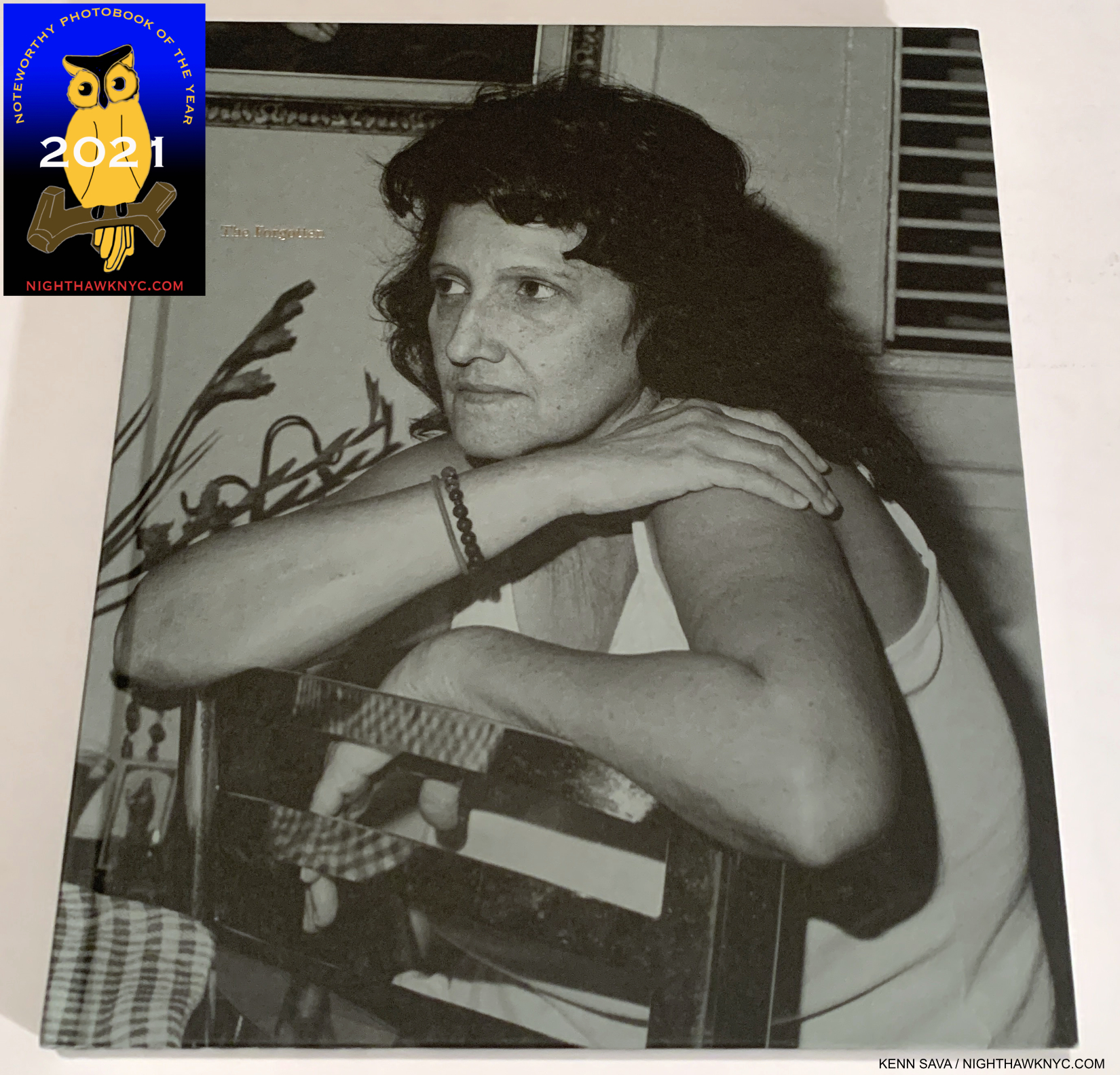
Rosalind Fox Solomon, The Forgotten, Mack Books- Another Artist who has been on my list before- for her last book. In 2018, the instant classic Liberty Theater appeared here. This one is exceptional as well. It’s so easy to get caught up in imaginary narratives as you move from page to page to not fully appreciate how remarkable the passing Photos are. The Forgotten is another book in what is now an exceptional string of PhotoBooks by Rosalind Fox Solomon published by Mack Books, joining Them, in 2014, Got to Go, 2016, and the aforementioned Liberty Theater in 2018, each of which is highly recommended. At 91, it’s hard to think of any other Photographer who’s created so many excellent books the past 5-7 years besides Ms. Fox Solomon and Gregory Halpern. Find them while you can.

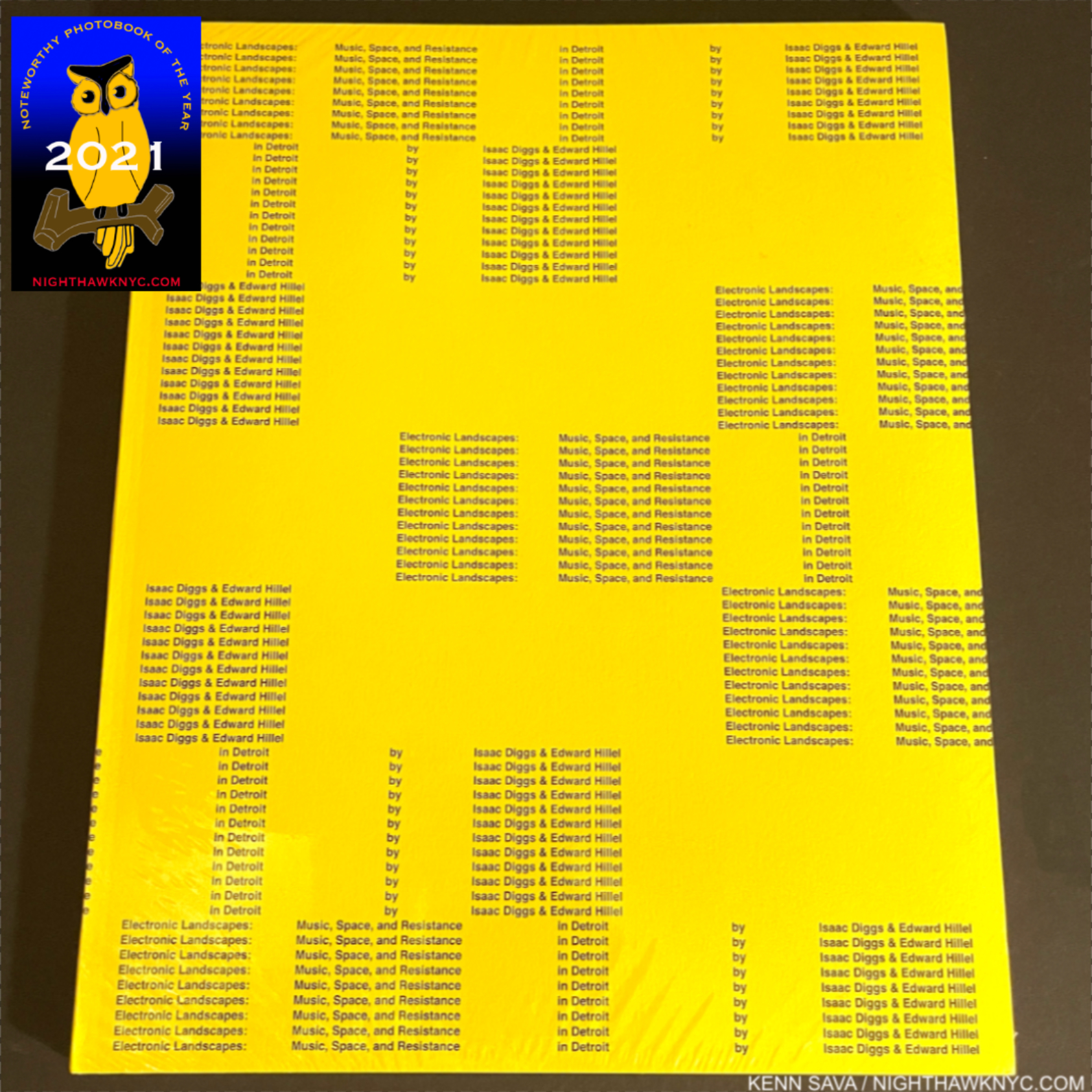
A sealed copy of Electronic Landscapes. Something that is going to be very rarely seen in the future, unless it’s reprinted.
Isaac Diggs and Edward Hillel, Electronic Landscapes, +Kris Graves Projects- I live in a city where great Music was has a long and storied history. Maybe you do, too. I bet for both of us, and probably almost every other place where great Music was made, almost no documentation of it exists, particularly of its beginnings. Isaac Diggs and Edward Hillel have seen to it that when people look back and want to know more about the beginnings of Detroit’s house, techno and hip-hop resurgence in 20 or 30 years the documentation will be there. And blessed they will be to have such a well-done and extremely well-organized book to refer to. +KGP was my NoteWorthy PhotoBook Publisher for 2020, when in spite of the pandemic and the worldwide shutdown, Kris Graves & Co. managed to publish 18 books! AND Mr. Graves created work, himself, that found him on the cover of National Geographic’s Photos of the Year Issue. This is Mr. Diggs third excellent book with +KGP. Only one, his equally excellent Middle Distance, is still available. Electronic Landscapes is just about sold out as I write this.
NoteWorthy 1st PhotoBooks, 2021-

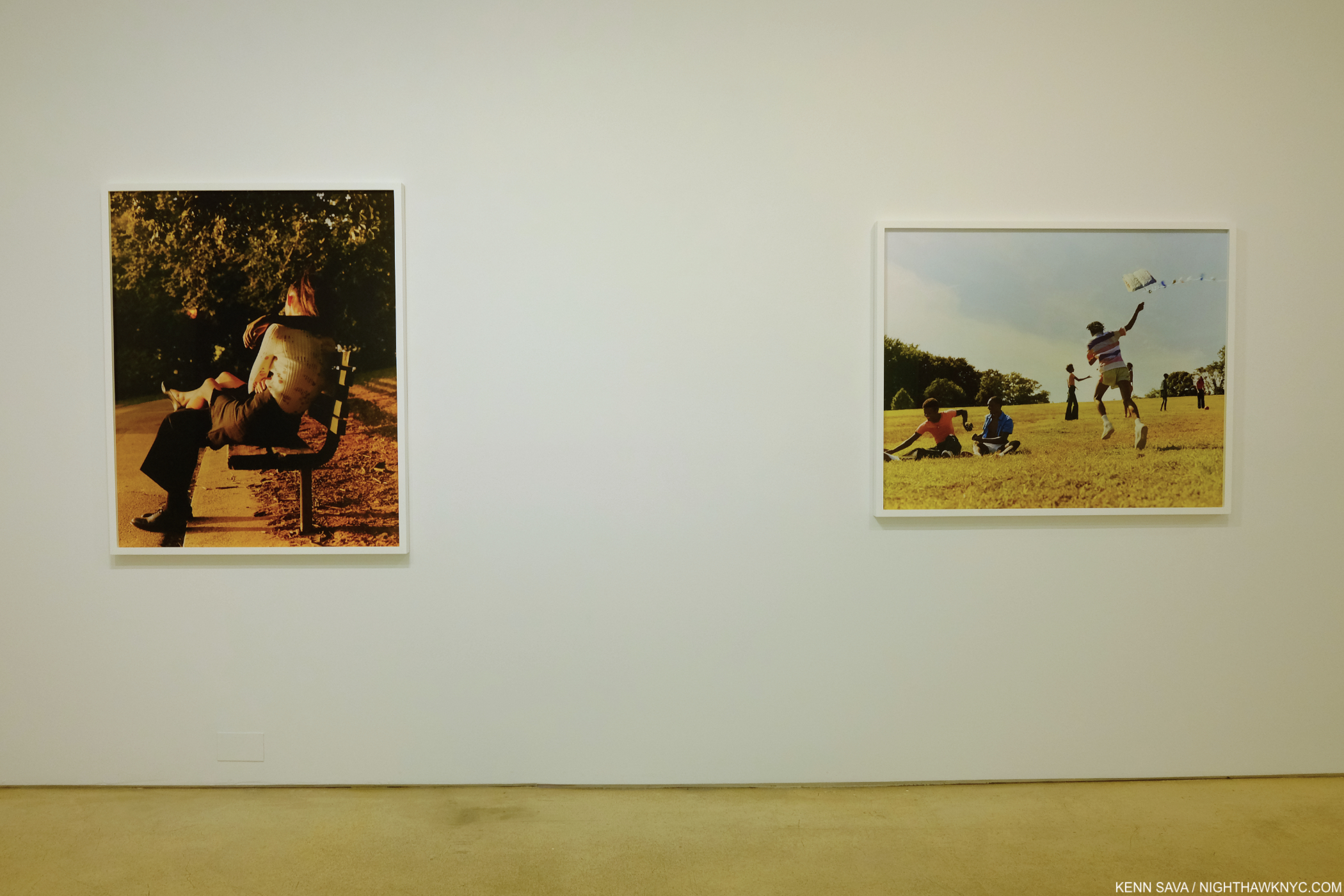
Rahim Fortune, I can’t stand to see you cry, Loose Joints- Mr. Fortune’s debut is centered around his trip home to care for his ill father. The resulting book is a poignant meditation on life and its fleeting moments captured in black & white. Having had a parent who was sick for 6 years before passing, I am unfortunately acquainted with this. Mr. Fortune’s images don’t hide the worry, but his images are full of dignity and strength, while they meditate on life, death, love and loss. A remarkable debut.
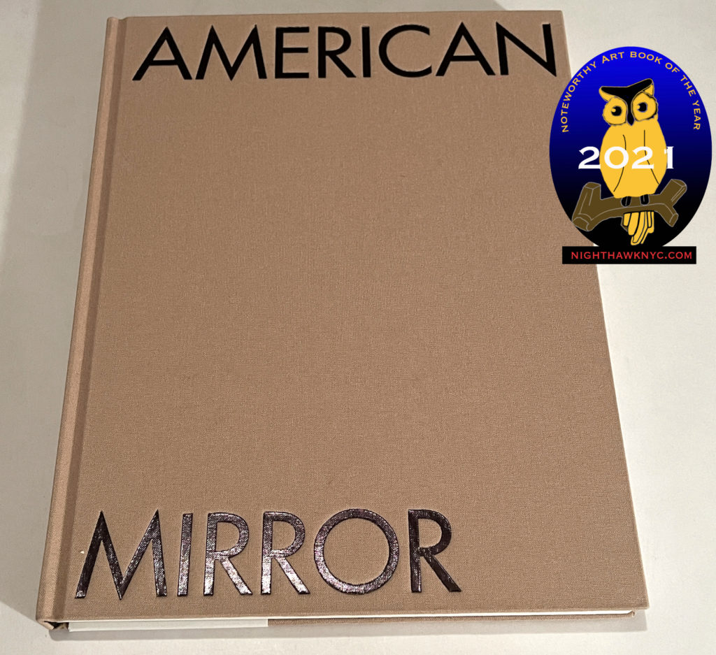
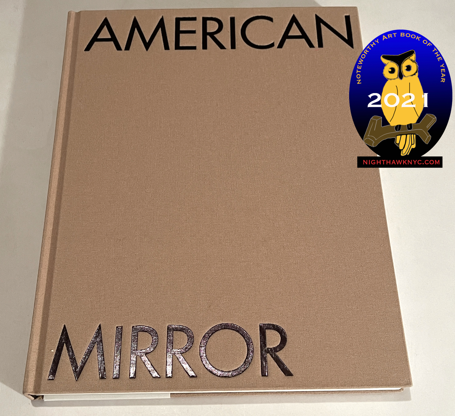
Philip Montgomery: American Mirror, Aperture. 2021 saw a number of fine books that looked back at America either the past two years, or over the past few decades, by Mitch Epstein (Property Rights), Ken Light (Course of Empire), Robert Adams (American Silence) and Peter Van Agtmael (2020 and Sorry About The War), and others. For me, Philip Montgomery: American Mirror stood out for me among them, particularly because it’s a first PhotoBook. Mr. Montgomery’s style is stark, economical and direct all the while being beautiful, regardless of his subject. At just 33, his work has already been featured in the world’s most prestigious publications from The New York Times & The New York Times Magazine, to The New Yorker, and Vanity Fair, among many others. Here you can see why. While he Photographs other subjects, it only takes one look at American Mirror to see that Mr. Montgomery has all the makings of a major voice in what used to be called “Documentary Photography.” American Mirror screams “auspicious.” It’s one of those books people will be referring to while others will be desperately trying to find if it goes out of print.
NoteWorthy Retrospective, 2021-

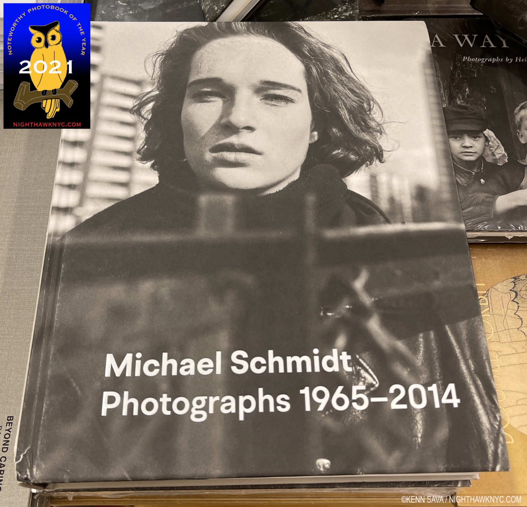
Michael Schmidt: Photographs 1965-2014- The late German (1945-2014) is another of the many excellent Photographers who are not nearly as well known in the USA as they are in Europe. Michael Schmidt had a show, Michael Schmidt: U-NI-TY (EIN-HEIT), in 1996 at MoMA. It featured one of his most important bodies of work, created in response to the fall of the Berlin Wall and the reunification of the two Germanys. It’s not the only excellent book Michael Schmidt produced. Waffenruhe (Ceasefire) is widely recognized as a 20th century classic. The fine softcover reprint is gradually disappearing, so be forewarned to get it soon. Michael Schmidt: Photographs 1965-2014 provides a very well done look at all of his books and his entire career, much of which will be new to PhotoBook aficionados in the USA. Check it out and don’t wait long if you want it. It will be very expensive after it goes out of print.
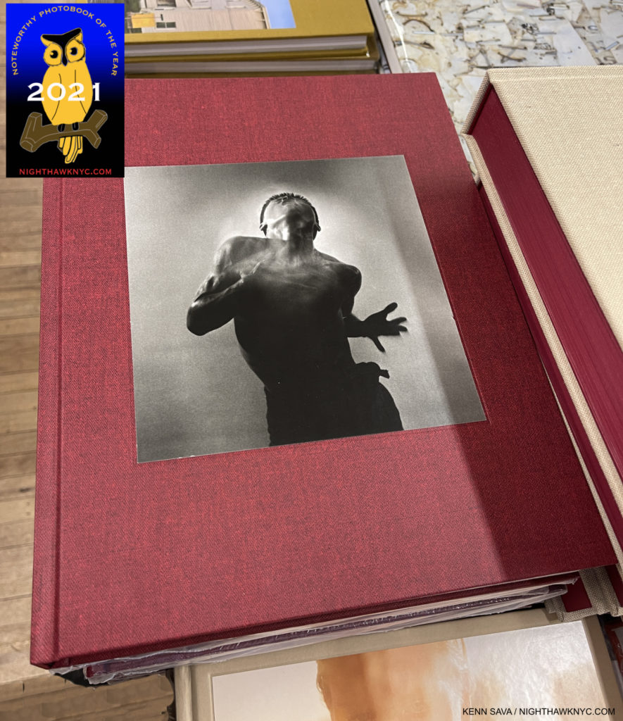
Eikoh Hosoe, Mack Books– Largely a contemporary of Michael Schmidt, though on the other side of the world, Eikoh Hosoe (B.1933) is something of a well-kept secret outside of his native Japan. Inside Japan, he’s known for his fine work over a 65 year career as a Photographer in helping to create post-war Japanese Photography, and as a teacher, who counts the world-famous Photographer, Daido Moriyama, among his students. For those looking to see where Mr. Moriyama’s signature high-contrast style came from, Eikoh Hosoe will prove most illuminating. Mack has outdone themselves with this excellent, 400 page, retrospective in which everything (the layout, the covers, the inclusion of a chronology, the quality of the binding and the printing) is first rate, especially the content. It’s now possible for those of us outside Japan to get up to speed on Mr. Hosoe’s accomplishment and follow his career step by step in this beautiful book, which is likely to stand as “definitive” for at least the near future.
NoteWorthy Reissued PhotoBook, 2021-
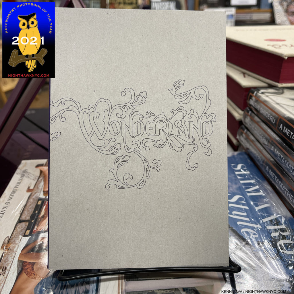
Jason Ezkenazi, Wonderland, Red Hook Editions- I’d given up hope of seeing this book, which quickly sold out, after achieving near legendary status. Then, earlier this year Jason Ezkenazi reissued his classic, in a larger size, and I immediately jumped on the chance to get it. Now, I come to it backwards, Wonderland being Book 1 of a trilogy. I was able to get the excellent Black Garden, Book 2, and Departure Lounge, Book 3 (see NoteWorthy PhotoBooks, 2020) last year, which only served to heighten my desire to see Book 1, Wonderland. It certainly holds up to both its reputation and the passage of time. Don’t miss it this time.
NoteWorthy Exhibition Catalog, 2021-
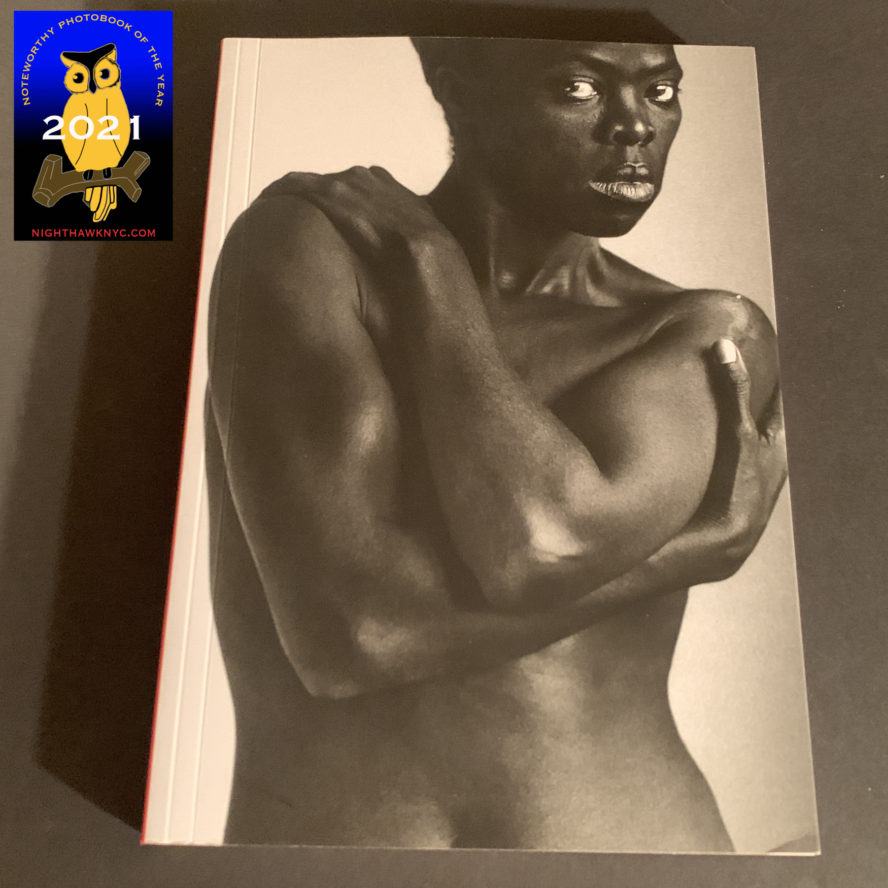
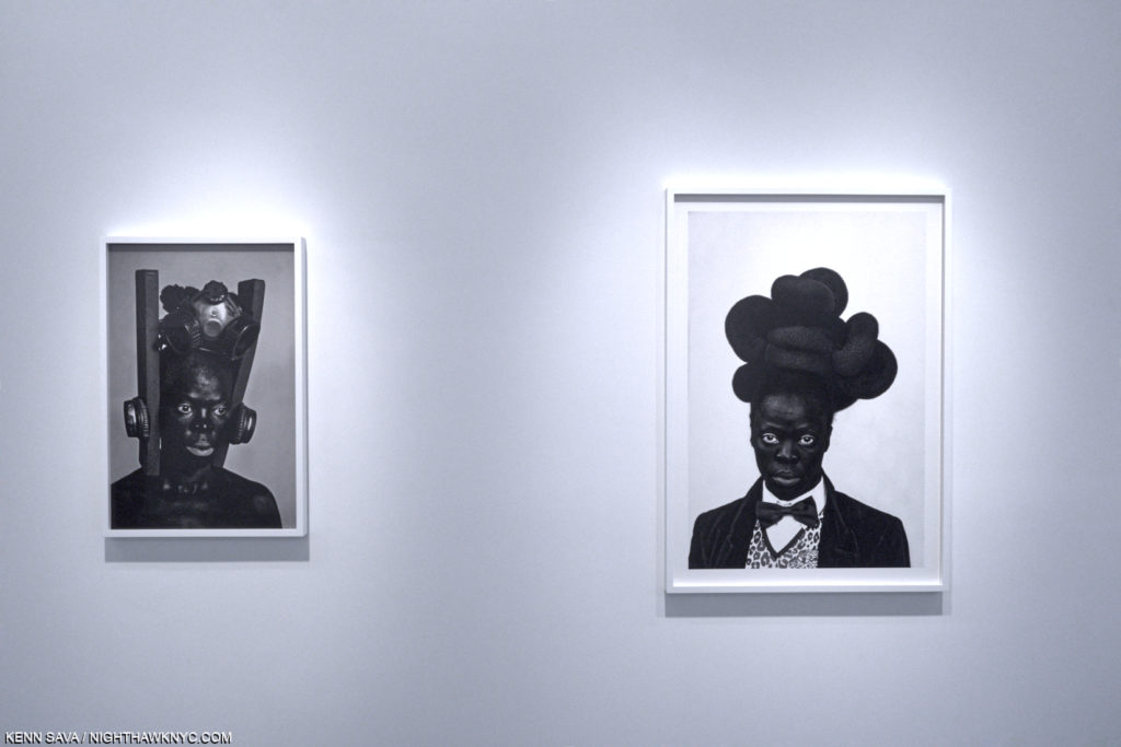
Zanele Muholi, Tate- The renowned Photographer, Painter & Activist received a Retrospective at the Tate, London this past year that included about 260 pieces covering her entire career. The only thing missing were her Paintings, who’s debut I recently looked at. For those of us not able to see the show, the Tate’s catalog is an essential book especially when you consider that some of her earlier books, like the excellent Faces & Phases 2006-14 and Only Half The Picture, are out of print and hard to find reasonably priced. At the moment, it’s the only way to see her early work and an overview of her whole accomplishment to this point.
NoteWorthy Photobook of 2018 I Missed- Mea Culpa!-

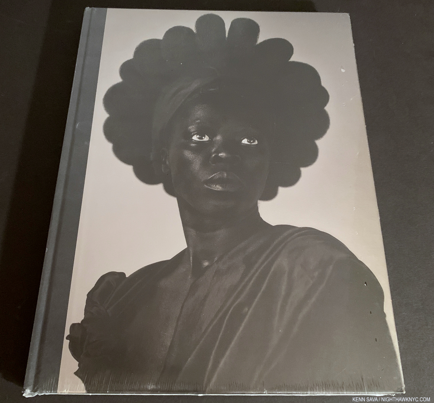
A word of warning- New, sealed copies, like this one, are getting quite hard to find.
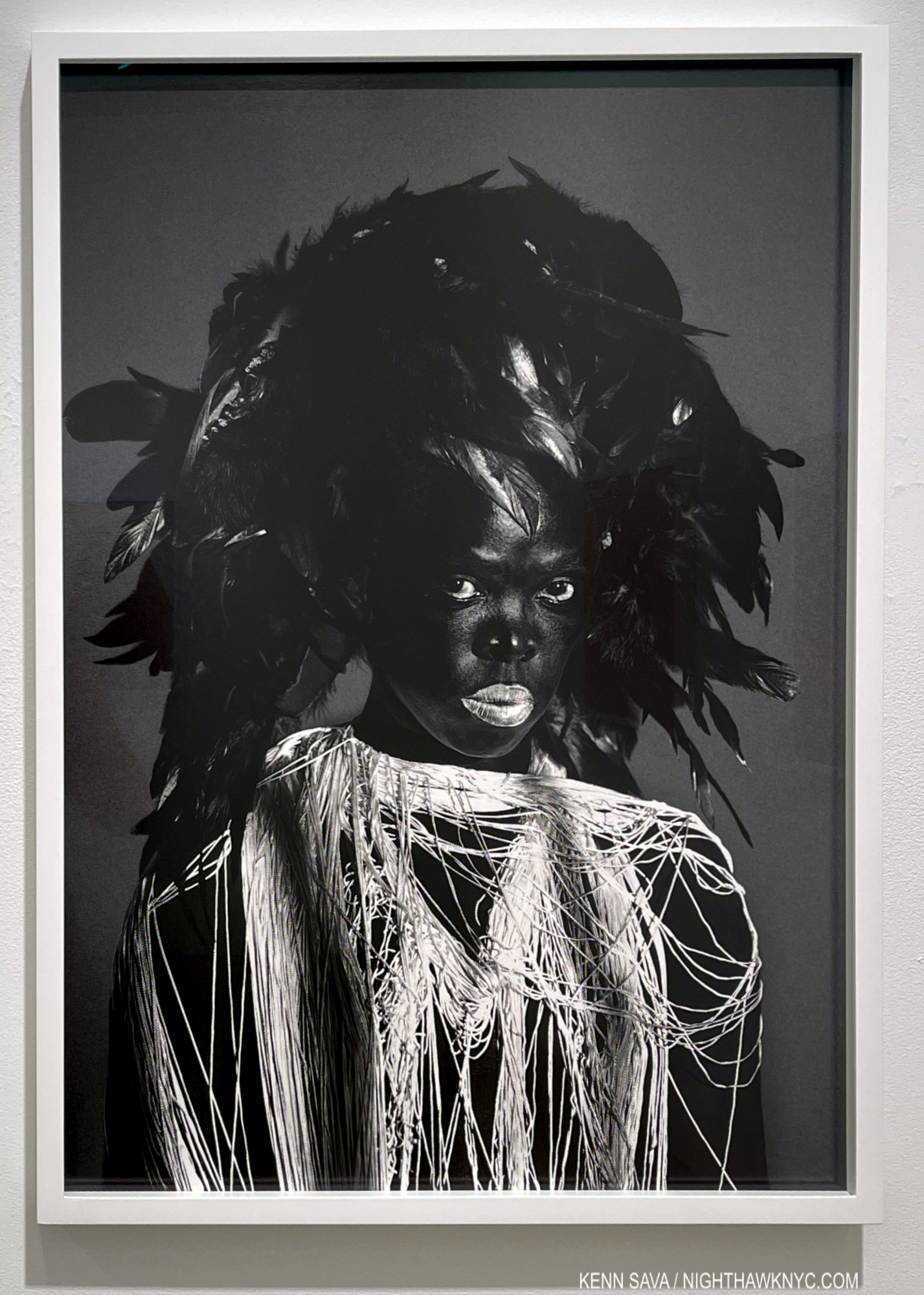
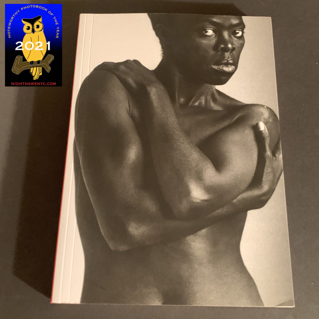
Zanele Muholi, Zanele Muholi: Somnyama Ngonyama, Hail the Dark Lioness, Aperture, 2018- Speaking of Ms. Muholi, HOW did I not include this in my 2018 NoteWorthy PhotoBooks, 2018 piece?
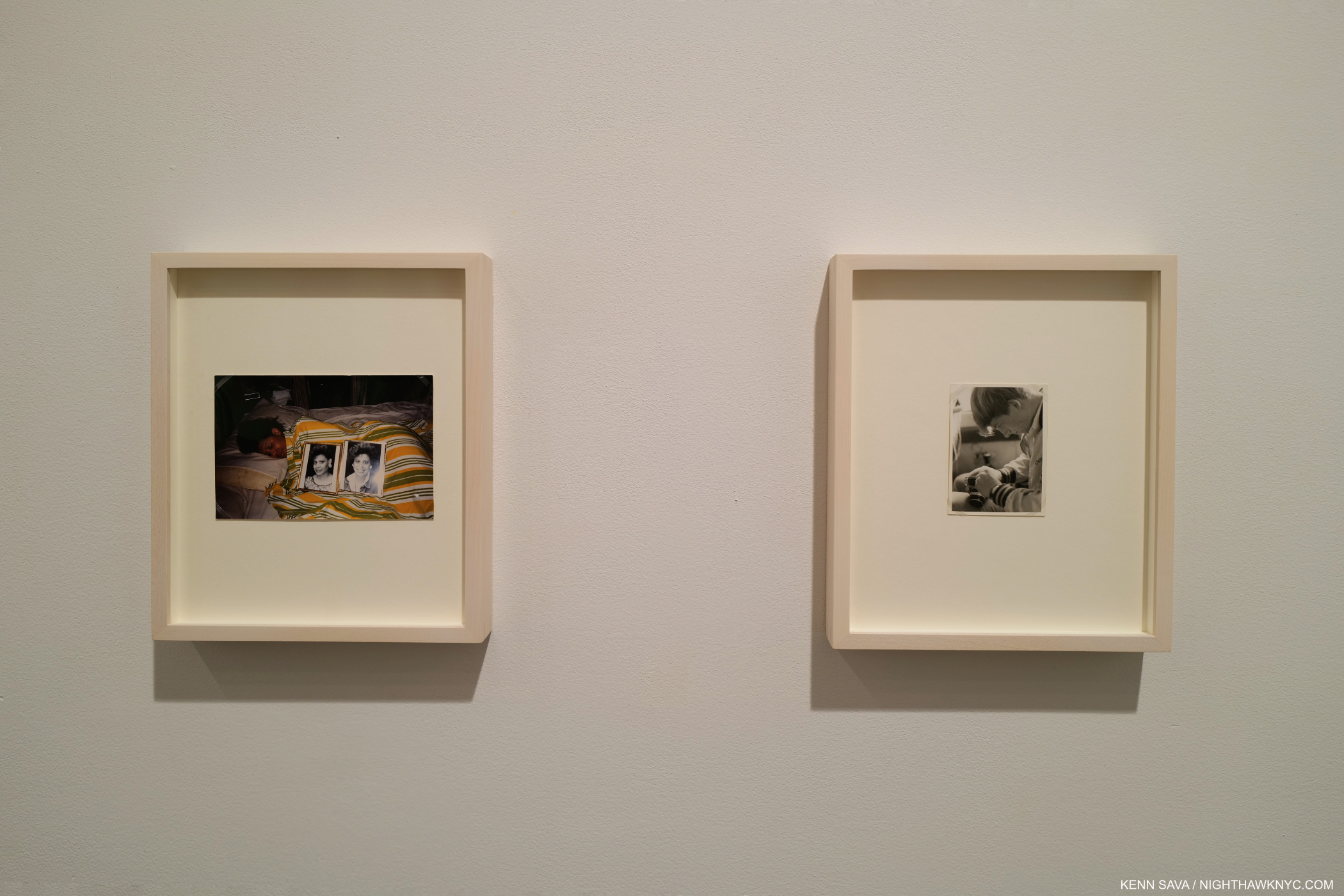
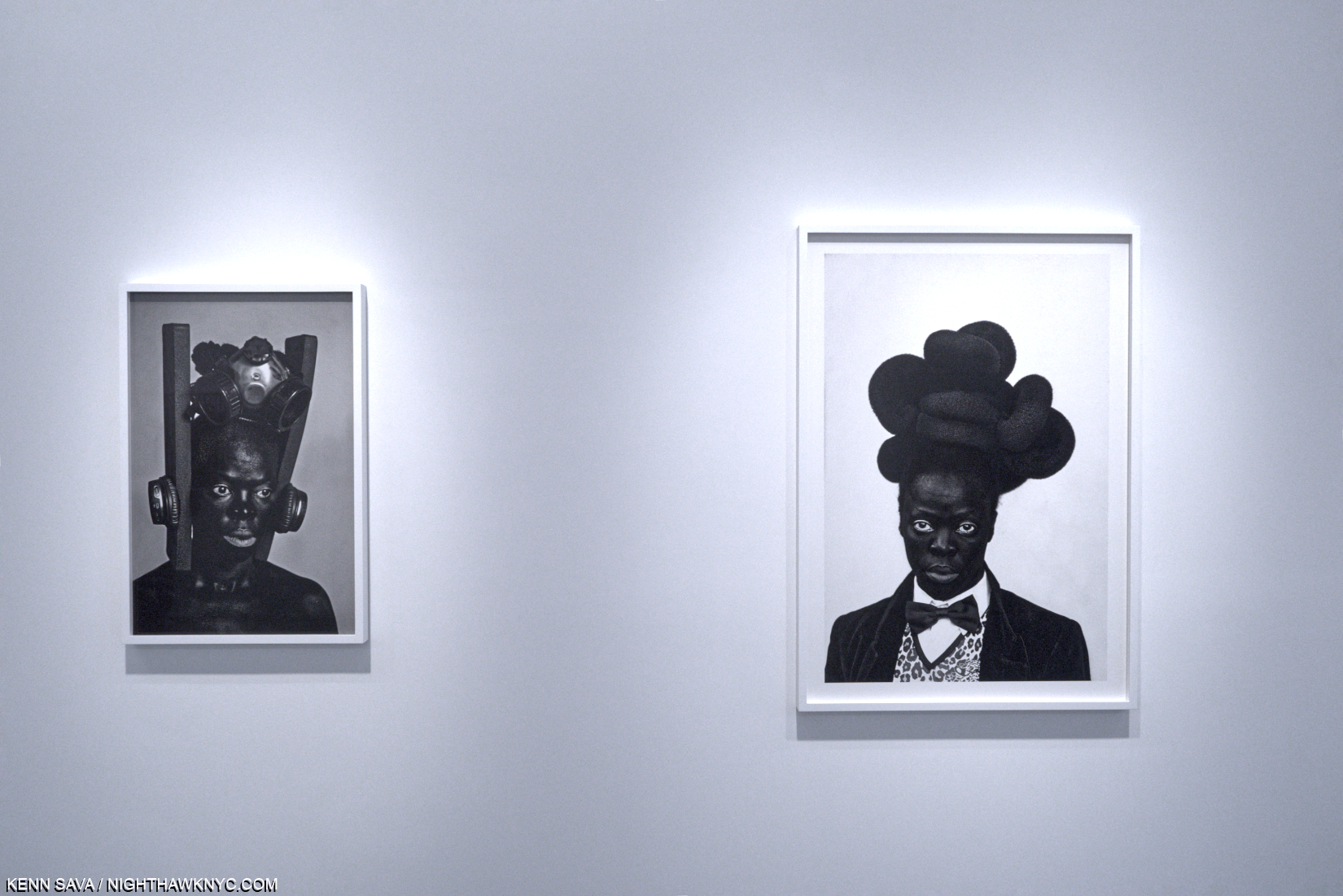
Zanele Muholi, from Brave Beauties and Somnyama Ngonyama (‘Hail, the Dark Lioness’), at Yancey Richardson, October, 2017
I had seen some of the work included in it at Yancey Richardson in 2017 and been stunned by it. The answer- the first printing sold out before I could get a copy. Suffice it to say that it is one of the masterpieces of the PhotoBook genre published this past decade. Though she has done other books and they are all worth seeking out, if she had only done this book, it would be sufficient to secure her place among the world’s great living portraitists- in any medium. Still, that only enhances the value of her ground-breaking work as an activist documenting over-looked and at risk communities.
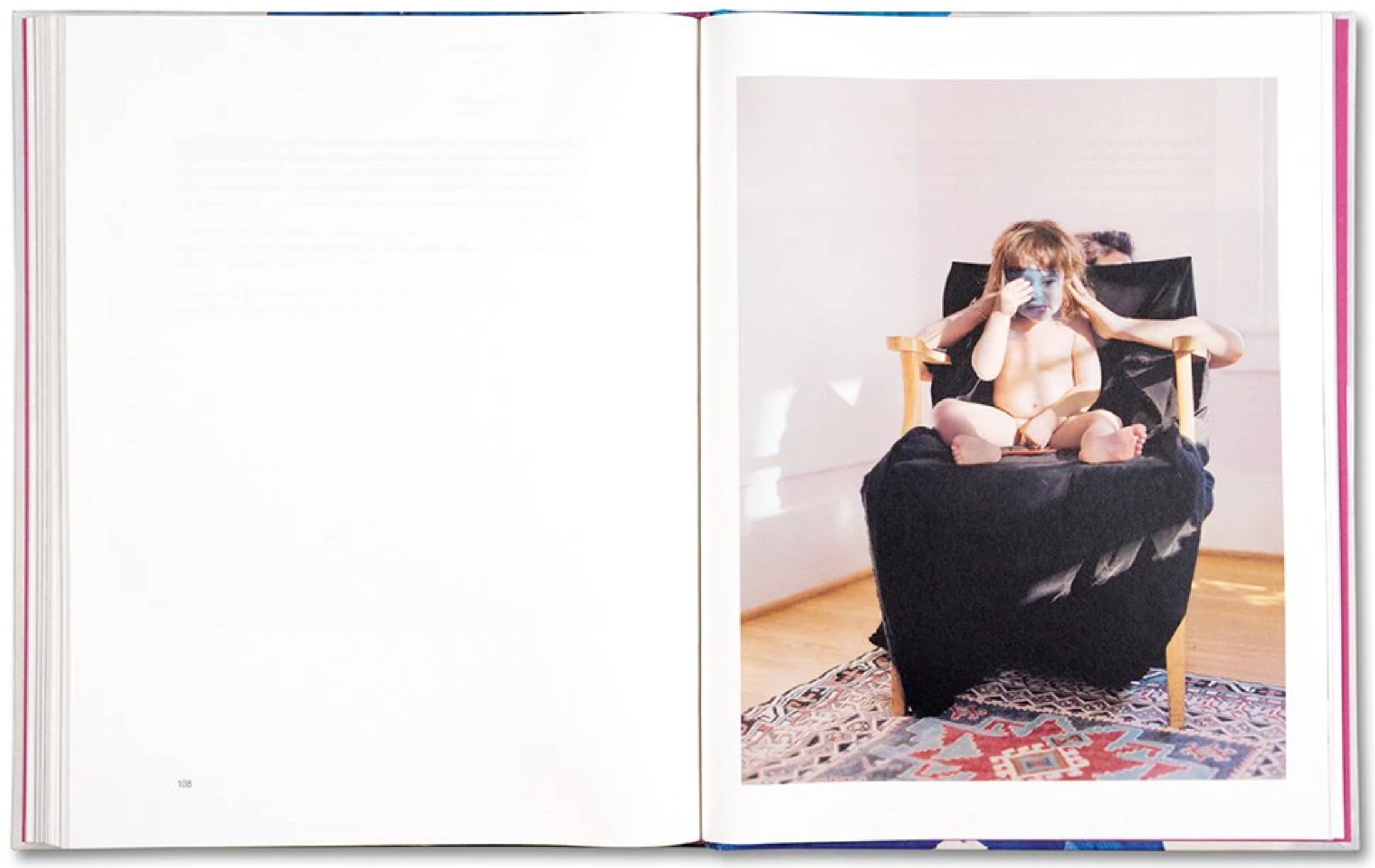
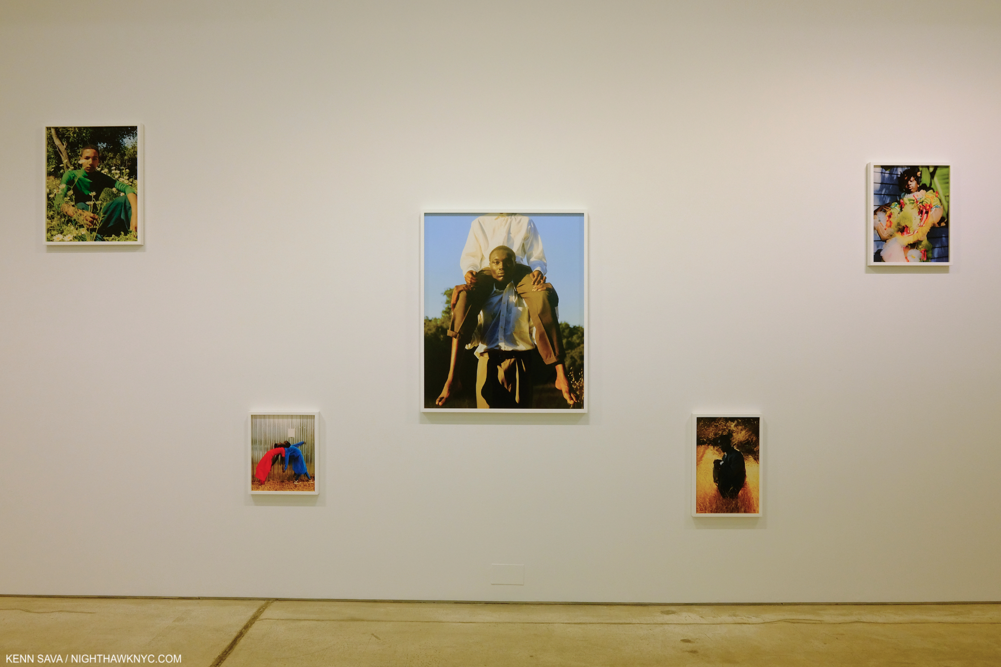
NoteWorthy PhotoBook After My Own Heart, 2021-
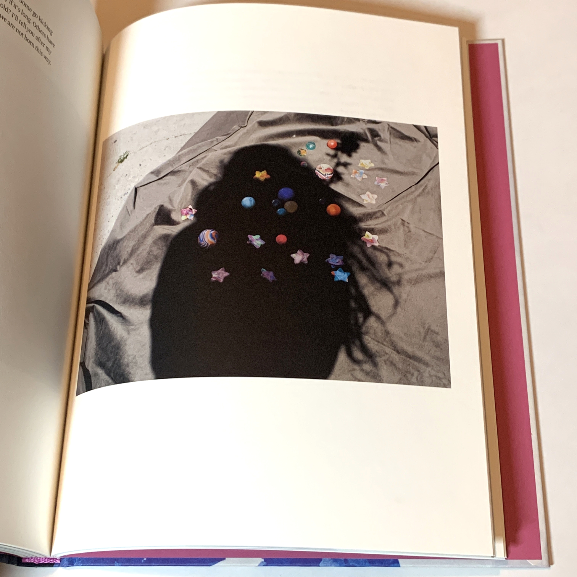
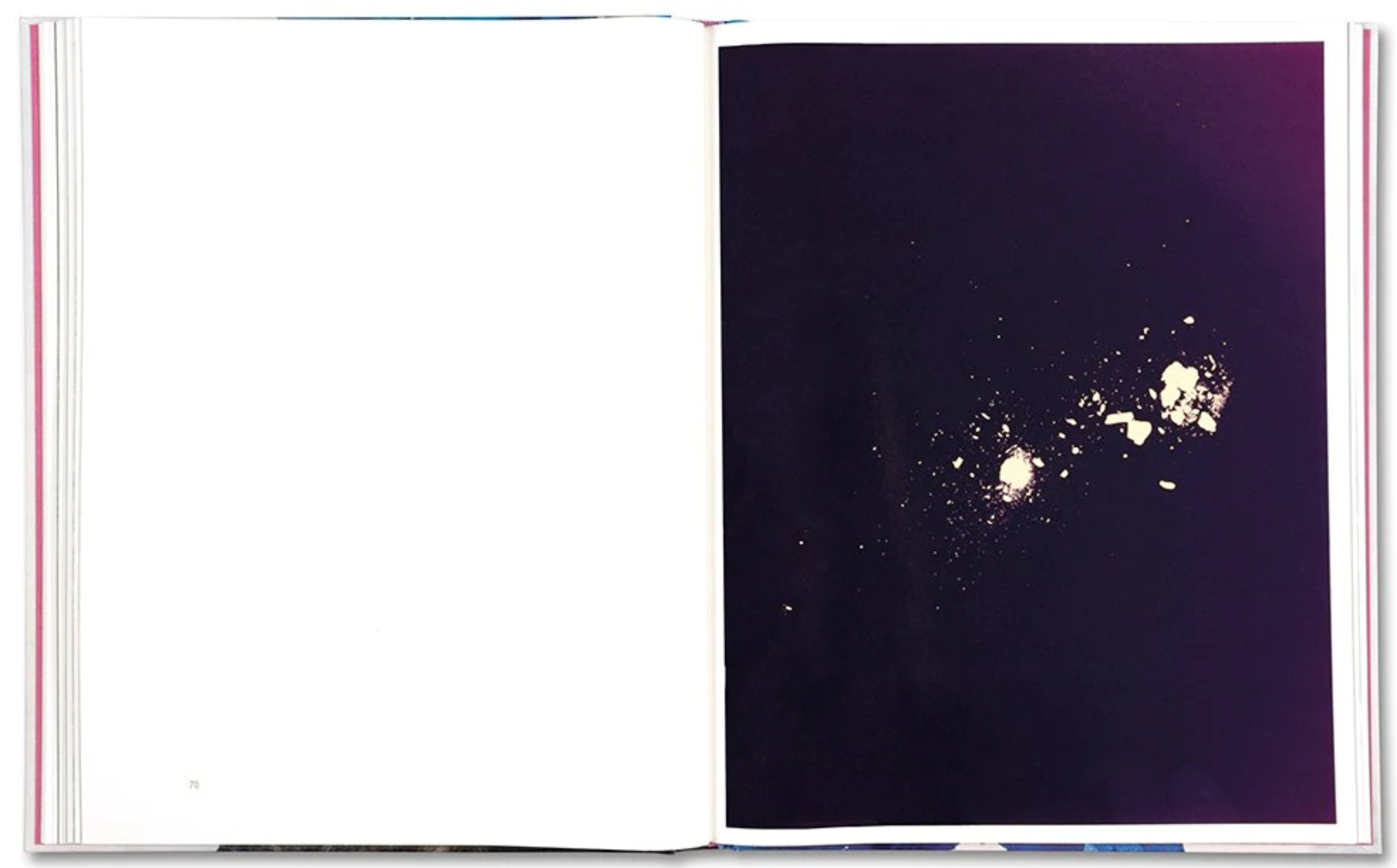
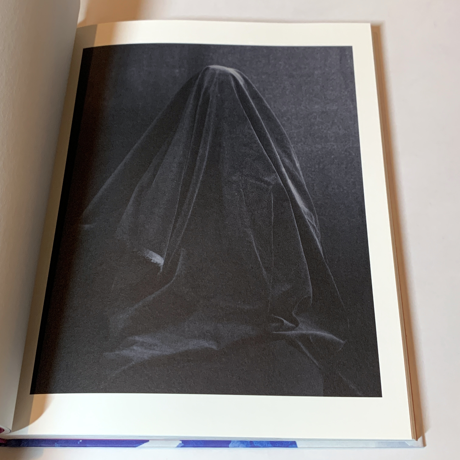
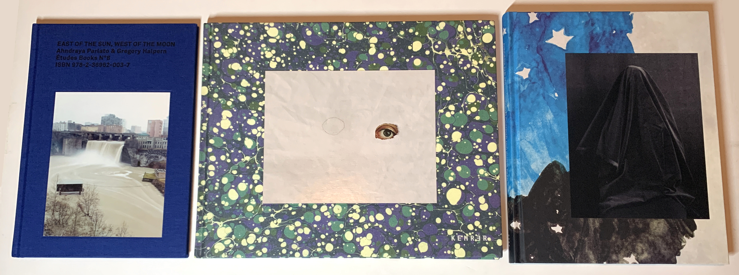
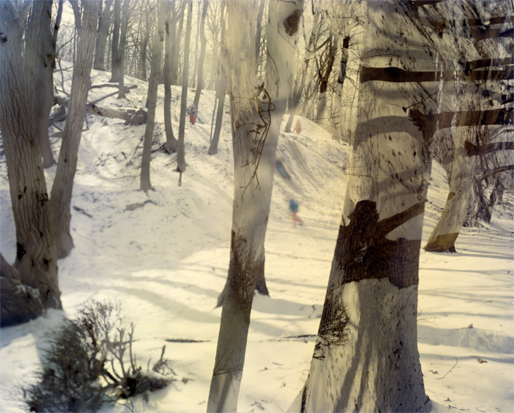
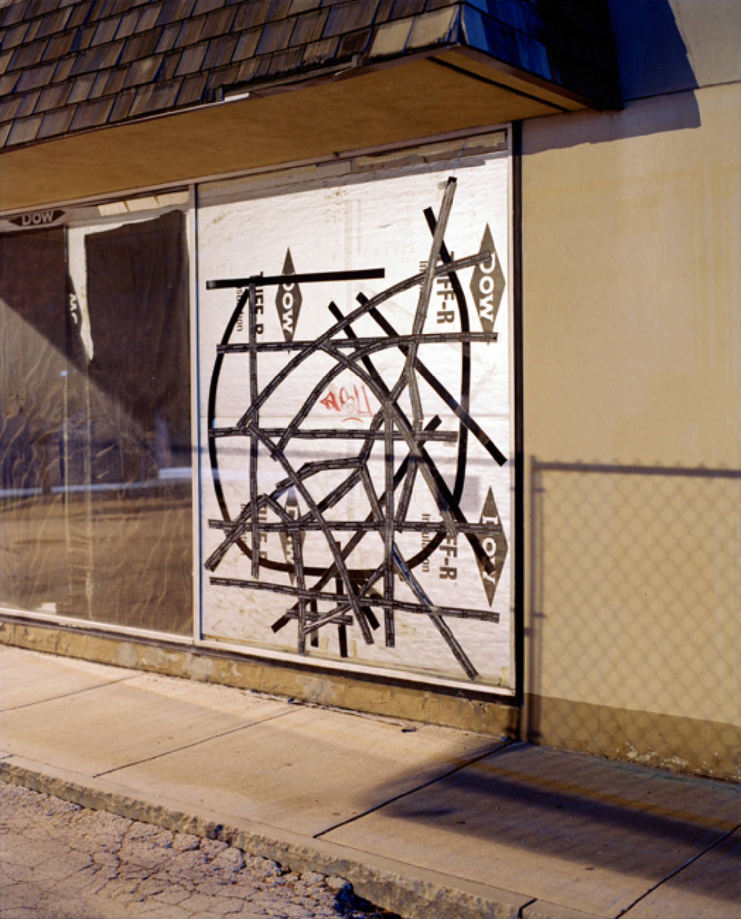
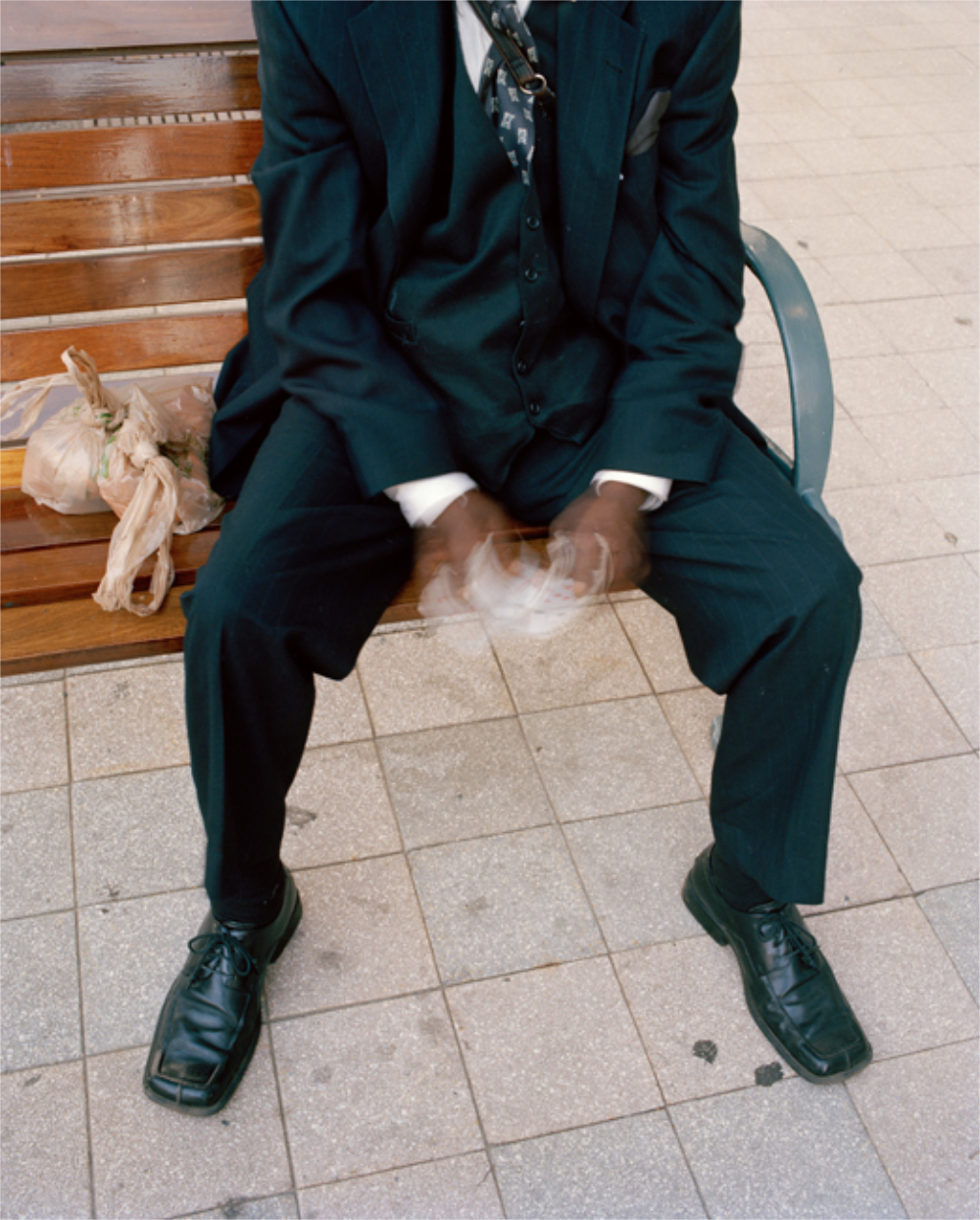
Ahndraya Parlato, Who is Changed and Who is Dead, Mack Books- Parents aren’t supposed to leave their kids. At least that’s what their kids believe. Even into adulthood. So, few kids think about the death of their parent, none are prepared to lose one, or both. In my experience, even after a long terminal illness, the passing comes as a big shock. When one’s parent commits suicide, it can feel like abandonment. The “victim” in this case is NOT the deceased. It is those Mom or Dad left behind. Being an offspring of one parental suicide, I am one of those victims, like Ahndraya Parlato is. No one has spoken for us- writer, novelist, or Artist, until Ms. Parlato braved this minefield, accompanied by her children, to create a book that is at once extremely personal, yet expresses the permanence of loss that all parental suicide victims live with. Her wonderful Photography (most recently seen in 2016’s excellent A SPECTACLE AND NOTHING STRANGE), is here accompanied by her writing, the two dialoging with, and enhancing, the other at every turn of the page. The loss is tinged with a longing I know too well, in the form of a light from a distant star, or creating work with her mother’s ashes.
Her children provide another dimension, and something more- hope. Had they been absent, the book might have been darker, but more narrowly focused. Instead, they show that Ms. Parlato is not alone in this struggle to survive and overcome the past that never ends. Yet, with them comes fear. While all of us live with fear in our daily lives (my big one is being hit by an ever-present bike on the sidewalks or streets of Manhattan). In both our cases, it is the unexpected sudden and life-altering event that would seem to lie underneath them. I have no idea what it’s like to have and to raise kids. I’ve never even held a child. Yet, I can’t help but wonder if both our fears are born in the wake of the trauma of losing a parent so suddenly and horrifically. Ahndraya’s book is THE most personal PhotoBook I saw in 2021. I applaud her courage wholeheartedly, and if creating Who is Changed… was, in part at least, an act of therapy, I only hope it helps.
NoteWorthy PhotoBook Issued Before 2021 First Seen in 2021-

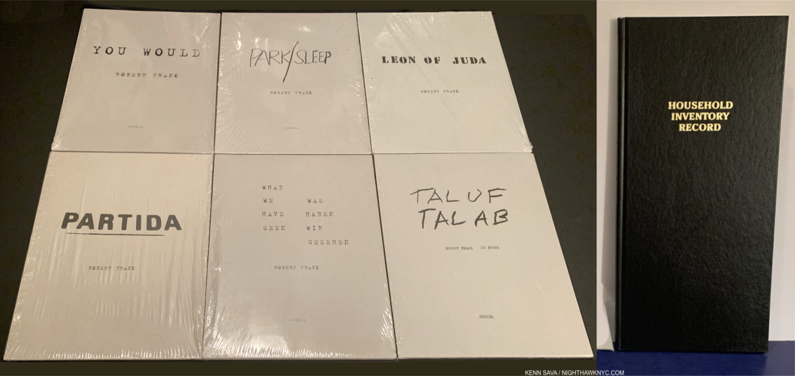
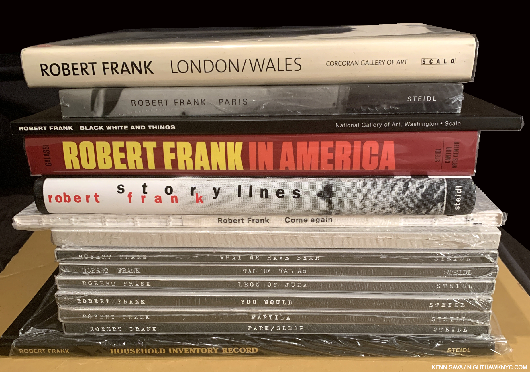
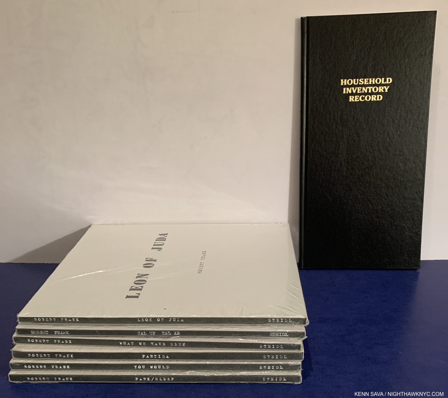
The seven volumes of Robert Frank’s Visual Diaries, 2010-17, six in a similar design- a softcover in a slipcase. The seventh is Household Inventory Record, 2013, right, designed to look like the original which was created in an actual Household Inventory Record book, so it looks different.
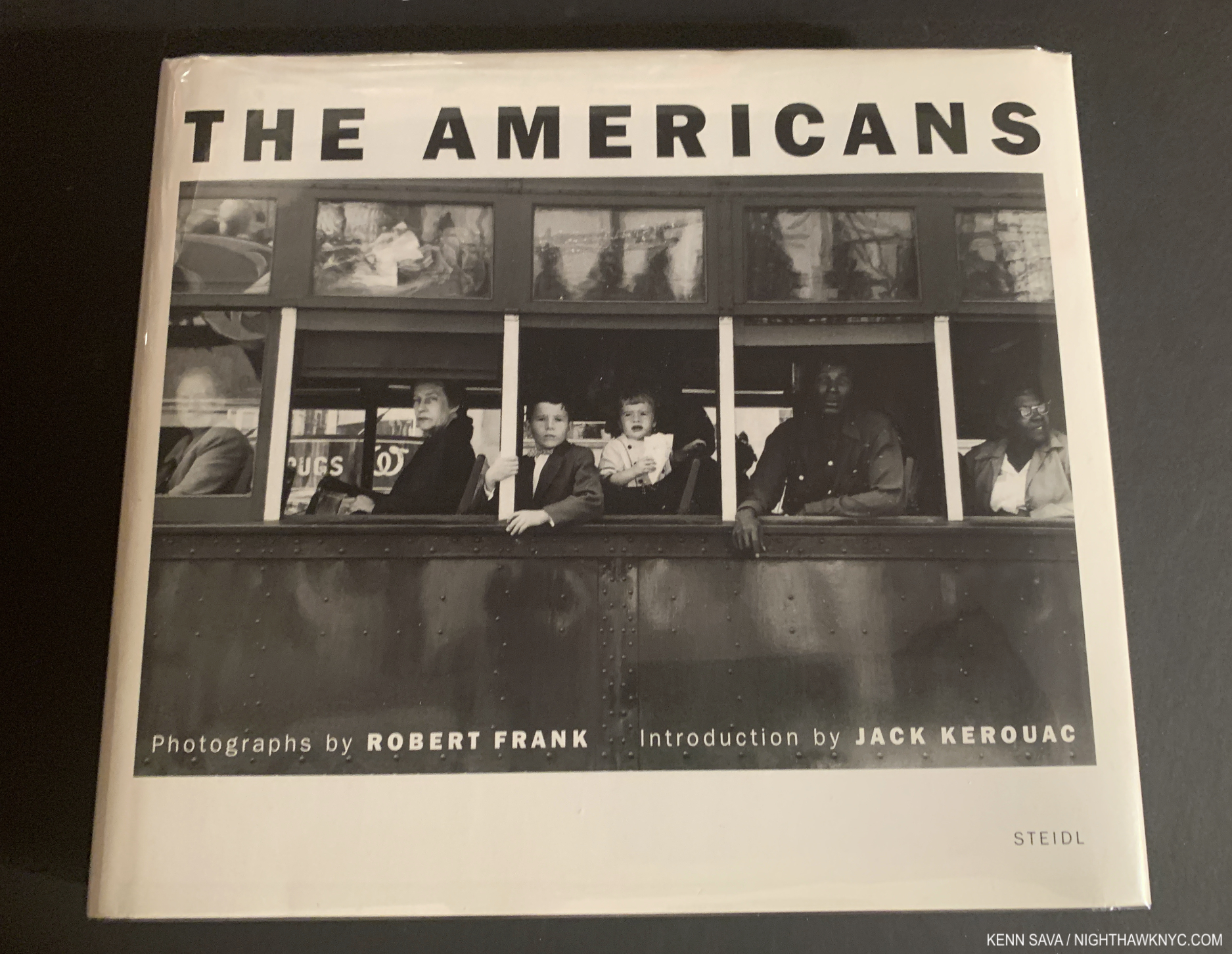
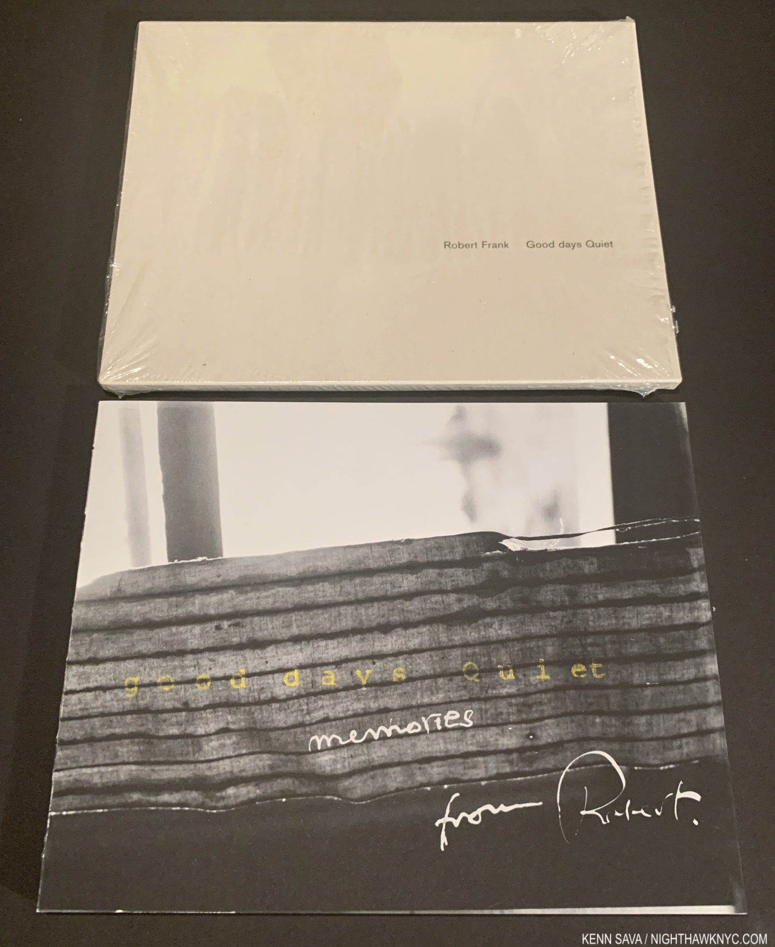
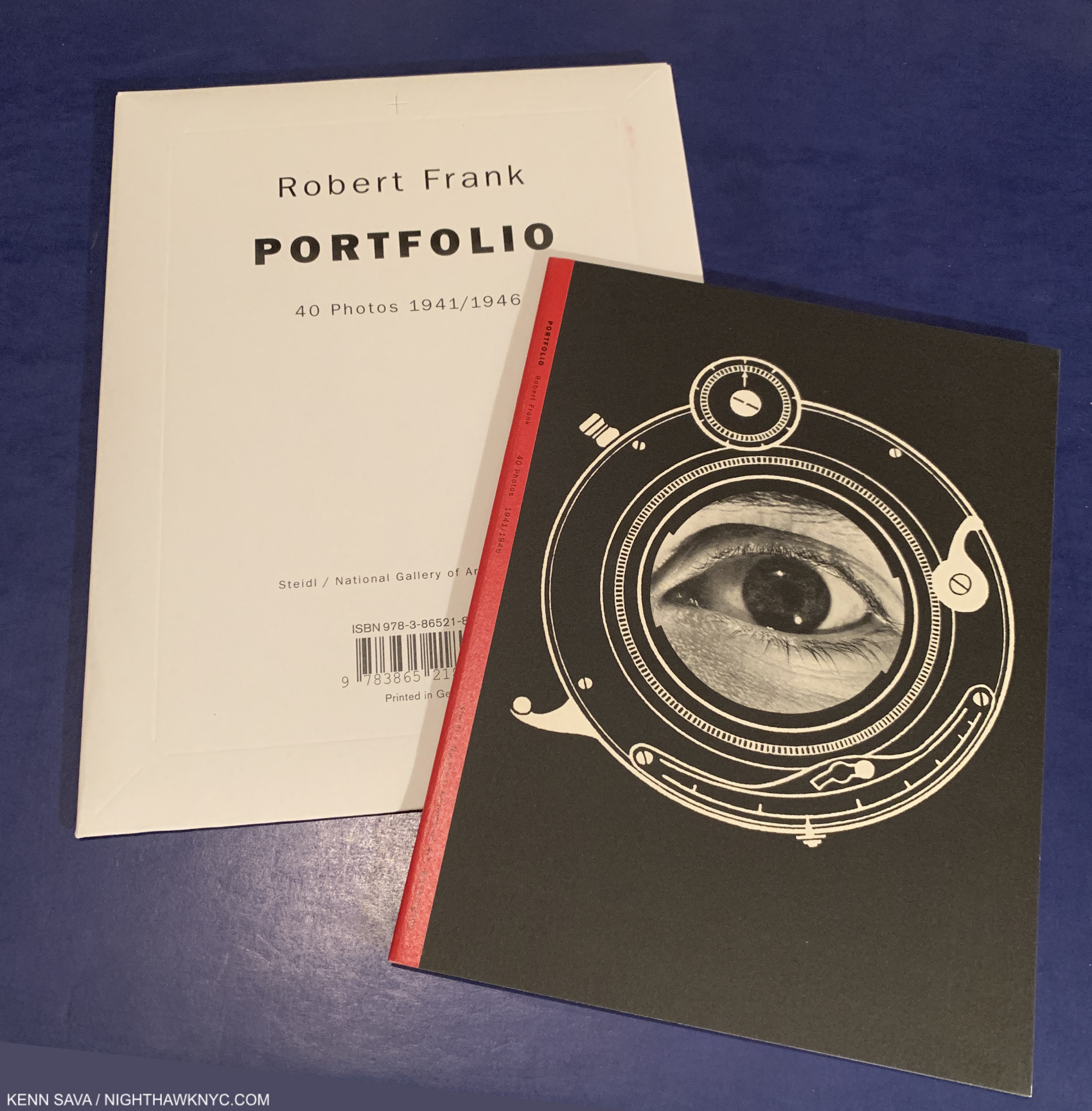
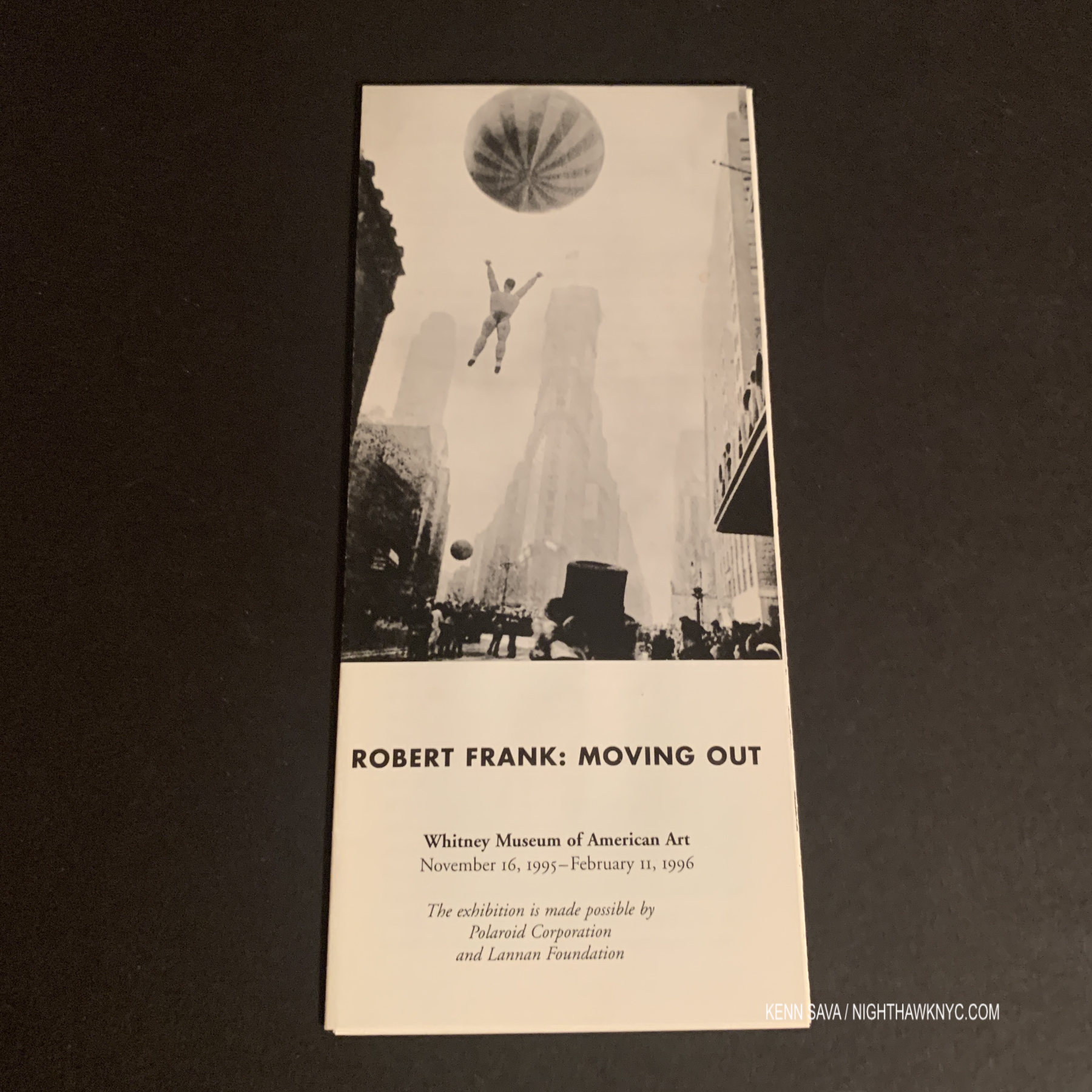
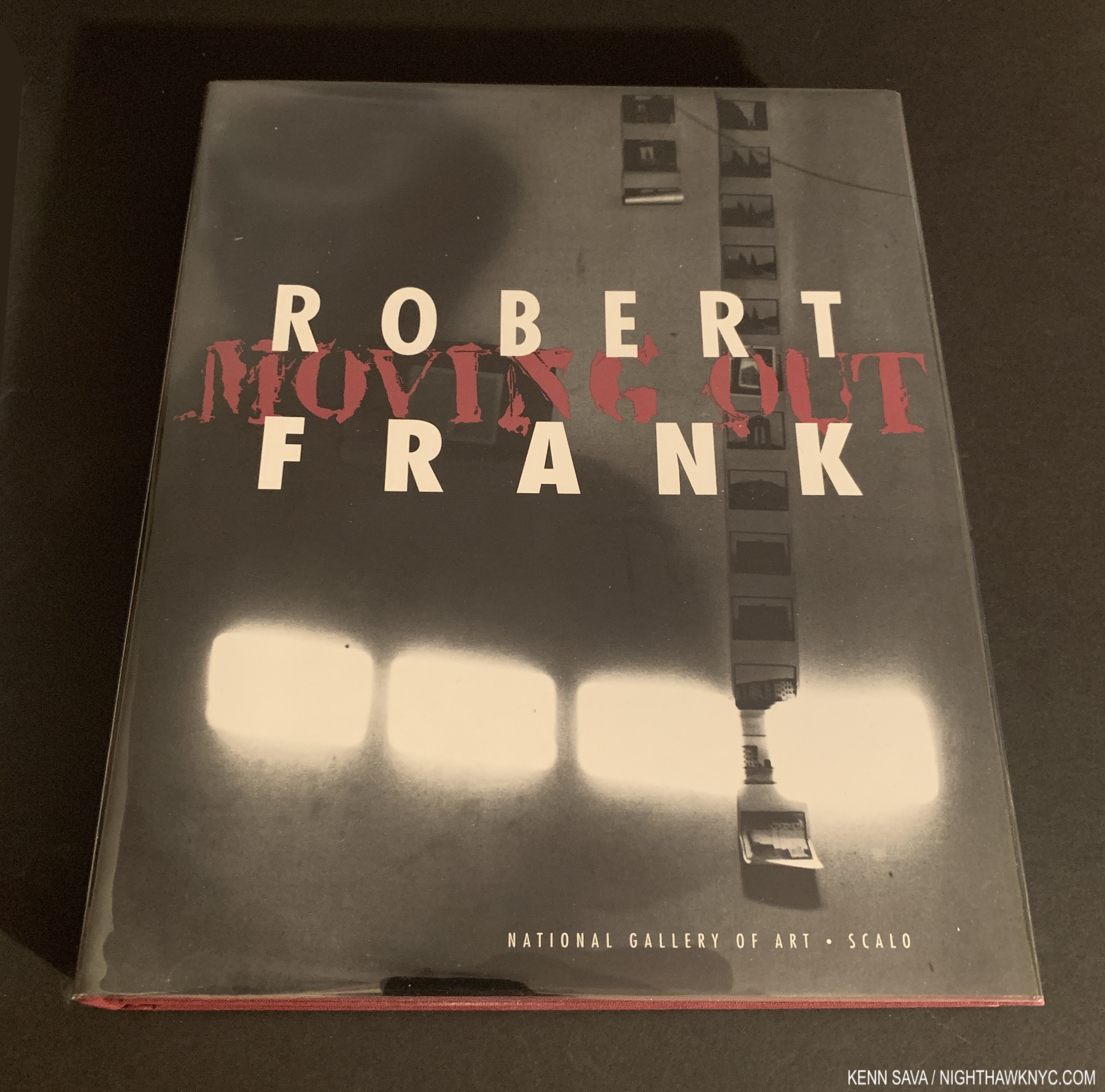
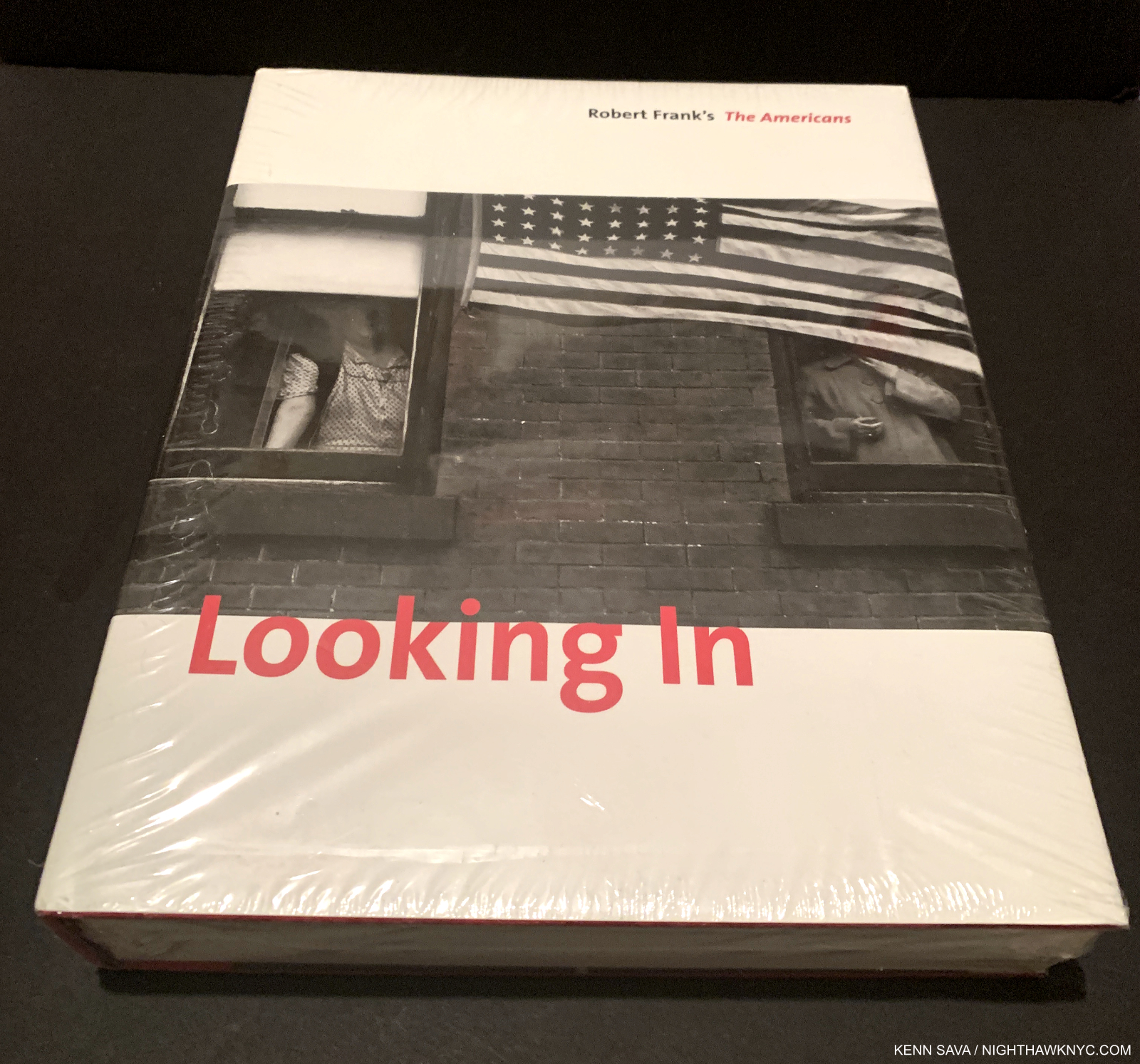
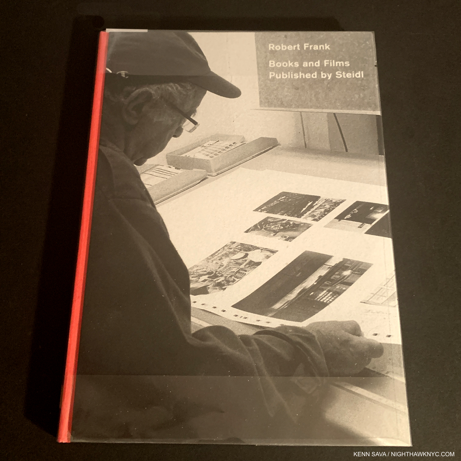
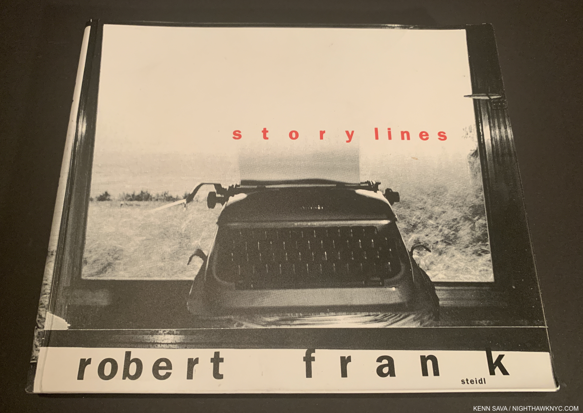
Robert Frank, “The Visual Diaries,” Steidl- As I wrote in my piece, The “Other” Robert Frank, I was one of the many who best knew Robert Frank from The Americans (though I had London/Wales, Moving Out, and Looking In, the latter two are not “by” Mr. Frank), before launching into trying to see as many of his “other” books as possible during the shutdown, like most of the books on this list, thanks to the USPS! The Visual Diaries is not an official title but the title the publisher, Steidl, refers to the group of seven books Mr. Frank created between 2013 and 2017 by. Now having seen about 20 of his “other” books, they each have a good deal to recommend them, and they are essential for Photographers or anyone who is trying to get an overview of Modern & Contemporary Photography, post-the publication of Mr. Frank’s The Americans in 1958 and 1959. And oh yeah, anyone trying to get a more complete picture of Robert Frank’s seminal career & accomplishment. These are as personal as one would expect from a “diary.” Filled with unpublished and familiar images over Mr. Frank’s long and productive life (he never stopped creating, which will come as news to many Americans fans), they are master classes in “How to make a great PhotoBook,” from their arrangement, page layout, and of course, the uncompromising Photos, which often seem to go out of their way to break every rule anyone else holds dear. And, unlike 99% of the other PhotoBooks I saw in 2021, the images are marvelously chosen and beautifully sequenced. None are superfluous. None weaken, or even bring down, the whole. If there is one thing most PhotoBooks I see continually fall short in, that’s it.
*- Soundtrack for this Post is “Diggin The New” by Joe Strummer & The Mescaleros as heard on their album Rock Art & The X-Ray Style.
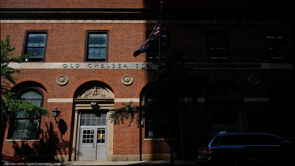
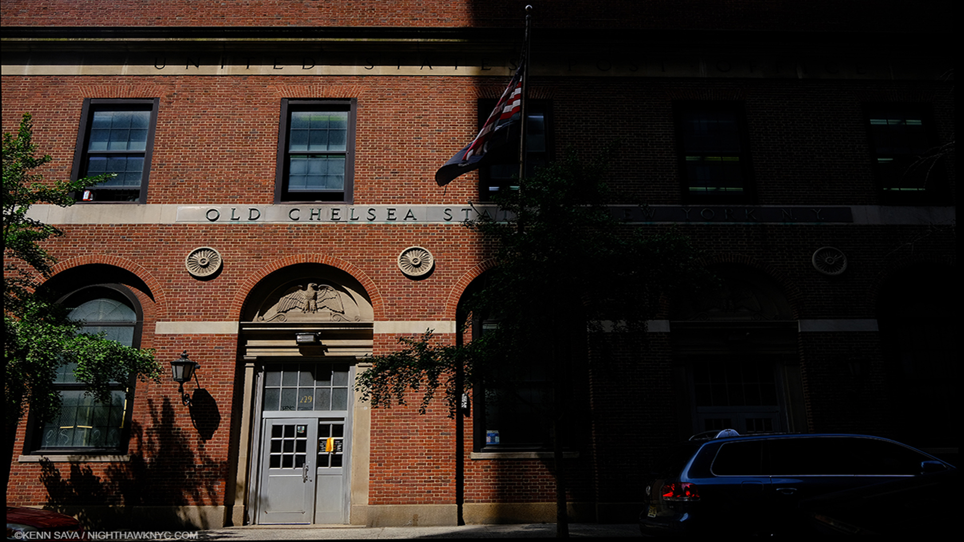
The Old Chelsea Post Office, May 29, 2020, fittingly half in shadow, during the height of the pandemic in NYC and during the height of the discussion about cutting the funding of the USPS. Yet, through it all, Manager Miss Lloyd and her staff showed up almost every day and persevered throughout.
This Post is dedicated to Miss Lloyd & the Staff of the Old Chelsea Post Office, NYC, which not only got books to me, but also were my first source of masks and alcohol, when there were none to be found anywhere locally. Miss Lloyd, the overall manager of this Post Office, recently retired, but not before getting her staff and her customers through the worst of the very, very dark days of the early pandemic. Thank you for your service, Miss Lloyd & Staff!
November 26, 2021- I started this post in better times and have worked on it all year. I mysteriously fell ill in September and I have been in and out of the E.R. and the hospital since. While the 21 doctors I’ve seen thus far are still trying to get to the bottom of it, some progress has been made, and my life altered as a result. I’m being monitored 24/7 as I write this, (but Sara Cwynar might remind me that we all are. ; ) ) I want to extend my thanks to everyone involved with my treatment and the staff of Mount Sinai’s Emergency Room & Hospital for their truly amazing care. Yes, even to the nurse who chastised me for working on this piece while I was hospitalized!
NighthawkNYC.com has been entirely self-funded & ad-free for over 7 years, during which over 275 full length pieces have been published! If you’ve found it worthwhile, PLEASE donate to allow me to continue below. Thank you, Kenn.
You can also support it by buying Art, Art & Photography books, and Music from my collection! Books may be found here. Music here and here.
Written & photographed by Kenn Sava for nighthawknyc.com unless otherwise credited. To send comments, thoughts, feedback or propositions click here. Click the white box on the upper right for the archives or to search them. Subscribe to be notified of new Posts below. Your information will be used for no other purpose.

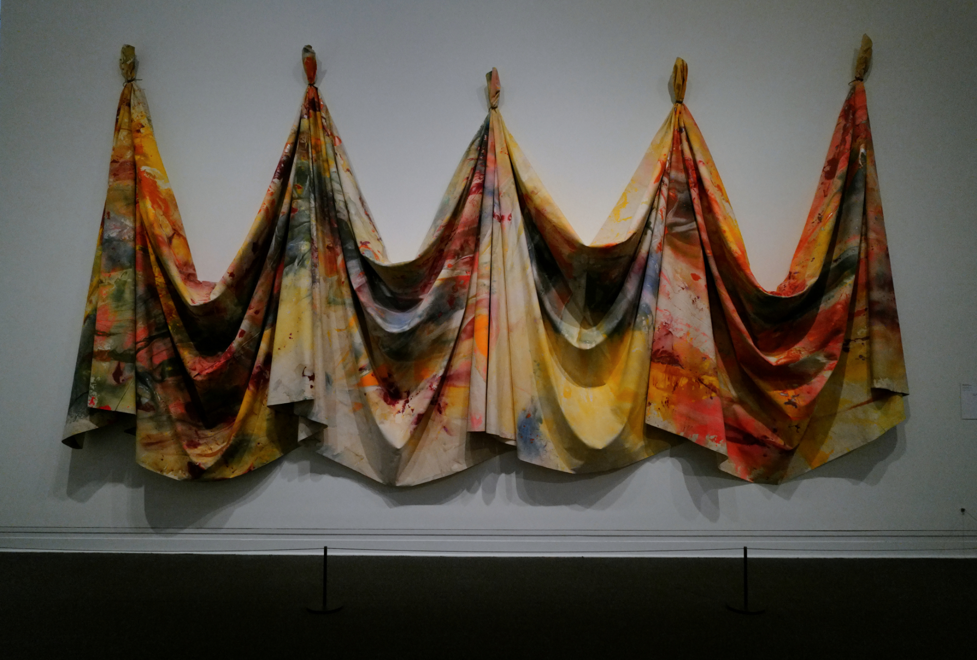
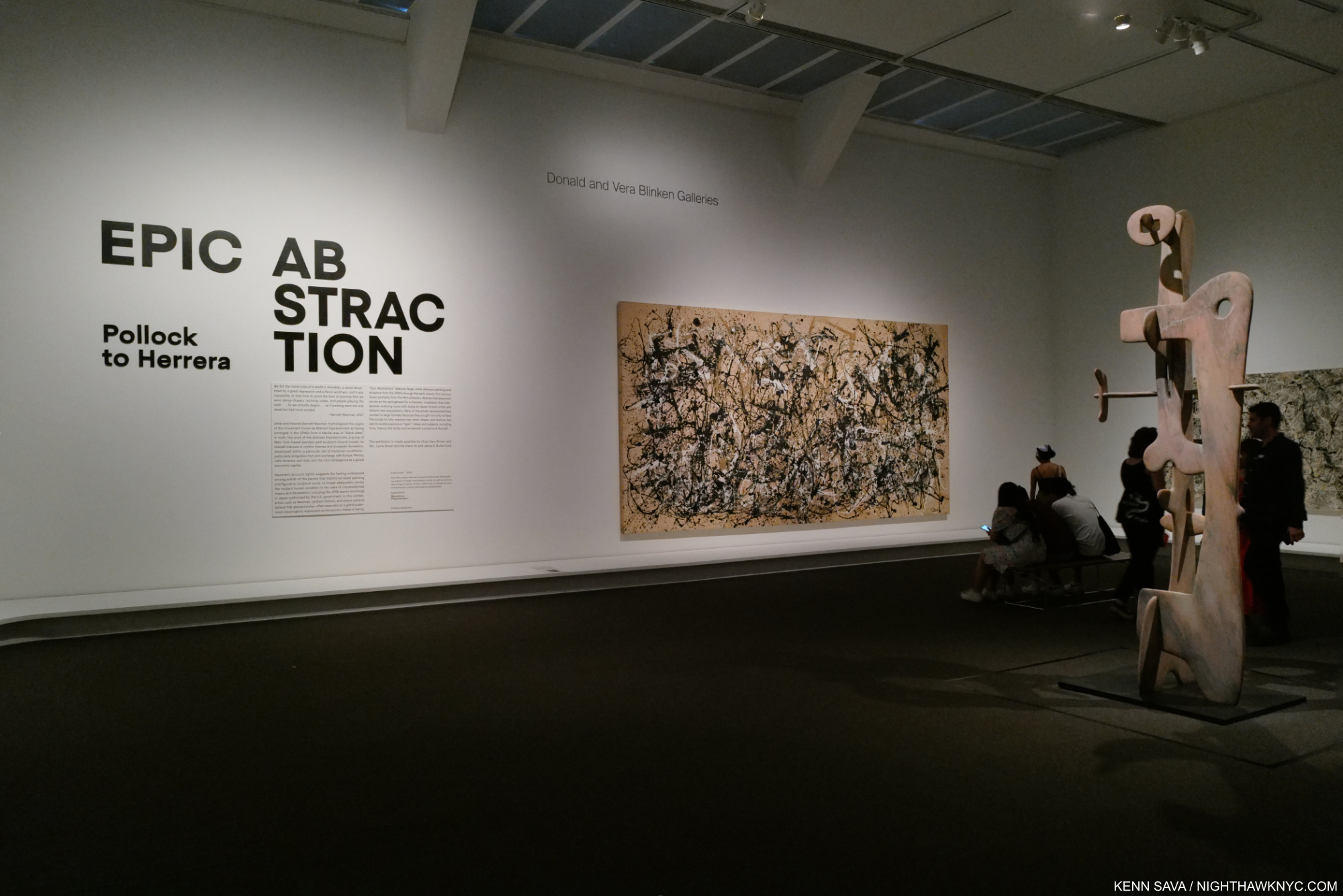 Epic Abstraction, 2018- Date – A show that’s been up for quite a while and has evolved over its run. Still as compelling in 2022 as it was when it opened.