The Met’s Alice Neel Love Letter To NYC

Written & Photographed by Kenn Sava
NYC has seen innumerable rough times. Too many for me to list here. Some of them I’ve lived through. During many of the hardest times the past 151 years The Metropolitan Museum of Art, founded in 1870, has stood at 1000 Fifth Avenue where it remained open allowing countless citizens and tourists the opportunity to walk up its famous staircase and take respite in its hallowed halls among its countless masterpieces, a beacon of culture and a repository of some of the greatest achievements of creative mankind over the past 5,000 years.

Until March 12th, 2020, that is.

Home, again, for the first time in over a year. The Met’s Grand Staircase, March 27, 2021. Up to the left. Down to the right, please.

At 6pm that day The Met closed due to the coronavirus pandemic shutdown1. It remained closed until August 29th. Five and one half months. Unprecedented in its history. Unwilling to risk being indoors until I could be vaccinated I missed the shows The Met held during the first six months after its reopening.

When it announced Alice Neel: People Come First, conceived by Sheena Wagstaff, would open on March 22nd, 2021, I thought back to what I had said about Alice Neel: Uptown, one of my NoteWorthy Shows for March-May, 2017- “…the breath of fresh air it provided only hints at how much pent-up longing I think there is to see more of her work. The time has come!”

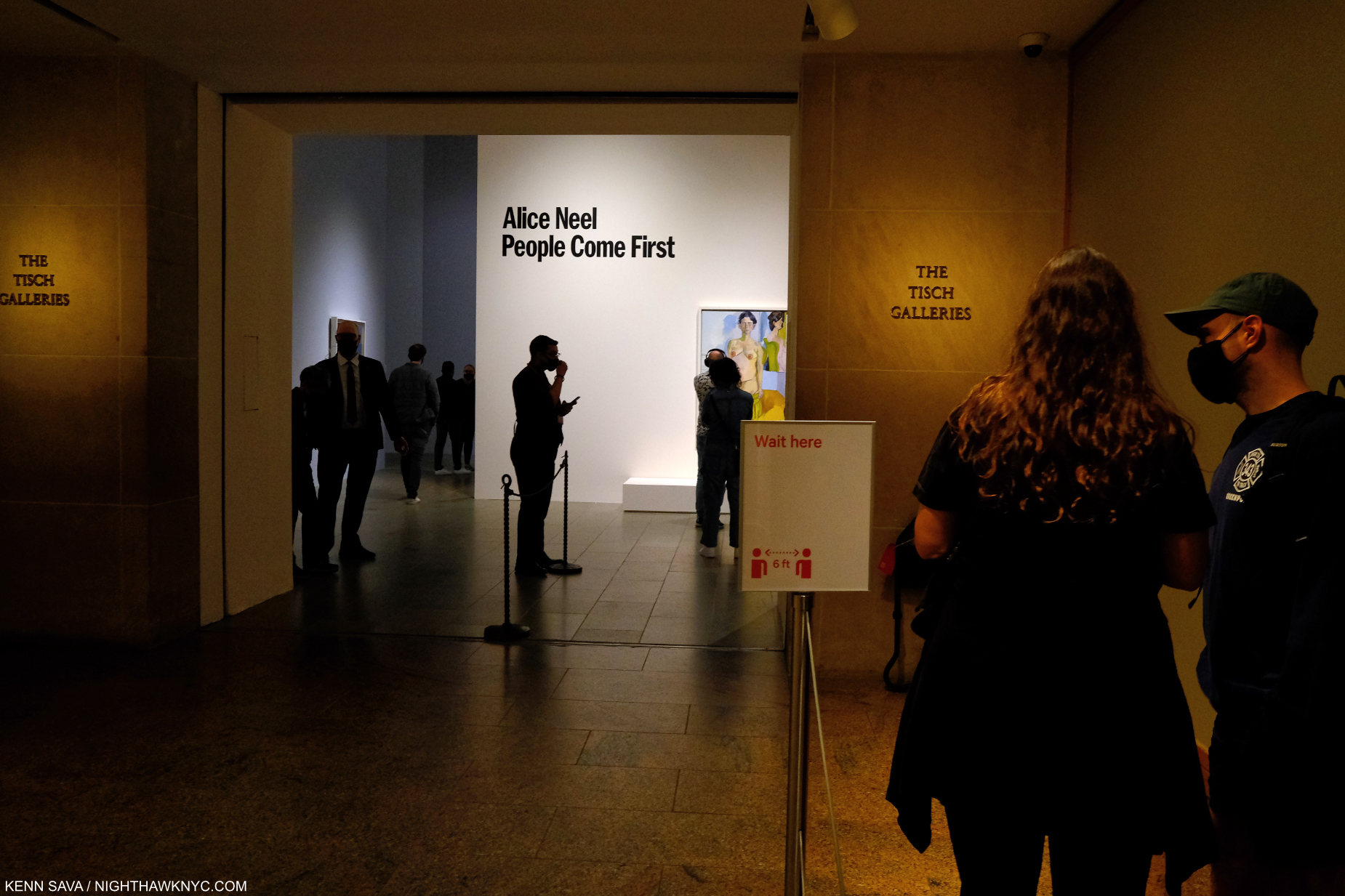
The entrance. The show opens with a nude. Pretty daring, but given how often Alice Neel asked her sitters to pose nude, fitting.

On March 27th that time did indeed come. Seeing the show a few weeks later once the vaccine kicked in I had one primary reaction-

What a terrific love letter to New York City! At a time when one may never have been needed more.

March 27, 2021.

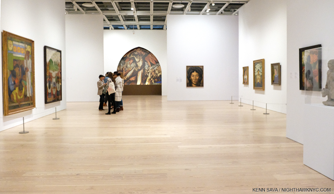
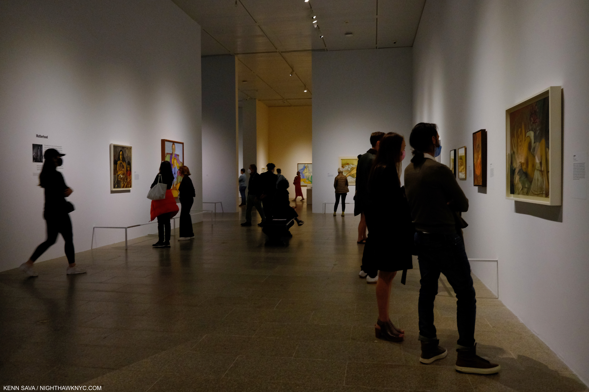
Fittingly, when I went in March, only fellow New Yorkers were my fellow visitors. In Alice Neel: People Come First’s parade of over 115 works the endless variety of people from all races, colors, orientations, and occupations that makes New York City great and unique is what is REALLY on view in this show.

“For me, people come first. I have tried to assert the dignity and eternal importance of the human being.” Alice Neel2.

Yes, Alice Neel’s place among the Masters of 20th century Art, established, at long last, in her Whitney Museum Centennial Retrospective in 2000, is reaffirmed. Yes, there are facets of her work that have been overlooked and are now getting attention, like her use of abstraction. But, it’s all secondary to the first theme- as she, and the show’s title says, people come first. Alice Neel Painted “pictures of people,” as she said. She spent about 60 years doing just that and the show draws on her entire career in the generous 115 or so works on view.

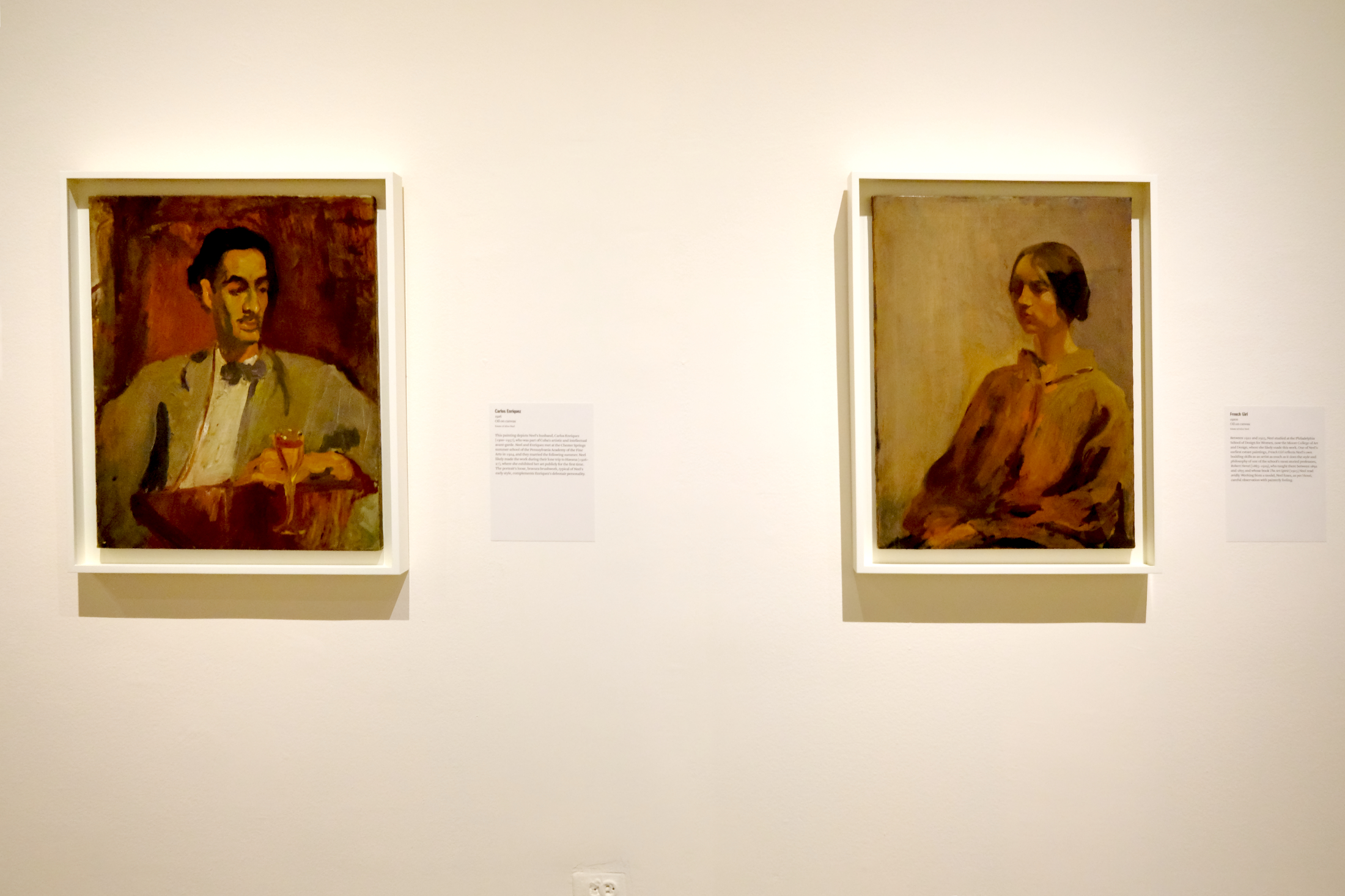
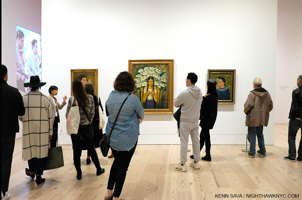
Carlos Enriquez, 1926, left, and French Girl, 1920s, right. Mr. Enriquez, a legendary Painter in his own right, was Alice Neel’s first husband and father of her first child, Santillana, who died of diphtheria as an infant daughter, and her second child, Isabetta, to whom she would be estranged for much of Isabetta’s short life.

How was she able to have this career? Born and raised in Pennsylvania, after marrying Carlos Enriquez, who went on to become one of the most renowned Cuban Artists of the century, in 1925, Alice Neel moved with him to Cuba from 1926-7, then returned to Pennsylvania, where they broke up. From there she moved to NYC in 1927. Both of these early, marvelous, works strike me as standing apart from typical student efforts, showing the young, mid-20s, Painter breaking free to seek her own style, finding her essence, and achieving success as captivating works. Phillip Bonosky wrote of her in his Journal in 1957, “She’s worked out her own code of behavior, whose cornerstones are two: 1) her freedom to paint; 2) the well being of her 2 boys. For 1, she will surrender everything else, and what other people place high- the sanctity of one’s flesh in bed- she subordinates to this superior law of her life. And the second also comes lower- but higher than anything else but the first. What other people strive for and cannot live without- good furniture, good clothes, a conventional acceptance by society, etc., etc.- she gives up without any sense of loss whatsoever3.”

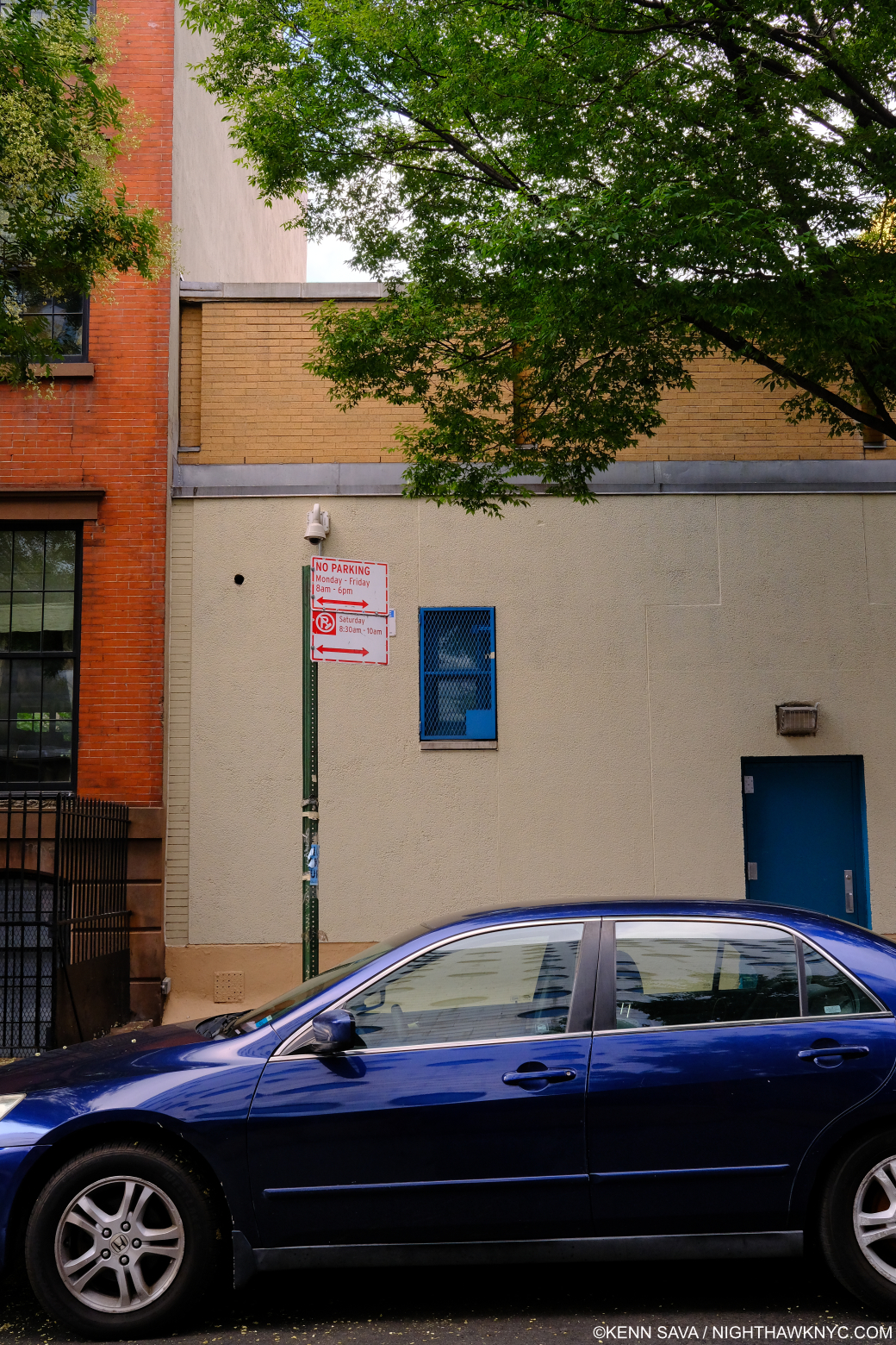
On this spot, behind the car, a brownstone stood in the 1930s where Alice Neel lived during the Depression, a few blocks from where I am writing this piece. It’s now part of a school building.

“Lived in a brownstone, lived in the ghetto. I’ve lived all over this town,*” as David Byrne wrote in the lyrics for the Talking Heads song “Life During Wartime,” the SoundTrack for this post.

She spent time living in  the Bronx and a few neighborhoods in Manhattan over 54 years here, including one a few blocks from where I am now, before moving uptown for good, first to East Harlem, and finally to West Harlem. She Painted wherever she was. Street scenes, still lifes, and “pictures of people,” related to her and not. No matter when, where or who she Painted, her work has the remarkable quality of both looking of its time and not looking dated now. That said, never fond of discussing possible influences, her style was always wholly her own and it evolved over her career.

“I sleep in the daytime, I work in the nighttime. I might not ever get home,*” from “Life During Wartime,”

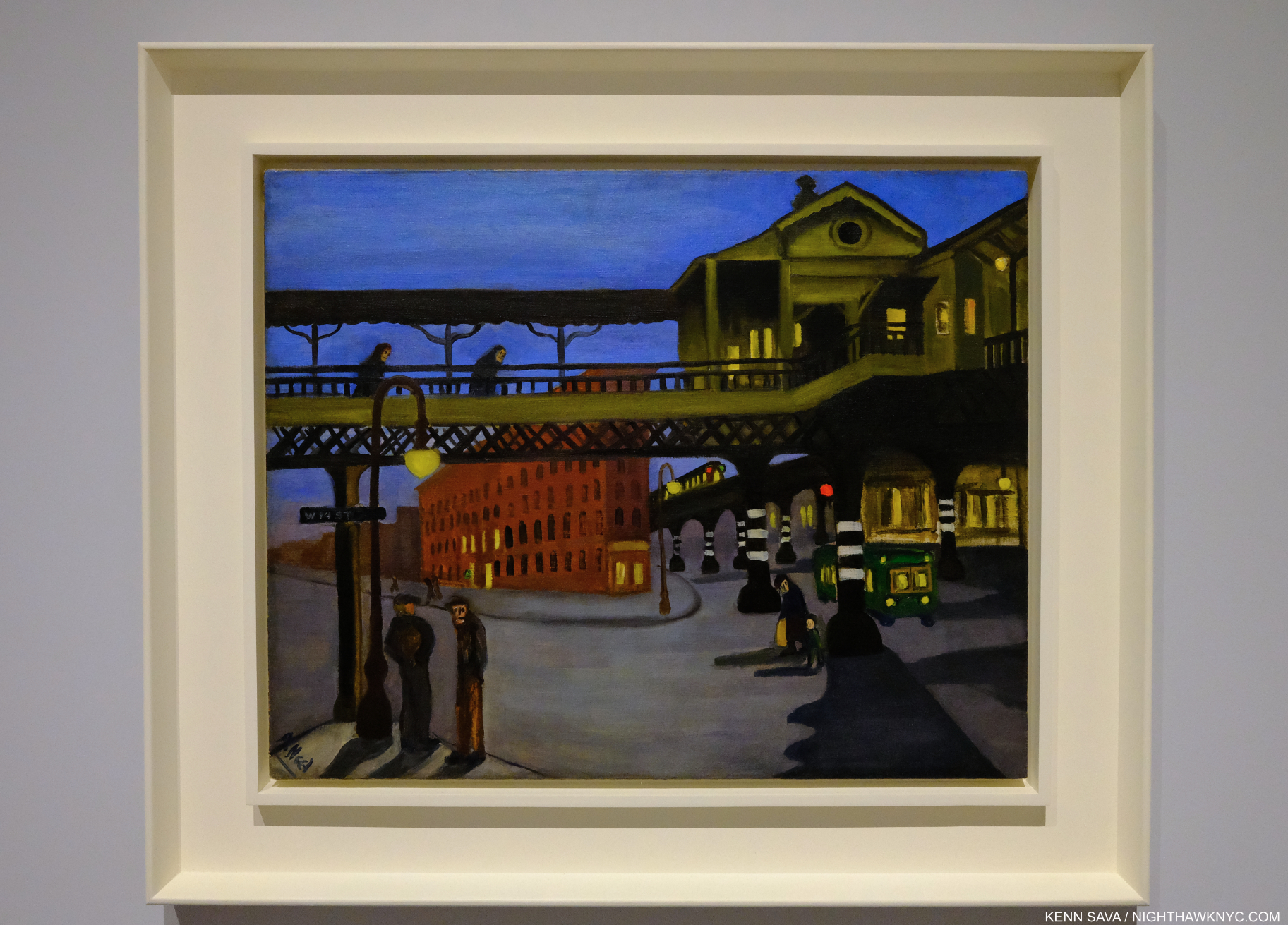
Ninth Avenue El, 1935. Night on West 14th Street at Ninth Avenue Painted at the peak of the Depression, the figures seem to carry the weight of the world with them. Looking at this now, and living in this area today, it’s hard for me, or no doubt most of my neighbors, to believe there was an elevated subway train here 90 years ago. It closed in 1940, only 5 years after this was Painted.

Standing on the same spot today in daylight. West 14th Street & Ninth Avenue, July 28, 2021, looking across to the Meatpacking District. The area is undergoing hard times, again. All the stores to my immediate left are For Rent, a large Apple store stands to my right. Today, there is not a hint that an elevated subway was once here.

“There isn’t much good portrait painting being done today, and I think it is because with all this war, commercialism and fascism, human beings have been steadily marked down in value, despised, rejected and degraded,” she explained in 19504.

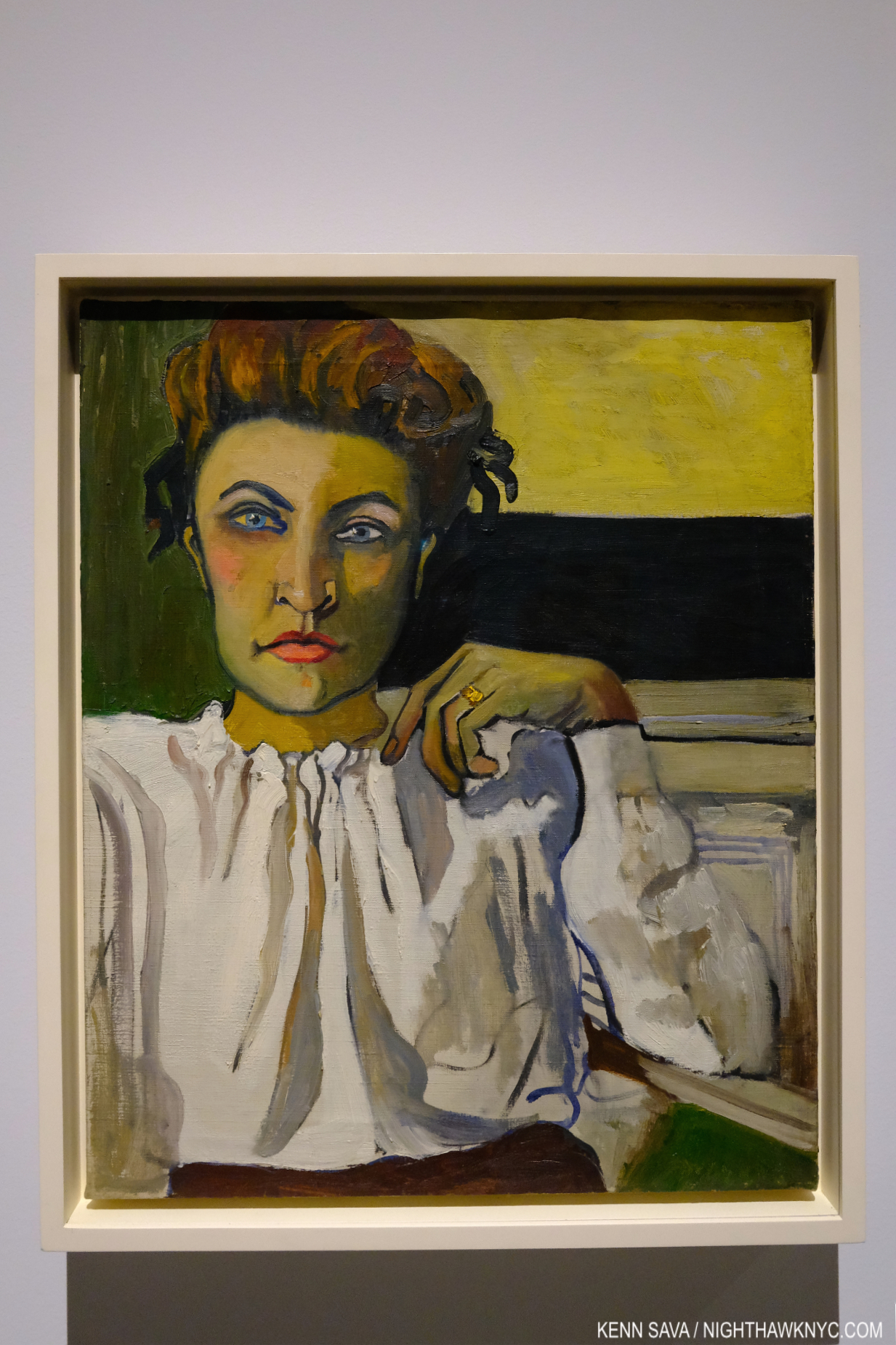
Elenka, 1936, is a work that shows the way for much the Artist did the rest of her career with its subtle complexity. It’s a daring picture of a strong woman with an intense gaze reinforced by the strong colors and shapes surrounding her, contrasted with the femininity of what she wears. The background is partially nebulous and partially furniture or building. The somewhat straightforward pose gives the feeling of being caught off guard, which of course Elenka wasn’t.

It’s interesting that during her “today,” Artists including Francis Bacon and Lucian Freud, to name two, were Painting portraits, though not nearly as well-known as they would become. Still, no matter what they, or anyone else was doing, Alice Neel, a humanist to the last, remained true to herself.

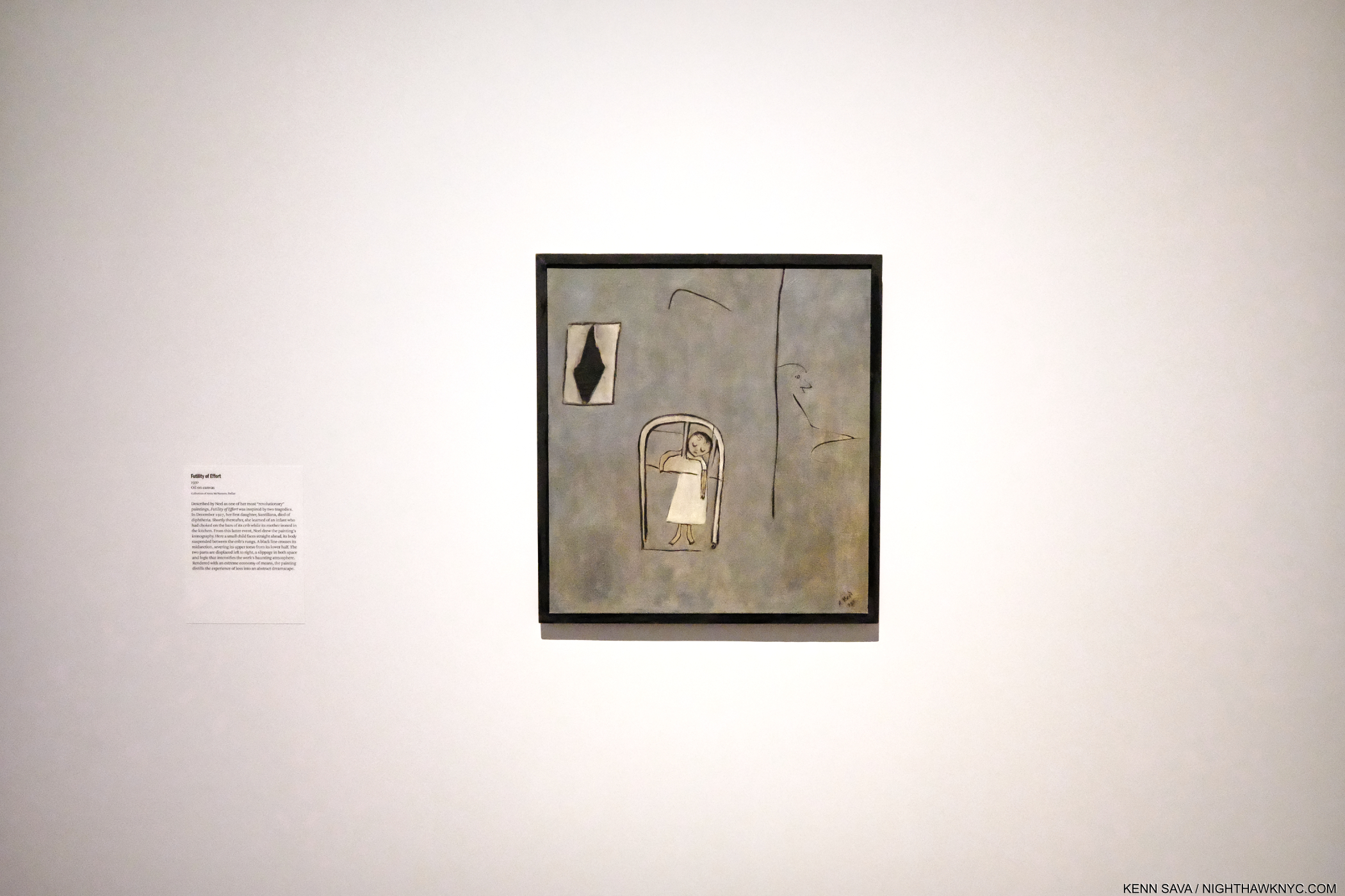
Futility of Effort, 1930. Alice Neel described this as one of her most “revolutionary” Paintings. Partily inspired by the death of her young daughter Santillana, partly by a news account of another infant death where the child choked on the bars of the crib while her mother ironed in the next room. It was shown on a wall by itself at the far end of a rectangular gallery.

She was also a survivor who persevered as a Painter as a single mother, virtually unprecedented among major Painters of the 20th century, or before, and a mother who lost an infant child,

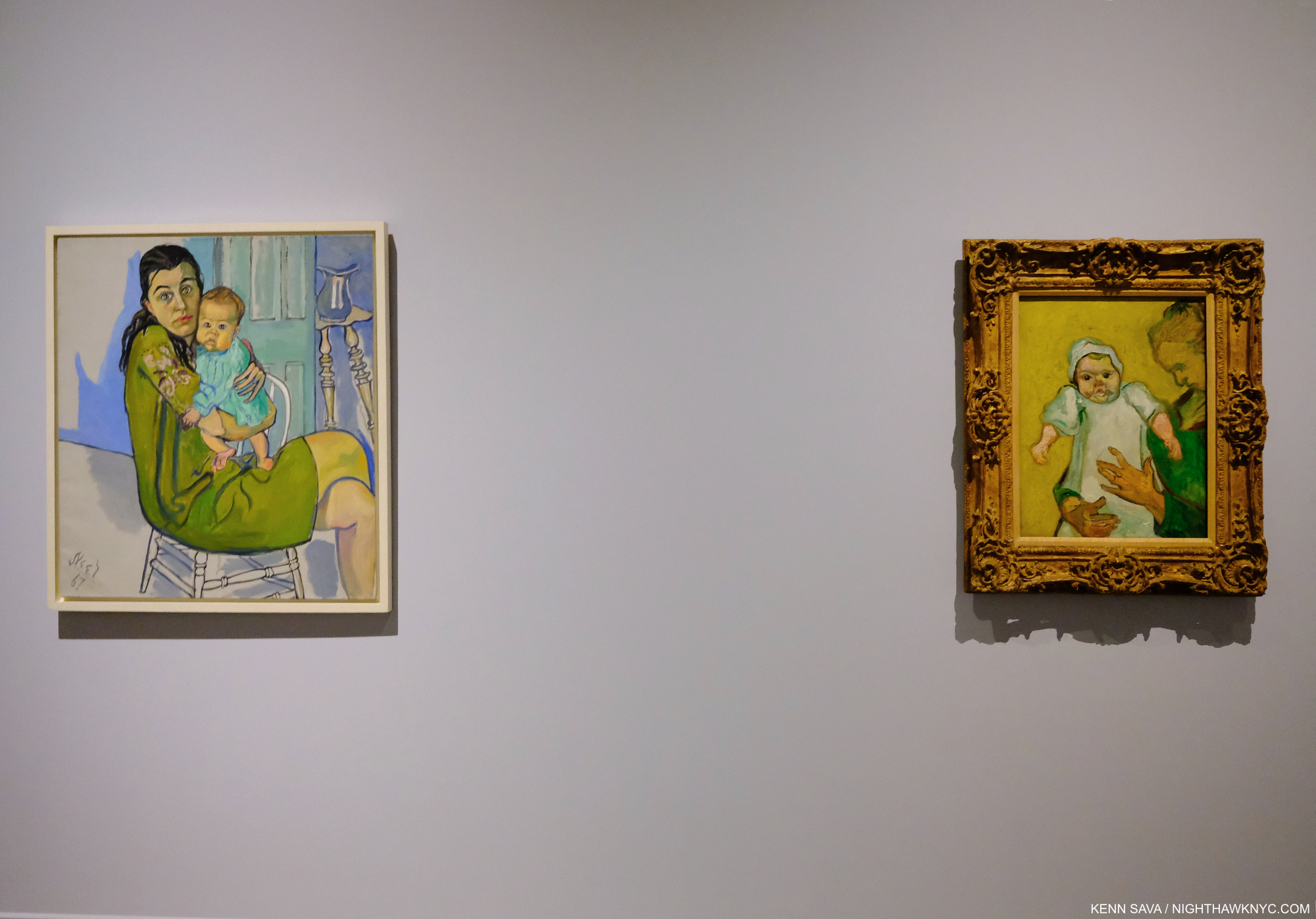
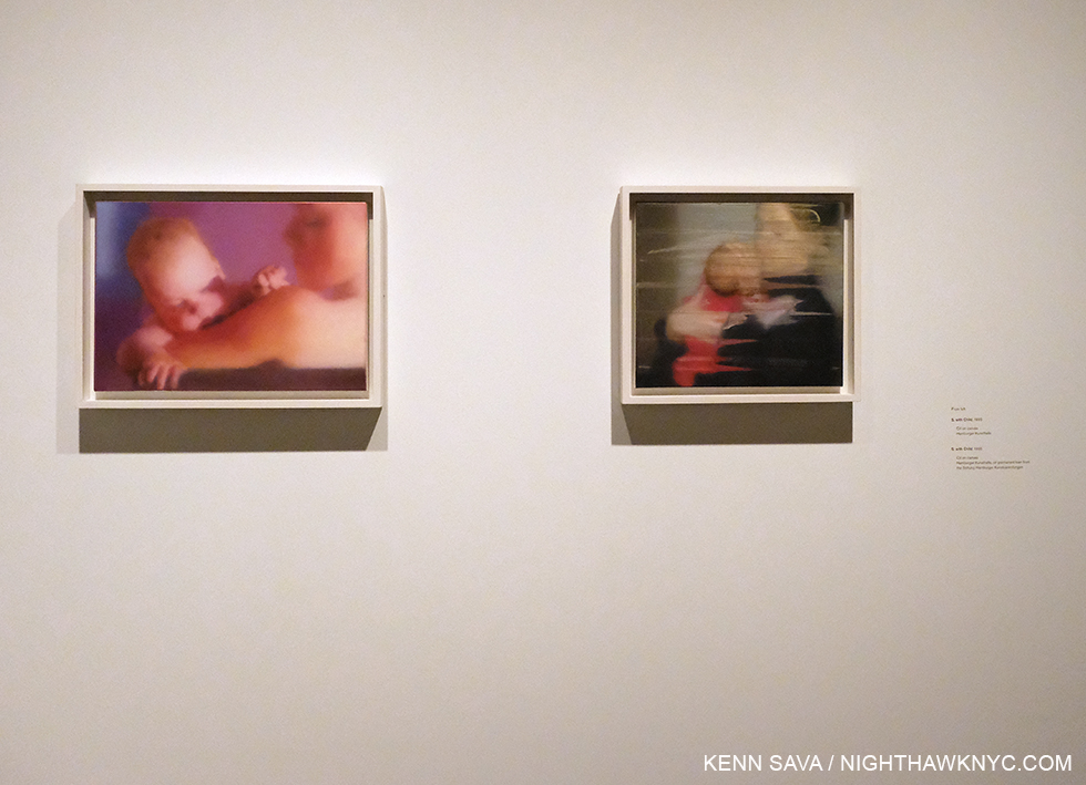
Alice Neel, Nancy and Olivia, 1967, left, Vincent van Gogh, Madame Roulin and Her Baby, 1888. One of the highlights of the show was a gallery showing Alice Neel’s work in dialogue with Met Museum masterpieces by other Artists including Jacob Lawrence, Helen Levitt, Mary Cassatt, among others including Van Gogh, here. Alice Neel lost an infant daughter, and Vincent longed for a family fruitlessly his entire life. Knowing that, it’s hard not to read both of these works as autobiography, poignantly hung side by side.

But there were other sides to Alice Neel, the woman, besides the mother.  “I’m cursed to be in this Mother Hubbard body. I’m a real sexy person,” she once said[Met Alice Neel: People Come First Exhibition Catalog, P.2]. One way it came out is her penchant for asking her sitters to undress for their “picture.” A good number of them complied- men, women, pregnant women, and couples. Even Andy Warhol.

“This ain’t no party, this ain’t no disco. This ain’t no fooling around. This ain’t no Mudd Club, or C.B.G.B. I ain’t got time for that now,*” from “Life During Wartime,”

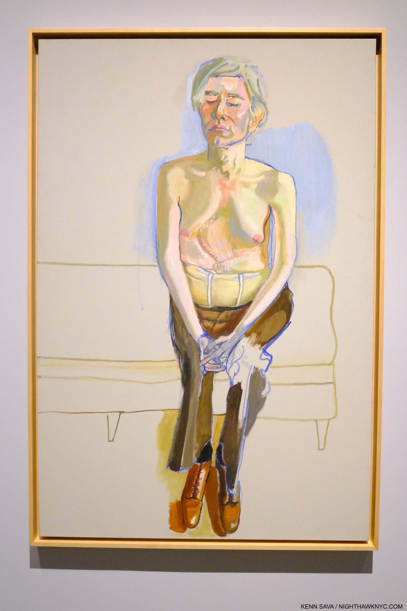
Andy Warhol, 1970, Oil and acrylic on linen. Alice Neel is revolutionary for the consciously “unfinished” look of a number of her Paintings, including this one, one of  masterpieces. Done less than 2 years after the assassination attempt on his life, according to Phoebe Hoban, the two Artists discussed doing the picture this way (half undressed) with eyes closed, making it close to an actual collaboration5.

The show featured a number of the nudes, including Alice Neel’s daring nude Self-Portrait, 1980, at age 80! She also trail blazed Painting pregnant women nude, and some of them were on view as well. Finally, there were numerous pictures of children, both hers, and neighborhood kids, as shown earlier.

“We dress like students, we dress like housewives. Or in a suit and a tie. I changed my hairstyle so many times now, I don’t know what I look like,*” from “Life During Wartime.”

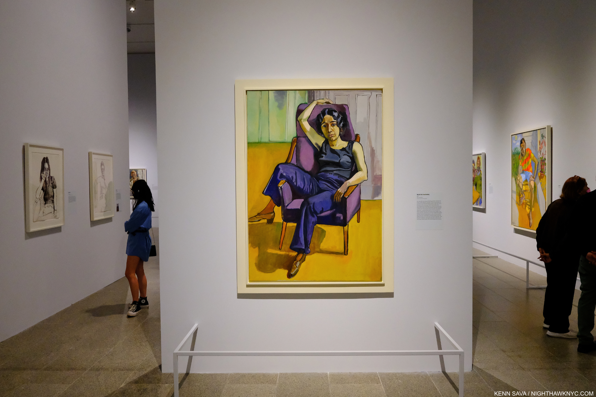
Marxist Girl (Irene Peslikis), 1972, all works are Oil on canvas, unless specified. “This captivating portrait …depicts artist and activist Irene Peslikis—a member of a new generation of revolutionary feminists that Neel began to paint in the early 1970s. Alice Neel’s relationship with second-generation feminism was sometimes strained, but she nonetheless supported—and was supported by—the movement.” @metmuseum.

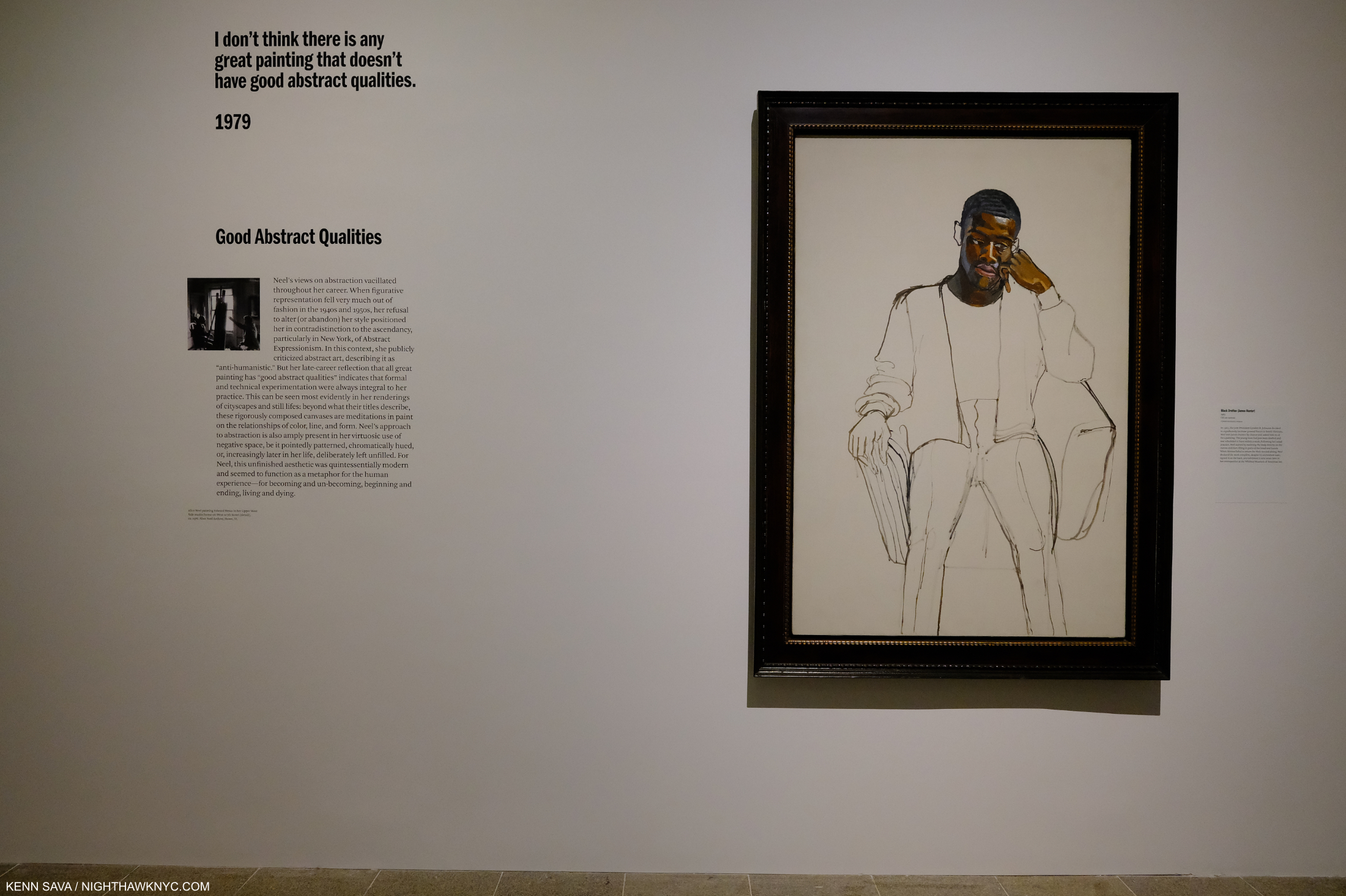
Further to that quote from @metmuseum, I find the piece daring and free with a power that exudes from Ms. Peslikis’s gaze in a pose that is at once natural and ground-breaking, matched by an extraordinarily daring and free background. Alice Neel had gone on record6, powerfully, against Abstract Expressionism in its heyday. Her views changed over time. Here she is, using its techniques to marvelous effect in the background, as she does in a number of other works of the 1970s. She said then, “I don’t think there is any great painting that doesn’t have good abstract qualities.7.” I’ve been thinking about those words since I read that quote…

“I don’t know what you expect to do in the world, Alice. You’re only a girl.” Alice Concross Hartley Neel (1868-1954), Alice Neel’s mother8

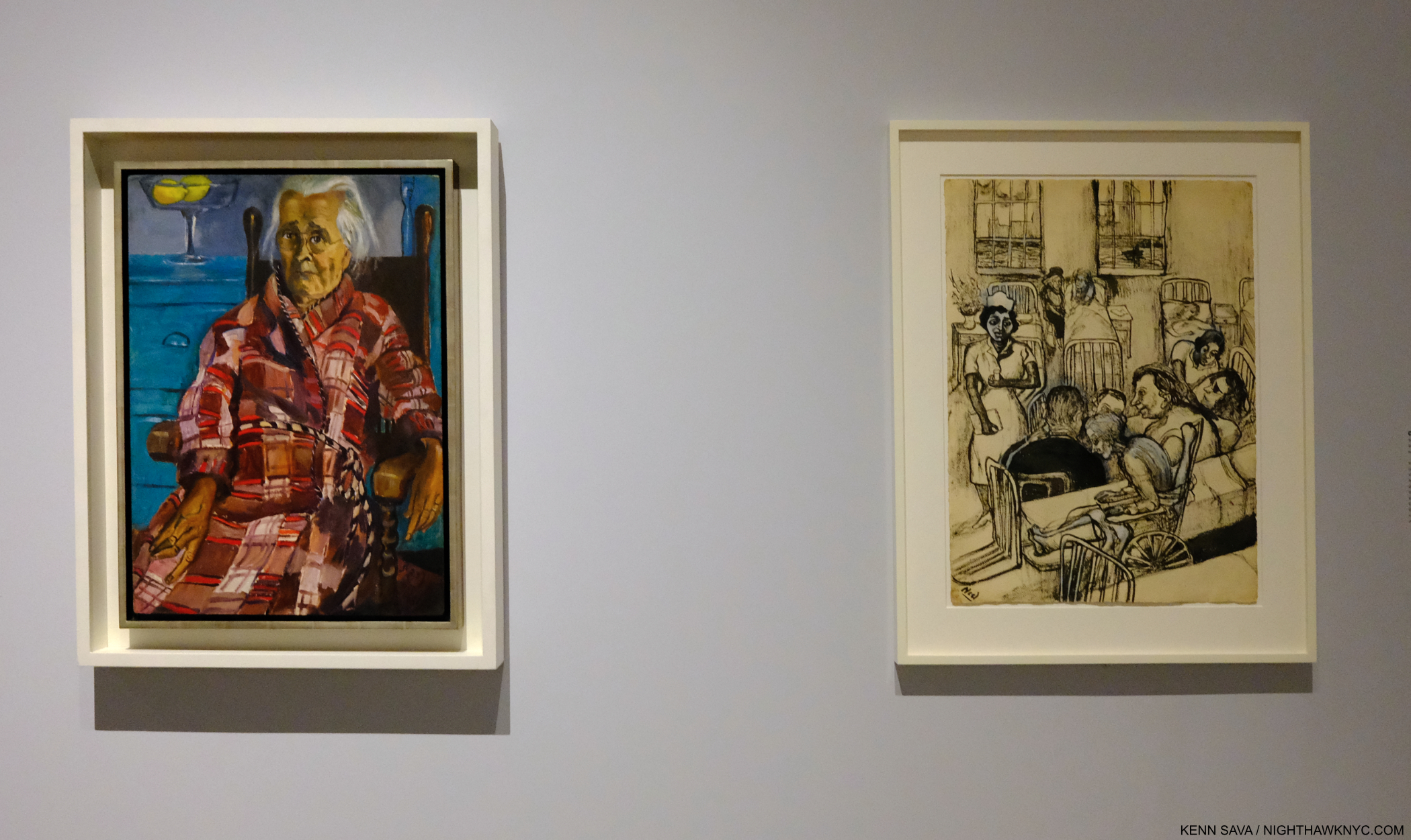
Last Sickness, 1953, left, and City Hospital, 1954, Ink and gouache on paper. Alice Neel’s mother, was no fan of her daughter becoming a Painter, as the quote from her, above, shows, yet Alice never turned her back on her. She died of cancer shortly after the Painted picture. City Hospital shows her mother at the bottom with an overworked nurse looking over other patients at her.

Her mother, who took her to cultural events, Alice describes as “intelligent and well read” continued, “None of us will be remembered.” “Well, I am not so sure about Alice,” Alice remembered her father saying9.

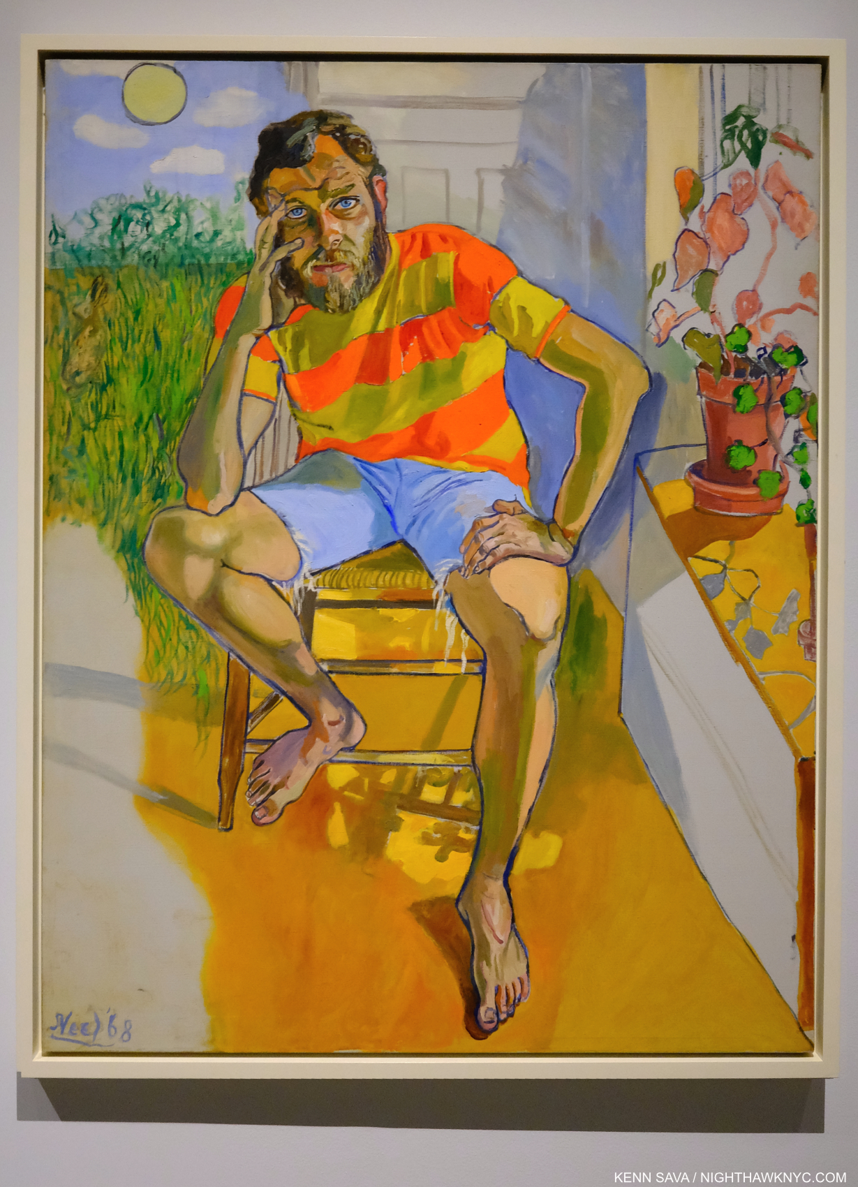
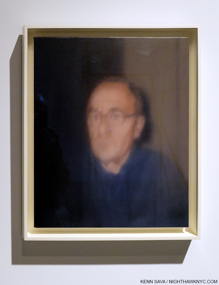
Richard Gibbs, 1968- Everything about this work strikes me as daring. The pose looks like a very casual take on Rodin’s The Thinker. Mr. Gibbs’ shirt is a riot of color with lines that go in the opposite direction to the path laid out for the eye to follow from front to back. That path, itself, is an adventure. We are seemingly inside and outside at the same time. Part of a room or building occupies the right part of the piece, a sudden landscape occupies the left, leading to a shining sun high up top. This inside-outness reminds me a bit of Dali or de Chirico, but for Alice Neel, who is known as being a somewhat traditional Painter of portraits, or pictures of people, as she preferred, it’s quite daring. The shadows under the chair leave me wondering, too. What are they of? Then, there’s the skin tones. Marvelously flat on Mr. Gibbs’ legs, feet, arms and hands, and more layered and nuanced on his face.

Many of Alice Neel’s non-family subjects were people fighting for causes, people who lived what they believed, and that is what comes across in her “pictures” of them. Taken as a whole one of the things her work is is a miniature picture of New York during her lifetime. While there are some cityscapes, Alice Neel’s New York City consists of its people in all their ages, sizes, shapes and variety.

“Heard about Houston? Heard about Detroit? Heard about Pittsburgh, PA?,*” from “Life During Wartime10.

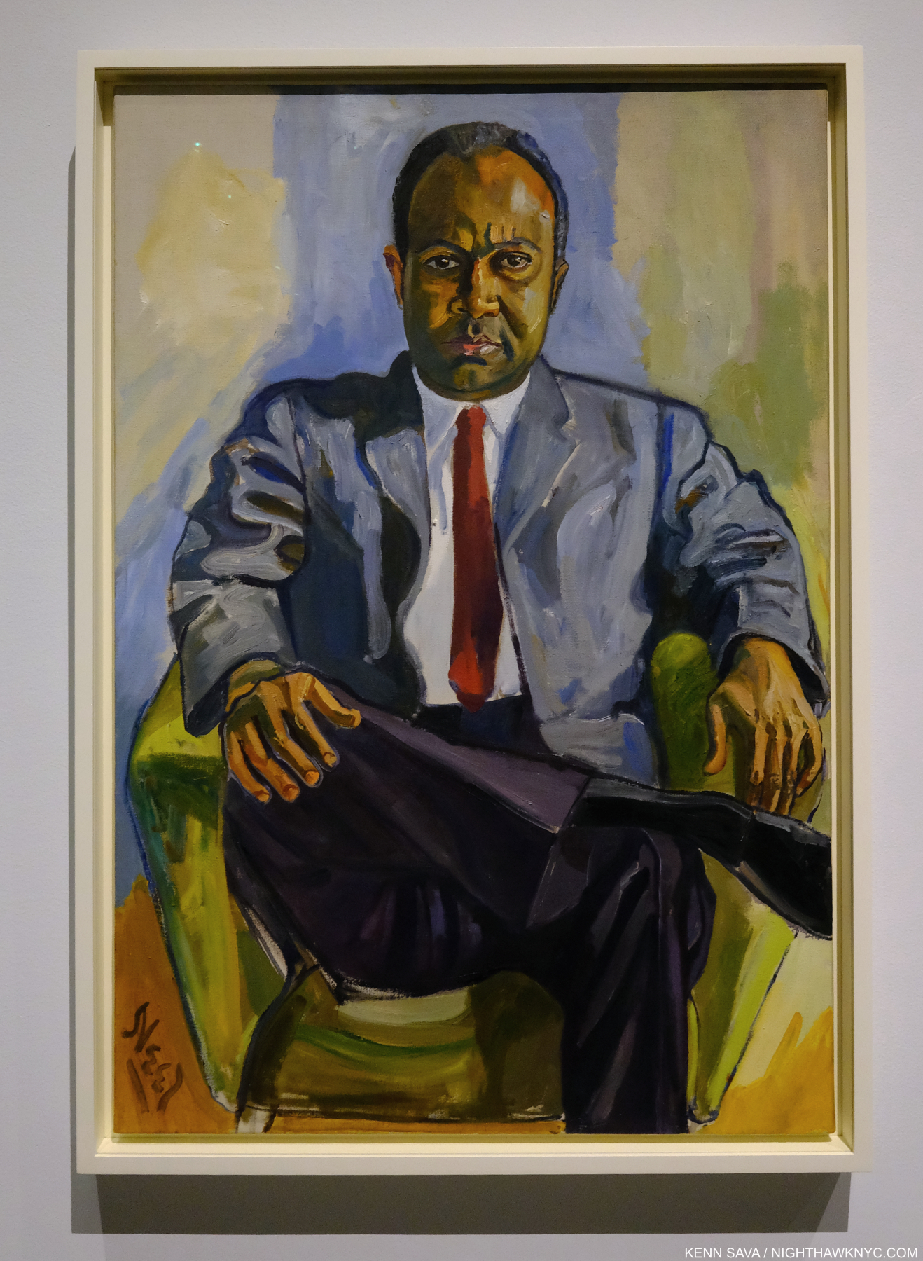
James Farmer, 1964. The year this was Painted, the civil-rights leader was among those arrested at the 1964 World’s Fair for protesting segregation and racial violence.

Mostly an outsider to the big NYC museums and larger Art world during most of her lifetime (though she attended them and marched in protests of some of their more controversial shows), Alice Neel fought for her Art most of her life. She had to. She didn’t find a lot of supporters in the Art word until late in her life (the Whitney held a Retrospective in 1974, when she was 74, and the posthumous Centennial show in 2000, her last big NYC museum show before this one). Phoebe Hoban says that between 1927 and 1964 she had about 6 solo shows. From 1964 to 1984, she had over sixty11. The first full-length monograph of her work was finally published in 1983, a year before she passed (see BookMarks, below).

James Hunter- Where are you? Black Draftee-James Hunter, 1965. One of the most compelling works in Alice Neel’s career, Mr. Hunter appeared for one sitting and never returned. Alice Neel declared the work finished and its gone on to spellbind viewers ever since. (Including me, when I saw it last at Unfinished at The Met Breuer in 2015.) Drafted for Vietnam, his name does not appear on the Wall in Washington, DC. To this day, what happened to him remains unknown.

Listening to her recorded interviews she always makes a compelling case for work and anyone interested in her Art should seek them out online and watch or listen to those first before reading anyone else speak about her work. In this interview, I love how she immediately corrects anything the interviewer says about her Art that she doesn’t agree with!

“Transmit the message, to the receiver. Hope for an answer some day,*” from “Life During Wartime,”

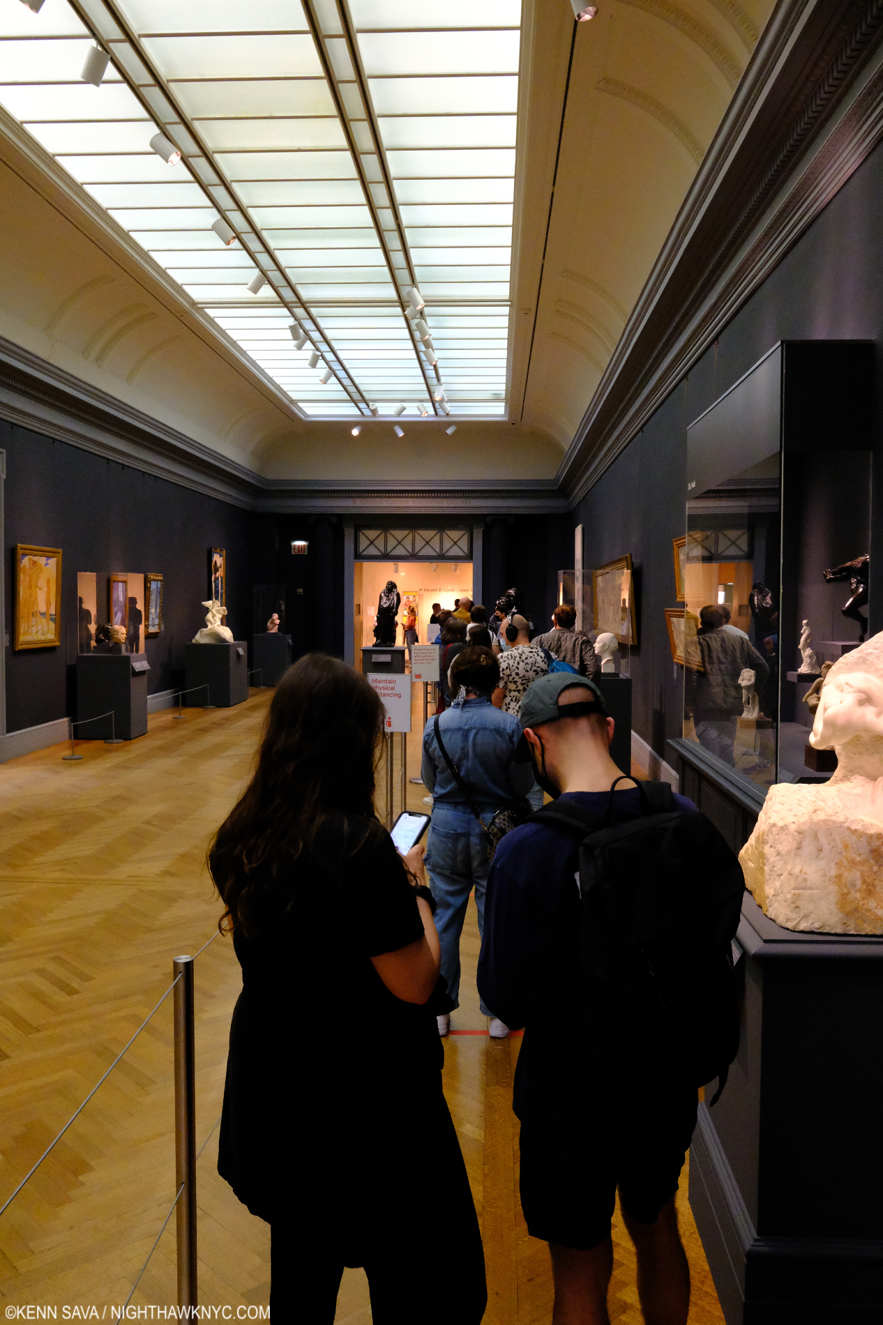
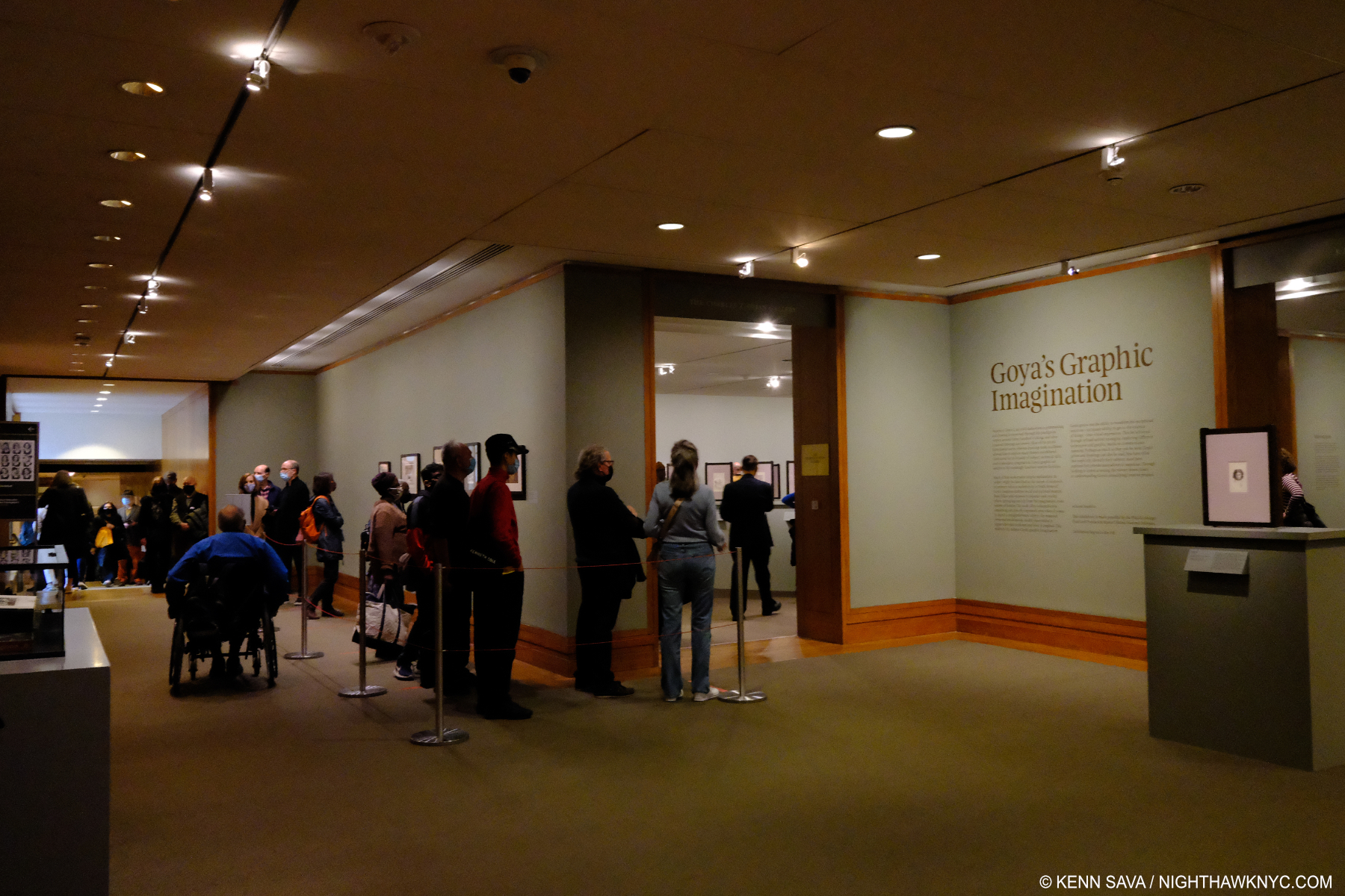
The line for Alice Neel: People Come First on March 27th. I imagine it’s significantly longer now.

Standing in line at The Met, in the very halls she frequented, I couldn’t help wonder what she would have felt seeing the line of visitors stretching all the way down the long hallway waiting to see her work. The same work she mostly kept in her archives, as a picture in the show, below, depicts.

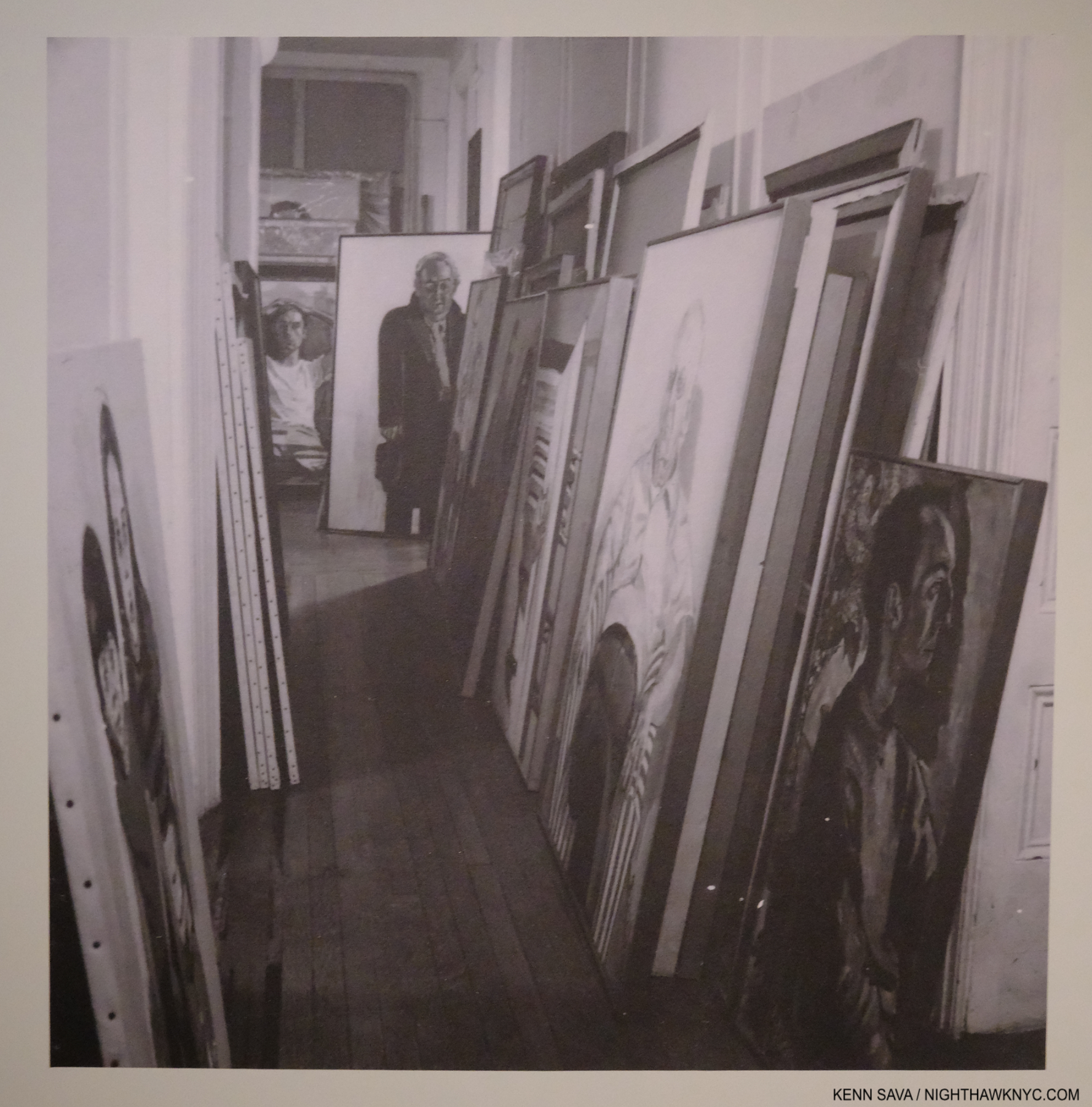
The archive of her work lining the walls of her apartment. Alice Neel hated to part with one of her Paintings and was known to Paint a copy when she did.

“The sound of gunfire, off in the distance. I’m getting used to it now,*” from “Life During Wartime.”

Living in Manhattan these past 30 years, it’s easy to relate to the solitary, single-minded sense of purpose her life exudes. “Tough times don’t last. Tough people do,” the age old quote goes. Alice Neel survived a lot of tough times. Now her Art is helping New Yorkers survive this horrible time by reminding us of who we are and what our strength is.

BookMarks-

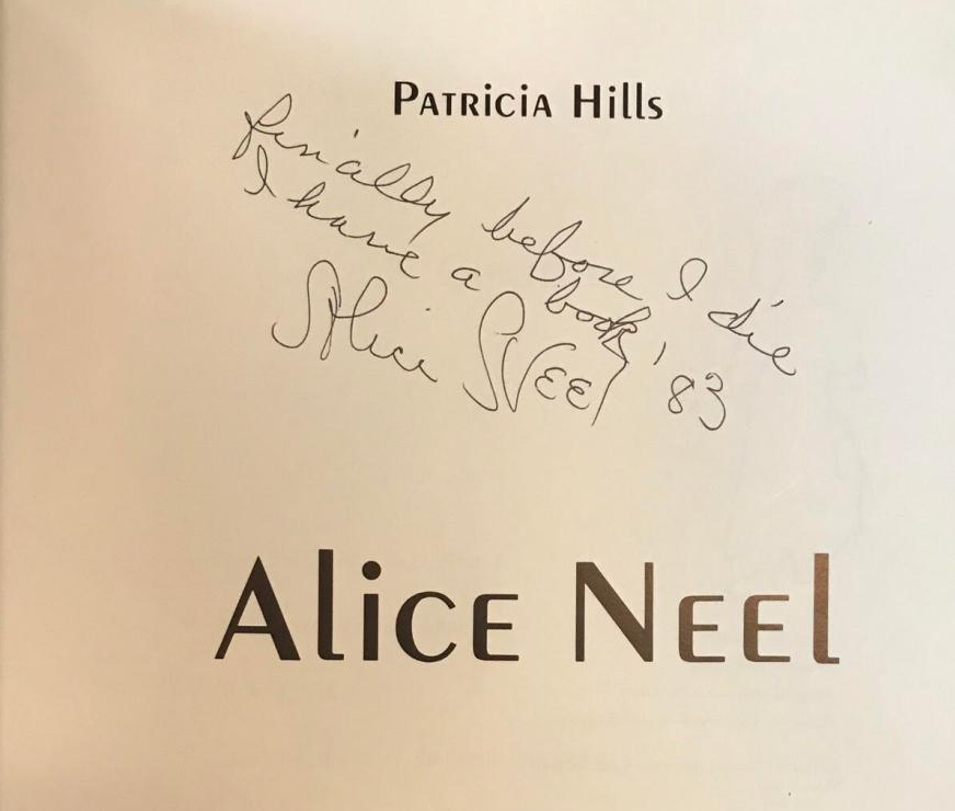
The poignant inscription in a signed copy of Patricia Hills’ monograph says it all. Alice Neel died the following year. Photographer unknown.

The Alice Neel bibliography is relatively small but growing. Here are a few recommendations based on living for at least a year with each recommended book, each  used in preparing this piece.

Alice Neel: People Come First, Met Museum Exhibition Catalog, is the most up to date monographic overview of her work and career. It features the most current research and has the most images currently (mostly the works in the show which were exceedingly well chosen) in very good quality on good paper, many in a large size. Recommended as a first, or go-to, monograph on Alice Neel until a more complete look at her whole career is published.

Alice Neel, by Patricia Hills, will always be NoteWorthy for being the first full length hard-cover monograph on Alice Neel and the only one released during her lifetime. Many good sized illustrations in color. It was also done with cooperation with the Artist. It holds up well today and copies in Very Good or better condition are still reasonable. Recommended as a 2nd monograph on Alice Neel, it remains a valuable reference book for the reasons I mentioned.

Alice Neel: The Art of Not Sitting Pretty, by Phoebe Hoban is another Art biography from Ms. Hoban. I found this one better than her Jean-Michel Basquiat bio, particularly when it comes to addressing the Art (a serious weakness of the J-M Basquiat book in my opinion). At the moment, there is no other full-length Alice Neel biography. Given Alice Neel’s steadily increasing popularity, and her increasing stature as an Artist, a woman and an influence, I suspect that will not be true indefinitely and a more definitive biography may be still to come. Done after the Artist’s passing it does not have Alice Neel’s input but it does have quotes from family members. Includes 23 pages of small illustrations in color and black & white. The binding is exceptional- rare for a large 500+ page paperback. Recommended, for now.

*-Soundtrack for this Post is “Life During Wartime,” with lyrics by David Byrne by Talking Heads from Fear Of Music, 1979. Regarding the references used above, check out the annotated lyrics on genius.com. Here it is performed live, at The Mudd Club, LA, of all places, on August 13, 1979-

NighthawkNYC.com has been entirely self-funded and ad-free for over 6 years, during which over 250 full length pieces have been published. If you’ve found it worthwhile, you can donate to keep it going & ad-free below. Thank you!

Written & photographed by Kenn Sava for nighthawknyc.com unless otherwise credited.
To send comments, thoughts, feedback or propositions click here.
Click the white box on the upper right for the archives or to search them.
For “short takes” and additional pictures, follow @nighthawk_nyc on Instagram.

Subscribe to be notified of new Posts below. Your information will be used for no other purpose.


  1. The PBS series Inside The Met shows behind the scenes leading up to, during and after the shutdown.
  2.  Mike Gold, “Alice Neel Paints Scenes and Portraits from Life in Harlem,” Daily Worker, December 27, 1950, p.11
  3. Phoebe Hoban, Alice Neel: The Art of Not Sitting Pretty, P.236
  4. Mike Gold, ibid, p.11
  5. Phoebe Hoban, ibid, P.310
  6.  “I am against abstract and non-objective art because such art shows a hatred of human beings. It is an attempt to eliminate people from art, and as such it is bound to fail.” Mike Gold, ibid, p.11
  7. Met Alice Neel catalog, P. 104
  8. Met Exhibition Catalog, P.12
  9. Met Exhibition Catalog, P.18.
  10. See the annotated lyrics, here.
  11. Phoebe Hoban, ibid, P 254

Francisco Goya: Modern Art & Photography Begin Here

Written & Photographed by Kenn Sava

The seemingly all-seeing eye. Francisco Goya, Los Caprichos, Plate 1, 1799, Etching, aquatint, drypoint, burin. The wall card reads- “In the first plate from the Caprichos, Goya presents himself as a sardonic observer of contemporary society.” Exactly what we’ll see in the rest of The Met’s Goya’s Graphic Imagination.

Francisco Goya’s Paintings are on the “must-see” lists of many museum goers, particularly the 200 or so portraits he did of royal, aristocratic or upper-class patrons over his 39 years as a court Painter1. Like this one-

Francisco Goya, Manuel Osorio Manrique de Zuñiga (1784–1792), 1787-8, Oil on canvas. One of the most charming Paintings in The Met for many. I can’t help but think it’s also more. An allegory about the end of  innocence? On the right, small birds in a protective cage. On the left, a magpie is eyed by cats. Any wonder this was the last Goya portrait commissioned by the child’s father, the Count of Altamira? Herein lies a hint of what lurks in Goya’s Graphic work. Its young subject died at age eight, 4 years after posing for it. A final touch- the magpie holds Goya’s card with his signature in his beak. Met Museum Photo of the work unframed.

But, to get the full picture of Goya’s Art, I believe his graphic work deserves every bit as much attention. Yet, chances to see his Drawings & Prints in depth are rare due to the fragility and light sensitivity of the originals. In 2015, a complete set of Goya’s timeless Print series Los Caprichos (the Caprichos) was shown at The National Arts Club in Gramercy Park, which I wrote about here. 2015 also saw the last large Goya Retrospective in the U.S., Goya: Order and Disorder, at the Museum of Fine Arts, Boston, which I actually made a day trip out of town to see and wrote about in the same piece. 

Goya after Velazquez, A False Bacchus Crowning Drunkards, 1778, Etching. Goya achieved, and demonstrated, his mastery of of the challenging medium of Etching copying the earlier Spanish master as in this remarkable Print done when Goya was about 32. And, he had the confidence to modify the composition of one of the greatest Painters of all time.

In the intervening 4 1/2 years, I’ve been preoccupied, if not obsessed, with exploring Photography & PhotoBooks, so when I finally got to see Goya’s Graphic Imagination at The Met in April with about 118 Drawings & Prints, I wondered if I might be able to spot Goya’s influence on Photographers and Photography, and on Modern Art in general for that matter.

“Both types of works on paper are closer to one another than they are to Goya’s painting. Paintings are a public expression. By contrast, an album of drawings is intimate and personal. These smaller-scale works served as a platform for Goya to think through his most private ideas.” Mark McDonald, Met Curator of Goya’s Graphic Imagination.

Goya’s eye, which seems to look askance at us in the Self-Portrait that opens Los Caprichos, up top, apparently never rested. He recorded much of what he saw in his Sketchbooks, which have largely survived. Over time, his beliefs ran in and out of sync with those of the powers that be, so he became adept at keeping his opinions to himself. It is in the privacy of these Sketchbooks that he gave full reign to what he felt about all he saw around him while keeping his position at court. He eventually rose to the exalted position of First Chamber Painter in 1799.

Title page to the first edition of Los Desastres de la Guerra (The Disasters of War), 1863, 24 years after the invention of chemical Photography. Met Museum Photo. Due to the low lighting in the show I was unable to take satisfactory pictures of much of the show without a tripod, so in those cases, I am using The Met’s Photos. This page was not included in the show.

A number of his Drawings became the basis of his Prints, including  Los Caprichos and later, inspired by the Peninsular War, 1807-14 and the Madrid Famine, 1811-12, Los Desastres de la Guerra (The Disasters of War). It was the 10 or so Prints from this series, equal parts “graphic” and revolutionary, on view in The Met’s show I looked forward to seeing most. Due to those ever-changing political winds, it wasn’t until 1863, thirty-five years after Goya’s death, that the world got to see his Fatal Consequences of Spain’s Bloody War with Bonaparte, and Other Emphatic Caprices, as he had originally titled a set of 85 Prints that he gave to an associate during his lifetime, when it was finally published under the title Los Desastres de la Guerra with 80 Prints2.

Plate 15 from Los Desastres de la Guerra (The Disasters of War): ‘And there is nothing to be done.’ (Y no hai remedio.) Met Museum Photo.

“Every figure in Los Desastres de la Guerra plays a specific role, defined by gesture, expression and costume. Nothing is superfluous.” Janis A. Tomlinson, Goya’s War: Los Desastres de la guerra, P.17

The series shows things never before seen in Art to that time, including graphic depictions of the horror of war, imprisonment and famine. About two hundred thirty years earlier, circa 1633,  Jacques Callot published his Print series Les Grandes Miseres de la guerre or The Miseries and Misfortunes of War. Of them, the Art Gallery of NSW, Australia, which owns a set, says– “Callot’s series is less an indictment of war than a moral tale about the unhappy consequences that befall the undisciplined soldier.” Callot’s Prints are in a long landscape format, and show what they depict at a distance. It is thought Goya owned a set of them, and they may have been an inspiration for him. In his series, Goya puts the action full frame presaging the words of Robert Capa, famed for his 20th century war & conflict Photographs, “If your photographs aren’t good enough, you’re not close enough.”

Plate 1 from Los Desastres de la Guerra (The Disasters of War): Sad foreboding of what is going to happen (Tristes presentimientos de lo que ha de acontecer), ca. 1815 (published 1863), Etching, burin, drypoint and burnisher. Met Museum Photo.

As powerful & profound as they are, there’s an element of them that is particularly puzzling. In more than one work, Goya’s caption gives the viewer the idea that what he’s showing are things he actually witnessed. DID Goya see the things he shows us?

DID he? Or, didn’t he actually see this happen? The title says he did. Plate 44 from Los Desastres de la Guerra (The Disasters of War): ‘I saw it.’ (Yo lo vi.). Met Museum Photo.

There is some debate around this. Wikipedia says repeatedly that he went around and saw the battles of the Peninsular War- without quoting a source for these statements I have seen no where else. While it seems it would have been hard for him to miss the daily effects of the Madrid Famine going on around him, the Artist going to battle scenes is harder for me to imagine. He was in his 60s and had suffered a serious illness that left him completely deaf. If he didn’t actually go to them, he could have been inspired by news accounts or from the accounts those closer to the action.

Preperatory Drawing for Plate 64 from Los Desastres de la Guerra (The Disasters of War): ‘Cartloads to the cemetery.’ (Carretadas al cementerio.) Prado, Madrid Photo.

Plate 64 from Los Desastres de la Guerra (The Disasters of War): ‘Cartloads to the cemetery.’ (Carretadas al cementerio.). Here an extremely rare opportunity to compare the Drawing, above, with the final Print. Met Museum Photo.

At this point, it’s unlikely we’ll ever know for certain how much of what we’re shown, if any of it, the Artist actually personally witnessed first hand. I’ve come to feel that thinking about this is a waste of time. Goya was an Artist- not a Photographer. He was working before the invention of chemical Photography and setting down his ideas by hand on paper, stone or canvas. With all due respect to the skill of Artists who Drew and Painted down through history, Drawing & Paintings done from life or memory are incapable of showing us the real world as it existed. Time is a key element in Drawing & Painting and in the time it takes to make one the world has changed. The people in it have moved. The light has changed. Things have happened and finished. In war, particularly, things happen way too fast to be captured accurately in a Drawing, let alone a Painting. They can give us a sense of what happened. What Goya is showing us is “something else” than the full reality of the moment- even if he did see it happen right in front of him. It’s his vision of things. If he tried to render it accurately to the scene in front of him, it’s still only an approximation. We’re seeing it through his eyes, and, as becomes apparent as you look at his Drawings & Prints, he does have a point of view.

The line for Goya extends further down the hall to the left than you can see here. April, 2021.

After seeing them in the show, it’s hard for me to think that these unprecedented images are not precursors of so-called war and conflict Photography. After the show I began to look to see if the Photographers, themselves, acknowledged this. In 2005, the renowned British Photographer Don McCullin, renowned for his coverage of the Vietnam War, among numerous other conflicts over his long & eventful career, told the BBC “When I took pictures in war I couldn’t help thinking of Goya.” Elsewhere he said, “…if what happened in front of my eyes was like a scene out of Goya. I wasn’t there to make icons. I had to bring back information that could possibly prevent other such miseries.” In those words I feel a simpatico with what Goya might have been trying to accomplish in Los Desastres de la Guerra .

Garroted Man, 1776-78, Etching. Done at about age 30, Goya’s second etching! A forerunner of Los Desastres, is also one of his most unforgettable images. According to Janis Tomlinson, Garroting “was considered one of the more humane forms of execution3.”

If a Drawing is incapable of showing us the complete “reality” of a scene, then it is what some might call today, “conceptual.” I was struck by some similarities of Goya’s Prints with so-called “conceptual” Photographers, who modify or create scenes from scratch that they then Photograph, like Duane Michals, Jeff Wall, Gregory Crewdson or Deana Lawson. Goya, too, may have been creating a scene on paper to make it express what he saw in his mind’s eye (keyword= may).

Plate 30 from The Disasters of War’ (Los Desastres de la Guerra). Proof, without caption. Without the titles makes them infinitely harder to decipher. According to the wall card, here, people fall to the ground after a building explodes.

Yet, no writing about these work exists in Goya’s hand besides the captions on the plates.

“It is important to emphasize that the inscriptions are not titles. They are captions that encourage a potential understanding. The captions do not explain the work for us. The meanings are often unclear, but this isn’t because Goya was being obtuse. He was thinking through drawings and prints for his personal purposes, and as such, there is no need for him to explain their significance to himself. His works on paper are so internal and layered that they would have sparked multiple associations, even for Goya.” Mark McDonald, Met Curator of Goya’s Graphic Imagination.

So, the captions add another layer of mystery to what we’re seeing! Duane Michals captions many of his Photographs right on the print itself. Robert Frank wrote directly on the image as his career went on, and so does Jim Goldberg, among others. Coincidences? Possibly.

Jim Goldberg, Ron E., Milwaukee, Wisconsin, USA, 2014, Magnum Photos Print.

During the lockdown I read Believing is Seeing by Errol Morris. Among Photos taken from 1855 until very recently, Mr. Morris examines the work of the 1930s Farm Services Administration (F.S.A.) Photographers, including Walker Evans and Dorothea Lange, and the evidence that they may have modified the scenes of some of their most iconic F.S.A. images from the 1930s. Modifying a scene to make it closer to what the Artist or Photographer is seeing in his or her mind’s eye would make them kin to what we see in Goya’s Drawings & Prints. So, it doesn’t really matter all that much if Goya was actually present when the events he shows us were happening. “The FSA collection (in the Library of Congress) therefore offers scholars an unparalleled opportunity to place masterworks, such as Dorothea Lange’s Migrant Mother (1936), in the context of companion images taken on the same day. This visual evidence offers a much more reliable guide to the photographer’s original intent than the artist’s recollections recorded decades after the fact,” James Curtis, the author of Mind’s Eye, Mind’s Truth: FSA Photography Reconsidered, said here. (The other images Dorothea Lange took that day in the archive may be seen here.) In my view, it doesn’t matter if the F.S.A. Photographers, “posed” subjects or modified scenes as Mr. Morris’ and Mr. Curits’ books suggest. Like it doesn’t matter if Goya saw “I saw it.” Even if, say Dorothea Lange, did modify the scene somehow4, she did not change the woman’s situation, which is the real and lasting point of the Photograph. At the end of the F.S.A. chapter in his book, Errol Morris concludes, “It is the idea that the photograph captures that endures 5.” It seems to me, regardless of their genesis, it’s exactly the same with Goya’s Prints & Drawings.

“The demise of Goya’s fortunes at Court has been attributed to his objections to the repressive nature of the restoration regime. Yet he had long survived within politically charged surroundings, and it seems likely he would have kept his political opinions to himself.” Janis A. Tomlinson, Francisco Goya y Lucientes: 1746-1828P.221

Goya, Self-Portrait, c.1796, Brush and point of brush, carbon black ink, on laid paper, seen at the show’s entrance.

After escaping trouble for his views after the Peninsular War, it finally caught up to him leading to his leaving Spain and becoming an exile in France near the end of his life, where he died at 82 in 1828. His remains were later exhumed and reburied in Madrid in 1919. As far as being the possible “Father of Modern Art” goes, I think a great case can be made for his nomination. Goya’s extremely wide range of subjects, from the royals to the incarcerated preshadowed the work of many Artists & Photographers of the past century. And he never minced the Drawn line, or words, when calling out those he felt were wrong. When I say “Modern Art & Photography Begins Here,” I’m not so much referring to the stylistic innovations though they are there for all to see, and his later Paintings were certainly ahead of their time, I’m referring to the content, and the depicting of what was not seen in Art to that point. Goya’s Drawings & Prints, and his Paintings, like the 2nd & 3rd of May, 1802, break away from the chains of Pontifical or Royal commissions. They show us a world that is all too familiar to us today. A world that has seen no end of man’s inhumanity to his fellow man.

In considering Goya’s candidacy as the “first modern,” it feels that he lived too long ago to be considered. Yet, it’s interesting to realize that Goya was born in 1746 and died in 1828. J.M.W. Turner, who’s work is often seen as “modern” lived from 1775 to 1851. Charles Dickens, who’s novels captured the “modern world” as soon as anyone else’s, lived from 1812-1870. Edouard Manet, often mentioned as one of the first moderns lived from 1832, only 4 years after Goya’s passing, to 1883.  James McNeill Whistler 1834-1903 and Vincent van Gogh, 1853-1890, was born 25 years after Goya’s passing. Chemical Photography was introduced to the world in 1839- eleven years after Goya’s death. Goya seems perfectly situated chronologically.

The Custody of a Prisoner Does Not Call for Torture (La seguridad de un reo no exige tormento)
ca. 1815; published ca. 1859. While not a part of the posthumous La Guerre set, Goya included a number of Prints of prisoners in the set he gave a friend during his lifetime. I’m also including this as an example of the show’s low, protective, lighting. This may be seen with better lighting in a Met Museum Photo, here.

Between his Paintings, his Drawings and his Prints, taken as a whole, Goya shows the full range of people, from all layers of society, from those of privilege to prisoners without privilege. People living in the utmost splendor to people starving to death, extending on what Rembrandt had done. Some of it was timely, referring to people and events only known to specialists and historians now. Much of it is timeless since human nature hasn’t changed. Met Curator McDonald sums this up-

“Not much changes. The same idiocy, cruelty, and violence take new shapes, but Goya captured those universal anxieties. So much of what we are dealing with now can be identified in Goya’s art—there’s politics, conflict, bloodshed, and ignorance of the impact of our actions fueled by stupidity and bad choices—the same old problems.” Mark McDonald, Met Curator of Goya’s Graphic Imagination.

Plate 79 from Los Desastres de la Guerra (The Disasters of War): Truth has died. (Muriola verdad). 1814–15, published 1863. The penultimate Print in the series. Met Museum Photo.

It was interesting to me that Goya’s Graphic Imagination. was on view a few hundred feet away from another major show of the work of another Artist who was focused on people: the famous and the already forgotten- Alice Neel: People Come First. It’s also interesting that both shows were up during the pandemic: our own 21st century horror show. As big a test of the resilience of New York as I hope to ever see.

*-Soundtrack for this Post is “Outside of Space & Time” by David Byrne & St. Vincent from their classic album Love This Giant.

BookMarks-
The Met’s catalog for Goya’s Graphic Imagination is exceptional. It features large, often full page plates of all the works on view on very nice stock and includes very insightful text from the show’s curators. These texts include numerous insights that weren’t included on the wall cards in the show. And so, it’s one of the better books on the subject of Goya’s Drawings & Prints and a very good place to start for those who want to know more about the show or the subject. Highly recommended.

The best overview of the work of Goya known to me is Janis A. Tomlinson’s Francisco Goya y Lucientes : 1746-1828 , published by Phaidon, which is my go-to book for all things Goya. In fact, I’ve relied so heavily on it that I am now on my second copy. Beware of nebulous listings on Amazon! This is a large book- in both hard & soft cover editions. There is apparently a subsequent smaller softcover edition I have not seen. For studying the Art, the large edition, which has over 250 images, is the one you want. Out of print, but quite inexpensive in Very Good condition, the hardcover is the way to go especially since it is really no more expensive than the softcover and its binding should last longer. 

The best overview on Goya’s Drawings is called simply that- Goya Drawings. Published by the Prado Museum, Madrid, who hold the world’s greatest collection of Goya’s work. It was one of my NoteWorthy Art Books of 2020. It also contains a few Prints but most of its 250 reproductions are of his Drawings, sectioned from all through his career with insightful text in English in a nice, smaller size.

Janis Tomlinson has also written two books about the prints.Graphic Evolutions The Print Series of Francisco Goya (Columbia Studies on Art) and Goya’s War: Los Desastres de la Guerra. Both are excellent and recommended, the latter the most comprehensive book on Los Desastres available. They are a bit harder to find in very good condition, but worth seeking out. Goya’s War contains reproductions of the all 80 published Prints in Los Desastres. It was only published in softcover. 

Photography Related-

Errol Morris’Believing Is Seeing: Observations on the Mysteries of Photography is a fascinating deeper look at iconic Photographs starting with Roger Fenton’s Photographs of the Crimean War, 1855, to current events, causing the reader to question his or her beliefs about just what these images say and what they conceal. Extremely wide-ranging it’s an essential book for Photographers, Art lovers, Art writers and anyone who cares about images.

James Curtis’ Mind’s Eye, Mind’s Truth: Fsa Photography Reconsidered (American Civilization) is lesser known and a ground-breaking look at the work of the Farm Services Administration Photographers, including Walker Evans, Russell Lee and Dorothea Lange. It puts their most famous images into the context of the Photographer’s work that day and analyzes them in a bigger picture way revealing much that is not apparent in the one, famous, Photograph that was widely circulated.

NighthawkNYC.com has been entirely self-funded and ad-free for over 6 years, during which over 250 full length pieces have been published. If you’ve found it worthwhile, you can donate to keep it going & ad-free below. Thank you!

Written & photographed by Kenn Sava for nighthawknyc.com unless otherwise credited.
To send comments, thoughts, feedback or propositions click here.
Click the white box on the upper right for the archives or to search them.
For “short takes” and additional pictures, follow @nighthawk_nyc on Instagram.

Subscribe to be notified of new Posts below. Your information will be used for no other purpose.


  1.  Janis Tomlinson, Francisco Goya y Lucientes: 1746-1828, P.1
  2. Also, as Janis Tomlinson points out- “For if, as the artist himself admitted, only twenty-seven sets of Los Caprichos had sold in much better times, how could he hope to find buyers in a capital devastated by war for these images of brutality, sadistic indifference, and tragic resignation?” Janis A. Tomlinson, Goya’s War: Los Desastres de la guerra, P.17
  3. Janis Tomlinson, Francisco Goya y Lucientes: 1746-1828, P.44
  4. James Curtis interview with Errol Morrisin Morris’, Believing is Seeing, P.138
  5. Errol Morris, Believing Is Seeing, p.185

William Buchina’s Stream

Written & Photographed by Kenn Sava

“What’s the matter with me
I don’t have much to say
Daylight sneakin’ through the window
And I’m still in this all-night café
Walkin’ to and fro beneath the moon
Out to where the trucks are rollin’ slow
To sit down on this bank of sand
And watch the river flow”*

William Buchina, Low Information Settings #1. 48 x 72 inches. Redacted documents, things being dug up, cryptic symbols, protest signs, places that almost look familiar (Is that a WWII Berlin Flak Tower upper left?), welcome to just some of the mysterious recurring images in Mr. Buchina’s work. All works 2020, Acrylic on canvas, unless specified.

Roaming your eye over one of William Buchina’s pieces feels a bit like watching an image stream. There’s so much going on in any of them, as seen in William Buchina: Low Information Setting, at Hollis Taggart, on West 26th Street, Chelsea, it’s a daunting task to unpack it all. His ideas seem endless, and they look back as much as they seem to look at “now” (well, it sure feels like now), or a time undetermined. While you look, there’s also a stream of names that run through your mind as possible “influences” for such work. For me, they range from Max Ernst to Bruce Conner to R. Crumb and Neo Rauch. Then, the next time you look, all of that starts all over again.

Low Information Settings, #7, 24 x 36 inches. Deserted stores or malls are another recurring element. All too real-world right now.

I’ve only been looking, and looking again, for about 2 months so I’m not going to claim any special insight into what his work “means,” but I will say it certainly resonates with the moment. This led me to look at his prior work, and see if to see if he had found serendipity in 2020-21. His website shows work going back to 2012 and a fascinating evolution. I found similar intrigue, complexity and depth. A soft touch for an Artist who Draws well, judging from what he shows there, Drawing has been central to William Buchina’s Art for quite a long time. His older works, like Lust, Crime & Holiness #30, 2013, shown further below, are every bit as complex, if not even more so. The stream of images that populate his older pieces, too, has now become a river.

Installation view. Low Information Settings #10, 2021, 96 x 72 inches, center, features a composition that reminds me of the ground-breaking layouts of George Herriman, Charlotte Salomon and Chris Ware.

Detail of the lower two thirds of L.I.S. #10. Unlike the Artists just mentioned, Mr. Buchina’s horizontal sections seem to add more mystery to the work. Looking at this section, the death and mouring (and lack of mourning in some quarters) of Princess Diana came to mind.

At first glance, his pieces often seem to be a chaotic jumble of people, places & things, but order is miraculously achieved through a number of compositional devices, brilliantly handled, the horizontal layers in this composition being only one. In pieces this complex they become fascinating to spot. How they hold the work’s wildly disparate images and multiple sections together is something of a tour de force.

Low Information Settings #3, 2020, 75 x 48 inches.

Though his images are often fantastic, unique amalgamations, the unexpected melded to something seemingly mundane, their inspiration appears to be more surrealistic than the fantastic work from the drug saturated 1960s as seen in Robert Williams or the early R. Crumb of Zap Comics. Yet, among the Surrealists, Mr. Buchina is closer to the Max Ernst of La Femme 100 Tetes (The Hundred Headless Women) or Duchamp than to Dali or Miro. Behind the curtain, it turns out that Mr. Buchina keeps a trove of found Photographs and other images, some of which he displayed in a prior show, that serve as inspiration/jumping off points for the streams of images he shows us that have a habit of looking vaguely familiar but you just can’t quite place it, or he adds other, usually unexpected elements to it, making it his own. Regardless the source, the imagination is his. It’s stunning and it never lets up.

Mask up! Detail of Low Information Settings #5. Full work is 72 x 48 inches.

Heightening this, remarkably, the times have caught up with some of what he has shown us. Though masks are seen regularly in the Low Information Settings pieces, as in the detail from #5 from 2020, above, the viewer might take it for granted these are covid19 pandemic references, until you realize masks have appeared in his work for years as his archive shows.

Lust, Crime & Holiness #30, 2013 India ink on paper 72 x 108 inches (hexaptych) shows a wide variety of masks 7 years before covid, and is just one of his pieces that show them pre-2020. Photo from williambuchina.com

Going back in time to look at work like this, I was struck by how the new works (Low Information Settings & the Scenery series) seem to be set in large buildings, complexes, or malls, which serves to provide a setting and a unifying element. The earlier works are more “free form,” with sections often hanging in pictorial space. Low Information Settings strikes me as a real breakthrough for Mr. Buchina. Not better. Different.

As for echoes of the recent political and social past in his work? According to the show’s catalog, “Mr. Buchina never views his imagery as overtly political.” Words to bear in mind, particularly when looking at a work like this-

Low Information Setting #6, 2021, 72 x 96 inches.

Detail. According to the show’s catalog, this work was finished days before the Washington insurrection. When I look at this work, I wonder if the setting isn’t a museum given all the Art on view in the background and on the upper levels, as seen in the prior image. After all, 2019 was a year when museum boards came under intense scrutiny, and 2020 a year when the museums came under fire for inequality, predjudice and exclusion.

“People disagreeing everywhere you look
Makes you wanna stop and read a book
Why only yesterday I saw somebody on the street
That was really shook
But this ol’ river keeps on rollin’, though
No matter what gets in the way and which way the wind does blow
And as long as it does I’ll just sit here
And watch the river flow”*

It doesn’t end there. In William Buchina: Low Information Setting, unrest, protests (of an unspecified kind), deserted/abandoned stores & malls, and any number of other things that are to be seen on a walk through any city probably anywhere in the world in 2020-21, appear in almost all of the pieces on view. The only thing missing are ambulances rushing people to treatment centers.

Low Information Settings #8, 2021, 24 x 36 inches. While the colors are exaggerated to an almost Day-Glo extent, these three complementary colors (red-yellow-blue based)harmonize a number of other works and set an atmospheric tone for the series.

But, then it was the surreal colors, the reds, yellows and blues particularly, that stopped me. What if you didn’t take all of this literally?

Scenery in Blue #8, 2021, Ink on paper, 30 x 44 inches.

Who was it who first said that all Art is really Self-Portraiture? These could all be inner portraits. Could they be scenes from the inner life of the Artist as he navigates both his world and the world of Art & image history? Could these be portraits of an imagination that’s image based and has a gift for stringing together disparate snippets that somehow manage to not only hold together, but do something far more difficult in today’s image oversaturated world- hold the viewer’s attention, and hold it long enough to get them to think about what they’re seeing?

Low Information Settings #2, 2020, 44 x 44 inches.

Then, of course, they could all “mean” nothing. But where’s the fun in that? Personally, I doubt it. Perhaps William Buchina’s Art strikes the raw nerve of navigating and surviving a “new norm” that’s anything but “normal.” The world in 2021 feels surreal in so many ways. Even things we thought we knew well are different or changed (like waiting in lines to buy food). And, there are a lot of people fed up with that “old norm” that are demanding to be heard. It’s possible to read all kinds of things into these works, but 2 months in, it seems you might have to look long and hard for specific references. And that leaves me continuing to think about them.

The moment I discovered William Buchina. 7pm, March 6, 2021. I was walking up West 26th Street when I saw this in the almost dark (closed) Hollis Taggart Gallery through their window. That was all it took. Immediately intrigued, it would be a month before I could go back and actually see the show.

At Hollis-Taggart, the show was rapidly selling out by the time I finally got to see it after being vaccinated. That’s evidence that some images in the endless stream still have the power to stick for longer than the moment they take to flash by.

Detail of Low Information Settings #5. The full piece, seen above, is 72 x 48 inches.

“Wish I was back in the city
Instead of this old bank of sand
With the sun beating down over the chimney tops
And the one I love so close at hand
If I had wings and I could fly
I know where I would go
But right now I’ll just sit here so contentedly
And watch the river flow”*

*-Soundtrack for the Post is “Watching The River Flow” by Bob Dylan from Bob Dylan’s Greatest Hits Volume II

NighthawkNYC.com has been entirely self-funded and ad-free for over 6 years, during which over 250 full length pieces have been published. If you’ve found it worthwhile, you can donate to keep it going & ad-free below. Thank you!

Written & photographed by Kenn Sava for nighthawknyc.com unless otherwise credited.
To send comments, thoughts, feedback or propositions click here.
Click the white box on the upper right for the archives or to search them.
For “short takes” and additional pictures, follow @nighthawk_nyc on Instagram.

Subscribe to be notified of new Posts below. Your information will be used for no other purpose.


The Met Breuer: Hail, and Farewell

Written & Photographed by Kenn Sava

Part Two of a series.

2,197 days.

I’m about to enter it for what I didn’t know would turn out to be the last time, on what would turn out to be its very last day. I’ll miss it.

That’s how long The Met Breuer (TMB) was open. March 8, 2016 (Member’s preview) through March 12, 2020, when it “temporarily closed” for the pandemic shutdown1. With the calendar turning to July, The Met’s time in the Breuer Building has ended, as I outlined in Part 1, making March 12th the final day it was open to the public. I was there on both its first and last day, and some in between. Though I regretfully missed some of TMB’s shows, I saw the major shows and a good many of the others. 

The Met Breuer, March 12, 2020.

My interest in The Met Breuer was born in curiosity. In May, 2011, they announced they would be taking over the Breuer building at 945 Madison Avenue.

“With this new space, we can expand the story that the Met tells, exploring modern and contemporary art in a global context that reflects the breadth of our encyclopedic collections. This will be an initiative that involves curators across the Museum, stressing historical connections between objects and looking at our holdings with a fresh eye and new perspective. This project does not mean that we are taking modern and contemporary art out of the Met’s main building, but it does open up the possibility of having space to exhibit these collections in the event that we decide to rebuild the Lila Acheson Wallace Wing where they are currently shown…” Met Director, Thomas P. Campbell, in The Met’s press release May 11, 2011. 

Going up. The elevator doors open onto Jack Whitten: Odyssey in October, 2018, one of the true blockbuster shows mounted at TMB.

After decades of being in denial about Modern & Contemporary Art’s worthiness of being in The Met, this marked a gigantic turn. Of course, it came 40 years too late to acquire most of the major works (or ANY of the major works) of some of the most important Artists of the past 40 years. Truth be told, I for one, was in agreement with The Museum about M&C Art from 1980 until about 2014, when I felt enough time had passed to begin to assess what had been done. A LOT of money had been invested in renovations to, and an 8 year lease on, the building Marcel Breuer had designed at 945 Madison Avenue at East 75th Street fo the Whitney Museum (see Part 1 for more on the history). The pressure was on. The Met, under then Director Thomas Campbell, had decided to make its mark in Modern & Contemporary Art, and brought Sheena Wagstaff on board from the Tate Modern, London, in January, 2012, as Chairman of the Department. What approach would Ms. Wagstaff (who’s shows at the Tate ranged from Edward Hopper to Jeff Wall), her staff and The Met take to M&C Art and how would it hold up against shows up at the Guggenheim, MoMA, The New Museum, The Whitney and the Brooklyn Museums?

Home is a Foreign Place, one of the 3 shows that closed TMB, drawn from recent additions to the Permanent Collection showed how far The Met’s collection of M&C has come.

Going into the opening, the press was all about how The Met was “hopelessly behind” NYC’s other Big Five museums, let alone those elsewhere in the country, in Contemporary Art. 2,197 days later, The Met Breuer has done the remarkable- It’s put The Met on that map. It did so by mounting a number of the most important shows of the past four years. From Nasreen Mohamedi and Unfinished: Thoughts Left Visible, which opened TMB, to Gerhard Richter: Painting After All, which closed it. In between, Kerry James Marshall: Mastry, will remain it’s peak moment in my mind, though there were others. And there were a surprising number of revelations along the way.

Sol LeWitt was an Artist I never paid much attention to until I saw this work, 13/3, 1981, Painted balsa wood, in the Breuer’s show, , in December, 2017. Ever since, his work continues to fascinate me

Originally scheduled to be open as TMB until July 5th, it still would have closed with the Gerhard Richter and Home Is A Foreign Place: Recent Acquisitions In Context and From Gericault To Rockburne: Selections From The Michael & Juliet Rubenstein Gift, the final three shows on its 2020 schedule. While the legacy is complete, in terms of the shows mounted, the influence was cut short as countless thousands more would have gotten to see these shows over the approximately four months longer they would have remained open. 

For now, I look back at some Highlights from The Met Breuer. The name of each show, listed in no particular order, is linked to the piece I wrote about it at the time-

Approaching this work, I thought “What is a piece of textile doing here?” “Untitled, 1970s, Graphite and ink on paper,” the wall card read. Wait. What? This is a DRAWING? Then, all of a sudden, a loud click when off in my mind, and Art was never the same for me again.

Nasreen Mohamedi Revelations. That might be the word that lingers with me with I think about TMB. They began on Day 1…The first show I saw that first day at TMB remains my personal favorite of all the shows I saw there. I had no idea who Nasreen Mohamedi was when I got off the elevator that day on 2. But Sheena Wagstaff sure did.

Incomparable is the word I now use to describe Nasreen Mohamedi, who lived in obscurity for 53 years and gave away her Art as gifts. Seen here in one of the handful of existing Photos of her, this one has lingered in my mind from the first moment I saw it, here in a slide show in the final gallery in March, 2016.

The show included Photos taken by Ms. Wagstaff of the area of Nasreen’s unmarked grave well off the beaten path in Kihim, Mumbai, India. THAT’S passion. THAT’S dedication. At that moment I saw them, I knew TMB would be one of NYCs most important cultural institutions. 

Unfinished, Member’s Preview. The first look at one of the most memorable shows to appear at The Met Breuer, March 8, 2016. Work by Titian, left.

Unfinished: Thoughts Left Visible. In the hundreds of years Art shows have been mounted, someone must have mounted one around this concept, right? I haven’t heard of it. If there was one, I doubt it was mounted as incredibly well and included rarely seen works by Michelangelo, Leonardo (the twin Kings of the unfinished work in the Renaisaance), Jan van Eyck, JMW Turner, and countless others. TMB’s first major blockbuster, and the other inaugural show in March, 2016, along with Nasreen Mohamedi. It belied The Met’s stated “mission” with TMB as “an outpost for Modern & Contemporary Art,” filling two floors, while the Nasreen got one. Given all the riches included, I have yet to hear anyone complain. Overall, over time, TMB was what The Museum said it would be.

Diane Arbus: In The Beginning was a revelation, as well, as much for the work as for the amazing way the show was installed- each of the over 100 pieces got its own wall- another thing I’ve never seen before. It also included a portrait of a departed friend of mine, Stormé DeLarverie, who told me more than once that it was she whose scuffle with police had incited the Stonewall uprising (she disagreed with the use of the term “riot.”), and that she had posed for Diane Arbus in 1961. At the time, I took both claims with grains of salt. Now, the world knows that both are facts, and in her gorgeous portrait by Ms. Arbus, which I snuck a shot of and show in my piece, Stormé will forever live on in The Met. In In The Beginning, she, fittingly, got a wall to herself.

The beginning of Kerry James Marshall: Mastry.

Kerry James Marshall: Mastry. As great a Painting show as I’ve seen in years. Maybe decades. 

Edvard Munch: Between the Clock and the Bed. A welcome reminder of the enduring accomplishment of this wonderful Artist who’s rarely seen in a show here. Between showed Mr. Munch is one of the very few Artists to successfully use techniques, styles and colors in realms that had only been used by Vincent van Gogh, who he was only 10 years younger than, and who he outlived by 54 years. 

Lichnos, 2008, at the entrance. 100 feet into this show my jaw was on the ground. It stayed there throughout.

Odyssey: Jack Whitten Sculpture, 1963-2017. Quick. Who’s the other Artist who is a Master of one medium, and who kept his mastery of another from public view his entire career? One stunning revelation after another that never let up. More remarkable for such a large show.

As I said in my piece on the show- “TWO whole museum floors of about 100 Paintings? My idea of heaven…” Having five floors at The Breuer added different dimensions to any number of shows, allowing a good number of shows to fill two whole floors- the kind of space that would be VERY hard to have at 1000 Fifth Avenue. The space between works at Gerhard Richter: Painting After All was one of its most memorable features and gave it an entirely different feel, allowing each work “space to breathe,” rare in big shows, and something I’ll miss very much.

Gerhard Richter: Painting After All. Exquisitely selected and hung, somehow managing to condense almost 6 decades of work into a selection that while not a “greatest hits” included enough of them, along with a good many surprises, and a chance to see the monumental Birkenau works. Unfortunately, it was open for all of NINE DAYS! It turns out that I saw it on its final day, at considerable risk. 

Along with other memorable shows-

Marsden Hartley’s Maine Marsden Hartley was unique and an Artist, though steeped in what the Europeans had and were doing, found his own ways. This was a show that served to open the mind, even in 2017, to the possibilities of Painting seen through a very free eye and mind in often daring fashion. A real breath of fresh air.

Marsden Hartley, Mont Sainte-Victoire, c.1927. Pretty daring to go to Aix-en-Provence and go toe-to-toe with the Master, Cezanne, in the land he made iconic. This work, in a show about Marsden Hartley’s work in Maine, this work set the stage for his bold brushwork and use of color in what would come.

Lygia Pape:A Multitude of Forms  No one medium could hold Lygia Pape’s vision, so the visitor to A Multitude of Forms was met with an ever-changing presentation that delighted the eye as much as it captured the mind.

Lygia Pape, Tetia 1, C, 1976-2004, Golden thread, nails, wood, lighting, a work that wonderfully characterized the ephemeral nature of Ms. Pape’s work in a show remembered for its endless variety and surprise. Seen at Lygia Pape: A Multitude of Forms, her first major show in a US museum in June, 2017.

Everything is Connected: Art and Conspiracy-

Rachel Harrison, Snake in the Grass, 1997. A work inspired by the Artist’s trip to Dealey Plaza, sight of JFK’s Assassination. While I was captivated by it, NHNYC Researcher Kitty said this work reminded her of being in her father’s garage.

And shows consisting of work from The Met’s Permanent Collection including-

Obsession: Nudes by Klimt, Schiele and Picasso From the Schofield Thayer Collection. With only 9 by Klimt and the majority by Shiele- no complaints here.

Provocations: Anselm Kiefer At The Met Breuer-

Anselm Kiefer, Iconoclastic Controversy, 1980, Gouache and ink on photograph, the wall card reads in part, “Rooted in the Second Commandment’s prohibition of graven images, the medieval debate involved the persecution of the artist-monks and the destruction of icons. Here he restaged the conflict in his studio with miniature versions of WWII tanks (one has destroyed a piece of clay in the shape of an artist’s palette)…The image links the iconoclastic battle to the Nazi’s attack on 
“degenerate art” in the late 1930s, which led to the destruction of hundreds of works of modern art.”

and Home Is A Foreign Place: Recent Acquisitions in Context. (Installation view of its lobby shown earlier)-

Mark Bradford, Crack Between the Floorboards, 2014. Can an Art writer have personal favorites? If he/she is a human being, it’s pretty hard not to. Mark Bradford is one of mine. So, I will long remember that this piece was the third to last work I saw on what turned out to be the closing day of The Met Breuer in the show Home Is A Foreign Place. The penultimate piece was Untitled, 1970, by Nasreen Mohamedi.

It’s fitting to end this piece with this show. Here, one could see just how far The Met’s Permanent Collection has come. Yes, there is a long way to go. Museums elsewhere in the US have built a lead in Contemporary Art that is, perhaps, insurmountable. But, The Met now has enough work in its own collection to mount fascinating shows like this. I was most impressed by the steps they’ve taken thus far as I looked at the acquisition dates on the items in Home Is A Foreign Place.

The very last work I saw at The Met Breuer is this piece from a series by Walid Raad, from 2014-5 in Home Is A Foreign Place. The wall card spoke about the Artist’s interest in the shadows these objects cast and how they enhance and expand the form. A bit like the shadow a museum visit casts…

And then, there were the shows I missed, like Vija Clemins. Phew…ALL of this in exactly 4 years! I think that’s a track record that can hang with what any of NYC’s other big museums- including The Met, 1000 Fifth Avenue.

Yes, there were a lot of very good, even great, shows at The Met Breuer during its four year run. You probably have your own list of favorites. Regardless of which show we’re talking about, the Breuer Building gave all of its shows the added dimension of space- often a whole floor, even two. There’s a lot to be said for that, and it will be very difficult to mount such shows at 1000 Fifth Avenue2. I’ll miss the place as The Met Breuer. I already cherish the days I got to spend there.

This is the Second part of my look back at The Met Breuer. Part 1 is here. Some thoughts on the “bigger picture” are coming.  

*- Soundtrack for this post is “Hail & Farewell” by Big Country. “Hail and farewell, Life begins again…”

You can now follow @nighthawk_nyc on Instagram.

NighthawkNYC.com has been entirely self-funded and ad-free for over 7 years, during which over 250 full length pieces have been published. If you’ve found it worthwhile, you can donate to keep it going & ad-free below. Thank you!

Written & photographed by Kenn Sava for nighthawknyc.com unless otherwise credited.
To send comments, thoughts, feedback or propositions click here.
Click the white box on the upper right for the archives or to search them.
For “short takes” and additional pictures, follow @nighthawk_nyc on Instagram.

Subscribe to be notified of new Posts below. Your information will be used for no other purpose.


  1. By my count. Subtract 10 days if you want to count from its official opening on March 18th.
  2. The huge China: Through the Looking Glass Fashion show in 2015 was mounted in different parts of The Met, which probably remains the only way to do it.

Hiroki Tsukuda: Drawings From Another World

Written & Photographed by Kenn Sava

Drawing is the beating heart of Hiroki Tsukuda’s Art. Hear, hear.

Voice from the O 05 2020. All works are Charcoal, acrylic ink, and pencil on paper, wood panel, with silkscreen printed acrylic frame, and dated 2020, unless otherwise stated. This work is 24.09 x 30.39 1.54 inches.

Even better, what he does with his Drawing is what makes his Art NoteWorthy, in my view. As I wrote recently, I worry about the decline of Drawing in today’s world. I mentioned the paucity of Drawing shows by contemporary Artists as being one symptom. So, I was pleasantly surprised when I walked into Petzel on West 19th Street on March 6th to see They Live, Hiroki Tsukuda’s second NYC show. Part inspired by the natural world, part seemingly by Architectural Drawing, part by visionary sci-fi, and the rest by his wide-ranging imagination, his work doesn’t stay in one place. Instead, each piece is a mixture of many parts that would seem to be at odds with each other until they came together in the Artist’s mind, and then under his hand.

Very few people got to see They Live, which was open publicly for nine days. I was able to see it twice.

So impressed was I by what I saw on March 6th, I returned on March 7th. Unfortunately, due to the coronavirus pandemic, which has now left over 23,000 people dead in the City alone!, the show, which opened on March 5th, was forced to close on March 14th. I have learned it will not reopen, a fate shared by innumerable shows around the world, a minor thing, in the scope of the incalculable loss suffered by so many.

Wasteland 01, 2020, Charcoal, acrylic ink, and pencil on paper, wood panel, with silkscreen printed acrylic frame.

They Live is nicely installed in the foyer + 3 room Petzel space, which is a somewhat unforgiving for some work, and smaller pieces have a tendency to be swallowed up by it. Mr. Tuskuda has come up with a wonderfully creative workaround for his smaller pieces, installing them in settings with natural objects including tree branches, small plants, and rocks, creating environments for the work that, often, echo the composition, with the work mounted on richly patterned wood walls and shelves that created an effect not unlike that of small “shrines.”

From Wasteland 02, 2020, The text elements along the bottom harken back to Architectural Drawings.

As you look, you may find yourself repeatedly reaching for the checklist. Next to each work therein, the description reads “Charcoal, acrylic ink, and pencil on paper, wood panel, with silkscreen printed acrylic frame,” and almost all are dated 2020, Yes, these are Drawings! They look like collaged elements printed out on sheets and mounted together. But, no. “I have drawings and different calligraphic elements that I’ve created over time, as well as pictures that I’ve personally taken and saved as well. I also collect images form the web. From there, I collage together different elements on the computer where 80% of the work is done. Then, it’s just drawing the work out,” the Artist said in 2016. Mounted in acrylic frames, a number of them have layers to them of varying transparency, adding to the pleasure of repeated looking.

Wasteland 02, 2020, left, Voice from the O 05, right.

The terrain his works encompasses is vast, and so he works in a few different styles. On first look, his pieces are often jarring, rendered in monochrome so the emphasis is on line and shape rather than color. Some, particularly his larger works, speak to the chaos of modern life, while others, mainly the smaller ones, seemed to me to have a foot in the natural world, echoed by their installation.

Neon Demon, 2019, Charcoal, ink and pencil on paper, wood panel, with acrylic frame 94.49 x 141.73 inches. The shape of the pieces adds yet a “false” perspective that marvelously makes it feel that this flat piece is falling away from you, or that you’re looking into a vast space, though perspective inside Mr. Tsukuda’s work is often “false.”

One of the most remarkable things about Hiroki Tsukuda’s work is his sense of composition. Each work, no matter how diverse its elements, somehow manages to come together in a unified whole. In the more abstract works…well, that’s one of the tricks to making “good” abstract Art, right? A composition that manages to hold together, something evident in the work of all of the masters of abstraction from Kandinsky through Pollock and Rothko to Jack Whitten and Mark Bradford. Mr. Tsukuda adds elements seen in some of the surrealists, like Miro and Dali, In the ostensibly more representational works, “objects” are treated as geometric elements in the whole composition, which frees the Artist to not be bound by their traditional meaning. Instead, he is now free to explore with them, and the viewer’s preconceptions.

When I reached the third and final gallery, things took a decided turn. I suddenly came face to face with a group of 4 pieces that screamed Hajime Sorayama’s “Gynoids,” works featuring beings that are part female, part robot, to me. Though Mr. Tsukuda’s are more “female,” and less robot, than Mr. Sorayama’s.

The legendary Hajime Sorayama stands in front of one of his newer works, seen at the opening to his last NYC show in October, 2016.

Sure enough, in researching him later, Mr. Tsukuda lists the famous Japanese Artist among his many influences. I had the pleasure of meeting Mr. Sorayama in 2016, and since I owned one of his works at the time, we quickly bonded, though the language barrier was never in danger. If imitation is the sincerest form of flattery, Mr. Sorayama has found an Artist who fully understands his “Gynoids” and has the facility and vision to take them in his own direction. Quite daring considering Mr. Sorayama is alive and working away. While they were a bit jarring with the “natural” feel of the first two rooms, (compared with the steel frame “cells” here) the Artist made it work, as characteristic traits of Mr. Tsukuda’s own style became familiar as one look further at them.

Vol. 31, left, with Vol. 13, Wasteland 03, right of center, and Your God, 2019, far right.

The show’s title, They Live, reverberates as you move through it. Among the installations, only the few plants included are actually “living.” Does ink on paper “live?” Not in the biological sense, but in the sense that Art continues to speak to people, it “lives” on in other ways. They Live, also, has a sci-fi ring to it (think of films like Them!), and in that sense serve to make us feel that Mr. Tsukuda’s creations, perhaps particularly the “enhanced females” seen in the third gallery, live. These are probably his “ultimate” manifestation of this combination of the natural and the technological fantastic.

Vol. 44, right, Vol. 91, Abyssal Grid, left of center, Your God, 2019, far left.

The “designs of nature” beautifully enhance, reinforce and dialogue with Mr. Tsukuda’s Drawing style, which borrows techniques seen in Abstract Expressionism and the rigor of Architectural Drawing, like those of Zaha Hadid, as displayed in her marvelous Guggenheim Retrospective in 2006, combining them in fresh and exciting ways.

Wasteland 02

The natural settings also reinforce Mr. Tsukuda’s upbringing “surrounded by abundant nature,” he told freundevonfreunden in 2013. This serves to ground his work, which quickly and effortlessly takes flight to…somewhere else. “You only start to appreciate its beauty once you’ve grown up and experienced city life. Always had a strong desire to travel to another realm outside of this world, even from a young age. It’s not that I hated reality and wanted to escape; it was more like I wanted to take a peek into the parallel universe that exists on the other side of this world. So hen seeing a landscape or buildings, I always imagined that there was a spacecraft launching pad in the mounters or was convinced that the building was actually a secret research lab.” I came across those words after getting that exact feeling seeing work like this-

In 2018, MoMA purchased Hiroki Tsukuda’s work Great Distortion, 2016, Ink and charcoal on paper, believe it, or not. 86 5/8 x 159 7/16 inches. MoMA Photo (not in this show).

While I may be new to Mr. Tsukuda’s work, his star has been rising on a number of fronts. In fact, Uniqlo is currently selling a T Shirt that features one of his Drawings, and in researching this piece, I discovered that in 2018, MoMA acquired one of his larger works, Great Distortion, 2016. While I have been harsh on MoMA’s acquisitions, here is an instance of the kind of vision that made MoMA the leader in Modern Art, a title NYC’s “big 4 museums” have relinquished to L.A., Chicago and elsewhere when it comes to collecting Contemporary Art1. It hasn’t been on view yet when I’ve been there (well, they’ve been closed for 10 months since 2018), so I look forward to seeing it in person.


Abyssal Grid

There are elements of the fantastic seen in Surrealism. the joy of patterns found in industrial design, like we’re lost in some fantastic industrial junk yard of the future. Ominous. Possibly threatening, without a clue as to how to get out, or how to “get” anywhere. Or even where we are. Here and there something looks vaguely familiar, but it’s promptly lost in a wash of other elements. I was left with only questions like these, and few answers. I find his Art fresh, very daring, and yes, spectacular. His work feels completely free and entirely unpredictable. They don’t look like the Drawings of many Artists I’ve seen.

Hiroki Tsukuda continues to expand the boundaries of what Drawing is and where it can take us. “Science fiction” is about giving us a vision of the future. Seeing They Live did that, too.

*-Soundtrack for this post is “Yoshimi Battles The Pink Robots Pt. 1” by The Flaming Lips from the 2002 album of the same name.


NighthawkNYC.com has been entirely self-funded and ad-free for over 6 years, during which over 250 full length pieces have been published. If you’ve found it worthwhile, you can donate to keep it going & ad-free below. Thank you!

Written & photographed by Kenn Sava for nighthawknyc.com unless otherwise credited.
To send comments, thoughts, feedback or propositions click here.
Click the white box on the upper right for the archives or to search them.
For “short takes” and additional pictures, follow @nighthawk_nyc on Instagram.

Subscribe to be notified of new Posts below. Your information will be used for no other purpose.


  1. The fifth of Manhattan’s Big 5, the New Museum, has no permanent collection.

Draw!

Written & Photographed by Kenn Sava

 For The Record #4.

Is Drawing becoming a lost skill in today’s world?

Michelangelo, Archers Shooting at a Herm, Red chalk, seen at The Met’s unforgettable Michelangelo: Divine Draftsman & Designer in 2018.

That would be tragic. For any number of reasons, perhaps the foremost being that I believe Drawing is an essential life skill. The cellphone camera seems to be replacing Drawing for many people, and I think this is shortsighted1. Drawing is a fundamental way that humans have communicated and expressed themselves for many tens of thousands of years. No doubt, even before the advent of writing and language. Its value to Art and Artists over the centuries can be seen in any museum. Beyond Art, Drawing is an important way of putting ideas down, or mapping out your thoughts. It’s an important means of thinking visually that nothing known to me can replace.

An Artist who Draws almost exclusively, Chris Ware’s fold-out cover for the hardcover edition of Jimmy Corrigan: The Smartest Kid on Earth took Drawing in entirely new directions in 2000. It’s part map, part story, part Art, part mind map, yet somehow, it all holds together. And, it also gives one an idea of what the amazing 380 pages inside are like. Is it any wonder the book was seven years in the making?

When I first tried to paint, I immediately realized I needed to work on my drawing, first, to paint the way I wanted to paint (yes, small letters. No Art with a capital A in this case). I proceeded to draw, daily, for the next decade. I still haven’t gone back to painting. Drawing became an obsession for me, both doing it and studying it’s amazing history in Art.

Ingres, Portrait of a Lady, 1815-17, seen at The Met in 2012 in very low light to protect it. I spent the better part of a decade trying to figure out HOW Mr. Ingres created incredible Drawings like this. In Secret Knowledge, David Hockney surmises that he may have used a camera lucida to draw the head from life, then sketched the rest fairly quickly. Regardless, it borders on the miraculous.

As time has gone on, particularly over the past decade, though there have been some monumental museum Drawing shows of work by the masters, I’ve seen fewer and fewer Drawing shows by Contemporary Artists.

An exception. Raymond Pettibon, No Title (It sounds powerful…), Ink, acrylic and collage on paper, 60.5 x 101 inches, seen at Zwiner in 2017.

Along with really looking, and learning to see, Drawing is invaluable in developing an eye. Try drawing anything. It forces you to really see and to really be clear about what you see so you can render it. I spent a few years drawing Sculpture in The American Wing Courtyard in The Met three times a week. One of the great things about that space is that it is faced and covered with glass. The light constantly changes, and if you sat there long enough, which I did countless times, day changed to evening and then to night. This is a real challenge to anyone trying to render an object with a pencil, like it would be to someone Painting outdoors. It forced me to learn how to look hard and fast, before the light I was trying to render changed. Of course, I could have drawn from a Photograph, but I found I learned much more trying to draw a Sculpture on the spot. 

Vincent Van Gogh, Harvest in Provence, 1888, Reed pen, quill and ink over graphite on wove paper, from Vincent Van Gogh: The Drawings. Vincent was one of the first Artists to fascinate me in my early teens when I discovered him in an early visit to MoMA. As time has gone on, I’m still amazed at how he saw the world, which you can really see in his incredible Drawings. Here, he almost Draws in shorthand. Look at the sky, and the way he renders most of the scene using lines and dots. There’s so much to look at, the figures almost disappear. The only thing he’s darkened is the cart in the center. Once you compare this with  the Painting he did of this scene, it might be apparent why.

When I’m first exploring an Artist, I want to see their Drawings. If they haven’t created any, I look into why not. Maybe they can’t Draw? Many Painters, like Richard Estes and Rod Penner, Draw their work directly on their canvases, creating an “Underdrawing,” as have countless Painters for centuries before them, and so don’t make standalone Drawings. If they have created Drawings, I want to see what role Drawing plays in their work, and I want to see what their Drawings reveal about it. Yes, there are Artists I admire who either don’t make separate Drawings or don’t Draw per se, but I’ve come to realize that they are in the minority. 


Frank Lloyd Wright’s Drawing of the Winslow House, 1893-7. The actual house may still be seen in Chicago. Drawing seen at MoMA in 2017.

Any number of Architects have made Drawings, often to present their ideas to their clients- Presentation Drawings, like the one above by Frank Lloyd Wright, that are now considered Art. Beyond their beauty, these Drawings serve any number of other purposes from showing an idea to a client, to helping engineers, landscape designers and urban planners understand the project.

Nasreen Mohamedi used Drawing both as the primary discipline of her Art and also for other reasons in other ways, as in her diary, two pages of which appear above, seen at The Met Breuer’s landmark, opening, show of her work in 2016. She, apparently, went back and colored out most of the lined pages but left words or sentences here and there legible. Did she do this for Artistic reasons? As a reminder of things left undone or to be remembered? Or…?

David Byrne, Tree Drawing, from Arboretum.

In 2003, the Musican & Artist David Byrne published his book of “tree drawings,” Arboretum. The fascinating Drawings inside show other ways in which Drawing can be used. He discussed them here. Three are shown here.

David Byrne, Drawing, from Arboretum.

Some border on graphs.

David Byrne, Music Tree, 2002, from Arboretum.

Others on maps.

Three iPad Drawings by David Hockney, seen at The Met’s David Hockney show in 2018.

On the positive side, Technology has brought new ways one can Draw into the world. David Hockney is among the many using the iPad to create museum level Art.

Nasreen Mohamedi Untitled, circa 1970, seen at The Met Breuer in 2016.

In some ways, it’s akin to her Drawings, her primary medium after her early work, and in other ways, it’s not. When I first saw “Untitled,” circa 1970, above, I thought it was a piece of fabric. I stood in front of it for almost 30 minutes in utter disbelief that it was a Drawing, and one of THE most amazing I’ve ever seen. I subsequently christened the late Ms. Mohamedi, “The Goddess of Line.” It was said that “She was one person who was always in tune- life, work, the way she dressed, how she talked, behaved- each always totally in tune with the other, one straight line2.” During her lifetime, she was largely unknown, and so she gave many of her pieces away as gifts. Eventually, a crippling illness robbed her of her ability to Draw, before tragically taking her life at just 53 in 1990.

Ms. Mohamedi taught, and those she came in contact with have continued to spread her name and influence. Thankfully, currently and in the recent past, there are other Artists, like Mr. Hockney, William Kentridge, Raymond Pettibon, Marcel Dzama, Kara Walker, Jean-Michel Basquiat, R. Crumb and Chris Ware for whom Drawing is central to their Art. My hope is they, and all the other Artists who Draw, inspire the next generations of Artists to continue Drawing, if schools continue to stop teaching it. The Met, MoMA and many other museums have Drawing workshops, but beyond Art, institutions in other realms, and businesses, benefit from Drawings to no end. They have a stake in this, too. It’s going to take many people and organizations from all walks of life who realize what’s at stake take action to reverse the direction things seem to be taking. Human creativity has always found ways to express itself. I’m hoping that continues to find popular expression in Drawings. The time is NOW! to make sure. Before it’s too late.

Today, there are infinitely more Drawing tools, and ways to Draw, available than ever before. So, pick up a pencil, or use whatever device you’re reading this on, express yourself, nurture your creativity and ideas, and Draw!

For The Record is a series of pieces that are about key/core subjects & beliefs that underly everything else I’ve written here. The first three parts are here. 

NighthawkNYC.com has been entirely self-funded and ad-free for over 6 years, during which over 250 full length pieces have been published. If you’ve found it worthwhile, you can donate to keep it going & ad-free below. Thank you!

Written & photographed by Kenn Sava for nighthawknyc.com unless otherwise credited.
To send comments, thoughts, feedback or propositions click here.
Click the white box on the upper right for the archives or to search them.
For “short takes” and additional pictures, follow @nighthawk_nyc on Instagram.

Subscribe to be notified of new Posts below. Your information will be used for no other purpose.


  1. David Hockney, the legendary Artist who has Painted, Drawn and Photographed, has spoken at length about the shortcomings of the camera. Over the past three years, I’ve come to agree with him.
  2. Here

Gerhard Richter’s Met Blockbuster: Open For Just 9 Days!

Written & Photographed by Kenn Sava

UPDATE- July 16, 2020- The Met now lists Gerhard Richter: Painting After All on its “Past Exhibitions” page1, meaning it will NOT reopen!

After checking every day, the show appeared on the “Past Exhibitions” page on July 17th. I’ve enlarged the date section for legibility and added the red text…My original look at the show follows-

What if they mounted a blockbuster and nobody got to see it? 

Ahhhh….A major show covering TWO whole museum floors with about 100 Paintings? My idea of heaven…

As I write this in early June, 2020 what is known is that Gerhard Richter: Painting After All will be remembered as the last major show to be mounted at The Met Breuer (TMB) before The Met’s lease on the Marcel Breuer’s Madison Ave at East 75th Street building ends in July and The Frick Collection moves in while the renovations of their 1 East 70th Street home take place. What’s still unknown is how long the show ran for. It opened on March 4th, then “temporarily closed” after I saw it on March 12th, due to the coronavirus shutdown. That’s all of NINE days! The Met’s site says “Closing Date To Be Announced” on its listing, but what are their options for reopening it? With The Met’s lease on the Breuer Building ending in July, reopening it there would seem to have to come in June, which we are half-way through. On May 19th, Met CEO Daniel Weiss said that The Met “hoped” to reopen on August 15th, “or a few weeks later.” His announcement made no mention of TMB, but that timeframe would seem to rule out a TMB reopening. Moving it to 1000 Fifth Avenue might seem to be an option, terms of loans and space requirements for shows previously planned permitting. That might also put any number of employees at risk of the virus, though. Then, there’s this-

The X Factor. The show’s listing in the coming attractions section of MOCA’s site with a start date of August 15th.

This show was scheduled to open at MOCA, LA, on August 15th. So, there remains a chance Gerhard Richter: Painting After All (GR:PAA, henceforthwon’t reopen in NYC. IF that does come to pass, its 9 day run will be the shortest for a major show at a major museum here in my memory. That would be a shame considering the last major Gerhard Richter show in NYC was 20 years ago, a chance missed to assess how his older work looks now and see his more recent work. I started looking closely at Mr. Richter shortly after that NYC show, so in the past 20 years I’ve seen his gallery shows (of mostly new and recent work), but I’ve never seen 100 of his Paintings in one place. Being that Mr. Richter is 88, this may be the last major show of his work during his lifetime. The Artist did not attend the opening, though members of his family did, I was told by Met staffers.

Installation view, showing part of Strip, 2013, in the final gallery, seen on March 12th- hours before the show “temporarily closed.”

SPOILER ALERT! Since The Met’s site still says “Closing Date to be Announced” for this show, my hunch is that they will find a way to reopen it, especially because The Met originated GR:PAA (which is co-curated by Met Modern & Contemporary Art Chairman Sheena Wagstaff), and so has a sizable investment in it. My bet is that they will get an extension on the Breuer lease and use that to give this show a proper run, and The Met Breuer the fitting end I think it deserves. So, if you don’t want a peek at it yet, you may want to wait before proceeding. This piece will still be here when it doesn’t reopen! In which case, you’ll have to go to L.A. to see it, and I will be among the very few to have seen it here.

Installation view of the lobby on the 3rd floor, the concluding floor of the show. Surprisingly for a show called “Painting After All,”  works in glass greet the visitor on both floors. Mirror, 1986, shown here, right.

Installed on the 3rd and 4th floors of the Breuer, and beginning on 4, GR:PAA is not a retrospective and not a “greatest hits.” It lies somewhere between the two. It covers the whole of his career and juxtaposes many very familiar works, alongside some that are barely known to many here. I can’t help but wonder about the Artist’s involvement in GR:PAA, because the selection and arrangement of it has a bold feel to it. For a show that covers such a long period of time, it also has a bit of a sparseness, the work is not crowded together. Each piece has space to breathe. In the documentary Gerhard Richter: Painting, the Artist and his staff are shown using mockups of exhibition spaces and miniatures of each Painting as they work out and assess the placement of each. It’s hard for me to think that something similar didn’t take place with GR:PAA, though Ms. Wagstaff and her staff have repeatedly shown they are more than capable of mounting extraordinary shows without the Artist’s involvement, so in wondering, I mean to take nothing away from their achievement here, which is yet another Met Breuer show that will live on in memory and in discussion. Here, you have a major, living Artist. If you can get his involvement in your show, why wouldn’t you use it2? Whatever the case is, the selection and arrangement of the work take GR:PAA to another level.

“Art requires freedom…in dictatorships there is no art, not even bad art.” Gerhard Richter.

He would know. Gerhard Richter has lived in two countries where there was no freedom. He was born in Dresden in 1932, 11 months BEFORE Adolf Hitler became chancellor of Germany. His father was drafted into the Wehrmacht in 1938 and sent to the horror of the Eastern Front. The elder Richter didn’t return to Germany until 1946. Gerhard finished growing up in East Germany before managing a crafty defection to West Germany in 1961. He’s lived in Nazi Germany, Communist East Germany, West Germany and (the Federal Republic of) Germany in his lifetime.

Table, item #1 in the Gerhard Richter Catalogue Raisonne, though not his first work. In the Catalogue, this is listed under “Household Icons” in the “Photo Paintings” section of his site, yet, with its abstract elements it seems to straddle the fence between the two categories of Paintings his work is broken down into there.

These experiences have continually informed his work3 be it in the people, places and things he’s encountered in them, or in things that went on while he was living there that he didn’t personally encounter (like the Holocaust) in a career that is closing in on 60 years. Officially, the first work listed in his Catalogue Raisonne (CR 1), Table, is dated 1962, 58 years ago. Among works that pre-date Table are a Mural he Painted in 1955, and the work Elbe, included in this show in a Print version, was created in 1957.

September, 2005, Oil on canvas, 20 1/2 x 28 3/8 inches. Painted four years after 9/11, it’s one of the more haunting works done relating to the tragedy I’ve seen, perhaps because it mimics the view I had of 9/11 from my window. Placed in the show’s first gallery, it greeted this viewer like a cold smack in the face. It’s also the only work that references NYC in the show. Mounted on the same wall with Table, it’s another work that abstracts reality, from 40+ years later, reinforcing the fact that Photographs have been one source of Mr. Richter’s Paintings for at least 5o years.

In the intervening years, Gerhard Richter’s work has been marked by a variety in output that has ranged from Prints, Drawings, Artist’s Books, Sculptures, Films and Paintings. On his website, his Paintings are broken down into two main groups- “Photo Paintings” (further broken down to 36 categories!), and “Abstracts” (in 8 groups by date and 6 other groups).

Self-Portrait, 1996, Oil on linen, 20 1/16 x 18 1/8 inches. It’s been a while since I’ve looked at Gerhard Richter’s work. Now, his Photo-Paintings, to use his term, like this one, look fresher to me than I had remembered and fresher than a number of his Abstracts.

“To talk about painting is not only difficult but perhaps pointless, too. You can only express in words what words are capable of expressing, what language can communicate.
Painting has nothing to do with that.” Gerhard Richter, 1966, quoted in the Documentary Gerhard Richter Painting.

Eight Student Nurses, 1966, Oil on canvas, refers to the mass murder of 8 young women by Richard Speck in Chicago, 1966. These are from his Grays, which evoke the effect of black & white Photographs.

As I walked through Painting After All, I was struck by how fresh the Photo Paintings looked…

S. with Child, 1995, (both)

which I didn’t get from a number of the Abstracts.

Seven Abstract Paintings, 2016, Oil on wood, each 15 3/4 x 11 13/16 inches. In these later abstractions, it looks like the Artist is using other techniques besides only the “squeegee” to modify the paint he had applied.

Part of the latter feeling may stem from the discovery that the late Jack Whitten had been extensively mining the squeegee technique Mr. Richter’s Abstracts are known for a full decade before he did. I’ve seen reference to Mr. Whitten using a squeegee in 19694, but he may have started before that5. The earliest Gerhard Richter squeegee work I seem to be able to find is from the mid 1980s.

Jack Whitten, Siberian Salt Grinder, 1974, Synthetic polymer paint on canvas, seen at MoMA in 2019.

Still, some of the Abstracts did stand out.

Three of the six Cage Paintings, 2006, each Oil on canvas, 9 1/2 feet square, which get their own room, the other three facing these.

The legendary Cage Paintings were much more stunning in person than in the book of the same name, especially in a group of all six of them, set off in a central gallery of their own on the 4th floor. Seeing them, and being able to be able to walk right up to them and see the details of their layers was one of the highlights of the show.

Four Birkenau Paintings, 2014, Oil on canvas, each 8′ 6 3/8 x 78 3/4 inches faced four Prints made from them in the next to last room of the show.

The other highlight, among the Abstracts, and of the whole exhibition, was the chance to see his recent Birkenau series of Paintings and the Prints he made after them. Installed in the show’s penultimate room along with the only four existing Photographs taken by Sondernkommandos surreptitiously in the titular Nazi Birkenau death camp, Gerhard Richter had wanted for decades to do something regarding the Holocaust. He originally started by using the Photographs as the basis for his work, but soon started over from scratch, abstractly. The results are remarkable and unforgettable. They, literally, drip with pain, bloodshed and horror.

4,900 Colors, 2007, Enamel paint on aluminum.

And there were other “kinds” of abstractions, like 4,900 Colors…

Strip, 2013, Inkget print on fine art paper between acrylic and aluminum.

And Strip, 2013.

Strip began here. Abstract Painting, 1990, seen on the 4th floor, was digitally manipulated in Photoshop hundreds, maybe thousands of times until the thin bands of color we see in Strip are achieved. These would have to be magnified to see an actual image.

This version of Strip, seen in the show’s last gallery on the 3rd floor, began life as Abstract Painting, 1990, seen on the 4th floor. The process Mr. Richter used to create the works in his Strip series is outlined in the Artist’s book, Patterns, in which he took his Abstract Painting (CR: 724-4) and manipulated it in Photoshop, using a mirroring process, he then repeated over and over until the results were reduced to the fine lines of color seen in Strip.

My results after Step 1.

Using his process, I took Abstract Painting, 1990, which I just showed, and began to create my own Strip from it.

My results after Step 2.

I got to the third stage.

My results after Step 3.

Already you can see where this is going, given a few hundred, or more, steps. Even these preliminary results made me feel that this exercise was fascinatingly making some sort of order out of the seeming “chaos” of abstraction.

Installation view of the 4th floor, with the lobby, where the show begins to the right.

Or course, it will be a long time before the final assessment of Gerhard Richter’s work is done, and hopefully, a long time before he stops creating it.

Early, and recent work. Here, early, Four Panes of Glass, 1967 in front of Elbe, 1957/2012, along the back wall, Originally paint roller on paper, 1957, eprinted as inkjet prints in 2012.

“In 2020, art can be made from literally anything. So why still paint?” Met Museum Primer for GR:PAA

Recent. Installation view showing House of Cards (5 Panes), 2020, Glass and steel, the most recent work in the show. That’s the view across Madison Avenue coming in through Marcel Breuer’s window to the left, reflected in the glass.

Though works in other medium are included, as seen above, even with these forays, his Painting have continued, and continued to be the main focus of his work. Highlights from many of the major categories of Painting that Mr. Richter has worked in are included, including his hugely influential landscapes, like Seascape, 1975.

Seascape, 1975, Oil on canvas, 78 3/4 inches by 9 feet 10 1/8 inches. I was stopped by this work when I came across it.  It spoke to me of so much going on at that moment- the looming covid shutdown, which would begin for Art in NYC a few hours later, and along with it, the status of this show. How the world would be different after…Are the clouds clearing, or is a storm coming? Is that light a dawn, or a sunset?

For me, the title Gerhard Richter: Painting After All  has multiple meanings. It can be read as a statement that Gerhard Richter has continued to Paint, or gone back to Painting, after exploring other mediums, his entire career. It can also be read as a statement about all the tumult that has gone on in the Arts over his lifetime, during which time Painting has received unprecedented challenges from Photography and other mediums which have attempted to take it’s prime place among the visual Arts. Regardless of how I, or anyone, feels about a work here or there, the one thing that remains is that Gerhard Richter has consistently shown what Painting can do, what it’s capable of giving us, that other mediums can’t- including Photography, to this point. In doing so, he has set signposts for other Painters to follow to continue to mine what Painting is uniquely capable of.

It can, also, be read as a statement about the survival, and ongoing importance of Painting. After all.

Particularly after my 3+ year immersion in Modern & Contemporary Photography, I’ll go with that one.

*- Soundtrack for this Post is the album Richter 858 by Bill Frisell, that was originally released along with a volume of Gerhard Richter’s Abstract Pictures 858-1 through 858-8. In 2005, then rereleased on Soundlines.

NighthawkNYC.com has been entirely self-funded and ad-free for over 6 years, during which over 250 full length pieces have been published. If you’ve found it worthwhile, you can donate to keep it going & ad-free below. Thank you!

Written & photographed by Kenn Sava for nighthawknyc.com unless otherwise credited.
To send comments, thoughts, feedback or propositions click here.
Click the white box on the upper right for the archives or to search them.
For “short takes” and additional pictures, follow @nighthawk_nyc on Instagram.

Subscribe to be notified of new Posts below. Your information will be used for no other purpose.


  1. Here
  2. This is probably discussed and clarified in the show’s catalog. Due to the shutdown, which has closed all bookstores, I have not seen the catalog. I may update/correct this when I do.
  3. In works in the show, like Uncle Rudi and others, and work that are not here, like the intriguing October 18, 1977 series.
  4. Here
  5. In his remarkable book, Notes From The Woodshed, Mr. Whitten, a master woodworker, writes about  the making of the tools he used to make them- “The Developer” he called a large one.

“Best” Doesn’t Exist In The Arts

For The Record #3. 

Third- I don’t believe in qualitatively comparing Artist or works of Art. There is no such thing as “Best” in the Arts. Qualitatively comparing Artists or Artworks is pointless. Whatever criteria you use are subjective. In my view, awards and “halls of fame” are pointless. Turn those halls of fames into museums.

Stanley Kubrick, seen here in his 1946 Photograph with “showgirl” Rosemary Williams, at the entrance to the Museum of New York show of his Look Magazine Photographs  never won a “best director” oscar. Neither did Charlie Chaplin. Neither did Alfred Hitchcock. Neither did Orson Welles. Neither has every black, female, Hispanic, or Asian director, ever.

For every award “winner” there are countless others who can also be said to “deserve” to have “won.” I wish all awards would cease. For every “hall of fame” member there are countless others who could have been included. I think they should all be closed and museums opened in their place. All of this being said, I have no problem with those who win awards enjoying them. As contradictory as that may sound, acknowledgement of Artists in any form in this country, particularly, is very hard to come by. It’s not their “fault” they “won.” History shows that all of these awards have missed many others as deserving, and also shows that some of the most important Artists in their fields never won any award- until someone decided late in their career that they better try and “fix” their oversight. The hype and marketing surrounding awards and award winners is meant to make you feel theirs is the final word on the subject. There is NO such thing!

Experience the work for yourself and make up your own mind. See if it speaks to you, or not. At the end of the day, or of the year? That’s ALL that matters.

So, I’ve preferred to use the term “NoteWorthy,” to refer to Art, shows, and books that have lingered with me, have had the most impact, and which I think others should know about so they can make up their own minds about. I also use the term “favorite,” which does not mean “best,” to connote something I personally like, whether or not I think it’s “important” or “NoteWorthy.” We all have what I call “guilty pleasures”- like a song we know is going to be forgotten as soon as we can get it out of our heads!

Screencap from The Metropolitan Opera’s broadcast of Alban Berg’s Lulu, with production design by the great William Kentridge, in 2015.

If something doesn’t speak to you…? Well, if something doesn’t speak to me I try and keep an open mind about it and revisit it one day, sometimes years later. I try and not say “I don’t like it.” I just let it lie with me, continue to think about it, and revisit it later, even years later. At that time, it still may not speak to me, but sometimes it does. In some of those cases the work and the Artist became very important to me. Like Alban Berg and his opera Lulu, which on first hearing may sound completely chaotic. As I listened to more and more Music in more and more styles, my ears opened up. Now, I only hear Mozartean beauty in Lulu, which has become my favorite opera. At other times, I’ve wrestled with Art or Music I just didn’t get. This involved digging deeper into the background of the work and looking or listening harder. Yes, harder. So, I try and always keep an open mind. That being said, there are some things I admit I will NEVER like or appreciate. Hitler was a painter (small ”p” intended), remember? It’s too bad he wasn’t able to get into school, become an Artist, and make a good contribution to the world, instead.

Instead of awards, perhaps give an Artist a grant, a commission, or buy their work, if you want to help them.

*-Soundtrack for this Post is “Award Tour” by A Tribe Called Quest from their immortal Midnight Marauders, 1993.

For The Record is a series of pieces that are about key/core subjects & beliefs that underly everything else I’ve written here. The first two parts are here

NighthawkNYC.com has been entirely self-funded and ad-free for over 6 years, during which over 250 full length pieces have been published. If you’ve found it worthwhile, you can donate to keep it going & ad-free below. Thank you!

Written & photographed by Kenn Sava for nighthawknyc.com unless otherwise credited.
To send comments, thoughts, feedback or propositions click here.
Click the white box on the upper right for the archives or to search them.
For “short takes” and additional pictures, follow @nighthawk_nyc on Instagram.

Subscribe to be notified of new Posts below. Your information will be used for no other purpose.


Vida Americana: Revolutionizing American Art

Written & Photographed by Kenn Sava

The museums and galleries will reopen.

The revolution comes north. The first major work by one of Los Tres Grandes in the USA. José Clemente Orozco, Reproduction of Prometheus, 1930. Jackson Pollock made a trip to see it, then called it “The best painting in the contemporary world.” He  kept a picture of it on the wall in his studio throughout the 1930s1.

Exactly when that will be in NYC is unknown at moment. Near the end of the voluminous list of unfortunate and tragic occurrences resulting from the pandemic in NYC is that the Year in Art shows, 2020, had gotten off to an exceptionally strong start here. A number of very good and important shows were forced to close early in their run, meaning relatively few got to see them. Unfortunate, not tragic. I’ve already looked at the most NoteWorthy, as I’m fond of saying, gallery show I’ve seen thus far this year- Noah Davis at David Zwirner. The most NoteWorthy museum show I’ve seen in 2020 is the landmark Vida Americana: Mexican Muralists Remake American Art, 1925-1945 at the Whitney Museum, which opened on February 17th and “temporarily closed” on March 12th.

The entrance of Vida Americana (“American Life”), seen on March 11, 2020, the day before it “temporarily closed” for the coronavirus pandemic.

With over 200 works by 60 Artists, Vida Americana makes the heretofore overlooked case for the influence the Mexican Muralists, particularly Los Tres Grandes (“The Big Three”), Diego Rivera, José Clemente Orozco, and David Alfaro Siqueiros, had on American Artists & American Art between 1925 to 1945. It does so convincingly in side by side installations and bringing to the fore little studied connections a number of major American Artists had with their Mexican counterparts. 10 years in its planning and 4 in creation, Vida Americana succeeds in making its case in resounding fashion with wonders seen now and likely never again according to the show’s curator, the inimitable Barbara Haskell, who’s been at the Whitney since 1975 2.

Times are hard everywhere as I write this as April, 2020 comes to a close. In researching Vida Americana, I was reminded that a little over 100 years ago, in 1918, the “deadliest pandemic in history” (according to John M. Barry’s book The Great Influenza) left 100 million people dead worldwide. A sobering thought at this moment.

Things can always be worse.

300,000 Mexicans died. Luckily, the three Artists at the center of Vida Americana, Diego Rivera, José Clemente Orozco, and David Alfaro Siqueiros, were not among them.

The first work in the show. Diego Rivera, Dance in Tehuantepec, 1928, Oil on canvas. Rightly famous for his incredible Murals, he was also a terrific easel Painter for his entire career, work that has yet to receive the attention on the level of his Murals. Are those some remnants of his passion for Cezanne, particularly in the clothes worn by the lead gentleman?

Though the decade-long Mexican Revolution ended 100 years ago in 1920, the final death toll may never be known. Today, estimates range between one million and three million, (not including that 300,000 who died in the 1918 pandemic). Diego Rivera spent the entirety of the Mexican Revolution studying in Europe on a grant from the governor of Veracruz to further his Art education. He precociously devoured the work of the great European Painters of the time, as can be seen in his easel Paintings that wonderfully echo El Greco and Cezanne, around 1913, and his adoption of Cubism, from 1914-18 or so. He knew Picasso and Georges Braque and was something of a competitor of theirs as he tried to make his own name, before finding his own style. In 1919, towards the end of his European period, Diego Rivera met David Alfaro Siqueiros, who was also in Europe on an Art scholarship. Vida Americana (American Life) takes its name from the sole issue of the journal Vida Americana that contained a manifesto of sorts written by Diego Rivera and David Alfaro Siqueiros.

José Vasconcelos, date unknown. As minister of education, he commissioned Artists, including Los Tres Grandes, to Paint Murals. And so, he had a major influence on Mexican history, and unintentionally, American Art history,

Meanwhile, back in Mexico, after the Revolution ended in 1920,  a profound change swept across Mexican society. New president Alvaro Obregon’s government enacted progressive social reforms that empowered workers and farmers. This transformative project wasn’t so simple. “There was no shared culture. No sense of a Mexican national identity,” Barbara Haskell said3. “The Mexican Revolution led to the need for Art that depicted the history and everyday life of the people.” President Obregon appointed José Vasconcelos as director of the Universidad Nacional de Mexico (National University of Mexico). He reached out to Diego Rivera in Europe in hopes of recruiting him for the campaign to create a new national culture. Backed by a Mexican government stipend, Diego Rivera, took a trip to Italy to study the great Italian Renaissance frescoes during the winter of 1920 in Verona, Padua, Venice, Ravenna, Florence, and Rome, where he saw Michelangelo’s Sistine Chapel. After he was sworn in as Mexico’s minister of education in the fall of 1921, José Vasconcelos commissioned Artists, including Diego Rivera, José Clemente Orozco, and David Alfaro Siqueiros, to create grand public Murals depicting the history and everyday life of the nation’s people, and “Los Tres Grandes” were born. They rose to the challenge, and in the process, reintroduced the Mural to Western Art.

Installation View. My mission? Get this shot without people in front of the Art, which includes two rarely seen works by Frida Kahlo.

Vida Americana is so big, with so many pieces drawing one’s attention, so many connections leaving much to study and ponder, in the one visit I was able to make I had to focus on, first, seeing it all, and second, on how the Mexican Muralists directly influenced Jackson Pollock and Philip Guston, two Americans who’s paths have long intrigued me.

One example of how extraordinarily this show was hung throughout. Jackson Pollock, Untitled, c1938-41, Oil on linen, 22 1/4 x 50 1/4 inches, David Alfaro Siqueiros, War, 1939, Nitrocellulose on composition board, 48 5/8 x 63 7/8 inches, Jackson Pollock, Composition with Flames, 1936, 26 1/2 x 21 1/2 inches, David Alfaro Siqueiros, Our Present Image, 1947, 87 3/8 x 68 11/16 inches, Pyroxylin on fiberglass, 87 3/8 x 68 11/16 inches, left to right.

Fast forwarding from 1920 to my own teen years, Jackson Pollock and Edward Hopper were the two Artists who planted stakes in my mind for modern American Art, after centuries of European domination that culminated at the time with the all-encompassing brilliance of Picasso. Of course, they had come on the backs of almost 200 years of earlier American Artists before my time, yet American Art seemed to be playing second fiddle the Europeans until the post-Second World War years. It was easy to get lost in the Americanism of Messers Pollock and Hopper and easy for me to relate to them particularly since both spent most of their career in NYC. Greenwich Village was home for Edward Hopper for about 50 years, and Jackson Pollock legendarily frequented the Cedar Tavern and other bars in the area, while living with his wife, Lee Krasner, in Springs, Long Island, where I indelibly visited his studio in 1999. In looking through his career, it was well-known that he came here to study at the Art Student’s League with Thomas Hart Benton. “He drove his kind of realism at me so hard I bounced right into non-objective painting,” Jackson Pollock later said reflecting on studying with Thomas Hart Benton4.

Jackson Pollock, Untitled, 1938-41. This “pre-drip” period fo the Artist’s work remains understudied and under-appreciated in my view. Whereas the journey Mark Rothko took from figuration to abstraction is interesting, Jackson Pollock’s is downright fascinating. Here, in this stunning work, the figures break up with such intense rigor and stunning color, it really does make you wonder where it was all going to lead. It also makes me wonder how many other Artists would have been content to continue Painting just like this, a very brief period in Jackson Pollock’s brief career.

After leaving Thomas Hart Benton, what always mystified me was how Jackson Pollock became “POLLOCK” to quote the title of the film made some years back- the Artist who burst on the scene, with a never before seen style that revolutionized what Painting could be in the late 1940s and early 1950s before his tragic death on August 11, 1956 at 44. I even wrote a piece with that title after the most recent MoMA Jackson Pollock show in 2016, Jackson Pollock: A Collection Survey 1934-54. Truth be told, looking back on it, though there were some clues in that show, I remained puzzled at how the Artist came up with his style, which has been called everything from “dripping,” to “splash and dash” to fill in your own, here. We know now that all of these terms sell Jackson Pollock’s formidable technique very short, as is demonstrated here.

“I simply paint the life that is going on at the present—what we are and what the world is at this moment. That is what modern art is.” José Clemente Orozco

Jackson Pollock, The Flame, 1934-38, Oil on canvas mounted on fiberboard, left, and José Clemente Orozco, The Fire, 1938, Oil on canvas, right. Seeing these works side by side was an eye-opening revelation for me.

José Clemente Orozco was the first of Los Tres Grandes to visit the USA in 1917-19, living in NYC and San Francisco. In 1930, he was commissioned by Pomona College in Claremont, California to paint a mural in the student cafeteria. Prometheus became the first true fresco ever painted in the USA.  Jackson Pollock made a special trip to see it. He called it, “The best painting in the contemporary world5,” and kept a picture of it on the wall in his studio throughout the 1930s. At the Whitney, there is a large, though reduced, reproduction of Prometheus (see the first picture in this piece), along with a few other, smaller, works by José Clemente Orozco that are hung next to early works by Jackson Pollock. HERE was the long-awaited first eureka moment in my quest for insights into Mr. Pollock’s work. The similarities in elements, even styles, between  them when seen side by side were beyond compelling. They were revelatory.

Jacob Lawrence, Selections from The Migration Series, 1940-1, Casein tempera on hardboard. On the wall card, it says, “Lawrence credited Orozco in particular with inspiring his ambition and his use of bold colors and architectonic forms.”

On an adjacent wall was an installation of selections of the work by Jacob Lawrence that seemed to take Mr. Siqueiros’ ideas in different and unique directions. I looked up to see if there was a now lit lightbulb hanging over my head. It wouldn’t be the last time.

David Alfaro Siqueiros, center, and Jackson Pollock, right, in Union Square, NYC, 1936, Archives of American Art/Smithsonian Institution Photo.

David Alfaro Siqueiros was the last to arrive in the USA. While each of Los Tres Grandes were on the cutting edge, if not the edge, socially and politically, he took it further. He believed that revolutionary ideas required revolutionary materials and techniques. In 1936 he established the Siqueiros Experimental Workshop in Union Square, a stone’s throw from where I sit writing this, which he referred to as a “Laboratory of Modern Techniques in Art.” Some 30 years later another Artist would explore “new materials and techniques” when Andy Warhol moved his Factory to Union Square. Among the students at the Siqueiros Experimental Workshop was Jackson Pollock, who was about 24, and who had been without a teacher since Thomas Hart Benton moved from New York to Missouri in 1935. “One anecdote recalls Siqueiros constructing something resembling a Lazy Susan, filling it with paint, and spinning it atop a horizontal canvas ”a predecessor to Pollock’s later drip technique6.”

David Alfaro Siqueiros, The Electric Forest, 1939, Nitrocellulose on cardboard, 28 x 35 inches, left, Jackson Pollock, Landscape with Steer, c.1936-7, Lithograph with airbrushed lacquered additions, 15 7/8 x 22 7/8 inches.  It’s interesting that while David Alfaro Siqueiros’s works are often political, Jackson Pollock’s don’t appear to be.

Later in the show, Gallery 11 is devoted to the Siqueiros Experimental Workshop. Here, a David Alfaro Siqueiros was hung next to a Jackson Pollock, and now I could feel the figure breaking down even more. Complete abstraction is not far away. The technique was getting wilder and more experimental. Now, it wasn’t that big a jump at all in my mind from works like Landscape with Steer to a work like his 20 foot long Mural, 1943, in a genre that itself would appear to be a nod to the influence of Los Tres Grandes. For me, this was the biggest takeaway among many, from Vida Americana. But, the joys of the show weren’t solely technical or historical.

Finally! The scene shown earlier, sans viewers. Frida Kahlo, Me and My Parrots, 1941, 32 5/16 x 24 3/4, left, Alfredo Ramos Martinez, Calla Lily Vendor, 1929, 45 13/16 x 36 inches, center, and Frida’s Two Women, 1928, 27 3/8 x 21 inches, right. All three are Oil on canvas.

Walking through the show, all three Artists are well represented, as are a number of other lesser-known Mexican Artists of the period. Frida Kahlo is not one of them. Perhaps as popular, if not more popular, than any other Artist represented in the show, her possible influence on American Artists from 1925-45 is curiously not touched on. Perhaps, it’s taken for granted that her example and influence have never stopped influencing Artists and the general public?

Out of focus shot of the installation showing the 2 Fridas, far right, facing 2 works by Diego Rivera.

Even not as well known is that it was an American who was Frida Kahlo’s first important collector. In 1938, when she was still an unknown in the US, the actor and Art collector Edward G. Robinson visited Diego Rivera in Mexico City. After selecting some works by Mr. Rivera, the Artist led him into Frida’s workspace. He bought 4 Paintings from her for $200.00, each(!), her first major sale7. To that point she had often given her work away. After Edward G’s purchases she said, “This way I am going to be free.” She didn’t have to ask Diego for money. This American had had a real influence on this great Mexican Artist. 

Frida is represented here by two beautiful examples of her work, including the stunning Self Portrait Me and My Parrots, 1941, beautifully installed facing two large works by the husband she married twice, Diego Rivera.

In looking at the work of Diego Rivera, it’s interesting to me that his figures seem to vary between the stereotyped and the specific and you’re likely to encounter either as you move from work to work of his. In both of these works, depicting specific people doesn’t seem to be his point. In many other works, including Man at the Crossroads, 1933, which he Painted for Rockefeller Centers, his inclusion of a portrait of Lenin, and his refusal to remove it, led to the work’s destruction. Elsewhere, he includes a number of his lovers, his wife, Frida Kahlo, and numerous other known persons, including Charlie Chaplin, and self-portraits.

Diego Rivera, Man Controller of the Universe, 1934, reproduction of the Mural at the Palacio de Bellas Artes, Mexico City.

None of the three members of Los Tres Grandes were strangers to controversy, with, perhaps, Diego Rivera’s Man at the Crossroads, 1933, Rockefeller Center commission being the most legendary incident. Man at the Crossroads was produced in a revised version as Man Controller of the Universe or Man in the Time Machine, at the Palacio de Bellas Artes (Palace of Fine Arts), Mexico City, in 1934. A stunning reproduction of it occupies the entire wall, and windows, that face the High Line, and is accompanied by a huge study.

In Gallery 3, titled “Siqueiros in Los Angeles,” another of the highlights for me were two loans of major works by the great Philip Guston.

Philip Guston, Bombardment, 1937-8, Oil on canvas, 42 inches.

Bombardment, 1937-8, one of the Artist’s masterpieces, from the Philadelphia Museum It’s as near to a “perfect Painting” as one can imagine, unique in Art history, and a work that deserves even more attention than it already has, if one can say that about a masterpiece. Securing the loan of it for this show was a major coup. My look at Philip Guston: Painter at Hauser & Wirth a few years back proved a bit controversial, but I make no bones of my admiration for his work before and after his “abstract period,” which I have continued to try find a way in to. It’s gotten easier. But here, in Bombardment, we have a work that is a one of a kind. A rare modern circular Painting (harkening back to the Tondo in the Renaissance, one of Philip Guston’s favorite periods of Art) in which motion, energy, death and destruction find no resting place in a brilliantly orchestrated “explosion” of paint. A work like this would be impossible in a Photograph. It’s also hard for me to look at and not think of Picasso’s Guernica, a mural, also from 1937, and both inspired by the Spanish Civil War, though they couldn’t be more stylistically different. Stylistically, it does make one think about the possible influence of David Alfaro Siqueiros, who Philip Guston had served as an assistant for. Looking at it closely, though it’s “only” 42 inches in diameter it feels a bit like a mural, not unlike another major work by the Artist nearby. 

Philip Guston, Reuben Kadish, Jules Langsner, Reproduction of The Inquisition also known as The Struggle Against Terrorism, 1934-5, Dimenseions and materials not stated.

Here was an amazing model for Philip Guston’s legendary early Mural collaboration with Reuben Kadish and Jules Langsner, The Inquisition also known as The Struggle Against Terrorism, 1934-5, something I never even knew existed. Murals on walls are not tranportable. Yet, throughout this show the curators continually find innovative ways of “bringing” them here and making them a part of the show- like this, and like Prometheus, shown up top, and the study for one of Diego Rivera’s “Portable Murals” for MoMA seen further below. Amazing. 

Detail. I would guesstimate this space is about 12-14 inches tall. The real one is over 1,000 square feet.

Philip Guston and Reuben Kadish were both about 23 when David Alfaro Siqueiros called them “the most promising young painters in either the US or Mexico.” He urged them to come to Mexico where he helped them secure a 1,000 square foot wall where they Painted The Inquisition also known as The Struggle Against Terrorism in the courtyard of the University of Michoacan, Morelia. Due to controversy over its depiction of the catholic church, the Mural was hidden from view for 40 years until it was accidentally discovered in 1973, yet it languished for a further 30 years until efforts began to restore it. Though very small, the model gives the viewer a sense of wonder that the Artists could envision the daring and monumental composition they created.

Thomas Hart Benton, Six Panels from American Historical Epic, 1920-28, Oil on canvas mounted on wood, varying sizes. Though panels, these terrific works were begun before Los Tres Grandes created their Murals, yet they share much in common, particularly its depiction of history. On the wall card it states, “Believing that art’s role was to tell the truth, Benton refused to sanitize history. Thus this mural cycle celebrates American history while also drawing attention its environmental and social injustices.” Exactly what we see in the work of the Mexican Muralists.

Diego Rivera, with his wife Frida Kahlo arrived in the US in November, 1930 to open a retrospective of his work in San Francisco, which was followed by one at the newly opened MoMA, NYC the following year. By that point, he was considered “the hero of the Western world, who embodies the spirit of the Mexican revolution8.” “His idea about creating a national epic (in his Murals) was something that would also be very influential on American artists,” Barbara Haskell added9.

Diego Rivera, Pneumatic Drilling, 1931-2, Charcoal on paper, 97 1/4 x 76 7/8 inches. Apparently a full size Drawing for one of the Portable Murals the Artist did for MoMA in 1931. About this work, MoMA said in 2012, “The day after Rivera arrived in New York City, the New York Herald Tribune reported on his plans to “paint the rhythm of American workers.” Rivera later identified this scene as depicting preparations for the construction of Rockefeller Center, which was still in its early stages when he arrived in New York10.” These are the kinds of scenes many American Muralists would do in their WPA FAP Projects, commencing a few years later.

The influence of the Mexican Muralists on the WPA Federal Art Project, 1935-43 is another revelation of Vida Americana. Reintroducing the Mural in Western Art brought it out of the church and into the realm of Public Art. At its peak in 1936, the Federal Art Project employed 5,000 Artists, possibly double that over the 8 years it existed, producing 2,566 Murals and more than 100,000 easel Paintings. It’s obvious, to me, that in looking at the Murals they produced many of them seem to follow in the footsteps of their Mexican counterparts, stylistically, and in their content, many of the Murals belied the influence of the Mexican Artists who’s works were steeped in history and the life of everyday people and workers.

Michael Lenson, Mining (Mural Study for Mount Hope, West Virginia Post Office), c. 1933-34, Tempera on wood, top, Xavier Gonzalez, Tung Oil Industry (Mural Study for Covington, Louisiana Post Office), 1939, Gouache, pen and ink, on pencil on paper mounted on cardboard.

Once you start looking for the influence of the Mexican Artists included in Vida Americana, particularly that of Diego Rivera, José Clemente Orozco, and David Alfaro Siqueiros, you begin to find it turning up all over and in surprising places. Add to this the incalculable influence of Frida Kahlo, as an Artist, as a woman, and as an unconquerable human being, it turns out, as Vida Americana finally demonstrates, the influence of Mexican Art on American Artists from 1925-45 rivals that of any other.

March 11, 2020. A Whitney staff member speaks about “Siqueiros in Los Angeles.” It might be a while before we see this again.

It will be very interesting to see how the Whitney, and all the museums, handle their schedules, and the virus, when they reopen. Will shows that were up when they temporarily closed be extended? What will that do to their future exhibitions and loans? It all remains to be seen.

The curtains have been drawn. For how long? A view of the Hudson River from the fifth floor behind the show. The former Department of Sanitation complex directly across the West Side Highway, which I mentioned in my piece on the Whitney building, has now been dismantled in preparation of…? What will the future bring?

As I write this in early May, it looks like Vida Americana will reopen giving others a chance to see this landmark show, in my view, the first one mounted in the Whitney’s new building (Thus far, I’ve written about their new building, Andy Warhol, Frank Stella, Stuart Davis, Grant Wood, Laura Poitras, the 2017 Whitney Biennial, and other smaller shows). In the meantime, having the chance to see it once has given me much to think about during this pause. While the world on the other side of the pandemic will be different, so too will be the way I henceforth look at 20th century American Art history.

*-Soundtrack for this Post is “Mexico” by Morrissey from You Are The Quarry.

NighthawkNYC.com has been entirely self-funded and ad-free for over 6 years, during which over 250 full length pieces have been published. If you’ve found it worthwhile, you can donate to keep it going & ad-free below. Thank you!

Written & photographed by Kenn Sava for nighthawknyc.com unless otherwise credited.
To send comments, thoughts, feedback or propositions click here.
Click the white box on the upper right for the archives or to search them.
For “short takes” and additional pictures, follow @nighthawk_nyc on Instagram.

Subscribe to be notified of new Posts below. Your information will be used for no other purpose.


  1. Whitney Museum introductory video
  2. Comments from Ms. Haskell in this piece are excerpted from her remarks at the Press Preview, unless otherwise noted.
  3. Here.
  4. Here
  5. per Barbara Haskell
  6. Here
  7. Here.
  8. Whitney Museum video
  9. Here
  10. Here.

Noah Davis: The Art of Vision

Written & Photographed by Kenn Sava

Art & Artists can come from anywhere at any time. Even from unexpected places, like a housing project. Pueblo del Rio: Arabesque, 2014, Oil on canvas, 48 x 72 inches. Pueblo del Rio, 1941-2,  is a housing project designed by Paul Williams at 52nd Street and Long Beach Avenue, Los Angeles, one of two works in the show set there. African-American Architect Paul Williams was a big influence on Noah Davis, according to his chosen curator Helen Molesworth, and he set other Paintings among Paul Williams buildings.

There is, sadly, no shortage of brilliant younger masters who left us far before their time. The tragedy endures but their Art prevails, and in the end, assumes a life of its own. In Contemporary Art, perhaps no one known to me seemed to do more as an Artist, curator, and visionary in as short a time as the late Noah Davis did before he passed from a rare soft tissue cancer at just 32 on August 29, 2015. Now thirteen years out from my own cancer treatment, the variety of cancers I hear and read about never ceases to astound me. One thing my journey through it taught me was that no two journeys are alike. Unlike mine, in Noah Davis’ case, cancer ran in his family, claiming his dad a few years before it took him. For some perspective (no comparisons intended)- Mozart died at 35. Raphael was 37. More recently, Jean-Michel Basquiat was 27. Music has Jeff Buckley, at 30, Jimi Hendrix, Kurt Cobain, both 27, among a long list of others. Photography has Francesca Woodman, at 22. Literature, and humanity, has Anne Frank, at just 15, and on and on…

Untitled, 2015, Oil on canvas, 32 x 50 inches. Of this late work, show curator Helen Molesworth spoke about the line between the two women on the couch in her gallery talk. The separation and isolation between two so close together on barely half of the couch is compelling in a Hopperesque way, yet, I haven’t been able to summarize everything this fascinating piece says to me because every time I look at it, I see something else. I see some of what I see in Deana Lawson’s work, some of what I see in Kerry James Marshall’s, Francis Bacon, and there’s a Rothko-with-a-difference in the background, yet what strikes me most is that in this work, as in any number of other works on view Noah Davis is entirely on his own. He has studied, learned, assimilated, and then staked out his own turf as a wholly formed Artist to be reckoned with does. In the moment I shot this picture, the feeling that I was standing in front of a masterpiece was undeniable.

I’ve been blessed with knowing some, and working with some others, who left far too soon. I met the incandescent Jaco Pastorius in 1976 at the release of his now classic debut solo album at Peaches Records Store in Fort Lauderdale, Florida. I watched as he put his hands in wet cement on the store’s “walk of fame” outside along Sunrise Boulevard (which I believe is still there) that evening never imaging he would leave us a scant 11 years later. I spoke to him a number of times over those years and we both wound up (independently) in NYC shortly before his tragic murder at just 35. I worked with the late, brilliantly talented, Mark Ledford, and worked with the equally brilliant Thomas Chapin, on three albums, both of who passed at, or before, 40 in the early stages of the prime of their careers, and their lives. I think of all three of them every single day. Though the passage of time eases some of the pain, in my experience, loss is something that does not go away.

Waiting Room, 2008, Oil and acrylic on canvas, 80 x 65 inches. In many of his works, a space opens up that sometimes seems to be an abyss. Here, the abyss is above us and two figures in the upper distance appear to be looking down on the scene below. Is the Waiting Room an “abyss,” where the outcome (possibly to be revealed  behind those large white doors) is unknown as is the effect it might thave on life to come? It can also have that surreal, “Is this really happening?” feel to it. Like any work of Art, it’s open to whatever the viewer may see in it. This was, however, Painted at about the time Noah Davis was diagnosed with cancer, after his father was.

But, thank goodness we have what they created- their Art, their Music, their words, and what they taught us. Us. Everyone whose lives were touched by all of these Artists are part of their legacy.

I never had the good fortune to meet Noah Davis, who was born in Seattle, and studied at Cooper Union in Greenwich Village, becoming something of a sensation here about a decade ago before leaving without graduating around 2004 (because he felt that his education was no longer pushing him, it is said), and moving to L.A.. I was only casually familiar with his work until I walked into David Zwirner on 19th Street, where his Art and his legacy filled no less than three entire galleries.

Imaginary Enemy, 2009, Oil on wood panel, 84 x 98 inches. Does the figure in white on the right, with what appears to be a cup on his head, have one foot on a portal? Or? The figure approaching on the left appears to be n flames. The strange, angular plane behind him has the effect of another dimension, as in Cubism. I’m still enjoying wrestling with this one, too, but I will say there are elements that remind me of Neo Rauch.

My mind was blown by all I saw. Noah Davis was, and is, a major figure in the Art of our time- in more ways than one.

Untitled (Birch Trees), 2010, Oil on canvas, 54 1/2 x 36 1/2 inches. Many of Noah Davis’ Paintings include nebulous, mysterious faces and heads. Maybe I’ve been looking at too much Francis Bacon this past year, but I find them unique and surprisingly compelling, given their frequent lack of features.

My perception had been that at 32 he was still developing, pursuing his own style- as most Artists in their early 30’s are. Ha! As I moved from work to work, I saw an Artist who was completely in control of a full range of styles, which he could dip into at will and which only hinted at influences in tantalizing and intriguing ways, while being wholly his own. Work after different work. How is this possible? The range. The depth. The power. It was all there in the service of his vision.

The Last Barbecue, 2008, Oil on canvas, 60 x 52 inches. Here, the faces are more defined. The group portrait on the left in countered by the odd triple portrait on the right behind the lid of the barbecue, and the scene in the center is surreal, disturbing and puzzling. It is an explosion, or? Looking at it, it was hard not to think of Kerry James Marshall’s Bang, 1994, a 4th of July barbecue scene.

Flashback- November 12,2016 at Kerry James Marshall: Mastry at The Met Breuer. KJM’s Bang, 1994, Acrylic and oil on unstretched canvas(! Notice that it’s tacked to the wall.), 103 x 114 inches.

Before he passed, Mr. Davis asked Helen Molesworth (who, a few years ago gave us the landmark Kerry James Marshall: Mastry Retrospective that I wrote about after its Met Breuer stop) to be his curator. The Zwirner show, which Ms. Molesworth has brilliantly selected and installed, is not arranged chronologically, which I am thankful for. It serves to downplay the “end” and the tragedy of Mr. Davis’ early loss and put the focus squarely on his Art and his accomplishment, where it belongs. (By my count, only 3 of the works did not have owners listed on the checklist.) Each work dialogs with other pieces from a few years later or earlier in ways only someone intimately familiar with the Artist and the work could bring us, which, by itself, sets this apart from most gallery shows of deceased Artists. Her work hasn’t ended here. Ms. Molesworth, who was controversially fired from her post at MOCA in 2018, has also been busy creating an upcoming monograph on Noah Davis, interviewing those who knew the Artist, due to be published this fall, which should be a slam dunk candidate for one of the most important Art books of the year, if not the decade.

1975 (8), 2013, Oil on canvas in artist’s frame, 49 q/w x 73 1/2 inches.

The show featured “fantastical” work, like Imaginary Enemy, alternated with domestic and family scenes. 1975 (8), 2013, was based on a Photograph from the 1970s Davis Family Photo Archives. It reminds me of the mural his mentor and friend Henry Taylor did a few years ago for NYC’s High Line.

Single Mother with Father Out of the Picture, Date unknown, Oil, acrylic, and graphite on canvas, 40 x 30 1/4 inches. There’s an elegance and a timeless, haunting, beauty to this work, which though all too common in our world, I can’t recall having been the subject of a Painting before.

Mr. Taylor has written eloquently about his friend who was 30 years his junior and the effect and influence Noah had on him, his work and his career. One of the more important Painters of our time, reading his words is eye opening, an important testament to Noah Davis’ legacy.

Untitled (Moses), 2010, Oil on linen on wood panel, 8 x 10 1/4 inches.

Perhaps none of these familial works is more poignant than the smallest Painting in the show, Untitled (Moses), 2010, 8 x 10 1/4 inches, showing his son, which may be based on another Photo from his family archives. In this remarkable, small, work, unique among Artist’s portraits of their children known to me, His son Moses has one foot in the water in the sink and one out, as if already leaving. The world shown in the window is dark.

But, as the remarkable, both precocious and fully formed mature works his Paintings are, there was more. Much more.

The Underground Museum is an ongoing Monument to the legacy of Noah Davis. Here, a model of it, showing its facade, with a mockup of the show ARTISTS OF COLOR, 2017-8, curated by Noah Davis. Mr. Davis left the plans for 18 shows for the UM, as it’s known, when he passed. After finding the space, Noah, his wife, Karon, and their baby, Moses, lived in the UM while it was under construction.

Having dealt with galleries early on, Noah Davis was one of those who came to feel the gallery model doesn’t work for them (something I’ve heard in innumerable conversations). Not an “established” Artist with big resources by any means, he nonetheless then dared to set out to forge his own path. With his wife, Sculptor Karon Davis, he took over 3 storefronts at 3508 West Washington Boulevard in the West Adams section of L.A., and opened what they christened the “Underground Museum” to bring museum quality Art, for free, to an area that was “underserved” by existing institutions.

“Noah wanted a space where he could show the work of himself and his friends. He wanted a space that could exist outside of the gallery/museum matrix,” Helen Molesworth said in a talk she gave at the opening.

The daring of that is only topped by his vision.

Noah Davis speaking in front of LA Nights, 2008, Oil on wood panel, 25 1/2 x 19 1/2 inches, which was also in this show. Photo by Alberto E. Rodriquez/WireImage.

In the first show he mounted at the Underground Museum, Imitation of Wealth, Noah recreated well-known works of Art by Marcel Duchamp, Jeff Koons, On Kawara, Robert Smithson and others that he wasn’t able to borrow the originals of so that the people in this underserved area could experience them. For me, it’s another indication of wide-ranging his knowledge of Art history and his taste was. Robert Rauschenberg famously erased a De Kooning Drawing, but I can’t think of any other Artist who has done such a thing and created an entire show of “pseudo reproductions.” As a first show, Imitation of Wealth was both an auspicious “Hello,” and a shot across the bow of the Art world.

Noah Davis’ first Underground Museum show, Imitation of Wealth, reinstalled at MOCA’s Storefront space in 2015.  The imitation of a “date” Painting, Imitation of Om Kawara. Oct 7, 1957, left, happens to be his father’s birthday. Noah Davis’ Imitation of Marcel Duchamp, 2014 (Bottle Rack) is in front of it, Imitation of Don Flavin (lamp) behind the door, and on the far right, behind his Imitation of Jeff Koons (vacuum on a vitrine), and his Imitation of Robert Smithson with sand and mirrors to the far right LACMA Photo by Fredrick Nilsen.

Helen Molesworth, at the time, Chief Curator of MOCA was impressed enough with his idea to make a three year arrangement with UM to collaborate! An arrangement like this is unheard of. Tell me the other case where a world class museum has made an arrangement like this with an Artist in his early 30s to lend Art and work together to present shows in THEIR space. MOCA reinstalled Imitation of Wealth in their Storefront space in 2015, where it opened the day he passed away. He did live to see works from MOCA lent to the Underground Museum.

Noah Davis knew what was “right” for his Art, and as part of that he also had a vision of the future, of bringing Art to the people, for free. But even by 32, he moved past the vision to create the reality. Today, the UM is an important venue, one that has featured the work of Kerry James Marshall, William Kentridge, Henry Taylor, Kara Walker, and Deana Lawson, Kahlil Joseph, Noah Davis’ brother, among others.

Of all the works in the show, Painting for My Dad, 2011, is the most haunting for me- perhaps the most unforgettable Painting I’ve seen in years. It was Painted while his father was in hospice with terminal cancer. We see his Dad about to embark into an unknown, dark, land with a lantern. The landscape, which strikes me as being distantly descended from Cezanne (which I also felt in Imaginary Enemy, shown earlier) in Noah Davis’ own way, is typical of how Mr. Davis took influences from across Art history and made them his own.

It’s fascinating (and something you can’t help but notice) to spot the possible influences from Art history in Noah Davis’ Paintings, and where he’s taken them. Kerry James Marshall’s Paintings set in projects, Henry Taylor’s way with figures, Francis Bacon’s nebulous portraits, Surrealism, and on and on. Every time I look at his work I see more of them, but in each and every instance he has made them his own. He’s not showing off a copious knowledge of Art history, he’s building on what others have done in the service of expressing himself with his own voice. Henry Taylor, Kerry James Marshall, Francis Bacon- these aren’t mentioned by way of comparison- I don’t believe in qualitatively comparing Artists, but just the fact that you can mention Noah Davis in the same sentence with those older masters says quite a bit about the man’s work. Walking through these rooms and looking at his work, even the selection of it shown here, I see someone who was, already, a master Painter, who’s work is going to remain important, in my view. Not only that, Noah Davis hung their work in his shows! In fact, he was one of those who take credit for “discovering” the now renowned Photographer Deana Lawson in 2009, when Mr. Davis served on a jury for a prize that Ms. Lawson submitted for. Ms. Lawson was subsequently featured in the show Deana Lawson: Planes at the UM.
The world not only lost a great Artist when he passed, it lost a budding brilliant curator, one who might have help fill the huge gap that exists in bringing Art out of the galleries and museums to the people. It also lost someone who broke the mould of the Artist/gallery matrix and found his own way. Whatever you think of his Paintings, his example is an enduring, important model for Artists today and in the future. That he was able to make his own way at such a young age has got to inspire countless people who come after him- maybe not to establish their own museum, but to find what works for them1. In the end, that on its own is an amazing, and major, legacy.

February 22, 2020. Closing day in the third gallery, designed to look a bit like the office at the UM, visitors watch videos and films by Kahlil Joseph, Noah’s brother, and others. I’m holding the camera above my head. Such were the crowds, it took me five minutes to navigate from this spot to the door to the right.

As I sit here now that this unforgettable show has closed, I’m left to wonder. What will last longer…what will have the bigger impact on the future- Noah Davis’ Art, or his example, manifested in the Underground Museum? His vision is their common thread. In the example he set, it seems to me that there is much for Artists to learn-now and in the future.

Letting the UM flag “fly high,” as Jimi Hendrix once said on the closing day in gallery 3. Long may it wave.

You can support the Underground Museum here, or by visiting it. The Noah Davis show is scheduled to open there “soon.”

*- Soundtrack for this post is “Bold As Love,” From Axis: Bold As Love, by Jimi Hendrix.

NighthawkNYC.com has been entirely self-funded and ad-free for over 6 years, during which over 250 full length pieces have been published. If you’ve found it worthwhile, you can donate to keep it going & ad-free below. Thank you!

Written & photographed by Kenn Sava for nighthawknyc.com unless otherwise credited.
To send comments, thoughts, feedback or propositions click here.
Click the white box on the upper right for the archives or to search them.
For “short takes” and additional pictures, follow @nighthawk_nyc on Instagram.

Subscribe to be notified of new Posts below. Your information will be used for no other purpose.


  1. As many are, and have been doing in their own ways, all around the world.