Todd Hido- Back To Black

Written & Photographed by Kenn Sava (*unless otherwise credited)

Maybe it was an Lp or CD that had this effect on you. I’ve been there too many times to count. More recently, it’s been PhotoBooks that I’ve related to. 

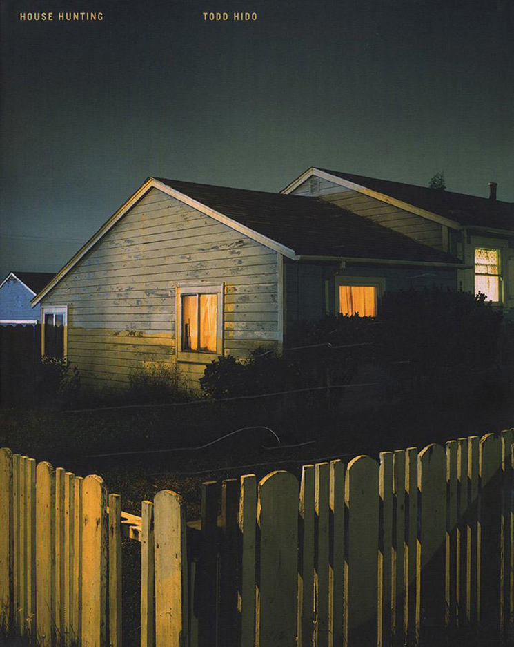
Todd Hido, House Hunting, 2001.17 by 14 inches. 56 pages containing 26 “carefully selected” Photographs. One of only 4,000 copies. I spent 3 months hunting one. *Nazraeli Photo. Click any picture for full size.

When I first saw House Hunting, it went right through me. It was akin to an album that spoke to you in a formative part of your life- you connect with it when you feel almost no one understands.

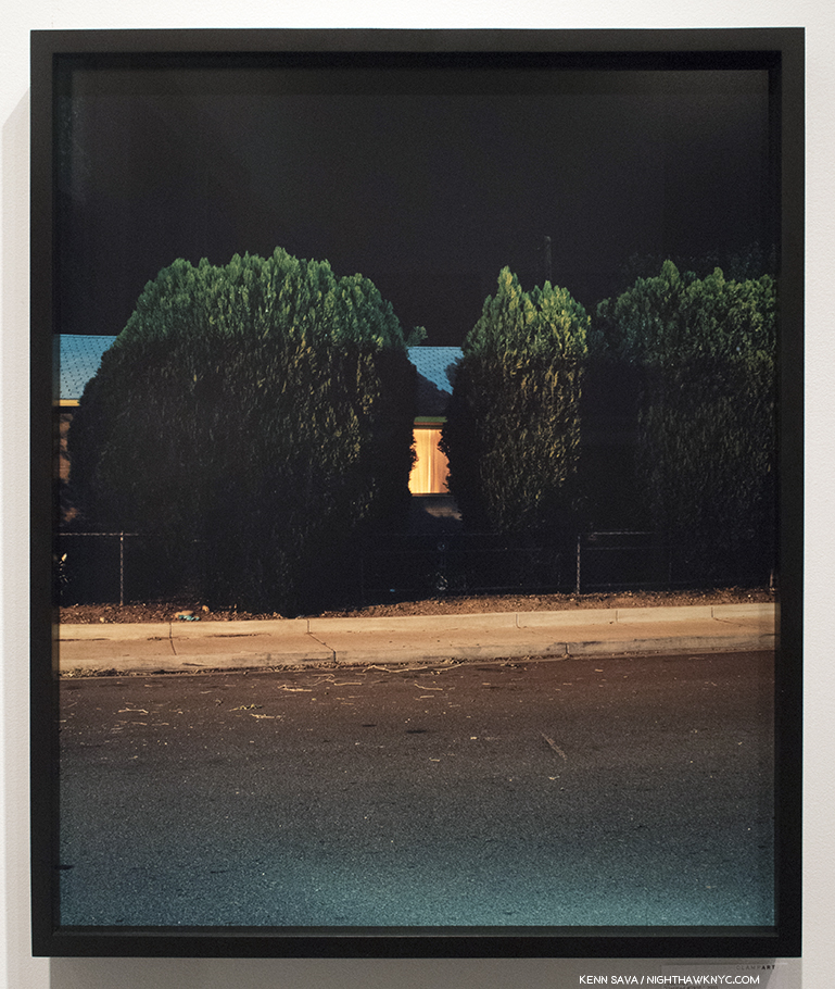
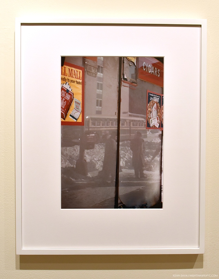
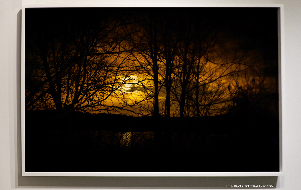
Todd Hido, Untitled #7910, 2003, seen at AIPAD, 2017.

I’ve spent most of my life being behind that lone light burning all night long.

But it’s more than that, of course. It’s a nocturnal portrait of suburban American life as (mostly) seen from the outside, with its partially crumbling picket fences, hanging laundry, it-seemed-like-a-good-idea-at-the-time discount clapboarding slapped on structures that don’t meet the floor of anyone’s definition of “architecture,” and aging vehicles. Home sweet home. Like the Artist, I grew up there, too. I’ve learned since that I am far from being alone in connecting with it. His “Houses at Night,” series, the work that first brought the Artist to prominence when it was released in his first PhotoBook, House Hunting, in2001, saw its two printings of 2,000 copies each disappear into the hands of 3,999 others. It wound up being selected by PhotoBook aficionados Martin Parr & Gerry Badger for inclusion in the third installment of their multi-volume rundown of PhotoBooks they find particularly notable, The Photobook, Volume III. It’s interesting to me looking back on it now that this work is so popular while not dissimilar work of his illustrious predecessors Robert Adams (Summer Nights, an acknowledged influence of Todd Hido’s) and Henry Wessel (Night Walk) have found only niche followings. Perhaps it was Mr. Hido’s use of color that explains his series popularity? Or, maybe it’s his series has more of those lone lit windows.

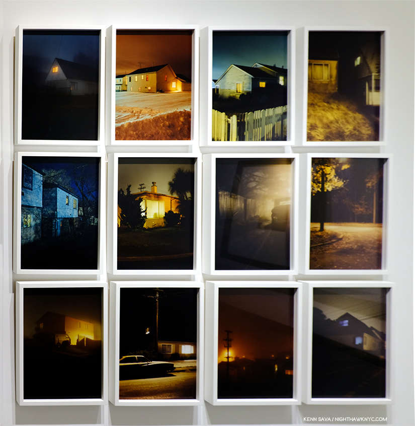
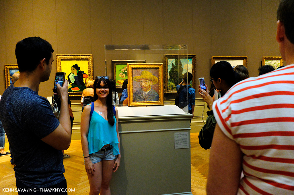
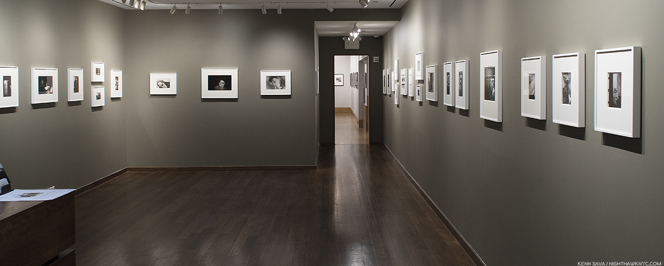
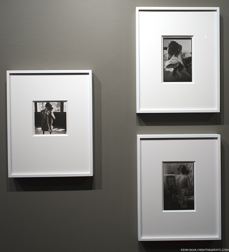
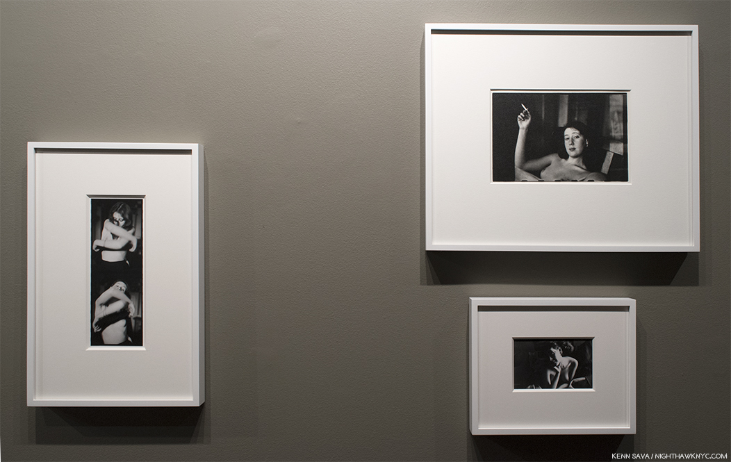
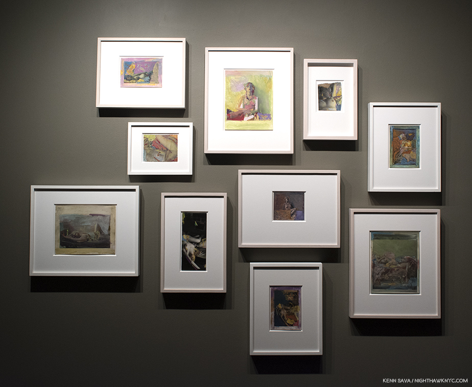
Old friends. 12 works from his “Houses at Night” series, published as House Hunting and Outskirts, include the former’s famous cover image, top row, third from left, with the cover image for the excellent Aperture mid-career retrospective, Intimate Distance to its left. Seen at Bruce Silverstein Gallery.

Outskirts, a veritable House Hunting, Volume 2 followed a year later, but then, with the release of Roaming in 2004, a book that purposely “has no homes in it,” it became apparent that Todd Hido was “no one trick pony1.” There were some dissenting voices that preferred their desolation with a single light burning in it. Roaming, a book who’s grey mood is characterized by its clouds and not a night sky, was the first inkling of what was to come, its title almost serving as a one-word summation of his subsequent creative journey. Todd Hido has not been one to stay in one place, artistically, or rest on his, now substantial, laurels. His work, as seen in his books and gallery shows, has continued to evolve, always in fascinating ways. Interiors, desolate landscapes (sans lights, except for his car headlights on occasion, maybe a rising or waning sun), and even portraiture, introduced, gradually, along the way, are now all part of his repertoire. He’s now, also, no stranger to appearing in the fashion and editorial media. In fact, when I met him earlier this year, Todd Hido was in town to shoot a series of New York Times Magazine covers, and there was the recent dual show of his work up with the fashion Photographer, Miles Aldridge.

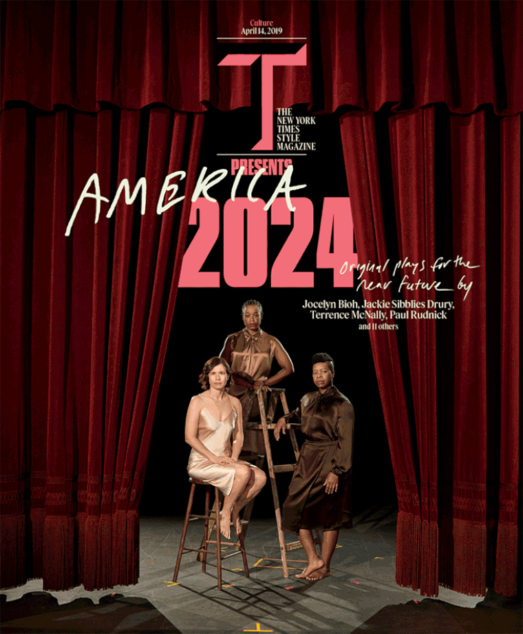
*Todd Hido, One of a series of 4 New York Times Magazine covers he shot for its April 14, 2019 issue.

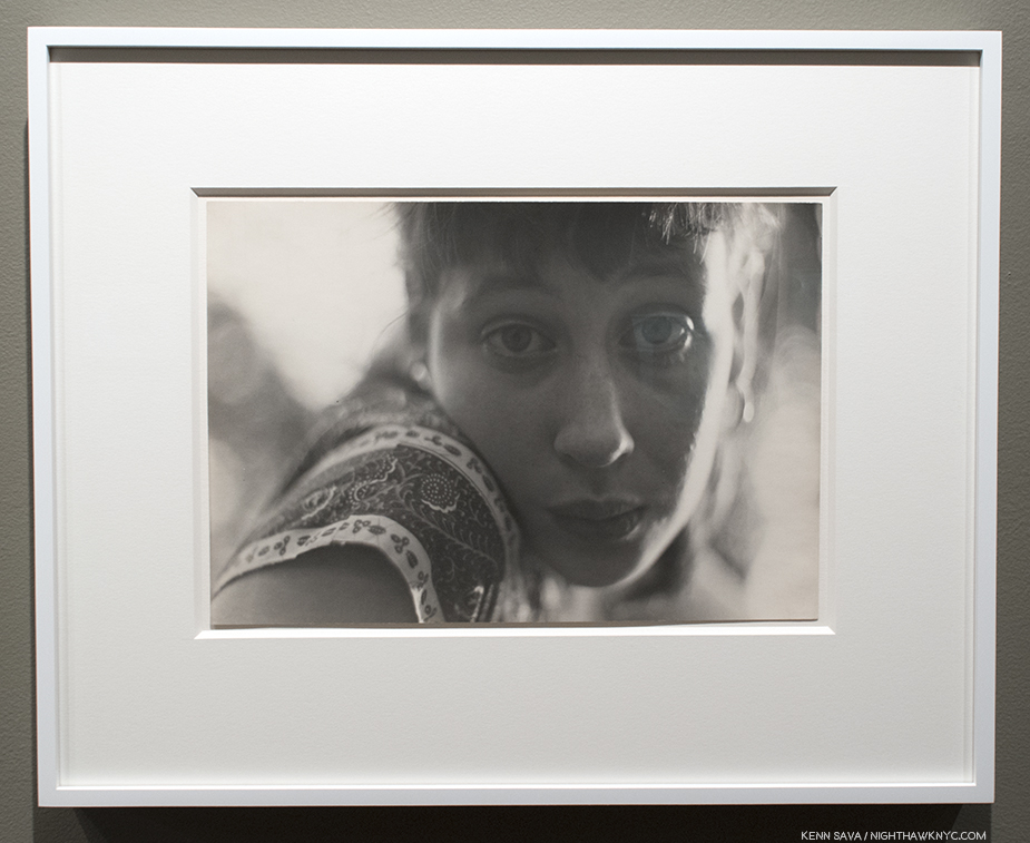
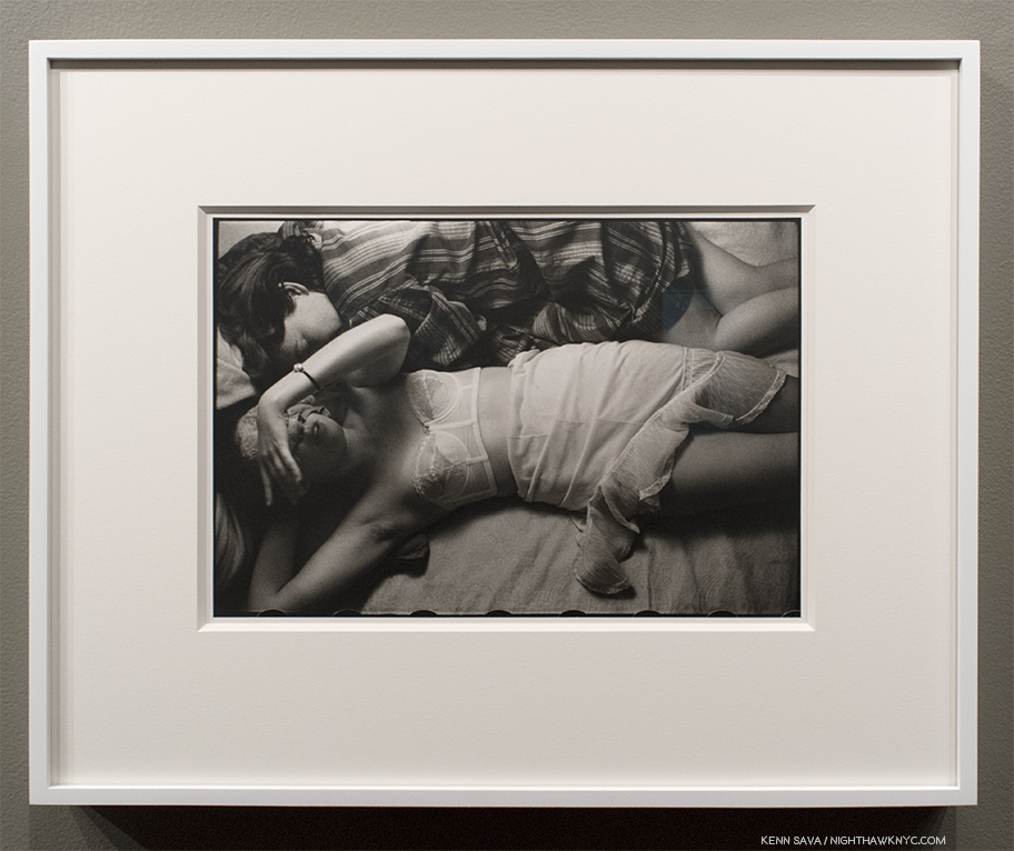
Each new monograph and each new subject brought new realms, both visually and in terms of the inner vistas Mr. Hido’s work stirs up in viewers. After beginning to work with models in 2004, his work with his beautiful and extremely versatile muse, Khrystyna, taking on something of the quality of his own version of Cindy Sherman’s Untitled Film Stills, has been a bit controversial, but for me, as in all of his work, it’s primarily interesting for what it reveals of the Artist. Excerpts from Silver Meadows, 2013, his last monograph until 2018, is a case in point. Though the titular street ran through his childhood neighborhood, the images include those from other places and other times- “surrogates,” as he called them. And that’s how I view all his subjects or actors & models- as surrogates.

“For me, I keep finding and exploring the same place no matter where I go. I draw from within, from my own history, as the basis of my work. All of the memories and experiences from my past come together subconsciously and form a kind of fragmented narrative2.”

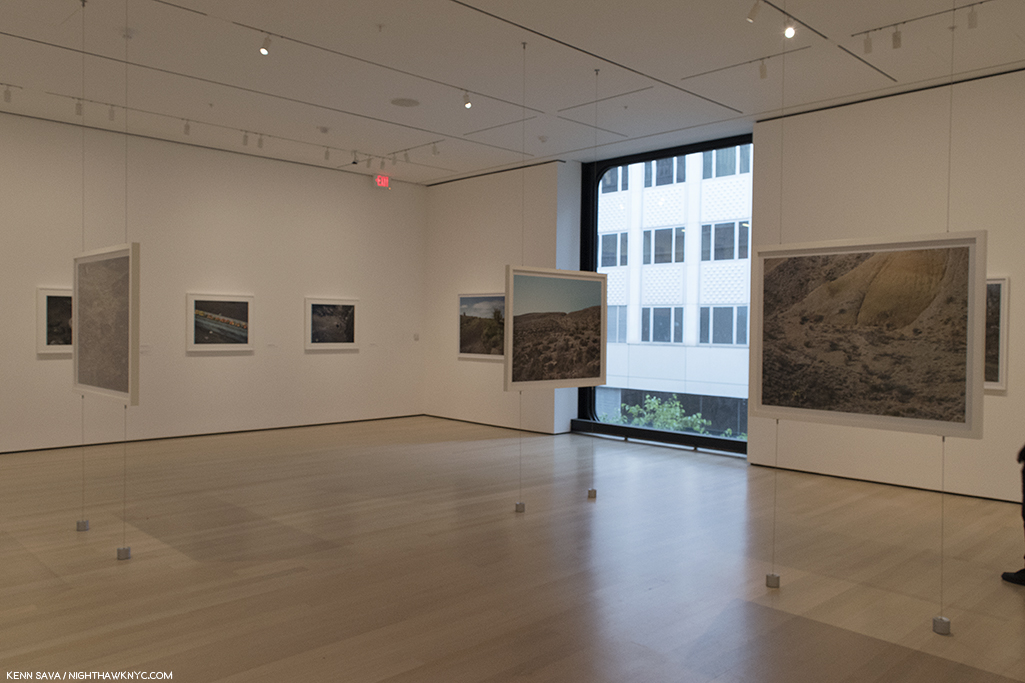
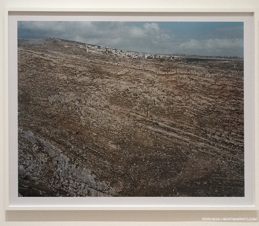
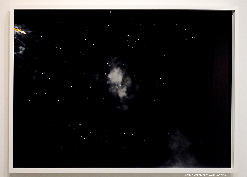
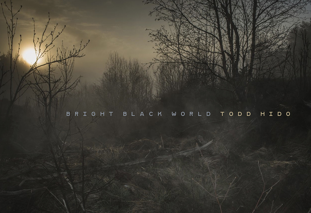
Still? NONE of his past work prepared me for what I saw when I walked into Bruce Silverstein Gallery on an appropriately cold winter day to see new work featured in a book that hadn’t yet been released titled Bright Black World in a show of the same name. The press materials say these works, “are the results of Hido’s exploration of the northern hemisphere in the impenetrable depths of winter. The realities of climate change lurk behind in these – the threat of an eternal darkness looming large….Not just a political statement, Bright Black World is infused with Nordic mythology, Ragnarok, and the idea of Fimbulwinter – a winter that never ends3.” And so, the show, and this work, marks more firsts in the work of Todd Hido- work addressing the state of the world, as well as being the first time he’s travelled to another country to create it.

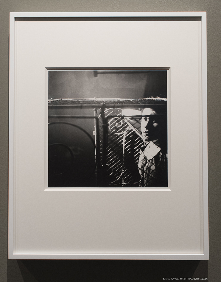
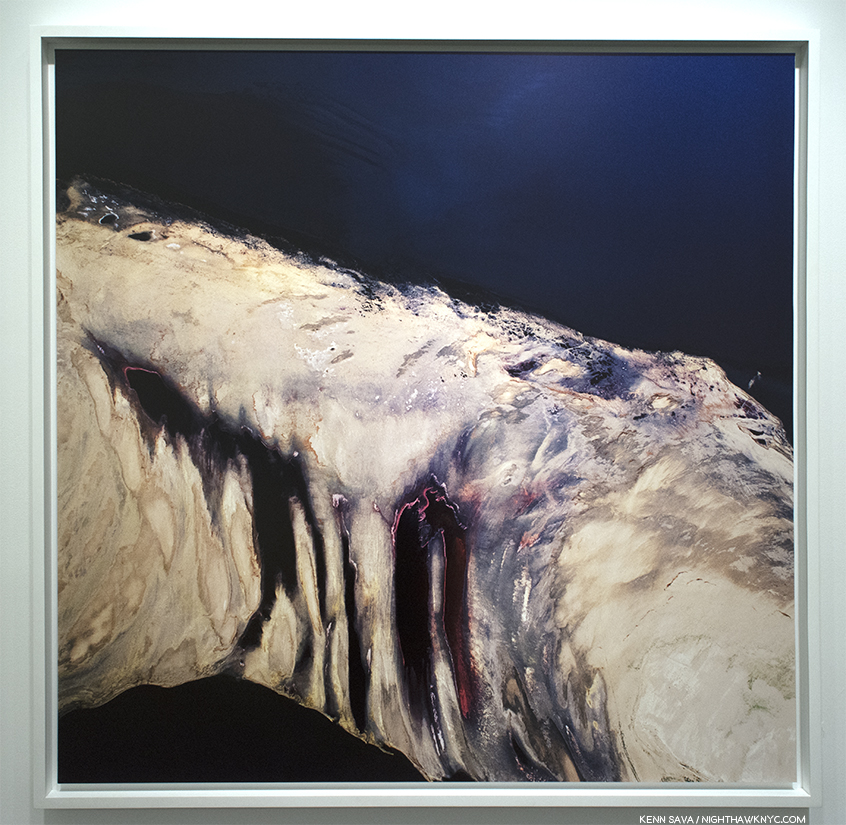
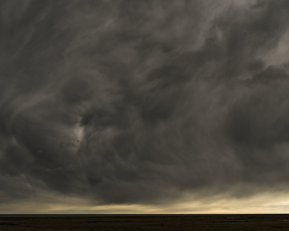
#11389-3087, 2014, 30 x 45 inches from Bright Black World seen at Bruce Silverstein Gallery.

As I looked at the new work, the first thing that struck me was how gorgeous the prints were. Instantly, THE Todd Hido quote that has stayed with more than any other came rushing back to me…

“I photograph like a documentarian, but I print like a painter4.”

Here? Though I own four Todd Hido prints (including Untitled #7910, seen earlier, alas, none at the size of these), in my opinion, he’s taken it to another level. The larger scale of many of them serves to engulf the viewer, who promptly gets lost in the overall feeling and the details. They’re extraordinary, and simply have to be seen to be appreciated.

The second thing that immediately stood out for me was that the character of the light has changed. I’ve never seen darkness quite like this.

“It’s been said that Inuits have many words to describe white. As the polar snow caps melt faster than we ever imagined, I wonder how long it will be before we have as many words to describe darkness,” Todd Hido5.

#11798-4172, 2017, 30 x 45 inches, is also the cover image for his new PhotoBook, Bright Black World.

And? My old friend, the night, makes a return appearance.

The return of the lone light burning at night. #11797-3252, 2017. Courtesy of Todd Hido and Reflex Amsterdam, where a sister show was up concurrently.

In the midst of his incredibly busy life, I am grateful that Mr. Hido found time to answer a few questions for me, both long-standing, and some brought on by his new work. I’ll intersperse them from here on. First, since I live my life at night, and have long been fascinated by the few Artists & Photographers who work at night, I had to ask him- What is it about the night that inspires you?

Mr. Hido replied, “I am inspired by the night for many reasons, but mostly it is because everything slows down and gets quiet. I find that that is when I am able to focus my attention and see the best. Also, there is an atmosphere at night that lends itself to creating the mood that I am interested in.”

#11793-9406, 2017, 20 x 30 inches. It could be a production still from countless horror movies.

Coincidentally, as I walked through the show, a random song started playing on my headphones…

“The windows of the world are covered with rain
Where is the sunshine we once knew?”*

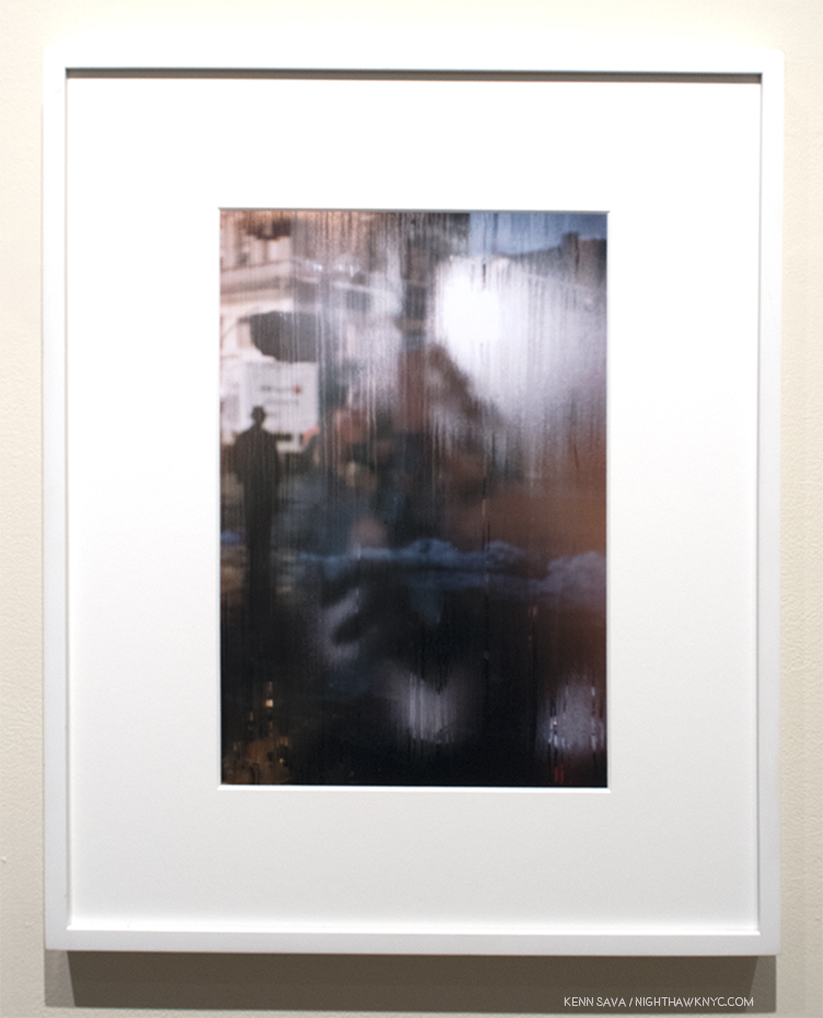
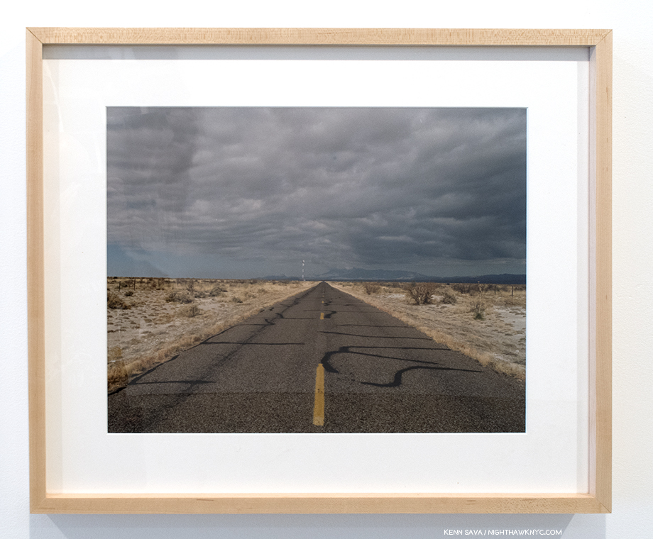
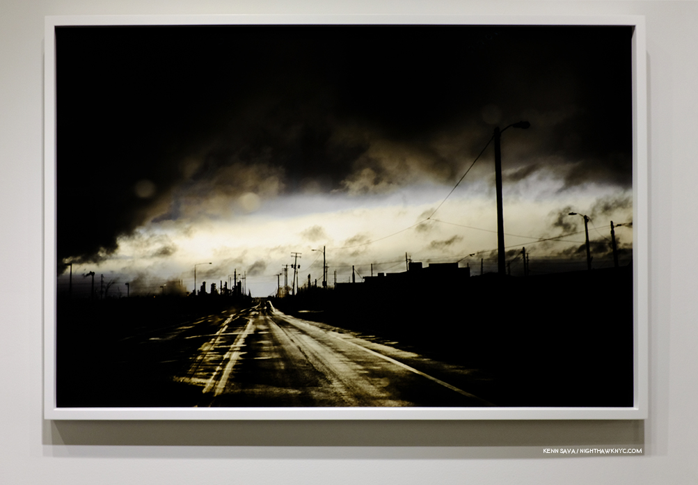
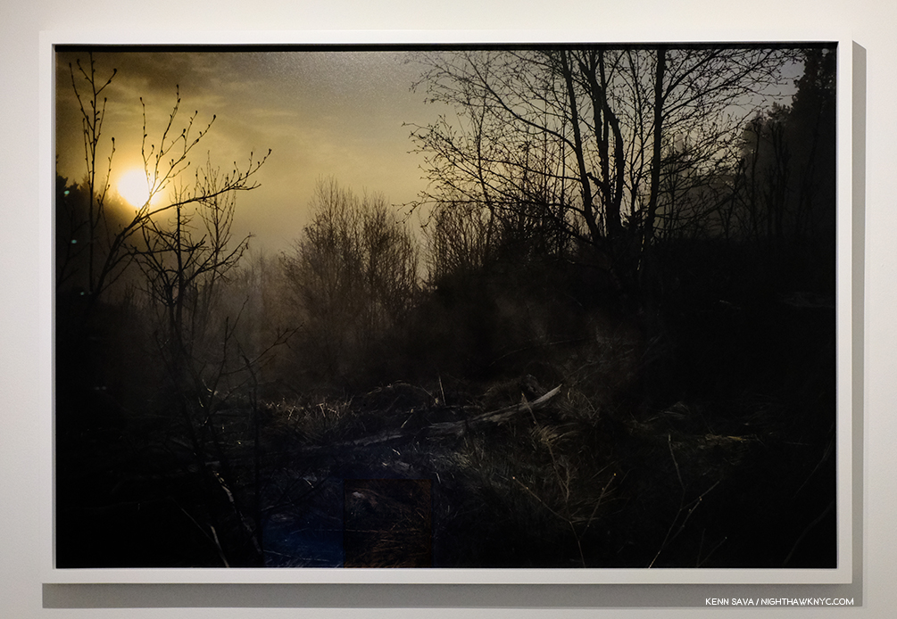
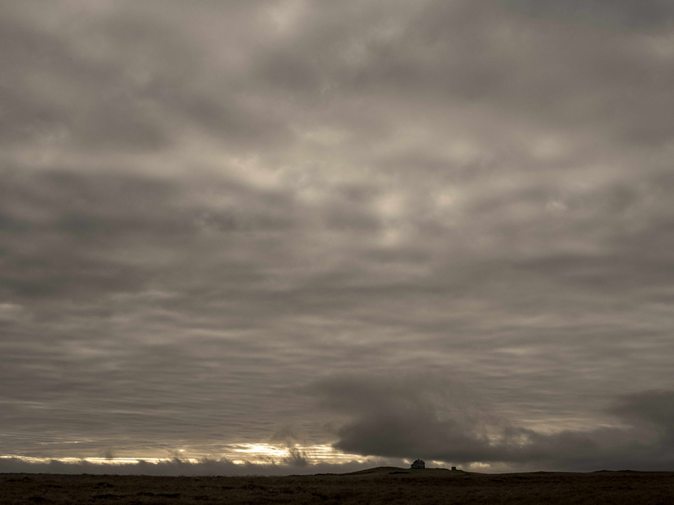
#11801-1971, in particular, held me spellbound for minutes on end.

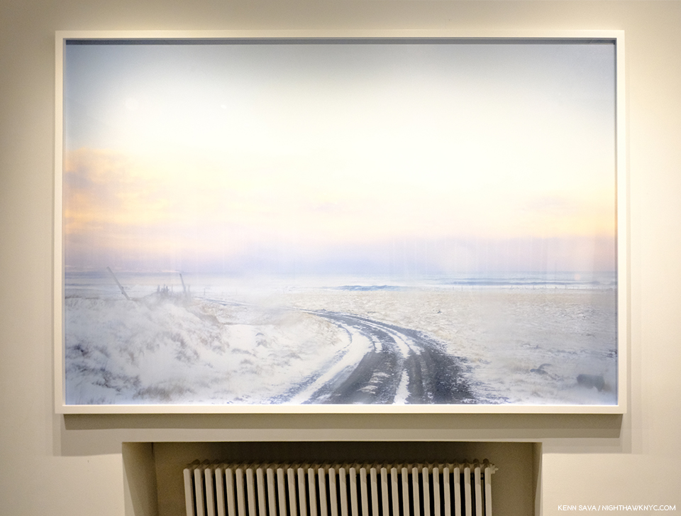
#11801-1971, 2017, a massive 59 x 88 inches, looks SO cold, even hanging it over the radiator isn’t going to make it feel warmer.

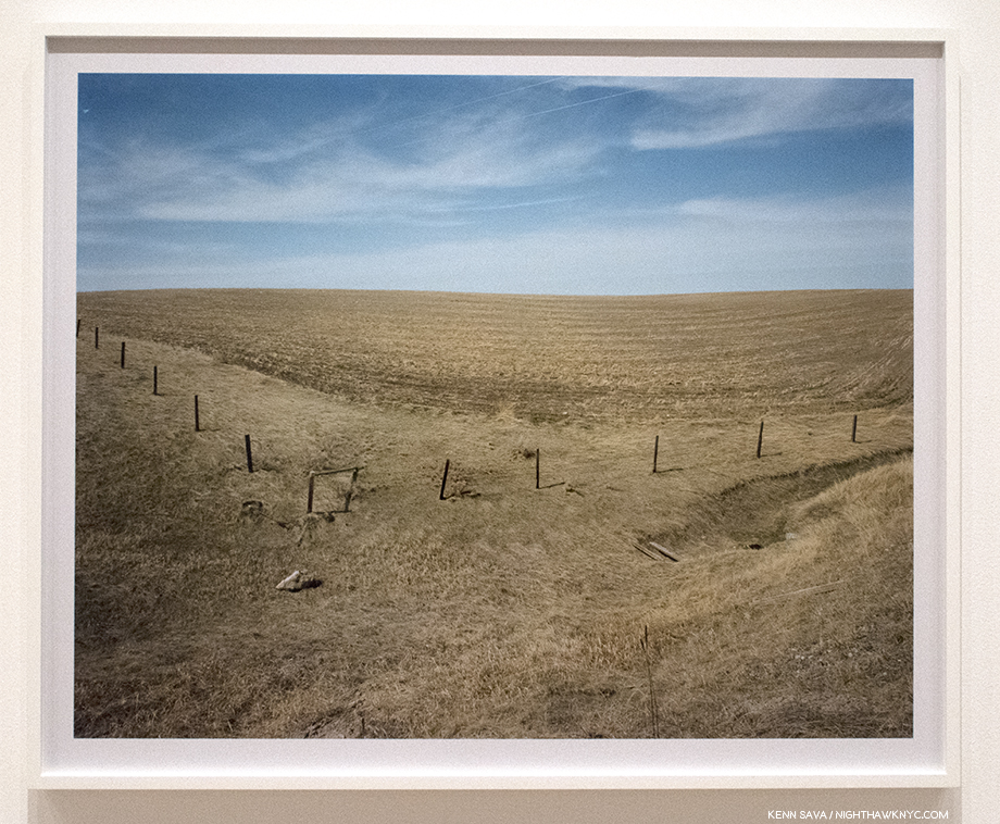
The sign of human intervention in the landscape disappears as the road turns left, leaving the viewer…? Standing there, I felt the ghost of the great James McNeill Whistler in it, among others, but at almost 7 1/2 feet long, it engulfs you in a sense of cold, and a resulting terror, that was unforgettable.

Hence, my second question- I’ve long wondered- Are there any painters who have influenced you?

Mr. Hido said,- “I am definitely influenced by Edward Hopper and Andrew Wyeth and of course I love Gerhard Richter, but one of my favorites is Marlene Dumas.”

#11756-269. That house looks to be the size of a stone.

These images are, therefore, characterized either by light that is fading, distant, faint, or has completely gone (though in some images it’s hard to tell if the sun is setting or rising). Whereas the air was, in my view, unthreatening and calm in the “Houses at Night”/House Hunting works, uneasiness, at least, is in the air in almost every one of these Bight Black World Photographs.

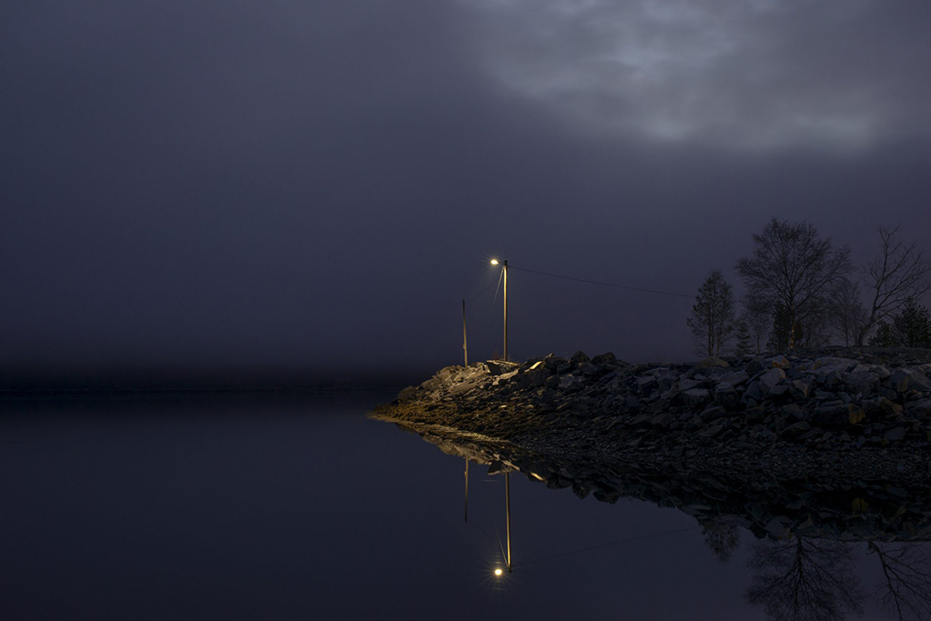
Exact locations for most of these Photos are not known, but it is known that for the first time Todd Hido went overseas, to Northern Europe, to create some of this work. It turns out that my brother from another mother, NYC guitar legend, Dave Fields, was, coincidentally, on tour in Norway the same day I saw this show. Without explaining why I wanted it, I asked him if he would step out of his hotel one evening and snap a picture of the sky. Maybe the amazing skies of Bright Black World are everywhere to be seen there. ? Here’s what he sent me-

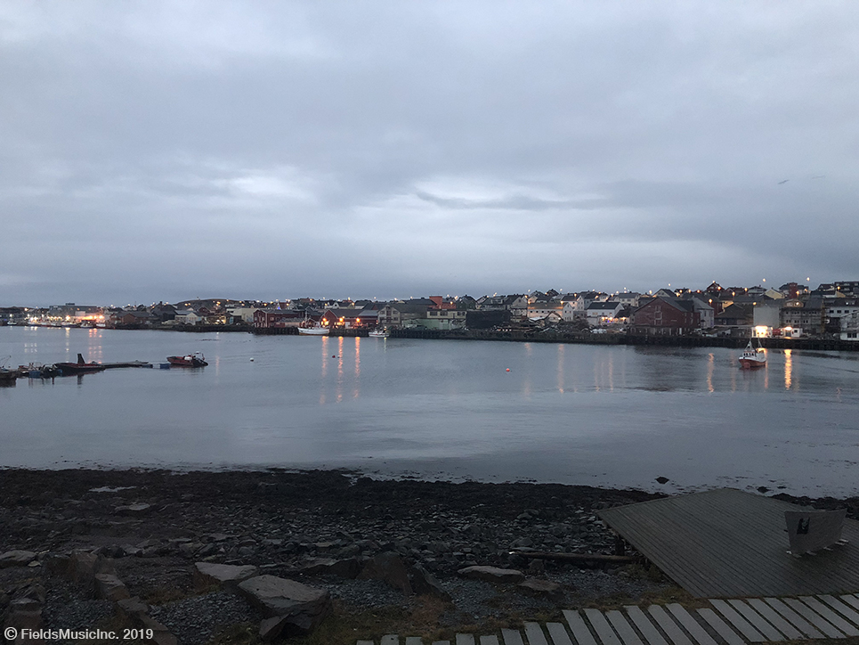
*Dave Fields, Lystgaard Skjerstad, Norway, November 18, 2018. A career as a Photographer possibly awaits the brilliant guitarist and singer/songwriter.

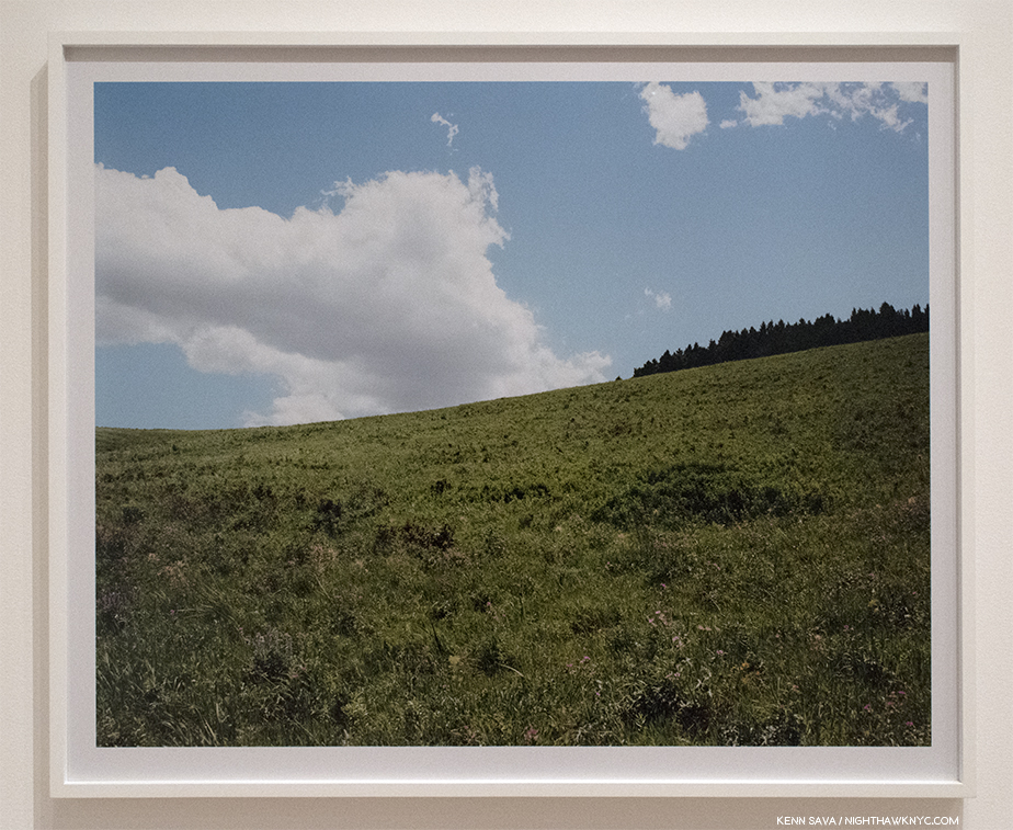
There’ve been subtle differences in each of his landscape projects, from House Hunting & Outskirts through those appearing in his subsequent books. Bright Black World continues that progression. Everything I’ve admired about his more recent landscapes- their atmosphere, their “spontaneous” feel that often looks like the shot was taken through a car window (many were), while the car was still in motion (Doubtful. He’s a dad.), the almost miraculous combination of elements, enhanced by their “painterly” feel, are all in full effect here. For me, at least, the results are as beautiful, if not more beautiful, than anything I’ve seen that Todd Hido has done.

#11755-2192. Photographs like this begin to make you understand what J.M.W. Turner might have been seeing that inspired his unequalled sky scapes.

His new book, Bright Black World, published, as each of Mr. Hido’s now seven monographs have been, by Nazraeli Press, saw its entire 3,000 copy first printing sell out almost immediately. On the one hand this is a testament to how popular Mr. Hido has become, as well as to how well done the book is. On the other hand, it’s a bit of a shame that the book is not more readily available for the rest of the world to see, as with so many great PhotoBooks that have gone out of print and become very hard to find or see. It’s a huge book- just about 17 inches long by about 12 inches high, and weighing over 3 1/2 pounds, with 108 pages, but, unlike other large PhotoBooks, it’s size is entirely necessary to convey the intended feeling seeing the full size prints imparts, as well as a sense of all that is in these images.

#11692-492, 2014.

“The windows of the world are covered with rain
What is the whole world coming to?”*

After Aperture’s 2016 mid-career Todd Hido retrospective, Intimate Distance (see BookMarks at the end), the Artist felt it was time to begin anew.

#11599-5811, Kent, OH

Kenn Sava (KS)- It’s been 5 years since Excerpts from Silver Meadows, with the retrospective Intimate Distance intervening. You spoke about “closing that chapter,” (per reflexamsterdam’s site), with Intimate Distance. In Bright Black World there are elements of things from your past series- rooms in decay, the beautiful denuded trees in inclement weather, a portrait of a woman, and even one or two Photos of buildings with a single light on. Yet the feeling, now, is completely different. It’s more ominous, expectant throughout, in my reading. I’m wondering why you chose to end both Intimate Distance and Bright Black World with the same image (#11599-5811, Kent, OH)?

Todd Hido (TH)- Well, to answer your  question it made perfect sense because Intimate Distance was a survey and the last part of that book was of things I had never used in a monograph. That image you are speaking of as dark as it is, I find kind of hopeful.

KS- As a dad, was it hard for you to release a (beautiful) book that’s this dark, one that references Fimbulwinter and the end of days?

TH- As a dad it was crushing to read Cormack McCarthy’s The Road, which I happened to delve into when my children were young. They have always called me “Papa” and that is exactly what the child in book called his father. Whenever I read that it always hit home harder. In terms of my own book, I would say that every book I make helps my children. No matter what my outlook may be.

#11804-3243, 2017, 30 x 41 inches.

“The windows of the world are covered with rain
When will those black skies turn to blue?”*

BookMarks-

Bright Black World, 2019, published as each of his prior 6 monographs have been, by Nazraeli Press, in a first printing of 3,000 copies that sold out almost immediately. It’s generous 17 by 12 inch size wonderfully compliments the expansive nature of the work, as do its two vertical gatefolds. It’s a book full of dark wonders and the most compelling new book of landscapes I’ve seen so far this year. Copies are currently trading for about 150.00, 2 times list, on the aftermarket around the world. Waiting to see if there will be a second printing might be wise at this point, as I don’t think aftermarket prices are going to immediately rise much higher for perhaps a year, or until it’s apparent there won’t be a 2nd printing. I will update this paragraph if I get news of a second printing.

Todd Hido: Intimate Distance: Twenty-Five Years of Photographs, A Chronological Album, Aperture, 2016, is the best place to get an overview of the Artist’s career and accomplishment up to 2016. Given his classic books, House Hunting and Outskirts are both out of print and each going for upwards of 400.00, Intimate Distance is also the place I recommend to start. It’s a very good overview, “roaming” (sorry) over all the series of his work to that point, and so gives a real sense of what he’s done, and achieved, in each realm he’s worked in (in his monographs), thus far.

Ok, yes, House Hunting is one of the great PhotoBooks of the first part of this century, in my view. Published by Nazraeli in a first printing of 2,000 copies in 2001, they vaporized within weeks. The 2007 second printing of 2,000 copies also quickly sold out. Currently, you’re looking at 300.00, and up for a second printing, first printings starting at 425.00, both in very good condition in very good dust jackets.

For Outskirts, 2002, his excellent second book, which has only seen one printing thus far, copies start at 400.00 (in vg/vg). If you are trying to choose between getting either House Hunting or Outskirts, my vote would be for House Hunting, which is much more in demand and more likely to stay that way. 

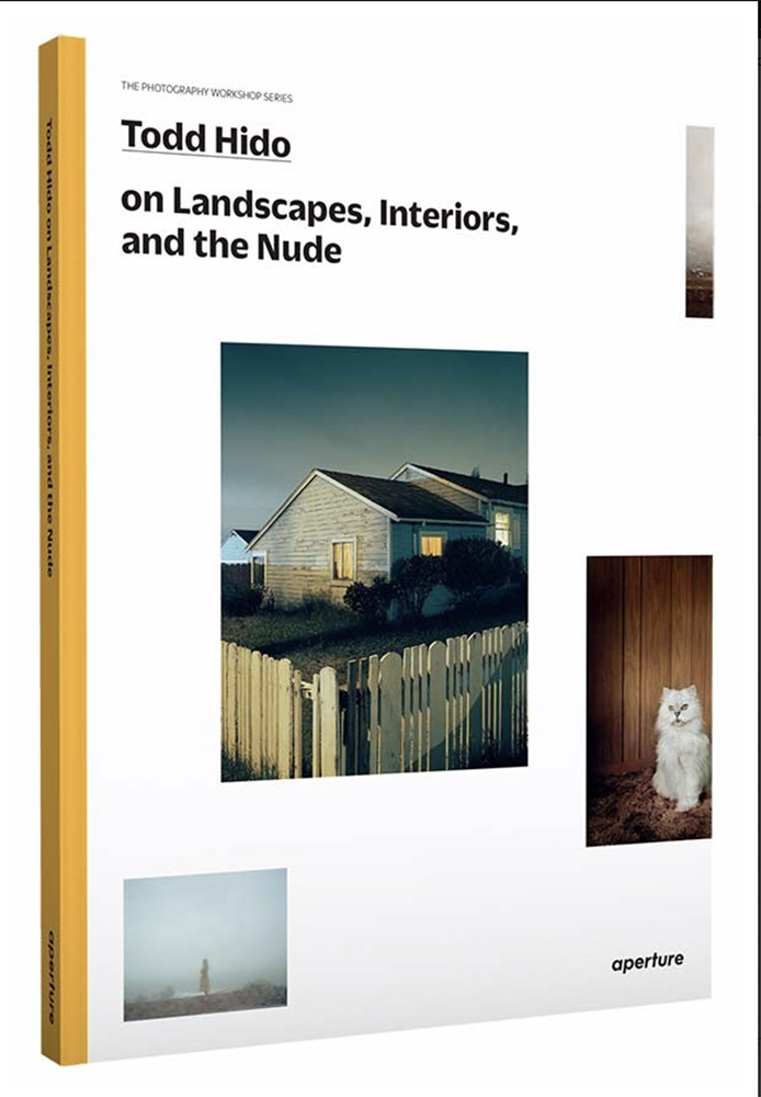
A sleeper pick, a book that at first glance may seem to be aimed particularly at Photographers, is Todd Hido on Landscapes, Interiors, and the Nude: The Photography Workshop Series, Aperture, 2014. Since it contains the most extensive writing Todd Hido has done on Photography to date, it’s continually insightful for lovers of his work as well. The introduction is by no less than Gregory Halpern, a one time student of Mr. Hido’s, who imparts a classic tale of his experience as one.

*- Soundtrack for this Post is “The Windows of the World” by Burt Bacharach and Hal David, performed by Dionne Warwick.

My thanks to Alison Crosby, Stefanie Williams, Gregory Halpern, Dave Fields, and Todd Hido.

NighthawkNYC.com has been entirely self-funded and ad-free for over 6 years, during which over 250 full length pieces have been published. If you’ve found it worthwhile, you can donate to keep it going & ad-free below. Thank you!

Written & photographed by Kenn Sava for nighthawknyc.com unless otherwise credited.
To send comments, thoughts, feedback or propositions click here.
Click the white box on the upper right for the archives or to search them.
For “short takes” and additional pictures, follow @nighthawk_nyc on Instagram.

Subscribe to be notified of new Posts below. Your information will be used for no other purpose.


  1. Todd Hido: Intimate Distance, P.108
  2. Todd Hido on Landscape, Interiors, and the Nude, P.8
  3.  Here.
  4. Todd Hido on Landscape, Interiors, and the Nude, P.53
  5. Here.

Charles White- Now

Written & Photographed by Kenn Sava

“Drawing is [a] particularly exciting medium for me. I just like the feel of it. My whole body is into it when I draw and I think black and white is as effective a medium [as any].” Charles White1

Charles White, Detail of Study for Nat Turner, Yesterday, Today, Tomorrow, 1968, Charcoal and oil wash over pencil on board. Click any Photo for full size.

Ah…the majesty of excellent draftsmanship… Just when you thought it was dead as a doornail, with Photography destroying all previous Artforms in its world dominating wake, along comes a Retrospective of one of the Masters of the craft of Drawing in the 20th Century, the late Charles White (1918-1979), who’s centenary is celebrated in the first major museum survey devoted to his Art in over 30 years. Charles White: A Retrospective, made its second stop at MoMA after debuting at the Art Institute of Chicago and now heads to LACMA beginning February 16th, thus tracing the 3 cities Mr. White lived in- in order. Its magisterial, full of wonders, and long overdue. The only possible caveat could be- MORE!…even bigger, please.

The entrance, divided by a sliding glass door, of one of the great shows of recent years.

By no means a small show, clocking in at 114 items (many of them quite large), over 13 section, the takeaway is that, henceforth, it will be impossible to deny Charles White his place in the pantheon of great Artists of the century. Again.

Charles White was a very successful Artist during his lifetime. He had gallery representation in each city he lived in and his work was collected by museums, nationally and internationally. He was also sought out as a teacher, particularly at Otis College of Art & Design in Los Angeles, from 1965 until his passing in 1979 at only 61. After his death, he fell into something of an eclipse. But, his influence has lived on through the work of his students including Richard Wyatt, Jr, Kent Twitchell (both muralists), and most prominently, Kerry James Marshall (a “representational” Painter) and David Hammons (who has worked in a wide range of media). Mr. Marshall never seems to miss an opportunity to laud Charles White- as a teacher and as an Artist, frequently speaking of him in the highest terms, as he has, again, writing the preface for the excellent Exhibition Catalog. He led me to take a deeper look at Charles White a few years ago. Mr. Hammons paid tribute to Charles White in October, 2017 when he curated the remarkable Leonardo da Vinci-Charles White show at MoMA, that I wrote about here. Judging by the crowds that attended this show, as the MoMA stop of the Charles White Retrospective “tour” ends and Los Angeles prepares to welcome it, I think it’s already safe to say, the Charles White “eclipse” is over.  The other take away, for me, is that Charles White’s influence deserves to be even greater than it already is. With all due respect to his students, Charles White’s Art more than speaks for itself.

Study for Nat Turner, Yesterday, Today, Tomorrow, 1968, Charcoal and oil wash over pencil on board.

When I was a kid, everyone drew. Some, eventually, took lessons and studied Drawing seriously, which is something you can devote your life to and learn something new each and every day. Even for those that didn’t study it, Drawing became a part of many of their lives, whether making doodles, notes, caricatures, or, what have you. That seems to be changing and I think it’s tragic. Drawing is another language, one that is every bit as effective at communicating as writing. I think it’s an essential life skill. Unfortunately, it’s one that I don’t see as many doing as they were 15 or 20 years ago. One look at the work of Charles White will show you what’s possible with Drawing. 

The final Drawing.Nat Turner, Yesterday, Today, Tomorrow, 1968, Drybrush and ink on board, 51 x 78 inches.

As beautiful and technically masterful as it is, Charles White’s work is about expressing ideas. “An artist must bear a social responsibility. He must be accountable for the content of his work. And that work should reflect a deep, abiding concern for humanity. He has that responsibility whether he wants it or not because he’s dealing with ideas. And ideas are power. They must be used one way or the other,” Charles White2. He was speaking in 1978. He could have been speaking yesterday.

Back cover of the Exhibition Catalog.

Those ideas revolved, largely, around his efforts to set the record straight on black history in America in response to the way it was taught when he was growing up. He did this through depicting both the famous and those not so famous in powerful and unique ways that seen over the course of my 4 visits seemed to resonate with visitors in ways I don’t often see. Time and again, I encountered whole families moving slowly from work to work, with the parents patiently explaining fine details of a subject’s life, or very little known cultural details Mr. White had depicted, from what I could gather when they were next to me.

Charles White hit the ground running. He received a scholarship to the School of the Art Institute of Chicago at 13. He drew this at 17-

Self-Portrait, 1935, Black crayon on cardboard.

He then began exploring a wide range of styles over the next few decades, some showing the influence of abstraction, cubism and mannerism, but, remarkably, always remaining his. I found it interesting to trace them in his early murals, for which only studies remain. The first one, Five Great American Negroes was done 4 years after the Self-Portrait, when Charles White was 21.

Charles White, Five Great Americans Negroes, 1939, Oil on canvas. From left to right- Sojourner Truth, Booker T. Washington, Frederick Douglass, George Washington Carver, and Marian Anderson

Here we see Charles White depicting famous figures- living and dead (these were selected by the readers of the newspaper who sponsored the mural), something he would do for much of the rest of his career. The enlarged arms and hands that begin to be seen here remind me of passages in Michelangelo and the Mannerists, like Hendrick Goltzius.  The Mexican Muralists- Diego Rivera, José Clemente Orozco and David Alfaro Siqueiros, who he met on a later trip to Mexico, were an obvious big influence. Artistically and philosophically.

Study for Struggle for Liberation (Chaotic Stage of the Negro, Past and Present), 1940, Tempera on illustration board.

One year later, his Struggle for Liberation (Chaotic Stage of the Negro, Past and Present), a 1940 project for a Chicago Library that was never completed, is known today only through this study and some Photographs taken by Gordon Parks. In this incredibly complex composition, the left side speaks to the past, the right to the present. Both scenes appear to be filled with everyday people, except for John Brown, apparently holding a gun,  in the lower left. According to curator Sarah Kelly Oehler in the Exhibition Catalog, this work can be seen as indication that his ideas were leaning left and towards putting more faith in everyday people to bring change. In the right side, “He depicted capitalism, politics, institutional power, and violence as responsible for the ongoing injustices faced by African Americans as they demanded their rights3.” The work was deemed “inappropriate” for a library, even one that served a black community. Charles White, apparently, finished the left side of it, then moved to New York.

Study for The Contribution of the Negro to Democracy in America, 1943. Tempera on board. Note the row of Civil War soldiers, near the center. Painted during World War II, these were possibly included in support of a campaign to gain equal rights at home and abroad for African American soldiers as a reminder of their contributions during the Civil War.

In the last of Charles White’s three early murals, The Contribution of the Negro to Democracy in America, 1943, the Artist includes at least 14 identified historical figures, in a circular composition. His style, again, is unique and fascinating. Note the hands of the guitar player, possibly Lead Belly (playing a guitar with no strings), in the lower right and the planar nature of the portraits. Again, there seems to be the influence of Diego Rivera, with the machinery in the center echoing his Detroit Industry Murals.

Five portraits, in five styles. Clockwise from top left- Worker, 1944, John Brown, 1949, Gideon, 1951, Untitled (Bearded Man), c. 1949, and Frederick Douglas, 1950.

This wall shows 5 portraits, each in a different style, that includes at least one study for a mural portrait.


Worker, 1944, Linocut on paper. From the Exhibition Catalog. .

When I look at these, and in particular the portraits of the Worker, John Brown, Untitled (Bearded Man) and Frederick Douglas, I’m reminded of the prints of the German Expressionist, Kathe Kollwitz (1967-1945), an Artist who was, also, passionately involved in social causes, increasingly after losing her son, Peter, in World War 1 in 1914. Kathe Kollwitz was influenced by Expressionist Ernst Barlach’s prints, but further stripped them down to their essentials, in stark works like this Frontal Self-Portrait, 1922-23.

Kathe Kollwitz, Frontal Self-Portrait, 1922-23, Woodcut. MoMA Photograph.

Charles White was both an avid Photographer and a collector of Photographs in books and in the media (like Francis Bacon). Charles White’s own Photography is only touched on in the show with this case of 17 Photographs. It’s a subject that warrants closer study.

A selection of Photographs taken by Charles White range from portraits to street scenes to shots of a protest in NYC.

Both his Photos and his collection of media provided him with reference material that he created many of his works from (also like Mr. Bacon). I find this interesting since Charles White was a master of life drawing which he also taught.

As his career went on, and his mature style appeared, particularly in his work after his move to California to help with the lingering side effects of the tuberculosis he got in the Army in 1944, his images are more and more open to interpretation.

Birmingham Totem, 1964, Ink and charcoal on paper, 71 x 40 inches.

Birmingham Totem, 1964, is an amazing work on many levels. First, it stands one inch shy of 6 feet tall, unheard of for a Drawing, except in this show. Second, it’s an “elegy” (per the wall card) to the four girls (one, aged 11, three age 14) that were killed in a KKK bombing of the 16th Street Baptist Church in Birmingham, Alabama on September 15, 1963. In it, a young man sits atop of pile of rubble, rendered in incredible detail. Even more remarkable, the young man holds a plumb line in his right hand, the weight of which is seen about half way down. He would appear to symbolize rebuilding.

J’Accuse #1, 1965, Charcoal and Wolff crayon on illustration board. This series marks the debut of Charles White’s mature style, based in realism. The hands and arms are no longer exaggerated. While the style is more direct, the composition is more open to interpretation, and so, more abstract, which would continue for the rest of his career. According to Ilene Susan Fort in the Exhibition Catalog, the 12 powerful and stunning works in the J’Accuse series “constitute a thematic indictment of the systemic, ongoing disenfranchisement of African Americans4.”

Charles White, master of Drawing, master of depicting the black form (per Kerry James Marshall- “Nobody else has drawn the black body with more elegance and authority.” Exhibition Catalog P.15), is someone who had a strong agenda he manifested in his work. He championed the struggle of African Americans, women (witness his 1951 solo show, Negro Women, where all 15 works on view included a woman), and workers, in Artworks that included both historical figures and every day people. Along the way, he created a body of work that adds another powerful voice telling another side of African American history with unique compositions featuring exquisite execution. Charles White’s compositions were always complex. From the earliest work shown, Kitchenette Debutantes, 1939,

General Moses (Harriet Tubman), 1965, Ink on paper.

Among the women that reappear in Charles White’s work, none is his subject more often than the activist and abolitionist Harriet Tubman (1822-1913). This later work, General Moses (Harriet Tubman), is a striking portrait of her. Then, so is this-

Harriet, 1972, Oil on board.

In what is, perhaps, his finest series, in my eyes, the late Wanted Poster Series, Charles White reimagines “Wanted” posters issued for runaway slaves.

Wanted Poster Series #17, 1971, Oil and pencil on poster board.

A series of 14 works he began in 1969, the images are powerfully direct, yet still retain a fascinating mystery as one ponders the details. The background textures and the stenciled text remind me of Contemporary Art techniques found in the work of, say, Jasper Johns.

Banner for Willie J., 1976, Oil on canvas, memorializes Charles White’s cousin, Willie J., an innocent bystander who was killed in a bar robbery.

Black Pope is the already classic example of late Charles White. Featured in the 2 piece MoMA show in 2017 opposite a Drawing by Leonardo da Vinci, it was also the subject of a fine MoMA book released at the time. It perfectly sums up the experience of looking at it, and late Charles White when it concludes on its final page, “If we today find the work difficult to define, the drawing demands that we try5.” It is this enigmatic approach to realism that may be of lasting influence to those who have come after Charles White, particularly Kerry James Marshall, though it seems to me it may be there in the work of Abstract Artists Jack Whitten and Mark Bradford as well.

Black Pope (Sandwich Board Man), 1973, Oil wash on board.

” I find, in tracing the course of the portrayal  of the Negro subject in art, a plague of distortions, stereotyped and superficial caricatures of ‘uncles’ ‘mammies,’ , and pickaninnies’,” he said6. Charles White is an important Artist because his work accomplished exactly what he set out to do. It does so most artfully, it seems to me. It’s full of life, depth and mystery. Yet, his work has an immediate directness that speaks to everyone as soon as they see it.

Now. And forever. Detail of just one part of the enigma of this endlessly fascinating work.

When I look at that “NOW” in Black Pope, I, too, wonder what the Artist was trying to tell us. Then, I quickly begin wondering what his reaction would be to living in this “NOW” and finding so little has changed. It’s terribly sad on one hand. On the other? It makes Charles White’s Art as relevant as its ever been.

UPDATE- My look at the two satellite Charles White shows concurrently at David Zwirner is here. One show is centered on the mural for Mary McLeod Bethune, Charles White’s last major work.


BookMarks- If you like what you find on NighthawkNYC, I hope you’ll consider supporting it so that I can continue to spend the countless hours and pay the expenses it takes to keep it going these past 3+ years-without ads.  To do so, you can make a donation through PayPal by clicking on the box to the right of the banner at the top of the page that will take you to the Donation button. Your support is VERY much appreciated. Thank you!

Charles White, A Retrospective, 2018

Charles White: A Retrospective, by Sarah Kelly Oehler, Esther Adler and with a preface by Kerry James Marshall, published in 2018 by the Art Institute of Chicago, is the finest book yet published on Charles White and easily the best one in print. It’s a terrific introduction to the Artist that will also serve as a go-to reference for years to come thanks to the depth it goes into on such little-known areas like Charles White’s Photography as well as the inclusion of a full and detailed chronology and exhibition history. The reproductions are gorgeous. Easily recommended.

Fun fact- The inside of the dust jacket folds out to reveal this beautiful detail from Wanted Poster #12, 1970, suitable for hanging.

Charles White: Black Pope by Esther Adler and published by MoMA in 2017, is the other recommended, in print, Charles White book. MoMA curator Esther Adler does a very good job of analyzing Black Pope and relating it’s history, in the process looking at a number of other works from Mr. White’s career. While A Retrospective is the first choice for an introduction, for those looking to go deeper into one of Charles White’s greatest and most mysterious works, this book has the most information we are likely to get anytime soon.

Charles White, Black Pope, MoMA, 2018

* -Soundtrack for this Post is this video of Lead Belly, frequent subject of Charles White, performing. Purportedly the only film ever made of him-

My thanks to Stephanie Katsias of MoMA. 

NighthawkNYC.com has been entirely self-funded and ad-free for over 6 years, during which over 250 full length pieces have been published. If you’ve found it worthwhile, you can donate to keep it going & ad-free below. Thank you!

Written & photographed by Kenn Sava for nighthawknyc.com unless otherwise credited.
To send comments, thoughts, feedback or propositions click here.
Click the white box on the upper right for the archives or to search them.
For “short takes” and additional pictures, follow @nighthawk_nyc on Instagram.

Subscribe to be notified of new Posts below. Your information will be used for no other purpose.


  1. Exhibition Catalog, P.39
  2. Black Pope Exhibition Catalog P.8
  3. Sarah Kelly Oehler, Exhibition Catalog, P. 32
  4. Exhibition Catalog, P. 131
  5. P.51
  6. Exhibition Catalog P.24

2018: The Year In Art Seen, And Met

Written & Photographed by Kenn Sava

Will Art ever be more popular than it is now? On January 4th, 2019,  The Met announced another attendance record was set in 2018 when almost 7.4 million visited The Met Fifth Avenue, The Met Breuer or The Cloisters1.

On this late summer day, I’ll be lucky if I can figure out a way to get up the stairs to get in! Click any Photo for full size.

Simply put, when I think back on 2018, I’ll remember the extraordinary number of truly great shows I saw at The Met and The Met Breuer this past year, among those 7.4 million. While I certainly spent quality time at the other Museums and saw wonderful shows at each of them (not to mention countless galleries and a few Art & Book fairs), it’s almost impossible to top the list of shows The Met, collectively, mounted this year- especially when you consider that I didn’t even see the biggest show of them all- biggest by attendance that is, the show that drew 1,659,647 visitors- Heavenly Bodies: Fashion and the Catholic Imagination (I saw the parts of it that were installed outside of the show proper).

Heavenly Bodies: Fashion and the Catholic Imagination– A view of part of the show installed to the south of the Great Staircase.

I chose to skip it. My friend, the fashion Blogger extraordinaire, Magda, saw it and did a terrific piece on it, here.  As for the Art I saw in 2018? I’ll remember most standing on this spot near the south west corner of the 2nd floor of The Met, and marveling at the sight in front of me in a 270 degree range.

I’ve never seen the likes of this before. A 270 degree panorama from “the spot.” 2nd Floor, Metropolitan Museum.

Before my eyes, there were no less that 4 major and/or historic shows going on within yards of each other AT THE SAME TIME!

A fortnight of heaven. From right to left- 1- Rodin At The Met, 2- Michelangelo: Divine Draftsman & Designer, 3- David Hockney 80th Birthday Retrospective, 4- Birds of a Feather: Joseph Cornell’s Homage to Juan Gris. This photo was taken on February 4th, 2018. The last day all four of these shows were open at the same time.

Behind me, to the far right in the panorama, above, was Rodin At The Met (1, above), which I had just walked through to get to this spot.

Rodin, The Tempest, before 1910, Marble, seen in Rodin In The Met.

Just to my right was the once in a lifetime Michelangelo: Divine Draftsman & Designer (2), containing 133 of the Master’s Drawings and 3 Sculptures. Just to the left of that was the David Hockney 80th Birthday Retrospective (3). Down the hall to the left, Birds of a Feather: Joseph Cornell’s Homage to Juan Gris (4) recently opened. The run of all four overlapped from January 23rd to February 4th, when I took the above, just 13 days.

Had enough? C’mon. This is NYC!

Thomas Cole, The Course of Empire, Oil on canvas, 1833-36, on loan from the New York Historical Society. Installation view of Thomas Cole’s Journey: Atlantic Crossings. 170 years later, they would inspire Ed Ruscha to create a contemporary version that was shown in conjunction with the National Gallery, London, incarnation of this show.

ALSO going on at that very moment down in the American Wing, Thomas Cole’s Journey: Atlantic Crossings was a quite pleasant surprise, AND, over at The Met Breuer, the revelatory Edvard Munch: Between The Clock And The Bed was closing that very day! The Met, typically, has up to 25 shows up at any one given time. But, SIX MAJOR Shows up at the same time is extraordinary. WHERE else in the world does that happen?

Edvard Munch, Self-Portrait: Between the Clock and the Bed, 1940-43, Oil on canvas. His last significant “self-scrutiny” as he referred to his self-portraits, he stands before the faceless clock and bed, in front of his Paintings.

Thus far, I’ve written about 3 of them-

Michelangelo: Divine Draftsman & Designer

Thomas Cole’s Journey: Atlantic Crossings

Edvard Munch: Between The Clock And The Bed

Given all of this, even before January, 2018 was over, I knew nothing was going to top The Met in Art in NYC this year. But? Keep an open mind, right? Let em try! Well, now that the year is over, and I take stock at all that happened, nothing changed my mind. In fact, there were more great shows at The Met as the year unfolded. So much happened that in spite of all of my coverage, there are other shows and Artists I feel the need to show and talk about. I’ve decided to focus on 3 Artists here I encountered or discovered in Met shows in 2018- one, very famous, another, who recently passed without receiving as much acclaim as I feel he deserves, and a third who, I feel, is one of the most important Artists of our time.

First, a spot quiz- Before you read the caption, who is this by?

Tyger Painting No 2, by David Hockney, 1960, when the Artist was about 22, Oil and mixed media on board.

When I saw that David Hockney was installed right next door to all the treasures by no less than Michelangelo, the Artist called “Il Divno,” I couldn’t help but wonder what that initial phone call was like…a Met executive reaching out to Mr. Hockney by phone, saying something like, “David, this is _______ from The Met. We have some good news for you, and, maybe, some not as good news for you. The good news is The Metropolitan is giving you an 80th Birthday Retrospective! Congratulations! The not as good news is it’s being mounted right next to a once in a lifetime Michelangelo show containing 133 of the master’s Drawings and 3 of his Sculptures…” And you say you want to be a famous Artist? Stay humble. Fame is relative, possibly fleeting.

The Met reported 702,516 people visited the Michelangelo show, and 363,877 attended David Hockney.

I haven’t spent much time looking at the Art of David Hockney, but I have with his exceptional books, particularly the now classic, Secret Knowledge, and the fascinating History of Pictures: From the Cave to the Computer Screen. Secret Knowledge, which has made a real contribution to Art History, was nothing less than a bombshell when it was released in 2001. His, and physicist Charles Falco’s, theory that the Old Masters (including Jan van Eyck, my first personal God of Painting) used optics, recently developed in Van Eyck’s time, to get the incredible realism they achieved was deemed heresy. Until you looked at the “evidence” they presented, including a huge wall Hockney created of postcards of Paintings created before 1400 and up to modern times that showed a sudden sharpening of their realism occurring about the beginning of the fifteenth century.

Upon closer look, their theory made perfect sense. I wished it had come years earlier when I was struggling to learn how to draw by “eyeballing” my subjects, which, of course, continues to have its place. Secret Knowledge became a superb BBC TV Documentary, and then a television series, and its impact is being felt to this day. The 2016 Film Tim’s Vermeer shows inventor Tim Jenison using these techniques to “re-create” how Vermeer might have done his Paintings. Of course, Secret Knowledge is a theory, not history, though as I said, it’s one that makes sense. Perusing it and A History of Pictures, released in late 2016, I was led to Cameraworks and his interviews on Photography, which I’ve found equally compelling. So, the David Hockney Retrospective gave me a long-delayed chance to consider his long, prolific and restless Art career. Afterall, since the passing of Lucian Freud and Francis Bacon, he is oft referred to as “England’s foremost living Painter.” 

Arizona, 1964, left, Portrait Surrounded by Artistic Devices, 1965, right.

Though his popularity would be a while coming, requiring a move half way around the world to California, David Hockney showed a remarkable tenacity early on, Painting in styles that were, well, “different” from that of any other Painter of the time. He moved from abstraction to works that were somewhere between abstract and figurative, generally including a figure, before landing on a style that retained his use of color while becoming even more representational.

A Bigger Splash, 1967, Acrylic on canvas. Without the unseen swimmer, the splash becomes a passage out of Abstract Expressionism, jarring the all too peaceful scene.

Moving to LA, his style exploded into color, a sudden taste for representationalism in a style that came to epitomize upper class California living to the point that its now sparked something of a “response,” from Ramiro Gomez, who focuses on the workers maintaining these places-

Ramiro Gomez, No Splash, 2013, 96 x 96 inches, after David Hockney’s A Bigger Splash, 1967, focuses on the pool workers instead of the residents. Photo: Osceola Refetoff for Charlie James Gallery

David Hockney could have continued to paint these ad infinitum and, no doubt, sell every single one he produced. But, he’s far too restless, and curious, to stand in any one spot for too long.

The Twenty-Sixth Very New Painting, 1992. Picasso and Cubism have never been very far from David Hockney’s mind- to this day.

He then revealed his own take on portraiture in single subjects and couples before exploring, and breaking the boundaries of, Photographic perception with his “joiners,” which explored his belief that we don’t see the way the camera sees- with a fixed, single, viewpoint.

In Pearblossom Highway, 11-18th April, 1986, #1, 47 x 64 inches, a “joiner” composed of hundreds of Photographs, David Hockney explores his belief that a camera has a fixed viewpoint and a single vanishing point. So, putting hundreds of Photos together creates many. He’s said he considers this work “a panoramic assault on Renaissance one-point perspective2.”

All along he drew, and he drew and he drew. There were times when I admit looking at his work and wondering how well he could draw but being well acquainted with the difficulties involved in mastering the line, as the show moved through his Drawings, its seminal and central place in his practice becomes clear as he relentlessly forged ahead. As the Drawing section ended, he seemed to me to have finally made peace with Drawing, having taken it from graphite on paper to the use of the Camera Lucida and more recently, to the iPhone and the iPad.

Three iPad Drawings, shown in-progress side by side in the final room.

His painting, too, continually evolved over the years and decades.

A Closer Winter Tunnel, February-March, 2006.

He left LA to return to the home his late mother had lived in and turned his attention to a little known area called the Yorkshire Wolds and created a remarkable series of landscapes, including some multi-panel monumental works, along with multi-channel videos that show this area that no Artist had previously “discovered” to be full of picturesque wonders.

Mr and Mrs Clark and Percy, 1971. The “coolness” here can be partially explained by the fact that this was a rare commission the Artist accepted and so, he didn’t have a personal relationship with them.

Mr and Mrs Ossie Clark, 1970, Photograph. Not mentioned anywhere in the show, and not very well known, is that David Hockney used Photographs, usually his own, as source material for years. Later, he finally created Photographs as stand-alone works. It’s fascinating to see what’s changed in the finished Painting. (From David Hockney on Art, Conversations with Paul Joyce, P.14, hence the curve.)

Personally, I find a cool distance in most of David Hockney’s work (felt most clearly in his double portraits, but present in everything from his landscapes to his single portraits) that the bright colors and the often undeniable beauty do not hide. This works to his advantage during the period he spent immortalizing the Yorkshire Wolds, beginning in 2005, until about 2013, near where he grew up, seen before. It’s hard for me to look at these beautiful works without being a little bit reminded of the work of another of his long time influences, Vincent van Gogh. Particularly because Mr. Hockney chose to largely create these works on the spot, en plein air, during all four seasons, late winter seen above. The passage of time looms large in this series of works, as it has in the intervening years since Mr. Hockney worked in these fields as a  young man. Yet, in them we see everything change- the seasons, the weather, individual trees, everything except the Artist. That we can only see through surveying his work through the years.

Ordinary versus Reverse Perspective.

David Hockney revealed an Artist who doesn’t get enough credit for his progressiveness, the resistance of his work to current fads, and its individuality. From the beginning he turned a deaf ear to trends and norms, rejecting both Abstract Expressionism and Pop while somewhat brazenly, and frankly, featuring homosexuality (which was illegal in England until 1967). After the tragic death of an assistant, Mr. Hockney sold the Yorkshire house in 2015 and returned to L.A. “Reverse perspective,” as he refers to it, has taken full hold in his most recent work, as seen in the final gallery at The Met, and at Pace on West 25th Street in David Hockney: Something New in Painting (and Photography) (and even Printing), in April and May.

Here, in David Hockney: Something New in Painting (and Photography) (and even Printing) at Pace, spring, 2018, Mr. Hockney cleverly manages to include all the works on the surrounding walls in the Pace show in this Photographic Drawing, as he calls it, which forces the eye to move around the work, each stop becoming a new perspective.

Taken to another level, I think, he’s also comparing Photography to Painting. In addition to his fascinating thoughts on perspective and how cameras see versus how humans see, I found he had already put down in print quite a few things I was feeling about Painting versus Photography a year and a half into my deep dive into “post-The Americans” Photography. I’ll save those for another piece.

Mr. Hockney has been first a number of times, so far, in a rage of realms, including Photography. Being first is not something history often rewards. David Hockney’s popularity seems to know no bounds, and his influence is there to be seen in the work of any number of Artists. Yet, as with every other Artist, posterity will decide where David Hockney’s Art belongs, and time will tell if it will be as popular in hundreds of years as it is now, or not. In the meantime? I’m interested to see what this Artist who lives to create does next.

Coincidentally, and fortuitously, 10 days after I took that panorama from “the spot,” The Met’s William Eggleston: Los Alamos opened, giving me a chance to revisit the work of the Artist who’s show at David Zwirner in December, 2016 led to my deep dive into the world of Contemporary Photography. I wrote about Los Alamos here.

Exit/Entrance installation view of History Refused to Die, showing the recto of the titular work, the recto  is seen below, center.

After the six major shows ended, I returned to The Met to see History Refused to Die, a sleeper of a show publicity-wise, that honored the recent gift to The Museum by the Souls Grown Deep Foundation by featuring a selection of 30 Paintings, Sculptures, Drawings and Quilts from it by self-taught contemporary African American Artists, highlighted by a number of truly amazing works by the late Thornton Dial (1928-2016).

Thonton Dial, History Refused to Die, 2004, Okra stalks and roots, clothing, collaged drawings, tin, wire, steel, Masonite, steel chain, enamel and spray paint, front, center. Verso of the work seen above.

Mr. Dial created a body of work after having watched the events of 9/11 on television. It, and the subsequent war were the subjects of a few works seen here, among others.

Thornton Dial, 9/11: Interrupting the Morning News, 2002, Graphite, charcoal, and watercolor on paper.

Thornton Dial, Victory in Iraq, 2004, Mannequin head, barbed wire, steel, clothing, tin, electrical wire, wheels, stuffed animals, toy cars and figurines, plastic spoons, wood, basket, oil, enamel, spray paint and two-part epoxy putty on canvas and wood.

Thonton Dial, The End of November: The Birds That Didn’t Learn How to Fly, 2007, Quilt, wire, fabric, and enamel on canvas on wood.

While I returned a few times to see Mr. Dial’s work again, I was also impressed with that of Ronald Lockett (1965-1995), a cousin of Thornton Dial.

Ronald Lockett, The Enemy Amongst Us, 1995, Commercial paint, pine needles, metal and nails on plywood.

One of the great things about this show was the complete freedom the Artists worked with. It’s hard for me not to believe that that was one of the benefits of being self-taught in their case. Yes, even today, you can be a self-taught Artist and still get in to The Met’s Permanent Collection.

Over my 1,500+ visits to The Met, I’ve spent countless hours sitting there in front of Jackson Pollock’s Autumn Rhythm (Number 30), 1950, Enamel on canvas, 105 x 207 inches, dating back to before I started counting my visits. Seen here on August 31st, at the entrance to what was then the Abstract Expressionist galleries.

Just to the left of one of the two entrances/exits to History Refused to Die, I paused to revisit an old friend.  Almost 30 years ago, I sat on those benches for hours on end staring at and contemplating one of the most remarkable and revolutionary Paintings in Western Art, Jackson Pollock’s Autumn Rhythm (Number 30), 1950, at the time my favorite Painting in The Met (“favorite” does not mean “the best.” I don’t believe in that), and, perhaps, the crown jewel of The Met’s Abstract Expressionism collection. In my opinion, this is a key wall in The Met. Its the entrance to the Abstract Expressionist galleries behind it, and it looks out to visitors passing the “corridor” I’m standing in going to the stairs. Over all these intervening decades, its never been moved from this spot. Little did I know when I took this Photograph on August 31st, it would be the last time I would see it here.

Fall brought the revelation that was Odyssey: Jack Whitten Sculpture 1963-2017, which opened at The Met Breuer just before History Refused to Die closed. Finally, and currently, back at 1000 Fifth Avenue, while the very good Delacroix show was going on down the hall, Epic Abstraction, opened on December 17th, a show I also find somewhat remarkable. It’s an “ongoing” show, meaning it has no end date at this point, largely because it and Reimagining Modernism, downstairs on the first floor, are reinstallations of works from The Met’s Permanent Collection, along with a few loans (in the case of Epic Abstraction).

Immediately adjacent to the sign, mere steps into the show, lookie here! It’s my old friend Autumn Rhythm! 

When I walked in the first time, I was startled to see that the show begins with Autumn Rhythm! Wow. They moved it! While I admired it at the beginning of this “epic” show, questions immediately flooded into my mind. An Abstraction show that BEGINS with Autumn Rhythm? That’s incredibly bold. Talk about throwing down a gauntlet for all that’s come after. Well, the subtitle of the show is Pollock to Herrera, so, chronologically, this is the beginning. That Sheena Wagstaff, Randall Griffey (credited with organizing Epic Abstraction & Reimagining Modernism- kudos) and the Modern & Contemporary Staff chose to move Autumn Rhythm and give it pride of place in this show I take as a “sign” they may agree with me about its importance. While I wondered what is going to maintain this level in the rest of the show to come, my mind then turned to the inevitable question- WHAT did they choose to hang in that prime spot where Autumn Rhythm hung for the past few decades?

Epic. Jackson Pollock, 3 Drawings, each, Untitled, 1938-41, Colored pencils and graphite on paper.

The first room is entirely devoted to the work of Jackson Pollock, except for one work- Kazuo Shiraga’s Untitled, 1958! Highlights, besides the reinstalled Autumn Rhythm include 3 spectacular colored pencil Drawings that should permanently quiet anyone who thinks that Jackson Pollock couldn’t draw. As remarkable as this start was, the second gallery is entirely devoted to Mark Rothko, save for a central sculpture by Isamu Noguchi! This is sure to stagger any long time Met goer. For decades, only 2 or 3 Rothkos have been on view at any given time. What museum on earth, besides the National Gallery in Washington, has enough Mark Rothkos sitting in storage to fill an entire gallery? Talk about an embarrassment of riches. I couldn’t believe it. Instantly, my fears about how they were going to keep the pace of this show going disappeared. Of course. They topped themselves.

Finally, making it through the first two galleries, still in shock, I turned the corner to finally see what was now in the spot Autumn Rhythm occupied. A sharp right turn, and my eyes alighted on this-

Mark Bradford, Duck Walk, 2016, Mixed media on canvas. Taking its title from Chuck Berry’s strut across the stage strumming his guitar, now hangs where Jackson Pollock’s Autumn Rhythm (Number 30) hung for decades.

If you don’t think a lot of thought went into this, Untitled, 1950, by Clyfford Still, one of Mark Bradford’s influences, hangs directly adjacent to it on the wall to the right, with the Sculpture, Raw Attraction, 2001, by Chakaia Booker, Rubber tire, steel, and wood, between them, behind the lady in red, and Tanktotem II by David Smith, barely seen at the far left.

Mark Bradford’s Duck Walk, 2016, a Mixed media on canvas diptych floored me the minute I saw it. It’s every bit as daring as Autumn Rhythm, in my opinion, done in a completely unique way, as Pollock’s was 66 years earlier in 1950. Mark Bradford uses layers of colored paper that he cuts through using a very wide range of techniques. Of course, Mr. Bradford didn’t do it in a vacuum. He’s had influences, including David Joseph Martinez and Clyfford Still, who’s been somewhat overlooked it seems to me among Abstract Expressionists. But not by Mark Bradford.

Detail of the center where the two canvases meet. Interestingly, the two pieces are shown in the opposite configuration on The Met’s website.

“Abstraction for me, I get it-you go internal, you turn off the world, you’re hermetic, you channel something. No. I’m not interested in that type of abstraction. I’m interested in the type of abstraction where you look out at the world, see the horror-sometimes it is horror-and you drag that horror kicking and screaming into your studio and you wrestle with it and you find something beautiful in it. That’s what I was always determined to do. I have never turned away.” Mark Bradford3.

Mrs. N’s Palace, 1964-77, by Louise Nevelson. Notice the black line on the floor going off to the left. That was left by a wall The Met took down to install this monumental work, the back of which is to the left. I’ve never seen this space, the room behind the Mark Bradfordls Duck Walk open like this before.

Now? Four visits in to Epic Abstraction, I can think of no other work in the show that deserves to be hung in this spot more. It not only holds its own with anything else in the show, which is a who’s who of Modern & Contemporary Abstractionists that includes de Kooning, Motherwell, Louise Nevelson, Franz Kline, Carmen Herrera, Cy Twombly, Dan Flavin, Alexander Calder, Joan Mitchell (including some pieces I’ve never seen on view), along with Pollock, Rothko and Noguchi. I was also very pleased to see that The Met managed to get a great work by a great contemporary Artist before the Artist’s prices made it possible only by donation. (Recently, tennis star John McEnroe sold a Painting by Mr. Bradford for over 12 million dollars at auction-to the Eli Broad Museum, in LA). It now joins single Paintings by Kerry James Marshall4 and Jack Whitten in The Met’s Modern & Contemporary Art collection, a collection that, unfortunately, can’t compare with the collections of museums in Chicago, L.A. or San Francisco in works by these Artists, at this point, due to…? I don’t know why. The Met owns 2 Paintings and a set of 6 prints, which are currently on display in the Drawings & Print Gallery, by Mark Bradford, seen below, with the accompanying card-

On the heels of Tomorrow is Another Day (named for the last spoken lines in Gone With The Wind), the show he mounted at the 2017 Venice Biennale after being chosen to represent the USA5, and his current installation, Pickett’s Charge, his largest work to date, currently on view at the Hirshhorn Museum in Washington (well, if and when the government re-opens, through 2021), I believe Mark Bradford is one of the world’s most important living Artists. He is an Artist who has been speaking truth about the reality of the world and the issues it faces from early on in his career and doing so in his own ways, developing unique techniques in a variety of medium. “The world is on fire,” he said in a 2017 interview in the catalog accompanying Pickett’s Charge, “whether we like it or not.” “I do feel there are moments in history when the intensity of the world in which you live comes to your door. We are at that moment now. There’s no way around it. Politically and socially we are at the edge of another precipice. I’m standing in the middle of a question about where we are as a nation6.”

Anselm Kiefer, Bohemia Lies By The Sea, 1996, 75 1/4 inches x 18 feet 5 inches, left, Kerry James Marshall, Untitled (Studio), 2014, Acrylic on PVC panels, 85 5/16 x 119 1/4 inches, right.

It’s also hard for me to not look at the choice of installing Duck Walk in this spot as a statement. Has the baton been passed to the next generation? Mark Bradford was born in 1961, 5 years after Jackson Pollock’s tragic early death. This baton passing might have also be happening downstairs in the Modern & Contemporary Mezzanine, Gallery 915, The Met’s large Anselm Kiefer, Bohemia Lies by the Sea, which for many, many years has occupied an end wall, has been moved to a side wall, and its former spot is now occupied by Kerry James Marshall’s Untitled (Studio). (Note- Anselm Kiefer was the subject of Provocations: Anselm Kiefer at The Met Breuer in early 2018).

If you continue further down the stairs to the first floor, you’ll discover the early Modern Art galleries have, also, been completely reinstalled, as Reimagining Modernism 1900-1950. It’s endlessly fascinating to me to see which pieces have come on display and which have gone into storage, (or loan?)

The signs they are a-changin’

Times are changing at The Met, in the Modern & Contemporary Galleries, and in the rest of the Museum, as new Director Max Hollein now takes charge (though I imagine Epic Abstraction & Reimagining Modernism were being planned prior). Along with The Met as a whole, the Modern & Contempoaray Department had another remarkable year. The list of memorable and/or important shows that have already appeared at The Met Breuer continues to grow. This is the second time in three years I’ve singled out Sheena Wagstaff and her Modern & Contemporary Department for having great years in NYC Art. Yes, the New Museum, who I singled out last year, continue to impress and grow, and yes MoMA had a number of memorable shows this year, including Stephen Shore  and two featuring the work of Charles White, the Guggenheim impressed with Danh Vo and Hilma af Klint, but none of them had the year The Met had, in my view, particularly in Modern & Contemporary Art.

They started from so far behind compared to the other Museums. I wonder how many others are now noticing.


BookMarks- I only list items in BookMarks that I strongly believe in and personally recommend. If you like what you see here, you can make a donation to help keep NHNYC.com ad-free through PayPal by clicking on the box to the right of the banner at the top of the page that will take you to the Donation button. Your support is VERY much appreciated. Thank you!

David Hockney’s Secret Knowledge (New and Expanded Edition): Rediscovering the Lost Techniques of the Old Masters is one of the most revelatory Art History books of the century thus far and is recommended to the Art History buff and the Art student. The Expanded Edition is only available in paperback, but it is the version I recommend. Keep an eye out for the excellent 2 part BBC Documentary, too.

His A History of Pictures: From the Cave to the Computer Screen, is a wider look at Art History, seen from an Artist’s perspective, which makes it somewhat unique, and is recommended for the general Art History student and buff. There is also a version for children.

Hockney’s Cameraworks is a remarkable book, unlike any other Photography monograph I know of. It includes a look at his Photography through 1984, along side a fascinating interview. Currently out of print, it’s highly recommended to Photographers, Hockney fans, and those interested in this sticky debate about perspective in Art, and definitely worth looking for. Copies in very good condition (minimal wear to the book or dust jacket, without marks of any kind or writing) may still be found for less than 100.00.

The best overview of Thornton Dial’s work, currently, is Thornton Dial in the 21st Century published by Tinwood Books in 2006. The time has come for a complete, comprehensive monograph on his life and work, and this, the best we currently have, is recommended until it arrives.

Mark Bradford (Phaidon Contemporary Artist Series) is the best and most current introduction to Mr. Bradford career. After that, it’s a toss up between 2010’s Mark Bradford published by Yale U. Press or Tomorrow Is Another Day, one of Michelle Obama’s “personal favorites.”  The Yale book is the most comprehensive book on his work to 2010, with the best images of his work to that date, while Tomorrow is an in-depth look at the work Mr. Bradford created for the US Pavillion at the 2017 Venice Biennale.

*- Soundtrack for this Post is “Coming Up” by Paul McCartney fromMcCartney II, 1980, seen here performing it with Wings, and Linda McCartney, Live in Kampuchea, 1979-

NighthawkNYC.com has been entirely self-funded and ad-free for over 6 years, during which over 250 full length pieces have been published. If you’ve found it worthwhile, you can donate to keep it going & ad-free below. Thank you!

Written & photographed by Kenn Sava for nighthawknyc.com unless otherwise credited.
To send comments, thoughts, feedback or propositions click here.
Click the white box on the upper right for the archives or to search them.
For “short takes” and additional pictures, follow @nighthawk_nyc on Instagram.

Subscribe to be notified of new Posts below. Your information will be used for no other purpose.


  1. Met attendance numbers quoted in this piece are from this press release.
  2. //www.getty.edu/art/collection/objects/106006/david-hockney-pearblossom-hwy-11-18th-april-1986-1-british-1986/
  3. Mark Bradford: Phaidon Contemporary Artists Series, Interview with Anita Hill, P.18
  4. The Met also owns a woodcut (a print) by Mr. Marshall
  5. Containing work that is now on view at the Baltimore Museum, under its Director, Christopher Bedford, long one of the leading Mark Bradford champions
  6.  //hirshhorn.si.edu/exhibitions/mark-bradford-picketts-charge/

Jack Whitten- Secrets From The Woodshed

Written & Photographed by Kenn Sava (*unless otherwise credited)

Dead Reckoning I, 1980, Acrylic on canvas, 73 x 73 inches. Click any Photo for full size.

When Jack Whitten left us, far too soon, this past January 20th, his hard earned, long-time-coming place among the most important and innovative Painters of his time was assured. This was most recently brought home for me in Spring, 2017 with the excellent Jack Whitten at Hauser & Wirth, where I was completely enthralled by the selection of 19 Paintings, all from 2016, save one each from 2015 and 2017.

Quantum Wall (A Gift for Prince), 2016, Acrylic on canvas with tivar. 190 x 84 inches(!), seen at  Jack Whitten, at Hauser & Wirth, February 7, 2017.

Jack Whitten often said his Paintings were “made,” not “Painted1.” In creating these Paintings, he worked with what he called “tesserae,” a chunk of acrylic that had been cut from a large slab of acrylic poured into a mould that were then applied to the canvas like mosaics. Walking through Jack Whitten last year, each Painting was so meticulously “made,” I couldn’t believe he could make so many of them in one year, in his late 70s.

Installation view of the first gallery of Jack Whitten at Hauser & Wirth, February 7, 2017. Quantum Wall (A Gift for Prince), seen above is on the back wall.

Standing front and center in the main gallery, the Paintings were accompanied by something I never saw before- a Jack Whitten Sculpture(!)- Quantum Man (The Sixth Portal), 2016. I wasn’t sure what to make of it. Surrounded by the Paintings, I came away struck by how different it seemed from them. During the run of the show, the Art documentarians, Art21, created this short piece on Jack Whitten. It serves as a wonderful introduction-

Earlier this year, the collected journals, essays and public talks of the Artist were published in the massive 500+ page book, Jack Whitten: Notes from the Woodshed (see BookMarks at the end). But, there was more…MUCH more hidden in that woodshed. It turned out the Artist had been creating a body of Sculpture going back to 1963 that he kept to himself, only having shown them twice in Crete, where he had a home and where he created many of his Sculptures. Except for that one work included in his last Hauser & Wirth show in 2017, he had never shown his Sculpture in this country (as far as I know).

Until now.

I’ve never seen the likes of this before. Lichnos, 2008, named after a somewhat dangerous Greek fish, at the entrance at The Met Breuer, November 23, 2018.

A few years ago he finally decided to show them. Unfortunately, he didn’t live to see the resulting show, Odyssey: Jack Whitten Sculpture 1963-2017 (henceforth, Odyssey), when it opened at the Baltimore Museum of Art on April 22nd, before moving to The Met Breuer on September 6th.

To say it’s a revelation is a huge understatement. Odyssey isn’t “A” revelation- It’s a revelation in so many ways, I can’t count them.

The meaning of my life- in one Photo. Installation view of the first gallery shows Jack Whitten’s earlier Sculpture surrounded by five of his Paintings. I was filled with wonder each and every time I entered this space.

When I entered the 3rd Floor at The Met Breuer to see it for the first time on October 5th, I had walked no more than 100 feet into the first gallery, when I realized, “THIS is why I go to Art shows.” Meaning, I live for the chance to discover something new and great. Standing in a spot where I could take in the whole room, I felt like I was, truly, in a different world- a world that, somehow, had managed to synthesize the past and the present in a completely unique and fresh way that pointed straight ahead. That visit, I never made it out of the first room shown above. So transfixed was I by every work it contained, it took me 3 subsequent visits to see all of the show. Each of my eventual eight visits left me filled with wonder at this wider view of the sheer scope and range of Jack Whitten’s creativity and talent. I felt that I was standing in a space that was somehow sacred. Each work reverberated with a deeper essence greater than the sum of its parts or its stunning design. Each has a spirit of its own.

As I moved through the show, at the pace of a frozen glacier (remember them?), I was struck by the feeling that it’s so sad that having overcome so much in his life Jack Whitten didn’t live to see this utter triumph- a show mounted by two of this country’s great Museums that once and for all establishes him as a Master Artist of our time.

And then, another revelation hit me, in the form of a question- WHEN was the last time a great Artist who had worked his entire life creating a major body of work in one medium (in this case, Painting) passed away and then ANOTHER major body of his work, in a completely different medium (Sculpture) was discovered? If you can think of one, let me know.

While Jack Whitten’s Sculpture feature wood, that’s not all they consist of. His brilliance extended to his taste, evidenced in the materials he carefully selected for these works. A partial list includes lead, copper, a wide range of wood (see this list-2), fishing line, various bones, and Gorilla Glue & saw dust are combined with any number of more common objects. Yes, those “blades” seen in the 3 striking works in the foreground are marble.

Moving through the show, it became apparent that the style of Jack Whitten’s Sculpture evolved every bit as much as his style of Painting did. New materials came into the mix, creating a vocabulary that extended dramatically beyond wood, but the essence of their spirit remained consistent.

The White House, September 22, 2016. *Photo by Cheriss May arts.gov

Jack Whitten was born (in 1939) and raised in Alabama before becoming discouraged by the racial turmoil he had encountered and seen first hand, particularly in the demonstrations he took part in3. He moved to NYC in 1960 to study at Cooper Union. Here, he was able to learn from “both sides,” he put it, encountering some of the most well known white and black Artists of the time, including Mark Rothko, Willem de Kooning, Jacob Lawrence, Philip Guston, Romare Bearden, Franz Kline, Andy Warhol and many others4. In fact, throughout his life, Jack Whitten met many of the great figures of his time, from Dr. Martin Luther King to John Coltrane to President Obama, seen above awarding him a National Medal of Arts for 2015. More importantly, he felt he learned from each one. He also saw some of the great cultural and societal events of our times- including Dr. King’s “I have a dream” speech, after having met him a few years earlier. Jack Whitten was, also, an eyewitness to the first plane flying into the World Trade Center on 9/11 from 14 blocks away! Incredibly, his voice is heard on the only video there is of that plane impacting the North Tower, by the Naudet brothers who were making a documentary on the New York Fire Department. Following them around, that morning they answered a call about a gas leak at the building Jack Whitten owned on Lispenard Street. The Naudets happened to be filming the firemen who were trying to find it when the plane flew right over their heads! Jack Whitten’s voice is the one heard making the expletive as it crashes into the North Tower5. He subsequently made one of his most powerful and important Paintings, in my opinion, 9.11.01, in 2006.

9.11.01, Acrylic on canvas, 20 x 240 inches. Not included in Odyssey. Photo- Hauser & Wirth

I’m not the only one who thinks so. Earlier this year, the Baltimore Museum of Art, who had sold works by Andy Warhol and Franz Kline (both of whom Jack Whitten knew) to fund new acquisitions astutely used some of that money to buy 9.11.01. The Museum’s Director, Christopher Bedford called it, “the most significant acquisition I’ll ever make for a museum.” He went on to say that he feels that “in 100 years it will be regarded as highly as Matisse’s Blue Nude, 1907, currently considered the crown jewel of the Museum’s holding6.”

All throughout his life, he followed his own path. Shortly after arriving in NYC, he visited the City’s Museums, where he saw the work of African Artists in The Met and the Brooklyn Museum that had the biggest and longest lasting influence7 on his Art, especially his Sculpture, which he began about 1963.

Power Figure: Male (Nkisi), 19th century, Angola or Democratic Republic of the Congo.

“All of this stuff was inspired by those figures. All of it. That’s the source,” Jack Whitten said of his Sculpture and these early African figures he saw in NYC museums (per the Audio Guide).

Homage to Malcolm, 1965, front, Homage to the Kri-Kri, 1985, left, the Painting, Black Monolith III For Barbara Jordan, 1998, rear center and Power Figure: Male (Nkisi) 19th century from Angola, via The Met’s permanent collection, right, one of the possible influences on Jack Whitten’s Sculpture, who visited The Met after moving to NYC in 1960, to study its collection of African Art.

Finding inspiration, (Odyssey includes some of the African, early American and Mycenaean Art from The Met’s permanent collection that may have influenced him), he also honored the purpose of many of these older works. And so, we see works that are “Power Figures,” “Guardians” (including one for wife, his daughter as well as himself), “Totems,” or “Reliquaries,” while others reference animals, including Owls, Scorpions, Orfos, Lichnos and Sharks. Two reference contemporary figures (something his Paintings do more often)- the then recently deceased Malcolm X, created in 1965, above, and the fascinating John Lennon Altarpiece created in 1968 (seen further below). In discussing his Homage to Malcolm, I was struck by the Artist’s comment on the Audio Guide regarding the “rough to smooth” character of the work, explaining, “The man had many stages to his personality. It’s another example of white folks trying to squeeze black people into one dimensional people. But, we’re not that.”

The Afro-American Thunderbolt, 1983-84

It then became apparent that a number of other Sculptures in this show also move from “rough to smooth,” each with exquisite craftsmanship.

Detail.

One of the reasons I think Mr. Whitten may have kept his Sculpture to himself is that many of the works are personal. He created a series of Guardian figures for his family, and this one for himself. As he said on the Audio Guide, “Growing up in the South, we had no protectors, so I built that one for myself, and it has served me well.”

The Guardian III, For Jack, 1986. Notice the blue section underneath, made from coiled fishing line. These “hidden” colors appear in a number of his Sculptures, where they seem to glow from underneath.

With, apparently, only those closest to him knowing, Jack Whitten managed to rewrite Sculptural history for the 20th and 21st centuries, beginning by forging his own way with African Art that by-steps the influence of the European modernists and Cubism, (including no less than Picasso, who’s own monumental 2015 Sculpture show at MoMA I wrote about here) of the early 20th century8.

Even though he studied at Cooper Union, looking at his career, it becomes obvious he learned every bit as much, if not more, from his conversations with other Artists, his observations and through discovering his own techniques- in both Sculpture and Painting.

Black Monolith II (For Ralph Ellison), 1994, Acrylic, molasses, copper, salt, coal, ash, chocolate, onion, herbs, rust, eggshell, razor blade on canvas, 58 x 52 inches.

Detail of the center of the “head.”

If Odyssey only consisted of Jack Whitten’s Sculpture, it would still be a major show. That it ALSO contains 16 major Paintings provides an unprecedented opportunity to see works from the same periods in different medium side by side. The whole is brilliantly installed, bringing different combinations of work into view at the same time as the visitor moves around. The sum of its parts takes Odyssey to an entirely different level into the realm of historic, in my opinion, where it now joins the list of truly great shows to have appeared at The Met Breuer. It’s becoming a formidable list, possibly unequalled in NYC since it opened on March 15, 2016. Imagine that.

Bush Woman, 1974-5, in front of Delta Group II, 1975, the only work by the Artist in The Met’s collection, as far as I know. The superb installation of Odyssey is apparent in the juxtaposition of these two works, where the similarities and the differences are apparent and striking. Given both, it’s endlessly fascinating to me that Jack Whitten finished these two pieces in the same year.

“My inspiration for painting comes from the wood. All of my ideas in painting come from the wood. My head is bursting!” he said, referring to his Sculpture9.

John Lennon Altarpiece, 1968, seen in front of Black Monolith VIII (For Maya Angelou), 2015, 84 x 63 inches, left and The Guardian I, For Mary, 1983, right.

I bore those words in the front of my mind as I looked closer. During the last 3 of my 8 visits, I tried hard to see what he meant, and, truth be told, I am still trying to connect his Sculpture to his Painting. Then again, that’s the nature of the mystery of inspiration.

This is NOT by Gerhard Richter. Its Slberian Salt Grinder, 1974, Synthetic polymer paint on canvas, 72 x 50 inches, by Jack Whitten that predates the German Painter’s “Squeegee Paintings” by about 15 years! Displayed “In Memoriam – Jack Whitten” at MoMA, seen on October 26, 2018.

He’s said this connection begins with his Slab series of Paintings, like Slberian Salt Grinder (on view at MoMA at the moment, “In Memoriam – Jack Whitten,” and so not included in Odyssey), above. “Painters use paint. I am a painter. My years of carving wood have been the single most important influence on my painting. The Slab paintings from the 1970s are elementary form derived directly from my sculptures10.” These works may have been a visual “response” to Jazz immortal John Coltrane’s famous “sheets of sound.” Jack Whitten created these “planes of light,” as he called them11. Interestingly, Jack Whitten’s Slab works pre-date Gerhard Richter’s work in a not dissimilar style, done with a squeegee, by over a decade12, something he has rarely been given credit for. Whitten created a 12 foot long tool he called the “developer,” that looked like a long wooden rake, to create the Paintings in this period, as he spoke about in the Art21 piece earlier.

The Saddle, 1977. A title with a few interpretations, including sexual.

Regardless how they directly influenced his Sculpture, as he didn’t in his Paintings, it quickly became obvious that Jack Whitten wasn’t going to stand still here, either. The sizes and shapes continued to be completely unpredictable and, taken as a whole, often without recognizable precedent. Still, the craftsmanship is always masterful, the combination of elements surprising and fresh, and the result unique. Added to all of this, over my visits, I found they don’t give up all their secrets quickly, or easily.

Detail revealing the tiny women’s portraits among the metal work, possibly referencing the sexual interpretation of the work’s title? As I took this Photo, a visitor next to me said, “The woodwork is beautiful…it’s insane.”

The visitor was right, of course. In fact, Jack Whitten earned his living for years using his masterful woodworking skills, until he was finally able to support himself through his Art. His feelings about his struggles and lack of greater acceptance and recognition are poignantly revealed in Notes From The Woodshed.

Anthorpos #1-3, 1972-4, three of the earlier Sculptures in Odyssey flanked by two of his Black Monolith Series of Paintings- VII Du Bois Legacy: For W.E. Burghardt, 2014, left, and VI Mask (Updated Version for Terry Adkins), 2014 right. (That’s a covered Breuer window in the back)

In August, 2017, the Artist said- “Wood is elemental matter; it is alive, organic and waiting for someone to release its spirit…that’s my job. When I find an interesting log, I study it and wait for the subject to reveal itself. I have logs that have been resting in my storage space for more than forty years. I do not impose the subject, it is within the log13.”

Memory Container, 1972-3, left, with Black Monolith, V Full Circle: For LeRoi Jones A.K.A. Amiri Baraka, 2014, Acrylic on canvas, 84 x 63 inches. Jack Whitten and LeRoi Jones (at the time) used to go and hear Jazz together at The 5 Spot Cafe (which I wrote about recently). About him, Jack Whitten said, “He made this full circle in life. He had a strong center anchor. It was very important for me to meet a black person who could be that outspoken.” (Audio Guide)

Mr. Whitten may have been influenced by Ancient Art and African Art but he took his own approach to it- “Whitten’s private logbooks show him pointing to the need to relate to African objects without the interfering filter of earlier modernisms (“Picasso’s European interruptions,” he called them14.”) He proceeded to do this in any number of ways, from creating his own forms, to adding a plethora of personal and found items to a number of these works, including Memory Container, 1972-3.

Detail of the right side of container of Memory Container as seen in the prior Photo.

All the while, he was Painting. “The point I want to make with painting is that abstraction, as we know it, can be directed towards the specifics of subject- a person, a thing, an experience. My goal is to use painting to build abstraction as symbol15.” His Black Monolith series of Paintings, dating back to the 1980’s are stunning examples of what he was speaking about.

Black Monolith, IX (Open Circle For Ornette Coleman), 2015, Acrylic on canvas, 84×63 inches. Mr. Coleman, who Jack Whitten met at the 5 Spot Cafe decades earlier,  is the only Artist Mr. Whitten memorialized who I met. He was extraordinarily nice and unforgettably generous to me.

As remarkable as seeing the previously unknown body of Sculpture is, perhaps equally remarkablly ALL 11 Black Monliths are included in Odyssey! In my view, they may be his supreme achievement in Painting.

Black Monolith IV For Jacob Lawrence, 2001, Acrylic on canvas, 96 x 96 inches.

Detail.

There are worlds in each work.

Gray Matter, 2010, stands in front of Atopolis: For Edouard Glissant, 2014, Acrylic on 8 canvas panels, 124 x 248 inches, on loan from MoMA.

Just when I was convinced of the abstract nature of Jack Whitten’s Sculpture, I happened on this Photo hanging on a wall in the Chelsea Restaurant, The Dish!

Taken as a whole, Odyssey presents a body of work that is so wondrous, so singular, so strong, so endlessly creative that it continually astounds.

Technological Totem Pole, 2013. Jack Whitten refers to the marble base as “the charger,” and he spoke about seeing totems from Alaska and elsewhere at the Brooklyn Museum. “Later on I began to think of them as computer based. Information is stored in them, about the tribe, the history of the people…When I use modern technology, it’s a way of connecting the present to the past.” (Audio Guide). And yes…the clock is telling the correct time.

Take the final Sculpture in the show for example, Technological Totem Pole, 2013. In place of all the items Jack Whitten had included on his earlier work that may be seen as having been influenced by work from the past, here he adds artifacts of the current time to a pole in a work that can be seen as a “tribute” to our time, or maybe a statement about what we will leave behind- it’s up for each viewer to decide.

Detail.

For me, like every piece that proceeds it, it’s another example of Jack Whitten’s endlessly creative mind, as well as being a testament to how far his Sculpture came in 50 years.

On a personal level, Jack Whitten’s work moves me greatly. When I first realized it, I wasn’t quite sure why. Is it his story of staying true to his vision and constantly creating fresh, unique, and innovative work? That’s part of it, I’m sure. So is that he didn’t live to see the wide acclaim this Odyssey has received. The other part is that his Painting, and now his Sculpture, both comprise bodies of work that embody our time, I feel, witnessed in the range of people he tributed as much as by how. Even more than that, having never had the chance to meet Jack Whitten, when I listen to him speak and see him on video, I’m always taken by what a “regular guy” he was, yet he was someone who responded to many of the things that speak to me- from his taste in Jazz (including Thelonious Monk and John Coltrane- neither of who I got to see perform live as he did), to his feelings about life and the world around him. Then, there’s the other side of Jack Whitten- a mystical, spiritual side combined with a visionary. In that sense he reminds me of Jazz’ Sun Ra or Ornette Coleman- you’ve never heard anything like them before. At first listen you might think they’re nuts, but closer inspection reveals an extraordinary rigor to every single note the write or play. While countless Musicians pick up an instrument, very very few can play it like no one else can.

In an Art age dominated by “movements” from Abstract Expressionism to Pop to Minimalism and beyond, Jack Whitten’s Art looks like no one else’s. He is his own movement. An Artist who literally “made” his own way, and kept going, kept moving ahead, no matter what. Even through serious illness towards the end.

“That painting came out of a lot of pain,” Jack Whitten said in the Art21 piece earlier. Black Monolith XI (Six Kinky Strings: For Chuck Berry), 2017. Jack Whitten speaks about the “battle” he fought with illness to create this amazing work, one of his final pieces, in the Art21 video Posted earlier.

With Odyssey, we get to finally see one of the great “secrets” in Modern and Contemporary Art. It’s almost as if there is suddenly now a “second act” to Jack Whitten’s career- over 50 years in the making. But, being able to finally see his Sculpture in concert with his Painting, we also get a bit of a sense of his full accomplishment- for the first time. The result is it’s going to demand a complete rewriting of Mr. Whitten’s achievement and accomplishment in the Art history books. They will now begin with the words-  “Jack Whitten was one of the most important Painters and Sculptors of his time.” EITHER one of those would be more than enough to make him a major figure in Art. Both? That brings to mind the names of Duchamp, Man Ray, Barnett Newman, Burgoyne Diller, Cy Twombly, Louise Bourgeois, Ellsworth Kelly, Eva Hesse, Sol LeWitt, Lee Bontecou, Jasper Johns, Robert Rauschenberg, Andy Warhol, fellow Alabamian Thornton Dial, and Picasso, among contemporaries. Rarified air.

In February, 2017 the Brooklyn Rail published an interview with Jack Whitten which ended with interviewer Jarrett Earnest asking him “What do you see as  the role of art today?”

He replied- “I use the word antidote. There is so much shit going on in society that I don’t believe in—the only thing I believe in is art. I have nothing else. Art is the only thing I’ve got to go on, and I see it as being able to provide an antidote to all this evil shit that is going on. And it is evil—I cannot stress that enough. Obviously, it’s going to get much worse too. We haven’t seen nothing yet. All of us will be tested—that I can promise you.”

Phoenix for the Youth of Greece, 1983

Detail. In the circular compartment, Jack Whitten placed an artificially aged handwritten note that reads- “Using the bones from the past, we can understand the present and foresee the future.”

It’s always sad for me when a truly great Art show ends. As Odyssey closed, I consoled myself by looking forward to the opening of another (as yet, unannounced) show- the long overdue, full scale, Jack Whitten Retrospective. Because, If Odyssey: Jack Whitten Sculpture 1963-2017  doesn’t make the case that NOW is finally the time for it? Nothing will.


BookMarks-

2 books. About as big a selection of Jack Whitten books as you are likely to find these days.

Jack Whitten: Odyssey: Sculpture 1963–2017 – With the closing of Odyssey, the real work of studying, appreciating and learning from this newly discovered body of work can begin. It’s gotten off to a great start with the exceptional catalog for the show. Given how few books are in print about Jack Whitten, it’s easily the best place to start exploring his Art and learning about him. I first saw it at the NYABF in September, before the show opened. I knew right then this would be a major, unforgettable show. Highly recommended.

As I mentioned earlier, Jack Whitten: Notes from the Woodshed, released earlier this year, is over 500 pages of journals and other writings by the Artist that have an effect not unlike that of reading a diary. While it includes technical detail regarding his work  in progress at whatever time, already completed, or to come, the Artist’s writings are also full of feelings, anecdotes, realizations and exhortations. As such, it’s a fascinating glimpse into both the Art world of his time and a record of his journey, and often, his struggle. Particularly recommended to Artists, it’s very readable for the general reader (it does not include any illustrations of his Art) and will serve as an invaluable reference book and exceedingly valuable historical document going forward.

If you can find it, Jack Whitten: Five Decades of Painting, published in 2015 by the Museum of Contemporary Art, San Diego, is the catalog for the last, great Jack Whitten traveling museum show of the same name, the largest show of his Paintings to date. Now out of print and becoming harder to find, it’s very well done, with both valuable essays and a decade by decade selection of the Paintings, the only overview of his Paintings published to date.

It’s my hope that the study and appreciation of Jack Whitten’s work is only beginning, which should be the case for an Artist I feel will be one of the more influential figures in Painting & Sculpture going forward. There are, fortunately, some excellent video interviews with him currently up online. As good as the available books are, there’s nothing like hearing him speak.

My thanks to Leah Straub of the Museum of Contemporary Art, San Diego, for her assistance.

*-Soundtrack for this Post is Lonely Woman by Ornette Coleman, from the prophetically titled The Shape of Jazz to Come, recorded in 1959, around the time Jack Whitten met him at the 5 Spot Cafe, which I recently wrote about.

NighthawkNYC.com has been entirely self-funded and ad-free for over 7 years, during which over 250 full length pieces have been published. If you’ve found it worthwhile, you can donate to keep it going & ad-free below. Thank you!

Written & photographed by Kenn Sava for nighthawknyc.com unless otherwise credited.
To send comments, thoughts, feedback or propositions click here.
Click the white box on the upper right for the archives or to search them.
For “short takes” and additional pictures, follow @nighthawk_nyc on Instagram.

Subscribe to be notified of new Posts below. Your information will be used for no other purpose.


  1. Odyssey: Jack Whitten Sculpture 1963-2017 Exhibition Catalog (henceforth Odyssey Catalog), P.39
  2. Woods used by Jack Whitten in his Sculpture include-American white oak
    Black mulberry (a staple throughout his Sculptural career)
    and white mulberry
    Cretan walnut
    Olive wood
    Wild cypress
    Carob wood
    Serbian oak
  3. Graphically described in this 2017 interview.
  4. Jack Whitten: Five Decades of Painting, P.19
  5. Jack Whitten: Five Decades of Painting, P.43-4.
  6. //news.artnet.com/art-world/baltimore-deaccessioning-proceeds-1309481
  7. //brooklynrail.org/2017/02/art/JACK-WHITTEN-with-Jarrett-Earnest
  8. See the discussion beginning on p.20 of the Odyssey catalog.
  9. Jack Whitten: Notes from the Woodshed, P.395.
  10. Odyssey Catalog, P. 38
  11. //prod-images.exhibit-e.com/www_alexandergray_com/Whitten_Walker_Blog_9_22_20150.pdf
  12. //www.tate.org.uk/art/artworks/richter-abstract-painting-809-3-ar00027
  13. Odyssey catalog, P.38
  14.  Odyssey catalog, P.21
  15. Jack Whitten, Alexander Gray Associates Exhibition Catalog, 2013, P. 3.

Burt Glinn: Meet The Beats

Written & Photographed by Kenn Sava (*unless otherwise credited)

It’s impossible to walk around NYC and not be walking on history. More often than not? You’re walking on a spot where something historic happened. Usually, time and “progress” have left no reminder. You have to be an historian to know, or a long time resident to remember. Unless someone pulls your coat. Just this happened to me this past May 5th as I was walking down Cooper Square between East 4th and 5th Streets in the Lower East Side. When someone did…

Once upon a time…On THIS spot stood The Five Spot Cafe, Cooper Square at East 5th Street, Lower East Side, (LES), NYC, May 5, 2018. Well? It’s gone now. But, is it? Chalk Editor’s Note- Add “This” in front of “was once…” Click any Photo for full size.

This story begins with chalk on the pavement, and a box.

From everything I’ve heard about it, as a lifelong Jazz fan, and in preparing this piece, considering the Musicians who performed there, the Artists, Writers and Poets who frequented it? In the late 1950’s, the Five Spot was THE hippest place on earth. A temporary sign seen on the fence where it stood, above the sidewalk shot, May, 2018, shows Billie Holiday (who made some of her final performances here), Ornette Coleman, who changed the course of Jazz History, and a very rare Photo of Thelonious Monk with John Coltrane performing here, top, by unknown Photographers.

Shortly after the very moment I felt that tug on my coat, a discovery long hidden in the estate of a Magnum Photographer who passed away in 2008 would bring history back to life in the form of a PhotoBook and 2 shows. Before I get too far ahead of myself…

Magnum Photos has been around as the world’s leading Photo Agency, documenting what is history now for 71 years, since being founded by legends Robert Capa and Henri Cartier-Bresson along with David “Chim” Seymour, George Rodger, William & Rita Vendivert and Maria Eisner in 1947. Along the way many of the greatest Photographers of our time have been members at one point or another. Today, it’s going as strong as ever, with as well-rounded a roster as its possibly ever had, including Harry Gruyaert, who I recently interviewed, and other living legends, including Bruce Davidson, Elliott Erwitt and Susan Meiselas, as well as a veritable “all-star team” of younger Artists counting Alec Soth, Alessandra Sanguinetti, Cristina de Middel and, in 2018, Gregory Halpern among them.

Those who come now are standing on the shoulders of giants of Photography.

With so many luminaries in its already storied history, it’s easy for one to slip into a bit of a lack of attention from time to time. Take Burt Glinn for example. Born in Pittsburgh in 1925, he joined Magnum in 1951, one of the first group of Americans in the member owned organization. He became president of it in the 1970s and again in the 1980s. He achieved fame for his international work, including beautiful Portraits of Russia and Japan in color, as well as for his coverage of the Cuban Revolution, which saw him somehow gain access to Fidel Castro and his inner circle. Back at home, he profiled Marilyn Monroe, Elizabeth Taylor, and Katherine Hepburn, while also shooting Queen Elizabeth II’s visit to NYC. Burt Glinn is one of those Photographers who might illicit a “who?” from some today, but as soon as you start looking at his work, that’s quickly replaced by, “Oh, that’s his. So is that. So is that…” Like this one, perhaps the most famous image of Andy Warhol with Edie Sedgewick-

Andy Warhol with Edie Sedgwick and Chuck Wein, 1965, New York City. Photo by Burt Glinn/Magnum Photos.

Or, this unbelievable moment-

Nikita Khrushchev in front of the Lincoln Memorial, 1959, Washington, D.C. “Without a doubt,” the image of his that he most closely identifies with1. Photo by Burt Glinn/Magnum Photos.

But, there are many sides to the work of Burt Glinn. In fact, so many sides, some are still coming to light 10 years after his passing in 2008. While working on an upcoming Burt Glinn Retrospective, Michael Shulman of Magnum Photos, Elena Glinn, the Artist’s widow, and Tony Nourmand of Reel Art Press discovered a box labelled “nonconformists.” Inside were never before seen Photos of those legendary “nonconformists,” the Beats, along with his notes and an original Jack Kerouac manuscript! The Retrospective was immediately put on hold while Reel Art Press published the beautiful PhotoBook, Burt Glinn: the beat scene, in July, that includes the first color Photographs of the Beats ever published. Some of these images were then shown at the Beat Museum, San Francisco, in July, and now others, including many not published in the book, were exhibited at Burt Glinn: Photographs of the New York Beat Scene at New York’s renowned Jason McCoy Gallery, a 40 year fixture in the famous NYC Art Mecca, the Fuller Building, on West 57th Street, from September 12th through October 12th.

Installation view of the entrance to, Burt Glinn: Photographs of the New York Beat Scene, at Jason McCoy Gallery.

The NYC Art world is a mysterious place to most people on the outside, so having the rare chance to walk through a show in a famous gallery with its curator, particularly this show’s curator, Samantha McCoy, who works regularly with the Photographs of this Artist and his estate, at Magnum Photos, was a special privilege. It turned out that Samantha was also curating a show by Artist Carla Gimbatti at ChaShaMa– at the same time! “He’s a chameleon,” she warned me before we began. As we turned the corner into the first gallery, I saw what she meant.

Jack Kerouac holds forth to an enraptured audience, Seven Arts Coffee Gallery, 1959. This is how it started- with a poet or writer reading his work aloud in coffee shops, bars, or wherever they could.  I’d love to know if that woman laughing in the back was laughing at something Jack said, or not. Everyone else looks very serious. The beret became a Beat trademark. Photo by Burt Glinn/Magnum Photos courtesy Jason McCoy Gallery.

As we looked, it immediately became apparent that these aren’t just any Photos of the Beats (Jack Kerouac, Allen Ginsberg, LeRoi Jones, who was later change his name to Amiri Baraka, and Gregory Corso). They’re a fascinating window into their daily lives, an invitation to hang out with them in moments public and private, and, in a revelation, they also offer an unprecedented chance to see the Beats in the company of a number of Painters and Sculptors, including Helen Frankenthaler, Willem de Kooning, David Smith, Franz Kline, Joan Mitchell, Larry Rivers, and Musicians, including David Amram and Lee Bostic. These images fire the imagination as they draw you in to ponder just what was being discussed. In addition to being beautiful Photographs that add another dimension to Burt Glinn’s achievement, like so many of his other works, these are vitally important historical and cultural documents. To top it all off, the book and the shows mark the first time color Photographs of the Beats in their early days have been seen!

Young Helen Frankenthal her in her studio working on an abstract expressionist painting. I always look at her work and wonder how she Painted it. Now, I have an idea. Helen Frankenthaler at about age 28, rarely seen at work in this period, shown in the act of creation in her NYC studio in 1957, in color! Photo by Burt Glinn/Magnum Photos courtesy Jason McCoy Gallery.

Given her experience working with Burt Glinn’s Photographs at Magnum, I asked Samantha what surprised her about this newly discovered body of work. “Before learning about the release of the beat scene by Reel Art Press, I was actually not at all familiar with this particular body of work,” she said. “It was a surprising and exciting discovery. I found it particularly impressive to learn that Burt had followed the Beats on his own accord2. As Elena Glinn informed me, ‘It was Burt’s roommate, Clay Felker, who had said to Burt, ‘We have to do something with these nonconformists who are all over the place. Go after those guys. Go to openings.’ Burt just did it, and he went to everything. He went to the poetry readings, to the gallery openings, to artist’s studios.'”

3 years younger than Jack Kerouac, a year older than Allen Ginsberg and 3 years older than Helen Frankenthaler, Burt fit right in with the Beats and the Artists.

” I love how Burt is able to transport you to this pivotal time in New York; he had this uncanny ability to really capture the atmosphere in such a way that you feel you are there,” Ms. McCoy added. “He was a true chameleon in that sense. And then, of course, to put this series into the context of everything else he was shooting at that time is all the more riveting. He was an immensely gifted storyteller.”

Speaking of telling stories, Samantha McCoy was, also, doing just that in the way she installed the show. As we see in this particularly interesting grouping she chose. Upper left, Dancer Anita Huffington and Willem de Kooning, 1957 NYC, Painter Barnett Newman at a gallery opening, 1957, NYC, right. Lower left and lower right- 2 Photos from the series Jack Kerouac holds forth to an enraptured audience, Seven Arts Coffee Gallery, 1959. As she says, Burt Glinn seemed to be everywhere.

I asked Samantha about the her groupings that seem to tell “short stories” within the larger body, and about her approach to installing this show. She said, “This is a very keen observation, and was definitely on my mind while curating, though I must say Burt’s work lends itself to this type of curation.”

Four from the series, Things get rough. John Rapinic restraints Corso who hurls insults at reporter: “But you don’t understand Kangaroonian weep! For sake thy trade! Flee to Enchenedian Islands”
And foreground, wizened Kerouac plays it cooler, 1959, NYC. That is Burt Glinn’s title for this series!

She continued, “There were so many anecdotes that spoke to me when I was making the edit, so I suppose I was hoping to give each of them life. The Beat life in New York was full of small stories, in different landscapes and pockets of New York. I wanted the viewer to have a feeling of all of them, as well as the scope of this movement.”

This wall, in particular, is full of unexpected intimacies. It starts with LeRoi Jones at home, Newark, New Jersey, USA, 1959, seen, apparently unawares, sitting in the window of his Jersey City home, right, and includes Photos of Helen Frankenthaler hugging David Smith, far left and below, as well as the group of four seen just earlier.

Particularly interesting to me is that these Photos were taken at the exact moment when the first generation Abstract Expressionists were seeing their hold on the cult of culture in NYC begin to gravitate to the Beats3, which would continue well into the Rock ‘n Roll era of the 1960s and beyond. NYC, and indeed, the world, would never be the same.

HOW was Burt Glinn able to get this shot? Painter Helen Frankenthaler and Sculptor David Smith in Frankenthaler’s studio, New York City, 1957. My favorite image in the show. David Smith is a very under-appreciated Artist, today, in my view, but not, apparently, by Ms. Frankenthaler.

Installation view of the excellent David Smith: Origins & Inventions, Hauser & Wirth, NYC, December 21, 2017.

No less than half of the Photos included in the show (22) were taken in 1957, the year On The Road was published, the very moment the Beats rose to cultural and literary prominence. That same summer, on stage at the Five Spot, the great Thelonious Monk was joined by the equally great John Coltrane, recordings of which were discovered and released in 1993. A further 14 of these Photos were taken in 1959, the year that Jack Kerouac, Allen Ginsberg, Gregory Corso, Larry Rivers, and David Amram, featured here, also appeared in Robert Frank’s legendary film, Pull My Daisy. And, 1959 was also the year that Burt Glinn received the Matthew Brady Award for Magazine Photographer of the Year from the University of Missouri. Heady times, indeed.

Burt Glinn’s startling color Photos of the Beats are the first ever published. Here- A Chess interlude during a break in the revelry at the Blackhawk, a night spot on the corner of Turk and Hyde Street where eminent jazz performers are often to be found in action. The player making the move here is Earl Bostic virtuoso of the loud  tone alto, 1960, San Francisco.

Although he later went to San Francisco to Photograph the Beat scene there, only one of those shots is on view here. “I really wanted to stay focused on the New York work,” Samantha said.

The crowd outside the Five Spot. I love that the sign scream THIS is the place! Unknown date. Unknown Photographer.

In New York, along with the famous Cedar Tavern, perhaps no where was more the place to be in the day than the Five Spot. There aren’t many Photos of the club, or what was going on inside of it, so Burt Glinn’s are an invaluable addition to those we have, taking us right into the midst of it.

Live from the Five Spot. This looks like Burt Glinn was actually right onstage! David Amran entertains at the Five Spot Cafe, 1957. Then, as now, a French Horn is still unusual to see in a Jazz club. Photo by Burt Glinn/Magnum Photos courtesy Jason McCoy Gallery.

Then, there are the recollections of those who were there4. I asked gallery owner Jason McCoy what he thought of the show, he said, “The photographs and the New York light brought back a nostalgia and sense of smell I associate with tenement hallways in Chinatown and in the Bowery, all places frequented by artists in those days!”

A back table at the Five Spot. left to right are sculptor David Smith, Art guru frank O’Hara, 
a poet; Larry rivers and grace Harriman, both artists; an economist, Sydney Rolfe, dancer Anita Huffington, and Bill Hunter a neurosurgeon. The lady with her back to the camera is painter Helen Frankenthaler. Peak crowd is about midnight. In quieter moments a poet will sometimes read his verse to the music. Bar jumps till 4 AM, NYC, 1957.
A wonderful composition. My guess is that this is the corner seen in the top, right of center in the preceding Photo. Photo by Burt Glinn/Magnum Photos courtesy Jason McCoy Gallery.

During this time, Burt Glinn was not only busy documenting the activities of the famous and the rising stars, he was also, everywhere else. He showed up at parties where none of the “big names” were. He haunted side streets as well as the bars, all of this enabled him to capture the full flavor of the scene, catching its atmosphere as he strove to find its essence. He’s even in Washington Square as the sun rises on a new day catching a lone minstrel with an acoustic guitar putting the night to bed with a song.

It’s a new day rising. A streak of loneliness runs through these Gordy evenings on the town. Today, a lone guitarist plays the last music of the night, NYC, 1959. Photo by Burt Glinn/Magnum Photos courtesy Jason McCoy Gallery.

No matter where he is, in his photos you’re right there- sitting at a crowded table, having drinks, and discussing literature, poetry, Art, life. You’re hunched in a corner of the Five Spot listening to the band, though you can’t even see all the musicians. Or, you’re listening to the Beat poets recite or test drive their latest creation at 2 a.m. You’re in the studio with Helen Frankenthaler, Willem de Kooning, and others. You’re going over to visit LeRoi Jones…

For the Beats, it was the best of times. Soon, millions of young people (including four lads from Liverpool, England, who would borrow the name) would aspire to be part of what was happening right in front of Burt Glinn’s lens. Back when very few knew.

Walking into history. Samantha McCoy told me chose this work to close the show as a “fitting farewell.” From left to right: Gregory Corso, Allen Ginsberg, and an unidentified woman. New York City, USA, 1957.

Jack Kerouac knew. He wrote a piece to accompany Burt’s Photographs called “and this is the beat nightlife of new york,” which reminded me why I went through a “Kerouac period.” Fittingly, the original was found with them. Where it belongs. Like in a time capsule. A parchment testament of the times.

But not the New York Times, these are the On The Road times. The Dharma Bums times. The Howl times. The Subterraneans times. The ‘Round Midnight times. The Pull My Daisy times.

The times they were a-changin.

5 Cooper Square, NYC, October, 2018.


BookMarks

As seen at The Strand Bookstore.

the beat scene: Photographs by Burt Glinn– Includes that terrific essay by Jack Kerouac, “and this is the beat nightlife of new york,” 170 Photographs, including the first 70 color Photos of the Beats in their early days ever published, and many Photos that show more of the public, and private, life of the Beats, the Artists, Musicians and others. It’s a unique PhotoBook because it shows seminal figures in 20th century Art, Music and Literature in close proximity as they live their lives at what was a key moment in each of their lives, and the culture of the world, along with other folks the world either never knew or has already forgotten, who, as Samantha McCoy said, “were more friends and drinking buddies.” Recommended.

Allen Ginsberg Photographs, 1990- is the other classic book of Photographs of the Beats. Ginsberg is a Poet whose work seems every bit as relevant today as it was when he wrote it, and his Photographs came to public attention, and acclaim, late in his life. They deserve the acclaim, in my opinion. Andrew Roth agreed and he included Allen Ginsberg: Photographs in his The Book of 101 Books: Seminal PhotoBooks of the Twentieth Century, one of the standard references on the subject for many. To date, I have only seen 1991 second edition copies and I found the reproductions lacking, though they are printed in a nice size. Perhaps the paper hasn’t aged well, I’m not sure. Perhaps they’re better in the out of print first edition, or perhaps this important part of Mr. Ginsberg’s oeuvre needs a new edition. In that case, unlike Allen Ginsberg: Photographs, he will no longer be able to oversee it, unfortunately. Recommended, if you can find a copy who’s reproductions do justice to the work.

*-Soundtrack for this Post is The Thelonious Monk Quartet: Live at the Five Spot: Discovery!, a very rare meeting of two Musical giants of the 20th century, Monk & John Coltrane, (let alone whoever may  have been in the audience that night), part of which you can hear, here-

My thanks to Samantha McCoy of Magnum Photos, and to Jason McCoy and Amanda Konishi of Jason McCoy Gallery.

NighthawkNYC.com has been entirely self-funded and ad-free for over 6 years, during which over 250 full length pieces have been published. If you’ve found it worthwhile, you can donate to keep it going & ad-free below. Thank you!

Written & photographed by Kenn Sava for nighthawknyc.com unless otherwise credited.
To send comments, thoughts, feedback or propositions click here.
Click the white box on the upper right for the archives or to search them.
For “short takes” and additional pictures, follow @nighthawk_nyc on Instagram.

Subscribe to be notified of new Posts below. Your information will be used for no other purpose.


  1.  https://web.archive.org/web/20091229204516/http://www.nppa.org:80/news_and_events/news/2008/04/glinn.html
  2. Later, he was given an assignment to Photograph the San Francisco Beats for Holiday Magazine. Some of these images were last, and only, seen there, and in a few other magazines of the time. The rest have not been seen previously.
  3. Partially due to the tragic death of Jackson Pollock, Jason McCoy’s uncle, on August 11, 1956 at 44
  4. You can read the recollections of some of the Musicians who played there, here.

Vincent van Gogh- Home, At Last

Written & Photographed by Kenn Sava

Vincent van Gogh spent his life looking…for things he never found. Detail of his  Self-Portrait with a Straw Hat, 1887. All works shown were seen at The Met and are oil on canvas. Click any Photo for full size.

While a reported 1,000,000 visitors have been busy seeing Heavenly Bodies: Fashion and the Catholic Imagination on The Met’s 1st floor, downstairs in the Costume Institute, and uptown at The Cloisters1, many visitors may have missed the fact that there is big news upstairs at 1000 Fifth Avenue. I’m not talking about the skylight renovation project, which is ongoing, and which has thrown the European Paintings galleries into a bit of temporary chaos. I’m talking about the fact that happy times have again returned to Gallery 825 near the southern wall of the Museum in the European Paintings galleries on the second floor, where The Met has reunited, what for me, has long been one of the glories of it’s collection, 10 of its Paintings by Vincent van Gogh, now that all of their Paintings by the beloved Artist have returned from loans.

HOW great is it to be able to walk into a room and see THIS? For me, it’s one of the great joys of life in NYC. One part of the newly reinstalled Gallery 825 showing 9 of the 10 Van Goghs in this room. #10 is on the other side of the Self-Portrait with Straw Hat in the vitrine. This shot was available for literally one second over 3 visits and the 3 hours I spent here recently.

A further 6 are adjacent to them in Gallery 822, making 16 of the 18 oil on canvas Paintings they own by my count on view at the moment.

1,500+ visits in I rarely pay attention to gallery # signs. You really can’t go wrong in The Museum. I always just wander and enjoy being surprised. For those with limited time, yes, it might be best to have a plan. Or? Just wander.

Of the 6 or 7 million folks who visit The Museum from all over the world, I’m sure seeing these works is on the lists of many. I made a visit to see their reinstallation, which puzzles me is some regards, and I had a revelation that caused me to make 2 return trips solely to further study what I found.

Also in Gallery 825, opposite the Van Goghs seen above, is a beautiful selection of work by his friend, Paul Gauguin, with works by Pointillists, including George Seurat, and a Rousseau, filling out the room. Seeing the Gauguin, I was struck by the thought that they have, and will, spend much more time together in this room than he and Vincent did in real life, a bit of a poignant reminder of the temporary nature of all of Vincent’s relationships and friendships, besides that with his younger brother, Theo (which did have some lapses, due to disagreements).

Across from Vincent in Gallery 825, is a corner of Paintings, an amazing sculpture(!) and a wood carving(!) by his friend, Paul Gauguin.

Regarding the installation of the Van Goghs in Gallery 825, two caveats. First, the works at each end of the wall are a bit difficult to see due to the placing of the guard rope. It’s worse for the smaller work on the left, Peasant Woman Cooking by a Fireplace, 1885, than it is for the larger work, First Steps, after Millet, 1890 at the other end.

Peasant Woman Cooking by a Fireplace, 1885, left, Sunflowers, 1887, right.

Regardless? My rule of thumb is this- “If THIS was your ONLY Painting by Vincent van Gogh- Would you hang it like THIS?”

First Steps, after Millet, 1890, quite popular with visitors, is a bit hard to see. When you stand near that post, you’ll understand what I mean. Rousseau’s The Repast of the Lion, 1907, is hung on the wall, right. It may have been interesting for visitors if The Met hung one of the 6 oil Paintings they own by Van Gogh’s cousin Anton Mauve (1838-1888), his only teacher (for a short time), here. Rousseau is far more popular.

This may, or may not, be a function of the fact that gallery space in the European Paintings Galleries is a bit scarce right now due to the skylight renovations. It pains me to no end there are only THREE Rembrandts on view at the moment!, so it’s great timing that at least the Van Goghs have been reunited.

The other caveat is in seeing the work on the front of Self-Portrait with a Straw Hat, 1887, The Potato Peeler, 1885. It’s a work from his earlier, “dark,” period and due to the glare from the lights, is very hard to see due to the reflections on the vitrine they’re in. It probably needs a vitrine with self-contained lighting on each side, which may not be practical due to conservation issues. It’s so darkly Painted it makes me wonder how popular Vincent would be now if he had continued Painting with this palette for the rest of his career.

The Potato Peeler, 1885, with Self-Portrait with a Straw Hat, 1887, on it’s back. Yes, Vincent was so poor, he had to use the other, unprimed, raw side of his canvases, in this case to Paint the astonishing Self-Portrait. Admittedly, a very difficult piece to light, particularly in a vitrine. A better view is here.

Coincidentally to the return of the Van Goghs, I’ve been absolutely lost in Steven Naifeh and Gregory White Smith’s, 2011 Van Gogh: The Life, as riveting a 976 page biography as I’ve ever read. Messers Naifeh and Smith, coming off the Pulitzer Prize for their Jackson Pollock biography, spent ten years in painstaking international research, with the full cooperation of the Van Gogh Museum, Amsterdam, tapping into 100 years of Van Gogh research, a wealth of previously unmined sources (including hundreds of unpublished family correspondences), and of course, Vincent’s justly famous letters, themselves fresh off the completion of the 15 year Van Gogh Letters Project, which, with the Van Gogh Museum, revisited every existing letter written by or received by Vincent. The results were published in 2014 in a 6 volume profusely illustrated (Vincent’s letters contain many drawings and illustrations) and completely annotated hardcover set, Vincent van Gogh: The Complete Letters, that clocks in at 33 pounds (only a few left- hurry! See BookMarks at the end), or the entire corpus is now available for free online!! Van Gogh: The Life, is so big, Naifeh and Smith have created a website to contain the full versions of the book’s extensive footnotes, picture galleries and an extensive bibliography. Their book has been called, “The definitive biography for decades to come,” by Leo Jansen, curator, the Van Gogh Museum, and co-editor of Vincent van Gogh: The Complete Letters.

It’s about time! It’s hard to think of any other Artist born after 1850 who’s life (and death) is shrouded in myth, fantasy and fiction more than Vincent van Gogh’s has been.

Cypresses, June, 1889

Vincent van Gogh was born on March 30, 1853, exactly a year after Vincent van Gogh died. His parents had a son, who they named Vincent, who was stillborn in 1852, and laid to rest under a marker inscribed “Vincent van Gogh.” His mother, Anna Carbentus, “never understood her eldest son…As time passed, she liked him less and less. Incomprehension gave way to impatience, impatience to shame, and shame to anger. By the time he was an adult, she had all but given up hope for him. She dismissed his religious and artistic ambitions as ‘futureless wanderings’ and compared his errant life to a death in the family. She accused him of intentionally inflicting ‘pain and misery’ on his parents. She systematically discarded any Paintings and Drawings that he left at home as if disposing of rubbish…She outlived Vincent by 17 years. Even after his death, when fame belatedly found him, she never regretted or amended her verdict that his art was ‘ridiculous2.'”

Yikes! WHAT can you possibly say to that? Still? As late as 1888, 2 years before he died, THIS is how he longed to see her- with an approving smile for him. Something he probably had to imagine. His father, Dorus, a Parson, was left to try and intermediate, but more often then not, having his own passionately held ideas and beliefs, that rarely seemed to coincide with his eldest son’s, met with little success.

Vincent van Gogh, First Steps, after Millet, Oil on canvas, 1890. It’s hard not to see Vincent’s yearning for family in this scene. Here, the subjects are, ironically and fittingly, frozen in time- forever apart. Painted after an original chalk and pastel Drawing by Jean-Francois Millet (1814-1875, one of Vincent’s biggest influences), because, he said, Millet “had no time to Paint them in oils3.” The compositional changes he made to the original are fascinating.

To say that Vincent wound up pining for the love of his family his entire life, that he never received to the extent it was “enough” for him, would be a huge understatement. At 11, they dropped him off on the steps of a boarding school 13 miles away from the home he longed to be in and said goodbye to him. It was an “abandonment,” his term, he never got over. At one point, he wrote about his parents, “(They) cannot feel for or sympathize with me.””(They) completely lack warm, live sympathy.” “They are creating a desert around themselves.””(They) have hardened their hearts.””(They) are harder than stone.””When I’m at home, I have a lonesome, empty feeling4.” For the rest of his life, which would largely be lived away from home, he valued nothing more than trying to win back their love, or, failing this, to find a surrogate family to fill this need, which he never did for long. Vincent’s two attempts at a relationship (the word “romantic” doesn’t seem appropriate), first to a widowed cousin, the second to a prostitute pregnant with someone else’s child, that he hoped would lead to marriage and thereby family stability, ended in humiliation. The closest he ever got to having a lasting friendship was, mostly at a distance, with his younger brother Theo.

While living this loveless, largely friendless life he went from one utter failed attempt at a job or career to another, until, finally, in August, 1880, he turned to becoming an Artist as a last resort. A month short of ten years later, in July, 1890, he would be dead. He was just 37 years old. In August, 1882, he wrote about having a feeling that he would not live long-

“I would like to leave some memento in the form of Drawings and Paintings…I have to accomplish in a few years something full of heart and love, and do it with a will. Should I live longer, so much better, but I put that out of my mind. Something must be accomplished in these few years5.”


Sunflowers, 1887. About as “alive” as still life gets. It positively bursts with so much energy you might think it was on fire if it wasn’t titled.

In his short Artistic career, he would leave about 2,100 Artworks, including an astonishing 860 oil Paintings, and those letters. His contemporary, Claude Monet, was born 13 years before him, in 1840, and died 36 years after him, in 1926, outliving him by almost 50 years to age 86. If Vincent had lived to be 86, he would have passed in 1939. IF he had been as productive for those 50 years as he was in his first 10? He would have left us 10,500 Artworks, including 4,300 oil Paintings! But, given how hard his life was to that point and the wear and tear it took on him, and that he had what were, possibly, both diagnosed and undiagnosed illnesses6, it was probably a very long shot, at best, he ever had a realistic chance of making it to 86.

Irises, 1890, the last year of Vincent’s life. The “pale” background seems very unusual for Vincent, though it offsets the Irises wonderfully.

I was one of the millions who grew up with Irving Stone’s Lust for Life. Reading it as a teenager, I naively took it as fact, not realizing there was such a thing as a “fictionalized biography.” Irving Stone set out to make biography as exciting as dime store novels. He did this to Michelangelo, too, with The Agony and the Ecstasy. In both instances, Art lovers are left to dig on their own in the historical record for the facts. Often overlooked by those who think Lust is a “biography” is the section of “Notes” warning the reader that he had to concoct scenes. Writing 40 years after Vincent passed, he never knew him. Making matters worse, he seems to have relied on people who weren’t there for “information” on key scenes, like his death. The resulting Film of the same name brought all of this to countless millions more. After reading Lust, I was compelled to dig deeper, to get “closer” to Vincent. I was given a 3 volume older edition of his Complete Letters, which is way more compelling than any novel (even one, like Mr. Stone’s that draws on them), and now with Van Gogh: The Life, the background has been filled in with 100 years of verifiable research. There’s no longer any need for fiction-  The real story is a way better page turner! If you love his work, dig deeper into his life and you’ll be rewarded by getting closer to the Artist. Reading Vincent’s letters, and now The Life, what comes consistently across to me is his LOVE for Life. When I look at his Art, I see an Artist who loves what he sees and wants to preserve it with pen or paint. Even during his earlier period when he Painted very poor farmers and others in a very dark palette. He Paints them to honor their work and their lives.

Peasant Woman Cooking by a Fireplace, 1885. The Photo is distorted because, as I said, it must be seen at an angle.

At The Met, seeing these works together again, I was struck by how very different they are. Though they were Painted over less than 8 full years, they’re different one from the next. They’re different from virtually everything else of their time.

Vincent desperately wanted to be a portraitist. He (over)spent much of his limited budget on models, but, as in so many other things, he was his own worst enemy in that he began Painting from life before he finished his studies, according to his Cousin Mauve, and others. The results are often a bit “rough,” but just as often surprisingly poignant and unique, particularly in his Self-Portraits, which he did so many of when he lacked for other sitters. It’s hard for me to look at any of Vincent’s portraits and not think that he was really Painting himself, particularly when he Paints people he barely knows. Here, it’s hard not to see another instance of his longing for family and domesticity. La Berceuse (Woman Rocking A Cradle; Augustine-Alex Pellicot Roulin), 1889 (who he knew better than most), It’s an image of home and family he Painted to hang in the famous Yellow House he briefly shared with Gauguin. If that string she’s holding wasn’t tethered to the cradle, she might be floating away like the flowers in the background almost appear to be.

His portraits look like no one else’s. Ditto his landscapes7, his interiors and still lifes. The same can be said for his Drawings, which were unforgettably seen in The Met’s landmark Vincent van Gogh: The Drawings show in 2005. And, they’re different from what’s come since. His work set the stage for what is called Expressionism, though no one else seems to have directly pursued his stylistic innovations, like his use of wavy lines to depict nature.

Meanwhile, Wheatfield with Cypresses, 1889, gets it’s own wall in Gallery 822.

Who else Paints like this?

This is all the more remarkable when you consider how little training in Drawing & Painting Vincent received, which, beyond his own studies of Charles Bargue’s legendary Drawing Course,and other texts, amounted to a month with his cousin, Painter Anton Mauve, and some classes, including a short-lived enrollment in Paris classes that were also attended by Henri Toulouse-Lautrec. Much of the rest can be attributed to talent, though part of the individuality in his Art can be attributed to isolation, I think. He worked most of his entire 10 year career by himself, with only occasional company or interaction with other Artists, though he voraciously and passionately looked at Art for most of his life, even long before he was an Artist. He assimilated all that he saw, felt it deeply and thought about it continually, yet he was able to create Art in his own style that, while partially based in Millet, he continually evolved. So much so that no two of these 16 works (in both galleries) are really in the same style, there are differences between each and every one of them. Most unique of all, to my eyes, is the Self-Portrait with a Straw Hat. Though at first glance it looks to be “classically pointillistic,” it’s not. Only Vincent achieves a somewhat similar effect with lines instead of dots. The results are something else entirely.

Self-Portrait with a Straw Hat, 1887, one of my personal favorite works in entirety of The Met, Painted on the raw, unprimed side of the canvas, (as you can see in the detail posted at the beginning), which adds to the unique texture of the work. Painting on this side can cause conservation problems, though it looks good for 131 years old. I’ve looked at it countless times over a few decades now and every time I see it, I marvel at it’s unique way of seeing the world.

Apparently, I’m not the only one who thinks so.

Midway through my visit, I stood away from the Van Goghs taking in the whole group. As I stood there, I noticed people posing for pictures with Vincent’s Self-Portrait with a Straw Hat.

People from who knows where.

That day, I was in the middle of the section of his biography where he desperately tries to see the object of his love, his widowed cousin, 35 year old mother of one, Kee Vos, who had adamantly rejected his proposal of marriage in August, 1881, with the infamous words, “Never, no, never!” (Vincent was 28). Not one to give up, EVER, he relentlessly pursued the matter, finally traveling to see her that November, only to find her absent. “At one point, he put his hand over a gas-lamp flame and demanded, ‘Let me see her for as long as I can keep my hand in this flame.’ Someone eventually blew out the lamp, but weeks later his burned flesh was visible from a distance8.” The longing and the emotional scars remianed for the rest of his life.

In the long, beautiful, letter he wrote to Theo after this event (Letter #193, December 23, 1881), showing every ounce of his talent as a writer, after a long summary of the event, he said, “I can’t live without love, without a woman. I wouldn’t care a fig for life if there wasn’t something infinite, something deep, something real. I will not, I may not live without love. I’m only human, and a human with passions at that, I need a woman or I’ll freeze or turn to stone, or anyway be overwhelmed.”

128 years after his death on July 29, 1890, I couldn’t help but notice that there were no shortage of women who wanted a picture with him. Many of them had, no doubt, traveled quite long distances, themselves, to get one.

Then, I started to notice whole families posing with his Self-portrait.

Hmmm…

I did a quick mental scan of the building. I can’t think of another work in the entire Museum that families pose in front of for a group self-portrait (feel free to let me know if you can).

Vincent, calmly looking out at us for all time behind glass, while I wonder, “What would you be feeling right now?”

Maybe it doesn’t happen often? I decided to go back 2 more times to see. Each time, the same thing happened- more families from all over the world, convened in front of one of my very favorite Paintings in The Museum, Vincent’s Self-Portrait with a Straw Hat.

Why?

I didn’t ask, so I still don’t know.

Standing there during one visit the thought suddenly occurred to me- IF I was somehow permitted to be allowed to bring back any one person from the dead, that person would be Vincent van Gogh. (Hey, in your imagination, you’re free to do whatever you want, too.)

Why Vincent?

Smiling, while I had a tear in my eye.

Because for his entire life, Vincent wanted little else more than to be loved by his family. Failing to get that, he started looking for surrogate families that would accept him, but these situations didn’t last long. Here, 128 years after he passed away, all these families have come who knows how far, and in the midst of the The Met’s 4 NYC blocks full of the greatest Art created by man and womankind, they feel compelled to gather as a group for a picture, AND INCLUDE HIM. Realizing this, I came close to being overcome.

I would just love to be able to stand there next to him and watch his reaction.

As close as I’ll ever get to knowing what it felt like to sit next to Vincent van Gogh. Henri de Toulouse-Lautrec, Vincent van Gogh, Paris, 1887, Colored chalk on cardboard. Vincent and Toulouse-Lautrec were friends for a time while taking classes. They routinely ended their day in a bar. Here, in this marvelous, and incredibly rare side view of the Artist, no doubt Drawn from life, he shows Vincent with an absinthe glass in front of him. Van Gogh Museum, Amsterdam (Vincent van Gogh Foundation).

Today, Vincent van Gogh is, very probably, the world’s most beloved Artist. For this almost entirely self-taught Artist, who was a virtual beginner at 28 years old, to create what he did in 10 years, in almost total isolation and become what he is now, is possibly the most astounding story in Western Art. The fact that his life was lived with so much hardship, suffering, loneliness and lack of acceptance serves to add even more layers to a hard to believe story. So, I would love to travel the world with him as he sees how millions of people around the world react to his Art today.

Would he be completely overwhelmed by all of this if he were to see it now? More than likely, it would be too much for him to grasp all at once. It would be for anyone.

I’ll never know.

There’s another question this “revelation” raised. Why? As in “WHY does his work speak to so many people?”

I think it’s because Van Gogh, throughout his life, in each different path he tried, what he sought, along with trying to win the love of his family, was to be consoled. This word comes up so often in Van Gogh: The Life that I started noting each instance. It’s continual and central to things that were important to him. He sought it in his efforts to become a Preacher. In his attempts at love. But, throughout his life he made Drawings and he collected prints (at one time, his collection of prints numbered over 1,000) that he continually rotated on his walls- before and during his Art career. He went to see Art in museums and galleries. Though they found his Paintings “unsaleable,” his extended family were part owners of one of the biggest Art Galleries in Europe9, where he worked for a few years. Looking back, one can see that throughout his life, even before he became a Painter, he had a passion for Art. He found consolation in Art.

“In Vincent’s reality, images evoked emotions. Born into a family and an era awash in sentimentality, Vincent looked to images not just to be instructed and inspired, but, most of all, to be moved.
Art should be ‘personal and intimate,’ he said, and concern itself with ‘what touches us as human beings10.'”

I think it’s, perhaps, the main reason he became an Artist- because Art offered consolation, and as Naifeh and Smith say, “No one needed consolation more than Vincent did.”

128 years later, his Art has consoled countless millions of Art lovers and continues to every day.

Vincent has found a loving family. At long last.


BookMarks-

The Van Gogh monograph section at the legendary Strand Bookstore.

Steven Naifeh and Gregory White Smith’s, 2011 Van Gogh: The Life is compelling reading for anyone interested in Vincent van Gogh, or Art history. It’s written in a way that seems to have an Art audience in mind, with frequent digressions into matters like Art he was looking at, thinking about, hanging on his walls, what he was reading, as well as details about the materials he was using. The book is, perhaps, most widely known for it’s “Appendix A: A Note on Vincent’s Fatal Wounding,” separate from their main narrative, in which the authors make their case for believing that Vincent DID NOT commit suicide!, but rather was the victim of a homicide, accidental homicide, or an accident! As I said in the piece, the Appendix aside, the reason to read Van Gogh: The Life is that it’s built on extensive research bringing to bear the fruits of 100 years of Van Gogh scholarship that ends the need to rely on fictionalized accounts.

Vincent van Gogh: The Letters: The Complete Illustrated and Annotated Edition (Vol. 1-6), in 6 volumes that weighs 33 pounds is the current “definitive” edition. Published for the USA by Thames & Hudson, the hardcover box set currently lists at $650.00. As I mentioned in the piece, the entire corpus of Vincent’s Letter has been made available, for FREE, online. While the books look like they would be easier to use in some ways, the internet site is easier to use in others. For those wanting something a bit more shelf and wallet friendly, Ever Yours: The Essential Letters, by the same team and published by Yale University Press in 2014, contains 265 letters over 784 pages, a concise version that is far less expensive. Older editions of Vincent’s Letters are far cheaper in printed editions than the new, 6 volume edition, though not as complete, lacking the 4,300 illustrations, annotations, supplementary texts and newly discovered letters the new complete edition has.

Taschen’s Van Gogh: The Complete Paintings by Metzger & Walther has been released in a few sizes over the years, including a “small” version (5.5 x 8 by 2 inches and 2.8 pounds) that has sat on my night table for a good while. Generally, I prefer the largest size of Taschen’s Paintings books (because they give as close to a life size reproduction as possible, sometimes larger), but since they’ve never issued an XL size of this (probably because it would be XXL), I use this small one to explore his work, then look elsewhere for larger images of pieces I want to study closer. It’s very good for getting an overview and for seeing his progression during each period. At 19.95 list, with 774 pages and countless color illustrations, it’s one of the better deals in current Art books. Just remember- this current edition is small. It does exist in larger versions (including a few that are 2 volumes in a slip case) that are now out of print, but not expensive. With continued controversy about real and fake Van Goghs (akin to his countryman, Rembrandt), I hope the Van Gogh Museum will issue a definitive (for the moment) Catalogue Raisonne of his all of Paintings & Drawings, but nothing has been announced as far as I know11. So, in the meantime, the Taschen book remains the best place to start looking at Vincent’s work, in my view. The Van Gogh Museum has digitized much of it’s world leading collection of the works Vincent sent to Theo, who died a skance 6 months after Vincent, that were preserved by Theo’s wife, Johanna van Gogh-Bonger (who the world of Van Gogh lovers owe an incalculable debt to for saving and promoting his work, and for preserving, compiling and first publishing their letters, and to their son Vincent Willem van Gogh, who established the foundation which led to the creation of the Museum), so those works, including their 200 Paintings, may be seen and studied there.

Out of print, but not expensive, is Vincent Van Gogh: The Drawings (Metropolitan Museum of Art Series), the catalog for The Met’s 2005 show of the same name mounted in conjunction with the Van Gogh Museum. The Met has made it available as a pdf for free here. I recommend it for Artists and Art Students interested in Drawing. Largely a self-taught draftsman (he studied Charles Bargue’s legendary Drawing Course on his own), Van Gogh’s Drawings reveal the limitations of his education (as do his Paintings), but do not get enough credit for their uniqueness and daring, in my view. The Charles Bargue: Drawing Course is something anyone interested in studying a “traditional/classical” method of Drawing, largely from casts, should check out, particularly if you, like Vincent, lack a teacher. Naifeh and Smith recount that Vincent didn’t complete his studies of Bargue due to an impatience to begin Drawing from life, which others told him he was not ready for. They may have had a point, but it’s also another reason his work looks like no one else’s.

*- Soundtrack for this Post is “I’ve Been Waiting For You,” by another iconic individualist, Neil Young. It was memorably covered by yet another one- David Bowie, on Heathen in 2002. Yes, I resisted the obvious “Home At Last,” by Steely Dan.

NighthawkNYC.com has been entirely self-funded and ad-free for over 6 years, during which over 250 full length pieces have been published. If you’ve found it worthwhile, you can donate to keep it going & ad-free below. Thank you!

Written & photographed by Kenn Sava for nighthawknyc.com unless otherwise credited.
To send comments, thoughts, feedback or propositions click here.
Click the white box on the upper right for the archives or to search them.
For “short takes” and additional pictures, follow @nighthawk_nyc on Instagram.

Subscribe to be notified of new Posts below. Your information will be used for no other purpose.


  1. My friend, the fashion guru extraordinaire, Magda, wrote an excellent piece on the Cloisters part of the show, here.
  2. Van Gogh: The Life, P32. Page numbers refer to the eBook edition, which has 1574 pages.
  3. Van Gogh in Saint-Remy and Auvers, Met Museum, P.173
  4. Van Gogh: The Life, P.409 eBook edition
  5. Van Gogh: The Life, P.569 eBook edition
  6. //ajp.psychiatryonline.org/doi/10.1176/appi.ajp.159.4.519
  7. Personally, I don’t see Vincent in the work of Edvard Munch (1863-1944), even in The Scream, as some do.
  8.  Van Gogh: The Life, P.415 eBook Edition.
  9. His uncle Cor, one of the officers of the firm did commission 19 Drawings from him, in two purchases. By the way, Vincent did sell more than one Painting during his lifetime. The exact number he sold is not known.
  10. Van Gogh: The Life, P.475 eBook edition
  11. The Van Gogh Museum has been producing catalogs of the Paintings & Drawings in it’s collection. At the moment the complete Drawings have been published in 4 volumes and 2 of the 3 volumes of the complete Paintings in it’s collection have been published.

PhotoBooks Take The L.E.S.

Written & Photographed by Kenn Sava

Report card from the future. Snapshots From the first LES Fotobookfair…

Welcome to the L.E.S.!

Outside Foley Gallery, left. Those boxes are not PhotoBooks waiting for eager buyers. They are, in fact, full of Chinese Restaurant menus, soon to wind up on all of our doorsteps. Click any Photo for full size.

Where? 

Manhattan’s Lower East Side has, to some extent, inherited the mantel of creativity that moved…no…was forced from the West Village to the East Village, and then to the LES due to rising rents. Yes, some of it moved to the 718- Brooklyn, The Bronx & Queens, and some to New Jersey, but the LES has been more than holding its own with a thriving gallery scene, The New Museum, the I.C.P. (International Center of Photography) and countless Artist-led initiatives and collaborations. 

At the entrance. Kris Graves, in the Murakami T, enjoys a conversation with a visitor, while his wife discusses a book at the +Kris Graves Projects table on July 21st.

The newest of these is a collaboration between Michael Foley of Foley Gallery and Photographer Kris Graves and his publishing arm, Kris Graves Projects.  Over the weekend of July 21-22 they mounted the first ever L.E.S. Fotobookfair. No less than 10 Publishers were represented displaying a very impressive selection of books. The exhibitors were-

Aint-Bad
Corey Persia
Conveyor Arts
Drittel Books
Gnomic Book
+KGP (Kris Graves Projects)
Puritan Capital
RITA Books
Roman Nvmerals
TBW Books
TIS Books
Zatara Press

And, host Foley Gallery, which presented “The Exhibition Lab Exhibition” installed surrounding the tables wonderfully complementing both the quality and the range of the books on display.

Jennifer Baumann, Hoe Bowl, 2018, part of Foley Gallery’s “The Exhibition Lab Exhibition”

I asked host long time gallerist and faculty member of the School of Visual Arts and the International Center of Photography, Michael Foley, how the idea for the FotoBook Fair came about. He said, “I’ve known Kris for a while now and I know that making photography and publishing photography are two great passions of his. I was impressed with the amount of titles he releases each year and how dedicated he is to getting the work of fellow photographers out there. I love doing events at the gallery…so I suggested we try one here if he felt he could get 10 publishers here. And so he did. He came up with the idea of a “Reading Room” which would give visitors a place to unwind and spend time with the books that they were interested in. Amazingly enough, the Reading Room was silent for the most part with people thumbing through the titles. Each publisher positioned a few of their titles back there, so it really became a library! He also was able to create a lecture series in a very intimate setting. The fair, the reading room and the talks all worked together and supported one another throughout the weekend.”

“The LES Book Fair, provides a more intimate setting, where the financial stakes are a little bit lower for the publishers and visitors can easily meet every one of them and probably look at every book at the fair! You won’t get lost here and you will probably find a few interesting titles to pick up and most importantly, you can take your time looking and looking again.” Organizer Kris Graves added, “(Michael) Foley and I have been thinking of working together on a project like this for a year or so. Michael reached out to me about two months ago and we put it together pretty last minute.”

It didn’t feel that way.

Mr. Graves was a veritable blur while I was there. Such is life when you wear as many hats as he does, with grace and ease. Here, he was Photographer & Artist- represented by his stunning new book “A Bleak Reality,” which opens up to a 20 by 24 inch spread of his series of Photos of eight locations where young black men were murdered by police officers between 2014 and 2016, each one captured on video. Seen so large, their presence is lifelike. Images from “A Bleak Reality” introduced me to Kris’ work at The Photography Show/AIPAD earlier this year.

Kris Graves, A Bleak Reality, 2018.

Wearing his publisher’s hat, +KGP (Kris Graves Projects), he told me that so far this year he has done 18 projects!?! (And I thought my 23 2018 pieces in 24 weeks was crazy, and I’m not making them into actual books!) The volumes that haven’t as yet sold out were gloriously on display. Wearing his co-host hat, he introduced speakers for the lectures and discussions in the reading room. Finally, wearing his book fair “manager” hat, he was regularly checking in with the other exhibitors and speaking to visitors. Given how busy Mr. Graves was, his table was in excellent hands, being co-staffed by his lovely and knowledgeable wife, Sarah. In the midst of all of this, he found time to direct me to the beautiful new book, El Libro Supremo De La Suerte, by Rose Marie Cromwell, at the TIS Books table. 

The first thing that struck me about it, something that became a theme with virtually every book at every table I looked at, was the exceptionally high quality of the production. It didn’t take long to realize that every single person involved in these projects cares deeply about the end product. As I moved throughout the fair, I heard all kinds of discussions about the finer points of bookmaking- here the endpapers are well glued, or not well glued…which countries have the best bookbinders…how different bookmakers pack their books for shipment, and the ins and out of having books made in various parts of the world, including the USA. I was even startled to learn that for those publishers who sell through that huge online retailer, notorious for not packing their books (they often just put them in a box with no padding or protection), keep any books that are returned by the customer for being received damaged!

Call me crazy (sorry, you won’t be first), but for a book junky like me, to hear people who live and breathe this stuff, particularly the Artists who’s books these are, discuss these details was enthralling. And reassuring. This care and attention to detail is one of the pleasures of buying physical books from smaller publishers, in addition, of course, to getting the chance to see work from a wider range of Artists. That passion, and the fruits of their labors, was gloriously on display. And the track was fast.

Photographer & Publisher Jason Koxvold, facing with his arms on the table, and Photographer Shane Rocheleau, right, discuss the finer points of their terrific new books at the Gnomic Book table.

Next to TIS was Gnomic Book who were showing three very impressive new books. Two by Photographer & publisher, Jason Koxvold, and one by Photographer Shane Rocheleau.

Knives by Jason Koxvold. Kinda hard to miss.

At Gnomic, VERY hard to miss with its stunning bright orange cover and eye-stopping title in bold black type, Knives by Jason Koxvold, a Photographer, creative director and an award winning Filmmaker, was one of the two books (along with Kris Graves’ new A Bleak Reality) I went specifically to see. After all, it’s not often a PhotoBook gets its own tote bag (sold separately). As I looked through it, it struck me that Knives is one of those books that contains a world, in this case an insular community that’s grown up around the Schrade knife factory, part of a 150 year old tradition that backboned its Hudson River Valley community, until it moved to China in 2004, within its covers. Knives documents a world that’s been slipping away. In its portraits, subjects look out at the camera (or not) with a look on their face of not knowing what’s happening, but feeling it happening. Nothing needs to be said. It’s all written on their faces.

At the Fair, Mr. Koxvold was debuting a “companion” book to Knives in the form of a hand-made limited edition of 25 titled You were right all along, or, Y.W.R.A, as it’s also known, a book that “can be thought of as connective tissue between several different projects, made at a unique historical intersection in the United States as we bear witness to the decline of capitalism, the rise of almost constant mass shootings, mistrust of the institutions that have held the country together, and the swollen, invisible power of the military industrial complex,” per the publisher, all tied in, like Knives, to the story of Schrade Knives.

YAMOTFABAATA (or You are the Masters of the Fish and the Birds and all the Animals, from the Book of Genesis) by Shane Rocheleau, just published by Gnomic Book, a beautiful creation. I shot it at an angle to show off its nice gold edges, carrying over the gold on the font, and mimicking the gold edges of bibles.

Shane Rocheleau’s YAMOTFABAATA, or You Are The Masters Of The Fish And Birds And All The Animals, was the surprise of the LES Fotobook Fair for yours truly  A gorgeously produced first book 3 years in the making ostensibly “about white masculinity,” (something it shares with “Knives”- both are centered on masculinity, and in both books white masculinity), Mr. Rocheleau’s with a strong autobiographical thread included. (My Q&A with Shane Rocheleau is here.)

My Dad, from YAMOTFABAATA by Shane Rocheleau.

Its a soul searching book, one that looks inward and outward, all the way to the power of nature, for its “answers.” Some of the images were included in the Artist’s A Glorious Victory series, but here, they’re added to a number of others to form one of those rare cohesive groups that takes a PhotoBook to a different level. Mr. Rocheleau, (like Jason Koxvold), is an accomplished Filmmaker, and it’s obvious when looking through YAMOTFABAATA. The work strikes me not so much cinematic, but rather a movie playing in the mind’s eye, as the terrifically sequenced succession of images take a cumulative toll. The air is mournful. There is a sense of loss, or impending loss. Old ways die hard. In the portraits, many subjects have no eyes- well, we can’t see them. They’e looking away, possibly looking inside. Nature is present, reaching into our world at random times to show us who’s the real boss. The result is one of the finest first PhotoBooks I’ve seen so far this year. 

Being one of the Artists on hand at the BookFair, I asked Mr. Rocheleau how the Fair experience was for him. “I really enjoyed hanging out with all the publishers, some of whom are old friends, and answering and asking questions about work.  The visitors were engaged, and it was great meeting new people.  My publisher, Gnomic Book, did quite well and is excited about the next one!  All in all, I had a great experience.” Jason Koxvold added, “We had a great experience at the LES Fotobook Fair – it was wonderful to make new friends and discover new work. Several people have told us that our work can only really be experienced in person, so an intimate book fair is a great place to let readers spend time with the books, and it was also the perfect place to start taking pre-orders for Romke Hoogwaerts’ new book, Vreugdevuur Scheveningen. I’d absolutely do it again.”

Will Glaser of “Aint-Bad” displays some fancy sleight of hand with their stickers while a full range of their books impresses on the table. Curator’s Choice is the bluish-silver book in the front, just to the right of center.

Up from Savannah, GA, “Ain’t-Bad” is a particularly interesting multi-threat organization that both publishes and promotes new photography. After Kris showed me a copy of their new Curator’s Choice, I immediately ordered it. It’s actually issue No. 12 of their Anti-Bad Magazine, this issue with the stated goal “to put the best contemporary Photography directly in front the eyes of the curators.” Fifteen curators in all showing thirty-one Photographers. Aint-Bad’s Will Glaser was on hand to discuss the impressive range of titles they’ve published, which included a fascinating collection of 7 years of Photo based collage work by Anthony Gerace, titled And Another Thing…, and  On The Periphery, by Sinziana Velicescu, a beautiful look at the man made landscape in and around Southern California that struck me as an echo of the early work of the great Lewis Baltz of The New Industrial Parks near Irvine, California, 1974, albeit in color. In addition to being a meditation on what man has done to and with nature in California, it also brings an element of humor which makes it continually fun to look through. Safely back in Savannah, I asked Mr. Glaser how the show went for him and “Aint-Bad.” He said, “As a previous resident of NYC, I was quickly reminded how amazing the Photography community is in New York. Thanks to the Foley Gallery and Kris Graves, the LES Book Fair was (not only) an amazing place to be, but it showed how a well organized and diverse book fair can bring practitioners of a solitary art form together.”

Kerrry Kolenut, Untitled 01-04 (from Rearview Series), 2018, seen as part of Foley Gallery’s “The Exhibition Lab Exhibition”

 Kris Graves’ A Bleak Reality is the newest of those 18 2018 titles by Kris Graves Projects. Its large size and beautiful printing work together to really make the you feel you are right there, in the midst of the spaces it depicts- the places where the 8 black men were murdered by police officers between 2014 and 2016.

Michael Brown, Ferguson, (12:00pm), taken in 2016, 2018, Photo by Kris Graves, Kris Graves Projects

I asked Kris to tell me about this project, in his words, since the text in the book is by Thomas Chatterton Williams. He said, A Bleak Reality was finished over the course of two long weeks in September 2016. It was released online on Vanity Fair’s Hive blog soon after. The New York locations felt dangerous, but I had an assistant so it went well. I am pretty comfortable traveling alone, the other locations weren’t a big deal. I had to remember that these were all normal places, not usually dangerous. I was shocked by how normal all the scenes felt.”

Walter Scott, Charleston 9:30am, 2018, taken in 2016, by Kris Graves. Photo by Kris Graves/Kris Graves Projects.

While all of these places could, literally, be anywhere. This scene really is. It’s downright chilling in its seeming innocence, and so, brought the series to a powerful conclusion in the Hive online piece. This innocent, peaceful, lovely park already hides a deep, dark secret of what happened under that tree. Already, a few years have passed and there’s no sign, or remembrance, of what happened here. My mind went back to Richard McGuire’s 2014 graphic novel, Here (Pantheon Graphic Novels), a book about the history of the corner of one room over hundreds of thousands of years and everything that happened there over the millennia. Having spent the better part of the past year looking at the work of the so-called “New Topographics”, this image, Walter Scott, Charleston 9:30am, suddenly struck me as, both, the ultimate culminating “New Topographic” image, a most horrible possible conclusion to the “movement.” Having seen it, I can’t get it out of my mind. Of it, Thomas Chatterton Williams writes in A Bleak Reality

“Walter Scott was killed in an empty field in an unremarkable suburb north of Charleston. It is nerve-racking to walk into that field, because it is difficult to tell if it is private or public property. It feels terrible to walk in the same line of fire as Scott did in order to make the photographs. The photo shoot was not a long one.”

Unlike the other locations, the only building is in the distance, behind a fence. It’s as if everything in the scene has been stripped away to a bare stage, where the murder takes place. There’s nothing to distract the viewer from thinking about what happened here. A Bleak Reality is highly recommended, and with only 150 copies printed, I wouldn’t wait long to get one. As I write this, virtually every other book of Kris Graves’ work has sold out.

Making history. Kris Graves signs A Bleak Reality. Mr. Graves is really good about making sure as many of his publications as possible get signed by the Artists. It’s a really nice touch buyers and collectors appreciate.

The LES FotoBook Fair also shows how in touch Mr. Graves is with the larger Photo community Will Glaser spoke of. This manifests itself in the talented roster of Artists Kris Graves Projects has published and in the group of publishers he was able to attract to join him and Michael Foley in presenting such an auspicious event.

“Looking forward to the next one,” was the recurring theme I heard from almost everyone I asked about the show. Me, too.

*-Soundtrack for this Post is “Can I Kick It?” by A Tribe Called Quest.

NighthawkNYC.com has been entirely self-funded and ad-free for over 6 years, during which over 250 full length pieces have been published. If you’ve found it worthwhile, you can donate to keep it going & ad-free below. Thank you!

Written & photographed by Kenn Sava for nighthawknyc.com unless otherwise credited.
To send comments, thoughts, feedback or propositions click here.
Click the white box on the upper right for the archives or to search them.
For “short takes” and additional pictures, follow @nighthawk_nyc on Instagram.

Subscribe to be notified of new Posts below. Your information will be used for no other purpose.


Behind Closed Doors With Saul Leiter

Written & Photographed by Kenn Sava (*unless otherwise credited)

One of the few good things about being out on a rainy day is that I use the opportunity to look around and see if I can see a “Saul Leiter.” Maybe the rain is being reflected off the pavement glistening in some unusual shade of neon, or a bright red umbrella will slice through the grey air unexpectedly, or I’ll see shapes abstracted through a misty cab window and try to figure out what they are…the possibilities are seemingly endless…

Outside the galleries…July, 2018.

Given how popular Saul Leiter has become, I doubt I’m the only one who does this.

Street Scene, 1959, by Saul Leiter, seen at the Howard Greenberg Gallery Viewing Room. Saul Leiter started out to be a Painter. To my eyes, works like these brilliantly walk the line between abstraction and realism, showing how abstraction is all around us in the “real world,” in ways, perhaps, only Ernst Haas was doing at the time, among Photographers. Meanwhile the “New York School” of Abstract Expressionists, including his friend, Richard Pousette-Dart, was revolutionizing Painting.

Of course, Saul Leiter (1923-2013) was able to make great Photos in any light, and included among them, he struck me as having a unique way with inclemency. It’s just one way that he’s impacted the way I see the world. For those who love Saul Leiter’s work, too much of it is never enough. So, the chance to see more is an event. Recently, two such chances appeared- a show at Howard Greenberg Gallery, which was accompanied by the release of a new Steidl book, both titled In My Room.

Self-Portrait with Inez. The first Photo in the book and the only time the Artist appears in it. *Photo courtesy the Saul Leiter Foundation and Steidl.

They center around a body of work that almost no one saw during the Artist’s lifetime, a collection of “intimate” Photographs taken of his female friends, often in various stages of dressing/undress. The show adds a second body of seldom seen work, Saul Leiter’s “Painted Nudes,” works that consist of black & white prints from the “intimate” series that he then hand Painted. First shown in the U.S. in 2014, to date they are the only body of Saul Leiter’s Paintings we’ve gotten to see. Having only seen them in the book “Saul Leiter: Painted Nudes,” which was released in 2015, this was my first time seeing some of them in person.

Inez, c.1947. One of the earlier works in this show.

Saul Leiter took thousands of nude Photographs of his friends and lovers between about 1947 through the early 1970s. Perhaps the first thing that’s interesting about them is they’re in black & white, though he worked exclusively in color during most of that period. Why are these then in black & white? The best theory I’ve heard is that he was able to develop and print them in his home darkroom, and could, therefore, keep them private. As a result, almost no one saw them. One of the few who did was his former art director at Harper’s Bazaar, Henry Wolf, who wanted to publish a selection of them as a book in the 1970’s. It didn’t come to pass then. By this point, Saul Leiter had fallen into eclipse. A total eclipse that had him completely out of the view of the public.

“I spent a great deal of my life being ignored. I was always very happy that way. Being ignored is a great privilege. That is how I think I learned to see what others do not see and to react to situations differently. I simply looked at the world, not really prepared for anything1.”

He got his wish, but It wasn’t always so.

The great Photographer Edward Steichen, then Director of Photography at MoMA2, included 5 works by Saul Leiter in his 1953 group show, Always the Young Stranger, the title a line borrowed from Carl Sandburg, who the show was intended as a 75th Birthday tribute to. He subsequently went on to a long career in fashion working for some of the most renowned publications of the time, until one day, he walked away, fed up with the micro-management that had crept into his shoots. He was rarely seen again until Steidl released the instant classic, Saul Leiter: Early Color, in 2006, launching the Saul Leiter renaissance. Now in its 8th edition, Early Color was followed by Early Black & White, in 2014, a year after Saul Leiter passed away, a week short of his 90th birthday. Now, In My Room brings Henry Wolf’s idea full circle. It’s dedicated to him.

Saul Leiter: In My Room, just published by Steidl. 148 pages, 81 images.

Saul Leiter is often referred to as “a pioneer of color Photography.” What, exactly, do they mean? Apparently he, too, was puzzled. “I’m supposed to be a pioneer in color. I didn’t know I was a pioneer….,” he told Time Magazine, in 2013. Fascinated by the history of color in Photography, I’ve spent most of this year researching it, which may help me understand what they mean. The story of color in Fine Art Photography is one that has only gradually, and relatively recently, been coming more to light. So entrenched has black & white Photography been in the Art world, that it seems that many Photographers kept their color work to themselves, when it wasn’t commissioned for magazines. It makes me wonder- if color film had been invented first, would black & white still have dominated? Maybe in media where color printing/reproducing technology hadn’t yet been invented, but in the world of Art? I wonder. In the world of Painting, even going back to ancient times, the Artist was working in color. Interestingly, Drawings (which are most often in pencil, and hence, in black & white) are often seen and still treated as “preliminary works” to something more “finished,” even when they ARE the final work. A preference for black & white imagery exists nowhere else in the world of Art besides the place it held in Photography until the 1970s.

New York City, USA, 1953. It’s got to be by Saul Leiter…right?

Meanwhile, Steichen in Color Portraits, Fashion & Experiments by Edward Steichen shows the aforementioned Edward Steichen’s color images from 1908!, on. Jacques-Henri Lartigue began making color images in 1912. Ansel Adams was making color images in the 1940’s, as was Keld Helmer-Petersen, who’s book Keld Helmer-Petersen: 122 Colour Photographs: Books on Books No. 14, released in 1948, will astound lovers of William Eggleston and Stephen Shore. Eliot Porter was making them in the 1950’s…And then there is Ernst Haas. It was Ernst Haas, and NOT William Eggleston who was given the FIRST show of color Photographs ever at MoMA in 1962, a full 14 years before Photographs by William Eggleston!, and its classic accompanying catalog William Eggleston’s Guide, finally marked the beginning of the acceptance of color Photography into the world of Fine Art Photography. Haas’ abstract works of the 1950’s on were seen in the terrific Steidl book, Ernst Haas: Color Correction: 1952–1986, that reveals another side of the Artist, one who loved abstraction, that stands in contrast to the somewhat staid image many had, and still have, of Ernst Haas. In fact, the image just above is not by Saul Leiter. It’s New York City, USA, 1953, by Ernst Haas, from Color Correction! There are, no doubt, others who will still come to light, as Fred Herzog, who also took color Photos of Vancouver in the 1950’s, has more recently (Mr. Herzog is an admirer of Saul Leiter’s). Helen Levitt Photographed NYC in color in 1958-9, but, unfortunately, most of those images were lost in a fire. She later went back out and shot the images included in the terrific book, Slide Show: The Color Photographs of Helen Levitt.” So? Saul Leiter was one of the first Photographers to take color Photographs on the streets in NYC, and so, he is a pioneer, though he is not a “street Photographer” like Robert Frank or Garry Winogrand3. His was an Artist’s eye, and that’s on view in all of his work, inside and outside of his Apartment, in Photography and in Painting, and, in my view, has a difference effect than street Photography does.

“They’re people who are driven by the notion…they sacrifice everything for success. I didn’t feel that way. I attached more importance to the idea that there might be someone who might love me and who I might love4.”

Both works are titled Soames, c.1960 featuring his long time lover and partner, the Artist Soames Bantry. Perhaps as close as Saul Leiter got to finding that person. A number of these images take advantage of furnishings, windows, or items in the apartment. Here both shots feature the same mirror.

I had those words in my mind as I walked through “In My Room” at Howard Greenberg. I’m not sure there’s really any other way to look at these images. Yes, we see them as “Fine Art” now, but back then they were among the most personal images Saul Leiter ever created, and his statement, above, speaks as much to what may have been one his mind in creating them as anything else I’ve read does. In the new Steidl book, the images are not captioned or dated, and the subject is not identified. And so, the book becomes a sort of scrapbook of intimate moments Saul Leiter shared with these women- lovers, and friends who felt comfortable being nude with him.

Installation view of In My Room.

As such, they’re intimate beyond the nudity. The women, obviously, feel free to be themselves while the Artist approaches taking their pictures in ways that will look familiar to those who know his color work, where it often feels like he is almost eavesdropping on his subject. Here, and in the book, it feels as if he is always watching them. But, it’s not mutual. by my count of the images in the book, out of 81, only in 14 do the women make eye contact with him, in 18 they appear to be asleep, and in a further 11 they’re awake but lying down. In 44 they are nude or topless. Abstraction plays a lesser role here compared with his more familiar color work, but it’s here in the unusual camera angles he uses, and in seeing his subject through doors, furniture, or in mirrors. But posing is never going on here. The natural postures are striking, completely unlike anything you’d find in texts about Drawing or Painting from live models. This is particularly fascinating given that Saul Leiter was, also, a Painter who revered Vermeer5.

Pierre Bonnard, Mirror on the Wash Stand, 1908, Oil on canvas. Early on, Bonnard was a founding member of the avant-garde group Les Nabis. *Unknown Photographer.

Roger Szmulewicz, Director of Gallery Fifty-One, Antwerp, who have represented Saul Leiter, and now his Foundation, since at least 2008 (Howard Greenberg Gallery, who have been showing Saul Leiter since at least 2006, is the other representative of the Saul Leiter Foundation), said, “The influence of his Painting on his Photographs is made apparent when the two are present side by side6.” As they are in this show, though the Paintings are not his “pure” Paintings, but created on existing Photographs. When I look at these works side by side (the Photos and the “Painted Nudes”), it is possible to see the influence of another of his favorite Painters, Pierre Bonnard (1867-1947). Saul Leiter was 24 when Bonnard passed away. There was a posthumous exhibition of Bonnard’s work at MoMA in 1948 with over 150 items, 2 years after Saul Leiter moved to NYC from Pittsburgh to become a Painter, so it’s possible he saw it. Interestingly, these “intimate works” seem to begin around 1947, shortly after he began taking Photographs.

Snow Scene, 1960

Saul Leiter’s color work is renowned for the astonishing way he uses color, but it seems to me that it’s equally impressive for his breaking of the “rules of composition.” His subject will be seen off center, or not complying with the “rule of thirds,” or be in shadows (even partially obscured as above), behind or visible through an object, window or mirror in the foreground. Sometimes, these foreground hindrances act as “curtains,” perhaps, a distant echo of Vermeer’s use of curtains.

Kathy, 1952.. Inscribed on the back- “In the collection of the Museum of Modern Art.”

Most intriguingly for me, Saul Leiter, like William Eggleston, Henri-Cartier Bresson and others, is another great Photographer who was also a Painter. My opinion is that being a Painter played an important role in the impact of their Photography, and is very possibly a reason why their work “looks different” from many other Photographers. When I see a Leiter or an Eggleston, it often feels to me that they are doing things they don’t do with Paint. Focusing on a detail that would seem to be too slight or unimportant for a whole Painting, or capturing a fleeting moment when light, setting and people are aligned for a split second. Or, in his “intimate” indoor work, capturing postures that are rarely seen in Paintings, perhaps, because they can’t be held long enough.

Barbara, 1950, left, Soames, c. 1960, top right, Untitled, 1950s, bottom right.

Saul Leiter is not often thought of as a portraitist, but he did them over his long career7. The portraits included here are beautiful, typically different but wonderfully evocative.

Inez, c.1947.

The lighting in these works is the natural light coming in through the large windows or the electrical lights in his apartment. No flash or extra lights.

All in all, the “intimate” series presents a remarkable tour de force of possibilities, of living in the moment, and of working creatively with whatever that moment presents to you, which is, of course, exactly what we see him capturing outside on the street in Early Color, but minus the personal element, which is entirely absent there. Those subjects are not connected, either to each other or to the Photographer. Here they are.

Barbara and Bettina, c.1950.

We’re told going in that these women are lovers and friends of Saul Leiter, though it might be hard to see that in these works. The Artist appears with one of the women in only two Photos (one in the show, and one in the book). There is no interaction beyond an occasional glance. There is comfort, obviously, but nothing is being done together. There is affection, but no romance or anything more. And so, when all is said and done, the overriding feeling I come away with is a sense of isolation on the part of the subject and the Photographer.

Inez, c.1947, left. Inez c.1947 above, right, and Self Portrait with Inez, c.1947, bottom right.

To outsiders, these Photos show the relaxed, natural beauty of his friends, in studies and portraits of them in the moment, and moment to moment.  Though they are “intimate,” no love or physical intimacy is taking place in them. Maybe it already has, or is about to, and what we’re seeing in a number of these works is the moments after, or before. A number of the Photos in the show are not in the book. Whatever the case may be, since he knew these women, they are momentos of intimacy, and possibly, momentos of moments where that search for “someone who could love me” was close at hand, proof that it WAS possible to find.

Then, there were the “Painted Nudes.”

A selection of works from the “Painted Nudes” group. All of these works are gouache, casein and watercolor on silver gelatin paper.

The “Painted Nudes” are often revelations. They look like nothing else I’ve seen. Here and there one might spot a passage reminiscent of Degas, but the brushwork, and the choice of color, is daring…free and exciting, at times reminiscent of his beloved Pierre Bonnard (particularly his lateSelf Portrait, 1939-42), but always wholly in his own style. The paint bursts with energy…motion…even when the woman is lying at rest. Seeing some of them for the first time, I wondered why the great Richard Pousette-Dart steered Saul Leiter to Photography. Not that I’m questioning the judgement of the most overlooked Abstract Expressionist, not enough of Saul Leiter’s Painting has been placed before the public to form any full sense of his talent and the scope of his achievement.

Untitled, 1970s-90s

Of Painting, Saul Leiter said, “I sometimes thought that maybe I would have been a better photographer if I were not a painter. And then sometimes I thought that maybe if I were not wasting my time doing photography maybe I’d be a better painter. But, in the end, I did both. I enjoy taking a brush and making a mark. Then making another mark. It’s a little bit almost like jazz, you know? You don’t know what you’re going to do8.”

Untitled, 1987. Unprecedented. About as abstract as anything the Abstract Expressionists were doing, but with a Photo added.

Of the group on view at Howard Greenberg, I find the best of these works to be terrific and they left me longing to see Saul Leiter’s “other” Paintings that are not done on top of Photographs. They may well be yet another body of Saul Leiter’s work that has gone under-appreciated for too long. Wouldn’t that be something if Saul Leiter turned out to be a great Photographer AND a great Painter?

Untitled, 1970s-90s.

At the moment, Saul Leiter has rapidly been ascending to his rightful place as one of the Master Photographers of the 20th Century. Having been forgotten for decades of his life, it now seems highly unlikely the world will forget Saul Leiter again.


BookMarks-

Steidl’s series of books share the same book design as Early Color, which was done by Martin Harrison. If it ain’t broke…

Saul Leiter: Early Color” is the place to start exploring the work of Saul Leiter. Just reissued in its 8th edition, in my view, it is one of the “must have” PhotoBooks released thus far this century. For a wider view of his work, pairing “Early Color,” with Steidl’s “Saul Leiter: Early Black and White” provides a good overview of his non-commercial Photography- at least as far as his large body of his work has been reintroduced to us thus far, especially while the latter is still in print. To supplement these, “Saul Leiter – All About Saul Leiter (Japanese and English Edition),” the catalog for a Retrospective in Japan last year, is a gorgeous, small, 300 page volume. Rumor has it that it is to be released in the USA later this year, but the original edition was named one of the 3 best PhotoBooks of the year by no less than Photographer Todd Hido. Two other retrospectives of note are much harder to find, especially at cheaper prices- Saul Leiter (Retrospektive/Retrospective published in 2012 by Kehrer Verlag is a 300 page volume that’s a full 9 by 10 inches. Second, there is the catalog for the show at the Henri Cartier-Bresson Foundation they co-published with Steidl in 2008, simply titled Saul Leiter. At 150 pages it’s a smaller retrospective, but benefits from a beautiful Steidl production. Finally, Saul Leiter: In My Room offers the best look we’re likely to get at Saul Leiter’s “intimate” work and nudes. Just published by Steidl, it includes 81 Photos, with only a few previously seen in Early Black & White. It’s far and away the most intimate and personal collection of Saul Leiter’s work. For the rest of us, who didn’t know these women, it’s something of a classic of the unguarded moment, filled with marvelously unconventional poses and compositions. It fills out our picture of Saul Leiter’s accomplishment, adding a very personal group of works that held a very special place in his life to those, largely impersonal work seen previously. It is another book that will surprise and enthrall his growing number of fans. Finally, Painted Nudes, published by Sylph Editions in 2015 is something of a sleeper. To date, it is the only book length collection of his Painting thus far released. Consisting of  black & white prints of nudes from the “intimate” series the Artist then hand Painted, as I said above, it leaves me yearning to see more of his Painting.

Regarding Ernst Haas, Color Correction is out of print and fine copies are trading for hundreds of dollars on the secondary market. However, if you look hard, there’s a little known French edition that’s still in print and available for about $60. I’ve compared them and they contain the same images, the same number of pages, but the introduction and the essay are in French. Steidl is about to release a new book, Ernst Haas: Abstrakt, which will include 118 of his abstract images and so is certainly a book anyone interested in Mr. Haas should check out.

*-Soundtrack for this Post is “In My Room,” by the Beach Boys, which they wrote during the time Saul Leiter was taking his “intimate” Photos, as performed by the amazing Jacob Collier -an Artist who created this entire recording in his room!

My thanks to Monika Condrea and Steidl.

NighthawkNYC.com has been entirely self-funded and ad-free for over 6 years, during which over 250 full length pieces have been published. If you’ve found it worthwhile, you can donate to keep it going & ad-free below. Thank you!

Written & photographed by Kenn Sava for nighthawknyc.com unless otherwise credited.
To send comments, thoughts, feedback or propositions click here.
Click the white box on the upper right for the archives or to search them.
For “short takes” and additional pictures, follow @nighthawk_nyc on Instagram.

Subscribe to be notified of new Posts below. Your information will be used for no other purpose.


  1. “Saul Leiter,” 2008 Co-published by Steidl and the Foundation Henri-Cartier Bresson
  2. from 1947-61, when he was succeeded by John Szarkowski, who went on to be a major shaper of the world of modern Fine Art Photography, and who he selected for the post.
  3. Saul Leiter is barely mentioned in Joel Meyerowitz & Colin Westerbeck’s Bystander: A History of Street Photography,” Joel Meyerowitz is, also, a Photographer who worked with color early on, beginning in 1962.
  4. Saul Leiter quoted in the introductory video on saulleiterfoundation.org
  5. “My favorite Painter is Vermeer,” Saul Leiter: I just want to be left alone, Published 2015, Interview with Sebastian Piras in 2009
  6. “Saul Leiter Photographs and Works on Paper, Gallery Fifty-One, P.3
  7. Including a fascinating series of Diane Arbus in 1970, in her own space, that (not nude) have an intimacy akin to that seen in these works.
  8. School of Visual Arts interview, 2013

Thomas Cole- Ahead of His Time. And Ours

Written & Photographed by Kenn Sava (*unless otherwise credited)

And then? There is beauty… 

The entrance. Not seen to the right, an intro video narrated by none other than Sting. Click any Photo for full size.

With all the recent talk about the Art world loving “ugly” Art, including Painting1, along came The Met’s Thomas Cole’s Journey: Atlantic Crossings. It’s an homage to “beautiful” Painting- to American Landscape Painting, to the birth of the Hudson River School that Mr. Cole is often credited with being a co-founder of (the first Art movement to form in America), and, it’s a testament to some very great Painters who expressed their passionate love of nature and it’s beauty on canvas and paper. Tucked away in galleries in the back of the first floor of the renovated American Wing, it was fitting that it was installed as close to the (man-made) natural glory of Central Park as is possible in American Wing. After closing at The Met on May 13th, it’s now been reinstalled, and added to, at London’s National Gallery, where it’s called Thomas Cole: Eden to Empire.

A hard act to follow. This is how the show begins- with a text intro accompanied by TWO amazing works by no less than JMW Turner.

The beauty it contains is (at least) three fold. First, there is the beauty of Thomas Cole’s Painting. We get to watch the Artist develop over time and travels, from his native England (where he was born in 1801), to America after his family emigrates here in 1818, to return trips to England and on to Italy, until he finds his voice, a voice that resonates as powerfully today as it ever has. Proof of that can be seen in expected and unexpected places, ranging from his direct disciples to contemporary masters, like Ed Ruscha and Rod Penner. Since influence is a continuum, we also get to see work by other Artists who influenced Thomas Cole, and who he learned from. This second kind of beauty, in the form of beautiful works by these influences and contemporaries, who’s presence caught me completely by surprise in the show. In fact, as soon as I entered, I was immediately bowled over by not one but two masterpieces by no less than the man many consider to be THE supreme landscapist, JMW Turner. And? There would be more!

Talk about setting the bar high.

J.M.W. Turner, Leeds, 1816, Watercolor, scraping out, pen and ink on paper. “One of the earliest and most sophisticated depictions of an industrial city, ‘Leeds’ was painted when Cole was 15 years old and living 60 miles away in Chorley, another center of textile production. Turner…chronicles the pollution and chaos of the growing city,” paraphrasing the wall card.

J.M.W. Turner, Dudley, Worcestershire, 1832, Watercolor and body color on paper. “Dudley lies in ‘the Black Country,’ an area characterized by smoke and soot from hundreds of forges, furnaces and hearths. Topographical features present a sharp contrast of ancient and modern: on top of the hill, the ruins of Dudley Castle, echoed by the recently rebuilt neo-Gothic tower of Saint Thomas’s Church, allude to the town’s history, while industrial mills vent dark smoke into the air in the foreground. The scene offered Turner the opportunity for a meditation on change over time, and for a solemn commentary on the industrial sublime.” Per the wall card, paraphrased.

Staggered, but not felled, by these bodyblows, my head cleared long enough to think about how Turner brilliantly uses two different styles sixteen years apart to convey similar messages. Whereas his later works strike us now as almost “impressionistic,” here he’s showing us real scenes. Already a lot to take in, I was ready to go home. Ah, but fear not. The “star” of our show would not be eclipsed. Thomas Cole hit the ground running.

View of Round-Top in the Catskill Mountains, 1827, Oil on panel. Cole discovered the Catskills in 1825, and he was about 26 when he Painted this masterful mix of landscape, realism and the sublime, as it was called at the time, in an American setting. This breathtaking vista was  one of his favorite spots.

The third kind of beauty on view is the beauty of nature that all of the works on view- by Cole, Turner, John Trumbull, Claude Lorrain, John Constable, John Martin, and the others included depict. The works included focus on natural beauty, what man has done with and to that natural beauty, and the possible ramifications of that.

The Garden of Eden, 1828, Oil on Canvas. Thomas Cole, the “romantic” is on view here, though in the service of the “message,” or “warning,” of paradise about to be lost. A theme that will recur.

The Hudson River School spent decades in eclipse in the 20th century as abstraction took center stage, but they’ve never failed to influence Artists, and their “popularity” has seemed to be on the upturn over the past 20 years. Upstairs in the American Wing, The Met’s Hudson River School permanent galleries are one of the lesser known glories of The Museum, judging by the fact that I’ve yet to see them crowded. While Art history has moved on, giving us countless styles, schools and movements since, no where else can the glories of original America be seen (pre-landscape Photography). Though the names of many of the places they Painted are familiar we longer can largely not recognize them. Beyond that, the Hudson River School includes some of the great Artists in 19th Century Painting. While they have enjoyed a “cult” following lo these many years, it’s high time they gain the wider acceptance and appreciation their work deserves. There’s no better place to start that than with a closer look at Thomas Cole.

View on the Catskill- Early Autumn, 1836-37, Oil on canvas.

Thomas Cole, who was born in England and emigrated to the U.S. in 1818, was 28 when he met JMW Turner on a return visit to London after a decade here. He visited Turner’s Gallery2. There, he saw, and was deeply impressed by, Turner’s Snow Storm: Hannibal and His Army Crossing the Alps. The Met’s wall card tells us Thomas Cole was not taken with Turner’s later work.

JMW Turner, Snow Storm: Hannibal and His Army Crossing the Alps, 1812, Oil on canvas.

At London’s newly opened National Gallery, he discovered Claude Lorrain and John Constable’s Hadleigh Castle, which haunted him for the rest of his life. He and Constable became friends.

John Constable, Hadleigh Castle, The Mouth of the Thames-Morning after a Stormy Night, 1829, Oil on canvas

In 1831, he went to Italy, where he painted this-

Aqueduct near Rome, 1832, Oil on canvas. Intriguingly, both of these work show ruins, in this case, that left by a great empire.

In Aqueduct near Rome, 1832, we see the ruins of a once great civilization, seen by Cole during his Italian trip and Painted from sketches he made of it. Among the ruins, we see a shepherd and his flock, a human skull, reminders of the passing of time and life going on. Looking at it in hindsight, it’s hard not to see it as something of a precursor for his masterwork, the 5 Painting series, The Course of Empire, 1934-36, the inclusion of which, on loan from the New York Historical Society, is one of the highlights of the show. Originally intended to hang over and around a fireplace by the gent who commissioned them, they seem much better hung as they are here, in a semi circular row where the endless detail in each can be better considered and appreciated. Interestingly, the largest of the five, designed to go in the center directly over the fireplace surrounded by the other four in vertical rows of 2 on each side, may well be the least “important.” At least, that’s a Met curator who spoke about the show in the galleries said.

Course of Empire, 1834-36, The rise and fall of civilization as seen from the same place. Notice the same distinctive mountain peak appearing in each Painting.

From The Course of Empire – The Savage State, 1834

From The Course of Empire – The Arcadian or Pastoral State, 1934.

Detail. In the center foreground, the Artist has included a Self-Portrait as a young man, Drawing, also showing the place of Art in this “ideal” world.

From The Course of Empire – The Consumation of Empire, 1836.

From The Course of Empire – Destruction, 1836.

From The Course of Empire – Desolation, 1836.

After Thomas Cole died in 1848, he was remembered by a number of Artists, including Frederic Church and Asher Durand, but his influence is ongoing. The London reinstallation of this show, at the National Gallery, is accompanied by a show of the work of the American Artist, Ed Ruscha, one of the most influential Artists of our time, who personally installed his own renowned Course of Empire series in a dialogue with one of his great influences. Mr. Ruscha traveled to NYC to speak about Thomas Cole at The Met on April 8th, and that fascinating conversation may be seen and heard here. In it, he speaks about visiting the New York Historical Society (“and not MoMA”) during his visits to the City because he wanted to see Cole’s The Course of Empire, who own the series, repeatedly.

Ed Ruscha, Jet Baby, 2011, lithograph. *Photo by Hamilton Press.

Many of Mr. Ruscha’s recent Paintings and prints have featured a mountain peak, often in snow, a constant reminder of the beauty and wonder of nature that was so close to Thomas Cole’s heart, and possibly a reference to the peak that recurs in each work of Cole’s The Course of Empire series. At The Met, Mr. Ruscha spoke about his love of nature in terms reminiscent of Thomas Cole. It speaks volumes that Mr. Ruscha would go to such lengths to bring Thomas Cole to a wider audience. But, he’s not alone. The string of Artists who’s work would seem to bear at least some debt to Thomas Cole is a very long one. Then there’s the line of Artist’s who’s work contrasts with Thomas Cole’s as they show us what man has done to the landscape in the years since, as he saw this beginning to happen in View from Mount Holyoke, 1836, below.

View from Mount Holyoke, Northampton, Massachusetts, after a Thunderstorm- The Oxbow, 1836, Oil on canvas.

Landscape Painting was joined by Landscape Photography, from about the 1850’s culminating in the work of Ansel Adams and Edward Weston in the first half of the 20th century. They were followed by Stephen Shore3, Lewis Baltz, Robert Adams, Joe Deal and others who were given a landmark show in 1975-76 at the George Eastman House, Rochester, called New Topographics: Photographs of a Man-Altered Landscape. The show’s theme was that the American landscape was no longer what it once was in the days of Ansel Adams,  Weston and Cole, that industrialization, commercialization and development had changed the landscape, and so, this new generation of Artists were bent on depicting the American Landscape they saw all around them.

Sketch for View from Mount Holyoke, Northampton, Massachusetts, after a Thunderstorm (The Oxbow), 1936. Thomas Cole masterfully lays out his conception of the composition with a remarkable sparseness of brushstrokes, which only seems to lack the self portrait he included in the final masterpiece seen above. Instead, there is what appears to be a female figure to the lower right. Though in it’s permanent collection, I’ve never seen this remarkable 5 1/2 by 9 1 /2 inch Sketch on display in The Met before.

Painters, too, were hard at work doing the same thing- Painting the world they saw around them. Thomas Eakins painted the encroachment of the industrial world in The Champion Single Sculls (Max Schmitt in a Single Scull, 1871. In the 20th Century, the Regionalists, including Thomas Hart Benton and Grant Wood did their best to focus on the beauty of nature and the American Landscape, but even in their work, the modern world is encroaching. This was all presaged in Thomas Cole’s View from Mount Holyoke, Northampton, Massachusetts, after a Thunderstorm- The Oxbow, 1836, in which the Artist shows us undeveloped land, left, developed land to the right, as he, himself, looks back at the viewer from a crevice right in the lower center, a man caught between the past, the present and the future. In this work he gives us at least the first two installments of The Course of Empire, and, with his turned look at the viewer seems to be directly asking us “Whither to from here?”

“Nature has spread for us a rich and delightful banquet.
Shall we turn from it?
We are still in Eden;
the wall that shuts us out of the garden is our own ignorance and folly.”
(Quotes by Thomas Cole from the introductory video.)

Thomas Cole’s Sketch Box, with added Italianate landscape, perhaps used for the Sketch, above.

The “Ash Can” School painted the harsh reality of American urban life as it rapidly expanded. Meanwhile, Georgia O’Keefe and Charles Sheeler were two Artists who walked the line between the traditionalists and the modern world, with the former gradually disappearing in Sheeler’s work (as both a Photographer and a Painter) as time went on, while Ms. O’Keefe added abstraction to her images of the natural world, while also Painting the city. Edward Hopper lived in both worlds for most of his life, splitting time between Manhattan and Maine. Hopper has been followed by Richard Estes, who also splits his time between Manhattan and Maine, and like Hopper, paints works that show the beauty of nature, in one thread, and the extremes of human development in his Paintings and “Urban Landscape” print series. 

John Salt, Red Mailbox #2, 2015, Casein on linen, seen at Meisel Gallery, 2018.

Along with Mr. Estes, other Painters, including John Salt and Rod Penner, like Thomas Cole, were born elsewhere, yet give us landscape Paintings of contemporary American scenes, as do many Photographers, including Catherine Opie, below, while others, including Emmet Gowin, Edward Burtynsky and David Maisel, have taken to the air to create works based on some of the most extreme uses man has made of the earth…so far.

Catherine Opie, Untitled #7 (1999), 1999, C-print, seen at Lehmann Maupin, 2018.

David Maisel, Termiinal Mirage 2, 2003, seen at Yancey Richardson Gallery. An aerial shot taken at the Great Salt Lake. The Artist calls the appeal of works like this “the apocalyptic sublime.”

Whether they have been influenced by Thomas Cole, or their work stands in contrast to his, somewhere in all of it lies a message (intentional or not) that is not all that dissimilar to that of Thomas Cole in one of the stages of The Course of Empire. The overriding question becomes- Which stage are we in?

*- Soundtrack for this Post is “Message in a Bottle,” by Sting and the Police.

NighthawkNYC.com has been entirely self-funded and ad-free for over 6 years, during which over 250 full length pieces have been published. If you’ve found it worthwhile, you can donate to keep it going & ad-free below. Thank you!

Written & photographed by Kenn Sava for nighthawknyc.com unless otherwise credited.
To send comments, thoughts, feedback or propositions click here.
Click the white box on the upper right for the archives or to search them.
For “short takes” and additional pictures, follow @nighthawk_nyc on Instagram.

Subscribe to be notified of new Posts below. Your information will be used for no other purpose.


  1. Like this piece in the New York Times
  2. George Jones Interior of Turner’s Gallery: The Artist Showing His Works, 1852, Oil on millboard, is here in this show on loan from the Ashmolean. My Photo of it appears in my Post on Ellen Harvey’s recent shows since her wonderful work, Arcadia is somewhat based on it. It may be seen here.
  3. The only one to show color work.

Stephen Shore: Beneath The Surfaces

Written & Photographed by Kenn Sava (except El Paso Street, El Paso, Texas, July 5, 1975 )

Let’s play “Curriculum Vitae Roulette.”

First, make a list of ages going down the left side of the page. Next, write down some amazing feats, then slice them up individually, put them in a hat and mix them up.

No cheating! Blindfold, please. Begin!

Pull them out one at a time and lay them in a row going down, one next to each age. Repeat step 5 until the hat is empty. We’ll start with a given- the birth year. Let’s say…”Born 1947.” Ok. Let’s see what we have.

Born- 1947
Age 6- Gets a gift of a darkroom kit. Proceeds to develop and print his family photos.
Age 8- Gets a 35mm camera. “I started photographing seriously. Before that, my real interest was darkroom work,” he would later say.
Age 10- Receives a copy of Walker Evans’ American Photographs, the catalog for Walker’s legendary 1938 MoMA show, perhaps, the first important American PhotoBook, which has a powerful and lasting impact on him. He would later call Evans “a kindred spirit1.”

Our subject. Self Portrait, 1957. He was ten. TEN!! Click any Photo for full size. (See- “A Note About Glare In My Photos” in this footnote-2.

Age 11- Has a Leica and a Nikon. Begins doing street photography.
Age 14- 1962- Legendary Photographer, then Director of Photography at MoMA, Edward Steichen, acquires 3 of his Photographs for MoMA. They ask him what his personal philosophy is. “None,” he replies. “I’m only 14.”
Age 15- First article about his Photography is published.

Angry Young Man With A Camera, U.S. Camera Magazine, 1963.

Age 16 & 17- Takes Photos like these-

Untitled, New York, 1964. A forerunner of similar images to come in the next decade, and beyond.

Untitled, 1965. I can’t look at this without thinking of Richard Estes’ now classic reflections from the 1970’s, like Central Savings.

Age 17- Meets Andy Warhol and begins to frequent, and Photograph, Warhol’s Factory. Of how this came about, he later said- “I made a film Elevator, which is shown in this gallery (see below), and it was shown the same night that Andy Warhol showed a film called The Life of Juanita Castro, and I had the opportunity then to meet him. And I asked if I could come to the Factory and take pictures. He said, “yes3.”

Ivy Nicholson, Chuck Wein, Peter Knoll, Danny Fields and Andy Warhol, the Factory, New York, 1965-67. I spent an evening hanging out with Ivy Nicholson, left in the white, in the early 2000’s. After a few drinks, she sold me one of her CD’s.

Age 24- 1971- First living photographer to have a one-man show at The Metropolitan Museum of Art.

Ok…I’m ROFLAICGU! (Rolling on the floor laughing, and I can’t get up!) Yeah…I know. Dumb exercise. NO ONE would believe that could actually happen, right?

But…Um? It did. It really did. ALL of it4! To ONE person. That’s actually the short list of the early life and career of Master Photographer Stephen Shore. REALLY!

Once I got over the staggering accomplishments Stephen Shore achieved by age 24, which I’m not sure I still have (bearing in mind that William Eggleston didn’t start seriously taking Photographs until he was 185!), I could start actually beginning to assess what the man’s achieved, and is still achieving. The former was gloriously on display in MoMA’s retrospective. The latter was, also, gloriously on display at 303 Gallery on West 21st Street earlier this year, in two shows simply titled Stephen Shore. In between, and every day since, there’s his Instagram page which is a veritable one Artist iPhone Photo Museum, that’s amended daily. As he passes age 70, Stephen Shore is one of the most respected, and influential, Photographers of our time.

He got there the hard way- by continually forging his own way, even though those often lay outside of the “accepted mainstream,” like color Photography was in the world of “Fine Art Photography” in 1972 when he started using it, as he has relentlessly sought new ways to solve “Photographic problems.”

Stephen Shore at MoMA was a terrific chance to get the big picture. Taking full advantage of its very generous six month run, I learned more than I have from any Photography show since William Eggleston: The Democratic Forest at David Zwirner in late 2016 led to a deep dive into the world of contemporary Photography.

Many, even most, of those familiar with his work know American Surfaces” or Uncommon Places long considered his classics, (the resulting PhotoBooks of each were cited in Martin Parr and Gerry Badger’s The Photobook: A History, Volume II). They may not be familiar with his earlier, or later work. Over such a long career, it’s impossible to cover everything Mr. Shore has done, but MoMA has done an exemplary job of hitting a good many of the high notes along the way, including many of his most familiar Photographs surrounded by a good many that are not so well known. Along the way, it seemed to me, the show manages to tie his many and varied projects into a running thread. For an Artist who’s work has continued to evolve for going on 60 years, that’s an accomplishment, and for work that some may look at and not understand, it’s a valuable insight, and perhaps a “way in.”

The first room features Stephen Shore’s earliest work, arranged counterclockwise. Which means that after you enter the gallery, to the right, you are presented with the latest works in the room, and you work your way to the earliest, on the left. Shouldn’t it have been the other way around? In the center of the room, Mr. Shore’s 16mm film, Elevator, 1964, the film Andy Warhol saw that led to him Photographing the Factory, is featured.

Fittingly, the first room begins with early work, and ends with his Photographs of Warhol’s Factory, while his short film, Elevator, 1964, plays in the middle of the gallery. It’s the film Warhol saw the led to Stephen Shore being invited to Photograph at the Factory. He would spend large parts of the next three years, from 1965-67 documenting it. It’s only recently that Stephen Shore has chosen to exhibit his Warhol/Factory work. “I rejected my Factory period for a long time. For so many of the others involved, it was the pinnacle of their lives. For me it just wasn’t. It was the beginning6.”

Marcel Duchamp, 1966, Photographed at Warhol’s Factory. With its evocative lighting, this unusual portrait was the final work displayed in the first gallery, though it’s actually the first Photograph viewers see after entering the show.

Lately, he’s seemed to come to terms with this work, as was seen in the 2016 Phaidon collection he was involved with, “Factory:Andy Warhol Stephen Shore.” Though different from all that came after that Stephen Shore has done, to my eyes, this is not only historically important work that documents the Factory as well as it has been. Each image brings unique elements- particularly the arrangement of the figures. Through it all, there is an intimacy on view that only a personal knowledge of the subjects can bring. It’s work that belies the youth of its creator and it more than holds its own as an historically important body of work that also holds up as Stephen Shore’s first “mature” body of work. At 17.

Detail of July 22-23, 1969, 1969. Stephen Shore Photographed a friend every 30 minutes for 24 hours. Even while his friend slept.

From there, Stephen Shore looked for new realms to explore, new problems to solve. He explored Conceptual and Serial Photography, which we see in the second gallery. The great Painter and Photographer, Ed Ruscha, had broken ground with his book Twentysix Gasoline Stations, 1963, a series of Photographs Mr. Ruscha took of gas stations from L.A. to Oklahoma City, which, influenced Stephen Shore deeply. As I walked through the rest of the show, I couldn’t escape the feeling that Conceptual and Serial Photography continues to influence his work- to this day. Ever since, most of the work he has done has been in series, whether in personal projects or commissions.

“Mick-a-Matic” Camera. Believe it or not, Stephen Shore used a Mick-a-Matic in 1971  to take his first color Photos, (some on view at MoMA, in the All The Meat You Can Eat section). He used it to get a “snapshot” feel, a pursuit he continued using a Rollei 35mm camera in his first landmark series, American Surfaces, in 1972-73.

In the 3rd gallery, we re-visit a show that Mr. Shore curated called All The Meat You Can Eat, 1971. On display were examples of the vernacular uses of Photography, with a few shots by Stephen Shore (apparently taken with the  “Mick-a-Matic”), but most taken by others. About it, he said, “I was just fascinated by how photography was used. I was interested, also, in the meaning conveyed by how it was used—that we see a snapshot differently than we see an art photograph, that we see an advertisement differently than we see a postcard7.” It was around this time that he became interested in color Photography. “Because postcards and snapshots, in 1971, were all in color, I had to begin examining color photography. In fact, most photography that an average person encountered at the time was color. While art photography, the photography that would be found in galleries, was almost always in black and white. That convention bothered me8.” Regarding his interest in the snapshot, he spoke about a certain quality that some of them had- “…it’s very hard to find the quality of the unmediated image(3. As quoted here. I amended the quote to “unmediated” with the input of Mr. Shore.].” All of this combined to lead him further down the road of Conceptualism, though with a better camera (a Rollei 35mm), and take him, literally on the road.

Installation view of 219 images from the over 300 that comprise American Surfaces as displayed in the 4th gallery at MoMA, recreating how they were first displayed.

He returned with American Surfaces, 1972-73. In keeping true to the snapshot model, he even sent his film to Kodak in New Jersey for processing, like every other snap shooter at the time was doing9. “It began as a road trip. My idea was to keep a visual diary of meals I ate, people I met, televisions I watched, motel rooms I slept in, toilets I used, as well as the towns I would drive through, and, through this visual diary and series of repeated subjects, build a kind of cultural picture of the country at the time10.”  The resulting series of over 300 35mm prints are in the familiar 3 1/16 by 4 5/8 inch snapshot size, though it’s debatable how many of them have that “unmediated” feel. Looking at them now, is a fascinating example of the impact of the passing of time. While the series was met with less than stellar reviews, most notably from the legendary head of MoMA’s Photo Department, John Szarkowski, The Metropolitan Museum of Art bought the entire series. It’s already hard for us to see them as they looked in 1973, but it’s not hard to find the innumerable examples of influence of this series in the work of others since…like in countless people’s social media feeds of every meal they eat, every place they visit, etc, etc. 40-odd years later? Stephen Shore has said that he found Robert Frank’s The Americans “too pointed11. That certainly cannot be said of American Surfaces, though the influence of Walker Evans, Ed Ruscha and Bernd and Hilla Becher, along with Andy Warhol, are to be found, if anything, it’s remarkably open.

Excerpts from American Surfaces, 1972-73, Stephen Shore’s now a classic groundbreaking first series, a visual diary of a road trip . Taken with a 35mm Rollei camera.

Mr. Szarkowski’s criticism of whether the semi-automatic Rollei had created the results, rather than Mr. Shore’s abilities, led the Artist to double down on his intentions. Realizing he couldn’t make 8 x 10 prints from the small negatives without too much grain, he decided to go on another road trip, with bigger cameras. He tried a 4 x 5 camera made famous by press Photographers like Weegee before settling on an 8 x 10 inch camera, which required a large tripod and for the Photographer to shoot under a black hood. The results were worth it. Uncommon Places retains every bit of its majesty and mystery. Though it reprises many of the themes familiar from American Surfaces- meals, motel rooms, architecture, and portraits, the results have a magic that have more than held up since Aperture first published them in 1982. They remain THE series people are referring to when they say something “looks like a Stephen Shore.”

U.S. 97, South of Klamath Falls, Oregon, July 21, 1973. Ahh…the wide open spaces…that only an 8 x 10inch camera can provide.

Both American Surfaces and Uncommon Places are personal and impersonal at the same time. Personal because these are his trips. These are the meals he ate, the rooms he slept in, the people he met, the places he saw. Impersonal because the Artist himself is not seen, nor do we get any indication of what meaning any of these places, people or things have for him. In that sense, they are different from most tourist’s snapshots. The shots of places are like the Paris of Atget, or many of Walker Evans shots of America. The difference I see between American Surfaces and Uncommon Places is the former is marked by Photos that say “look at this,” whereas the latter creates “a little world that a viewer can move their attention through without (his) directing it12.”

Lookout Hotel, Ogunquit, Maine, July 16, 1974, 1974.

It’s up to the viewer to piece them together- individually and as a group, like William Eggleston’s “Los Alamos,” 1965-74, which is also a travelogue of sorts, who’s period partially overlaps.

Merced River, Yosemite National Park, California, 8/13/79, 1979. The only work in the show to hang on a wall by itself would seem to lie at the heart of the show.

Merced River, Yosemite National Park, California, 8/13/79, 1979, strikes me as a bit of a rosetta stone when looking at much of Stephen Shore’s work. Intriguingly, it hangs on a wall by itself at something of the heart of the show. At first glance, it appears to be a fairly ordinary landscape view with some folks (perhaps a family) frolicking on the beach in the mid foreground. “…what I realized is that it renders the world in such detail that I don’t have to move into something close to make it clear in a picture. I can let it be a small part of a larger, more complex picture. And so, rather than the picture being, in a way, a view through my eyes, it becomes something else. It becomes a complex world where the viewer can move their attention13.”

The gallery of Print on Demand books, with a row of iPads displaying Stephen Shore’s Instagram page, right.

He demonstrates this in the gallery to its left, in a room full of hanging books, print-on-demand titles he created in the early 2000’s. Of the 20 books hanging in this gallery, one is devoted to Merced River.

The complete contents of Merced River, Yosemite National Park, California, 8/13/79, 1979, one of the print on demand books seen above.

In it, the Artist presents the master image as a series of sectioned images, showing us that each one could be a stand alone Photograph. While each proves fascinating on its own, for me, most interesting is the bottom left Photograph, in which we see a side view of the scene Ansel Adams shows us in his famous Photographs, Monolith, Face of Half Dome, 1927, and Moon And Half Dome, 1960.  Stephen Shore was one of the Artists included in the ground breaking 1975 exhibition titled New Topographics: Photographs of a Man-Altered Landscape, at the George Eastman House in Rochester. Mr Shore, along with Lewis Baltz, Robert Adams, Joe Deal and 4 other American Photographers were shown turning away from the classic landscapes of Ansel Adams and Edward Weston’s time and showing the American Landscape as it now existed- altered by man.

This gallery of landscapes taken in the Montana, Texas, Upstate New York and Scotland was something of a beautiful revelation. Complete with landscapes hanging in mid-air.

There’s a “calmness” that overrides almost everything I’ve seen by Stephen Shore. There’s very little “action.” Even in his commissioned Photographs of the New  York Yankees in Spring Training, not much is going on. Players sit in a group, or stand at the plate, motionless. What we’re almost always given to look at is a “surface” of some kind. But, what strikes me about Stephen Shore’s work is that it almost always leaves me pondering what’s under that surface.

Gallatin County, Montana, April 18, 1981. The second time I met him, I asked Stephen Shore about Painters he liked. He replied, “Anselm Kiefer.” Then added, “I don’t think of Painters when I’m working.” That doesn’t stop me from thinking about them. Looking at this work, I’m reminded of Van Gogh’s immortal Wheatfield With Crows. Minus the crows.

Gallatin County, Montana, August 2, 1983. Again in the gallery that I came to call “The Hall of Landscapes,” this one struck me as being a non-“New Topographic” landscape, and so is rare in his work. Here, there is no evidence of man altering the landscape. Instead, we see an image almost split in two between land and sky, though it’s hard to tell exactly how far off the crest of the hill is, and so it reminds me of Holden Street, North Adams, Massachusetts, July 13, 1974, from Uncommon Places, as a work in which distance and perspective are key elements. Along with the peaceful beauty.

I met Stephen Shore twice during the show’s very generous six and a half month run. I asked him how he felt about the show. “I’m thrilled,” he replied. Well, that might not sounds like an earth-shaking, newsworthy response. But, then I thought about Stephen Shore’s career, and how the initial reaction to his work was not always positive (see below). At MoMA, all these years later, with glories around every corner in every gallery, he’s been “proven right,” so to speak. The show is an unmitigated triumph.

The central gallery devoted to his book, The Nature of Photographs, about looking at Photographic prints, features his work and the work of others he uses as examples in the book, like Thomas Struth, center.

Add to that, he’s been the Director of the Photography Program at Bard College since 1982, as well as the author of the highly respected primer on looking at Photographs, The Nature of Photographs,  which was first published in 1998 (See the “BookMarks” section at the end for my recommended Stephen Shore books…though you really can’t go wrong.). His influence on other Photographers is everywhere and already incalculable, and seems likely to continue indefinitely. There’s certainly a lot in 2018 for Stephen Shore to be “thrilled” about.

3 Stereoscopic viewers each containing 10 different Stereo Photographs Stephen Shore took in 1974 with a Studio-Realist 3-D camera.

Stephen Shore’s Instagram page, January 6, 2018.

Stephen Shore has been posting virtually daily on Instagram since 2014. Of his approach, and some of the comments he’s received he wrote this on February 18, 2018-

  • stephen.shore “Shore seems intent on proving that anyone can photograph as well as he can, and I must admit he’s building an airtight case. The specific concept behind this exhibit is not readily apparent to me, which would make me feel old-fogeyish as all get-out if I weren’t still young enough to not give a fuck.” This is from a review (in the Village Voice) of a show of mine in 1972. This is how some people viewed the very work of mine that you now respect and perhaps view as “iconic” at the time it was made. It sounds very much like the criticism I’m hearing today – except you all are more polite and respectful. Every now and then I write about my use of Instagram and this seems like an appropriate time. Some photographers refer to their feed as their “gallery”; they see it as a means to make public their best work. There are also well known photographers who have an assistant go into their archives and post one of their best known images each day. My own approach is to post almost every day a picture I made with my phone with Instagram in mind. I see the pictures as a kind of visual jotting – similar to the way Walker Evans used the Polaroid SX-70 camera when he was about the same age as I am now. I’m definitely not defining how Instagram should be used, just stating my intentions. I want to thank all of you for taking the time to express your views. You might find this article of interest: http://stephenshore.net/press/Photograph_Dec_17.pdf

(One of) Stephen Shore’s iPhones. When I met him in January, as seen below,, he was holding a different one. Still, this one was most likely used for his Instagram page. Your results may differ.

While countless social media feeds now look eerily similar to American Surfaces when he first showed them in the fall of 1972, the show was “totally baffling then to almost everyone who saw it14.” Now, Stephen Shore uses Instagram in his own way, and after 4 years of doing so, with an iPhone, its influence can be seen in his other new work. In addition to the MoMA show, 2018 began with a show of new work by Stephen Shore at Cheslea’s 303 Gallery, his long time dealer. On view were recent Photographs taken with his new Hassleblad Digital  X1D camera, which features a touchscreen, much like an iPhone.

Stephen Shore arrives at the opening of his show at 303 Gallery, January 11, 2018. Moments later, this room was packed.

His recent work may look familar to anyone who’s seen his Instagram page. Mr. Shore explained that while he was out walking his dogs he did a lot of looking at the ground. He became interested in “details” he’d see of the ground or the street. More surfaces, yes, but looking through his past, pre-Instagram work, reveals the occasional image similar to these. Using the 50 megapixel Hasselblad X1D Medium Format Mirrorless Digital Camera, he’s able to take images that he can print at sizes of 5 feet, that are, he says, “more highly resolved than work from my 8 x 10 camera15.”

New York, New York, May 19, 2017, seen at 303 Gallery, January, 2018.

I find the results enthralling. Some of the 9 works on view at 303 reminded me of Aaron Siskind, but in the level of detail Mr. Shore brings to bear, they’re completely and entirely something else. Seeing details printed in such a scale presented a small world, where only an occasionally recognizable object, like a matchstick, would give a sense of scale.

New York, New York, May 19. 2017, left, and London, England, June 9, 2017, right, both seen at 303 Gallery, January, 2018.

New York, New York, May 19.2017, seen at 303 Gallery, January, 2018.

New York, New York, May 19.2017 seen at 303 Gallery, January, 2018.

New York, New York, May 20.2017, seen at 303 Gallery, January, 2018.

Without that familiar object, some almost look like a Photograph of the Earth, or some other planet, seen from space. In these works, he’s gotten closer to the surface than ever, about as close to it as possible.

Detail of New York, New York, May 19, 2017. Kinda, sorta looks like North America, no?

For most of his career he seemed to be striving to make big scenes big, possibly to have the impact of being there. These seems to be striving to also make small scenes big. In his latest work, he brings the viewer so close it’s almost as if he’s trying to see under the surface.

Back over at MoMA, there is a small room of works in which he has actually gone under the surface.

Ashkelon, Israel, 1996, at MoMA.

In 1990s Stephen Shore became fascinated by archeology. After reading extensively on the subject, he undertook projects at excavation sites, beginning with some ancient sites in Israel. Once again, as in a good deal of his earlier and later work, the images are without people. What he shows us here are ancient objects dug out from under the surface. In this case Stephen Shore shows us the surface and what literally lives under it. What we see are the remnants of human activity, life…their presence. In this case the remnants of a lost civilization.

Beitin, West Bank, January 13, 2010, at MoMA.  It almost looks like the side of a large hill, with eons of geological strata facing us, with the current civilization on top, though it’s most likely a flat road or open space leading to the town in the distance.

While thousands of years have past since humans created and used these objects and places, in Ashkelon, Israel, and the other sites he Photographed, are they really all that different from what he shows us in American Surfaces, from 46 years ago? I’m sure a good number of those places are gone now, too. The main difference is that American culture is still here. What lies on the surface eventually gets covered over or is lost to time. One day there may be archeological digs going on here. “American Surfaces” is an unintentional piece of our cultural past, as are any vintage Photographs. In its case, it’s an artfully done series of over 300 works that taken together gives us a bigger sense of our culture in 1972. Much of the same can be said for Uncommon Places, since it continues many of the same themes. The larger 8 x 10 format is, perhaps, shown to best effect in the landscapes. In these, we see the effect that humans have had on the land- constructing buildings of various kinds, or otherwise modifying the land- the very crux of what was meant by “New Topographics,” Photographs of the man-altered landscapes.

“Lately I’ve been paper thin
So, why can’t I fly?
Why can’t I move with the wind on a whim?”*

Photographs are two dimensional representations on the surface of Photographic paper, of course. There is no “going underneath” the surface of a Photograph. Stephen Shore has long been something of an Archeologist Photographer, showing us our world as he finds it, a world teaming with evidence and artifacts of human presence, and so the resulting Photographs are often packed with so much information the temptation arrises to ponder what it “means,” what lies “under” the surface.

El Paso Street, El Paso, Texas, July 5, 1975 from Uncommon Places. This is one image I’ve literally spent hours looking at and thinking about. MoMA Photograph, and included in the Nature of Photographs section of the show.

Until, I came across this that he, himself, said. “…I was fascinated by what the world looks like when you pay attention to it, and I’m still interested in this act of attention. And so the pictures are reflective of the condition of a self, paying attention.”

Remember that game we played in the beginning? Stephen Shore’s real life C.V., now approaching book length, gets even more impressive every day. Exploring it serves to show me that one of the great lessons, and examples, of both shows is that over such a long and fruitful career, Stephen Shore has continually resisted repeating himself. There are other Photographers who have made a career out of attempting Uncommon Places-style work, but Mr. Shore has relentlessly moved forward, seeking new Photographic problems to solve and continuing to evolve as an Artist. Think about how few Artists have been able to do this. Among Musicians,  The Beatles, weren’t able to last more than 10 years before they broke up, and even among individual Musicians or Artists there are very few who have a similar track record. When considering Stephen Shore’s ongoing accomplishment, I look over this already long piece and the first thing I think about is how much I’ve left out. But, the joy of delving deeply into any great Artist’s work is that of discovery. I don’t claim to have “discovered” all that there is to discover in Stephen Shore’s work in 6 months. Particularly because- He’s going to surprise me, again, tomorrow.


BookMarks- (A series that looks at books related to the subject of this Post.)-

A copy of the Phaidon edition of Stephen Shore’s The Nature of Photographs: A Primer.

PhotoBooks have been a big part of Stephen Shore’s career. If you want to explore Stephen Shore’s work, the excellent Aperture Foundation has 2 books available that are both essential, in my view. Uncommon Places: The Complete Works, updates the original 1982 Aperture classic, Uncommon Places, (now out of print with first edition/first printing copies selling for about $900.00 at the moment). I recommend the Aperture’s 2015 update, Uncommon Places: The Complete Works, which lists for $65.00, because Mr. Shore added 20 rediscovered images, in what is now, as Aperture says, the “definitive edition,” of this unique and endlessly influential series.

Second, last year, Aperture released Stephen Shore: Selected Works, 1973-1981, which was one of my choices for the PhotoBook of the Year. Though a bit too large (note all the white space around the Photos), the concept of this book is brilliant. Aperture explains- “Over the past five years, Shore has scanned hundreds of negatives shot between 1973 and 1981. In this volume, Aperture has invited an international group of fifteen photographers, curators, authors, and cultural figures to select ten images apiece from this rarely seen cache of images. Each portfolio offers an idiosyncratic and revealing commentary on why this body of work continues to astound; how it has impacted the work of new generations of photography and the medium at large; and proposes new insight on Shore’s unique vision of America as transmuted in this totemic series.” Check out the list of the 15 contributors- Wes Anderson, Quentin Bajac, David Campany, Paul Graham, Guido Guidi, Takashi Homma, An-My Lê, Michael Lesy, Hans Ulrich Obrist, Francine Prose, Ed Ruscha, Britt Salvesen, Taryn Simon, Thomas Struth, Lynne Tillman.

American Surfaces, first released in 1999 with 77 Photographs, was reissued in an expanded, 300 Photograph edition, in 2005 by Phaidon, that came in a reproduction of a 1970’s Kodak film processing bag. it’s currently available (without the nifty bag) in a very good paperback edition that lists for 39.95, and is still essential for anyone interested contemporary Photography.

Stephen Shore has been Director of the Photography Program at Bard College, NY, since 1982, and The Nature of Photographs: A Primer, first published in 1998, and now republished by Phaidon, is as close as we have to his “textbook” on the subject. Not a “how to take great Photos” book, it’s more a study of looking at the end result- prints. Mr. Shore believes that aspiring Photographers should spend at least some time working with film, and that includes its end product- the print. As the world of Photography becomes more and more digital, and fewer Photographers have experience working with film and printing in a darkroom, this book becomes an ever-more valuable document from a master of the darkroom for over 64 years. In it, Mr. Shore talks about “the physical and formal attributes of a Photographic print that form the tools a Photographer uses to define and interpret…content,” such as flatness, frame, time and focus, each accompanied by classic images, the choice of which is fascinating on its own. Rembrandt never wrote a book about “The Art of the Print.” Ansel Adams did in the 1960s. Stephen Shore has for our time.

Finally, an under the radar book I recommend is Winslow Arizona: Stephen Shore (English and Japanese Edition),” 2014, published by Amana. It’s a collection of Photographs Mr. Shore took in one day in 2013 in the titular town he had first seen in 1972. The series was created for for a slideshow which was recreated at MoMA. I find it a beautiful collection of first rate later Stephen Shore images. Being that the entire collection was taken in one day may be intimidating for some who aspire to become Photographic Artists, it’s remarkable for the rest of us.

*- Soundtrack for this Post is “Surface” by Bonobo
*- Stephen Shore at MoMA is my NoteWorthy Show for May, 2018.
My thanks to Stephen Shore.
My previous Posts about Photography are here.

NighthawkNYC.com has been entirely self-funded and ad-free for over 6 years, during which over 250 full length pieces have been published. If you’ve found it worthwhile, you can donate to keep it going & ad-free below. Thank you!

Written & photographed by Kenn Sava for nighthawknyc.com unless otherwise credited.
To send comments, thoughts, feedback or propositions click here.
Click the white box on the upper right for the archives or to search them.
For “short takes” and additional pictures, follow @nighthawk_nyc on Instagram.

Subscribe to be notified of new Posts below. Your information will be used for no other purpose.


  1. MoMA Catalog, P.92
  2. “A Note About Glare in my Photos- Yes, I know. It’s annoying. It makes it very hard to see the Art or the Photo being displayed. I try very hard to minimize it in my Photos, even leaving out works where the glare is insurmountable (this was an especially BIG problem with MoMA’s great Frank Lloyd Wright show. For a while I thought I’d have no Photos to run of it.). Most galleries and museums don’t glaze their Art with non-reflective acrylic. For one thing, it’s quite expensive. For another, lighting in museums, particularly, is often less than ideal in spite of the efforts of some of the world’s best museum staffs. This is almost always an issue for any Art with glass or acrylic in front of it. Time and again I’ve pointed this out to curators who, much to my surprise, have actually agreed with me. Um? Then why isn’t it better? Add to this the proximity of other Art that is lit, and this is a problem for me in preparing these Posts. But? It’s also a problem for any show visitor. WHOEVER goes to the show is going to experience it- THIS is what they are going to see. So…I’ve thought about this problem long and hard in regard to the Photos I Post here. What I’ve decided, for better or worse, is that instead of using Photos of the Art from galleries or other sources, I’m running Photos of the Art as it actually appears in the show because this is how show attendees would most likely see it. My purpose is to give a sense of what the show was like and what it was about. To this end? I think this makes the most sense. In the “Self Portrait” Stephen Shore took at age 10, the glare was insurmountable, particularly in the large dark area to the lower left. I tried over numerous visits to minimize the glare, even trying different cameras, but given the yellow room, the bright lights and the proximity of the other frames reflected in it, it was just not possible. I decided that the reflections seem to auger the work to come in Mr. Shore’s illustrious future, and to “let it be.”
  3. MoMA Exhibiton AudioGuide https://www.moma.org/audio/playlist/45/706
  4. References for the list- UO Interview, and P.2 Tony Hiss/John Szarkowski stephenshore.net
  5. Thomas Weski, William Eggleston: From Black and White to Color, P. 177
  6. wallpaper July 26, 2007  https://wallpaper.com/art/Stephen-Shore-interview
  7. MoMA Exhibition AudioGuide https://www.moma.org/audio/playlist/45/715
  8. MoMA Exhibition AudioGuide https://www.moma.org/audio/playlist/45/715
  9. The first edition of the 2005 expanded version of “American Surfaces,” even comes in a recreation of a 1972 Kodak film processing bag.
  10. MoMA Audio Guide
  11. http://issuemagazine.com/a-ground-neutral-and-replete/8/#/
  12. http://www.tate.org.uk/whats-on/tate-liverpool/exhibition/sky-arts-ignition-doug-aitken-source
  13. MoMA Exhibition AudioGuide https://www.moma.org/audio/playlist/45/709
  14. https://newrepublic.com/article/115243/stephen-shore-photography-american-surfaces-uncommon-places
  15. Source for this paragraph is a video Stephen Shore made about the X1D https://www.youtube.com/watch?v=1BplS1MmZXk