My thanks to Monika Condrea and Steidl, the world’s #1 PhotoBook Publisher, for including my recent Post, “William Eggleston’s Secret Lab” on their facebook page on May 24th.

My thanks to Monika Condrea and Steidl, the world’s #1 PhotoBook Publisher, for including my recent Post, “William Eggleston’s Secret Lab” on their facebook page on May 24th.
Set the Way Back Machine to December, 2016, when William Eggleston: The Democratic Forest was at David Zwirner Gallery, 537 West 20th Street, where all the trouble began. I had one of those “Dubliners” moments, where James Joyce’s Stephen Dedalus has an epiphany and his life (and the story) is forever altered.
My life hasn’t been the same since.
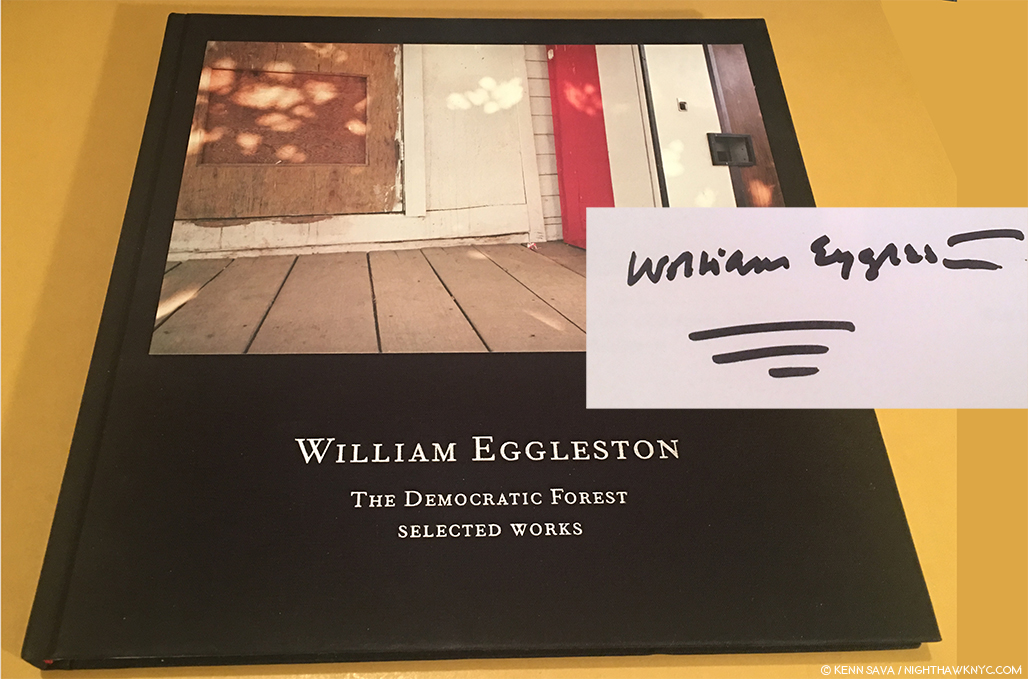
A signed copy of the catalog for the 2016 show, William Eggleston: The Democratic Forest: Selected Works, with William Eggleston’s characteristically vibrant signature, is all that remains to remind me…
As I walked through that show, revisiting the classic images on view (a total of 40, many in a larger size that I still haven’t gotten used to), I left with an overpowering realization that I needed to do a deep dive into the world of contemporary Photography, to catch up on it, Post-Robert Frank’s “The Americans,” 1958 (though Mr. Frank is still with us, of course, and still releasing great books with Steidl. Long may he wave!), and see what’s been going on. I also wanted to do this to gain some perspective on William Eggleston’s place in Photography and his accomplishment to date.
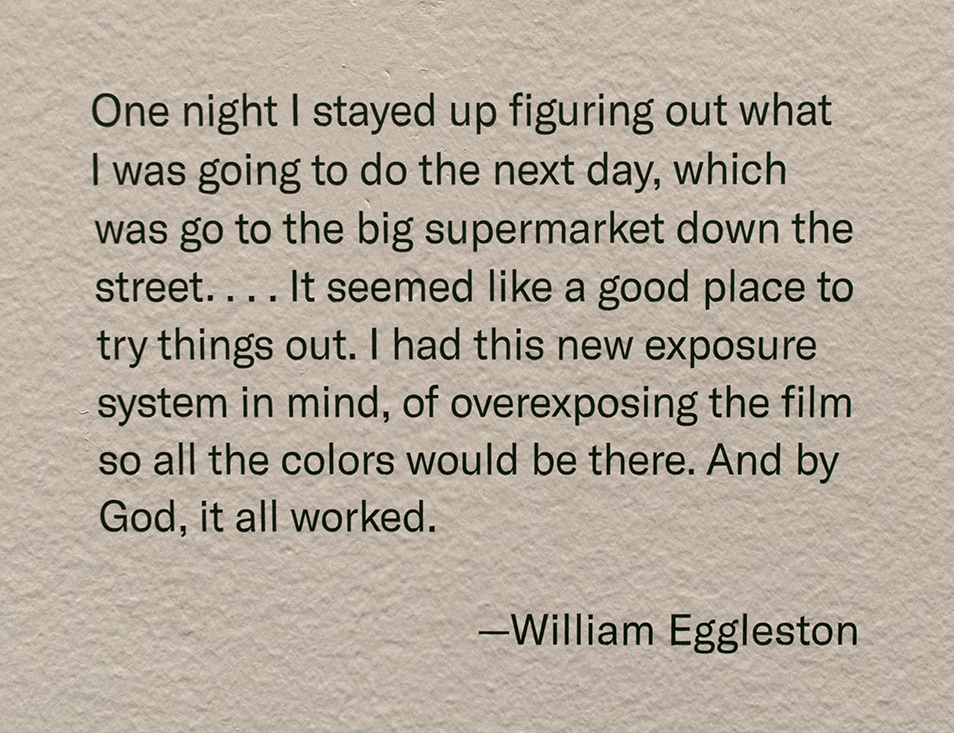
Henri Cartier-Bresson has his cryptic “decisive moment.” Robert Capa has “If your pictures aren’t good enough, you’re not close enough.” Eggleston has his own quote that will keep us guessing indefinitely.
Yes, I knew that famous quote, and William Eggleston’s work, but not in depth. Steidl’s 10 volume set of “William Eggleston: The Democratic Forest,” containing 1,010 images from this body of work, released concurrently with the show, was a sizable step towards addressing that. Never before (or since) had such a large body of color work been published in one set. Add to it the unrelenting quality of the images, and Mr. Eggleston’s extraordinary eye, and you’re face to face with a landmark body of work. From there, I went back to his prior Steidl sets, William Eggleston: Chromes
, 2011, and Los Alamos Revisited, 2012, both of which contain his earliest color work (the former his early slides, the latter his early prints). At this point, there was no denying William Eggleston’s exceptional importance in the world of Photography, being one of the few to bring a new way of seeing to the world.
The question became- “Who else is important?” I’ve explored some of the others I’ve discovered in these pages since Mr. Eggleston’s David Zwirner show, this past year and a half, including 4 article looks at The Photography Shows, AIPAD, in 2017 and 2018. How times have changed here at NHNYC. William Eggleston: The Democratic Forest didn’t even get a full article to itself! The spark that started a bonfire. The journey continues.
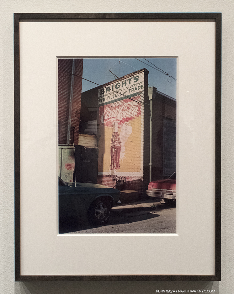
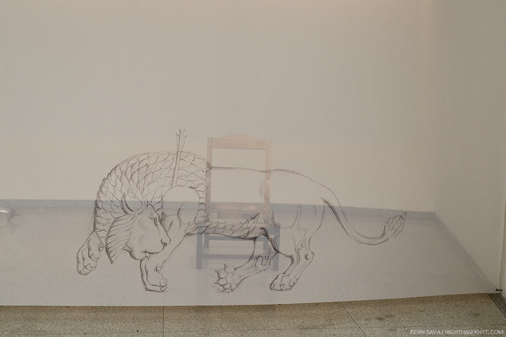
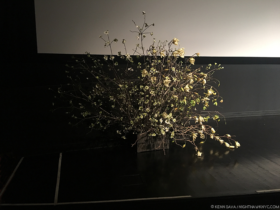
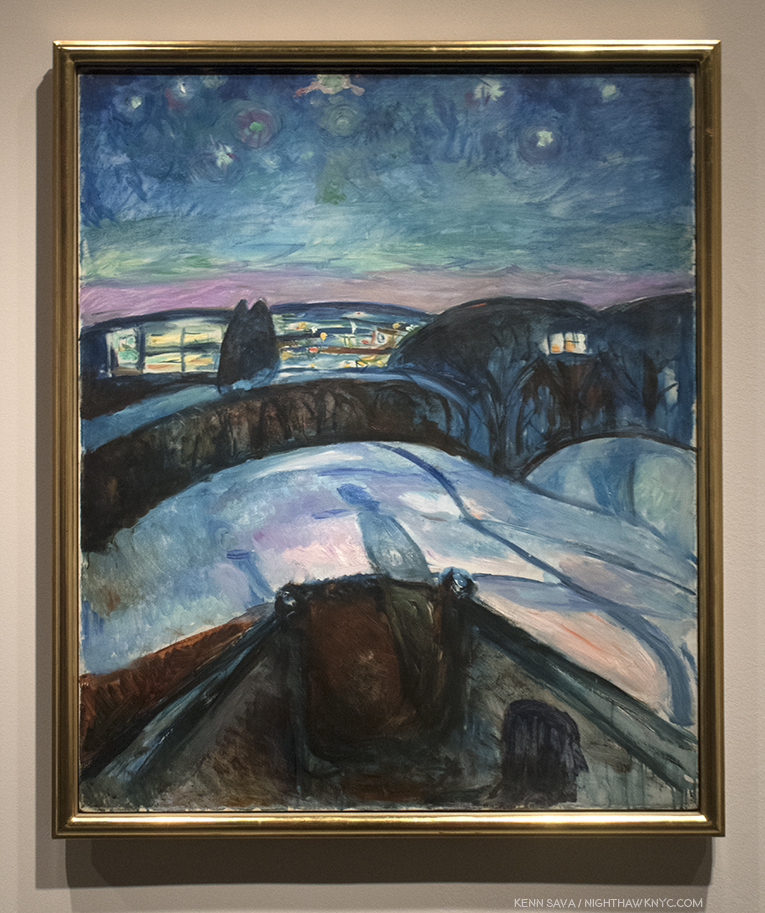
On the road, again. William Eggleston’s Los Alamos was shot on the road, over trips he took across the country between 1966 and 1974. When he, and his friend the curator Walter Hopps hit Los Alamos, NM, scene of the Atomic Bomb development in WW II, the Photographer commented about wanting “his own secret lab.” Click and photo for full size.
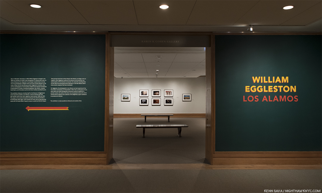
So, after literally hundreds of Photo shows seen, countless PhotoBooks perused and too many bought in the interim, here I was, once again, on the precipice of another William Eggleston show. This one at no less than The Metropolitan Museum of Art, featuring the recently promised gift of one of the seven Portfolios of “Los Alamos,” never previously seen as a set in NYC, containing the Artist’s earliest color print work. A sense of trepidation filled me- What new havoc would Mr. Eggleston wreck upon me now?
Untitled, 1967-74, Gelatin silver print. Perhaps a touch of the lingering influence of Henri Cartier-Bresson here?
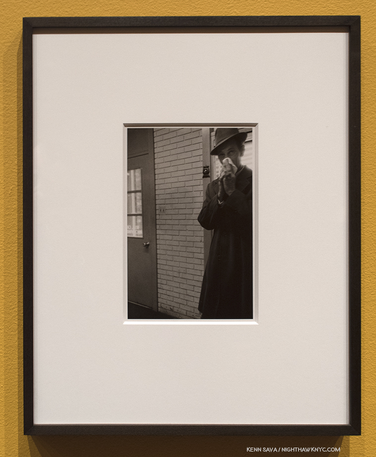
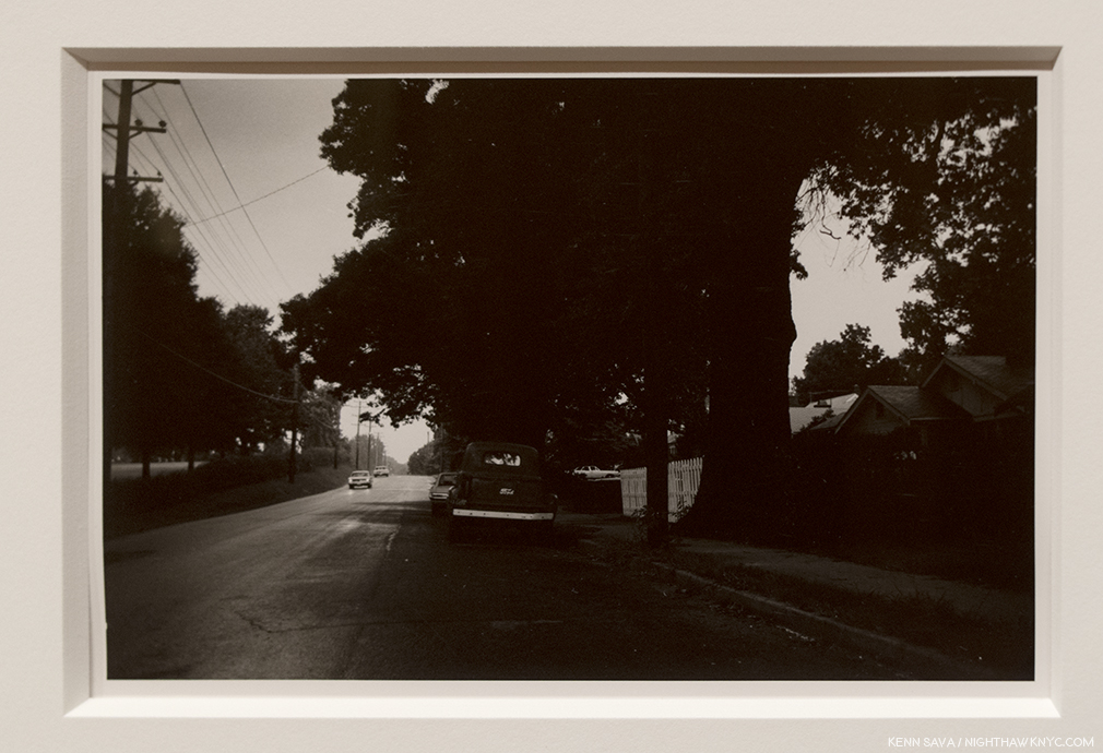
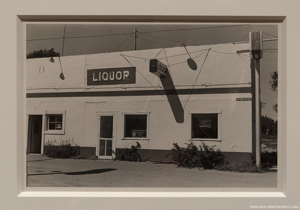
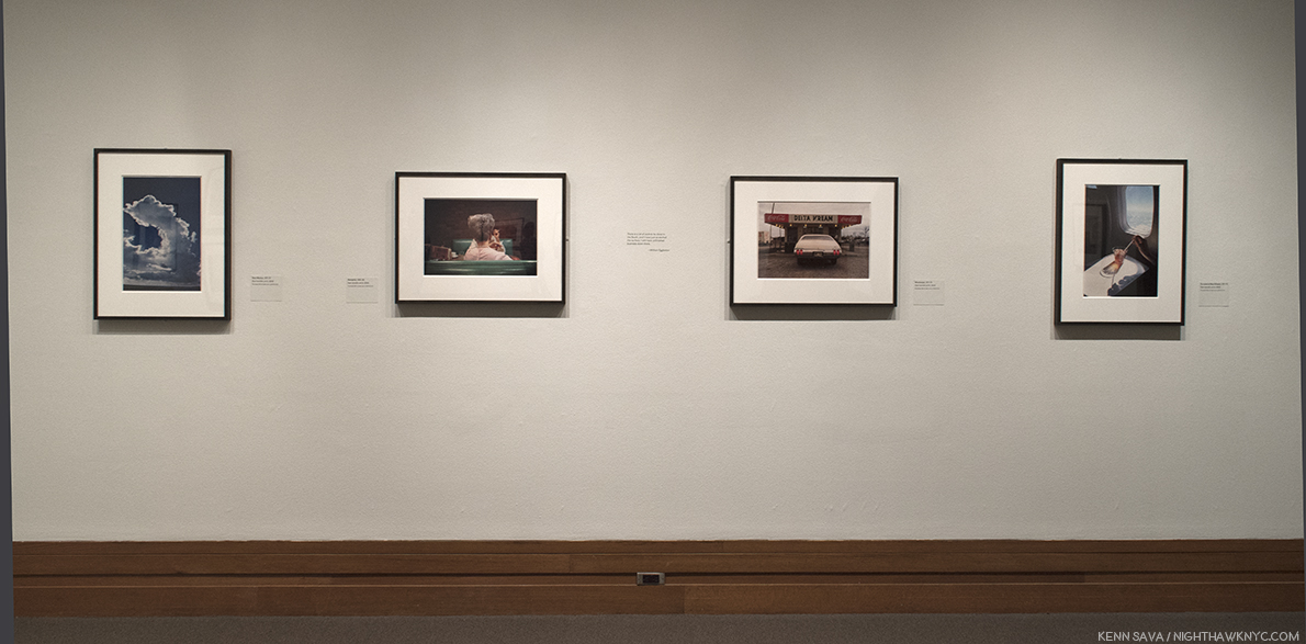
I didn’t have to wait long to find out. As I approached the show’s entrance, I realized The Met had decided to give us more. This monumental show of one of the landmark bodies of color Photography begins with two walls of William Eggleston’s comparatively little known black & white work(!), flanking each side of the show’s entrance containing a total of 11 black & white Photographs created between 1959 and 1974 mounted on mustard walls! 11 Photographs might not sound like many but their subjects and styles are so varied they present a fascinating capsule look at where his work was before he turned to color film.
I’ve seen some of his black & white work in the two Steidl books centered on it1, to feel they are an overlooked realm of his work that deserves a closer look. But, such is the all-encompassing power of his color work that it has garnered only occasional attention.
William Eggleston fell asleep reading Cartier-Bresson’s Les Europeans, Paris, 1964, shown here in this Photo by his wife, Rosa, as seen in William Eggleston: From Black and White to Color, P. 176. (Not in the exhibition. )
Early on, William Eggleston was captivated by the work of Henri Cartier-Bresson. He so worried about copying him that during a trip to Paris in 1964, where the French master lived and worked for many years, he didn’t take a single Photograph. Returning home, he realized that “foreign land” surrounded him right there in Memphis (including the new shopping malls and strip malls that were sprouting like weeds) and he set about Photographing it. That is what we see in these 11 black & white shots- a great Artist stepping beyond influences and beginning to trust his own vision. In the shots with human subjects, the influence of Cartier-Bresson’s infamous “Decisive Moment” would seem to be there, but he’s putting his own stamp on it. By the early 1970’s he was on his way.
Untitled, 1967-74, Gelatin silver print. Light & dark…day & night…this is one of the most “different” images by William Eggleston I’ve seen.
Moving beyond the images with people, some others show a fascination with a wider view, courtesy of a wide-angle lens, in landscapes where it’s hard to discern details of the scene (above). In these people-less works, compositionally, they’re still fascinating and still “democratic,” the term he used recurringly connoting nothing being more important than anything else in the frame. But, overall, they lack the laser focus that permeates Los Alamos, and much of what has followed.
Untitled, 1967-74, Gelatin silver print. This begins to call to mind any number of William Eggleston’s later color Photos, like Los Alamos.
The revelation from these earlier black & white Photos, for me, is they emphasize the Artist’s gift for composition (including a penchant for Photographing from unusual angles). But this really shouldn’t be a surprise. Like Cartier-Bresson and that other great master of early color Photography, Saul Leiter, William Eggleston is also a Painter. Turning to color film, however, he would also have to find his way. “I’d assumed that I could do in color what I could do in black and white, and I got a swift harsh lesson. All bones bared. But it had to be,” he’s quoted on a wall. The stage having been set, the main event beckoned.
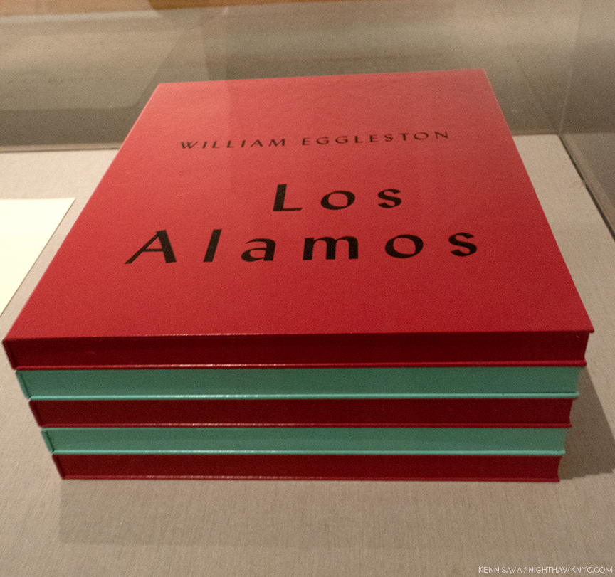
Only SEVEN sets of this large 5 volume set were released in 2002, along with 3 Artist’s Proofs. This extraordinarily rare complete set, in, apparently, pristine condition, is a promised gift to The Met, who is showing the 75 Dye-transfer prints it contains, (15 per box) complete, for the first time ever, in NYC, along with 13 others from the extended series.
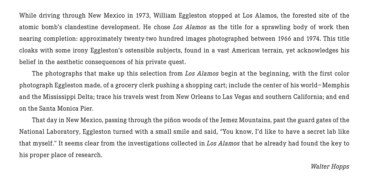
Walter Hopps’ Introduction to Los Alamos as it appears in the Steidl set. Photo courtesy of Steidl.
The first selection was shown at Museum Ludwig, Cologne in 20022, when this Portfolio was released, along with a catalog for the show, also titled, Los Alamos. The Portfolio consists of 75 dye transfer prints, in 5 boxes of 15, perhaps the most revered type of color print, as they possess a larger color gamut and tonal scale than any other process. Since Kodak stopped making the materials for this process, they are rarely created today3 These images were known to me to now through Steidl’s three volume set, Los Alamos Revisited, where they are supplemented by other images from the series. In the “Editorial Note” at the end of Volume 3, Gerhard Steidl says “Los Alamos is presented in its entirety in this three volume set,” though there are far fewer than the 2,200 images Mr. Hopps says was created, above. As good as Steidl’s books are, no book can match seeing a dye transfer print in person.
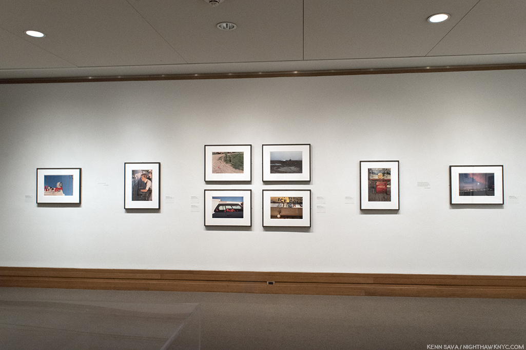
The first wall of William Eggleston: Los Alamos.
Along the show’s first wall, the second print is the image Mr. Hopps refers to as being William Eggleston’s first color Photograph.
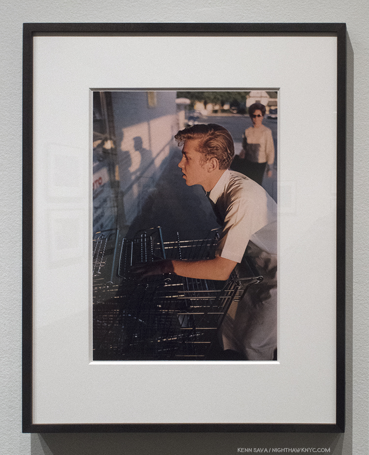
Untitled, 1965, Dye-Transfer print, as are all the Photos that follow.
This man in this incredibly odd image, that would seem to be as far away from “Art” as one could imagine, is not pushing a shopping cart into a row of them. He’s pushing color Photography into the world of Fine Art Photography. Interestingly, 53 years later, for such a famous Photograph, seeing it in person in a dye-transfer print, it’s not a shot that screams with color, as so many others in Los Alamos do. It’s subtle relative to many of the others in the Portfolio. The colors emerge from shadows. Glimpses of light in a grey world. What strikes me are the subtle shades of silver in the carts- some of which are in the light, some are in shade. Then there’s the shadows. They echo the two figures we see, but the woman in the sunglasses isn’t one of them. They are the Photographer and the shopping cart man. The shadows are, almost, black and white images, something I’ve yet to see someone point out. As part of the “grey world” they wonderfully echo the black & white world he’s left behind in the “new world” of color Photography William Eggleston had embarked upon.
It almost looks like a black & white Photo. Detail of the left center showing William Eggleston, left shadow, taking the photo of the cart worker, on the right.
He would never go back.
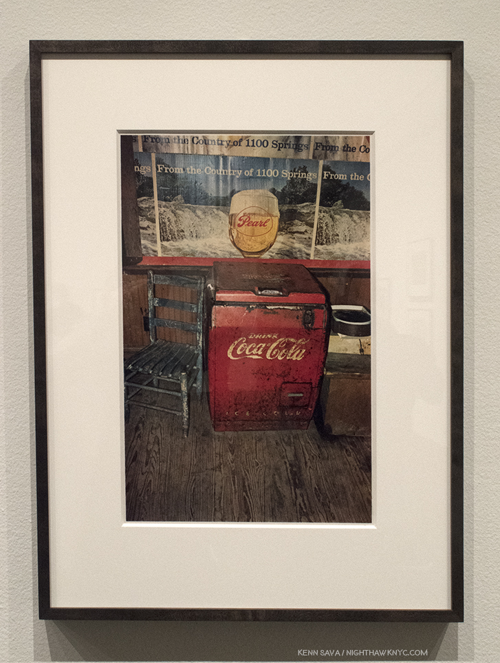
Memphis, 1971-74
Memphis, 1965-68
William Eggleston began his career working in isolation “that was almost inconceivable.” “Photography wasn’t even born yet,” he said later. He even had no knowledge of the controversy the appearance of The Americans caused4. Going back before The Americans, it must be said that it seems to me that it’s hard to speak about ANY American Photographer of the 20th (or 21st) centuries without mentioning Walker Evans, though he did very little color work, and late in his career. It’s hard NOT to see the influence of Walker Evans everywhere in work created after his FSA works of the 1930’s. That includes the work of William Eggleston. I say that not to diminish his accomplishment by any means. I say it because almost every Artist in the western world has been influenced by someone who came before him or her. William Eggleston’s work has a rawness to it, akin to extremely proficient snapshots that I also see in some of Walker Evans’ work. William Eggleston knew the work of Walker Evans before he embarked on the work shown at The Met, but he proves himself over and over to be among the few who’s own vision is strong enough to overcome “echoes” of any influence. This was first seen in his controversial at the time, now landmark 1976 MoMA show Photographs by William Eggleston5,” and in much of what he’s shown us since.
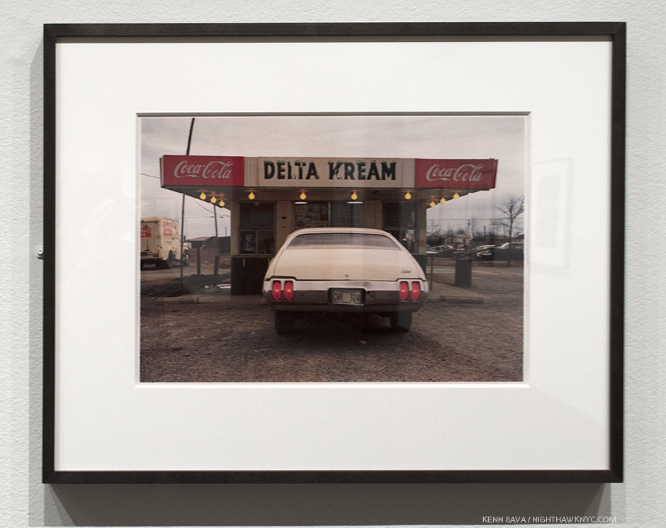
Greenwood, 1971-74
Memphis, 1971-74
Santa Monica, 1974
Speaking of the continuum of influence, it’s hard to walk around this show and not see each image as a jumping off point for the work of so many others. Yet, the big mystery in them- “What do they mean?”- is only answered until you look at them again.
Mississippi, upper right and upper left, Memphis, lower left and lower right, all 1971-74
Part of their “charm” is how the cars, furniture, objects, and places look dated to us now. That’s inevitable with Photography as time goes on. Then, of course, there’s the power of his colors to seduce the eye like few others can.
Louisiana, 1971-74
While I’m eternally pondering the “What is he saying?” question myself, I always come back to studying, and admiring, his compositions. Their balance, or their off kilterness…in both cases, manage to retain interest.
Mississippi, 1971-74. Balance. Well? Almost. But, that’s life, right?
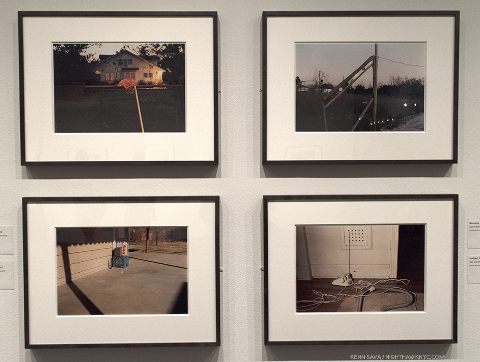
Greenwood, upper left, Memphis, upper right, both 1971-74, Untitled (Bottle on Cement Porch), lower left, and Untitled (White Phone and Vacuum Cleaner, lower right, both 1965-74.
Images like the group of four above spawn countless “I could do that” comments. While I don’t deny the possibility someone could, what’s overlooked is the time and the context. These were taken over 45 years ago, when no one was “doing that.” When seen in the context of the history of Photography, they were, therefore, unprecedented, particularly in color. And yes, today? Countless people, and Photographers, are trying to “do that,” though we’re still waiting for the “next William Eggleston” to reveal him or herself, and so am I.
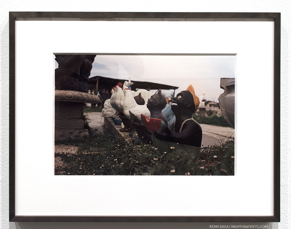
Louisiana, 1971-74
What to make of this image, with its carefully considered composition, shot from a low angle? I don’t know and my efforts at gaining insights reached a dead end. Ostensibly it’s here because it’s part of the complete portfolio, and as such, it’s now in The Met’s Permanent Collection. Though taken over a generation ago, it remains disturbing and offensive, and puzzling. In a 2004 interview in The Guardian, Sean O’Hagan quoted William Eggleston saying, “A picture is what it is, and I’ve never noticed that it helps to talk about them, or answer specific questions about them, much less volunteer information in words. It wouldn’t make any sense to explain them. Kind of diminishes them. People always want to know when something was taken, where it was taken, and, God knows, why it was taken. I mean, they’re right there, whatever they are.” As a result, I can’t help but think it calls into question the whole sense of “detachment” that exists in all of these works. At this point, it seems these questions are going to remain indefinitely.
The last wall at The Met includes the image taken during the plane trip home, far right, as if to put a “bow” on the project.
My current feeling about Louisiana, 1971-74, and the series as a whole, is that these are glimpses of America, moments that passed in front of the Photographer and his camera, that may, or may not, be gone forever, but will remain frozen in time. Taken as a whole, it’s as compelling a portrait of America as Jack Kerouac’s On The Road, (perhaps an inspiration for Mr. Eggleston), is, in my view, albeit in a completely different way. While Jack Kerouac inspired a generation of “Beatniks,” and countless others, Mr. Eggleston has inspired two generations of Photographers, and counting. In Los Alamos we see the mundane, the beautiful, the ugly, and the never noticed before, all seen by a man possessing one of the most singular eyes in Contemporary Art. If not in Art. Period.
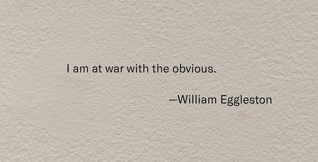
Yes, William Eggleston went to “war with the obvious.” And he imposed his will upon it.
————————————
BookMarks- (A new feature regarding Art and/or PhotoBooks related to this Post). If you want to begin to explore the work of William Eggleston, William Eggleston’s Guide, published by MoMA is the place to start. After that, you really can’t go wrong with any Eggleston book published by Steidl or Twin Palms Publishers, though I would recommend considering William Eggleston: Los Alamos Revisited
, next.
If you find yourself taken by Los Alamos, I highly recommend Steidl’s 3 volume box set.” Produced by William Eggleston, The Eggleston Artistic Trust and Gerhard Steidl, given the involvement of the Artist, it’s highly unlikely to be surpassed as a definitive document of this landmark series. The production is first rate in all respects. At Steidl’s booth at The Photography Show/AIPAD this year there was some question around how much longer copies of Los Alamos Revisited would be available. Released in 2012, I wouldn’t wait long to get one. Steidl’s previous William Eggleston Box set, Chromes, released the year before, is now out of print. The asking price for the cheapest USED copy known to me at the moment is $1,500.00.
*- Soundtrack for this Post are “Inventions & Sinfonias” by Johann Sebastian Bach as performed by Glenn Gould. Mr. Eggleston is, also, a Pianist, who recently released his first CD, William Eggleston: Musik (Vinyl). He lists J.S. Bach as his favorite composer. Something we agree on.
Update 5/22/18- Rewatching the fascinating documentary, The Colorful Mr. Eggleston, I saw what sure looks like one of the other sets of “Los Alamos.” At the 7 minute mark, Mr. Eggleston is speaking at what looks to be the Eggleston Artistic Trust, and behind him to the right, there are five similarly color boxes sitting on a shelf next to a “Coke” sign.
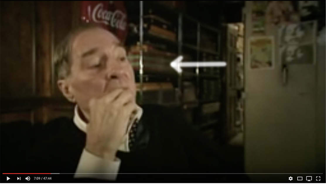
William Eggleston speaking in The Colorful Mr. Eggleston, with what looks to be a set of Los Alamos on the shelf behind him. Walker Evans, also, Photographed, and collected, Coke signs.
My thanks to Monika Condrea and Steidl for their assistance.
My previous Posts on Photography are here.
You can now follow @nighthawk_nyc on Instagram for news and additional Photos!
NighthawkNYC.com has been entirely self-funded & ad-free for over 7 years, during which over 275 full length pieces have been published!
I can no longer fund it myself. More on why here.
If you’ve found it worthwhile, PLEASE donate to keep it online & ad-free below.
Thank you, Kenn.
Written & photographed by Kenn Sava for nighthawknyc.com unless otherwise credited.
To send comments, thoughts, feedback or propositions click here.
Click the white box on the upper right for the archives or to search them.
Subscribe to be notified of new Posts below. Your information will be used for no other purpose.
“‘History,’ Stephen said, ‘is a nightmare from which I am trying to awake.’”
James Joyce, Ulysses, Episode 2.
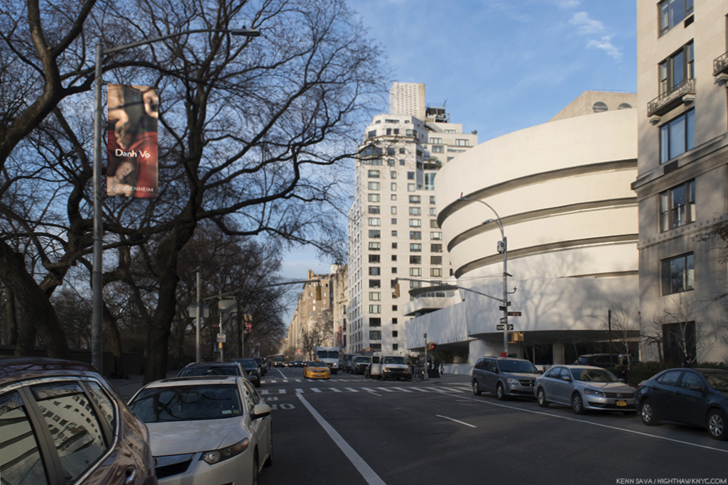
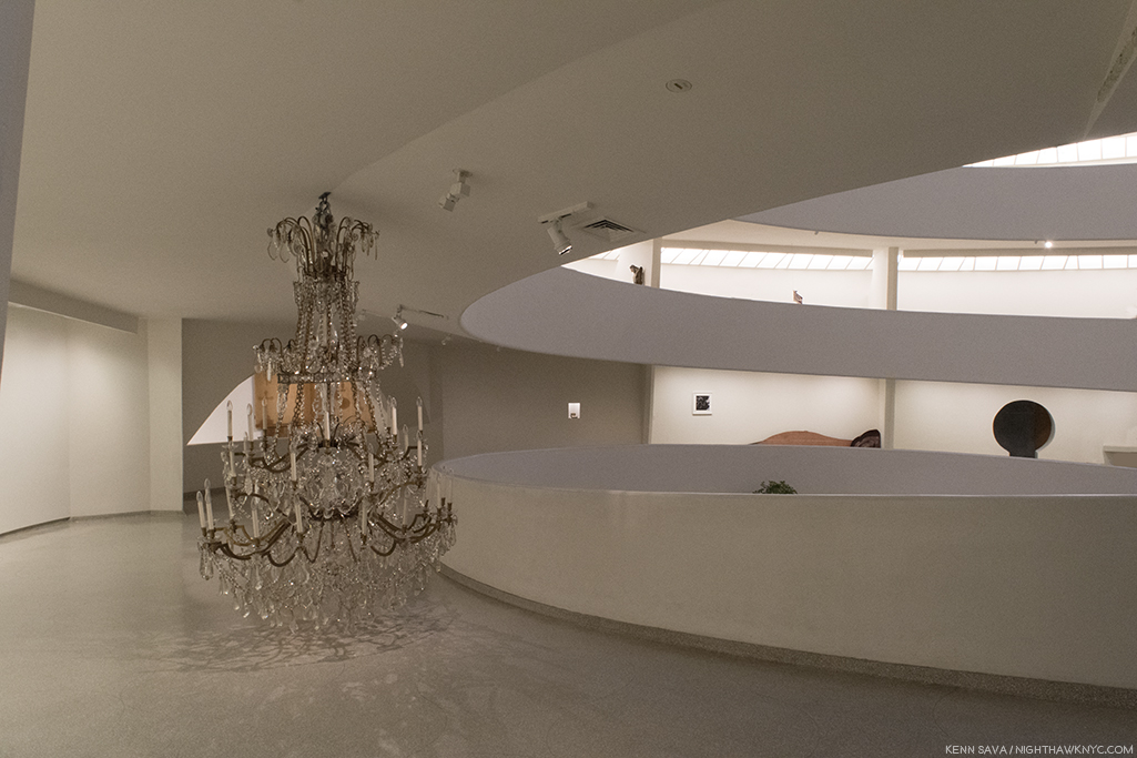
Museum Mile, late winter, 2018. Guggenheim Museum ahead on the right. Click any Photo for full size.
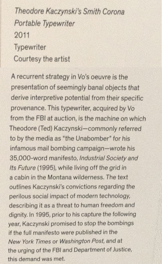
A typewriter sits almost alone on the floor of a gallery on the Guggenheim Museum’s 5th floor.
I stood opposite it for a few minutes over multiple visits, considering the installation of this gallery and watching other visitors pass by.
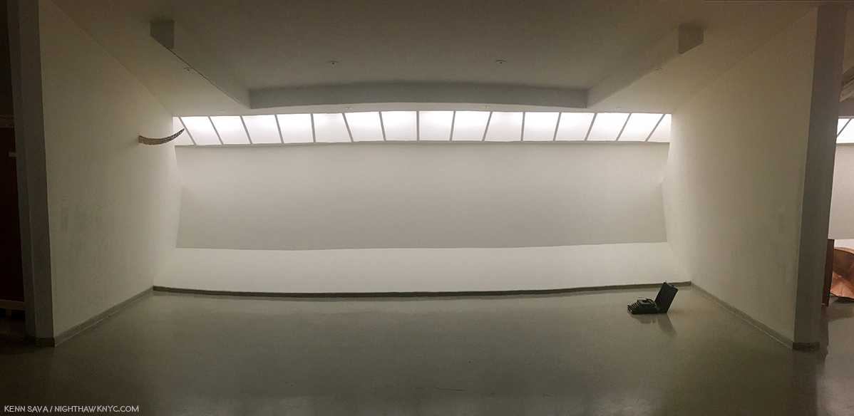
Only a few stopped to read the wall card, above it to the right. For those that didn’t, I couldn’t help wonder what they were thinking. “A typewriter? What? Why? Is this “Art?”
The wall card.
A few days later, about 50 blocks south, I saw another typewriter sitting alone on display.
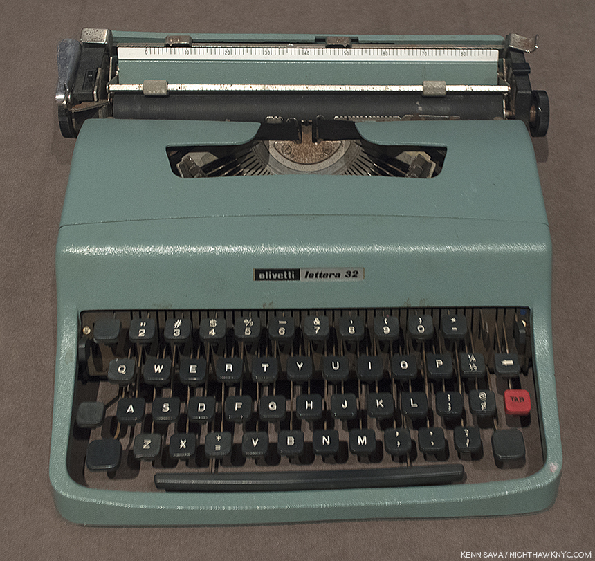
Tennessee Williams’ Olivetti Typewriter seen at Tennessee Williams: No Refuge but Writing, at The Morgan Library, April, 2018.
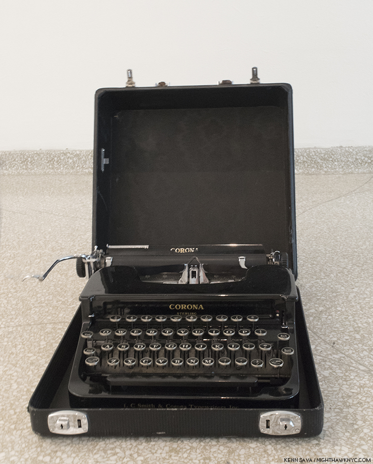
This one was one of the great Tennessee Willams’ two most cherished possessions, along with a copy of Hart Crane’s Poems. A typewriter can be a weapon of murder, of Art, and now in both cases, an “Art object,” with completely opposite impacts. At the Guggenheim, Danh Vo’s placing of the Unabomber’s typewriter, (with it’s keyboard turned towards the side, and so, not an invitation to the viewer to use it, but to look at it as an object), is rife with irony, and very subtle power. Seeing both machines reminded me that a typewriter is a typewriter is a typewriter- it’s the person using it that makes it a tool for timeless beauty, or for catastrophic destruction.
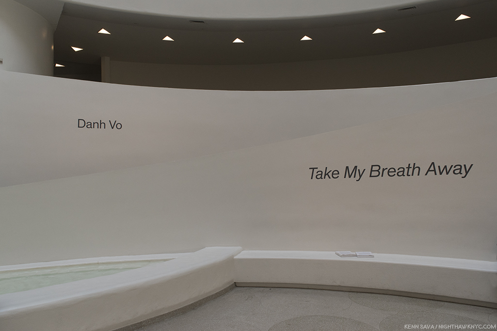
Therein lies the crux of Danh Vo: Take My Breath Away, which fills Frank Lloyd Wright’s iconic rotunda. Along with Art that he (or his calligrapher father) makes by hand, to a large extent Danh Vo’s Art relies on carefully selected actual historical items who’s significance fit the three primary threads that run through his Art- the history of Vietnam (dating back to it’s colonial past), American history, and his personal & family history. The Artist chooses objects for their ongoing power to speak to us through the history they witnessed or participated in. They are now mute witnesses, but like possessions in one’s home, their sum a portrait of where the Artist “lives,” so to speak. Combined, and seen over a large show, these three histories (Vietnamese, American and personal) interweave and dialogue with each other. The national and global becomes personal. For viewers, they are pieces of histories that speak to us still, like events that happened before our birth are “pieces” that have real and lasting effects on our lives many years after.
Then, I moved to the right, and saw what was installed along the intervening gallery wall in the next gallery.
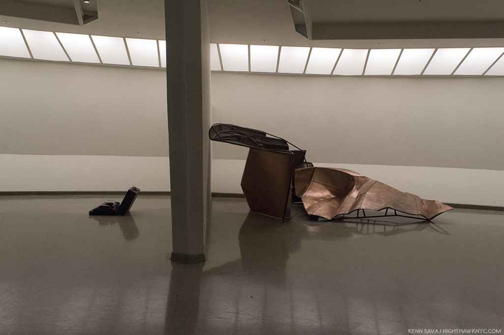
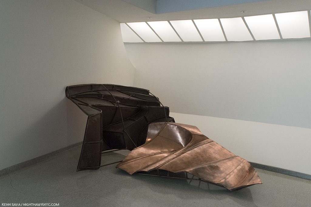
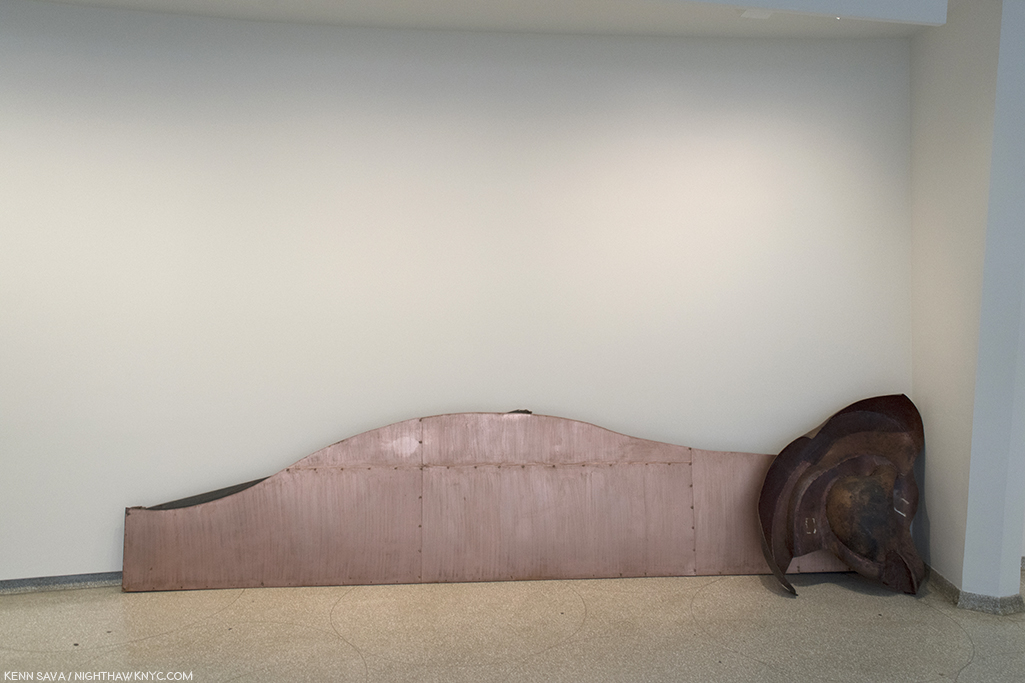
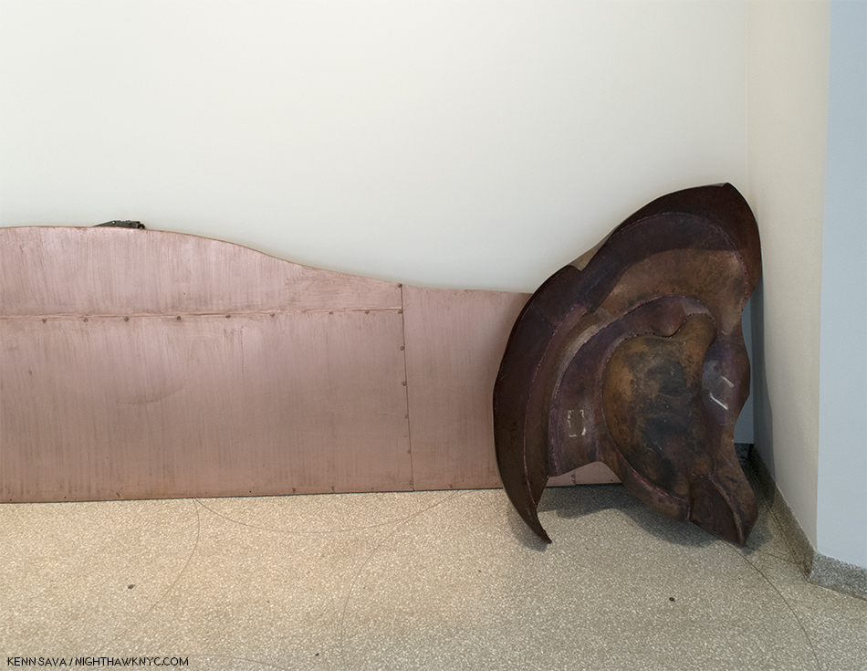
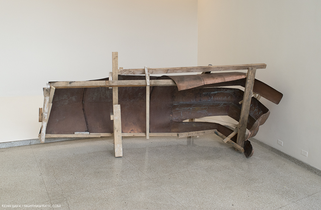
On the wall behind the Unablomber’s Typewriter, left, is part of We The People, 2011-16, Copper, right. Installed (ironically, or coincidentally) so they mirror each other.
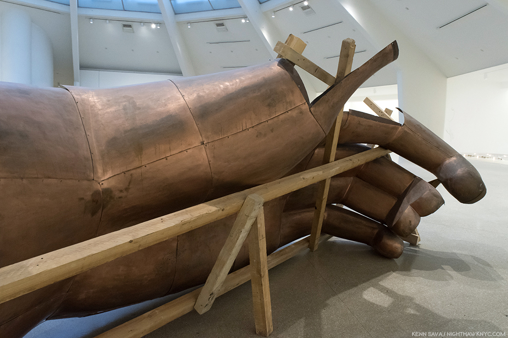
It’s a work called We The People,. Well, it’s part of the work called We The People, which totals over 300 pieces in all, each one part of a full size replica of the Statue of Liberty!
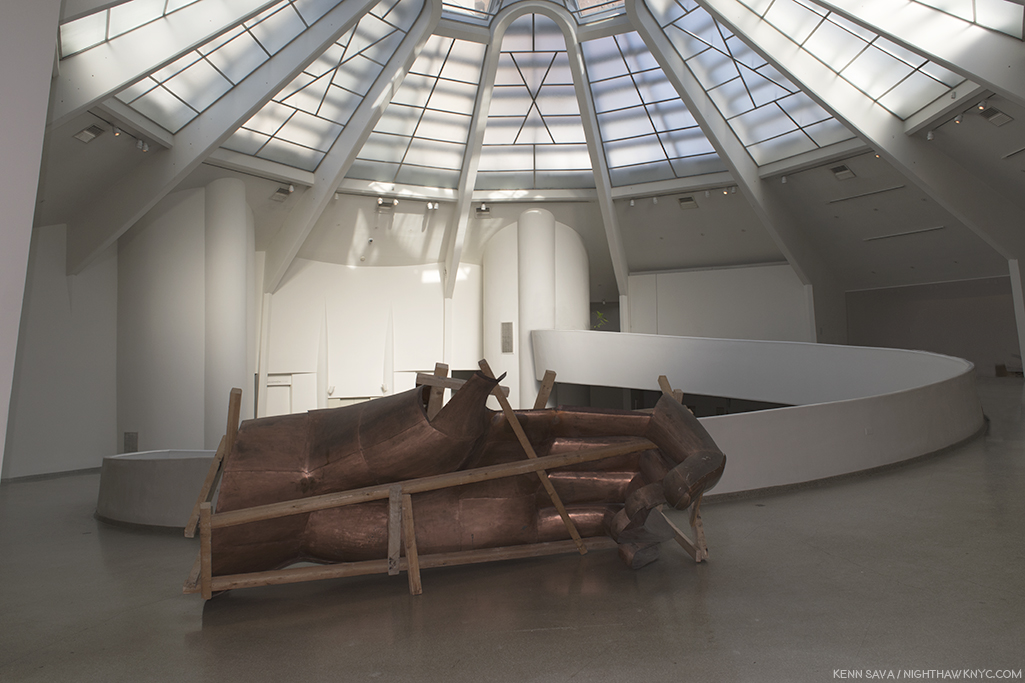
Every American “knows” the Statue of Liberty. How many would recognize one of her hands if seen by itself? The front of her left hand, minus her thumb (which is lying on the floor just behind me).
Vo’s parents idolized the U.S. as a land of political freedom and economic power, values their son couldn’t help but pick up, though later he suffered from disenchantment. Danh Vo was inspired after finally visiting the Statue in person to have it painstakingly replicated in copper. Press two pennies together between your fingers. That’s how thick the skin is on both sculptures! He and his team used the same techniques used to craft the original (though in China, instead of France), each of it’s 300 body fragment parts serving as both a reminder of the whole and an autonomous sculpture on it’s own. “In taking the Statue of Liberty as subject, Vo appropriated the definitive symbol of not just America but of the abstract notion of freedom itself. The metaphoric fracturing of the American body politic in the literal body of Liberty not only suggests the fragility of the philosophy she enshrines, it also enacts a profound violence on the fabric of the national consciousness1.” In the catalog for the show, curator Katherine Brinson speaks of the damage to the American psyche that would be done seeing the actual Statue in pieces, referring to nerve the 1986 campaign to restore the Statue struck in the American public. Showing a replica of it is brings none of that trauma and instead allows the viewer to see it anew.
“I thought it would be interesting to make something that people felt so familiar with, in all the different ways that people project on the sculpture, and try to destabilize your own thinking of it,” the Artist said in 2013.
From the start, Danh Vo never intended to assemble the pieces he made, but rather to distribute them around the world, so it’s effect would be international, allowing no single person or entity to own more than 8 pieces of it. While about 50 parts of We The People, were previously seen locally in a 2014 Public Art Fund show in Brooklyn Bridge Park and City Hall Park, having seen only 6 pieces of it I still found it utterly remarkable- A remarkable concept. Remarkable that someone could do it and do it so well. Remarkable that he or she would choose to recreate all of it and not assemble it. Remarkable that this Artist, Danh Vo, is not now and has never been, an American2.
Two pieces from We The People,, another view of the works seen adjacent to the gallery with Kaczyinski’s Typewriter.
Danh Vo (pronounced yon voh) was born in Ba Rja, Vietnam, 4 months after the Vietnam War ended. Nonetheless, as it does with countless others in innumerable ways, the War casts it’s long shadow over Danh Vo’s life and Art, directly and indirectly. As seen in Danh Vo: Take My Breath Away, the War, which ended 43 years ago this April 30th, occupies the center, a defining event in his life though he wasn’t even alive during it. After he was born, his family was among 20,000 resettled to Phu Quoc in far southwest Vietnam, and then to Ho Chi Minh City, as part of a government “reeducation” program. In 1979, when Vo was 4, his family fled Vietnam in a homemade boat with 117 others, and were rescued at sea by a Danish freighter.
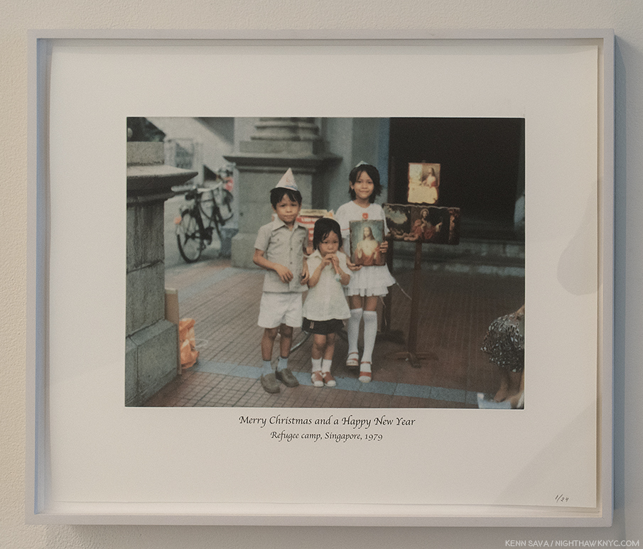
After escaping Vietnam in a homemade boat and being rescued at sea, Vo, age 4, left, and his family were taken to a refugee camp in Singapore. Having left everything behind, they were gifted the items seen in this Photo by Christian missionaries, which the Artist has turned into a “Christmas card” long after the fact. “Untitled,” 2007, Photogravure.
After a winter in a camp in Singapore, the family was eventually resettled in Denmark, where Vo was raised. Today he lives in Berlin and Mexico City. “I don’t really believe in my own story, not as a singular thing, anyway. It weaves in and out of other people’s private stories of local history and geopolitical history. I see myself, like any other person, as a container that has inherited these infinite traces of history without inheriting any direction. I try to compensate for this, I’m trying to make sense of it and give it a direction for myself,” the Artist has said3.
Two pieces of “We The People-
In 2012, he won the Hugo Boss Prize, which resulted in his first show at the Guggenheim Museum, the remarkable I.M.U.U.R.2, (I am you and you are too), which consisted of about 4,000 Artworks and items that belonged to the late Painter, Martin Wong. It says quite a bit that Danh Vo would take his first opportunity of a show in one of NYC’s “Big Five” Museums and devote it to the work of another Artist. Martin Wong is someone who’s work Danh Vo has championed, as he owns at least one his Paintings. In that sense, it’s part of the thread of his personal history that his work continues to explore. It was also a unique opportunity to walk around in the mind and life of the late Artist while it created an effect not unlike one of Martin Wong’s Paintings. It also served to expose visitors (including myself) to the work of a terrific Painter, who died in 1999 at age 53. (For further information, I recommend “Martin Wong: Human Instamatic,” which was produced for a 2016 Bronx Museum of Arts show.)
Another piece of We The People, one of the last pieces fabricated. The hand that holds the tablet.
The exhibition catalog for Danh Vo: Take My Breath Away, surprisingly lacks any direct information about it. Instead, it provides excellent background and analysis of the individual Art works, with the bulk of the book consisting of an extensive, complete catalog of Danh Vo’s exhibition history prior to Take My Breath Away, with numerous, fascinating installation views of each show that allows the viewer to this show to consider most of the Art on view here in different combinations and in different installations. This served to heighten my respect for his gift of installation. At almost 350 pages, it’s the first full-length monograph on Danh Vo, and now stands as the go-to reference on the Artist and his work over the first part of his career.
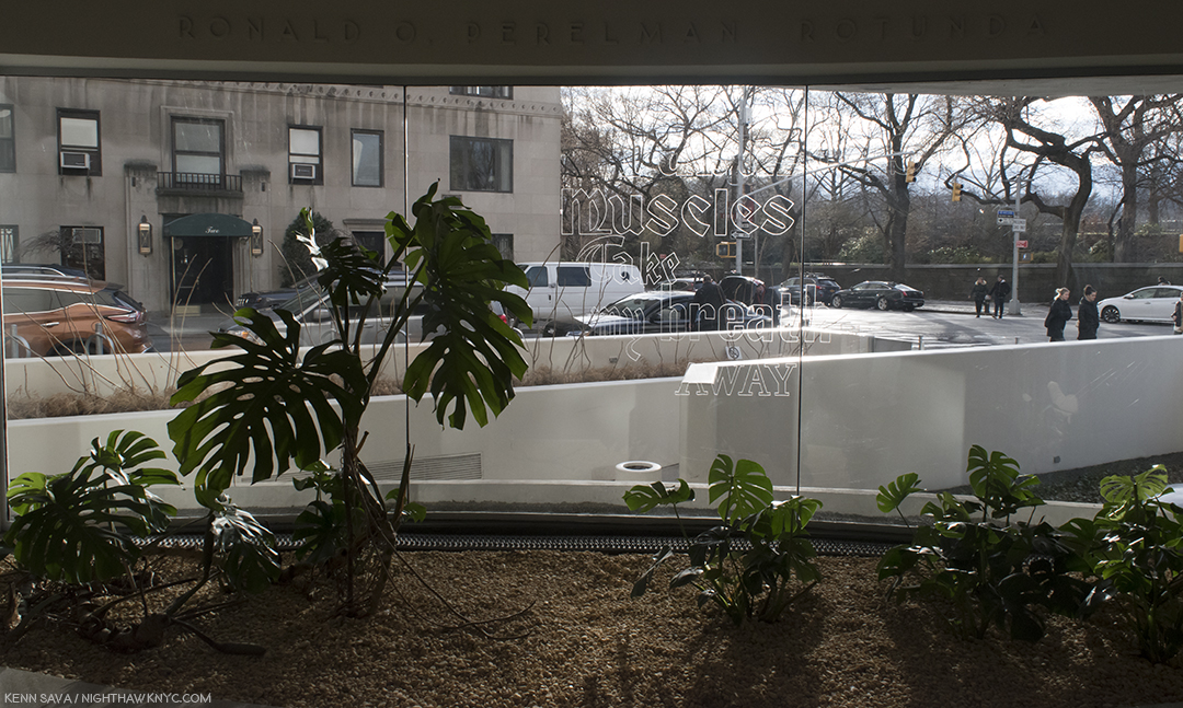
Untitled, 2018. Adds “Fabulous Muscles” to the show’s title, Take My Breath Away, yes, the theme from the 1980’s film “Top Gun,” was etched on the glass window in the Museum’s rotunda floor by the Artist’s father, Phung Vo. It was almost impossible to get a full shot of it. This was as close as I got over innumerable attempts.
As for Take My Breath Away, it’s rare (and wonderful, I find) to walk into a large show and almost all of it feels “different,” unlike almost anything I’ve seen before. A classic case of this was Matthew Barney’s The Cremaster Cycle, in 2003, also, at the Guggenheim, where almost every single object felt like it had been created by beings from another world. Danh Vo uses, mostly, recognizable objects, but he often deconstructs them or combines them in new and totally unexpected ways and then displays them brilliantly in ways that are Zen-like, daringly unexpected, and fresh.
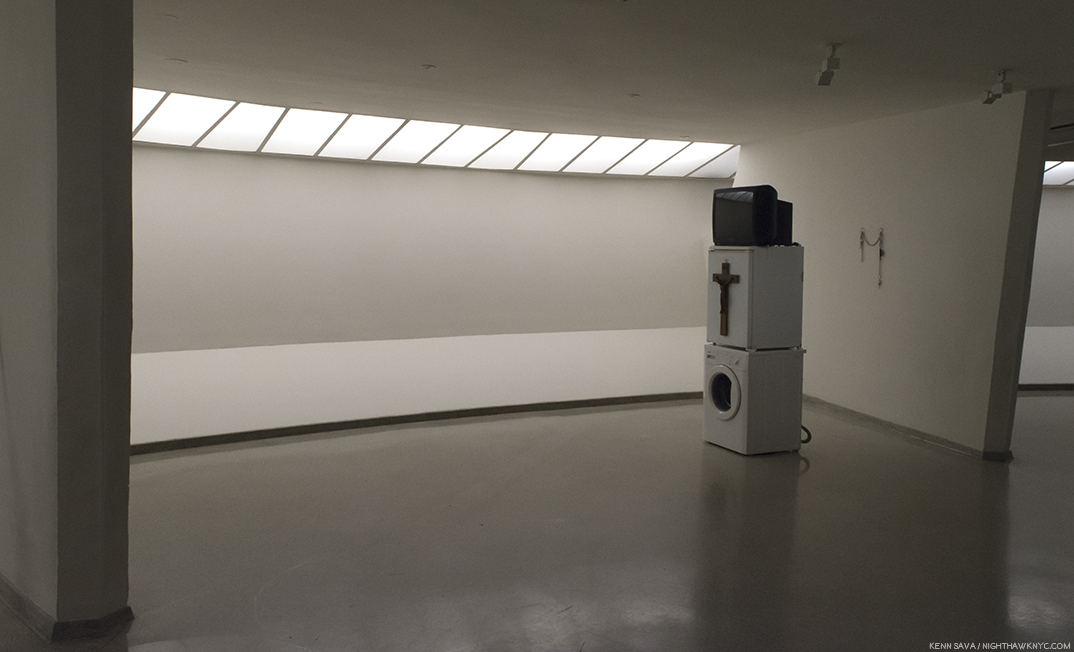
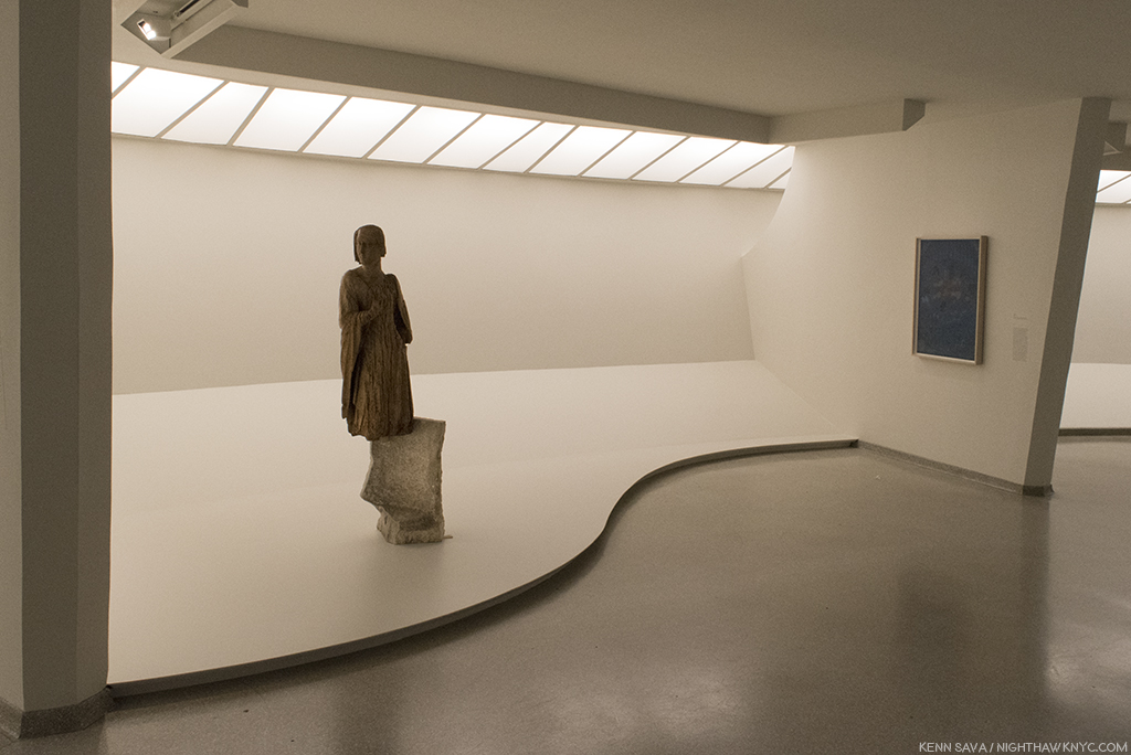
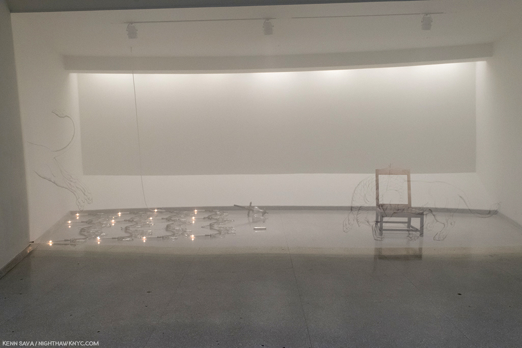
In another gallery, a different “statue” is seen. “Oma Totem,” 2009, consists of items that belonged to the Artist’s grandmother. After deciding to emigrate to Germany in 1980, upon her arrival, she was gifted a washing machine, a television and a refrigerator, by an immigrant relief program, along with a crucifix, gifted by the Catholic Church. Vo has turned them into his work, “Oma Totem.” At the Guggenheim, it/they also sit virtually alone in a gallery, turned sideways. They’re a monument to being a refugee, of leaving one culture behind, while another now stands before you. As the wall card says, “…the sculpture reduces its subject’s harrowing experience of war and exile to the set of archetypes- refugee, convert, and consumer- that were assigned to Vo’s grandmother by her new society.”
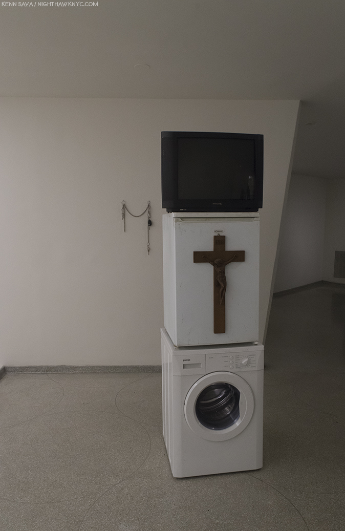
Oma Totem, 2009, Philips television set, Gorenje washing machine, Bomann refrigerator, wooden crucifix, and personal casino entrance card, with “Uro,” 2009, Keys on a chain, behind on the wall.
Partially hidden on the wall behind them, is Uro, 2009, which consists of keys left over from a past relationship. The chain that connects them is all that remains of the connection they once shared.
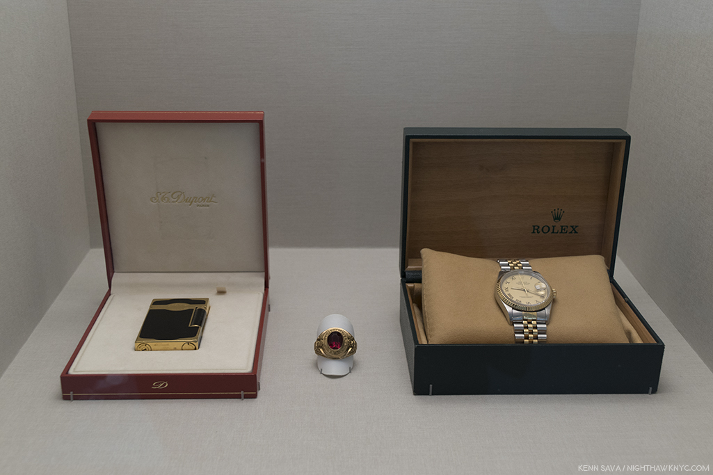
“If you were to climb the Himalayas tomorrow,” 2006, Rolex watch, Dupont lighter, American military class ring. Three items his father, Phung Vo, cherished as signs of his “success” in his new country. The Artist hd to negotiate with him to get him to give these to him for this work. Displayed in a lit vitrine behind glass, like they would be in a fine jewelry store, the work’s title was taken from a Rolex ad campagin.
Beyond the image of America his parents had while he was growing up, it’s interesting how much American history is in his work. As with the typewriter seen earlier, not all of it pertains to Vietnam.
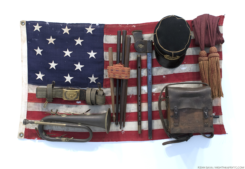
“She was more like a beauty queen from a movie scene,” 2009, Brass bugle, felt cap with velvet, bayonet sheath, field radio with wood and leather case, sashes, wooden drumsticks, fife, leather sword belt with gold and silver details, and 13-star American flag. The Artist purchased this at auction, exactly as it appears now, adding only the title. It was created to celebrate the 100th anniversary of the Declaration of Independence. It would seem to also stand for America in it’s ascendency to the country Vo’s parents idolized.
Taking his place in the now long line of Artists working with found objects, (primarily, though Danh Vo also makes Art by hand), with Marcel Duchamp appearing to be particularly inspiring for him, he brings new dimensions to this now 100 year old (at least) genre through the use of historic and personal items, his choice to disassemble them or leave them, and in the breathtaking way, in my opinion, that he installs them. .
A chandelier from the Grand Ballroom of the Hotel Majestic, Paris, where the Paris Peace Accords were signed, ending the Vietnam War.
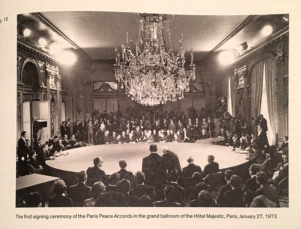
Photo from the Exhibition Catalog, P.XXXIII
Even when these items are literally in pieces their parts are shown in surprising ways.
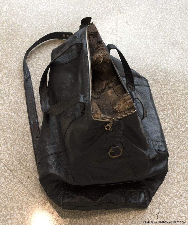
Untitled, 2009, Carry-on bag, fruitwood St. Joseph (Germany, late 16th century). Danh Vo acquired a wooden sculpture that was too big to transport by plane. So? He cut it into sections and put each into a bag so he could carry them on. At the Guggenheim, they were distributed, in their bags, with at least one also on a handcart.
At other times, the pieces are recombined in extraordinary new ways, as in these sculptures.
(Unpronounceable title uttered by the demon in The Exorcist), Poplar Virgin of the Annunciation, 2nd century, with Greek marble sarcophagus, ca 1350, left. Throughout the show, Vo displays sculpture that has either been broken up into parts (by the Artist or found that way), and displayed them either alone or with parts of a totally different sculpture, as seen here on the left, the lower half of which shows a lion devouring an antelope, “juxtaposing the sacred and the profane4,” though it’s also visually striking and unprecedented to my eyes, the effect only enhanced by it’s installation.
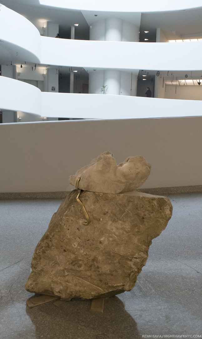
Untitled, 2018, Marble Eros (Western Europe, 2nd century CE) and sandstone eagle (Germany late 19th century). Notice the wooden shims left unpainted underneath it. Museum staff told me that the Artist stopped them from Painting them, something they would always do.
At the Guggenheim, the staff regaled me with stories of how the Artist laid out this show with almost Zen-like techniques. He left shims unpainted, chandeliers uncrated, and left other pieces where the handlers left them. I was told it was “unprecedented.”
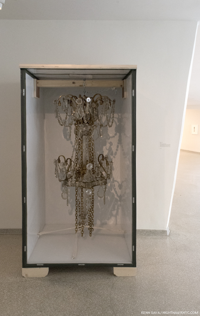
16:32, 26.05 Late 19th-century chandelier. “Leave it just like that,” the Artist must have said to the Art handlers. Because they did. Open shipping crate on unpainted blocks and all.
I found the installation completely captivating, a model of taste and restraint, a breath of fresh air. Looking through the catalog (where those responsible for the display of the work in prior shows are not credited), I see a similar brilliance in the design of each show. Whatever one thinks of Danh Vo’s Art, he has a mastery of display that borders on showmanship.
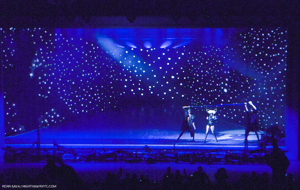
Lady Gaga, live at Radio City Music Hall, January 20, 2010, her first major NYC Concert, in a show designed by the brilliant stage designer, Es Devlin. The stage was set inside a “frame” that goes all the way around it, with a screen in front of it that was never removed. Many of the designs for songs reminded me of Art works. It became obvious to me that either Ms. Devlin, Lady G, or both, were channeling Art history. This one, with the singer’s hair fastened to rings threaded through the pole the dancers hold on each side of her, and then moved around the stage, reminded me of Joseph Cornell.
I said “showmanship,” meant with respect, because the only other instance I can think of where I saw such amazing, beautiful display was at Lady Gaga’s first “big” NYC concert at Radio City Music Hall in January, 2010, in a show designed by the brilliant stage designer, Es Devlin5. At the time, I was completely floored by what I saw, though I immediately knew that whoever was responsible for it had gone to school on Art history. There were elements of Dali, Magritte, and especially Joseph Cornell throughout. Danh Vo, is adding display to the accomplishments of Duchamp, and Rauschenberg, making it an inherent and critical part of his Art.
Lot 20, Two Kennedy Administration Cabinet Room Chairs, 2013, right, and 08:43, 26.05, 2009, Late-19th century chandelier, left, behind Painted screen. At the Guggenheim, Danh Vo turned the museum’s “bays” into stage sets of a sort, some, like this one, behind transparent screens. Vo acquired 2 chairs from John F. Kennedy’s Administration that he proceeded to dismantle. The parts, and the fabric, are shown on their own elsewhere in the show. Here the frame of one chair is juxtaposed with parts of a chandelier, from the room the Vietnam War Paris Peace Accords were signed in a beautiful, haunting display. Like a memory, it’s both there and not there. In front of both is a thin curtain on which a beast, possibly a lion, is shown with an arrow sticking out of his shoulder. A reference to Kennedy being short down in 1963?
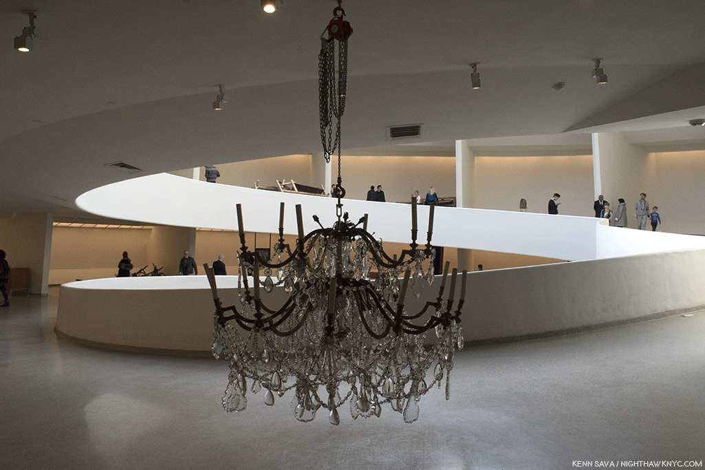
Frank Lloyd Wright designed the Guggenheim Museum to be seen from the top, down. He intended for viewers to take the elevator to the top and walk down the gently sloping ramp, something I always do. Yet, I have never seen a show laid out this way. Instead, each one insists visitors walk up the 6 ramps. Well, it is a small elevator. So, this gallery, above and below, was among the first I saw in this show, and created a powerful effect.
Detail showing part of the JFK Administration chair and the transparent screen in front of it.
Danh Vo is an Artist who’s also something of a cultural anthropologist, someone who’s attuned to the deeper significance of historic objects as part of history and histories. Like Ai Weiwei, he’s not bashful about deconstructing them to mine even deeper significance. It helps that he’s also blessed with a terrific sense of reconfiguring these objects and pieces of objects in stunning and fascinating installations that he varies greatly from show to show, creating unique experiences each time. Seen in pieces, they are often completely new experiences which cause the viewer to see them in new ways. From looking at the catalog’s compilation of these past shows, Danh Vo: Take My Breath Away is both a high watermark in the young Artist’s career and a “beacon” of a calling card that he is an Artist to watch. The Guggenheim took a chance with this show, and then took another chance in giving Danh Vo so much leeway in it’s installation. They, and he, have succeeded in creating a show that is rich in layers of meaning and relevance for the moment. The Guggenheim’s commitment to Danh Vo’s Art, going back to I.M.U.U.R.2, is something I believe NYC’s Big Museums should be doing, and doing more of.
At a time when the Vietnam War seems prime to slip from the consciousness of America and the world as it’s survivors age, pass on, and the world moves on, Danh Vo serves to show that the legacy of Vietnam is multi-generational in it’s effect and impact on the world. Something that is not news to anyone who was involved in it.
It also shows us that even Art can come from something so horrific. Art that has much to tell us now, lest we find our selves in another “nightmare of history” one day.
An unexpected Postscript-
It turns out that Danh Vo and I have someone in common. Or, we had.
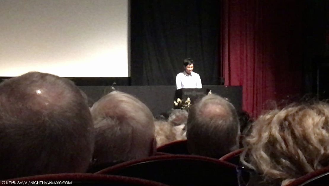
Danh Vo speaks about his experiences with Tim Rollins at the Tim Rollins Memorial Celebration, SVA Theater, NYC, April 30, 2018, which also happened to be the 43rd Anniversary of the end of the Vietnam War, on April 30, 1975.
On April 30th, I went to the Memorial Celebration at the SVA Theater on West 23rd Street for my late friend, the Artist and educator Tim Rollins. Much to my surprise, Danh Vo was there, and was one of a number of well-known Artists, and friends, who spoke about Tim Rollins during the service! He also generously donated the flowers. Sitting way in the back, in the jam packed auditorium, I was taken by a group of them to the left of the stage.
One group of flowers donated by Danh Vo at the Tim Rollins Memorial Celebration, April 30th, 2018, at the SVA Theater.
The way they were half in the light, and half in shadow perfectly summed up the experience of the evening for me. Was Danh Vo responsible for the lighting? I tend to doubt it because the lights were for what was going on onstage. Such is my respect for his installations, he had me wondering.
*- Soundtrack for this Post is “I Want To Come Home For Christmas,” by Marvin Gaye and Forest Hairston in 1972.
My thanks to Kristina Parker and May of the Guggenheim Museum.
NighthawkNYC.com has been entirely self-funded & ad-free for over 7 years, during which over 275 full length pieces have been published!
I can no longer fund it myself. More on why here.
If you’ve found it worthwhile, PLEASE donate to keep it online & ad-free below.
Thank you, Kenn.
Written & photographed by Kenn Sava for nighthawknyc.com unless otherwise credited.
To send comments, thoughts, feedback or propositions click here.
Click the white box on the upper right for the archives or to search them.
Subscribe to be notified of new Posts below. Your information will be used for no other purpose.
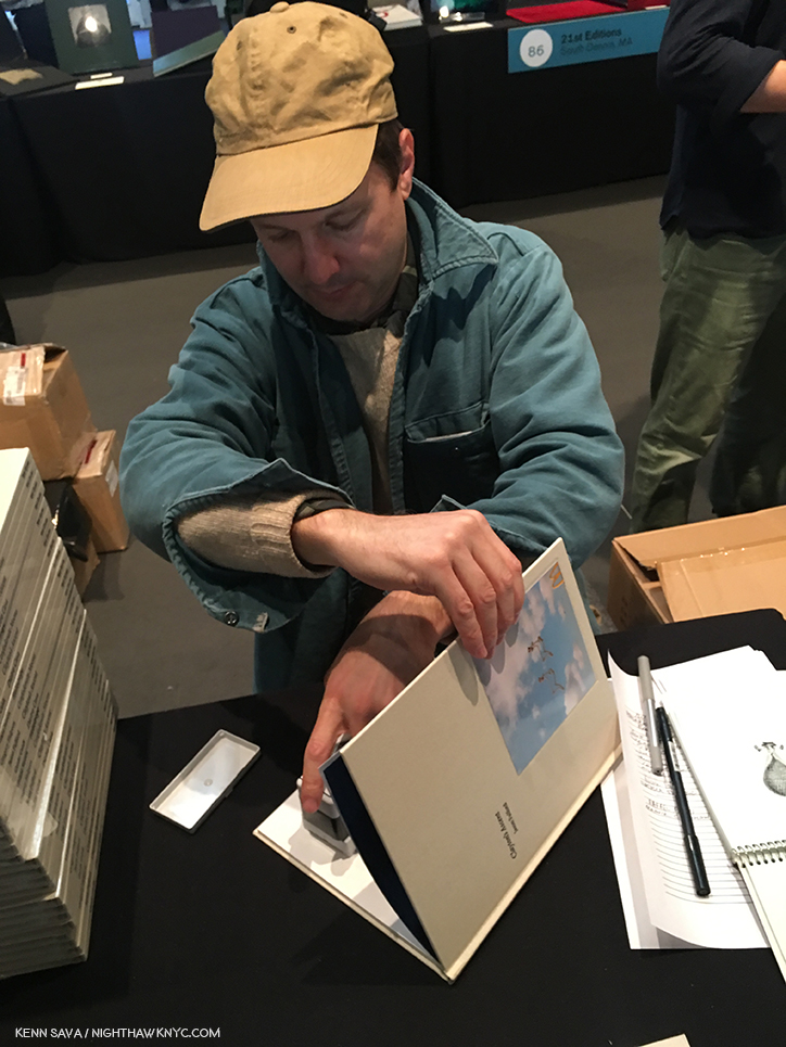
One of the great things about The Photography Show (aka AIPAD) is beyond the staggering amount of Photographs to be seen, it’s rich in in the presence of Photographers, themselves. In this second Post on The Photography Show, 2018, I’m going to take look at some of those I saw, met and spoke to. Going in, I thought last year’s list of those I met would hard to top- Bruce Davidson, Mike Mandel, Gregory Halpern, Jim Jocoy, Raymond Meeks, Paul Schiek, Tabitha Soren, among others. But, this year’s edition turned out to be equally rich. Here are some highlights.
First, the legendary Elliott Erwitt, a former President of Magnum Photos, still going strong at 89, was on hand to sign “Pittsburgh 1950,” a new release of work unseen these past 68 years at GOST Books-
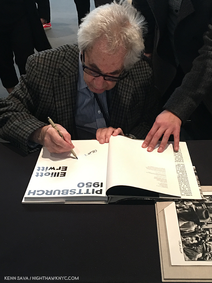
Elliott Erwitt joined Magnum Photos in 1953 and is still a member. Here, he signs the Special Edition of his book, “Pittsburgh 1950,” which comes with the print seen in the right corner, at GOST Books.
The equally legendary Susan Meiselas, also a Magnum Photos member (since 1976), was on hand, graciously signing her classic Aperture book, “Nicaragua” for me at Damiani-
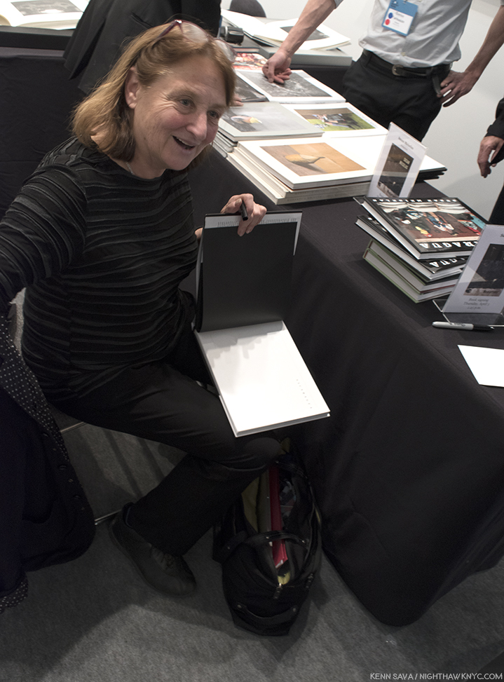
Susan Meiselas at the Damiani booth on Thursday
Dayanita Singh signed her newly minted Paris-Photo Aperture PhotoBook of the Year, 2017, “Museum Bhavan,” at Steidl’s table. It consists of a unique box that contains 10 smaller books that the Artist conceived as a portable museum-
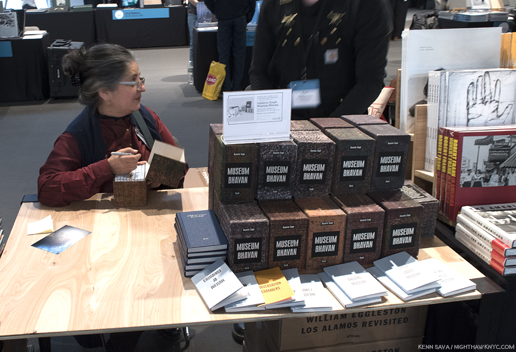
Photographer Dayanita Singh, signs “Museum Bhavan,” at Steidl. As you can see, each copy comes in a unique box. The Artist graciously selected one for me she thought was particularly beautiful.
Jungjin Lee signed her beautiful book, “Opening,” at Nazraeli Press-
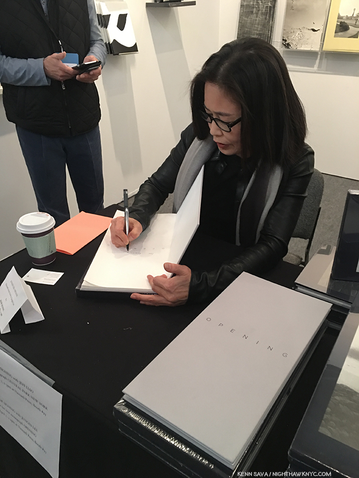
Jungjin Lee at Nazraeli Press’ booth.
The renowned and influential Paul Graham spoke about his classic 12 volume set, “A Shimmer of Possibility,” then signed the newly released MACK Limited Third Edition-
Paul Graham at MACK Books.
Along with MACK’s third edition of “A Shimmer of Possibility,” the most highly anticipated book release of the show was, perhaps, the debut of TBW Books 4 volume “Annual Series #6,” which resulted in the biggest book release crowd I saw. Last year’s “Annual Series #5,” which featured volumes by Lee Freidlander, Mike Mandel, Bill Burke and the aforedepicted Susan Meiselas, was shortlisted for the Paris-Photo Aperture PhotoBook of the Year, 2017. Both Gregory Halpern (“Confederate Moons”) and Jason Fulford (“Clayton’s Ascent,”) were on hand to sign their two books. Like many others, I was anticipating Mr. Halpern’s first book since “ZZYZX,” which won the Paris-Photo Aperture PhotoBook of the Year for 2016. Would this one, titled “Confederate Moons,” considerably shorter in the making, measure up? No pressure.
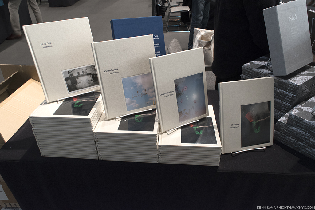
TBW’s “Annual Series #6,” debuting at AIPAD, consists of new books by Guido Guidi, Jason Fulford, Gregory Halpern and Viviane Sassen, from left to right.
He didn’t seem to be worried when I spoke with him, first at MACK’s booth, where he signed “ZZYZX,” and later at TBW Books-
Gregory Halpern was a popular man. First, he was on hand to sign his classic, “ZZYZX” at MACK Books, ..
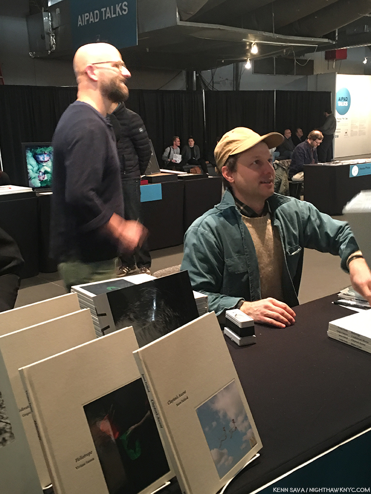
Then, like a blur, Mr. Halpern was over at TBW Books signing his terrific, new, “Confederate Moons.” Here’ he’s seen behind Artist & Publisher, Jason Fulford, who also has a book in “Annual Series #6,” titled “Clayton’s Ascent.”
I’ve said before that Gregory Halpern’s work speaks to me as much as any Photographer from the younger generations of Photographers I’ve discovered these past 18 months. I now live with his work on my walls. Seeing new work by him was an event for me, the way music lovers look forward to a new album/CD by an Musician or group that inspires them. So, I made a conscious effort to put any resulting bias aside and live with “Confederate Moons” for a week.
The first Photo in “Confederate Moons,” by Gregory Halpern, courtesy of the Artist and TBW Books.
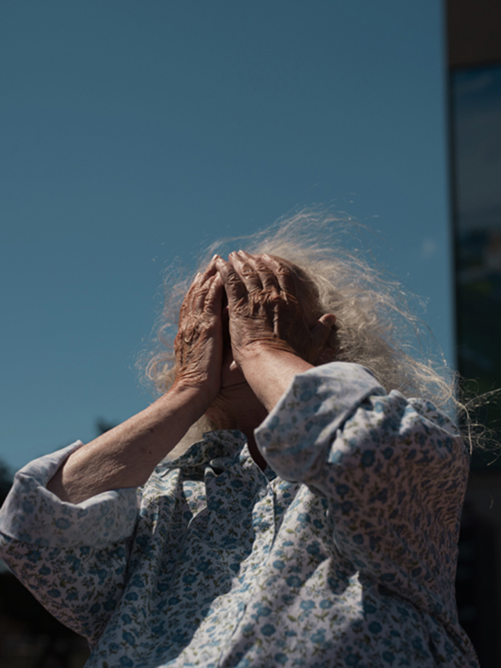
It turned out to be very easy to do. I opened it, was presented by the first image, and just went on the trip from there. There is no text in “Confederate Moons,” beyond the title page and the colophon. The Photographs are not titled or dated. A few days after AIPAD ended, Mr. Halpern posted an “About” on the “Confederate Moons” section of his website. It revealed that “Confederate Moons” is a collection of Photographs taken in North and South Carolina, in August, 2017, the month of the solar eclipse. I find it a beautiful meditation on unity, difference and something that unites everyone, regardless of their location, demographics, beliefs, age, or race- the sun, the source of life. A good many of the Photos are portraits in one way or other, many show the subject looking up.
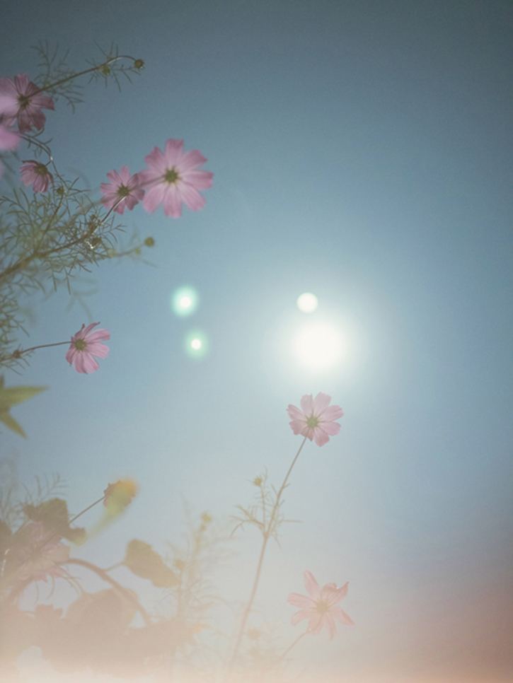
Photo from “Confederate Moons,” by Gregory Halpern, courtesy of the Artist and TBW Books.
Whereas “epic” is a word I’d use to characterize “ZZYZX”- as in an epic journey filled with epic images. “Confederate Moons,” strikes me as something of a “love letter” to nature, including humanity, while also serving as a reminder that whatever our differences are, we are united by things like our dependency on the sun. Along with striking images of the eclipse and the darkened world (Mr. Halpern must have been EXTREMELY busy during those very few minutes) there are images of the south and it’s natural beauty and uniqueness, during what I assume may be before and after.
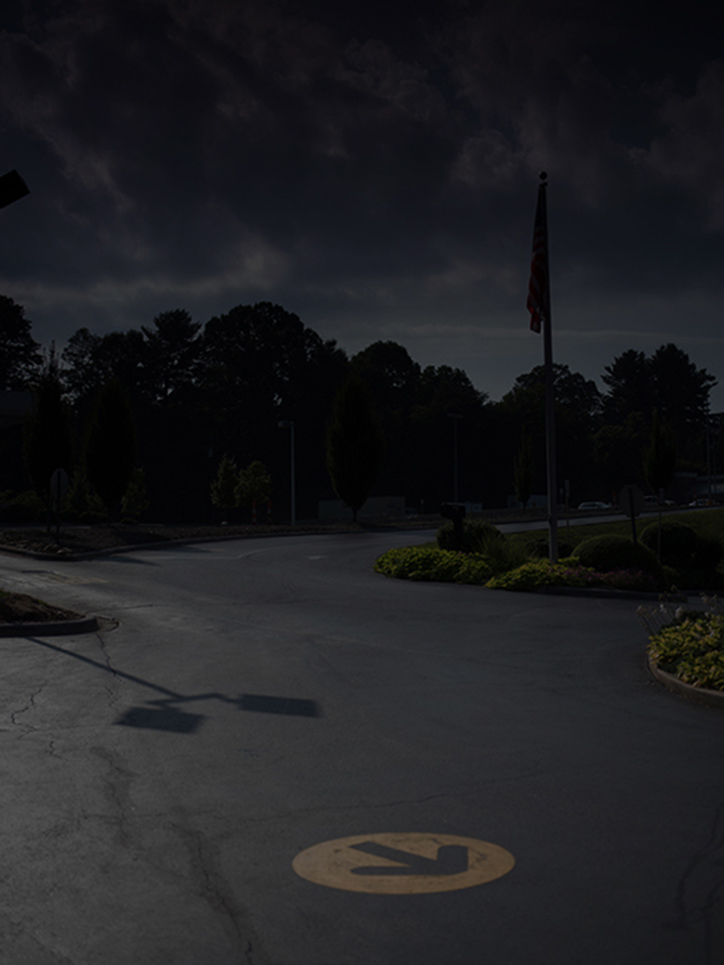
Photo from “Confederate Moons,” by Gregory Halpern, courtesy of the Artist and TBW Books.
It’s easy to make up your own story as you move through it. Or multiple stories. I find it’s enhanced by not having any texts or even titles for the Photographs, though I usually insist on titles (even if it’s “Untitled,” or “No Title”). It’s another extraordinary book, every bit as evocative as “ZZYZX,” though it feels more personal to me. Mr. Halpern mentioned to me that he still believes in the power of a Photograph or a work of Art to change the world. I hope he’s right. I do, too.
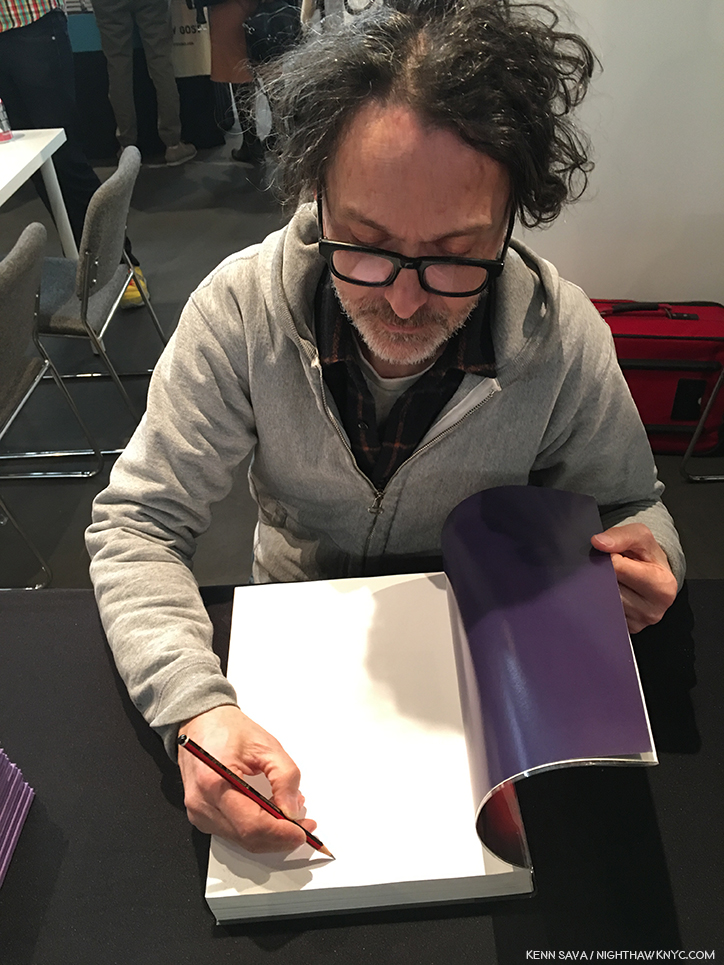
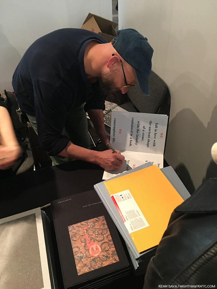
At TBW’s Book release, Mr. Halpern was joined by his friend, the accomplished and well-known Photographer & Publisher, Jason Fulford, who’s “Clayton’s Ascent,” is, also, one of the 4 volumes in “Annual Series #6.”
Jason Fulford puts his official stamp, appropriately of two men in a hot air balloon, on his wonderful, new, TBW Book, “Clayton’s Ascent.”
In addition to all of these renowned Artists, there seemed to be more Photographers present in gallery booths, on hand to talk to show goers about their work, something I think is just terrific. As I’ve said in the past, personal contact with an Artist is one of the great joys of buying Art. More often than not, priceless insights, stories and details are shared, which I’m sure help sales, but become cherished memories for both buyers (a sort of verbal/experiential provenance) and visitors.
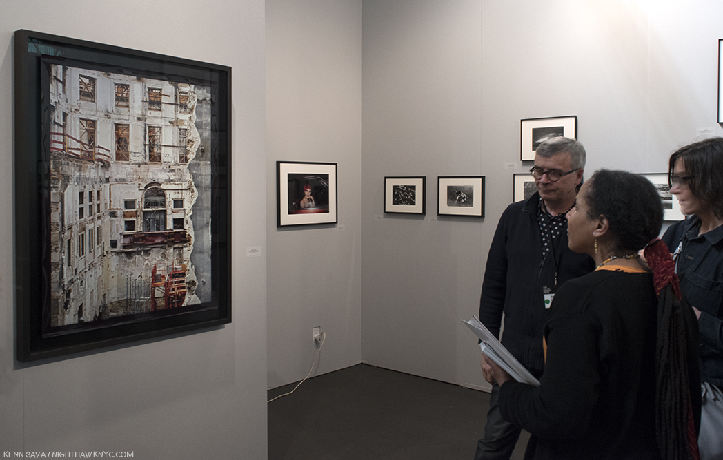
Stephane Couturier discusses his “Paris 9- ilot Edouard VII- Photo no 10, 1998” at Les Douches la Galerie, Paris’ booth, where Tom Arndt followed discussing his work.
Over the course of the show, I noticed that Stephen Wilkes was on hand over multiple days at Bryce Wolkowitz Gallery, graciously discussing his monumental landscapes and answering questions from visitors. I know firsthand that he made fans out of some of those who heard and met him.
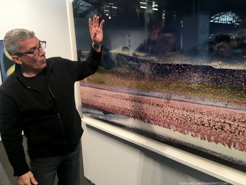
Stephen Wilkes at Bryce Wolkowitz was on hand for 3 days by my count to discuss his massive, extremely intricate landscapes.
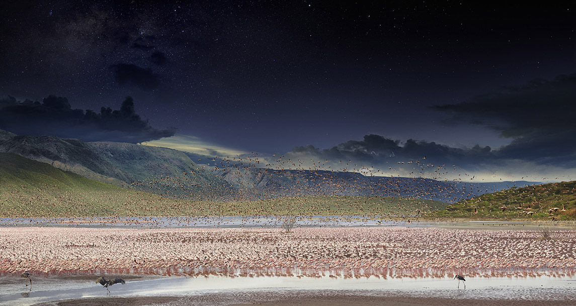
The work Stephen Wilkes is discussing- “Lake Bogoria, Kenya, Day to Night, 2017.” This is a composite of over 1,000 Photographs taken in a single day, from morning to night. The black birds in the front are circling their prospective dinner while the prospective prey gets nervous. Courtesy the Artist and Bryce Wolkowitz Gallery.
Over at Jorg Maass Kunsthandel, all the way from Berlin, Gilles Lorin was also on hand over multiple days to discuss his classical/modern still lifes. As if that wasn’t enough, he also did a terrific job designing the layout of the booth, one of the most beautiful I saw, that, in addition to a wall of Mr. Lorin’s darkly mysterious works also included Diane Arbus, Robert Frank, Painter Sean Scully(!), and a marvelous William Eggleston.
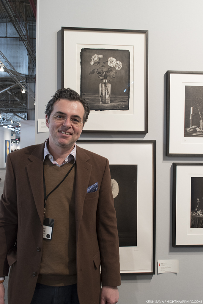
Gilles Lorin at Jotg Maass Kunsthandel, Berlin, where he also designed the booth’s layout superbly.
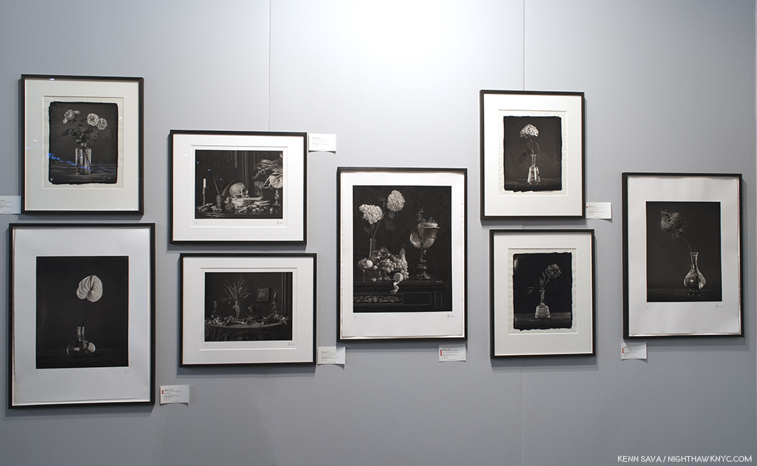
Still-lifes by Giles Lorin at Jorg Maass. One or two struck me as having a small bit of Durer’s “Melencolia.”
Ok. Quick quiz time- What do Picasso, Frank Lloyd Wright, Georgia O’Keeffe, JFK, Greta Garbo, Fellini, Jackson Pollock, Elaine and William DeKooning, Grace Kelly, Marcel Duchamp, Giorgio DeChirico, and World War II have in common?
All were Photographed by Mr. Tony Vaccaro.
So, there I was…
Monroe Gallery booth, AIPAD, April 7, 2018
Henri Cartier-Bresson is famous for his Photography, and for the title of his most famous book- “The Decisive Moment,” 1952. It’s a cryptic, mysterious phrase that has become both a mantra for countless Photographers since, and something of a phantom for those seeking “it” in the real world. Adding to the mystery, and magic, of the book, beyond the 126 classic Photos within, is the fact that the original French title of the book translates as “Images on the sly.” Talk about a moving target!
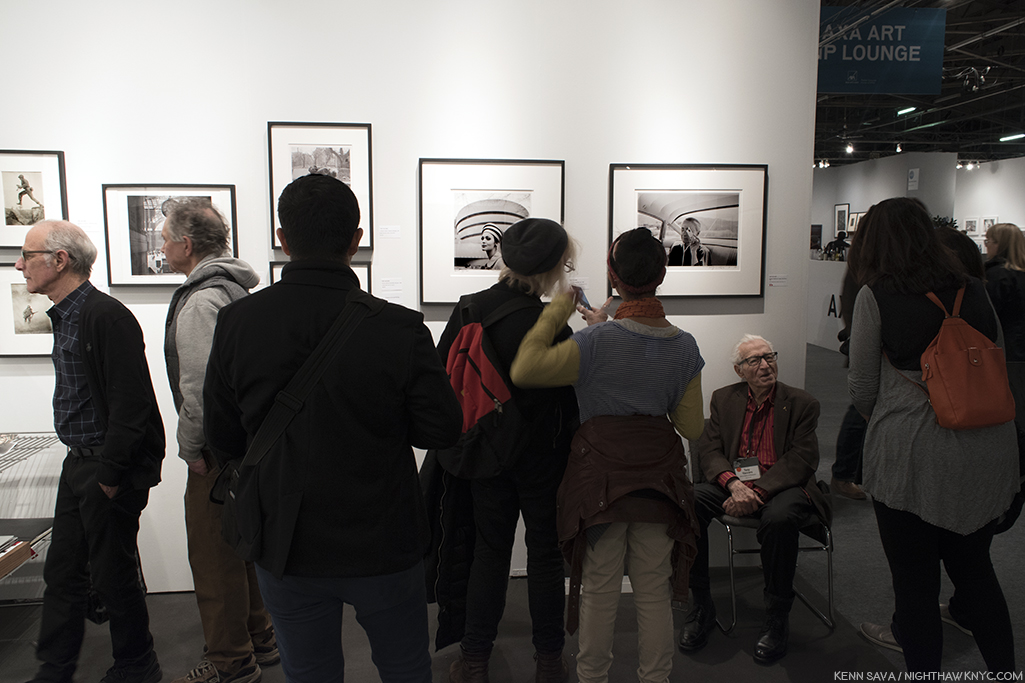
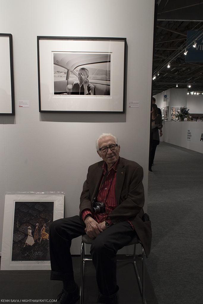
Standing in Sydney Monroe Gallery’s booth on Sunday, April 7th in mid-afternoon, I was faced with the scene above. In front of me sat the living legend, the Dean of Photographers, ninety-six years young, Artist Tony Vaccaro, the subject of an amazing HBO Documentary, “Underfire: The Untold Story of Pfc. Tony Vaccaro,” enchanting all who came within earshot of him with astounding and unforgettable tales of the classic Photo lining the wall above him. What was I saying about the value of personal contact with the Artist?
I yearned to say “Hello,” to tell him how much I admire his work, and congratulate him on an incredible life…
But? This was my third attempt at doing so.
Flashback. Last year, at 2017’s AIPAD, Mr. Vaccaro was present at Mr. Monroe’s booth, but the crowd was, understandably, unrelenting. This was as close as I got to him-
AIPAD, April 1, 2017. Tony Vaccaro at Monroe Gallery’s booth.
Going into AIPAD, 2018, he was scheduled to appear on Saturday, April 6th. But, delayed in traffic, I missed Mr. Vaccaro’s appearance! Darn! So? I stayed to look at his work on view.
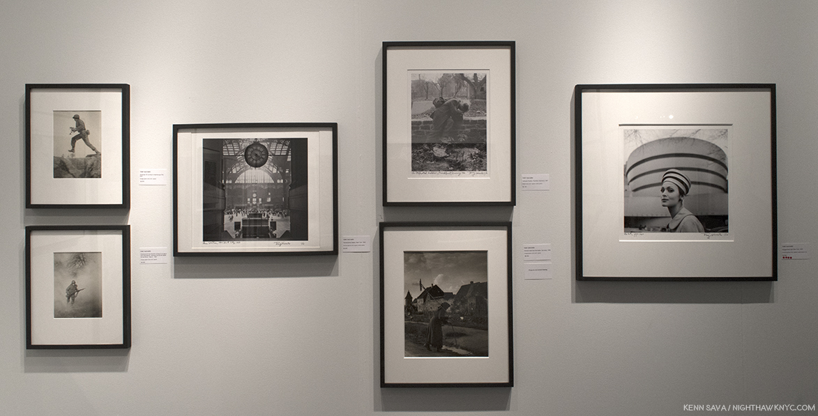
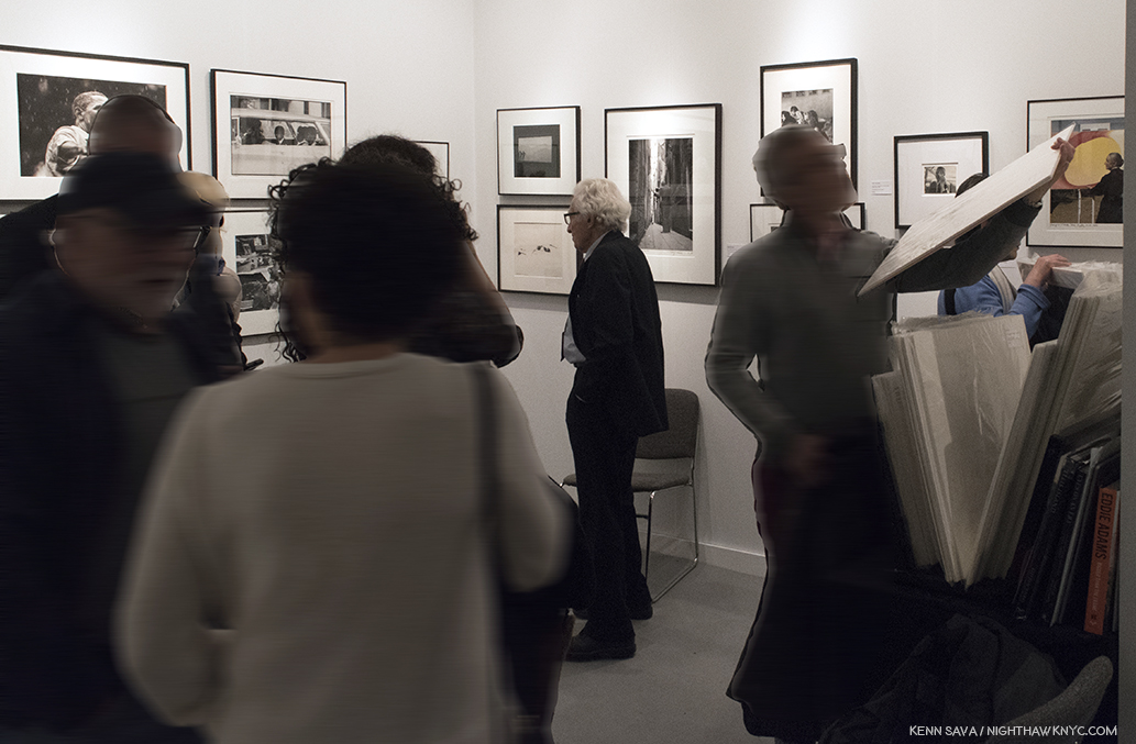
Wall of Photographs by Tony Vaccaro seen at Monroe Gallery’s booth at AIPAD, April 6, 2018.
Before me was a history of much of the 2nd half of the 20th century. On the left, combat Photos taken, literally, in the trenches during World War II! To their right, a gorgeous Photo of the old Penn Station. Next to that, two Photos taken in Europe after the War. Next to that a model wears a hat very similar to the immortal rotunda of Frank Lloyd Wright’s Guggenheim Museum in 1960, a year after it opened! Each work was hand titled, numbered and signed by the Artist. And, to the right of that, the amazingly off the cuff Photo of Georgia O’Keeffe seen later.
I mentioned to Mr. Monroe my disappointment at having missed Mr. Vaccaro. “He’ll be back tomorrow afternoon,” he replied. “Really?,” I replied in shock. The third try might be the charm. Returning as soon as I arrived at the show, I was faced with the scene up top. This time, I stood patiently, waiting for the seas to part. Finally, I took a hard swallow. (Hey, I’m a pretty shy guy. It’s hard for me to approach strangers.) I walked forward and grabbed my own “decisive moment.”
Then, all of a sudden, I was face to face with a chance to talk to a legend. He couldn’t have been nicer….more gracious…more welcoming. Wow… I asked him if I could take his Photo. Not only did he agree, he posed, then after I did, he even decided to remove his glasses.
I’ll never forget the next few moments. Though I have already forgotten just how many passed.
After taking the Photo, I asked him about his work. Regarding the one of a kind Photo of Georgia O’Keeffe he was sitting under, he said that he had spent a few days around her and she was not responsive to the idea of being Photographed. That’s understandable. Earlier in her life, Ms. O’Keeffe had been the muse of legendary Photographer Alfred Stieglitz. Together, O’Keeffe & Stieglitz created a unique, perhaps unequalled body of work, characterized by her haunting, ethereal beauty and a very rare intimacy. But, suddenly, she looked at him through a piece of cheese, and voila! I can’t recall ever seeing one as unguarded as this. The fact that she’s still not smiling, makes it all the more special. She’s only letting the viewer in so far. The cheese is in the way, acting like a shield. Of course, Mr. Vaccaro took other Photos of her, in color, which are now quite famous, but this one is the only one I’ve seen that shows another side of her.
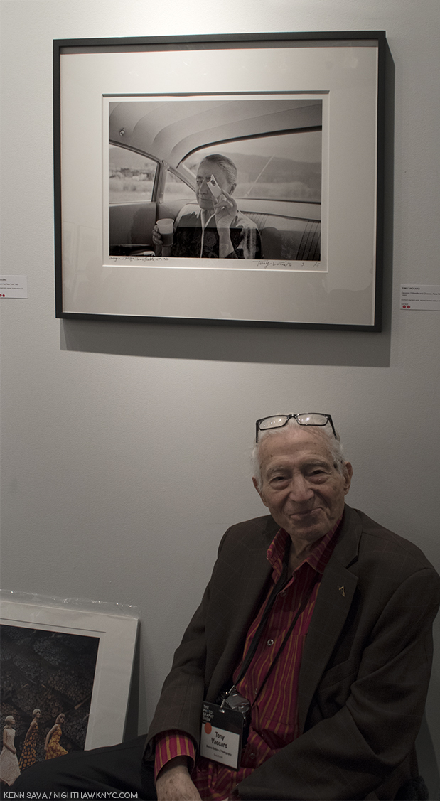
Mr. Vaccaro graciously posing for yours truly under his classic Photo of the greeat Georgia O’Keeffe. I’m amazed you can’t see the camera shake in the Photo.
Next to it, the wonderful Photo of the model in front of the Guggenheim, elicited a question about it from a visitor. “I was there when Frank Lloyd Wight was designing the Guggenheim,” Mr. Vaccaro answered. Wait. What??? Sure enough. I remembered the famous shot, one of my favorites of Frank Lloyd Wright, standing in his work room, with his arms raised and outstretched, standing behind his desk. A spontaneous moment that became something of a “perfect” portrait of the great Architect. Blown away, I had to ask a follow up question. “What was Frank Lloyd Wright like?,” words I never expected to ask any one. “Hard worker. Hard worker,” Mr. Vaccaro said. “What was it like to Photograph him?” “He never told me anything. I told him just go about your work, do what you want to do, and I’ll take the Photographs. And that’s what we did. He never told me anything.” I asked him about his amazing World War II Photographs. He told me he was always able to get film, and he carried a small film developing set with him, with chemicals and small nesting trays that were easy to pack. He developed his film as he used it. As is shown in the Documentary, he went from Normandy to Berlin. “Mrs. Roosevelt was waiting for me when I got to Berlin,” he said. He moved on to the beautiful shot of the “Old Penn Station,” “It was lucky I photographed it. A short time later, they destroyed it. What a shame. What a beautiful building,” he said. I asked him if he had a favorite among the countless Photographs he’s taken. “The G.I. kissing the little girl.(“The Kiss of Liberation”) I think that’s marvelous.The French also thought that was super and they gave me the “Legion of Honor” (in 1994).
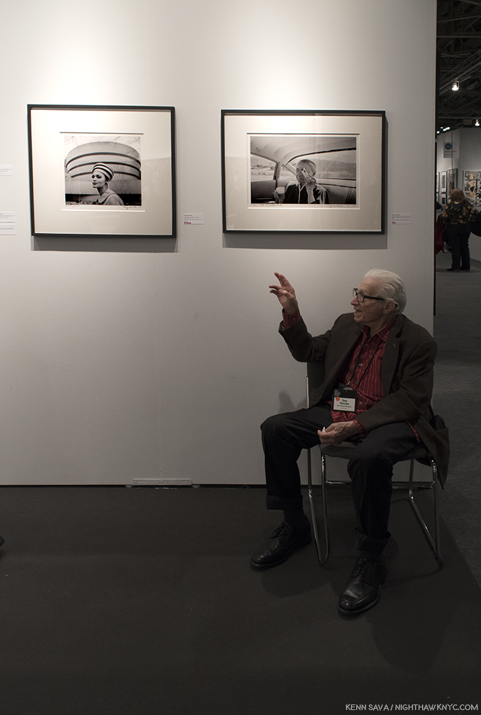
“I was there when Frank Lloyd Wright designed the Guggenheim,” Mr. Vaccaro said. That sound you heard was my jaw hitting the floor.
He mentioned having worked at Life Magazine after the War, and I asked him if he knew Gordon Parks, who would have been at Life at the same time. “Gordon was a good friend of mine,” he recalled. These days, Mr. Vaccaro and his family have the Tony Vaccaro Studio, in Long Island City, where Mr. Vaccaro was headed when he stopped to take the Photo of the “Old” Penn Station, which maintains and manages his archives, as Mr. Vaccaro continues to work. His daughter in law, Maria, who manages sales and the archive was on hand as well. I couldn’t help but notice the beautiful Leica Mr. Vaccaro had around his neck. He told me it was a gift to him from the great German camera maker. Well, you can’t get better advertising than what he’s created with one, that surrounded him on “his wall,” as he called it. Then? He talked about looking forward to his 100th Birthday!
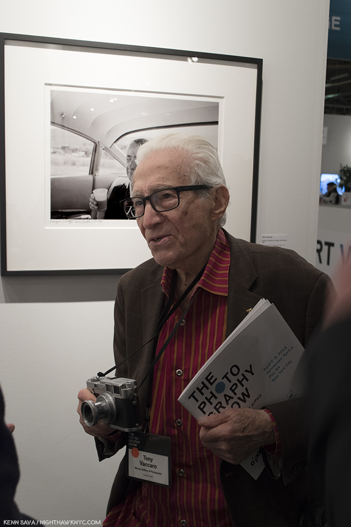
A beautiful Man, and his beautiful Leica.
Right before I bid farewell, Mr. Vaccaro was discussing his work with a couple who promptly made a purchase they’ll never forget. Not privy to the conversation, he leaned back next to me and I heard him say, “I was at the right place at the right time.”
I leaned over and, smiling, said to him,, “Yeah. A LOT of times.”
*- Soundtrack for this Post is “Time In A Bottle,” by Jim Croce (for Sv)-
This Post is dedicated to Susan Meiselas, Paul Graham, Gilles Lorin, Dayanita Singh, Gregory Halpern and, the one and only, Mr. Tony Vaccaro, for their Art, for the beauty of their spirits, and for sharing both, with me, and the world.
The Photography Show/AIPAD, 2018, is my NoteWorthy Show for April.
Once again, for the second year, I’m proud to bring you THE most extensive coverage of The Photography Show anywhere. This is Part 2. The rest is here.
My coverage of The Photography Show, AIPAD, 2017 (including “Memorable Meetings, 2017”) is here, and my prior Posts on Photography are here.
NighthawkNYC.com has been entirely self-funded & ad-free for over 7 years, during which over 275 full length pieces have been published!
I can no longer fund it myself. More on why here.
If you’ve found it worthwhile, PLEASE donate to keep it online & ad-free below.
Thank you, Kenn.
Written & photographed by Kenn Sava for nighthawknyc.com unless otherwise credited.
To send comments, thoughts, feedback or propositions click here.
Click the white box on the upper right for the archives or to search them.
Subscribe to be notified of new Posts below. Your information will be used for no other purpose.
Edvard Munch (1863-1944) is mostly known in the USA for The Scream, so, Edvard Munch: Between The Clock & The Bed, at The Met Breuer was something of a revelation, an all too rare chance to see a selection of his work, in this case 43 Paintings, and see a bit more of what the Norwegian Artist was all about. The fact that more than half of the works on view remained in his collection until his death gave it a personal feel. Munch, who never married, considered his Paintings to be his children. So, when he passed away in January, 1944, he bequeathed his collection to the city of Oslo- 1,100 Paintings, 4,500 Drawings and 18,000 Prints, now housed in the Munch Museum.
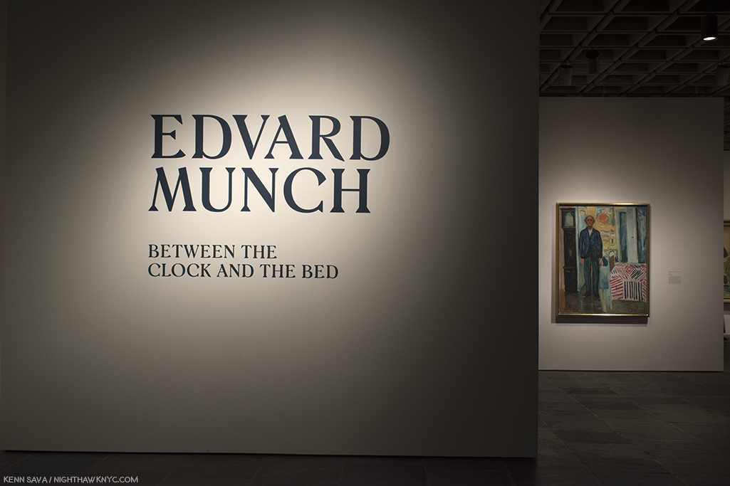
Installation view of the entrance at The Met Breuer.
The personal feeling was heightened by the fact the show included 16 self-portraits, created over the 6 decades he was active. And so, we get to see the changing face of Edvard Munch-
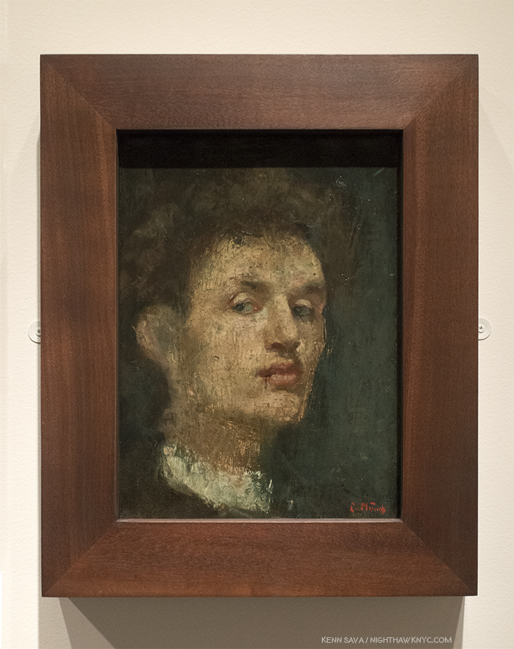
Self-Portrait, 1886, Oil on canvas. Age 23. The first work Munch signed, created using a spatula and by scratching the surface, in some areas, baring the canvas.
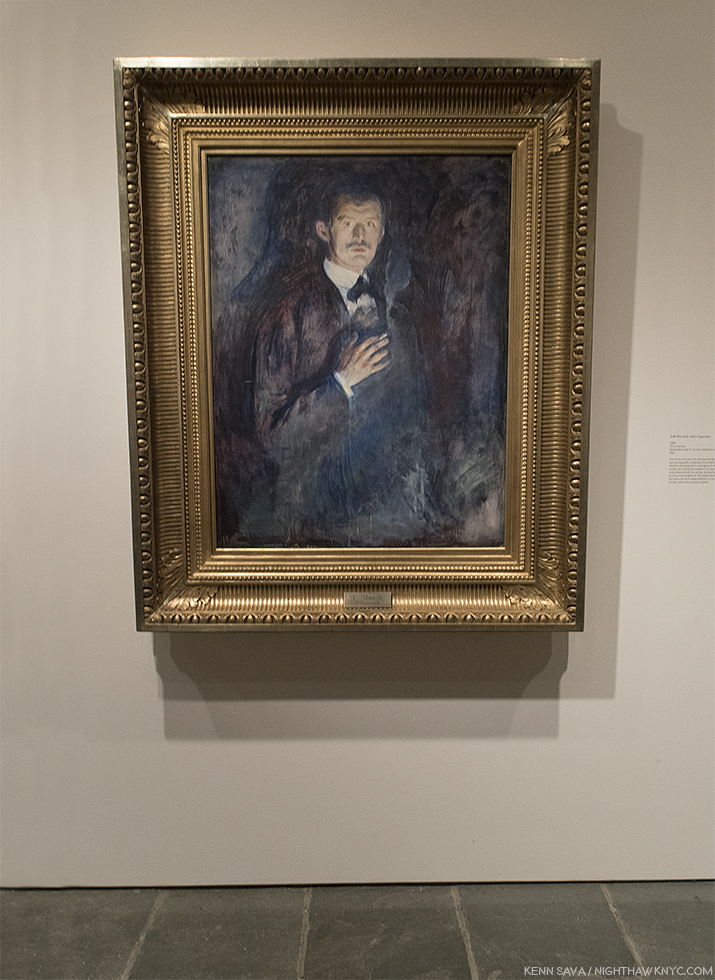
Self-Portrait with Cigarette, 1895, Oil on canvas.
The Night Wanderer, 1923-24, Oil on canvas.
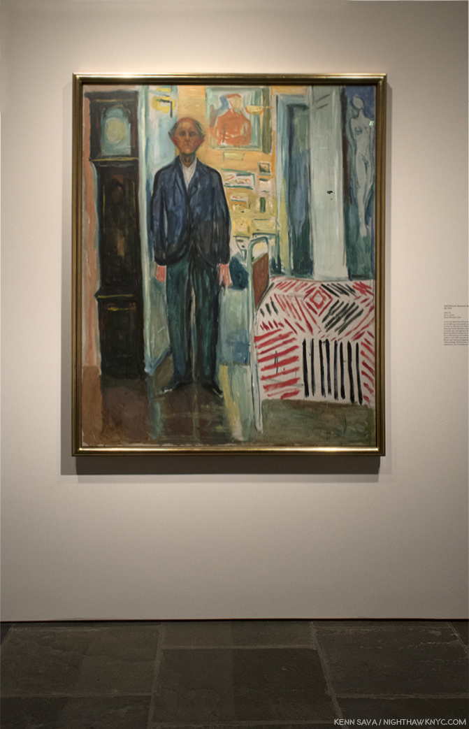
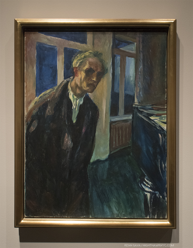
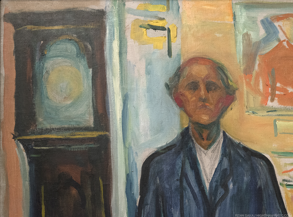
Self-Portrait: Between the Clock and the Bed, 1940-43, Oil on canvas. In his last significant “self-scrutiny” as he referred to his self-portraits, he stands before the faceless clock and bed, in front of his Paintings, facing mortality, and immortality.
Munch’s journey saw him experiment with a variety of styles, including Impressionism. But, even early on, as seen in his “Self-Portrait,” 1886, above, he showed signs of breaking out and finding his own way. Once he did, there is a strain in his mature work that is, famously, characterized by a depth of feeling that regularly includes agony and isolation, which he expresses in a style uniquely his own. Those works are what is mostly seen at The Met Breuer, and they proved captivating in one of the best shows thus far in 2018.
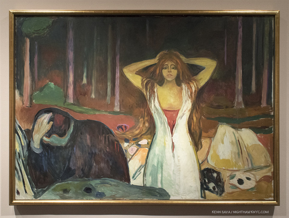
Ashes, 1925, Oil on canvas. The anguished man..the sensuous woman, and the log in the rear turning to ashes, it’s flame apparently gone out…
In these works, he’s moved beyond “Impressionism,” and all that’s left is raw emotion, powerfully and poignantly expressed in unusual poses and striking compositions.
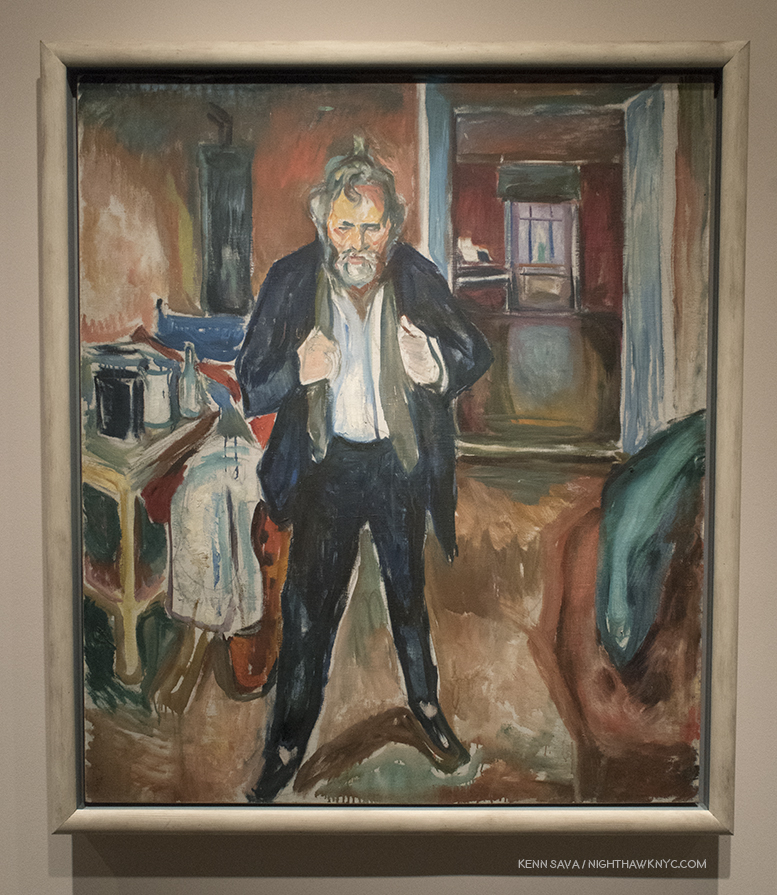
Sleepless Night: Self-Portrait in Inner Turmoil, 1920, Oil on canvas
In another Self-Portrait, Sleepless Night: Self-Portrait in Inner Turmoil, 1920, the walls, floors and table surfaces seem to vibrate, and fade into other dimensions, as if the spaces themselves are emoting. Here and in the later Self-Portraits, Munch has also moved past the great self-portraitist, Van Gogh, to reveal himself at seemingly odd and unexpected random moments. The loneliness in these self-portraits as an older man is still somewhat startling, something rarely seen in Art History to that point. Michelangelo’s, apparent, inclusion of himself as Nicodemus in The Deposition aka The Florentine Pieta,” and, of course, Rembrandt’s late Self-Portraits being two that come to mind.
Of course, any discussion of loneliness, pain and agony in Munch must include The Scream.
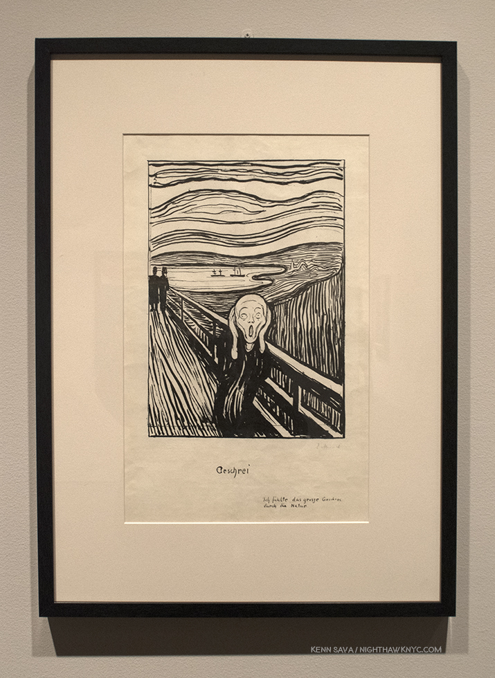
The Scream, 1895, Lithographic crayon. The inscription near the lower right, reads, “I felt a loud unending scream piercing nature.”
At The Met Breuer,The Scream was included in an 1865 version done in lithographic crayon, Interestingly, he has rendered virtually the entire composition in lines, except for the coats and the sides of the railing. But, the highlight of this show was the chance to see precursors of The Scream, which I had never seen before.
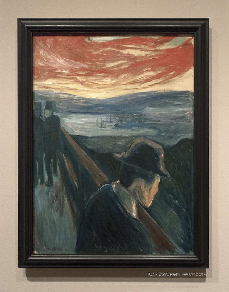
Sick Mood at Sunset: Despair, 1892, Oil on canvas. A precursor to the first version of The Scream, 1983, The wall card says Munch referred to this work as “the first Scream.”
On January 22, 1892, while in Nice, where he painted Sick Mood at Sunset: Despair, Munch recorded in his diary an event that took place years earlier in Norway, “I was walking along the road with two friends. The sun set. I felt a tinge of melancholy. Suddenly the sky became a bloody red. I stopped, leaned against the railing, dead tired and I looked at the flaming clouds that hung like blood and a sword over the blue-black fjord and city. My friends walked on. I stood there trembling with fright. And I felt a loud, unending scream piercing nature.”
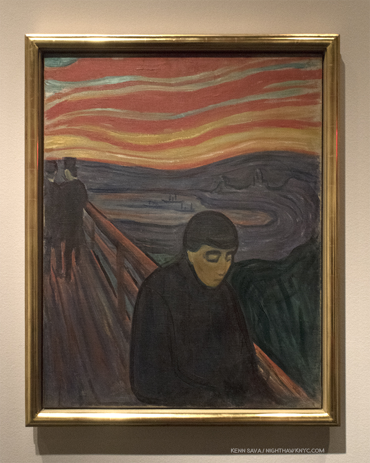
Despair, 1894, Oil on canvas.
These two take an opposite, introverted approach to the famous Scream. As such, they seem much more in character with the Edvard Munch seen in the rest of this show (admittedly, a low single digit percentage of his Painted output), and so serve to sharpen the feeling that The Scream is that rare moment of extroverted outburst that so many of his other works keep just below the surface. All three works (counting the Painted “Scream,” not here) are marvelously original, with searingly burning skies that even Van Gogh might have envied. The two above are masterpieces in their own right, in my view.
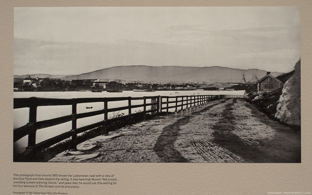
Photo, circa 1870, showing the Ljaborveien road Munch depicts. Oslo is in the background.
The show also included an 1870 Photo of the Ljaborveien road Munch depicts. It was here that Munch “felt a loud, unending scream piercing nature,” which he would immortalize over two decades later.
Starry Night, 1922-24, Oil on canvas. Even this late in his career, the influence of Van Gogh remains, here as a jumping off point. Note the two shadowy figures.
As I moved through this marvelous show, while bearing in mind that these works are only a tiny percent of his oeuvre, I couldn’t help but feel that after he left Impressionism behind, the influence of Vincent Van Gogh lingered. Of the countless Artists who have been similarly influenced, Edvard Munch is one of the very few who’s work would make an interesting counterpoint if hung along side his.
“The Sick Child,” 1907, Oil on canvas. One of the seminal works in Munch’s career.
Whereas Vincent never shows us pain in an actual event, leaving us to feel it, and everything else, in the “quiet” scenes he shows us after, like in his Self Portrait with Bandaged Ear,or in the garden scenes of the hospital he’s in. Edvard Munch shows us the events, like The Scream, and his terminally ill sister in The Sick Child, 1907, and this seemingly inconsolable woman, below, in Weeping Nude, 1913-14, as if to let us feel what he’s feeling and see why. The deaths of his mother when he was 5, and then that of his beloved sister, Sophie, when Munch was 13, both from tuberculosis (despite the fact that his father was a physician), stayed with him the rest of his life. He created six versions of The Sick Child, (the one above is #3), using a different model, over FORTY years (between 1885 and 1927), such was it’s hold on him. Therefore, it’s hard to think Painting these scenes were “therapeutic” for him.
Weeping Nude, 1913-14, Oil on canvas.
Edvard Munch: Between the Clock and the Bed shows an Artist who stands apart. He found his own way, apart from everything else that was going on in the Art world during his time. In an Art world full of genres, I find it refreshing that his work doesn’t really belong in one, as a reminder that no Artist’s work does. And? As I discovered in an interesting satellite show, Like Edgar Degas, Thomas Eakins, and other Artists of the time who are generally considered Painters, it turns out that Edvard Munch was, also, an avid Photographer.
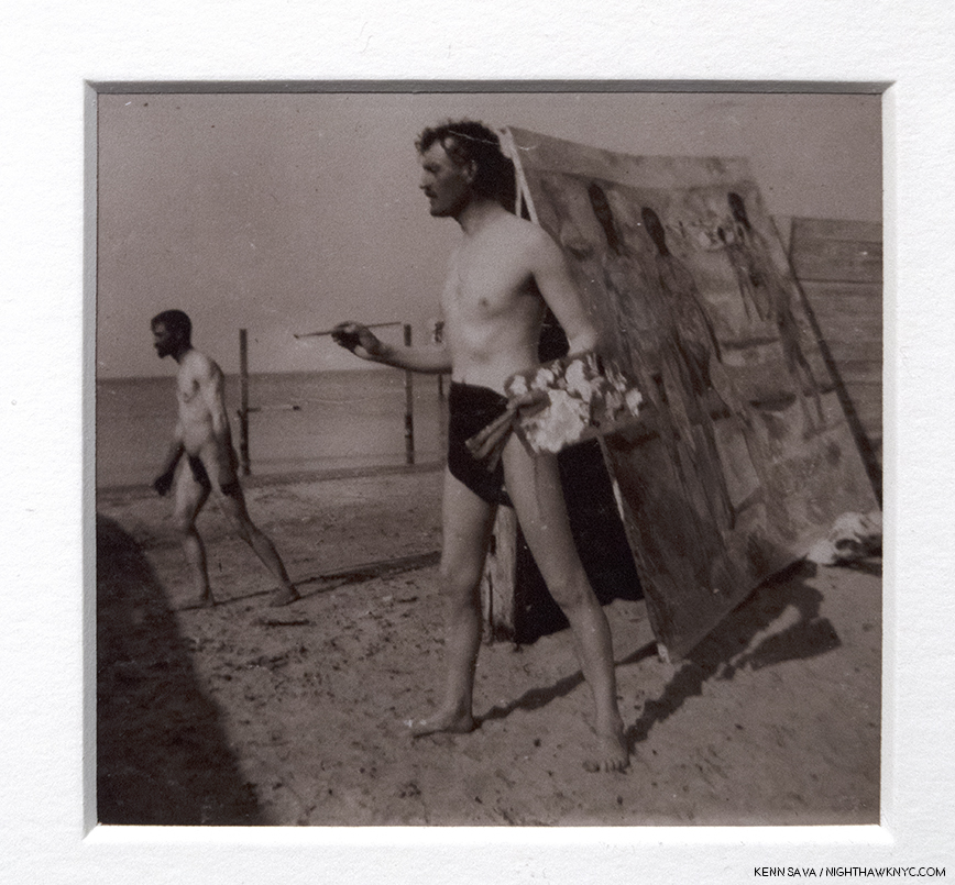
Edvard Munch, Self-Portrait on the Beach with Brushes and Palette in Warnemunde, 1907, Printed from a collodion contact print. Perhaps channeling Gauguin in Tahiti.
If his Painting is not as well known here as it should be, his Photography is completely unknown. Into the void came the Scandinavian House who mounted a thorough show of these works (along a few graphics, and his experiment with filmmaking), titled Edvard Munch: The Experimental Self, as a satellite to The Met Breuer’s show. Part of the reason his Photography is unknown is that his surviving Photographs are extremely fragile. So much so, they had to be scanned and reproduced to be displayed here.
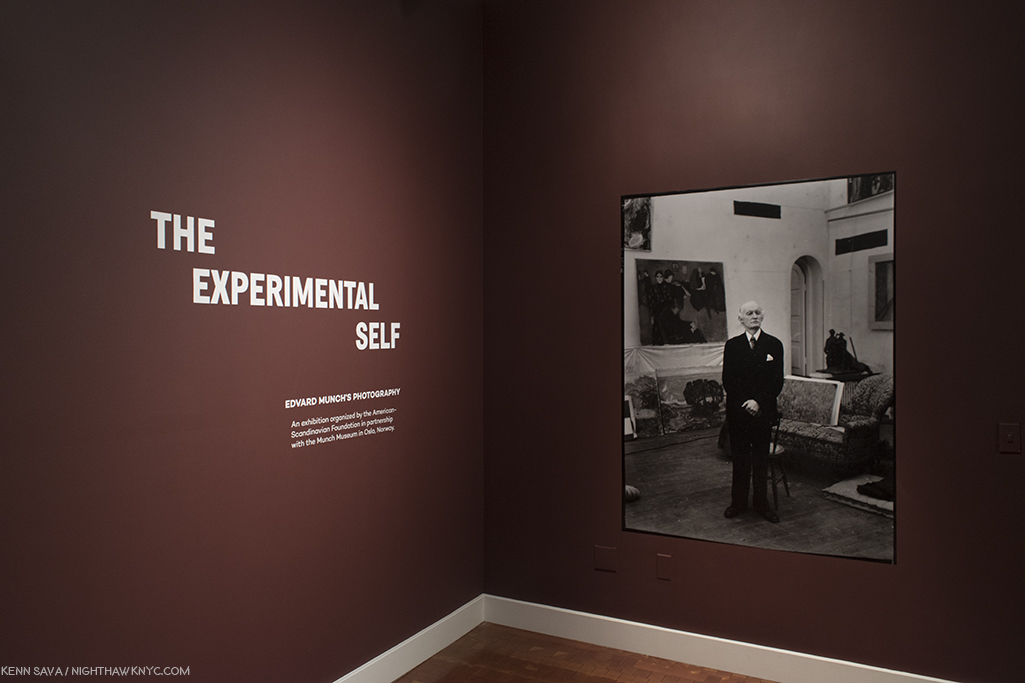
Edvard Munch strikes what would turn out to be a familiar pose in the introduction to this surprising show of his Photography and Films.
As I’ve been exploring the world of Contemporary Photography intensely since December, 2016, one thing that’s become apparent to me is that a surprising number of Painters have, also, been Photographers of varying degrees of seriousness, and almost none of them have had their Photography taken seriously- either by the Art world or by the world of Photography. Edvard Munch is yet another Painter who explored Photography. In his case, “explored” might be the best term to characterize his approach.
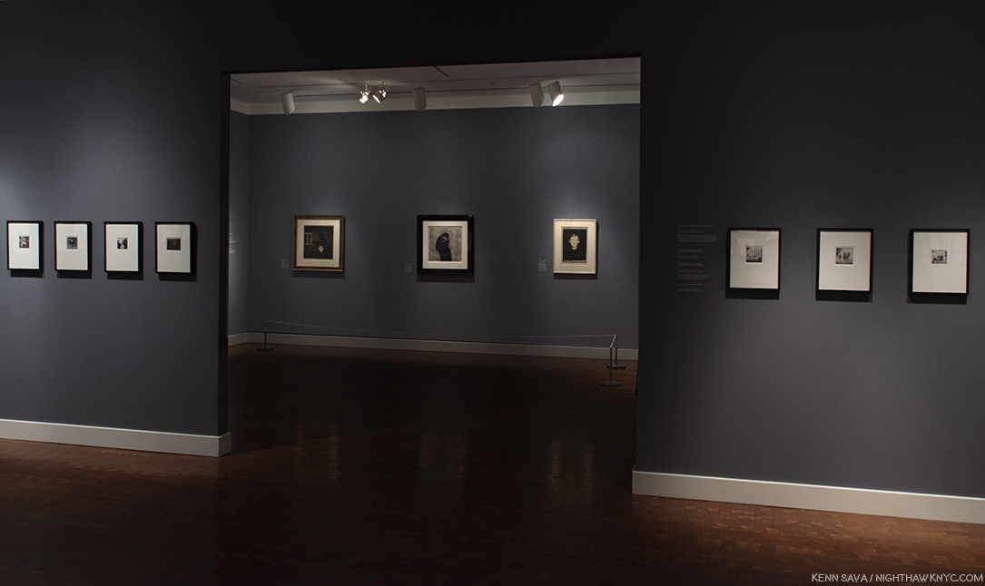
Scandinavian House Installation view. 3 prints in the far gallery, Photographs in the near gallery.
Munch considered himself an amateur as a Photographer, though he was pleased with the results he got and said that he planned on preparing this work for display at some point. It is interesting that none of the Photographs on view were, apparently, studies for subsequent Paintings, even with, as in The Met Breuer show, so many Self-Portraits included.
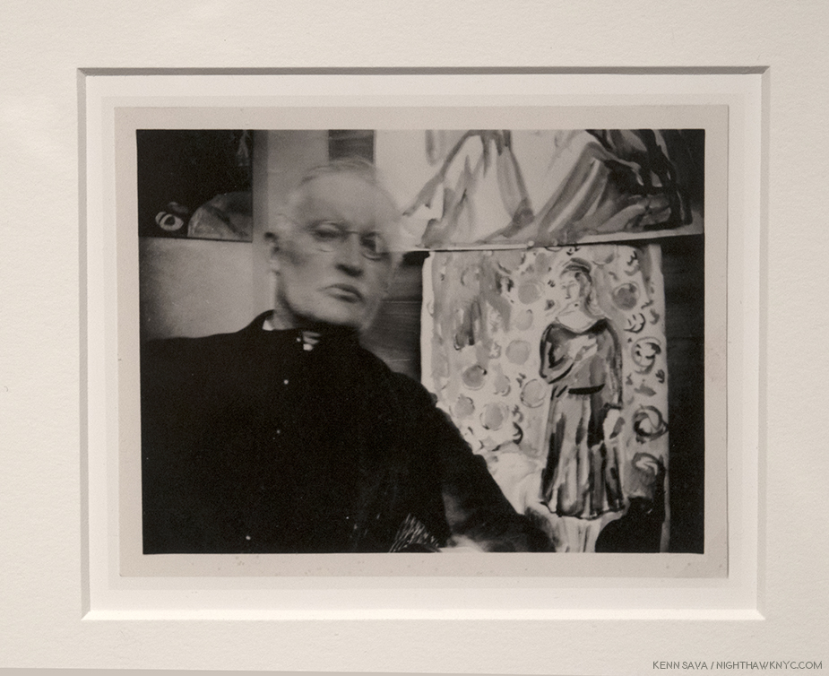
Self-Portrait wearing glasses and seated, with two Watercolors at Ekely, 1930, Print after an original silver gelatin print. Munch, hauntingly, with parts of two of his works, in, perhaps, a double exposure?
Munch Photographed during two periods. First, between 1902 and 1910, a period that began with the tumultuous end of a relationship during which one of the Artist’s fingers was mutilated by a gunshot, and ended with a rest cure for “emotional turmoil,” and again between 1927 and the mid-1930s, a period that began with the success of retrospectives in Berlin and Oslo and ended with a hemorrhage that temporarily impaired his vision in his right eye.
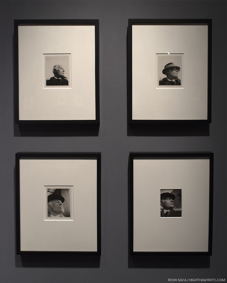
4 Self-Portraits, all taken in 1930. Munch was, apparently, very fond of this very serious pose, taken by himself with an extended arm, or with a cable shutter release, as it appears over and over again at different times, as seen here.
The “revelations” I found in his Photography was that along with the fact that he was his own preferred model with a camera, his poses are more serious. This may be due to the need to hold still during the long exposure times, but it does offer an interesting counterpoint to the Edvard Munch we see in his Paintings and Prints, where he seems more “natural.” It also appears that Munch was one of the first Artists obsessed with the “selfie,” and given how many variations he made with the same pose makes one wonder if Andy Warhol knew about them.
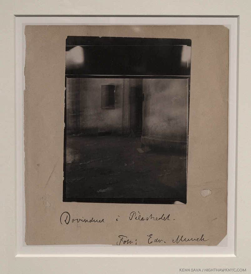
Courtyard at Pilestredet 30B, 1902, Original contact print on silver gelatin paper. I prefer this interesting shot of one of his childhood homes. He moved the camera while the shutter was opened and he, too, apparently liked the results enough to sign it.
The Photographs don’t portray the isolation and loneliness, nor the depth of emotion and expression his Paintings do. Therefore, it seems to me they will be considered an appendix to his Paintings and Graphic work, of interest, primarily, to Munch specialists.
Detail of Munch and the faceless clock in Between the Clock and the Bed.
All in all, Edvard Munch has been a figure who’s notoriety largely rests on one work, The Scream. It’s a work that speaks to the depth of feeling that characterizes a good many of the rest of his Paintings seen at The Met Breuer. The show proved his Paintings retain their power to speak to us and they reward both close, and repeat, looking. Perhaps even more than the Impressionists, Edvard Munch, working away in isolation in Oslo, created Paintings & Prints that resonates with our time. Like that clock with no hands, the emotions he Paints are timeless.
Edvard Munch: Between the Clock and the Bed is my NoteWorthy show for March, though it ended on February 4th. Edvard Munch: The Experimental Self ended on April 7th.
*- Soundtrack for this Post is “Forlorn,” by Weather Report, which may be heard here.
NighthawkNYC.com has been entirely self-funded and ad-free for over 7 years, during which over 250 full length pieces have been published. As I face high expenses to keep it going, if you’ve found it worthwhile, please donate to keep it up & ad-free below. Thank you!
Written & photographed by Kenn Sava for nighthawknyc.com unless otherwise credited.
To send comments, thoughts, feedback or propositions click here.
Click the white box on the upper right for the archives or to search them.
For “short takes” and additional pictures, follow @nighthawk_nyc on Instagram.
Subscribe to be notified of new Posts below. Your information will be used for no other purpose.
Wait. What? My rough realization of what Grant Wood may have REALLY wanted “American Gothic” to look like. I’ll explain shortly. Click any Photo for full size.
There is no denying Grant Wood’s contribution to what is now called “American Art.” He was one of the staunchest advocates for this country developing it’s own style of Art. He did as much as anyone else from the late 1920’s on, towards making it a reality. He spoke, taught, and formed Artist’s communities. and created Art that received wide acclaim as being American. Yet, seventy-five years after his death, the image we have of Grant Wood, the man, as well as the common perception of his work, is not the whole picture.
Behind the show’s entrance, the first gallery is ominously dark, ostensibly to show off the work in the next Photo. It did “set a tone,” at least for this viewer.
Like Michelangelo, he carefully monitored his public image, and like Il Divino, this was no easy task given the unprecedented level of popularity “American Gothic”, um…the real one… received, literally overnight, when it debuted at the Art Institute of Chicago’s Annual Exhibition of Painting & Sculpture in October, 1930. It pretty much never waned the rest of his life. Along the way, he carefully monitored his public image to keep out any inkling of homosexuality, which was, apparently his preference, though he married, once. Critics, and the public, have looked long and hard at his Art for “telltale” signs of it. I find very few passages that are even “suggestive.” That doesn’t mean he wasn’t homosexual1. That only tells me he was careful. Looking at the work, I find far more that would belie his image as the “Painter of Middle American values.”
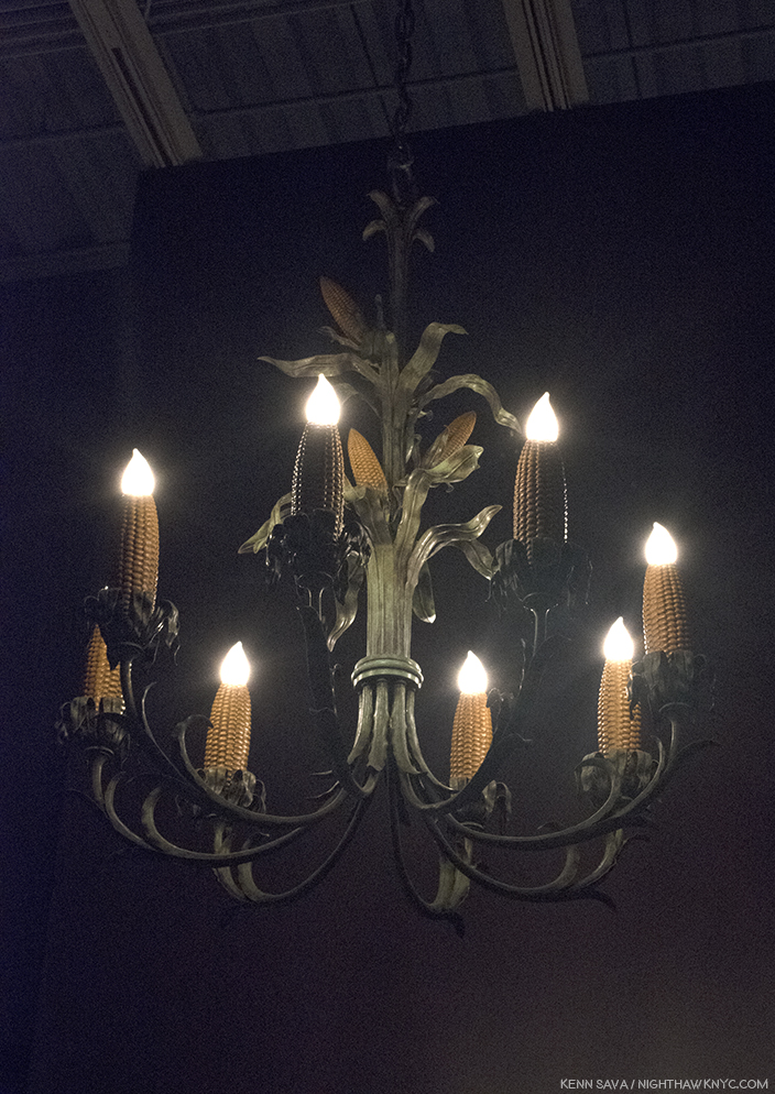
Grant Wood, yes. Grant Wood, “Corn Cob Chandelier,” 1925, Copper, iron, paint. I can just hear Frank Lloyd Wright and Louis Comfort Tiffany, the two geniuses of American Design and Ornamentation of the time saying, “Now WHY didn’t I think of that??”
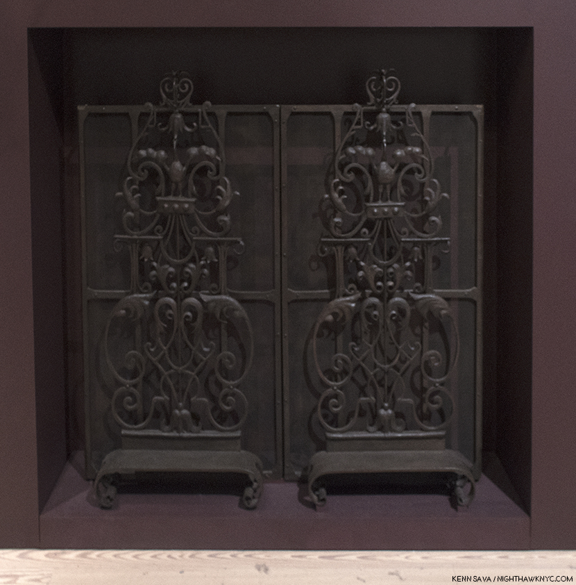
“Fire Screen Ornament,” 1929-30, Wrought iron. Grant Wood was accomplished at a wide range of things, including iron working, as here, jewelry making and he even designed and constructed a few houses. As seen here, he had his own style in these materials, that was different from the ornament created by Wright, Sullivan or the Europeans.
My initial walk through of the entire “Grant Wood: American Gothic & Other Fables’” 9 galleries over 3 visits to the Whitney Museum, left me with one overriding feeling. Though his mature period lasted barely 11 years, from 1930 to his death at age 50 in 1941, I found much of this work unsettling. Over my subsequent re-visits, I searched for why.
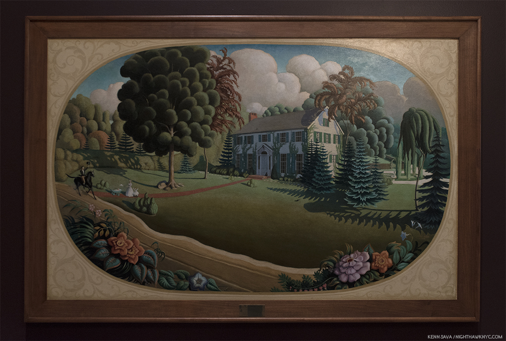
Overmantel Decoration,” 1930, Oil on composition board. Also displayed in the first, darkened gallery. Painted the same year as “American Gothic,” to go over the mantel of a couple’s new home, this “idyllic” scene bothers me to no end. Notice, half of the front lawn is covered by an ominous shadow (or a dying lawn2, the trees on the right look more like circular saws (not exactly welcoming), and the mother looks away from the man on horseback, who is going past her and what we assume are her children, given his horse’s leading hoof is already past the path they’re standing on. The tall tree to the right is brown- is it dead? In the background 2 dark clouds loom. The house is already being covered in vines. What, exactly, is going on here, and why are we “spying” on this scene from behind the plants across the road?
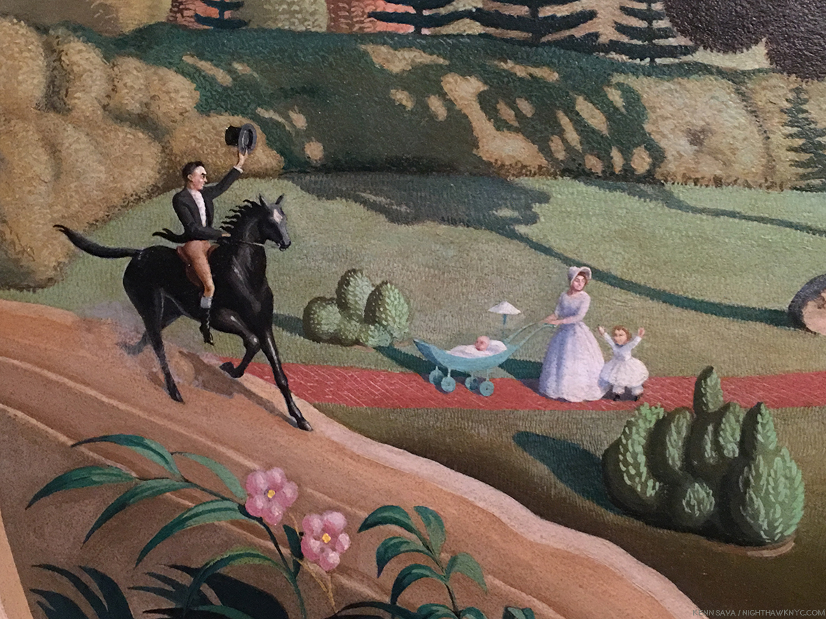
Detail. A strange “Welcome home” from the woman, IF this is her husband.
Grant Wood was born to a farmer and his wife in Anamosa, Iowa in February, 1891. His father was a very strict, my-way-or-the-highway kind of man, who wouldn’t hesitate to discipline if things weren’t done his way. He was a man’s man, and to his son Grant, more a God than a man, as he said in his autobiography. Plump and not blessed with physical strength, Grant (who was named after that paragon of manliness, U.S. Grant), was not cut out to follow in his father’s footsteps. His sense of inadequacy and his sense of striving to put forth a “manly” persona remained with him for the rest of his short life. (He died 2 hours short of turning 51 in 1941.) His father suddenly died when Grant was 10, forcing his mother to sell the family farm, and leaving Grant with issues that stayed with him the rest of his life, and I feel, are quite visible in his work. Yes, right there alongside the “wholesome,” American values so many see in his work.
“Market Place, Nuremberg,” 1928, Oil on canvas.
In 1920, he sailed to Europe on the first of 4 visits. In 1940, he explained, “when I told my friends in Cedar Rapids, Iowa that I was going ‘there’ to Paint, I immediately became an outcast. It wasn’t considered manly to be an Artist. Then I read H.L. Mencken’s articles, and decided I must leave the Bible Belt at once and go to Paris for freedom3.” During his 4th trip, in 1928, Grant Wood suddenly had an “epiphany” as he called it during a visit to Munich, Germany’s Alte Pinakothek, when he came upon works by the Northern Renaissance masters, particularly Hans Memling and Albrecht Durer. Virtually instantaneously, he abandoned the “Impressionistic” style he had been using (as seen above) in his non-commissioned work, for most of the 1920’s.
“Portrait of John B. Turner, Pioneer,” 1928/30, Oil on canvas. Almost on a dime, his work changed to this, sharply realistic style, that harkens back to Memling and Van Eyck, in a work that marks the beginning of his “mature” period. A number of portraits followed, this prize-winning work.
Returning home, almost immediately, his mature style debuted in the portrait of the father of the Artist’s patron, David Turner. Grant Wood was obsessed with the appearance of “manliness” throughout his life. David Garwood, who wrote the first biography of Grant Wood, said his father, Maryville (pronounced “Mervil”), “looked at Grant now and then and wondered how he happened to bring such a son into the world4.” For the rest of his life, Grant Wood would be so mindful of the impression he made he even adopted overalls when he worked and often when he was Photographed so as to not look like the stereotypical “Artist” of the day, which was associated with “unmanliness,” since Art making wasn’t considered “real work”. In “Portrait of John B. Turner, Pioneer,” the subject looks out at us as if to say, “I have secured my place in Iowa history. Can you measure up?” “The sitter appears to know” the answer, R. Tripp Evans, says. He also sees it as a “down payment on his debt to Maryville, whose death had freed him to become an Artist. Safely contained behind the mask of ‘Daddy’ Turner, as John Turner was familiarly known, Maryville sits before the map that will lead Wood back to his past- and to a new approach5.”
Continually using his family and friends as models, a series of portraits of them followed, Most notably this one-
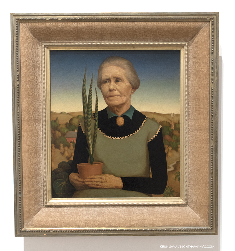
“Woman with Plants,” 1931, Oil on composition board. The Artist’s mother in what was Grant Wood’s favorite of his own works.
It’s a portrait of his mother, Hattie Deette Weaver Wood, who Grant Wood lived with for the rest of her life after Maryville’s death in 1900, until her own death in October, 1935, partially perhaps, to shield him from the scrutiny and gossip surrounding him being a “bachelor Artist.” In it he depicts her as he remembered her looking on the day of her husband’s death. She wears an apron over a black long sleeve top, possibly in reference to the Artist’s comment regarding his change of styles, ” I spent twenty years wander around the wold hunting ‘arty’ subjects to Paint. I came back to Cedar Rapids, my home town, and the first thing I noticed was the cross-stitched embroidery of my mother’s kitchen apron6.” His eyes opened to the potential subjects all around him, the change would last the rest of his life. After the fact, he tried to alter the dating of these two works to make it appear that “Woman with Plants” had come first, and before “Portrait of John B. Turner, Pioneer,” but it had not. Though he dearly loved it, Hattie insisted he sell it. Sorrowfully, he did, but intended to do another portrait to replace it. When the idea for “American Gothic” came to him, after seeing the now famous small house with the upstairs Gothic window in Eldon, Iowa, he had an idea. His sister Nan, who posed for the young lady in the Painting, said this in an interview soon after-
“As he put together his composition for the house and two people while he was at the breakfast table that morning in 1930, he said he had models in mind—a man and a woman who would be just perfect. However, he was afraid to ask the woman, fearing she would be angry at the idea of being made something less than beautiful … Grant never told me whose place I took as the model, but I’m sure it was a spinster who had hounded him7.”
So, finally, he arrived at this-
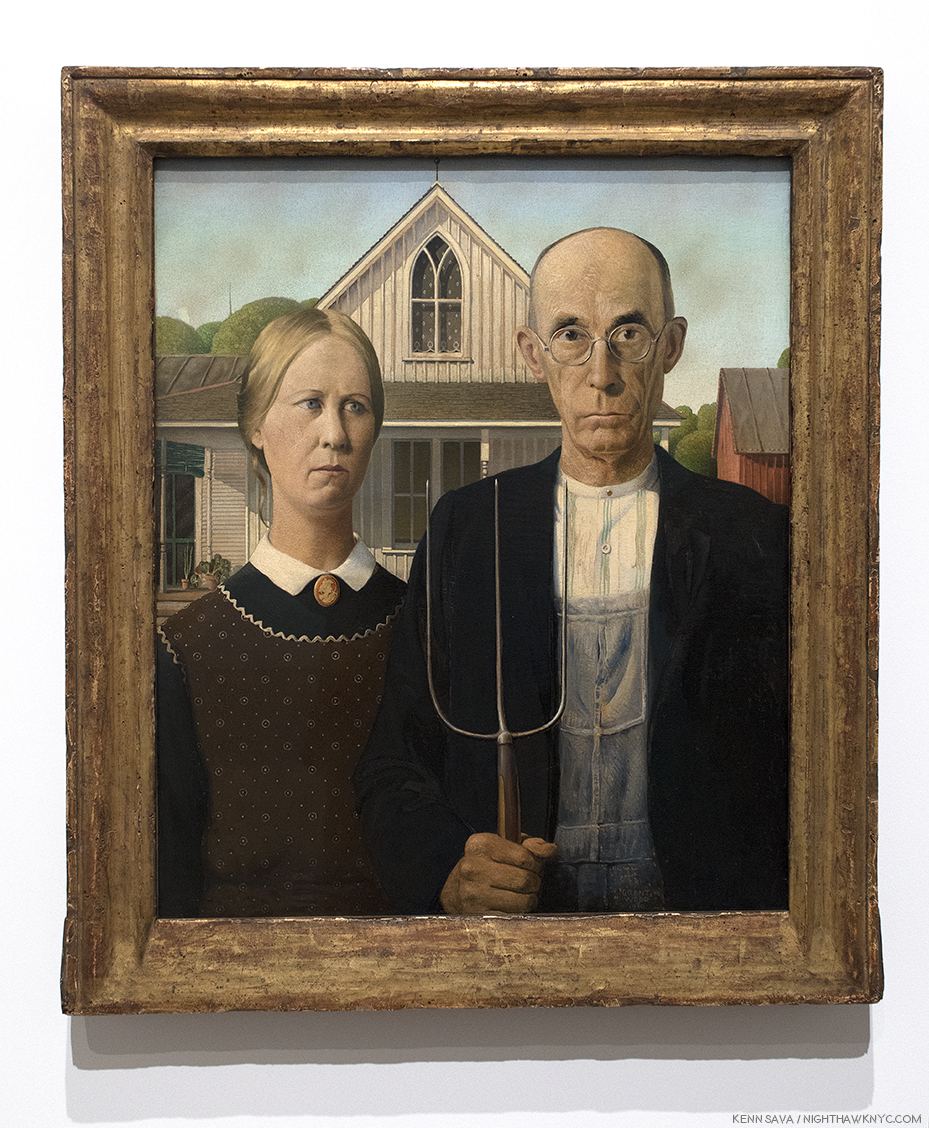
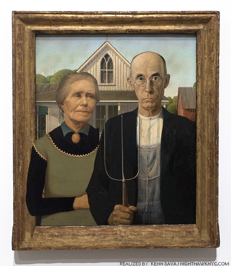
The “real” “American Gothic,” 1930, Oil on composition board. On loan from the Art Institute of Chicago, who bought it for the outrageous sum of…three HUNDRED dollars!
How can ANYone stand in front of this and not feel uneasy? I, for one, don’t like having the business end of a pitchfork pointed at my eyes.
The Artist happened to drive by the house one day and was taken by the gothic window on the second floor, which reminded him of the Cathedrals he’d recently seen in Europe. Dr. Byron McKeeby, Grant Wood’s dentist, 62, by accounts an affable man, posed as the farmer. His sister, Nan, 30 at the time, posed as the lady who has been identified as either the farmer’s wife, or his daughter (Grant Wood is quoted calling her either at least once, though, like Michelangelo, he appears not to be above saying things for his own reasons, on occasion). The uneasiness this work invokes, along with a “Mona Lisa”-like enduring mystery about it’s “meaning,” hasn’t stopped it from becoming one of the most famous works of American Art of the 20th Century. My reading of it is that it has to do with the Artist’s feelings of confronting his father about his being an Artist and not a farmer. That it’s his devoted sister, Nan, standing besides the father figure, says to me that she wants him to show him some understanding. It also expresses the Artist’s sense of feeling like an outsider in his native state. Those feelings may have been sharpened into irony (if not outright scorn of his neighbors) by his reading of H.L. Mencken8.
No, Grant Wood wasn’t a farmer. The closest he got to it was tending a garden. He was, originally, a Decorative Artist. He studied and worked at making silver jewelry and coffee and tea sets, he worked in iron, as seen earlier, and he did stage design. None of these were considered “manly” and most weren’t considered actual “work” by his father and others at the time in Iowa. Right up until the 1930’s, years after he had settled on being a Painter, he was still supporting himself designing, building and furnishing homes. He spent his whole life striving to overcome what he perceived was a lack of manliness in the perception of him by others, ingrained on him by Maryville.
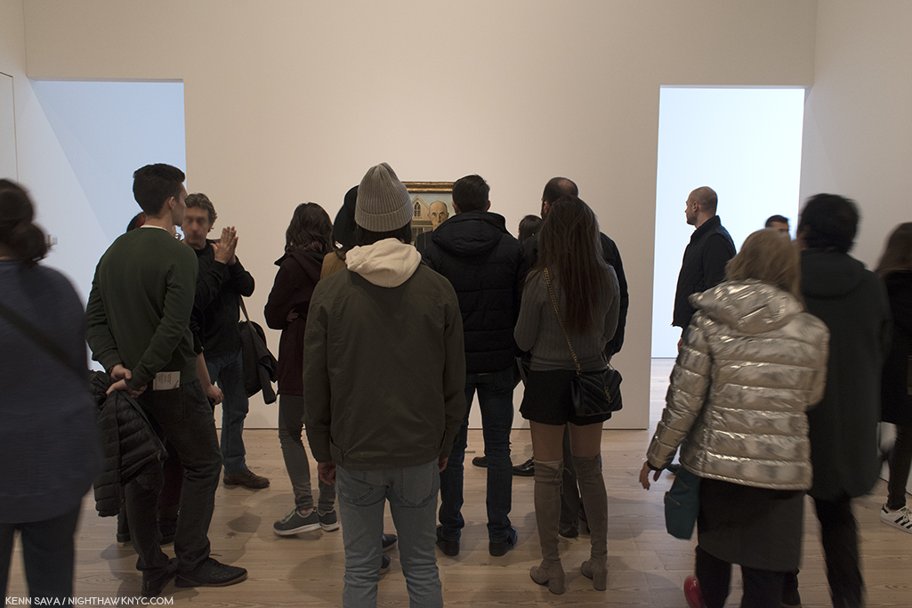
Over 6 visits I made a point of carving out a few minutes each time to stand alongside viewers looking at “American Gothic.” I stood to the side so I could watch their expressions. Yes, quite a few posed for selfies with it, and in those cases, I looked at their faces, too. No one smiled. It seemed to me that the mood of the work was imparting something beyond the hype the work has received for 80 years as being an icon of the American Mid-west and it’s core values. I detected uneasiness in my fellow viewers as well. The power of the work begins in the eyes. R. Tripp Evans says the farmer’s eyes don’t make eye contact with the viewer, they look just past him/her. They bored right through me.
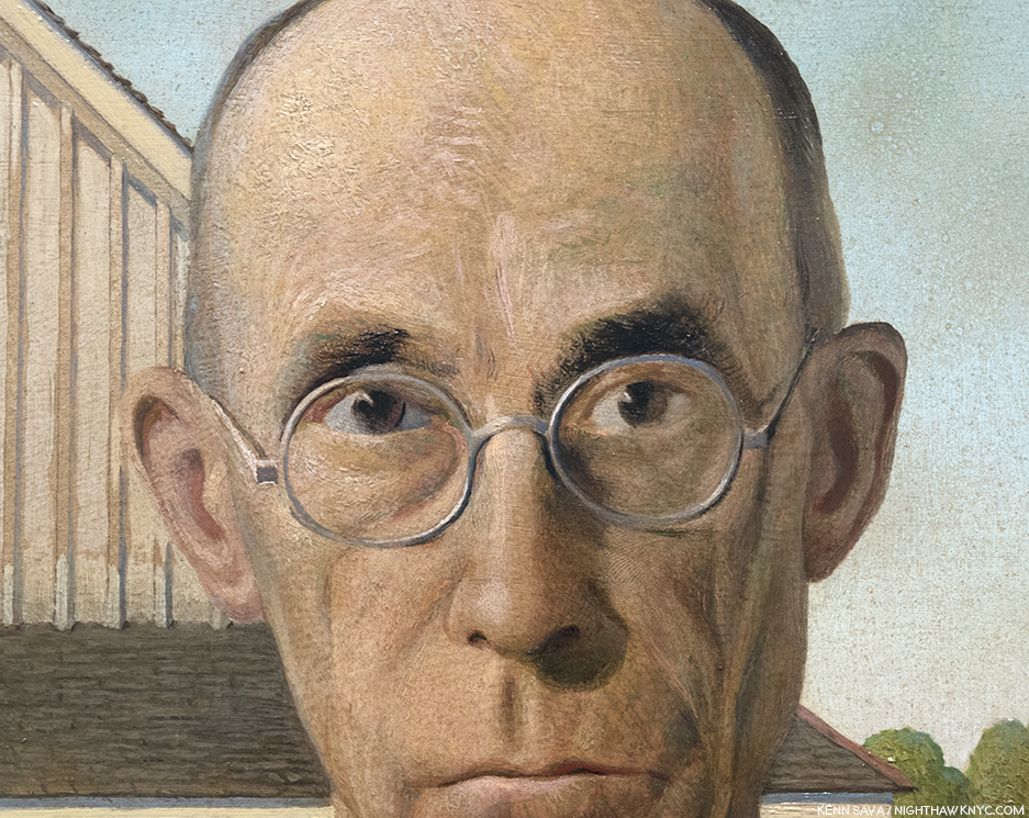
So…? What’s up with the image I posted up top?
The same R. Tripp Evans makes a strong case that the “woman who would be just perfect” was the Artist’s mother, Hattie. But, asking her to pose alongside another stern farmer other than her late hubsand would have been too close to home for her, and too painful. She would never had agreed. So, he posed Nan in her stead. Somewhat revealingly, Nan wears the same cameo (of Persephone) that Hattie wears in “Woman with Plants,” She wears long black sleeves under her apron, like Hattie does, both with pointed fringe and collar poking out up top, and, both women wear their hair back. Also, the potted sansevieria, which Hattie grasps with both hands on her lap in “Woman with Plants,” now appears on the porch over Nan’s right shoulder. Grant Wood never reused items that had appeared in one of his works in any other work ever again. Where there’s smoke? There’s fire. There’s quite a bit of “Hattie smoke” in Nan’s portrait here.
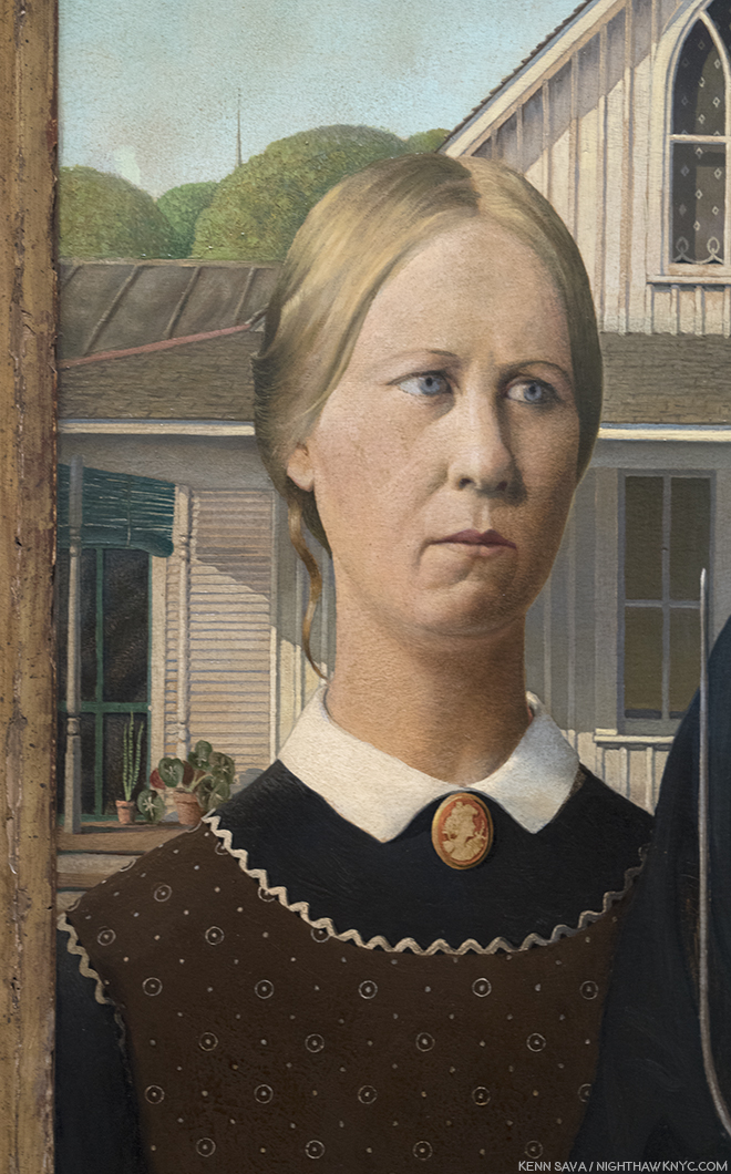
Is this the farmer’s wife, or daughter? She’s both. She’s made to look like Hattie, but she’s Grant Wood’s devoted sister, Nan, here taking his side, as usual. Note the sansevieria plant on the porch.
His father having passed away, his mother not being ammenable to posing, he did the next best thing. He asked his sister, Nan, to pose, and asked his dentist, Dr. Byron McKeeby to pose as the farmer. In his unfinished autobiography, “Return from Bohemia,” Grant Wood describes Maryville as “Tall and gaunt,” with a “solemn, stern, angular face9.” The affable Dr. McKeeby was able to capture the grim look Grant Wood wanted, aided in no small part by the fact that he is wearing Maryville Wood’s eyeglasses! The only item belonging to his father that Grant Wood kept. He liked them so much, he had a duplicate pair made for himself. All these things point to the Artist’s original intention to depict his mother and father in “American Gothic.” The Artist, himself, is represented, I believe, by the European Gothic window- quite out of place in 1930’s Iowa, like Grant Wood felt he was, fittingly, with it’s curtain down, hiding what’s inside.
So? I’ve created a very rough idea of what “American Gothic” might have looked like if he had asked Hattie to pose and she agreed. Taking her portrait from “Woman with Plants,” my job was made easier because there are so many similarities with Nan’s appearance in “American Gothic,” and her mother’s in “Woman with Plants,” as I’ve listed. The main visual difference being the disparity of their ages.
What this exercise showed me is the difference in the effect in switching Nan for her mother would be major. Of course, we have no idea how Grant Wood would have rendered Hattie had she agreed, and enabled the Artist to follow through on his yearning to replace “Woman with Plants.” If this had happened, it is interesting to ponder if the public would have responded to it the way they have to the “American Gothic” we have. That circles the question back as to why they have.
It’s ironic that it was his mother, who’s protective presence shielded him from unwanted public scrutiny, who inadvertently led to more of it than either of them could have ever imagined. Perhaps, only the Artist would have preferred it with his intended “perfect models,” and if he had gotten them, would he have remained a strictly local favorite Artist- a while longer, or permanently, as so many others have?
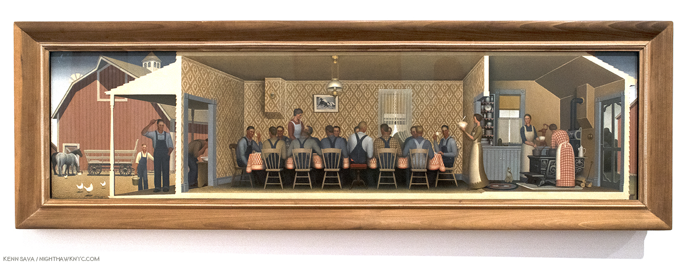
“Dinner for Threshers,” 1934, Oil on board, nearly 7 feet long. Ostensibly, a communal meal on “threshing day,” the day when the edible part of the grain was loosened from the husks and stalks (i.e.-the chaff). For Grant Wood, threshing day was “the big event of the year10.”
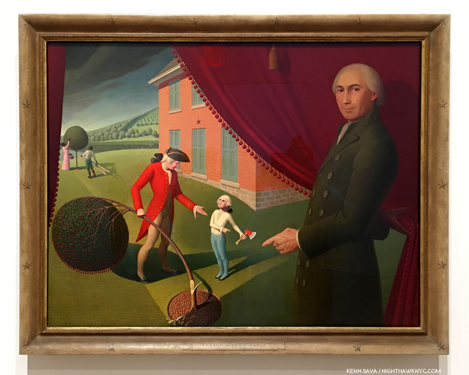
“Parson Weem’s Fable,” 1939, Oil on canvas.
In “Parson Weem’s Fable,” 1939, the fictitious fable about George Washington it depicts is not the only “fable” being told. Here, also, as late as 2 years before his death, Grant Wood is having it out with his father. By not wanting to become a farmer, he is ostensibly killing the cherry tree, i.e. his farm, which was sold after his sudden death in 1900. He refuses to return the axe, that is go back on his choice of an Artistic career. Grant Wood acknowledged that Washington’s attitude is his own[Ibid P.409]. The house in the back is his and his wife, Sara’s house, and the house where his mother would die. The red curtain the Parson opens is his mother’s curtain used in their prior Turner Alley sleeping quarters for a decade. Those would would classify Grant Wood’s work as Magic Realism, including Emily Braun in the show’s catalog (P.67), need to look no further, as what I believe they mean is seen in full effect here. No less than Gilbert Stuart’s portrait of the mature George Washington12, the one seen on the dollar bill, is morphed on to young George’s body, because, as he said, no portraits of the young Washington exist. Intriguingly, in the back of the scene a black woman and man tend to another cherry tree. Are they a couple? Mother and son? They do serve to remind us that both George Washington and Washington’s father owned slaves. They are the only African Americans to appear in Grant Wood’s work (as far as I know).
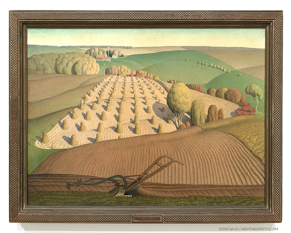
“Fall Plowing,” 1931, Oil on canvas
“Fall Plowing,” 1931, is an example of what others call “Magic Realism” (a term that Edward Hopper gets lumped into and I will never understand why), with it’s classic, surreal, Grant Wood background. What strikes me is the unattended plow. While others (R. Trip Evans, “Grant Wood,” P. 204) see a sexual metaphor, there is no other way for me to “read” this work than to think it’s a very poignant homage to his father, Maryville and his sudden passing. He may well have left some farm implement right where he was working and using it. The plowed and planted fields rolling off into the distance speak of work accomplished, while the unplowed land in the immediate foreground speak of work to come and now left undone. I can picture the Artist coming across such a scene after his father died, so for me, this strikes closest to home among all of Grant Wood’s landscapes. It’s interesting how the only sign of other human life is way off in the distance, heightening the sense of isolation. In the most recent biography of Grant Woods, by R. Tripp Evans, which is full over very interesting biographical detail, the author goes to great length to sexualize this work, as he does too many times, in my opinion. Frankly, I just don’t get that at all standing in front of “Fall Plowing.” I also note that in the same year, he painted Portraits of his sister, Nan (“Portrait of Nan”), and his great-aunt, Matilda Peet, (“Victorian Survival”).,
“Victorian Survival,” 1931, Oil on composition board. Grant Wood’s maternal great-aunt, Matilda Peet, rendered, in a different style, from a 19th century family tin-type…with the addition of a “modern” telephone on the left.
Here there is, also, the overriding distance that is seen in most of Grant Wood’s mature landscapes. The scenes are seen from far away, leaving the viewer isolated, as in “The Midnight Ride of Paul Revere,” 1931, for one example. The feeling is not all that different from that in the work of Edward Hopper at about the same time.
The loneliness seen throughout Grant Wood’s work may be rooted in the isolation he and his family lived during his first decade, isolated on a farm near Anamosa, a village of less than 2,000, “as if we had been on an island in the ocean,” he said. “If the unique circumstances of Wood’s childhood- it’s profoundly rural setting, his father’s strict expectations, and his own emotional makeup- established early self-doubts concerning his masculinity, then the cultural context of his youth only compounded the problem…the most compelling element of his mature work- his selective reorganization of past experience-was present in his art from an early age, and appears to have served a deeply cathartic function13.”
“Death on the Ridge Road,” 1935, Oil on composition board. The only appearance of multiple motorized vehicles in this show.
Death is, obviously, an undertone that accompanies many of Grant Wood’s works, and a theme in his life. Even beyond his father’s death, Grant Wood, appears to almost be obsessed with it. He took walks in graveyards, he worked for at least two funeral homes, including his first job as a night watchman. He took various roles at David Turner’s Funeral Home, including designing casket biers, and after being given a studio directly behind it, he used a coffin lid as it’s front door. In this work, “Death on the Ridge Road,” 1935, he Paints it. Inspired, Nan says, by a close call a friend had but survived, here, the long sedan has no way out. At this time, Grant Wood was facing the eminent demise of his “we three” family unit he had been nurtured by for the past 25 years. Nan moved to Albuquerque and his mother, Hattie, was starting to go. She would die in October. Startlingly, on March 2nd Grant Wood, 44, finally married. Of course, some surmised, at the time and since, that his marriage was a “cover,” necessitated by Hattie’s demise. I have no idea. It ended in divorce some 3 and a half years later.
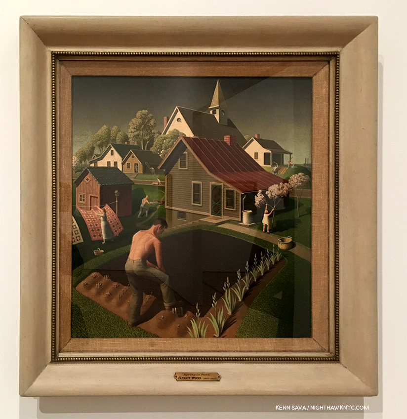
“Spring in Town,” 1941, Oil on Wood.
As the Nazis blitzkrieged across Europe, Grant Wood embarked on a series of works designed to show Americans what they stood to lose. “Spring in Town,” 1941, is one of the two he lived to finish before he died of pancreatic cancer on February 12, 1942. In the midst of the townspeople busy with their daily chores, I can’t help but notice the gent planting in the foreground. For me, this symbolizes much of Grant Wood’s Art. His work speaks for him, and they do so on a number of levels, not all of them obvious. As this increasingly comes to light, the reassessment of Grant Wood is continuing. Just what is he really sowing in that ground, and in these Paintings? He had quite mixed feelings for Iowa, it’s citizens and their lifestyle, and some of his most famous works, including “American Gothic” were born out of his desire to poke fun at them in response to the way he felt he was treated as an Artist then and there. But more than that, seeing this many of his works together, it becomes obvious that Grant Wood was painting his childhood of the 1890’s, and not the mid-west of the 1930’s. He was painting what he lost, not what was disappearing as he grew older, and he was working out that most significant relationship of his life, that failed relationship with his father.
With 117 works on view by my count, the show is larger than the Stuart Davis show. It does feel light on his early work (I saw one Painting from the decade of the 1910s, three dated 1920-25), which misses a chance to trace his development from nearer his beginnings. I doubt the overall impression would be much different. “Grant Wood: American Gothic & Other Fables” provides New York with a rare chance to see so many of the Artist’s works in one show (the last time, if I recall correctly, was also at the Whitney in 1983), given the overwhelming number of them permanently reside in Iowa, and most importantly, a rare chance to assess his work in light of all that has come after it, and to see what it has to offer to us today.
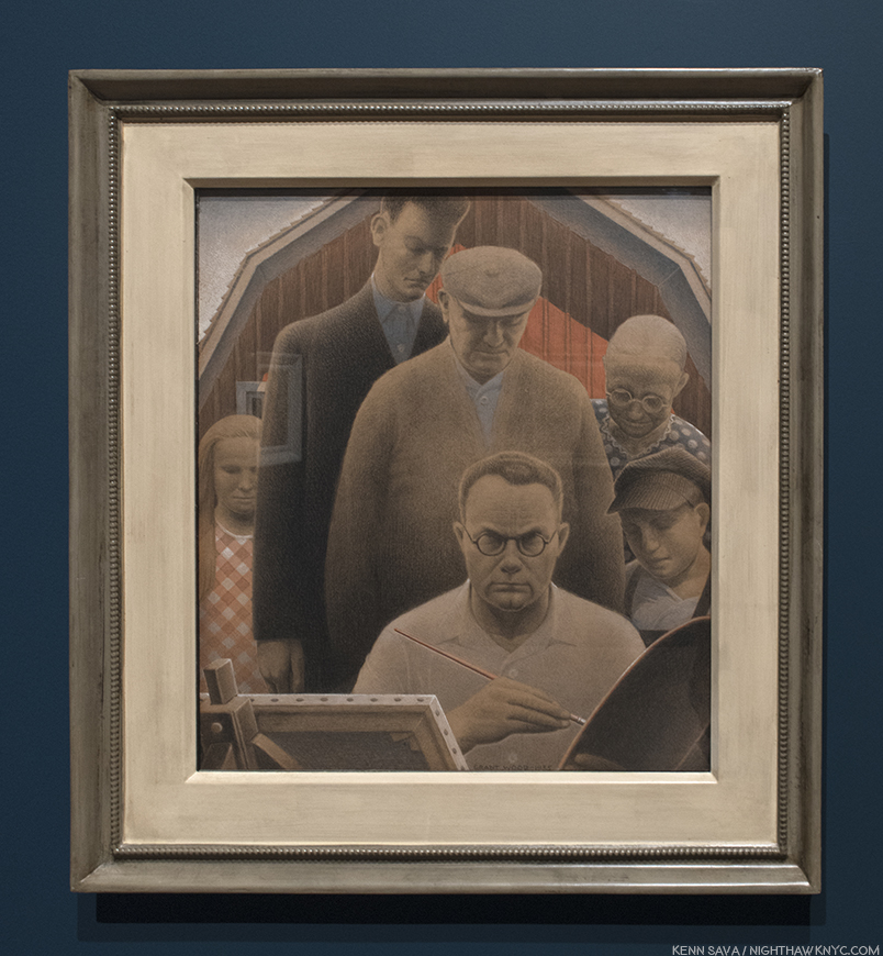
“The Return from Bohemia,” 1935, Pastel, gouache and pencil on paper. The cover for his unfinished autobiography shows the Artist surrounded by Nan, his early dealer, Ed Rowan, his patron, funeral home owner, David Turner, Hattie, and his younger self, left to right, looking over his shoulder. Mysteriously, each of their eyes are hidden from us.
When you begin to piece it all together, Grant Wood comes across as more of a “contemporary” American, who’s complex, had issues with his family and neighbors, and was a member of a sexual minority. He looked forward to, and did all he could to help establish, an American style of Art, while at the same time, his own Art seems fixed in time- the 1890s. In that sense he was “old-fashioned,” too. Having dealt with rejection from his childhood, by the time he achieved his breakthrough, Grant Wood was an expert at managing what he revealed to others. He edited his work relentlessly to make sure it presented the image he intended, and he destroyed what he thought didn’t. Therefore, it should be no surprise that looking for “proof” of his homosexuality (in things like the gent in “Spring in Town,” above, working without a shirt on, or in “Fall Plowing”) is a waste of time, in my opinion. He didn’t want it to be found because the results would have been disastrous, personally and professionally, and he knew his work better than anyone else ever will. Looking, instead, at his work for messages and intentions that lie beneath the surface may be a bit more fruitful, but, again, it seems to me that so much of what he did was known only to himself. We can find elements of it through a study of his biography, his interviews, the memoirs of his sister, Nan, and the unfinished autobiography he left. But, it seems to me, that the still un-tilled, “deeper” levels in Grant Wood’s work, (reminiscent of the planting going on in “Spring in Town”), which I believe are there, are purposely buried so deeply under it’s topsoil that only he knew where they are.
*- Soundtrack for this Post is “I Shall Be Released” by Bob Dylan, lyrics here, as performed with The Band and a cast of thousands in “The Last Waltz.”
References-
“Grant Wood: American Gothic & Other Fables,” by Barbara Haskell, Glenn Adamson, et al, Whitney Museum, 2018- Ms. Haskell and her team have done an excellent job with this 272 page catalog. The quality of the reproductions are excellent (180 color, 30 B&W), and include works not seen in the show, and different views of some that are, though some suffer loss of detail due to being across two pages. The essays are interesting, informative and even unusual, especially an entire essay about Grant Wood’s Homosexuality by Richard Meyer. Also included is a thorough Chronicle by Ms. Haskell, which includes a number of texts and additional Photos. Throughout rarely seen Photos add much to the book, which is now, the standard in Grant Wood monographs, admittedly a small field.
“My Brother, Grant Wood,” by Nan Wood Graham. I haven’t found an actual copy of this book, which is still in print, but the fact that she burned her brother’s letters after he passed would seem to indicate a protective slant. That being said, from the excerpts I’ve read of it, and interviews with her published elsewhere, I have no doubt it’s an essential resource.
“Grant Wood,” by R. Tripp Evans. Though marred by, what I consider to be, oversexualized interpretations of the Artist’s work, it is extremely well researched and adds countless key insights and details to his biography and background on his work.
My thanks to Danielle Bias and Veronica Brown of the Whitney Museum.
NighthawkNYC.com has been entirely self-funded & ad-free for over 7 years, during which over 275 full length pieces have been published! If you’ve found it worthwhile, PLEASE donate to allow me to continue below. Thank you, Kenn.
You can also support it by buying Art, Art & Photography books, and Music from my collection! Books may be found here. Music here and here.
Written & photographed by Kenn Sava for nighthawknyc.com unless otherwise credited. To send comments, thoughts, feedback or propositions click here. Click the white box on the upper right for the archives or to search them. Subscribe to be notified of new Posts below. Your information will be used for no other purpose.
Take that, Elvis, who’s 1959 album title, and cover, I just borrowed. Michelangelo was the “King” of a different kind of rock. Old school rock.
Marble.
So “old school,” his work is proving to be timeless. Good luck outlasting him, Mr. Presley. No, they didn’t call him “The King.” Such were his skills as a Sculptor, Painter, Architect and Poet, they called him “Il Divino” during his lifetime. “The Divine One.”
Met Curator Carmen C. Bambach deserves a medal. Nine years in the making, she now joins the ranks of The Museum’s “superstar” curators, like Andrew Bolton. After curating the Leonardo da Vinci, Master Draftsman Blockbuster, in 2003, Michelangelo: Divine Draftsman & Designer is her crowning masterpiece. In her superb catalog for this show she points out that Michelangelo, himself, was quite fond of this rendering of his profile in this Portrait Medal of Michelangelo, c.1561, one of which was given to him by its creator, Leone Leoni. Click any Photo for full size.
Since Art is my religion, “Il Divino” works in my book, too, these 542 years after his birth. For me, Michelangelo is not “Divine,” as in “more” or “other than human.” His talent is “Divine”- Merriam-Webster definition 2a “supremely good: superb.” It is in that sense I relate to him as “Il Divino.” While qualitatively comparing creative people or their work is meaningless, I will say that if there is a “greater” Artist than Michelangelo? I haven’t found him, or her. Michelangelo was Art’s first “reality” superstar. He was the first Artist to have a biography written about him during his lifetime. In fact, there were three 1. Such was his renown that people came from all over Europe hoping to simply see him, or in hopes of acquiring something from his hand (like a Drawing).
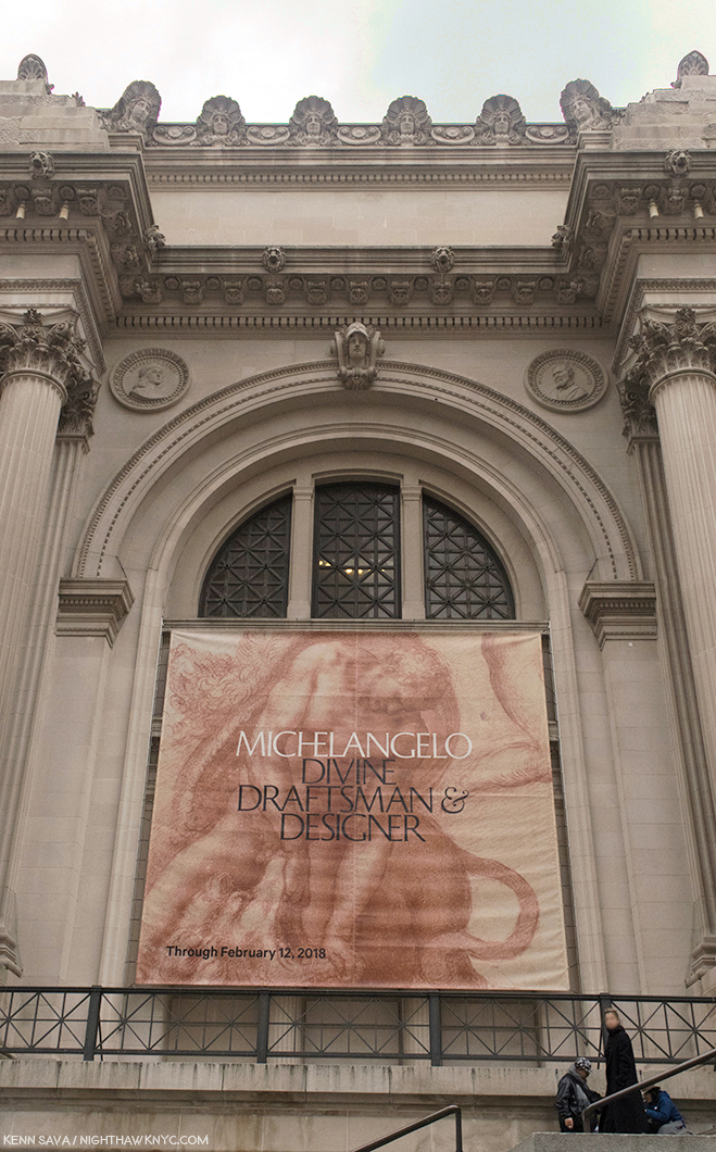
Met fun fact- If you look over the banner, one of the largest I’ve ever seen hung outside, into the corner alcove on the right, that’s Michelangelo’s circular portrait permanently part of the wall of The Museum. It’s a “Badge of Honor” now. Though, I don’t think he’d be thrilled at having to face his rival Raphael, left alcove, in perpetuity. By accounts Michelangelo wasn’t fond of the younger Artist because of his “borrowing” from/being influence by him, and then having to compete with him for work. But? He can smirk now. Raphael is still waiting for his Met blockbuster show.
Yet, a good deal of the “Il Divino” cult that has surrounded him ever since his passing in 1654, at 88, was his own doing in creating. The third of those biographies, A Life of Michelangelo, 1553, by Ascanio Condivi, has been seen by many/most Michelangelo scholars as being ghostwritten by Michelangelo as a means of giving the world his story the way he wants it to be seen and known. The recent birth of the printing press served to help make it “go viral.” Ok. Widely read by many more than had ever been possible. That theory also holds that it was created as a “response” to the story of his life as told in Giorgio Vasari’s 1550 edition of The Lives of the Artists. For instance, in Michelangelo’s view (per Condivi), he burst on the Art world fully formed- i.e. without having studied Art. If this had been true, it would have been highly unlikely Pope Julius II would have entrusted him with Painting the Sistine Chapel ceiling, the most important church in Christiandom, a surface that amounts to about 10,000 square feet, if he had not been trained in Painting2. Vasari’ “replied” with a revised version of his Life of Michelangelo in 1568, four years after Michelangelo’s passing3. The revised version includes documentary proof, that Michelangelo was, indeed, apprenticed to Domenico Ghirlandaio. Nonetheless, the legend took root, including fact and fiction, and thanks to popular novels and movies, has lived on.
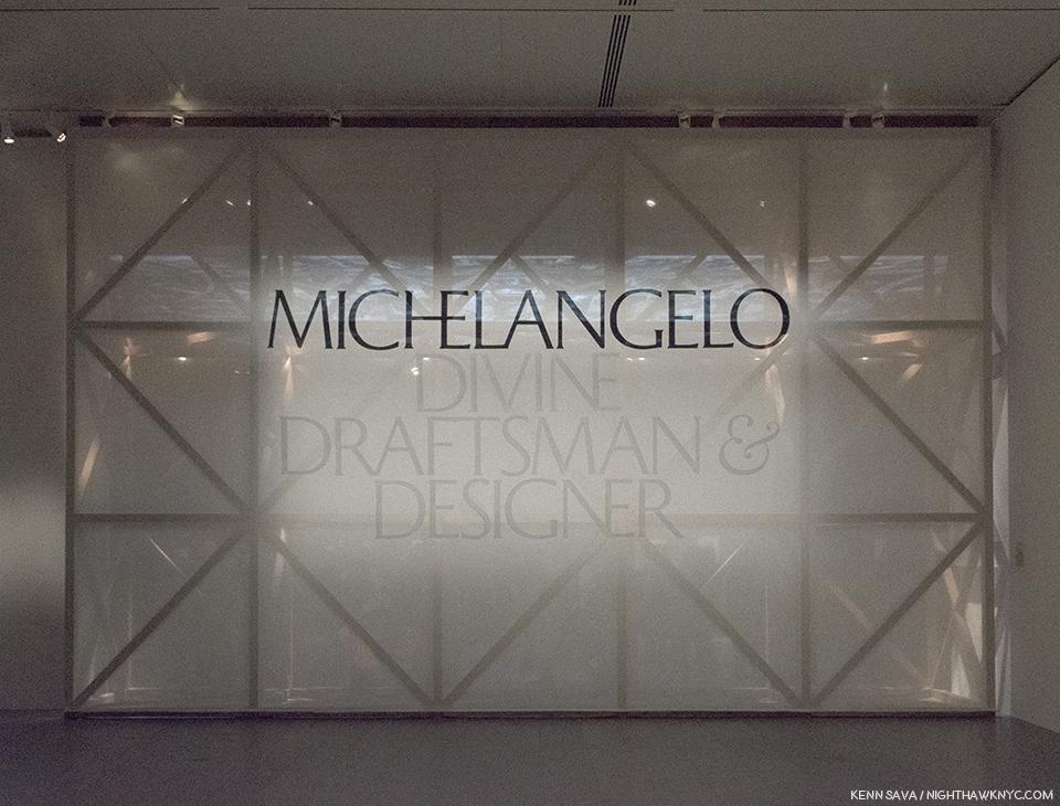
I’ll be seeing this in my dreams for the rest of my life. The show’s sign in Gallery 1 covers the faux scaffolding in the large Gallery 7 behind it devoted to the Sistine Chapel ceiling.
It doesn’t end with his life. There are all sorts of myths about Michelangelo’s works as well, and this show, along with recent scholarship, is slowly bringing the truth to light, even though it takes some darkened rooms to do so. Works by Michelangelo in the Western Hemisphere are about as rare as Leonardo da Vinci’s are. His Drawings (the only works in this part of the world besides one Sculpture and one Painting- both of which are included in this show) appear every once in a while, but given they are going on 500 years old and done in the days before acid-free or archival papers, their sensitivity to light means they’ll be shown briefly and in the darkened galleries, seen throughout this show. So, I’ve waited my whole life to see more than one or two Michelangelos in one place, let alone upwards of about ONE HUNDRED FORTY (I got chills typing that) by Il Divino among 250 items the catalog lists. The closest I’ve come to this point was when I last left Manhattan overnight, exactly six years ago in early February, 2012 to see the once in a lifetime Leonardo da Vinci: Painter at the Court of Milan, on its closing day, at London’s National Gallery, then stayed 3 more days solely to see the rest of the National Gallery, including their two, strange, Michelangelo Paintings (Photos were not allowed). So, to say I’ve been eagerly anticipating Michelangelo: Divine Draftsman & Designer since The Met announced it, is as big an understatement as I’ve yet made on this site.
When I finally turned the corner to see it, I was stopped in my tracks. I’ve said before in these pages that sometimes I don’t feel like I’m alive anymore. Here was one of those moments. How else to explain THIS?-
Art Heaven? No. It’s just one part of The Met’s 2nd floor. From far right to left- 1- Rodin In The Met, 2- Michelangelo, in the darkened room, 3- David Hockney, straight ahead, 4- Joseph Cornell & Juan Gris seen in this 270 degree view. It’s so big, it’s seen better if you click to enlarge it.
Being The Met, the “once in a lifetime” (to quote their own press release) Michelangelo show, apparently, isn’t “enough.” Not only was that going on, right NEXT to it on one side, the David Hockney 80th Birthday Retrospective was going on in 8 large galleries, on the other side, “Rodin in The Met, was going on, AND down the hall, the Joseph Cornell/Juan Gris show, Birds of a Feather, had opened! Just amazing. The run of the four shows overlapped for 8 days. I don’t know what’s on view now in Heaven’s Art Museum, and I’m not in a hurry to find out, but can it be any better? I hear they don’t allow Photos, either.
Welcome to New York. At the back of the line in the gallery now occupied by the Joseph Cornell/Juan Gris show, “4”, above, on December 29th, with a long way to go to get in.
Over the holidays there was a waiting line that snaked all the way down that long hall, to the left in the panorama, around the corner and through the Modern Art galleries, including the one now occupied by the Joseph Cornell/Juan Gris show, Birds of a Feather, “4” in the panorama, above. Still, I managed 10 visits, and I was there when the show ended at 9pm on February 12th. The Met staying open that late on a Monday is unheard of in my experience. After its first month, it was continually crowded right to the end, amazing given the show’s huge size (see my floor plan further below). On February 13th, The Museum announced 702,506 other visitors attended (702,516 all told), making it the 10th most visited exhibition in Met history.
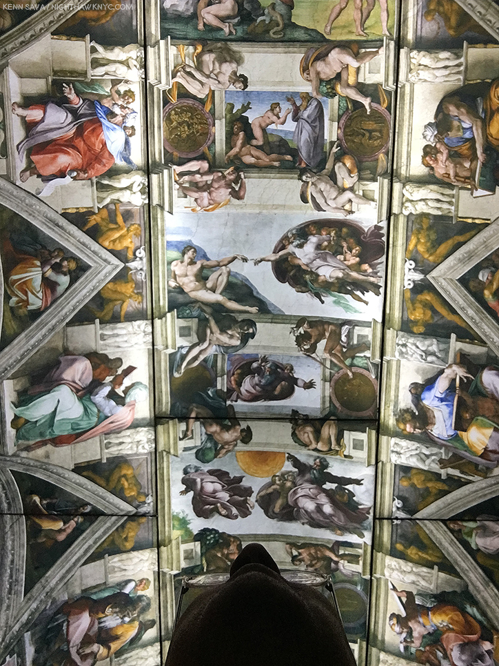
“It’s full of stars.” Stanley Kubrick was right. It really was. Before Michelangelo, the Sistine’s ceiling was a Painted blue sky with stars until a structural collapse in 1504 necessitated it be repainted after being repaired. Michelangelo’s rivals wanted the Pope to select him because they were sure he couldn’t possibly Paint as well as he could Sculpt. I would laugh out loud at them if I weren’t eternally in their debt.
Michelangelo: Divine Draftsman and Designer is a dream come true. Wandering the 20 sections in the 12 galleries, a number of them large, all of them densely lined with 250 pieces, including 133 Drawings by Michelangelo, 3 of his sculptures and one Painting, the largest Michelangelo show in this country during our lifetimes (regardless of when you were born), I was left to wonder if anything like this will ever be mounted on this side of the pond again. Only the 1980 Picasso Retrospective, which took over all of the old MoMA, is comparable among shows I’ve seen in NYC.
My Drawing of the show’s floor plan.
“It’s overwhelming…” was the comment I heard visitors say most often as they passed me. Most said it in the affirmative4. Yes, there is a lot to take in. The detail in the Drawings is staggering- on a number of levels. First, Michelangelo’s technical mastery of Drawing provides an endless amount to admire and study. Second, since many of the Drawings here are details of large compositions (like the Sistine Chapel’s ceiling and The Last Judgement), the show presents a rare chance to study how these details fit into his grand vision for both of those incomparable works, as well as to appreciate how much Artistry is packed into them. (A Note- Michelangelo’s immortal Vatican Pieta, and David are omitted here. In the show’s catalog, page 69, Carmen Bambach says no Drawings for the former survive. He, possibly, worked from a model, which may, or may not, have been found. I remain to be convinced by it. Michelangelo, famously, burned many of his Drawings right before he died, as Vasari theorized, so nothing remaining by him would appear to be less than perfect5.) Out of the 140 works by him on view, complete works (i.e. whole compositions) by Michelangelo are in the minority. Studies of details for huge compositions are what most of these Drawings are. They are, often, the Artist working out on paper exactly how to realize figures, body parts, faces, etc.. There are also Drawings for Architectural works, most of them details, as well. It’s hard not to come away thinking that his large Paintings for the Sistine Chapel were not conceived the way he conceived his Architectural plans. His work on Pope Julius’ Tomb, which occupied him for FORTY YEARS (Seriously!… Don’t get me started.), is something of a “bridge,” it seems to me, between these enormous Paintings and his Architectural works, since the Pope’s Tomb is equal parts Sculptured figures and Architecture. Especially in its early incarnations as a free standing monument, it combines these two of his three core Arts. Painting and Architecture are also, in a sense, combined in the Sistine Chapel, which includes Painted Architectural elements throughout the composition. But, before I get too far ahead, let’s start at the beginning…
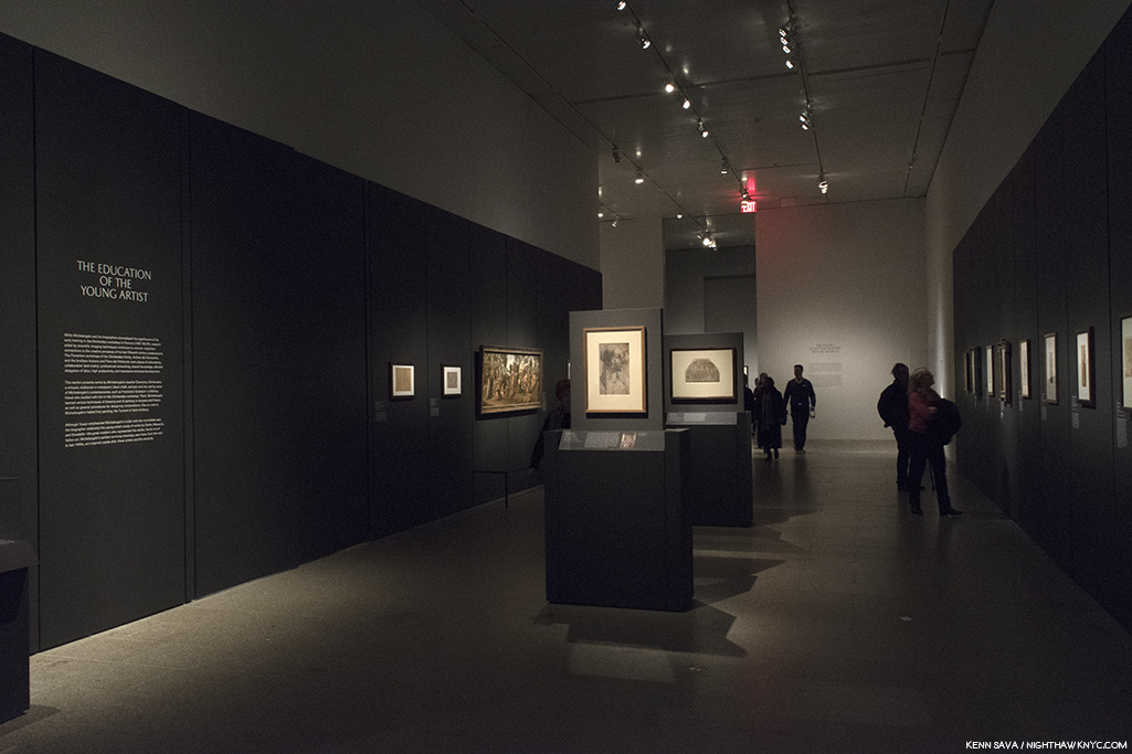
The first gallery contains his earliest surviving work, alongside brilliant examples by his teacher, Ghirlandaio (first two works, center), and his fellow student under him, Granacci (large Painting from The Met’s collection, left).
Based on the evidence here, Michelangelo demonstrated his genius for design early on. In the first gallery, we’re treated to masterpieces of Drawing by Ghirlandaio, who Michelangelo was apprenticed to, and a brilliantly executed Painting by Francesco Granacci, Michelangelo’s fellow student under Ghirlandaio, from The Met’s collection.
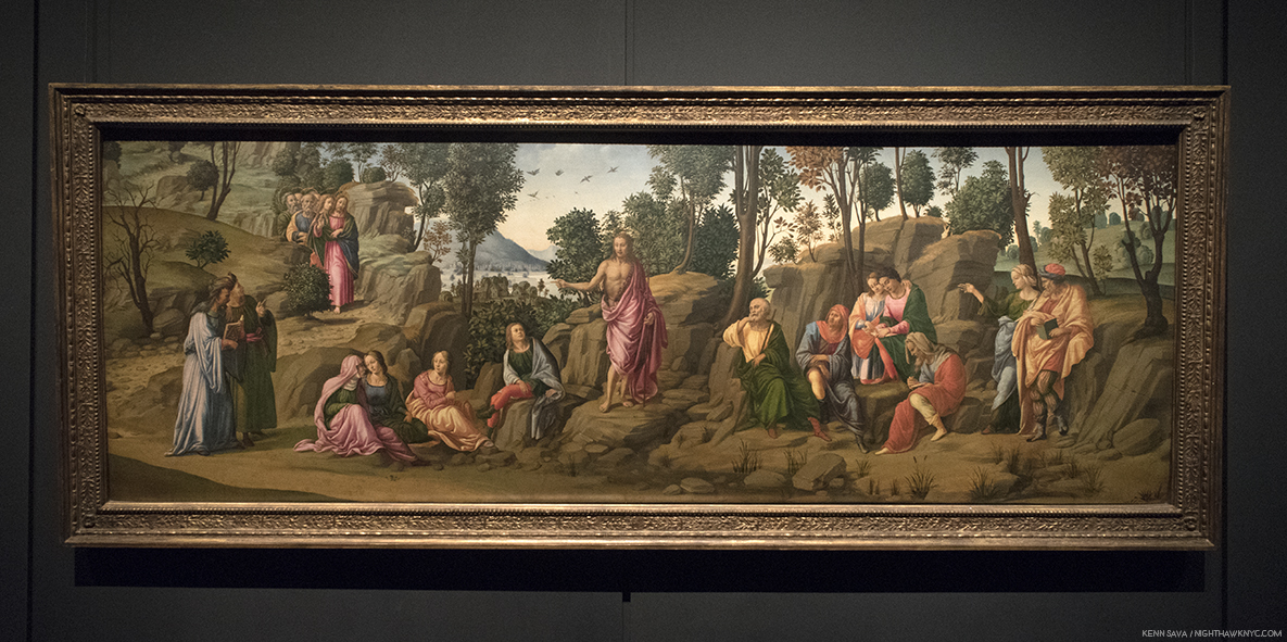
Saint John the Baptist Bearing Witness, 1506-7, by the “Workshop of Francesco Granacci.” In 2010, Everett Fahy, no less than the former head of European Paintings at The Met, announced that in his opinion, this was really by Michelangelo, not Granacci. Carmen Bambach disagrees, saying that some of the figures may be based on a Michelangelo Drawing6. Looking at it, the work lacks the overall compositional unity seen in, say, Michelangelo’s version of St. Anthony, below. Strangely, at least 6 of the foreground figures are not even paying attention to St. John. The top half of the figure of the Saint’s body doesn’t seem attached to the lower part. Finally, it’s so different stylistically, with none of Michelangelo’s “dash and daring,” combining to make it too hard for me to believe that Michelangelo could have Painted this a mere two years before Painting the Sistine Chapel ceiling, which he began in 1508.

A shot across the bow of Art History. Two versions of the The Torment of Saint Anthony. Martin Schongauer’s print, right, which inspired Michelangelo’s astonishing first Painting, left.
Looking at it, I realized his genius for design begins here (among the works that have survived to reach us), and I now see it as nothing less than a “Rosetta Stone” of sorts for much that came after. It’s hard not to remember that both of his most famous later Paintings- the Sistine Chapel’s ceiling and The Last Judgement take place, largely, in mid-air, though both have elements that “attach” them to the Earth. On the ceiling, he does this by including faux Architectural elements he Painted between and among the scenes, and in The Last Judgement, of course, by including Earth, Purgatory and Hell. In fact, there are quite a few interesting similarities between The Last Judgement (seen here, and further below), and The Torment of Saint Anthony, including the landscape, river and sailing craft, and of course, beings suspended in mid-air. As brilliant as the execution of the Painting is, it’s the mind at work in the background creating the overall composition, from Schongauer’s original, in light of its similarities with these later works that proves for me that this IS a Michelangelo.
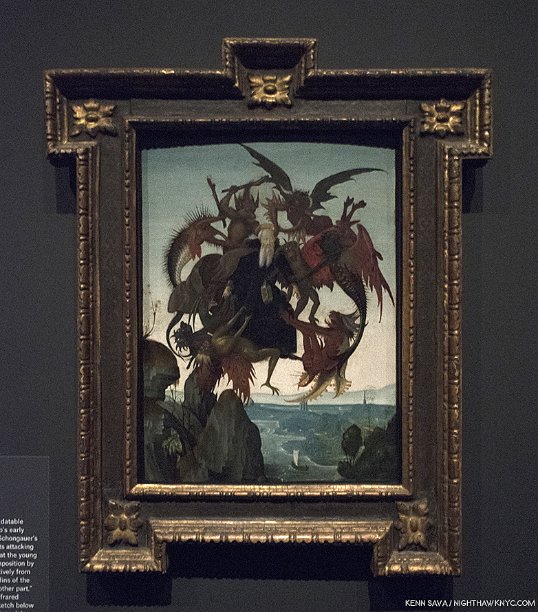
Michelangelo, The Torment of Saint Anthony.
And so, even in Gallery 1, we see that underlying much of what he created is his mastery of Drawing and his genius for design and compositions. This will be made clearer in every following gallery. As a result, Carmen Bambach serves to rewrite our understanding of Michelangelo as not only a genius of Sculpture, Painting and Architecture, but one of the supreme masters of composition and design.
The first gallery is completed with our first taste of masterpieces of Michelangelo’s Drawings. Drapery studies have been a staple for Art students probably since the advent of Drawing. Having recently seen, and written about a masterpiece of Drapery Drawing by Leonardo da Vinci at MoMA, it’s utterly fascinating to compare it with those of his great rival, Michelangelo. Leonardo’s though “perfect” as it is, is focused solely on the thigh, knee and calf of the subject, leaving much of the rest undone/unfinished, particularly on the fabric that lies on the floor. In this Drawing, a study after Giotto, Michelangelo gives us an almost complete figure, and another in less detail, save for his face and hands. While it is fascinating to compare these two supreme masters of Drawing, some consider this to be Michelangelo’s earliest extant drawing, which might make it unfair to compare with the more mature Leonardo piece.
Michelangelo’s earliest surviving Drawing, Studies after Two Figures in the Ascension of Saint John the Evangelist by Giotto, c.1492. Michelangelo would have been 16 or 17. Notice the standing figure clutching at his robe- something that makes the folds so difficult to draw, you rarely see a student attempt it. Interesting, also, these are two male figures which are not “sculptural.” Rare in Michelangelo’s later figures.
Few people may realize that Michelangelo started out as a Painter. It was only in 1490, when he was all of 15, that he began Sculpting. From Saint Anthony, the Young Archer greets us alongside a few possible influences and examples of other works that bear some similarity to lost early Sculptures by Michelangelo.
Young Archer, c. 1490, when Michelangelo would have been about 15, seen at The Met in 2015. Recognized as an early Michelangelo by Kathleen Weil-Garnis Brandt in 1996, it’s been the only work by the Master regularly on view in NYC since 2009, though, most visitors to The Museum, apparently, don’t realize it given this typical “crowd” I’ve encountered around it every time I’ve seen it- until now.
As if to make up for it’s questionable placement for much of the past decade, The Met placed it smack dab in the middle of the path to the next gallery so you can’t miss it. It’s certainly worth a long look wherever it winds up being displayed in The Museum now that the show has ended, to see if you think it’s the real thing, or…?
After 527 years? The Young Archer’s moment has arrived.
In The Room With Michelangelo.
“In the room the women come and go
Talking of Michelangelo”
T.S. Eliot, “The Love Song of J. Alfred Prufrock”
’Tis no different almost exactly 100 years after T.S. Eliot wrote those immortal words in 1920. At The Met I heard them. More than once. It was hard not to. Visitors were often shoulder to shoulder its last two months.
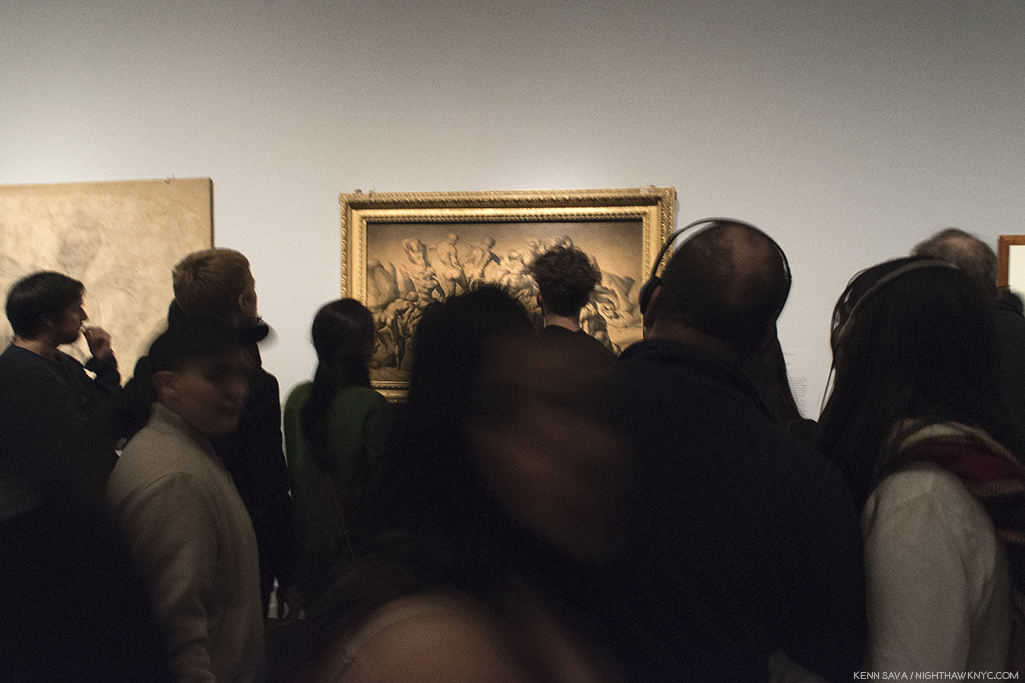
Rush hour on the A Train? Gallery 3 on February 11th, the day before it ended. I was thrilled to see so many people at this show. Not only that, they looked and they looked hard. That’s particularly amazing given that many of the works were studies of details of large compositions.
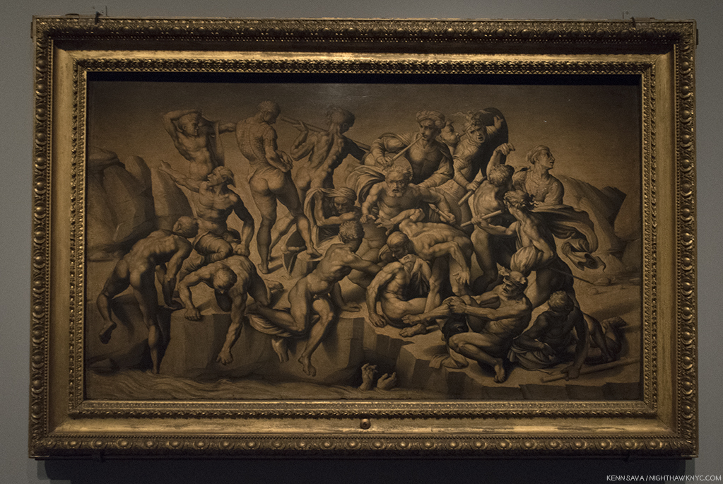
Seen without the crowd, Bastiano da Sangallo’s famous, Copy after the Central Episode of the Bathers in Michelangelo’s Battle of Cascina, The only surviving record of Michelangelo’s lost Battle of Cascina, which he was commissioned to do on a wall opposite the also lost Battle of Anghiari, commissioned from Leonardo da Vinci, of which a Drawing by Rubens is it’s only record. Still, so many Artists have been influenced by this work. I always wonder if Gericault’s masterpiece The Raft of the Medusa, is one.
I admit it. I did lean in to hear the details, and FINALLY know what Thomas Stearns Eliot was referring to. Most of the time? There were commenting on Michelangelo’s “unusual” female bodies. Their second most popular topic was his “choice of ‘friends.’” Oh well. Imagine my disappointment. Neither of these topics were news to me.
Sketches of the Virgin, the Christ Child Reclining on a Cushion, and Other Sketches of Infants. Early on, as seen here, and in the immortal Vatican Pieta, Michelangelo’s women seemed much more feminine to my eyes. This beautiful Drawing, which echoes his early Madonna of the Stairs, may have been a model for the Painting Virgin and Child with the Infant Saint John, possibly by Piero d’Argents, that was displayed next to it.
One of his “friends.” One Michelangelo portrait in the aptly titled, staggering, “Divine Heads,” section of Gallery 5, Portrait of Andrea Quaratesi, c. 1532.
A section on his early designs for Pope Julius II’s tomb leads us to a gallery of early Architectural projects, and then to a gallery full of “Divine Heads,” which includes the one above.
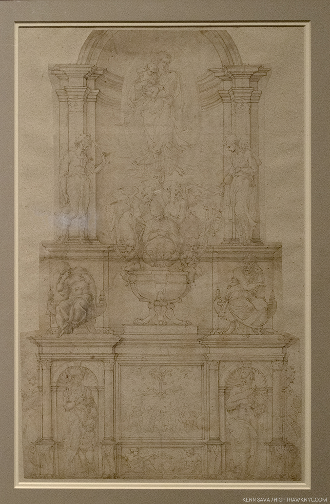
Demonstration Drawing for the 1505 Design of the Tomb of Pope Julius II. It’s interesting to me that once again, we see a compositions of multiple levels- like The Last Judgement. In this one, as well, salvation is to be found at the top. This was just one of the countless incarnations of the design for Pope Julius’ Tomb, as it evolved from free standing monument to the wall tomb it is today, which was FINALLY finished in 1545. The haggling lasted so many years that of course the Pope died (in 1513!) before it was finished…32 years before it was finished! Michelangelo’s Moses, one of his enduring, greatest, masterpieces, is its central Sculpture, in quite a different design, in the church of San Pietro in Vincoli.
Moving back to figurative Drawings, in Galleries 5 & 6, one card described his style perfectly- “He drew like a Sculptor.” Meaning he drew with a heavy hand, the examples just above notwithstanding. Yes, his outlines are distinct, lyrical, and strong, and yes, his figures are often “Sculptural,” but even beyond all of this, his brilliant composition extends beyond the possibilities of Sculpture. Look at this, for example-
The Archers A work of sublime beauty equalled only by its mystery that starts with the fact that most of the the titular “archers” hold no bows.
The Risen Christ. A fascinating, “simpler,” composition with only one figure that nonetheless reaches to the infinite.
Its wall card. I selected this one as a typically, enlightening, example of the commentary throughout.
Michelangelo presented a design for the Pope’s tomb that included 40 Sculptures, a composition so incredibly ambitious it was impossible for any one man, even one with “divine” skills, to Sculpt during one lifetime. Though he considered himself a “Sculptor,” we can be thankful that he was compelled to Paint the Sistine Chapel ceiling (seen, fully, here). Painting, especially (and Drawing in lieu of a Painting), provided the best means of realizing many of his extraordinarily ambitious and involved compositions. Thankfully, he was able to finish this one- in four years. Sill clouded in drama, fiction and fantasy after 500 years of dirt was removed from it in the 1980s, the real story of the ceiling’s creation is every bit as dramatic as are the incomparable results, which many consider to be the greatest work of Art in the Western world.
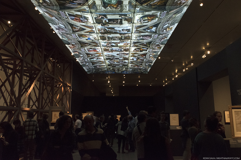
“It’s not the real thing.” I heard one visitor comment in Gallery 7. ! No, but it’s 1/4 size of the original. You can take a 360 degree tour of this gallery, with The Met’s brilliant curator, Carmen Bambach, here. By the way, Michelangelo’s scaffolding ingeniously hovered over the floor and was moved as the work progressed. So brilliantly conceived, the 1980 restoration team reconstructed it, in lightweight metals, as STILL the best option to work on the ceiling.
In the heart of the show, Gallery 7 featured a range of studies for the Sistine Chapel ceiling that provide fascinating insights to the individual characters and the overall composition. Full of details who’s meanings have faded over the centuries (like what’s up with all the acorns?), one of the most fascinating and thought-provoking voices about it belongs to Art critic, writer and filmmaker, Waldemar Januszczak, who was one of those to receive permission to observe the restoration up close on the reconstruction of Michelangelo’s ingenious scaffolding in the 1980s. He used the opportunity to launch into a full fledged investigation of the ceiling’s history, and its “meaning.” His resulting book, Sayonara, Michelangelo: The Sistine Chapel Restored And Repackaged, 1990, and documentary, The Michelangelo Code: Lost Secrets of the Sistine Chapel, looks at the history of the Chapel and the “meaning” of both the ceiling and The Last Judgement. More on that in a bit.
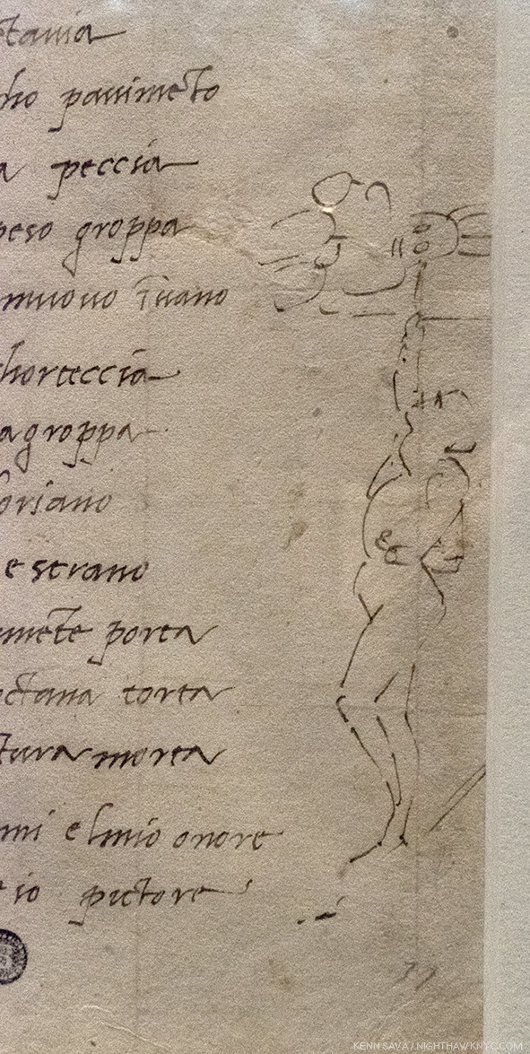
Fact versus fiction. Michelangelo’s self-portrait Painting the Sistine Chapel ceiling.
Regarding the infamous “he Painted it lying on his back” story, Mr. Januszczak says, “Its origins can be traced back to a mistranslation of Michelangelo’s first biography, 31 lines written in Latin by Paolo Giovio, Bishop of Nocera, sometime between 1523 and 1527, (which can be read here). Giovio describes Michelangelo’s posture while painting the Sistine ceiling as resupinus. This was assumed to mean ‘on his back’ by various Michelangelo commentators who spent 5 centuries enthusiastically emphasizing his agony at the expense of his ecstasy. A more accurate translation of resupinus would be ‘bent backward7.’” In the show, we see Michelangelo’s own Drawing of the way he worked, above, alongside a sonnet he wrote to a friend about it.
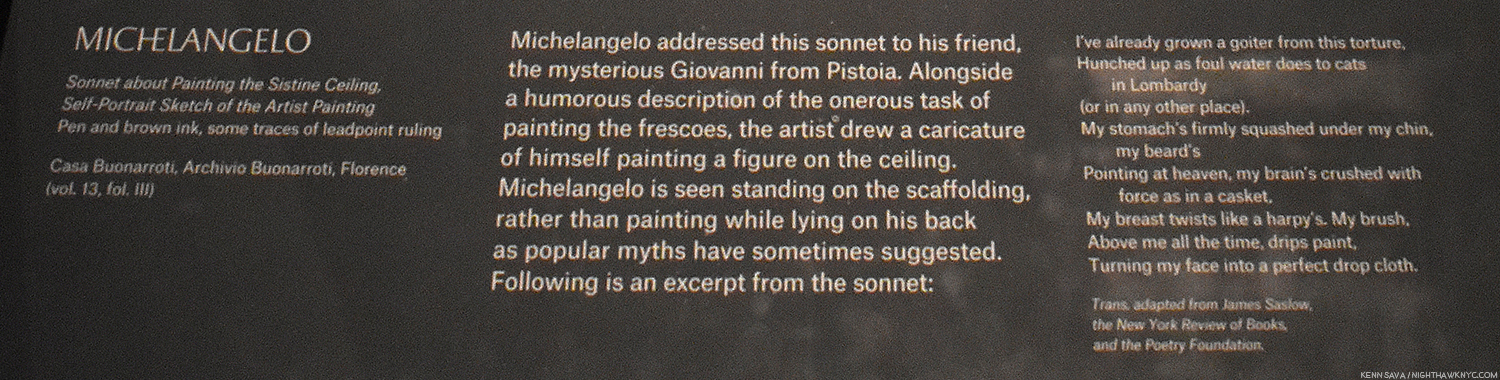
The Met’s caption for the Drawing, above.
Apparently, The Agony & The Ecstasy author Irving Stone, and the film’s director, Carol Reed, haven’t seen this. At The Met, old wives’ tales died hard in the dim light of the darkened galleries.
No. Michelangelo did not paint it lying on his back. Given how crowded it was, and how many visitors were looking up, it’s a bit amazing he didn’t get stepped on, though the young lady on the left almost got him.
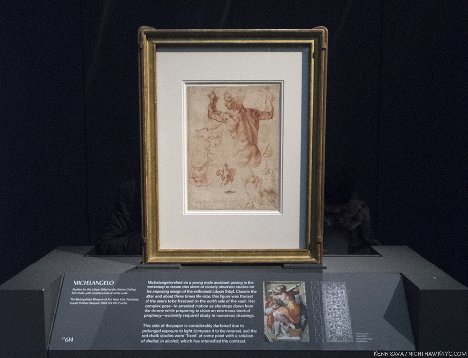
Studies for the Libyan Sibyl in the Sistine ceiling. One of the most amazing things for me in the ceiling, beyond the astounding overall composition, are the postures of the figures- almost all of them. Perhaps none is more extreme than the immortal Libyan Sibyl. In the finished work, this priestess is seen at once stepping down from her throne while apparently preparing to move or close the gigantic book she holds in both hands. So complex are these movements that Michelangelo made studies of this figure in sections so he could closely analyze them, like this well-known example, in which the left hand is slightly higher than the right- the opposite of how they are in the Painting. The Artist possibly realized this would have made the whole pose look extremely unbalanced, not to mention rob the figure of much of its timeless grace.
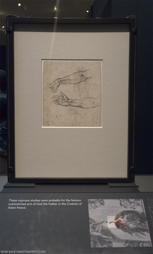
Jaw dropping. One of the most important Drawings in existence. Every time I went, I had to stop and ponder this. I never knew it existed. Two Studies for an Outstretched Right Arm, Very possibly for God the Father in the Creation of Adam section of the Sistine Chapel. According to Waldemar Januszczak, the celing’s fingers have been REPAINTED by restorers at least twice, including during the most recent restoration in the 1980s8! So? THIS is as close as we may ever get to what Michelangelo intended they look like, from his own hand. Just astounding.
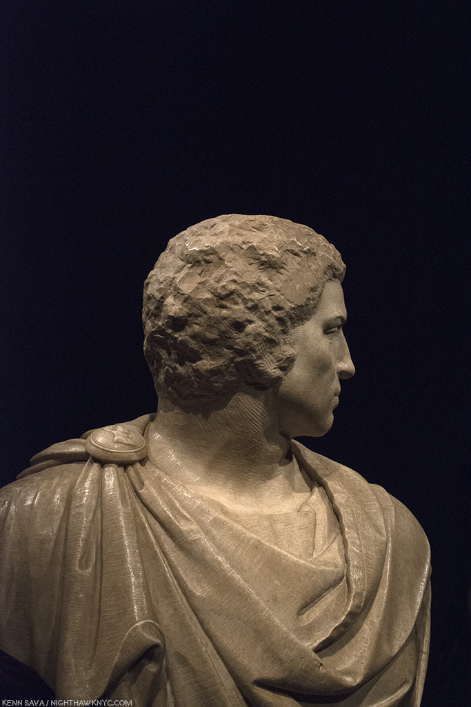
Bust of Brutus, (with “some assistance” from Tiberio Calcagni), My recreation of an iPhone Photo the great Photographer, Stephen Shore, the subject of a terrific retrospective up right now at MoMA, took of it during his visit and posted on his Instagram page.
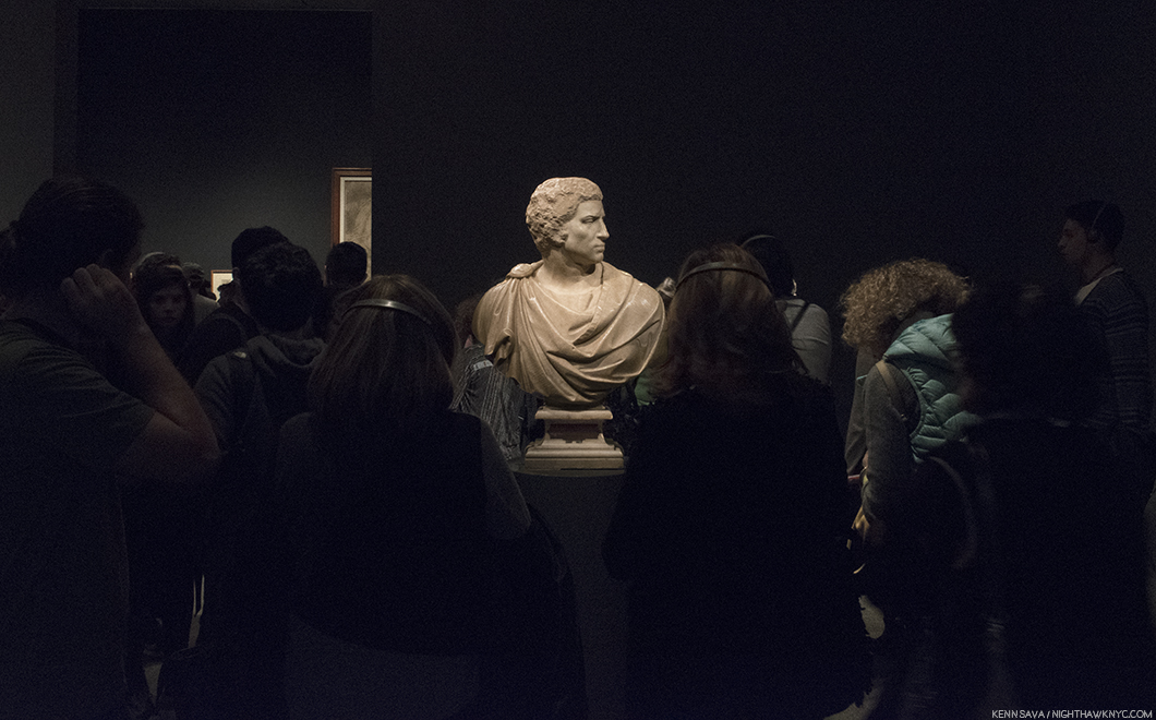
Last look. The crowd was still heavy around Michelangelo’s stunning, Bust of Brutus, in the final hour of the run of the show on February 12th.
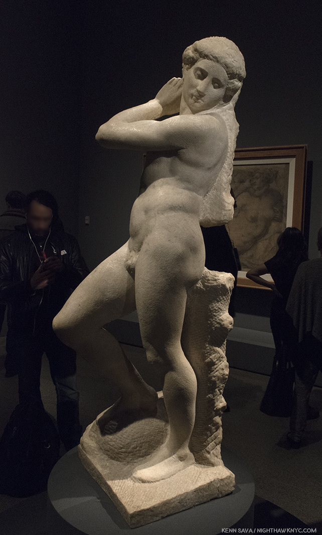
Apollo-David, (Unfinished). Both it, and the Brutus, were on loan from the Museo Nazionale del Bargello, Florence, Italy. I can’t imagine how much the insurance was to ship these…round trip.
The Met’s glorious show goes a long way further to set the record straight about Michelangelo and his accomplishments, in my view. Michelangelo, the somehow “not human” myth, is dead. Long live Michelangelo, the all too human genius of Art & Design. It seems to me that the myth does him a disservice. If he wasn’t human, it would have been easier for him to accomplish Artistic perfection. But, he was very human, as his Poems and letters reveal, as does how hard he worked for a very long time (he died at 88, about 3 weeks short of his 89th Birthday- unheard of in the fifteenth & sixteenth century, when 35 was closer to the norm) to achieve the brilliant results he brought the world. Yes, human. He was continually worried about his finances (as we see in this show, where he uses every square inch of paper, on both sides, to economize), he continually worried about his family and their status, he worried about being paid, often by whichever Pope he was working for (He lived through the reigns of 12 popes and, extraordinarly, worked for 7 of them9.), and his temperament ran hot and cold. If you were out, he could be very hard on you. It seems to me he lived a largely loveless, isolated life. His loves, such as we see in his Drawings and Poems and in his relationships, remained largely unrequited.
Michelangelo, Fragment with a Study for the Virgin for a Crucifixion, left, and Fragment, with a Study for Saint John the Baptist for a Crucifixion, right.
Michelangelo: Divine Draftsman & Designer, serves to revise our perception of Il Divino. To this point, he, and Leonardo, are perceived as geniuses who finished little of what they started. While there are many projects that Michelangelo didn’t complete (as well as others he did finish that are now lost), the bigger picture is that he completed a remarkable number of compositions & designs- some of which were either intended for, or realized by, other Artists, or were completed after his death. During his lifetime, Michelangelo was the only Artist thought to have excelled the revered masters of ancient Greece and Rome (per Vasari), who inspired the Renaissance- perhaps the highest esteem a Renaissance Artist could achieve.

Marcello Venusti, The Crucifixion with the Virgin and Saint John the Evangelist, based on Drawings by Michelangelo, above, shown as one example among many of Michelangelo’s designs adapted by other Artists in this show. I selected Venusti’s because, well, it’s just gorgeous.
In one of the great mysteries in Art History, TWENTY FOUR YEARS after completing the ceiling, Michelangelo returned to the Sistine Chapel to Paint this. Well, almost this, The Last Judgement.
Marcello Vanusti’s copy of The Last Judgement, is a very valuable record of what the work looked like in the mid-sixteenth century, before the addition of the controversial loincloths. However, Venusti took a number of liberties elsewhere, himself, so this is not a verbatim record of what he saw, though important nontheless. Due to its popularity, this was, perhaps, the hardest work to get full frame in the entire show.
WHY? Never before had an Artist returned to the scene of one work to complete another after such a long period. Whereas the ceiling gives us Genesis, the beginning of the universe, and life, on the wall over the altar, Michelangelo now gives us the end of the world, in all of it’s shocking glory. A bit too shocking for the time as it turned out. The beginning, and the end, in one space. In the interest of keeping this piece shorter than it might be, I’m only going to briefly mention something I feel is important, though not addressed in this show- The possible “meaning” of the Sistine Chapel ceiling and The Last Judgement. There seem to be two main theories. First, Waldemar Januszczak believes the Chapel building, itself, is modeled on the plan of the universe laid out by the ancient Christian Cartographer, Cosmas, in his Christian Typography, 547 AD. In it, the universe is rectangular, with a dome, like the Sistine Chapel, and its proportions are the same as the Temple of Solomon’s, which also match the Sistine Chapel’s. The universe is bordered by curtains with heaven and a second earth lying beyond. This is where the Genesis story takes place. So, when we look at the ceiling, we see into the past, through the painted Architectural elements all over the ceiling, in a world that is flat with the Sun revolving around it.
Waldemar Januszczak mentions the long forgotten sixth century Christian Cartographer, Cosmas, as the creator of this model for the universe, which looks shockingly similar to the structure of the Sistine Chapel. Notice, the Sun revolves around the Earth, with God & Christ above. Interestingly, it shows a blue background sky, with stars, which is how the Sistine’s ceiling looked before the collapse led to Michelanglo repainting it.
The second theory is based on the coincidence that Nicolaus Copernicus happened to be in Rome espousing his theory the the Earth revolved around the Sun at the exact moment Michelangelo was painting the ceiling. It believes he, and the Pope, were privy to it, though it had not as yet been published, and they included it in the ceiling and The Last Judgement. In the latter work, Jesus’ left thigh is at the exact center of the composition. Dr. Valerie Shrimplin says, “The most probable source for this choice of a central point on Christ’s thigh, as the pivotal centre of the entire cosmological fresco, seems to be the Book of Revelation 19:16. In a description of the Christ of the Judgment, it reads: ‘And he hath on his vesture and on his thigh a name written, KING OF KINGS AND LORD OF LORDS.’ This text is immediately followed by a reference to the Sun-symbol: ‘And I saw an angel standing in the sun…’ (v. 17). In the Sistine Last Judgment, Christ is thus depicted (theologically, neoplatonically and scientifically) as Michelangelo viewed Him: as King of Kings and Lords of Lords, the Sun, the centre of the Universe.”
Given the lack of anything definitive in Michelangelo’s surviving documents (his Drawings or letters), to support either of these theories, I find Mr. Januszczak’s the more compelling case. Pope Julius was a theological scholar who became a Doctor of Theology before becoming Pope. It makes sense to me that he would have known about Cosmas, and given that his uncle built the Sistine Chapel in the exact same dimensions Cosmas espoused (the building is not mentioned in the other theory), means that TWO Popes were involved in the Sistine Chapel. Nicolaus Copernicus was 2 years old when the Sistine Chapel’s construction, in Cosmas’ proportions, began, which would seem to make it a moot point. These factors tips the balance to Mr. Januszczak’s theory, in my mind.
By the way, Pope Julius II and his uncle, Pope Sixtus IV, were members of the della Rovere family who’s coat of arms include acorns and oak trees, both of which are seen all over the ceiling, and indeed, all over Italy, by way of “marking their turf,” as it has been called.
From all I’ve read, one thing seems certain. Michelangelo was a deeply religious man. An Artist who included himself in his final Pieta, called The Deposition, as well as including his Self-Portrait on his flayed skin that St. Bartholomew holds in The Last Judgement. Some see a self portrait included in the depiction of the Archangel Michael (or “Michelangelo”) on the ceiling. I don’t think he would have done any of these things if he was not deeply religious. It also makes me think that he went back to the Sistine Chapel to Paint The Last Judgement years after Pope Julius’ death because, then in his 60’s, he may have been thinking of his own mortality. Regardless, 506 years after he completed the ceiling, and going on 500 years after he completed The Last Judgement, the discussion remains ongoing about trying to understand these two incomparable masterpieces.
The controversy doesn’t end there. Regarding those “ladies talking of Michelangelo”… Waldemar Januszczak says, “Michelangelo was thus never a fully accepted and fully committed homosexual of the modern kind. He belongs, rather, besides Donatello, Leonardo, Botticelli and the painter nicknamed Sodoma among those homogamous Renaissance artists about whom we have conflicting evidentce of a conflicting sexuality. That he was a homosexual in some form seems certain. that he was not homosexual, in the way we understand the word today, appears equally unarguable10.” And, on the question of his depictions of the female body, he continues, “Given Michelangelo’s obsession with human anatomy, it seems improbable that he never actually saw a naked woman in his life. But he cannot have seen very many. And he does not appear to have looked too closely11.”
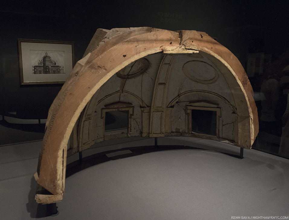
Nothing Less than Michelangelo’s model for the vault of the Chapel of the King of France, 1556-57, created under his direction by Fabbrica di San Pietro, Vaticano, Vatican City. The calotte of the dome of the south apse at a scale of 1:30. He would not live to see his designs for St. Peter’s, of which he was chief architect for 17 years, completed, and those that were were, including its dome, were altered12.
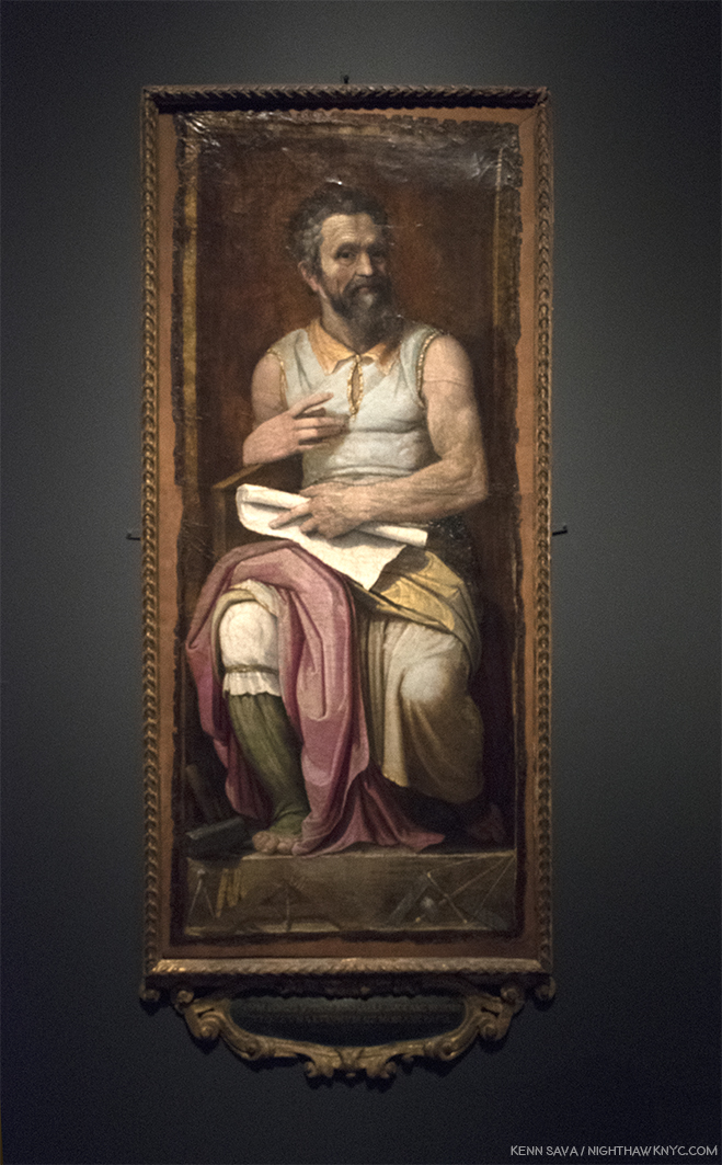
Frederico Zuccaro, Portrait of Michelangelo as Moses, showing “Il Divino” in a similar posture to that of his brilliant Sculpture for Pope Julius’ tomb. Michelangelo was not a tall man, and I imagine his arms must have looked not all that different to these after a life of carving stone. The tools of his trade lie on the pedestal beneath his feet. Carmen Bambach says of it, “Much as the prophet (Moses) led the Children of Israel out of Egypt, do did Michelangelo save the Artis, by indicating the true path through a command of disegno and visual judgment..” (Catalog, P.257)
While I continue to love and admire his Sculpture, Painting, Drawing, Poetry, and what I can understand of his Architecture (most of which was unbuilt), I now see him as a genius of design and composition, first and foremost, due to this show. That his Art continues to speak to so many of us 542 years after his birth is the supreme testament to his skill. It makes me wonder why he felt he needed to “pump himself up” to mythic proportions when his work, itself, has done so for him. His real story, as far as is known, makes him much more “human,” than “divine,” and I, for one, find that more compelling. It gives me hope that there may be another “supremely talented” Artist, or perhaps there already has been and he or she remains unknown to us. For the here and now, nearly three-quarters of one million people saw something they’ll never forget. One of the ultimate displays ever mounted of what human Creativity is capable of, and has achieved.
I am thankful I lived to see it.
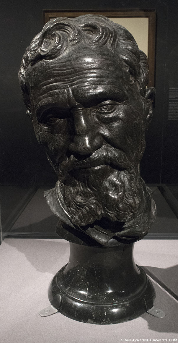
“Now, speak!,” Michelangelo said after finishing the monumental “Moses” for Pope Julius’ Tomb, according to legend. I muttered it silently when I stood in front of his friend and collaborator Daniele de Volterra”s lifelike bust of him, partially created from Michelangelo’s death mask, at the very end of the final Gallery #12.
“‘Immortality’
Here my fate wills that I should sleep
too early,
but I’m not really dead; though I’ve
changed homes,
I live on in you, who see and mourn
me now,
since one lover is transformed into
the other.
Here I am, believed dead; but I lived for
the comfort
of the world, with the souls of
thousand true lovers.
Although I have been deprived of my
own soul,
I still live on in the souls of all those
who loved and remember me.”*
* * * * * * * * * * * * *
(Happy 543rd Birthday, Michelangelo di Lodovico Buonarroti, born March 6, 1475 in Caprese near Arezzo, Tuscany, since renamed Caprese Michelangelo.)
Michelangelo: Divine Draftsman & Designer is a NoteWorthy show in my life, and for February, 2018.
*-Soundtrack for this Post is “Suite on Verses of Michelangelo Buonarroti,” Op. 145a, by Dmitri Shostakovich in 1974, the year before he died, which includes Michelangelo’s words quoted above in its final section, titled “Immortality.” Shostakovich, one of the great symphonists of the 20th Century, considered it to be his Sixteenth (and obviously, final,) Symphony, as he told his son.
Appendix- Recommended Resources-
-The Exhibition Catalog for Michelangelo: Divine Draftsman & Designer, by Carmen Bambach, is one of the best books on Michelangelo I’ve come across this past year, at least. It’s certainly the first stop for anyone who saw this show and wants to know more about it, and I highly recommend it to those who missed it as all the works displayed are wonderfully reproduced, along with a good many that were not here. Unlike many exhibition catalogs I see that are slapped together quickly, this one was NINE YEARS in the researching and writing (Catalog P.8). It shows on every page. Full of insights, stories and details, I haven’t seen anywhere else, it truly is the next best thing to having been there, and the best record of what it was. Though its focus is on the show and works included in it, Ms. Bambach never forgets to tie the works into the bigger picture, providing a remarkably thorough running biographical picture in the process, plainly sorting facts from fiction as she sees them in a wonderfully no-nonsense way, along with including priceless technical details and insights only a world class curator, who’s spent her life immersed in this work would have. Essential reading for Art History students, Michelangelo collectors (soft smile), and anyone with a passion for Art History, or Michelangelo.
-If you only want one book on Micheslangelo, out of the current Michelangelo books, I’d recommend Frank Zollner’s Michelangelo, The Complete Paintings, Sculptrues and Architecture, published by Taschen. I’m saying that while also saying there are better books for the Paintings. Better books for the Sculptures, but most are out of print and would require quite a bit of digging. But, if you want one book with as many good Photos of the full range of his accomplishment (yes, that means after restoration where they have been done, and I have no problem with any of them I’ve seen thus far), I’d recommend you look at it. Prior to the Taschen book, which originally came in the HUGE, 23 pound, XL size (which I, personally LOVE), look for Michelangelo: The Compete Sculpture, Painting, Architecture, by William E. Wallace, who teaches and lectures on the Artist, and has also written a good biography of him.
-The best books on the restored Sistine Chapel is the 2 Volume set, The Sistine Chapel, 1991, featuring the Photographs of Takashi Okamura, very probably the best ever taken of the ceiling and “The Last Judgment,” because he, and NHK TV had exclusive rights to Photograph it in return for NHK Japanese TV putting up 3 million dollars for their restorations. But? Being issued in limited editions, weighing 27 pounds, they’re very expensive now. The good news is there are other books with many of the same Photos, though smaller, and text by the restorers which are currently very cheap, including- “The Sistine Chapel: A Glorious Restoration,” “Michelangelo: The Last Judgement,” and Michelangelo: The Vatican Frescoes” which have all been on my shelf for years.
-As for his Sculpture- There are two ways to go- General overviews, or books that focus on one work. Which way you go depends on how closely you want to look at one particular work. A good number of the specialized books are out of print, but can be found at a decent price used, and of course, depending on age, feature black & white Photos, the older you get. I have the Hartt Frederick book published by Abrams, but it’s out of print, now and pricey. For current overviews, take a look at the Zollner and Wallace books cited earlier and see what you think of them.
-Writings- Michelangelo’s Poems are beautiful. They reveal the depth of his feelings in a way that is surprising at first, while they give a bit of insight to how his mind worked. For the true devotee of Michelangelo, they are essential. The problem is that there has yet to be a “definitive” translation of them into English. You can drive yourself crazy reading different translations of the same Poem. Find one that speaks to you, and don’t read any others…unless you’re THAT obsessed. I have the James M. Saslow paperback, which includes annotations, and more than 300 of his sonnets, madrigals and other poems.
-As for the biographies, Condivi’s or Vasari’s Biographies of Michelangelo both have the issues I outlined earlier. Condivi’s is a bit harder to find currently. Another way to go is to start by reading his letters. There’s a lot of them, and the 2 volume set edited by E.H. Ramsden (the one I have), gives a the largest number of them. They’re presented chronologically, and give you the feeling of his day to day life, which no biography does, and, in my opinion, you also get a sense of some of his values, and what’s important to him. Then, you can read the biographies and sort out for yourself what’s true and what’s “marketing.” Penguin has a paperback of selected poems and letters, which I have not looked at, so I can’t share any thoughts about it. Please, do not read Irving Stone’s books on Michelangelo (or Vincent Van Gogh) as “biography.” You’ll get much closer to the real Michelangelo’s biography reading Carmen Bambach’s catalog for this show, and it’s not, primarily, a “biography.”
-Finally, as I mention in the piece, I find Waldemar Januszczak’s book, Sayonara, Michelangelo: The Sistine Chapel Restored And Repackaged, 1990, and documentary on the Sistine Chapel, “The Michelangelo Code: Lost Secrets of the Sistine Chapel,” to be the most enlightening, and extremely well researched exploration of the ceiling’s history I have found. It also includes a fascinating presentation of a possible “meaning” Mr. Januszczak researched and developed over more than a decade. He may be right about it. Agree with him, or not, it’s well worth seeing for the tour it gives, which includes access to many off-limits areas, as well as for the history lesson. The 2-part film is out of print on DVD, but appears on Public Television’s “Secrets of the Dead” series every once in a while.
The former entrance as seen on February 23rd, thirteen days after it closed. “Sayonara, Michelangelo.”
NighthawkNYC.com has been entirely self-funded & ad-free for over 7 years, during which over 275 full length pieces have been published!
If you’ve found it worthwhile, PLEASE donate to allow me to continue below.
Thank you, Kenn.
Also- I’m pleased to announce I’m curating a selection of Art, ArtBooks & PhotoBooks for sale! All items are from my collection or selected by me in my travels through the Art world. The complete selection of over 370 items is here.
Written & photographed by Kenn Sava for nighthawknyc.com unless otherwise credited.
To send comments, thoughts, feedback or propositions click here.
Click the white box on the upper right for the archives or to search them.
Subscribe to be notified of new Posts below. Your information will be used for no other purpose.
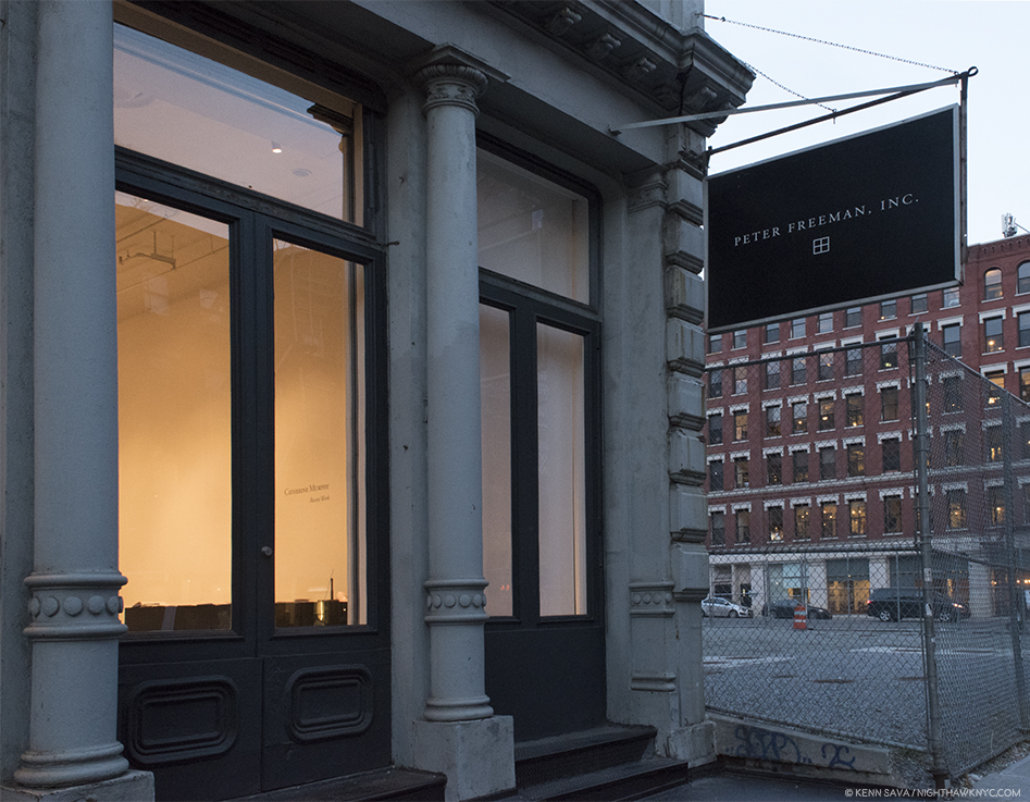
After months of Photography shows…Hark! I see a flag and a light that portends some State of the Art American Painting & Drawing in 2018 within.
Fellow lovers of Painting, fear not. I’ve surfaced from my year long deep-dive into the world of Contemporary Photography, finding equilibrium just as the New Year is continuing the holiday spirit, bearing Art gifts of it’s own. First, there were the unexpected wonders of “Edvard Munch: Between The Clock and the Bed,” at The Met Breuer, the fascinating “Figuratively Speaking” at Michael Rosenfeld Gallery, and now with “Catherine Murphy,” the long awaited show of recent Paintings & Drawings by the singular and influential Artist and Educator1 at Peter Freeman, Inc., I can positively feel the wind of great Painting blowing through my hair once again. Well, at least my eyebrows. “Long awaited” as Ms. Murphy’s last show, “Catherine Murphy: Working Drawings” at Sargent’s Daughters, was in 2016, but the last show of her Paintings and finished Drawings, also at Peter Freeman, Inc., was back in 2013.
Over a career that now extends more than 50 years, though her style, focus, and her choice of subjects have evolved, there is one constant- an extraordinarily high level of accomplishment. It’s hard to think of another Artist who’s Paintings AND Drawings are among the finest created in each medium over that time. Both bodies of work are marvels. And, at least her more recent pieces are inspired by her dreams. Her new show, which focuses on this more recent work, is a visual tour de force- in more ways than one. No less than Artist Rod Penner told me in the Q&A I did with him last year that, in his opinion, Catherine Murphy “is in a class of her own,” among Artists he feels have been overlooked and/or are “important” today.
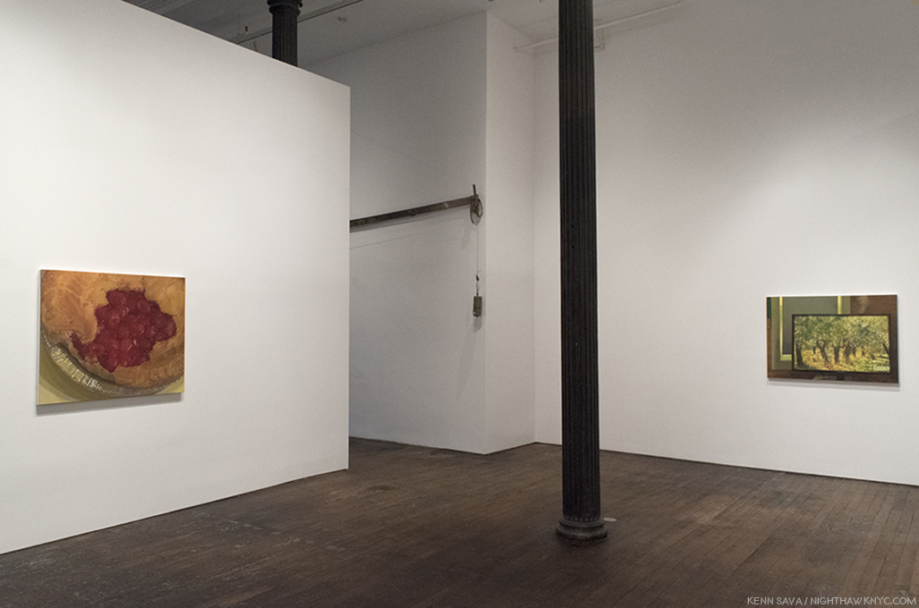
Installation view of part of the first gallery. All Photos by Kenn Sava, courtesy of the Artist and Peter Freeman, Inc. Click any Photo for full size.
As I moved through the galleries I was struck by something I hadn’t noticed as a focus of her work before. Unlike, say, her early landscapes, many of the pieces on view shared the common theme of seeing & perception. Take for example the first Painting in the show, “Cherry Pie,” from 2104. It’s obviously a pie, yet even a quick look reveals it’s a Painted pie, not a “photorealistic” pie.
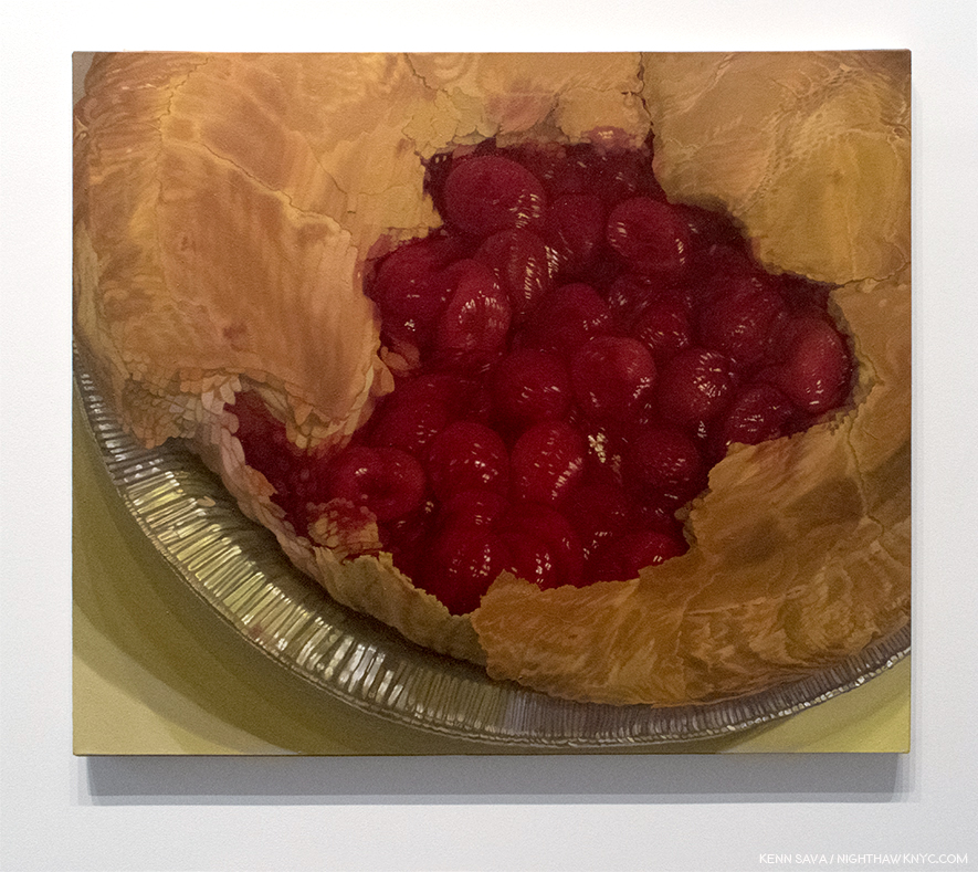
“Cherry Pie,” 2014, Oil on canvas, 38 x 45 1/4 inches
No matter how close, or far, you stand from it, the work remains just out of focus, as if seen at a glance or in a slightly blurry photograph, but the level of artistry brought to bear in the entire work is staggering. The crust is open, missing one section. Strange. You’d expect a slice to be missing. Looking closer I was enraptured by what I saw.
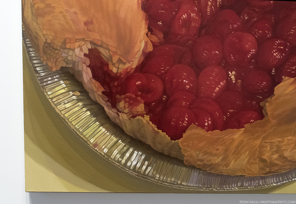
The cherries, for instance, seem to have taken Cezanne’s immortal still lives to a different level. (Not “better,” I don’t believe in those kinds of comparisons. Different.) Look at how finely the highlights and the shading are done on each one. Then look at the broken edge of the pie crust to the left- each flake is carefully and sharply delineated in a way that is positively surreal. When have you seen real pie crust look like this? Their sharpness is in contrast to the overall blurriness, as if they are the point of focus for the absent camera. Then, there’s the pie tin. It’s countless folds appear to be almost individually colored as the light plays off them so magnificently, echoed in the wonderfully realized cast shadows underneath. If we take the pie tin for a “ground,” the work strikes me as a Painting that strives to go beyond two dimensions. It wants to, at once, lie above the surface, on it, and under it- all while drawing us inside of it. These questions of seeing (What do you see? What do you expect to see?) and looking into, though a painting is a flat, thin surface, recur repeatedly in this show.
“Shift,” 2016, Oil on canvas in two parts, each 37 7/8 x 45 1/8 inches.
Directly across the room from it is another pie-related work, in two parts. This time, what is apparently the top of the crust is an entirely separate work, displayed next to the empty pie crust. If these were hung separately, Would we think they are a pie crust and it’s top? They could be one of Edward Burtynsky’s aerial landscape Photographs of some distant land and an aerial shot of a crater in an icy land. Still, even in this context, shown together, it seems strange. It’s hard to not see the apparent top being on a pie. I kept thinking about what’s under it. Nothing but the surface it’s laid on. As for the pie crust, itself, we’re left to imagine what’s going to go inside, while we ponder the top now being a surface instead of a top and the empty space of the pie drawing us into a space, which is in reality, flat.
“Flat Screen,” 2016, Oil on canvas, 35 1/2 x 19 1/4 inches.
Adjacent to the previous two works is “Flat Screen,” a work that depicts a lovely, Painted, sunny, outdoor scene on the titular flat screen monitor. Perhaps, it’s a screen saver given the partial text on the lower right. The window behind it is blank being mostly covered by what appears to be a window shade. The light that does come through around the shade mimics the black border around the monitor’s screen. I wonder…wouldn’t we expect see the reverse- a blank, or grey, computer screen, and the sunny outdoor scene outside of the window? It might be technology taking the place of experiencing nature via a live feed from outdoors, except that we see it’s a Painting. Is it the scene outside the window? We’ll never know. Continuing the spacial relationships, it also reminds us a monitor is flat and presents us with the illusion of 3 dimensions, like a Painting does.
“Float,” 2015, left, “Becalmed,” 2017, right, both Oil on canvas, 72 x 54 inches and 54 x 72 inches ,
In the main gallery, are two works that might seem descendants of late Monet- both depict scenes taking place on bodies of water with trees nearby. In both, we are left to ponder, and admire, the surface, what’s on top of it, and what’s being reflected on it- all handled masterfully.
“Float,” 2015, Oil on canvas, 54 x 72 inches.
The one above, “Float,” 2015, is over the top, literally and figuratively. It continues the line of her early landscapes, which were painted outdoors. In 2013, she said, “Any Painting that you see is outdoors is a really slow Painting. Because I have to wait for the sun. I have to wait for the weather…2” “I got very interested in things that look spatial, but are not spatial,” she said in 2014. As you look at “Float,” it’s a bit like looking down the rabbit hole. I almost wondered if I was underneath the water looking up at the surface and the foliage above it, but the yellow leaves would seem to indicate we’re looking down on it. The floats and the leaves floating on the water provide a fulcrum between the two worlds- outer and inner. Again, she has created a scene of extraordinary depth on a simple, flat canvas, a bit like the feeling I got from “Cherry Pie.”
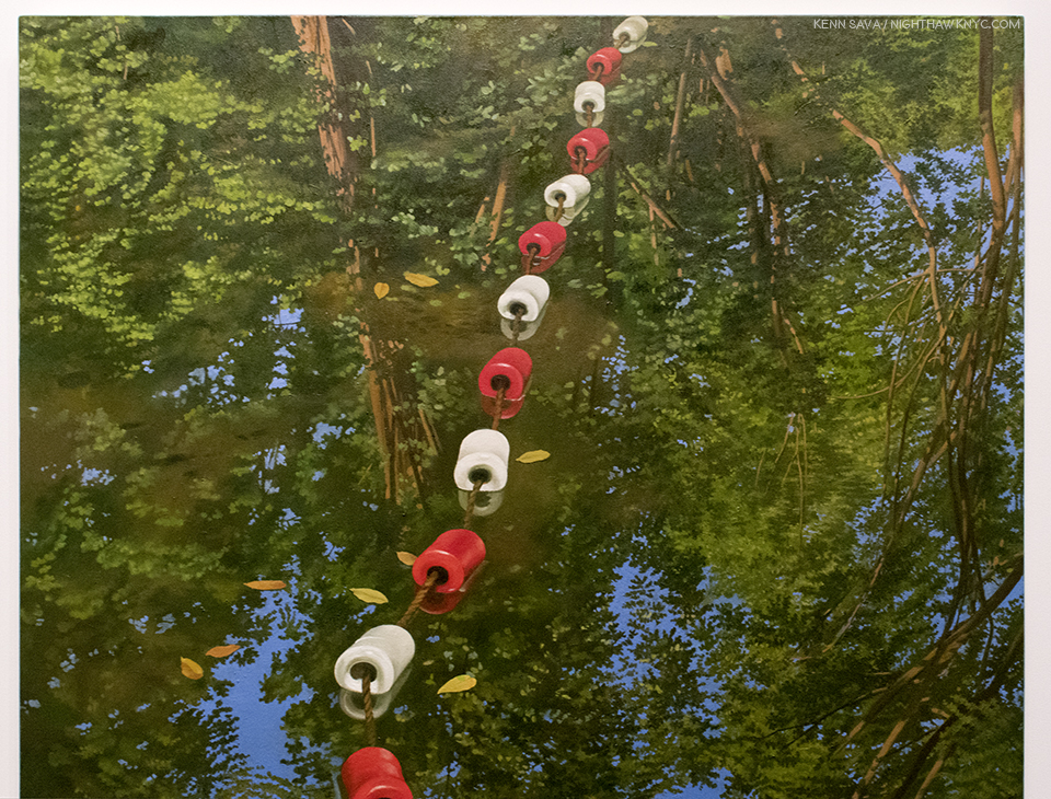
Don’t fall in. It’s only an inch or so “deep” and there’s a concrete wall behind it.
Then, “…I started dreaming Paintings, and thinking about Paintings differently. It was the beginning of a whole thing, giving myself permission to do it in a new way. that is really what stops everyone in the world: because of an idea of who you are you’re afraid to break your rules3.” So, more recently, she’s moved to scenes that are “smaller” closer, or more intimate, like those seen in most of this show. She says that after being inspired by her dreams, she then sets up the scene in her studio.
Half the show is devoted to Catherine Murphy’s amazing Drawings, all of which are these indoor scenes. And, I mean amazing. Like this one-
“Studio Floor,” 2015, Graphite on paper, 28 3/4 x 31 3/16 inches.
Again, the mastery of rendering surfaces is just stunning- the shading of each wire mezmerizes. Then, there’s the beautiful wooden floor- all Drawn in graphite. Once again, the feeling of depth is present. We can’t tell how high the pile of wire is from that floor. Is it one insanely long cable, or more? If it’s more, despite the yards of spare cable lying around, those two ends are never going to reach each other. It’s a very daring piece. If you want to test your technique, and your eye? Take a shot at Drawing something like this.
Catherine Murphy, long seen as a champion of figurative/representational Art, surprisingly said she’s “a compulsive Abstract Expressionist.” While I think she may have been referring to the technique of applying paint, I filed that in the back of my mind, though yes, there are passages here and there in this show that do qualify. Perhaps, none more so than “Studio Wall,” 2014, Graphite on paper. Without it’s title or the name of the Artist, one might think it’s by Cy Twombly. The more I looked at it the more I couldn’t believe it’s ONLY graphite on paper.
“Studio Wall,” 2014, Graphite, yes, Graphite on paper, 32 3/8 x 34 3/8 inches.
Standing in front of it for the longest time, it looked for all the world to have been Painted. So, I asked Catherine Murphy through the gallery how the background was done. She said, “I just keep adding graphite until the tone is correct. There is not much actual “white” (although the wall I was drawing from was painted white). What “white” there is, is the paper.” The fact that there is so little white of the paper left is what amazes me. The shading is so brilliantly done that no matter how close you get to it, the background looks like Paint.
Since she said that her dreams inspire many of her works these days, I asked her if she dreams in color, or black & white, as the resulting works are in both. She replied, “In the dreams the color suggests itself, but I could be dreaming color for all I know. Some things have to be in color and some things have to be in black and white. But one way or another they are both about color.” Her Drawings are unique, whole works unto themselves that have nothing to do with her Paintings. They stand alongside her Paintings as “different but equal,” so to speak. Well? Except for this one-
“Painting Drawing Painting,” 2017, Oil on canvas, 51 x 72 inches.
In “Painting Drawing Painting,” 2017, she seems to be playing with that, though, blurring the boundaries between the two medium. Again, making us question what we’re seeing- What’s “Drawn?” What’s Painted?” Being oil on canvas, it’s all Painted, but much of it “looks” Drawn. It’s also fascinating that she’s left part of it, apparently, unfinished, while another part, along the right white border, appears to have been erased or removed, something she doesn’t do in her “real” Paintings. My takeaway was that in this work, she’s giving Drawing the same “status” as Painting, which is traditionally the more valued medium, which also serves to reinforce their importance in her oeuvre as equals.
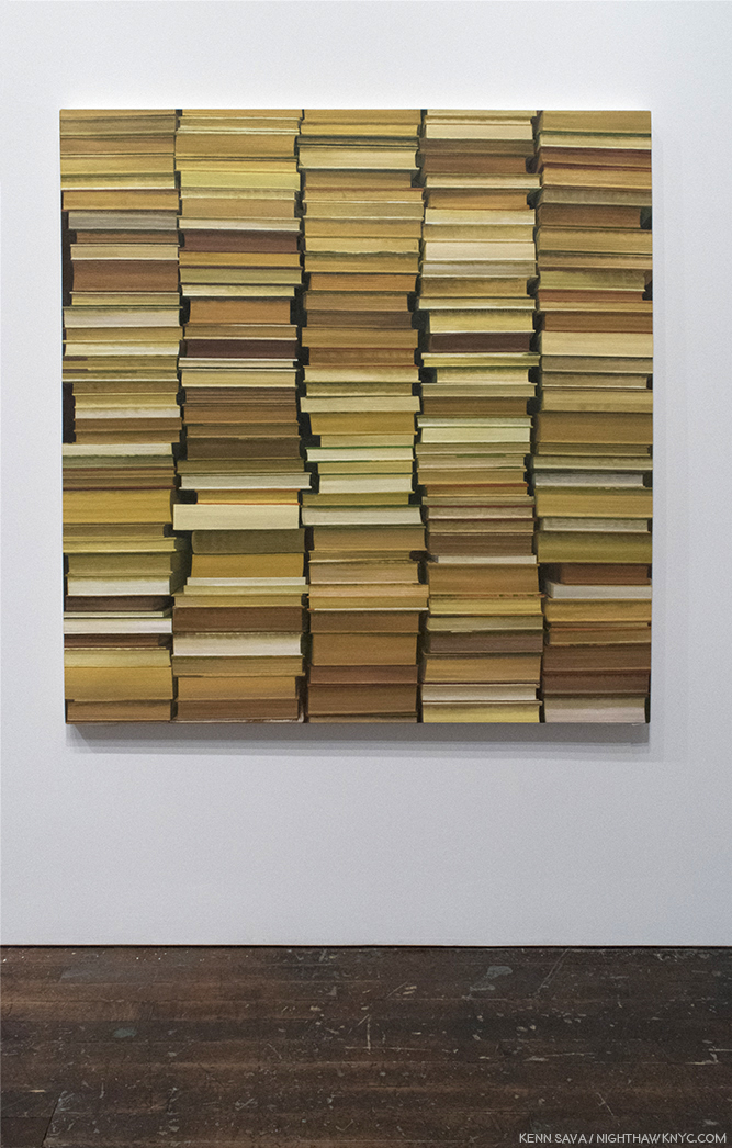
“Stacked,” 2017, Oil on canvas, 60 x 60 inches.
“Stacked,” 2017, one of the three newest Painting on view (“Painting Drawing Painting” being another, “Becalmed,” seen further on, the third), creates the optical illusion that the stacks of books are suspended in mid-air. When I saw this, I wondered if Catherine Murphy had seen my apartment in her dreams. Then, alas, mine haven’t levitated. Yet.
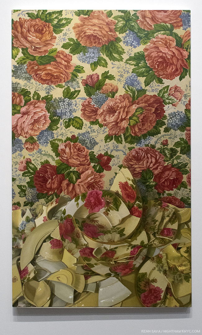
“Floribunda,” 2015, Oil on canvas, 66 1/16 x 41 1/8 inches.
“I’m avoiding the comfort of realism. The pillow you know. The bottle you know. The landscape you know…I want to confront,” she said in 2013. The masterful, knock-out, “Floribunda,” 2015, is a classic example of that. It also speaks to what we see. What, exactly, are the broken dishes lying on, or seen against? The two patterns of whatever it is and the dishes are so similar it takes effort to see where one ends and the other begins as the eye moves across the canvas. It’s almost M.C. Escher-esque. Yes, they, positively confront each other. A detail that caught me in this, among so many others, is the “marrow” of the broken yellowish cup in the lower left corner.
Catherine Murphy has always followed her own star, regardless of what the rest of the Art world was doing or favoring. Marketing ploys, like “photorealism,” have proved to be an albatross around the necks, and careers, of any number of Artists, which has only served to delay (hopefully not permanently) the proper assessment of their work and accomplishment. Modern & Contemporary Realistic, Representational and Figurative Art has been slowly coming back, mostly in the galleries, and in museums elsewhere, but not the NYC museums, beyond, Kerry James Marshall in late 2016, early 2017.
Looking at their websites, Catherine Murphy is in, at least, 3 of NYC’s “Big Five” Museums (as I called them recently). The Met’s site shows 2 Paintings (acquired in 1986 and 1991), The Whitney’s shows 1 Painting (acquired in 1973), and 2 Drawings (acquired in 1993), and MoMA’s shows 2 Drawings, (acquired in 1987 and 2004). It’s a start, but one that hasn’t been followed up on in 14 years, plus. Of those three, only MoMA lists Catherine Murphy’s work as having appeared in an exhibition, both times in group shows, once when she was selected by Artist Vic Muniz, the show’s curator.
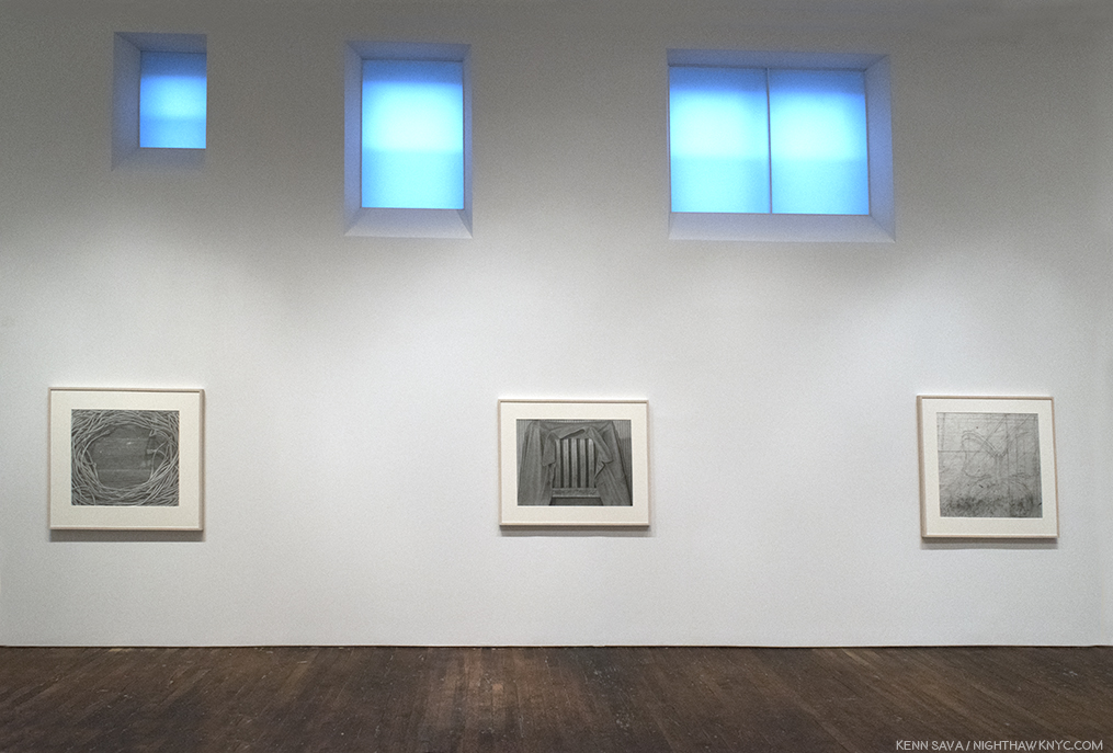
“Studio Floor,” 2015, left, “Chairback,” 2016, Graphite on paper, center, “Studio Wall,” 2014, right.
Yes, many have put her in the category of “Realism,” “Representational” and “Figurative” Art, I know, but Catherine Murphy’s work seems to me to stand aside of all of those categories because there are bits and pieces of any number of influences, periods, and styles going on in her work. Interestingly, she said in 2013 that there isn’t a style of Art she doesn’t like, because there is always someone doing something good in it. Elsewhere she has shown a familiarity with contemporary Photographers Jeff Wall and Gregory Crewdson (both of whom meticulously set up their shots, as Catherine Murphy sets up the scenes she Paints). I have a feeling along with not being afraid “to break your own rules,” as she said, it’s that range that helps her stand apart.
While shows like the Whitney Biennial and the New Museum “Triennial” are major events in the Art world that draw big crowds and gain instant recognition for a number of their younger participants, it seems to me that the time has come for such a show that features established Artists that have, as yet, not received their due in a major Museum show. The point is not to “shame” the Museums, but to give these Artists some of the exposure, attention and recognition, I for one, feel is long overdue.
Casting around for recommendations to be included in such a show (not to mention a Retrospective of her own), you need to look no further than Catherine Murphy.
*-Soundtrack for this Post is “Time Passes Slowly,” by Bob Dylan from “New Morning.” Catherine Murphy has said that her Paintings are about the passing of time. In lieu of the album version I would like to include, Mr Dylan may be seen and heard performing an early version of it, with George Harrison, here.
My thanks to Catherine Murphy, and Alexander Whitehead of Peter Freeman, Inc.
The Archive of previous Posts related to Painting & Drawing may be found here.
NighthawkNYC.com has been entirely self-funded & ad-free for over 7 years, during which over 275 full length pieces have been published! If you’ve found it worthwhile, PLEASE donate to allow me to continue below. Thank you, Kenn.
You can also support it by buying Art, Art & Photography books, and Music from my collection! Books may be found here. Music here and here.
Written & photographed by Kenn Sava for nighthawknyc.com unless otherwise credited. To send comments, thoughts, feedback or propositions click here. Click the white box on the upper right for the archives or to search them. Subscribe to be notified of new Posts below. Your information will be used for no other purpose.

Talk about “digging a hole to China.” This one’s right through the Guggenheim’s ground floor! Wang Gongxin, “Sky of Beijing,” 2017, Color video installation with sound.
“MIRANDA:
O, wonder!
How many goodly creatures are there here!
How beauteous mankind is! O brave new world,
That has such people in’t!
PROSPERO:
‘Tis new to thee.”
(Shakespeare, The Tempest, Act 5, Scene 1)
The International world of Chinese Art is a dichotomy, it seems to me. On the one hand you have record prices being paid for Chinese Art all over the planet (particularly in the tightly controlled domestic Chinese market1), to the point that China is now the largest, or second largest, Art market in the world, depending on who you read (as of the latest figures, 12/31/2016). Meanwhile, a large part of the Western world is sitting back with absolutely no idea what is going on, who these Artists, not-named Ai Weiwei, are, and what all the fuss is about. Some of this market explosion may be due to a slumping Chinese stock market, some due to limited investment options in China, and some is good ol’ interest in Art. (Of course, prices being paid for any Art, or anything, are no indication of quality or “importance.” Regarding buying Art, my thoughts are here.)
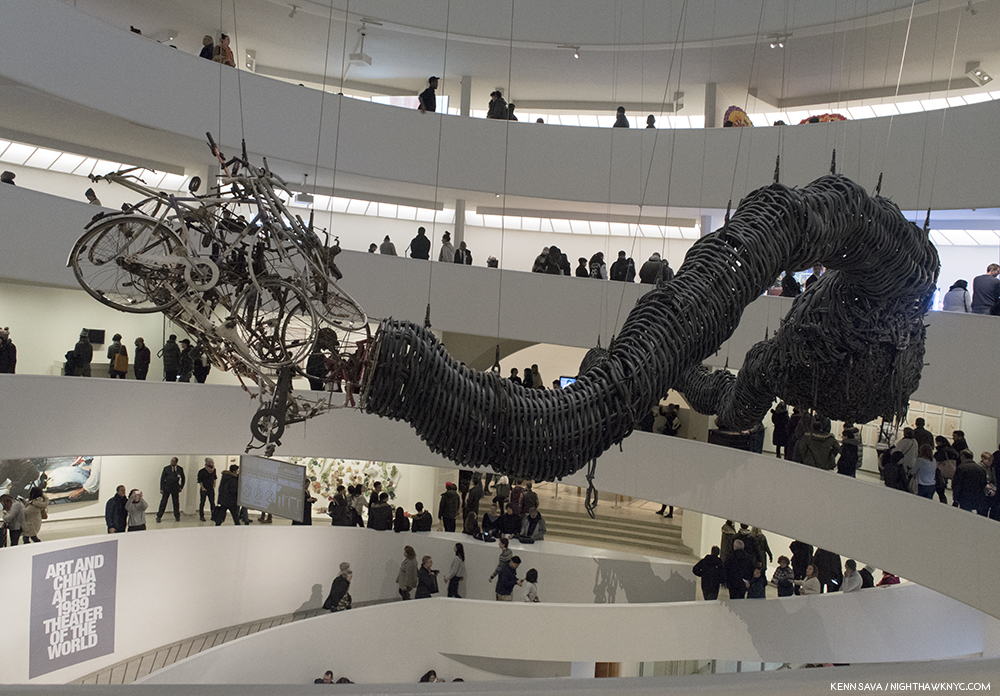
Chen Zhen, “Precipitous Parturation,” 1999, Rubber bicycle inner tubes, fragments of bicycles, toy cars, aluminum, silicone and paint. Though living in Paris, Chen returned to his native Shanghai in 1999, one year before he passed away, where he saw signs that read “By the year 2000, 100 million people will have their own cars.” In response, he created this huge snaking dragon, largely from bike parts, especially the countless rubber bike tires that form it’s body. It’s pregnant belly is opening to reveal a load of toy cars. One older mode of transportation giving birth to the next.
That crack in the iceberg of the lack of broad Western exposure you heard on October 6th was not another artifact of global warming. It was the opening of the Guggenheim Museum’s monumental, and already historically important, show “Art and China after 1989: Theater of the World,” the long-overdue comprehensive NYC Museum introduction to what’s been going on in the Art of China since that apocryphal year of 1989. It’s the biggest show of Contemporary Chinese Art yet in the U.S.A.
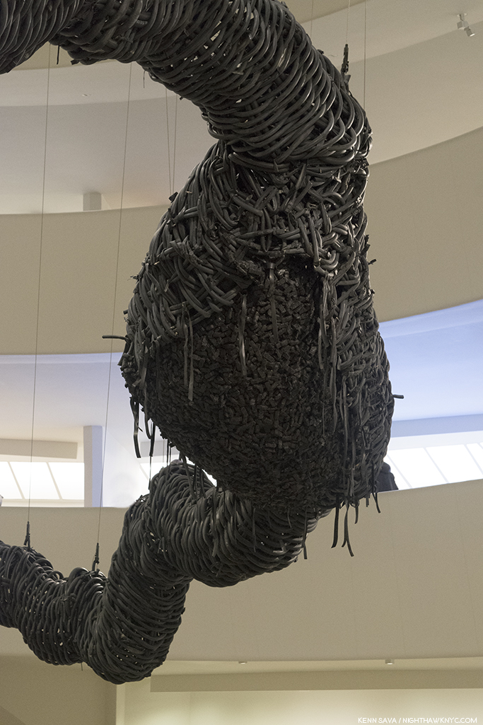
Detail of the “bursting belly” full of tiny toy cars. I can’t help but recall that both Marcel Duchamp and Robert Rauschenberg featured bicycles in their works. They are the two Western Artists I was reminded of the most in this show- whether or not they were influences on the Artists.
“Apocryphal” may be putting it mildly to characterize 1989…Empires fell (the communist’s in Eastern Europe). New ones were born (the first commercial internet service & the first written proposal for the world wide web), and other empires trembled- 1989 was the year of a protest involving 1 million Chinese calling for “government reforms and accountability2” that lasted 6 weeks and 6 days centered in Beijing’s Tiananmen Square, (which means “Gate of Heavenly Peace,” named after the Tiananmen to it’s north, separating the Square from the “Forbidden City”). The protests (Plural. They took place in many cities in China) culminated in the “Tiananmen Square Massace” (or “June Fourth Incident,” locally), in which 10,000 people are said to have been killed, with many more injured.
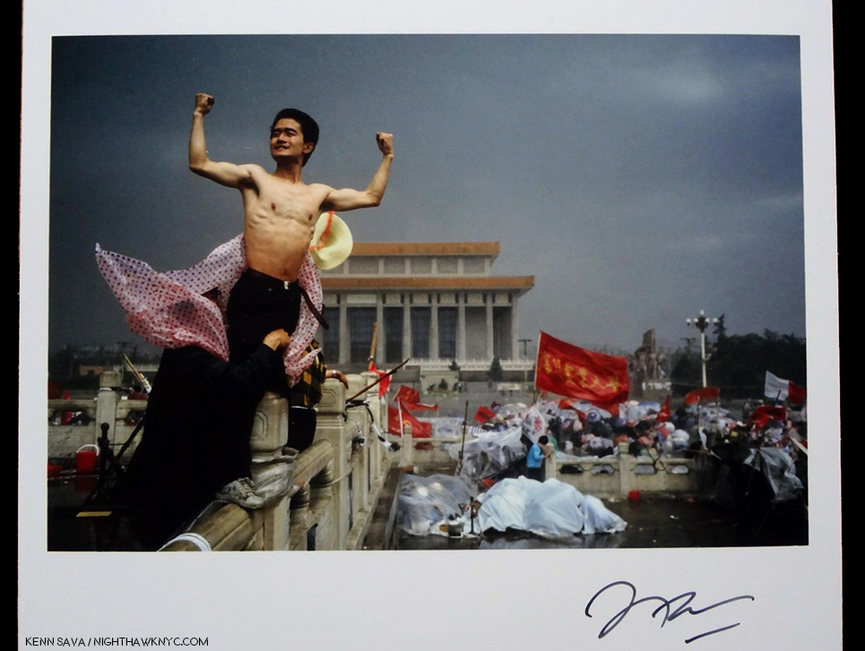
“It crystallized the spirit of the revolt,” Stuart Franklin, says on the verso of this 2015 Print issued by Magnum of his 1989 Photo, “Protestor in Tiananmen Square,” which he signed on the front. “It was a movement for freedom of expression, for basic rights, and against the outrage of official corruption,” he added. From my collection.
The iconic “Tank Man” Photo was taken by Magnum’s Stuart Franklin on June 5th. A tragic end to the decade of the relaxed “Reform-era,” begun in 1978, 2 years after the death of Mao Zedong. Marked by the “lifting China’s long-closed borders on the world and allowing for socialism’s planned economy to adapt to limited free-market principles3,” it served to stimulate both experimental and avant-garde Artists as well as students to question the status quo and seek other possibilities. Smack dab in the middle of this period, Robert Rauschenberg arrived in China in 1982, his experience inspired him to return and mount the “ROCI CHINA” show (for Rauschenberg Overseas Cultural Initiative), in the country’s most prestigious venue, Beijing’s National Art Gallery, in 1985, which more than 300,000 people visited in the three weeks between November 15th and December 5th!
Robert Rauschenberg, Poster for “ROCI CHINA,” 1985, Offset lithograph, featuring Photos Rauschenberg took in China, as seen at “Robert Rauschenberg: Among Friends,” at MoMA, 2017 (apologies for the glare). The show moved to Lhasa, Tibet after Beijing.
The exhibition “confounded and inspired viewers, whose exposure to Western Art had been limited to reproductions within catalogs, and whose understanding of art had largely been confined to academic Painting, Sculpture, and Printmaking4.” For me, at least, it’s hard to not see that there may be at least some influence of that show here. At the very least, Robert Rauschenberg (Duchamp, etc.) may have inspired Artists with a broader range of possibilities, as he has countless other Artists in the West. At the same time, however, many Chinese Artists were rejecting the “New Wave,” and all outside influences, focusing on finding their own answers and their own way forward. After June 4th in Tiananmen Square, radical economic reform came in, experimental Art was no longer “sanctioned,” all backed by strong suppression of any mention of what had happened on June 4th in the press, media, online, or in history books, that continues to this day, as do the international sanctions that the rest of the world responded with.
The scene outside the National Art Gallery during “China/Avant Garde,” with it’s famous “No U-Turn” Sign. From this moment on, there would be “no turning back.”
Four months before that horrible end, another event took place that has had lasting impact-inside and outside of China. The “China/Avant-Garde” Art Show opening on February 5th, 1989, which is seen to be the “official” start of Contemporary Chinese Art in some quarters, and marks the beginning of the period covered by this show. “China/Avant-Garde” was “official,” in more ways than one. First, it was officially sanctioned, as hard as it may be for most Westerners to believe, as the “China Modern Art Exhibition,” on one condition- that there would be no performance Art, and second, it was held in the National Art Gallery, Beijing, where Rauschenberg’s show had been 4 years before.
The “Official sanction” didn’t last long. Two hours after it opened, Artist Xiao Lu fired a gun at her own work, “Dialogue,” and the police shut the show down for breaking the ban on performance Art. It opened and closed a few times (once for a bomb scare, which might have been a “performance”), before running it’s scheduled allotted length of time. By then it had made history- Artistically, culturally, historically, and influentially. While many Artists wound up leaving the country after the climate changed, a good deal of that experimental creative spirit and energy remains. Regardless of where the Artists may be now, the range of creativity on view at the Guggenheim was unceasing, eye-opening, and a good deal of it was operating on multiple levels simultaneously.
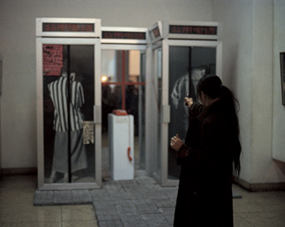
Xiao Lu fires a pistol at her work “Dialogue,” Custom-made telephone booth, Photograph, red telephone, glass, mirror, on February 5, 1989, 2 hours after “China/Avant-Garde” opened causing the immediate shutting down of the show. Photo from xiaoluart.com
With so many Artist options and so much time to cover (27 years), any number of alternate shows could’ve been mounted, but I think that what made it into Frank Loyd Wright’s rotunda and the two adjoining galleries, was, on the whole, exceedingly well chosen, with the caveats that, yes, that with 71 Artists included there should’ve been more than nine female artists included- a little under 8%, and, it felt to me that there was a plethora of video and installation Art, at the expense of other mediums, like Painting and Photography.
Lead curator Alexandra Munroe sums up the “post-Reform” environment- “Historical turbulence has given rise to an intelligentsia with a profound sense of skepticism towards governing ideologies and a predisposition to pragmatism in the absence of enduring meaning.” This extended to Artists working post-1989. “They produced works that questioned systems of truth and ideological formations…Eschewing Western humanist avant-garde ideals…experimental Artists approached ‘contemporary art’ as a new ‘other’ space outside the Western and Chinese Art words5.”
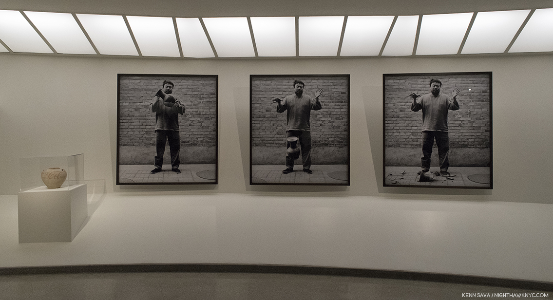
Ai Weiwei, “Dropping a Han Dynasty Urn,” 1995, 3 Gelatin silver prints and “Han Dynasty Urn with Coca-Cola Logo,” 1993, left, Paint on earthenware.
For me, a classic example of this is Ai Weiwei’s “Dropping a Han Dynasty Urn,” 3 Gelatin silver prints, from 1995, is a prime example of letting go (sorry) of the past, it’s influence, and the “baggage” the past brings with it for Artists to “live up to,” or to continue what has been done before.
Many are undoubtedly familiar with those Ai Weiwei works. Not being able to include everything else on view in this piece, I’m going to focus on what stood out to me in Painting, Drawing & Photography, along with a few other works in other mediums I just have to include. The works are not listed in any particular order.
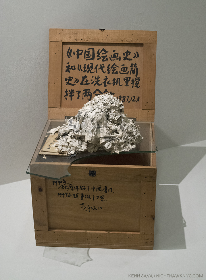
Huang Yong Ping, “The History of Chinese Painting And A Concise History of Modern Painting Washed in a Washing Machine for Two Minutes,” 1987, reconstructed in 1993, Ink on wooden crate, paper pulp and glass. The original was a work displayed at “China/Avant-Garde,” in 1989.
Huang Yong Ping, “The History of Chinese Painting And A Concise History of Modern Painting Washed in a Washing Machine for Two Minutes,” 1997, Ink on wooden crate, paper pulp and glass, begins this show with a strong statement that the past is over. History, as written in these two Chinese Art History Books, needed to be cleansed. The result is illegible, and so stands as a metaphor. Here is an Artist struggling with the question of how to become “modern” without becoming Western. Will studying Art History lead to something truly new, or will it just be recycling what’s been done? On one hand, the pulp though having been washed, is dirty. But, the slate has, also, been wiped clean since the books are now illegible. As Joe Strummer said, “The future is unwritten.” After this work, (which was shown in the 1989 “China/Avant-Garde” show), it was. As such it stands as an ideal starting point for this show. Let’s see what was “written” after.
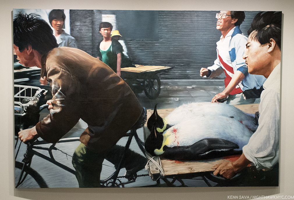
Wang Xingwei, “New Beijing,” 2001, Oil on canvas. In this work Wang Zingwei reimagines a well known Associated Press news photo by Liu Heung Shing, “Beijing- Rushing students to hospital,” 1989, taken on June 4th during the Tiananmen Square tragedy, where heroic bicyclists were shown rushing off with some of the wounded/injured, or deceased. Everything is as it is in the Photo, except Wang Xingwei has substituted 2 Emperor Penguins- animals not native to China, and therefore devoid of the political import Painting 2 wounded (or dead?) students would have had, while those helping are pulling together in ways that Chairman Mao espoused.
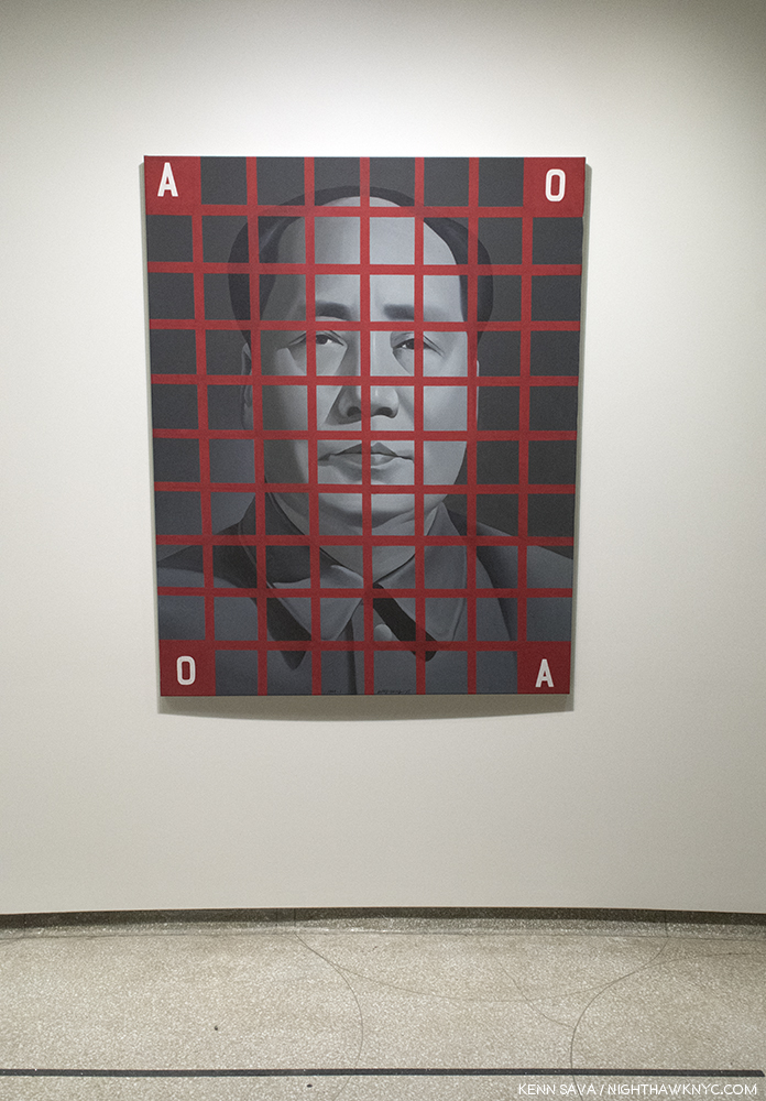
Wang Guangyi, “Mao Zedong, Red Grid No. 2,” 1988, Oil on canvas. Daring, and shocking, even 12 years after the death of Mao, given the omnipresence and power of his image in China. Unlike Andy Warhol’s “Mao as celebrity” series on the early 1970’s, Wang Guangyi has placed the former Chairman in a grid. It almost looks like he’s behind bars. It looks like it was done by (or influenced by) Chuck Close. The grid being one way Artists, including Close, have traditionally transferred images from one medium to another, but here it feels like there’s a different kind of transferring going on. Wang Guangyi painted this in 1988, 12 years after the subject’s passing, when it’s “meaning” is something else, something less fearful, something almost as neutral as the color he’s painted in, where it looks more like an old black and white Photo, and as such, it’s an image now locked in the past.
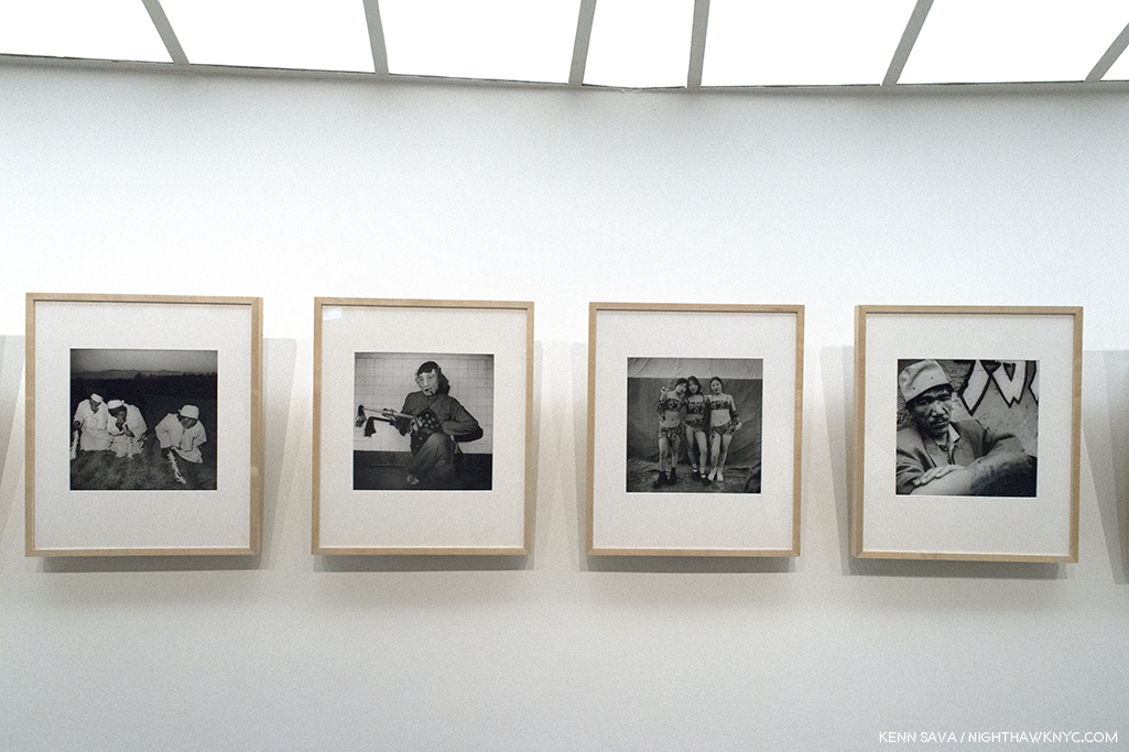
Liu Zheng, “The Chinese,” 1994-2002, 120 Gelatin silver prints. Among the Photography on display, these examples from the series of 120 stood out. Having worked on the state-run “Worker’s Daily” newspaper, his images go beyond the social realism they favored into a realm that isn’t quite “Street Photography,” and is significantly different from Robert Frank or Diane Arbus’ work, though the title is reminiscent of Frank’s “The Americans,” 1958. The rawness of the image is matched by the Photographer’s approach, which varies in each memorable shot.
Zhang Xiaogang, “New Year’s Eve, 1990,” Oil on canvas with collage of cloth and playing cards. After being hospitalized due to a bout with alchoholism, Zhang emerged from a dark period in his life in 1985 and joined the New Wave movement. This work has a haunting isolation to it. All we can really see are the figure’s left hand and his head/face. It’s as if he’s disembodied. In front of him lie 2 playing cards an unlit candle and a knife. Has the candle gone out? Is the knife for protection or self harm? This work was Painted after Tiananmen Square and refers to the beginning of the New Year. A black cloth hangs over the subject’s head, like a black cloud, with a red lining, possibly referring to additional raining of blood. The eyes stare straight out from the canvas, but not at the viewer. His glance doesn’t seem to make it out of his eyes.
Zhao Bandi, “Young Zhang,” 1992, Oil on canvas. One of the more popular Paintings in the show, judging by how many selfies I’ve seen taken in front of it online. It’s effect goes beyond it’s unorthodox off center hanging. Zhao shows us a young worker, living in a cramped space with few belongings beyond his embroidered comforter and a TV. Rising from sleep, he puts on his glasses and grabs a cigarette and stretches as he begins his day in his life in post-Reform China, where the economy is now booming, though the fruits of that may be slow to reach all levels of the workers. This work was painted with a model in the Artist’s small room, on his bed. The title “Young Zhang” could really be “Young Everyman,” with Zhang being one of the most popular surnames in China.
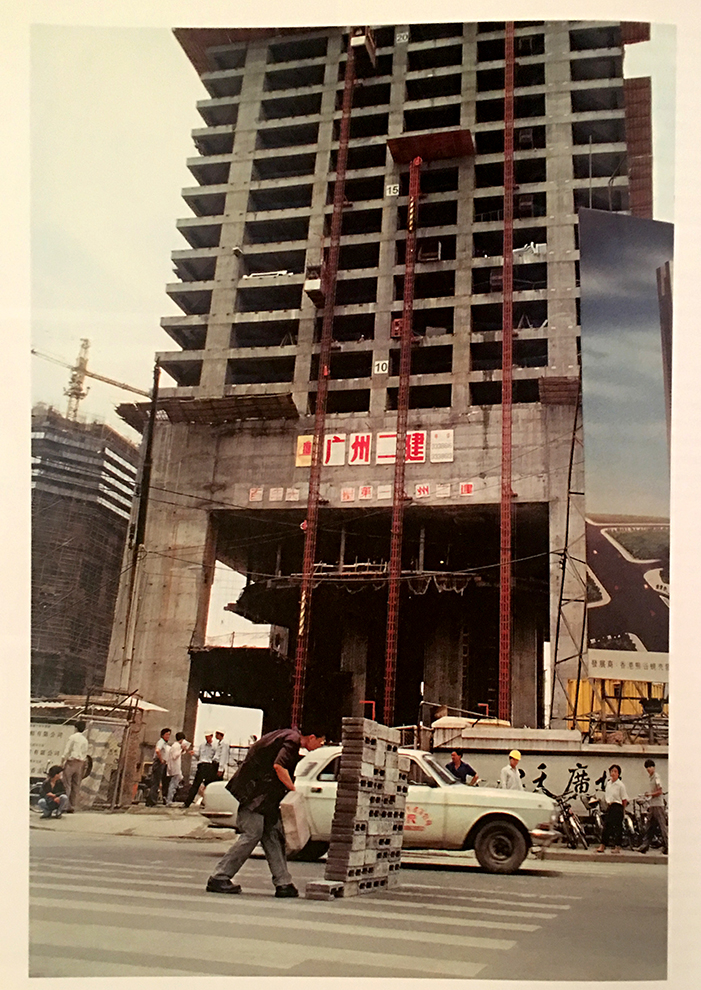
Lin Yilin, “Safely Maneuvering Across Linhe Road,” 1995, Still from Performance video, CITIC Plaza, June 3, 1995
Lin Yilin, “Safely Maneuvering Across Linhe Road,” 1995, Color video with sound 36 minutes 45 seconds. Living in Manhattan, where pedestrian safety is an ever-increasing concern, there was no way I could leave this work out.
].”
Here, the Artist constructs a wall of cinder blocks on a road, then moves it block by block, column by column, across all 4 lanes until he reaches the other side, safely. At the show, all 36 minutes of it were looped. While I immediately related to the issue of trying to cross any street safely, Katherine Grube, who spoke with the Artist, said “Mr. Lin’s objective was to create a ‘movable wall,’ animated by his own efforts that would interrupt the steady flow of traffic…and call attention to the unnatural, inhuman pace of urbanization and the human dislocations necessary to, and inseparable from such monumental environmental change6.”
Ai Weiwei, “June, 1994,” Gelatin silver print
Ai Weiwei, “June, 1994,” Gelatin silver print- A while back in these pages I called Ai Weiwei the “Artist of the Decade,” even though there were three years left to run in it. I still feel good about my choice. He was named the #1 “Most Influential Photographer in the World,” among 50 selected in 2013, and by now he is, or will soon be, the most Photographed Artist in Art history. Still, it’s now obvious that he’s not the only important Chinese Artist of the past, let’s call it 3 decades. While his works, “Fairytale,” 2007, and “Citizen’s Investigation,” 2009-10, both “multi-media,” for lack of a better term, were also included, I picked this one because Ai Weiwei was in New York in June, 1989, when Tiananmen Square happened. He took this in Tiananmen Square on the 5th anniversary. It features his future wife, Lu Qing, center, while two soldiers walk casually behind her, another woman has her back to her right behind her, and, at the moment Ai shot this, a pensioner driving a powered cart, with his or her crutches visible, drives into the frame. Mao overlooks the whole scene. in the distance. What I haven’t seen mentioned, either on the wall card, or in the show’s catalog is that beginning the next year, 1995, Ai Weiwei began his famous “Study of Perspective” Photograph series, that lasted until 2003, where he flipped off important monuments around the world, including Tiananmen Square. Perhaps, learning from his experience with “June, 1994,” he opted to create a similar “affront” to “power” through means that required less “production,” and therefore, allowed him more control over the final result. Yes, it can be said he, therefore, stripped it down, even further than here, to it’s bare essentials.
Liu Dan’s “Splendour of Heaven and Earth,” 1994-95, Ink on paper. 196 by 75 inches. Photo- Liu Dan, Guggenheim Museum.
Liu Dan, “Splendour of Heaven and Earth,” 1994-95, Ink on paper. Besides Ai Weiwei, Liu Dan is the other Contemporary Chinese Artist that has captivated me since I discovered him at The Met’s “Ink Art: Past as Present in Contemporary China” show in 2013. A close look at the incredible detail in his (often) huge works, reveals the man is a magician. I have since tracked down every book of his work I can find. Each of his larger works have the look and feel of being part of a giant scroll, with no “beginning” and no “end.” They seem to be influenced by ancient Chinese landscape Painting and the study of “Gongshi,” or “scholar’s rocks,” which have the abstract qualities of fantastic 20th Century sculpture. Still, I have absolutely no idea how he creates such incredible Paintings/Drawings, this one is almost 16 1/2 FEET long! Now living in the USA, he is gradually receiving the attention he richly deserves (witness “Ink Unbound: Paintings by Liu Dan,” where he reimagines classics of Western Art, which closes on January 29th at the Minneapolis Institute of Art). It might be too late for latecomers, though. His work already fetches large sums at auction, making it hard for it to find it’s way into public collections.
Liu Xiaodong, Two works from “Battlefield Realism: The Eighteen Arhats,” 2004, Oil on canvas.
Liu Xiaodong, “Battlefield Realism: The Eighteen Arhats,” 2004, Oil on canvas, 18 panels. Liu Xiaodong created a series of 9 diptychs of portraits of soldiers stationed on islands that are contested by China and Taiwan, Painting one soldier in each army in a pair. After Painting each portrait, he asked the subject to Paint their name, age and birthplace on the work. The result makes it hard for outsiders to know which army each soldier represents, and brings home the fact that though the soldier on the left, above, is 20, they all look very young, and the series quickly becomes a powerful meditation on…well, that’s up to you. For me, the two sides look indistinguishable. I can’t tell which side is which. About all that’s obvious is that these are young people with their whole lives ahead of them…unless war cuts them short.
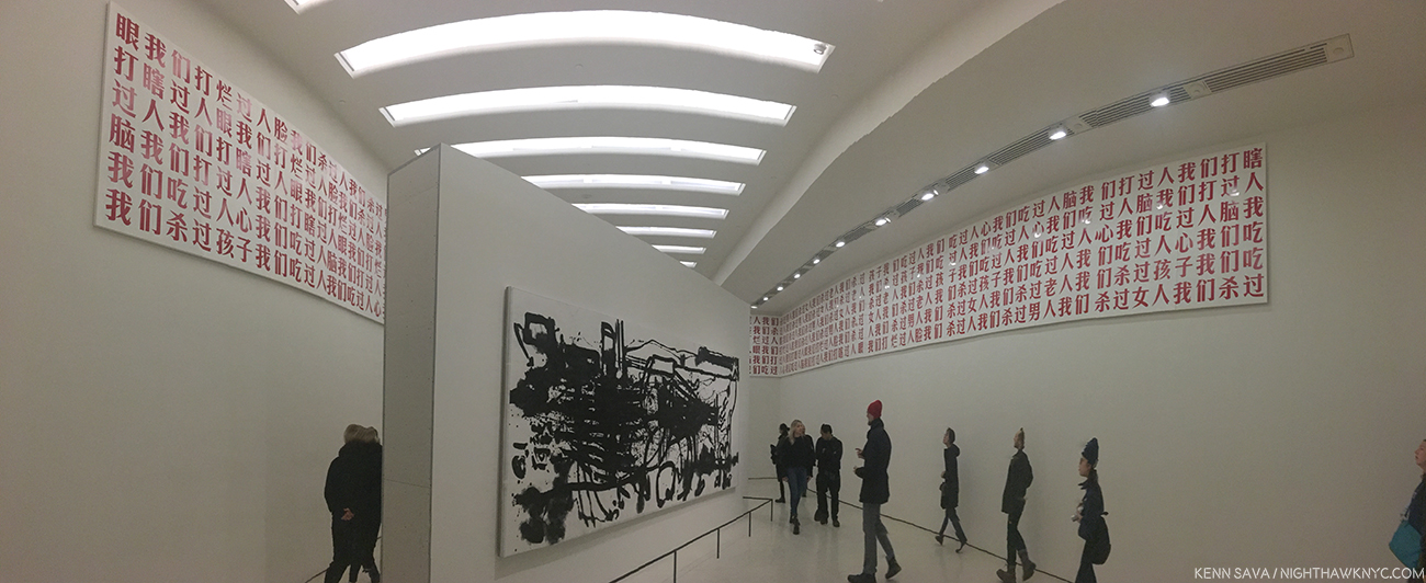
Gu Dexin, 2009-05-02, 2009, Mounted on the top of the surrounding walls, Paint on 72 wood panels, Yang Jiechang, Lifelines I, 1999, On center pillar (and below), Ink and acrylic on paper mounted on canvas, as seen at the Guggenheim.
Gu Dexin, “2009-05-02,” 2009, Paint on wood, (Originally consisting of ) 74 panels, concrete and red lacquer, color video installation. Its’ fitting the show ends with Gu Dexin’s work, “2009-05-02,” At the Guggenheim, it consisted of a frieze surrounding the space who’s panels contain 11 sentences, unbroken, unpunctuated and repeated, which read, “We have killed people we have killed men we have killed women we have killed old people we have killed children we have eaten people we have eaten hearts we have eaten human brains we have beaten people we have beaten people blind we have beaten open people’s faces.” These sentences are said to evoke the revolutionary writer Lu Xun’s “A Madman’s Diary,” from 1918. The work bears the same title as the show at which it debuted, as seen below, where it consisted of three components- a video of white clouds in a blue sky looped on video screens mounted over the gallery’s windows, above the 74 Painted panels. At the center of the gallery’s floor was a concrete plinth bearing a single sentence: “We Can Ascend To Heaven.” The show was up during the 20th Anniversary of the June 4th Incident in Tiananmen Square.
Gu Dexin, “2009-05-02,” installed at it’s premiere, Galleria Continua, Beijing, May, 2002, with the concrete plinth with red lacquer, below, and the video screens, above, from the show’s catalog.
During the run of the “2009-05-02” show, “Gu Dexin declared that ‘2009-05-02’ would be his last Artwork. He then proceeded to retreat entirely from Art and the Art world, which he understands as having become complicit in a political, cultural, and moral system which he refuses to accept. This refusal, more than any single object or image, may be his most enduring work of Art…He is, in singular ways, the conscience of his generation7.”
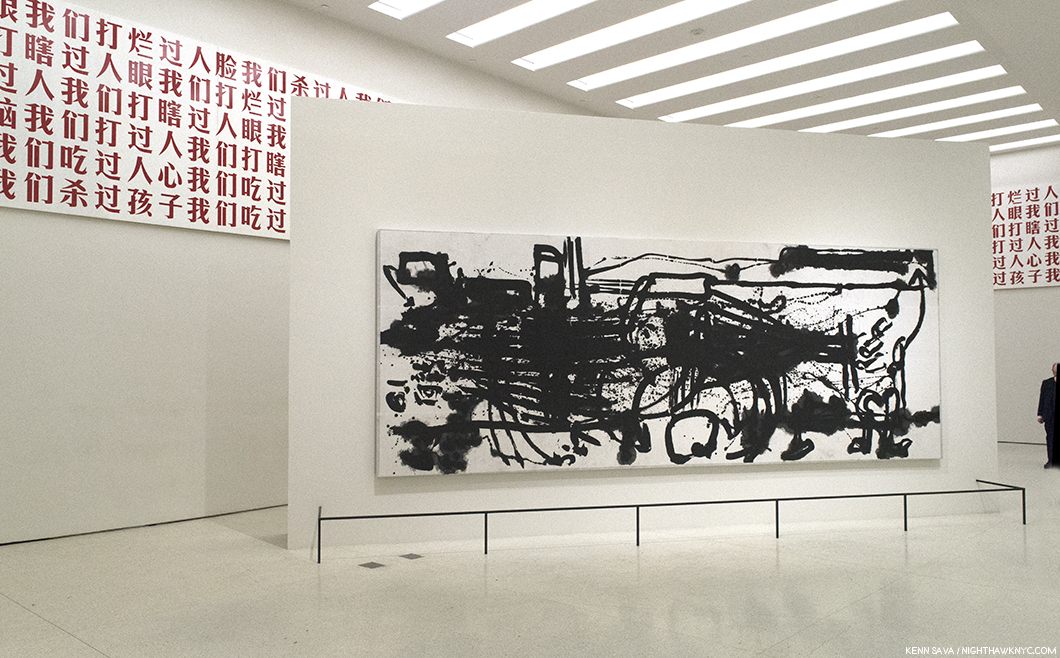
Yang Jiechang, “Lifelines 1,” 1999, Ink and acrylic on paper mounted on canvas. 236 x 91 inches.
At the Guggenheim, Gu Dexin’s “2009-05-02” panels were installed surrounding Yang Jiechang’s “Lifelines 1,” 1999, in the final gallery at the top of the 6th floor. Of “Lifelines 1,” which Yang Jiechang created for the 10th Anniversary of Tinananmen Square, Alexandra Munroe says, “”It recalls the pathways volunteers made in Tiananmen Square during the demonstrations to ferry hunger-striking students to the hospital8.”
I’ve never been to China so I have to see this show through Western eyes. Overall, I find Chinese Contemporary Art to be one of the most interesting and fresh realms of Contemporary Art anywhere9. I’m not sure exactly why, but it seemed to me that even the most “avant-garde” works were not as obtuse as much of what I see around NYC, and most of what I’ve seen in my lifetime. While I’m not big on Art that meeds to be “explained,” given the differences in language and culture, I took a different approach here in an effort to “meet the work halfway.” Almost every time I did, I found the work not only made sense, I became aware of different levels the Artist was working on. Of course, it should be said that though Shakespeare’s “Tis new to thee” applied to me, with the two noted exceptions, most of these Artists have been long established both in China and Internationally. As I said, however, it would have been possible to mount any number of alternate shows given the universe of Artists to choose from. As a result, the only possible way to look at this show is that it represents “the tip of the iceberg” of Contemporary Chinese Art.
Therefore, trying to sum up this show is as pointless as trying to sum up China itself. The strength of the show lies in the diversity of its vision, that so many unique, strong voices are at work creating impressive, and interesting, work right now is what counts. At those times when I wonder where the next big breakthrough will come from I see I need to cast a much wider net. It’s out there. And it’s probably going on right now out of the gaze of most of us.
“It’s new to thee,” indeed.
If this work can come out of/be born of repression? There may be more hope for the world than I feared.
“Art and China after 1989: Theater of the World” is my NoteWorthy show for December.
My previous Posts on Ai Weiwei, covering his NYC shows in Brooklyn in 2014 and four Manhattan shows in 2016 may be found here.
My look at Cai Dongdong’s recent show at Klein Sun Gallery may be found here.
*- Soundtrack for this Post is “Brave New World” by Iron Maiden, released in 2000 on the album of the same name, which was inspired by Aldous Huxley’s novel.
NighthawkNYC.com has been entirely self-funded & ad-free for over 7 years, during which over 275 full length pieces have been published!
I can no longer fund it myself. More on why here.
If you’ve found it worthwhile, PLEASE donate to keep it online & ad-free below.
Thank you, Kenn.
Written & photographed by Kenn Sava for nighthawknyc.com unless otherwise credited.
To send comments, thoughts, feedback or propositions click here.
Click the white box on the upper right for the archives or to search them.
Subscribe to be notified of new Posts below. Your information will be used for no other purpose.
Cai Dongdong “Aiming at the Camera,” 2017, Gelatin silver print, Russian camera(!), wood. Photo courtesy Cai Dongdong and Klein Sun Gallery. Click any Photo for full size.
On October 6th the NYC Art world was permanently changed with the opening of the monumental “Art and China after 1989: Theater of the World” at the Guggenheim. Filling all 6 floors of Frank Lloyd Wright’s Rotunda and spilling over into two of the side galleries, it was as close to encyclopedic as any show of it’s kind could ever hope to be. Having closed on January 7, I’m still processing my thoughts about it. (Update- My piece on it is here.)This much I can say- In it’s wake, the training wheels are now off. The flood gate of what’s been going on in Contemporary Art in China has opened and we’re officially in the deep water.
And it’s about time.
The 71 “key Artists and groups” as the show’s site calls them were remarkably well chosen, in my opinion, divided between historically important Artists and works, and those of the moment. Still? In a country of 1.4 Billion people, it’s impossible to include everyone. Many deserving Artists were missed, especially with only 9 women represented. (My Post on it is here.) While big on video & installations, almost completely missing was Photography, Ai Weiwei’s famous “Dropping a Han Dynasty Urn,” 1995, being one of the few works included.
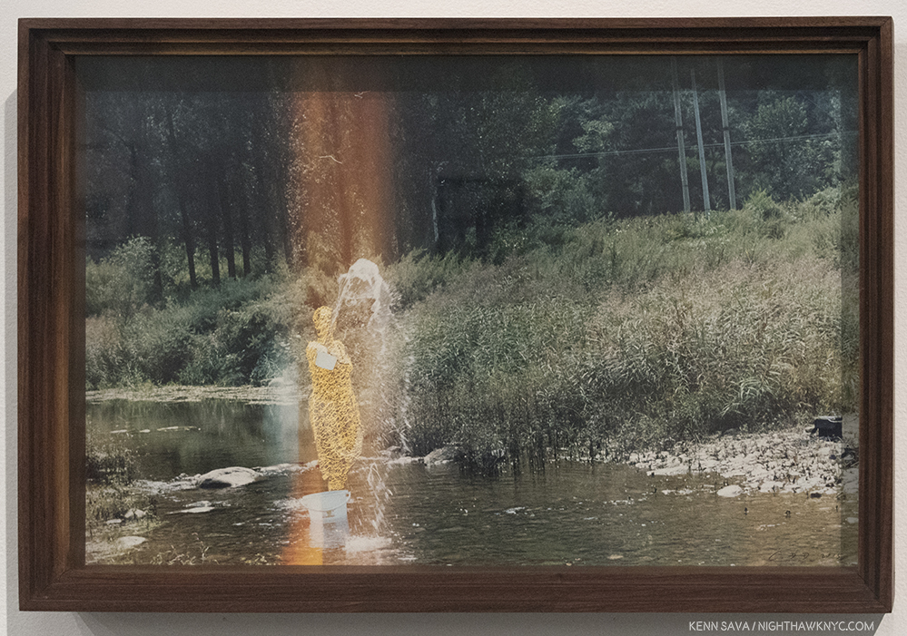
Cai Dongdong, “Splashing Woman,” 2016, Handmade color photo, knitting, in Artist’s frame. I can’t say I’ve ever seen anything quite like this.
If you are among those left wanting to see more, see what other Contemporary Chinese Artists are doing, or see what Contemporary Chinese Photography Artists are doing, I strongly encourage you to check out some of the fine and daring galleries around town that specialize in Contemporary Chinese Art. With a 10 year history of representing and showing Chinese Artists who are, largely, in the process of becoming better known in the USA, Klein Sun Gallery on West 22nd Street is among the leading galleries in the field. Gallerist Eli Klein speaks with both passion and experience about the Artists he, and his gallery, represent, but, also about “the difficult concepts and social commentary portrayed by some of our artists,” as he told me.
The latter is exactly what makes Klein Sun a must visit gallery on my rounds. Mr. Klein comes by his passion naturally. He is the son the late, extraordinary, women’s champion, Janet Benshoof, who passed away on December 18th.
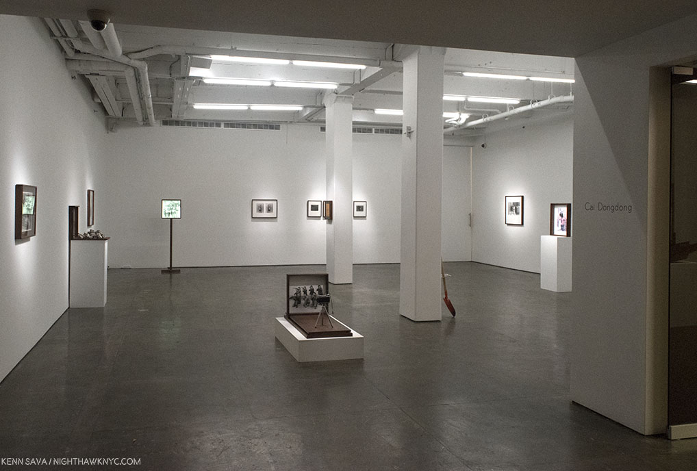
Installation view of the first gallery.
In all the years that I’ve been going to Klein Sun, this is a particularly good time to go. Their current show, “Cai Dongdong: Photography Autocracy,” through January 18, is an eye-opener, full of pushing-the-envelope creativity, in works that will linger with you after they upend your preconceptions. Mr. Dongdong’s work, which is centered on Photography, is rife with commentary, divided between themes including the military, the act of seeing and being seen, and Henri Cartier-Bresson’s famous “Decisive Moment.” But it’s the universality and humanity of his work as a whole that impresses me the most. Though the faces are Chinese, they could be anyone. For western eyes, there are echoes of Man Ray, Max Ernst, Marcel Duchamp and Joseph Cornell in works that are “Photo-Sculptures,”as he calls them, but decidedly different from Robert Rauschenberg’s “Combines.” Unique among all the Photographers I spent last year seeing, Cai Dongdong, also, constructs the beautiful stands and frames he uses himself, ala Joseph Cornell or Holly Lane, creating an all in one experience in which the Photograph plays one part. The Artist, who turns 40 this year, has a bit of a unique background. He joined the People’s Liberation Army- as a portrait Photographer, a post he remained in for about a decade. This served to have a lasting influence on him, as one might suspect, as one side of his subsequent Art incorporates these Photos, while another side uses found images, (selected from an archive that Phil Cai, Mr. Klein’s Associate at Klein Sun, told me numbers over 600,000 images), but in all his work, he combines Photographs in ways that defy the “Autocracy” of the image to force it to say “something else,” always unexpected.
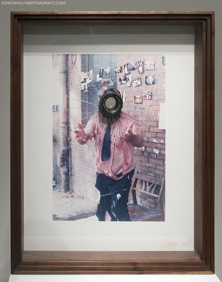
Cai Dongdong, “The Photographer II,” 2015, Handmade color photo, photographic lens in Artist’s frame. The lens goes right through the work.
Going beyond Photographs with his passion for Photography, a number of these works contain camera lenses inserted right into the piece, making the viewer the subject. Many others contain mirrors or reflective surfaces, and one, seen at the beginning, and below, puts you at the place of the Photographer- if you dare.
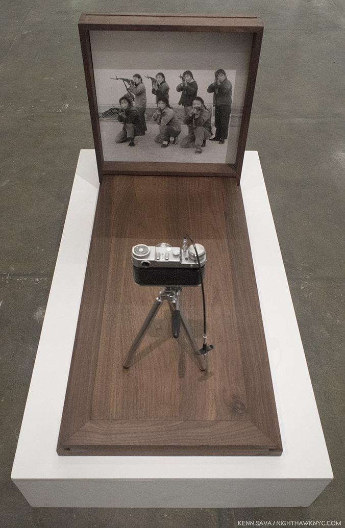
Cai Dongdong “Aiming at the Camera,” 2017,
Through mirrors and lenses, he also puts the viewer in the work, reminding us of our complicity by looking and seeing, most poignantly they’re included in a number of nudes on view, including one that replaces the model’s head with a round mirror, all ready for your face.
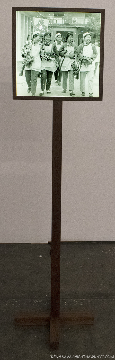
Cai Dongdong, “Back from Target Practice,” 2017, Gelatin silver print, LCD Light box. These harmless looking smiling armed ladies are returning from target practice. Or? Are they coming for us? Interestingly, the piece is mounted about head high for many viewers, making it personal.
The central element, for me, in his work is the humanity that runs through it. In “Aiming at the Camera,” 2017, the Artist, literally, puts you in his shoes when he took this Photo. In “The Association of the Cannon,” 2016, a cannon goes off expelling a harmless and lovely nude. Right next to it, in “Back from Target Practice,” 2017, a group of armed young women walk towards the viewer, making you feel that even women, the givers of life, when armed, can pose a real danger to you-particularly when they’re coming your way. These Photos have a “journalistic” feel that’s turned into something else in the whole, something the Photo may, or may not have originally intended. Hence, the Photo’s “Autocracy” in the show’s title is subject to Artist’s intervention. The Artist is the one with the unlimited power to control what it says.
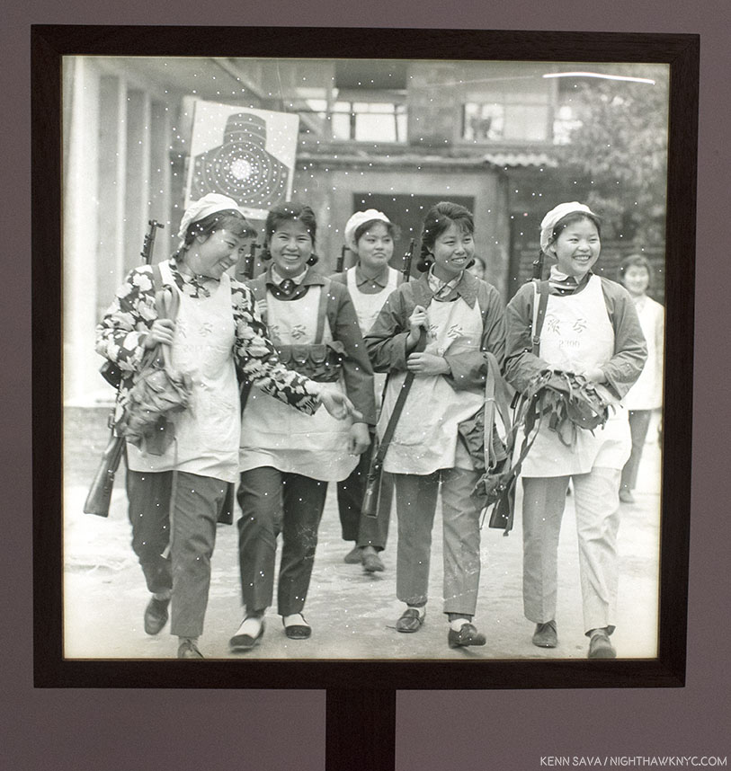
Detail.
The role of guns (rifles and cannons) is a recurrant theme in the Artist’s work that was also a memorable part of his last Klein Sun show, “Fountain,” 2015. Here, guns alternate between being a threat and being “defused.” The two shows mirror each other beautifully, down to their success, with “Fountain” selling out, and “Photography Autocracy” getting very close to it. (A word to book collectors- The Artist created an extraordinary book for “Fountain,” in a limited edition of 500 signed & numbered copies, the stack of available copies at the gallery dwindled each time I visited, partially my fault. For someone who has been buried, literally up to his neck in Art & PhotoBooks, as anyone who has seen my apartment this year could swear to in court, I was shocked to see the intricate details that have been painstakingly included in this book. It’s gorgeous. Another example of the extreme care and craftsmanship that goes into Cai Dongdong’s Art.)
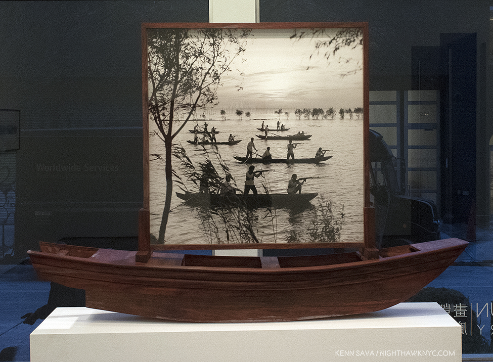
Cai Dongdong, “The Guerrilla on Hunghu Lake,” 2017, Gelatin silver print, wood. This is just an extraordinarily beautiful Photograph, in addition to being a powerful image. The background is ravishing, which serves to bring another level of meaning to the “action” of the approaching guerrillas in front of it. The idea of setting this in a hand made boat is just brilliant, in my opinion.
It’s fascinating to look for evidence of his experiences in the Army in these works, but it’s unknown (to me) which Photo Mr. Dongdong took and which he found. In the end, it matters not. Some of the end results, however, have a “day dream” effect, where I picture the Artist in his Army job, armed with his camera, fantasizing about whatever scene is going on in front of him. “Wouldn’t it be great if a beautiful lady came out of this cannon right now instead of a shell?”
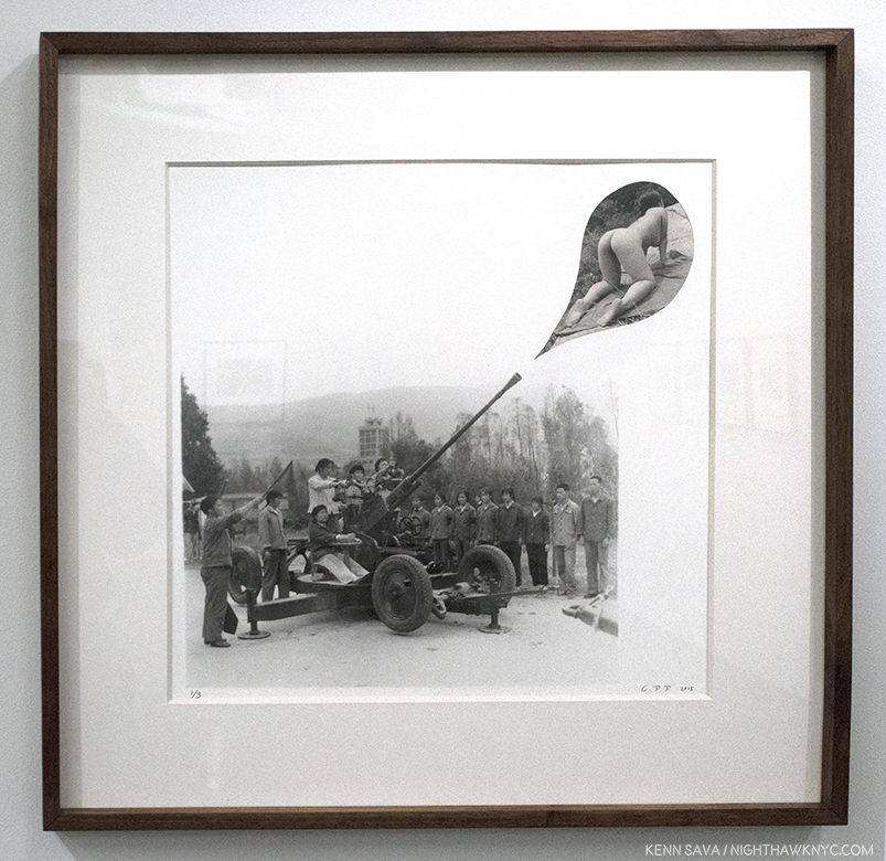
Cai Dongdong, “The Association of the Cannon,” 2016, Gelatin silver print in Artist’s frame. Right out of Max Ernst, a work I might have expected from John & Yoko, seems to sum up this show.
I think it’s exactly that that makes this show so successful and so popular- it’s very easy to relate to the humanity in the work, regardless of your culture or background.
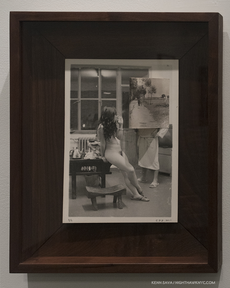
“Road,” 2016, Gelatin silver print in Artist’s frame. The Photo of the “road” in the upper right is collaged on and extends out from the surface, curved on the side nearest the lady.
Regarding his background, I asked the Artist a few questions, through the gallery since he lives and works in Beijing-
Frist- What inspired you to become an Artist?
Cai replied, “A rain when I was born.”
And- Who influenced your Art?
Cai- “My kids.”
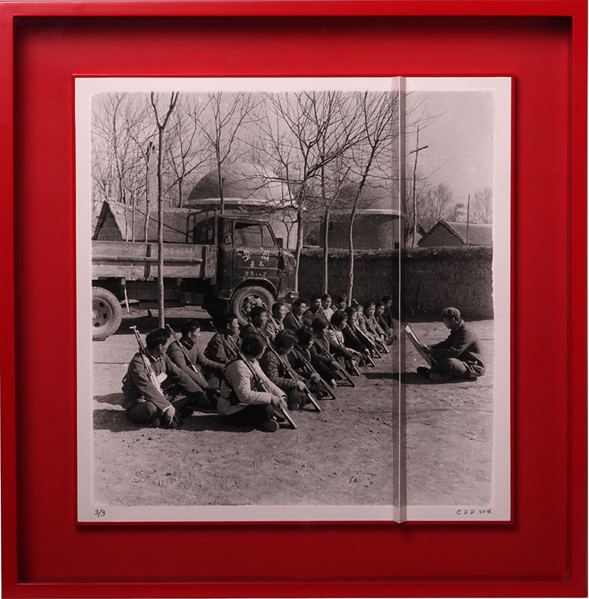
Cai Dongdong, “Obstacle,” Gelatin silver print in Artist’s frame. Notice the ridge where the print is folded about 2/3 to the right. Photo courtesy of Cai Dongdong and Klein Sun Gallery.
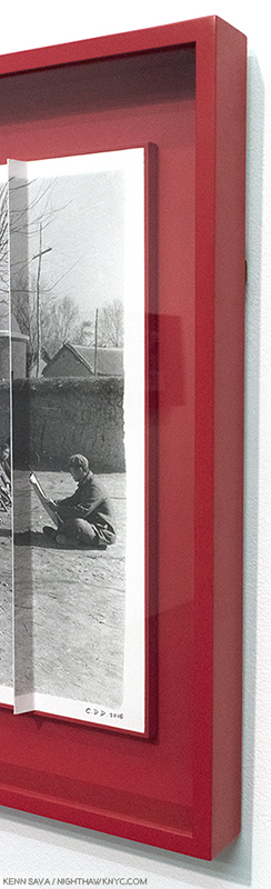
As Phil Cai pointed out to me, looking at it from the right, the lecturer is cut off by the ridge made by the folded print…as the solders are cut off from him on the lefl.
I also asked Mr. Klein how he discovered Cai Dongdong. He said, “I first saw his work on a chance Studio visit in Beijing. His studio was close to one of another artist I was visiting and was told I shouldn’t miss it. Quite frankly I was blown away. It was such pure art, no bullshit, no trying too hard, not showing off. It was just Real. Cameras and parts all over the place, wood that he was using to make his own frames. A unique mix of installation, old and new photography, mixed media, collage, sculpture and compelling cultural commentary. I had to pursue representing him and knew that very quickly. His demeaner and dedication were also very clearly defined which is indicative of a better potential for a long and successful career.”
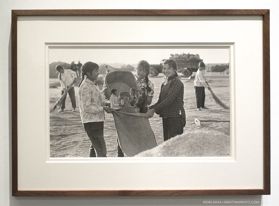
Cai Dongdong, “Big Harvest,” 2017, Silver gelatin print in Artist’s frame. Phil Cai spoke to me of the influence of China’s “Collectivsim,” in this work, that they are “gathering themselves.” When I see it, I see the succeeding smaller figures representing future generations.
Mr. Dongdong’s work speaks to the larger “cultural commentary” than to one that’s specifically Chinese, in my opinion. These are works that end up expressing the universal experience of being human- even in a “collective.” People can be “trained” to move and operate together, but it’s harder to control their thoughts, imaginations, fantasies, and Artistic impulses. Yes, guns can be dangerous. Yes, nations are continually preparing for war. But, these nations are made up of human beings who are living their daily lives, too. Here are works about the experience of being human- from basic events like being seen naked, being seen at work, being seen serving your country, that every human being experiences. In Cai Dongdong’s Art, the world becomes a little smaller, and that’s one of the best things Art can accomplish. It also looks like he has fun creating it, and that comes through, too.
Time will tell if Cai Dongdong achieves the stature of Gu Dexin, Alec Soth or Ai Weiwei, but in the meantime he’s creating beautifully made objects with their own point of view, a decidedly unique way of seeing the world, each one overflowing with humanity. That’s certainly a recipe that’s stood the test of time, for a long time.
*-Soundtrack for this Post is “Happiness is a Warm Gun,” by John Lennon & Paul McCartney, and recorded by The Beatles on “The White Album.” (No, It’s not a drug song, as you can hear John say, here.) In lieu of their version, Gavin DeGraw does it here-
This Post is dedicated to the memory of Janet Benshoof.
NighthawkNYC.com has been entirely self-funded & ad-free for over 7 years, during which over 275 full length pieces have been published! If you’ve found it worthwhile, PLEASE donate to allow me to continue below. Thank you, Kenn.
You can also support it by buying Art, Art & Photography books, and Music from my collection! Books may be found here. Music here and here.
Written & photographed by Kenn Sava for nighthawknyc.com unless otherwise credited. To send comments, thoughts, feedback or propositions click here. Click the white box on the upper right for the archives or to search them. Subscribe to be notified of new Posts below. Your information will be used for no other purpose.