The Sound of Silence: The Slideshow

Written & Photographed by Kenn Sava

The response to my previous piece, “The Sound of Silence,” has been a bit overwhelming. My thanks to all of you who have read it and especially to those who have taken the time to write. I’ve heard from people all over the world, all of who are also knee deep in trying to get through the pandemic themself. At times like these it’s important to feel we’re in this together. I hope that wherever these words find you, you and yours get through this in good health.

There’s always Music going on in my mind. So, all of the 228 pieces I’ve written so far have a soundtrack that accompanies the words and the pictures. Never before have I taken one of those soundtracks and made it into a slideshow. Until now. At the suggestion of Lana Hattan, I’ve compiled some of the Photos I’ve taken this month (April, 2020, and only in April, 2020) into a slideshow, extending the concept of my piece, accompanied by the lyrics of the song.

As I completed it, I was shaken to hear of the tragic passing of Dr. Lorna Breen, Medical Director at New York-Presbyterian Allen Hospital yesterday. As an Emergency Room Doctor, she was on the front lines of fighting the coronavirus pandemic.

“She went down in the trenches and was killed by the enemy on the front line. She loved New York and wouldn’t hear of living anywhere else,” her father said.

My life was saved at New York-Presbyterian in 2007, so it is with the deepest respect that I dedicate this slideshow to Dr. Breen, and all those working to get us through this.

Be well.

*-Soundtrack for this Post is “The Sound of Silence” by Paul Simon and recorded by Simon & Garfunkel on their debut album Wednesday Morning, 3AM, 1964, with overdubs on the 1966 album, Sounds of Silence and live on Concert in Central Park, recorded in 1981.

Special thanks to Lana Hattan. 

NighthawkNYC.com has been entirely self-funded and ad-free for over 6 years, during which over 250 full length pieces have been published. If you’ve found it worthwhile, you can donate to keep it going & ad-free below. Thank you!

Written & photographed by Kenn Sava for nighthawknyc.com unless otherwise credited.
To send comments, thoughts, feedback or propositions click here.
Click the white box on the upper right for the archives or to search them.
For “short takes” and additional pictures, follow @nighthawk_nyc on Instagram.

Subscribe to be notified of new Posts below. Your information will be used for no other purpose.


The Sound of Silence

Written & Photographed by Kenn Sava

In 2017, I did a PhotoEssay commemorating the 10th anniversary of my cancer treatment. This year, I’ve decided to do another one, taking a look at this extraordinary April in New York…

There’s “Autumn in New York” and “April in Paris,” but no songwriter has yet written “April in New York.” This April may or may not inspire such a song, but one thing’s for sure- April, 2020 will long be remembered by everyone who’s lived through it- in NYC, and everywhere else.

Here, in one of the current centers of the pandemic, with New York City, alone, accounting for 129,788 cases and 13,240 confirmed or probable deaths from the coronavirus1 as I write this, people have been mostly hunkered down and staying inside. Last week, however, for a reason I can’t quite explain, I felt compelled to walk over to Times Square. I got there after 11pm, normally a time when activity is high in the days before the pandemic. I’m not sure what I was expecting to find. It’s not a place I have any reason or desire to go to. Most New Yorkers I know say pretty much the same thing. When I turned the corner of 8th Avenue onto 42nd Street, a corner once known as “the crossroads of the world,” I was taken by what I saw. Actually, I probably shouldn’t have been- it was pretty much what I’d been seeing on the mile walk there. The streets were deserted. Nothing was open. There were too few cars or trucks to qualify as“traffic” along ever-busy 8th Avenue that I should have been prepared for a similar sight on 42nd Street, but I wasn’t. What I saw was actually hard to believe.

It was completely deserted. The only sign of life was a police car’s revolving lights on top parked out front of the McDonald’s near 7th, which might have been open for takeout. If so, it was the only even partially open business I saw in Times Square. Or, maybe something had happened warranting a police visit. From the other side of the street, I couldn’t tell, and I wasn’t about to get curious. I turned the corner and walked up 7th Avenue to 44th Street, stopped on the corner and looked around. I was completely and utterly alone.

A song started playing softly in my brain…

“Hello darkness, my old friend.
I’ve come to talk with you, again.”*

Alone in Times Square. 7th Avenue at West 44th Street, 11:24pm, April 8, 2020. Click any picture in this Post for full size.

There was another NYPD car across the street with its lights on. I don’t know if anyone was inside it, or not. That was the only sign of “life” I could see anywhere around me. I can’t remember ever seeing it this deserted before. Ever. In my entire lifetime, I’ve never experienced a feeling quite like it.

“In restless dreams I walked alone
Narrow streets of cobblestone
‘Neath the halo of a street lamp
I turned my collar to the cold and damp
When my eyes were stabbed by the flash of a neon light
That split the night
And touched the sound of silence”*

I spent some of my formative days on “the deuce” as West 42nd Street was called back when it was as it appears in the film Taxi Driver. It was raw, seedy, nasty and dangerous, but it never closed. Ever. It was, literally, the same 24 hours a day, everyday. Of course, those days are long gone. I’ve never “gotten” what 42nd Street is supposed to be now, beyond a pseudo theme park for tourists. Ditto Times Square around the corner. No wonder New Yorkers never go there. Of course, they go to the shows on the side streets, and there are some good restaurants on those as well, too, but Times Square is one gigantic wasteland as far as I’m concerned. The “redesign” is a disaster. Personally, I can’t imagine why anyone would come to New York City and go to Times Square. Even just to see it.

On this night. No one (else) did.

Harry Belafonte alone in Times Square in The World, The Flesh and The Devil, 1959. In 1981, I would see The Clash perform six times at Bond Casino, seen here when it was Bond Clothing, on the right.

In The World, The Flesh and The Devil, Harry Belafonte plays a miner trapped in a cave-in who resurfaces only to discover mankind has been wiped out in a nuclear holocaust. He sets out to look for other survivors. Bizarrely enough, this film, with the scene above, was on the night after I was in Times Square equally alone. The difference being I KNOW there are millions of other people still here. They are all hunkered down, like I am 23 hours a day, trying to survive the coronavirus pandemic.

I haven’t been able to get the feeling out of my mind since. It’s also stuck with me for other reasons I’m still trying to fully understand.

A few days later, I walked over to Grand Central Terminal, getting there at about the same time I got to Times Square, just before 11:30pm on a weeknight. A time when it’s generally pretty busy. On the way (about a mile), I counted about 10 people- on either side of the street. I entered through the Vanderbilt Avenue corner, not sure it would be open, when I came out of the underpass into the world famous main terminal, the feeling was very much the same as it was in Times Square, with a difference.

Grand Central Terminal, April 14, 2020, 11:34pm.

Standing there, alone again, reminded me that we are all on our own in a crisis. Only those working hard to keep the essentials of life going- doctors, nurses, power station workers, truck drivers, food store employees, essential business employees, pharmacy workers, postal, delivery and transit workers are keeping us from being in a very, very bad situation, particularly for as long as this is likely to wind up being. Standing there at that moment in Grand Central, I was also struck by something else. A train station is a place about travel, about going somewhere or arriving here form somewhere else. That feeling is completely alien to me. I have nowhere else to go. I realized then that the thought of leaving has never entered my mind. But for some reason, standing there, I didn’t feel hopeless, I just felt like I always do, with cancer, Sandy or 9/11- I have to find a way through it by myself.

Cary Grant, left of center, in Grand Central Terminal, in Hitchcock’s North by Northwest, 1959, shows the space as it more normally is during the morning/evening rush.

Last week, a reader asked me if I’d ever been through something like this before. I had to give a qualified “Yes.” The 2012 Hurricane Sandy blackout- when we had none of those things I just listed that we have, thankfully, now, for between 5 and 12 days depending on where you were. No power, no mass transit. Not one thing was open because of a lack of electricity, and at night, the temperature went down to about 32. I spent days hunkered down in my bed fully dressed under every blanket I could muster as everything in my refrigerator and freezer went bad and I had to go about a mile to charge my phone. Of course, MANY other people had things much worse from Hurricane Sandy than I did. Many, many people lost everything. An apartment building 4 blocks from me, that I had been in the day before the hurricane, collapsed. It has still not been rebuilt. The risen tide from the Hudson River came to within one block of my apartment building, flooding many of the ground floor galleries in West Chelsea, while devastating lives all around the area. I was lucky. Still, I learned a lot from going through that, a 2 day blackout in the 90’s and of course, going through 9/11. Then, there was the Chelsea bombing in 2016 that was too close for comfort…

Close to the same scene just shown, minus Cary and everyone else. Grand Central Terminal, April 14, 2020, 11:36pm.

Standing there at that moment in Grand Central, I was also struck by something else. A train station is a place about travel, about going somewhere or arriving here from somewhere else. That feeling is completely alien to me. I never leave NYC. As with the other crisis I’ve lived through here, I, like everyone else, just finds a way. 

When I think about rising above it and transcendental places in NYC, the first place that comes to my mind is, in my opinion, what may well be the greatest feat of building by modern man in the world, Brooklyn Bridge. Before you say, “You’re nuts,” watch Ken Burns’ Documentary film on the making of Brooklyn Bridge, then see what you think. On April 16th, I decided to go there and see how The Bridge was faring during the pandemic.

Just after sunset on Brooklyn Bridge, facing Brooklyn, 7:53pm, April 16, 2020. If I could save one modern structure for eternity it would be Brooklyn Bridge. It is one of the supreme achievements of mankind, both Artistically and as a testament to the human spirit. In this case the spirit of those who designed it and built it while overcoming impossible odds.

I walked the entire span, beginning on the Brooklyn side, and arriving on the Manhattan side just after sunset. It was emptier than I could imagine it during daytime hours. As anyone who has had the joy of walking The Bridge knows, when you reach the center you are, magically, all of a sudden on top. The cabling has ended, the sides and even the railings seem to melt away and you feel like you are standing on top of the world. Now, imagine doing this in 1883 when The Bridge opened. At that point, you REALLY WERE on top of the world! This was decades before the advent of the skyscraper. Standing there, you were higher than anything you could see- anywhere around you. It truly must have felt like going to outer space. Of course, I paused and spent a good 30 minutes pondering everything that had been going on as I stood there, alone.

Alone in the middle of Brooklyn Bridge, with Manhattan to the left, Brooklyn to the right, and the East River straight ahead, 7:11pm, April 16, 2020.

“Because a vision softly creeping
Left its seeds while I was sleeping
And the vision that was planted in my brain
Still remains
Within the sounds of silence.”*

Thinking about things I’ve lived through in NYC, of course, 9/11 was the first major crisis I would point to. That morning, as I walked to work with one Tower on fire, the second about to be hit, a neighbor standing on the corner told me the first plane had flown down 7th Avenue- it had flown down my block! To this day, no one I know died in the horror that ensued. Both people I knew at the time got out. Still, the mysteries of the brain being what they are, somehow my sleeping mind connected that American Airlines Flight 11 that hit the North Tower of the World Trade Center with the heroic United Flight 93. In my dream (actually, a recurring nightmare), it was the passengers and crew of American Flight 11 that fought back and jumped the hijackers, causing Flight 11 to crash early- into my apartment building. 

18 years later, those thoughts were not in my mind when I decided to visit the Oculus in Santiago Calatrava’s World Trade Center Path Station Terminal at the site of the World Trade Center Towers. What is always on my mind when I visit the site of the World Trade Center is my own past. I grew up in the area. My dad had an office 2 blocks from the WTC for 45 years. I remember walking past the Towers while they were being built. Years later, the company I worked for had two Holiday Parties at Windows On The World Restaurant at the top of the South Tower, a few hundred feet from where the Oculus now is, including one for Holiday, 2000, the last Holiday season that would ever be celebrated there. Walking through the area my thoughts were on change. As in HOW MUCH change has gone on Downtown just in my lifetime

Crossing Church Street, I walked up to the front doors, half expecting to find them locked. The door opened, and there was a man standing along the wall, just inside the door. He was one of about 7 or 8 people I saw while I was inside who just stood in a spot. And stood in that spot throughout. Homeless, I guess. Most had some sort of baggage with them. There were 3 police officers walking around, who checked in on them to make sure they weren’t sleeping, among their other duties. But there was almost no one else there. I moved to the edge overlooking the 57,000 square foot floor. All the surrounding stores were closed. Off in the far distance, at the other end, the PATH train station was still in operation. Once in a while, someone walked from my end across the floor to take a PATH train uptown or to New Jersey. Mostly, I was utterly alone, once more. Again, I stood transfixed by the scene.

The 57,000 square foot main floor of Santiago Calatrava’s Oculus on April 15, 2020 at 11:56pm.

Speaking of change, I wrote about being at the Oculus in August, 2016 as it opened. That day, the floor looked like this-

Standing in the same spot I stood in taking the prior picture, on August 17, 2016 at 3pm.

Here, in this gleaming, barely 4 year old facility, was a shocking look at our present in a nutshell. The brick and mortar economy, represented by the stores that surround both levels of the Oculus, with more elsewhere in the 800,000 square foot complex, has completely paused, save for food stores, pharmacies, and home supply stores. The world has almost completely come to a stop. In fact, I think this period of time when we’ve all been home will be eventually seen as a pause between life as it was and life the way it will be. I think most of us know right now that once activity start up again, things will be different. Many of us have been, at least, subtly changed by this experience. Exactly how things will be different remains to be seen, but they will be different. Beyond the horror of all the illnesses and deaths, we will always look back at this moment “between” the old and the new as “the pause” between them.

Right now, the focus is on finding those infected, treating those ill, and keeping the virus from spreading. Eventually, we all hope, this crisis will mitigate. And then what? A lot of people (even those who haven’t gotten sick) are seriously hurting. Many have lost their jobs- temporarily, or permanently. There’s going to be a gigantic, collective, “starting over” for countless people. The ways people interact or get together and many other aspects of life not known right now will also be different. The way many businesses do business will be changed. A few/some/many small businesses, who knows how many, won’t reopen. More business will be done online.

What does this all mean?

“And the sign said:
The words of the prophets are
Written on the subway walls
And tenement halls
And whispered in the sound of silence.””

7th Avenue at West 20th Street, April 17, 2020, 8:29pm. On this very corner, Jack Kerouac’s novel On The Road ends. He wrote it 3 blocks west.

We won’t know specifically how life will be different until this is over. And no one knows when that will be right now. In the midst of all this silence, something else that can’t be heard is happening.

Change.

While we are all alone together inside, hopefully staying safe, the world is changing. The only choice we have is to adapt to it.

*- Soundtrack for this Post is “The Sound of Silence” by Paul Simon and performed by Simon & Garfunkel on the album Wednesday Morning, 3AM, 1964, and with overdubs on Sounds of Silence, released in 1966. They perform it on September 19, 1981 in Central Park below. As I write this, almost 53 million people have watched it-

This Post is dedicated to all those keeping us going, particularly in my case, my thanks to the staffs of Trader Joe’s, and Gristede’s, Chelsea, NYC, Rite-Aid, Home Depot, Con Ed, the USPS, to the truck drivers and delivery people who keep this island supplied, and to Drs. Ro & Hoffman.

NighthawkNYC.com has been entirely self-funded and ad-free for over 6 years, during which over 250 full length pieces have been published. If you’ve found it worthwhile, you can donate to keep it going & ad-free below. Thank you!

Written & photographed by Kenn Sava for nighthawknyc.com unless otherwise credited.
To send comments, thoughts, feedback or propositions click here.
Click the white box on the upper right for the archives or to search them.
For “short takes” and additional pictures, follow @nighthawk_nyc on Instagram.

Subscribe to be notified of new Posts below. Your information will be used for no other purpose.

  1. The current stats are here.

Death To Boxes!

Written & Photographed by Kenn Sava (except *)

For The Record #2.

Boxes Must Die!

In the Arts, that is.

Doing my part.

Artists are people. Like anyone else, you can’t put an Artist in a box (i.e. a so-called “style”,“school” or “movement”) UNLESS he or she puts themself in one, and that distinction is critical. No one else can, in my opinion, and that includes Art historians, gallerists, or yes, writers. Over the years I’ve spent studying and researching Art history, it seems the vast majority of the time, these labels get stuck on Artists by someone else, often someone with something to sell or someone attempting to write about the Artist. Whoever else does it, I believe they do more harm than good. It seems to me that all these terms serve to do is to keep you from looking at the Art for yourself and making up your own mind. They’re a kind of shorthand for “this is that.” They want you to think- “Oh. I already know what ‘this’ is, so I ‘know’ what that is.”

Really?

Now, press a little harder.

How many “schools” or “movements” have there really been in Art history among museum level Artists? Both imply the Artists were organized around shared beliefs. Most Artists I’ve met tend to be solitary beings who work alone (or, with their assistants, if they have them). The Renaissance is often listed as a “movement.” This brings an upside down smile to my face. While there were a number of Artists and others who turned their attention to the work of the ancients, which they “revived” in their own way, the term implies a unity that might not have been the case. Many of the leading Artists of the 15th century (particularly Leonardo da Vinci, Michelangelo and Raphael) were rivals who competed for jobs and, as far as is known, never “got together around shared beliefs.”


My copy of Rona Goffen’s Renaissance Rivals. Check this out if you want to get a taste to what life for these Artists may have really been like.

Raphael is reported visiting Leonardo’s studio, but there is no report that Leonardo was actually there at the time. Perhaps, the only time we may surmise that Leonardo and Michelangelo may have been in the same place at the same time was they were both commissioned to create frescoes on opposite walls of the same building. I wonder what they would think of being lumped together by posterity. It seems to me that what is known as “the Renaissance” in Art may be also be characterized as “the optical revolution,” since, as David Hockney’s Secret Knowledge points out, the fifteenth century seems to be the period when optics were introduced into Painting, “The Romantics?” While images of a period of group love pre-dating the hippies by 200 years might be a nice thought, there was no banding together among Artists, only others who see common threads in their work. In fact, the actual 1960s hippies were more of an actual “movement,” though they are not thought of as an “Art movement”…yet. “The Impressionists?” In 1874 thirty Artists showed their work in the space formerly occupied by the Photographer Nadar in a show titled The Anonymous Society of Painters, Sculptors, Engravers, etc. This show included work by Monet, Degas, Renoir, Pissarro, Cezanne, Berthe Morisot among others. It wasn’t until their third show in 1877 that the term “Impressionists,” which had been coined by a critic, after the work Impression, Sunrise, 1873, by Monet, was “accepted” by the group. They held a total of eight shows through 1886. Not one bore the word “Impressionist” in its title. It seems to me a “bad habit” had begun. Ever since, dealers, critics and historians have continually fallen all over themselves trying to put names (i.e. boxes) on whatever has been done since, in a criminally short sighted “rush to judgment” naming competition. Very rarely since, however, have the Artists involved agreed to have their work so “boxed.”

It’s one thing to have a lack of imagination yourself, but to foist it on others, including possibly, many who have not seen the Art under discussion is doing them, and the Art, a real disservice.

I’m this close to agreeing with this sentiment, in the Arts, though I’m sure there must be at least one “ism” that’s “ok,” right?

Beyond this, the practice speaks of a terrible lack of responsibility on the part of those naming and using boxes to speak about Art. Do these people who come up with these boxes ever stop to think about the ramifications of putting someone in a box? Short term? Long term? Longer term? Once in such a box, getting out is extremely hard, if not impossible. In many (if not most) cases, living Artists in such a situation would be risking their financial survival and their careers to fight back. I’ve spoken with a number of Artists who have expressed their frustration with this to me. As a result, I’ve come to feel they represent the tip of the proverbial iceberg in the high seas of the Art world. Unlike some others, this iceberg isn’t melting nearly fast enough.

When you come across one of these terms, take a quick look back into what the Artist has said about his or her work and see if he or she ever used the term themself in speaking about their Art, or if they really aligned themselves with others in the broader sense of a “school” or “movement.” My bet is that if you do this often you’ll become unsurprised to find that 90% of the time, or more, no such arrangement ever existed. IF it did, most of the time it didn’t last for more than a decade of their career. As far as “styles” go, I laugh when I see someone other than the Artist try and name an Artist’s style. For me, it’s like “naming” a wave in the ocean. “That wave seems angry. That’s the ‘expressionist’ wave. The wave that hit me in the face when I waded in was the ‘hyper-realistic’ wave…”

The common sense thing to do, in my opinion, when looking at Art is to let the Artist have some. Let him or her “speak” for themselves through their work. Look at it through your own eyes.

Being human beings, Artists, like the rest of the universe, are subject to change. Along with death and taxes, change is one of the universal laws of the universe, right? Many Artist’s styles change or evolve over time, some, like Picasso or Miles Davis, changed frequently, over the course of their careers. Then, whatever “box” the powers that be had put them in no longer applied. Now what? People coming to their work with one box in their head are now confronted with work nothing like it! Oops. Instead of coming to realize the obvious, scholars, critics and dealers struggle to put him or her in a new box.

“Blue Period,” “Rose Period,””Cubism,” “Late Period,” and on and on. In the end, Picasso, is simply Picasso- a talent so broad it burst any and all categories in almost as many mediums. Unfortunately, his example wasn’t apparently enough for the practice to cease once and for all. Here, his The Charnel House, 1944-5, is seen at MoMA. While Guernica is world-famous as a work that was Painted in 1937, during the pre-WW II Spanish Revolution, The Charnel House bookends it from the end of the War after the discovery of the horror of the death camps.

Why didn’t they just take the “easy way” out? If you insist on using boxes, Picasso, Miles, EVERY Artist, in my view, belongs in one box- the one with their name on it. Aren’t people unique? So are Artists. So, WHY do some insist on lumping them together in a box?

People tried to put Miles Davis in a box his whole life. FIFTY YEARS AGO, on March 30th, 1970, he permanently messed up their minds when he released this masterpiece. With a cast of Musicians who are now each legends in their own rite, it couldn’t have been more aptly titled. The cover art is perfect, too. *Sony picture.

It seems to me that Miles Davis eventually “answered” those trying hopelessly to pigeonhole him. Later in his career, he started labelling his albums “DIRECTIONS IN MUSIC BY MILES DAVIS.”

Word. Put it right up top, in CAPS before anyone else can call it something else. Enough said. *Crop of the previous Sony picture.

Speaking of human beings, “women Artists”, “transgendered Artists,””disabled Artists,””Asian Artists,””black Artists”- these are boxes too! People are people and Artists are Artists. Let’s leave it at that.

Whatever the short term “gain” someone got from boxing an Artist, little thought appears to be given to the fact that Art is this Artist’s career, and so, something they’re going to have to deal with for the rest of it. Some, like Chuck Close and Todd Hido have been able to break out of the boxes they were initially put in and gone on to show other sides of their creativity. How did they do it? It seems to me that both of them were and are frequent interview subjects, and this allowed them to frame the conversation around their own work to the point that they “drowned out” any other voices about it. If you look around, you’ll find they are in the vast minority. It’s very hard to do. Both achieved enough popularity to garner frequent interviews where they were free to speak about their work on their own terms. I can’t help but wonder how many others have given up, or worse, possibly even ended their careers…or their lives.

Seriously.

When Art is your life, what else matters?

Perusing the new book Genealogies of Art, which has 448 other pages that try to trace the “lineage” of Art down through the centuries. Hmmm….Yes, most Artists have influences, but who’s to say how much anyone has been influenced by someone else? What about multiple influence? It seems to me drawing direct lines between and “connecting” them (which is on the other 448 pages) is pointless and meaningless. So far, these are the only two pages I agree with. Personally? I would have left it at this.

It’s way past time for this practice to end. STOP teaching this in Art history classes! Stop using boxes, “schools,” “movements” that Artists never joined, or bogus, imagined, “styles” that mislead and pigeonhole!

It’s time to look at the Art for what it is and for what it says to you (if anything), without prejudice or boxes, labels, imaginary “schools,” or “styles.” So, when you hear a meaningless marketing term like say, “photorealism,” do what I do. Ignore it!

Save a career. Maybe even save a life. Stop the insanity- NOW!

Of course, NighthawkNYC asks that you please dispose of boxes responsibly. Put them where they belong.

*-Soundtrack for this Post is “Bitches Brew” by Miles Davis from the aforementioned album of the same name. Here, Miles and most of the Musicians on the record including legendary Saxophonist Wayne Shorter, perform it in Copenhagen, 1969, shortly before the album’s March, 1970 release-

This Post in honor of the 50th Anniversary of the release of Bitches Brew, one of the great box-busting moments in 20th century Art, is dedicated to all those Artists I’ve spoken with who suffer with being stuck in boxes, and all of those who are that I haven’t. 

For The Record is a series of pieces that are about key/core subjects & beliefs that underly everything else I’ve written here. The first part is here. 

NighthawkNYC.com has been entirely self-funded and ad-free for over 6 years, during which over 250 full length pieces have been published. If you’ve found it worthwhile, you can donate to keep it going & ad-free below. Thank you!

Written & photographed by Kenn Sava for nighthawknyc.com unless otherwise credited.
To send comments, thoughts, feedback or propositions click here.
Click the white box on the upper right for the archives or to search them.
For “short takes” and additional pictures, follow @nighthawk_nyc on Instagram.

Subscribe to be notified of new Posts below. Your information will be used for no other purpose.


Noah Davis: The Art of Vision

Written & Photographed by Kenn Sava

Art & Artists can come from anywhere at any time. Even from unexpected places, like a housing project. Pueblo del Rio: Arabesque, 2014, Oil on canvas, 48 x 72 inches. Pueblo del Rio, 1941-2,  is a housing project designed by Paul Williams at 52nd Street and Long Beach Avenue, Los Angeles, one of two works in the show set there. African-American Architect Paul Williams was a big influence on Noah Davis, according to his chosen curator Helen Molesworth, and he set other Paintings among Paul Williams buildings.

There is, sadly, no shortage of brilliant younger masters who left us far before their time. The tragedy endures but their Art prevails, and in the end, assumes a life of its own. In Contemporary Art, perhaps no one known to me seemed to do more as an Artist, curator, and visionary in as short a time as the late Noah Davis did before he passed from a rare soft tissue cancer at just 32 on August 29, 2015. Now thirteen years out from my own cancer treatment, the variety of cancers I hear and read about never ceases to astound me. One thing my journey through it taught me was that no two journeys are alike. Unlike mine, in Noah Davis’ case, cancer ran in his family, claiming his dad a few years before it took him. For some perspective (no comparisons intended)- Mozart died at 35. Raphael was 37. More recently, Jean-Michel Basquiat was 27. Music has Jeff Buckley, at 30, Jimi Hendrix, Kurt Cobain, both 27, among a long list of others. Photography has Francesca Woodman, at 22. Literature, and humanity, has Anne Frank, at just 15, and on and on…

Untitled, 2015, Oil on canvas, 32 x 50 inches. Of this late work, show curator Helen Molesworth spoke about the line between the two women on the couch in her gallery talk. The separation and isolation between two so close together on barely half of the couch is compelling in a Hopperesque way, yet, I haven’t been able to summarize everything this fascinating piece says to me because every time I look at it, I see something else. I see some of what I see in Deana Lawson’s work, some of what I see in Kerry James Marshall’s, Francis Bacon, and there’s a Rothko-with-a-difference in the background, yet what strikes me most is that in this work, as in any number of other works on view Noah Davis is entirely on his own. He has studied, learned, assimilated, and then staked out his own turf as a wholly formed Artist to be reckoned with does. In the moment I shot this picture, the feeling that I was standing in front of a masterpiece was undeniable.

I’ve been blessed with knowing some, and working with some others, who left far too soon. I met the incandescent Jaco Pastorius in 1976 at the release of his now classic debut solo album at Peaches Records Store in Fort Lauderdale, Florida. I watched as he put his hands in wet cement on the store’s “walk of fame” outside along Sunrise Boulevard (which I believe is still there) that evening never imaging he would leave us a scant 11 years later. I spoke to him a number of times over those years and we both wound up (independently) in NYC shortly before his tragic murder at just 35. I worked with the late, brilliantly talented, Mark Ledford, and worked with the equally brilliant Thomas Chapin, on three albums, both of who passed at, or before, 40 in the early stages of the prime of their careers, and their lives. I think of all three of them every single day. Though the passage of time eases some of the pain, in my experience, loss is something that does not go away.

Waiting Room, 2008, Oil and acrylic on canvas, 80 x 65 inches. In many of his works, a space opens up that sometimes seems to be an abyss. Here, the abyss is above us and two figures in the upper distance appear to be looking down on the scene below. Is the Waiting Room an “abyss,” where the outcome (possibly to be revealed  behind those large white doors) is unknown as is the effect it might thave on life to come? It can also have that surreal, “Is this really happening?” feel to it. Like any work of Art, it’s open to whatever the viewer may see in it. This was, however, Painted at about the time Noah Davis was diagnosed with cancer, after his father was.

But, thank goodness we have what they created- their Art, their Music, their words, and what they taught us. Us. Everyone whose lives were touched by all of these Artists are part of their legacy.

I never had the good fortune to meet Noah Davis, who was born in Seattle, and studied at Cooper Union in Greenwich Village, becoming something of a sensation here about a decade ago before leaving without graduating around 2004 (because he felt that his education was no longer pushing him, it is said), and moving to L.A.. I was only casually familiar with his work until I walked into David Zwirner on 19th Street, where his Art and his legacy filled no less than three entire galleries.

Imaginary Enemy, 2009, Oil on wood panel, 84 x 98 inches. Does the figure in white on the right, with what appears to be a cup on his head, have one foot on a portal? Or? The figure approaching on the left appears to be n flames. The strange, angular plane behind him has the effect of another dimension, as in Cubism. I’m still enjoying wrestling with this one, too, but I will say there are elements that remind me of Neo Rauch.

My mind was blown by all I saw. Noah Davis was, and is, a major figure in the Art of our time- in more ways than one.

Untitled (Birch Trees), 2010, Oil on canvas, 54 1/2 x 36 1/2 inches. Many of Noah Davis’ Paintings include nebulous, mysterious faces and heads. Maybe I’ve been looking at too much Francis Bacon this past year, but I find them unique and surprisingly compelling, given their frequent lack of features.

My perception had been that at 32 he was still developing, pursuing his own style- as most Artists in their early 30’s are. Ha! As I moved from work to work, I saw an Artist who was completely in control of a full range of styles, which he could dip into at will and which only hinted at influences in tantalizing and intriguing ways, while being wholly his own. Work after different work. How is this possible? The range. The depth. The power. It was all there in the service of his vision.

The Last Barbecue, 2008, Oil on canvas, 60 x 52 inches. Here, the faces are more defined. The group portrait on the left in countered by the odd triple portrait on the right behind the lid of the barbecue, and the scene in the center is surreal, disturbing and puzzling. It is an explosion, or? Looking at it, it was hard not to think of Kerry James Marshall’s Bang, 1994, a 4th of July barbecue scene.

Flashback- November 12,2016 at Kerry James Marshall: Mastry at The Met Breuer. KJM’s Bang, 1994, Acrylic and oil on unstretched canvas(! Notice that it’s tacked to the wall.), 103 x 114 inches.

Before he passed, Mr. Davis asked Helen Molesworth (who, a few years ago gave us the landmark Kerry James Marshall: Mastry Retrospective that I wrote about after its Met Breuer stop) to be his curator. The Zwirner show, which Ms. Molesworth has brilliantly selected and installed, is not arranged chronologically, which I am thankful for. It serves to downplay the “end” and the tragedy of Mr. Davis’ early loss and put the focus squarely on his Art and his accomplishment, where it belongs. (By my count, only 3 of the works did not have owners listed on the checklist.) Each work dialogs with other pieces from a few years later or earlier in ways only someone intimately familiar with the Artist and the work could bring us, which, by itself, sets this apart from most gallery shows of deceased Artists. Her work hasn’t ended here. Ms. Molesworth, who was controversially fired from her post at MOCA in 2018, has also been busy creating an upcoming monograph on Noah Davis, interviewing those who knew the Artist, due to be published this fall, which should be a slam dunk candidate for one of the most important Art books of the year, if not the decade.

1975 (8), 2013, Oil on canvas in artist’s frame, 49 q/w x 73 1/2 inches.

The show featured “fantastical” work, like Imaginary Enemy, alternated with domestic and family scenes. 1975 (8), 2013, was based on a Photograph from the 1970s Davis Family Photo Archives. It reminds me of the mural his mentor and friend Henry Taylor did a few years ago for NYC’s High Line.

Single Mother with Father Out of the Picture, Date unknown, Oil, acrylic, and graphite on canvas, 40 x 30 1/4 inches. There’s an elegance and a timeless, haunting, beauty to this work, which though all too common in our world, I can’t recall having been the subject of a Painting before.

Mr. Taylor has written eloquently about his friend who was 30 years his junior and the effect and influence Noah had on him, his work and his career. One of the more important Painters of our time, reading his words is eye opening, an important testament to Noah Davis’ legacy.

Untitled (Moses), 2010, Oil on linen on wood panel, 8 x 10 1/4 inches.

Perhaps none of these familial works is more poignant than the smallest Painting in the show, Untitled (Moses), 2010, 8 x 10 1/4 inches, showing his son, which may be based on another Photo from his family archives. In this remarkable, small, work, unique among Artist’s portraits of their children known to me, His son Moses has one foot in the water in the sink and one out, as if already leaving. The world shown in the window is dark.

But, as the remarkable, both precocious and fully formed mature works his Paintings are, there was more. Much more.

The Underground Museum is an ongoing Monument to the legacy of Noah Davis. Here, a model of it, showing its facade, with a mockup of the show ARTISTS OF COLOR, 2017-8, curated by Noah Davis. Mr. Davis left the plans for 18 shows for the UM, as it’s known, when he passed. After finding the space, Noah, his wife, Karon, and their baby, Moses, lived in the UM while it was under construction.

Having dealt with galleries early on, Noah Davis was one of those who came to feel the gallery model doesn’t work for them (something I’ve heard in innumerable conversations). Not an “established” Artist with big resources by any means, he nonetheless then dared to set out to forge his own path. With his wife, Sculptor Karon Davis, he took over 3 storefronts at 3508 West Washington Boulevard in the West Adams section of L.A., and opened what they christened the “Underground Museum” to bring museum quality Art, for free, to an area that was “underserved” by existing institutions.

“Noah wanted a space where he could show the work of himself and his friends. He wanted a space that could exist outside of the gallery/museum matrix,” Helen Molesworth said in a talk she gave at the opening.

The daring of that is only topped by his vision.

Noah Davis speaking in front of LA Nights, 2008, Oil on wood panel, 25 1/2 x 19 1/2 inches, which was also in this show. Photo by Alberto E. Rodriquez/WireImage.

In the first show he mounted at the Underground Museum, Imitation of Wealth, Noah recreated well-known works of Art by Marcel Duchamp, Jeff Koons, On Kawara, Robert Smithson and others that he wasn’t able to borrow the originals of so that the people in this underserved area could experience them. For me, it’s another indication of wide-ranging his knowledge of Art history and his taste was. Robert Rauschenberg famously erased a De Kooning Drawing, but I can’t think of any other Artist who has done such a thing and created an entire show of “pseudo reproductions.” As a first show, Imitation of Wealth was both an auspicious “Hello,” and a shot across the bow of the Art world.

Noah Davis’ first Underground Museum show, Imitation of Wealth, reinstalled at MOCA’s Storefront space in 2015.  The imitation of a “date” Painting, Imitation of Om Kawara. Oct 7, 1957, left, happens to be his father’s birthday. Noah Davis’ Imitation of Marcel Duchamp, 2014 (Bottle Rack) is in front of it, Imitation of Don Flavin (lamp) behind the door, and on the far right, behind his Imitation of Jeff Koons (vacuum on a vitrine), and his Imitation of Robert Smithson with sand and mirrors to the far right LACMA Photo by Fredrick Nilsen.

Helen Molesworth, at the time, Chief Curator of MOCA was impressed enough with his idea to make a three year arrangement with UM to collaborate! An arrangement like this is unheard of. Tell me the other case where a world class museum has made an arrangement like this with an Artist in his early 30s to lend Art and work together to present shows in THEIR space. MOCA reinstalled Imitation of Wealth in their Storefront space in 2015, where it opened the day he passed away. He did live to see works from MOCA lent to the Underground Museum.

Noah Davis knew what was “right” for his Art, and as part of that he also had a vision of the future, of bringing Art to the people, for free. But even by 32, he moved past the vision to create the reality. Today, the UM is an important venue, one that has featured the work of Kerry James Marshall, William Kentridge, Henry Taylor, Kara Walker, and Deana Lawson, Kahlil Joseph, Noah Davis’ brother, among others.

Of all the works in the show, Painting for My Dad, 2011, is the most haunting for me- perhaps the most unforgettable Painting I’ve seen in years. It was Painted while his father was in hospice with terminal cancer. We see his Dad about to embark into an unknown, dark, land with a lantern. The landscape, which strikes me as being distantly descended from Cezanne (which I also felt in Imaginary Enemy, shown earlier) in Noah Davis’ own way, is typical of how Mr. Davis took influences from across Art history and made them his own.

It’s fascinating (and something you can’t help but notice) to spot the possible influences from Art history in Noah Davis’ Paintings, and where he’s taken them. Kerry James Marshall’s Paintings set in projects, Henry Taylor’s way with figures, Francis Bacon’s nebulous portraits, Surrealism, and on and on. Every time I look at his work I see more of them, but in each and every instance he has made them his own. He’s not showing off a copious knowledge of Art history, he’s building on what others have done in the service of expressing himself with his own voice. Henry Taylor, Kerry James Marshall, Francis Bacon- these aren’t mentioned by way of comparison- I don’t believe in qualitatively comparing Artists, but just the fact that you can mention Noah Davis in the same sentence with those older masters says quite a bit about the man’s work. Walking through these rooms and looking at his work, even the selection of it shown here, I see someone who was, already, a master Painter, who’s work is going to remain important, in my view. Not only that, Noah Davis hung their work in his shows! In fact, he was one of those who take credit for “discovering” the now renowned Photographer Deana Lawson in 2009, when Mr. Davis served on a jury for a prize that Ms. Lawson submitted for. Ms. Lawson was subsequently featured in the show Deana Lawson: Planes at the UM.
The world not only lost a great Artist when he passed, it lost a budding brilliant curator, one who might have help fill the huge gap that exists in bringing Art out of the galleries and museums to the people. It also lost someone who broke the mould of the Artist/gallery matrix and found his own way. Whatever you think of his Paintings, his example is an enduring, important model for Artists today and in the future. That he was able to make his own way at such a young age has got to inspire countless people who come after him- maybe not to establish their own museum, but to find what works for them1. In the end, that on its own is an amazing, and major, legacy.

February 22, 2020. Closing day in the third gallery, designed to look a bit like the office at the UM, visitors watch videos and films by Kahlil Joseph, Noah’s brother, and others. I’m holding the camera above my head. Such were the crowds, it took me five minutes to navigate from this spot to the door to the right.

As I sit here now that this unforgettable show has closed, I’m left to wonder. What will last longer…what will have the bigger impact on the future- Noah Davis’ Art, or his example, manifested in the Underground Museum? His vision is their common thread. In the example he set, it seems to me that there is much for Artists to learn-now and in the future.

Letting the UM flag “fly high,” as Jimi Hendrix once said on the closing day in gallery 3. Long may it wave.

You can support the Underground Museum here, or by visiting it. The Noah Davis show is scheduled to open there “soon.”

*- Soundtrack for this post is “Bold As Love,” From Axis: Bold As Love, by Jimi Hendrix.

NighthawkNYC.com has been entirely self-funded and ad-free for over 6 years, during which over 250 full length pieces have been published. If you’ve found it worthwhile, you can donate to keep it going & ad-free below. Thank you!

Written & photographed by Kenn Sava for nighthawknyc.com unless otherwise credited.
To send comments, thoughts, feedback or propositions click here.
Click the white box on the upper right for the archives or to search them.
For “short takes” and additional pictures, follow @nighthawk_nyc on Instagram.

Subscribe to be notified of new Posts below. Your information will be used for no other purpose.


  1. As many are, and have been doing in their own ways, all around the world.

Art- With A Capital “A”

For The Record #1. First part of a series.

Written & Photographed by Kenn Sava

Back at The Met, May 6, 2018. The Museum, as it’s referred to, is one of the world’s great repositories of Art with a capital “A” with collections covering 5,000 years of it from all cultures in all its forms. It’s also one of the very best things about living in NYC. No. It’s THE best thing in my opinion. 1,700+ visits in since August 1, 2002, every time I turn the corner and see the building looming in front of me, I still get a chill down my spine. I touch the corner as I go in each time as a way of saying “Hello” to an old friend and to give thanks for each and every opportunity I get to do so.

To mark the 4 and a half year Anniversary of NighthawkNYC, during which I’ve published 225 pieces in 240 weeks (Phew…), I thought I’d take the opportunity to set the record straight on a few things that I feel are at the core of what I believe, and what I’ve written here. Perhaps I should have “explained” them at the beginning instead of letting those who’ve read these pieces (for which I Thank You) wonder, “What the heck?” Well, better late than never. Herewith the first installment in a brief series called For The Record. Consider them “footnotes” or “addendums” to every piece I’ve written.

Michelangelo’s Sistine Chapel Ceiling reproduced as part of The Met’s staggering Michelangelo: Divine Draftsman & Designer, 2017-8, one of the sublime experiences of my life.

First- Art is of one of man and womankind’s supreme accomplishments in my view. I believe there should be some distinction between the Art of someone like Michelangelo and, say, the art of someone learning (said with all due respect).

Various young artists, unknown titles. A display of children’s art beautifying an NYC public school under renovation.

That’s why I capitalize Art and its associated terms (Artist, Painter, Sculptor, Musician, Painter, Photographer, et al.). It’s my way of showing these people the respect I think they’ve earned and deserve. I’ve done this here since Day 1- July 15, 2015, and I’m sure there are some who frown at me for doing it, and some who disagree with me for doing it. Along the way, I’ve seen a few others doing it this way and frankly, I’m surprised it hasn’t become more widely adopted. I hope it does soon.

The terrific, and terrifically overlooked, Honore Sharrer’s, Workers and Paintings, 1943, Oil on board, seen at MoMA. Some of the Art she includes are Grant Wood’s American Gothic, Picasso’s Girl before a Mirror, and others by Jean-Francois Millet and Diego Rivera. Though this work and the originals of most of what she includes in it are 100 years old, +/-, for me, this and all of them are Art. Will the future agree? Time will tell…

“What makes a work of art? I don’t know. There are lots of people who tell you they are making art. Maybe some of them are, but I’m not sure that’s true for all of them. Perhaps I’m old fashioned, but that’s not a phrase I would use. I’d prefer to say I’m making pictures – depictions.” David Hockney, A History of Pictures, with his capitalization, eBook P.2.

I’ve held David Hockney’s writings, and ideas, in the highest regard since his revolutionary, and eternally controversial, book Secret Knowledge came out in 2001, but I find it cumbersome to use the word “pictures” here in place of “Art.” Regarding what “makes a work of art?,” as he asks, it seems to me that it takes hundreds of years for the dust to settle on what’s being created in our time and for something, a “picture,” as Mr. Hockney says, to be considered “Art” (IF it continues to speak to people). None of us will be around when that bell rings. So, in the meantime, I’ve opted to use the term Art, capital “A,” respectfully, applying it to all working Artists, present or past.

Thanks, Twyla. I couldn’t have said it better. And so, this scene has appeared in my Banner, sans moving truck, for the past year. If that truck is waiting for me, it may have a long wait. I haven’t been out of Manhattan overnight since February 4, 2012. The Joyce Theater, December, 2019.

The other reason I do it is because Art is my religion. Frank Lloyd Wright, who I consider to be an “ultimate Artist,” capitalized Nature since it was his religion. Art is mine.

Reach out and touch faith. For me, going to The Met is going to church, as I said early on. At this point in my life, it feels like Home. Back Home, again, late on December 22, 2018. Weather be damned. It’s always beautiful inside.

*-Soundtrack for this Post is ”Personal Jesus” by Martin L. Gore of Depeche Mode, from their 1990 album Violator. They perform it here on Letterman

For The Record is a series of pieces that are about key/core subjects & beliefs that underly everything else I’ve written here.

NighthawkNYC.com has been entirely self-funded and ad-free for over 6 years, during which over 250 full length pieces have been published. If you’ve found it worthwhile, you can donate to keep it going & ad-free below. Thank you!

Written & photographed by Kenn Sava for nighthawknyc.com unless otherwise credited.
To send comments, thoughts, feedback or propositions click here.
Click the white box on the upper right for the archives or to search them.
For “short takes” and additional pictures, follow @nighthawk_nyc on Instagram.

Subscribe to be notified of new Posts below. Your information will be used for no other purpose.


Sarah Sze: Creativity, Unbounded

Written & Photographed by Kenn Sava

“I bring together the materials I find around me. I gather them to try and create immersive experiences that occupy rooms, that occupy walls, landscapes, buildings, but ultimately I want them to occupy memory.” Sarah Sze, TED Talk.

Crescent (Timekeeper), 2019, Mixed media

In the 4 1/2 years of NHNYC I’ve never yet called a Contemporary Artist a genius. Until now. [Drum roll]

Sarah Sze is a genius in my opinion.

As I take stock of the Art I saw in 2019, along with Jean-Michel Basquiat at The Brant Foundation (which I looked at here), the most unforgettable show I saw this past year was Sarah Sze at Tanya Bonakdar Gallery. As I write this three months after it closed, it’s at the front of my memory of everything I saw last year.

Overflowing. Sarah Sze began on the outside(!) of the gallery’s doors and windows.

Detail of part of Images in Refraction (West) on the western part of the facade of Tanya Bonakdar Gallery (to the left in the previous picture) reveals the multimedia nature of what’s on view inside, and the multi-dimensional talent of the Artist. Painting, Sculpture, Collage, Engineering & Architecture, Photography, Film, Installation- you name it. You get it. And then some.

I’ve seen her gallery shows over the past decade, and each time, I left shaking my head. Part sculpture, part installation, part construction project, part hardware store free-for-all, they were always impossible to fully take in at one look. You saw their shape from a distance and admired the overall composition, and then learned the devil was in the detail, and the detail, and the seemingly endless detail. Still, I wasn’t prepared for her expansion into multi-media, including the debut of her Paintings, she presented on West 21st Street this fall where not even two floors, the reception area, the ancillary walls, both sides of the galleries windows, doors, or the space under the stairs were enough to contain her seemingly boundless creativity.


Looking out at the view seen previously of Images in Refraction (West), with installation on the wall, right, leading to the first gallery.

Not to mention 4 galleries filled with her trademark seemingly infinite detail.

Detail of the ever-changing projection that filled the walls surrounding Crescent/Timekeeper.

After the lead-in provided by entering the gallery and passing through the prelude in the reception area, Crescent (Timekeeper), 2019, turned the large gallery into a fully immersive experience from the moment you entered the space and tried to take it all in from about 25 feet away, as may be seen in the very first image above, like some alien craft in a pre-2001:A Space Odyssey 1960s sci-fi movie. “Yes. Something landed…and…it’s glowing! Moving in for a closer look. Tell Lana I love her…” Situated near one far corner allowed embedded rotating projectors to have much of the surrounding walls to themselves engulfing you as you enter the space.

Close up/Details of the center section of Crescent (Timekeeper). Stepladders are a recurring motif in Sarah Sze’s work. As she’s said, “Everything you need to make the piece is in the piece.”

As you approach between two “arms” extending out on the floor, you realize that the center section contains about 50 screens of varying size. Standing there for a few moments reveals each one of those screens contains projected images moving independently of each other. Yet, tracing them back, you find only a few overhead projectors. ? On one visit the work struck me as an almost nostalgic look at life on earth. Suffice it to say, you need to experience it for yourself.

To the stars…Gazing at the top of the “superstructure” of Crescent (Timekeeper), 2019, Mixed media.

With so much to see in just this work, I was somewhat shocked when I realized Crescent (Timekeeper) wasn’t the only “monumental” work on view!

Detail, part of one of 4 walls that makes up After Studio, 2019, with the work Surround Sound (After Studio), 2019, Oil paint, acrylic paint, acrylic polymers, ink, aluminum, archival paper, disband and wood, 103 1/4 x 130 inches, center. No Photo can begin to covey what it was like to be in this work, which is what visitors to this space were, but looking at the piece on the wall, center, the first “Painting” by Sarah Sze I’ve seen, might begin to.

In a smaller, rear, gallery on the first floor, I encountered one of the most amazing things I’ve ever seen in an Art show- what looked to be a complete (re)construction of one of her studios down to the last detail. A work titled After Studio, 2019. It appeared to me to center around a series of Paintings by Sarah Sze, the first I’ve ever seen, though they are as much Collage as Painting. ”In the age of the image, a painting is a sculpture,” Sarah Sze said in 2019.

Details of details from the right of center section of Surround Sound (After Studio) seen above.

That sentiment puts her in the direct line of Picasso & Braque’s Cubism, Marcel Duchamp, Joseph Cornell, Robert Rauschenberg, Jasper Johns, Jack Whitten, Frank Stella and, more recently, Mark Bradford and Julie Mehertu. With everything Sarah Sze includes in her Paintings, two things struck me as particularly interesting- her use of Photography (apparently her own), and her “use” of words. They’re there, if you look closely, but they almost exclusively appear to be “notes to self” rather than to others on “post-it” like notes. I was told that the Artist went back and replaced each one with archival equivalents as she completed the work. Yes Surround Sound (After Studio) is complete, and some very astute museum bought it.

The corner of the opposite and adjacent walls. Remind yourself- You’re in a gallery.

I returned to experience After Studio again and again and it felt to me like I was walking around in the Artist’s mind. Often when I see Art, especially landscapes, I close my eyes to feel the presence of place in the piece in my mind’s eye. Here was one “landscape,” I couldn’t keep my eyes open long enough to drink in. Nary a foot of After Studio, save for the center space to move around it, lacked vision or wonder. When I left if for the last time on October 17th, I was fully in awe1.

Another detail, this one interesting for showing some of the Photographs the Artist may, or may not, use, along with what may happen to them on the way.

On the 2nd floor, the large back gallery contained more Paintings, and a Painted floor. All told, nine Paintings were in the show. I guess I shouldn’t be surprised by the appearance of her Paintings, after all Sarah Sze studied to be a Painter for a decade before turning her attention to “make meaning of the things around us through materials2.” For me, as amazing as the installations are, the Paintings linger with me every bit as much. No small feat.

I am thrilled to see her interest in Painting return in stunning works like this. 12 Landscapes (After Object), 2019, Oil paint, acrylic paint, acrylic polymers, ink, aluminum, archival paper, disband and wood (triptych), 73 1/2 x 110 1/4 inches.

Detail of 12 Landscapes (After Object).

I was told the show took 2 1/2 weeks to install- for a show that only ran for 6 weeks!

Images in Translation, 2019, Mixed media.

Finally, upstairs in the Project Room, Images in Translation, 2019, was installed in the dark, making it very hard to get a shot of that comes close to doing it justice.

Detail.

Time to head downstairs and back outside.

Looking down from 2 flights above at Images in Refraction(East) under the stairs.

I then immediately started scrambling down West 21st Street to find the pieces of my exploded mind that had wound up on the ground. On September 21st, the opening day of the “New” MoMA, two days after Sarah Sze ended, I discovered this installed on the 6th floor-

Sarah Size, Triple Point (Pendulum), 2013, seen at MoMA, Opening day, September 21, 2019

Sarah Sze’s Triple Point (Pendulum), a work that was originally shown at the 2013 Venice Biennale when the Artist represented the USA, was on display, front and center, in the exhibition Surrounds: 11 Installations.

The immersive experience Sarah Sze gives us in Blueprint for a Landscape in the 96th Street 2nd Avenue Station is based on a fantasy of the construction of Hudson Yards, which is no where near it.

Though that show, too, has now ended, New Yorkers are able to see Sarah Sze’s work anytime- 24/7/365. Ms. Sze created the Art in the 96th Street Subway Station on the new 2nd Avenue line, which opened in 2017, making her one of a handful of Artists who’s work was installed during the creation of the brand new Subway Station it will be seen in permanently. I’ve lauded before the taste of those charged with selecting Art for the Subway, and here’s yet another instance of brilliant vision, in my opinion. Here’s a look for readers without a MetroCard. I can’t help thinking that in 100 years, people will treasure this remarkable video of both the construction of the Station and the Artist actually there, giving a walkthrough-

Sarah Sze is moving between Sculpture, Painting, Photography, Film, Installation and collage in new ways, creating results that have never been seen before. Her work is like the city, like the forest, like a home, and filled with elements, reminders, and the detritus of each. And, in a work like Crescent (Timekeeper), it’s full of what will be memories and associations in the form of images. To what end? As in all great Art, that’s left to each viewer to decide.

More details of After Studio

In my view, though the show marks something of a new “period” in her work, it’s seamless with what’s come before. Already a world famous Artist, could it be that she’s only scratched the surface of her talent? A year ago I’d be shocked to have said that about her work. Now? I’m ready to bet on it.

I have no idea how she conceives her pieces, but in each one of Sarah‘s shows- literally, never more than in her most recent show, I felt like I was walking around inside of her brain.

Ah…so this is what it’s like to be a genius…

*Soundtrack for this Post is “Aurora” by Bjork from Vespertine.

NighthawkNYC.com has been entirely self-funded and ad-free for over 6 years, during which over 250 full length pieces have been published. If you’ve found it worthwhile, you can donate to keep it going & ad-free below. Thank you!

Written & photographed by Kenn Sava for nighthawknyc.com unless otherwise credited.
To send comments, thoughts, feedback or propositions click here.
Click the white box on the upper right for the archives or to search them.
For “short takes” and additional pictures, follow @nighthawk_nyc on Instagram.

Subscribe to be notified of new Posts below. Your information will be used for no other purpose.


  1. I returned on October 19th, the show’s closing day, but there was a line to get into After Studio. I passed and left feeling fortunate to have spent a few hours in it by myself over the run of the show.
  2. Ted Talk

NoteWorthy PhotoBooks, 2019. And others

Written & Photographed by Kenn Sava

Three years in to my “deep dive” into the world of Modern & Contemporary Photography and PhotoBooks, I find myself at a crossroads. I’ve seen thousands of books, hundreds of Photography shows. I’ve answered most of the questions I had going into this exploration about Photography and its place in the larger Art world. Of course, there will always be more to see and more to learn. The joy of discovering a new (i.e. one previously not known to me) and terrific Artist continues to drive me. Though this past year this was balanced with something else. Frustration. Increasingly, I’m left with one inescapable feeling-

There are too many books!

Time and time again, I find myself holding a book with only one thought in my mind before I finish paging through it. “WHY was this book published??”

Paging through one of these becomes a mind-numbing blur…

99.5% of the time this happens to me with a “name” Photographer. The net result is wonder- I wonder what the process was that got this project to the point where I’m holding it in my hand. What was the publisher thinking? Who edited this material? Did anyone give ANY thought to the fact that at the end of the day, in many of these cases, only the historians are going to remember this book and they are going to use it when they assess said Photographer’s larger body of work, and it’s then going to serve to diminish his/her overall accomplishment.

With this looming on my mind, early this fall I had a dream. I dreamt the large PhotoBook publishers in the world took a year off during which they released no new books. Instead, they focused their efforts on making the public more aware of their existing, already published, PhotoBooks…particularly the really good ones that come out and quickly become afterthoughts when their next batch comes out.

But, wait. A REALLY good PhotoBook doesn’t have an expiration date! It continues to speak to those who pick it up indefinitely.

Before the crush. Early Saturday, September 21st in one of countless rooms at the New York Art Book Fair at MoMA PS1. In the afternoon, this room was so crowded I wouldn’t have been able to move my arms to get this shot.

Meanwhile, back in the hard light of the day, none of what I’ve said above applies to smaller PhotoBook publishers. For most Photographers, getting a PhotoBook published is the only way their work can be seen beyond their immediate circle. As a former (and soon to be again) independent Jazz record producer, I can relate to their realities. Some live from book to book, hoping to break even so they can release their next book. Others, like Michelle Dunn Marsh & Minor Matters, are using new models to realize books by making sure readers want them. And? A good many of the small PhotoBook publishers, like Kris Graves Projects, routinely sell out of their titles. This spring, during a chat with one of the most respected European PhotoBook publishers, he bemoaned to me the conditions in bookstores there, speaking of table after table of deeply discounted books that weren’t selling. Since I haven’t been out of NYC overnight since 2012, I’ll have to take his word for that, and I don’t know which books are sitting on those tables. But I can’t help wonder if that’s an indication that we’re reaching a tipping point…

NYC, Fall, 2019

Yet, of course there are still really good PhotoBooks being released.

As I’ve repeatedly said, I don’t believe in “winners” or “losers.” There is no such thing as “best” in the Arts. Whatever criteria you use, it seems to me, the results are subjective. So? Look for yourself and see what speaks to you. As it was last year, this piece is born out of a common question- “Which books would you most highly recommend of all those you’ve seen this year?” For those with limited funds, or those who don’t have space for a collection of PhotoBooks, these are books that have held up for me, that continually draw me back to them, and have left a strong impression that will continue after the year is over. For the record- I bought every book I write about (this year, like last year, I did receive one as a gift). No one sponsors me. As always, I have not read anyone else’s reviews or looked at anyone else’s list.

NoteWorthy PhotoBooks, 2019

In the approximate order of their release-

Mari Katayama, Gift, United Vagabonds
Petra Collins, Miert Vage Te, Ha Lehetsz en is? or Why be u, when u can be me?, Baron Magazine
Gregory Halpern, Omaha Sketchbook, MACK Books

In Hungarian, where her family is from, Miert Vage Te, Ha Lehetsz en is? or in her English translation, Why be u, when u can be me?, Petra Collins’ latest is unique.

All three books break new ground. The first two, personally, the third both as a PhotoBook and for the way it looks at its subject. Gregory Halpern’s Confederate Moons was my most highly recommended book last year, when Petra Collins’ Coming of Age made my NoteWorthy First PhotoBook list. I recently looked at Gregory Halpern’s Omaha Sketchbook when I looked at Mr. Halpern’s body of PhotoBooks, and I deeply admire what Petra Collins is doing in helping to reclaim the world of imagery of women, particularly young women, in a male dominated world. Her work is even more remarkable when you consider she only picked up a camera for the first time in 2009. In 2019’s Why by u…? her work has grown so much it’s hard to believe it’s only been a year since Coming of Age, was published. And she’s taken her talents in multiple directions, including advertising, Music video and film. Yet, unlike many Photographers who have delved into those fields, so far, no matter what she’s turned her hand to it all feels like part of the whole to me, as can be seen in the second book she released in 2019, OMG! I’m being killed for Super Labo in Japan, which consists of unused (i.e. “killed”) advertising work. Why be u…? continues the threads she wrote about in Coming of Age– it’s deeply personal and startlingly revealing. I spoke with Ms. Collins twice this year and I asked her about the possible influence of Ralph Eugene Meatyard on Why be u…? She instantly, and firmly, said no. Instead she pointed to the opportunity to collaborate with the Artist & Sculptor Sarah Sitkin. The resulting Why be u when u can be me? is one of the most unique and remarkable Self-Portraiture projects of recent times, if not longer, in which she gives models, and herself the opportunity to pose wearing amazingly life-like masks of her face and other body parts. As she approaches one million followers online, I only hope the demons she’s written about so powerfully are in her past. The world needs her.

Mari Katayama is an Artist who’s barely known in the USA, thanks to a solo show this fall at the University of Michigan Museum. I have yet to find her terrific book, Gift, for sale here, so I spent the better part of the year seeking a copy. It so far exceeded my expectations and revealed one of the most remarkable Artists in the known world. Like Ms. Collins’ Why be you…?, it’s another utterly unique book of Self-Portraits. Her site says- “Suffering from congenital tibial hemimelia, Katayama had both legs amputated at age of 9. Since then, she has created numerous self-portrait photography together with embroidered objects and decorated prosthesis, using her own body as a living sculpture. Her belief is that tracing herself connects with other people and her everyday life can be also connected with the society and the world, just like the patchwork made with threads and a needle by stitching borders.” Mari Katayama (like my friend Magdalena Truchan, Christine Sun Kim and others), continue to show the world that disabled does not mean unable, particularly when it comes to Art. Gift leaves me wondering- While we live in a time that’s supposedly about inclusion, particularly in the Arts, why do so few disabled Artists reach the larger public?

NoteWorthy Photobook Publisher of 2019

Red Hook Books-
Sebastian Meyer, Under Every Yard of Sky
Jason Eskenazi, Departure Lounge, and Black Garden
Ben Brody, Attention Servicemember

After a long wait, we got the last 2 parts of Jason Eskenazi’s trilogy this year. The wait was worth it.

As the year went on and more books came out from Red Hook, instead of singling out one of these, I opted to take the easy way out and cite them for their body of work this year. Red Hook is giving Artists who may not otherwise be heard from a voice and they’re executing each project with power. This became very apparent when I heard Sebastian Meyer discuss his book and the difficulties he faced getting magazine publishers to run some of this work. His new, first, PhotoBook serves a double purpose- it documents a decade’s worth of work he created in Iraqi Kurdistan, while it also tells the story of his best friend and associate, the Photographer Kamran Najn, who was captured/abducted by ISIS, and remains missing. With his two books, Jason Eskenazi has finally completed the trilogy of books he began with the now legendary Wonderland: A Fairytale of the Soviet Monolith, 2008. It turns out to be worth the wait, and with copies of Wonderland changing hands for 2 to 3 hundred dollars per these days in any condition, I wouldn’t wait long to buy its two brothers. My “Sleeper Recommdation of the Year” is Attention Servicemember by Ben Brody, a servicemember when he created this remarkable book, which, being a first PhotoBook, will be mentioned again.

NoteWorthy, no, Amazing Accomplishment in PhotoBook Publishing

This view of a full set of Lost II in its slipcase shows the location on the left, which doubles as the title of each book, and the Photographer on the right. .

Various Artists, LOST II, Kris Graves Projects. Last year, Kris Graves Projects had 2 titles on my NWPH, 2018 List- LOST and A Bleak Realty, a total of 11 books. Pretty remarkable. Particularly for an Artist-run smaller company. This year, Mr. Graves Projects has one title, but a total of 20 books on this list! LOST II may be unique in the annals of PhotoBook history. Show me the other 20 volume set that is as consistently terrific as LII is. Chock full of established ”names” and soon to be “names,” each book in the series digs deeply beneath the surface to give the viewer a look at a place you couldn’t get even if you were there. I was privileged to get a look at the making of this series I called “monumental” before it had even been published. Now actually having it, I feel it’s a landmark set people are going to continue to reference indefinitely. Published in a ridiculously low number of complete sets (under 100). If you can find one, don’t wait. I doubt it’s ever going to be cheaper than it is right now.

NoteWorthy First PhotoBook

Mari Katayama, Gift, United Vagabonds- For the second year in a row a book is listed under NW 1st PhotoBook and NW PhotoBook of 2019. It is both. I have no words for the beauty, power, courage shown on every page of this book. Unless that word is transcendental.

Jack Davison, Jack Davison, Loose Joints- The first printing just vaporized and it’s easy to understand why. Mr. Davison is, perhaps, best known on this side of the pond for his stunning work in the New York Times Magazine (most recently in his cover piece for the current, December 15th, issue), but his eponymous first PhotoBook will shock those expecting those haunting portraits with something else again. A tiny bit Saul Leiter, a tiny bit Ralston Crawford, a tiny bit….virtually every image seems to almost recall someone else, but not really. Jack Davison is the real deal and one of the most exciting new voices in Photography in the recent past known to me.

Ryan Vizzions, No Spiritual Surrender, Self-published- Here is a case of someone who finds a cause and is so taken with that cause that he sells all his stuff and moves clear across the country to document it. WOW! WHO does that these days? His cause was documenting indigenous power at Standing Rock, and the book is a collaboration with 6 women of the Oceti Sakowin, with over 100 of his Photographs from the 6 months he spent witnessing the NODAPL resistance.

Ryan Vizzions poses for me in front of a selection of his terrific work at Monroe Gallery’s booth at AIPAD on April 6, 2019 with his book on the shelf to the right.

Amazing work by a remarkable man I had the pleasure of meeting and speaking with this April that deserves to be much more widely seen. Mr. Vizzions announced on December 10th that all 2,200 copies have now been sold, and, he signed every single one of them. He didn’t have to. You can feel how personal this is for him on every single page.

Ben Brody, Attention Servicemember- Mentioned earlier, this is one of the most exceptional books depicting the US wars in Iraq and Afghanistan known to me. An extraordinary thing for a first PhotoBook who’s generous 304 pages still don’t feel like enough.

NoteWorthy Retrospective

Kwame Brathwaite, Black Is Beautiful, Aperture

Kwame Brathwaite, Black Is Beautiful, Aperture
AND
Dawoud Bey, Seeing Deeply, University of Texas Press- WHY did it take SO long for retrospectives on these important Artists? There are other books with selections of Mr. Bey’s work, but none (known to me) of Mr. Brathwaite’s! Aperture and the University of Texas Press have both done terrific jobs with these making it worth the wait, but there’s no forgiveness (to the whole publishing world) for the delay.

Thomas Demand, The Complete Papers, MACK Books A remarkable book documenting a remarkable body of work that’s equal parts Sculpture and Photography. No. It’s more Sculpture, given how much work goes into creating each of his works- in paper! Beautifully rendered and realized in a majestic book that is only going to be more and more sought after as this unique Artist becomes better known in the USA.

NoteWorthy Exhibition Catalog

Dave Heath: Dialogues with Solitude

Dave Heath, Dialogues With Solitudes, Steidl- PLEASE don’t tell me this terrific book is already out of print! That’s what Steidl’s site says. So, RUN, don’t walk, and find a copy. It’s the best recent overview of the work of this wonderful Artist who has been in eclipse since his passing. This book was published in conjunction with the show at Le Bal, Paris last year. In my view, Dave Heath is one of the timeless masters of Photography. That he was, also, a master printer was proved for the ages when no less than the late Robert Frank asked him to make the prints for Mr. Frank’s first solo show at the Art Institute of Chicago after The Americans was released. Nuff said.

Richard Mosse The Castle, MACK Books- I saw Mr. Mosse’s show Heat Maps which included much of the work in The Castle at the renowned Jack Shainman Gallery in 2017 and it was mind-blowing- on any number of levels. For one thing, the pieces were SO big you could ponder them from a distance of 30 or more feet away, and then spend minutes, yes, minutes, walking along them at about arm’s length to inspect and appreciate the endless detail. Of course, the subject Mr. Mosse is addressing is the refugee crisis, and here it’s done using military grade technology in the aim of Art, instead of harm, and Art with the intent of bringing this gigantic crisis to wider attention in a book that includes 28 DOUBLE gatefolds. Each spread is preceded with a brief paragraph recapping the story of the place depicted and accompanied by large details on the outer panels.

The Castle.

This work is beautifully rendered in MACK’s edition of The Castle, who’s first edition promptly sold out. MACK used the opportunity of a second edition to bring Mr. Mosse in to fine tune the highlights. When I first heard this I wondered if it was a marketing ploy to get buyers to buy both editions. I had a chance to compare edition 1 and edition 2 side by side and yes, there is a difference. It struck me that the black point was brought down in the second printing, giving more emphasis to the silver highlights. Personally, I prefer the first printing, yet, it seems to me, that here is a case where you can’t go wrong with whatever edition you get. If you get the first, well then you have an out of print “collectible” by one of the more important Artists working today. If you get the second, you have a version that was overseen by the Artist. All of this is secondary to the fact that The Castle is one of the great achievements in PhotoBooks I saw in 2019.

Most NoteWorthy Book of 2018, Seen in 2019

Daniel Shea, 43-35 10th Street, Kodoji Press- PhotoBooks are a phenomenon and many of the best ones are published in such small quantities that once the word gets out the demand overwhelms the supply and they become impossible for the rest of us to see. Such was the case with 43-35 10th Street. It took me until February, 2019 to track down a copy, and I had to go to the titular address on the coldest day of the year to do so. I froze my butt off on the streets of Long Island City walking to and fro, but it helped me get a feel (once the feeling in my extremities returned) for the subject of this singular and gorgeous book, which is partially set there, a book that is so good had I seen it last year it would have been singled out with Gregory Halpern’s Confederate Moons as my most highly recommended. A year+ later, 43-35 10th Street is seen offered for sale increasingly less and less often. You can preview it on Daniel Shea’s site, and if you decide to go for it, don’t wait any longer.

NoteWorthy PhotoBook Designer, 2019

Morgan Crowcroft-Brown, MACK Books Head Designer- Richard Mosse’s The Castle. Gregory Halpern’s Omaha Sketchbook. Thomas Demand’s The Complete Papers. What do all three of these remarkable, and NoteWorthy, PhotoBooks have in common? Each one was published by MACK Books, and each one was designed by MACK Books Head Designer, Morgan Crowcroft-Brown. EACH of their designs is a significant part of the book’s effect, impact, and in the end, success. Bravo, Morgan!

NoteWorthy Overlooked Group of Photographers…Still!

Painters who Photographed.

Ralston Crawford- The Photographs of Ralston Crawford, and Ralston Crawford Torn Signs– The great Undiscovered Land for the Fine Art Photography world is the work of Painters who were also Photographers. There are more of them than anyone seems to realize and ALL of them have been SERIOUSLY overlooked by the Fine Art Photography world. The list is long and getting longer all the time. Ralston Crawford (1906-78) is just the latest case in point to receive long overdue attention and I’m using the fact that two excellent books on his work were released this year to make the larger point.

NoteWorthy Photographer I Only Discovered This Year

Ok, this is a tough one. Francesca WoodmanOn Being An Angel, Koenig Books (2016)- Well? She is one now, and has been, tragically, for going on 40 years. But, oh my gosh. Every single time I pick up a book of her work, I break down in tears.

Every. Single. Time.

What incredibly beautiful work! What a talent! What an unfathomable loss at just 22 years of age!

Now? It lasts for about 5 minutes, then, thankfully, it passes, and I’m able to continue looking at her impossible work that feels like a message from another world. Thank goodness she created as much she did in 8 or 9 all too short years, between the ages of 13(!) and 22. There are other books on Francesca, and a very good one came out this year, but I’m singling out this one for a few reasons. First, it’s just gorgeous. The kind of book you can get lost in. The collection of her work is excellent. Second, it’s a nice, smaller size (Hey, Publishers? Remember how to make a great, smaller book? We don’t all live in more than 500 square feet.) It’s perfect for someone new to Ms. Woodman, or someone who wants to delve into it on the train. When I first discovered her and her work, I thought “This is the greatest natural Photographic talent I’ve ever seen.” Then, I thought I was doing her skill a disservice saying that. Finally, I realized that she knew exactly what she was doing, what she wanted, and how to get it, so her technique became invisible. I read things that people write diminishing her saying we’ve only seen part of her archives, but I could care less. Isn’t that true of every Artist & Photographer? Michelangelo, “El Divino,” is reported burning Drawings shortly before his death so that nothing by him would be left that was less than perfect. Francesca Woodman didn’t live long enough to have a career, let alone edit it. Even if not one decent image exists in everything else she created that has not yet been seen (which I doubt), her position is unassailable, undiminishable. Perhaps some are so threatened by an Artist who created so fearlessly, so “maturely,” so young? I don’t know. Ignore them and look at her work for yourself. In my opinion, her work will live for as long as humans have eyes with which to see.

On Being An Angel may be one of the most daring titles ever given by an Artist or a Photographer to a Self-Portrait (in this case, a series of them). In the case of Francesca Woodman, there is, of course, no more fitting title. Art is my religion. That’s why I capitalize it, and its associated terms. I believe there should be some distinction between the Art of someone like Michelangelo and art created by someone learning. In my own, personal, “church” of Art, Francesca Woodman is an Angel.


*-Soundtrack for this Post is “Ask The Angels,” by Patti Smith, (a terrific Photographer in her own right, who released an Illustrated Edition of the book that won the NYC One Book Award this year, Just Kids, about her time with Photographer Robert Mapplethorpe this past year),  the first song on her album Radio Ethiopia. She gives it a wild reading here in 1977, while showing off some snazzy pants.

NighthawkNYC.com has been entirely self-funded and ad-free for over 6 years, during which over 250 full length pieces have been published. If you’ve found it worthwhile, you can donate to keep it going & ad-free below. Thank you!

Written & photographed by Kenn Sava for nighthawknyc.com unless otherwise credited.
To send comments, thoughts, feedback or propositions click here.
Click the white box on the upper right for the archives or to search them.
For “short takes” and additional pictures, follow @nighthawk_nyc on Instagram.

Subscribe to be notified of new Posts below. Your information will be used for no other purpose.


Gregory Halpern’s America

Written & Photographed by Kenn Sava (except *)
Late one March afternoon, winding up a long day of looking at The Photography Show/AIPAD, 20171, having seen thousands of Photographs and almost as many PhotoBooks, I was stopped in my tracks when I saw this at Aperture Foundation’s booth-

Gregory Halpern, Untitled (from Buffalo), 2017 *Gregory Halpern/Magnum Photos Photo

Who is Gregory Halpern, I wondered? That night I researched him and saw about 30 of his Photographs. While it’s not unusual to see 1, 2 even 5 pieces by an Artist unknown to me that catch my eye, once it gets to more than 10, the Artist has my attention. Here, were threefold that many and I hadn’t seen one that didn’t speak to me. I went back to AIPAD the next day and bought the piece. Mr. Halpern happened to be there and I got a chance to meet him and speak with him. Living with the work for almost 3 years now, I find myself as intrigued by it as I was the first moment I saw it. Everything about it compels me. But something nagged me about the composition. I must have seen this elsewhere, right? It’s ostensibly such a simple subject- what appears to be a man eats a meal at a table- it’s one of the more common subjects in Art History, and any number of Painters and Photographers have mined it. Then something a bit remarkable happened. Try as I might, to this moment, I haven’t found a direct predecessor for it in Art or Photo history.
There’s this by Edgar Degas-

Edgar Degas, The Absinthe Drinker, 1876, Oil on canvas *Photographer unknown

This by Edward Hopper-

Edward Hopper, Chop Suey, 1929, Oil on canvas *Photographer unknown

Though, perhaps these two Photographs by Constantine Manos of Magnum Photos (of which Mr. Halpern became a Nominee Member of in 2018) come closest of those known to me-

Constantine Manos, Fort Lauderdale, Florida, USA, 2000, Photograph *Constantine Manos/Magnum Photos

Constantine Manos, Miami Beach, Florida, USA, 2003, Photograph *Constantine Manos/Magnum Photos

A similar thing has happened to me with innumerable Photographs by Gregory Halpern since. Somehow, he manages to skate through Art history without repeating what’s already been done2. I’ve come to think this isn’t by accident. When I’ve spoken to him or read his interviews, I’ve found that he has a veritable encyclopedic knowledge of Photographers and PhotoBooks, and is an avid student of Art History as well.

15 years of work in Omaha, edited down to 150 images. Now? Sequence and arrange these into a classic PhotoBook.

While I was introduced to him as a “wall Artist,” he’s said the PhotoBook is the best medium for his work- “It definitely is. I love the space between images. The things that happen when you turn the page, when you are looking at a new image with the ghost of the previous image lingering in your mind… I love the feel of being swept up, as if by a stream, by a book of photographs.” So, after my introduction to Gregory Halpern, as a “wall Artist,” it was time to explore his PhotoBooks. I’ve spent the past two and a half years doing so.

Gregory Halpern, front right, in his element, discussing a PhotoBook. Here, he happens to be introducing the limited “Book Edition” of his brand new Omaha Sketchbook, while publisher Michael Mack, behind him, unwraps copies of it for waiting customers during a signing at The Strand Bookstore, September 21, 2019.

His latest PhotoBook, the MACK Books edition of Omaha Sketchbook, was released in September, completing a 15 year project that was initially published in a book of the same title in 2009 in an edition of just 35 copies by Jason Fulford’s J&L Books. As it was released, I was ready to dig into Omaha Sketchbook when a chance sighting at The Strand Bookstore got me thinking a bit more broadly.

Strand Bookstore, September 25, 2019.

It was the day after Mr. Halpern had been back to the Strand speaking to an audience about the new MACK Books edition of Omaha Sketchbook, the timing of its September release was a bit unfortunately coincidental coming a few weeks after the passing of Robert Frank. There in front of me was an appropriately well worn display copy of Mr. Frank’s landmark PhotoBook, The Americans, next to The Photographer’s Playbook, edited by Mr. Halpern and Jason Fulford. It got me thinking about the last five PhotoBooks Gregory Halpern has now released3 particularly because the new MACK Edition of Omaha Sketchbook happens to bookend this (unofficial) body of five Photobooks, that includes A(2011), ZZYZX (2016), Confederate Moons (2018), and the original, 2009 J&L Books edition, of Omaha Sketchbook.

“Let us be lovers, we’ll marry our fortunes together
I’ve got some real estate here in my bag
So we bought a pack of cigarettes and Mrs. Wagner pies
And walked off to look for America.”^

A dog stands watch silhouetted on the first spread in Gregory Halpern’s latest PhotoBook, Omaha Sketchbook, 2019, MACK Books. Interestingly, this was the final image in the J&L Books edition in 2009. If that’s not the definition of “open-ended,” I don’t know what is. Note the color of the paper, which changes with each turn of the page.

Pondering them, his five most recent PhotoBooks do have some things have in common with The Americans. Both Mr. Frank’s and Mr. Halpern’s books resulted from extensive travel through the country, though Mr. Frank’s is a concise look at America as a whole, in his inimitable style, and each of Mr. Halpern’s more local, and even taken in toto, doesn’t cover the country. A close comparison is not the intent of this piece. Besides, it’s dangerous to read too much into this. Mr. Halpern has said “there aren’t honestly any specific ‘models’ I could point to“ for Omaha Sketchbook, specifically referring to The Americans. Leaving aside any question of influence then, particularly after the exercise I undertook with Untitled (from Buffalo), above, I will say I find it utterly fascinating to look through The Americans and then look through each of Gregory Halpern’s books. Sixty years have passed since Robert Frank created the work in his classic book4, and yes, times have indeed changed, but how much has America, or Americans, changed? Have we gone forward, stayed in the same place, or gone backwards since the late 1950’s? This is one question I ask myself as I go back and forth between The Americans and Mr. Halpern’s books, particularly since his body of books now covers 15 years of work. 15 is one of those nice round numbers I like to use as a signpost to consider where we’ve been.

“Greg” Halpern, Harvard Works Because We Do, 2003, his first PhotoBook predates the books under discussion here. It features words(!) and Photos by Mr. Halpern for a cause. Harvard Works is an important book in my view, sadly, every bit as relevant today, Filled with excellent, black & white(!) portraits, like the one on the cover, Don’t miss it if you are interested in his work, or the cause.

Actually, it’s worthwhile to go back one book further, to Mr. Halpern’s first PhotoBook, Harvard Works Because We Do, published by Quantuck Lane Press in 2003, which addressed the issue of the lack of a living wage for University food workers, custodians and security guards. For those who only know his later books, Harvard Works is a fascinating look at Mr. Halpern’s beginnings, one that holds up every bit today, including unfortunately, the importance of the issue he’s addressing, as can be seen in the fact that others, like the fine Artist Ramiro Gomez, have been focusing on the same subject. The book includes transcripts of interviews conducted by Mr. Halpern and edited down into concise statements accompanying the pictured subject. (By the way, I’m taking this as an opportunity to mention that Gregory Halpern is, also, one of the finest writers on Photography today known to me.)

“The work itself sucks, all right?,” so begins the statement of Carol-Ann Malatesta, accompanying her portrait in Harvard Works

For this overview of his work to date, the Photographic portraits are strong, straight forward, though, to my eyes, there are a number that show signs of the Artist within. It’s a significant book, both for the situation and conditions it documents, and centrally, those struggling with them it portrays, as well as for being Gregory Halpern’s first PhotoBook, and for both reasons, it’s a book that will remain important. “Greg” Halpern, as he is listed on the book, came away from Harvard Works feeling he wanted to take a more Artful, open-ended approach that would allow the viewer to react to the image in his or her own way. And this is what we see in each book he’s created since.

“‘Kathy,’ I said as we boarded a Greyhound in Pittsburgh
Michigan seems like a dream to me now
It took me four days to hitchhike from Saginaw
I’ve come to look for America”^5

An extremely rare pristine copy of the first iteration of Omaha Sketchbook, published in 2009 by J&L Books. *Photo from @Gregoryhalpern

Moving forward to 2009, with the publication of the original Omaha Sketchbook by J&L Books,  the stage was set for all that has come after in Mr. Halpern’s PhotoBooks. At The Strand on September 24th with Jason Fulford, he spoke about the genesis of the projectAfter winding up a teaching job in California, he cast around for residencies, finding one at the Bemis Center for Contemporary Art in Omaha. And so began a what would become a body of work that would take 15-years to complete.

Gregory Halpern, left, explains his working process and the creation of the original, large, construction paper book dummy for Omaha Sketchbook, which Jason Fulford holds. Note the spots on the pages from prints being mounted and removed as the Artist assessed them and possible arrangements. Strand Bookstore, September 24, 2019.

A few years in, after deciding to make a book dummy of the work he’d done, he went to an art supply store and looked at paper. Failing to find inspiration in the sterile white acid-free paper that was de rigueur, then and now, he discovered some faded construction paper in an abandoned school he was shooting in, and in a flash of inspiration realized he could use its rainbow of colors in a myriad of ways. He constructed a large book and mounted his prints- hand-cut from medium format contact sheets(!) with various sticky media that allowed him to place and remove the images and see how they “reacted to each other, for lack of a better word,” he said at The Strand. I find this whole idea ingenious.

Omaha Sketchbook, 2019, MACK Books edition, front cover.

He discovered that when he removed an image after a few days, a “ghost” of that image remained on the paper. Over a decade later, that effect would be recreated on the cover of the new MACK Books edition. After making his book dummy on the colored construction paper, he showed it to publisher Jason Fulford who decided to publish it through his J&L Books imprint. The J&L edition was produced a short time later, on white paper for expediency’s sake, with the 2009 New York Art Book Fair looming. Though it only sold “a few copies,” at the show, Mr. Halpern spoke of his pride at having created an actual book. He hasn’t looked back. But, he’s gone back. Though three other excellent books followed over the next 9 years, he kept returning to Omaha. I find this absolutely remarkable when you consider that along with this, Gregory Halpern is married (to the terrific and terrifically underknown Photographer, Ahndraya Parlato), he’s a father with young children, a professor at Rochester Institute of Technology, a Nominee Member of Magnum Photos, the co-editor (with Jason Fulford) of The Photographer’s Playbook, a contributor to The New York Times, The New Yorker, California Sunday Magazine and Aperture Magazine (among others), an exhibiting Artist who’s mounted shows on two continents, has a “mid-career” Retrospective coming in 2020 at no less than SFMoMA (Hello, NYC Museums? Is this on?)- ALL while creating 3 of the most memorable PhotoBooks of recent years along the way (A in 2011, ZZYZX in 2016 and Confederate Moons, 2018)- each of which involved extensive travel, two took a number of years. My fingers got tired just typing that list. Time for a paragraph break.

Eventually, Gregory and Jason got what was about 4 years of work at the time down to the 37 images I counted on the 44 pages of the original Omaha Sketchbook (OS, 2009, henceforth) when I was lucky to be able to look through an extremely rare copy for a few minutes. There should be a term for “rarer than rare ” when you’re dealing with something THIS rare. I counted 18 images (about 50%) that do not appear in the MACK edition. That OS, 2009 is remarkably concise becomes apparent when you see the new MACK Books edition (which I call OS, 2019). I found the overall effect of the two books remarkably similar, even though we now get over 100 additional images and Mr. Halpern has been Photographing in Omaha for a further 10 years. How to feel about this? Is the place and its residents, apparently, so little changed? Even though we’re looking at 15 years in the new edition, both books feel like time capsules.

This startling image taken inside a meat plant is the only image in OS, 2009 taken indoors, one of 23 portraits I counted in this edition. Note the white paper.

OS, 2009‘s first 5 images include a house or apartment building, but there’s no “domestic” feel- we don’t go inside them. The feel is we’re visiting, passing through. Instead, the only interior shot in the book is in a meat processing plant. One thread I note in OS, 2009 that continues from Harvard Works– Gregory Halpern is a master portraitist. By my count no less than 23 Photos in OS, 2009 (more than half of the 37) are (or include) portraits, dual portraits, group portraits or “portraits” of animals.

“Laughing on the bus
Playing games with the faces
She said the man in the gabardine suit was a spy
I said “Be careful his bowtie is really a camera”^

A, published in 2011 by J&L Books. A look at the “Rust Belt” in images taken from 2008-11.

This continued in his next book, A, also published by J&L Books, in 2011, consisting of work created in the American Rust Belt in cities like Baltimore, Cincinnati and Detroit, from 2008-11. Here, over 96 pages of large Photographs on its 9 1/2 by 11 3/4 inch pages, we see people and places who have seen better days, alongside some gleaming office buildings- greatly simplifying. A number of the portrait subjects look right into the camera, almost seeming to confront the viewer for a reaction.

From A, 2011. *Gregory Halpern/Magnum Photos

And, speaking of “confronting,” the animal “portraits” continue, too, like this memorable one, the first Photograph in the book.

The first image in A, 2011 *Gregory Halpern/Magnum Photos Photo

In my view, A is an overlooked classic. Perhaps, it’s only “overlooked” because its 1,000 copies have long since disappeared and those who have one aren’t parting with it because they appreciate how good it is So, the masses have yet to experience it. As a result, it’s a prime candidate among important contemporary Photobooks to be reissued. What began with OS, 2009, was furthered exponentially in A, before being carried even further, reaching a crescendo of sorts, with Mr. Halpern’s next book, the instant classic, ZZYZX, a look at Los Angeles and its vicinity shot between 2008 and 2015, published in 2016 by MACK Books.

“Toss me a cigarette, I think there’s one in my raincoat”
“We smoked the last one an hour ago”
So I looked at the scenery, she read her magazine
And the moon rose over an open field”^

ZZYZX, 2016, one of the most influential PhotoBooks of the decade, now in its 3rd printing in 3 years.

Is it only 3 years since ZZYZX was published? For a book I hear mentioned and referred to so often, it feels as if it’s been around much longer. Today, I can’t tell which is bigger- its influence or its popularity. From the incredibly succinct editing and tight sequencing, to the beauty of its images, it’s a true epic in the Hollywood sense, mirroring the time it took to create. (Speaking of Hollywood- A ZZYZX fun fact- There’s a film named ZZYZX, that’s directed by a gentleman named Halpern. Richard Halpern.)

From ZZYZX, 2016 *Gregory Halpern/Magnum Photos Photo

ZZYZX features more of Mr. Halpern’s memorable portraits, unexpected moments, like the one above, and something I can only describe with one word-

From ZZYZX. “And the moon rose over an open field”^*Gregory Halpern/Magnum Photos Photo

“Magic.”

There are any number of Gregory Halpern’s images that have a “magical” quality for me, including both of these shown above. I know. I was about to agree with you in questioning my own sanity, when I came across this image by his wife, Ahndraya Parlato-

Gregory Halpern, youngster in tow, admiring Charles E. Burchfield’s Moonlight in a Flower Garden, 1961, Watercolor and charcoal on paper at the Burchfield Penney Art Center in his hometown of Buffalo, NY. *Photo by @ahndraya_parlato

Charles E. Burchfield (1893-1967), was an Artist Edward Hopper greatly admired, perhaps as much as any other contemporary, and said so when he was asked6. Mr. Burchfield was “best known for his romantic, often fantastic depictions of nature,” according to the Burchfield Penny Art Center site. Other words used to describe him are “visionary,””one of the most inventive American artists of the 20th century,” “fantastic,” mystically poetic.” It’s easy to imagine Mr. Halpern being influenced by Artists like Charles E. Burchfield, and Ms. Parlato’s image would seem to provide an insight as I try to understand these “fantastical” elements in his work.

Like this one on the cover of Confederate Moons, 2018, TBW Books  Charles E. Burchfield might be proud of this shot. Incredibly beautiful, ethereal, and equally daring- he’s shooting directly into the sun, a professor “breaking the rules,” which he’s said film has the latitude to allow him to.

These images are even more present in his next PhotoBook, Confederate Moons, TBW Books, 2018, which I singled out as the one PhotoBook I’d recommend for 2018 in my roundup of books for last year, a year of very strong PhotoBooks. Issued as part of the 4-volume TBW Annual Series 6 in a limited edition of 1,000, it’s now sold out which may explain why I feel it’s a bit overlooked, too. Unlike his other three books, Confederate Moons was shot in North and South Carolina in just one month, August, 2017, the month of the solar eclipse.

From Confederate Moons. *Gregory Halpern/Magnum Photos

While created in a shorter span, and a shorter book than the others, don’t let its brevity fool you. It has every one of the elements that make his 2 preceding books classics and a good deal of experimentation to boot. Living with it since April, 2018, it’s every bit as open-ended as his other books. One time, I read it as a “reminder” that nature, in the form of the sun, is a much more powerful “controller” of life than anyone’s hopes, wishes, or agenda, coming at a time when the nation was as divided as it had been in years. Then, the next time through, I just marveled at how busy Mr. Halpern must have been during those few minutes of the eclipse! Still, it’s another important, and beautiful, book in my opinion, and one I wouldn’t want to be without.

Gregory Halpern and Jason Fulford, with the wrist band, and a selection of the cut up contact sheet prints that appear in Omaha Sketchbook laid out for a talk on the book at The Strand on September 24th.

So, the stage was set for this unofficial set of books to be completed and come full circle when MACK Books announced a new edition of Omaha Sketchbook, now with a whopping 152 images. Also in my NoteWorthy PhotoBooks of 2018 piece, I singled out MACK Books for praise for their excellent series of reissues, which enables PhotoBook lovers to buy new editions of classic and now incredibly rare (prounced “expensive”) PhotoBooks in beautifully produced new editions at regular prices. Omaha Sketchbook is the poster boy of this program, given that only 35 or so people got to see it the first time around. Michael Mack and MACK Books Head Designer Morgan Crowcroft-Brown have done a beautiful job from A to Z with OS, 2019, leaving me with only one caveat- I page through it so often, I wish it was a hardcover. But, that would probably add $10. to its $50. list price…MACK’s limited “Book Edition” of OS, 2019, takes the influence of Mr. Halpern’s book dummy literally, hand mounting the 152 prints into a handmade book, in the spirit of the original. (100 signed/numbered copies, $750. per as I write).

Another spread from the MACK Omaha Sketchbook. *MACK photo.

Immediately apparent as you dig into OS, 2019 are its revolutionary aspects- First, the ever-changing color of the pages, like the original book dummy shown earlier. I asked Morgan Crowcroft-Brown what we’re seeing here as I was curious about the paper in the regular edition. She told me, “They are actually scans of US construction paper. The paper was imperfect, covered with scuff marks and sun fading, but it made for an interesting backdrop to the contact prints. So these backgrounds were scanned then printed onto a textured offset paper, in an attempt to mimic the construction paper.” She, MACK and Mr. Halpern have given us the book as close as possible to what it was originally in the early days of the project, now at its completion with 152 images. It brings the project full circle in more ways than one. Given that they take up so much of the page relative to the images, the color is an element that’s impossible to ignore. It’s used in a wide variety of ways. First, to pick up a color in the Photograph, at other times a color that’s in a very small part of it. At still other times it reinforces or contrasts the mood of the Photo. Then there is the way OS, 2019 appears to be in sections- on light color paper in the beginning of the book, followed by a center section in red, leading to a gradual darkening in the last part. This gives the book a flow that reminds me of a Musical composition.

Projected overhead view of the table seen previously, with my ever-present nemesis, glare. During the talk Jason and Gregory created their own spontaneous 3 image arrangement from the pile and assessed how they “reacted” to each other, providing fascinating insight into their editing and sequencing processes. Mr. Halpern added that he would leave 2 and 3 image arrangements up on small shelves for, maybe, a week or a month to see how they worked.

Second- While there are numerous books of contact sheets, try as I might I can’t find another PhotoBook done using prints cut out of contact sheets! If you know of one, please let me know. If you look closely, you can see evidence of the prints being hand cut in their margins in things like uneven borders, which add to the “handmade” feel (the trade edition is, of course, not handmade). While some may prefer larger prints, I’m fine with them at this, smaller, size. Having just spent 5 months researching Jean-Michel Basquiat for a series of pieces on the 5 shows of his work going on around town this year, I recall he once said that he crossed out words to get people to look closer. I get the same feeling here. The small prints make you look closer.

Mr. Halpern has said the diptych on the right “exemplifies” the MACK Omaha Sketchbook for him. *MACK photo.

Another fascinating thing about OS, 2019 is though there are over 100 additional Photos, and though the body of work took 15 years to shoot, it’s impossible for me to tell when the Photos were taken. The only way I’ve found to tell if an image is earlier so far is if it appears in OS, 2009! In fact, if you didn’t know this was 15 years of work, I doubt you’d be able to tell that these weren’t all taken at the same time. Even more remarkably, as I’ve shown a taste of above, Mr. Halpern’s Photographic style has “changed” with each of his books, reaching its most experimental so far (to my eyes) in his most recent book, Confederate Moons. Yet, here, we are right back squarely in the same style he used in OS, 2009! All of these things add to the many levels in the book. Only a few weeks in, I’m sure there are more waiting to be discovered.

“Kathy, I’m lost,” I said, though I knew she was sleeping
I’m empty and aching and I don’t know why
Counting the cars on the New Jersey Turnpike
They’ve all come to look for America
All come to look for America
All come to look for America”^

From A. Taken in the American Rust Belt, this image has haunted me since I first saw it. Today, I find it extraordinarily beautiful, a subject countless Painters might dream of.

In the end, all of those levels help create a different experience, with new discoveries, each time you look at it. Yet, each time I page through it, one thing hasn’t changed. As an Art lover, I find beauty in his work, as I’ve said, in the “picturesque” images as well as in the “grittier” ones. There’s a good deal of both here. No matter what his subject is- portrait, landscape, building or object, I find a full range of beauty in his work, that calls me back to look at and ponder again and again. And yes…there’s that “Magic.”

I was about to look for the French Painter who created something like this when I stopped remembering this was done by an American, and not Monet, or the Camilles- Pissarro or Corot. Though in bright sunlight, it has an air that makes some of its exceptional beauty subtle, down to the way the left side of the roof is framed by the two trunks.

In the now three years this month of my “deep dive” into Modern & Contemporary Photography, which I define as being the period after the publication of The Americans, I have yet to find another Photographer who’s work speaks to me like Gregory Halpern’s does.

Some discuss whether or not he’s a “documentary” Photographer, and I’m blessed to have come to Photography years after that discussion was rampant. I’m glad I missed it. As always, I prefer to let the work speak for itself. Gregory Halpern is an Artist, one of the most compelling working today, in my view, so I approach his work the same way I would that of any other Artist- without the baggage of any “boxes” in the way. Though each of his books stand on their own, considered as a “body” they paint a fascinating picture of where he’s been so far- literally and creatively, where you can already see the growth and the amazing things the man has accomplished already, in 15 short years.

Omaha Sketchbook, now available in the “Nature Photography” section of your favorite store. ? Over 450,000 people live in Omaha. Looks like someone else, besides me, needs to get out of town and “discover America.” On behalf of whoever did this…Sorry, Omaha!

Whether it be Robert Frank, Paul Simon, Gregory Halpern, or any number of the rest of us. People have been “looking for America” for a long time. It seems to me that if it were that easy to find? “America” would have been “found” long ago. In The Americans, as well as in A, ZZYZ, Confederate Moon, and Omaha Sketchbook, you get the sense that it’s here. Hiding in plain sight.

^-Soundtrack for this Post is “America” by Paul Simon and recorded by Simon & Garfunkel from their classic album Bookends, released in 1968.

My thanks to Gregory Halpern, Kellie McLaughlin of Aperture Foundation and Morgan Crowcroft-Brown of MACK Books. 

My prior pieces on Photography are here.
You can now follow @nighthawk_nyc on Instagram for news and additional Photos!

NighthawkNYC.com has been entirely self-funded and ad-free for over 6 years, during which over 250 full length pieces have been published. If you’ve found it worthwhile, you can donate to keep it going & ad-free below. Thank you!

Written & photographed by Kenn Sava for nighthawknyc.com unless otherwise credited.
To send comments, thoughts, feedback or propositions click here.
Click the white box on the upper right for the archives or to search them.
For “short takes” and additional pictures, follow @nighthawk_nyc on Instagram.

Subscribe to be notified of new Posts below. Your information will be used for no other purpose.


  1. My complete coverage of AIPAD, 2017 is here, which includes more on Gregory Halpern.
  2. Yes, there are “echoes” in his work. In his new Omaha Sketchbook, I note works that show the influence of The Bechers’ isolated Water Towers, Walker Evans’ Main Street of Pennsylvania Town, 1936, Robert Adams and his former teacher, Todd Hido, among others. I take these as conscious referencing- echoes, as I like to call them.
  3. Not counting East of the Sun, West of the Moon, which he did with his wife, Photographer Ahndraya Parlato, since it is a collaboration.
  4. The Americans was first published by Robert Delpine in France in 1958, and in the USA by Grove Press in 1959.
  5. On the bootleg album entitled Village Vanguard, a collection of live recordings, in their performance of “America” in 1969, Simon & Garfunkel changed this line from “I’ve gone to look for America,” to “I’ve come to look for America,” which I opted to use here.
  6. Gail Levin, Edward Hopper: An Intimate Biography, P.265.

The “New” MoMA, And The Gorillas In The Room

Written & Photographed by Kenn Sava (except *)

MoMA, 1st floor lobby sign, October 19, 2019. I’ve been through this before. The last time, it was a nightmare. How would this “new” MoMA be?

MoMA and I go a long way back. It’ll be 40 years next year. 

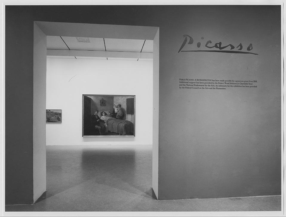
I can remember this like it was yesterday…The entrance to Pablo Picasso: A Retrospective at MoMA, 1980. My Art show attending career began when I walked through that entrance. *MoMA Photo.

I first went to The Museum of Modern Art in 1980 for their incomparable Pablo Picasso: A Retrospective that took over the whole museum. I was on the road with a band at the time and I flew back to NYC twice to see it. Though it was not my first trip to a museum to see Art, it began my career of seeing Art shows and is burned indelibly in my mind since. While I came away feeling the late works were underappreciated, the earliest works which were new to me, like Science and Charity, 1897, Painted at age 15, seen through the entrance, above, particularly astounded me, and it never let up from there. An almost impossibly high bar had been set. I wasn’t able to attend MoMA regularly until after the 1984 renovation, which I call MoMA, 1984. Looking back on that MoMA now, I have quite fond memories of the building. I’ll never forget being in the gallery the museum dedicated to Claude Monet’s Water Lilies, 1914-26, long a very important bridge between representational Art and abstraction for me. As I recall, it was a small room, with a bench along the window overlooking West 53rd Street. You entered the room where panel 1 met panel 2, at about 10 o’clock as you faced it. You sat there and the three huge panels surrounded  you, making you feel like you were inside it. It was one of the greatest feelings I’ve ever had looking at Art. I didn’t think MoMA, 1984 was anything special at the time, but given how lacking MoMA, 2006, the most recent MoMA was, which of course, is still with us in the partially new MoMA, 2019, I now feel quite nostalgic for a building that was “adequate” at best, overall.

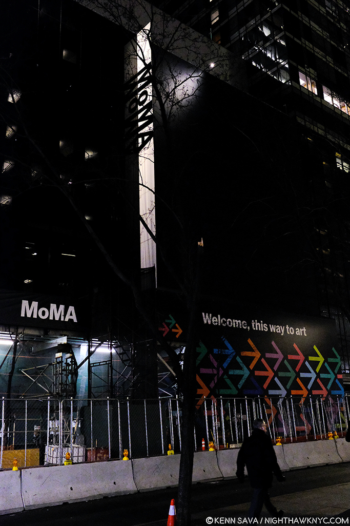
The heart of Art darkness. Construction for MoMA, 2019 in progress at the famous main entrance, behind the arrows pointing visitors to the temporary entrance, December 20, 2018.

I saw Matisse-Picasso at MoMA Qns in 2003, where MoMA was temporarily as MoMA, 1984 became MoMA, 2006, which I went to innumerable times (and have written about a number of its shows here on NYNYC), from it’s earliest days. MoMA, 2006, which opened that November, was terrible, in my opinion (I replaced a stronger negative). I remember standing in utter shock looking at Monet’s Water Lilies installed around the base of the huge, open space, they called the “atrium,” where they had no sense of their compositional continuity or unity. Barnett Newman’s Broken Obelisk, 1963-9, installed in the center of the space looked better there than anything I’ve seen there that came after it, which is not really saying anything all that positive.

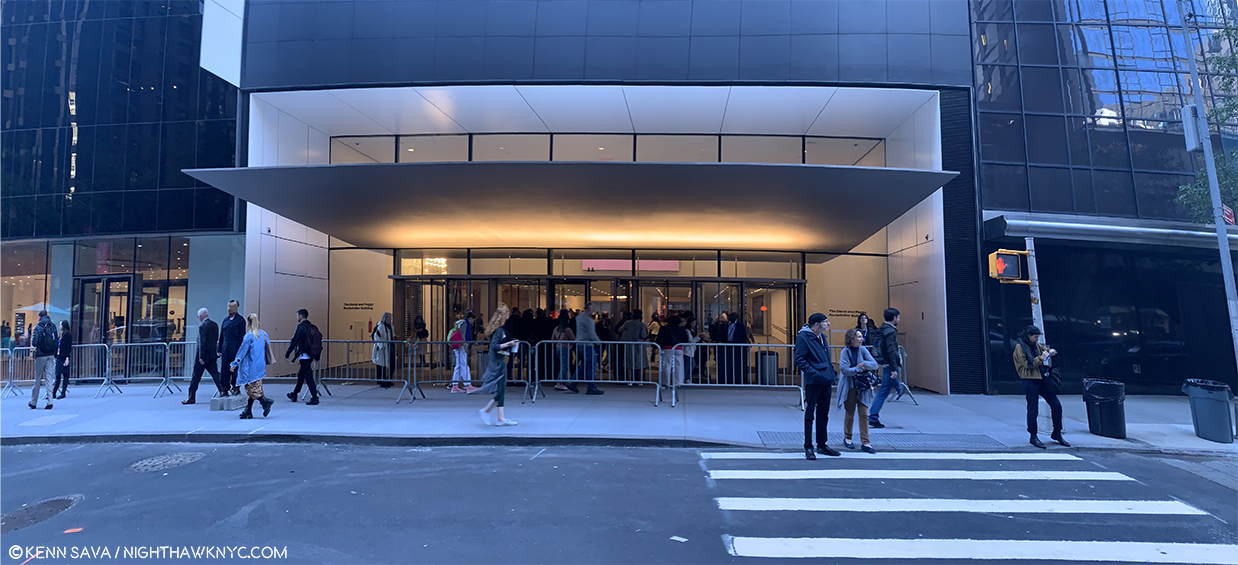
The newly renovated main entrance. Opening day, October 21, 2019.

“The Shopping Mall of Modern Art,” I took to calling MoMA, 2006, the one we’ve been living with these past 13 years. I don’t live in the suburbs partially because I hate malls, yet, here we were given one. The Architect, Yoshio Taniguchi, said1 “The model for MoMA is Manhattan itself.“ He spoke about how Central Park is like MoMA’s Sculpture Garden in his concept. Apparently he felt the rest of Manhattan is one giant shopping mall, cause that’s the design we got- a department store, nothing more, nothing less, who’s floors/departments are connected by an escalator, as they always are. If MoMA had decided to move to an entirely new location instead of turning MoMA, 2006 into MoMA, 2019, whoever would have come into the building would have a virtual turnkey Macy’s II ready to go. “Contemporary on 2,” “This way to the Permanent Collection, and home fixtures…I mean Design”…

That brings me to the Gorillas in the room…Both of them.

“There’s a hole
In my life
There’s a hole
In my life”*

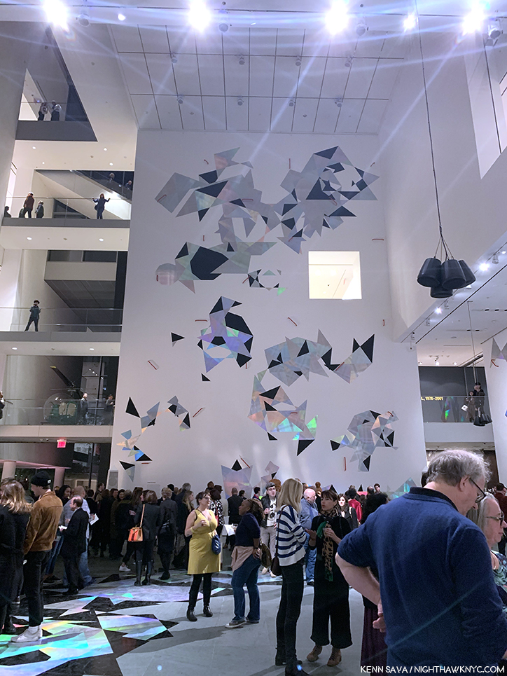
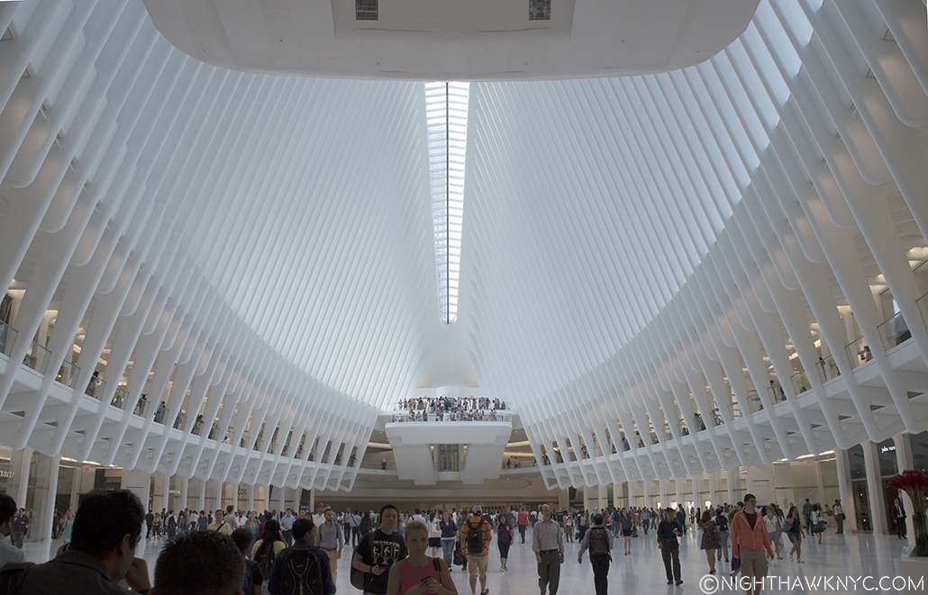
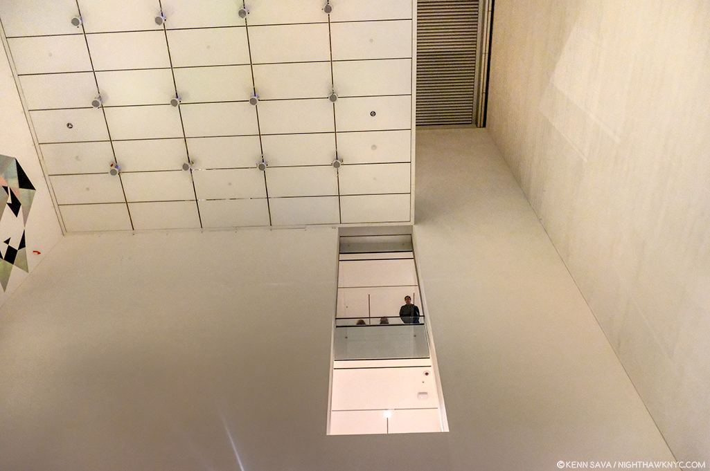
The “atrium,” Member’s Preview” for the “new” MoMA, October 19, 2019.

The first is that 110 foot tall gorilla in the building officially or unofficially called the “atrium.“ For some reason that I have not for the life of me been able to figure out over a few hundred visits these past 13 years, the Architect decided to drop a 110 foot tall atrium, (the “hole” I call it), smack dab in the middle of the building that, apparently, even some of the world’s great curators haven’t found a defining use for in almost one and a half decades2. I don’t blame them. I blame the Architect and whoever else thought this space was a good idea. I’ve never seen them use any more than the first 20 feet or so of its 110 until they mounted a decal-like iridescent work, seen above, on one of its walls for the opening of MoMA, 2019. And, I blame those who decided not to remove it in MoMA, 2019.  MoMA created MoMA, 2019, partially, because they “needed more space.” Well, guess what? You’ve got 7,700 square feet, or so, of completely useless space right smack dab in the middle of the building3, right in the middle of some of the most expensive real estate on earth. Instead of extending each of the floors as they should have been originally and filling that hole, they tore down an existing, good, museum, The American Folk Art Museum, formerly at 45 West 53rd Street next door!

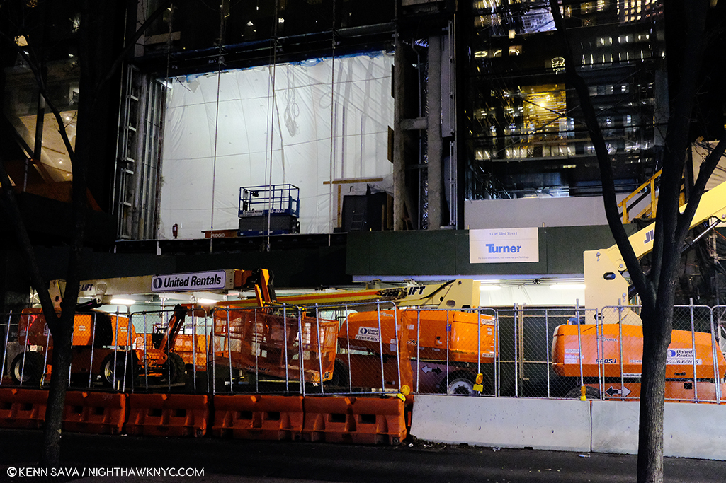
Construction of the new building for MoMA, 2019, where the American Folk Art Museum stood, seen on December 20, 2018.

“Shadow in my heart
Is tearing me apart
Or maybe it’s just something
In my stars”*

Frankly, all of this galls me.

“Soaring…””Majestic…””One of NYC’s great interior spaces…” Oh, sorry. I was reading about the Guggenheim. I can’t find anyone saying that about this.

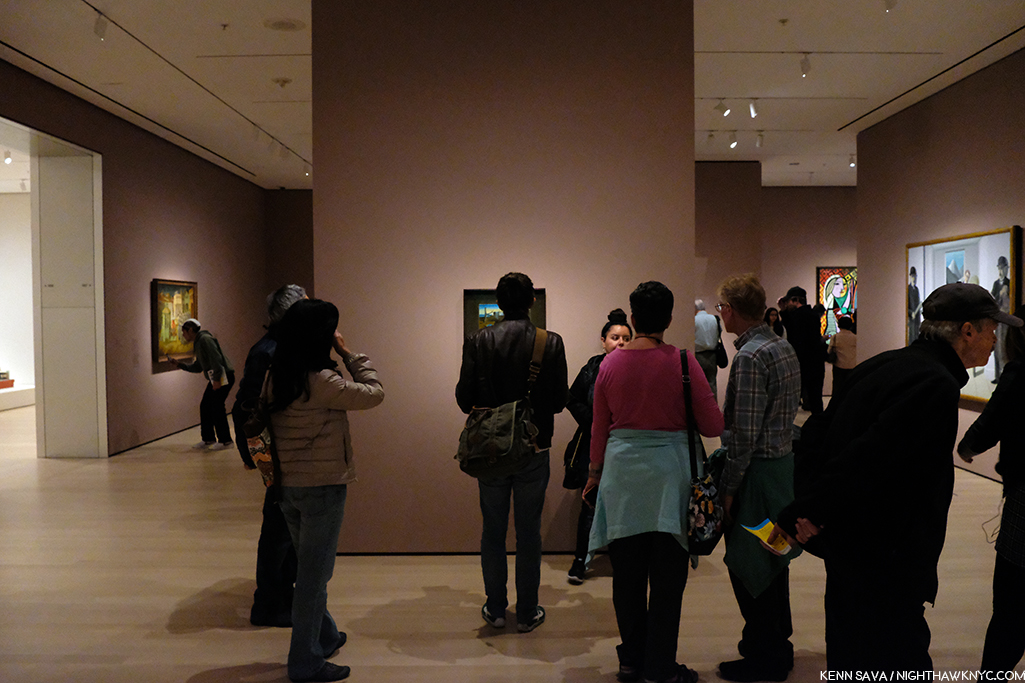
Because of the atrium, the flow of every floor in MoMA, 2006 is broken up, causing headaches for visitors and curators. This goes right to the heart of the museum’s purpose- showing Art. A good number of the galleries in MoMA, 2006 felt strangely shaped, small, or lost. In this case, small doesn’t add “intimacy.” Instead, it serves to actually minimize the effect of the Art being shown in them, in my experience. The Brancusi show mounted before the summer, 2019 closure, and the new Betye Saar show both suffer from this, in my opinion, both being mounted in the same 2nd floor gallery, tucked off to the south side of the hole, behind sliding glass doors (which I also think are an annoying idea and an energy drain), unchanged between Moma, 20o6 and MoMA, 2019.

Apparently, given it’s still here in MoMA, 2019, MoMA is in denial that the atrium is a problem. For me, visiting MoMA, 2006 gives me the unmistakable feeling that I’m continually walking around, and working my way around, the hole, instead of the whole experience just flowing.

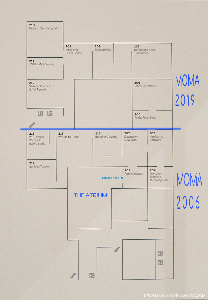
MoMA’s floor plan for part of the “new” 2nd floor. I’ve added notations in dark blue- a label for the atrium to point out where it is and how it needs to be navigated around. I’ve also labelled where MoMA, 2006 was (below the added blue line) and labelled where MoMA, 2019 is now (above the blue line) in the margin. Not shown- the other galleries on this floor, located in what MoMA now calls the “South” section (to the left and lower left.). All are effected by the “atrium.” Bear in mind- this is only ONE floor!

In fact, in MoMA, 2019, they’ve decided to double down. Keeping the hole, they’ve opted to extend the existing 2nd, 3rd, 4th and 5th floors the other way- to the west. I take this as an admission that the floors needed to be extended. We differ on how. You can see this in the 2nd floor floor plan, above. I’ve drawn a blue line to the left from gallery 205 and everything above that is the new building, what I call MoMA, 2019, below is what I call MoMA, 2006. It almost works. It does serve to minimize the “interference”/inconvenience of the hole, unless you’re in a section where you have to navigate around it. Alas, as soon as you are back in the “old” building, the MoMA, 2006 part, there it is, rearing its ugly head again, sending you to a floor plan trying to find your way. But, it also dramatically effects MoMA’s curators, and no doubt, every single show they mount in these spaces. WHY they just didn’t remove the atrium and extend the floors and make the 2nd, 3rd, 4th, and 5th floors full floors? (The 6th floor is a different matter, I believe due to the heights of the buildings. It already is a full, raw, space in the MoMA, 2006 building and a cafe has been installed on 6 on the MoMA, 2019 side (which I have not seen as yet. You can walk through from MoMA 2006 to MoMA 2019 on 2, 3, 4 and the 5th floor, but you can’t on 6. If you’re on 6 in MoMA 2006, you have to go down to 5, walk over to MoMA, 2019, and then go up to 6 on that side, or vice versa). That they didn’t remove the atrium is another, huge, mistake in my view. Alas, it’s too late for tears. And having been sad about MoMA’s building since MoMA, 2006 opened, I’m about cried out. Yes, MoMA, 2006 was so bad it actually kept me from going at times.

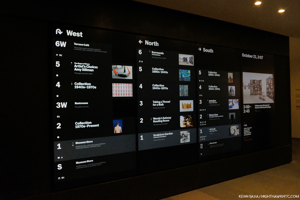
Where the heck am I going? Before going anywhere, it’s a good idea to check the “central scoreboard,” as I call it. West? North? South? What? Look quick! Those listings next to each floor change to show other things going on on that floor. Seen on the official opening day, October 21, 2019.

Another question for me is HOW do you redesign the building into MoMA, 2006, spending over 850 million dollars doing so, and not early on in the game ask, “WHERE are we going to put our most popular works?” Apparently, no one asked. Over the subsequent 13 years of the building, Monet’s Water Lilies and Van Gogh’s Starry Night, to name two, were continually moved, and never once looked to have found THE place for them. I lost count of how many places I saw the Water Lilies in MoMA, 2006, all the while with that indelible memory I recalled earlier in my mind.

The brand new elevator doors open on my first visit to MoMA, 2019’s 2nd floor, October 19, 2019.

SURELY someone would ask that question when it came to designing MoMA, 2019! Two visits in? The answer is a decided…I’m not sure.

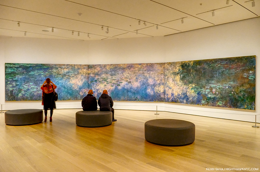
Home? At last? Monet’s Water Lilies, 1914-26, in a gallery devoted to his Water Lily Paintings (yes, they have others). We’ll see how long these stay here.

The Water Lilies seem to have been given some thought. They are decently situated in a gallery that contains only Monet Water Liliy works on an angled wall, similar to one of the installations they had in MoMA, 2006. You can scan the whole work continuously but it doesn’t give you a “wrap around” feeling. Starry Night fares far less well. It’s stuck in a corner(!?) at the end of a long gallery. I was shocked when I walked in and saw this. It’s just terrible.

Cornered! Vincent van Gogh’s beloved Starry Night, 1889 can be barely seen (as usual), though it’s now stuck in a corner. Seen on the official opening day, October 21, 2019

In this large gallery one other Van Gogh is installed half way down the wall to the left. I didn’t get the feeling of connection with the other works shown near Starry Night. Munch, who I greatly admire, is seen on the left hand wall, and while many pair him with Vincent, he gives me a completely different feeling, though l’ve wondered if Vincent may have been an influence on the Artist who was a decade younger. MoMA may have felt that putting other Van Goghs next to Starry Night might have created too big a crowd. I can live with seeing Munch next to Van Gogh’s. As seen in this gallery, due to the new arrangement of the galleries, multiple works by the same Artist are spread out, often across galleries.

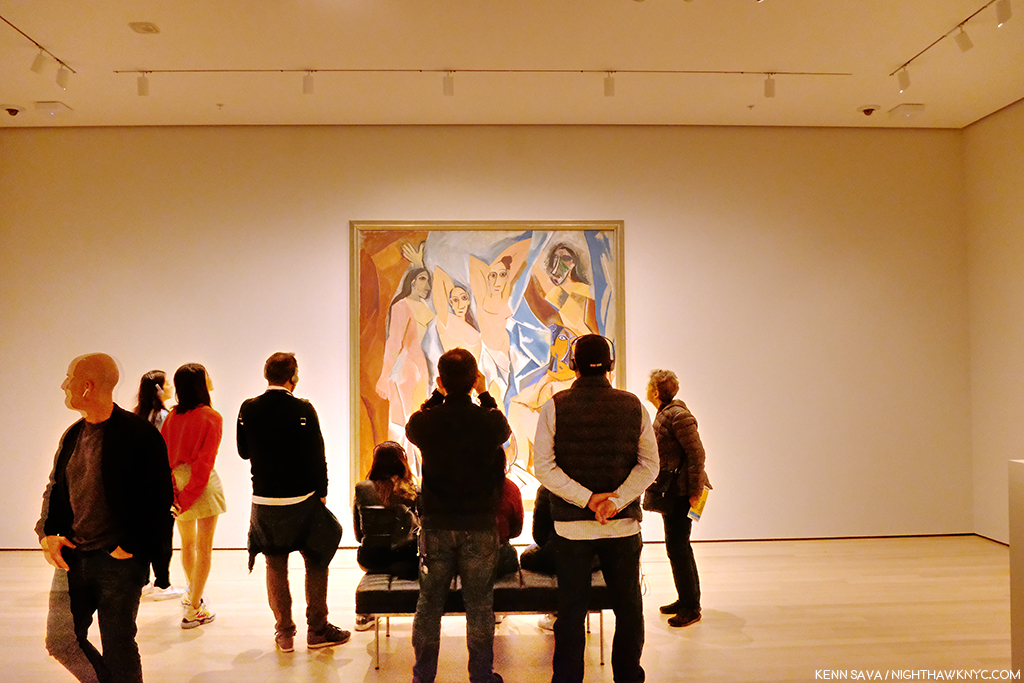
Picasso, Les Demoiselles d’Avignon, 1907.

That means that if you want to see, say, the Picassos, you have to plot a path to a number of rooms, where you might see one, or you might see 3 or 4. If you have multiple Artists on your hit list of pieces to see? You’re going to need a good chunk of time- just to plan your routes. Especially if they’re installed over multiple floors. I have mixed feelings so far about this arrangement, but I’ve been living with this collection for decades, and while I prefer seeing it chronologically so you can see how Art has evolved over time, mixing it up can be a nice change of pace and reveal new synergies. This “theme” strategy, which is more like that of a special exhibition, feels geared to people like me who have lived with the collection for a while and might welcome being surprised (if that’s what they feel). First time visitors, or those here with limited time, may feel differently.

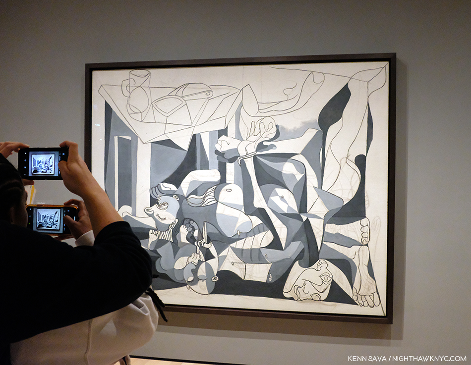
Picasso, The Charnel House, 1944-5. The iconic Guernica is a work Picasso Painted in 1937, in the early days of World War II. The Charnel House was Painted at the end of the War, bookending Guernica, though far less well-known. Guernica was part of MoMA’s collection until Picasso died. He stipulated in his will it be returned to Spain. So, including it in the 1980 Picasso Retrospective, where I was able to see both of them, was something of a farewell before Guernica went to Spain.

Picasso seems to fare better than Starry Night. At least three of his major works (Les Demoiselles d’Avignon, 1907, Three Musicians, 1921, and The Charnel House, 1944-5) get walls all to themselves- in different galleries.

The upper left corner of Dali’s, The Persistence of Memory, 1931 (aka the “Soft Watches”). Picasso watch- Girl before a Mirror, 1932, is partially seen in the rear to the right.

As for other works on the most popular list, one was easier to find. Dali’s The Persistence of Memory, 1931 (aka the “Soft Watches”) gets a pillar to itself front and center in gallery 517. And on the opposite side of the same wall is Frida Kahlo’s Self-Portrait with Cropped Hair, 1940. That was easy. I only had to ask once to find it. (The Water Lilies? I asked 3 times. I saw another visitor seeking them ask twice.)

I found the galleries to be well lit, as readers well know, lighting is one of my long standing peeves in most spaces I see Art. One gallery of 2 Hopper Paintings accompanied by a good many Photographs was a bit dark, I presume this was intentional for conservation purposes. The consistency of the lighting across the museum that I’ve seen thus far is to be commended.

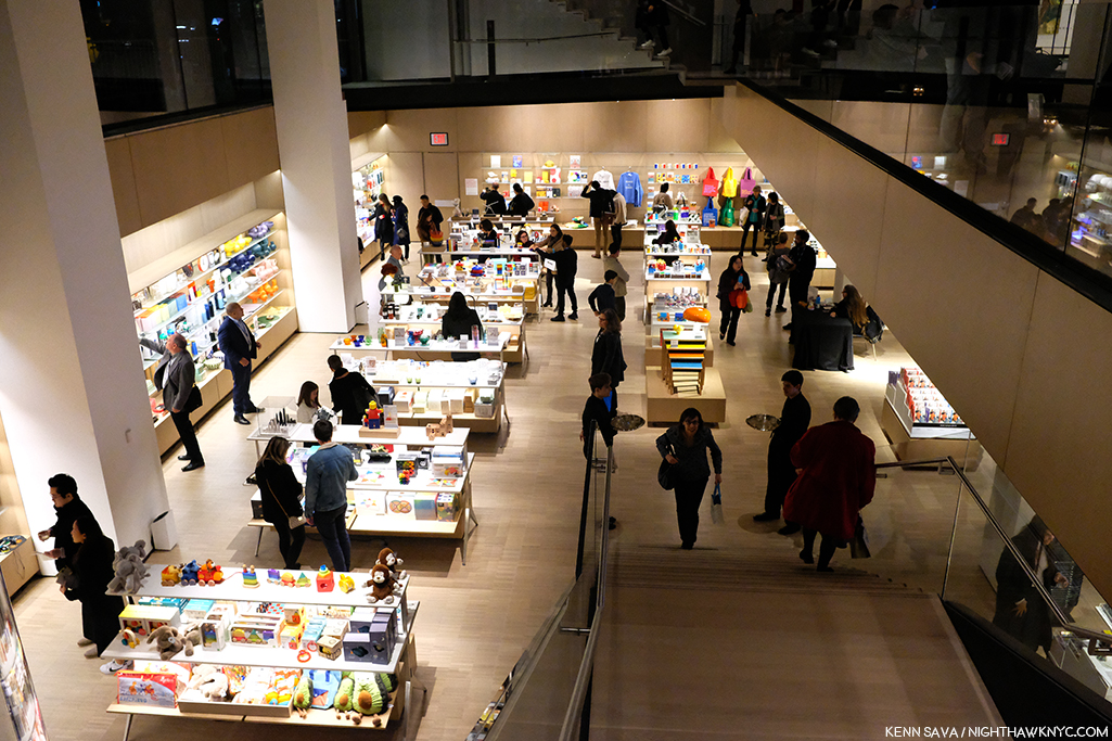
Lower level gift & book shop. One of at least 2 in the museum.

The first floor lobby felt like being in any of the faceless, large Times Square hotels nearby. It felt that a lot of money was spent here. Yet, I can never recall asking someone “How was your visit to such and such museum?” and getting the response, “Oh, the lobby was amazing!” I believe “sinking” the gift shop/book store is a mistake. Getting anywhere in MoMA, 2019 requires taking stairs and elevators. The last thing people may feel like doing is taking MORE stairs just to visit a shop. We shall see.

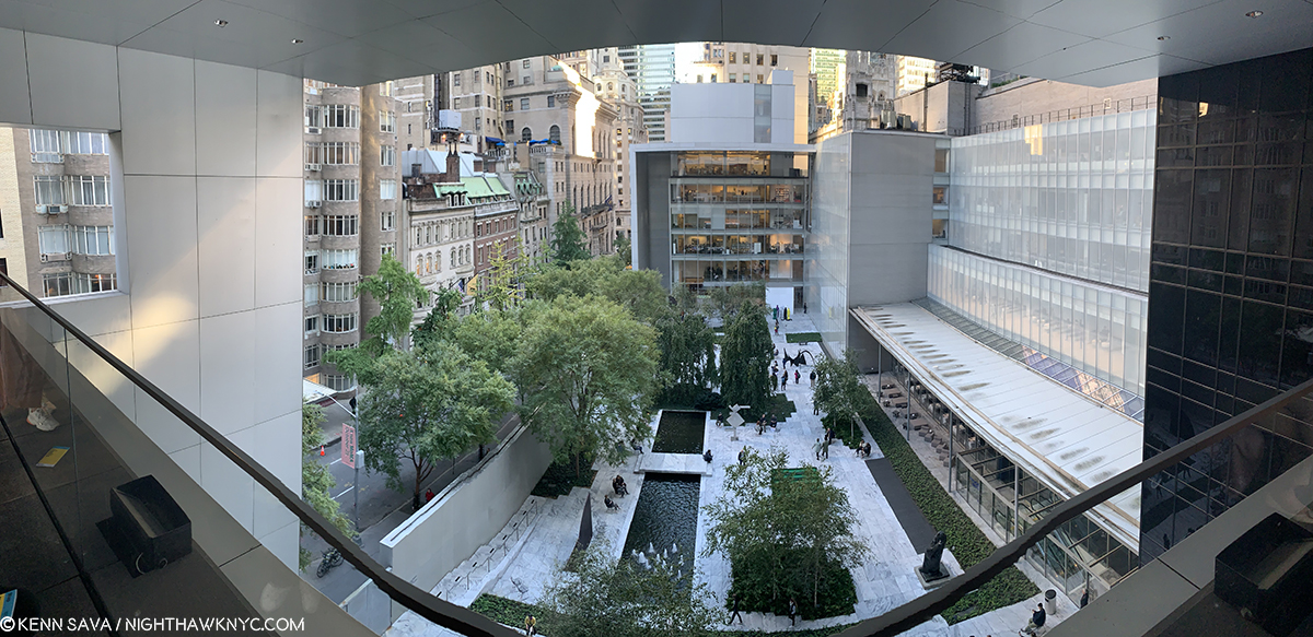
Not listed on the floor plan, the previous cafe has been replaced by a Brancusi gallery on 5 (gallery #500). Behind it, we now get free access to the outside patio overlooking the Sculpture Garden.

“There’s something missing from my life
Cuts me open like a knife
It leaves me vulnerable
I have this disease
I shake like an incurable
God help me please”*

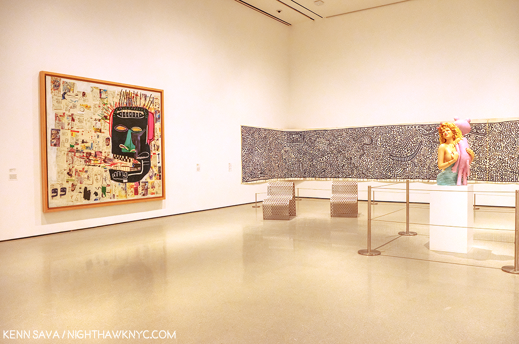
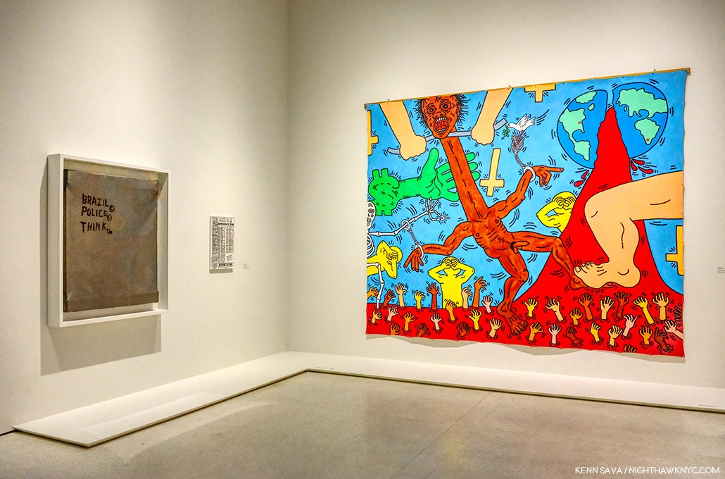
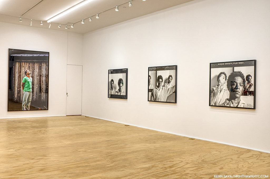
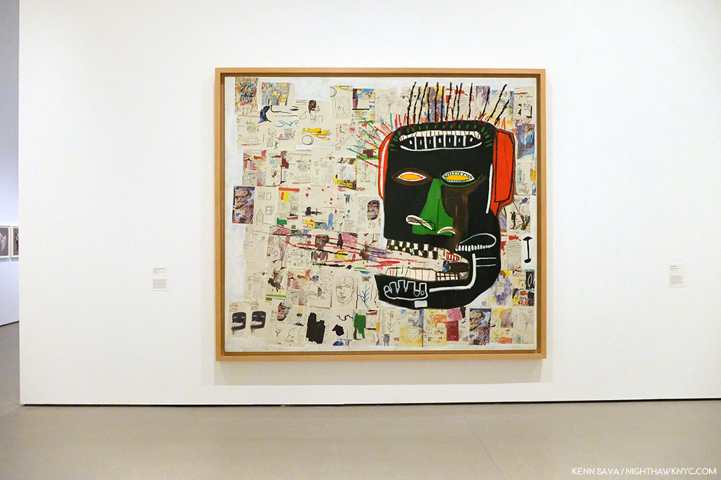
Jean-Michel Basquiat, Glenn, 1985, left, Keith Haring, Untitled, 1982, right.

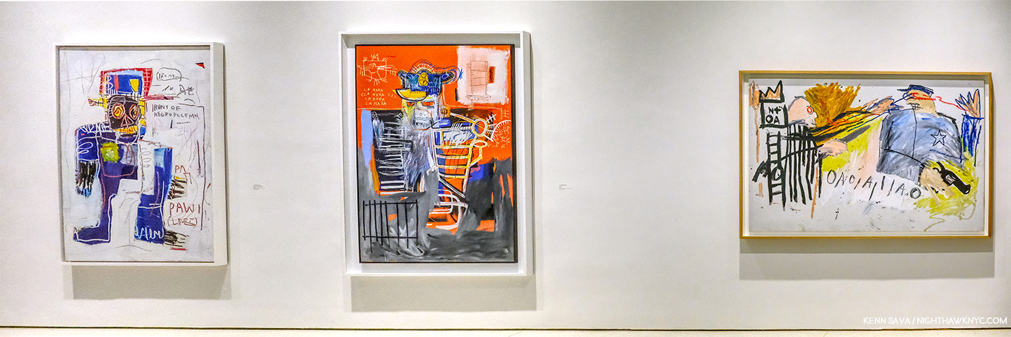
Then there’s the other gorilla in the room at the “new” MoMA, 2019. My feeling is that MoMA, The Museum of Modern Art, is dangerously close (if it hasn’t happened already) to remaining just that, indefinitely. It’s not THE Museum of Modern & Contemporary Art many think it is. Their collection of the most important Contemporary Art is nowhere to the level of it’s preeminent collection of Modern Art (the period I consider to be approximately from Edouard Manet’s Le Dejeuner sur l’herbe, 1862, through 1979), or the collections of important Contemporary Art in LA, SF or Chicago, in the US. MoMA (and all the NYC museums) have fallen hopelessly behind in collecting important Contemporary Art. Jean-Michel Basquiat (J-MB) is a classic case, but he’s not alone. As they admitted, they didn’t collect his work early on and now it’s too late. I recently recounted MoMA’s history (or lack thereof) with J-MB in my series on the J-MB shows going on in NYC this year. Revealingly, only one of the 5 shows in NYC was mounted in a museum- The Guggenheim. Then, when I walked into the member’s preview for MoMA, 2019 on October 19th, low and behold there was a Basquiat front and center in the second gallery, above. It turns out they borrowed it from a private collection. This seemed to me to be a classic case of “smoke and mirrors,” of trying to hide this large hole in their Contemporary Art collection- and, after all these years (40 next year), possibly an admission they were “wrong” about Jean-Michel Basquiat.

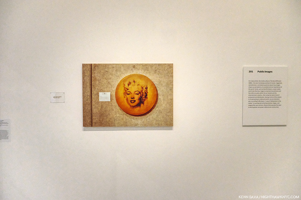
Louise Lawler’s Does Andy Warhol Make  Your Cry?, 1988, above, and a group of 24 Untitled Film Stills, by Cindy Sherman.

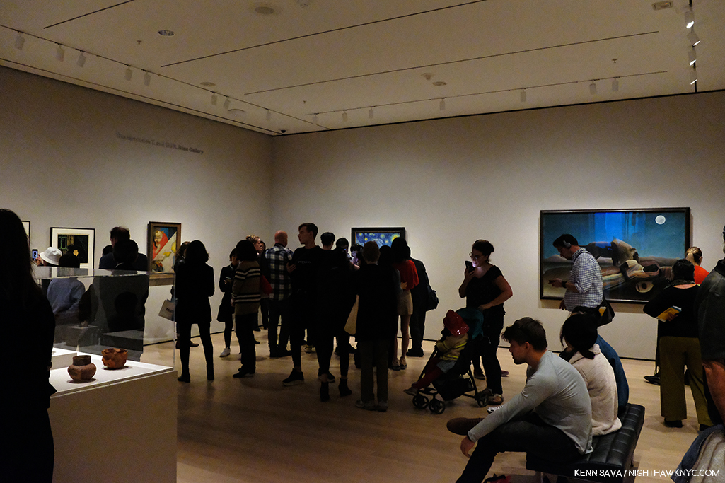
Elsewhere on the 2nd floor, the entire first gallery, titled “Public Images,” was made up of work by women Artists, as if to immediately counter the oft mentioned fact that a very small number of women Artists have been given retrospectives by MoMA. They have also installed a Betye Saar show, The Legends of Black Girl’s Window, across the atrium, centered around a recent acquisition by the museum of earlier work by Ms. Saar. It doesn’t include any of her more recent, powerful, work, some of which were presented in Washboards, 1997-2017, presented earlier this year at the New York Historical Society. While nothing will detract from her overdue appearance in a substantial show in another NYC museum, I was left wondering why they didn’t mount the long overdue full Betye Saar Retrospective, who is still going strong at 93, while she’s alive to enjoy it. Looking at MoMA’s permanent collection online, time and again, I found either a lack of any works by important Contemporary Artists (Ai Weiwei? Robert Frank’s Photographs? Leonardo Drew? Rod Penner? Gregory Halpern? Petra Collins?…None by any of them. The most recent work by Betye Saar, who was born in 1926, is from 1972- 47 years ago!), a lack of their important work, or a lack of depth of these works (2 works, each, by Henry Taylor, Francesca Woodman, 1 Painting and 10 Prints by Richard Estes, 2 Paintings, 2 Studies and 22 Drawings by Kerry James Marshall and Jean-Michel Basquiat– 0 Paintings, 2 Prints, 10 Drawings). A close look at what is installed in the Contemporary galleries on 2, which makes a point of being inclusive, strikes me as an attempt to rewrite MoMA’s perception in the face of criticism, and, some smoke and mirrors- how much will require more than 2 visits. In the meantime, go and make your own study.

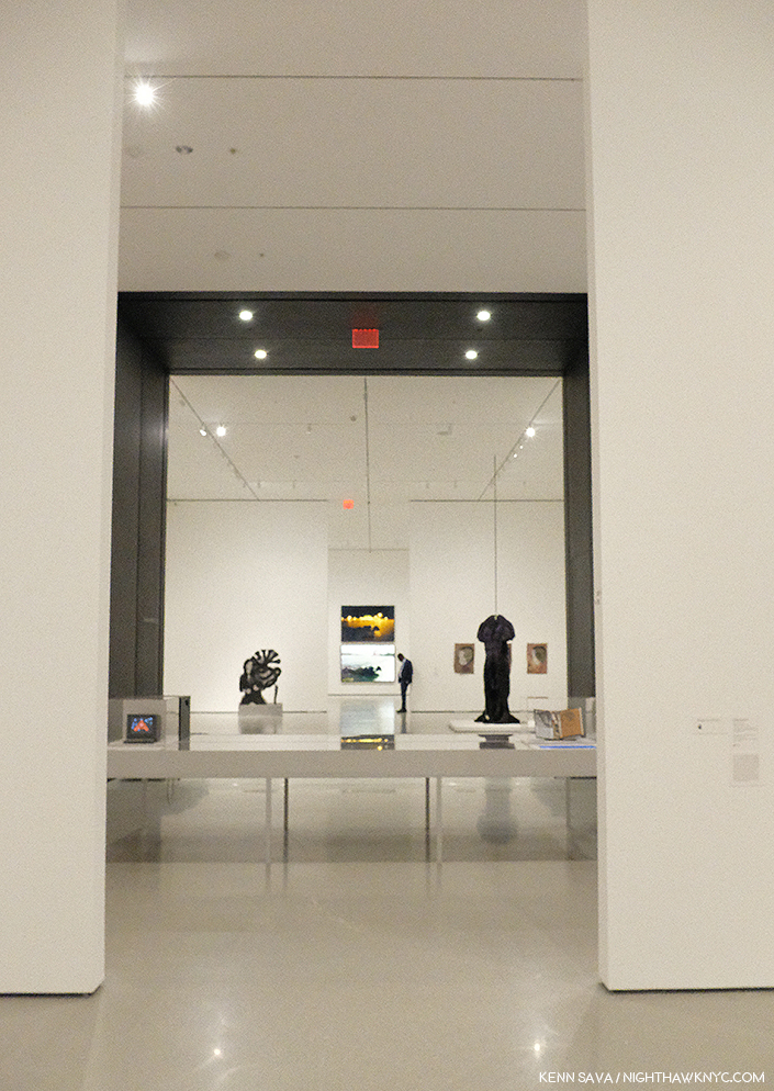
Before the crowds. Parts of 4 galleries, Contemporary Art, 2nd floor. Member’s preview, October 19, 2019.

Tourism is a big deal for MoMA, the other NYC museums, and NYC. If the Art going public begins to perceive the reality that NYC is not the place to go see important Contemporary Art, one of the most popular periods of Art there is at the moment, this would be a disaster, especially after having just spent over 450 million dollars on MoMA, 2019. Smoke and mirrors might buy them some time, but whether they can overcome the self-inflicted damage they’ve already done remains to be seen. MoMA was incalculably helped to become THE Museum of Modern Art by a visionary curator, Alfred Barr, during its formative years. More recently, those in charge didn’t believe in the work of these Contemporary Artists at the time, didn’t have the vision and foresight Mr. Barr did, and so they missed the boat.

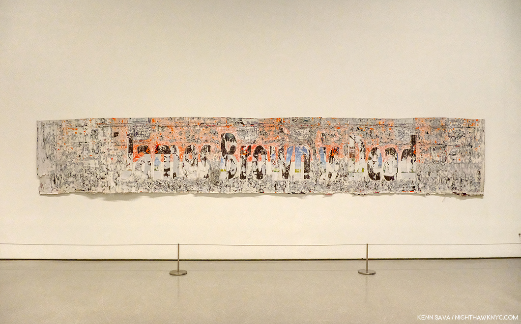
Mark Bradford, James Brown is Dead, 2007, Torn-and-pasted printed paper, 47 3/4 x 267 inches. I’ve made no secret of my admiration for Mr. Bradford, who I consider one of today’s most important Artists. In fairness, since I’ve mentioned some of the Artists omitted from their collection, MoMA owns 4 of Mr. Bradford’s larger works, 1 Sculpture, 1 Video and about 17 Multiples. So, I find it interesting they chose this work for display.

They, and their counterparts at the other NYC museums, may well have cost NYC it’s world leading status as THE Art capital of the world, we shall see. It’s too late now. Only mass, and massive, donations will help to close that gap now.

Though I am a paying member, I dreaded going to see the “new” MoMA, 2019. Such is the level of disdain I have for MoMA, 2006, which I consider to be the worst major museum building I’ve ever been in, it actually keeps me from going to see the Art! Maybe I’m just too used to MoMA, 2006 that MoMA, 2019 actually feels “not so bad.” Well Let’s see. MoMA, 2006 cost 858 million dollars according to The Times. I’ve seen 450 million as the cost of MoMA, 2019. That’s at least 1.3 BILLION dollars to make something I just said was “not so bad.”

Well, in 10 years, when MoMA decides that they “need more space,” which you know they will, I know where they can get 7,700 square feet of it, without tearing down anyone else’s building. Let’s say by then it will cost another 500 million to create MoMA, 2029. Then, they’ll have a chance at actually making the building “decent.”

Gee…Wait a minute. Between MoMA, 2006 and MoMa, 2019, they’ve spent 1.3 billion dollars? If they spent that on Art back when MoMA decided to build MoMA, 2006? You might actually have a collection of important Contemporary Art on the level with MoMA’s collection of Modern Art.

Instead? We got one of the biggest Architectural design mistake in NYC in my lifetime, right up there with not allowing the world’s greatest Architects, beginning with Frank Lloyd Wright, who’ve tried to build here a chance to build more than one building each. More? That the powers that be at MoMA thought putting a gigantic hole in the middle of the most expensive real estate on earth was a good idea, and then less than 10 years later tear down an actually good museum saying they “need more space” is plain hubris.

On second thought, maybe that hole does signify something about Manhattan after all. It signifies the hole in the collections of Contemporary Art at MoMA, and the other Big 4 NYC Museums. Smoke and mirrors aren’t going to be able to cloud that realization from many for very much longer.

“Be a happy man
I try the best I can
Or maybe I’m just looking for too much?”*

*-Soundtrack for this Post is “Hole In My Life” from Outlandos d’Amour by The Police, performed live in Paris in 1979, here-

NighthawkNYC.com has been entirely self-funded and ad-free for over 6 years, during which over 250 full length pieces have been published. If you’ve found it worthwhile, you can donate to keep it going & ad-free below. Thank you!

Written & photographed by Kenn Sava for nighthawknyc.com unless otherwise credited.
To send comments, thoughts, feedback or propositions click here.
Click the white box on the upper right for the archives or to search them.
For “short takes” and additional pictures, follow @nighthawk_nyc on Instagram.

Subscribe to be notified of new Posts below. Your information will be used for no other purpose.


  1. In the same New York Magazine piece, the author, Alexandra Lange, concluded that MoMA, 2006, “…is a question, sublimely unanswered.” 13 years later, I’ve still got a few questions, which I ask in this piece. Living with them has been painful, not “sublime.”
  2. Yes, the Tate Modern in London did something a little similar, but dissimilar enough to make the difference, and they’ve continually found good uses for it since it opened around the same time as MoMA, 2006.
  3. Where did I get 7,700 square feet from as the size of this space? I’ve been unable to find out the official square footage of the atrium (interesting, no?). It hasn’t been published anywhere and those I asked at the museum didn’t know or wouldn’t tell me. So? I took it upon myself to calculate it. 110 feet is the published (known) height. I stepped off 35 paces from wall to wall and each of my paces is 24 inches. That’s 70 feet, and 7,700 square feet in total by my guesstimation.

Jean-Michel Basquiat, At 59

Written & Photographed by Kenn Sava (except *)

Part 3 of a series…

In January, 1983, Henry Geldzahler asked Jean-Michel Basquiat- “Is there anger in your work now?
He replied, “It’s about 80% anger1.”

Jean-Michel Basquiat, at about age 20, walks with his clarinet at the intersection of East 88th Street and 5th Avenue across from the Guggenheim Museum, circa 1980-81 in a screenshot from the movie, Downtown ’81, directed by Edo Bertoglio and written by Glenn O’Brien. 39 years later the Guggenheim has mounted a show of work the Artist would create over the next few years. *

The Brant Foundation’s Jean-Michel Basquiat was the largest show of the five going on in NYC this year featuring the work of Jean-Michel Basquiat (J-MB, henceforth), or about him. Though it provided a rare opportunity to see a broad range of his Paintings through most of his career, there was no context to the show, beyond it being an exceptional, diverse, collection of his Paintings. My impression was the attention paid to presenting groups of work by theme consisted of a group of portraits in the rear gallery on the 4th floor, a room half full of Paintings of Boxers and a wall of Paintings with unusual stretchers, both on the second floor. The lack of a theme or themes is mitigated by the fact that in many of his works there are multiple themes present allowing viewers to piece together their own narratives in, and between, pieces. Yet, as time goes on, and the focus of J-MB studies turns away from the well-worn biography and more and more to the “less discovered land,” i.e. his work, some of the themes lying just beneath the surface are starting to finally get the attention they deserve.

In that same interview with Henry Geldzahler, J-MB said that “royalty, heroism and the streets” were his favorite subjects. Over on the sixth floor of the Guggenheim Museum, in Basquiat’s Defacement: The Untold Story, the only museum show of the five J-MB and J-MB related shows going on in NYC this year, all three of those themes were featured, with “the streets” perhaps most front and center. The show’s overriding focus was the death of Michael Stewart, a 26 year old Artist who died of injuries he received “on the streets,” after being arrested by the Port Authority Police on September 25th, 1983, for allegedly drawing or writing in the 14th Street L subway station two weeks earlier on September 15th.

The scene of a crime. The 1st Avenue Brooklyn bound L Subway Station, currently under construction. It’s a narrow platform as subway platforms go with nothing obstructing the view from one end to the other. The only entrance/exit, the one Michael Stewart must have entered and been removed through, is just to my right rear. Seen in October, 2019.

A public outcry and numerous protests ensued. The effect was immediate, deep and lasting, as the show reminds us, bringing us right back to the moment. The downtown community of Artists that Michael Stewart, J-MB, Keith Haring, and many others, were a part of, also responded with their creativity. In his “Chronology” in the Whitney Retrospective catalog, Franklin Sirmans writes, “Basquiat always conscious of racial realities is deeply effected by the death of Michael Stewart on September 15th…Basquiat, perhaps in fear, practices a form of denial. He consciously distances himself from the situation. No matter what his art world status might have been, incidents such as this were a constant part of his life2.” He continues, quoting Keith Haring, “One thing that affected Jean-Michel greatly was the Michael Stewart story…He was completely freaked out. It was like it could have been him. It showed him how vulnerable he was.” He then quotes J-MB as saying, “It could have been me. It could have been me3.” Michael Stewart died 8 months or so after J-MB said his work is “about 80% anger.”

Keith Haring’s Cable Building studio after Defacement was cut from the wall to the right of center, where he created it, 1985. *Keith Haring Foundation Photograph.

The show’s centerpiece is a work that has come to be called Defacement (The Death of Michael Stewart), 1983, that J-MB created on a wall of Keith Haring’s Cable Building studio at some point between September 29th and October 5th, 19834.

Keith Haring’s Bedroom, Greenwich Village, 1989. *Photograph by Nancy Elizabeth Hill, Keith Haring Foundation.

When he moved out of the Cable Building, Mr. Haring had it cut out of the wall and framed. In an indication of how he felt about the work, it hung over his bed, where it remained, apparently, until he died, in February, 1990, almost exactly a year and a half after J-MB.

Along with it, in the first gallery were 6 other Paintings and two limited edition prints by J-MB. In the second gallery, the rest of the show recounts the tragic story highlighted by vintage posters announcing protests, newspaper articles and ephemera, accompanied by Art by Keith Haring, David Hammons, George Condo, Lyle Ashton Harris and Andy Warhol. A moving highlight of the show is the inclusion of very rare examples of Michael Stewart’s work, which I have never seen before, from his family’s collection. At the time of his death, Mr. Stewart was planning his first show. Seeing these works now, the sense of lost possibilities remains undimmed 36 years later. Of him, Fred Brathwaite (aka Fab5Freddy) says- “Michael Stewart was a new artist making moves on the scene and one of the few people of color in the mix downtown at that time. He came from an intellectual educated family and wanted to find a place where he could express himself in a cool way around like-minded people….When he was killed and the police claimed he was writing his name on the wall in the subway-which was surprising and seemed unlikely to us- the media jumped all over the idea that he was a graffiti artist. …It was like a chill going through you, realizing that it could be me- it could be any of a number of people I knew. Even though we all knew that Michael Stewart was not the graffiti artist they were portraying him to be, it could clearly have been any person of color, particularly myself and the numerous others I knew who were making art and would occasionally tag a wall, or had that background. That was frightening5.”

Andy Warhol, Daily News (Gimbels Anniversary Sale), ca. 1983, Synthetic polymer paint on canvas, 24 x 16 inches.

Mr. Brathwaite’s testimonial is excerpted from an interview he gave for the show’s exceptional catalog, which deserves special mention. Informative new essays by curators are followed by almost 60 pages of recollections by Artists, journalists, and other figures were were part of this period in NYC history, each based on new interviews conducted by curator Chaédria LaBouvier in 2018 and 2019 that were edited into concise statements for this publication- an amazing list that includes Mr. Brathwaite (Fab5Freddy), Dianne Brill, Michelle Shocked, Kenny Scharf, Eric Drooker, Lyle Ashton Harris, Jeffrey Deitch, Annina Nosei, George Condo, Tony Shafrazi, ABC-TV reporter Lou Young (who did over 60 pieces on the Michael Stewart story), Ronald Fields (a member of the first grand jury in 1983) and Carrie Stewart, mother of Michael Stewart. Their contributions bring the reader, as the show does, right back to the place and time in the kind of detailed recollections only those who lived it on the front lines could relate. When I’ve spoken in Parts 1 & 2 about the need for those who knew the Artist to step up and speak, this is a shining example of what those with first hand knowledge to bring to the table. Anyone interested in Jean-Michel Basquiat, Michael Stewart and/or his tragic end should find their way to the catalog before it goes out of print. Many exhibition catalogs have a notoriously short shelf life after shows end.

Defacement (The Death of Michael Stewart), 1983, Acrylic and marker on plasterboard, 25 x 30 1/2 inches.

In the first gallery, a long, rectangular space leading to Defacement (The Death of Michael Stewart), 1983, as the work is now known, due to the fact the Artist has written “¿Defacement©? ” in the upper center, are other works by J-MB that revolve around the themes of the police, royalty and the death of kings. Defacement feels like a dream, or nightmare, due to the presence of “clouds” of blue, pinkish and black paint. Painted on a white background, the blue figures, with pink/red skin, of the police frame and tower over the central black figure, apparently seen from the back. There are parts of what appears to be two circles in black around the head of the center figure, who’s hands and feet are not visible. Apparently, some of the marks on the work may have been added by others, like the letters on the right side that appear to be (“ZERLOL”), but it appears these circles are under the blue paint and so may have been done by J-MB. One of the policemen appear to be looking out at the viewer.

Francisco Goya, The Third of May, 1808, Oil on canvas, *Prado Museum.

One thing that stands out to me is the composition in context of Art History, particularly, in works of Goya and Picasso. In Goya’s legendary The Third of May, 1808, the soldiers stand decidedly to the right- the same side as the viewer.

Picasso, Massacre in Korea, 1951, Oil on canvas, *Picasso Museum, Paris.

In Picasso’s Massacre in Korea, 1951, the viewer is placed right in the center, with the soldiers on the right, and the victims on the left, one or two of who look out at the viewer. In Defacement, J-MB has also placed the viewer in the center, between the policemen, and directly behind the black figure/Michael Stewart, who appears without hands or feet. The effect made me feel like being in line to run the gauntlet- like you’re next in line, in line with his reported feeling “It could have been me. It could have been me.” It’s hard not to take the Painted “¿Defacement©?” as a double entendre. Did Michael Stewart really deface the subway station? And, why are the police “defacing” him, removing his face from the world?

La Hara, 1981, Irony of a Negro Policeman, 1981, both Acrylic and oilstick on wood panel, both 72 x 48 inches, Untitled (Sheriff), 1981, Acrylic and oilstick on canvas, 51 1/2 x 74 inches, from left to right.

On the right hand wall are three Paintings featuring policemen. All three are different. One has a white officer, one a black officer, one a grey officer (the two in Defacement appear to be pink-ish red). Two have white backgrounds, one red. All three are extremely nebulous (at least to me), even in the nebulous work of J-MB. All three are terrifying, and so perfectly set the stage for, and compliment Defacement.

The prints Back of the Neck, 1983, 50 1/4 x 102 inches, which I saw 14 years ago at the Brooklyn Museum (See Part 1Part 1), who is is on loan from, and Tuxedo (1982-3), 102 1/4 x 60 inches, both prints are editions of 10.

On a wall facing it are the limited edition print, Back of the Neck, also from 1983, my old friend from the 2005 Brooklyn Museum Retrospective on loan from the museum, and another print, Tuxedo, 1982-3, a work that references kings. As others have pointed out, Back of the Neck could be a reference to the injuries sustained by Mr. Stewart.

CPRKR, 1982, Acrylic, oil stick, and paper collage on canvas, mounted on tied-wood support, 60 x 40 inches, Self-Portrait, 1983, Oil, acrylic and oil stick on two wood doors and wood panel, with graphite and ink on paper, 96 3/4 x 63 3/4 inches, and Charles the First, 1982, Acrylic and oil stick on canvas, three panels, 78 x 65 inches, left to right.

On the 4th wall are a stunning trio centered around the Self-Portrait, 1983, and two works that pay homage to another of J-MB’s “Kings,” Charlie Parker. Both of those relate to (his) death, and the death of kings. To the left is, perhaps, the most poignant work the Artist did referencing Bird, CPRKR. In it, he memorializes his death, listing the place and date, under a crown, with the moniker, “Charles The First” written below. And so, it fits with Defacement. Right next to it is the Self-Portrait, 1983, which in this show is impossible to think about without considering the year it was Painted, particularly since on its right-hand panel, the words “To Repel Ghosts” are Painted. To the right of these is Charles the First, 1982, with it’s equally haunting words “Most Young Kings Get Their Heads Cut Off” written along the bottom. Of the “young kings” referenced in this room, Michael Stewart died at 26, J-MB at 27 and Bird at 34. Charlie Parker turns 100 on August 29, 2020. Michael Stewart would be 61 today. As I pointed out in Part 2, J-MB should be 59 years old RIGHT NOW, in mid-career as the museums call it. Both should be living, vibrant, forces. Not ghosts.

Jean-Michel Basquiat, Untitled, 1987, Andy Warhol, Daly News (Gimbels Anniversary Sale), 1983, Keith Haring, Michael Stewart- USA for Africa, 1985, left to right.

Not mentioned anywhere that I’ve seen, this is the only time Jean-Michel Basquiat, Andy Warhol and Keith Haring, the three figureheads of the Art of their time in NYC ever addressed the same event, (as far as I know). I’m not saying Untitled, 1987, shown in the group above, seen in the second gallery, is a reference to Michael Stewart- I don’t know, but Defacement is. Describing the amazing Keith Haring work, the defunct website basquiatdefacement.com said, “It depicts a black man being strangled while handcuffed to a skeleton holding a key. People from all nations drown in a river of blood below, while others shield their eyes from the scene, and the green hand of big money oversees the scene6.”

Michael Stewart poses for Dianne Brill Menswear, 1983, from the show’s catalog. “Michael was buried in a suit I designed,” Dianne Brill writes in her piece in the catalog (P.107).*

Basquiat’s Defacement: The Untold Story is one of the most powerful, smaller shows I’ve seen in years. Though it depicts events that took place 36 years ago, its relevance was, I’m sure, not lost on a good number of its viewers.

Alexis Adler, Jean-Michel Basquiat (the exact title is unknown to me).

Two other shows, the last two I saw in the group of five7, document little seen sides of J-MB. In The 12th Street Experiment: Photographs of Jean-Michel Basquiat, the Photographs in question are by embryologist and former J-MB girlfriend and roommate, Alexis Adler, who lived with the Artist from 1979-80.

Alexis Adler speaks about Jean-Michel Basquiat and her Photographs of the Artist at The Bishop on Bedford Gallery, Brooklyn, May 18, 2019.

A veritable Portrait of the Artist as a Young Man, this was a show that, along with the items in Ms. Adler’s archive J-MB left behind in, and on, her apartment (on tour in museums shows elsewhere at the time, most recently at the Cranbrook Museum, The Museum of Contemporary Art, Denver and in Europe), form an important and unique collection. In my research, I’ve come to see that J-MB’s formative period after he left home for good has gone largely overlooked and understudied. Alexis Adler has stepped forward, sharing her experiences and her knowledge, in books, essays and traveling around the world speaking about her time with Jean-Michel Basquiat from 1979-80 and his Art, in addition to sharing her collection in the shows I mentioned. As she walked me through the show of her Photographs at The Bishop Gallery on Bedford, Brooklyn, I was amazed at both the J-MB work that Alexis has documented in Photographs and the range of experimentation the young Artist was undertaking- extending down to his continually evolving hairstyles! Lacking funds, he worked with whatever he found, whatever was at hand- including the doors, walls, and floor of the apartment, and whatever he found on the street, making him part of the line that includes Duchamp, Rauschenberg and Jasper Johns, among others.

A Performance piece that involved installing a television set in a refrigerator. J-MB wears one of his hand Painted helmets here in one of a series of Photographs documenting the performance.

There is an element of performance in a number of these Photographs and in the work, which took place at the time he was performing with his band, Grey (and he is seen practicing his clarinet). Personally, I find this work fascinating and remarkable- on its own and for what it anticipates. A good deal of it might surprise many only familiar with his Paintings and Drawings.  This period seems to me to be more than only “early experimentation,” as it contains the roots and beginnings of much that came after, including his Painting. That he was Painting on everything he could find (out of a lack of funds for traditional Art materials, no doubt), presages his later Paintings executed on doors, like Self-Portrait, 1983 in the Guggenheim show, to fence slats, like Gold Griot, seen at The Brant in Part 2, among others.

Alexis Adler, Basquiat in the apartment, 1981. Note the work by Bacon right behind his head. In another of Alexis Adler’s Photos, Burroughs’ Naked Lunch is seen attached to the wall. More evidence of J-MB’s Beat connection I mentioned in Part 1.

In addition, Ms. Adler said that J-MB studied her Art textbooks from the classes she was taking at the time. I found fascinating evidence of this in this Photo of hers, where a work by Francis Bacon is mounted on the wall. I wondered in Part 2 what Francis Bacon would think of J-MB’s Untitled, 1981. Here is the proof that J-MB knew of Francis Bacon’s work that very year.

Alexis Adler, Painted television in the apartment, c.-1979–1980. It’s amazing this Photo of the work exists, but I would love to see it in color because there’s nothing else like this in his subsequent Paintings!

Ms. Adler, who spoke about having her ear to the ground and priding herself on being aware of what was coming next, said she “knew” J-MB was an important Artist almost immediately. “He said he would. I was definitely the first one to believe him. Everyone else was like, ‘Sure Jean.’ He was brilliant. I could tell. His spirit — everything about him. He was an amazing person, a very deep-thinking individual.” It’s only because she acted on that feeling and bought a camera that we have a record of these works which would otherwise be lost to history.

Alexis Adler, Refrigerator in the apartment, ca. 1979-80, Untitled (Famous Negro Athletes), 1980-81, left to right.

Seeing the show, I came to feel that this early period of J-MB should be appreciated as a “period” of his work every bit as much as his later work has been broken down into periods. It stands apart. While it’s formative and precocious and different from what he’s “famous” for, it’s a part of the whole. It has the same spirit of freedom, of experimentation, the unexpected, of seeing new possibilities that characterize all his work.

Lee Jaffe was a Musician at the time who had just recorded and performed with Bob Marley when he met J-MB. The two struck up a friendship and traveled extensively together. In the fifth and last show I saw, Lee Jaffe’s Photographs of J-MB at Eva Presenhuber Gallery, show him in relaxed settings, where the Artist is just being himself. He’s seen as just another tourist, mugging with other tourists, and looking extremely at ease.

Lee Jaffe, Jean-Michel Painting in St. Moritz, 1983-2019, Dye sublimation on aluminum, 60 x 209 inches.

The highlight of Mr. Jaffe’s show for me was this fascinating montage showing J-MB creating a work in St. Moritz, virtually from start to finish, something I don’t recall seeing anywhere else.

Four Untitled works, 1985, far left, with three black & white works from 1984-2019. J-MB, as a real person. About two hundred feet behind that wall on the right, Jean-Michel Basquiat lived from 1983, until he died, on August 12th, 1988.

Somehow, these images felt jarring to me after reading so much drama-soaked biography and anecdote. Compounding this “reality,” ironically, the show was installed at 39 Great Jones Street, just a few doors west of 57 Great Jones Street, where J-MB lived, and died, which I showed at the very beginning of Part 1 of this series, bringing this five-month journey full circle.

Coincidentally, right around the corner from The Brant, on B and East 10th Street, is Charlie Parker Place, where Bird lived from 1950 to 1954, in the building to the right with the woman in white on the stairs. May, 2019.

A few weeks after seeing The Brant show, I took a trip to “Charlie Parker Place,” on Avenue B where Bird lived from 1950 to 1954. Taking stock of everything I’d seen, I sat across the street in Tompkins Square Park and listened to Bird, trying to hear him through J-MB’s ears. The soaring, unexpected majesty, the spontaneous “flights” of imagination, the beauty (much of it created in the sordid world of 1940s nightclubs, rife with drugs, crime and of course alcohol), the daring, the guts to be different, to be yourself…to be free, inside yourself, and then outside. I was sitting a mere 4 blocks from The Brant Foundation, and around the corner from where J-MB lived with Alexis Adler. As such, ironically, I was at a sort of center of this whole journey I’d been on, right across the street from Bird’s former residence, a man who’s been a part of my evolution, too.

I kept thinking back to the fact that J-MB lost his spleen, his (blood) filter, when he was hit by a car at age 6. That’s what his work looks like. It includes everything, everything around him, at the time, or in his experience. So much is going on in modern life, how else can you really depict it? The only “filter” in the work of Jean-Michel Basquiat is that of his unique eye and sensibility.

The Artist @OR1EL poses with his work which includes what appears to be a Portrait of Jean-Michel Basquiat next to his left knee. I note a J-MB Crown on his left shoe. Seen at the 8th Avenue L Station- 4 stations west of the L station Michael Stewart was arrested in, May 28, 2019.

Alas, Jean-Michel Basquiat isn’t 59 right now. He’s a ghost, a spirit. His Art is only 31 to 40 years old. It remains very much alive- speaking to, and moving, an extraordinary number of people. In the 31 years since his own tragic end his influence seems to still be increasing.

Charlie Parker Place, June 7, 2019.

As I left Charlie Parker Place that June day, I was startled to see what someone had written on a newspaper box right on the corner. Downtown 81 is the film that J-MB starred in made in 1980-81, a still from which I showed at the beginning of this piece. In the same style as the Film’s logo, someone had appended “DOWNTOWN 18.” Jean-Michel Basquiat learned from those who came before him, and today others are learning from him.

Portraits of Jean-Michel Basquiat and his associates Keith Haring and Andy Warhol flank Frida Kahlo at 22nd Street & 10th Avenue in Chelsea, looming over the Chelsea Art galleries behind me.

Art history is a continuum. Pass it on.

To answer that question I asked in Part 1– Over these past five months, five shows, all the books, and now three long pieces on his Art, I have come to side with the believers. I’ve come to believe that Jean-Michel Basquiat was, perhaps, the most important Painter known to me to emerge in the 1980s. His work is here to stay.

Postscript-
It turns out I’m not the only one who’s come around to the Art of Jean-Michel Basquiat. Tonight, I went the Preview for the “New MoMA.” And, lo and behold in one of the very first galleries on the 2nd floor, I saw this-

Well? They borrowed it from a “Private Collection.” But, that it’s here is a big statement, and possibly a reversal of their assessment I wrote about way back in Part 1. Now? It appears they feel it’s not only “worth the storage space,” his work is worth giving pride of place to, too. By the way? It’s clear that MoMA’s researchers need to take heed from J-MB’s own words that he was “not a graffiti artist,” which I quoted in Part 1. They also left out that Glenn O’Brien wrote the screenplay for Downtown ’81, which I showed a still from up top. He cast him in the Film after featuring J-MB regularly on his cable access show…which brings this piece full circle, too.

– Soundtrack for this Post is “Donna Lee’ by Charlie Parker as performed by the Charlie Parker All Stars featuring the legendary Bud Powell on piano and that other immortal of Music, Miles Davis, on trumpet. Miles was 21(!) when this recording was made, live, on August 5, 1947. In 1976, when I was coming up as a bassist, another genius, Jaco Pastorius, (to my mind, the “Jimi Hendrix of the bass), blew everyone’s minds by beginning his debut solo album with a performance of “Donna Lee” on his bass. Jaco, who I met and spoke with over the years, was tragically killed in September, 1987 at at 35, less than a year before J-MB’s death. Both performances are pillars of the Art of Music. Here’s Bird & Miles-

*My thanks to to Alexis Adler, May Yeung of the Guggenheim Museum, and to Lisa for pulling my coat to Alexis Adler’s talk.

This is Part 3 of my series on the five Jean-Michel Basquiat and related shows going on in NYC this year. Parts 1 & 2 are under this one, or here and here

NighthawkNYC.com has been entirely self-funded and ad-free for over 6 years, during which over 250 full length pieces have been published. If you’ve found it worthwhile, you can donate to keep it going & ad-free below. Thank you!

Written & photographed by Kenn Sava for nighthawknyc.com unless otherwise credited.
To send comments, thoughts, feedback or propositions click here.
Click the white box on the upper right for the archives or to search them.
For “short takes” and additional pictures, follow @nighthawk_nyc on Instagram.

Subscribe to be notified of new Posts below. Your information will be used for no other purpose.


  1. Henry Geldzahler was the former Curator for American Art at The Met, later Commissioner of Cultural Affairs for NYC. He interviewed J-MB in January 1983, for Andy Warhol’s Interview Magazine, as reprinted in Jean-Michel Basquiat, published by Charta, 1999, P.LIX,
  2. Whitney Retrospective Catalog, P.243
  3. from an interview with Suzanne Mallouk.
  4. Defacement Exhibition catalog, P.19
  5. Defacement Exhibition catalog, P.104
  6. Here, footnote 22.
  7. I wasn’t able to get to the sixth show, Basquiat x Warhol, which was 3 hours outside of NYC.