This site is Free & Ad-Free! If you find this piece worthwhile, please donate via PayPal to support it & independent Art writing. You can also support it by buying Art & books! Details at the end. Thank you.
Written & Photographed by Kenn Sava (*- unless otherwise credited)
Show seen: Ed Ruscha/Now Then @MoMA
Who doesn’t like the Art of Ed Ruscha?
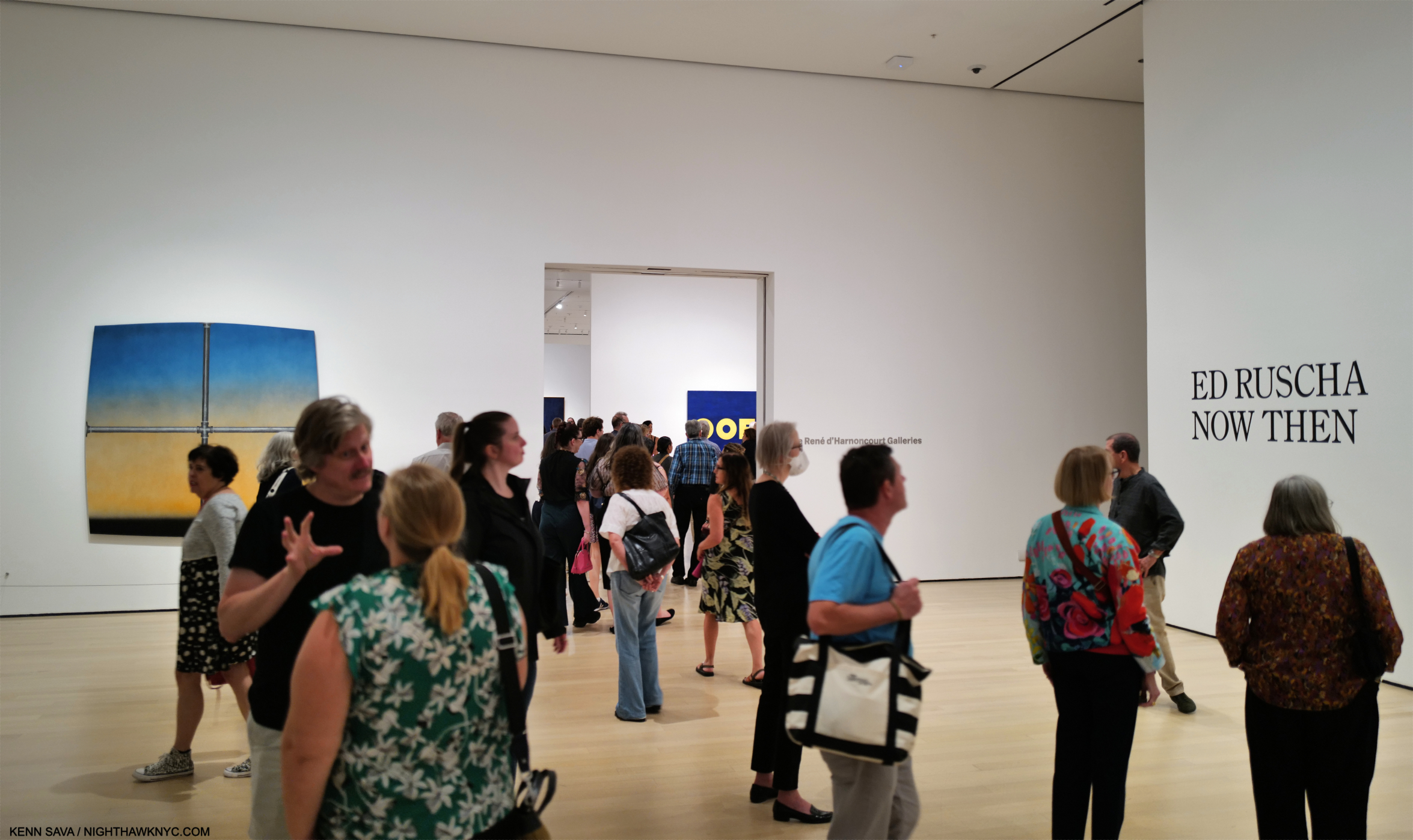
Installation view of the entrance, September 14, 2023. Images in this piece are thumbnails. Click any picture for full size.
Walking through the crowds at MoMA’s winter blockbuster, Ed Ruscha/Now Then over my six long visits bookending a terrible, six-week illness, I saw smiles as visitors moved from piece to piece, yet I couldn’t help but wonder how many of them felt they “understood” his Art. While humor undoubtedly plays a part in the craft of an Artist who knows you catch more flies with honey than vinegar, however they appear at first glance, his work usually leaves me scratching my head.
Returning to look at it again and again, that his work says something different to me every time I look at it has kept Ed Ruscha among my favorite Contemporary Artists. Judging from the turnout at MoMA, I’m far from alone in that. Having the chance to explore, and be mystified by, 200 pieces of his Art in Now Then from the, approximately, SIXTY-SEVEN YEARS(!) he’s been making it proved an all-too-rare chance to take a good hard look and try to get to the bottom of the mystery.
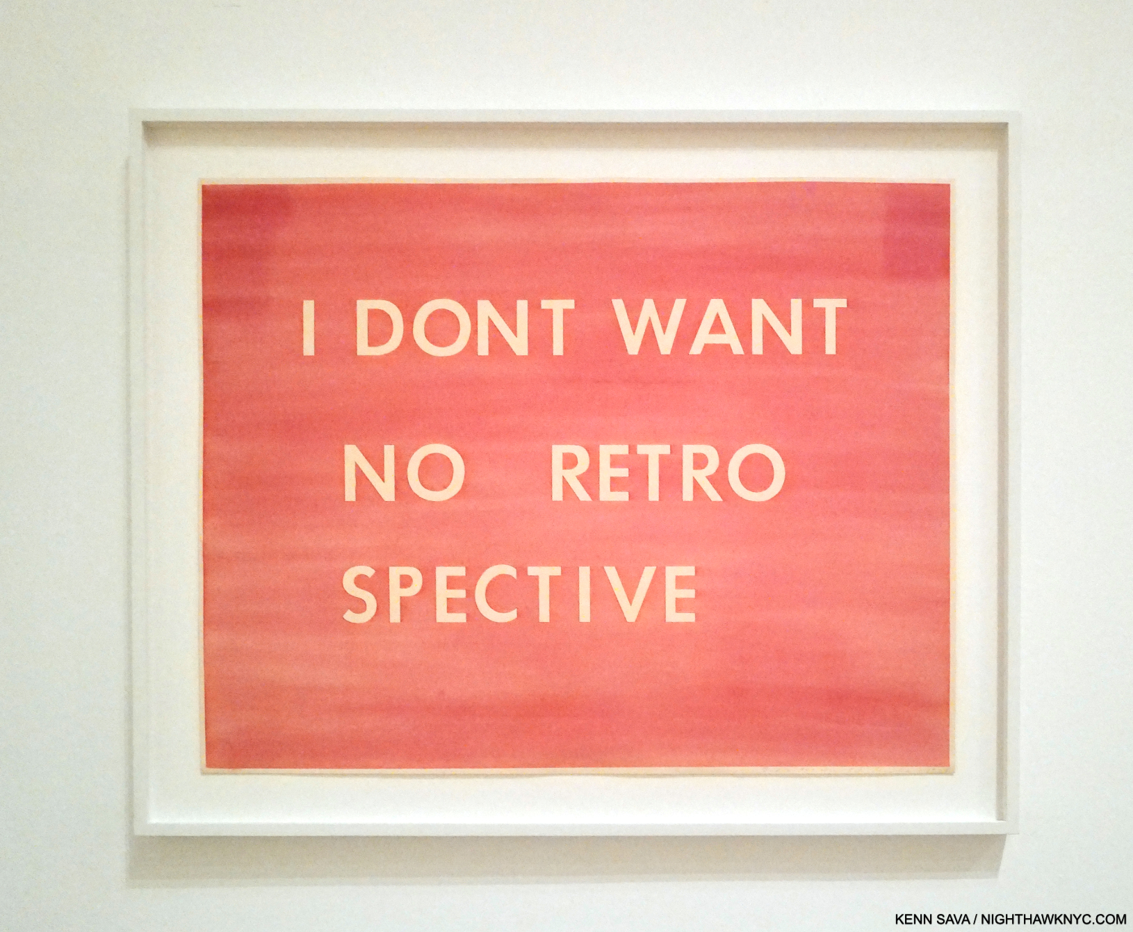
I Don’t Want No Retro Spective, 1979, Pastel on paper. The catalog for the last Ed Rusha retrospective in 1982(!) is also known by the Ruscha on the cover of its catalog, I Don’t Want No Retro Spective, though the show’s title was THE WORKS OF ED RUSCHA.
“All too rare,” as in Now Then is the first Ed Ruscha retrospective here since 1982, (and so mine, too): over FORTY YEARS ago!1 The gap between them is another head scratcher given how popular Ed Ruscha’s Art is. The title Ed Ruscha/Now Then can be taken as a reference to the Artist’s penchant for revisiting his subjects over time, as well as the fact the show includes old and recent work, or a chance to see his older work now. It’s also a rare retrospective of a West Coast Artist who came to prominence in the 1960s mounted on the East Coast. Bruce Conner didn’t live to see his at MoMA like Ed Ruscha has. Ed Kienholz, and Mr. Conner’s friend, Jay DeFeo, among others, are still waiting for their East Coast retrospective.
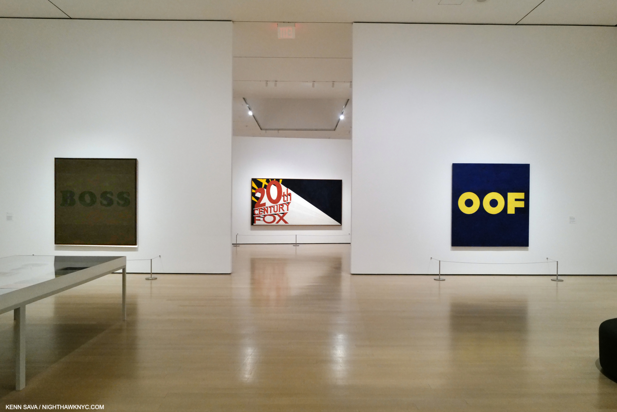
Installation view from just inside the entrance of the first gallery looking into the second. Boss, 1961, the famous Large Trademark with Eight Spotlights, 1962, and the infamous OOF, 1962-3, left to right, all Oil on canvas.
Walking through it, I became particularly fascinated by how his style(s) developed, and how Edward Joseph Ruscha IV became Ed Ruscha, one of the most influential Artists in the world among Modern & Contemporary Artists, if not THE most influential, at this point in time.
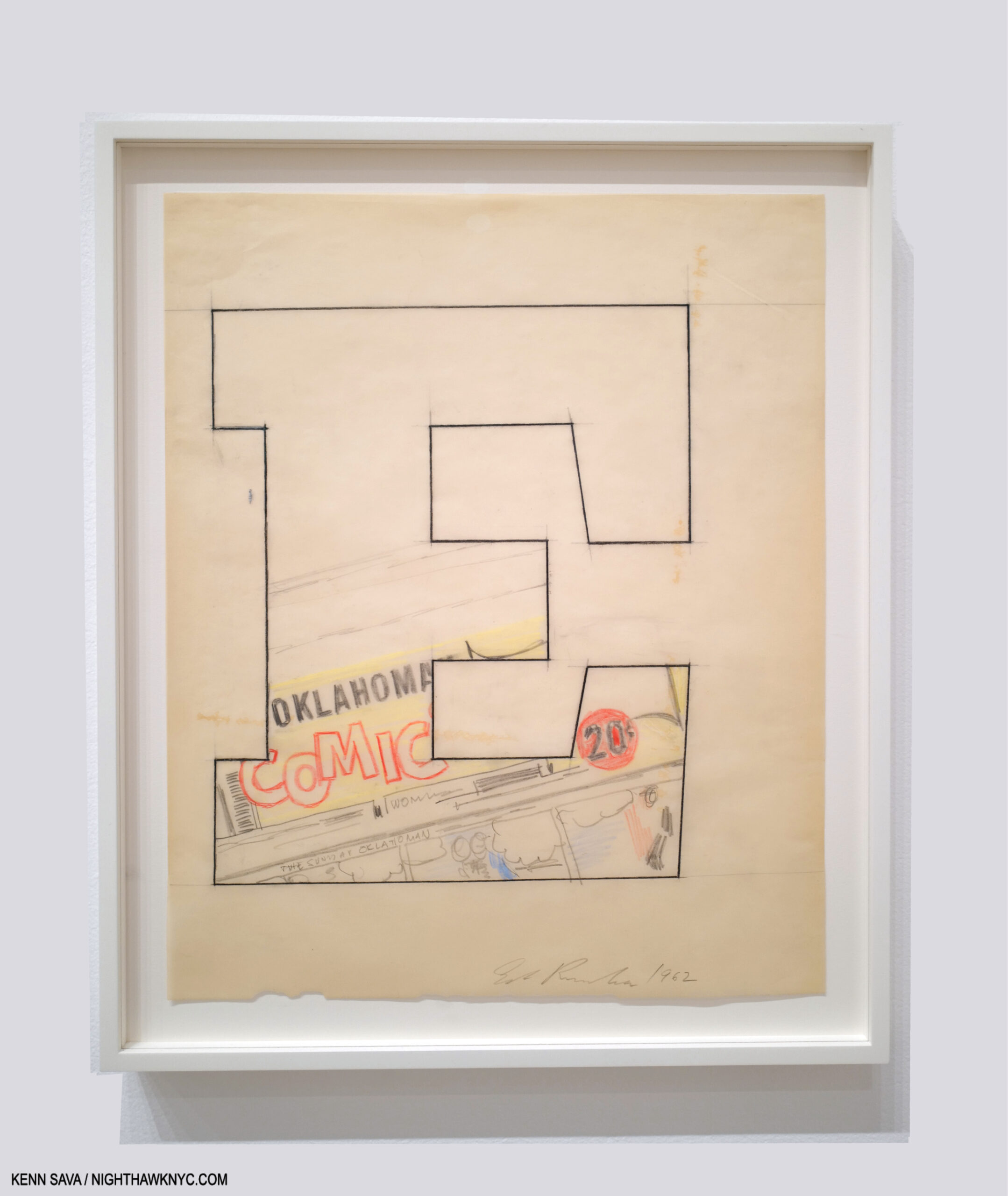
Oklahoma-E, 1962, Pencil, colored pencil and charcoal on paper
Born in Omaha in 1937, his family moved to Oklahoma City when Ed was 5. Early on, he had a passion for comics and a love of typography, particularly as it appeared in commercial publications. All of these are combined in Oklahoma-E from 1962, a seminal year in his early career. His initial desire was to become a Commercial Artist, and it was towards that end that he left OKC after graduating high school to head to L.A. with a friend in a lowered 1950 Ford, to study it. He chose to go west rather than east because of its energy, glamour, and its “hot rods and custom cars2.” Unable to get into his chosen school, he was accepted at Chouinard Art Institute (later Cal Arts, where Henry Taylor would study in the 1990s). His teachers, disciples of Abstract Expressionism, “wanted to collapse the whole art process into one act3.’’ “It (Abstract Expressionism) was, in his opinion, ‘a solid way of thinking…If you think about the paintings that were done in the 1950s, I find them overwhelming, nothing but quality…It was a very powerful time in art.’ However, ‘…within AbEx there was no room for my ideas4.'” While this frustrated him, they did succeed in getting him to change his focus from Commercial Art to Fine Art, which we can all be grateful for. After Now Then, I wonder if they accomplished more.
While in school in 1957 he had an epiphany.
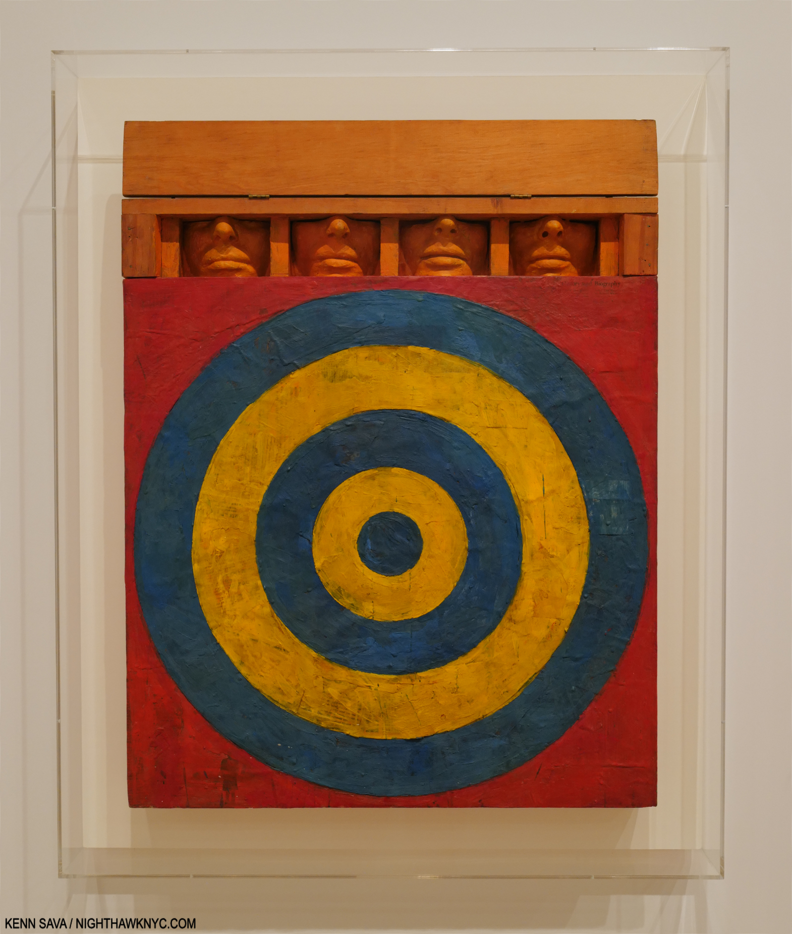
One of the most extraordinary works of the 1950s. Jasper Johns, Target with Four Faces, 1955, Encaustic on newspaper and cloth over canvas surrounded by four tinted-plaster faces in wood box with hinged front. Seen in Jasper Johns: Mind/Mirror at the Whitney in 2021.
“The breakthrough he sought came in 1957, when he spotted a small black-and-white repro of Jasper Johns’s 1955 Target with Four Faces in the Feb/Mar 1957 issue of Print Magazine. Encountering Johns’s painting was, he said, an ‘atomic bomb’ in his training, ‘a stranger fruit’ that he ‘saw as something that didn’t seem to follow the history of art. My teachers said it was not art. ‘I didn’t need to see the colors or the size…’ ‘I was especially taken with the fact that it was symmetrical, which was just absolutely taboo in art school- you didn’t make anything symmetrical…Art school was modernism, it was asymmetry, it was giant brush strokes…it was all these other things that were gestural rather than cerebral. So I began moving to things that had more of a premeditation5.’”
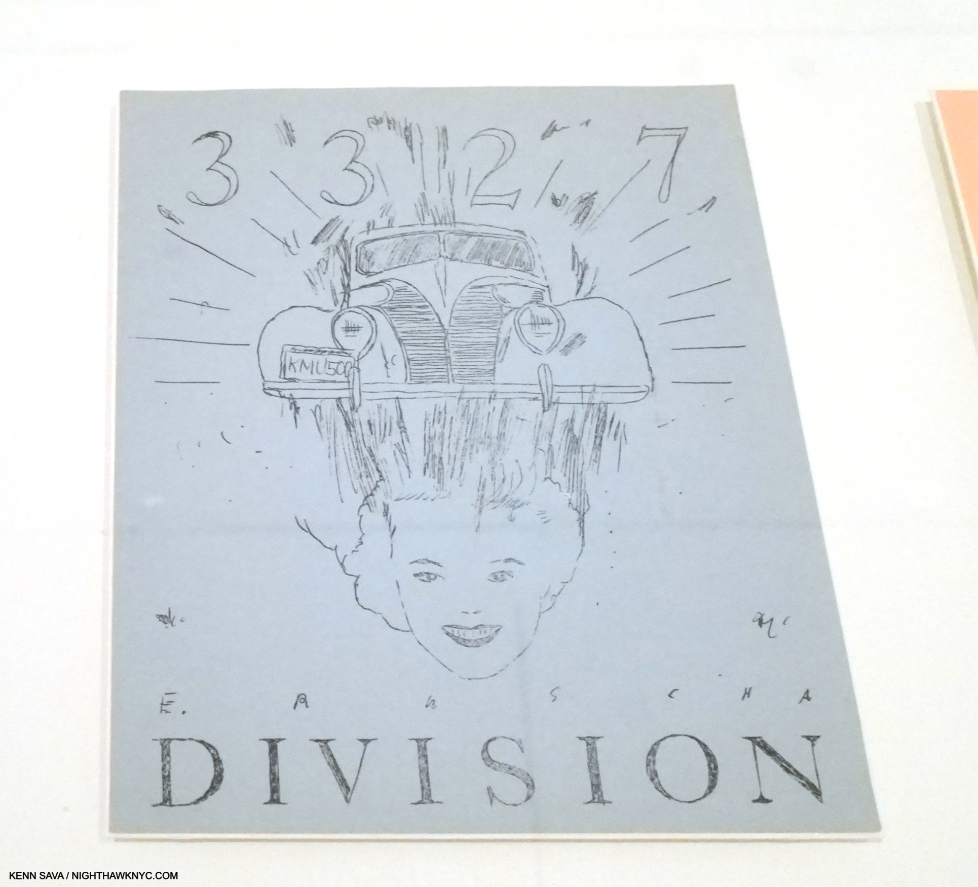
Dvision, 1962, Mimeograph on paper, One of five Prints by five Artists in the Portfolio issued in conjunction with the New Painting of Common Objects show.
That has continued to this day. Along the way, he and others (including Andy Warhol, Roy Lichtenstein and James Rosenquist), built on what Johns, Rauschenberg and Marcel Duchamp had started: the “next thing” after Abstract Expressionism, an Art based in the recognizable, the familiar, the every day. Some called it “pop.” Personally, I see nothing but danger in trying to box Ed Ruscha (who has consistently eschewed boxes).
In fact, one word comes to my mind over and over again as I look at his Art over time: abstract. If I were going to use two words to describe it they would be “premeditated abstraction.” Look at Division, above. It contains what would become Ed Ruscha trademarks- text, typography, and images, combined in a way that are next to impossible for most viewers to “read.” If that’s not “abstract?” What is? Maybe his teachers would be proud after all. It was only through delving into his history, I found that 3327 Division Street was the address of his first L.A. studio6. The car might have been his. Does that mean there’s more of a backstory to it? I haven’t found it. In the end, for me this says there may, or may not, be personal meaning to some/many/even all of his Art, but, 60+ years on, they haven’t come to light. So, with Division, as with all his Art, the viewer is left to make of them what they will.
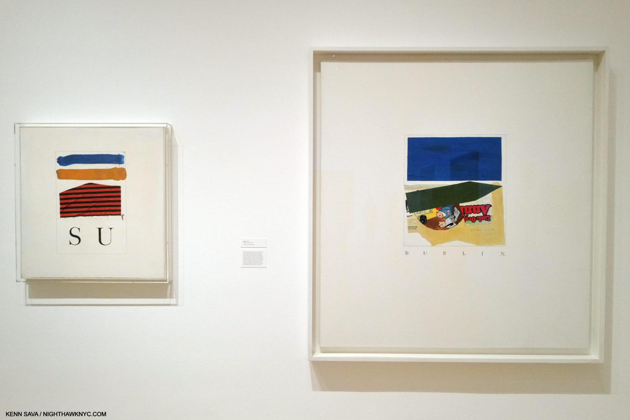
The two earliest piece in the show, SU, 1958, Oil, ink and fabric on canvas, (sixty-six years old!), left, with Dublin,, 1960, Oil and ink on canvas, right. Yes, a comma is part of the title.
Before graduating, he took hitchhiking trips that he immortalized in some of the earliest works in the show. the mysterious SU, 1958, the earliest, strikes me as a forerunner of what would come later. Even in these early works, text and imagery appear, though separately, as different elements that seem to stand apart from each other until the viewer brings them together, or creates a narrative around them, in his or her mind. These elements have continued in his work to this day, though he would soon start layering them. SU is, also, one of the relatively few of his works that refers to an actual person, the title referring to Su Hall, his girlfriend at the time.
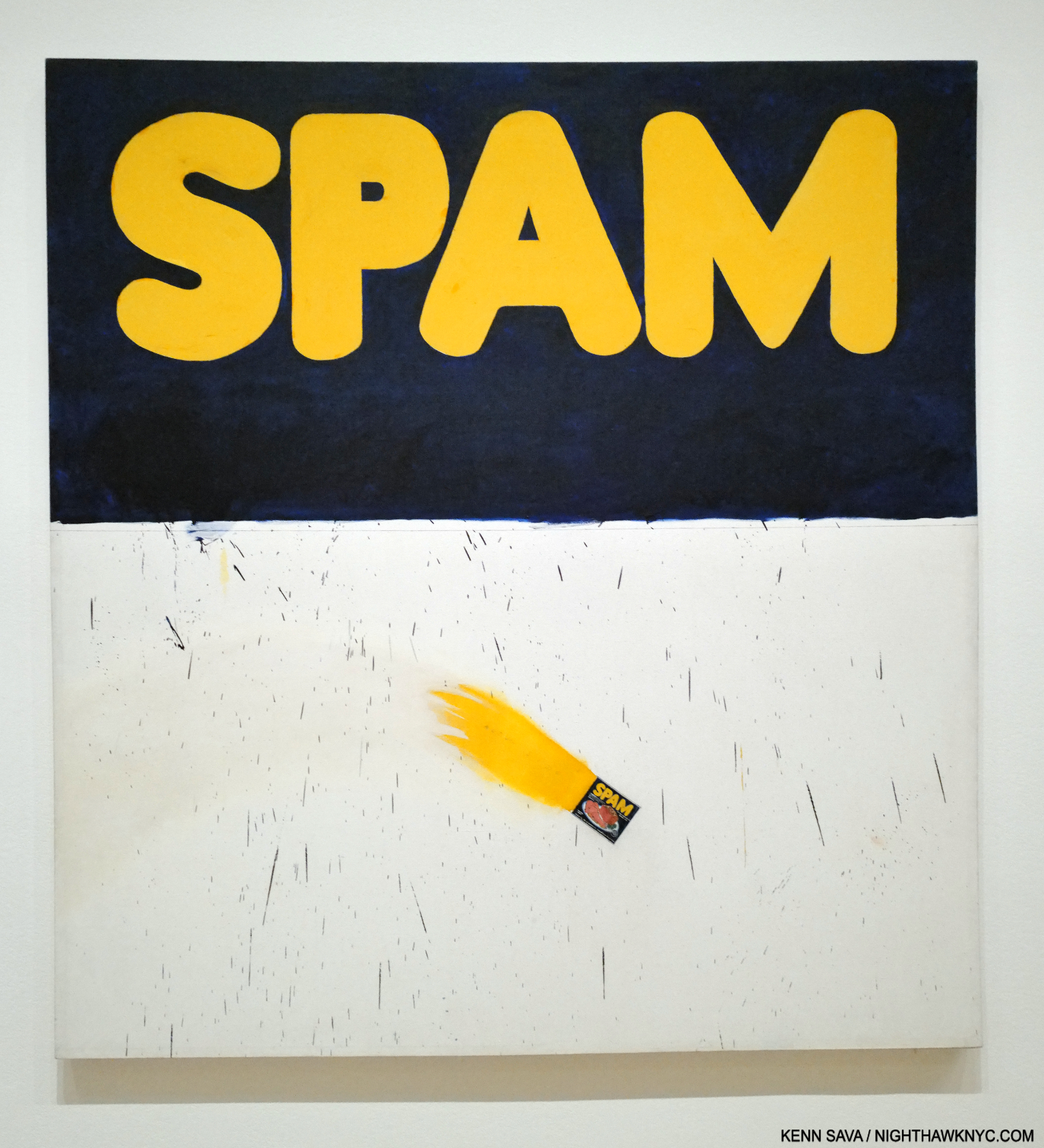
Actual Size, 1962, Oil on canvas, 67 1/16 x 72 1/16 inches. His breakthrough work when it was included in the landmark New Paintings of Common Objects show. A Painted, flaming, “actual size” can of Spam in its lower section is accompanied by some brush marks that might be associated with Abstract Expressionism. In fact, a number of his early pieces, like Three Standard Envelopes, 1960, also include them. Given his prodigious technique, on display in this, I don’t see how these marks can be considered accidental. Jennifer Quick7 surmises these connote AbEx’s commercialization. I see them as Ruscha making this technique his own, using it in a way none of the AbEx Artists did. I also see it as an early example of the many forms that abstraction would take in his work.
The rest of the gallery includes highlights of his early 1960s Word Paintings. We watch as he continued to strip away excess and refine his concept. Eventually, single words appeared alone on solid backgrounds This is interesting because he has said of his recent phrase Paintings that the backgrounds are simply that. Early on, as in Actual Size, they appear to be more.
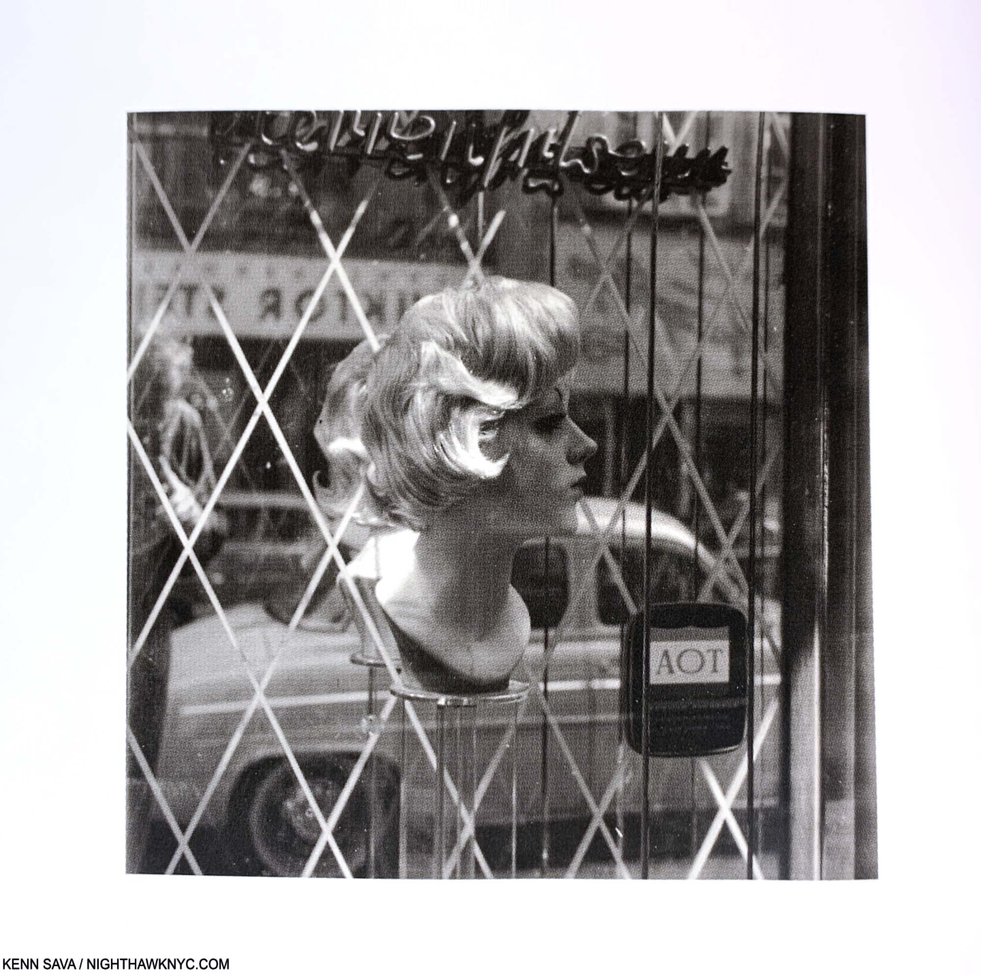
Vienna, Austria, 1961. This striking Photo was in a vitrine in the show, which prevented my getting a decent picture. This image of it comes from the book Ed Ruscha and Photography, P.48
After he graduated college, Ed spent 10 months on an extensive tour of Europe. While he reports not being impressed with the museums (among other things, he was disappointed by the lack of Contemporary Art), he took note of quite a bit of what he saw while out and about, particularly the street signs, with their foreign words, different design & typographies. He Drew and Painted a number of these, but he also put the new Yashica twin-lens reflex camera he was required to get in one of his classes to good use, taking a number of interesting Photos, beginning a revolutionary career in the medium in the process. Back home in fall, 1961, he set to work. Less than a year later his work was included in the landmark show, New Paintings of Common Objects at the Pasadena Art Museum, along with that of Andy Warhol, Roy Lichtenstein, Wayne Thiebaud and others, and so-called “pop” Art was born. Ed Ruscha has consistently rejected being boxed, though he rode on the coattails of the “movement,” and the word is still used in describing his work, ignoring the visual evidence.
The first gallery concludes with an infamous work. Does this look familiar?
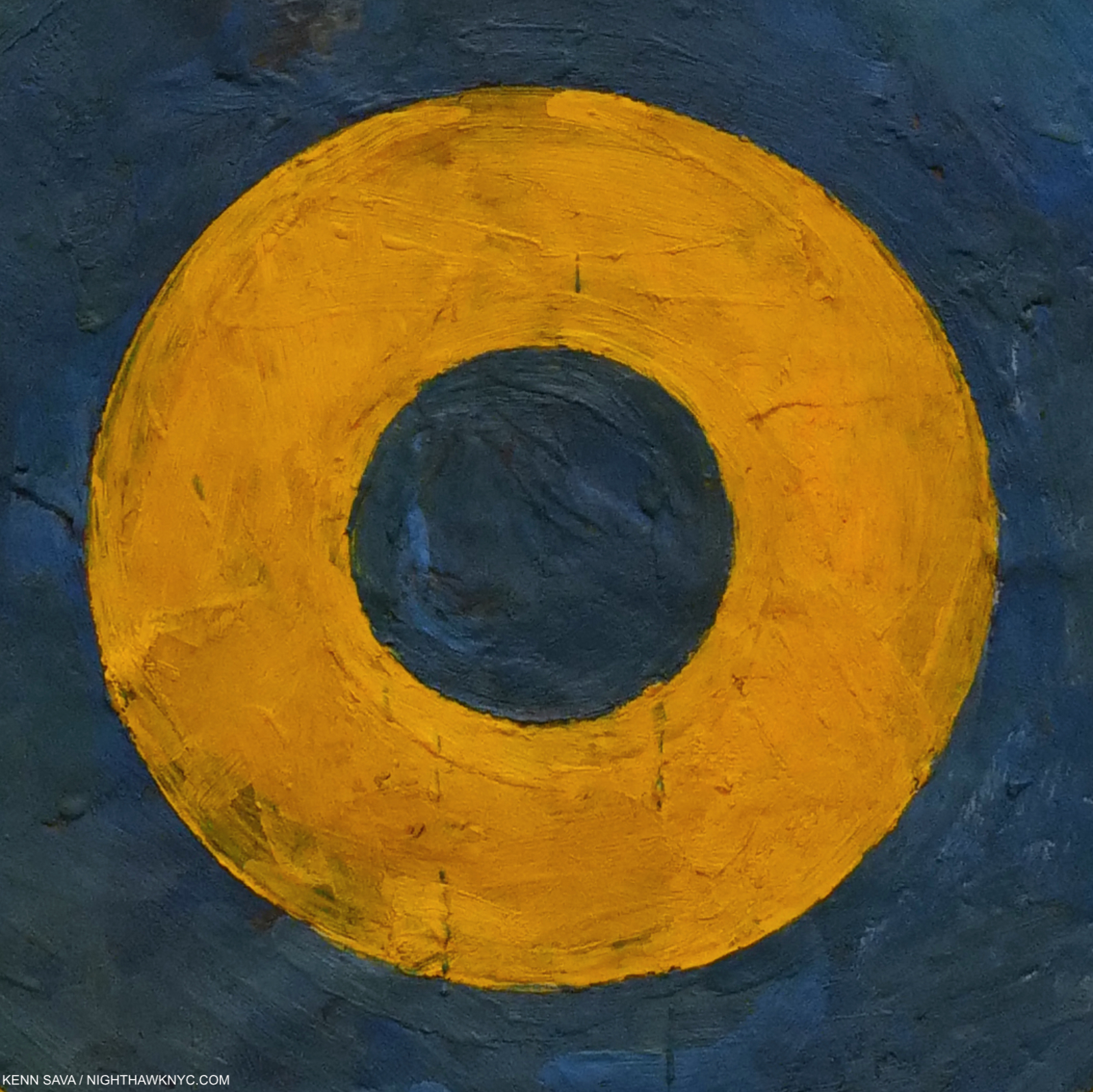
Ummm…It might not be what you might think it is. It’s a detail of the center of the target in Jasper Johns’s, Target with Four Faces, 1955, shown earlier. Now, look at this-
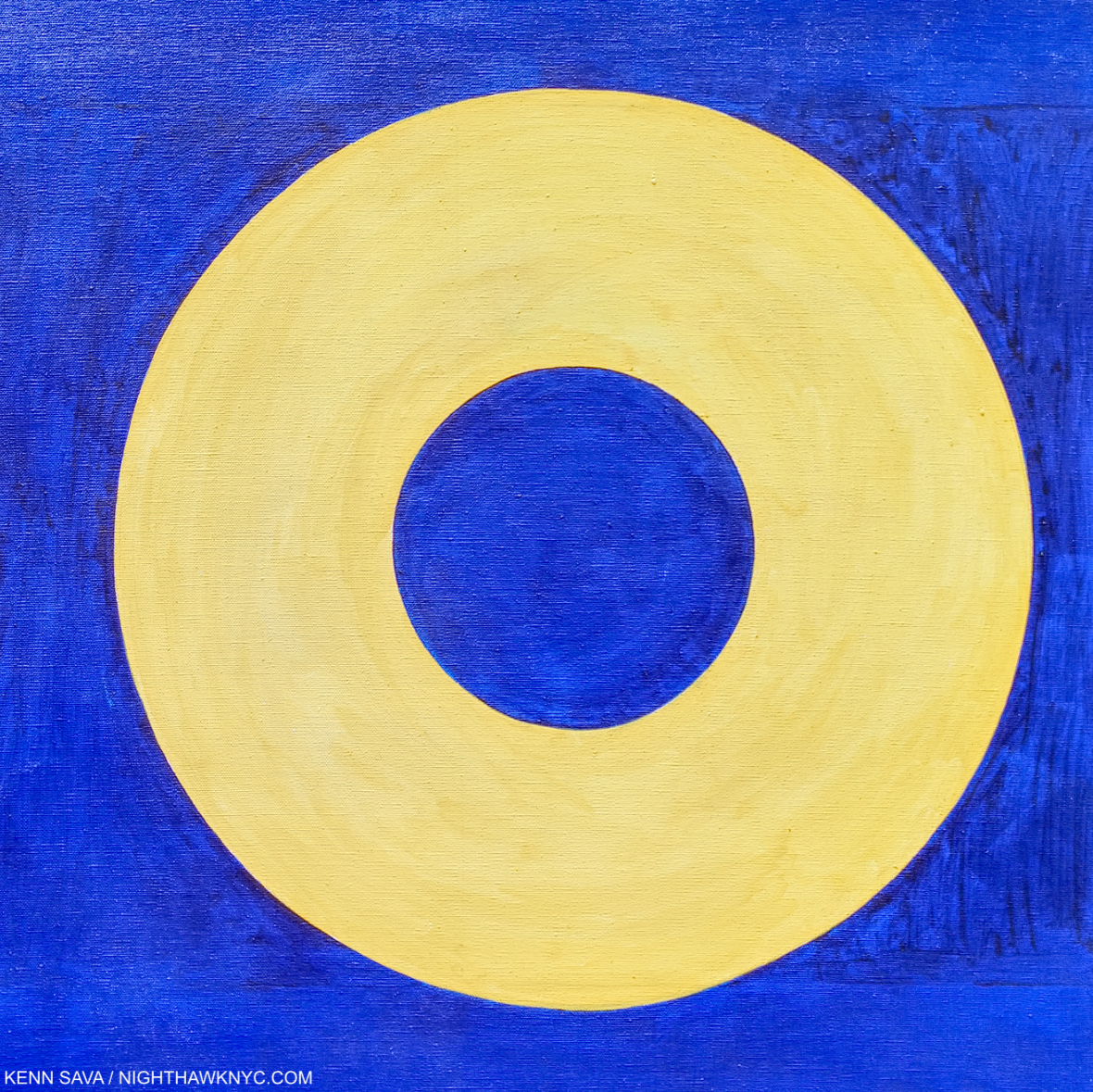
Yes! One of the two “Os” in Ed Ruscha’s OOF, 1962 (reworked 1963). Just five years after he saw Target with Four Faces, Ed Ruscha Painted the above. Coincidence? Homage? Fallout from that “atomic bomb going off in my training?” My feeling is the visual evidence is pretty strong for making a case for any or all three.
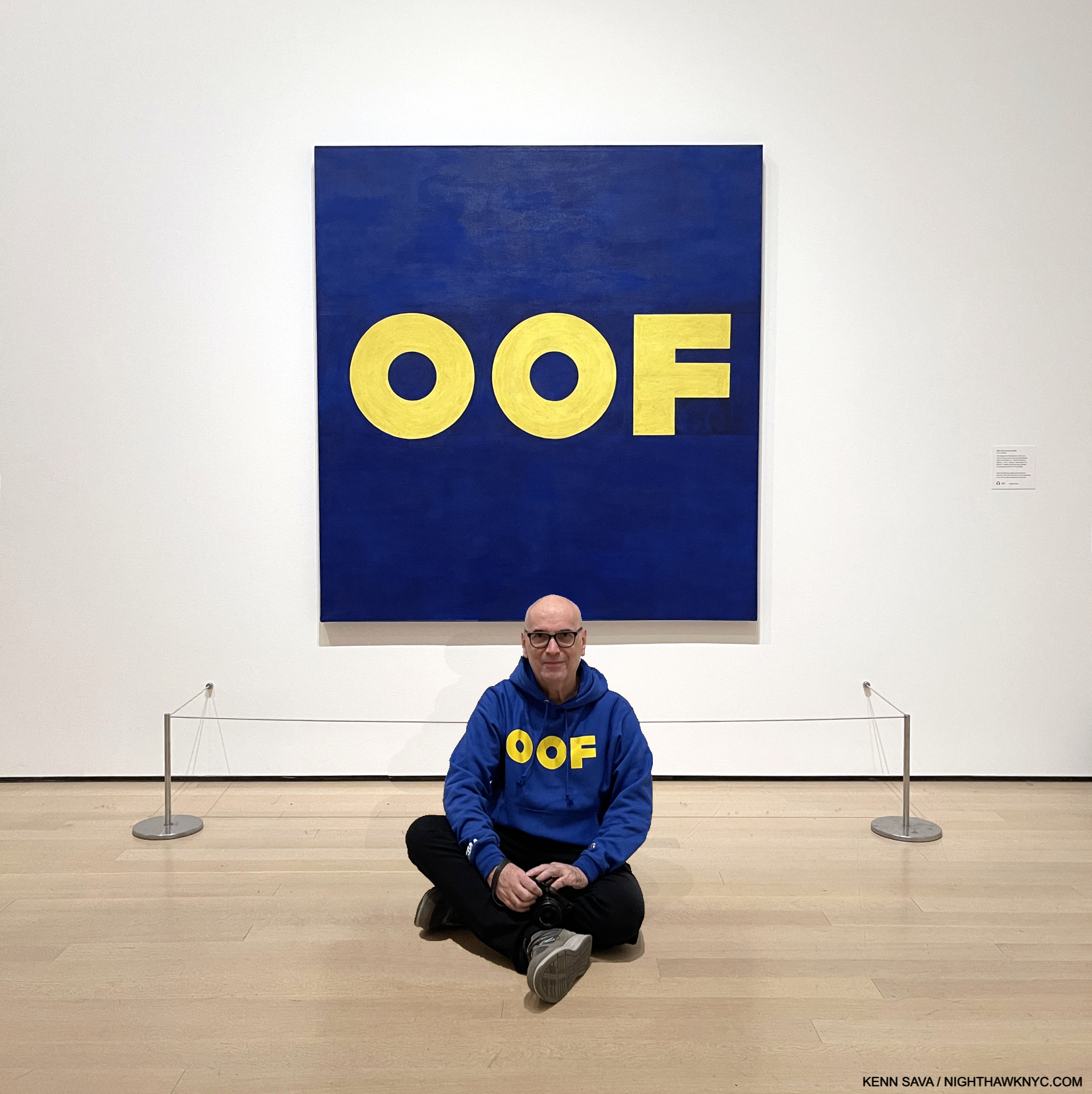
Hello! I’ve never appeared on NighthawkNYC over its 8 1/2 years, except in my self-portrait in the Banner (and a picture in my last piece, here, from the distant past). Until now. I’m introducing myself to NHNYC readers in front of a Painting I have a personal connection to: OOF, 1962-3, Oil on canvas, 71 1/2 x 67 inches on Ed Ruscha/Now Then’s final day, January 15, 2024. As for my “personal connection” to OOF? Very, very few know. My thanks to the lady who graciously agreed to take this.
Personally, it’s hard for me not to think there’s an influence; in the colors, the shape of the circle/”Os.” Even if it’s subconscious. Looking at both of these works now, they’re both revolutionary in their way. The Johns has been discussed at length over the past 60 years. Does anyone else think OOF is a revolutionary work, let alone a masterpiece? I believe it’s both. Revolutionary? It’s possibly the first time (as far as I know) that a Painting features a “word” that Merriam-Webster categorizes as an “interjection,” and not an actual “word” per se. I also believe it’s an “alt masterpiece.” Seriously. The composition, colors, font, placement of the text are all perfect, belying Ed Ruscha’s mastery of typography and graphic design, with the sublime taste that would be a hallmark of his work. OOF stands as the pinnacle of his early word Paintings in my view. Oof is a word, if it is one, that defies concrete understanding, making it a perfect (unofficial) conclusion of sorts to the series. Merriam-Webster says Oof is an interjection “used to express discomfort, surprise, or dismay8.” They point out “the first known use of the word was in 1777,” which I find hilarious. How do they know? Did they consult an Oofologist? They further define an interjection as “an ejaculatory utterance usually lacking grammatical connection9.”
Oof!
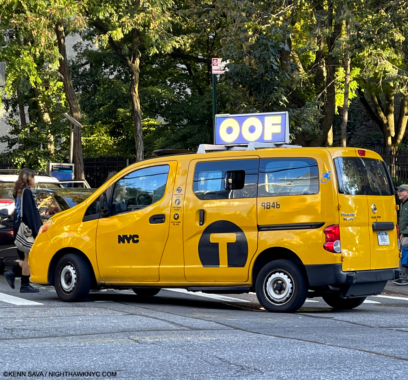
OOF everywhere around town. A first step to a better world! I yelled “OOF,” but he didn’t stop.
As such it seems to me that OOF stands as an outlier among the single words Ed Ruscha chose as the subjects of his early 1960s Word Paintings (BOSS, HONK, ACE, SMASH, FLASH and NOISE, shown below, et al) because it is quite abstract, and therefore, a jumping off point for what was to come. I wish I had asked viewers what the Painting said to them. Having owned it for 61 years, MoMA is well aware of its mysterious appeal. No doubt that is why the museum chose to emblazon OOF all around town as the focus of their show marketing.
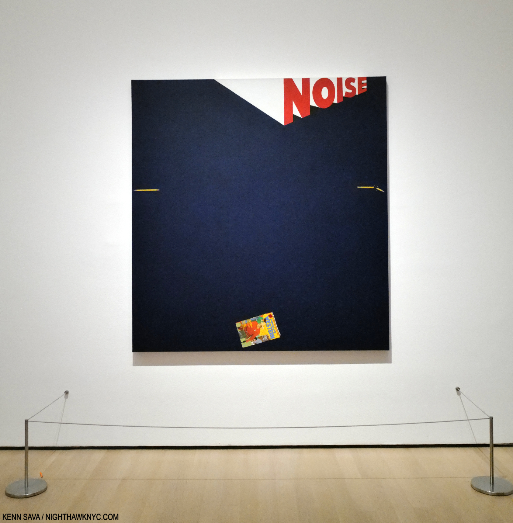
Noise, Pencil, Broken Pencil, Cheap Western, 1963, Oil and wax on canvas, 71 1/4 x 67 inches. There are two Painted pencils in the piece, and lo and behold someone left another one on the floor, behind the left stanchion. I resisted the urge to move it for effect for this picture. Maybe, I should have…
Along with abstraction, it seems to me there are surreal elements in his work. Perhaps no single word Painting has these abstract/surreal qualities than Noise, Pencil, Broken Pencil, Cheap Western, 1963, which also represents an evolution. Ed Ruscha has long considered it one of his best Paintings[3, Per the wall card.]. In it, the mystery of the word is added to with three very realistic images, close to its own edge. Unusual for a Painting, or Art, it leaves the center, the focus of most Art, empty except for the background color. Most of the previous Word Paintings centered the featured word. As such, it’s both unique and a precursor of other works that combine words and images. It’s also both abstract, thought it depicts realistic objects, and surreal. If I read it from the left, the whole pencil lies quietly seemingly in mid-air. The word “NOISE,” another monosyllabic word, grows until it reaches the right side (again, like a speeding train) where it hovers above the broken pencil. The cheap western seems to be hovering in the air, too, like the left-hand pencil, where it wouldn’t make noise until it lands, which it might be close to doing. The Artist has created “action” from three still objects and a word.
In the catalog for that last major Ruscha retrospective there’s this-
“The broken pencil calls to mind the incident Ruscha has referred to a number of times in interviews when as a child in parochial school he was regularly rapped on the knuckles with a pencil by a nun who caught him misbehaving in class. Is the pencil, then, simultaneously a symbol of expression and repression10?”
If this is the case, though Mr. Ruscha has not said that this incident is what’s depicted here, my reading of it wonders if the “Cheap Western,” i.e. the comic book which appears to be reaching the bottom of the piece, was struck from his hand when he was caught reading it in class, being a big fan of comics at this age, the broken pencil having been cracked over his hand. It’s also, simultaneously, an abstract and a surreal composition. As many have pointed out, it also leaves the center bare. It carries forward his use of the single word, while also taking it on a new tangent.
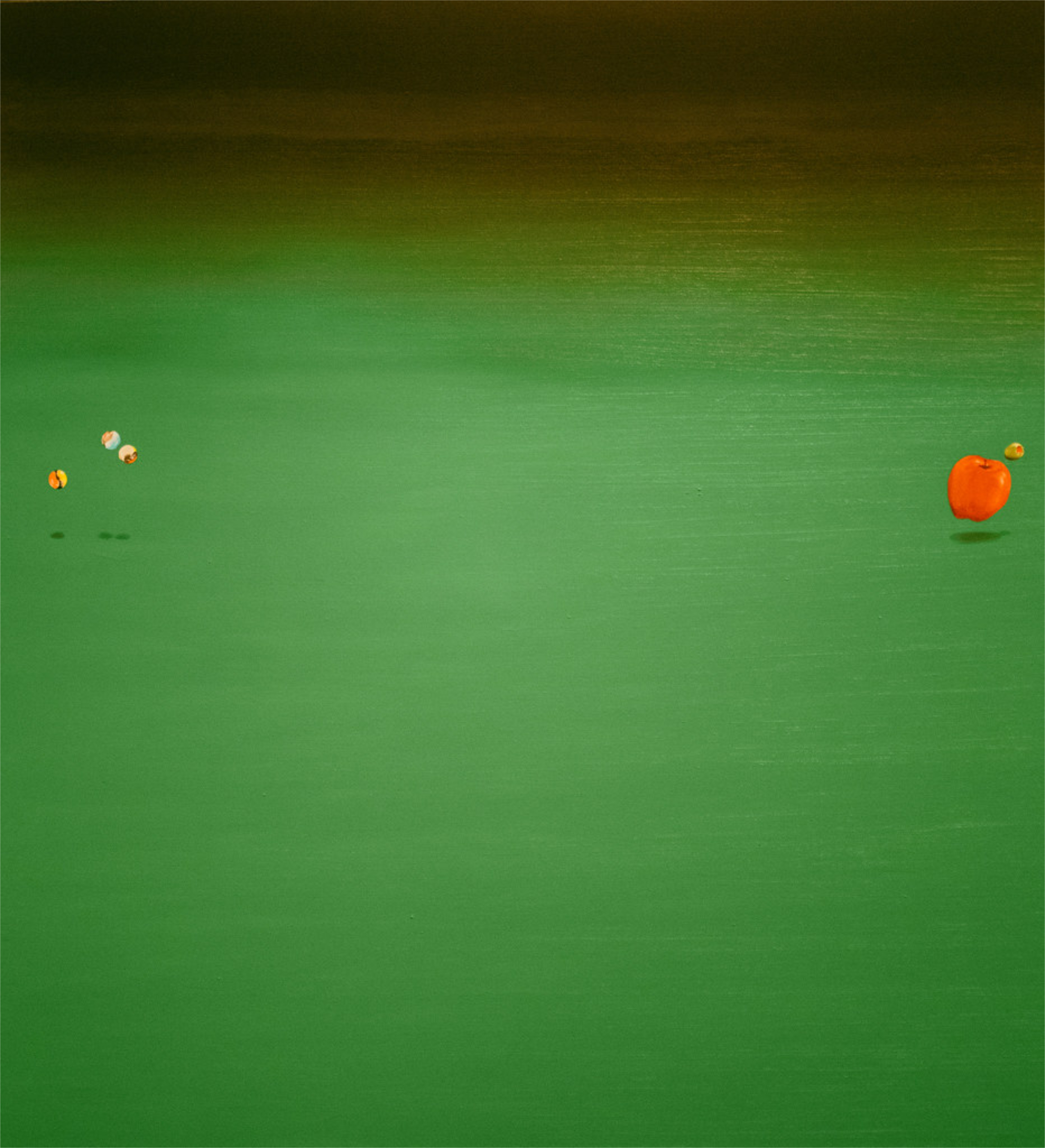
Bouncing Marbles, Bouncing Apple, Bouncing Olive, 1969, (not in the show) has much in common with Noise, Pencil, Broken Pencil, Cheap Western from six years earlier. One of countless Ed Ruschas that feel surreal to me. Here, he “sugar coats” the surrealism by using harmless objects like marbles and an apple on a welcoming green background. Leaving the olive, the looming black, and the fact that the marbles & apple are bouncing to stir up our imaginations, making the work decidedly not a “still life.” *- Photographer unknown.
Noise, Pencil, Broken Pencil, Cheap Western is another one-Painting revolution, like OOF was. Though both were only followed-up indirectly, as in Bouncing Marbles, Bouncing Apple, Bouncing Olive, 1969. Now, look at this-
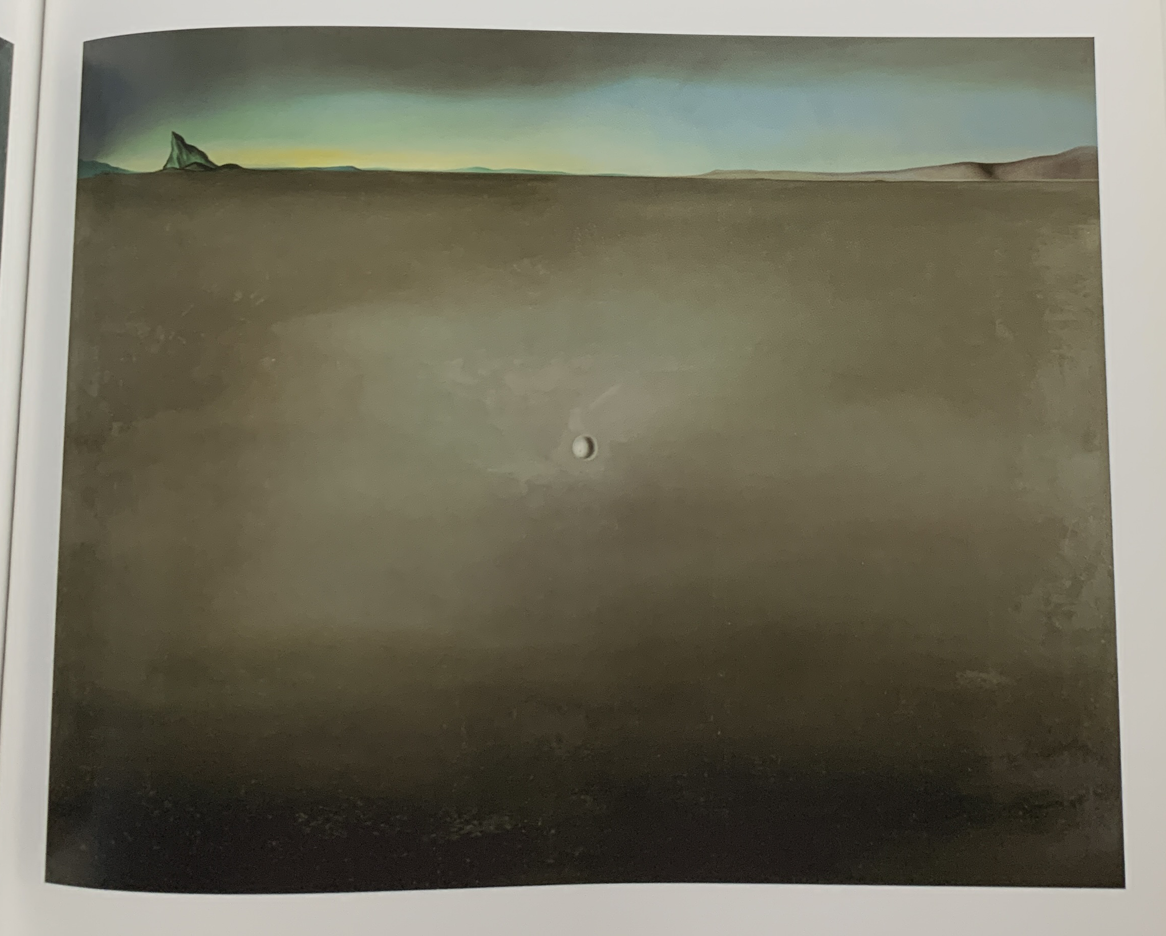
Salvador Dali, the legendary Surrealist, Open Field with Ball in Centre and Mountains in Rear, Study for the Disney film Destino, 1946, Oil on masonite. Influence? Seen in MoMA’s catalog for their show Dali & Film.
Works like Noise, Pencil, Broken Pencil, Cheap Western and Bouncing Marbles, Bouncing Apple, Bouncing Olive (and other works that include marbles and olives) are so different from anything that’s come before in his work. Yet, as time went on, they are joined by many works that while they depict recognizable objects are very abstract, even surreal, including his recent Tom Sawyer Paintings. Most of them have no words, and taken as a group they now form a sizable part of his oeuvre. For my part, I trace them all back to Noise, Pencil, Broken Pencil, Cheap Western from 1963.
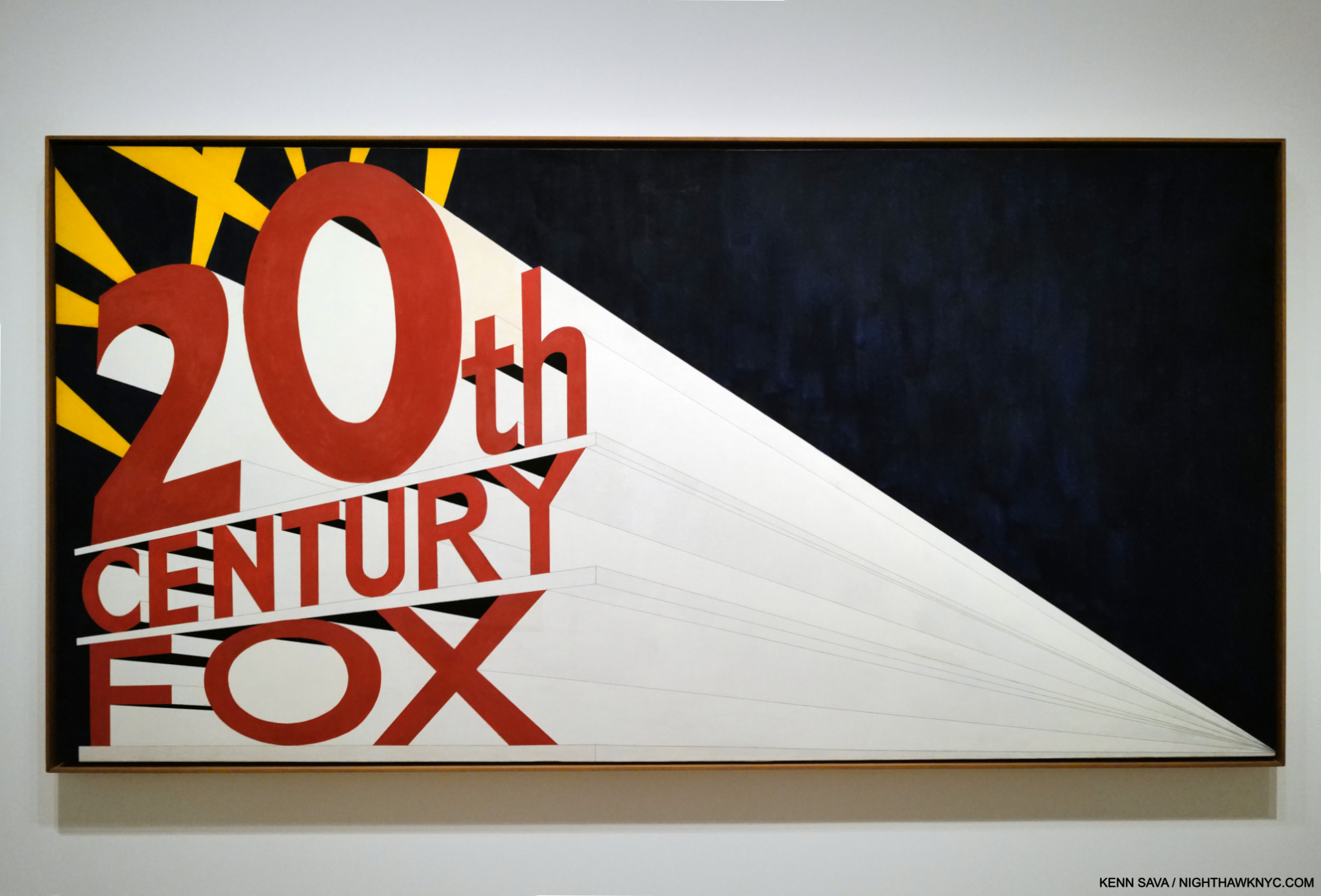
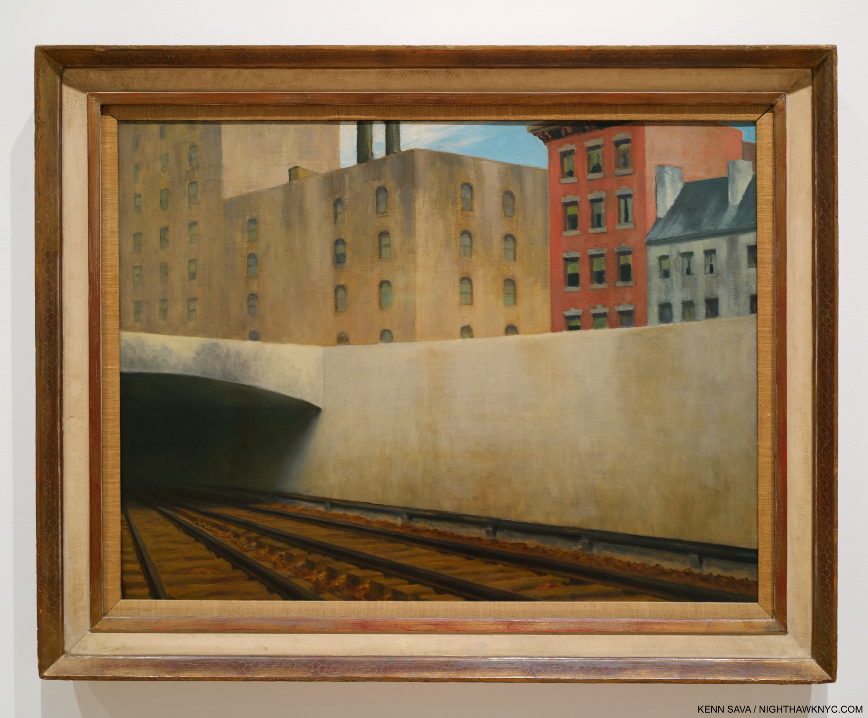
Large Trademark with Eight Spotlights, 1962, Oil on canvas 66 9/10 x 133 1/10 inches. An early L.A.-inspired work, like most of Ed Ruscha’s work its “meaning” is nebulous. At the time he Painted this, the famous Film studio was in decline and going through layoffs. One reading might be a comment on fleeting fame about to fade out, or like his PhotoBook, Every Building on the Sunset Strip, 1966, possibly a hard realization for the Artist who relocated from Oklahoma City, that glamour is not all it appears to be from afar. It’s also a work that is reminiscent of a speeding, approaching train, a compositional device he would use again. Though it’s described as “Oil on canvas,” those are graphite lines leading to or from the vanishing point.
In 1962, L.A./Hollywood, its sites and culture began appearing in Ed Ruscha’s Art, as in Large Trademark with Eight Spotlights, which is also a precursor to his multi-word and phrase Paintings. Over the succeeding 60+ years, few if any, Artists would become more associated with Los Angeles than Ed Ruscha is and has been. From then to now, he would continue to Paint the city, and words and image would coexist in his Art, while single words largely became multiple words and, beginning in 1973, short phrases that he has continued to create to this day.
Part 2, “Ed Ruscha’s Wall Rockets,” is here. The concluding Part 3, “Ed Ruscha & The Two-Sided Coin of Influence,” is here.
*-Soundtrack for this piece is “Down the Highway,” by a Musician who has been creating and performing for about as long as Ed Ruscha has: Bob Dylan, born May 24, 1941, 3 1/2 years after Ed Ruscha. Bob released “Down the Highway” the same year Mr. Ruscha created a number of the Paintings in this piece, on 1963’s The Freewheelin’ Bob Dylan.
NighthawkNYC.com has been entirely self-funded & ad-free for over 8 years, during which 320 full-length pieces have been published! If you’ve found it worthwhile, PLEASE donate by PayPal to allow me to continue below. Thank you, Kenn.
You can also support it by buying Art, Art & Photography books, and Music from my collection! Art & Books may be found here. Music here and here.
Written & photographed by Kenn Sava for nighthawknyc.com unless otherwise credited. To send comments, thoughts, feedback or propositions click here. Click the white box on the upper right for the archives or to search them. Subscribe to be notified of new Posts below. Your information will be used for no other purpose.
- The traveling retrospective, THE WORKS OF ED RUSCHA, came to the Whitney Museum in 1982, one of five museum stops it made, when the Artist was about 45. ↩
- ER, Tate, P. 9 ↩
- Alexandra Schwartz, Ed Ruscha’s Los Angeles, P.17 ↩
- Alexandra Schwartz, Ed Ruscha’s Los Angeles, P.15 ↩
- Alexandra Schwartz, Ed Ruscha’s Los Angeles, P.15 ↩
- E.R. Tate, P.100 ↩
- in her book, Ed Ruscha: Art & Design in the 1960s ↩
- Here ↩
- Here ↩
- I Don’t Want No Retrospective- The Works of Ed Ruscha, P.15 ↩