Winslow Homer: Crosscurrents is now over. If you missed it, one of the few places you can still see a bit of it is here! If you appreciate that, please donate to keep this site alive. I can no longer create it AND fund it myself. Thank you.
Written & Photographed by Kenn Sava (*-unless otherwise credited)
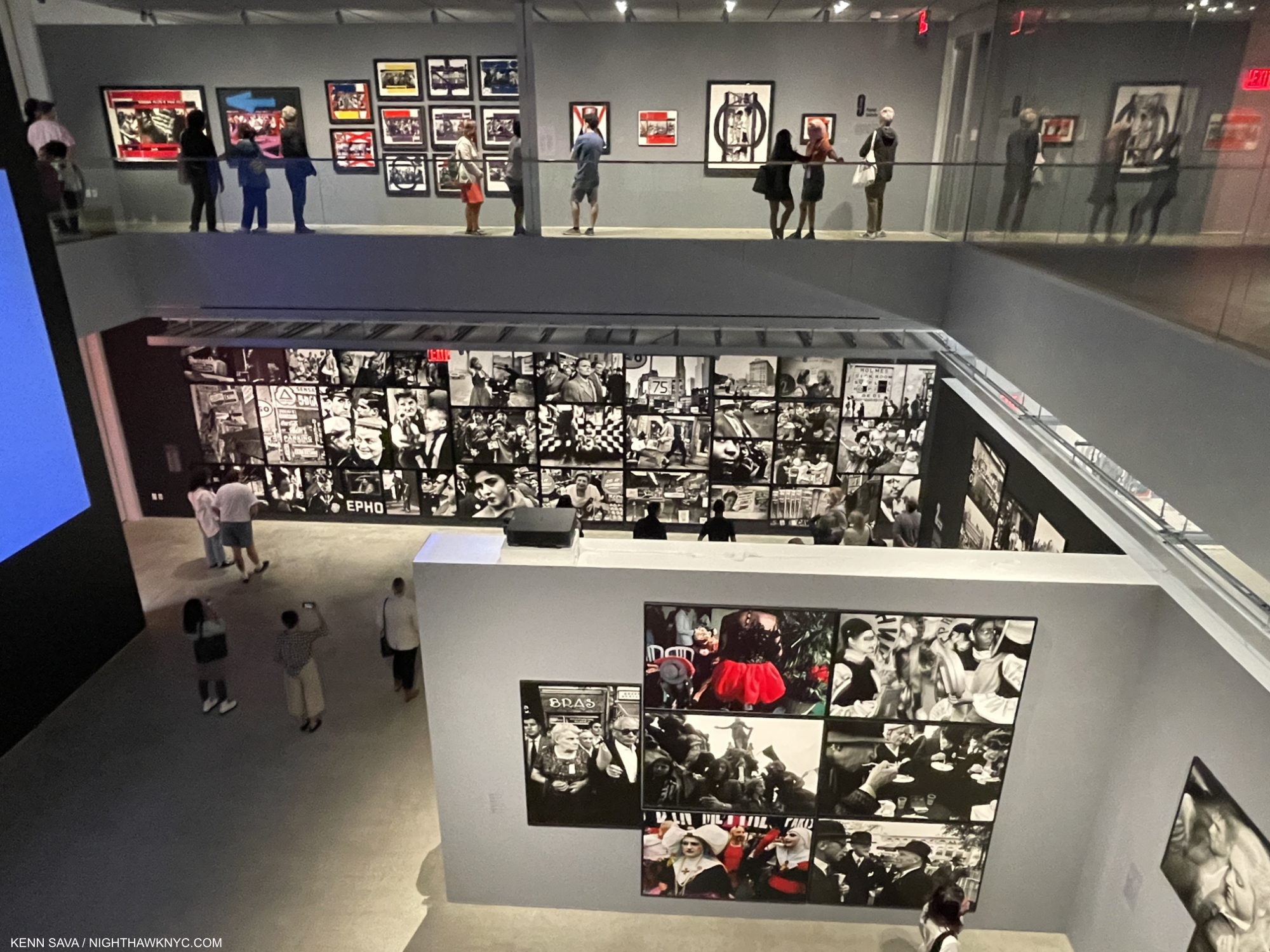
Ahhh….The summer blockbuster. What would Art life be without one? In spite of covid, we’ve been blessed here in NYC with big and memorable shows the past two summers, though of course, remaining careful is the only way to see one. So, I donned my double masks and went to see this year’s summer-fest, Winslow Homer: Crosscurrents, at The Met.
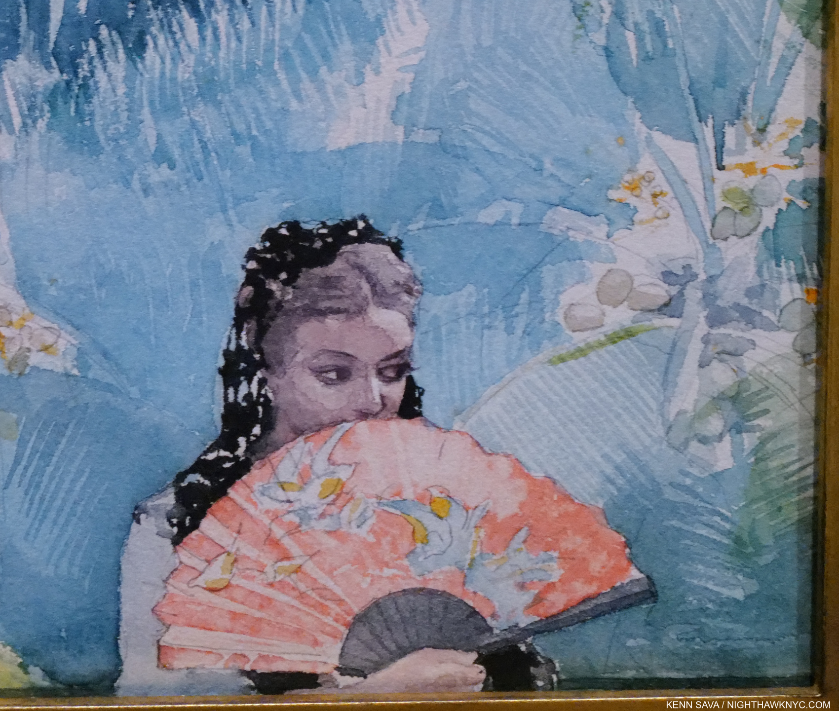
Winslow & chill…Detail of Lady of Santiago (Girl With a Fan), 1885, Watercolor on paper. Less than one quarter of the whole 8 7/8 by 11 1/2 inch piece is shown. How this is Painted is just stunning. Look at her face! Look at those Palm tree leaves! Not bad for not having any lessons, right? His mother was an accomplished Artist and gave Winslow some help early on, later he took a few lessons in Oils, beyond that, he was self-taught.
Interestingly, and probably purely coincidentally, Winslow Homer turns out to be almost an exact contemporary of the Artist who enthralled me last summer, Paul Cézanne, he of Cézanne Drawing at MoMA: Cézanne, 1839-1906; Homer, 1836-1910! Cézanne was, and remains, one of the most influential Artists of his time. Winslow Homer, though continually popular since he began creating, has not enjoyed the same reputation as a ground-breaker as the French master. To this point.
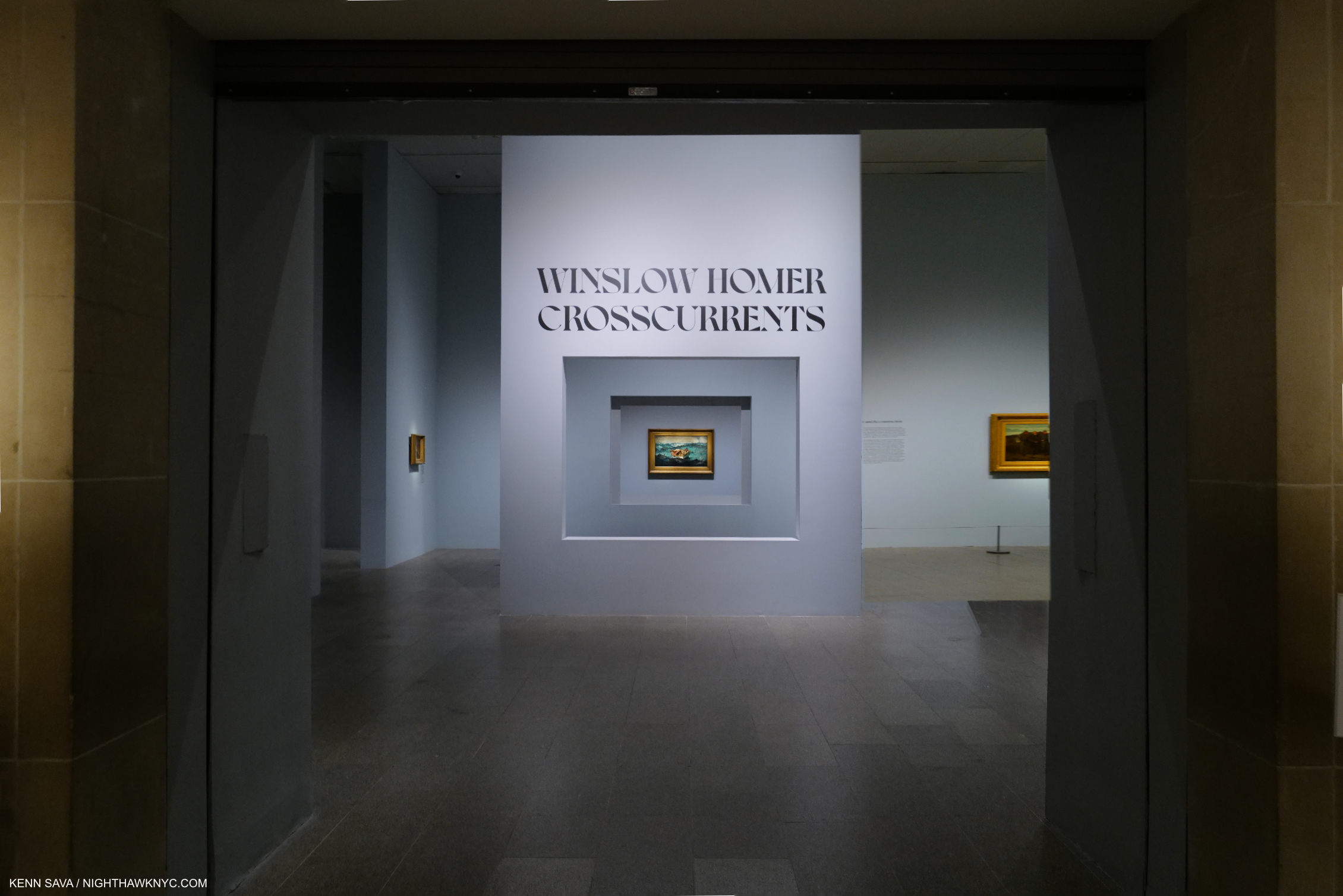
You’d need a telescope to see The Gulf Stream, center, from the show’s entrance, which announces it as the centerpiece for the entire show. There are a lot of very good Paintings before and after you get to it.
That sound you heard might be the tides beginning to turn after Winslow Homer: Crosscurrents.
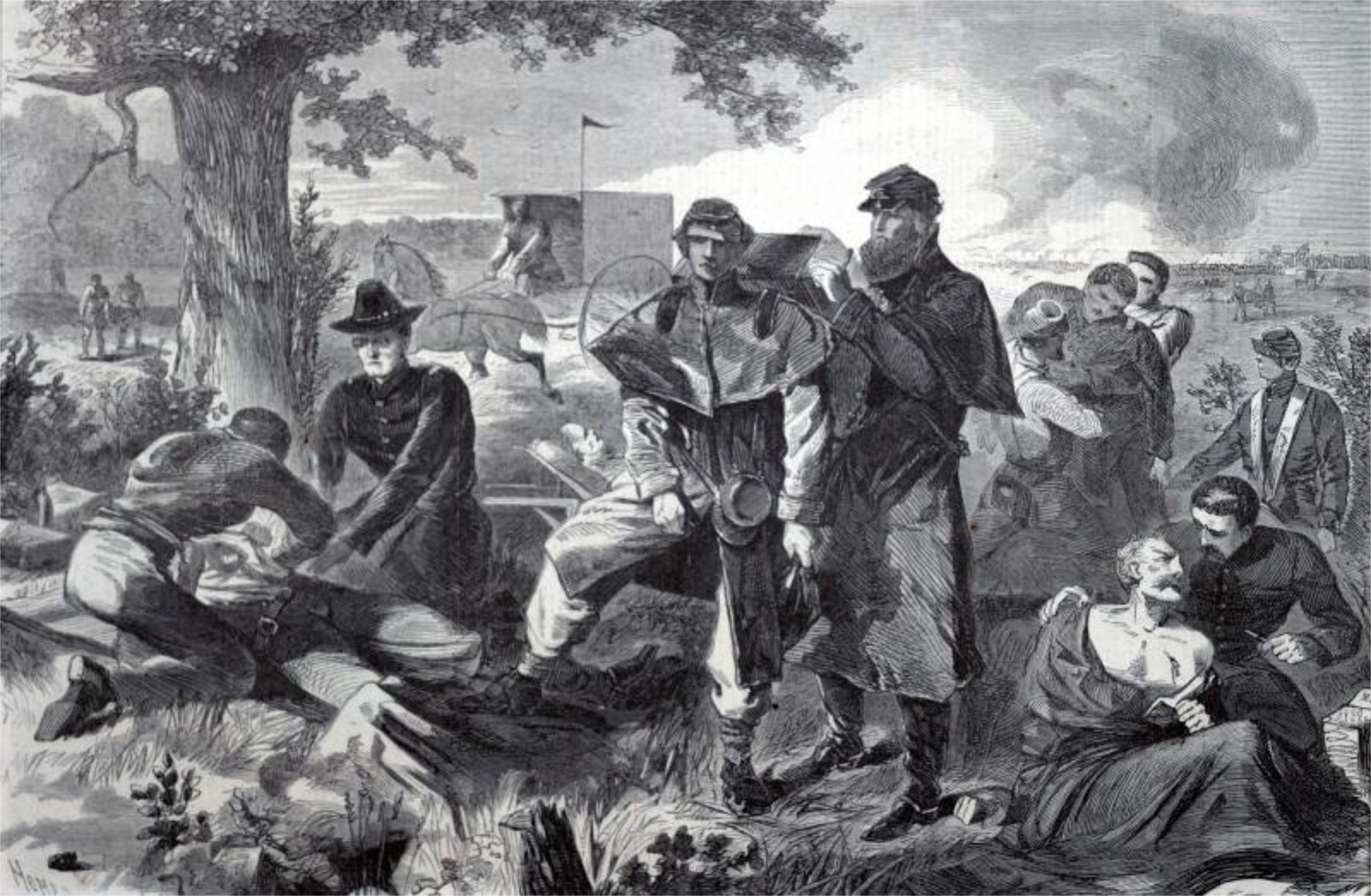
The Surgeon at Work at the Rear During an Engagement, from Harper’s Weekly, July 12, 1862, Wood engraving on paper. A number of Homer’s War pieces compile different scenes he may have witnessed on one of his trips to the front of the Civil War into one composition. I wonder if this is the case here. Homer was about 26 at the time he created this Drawing which was sent back, and then engraved by someone else. (* Not included in Crosscurrents. Smithsonian Museum of American Art Photo)
After early work as a free-lance illustrator covering the genteel life around him, Winslow Homer moved to NYC in 1859, where he took a few lessons in Oil Painting at the National Academy of Design with Frederic Rondel. He took a job as an illustrator for Harper’s Weekly right after the Civil War started in April, 1861, and much to his surprise, quickly found himself at the front in Virginia! It was there that he would come into his own, creating a body of War Illustrations that was important, historic, and ground-breaking, becoming, along with renowned Photographers Matthew Brady and Alexander Gardner, America’s first visual War reporters.
Crosscurrents begins at this point, in 1863. With 88 Oils and Watercolors, covering the full range of subjects the Artist rendered after he found himself and his direction during the War, and tracing the rest of his long career, the show is centered around The Met’s masterpiece, The Gulf Stream, 1900,1906. Work after work shows the lie to the out-dated standing perception and in its stead reveals how shockingly contemporary Winslow Homer is, 112 years after his death. The feeling one leaves the show with is akin to “How could we have missed so much in Winslow Homer?”
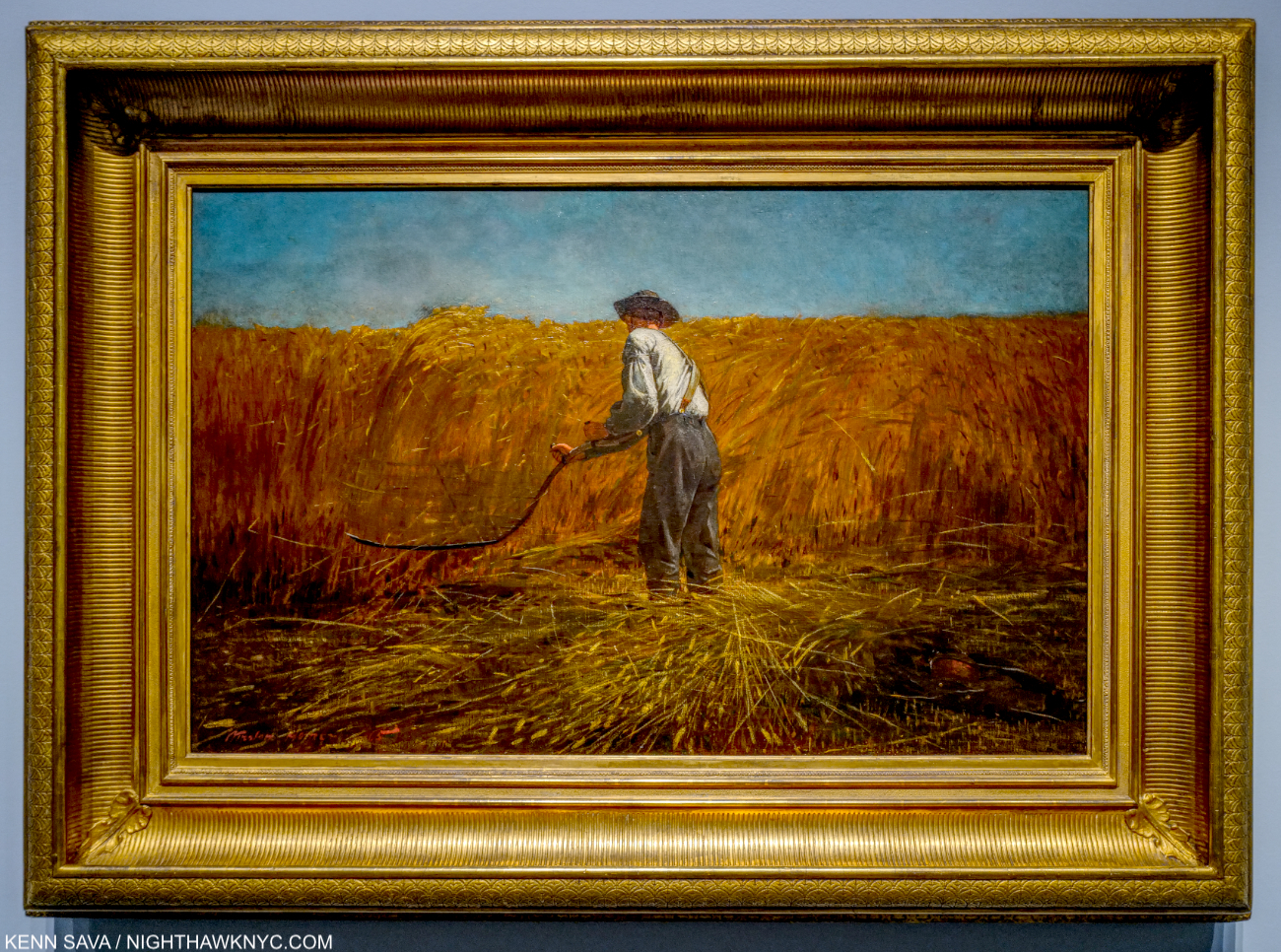
The Veteran in a New Field, 1865, Oil on canvas. As time went on, he felt he needed a different medium to express the depth of what he wanted to communicate. So, in 1863, he turned to Oil Painting, a medium he had only briefly studied. The soldier’s jacket lies to the right in this powerful image from the end of the War and the beginning of the Reconstruction. Originally, the scythe’s blade was even longer.
Part of the reason opinions on Winslow Homer haven’t changed is there’s been a lack of big Homer shows, and even Crosscurrents isn’t a full blown retrospective. The Met and National Gallery of Art in Washington had a Homer Retrospective in 1959, which the catalog shows to have had around 130 works. The Whitney had a Homer show in 1974 that had 200 works (per its catalog). For perspective, Winslow Homer created 300 Oil Paintings and 685 Watercolors, plus Prints and Drawings over the course of his career. 2022 is proving to be a fortuitous time to see 88 Homers.
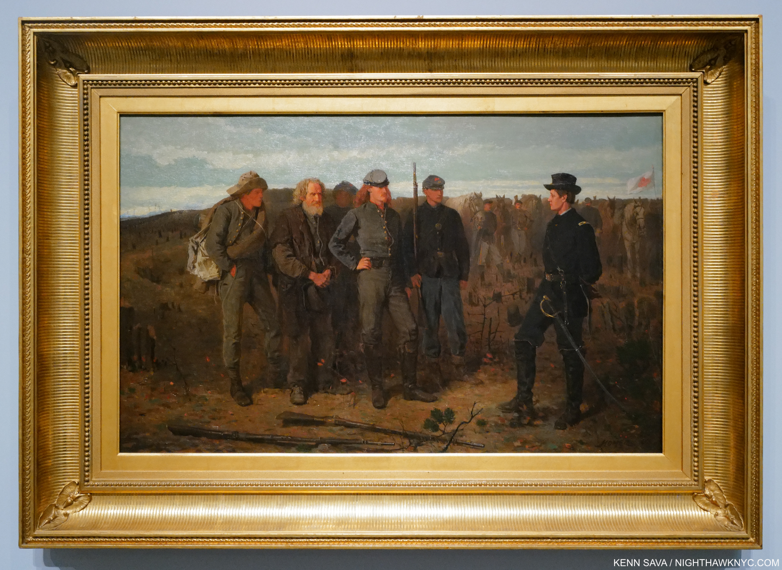
Prisoners from the Front, 1866, Oil on canvas. The work that made Winslow Homer’s name, reputation and career. It was then quickly acquired by the young Metropolitan Museum.
Before the War ended, Winslow wound up making multiple trips to the Virginia front. Of one, his mother wrote-
“Winslow went to the war front of Yorktown and camped out about two months. He suffered much, was without food 3 days at a time & all in camp either died or were carried away with typhoid fever- plug tobacco & coffee was the staples…He came home so changed that his best friends did not know him, but is well & all right now.”
The War forever changed Homer, and his Art. The genteel subjects were gone. To go deeper, he finally turned to Oil Painting in 1863 at the age of 27, fairly old to begin.
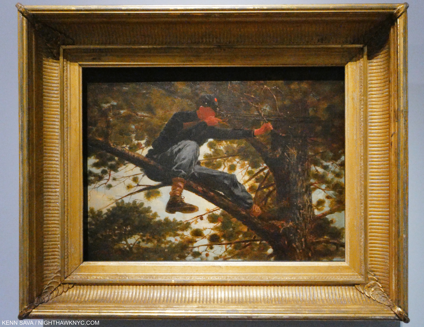
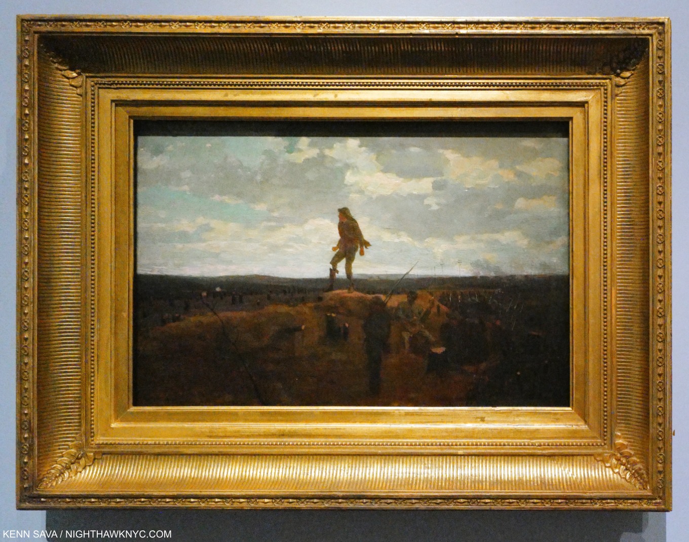
Sharpshooter, 1863, Oil on canvas. Not bad for a first Oil Painting, right?
“He was painting by eye, not by tradition; painting what he saw, not what he had been taught to see.” Lloyd Goodrich
Sharpshooters were, perhaps, the most deadly branch of the Army in the Civil War. The series The Civil War: Brothers Divided, credits sharpshooters with winning the Battle of Gettysburg, and by extension the Civil War. In Sharpshooter, we see one taking aim. In 1896, Homer recalled-
“I looked through one of their rifles once when they were in a peach orchard in front of Yorktown in April, 1862. The impression struck me as being as near murder as anything I ever think of in connection with the army & I always had a horror of that branch of the service.“ He included this sketch in his letter-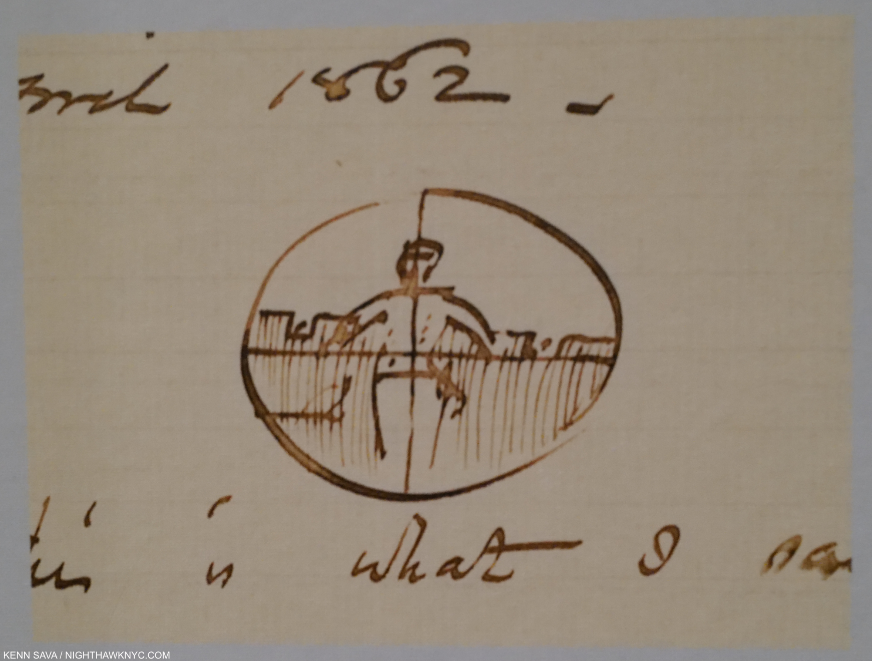
His very first Oil Painting, Sharpshooter, 1863, opens the show in attention- grabbing fashion. When I look at it, I feel for whoever may be on the other end of the telescope. After seeing the Drawing, I believe that’s what Homer intended.
There it is: right from the very first work, and then time and again, as I walked through the 40+ years of his career covered in Crosscurrents, what stands out for me is his empathy. This is what makes Winslow Homer special in his time, and timely today.
His strikes me as being on the level of the empathy I see in Rembrandt, Vincent Van Gogh, and especially in Goya. All his life he traveled, and many of his pieces reflect things he actually witnessed (some were based on newspaper reports). This combination of observation with his inherent empathy brings an uncanny “realism” to his work, even allowing that some pieces are based on the accounts of others, and some are compilations of events. And so, taking his Paintings as “documentary” is a bit problematic. I prefer to focus on the empathy.
Defiance: Inviting a Shot before Petersburg, 1864, Oil on panel. A Confederate soldier about to get what he’s asking for- two small puffs of smoke are seen at the middle left would seem to indicate the dare accepted, the shots on their way. And so, this is the flip-side of Sharpshooter.
On an adjacent wall, the very next Painting would seem to indicate the Artist may have been thinking similarly. Perhaps, he felt he wanted to be clearer about his intentions, and create a “more direct” work? Here, he shows us the opposite viewpoint. Brilliantly paired in the show. Defiance is utterly remarkable. It’s not like the sharpshooters needed a lot of help.
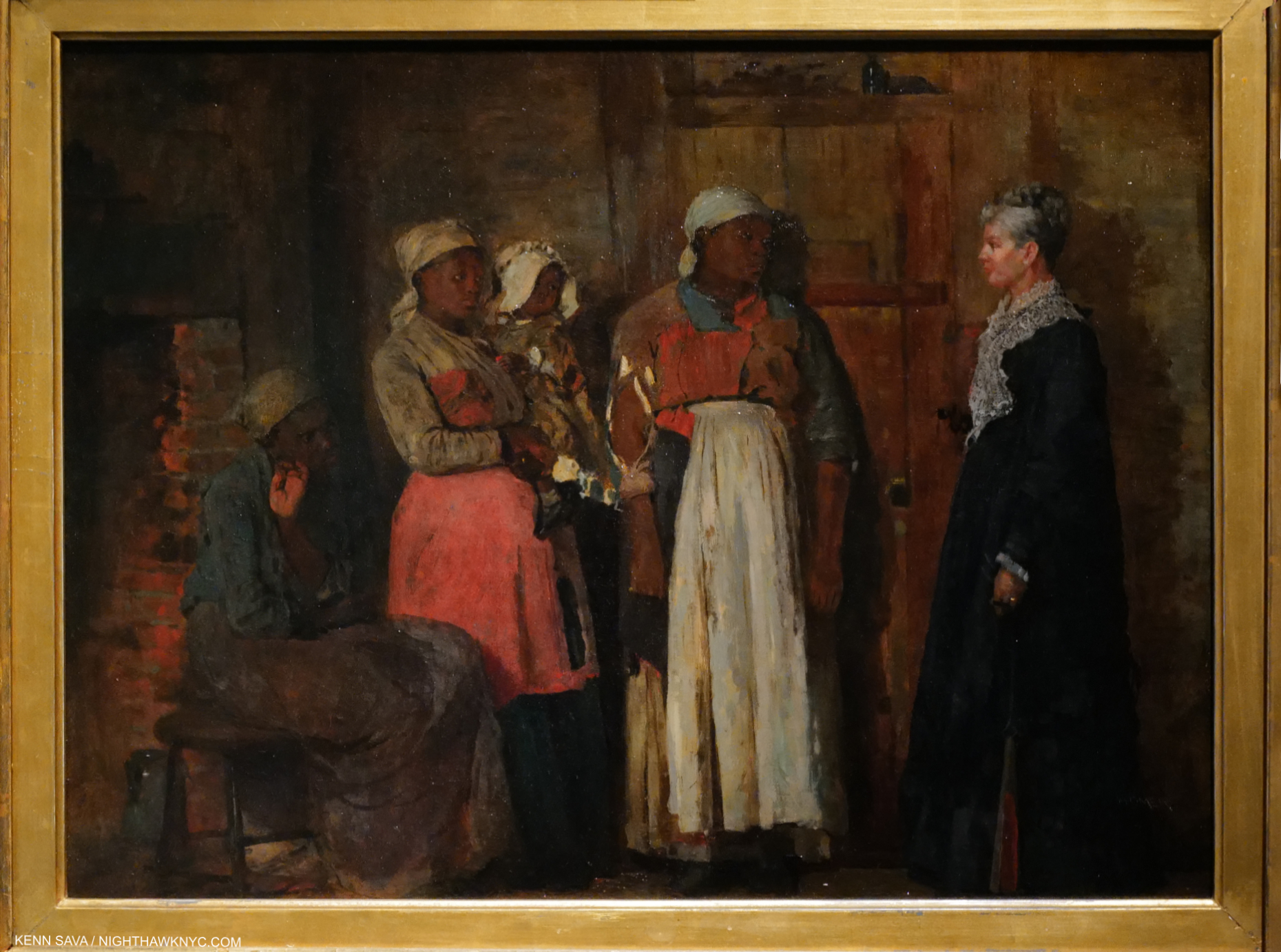
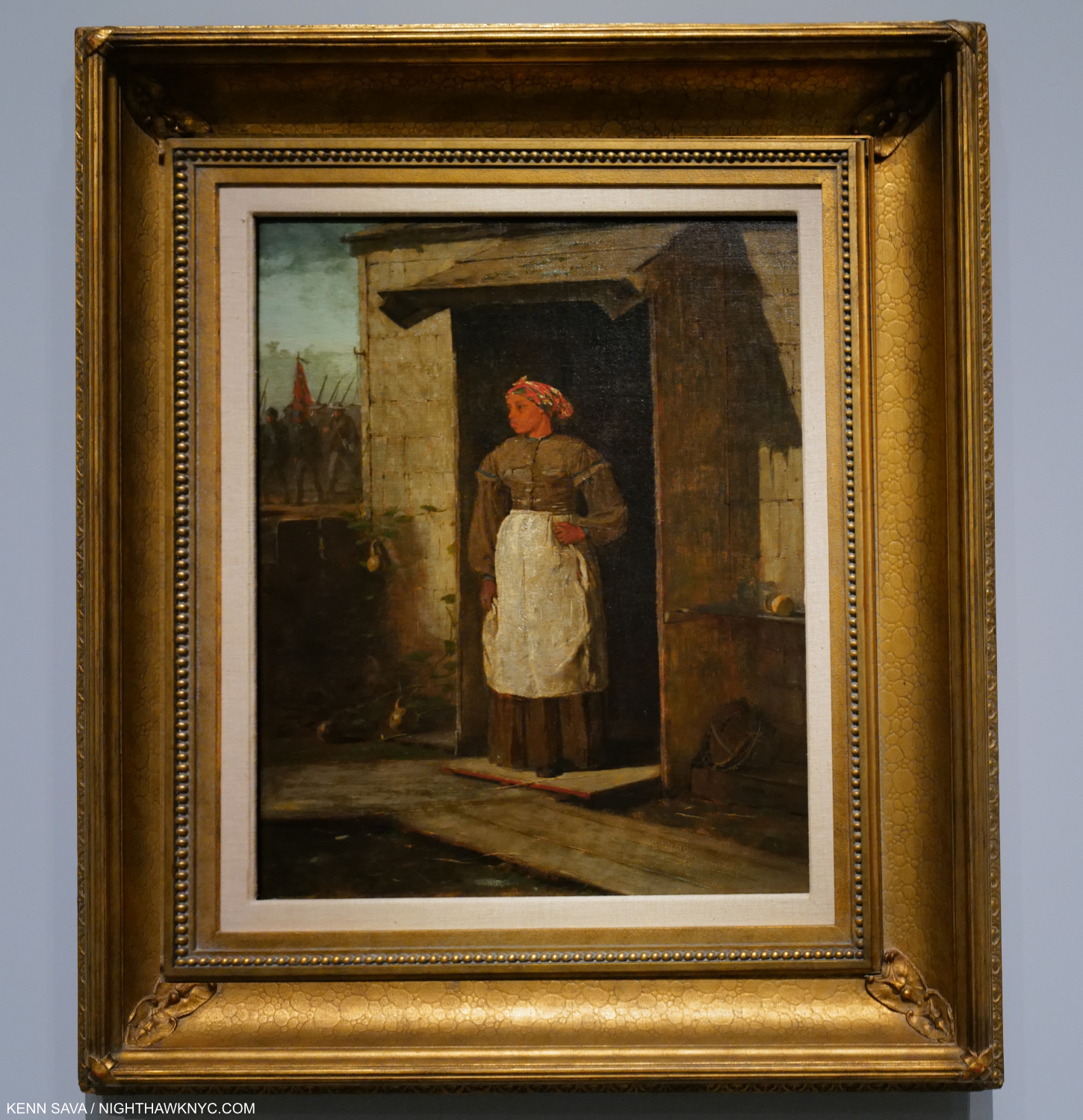
A Visit from the Old Mistress, 1876, Oil on canvas. Seeing this work from 11 years after the end of the War and the middle of the Reconstruction made me wonder if I’ve seen a more powerful 19th century American Painting. Who else Painted anything like this before 1900?
Then, in the period after the War, the Reconstruction, Winslow Homer did something no other Artist I know of did- He made Paintings showing the life of the newly freed Black men and women, and in the process created a unique record of part of their experience, and race relations in the country, at the time. This is another thing that makes him a ground-breaking Artist and gives hm much relevance, today. In A Visit From the Old Mistress, 1876, volumes are said in the eyes and body language. Early on, the Mistress held a red flower in her right hand, which the Artist Painted over after changing his mind. Over time, a hint of the red has become visible near her shoulder. Given that much (but not all) of what he shows us are scenes he witnessed, I’m left to wonder if he saw this scene and the one below. If not, how could he have Painted them so convincingly? His empathy powerfully comes through, yet as strong as it is, here and in all his work, he never hits the viewer over the head with it, and it is his subtlety that I believe has caused the appreciation of his empathy, power and brilliance to be somewhat under-appreciated for so long.
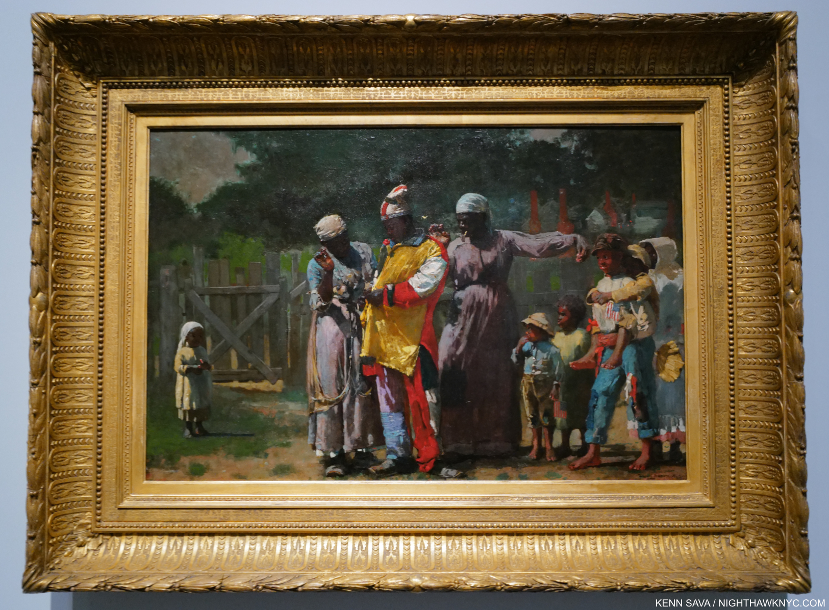
Dressing for the Carnival, 1877, Oil on canvas. A tour de force in so many ways beginning with color and ending up in a timeless meditation on so many things. Who else Painted anything like this?
In 1873, Winslow Homer produced his first Watercolor (at about 37 years of age!). They would become both rightly revered for their virtuosity among any done during his lifetime and extremely popular, helping the Artist survive. No small thing since after Prisoners from the Front, he struggled to regain the same level of success with his Oils, which continually disturbed him, no matter how popular his Watercolors became. Along the way, his focus changed. He turned to the sea. First, in Cullercoats, England, than in New England, and finally in the Gulf Stream- the Bahamas, Bermuda, Cuba and Florida. Based in Prouts Neck, Maine, he regularly traveled south to avoid the harsh northern winters. That might be why there was only one Winslow Homer snow scene in the show!
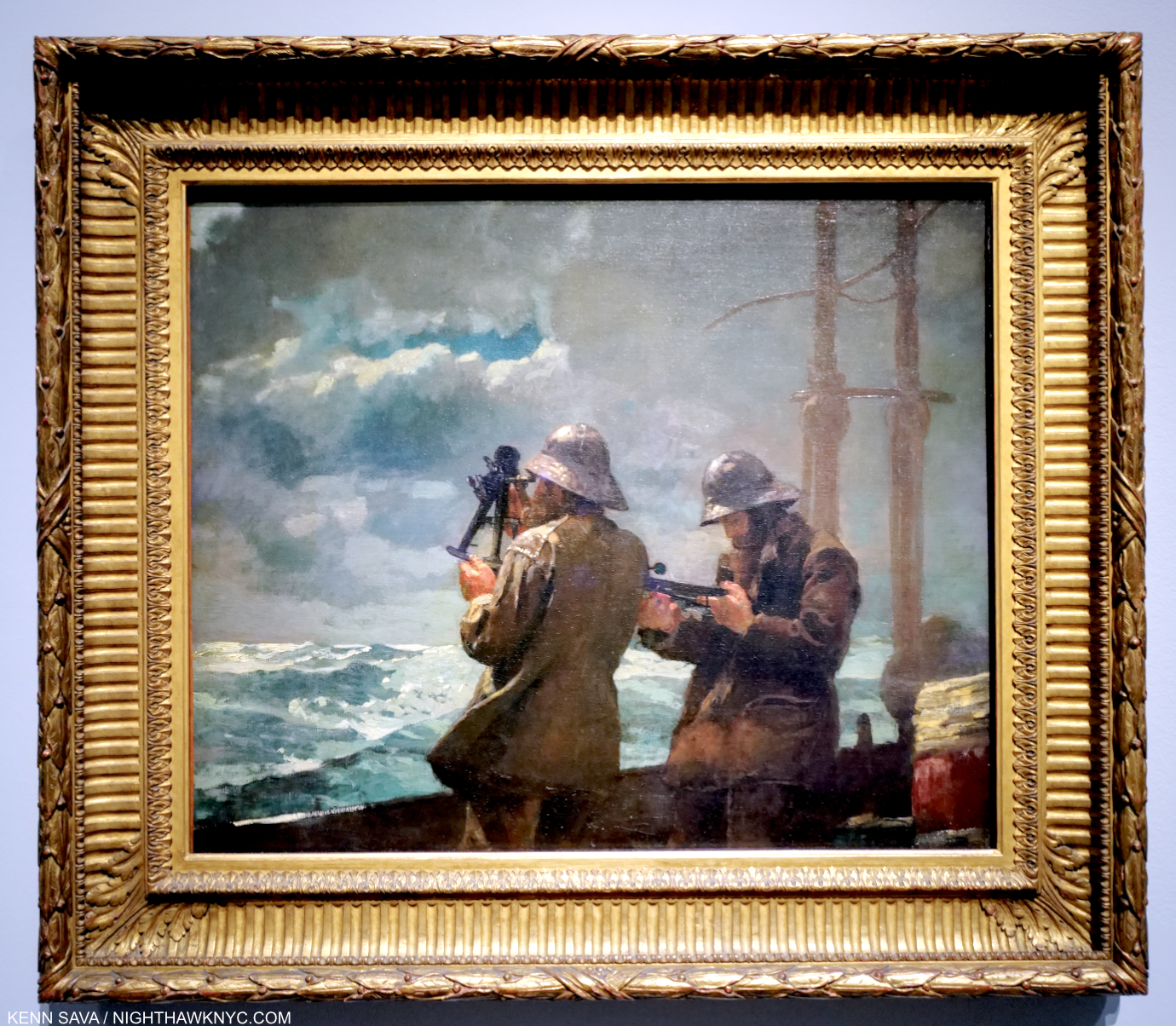
Eight Bells, 1886, Oil on canvas, struck me as endemic of Homer’s work on man & the sea. Here, two sailors take measurements. Man trying to understand the sea.
Of course, Winslow Homer is rightly revered for his sea pictures. Along with the intense, timeless drama in many of these pieces, what has always stood out for me is his mastery of rendering the sea itself. Crosscurrents includes quite a few highlights, including some daring sea rescues Homer witnessed or read about. Regarded so at the time, Winslow Homer remains one of the real masters of sea Paintings. No mean feat in a country about 100 years old at the time in view of the long history of sea Art in many other countries.
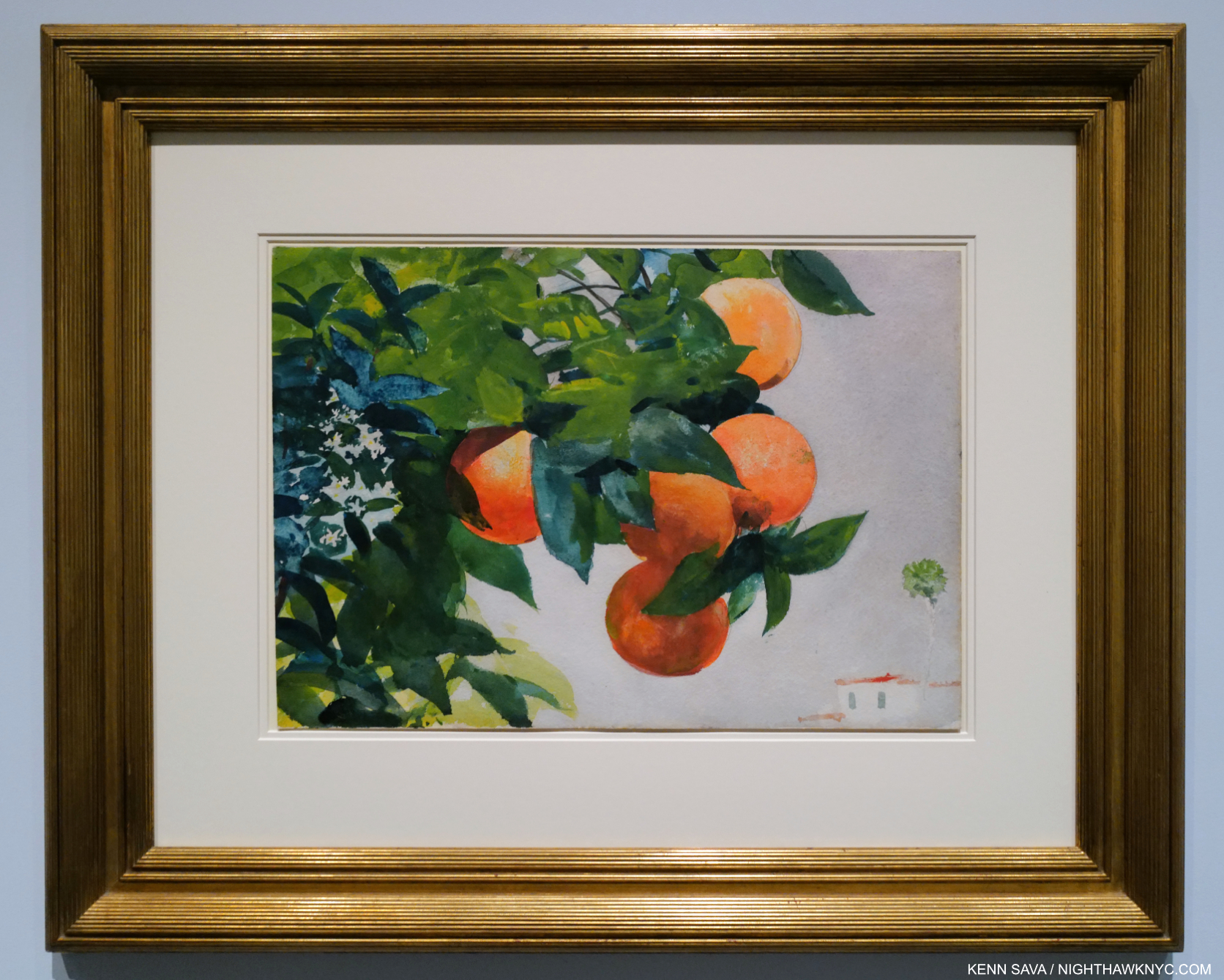
Oranges on a Branch, 1885, Watercolor on paper. Hypnotically beautiful, during one visit, another visitor nearby railed against the inclusion of the building on the lower right in this rare Homer Still Life. Oranges were something of a delicacy at the time, and a treat as a staple at meals in the Bahamas, they would seem exotic to many contemporary American viewers.
As darkly hued as many of his Oil Paintings are, as a result of his yearly winter trips south, all of a sudden come his Watercolors that just explode with light and color.
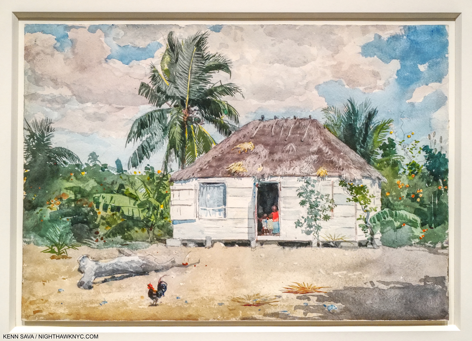
Native Hut at Nassau, 1885, Watercolor on paper. During his trips, Homer kept a close eye on the local population and had a gift for capturing their lives in extraordinary works like this, a scene he may have seen on a walk from his luxury hotel. While picturesque elements of the piece would appeal to American viewers, the condition of the local’s lives is front and center. Again, something not many were doing in 1885.
Homer’s Watercolors were extremely popular with collectors, and even he seemed to get caught up in it. He’s quoted in the show saying-
“You will see, in the future I will live by my watercolors.”
At The Met, they indeed glisten with the beautiful light he found in the Bahamas and elsewhere on the Gulf Stream. But, for me, it’s his Oils that are the revelation, and which largely serve to rewrite our perception of him. Homer followed sales of his Oils closely, and took the results personally, particularly when they were misunderstood. His Watercolors cast his subjects in a different light, no pun intended, and seem to me to be more meditative, while his Oils bring the power.
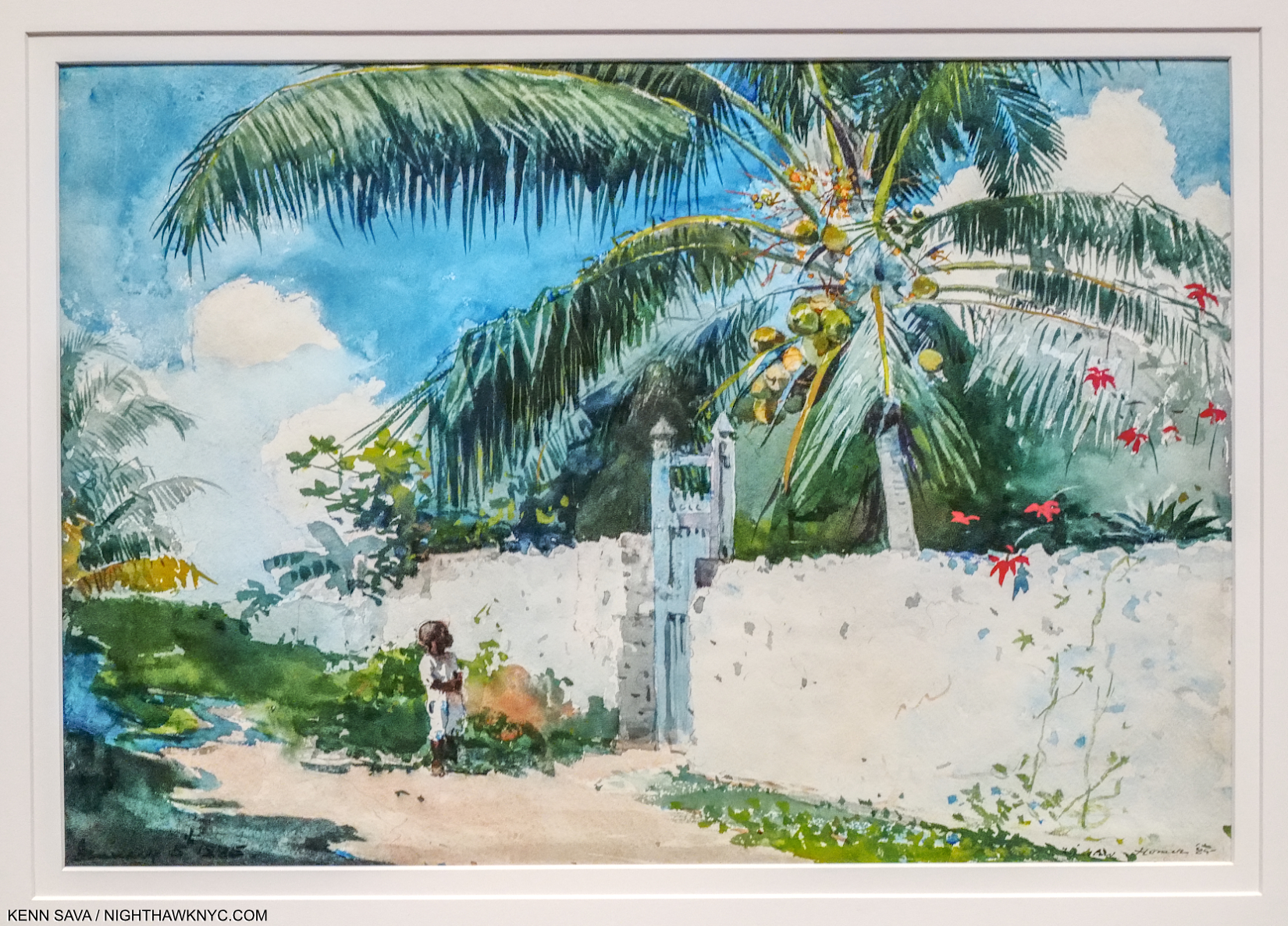
A Garden in Nassau, 1885, Watercolor on paper. Another poignant example shows a child outside a walled private garden. A small detail- Homer’s watercolor palm leaves are always amazing, and offset the sparseness of the wall.
Still, a number of those on view, like these two above, get to the same power, empathy and subtlety, seen in his Oils.
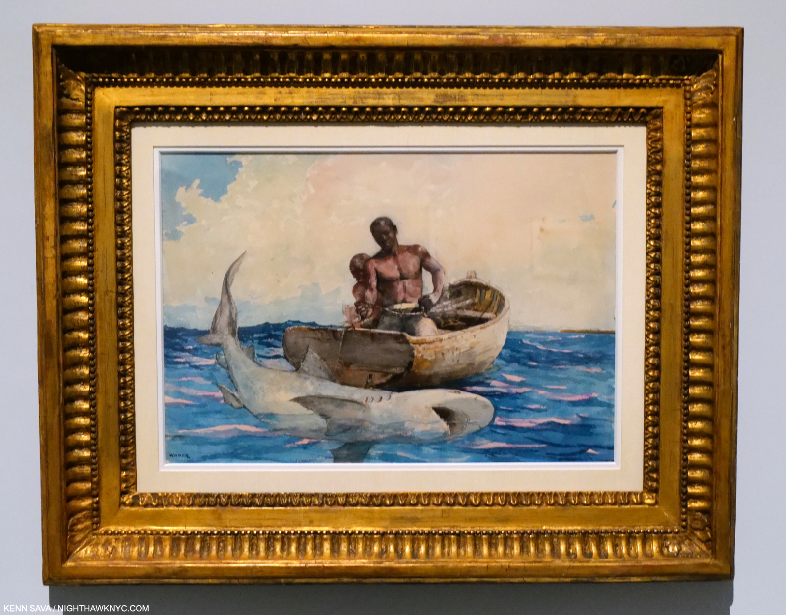
Shark Fishing, 1885, Watercolor on paper. Ummm…I think they’re going to need a bigger boat. The shark is similar to one seen in The Gulf Stream, 15 years later.
In 1885, while in the Gulf Stream, Winslow Homer may have seen and recorded a boat in distress in a sketchbook. The sketch was in the show, as were a number of fascinating Watercolors that seem to reveal something of the development of The Gulf Stream Oil Painting over the next 21 years. Not all of the pieces I’m showing here were in the show’s Gulf Stream section. I’m including Shark Fishing, above, (which is not a disaster work like the others), due to the similarities between the shark in The Gulf Stream. It also includes two Black sailors.
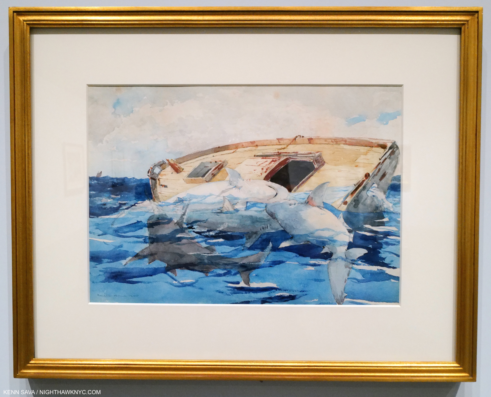
Sharks (The Derelict), 1885, Watercolor on paper. It would seem that this was a work that informed The Gulf Stream, with many of its familiar compositional elements, minus the sailor.
The Gulf Stream Oil was displayed in 1900, then Homer reworked it in 1906. (Possibly in response to criticism?) The Met quickly acquired it the same year.
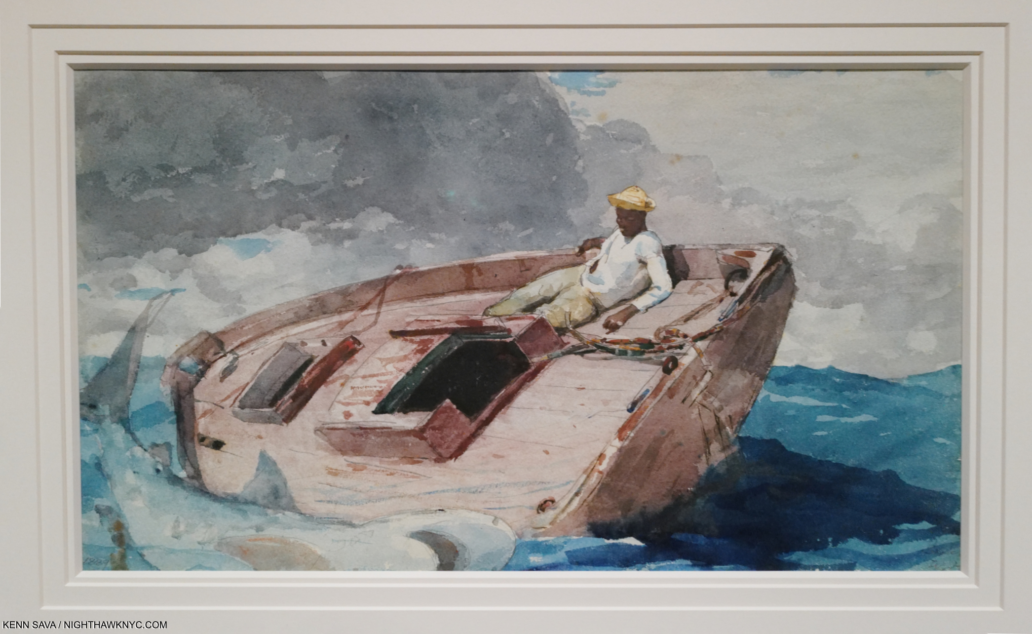
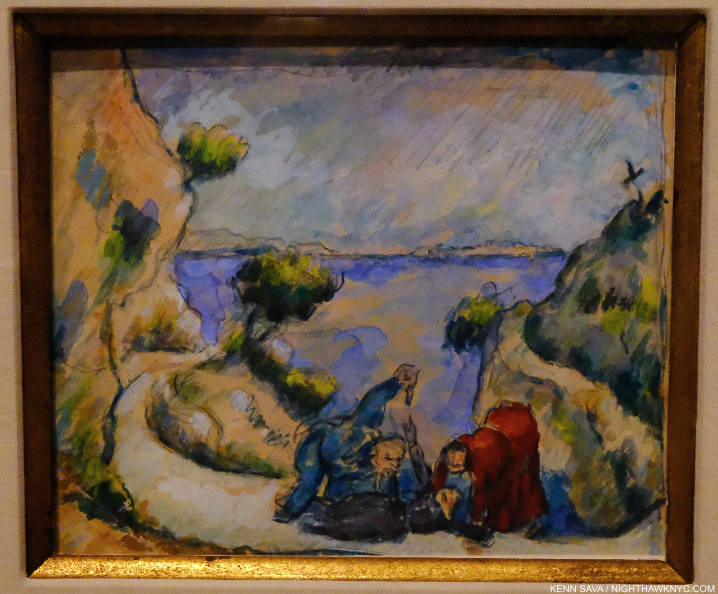
The Gulf Stream, c.1889, Watercolor on paper. What would be the final composition is taking shape.
In this version, there is no sign of rescue, which is closer to the Oil as it was originally displayed. No water spout to the right. The sailor looks down in the direction of the sharks.
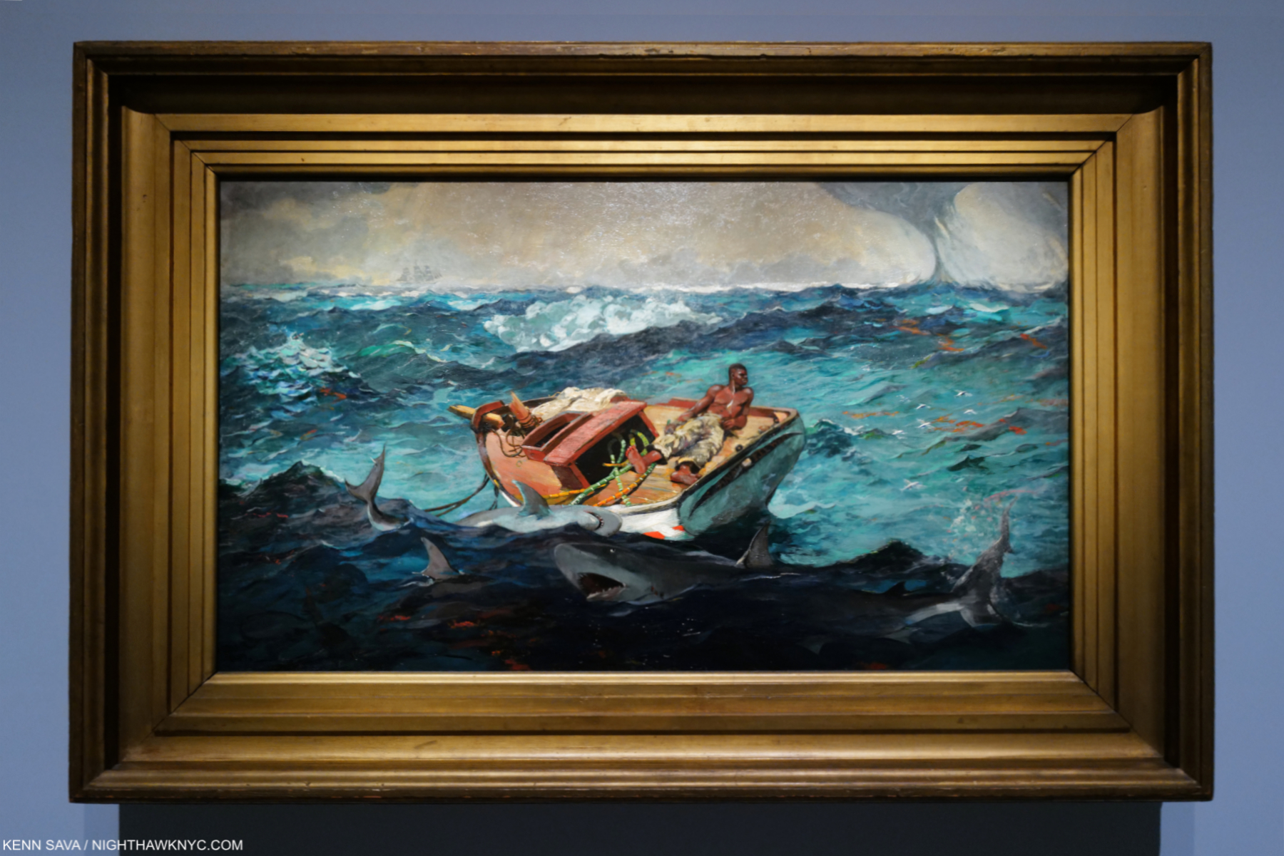
The Gulf Stream, 1900, 1906, Oil on canvas. It was praised and condemned early on. From The Met’s Audio Guide- “When the Worchester Art Museum was considering its purchase, two women Trustees objected to the unpleasantness of the subject. Homer wrote to his agent- “The boat and sharks are of very little consequence. You can tell these ladies that the unfortunate negro who is by now so dazed and parboiled will be rescued and return to his friends and home and ever after live happily.” In 1906 he added the ship on the upper left horizon.
Not many images exist of The Gulf Stream before his 1906 modifications of it, most noticeably adding the ship on the horizon in the upper left in 1906. A print displayed nearby shows the work as it originally was displayed in 1900 without it. Was it added in response to the worry for the lone sailor expressed to him by viewers? In a letter to his dealer the Artist vehemently expressed that “the subject of this piece is its title.” It’s hard for me to see one subject in it. I’m puzzled by how the man is Painted, and why he is looking off to our right. Perhaps, Homer felt that looking straight ahead, as he does in the Watercolor above, was too obvious. Some see the Painting as being inspired by the recent death of Homer’s father. Yet, he had produced Watercolors of this subject 15 years before. Whatever the case is, it again features a Black man. Perhaps the most iconic American Painting to do so from its time, or earlier. Or, from substantially later, for that matter.
Natural Bridge, Bermuda, 1901, Watercolor on paper. It’s hard for me to look at this and not think of Cézanne’s rock formations I showed in my Cézanne Drawing piece his last year that were done at almost the same time.
“If a man wants to be an artist, he should never look at pictures.” Winslow Homer quoted in Lloyd Goodrich’s Winslow Homer, P.21.
Winslow Homer kept to himself. His life is in his work. He refused to cooperate with his biographer and so very little is known about his possible influences. Writers and critics have been left to wonder about them, and I do, too. He spent 10 months living in Paris when much was going on in the Art world there. Yet, almost nothing is known about how he felt about what he saw. I see bits of Manet, Monet, Cézanne and Goya in his work. Is it coincidental?
Near Andersonville, 1865-66, Oil on canvas. The wall card speaks of the “Black woman emerging from a darkened interior, standing on a threshold and contemplating an uncertain future” near Andersonville, the site of an horrific Confederate prison.
Strong women are also featured in Homer’s work. The Black woman in the stunning early Oil, Near Andersonville, above, and women he encountered in the seaside communities he lived in in Cullercoats, England, and New England, like this one-
The Gale, 1883-93, Oil on canvas.
Again, something not many other Artists were doing at the time.
Right and Left, 1909, Oil on canvas. Homer’s next to last Oil Painting.
Late in his life, he turned his attention to mortality and the struggle of life and death, animal versus animal and man versus animal, as here, and of course earlier, he had depicted the struggle of man versus man, in the Civil War, and man versus the sea. It takes an effort to find the hunters in the piece, since the work is designed to show us the scene from the victim’s viewpoint, like Defiance, shown earlier. This is something unique in my experience to Homer in Art.
As if ALL of that isn’t enough, Winslow Homer’s compositions continually surprise me with their originality. Right and Left being one classic example among many. Something he is not generally appreciated for.
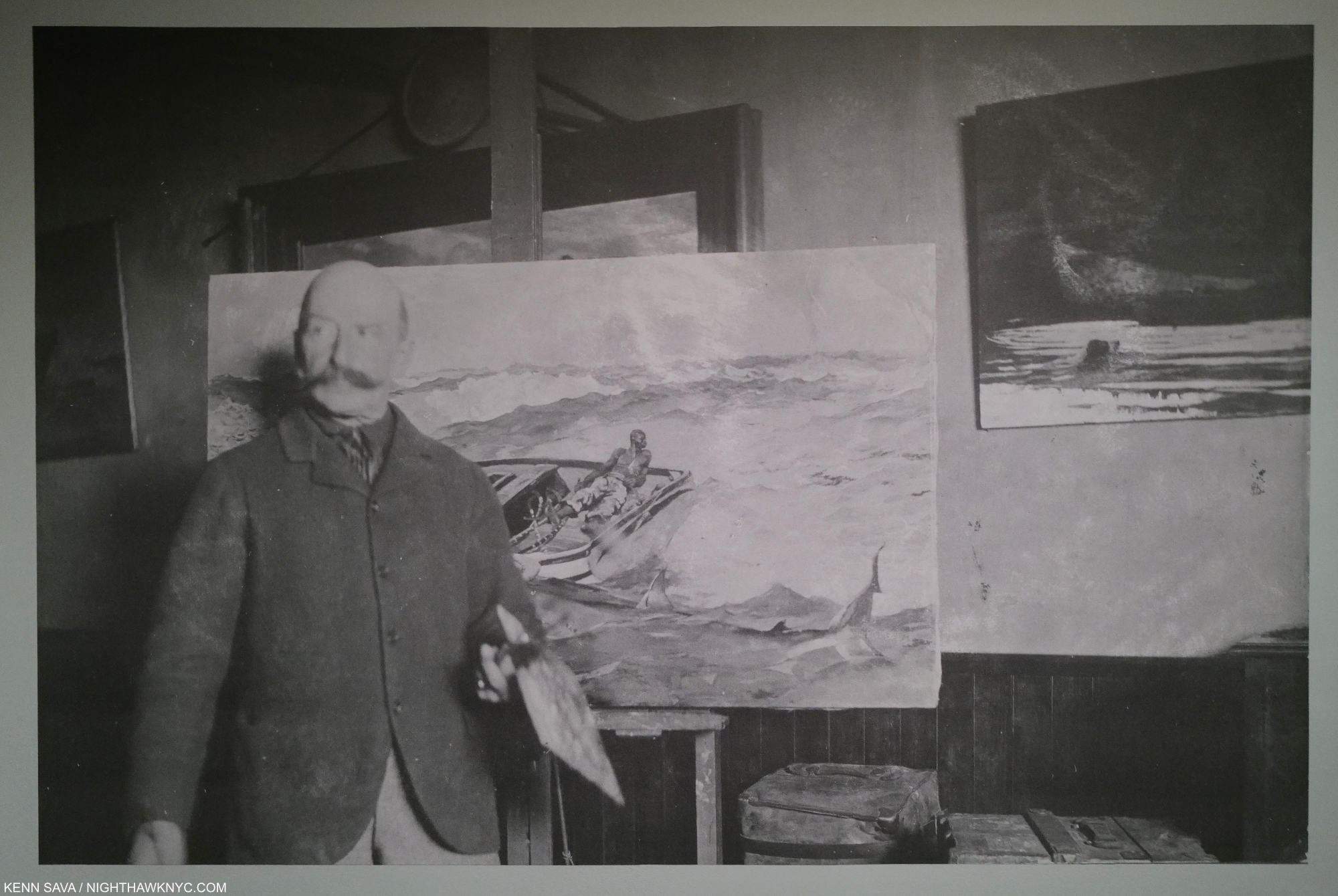
Winslow Homer with The Gulf Stream and his palette in his Prouts Neck, Maine Studio, c. 1899-1900
Francis Bacon said whether something was art or not wouldn’t be known for 75 to 100 years. I’ve always felt it took longer. Still, at about 100 years since his passing, it seems to me that Winslow Homer’s stock is beginning to rise to about mark twain (2 fathoms, or 12 feet, the depth the river must be for a riverboat to pass safely), also the pen name of almost an EXACT contemporary of Winslow Homer- Samuel Langhorne Clemens, 1835-1910, being 1 year older, and passing in the same year! Like Mark Twain is, for many among American Novelists, in my book, Winslow Homer is just about at the top of innovative and important 19th century American Painters, for his Paintings, his mastery of Watercolor, and his illustrations.
Regardless of how the future looks at him, it seem to me that he’s certainly an Artist with a lot to say to us today. His technique catches the eye, then his subtlety and empathy hold the mind, and the heart.
*- Soundtrack for this Piece is- (“I ain’t gonna work on) Maggie’s Farm (no more),” by Bob Dylan from Bringing it All Back Home, 1965.
This Piece is dedicated to Amy Harding (who made a long trip to see this show, particularly admiring Dressing for the Carnival), for her help in getting this piece published and her long-time support!
NighthawkNYC.com has been entirely self-funded and ad-free for over 7 years, during which over 275 full length pieces have been published. I can no longer fund it myself. (More here.) If you’ve found it worthwhile, please donate to keep it online & ad-free below. Thank you!
Written & photographed by Kenn Sava for nighthawknyc.com unless otherwise credited.
To send comments, thoughts, feedback or propositions click here.
Click the white box on the upper right for the archives or to search them.
For “short takes” and additional pictures, follow @nighthawk_nyc on Instagram.
Subscribe to be notified of new Posts below. Your information will be used for no other purpose.