This site is Free & Ad-Free! If you find this piece worthwhile, please donate via PayPal to support it & independent Art writing. You can also support it by buying Art & books! Details at the end. Thank you.
Written & Photographed by Kenn Sava (*-unless otherwise credited)
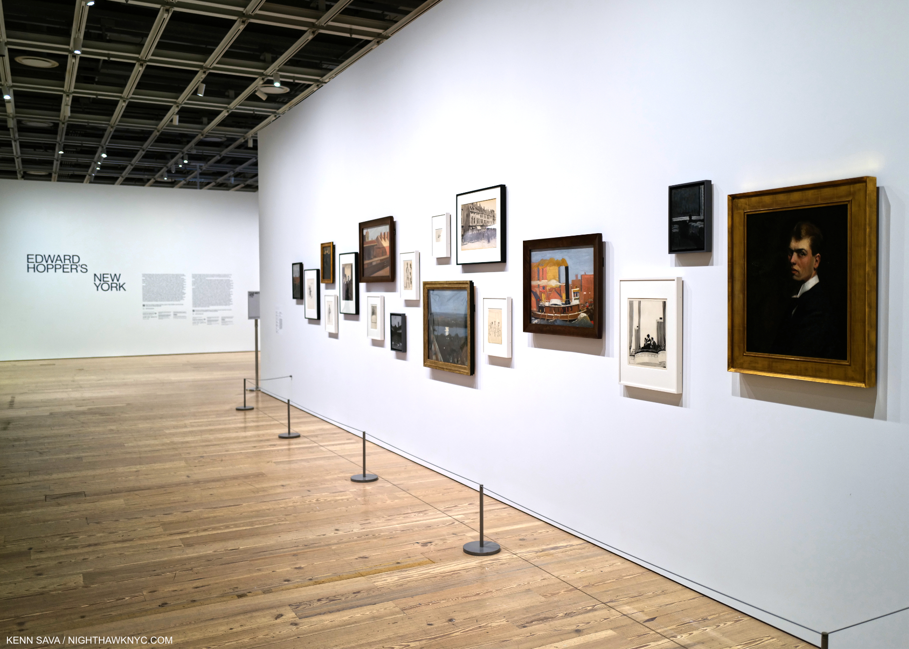
Show seen: Edward Hopper’s New York @ The Whitney Museum, Part 2. (Part 1 is here.)
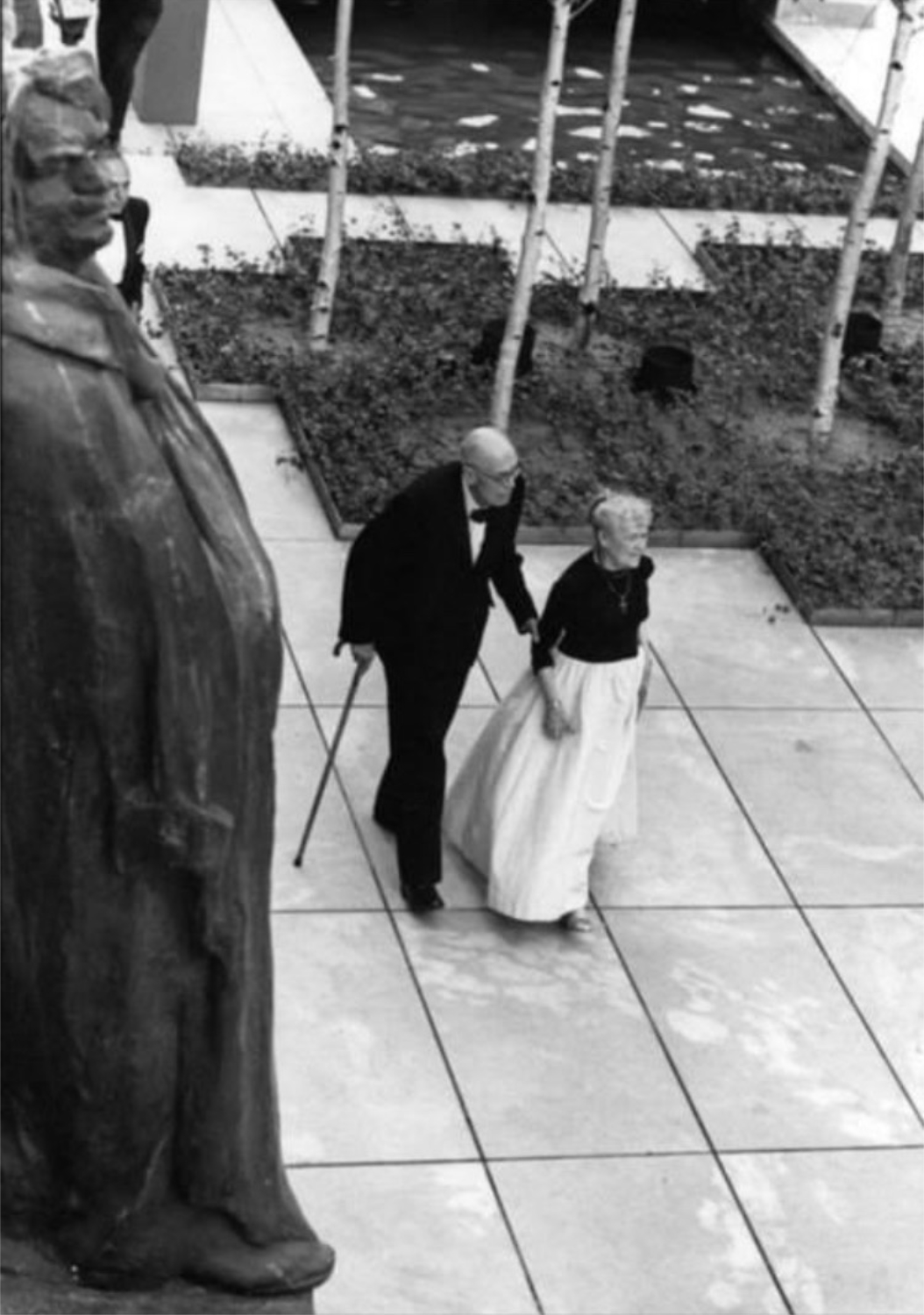
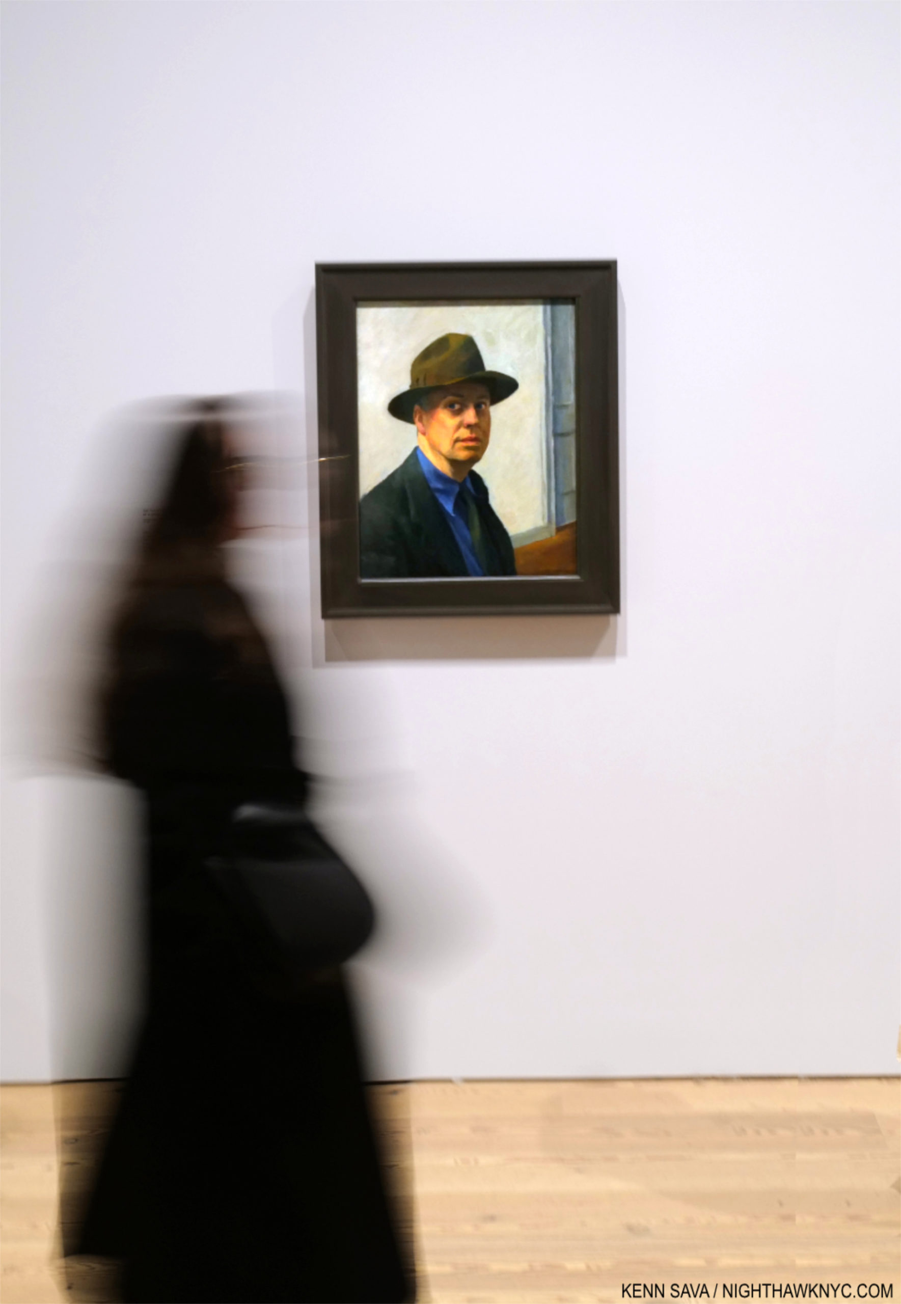
Edward Hopper in his New York. With his wife, Jo, strolling the Museum of Modern Art’s Sculpture Garden in 1964. In this Photo, by Eve Arnold, Edward is glimpsed unawares like a good number of his subjects were. *-Photo by Eve Arnold, Magnum Photos. Thanks to Lana for finding it. Click any picture for full size.
Change is the only constant in the universe. For those, like me, for who New York City IS the universe, every day brings change. During Edward Hopper’s time here (1900-67), the City of continual change metamorphosized more than it ever had.
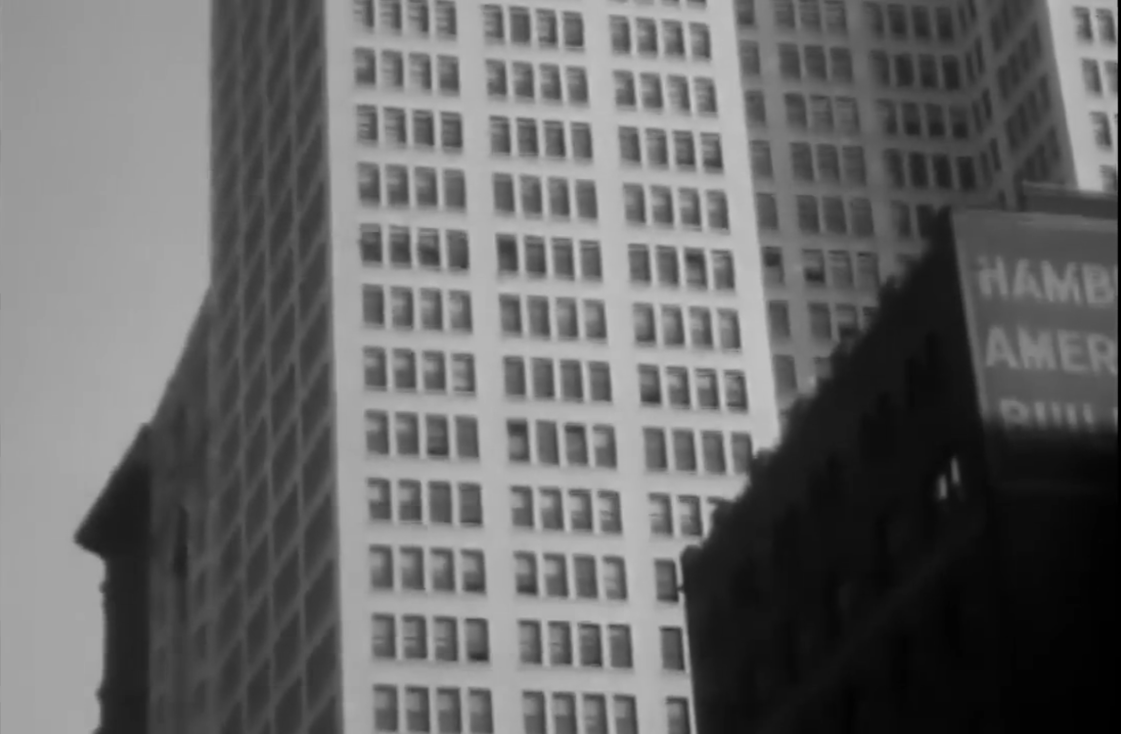
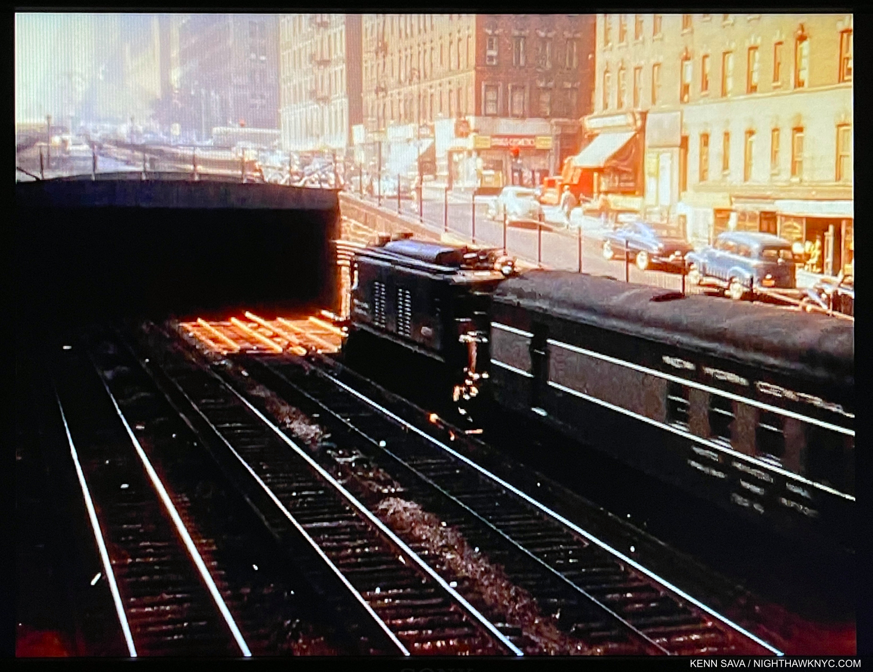
Screencap from the short Film, A Ride on the 6th Ave El, 1916. Edward Hopper frequently rode NYC’s elevated trains, and he was located closest to the 6th Avenue el, which he no doubt rode before, during and after 1916. He glimpsed more than one scene he turned into a Painting while riding one. *-Ford Motor Company video.
The advent of the tall building & skyscrapers (facilitated by the development of elevators with safety brakes), first in Chicago and then here, along with the ongoing spate of bridge building (Brooklyn Bridge, then Manhattan Bridge and others), the advent of the elevated train, the subway, electric lights, movies, and the rest, ushered in with them what we know as modern urban life. All of these inventions & developments brought side effects. Edward Hopper’s New York reveals that the Artist may not have been a fan of some of these changes.
Edward Hopper’s Art: What I See
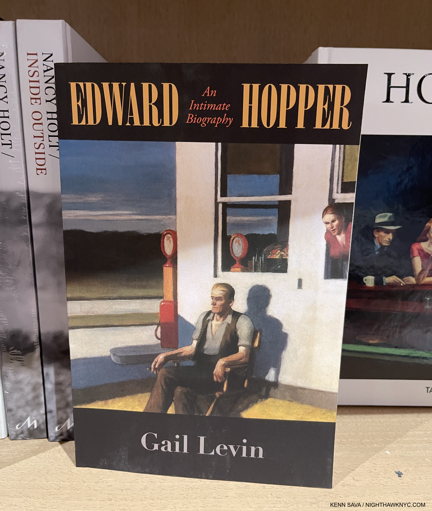
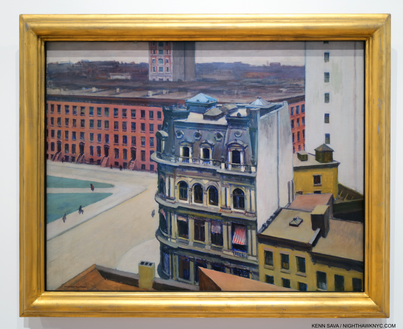
As I said in Part 1, having the chance to see 58 Hopper Paintings from early through late in his career 14 times, Edward Hopper’s New York completely changed how I see his work. This is shocking to me because I’ve been looking at his work almost as long as I have anyone else’s- well over 40 years. To this point, I saw his work as one of the ultimate (and perhaps unsurpassed) expressions of modern loneliness and isolation in the Art of the 20thy century. But, this is a theme that requires human subjects (like the vast majority of his NYC work has, though he Painted these scenes with people elsewhere as well). What about the rest of his oeuvre; all the other scenes he Painted that don’t include people? These include landscapes he Painted in Maine, Cape Cod, and elsewhere in the U.S., and Paintings he made on, or inspired by, trips to Europe and Mexico. Some of the non-peopled landscapes include houses, buildings, bridges or other man-made structures. Some of them are pure landscapes. (An overview of the range of his work can be seen in any comprehensive book on Hopper. I particularly recommend seeking out Edward Hopper: The Art & The Artist, by Gail Levin, the catalog of the last U.S. Hopper Retrospective, at the Whitney in 1981.)
As a result of considering the whole, I’ve come to believe there are two primary threads, intentional, or not. that run through almost all of Edward Hopper’s work.
First, the “man-altered landscape,” i.e. what man has done with and to nature.
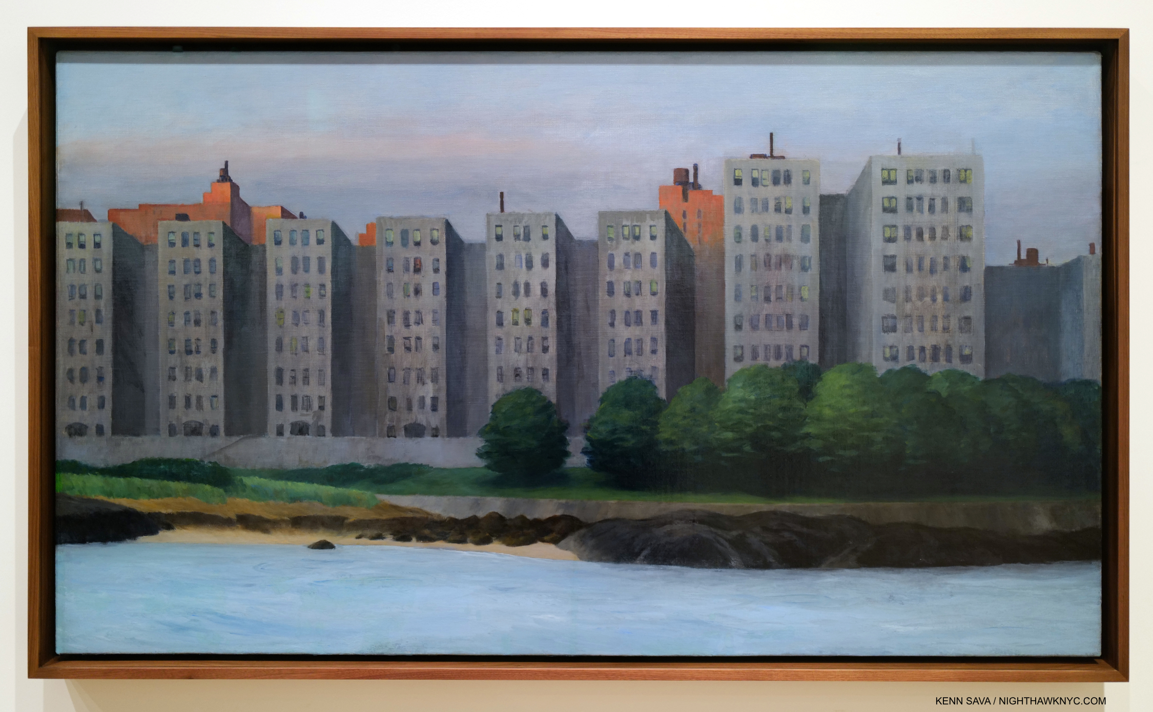
The man-altered landscape. Apartment Houses, East River, 1930. It seems fairly obvious what Edward Hopper thought of this waterfront development. All works are Oil on canvas, unless specified.
In Photography circles, this is what is called “New Topographics” in honor of the legendary Photo show of the same name at the Eastman House, Rochester, in 1975-6, eight years after Edward Hopper’s passing. The subtitle of the show was “Photographs of a Man-Altered Landscape.” What man has done to and with nature, as in Apartment Houses, East River, is a theme I now see in more of Edward Hopper’s work than I see any other theme.
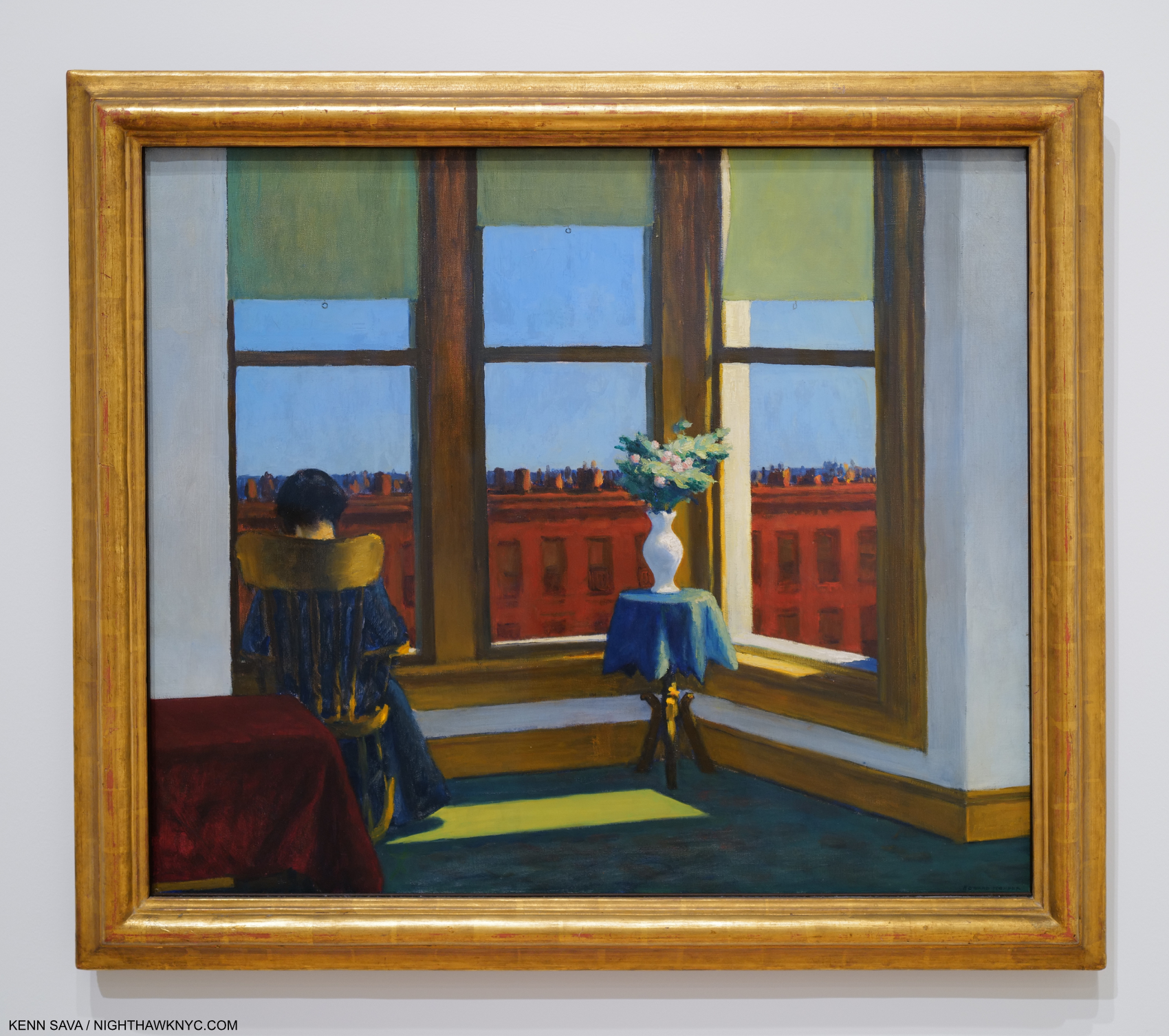
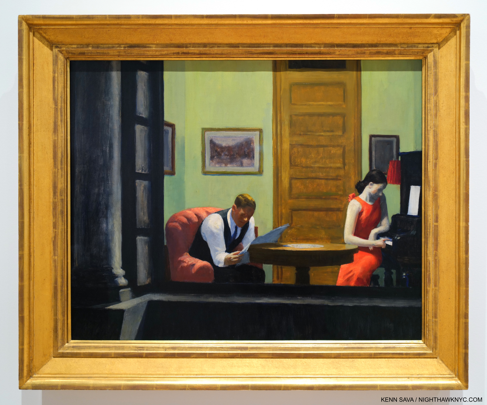
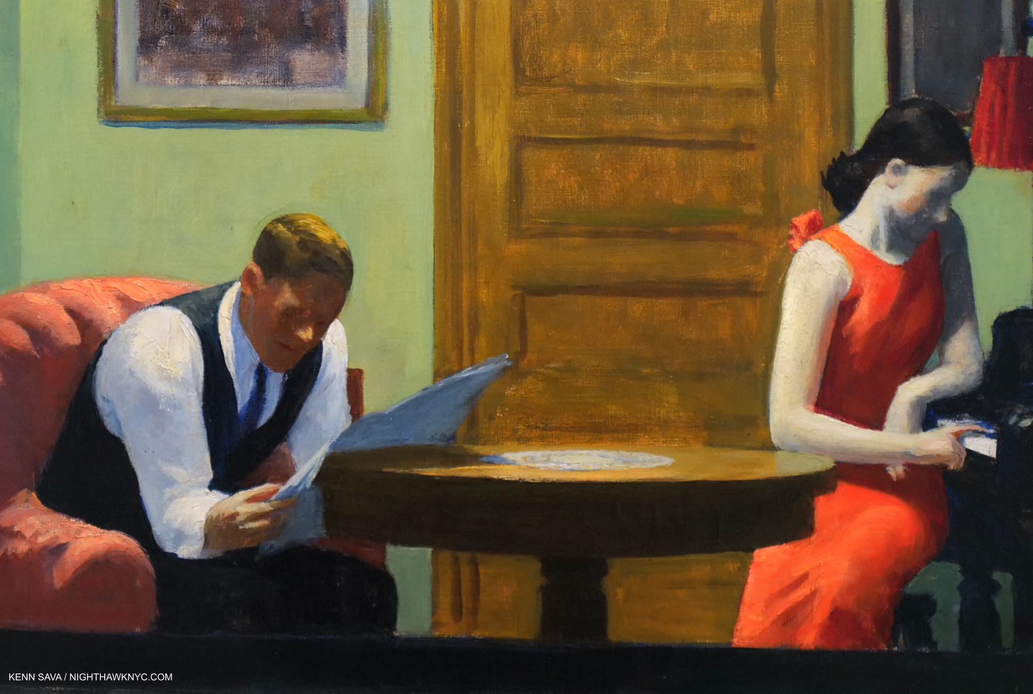
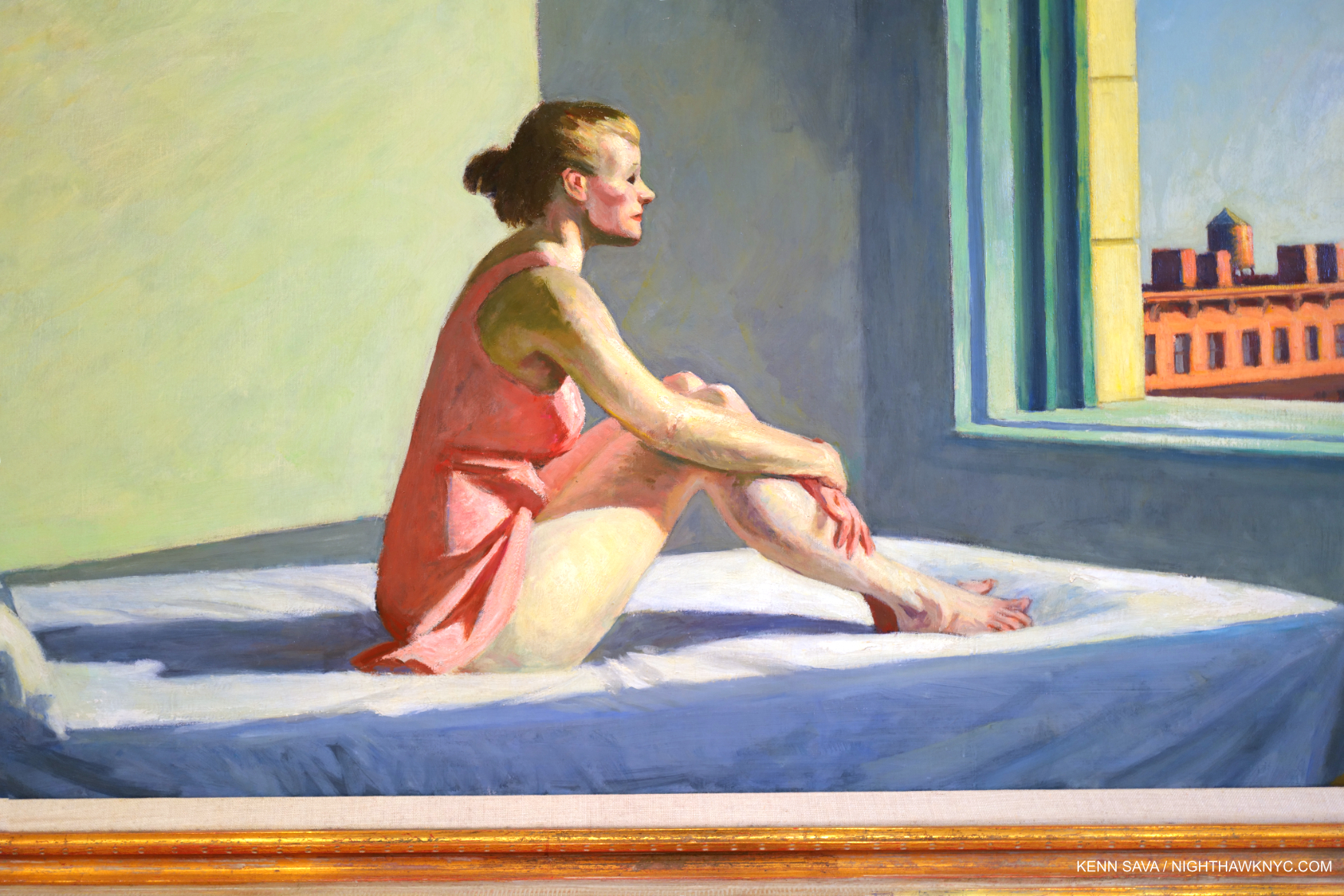
Room in Brooklyn, 1932
Yes, I even see the “what man has done with and to nature” theme in works like the sedately charming Room in Brooklyn, where “nature” is reduced to flowers in a vase. It’s interesting that Hopper’s flowers are higher than the background buildings.
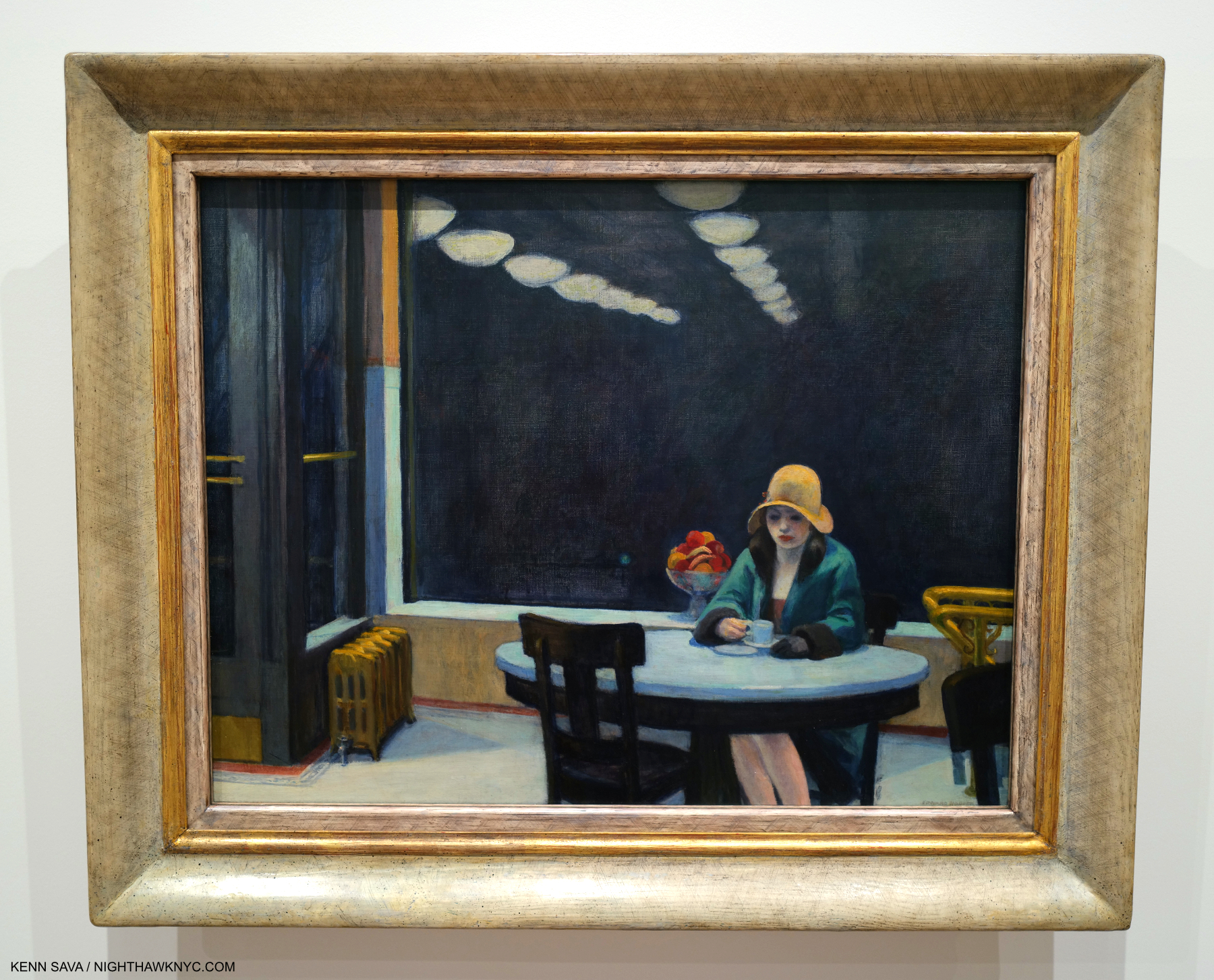
Automat, 1927. Edward Hopper spent a lot of time in Horn & Hardart’s extremely popular Automat Restaurants in the 1920’s, so much that Jo worried he was drinking too much 5-cent coffee. It was worth it because he produced this, another of his show stoppers. Jo chided him for not being able to Paint beautiful women, but Automat certainly puts the lie to that. Its stripped-down composition is a masterpiece of including only the essential. I still wonder about that fruit bowl in the back, though. Is this an instance of “what man has done with nature,” along the lines of Room in Brooklyn? The reflected receding lights are a master stroke.
A byproduct of what man has done with nature in cities, in Hopper’s time and everywhere since, which some call “progress,” is the effect of what man has built on those who live and work in these places. So, I now include all of Edward Hopper’s work that includes human subjects under this man-altered landscape theme, including his New York work (though not all of them include people- like Apartment Houses, East River, shown earlier).
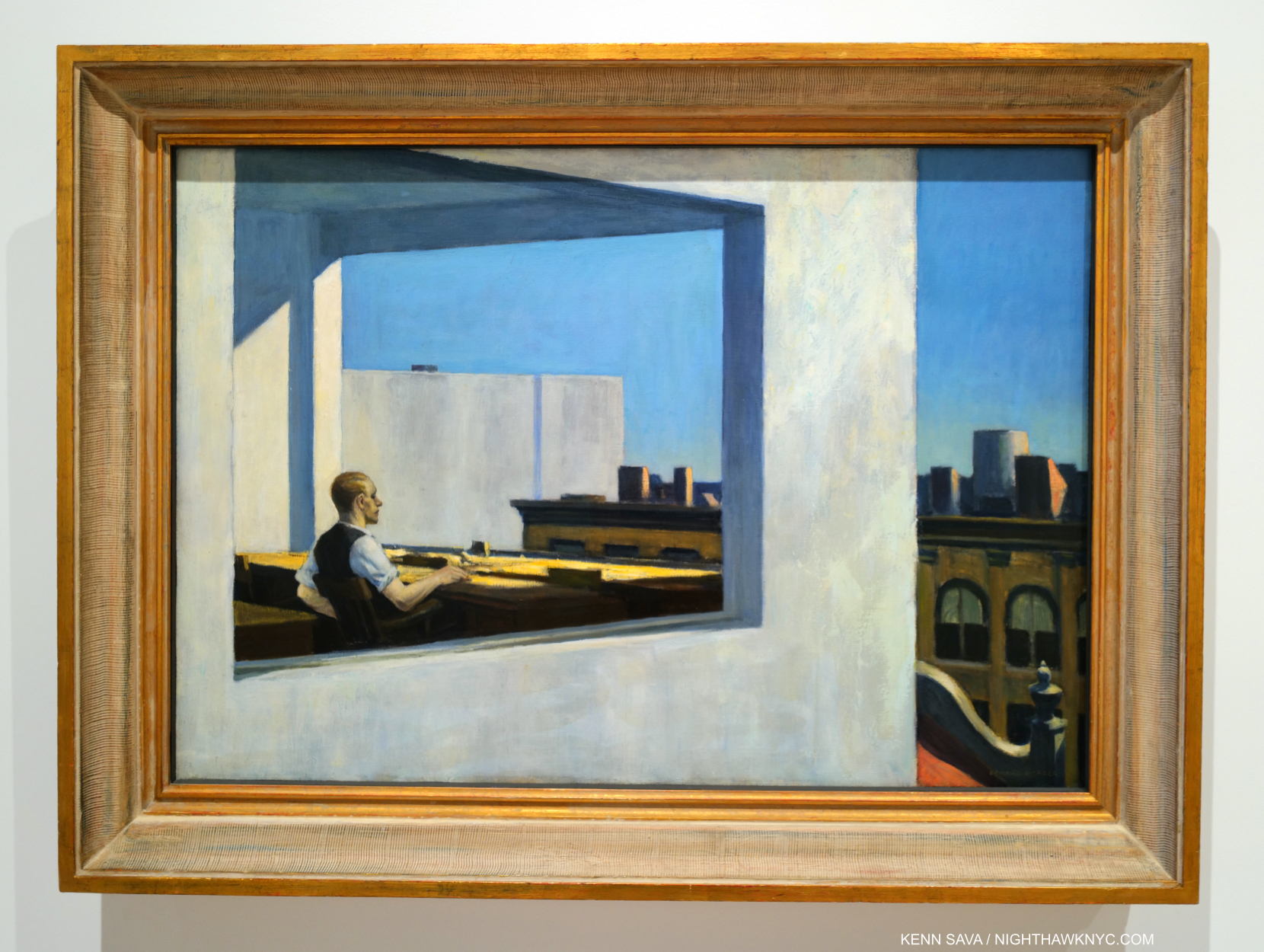
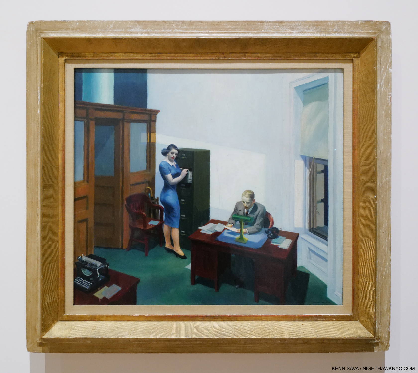
Office in a Small City, 1953. Life in the cube. An example of what I call the “Hopper fish bowl.”
Many may see Edward Hopper as the “king” of depicting the isolation and loneliness that was endemic in 20th century modern life, and feels increasingly so in the 21st century, but after seeing it as his primary theme for so long, myself, I now believe he is depicting side-effects of this new modern urban life in the man-altered landscape to “turn up the volume” on his feelings about these changes. Therefore, when he depicts it, in my view, he’s also “commenting” on what man has wrought on his fellow man through altering the world so. All of this also makes me wonder about the melancholy that permeates his Art. Is it indicative of “the inner state of the Artist” (as I quoted Hopper saying in Part 1), or is it solely being used to depict the state of his subjects in the man-altered environment? Gail Levin’s Edward Hopper: An Intimate Biography certainly provides fodder for the former-
“Raphael Soyer, for whom Hopper posed for a portrait…observed: ‘There is a loneliness about him, a habitual moroseness, a sadness to the point of anger.'”
That makes me wonder if the effects of this new, modern world ON HIM is a good deal of what we’re seeing in his work/or, that he’s recognizing in people he sees.
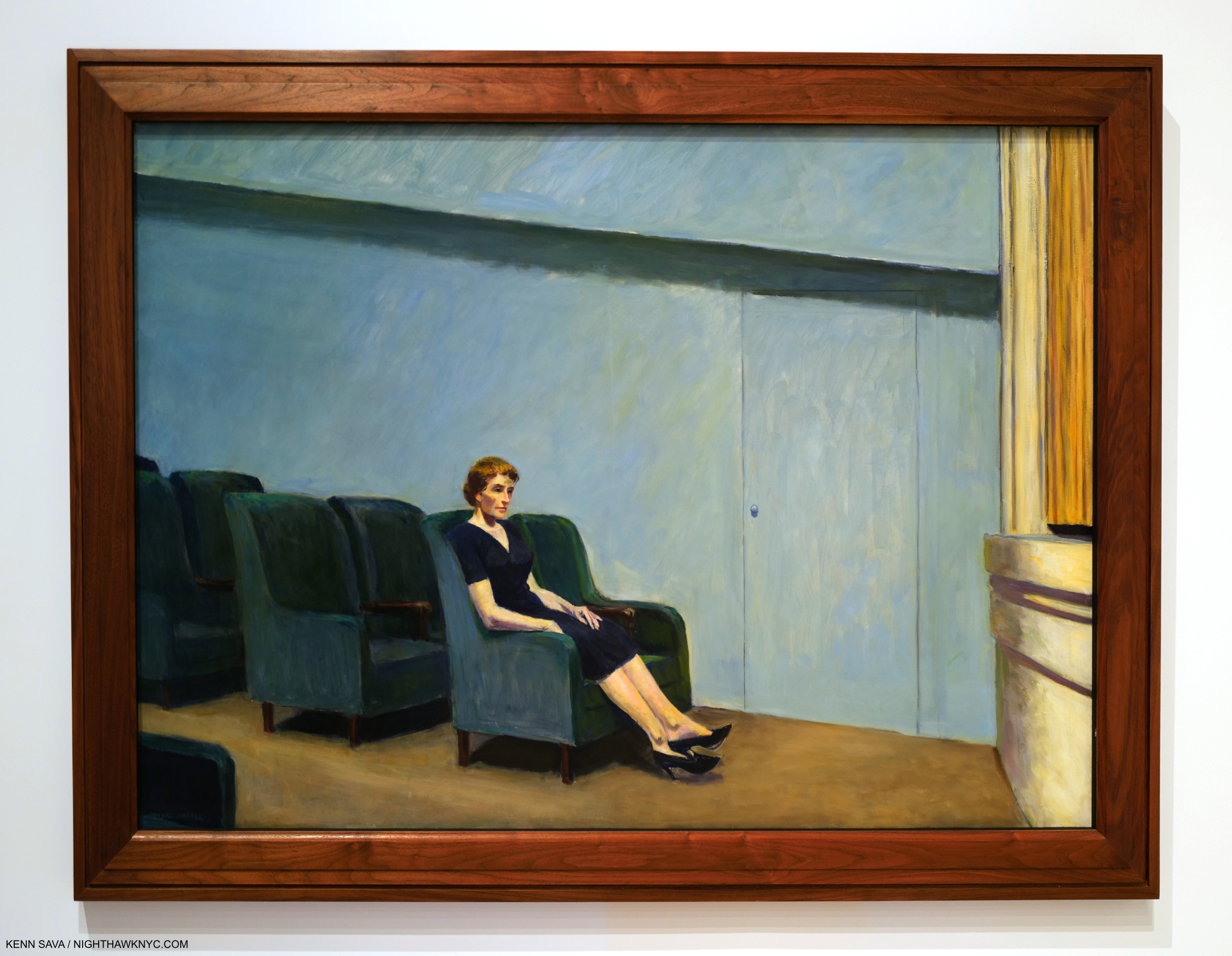
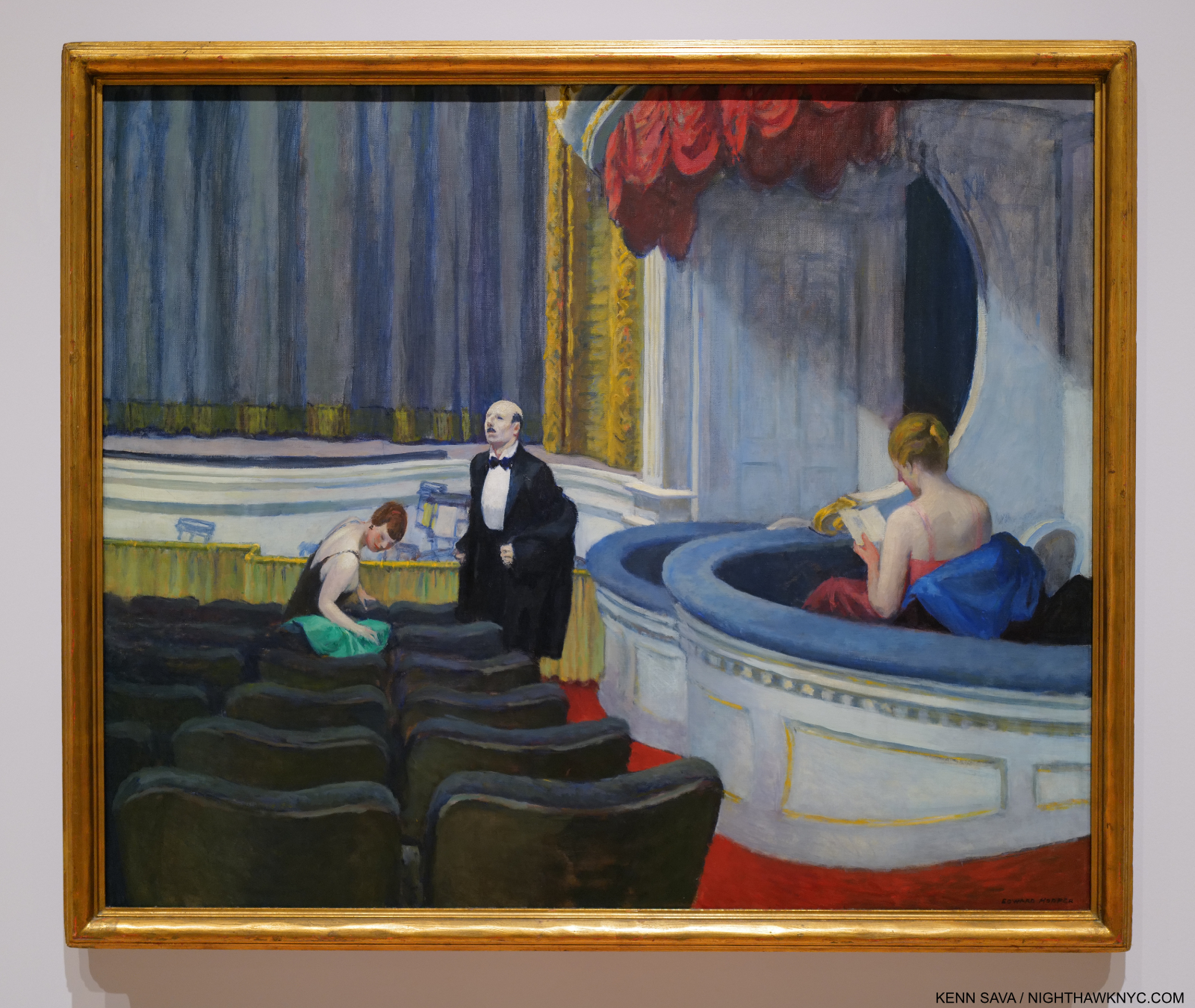
Intermission, 1963. Edward & Jo Hopper were avid movie & theater goers, and Edward Hopper’s New York dedicated a gallery to his movie/theater work making interesting observations of how some theater sets and Films may have influenced the settings of some of his Paintings. Others, like this, are set in these venues. Intermission presents a “basic” idea in a theater environment, yet it makes me wonder- People have been going to concerts and theaters for many hundreds of years. Why haven’t I seen it done like this before?
The man-altered world’s effects on the population, then and now, run deep. So deeply, in fact, I’d been living with these symptoms for 40 years myself before I realized that they are what I was seeing them in Hopper’s work! ”
Was mankind meant to live this way?” may be another question his Art asks.
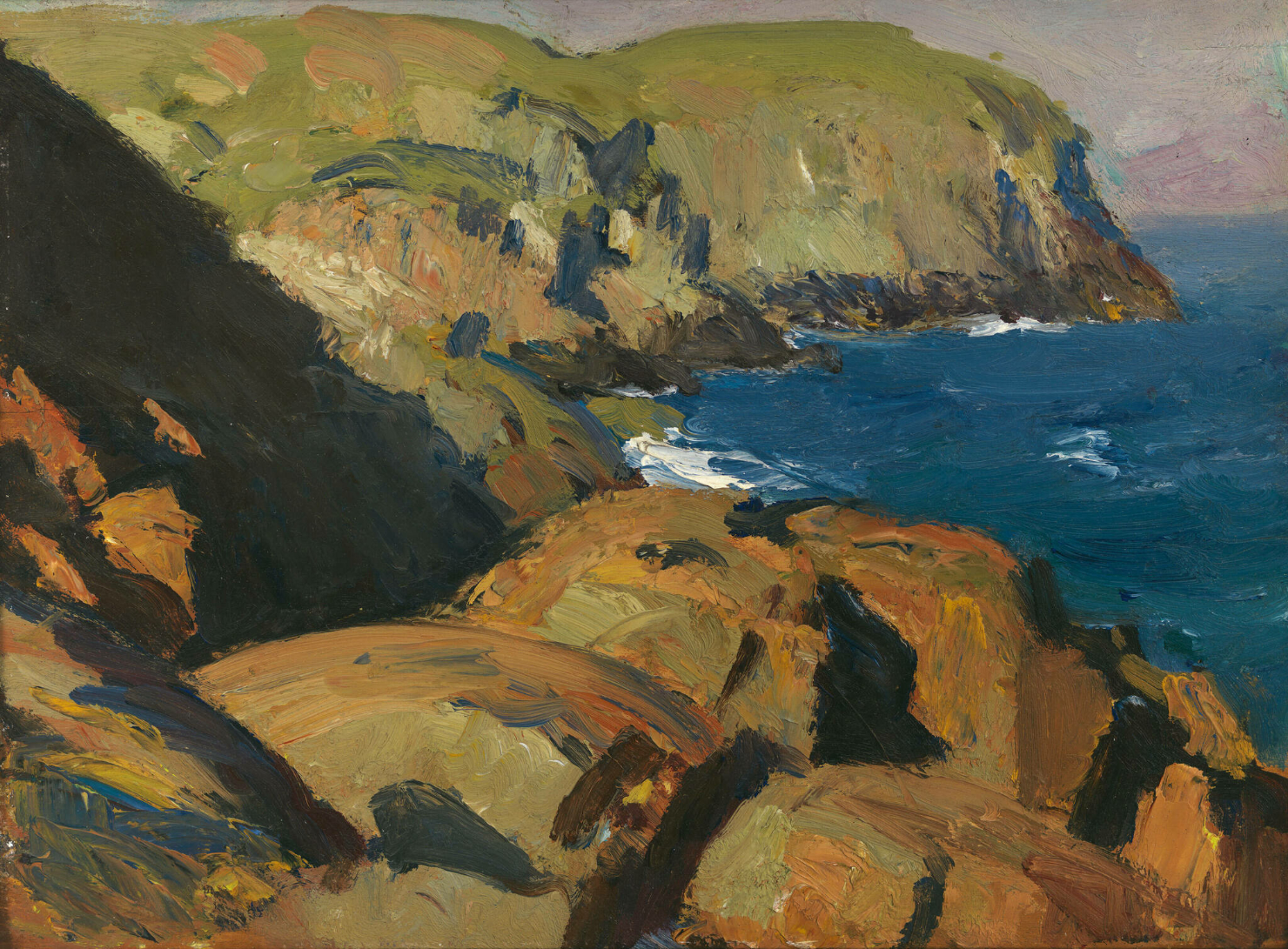
Nature. In all its natural glory. Blackhead, Monhegan, 1916–19. Edward Hopper in Maine. *-Whitney Museum Photo. Not in the show.
The second theme that I see in his Art is the unaltered natural landscape. These exclusively depict locations outside of NYC.
“If you look at landscape painting from that time in America, there isn’t anyone close to him (Edward Hopper) in technique.” Alex Katz, Artist, and designer of the installation of Edward Hopper’s Maine at the Bowdoin College Museum of Art in 2011 on Hopper’s landscapes.
I’ve come to believe his unaltered natural landscapes, like Blackhead, Monhegan, remain very under-appreciated. Though they are beyond the scope of this piece, I will say that it’s fascinating to me to consider that this one was done after Cézanne & Monet’s innovations; two of the “earlier French Artists” I referenced in Part 1. I don’t see their direct influence, though indirectly, his unaltered natural landscapes, like this, also strike me as “impressions,” as I called his New York Paintings there.
“There is a sort of elation about sunlight on the upper part of the house. You know, there are many thoughts, many impulses, that go into a picture … I was more interested in the sunlight on the buildings and on the figures than in any symbolism.” Edward Hopper.
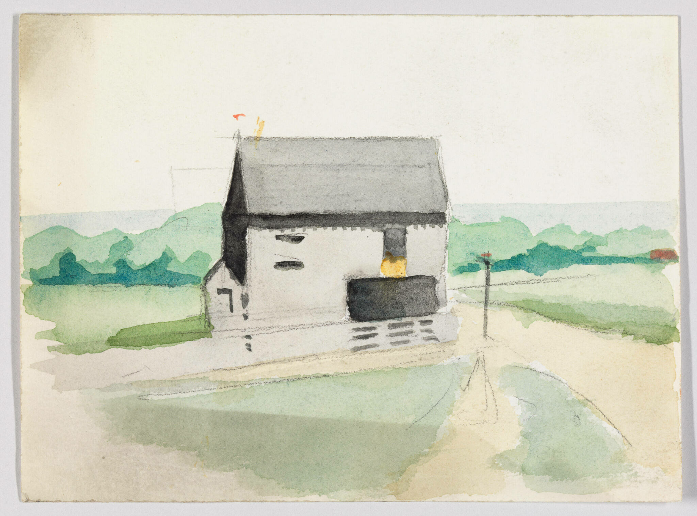
Landscape with Building, c.1900, Watercolor and graphite pencil on paper. *-Whitney Museum Photo. Not in the show.
As I mentioned in Part 1, Edward Hopper’s New York sent me back to the beginning of his Art looking to see how his themes began and evolved. This non-NYC work from the year he started Art school strikes me as an early example of the man-altered landscape theme. At various points in his life, Hopper professed an interest in rendering “sunlight on buildings,” and he had a love of Architecture. You can say he’s expressing both here. But the building, rendered in a predominance of grey, certainly doesn’t look to be basking in the sunlight. It’s almost like he’s using the grey wash (instead of simply leaving the paper a bare white) to downplay the effects of the sunlight. What strikes me is how forlorn and seemingly out of place the building looks in the peaceful landscape. 30 years later, Hopper Painted East River Apartments, shown earlier, again rendering the buildings in grey. The only sunlight in that Painting is playing on the buildings in the back. If he is not showing his love of “sunlight on the buildings,” in these, what is he showing us? Is he being Edward Hopper: Architectural critic? The encroachment of man into nature seems plausible to me. The unspoken question he may be asking is “What do you think of this?” A question I feel being asked in any number of his man-altered landscapes. Given what he said about no “symbolism,” is what I see a coincidence? A coincidence that runs through most of his work is most likely not a coincidence.
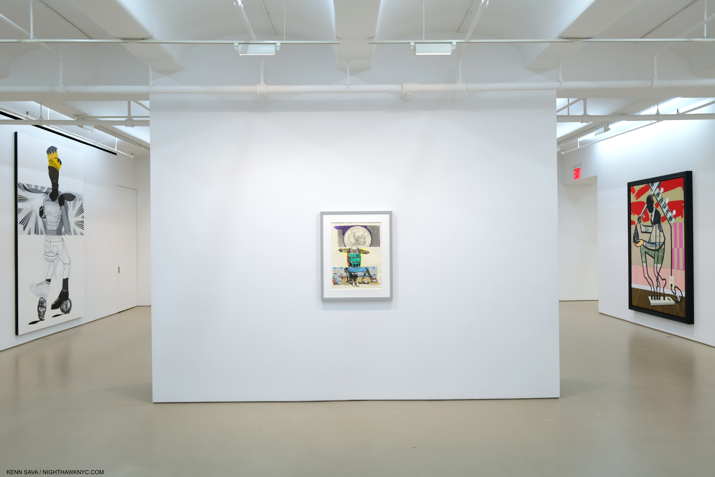
Remember how this looked on opening day in Part 1? Here’s the opening section on closing day, March 5, 2023.
What we call modern city life now only existed in Chicago, the birthplace of the tall building, and New York when Edward Hopper began to Paint here in the first third of the 20th century. Since, of course, it has spread everywhere, all around the world. There are countless millions more people living in these environments now than when he began rendering these places. In some ways, Edward Hopper was reporting from the front lines on the change that was happening around him in NYC. Change that was soon to happen in those countless other places around the world.
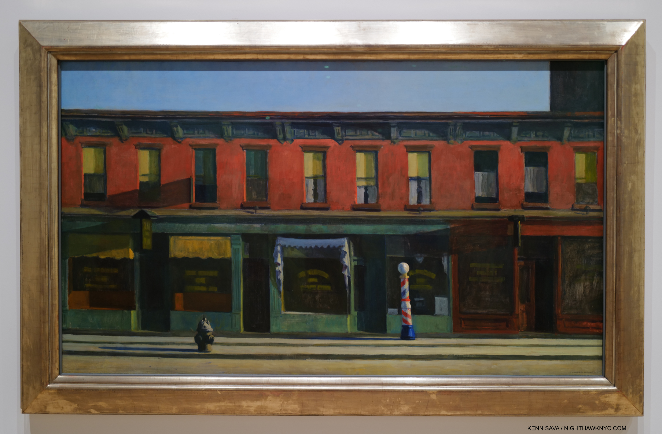
Early Sunday Morning, 1930. Edward Hopper is not going to hit you over the head with it. Instead, his subtlety is front and center here, in my view. The Whitney paid $3,000. for it in 1931, then featured it when the Whitney Museum opened to the public for the first time in November, 1931. 91 years later, it’s featured again.
For a long time I looked at Hopper’s famous Early Sunday Morning, 1930 as a charming Manhattan street view, one that depicts a block in my neighborhood 93 years ago. Now, I see it as something more ominous. I can attest that as 7th Avenue, shown here, runs North/South, the Sun, which rises directly behind the viewer, has never shone as Mr. H. has depicted it here- see the Photo of the site now in Part 1. Why did he do so? For me, the long shadows mimic the subtle dark rectangle extending off the canvas to the upper right. That’s part of the newer, tall building you can see in my recent Photo of this scene in Part 1, which was just going up when he Painted it. It’s the only building in this Painting that is still standing. The charm of the old human-scale neighborhood is evidenced by the barber pole, shown in full sunshine just to the right of the center of the composition, which emphasizes the human scale of the buildings. This is about to be lost as it is already being ominously encroached upon (if not engulfed) by “progress” (i.e. new tall buildings) while the City sleeps, i.e. while the public was helpless to stop it. This scene is about to be lost, which it was, as I showed. This idyllic, peace hides the loss of a world the Artist knew and loved, and the helplessness to do anything about it.
For me, Early Sunday Morning is a work that encapsulates Edward Hopper’s melancholy as he was about to lose the City he loved, and a “wake-up call” to those “sleeping” through what was happening around them. Now, it’s a reminder that there are always things happening most people aren’t all that aware of that will change their lives. Is he saying here, “Wake up, before it’s too late”?
The City, 1927. Change comes to Edward Hopper’s front door.
In The City, Hopper’s home, 3 Washington Square (see my picture of it from November, 2022 in Part 1), is seen in the row of buildings in the mid-distance. For me, everything about this screams distaste. This is Edward Hopper’s neighborhood; the block he lived on, on Washington Square Park in Greenwich Village. From the vantage point of a new taller building to the east, the people now look like ants. Two, new, taller buildings are unceremoniously chopped off. Edward Hopper Painted, virtually exclusively, in the landscape format. I take this as another instance of holding on to his values and refusing to compromise by Painting tall buildings in the portrait format. Eventually, change would come up and knock right on his apartment door. In 1946, NYU, which was in the act of swallowing up much of the area, bought 3 Washington Square and proceeded to try to evict its residents. The Hoppers publicly fought NYU for a few years before winning permission to stay. They would both live out their lives here.
The show made me think about the locations he Painted, and those he didn’t Paint. The latter is easier- it’s interesting that in spite of living and working here for so long, he never Painted NYC’s most iconic landmarks- Brooklyn Bridge, the Empire State, the Chrysler Building, The Metropolitan Museum (or ANY New York museum), and on and on. Instead, he found his meat in “second-tier landmarks” and everyday locations. Still, in each work, it seems to me that the notoriety of the building or bridge included isn’t his point. He down plays it or presents it as an element in a man-altered landscape composition, again asking, I believe, “What do you think of what man has done here?” Again and again, the takeaway for me was it was all about change: rapid change, or change over time.
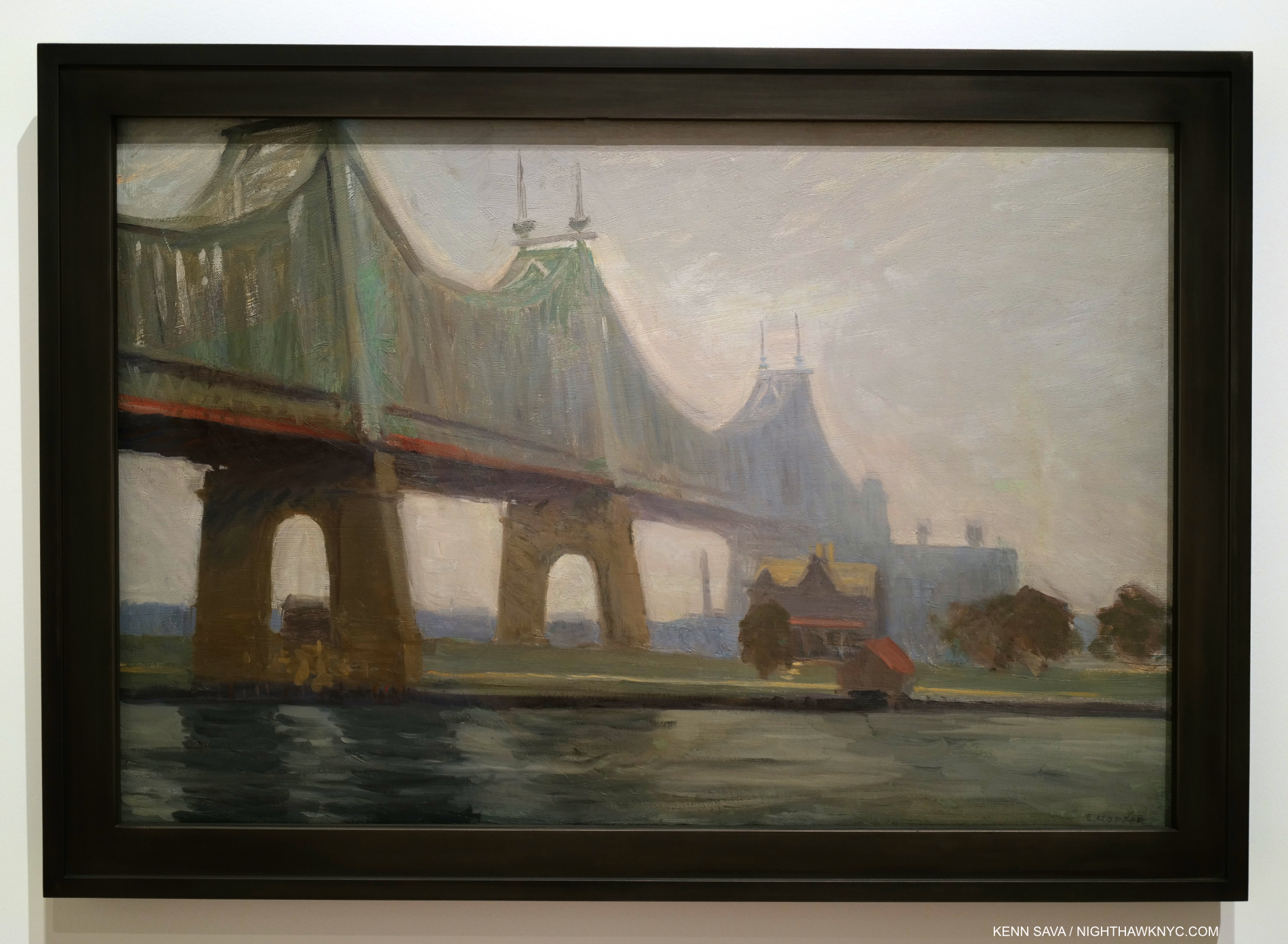
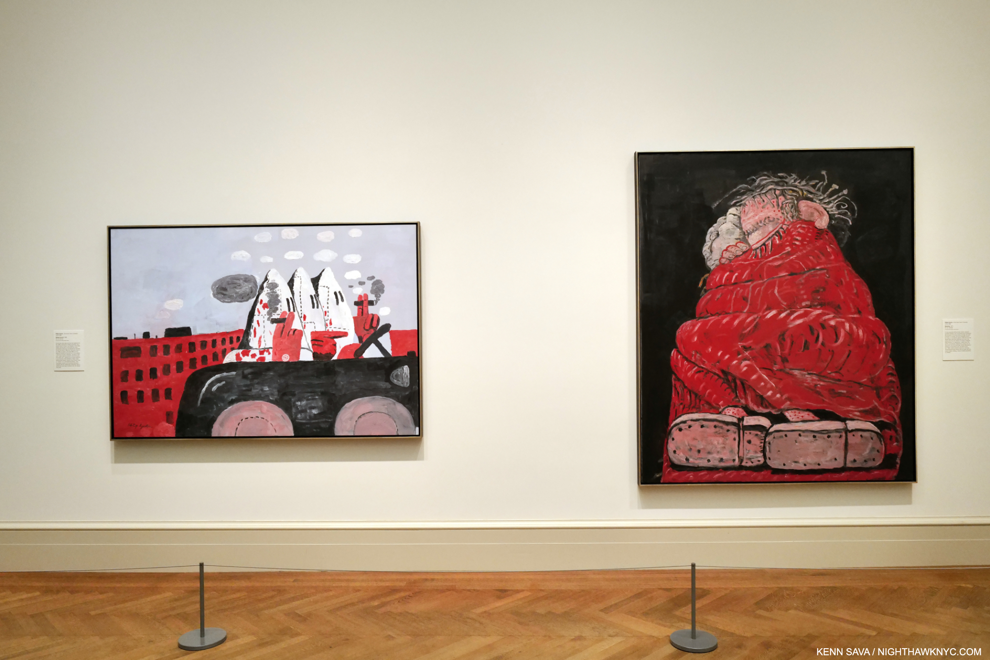
Queensborough Bridge, 1913. All of Hopper’s bridge Paintings (including Macomb’s Dam Bridge, 1935, which has much in common with Queensborough Bridge) strike me as man-altered landscape works.
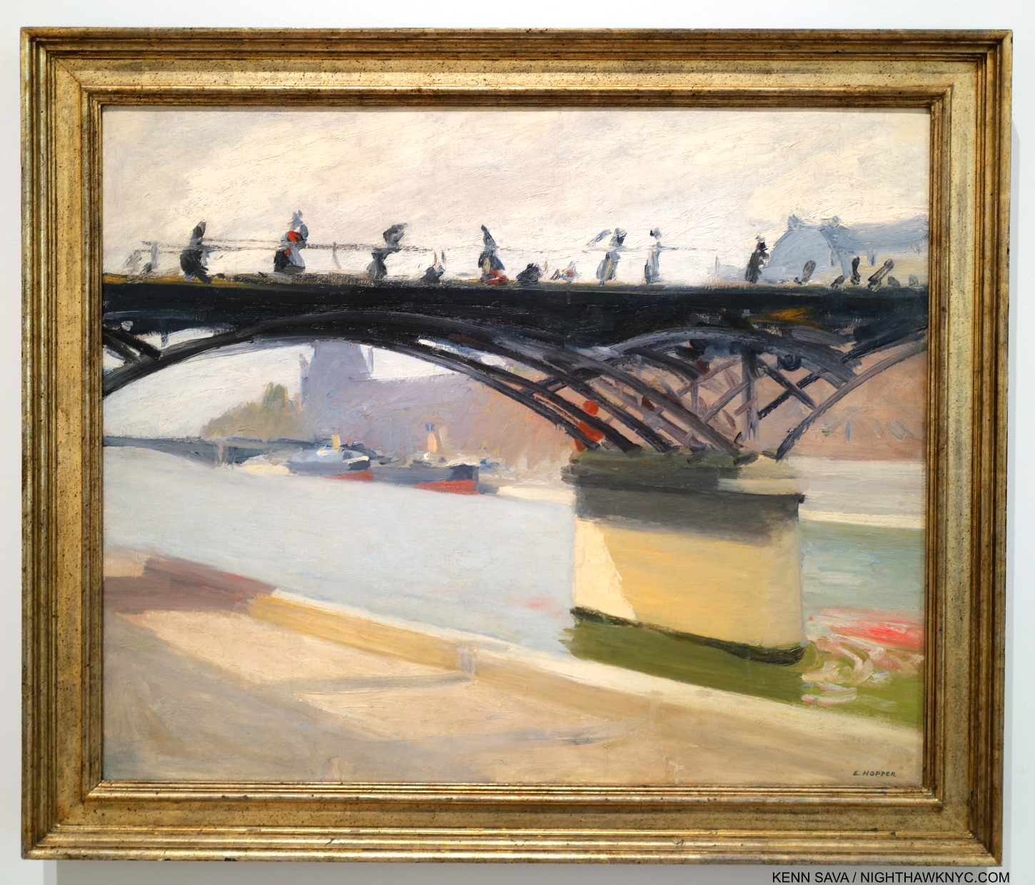
Bridges were a favorite subject for Edward Hopper going back to his time in Paris (I showed Le Pont des Arts, which he Painted there in 1907, in Part 1). Back in NYC, he Painted Queensborough Bridge in 1913, just 4 years after it opened in 1909! It has a few things in common with most of his other bridge Paintings. Most of them show the bridge from underneath, reminding us of human scale, and giving the viewer the sense he must have felt at the time of suddenly being VERY small. In this one, the first tower is chopped off by the top of the canvas- like he does with the new tall buildings. A sign of distaste? Also typical, the structure is cropped oddly and ends suddenly just past the right of center. This gives me the feeling that it’s not the sole focus of the composition. We also see East River and what is now Roosevelt Island with a colonial style (i.e. older) house. The house is in a bit shaper focus and is just to the right of center. The bridge draws the eye along until it suddenly trails off right over the house. Human scaled, it looks puny next to the huge bridge. The juxtaposition of size between these two man-made objects is jarring. Given the water in the foreground, which with the strip of land, represent nature, I see this as both an example of the man-altered landscape and how man changed it, first with the colonial style house, and again later with the bridge. The island looks fairly deserted, but it wouldn’t be for much longer as “progress” marched on inexorably.
Manhattan Bridge Loop, 1928. The lone figure, dwarfed by a wall in the Loop part of the Bridge, who adds so much, might have been a late addition to the composition. He does not appear in the Drawn Study on view in another gallery. Perhaps my favorite Painting in the show.
In the wonderful Manhattan Bridge Loop we aren’t seeing the bridge from underneath as he usually shows. We’re on a little known and now lost part of the Manhattan Bridge that was called the “Loop.” Built in 1906, Manhattan Bridge, which connects Lower Manhattan at Chinatown with Brooklyn across the East River, was another bringer of change to the City. It’s hard for us to imagine this now, but for several years after it opened in 1883, Brooklyn Bridge at 272 feet tall, remained the tallest structure in the Western hemisphere for a few years! Walking across it, when you reach the middle of the Bridge, you suddenly find yourself out in the open, its structure having magically disappeared due to the genius of its design. Every time I stand there I try and imagine what it must have felt like to those who stood here in 1883 when, as far as the eye could see, nothing was higher than you were. What a feeling that must have been! It still is. At 336 feet in height, Manhattan Bridge was even taller. These tall bridges presaged the era of tall buildings, and the effect of these immense structures that dwarfed human scale must have had a profound effect on the populace. I get that feeling looking at Queensborough Bridge, in particular, the newness of suddenly feeling so very small in the presence of the new bridge. Perhaps this is also Edward Hopper’s motif for Manhattan Bridge Loop- with a twist. Behind the wall the man walks in front of, which dwarfs him, and under the gantry, which mimics a bridge tower, is a trolley that ran on a loop from one side of the bridge to the other giving the work its title. In Manhattan Bridge Loop, Edward Hopper finds a new way to express the size of the bridge versus the human scale world he knew. And guess what would happen to those buildings along the back.
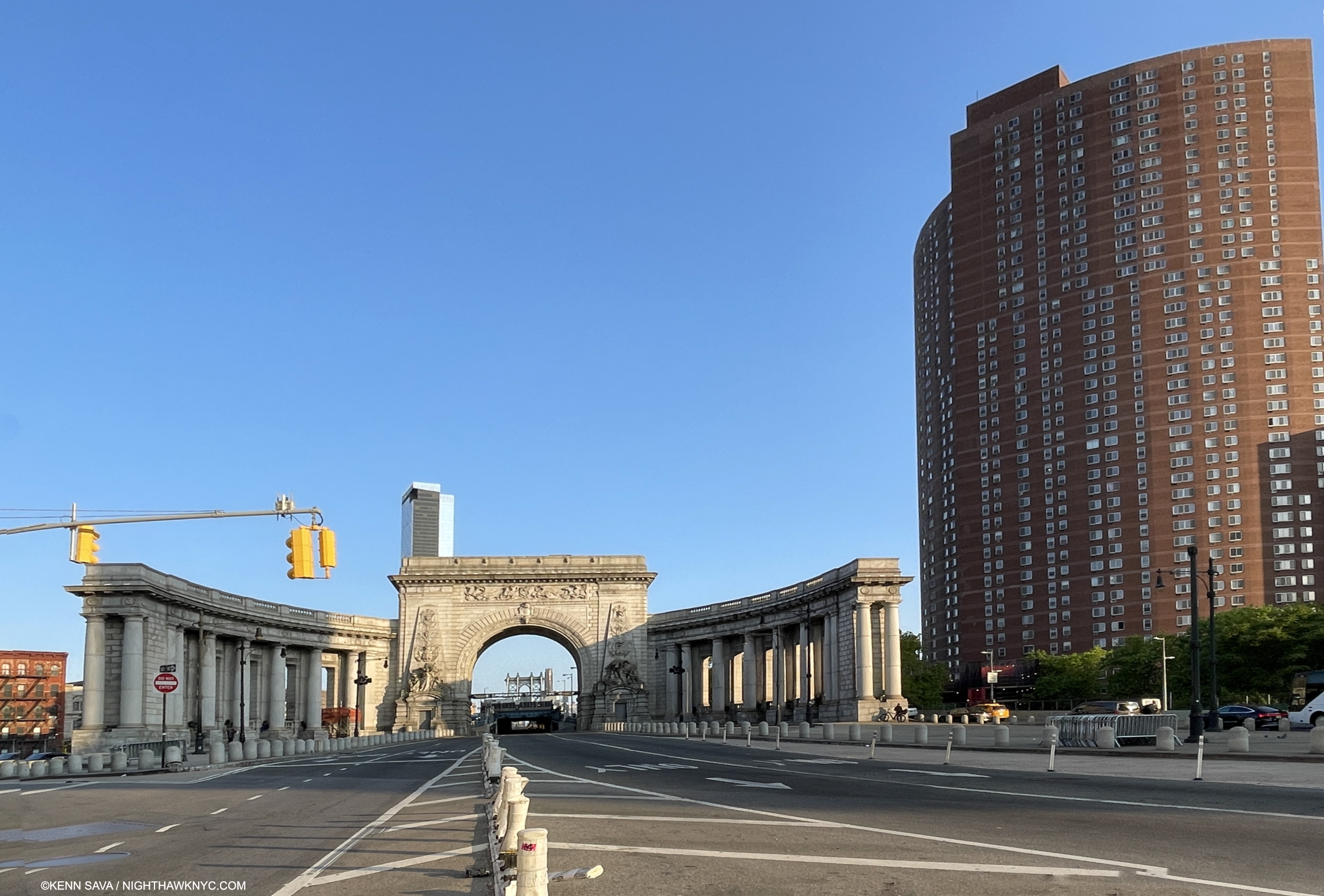
Change continued after Hopper. The approach to the Manhattan Bridge (seen in the far distance under the arch) on May 18, 2023. That’s the Confucius Plaza complex on the right. The Loop Hopper Painted was located to the right behind the arch. The only way to access it now is to walk around the center arch on the Bridge roadway(!) and hope it happens to be as deserted as it is here, which it almost never is. No, thank you.
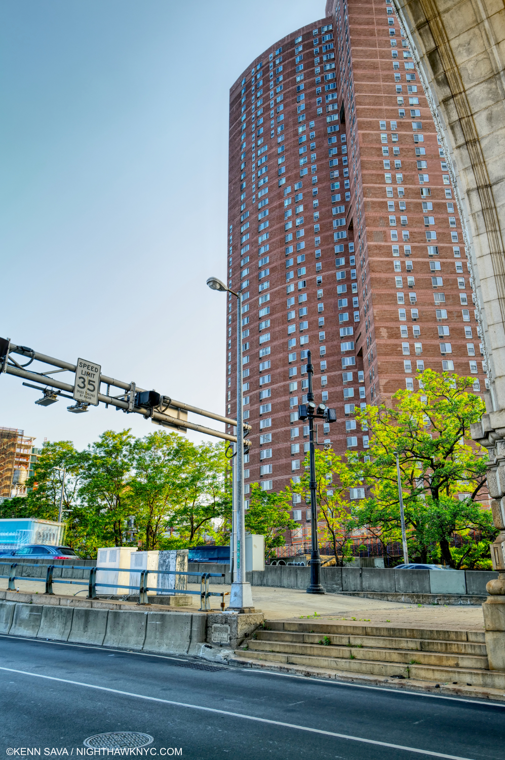
Not willing to risk life and limb as I did further below, I shot this from in front of the arch (part of which is seen at the upper right across the busy two-way roadway on May 18, 2023. This is approximately the scene of Manhattan Bridge Loop . Human scale was lost in a big way. Unlike Hopper, I’m using the portrait format to show just how tall the Confucius Plaza complex, which is where the buildings in the Hopper stood, is.
As in Early Sunday Morning, as time progressed, the beginnings of the loss of human scale in Manhattan Bridge Loop would only dramatically increase as time went on.
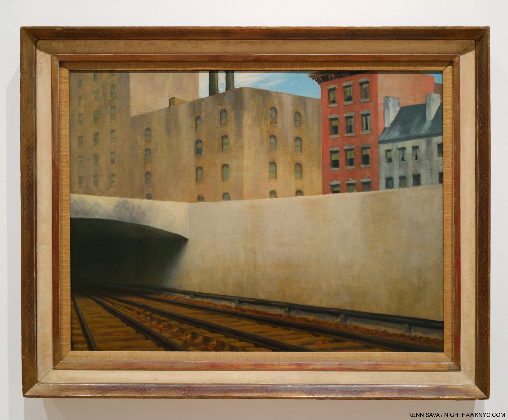
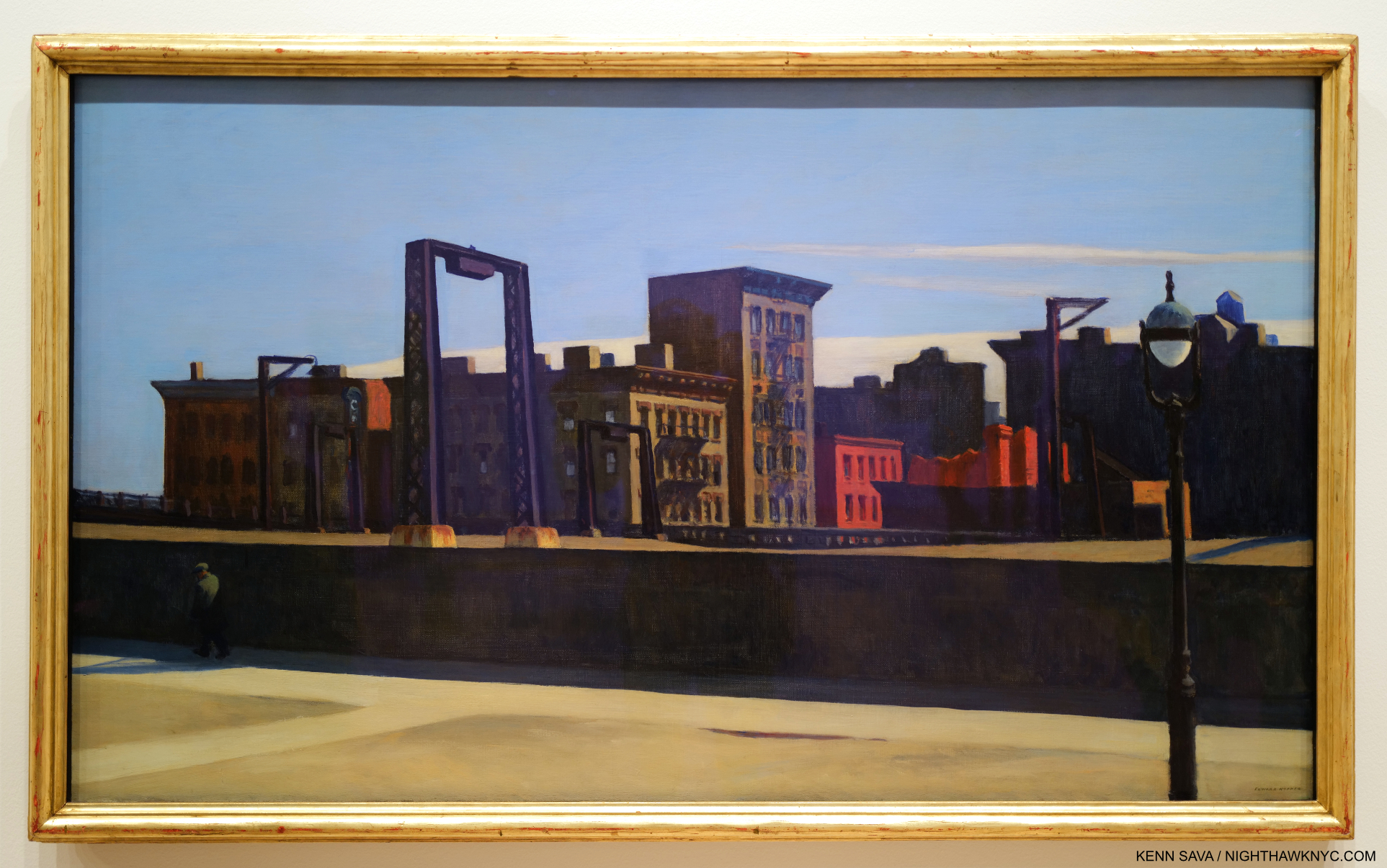
Approaching a City, 1946. Perhaps not one of NYC’s more scenic locations. The Artist visited the site, at Park Avenue at East 97th Street, the point where above ground trains become underground trains (and vice versa) going to and from Grand Central Terminal 55 blocks south, multiple times in 1945 to Draw it. Interestingly, the first work in Edward Hopper’s New York, my research reveals it was the last work shown in the Whitney’s 1950 Edward Hopper Retrospective catalog. I’ve been unable to find out if that means it closed the show.
After the introductory wall of early works I showed in Part 1, Approaching a City, 1946, showing another bridge, is the first work in Edward Hopper’s New York, proper after the introductory wall. I was surprised by this choice, but the more I studied it, I’ve come to see it as a commentary on change in the City over time. First, I was interested that Hopper chose this site, given how far it is from his apartment (and mine). As a result, it’s a bit of an outlier among all the subjects of his NYC Paintings. That made me wonder if this, too, was another scene he initially glimpsed while a passenger on a train, particularly given its low vantage point, and then decided to go back and Draw it. I was so puzzled by the Painting and why he chose this location that I visited the site to see what the real thing would reveal.
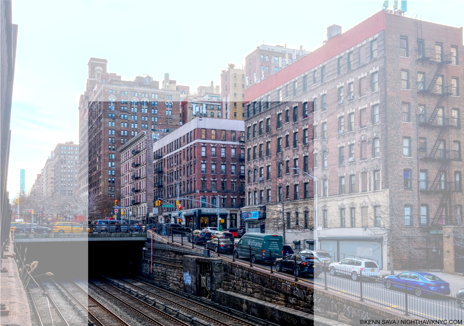
Park Avenue & East 97th Street, February 15, 2023 with the area shown in the Painting centered. What strikes me is that factory Hopper shows in the center & left of the Painting. Was it really there in 1946, right across East 97th Street from an apartment building? I didn’t crop this picture to the area showing in the Painting to show that the entire surrounding neighborhood is residential, and these building look to me to be 100 years old, if not older.
Today, it’s not possible to get down low enough to recreate the angle he shows- unless you’re on a train coming or going from Grand Central Terminal, 55 blocks to the south. Standing above, I took considerable risk taking this photo, my back danger close to the traffic zipping by on Park Avenue behind me. Vintage Photos in the City’s archive from the early 1940s show there was no factory where Hopper Painted it. The neighborhood was, and is, residential, and I believe the buildings I saw there now were there then.
I spotted this fleeting scene in the Film, The Band Wagon, 1953, showing the scene Hopper Painted just 7 years after he did! It’s highly unlikely the buildings in the background had changed that much.
Instead, Hopper chose to show a range of Architectural styles from Colonial, far right, to brownstone, to its left, to the modern factory, center, which could be taken as a comment, or a lament, on change in the City over time (a bit like Queensborough Bridge, and Early Sunday Morning do for me). The evidence would seem to show that he modified the background buildings to suit his purposes. So, what does modifying an actual place in a Painting mean? It means the Artist is using “Artistic license,” and putting it at the service of his or her intentions. (So much for so-called “realism.”) He or she may also want to remove the distraction of the place from the “point” they are trying to make. In the case of Approaching A City, Edward Hopper replaced a residential building with a factory and placed it among other residential buildings. He also changed the Architectural styles of the other buildings. It’s up to the viewer to read this as he or she will. For me, it shows that if he did so once, he would do so again. And he did.
Therefore, when I look at the places he shows, whether or not they are actual places is now a secondary consideration, said the guy who spent decades looking for the “actual site” of Nighthawks. I was driven by the fact that Hopper had Painted actual sites. But, as time went on, he moved away from doing so because it no longer served his purposes, or he modified them as he did here. (For those interested in knowing more about the actual sites Hopper did Paint, and comparing them with his Paintings, Hopper authority, Gail Levin, the Whitney’s first Hopper curator, and author of both the Hopper Catalogue Raisonne and the definitive biography, has published a book of Photographs she took traveling in NYC, the rest of the U.S. and Europe of places Hopper Painted appropriately titled, Hopper’s Places.) Finally, the darkness inside the tunnel I find interesting. Is it a comment on where things are heading? Into the unknown?
The Hopper Fish Bowl
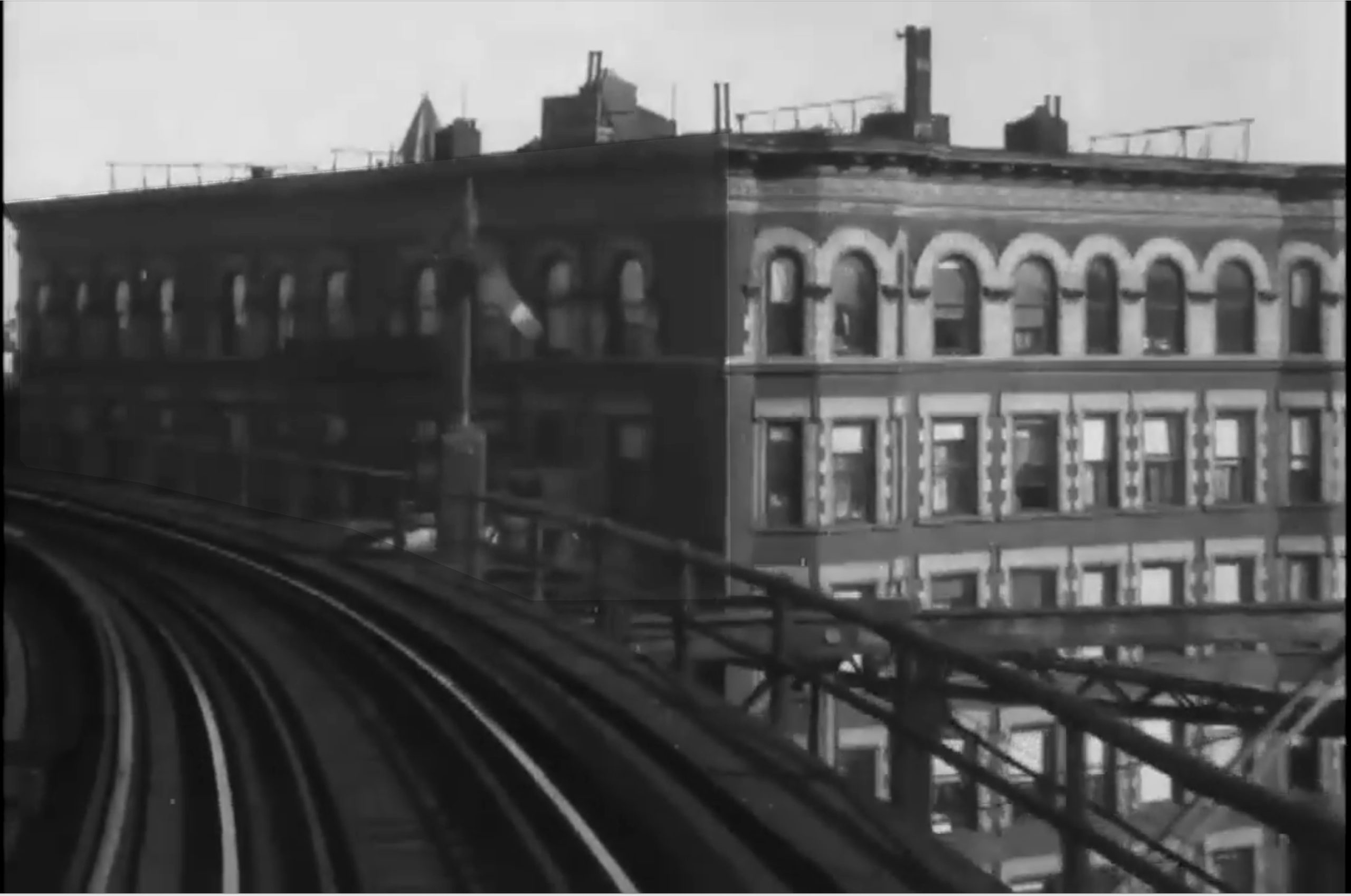
A frame from the 1916 short Film, A Ride on the Sixth Avenue Elevated shows the train approaching a row of windows, which might have provided Edward Hopper, a regular rider, with ample opportunity for fleeting inspiration…
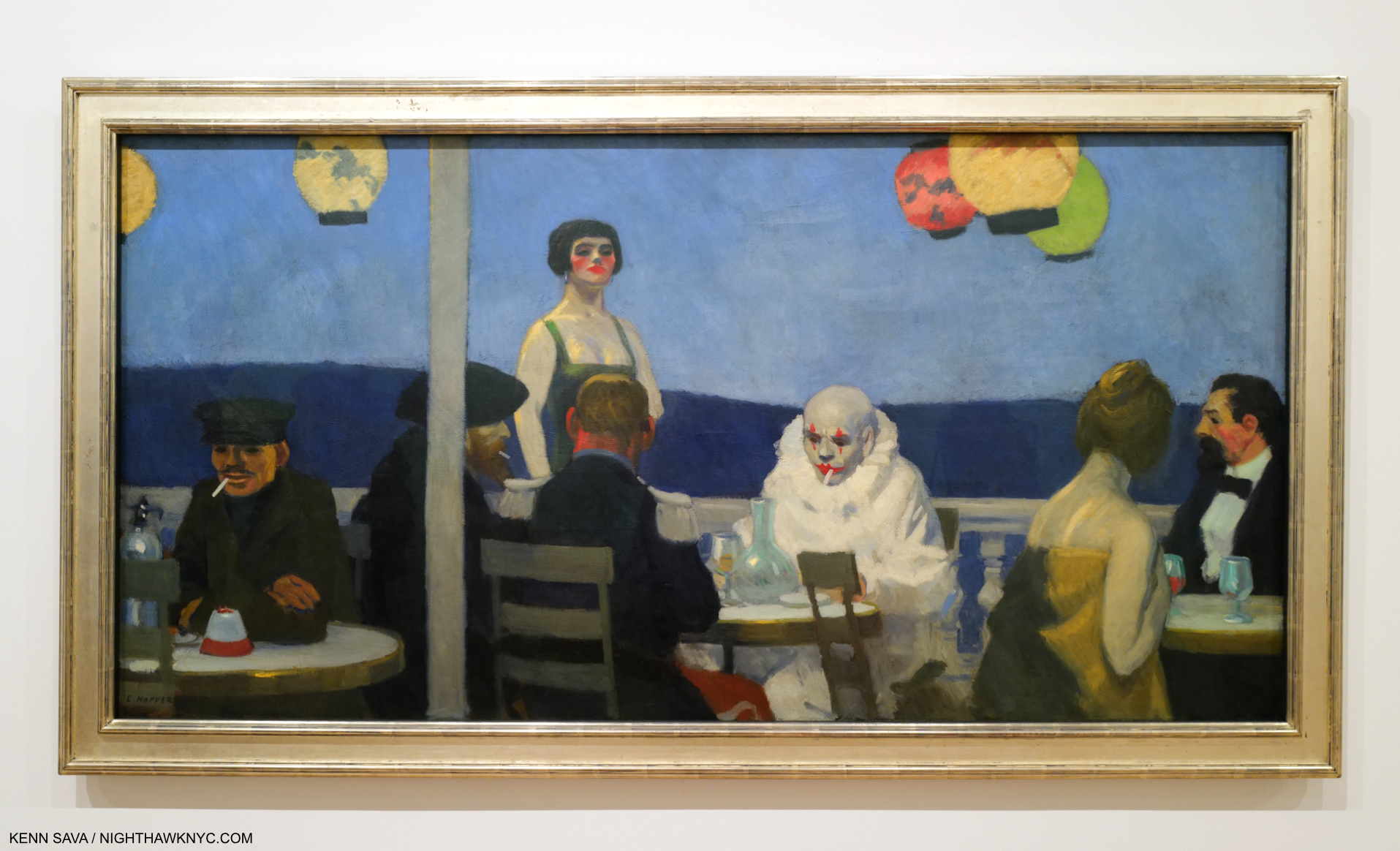
Life in NYC offers little privacy. New Yorkers are forced to adapt, but somewhere in the back of their mind lives the thought that “someone’s always watching.” That was born in the days long before video cameras, helicopter & drone surveillance! That Edward Hopper had his eyes open is seen by the number of his Paintings that look into a window. These strike me as new in Art. Some of these may have been inspired by fleeting, passing moments witnessed while a passenger on a train, others while on one of his walks around town. In any number of his Paintings we see one or more people behind glass. As I said in the caption for Office in a Small City, earlier, I call this the “Hopper fish bowl.” These include the “looking into a window” works, like Night Windows, 1928, which I showed in Part 1, and Nighthawks, which includes 4 figures behind glass.
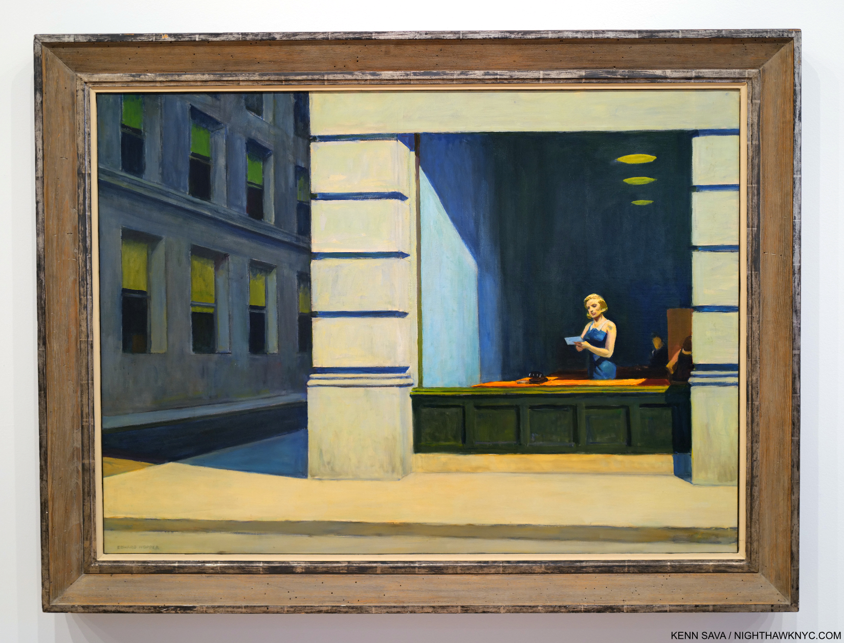
Office at Night, 1940. A work that has haunted me for over 40 years. I saw it here for only the second time in person.
Office at Night, 1940, is another scene apparently glimpsed through a window. Or is it? In The Art & The Artist, P.60, Gail Levin quotes Hopper saying there are three sources of light for this picture- the overhead light, the desk light and the window. If it was a scene glimpsed while on a passing train there would need to be 4- with another window in the front. I think people who have seen many Hoppers will immediately assume this is another “glimpsed in passing” scene, as I have until I read that. Who else Painted something like this before 1940? I grew up being forced to work in an old office that looked a bit like this one as a child, so it always gives me the chills to see it. The quiet drama at work here speaks volumes, and says everything about what has become “life in the cube.” It seems to me that Edward Hopper owns the genre of Painting office interiors (including Office in a Small City, shown earlier), and the next one, all showing the effects of the man-altered landscape on those who live in these places.
Edward Hopper’s New York, Now
New York Office, 1962. With a change in telecommunication equipment, this could be now in Downtown, NYC. In 500 years, if people make it that far, it’s hard for me to imagine this won’t still be speaking to them. Hopefully, it will have a better frame by then.
Beyond changing my thinking about his work, Edward Hopper’s New York made me realize that sooner or later, everyone who lives in NYC (and perhaps most other cities) for a period of time winds up lamenting the loss of what it “used to be.” Early Sunday Morning is, perhaps, the epitome of this, but I think it’s there in many of his works. I miss the NYC of the 1970s and the 1990s. The pandemic has changed the City dramatically, too. It’s still hard for me to believe that 45, 215 irreplaceable people have died in NYC from covid as of June 1, 2023. Building and renovation (i.e. “progress”) continues as robustly as ever- for better or for worse. Rarely has there been an Artist who documented change in the City as Edward Hopper did. In spite of all these changes, he never changed. He kept working in the landscape format until the end. There were only a handful portrait formatted Paintings in Edward Hopper’s New York, notably his Self-Portraits and his Portrait of Jo, and a few in the square format, like Office at Night. It’s easy for me to relate to his angst at losing part of what he loved. It’s obvious how much he cared. As we venture into this new time of change, Edward Hopper’s New York can also be seen as lessons to us now- before, during and after change.
What I’m saying here is what Edward Hopper’s Art says to me. As with all Art, it’s up to each of his viewers to take from it what they will.
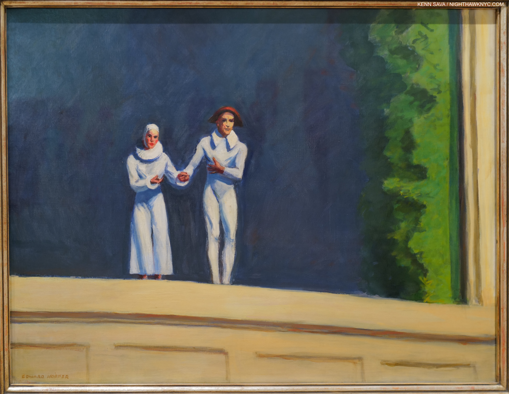
Edward Hopper’s final Painting, Two Comedians, 1965. He and Jo taking a bow in front of a dark blue sky(?) background with a landscape prop to the right. At first glance, it seems a straight-ahead Painting. I now also see it as showing a man-made setting (the backdrop and prop) depicting the “natural world,” thus “flipping the narrative” from what man has done with and to nature in his final work. Or, is it a reminder that everything he’s shown us was created by by him, assisted by Jo, in paint?
Back at home, Edward Hopper always struck me as being somewhat out of place in Greenwich Village. It became the home of the beatniks and then the hippies as his life came to a close. He died on May 15, 1967- right at the dawn of the “Summer of Love.” Throughout his 84 years, Edward Hopper held on to his traditional values and way, as I discussed in Part 1. He never went with fads, changing styles, or trends. At times this made him seem “old-fashioned,” particularly in the face of Abstract Expressionism and then Pop, but he’s having the last laugh now. The crowds that flock to see his work wherever it’s displayed around the world are proof positive that his Art is speaking to more people right now than it ever has before. People everywhere have seen the modern, man-altered world that was new in his time in New York up close and personal where they live and have been effected by it- for better, for worse, or some of both.
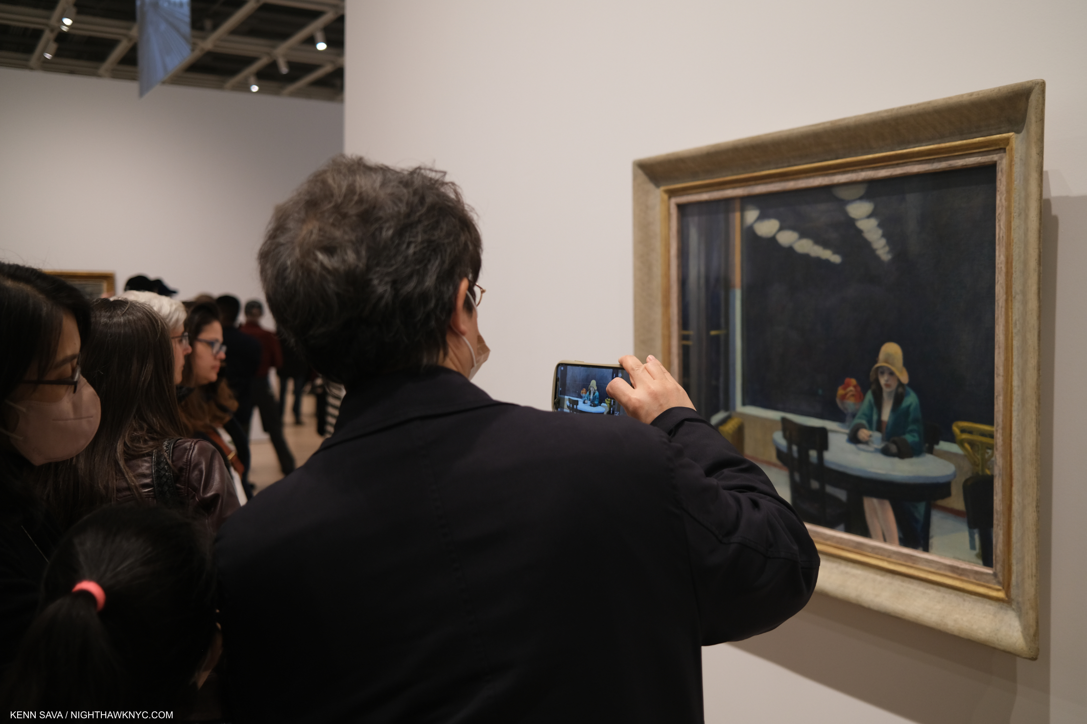
Last look at Automat. Closing day, March 5,2023.
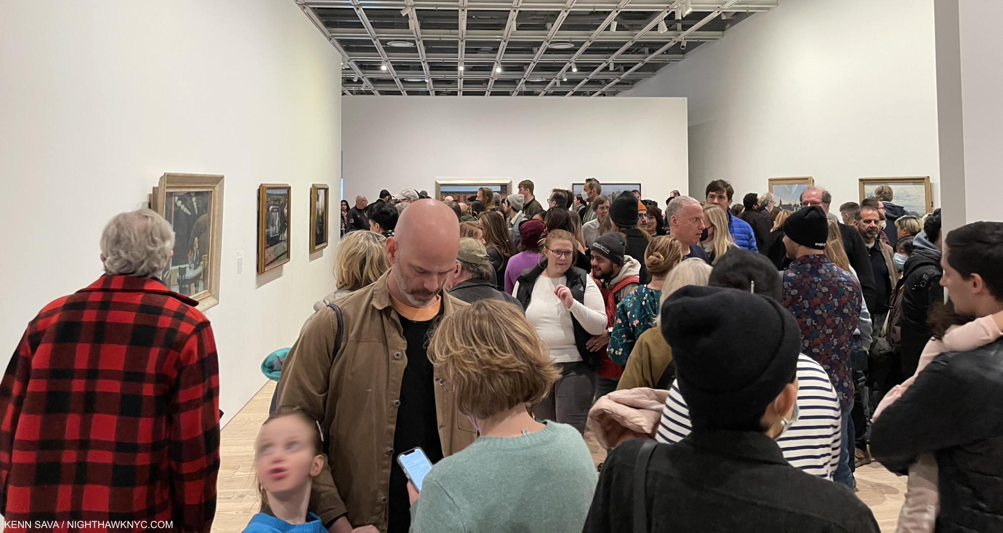
Another big take away from Edward Hopper’s New York came from observing my fellow show-goers. It struck me that that for many others, as it does for me, it serves as a confirmation of what they’re feeling wherever they’re living. That makes me wonder- was Edward Hopper a visionary, too? Did he foresee that what was going on around him in NYC between 1910 and 1950 would become a world-wide phenomenon? I tend to think he was NYC-centric, like I am. He was worried about what he saw going on around him in a place he loved and loved living in. He noticed the effects these changes had on his friends and neighbors and on total strangers he happened to glimpse for a fleeting moment as he moved around town. He froze those moments in oil paint where they have become frozen in many of our minds. That front line moved further and further until it covered much of the world in the following 100 years since he started.
Ending this series with the same piece I began Part 1 with: Edward Hopper’s Self-Portrait, 1925-30, begun 98 years ago. Seen on March 1, 2023. In 2022, I also featured it here, where you can see it close up.
“I saw the Edward Hopper exhibition at the Whitney Museum in the fall of 1995 and I was amazed at the number of people there and how they reacted to the paintings….Hopper seems to reach more people than any other American artist.” Alex Katz, Looking at Art with Alex Katz, P.88-9.
Since that show Alex Katz refers to in 1995, Edward Hopper’s star has continued to rise- both here and especially around the world, If Edward Hopper isn’t THE most popular American Painter world-wide right now (and he may be), the inexorable rise in popularity his work has seen these past 100 years tells me he will be just that one day soon.
Closing Day, March 5, 2023
For me, in the end, the very good thing about that would be that his popularity is not due to a fad, sex appeal, a glamorous lifestyle, or the trappings of celebrity. It’s solely due to his Art speaking to people! In this modern day & age, with all the trappings of 21st century life that Edward Hopper couldn’t begin to dream of…imagine that.
A Postscript that looks at some serious issues involving & surrounding the Art of Edward Hopper at the Whitney Museum is here.
*- Soundtrack for this piece is “Rhapsody in Blue” by George Gershwin, who returns from Part 1. Feeling “blue” may be a symptom of the man-altered environment. Gershwin was the ultimate interpreter of his own Music, of course. After his early death, the charge of performing Gershwin authentically fell on his friend, the extraordinary Oscar Levant. Best known as a somewhat sarcastic actor in An American in Paris, and other Films, lesser known is as one of the great pianists of the 20th century he was the highest paid concert artist for quite a while. (If you want to be blown away, check out this segment from the Film, which may be the first Music video.) Here, he powerfully performs “Rhapsody in Blue” with Eugene Ormandy conducting. It is posterity’s eternal loss that the record companies never sat Mr. Levant down in front of state-of-the-art studio recording equipment and had him record every note George Gershwin wrote that included a piano part. I cherish what we have.
<
NighthawkNYC.com has been entirely self-funded & ad-free for over 8 years, during which 300 full length pieces have been published! If you’ve found it worthwhile, PLEASE donate to allow me to continue below. Thank you, Kenn.
You can also support it by buying Art, Art & Photography books, and Music from my collection! Art & Books may be found here. Music here and here.
Written & photographed by Kenn Sava for nighthawknyc.com unless otherwise credited. To send comments, thoughts, feedback or propositions click here. Click the white box on the upper right for the archives or to search them. Subscribe to be notified of new Posts below. Your information will be used for no other purpose.