R. Crumb Meets His Match

This site is Free & Ad-Free! If you find this piece worthwhile, please donate via PayPal to support it & independent Art writing. You can also support it by buying Art & books! Details at the end. Thank you.

Written & Photographed by Kenn Sava (*- unless otherwise credited)

(This is, also, my NoteWorthy Show for January, 2017.)

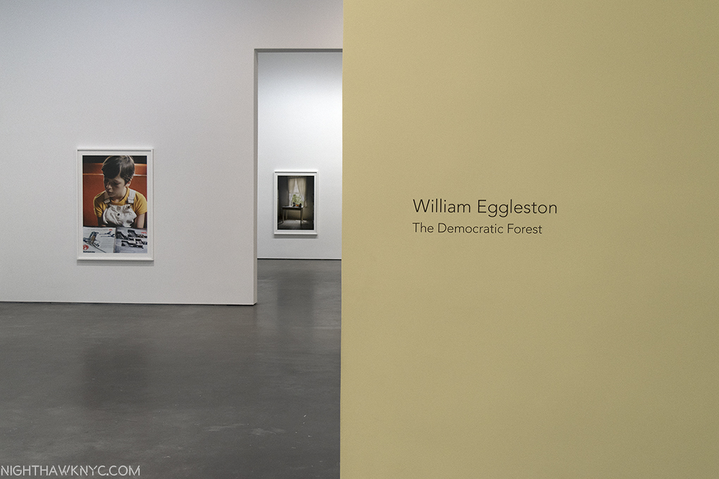
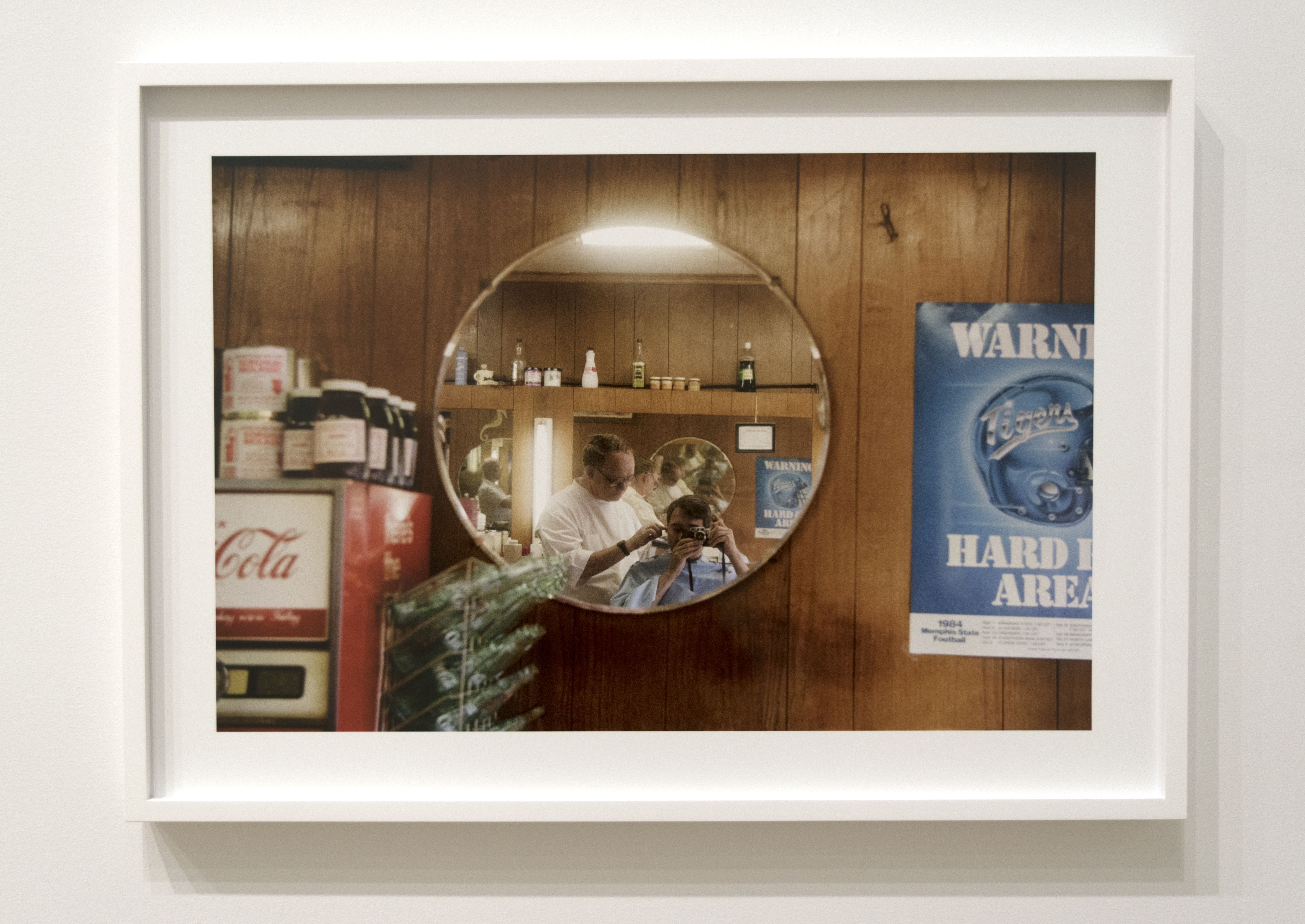
I’ve been looking at R. Crumb for a very long time. At least 20 years. Of course, his work predates that by a further 35 years, and today I still find all of it compelling. Unfortunately, the chances to see a number of original works by R. Crumb remains all too rare. The chance to see the Artist himself, rarer still. So rare, I never have. I tried in vain to find out if he would be appearing at the opening for the show co-starring his wife of FORTY YEARS (in 2018), Aline Kominsky-Crumb, “Drawn Together,” on January 12, then decided to take a chance and swing by David Zwirner Gallery (most recently the scene of “William Eggleston- The Democratic Forest,” which pretty much turned my entire life upside down, launching my free-fall into a bottomless pit of research into Contemporary Photography. In fact, If I’m not careful, this will become a Photography Blog very soon!) and have a look see, anyway. I’m not one to attend Art Openings unless an Artist I’m interested in is making an appearance.

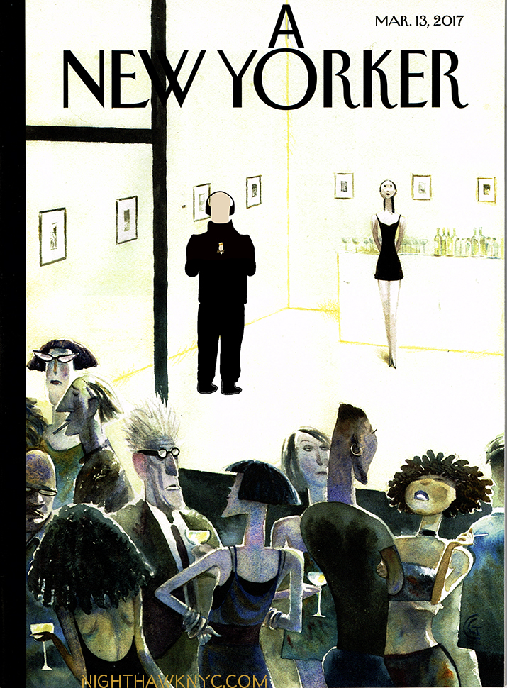
The Nighthawk At The Opening (Artist’s conception, cause I generally don’t attend them). Adapted from The New Yorker’s March 13, 2017 cover called “Opening Night.” I couldn’t resist. My Apologies to Artist Carter Goodrich, and the great editor Francoise Mouly (a friend of R. & Aline Crumb).

R. Crumb’s work occupies a unique place somewhere between what’s been traditionally the so-called “low-brow” world of comics and “Fine Art,” that’s been hard won. Bursting on the world’s awareness like a supernova in 1967, when he was there are the genesis (sorry) of what would come to be called “Underground Comics,” a genre of which he soon became the de-facto figurehead of, and, for many, it’s most important Artist. Over the years, his work has begun to be more fully appreciated beyond the world of Comics. The late Art Critic Robert Hughes called him “the Brueghel of our time.” Even that lofty observation barely scratches the surface of R. Crumb’s impact and influence. While I was walking the streets of Chelsea to the opening of this show, admittedly with Crumb on my mind, I found it quite hard not to see his influence in the work of a number of shows I passed by Artists who’s work has nothing to do with comics or graphic novels and even in the flared pants snd chunky shoes women seem fond of these days. While Crumb’s work remains under-appreciated by the Fine Art world, in my opinion1, his influence has barely begun to be seriously considered2.

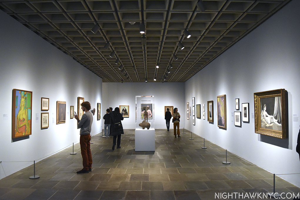
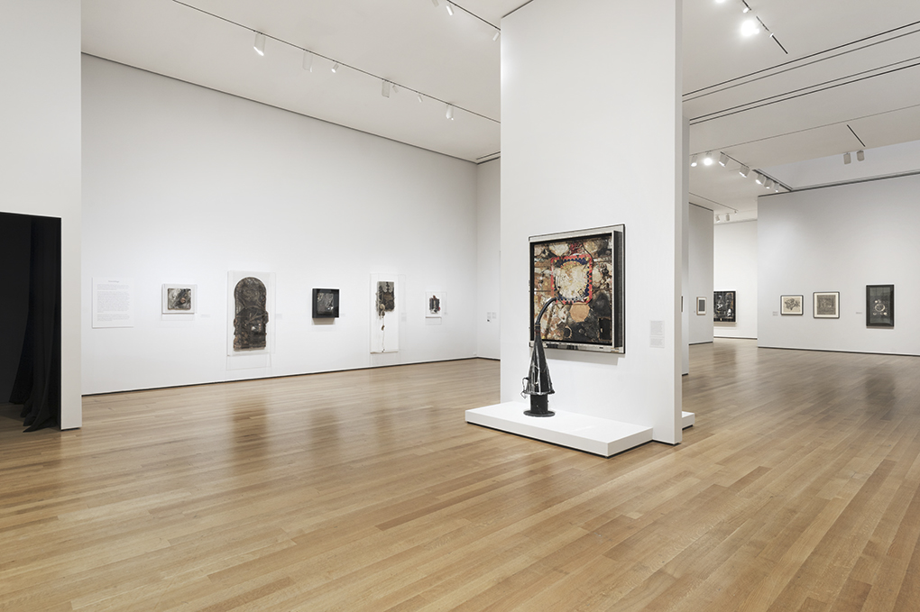
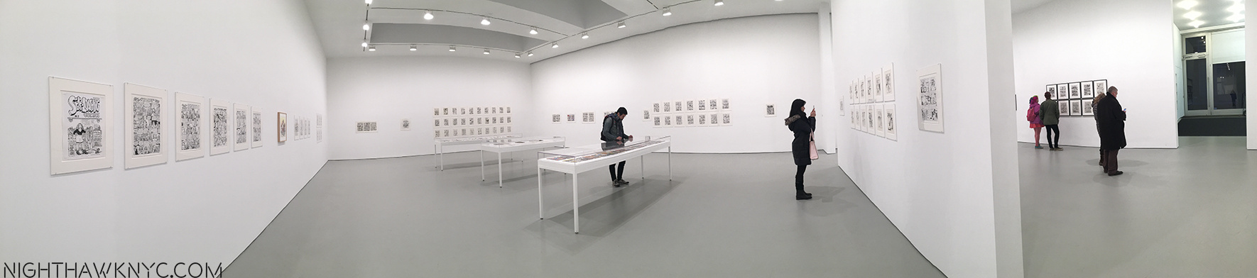
Arriving, I walked in to a good sized crowd…and live music. As I made my way through the gallery to the rear, large room. Low and behold…

R. Crumb, himself.

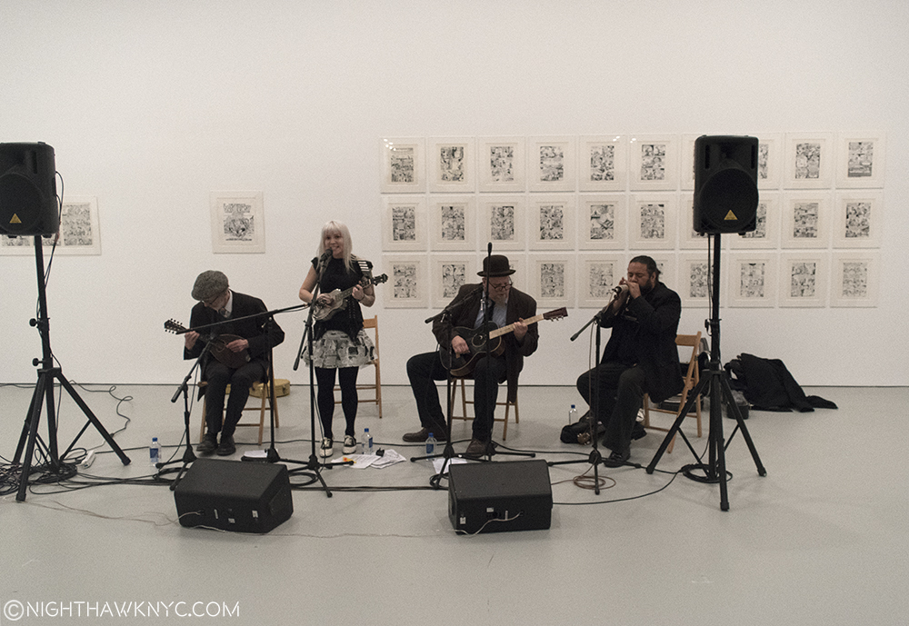
Art, and Artist. R. Crumb on left-handed mandolin(!), appropriately on the far left, performing with the East River String Band, at the Opening, David Zwirner Gallery, West 19th Street, January 12, 2017.

…looking just like a comic of R. Crumb, himself. He was seated wearing a cap and playing a mandolin with a group, the “East River String Band,” who’s blonde singer and one of the musicians I immediately recognized from covers R. has drawn for the band’s albums. The music was lively and pleasant, but, frankly, it went right past me. I couldn’t get over the fact that here he was, a few feet in front of me. Every little move he made fascinated me- he plays left handed!? (he writes & draws lefty, too), how he interacted with the other musicians (he seemed to mostly follow), how he held his instrument, how he sat while playing it (slightly folding himself around it)…Partly, the former Musician in me was interested. Mostly, it was because R. is someone who seems to do everything he does deliberately, so this might reveal some small key to the Artist.

The set ended, and I moved a bit closer as the equipment was torn down. R., his instrument put away, remained in his chair. Carefully approached by a few (the legend of his not being a fan of his fans well-known to his, um, fans), only one, who he appeared to know, actually dared speak to him. He presented a book. It may have been one they collaborated on.

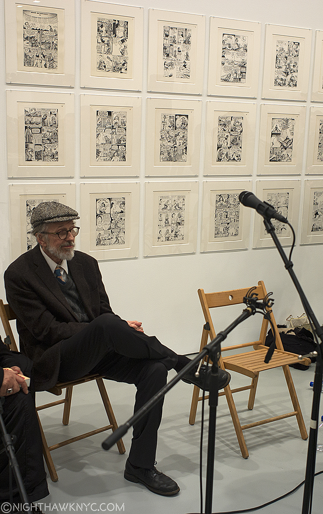
Alone in a crowd. R. Crumb after the set.

I watched the Artist reach into his inside jacket pocket and produce a white pen to sign it. I immediately recognized it as a Rapidograph pen, the pen he’s made famous, at least for me, because they are what he’s drawn with for lord knows how long now. I had never heard of them until I found out he used them a decade ago, and immediately bought a set for like 120 bucks. Then, I realized that drawing in ink is not for those squeamish at the site of their own blood. So? Back to graphite and my trusty eraser it was for me, leaving ink to Master Draughtsmen, like R. Crumb. To this day, It’s always funn to look at a Crumb original and see if there is any use of White Out Correction Fluid on it or not. He will do the most intricate cross hatching and there will be no White Out to be seen, anywhere. I don’t think I’ve drawn in ink since.

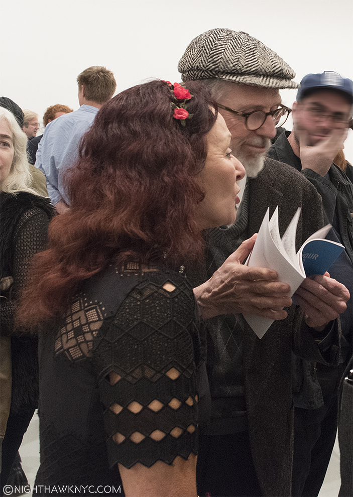
Happy Early 40th R. & Aline! HOW did you do it?? Maybe the gent in the back is wondering, too.

He looked a bit older than the last time I’d seen him on video, a bit frailer, perhaps, then he stood up, and with Aline alongside, made his way through the throng to the gallery’s offices, not to be seen again (at least while I was there). Due to the Opening Night crowd, I returned a number of other times to see the actual show.

What I saw was shocking.

As shocked as those at the opening may have been by the unannounced (as far as I know) appearance by the Artist, more may have been shocked by the excellence of the “other Artist” who shared the bill with R. Crumb, his wife of 40 years (next year. Sorry. I can’t stop saying that because it blows my mind), Aline Kominsky-Crumb.

Yes, excellence.

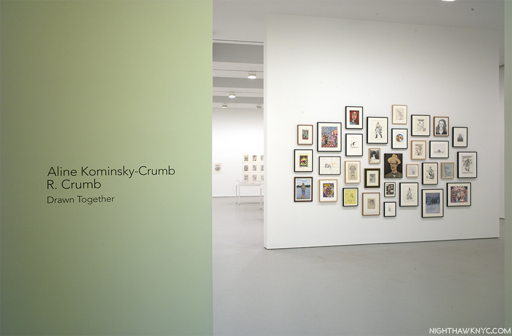
Anyone who can go toe to toe (not to mention parts more intimate, but no less appropriate to this show), with R. Crumb over the course of most of a show (and ALL those years of marriage) is someone who deserves an award. Well, at least recognition. It’s high time Aline Kominsky-Crumb be acknowledged, and accepted, and her considerable body of work be appreciated. “Drawn Together” made the case for that as well as it’s likely to be made.

The standard “knock” against her has to do with her draughtsmanship. Even she mentions it in a panel here. There are many cartoonists, graphic novelists, even Artists hanging in The Met, who’s draughtsmanship is “suspect,” (to be kind). It’s missing the point. The point of Art is to express and communicate, (even if the latter is “only” a byproduct). Those just happen to be Aline Kominsky-Crumb’s strongest suits.

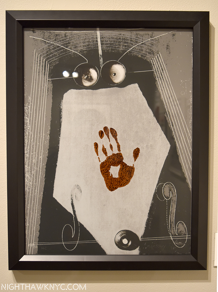
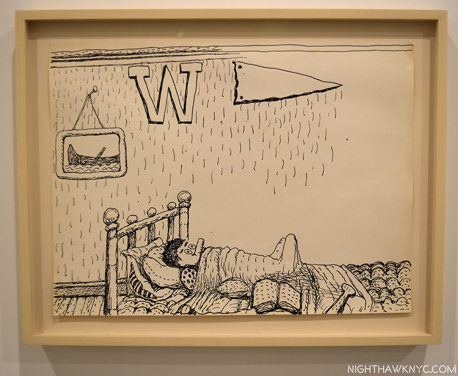
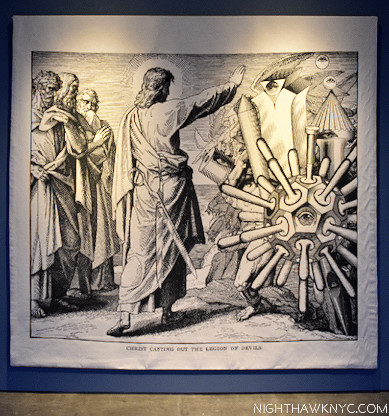
But, yes, there are masterpieces by the Master of Underground Comics to be seen here, too. The ten page story, “Walkin’ The Streets,” wherein we witness a conversation between R. and his late brother, Charles, strikes me as one of his great(est) works.

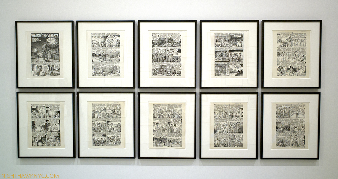
R. Crumb’s “Walking The Streets,” with his dear brother, Charles.

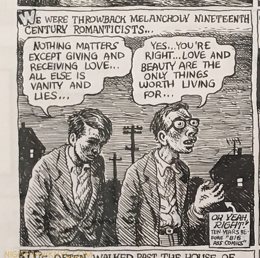
Charles(left)? I was just saying the same thing, here, a few weeks back.

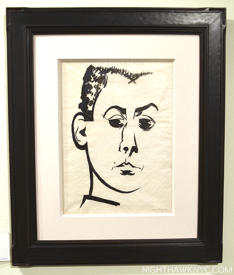
In fact, on the subject of draughtsmanship, it’s actually arguable who among the three Crumb Brothers, was/is the greatest. R. has spoke glowingly of Charles’ talents. He passed at age 50 from an OD of his prescribed drugs.

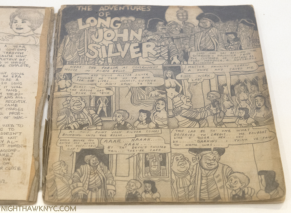
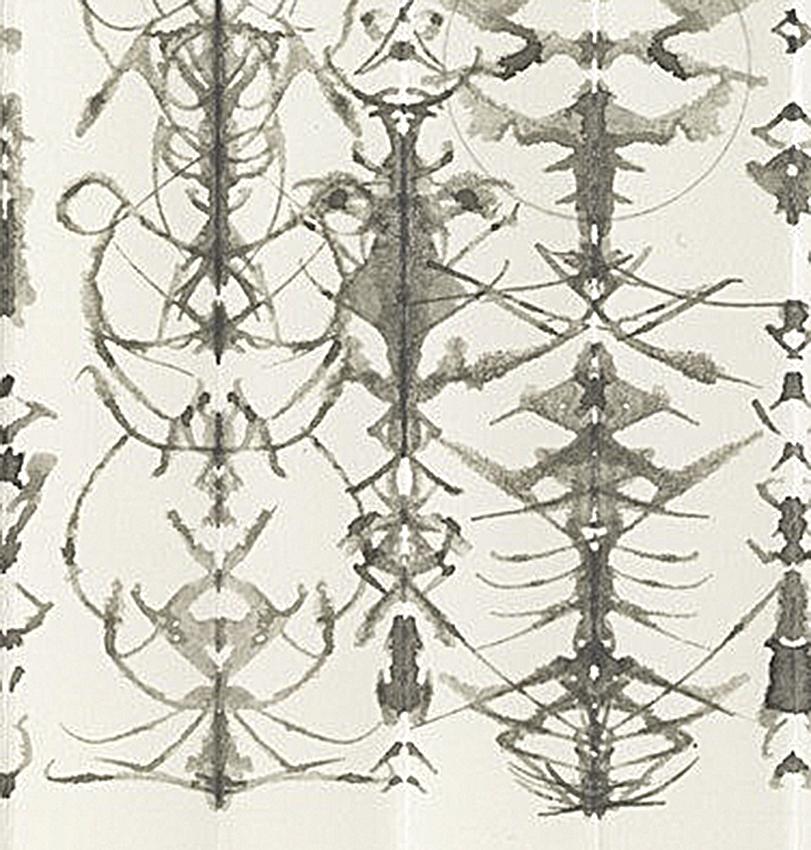
A page from an extremely rare surviving sketchbook by Charles Crumb reveals his obsession with “Long John Silver.” See Terry Zwigoff’s superb documentary “Crumb” for more, and seldom seen video of Charles and Maxon.

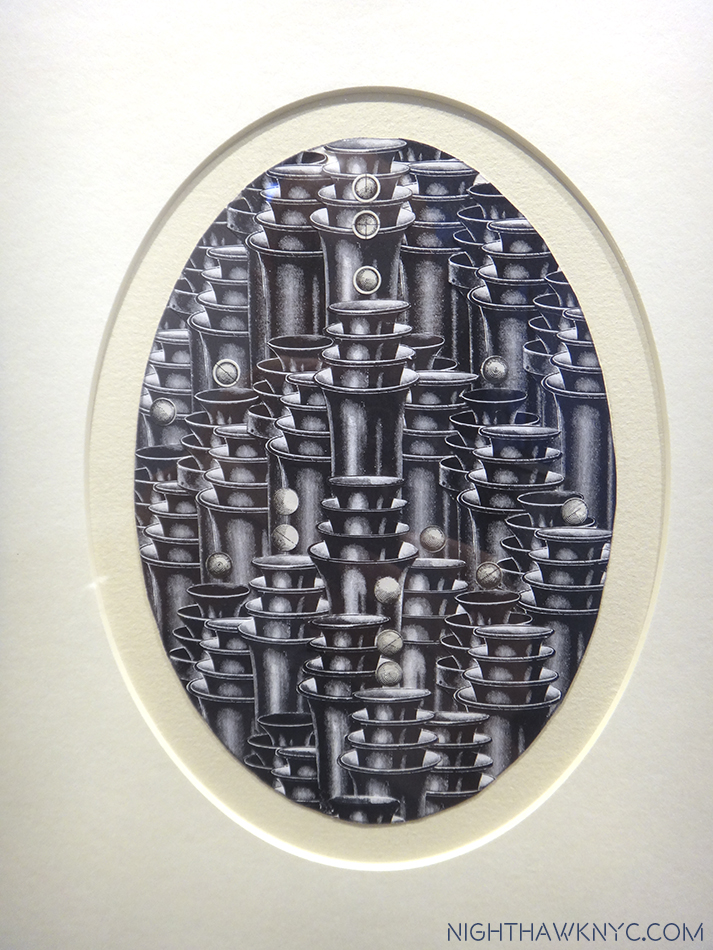
The other brother, Maxon’s, work is ingeniously intricate, and brilliantly executed, though both of those are matched by his penchance for obfuscation and symbolism. If you can fight through that, you will find an Artist who doesn’t fit into the “comic book,” or even graphic novel genre, but an Artist, who’s path is closer to that of a Fine Artist. While R.’s originals sell for up to six figures (before the decimal point), Maxon’s drawings sell for hundreds, maybe a thousand dollars, his scarcer paintings for maybe 10 to 15 grand. In my opinion, he is very unfairly overlooked, (a bit like Charles Pollock is to his brother, Jackson Pollock.) Look at this-

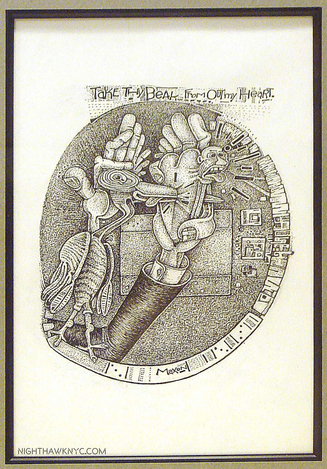
Maxon Crumb’s “Take Thy Beak From Out My Heart,” Ink. The intricacy of this work is just staggering. (This was not in the show).

Speaking of being overlooked, R. Crumb has been ever so gradually finding acceptance as a Fine Artist on his way to being recognized as a “great Artist.” Beyond his draftsmanship, the honesty in his work is something that might seem common now, in this age of so-called “reality” shows. R. Crumb is the original reality star in the sense of honesty depicting himself- “good,” and “bad.” This turned off many, and it, too, hasn’t “mellowed” much over time. Though things like his sexual preferences (and appetites) remain controversial, and retain the ability to shock, as does how nakedly he discusses his inner feelings and thoughts. His wife is no shrinking violet, either. She never hides what she’s thinking or feeling, about herself, or anyone else, either. As a result, she is, perhaps, the ideal collaborator and foil for R..

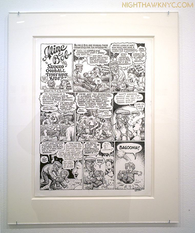
R. & Aline Crumb, “Should Oddball Types…,” ink. Just one example.

The results present countless fascinating insights into their lives and their long standing open marriage. Making it a family affair, daughter Sophie, now an adult Artist with children of her own, makes an appearance, too. Want to hear what the Crumbs think about having kids? How Aline knows that R. hasn’t left her? (Hint- It has to do with vinyl.) How much R.’s “Book of Genesis” was sold for by Zwirner? How sobriety has been going for Aline? The joys of owning a “vintage” refrigerator,” or, you just want to watch R & A get “50 Shades”-style kinky? It’s all here. In fact, what’s here, and unspoken, is that the two of them have quietly amassed a major body of work. Appearing, variously, under titles including “Self-Loathing Comics,” or “Dirty Laundry Comics” (what could be more appropriate?) it’s now, finally, collected in the 184 page catalog for the Cartoonmuseum Basel version of this show, entitled “Drawn Together.”

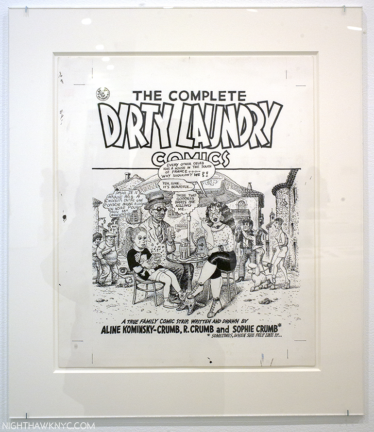
R., Aline & Sophie Crumb, “Dirty Laundry” Cover Art, Ink.

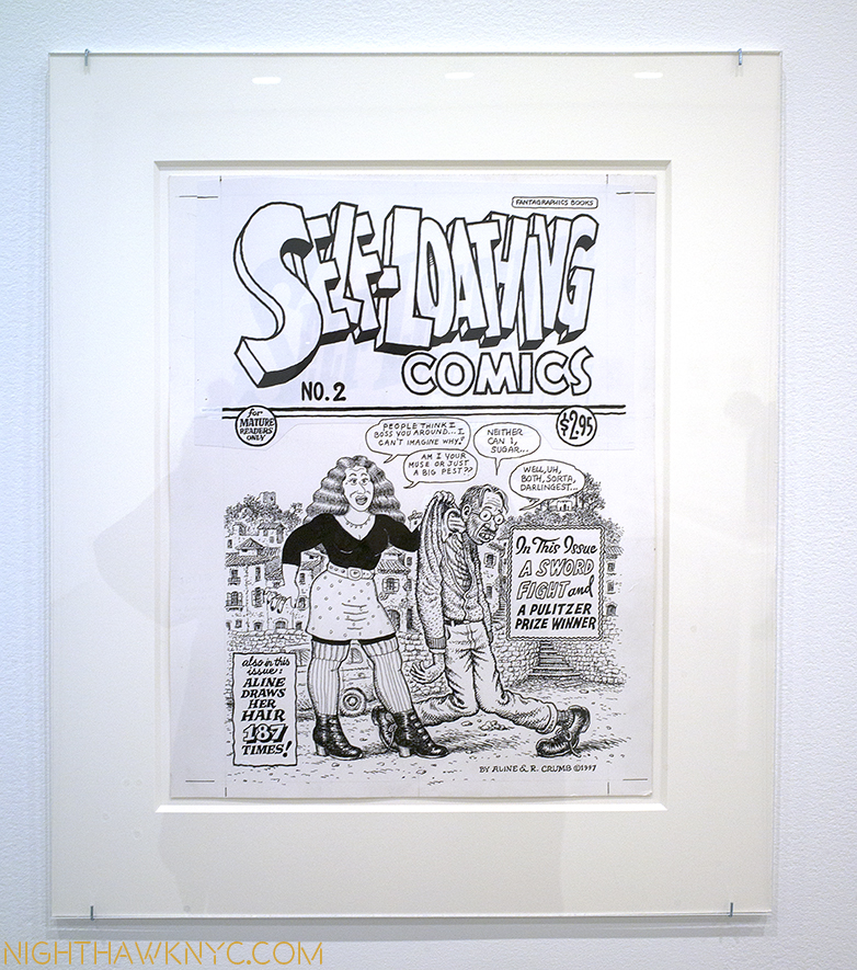
R. & Aline Crumb, “Self-Loathing Comics,” Cover. Ink. After the age of “superheroes,” R. ushered in the “reality” based Artist as anti-hero age, we’re still in the midst of. And, Aline will keep drawing her hair to prove it!

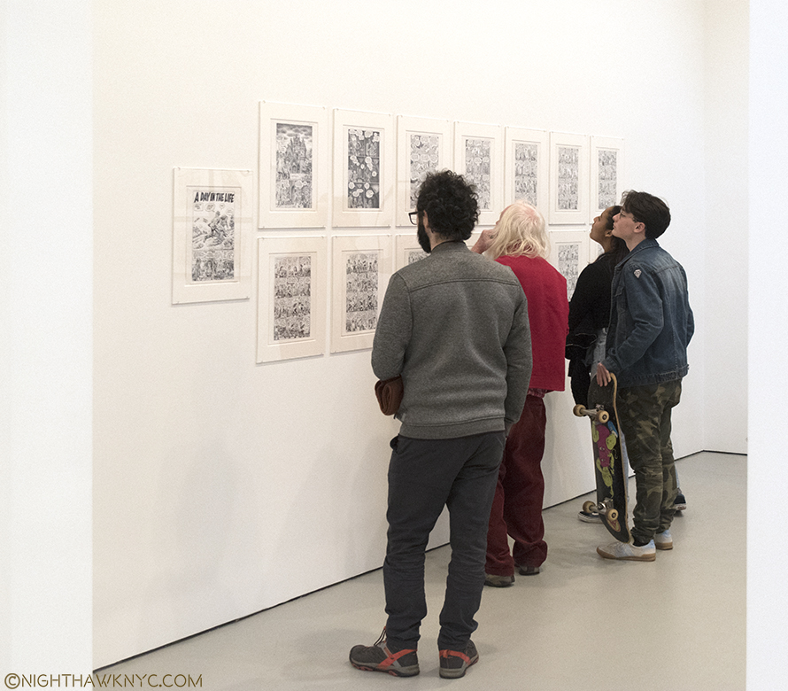
Highlights? For me? Aline’s “My Very Own Dream House,” which takes up almost the entire front gallery, and holds rapt attention over 33 pages.

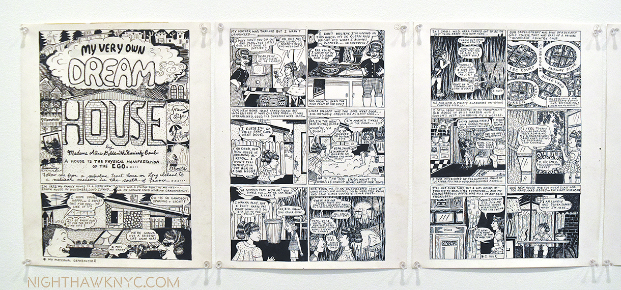
Aline Kominsky-Crumb’s “My Own Dream House,” Ink, beginning.

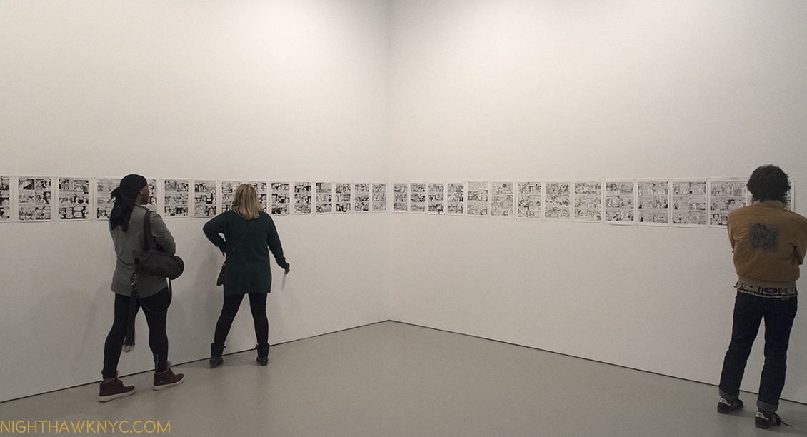
Installation view of (almost) all of it.

Her “Goldie in Fanatic Female Frustration” in the main room, in a different drawing style, is sparser, but none the less engrossing.

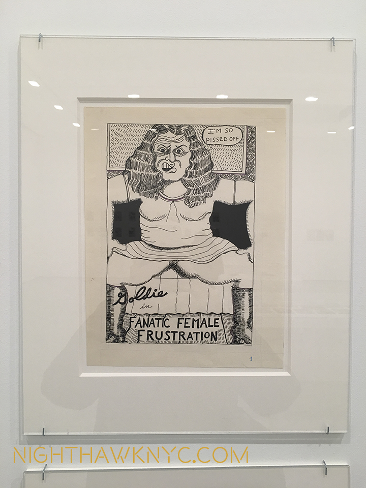
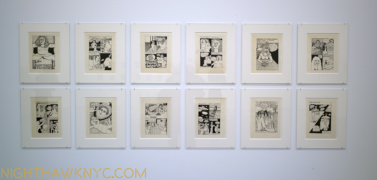
Aline Kominsky-Crumb’s “Goldie,” ink. Even at a distance, the unique style of this terrific work grabs you, and perfectly conveys the fanatic frustration within.

Along with these, we get a case of R.’s classic underground comics, ranging from “Zap” #0 to “Fritz The Cat” to “Weirdo,” a case of early drawings and sketchbooks, including the very rare sketchbook of Charles’ shown above, and a collection of family photos.3

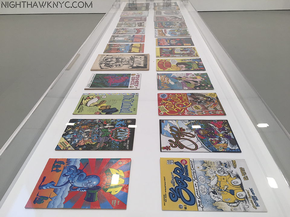
A Hall of Fame of Underground Comic Classics.

If Aline was the star of this show, if not a revelation for me, R.’s star now shines all over the world, as we see in their collaboration about their visit to Belgrade, where they were treated like “superstars,” Aline writes. At Zwirner, the range of folks coming in to see this show was striking. It was, literally, every kind of person imaginable. Young, old, male, female, black, white, hipster, hippie, businessman, writers, photographers and yes, Artists.

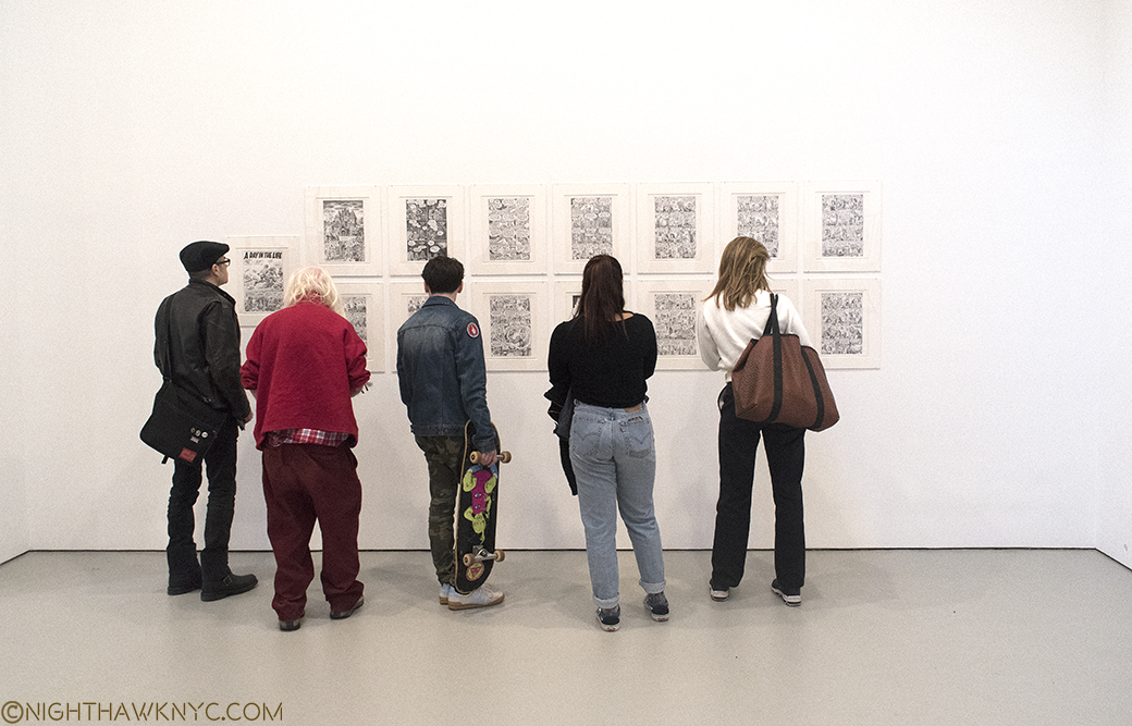
One thing that surprised me was how many of them took the time to read the works. It’s one thing to read a comic book or graphic novel in a book, it’s another to read a 10 or 20 page story hanging on a wall, especially when half of it is hung higher than eye level. Yet, I watched person after person read each panel before moving a foot to their right to read the next. Since comic Art or Graphic Novels aren’t often seen in galleries or museums, I found this an unusual, interesting and refreshing thing. Most people seem to spend 1/4 the amount of time in front of paintings.

Crumb shows are way too infrequent. The last NYC show, “The Book of Genesis,” was also at Zwirner in 2010! While I expect, and welcome, future Crumb gallery shows, the time has come for a Crumb show in an NYC Museum.

Any bets on who will be the first to step up? My guess is MoMA. I think it’s a matter of when, not if. It’s hard to imagine it not being a blockbuster show.

It would be nice if it happened while he’s still around to see it. That is, IF he decides to actually show up to see it.

*- Soundtrack for this Post is “Ball and Chain,” as recorded by Janis Joplin and Big Brother & The Holding Company (what else?), as recorded on “Cheap Thrills,” 1968(! FIFTY years ago next August), with an R. Crumb cover, one of the most classic album covers ever done, which might have made him as famous as anything else, and written by Big Mama Thornton.

NighthawkNYC.com has been entirely self-funded & ad-free for over 8 years, during which 300 full length pieces have been published! If you’ve found it worthwhile, PLEASE donate to allow me to continue below. Thank you, Kenn.

You can also support it by buying Art, Art & Photography books, and Music from my collection! Art & Books may be found here. Music here and here

Written & photographed by Kenn Sava for nighthawknyc.com unless otherwise credited. To send comments, thoughts, feedback or propositions click here. Click the white box on the upper right for the archives or to search them. Subscribe to be notified of new Posts below. Your information will be used for no other purpose.


  1. Though collectors paid large sums paid for his work at auction last fall.
  2. I have wondered if even the great Philip Guston’s late work may have been…?
  3. For those so inclined, The Strand somehow STILL has signed copies of Aline’s gorgeous, unique Autobiography/ScrapBook/Graphic Novel entitled “Need More Love,” which has long been out of print for all of TEN DOLLARS! Word.

Kerry James Marshall: The Revolution Was NOT Televised

Written & photographed by Kenn Sava

“The revolution will not be televised, will not be televised
The revolution will be no re-run, brothers;
The revolution will be live.”*

Gil Scott-Heron was right. The revolution wasn’t televised. It was painted. Well, one revolution…so far, was.

Kerry James Marshall: Mastry,” was live, on the walls of the 3rd and 4th Floors of The Met Breuer (TMB), where it was nothing less than a revolution, bringing black figures to Art in Museums, for the first time, in the form of a Retrospective of 35 years of Marshall’s work. While that might be the lead, in my book, it also established it’s subject, KJM for short, as a modern Master, and proves his work belongs in our greatest Museums, and well, any Museum.

Life, and Remembrance. Mastry’s opening gallery @TMB presents two of his major themes. In “De Style,” 1993, right, one of his most iconic works, KJM’s barbershop is full of life, culture, individuality and invention- painted and coiffed. On the left, his “The Lost Boys,” also 1993, a title borrowed from Peter Pan, is an homage to two children lost to gun violence, and all the boys who were “lost” to a variety of causes.

The revolution takes place…in a barbershop. “De Style’s” title seems a coy play on the name of the Dutch Art Movement “De Stijl,” brought to “Percy’s House of Style,” though the painted style of this work is purely his own. A very wise purchase by the L.A. Museum of Contemporary Art in 1993, the year it was completed, 22 years before The Met acquired one.

In bringing the black figure to Museum(s), KJM seems determined to fill as many of the “slots” they’ve been overlooked in heretofore as he can. We see boy scouts, girl scouts, lovers, monsters (“Frankenstein,” and his “Bride,”), models, Self Portraits, murderers, (imagined) Self Portraits of other Artists, portraits of historical figures, as well as scenes from family life, in the suburbs, the inner city and in recreation, as well as daily life, and home life, in the Artist’s studio, at the barber shop & hair salon, which are becoming his most famous works. Along with these, we see memorials to slain children and cultural leaders, the questioning of the aesthetics of beauty & desirability, and the Artist’s own graphic novel, “Rythm Mastr,” (which left me longing to see much more of it). And, yes, there are even revolutionaries.

Early works. “Portrait of the Artist & A Vacuum Cleaner,” 1981, age 26. Cleaning up Art History.

“So This Is What You Want?,” 1992, tells a story in a different way that would soon coalesce and lose the “collage” feel. The image of the uterus (left of center) appears in a number of his works, including “De Style.”

Art History runs strong in the work of KJM. While many Artists study the past, copy the great Masters, and “borrow,” even steal some of their styles, etc., it’s unusual to see an Artist who is as familiar with the range and breath of Art History as KJM is. Charles Wilbert White, in particular, was an early idol, then a teacher and friend, so it’s not surprising that something of his style does seem to have echoes in KJM’s, especially in his portraits, Marshall’s fluency with Art History is something that reveals the long hours of study he spent in Museums and studying Art Books. The way he will use bits of a style, seemingly out of nowhere is thrilling,  makes the old “modern,” while seamlessly making it a part of his own style, often to the end of adding mystery. Abstract Expressionism seems to be a particular favorite, given how often passages of it occur in the works here. Then, there is the anamorphosis portrait of “Sleeping Beauty,” painted oblong right smack dab in the center in “School of Beauty, School of Culture,” 2012 (below), who can only be properly seen from the side. An homage to Hans Holbein the Younger, who used this technique in his masterpiece, “The Ambassadors,” 479 years earlier in 1533, where a skull appears that’s visible only looking at it from the painting’s side. In both works, it’s an optical tour de force, the sheer brilliance of it lies both in the audacity of using it in this work, as much as it appears directly under a coy “Self Portrait” of the Painter, himself, shown behind the flash of his camera. That this was hanging in The Met Breuer, part of a Museum that owns no less than 5 Hans Holbein the Younger’s paintings (though not “The Ambassadors”), was as much of a statement as anything else in this show.

“School of Beauty, School of Culture,” 2012, 13 feet long, pays homage to Art History, and Hans Holbein in the center, in a work that is wholly unique, fresh, exciting and endless fun to look at.

A child looks at Sleeping Beauty, while the Artist takes a step back to shoot the whole scene (in the rear, with flash).

Elsewhere there are echoes of Winslow Homer, Breughel, and, there is also a spectacular homage to Edward Hopper’s “Early Sunday Morning.” Marshall’s is, like Hopper’s, a tale of urban reality, and like the original, it finds it’s own way to make magic with the early morning sunlight.

“7am Sunday Morning,” 2003, 18 feet long. KJM’s take on Edward Hopper’s “Early Sunday Morning,” 1930, an urban work that reflects the Great Depression, Marshall’s features Chicago’s South Side, with one remaining high rise from the Robert Taylor Homes, the rest having been raised, with music coming from it, and includes a painted interpretation of a camera’s lens flare, in the right half.

As work after work goes by, it becomes plain that more than paying homage to Art History, KJM has added his name to the list of Masters- Old, and “New,” and, in the process, he brings the Art of Painting kicking and screaming into the 21st Century, along with him.

“Rythm Mastr,” 1999-on, is his endlessly inventive graphic novel. Sometimes broadsheet handouts, sometimes lightboxes, as here. I traveled to a satellite show at IPCNY just to see more of it. I’ve never seen anything like it. Publish it all, please!

Along with all of this, 1/3 of the way through, there is, also, a large gallery full of works chosen from The Met’s permanent collection by the Artist, for a “show within a show,” called “Kerry James Marshall Selects.” Which reminds me, that though The Met has had a “tempestuous” past when it comes to the work of Modern & Contemporary Art & Artists, as the world’s greatest depository of 5,000 years of man’s creativity, it is uniquely suited to “highlight Mashall’s deep connection to history,” as Met Director Thomas P. Campbell said in their October press release, and dialogue with it, as the show within a show does.

“Kerry James Marshall Selects,” Installation view. In my dream, I get to do this…Of course, in the same dream, I’m also a genius painter, so The Met will let me.

Charles Wilbert White, “John Brown,” 1949, idol of, later teacher and friend of KJM.

Among the pieces chosen by KJM were works by Ingres, Batlhus, Ad Reinhardt, Gerhard Richter, Durer, Paul Cadmus, DeKooning, Bonnard, Seurat, the aforementioned Charles Wilbert White, Toulouse-Lautrec, Yoshitoshi, Utagawa, Andrew Wyeth, the Bamana and Senufo Peoples, Jacob Lawrence, Horace Pippin, George Tooker, Matisse, John Graham, Romare Bearden, Roy DeCarava, Walker Evans, Aaron Douglas, and yes, Holbein The Younger. I list them here for those interested because the only place they appear in on page 265 of the show’s excellent exhibition catalog, which quickly went out of print, halfway through it’s run at TMB, and before it even opens at LA’s MOCA in March!1 KJM lived in LA, and works remembering those days are some of the most complex in the show. He currently lives in Chicago, where the show originated in April, 2016 at the MCA.

“Untitled,” 2009, an imaginary portrait of a female Artist that deftly melds a number of styles, including Abstract Expressionism and “paint by numbers” that leave you wondering what the imaginary Artist’s work looks like.

An analysis of Marshall’s mastery of At History, as seen in the works in “Mastry,” alone, would be a book of it’s own. I don’t know if he anticipated that the end result of his study would be his carrying on dialogues with his influences for the rest of time on the very same walls. But? That is most likely what will happen now.

Mastr-piece. “Untitled (Studio),” 2014. The only work in the show that belongs to an NYC Museum. The Met acquired this in 2015. They started late, but very well.

In October, the New York Times called him, and I quote, “an immortal man,” in a profile in their “The Greats” issue. That click you heard was the sound of a very deserving Artist “making it.”

“Untitled (Blot),” 2015, the most recent work in the show, ends it. Bruce Conner was famous for these, but in ink.

Welcome to forever, Kerry James Marshall.

*-Soundtrack for this Post is “The Revolution Will Not Be Televised,” by Gil Scott-Heron, from the classic live album of the same name. Published by Carlin America Inc.

NighthawkNYC.com has been entirely self-funded and ad-free for over 7 years, during which over 250 full length pieces have been published. As I face high expenses to keep it going, if you’ve found it worthwhile, please donate to keep it up & ad-free below. Thank you!

Written & photographed by Kenn Sava for nighthawknyc.com unless otherwise credited.
To send comments, thoughts, feedback or propositions click here.
Click the white box on the upper right for the archives or to search them.
For “short takes” and additional pictures, follow @nighthawk_nyc on Instagram.

Subscribe to be notified of new Posts below. Your information will be used for no other purpose.

  1. If you want one, don’t pay the 200-300. being asked online for the few copies for sale there. I’d say wait. There MUST be a 2nd printing coming…right? In the meantime, The Met has an excellent website for the show that features images of the pieces and it’s audio guide, here. That there were no copies for the hundreds of people who wanted one during the second half of the show’s run at TMB astounds me. This cost The Met thousands of much needed dollars in revenue. Also, during it’s run at TMB, limited edition signed & numbered prints by KJM went from 2,700.00 each at the show’s opening to 4,000.00 each at The Met’s store currently. A 50% increase.

Noteworthy Shows, December, 2016 (Updated)

This site is Free & Ad-Free! If you find this piece worthwhile, please donate to support it & independent Art writing. Thank you. 

Written & Photographed by Kenn Sava

William Eggleston- The Democratic Forest @ David Zwirner. It’s impossible for us to “see” Eggleston’s work now the way the way it was seen in 1976 when 69 images were presented at MoMA in the legendary show, Photographs by William Eggleston (which you can relive, here, in glorious black & white). In that black & white world, it was received as “shocking,” and widely panned (famously by The Times). If anything, today, there are “too many cameras and not enough food,” as Sting sang, and too many pictures in the world, so, perhaps I shouldn’t be surprised to read a number of comments on Eggleston’s books, shows and works where commenters say they don’t see what’s special about it, or, that, as has often been said about Jackson Pollock, they could do it. Hmmm…Many, many have tried, and are still trying. What’s lost in translation in seeing Eggleston in 2016 is how many photographers have “gone to school” on his work, over the past 40 years, learned from it, and yes, copied it 1, so that much of what he is famous for is now omnipresent. Yet, it’s barely 40 years since his breakthrough at MoMA.

Depth of Field. Untitled, 1983-86, as each work here is so named and dated. Leica can’t buy advertising like this, and the rest of what is on the walls of this show. Note the endless mirror Self Portraits, that mimic all the bottles, jars and cans.

Countless professionals and amateurs shoot “the everyday,” the seemingly mundane now. Who’s to say what’s good, what’s bad, and what’s “Art?”

The road less traveled…It doesn’t exist in Manhattan.

As always? Time will. In the meantime, what about the work of William Eggleston in 2016?

On the left, a classic shot of the so-called “mundane.” On the right, possibly a color Homage to Robert Frank’s The Americans, an early influence.

William Eggleston, now 77, has been making photographs since his college days, closing in on 60 years ago. He’s often called “the father of color photography,” which puzzles me. He was not close to being the first Photographer to shoot in color, nor the first to create a substantial body of work in color. Nor was he, as has often been reported, the first Artist to have a solo show of color Photography at MoMA. Ernst Haas beat him to that honor by 14 years with Ernst Haas: Color Photography at MoMA in fall, 1962! It can be seen here. Still, it’s enough passage of time for some things to be known. For one thing, his work still seems to be gaining in popularity. For another, it still garners a lot of respect from both his fellow Photographers, and Museums, judging how widely they hold and show his work. William Eggleston Portraits at the National Portrait Gallery, London this fall, drew raves. Millions of dollars are being spent on his work at auction. He, and his Eggleston Artistic Trust2, left the Gagosian Gallery this past June and signed with the equally prestigious David Zwirner Gallery for representation, (this being their first show), and this century has already seen a steady stream of stunning books and huge box sets by Steidl, which have the look and feel of monuments, that sell out and some then command a thousand dollars a copy, and more, on the aftermarket.

Famous for his very vivid colors, I found the shot on the left, with it’s pastel colors, equally effective.

In October, The New York Times featured him as one of their six “Greats,” along with superstar (my term) Artist, Kerry James Marshall, and Michelle Obama. William Eggleston is big time. Ok. So, back at David Zwirner on West 20th Street, how’s the show?

The shot on the left (who’s  location is unknown to me) makes me yearn to see shots of his taken in NYC.

30-odd years after these works were created they retain a surprising freshness and resonance that’s not easy to explain. I’m not sure it’s entirely the famous(ly) bright colors that are solely responsible for this, either. They’re undoubtedly a hook, but there’s far more going on, and there are works that don’t feature “knock your eyeballs out” colors that are equally compelling. Following in the tradition of Cartier-Bresson and Robert Frank, he has taken their ideas someplace else. Someplace subtle, or very subtle, mundane, often easily overlooked. A place decidedly “American” (in these works), that American viewers instinctively recognize, and one that must look like Mars to the foreign eye. Heck, in a few more years, it’s going to look like Mars to ANY eyes. Yes, so many others have tread this ground since Eggleston’s work became widely seen. They shoot similar subjects, using the same camera. But, in the hands of a visionary master of the medium, the results are truly unique. Seeing 40 works together reinforces all of this, and reveals intimacies about his approach and style. Seen in isolation this sense is harder to glean. His work has a feeling of spontaneity that is, also, often copied, perhaps, increasingly. Watching him at work in documentaries, we see this spontaneity is not contrived. Frankly? I marvel at it. What is going on in his mind as he approaches his spot? As he composes and frames? Untold millions walk around with cameras, raise them and take a photo. None are these. How is this possible? Also an Artist (his book Paris featured his Art alongside his photos), as well as a musician, it should be no surprise that he has one hell of an eye for composition (which can be seen in even his earliest black and white work), and which I feel is under-appreciated given how rarely I hear anyone mention it. It may be as big a part of his impact as color. His is, also, a painter’s eye, which also sets him apart as a photographer. Perhaps it is this that gives him his eye for the “secret life” of what most overlook in the world. All of these things work together to make a composition of random “things” a personal statement, even without people present in most of his photographs, and they seemingly come together in the instant the exposure takes. With a master technician of photography who’s also an Artist behind the shutter, I think his results are going to intrigue viewers for a very long time no matter how many try to copy and imitate him.

A wall of the smaller, 20 3/4 x 28 3/4 inch, prints for comparison. The work in the center is also in the Whitney, though smaller.

Eggleston said he has over a million and a half images in his archives. They ALL can’t be classics, can they? According to the press release, the show includes 40 works, “the majority of which have not been exhibited previously.” The “Democratic” in the show’s title speaks to the camera’s ability to “render equally what is in front of the lens.” What is rendered in these 40 works includes very few people.


Each work here bears the same title and dating- Untitled, 1983-86. Very democratic, indeed. Not mentioned is that these works are recent prints in a larger size, somewhat controversially, (about 65 x 45 inches, though a few are 20 x 28) Digital Pigment Prints, instead of the  Dye Transfer Prints that Eggleston is renowned for, which his works in the collections of MoMA, The Met, and many other places are. For me, the larger size (the original sizes were of the order of 16 x 20 inches), seem to reach for a “painterly” impression. This struck me as soon as I walked in, not surprising, perhaps, since I have looked at mostly Painting in my life. Some succeeded larger, some didn’t. Interestingly, I found images I’ve long struggled with to be among those I am still struggling with larger.

One I’ve struggled with.

This one continues to haunt me with it’s unique blend of a photograph that “borrows” much from painting, then takes it somewhere else.

Another thing that most impresses me…no…blows my mind, is that Eggleston does it taking only a single shot. While he would, no doubt, prefer his work remind me more often of Degas (who, among many other things, was a photographer, as well as a master print maker and immortal Painter), I found myself thinking of him as being somewhere between Edward Hopper/Charles Sheeler and Ed Ruscha/Richard Estes. To study the individual photos in this show closer, check out the exhibition’s catalog. I’ve mostly opted to show the very interesting combinations in which they were hung, which I assume Mr. Eggleston, himself (who was in NYC for the opening, also making rare appearances at The Strand and at Aperture), was involved with, since those won’t be widely documented.

“Well I hope you’re happy with what you’ve made
(Puzzling evidence)
In the land of the free and the home of the brave
(Puzzling evidence)”*

William Eggleston’s worldwide reputation as an important American Artist of our times increases seemingly daily. While his Artistic Trust, which his sons are involved in, seems to have it’s own ideas about the future of his work, it seems assured that his work is going to be seen far and wide for a very long time. With that 1.5 million photos he guesstimated are in his archives, he must have taken some in NYC, as he memorably did of Paris, right? Maybe those will be in a future show called “The Democratic City.”

Francis Picabia @ MoMA- (Note- March 3, 2017. I went back to see this show, again, before it ends March 19, and so I update my Post on it, in hopes of doing it more justice.) Picabia first got me into Abstract Art as a teenager with this work-

Let’s Get Lost. Picabia’s masterpiece I See Again in Memory My Dear Udnie, 1914. Worth the price of admission by itself.

I bought the postcard of it, which I still have. It sucked me into it- almost literally, it’s grip on my mind, and my eyes, was so intense. It’s a work that looks like you could walk inside and climb around in and explore it’s unprecedented landscape. But, it was it’s title that hooked me…”I See Again in Memory My Dear Udnie.” When I finally climbed back out of it and got around to pondering the name of the work…Well? I’m still pondering it. Most of the other Abstractionists (Pollock, Rothko, Duchamp, even Kandinsky) didn’t usually title their works. This proved a vital “way in” for me. From this, and Picabia’s other works of this period, I discovered Pollock, Kandinsky, Miro, then the Surrealists, Dada, and the Abstract Expressionists. Seeing it, again, in this very well done retrospective brought all of that back to me. I was, initially, startled because I’d forgotten how large it is- over 8 feet high by 6 and a half feet wide. Talk about making a statement. It’s presence, and impact, is still every bit as strong. For me, at least, it’s a central work in his oeuvre. His early abstractions are, still, breathtaking, unique and just gorgeous.

Front row seat to genius. Ecclesiastic, left and Udnie, Young American Girl, both 1913, right. The now immortal Udnie was a dancer named Stacia Napierkowska, who’s on-ship performances Picabia was taken with on his voyage to NYC for the famous 1913 Armory show, a triumph for him. Meanwhile Stacia/Udnie was arrested by the NYPD for “indecent” performances. (Here in the NY Times.).

While Cubism was all the rage at the time (c.1914), I think it’s a shame that other Artists didn’t follow Picablia down this road. Then again? Where else was there left to take it? Perhaps this is why, Picabia, himself, turned his back on this style and adapted others. The man is one of the ultimate chameleons of his time.

It’s not “Cubism,” or “Futurism,” or “Geometric Abstraction.” So? What do you call The Spring, 1912? How about beautiful?

This is a long overdue show, and a big one. It surprised me with Picabia’s endless evolution throughout his career, much of which, post-1925 seems to be a bit in the shadows compared to his early, seemingly endless inventions.

Down in front. The Animal Trainer, 1923, (inscribed “1937”). Fear not- I’ve been assured by MoMA that no Owls were harmed in the making of this Retrospective. Actually? I’m not sure just who is being trained in this work.

It points out that there remains much to see and study in the long career of this defiantly original, prolific and continually surprising individualist. I found myself a bit lost by what came after 1925, but he called me back with his somewhat surprising evolutions during WW2.

Moving on. The Lovers (After The Rain), 1925. Picabia painted over an earlier, abstract work in creating this. I’d love to see an x-ray and see what he chose to paint over.

Good luck trying to stick Francis Picabia in a style hole. He didn’t stand still, as we see here in The Wandering Jew, interestingly, from 1941. A period that features quite a few nudes.

In the end, Picabia is, like I See Again in Memory… one of those Artists who’s work demands, and rewards, repeated viewing. His formidable technique, and endlessly creative & inventive mind gave us an Artist who wasn’t content to stay with one style for very long. When you have that kind of talent? Why would you want to? He was, as he famously said, “a monster.” A monster talent.

Portrait of the Artist, 1934, a collaboration with Bruno Eggert. A bit of Christian Schad, perhaps? Schad was 40 in 1934, though pretty obscure.

Paths To The Absolute: Kandinsky, Malevich, Mondrian, Newman, Pollock, Rothko and Still @ Di Donna Galleries- A small wonder. All of those big names in one gallery show. Beautifully hung, in fascinating combinations that created wonderful inner dialogues, and one that offered a nice different perspective on Rothko from that going on in the “big” show, concurrently, at Pace, Chelsea. A show I almost missed and long will be grateful I did not.

Pollock and Malevich. I don’t believe I’ve ever see them together! Why not?

Franz Kline, Malevich, Barnett Newman and Mondrian. And, that bench!

As good as that show was, one Artist was not included…

Richard Pousette-Dart: The Centennial @Pace Gallery, East 57th Street, and Altered States: The Etchings of Richard Pousette-Dart @Del Deo & Barzune. This past June 8th would have been the 100th Birthday of Richard Pousette-Dart (RP-D for short), who died in 1992 at 76. An Artist who, I feel, has not yet been fully appreciated. June 8, 2016 would slip quietly by, but it turned out his 100th had not been forgotten. Pace Gallery 57th Street, opened a Centennial Show on September 6, (with RP-D’s wife and well known son, the musician, Jon Pousette-Dart in attendance). A symposium was held at the Whitney a few weeks later, a restored public work was unveiled downtown, and a revelatory show of his etchings at Del Deo & Barzune in the Flatiron District opened on October 6.

RP-D: The Centennial @ Pace, Uptown

Phew…My fears he’d be forgotten were assuaged. RP-D has become something of a “cause” for me. The more I see of his work, the more I’m baffled that he’s not (often) spoken of with his long time compatriots Jackson Pollock, Mark Rothko, Willem de Kooning, et al. I just don’t get it. For my money (and I have none personally invested), he’s every bit as good, and important, as any of them.

Altered States: The Etchings of RP-D @ Del Deo & Barzune

The show at Pace Uptown was nicely concise, giving a taste of the range of his stylistic development, which, for me, were a feast for the eyes. There is something wonderful about his work that allows it to work just as well in a small space (as the etchings prove), or in a large gallery at The Met’s newly rehung M&C Galleries. It’s so easy to get endlessly lost in either close study of his work, or at a distance. His compositions are among the most complex of the AbEx Artists, and his attention to detail borders on the staggering. You wonder how he ever finished one work, let alone as many as he did.

White Silence, 1974, 14 feet long, above. Hurry up and grab a seat before I sit there until they close.

Detail. “…it’s full of stars.”

Astoundingly, RP-D was, also, one of Ai Weiwei’s teachers at The Art Student’s League (on West 57th Street, down the street from where Pace is now) from 1983-86. I have yet to hear, or read, him (AWW) speak about the experience.

Installation view- Pace Gallery

Visiting the wonderful satellite show, with the prefect name, Altered States: The Etchings of Richard Pousette-Dart at Del De & Barzune in the Flatiron, the impression (sorry) is amended (as it always seems to be when one sees a work by RP-D he previously hadn’t seen), enhanced and refined. Here, his attention to detail is in just as full effect, and the results are even more (and even more sadly) unknown. The work on view is uniformly marvelous. They give the same effect as his larger painted masterpieces- ponder them from afar, or get lost in them up close. These are works you will look at for an entire lifetime and still see something new in them.  Long live Richard Pousette-Dart.

Just in time for RP-D, 100- Symphony No. 1, The Transcendental, 1942-42, now on view in the newly rehung Modern Galleries at The Met, 5th Avenue.

And, finally…a show I planned to write more about but haven’t, and just can’t let get away- Rembrandt’s First Masterpiece @ The Morgan Library. Worth the price of admission to see the figure of Judas in the 1629 painting, Judas Returning the Thirty Pieces of Silver, The Master did at age 23(!), the work that sealed his status as a “Master,” and which I haven’t as yet found an antecedent for in the prior history of Painting3

While you were waiting for a slight opening in the throng surrounding it, you were blessed with the rest of this one, large, room being chocked full of some of the greatest impressions of Rembrandt’s prints to be seen in this hemisphere.!

One half of the show.

I could think of worse ways of spending my time “waiting.” Like doing anything else, short of making love. So overwhelming were they that you were 3/4 of the way home before you realized you saw “only” one painting.

Murderer’s Row. If I could only have one work of Art for the rest of time? I’d take a Rembrandt painted Self-Portrait. So, I was floored to walk into this show and see no less than FIVE Rembrandt Self-Portrait etchings.

And then? The seas parted and lo and behold? THERE IS WAS! QUICK! SHOOT!!!

Judas Returning The 30 Pieces of Silver, 1629. Private collection. (i.e. Someone has this hanging on their wall. I felt a twinge typing that.)

Where was I? Oh yeah…”only” one painting here…That was immediately followed by the realization that with Rembrandt? The medium is not the message- The message is the message. it matters not which medium he chooses to work in. He created timeless Art in many mediums, Painting, drawing and prints, here. From what is called his “First Masterpiece,” (I didn’t say that)4, he lets it be known that he is someone that is, and will be, unprecedented in Art History, and earned the admiration of the diplomat, poet and great Art connoisseur Constantijn Huygens, who’s original diary, containing Huygens’ now immortal words about Rembrandt and “Judas,” which put the young Artist on the map, is here as well. Remarkable! Of “Judas,” Huygens writes in THIS very book(!)-

The Legend of Rembrandt begins here.

his Autobiography, written between 1629-31-

“Compare this with all Italy, indeed, with everything beautiful and admirable that has been preserved from the earliest antiquity. The singular gesture of the despairing Judas-leaving aside the many fascinating figures in this one painting-that one furious Judas, howling, praying for mercy, but devoid of hope, all traces of hope erased from his countenance, his appearance frightening, his hair torn, his garment rent, his limbs twisted, his hands clenched bloodlessly tight, fallen prostrate on his knees on a blind impulse, his whole body contorted in wretched hideousness. Such I place against all the elegance that has been produced throughout the ages.”

One of the most auspicious, calling cards in Art History…even 388 years later.

This “such” retains every bit of it’s power to awe onlookers nearly 400 years later as it did Mr. Huygens shortly after he created it, to the extent that it’s possible to see so much of what’s come after in this one figure, right up to Lucian Freud and Francis Bacon.

I give this show my award for the exhibition that went the furthest beyond above and beyond delivering on the advertised expectations. Any show that elicits an “Oh My God,” from it’s doorway as I first entered and it dawned on me what awaited and how undersold this show was has to be, at least, NoteWorthy, and at most, unforgettable.

As the new year begins? To any show with designs on winning that award this year, I say  “Bring It On!”

*- Soundtrack for this Post is “Puzzling Evidence” by David Byrne and recorded by Talking Heads on True Stories, which was accompanied by a movie and a book of the same name. The book contained photographs by William Eggleston, among others.

NighthawkNYC.com has been entirely self-funded & ad-free for over 7 years, during which over 275 full length pieces have been published!
I can no longer fund it myself. More on why here.
If you’ve found it worthwhile, PLEASE donate to keep it online & ad-free below.
Thank you, Kenn.

Written & photographed by Kenn Sava for nighthawknyc.com unless otherwise credited.
To send comments, thoughts, feedback or propositions click here.
Click the white box on the upper right for the archives or to search them.
Subscribe to be notified of new Posts below. Your information will be used for no other purpose.

  1. Continuing the continuum. Eggleston learned from Cartier-Bresson and Robert Frank, among others.
  2. holders of all of his copyrights
  3. “Agony” seems to be something avoided in Painting. To this time, Christ on the Cross was depicted “transcending” the physical agony, and Paintings of the so-called “Agony In The Garden,” invariably show Christ lost in meditation, prayer and deep, though possibly, pained, thought. If you know of an ancestor or influencer, please let me know.
  4. His early work is pretty darn stellar in my book. I’ve long had a love of this one in Boston, from 1628, one year before “Judas”, that is only 9 inches by 12 inches. Don’t be fooled by it’s apparently “simplicity.” Much is going on.

Ai Weiwei & The Value of One Refugee

Written & Photographed by Kenn Sava

Ai Weiwei returned to show his latest work in NYC for the first time since getting his passport back, making a splash to rival his last big show here (which he could not attend), the retrospective “Ai Weiwei: According To What?” (at the Brooklyn Museum in 2014), this time with no less than FOUR concurrent shows- one in Soho, two in Chelsea and one Uptown. With so much terrain to traverse, and with so much to see, it makes sense to adapt my approach to writing about them, so I’m going to cover the 4 shows over 2 Posts, as follows-

Ai Weiwei: 2016 Roots & Branches @Mary Boone Gallery, Chelsea
Ai Weiwei: 2016 Roots & Branches @Mary Boone Gallery, Uptown and
Ai Weiwei: 2016 Roots & Branches @Lisson Gallery, Chelsea in a second Post, here.
Ai Weiwei: Laundromat @Deitch Projects, Soho will be the subject of this one.

Ai Weiwei: Laundromat

Deitch Projects. Also seen in this site’s Banner.

Of the 4 shows, the centerpiece has to be Laundromat at Deitch Projects, an unprecedented Art show/installation, unlike anything I’ve encountered.

View just inside the front door. Click any image to see the full size photo.


Along with an upcoming documentary film, it’s part of the Artist’s response to the Syrian Refugee Crisis as experienced by the estimated 18,000 (at it’s peak) in the refugee camp at Idomeni, in Northern Greece, on the Macedonian border.


Ai Weiwei said-
“When we started filming in Idomeni, the first thing we noticed was people trying to change their clothes. These are the clothes they wore from Syria, wet and soiled from the difficult journey across the ocean, over mountains and through woods. They had no chance to wash their clothes until they were forced to stop in Idomeni. They would hand wash the clothes and throw it on the border fence to dry. There was nowhere else to hang dry their laundry. We photographed the clothes, but we did not, and could not, imagine they could later be included in an exhibition. The clothes were some of the few possessions they could take when they decided to leave their homes. There is not much else they could take. Off the coast of Lesbos, I found an abandoned boat drifting in the sea. Inside, I found a copy of the Bible and a baby’s bottle. You would also find small objects wash up on the shore. These objects were the most precious things a person could have, the last things they brought with them as they sought a new life.”

Merry Christmas

“Once the refugees were forced to evacuate to different camps from Idomeni, many of those possessions were left behind. Trucks came in and loaded these items up to take towards the landfill. I decided to see if we could buy or collect them so they would not be destroyed. Previously, my studio collected many life jackets from the local officials in Lesbos and made an installation with them at the Berlin Konzerthaus. My team negotiated with local officials who agreed to let us have the collected material. They were aware of our presence and were supportive. With a truckload of those materials, including thousands of blankets, clothes and shoes, all impossibly dirty, we transported them to my studio in Berlin. There, we carefully washed the clothes and shoes, piece by piece. Each article of clothing was washed, dried, ironed, and then recorded. Our work was the same as that of a laundromat.”1

Every item is hand tagged. These read “Baby Rompers.”

While Downtown New Yorkers are no strangers to acts of war and terrorism, catastrophic weather or blackouts2, one of the strange things about living through those events, for me, was that many people in other parts of the City, who were directly unaffected by them, lived in a certain level of oblivion about them. Many seemed completely disconnected from what was going on right in their own City. It can be easy to understand when you look at this, from the Hurricane Sandy blackout, which effected me, and all of downtown New York for 5 days to 2 weeks.  Now? At “Laundromat,” I was the “directly unaffected,” I had never heard of Idomeni, Greece, and knew little about the Syrian Civil War that’s led to 13.6 million refugees3 seeking to rebuild their lives elsewhere. That’s equal to the population of London. During my 5 visits to  it was easy to say now what others may have said about the Sandy Blackout- life gets to be so all-encompassing that few of us really know what’s going on in much of the City, let alone the rest of the world. It’s different when it’s personal.

I’m sure there are those who walked in and thought “This is Art? It looks like the Salvation Army.” I know what they mean. But? Yes, I consider this to be Art, and I consider it to be groundbreaking Art. Laundromat’s range of expression is formidable. Ai Weiwei is the master Artist of the electronic information age. Recently named “The Most Influential Photographer of the Past 10 Years” by complex.com (Cindy Sherman placed 13th, Annie Liebovitz 8th, and Sebastio Salgado didn’t place.? Yet, another reason I don’t believe in qualitatively comparing Artists.). Weiwei’s Blog was, perhaps, the first “essential” Blog of the 2000’s, before it was forcibly removed. Part of it has been translated and published and is still in print.4 Mr. Ai became the first Artist to have photographs “go viral” with his now infamous shot in the elevator with police after his arrest in 2009. Now, he has combined mediums (thousands of photographs, an excerpt from his upcoming documentary film and hundreds of internet articles and social media postings), with actual objects- the clothes and shoes left by the refugees in the camp. The clothes hang on racks. Washed, ironed and/or cleaned, they are “ready-to-wear,” tagged by hand and sorted by type, sex and age, near hundreds of shoes aligned in neat rows on the floor- about an equal number of matching pairs and singles. The shoes are of every kind imaginable, except high heels. (I saw only one pair with a very low heel.) Boots, low boots, sneakers dominate. I assume because their owner’s felt they were finished with crossing wet terrains or bodies of water. Both are present in mute witness to what they have seen and experienced.
What their wearers have experienced can never be washed away that easily. Many are, no doubt, still going through the experience of being a refugee and seeking an answer.

“Time to recharge my batteries” this shirt reads.

A Sea of Words. Hundreds of news and web postings seen in the “Newsfeed” section of the show, which fills the floor beneath visitor’s feet.

Laundromat is a deeply personal show for Ai Weiwei. On a number of levels. First, he seems to just naturally respond to humans in crisis, all over the world, be they individuals in the case of the Feminist Activist Ye Haiyan, as we saw in Brooklyn, in Ye Haiyan’s Belongings,  in 2013 (which recreated that photo verbatim, installing all of her belongings in a gallery in the Brooklyn Museum(!), something of a possibly precursor to this show), or his powerful documentary Stay Home, about the Aids activist  Liu Ximei, or by trying to put names and identity to the countless thousands lost in the 2008 Sichuan Earthquake, the subject of Backpack pieces Remembering, 2009, installed in Germany, and “Snake Ceiling” (seen in Brooklyn) as well as the monumental work Straight, 2008-12, which consists of 40 tons of rebar from the Sichuan quake that Ai recovered and straightened, It was powerfully displayed alongside the list-turned-wall paper, Names of the Student Earthquake Victims Found by the Citizen’s Investigation, 2008-11, in Brooklyn, photos of which I posted here. The amount of work he, his staff and volunteers put in to try and identify the dead children was nothing less than monumental. Laundromat is only the latest “piece” in Ai’s ongoing “work” regarding human rights. It, too, is monumental, in more ways than one.

I’m left to wonder- If he didn’t do this, who would? Would anyone?

First learning about this refugee crisis in 2015, after being freed from jail, but still unable to leave China, he dispatched two members of his staff to go see the camps and interview refugees. Once he got his passport back, he travelled to Germany, where he could get a much closer look at what was going on. Then he decided to go to Idomeni, and document it. “Laundromat” is the first result of those efforts. The documentary film, Human Flow, is next, scheduled to be released in 2017.

The second level of this being personal for Ai Weiwei is that he, himself, lived in exile for TWENTY YEARS! And? They began when he was an infant, in 1957.

He says-
“When I was born, my father (the great poet and intellectual), Ai Qing, was denounced as a ‘rightist’ and was criticized as an enemy of the party and the people. We were sent to a labour camp in a remote region far away from our home and so began 20 years in hard exile, which saw my father clean bathrooms and the family live in an earthen pit5.” This was after Ai Qing had been a friend of Chairman Mao (Ai Weiwei has spoken about handwritten letters from Mao being in their home), and had served as a representative of the Chinese government. “We carried almost nothing with us to the camp, only trying to survive. It was an extremely difficult time being seen as a foreigner in your own nation, an enemy of your own people, an enemy of those my father loved most. I know what it is like to be viewed as a pariah, as sub-human, as a threat and danger to society.”1. When the exile ended in 1976, and Ai Qing and his family returned to Beijing, many of his father’s readers had assumed he had died. Before he was all that he is today, Ai Weiwei grew up a refugee.
Now, he has turned the latest refugee crisis, coming after what the New York Times called “The Century of Refugees,” into a work of Art, giving voices to all of those who have not been heard. It’s impossible to walk through these clothes and shoes and not feel their presence- that there was a person for every single article here- especially the babies. Though cleaned, evidence of personal wear remains that is permanent, along with what is permanent, though now invisible- the experiences each of these items, and the person wearing them went through. You wonder “Did someone really make this trip wearing thong sandals?” You see many well-known famous brand names, like Adidas, famous images and icons, as well, including “Hello, Kitty,” even “Barbie.”
The clothes look like clothes you could see being sold right down the street, though many of the labels are unfamiliar (a classic way New Yorkers identify tourists), yet so much of what’s here is so common- everywhere in the commercialized world. and not all that different from the jeans t-shirt, sneakers and jacket I’m wearing standing among them. Though, of course, it’s very hard to consider the Idomeni Camp part of the “civilized world,” especially when you read accounts of it, like this one from International Women’s Rights Journalist, Jina Moore.
What are  you going to wear if your house catches fire and burns, or, you have to leave town, or state, or country…in a real emergency, or war?
A story could be told for each item here. Mr. Ai could have made a show with one item, and it would have been quite powerful, but it wouldn’t have been this show. As you walk among the clothes, or around the shoes, look at the thousands of photos on three of the 4 walls, and the hundreds of internet articles and posts on the floor beneath your feet, it is easy to become numb to the numbers, but the little bits of individuality each item retains reminds you of a more finite realm of experience. This is a group made up of people. Of individuals, like you, and me. 1+1+1+…= 18,000.


In the midst of ALL of this, the sea of humanity (not to mention the actual Seas surrounding Greece they crossed), the incredible hardships, suffering and deaths, there was one small part of this story, and this show, I found particularly interesting & revealing, though nothing about it is mentioned in the show itself! I only learned about it through doing my research. Ai Weiwei came across a 24 year old Syrian refugee named Nour Al Khzam, who’s photo I spotted (above) among the thousands on the walls, who is from Deirez Zor, Syria. She was trying to get to Germany to reunite with her husband. Before fleeing Syria she had been studying piano. Ai Weiwei arranged for a piano to be brought to the Idomei Camp so she could play it, as seen in the photos immediately above. I know he’ll be criticized for doing this, but I find it poignent because it speaks to a number of important things, including- going on with your life and realizing your creativity, even after being a refugee (which Ai Weiwei, himself did). It also speaks to something very important- What is the value of one refugee? How many great Artists, maybe an Ai Weiwei, great Scientists, or great people are among these refugees?

This image, above (Photo by Matt Cardy/Getty Images) of Ai Weiwei, right, helping to hold a plastic sheet while Ms. Al Khzam’s plays in the rain that day is of particular importance, as we shall see next time. (Note- This photo was not included in the show.)
Though Idomeni is half a world away, there was a beautiful piece of New York City included in this show. Among the materials handed out at Deitch was a sheet containing September on Jessore Road, by “New York’s Poet,” as Ai Weiwei calls his friend, Allen Ginsberg, written after Ginsberg had visited the Bangladeshi refugee camps in 1971. Allen Ginsberg had come to know Ai Qing during a trip to Beijing. And with it, AWW adds poetry to the list of mediums included in this show.
Having lived through a few events that might have made me a refugee (the Hurricane Sandy blackout left me without means of getting off of Manhattan, except on foot), the inescapable feeling of Laundromat was “There, but by grace, go I.” If anything defines the 20th Century as much as the airplane, space flight, electricity and the atomic bomb, it’s the refugee. More of them were created in one century than at any time in world history.
“I cannot give them food or tea, or money, but rather I can let their voices be heard and recognized. I can give them a platform to be acknowledged, to testify that they are human beings. During the saddest moments in our history, mankind has had to prove their worth as humans to their own kind. Unfortunately, this has proven to be the most difficult task. As an artist, this is something I would like to take on1.”
Ai Weiwei reminds us here that in this new millennium we have yet to find a way to deal with this world wide question.

There- but by grace, go I.

“He wants to see how far an individual’s power can go,” Chen Danquing, a Chinese painter and social critic said in the Nw Yorker’s profile of Ai Weiwei in 20108.  Ai Weiwei doesn’t help all of people directly, as he said, that’s not within his means. Yet he, in the way he lives his life, and in his work, stands for freedom- Artistic freedom and human rights. He, and his work, continually remind us of the primacy of human rights in ways that are unique, powerful and unforgettable. As for an “individual’s power?” The more of his work I see, the more I read his words, and the more I see of his compassion and soul, I’ve come to believe that Ai Weiwei is one of the most important human beings of our time. He has become something of the “conscience” of the Art world. If not the world, itself.

As big a statement as that is, even beyond it, no one can leave this show without remembering that here is a man who has accomplished so very much in the world after he, himself, lived in exile as a refugee in his own country for 20 years (not to mention everything else he has had to overcome). Though he wasn’t able to help them all financially, etc. I think he understated the impact he may have had on them.

Ai Weiwei at the Idomeni Camp.

As much as every item in Laundromat speaks for those with no voice, Ai Weiwei, the man, is living proof a refugee can survive, overcome, and make a lasting mark on the world. I have a feeling his mere presence in Idomeni served to remind at least some of those he encountered of that, and possibly gave them hope. How do you put a value on that? Of course he chose to avoid mention of any such thing when he commented on what he could and couldn’t do for them.

I don’t have to.

*-Soundtrack for this Post is “The Unknown,” by Acrassicauda, a heavy-metal band from Baghdad, themselves exiled by the Iraqi War, and the subject of the documentary Heavy Metal in Baghdad. I had the honor to meet and hang out with Tony Aziz, their lead guitarist, in 2011, shortly after the band finally made it to the United States. Talk about overcoming, and continuing to follow your  dream…

(PS- Oh yeah…I still have THREE more Ai Weiwei shows to see…)

NighthawkNYC.com has been entirely self-funded and ad-free for over 7 years, during which over 275 full length pieces have been published. If you’ve found it worthwhile, PLEASE donate to keep it up & ad-free below. Thank you!

Or-
I’M PLEASED TO ANNOUNCE I’M CURATING A SELECTION OF ART, ARTBOOKS & PHOTOBOOKS FOR SALE! All items are from my collection or specially selected in my travels through the Art world for my readers. The initial selection of over 400 items is here. Either way, all proceed go to support the site. With my thanks.

Written & photographed by Kenn Sava for nighthawknyc.com unless otherwise credited.
To send comments, thoughts, feedback or propositions click here.
Click the white box on the upper right for the archives or to search them.
For “short takes” and additional pictures, follow @nighthawk_nyc on Instagram.

Subscribe to be notified of new Posts below. Your information will be used for no other purpose.

  1. Deitch Projects Interview, 2016.
  2. Hurricane Sandy caused a partial evacuation
  3. According to the UN., 6.4 million have fled the country. An additional 7.2 million are displaced within Syria.
  4. It may be the most essential book on Ai Weiwei, along with the Taschen monograph, which, though published in April, 2016, is already slightly dated as his career continually evolves. Perhaps the best way to stay current with Ai Weiwei is on his Instagram page. But, be forewarned- he almost never captions his photos there, like he does not for the thousands of them in this show.
  5. Ai Weiwei’s Blog, P.53
  6. Deitch Projects Interview, 2016.
  7. Deitch Projects Interview, 2016.
  8. May 24, 2010

NoteWorthy Shows- November, 2016

This site is Free & Ad-Free! If you find this piece worthwhile, please donate via PayPal to support it & independent Art writing. You can also support it by buying Art & books! Details at the end. Thank you.

Written & Photographed by Kenn Sava (*- unless otherwise credited)

Things are reaching a fever pitch in the Galleries as the year end approaches, with nary a Black Friday Gallery sale in sight, allowing me to sleep in this year. Still, there was plenty to see and be Thankful for, along with the usual smattering of turkeys, but let’s get right to dessert, shall we? As in October, here’s my list, in no particular order, of what I found NoteWorthy in November. Once again, each one of these deserves a longer, in depth piece that I’m not going to have time to do, but I would be remiss in not mentioning them at all. November, also, marked the end of the world as we know it, so…

The world looks different…Brian Dettmer’s Western Civilizations 3, 2016. A “Book Sculpture.” More below.

Faberge from the Matilda Geddings Gray Foundation Collection @ The Met- Will the artist in modern history who is a greater craftsman than Carl Faberge please stand up and make yourself known to me? Thank you. While I’m waiting on that, this is the first show of the work of Faberge in New York since 2004. As small as one of the details on his timeless (and priceless) masterpieces, this show in a hallway at The Met is easy to miss (countless thousands do just that as they wait in line for the elevator to the roof, right in front of this very show). Ms Gray began collecting Faberge in 1933, when prices for his work were cheaper than they will ever be again. Money aside, Faberge combines the equally rare gifts of ingenuity, vision, craftsmanship and delight in works that are a century old but have lost none of their grace, beauty or charm. Scheduled to end on November 27, this show has been extended until 2021, giving you plenty of time to see it.

Imperial Lillies of the Fields Basket, 1896, Yellow & green gold, silver, nephrite, pearl, rose-cut diamond. This is considered THE most important Faberge piece in the USA. It was presented to the wife of Czar Nicholas at her visit to the Pan-Russian Exposition in 1896. This is only 7 1/2  x 8 1/2 inches!

Imperial Napoleonic Egg, 1912, gold, enamel, rose-cut diamond, platinum, ivory, gouache, velvet, silk. One of the infamous “Faberge Eggs,” this was presented by the Czar to his wife for Easter, 1912. Designed to commemorate the 100th Anniv of victory over Napoleon. This is 4 5/8 inches tall! The inside is solid gold, and holds…

a six-panel screen depicting paintings of six regiments she was an honorary colonel in.

Description in next photo. Click any photo in this Blog to see it larger.

Imperial Caucasus Egg, for Easter, 1893. This is 3 1/2 inches high!

Easy to miss, this is the whole show!

Joan Mitchell: Drawing Into Painting @ Cheim Read- Yet another good sized show of an Abstract Expressionist, “second generation” this time, and the most renowned female (Lee Krasner may be gaining on her) AbEx painter, right down the street from the blockbuster Mark Rothko: Dark Passage Show, it makes the perfect before or after bookend to it. I owned a Joan Mitchell print until a few years ago, so I lived with the energy and lyricism her work is known for. Looking around, her work is in most major museums, though it’s been 12 years since an American museum gave her a show. So, it’s been left to Cheim & Read to fill the gaps, and they’ve mounted Joan Mitchell shows every two years, or so, going back to the late 1990’s. This one does make for fascinating pairing with the Rothko show- they couldn’t be more different, while sharing what the scholars call Abstract Expressionism, I’ve heard some of the Artists, including Philip Guston, say they prefer the term “New York School.”

UNTITLED, 1958, oil on canvas

LA GRANDE VALLEE XVI POUR IVA, 1983, oil on canvas

UNTITLED, 1982. oil on canvas

Man Ray: Continued and Noticed @ Francis Naumann- It’s been too long between Man Ray shows. Readers already know my fondness for Man Ray. Francis Naumann Gallery opened 15 years ago with a Man Ray show, so they revisited him for this anniversary show and they did it in style. Man Ray was so prolific, and so prolifically diverse he can be hard to “sum up” in a gallery show, but this one was an out and out winner, a must see, especially for anyone who thinks of Ray as “only” a ground breaking photographer. While featuring a wonderful selection of his photos, portraits and “Ray-o-grams,” it also included his drawing, painting, sculpture, writing, and even no less than 2 Ray designed chess sets.

Paletteable, 1969

The great Man (Ray). Self-Portrait, 1948. A card under speaks of his concerns in his early work- “1) a defiance of artistic convention replaced by steadfast commitment to absolute freedom in the arts.” That says it all.

…and seen again. Autoportrait, 1917/70, Screen print on plexiglass. Really? Hmmm…

…and again. Self Portrait, 1914

Yes, that’s one of the chess sets Man Ray designed to the left of the chair.

Lampshade, center, surrounded by an astounding range of creativity.

Philip Guston: Laughter in the Dark, Drawings from 1971  & 1975 @ Hauser & Wirth- There was no more auspiciously timed show than this one which not only brings us the 73 drawings Philip Guston selected for his Poor Richard series but 100 additional drawings that didn’t make the cut and 3 wonderful paintings that are related or have relevance to them. Opening exactly 4 months after Hauser’s last Guston show, it would be very very hard to find work more different than those in seen in Philip Guston Painter, 1957-67, which I wrote about here, perhaps the “darkest” of his career, in many ways. Though the show’s title refers to the presence of “laughter” here, make no mistake it is more than tinged with darkness, especially because viewing them now, we know how things turned out for Nixon. These were dark times for the country, and many of these drawings were Guston’s “at the moment” reaction to unfolding events. Even before Watergate, the Nixon Presidency was not without a sizable opposition, for more reasons than the seemingly endless war in Vietnam. Everything about Nixon rubbed many people the wrong way, and provided a brilliant Artist ample fodder for “political satire” of the highest order. Most interestingly, for me, these are works in which Guston turns his focus outwards for, perhaps, the only time in his post 1940’s career. Poor Richard was published in 2001 and is still in print. You can see it here.

The 73 drawings that Guston selected for Poor Richard are shown, here (and below), together.

Title Page. Guston Depicts Nixon with VP Spiro Agnew (triangular skull), Attorney General John Mitchell (with his pipe) and Advisor Henry Kissenger (as glasses) as the cast of characters

Guston’s series begins with young Richard Nixon.

Jeff Elrod: This Brutal World @ Luhring Augustine- Chelsea & Brooklyn Galleries. It pains me not to write a longer piece on this. Jeff Elrod has been at the cusp of reinventing painting by combining digital drawing and computers with the end result of that stage outputted to canvas.where it may, or may not be combined with analog, old fashioned painting (at least those on display here). Dealing with blurriness from my recent eye treatment, my initial reaction was, “Hmmmm…If I close my right eye, my good eye, this is how the world looks to me these days.” But, I was drawn back repeatedly, even compelled to make the (unheard of for me) trip to Brooklyn to see the Bushwick segment of this show. In both locations, the effect was the same- I couldn’t get them out of my mind. They’re like something you see when you’re not really looking, or when you’re not fully awake after dreaming, or about to fall asleep…My initial reaction was “This looks easy to do on a computer. Take a photo, blur the heck out of part of it in Photoshop. Add a layer of a frenzied drawing and output to canvas. Then, I remember people say the same thing about Pollock and Rothko, yet no one else has done them. Some works remind me of passages of Monet, some of Yves Tanguay. But not really. They weren’t created like those were and so they don’t look like anything else. Mr. Elrod’s work commands some fancy prices. Ah well…They’re much too big for my place, anyways. If there’s a “cutting edge” in painting in 2016, Jeff Elrod’s work is the closest I’ve seen to being on it. I’m very much looking forward to seeing where this is going.

Auto-Focus, 2016 UV Ink on Canvas 9064 inches. Mystifyingly alluring.

Rubber-Miro, 2015 Acrylic and UV Ink on canvas. His uniquely shaped canvases give the work a different feel from most square/rectangular paintings.

Rake-Adaptable, 2016 UV Ink on FIscher canvas. The ghost of Robert Motherwell? “Haunting” is a word his work brings to my mind most often.

Under The Skin, 2016 UV Ink on canvas, 108 x 84 inches.

Plume, 2016 as seen in Bushwick, Brooklyn. 16 1/4 feet long by 9 1/2 feet tall.

After countless visits, I began to “see” “Jeff Elrods” everywhere I went. Like here-

Life Mirrors Art.

Brian Dettmer: Dodo Data Dada @ P.P.O.W. Mr. Dettmer creates “Book Sculptures,” something new to me. As far as I can tell, he takes a scalpel to a book, or books, and carves away all but what he wants to remain. I’ve never seen anything quite like it.

Funk and Wag, 2016. As in, the whole encyclopedia.

Ew Ass, 2016

PostScript.- And meanwhile, over at Gagosian, Richard Serra’s MASSIVE Every Which Way, 2015, all 16 slabs of it was coming down, making way for the next show there…

Richard Serra, Every Which Way, 2015 @ Gagosian

*-Soundtrack for this Post is “It’s The End Of The World (As We Know It)” by Michael Stipe, Mike Mills, Peter Buck and Bill Berry of R.E.M. and published by Warner/Chappell Music, Inc and Universal Music Publishing Group, from their 1987 album “Document.”

NighthawkNYC.com has been entirely self-funded & ad-free for over 8 years, during which 300 full length pieces have been published! If you’ve found it worthwhile, PLEASE donate to allow me to continue below. Thank you, Kenn.

You can also support it by buying Art, Art & Photography books, and Music from my collection! Art & Books may be found here. Music here and here

Written & photographed by Kenn Sava for nighthawknyc.com unless otherwise credited. To send comments, thoughts, feedback or propositions click here. Click the white box on the upper right for the archives or to search them. Subscribe to be notified of new Posts below. Your information will be used for no other purpose.

Bruce Conner- “The Most Important Artist of the 20th Century”

This site is Free & Ad-Free! If you find this piece worthwhile, please donate via PayPal to support it & independent Art writing. You can also support it by buying Art & books! Details at the end. Thank you.

Written & Photographed by Kenn Sava (*- unless otherwise credited)

“In my opinion, Bruce Conner is the most important Artist of the 20th Century.”

And all this time I thought it might have been Picasso. Before you put fingers to keyboard to email me- I didn’t say that. Dennis Hopper did. Here-

In addition to being a fine Actor, Director and Photographer, Hopper was a major, and an astute, collector of Contemporary Art. Sharp enough to attend Andy Warhol’s first show and buy one of his “Soup Can” Paintings for 75.00. He was also a long time friend of Bruce Conner.

You've got to have friends. Bruce Conner, left, with Dennis Hopper.

You’ve got to have friends. Bruce Conner, left, in Hopper’s chair, with Dennis Hopper from the Senior & Shopmaker show catalog.

Still? That’s a pretty big statement, Mr. Hopper.

The Magic Curtain. Like a black hole to new universes within.

The entrance. Walk through this black curtain and it’s like entering a black hole to new universes within.

Though I don’t believe in qualitatively comparing Artists, there are, no doubt, many other differing opinions on the question of who was the most important 20th Century Artist. But, there was some quite compelling evidence in favor of Mr. Hopper’s opinion on view over 20 rooms at “Bruce Conner: It’s All True,” the first posthumous retrospective of the Artist, at MoMA from July 3 through October 2, and now at SFMOMA until January 22, 2017. (You can revisit MoMA’s Show  in amazing detail here.) In fact, it makes Hopper’s case about as well as it is possible to make it. With 250 pieces this show is one mind bend after another after another and after another that doesn’t stop until you’re back outside of it, in the lobby of MoMA’s 6th Floor. It’s like Groucho Marx’ joke delivery style- You don’t like that one? Here’s another. And another, and another, and another until he finally gets you. Having never even heard of Bruce Conner, he got my attention pretty quickly on my first visit.

How my head felt after. Show's Lobby.

“It’s All True’s” Lobby. The show’s title comes from a letter Conner wrote in 2000, paraphrased on the left.

By my third visit, I was obsessed. For me, “Bruce Conner: It’s All True” sets a bench mark for Retrospectives of a Contemporary Artist. Pick a genre- drawing, painting, collage, photography, film, assemblage, Bruce Conner’s work in it can hang with anyone else’s. Here are some things I noticed that could be used to support Mr. Hopper’s claim-

-He was an assemblage Artist every bit as inventive and creative as the great Robert Rauschenberg during the same period. In fact, one of Conner’s assemblages was selected for the 1961 Moma show, “the Art of Assemblage,” when he was 28, where it was shown alongside works by Malevich, Magritte, Miro, Man Ray, Picasso and Rauschenberg. Conner, himself, was denied entry to MoMA on opening night, but that’s a story unto itself.

"THE BOX," 1960 Photo ©MoMA

“THE BOX,” 1960. Dennis Hopper actually preferred this work to Picasso’s “Guernica” as an anti-war statement because it is “not cloaked in pleasing forms.”1 Photo ©MoMA

-While he drew for much of his career, with fascinating results, he created an entirely new and unprecedented type of drawing, made out of inkblots (yes, you read that right) that contain from 1 or 2  upto 494 inkblots in a single work that, I believe, people will spend years trying to figure out how he did them. Even once they do, they are going to have a very hard time achieving his level of mastery with their manipulation.

inkblot-drawing-8-17-1991p

HTF? “INKBLOT DRAWING,” August 17, 1991. See a Detail of this further down. Photo ©MoMA

-His groundbreaking first film, “A MOVIE.” was a work that was hugely influential, credited by the same Dennis Hopper with inspiring the acid scene in his own film “Easy Rider.”

Blowing Minds. "Crossroads," 1976 at Moma. Photo ©Moma

“CROSSROADS,” 1976. Mushrooms, of all kinds, even atomic clouds as here, are a running theme. Yes, all of his titles are in CAPS. *-Photo ©MoMA

“CROSSROADS,” 1976, a 36 minute film that struck me as being part horror film, part meditation on the power of the unseen forces in the universe, showing the unimaginable devastation an atomic explosion unleashes, while at the same time showing it as a force of nature to which it gradually melts into, as we watch the surrounding clouds become indistinguishable from the atomic cloud. The end result is summed up in what writer William C. Wees calls the “Nuclear Sublime2.” Showing multiple views of the atomic blast at Bikini Atoll on July 26, 1947, which Conner selected from the over 500 cameras that filmed the event (some at speeds of up to 8,000 frames per second), and juxtaposes the images with, first, actual sounds of the event, and then soundtracks created by synth master Patrick Gleeson and avant garde composer Terry Riley. Forty years later it’s hard to see this film becoming irrelevant any time soon. It’s a film that everyone involved in the military or government of any nation around the world, or those with the power to vote for or select them should see. Conner’s other films (totaling over 20) were no less creative or groundbreaking, and are increasingly being studied, and recognized.

-He took some of the greatest photos of punk musicians and punk bands ever taken.

MoMA_Bruce Conner_June 2016

Up against the wall! A wall of his punk photos shot at the Mabuhay Gardens Club in L.A. *-Photo ©MoMA

Frankie Fix of "Crime," 1977. Photo ©Moma

FRANKIE FIX of the band “Crime,” 1977. *-Photo ©MoMA

-He created unique portraits he called “photograms” using his own body that are unlike any “selfie” ever taken (actually, Edmund Shea photographed them) and are so ethereal he titled them “Angels.”

Spiritual Side "Sound of One Hand Angel," 1974, Photo ©MoMA

“SOUND OF ONE HAND ANGEL,” 1974, *-Photo ©MoMA

"Angels" by Bruce Conner. Photo courtesy of Moma.

A Room full of “ANGELS.” *-Photo ©MoMA

-His collages are every bit as surreal as any by Max Ernst, the Surrealist Master of the Collage.

"PSYCHEDELICATESSEN OWNER," 1990 collage from engravings. Photo ©MoMA

“PSYCHEDELICATESSEN OWNER,” 1990, collage from engravings. *-Photo ©MoMA

-Being as he was the first Artist to put film to contemporary music, he is considered to be the “Father of Music Video,” with his “COSMIC RAY,” in 1961, then “BREAKAWAY,” with Toni Basil (see above). His subsequent work with David Byrne and Brian Eno on videos for their 1981 album “My Life In The Bush of Ghosts” presaged and anticipated MTV’s “Music Videos.” Having his innovations and techniques aped without credit was not something he accepted well. I put this lower on the list because the music video seems to be fading in importance.

And, he ran for office (a seat on the Board of Supervisors in San Francisco), in 1967, actually garnering a few thousand votes.

So?

Why haven’t more people heard about Bruce Conner? Why isn’t he listed and discussed in 20th Century Art History Books?

"Untitled" from Mandalla Series, 1965, felt tip pen on paper. 10x10 inches

“UNTITLED” from MANDALA SERIES, 1965, felt tip pen on paper. 10×10 inches. *-Photo ©MoMA

Detail of left side

Detail of left side

Bruce Conner was something of af an “anti-artist.”  He didn’t like the art establishment, and that came out in his dealings with galleries and museums, including a bizarre encounter with the Security staff at MoMA, at that opening in 1961, alluded to above. In this show he is quoted questioning the need for an Artist to put his name on a work, and near the end of his career works that are undeniable Bruce Conners began appearing with other names, like “Emily Feather,” or “Anonymouse” attached to them. It seems it was a conscious effort to avoid inclusion. He claimed he hired these Artists, but today, they are assumed to all be by him. He once said having work out in the public under his own name made him nervous.

Women's World. Form Left- Pinups on the back of "Untitled," 1954-61, "Spider Lady," & "Spider Lady Nest," 1959, Homage to Jean Harlow," 1963,

Women on his mind. Form Left- Pinups on the back of “UNTITLED,” 1954-61, “SPIDER LADY,” & “SPIDER LADY NEST,” 1959, “HOMAGE TO JEAN HARLOW,” 1963, “WEDNESDAY,” and “LADY BRAIN,” both 1960. Entrance to “BREAKAWAY,” right. *-Photo ©MoMA

Contemporary Art of any time is supposed to break all the rules that had been set in place before it. In Bruce Conner’s case, he broke the rules in every medium he created in, and he broke the rules for being an Artist in the “Art World,” which he loathed. It’s interesting to me that there is so much craft in his films- including dripping ink on them, punch holes seemingly randomly, that make them Art Pieces in themselves. This is part of a duality in his nature that sees him pay attention to the minutest of details like these films, his collages, or his ink drawings where countless minute lines are drawn in pen that somehow never intersect with each other, contrasted with the hugeness of “Crossroads,” horrible, yet strangely beautiful, and contrasted with the “spirituality” of works like the “Angels” and his final work, “Easter Morning.” Bruce Conner may have been many things, it’s all true (as he says in a letter that is the basis for the show’s title), but one thing he was not is easy to categorize. Unless that word is “Artist.”

The first gallery featuring Assemblages. Photo ©MoMA

After seeing “A MOVIE,” you exit the door at left and enter the first gallery featuring Assemblages. *-Photo ©MoMA

Walking around “It’s All True,” as well as no less than three very good satellite shows going on around town, of Conner’s trippier collages and tapestries at one Paula Cooper, unique works at the other, and prints and drawings at Senior & Shopmaker Gallery. I found that every time I look at one of his works, I’m left with the same question-

"Tocatta & Fugue," 1986, engraving collage

“TOCATTA & FUGUE,” 1986, engraving collage

"Christ Casting Out The Legion Of Devils," Tapestry from engraving collage. Both seen at Paul Cooper Gallery

“CHRIST CASTING OUT THE LEGION OF DEVILS,” Tapestry from engraving collage. Both seen at Paula Cooper Gallery

“HTF?”

That’s “How” inserted instead of the W in WTF? As in- HOW did he do that?” No matter which genre of his work I’m considering, that question hits me. I stare at his drawings, for example, including one with hundreds of lines where no two intersect (like “UNTITLED,” above) and wonder “How did he do that?” I’m face to face with a pseudo Max Ernst collage, like the one above, and wonder “I can’t see anything cut out and applied on top of something else. It’s all seamless, and this was before scanning, photoshop and all the rest. How did he do that?” I look at his movies, “BREAKAWAY,” (above) and wonder the same thing. “How? The editing and the way it’s complied is beyond the technology of the time.” I’m not alone in saying this. In fact, no less than Harvard put on a film series of Bruce Conner’s films in 2008 that THEY called “Bruce Conner, the Last Magician of the 20th Century.” (Mr. Conner passed away in 2008). Then, there’s the “Inkblot” drawings, in which each inkblot is a perfect, unique, miracle of beauty, like a snowflake.

Detail of "INKBLOT DRAWING, August 17, 1991" seen above in full. Photo ©MoMA

Detail of “INKBLOT DRAWING, August 17, 1991” seen above in full. *-Photo ©MoMA

“How the…” Don’t ask.

As near as I can tell, Conner folds the paper (vertically in the image above) then applies the drop of ink. How he manipulates it after that to get these seemingly miraculous results is the mystery. Artist David Hockey wrote a fascinating book titled “Secret Knowledge,” about the lost techniques of the Great Masters of Painting going back to the mid 1400’s. He makes a downright riveting case, via reverse engineering, for some of the optical “tricks” and methods some of the greatest Painters ever used. I think someone is going to need to do a Volume 2 of “Secret Knowledge” and include Bruce Conner. MoMA’s curator, Laura Hoptman, said at the Press Opening, “For Bruce Conner there is always the acknowledgement of the viewer, especially in the drawings you can not only admire the steady hand and the attention to detail but it’s also on us to look so carefully and closely as possible to divine the meaning and also the intensity of the work.” While I agree that looking closely reveals wonders, I also wonder how much Conner really wanted us to see and understand3, how much of Bruce Conner, the Artist, was about making (some) works for himself, works that defy understanding by others because they aren’t meant to be. Unless his wife, Jean, also a very fine Artist, tells us, it looks like we’ll never know.

"Black Dahlia," 1960 Photo © Moma

“BLACK DAHLIA,” 1960. Inspired by an unsolved sex-murder case in L.A. His Assemblages require, and reward, very close looking. You’ll even see a nude, from the back. *-Photo ©MoMA

One of the themes of some bigger NYC Art Shows this year has been a revisiting of the Art History of the 20th Century. “It’s All True” does it again and makes such an emphatic case, as “Nasreen Mohamedi” did earlier this year inaugurating TMB, that I would be shocked if either Artist is omitted going forward.

From the "Dennis Hopper One Man Show," Print after engraving collage as seen at Senior & Shopmaker Galleri

From the “Dennis Hopper One Man Show,” at Senior & Shopmaker Gallery, a partial reconstruction of a Bruce Conner show honoring Dennis Hopper. Limited Edition print after engraving collage.

Beyond that, Dennis Hopper’s opinion will live on. I’m glad he expressed it before he passed of prostate cancer in 2010. Is Bruce Conner “The most important Artist of the 20th Century?” I don’t know if it matters. What matters is that his Art is being seen more and more, and so it will grow in appreciation and influence. Bruce Conner may have had reasons for being an “Anti-Artist,” and “Anti Art World” during his life, but one thing that is apparent- Now that he’s unfortunately no longer with us, his work is going to continue to speak for him, while it is seen far and wide in the 21st Century. Where he will continue to blow minds…like mine.

"BOMBHEAD," 2002

“BOMBHEAD,” 2002. Based on a Self Portrait. *-Photo ©MoMA.

*-Soundtrack for this Post is “In C” by Terry Riley, the soundtrack for Bruce Conner’s final film, the gorgeous masterpiece, “EASTER MORNING,” 2008, which struck me as a farewell to life, and is the final work in “It’s All True.”

NighthawkNYC.com has been entirely self-funded & ad-free for over 8 years, during which 300 full length pieces have been published! If you’ve found it worthwhile, PLEASE donate to allow me to continue below. Thank you, Kenn.

You can also support it by buying Art, Art & Photography books, and Music from my collection! Art & Books may be found here. Music here and here

Written & photographed by Kenn Sava for nighthawknyc.com unless otherwise credited. To send comments, thoughts, feedback or propositions click here. Click the white box on the upper right for the archives or to search them. Subscribe to be notified of new Posts below. Your information will be used for no other purpose.

  1. SFWeeky
  2. Wees’ excellent piece on “CROSSROADS,” in which he coins the term, is here.
  3. Very very few are going to get to examine the film strips of his movines to see the attention to detail he lavished on them.

The Rothko Chapel, Chelsea

“I became a painter because I wanted to raise painting to the level of poignancy of music and poetry.” Mark Rothko.

I could sit there for a month. One of the infamous "Seagrams Murals," 1959. Rarely seen.

Seagrams Murals, Section 6, 1959. One of the infamous murals for the 4 Seasons Restaurant, but never installed there.

Lines to get in are nothing new in New York, or in Chelsea, home to some of the most “happening” nightclubs in the City. But a line to get in at 2 or 3pm in the afternoon is rare anywhere in NYC. Even rarer are lines to get into an Art Gallery at that hour- unless it’s late in the run of a “must-see” show. But, the line filled the lobby and extended out the door at the extraordinary Mark Rothko: Dark Palette show which only opened the day before at Pace on West 25th Street. Five years in the making, and focused on exploring one aspect of his work, don’t bother asking for the price list, it’s also unusual for a gallery show because none of the work is for sale. Darn! What will I do now with that spare 90 million dollars?? Maybe I’ll open some grocery supermarkets with reasonable prices most neighborhoods in Manhattan desperately need.

3pm November 5. The crowd in the lobby waits.

3pm November 5. The crowd waiting to get in fills the lobby. Buckle up! It’s only going to get more crowded.

When it comes to writing about the work of Mark Rothko, I have to say up front that it’s very hard for me to be unbiased. Mark Rothko’s Art changed my life. In 1999 I saw his Retrospective at the Old Whitney (now TMB) the final weekend it was there. It was one of the unforgettable experiences I’ve ever had at an Art show, and it was perfect timing, given the roadblock I had hit with record companies in trying to get my records released unaltered, I then decided to turn (back) to Art History, my first love. Thank you, Mark Rothko.

dsc_0040pnh

dsc_0113pnh

Let’s get lost. This is how I prefer to see Rothko. Each work can be seen on it’s own. Getting close to feel engulfed by the work is good, too.

There have been Rothko shows in NYC since 1. But, none of them have yet matched the feeling I got from the 1999 show- aided in no small part by the way the works were hung, the way the show moved through his career. I’ve longed for that feeling ever since. At long last, here it is. The “dark” works have a unique mystery among Rothko’s work, and are a terrific choice for a theme. While some see them as “depressing,” (including a lady mentioned in the show’s introduction card who rejected one that Rothko had painted for her for that reason), I find them to be among his most powerful, subtle, even, yes, poignant pieces. While it’s always great to encounter a Rothko in a Museum, they’re usually hung among the work of others, which I find a bit distracting, For me, Rothko needs to be seen and experienced in a “vacuum,” or with only Rothkos nearby. Few institutions have that many Rothkos, and given their popularity, it is very hard for them to part with them and disappoint their visitors, even for a couple of months.

Worshipping at the altar?

Worshipping at the altar?

Luckily, two of the very few people who do have some, the offspring of Mr. Rothko, Dr. Kate Rothko Prizel and Dr. Christopher Rothko, have gone above and beyond to support this show. A number of the works on view come from their collections- by my count, no less than 4 from Kate’s and 2 from Christopher’s, in addition to “Seagrams Mural, Section 6” which they jointly own. That’s 7 of the 21 works on view- one third. (Christopher Rothko, by the way, is the author of one of the very best books on his father there is- Mark Rothko: From the Inside Out.). To help facilitate the loans of 3 pieces from major Museums, the Rothko “kids” loaned the institutions works from their own collections so the institutions would still have Rothkos to show their visitors, and enable them to part with the works requested for this show. Remarkable. Dad would no doubt be proud. With 21 “dark” works, the majority of which are out and out masterpieces in my estimation, including some stunning works on paper mounted on canvas, the results are as close as there has been to a truly “must see” show in Chelsea in years.

Someone else...

Someone else…

That said, it was only a year and a half ago that another show in this same space left me transfixed and provided many hours spent in sheer meditative bliss- by Richard Pousette-Dart. This one is very similar in it’s effect, as we explore the history of Rothko’s use of dark colors in his “sectional” works. I can’t categorize what these works say to me because it’s different each time I see them. Sometimes it’s spiritual. Sometimes poetic. Sometimes I feel like I’m standing on a foreign landscape looking at distant horizons. But, it’s that experience they give, the pure joy of looking, seeing and letting them in that transfixes me.

"Black in Deep Red," 1957. The day will come where these works will be as famous as Monet's are now, in my opinion.

Black in Deep Red, 1957. The day will come when Rothko’s work will be as ubiquitous as Monet’s are now, in my opinion.

This has been a year full of big New York School Abstract Expressionist Shows. First, there was the biggest “name” in AbEx, Jackson Pollock, at MoMA, then concurrent shows of his wife, Lee Krasner, and long time friend, Philip Guston. A very nice smaller show of New York School Artists is going on at Allan Stone Projects that includes two marvelous Joseph Cornell Boxes (Ok, he’s not an AbEx Artist, but his work is wonderfully abstract, and he was a New Yorker), alongside works by Abstract Expressionists2 de Koonjng, Arshile Gorky and Clifford Still. There’s also a nice Joan Mitchell show that’s about the same size as the Rothko show going on very nearby it, AND there’s the Centennial show of Richard Pousette-Dart, for my money the most under appreciated of the lot, going on right now at Pace uptown!

"Untitled," 1955 the earliest work here has never been displayed in the country before.

Untitled, 1955, the earliest work here, has never been displayed in the country before.

Phew…

I didn't bring flowers, so this will suffice as my "bouquet."

I didn’t bring flowers, so this Post will have to suffice as my “bouquet.”

For me, though, this show will be the high point. Short of going to the “real” Rothko Chapel in Houston, Texas or the Seagrams Room at the Tate, London, this is the only, and best, chance you’ll get to get that feeling…until the next big Rothko show. Unlike most of my Art Show Posts, this show only opened this past Friday, November 4, so you have until January 7, 2017 to experience it.

"Untitled," 1968, one of a few acrylic on paper, mounted on panel pieces here, seen from an angle.

Untitled, 1968, one of a few wonderful acrylic on paper, mounted on panel pieces here, has fascinating sides.

dsc_0328p2nh

After that? You’re stuck being like me- Praying for the next one.

dsc_0358pnh

*-Soundtrack for this Post is “Rothko Chapel” by Morton Feldman.

NighthawkNYC.com has been Free & Ad-Free for over 7 years, during which over 275 pieces have been published! If you’ve found it useful, please support it so I can continue.
I’m pleased to announce you can now support it by buying Art, ArtBooks and PhotoBooks! I’ve curated a selection of 400 books & pieces of Art from my collection, offered through my partnership with eBay seller GallerieK. Featured items of particular interest to my readers may be seen here. The complete selection is here now!

Or, you can donate to help keep NighthawkNYC.com online & ad-free below. Thank you!

Written & photographed by Kenn Sava for nighthawknyc.com unless otherwise credited.
Comments, thoughts, feedback or propositions? Click here.
Click the white box on the upper right for the archives or to search them.
Subscribe to be notified of new Posts below. Your information will be used for no other purpose.

  1. Mark Rothko: The Watercolors in 2014, shining light on his seldom seen work in the medium, and Mark Rothko: A Painter’s Progress, The Year 1949 in 2004, focused and fascinating, both excellent, and both at Pace, East 57th Street.
  2. according to a list The Met has published

Stuart Davis- The King of Swing

This site is Free & Ad-Free! If you find this piece worthwhile, please donate via PayPal to support it & independent Art writing. You can also support it by buying Art & books! Details at the end. Thank you.

Written & Photographed by Kenn Sava (*- unless otherwise credited)

Try it yourself.

Walk into your local Art Museum and look for Stuart Davis. I bet they own at least one, and I also bet it’s on display. I’m making this wager based on my experience that every American Museum I’ve been to, including many smaller ones, owns at least one work by Stuart Davis, and that work seems to always be on view1. This is a testament to his wide, and ongoing, appeal. Stuart Davis’ Art still has a contemporary look and feel to it. Maybe that’s because so many Artists who have come after him, like much of “Pop Art,” have been influenced by him. Somehow, Davis is also an Artist who is rarely given a show. The last big one I know of was “Stuart Davis: American Painter” at The Met in 1991. It’s left me with years of longing to see more than one or two of his works at a time, so I was very excited when I heard about “Stuart Davis: In Full Swing,” June 10-September 25 at the Whitney.

dsc_6043pnh

It turns out to have been worth the wait. With 75 works ranging from 1923 until his final work left unfinished on his easel the night he died in 1964, we get to see much, if not all, of his accomplishment. The 1991 Met show featured 175 works, 31 before the earliest work in this show. While I’m a bit disappointed the show is missing the first decade of his work, (the title “Stuart Davis: In Full Swing” refers to his career being in full swing during the period of his work displayed), what’s included has been marvelously hung adding much insight into Davis’ process and development.

Davis' seminal 4 "Egg Beater" Paintings, 19__, rarely united

Davis’ seminal 4 “Egg Beater” Paintings, 1927-28, rarely united.

…I nailed an electric fan, a rubber glove and an eggbeater to a table and used it as my exclusive subject matter for a year.” Egg Beater No. 4," 1928

Breakthrough. “I nailed an electric fan, a rubber glove and an eggbeater to a table and used it as my exclusive subject matter for a year.2” Egg Beater No. 4,” 1928

Beyond this, it’s simply gorgeous to behold. Davis, the colorist, is  something not often  spoken about, and for me, is under-appreciated. His work needs to be seen in person, where his color makes a vibrant, stunning, often shocking first impression- even in 2016. Looking closer, it becomes apparent that though he uses relatively few colors and repeats them from piece to piece he is a master of color schemes. Has any American Artist used Yellows or Oranges the way Davis has?

"Cliche," 1955

“Cliche,” 1955

Having come out of the end of the era of  “Ashcan School,” Davis’s early work, often depicting street scenes of the greater New York area, shared their darker palette. Here and there he’d inject very bright passages of color, as in “Bleecker Street,” 1912. Soon, they would dominate as the influence of the Europeans, the Cubists 3, and Joan Miro took hold, his palette brightened. Matisse was also an early influence, and  even in the 1950s, Davis’ work features shapes that echo those found in Matisse’s late Cut-Outs.

dsc_2983nefpnh

“Midi,” 1954

The title “Stuart Davis: In Full Swing” is a double entendre, also referring to his love of Jazz- “swing” being the most popular form of the music in the 1920’s and 1930’s. Stuart Davis loved Jazz. As I wrote not all that long ago upon accidentally discovering where he lived for 20 years in Greenwich Village, it was, coincidentally or not, around the corner from some of the greatest jazz clubs in the world4.

DSC_7025P2NH

The plaque outside Davis’ home of 20 years where he created works that have “come home” to the nearby Whitney.

Looking at his work, it’s clear that he “gets” what it’s like to play Jazz, what goes on in the mind of the musician or singer, and it comes out of his hands, like it does for musicians, too.

Davis In Full Swing. "Swing Landscape," 1937

In Full Swing. “Swing Landscape,” 1938, over 14 feet long, the largest work here, originally intended for a Brooklyn Apartment Building.

Walking around, I spent quite a bit of time trying to associate Davis’ work with specific Jazz Artists. While I found there were many who came to mind for specific works, I came to feel that Davis’ work was ahead of it’s time, musically, as well as visually/Artistically. His shapes seem to anticipate the angular developments of Musicians like Thelonious Monk and Andrew Hill. Standing in front of a work like “Swing Landscape,” 1938, an endlessly fascinating blend of nautical visual motifs in a riot of color, the feeling is like listening to a great Big Band. Take Duke Ellington’s or Count Basie’s classic Big Bands that were chock full of unique soloists. each one with a recognizable solo voice. When Lester Young soloed on Tenor Sax for Basie, there was no doubt who was playing. Same for Johnny Hodges, “Tricky” Sam Nanton, Ben Webster, or Bubber Miley with Duke, not to mention Duke and the Count, themselves. Looking at “Swing Landscape,” is like hearing a big band to me, a band comprised of unique voices (colors on shapes), each playing their own part, but still a part of the whole. There is an overriding feeling of joy, and life. But, there were other works that looked to me more like the music of non-swing Masters Art Blakey’s Jazz Messengers and even early Ornette Coleman. Though I mixed them in, and many others, I found myself repeatedly returning to Duke Ellington, one of the greatest composers of the century, in any style of music, who also continually pushed and evolved his style, taking the Big Band to many other places musically, like Davis did with Cubism, as the soundtrack for my visits.

Stuart Davis with Duke Ellington, 1943, from the show's catalog.

Let’s talk about Jazz. Stuart Davis with Duke Ellington at a Davis show, 1943, from this show’s catalog.

Also like a Jazz Artist, Davis returned again and again to earlier compositions and “riffed” on them, as Patricia Hills said 5. Davis re-interpreted his earlier compositions the way Jazz Artists reinterpret standards- using his original theme as a jumping off point to create something entirely new.

Progress in the Process. All 3 of these works are based on the center work from 192_. Left, 195_ and 19__, right

Riffin’ on a Theme. All 3 of these works are based on “Landscape, Goucester,” center, as follows.

dsc_3001pnh

“Landscape, Goucester,” 1922…

"Colonial Cubism," 1954

Became this- “Colonial Cubism,” 1954

dsc_2996pnh

And then, this- “Memo, #2,” 1956

In terms of Jazz in Art, I can’t think of another Artist who has a similar effect on me. Other Artists listened to Jazz, during the same time and later, but Stuart Davis’ work looks like Jazz to me. I get that feeling from isolated works by other Artists, especially that of Romare Bearden, who Davis told to visualize the relationships between jazz and art in 1940, though his works are primarily collages, not paintings, but Davis’s whole body of work, with rare exception, gives me that feeling6.

Blue Note. "The Woodshed," 1969, collage by Romare Bearden. The "Woodshed," or "Shed" is where musicians hone their craft.

Blue Note. “The Woodshed,” 1969, collage by Romare Bearden, at The Met Breuer.. The “Woodshed,” or “Shed” is where musicians hone their craft.

Yet, there’s more going on here than Jazz.

Revolutionizing the still life. “Super Table,” 1924. For me, the earliest masterpiece in this show.

We watch Davis breaking through and coming into his own in works like “Super Table,” 1924, and the “Egg Beater” series of 1927-28, which were revolutionary takes on the Cubist “still life,” that proved to be the jumping off points for all his future work that would see him develop his own approach to Cubism, becoming one of the very few outside of the inventors of the style to do so. While he built upon the influences of others, he was very influenced by place and environment as well. His 1928 trip to Paris crops up again and again in his later work. His summers along the water in Gloucester, Mass supplied a life long reservoir of nautical imagery, as did, NYC, while Jazz provided inspiration. Products appear in Davis’ work, possibly evolving out of the still life works of the Cubists, but quickly becoming his own. He then takes words, first seen in ads and on products, and uses them in new ways, sometimes referencing the “hip” jargon of the time, sometimes cryptically, that only he really understands.

"Odol," 1924, a bottle of mouthwash, presaging Warhol by 35 years.

“Odol,” 1924, a bottle of mouthwash, presaging Warhol by 35 years.

A walk through the show reveals that Pop Art, and a number of it’s leading lights were creating work that featured elements Stuart Davis began using way back in the 1920’s. In fact, after seeing it, you may never look at Andy Warhol, Roy Lichtenstein, Jasper Johns or James Rosenquist quite the same again. Beyond his use of products, his use of words is something that many Artists since Davis, right up to Ed Ruscha, Jenny Holzer and Wayne White, have continued, some basing their entire Artistic output on them. While his influence is huge, it’s also interesting to me how different his work is from the work of the other Abstract Artists of his time, especially the Abstract Expressionists, who were then working right around him every day in NYC and it’s suburbs. Philip Guston speaks of knowing him 7. What about Jackson Pollock, (who was born, lived and work, then died during the time Davis was alive)? Did Davis know him? It would seem to me they must have met, especially since they both worked for the WPA (Works Progress Administration). It’s hard to imagine two more different Abstract Artists.

The end. "Fin," 1962-64, as it was left on his easel when he died.

The end. “Fin,” 1962-64, as it was left on his easel when he died. The yellow-ish lines are masking tape Davis used as guides.

dsc_2690pnh

“Arboretum by Flashbulb,” 1942

It must also be mentioned that Mrs. Gertrude V. Whitney was a substantial, and early, supporter of Davis, in a number of ways, both financially (buying his Art and advancing him funds) and through the Whitney Studio Club, the precursor of the Whitney Museum, where he got his “big break,” 8 with a 2 week retrospective exhibit in December, 1926. 90 years later, Davis returns to the latest incarnation of the Whitney Museum, a few minutes walk from where he once lived, something of a “champion” of American 20th Century Art, himself. His influence is ongoing. His achievement is still being considered. Yet? All in Stuart Davis’ Legacy is not painted in the bright colors he used so masterfully in his work.

"Little Giant Still Life," 1950, a box of "Champion" matches

“Little Giant Still Life,” 1950, a box of “Champion” matches.

While the joy, beauty and insights this show provides will stay with me for a very long time, it’s impossible not to also be reminded of the fact that 90 works by Stuart Davis were discovered to have been “looted” 9 from the Artist’s Estate by Laurence Salander of Salander-O’Reilly Gallery, the long time dealer for Stuart Davis’ Estate, in 2007. The court ruled that Salander owes Earl Davis and the Estate $114.9 million dollars, but being as Salander is behind bars on Riker’s Island no one knows if and when any of that money will be repaid. As bad as that is, perhaps even more tragically, to this day, I’m not sure that all of Davis’ works have been accounted for. The case led to the creation of new laws pertaining to Artist/Gallery dealings. That is the saddest part of what is otherwise the great and ongoing influence that is the legacy of Stuart Davis, one of America’s greatest, and most influential, Artists.

Even his beautiful signature, boldly featured in many of his works, has the peaks and valleys, the ebbs and flow, of a Jazz solo.

*-Soundtrack for this Post is “It Don’t Mean A Thing (If It Ain’t Got That Swing)” by Edward Kennedy “Duke” Ellington, the title of which appears on Davis’ painting “Tropes de Teens,” 1956.

NighthawkNYC.com has been entirely self-funded & ad-free for over 8 years, during which 300 full length pieces have been published! If you’ve found it worthwhile, PLEASE donate to allow me to continue below. Thank you, Kenn.

You can also support it by buying Art, Art & Photography books, and Music from my collection! Art & Books may be found here. Music here and here

Written & photographed by Kenn Sava for nighthawknyc.com unless otherwise credited. To send comments, thoughts, feedback or propositions click here. Click the white box on the upper right for the archives or to search them. Subscribe to be notified of new Posts below. Your information will be used for no other purpose.

  1. I’m not wagering “anything” on this, so if you find one that doesn’t have a Stuart Davis, write me and let me know and I’ll send this Post to them to hopefully influence their future purchases!
  2. Stuart Davis “Autobiography” in “Stuart Davis” edited by Diane Kelder, P.26
  3. Davis, 21, was the youngest artist to be included in the legendary Armory Show of 1913, the first modern art show in America, which marked the arrival of Cubism in New York.
  4. His parents had lived in the Hotel Chelsea, 11 blocks north.
  5. “Stuart Davis,” by Patricia Hills, P. 19
  6. I am only talking about Artists who were/are Painters first, so I am leaving out Musician/Artists like Miles Davis, Art Blakey, Tony Bennett, Muhal Richard Abrams, Anthony Braxton, Roscoe Mitchell, et al..
  7. Guston “Collected Writings” P.40
  8. according to Patricia Hills “Stuart Davis” P.73
  9. Artnews April 18, 2014

NoteWorthy Shows-October, 2016

As a counterpoint to my longer pieces on big shows, here’s something else-  shorter looks at some especially Noteworthy Shows that I’m not going to have the time to do the full pieces on that they each deserve, but that I want to bring to your attention.

Post-Labor Day has seen things quiet down on the NYC Museum show scene, after an insanely busy summer. The action has turned to the galleries. Here are some shows I saw recently that I was especially impressed with, in no particular order-

Ethan Murrow: Water Almanac” @Winston Wachter. A show of very large drawings(!) about the folly of man trying to control nature, many featuring water, shown in a space that was partially submerged almost 3 years ago after Hurricane Sandy, destroying some of Mr. Murrow’s work. When I pointed out the irony of it to him, he responded, “At least they weren’t people,” he said referring to his lost work. When I asked him why he draws instead of paints he spoke of the minimal amount of materials necessary. His work has wonderful elements of the Surrealism of Max Ernst and Bruce Conner that he makes seem everyday real world.

"Deluge Estimator," 2016, graphite on paper

Ready for the next Sandy? Hmmm… “Deluge Estimator,” 2016, graphite on paper

Ethan Murrow (in orange shirt) at his opening.

Ethan Murrow (just to the left in orange shirt) at his opening.”Hail Cannon Rainmaker,” 2016, graphite on paper, 60 x 48 inches, right.

"To Redirect the Tempest," 2016, graphite on paper

“To Redirect the Tempest,” 2016, graphite on paper, 52 x 72 inches

Meleko Mokgosi: Democratic Intuition” @ Jack Shainman Gallery. I’d write something about this, if I could ever finish looking at it and thinking about it.

img_6684pnh4

“Democratic Intuition- Comrades II,” a very large work

And seen at the show's 2nd location.

And as seen at the show’s 2nd location.

Sol LeWitt” at 3 Paul Cooper Gallery Locations, Pace Prints, and The Met. Yes, no less than 5 simultaneous shows featuring Lewitt’s drawings, scultpture, photography, collages, prints and, suddenly ubiquitous wall drawings (not to mention the permanent one on view in the NYC Subway at 57th Street & Columbus Circle!).

"Complex Form #65," 1989, painted wood, 59 x 38 x 40 inches, in front of "Wall Drawing #368" @ Paula Cooper.

“Complex Form #65,” 1989, painted wood, 59 x 38 x 40 inches, in front of “Wall Drawing #368” @ Paula Cooper.

Detail

Detail

"Wall Drawing #370" as seen at The Met

“Wall Drawing #370” as seen at The Met

“Alexi Torres: Sun Light” @ UNIX Gallery. No mere photo-realistic interpretations of source photos here. Visions- exquisitely executed.

"Sun Light-Ernesto," 2016, oil on canvas

“Sun Light-Ernesto,” 2016, oil on canvas, 72 x 68 inches

"Sun Light-Miguel," 2016, 84 x 80 inches, oil on canvas

“Sun Light-Miguel,” 2016, , oil on canvas, 84 x 80 inches

dsc_8734pnh

Detail

Miguel- Source Photo

Miguel- Source Photo

Robert Currie in “Mind Storm” @ Bryce Wolkowitz. A name new to me. As close as I can gather, Robert Currie applies paint to monofilament thread in rows, which can be seen from the side, or in their reflections, below the works. The image can only really be seen from directly in front. Somehow, they still manage to evoke the sense of the place as well as the sense of a bygone era.

Installation View

Installation View

"17,820cm of nylon monofilament and acrylic," 2016. That's 590 feet.

Entitled- “17,820cm of nylon monofilament and acrylic,” 2016. That’s 590 feet of it in a work that’s 12 x 16 x 5 inches.

dsc_8790pnh

Side view

Fahamu Pecou: #BlackMatterLives” @Lyons Wier Gallery. Prolific and multi-talented, this could be a breakthrough show for him. Powerful. Gorgeous rawness. Present tense.

dsc_9124pnh

“Even In Darkness,” 2016, acrylic, spray paint, gold leaf on canvas, 60 x 48 inches

"Ultimate Yello Brick," drawing

“Ultimate Yello Brick,” 2016, graphite and iridescent ink on paper

And- “diane arbus: in the beginning” @ The Met Breuer. Memorable as much for the show’s content as for it’s innovative display, Ms. Arbus’ beginnings show the Artist’s eye fully formed. Each of the 100 plus images on view is given it’s own wall- a side of a “mini-pillar” that allows the viewer to move through the show any which way they want to. Ingenious and ground-breaking, it’s more a case of The Met showing off it’s construction capabilities and resources more than “why didn’t anyone else think of this before?”

There is no "recommended" way to see this show.

There is no “recommended” way to see this show.

Especially noteworthy for me was a photo of my late friend, the legendary Stormé DeLarverie,, titled Miss Stormé DeLarverie,The Lady Who Appears to be a Gentleman, NYC, 1961. I knew Storme during the final decade of her life, and she had told me that Diane Arbus had photographed her, though I had not previously seen it. I took it with a grain of salt, given to tall tales as she was on occasion (will we ever know if she really was the “cause of,” or started, the Stonewall Uprising, not “Riot”, which I heard her claim she was?). But, there she is, sitting elegantly on a park bench in 1961, immortalized for all time, in the permanent collection of the Metropolitan Museum of Art, and on view as part of this very good show at The Met Breuer. Diane Arbus had one of the greatest eyes in photography.

Storme, in full effect in 1961. 45 years before I would meet her.

Stormé, in full effect in 1961. 45 years before I would meet her.

Some of these shows are still up, some have just closed. And somewhere the singer is saying…

“’cause no one knows about a good thing
Until a good thing is gone.”

R.I.P- Stormé DeLarverie,. Get home safe, my friend.
*- Soundtrack for this Post is “No One Knows About A Good Thing” by Curtis Mayfield and Daryl Simmons, from Mayfield’s album “New World Order,” and published by Warner- Tamerlane Publishing Corp.

NighthawkNYC.com has been entirely self-funded & ad-free for over 7 years, during which over 275 full length pieces have been published!
I can no longer fund it myself. More on why here.
If you’ve found it worthwhile, PLEASE donate to keep it online & ad-free below.
Thank you, Kenn.

Written & photographed by Kenn Sava for nighthawknyc.com unless otherwise credited.
To send comments, thoughts, feedback or propositions click here.
Click the white box on the upper right for the archives or to search them.
Subscribe to be notified of new Posts below. Your information will be used for no other purpose.

Does Humor Belong In Art? Ask Wayne Whiter

This site is Free & Ad-Free! If you find this piece worthwhile, please donate via PayPal to support it & independent Art writing. You can also support it by buying Art & books! Details at the end. Thank you.

Written & Photographed by Kenn Sava.

In 1986 the great Frank Zappa released an album who’s title asked “Does Humour Belong In Music?” The same year Wayne White was working as set designer, puppet creator & operator on the ground breaking, now classic, avant-garde TV show, “Pee-Wee’s Playhouse,” for which he won 3 Emmy Awards. Not content with that, 1986 also saw him win a Billboard Magazine award for best Art Direction for Peter Gabriel’s music video “Big Time.” He followed that up with an MTV Music Video Award for designing the Smashing Pumpkins video “Tonight, Tonight” in 1996-

20 years later I caught up with what he’s doing now over at his show, “I”m Having A Dialogue With The Universe And You’re Just Sitting There,” at the Joshua Liner Gallery, in the shadow of the new Zaha Hadid Building still going up on West 28th street. (They’ve added her name in very large letters at the very top, looking not unlike one of Wayne White’s “Word Paintings,” though it’s temporary…I assume.) As for Wayne White, he’s moved on from Pee-Wee to this-

3 Works in Wayne's custom hand holders.

Wayne White’s “set-like” installation for 3 of his “Word Paintings.”

The endless sailboat is now the endless covered wagon above on the left, below, and is joined by a series of Wayne’s “Word Paintings,” which consists of words and phrases he paints on top of old lithographs he finds in thrift stores, and one sculpture.

"I'm Having A Dialogue With the Universe And You're Just Sitting There," 2016

“I’M HAVING A DIALOGUE WITH THE UNIVERSE AND YOU’RE JUST SITTING THERE,” 2016

It turns out that all the while (actually, most of his life) Wayne White has been drawing incessantly, as can be seen in the 400 page monograph edited by designer Todd Oldham entitled, “Wayne White: Maybe Now I’ll Get The Respect I So Richly Deserve.” But even this only covers some of his creative work. Yet, he is clear on what he wants to accomplish.

“My mission is to bring humor into fine Art. I’m not talking about coy art world funny. I’m talking about real world, Richard Pryor funny. Humor is our most sacred quality. Without it, we are dead,” he says.

dsc_8839pnh

“HAD IT GOIN ON BUT LOST IT THEN GOT IT BACK THEN FUCKED UP AND LOST IT,” 2016

"DEMAGOGUE," 2016

“DEMAGOGUE,” 2016

Is this Art? Hmmmm….Time will tell. There is a history of “word art” in museums, from Stuart Davis through Jasper Johns, Warhol, Ed Ruscha, Jenny Holzer and Barbara Kruger.

Ed Ruscha's "OOF," 1962, at Moma, one of the most beloved works in Western Art at the NighthawkNYC Offices (It's an inside joke.)

Ed Ruscha’s “OOF,” 1962, at Moma, a favorite here at the NighthawkNYC Offices.

There is the whole question about the ethics of taking someone else’s art and painting over it, though Mr. White only paints on lithographs, not paintings, so he’s not defacing a one of a kind, like Hans-Peter Feldman, who happened to have a show right around the corner, does. There is recent precedent for this in Ai Weiwei’s “Coca-Cola” painted on an antique Chinese Urn, among others, but I am not an intellectual property lawyer.

dsc_8826pnh

I find it ironic that he did the Art Direction for Gabriel’s Big Time…

whose lyrics now seem prophetic-

“The place where I come from is a small town
They think so small, they use small words
But not me, I’m smarter than that,
I worked it out
I’ll be stretching my mouth to let those big words come right out”*

Born and raised in Chattanooga, Tennessee, his life changed when he discovered the underground comics of Art Spiegelman and R. Crumb. He hunted down Spiegelman and took his cartooning class at the School of Visual Arts. After graduating, Pee-Wee, and the music videos, a studio accident led to his putting words on found art, and his “Word Paintings” were born. Over a decade later, they are becoming iconic- most of those on view are sold, some for as much as $25,000.00. But, they are only one side of the man’s talent. I yearn to see a more complete showing of his range- his more abstract Word Paintings, as well as his other paintings which are not based on found lithographs, his sculpture, his puppets, and on and on. The breath of his talent is both mind-bending and mind-opening.

Mr. White is, also, quite a self-promoter, which he accomplishes with both southern charm and his trusty banjo in hand. There is no better sample of, or introduction to him, than this-

And? If you want to see more of him, there’s a new documentary on him called “Beauty Is Embarrassing,” that was a hit at the festivals and is now out on DVD.

Also of note is the installation- a set design, itself. Along with the “art holders,” White has collaborated with a Brooklyn company to create his own “Waynetopia” wall paper, which in installed in the back half of the show. You can buy it for 11.00 the square foot.

img_6659nh

The rear half of the show features White’s “Waynetopia” wallpaper, available at $11. the sq foot, and a windmill word sculpture.

Side view of one of White's Art Holders.

Side view of one of White’s Art Holders. LOVE the painted faux shadow lines on the wall..

High above the show are his initials, as he signs his patintgs.

High above the show are his initials, as he signs his paintings.

dsc_9251pnh

Oh! And lest I forget- If you don’t have a spare $20,000. laying around for a painting, you can always head over to the wonderful Fishs Eddy who have collaborated with him on a collection of serving trays. Yes, serving trays. At popular prices. I guess with a couple of hooks you could hang one on your wall, and take a trip around the world with the savings. (I’ve got my eye on the “Luv Hurtz” tray myself, though “Beauty Is Embarassin’!” is a close second.)

Wayne White Serving Trays in collaboration with Fishs Eddy, NYC

Wayne White Serving Trays in collaboration with Fishs Eddy, NYC, seen in their Broadway store.

While I prefer his edgier work (surprise, surprise), Wayne White is so prolific, he’s like the weather in Miami- If you don’t like it now, wait 15 minutes- it’ll change. Meaning, he’s almost certainly got something in his oeuvre to wow you. He has begun to get shows where he’s been able to bring all of his talents to bear, (like “BIG LICK BOOM,” an installation at the Taubman Museum,Roanoke,VA. in 2012). He is yet another of the generation of Artists who have come up influenced as much by  R. Crumb’s “Zap” and Art Spiegelman’s “Raw” as by Raphael. Yet, I’ll give him this- Wayne White is, perhaps, funnier than Speigelman or Crumb (though both, assuredly, have many moments of their own, I don’t think humor is their primary goal.) Time will tell what Wayne White’s ultimate “goal” is. For now, he’s building a following and breaking barriers. It will be interesting to see where he takes things.

"THOSE GUYS ARE PUSSIES, 2016. I can see this hanging on some exec's wall.

“THOSE GUYS ARE PUSSIES, 2016. I can see this hanging on some exec’s wall.

WE WERE IN AWE OF HIS WORK BUT HE WAS A GIANT ASSHOLE, 2016

WE WERE IN AWE OF HIS WORK BUT HE WAS A GIANT ASSHOLE, 2016

As I left Joshua Liner, I came away thinking that it’s not often an Artist goes to such lengths to install a show, especially one that is only up for exactly one month. The work designing and creating this installation must have taken much much longer. As much as the work on display, I was impressed by what that says. It really was like walking around in a “Wayne White World.” It’s unique, wonderfully well thought out, and, ummmm, what’s that word I’m looking for? Oh yeah….FUN!

*-Soundtrack for this Post is “Big Time” by Peter Gabriel, from “So,” and published by Sony/ATV Music Publishing, LLC.

NighthawkNYC.com has been entirely self-funded & ad-free for over 8 years, during which 300 full length pieces have been published! If you’ve found it worthwhile, PLEASE donate to allow me to continue below. Thank you, Kenn.

You can also support it by buying Art, Art & Photography books, and Music from my collection! Art & Books may be found here. Music here and here

Written & photographed by Kenn Sava for nighthawknyc.com unless otherwise credited. To send comments, thoughts, feedback or propositions click here. Click the white box on the upper right for the archives or to search them. Subscribe to be notified of new Posts below. Your information will be used for no other purpose.