NoteWorthy Shows- June & July, 2017

“Hot town, summer in the city
Back of my neck getting dirty and gritty
Been down, isn’t it a pity
Doesn’t seem to be a shadow in the city.”*

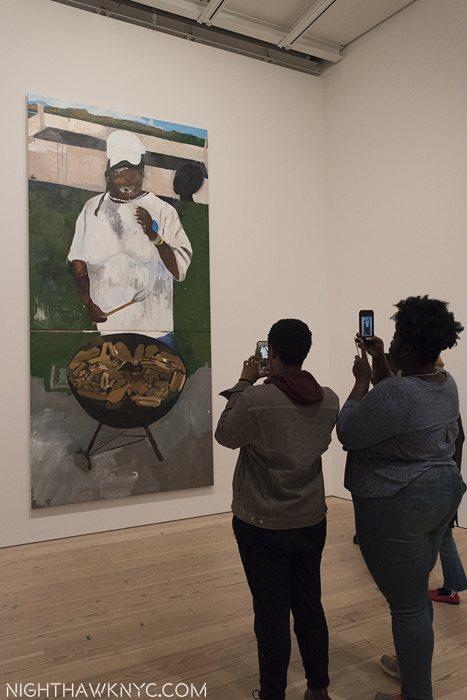
Summer in the City brings temperatures in the 90’s and short schedules in the galleries. Still, this summer has brought with it a surprisingly high number of very good shows. While the blockbusters Robert Rauschenberg: Among Friends, and Frank Lloyd Wright at 150, both at MoMA, have captivated me, they haven’t kept me from seeing the rest. Here are some I found especially NoteWorthy.

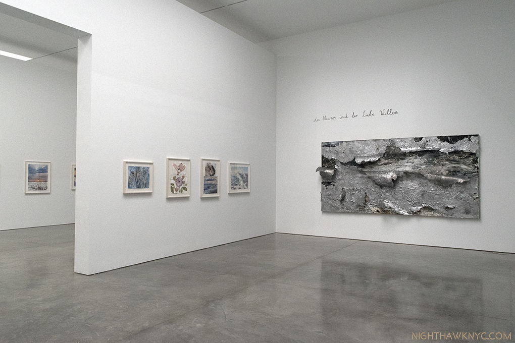
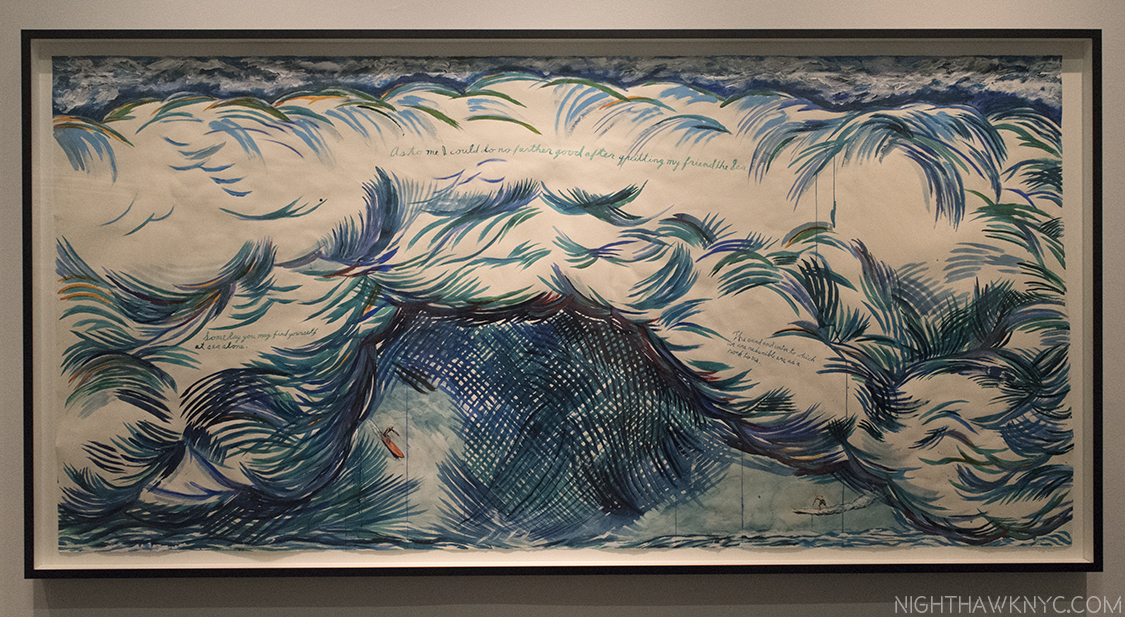
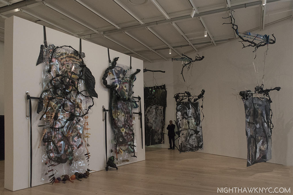
Installation View of Room 3, and part of 2, left. On the right, “The Waves of Sea and Love,” 2017, Oil, emulsion, acrylic and lead on canvas. The other works are watercolor on paper. Click any photo to enlarge.

Anselm Kiefer: Transition From Cool To Warm (at Gagosian, West 21st Street)- Hold the Apocalypse. Though there were moments recently where it seemed imminent some respite was to be found at Gagosian on West 21st Street this summer in a large show of lyrical works by renowned German Artist Anselm Kiefer. Yes, Anselm Kiefer- the same Artist who sees civilization as a  shining moment between dark ages. It’s been getting harder to argue with him.

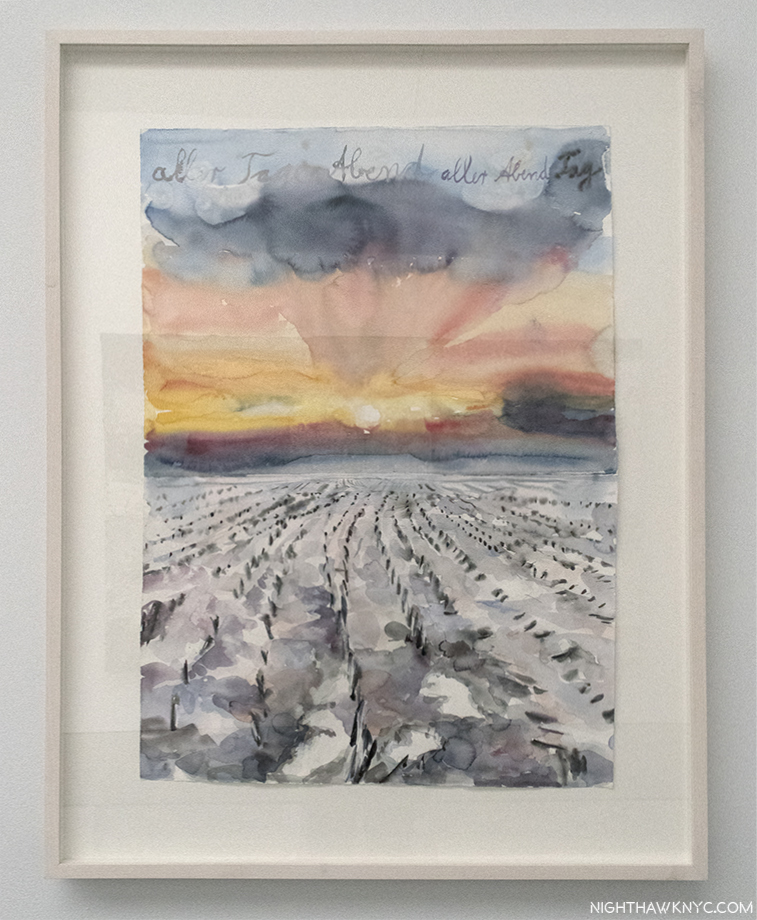
“The Evening of All Days, The Day of All Evenings,” 2014, Watercolor on paper.

Maybe Mr. Kiefer’s crystal ball also told him there would be a need for a “brighter” moment this summer. Whatever the inspiration for it, it’s certainly a bit shocking that this ray of light would come from this Artist after the dark shows that he’s had recently, like this one in London this past winter. You’ll look long and hard (as I did) for signs of it at Gogosian, where female nudes, many, apparently, under the spell of Eros, lush waters and copious flora abound instead creating a plethora of beauty that lingers in the mind, while we await whatever is coming next. And I mean plethora. Over 100 pieces, probably upwards of 300 individual works.  A “Transition from Cool to Warm,” a term used to describe color temperatures by watercolorists, in more ways than one.

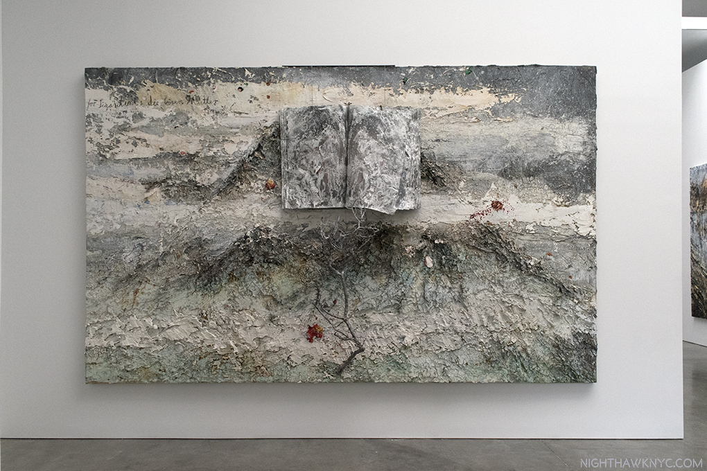
“For Segatini: The Bad Mothers,” 2011-12, Oil, emulsion, acrylic, shellac, wood, metal, lead and sediment of an electrolysis on canvas. The book in the top half, and the tree branch in the bottom half, are mounted on, and extend from, the canvas. It’s hard to capture how thickly the paint is applied. All the other books in this show contain watercolors.

It’s rare, in my experience, to see a show this large that is, primarily, watercolors. Interspersed with them are some large landscapes in oils that are spread on thick and heavy, some combined with elements that include tree branches, lead and sediment of an electrolysis, like “For Segatini: The Bad Mothers,” above, which served as an echo for me me of Robert Rauschenberg’s groundbreaking “Combines,” from 60 years earlier, on view 30 blocks north at MoMA.

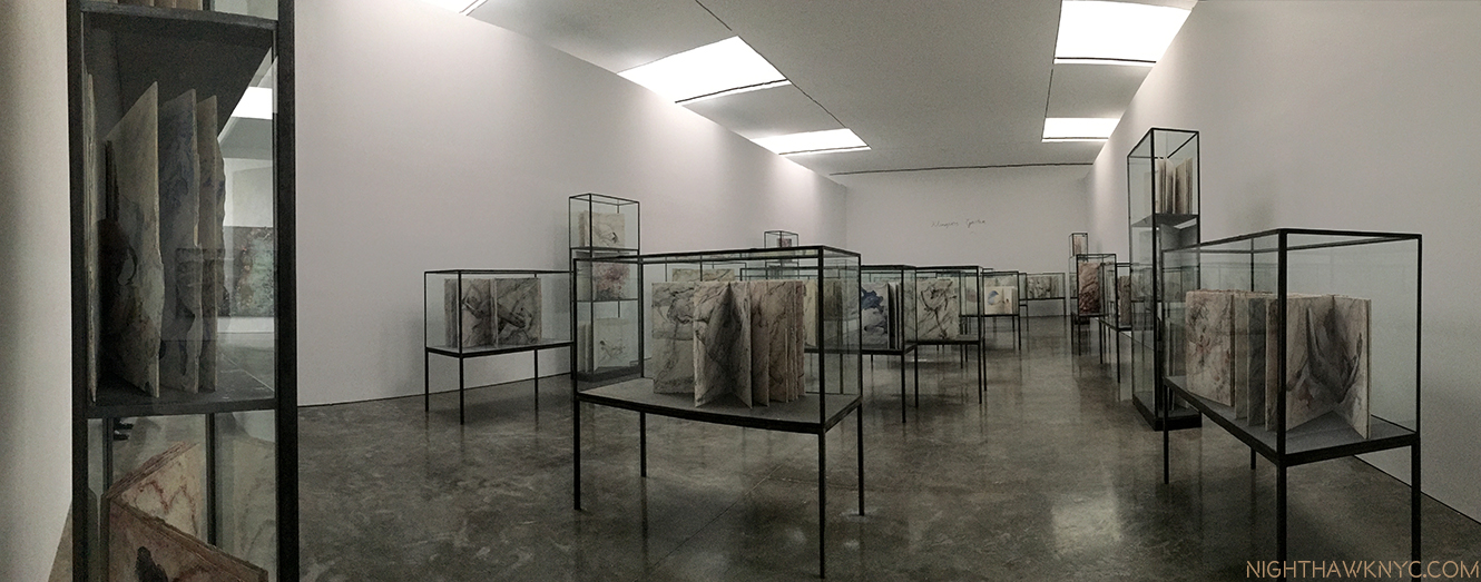
Installation view of the central gallery, “Klingsor’s Garden,” displaying 38 Artist’s Books, each one containing 8-12 watercolors.

Anyone who has tried watercolors quickly learns that this tricky medium tends to have a mind of its own. Kiefer long ago mastered them, as he demonstrated in 1977 in a book of them of the same name as this show. He’s been hard at work since creating a number of individual watercolors and about 48 unique Artists Books (the other 9 are in the final room) filled with them on view here. In this age of Artist’s Books, you’ll look long and hard to find even one that can match these (or their prices), each page of which contains a finished watercolor, many of the books containing 10.

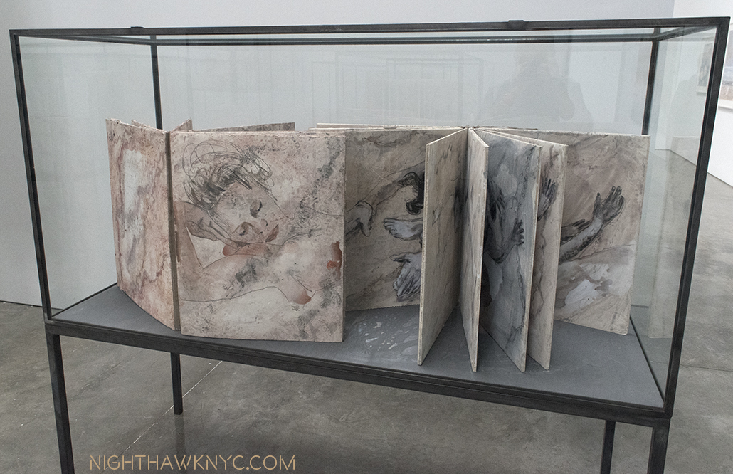
Two books of watercolors in a vitrine, each bearing the same title as room, “Klingsor’s Garden.” Watercolor and pencil on plaster on paper, executed in 2016-17.

His watercolor nudes bear a passing similarity to Gustav Klimt’s and Rodin’s famous nude watercolors, but Mr. Kiefer (who says he didn’t know Rodin’s watercolors until after he had started doing his own) makes them seem as something of a jumping off point for his own striking poses, done from models, that seem to float on the gesso he uses to create an imitation marble “ground,” intertwined with snakes, or accompanied by other elements, typically water and flowers in the standalone work, which feature sunsets (as seen in the first photo), somewhat barren landscapes, with muddy roads, or seascapes.

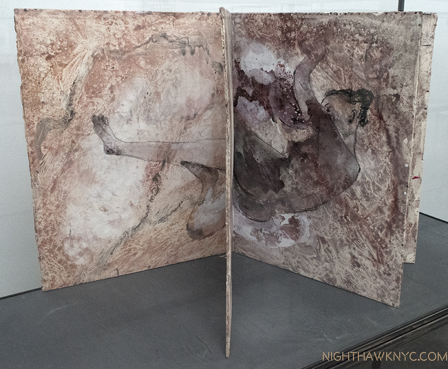
The partially opened books lead the mind to construct whole images out of halves of different pages, as seen here. Mr Kiefer says books “are more than half of what I make…the pictures come and go away, and then a new one comes. So it is always the picture between two pages. You turn the page, you still have the other one, but you already have the new one. I like this very much because it’s not a fixed picture, it’s a transition, it’s an action.” (Interview with Gagosian, 2017)

In many of them Keifer alludes to a wide range of literature, from the bible to poetry, a good many of them being fairly obscure, with handwritten notations on the works. The central room, containing most of the vitrines of Artist’s Books filled with (mostly) nudes, is named “Klingsor’s Garden,” seen above, which I take as a reference to Wagner’s “Parsifal” where the magician Klingsor has a garden full of beautiful flower-maidens under his power.

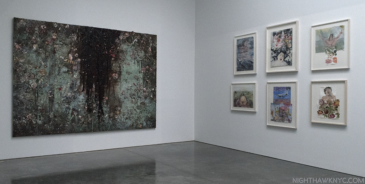
An element of darkness creeping in? “Aurora,” 2015-17, Oil, emulsion, acrylic, shellac, and sediment of an electrolysis on canvas, seen adjacent to 6 watercolors.

This is the first show I’ve seen of Mr. Kiefer’s, who has had a large work continuously on view in The Met’s 5th Avenue Modern & Contemporary galleries, in the same spot, for over 20 years. Having given up looking for a “darker message” in these works, I succumbed to the beauty and preferred to simply study the technique in the large oils, and enjoy the chance to see so many unique watercolors in one place. It will be interesting to see what his next show is like. While the world and universe will end one day- sooner or later (the jury being still out on civilization’s longevity), its the fleeting moments of beauty, and Art, that make this temporal experience special.

Ellsworth Kelly: Last Paintings, Ellsworth Kelly: Plant Drawings & Ray Johnson (all at Matthew Marks Gallery)- Each of these memorable shows deserves its own writeup. Both Ray Johnson and Ellsworth Kelly are Artists whose importance seems to be increasing as time goes by.

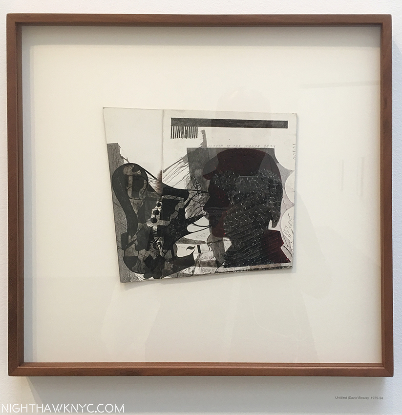
In Ray Johnson at Matthew Marks, West 24th Street, “Untitled (David Bowie),” 1979-94 is one of a group of “silhouettes” on display, perhaps  the most complex. Ink and collage on board. The multiple dates of Mr. Johnson’s work reflect the fact that he often rethought a work many times.

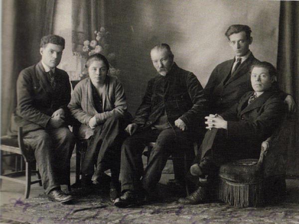
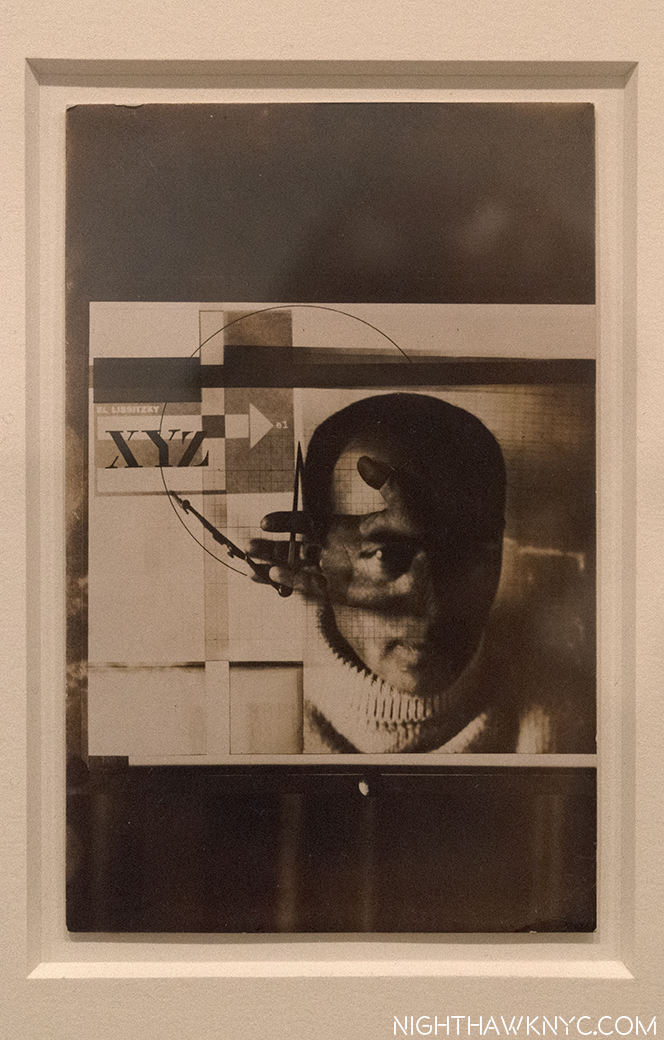
In Ray Johnson’s case, substitute “being taken more seriously as time goes by.” It’s about time. Mr. Johnson studied at Black Mountain College with Artist, and legendary teacher, Josef Albers, and Robert Motherwell, while Rauschenberg, John Cage, and others, were there in the late 1940’s heyday of that legendary institution. After burning his early paintings, possibly to get out from under the cloud of his illustrious teachers, he became something of a “shadow figure” in the Art world, though he seemed to know almost everyone in it. He started the Mail Art movement, and the New York Correspondence (or “dance”) School, and worked, mostly secretly, on collages. After his tragic and mysterious death, a suicide (or “Rayocide,” as Mark Bloch called it, which many considered to be his final “performance,” in a life that had been full of performances, like his “Nothings” earlier on), a wonderful 2002 documentary, “How To Draw A Bunny,” seems to have begun a reassessment/fuller appreciation of Mr. Johnson’s work that is, finally, seeing it loom larger than his large, unique/endlessly quirky personality. This show consists of an excellent cross section of those collages, some doing double duty as Mail Art, and two other works that defy easy description, one seen below, the other further down.

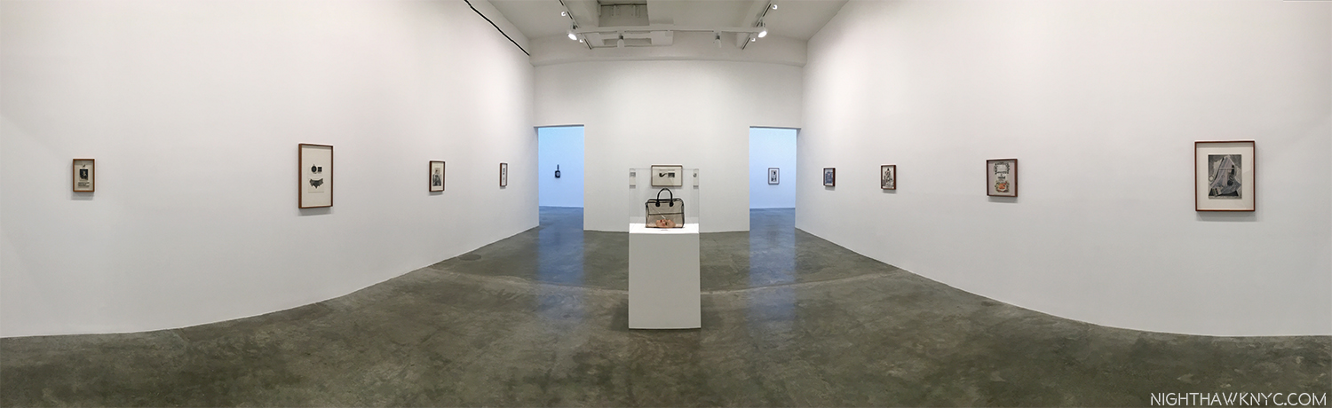
Iinstallation View of the second gallery (with gallery #3 and 4 ahead), showing the “Candy Darling Cast,” 1970- of her face, complete with fabulous eyelashes, in its clear carry bag, center.

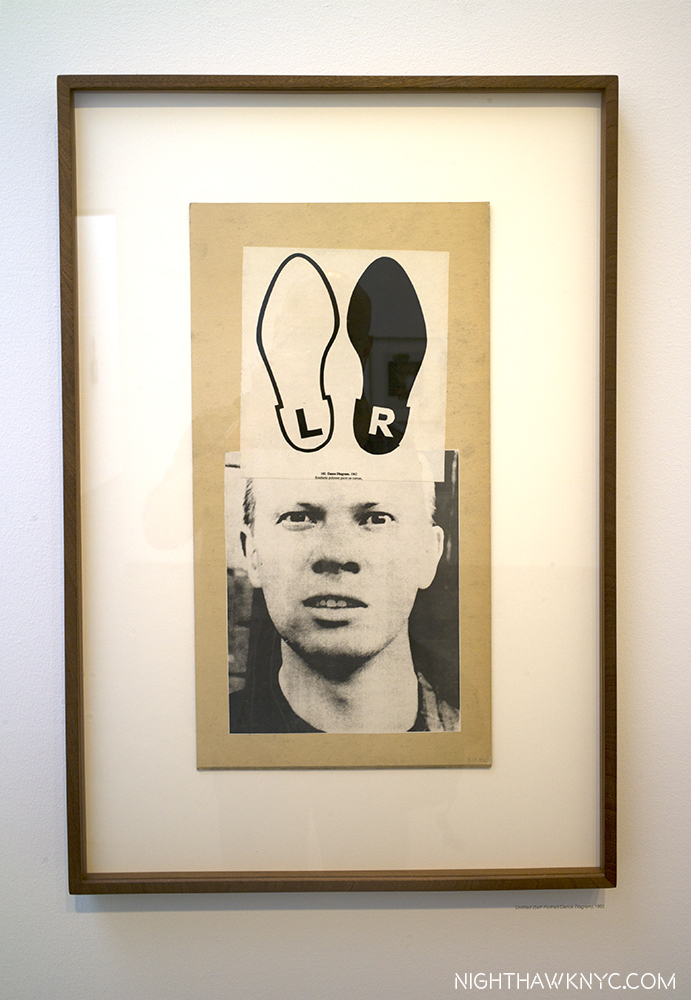
“Untitled (Self Portrait/Dance Diagram), 1992, Collage on board (double sided). The shoes are reminiscent of the ears on the Bunnies with long squishy noses that are Mr. Johnson’s “trademark.”

Ray Johnson was a unique Artist who was a Master of graphic design in my eyes, and still ahead of his time. He was a vital part of the NYC Artist community, until he opted to drop out of it, and NYC, moving to Long Island, and finally to Locust Valley, NY, where he lived as a recluse, like his friend, Joseph Cornell. He stopped showing, or selling, his work, other than continuing to mail some of it. Some see him as a precursor of “Pop art,” because of his use of celebrity portraits before Warhol (who he met in 1956), and benday dots before Roy Lichtenstein. He was also fond on including his own portrait in his work, and these are the works I find among his most engrossing given his reclusiveness. Every time I saw someone posing for a selfie in front of one of them, I couldn’t help wonder what Mr. Johnson would make of it. email and instant messages don’t have the charm of actual mail, or it’s creative possibilities. It’s a shame that it’s now unlikely another “Mail Artist” will come along to further what Ray Johnson started in this “medium.” It may have ended with him (or, “Post-Secret.”)

In this “Summer of Rauschenberg” in NYC, as I saw one writer aptly call it, Ray Johnson is not forgotten. In 1955, Rauschenberg was invited to participate in the Stable Gallery Annual. Artists had been allowed to propose new artists for the following years’ exhibition, but they changed the rule. To circumvent this, Rauschenberg asked Jasper Johns, his former wife/Artist Sue Weill and Johnson to each create a piece that he would install inside of his piece, thereby getting them in the show. Johnson’s contribution didn’t reach Rauschenberg in time to be included. “Short Circuit,” Rauschenberg’s resulting piece, and its circuitous story, are included in the MoMA Rauschenberg show. In Calvin Tomkins’ Rauschenberg biography, “Off The Wall,” Tomkins says that in 1955, he asked his friend Johnson to contribute to it in because he was “another young Artist who was unjustly neglected[P. 121].” 62 years later, the world is still catching up.

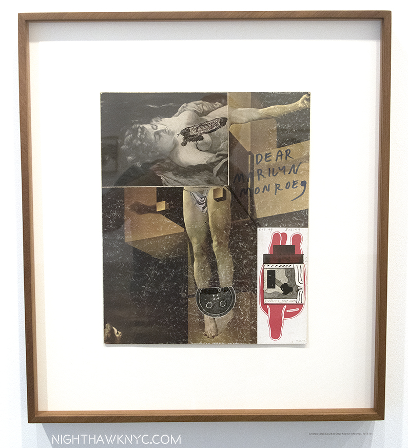
‘Untitled (Dali/Courbet/Dear Marilyn Monroe),” 1975-94, Ink and collage on board. One of a group of collages that are variations on Dali’s “Crucifixion.”

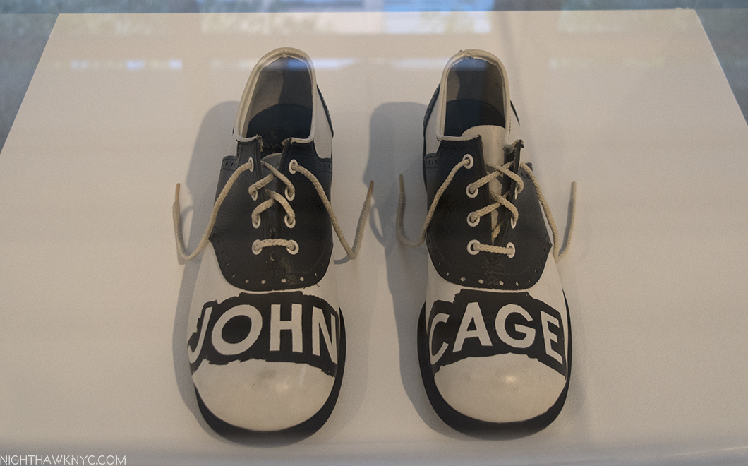
“A Shoe (John Cage Shoes),” 1977. Mixed media. Johnson met composer John Cage at Black Mountain College, and later lived in the same building with him in NYC. Both were parts of the Artist circle that included Jasper Johns, Cy Twombly, Morton Feldman, Merce Cunningham and Rauschenberg. What any of this has to do with these shoes? I have no idea.

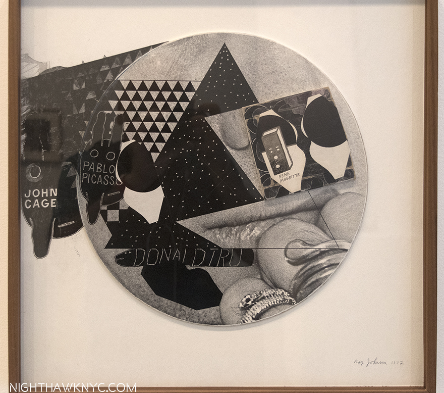
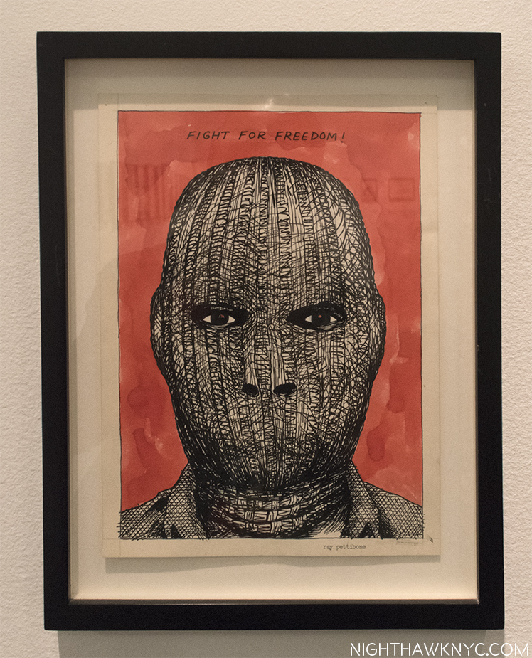
John Cage, appears again, next to Picasso, across from Rene Magritte on top of the bottom half of a Photo Photo Portrait of Ray Johnson and the inscription “DONALD TRU” under. Could this be another piece referencing Donald Trump from years ago (this one, 1972), like Raymond Pettibon’s piece seen earlier this year from _____? “Untitled (Cage, Picasso, Magritte, Donald Tru),” 1972-90, Ink and collage on board.

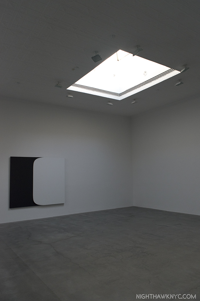
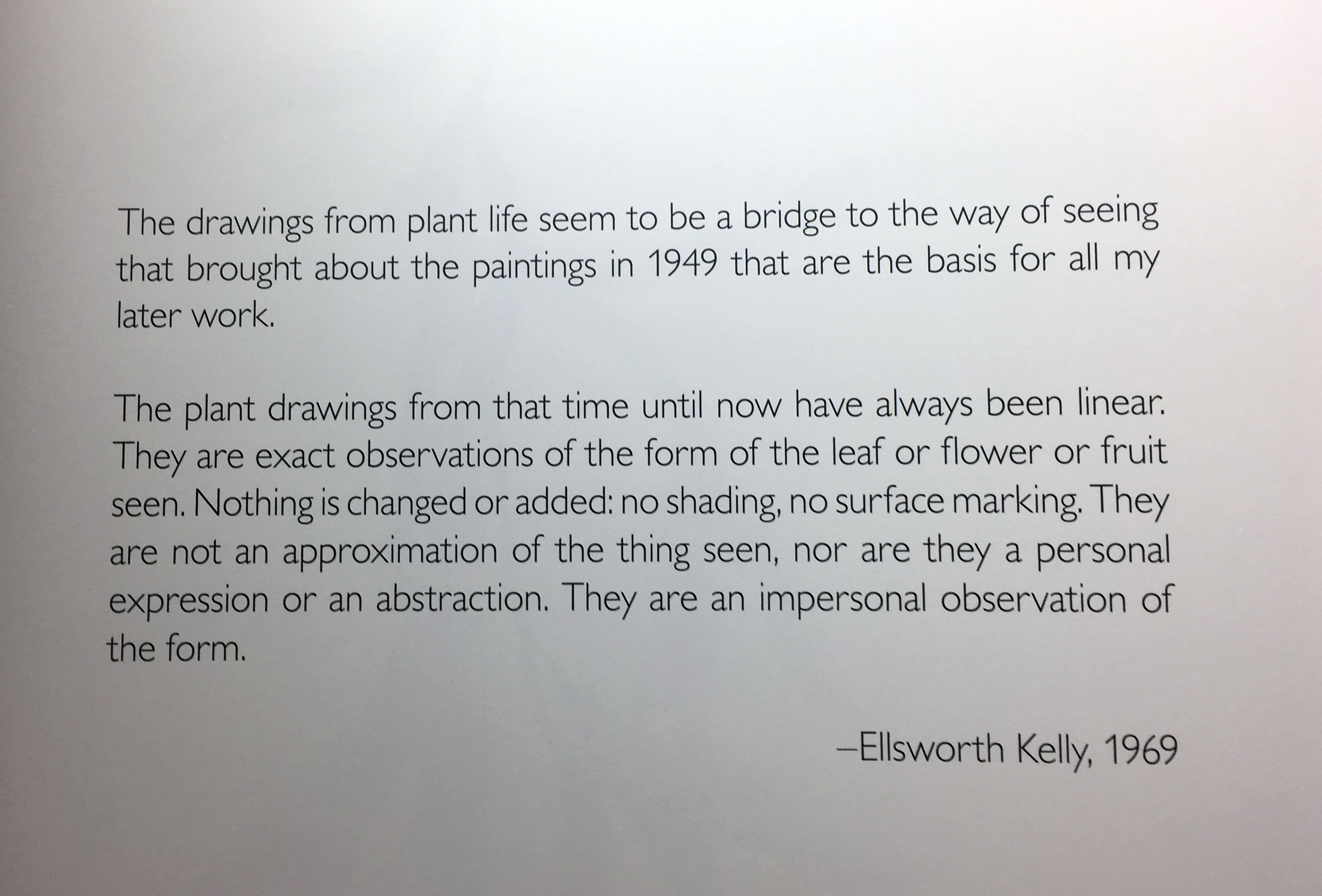
At Matthew Marks on West 22nd, Ellsworth Kelly’s 9 Last Paintings, and a selection of 16 of his beautiful Plant Drawings spanning almost 60 years, occupied adjacent galleries. Kelly, seemed to be on a lifelong mission to “free shape from its ground, and then to work the shape so that it has a definite relationship to the space around it, so that it has a clarity and measure within itself of its part (angles, curves, edges and mass), and so that, with color and tonality, the shape finds its own space and always demands its freedom and separateness.” as he said. Included in the seminal 1959MoMA show, “Sixteen Americans,” along with Jasper Johns, Louise Nevelson, Jay De Feo, Frank Stella, and Robert Rauschenberg, his career lasted a long time. As a result, it’s sometimes easy to overlook his work, and that would be our loss, especially in these wonderful last works.

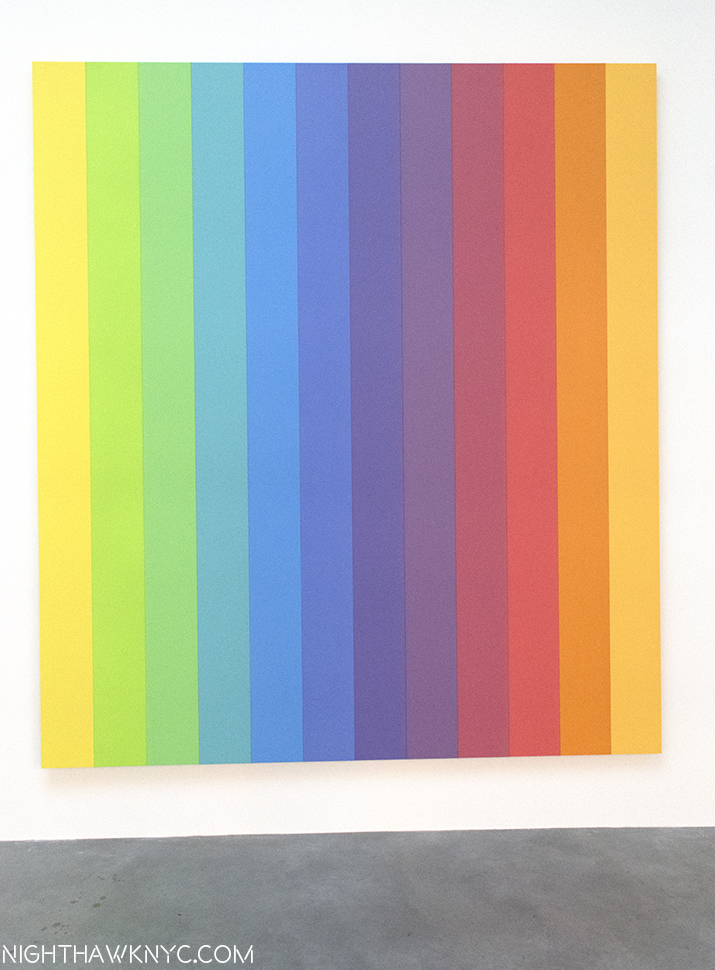
“Ellsworth Kelly: Last Paintings. This work is “Spectrum IX,” 2014, Acrylic on canvas, twelve joined panels, 107 x 96 inches

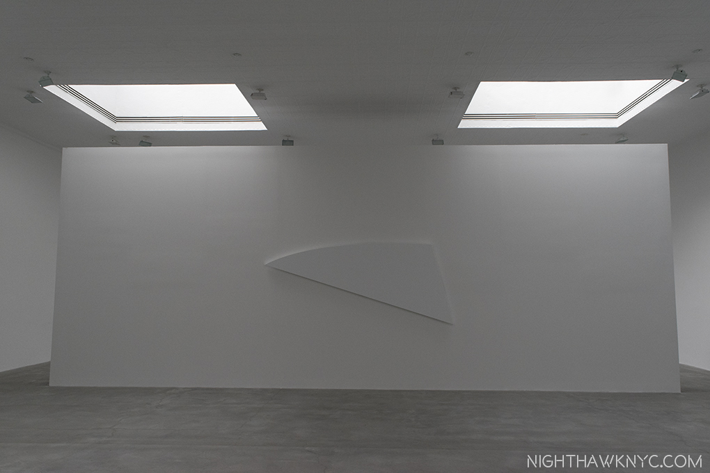
Installation view of “White Diagonal Curve,” 2015, Oil on canvas, 52 x 120 inches

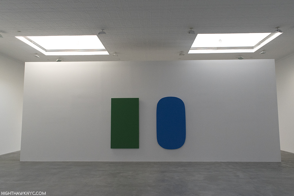
Installation view of “Diptych: Green Blue,” 2015, Oil on canvas, two panels, 80 x 114 inches.

Installation view of “White Form Over Black,” 2015, Oil on canvas, two joined panels, 75 x 87 inches.

One look at his marvelous Flower Drawings, and I was transported back to my first encounter of them in a mesmerizing show at The Met in 2012. They still leave me wondering “Why hadn’t I seen anyone do this before?” And, I still haven’t. They are true to the statement quoted earlier, though they are more easily “seen” to be based on real objects, though real-life observations were at the heart of his abstractions, as well. As such, these two side-by-side shows provided a rare chance to compare two, seemingly quite different aspects of his work, and find the commonality. They share that zen-like essence, this time of line, rather than shape and color, like the last Paintings. Both, in relation to space.

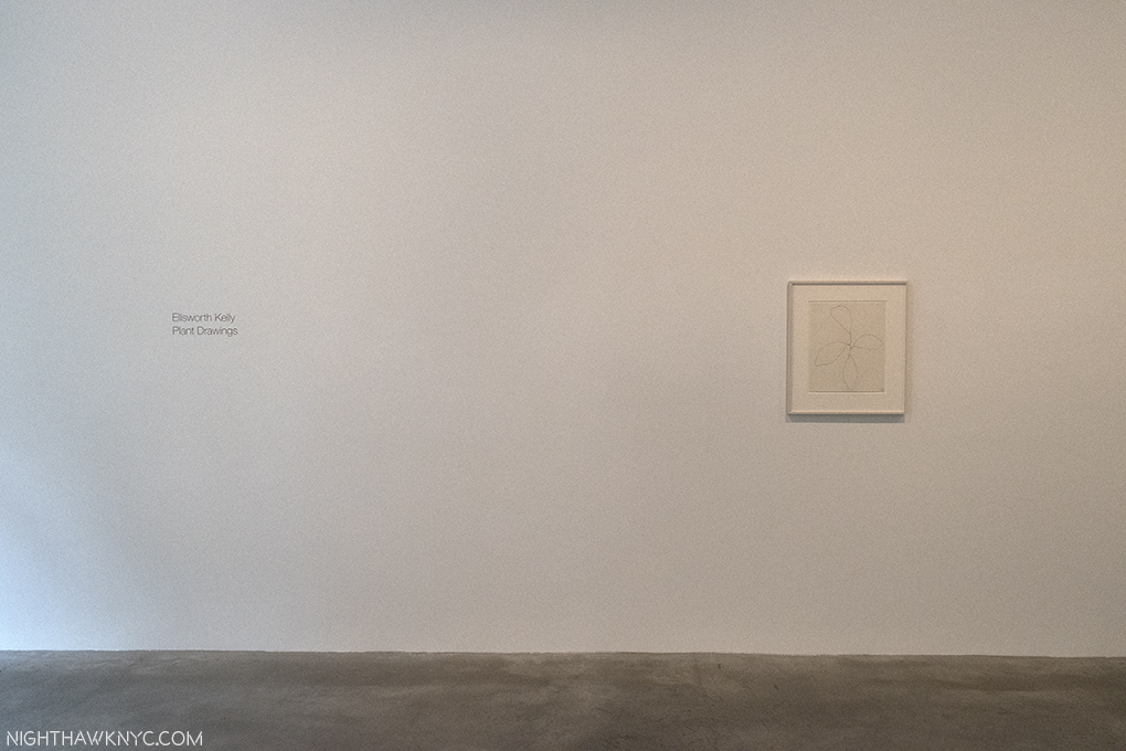
Next door to “Last Paintings,” the entrance to “Plant Drawings”

From the  catalog for this show.
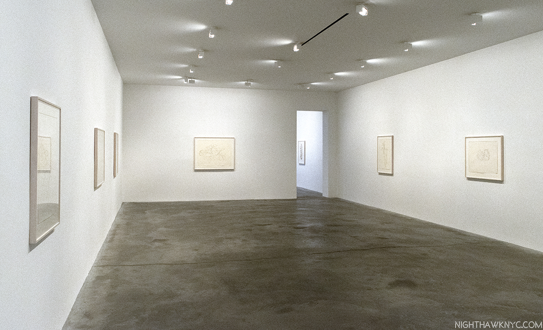
Installation view.

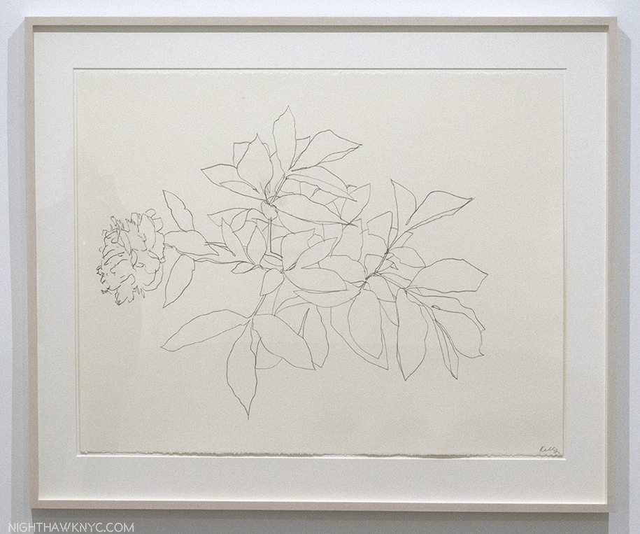
“Peony,” 1982, Graphite on paper, 30 x 40 inches.

Each shows is accompanied by its own wonderful catalog, adding to the line of excellent publications Matthew Marks Gallery has produced. The Last Works catalog includes photos by Jack Shear showing Mr. Kelly’s studio as he left it, complete with some of these very works. Touching and profound. Of course, seeing them in Matthew Marks beautiful, spacious Gallery is more akin to where these works will most likely be seen henceforth- on Museum walls.

“And babe, don’t you know it’s a pity
That the days can’t be like the nights
In the summer, in the city
In the summer, in the city”*

*- Soundtrack for this Post is “Summer In the City,” by Steve Boone, Mark & John Sebastian of the Lovin’ Spoonful, published by Sony/ATV Music Publishing LLC, Carlin America Inc, BMG Rights Management, US, LLC.

NighthawkNYC.com has been entirely self-funded & ad-free for over 8 1/2 years, during which 320 full-length pieces have been published! If you’ve found it worthwhile, PLEASE donate by PayPal to allow me to continue below. Thank you, Kenn.

You can also support it by buying Art, Art & Photography books, and Music from my collection! Art & Books may be found here. Music here and here.

Written & photographed by Kenn Sava for nighthawknyc.com unless otherwise credited. To send comments, thoughts, feedback or propositions click here. Click the white box on the upper right for the archives or to search them. Subscribe to be notified of new Posts below. Your information will be used for no other purpose.

About My Art Show Posts…

This site is Free & Ad-Free! If you find this piece worthwhile, please donate via PayPal to support it & independent Art writing. You can also support it by buying Art & books! Details at the end. Thank you.

Written & Photographed by Kenn Sava.

There are so many writers who write about shows immediately as they open, and that’s great. It gives people an idea if they want to see them or not. As you may have noticed by now- I’m not one of them. Many (most) of my Posts on Art shows appear after the show closes.

Why?

If a show is large, there’s too much to see in one visit for me to do it justice. I only scratch the surface of it the first time I see it. If it’s over 100 pieces, I’ll typically do a walkthrough to get “the lay of the land,” so I can strategize how to approach seeing it in full, based on how long it’ll be there. I prefer to see larger shows in sections.

Just keep moving towards the light. April Gornik @ Danese Corey

I find it takes me time to see Art. To see 100, 200, or 800 pieces? That takes me A LOT of time, and visits. In such cases, I’ll go and see it as many times as I can. While many shows have some works that may be familiar from books or photos, no matter how much Art you’ve seen, most of the work on display in any given show are pieces that are either not famous, rarely seen, unseen, or new. Also, great curators hang shows in unique ways and combinations that need to be appreciated and pondered on their own. Beyond all of this, really good Art rarely reveals all it’s secrets in one viewing. I find that Art I especially admire says something new, or something different, to me each time I see it. Given the high prices of Art these days, there is no other way to see these works, unless they are publicly displayed. Therefore, making multiple visits is as close to “living with the Art” as I’ll ever get. Often, while I start writing about a show while it’s up, the real work begins once I can no longer see it and I have time to let the dust settle, and see what remains.

Outside Alexi Torres‘ excellent show @ UNIX Gallery in 2016.

On the other hand? If I don’t like a show? You’re not going to read about it here. The same applies to music. This has always been my policy, even when I was writing for a national music magazine. There’s too many great things around to waste time and space writing about things I don’t like. Besides, I also believe that “Someone who loves something may know more about it than someone who doesn’t.” So? I prefer to revisit whatever it is I don’t like on another day. Maybe I’ll “get it” then. (But? Yes. There are things I can’t stand that I know I will never come around about!)

Outside “Jeff Elrod” @ Luhring Augustine. I walked through that door quite a few times while it was up.

It further seems to me that once a show is over, it’s gone. It only continues to live on in the show’s catalog (if there was one), and whatever was written about it or posted online. Therefore, my aim is to Post something as substantial as I can about the shows I write about, to that end. Most people don’t live in or near NYC, and so, will have missed much of what goes on here. Hopefully, these will provide a bit of a sense of what the show was like.

The Skylight @ Matthew Marks Gallery

This is the approach I’m taking in this Blog. So be warned- My Posts aren’t meant to be the “This just opened,” type.

A Skylight @ The Met. At night, when I’m usually there.

Sorry, Jeff!

The bottom line is that while some shows may still be up by the time I get my Post about them up. Increasingly? They are not. Even a long running show like “Unfinished,” which opened on March 8, 2016 (to members), and only closed on September 4, 2016 ended TEN DAYS before my Post was finished! I find that I’ve been spending months doing additional research about the shows, and Artists, I’m working on writing about, but I never read what anyone else has said about something I’m going to write about. I research the Artist, what they’ve said, or written about the work, and what was going on before and during the period they were creating the work being displayed. And this is taking more time than I expected it to. Even with Artists I have been looking at for a long time- like Robert Rauschenberg & Frank Lloyd Wright, who I’m currently working on.

February, 2015. It’s good to be Home. 1,500 visits to The Met later I’ve spent more time there than I have at all but 2 places I’ve ever lived in.

Most of what’s out there doesn’t speak to me. Much of it is decorative, which is fine, but it’s not for me.

“It has to go with my wallpaper.” Yes. I’ve actually heard prospective buyers say this in Art galleries.

With so much going on, I’m lucky if I can keep from missing something great, which, unfortunately still happens no matter how hard I try to keep it from happening.

The fliers for old and new things going on are probably inches thick on this wall. No one can see everything going on in NYC.

These Posts are more meant to be- “This was here, and here’s a bit of what it was like, and what remains with me.” So, buyer beware!

Until the next time I darken your gallery doorway, again.

Thanx for your understanding.

Have a great night,
Kenn.

On The Fence #10, Him, again, Edition “

*-Soundtrack for this Post is “I’ll Remember You,” by Bob Dylan.

NighthawkNYC.com has been entirely self-funded & ad-free for over 8 years, during which 300 full length pieces have been published! If you’ve found it worthwhile, PLEASE donate to allow me to continue below. Thank you, Kenn.

You can also support it by buying Art, Art & Photography books, and Music from my collection! Art & Books may be found here. Music here and here

Written & photographed by Kenn Sava for nighthawknyc.com unless otherwise credited. To send comments, thoughts, feedback or propositions click here. Click the white box on the upper right for the archives or to search them. Subscribe to be notified of new Posts below. Your information will be used for no other purpose.

Raymond Pettibon’s Burning Bush

This site is Free & Ad-Free! If you find this piece worthwhile, please donate via PayPal to support it & independent Art writing. You can also support it by buying Art & books! Details at the end. Thank you.

Written & Photographed by Kenn Sava.

Raymond Pettibon: A Pen of All Work, at The New Museum featured a multi-faceted lobby Mural by the Artist that touched on long time themes, and added a few messages.

High above, to the left of center, the Artist painted these words…

“I have been rewriting ‘that modern novel’
I spoke of to you…On th’ whole it is a failure, I think,
tho nobody will know this, perhaps, but myself…iyt is a simple story, simply told. And yet iyt hath no name.”

This show fills THREE FLOORS of a quite prestigious Manhattan Museum. Please define “failure,” Raymond. Unless, you’re pulling our leyg…again?

Raymond Pettibon: A Pen of All Work, a Retrospective that also marked his first major NYC Museum show, closed at the New Museum on April 16. I was there almost to last call, drynking in as much as I could, though I was past being intoxxxicated on the 800 Drawings, fliers, album covers, ’zines, Artist’s Books and his films the museum displayed over those 3 full floors1, plus the fascinating, multifaceted mural he did in the lobby, seen above, and below.

“Beyond it lays everything tht mattered.” That tells you right off how the Artist feels about this, the logo he designed for the legendary band HE named Black Flag, that featured his brother, Greg (who also founded SST Records, who sell Pettibon’s work to this day, without ever mentioning his name). The period it represents really is such a small part of his, now, 40 years of work. It’s (also) the #1 tattoo in the land, here painted on the Museum’s elevator doors. Still on the outs with his brother, he says he rarely draws it any more, so this time, he added very small text above each bar, which reads-“Doors nor windows.””Beyond it lays everything tht mattered.””He isn’t under there, he’s in the woods.” and “The last sentence is somewhat obscured to me.” from left bar to right.

Homage to classic NYC Baseball. Another part of the mural (all since painted over) showed Brooklyn Dodger Jackie Robinson, waving a huge bat, and the Yankee star, Whitey Ford, right, in individual Drawings, not in action against each other.

It might be a while before you see this in a Museum, again. That elevator goes to THREE floors filled with Pettibon. Some “failure.”

Installation View of the 4th floor on its closing day, April 16. In the center is a room with work the Artist created for this show inside.

Barely, had I had time for this buzzz to peak when lo and behold…Here comes A-NOTHER Raymond Pettibon show, “TH’ EXPLOSIYV SHORT T,” at David Zwirner, 19th Street, with NINETY-NINE more, recent works, only a couple of which were in “A Pen…”(they were part of the lobby mural, tacked to the wall)! And? These 99 works were being shown in the very space where Raymond Pettibon had created them. Whoa! So, unless I completely overdose on Pettibon first, you might, as I’ve opted to do three pieces- because I think his work is that important and timely- one on each show, and a third piece that looks at the place Raymond Pettibon’s Art is now. Since the David Zwirner show, where I met Raymond Petitibon on April 29, still has some time to run before it closes on June 24, I’ll start with A Pen of All Work, my “NoteWorthy” show for April, before the trail grows cold on it, though for you lucky folks near Maastricht (correctly spelled), the Netherlands, it just reopened at Maastricht’s Bonnefantenmuseum, on June 2, with 700 works, where it will run through October 29. 2

Try everything, Do everything, Render everything, Ink on paper, date unknown. And? He proceeds to do just that…

Mr. Pettibon is somewhat unique in the Art world because of the way he got here, achieving legendary status through his work for bands before he got a Gallery to represent him. So? The Art world is not as familiar with the early work, while his early fans may not be as familiar with what he’s done lately (though, of course, he has many fans who have been with him the whole way, too). I’ll try to show a mix of work here, while trying to give a sense of what this remarkable show was like.

I have to think back to the Picasso Retrospective which filled ALL of the old MoMA in 1980 to recall a show of comparable size. Still, if there was a common theme to be found it was that “his entire body of work is very much a confrontation against ideologies,” to quote Massimiliano Gioni, the New Museum’s Artistic Director, on the excellent audio guide. Whatever you’ve got? Pettibon will confront it, and given how much confronting he’s done, everyone involved did a superb job of installing it, organizing all of these works by themes.

Timeless. Unfortunately. No Title (Fight for freedom!), 1981(!), Pen and ink on paper

The 2nd floor mostly focused on Pettibon, himself, looking at his early work with an eye on how he created his own “alternate media” in the form fliers, zines, record covers, Artist’s books, films & videos, et al, and how he goes about his craft, including samples from the archive he uses as source material, and to draw inspiration from on a daily basis.

A bit of Pettibon’s never before seen archive of source material includes Iwo Jima, Giuliani, and 9/11.

Also on 2, along with a good part of his past, part of Pettibon’s current legacy was on view in full effect, as seen below. He forged his own way of getting his work seen, first on fliers, then on record covers, zines, Artist’s Books, and then added film and video, all before finding acceptance in the Art world, something he says was delayed by 10 years due to his association with punk. A visit to stores like New York’s Printed Matter feels like visiting the work of many of the “children” of Raymond Pettibon, as his example has been, and is being, followed by countless Artists, Photographers, Musicians and Writers right now. Including thiys one. Though, perhaps not the first Artist to work in any of those media, his methods, and his path, remain most influential.

I had to cross the Framers Union picket line to see this show, who were on strike because Pettibon prefers to tack his work to the walls with straight pins. With 800 works in this show? That’s a LOT of lost work for framers. Ok…I’m kidding. I’m pulling your leyg now. Looking at this photo, you can see how very far Pettibon’s work has come. In the glass case are GORGEOUS copies of his (now rare) early gig fliers that were posted with no thought of posterity in the late 1970s. Behind them, on the wall are 2 tacked up drawings, and one painting(!), left, next to 13 framed drawings of no less than the Manson family. Out of the 20,000 Drawings Pettibon has done, only a small percent have been framed. With the prices being paid for his work? I’d bet that just about every piece that is tacked to the wall here is being seen that way for the last time. Framers? Get ready.

Also on the 2nd floor is the American premier of the virtually complete original art for his first book, Captive Chains, 1978, an homage to comic books/Texas Chainsaw Massacre/ Betty Page that is laced with S&M imagery as well as first rate drawings, different in style than what most of his fans may be familiar with. Pettibon has been quick to downplay/under-play/denigrayte his self-taught Drawing skills- including these! Captive Chains begs to differ. Sorry! No faylure here. These are both terrific, and now classic. Perhaps most interesting, a number of its pages are full page drawings with no text, something almost never seen in Pettibon’s work since. In fact, it seems to me his career has followed the trajectory of his work being more about image primacy early on to now when text and language have come more and more to the forefront. One indication of this is that many drawings lie unfinished in his studio at any given time while they await the inspiration of texts to complete them. Sometimes for years.

The complete original art for Captive Chains, 1978. 68, ink on paper Drawings seen in the USA for the first time, and yes, they’re tacked to the wall.

One page. Ugh…I’m sorry. Putting a tack in this is like putting one in my hand.

Pettibon is fond of recycling old characters from the comics and television, including Batman, Superman, Gumby and the obscure side-kick character, Vavoom. While Batman and Superman are famous, Gumby, a long time personal favorite, is in eclipse. A claymation character created by Art Clokey3, he was able to walk into books and live in them, as well as visit other times in history. Vavoom was a side kick on the Felix the Cat cartoon show, a character, who’s only vocalization was, literally, an earth shattering shout out of his own name. Both Gumby and Vavoom are alter egos of Pettibon, and stand-ins for the Artist. Very interesting choices, to say the least.

The old cartoon side-kick, Vavoom (seen here in No Title (A beautiful, actual…), 1987 ink on paper, only able to say his own name is an interesting alter ego for an Artist who is so intensely literate.

…so is Gumby. No Title (I borrow My…), 1990, Acrylic on board.

In a long, rear gallery on the 2nd floor, was an amazing selection of Pettibon’s superb Baseball Drawings.  Along with surfing, the Artist’s passion for Baseball is lifelong. As with his other work, unless you’re a Baseball Stat expert, like he may well be, it takes some digging to begin to understand why Pettibon is choosing to depict a certain player at a certain point in his career. (More on this in my Post on the Zwirner show.) While his early punk work continues to gets so much attention, other areas of his work live in neglect. If there’a another Baseball Artist in Pettibon’s league? I don’t know of him/her.

Against the world. No Title (1.12 Bob Gibson), 2015, Pen, ink, pencil, acrylic on paper. “1.12” was Bob Gibson’s E.R.A. in 1968, when he won 22 games and lost 9. His St. Louis Cardinals lost in Game 7 of that year’s World Series. Could anything better capture his intimidating presence than this?

The 3rd floor sees Pettibon looking at the various “tribes,” and subcultures in recent American history- surfers, hippies, punks, the Manson family, and musicians.

Even The Beatles “get Pettibon-ed,” to coin a phrase, about who is the “largest” member. No Title (Few know this…), 2015, Ink on paper. Pettibon continually revisits history (usually, American), often years later, as here. In the 2000’s, he began addressing events closer to “real time,” like the War in Iraq. One thing I haven’t figured out yet? His work’s “penis obsession.”

His Surfer and Wave works strike me as living at the center of his work, the heart of it. Beyond punk, Manson, religion, politics, war- all the rest of it. Here’s a world Pettibon knows intimately having grown up near the water in Malibu, where he indeed surfed, though, as he told Dennis Cooper in Raymond Pettibon, (Phaidon), “I don’t surf much any more, but I grew up with it. I was never a card-carrying surfer.” Usually, he depicts a solitary man in the middle of a gigantic wave, testing himself against nature, symbolically against the world, against the nature of things, against chance, and against himself. As his 2005 work, ”Man stands as in the center of Nature, his fraction of time encircled by eternity…”, which wasn’t in this show, sums up perfectly. At moments like those, the “truths” that present themselves (or rather, that Pettibon presents) are often zen-like koans- they’re ineffable. They can’t be distilled further. All but the tiny place where board meets water is out of his control. How long will the ride last? Will he survive? Be maimed? What goes through the mind while it does, and at times like those? It’s not just a man’s game, either. He shows us girls and women surfing, sometimes topless.

Monumental. No Title (As to me…), 2015, Pen ink, watercolor, acrylic on paper 55″ x 113″. Another of his large Surfer Drawings sold for 1.5 million dollars in 2013, “failing” to reach four times the high estimate.

No Title (Don’t complicate…), 1987, Ink and gouache on paper, 24″ x 18″, MoMA. If I could choose one work of his? This might be it…at the moment. You styll have 300 other Pettibons, MoMA.

The 4th floor sees Pettibon’s extensive, long-running, devastating and ever-timely political and war works, along with works relating to the power of media. Brace yourself- Pettibon doesn’t play favorites. Democrats and republicans come in for just about equal poundings- from JFK through Obama. It culminates, and the show concludes, with an inner gallery of work Pettibon created for A Pen of All Work.

Twas ever thus. No Title (You’re supposed to read the green first, Congressman Ford), 1976, Red, blue pencil on paper.  An early work about Gerald Ford by “R. Ginn.” The name “Pettibon” comes from his dad.

The layout of the 4th floor is interesting in the choice of having the most timely, most controversial and most “explosive” work including pieces regarding Ronald Reagan, Gerald Ford, Donald Trump (one from the 1980’s, and one from the 2016 campaign) and atomic explosions….

No Title (“End the war…), 2007, Pen, ink, gouache on paper, 30″ x 22,” left, seen with No Title ( The war, now…), 2008, Pen, ink, gouache,  acrylic on paper. Don’t worry. There was a whole wall about JFK, and yes, Obama got “Pettibon-ed,” as well.

A wall of work on religion, another ongoing theme.

surrounding an inner space, where the feeling is, surprisingly, both personal and intimate, it felt to me. Inside, the Artist pays homage to his mom, talks about his craft, and, apparently, nature, life, some of his wishes at this stage of his life (he turns 60 on June 16), all in works created for this room, and some on its walls.

The show includes some treasures. His mother, 95 as of last December, saved some of his childhood drawings from the 1960’s and 19 of them were on view that Pettibon has now added texts to! Pettibon pays homage to his Mom in a wonderful, Artful, way in this final gallery, which brings the show full circle.

Inside the final room on 4, containing works Pettibon did especially for iyt includes this version of Whistler’s Composition in Black and Grey, the Artist’s Mother, an homage to his own Mother, now 95, who he has says has always been his biggest fan, at times his only fan. The feeling this room gave felt like walking around in his head at the moment. He added the writing above it because, he thought, Whistler’s Mother looks like Mary Baker Eddy.

So…Moms? Hold on to your kids drawings!

A view of another part of the final room.

No Title (Pinned to the Earth), 2017, Ink on paper. In the final room, birds are featured since their feathers are used for quills- drawing instruments. Uh-oh. Someone else wants to chime in on this one…

“On The Fence, #5, Picking-A-Petite-Bone”

Painted on the wall of the final room.

PHEW. Some “failure!” It sounds HUGE, and it was, but it was a mere pittance (4%!) of the over 20,000 Drawings Mr. Gioni says Pettibon has created to date. And counting. He’s already added at least the 99 drawings in the David Zwirner show to the total. And? The one he did for me there.

No Title (When I see…), 2006. Pen, ink, collage on paper. Pettibon has been doing collages since around this time, and says one may include up to 70 drawings. As if his work wasn’t cryptic enough!

Beyond that, in a show that contains work that goes back to the 1970’s, it’s fascinating that nothing here feels “dated,” and virtually all of it holds up. Over 800 of any works is a pretty good indication of quality, even out of a body of 20,000. I’m still looking for a “bad” Pettibon.

No Title …(Do you really believe…), 2006, Pen and ink on paper.

After spending some weeks with these works, and Pettibon’s work in general, I find Mr. Gioni sums up the mystery of “understanding” Pettibon’s work the best I’ve found so far when he says on the audio guide, speaking of his political works, but I think it’s valuable to keep in mind, regardless of subject- “Pettibon plays with a variety of voices, in this case a cacophony of voices. The texts that are inscribed in the works of Pettibon are rarely a direct confessional expression of the Artist’s opinion, and they are instead a collection of what could be defined as the collective unconscious…” Proof of this is that we learn very little about the Artist, himself, from his work. Unless he comes out and tells us, directly, in interviews, and even then? Watch out for his “tall tales!” The point of the work is not personal (about the Artist, himself). It’s more about self, than “himself.”

My Heart Tells Me (Self Portrait), 1990, Ink on paper.

Personally? I felt like I was seeing the work of 800 Mensa members.  If you want to know why he is a major, and in my opinion, crucially important, Artist of our time, the “Pen,” and a pretty nice one, called the New Museum held your your answer. A wall card says the show’s title comes from a poem by Lord Byron. Ok. Another way to look at it is that the New Museums truly was A “Pen” (as in an enclosure) of All (well, A LOT) of his Work “that matters,” as he painted in the lobby.

No Title …(Good prose is…), 2013, has been turned into a styling Tote Bag by MZ Wallace, proceeds go, appropriately, to the New York Public Library.

I must also say that I feel that this show was a huge coup for the New Museum. As far as I’m concerned, this is the show that takes the New Museum to the next level. “Big 4” Museums? That sound you hear is someone breathing down your necks in contemporary Art. As for Mr. Pettibon, himself? I wonder. This show could have been held at MoMA (who, according to their site own over 300 of his works, on say, the whole 6th floor) or  it could have filled The Met Breuer (The Met lists 3 of his works online). Either would have, most likely, given him quite a bit more exposure, which might be critical given the timely nature of his work. I would love to know if either was ever an option, and why they passed if they were. Raymond Pettibon’s time is (still) now. Maybe MORE now than ever. Still, all of that having been said, I’m glad that it happened at all! I mean no disrespect to the New Museum. On the contrary, I heartily applaud them on doing such a superb job, on all accounts. Bravo! While I won’t compare qualitatively, “A Pen of All Work” will be one very hard show to top in NYC in 2017. Meanwhile, his Art continues to find favor elsewhere around the world. If you are anywhere near Maastricht, the Netherlands before October 29, don’t miss iyt! Raymond Pettibon also has a show about to open at the excellent Garage in Moscow, Russia. But? Sadly, this one is over.

“And the only sound that’s left
After the ambulances go
Is Cinderella sweeping up
On Desolation Row.”*

When I left A Pen of All Work as the show closed that last time, I walked out on to the Bowery, the erstwhile “Skid Row,” or “Desolation Row,”(hence, this Post’s Soundtrack), where C.B.G.B. used to stand a few hundred feet away, back in the day before gentrifucation. Yes, punk is long gone, but Raymond Pettibon’s “failed modern novel” gets more and more attention than ever, now worldwide. Pondering all of this, I felt that Pettibon seemed to be akin to a modern day biblical, or zen, prophet- complete with his own burning bush, wandering in the desert, speaking in tongues.

800 works in, I’m listening harder than ever.

*- Soundtrack for this Post is “Desolation Row” by Bob Dylan, from the classic Highway 61 Revisited, and published by Bob Dylan Music Co.

Special thanks to Kitty, who’s research assistance made thiys Post possible.

NighthawkNYC.com has been entirely self-funded & ad-free for over 8 years, during which 300 full length pieces have been published! If you’ve found it worthwhile, PLEASE donate to allow me to continue below. Thank you, Kenn.

You can also support it by buying Art, Art & Photography books, and Music from my collection! Art & Books may be found here. Music here and here

Written & photographed by Kenn Sava for nighthawknyc.com unless otherwise credited. To send comments, thoughts, feedback or propositions click here. Click the white box on the upper right for the archives or to search them. Subscribe to be notified of new Posts below. Your information will be used for no other purpose.

  1. 800 pieces, per the show’s audio guide, which you can still access, as I write this, here.
  2. Update- July 20- You can read my Post on “TH’ EXPLOSIYV SHORT T” here.
  3. (who passed in 2010. I wonder what he thought of these…

The Whitney Biennial Turns The World Upside Down

There’s more than “one way” to select a Biennial, and therein lies my rub…Click any photo to enlarge.

Ahh…The Whitney Biennial. That semi-annual whipping post, “they don’t make Art like they used to” kind of a show of Contemporary American Art by “young and lesser known Artists” that, frankly, I gave up on and stopped going to, missing the last one at the “old” Whitney (now The Met Breuer) in 2014. This new one, the first in their new building, ends on June 11.

Liberty by Puppies Puppies, 2017. “Give me your tired tourists, yearning for a selfie moment, rife with sociopolitical comment,” with an incomparable background. At various times, it’s a real performer, at others, it’s a mannequin. At no time will the Nighthawk go out on that deck.

Oh! What I do in the name of “Art!” Ummm…You need some gel or something for those spikes. That Torch seems to be slipping. And? Where is that big book? Whatever you do? DON’T look down!

If you have any interest in Contemporary American Art you should see it if you can. Is it a “must see?” My initial impression, which I Posted here on March 31 (which this Post replaces) left me feeling there was much to see and impressed by some of what I’d seen. Having made 10 visits thus far, however, my answer is “No.” Unfortunately, though there are a number of memorable pieces on view, and I think it’s highly likely you’ll discover some new names you’ll put on your list that you’ll want to explore further, overall, it’s not a must see, in my opinion. Let’s face it- there are so many really, really good shows going on here now. If you’d ask me what to see that’s up at the moment? I would say about the Biennial, “See it if you have time,” after seeing the others.

As always, it wouldn’t be the Biennial without some hair-pulling, teeth-gnashing, and “Wtf moments.” In this edition’s case they are there, and fairly serious negatives, in my opinion, mostly regarding the choices of what is included and what has been omitted.

True, but I’d at least like to survive this show. In the Wake, 2017, 2 of 16 Banners by Cauleen Smith.

As for my lists, after two visits, the name Samara Golden made mine of Modern & Contemporary Artists- of any age, to keep an eye on. After 10 visits? She’s still there. During each one, my wonder never ceased every time I experienced her work…ummm…installation….ummm….ok…creation, The Meat Grinder’s Iron Clothes, 2017. It is, literally, one of the most astonishing Art works I have seen since…? I honestly don’t know. Maybe, ever.

Check your expectations at whichever side door you choose to go in to enter Samara Golden’s work.

It’s so big with so much to see it may well be un-photographable. Hmmm…where have I heard that before?

“Your looks are laughable
Unphotographable
yet your my favorite work of Art”*

It, literally, turns your world upside down it’s so disorienting. Like I said about the unforgettable Bruce Conner Retrospective when it was at MoMA, “Htf?,” substituting “How” for “What,” this work takes that “How” to the “nth” degree. Unfortunately for me, it’s a work that uses height as a key element, (as does “Liberty,” above). Being deathly afraid of heights I was unable during either visit to get close enough to the preferred viewing areas to really even see most of it and get the full effect. This is as close as I’ve managed to get (thanks to the Whitney staff for nailing me to the floor)-

One little bit of Samara Golden working her magic. Ok. I’m looking down at the sky, and up at the street. Whatever is going on? I’m not sitting in that chair.

During one visit, a viewer turned away and said, “It’s an optical illusion.” I didn’t reply, but thought to myself- “Yeah? So is the Mona Lisa. There’s no real woman up there on that canvas. There’s only oil paint, and whatever Leonardo Da Vinci put under it, and what’s been put over it up there. It’s what the Artist does with his or her materials that makes the miraculous thing called “Art.” I don’t understand exactly how that translation occurs, but I’m always glad when I it does, as with Samara Golden’s “The Meat Grinder’s Iron Clothes.”

Taken as a whole, I heartily applaud the up to the minute, very politically and socially aware bend to the show, which leaves plenty to think about, which both honors, and continues, the Whitney’s long-standing tradition of being involved.

Occupy Museum’s piece, Debtfair, recounts the historic rise of the mounting debt Artist face, as shown in this graph, trying to survive & create.

Samara Golden’s work does this, too, except she gives you very different things to think about. The feeling that came to my mind was the so-called “trip” section of Stanley Kubrick’s 2001: A Space Odyssey, forever my favorite film. I don’t want to say more about it to give readers a chance to experience it for themselves without anyone else’s words in their head (and that’s also why I’m including only one of the photos I attempted at this time). Ok, and also because I still don’t know what to make of it myself. To help me, I bought the brand new MoMA PS1 book for her The Flat Side Of The Knife, 2014 show there (of the same title) for background. After 10 visits, I’m not sure the book, interviews with the Artist, or ANYthing will help me better understand this work. (Note to self- You haven’t even read the information card for this piece. In fact? You don’t even know where it is!) You’re on your own to make of it as you will, and frankly? I prefer it that way. I wish more Contemporary Art “needed” less explaining.

Elsewhere, the other highlights, for me, are- the brilliant choice of having Henry Taylor and Photographer Deana Lawson (who share a real life working dialogue) share a gallery (Mr. Taylor’s biggest work is in the lobby area just off the elevator on the 6th floor, as I wrote about, and pictured, in my Post on Henry Taylor). Deana Lawson is, undoubtedly, one of the stars of this Biennial. For weeks after the show opened,  I heard her name on people’s lips just about every where I went. Amazingly, you can still buy an original work of hers, in a signed and numbered limited edition of 50 on Light Work’s excellent site, here, for $300.00! They also have an excellent edition of Contact Sheet dedicated to her, which was available there for $12.00. Neither will last long.

Installation view of the Deana Lawson-Henry Taylor gallery.

Deana Lawson, Sons of Kush, 2016. Apologies for the glare.

The Artists, KAYA (Painter Kerstin Bratsch and Sculptor Debo Eilers), impressed me with their unique works, as Artists striving to bend boundaries between mediums, possibly following the path of Frank Stella, and they succeed to memorable effect in the works shown here.

SERENE, Processione (ALIMA), Processione (JAKE), Processione (TIN), all 2017, by KAYA (Painter Kerstin Bratsch and Sculptor Debo Eilers)

Painters Jo Baer, Aliza Nisenbaum, Celeste Dupuy-Spencer, and Dana Schulz stood out, for different reasons, but perhaps most importantly as far as I’m concerned, they show the ongoing vitality of Painting in 2017.

Veteran’s Day, 2016, Celeste Dupuy-Spencer, “looks at figures who engaged in meaningful resistance. These include the Abraham Lincoln Brigade, the international volunteers who fought against Franco in the Spanish Civil War, Muhammad Ali, and Karl Marx and Engels,” per the info card.

Paintings outdoors? At night? One of an interesting series of work by Ulrike Muller, yes, seen outside on the 5th Floor, at night.


Jo Baer, Dusk (Bands and End-Points), 2012

The Whitney & the Biennial’s curators have taken a fair amount of heat for the inclusion of Dana Schulz’ Open Casket. Further on the controversy front, an entire gallery was devoted to Frances Stark’s series Censorship NOW, which consisted of a series of huge, painted, double page reproductions (with underscores in blood red paint) from the 2015 book of the same name by musician, writer, D.J., etc. Ian F. Svenonius. While her/their point is fascinating, I was left wondering if she/they chose the right targets. As with the other works I’ve shown thus far, it’s worth seeing for yourself and making your own mind up.

Frances Stark, Censorship NOW, 2017, large, painted reproductions, with notations, of the book of the same name by musician Ian F. Svenonius.

I will say that a good deal of the Biennial I most likely won’t see because I’m not particularly drawn to film & video. As for the negative aspects of this Biennial. I’m quite puzzled by a good deal of what’s installed on the 5th floor. This wouldn’t be so frustrating for me except for the fact that I can’t understand why so many deserving Artists, who I feel should be here, are not.

Yes, there was snow on the ground as the Biennial opened as seen on the 5th floor roof deck. I have nothing to say about anything else in this photo.

In line with my ongoing policy against being negative about Art or Artists, I’m not going to get specific about the latter. With regards to the former, there is a long list of Painters and Photographers, especially, who I feel are serious omissions. Here’s a short list-

Painters (in no particular order)- Where is Andy PiedilatoJeff Elrod? Fahamu Pecou? Hope Gangloff? (Heck, Rod Penner is only 2-3 years older than Henry Taylor.)

Drawings-Ethan Murrow? Emil Ferris?

Photographers (By my count, there are only SIX in the show! Not counting, Artists, like Oto Gillen, who display stills from video. I don’t consider that Photography.)- Where is Gregory Halpern? Mike Brodie? (He’s 32, and though he says he’s “retired,” he deserves to be here.) Matt BlackAhndraya Parlato?

In closing there is one thing I will say about Samara Golden’s “Meat Grinder’s Iron Clothes.” Already, it’s apparent that no matter how many times in the years to come I visit the western end of the Whitney’s 5th floor I will think back to this work having been there, and marvel at how she did it…

“Hey,” I’ll say to no one in particular nearby in the future. “Did you see THAT?”

“Yeah,” someone I haven’t yet met will say. “They don’t make Biennials like they used to.”

On The Fence,” #4- Samara Golden Edition.

*- Soundtrack for this Post is “My Funny Valentine,” written by Rogers & Hart and published by Warner/Chappell Music, Inc.

NighthawkNYC.com has been entirely self-funded & ad-free for over 7 years, during which over 275 full length pieces have been published! If you’ve found it worthwhile, PLEASE donate to allow me to continue below. Thank you, Kenn.

You can also support it by buying Art, Art & Photography books, and Music from my collection! Books may be found here. Music here and here.

Written & photographed by Kenn Sava for nighthawknyc.com unless otherwise credited. To send comments, thoughts, feedback or propositions click here. Click the white box on the upper right for the archives or to search them. Subscribe to be notified of new Posts below. Your information will be used for no other purpose.

“Only God Sees This”

This site is Free & Ad-Free! If you find this piece worthwhile, please donate via PayPal to support it & independent Art writing. You can also support it by buying Art & books! Details at the end. Thank you.

Written & Photographed by Kenn Sava (*- unless otherwise credited).

As I continue to explore Contemporary Photography this year, I find I am increasingly drawn to the field of “PhotoJournalism.”

Is this the Early Magnum: On & In New York Show, or the Black Hole of Photography that has swallowed me whole in 2017. Or, both? Click to feel engulfed, like I do.

Or, what was called “PhotoJournalism.” As far as I can discern it was a term meaning using pictures to tell a story, report a story, or support a story. Was? Or is? It’s a term that I struggle to define today, in the dual print & cyber world. As I explore the field, I find that some Photographers have an issue with the term, too, while others still use it. Since I am someone who loathes “boxes” applied to work in any creative field of endeavor, or the creators, themselves, I’m going to use it (with those caveats) only for the sake of clarity, though I prefer to refer to the creators of this work as Photographers. For a number of reasons, I wonder if the term is on the verge of outliving it’s usefulness, though professionals, no doubt, may differ.

At a time when these Photographers are under seemingly ever-increasing threat, on many fronts, showing their work is one of the best means there is of combating that, and helping them because it brings this work more and more into the light and before more eyes. In making the rounds of shows and in doing my research, I’ve been surprised by the amount of Photographs I’ve seen documenting current and recent conflicts and crisis around the world- in gallery shows, at AIPAD, and in PhotoBooks. In most of these instances, they’re seen on their own, with almost no supporting text, save for the ever-popular small info card. This also makes me wonder- Without the “Journalism” (i.e. a text), is it still “PhotoJournalism?”

Speaking, without words. Dennis Stock of Magnum Photos, Audrey Hepburn during the filming of “Sabrina,” NYC, 1954. Standing there, it was hard for me not to think that she survived near-fatal starvation in Nazi Holland at the end of WW2, just 9 years before.

With all of that being said, I find I’m being drawn to “PhotoJournalism” for one overriding reason-

I believe these Photographers, especially those who work in what is called “Conflict Photography,” may well be the bravest creative people in the world today. To my mind, that gives them a leg up on being among the most compelling creators of our time. And, especially in these times, their work is critically, and increasingly, important. For all of us.

Robert Capa’s eight surviving photographs of Omaha Beach on D-Day (out of the 106 he’s said he took) were among the first works of what is called “Conflict Photography” to captivate me. Their story is tragic. I mean the story of his film being ruined, and only these precious few, now iconic, images surviving, is tragic. Yet, I’ve come to make peace with that, first, because there’s nothing to be done to change it, and second, because I’ve come to see them as symbolizing the larger experience- that not all of those incredibly brave fighting men who entered that living hell survived, either. They, and the ones that did survive, (though, with typical modesty, say otherwise in interviews), ARE Heroes, of what was the most important day of the 20th Century. That Mr. Capa lost his life almost exactly 10 years to the day after D-Day covering another battle in a far away land speaks to the dedication he had to his craft, and his life’s mission.

It truly was life and death to him. Every single time he stepped on to a battlefield- to do his job, “armed” with only a camera.

Giles Caron (APIS & Independent), 3 images from his Vietnam War Series, 1967. Mr. Caron was killed there 3 years later. Seen @ School Gallery, Paris, AIPAD Booth

But, before Robert Capa left us, he also left us Magnum Photos, which he was a co-founder of1, now the world’s leading Photo Agency. It’s a cooperative, an agency and an archive, owned by it’s Photographer-members. The list of past and present men and women who have been, or are, members is closer to staggering than impressive. Though of course, there are many Photographers who are not Magnum members who are doing/have done great and important work. Being as 2017 marks the 70th Anniversary of Magnum’s founding, I’m going to focus on Magnum Photographers, though begin with two “Independents,” the first, Giles Caron, above, who died in Cambodia at age 30 (I will note “Independent/Other Association” next to their names here).

Tony Vaccaro, center rear, seen with a wall of his masterpieces to his right. From the far right corner- Georgia O’Keefe (2), Picasso, “The Violinist” directly behind his head, Hitler’s Eagles Nest (top, in front of him) and a fallen GI (bottom), at Monroe Gallery’s AIPAD Booth, in March.

I can’t go any further without mentioning, again, having recently been in the presence of the the second, the “Dean” of Photographers, 94 years young Tony Vaccaro, at Morgan Gallery’s booth at AIPAD, because it still feels like I imagined it. Like Mr. Capa, Mr. Vaccaro is today known for many other genres of photographs, especially portraits, besides his classic World War II photos, (which are the subject of a PBS Documentary), examples of all lined the wall behind him that day. Looking at these, like looking at Robert Capa’s “other” work (after putting down “Robert Capa: This is War!”), is fascinating because it provides insights into the man and, once in a while, his life. Sometimes it’s hard to remember these Photographers, who shoot War and Conflicts, are real people, with real lives.

Flesh and blood human beings.

Smile! Werner Bischof’s Magnum Photos Office, 1953. See that Magnum bottle of champagne on the left? That’s the inspiration for the name “Magnum.”

The recently ended show, “Early Magnum: On & In New York,” produced by Magnum Photos at the National Arts Club focuses on this “other” side, as we get to see Photos of NYC by Elliott Erwitt, Bruce Davidson, Cornell Capa, Erich Hartmann, Dennis Stock, Eve Arnold, Werner Bischof and others, along with candid early shots of the Magnum Offices in action.

(Another) Installation View of Early Magnum: On & In New York in the Grand Gallery of the National Arts Club, on Gramercy Park.

A good many of these are famous. As a group, they show the contribution Magnum has made to our culture in preserving memories and time, as well as to the Art of Photography by having so many terrifically gifted, and amazingly versatile Photographers as members. Their work is eternally of it’s time, timely for us now, and a good deal of it is still ahead of our time. There are pleasures, familiar and unexpected, throughout this well conceived and arranged selection, and it does a fine job of celebrating this part of Magnum’s achievement.

Dennis Stock’s haunting portrait of James Dean on Broadway in Times Square, in 1955, a block from Lee Strasberg’s Actors Studio, taken just months before his death that September.

While it was utterly fascinating looking at well-known images like this, or Sammy Davis in his hotel in 1959,

Cornell Capa (Robert’s brother), JFK in NYC, 1960, a month before the election.

or JFK campaigning in an open vehicle (poignant now, on it’s own) in an NYC Motorcade a month before the 1960 election by Robert Capa’s brother, Cornell Capa, it was images of people mostly forgotten to history that held me longest, like a group of shots from Bruce Davidson’s Brooklyn Gang, in 1959, which captures the lives of a Brooklyn gang so brilliantly that the images still look ahead of their time to me, like the second one below.

Styling. Bruce Davidson, center in 1959, with 2 members of the Brooklyn Gang.

Bruce Davidson, Brooklyn Gang on the Boardwalk in Coney Island, 1959, the gent on the right is also on the right in the previous shot.

I previously mentioned asking Mr. Davidson, who I revere as the living Master of NYC Photography2, how he was able to survive shooting “Subway” in the dark days of 1980. He said “Because I looked like a photographer.” Looking at these “Brooklyn Gang” classics, taken in yet another environment not welcoming of outsiders, I again marveled he survived. I mean, just look at how he’s dressed! Part of the answer, and his disavowal of the term “PhotoJournalism” for his work, can be found here-

While all of this shows that “other” side I spoke of earlier very well, meanwhile, on the “Conflict Photography” front, I wondered many other things looking through another PhotoBook, a new one, about conflict, revolution, it’s effects and aftermaths. It’s “Discordia” by Moises Saman, a Spanish-American PhotoJournalist who’s been a full member of Magnum Photos since 2014, and consists of Photographs he took over four years of the “Arab Spring,” from 2011 to 2014, edited, and with collages, by Daria Birang.

Moises Saman, Discordia, 2016, Cover

It’s cover shows a silhouetted figure who’s, possibly, just thrown something?, or has just been hit by something? Either way, he seems to be off his feet, as if picked up out of the world and transported somewhere else, and lost in the world he’s collaged in over part of a static-covered TV Screen. It’s not an image you’d see in the “real world,” and it’s not an image you’d see on TV. Right off, “Discordia,” the name of the Roman goddess of strife, seems to be announcing it is walking the line between document and Art. After my first pursuing of  this self-published book, I asked myself…

How does someone become Moises Saman? Who, in addition to being a Magnum member, is a world-renowned Photographer, who’s work appears regularly in the New York Times, Time, National Geographic, among other places, and is a winner of a 2016 “Picture of the Year” Award. (“Discordia,” won the 2016 Anamorphosis Prize.) Do you just get on a plane with a camera, go somewhere where there’s a battle or revolution taking place and start taking photos? And, being someone who almost broke both of his knees a few weeks ago photographing on the High Line (I’ll wait for the laughter to subside…)…How do you learn to survive?”

And, if you do?- “What drives you to keep going back?”

All of these questions come to mind before the key question at the heart of the matter of this book- How do you get such amazing photos in the midst of utter chaos, bloodshed, even death going on all around you?

When I saw this one, of nothing less than a bomb maker actually making a bomb in Syria, I was struck by a thought-

Moises Saman, Magnum Photos “A bombmaker working for the rebels mixes chemicals in a makeshift bomb factory in a rebel-held district, Aleppo, Syria, 2013.” Quotes denote Magnum Photos caption.

“Who sees this?”

Yes, it raises questions that are beyond the scope of this site. So, I am not going to get into any of the “bigger” questions regarding the individuals photographed here. Hopefully, each viewer assesses the work for themselves and, after all, in a free society, that’s one of the key freedoms we have- to be able to do so. Another is the right to see such images. And that’s why whatever you call them- “PhotoJournalists,” “Conflict Photographers,” or “Documentary Photographers” (which Mr. Saman refers to himself as),  who’s jobs, and very existence, seems to get harder with every passing day, are so important to all of us. It will be up to the future to decide if it, like every thing else being created today, is “Art,” or not. For now, work that speaks (at least to me), and has importance, in my life, and the world, makes it “important” now. For myself, looking at this shot- the angle Mr. Saman chose, that light actually enters this room, and shines on the floor, the bomb maker himself- what he’s wearing and how he looks, what else is in the room. It’s familiar. It’s foreign. It’s everyday- (you want to think- “Ok. He’s preparing to paint the walls.”)..and it’s…not. It’s unimaginable. It’s impossible. And then? It’s unforgettable.

Or this? Moises Saman, Magnum Photos, “Seif al-Islam Qaddafi, son of Colonel Muammar Qaddafi photographed shortly before the fall of Tripoli, Libya, 2011.” Quotes denote Magnum Photos caption.

In looking through “Discordia,” the emphasis often seems so be on the posture and/or expressions of those depicted, which can be seen even on the cover. This brings a powerful human element to everts that often takes place in rubble, or completely or partially destroyed structures. We see leaders feeling the weight of their dilemma, fighters seen in the act, and, their families in the throes of dealing with their deaths, after. We see business people trying to maintain some semblance of “normal life,” traveling to and fro, one climbing over a wall with his pretzels to sell on his back, another navigating ever changing roads.

You think your commute is hard? Moises Saman, Magnum Photos, “Pretzel seller near Tahrir Square, Cairo, Egypt, January, 2013.” Quotes denote Magnum Photos caption.

These serve to remind that conflicts affect everyone in these towns, cities, or countries. Though “Discordia” documents 4 years of work, capturing the “Arab Spring” as it spread through the Middle East, there are no chapters separating one part of it from another. The effect is to show the basic nature of these revolts- their commonality. The struggle against and the resulting push back, before, during and after, and, most of all, the effect on lives. For those of us far far away from these lands we see the face of struggle, of revolution being born and fighting for life against the powers that be that want to remain being the powers that be. From afar, it seems as “alien” as the cover image. Mr. Saman appears to show us both sides, and while the names, places and background info he provides in the back of the book shed light on the photos, they’re still incredibly powerful without knowing any of this- just as pictures of people in a revolution, human beings in unimaginable circumstances, and in the process, presenting them this way “separates” the images from “traditional” PhotoJournalism,” especially since the only words to be found in the book are in a section in the back3. At least for me, this is a book about human beings, and their underlying humanity- the pain and suffering, and the struggle to overcome injustice, and the inevitable results of their actions, or the actions of others, in the midst of unbelievable situations and environments, that looks like another world.

Moises Saman, Magnum Photos, “Young protesters take shelter during clashes near Tahrir Square. Cairo, Egypt, January, 2013.” Quotes denote Magnum Photos caption.

Right from the silhouette on the cover, I was taken by the postures and expressions of those in the Photographs, which becomes a running theme in them, and, for me, their essence. Julian Stallabras, author of a book on Contemporary Art, Art, Incorporated, that I highly recommend, said, “Discordia shows the hopes, idealism and strength of rebellion against long-established dictatorial regimes, and also- with great clarity- the price paid for it.” Indeed. But what’s left (largely) unsaid, and not shown, is the price Mr. Saman paid. Only at the end of the plates, in a small section of text do we learn that the helicopter crash in 2014 that he shows us the aftermath of (below) was one that he, himself, survived! He makes no mention of whether he was injured, or not, and only shows us the reactions of others, that injured, or not, he kept on capturing!

Mosies Saman, Magnum Photos, “A boy whose mother was onboard the helicopter cries as he does not know the fate of his mother. (She survived.) An Iraqi Air Force helicopter on a rescue mission in the Sinjar Mountains crashed shortly after takeoff. Onboard the helicopter were dozens of Yazidi refugees stranded in the mountain for days unable to reach the safety of Kurdish-controlled areas of northern Iraq. Sinjar Mountains, Iraq, 2014.” Quotes denote Magnum Photos caption.

If that doesn’t tell you all you need to know about his commitment, nothing does.

Meanwhile, I also hear an undercurrent of talk about this work being “difficult” to look at, let alone buy or hang in homes. Is it because it’s a Photograph and not a Drawing or Painting? When I hear this, I’m reminded that many found Jackson Pollock’s work “ugly,” and while a good many, no doubt, still do, many more now accept it. With the number of excellent shows and PhotoBooks around, this may be changing for these Photos, too. Slowly. Renowned Photographer turned Photo collector, Harriett Logan, recently spoke to Magnum about building a collection of these works, which she started (I think astutely) only four years ago. It includes work by Robert Capa, Dorothea Lange and Matt Black, among others. She, through the Incite Project, supported the publication of “Discordia,” in return for prints by Mr. Saman. She said, “Like the tank man in Tiananmen Square, history stops at those still images, and the photographers that took those pictures did an incredible job of essentially isolating, for all of us, those moments of history.” Those isolated moments adds up. Ashley Gilbertson’s (of VII Photo Agency) “Refugees Disembark on Lesvos, Greece” at Monroe Gallery at AIPAD, provided “another chapter” to the story Ai Weiwei so movingly told in his show, Laundromat, about the Refugee Camps, which I wrote about recently. And there are others.

Ashley Gilbertson’s Refugees Disembark on Lesvos, Greece, 2015, at Monroe Gallery, AIPAD.

The always excellent Jack Shainman Gallery recently had a compelling show of Richard Mosse, and Sebastiao Salgado, (both former Magnum members), perhaps the best known “Concerned Photographer” alive, just had a show of his extraordinary Photographs of the 1991 Kuwaiti Oil Fires at the Tagore Gallery,

The legendary Sebastiao Salgado at the opening for his Kuwait 1991 show at  Tagore Gallery Show, March 30, 2017.

Sebastiao Salgado, Kuwait, 1991, at Tagore Gallery.

and, the Howard Greenberg Gallery had a show of the work of Magnum’s Alex Majoli, who’s chiarascuro  lighting has the power of a modern Caravaggio, with all the drama and theater of Grand Opera, without music or words, which included this-

Alex Majoli, of Magnum Photos, faced these Sao Paolo, Brazilian, Police in 2014, with just his camera, and took this Photograph. Seen at Howard Greenberg.

This past week, at the beautiful new show by the Artist Robert Longo, the Contemporary Master of Charcoal Drawing, I had a deja vu moment-

The Artist Robert Longo DREW this work, Untitled (Riot Cops), 2016, possibly inspired by a Photograph, in the safety of his studio, brought back memories of Mr. Majoli’s, above.

Or, two-

Robert Longo Untitled (Raft at Sea), 2016-17, (both works at Metro Pictures), totals 24 FEET wide. These are Drawings!

His show, “The Destroyer Cycle,” at Metro Pictures as I write this, consists of 12 powerful, typically brilliantly executed, black and white charcoal drawings. The press release states- “For each exhibited work, Longo has developed a technique that reflects the medium of the drawing’s source image.” Specifically about the one above, it says it is- “A composite image partially sourced from the cover of a Doctors Without Borders publication, the drawing depicts refugees on a raft amidst the vast, turbulent Mediterranean Sea.” Curious to learn more, I reached out to Doctors Without Borders/Médecins Sans Frontières (MSF, as they are known), who kindly provided me with what may be one of those “images partially sourced?” In any event, it’s an amazing photo in it’s own right, taken by Will Rose (of  Rose & Sjolander)-

Will Rose, of Rose + Sjolander, December 18, 2015

MSF provided this information about it-

“A Medecins Sans Frontiers (MSF) and Greenpeace rescue team responded to a sinking rigid inflatable boat carrying 45 Afghan refugees crossing from Turkey to the north shore of Lesvos, Greece. On arrival to the scene, the poor quality inflatable was taking on water. The people on board were having problems with the outboard motor as it was poorly fitted and could not be restarted. It was soon obvious to the Greenpeace/MSF crew that the sponsons were rapidly losing air and the lives of the people were in immediate danger…The women and children were grabbed first and transferred into two Greenpeace/MSF boats that were flanking both sides of the sinking boat. All people were successfully rescued and transferred to MolyvosHarbour in Greece, where response teams were on standby.” 

Snapping a camera’s shutter freezes a moment in time for all time. Part of what remains from December 18, 2015, beyond the memories of those who lived it, is Mr. Rose’s Photo, and the ongoing effect, and possibly inspiration, it has on all who see it. With shutters being snapped billions of times each day, it becomes easy to be overwhelmed by the number of images before us. Billions of people also draw, but very few of those wind up speaking to people over hundreds of years. Time will judge the lasting import, if any, of everything created today. That it has importance to us living now is undeniable, and what matters most, it seems to me.

Robert Longo’s amazing drawings are, rightly, in many of the world’s great Museums, including MoMA, the Guggenheim, and Whitney Museums4. Alex Majoli or Moises Saman are not in any of them (as far as I know.)

Why not?

The movements of NYC Museum Acquisition staffs remains a mystery to me, so I can’t answer that. I do feel that they will be there one day. In the meantime, their work needs to be seen by us, the people they risk their lives for to show us what they see. We miss it at our own peril.

While “PhotoJournalism” strikes me as a term in flux, Magnum co-founder, and legendary Photographer, Henri Cartier-Bresson said, “Magnum is a community of thought, a shared human quality, a curiosity about what is going on in the world, a respect for what is going on and a desire to transcribe it visually.” That might be the “other” definition I was looking for.

“Before you board that plane
I owe you a bottle of cold champagne
Yeah, cold champagne
I don’t know if we have coffee cups
Or plastic cups, I think Sonny has the cups-
Tonite we’re drinking straight from the bottle.”*

Happy 70th, Magnum Photos!

*- Soundtrack for this Post is “Champagne,” by Lin-Manuel Miranda from “In The Heights,” 2008. Publisher not known to me.

NighthawkNYC.com has been entirely self-funded & ad-free for over 8 years, during which 300 full length pieces have been published! If you’ve found it worthwhile, PLEASE donate to allow me to continue below. Thank you, Kenn.

You can also support it by buying Art, Art & Photography books, and Music from my collection! Art & Books may be found here. Music here and here

Written & photographed by Kenn Sava for nighthawknyc.com unless otherwise credited. To send comments, thoughts, feedback or propositions click here. Click the white box on the upper right for the archives or to search them. Subscribe to be notified of new Posts below. Your information will be used for no other purpose.

  1. Along with Henri Cartier-Bresson, David “Chim” Seymour, George Rodger, William Vandivert, Rita Vandivert, and Maria Eisner.
  2. He spent FOUR YEARS shooting in Central Park in creating his classic book of the same name.
  3. You can see other work by Mr. Saman, accompanied by text, i.e. more traditional “PhotoJournalism” here.
  4. The Met owns a print of his, though I recall seeing a series of his works on view there in the Great Hall during their “Pictures Generation show in 2009, so they may own others.

The Vermeer of Marble Falls, Texas

“Warm winds blowin’
Heat ‘n’ blue sky
And a road that goes
Forever…
I’m goin’ to Texas.”*

See the little square on the left? That’s Rod Penner’s Ranch View Motel, seen in an Installation View of a group show at George Adams Gallery in April, 2016.

Here, in the Big Apple, where there is ALWAYS too much Art for any one person to see, Rod Penner hasn’t been part of that problem. That’s because his work is almost never seen, or offered for sale, here. As a result, I only discovered him a year ago at the George Adams Gallery when I saw a tiny little painting that was smaller than a paperback book of a large hotel sign.


Rod Penner, Ranch View Motel, 6 x 6 INCHES!, 2013.

Right away I was enthralled by it. I enquired. But? It was not for sale. Once I saw it? I had to know more. It turned out that this little work is the veritable tip of a sizable iceberg of equally excellent paintings he’s done going back to 1992 (as can be seen here.) Rod Penner became mythic to me. I waited like the Titanic adrift on the Gallery seas of Manhattan to run into more of his ‘berg.

Seen a little closer still.

Tonite, a year later, under clear skies, completely by chance, I accidentally crashed into it. I happened to walk in to Ameringer McEnery Yohe in Chelsea just as a solo show of his work, Rod Penner,  was opening, without knowing it was there. Women & children, first! Too late. 8 of the 9 works on view had been sold before the opening bell.

What?

Small wonders. Installation View of all of Rod Penner at Ameringer, McEnery, Yohe, tonite. ALL of it! The “larger” works are 5 x 7 1/2 inches. The square ones are only 6 x 6 inches!

The only one available was a work he had just finished and had to overnight to the gallery so it could be framed in time for the opening. No doubt it’s been sold, too, by now. Ok, let me get this straight- Here’s an Artist, who lives and works in Marble Falls, Texas (pop. 7,154 in 2016), that very few seem to have even heard of. There were no books about him until the gallery released one today for this show. There’s very little about him online. His work is so rarely shown, that his last NYC solo show was in 2013! Still? His new work is virtually pre-sold. What’s going on?

Looking for insight, I stood watching visitors to the opening come in and listened to their reactions. Most responded like I did, with astonishment, and only a few seemed to know his work previously. Two or three asked out loud about the prices and availability of the paintings, something I just don’t see happening at shows (where business is generally conducted quietly), even though there was a printed price list at the desk. Hmmm…

Commie’s Tacos, 2017, all of 5 x 7 1/2 inches of it. Seen from afar, its streets and buildings.

Full of desolation, empty streets, crumbling, or abandoned buildings, or oddly decorated houses, all under grey skies and fronted by cracking pavement, these latest works all depict scenes the Artist observed in San Saba, Texas (the erst-while “Pecan Capital of the World,” which is a bit north of Marble Falls, which, in turn, is north of San Antonio). It’s a bit odd to find this work speaking to New Yorkers. I, for one, have never been anywhere near Texas, yet it speaks to me.

Close-up. Like peering through the looking glass, more and more details emerge, allowing the viewer to imagine a narrative.

Is it the isolation that’s an inherent part of modern living? The foreboding of our times? The nostalgia for small town life, or times gone by, many transplanted urban dwellers retain? Or? Is it they just appreciate amazingly good painting? I still can’t say. I probably fall into all of those groups. From my earliest days looking at Art Books when the uncanny micro-imagery of Jan Van Eyck astounded me (and still does), to Durer, Goltzius, Richard Estes and on and on, I’ve looked at a lot of work that has a level of technique some would label super-human. No one can deny that his “Oh my gosh” astonishment inducing level of technique is part of the charm of Rod Penner’s work. But, it goes much deeper.

The size of his work, which he speaks of being a response to large works he sees proliferating, is also a way of putting the world around us, and by extension even our own worlds, in perspective. Seen from a distance? The abandonment of some of the failed businesses is undiscernible, and hence, it’s impersonal, a bit like passing through a town in a moving car. Move closer and all of a sudden detail after detail after even more detail comes into focus. From then on, it’s up to you to decide. The effect of looking closely at such small paintings is not unlike looking closely through old family albums, where the photos are small, what’s in them looks “old,” even though, Mr. Penner is painting scenes that may still exist. It’s work that stands up to, and demands, repeated viewings. Up close viewing.

The gallery handout speaks of the “hope” in these works. I never see construction or new building going on. The skies look ominous to me. There is virtually no activity to be seen in any of these works, save for a lone car in the distance in a few of them. It’s hard to tell if people are even home in the house depicted below, with its two huge inflatables out among its Christmas decorations. Yes, humor, usually a little subtler, is in these works, too. Yet, the peeling paint on the house’s walls gives the feeling of “times are hard, but we’re celebrating Christmas anyways.” I don’t know if that’s hope, but it’s at least perseverance.

Yard Inflatables, 2016, 6 x 6 inches. Mr. Penner includes  humor surprisingly often. You can see “in-progress” shots of this work, here.

While William Eggleston shows details of southern scenes that grab him, Rod Penner takes a step back. Or 50 steps back, usually half way into the street. He casts a wide angled lens (figuratively, not photographically) on a tiny canvas. Many hundreds of years ago works this size by Duccio and others were meditation objects. In works like these, they still are.

Ok. But, Vermeer, Nighthawk? Perhaps THE most desired, and one of the most revered Artists in Art History? Seriously? Well, I don’t believe in comparing Artists qualitatively, but I see some similarities. Mr. Penner speaks in interviews about being into the Hudson River School and the early Flemish Masters, himself,  but consider this- Though Vermeer is famous to us, mostly, for his interior scenes, there are two outdoor works of his that we have- View of Delft, which is thought to have been painted when  the Artist was 28 or 29, relatively early in his short career, his last outdoor work known to us, now in Mauritshuis, The Hague, and his The Little Street, which is in the Rijksmuseum, painted a year or two before. Both, but especially the latter, remind me of Rod Penner.

Vermeer, The Little Street, 1657-58, Rijksmuseum, Amsterdam. It looks like Vermeer liked to stand in the middle of the street, too. Rijksmuseum Photo

The Little Street shows us what seems to be a typical doorway scene of daily life, with one door and one passage way open to show us the inside, turning this into a classic Vermeer “tease,” among another closed door and 19 windows that are either boarded up or dark preventing our seeing inside. Removing the two women leaves the cloudy (“Penneresque,” to copyright a term) sky, the similar state of the well lived-in buildings, and the cobblestone streets (roughly equivalent to Mr. Penner’s ever-present cracked pavement, which, as seen below, resembles cobblestone), are among the similarities I find between this Vermeer and Rod Penner’s new works at Ameringer, McEnery, Yohe. They’re an echo, let’s say, across 350 years and thousands of miles. Here’s one example, but I see elements in the other works by Mr. Penner on view here.

On another “little street.” Boarded up windows, a closed door (with “For Lease” sign), an “aged” brick building, the cracked street resembling cobblestones, under a “Penneresque Sky,” all rendered with exquisite skill. Rod Penner’s, The Studio, 2017, 5 x 7 1/2 inches, also speaks to hard times for the Arts everywhere.

But yes, there are no people in any of these Penners. In that sense, he may be part of another part of Art History, that of American 20th Century Artists Edward Hopper, Charles Sheeler, Ralston Crawford and Richard Estes, who painted many scenes without people, though, of course, Hopper painted many with them as well.

Who knew butane was ever that popular? Or? Is he pulling our leg? Rod Penner, San Saba Butane, 2017 6 x 6 inches

Another thing that Mr. Penner has in common with Vermeer is that his amazing technique is always painterly, it’s always put in the service of his message, and that message is NOT to replicate a photo. In addition to seeing more of the “iceberg,” I also had the equally unexpected privilege of spending a few moments speaking with the mythical Artist, himself, at the show’s opening tonite, and he spoke of waking a few weeks ago and feeling unhappy with the foreground pavement in his most recent work, View of San Saba, seen below, and so he changed it- In ways that had nothing to do with the reference photos he had of it. Then he mentioned that he also uses sketches, video and other mediums to capture his thoughts of his subject, though he doesn’t paint “en plain air,” or paint on the spot.

I hope not. These works take him weeks to complete, and that’s part of why there are so few of them being offered. This show represents this year’s work. The other part is that current owners are holding on to them.

I also asked him how he felt about the term “photorealism,” which gets applied to him, and others, like Richard Estes. He said he doesn’t like it, which I was happy to hear. He prefers “Photo-influenced.” There’s only one term to apply to Rod Penner’s work- Art. His work is masterful. It speaks to so much going on right now in our country, and in our world, yet it, also, speaks every bit as much to the past, and it’s all done in ways that are uniquely his own, though many people seem to relate to.


Rod Penner’s just completed View of San Saba, 2017, 5 x 7 1/2 inches, with its new foreground.

“He says he’s been to Texas
And that’s the only place to be
Big steaks, big cars, no trouble here
That’s the place for me.
I’m going to Texas (yeah, yeah)
I’m going to Texas”*

It’s interesting to me that Mr. Penner is a transplant to Marble Falls, Texas from Vancouver, (which must be as different as Marble Falls seems to a Manhattanite), because that reminds me of the work of another Vancouverite- Photographer Fred Herzog‘s, which I just saw at AIPAD. Is it a coincidence that both of these past & present (Herzog) Vancouver resident’s work has a universality that surmounts the place it depicts, and where it is seen?

He’s real! Rod Penner, in person, left, introduces his most recent work, View of San Saba, 2017, 5 x 7 1/2 inches, at Ameringer tonite.

Though the world is a very big place, Rod Penner’s work shows us that it’s really made up of a lot of small places.

My subsequent Q&A with Rod Penner is here. Further thoughts about this show are here.

*- Soundtrack for this Post is “Texas,” by Chris Rea, published by Warner/Chappell Music, Inc.

NighthawkNYC.com has been entirely self-funded and ad-free for over 6 years, during which over 250 full length pieces have been published. As I face high expenses to keep it going, if you’ve found it worthwhile, please donate to keep it up & ad-free below. Thank you!

Written & photographed by Kenn Sava for nighthawknyc.com unless otherwise credited.
To send comments, thoughts, feedback or propositions click here.
Click the white box on the upper right for the archives or to search them.
For “short takes” and additional pictures, follow @nighthawk_nyc on Instagram.

Subscribe to be notified of new Posts below. Your information will be used for no other purpose.


The “Other” Russian Revolution

This site is Free & Ad-Free! If you find this piece worthwhile, please donate via PayPal to support it & independent Art writing. You can also support it by buying Art & books! Details at the end. Thank you.

Written & Photographed by Kenn Sava (*- unless otherwise credited)

“I’m back in the USSR
You don’t know how lucky you are, boy
Back in the USSR”*

There was that “big” one…you know…the one that was in all the papers over here one hundred years ago, in 1917 – The “October Revolution,” or the “Russian Revolution.” Whatever you call it, 9 million people died in 5 years, and it resulted in the loss of freedom for countless more millions over the next 74 years, I’m no historian or political writer, but I hear it’s been fading in importance for quite a while now. While that one caused a big stir, meanwhile, off in what was then a quiet, small town (a city of 350,000 today) in the eastern U.S.S.R. (Belarus today), the seeds of another revolution were beginning to sprout. No one was killed in that one, as far as I know. The instigator of a good deal of it is a world famous Artist now, who, though a pioneer of modernism, is not often thought of as a revolutionary.

Today, he’s famous for flying lovers.

Marc Chagall is the most famous native son of that small town- Vitebsk, Belarus. In the early days after the “October Revolution” he accepted the Post of “Commissar of Visual Arts” for Vitebsk. He then founded the Vitebsk Arts College, and in 1919 invited a number of Artists to be its teachers. Among them were Kazimir Malevich, El Lissitzky and Yehuda Pen. Kazimir Malevich would soon become the fountainhead of a movement that crystalized in a group named “UNOVIS” ( or “Exponents of the New Art”), who, in the spirit of the larger revolution, shared credit for the works they created. At the core of this movement was Malevich’s “Suprematism,” a style of work that focused on basic geometric forms and colors, in the service of “pure artistic feeling.” This put him (stylistically) directly at odds with Chagall, who was, at heart, a classicist…

“On The Fence, #2: El We-sit-ski.” Click any image to enlarge, if you dare..

and when Lissitzky, who was on the fence between both camps (sorry!), sided with Malevich, Chagall soon left the school to continue his career elsewhere. 100 years later, Suprematism and the Russian Avant-Garde is still growing in importance and appreciation, as was plain to see in MoMA’s recent exhibition, “A Revolutionary Impulse: The Rise of the Russian Avant-Garde,” 1915-1932,  which featured, and grew out of, Malevich’s “Suprematism” movement. MoMA’s show, consisting exclusively of works from its own collection, is NOT to be confused with a show of a very similar title, “Revolution: Russian Art 1917-1932,” running concurrently at the Royal Academy, London, which included quite a few loans from Russia. While the show, and the movement, includes filmmakers, poets and other visual Artists, I’m focusing on the Painters, Photographers and Graphic Artists included. Many are, surprisingly, multi-threats (i.e. multi-talented). To quote MoMA about these Artists, they were “a group who was fed up with form, the way the “other” revolutionaries were fed up with 300 years of Czarist rule and decided to throw it all out, so to speak, and start over from the basics, giving a new hierarchy to basic forms, and basic (or non) colors, like black and white. (i.e. Suprematism. )1” Stalin’s 1933 decree led to the banishment of the Avant-Garde, in favor of “socialist realism,” which has already been forgotten, as we approach the 100th anniversary of the “Russian Revolution.”

While Chagall, himself, was not included in MoMA’s show (though he was in the Royal Academy’s), the headline highlight was an extremely rare opportunity to see so many works from MoMA’s incomparable (in the West) collection of Kazimir Malevich, the brilliant visionary who died only a few years after the period this show covers ends, 1932, passing in 1935 at 57. That New Yorkers are lucky enough to enjoy this superb collection is due to the foresight of another legend, Alfred H. Barr, Jr, MoMA’s first Director, who in 1929 had the prescience to secure many of Malevich’s works.

Shots across the bow of painting. An entire wall of rarely seen works by Kazimir Malevich, that are at the crux of the Revolution, featuring  “Suprematist Composition: White on White,” 1918, considered his masterpiece, center.

Close-up with Malevich’s “Suprematist Composition: White on White,” 1918.

At 26, in 1927-28, Mr. Barr went to Moscow, where he wrote in his diary, “Apparently, there is is no place where talent of artistic or literary sort is so carefully nurtured as in Moscow. Would rather be here than any place on earth.” This trip stayed with Barr when a year later he became the founding director of MoMA, as part of his vision of MoMA as a lab of critical inquiry analysis and communication1. MoMA went on to compile one of the most outstanding collections of Russian Modern Art outside of Russia under his stewardship, which lasted until 1969, part of which is on view in the 8+ galleries of this surprisingly large, and excellent, show. While I am showing selected highlights, you can see Installation Views and get a different idea of the experience towards the bottom of MoMA’s page for the show, here. To get an idea of the ongoing importance of Mr. Barr’s choices, while I was standing in front of what many consider Malevich’s Masterpiece, “White on White,“ 1918, complete strangers to each other had a moment after each posed for pictures in what they both announced was their “very favorite painting,” 99 years after its creation.

Two total strangers explain to each other why this Malevich is their “very favorite painting of all time.”

A case of early books by Malevich, including “Suprematism: 34 Drawings,” 1920, published by UNOVIS, Vitebsk, left.

Remarkable insights to genius. 4 charts Malevich made as visual aids for his European “Introductions to Suprematism” Lectures.

This blows my mind, so I’m showing a closer view of it. In this chart, we get an incredibly rare insight into how a founder of an Artistic movement (how many of them are there?) sees Art. We get to look over his shoulder as he recaps the development of Modern Art through Cubism and Futurism to Suprematism.

As impressive as Malevich’s works are, which is equalled by the ongoing importance of his ideas, for me the show’s biggest revelation came in two words- El Lissitzky. A student of Yehuda Pen’s at age 13, he then studied to become an Architect, before Chagall’s call summoned him to Vitebsk. There, he became convinced by Malevich (who he had known previously), and this led him to create “Suprematist” works that remain both fresh and incredibly inventive today.

Visionary, and then some. In 1920, UNOVIS staged a utopian opera in Vitebsk titled “Victory Over the Sun.” El Lissiztky created these designs for abstract, electromechanical dolls for it, which were never realized. Seen are 5 Lithographs from a set of 11 he did titled “Figurines: 3 Dimensional Design of the Electro-Mechanical Show ‘Victory Over the Sun,'” 1921.

MoMA owns the only complete copy known of what may be Lissitzky’s masterpiece, “Proun,” from 1920, a Portfolio of 11 lithographs, published in Vitebsk. MoMA’s curator called it a “project for the affirmation of the new.1” The exact definition of “Proun” is not known, or lost to us, but the work itself explores the creative possibilities of Malevich’s theories in startling, and beautiful, (yes, beautiful) ways.

3 photos above- El Lissiztky, “Proun,” 1920, a Portfolio of 11 lithographs, who’s title is untranslatable now. A masterpiece of invention & design, seen in the only complete set that includes the covers (top), detail of 4 prints, center, and the translation of its manifesto, bottom.

While his work is, strangely & unfortunately, absent from MoMA’s fine and surprisingly large show, behind the scenes looms the over-looked Artist, Yehuda Pen. Teacher of both Marc Chagall and El Lissitzky, his work is brilliant in its own right, to my eyes, though different from that of either of his students. Pen went on to teach at Chagall’s School, alongside Malevich, and Lissitzky.

The great Artist & Teacher Yehuda Pen, center, with friends in 1922.

Yehuda Pen’s studio in 1917, a few years after he taught El Lissitzky.

“Portrait of Marc Chagall,” circa 1915, by Yehuda Pen. More of his work is here.

Along with El Lissitzky, Aleksandr Rodchenko, impresses, on a number of fronts, including his attitude- ”I reduced painting to its logical conclusion,” he said, speaking of his three monochrome paintings- “Pure Red Color, Pure Yellow Color, and Pure Blue Color” in 1921, “I affirmed: it’s all over. Basic Colors. Every plane is a plane and there is to be no more representation4.”

Oh yeah? Rodchenko “Non-Objective Painting no. 80 (Black on Black),” 1918, his “answer” to Malevich’s square “White on White.”

Wow. Luckily, 96 years later, painting, itself can quote Mark Twain: “The rumors of my death have been greatly exaggerated,” thank goodness! I’m left to wonder what was in Rodchenko’s Borscht. Having buried his paintbrush, he got into Photography after buying a camera in Paris in 1925, four years after declaring the death of painting. He turned out to be a naturally gifted Photographer, a medium he never formally “studied.” His photography has, also, remained influential ever since.

Avant-Realism? Rodchenko “Pro eto. Ei i men (About This. To Her and to Me),” 1923, showing off his unique approach to photography, and graphic design.

There was a lot to see over 8+ galleries, in spite of the fact there was only one work by Kandinsky on view. It would have been most welcome to see more, but I never missed them, thanks to the many works by Rodchenko, and Lissitzky, who’s Photography was also shown, proving that he was, like Rodchenko, a very gifted (and underrated) Artist in that medium, too.

Remember my name (well, it’s there over the “XYZ”). El Lissiztky was, also, a naturally gifted Photographer. This amazing “Self Portrait,” 1924, Gelatin silver print, was made using SIX exposures.

Other Artists impressed, too (Lyubov Popova, Vladimir Tatlin and Olga Rozanova among them), yet regardless of how impressive this show was, more importantly, the names of many of the Artists on view have been increasingly coming from the lips of today’s important Artists, including Nasreen Mohamedi, hereWilliam Kentridge, and the late, great Architect, Zaha Hadid, who speaks about Malevich, here. Also, amazingly, the legacy lives on in Vitebsk, Belarus, something that astounds me given that the biggest battle of World War II, and possibly EVER fought, was fought in Belarus, with monumental horrific fighting in Vitebsk. Chagall’s former School, after somehow miraculously surviving, has been renovated and is to reopen as the Museum of the History of the Vitebsk People’s Art School later this year. Below is a photo of the restored building, courtesy of myrecentdiscoveries.com, the International Marc Chagall researchers, who visited the building, and wrote about its new life, here. A photo of its new lobby, which appears to pays homage to Malevich, can be seen here.

The Revolution Happened Here. Miraculously, Chagall’s School in Vitebsk, Belarus, survived the biggest battle ever fought, while everything around it was destroyed. Malevich, Lissitzky, Pen & Chagall taught here. UNOVIS was founded here. its being remodeled and reopened as the Museum of the History of the Vitebsk People’s Art School! Photo by, and courtesy of myrecentdiscoveries.com

They were kind enough to also put me in contact with the Director of the Vitebsk Modern Art Center, Andrey Duhovnikov, which includes the new Museum, above, and who is also an Artist in his own right. I asked Mr. Duhovnikov about whether UNOVIS will be represented in the new Museum of the History of the Vitebsk People’s Art School. He told me, “There will be 12 thematic sections, two of which will be dedicated to UNOVIS, where archival documents will be presented.” I’m not surprised by this. Chagall and Malevich’s influence & memory live on in Vitebsk, a city that continues to hold celebrations to mark anniversaries of milestone events, like the 100th Anniversary of Chagall’s wedding in 2015. In response to my question about whether Yehuda Pen is being forgotten, Mr. Duhovnikov explained that Yehuda Pens’ work is too fragile to travel, which prevents it from being better known outside of Belarus, however over 180 works by Pen can be seen today at the Vitebsk Art Museum, and a Museum dedicated to Pen is being discussed. Good news, indeed.

The process whereby Art goes from “Contemporary,” or “Modern,” to “Art” is endlessly fascinating to me as I look at what Artists are creating now, and wonder- “What, if ANY of this, will be considered Art one day?” Certainly influencing major Artists who come after (like Nasreen Mohamedi, William Kentridge, and Zaha Hadid) plays a part in that, so do visionaries, like Alfred Barr, who had the foresight to hand pick 21 works from Malevich’s 1927 Retrospective for MoMA, thereby giving countless future generations, including mine, the chance to see these works in shows like this one, (which is MoMA “showing off,” a bit, like The Met did with “Unfinished“). But, also, in there quietly working away are others, like Mr. Duhovnikov, and his associates, who feel and recognize the value & importance of the work, and are dedicated to sharing it, and making sure this legacy endures to influence more generations.

That’s how “Revolution” becomes evolution, and “Art History.”

My thanks to myrecentdiscoveries.com and Andrey Duhovnikov for their assistance.

*-Soundtrack for this Post is “Back in the USSR,” by John Lennon & Paul McCartney, published by Sony/ATV Music Publishing.

NighthawkNYC.com has been entirely self-funded & ad-free for over 8 years, during which 300 full length pieces have been published! If you’ve found it worthwhile, PLEASE donate to allow me to continue below. Thank you, Kenn.

You can also support it by buying Art, Art & Photography books, and Music from my collection! Art & Books may be found here. Music here and here

Written & photographed by Kenn Sava for nighthawknyc.com unless otherwise credited. To send comments, thoughts, feedback or propositions click here. Click the white box on the upper right for the archives or to search them. Subscribe to be notified of new Posts below. Your information will be used for no other purpose.

  1. From the MoMA LIVE Video- “The Russian Avant-Garde: Scholars Respond”, which can be seen here.
  2. From the MoMA LIVE Video- “The Russian Avant-Garde: Scholars Respond”, which can be seen here.
  3. From the MoMA LIVE Video- “The Russian Avant-Garde: Scholars Respond”, which can be seen here.
  4. //www.moma.org/interactives/exhibitions/1998/rodchenko/texts/death_of_painting.html

Henry Taylor Is Having A New York Moment

This site is Free & Ad-Free! If you find this piece worthwhile, please donate via PayPal to support it & independent Art writing. You can also support it by buying Art & books! Details at the end. Thank you.

Written & Photographed by Kenn Sava (*- unless otherwise credited)

Either the Artist has a great representative, the Force is strong with him, or the powers that be in the Art World have magically combined as they rarely seem to, and at the same moment, to give us something unusual here- Multiple high-profile venues simultaneously featuring the work of the same (deserving) Artist. Or? Maybe it’s a coincidence. Or? Maybe they just agree- his time is now.

Wish you were here. Henry Taylor, wearing shades underwater, in his The Floaters, 2017 the  latest High Line Mural Commission just after it’s completion in mid-March. Click to enlarge.

Whichever one it is, “his time” came on March 17, when on the same day, Henry Taylor’sThe Floaters, was unveiled as the latest High Line Mural Commission, at West 22nd Street, AND multiple paintings by Mr. Taylor were debuting as the Whitney Biennial opened, the largest, right out in front of the 6th Floor elevator, where it leads to an entire gallery of his work, in dialogue with the wonderful photographer, Deana Lawson, both of whom shine in this Biennial, to my eyes.

Almost ready for his close-up. The Floaters seen with rigging used to paint it as it nears completion last month.

Mr. Taylor’s piece strikes me as, possibly, “one upping” the High Line by showing himself doing something none of the the High Line’s 5 million visitors can do- submerging themselves in a swimming pool. Very L.A. Well? L.A. is where he lives. Touche. His summery The Floaters, the first sign of the coming of spring in Manhattan, couldn’t be more in contrast to Barbara Kruger’s Untitled (Blind Idealism…), 2016, which occupied the same wall for the past year.

Barbara Kruger’sUntitled (Blind Idealism…), 2016,” seen in March, where it followed no less than Kerry James Marshall’s Mural (which you can watch actually being painted, here).

If you walk down the High Line to it’s southern terminus, you’ve arrived at the Whitney Museum, where Mr. Taylor’s Ancestors of Ghenghis Khan with Black Man on Horse, 2015-17, greets you as you step off the elevator on 6.

The elevator doors open on the 6th Floor at the Whitney Biennial. Seen in full below.

“Welcome to the 2017 Whitney Biennial,” indeed.

Ancestors of Ghenghis Khan with Black Man on Horse, 2015-17, at the 2017 Whitney Biennial.

Originally, the Whitney Biennial was a painting show, so I’m glad to see exciting, recent work by Henry Taylor, Dana Schutz, Kaya, Aliza Nisenbaum,  Celeste Dupuy-Spencer, Frances Stark, and Jo Baer included among a plethora of video and only a handful of Photographers. Painting has a long history of expressing the inexpressible, as well as capturing the moment, and there’s been a lot going on in these recent moments, to be sure. Following in the footsteps of Goya’s The Third of May 1808, on down, Mr. Taylor’s THE TIMES THEY AIN’T A CHANGING, FAST ENOUGH!, 2017 is one of the most powerful paintings (seen here with it’s accompanying card) I’ve seen at this Biennial, along with Open Casket, by Ms. Schutz and Censorship Now, by Ms. Stark.


THE TIMES THEY AIN’T is based on a video, and is an image we are, perhaps, more used to seeing from PhotoJournalists, than in a painting, yet, it’s precedent is right there in Art History, in Goya, and countless others. Though there are similarities between the two Paintings, Mr. Taylor’s work is uniquely his own, especially as he depicts an inner space (a recurring theme, in this case, the back seat of a car), being intruded upon and violated, fatally. Portraiture is what he seems to be most known for, and he brings this extensive knowledge of Art History (as Kerry James Marshall does) to his portraits as well, sometimes playfully, sometimes as a jumping off point, as in his 2007 portrait of Eldridge Clever, which takes Whistler’s Mother, of all things, as it’s basis.

Mr. Taylor is an Artist who’s work has a range (from the humor of The Floaters, to the life & death of THE TIMES THEY AIN’T, to scenes from home life, below), which prevent him from being slotted as being any one thing beyond “Artist.” His work, even his portraits, often seems to have a landscape feel to it- there’s an element of space- inside, outside (or both, in The Floaters,), or personal space, in many of his works, and, of course, race is an overriding theme. His is, also, a shining example of the relevance of Painting in Contemporary Art (as is the work of the Painters I mentioned above, among others), a medium that some question the value of every so often. As Kerry James Marshall has, Henry Taylor is another Artist who is putting black faces onto Museum walls, and possibly, bringing new audiences to them to see their work.

The 4th, 2012-17, by Henry Taylor. It’s interesting to compare this with Kerry James Marshall’s painting of the same subject seen a few months ago.

While his “15 Minutes of Fame,” will come to an end when the Biennial closes on June 11 and The Floaters gives way to the next High Line Commission in March, 2018, his work isn’t going anywhere. As in- anywhere away from public view, any time soon. Even here, in “tar beach.”

*- Soundtrack for this Post is “I Love L.A.,” by Randy Newman.

NighthawkNYC.com has been entirely self-funded & ad-free for over 8 years, during which 300 full length pieces have been published! If you’ve found it worthwhile, PLEASE donate to allow me to continue below. Thank you, Kenn.

You can also support it by buying Art, Art & Photography books, and Music from my collection! Art & Books may be found here. Music here and here

Written & photographed by Kenn Sava for nighthawknyc.com unless otherwise credited. To send comments, thoughts, feedback or propositions click here. Click the white box on the upper right for the archives or to search them. Subscribe to be notified of new Posts below. Your information will be used for no other purpose.

AIPAD: The Picture Show

This site is Free & Ad-Free! If you find this piece worthwhile, please donate via PayPal to support it & independent Art writing. You can also support it by buying Art & books! Details at the end. Thank you.

Written & Photographed by Kenn Sava (*- unless otherwise credited)

This is the fourth Post in my series on “The Photography Show, 2017,” aka “AIPAD.” The first three Posts are here. AIPAD was, also, my NoteWorthy Show for March. 

This time, I’m finally going to show some Photographs! After all? Isn’t that why anyone went? I’ve shown some in my prior Posts, and here are some more (with who was presenting it, of course), along with a few shots of Gallery Booths (after all, it’s the work being shown that matters, right?), and one of the Collections, (which were included this year for the first time), that stood out to me. Then, I’ll wrap up all of my coverage with the reaction to the show of the Gallerists I spoke to, as well as my own. Ok. Let’s see pictures!

“Look at that cloud
As high as a tree
At least that’s how it looks to me

How about you?
What do you see?
What if we see things differently?

Show me how the world looks through your eyes
Tell me about the sunrise, let me see the stars shine
Show me how the world looks through your eyes”*

Speaking of “Look at that cloud…,” this is Glenda Leon’s “Between the Air and Dreams,” 2008, from The Plonsker Collection of Cuban Photography (see below). I don’t know if the clouds REALLY aligned like this, but it sums up the global scope of The Photography Show, 2017. Click any image to enlarge.

A world, and 140 years apart, gives an idea of the range seen at AIPAD. Sohei Nishino’s incredibly complex “Diorama Map of New Delhi,” 2013, at Bryce Wolkowitz left, across the hall from Edward Muybridge’s equally incredible 1873 “View of Yosemite” at Robert Koch Gallery, right.

Ashley Gilbertson’s “Refugees Disembark on Lesvos, Greece, 2015,” quickly becoming iconic, at Monroe Gallery, where…

I still can’t believe that really was the legendary Tony Vaccaro. Seen with a wall of his masterpieces to his right. Georgia O’Keefe (below), Picasso, “The Violinist,” Hitler’s Eagles Nest and a fallen GI, from the far right corner, behind him, at Monroe Gallery’s booth.

Living history. Mr. Vaccaro actually knew Georgia O’Keefe (seen in both of these), Jackson Pollock, Frank Lloyd Wright, and on and on.

Want to buy top quality work by major Photographers in signed, limited editions for as little as 300.00? Check out Light Work, at lightwork.org, a non-profit in Syracuse, NY. The money goes to help Photographers. Their astounding list of their Artists In Residence to date, which includes Cindy Sherman, can be seen here.

Wonderfully friendly Gallerists were on hand from all over the world, like Raffaella De Chirico, all the way from Turin, Italy, bringing stunning work…

like that of Fabio Bucciarelli, with her, which she sold shortly after I got this photo.

Tribe came all the way from Dubai, U.A.E. to represent the thriving Photo world in 22 Arab countries.

With Galleries as far as the eye can see (check out the signs up top), you’ll need a plane. This is only one aisle of them.

Collections were a new feature this year, including the Plonsker Collection of Cuban Photography, above, and the renowned Walther Collection.


Intermission. In case you need a rest, here’s a little thing I call “On The Fence, #1- AIPAD Edition,” 2017. The Owl in question was by no less than Masao Yamamoto at Yancey Richardson.


Far & Away THE most amazing book on view, and that’s saying something- “Rijks”. $7,000.00 per, and 55 pounds. Huge! It comes with the table.

Seen the way Rembrandt created it. An immortal “Self Portrait,” as never seen before- UNFRAMED, gives a remarkably different effect.

More workmanship went into the cover of it than I could explain in an entire Post.

I know what you’re thinking- “The ‘Painting guy’ goes to The Photography Show and winds up writing about what else? A PAINTING BOOK- The ONLY Painting book in the place, no less! Well…Yes, and no1. It’s “Rijks: Masters of the Golden Age,” published by Marcel Wanders (Uitgeverij Komma and Magic Group Media), a book of photographs of paintings, but not just any paintings. 64 masterpieces from the Rikjsmuseum, Amsterdam’s “Gallery of Honour,” like you will never see them- UNFRAMED. Yes. You read that right (It STILL blows my mind) with details of each blown up to over 1,000%! Of course, I couldn’t stop looking at it, and just WOW! It may well be the greatest, the most beautiful, and the most well done Art Book I’ve ever seen. I’ve never seen Rembrandt in anything close to this level of detail. I told them that most of it’s pages would make stunning posters. For the “rest of us,” who don’t have the 7 grand, the space, or both for this incredible book, there is a smaller version available for 150.00. It’s cheaper than a plane ticket to Amsterdam!

Forever young. “Two Sisters,” 1850, by Southworth and Hawes at Contemporary Works/Vintage Works, Chalfont, PA.

Interesting to contrast with these hauntingly beautiful portraits of the moment by Ruud Van Empel at Jackson Fine Art

“Washington Merry Go Round,” 1950, by Weegee. An unusual work of his using lens experiments, and a very rare signed piece by the NYC Legend, at Michael Shapiro Gallery.

“Mommy, Are you SURE Kate Moss started out this way?”

Fred Herzog, who began doing color street photography in Vancouver circa 1954, and continued for 50 years, has only been shown since 2007. He has a marvelous eye, and a universal charm that is only beginning to be as recognized in the USA, as he is in Canada. Vancouver’s Equinox Gallery revealed his range over about 25 wonderfully chosen works.

Todd Hido, from his classic series, “House Hunting, 2002,” at ClampArt, NYC. Somebody better buy this before I do!

And, Finally- Summing up AIPAD…

I spoke to approximately 25 Gallerists (out of the 115 or so attending) about their experience at AIPAD starting on Thursday, and followed up on Sunday as the show was about to end. I’ve continued to do so with those I encountered this week as the dust was still settling. (Amazingly to me, most of the NYC Galleries had shows going on WHILE they were at AIPAD!) Of course, there was a range of reactions. Most of the Gallerists I spoke to seemed pleased. Some thought the show was too big, others wondered about the inclusion of the book area. Early on (through Thursday night), most of those I spoke with weren’t happy. “I could have done this from home,” one told me, summing up the general feeling. This was understandable as there was an absolutely torrential rain storm that lasted all day and night Thursday. Given Pier 94’s out of the way location (the trade off for getting it’s generous size), only the very, very dedicated somehow found a way to get to the show (the MTA runs not exactly near it, and cabs in hard rain that far west are as rare as finding a real, signed Diane Arbus at a flea market. There were shuttles, but I never tried them). Friday, the crowds returned, and the show seemed well attended, as far as I could tell, from then on. Activity seemed steady at the Gallery booths, in the book area (aided by a never ending string of book signings), and in the talks. The two cafe areas looked pretty full much of the time. It was hard to judge sales by only looking for red dots on title cards or lists, so I asked. No one dodged my question. On the contrary, most seemed eager to express their experience and feelings. A surprising number had taken the time to wander around and see the show, and were well versed in specifics of what they saw, which was fascinating. Some bemoaned the encroachment of “video,” which I agree with, unfortunately extending to Colleen Plumb’s “Path Infinitum,” a very laudable work about animals in captivity, being out of place in a Photography show. Some felt there was relatively little older/classic work. I found this interesting given that the Art/Painting Gallery world is so skewed towards Modern & Contemporary Art- the number of Galleries showing “classic” works is, relatively, small. I expected to see something similar at AIPAD, especially since I have been to most of the NYC Galleries who were exhibiting. (This was my first AIPAD.) Personally, I was surprised by the number of beautiful classic works by Ansel Adams and Robert Frank, though I was disappointed to see only one William Eggleston, only a handful of Saul Leiters, and no Araki’s (I am sure I just missed them. Many of Araki’s books were present in the book area).

The hair of the dog that bit me. William Eggleston’s “Yellow Market Sign and Parking Lot,” 2001, at Jorg Maass. The only work by the Photographer that I saw. He started all this “trouble” for me back in December, and STILL only continues to grow in my esteem, which surprises the heck out of me, Typically, this work haunts me. What better way to close this chapter?

From the following generation of Photographers, there were only a couple of Bruce Davidsons, and Sebastiao Salgados, though there was a nice group of Ernst Hass, who’s “Route 66, Albequerque, New Mexico,” 1969, seemed to stop everyone who passed it at Atlas Gallery. Personally? I came looking for great Photographers previously unknown to me, and aided by an expert, the man called Jackson Charles, I added about 100 names to my lists. Most of the Gallerists I spoke with agreed that there was an impressive amount of PhotoJournalists on display, a number of who turned their cameras on the refugee crisis, with amazing results. Particularly surprising, and impressive, for me were the Galleries that came the longest distances, like Raffaella De Chirico from Turin, shown above, often showed PhotoJouralism, or other similar work that many deem “difficult” to hang. Others who traveled significant distance, featured Photographers who are not big names here, but who’s work deserves more attention, like Shoot Gallery, Oslo, I wrote about earlier.

Too Much Is Never Enough In New York. That’s Pier 92, seen from half way down Pier 94 (where AIPAD was) to give a sense of size. Pier 92 is SMALLER than Pier 94!

The reaction of the attendees I heard most often later on Saturday was their feet were getting tired. It dawned on me that if there wasn’t so much worth seeing, they would have left before their feet got tired. I heard mixed things in the book area. Some Booth-holders were very pleased with how they did. Others not so much. It seemed to me it drew a lot of visitors, not surprising given how many Photographers were on hand for book signings throughout the show. A number of publishers debuted titles, or brought about to be released books. I think there were quite a few people who went to AIPAD purely for the book area. (Maybe this will lead to a separate PhotoBook show…?) Some of these tables seemed a bit small and crowded together (just like NYC Apartments), but the range of Publishers and Organizations present in this area I found most impressive. I hope they are included next year, and the layout is improved.

Personally? I found AIPAD to be professionally staged, managed and run throughout. I think most visitors were impressed by it. I found little to complain about- and I looked hard. Getting to and fro was the biggest downside, in my opinion. In the end, I hope lessons are learned from this year’s show to make a very good experience even better next year.

Thank You’s-
I can’t leave AIPAD without thanking the following people-

-Jackson Charles- Photography & PhotoBook Expert Extraordinaire, for his guidance and insights above and beyond the call of duty over FOUR days.
-Kellie McLaughlin of the legendary Aperture Foundation for introducing me to Gregory Halpern, and considerations throughout
-Paul Schiek and Lester Rosso of TBW Books for introductions to Jim Jocoy, Raymond Meeks, and other considerations
Jim Jocoy for sharing his extraordinary experiences, and amazing new book with me
Raymond Meeks for sharing his beautiful work, especially his lovingly crafted hand made new release
-Danny who turned me on to Curran Hatleberg
-Forrest Soper of PhotoEye for turning me on to Moises Saman’s “Discordia
-Sophie Brodovitch of Equinox Gallery, Vancouver for her Fred Herzog expertise, and consideration
-All the Gallerists and Organizations who spoke with me and shared their expertise and insights with me.
-Margery Newman of Margery Newman Communication for her help and consideration throughout

And, finally, to Bruce Davidson, and all the great Photographers, past and present, all over the world, who are the reason we went to AIPAD- To see the world through their eyes.

*-Soundtrack for this Post is “Through Your Eyes,” written by Richard Marx and Dean Pitchford, published by Wonderland Music Co., Inc.

This is the 4th and final Part of the most extensive coverage of AIPAD, 2017, available anywhere! The rest of this 4-part series is here.

NighthawkNYC.com has been entirely self-funded & ad-free for over 8 years, during which 300 full length pieces have been published! If you’ve found it worthwhile, PLEASE donate to allow me to continue below. Thank you, Kenn.

You can also support it by buying Art, Art & Photography books, and Music from my collection! Art & Books may be found here. Music here and here

Written & photographed by Kenn Sava for nighthawknyc.com unless otherwise credited. To send comments, thoughts, feedback or propositions click here. Click the white box on the upper right for the archives or to search them. Subscribe to be notified of new Posts below. Your information will be used for no other purpose.

  1. I’ve written about a number of excellent PhotoBooks I saw at AIPAD in the earlier parts of this series.

AIPAD- The Photo World Poses For It’s Close-Up

This site is Free & Ad-Free! If you find this piece worthwhile, please donate via PayPal to support it & independent Art writing. You can also support it by buying Art & books! Details at the end. Thank you.

Written & Photographed by Kenn Sava (*- unless otherwise credited)

Part 1- Pulling Back The Curtains on the World of “Fine Art” Photography.

Live, From Pier 94.

“Kodachrome
They give us those nice bright colors
They give us the greens of summers
Makes you think all the world’s a sunny day
I got a Nikon camera
I love to take a photograph
So mama don’t take my Kodachrome away.”*

Speaking of pulling back curtains, Arno Minkkinen’s “From the Shelton Hotel, Looking East,” 2005 @ Edward Houk Gallery does the honors nicely. Click any image on this site to see it full size.

Well, Kodak did take Kodachrome away from us in 2009, but even that didn’t stop the world’s Photographers from still “loving to take a photograph.” For the rest of us, if you love looking at Photography, and want to see the best of it- older or contemporary, going to “The Photography Show,” or “AIPAD” as everyone calls it (actually the initials of it’s sponsoring organization- The Association of International Photography Art Dealers) on Pier 94 this week, is like dying and going to Photo-heaven. It’s walls are lined with a seemingly never ending array of classic works and works that push the envelopes of today’s cutting edge tech, with everything else you can think of mixed in. The range and diversity was head-spinning and reached what seems to be every corner of the known world.  Unfortunately, due to the travel ban, an Iraqi Gallery cancelled, leaving a poignant open space, and um? A photo op.

He said, raising his Nikon…Wish you were here. NG Galerie, Tehran didn’t make it due to the “travel ban and the uncertainty of international travel…” as the sign reads.

The other booths were occupied by 115 of the world’s leading Photography galleries and organizations, augmented by some exceptional collections and an entire area devoted to the white-hot world of Photobooks and Publishers- large and small. The presence of so many top notch small publishers (like Nazraeli Press and TBW Books) who continually issue exemplary titles by artists both well-known and not so well known, but very deserving, is a highlight for me. Quite a few of their older titles command big sums on the secondary market. While NYC-based Aperture, as always, deserves special acknowledgement for their ongoing commitment to Photographers, I was especially excited at the rare chance to be able to speak to both Nazraeli and TBW (who aren’t based here) at length and get previews of some very impressive titles they are about to release. More on this, soon, but I will say that the Art, and the Craft, of bookmaking shows no signs of slowing down in the face of eBooks. These are people who LOVE books, and making books that contain the utmost respect for the work within for people who love physical books. My heart, if not my overflowing bookshelves, are with them!

Exhibitor List & Floor Plan. No. You’re not at The Met. It only feels that big. Three visits in? I’ve seen 15% of it.

The book area also proved an especially hard area to leave given the steady stream of big name Photographers (led by the incomparable Bruce Davidson), who were on hand for book-signings going on all weekend. If that wasn’t enough, and here in NYC, too much is NEVER enough, there also talks scheduled, featuring the likes of Lee Friedlander, who’s is sold out.

The Photobook area just after opening Wednesday eve and before the crowds descended upon it looking for rare items, discounts and signed copies. Among those here are Aperture, Light Work (both right), Nazraeli Press, TBW Books (both center rear), Steidl, and no less than 5 from Japan, even one from Dubai.

In the presence of Greatness. After a two day long buzz anticipating his appearance, Mr. Bruce Davidson, the Master of NYC Photography, in my book, makes a rare appearance at Steidl’s table.

Wandering through the huge display area, just about every Photographer you can think of was represented, many by exceptional, Museum-worthy examples of their work. It quickly dawned on me that seeing ALL of this was going to take the full 5 day run of the show. As I write this at 4:30am on Saturday, after being there Wednesday eve, Thursday and Friday, I plan to return to see as much as I can later today and Sunday.

All of these folks are saying the same thing- “If I only had more wall space…”

The impression I already get is that the realm of so called “Fine Art” Photography seems to be as popular, as vital, full of surprises and promising new voices right now as, perhaps, it’s ever been. It will be interesting to see how attendance is this weekend (after rains of Biblical proportions all day and night today), and if attendees vote with their wallets. Stay tuned. My coverage of AIPAD is just getting started!

This is Part 1 of the most extensive coverage of AIPAD, 2017, available anywhere! The rest of this 4-part series is here.

*-Soundtrack for this Post is “Kodachrome” by Paul Simon, published by Universal Music Publishing Group

NighthawkNYC.com has been entirely self-funded & ad-free for over 8 years, during which 300 full length pieces have been published! If you’ve found it worthwhile, PLEASE donate to allow me to continue below. Thank you, Kenn.

You can also support it by buying Art, Art & Photography books, and Music from my collection! Art & Books may be found here. Music here and here

Written & photographed by Kenn Sava for nighthawknyc.com unless otherwise credited. To send comments, thoughts, feedback or propositions click here. Click the white box on the upper right for the archives or to search them. Subscribe to be notified of new Posts below. Your information will be used for no other purpose.