Written & Photographed by Kenn Sava (*unless otherwise credited)
“So you should always have a product that’s not just ‘you.’ An actress should count up her plays and movies and a model should count up her photographs and a writer should count up his words and an artist should count up his pictures so you always know exactly what you’re worth, and you don’t get stuck thinking your product is you and your fame, and your aura.” Andy Warhol1.
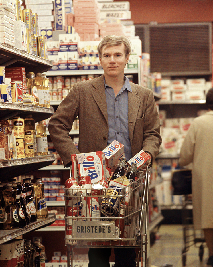
Andy shopping for products. *Bob Adelman, Andy Warhol at Gristede’s Market near 47th Street. New York City, 1965, near where he lived with his mother. Countless millions went shopping in American grocery stores in the 1960s. Very few made Art out of it before he did. Click any picture for full size.
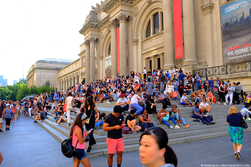
That being said, leaving the Whitney Museum’s Andy Warhol- From A to B and Back Again, the first Retrospective in NYC since MoMA’s in 1989, I was left believing Andy Warhol’s greatest creation was himself.
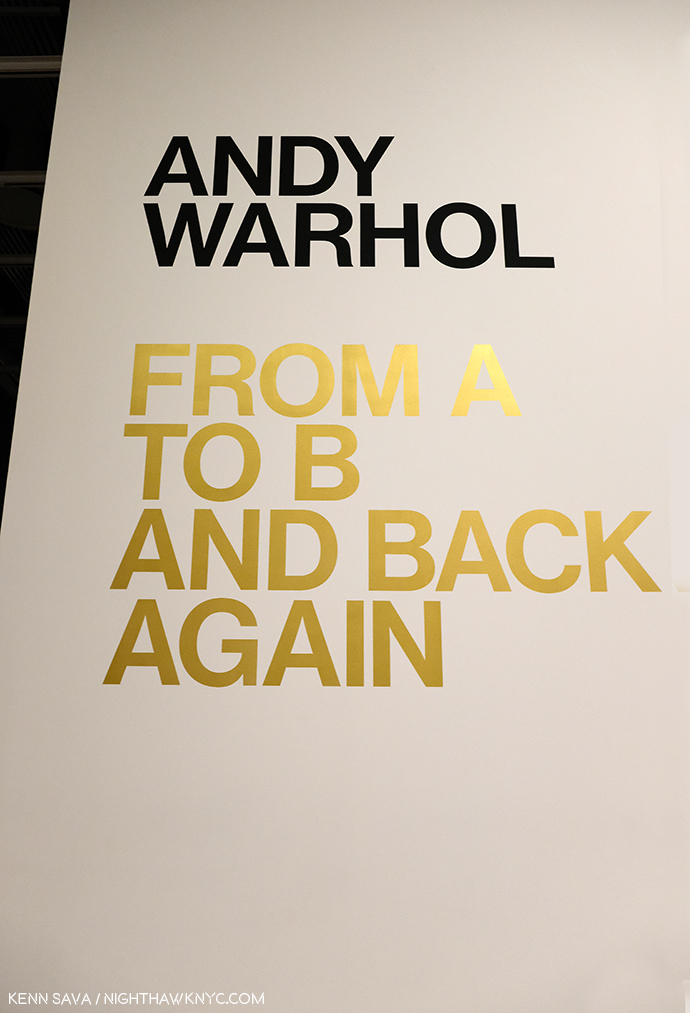
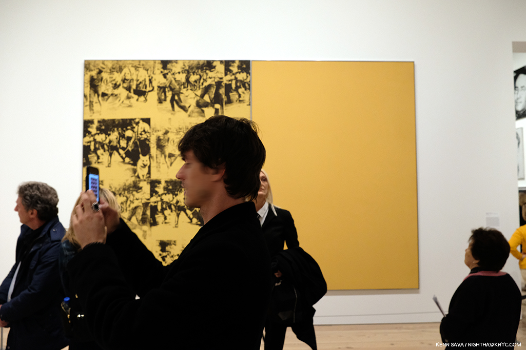
The use of gold here, and on the exhibition catalog’s cover, is interesting. It mimics Gold Marilyn, at MoMA, and also reminds of the background color of icons from the Eastern Orthodox and other churches. And? It’s a color often associated with money and “value,” so could it be a veiled reference to the high prices paid for his Art? Which of these is the intended meaning?
But, no matter how I feel about his Art, even I can’t deny that today, it can be said that we are living in his world to a greater extent than we realize. Look around you. His influence is everywhere. His innovations are now used by countless other Artists and businesses.
“A friend of mine named Ingrid from New Jersey came up with a new last name, just right for her new, loosely defined show-business career. She called herself ‘Ingrid Superstar.’ I’m positive Ingrid invented that word2.”
The everyday people he made into “superstars” presaged today’s television “reality stars.” His square portraits are now instantly recognizable as the Instagram standard. Andy Warhol came to define the Contemporary Artist working with a team of assistants at his Factory and his example is to be seen being followed by Artists all over the world today. How often do you see one of his color variated group of (4) portraits or flowers emulated by someone else? And on and on. These are only a few examples. Andy Warhol’s influence is incalculable. If it could be totaled, it might well rival that of Steve Jobs among THE most influential people of the past 75 years on our lives today.
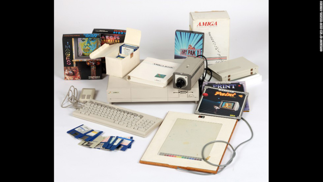
Commodore Amiga computer equipment used by Andy Warhol in 1985-86. Andy’s interesting computer Art was extracted from this machine by a team led by the Andy Warhol Museum in 2014! *Photo by The Andy Warhol Museum.
But, it was Andy Warhol, not Steve, who said, “A computer would be a very qualified boss3” decades before the time when many people’s lives seem to be run by their devices. A-hem. Sometimes I wonder if the internet is nothing but a cyber projection of Andy Warhol’s brain.
Artistically, I respect him as an Artist who was continually innovative in so many mediums during his surprisingly short career. Yes, short. It feels like he was around forever, but he was just 58 when he passed away on February 22, 1987. This insatiable creativity now strikes me as a function of his innate ability to see the world in his own way, which led him, continually, in different directions, to try new things, and explore new ways of doing old things.
It seems to me, however, that THIS may be the peak moment of Andy Warhol’s influence- the influence of Warhol, the Artist and his Art.
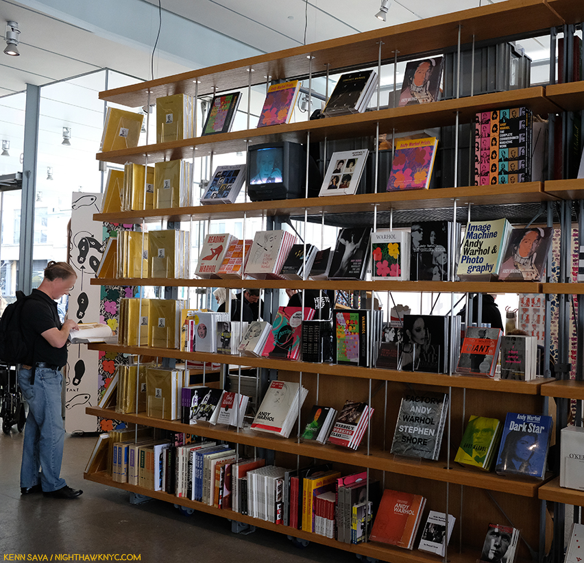
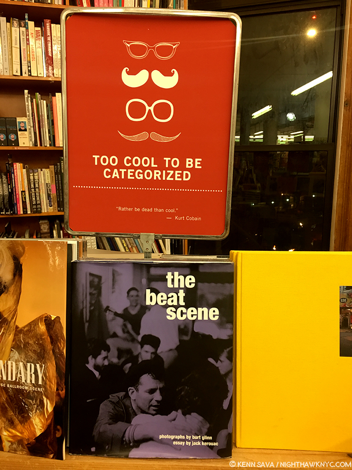
Warhol books, and ONLY Warhol books, seen in the Whitney Shop, March 27, 2019.
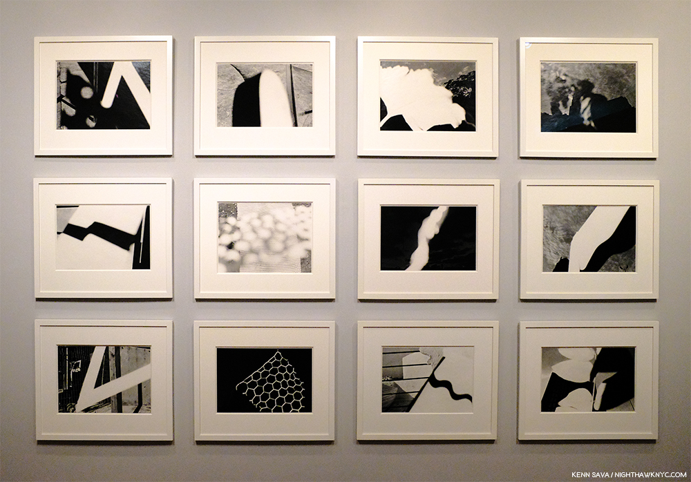
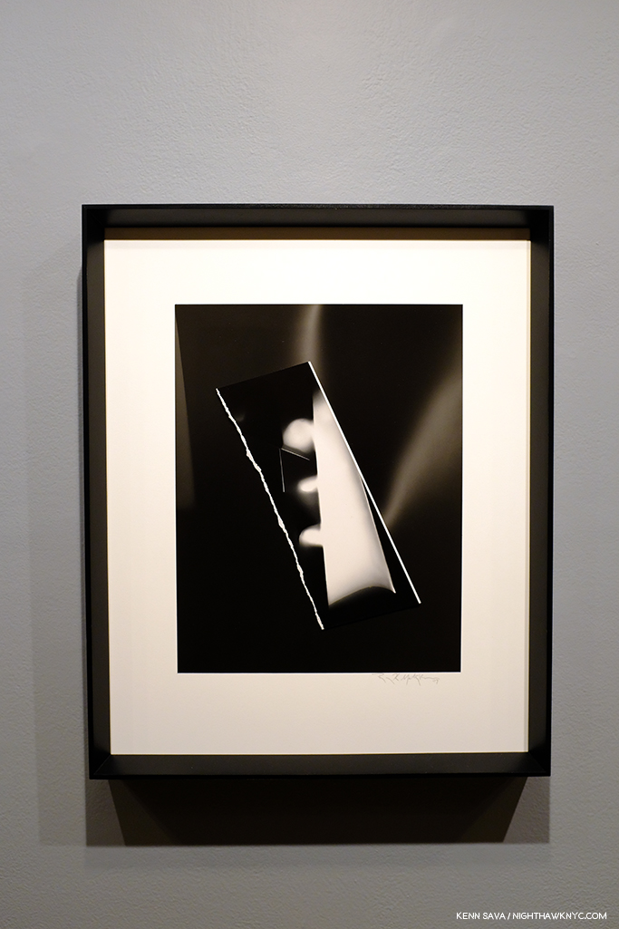
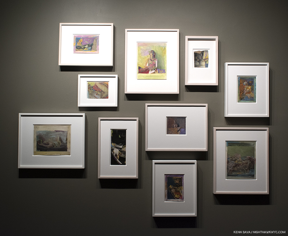
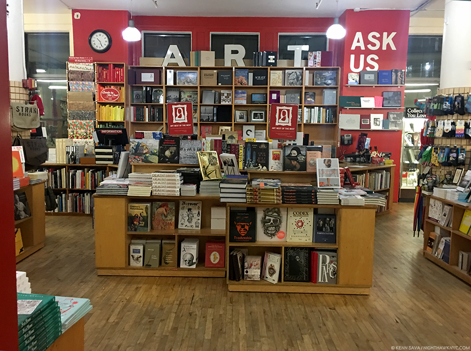
I wonder if the level of his fame may, in fact, work against its longevity from here. Virtually everything he did has been shown, written about, analyzed and assimilated. If you don’t think that’s true, take a look at this picture I took of part of the book shelves in the Whitney Museum’s Shop during the run on Andy Warhol- From A to B. I used a 28mm lens and even though I stood more than 20 feet away, backing into the middle of the admissions cue, I still wasn’t able to get ALL the Andy Warhol books on sale in the shot. There are books on his pre-Pop work, his newspaper-like work, his portraits, his posters, his prints, his record covers, his career as a publisher, his films, books on the Factory (including one of Photos taken by a teenaged Stephen Shore), a few about his Photography and polaroids, including a collection of Photos of him in drag, AND a multi-volume Catalogue Raisonne of his Paintings (on the far left of the bottom shelf). Oh, and Andy Warhol: Knives. ? This is not to mention all the books, by the Artist, and others, about his life, including the infamous, The Philosophy of Andy Warhol (From A to B and Back Again), published in 1977, which seems to have inspired the name of this show. My copy, bought from the display, is the 46th printing of the paperback. In all my many years of looking at Art books, I have to say the only other Artist who has as many books written about him and his Art is Picasso.
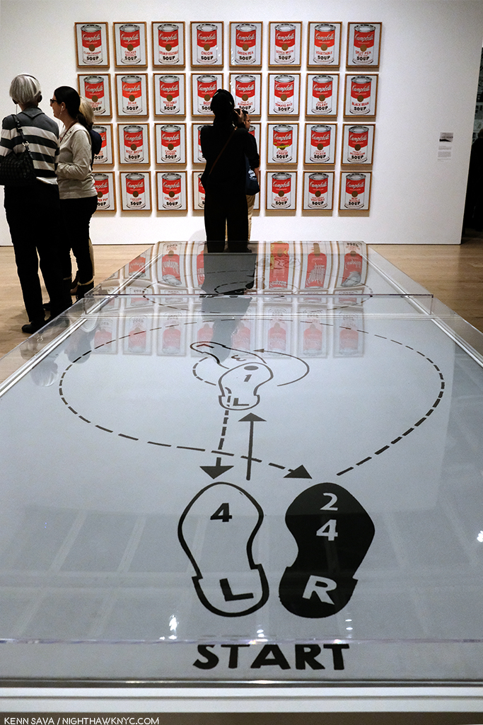
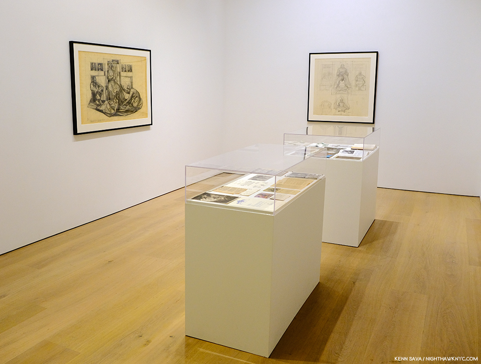
Start here. In the first gallery, which contains early Pop work, like Dance Steps, 1961, and a wall of Campbell’s Soup Cans in the back.
As I headed to the 5th floor for the main part of the show, I wondered- What’s left for the future to learn about Andy Warhol’s Art? Given his popularity, I’m sure people will find things for yet more books.
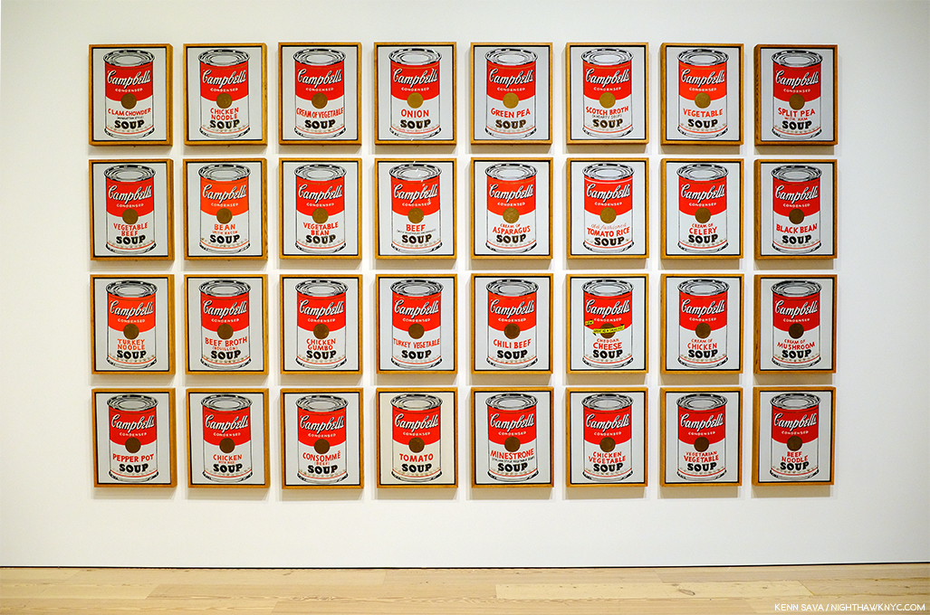
Andy’s mother fixed him Campbell’s Soup everyday for lunch, including after he became famous, until she passed. The family was poor. Beyond the comfort of the warmth of soup, having a lot of food around represents something of an ideal, a dream, even cheap food, like this soup was at the time, at 15 cents a can. Originally, these Paintings sold for $100 a piece at his first show at Ferus Gallery in LA, where Dennis Hopper bought one.
As I looked at his Art, it also raised questions. Questions that the passage of time has only intensified.
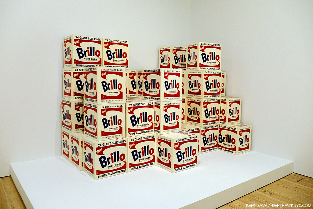
Brillo Boxes, 1969 (version of the 1964 original). Yes, a copy of a copy. The interesting thing about this work for me is that this “Art is everywhere around us” work of so-called “Pop Art,” which helped to mark the end of Abstract Art’s hold on the Art world, is based on the Brillo Box design of James Harvey, a moonlighting Abstract Expressionist Painter! Beyond that, and wondering if Sol LeWitt was influenced by it, it’s lost on me.
First, and most importantly, Andy Warhol’s Art is accessible. This has been the most important factor in his achieving success and fame and it may be the most important factor in the longevity of both. Popularity doesn’t necessarily equate with quality. Since the future is unwritten, as Joe Strummer reminded us, it’s impossible to know what posterity will value, if anything. To this point quality has definitely been a factor. I wonder- Where does that leave Andy Warhol’s Art?
Arising at a time (the late 1950s) when the Art world had been fed a steady diet of extreme abstraction by the Abstract Expressionists, Andy Warhol’s Art burst on the world with images featuring things, yes, things, that everyone living in the country recognized. Brillo boxes, Campbell’sl soup cans, dollar bills. His work was instantly accessible in an Art world dominated by Art that was becoming more and more obtuse and remote. I’m not saying Andy Warhol’s work was “understandable,” or even “more understandable” than that of the Abstractionists, only relatable. Even in today’s world where fewer and fewer living beings remember S&H Green Stamps, walking through this show, this seems to still be the case.
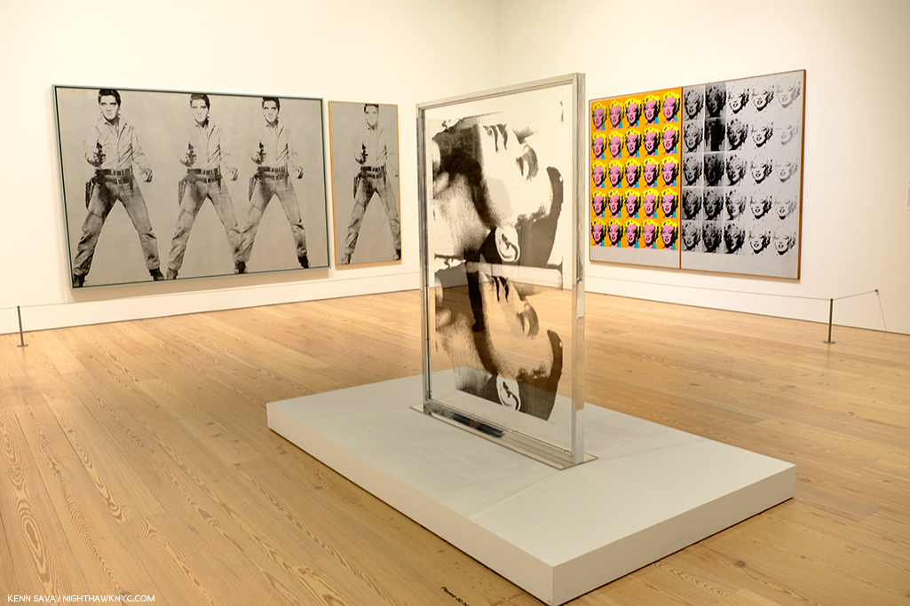
Marilyn & Elvis. Andy Warhol was always drawn to stars, and beautiful men. Personally, and in his Art.
But, the world has changed in the, now, 60 years since Andy Warhol’s career first took off. A lot of Artists have grown up with what he did and it’s become part of their work, even if it’s only unconsciously.
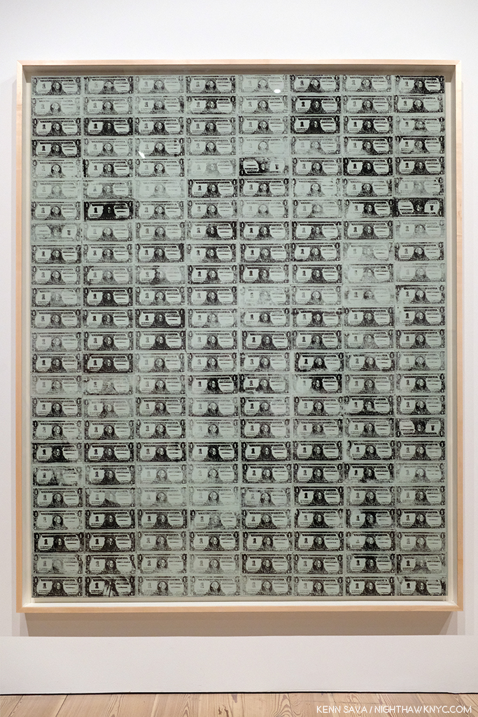
129 Dollar Bills, 1962, among the very first uses of silkscreening in Modern & Contemporary Art.
How many Artists have created with silkscreens since Andy Warhol introduced the possibilities of the ancient technique to the modern world in 1962? Even one of the other innovators and endlessly creative pillars of American Art in the late 1950s and 1960s (and after), Robert Rauschenberg, picked up the technique from Warhol. Since, silkscreening went from creating edgy Art to being used to create the large majority of the world’s T-Shirts, among countless other uses.
“I had by that time decided that ‘business’ was the best art. Business art is the step that comes after Art. I started as a commercial artist, and I want to finish as a business artist. After I did the thing called ‘art’ or whatever it’s called, I went into business art. I wanted to be an Art Businessman or a Business Artist. Being good in business is the most fascinating kind of art. During the hippie era people put down the idea of business—they’d say, ‘Money is bad,’ and ‘Working is bad,’ but making money is art and working is art and good business is the best art,” Andy Warhol. (Note- Not to be confused with my capitalization, caps and lowercase usage are Warhol’s own, reproduced exactly as the quote appears in TPoAW P.92.)
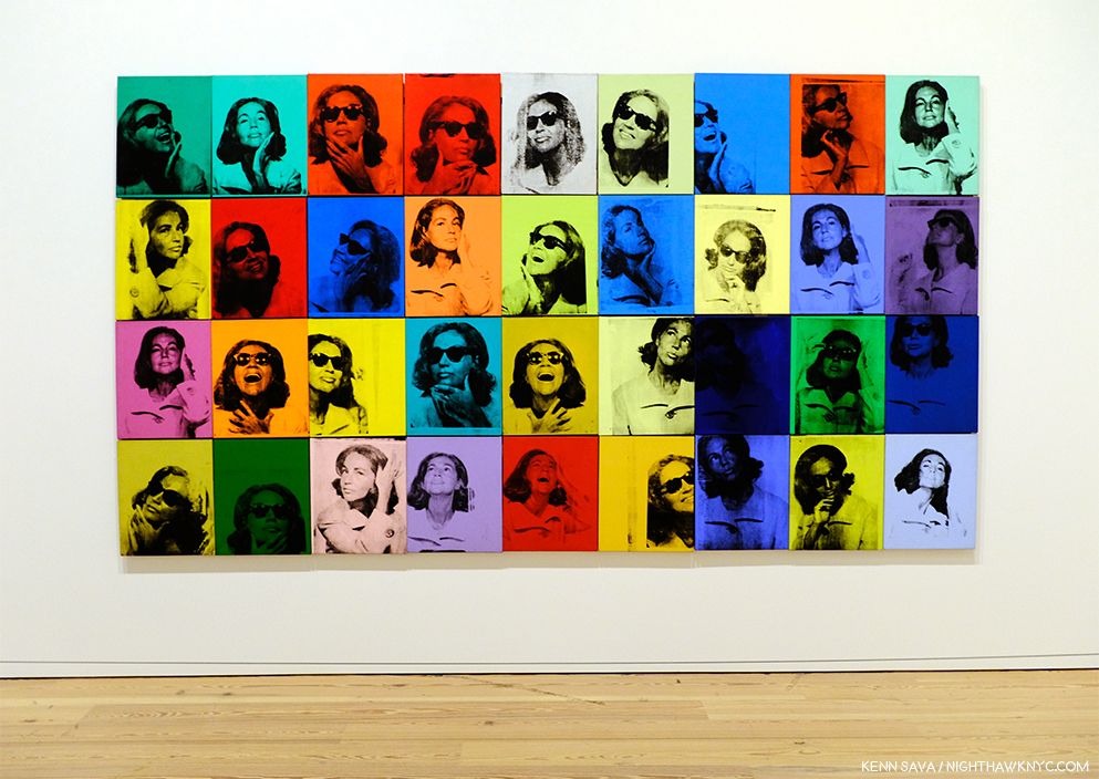
Ethel Scull 36 Times, 1963, jointly owned by The Whitney & The Met, was the first work commissioned from Andy Warhol. It’s a work that, in my view, has outlived its cachet as “Art,” and one that I don’t think posterity will look kindly upon.
Looking at the show, a takeaway for me was the distinct feeling I got was that there was his work, and then there is the work he did on commission (i.e. “Business Art,” a term he mentions in The Philosophy of, quoted above, but doesn’t define). After a while, I thought I could tell even before reading the card or researching the work, which was which- which were the work he did “for himself,” which were the works he did on commission, and I came away feeling there is a world of difference between the two. Wait! There’s a subject for a book I don’t think anyone’s written yet! For Andy Warhol, the business of Art was an Art in itself. Few before (maybe Rembrandt, Picasso and Dali in their ways) understood this and used it, but no one before him mastered it to the degree that Andy Warhol did. Its testament to how well he did it that a good many of his commissions, which detract from his other work when seen along side them as Ethel Scull 36 Times does in my opinion, hang in museums around the world, at least for now.
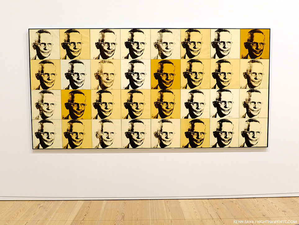
The American Man (Portrait of Watson Powell), 1964, a pseudo-companion piece to the Ethel Scull piece, above, and another commission, has aged better and still manages to speak to 2019 viewers.
To be fair, looking at some of his commissions now, we might well see in them a “commentary” by the Artist on matters beyond the mere representation of a given subject. The American Man, 1964, commissioned after seeing Warhol’s Ethel Scull piece, struck me that way. I’m still looking for that in a good many others, though.
After a couple visits, I was able to choose a few works in the great guessing game I like to play, and encourage everyone else to play- “Which works will be considered Art in the future- if any?” I came up with eight including the Campbell’s Soupcans and the 129 Dollar Bills already shown. 8 out of the 350 works the Museum says were on view. Personally, I don’t believe the passage of the centuries is going to be kind to most of Andy Warhol’s Art. Part of the reason for that is his pervasive influence. History doesn’t often look back favorably on who was first, particularly in Art. (Quick- Who “invented” oil painting? When I was growing up, I believed what Vasari wrote in The Lives of the Most Excellent Artists, 1550, that it was the great van Eyck brothers, Jan and Hubert, who happened to be my first favorite Artists.) More recently there is no consensus and evidence of oil paint may have been found going back to 650AD.) Given the overheated state of his prices (still, in spite of a recent leveling off), his Art is definitely not where I’d put my money now. That ship has sailed. NOTHING goes up forever! Look elsewhere in 2019. (See my Post On Buying Art for additional considerations, all of which apply to the Art of Andy Warhol.)
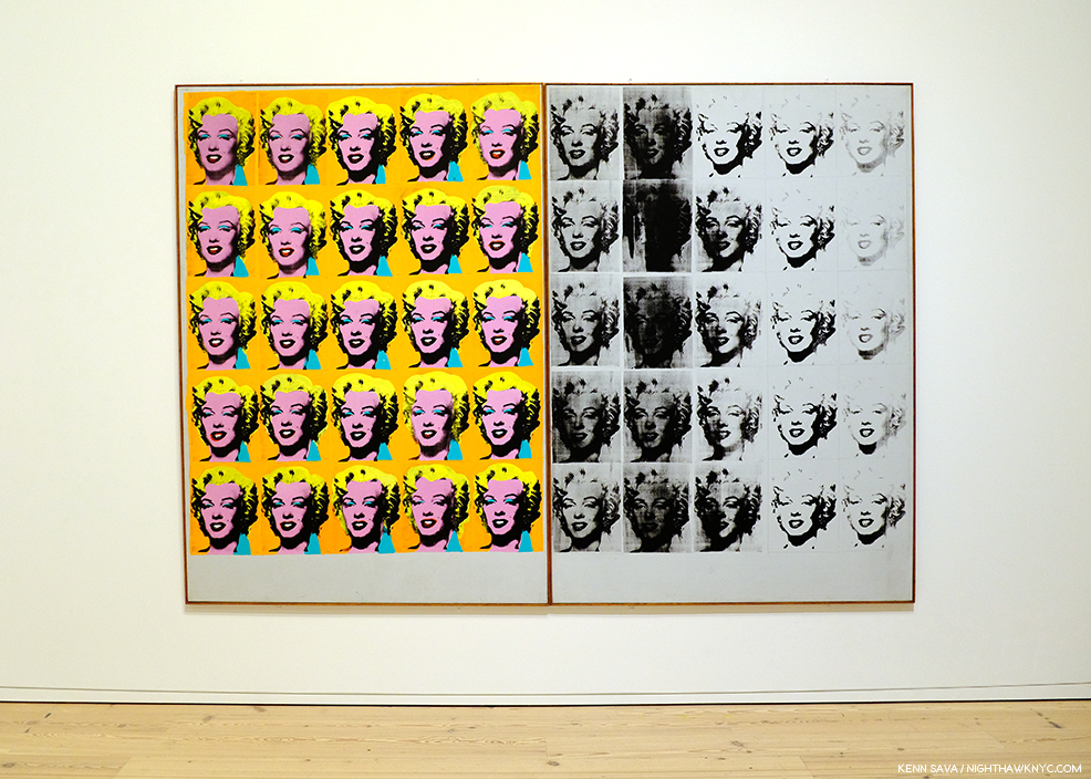
Marilyn Diptych, 1962
Let’s look at numbers 3 to 7 on my list for the ages (in no particular order). Next, Marilyn Diptych, 1962 – The duality of this work painted shortly after Marilyn Monroe’s suicide is revolutionary. On the one hand, Warhol shows Marilyn the idealized, beautiful, glamorous movie star, repeated radiantly in a sea of gold not unlike that of the religious icons of the Eastern Orthodox and other churches. On the right hand, the work seems to reference the darker side of both Marilyn’s life and death. This work is striking when one also considers that Andy was someone who sought autographs of movie stars as a child. Here, all the illusions of the silver screen are gone.
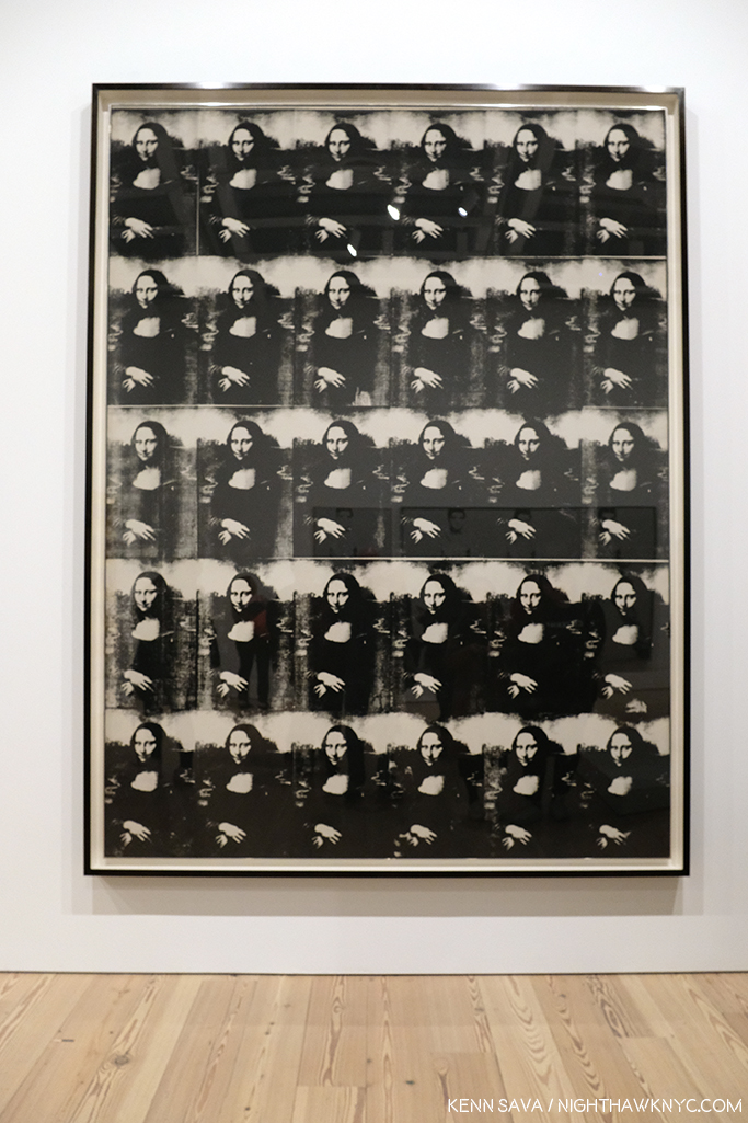
Thirty Are Better Than One, 1963
Thirty Are Better Than One, 1963, The multiple Mona Lisa as a commentary on the original’s visit to the USA at the time present an interesting counterpoint to the da Vinci- even in black & white. This one barely made my list, but given the precedent of other Artist’s commenting on or reinterpreting the Mona Lisa, like Duchamp, I think it will be of interest indefinitely.
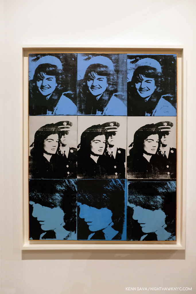
Nine Jackies, 1964
Nine Jackies, 1964. Something revolutionary in portraiture, the Artist captures the beauty of the Kennedy “Camelot,” and the horror and disbelief of what took place on November 22, 1963, as I remember it. A work that relies on the power of the Photograph, it’s one of the strongest uses of it in a medium outside of its own.
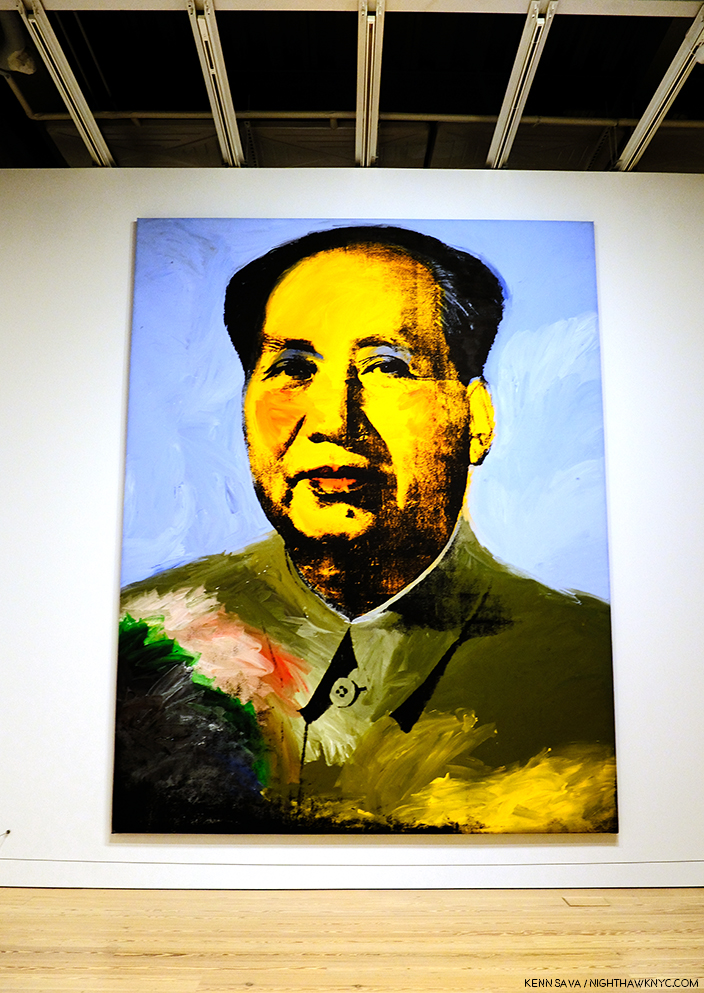
Mao, 1972
Mao, 1972- Created during the year of Nixon’s breakthrough visit to China, Andy Warhol’s image takes the portrait of Mao from the infamous Little Red Book of sayings and statements by the Chairman, which may have been the most reproduced image in the world at the time. Here, over 14 feet high, it symbolizes the Charman’s looming over all things in China, a different kind of manifestation of fame. Andy would make a brief trip, himself, to China in 1982, where he posed for a few pictures looking very stiff and uncomfortable.
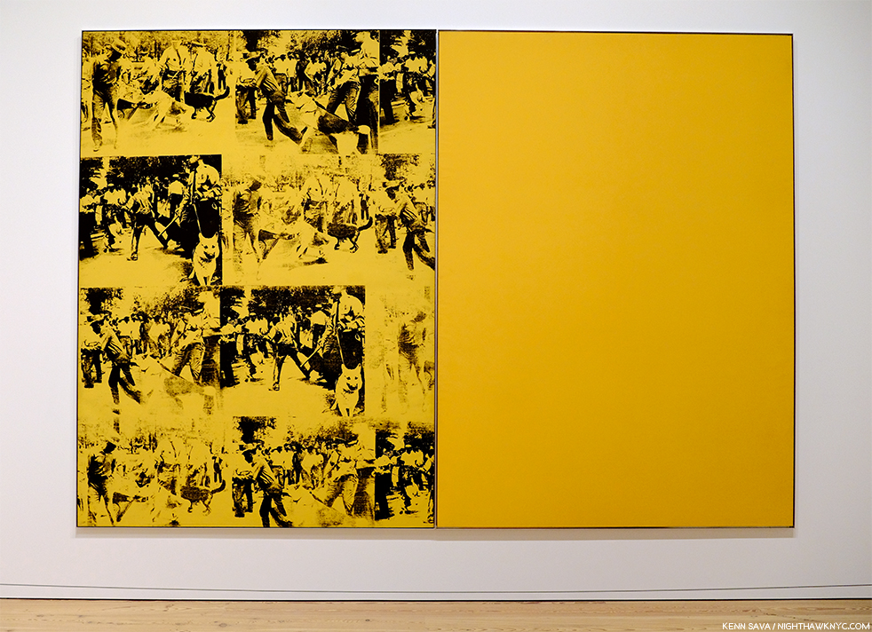
Mustard Race Riot, 1963.
Mustard Race Riot, 1963- Without a doubt, the most powerful work in the show, in my opinion, it sold for only $15,127,500.00 in 2004. “Only,” when you consider the current record price for a Warhol is $100 million (Eight Elvises), and when you consider another Warhol Race Riot, one that had been owned by Sam Wagstaff and Robert Mapplethorpe, sold for almost $63 million in 2014. As Artist Hank Willis Thomas, and others, have pointed out, this work looks as prescient as almost anything else in the show. Standing in front of it (which means standing a ways distant since it’s 114 by 82 inches), pondering it over multiple visits, I came away feeling that it may be one of the most important works of the 1960s, and for 1963, certainly gave those putting Andy Warhol in the “Pop Art” box pause for thought, pointing out yet again the pointlessness of such terms.
Then? Something occurred to me to sleep top me dead in my tracks. ALL FIVE of these works involve the use of appropriated Photographs taken by others. Did Andy Warhol pay the Photographers for using them?
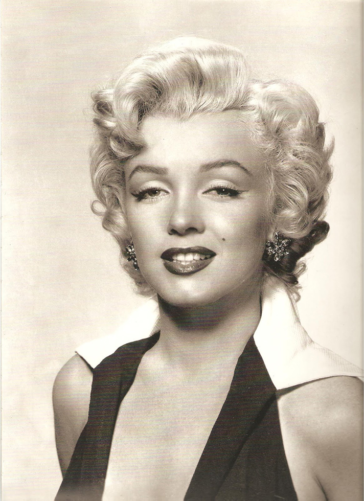
Gene Kornman, Photograph (Marilyn Monroe ), 1953. *Publicity Photo of Marilyn Monroe for the Film, Niagara.
This subject was not brought up anywhere that I saw in the show. They did mention (and exhibit) the Gene Kornman Photo Andy Warhol used, perhaps more than any other, was originally a publicity shot of Marilyn from her classic 1953 Film, Niagara. Also exhibited were the source Photos he used in Nine Jackies, which I subsequently learned Andy Warhol was sued over his use of. Charles Moore’s 1963 Life Magazine Photos were the source for Warhol’s Race Riot works, including Mustard Race Riot. Frankly? For an Artist who was so endlessly creative? That he did this, and did it for so long and so often surprises me. It took lawsuits for Andy and Robert Rauschenberg, who was also doing it, to decide to exclusively use their own Photographs henceforth, which, I think, improved the results for both. Yes, at the time, this was new territory for Artists. Copyright infringement was not a term that was not as common in Art in the late 1950s and early 1960s, and he had made his name using copyrighted names and trademarks for Campbell’s Soup, Brillo, etc., without issue- the companies involved, no doubt, relished the free advertising and attention, so giving his restless creativity the benefit of the doubt might apply here, I think (easy for me to say, I’m not Gene Kornman, who’s Photo of Marilyn wound up in Art that’s, no doubt, worth hundreds of millions of dollars, if not more, today).
I still think these are powerful works, among the best Warhols I’ve seen, but this does tarnish them a bit. It’s hard to ignore today. But, let’s move on.
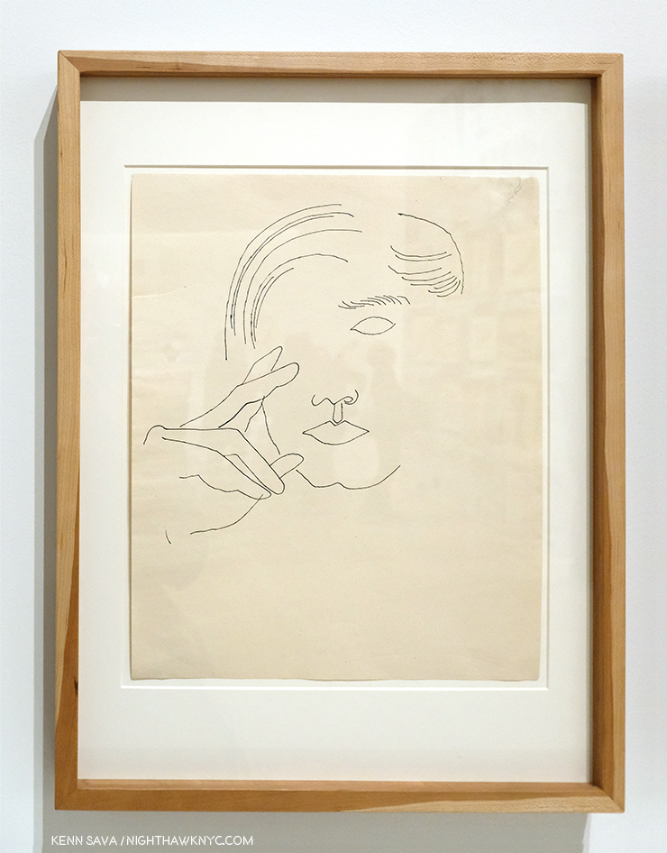
Self-Portrait, 1950s
I’m always interested to see any Artist’s Drawings, and I made a point of spending a considerable amount of time with the Drawings, mostly early, of Andy Warhol displayed here. It’s interesting that they reveal a wonderful sense of, and control of, line, which I’ve long thought to be the most technically difficult part of Drawing. So confident is the young Artist in his line that he dispenses with almost everything else- even parts of the composition! Shading is only hinted at once in a while. Throughout, it’s his line that carries the work. This style is reminiscent of one Picasso used in the early 1900s to create works like this. In addition, he shows an economy that makes it fascinating to consider what he’s left out, a uniqe way of using what Artists call “negative space.” This Drawing is markedly different from the “scratchy” drawings with halting lines seen in some of his commercial work of the period. He changed his style to fit the subject, and it always worked. He was a very successful illustrator and store window designer. But? Shoes and shoe design held a special place in his heart.
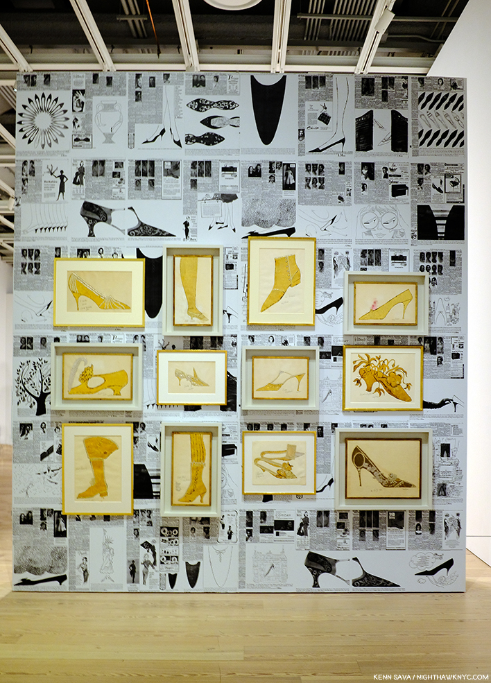
A wall of shoes. In each of the works in gold, Andy created a shoe as a caricature of a person.
It turns out that Andy Warhol had a shoe fetish. A real one, that surpasses the most shoe obsessed of my female friends, which John Giorno describes in graphic detail in the Documentary Andy Warhol: The Complete Picture! At 24:30, Mr. Giorno says, “There was Andy Warhol on his hands and knees kissing my shoes…”
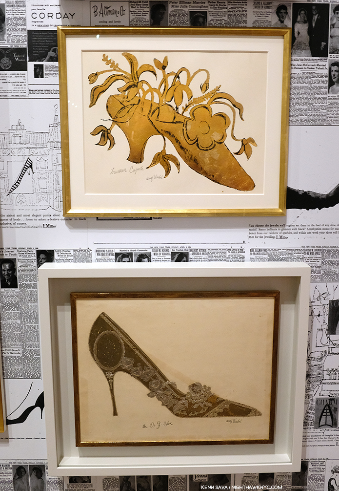
Andy’s Truman Capote Shoe, with calligraphy by his mom, is seen over his The B.J. Shoe. Given his shoe obsession, it’s interesting that there are no works after this period that feature shoes, as far as I know. Also interesting is that Andy, himself, wore the same pair of paint splattered shoes for 25 years, which are also shown in The Complete Picture.
Even in the midst of his intensive period of Drawing for his commercial illustration clients, he was always looking for ways to create multiples of his Drawings. This led to his use of silkscreens. But yes, he Painted. This early Painting is the one work in included that would meet the definition of a Painting for most of Art History- prior to Warhol.
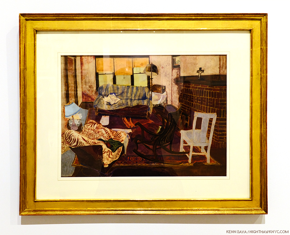
The charming Living Room, 1948.
From there, his Painting skills were used to modify and enhance works in other medium, like silkscreens, in works that were multi-media Paintings.
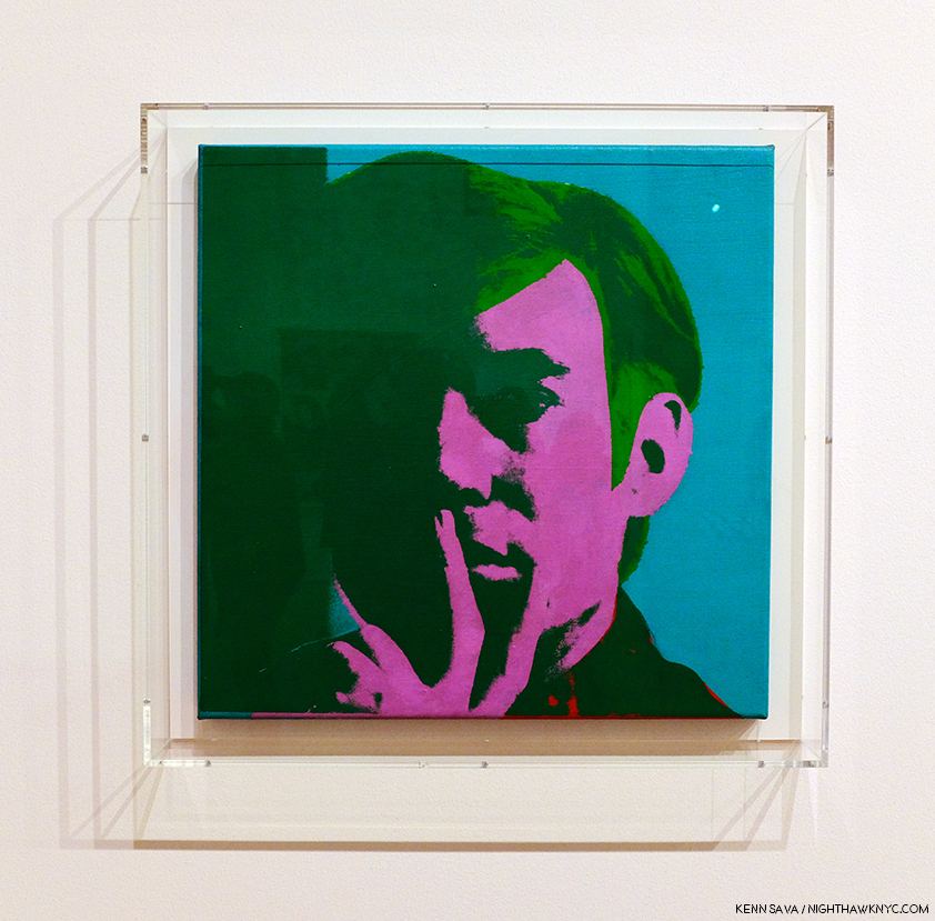
Self-Portrait, 1966, Acrylic, silkscreen ink, and graphite on linen.
It seemed to me walking through the show that Warhol’s Self-Portraits are stronger than just about any of his other portraits. Downstairs on the first floor, an entire gallery was devoted to his square portraits, which alternated between the famous and the already forgotten with a fascinating portrait of his mom almost hidden among them.
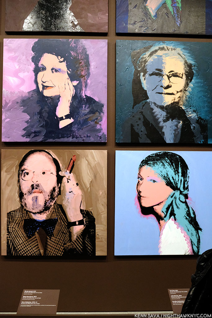
Julia Warhola, 1974, upper right, a year or so after she passed away in 1972. Interestingly, it’s in the collection of Roy Lichtenstein, and that’s Dorothy Lichtenstein, Roy’s wife, below her. To her left is Met Curator Henry Geldzhaler, who was also painted by David Hockney.
Along with fame, Andy Warhol’s other big theme was death. It’s a subject that makes an appearance early on in his Fine Art career, in works like 129 Die in Jet, 1962
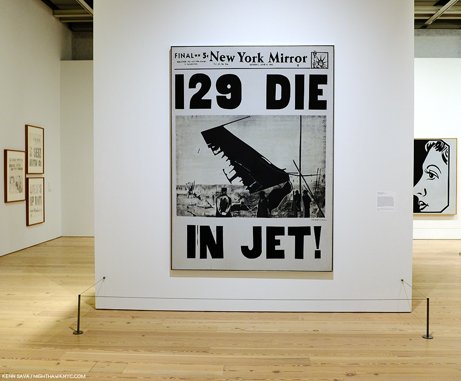
129 Die in Jet, 1962
It carries on in his Electric Chair Paintings, and is an element in his Marilyn and Jackie pieces, both created shortly after deaths- Marilyn’s and JFK’s. The hold death has on visitors struck me on one visit while I was considering Mustard Race Riot. Given its large size, I had to stand a good distance away from it to take it all in.
I couldn’t help noticing a steady stream of visitors who entered the gallery and stood in front of me, facing to my left. They were looking at this-
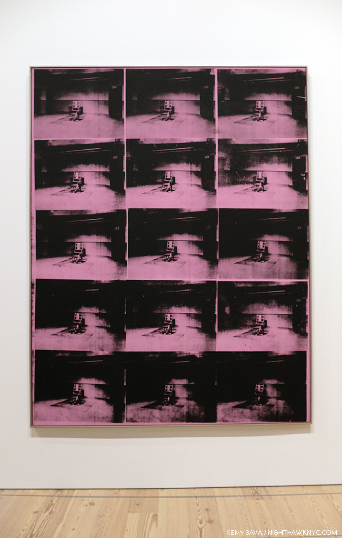
Lavender Disaster, 1963.
I heard someone say, it takes away the power of the electric chair as an image of fear. I don’t get that. I, for one, don’t get the point of multiplying the electric chair. I prefer these, individually-
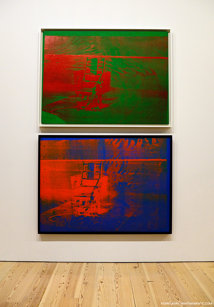
Both, Big Electric Chair, 1967-8, top, 1967, bottom.
And, of course, there were the car wrecks, also featuring repeated Photos, which led into the next gallery, where the equally death-soaked Nine Jackies awaited, facing a wall of Most Wanted Men, 1964, Andy Warhol’s works based on wanted posters that hung at the New York Pavillion at the 1964 World’s Fair, and works from Flash-November 22, 1963, also about the JFK Assassination. But, of all the works related to death in this show, the eighth and final work on my “Art” list is Self-Portrait with Skull, 1978, in which the Artist brings his obsession with death home.
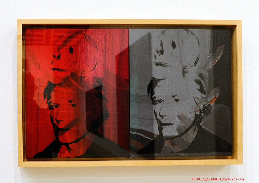
Self-Portrait with Skull, 1978
On the left, the red is hard to miss as the color of blood, and therefore, of life, while the grey/black image on the right recalls those in the Marilyn Diptych, which speaks to her demise and death. This work is based on one of Warhol’s own Photographs.
Andy Warhol- From A to B and Back Again was a good, but not a landmark show, in my opinion. In NYC, MoMA’s Warhol: A Retrospective remains the benchmark Warhol show. Part of the reason it’s not better is possibly due to the popularity and value of his work making loans very hard to get. After the silkscreen gallery with Mustard Race Riot, I felt the rest of the show continually declined, with isolated examples of better work. In much of the rest of it, I felt lost, adrift in galleries of work that either hadn’t held up to the passage of time (if they ever did stand out) or that contained ideas manifested on a gigantic scale, like the “piss paintings,” that were probably either left in the studio or done on a smaller scale. At this late date in his life and career, to suddenly go fully abstract smacked of running out of ideas, which is something that seems impossible for Andy Warhol.
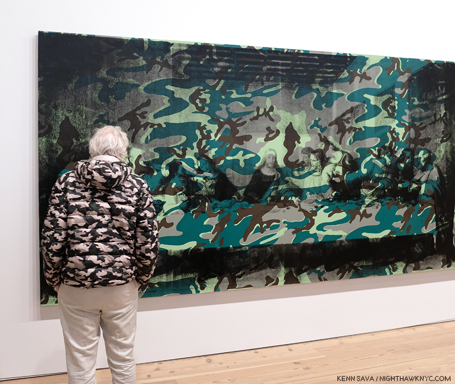
A camouflaged visitor scrutizies the left half of Camouflage Last Supper.
The culminating gallery with the also gigantic Camouflage Last Supper also struck me as a poor choice. Here, Warhol reprises the idea of the multiple Leonardo da Vinci’s, this time with 2 huge Last Supper reproductions side by side, which makes a point that escapes me, and then covers them with camouflage, perhaps to try and add some interest to his idea. Camouflage is, in keeping with Andy Warhol’s instantly recognizable images, a military artifact and symbol. What that has to do with the Last Supper is, also, lost on me.
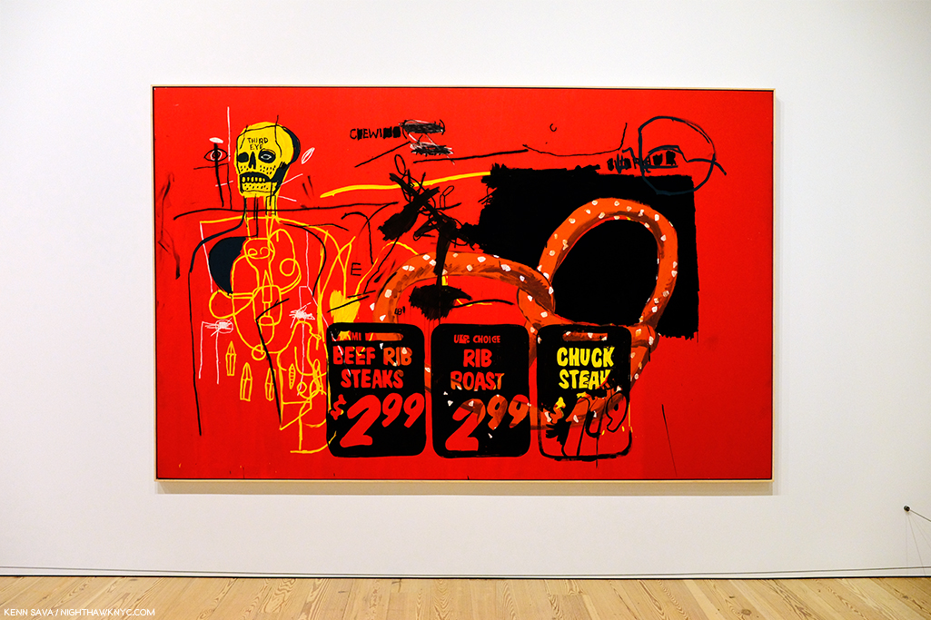
Andy famously collaborated with Jean Michel Basquiat, as seen here in Third Eye, 1985.
And then there were two of his collaborations with Jean Michel Basquiat. Though extremely colorful, looking at them I have as yet to see them as more than each bringing what they do to the work. The feeling of a true collaboration bringing the work to someplace else escapes me…so far, but I know people who love them.
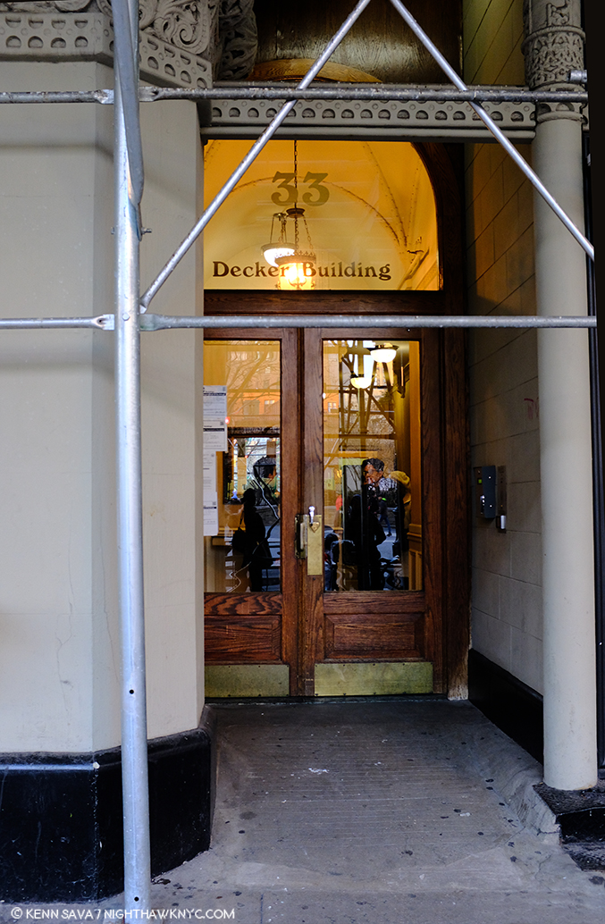
If these walls could talk. The site of Andy Warhol’s Factory when it was on Union Square, seen in Winter, 2018. Ironically, the scaffolding seems to be making an “A” for Andy.
Andy Warhol opened the doors to whole worlds of possibilities in the world of Art, and, indeed, the world. In doing so, he taught all of us how to see new possibilities in our work, and our lives. (And I am not speaking about his life or lifestyle in any of this.) There are very few Artists who even open one new door. For this, the world owes him a debt. A debt that might be best repaid by following his example of seeking new possibilities. He sought out, encouraged, and worked with, young, even beginning Artists, and so played a role in the creation of world renowned Artists including Stephen Shore, Robert Mapplethorpe, and Jean Michel Basquiat, and treated them every bit the same as he did established Artists.
Regardless of what the world comes to think of his Art, these are the contributions of Andy Warhol I choose to remember and celebrate.
BookMarks-
As I showed earlier, a list of books written on and about Andy Warhol could fill a book itself. I have only seen a minuscule number of this vast library. Of those, a few stand out to me, particularly for those looking to keep from having a wall of Andy Warhol books that rivals that in the Whitney’s Shop!
The best overviews of his Art I’ve seen are these two-
Andy Warhol “Giant” Size: Gift Format has been issued in a few sizes
over the years since it’s first release 10 years ago. Whatever size works for you, this “visual biography,”which includes over 2,000 images, remains the best one-volume survey of Andy Warhol’s Life & Work.
Andy Warhol: A Retrospective– The catalog for MoMA’s 1989 Retrospective. Out of print, it’s reasonably priced in hard or softcover on the aftermarket. It remains the most comprehensive overview of his Art, and serves as the catalog for the most exhaustive show of his work yet mounted.
Factory: Andy Warhol by Stephen Shore is a fascinating book for Photography lovers. It preserves, both, the earliest body of work yet published by one of the most important American Photographers of his generation, and the most comprehensive look at Andy Warhol’s legendary Factory we have. Wasn’t it Andy who said, “It’s like an auto wreck you can’t take your eyes off of”? If not, he should have.
Finally, The Philosophy of Andy Warhol (From A to B and Back Again) is a must read, as much for its entertainment value as for its life experience advice, which is given on almost every page, though it’s light on Art and technique for Artists looking for a “how I did it.” Rumor has it a team “helped” Andy write it, but it’s hard to tell from the distant outside if that’s true or who did what. It’s something of a classic among pseudo-autobiographies, and plays a seminal role in the creation of Andy Warhol, as a work of Art in himself.
*- Soundtrack for this Post is, what else? “Andy Warhol” by David Bowie, who memorably played Andy in Julian Schnabel’s Film, Basquiat, looking for all the world like he was having a blast doing it.
Oh! PS- Andy? 4,627 words.
NighthawkNYC.com has been entirely self-funded and ad-free for over 6 years, during which over 250 full length pieces have been published. If you’ve found it worthwhile, you can donate to keep it going & ad-free below. Thank you!
Written & photographed by Kenn Sava for nighthawknyc.com unless otherwise credited.
To send comments, thoughts, feedback or propositions click here.
Click the white box on the upper right for the archives or to search them.
For “short takes” and additional pictures, follow @nighthawk_nyc on Instagram.
Subscribe to be notified of new Posts below. Your information will be used for no other purpose.