Remembering 9/11

This site is Free & Ad-Free!

Written & Photographed by Kenn Sava

Preface- I lived in Manhattan through September 11, 2001 unscratched. I lost no one I personally knew in the attacks (as far as I know), but we all lost 2,713 irreplaceable New Yorkers. 20 years later, 9/11 remains one of the most unforgettable days in my life. My days in the World Trade Center area go back to before the construction of the Twin Towers. Then, the weeks after the attacks were equally gut-wrenching. In Remembrance of the victims on the 20th Anniversary of the 9/11 attacks I decided to share my experiences and the pictures I took of the World Trade Center before, on 9/11, and after, for the first time, not because I think they are anything outside of the ordinary, but because they are just that- the memories of one average person living in Manhattan on September 11th, 2001, of the World Trade Center, the attacks, and the weeks immediately after. 

Facing south, looking up at Tower 1 on the right, Tower 2 on the left over World Trade Center 6, the black shape, right, and a piece of World Trade Center 5, on the left. Vesey Street, June 20, 1998. Click any picture for full size.

1- Witness to Unspeakable Horror

September 11th, 2001 marked the first of the “life will never be the same” moments that have characterized the first century of the new millennium, the latest of which we are all still living, wherever we are. Wherever we were that September morning 20 years ago as this was happening here, in Washington DC, and in Shanksville, Pennsylvania, I doubt many of us had any idea what was really happening and how all of our lives would change.

I didn’t.

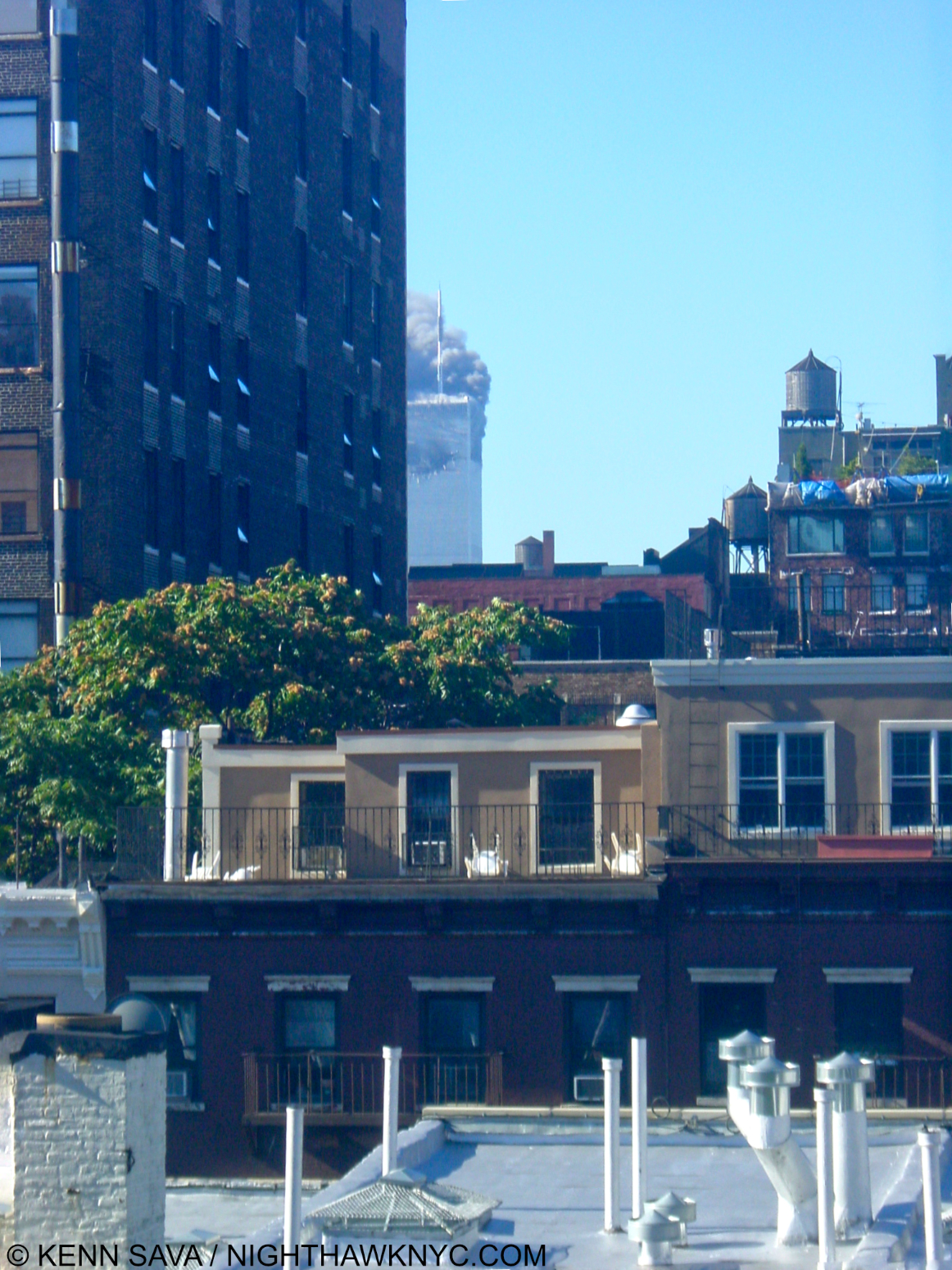
Just unimaginable. The view from my window shortly after 9:05am on 9/11/2001 showing the North Tower, 1 World Trade Center, on fire.

I woke that morning at 9:05am. I switched on NY1, the local news station to get the weather, as was my habit each morning. When the set came on, I saw a stunning image through my waking eyes. Smoke coming out of the top of the World Trade Center! What? HOW is that possible? They were saying “a small plane” had crashed into it. As we know now, at 8:46am, hijacked American Airlines Flight #11 had been purposely crashed in to the North Tower.

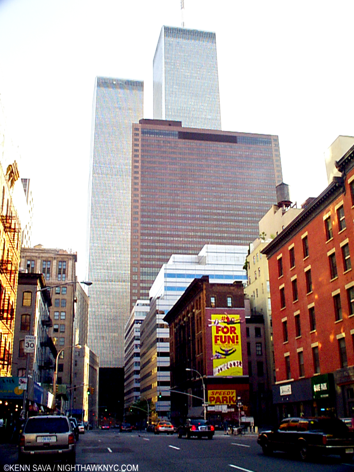
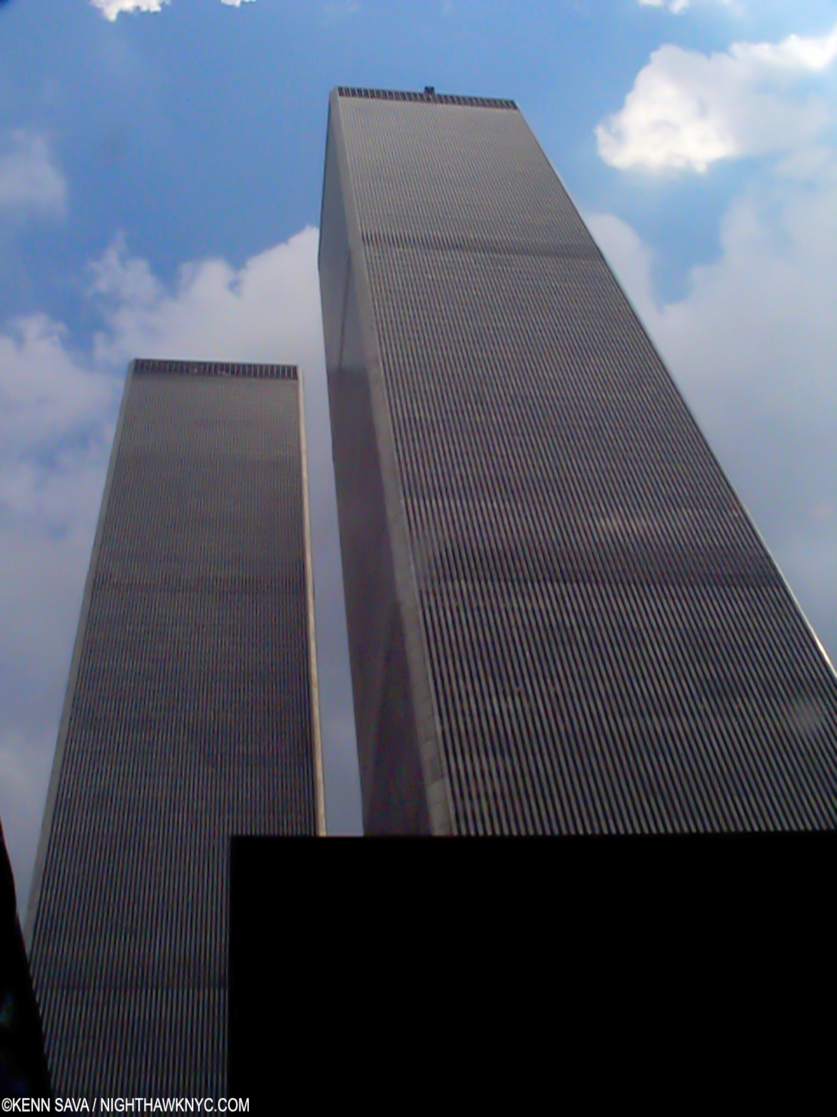
Dwarfing everything. The Twin Towers and 7 World Trade Center, the taller brown building in front of them, seen on June 20, 1998. I remember the neighborhood before the WTC, and the white College of Insurance in front of it, were built. It all looked like the rest of the buildings in the picture. For a look at the destruction of the area to build the WTC check out Danny Lyon’s PhotoBook The Destruction of Lower Manhattan.

A little over 8 months earlier I had been to the Windows On The World Restaurant at the top of Tower 1 (the North Tower, the first to be hit on 9/11, the Tower on fire in the picture earlier) for a company holiday party, the second time in 3 years the company had held it there. For those who never set foot inside either Tower of the World Trade Center, I’m sorry. You really can’t begin to imagine it. From a distance, the WTC is the highest thing in sight, visible in almost every picture of the NYC skyline. It was visible for almost an hour away on various roadways approaching Manhattan. As you moved closer and closer to it on the street, it’s height went from gigantic (above), to overwhelming (as in the first picture in this piece) to impossible, as in the following picture-

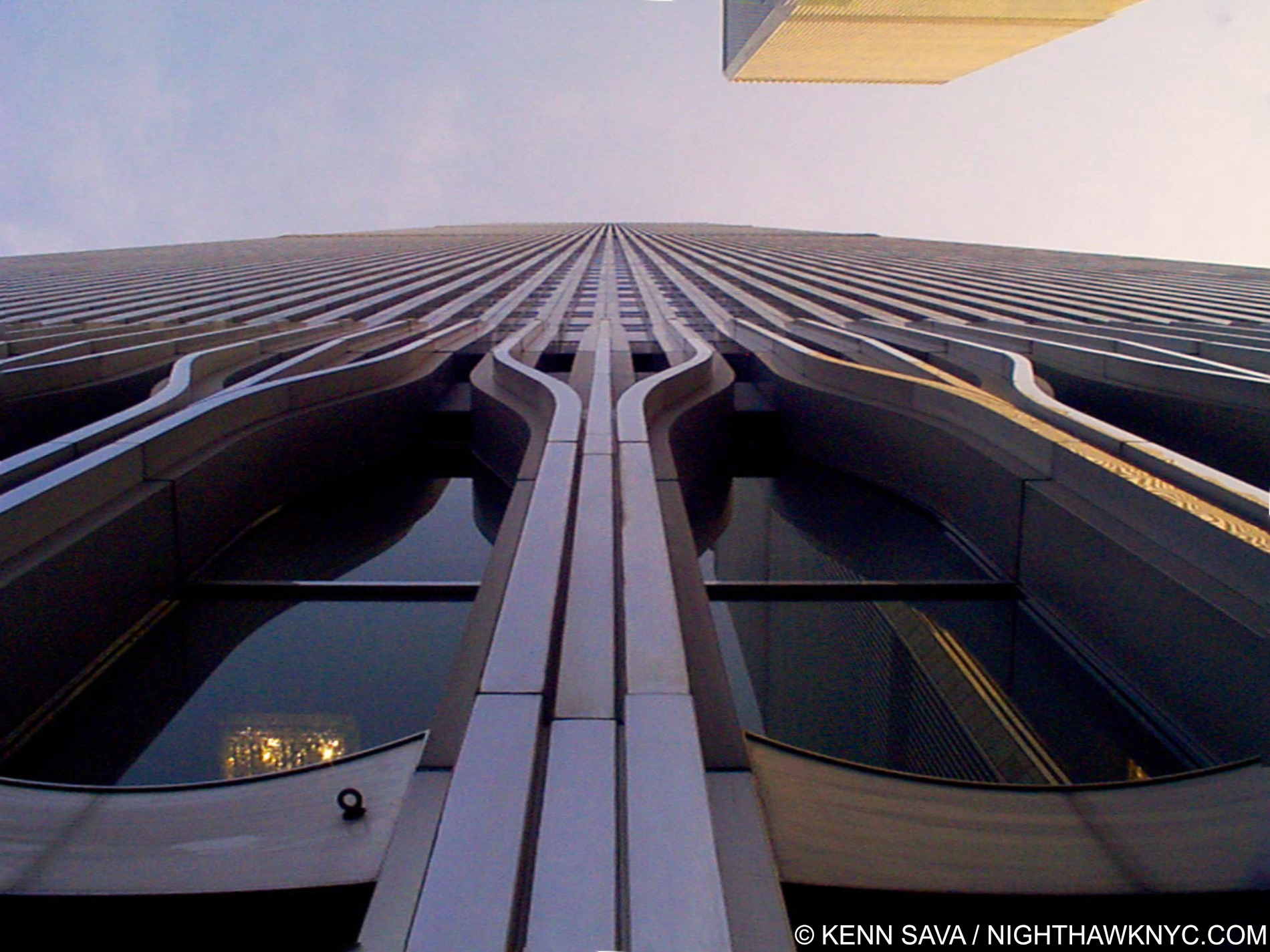
Standing at the base of World Trade Center Tower 2 with Tower 1 looming above on June 28, 1998. If I lowered my head, at eye level was a magnificent Tapestry by Joan Miro on display right beyond the girders in the lobby. Created in 1974 by the great Spanish Artist himself by hand for the building, it was also destroyed on 9/11.

Each building contained 110 stories! Looking up, you couldn’t see the top. As if 110 stories in each Tower, wasn’t enough, each floor was an acre in size. That fact still staggers me.

Riding up to the top was a special experience, even here, in the land of very tall buildings. With “local” and “express” elevators, it was a little like taking a vertical subway. When I got to Windows On The World, of course, I had to look down from those windows, though I’m deathly afraid of heights. I never made it to the roof, but this was close enough. Looking down, at night, was like being in an airplane and looking down on dots of light far below you. I really couldn’t make much else out. 

The World Trade Center and I went back a long way, to before there was a World Trade Center when it was “Radio Row.” My father had an office two blocks from the WTC for 45 years. He used to take me to work there on Saturdays and in the summer as a kid, which I absolutely hated. We used to park under the old West Side Highway at Vesey Street and I’d walk along the site of the WTC as the towers and the complex were being built after the area had been demolished to make way for it. I went to work, two blocks away, the day of Philippe Petit’s incredible walk between the two Towers on August 7, 1974. Over the years, I frequented the legendary J&R Music World on Park Row, one block east of the WTC, and I was there two and a half weeks before 9/11. I lived about a mile and a half from the Trade Center.

That morning, after seeing the smoke on TV, I opened my curtains and, sure enough, I could see from my windows the North Tower was on fire! After dressing, I walked out of my building heading east. As I got to 7th Avenue, I asked someone what happened. He said a plane had flown down 7th and crashed into the World Trade Center! So much happened that day, and the weeks after, that thought didn’t really hit me right away. Later, as I put the whole thing together, I got it-

The first plane (American Airlines Flight #11) on 9/11 had flown down my block!

People frozen in their steps in disbelief, unable to tear themselves away from the horror unfolding in front of them to the left on 6th Avenue around 9:30am on 9/11.

In the months that followed, somehow my sleeping mind grasped this thought my conscious mind had forgotten and concocted a nightmare in which the passengers of the first plane, Flight #11, realized in those final minutes what was going to happen, and jumped the hijackers (no doubt influenced by what really happened to Flight #93 in Pennsylvania) causing it to crash early- into my building!

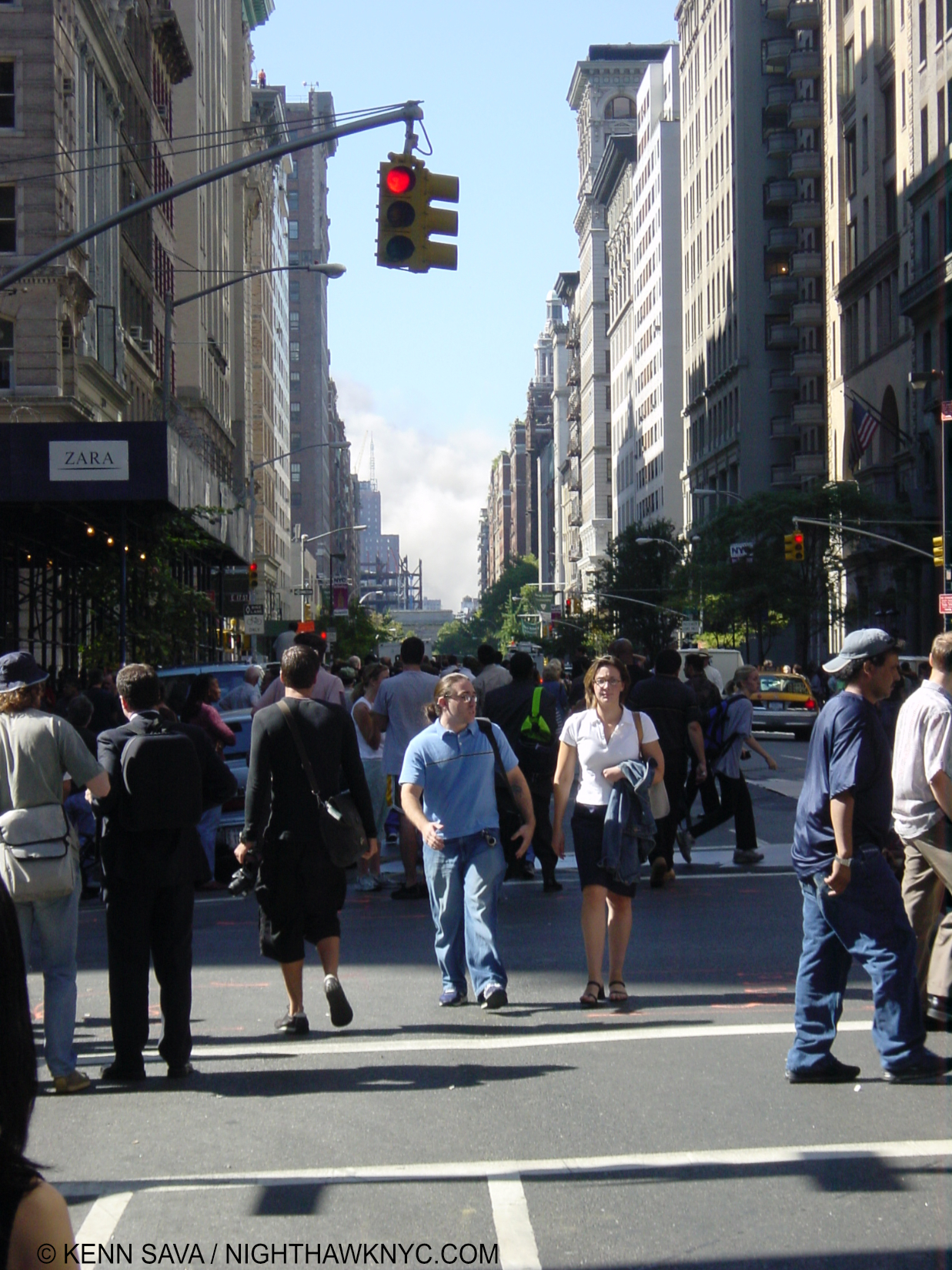
On the corner of 6th Avenue, there were crowds of people looking at the Towers directly down the street. I pressed on to get to work. On 5th Avenue, that scene was repeated with many more people who lined the Avenue on both sides as far as I could see down. 

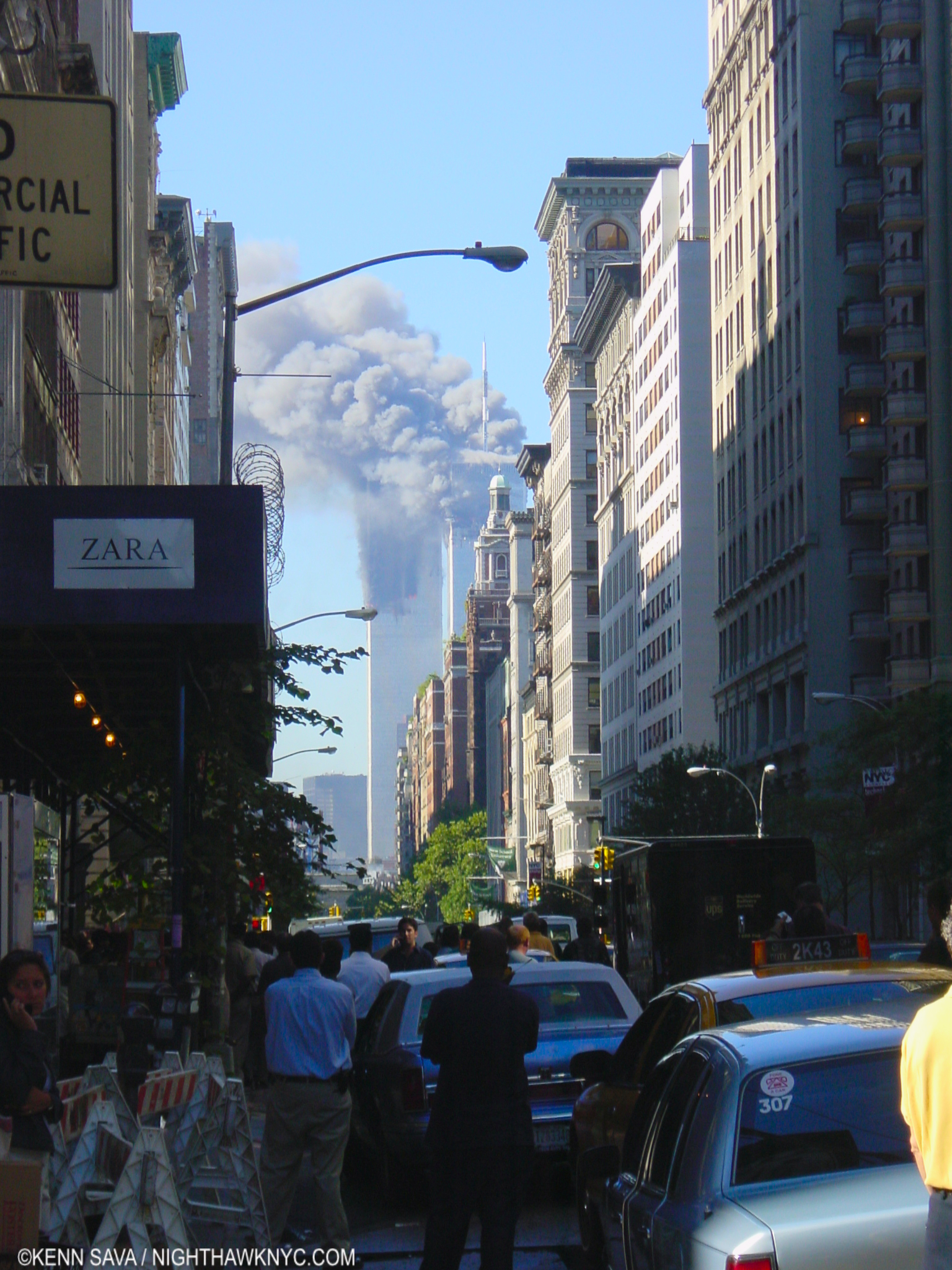
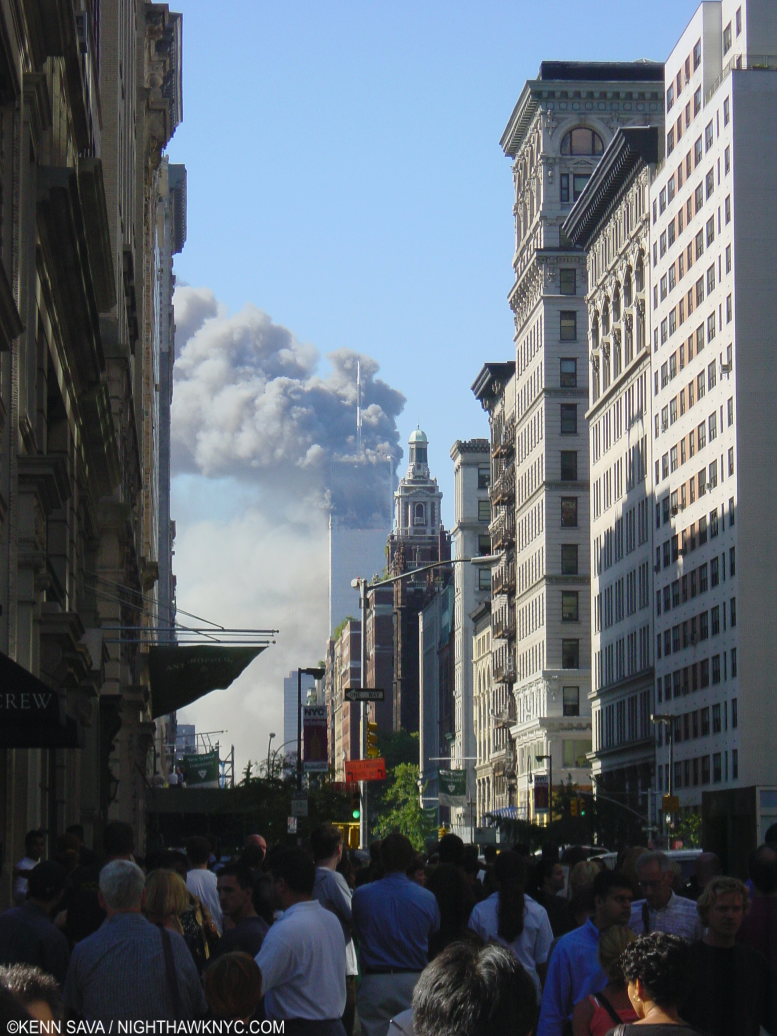
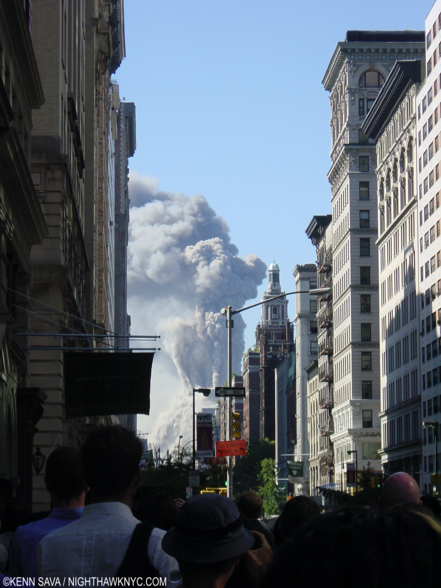
The view down 5th Avenue with both Towers on fire just before 10am on 9/11.

By now, it was close to 10am and BOTH Towers were on fire, the second plane having hit the South Tower, a bit lower than the first had hit the North Tower. 

On 5th Avenue, people strain to watch a tiny TV set perched on the widow of a truck, just visible beyond the woman’s blue blouse, as the horror was unfolding to their left at about 10am, 9/11.

I checked in at work. Other staff members were there but most were listening to the radio. Nobody was working. I went back out to 5th Avenue to watch again. When I got there, I immediately realized the South Tower was gone! It had collapsed!

The South Tower had just collapsed leaving something I could never imagine seeing- only one Trade Center Tower standing. Seen on 5th Avenue.

As I said, unless you’d been to the WTC, you have no idea how immense they were. HOW could one collapse?? As it turned out, most New Yorkers, including the first responders, apparently had no idea the Towers being about the biggest thing in NYC could ever collapse. It’s hard to articulate the feeling of seeing something impossible right in front of you. The fires looked like terrible fires, but I’m sure most people felt they would be put out. But, no! That MASSIVE building had collapsed! 110 acres of steel, glass and people were somehow just gone. That was the first realization that our long-held unassailable assumptions were assailable. I remembered hearing someone say years ago that if one of those buildings ever fell it would destroy everything for blocks around in that direction. Having lived for must of my life with those Twin Towers defining the famous skyline of Manhattan. Now, there was only one!, it too was on fire, and had been for longer than Tower 2 was!

A few minutes later, as I stood there in a crowd of fellow New Yorkers, I saw THE most horrific thing I’ve ever seen in my life happen right in front of my eyes.

Tower 1 collapsed.

The North Tower, World Trade Center 1, in the midst of collapsing at 10:28am.

It looked like it happened in slow motion. A huge, eerie, grey cloud slowly rose where it had stood, and kept rising. I stood there open-mouthed watching in utter horror. How many people did I just watch die? 

After watching Tower 1 collapse, my immediate thought was – What’s gong to happen next? I immediately turned around 180 degrees. There, 13 blocks behind me, straight up 5th Avenue, stood the Empire State Building. In 1945 a B-25 Bomber, a large plane indeed, had accidentally crashed into it. Yet, it remained standing after that, and it was still standing now.

The scene after both Towers had collapsed around 10:45am leaving billowing clouds of smoke that would last for days.

Numb, and in a state of shock, I headed back to my office. We closed for the day. Some of my co-workers began the walk over the Brooklyn Bridge. I headed back across town. I dropped my bag off and headed back out with my camera. 

West Side Highway at Houston Street as far as the NYPD was letting pedestrians go on the afternoon of 9/11.

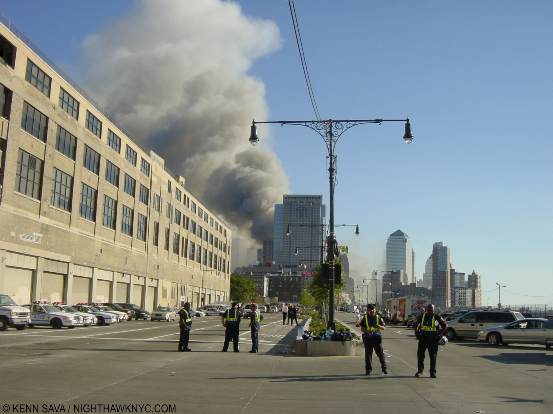
I walked over to the Hudson River, where you could see the WTC all the way down. As I started walking along what is now Hudson River Park, a steady stream of Emergency & construction vehicles sped past me on the Highway. At Houston Street, a bit north of Canal Street, all pedestrian, and non-emergency related traffic was stopped. I stood there for a few hours, most of which was spent watching the biggest cloud of smoke I’d ever seen rising up then bending over east towards Brooklyn (which was a lucky thing, for me, at least, as it turned out).

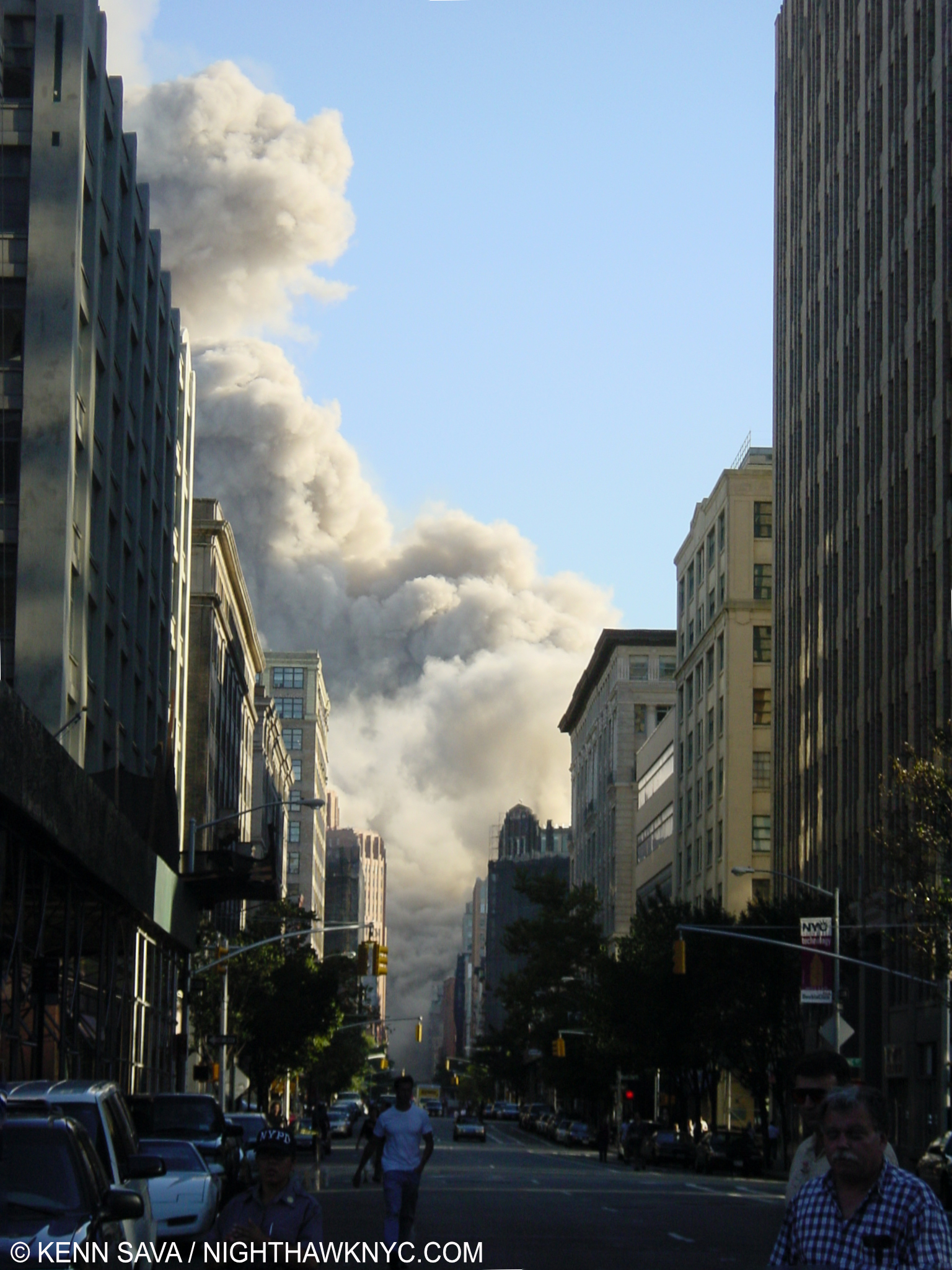
7 World Trade Center collapses at 5:20pm. Seen from Greenwich Street, September 11th.

Finally, I headed inland. As I reached Greenwich Street, it was now 5:20pm. Just as I got there, 7 World Trade Center collapsed! 7 WTC was a nondescript brown square building across Vesey Street from the Twin Towers. It would have seemed to be a fair distance away from them, but given the immensity of each Tower, not far enough. There was also a huge shopping center under the Towers and other, lower, buildings and a hotel I once stayed in, as part of the main complex. ALL of it was destroyed in the 9/11 attack. 

Wow. I had personally witnessed TWO of the three main World Trade Center complex buildings collapse! 

I found out later, 7 WTC had been evacuated. Unfortunately, as we all know, that wasn’t the case for 1 or 2 WTC, the Twin Towers. 

After watching 7 World Trade go down, I began making my way home. I walked through Greenwich Village. There, I came upon an incredible sight that has stayed in my mind along with the collapses as indelible.

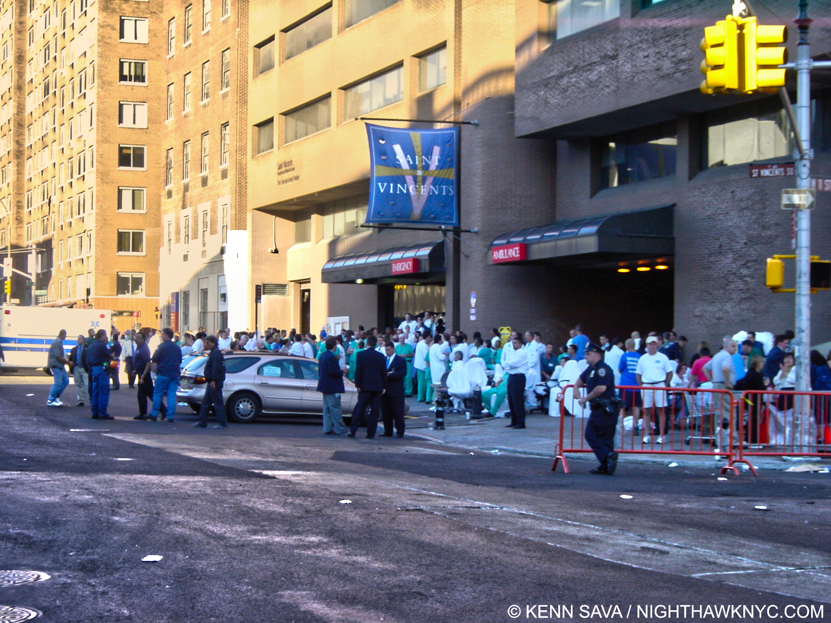
The heartbreaking scene outside of Saint Vincent’s Hospital. Doctors, nurses and staff wait for the arrival of victims. Before 6pm, September 11th.

As I came upon Saint Vincent’s Hospital, the closest hospital to the WTC, I saw their side of 7th Avenue lined with green hospital scrubs, with a few white coats mixed in, doctors, nurses and hospital staff, all of who were standing alongside empty, clean gurneys. 

It took me a moment to realize what that meant. And that moment was the moment I lost it. 

NO ONE was coming to be treated. 

EVERYONE was dead. 

2- Union Square

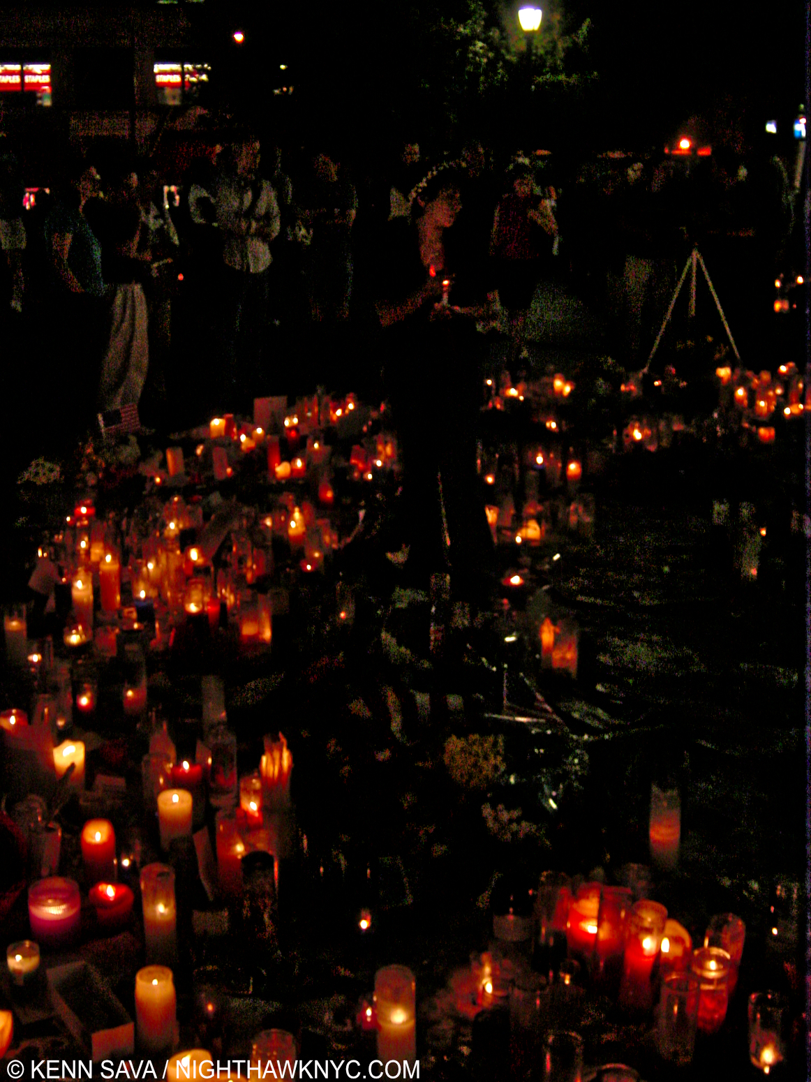
That night, I went to my local watering hole and commiserated with friends and neighbors. As the hours and days passed, you could not go anywhere around here and not see “MISSING” fliers posted on every available space. These were often unlike most of the typical “MISSING” fliers that pop up from time to time. Many of these went beyond the basic stats needed to identify a missing person, into the realm of biography & memorial. A few days after 9/11, I walked with 2 acquaintances heading south. We passed through Union Square. I was stopped dead in my tracks. The central lawn area is rung with a brick wall all around it, and there was a fence inside that protecting the grass. There, on every square inch of this wall and fence were MISSING fliers! In front of them, spontaneous memorials, with thousands of candles burning bright at 3am. I parted from the couple and went home to grab my camera then walked back. I stayed until after 7am. It was just overwhelming to walk among so much loss, to get a tiny sense of who someone was, from a smile, from a few words, from someone else’s pain who was left behind.

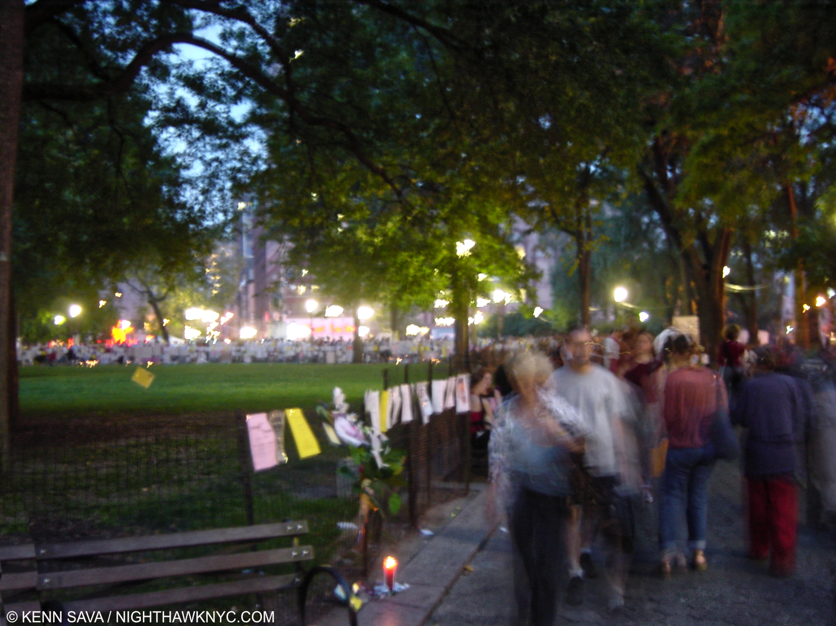
Blurry night photo of Union Square, September 19, 2001. The entire Park was blanketed with MISSING fliers, candles and remembrances left by the constant stream of visitors, here ringing the entire lawn to the right and all the way in the back. Never, before or since, have I seen such a huge outpouring of love, loss and incalculable pain.

I found out in the week following 9/11 that two people I knew had been in the Towers that day. Both got out. To this day, I’m not aware of anyone I personally knew who died. Of course, many, many “MISSING” fliers were NYFD, NYPD, PAPD, EMTs, and other first responders. Those that got me hardest were those seeking everyday people. People who either just happened to be there, or who worked there.

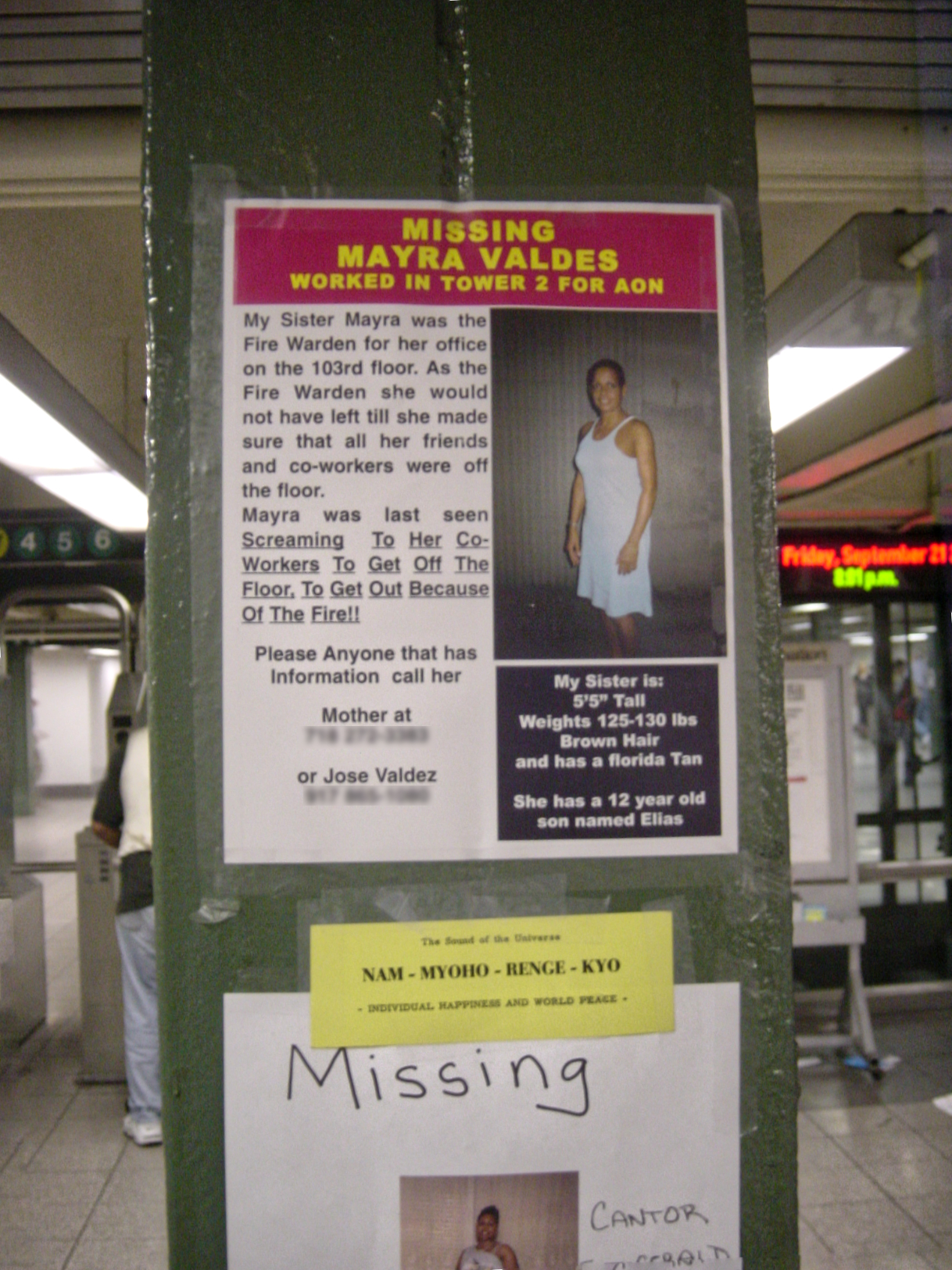
MANY of the MISSING fliers were so poignant they stopped me in my tracks, like this one. When they talk about 9/11 heroes, and there are many, people like Mayra Valdes, who served as a Fire Warden for her company on the 103rd floor of the South Tower, deserve to be counted highly among them, “…last seen screaming to her co-workers to get off the floor, to get out…” Ms. Valdes left a 12 year old son. Union Square Subway Station, September 19, 2001.

Imagine just going to work on a Tuesday morning only to be the target, and the victim, of the biggest terrorist attack on US soil since Pearl Harbor, and the biggest targeting civilians? I thought back to the staff members of Windows On The World, who would have had ZERO chance of getting out if they had been there when the 1st plane hit1, and those others I’d seen who worked at the WTC. 

3- Christmas at Ground Zero

Having no family, I’m alone most holidays. It’s never easy when everyone else is with someone. Hell, no one had called me on 9/11 to see if I was ok. Christmas, 2001, was particularly hard because of what had happened that September day and after. Starting to feel depressed Christmas afternoon, I realized I need to stop that in its tracks. I decided to walk down to the World Trade Center site, by then, commonly called Ground Zero. 

I walked down along the West Side Highway, revisiting my youth when I had to park the car there often in gale force winds whipping off the Hudson. This was a particularly cold night. I was frozen to the core, but I was determined to get there and meditate on what had happened and those lost. I walked along the highway and as I approached Vesey Street, I saw some faint lights in the distance. No one was around. My only companion was the wind, the coming dark, and the cold. 

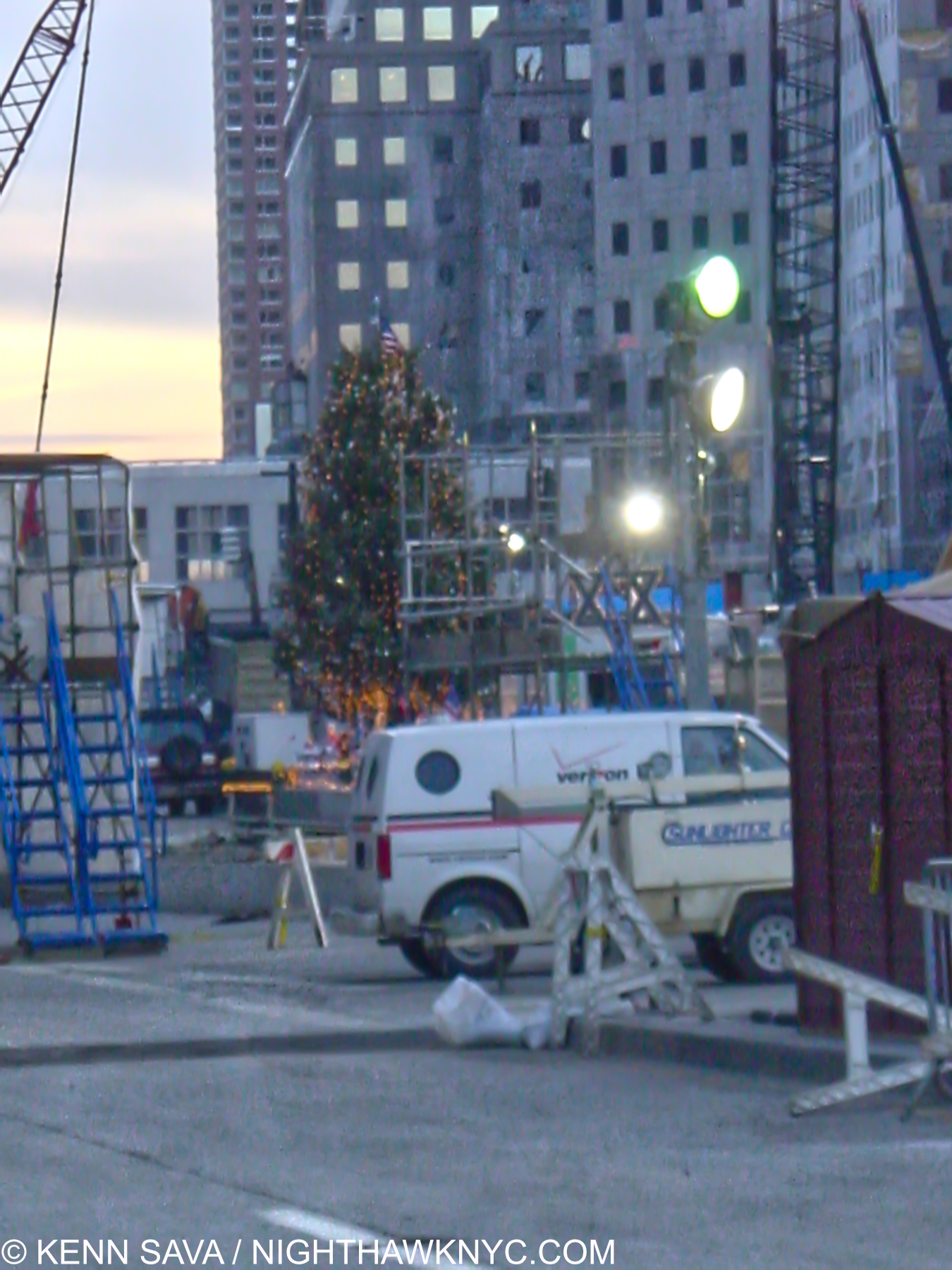
A Christmas Tree installed by construction workers on the West Side Highway at Ground Zero with the Overpass to the World Financial Center behind, the severely damaged World Financial Center to the right. Christmas Day, 2001.

As I approached Vesey Street, I could make out a Christmas Tree with some lights on it. I imagine the construction workers had set it up. No one else was around. Whoever had put it here was off somewhere else with his or her others. It was fitting it was here. Off to my 10 o’clock “the pile” of debris from the collapse sat, the smoldering finally ended, containing the remains of who knows how many in complete stillness in the dark. I stood there letting ALL of this wash over me for a few minutes, staring over at the dark emptiness that had been the World Trade Center complex. I had stood on this very spot before the World Trade Center was built. I was here when they were being built. Now, I am standing here after they were gone, something I never imagined possible. Though there was a lot of damage and destruction to the surrounding buildings, it always felt like if the WTC Towers had ever fallen over entire City blocks would have been taken out by them. But no. It wasn’t like that for the most part. Most of the buildings right around them, including 3 landmarks, were still there. It struck me standing there that what happened was like a giant hand had come down and lifted the Towers clean out the damage from two such immense collapses was so confined. While it was happening, then as I stood there on Christmas, and to this day 20 years later, when I look out of my window, it’s still very hard to believe they’re gone. But it happened, largely right in front of me.

A woman walking around keeping the candles lit. Union Square, September 19, 2001

I said a silent prayer for all of those we lost, and realized that things could ALWAYS be worse. Then, I turned around and walked home.

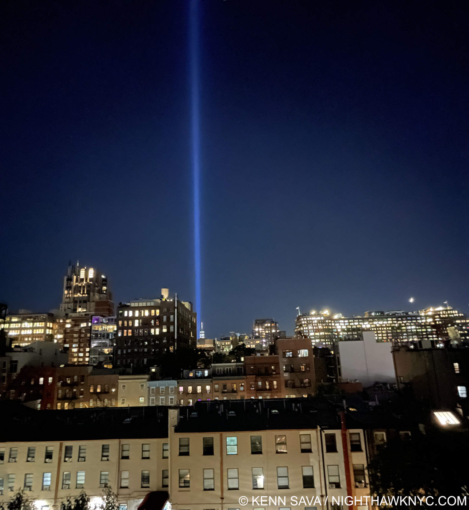
The view from my window, tonight, September 10, 2021, with the Tribute in Light just behind where the Twin Towers stood.

This Post is dedicated to all those lost on September 11, 2001, and those who continue to be lost since the attacks due to related illnesses.

*-Soundtrack for this Post is “Life In The Air Age,” by Bill Nelson of Be Bop Deluxe and recorded on their classic Lps Sunburst Finish, 1976 and Live! In The Air Age, 1977, below-

NighthawkNYC.com has been entirely self-funded & ad-free for 9 years, during which 330 full-length pieces have been published! If you’ve found it worthwhile, PLEASE donate by PayPal below to allow me to continue. Thank you, Kenn.

You can also support it by buying Art, Art & Photography books, and Music from my collection! Art & Books may be found here. Music here and here.

Written & photographed by Kenn Sava for nighthawknyc.com unless otherwise credited. To send comments, thoughts, feedback or propositions click here. Click the white box on the upper right for the archives or to search them. Subscribe to be notified of new Posts below. Your information will be used for no other purpose.

For “short takes,” my ongoing “Visual Diary” series, and outtakes from my pieces, be sure to follow @nighthawk_nyc on Instagram!

  1. It turns out the Restaurant was open at the time, and the staff members and guests who were there all died.

The Met’s Alice Neel Love Letter To NYC

Written & Photographed by Kenn Sava
NYC has seen innumerable rough times. Too many for me to list here. Some of them I’ve lived through. During many of the hardest times the past 151 years The Metropolitan Museum of Art, founded in 1870, has stood at 1000 Fifth Avenue where it remained open allowing countless citizens and tourists the opportunity to walk up its famous staircase and take respite in its hallowed halls among its countless masterpieces, a beacon of culture and a repository of some of the greatest achievements of creative mankind over the past 5,000 years.

Until March 12th, 2020, that is.

Home, again, for the first time in over a year. The Met’s Grand Staircase, March 27, 2021. Up to the left. Down to the right, please.

At 6pm that day The Met closed due to the coronavirus pandemic shutdown1. It remained closed until August 29th. Five and one half months. Unprecedented in its history. Unwilling to risk being indoors until I could be vaccinated I missed the shows The Met held during the first six months after its reopening.

When it announced Alice Neel: People Come First, conceived by Sheena Wagstaff, would open on March 22nd, 2021, I thought back to what I had said about Alice Neel: Uptown, one of my NoteWorthy Shows for March-May, 2017- “…the breath of fresh air it provided only hints at how much pent-up longing I think there is to see more of her work. The time has come!”

The entrance. The show opens with a nude. Pretty daring, but given how often Alice Neel asked her sitters to pose nude, fitting.

On March 27th that time did indeed come. Seeing the show a few weeks later once the vaccine kicked in I had one primary reaction-

What a terrific love letter to New York City! At a time when one may never have been needed more.

March 27, 2021.

Fittingly, when I went in March, only fellow New Yorkers were my fellow visitors. In Alice Neel: People Come First’s parade of over 115 works the endless variety of people from all races, colors, orientations, and occupations that makes New York City great and unique is what is REALLY on view in this show.

“For me, people come first. I have tried to assert the dignity and eternal importance of the human being.” Alice Neel2.

Yes, Alice Neel’s place among the Masters of 20th century Art, established, at long last, in her Whitney Museum Centennial Retrospective in 2000, is reaffirmed. Yes, there are facets of her work that have been overlooked and are now getting attention, like her use of abstraction. But, it’s all secondary to the first theme- as she, and the show’s title says, people come first. Alice Neel Painted “pictures of people,” as she said. She spent about 60 years doing just that and the show draws on her entire career in the generous 115 or so works on view.

Carlos Enriquez, 1926, left, and French Girl, 1920s, right. Mr. Enriquez, a legendary Painter in his own right, was Alice Neel’s first husband and father of her first child, Santillana, who died of diphtheria as an infant daughter, and her second child, Isabetta, to whom she would be estranged for much of Isabetta’s short life.

How was she able to have this career? Born and raised in Pennsylvania, after marrying Carlos Enriquez, who went on to become one of the most renowned Cuban Artists of the century, in 1925, Alice Neel moved with him to Cuba from 1926-7, then returned to Pennsylvania, where they broke up. From there she moved to NYC in 1927. Both of these early, marvelous, works strike me as standing apart from typical student efforts, showing the young, mid-20s, Painter breaking free to seek her own style, finding her essence, and achieving success as captivating works. Phillip Bonosky wrote of her in his Journal in 1957, “She’s worked out her own code of behavior, whose cornerstones are two: 1) her freedom to paint; 2) the well being of her 2 boys. For 1, she will surrender everything else, and what other people place high- the sanctity of one’s flesh in bed- she subordinates to this superior law of her life. And the second also comes lower- but higher than anything else but the first. What other people strive for and cannot live without- good furniture, good clothes, a conventional acceptance by society, etc., etc.- she gives up without any sense of loss whatsoever3.”

On this spot, behind the car, a brownstone stood in the 1930s where Alice Neel lived during the Depression, a few blocks from where I am writing this piece. It’s now part of a school building.

“Lived in a brownstone, lived in the ghetto. I’ve lived all over this town,*” as David Byrne wrote in the lyrics for the Talking Heads song “Life During Wartime,” the SoundTrack for this post.

She spent time living in  the Bronx and a few neighborhoods in Manhattan over 54 years here, including one a few blocks from where I am now, before moving uptown for good, first to East Harlem, and finally to West Harlem. She Painted wherever she was. Street scenes, still lifes, and “pictures of people,” related to her and not. No matter when, where or who she Painted, her work has the remarkable quality of both looking of its time and not looking dated now. That said, never fond of discussing possible influences, her style was always wholly her own and it evolved over her career.

“I sleep in the daytime, I work in the nighttime. I might not ever get home,*” from “Life During Wartime,”

Ninth Avenue El, 1935. Night on West 14th Street at Ninth Avenue Painted at the peak of the Depression, the figures seem to carry the weight of the world with them. Looking at this now, and living in this area today, it’s hard for me, or no doubt most of my neighbors, to believe there was an elevated subway train here 90 years ago. It closed in 1940, only 5 years after this was Painted.

Standing on the same spot today in daylight. West 14th Street & Ninth Avenue, July 28, 2021, looking across to the Meatpacking District. The area is undergoing hard times, again. All the stores to my immediate left are For Rent, a large Apple store stands to my right. Today, there is not a hint that an elevated subway was once here.

“There isn’t much good portrait painting being done today, and I think it is because with all this war, commercialism and fascism, human beings have been steadily marked down in value, despised, rejected and degraded,” she explained in 19504.

Elenka, 1936, is a work that shows the way for much the Artist did the rest of her career with its subtle complexity. It’s a daring picture of a strong woman with an intense gaze reinforced by the strong colors and shapes surrounding her, contrasted with the femininity of what she wears. The background is partially nebulous and partially furniture or building. The somewhat straightforward pose gives the feeling of being caught off guard, which of course Elenka wasn’t.

It’s interesting that during her “today,” Artists including Francis Bacon and Lucian Freud, to name two, were Painting portraits, though not nearly as well-known as they would become. Still, no matter what they, or anyone else was doing, Alice Neel, a humanist to the last, remained true to herself.

Futility of Effort, 1930. Alice Neel described this as one of her most “revolutionary” Paintings. Partily inspired by the death of her young daughter Santillana, partly by a news account of another infant death where the child choked on the bars of the crib while her mother ironed in the next room. It was shown on a wall by itself at the far end of a rectangular gallery.

She was also a survivor who persevered as a Painter as a single mother, virtually unprecedented among major Painters of the 20th century, or before, and a mother who lost an infant child,

Alice Neel, Nancy and Olivia, 1967, left, Vincent van Gogh, Madame Roulin and Her Baby, 1888. One of the highlights of the show was a gallery showing Alice Neel’s work in dialogue with Met Museum masterpieces by other Artists including Jacob Lawrence, Helen Levitt, Mary Cassatt, among others including Van Gogh, here. Alice Neel lost an infant daughter, and Vincent longed for a family fruitlessly his entire life. Knowing that, it’s hard not to read both of these works as autobiography, poignantly hung side by side.

But there were other sides to Alice Neel, the woman, besides the mother.  “I’m cursed to be in this Mother Hubbard body. I’m a real sexy person,” she once said[Met Alice Neel: People Come First Exhibition Catalog, P.2]. One way it came out is her penchant for asking her sitters to undress for their “picture.” A good number of them complied- men, women, pregnant women, and couples. Even Andy Warhol.

“This ain’t no party, this ain’t no disco. This ain’t no fooling around. This ain’t no Mudd Club, or C.B.G.B. I ain’t got time for that now,*” from “Life During Wartime,”

Andy Warhol, 1970, Oil and acrylic on linen. Alice Neel is revolutionary for the consciously “unfinished” look of a number of her Paintings, including this one, one of  masterpieces. Done less than 2 years after the assassination attempt on his life, according to Phoebe Hoban, the two Artists discussed doing the picture this way (half undressed) with eyes closed, making it close to an actual collaboration5.

The show featured a number of the nudes, including Alice Neel’s daring nude Self-Portrait, 1980, at age 80! She also trail blazed Painting pregnant women nude, and some of them were on view as well. Finally, there were numerous pictures of children, both hers, and neighborhood kids, as shown earlier.

“We dress like students, we dress like housewives. Or in a suit and a tie. I changed my hairstyle so many times now, I don’t know what I look like,*” from “Life During Wartime.”

Marxist Girl (Irene Peslikis), 1972, all works are Oil on canvas, unless specified. “This captivating portrait …depicts artist and activist Irene Peslikis—a member of a new generation of revolutionary feminists that Neel began to paint in the early 1970s. Alice Neel’s relationship with second-generation feminism was sometimes strained, but she nonetheless supported—and was supported by—the movement.” @metmuseum.

Further to that quote from @metmuseum, I find the piece daring and free with a power that exudes from Ms. Peslikis’s gaze in a pose that is at once natural and ground-breaking, matched by an extraordinarily daring and free background. Alice Neel had gone on record6, powerfully, against Abstract Expressionism in its heyday. Her views changed over time. Here she is, using its techniques to marvelous effect in the background, as she does in a number of other works of the 1970s. She said then, “I don’t think there is any great painting that doesn’t have good abstract qualities.7.” I’ve been thinking about those words since I read that quote…

“I don’t know what you expect to do in the world, Alice. You’re only a girl.” Alice Concross Hartley Neel (1868-1954), Alice Neel’s mother8

Last Sickness, 1953, left, and City Hospital, 1954, Ink and gouache on paper. Alice Neel’s mother, was no fan of her daughter becoming a Painter, as the quote from her, above, shows, yet Alice never turned her back on her. She died of cancer shortly after the Painted picture. City Hospital shows her mother at the bottom with an overworked nurse looking over other patients at her.

Her mother, who took her to cultural events, Alice describes as “intelligent and well read” continued, “None of us will be remembered.” “Well, I am not so sure about Alice,” Alice remembered her father saying9.

Richard Gibbs, 1968- Everything about this work strikes me as daring. The pose looks like a very casual take on Rodin’s The Thinker. Mr. Gibbs’ shirt is a riot of color with lines that go in the opposite direction to the path laid out for the eye to follow from front to back. That path, itself, is an adventure. We are seemingly inside and outside at the same time. Part of a room or building occupies the right part of the piece, a sudden landscape occupies the left, leading to a shining sun high up top. This inside-outness reminds me a bit of Dali or de Chirico, but for Alice Neel, who is known as being a somewhat traditional Painter of portraits, or pictures of people, as she preferred, it’s quite daring. The shadows under the chair leave me wondering, too. What are they of? Then, there’s the skin tones. Marvelously flat on Mr. Gibbs’ legs, feet, arms and hands, and more layered and nuanced on his face.

Many of Alice Neel’s non-family subjects were people fighting for causes, people who lived what they believed, and that is what comes across in her “pictures” of them. Taken as a whole one of the things her work is is a miniature picture of New York during her lifetime. While there are some cityscapes, Alice Neel’s New York City consists of its people in all their ages, sizes, shapes and variety.

“Heard about Houston? Heard about Detroit? Heard about Pittsburgh, PA?,*” from “Life During Wartime10.

James Farmer, 1964. The year this was Painted, the civil-rights leader was among those arrested at the 1964 World’s Fair for protesting segregation and racial violence.

Mostly an outsider to the big NYC museums and larger Art world during most of her lifetime (though she attended them and marched in protests of some of their more controversial shows), Alice Neel fought for her Art most of her life. She had to. She didn’t find a lot of supporters in the Art word until late in her life (the Whitney held a Retrospective in 1974, when she was 74, and the posthumous Centennial show in 2000, her last big NYC museum show before this one). Phoebe Hoban says that between 1927 and 1964 she had about 6 solo shows. From 1964 to 1984, she had over sixty11. The first full-length monograph of her work was finally published in 1983, a year before she passed (see BookMarks, below).

James Hunter- Where are you? Black Draftee-James Hunter, 1965. One of the most compelling works in Alice Neel’s career, Mr. Hunter appeared for one sitting and never returned. Alice Neel declared the work finished and its gone on to spellbind viewers ever since. (Including me, when I saw it last at Unfinished at The Met Breuer in 2015.) Drafted for Vietnam, his name does not appear on the Wall in Washington, DC. To this day, what happened to him remains unknown.

Listening to her recorded interviews she always makes a compelling case for work and anyone interested in her Art should seek them out online and watch or listen to those first before reading anyone else speak about her work. In this interview, I love how she immediately corrects anything the interviewer says about her Art that she doesn’t agree with!

“Transmit the message, to the receiver. Hope for an answer some day,*” from “Life During Wartime,”

The line for Alice Neel: People Come First on March 27th. I imagine it’s significantly longer now.

Standing in line at The Met, in the very halls she frequented, I couldn’t help wonder what she would have felt seeing the line of visitors stretching all the way down the long hallway waiting to see her work. The same work she mostly kept in her archives, as a picture in the show, below, depicts.

The archive of her work lining the walls of her apartment. Alice Neel hated to part with one of her Paintings and was known to Paint a copy when she did.

“The sound of gunfire, off in the distance. I’m getting used to it now,*” from “Life During Wartime.”

Living in Manhattan these past 30 years, it’s easy to relate to the solitary, single-minded sense of purpose her life exudes. “Tough times don’t last. Tough people do,” the age old quote goes. Alice Neel survived a lot of tough times. Now her Art is helping New Yorkers survive this horrible time by reminding us of who we are and what our strength is.

BookMarks-

The poignant inscription in a signed copy of Patricia Hills’ monograph says it all. Alice Neel died the following year. Photographer unknown.

The Alice Neel bibliography is relatively small but growing. Here are a few recommendations based on living for at least a year with each recommended book, each  used in preparing this piece.

Alice Neel: People Come First, Met Museum Exhibition Catalog, is the most up to date monographic overview of her work and career. It features the most current research and has the most images currently (mostly the works in the show which were exceedingly well chosen) in very good quality on good paper, many in a large size. Recommended as a first, or go-to, monograph on Alice Neel until a more complete look at her whole career is published.

Alice Neel, by Patricia Hills, will always be NoteWorthy for being the first full length hard-cover monograph on Alice Neel and the only one released during her lifetime. Many good sized illustrations in color. It was also done with cooperation with the Artist. It holds up well today and copies in Very Good or better condition are still reasonable. Recommended as a 2nd monograph on Alice Neel, it remains a valuable reference book for the reasons I mentioned.

Alice Neel: The Art of Not Sitting Pretty, by Phoebe Hoban is another Art biography from Ms. Hoban. I found this one better than her Jean-Michel Basquiat bio, particularly when it comes to addressing the Art (a serious weakness of the J-M Basquiat book in my opinion). At the moment, there is no other full-length Alice Neel biography. Given Alice Neel’s steadily increasing popularity, and her increasing stature as an Artist, a woman and an influence, I suspect that will not be true indefinitely and a more definitive biography may be still to come. Done after the Artist’s passing it does not have Alice Neel’s input but it does have quotes from family members. Includes 23 pages of small illustrations in color and black & white. The binding is exceptional- rare for a large 500+ page paperback. Recommended, for now.

*-Soundtrack for this Post is “Life During Wartime,” with lyrics by David Byrne by Talking Heads from Fear Of Music, 1979. Regarding the references used above, check out the annotated lyrics on genius.com. Here it is performed live, at The Mudd Club, LA, of all places, on August 13, 1979-

NighthawkNYC.com has been entirely self-funded and ad-free for over 6 years, during which over 250 full length pieces have been published. If you’ve found it worthwhile, you can donate to keep it going & ad-free below. Thank you!

Written & photographed by Kenn Sava for nighthawknyc.com unless otherwise credited.
To send comments, thoughts, feedback or propositions click here.
Click the white box on the upper right for the archives or to search them.
For “short takes” and additional pictures, follow @nighthawk_nyc on Instagram.

Subscribe to be notified of new Posts below. Your information will be used for no other purpose.


  1. The PBS series Inside The Met shows behind the scenes leading up to, during and after the shutdown.
  2.  Mike Gold, “Alice Neel Paints Scenes and Portraits from Life in Harlem,” Daily Worker, December 27, 1950, p.11
  3. Phoebe Hoban, Alice Neel: The Art of Not Sitting Pretty, P.236
  4. Mike Gold, ibid, p.11
  5. Phoebe Hoban, ibid, P.310
  6.  “I am against abstract and non-objective art because such art shows a hatred of human beings. It is an attempt to eliminate people from art, and as such it is bound to fail.” Mike Gold, ibid, p.11
  7. Met Alice Neel catalog, P. 104
  8. Met Exhibition Catalog, P.12
  9. Met Exhibition Catalog, P.18.
  10. See the annotated lyrics, here.
  11. Phoebe Hoban, ibid, P 254

Francisco Goya: Modern Art & Photography Begin Here

Written & Photographed by Kenn Sava

The seemingly all-seeing eye. Francisco Goya, Los Caprichos, Plate 1, 1799, Etching, aquatint, drypoint, burin. The wall card reads- “In the first plate from the Caprichos, Goya presents himself as a sardonic observer of contemporary society.” Exactly what we’ll see in the rest of The Met’s Goya’s Graphic Imagination.

Francisco Goya’s Paintings are on the “must-see” lists of many museum goers, particularly the 200 or so portraits he did of royal, aristocratic or upper-class patrons over his 39 years as a court Painter1. Like this one-

Francisco Goya, Manuel Osorio Manrique de Zuñiga (1784–1792), 1787-8, Oil on canvas. One of the most charming Paintings in The Met for many. I can’t help but think it’s also more. An allegory about the end of  innocence? On the right, small birds in a protective cage. On the left, a magpie is eyed by cats. Any wonder this was the last Goya portrait commissioned by the child’s father, the Count of Altamira? Herein lies a hint of what lurks in Goya’s Graphic work. Its young subject died at age eight, 4 years after posing for it. A final touch- the magpie holds Goya’s card with his signature in his beak. Met Museum Photo of the work unframed.

But, to get the full picture of Goya’s Art, I believe his graphic work deserves every bit as much attention. Yet, chances to see his Drawings & Prints in depth are rare due to the fragility and light sensitivity of the originals. In 2015, a complete set of Goya’s timeless Print series Los Caprichos (the Caprichos) was shown at The National Arts Club in Gramercy Park, which I wrote about here. 2015 also saw the last large Goya Retrospective in the U.S., Goya: Order and Disorder, at the Museum of Fine Arts, Boston, which I actually made a day trip out of town to see and wrote about in the same piece. 

Goya after Velazquez, A False Bacchus Crowning Drunkards, 1778, Etching. Goya achieved, and demonstrated, his mastery of of the challenging medium of Etching copying the earlier Spanish master as in this remarkable Print done when Goya was about 32. And, he had the confidence to modify the composition of one of the greatest Painters of all time.

In the intervening 4 1/2 years, I’ve been preoccupied, if not obsessed, with exploring Photography & PhotoBooks, so when I finally got to see Goya’s Graphic Imagination at The Met in April with about 118 Drawings & Prints, I wondered if I might be able to spot Goya’s influence on Photographers and Photography, and on Modern Art in general for that matter.

“Both types of works on paper are closer to one another than they are to Goya’s painting. Paintings are a public expression. By contrast, an album of drawings is intimate and personal. These smaller-scale works served as a platform for Goya to think through his most private ideas.” Mark McDonald, Met Curator of Goya’s Graphic Imagination.

Goya’s eye, which seems to look askance at us in the Self-Portrait that opens Los Caprichos, up top, apparently never rested. He recorded much of what he saw in his Sketchbooks, which have largely survived. Over time, his beliefs ran in and out of sync with those of the powers that be, so he became adept at keeping his opinions to himself. It is in the privacy of these Sketchbooks that he gave full reign to what he felt about all he saw around him while keeping his position at court. He eventually rose to the exalted position of First Chamber Painter in 1799.

Title page to the first edition of Los Desastres de la Guerra (The Disasters of War), 1863, 24 years after the invention of chemical Photography. Met Museum Photo. Due to the low lighting in the show I was unable to take satisfactory pictures of much of the show without a tripod, so in those cases, I am using The Met’s Photos. This page was not included in the show.

A number of his Drawings became the basis of his Prints, including  Los Caprichos and later, inspired by the Peninsular War, 1807-14 and the Madrid Famine, 1811-12, Los Desastres de la Guerra (The Disasters of War). It was the 10 or so Prints from this series, equal parts “graphic” and revolutionary, on view in The Met’s show I looked forward to seeing most. Due to those ever-changing political winds, it wasn’t until 1863, thirty-five years after Goya’s death, that the world got to see his Fatal Consequences of Spain’s Bloody War with Bonaparte, and Other Emphatic Caprices, as he had originally titled a set of 85 Prints that he gave to an associate during his lifetime, when it was finally published under the title Los Desastres de la Guerra with 80 Prints2.

Plate 15 from Los Desastres de la Guerra (The Disasters of War): ‘And there is nothing to be done.’ (Y no hai remedio.) Met Museum Photo.

“Every figure in Los Desastres de la Guerra plays a specific role, defined by gesture, expression and costume. Nothing is superfluous.” Janis A. Tomlinson, Goya’s War: Los Desastres de la guerra, P.17

The series shows things never before seen in Art to that time, including graphic depictions of the horror of war, imprisonment and famine. About two hundred thirty years earlier, circa 1633,  Jacques Callot published his Print series Les Grandes Miseres de la guerre or The Miseries and Misfortunes of War. Of them, the Art Gallery of NSW, Australia, which owns a set, says– “Callot’s series is less an indictment of war than a moral tale about the unhappy consequences that befall the undisciplined soldier.” Callot’s Prints are in a long landscape format, and show what they depict at a distance. It is thought Goya owned a set of them, and they may have been an inspiration for him. In his series, Goya puts the action full frame presaging the words of Robert Capa, famed for his 20th century war & conflict Photographs, “If your photographs aren’t good enough, you’re not close enough.”

Plate 1 from Los Desastres de la Guerra (The Disasters of War): Sad foreboding of what is going to happen (Tristes presentimientos de lo que ha de acontecer), ca. 1815 (published 1863), Etching, burin, drypoint and burnisher. Met Museum Photo.

As powerful & profound as they are, there’s an element of them that is particularly puzzling. In more than one work, Goya’s caption gives the viewer the idea that what he’s showing are things he actually witnessed. DID Goya see the things he shows us?

DID he? Or, didn’t he actually see this happen? The title says he did. Plate 44 from Los Desastres de la Guerra (The Disasters of War): ‘I saw it.’ (Yo lo vi.). Met Museum Photo.

There is some debate around this. Wikipedia says repeatedly that he went around and saw the battles of the Peninsular War- without quoting a source for these statements I have seen no where else. While it seems it would have been hard for him to miss the daily effects of the Madrid Famine going on around him, the Artist going to battle scenes is harder for me to imagine. He was in his 60s and had suffered a serious illness that left him completely deaf. If he didn’t actually go to them, he could have been inspired by news accounts or from the accounts those closer to the action.

Preperatory Drawing for Plate 64 from Los Desastres de la Guerra (The Disasters of War): ‘Cartloads to the cemetery.’ (Carretadas al cementerio.) Prado, Madrid Photo.

Plate 64 from Los Desastres de la Guerra (The Disasters of War): ‘Cartloads to the cemetery.’ (Carretadas al cementerio.). Here an extremely rare opportunity to compare the Drawing, above, with the final Print. Met Museum Photo.

At this point, it’s unlikely we’ll ever know for certain how much of what we’re shown, if any of it, the Artist actually personally witnessed first hand. I’ve come to feel that thinking about this is a waste of time. Goya was an Artist- not a Photographer. He was working before the invention of chemical Photography and setting down his ideas by hand on paper, stone or canvas. With all due respect to the skill of Artists who Drew and Painted down through history, Drawing & Paintings done from life or memory are incapable of showing us the real world as it existed. Time is a key element in Drawing & Painting and in the time it takes to make one the world has changed. The people in it have moved. The light has changed. Things have happened and finished. In war, particularly, things happen way too fast to be captured accurately in a Drawing, let alone a Painting. They can give us a sense of what happened. What Goya is showing us is “something else” than the full reality of the moment- even if he did see it happen right in front of him. It’s his vision of things. If he tried to render it accurately to the scene in front of him, it’s still only an approximation. We’re seeing it through his eyes, and, as becomes apparent as you look at his Drawings & Prints, he does have a point of view.

The line for Goya extends further down the hall to the left than you can see here. April, 2021.

After seeing them in the show, it’s hard for me to think that these unprecedented images are not precursors of so-called war and conflict Photography. After the show I began to look to see if the Photographers, themselves, acknowledged this. In 2005, the renowned British Photographer Don McCullin, renowned for his coverage of the Vietnam War, among numerous other conflicts over his long & eventful career, told the BBC “When I took pictures in war I couldn’t help thinking of Goya.” Elsewhere he said, “…if what happened in front of my eyes was like a scene out of Goya. I wasn’t there to make icons. I had to bring back information that could possibly prevent other such miseries.” In those words I feel a simpatico with what Goya might have been trying to accomplish in Los Desastres de la Guerra .

Garroted Man, 1776-78, Etching. Done at about age 30, Goya’s second etching! A forerunner of Los Desastres, is also one of his most unforgettable images. According to Janis Tomlinson, Garroting “was considered one of the more humane forms of execution3.”

If a Drawing is incapable of showing us the complete “reality” of a scene, then it is what some might call today, “conceptual.” I was struck by some similarities of Goya’s Prints with so-called “conceptual” Photographers, who modify or create scenes from scratch that they then Photograph, like Duane Michals, Jeff Wall, Gregory Crewdson or Deana Lawson. Goya, too, may have been creating a scene on paper to make it express what he saw in his mind’s eye (keyword= may).

Plate 30 from The Disasters of War’ (Los Desastres de la Guerra). Proof, without caption. Without the titles makes them infinitely harder to decipher. According to the wall card, here, people fall to the ground after a building explodes.

Yet, no writing about these work exists in Goya’s hand besides the captions on the plates.

“It is important to emphasize that the inscriptions are not titles. They are captions that encourage a potential understanding. The captions do not explain the work for us. The meanings are often unclear, but this isn’t because Goya was being obtuse. He was thinking through drawings and prints for his personal purposes, and as such, there is no need for him to explain their significance to himself. His works on paper are so internal and layered that they would have sparked multiple associations, even for Goya.” Mark McDonald, Met Curator of Goya’s Graphic Imagination.

So, the captions add another layer of mystery to what we’re seeing! Duane Michals captions many of his Photographs right on the print itself. Robert Frank wrote directly on the image as his career went on, and so does Jim Goldberg, among others. Coincidences? Possibly.

Jim Goldberg, Ron E., Milwaukee, Wisconsin, USA, 2014, Magnum Photos Print.

During the lockdown I read Believing is Seeing by Errol Morris. Among Photos taken from 1855 until very recently, Mr. Morris examines the work of the 1930s Farm Services Administration (F.S.A.) Photographers, including Walker Evans and Dorothea Lange, and the evidence that they may have modified the scenes of some of their most iconic F.S.A. images from the 1930s. Modifying a scene to make it closer to what the Artist or Photographer is seeing in his or her mind’s eye would make them kin to what we see in Goya’s Drawings & Prints. So, it doesn’t really matter all that much if Goya was actually present when the events he shows us were happening. “The FSA collection (in the Library of Congress) therefore offers scholars an unparalleled opportunity to place masterworks, such as Dorothea Lange’s Migrant Mother (1936), in the context of companion images taken on the same day. This visual evidence offers a much more reliable guide to the photographer’s original intent than the artist’s recollections recorded decades after the fact,” James Curtis, the author of Mind’s Eye, Mind’s Truth: FSA Photography Reconsidered, said here. (The other images Dorothea Lange took that day in the archive may be seen here.) In my view, it doesn’t matter if the F.S.A. Photographers, “posed” subjects or modified scenes as Mr. Morris’ and Mr. Curits’ books suggest. Like it doesn’t matter if Goya saw “I saw it.” Even if, say Dorothea Lange, did modify the scene somehow4, she did not change the woman’s situation, which is the real and lasting point of the Photograph. At the end of the F.S.A. chapter in his book, Errol Morris concludes, “It is the idea that the photograph captures that endures 5.” It seems to me, regardless of their genesis, it’s exactly the same with Goya’s Prints & Drawings.

“The demise of Goya’s fortunes at Court has been attributed to his objections to the repressive nature of the restoration regime. Yet he had long survived within politically charged surroundings, and it seems likely he would have kept his political opinions to himself.” Janis A. Tomlinson, Francisco Goya y Lucientes: 1746-1828P.221

Goya, Self-Portrait, c.1796, Brush and point of brush, carbon black ink, on laid paper, seen at the show’s entrance.

After escaping trouble for his views after the Peninsular War, it finally caught up to him leading to his leaving Spain and becoming an exile in France near the end of his life, where he died at 82 in 1828. His remains were later exhumed and reburied in Madrid in 1919. As far as being the possible “Father of Modern Art” goes, I think a great case can be made for his nomination. Goya’s extremely wide range of subjects, from the royals to the incarcerated preshadowed the work of many Artists & Photographers of the past century. And he never minced the Drawn line, or words, when calling out those he felt were wrong. When I say “Modern Art & Photography Begins Here,” I’m not so much referring to the stylistic innovations though they are there for all to see, and his later Paintings were certainly ahead of their time, I’m referring to the content, and the depicting of what was not seen in Art to that point. Goya’s Drawings & Prints, and his Paintings, like the 2nd & 3rd of May, 1802, break away from the chains of Pontifical or Royal commissions. They show us a world that is all too familiar to us today. A world that has seen no end of man’s inhumanity to his fellow man.

In considering Goya’s candidacy as the “first modern,” it feels that he lived too long ago to be considered. Yet, it’s interesting to realize that Goya was born in 1746 and died in 1828. J.M.W. Turner, who’s work is often seen as “modern” lived from 1775 to 1851. Charles Dickens, who’s novels captured the “modern world” as soon as anyone else’s, lived from 1812-1870. Edouard Manet, often mentioned as one of the first moderns lived from 1832, only 4 years after Goya’s passing, to 1883.  James McNeill Whistler 1834-1903 and Vincent van Gogh, 1853-1890, was born 25 years after Goya’s passing. Chemical Photography was introduced to the world in 1839- eleven years after Goya’s death. Goya seems perfectly situated chronologically.

The Custody of a Prisoner Does Not Call for Torture (La seguridad de un reo no exige tormento)
ca. 1815; published ca. 1859. While not a part of the posthumous La Guerre set, Goya included a number of Prints of prisoners in the set he gave a friend during his lifetime. I’m also including this as an example of the show’s low, protective, lighting. This may be seen with better lighting in a Met Museum Photo, here.

Between his Paintings, his Drawings and his Prints, taken as a whole, Goya shows the full range of people, from all layers of society, from those of privilege to prisoners without privilege. People living in the utmost splendor to people starving to death, extending on what Rembrandt had done. Some of it was timely, referring to people and events only known to specialists and historians now. Much of it is timeless since human nature hasn’t changed. Met Curator McDonald sums this up-

“Not much changes. The same idiocy, cruelty, and violence take new shapes, but Goya captured those universal anxieties. So much of what we are dealing with now can be identified in Goya’s art—there’s politics, conflict, bloodshed, and ignorance of the impact of our actions fueled by stupidity and bad choices—the same old problems.” Mark McDonald, Met Curator of Goya’s Graphic Imagination.

Plate 79 from Los Desastres de la Guerra (The Disasters of War): Truth has died. (Muriola verdad). 1814–15, published 1863. The penultimate Print in the series. Met Museum Photo.

It was interesting to me that Goya’s Graphic Imagination. was on view a few hundred feet away from another major show of the work of another Artist who was focused on people: the famous and the already forgotten- Alice Neel: People Come First. It’s also interesting that both shows were up during the pandemic: our own 21st century horror show. As big a test of the resilience of New York as I hope to ever see.

*-Soundtrack for this Post is “Outside of Space & Time” by David Byrne & St. Vincent from their classic album Love This Giant.

BookMarks-
The Met’s catalog for Goya’s Graphic Imagination is exceptional. It features large, often full page plates of all the works on view on very nice stock and includes very insightful text from the show’s curators. These texts include numerous insights that weren’t included on the wall cards in the show. And so, it’s one of the better books on the subject of Goya’s Drawings & Prints and a very good place to start for those who want to know more about the show or the subject. Highly recommended.

The best overview of the work of Goya known to me is Janis A. Tomlinson’s Francisco Goya y Lucientes : 1746-1828 , published by Phaidon, which is my go-to book for all things Goya. In fact, I’ve relied so heavily on it that I am now on my second copy. Beware of nebulous listings on Amazon! This is a large book- in both hard & soft cover editions. There is apparently a subsequent smaller softcover edition I have not seen. For studying the Art, the large edition, which has over 250 images, is the one you want. Out of print, but quite inexpensive in Very Good condition, the hardcover is the way to go especially since it is really no more expensive than the softcover and its binding should last longer. 

The best overview on Goya’s Drawings is called simply that- Goya Drawings. Published by the Prado Museum, Madrid, who hold the world’s greatest collection of Goya’s work. It was one of my NoteWorthy Art Books of 2020. It also contains a few Prints but most of its 250 reproductions are of his Drawings, sectioned from all through his career with insightful text in English in a nice, smaller size.

Janis Tomlinson has also written two books about the prints.Graphic Evolutions The Print Series of Francisco Goya (Columbia Studies on Art) and Goya’s War: Los Desastres de la Guerra. Both are excellent and recommended, the latter the most comprehensive book on Los Desastres available. They are a bit harder to find in very good condition, but worth seeking out. Goya’s War contains reproductions of the all 80 published Prints in Los Desastres. It was only published in softcover. 

Photography Related-

Errol Morris’Believing Is Seeing: Observations on the Mysteries of Photography is a fascinating deeper look at iconic Photographs starting with Roger Fenton’s Photographs of the Crimean War, 1855, to current events, causing the reader to question his or her beliefs about just what these images say and what they conceal. Extremely wide-ranging it’s an essential book for Photographers, Art lovers, Art writers and anyone who cares about images.

James Curtis’ Mind’s Eye, Mind’s Truth: Fsa Photography Reconsidered (American Civilization) is lesser known and a ground-breaking look at the work of the Farm Services Administration Photographers, including Walker Evans, Russell Lee and Dorothea Lange. It puts their most famous images into the context of the Photographer’s work that day and analyzes them in a bigger picture way revealing much that is not apparent in the one, famous, Photograph that was widely circulated.

NighthawkNYC.com has been entirely self-funded and ad-free for over 6 years, during which over 250 full length pieces have been published. If you’ve found it worthwhile, you can donate to keep it going & ad-free below. Thank you!

Written & photographed by Kenn Sava for nighthawknyc.com unless otherwise credited.
To send comments, thoughts, feedback or propositions click here.
Click the white box on the upper right for the archives or to search them.
For “short takes” and additional pictures, follow @nighthawk_nyc on Instagram.

Subscribe to be notified of new Posts below. Your information will be used for no other purpose.


  1.  Janis Tomlinson, Francisco Goya y Lucientes: 1746-1828, P.1
  2. Also, as Janis Tomlinson points out- “For if, as the artist himself admitted, only twenty-seven sets of Los Caprichos had sold in much better times, how could he hope to find buyers in a capital devastated by war for these images of brutality, sadistic indifference, and tragic resignation?” Janis A. Tomlinson, Goya’s War: Los Desastres de la guerra, P.17
  3. Janis Tomlinson, Francisco Goya y Lucientes: 1746-1828, P.44
  4. James Curtis interview with Errol Morrisin Morris’, Believing is Seeing, P.138
  5. Errol Morris, Believing Is Seeing, p.185

William Buchina’s Stream

Written & Photographed by Kenn Sava

“What’s the matter with me
I don’t have much to say
Daylight sneakin’ through the window
And I’m still in this all-night café
Walkin’ to and fro beneath the moon
Out to where the trucks are rollin’ slow
To sit down on this bank of sand
And watch the river flow”*

William Buchina, Low Information Settings #1. 48 x 72 inches. Redacted documents, things being dug up, cryptic symbols, protest signs, places that almost look familiar (Is that a WWII Berlin Flak Tower upper left?), welcome to just some of the mysterious recurring images in Mr. Buchina’s work. All works 2020, Acrylic on canvas, unless specified.

Roaming your eye over one of William Buchina’s pieces feels a bit like watching an image stream. There’s so much going on in any of them, as seen in William Buchina: Low Information Setting, at Hollis Taggart, on West 26th Street, Chelsea, it’s a daunting task to unpack it all. His ideas seem endless, and they look back as much as they seem to look at “now” (well, it sure feels like now), or a time undetermined. While you look, there’s also a stream of names that run through your mind as possible “influences” for such work. For me, they range from Max Ernst to Bruce Conner to R. Crumb and Neo Rauch. Then, the next time you look, all of that starts all over again.

Low Information Settings, #7, 24 x 36 inches. Deserted stores or malls are another recurring element. All too real-world right now.

I’ve only been looking, and looking again, for about 2 months so I’m not going to claim any special insight into what his work “means,” but I will say it certainly resonates with the moment. This led me to look at his prior work, and see if to see if he had found serendipity in 2020-21. His website shows work going back to 2012 and a fascinating evolution. I found similar intrigue, complexity and depth. A soft touch for an Artist who Draws well, judging from what he shows there, Drawing has been central to William Buchina’s Art for quite a long time. His older works, like Lust, Crime & Holiness #30, 2013, shown further below, are every bit as complex, if not even more so. The stream of images that populate his older pieces, too, has now become a river.

Installation view. Low Information Settings #10, 2021, 96 x 72 inches, center, features a composition that reminds me of the ground-breaking layouts of George Herriman, Charlotte Salomon and Chris Ware.

Detail of the lower two thirds of L.I.S. #10. Unlike the Artists just mentioned, Mr. Buchina’s horizontal sections seem to add more mystery to the work. Looking at this section, the death and mouring (and lack of mourning in some quarters) of Princess Diana came to mind.

At first glance, his pieces often seem to be a chaotic jumble of people, places & things, but order is miraculously achieved through a number of compositional devices, brilliantly handled, the horizontal layers in this composition being only one. In pieces this complex they become fascinating to spot. How they hold the work’s wildly disparate images and multiple sections together is something of a tour de force.

Low Information Settings #3, 2020, 75 x 48 inches.

Though his images are often fantastic, unique amalgamations, the unexpected melded to something seemingly mundane, their inspiration appears to be more surrealistic than the fantastic work from the drug saturated 1960s as seen in Robert Williams or the early R. Crumb of Zap Comics. Yet, among the Surrealists, Mr. Buchina is closer to the Max Ernst of La Femme 100 Tetes (The Hundred Headless Women) or Duchamp than to Dali or Miro. Behind the curtain, it turns out that Mr. Buchina keeps a trove of found Photographs and other images, some of which he displayed in a prior show, that serve as inspiration/jumping off points for the streams of images he shows us that have a habit of looking vaguely familiar but you just can’t quite place it, or he adds other, usually unexpected elements to it, making it his own. Regardless the source, the imagination is his. It’s stunning and it never lets up.

Mask up! Detail of Low Information Settings #5. Full work is 72 x 48 inches.

Heightening this, remarkably, the times have caught up with some of what he has shown us. Though masks are seen regularly in the Low Information Settings pieces, as in the detail from #5 from 2020, above, the viewer might take it for granted these are covid19 pandemic references, until you realize masks have appeared in his work for years as his archive shows.

Lust, Crime & Holiness #30, 2013 India ink on paper 72 x 108 inches (hexaptych) shows a wide variety of masks 7 years before covid, and is just one of his pieces that show them pre-2020. Photo from williambuchina.com

Going back in time to look at work like this, I was struck by how the new works (Low Information Settings & the Scenery series) seem to be set in large buildings, complexes, or malls, which serves to provide a setting and a unifying element. The earlier works are more “free form,” with sections often hanging in pictorial space. Low Information Settings strikes me as a real breakthrough for Mr. Buchina. Not better. Different.

As for echoes of the recent political and social past in his work? According to the show’s catalog, “Mr. Buchina never views his imagery as overtly political.” Words to bear in mind, particularly when looking at a work like this-

Low Information Setting #6, 2021, 72 x 96 inches.

Detail. According to the show’s catalog, this work was finished days before the Washington insurrection. When I look at this work, I wonder if the setting isn’t a museum given all the Art on view in the background and on the upper levels, as seen in the prior image. After all, 2019 was a year when museum boards came under intense scrutiny, and 2020 a year when the museums came under fire for inequality, predjudice and exclusion.

“People disagreeing everywhere you look
Makes you wanna stop and read a book
Why only yesterday I saw somebody on the street
That was really shook
But this ol’ river keeps on rollin’, though
No matter what gets in the way and which way the wind does blow
And as long as it does I’ll just sit here
And watch the river flow”*

It doesn’t end there. In William Buchina: Low Information Setting, unrest, protests (of an unspecified kind), deserted/abandoned stores & malls, and any number of other things that are to be seen on a walk through any city probably anywhere in the world in 2020-21, appear in almost all of the pieces on view. The only thing missing are ambulances rushing people to treatment centers.

Low Information Settings #8, 2021, 24 x 36 inches. While the colors are exaggerated to an almost Day-Glo extent, these three complementary colors (red-yellow-blue based)harmonize a number of other works and set an atmospheric tone for the series.

But, then it was the surreal colors, the reds, yellows and blues particularly, that stopped me. What if you didn’t take all of this literally?

Scenery in Blue #8, 2021, Ink on paper, 30 x 44 inches.

Who was it who first said that all Art is really Self-Portraiture? These could all be inner portraits. Could they be scenes from the inner life of the Artist as he navigates both his world and the world of Art & image history? Could these be portraits of an imagination that’s image based and has a gift for stringing together disparate snippets that somehow manage to not only hold together, but do something far more difficult in today’s image oversaturated world- hold the viewer’s attention, and hold it long enough to get them to think about what they’re seeing?

Low Information Settings #2, 2020, 44 x 44 inches.

Then, of course, they could all “mean” nothing. But where’s the fun in that? Personally, I doubt it. Perhaps William Buchina’s Art strikes the raw nerve of navigating and surviving a “new norm” that’s anything but “normal.” The world in 2021 feels surreal in so many ways. Even things we thought we knew well are different or changed (like waiting in lines to buy food). And, there are a lot of people fed up with that “old norm” that are demanding to be heard. It’s possible to read all kinds of things into these works, but 2 months in, it seems you might have to look long and hard for specific references. And that leaves me continuing to think about them.

The moment I discovered William Buchina. 7pm, March 6, 2021. I was walking up West 26th Street when I saw this in the almost dark (closed) Hollis Taggart Gallery through their window. That was all it took. Immediately intrigued, it would be a month before I could go back and actually see the show.

At Hollis-Taggart, the show was rapidly selling out by the time I finally got to see it after being vaccinated. That’s evidence that some images in the endless stream still have the power to stick for longer than the moment they take to flash by.

Detail of Low Information Settings #5. The full piece, seen above, is 72 x 48 inches.

“Wish I was back in the city
Instead of this old bank of sand
With the sun beating down over the chimney tops
And the one I love so close at hand
If I had wings and I could fly
I know where I would go
But right now I’ll just sit here so contentedly
And watch the river flow”*

*-Soundtrack for the Post is “Watching The River Flow” by Bob Dylan from Bob Dylan’s Greatest Hits Volume II

NighthawkNYC.com has been entirely self-funded and ad-free for over 6 years, during which over 250 full length pieces have been published. If you’ve found it worthwhile, you can donate to keep it going & ad-free below. Thank you!

Written & photographed by Kenn Sava for nighthawknyc.com unless otherwise credited.
To send comments, thoughts, feedback or propositions click here.
Click the white box on the upper right for the archives or to search them.
For “short takes” and additional pictures, follow @nighthawk_nyc on Instagram.

Subscribe to be notified of new Posts below. Your information will be used for no other purpose.


A Visit To Macy’s Spring Flower Show

Written & Photographed by Kenn Sava
As I ventured back out into the world, I received a request to go and see Macy’s Flower Show. A piece about a Flower Show on an Art site? The reader told me that the show is being held in conjunction with the Fashion Institute of Technology, aka F.I.T., in Manhattan, the renowned fashion school1. Ahhh…Ok. Long time readers will recall that I covered the China: Thought the Looking Glass fashion show at The Met in 2015 in depth here. Before that, I drew my own designs for a number of years. Actually, fashion is a realm I’ve always kept an eye on. ; )

Click any image for full size. The two week show begins across the street in Herald Square where two majestic Owls always stand watch on top of the pillars. Oof!

I’m also posting this is to offer some support to Macy’s and their iconic Herald Square store, long a hub of shopping in NYC, for New Yorkers and tourists from all over the world- the anchor of the entire West 34th Street area.

Flashback- Dark times. June 7, 2020, the evening after the break ins and looting at Macy’s and in the area finds the store boarded up and security guards on duty. Of course, during the pandemic, the store was closed for months.

In 2020, they were hit by vandals during the lockdown, and they were already facing hard times as many shop online. NYC would not be the same if we were to lose them. And so, I bring you a look at Macy’s Spring Flower Show which features fashion designs and installations by some talented F.I.T. students to offer some support. Enjoy!

The light of spring. You can enter Macy’s from any number of points but the Herald Square entrance shown here, and in the picture above, is the most famous and the one I consider the “main” entrance. It directly faces the Empire State Building, on the next block east.

The view of the Flower Show just in side the main entrance.

I was there about 4pm on a weekday. As I walked through the store, I noted there were shoppers though not as many as usually.

A look at the F.I.T. students installations, the highlight of what I saw-

Caption for the above installation.

Caption for the above installation.

Caption for the above installation. .


Caption for the above installation.

A closer look at the top section…

…and the lower part.

Caption for the above installation.

If you need some shoes to go with these outfits, hit the 2nd floor. ; )

The 7th Avenue entrance on the northeast corner of West 34th Street was where I exited. The store occupies an entire NYC block. Just amazing.

A well-worn plaque on the ground out front belies how many soles have come here since 2002 when it was put here for the store’s 100th.

The architectural details still take you back in time. It always amazes me to walk through a store so big, with countless sections, right in the middle of Manhattan.

Lookin’ good! Hang in there, Macy’s! Like the rest of us.

*-Soundtrack for this Post is “F Me Pumps” by Amy Winehouse from Frank, 2003.

For Sv.

NighthawkNYC.com has been entirely self-funded and ad-free for over 6 years, during which over 250 full length pieces have been published. If you’ve found it worthwhile, you can donate to keep it going & ad-free below. Thank you!

Written & photographed by Kenn Sava for nighthawknyc.com unless otherwise credited.
To send comments, thoughts, feedback or propositions click here.
Click the white box on the upper right for the archives or to search them.
For “short takes” and additional pictures, follow @nighthawk_nyc on Instagram.

Subscribe to be notified of new Posts below. Your information will be used for no other purpose.


  1. Who also have a Fashion Museum which regularly runs interesting shows. Currently, it’s only open online.

A Year Without Art

Written & Photographed by Kenn Sava

Part 1- A Hush All Over The World

Last call. Hudson River, 7:30pm, May 30, 2020. Immediately after I took this I had to hurry home to be off the streets before the 8pm curfew, the first time in my life I’ve lived under a curfew, let alone one during a pandemic. The scene, with the light going out, fits the reality of life at that moment.

It was exactly a year since I was able to see Art when I left The Met Breuer on March 8, 2020, for what turned out to be its last day ever, with the NYC covid shutdown commencing the following day, It was longer than I thought it would be that day, but much shorter than I thought it would be when we were in the heart of the shutdown with the City being the epicenter of one of the worst outbreaks of the virus to that point a few months later. Over 32,000 have died from covid in NYC alone as I write this. I count myself lucky not to be one.

Galleries on West 19th Street, June 4, 2020.

Since I started regularly going to see Art in 1980, this was the longest I hadn’t been able to do so in person.

Someone posted this captioned photo on a window of the shuttered Park Restaurant that summed up one aspect of life in NYC in the pandemic. Here I need to clear something up. In April, 2020, I posted a slideshow of a “deserted” NYC. Yes, the streets were empty- day and night. But that was largely because everyone was staying home- as they should have, and only going out for essential errands.

During that time, a time I spent entirely alone (450+ days, and counting), Art & PhotoBooks were my friends and family. They enabled me to keep seeing & exploring Art & Photography, and actually continue to discover Artists & Photographers. Of course, during the shutdown, the only way I could see books were in my library or by USPS delivery. 

I must digress here. 

The shadows half engulf the embattled  West 18th Street Post Office, May 29, 2020, during the height of the pandemic in NYC and during the height of the discussion about cutting the funding of the USPS. Yet, through it all, Manager Miss Lloyd and staff showed up almost every day and persevered throughout enabling people like me to get potentially life-saving supplies.

My debt to the Post Office goes much deeper. In a pandemic everything quickly disappears from store shelves. All I had was a bandana until the USPS was able to deliver some masks to me in July. Isopropyl Alcohol took a while longer to find, and I finally found some in a store after months of looking.

The new normal. The line for Trader Joe’s extends hundreds of feet down the street to the left and 100 feet in front. April 5, 2021.

Through it all, the staff at Trader Joe’s were positively heroic in keeping this community going, only closing for a couple days here and there when a team member got sick for extra cleaning. Completely uncharted ground for them, they quickly emerged as a role model business in terms of how they adapted and carried on, modifying and inventing procedures to keep their team and the public safe. 

ALL of these heroic essential workers deserve our highest thanks and gratitude. If and when this ends, there should be a parade for them down the Canyon of Heroes.

I don’t know what to say about the countless medical professionals who hung in there during the worst of times, especially those who treated me right in the middle of it for a non-covid related condition, and particularly those who lost their lives trying to help and save others. The tragic story of Dr. Lorna Breen, who worked for the hospital that saved my life in February, 2007, broke my heart when I heard about it. “It’s OK Not To Be OK” were words I took seriously. They are wise- to a point.

Only you can judge if you need real, professional, help, or not, when you are locked down, or overwhelmed, as Dr. Breen apparently was. As a victim of suicide, I can’t stress enough that while it is “OK Not To Be OK” for a while, if you continue to not be OK, reach out and get help- by phone, online, or in person. 

Outdoor dining in the middle of winter in a structure built right IN West 17th Street. February 20,2021. Yes, that structure, and many others, was built right in the street! I admire the creativity restaurants showed in staying open once they were allowed to, though it seemed too unsafe for me. Their creative mindset is an example for other businesses struggling to survive the pandemic.

Many of them did not. In April, the legendary Eisenberg’s Sandwich Shop, 174 Fiffh Avenue, closed after 92 years. I doubt the space was ever remodeled in that time allowing you to walk into the past anytime you went in. It was one of Anthony Bourdain Top Restaurants (#11) in NYC, and one of mine. Every time a place like this closes a part of NYC goes with it, probably never to be replaced. While, many high end galleries got SMA loans, which continues to mystify me, most small businesses did not.

Spending so much time on my own, what did I do besides read Art & PhotoBooks? I took pictures every single day, during excursions I timed when almost no one would be out. I did no writing, but a lot of thinking. I dipped my toe into the ocean of Instagram, though I am no fan of monopolistic social media as it is. It was a VERY strange feeling walking around without a list of Art shows to go see in my pocket. What to do? I just wandered aimlessly, and sure enough, I saw something new, surprising or shocking, which takes a lot after 30 years of living here.

Other than that, I have been silent. Still, much to my surprise, readership continues to climb, which I try to not think means that people like the site better without me, and I continue to hear from readers all over the world. As always, Thank You for reading my pieces. I hope this finds you & yours well where it finds you. 

Coming Attractions? This window on a shuttered multiplex movie theater usually features posters of what’s playing or coming. Now it serves to make me wonder what the future holds. February, 2021.

I’m a different man than I was when I left The Met Breuer on March 8, 2020. I had NO idea what I, NYC, or the world was in for in the coming weeks and months. Much still remains unknown. I’ve survived the worst of the covid pandemic in NYC (knocking hard on wood). Along the way, I’ve survived a number of unrelated crisis that were made exponentially more difficult because everything was closed here. Yet, I got through all of them with no help from anyone, except those mentioned above.

A covid testing facility in the Flatiron after hours.

As the vaccine took effect, I turned my sights to going to see Art, again. Yet, I say that with a certain amount of guilt. There are too many, many, many people in this country and around the world without access to the vaccine! And, there’s little to no information as to when they might get it. The pandemic has been horribly managed virtually everywhere in the world. If the distribution of the vaccine continues to be as badly managed, any recovery will also be delayed. At the cost of how many more lives?

A woman about to be vaccinated. The Javitz Convention Center has been put to good public use since covid hit. First as a US Army Temporary Hospital last year, and now as a mass vax site. I was vaccinated here twice, the first time I’d set foot in the place since it opened in 1986. If you’re on the fence about getting it? For the record I had absolutely NO SIDE EFFECTS either time. None. Zero. Not even a sore arm. Two weeks after Pfizer shot #2 it was fully effective I was told by the Registered Nurse who gave it to me.

And, I’ve yet to hear anyone mention something else very important- It’s almost MIRACULOUS that a covid vaccine has been developed in a year!

Look at the history of pandemics and scourges. 2021 marks FORTY years since the CDC first officially reported what would be called AIDS, there is STILL no HIV vaccine! William Shakespeare lived his entire life under the threat of the plague, which devastated London no less than 3 times during his lifetime. The plague was a scourge that lasted from 1350 to well into the 1800s! So, WE ARE INCREDIBLY LUCKY a vaccine was found so quickly. I shutter to think what 1, 2, 3 more years without a vaccine would have looked like.

Why I digressed…

Art, unless you make it yourself, is a luxury, “important” only once the main necessities of life and well-being have been covered. As I ventured back to see Art I had everything I’ve said thus far, and everything I’ve been through this past year, on my mind. 

Part 2- Temperature Check

The Met’s famous main entrance, gated, during the 5 months it was closed, unprecedented in my lifetime, May 21, 2020.

Going to The Met or MoMA now (April, 2021) is a very, very strange experience.

MoMA, Main Lobby Entrance, April 29, 2021. Even 5 minutes before closing I NEVER saw it like this. This is usually crowded with people and staff. It’s daytime! Note the sun streaming in from the famous Sculpture Garden directly behind me.

They were both almost entirely empty on weekdays when I’ve been there. In some ways, it’s a dream for me. I can have almost any gallery I want completely to myself.

The Met’s Roofdeck, April 22, 2021. Looking around, I felt that perhaps I wasn’t supposed to be here? But, there is a guard way off on the left.

The only exceptions were The Met’s dual blockbuster shows- Goya’s Graphic Imagination and Alice Neel: People Come First. The times I went I waited 15 minutes to get in to each show.

April 22, 2021. This terrific show opened in early February, when virtually no one had been vaccinated and closed on May 2nd as more were just beginning to be. Very unfortunate timing for a great and timely show of work too rarely seen in this depth & breath due to their fragility.

On subsequent visits I asked people in the front of the line how long they waited and they also responded 15 minutes. The lines are due to The Met’s safety procedures and not letting the galleries get too crowded so visitors can maintain distance. Once inside, I thought they were “comfortably” occupied with ample distance. The lines are interesting because the Goya show was about to end on May 2nd, which generally would cause lines to get in, pre-pandemic, but the Alice Neel show had only opened on March 22nd. That means expect longer lines to see it as the summer progresses. Both shows will live on and continue to be discussed. I am disappointed The Met did not extend the Goya show, or schedule it to open later in the year, so more people could see it as more are vaccinated. Alice Neel: People Come First is a landmark show, perhaps the most important Painting show in NYC since Kerry James Marshall: Mastry because it demonstrates how contemporary Alice Neel remains- as a woman, an Artist/mother and as a thinker and activist. Her position in the canon of great Artists of the 20th century had been established by the regular shows her work has increasingly received over time, including the Whitney Retrospective on the centennial of her birth in 2000, and most recently, Alice Neel, Uptown at Zwirner in 2017, which I covered. 

The boarded up Hauser & Wirth Gallery, an SMA Loan grantee, on West 22nd Street behind Joseph Beuys columnar basalt stone, June 4, 2020. Public Art, like the Beuys seen here, was not boarded up.

Elsewhere around town, most galleries seem to be open for business, those that are left that is, each with their own terms. The carnage that has devastated small business has not spared the smaller galleries. A walk down West 26th Street showed that perhaps 50% of galleries are gone (It could be higher since some entire multi floor buildings were devoted to galleries and I have not gone into them to do a headcount). Among the survivors, some will let you right in. Some with an appointment only. Some are requiring info for contact tracing and/or temperature checks, all are requiring masks and distancing. That’s from reading signs on the doors as I walk past. I’ve only been to a few gallery shows. From the email I get, the number of shows is drastically lower than it was. It should be said that the summer is always slow(er) here so perhaps galleries are getting ready to be more active post-Labor Day. I also haven’t been able to get a sense of Art world employment and the current status of the many who were laid off or furloughed during the shutdown. 

Never say Never is just one lesson of 2020.

As for the Art market, I have noticed some softening in asking prices around town, though of course that depends on who and what we’re talking about1. Is this a buying op, or a harbinger of a long overdue market correction? It’s still very early in the recovery (if it is the recovery), and a bit hard to tell where things are heading,

11th Avenue, April 8, 2021.

It seems to me that most of it will depend on how quickly more people get vaccinated everywhere around the world so the world as a whole can begin to recover. Art is global, made & traded virtually everywhere, but that’s only one instance of how interconnected everyone and everything is. As poorly as the covid crisis has been handled everywhere much now depends on how well the global vaccine distribution is handled. The pandemic will only end as quickly as the vaccines can reach those who need it. Only then can the world truly begin to heal and a real recovery begin.

And we can can get back to exploring Art.

*- Soundtrack for this Post is “Spring Is Here,” composed by Richard Rogers & Lorenz Hart and recorded by Frank Sinatra on his immortal Sings For Only The Lonely, 1958. Rogers & Hart are among the very greatest songwriters of all time in my opinion and Lorenz Hart’s lyrics remain extremely under appreciated. Heard here in a gorgeous 2018 stereo mix where you can fully appreciate the brilliant arrangement by Nelson Riddle-

“Once there was a thing called spring
When the world was writing verses like yours and mine
All the lads and girls would sing
When we sat at little tables and drank May wine
Now April, May and June are sadly out of tune
Life has stuck a pin in the balloon
Spring is here! Why doesn’t my heart go dancing?”

NighthawkNYC.com has been entirely self-funded and ad-free for over 6 years, during which over 250 full length pieces have been published. If you’ve found it worthwhile, you can donate to keep it going & ad-free below. Thank you!

Written & photographed by Kenn Sava for nighthawknyc.com unless otherwise credited.
To send comments, thoughts, feedback or propositions click here.
Click the white box on the upper right for the archives or to search them.
For “short takes” and additional pictures, follow @nighthawk_nyc on Instagram.

Subscribe to be notified of new Posts below. Your information will be used for no other purpose.


  1. The auction market seems to still be as strong as ever. Auctions are primarily resales of Art, whereas many galleries are selling new Art.

A Look Back At The Met Breuer

Written & Photographed by Kenn Sava

First part of a series. 

I was there when it opened (to Members) March 8, 2016, and now I find I was there when it closed on March 12, 2020.

First look. Approaching The Met Breuer for Member’s Preview, March 8, 2016.

With the calendar turning to July, what had been a “temporary” closing due to the pandemic has become permanent with the turning over of The Met’s lease on the building Marcel Breuer designed at 945 Madison Avenue at East 75th Street to The Frick Collection. Originally commissioned by The Whitney Museum, who occupied it for almost 50 years after it opened in September, 1966, The Met (TM, henceforth) rechristened it “The Met Breuer,” (I promptly christened it TMB). The Frick Collection will now move in.

There was no press release or official announcement when The Met’s (TM) turned the Breuer building over to The Frick Collection, effective July. There was a mention on TM’s Instagram page, and now only this on the Visitors page on TM’s website.

In mid-July, the status of Gerhard Richter: Painting After All, which was had been open for just 9 days, and which I saw March 12th, its last day, was clarified when its listing along with those of the two other shows that were open at the time of the “temporary” closing, were moved to the “Past Exhibitions” section of The Met’s website.

After checking every day since March, the show appeared on the “Past Exhibitions” page on July 17th. I’ve enlarged the date section for legibility and added the red text to their listing.

So, with the status of its final chapters finally clarified, the book is now closed on The Met Breuer. It’s time to begin to assess it and its legacy. In Part 1 of my look back, I’ll look at the beginning and the end of TMB. Part 2 will look at some of the highlights of the intervening four years. Part 3 will include some thoughts on the “bigger picture” and what it may “mean.”

Back to the future. March 7, 2015

After trying to get approval for a remodeling of the Breuer Building failed1, the Whitney then decided to build a new building downtown in the Meatpacking District, and so moved out of the Breuer Building in October, 2014. It’s seen here empty in March, 2015, almost exactly a year before The Met Breuer would open here.

The Met announced it would take over the Breuer Building as it’s “outpost” for Modern & Contemporary Art in 2011. Seen here on December 18, 2015. I was told that the silver circles on the windows were meant to echo the ceiling lighting of the lobby inside shown further below.

Looking down at the lower level, December 18, 2015. See the next picture.

The same window. March 8, 2016, Member’s Preview Opening Day. The white wall on the lower level is in front of a bar that had not been completed. The circular ceiling lights are partially seen upstairs.

Member’s Preview, March 8, 2016. Close-up of the sign to the right follows.

On the sign are the two inaugural shows that are both now legendary in my book- Nasreen Mohamedi and Unfinished: Thoughts Left Visible both unseen when I took this shot before going in.

The original Marcel Breuer lobby lighting seen in October, 2018.

The building remained largely unchanged by The Met, except for extensive renovations to the lower level, where they installed the Flora Bar and Cafe. Over the years, I’ve warmed up a bit to the design of this building, which is generally described in unattractive terms, including “brutalist.” I’ve always wondered how Marcel Breuer felt about this term being applied to his work. I characterize the building as “overly cold.” To me, now, it feels like it’s keeping a secret close to its vest, one that even an exploration of all its floors does not reveal. There are some details of the design I’m quite fond of- the windows, particularly the large front facing window, and the lobby ceiling lighting. Both of which strike me as “warm” touches in the midst of the unrelenting cold stone inside and out. Even the seating is stone.

“Wake Up over there on the right!” It’s MacArthur “genius” grant recipient, Vijay Iyer, in the shadows, left, on piano, performing with his Trio for Members during their preview in the first floor Gallery, March 8, 2016.

Being in this space, listening to Vijay Iyer’s Trio, reminded me that my very first exposure to the work of the great Joseph Cornell was the Joseph Cornell: Cosmic Travels show, 1995-96 I saw in this space when it was the Whitney2. I’ve been a big fan ever since.

A rare shot of Tatsuo Miyajima’s Arrow of Time, on view in TMB’s first floor gallery seen in 2016. The only show to take place there before it became the gift shop.

The same space seen in October, 2018, soon after it became the Store, as it would remain.

After various attempts at showing Art in this space, it became the gift shop.

Nasreen Mohamedi, lobby installation view.

The first two shows got TMB off to an “auspicious” start, as I called my piece on Unfinished: Thoughts Left Visible. I had no idea the impact Nasreen Mohamedi would have on me, creating an open and closed case for her place among the great Artists of the 20th century. I returned to see it thirteen times, and I still walk around it in my mind.

Chairs in the final room of Nasreen Mohamedi with one of Marcel Breuer’s unique windows.

Unfinished: Thoughts Left Visible, installation view that first day.

Scenes from The Last Day of The Met Breuer…

Back for what turned out to be the last time, March 12, 2020.

The Met 150th Anniversary banners flying on the corner on what would turn out to be the last day of The Met Breuer strike me as being quite ironic. Unfortunately, they have not had much to celebrate this year. The Met Breuer was closed on the 150th Anniversary of The Met’s founding, April 13th, and then permanently when the calendar turned to July. Losing a branch is a memorable event, but (considerable financial savings aside) not something to celebrate. What it was, is, in my view.

Last call. The sign on the final day lists three very good shows, the other two open for a bit longer than the scant 9 days Gerhard Richter: Painting After All was.

Three very good shows were up that final day, including Gerhard Richter: Painting After All, which will be remembered among all the Artist’s many shows, I believe. I saw all three that day. My look at the Gerhard Richter show that final day is here. At the time, NYC had little idea about the virus that would soon devastate us, how it was spread and what precautions to take. I wasn’t wearing a mask, March 12th. I didn’t have one. A number of the guards were. I didn’t realize then how big a risk I was taking going to The Met Breuer that day, or seeing the other shows I ran around to see just before the March 13 shutdown.

Gerhard Richter, 4,900 Colors, 2007, Enamel paint on aluminum.

A number of pieces I saw that day also spoke to the conditions looming in the City, and the world. Looking at Mr. Richter’s 4,900 Colors it was hard not to feel that the future was fuzzy and out of focus. It still is.

A final look at the lobby counter before leaving for the last time.

I stood outside for a few minutes as the clock approached the 6pm closing, just taking in the scene. When would TMB reopen? There were no thoughts, then, that it wouldn’t, though of course I had TM’s announcement of the summer hand off to The Frick in the distant back of my mind. Summer was a long way off in late winter. As I was leaving, I overheard two staff members say to each other “See you June 1st,” and I wondered if they knew something I didn’t. June 1st? Wow. They’ll be closed for TWO AND A HALF MONTHS! It would turn out to be four and a half months, and never reopen. The Met announced in early July “tentative plans” to reopen at 1000 Fifth Avenue on August 29th. By then, it will be five and a half months.

Last look. It’s 5:50pm, March 12, 2020, as I’m leaving. The Met Breuer is “temporarily closing” in 10 minutes, yet this intrepid staff member is busy cleaning the front doors. It would never reopen to the public, and so this remains my last memory of it.

I’m left with the feeling that when The Met Breuer’s doors closed March 12th, something else may have closed with them. I’ll address that in Part 3. Next, I’ll look at what I saw between March 8, 2016 and March 12, 2020.

*- Soundtrack for this post is “Soundwalk 9:09” by John Luther Adams, commissioned by The Met for The Met Breuer’s opening, that takes its title from the amount of time it takes to walk from 1000 Fifth Avenue to The Met Breuer, in two parts. “Uptown” for listening while walking from TMB uptown to TM, and “Downtown” for the reverse. Both pieces may be heard here.

NighthawkNYC.com has been entirely self-funded and ad-free for over 6 years, during which over 250 full length pieces have been published. If you’ve found it worthwhile, you can donate to keep it going & ad-free below. Thank you!

Written & photographed by Kenn Sava for nighthawknyc.com unless otherwise credited.
To send comments, thoughts, feedback or propositions click here.
Click the white box on the upper right for the archives or to search them.
For “short takes” and additional pictures, follow @nighthawk_nyc on Instagram.

Subscribe to be notified of new Posts below. Your information will be used for no other purpose.


  1. I was active in trying to get it, and the proposed Guggenheim Museum expansion at the time, stopped, with mixed results, as I recounted here.
  2. For some reason the Whitney doesn’t list this show on their site. Though I don’t have pictures of it, I know it was there- I still have the exhibition brochure, and so do these folks.

Hiroki Tsukuda: Drawings From Another World

Written & Photographed by Kenn Sava

Drawing is the beating heart of Hiroki Tsukuda’s Art. Hear, hear.

Voice from the O 05 2020. All works are Charcoal, acrylic ink, and pencil on paper, wood panel, with silkscreen printed acrylic frame, and dated 2020, unless otherwise stated. This work is 24.09 x 30.39 1.54 inches.

Even better, what he does with his Drawing is what makes his Art NoteWorthy, in my view. As I wrote recently, I worry about the decline of Drawing in today’s world. I mentioned the paucity of Drawing shows by contemporary Artists as being one symptom. So, I was pleasantly surprised when I walked into Petzel on West 19th Street on March 6th to see They Live, Hiroki Tsukuda’s second NYC show. Part inspired by the natural world, part seemingly by Architectural Drawing, part by visionary sci-fi, and the rest by his wide-ranging imagination, his work doesn’t stay in one place. Instead, each piece is a mixture of many parts that would seem to be at odds with each other until they came together in the Artist’s mind, and then under his hand.

Very few people got to see They Live, which was open publicly for nine days. I was able to see it twice.

So impressed was I by what I saw on March 6th, I returned on March 7th. Unfortunately, due to the coronavirus pandemic, which has now left over 23,000 people dead in the City alone!, the show, which opened on March 5th, was forced to close on March 14th. I have learned it will not reopen, a fate shared by innumerable shows around the world, a minor thing, in the scope of the incalculable loss suffered by so many.

Wasteland 01, 2020, Charcoal, acrylic ink, and pencil on paper, wood panel, with silkscreen printed acrylic frame.

They Live is nicely installed in the foyer + 3 room Petzel space, which is a somewhat unforgiving for some work, and smaller pieces have a tendency to be swallowed up by it. Mr. Tuskuda has come up with a wonderfully creative workaround for his smaller pieces, installing them in settings with natural objects including tree branches, small plants, and rocks, creating environments for the work that, often, echo the composition, with the work mounted on richly patterned wood walls and shelves that created an effect not unlike that of small “shrines.”

From Wasteland 02, 2020, The text elements along the bottom harken back to Architectural Drawings.

As you look, you may find yourself repeatedly reaching for the checklist. Next to each work therein, the description reads “Charcoal, acrylic ink, and pencil on paper, wood panel, with silkscreen printed acrylic frame,” and almost all are dated 2020, Yes, these are Drawings! They look like collaged elements printed out on sheets and mounted together. But, no. “I have drawings and different calligraphic elements that I’ve created over time, as well as pictures that I’ve personally taken and saved as well. I also collect images form the web. From there, I collage together different elements on the computer where 80% of the work is done. Then, it’s just drawing the work out,” the Artist said in 2016. Mounted in acrylic frames, a number of them have layers to them of varying transparency, adding to the pleasure of repeated looking.

Wasteland 02, 2020, left, Voice from the O 05, right.

The terrain his works encompasses is vast, and so he works in a few different styles. On first look, his pieces are often jarring, rendered in monochrome so the emphasis is on line and shape rather than color. Some, particularly his larger works, speak to the chaos of modern life, while others, mainly the smaller ones, seemed to me to have a foot in the natural world, echoed by their installation.

Neon Demon, 2019, Charcoal, ink and pencil on paper, wood panel, with acrylic frame 94.49 x 141.73 inches. The shape of the pieces adds yet a “false” perspective that marvelously makes it feel that this flat piece is falling away from you, or that you’re looking into a vast space, though perspective inside Mr. Tsukuda’s work is often “false.”

One of the most remarkable things about Hiroki Tsukuda’s work is his sense of composition. Each work, no matter how diverse its elements, somehow manages to come together in a unified whole. In the more abstract works…well, that’s one of the tricks to making “good” abstract Art, right? A composition that manages to hold together, something evident in the work of all of the masters of abstraction from Kandinsky through Pollock and Rothko to Jack Whitten and Mark Bradford. Mr. Tsukuda adds elements seen in some of the surrealists, like Miro and Dali, In the ostensibly more representational works, “objects” are treated as geometric elements in the whole composition, which frees the Artist to not be bound by their traditional meaning. Instead, he is now free to explore with them, and the viewer’s preconceptions.

When I reached the third and final gallery, things took a decided turn. I suddenly came face to face with a group of 4 pieces that screamed Hajime Sorayama’s “Gynoids,” works featuring beings that are part female, part robot, to me. Though Mr. Tsukuda’s are more “female,” and less robot, than Mr. Sorayama’s.

The legendary Hajime Sorayama stands in front of one of his newer works, seen at the opening to his last NYC show in October, 2016.

Sure enough, in researching him later, Mr. Tsukuda lists the famous Japanese Artist among his many influences. I had the pleasure of meeting Mr. Sorayama in 2016, and since I owned one of his works at the time, we quickly bonded, though the language barrier was never in danger. If imitation is the sincerest form of flattery, Mr. Sorayama has found an Artist who fully understands his “Gynoids” and has the facility and vision to take them in his own direction. Quite daring considering Mr. Sorayama is alive and working away. While they were a bit jarring with the “natural” feel of the first two rooms, (compared with the steel frame “cells” here) the Artist made it work, as characteristic traits of Mr. Tsukuda’s own style became familiar as one look further at them.

Vol. 31, left, with Vol. 13, Wasteland 03, right of center, and Your God, 2019, far right.

The show’s title, They Live, reverberates as you move through it. Among the installations, only the few plants included are actually “living.” Does ink on paper “live?” Not in the biological sense, but in the sense that Art continues to speak to people, it “lives” on in other ways. They Live, also, has a sci-fi ring to it (think of films like Them!), and in that sense serve to make us feel that Mr. Tsukuda’s creations, perhaps particularly the “enhanced females” seen in the third gallery, live. These are probably his “ultimate” manifestation of this combination of the natural and the technological fantastic.

Vol. 44, right, Vol. 91, Abyssal Grid, left of center, Your God, 2019, far left.

The “designs of nature” beautifully enhance, reinforce and dialogue with Mr. Tsukuda’s Drawing style, which borrows techniques seen in Abstract Expressionism and the rigor of Architectural Drawing, like those of Zaha Hadid, as displayed in her marvelous Guggenheim Retrospective in 2006, combining them in fresh and exciting ways.

Wasteland 02

The natural settings also reinforce Mr. Tsukuda’s upbringing “surrounded by abundant nature,” he told freundevonfreunden in 2013. This serves to ground his work, which quickly and effortlessly takes flight to…somewhere else. “You only start to appreciate its beauty once you’ve grown up and experienced city life. Always had a strong desire to travel to another realm outside of this world, even from a young age. It’s not that I hated reality and wanted to escape; it was more like I wanted to take a peek into the parallel universe that exists on the other side of this world. So hen seeing a landscape or buildings, I always imagined that there was a spacecraft launching pad in the mounters or was convinced that the building was actually a secret research lab.” I came across those words after getting that exact feeling seeing work like this-

In 2018, MoMA purchased Hiroki Tsukuda’s work Great Distortion, 2016, Ink and charcoal on paper, believe it, or not. 86 5/8 x 159 7/16 inches. MoMA Photo (not in this show).

While I may be new to Mr. Tsukuda’s work, his star has been rising on a number of fronts. In fact, Uniqlo is currently selling a T Shirt that features one of his Drawings, and in researching this piece, I discovered that in 2018, MoMA acquired one of his larger works, Great Distortion, 2016. While I have been harsh on MoMA’s acquisitions, here is an instance of the kind of vision that made MoMA the leader in Modern Art, a title NYC’s “big 4 museums” have relinquished to L.A., Chicago and elsewhere when it comes to collecting Contemporary Art1. It hasn’t been on view yet when I’ve been there (well, they’ve been closed for 10 months since 2018), so I look forward to seeing it in person.


Abyssal Grid

There are elements of the fantastic seen in Surrealism. the joy of patterns found in industrial design, like we’re lost in some fantastic industrial junk yard of the future. Ominous. Possibly threatening, without a clue as to how to get out, or how to “get” anywhere. Or even where we are. Here and there something looks vaguely familiar, but it’s promptly lost in a wash of other elements. I was left with only questions like these, and few answers. I find his Art fresh, very daring, and yes, spectacular. His work feels completely free and entirely unpredictable. They don’t look like the Drawings of many Artists I’ve seen.

Hiroki Tsukuda continues to expand the boundaries of what Drawing is and where it can take us. “Science fiction” is about giving us a vision of the future. Seeing They Live did that, too.

*-Soundtrack for this post is “Yoshimi Battles The Pink Robots Pt. 1” by The Flaming Lips from the 2002 album of the same name.


NighthawkNYC.com has been entirely self-funded and ad-free for over 6 years, during which over 250 full length pieces have been published. If you’ve found it worthwhile, you can donate to keep it going & ad-free below. Thank you!

Written & photographed by Kenn Sava for nighthawknyc.com unless otherwise credited.
To send comments, thoughts, feedback or propositions click here.
Click the white box on the upper right for the archives or to search them.
For “short takes” and additional pictures, follow @nighthawk_nyc on Instagram.

Subscribe to be notified of new Posts below. Your information will be used for no other purpose.


  1. The fifth of Manhattan’s Big 5, the New Museum, has no permanent collection.

Gerhard Richter’s Met Blockbuster: Open For Just 9 Days!

Written & Photographed by Kenn Sava

UPDATE- July 16, 2020- The Met now lists Gerhard Richter: Painting After All on its “Past Exhibitions” page1, meaning it will NOT reopen!

After checking every day, the show appeared on the “Past Exhibitions” page on July 17th. I’ve enlarged the date section for legibility and added the red text…My original look at the show follows-

What if they mounted a blockbuster and nobody got to see it? 

Ahhhh….A major show covering TWO whole museum floors with about 100 Paintings? My idea of heaven…

As I write this in early June, 2020 what is known is that Gerhard Richter: Painting After All will be remembered as the last major show to be mounted at The Met Breuer (TMB) before The Met’s lease on the Marcel Breuer’s Madison Ave at East 75th Street building ends in July and The Frick Collection moves in while the renovations of their 1 East 70th Street home take place. What’s still unknown is how long the show ran for. It opened on March 4th, then “temporarily closed” after I saw it on March 12th, due to the coronavirus shutdown. That’s all of NINE days! The Met’s site says “Closing Date To Be Announced” on its listing, but what are their options for reopening it? With The Met’s lease on the Breuer Building ending in July, reopening it there would seem to have to come in June, which we are half-way through. On May 19th, Met CEO Daniel Weiss said that The Met “hoped” to reopen on August 15th, “or a few weeks later.” His announcement made no mention of TMB, but that timeframe would seem to rule out a TMB reopening. Moving it to 1000 Fifth Avenue might seem to be an option, terms of loans and space requirements for shows previously planned permitting. That might also put any number of employees at risk of the virus, though. Then, there’s this-

The X Factor. The show’s listing in the coming attractions section of MOCA’s site with a start date of August 15th.

This show was scheduled to open at MOCA, LA, on August 15th. So, there remains a chance Gerhard Richter: Painting After All (GR:PAA, henceforthwon’t reopen in NYC. IF that does come to pass, its 9 day run will be the shortest for a major show at a major museum here in my memory. That would be a shame considering the last major Gerhard Richter show in NYC was 20 years ago, a chance missed to assess how his older work looks now and see his more recent work. I started looking closely at Mr. Richter shortly after that NYC show, so in the past 20 years I’ve seen his gallery shows (of mostly new and recent work), but I’ve never seen 100 of his Paintings in one place. Being that Mr. Richter is 88, this may be the last major show of his work during his lifetime. The Artist did not attend the opening, though members of his family did, I was told by Met staffers.

Installation view, showing part of Strip, 2013, in the final gallery, seen on March 12th- hours before the show “temporarily closed.”

SPOILER ALERT! Since The Met’s site still says “Closing Date to be Announced” for this show, my hunch is that they will find a way to reopen it, especially because The Met originated GR:PAA (which is co-curated by Met Modern & Contemporary Art Chairman Sheena Wagstaff), and so has a sizable investment in it. My bet is that they will get an extension on the Breuer lease and use that to give this show a proper run, and The Met Breuer the fitting end I think it deserves. So, if you don’t want a peek at it yet, you may want to wait before proceeding. This piece will still be here when it doesn’t reopen! In which case, you’ll have to go to L.A. to see it, and I will be among the very few to have seen it here.

Installation view of the lobby on the 3rd floor, the concluding floor of the show. Surprisingly for a show called “Painting After All,”  works in glass greet the visitor on both floors. Mirror, 1986, shown here, right.

Installed on the 3rd and 4th floors of the Breuer, and beginning on 4, GR:PAA is not a retrospective and not a “greatest hits.” It lies somewhere between the two. It covers the whole of his career and juxtaposes many very familiar works, alongside some that are barely known to many here. I can’t help but wonder about the Artist’s involvement in GR:PAA, because the selection and arrangement of it has a bold feel to it. For a show that covers such a long period of time, it also has a bit of a sparseness, the work is not crowded together. Each piece has space to breathe. In the documentary Gerhard Richter: Painting, the Artist and his staff are shown using mockups of exhibition spaces and miniatures of each Painting as they work out and assess the placement of each. It’s hard for me to think that something similar didn’t take place with GR:PAA, though Ms. Wagstaff and her staff have repeatedly shown they are more than capable of mounting extraordinary shows without the Artist’s involvement, so in wondering, I mean to take nothing away from their achievement here, which is yet another Met Breuer show that will live on in memory and in discussion. Here, you have a major, living Artist. If you can get his involvement in your show, why wouldn’t you use it2? Whatever the case is, the selection and arrangement of the work take GR:PAA to another level.

“Art requires freedom…in dictatorships there is no art, not even bad art.” Gerhard Richter.

He would know. Gerhard Richter has lived in two countries where there was no freedom. He was born in Dresden in 1932, 11 months BEFORE Adolf Hitler became chancellor of Germany. His father was drafted into the Wehrmacht in 1938 and sent to the horror of the Eastern Front. The elder Richter didn’t return to Germany until 1946. Gerhard finished growing up in East Germany before managing a crafty defection to West Germany in 1961. He’s lived in Nazi Germany, Communist East Germany, West Germany and (the Federal Republic of) Germany in his lifetime.

Table, item #1 in the Gerhard Richter Catalogue Raisonne, though not his first work. In the Catalogue, this is listed under “Household Icons” in the “Photo Paintings” section of his site, yet, with its abstract elements it seems to straddle the fence between the two categories of Paintings his work is broken down into there.

These experiences have continually informed his work3 be it in the people, places and things he’s encountered in them, or in things that went on while he was living there that he didn’t personally encounter (like the Holocaust) in a career that is closing in on 60 years. Officially, the first work listed in his Catalogue Raisonne (CR 1), Table, is dated 1962, 58 years ago. Among works that pre-date Table are a Mural he Painted in 1955, and the work Elbe, included in this show in a Print version, was created in 1957.

September, 2005, Oil on canvas, 20 1/2 x 28 3/8 inches. Painted four years after 9/11, it’s one of the more haunting works done relating to the tragedy I’ve seen, perhaps because it mimics the view I had of 9/11 from my window. Placed in the show’s first gallery, it greeted this viewer like a cold smack in the face. It’s also the only work that references NYC in the show. Mounted on the same wall with Table, it’s another work that abstracts reality, from 40+ years later, reinforcing the fact that Photographs have been one source of Mr. Richter’s Paintings for at least 5o years.

In the intervening years, Gerhard Richter’s work has been marked by a variety in output that has ranged from Prints, Drawings, Artist’s Books, Sculptures, Films and Paintings. On his website, his Paintings are broken down into two main groups- “Photo Paintings” (further broken down to 36 categories!), and “Abstracts” (in 8 groups by date and 6 other groups).

Self-Portrait, 1996, Oil on linen, 20 1/16 x 18 1/8 inches. It’s been a while since I’ve looked at Gerhard Richter’s work. Now, his Photo-Paintings, to use his term, like this one, look fresher to me than I had remembered and fresher than a number of his Abstracts.

“To talk about painting is not only difficult but perhaps pointless, too. You can only express in words what words are capable of expressing, what language can communicate.
Painting has nothing to do with that.” Gerhard Richter, 1966, quoted in the Documentary Gerhard Richter Painting.

Eight Student Nurses, 1966, Oil on canvas, refers to the mass murder of 8 young women by Richard Speck in Chicago, 1966. These are from his Grays, which evoke the effect of black & white Photographs.

As I walked through Painting After All, I was struck by how fresh the Photo Paintings looked…

S. with Child, 1995, (both)

which I didn’t get from a number of the Abstracts.

Seven Abstract Paintings, 2016, Oil on wood, each 15 3/4 x 11 13/16 inches. In these later abstractions, it looks like the Artist is using other techniques besides only the “squeegee” to modify the paint he had applied.

Part of the latter feeling may stem from the discovery that the late Jack Whitten had been extensively mining the squeegee technique Mr. Richter’s Abstracts are known for a full decade before he did. I’ve seen reference to Mr. Whitten using a squeegee in 19694, but he may have started before that5. The earliest Gerhard Richter squeegee work I seem to be able to find is from the mid 1980s.

Jack Whitten, Siberian Salt Grinder, 1974, Synthetic polymer paint on canvas, seen at MoMA in 2019.

Still, some of the Abstracts did stand out.

Three of the six Cage Paintings, 2006, each Oil on canvas, 9 1/2 feet square, which get their own room, the other three facing these.

The legendary Cage Paintings were much more stunning in person than in the book of the same name, especially in a group of all six of them, set off in a central gallery of their own on the 4th floor. Seeing them, and being able to be able to walk right up to them and see the details of their layers was one of the highlights of the show.

Four Birkenau Paintings, 2014, Oil on canvas, each 8′ 6 3/8 x 78 3/4 inches faced four Prints made from them in the next to last room of the show.

The other highlight, among the Abstracts, and of the whole exhibition, was the chance to see his recent Birkenau series of Paintings and the Prints he made after them. Installed in the show’s penultimate room along with the only four existing Photographs taken by Sondernkommandos surreptitiously in the titular Nazi Birkenau death camp, Gerhard Richter had wanted for decades to do something regarding the Holocaust. He originally started by using the Photographs as the basis for his work, but soon started over from scratch, abstractly. The results are remarkable and unforgettable. They, literally, drip with pain, bloodshed and horror.

4,900 Colors, 2007, Enamel paint on aluminum.

And there were other “kinds” of abstractions, like 4,900 Colors…

Strip, 2013, Inkget print on fine art paper between acrylic and aluminum.

And Strip, 2013.

Strip began here. Abstract Painting, 1990, seen on the 4th floor, was digitally manipulated in Photoshop hundreds, maybe thousands of times until the thin bands of color we see in Strip are achieved. These would have to be magnified to see an actual image.

This version of Strip, seen in the show’s last gallery on the 3rd floor, began life as Abstract Painting, 1990, seen on the 4th floor. The process Mr. Richter used to create the works in his Strip series is outlined in the Artist’s book, Patterns, in which he took his Abstract Painting (CR: 724-4) and manipulated it in Photoshop, using a mirroring process, he then repeated over and over until the results were reduced to the fine lines of color seen in Strip.

My results after Step 1.

Using his process, I took Abstract Painting, 1990, which I just showed, and began to create my own Strip from it.

My results after Step 2.

I got to the third stage.

My results after Step 3.

Already you can see where this is going, given a few hundred, or more, steps. Even these preliminary results made me feel that this exercise was fascinatingly making some sort of order out of the seeming “chaos” of abstraction.

Installation view of the 4th floor, with the lobby, where the show begins to the right.

Or course, it will be a long time before the final assessment of Gerhard Richter’s work is done, and hopefully, a long time before he stops creating it.

Early, and recent work. Here, early, Four Panes of Glass, 1967 in front of Elbe, 1957/2012, along the back wall, Originally paint roller on paper, 1957, eprinted as inkjet prints in 2012.

“In 2020, art can be made from literally anything. So why still paint?” Met Museum Primer for GR:PAA

Recent. Installation view showing House of Cards (5 Panes), 2020, Glass and steel, the most recent work in the show. That’s the view across Madison Avenue coming in through Marcel Breuer’s window to the left, reflected in the glass.

Though works in other medium are included, as seen above, even with these forays, his Painting have continued, and continued to be the main focus of his work. Highlights from many of the major categories of Painting that Mr. Richter has worked in are included, including his hugely influential landscapes, like Seascape, 1975.

Seascape, 1975, Oil on canvas, 78 3/4 inches by 9 feet 10 1/8 inches. I was stopped by this work when I came across it.  It spoke to me of so much going on at that moment- the looming covid shutdown, which would begin for Art in NYC a few hours later, and along with it, the status of this show. How the world would be different after…Are the clouds clearing, or is a storm coming? Is that light a dawn, or a sunset?

For me, the title Gerhard Richter: Painting After All  has multiple meanings. It can be read as a statement that Gerhard Richter has continued to Paint, or gone back to Painting, after exploring other mediums, his entire career. It can also be read as a statement about all the tumult that has gone on in the Arts over his lifetime, during which time Painting has received unprecedented challenges from Photography and other mediums which have attempted to take it’s prime place among the visual Arts. Regardless of how I, or anyone, feels about a work here or there, the one thing that remains is that Gerhard Richter has consistently shown what Painting can do, what it’s capable of giving us, that other mediums can’t- including Photography, to this point. In doing so, he has set signposts for other Painters to follow to continue to mine what Painting is uniquely capable of.

It can, also, be read as a statement about the survival, and ongoing importance of Painting. After all.

Particularly after my 3+ year immersion in Modern & Contemporary Photography, I’ll go with that one.

*- Soundtrack for this Post is the album Richter 858 by Bill Frisell, that was originally released along with a volume of Gerhard Richter’s Abstract Pictures 858-1 through 858-8. In 2005, then rereleased on Soundlines.

NighthawkNYC.com has been entirely self-funded and ad-free for over 6 years, during which over 250 full length pieces have been published. If you’ve found it worthwhile, you can donate to keep it going & ad-free below. Thank you!

Written & photographed by Kenn Sava for nighthawknyc.com unless otherwise credited.
To send comments, thoughts, feedback or propositions click here.
Click the white box on the upper right for the archives or to search them.
For “short takes” and additional pictures, follow @nighthawk_nyc on Instagram.

Subscribe to be notified of new Posts below. Your information will be used for no other purpose.


  1. Here
  2. This is probably discussed and clarified in the show’s catalog. Due to the shutdown, which has closed all bookstores, I have not seen the catalog. I may update/correct this when I do.
  3. In works in the show, like Uncle Rudi and others, and work that are not here, like the intriguing October 18, 1977 series.
  4. Here
  5. In his remarkable book, Notes From The Woodshed, Mr. Whitten, a master woodworker, writes about  the making of the tools he used to make them- “The Developer” he called a large one.

Vida Americana: Revolutionizing American Art

Written & Photographed by Kenn Sava

The museums and galleries will reopen.

The revolution comes north. The first major work by one of Los Tres Grandes in the USA. José Clemente Orozco, Reproduction of Prometheus, 1930. Jackson Pollock made a trip to see it, then called it “The best painting in the contemporary world.” He  kept a picture of it on the wall in his studio throughout the 1930s1.

Exactly when that will be in NYC is unknown at moment. Near the end of the voluminous list of unfortunate and tragic occurrences resulting from the pandemic in NYC is that the Year in Art shows, 2020, had gotten off to an exceptionally strong start here. A number of very good and important shows were forced to close early in their run, meaning relatively few got to see them. Unfortunate, not tragic. I’ve already looked at the most NoteWorthy, as I’m fond of saying, gallery show I’ve seen thus far this year- Noah Davis at David Zwirner. The most NoteWorthy museum show I’ve seen in 2020 is the landmark Vida Americana: Mexican Muralists Remake American Art, 1925-1945 at the Whitney Museum, which opened on February 17th and “temporarily closed” on March 12th.

The entrance of Vida Americana (“American Life”), seen on March 11, 2020, the day before it “temporarily closed” for the coronavirus pandemic.

With over 200 works by 60 Artists, Vida Americana makes the heretofore overlooked case for the influence the Mexican Muralists, particularly Los Tres Grandes (“The Big Three”), Diego Rivera, José Clemente Orozco, and David Alfaro Siqueiros, had on American Artists & American Art between 1925 to 1945. It does so convincingly in side by side installations and bringing to the fore little studied connections a number of major American Artists had with their Mexican counterparts. 10 years in its planning and 4 in creation, Vida Americana succeeds in making its case in resounding fashion with wonders seen now and likely never again according to the show’s curator, the inimitable Barbara Haskell, who’s been at the Whitney since 1975 2.

Times are hard everywhere as I write this as April, 2020 comes to a close. In researching Vida Americana, I was reminded that a little over 100 years ago, in 1918, the “deadliest pandemic in history” (according to John M. Barry’s book The Great Influenza) left 100 million people dead worldwide. A sobering thought at this moment.

Things can always be worse.

300,000 Mexicans died. Luckily, the three Artists at the center of Vida Americana, Diego Rivera, José Clemente Orozco, and David Alfaro Siqueiros, were not among them.

The first work in the show. Diego Rivera, Dance in Tehuantepec, 1928, Oil on canvas. Rightly famous for his incredible Murals, he was also a terrific easel Painter for his entire career, work that has yet to receive the attention on the level of his Murals. Are those some remnants of his passion for Cezanne, particularly in the clothes worn by the lead gentleman?

Though the decade-long Mexican Revolution ended 100 years ago in 1920, the final death toll may never be known. Today, estimates range between one million and three million, (not including that 300,000 who died in the 1918 pandemic). Diego Rivera spent the entirety of the Mexican Revolution studying in Europe on a grant from the governor of Veracruz to further his Art education. He precociously devoured the work of the great European Painters of the time, as can be seen in his easel Paintings that wonderfully echo El Greco and Cezanne, around 1913, and his adoption of Cubism, from 1914-18 or so. He knew Picasso and Georges Braque and was something of a competitor of theirs as he tried to make his own name, before finding his own style. In 1919, towards the end of his European period, Diego Rivera met David Alfaro Siqueiros, who was also in Europe on an Art scholarship. Vida Americana (American Life) takes its name from the sole issue of the journal Vida Americana that contained a manifesto of sorts written by Diego Rivera and David Alfaro Siqueiros.

José Vasconcelos, date unknown. As minister of education, he commissioned Artists, including Los Tres Grandes, to Paint Murals. And so, he had a major influence on Mexican history, and unintentionally, American Art history,

Meanwhile, back in Mexico, after the Revolution ended in 1920,  a profound change swept across Mexican society. New president Alvaro Obregon’s government enacted progressive social reforms that empowered workers and farmers. This transformative project wasn’t so simple. “There was no shared culture. No sense of a Mexican national identity,” Barbara Haskell said3. “The Mexican Revolution led to the need for Art that depicted the history and everyday life of the people.” President Obregon appointed José Vasconcelos as director of the Universidad Nacional de Mexico (National University of Mexico). He reached out to Diego Rivera in Europe in hopes of recruiting him for the campaign to create a new national culture. Backed by a Mexican government stipend, Diego Rivera, took a trip to Italy to study the great Italian Renaissance frescoes during the winter of 1920 in Verona, Padua, Venice, Ravenna, Florence, and Rome, where he saw Michelangelo’s Sistine Chapel. After he was sworn in as Mexico’s minister of education in the fall of 1921, José Vasconcelos commissioned Artists, including Diego Rivera, José Clemente Orozco, and David Alfaro Siqueiros, to create grand public Murals depicting the history and everyday life of the nation’s people, and “Los Tres Grandes” were born. They rose to the challenge, and in the process, reintroduced the Mural to Western Art.

Installation View. My mission? Get this shot without people in front of the Art, which includes two rarely seen works by Frida Kahlo.

Vida Americana is so big, with so many pieces drawing one’s attention, so many connections leaving much to study and ponder, in the one visit I was able to make I had to focus on, first, seeing it all, and second, on how the Mexican Muralists directly influenced Jackson Pollock and Philip Guston, two Americans who’s paths have long intrigued me.

One example of how extraordinarily this show was hung throughout. Jackson Pollock, Untitled, c1938-41, Oil on linen, 22 1/4 x 50 1/4 inches, David Alfaro Siqueiros, War, 1939, Nitrocellulose on composition board, 48 5/8 x 63 7/8 inches, Jackson Pollock, Composition with Flames, 1936, 26 1/2 x 21 1/2 inches, David Alfaro Siqueiros, Our Present Image, 1947, 87 3/8 x 68 11/16 inches, Pyroxylin on fiberglass, 87 3/8 x 68 11/16 inches, left to right.

Fast forwarding from 1920 to my own teen years, Jackson Pollock and Edward Hopper were the two Artists who planted stakes in my mind for modern American Art, after centuries of European domination that culminated at the time with the all-encompassing brilliance of Picasso. Of course, they had come on the backs of almost 200 years of earlier American Artists before my time, yet American Art seemed to be playing second fiddle the Europeans until the post-Second World War years. It was easy to get lost in the Americanism of Messers Pollock and Hopper and easy for me to relate to them particularly since both spent most of their career in NYC. Greenwich Village was home for Edward Hopper for about 50 years, and Jackson Pollock legendarily frequented the Cedar Tavern and other bars in the area, while living with his wife, Lee Krasner, in Springs, Long Island, where I indelibly visited his studio in 1999. In looking through his career, it was well-known that he came here to study at the Art Student’s League with Thomas Hart Benton. “He drove his kind of realism at me so hard I bounced right into non-objective painting,” Jackson Pollock later said reflecting on studying with Thomas Hart Benton4.

Jackson Pollock, Untitled, 1938-41. This “pre-drip” period fo the Artist’s work remains understudied and under-appreciated in my view. Whereas the journey Mark Rothko took from figuration to abstraction is interesting, Jackson Pollock’s is downright fascinating. Here, in this stunning work, the figures break up with such intense rigor and stunning color, it really does make you wonder where it was all going to lead. It also makes me wonder how many other Artists would have been content to continue Painting just like this, a very brief period in Jackson Pollock’s brief career.

After leaving Thomas Hart Benton, what always mystified me was how Jackson Pollock became “POLLOCK” to quote the title of the film made some years back- the Artist who burst on the scene, with a never before seen style that revolutionized what Painting could be in the late 1940s and early 1950s before his tragic death on August 11, 1956 at 44. I even wrote a piece with that title after the most recent MoMA Jackson Pollock show in 2016, Jackson Pollock: A Collection Survey 1934-54. Truth be told, looking back on it, though there were some clues in that show, I remained puzzled at how the Artist came up with his style, which has been called everything from “dripping,” to “splash and dash” to fill in your own, here. We know now that all of these terms sell Jackson Pollock’s formidable technique very short, as is demonstrated here.

“I simply paint the life that is going on at the present—what we are and what the world is at this moment. That is what modern art is.” José Clemente Orozco

Jackson Pollock, The Flame, 1934-38, Oil on canvas mounted on fiberboard, left, and José Clemente Orozco, The Fire, 1938, Oil on canvas, right. Seeing these works side by side was an eye-opening revelation for me.

José Clemente Orozco was the first of Los Tres Grandes to visit the USA in 1917-19, living in NYC and San Francisco. In 1930, he was commissioned by Pomona College in Claremont, California to paint a mural in the student cafeteria. Prometheus became the first true fresco ever painted in the USA.  Jackson Pollock made a special trip to see it. He called it, “The best painting in the contemporary world5,” and kept a picture of it on the wall in his studio throughout the 1930s. At the Whitney, there is a large, though reduced, reproduction of Prometheus (see the first picture in this piece), along with a few other, smaller, works by José Clemente Orozco that are hung next to early works by Jackson Pollock. HERE was the long-awaited first eureka moment in my quest for insights into Mr. Pollock’s work. The similarities in elements, even styles, between  them when seen side by side were beyond compelling. They were revelatory.

Jacob Lawrence, Selections from The Migration Series, 1940-1, Casein tempera on hardboard. On the wall card, it says, “Lawrence credited Orozco in particular with inspiring his ambition and his use of bold colors and architectonic forms.”

On an adjacent wall was an installation of selections of the work by Jacob Lawrence that seemed to take Mr. Siqueiros’ ideas in different and unique directions. I looked up to see if there was a now lit lightbulb hanging over my head. It wouldn’t be the last time.

David Alfaro Siqueiros, center, and Jackson Pollock, right, in Union Square, NYC, 1936, Archives of American Art/Smithsonian Institution Photo.

David Alfaro Siqueiros was the last to arrive in the USA. While each of Los Tres Grandes were on the cutting edge, if not the edge, socially and politically, he took it further. He believed that revolutionary ideas required revolutionary materials and techniques. In 1936 he established the Siqueiros Experimental Workshop in Union Square, a stone’s throw from where I sit writing this, which he referred to as a “Laboratory of Modern Techniques in Art.” Some 30 years later another Artist would explore “new materials and techniques” when Andy Warhol moved his Factory to Union Square. Among the students at the Siqueiros Experimental Workshop was Jackson Pollock, who was about 24, and who had been without a teacher since Thomas Hart Benton moved from New York to Missouri in 1935. “One anecdote recalls Siqueiros constructing something resembling a Lazy Susan, filling it with paint, and spinning it atop a horizontal canvas ”a predecessor to Pollock’s later drip technique6.”

David Alfaro Siqueiros, The Electric Forest, 1939, Nitrocellulose on cardboard, 28 x 35 inches, left, Jackson Pollock, Landscape with Steer, c.1936-7, Lithograph with airbrushed lacquered additions, 15 7/8 x 22 7/8 inches.  It’s interesting that while David Alfaro Siqueiros’s works are often political, Jackson Pollock’s don’t appear to be.

Later in the show, Gallery 11 is devoted to the Siqueiros Experimental Workshop. Here, a David Alfaro Siqueiros was hung next to a Jackson Pollock, and now I could feel the figure breaking down even more. Complete abstraction is not far away. The technique was getting wilder and more experimental. Now, it wasn’t that big a jump at all in my mind from works like Landscape with Steer to a work like his 20 foot long Mural, 1943, in a genre that itself would appear to be a nod to the influence of Los Tres Grandes. For me, this was the biggest takeaway among many, from Vida Americana. But, the joys of the show weren’t solely technical or historical.

Finally! The scene shown earlier, sans viewers. Frida Kahlo, Me and My Parrots, 1941, 32 5/16 x 24 3/4, left, Alfredo Ramos Martinez, Calla Lily Vendor, 1929, 45 13/16 x 36 inches, center, and Frida’s Two Women, 1928, 27 3/8 x 21 inches, right. All three are Oil on canvas.

Walking through the show, all three Artists are well represented, as are a number of other lesser-known Mexican Artists of the period. Frida Kahlo is not one of them. Perhaps as popular, if not more popular, than any other Artist represented in the show, her possible influence on American Artists from 1925-45 is curiously not touched on. Perhaps, it’s taken for granted that her example and influence have never stopped influencing Artists and the general public?

Out of focus shot of the installation showing the 2 Fridas, far right, facing 2 works by Diego Rivera.

Even not as well known is that it was an American who was Frida Kahlo’s first important collector. In 1938, when she was still an unknown in the US, the actor and Art collector Edward G. Robinson visited Diego Rivera in Mexico City. After selecting some works by Mr. Rivera, the Artist led him into Frida’s workspace. He bought 4 Paintings from her for $200.00, each(!), her first major sale7. To that point she had often given her work away. After Edward G’s purchases she said, “This way I am going to be free.” She didn’t have to ask Diego for money. This American had had a real influence on this great Mexican Artist. 

Frida is represented here by two beautiful examples of her work, including the stunning Self Portrait Me and My Parrots, 1941, beautifully installed facing two large works by the husband she married twice, Diego Rivera.

In looking at the work of Diego Rivera, it’s interesting to me that his figures seem to vary between the stereotyped and the specific and you’re likely to encounter either as you move from work to work of his. In both of these works, depicting specific people doesn’t seem to be his point. In many other works, including Man at the Crossroads, 1933, which he Painted for Rockefeller Centers, his inclusion of a portrait of Lenin, and his refusal to remove it, led to the work’s destruction. Elsewhere, he includes a number of his lovers, his wife, Frida Kahlo, and numerous other known persons, including Charlie Chaplin, and self-portraits.

Diego Rivera, Man Controller of the Universe, 1934, reproduction of the Mural at the Palacio de Bellas Artes, Mexico City.

None of the three members of Los Tres Grandes were strangers to controversy, with, perhaps, Diego Rivera’s Man at the Crossroads, 1933, Rockefeller Center commission being the most legendary incident. Man at the Crossroads was produced in a revised version as Man Controller of the Universe or Man in the Time Machine, at the Palacio de Bellas Artes (Palace of Fine Arts), Mexico City, in 1934. A stunning reproduction of it occupies the entire wall, and windows, that face the High Line, and is accompanied by a huge study.

In Gallery 3, titled “Siqueiros in Los Angeles,” another of the highlights for me were two loans of major works by the great Philip Guston.

Philip Guston, Bombardment, 1937-8, Oil on canvas, 42 inches.

Bombardment, 1937-8, one of the Artist’s masterpieces, from the Philadelphia Museum It’s as near to a “perfect Painting” as one can imagine, unique in Art history, and a work that deserves even more attention than it already has, if one can say that about a masterpiece. Securing the loan of it for this show was a major coup. My look at Philip Guston: Painter at Hauser & Wirth a few years back proved a bit controversial, but I make no bones of my admiration for his work before and after his “abstract period,” which I have continued to try find a way in to. It’s gotten easier. But here, in Bombardment, we have a work that is a one of a kind. A rare modern circular Painting (harkening back to the Tondo in the Renaissance, one of Philip Guston’s favorite periods of Art) in which motion, energy, death and destruction find no resting place in a brilliantly orchestrated “explosion” of paint. A work like this would be impossible in a Photograph. It’s also hard for me to look at and not think of Picasso’s Guernica, a mural, also from 1937, and both inspired by the Spanish Civil War, though they couldn’t be more stylistically different. Stylistically, it does make one think about the possible influence of David Alfaro Siqueiros, who Philip Guston had served as an assistant for. Looking at it closely, though it’s “only” 42 inches in diameter it feels a bit like a mural, not unlike another major work by the Artist nearby. 

Philip Guston, Reuben Kadish, Jules Langsner, Reproduction of The Inquisition also known as The Struggle Against Terrorism, 1934-5, Dimenseions and materials not stated.

Here was an amazing model for Philip Guston’s legendary early Mural collaboration with Reuben Kadish and Jules Langsner, The Inquisition also known as The Struggle Against Terrorism, 1934-5, something I never even knew existed. Murals on walls are not tranportable. Yet, throughout this show the curators continually find innovative ways of “bringing” them here and making them a part of the show- like this, and like Prometheus, shown up top, and the study for one of Diego Rivera’s “Portable Murals” for MoMA seen further below. Amazing. 

Detail. I would guesstimate this space is about 12-14 inches tall. The real one is over 1,000 square feet.

Philip Guston and Reuben Kadish were both about 23 when David Alfaro Siqueiros called them “the most promising young painters in either the US or Mexico.” He urged them to come to Mexico where he helped them secure a 1,000 square foot wall where they Painted The Inquisition also known as The Struggle Against Terrorism in the courtyard of the University of Michoacan, Morelia. Due to controversy over its depiction of the catholic church, the Mural was hidden from view for 40 years until it was accidentally discovered in 1973, yet it languished for a further 30 years until efforts began to restore it. Though very small, the model gives the viewer a sense of wonder that the Artists could envision the daring and monumental composition they created.

Thomas Hart Benton, Six Panels from American Historical Epic, 1920-28, Oil on canvas mounted on wood, varying sizes. Though panels, these terrific works were begun before Los Tres Grandes created their Murals, yet they share much in common, particularly its depiction of history. On the wall card it states, “Believing that art’s role was to tell the truth, Benton refused to sanitize history. Thus this mural cycle celebrates American history while also drawing attention its environmental and social injustices.” Exactly what we see in the work of the Mexican Muralists.

Diego Rivera, with his wife Frida Kahlo arrived in the US in November, 1930 to open a retrospective of his work in San Francisco, which was followed by one at the newly opened MoMA, NYC the following year. By that point, he was considered “the hero of the Western world, who embodies the spirit of the Mexican revolution8.” “His idea about creating a national epic (in his Murals) was something that would also be very influential on American artists,” Barbara Haskell added9.

Diego Rivera, Pneumatic Drilling, 1931-2, Charcoal on paper, 97 1/4 x 76 7/8 inches. Apparently a full size Drawing for one of the Portable Murals the Artist did for MoMA in 1931. About this work, MoMA said in 2012, “The day after Rivera arrived in New York City, the New York Herald Tribune reported on his plans to “paint the rhythm of American workers.” Rivera later identified this scene as depicting preparations for the construction of Rockefeller Center, which was still in its early stages when he arrived in New York10.” These are the kinds of scenes many American Muralists would do in their WPA FAP Projects, commencing a few years later.

The influence of the Mexican Muralists on the WPA Federal Art Project, 1935-43 is another revelation of Vida Americana. Reintroducing the Mural in Western Art brought it out of the church and into the realm of Public Art. At its peak in 1936, the Federal Art Project employed 5,000 Artists, possibly double that over the 8 years it existed, producing 2,566 Murals and more than 100,000 easel Paintings. It’s obvious, to me, that in looking at the Murals they produced many of them seem to follow in the footsteps of their Mexican counterparts, stylistically, and in their content, many of the Murals belied the influence of the Mexican Artists who’s works were steeped in history and the life of everyday people and workers.

Michael Lenson, Mining (Mural Study for Mount Hope, West Virginia Post Office), c. 1933-34, Tempera on wood, top, Xavier Gonzalez, Tung Oil Industry (Mural Study for Covington, Louisiana Post Office), 1939, Gouache, pen and ink, on pencil on paper mounted on cardboard.

Once you start looking for the influence of the Mexican Artists included in Vida Americana, particularly that of Diego Rivera, José Clemente Orozco, and David Alfaro Siqueiros, you begin to find it turning up all over and in surprising places. Add to this the incalculable influence of Frida Kahlo, as an Artist, as a woman, and as an unconquerable human being, it turns out, as Vida Americana finally demonstrates, the influence of Mexican Art on American Artists from 1925-45 rivals that of any other.

March 11, 2020. A Whitney staff member speaks about “Siqueiros in Los Angeles.” It might be a while before we see this again.

It will be very interesting to see how the Whitney, and all the museums, handle their schedules, and the virus, when they reopen. Will shows that were up when they temporarily closed be extended? What will that do to their future exhibitions and loans? It all remains to be seen.

The curtains have been drawn. For how long? A view of the Hudson River from the fifth floor behind the show. The former Department of Sanitation complex directly across the West Side Highway, which I mentioned in my piece on the Whitney building, has now been dismantled in preparation of…? What will the future bring?

As I write this in early May, it looks like Vida Americana will reopen giving others a chance to see this landmark show, in my view, the first one mounted in the Whitney’s new building (Thus far, I’ve written about their new building, Andy Warhol, Frank Stella, Stuart Davis, Grant Wood, Laura Poitras, the 2017 Whitney Biennial, and other smaller shows). In the meantime, having the chance to see it once has given me much to think about during this pause. While the world on the other side of the pandemic will be different, so too will be the way I henceforth look at 20th century American Art history.

*-Soundtrack for this Post is “Mexico” by Morrissey from You Are The Quarry.

NighthawkNYC.com has been entirely self-funded and ad-free for over 6 years, during which over 250 full length pieces have been published. If you’ve found it worthwhile, you can donate to keep it going & ad-free below. Thank you!

Written & photographed by Kenn Sava for nighthawknyc.com unless otherwise credited.
To send comments, thoughts, feedback or propositions click here.
Click the white box on the upper right for the archives or to search them.
For “short takes” and additional pictures, follow @nighthawk_nyc on Instagram.

Subscribe to be notified of new Posts below. Your information will be used for no other purpose.


  1. Whitney Museum introductory video
  2. Comments from Ms. Haskell in this piece are excerpted from her remarks at the Press Preview, unless otherwise noted.
  3. Here.
  4. Here
  5. per Barbara Haskell
  6. Here
  7. Here.
  8. Whitney Museum video
  9. Here
  10. Here.