Charles White & Leonardo da Vinci…at MoMA!

“I am a traveler of both time and space
To be where I have been
And sit with elders of the gentle race
This world has seldom seen
Who talk of days for which they sit and wait
When all will be revealed”*

In all the years I’ve been going to MoMA, which pre-dates the 1980 Picasso Retrospective, this is one of the most unusual shows I’ve seen there. Charles White-Leonardo da Vinci. Curated by David Hammons consisted of two works. Well? Four works if you count the two Vedic astrological charts included. Two works of Art…both masterpieces, separated by more than four and a half centuries.

The Exhibition Brochure folds out into this cosmic poster. Click any Photo for full size.

Here each was separated by only tens of feet, installed facing each other across the gallery.

Installation view…of the whole show. Leonardo da Vinci, Drapery of a kneeling figure, c.1491-4, Brush and black ink with white heightening on pale blue prepared paper, left, Charles White’s Black Pope (Sandwich Board Man), 1973, right. Vedic astrological charts for both Artists center.

They were brought together by one man- the curator of this show, Artist David Hammons, who also commissioned Vedic astrological charts for both Artists, seeking connections that extend beyond what’s on the walls. What’s on the walls are Charles White’s lack Pope (Sandwich Board Man), 1973, Oil wash on board, from MoMA’s Permanent Collection, right, and Leonardo da Vinci’s Drapery of a kneeling figure, c.1491-4, Brush and black ink with white heightening on pale blue prepared paper, here on loan from Queen Elizabeth’s collection. It’s a study for the kneeling angel in his The Virgin of the Rocks, in the National Gallery, London, that I had a once-in-a-lifetime experience with in February, 2012.

Charles White, Black Pope (Sandwich Board Man), 1973, Oil wash on board.

Wait. Leonardo da Vinci in The Museum of Modern Art? That, alone, made this something to see. It’s only the 3rd time a da Vinci has been shown at MoMA.

Leonardo da Vinci, Drapery of a kneeling figure, c.1491-4, Brush and black ink with white heightening on pale blue prepared paper

Closer. Who was the genius that decided to mark THIS with the “E R” tag on the lower right corner? Seriously? Isn’t the notation on the accompanying card that it’s in Queen Elizabeth’s collection sufficient?

But, don’t sleep on Charles White. His is a name that’s increasingly being brought up by Artists, acknowledging his influence, and/or his direct instruction. I have a feeling that as time goes on, his Art, too, will be increasingly part of the conversation. Black Pope, 1973 is considered one of his masterpieces. It’s haunting presence and mysterious message- his left hand giving the “Peace Sign,” the sandwich board reads, simply, “NOW,” as the figure moves under the word “Chicago,” emblazoned on the lower half of a skeleton, wonderfully executed, is a work that immediately impresses as “important.” The first thought turns to the war in Vietnam, which would not end for another 2 years, in 1975. Somehow, I don’t think it’s that simple. As it continues to haunt me, it also serves to make me want to see much more of his work.

The mercurial and elusive David Hammons was one of Charles White’s students. Though he chose a different stylistic path from his teacher’s realism (like, infamously, selling snowballs one winter’s day), he retained the latter’s activist stance, and has steadfastly held on to his “outsider” position. As a result, it’s somewhat surprising to see his name as the curator for this museum show. Another reason this was a must see show. Mr. Hammons has come up with a fascinating idea. In trying to understand his concept and intentions, I looked at MoMA’s recently published book on Charles White’s Black Pope, written by Esther Adler, Assistant Curator of Drawings and Prints at MoMA. In it, David Hammons, who sought Charles White out in 1968 as a teacher, is only quoted once. He says that “He (Charles White) is the only Artist I really related to1.”

Then, there’s this, in the exhibition’s brochure-

Inside of the exhibition brochure. Written by David Hammons..? No one is credited.

Beyond that, the wall tag reads, in part, “Hammons…asks us to consider commonalities between these two artists.” Ok. Let’s see…

On the surface the two Artists couldn’t seem to be more different.

Born 460, or so, years apart. Half a world apart. Leonardo was illegitimate (“a social disadvantage that was nearly impossible to overcome…2”  at the time). Charles White was a black man, born the son of a steel worker who was a Creek Indian- not exactly “favored” social standing. One fantasized about manned flight and his Drawings of it are still studied today. The other, born in 1918, grew up in the early days of real manned flight, and died in 1979, 10 years after man first set foot on the moon. One spoke Italian and wrote backwards, the other’s major concern was “to be accepted as a spokesman for my people3.” But, there are similarities that become more apparent as you look, and, yes, even more.

The first thing that becomes obvious, at least to me, is that they are both Masters. Fear not, Charles White holds his own, a remarkable achievement for any Artist.  The second is that they are not at all at odds with each other, nor do they look jarring alongside each other, at least to my eyes. Obviously, they both valued the craft and Art of Drawing. Going further, they were both born in the first half of April. Leonardo on April 15, 1452, Charles White on April 2, 1918. Hence the idea of commissioning Vedic Astrologer Chakrapani Ullal to create charts for each.

Ahhh…It was all written in the stars. The first page of da Vinci’s Vedic astrology chart, left, and Charles White’s right. If only I could read them. I do note that “Ke” is in the upper right quadrant of both.

“Talk and song from tongues of lilting grace
Whose sounds caress my ear
But not a word I heard could I relate
The story was quite clear”*

Both Artists “taught” Drawing- Leonardo’s dedication to the technique of Art has been exceeded by few, if any Artists before or after him. He “taught” drawing, directly, to his apprentices and ever since his death, his voluminous Notebooks have been excerpted into a number of texts on technique, that, along with his few Paintings and many Drawings have served to inform and inspire countless Artists down through the centuries. As Leonardo is a “tree” from which countless Artists have become branches, Charles White now has his own tree. He taught directly, in person, with numerous students over the years, at Dillard University, then most notably later in his life at Otis Art Institute, from 1965-79. It was while he was at Otis Art Institute , that David Hammons sought him out to study with in 1968. Kerry James Marshall closely studied Charles White’s work from a distance during his formative years, finally deciding in 7th grade that he would take his class and study under him. “In high school, Marshall sneaked into Otis and sat at the back of Charles White’s evening art class, hoping to remain unnoticed. “I didn’t have any business being in there in the first place, and then there was a naked person in there, so that was even more of a factor, you know,’ Marshall recalls, laughing. White noticed the youngster and approached him, saying, ‘You can’t see nothing from back here.’ He moved Marshall to the front and taught him how to draw a head in profile. He could come back anytime, White said4.” Marshall, fresh off his monumental, traveling retrospective is, at the moment, the most prominent member of Charles White’s influence tree, and he has continually spoken of his debt to Charles White.

Looking further, both Artist’s work is “representational,” though Charles White does touch on realms considered abstract. Still, standing in front of the Leonardo, and looking towards the very next gallery, filled with Surrealism, I wondered what he would think of this, which was in it’s direct sightline-

Yves Tanguy, “Mama, Papa Is Wounded!,” 1927, Oil on canvas

Interestingly, in Charles White’s “Black Pope (Sandwich Board Man),” 1973, we see the figure from, apparently, right above his knees (though the skeleton of a lower body looms above him5). In Leonardo’s Drawing, we see the figure’s lower body. Between the two works of Art, we’d have one whole human body (half female, half male). Looking at it another way, it’s as if Leonardo’s is providing the foundation-figuratively and literally. Both have a fair amount of beautiful drawn “drapery,” or clothing, the folds and nuances of shading is something that Artists have long prided themselves on mastering- Leonardo, a supreme Master of it, gives us a classic example of one such exercise here.

Leonardo’s work is a study for the Virgin of the Rocks, a work that seems to focus on Saint John the Baptist, a prophet. Charles White’s Black Pope, also appears to be something of a prophet, but “saying,” or “foretelling” exactly what, is not clear. Both works are surrounded in mystery as to exactly what is happening.

“Oh, father of the four winds, fill my sails
Across the sea of years
With no provision but an open face
Along the straits of fear.”*

Perhaps, Mr. Hammons has some personal insight from Charles White about Leonardo and his influence on him, but that is not shared here. Leonardo is one of the most respected and revered Artists in Western Art History. Is Mr. Hammons putting him, alone, in the same room with Charles White his way of saying that Charles White, “the only Artist he related to,” is comparable for him to how Leonardo is held by the larger, and largely white, Art world?

I think Kerry James Marshall may have summed it up best- “When I looked at his (Charles White’s) work it seemed as good as something anyone else ever made, and better than a lot of things other people made, but how come he’s invisible to Art history?” 6

Getting back to Black Pope, the Artwork, MoMA’s new book on the piece does an excellent job of tracking down some of Charles White’s possible visual references. Though they located newsphotos that appear to be closer to Charles White’s composition, I was, also, struck that among them is the fold out cover for Isaac Hayes album Black Moses, released by Stax Enterprise Records, 1971.

Isaac Hayes, Black Moses, Foldout Lp Cover, Stax Enterprise Records, 1971.

Charles White’s influence is already well-established through his illustrious and important students. Art history may, also, be slowly beginning to catch up. It turns out that this show is something of  an “appetizer” for MoMA’s Charles White: A Retrospective which opens next year (Update, January, 2019- which I’ve written about, here). It’s an overdue show that could go a long ways in finally solidifying Charles White’s place as an important Artist.

*- Soundtrack for this Post is “Kashmir” by John Bonham, Jimmy Page & Robert Plant of Led Zeppelin, and which was recorded on Physical Graffiti, 1975, 2 years after Charles White created Black Pope. A great performance of it is here.

NighthawkNYC.com has been entirely self-funded & ad-free for over 7 years, during which over 275 full length pieces have been published! If you’ve found it worthwhile, PLEASE donate to allow me to continue below. Thank you, Kenn.

You can also support it by buying Art, Art & Photography books, and Music from my collection! Books may be found here. Music here and here.

Written & photographed by Kenn Sava for nighthawknyc.com unless otherwise credited. To send comments, thoughts, feedback or propositions click here. Click the white box on the upper right for the archives or to search them. Subscribe to be notified of new Posts below. Your information will be used for no other purpose.

  1. This Charles White-Leonardo show, upcoming at the time, is mentioned in a footnote.
  2. https://www.press.umich.edu/17155/illegitimacy_in_renaissance_florence
  3. charles white-imagesofdignity.org
  4. Sam Worley, Chicago Mag, 3/29.2016
  5. Remarkably reminiscent of Robert Rauschenberg’s X Ray in his 196 7work, Booster, created at Gemini G.E.L., where Charles White was also working at the time.
  6. https://www.independent.co.uk/news/people/kerry-james-marshall-interview-putting-black-artists-into-the-textbooks-9801055.html

Up All Night With Frank Lloyd Wright

“Architects may come
Architects may go
and never change your point of view.
When I run dry
I stop awhile
and think of you.”*

Once, back in the day, I came home from work on a Friday evening and put that Simon & Garfunkel song on. Then, I hit the repeat button. “So Long, Frank Lloyd Wright” played all weekend, non-stop, until I had to go to work on Monday. Even while I slept.

Such was my life under the spell of Frank Lloyd Wright.

The mark of genius. Frank Lloyd Wright’s “symbol” (the red square) and his signature on the corner of one of his Drawings. “The color red is invincible. It is the color not only of blood-it is the color of creation. It is the only life-giving color in nature…1

I guess I hoped that playing this unique song from Bridge Over Troubled Water, with its unusual marriage of Brazilian rhythm and a string quartet under the ethereal vocals, would lend a different perspective on Wright and his work.

In the years after my father passed, Wright, became an all encompassing figure to me, something I didn’t realize until a German Architect I was dating pointed it out to me. She might have been (W)right. Looking back, though, I think it was the discovery of, and the falling in to, the seemingly bottomless pit of creativity that was Frank Lloyd Wright, and the enigma and charisma of the man, his ideas and his accomplishments (including the countless buildings he designed that were never built, or that were built and since lost). This passion took many forms in my life at the time. Along the way, I learned that the man was a great Artist in other ways beyond Architecture- as a Draughtsman and, in my opinion, as a writer. His writings often marry Art & Architecture and philosophy. He was, also, something of a “teacher,” or model, later in his life at his Taliesen Fellowship. His “teaching” seems to have greatly influenced some, and left others unhappy. Beyond all of this work, his personal life? Well…as I’ve said previously about others…is not for me to judge. My interest in is the Art, his creative ideas and the work.

Speaking of teaching & learning…Just outside MoMA’s show, in “The People’s Study,” the public was invited to create and experiment with a range of materials, including blocks, which Wright, himself, created with as a child. Along the windows, they were invited to design their own “Broadacre City,” Wright’s concept for urban/suburban development.

MoMA’s show, Frank Lloyd Wright at 150: Unpacking the Archive is a major event, honoring two major events.  First, it opened on June 12th, four days after Frank Lloyd Wright’s 150th Birthday. Second, it marks the joint acquisition by MoMA and the Avery Architectural & Fine Arts Library of Columbia University of Frank Lloyd Wright’s Archives. It’s a fascinating show, though, of course, it’s a mere sliver of the massive Archive that will keep scholars busy for decades Some of the early fruits of their labors were on view, particularly in short videos on display in each gallery where curators spoke of some of the highlights they’ve found so far. Parts of Wright’s Archives have been known to me through earlier shows at MoMA and the Guggenheim, and through books, most notably In His Renderings, the final volume of  the landmark 12 volume box set published by A.D.A Edita Tokyo in 1984, right in the middle of my Wright obsession2. The 200 Drawings In His Renderings included made the case for Wright’s Drawings being works of Art in themselves, and a good many of them are in MoMA’s show, which totals about 450 items. Indeed, they are right at home on the walls of the great museum.

The show is made up of galleries devoted to individual projects and galleries devoted to aspects of his work. Of course, given his career lasted over 60 years, only selected Wright projects are here and they range from key buildings, like the Imperial Hotel, 1923, to some much less well known, like his design for the Rosenwald School for Negro Children, 1928, as it was labelled, as well as galleries devoted to Wright’s Ornamentation (an almost completely lost art in today’s Architecture), Urban projects, the role of landscaping in his projects, and built, and (mostly) unbuilt projects for NYC. There is also a gallery showing 2 rare videos of Frank Lloyd Wright- one an infamous interview with Mike Wallace in 1957, the other an appearance on the game show, “What’s My Line.” The long central, first gallery includes a range of Drawings, many masterpieces- both as Architecture and as Artworks, from a wide range of periods of Wright’s career, including the Winslow House, 1893, Unity Temple, 1908, Fallingwater, 1935, and the Marin County Civic Center, which opened in 1962.

Frank Lloyd Wright seen at the end of the first gallery as he’s interviewed by Mike Wallace in 1957, at age 90. Still sharp as a tack.

When Wright burst on the scene, after leaving his employer & mentor, the great Louis Sullivan3, the “Father of the Skyscraper,” (who he held in such high esteem, he referred to him as “Lieber Meister,” German for “Dear Master”), and began his own practice, there was no such thing as a truly “American” style of Architecture.

Louis Sullivan’s Bayard-Condict Building, 1898, on Bleecker & Crosby Streets, his only NYC building, was one of the first steel skeleton skyscrapers in NYC. As the columns between the windows rise, they lead to the parapet decorated with angels.

Even half-hidden by scaffolding the genius of Louis Sullivan’s ornament is impossible to miss, here on the entrance.

While Henry Hobson Richardson and Sullivan (both a bit under appreciated today), had taken steps towards creating an American style, Wright completed it with the introduction of his Prairie Style in the first decade of the 20th Century, like the “Unity Temple,” 1908, in Oak Park, IL, below.

Rendering of Unity Temple, Oak Park, IL, 1908, which still stands, an example of his “Prairie Style,” with its low, land-hugging profile. Wright, who’s church was “Nature,” went on to design churches for many religions.

Off the central gallery, the first side gallery is devoted to Wright’s Imperial Hotel, Tokyo. Incredibly, it was dedicated on September 1, 1923, the very day of the devastating Great Kanto Earthquake that killed 100,000 people and leveled almost every other structure in Tokyo, except for Wright’s Masterpiece, which he had designed to withstand such an event. Instant world-wide fame followed. The genius in its floating concrete foundation below was also abundant in the superhuman amount of creativity above it.

Imperial Hotel, 1923, cross section.

Wright designed the furniture, the windows, the lamps, the dishes- all of it. He created a massive building that was one unified composition from top to bottom, down to the smallest detail. I couldn’t get over it. Yet the Imperial Hotel was far from the only building he did this for. No other Wright structure has captured my fascination, and awe, more than the Imperial Hotel (which is saying something), perhaps because, though it was gigantic, so little of it remains- even in photographs, film or books (An amazing online collection of photos and relics of the “Imperial Hotel” I’ve seen is to be found here.). What is left teases the viewer to imagine the rest. I’ve tried to imagine walking around in it…what that must have looked like and felt like. It withstood what Nature (Wright capitalized it, since he said it was his “religion,” my inspiration for capitalizing “Art,” “Music,” “Painting,”etc., since Art is my religion) threw at it, and World War II, but it couldn’t withstand the rising value of Tokyo real estate leading to its tragic demolition in 1958 after standing for a mere 45 years! The facade was saved and reconstructed at Japan’s Meiji Mura Outdoor Architectural Museum, a few pieces of furniture are in The Met (which also has one of the Urns that was out in front of the entrance), and other items are in collections elsewhere.

Frank Lloyd Wright’s First Symphony. The Imperial Hotel, Tokyo. Imagine designing this, AND all the furniture, dishes, windows, lamps, and on an on. For my money, one of mankind’s supreme creative achievements. It’s so large it extends off the frame from across the street. Part of the entrance is barely visible to the right, center.

Fragments of the Imperial Hotel,  The two side chairs are on loan from The Met. The dishes are reproductions.

Wright’s other huge early masterpiece was Chicago’s Midway Gardens, 1914, an indoor/outdoor entertainment complex in the Hyde Park section. Again, Wright designed all of it, and once again, almost nothing remains. Either one of these two buildings would have been enough to secure his name, and his legend. Midway Gardens, stood for FIFTEEN years. The loss of both is a cultural tragedy that will echo on through centuries to come.

Like a vision of the past through a misty glass. Rendering of Midway Gardens, 1913, Chicago. Another early lost masterpiece.

Represented in MoMA’s show by this “Block for Midway Gardens,” 1914. Remnants of it are extremely rare. Photos of, and more about Midway Gardens, can be found here. (Scroll down.)

Gone forever was the chance for young Artists & Architects to experience and be directly influenced by them the way you only can from seeing Architecture, or Art, in person. Wright’s buildings require your presence in their space to fully appreciate them. He was fond of low corridors giving way to large open spaces, and this is just one of the experiences you can’t get from a book. Speaking of books, after one of my visits, I wandered into MoMA’s bookstore. A young couple next to me picked up a book on Wright and one said, “What did he build? Oh! He did the Guggenheim.” I thought everyone knew who Frank Lloyd Wright was. I don’t know if they went up to see the show or not, but I decided then and there to write this Post.

After these early masterpieces, Wright’s style evolved from the Prairie style, through the Mayan and Japanese influence seen in the Imperial Hotel and a number of houses he designed at the time, to his “Usonian”style of the mid-1930’s, to buildings beyond style, like the Johnson Wax Headquarters, Fallingwater, and eventually, The Guggenheim Museum. They would all fall under the umbrella of “Organic Architecture.” The “Usonian” houses began around 1936, and have a style which brings these houses even closer to the land than the “Prairie Style” houses, being almost universally a single storey, while featuring simpler materials, which, Wright believed, would make them more affordable. Though more “popularly priced”, he still designed all the furniture for them as well, and the chair I once owned came from a “Usonain” house. These “Usonian” houses, along with his “Broadacre City,” were part of his vision for urban and suburban landscape design, called “Usonia,” as in “U.S.-onia.”

Rendering of the Johnson Wax Headquarters, 1936. Its innovations are everywhere from the dendriform columns in the great workspace that rise from 9 inch bases to 15 foot “lily-pad” tops (see below), to the design of the furniture to expedite cleaning, to the use of glass tubes to block out the “urban blight” outside while creating a soft light inside. A sideshow of Photos of this incredibly beautiful building are here.

No one believed Wright’s slender columns for the Johnson Wax Headquarters could support enough weight to be practical. So, he staged this demonstration and piled 60 TONS on top of one! Photographer unknown. 81 years later? They’re still standing tall.

The later masterpieces while unique to themselves, still remain true to Wright’s core beliefs. Herbert F. Johnson, president of the S.C. Johnson Company hired Wright to build his company’s corporate headquarters in 1936 in Racine, Wisconsin. The resulting landmark, above, is a sheer wonder- a cathedral of capitalism. Though they encountered some problems, Mr. Johnson was so pleased with Wright that he contracted him to build a research tower on the property and then to design a large house for himself, known as Wingspread.

Within the year, he, also, created what may be the most famous private house ever built. Fallingwater, for Edgar J. Kaufmann, owner of Kaufmann’s department store.

Rendering of Fallingwater, 1935. Legend has it that Wright had put nothing on paper though his client, Edgar Kaufman, was on his way from the airport to see the design of his house. Wright had it all in his head and put it down on paper in time for Mr. Kaufman’s arrival. This is probably not that Drawing.

Perhaps nowhere in Art is there greater harmony of Art & Nature than there is in Fallingwater, which may make it Wright’s ultimate expression of his “Organic Architecture.” In it, the Artist strives to achieve the ultimate- create something worthy of a spectacular natural site, a work that seems to grow out of it, and be integral to it. Mr. Kaufmann was expecting the house to be sited across from the waterfall so he could enjoy looking at it. Instead, Wright put the house directly on top of it, centering the living room on a rock the family liked to picnic on.

As a result of all of this, it shouldn’t come as a surprise that later in his career he spoke defiantly about the Architects of the new “International Style,” with their bland, impersonal boxes of steel and glass, that are about as far from “Nature” as anything could be. Here in NYC, as in many other places, a casual look around reveals they’re already dated, and many (most? All?) are plain eyesores. One thing MoMA’s show reinforces is that Wright’s work has a way of not going out of fashion. Perhaps it’s because it’s so tightly integrated with its surroundings- with nature. It also helps that most of what he built and remains is out in nature, i.e. not in a City. Then again, perhaps it’s because his endless, unique, creativity serves to constantly inspire. Like the song says. For myself, my now long-standing passion for the work of Frank Lloyd Wright leaves me wondering if he is not the greatest Architect who ever lived. I’m lucky. I don’t believe in qualitatively comparing Art or Artists. But if I did? That’s one statement I might actually make. Now, I’m content wondering.

“The tree that escaped the forest.” Like a tree, it looks different from every angle. Originally designed for Astor Place in Manhattan, after it was rejected, it was redesigned and became the only “skyscraper” Wright built during his lifetime, the Price Tower in, you guessed it- Bartlesville, Oklahoma.

Speaking of “not being in the City,” though Wright has only one building in NYC, that’s not because he didn’t try. Though he loathed cities, particularly this one, he did. He designed many structures that he wanted to have built here but he was shot down by the powers that be every single time4! Only when he had a client powerful enough to push through his project did the Guggenheim get built. MoMA’s show serves as a reminder of this nightmare as it shows us some of the projects he envisioned for the City, along with an in-depth look at the Guggenheim’s coming to be. It, therefore, serves to remind us that the travails of that other brilliant Architect named “Frank,”…Gehry, has had getting projects built here are nothing new. To date. Mr. Gehry, who has tried to get countless plans built that would have transformed the City, to date has only two. Between Wright & Gehry? Ohhhh…the City we should have had.

Rendering of the New York Sports Pavilion, for Belmont Park, 1956 , another of the countless structures Wright designed for Manhattan that were never built.

As his only NYC building, the Guggenheim Museum it is still able to inspire with its incredibly bold vision almost 60 years on. It echoes the trees across 5th Avenue in Central Park as a way of bringing a hint of Nature across the street into the City. But, lesser known is the building as we see it now went through quite a metamorphosis on the way. Take a look at this-

The Guggenheim Museum underwent extensive design modifications between this model and the finished building. Looking at it from the 5th Avenue side, very little is the same besides the ramp/rotunda (though here it’s located on the East 89th Street corner, instead of the East 88th Street corner, to the right, as it was built), and the lower overhanging floor. Everything else is different.

This detail fascinates me. It shows Wright’s rarely seen original design for the roof, most notably the skylight over the famous rotunda. The variously sized circles make much more sense to the overall composition than the grid that’s up there now, since so much of the composition involves circles (right down to circles being etched on the sidewalk out front). Of course, the Guggenheim chose to ignore all of this when they put a square building behind it. I wonder why this design was not used. Nor were the surrounding small domes.

The rotunda is now on the right in this rendering, done to demonstrate how it would look in pink. Yes…pink! Still, along with the final color, so much about the building remained to be finalized even here.

The Guggenheim didn’t follow through on all of Wright’s ideas when completing the building (which may, or may not explain the current skylight). So, perhaps, it shouldn’t be a surprise when the Guggenheim was altered in the early 1990’s, terribly in my opinion. I was actively involved in trying to prevent it, and the modification of the Breuer Whitney Museum (now, unmodified, it’s The Met Breuer). To that end, in June, 1987, my letter was published in the New York Times-

My letter in the NY Times Op-Ed page opposing the & Guggenheim & Whitney modifications, June, 1987. I love the very fitting Drawing they added.

“So long, Frank Lloyd Wright.
All of the nights we’d harmonize till dawn.
I never laughed so long.
So long.”*

Today, are there ANY Architects who are also designing the dishes, rugs, windows, lamps & furniture for their buildings on a regular basis? Having owned an original Frank Lloyd Wright chair I can attest to both the ingenuity of the design (though “impractical” most people who saw it said, its 3 legs required you to sit with both feet on the floor, or fall off. Wright teaching proper posture), and to the fact that it was in itself a miniature work of Architecture. When I thought of Wright, I thought of Brahms, Mahler or Anton Bruckner (all of whom were alive during Wright’s lifetime) or his beloved Bach & Beethoven. Wright was building symphonies in the physical world. The extraordinary attention to detail in his work- down to even designing the napkin rings at “Midway Gardens,” is something akin to the musical structure of any of those Composer’s compositions, where every note plays a role in the whole. Wright creates a unified physical structure that is hard to find in any other Architect’s work- before or after. Music was the only analogy I could think of for what he had done. At least for me. I think he may have agreed- music was always central to him, particularly chamber music, which he would have weekly performances of at his Taliesin homes. It was hard for me to understand my fascination & obsession with all things Frank Lloyd Wright until I realized what he was doing was creating buildings the way Bach, Mahler or Bruckner created “edifices in sound.” Wright loved music and the connection is something that needs closer study.

Like Picasso, or Miles Davis, he was not one to stay in the same place for long. They are the only two other 20th Century Masters who had multiple unique “periods.” Wright’s style continually evolved, but it were always true to his principles- using nature as the supreme guide, building in harmony with the site, and building “organically.”

Approaching age 90, Wright unveiled one of his most daring ideas yet- “The Illinois,” perhaps better known as the “Mile High Skyscraper,” because that’s what it was- a mile tall. A number of Drawings related to it were on view at MoMA, five about 8 feet high each.

8 foot tall rendering of The Illinois, 1956. Wright’s “Mile High Skyscraper.” Designed to be made of concrete, some doubt its feasibility. It would have been FOUR times the height of the Empire State Building!

Interestingly, in one Drawing, the “Mile High” shares the sheet with extensive text. The curator’s video in the gallery says this Drawing is his second “Autobiography,” to the book of that title. On it, Wright pays tribute to his influences, and proceeds to list some of his accomplishments. As a result, it’s perhaps the most fascinating Drawing in the show. Its something of a testament. It’s hard for me to look at the “Burj Khalifa” in Dubai and not think its Architect, Adrian Smith of S.O.M., owes a serious debt to The Illinois. It’s “only” 2,722 feet tall, though, half of the proposed height of The Illinois.

Wright’s “salutations,” list of accomplishments, and building stats on the top half of another 8 foot tall Drawing of the “Mile High.”

One striking thing about Frank Lloyd Wright is that at the time of his death on April 9, 1959, Frank Lloyd Wright was exactly half as old as his country. (He was 91, the country was 182 years old.) Remarkable. When Wright started in Architecture, working for Joseph Silsbee in 1872, he did so in a Chicago that was still digging out from the Great Fire the previous year. There were no skyscrapers until his “Lieber Meister” Sullivan began to create them 20 years later. When he passed away in 1959, one of his final masterpieces, the Guggenheim Museum was about to open. Much had changed in the 87 years between. But, given that he stayed true to his core belief in “Organic Architecture,” (“building as nature builds,” he said), I’m not sure that Wright changed all that much as much as he evolved. As a result, in the final analysis, he showed us that his idea was infinitely pliable, and that creativity and imagination had a central role in it, something that seemed to go out of Architecture, increasingly, during that same period. While some of his greatest works are gone, his Archives contain an enormous wealth of materials that can bear witness to them, and the thousand or so projects he undertook (about 400 or so still stand). It was a lot for one life- even one that lasted 91 years.

Frank Lloyd Wright during the “Mike Wallace Interview,” 1957, near the age of 90, two years before he passed away.

“So long, Frank Lloyd Wright.
I can’t believe your song is gone so soon
I barely learned the tune
So soon, so soon”*

As I left this show, filled with that same, familiar, head-shaking amazement, I was reminded of a quote of Wright’s- “The scientist has marched in and taken the place of the poet. But one day somebody will find the solution to the problems of the world and remember, it will be a poet, not a scientist5.” Whether the world will listen to the next poet is a question that remains to be answered. In the meantime, with regard to this poet, there is much still to learn.

“Frank Lloyd Wright at 150: Unpacking the Archive” is my NoteWorthy Show for September.

*- Soundtrack for this Post is “So Long, Frank Lloyd Wright,” by Paul Simon, which is, also, something of his farewell to Art Garfunkel as Garfunkel was about to leave to go to Mexico to shoot Catch 22, which marked the end of Simon & Garfunkel. Garfunkel majored in Architecture at Columbia, admired Wright, and suggested to Simon that he write a song about the Architect. Published by Universal Music Publishing Group.

On The Fence, #14,” the Stair way to Heaven Edition.

You can now follow @nighthawk_nyc on Instagram for news and additional Photos!

NighthawkNYC.com has been entirely self-funded & ad-free for over 7 years, during which over 275 full length pieces have been published! If you’ve found it worthwhile, PLEASE donate to allow me to continue below. Thank you, Kenn.

You can also support it by buying Art, Art & Photography books, and Music from my collection! Books may be found here. Music here and here.

Written & photographed by Kenn Sava for nighthawknyc.com unless otherwise credited. To send comments, thoughts, feedback or propositions click here. Click the white box on the upper right for the archives or to search them. Subscribe to be notified of new Posts below. Your information will be used for no other purpose.

  1. Kliment Timiriazev
  2. Eight of the other eleven volumes are monographs dedicated to period of Wright’s career, the remaining 3 volumes contain preliminary studies, which I assume are part of his Archives. These books were the only way most of us could see these pieces of the Archives, except for occasional shows, until now.
  3. Controversy still surrounds whether he left or was fired by Sullivan for taking freelance commissions on the side.
  4. To read this very sorry tale, in detail, I highly recommend the book “Man About Town,” by Herbert Muschamp, who details Wright’s plans for Manhattan and efforts to overcome the powers that be. i.e Robert Moses.
  5.  As quoted in “The Star,” 1959, and “Morrow’s International Dictionary of Contemporary Quotations,” 1982, by Jonathon Green.

This Summer In “The Era of Rauschenberg”

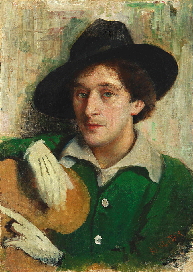
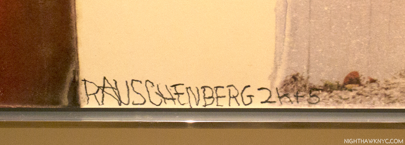
Everyone thought it was a joke, the gallery owner included, at his first show’s debut in Rome. Then, the respected reviewer of a show of work by a 28 year old Artist at its second stop at the Galleria d’Arte Contemporanea in Florence, Italy, called it a “psychological mess.” But, he wasn’t done. After continuing in biting terms, the reviewer concluded that the work should be “thrown into the Arno (River).” Shortly thereafter, the Artist sent the reviewer a note that read, “I took your advice.” Saving five or six works to bring home to NYC, he threw the rest, discreetly, into the Arno, finding a spot where he wouldn’t be caught in the act, and doing so in a manner to prevent their re-surfacing1.

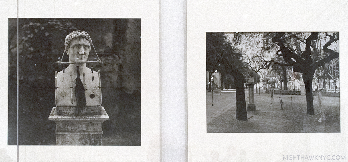
The Artist’s photos of his hanging works called Feticci personal, or Personal fetishes, displayed in his shows in Rome & Florence. One, left, shown hung on a bust. 9 of them shown hanging in a park, right. They seem to have disappeared since. Click any photo to view it full size.

His story continued…as the esteemed Calvin Tomkins tells it…

So branded an “Enfant Terrible,” “he had come back with two wicker trunks and five dollars in cash, and for a while that spring and summer he lived on the far edge of poverty. He found a loft on Fulton Street, near the fish market, a big attic space with twenty-foot ceilings but no heat or running water; the rent was fifteen dollars a month, but he talked the landlord into letting him have it for ten. A hose and bucket in the backyard served as his basin, and he bathed at friend’s apartments, sometimes surreptitiously, asking to use the bathroom and taking a lightning shower at the same time. His food budget was 15 cents a day, usually spent at Riker’s cafeteria, and supplemented by bananas he picked up on the United Fruit Company’s docks. Living that far downtown, he saw few other artists. Most of the New York artists lived in Greenwich Village then, or further uptown, and he could rarely afford the subway fare (still only a dime) to socialize.2” Shortly after, his NYC Dealer was not overly enthused about his latest paintings, so she dropped him.

So…You say you wanna be an Artist? Somehow, as bad as things got, he persevered when few would have.

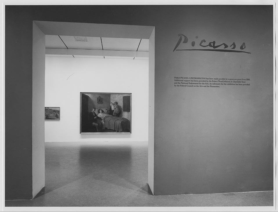
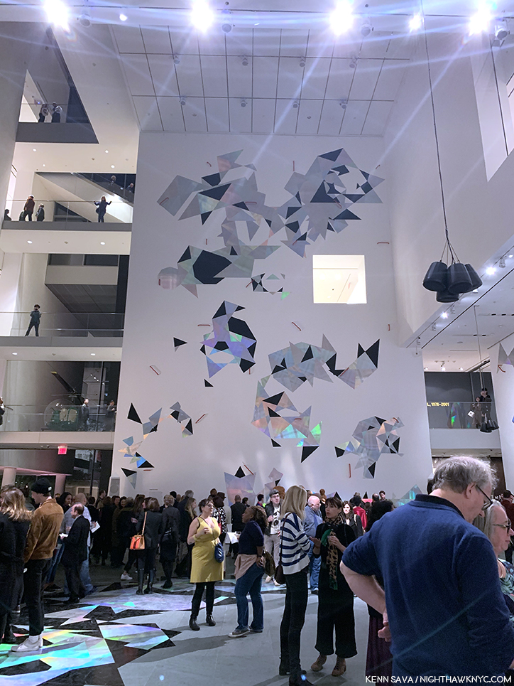
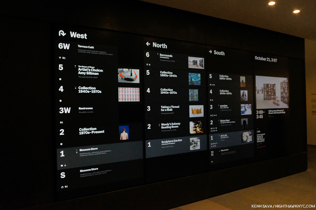
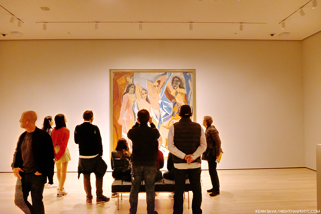
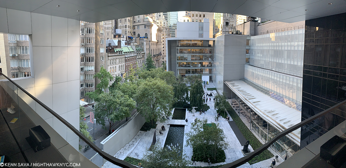
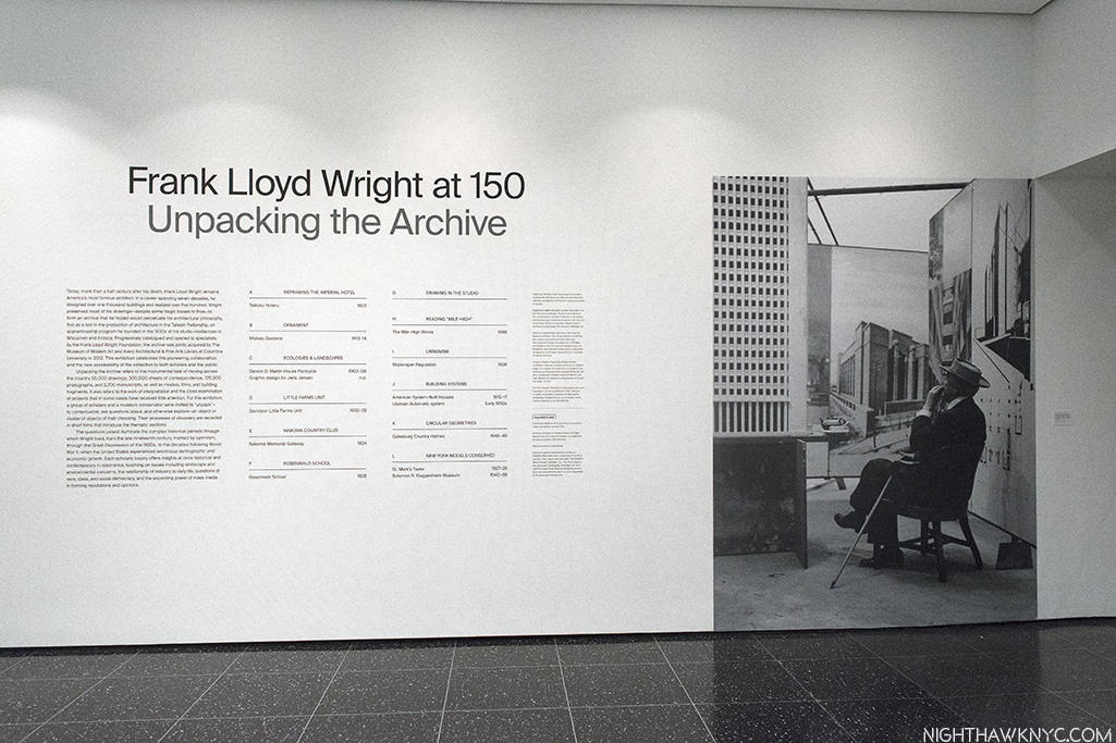
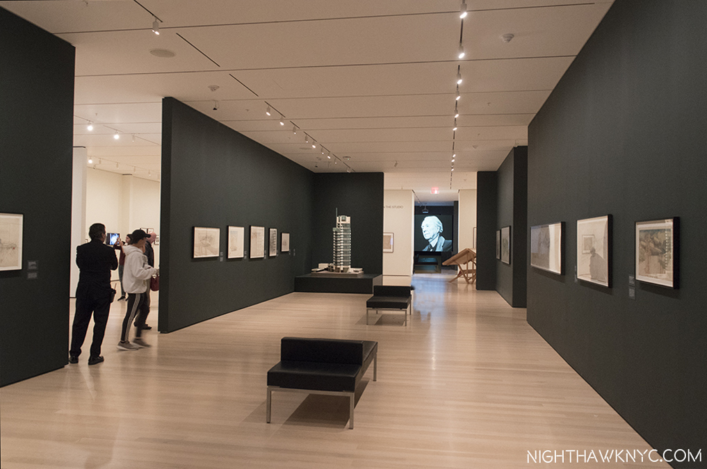
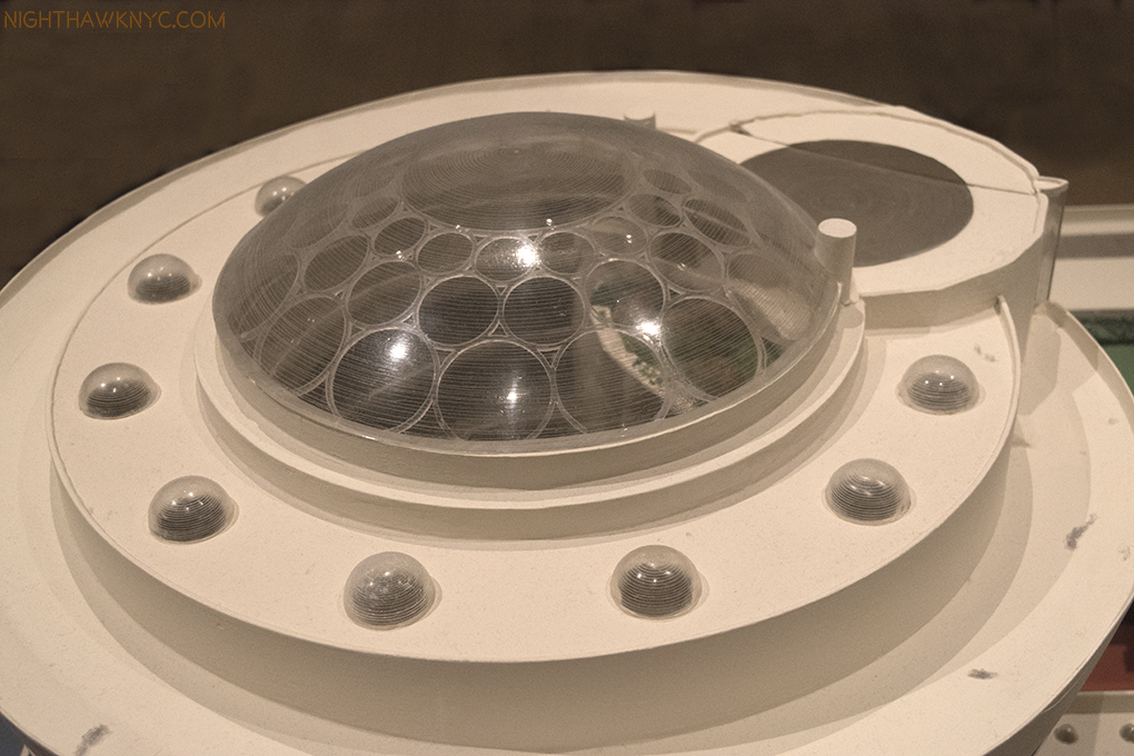
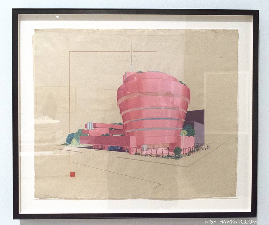
44 years later, in 1997, his work filled Frank Lloyd Wright’s Guggenheim Museum Building, spilled over to fill the Guggenheim Soho (its final show ever), the Ace Gallery downtown, and numerous other satellite shows in galleries around town simultaneously, in what was to my eyes at the time, and my mind since, a monumental and utterly overwhelming Retrospective, an effect not unlike seeing the incomparable Picasso Retrospective, which filled all of  MoMA in 1980, or the Rothko show at the Whitney in 1998. 64 years A.A. (After Arno), as I type, his work fills MoMA’s 4th floor (until September 17). No less than Frank Lloyd’s Wright’s just happens to fill the 3rd floor. Be careful walking by MoMA. With that much American creativity on view, the building might just levitate.

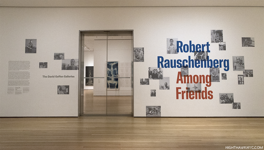
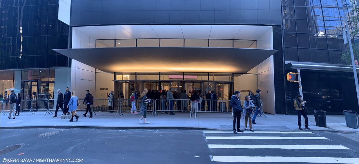
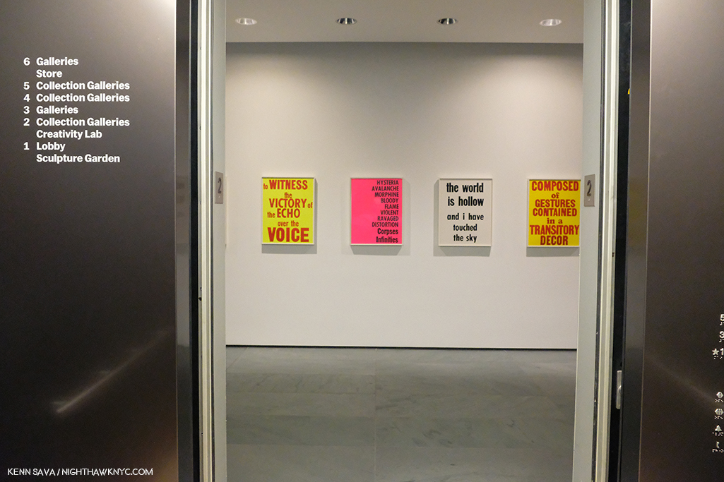
The entrance on MoMA’s 4th Floor.

Speaking about his achievement, Artist, and former partner, Jasper Johns once said he “was the man who in this century had invented the most since Picasso3.” In the Catalog for that Guggenheim Retrospective, Charles F. Stuckey wrote-

“Globally speaking artists and their audiences have been living since around 1950 in what might well be called the Rauschenberg Era (his cap). As we look toward the culture of the next millennium, our vantage is from atop his shoulders4.”

Wait. Stop the march of time for one second. WHO has an “Era?”

Michelangelo and Leonardo share the Renaissance, with Raphael, Titian and a host of other “Old Masters.” Rembrandt & Vermeer are part of the Dutch Golden Age of the 17th Century that includes literally hundreds of Artists still fondly considered almost 400 years on. The Impressionists were a group. So were the Surrealists and the first generation Abstract Expressionists (though Rothko had his own name for it). Perhaps Picasso (who, early on, shared Cubism with Braque and Juan Gris) comes closest, especially in recent times. Well, Picasso is Picasso.

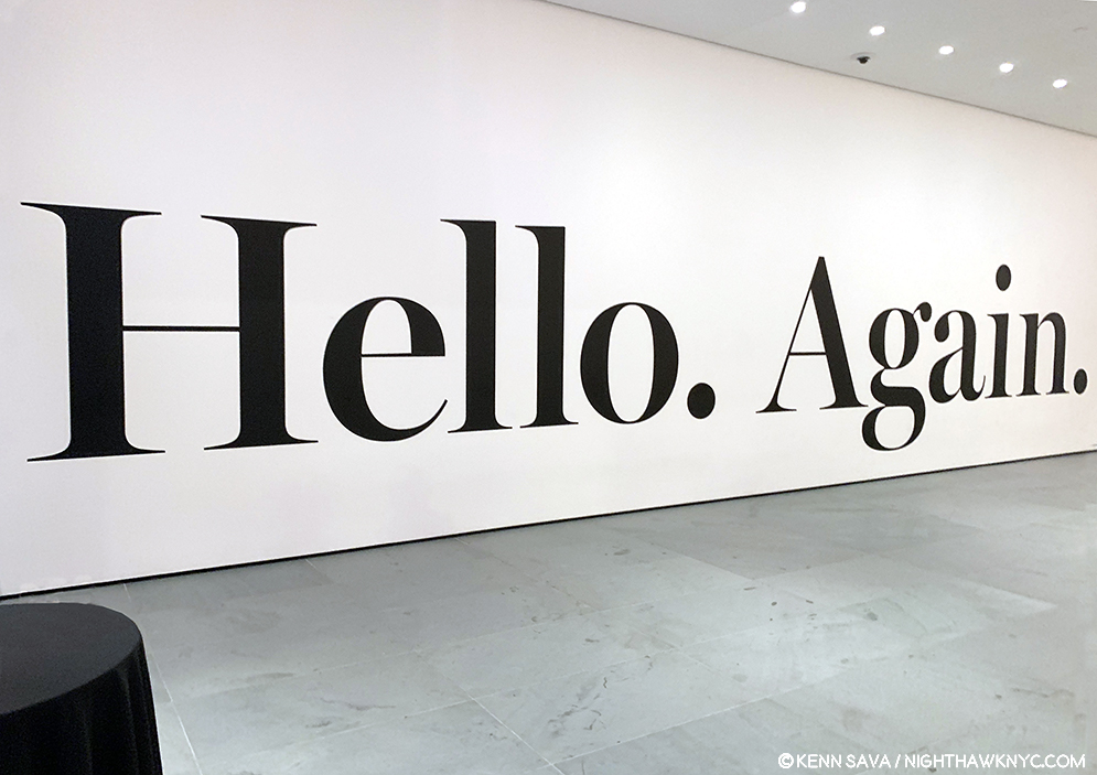
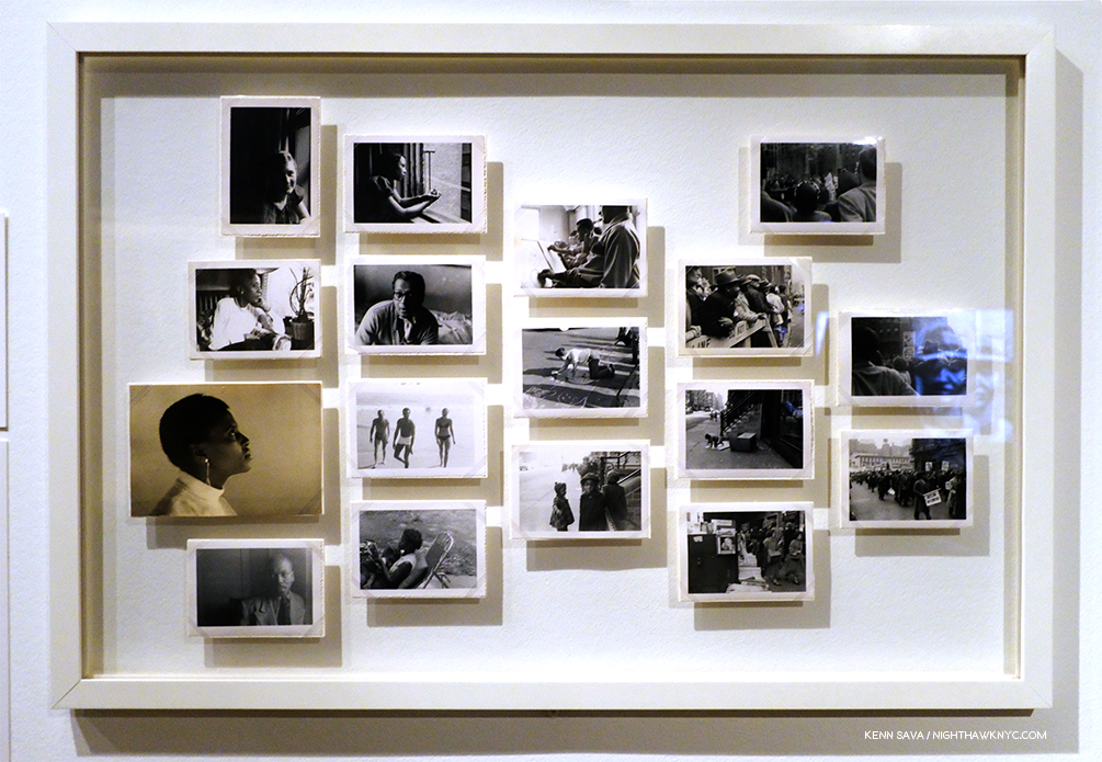
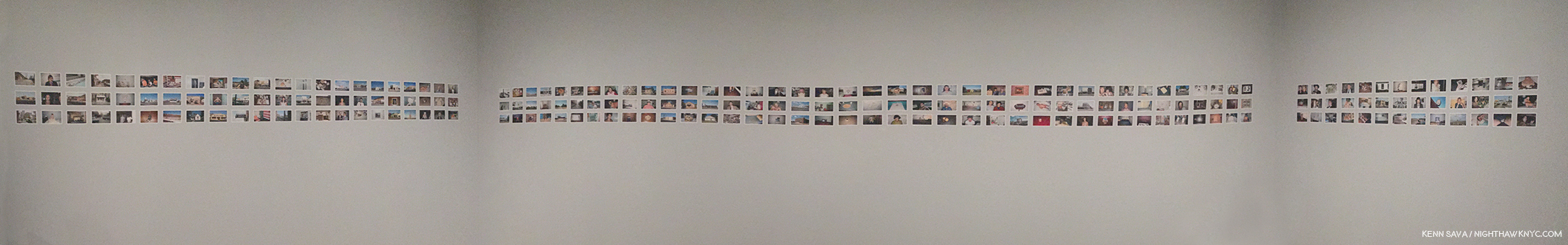
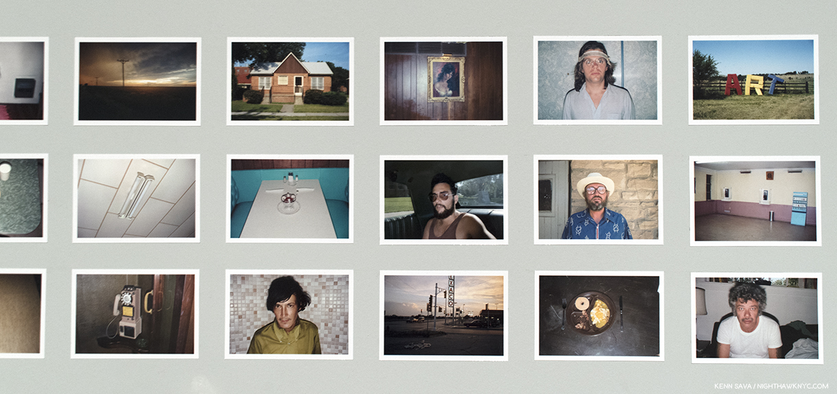
How did Robert Rauschenberg get from being told to throw his work into the Arno, to having an “Era” that’s lasted 50 years (to 2000), and may well still be going on, even though he passed away in 2008? This, and other questions, were foremost on my mind, during the first of 17 visits to MoMA’s 250 work retrospective, Robert Rauschenberg: Among Friends, and half as many to the 4 satellite shows around town, in this “Summer of Rauschenberg,” as I saw a writer call it. The other questions included- Does the show finally make the “case” for his later work? Does it finally make one for him as a major Photographer? First, putting off a look at the other shows, let’s take a look at Robert Rauschenberg: Among Friends. Outside, on the entrance wall, Photos of Rauschenberg & his friends, seen above, reinforce the message that the show features his interactions, mutual influence and collaboration with his friends, many of who happened to be brilliantly talented Artists, themselves. This is the view immediately inside those Star Trekian automatic sliding glass doors. Beam me up, Bobby.

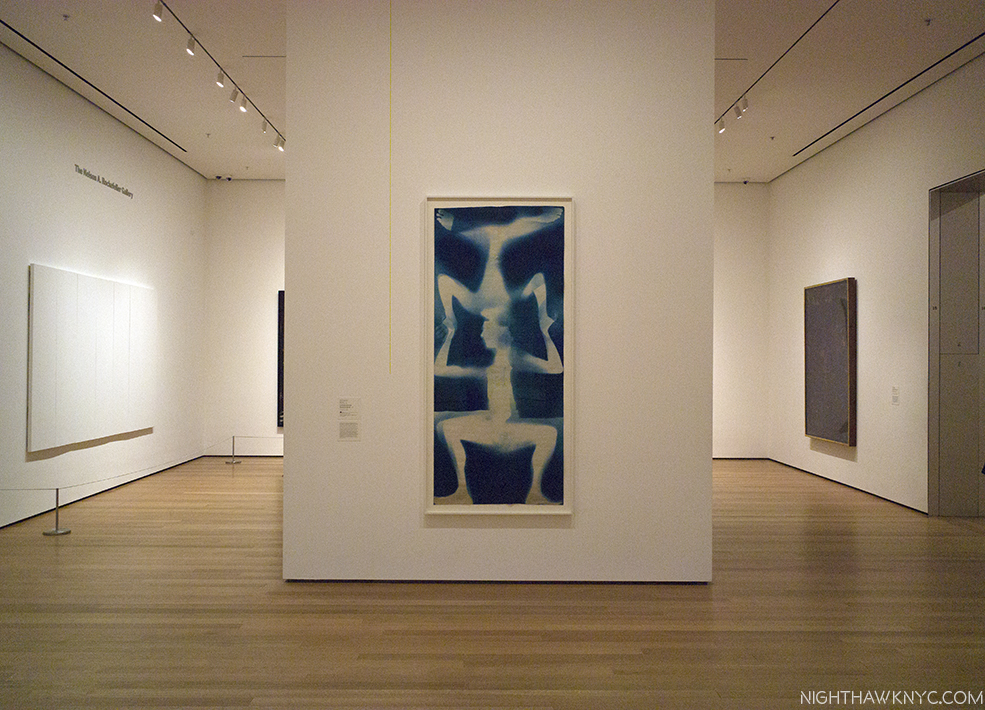
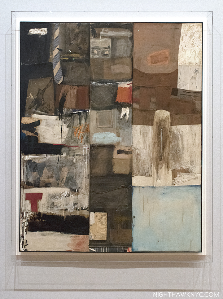
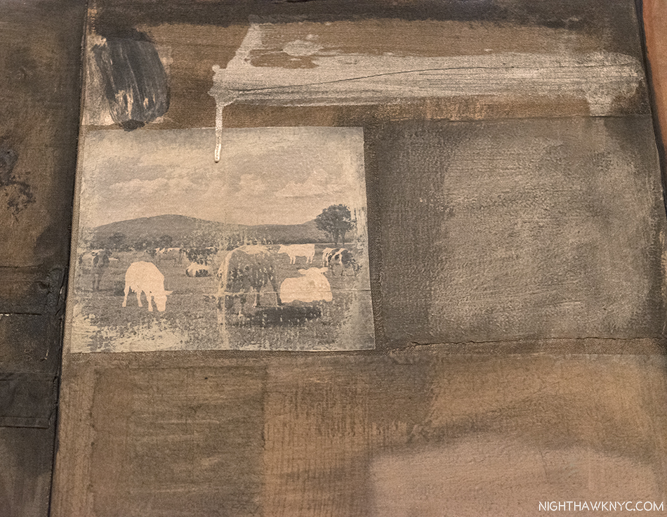
Partial installation view of the first gallery.Untitled (Double Rauschenberg), c.1950, Monoprint; Exposed blueprint paper, a collaboration with Sue Weil, center, White Painting (Seven Panel), 1951, left and Untitled (Black Painting), 1952-3, right, examples of the two bodies of work that were to come shortly after, once Rauschenberg had decided to become a Painter, not a Photographer. The White Paintings would inspire John Cage. Of the Black Paintings, which had newspaper collaged on them, painted over with black paint, he said- “I was interested in getting complexity without their revealing much. In the fact that there is much to see but not much showing. I wanted to show that a painting could have the dignity of not calling attention to itself, that it could only be seen if you really looked at it5.”

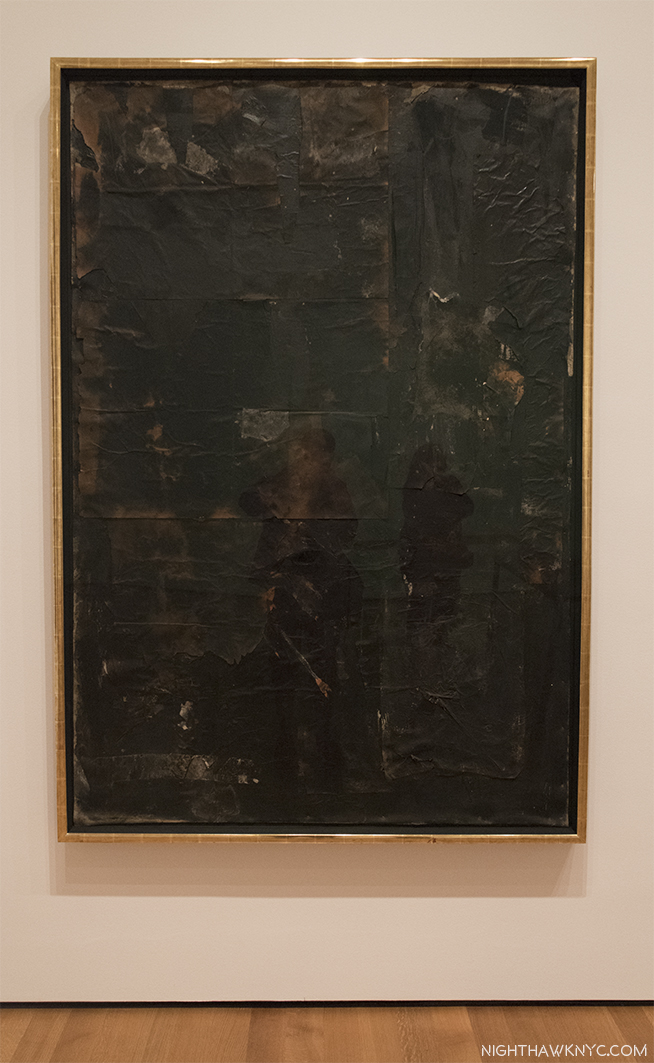
Untitled (Black Painting), 1952-3, Oil and newspaper on canvas, affixed to screen door.

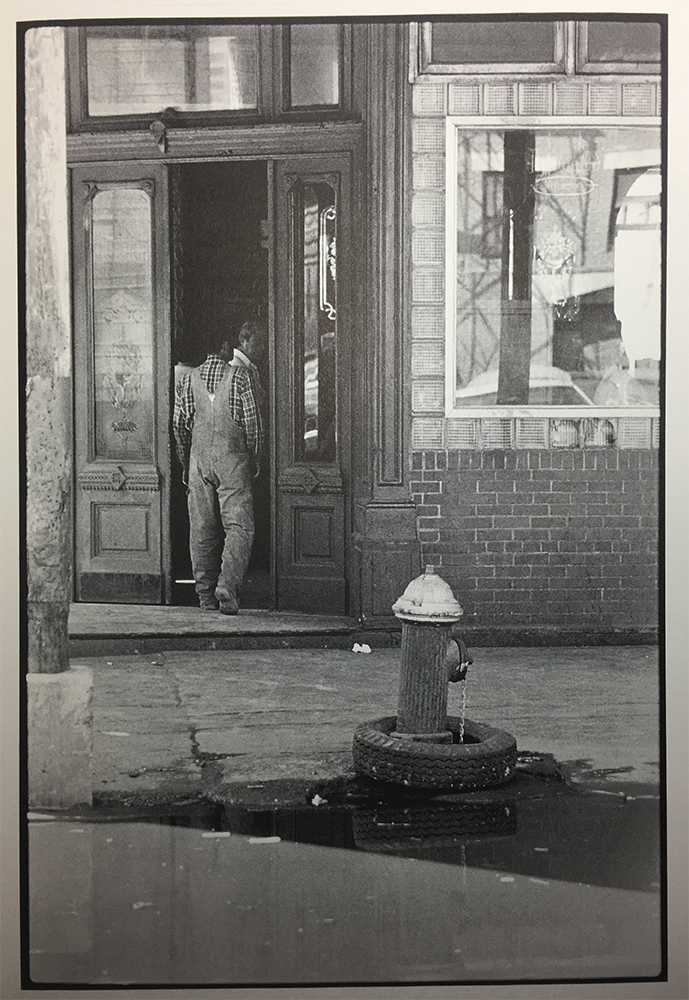
The first room contains his earliest work (unlike the 1977 Rauschenberg Retrospective, which came to MoMA, and started with his newest work). On either side of the door, and facing it, are 3 of the Blueprint images he created with Artist, and future ex-wife, Sue Weil in 1950 & 51. They were as attention getting then as they are now, garnering the couple a 3 page spread in Life Magazine in April, 1951, in which they demonstrated their process. To the right, a wall of his early Photographs are collected, mostly done in his days at Black Mountain College, including two that were the first works by Rauschenberg to be acquired by MoMA, in 1952, six years before it would acquire anything else by the Artist.

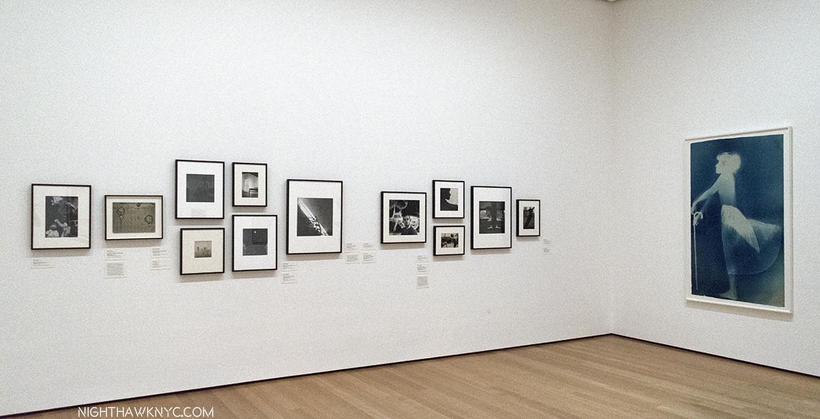
To the right of the door, a wall of early Photographs, and the Blueprint, Sue, c.1950, make it easy to see why he had a hard time deciding whether to be a Photographer or a Painter. I’m not entirely sure he ever truly chose one.

To the left are his earliest non-photographic works, including his earliest surviving painting, 22 The Lily White, c.1950, one of very few survivors from his very first show at Betty Parsons Gallery in May, 1951.

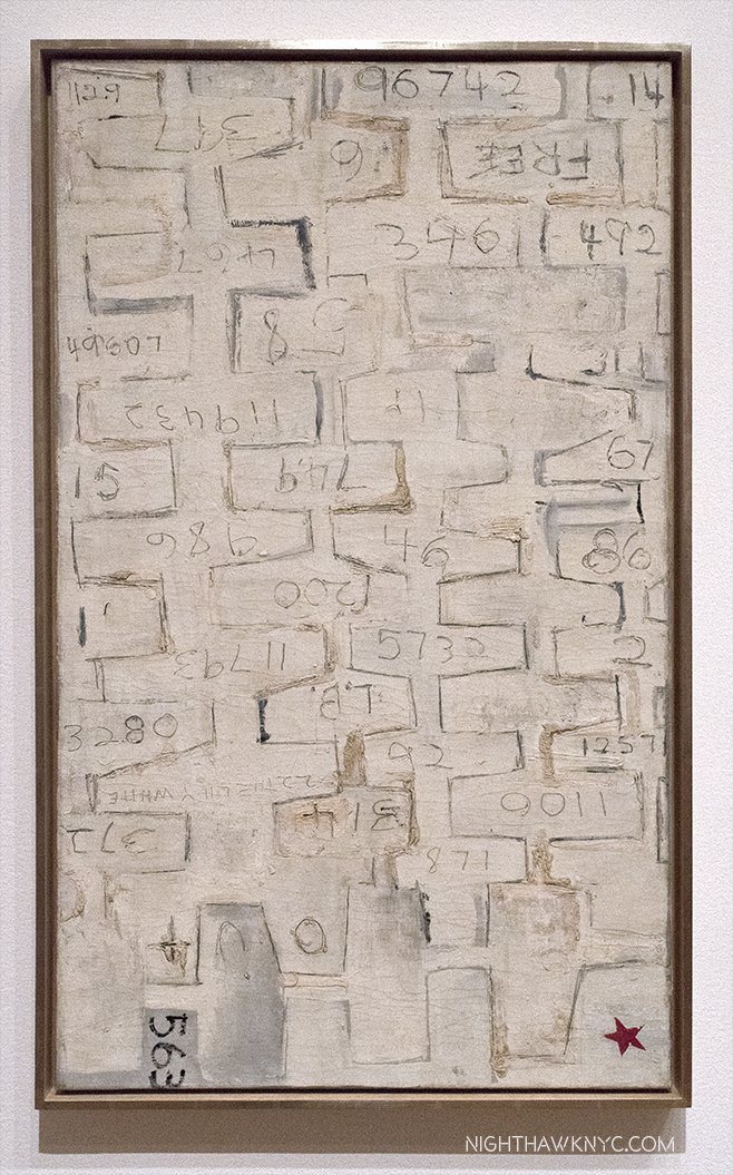
22 The Lily White, c.1950, Oil and graphite on canvas. The earliest surviving Rauschenberg Painting. The red star mimics those galleries put near sold items. This one didn’t sell. Perhaps viewers thought it had already been sold.

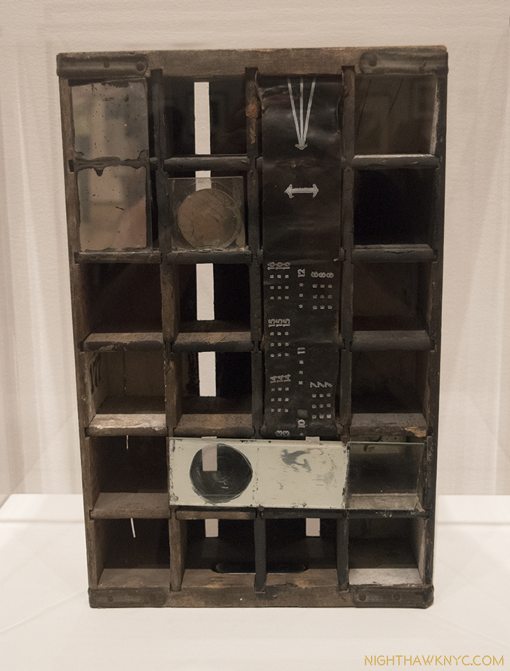
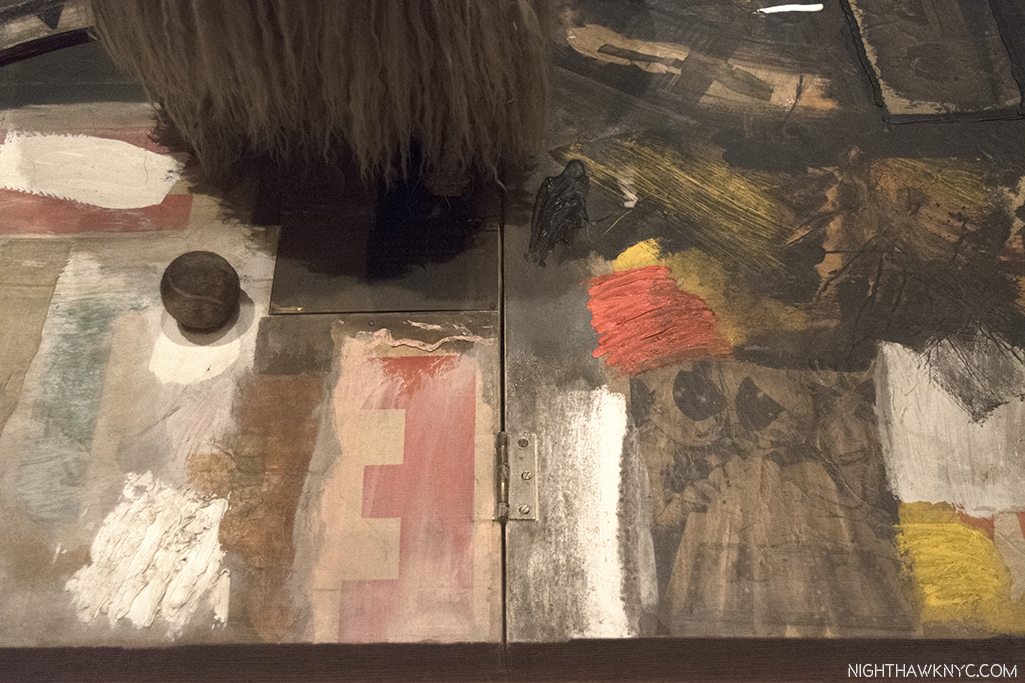
Untitled, 1952, Mirrors and objects in Coca-Cola box. The shape of things to come..Perhaps his first effort at blurring the lines between Painting & Sculpture he would revisit in his “Combines.” Believe it or not, at this point, he had not seen the boxes of Joseph Cornell.

Behind the pillar displaying Double Rauschenberg, is a Seven Panel White Painting, left, and 3 of the Black Paintings, one shown above, which came next. In the center of the space is a vitrine containing, among other artifacts, the original “score” for John Cage’s infamous 4’33, which the “White Paintings,” which Cage was a vocal, and poetic, admirer of, were one of the inspirations for.

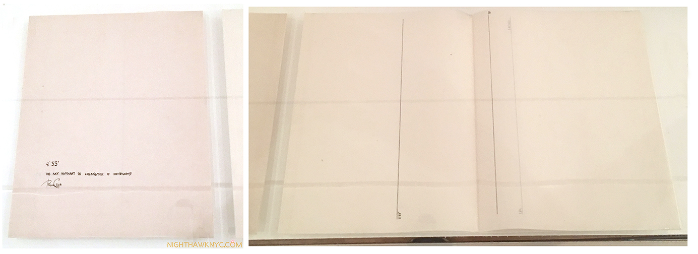
The most avant-garde piece of “music” ever “written”. The manuscript John Cage’s 4’33 1952-53,, partly inspired by Rauschenberg’s White Paintings. The cover is seen, left, and the actual “score,” right. Go ahead. Try it at home.

The first “performance” of Cage’s 4’33 consisted of pianist David Tudor walking on stage and sitting at the piano for 4 minutes and 33 seconds. Then, he got up and walked off. It’s hard to imagine a more “avant-garde” piece of “music.” Rauschenberg’s exploration of the possibilities of materials, beyond painting, now took center stage in his work. “He thought of his work as a collaboration with materials, as he put it. He was not interested in expressing his own personality through art- ‘I feel it ought to be be much better than that,6‘”

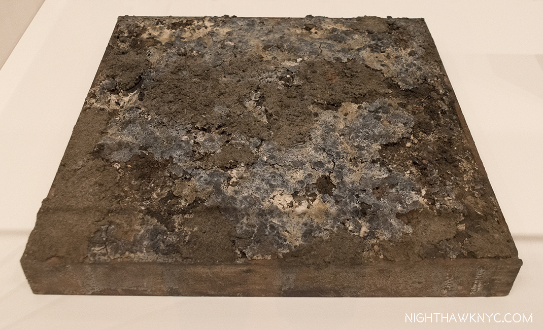
Dirt Painting (For John Cage), 1953, Dirt and mold in wood box. “Painting” doesn’t get more avant-garde than this (or, his White Paintings.). More on this subject later.

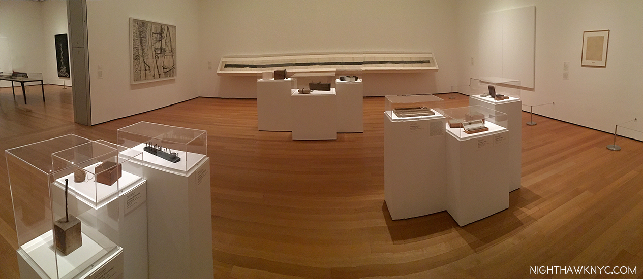
More of the second gallery showing “Elemental Sculptures,” Scatole Personali 0r Personal Boxes, both on pedestals, the Erased de Kooning Drawing, right, another White PaintingTiznit, 1953, Oil on canvas, by Cy Twombly, left corner, and the Automobile Tire Print, with John Cage, 1953, in the back.

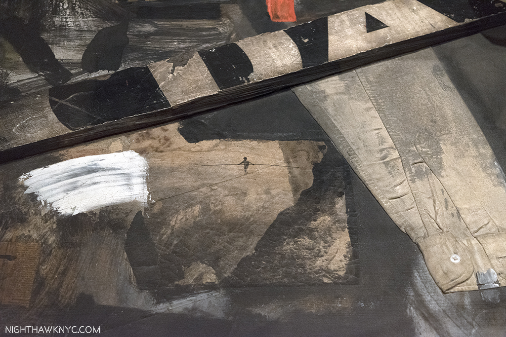
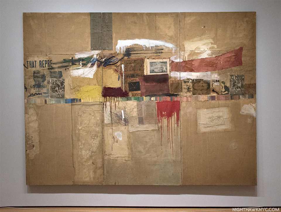
At this point, he went to Italy with Cy Twombly, culminating with the shows mentioned at the beginning, after which he returned to NYC. He decided to commence a series of Paintings using red, because white, and then black “impressed  a lot of people as aggressive, ugly, and full of the anger of negation. So, Rauschenberg “thought he had better find out whether there was any truth to these charges. He would test his own motives by turning from black and white to red, for him almost aggressive, the most difficult, the least austere color in the spectrum. [7, “Off the Wall,” P.78]” These are featured in the 3rd gallery, which includes some of his most well-known and influential works.

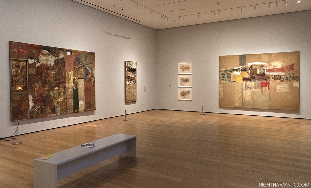
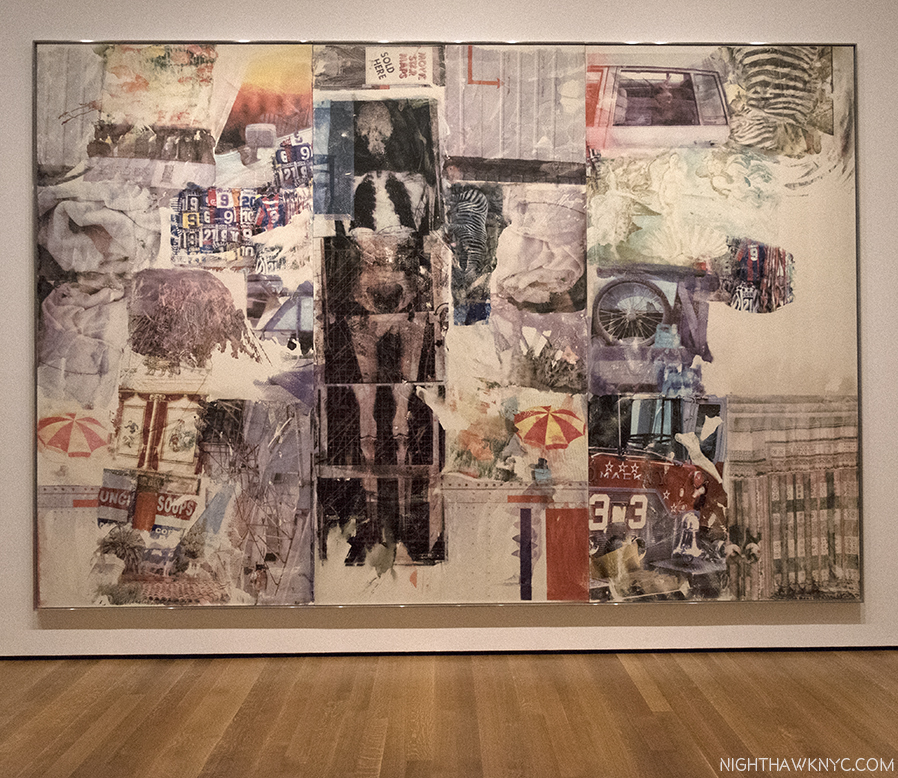
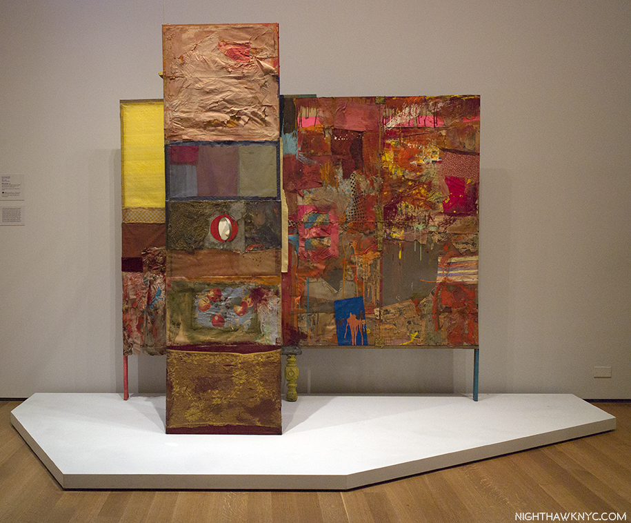
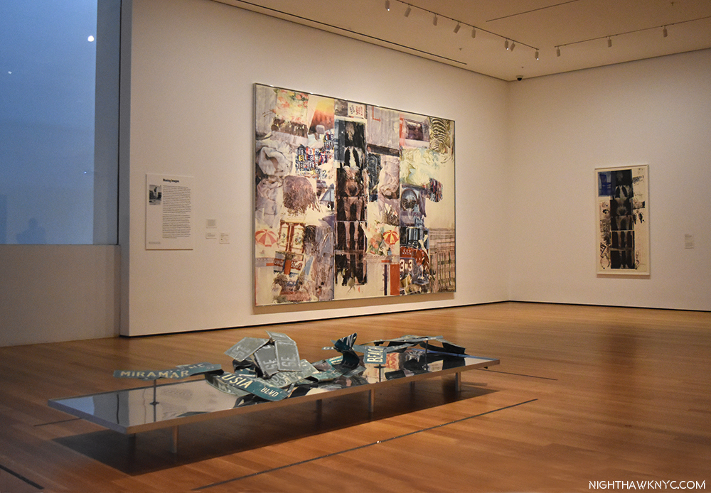
Charlene, 1954, a “Combine Painting,” and the last Red PaintingBed, and Rebus, both 1955, left to right, with a column of 3 Untitled Drawings, 1954 by Cy Twombly in between.

On the facing wall is Minutiae, 1954, a Combine, created as a set for the Merce Cunningham Dance Company, which Rauschenberg served as set, costume and lighting designer for at the time.

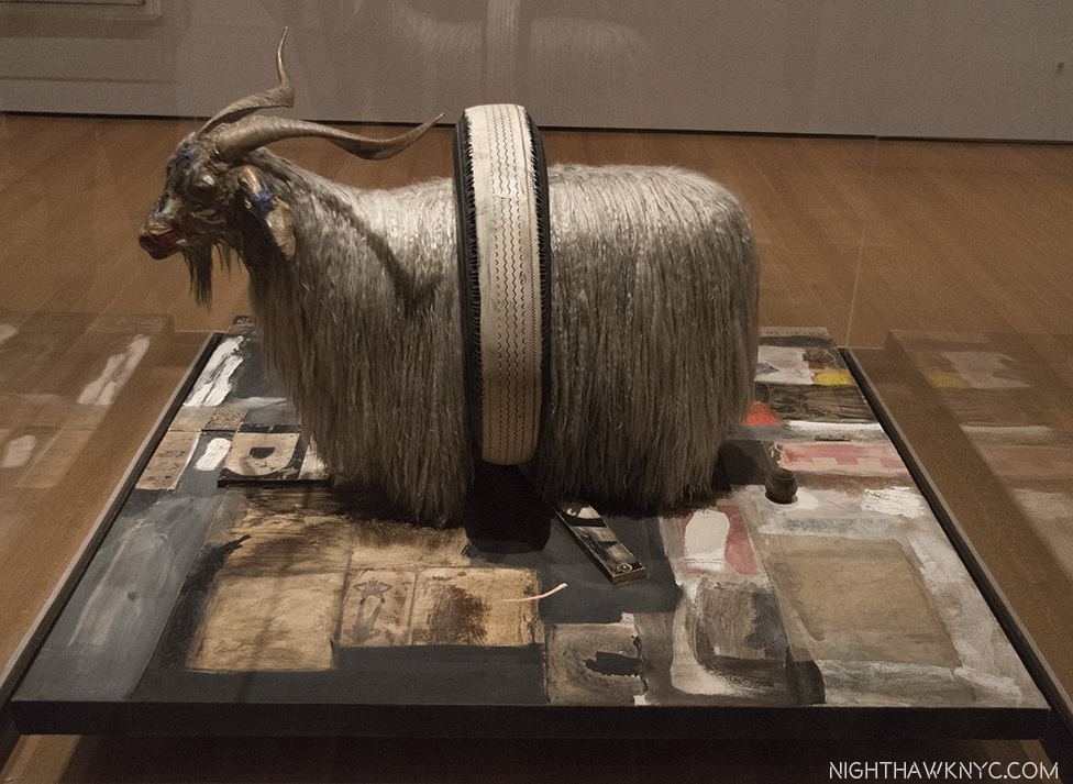
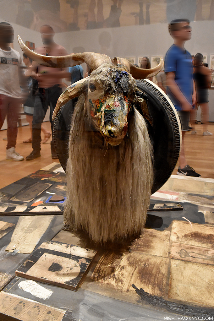
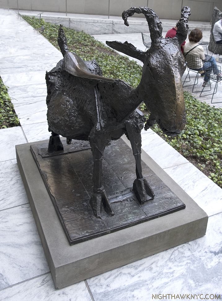
Something happened to Robert Rauschenberg in 1954. A number of writers have tried to explain exactly what it was. I’m not sure I understand. Whatever it was, it led to a breakthrough. He started adding more to his collages, anything was game, he said, as in Bed, 1955, which uses an old comforter since he had run out of canvas. Then, Red went out and was replaced with the the more neutral tones seen in Rebus, 1955. He had been including newspapers in his works going back to the Black Paintings, in 1951-2. At some point, around this time, he also began including photographs- found images from magazines and newspapers, etc.7 As time went on, however, he started incorporating large found objects, including an Angora goat and a Bald eagle, which, of course, grab your attention before you get to any of the details the works also include. Among Friends, is a very rare chance to see the two famous works that feature them, Monogram and Canyon, together. 8

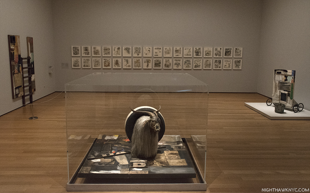
Reinventing Painting, Sculpture & Drawing. Monogram, 1955/59 on loan from the Moderna Museet, Stockholm, front, with Gift for Apollo, 1959, right, Winter Pool, left, both 1959, and 34 Illustrations for Dante’s Inferno, 1958-60, on the far wall. Some of the most revolutionary Art of the past 60 years.

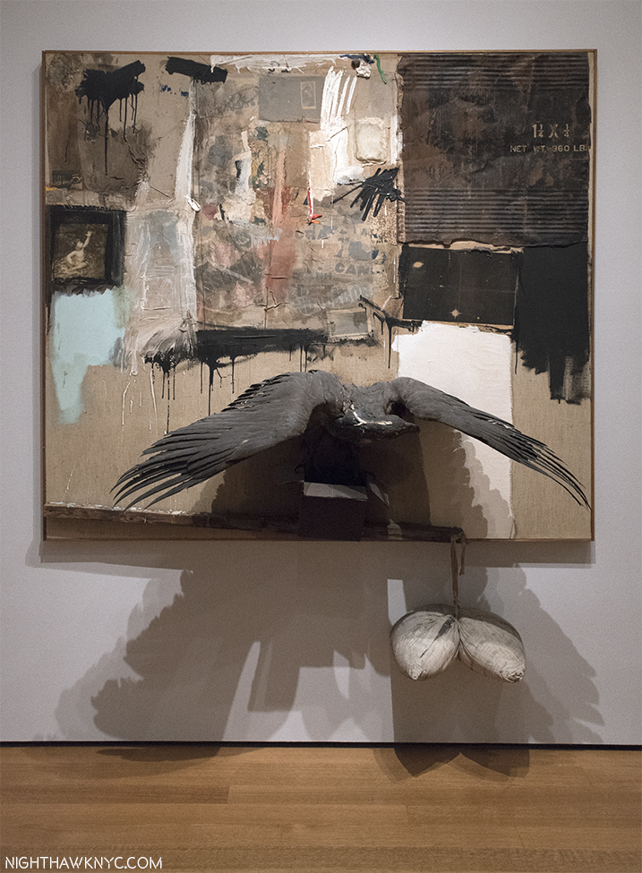
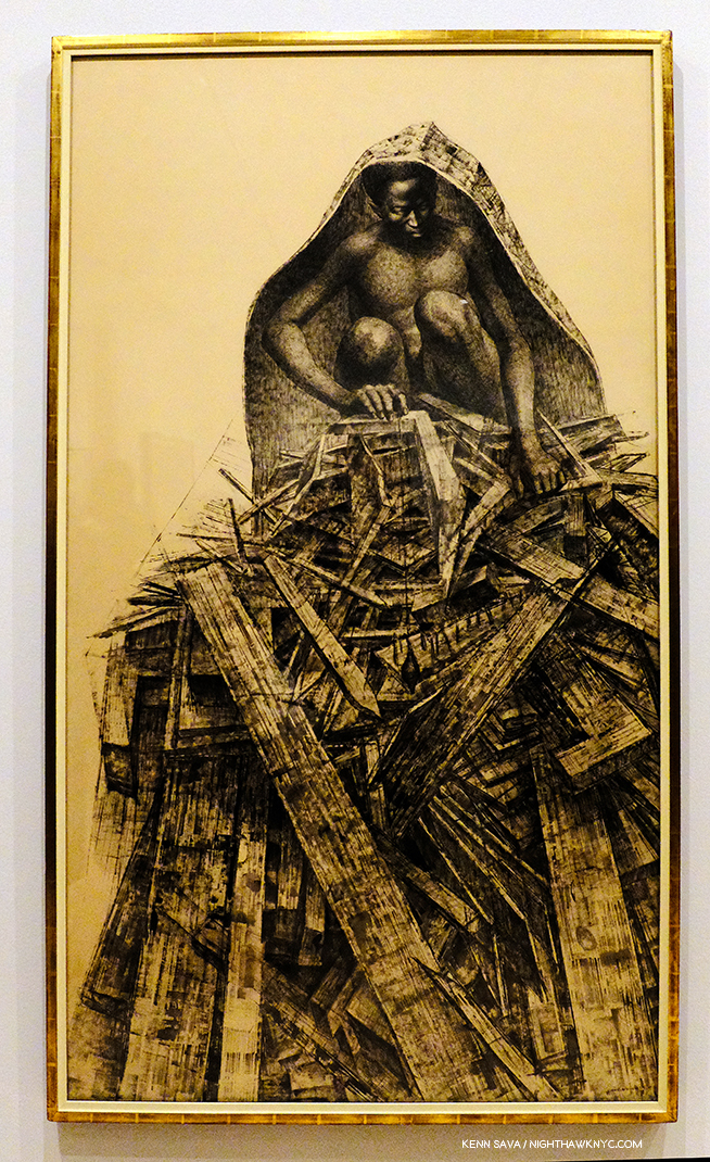
Canyon, 1959, Combine. One of the masterpieces of post WW2 Art. Rauschenberg on the Ganymede myth, with a Bald Eagle standing in for Jupiter’s Eagle, and fascinating to compare with Rembrandt’s Abduction of Ganymede, 1635, down to the inclusion of Rauschenberg’s Photograph of his son Christopher, on the left.

Canyon, 1959, is my personal favorite among his Combines (the word denotes a work that is a “Combination” of Painting and Sculpture, or as Jasper Johns said, “It’s painting playing the game of sculpture9.”) The controversial American Bald eagle’s very strange “pose,” standing on the sides of an open cardboard box, notwithstanding. It audaciously revisits the Ganymede myth, as he was doing in the Dante Illustrations (bringing a contemporary interpretation to an ancient tale) and, creating something of his own mythology, enhanced by the presence of a Rauschenberg Photo of his young son, Christopher (now a Photographer and head of the Rauschenberg Foundation), and including the cardboard box, which would become a staple Rauschenberg material (from the days before acid-free papers, adding to the conservator’s nightmare this works is). It takes the concept he realized in his 34 Illustrations for Dante’s Inferno one step further, into a 3-D Combine. 58 years later, it’s still a thrilling, unique experience, that’s every bit as audacious as it must have been in 1959.

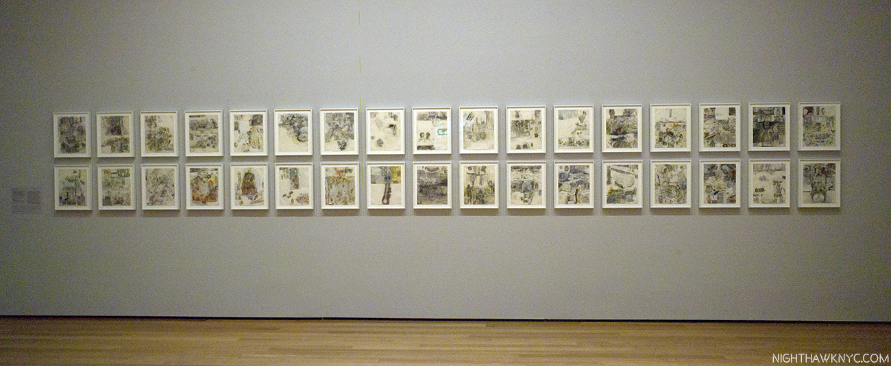
As they hadn’t in Italy in 1953, a sizable amount of the viewing public still didn’t take Rauschenberg seriously by the late 1950’s, and the Combines actually served to reinforce that. Standing near Monogram for 15 minutes on 3 different occasions, I noted the immediate reaction of at least 75% of viewers were smiles, or outright laughs. I don’t know what they wound up thinking of it after taking a closer look. Increasingly “troubled10”  by this reaction 60 years ago, in 1958, he decided to illustrate Dante’s Inferno. To do so would require nearly 3 years. The resulting series of “34 Illustrations,” displayed at the Leo Castelli Gallery in December, 1960, finally served to alter the public, and critical, perception of Rauschenberg. The complete series lines the back wall of this gallery, where they loom as something of a “spiritual center.” For me, their Artistic importance in his entire oeuvre cannot be overstated- so much of what was to follow can be seen in them. Including his use of Photographs, now as independent elements, standing in for many of the characters in the Inferno, in Rauschenberg’s unique, contemporary imaging of the story. I take a closer look at them in the “Highlights” Post, following.

The Combines and Combine Paintings lead us to a “central” gallery containing his classic Silkscreen Paintings of 1962-64, and Oracle, a five-part found object assemblage integrated with technology that he created with engineer Billy Klüver and 4 others between 1962-5. Rauschenberg discovered silkscreening during a 1962 visit to the studio of Andy Warhol, who had been working with the technique since 1961. Silkscreening provided the answer he had long sought- how to transfer images to canvas in good resolution. His Transfer drawing technique only taking him part of the way (though he would continue to use it when he felt it was needed through the years).

Oracle, 1962-65,a five-part assemblage, with wireless microphone system, concealed radios & speakers, washtub with running water, surrounded by 10 of his groundbreaking Silkscreen Paintings, 1962-64

His silkscreens look nothing like Warhol’s, as can be seen below. Especially early on, Warhol took a single image and replicates it and/or varies it, using a grid. While Rauschenberg may repeat the same image up to 4 times in a work (usually varying it), he never allows it to become the central “point” of the work.

Warhol’s Let Us Now Praise Famous Men (Rauschenberg Family), 1962, Silkscreen on canvas, along side Rauschenberg’s early Silkscreen Painting, Crocus, 1962

Rauschenberg’s insatiable creativity led him to move forward, so the period he made these Silkscreen Paintings lasted only from 1962-64. Though he used Abstract Expressionist techniques (his work is characterized by his use of everything & all techniques), they complete his moving beyond the style of Abstract Expressionism, something he began working towards doing in the early 1950’s, to Painting wholly in his own style, and along the way, freeing Art to move on. While these works include some of his own Photographs, the featured images are, primarily still found images. As such, as great as they are, they are another step, an important one, to what his work would eventually become.

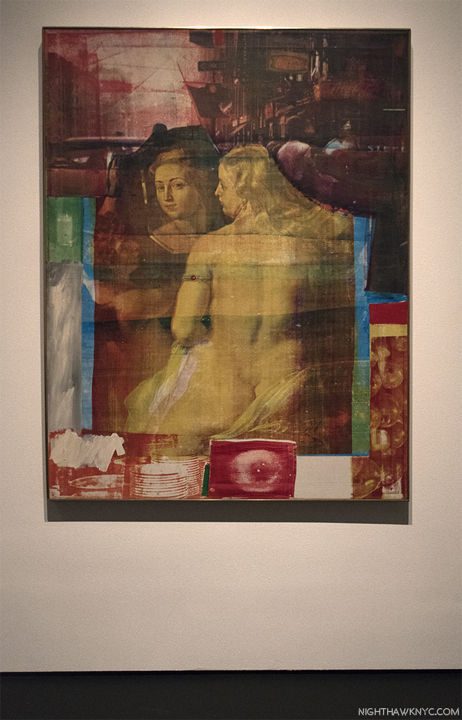
Persimmon, 1964, Oil and silkscreen on canvas. There’s much to say about this revolutionary work, but notice the mirror in Ruben’s Venus, which I’ll get to. Interestingly, Ruben’s Venus appears in a number of the silkscreen paintings, and curator Roni Feinstein noted they seem to be a female counterpart to JFK, who appears many times.

After becoming the first American to ever win the grand prize in Painting at the 1964 Venice Biennale, he would soon largely stop painting and turn his focus to performances, and the marrying of Art & Technology.

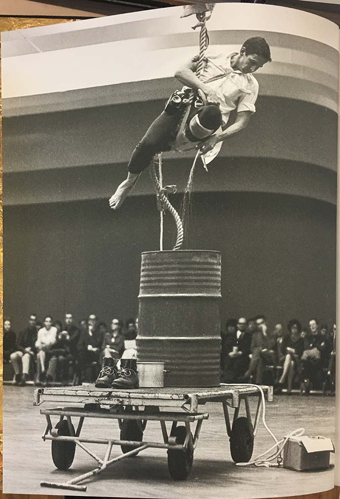
Scaling the heights of Art. Rauschenberg performing in his Elgin Tie, in 1964 in Stockholm. From the Hardcover edition of the show’s excellent catalog.

The latter took place in both stand alone works, and in performances, particularly “9 Evenings,” which is marvelously explored here11, and includes Rauschenberg’s contribution, Open Score. (See my look at Early Networks in Part 3 of this series, here.) The massive Mud Muse, which I’ve seen described as an experience akin to a visit to Yellowstone, is one stand alone work that is certainly popular with younger viewers. A monumental feat of installation considering the work holds 8,000 pounds of “listening” Bentonite mud,  with embedded sensors that cause the mud to react with the music being played on the control unit nearby. On loan from the Moderna Museet, Sweden, it’s one of the most ambitious and technologically complex works Rauschenberg ever made, and is making its first NYC appearance since Rauschenberg completed it here in 1971.

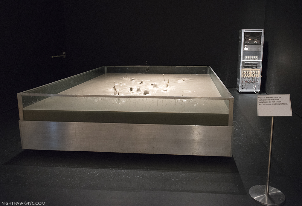
Now, I’ve seen everything. Mud Muse, 1968-71, 8,000 pounds of Bentonite mixed with water, in action.

From there, the show moves through his Cardboards (sculptures made from found cardboard boxes), the famous Son Aqua (Venetian), 1973, with its water filled bathtub, and works inspired by trips to India, before getting to the penultimate, large gallery of later works.

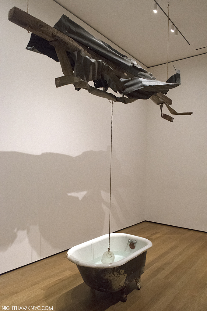
Sor Aqua (Venetian), 1973, Water-filled bathtub, rope, metal, wood and glass jug. Rauschenberg continued to use found objects, like these, his entire career, even after he could afford traditional supplies. “Gifts from the Street,” he called them. After a while of looking at this, it hit me- There’s no drain in the bathtub. Maybe that’s why its owner threw it out, to become a Rauschenberg found object. A guard told me he called the metal on wood structure above, “The Angel.”

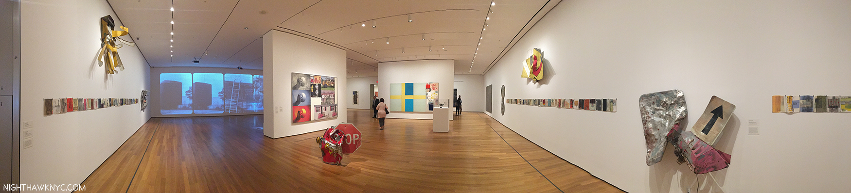
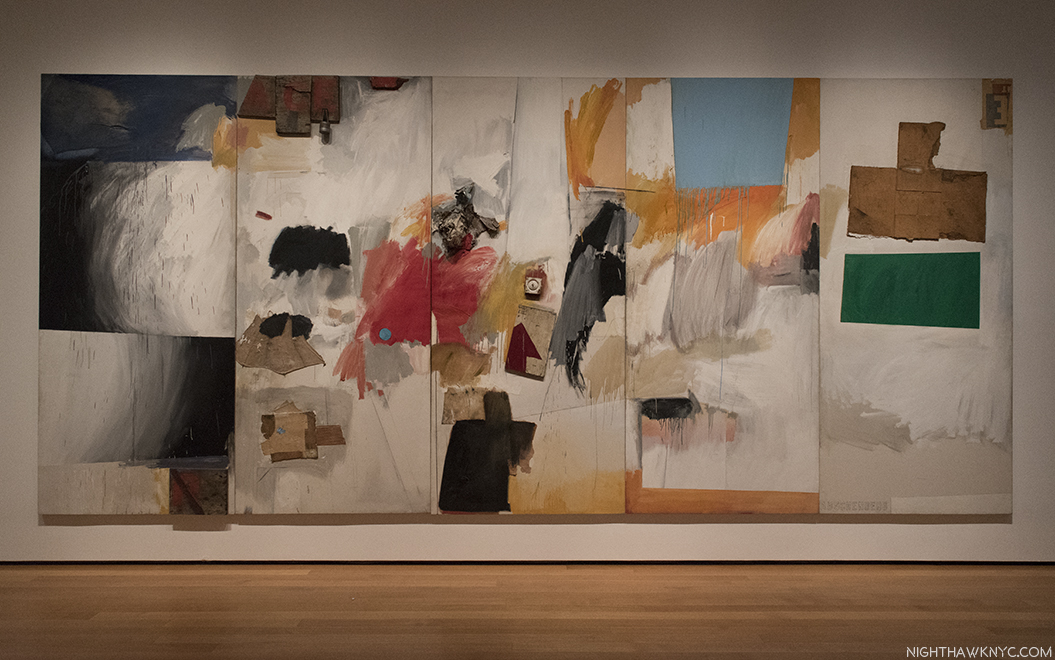
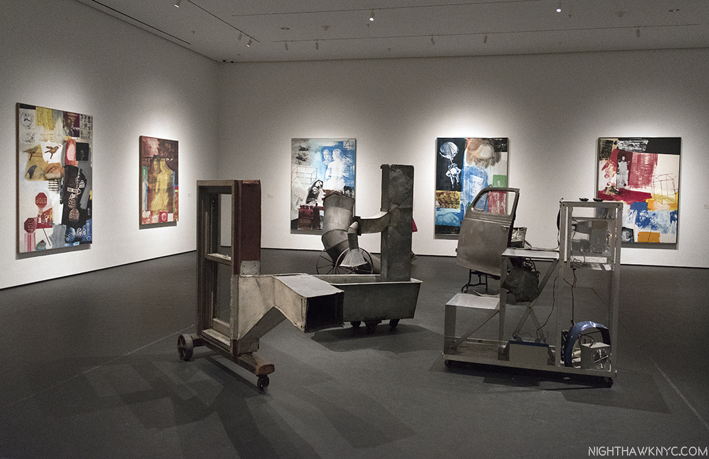
The large gallery of later works includes Hiccups, 1978, the horizontal rows, left & right, joined by zippers,Glacial Decoy, the collaboration with Trisha Brown (black and white photos, left), Triathlon, 2005, from Scenarios, the color painting, left of center, the latest work here, and For A Friend And Crazy Kat (Spread), 1976, along with a few examples from his Gluts series of found metal objects & signs. I will long wonder about what was omitted from this gallery.

The large gallery of later work, above, includes a very wide range of pieces that attest to some of the incredibly wide range of materials and styles Rauschenberg worked in. It highlights the fact that he continued to use found materials even when he could well afford art store materials. This was one of his ways of bringing “life” into his work, which he felt was essential in Art. Though not nearly as well known as the earlier periods of his work, there are a number of major works on view here, too. To my eyes, Mirthday Man, from his Anagrams series, Inkjet dye and pigment transfer on polylaminate (center, on the wall in the photo below), created on the Artist’s 72nd Birthday, in 1997, is one. Booster, a print from 1967, to its right, is as well.

Urban Katydid, (Glut), 1987, Riveted street signs on stainless steel,, front, Mirthday Man, 1997, Inkjet dye & pigment transfer created on his 72nd Birthday, center, and Booster, 1967, Lithograph & screen print, right, end the gallery of late works. The latter two feature almost life size X-rays of Rauschenberg. Both are among his major works in my opinion.

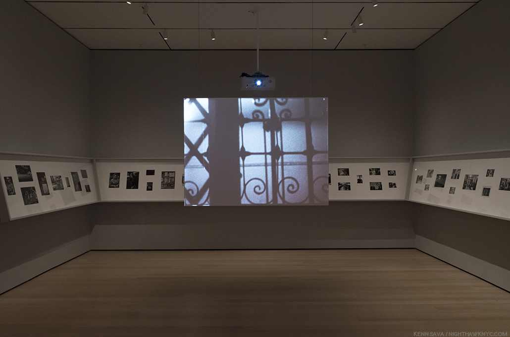
Partially seen in the last gallery photo, on the back wall to the left, and below, are black & white photos that form the backdrop for Rauschenberg’s collaboration with the late Trisha Brown called Glacial Decoy, 1979, in an installation by Charles Atlas, who worked with Rauschenberg. The piece comes closest to showing Rauschenberg’s later Photography, cleverly getting 620 examples of it in the show, though the images move one space from left to right every 4 seconds. The smaller color screen hanging in front shows video of a performance of the work from 2009 at BAM. All the way around, this is a terrific work, though if you want to focus on the Photos, you have 16 seconds to ponder each one before it disappears. The performance is, also, amazing. The installation? I’m not so sure. Sitting directly in front of the transparent hanging color screen, it’s a bit hard to make out everything that’s going on onstage since the large black and white photos on the back wall shine through. Though they are in the same sequence as they  are in the background of the performance, they’re in a different scale and so it serves to make it hard to see the screen. The resulting effect is somewhat strange. I found it better to see, standing quite a bit off to the side, as below.

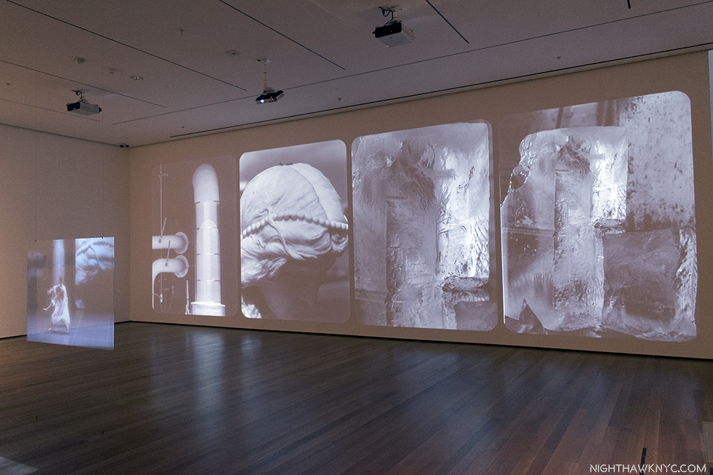
Glacial Decoy, 1979, with 620 Photographs that scroll from left to right in 4 second segments & costumes by Rauschenberg, choreography by Trisha Brown. Interestingly installed by Charles Atlas, who worked with Rauschenberg.

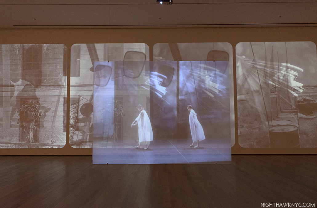
The view directly in front of Glacial Decoy. The background of the on-screen performance is synched to the large Photos on the back wall, but they’re in a different scale, and they are both moving to the right every 4 seconds.

As with his fondness for found objects and Photography, Rauschenberg continued to refine and develop his techniques from the beginning to the end, as we see in Holiday Ruse (Night Shade), 1991, a captivating work, which has a look that seems to harken back to his “Black Paintings” (like Untitled (Black Painting), 1952-3, shown near the beginning), bringing them full-circle, with black images layered under black paint requiring a very close look to make them out.

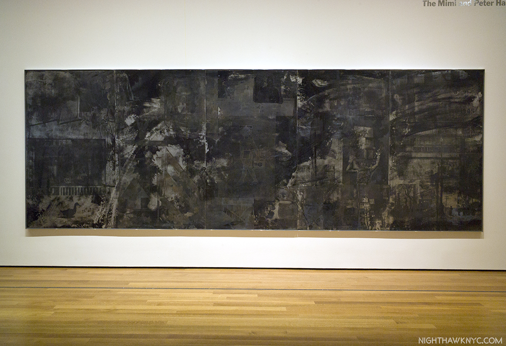
Holiday Ruse (Night Shade), 1991, Screenprint chemical-resistant varnish, water and Aluma-Black

Also noteworthy, among the Gluts, works made of found street signs and other metal objects, Mercury Zero Summer (Glut), 1987, an electric fan with metal “wing,” an ecology-themed work, stood out. Finally, Triathlon (Scenario) 2005, Inkjet pigment transfer on polylaminate, from one of his final series, Scenarios, immediately “looks different,” than all that’s come before, with each of its Photos given their own place, and not being layered as earlier, with added prominence intriguingly given to white space, the overall effect is striking. Finally, Photos, in stunning clarity, stand to speak on their own as “characters” in the whole. The three images of the hand with the sphere, left, remind me of the repeated/slightly altered birds in Overdrive, and other Silkscreen Paintings, and masterfully unify the composition horizontally. Interestingly, since his right (Painting & Photographing) hand had been paralyzed in a stroke a few years earlier, and he could no longer take Photos, he had to, again, use the Photos of others (possibly under his direction at times), as he had done when he first started to use Photos, in the 1950’s.
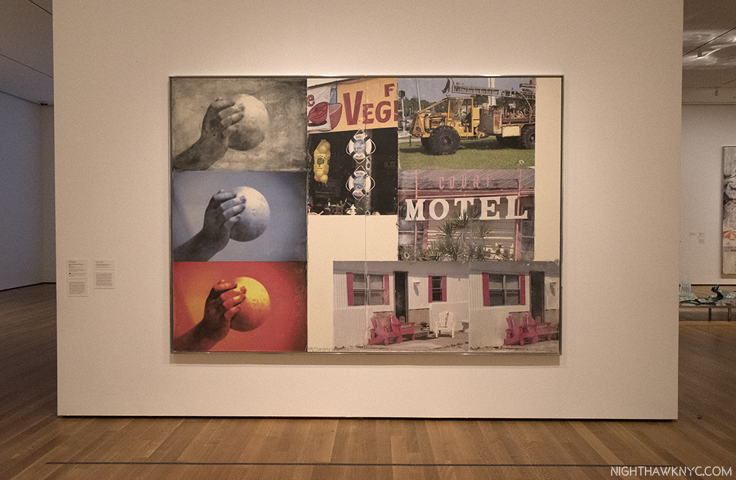
Triathlon (Scenario), 2005, from 3 years before his passing is the latest work in the show.

The show concludes with a room dedicated to R.O.C.I., the Rauschenberg Overseas Culture Interchange, “a tangible expression of Rauschenberg’s long-term commitment to human rights and to the freedom of artistic expression,12,” a self-funded collaboration with Artists in 10 countries that Rauschenberg was extremely dedicated to, even mortgaging his homes, and selling his vaunted Art collection to fund. Rauschenberg took the term “action painting,” first coined to describe the technique of abstract expressionists Jackson Pollock, and others, literally. For him, it meant ethical action, as well. Thist took many forms during his career. As Barbara Rose said about him, he was “among the last artists to believe that art can change the world.13

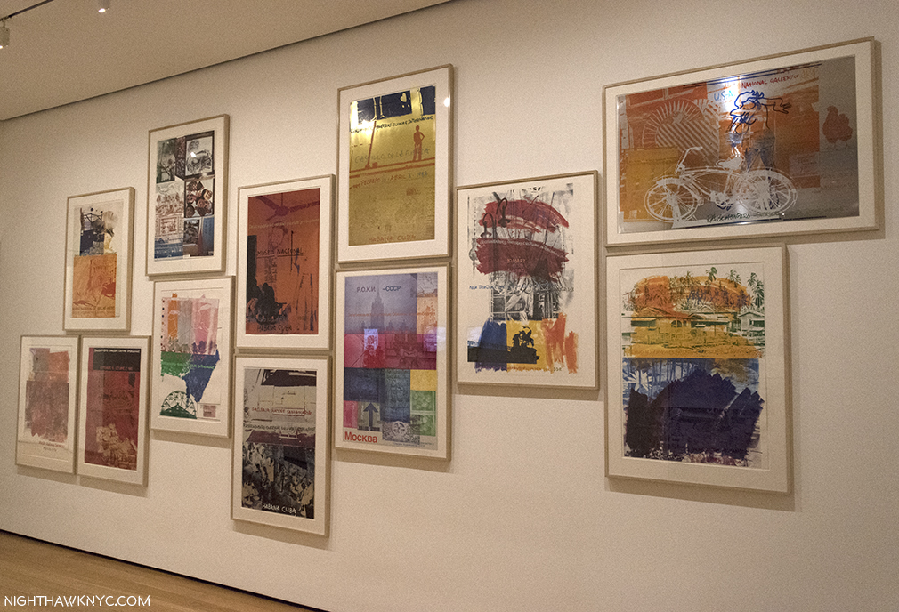
The final gallery contains 12 Posters for R.O.C.I.- the Rauschenberg Overseas Culture Interchange, 1985-91, along with 3 videos shot in Mexico, Cuba and China. 10 countries are represented here.

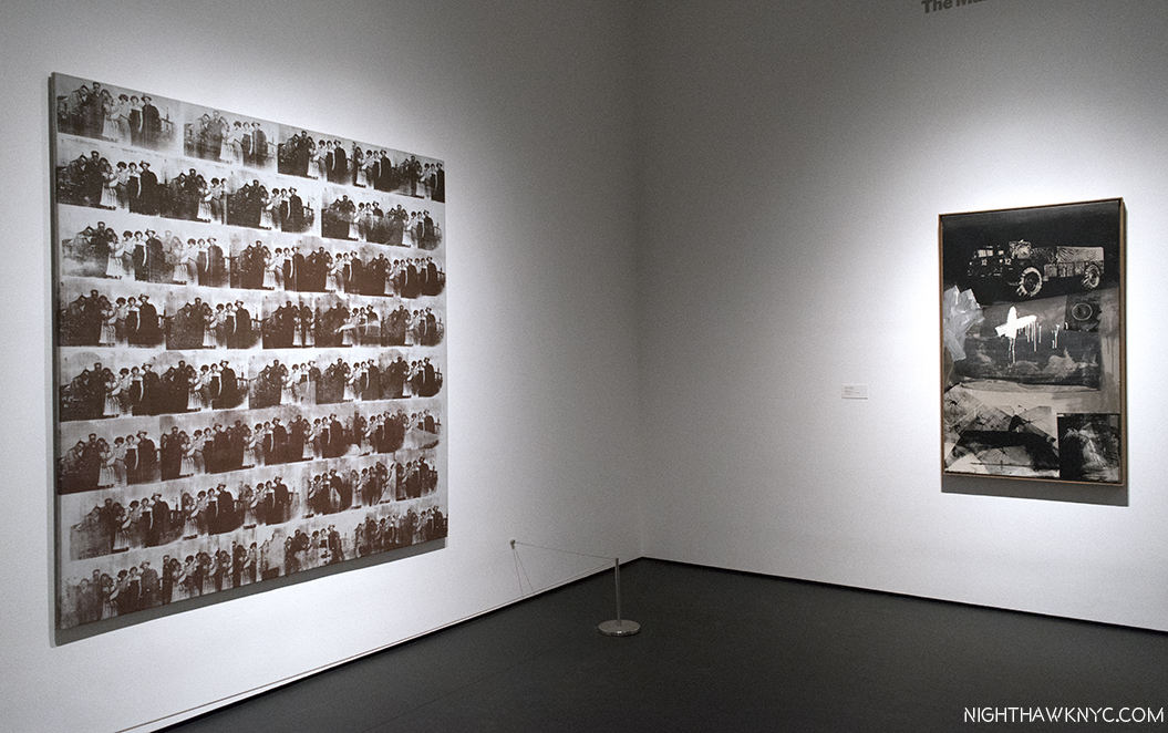
Though work by Rauschenberg has been in 152 shows at the Museum, only ONCE before has MoMA presented a retrospective of his work- FORTY years ago, in 1977. That show originated at the National Collection of Fine Arts (associated with the Smithsonian) and was curated by its Walter Hopps. Among Friends, is co-produced by MoMA and the Tate Modern, London, where it appeared under the title Robert Rauschenberg. So, this is the FIRST large show devoted to Rauschenberg that MoMA has been credited with creating. In fact, of those 152 shows I mentioned, only 4 had his name in the title- this is number five14. For someone so important and influential, I find this most puzzling. In fact, it’s only been fairly recently that MoMA has begun to fill in some of the substantial gaps in their Rauschenberg holdings, acquiring Rebus, one of his most important Combine Paintings, Canyon, in 2012, one of the most important Combines, and the now classic Silkscreen Painting, Overdrive, 1963, (seen in far left in the photo of the Silkscreen Paintings with Oracle, above) in 2013.

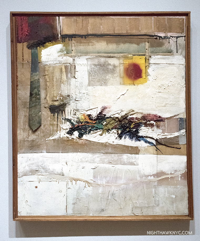
Rebus, 1955, Combine painting. The info label says its a “promised gift,” but Calvin Tomkins says MoMA paid 30 million dollars for it. (Off the Wall, P.282) This would be most interesting as MoMA’s Alfred Barr was offered Rebus in 1963 but he declined. (ibid.).

My reaction to Among Friends was tinged with a bit of disappointment- Though the early galleries, up through the Mud Muse/’9 Evenings,” 1965, are extraordinary. Stories abounded of curators bringing in “people who were there” to recreate how works had been originally displayed, complimenting major loans, like Charlene, Monogram, among many more. After 1965, I felt the show “thinned out.” The huge, penultimate gallery of his late works (a period I believe is very under-appreciated), left me wondering why it had so much empty space. In fact, I can’t quite recall seeing anything like it in a major show. Part of the reason is Among Friends attempts to integrate larger videos of performances right in the show, as opposed to having separate rooms for them (as MoMA did with Bruce Conner: It’s All True, last year). The spot chosen for Glacial Decoy’s installation left a large corner completely dark and empty. As nice as it is to see all of Hiccups, 1978, a beautiful work consisting of 97 solvent transfers (an “update of his “Transfer Technique”) on paper panels held together by zippers, so it can be endlessly rearranged. (Rauschenberg may have employed his mother, Dora, to attach the zippers, David White told me.) Taking up the better part of 2 long walls, I was left feeling that space could have been put to better use, and Hiccups displayed in another manner, as it has been in the past.

Another view of the later works gallery shows a lot of open floor space, and on the middle right, behind Charles Atlas hanging video screen for Glacial Decoy, which is in the center of the room, a dark, empty corner. An interesting installation, I’m not sure was entirely successful, but should it have been mounted elsewhere?

Rauschenberg, perhaps more than any other Artist, established what it was to be an American Artist around the world, continually going seemingly everywhere, beginning in the early 1950’s, but his travel during his later years is not mentioned in the later works gallery, including his trip to China in 1982, where he collaborated with local paper makers, and others, the trip resulting in a typically large creative output, entirely absent here. That’s one example. The travel thread is picked up in the next, and final, R.O.C.I. gallery.

Whereas the show to this point had been chronological, this room is a bit all over the map, with works ranging from 1967-2005 on view. With the only large placard, the show uses to give context, next to Mirthday Man, one of the last works in the show all the way on the other side of the gallery, visitors here were left a bit hanging about what was going on in Rauschenberg’s Art and the path its development was taking, which its non-chronological display didn’t help. It’s a bit of a shame. While what’s included in this gallery may serve to pique the interest of viewers to investigate it further, the overall result, I feel, is a “sketch” of what the Artist created, achieved and accomplished in this period. The result is the show feels like it progressively winds down in the later galleries, and ends on somewhat “quiet” notes. A chance to shine new light on Rauschenberg’s late period was, I feel, missed. It should be noted that, not unlike Picasso, Rauschenberg’s later works have been largely overlooked by the Art world to this point, save for a few gallery shows (including this one I wrote about in 2015)15. (Though, they have not been overlooked by Artists.) So, the other possibility is, of course, that the show’s curators do not feel the rest of his later work is important enough to be here.

With the catalog for the 1997 Guggenheim Retrospective, one of the greatest shows I’ve ever seen, listing 480 items, almost double the amount here, I prefer to think of this show as an “overview,” being as it wonderfully selects key works from key periods through 1965. With an Artist as prolific as Rauschenberg was (Calvin Tomkins says he created over 6,000 works by 2005, not counting multiples), it’s probably not likely a full retrospective is even possible. But? I would LOVE for someone to try!

Still, Among Friends is, caveats aside, important in its own right because it does include so many works created at key moments in his career, and because it shines a light on the importance to his work, and accomplishment, of collaboration- with other Artists, Engineers & Performers, and with the materials he was working with16 It also allows a very rare chance to see, and experience, rarely seen works involving technology (collaborations with engineers), putting OracleMud Muse, and “9 Evenings” front and center, each one a major feat of museum installation. Alas, it, also leaves, until another day, a complete assessment of both his late period and his Photography (i.e. the body of Photographs he created). Regardless of what isn’t here, a careful examination of what does comprise the 250 works in Among Friends reveals there is no doubt whatsoever that this is an important show, a major event in Rauschenberg scholarship and appreciation, and one of the best shows of 2017.

In the early 2000’s, Rauschenberg suffered a stroke which paralyzed his right (Painting & Photography) arm. Nonetheless, he continued creating, having others take the photos, and signing his works, with difficulty, with his left hand, as here, on Triathlon, 2005, from Scenarios, one of his last series.

Speaking of friends and collaborators, another question lingers with me- As Among Friends beautifully details, Rauschenberg was friends early on with John Cage, Merce Cunningham, Morton Feldman, among others, who were among the most avant-garde creators of the 20th Century. HOW was it possible that Robert Rauschenberg, alone among them, escaped the “avant-garde ghetto” to achieve both fame and fortune, while holding on to his integrity? I well remember when avant-garde composer Pierre Boulez was named Musical Director of the New York Philharmonic, succeeding no less than Leonard Bernstein, and how audiences voted with their feet and voices in displeasure when he performed a modern & contemporary work, as you can plainly hear on recordings of the Philharmonic broadcasts at the time. Rauschenberg, as I mentioned earlier, was actually an inspiration for the most avant-garde work of music ever “written”- John Cage’s 4’33,” 65 years later, Cage is highly respected, but, still his music is sparsely performed. Among his other friends, Morton Feldman (a major composer who remains under-known, and who Rauschenberg gave his first public performance at one of his early shows), is a cult figure who shows signs of becoming more. Even Pierre Boulez, who passed last year, is, mostly, remembered for creating the most “definitive” body of recordings of 20th Century music we have thus far, while his own music is still sparsely performed. Meanwhile…during all of this, Robert Rauschenberg had, or has, an “Era,” and had a long career that was marked with a good deal of success, however you’d care to define it, including financial. Given the “edginess” of much of his work, a fair percentage of its components coming from the trash, and not art supply stores, I find it absolutely remarkable.

How was Rauschenberg able to avoid the “Avant-garde ghetto?” Walking through the show, I think it is possible to “experience” the answer. As Among Friends highlights, collaboration may well have been key to his success. Beyond collaborating with so many gifted Artists, across realms, and collaborating with his materials, as Calvin Tomkins said- “All his work, Rauschenberg increasingly felt, was a form of collaboration with materials. He wanted to work with them, rather than to have them work for him17.”

There is more. One of his most famous quotes is “Painting relates to both art and life. Neither can be made (I try to act in the gap between the two)18.” That gap also includes life being lived now…i.e. the viewer’s experience.

Have a seat. (No, Don’t!) Rauschenberg understood that his ultimate collaboration was with his viewers. He continually strove to bring them in to his works. Pilgrim, 1960, Combine Painting.

Rauschenberg’s most important collaboration may be with his viewers. He never forgot the experience of the viewer, something, it seems to me, most other avant-gardists of the period seemed to ignore, if not take a polar opposite approach to. Therein may lie the key. As one of them, John Cage, himself, wrote in Silence, “The real purpose of art was not the creation of masterpieces for the delectation of an elite class, but rather a perpetual process of discovery, which everyone could participate19.” It seems to me that this, as much as anything else, was at the heart of Rauschenberg’s approach during his entire career. As he said, “I don’t want a painting to be just an expression of my personality. I feel it ought to be much better than that20.” What’s “better than that?” He said that he wanted to create a situation  “in which there was as much room for the viewer as for the artist21.” This collaboration  takes an exceedingly wide range of forms. The “White Paintings” were intended to allow the shadows of viewers, and the atmosphere of the room to be “reflected” on their surfaces. Numerous other works, from  Charlene, in 1954, right through the late “Gluts” have reflective mirrors or surfaces that reflect whatever is in front to it, even the viewer themselves. This goes way back to the mirrors in the upper left corner of Untitled, 1952, pictured early on. And, in Persimmon, Ruben’s Venus holds a mirror so she can look out at us, though her back is turned.  Once you look for ways that Rauschenberg includes the viewer in his work, you’ll see it more and more- throughout his career. Like that welcoming chair in Pilgrim, 1960, above. But, don’t really sit in it. You know…

Another thing that becomes apparent- The more work of Robert Rauschenberg’s I look at, one thing strikes me above all others- While I loathe comparisons of anyone creative, I don’t think I’ve ever seen any Artist with a better “eye” than Robert Rauschenberg. “I have a peculiar kind of focus,” he once told an interviewer. “I tend to see everything in sight22.” He was, also, one of the most creative people I’ve ever come across. He broke all the rules, and used that eye to create his own world out of ours.

Collaboration with his viewers, itself, led to more. Some of those viewers became Artists, themselves. From what I see in the shows I attend, and have attended, particularly over the past 15 years, I would say we are still in the “Rauschenberg Era.” His influence is all around. “Bob is the wind, blowing through the art world for almost a century now, pollinating everything,” Arne Glimcher, founder of Pace Gallery said in the BBC Documentary “Robert Rauschenberg: Pop Art Pioneer.”

Regardless whether you think we are still in the “Rauschenberg Era,” or not, one thing strikes me as undeniable- Nearly 10 years after his 2008 passing, the full assessment of the achievement of Robert Rauschenberg is no where near finished. Among Friends is another piece, one that will be long rememeberd, towards that end.

*- The soundtrack for this Post is “Moon Rocks,” by Talking Heads, from Speaking in Tongues, 1983, which Robert Rauschenberg did the artwork for the limited edition release of, seen below. Another classic collaboration. NASA invited Rauschenberg to witness the launch of Apollo 11, in July, 1969.

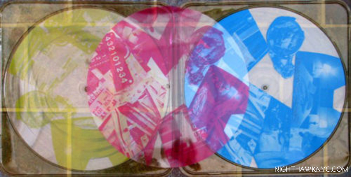
Robert Rauschenberg’s Cover for the limited edition of Talking Heads’ Speaking in Tongues. No, it wasn’t in Among Friends, but it is in my collection.

“Robert Rauschenberg: Among Friends” is my NoteWorthy Show for August. 

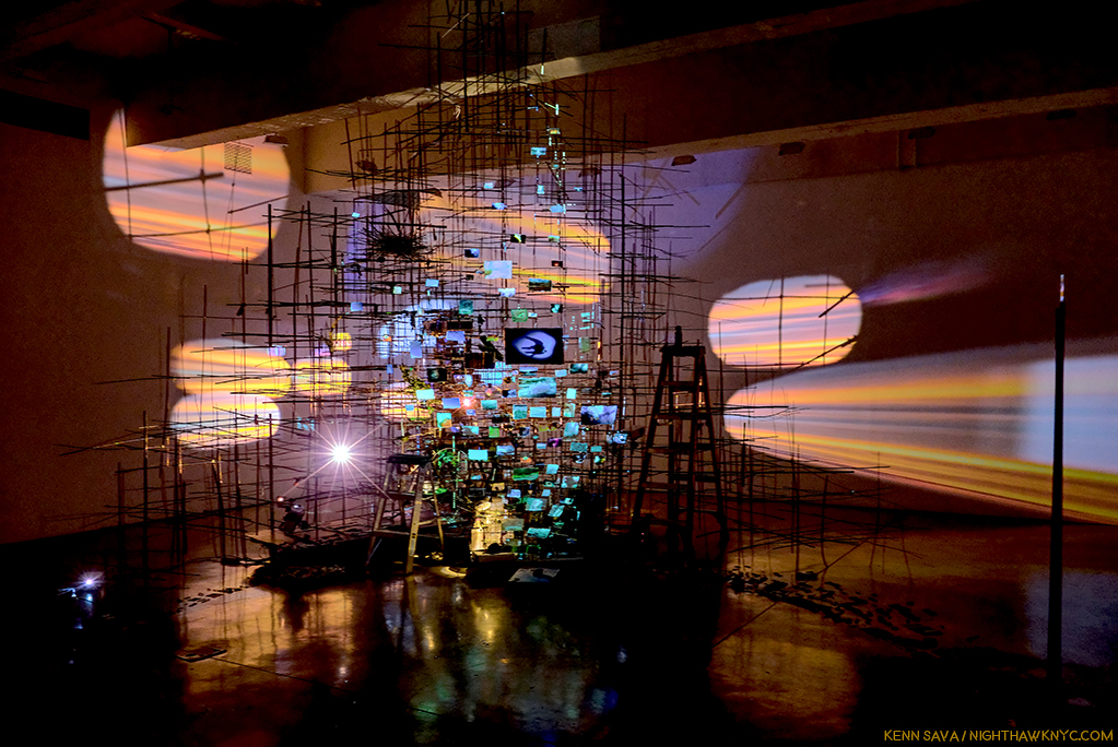
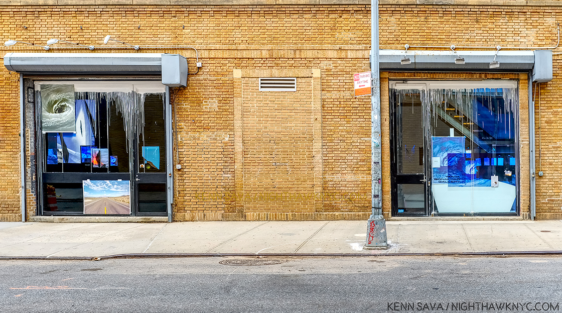
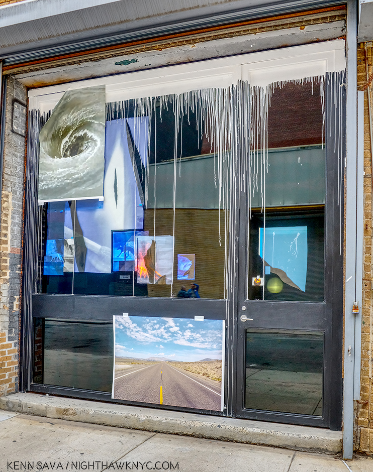
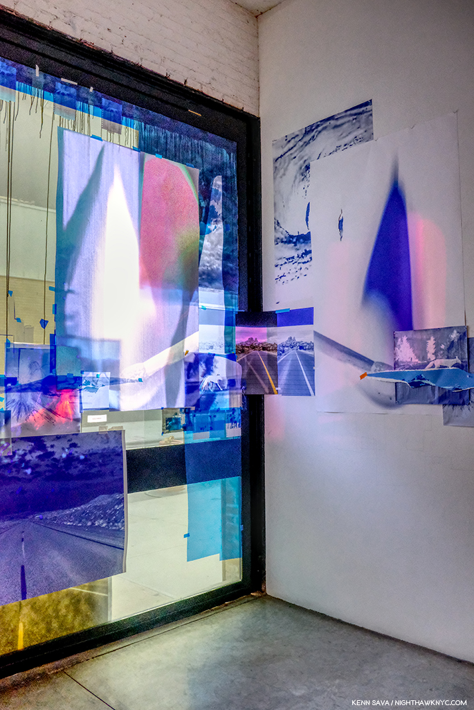
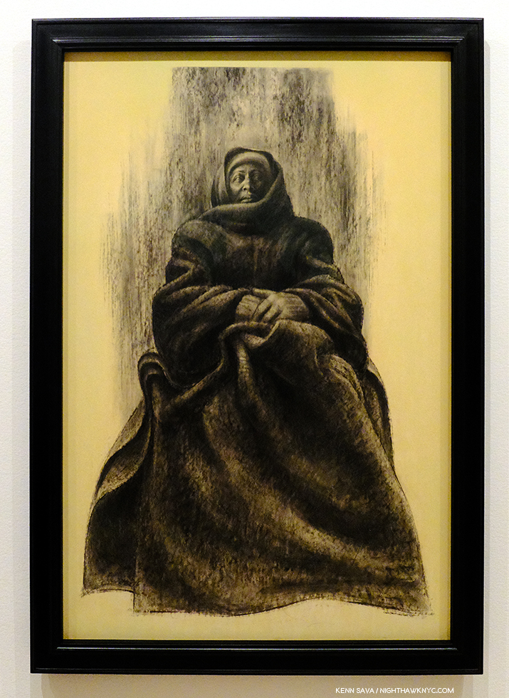
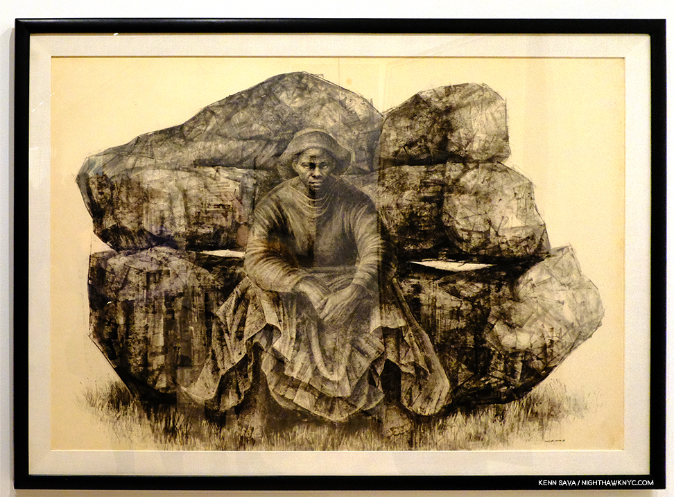
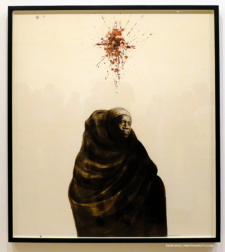
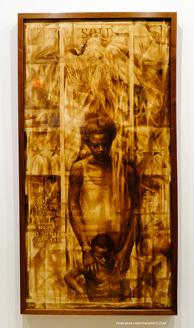
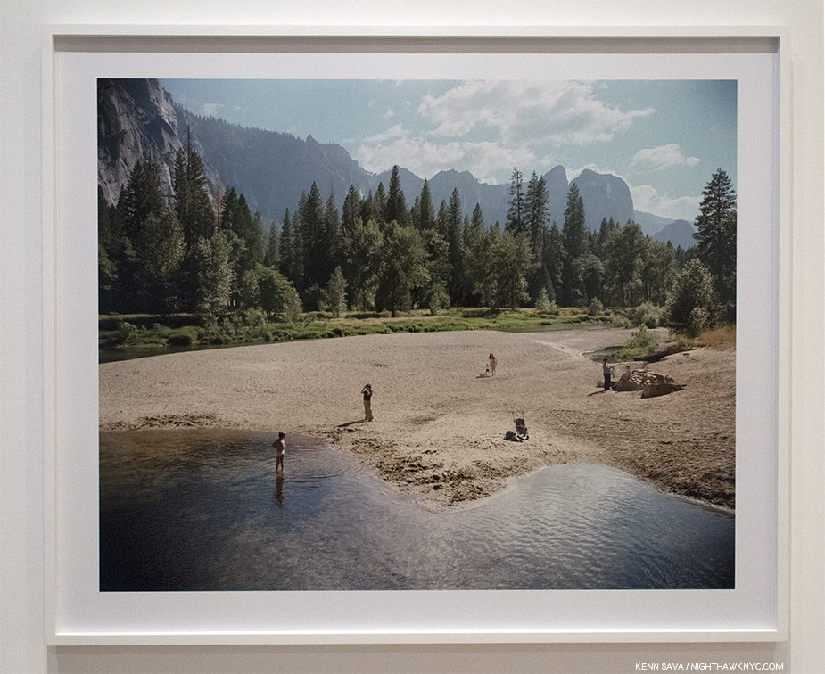
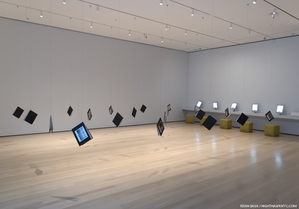
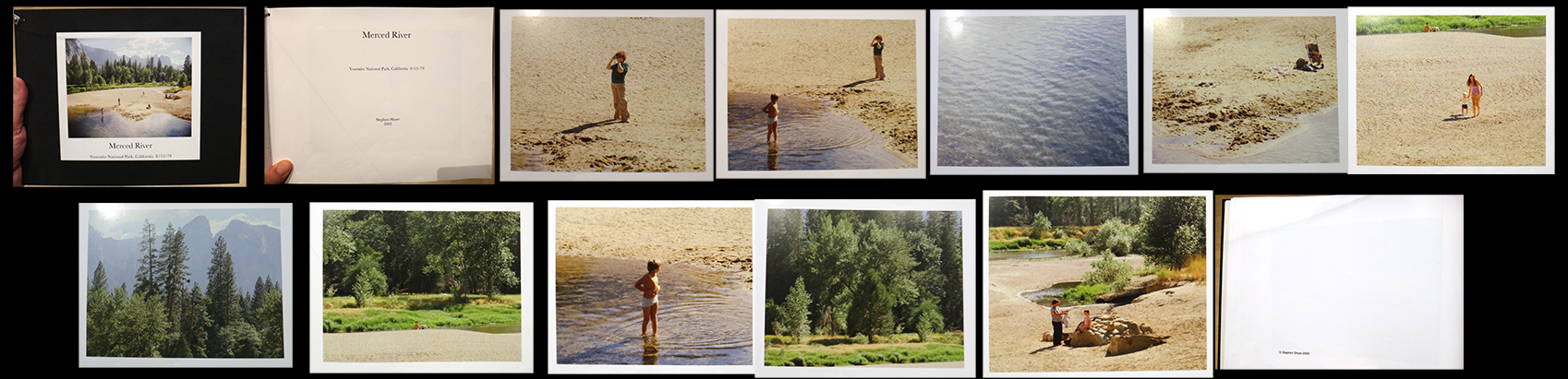
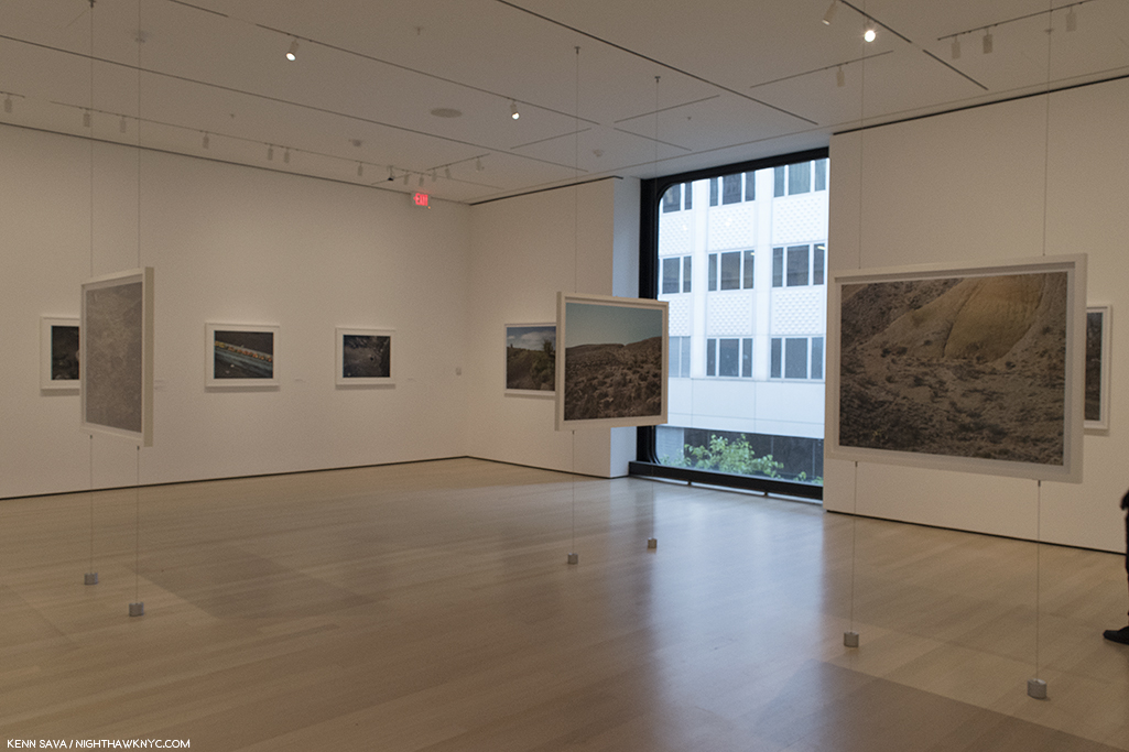
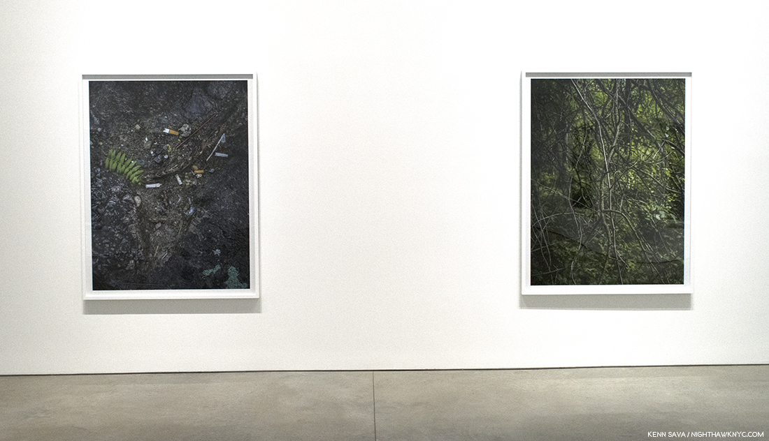
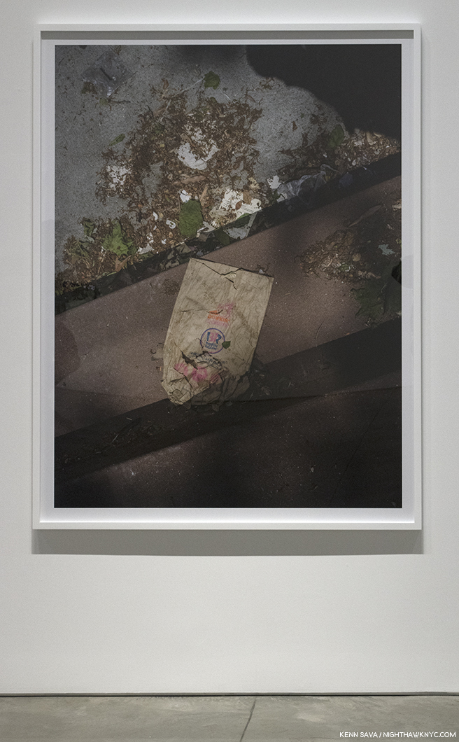
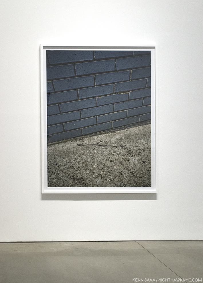
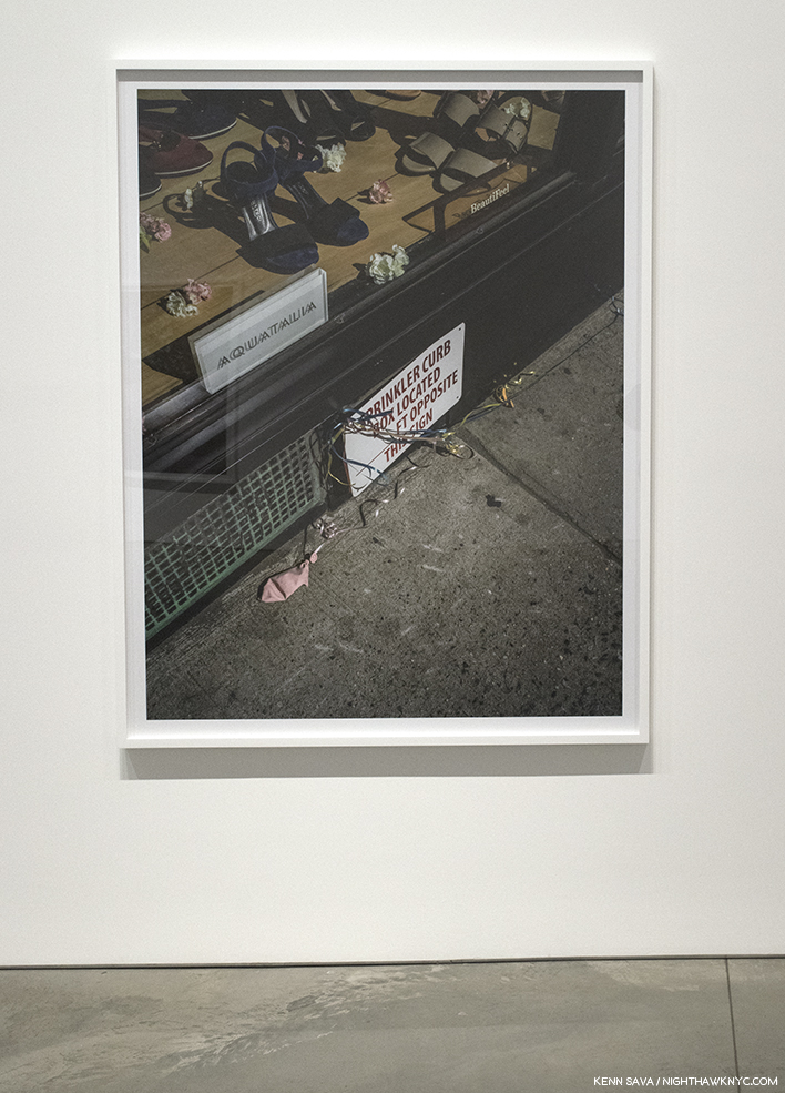
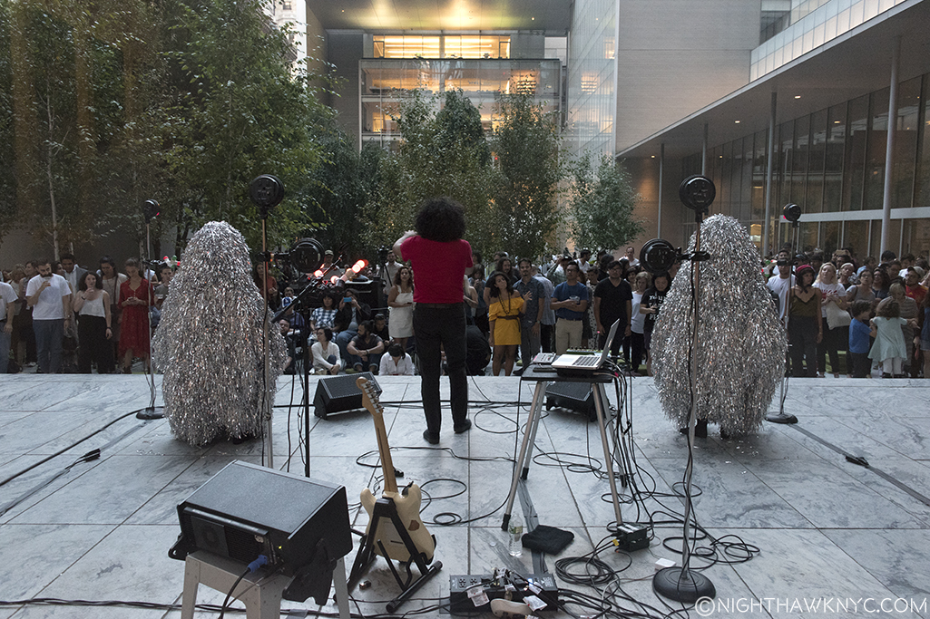
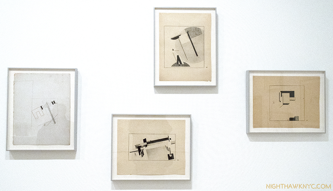
A second Post, which follows below, looks at highlights from Among Friends. Between the satellite shows- Robert Rauschenberg: Rookery Mounds, and Selected Series from the 60s & 70s, at Gemini G.E.L. at Joni Moisant Weyl Gallery, Robert Rauschenberg: Early Networks at Alden Projects, Robert Rauschenberg: Outside the Box, at Jim Kempner Fine Art, and Susan Weil at Sundaram Tagore Gallery, there were, also, many highlights. The third Post, further below, focuses on them. 

January 8, 2018-All three Posts are dedicated to the memory of my friend, the late Artist Tim Rollins. Tim and I spoke about and compared notes on these shows both of the last two times I saw him. He told me that he knew Rauschenberg, and he agreed to give me a quote about Rauschenberg for this series. But, I never got around to getting one from him. R.I.P., my friend. I hope you like them.

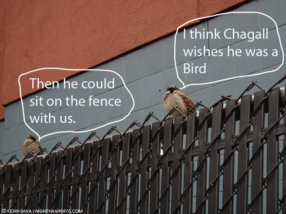
“On The Fence, #10, The Rausch-and-Bird Edition.” (Sorry, Bob.)

NighthawkNYC.com has been entirely self-funded and ad-free for over 6 years, during which over 250 full length pieces have been published. If you’ve found it worthwhile, you can donate to keep it going & ad-free below. Thank you!

Written & photographed by Kenn Sava for nighthawknyc.com unless otherwise credited.
To send comments, thoughts, feedback or propositions click here.
Click the white box on the upper right for the archives or to search them.
For “short takes” and additional pictures, follow @nighthawk_nyc on Instagram.

Subscribe to be notified of new Posts below. Your information will be used for no other purpose.


  1. The story in this section is excerpted and paraphrased from Robert Rauschenberg’s work, Autobiography, and from Calvin Tomkins’ excellent biography of Robert Rauschenberg, Off The Wall, 2005, P. 72-4.
  2. “Off the Wall,” P.76
  3. Paul Schimmel Robert Rauschenberg: Combines, P.9
  4. Charles F. Stuckey in Robert Rauschenberg: A Retrospective, Guggenheim Museum, 1997, P. 31
  5. Tomkins Off The Wall, P.65
  6. Calvin Tomkins- “Master of Invention,” The New Yorker, Oct 13, 1997 P.92
  7. the Combine, Untitled, ca.1954, not in the show is the earliest work I’ve seen this in so far.
  8. MoMA had a chance to acquire Monogram early on, but Alfred Barr passed, fearing it might harbor vermin, among other reasons. Off the Wall, P. 282.
  9.  Everything In Sight,” Calvin Tomkins, The New Yorker, May 23, 2005
  10. Off the Wall, P.143
  11. and it’s also wonderfully displayed in Robert Rauschenberg: Early Networks at Alden Projects
  12. raushcenbergfoundation.org
  13. Barbara Rose, Rauschenberg, P.4
  14. Two of the those featured the 34 Illustrations for Dante’s Inferno as a set, in 1966 and 1988, the other featured his work Soundings, in 1969.
  15. To this point, the best overview of the later period works I’ve seen is in the Guggenheim Retrospective Catalog, one of the greatest exhibition catalogs- for any show, ever produced. The caveat to that is that when it was published in 1997, he would still work for a further 11 years.
  16. Guggenheim Retrospective Catalog, P.36-7.
  17. Tomkins in Off The Wall, P.79
  18. Rauschenberg’s statement in 16 Americans, MoMA Exhibition Catalog, 1959
  19. Off The Wall, P.62
  20. Off The Wall, P.66
  21. Off The Wall, P.xv
  22. “Dore Ashton, Art News, Summer, 1958, quoted in “Off The Wall,” P.8

Highlights From Rauschenberg At MoMA

Written & Photographed by Kenn Sava (*unless otherwise credited)

They flew in from all over for this one. Click any image for full size.

With upwards of 300 works by Robert Rauschenberg on view over 4 shows of his work, and a show of work by early collaborator and ex-wife, Susan Weil, there was too much that lingers in the mind to fit into one Post. My overview of MoMA’s Among Friends is above (here). Part 3, below (or here), looks at the 4 “satellite” shows going on around town. This Post will feature some works that struck me as important, both in terms of Art, and in terms of Rauschenberg’s Art, at Robert Rauschenberg: Among Friends, at MoMA.

Helado Negro,” with Roberto Carlos Lange, and…? outside in MoMA’s Sculpture Garden on August 31 are hoping there’s no lightning. No, Rauschenberg didn’t design those costumes. I headed upstairs to see what he did create after taking this.

Even on my 17th trip to the show, as with most great Art, I saw something new, and wondered how I missed it before. I’ll explain below. Apparently, I’m not the only one this happens to. In 1961, John Cage wrote this about looking at Rauschenberg. “Over and over again I’ve found it impossible to memorize Rauschenberg’s paintings. I keep asking, “Have you changed it?’ And then noticing while I’m looking it changes1.” His friend, Marcel Duchamp, once said about Paintings- “A painting had an active life of about 30 years; after that it died- visually, emotionally and spiritually2.” Try as I might, I don’t see that at all in Rauschenberg’s work. While I do see an evolution of styles, over the years,  a good deal of it looks like it could have been made this past month. Also, Mr. Rauschenberg’s career not only lasted over 60 years, he was one of the most prolific Artists of our time. Not having seen everything he did, it’s a given that some/many works I previously hadn’t known will seem revelatory. I can’t remember ever feeling, “That’s dated.” Discovery was the joy of these 5 shows for me (and, in looking at Art, in general). And, it was also a very rare chance to see works housed in distant collections, galleries and museums. Still, it was very hard to narrow down the works to those in this Post.

Sue, ca.1950, with Susan Weil, Exposed blueprint paper.

Sue, ca.1950, with Susan Weil, the first work in the show, continuously captivated viewers, as it has for over 65 years. Created with his first collaborator, later his wife and mother of his son, Christopher, and eventually his ex-wife. Early on, they used blueprint paper to create one of a kind works, where the subject would lie on the paper, while the Artist moved over them with a lamp exposing the paper and recording the image. The pair then moved to the bathroom they shared with others to fix the image in the shower. Unique and beautiful, it’s an early example of Rauschenberg’s love of found objects, as they got the paper for free because it came from rolls that had been partially exposed. The works quickly found an audience, being the subject of a 1951 Life magazine photo spread detailing their process, and even resulting in their inclusion in a 1951 MoMA show called Abstraction in Photography. Rauschenberg went on to passionately explore Photography, and Painting, before deciding to be a Painter. Susan Weil is still creating and her show at Sundaram Tagore Gallery this summer will be part of the next Post.

Monogram, 1955-59, Multi-media. Fascinating. From any angle.

Monogram, 1955-59, seen at MoMA, from the Moderna Museet, Stockholm. Ok. It’s famous. Everyone’s seen Photos of it. Seeing it in person is an entirely different animal. An animal that’s rarely seen on this side of the pond. It was last seen here 12 years ago at The Met’s excellent 2005 Rauschenberg Combines show. What made it even more special was it being displayed at MoMA near two survivors of the earlier “states” of the work, as Rauschenberg tried to find the ideal composition in which to incorporate the Angora goat he bought from a second hand store for 35 dollars. He put 15 dollars down on it, and according to Calvin Tomkins, intended “to go back and pay the balance, one day3.” The chance to imagine Rhyme, 1956, and the central panel of Summerstorm, 1959, as part of the work shows he made the right choice, though both are interesting on their own- particularly the inclusion of an image of animals at pasture near the top of that center panel of Summerstorm.

Rhyme, 1956, Combine Painting. In the first state of Monogram,”the goat was mounted right above the red circle. At that point, there was another part of it that extended higher from there.

Summerstorm, 1959. Originally, in the second state of Monogram, its center panel stood in back of the Goat. Later, it was reworked and became a part of this. Yes, that’s a zipper in the middle of the right side.

On my 17th visit I finally noticed this! Near the top of Summerstorm’s central panel, there’s a small image of animals grazing. Rauschenberg went from grazing animals in the second state of Monogram, to his Angora goat “grazing” on Art in the final work.

Then, I used this rare opportunity to study the Combine Painting the goat is mounted on, which is hard to do from photos of it in most books. Each angle of the base reveals new details- the sleeve of a white shirt, to the left of the Goat’s head, a heel from a shoe, part of signs that just can’t quite be pieced together into a word, images of a man looking up, astronauts (a new thing in the world beyond science fiction in 1959), and three small human footprints.

So, how does it feel to be an icon of Modern & Contemporary art? Rauschenberg added the paint on the face to cover damage.

Rolling down his sleeves and walking the high wire of Art. The view of the left front corner as seen from the left side.

View of the center back. Interesting placement of that tennis ball, right under the rump of the Goat, where it can be “read” as leaving a comment on Art. Also notice the two helmeted figures to the right that could possibly be astronauts.

Another thing about seeing Monogram in MoMA- It’s hard not to wonder about the possible influence Picasso’s famous She-Goat may have had on it. Created in 1950, out of found materials, it appeared in the May, 1953 Magazine of Art, which makes it possible Rauschenberg could have seen it. Also coincidentally, one of the two bronze casts Picasso subsequently made of it were acquired by MoMA in 1959, the year Rauschenberg decided to mount his on top of the Combine Painting it rests on to this day.

Pregnant with possibilities. Picasso’s (expectant) She-Goat, 1950, cast 1952 as seen outside in MoMA’s Sculpture Garden. Picasso’s original, coincidentally, was made of found objects, and now grazes in the Musee Picasso.

Ok. What does it “mean?” The goat was worshipped by the Ancient Egyptians, where the horns represented Gods & Goddesses, while also symbolizing fertility. In mythology the he-goat was Pan. The goat became the symbol of satanism. Take your pick there. “Animal energy” people say that the goat represents independence, stubbornness, a wild nature, and sexuality4. This last resonates with me. While I don’t know what was on Rauschenberg’s mind when he created it, reading what I have about his personality, journey and perseverance, the “independence” and “stubbornness” parts fit. The “wild nature” fits Rauschenberg’s work to this point as he broke every law of Painting, Sculpture, and Art he could. Beyond that, the best comments on Monogram I’ve seen thus far comes from critic Jerry Saltz who said, “Allegorically, Rauschenberg is a bull in the china shop of art history, a satyr squeezing through the eye of an esthetic/erotic needle. In early Christian art goats symbolized the damned. This is exactly what Rauschenberg was as a gay/bisexual man and an artist, at the time. “Monogram” is Rauschenberg’s credo, a line drawn in the psychic sands of American sexual and cultural values. It is a love letter, a death threat, and a ransom note. It is Rauschenberg carving his monogram into art history5.” As for that “eye of the needle,” the famous tire, Mary Lynn Kotz, a Rauschenberg biographer, points out that the tire is made of rubber, which is made from crude oil, which Port Arthur, Texas, where Rauschenberg was born and raised, was known for6. (If you’re wondering about Rauschenberg’s use of taxidermied animals in his work, he speaks about it here.) Finally, on page 17 of Rauschenberg’s book Photos In +  Out City Limits New York C. there’s a photo of what could be an East Village, or Lower East Side bar (given the beer sign in the window). Gina Guy of the Rauschenberg Foundation told me that “Bob didn’t title Photographs, he simply located them,” so this one is “titled”  New York City, and was taken in 1981. Intriguingly, it includes a fire hydrant with a tire wrapped around it.

New York City, 1981

34 Illustrations for Dante’s Inferno, 1958-60, seen at MoMA. For me, these are the key works in his Artistic evolution. Besides the new ground they break on their own, I believe it’s possible to see in them much of what came after in his work. Though Dante’s “Divine Comedy” has been illustrated by many Artists down through the centuries (including William Blake, Gustave Dore, Botticelli and Salvador Dali), Rauschenberg was the first to stage the 14th century classic in modern times. Here, he begins to incorporate Photographs culled from magazines and newspapers, not in collage, but by using the “Transfer Drawing” technique he had developed a few years earlier on a trip to Cuba. It’s a technique where an image is soaked with lighter fluid, placed face down on a piece of Strathmore 14.5 x 11.5 inch Drawing paper, and then rubbed with an empty ballpoint pen, which enabled him to get a shadowy copy of the Photo on to his paper, that he then enhanced using a variety of techniques. Rauschenberg described the end results as “Combine Drawings7.”He created them because he was feeling “increasingly troubled by those who saw his work as a joke8.” “The problem when I started the Dante illustrations was to see if I was working abstractly (previously) because I couldn’t work any other way or whether I was doing it by choice,” the artist explained to Dorothy Gees Seckler. “So I insisted on the challenge of being restricted by a particular subject where it meant that I’ve have to be involved in symbolism… Well, I spent 2 1/2 years deciding that, yes, I could do that9.”

Rauschenberg’s 34 Illustrations for Dante’s Inferno, 1958-60, Transfer drawing on paper, foreshadow much of what was to come. They are rarely seen as a group.

What he created was a way of bringing Dante’s tale of a man “midway in the journey of our life,” into the 20th century, using images he found in newspapers and magazines. They include contemporary figures, (including JFK and Adlai Stevenson), current events, and possibly, gay love. Rauschenberg cloistered himself for the better part of 3 years studying John Ciardi’s “Inferno” translation, communing with the muse, and crafting his remarkable, unique “Illustrations.” The entire set being on view was a highlight of Among Friends10. In the gallery where they were displayed, as I showed in the last Post, they were accompanied by other works with mythological references, including Canyon.

The narrator, Dante himself, is represented by a man with just a towel wrapped around his waist, which Rauschenberg found in an ad in Sports Illustrated for golf clubs. The narrator was 35. Rauschenberg turned 35 on October 22, 1960.

34 Illustrations for Dante’s Inferno, Canto II: The Descent, 1958, Transfer drawing on paper. Our hero, Dante, is at the top, slightly to the right, with a towel around his waist. Interestingly, many of the Illustrations are done in three sections, giving a feeling of being on a journey, and a reminder of the three levels of the afterlife, each given a volume in Dante’s Divine Comedy, The Inferno, being Volume 1..

Halfway through, he began to struggle with certain aspects of Dante’s narration. He decided he needed to work away from the distractions of NYC in the isolation he found in a storage room on Treasure Island, Florida, where he spent 6 months completing the set. “I was so irritated by his morality-the self-righteousness, the self-appointed conscience imposing guilt on old friends. He was the hero and the author….I wanted to show Dante the character in the story, and that forced me into isolation11.” Particularly troublesome for the Artist was reading Cantos XIV and XV, where Dante and his guide, the ancient Roman poet Virgil, encounter the Sodomites in Hell. Among them was an old teacher of Virgil. Virgil responds by taking it personally. “His (Dante’s) morality I treat objectively- the self-righteousness, the self appointed conscience imposing guilt on old friends. He was the author, the hero, and the man who made the world described. He ran into his teacher, and couldn’t imagine what he was doing in hell: It might not have bothered Dante, but it bothered me12.” Rauschenberg found a powerful way of expressing his feelings about this in his Illustration for Canto XIV.

34 Illustrations for Dante’s Inferno, Canto XIV That’s Rauschenberg’s foot traced in red, possibly indicating solidarity with the Sodomites who are condemned to wander hell eternally on burning sands.

In December, 1960, the set debuted at Leo Castelli Gallery, and their reaction served to, finally, establish Rauschenberg’s reputation as a serious Artist. Subsequently, Alfred Barr steered their acquisition by MoMA through an “anonymous” donation, that Calvin Tomkins says came from an architect undergoing a divorce in 1963. Seeing them now, their effect is akin to looking at glimpses of events unfolding through a misty glass, which perfectly fits the distance of 600+ years from the original. Rauschenberg makes the story contemporary, and it’s hard not to think that he might have identified with the central character being “midway in the journey of our life,” though the search for “autobiographical references” in it would be, it seems to me, largely conjecture. Subsequently, he continued to search for new and better ways to get these Photographs, and then his own Photographs, on to canvas, beginning with his Silkscreen Paintings in 1962, and through much of his subsequent career, eventually leading to his use of digital processing of images with computers in his series, Anagrams, through his final works.

Ace, 1962, Combine Painting. There are some objects attached to the painting, but, unlike in the Combines, they don’t dominate it.

Ace, 1962, Combine painting. After doing Combines for 8 years, Rauschenberg, not surprisingly, felt the urge to move on. As Calvin Tomkins put it, “his methods had become too familiar to him13.” On loan from Albright-Knox Gallery in Buffalo, Ace may be his Painted masterpiece. It’s certainly his most painterly work in the show, it also stands apart, first, for its size (108 x 240 inches, or 20 feet long), and because it was done right before the Silkscreen Paintings took him in a completely different direction. It, apparently, relates to the dancer Steve Paxton, his partner at the time, Ace being Mr. Paxton’s nickname. Though, it also includes some collaged elements, most notably cardboard, here he largely leaves the elements of Combine Painting behind.

The far left panel feels all about motion, told with Abstract Expressionistic/action brushstrokes and drips. That “R” on the bottom is a long way from the “auschenberg,” the rest of his signature, in the far right panel.

Still, almost all of the left-hand 4 panels have the feel of motion, yes, like a dancer in any one of a variety of movements, before we reach the 5th and right hand panel, which seems entirely without motion. Interestingly, it does feature a torso-like cardboard box, a material that would become more prominent in his work. That’s one interpretation. Take from it, as with everything else he created, what you will. In spite of the fact that as Roy Lichtenstein said, “the Combines marked the end of Abstract Expressionism and the return to the subject14,” Rauschenberg continued to use AbEx techniques throughout his career, consistent with his physical, “action” based manner of working.

Mirthday Man, (Anagram, A Pun), 1997, features an x-ray of Rauschenberg done 30 years before, which he called a “self-portrait of inner man.”

“I was the ‘charlatan’ of the art world. Then, when I had enough work amassed,
I became a ‘satirist’ – a tricky word – of the art world, then ‘fine artist’,
but who could live with it? And now, ‘We like your old things better’.”  Robert Rauschenberg, 197215

Not me.

Mirthday Man, (Anagram, A Pun), 1997, Inkjet dye and pigment transfer on polylaminate. (There’s that “transfer” word, again.) Rauschenberg’s later works are the most overlooked part of his career, in my opinion. Maybe it’s because he was so prolific (Calvin Tomkins estimated he had created 6,000 works by 2005, not including multiples16), or maybe it’s because some critics seemed to feel he ran out of ideas earlier on and stopped paying attention. Whatever the reason, the feeling seems to reach into Museums. In New York, it’s rare to see a later Rauschenberg on view in a museum. I think this will all change. To my eyes, his later works are among his most beautiful. While he still loves to finesse an image, and modify it in countless ways, he’s finally perfected getting Photographs into his works in excellent color & resolution-when he wants them that way. He began using Apple Macintosh computers circa 1991 or 1992, back in the day when they were still called “Macintosh.” He was an early adaptor of using digital technology with photographs, though the results of his earlier processes shows that he was getting some of the same layering and modification effects that many Artists now achieve in Photoshop, etc. back in the late 1950’s. In fact, what many Artists do today in Photoshop, etc. looks to me like what Rauschenberg was doing years before digital Photo manipulation. It’s interesting that in his very late work (like the series Scenarios,(an example from which I showed last time, and Runts, 2005-08) the photos are left entirely on their own to dialogue with each other. Mirthday Man, from his Anagram, A Pun series, (which I wrote about here), is a masterpiece of his later period. Created on a single day, the Artist’s 72 birthday in 1997, its images occupy their own spaces and are not layered. While he “modifies” them, the clarity of the base image still shines through. Because they seem scraped or cut up and used in sections, they have a collaged look. Slightly to the left of center is a full x-ray of Rauschenberg’s body from 30 years earlier. (It’s the common denominator with Booster, 1967, which hangs adjacent to it in the large later works gallery.) The images seem impossibly random, and white space is also beginning to come in. The front of an NYC Firetruck (taken near his studio on Lafayette Street), a spoked wheel and an umbrellas (images he’s used frequently), sports jerseys (with a lot of 9’s, 2’s, and 1’s. I looked long and hard, but I couldn’t make out his birthday out of these numbers- 10/22), Botticelli’s Birth of Venus (near the upper right corner. Strangely faded here, it’s an image he also used in Rebus, 1955. The Botticelli is as close as I got to a “birth day” reference…so far! Since most of them are Photographs he took, perhaps the work is a bit of a personal scrapbook, looking back on an extraordinarily eventful & productive 71 years in a way that looks like the way memory often works- in fragments. Whereas he called the x-ray a “self-portrait of inner man,” the rest of the composition is something akin to a portrait of where that man has been, seen in seemingly random moments in dream-like fragments.

He would still have 10 more birthdays to show us the inner man, and everything he saw outside of himself.

*- Soundtrack for this Post is “I’m Looking Through You,” by John Lennon & Paul McCartney of The Beatles.

Thanks to Gina Guy & David White, of the Robert Rauschenberg Foundation, for their assistance.

Oh! One final work…by request. It was in the show, but it’s not by Rauschenberg…

Bob Rauschenberg in Birdo, 1973, by Oyvind Fahlstrom. Per MoMA- “In this work, Fahlstrom affectionately reimagined Rauschenberg’s name in “Birdo,” a language he invented based on American bird sounds….”

I wonder who could have requested it…

On the Fence #11, Among (Feathered) Friends” Edition

This is Part 2 of my 3 Part series on the shows in this “Summer of Rauschenberg.” Part 1 is above this Part (or here). Part 3, which looks at the 4 “satellite” shows going on around town is below this one, here

NighthawkNYC.com has been entirely self-funded and ad-free for over 6 years, during which over 250 full length pieces have been published. If you’ve found it worthwhile, you can donate to keep it going & ad-free below. Thank you!

Written & photographed by Kenn Sava for nighthawknyc.com unless otherwise credited.
To send comments, thoughts, feedback or propositions click here.
Click the white box on the upper right for the archives or to search them.
For “short takes” and additional pictures, follow @nighthawk_nyc on Instagram.

Subscribe to be notified of new Posts below. Your information will be used for no other purpose.

  1. John Cage, “On Robert Rauschenberg,” in Silence. You can hear him read it here.
  2. Calvin Tomkins Off The Wall, P. 116
  3. Calvin Tomkins Off the Wall, P.124
  4. http://wildspeak.com/animalenergies/goat.html
  5. http://www.artnet.com/magazineus/features/saltz/saltz1-11-06.asp
  6.  https://www.nga.gov/content/ngaweb/audio-video/audio/rausch-ritch2.html
  7. Glenn Lowry in Robert Rauschenberg: 34 Illustrations for Dante’s Inferno, MoMA P.7
  8. Off the Wall, P.143
  9. Quoted in “Robert Rauschenberg: 34 Illustrations for Dante’s Inferno,” MoMA P.9
  10. It’s, apparently, a big deal even to MoMA, itself, who released a limited edition complete set of prints of them in 500 copies for as many dollars, in honor. Unfortunately, as nice as the limited edition is, comparing its prints to the real thing reveals the extremely subtle colors of the originals to be slightly off in the prints to my eyes.
  11. Off the Wall, P.146
  12. Calvin Tomkins Archives at MoMA.
  13. Off the Wall, P. 181
  14. https://www.villagevoice.com/2006/01/03/still-rabble-rousing/
  15. Independent Obituary, 5/14/2008.
  16. “Off the Wall,” P.283

The “Other” Russian Revolution

This site is Free & Ad-Free! If you find this piece worthwhile, please donate via PayPal to support it & independent Art writing. You can also support it by buying Art & books! Details at the end. Thank you.

Written & Photographed by Kenn Sava (*- unless otherwise credited)

“I’m back in the USSR
You don’t know how lucky you are, boy
Back in the USSR”*

There was that “big” one…you know…the one that was in all the papers over here one hundred years ago, in 1917 – The “October Revolution,” or the “Russian Revolution.” Whatever you call it, 9 million people died in 5 years, and it resulted in the loss of freedom for countless more millions over the next 74 years, I’m no historian or political writer, but I hear it’s been fading in importance for quite a while now. While that one caused a big stir, meanwhile, off in what was then a quiet, small town (a city of 350,000 today) in the eastern U.S.S.R. (Belarus today), the seeds of another revolution were beginning to sprout. No one was killed in that one, as far as I know. The instigator of a good deal of it is a world famous Artist now, who, though a pioneer of modernism, is not often thought of as a revolutionary.

Today, he’s famous for flying lovers.

Marc Chagall is the most famous native son of that small town- Vitebsk, Belarus. In the early days after the “October Revolution” he accepted the Post of “Commissar of Visual Arts” for Vitebsk. He then founded the Vitebsk Arts College, and in 1919 invited a number of Artists to be its teachers. Among them were Kazimir Malevich, El Lissitzky and Yehuda Pen. Kazimir Malevich would soon become the fountainhead of a movement that crystalized in a group named “UNOVIS” ( or “Exponents of the New Art”), who, in the spirit of the larger revolution, shared credit for the works they created. At the core of this movement was Malevich’s “Suprematism,” a style of work that focused on basic geometric forms and colors, in the service of “pure artistic feeling.” This put him (stylistically) directly at odds with Chagall, who was, at heart, a classicist…

“On The Fence, #2: El We-sit-ski.” Click any image to enlarge, if you dare..

and when Lissitzky, who was on the fence between both camps (sorry!), sided with Malevich, Chagall soon left the school to continue his career elsewhere. 100 years later, Suprematism and the Russian Avant-Garde is still growing in importance and appreciation, as was plain to see in MoMA’s recent exhibition, “A Revolutionary Impulse: The Rise of the Russian Avant-Garde,” 1915-1932,  which featured, and grew out of, Malevich’s “Suprematism” movement. MoMA’s show, consisting exclusively of works from its own collection, is NOT to be confused with a show of a very similar title, “Revolution: Russian Art 1917-1932,” running concurrently at the Royal Academy, London, which included quite a few loans from Russia. While the show, and the movement, includes filmmakers, poets and other visual Artists, I’m focusing on the Painters, Photographers and Graphic Artists included. Many are, surprisingly, multi-threats (i.e. multi-talented). To quote MoMA about these Artists, they were “a group who was fed up with form, the way the “other” revolutionaries were fed up with 300 years of Czarist rule and decided to throw it all out, so to speak, and start over from the basics, giving a new hierarchy to basic forms, and basic (or non) colors, like black and white. (i.e. Suprematism. )1” Stalin’s 1933 decree led to the banishment of the Avant-Garde, in favor of “socialist realism,” which has already been forgotten, as we approach the 100th anniversary of the “Russian Revolution.”

While Chagall, himself, was not included in MoMA’s show (though he was in the Royal Academy’s), the headline highlight was an extremely rare opportunity to see so many works from MoMA’s incomparable (in the West) collection of Kazimir Malevich, the brilliant visionary who died only a few years after the period this show covers ends, 1932, passing in 1935 at 57. That New Yorkers are lucky enough to enjoy this superb collection is due to the foresight of another legend, Alfred H. Barr, Jr, MoMA’s first Director, who in 1929 had the prescience to secure many of Malevich’s works.

Shots across the bow of painting. An entire wall of rarely seen works by Kazimir Malevich, that are at the crux of the Revolution, featuring  “Suprematist Composition: White on White,” 1918, considered his masterpiece, center.

Close-up with Malevich’s “Suprematist Composition: White on White,” 1918.

At 26, in 1927-28, Mr. Barr went to Moscow, where he wrote in his diary, “Apparently, there is is no place where talent of artistic or literary sort is so carefully nurtured as in Moscow. Would rather be here than any place on earth.” This trip stayed with Barr when a year later he became the founding director of MoMA, as part of his vision of MoMA as a lab of critical inquiry analysis and communication1. MoMA went on to compile one of the most outstanding collections of Russian Modern Art outside of Russia under his stewardship, which lasted until 1969, part of which is on view in the 8+ galleries of this surprisingly large, and excellent, show. While I am showing selected highlights, you can see Installation Views and get a different idea of the experience towards the bottom of MoMA’s page for the show, here. To get an idea of the ongoing importance of Mr. Barr’s choices, while I was standing in front of what many consider Malevich’s Masterpiece, “White on White,“ 1918, complete strangers to each other had a moment after each posed for pictures in what they both announced was their “very favorite painting,” 99 years after its creation.

Two total strangers explain to each other why this Malevich is their “very favorite painting of all time.”

A case of early books by Malevich, including “Suprematism: 34 Drawings,” 1920, published by UNOVIS, Vitebsk, left.

Remarkable insights to genius. 4 charts Malevich made as visual aids for his European “Introductions to Suprematism” Lectures.

This blows my mind, so I’m showing a closer view of it. In this chart, we get an incredibly rare insight into how a founder of an Artistic movement (how many of them are there?) sees Art. We get to look over his shoulder as he recaps the development of Modern Art through Cubism and Futurism to Suprematism.

As impressive as Malevich’s works are, which is equalled by the ongoing importance of his ideas, for me the show’s biggest revelation came in two words- El Lissitzky. A student of Yehuda Pen’s at age 13, he then studied to become an Architect, before Chagall’s call summoned him to Vitebsk. There, he became convinced by Malevich (who he had known previously), and this led him to create “Suprematist” works that remain both fresh and incredibly inventive today.

Visionary, and then some. In 1920, UNOVIS staged a utopian opera in Vitebsk titled “Victory Over the Sun.” El Lissiztky created these designs for abstract, electromechanical dolls for it, which were never realized. Seen are 5 Lithographs from a set of 11 he did titled “Figurines: 3 Dimensional Design of the Electro-Mechanical Show ‘Victory Over the Sun,'” 1921.

MoMA owns the only complete copy known of what may be Lissitzky’s masterpiece, “Proun,” from 1920, a Portfolio of 11 lithographs, published in Vitebsk. MoMA’s curator called it a “project for the affirmation of the new.1” The exact definition of “Proun” is not known, or lost to us, but the work itself explores the creative possibilities of Malevich’s theories in startling, and beautiful, (yes, beautiful) ways.

3 photos above- El Lissiztky, “Proun,” 1920, a Portfolio of 11 lithographs, who’s title is untranslatable now. A masterpiece of invention & design, seen in the only complete set that includes the covers (top), detail of 4 prints, center, and the translation of its manifesto, bottom.

While his work is, strangely & unfortunately, absent from MoMA’s fine and surprisingly large show, behind the scenes looms the over-looked Artist, Yehuda Pen. Teacher of both Marc Chagall and El Lissitzky, his work is brilliant in its own right, to my eyes, though different from that of either of his students. Pen went on to teach at Chagall’s School, alongside Malevich, and Lissitzky.

The great Artist & Teacher Yehuda Pen, center, with friends in 1922.

Yehuda Pen’s studio in 1917, a few years after he taught El Lissitzky.

“Portrait of Marc Chagall,” circa 1915, by Yehuda Pen. More of his work is here.

Along with El Lissitzky, Aleksandr Rodchenko, impresses, on a number of fronts, including his attitude- ”I reduced painting to its logical conclusion,” he said, speaking of his three monochrome paintings- “Pure Red Color, Pure Yellow Color, and Pure Blue Color” in 1921, “I affirmed: it’s all over. Basic Colors. Every plane is a plane and there is to be no more representation4.”

Oh yeah? Rodchenko “Non-Objective Painting no. 80 (Black on Black),” 1918, his “answer” to Malevich’s square “White on White.”

Wow. Luckily, 96 years later, painting, itself can quote Mark Twain: “The rumors of my death have been greatly exaggerated,” thank goodness! I’m left to wonder what was in Rodchenko’s Borscht. Having buried his paintbrush, he got into Photography after buying a camera in Paris in 1925, four years after declaring the death of painting. He turned out to be a naturally gifted Photographer, a medium he never formally “studied.” His photography has, also, remained influential ever since.

Avant-Realism? Rodchenko “Pro eto. Ei i men (About This. To Her and to Me),” 1923, showing off his unique approach to photography, and graphic design.

There was a lot to see over 8+ galleries, in spite of the fact there was only one work by Kandinsky on view. It would have been most welcome to see more, but I never missed them, thanks to the many works by Rodchenko, and Lissitzky, who’s Photography was also shown, proving that he was, like Rodchenko, a very gifted (and underrated) Artist in that medium, too.

Remember my name (well, it’s there over the “XYZ”). El Lissiztky was, also, a naturally gifted Photographer. This amazing “Self Portrait,” 1924, Gelatin silver print, was made using SIX exposures.

Other Artists impressed, too (Lyubov Popova, Vladimir Tatlin and Olga Rozanova among them), yet regardless of how impressive this show was, more importantly, the names of many of the Artists on view have been increasingly coming from the lips of today’s important Artists, including Nasreen Mohamedi, hereWilliam Kentridge, and the late, great Architect, Zaha Hadid, who speaks about Malevich, here. Also, amazingly, the legacy lives on in Vitebsk, Belarus, something that astounds me given that the biggest battle of World War II, and possibly EVER fought, was fought in Belarus, with monumental horrific fighting in Vitebsk. Chagall’s former School, after somehow miraculously surviving, has been renovated and is to reopen as the Museum of the History of the Vitebsk People’s Art School later this year. Below is a photo of the restored building, courtesy of myrecentdiscoveries.com, the International Marc Chagall researchers, who visited the building, and wrote about its new life, here. A photo of its new lobby, which appears to pays homage to Malevich, can be seen here.

The Revolution Happened Here. Miraculously, Chagall’s School in Vitebsk, Belarus, survived the biggest battle ever fought, while everything around it was destroyed. Malevich, Lissitzky, Pen & Chagall taught here. UNOVIS was founded here. its being remodeled and reopened as the Museum of the History of the Vitebsk People’s Art School! Photo by, and courtesy of myrecentdiscoveries.com

They were kind enough to also put me in contact with the Director of the Vitebsk Modern Art Center, Andrey Duhovnikov, which includes the new Museum, above, and who is also an Artist in his own right. I asked Mr. Duhovnikov about whether UNOVIS will be represented in the new Museum of the History of the Vitebsk People’s Art School. He told me, “There will be 12 thematic sections, two of which will be dedicated to UNOVIS, where archival documents will be presented.” I’m not surprised by this. Chagall and Malevich’s influence & memory live on in Vitebsk, a city that continues to hold celebrations to mark anniversaries of milestone events, like the 100th Anniversary of Chagall’s wedding in 2015. In response to my question about whether Yehuda Pen is being forgotten, Mr. Duhovnikov explained that Yehuda Pens’ work is too fragile to travel, which prevents it from being better known outside of Belarus, however over 180 works by Pen can be seen today at the Vitebsk Art Museum, and a Museum dedicated to Pen is being discussed. Good news, indeed.

The process whereby Art goes from “Contemporary,” or “Modern,” to “Art” is endlessly fascinating to me as I look at what Artists are creating now, and wonder- “What, if ANY of this, will be considered Art one day?” Certainly influencing major Artists who come after (like Nasreen Mohamedi, William Kentridge, and Zaha Hadid) plays a part in that, so do visionaries, like Alfred Barr, who had the foresight to hand pick 21 works from Malevich’s 1927 Retrospective for MoMA, thereby giving countless future generations, including mine, the chance to see these works in shows like this one, (which is MoMA “showing off,” a bit, like The Met did with “Unfinished“). But, also, in there quietly working away are others, like Mr. Duhovnikov, and his associates, who feel and recognize the value & importance of the work, and are dedicated to sharing it, and making sure this legacy endures to influence more generations.

That’s how “Revolution” becomes evolution, and “Art History.”

My thanks to myrecentdiscoveries.com and Andrey Duhovnikov for their assistance.

*-Soundtrack for this Post is “Back in the USSR,” by John Lennon & Paul McCartney, published by Sony/ATV Music Publishing.

NighthawkNYC.com has been entirely self-funded & ad-free for over 8 years, during which 300 full length pieces have been published! If you’ve found it worthwhile, PLEASE donate to allow me to continue below. Thank you, Kenn.

You can also support it by buying Art, Art & Photography books, and Music from my collection! Art & Books may be found here. Music here and here

Written & photographed by Kenn Sava for nighthawknyc.com unless otherwise credited. To send comments, thoughts, feedback or propositions click here. Click the white box on the upper right for the archives or to search them. Subscribe to be notified of new Posts below. Your information will be used for no other purpose.

  1. From the MoMA LIVE Video- “The Russian Avant-Garde: Scholars Respond”, which can be seen here.
  2. From the MoMA LIVE Video- “The Russian Avant-Garde: Scholars Respond”, which can be seen here.
  3. From the MoMA LIVE Video- “The Russian Avant-Garde: Scholars Respond”, which can be seen here.
  4. //www.moma.org/interactives/exhibitions/1998/rodchenko/texts/death_of_painting.html

Noteworthy Shows, December, 2016 (Updated)

This site is Free & Ad-Free! If you find this piece worthwhile, please donate to support it & independent Art writing. Thank you. 

Written & Photographed by Kenn Sava

William Eggleston- The Democratic Forest @ David Zwirner. It’s impossible for us to “see” Eggleston’s work now the way the way it was seen in 1976 when 69 images were presented at MoMA in the legendary show, Photographs by William Eggleston (which you can relive, here, in glorious black & white). In that black & white world, it was received as “shocking,” and widely panned (famously by The Times). If anything, today, there are “too many cameras and not enough food,” as Sting sang, and too many pictures in the world, so, perhaps I shouldn’t be surprised to read a number of comments on Eggleston’s books, shows and works where commenters say they don’t see what’s special about it, or, that, as has often been said about Jackson Pollock, they could do it. Hmmm…Many, many have tried, and are still trying. What’s lost in translation in seeing Eggleston in 2016 is how many photographers have “gone to school” on his work, over the past 40 years, learned from it, and yes, copied it 1, so that much of what he is famous for is now omnipresent. Yet, it’s barely 40 years since his breakthrough at MoMA.

Depth of Field. Untitled, 1983-86, as each work here is so named and dated. Leica can’t buy advertising like this, and the rest of what is on the walls of this show. Note the endless mirror Self Portraits, that mimic all the bottles, jars and cans.

Countless professionals and amateurs shoot “the everyday,” the seemingly mundane now. Who’s to say what’s good, what’s bad, and what’s “Art?”

The road less traveled…It doesn’t exist in Manhattan.

As always? Time will. In the meantime, what about the work of William Eggleston in 2016?

On the left, a classic shot of the so-called “mundane.” On the right, possibly a color Homage to Robert Frank’s The Americans, an early influence.

William Eggleston, now 77, has been making photographs since his college days, closing in on 60 years ago. He’s often called “the father of color photography,” which puzzles me. He was not close to being the first Photographer to shoot in color, nor the first to create a substantial body of work in color. Nor was he, as has often been reported, the first Artist to have a solo show of color Photography at MoMA. Ernst Haas beat him to that honor by 14 years with Ernst Haas: Color Photography at MoMA in fall, 1962! It can be seen here. Still, it’s enough passage of time for some things to be known. For one thing, his work still seems to be gaining in popularity. For another, it still garners a lot of respect from both his fellow Photographers, and Museums, judging how widely they hold and show his work. William Eggleston Portraits at the National Portrait Gallery, London this fall, drew raves. Millions of dollars are being spent on his work at auction. He, and his Eggleston Artistic Trust2, left the Gagosian Gallery this past June and signed with the equally prestigious David Zwirner Gallery for representation, (this being their first show), and this century has already seen a steady stream of stunning books and huge box sets by Steidl, which have the look and feel of monuments, that sell out and some then command a thousand dollars a copy, and more, on the aftermarket.

Famous for his very vivid colors, I found the shot on the left, with it’s pastel colors, equally effective.

In October, The New York Times featured him as one of their six “Greats,” along with superstar (my term) Artist, Kerry James Marshall, and Michelle Obama. William Eggleston is big time. Ok. So, back at David Zwirner on West 20th Street, how’s the show?

The shot on the left (who’s  location is unknown to me) makes me yearn to see shots of his taken in NYC.

30-odd years after these works were created they retain a surprising freshness and resonance that’s not easy to explain. I’m not sure it’s entirely the famous(ly) bright colors that are solely responsible for this, either. They’re undoubtedly a hook, but there’s far more going on, and there are works that don’t feature “knock your eyeballs out” colors that are equally compelling. Following in the tradition of Cartier-Bresson and Robert Frank, he has taken their ideas someplace else. Someplace subtle, or very subtle, mundane, often easily overlooked. A place decidedly “American” (in these works), that American viewers instinctively recognize, and one that must look like Mars to the foreign eye. Heck, in a few more years, it’s going to look like Mars to ANY eyes. Yes, so many others have tread this ground since Eggleston’s work became widely seen. They shoot similar subjects, using the same camera. But, in the hands of a visionary master of the medium, the results are truly unique. Seeing 40 works together reinforces all of this, and reveals intimacies about his approach and style. Seen in isolation this sense is harder to glean. His work has a feeling of spontaneity that is, also, often copied, perhaps, increasingly. Watching him at work in documentaries, we see this spontaneity is not contrived. Frankly? I marvel at it. What is going on in his mind as he approaches his spot? As he composes and frames? Untold millions walk around with cameras, raise them and take a photo. None are these. How is this possible? Also an Artist (his book Paris featured his Art alongside his photos), as well as a musician, it should be no surprise that he has one hell of an eye for composition (which can be seen in even his earliest black and white work), and which I feel is under-appreciated given how rarely I hear anyone mention it. It may be as big a part of his impact as color. His is, also, a painter’s eye, which also sets him apart as a photographer. Perhaps it is this that gives him his eye for the “secret life” of what most overlook in the world. All of these things work together to make a composition of random “things” a personal statement, even without people present in most of his photographs, and they seemingly come together in the instant the exposure takes. With a master technician of photography who’s also an Artist behind the shutter, I think his results are going to intrigue viewers for a very long time no matter how many try to copy and imitate him.

A wall of the smaller, 20 3/4 x 28 3/4 inch, prints for comparison. The work in the center is also in the Whitney, though smaller.

Eggleston said he has over a million and a half images in his archives. They ALL can’t be classics, can they? According to the press release, the show includes 40 works, “the majority of which have not been exhibited previously.” The “Democratic” in the show’s title speaks to the camera’s ability to “render equally what is in front of the lens.” What is rendered in these 40 works includes very few people.


Each work here bears the same title and dating- Untitled, 1983-86. Very democratic, indeed. Not mentioned is that these works are recent prints in a larger size, somewhat controversially, (about 65 x 45 inches, though a few are 20 x 28) Digital Pigment Prints, instead of the  Dye Transfer Prints that Eggleston is renowned for, which his works in the collections of MoMA, The Met, and many other places are. For me, the larger size (the original sizes were of the order of 16 x 20 inches), seem to reach for a “painterly” impression. This struck me as soon as I walked in, not surprising, perhaps, since I have looked at mostly Painting in my life. Some succeeded larger, some didn’t. Interestingly, I found images I’ve long struggled with to be among those I am still struggling with larger.

One I’ve struggled with.

This one continues to haunt me with it’s unique blend of a photograph that “borrows” much from painting, then takes it somewhere else.

Another thing that most impresses me…no…blows my mind, is that Eggleston does it taking only a single shot. While he would, no doubt, prefer his work remind me more often of Degas (who, among many other things, was a photographer, as well as a master print maker and immortal Painter), I found myself thinking of him as being somewhere between Edward Hopper/Charles Sheeler and Ed Ruscha/Richard Estes. To study the individual photos in this show closer, check out the exhibition’s catalog. I’ve mostly opted to show the very interesting combinations in which they were hung, which I assume Mr. Eggleston, himself (who was in NYC for the opening, also making rare appearances at The Strand and at Aperture), was involved with, since those won’t be widely documented.

“Well I hope you’re happy with what you’ve made
(Puzzling evidence)
In the land of the free and the home of the brave
(Puzzling evidence)”*

William Eggleston’s worldwide reputation as an important American Artist of our times increases seemingly daily. While his Artistic Trust, which his sons are involved in, seems to have it’s own ideas about the future of his work, it seems assured that his work is going to be seen far and wide for a very long time. With that 1.5 million photos he guesstimated are in his archives, he must have taken some in NYC, as he memorably did of Paris, right? Maybe those will be in a future show called “The Democratic City.”

Francis Picabia @ MoMA- (Note- March 3, 2017. I went back to see this show, again, before it ends March 19, and so I update my Post on it, in hopes of doing it more justice.) Picabia first got me into Abstract Art as a teenager with this work-

Let’s Get Lost. Picabia’s masterpiece I See Again in Memory My Dear Udnie, 1914. Worth the price of admission by itself.

I bought the postcard of it, which I still have. It sucked me into it- almost literally, it’s grip on my mind, and my eyes, was so intense. It’s a work that looks like you could walk inside and climb around in and explore it’s unprecedented landscape. But, it was it’s title that hooked me…”I See Again in Memory My Dear Udnie.” When I finally climbed back out of it and got around to pondering the name of the work…Well? I’m still pondering it. Most of the other Abstractionists (Pollock, Rothko, Duchamp, even Kandinsky) didn’t usually title their works. This proved a vital “way in” for me. From this, and Picabia’s other works of this period, I discovered Pollock, Kandinsky, Miro, then the Surrealists, Dada, and the Abstract Expressionists. Seeing it, again, in this very well done retrospective brought all of that back to me. I was, initially, startled because I’d forgotten how large it is- over 8 feet high by 6 and a half feet wide. Talk about making a statement. It’s presence, and impact, is still every bit as strong. For me, at least, it’s a central work in his oeuvre. His early abstractions are, still, breathtaking, unique and just gorgeous.

Front row seat to genius. Ecclesiastic, left and Udnie, Young American Girl, both 1913, right. The now immortal Udnie was a dancer named Stacia Napierkowska, who’s on-ship performances Picabia was taken with on his voyage to NYC for the famous 1913 Armory show, a triumph for him. Meanwhile Stacia/Udnie was arrested by the NYPD for “indecent” performances. (Here in the NY Times.).

While Cubism was all the rage at the time (c.1914), I think it’s a shame that other Artists didn’t follow Picablia down this road. Then again? Where else was there left to take it? Perhaps this is why, Picabia, himself, turned his back on this style and adapted others. The man is one of the ultimate chameleons of his time.

It’s not “Cubism,” or “Futurism,” or “Geometric Abstraction.” So? What do you call The Spring, 1912? How about beautiful?

This is a long overdue show, and a big one. It surprised me with Picabia’s endless evolution throughout his career, much of which, post-1925 seems to be a bit in the shadows compared to his early, seemingly endless inventions.

Down in front. The Animal Trainer, 1923, (inscribed “1937”). Fear not- I’ve been assured by MoMA that no Owls were harmed in the making of this Retrospective. Actually? I’m not sure just who is being trained in this work.

It points out that there remains much to see and study in the long career of this defiantly original, prolific and continually surprising individualist. I found myself a bit lost by what came after 1925, but he called me back with his somewhat surprising evolutions during WW2.

Moving on. The Lovers (After The Rain), 1925. Picabia painted over an earlier, abstract work in creating this. I’d love to see an x-ray and see what he chose to paint over.

Good luck trying to stick Francis Picabia in a style hole. He didn’t stand still, as we see here in The Wandering Jew, interestingly, from 1941. A period that features quite a few nudes.

In the end, Picabia is, like I See Again in Memory… one of those Artists who’s work demands, and rewards, repeated viewing. His formidable technique, and endlessly creative & inventive mind gave us an Artist who wasn’t content to stay with one style for very long. When you have that kind of talent? Why would you want to? He was, as he famously said, “a monster.” A monster talent.

Portrait of the Artist, 1934, a collaboration with Bruno Eggert. A bit of Christian Schad, perhaps? Schad was 40 in 1934, though pretty obscure.

Paths To The Absolute: Kandinsky, Malevich, Mondrian, Newman, Pollock, Rothko and Still @ Di Donna Galleries- A small wonder. All of those big names in one gallery show. Beautifully hung, in fascinating combinations that created wonderful inner dialogues, and one that offered a nice different perspective on Rothko from that going on in the “big” show, concurrently, at Pace, Chelsea. A show I almost missed and long will be grateful I did not.

Pollock and Malevich. I don’t believe I’ve ever see them together! Why not?

Franz Kline, Malevich, Barnett Newman and Mondrian. And, that bench!

As good as that show was, one Artist was not included…

Richard Pousette-Dart: The Centennial @Pace Gallery, East 57th Street, and Altered States: The Etchings of Richard Pousette-Dart @Del Deo & Barzune. This past June 8th would have been the 100th Birthday of Richard Pousette-Dart (RP-D for short), who died in 1992 at 76. An Artist who, I feel, has not yet been fully appreciated. June 8, 2016 would slip quietly by, but it turned out his 100th had not been forgotten. Pace Gallery 57th Street, opened a Centennial Show on September 6, (with RP-D’s wife and well known son, the musician, Jon Pousette-Dart in attendance). A symposium was held at the Whitney a few weeks later, a restored public work was unveiled downtown, and a revelatory show of his etchings at Del Deo & Barzune in the Flatiron District opened on October 6.

RP-D: The Centennial @ Pace, Uptown

Phew…My fears he’d be forgotten were assuaged. RP-D has become something of a “cause” for me. The more I see of his work, the more I’m baffled that he’s not (often) spoken of with his long time compatriots Jackson Pollock, Mark Rothko, Willem de Kooning, et al. I just don’t get it. For my money (and I have none personally invested), he’s every bit as good, and important, as any of them.

Altered States: The Etchings of RP-D @ Del Deo & Barzune

The show at Pace Uptown was nicely concise, giving a taste of the range of his stylistic development, which, for me, were a feast for the eyes. There is something wonderful about his work that allows it to work just as well in a small space (as the etchings prove), or in a large gallery at The Met’s newly rehung M&C Galleries. It’s so easy to get endlessly lost in either close study of his work, or at a distance. His compositions are among the most complex of the AbEx Artists, and his attention to detail borders on the staggering. You wonder how he ever finished one work, let alone as many as he did.

White Silence, 1974, 14 feet long, above. Hurry up and grab a seat before I sit there until they close.

Detail. “…it’s full of stars.”

Astoundingly, RP-D was, also, one of Ai Weiwei’s teachers at The Art Student’s League (on West 57th Street, down the street from where Pace is now) from 1983-86. I have yet to hear, or read, him (AWW) speak about the experience.

Installation view- Pace Gallery

Visiting the wonderful satellite show, with the prefect name, Altered States: The Etchings of Richard Pousette-Dart at Del De & Barzune in the Flatiron, the impression (sorry) is amended (as it always seems to be when one sees a work by RP-D he previously hadn’t seen), enhanced and refined. Here, his attention to detail is in just as full effect, and the results are even more (and even more sadly) unknown. The work on view is uniformly marvelous. They give the same effect as his larger painted masterpieces- ponder them from afar, or get lost in them up close. These are works you will look at for an entire lifetime and still see something new in them.  Long live Richard Pousette-Dart.

Just in time for RP-D, 100- Symphony No. 1, The Transcendental, 1942-42, now on view in the newly rehung Modern Galleries at The Met, 5th Avenue.

And, finally…a show I planned to write more about but haven’t, and just can’t let get away- Rembrandt’s First Masterpiece @ The Morgan Library. Worth the price of admission to see the figure of Judas in the 1629 painting, Judas Returning the Thirty Pieces of Silver, The Master did at age 23(!), the work that sealed his status as a “Master,” and which I haven’t as yet found an antecedent for in the prior history of Painting3

While you were waiting for a slight opening in the throng surrounding it, you were blessed with the rest of this one, large, room being chocked full of some of the greatest impressions of Rembrandt’s prints to be seen in this hemisphere.!

One half of the show.

I could think of worse ways of spending my time “waiting.” Like doing anything else, short of making love. So overwhelming were they that you were 3/4 of the way home before you realized you saw “only” one painting.

Murderer’s Row. If I could only have one work of Art for the rest of time? I’d take a Rembrandt painted Self-Portrait. So, I was floored to walk into this show and see no less than FIVE Rembrandt Self-Portrait etchings.

And then? The seas parted and lo and behold? THERE IS WAS! QUICK! SHOOT!!!

Judas Returning The 30 Pieces of Silver, 1629. Private collection. (i.e. Someone has this hanging on their wall. I felt a twinge typing that.)

Where was I? Oh yeah…”only” one painting here…That was immediately followed by the realization that with Rembrandt? The medium is not the message- The message is the message. it matters not which medium he chooses to work in. He created timeless Art in many mediums, Painting, drawing and prints, here. From what is called his “First Masterpiece,” (I didn’t say that)4, he lets it be known that he is someone that is, and will be, unprecedented in Art History, and earned the admiration of the diplomat, poet and great Art connoisseur Constantijn Huygens, who’s original diary, containing Huygens’ now immortal words about Rembrandt and “Judas,” which put the young Artist on the map, is here as well. Remarkable! Of “Judas,” Huygens writes in THIS very book(!)-

The Legend of Rembrandt begins here.

his Autobiography, written between 1629-31-

“Compare this with all Italy, indeed, with everything beautiful and admirable that has been preserved from the earliest antiquity. The singular gesture of the despairing Judas-leaving aside the many fascinating figures in this one painting-that one furious Judas, howling, praying for mercy, but devoid of hope, all traces of hope erased from his countenance, his appearance frightening, his hair torn, his garment rent, his limbs twisted, his hands clenched bloodlessly tight, fallen prostrate on his knees on a blind impulse, his whole body contorted in wretched hideousness. Such I place against all the elegance that has been produced throughout the ages.”

One of the most auspicious, calling cards in Art History…even 388 years later.

This “such” retains every bit of it’s power to awe onlookers nearly 400 years later as it did Mr. Huygens shortly after he created it, to the extent that it’s possible to see so much of what’s come after in this one figure, right up to Lucian Freud and Francis Bacon.

I give this show my award for the exhibition that went the furthest beyond above and beyond delivering on the advertised expectations. Any show that elicits an “Oh My God,” from it’s doorway as I first entered and it dawned on me what awaited and how undersold this show was has to be, at least, NoteWorthy, and at most, unforgettable.

As the new year begins? To any show with designs on winning that award this year, I say  “Bring It On!”

*- Soundtrack for this Post is “Puzzling Evidence” by David Byrne and recorded by Talking Heads on True Stories, which was accompanied by a movie and a book of the same name. The book contained photographs by William Eggleston, among others.

NighthawkNYC.com has been entirely self-funded & ad-free for over 7 years, during which over 275 full length pieces have been published!
I can no longer fund it myself. More on why here.
If you’ve found it worthwhile, PLEASE donate to keep it online & ad-free below.
Thank you, Kenn.

Written & photographed by Kenn Sava for nighthawknyc.com unless otherwise credited.
To send comments, thoughts, feedback or propositions click here.
Click the white box on the upper right for the archives or to search them.
Subscribe to be notified of new Posts below. Your information will be used for no other purpose.

  1. Continuing the continuum. Eggleston learned from Cartier-Bresson and Robert Frank, among others.
  2. holders of all of his copyrights
  3. “Agony” seems to be something avoided in Painting. To this time, Christ on the Cross was depicted “transcending” the physical agony, and Paintings of the so-called “Agony In The Garden,” invariably show Christ lost in meditation, prayer and deep, though possibly, pained, thought. If you know of an ancestor or influencer, please let me know.
  4. His early work is pretty darn stellar in my book. I’ve long had a love of this one in Boston, from 1628, one year before “Judas”, that is only 9 inches by 12 inches. Don’t be fooled by it’s apparently “simplicity.” Much is going on.

Ai Weiwei’s Mute Witnesses

This is the second of two Posts about Ai Weiwei’s 4 recent concurrent NYC shows. Part One, about Ai Weiwei: Laundromat, at Deitch Projects, may be found here. This piece is on the other 3 shows. 

Written & Photographed by Kenn Sava.

Show Seen: Ai Weiwei: 2016: Roots and Branches, Lisson Gallery, Chelsea

If there’s one thing I think NYC needs many more of, it’s trees. Given the extremely high rate of tree deaths here1, it’s always great when new ones show up. Even transiently. Ai Weiwei temporarily added to our tree population in 2 of his 4 shows, as only he could. Though it’s been over for nearly a month as I write this, I continue to think about this show every day, only partially due to the meditative properties of trees.

Lisson Gallery, December, 2016, nicely nestled under the High Line. Click any photo to see it full size.

Walking into the long rectangular space of Lisson Gallery on West 24th Street in Chelsea during “Ai Weiwei: 2016 Roots and Branches,” you’re confronted by a “forest” of 9 massive tree parts (3 measure almost 16 feet each) situated among 4 newly exposed and equally massive columns for the High Line, which runs directly above the gallery’s ceiling. Along the seemingly endless right hand (western) wall, 16 rows of black and white graphic images fill it’s wallpaper. The other 2 walls remains stark white (the 4th wall being the doors). Natural light streams in from both sides of the long ceiling as if there really were a canopy of leaves and branches above the “trees” allowing only some sunlight in.

A “Zen Garden” of the beauty, and horror, man can create. 7 of the 9 sculptures are seen, or partially seen, along with a partial view of the wallpaper, right.

But, these tree parts show no signs of life, the ones that “stand” only do so due to placement. Or, is it dis-placement?

Though their arrangement invites walking around them and viewing them from all sides, a relevatory experience in itself…

9 views of the same piece- Iron Root, 2015. Seen larger, below-

it is viewing them from one angle in particular- directly behind, that one gains a unique perspective. Standing behind them (to their east, that is) you see them with the wallpaper behind them. The effect struck me as making them “mute witnesses” to the seemingly endless spectacle unfolding on the wall. The saga unfolding therein is about war and displacement. The displacement of countless thousands of refugees due to the war in Syria.

A view of just about all of the 200 x 25 feet (my estimate) of wallpaper.

The wallpaper is also designed to be looked at every bit as closely as the tree parts are.

A close-up. You’re not alone if you think you’re looking at real tree bark. Then again? I never get out of Manhattan. This is cast iron.

So encouraged, I returned again and again, continually seeing something “else” so often that after 15 visits, I stopped counting. The first thing that’s striking is it’s all in black and white. Looking a bit closer you note the poses, the lack of detail, and even some of the outfits call to mind the Ancient Greek Vases I’ve seen often at The Met, which is fitting since Idomeni, home of the camp in Ai Weiwei’s Laundromat, is in Greece.

About a third of the wallpaper. Each row seems to have it’s own theme.

There’s a lot to see. A detail of 12 of 16 rows in this section.

From bottom- 2 rows of the refugees in flight- by boat, by foot, by vehicle, while the third row depicts the reasons why. In the 4th row from the bottom, Ancient Greek soldiers march on the left, while their modern counterparts march to the right of the fighting animals. Directly above them in Row 5, Ai Weiwei’s iconic extended arm and middle finger looms as a repeating circular motif, which will appear again. To the left in Row 5, a backhoe picks up the clothes left by the refugees in the Idomeni Camp that would become the clothes in Ai Weiwei’s show, Laundromat.

Looking even closer, I realized that some of the motifs recur, except in the very middle! There, in what musicians call “the golden section,” some fascinating images appear. They include Michelangelo’s Vatican Pieta, and a variant of the image of Nour Al Khzam, the 24 year old Syrian woman refugee who Ai Weiwei had a piano brought to the Idomeni Camp for, (as I wrote about, and Posted a photo of, in Part 1)! We see her playing the piano, while others (including Ai Weiwei himself, seen from the back) hold up a plastic sheet to protect her from the rain that day. Yet, in the wallpaper, we don’t see rain. So? Perhaps they are protecting her from everything else that’s going on. Is this Ai Weiwei’s way of speaking about the value of protecting your creativity, no matter what’s going on around you? Or, protecting what’s most important to you? Or, does it speak to overcoming all over this and having a life after, like Ai Weiwei, himself did?

The wallpaper’s “Golden Section,” (the darkened center section) features Nour Al Khzam right smack dab in the middle of the entire 200 foot piece (rows 6 & 12). Also notice Michelangelo’s Vatican Pieta, just to the left of center in rows 3, 9 and 15. Elsewhere we see a huge explosion (rows 4, 10, 16) and a baby, perhaps abandoned, under trees (rows 1, 7 and 13).

A singular image. A close-up of the image of 24 year old Nour Al Khzam playing piano as Ai Weiwei (right) and others hold a plastic sheet over her. A photo of the event is here.

I was left to ask my friends, the trees.

If you were careful, you could stand inside the semi-circular Iron Tree Trunk, 2015. It felt like a hug.

I felt a terrible pang when this show ended on December 23, and I’ve missed it daily since.

Outside Lisson Gallery on December 26, “Iron Tree Trunk,” 2015, and a piece of the wallpaper still barely visible on the right. My tears are not shown.

Why?

Partially, it’s the beauty of these “trees.” They are contemporary sculpture at it’s finest, in my opinion. I could look at them endlessly. Partially it’s the wallpaper has sucked me in to trying to understand it’s every detail. Real trees spend their entire lives in one place. Something humans can’t imagine doing. Trees have been meditative objects for a thousand years in Zen Buddhism and elsewhere. They are that, here, as well. These “tree parts” were created from parts of dead trees brought down from the mountains of southern China and sold in the markets of Jingdezhen, Jiangxi province, where Ai Weiwei found them and brought them to his studio.

Maybe the show reminds me of life in NYC, where the few trees we have stand alone as all the chaos and activity of this insanely busy City happens around them. Perhaps, Ai Weiwei, who lived here for 10 years, intends this. Perhaps not. But this is no story of City life unfolding up there, with each of those 16 bands telling a different part of it simultaneously, perhaps symbolizing that these events were happening to so many people simultaneously, each making their own journey, and each with their own experiences and story. It’s a story that begins with the horrors of war and it’s various instruments (including Ai’s trademark surveillance cameras), followed by the long, treacherous journeys, of (too) many refugees, to lands unknown, their lives in the camps, a story that, unfortunately, continues for who knows how many. Here we come face to face with man- at his best, as when he is creating Art, and at his worst, when he is killing and ruining the lives of countless innocents, who have no one to turn to for help. Taken as a whole, Ai Weiwei has created one of the most unique Zen-like “Gardens” ever seen. One that offers almost as much to ponder as a “real” Zen Garden.

Ai Weiwei: 2016: Roots and Branches, Mary Boone Gallery, Chelsea

The new LEGO triple self portrait, Dropping a Han Dynasty Urn, a LEGO version of his well-known work of the same name from 1995, is seen in the background. Better view and details below-

Ai “was so much older then, he’s younger than that now.” And, “playing” with toys. Sorry, Bob. Ai Weiwei as seen in his recent LEGO version of his work, Dropping a Han Dynasty Urn, 1995

Besides Laundromat (the only show of the 4 with a different title), Ai Weiwei’s three other NYC shows, Ai Weiwei 2016: Roots and Branches, eshewed the use of his most renowned media- the internet, photography and words (seen to devastating effect in “Laundromat”) to focus on two other of his “signature” mediums- natural elements and ancient artifacts along with one newer medium- LEGO portraits, originally inspired by his son, who constantly plays with them. His LEGO works were previously seen in, perhaps, his most political show to date- Ai Weiwei: @Large, which took place at none other than the former site of one of the world’s most notorious prisons, Alcatraz. Ironically, Ai Weiwei, himself, was not able to attend that show as he was still living out the rest of his sentence following his 81 days of imprisonment, that saw him unable to travel internationally (because his passport was still held). At Alcratraz, the work, Trace, consisted of LEGO portraits of 176 people from around the world who have been imprisoned or exiled because of their beliefs or affiliations,” according to the show’s press release. This time, the LEGO Portraits on view at Mary Boone Gallery, Chelsea (a few hundred feet west of the Lisson Gallery show), were confined to Self Portraits. These were juxtaposed with two works in wood- both “sculptural,” and both “puzzles” in their own way, while, again, one wall was lined with gorgeous, fascinating wallpaper, this time in gold.

Tree at Mary Boone Gallery, Chelsea

In the main room, facing the LEGO triple self portrait seen above, a Tree was, again, the centerpiece, This time it’s one, monumental Tree, 25 feet tall, that is constructed of actual weathered sections of dead trees that, according to the press release, “may be seen as a comment on the strength of modern China built from many ancient ethnic groups, or a determined attempt to create something new and vital from what is irrevocably lost.” In China, dead trees are venerated as important counterparts to the dead on earth, the realm between heaven and the underworld.2 It stands in front of another monumental wallpaper piece, this one I believe titled “Golden Age,” another graphic tour de force. This work is based on images from AWW’s life- from the ever present surveillance cameras, police chains and handcuffs, to cats- all depicted in a lustrous 3-D gold. For me, it stands for overcoming oppression and turning it’s artifacts into beautiful objects that are, now, just another part of his life, like his beloved cats.

Golden Age, detail, and reflection.

Situated on center stage, here, Tree, is, seemingly, another work that speaks to modern China being a blend of many ethnic groups, like Map of China is, see further down. That the parts making it are dead, as is the whole construction, of course, is something I cannot offer a comment about. I can say that I find it a compelling idea, and object, and one that some of it’s base parts seemed to bear a resemblance to the Iron Roots seen at Lisson.

Also on view here was the amazing Treasure Box, a sculptural piece of furniture made of ancient reclaimed huali wood, which is actually an intricate puzzle box of sliding and locking components3

Ancient & Contemporary puzzles. Treasure Box, sits in front of Self-Portrait, made of LEGO bricks.

This is, surely, an aspect of Weiwei’s work that, while not by any means new, deserves more attention and study. The Mary Boone, Chelsea show struck me as being “about” things not being what they seem. Being “more,” perhaps, and being “other.” There’s still one more show left to see…

Ai Weiwei: 2016: Roots and Branches, Mary Boone Gallery, Uptown

40,000 spouts broken from antique Chinese porcelain teapots are surrounded by Finger Wallpaper.

The final show, at Mary Boone’s Uptown Gallery may be his comment on all of this.

Detail of the spouts

Finger Wallpaper, and detail-

Yes, a variant of this wallpaper, too, is available, here.

As the world has seen these past 6+ years since his “Sunflower Seeds” Show at Tate Modern, London, brought him to international renown in 2010, Ai Weiwei is a man with a strong conscience. He’s not shy to share it with the world, whenever, and wherever he sees things that bother him. While it’s tempting to say that he’s turning his attention away from China after his arrest and 81 day imprisonment in 2011, he said to the Council on Foreign Relations in November

“When I fight human rights in China, I never think that’s human rights in China. I think that’s human rights everywhere. That’s first. And also, when I’m dealing with situation outside of China, I don’t even think that it’s not going to help China, you know? Human rights is the value which I believe is universal, it relate to everybody.”

Garbage Container, an elegy to five homeless boys who suffocated in a dumpster while trying to stay warm.

Summing up…

The meditative effect of all four shows was the common takeaway for me, vastly different from the meditative effect of Mark Rothko: Dark Palette, a few hundred feet away from Ai Weiwei’s 2 Chelsea shows. While Rothko’s meditative impact is almost otherworldly, akin to standing in a door way open to…?, Ai Weiwei has us meditate on life, presence and absence, having roots and being rootless, what it is to be human, and what it should be to be human.

Speaking of “being human,” it almost looks like a hand. Or, maybe an extended arm and extended…hmmm…

For me, the shows seemed to flow into each other from south to north, beginning with Laundromat, the southern most, in Soho, to Lisson on West 24th, to Mary Boone, Chelsea, further west on 24th, and finally up to Mary Boone uptown. I have no idea if this was the intention, or not.  The Lisson show carries pieces of Laundromat, while the Mary Boone, Chelsea, shares the “tree” motif of Lisson, and Mary Boone uptown shares Ai Weiwei’s trademark extended arm and extended middle finger motif with Mary Boone, Chelsea, though it now is the overriding motif. It’s hard, for me, not to see this as Ai Weiwei extending his middle finger (and that of 39,999 refugees), now, to the “powers that be,” that have created and largely ignored this refugee crisis, while seemingly having little solution for the crisis to come. But? Your results may differ. Everyone is free to take from it what they will, or leave without taking anything from it. In this case, that would be a shame, and might be shortsighted. If it’s not “personal” for you now, it might be one day. There…but by grace, go I.

Golden Age, Detail. You, too, can hang (a variant) of this on your wall, here.

Of course, Ai Weiwei is not the only Artist who was a refugee. The 20th Century, for instance, is full of them. Some of them, like Marc Chagall, and the great composer Bela Bartok, created works of nostalgia for their homelands, not documentary works about being exiled. Then, there is Picasso, who created “Guernica,” in 1937, about the tragic bombing of that small Spanish town in his homeland, while he was living in Paris, where he would remain throughout the Nazi occupation that began a few years later, through the end of the Second World War, and after, in continuing exile from Spain. Perhaps the greatest artistic record of exile we have was created by a “young girl,”- Annelies, better known as Anne, Frank, the brilliant young writer who’s life ended at 15 at the hands of the Nazis, but who managed to write for the ages about her exile in her own country before she was discovered, and arrested in her “Diary of a Young Girl,” which has sold 30 million copies to date. While Ai Weiwei depicts, and documents, the Syrian Refugee crisis, he has only, as yet (as far as I know), documented his own exile in words. He’s spoken about it in interviews, and written about it in Ai Weiwei’s Blog. His words are chilling, unforgettable, and impossible for me to get out of my mind when I visited these shows. About the “earthen pit” his family lived in when he was 8 years old he said –

“…when pigs would run overhead, their bottoms would fall through our roof, making us all too familiar with the sight of swine nether regions….on one occasion, because there was no light in our earthen pit, my father was descending into our home and smashed his head on a roof beam. He fell immediately to the earth on his knees with a bleeding forehead. Because of this, we dug out a shovel’s depth of dirt, an equivalent to raising our roof twenty centimeters (about 8 inches).”4

While his mediums keep expanding (LEGO portraits), others, especially his sculpture and “furniture,” continue to evolve in wonderful ways. Yet no matter what he does, or what he creates with, his heart, mind, passion, and humanity- his core values, come through loud and clear. Not being one who’s given to compare creative beings, I still find it hard to think that this decade, that still has 3 years to go, is the decade of any other Artist. This is Ai Weiwei’s decade.

Like son, like father. Ai Weiwei says he was inspired by his son’s passion for LEGO to try them himself.

As this decade has unfolded, I find he reminds me of someone else. Another man from the East, who has lived in exile for a very long time. A man with a deep knowledge of the West, a man of compassion, wisdom and humanity. The Dalai Lama. One has written a book called The Art of Happiness, the other has done more than most others to bring compassion to those suffering, through Art. I make no comparison of them. I am simply saying that one brings the other to mind. In any event, there is no doubt that Ai Weiwei has gone from being an exile to being an unknown Artist and Art Student in New York for a decade to now having the eye, and ear, of a good part of the world. In doing so, am I alone in feeling that what he espouses about human rights and freedom sounds a good deal like what passed for “traditional American values” for most of my life?

A detail of the above. LEGO refused a bulk order from Ai Weiwei last year, which resulted in a furor that led to the company reversing themselves.

Artistically, these shows raised another question for me.

Even now, very rarely do I see his work on view in the museums here. Right now, The Met lists zero works of his in their online database of over 700,000 items (about 1/3 of their total holdings)! I do recall seeing 5 works of his displayed during the Ink Art: Past as Present in Contemporary China. Show there in 2014., including the one I photographed, below. It turns out that all five were lent to The Met. MoMA lists 12 of his works out of their 73,000 items currently online. Of those 12, 7 are photographs with his extended middle finger at various locations, 4 are books, and one is a magazine! I have to say I find it shameful that there is no major work of his in either The Met or MoMA! I would love for either, or both, to tell me why not.

Ai Weiwei at The Met! Map of China, 2006, a work that speaks to the mosaic of fragments that is China today, made from wood salvaged from destroyed temples, as seen (on loan) in the Ink Art in China Show in 2014.

While we see the results of uprooting in both it’s natural and unnatural ways, at Lisson, Ai Weiwei turns uprooting into creative acts in using the felled tree parts as the basis for his sculptures and the travails of the refugees who’s journeys he shows us in “Laundromat” into what he depicts so beautifully on Lisson’s western wall, in trying to give them a voice, and make their experiences known. During my daily visits, I, and many of my fellow visitors, stood looking at, and contemplating, the complex images that seemed to stretch out endlessly before us on that wall. Like the lines of refugees must have looked like in transit. When I was alone in the gallery, I was like the the cast iron trees before me standing as “mute witnesses” to what was going on in front of us on the wallpaper.

Now that this unique show that was equal parts horror show, and equal parts astonishingly beautiful- depicting the best, and worst of what man is capable of, is over, it’s up to all of those who saw it to not remain mute.

Since Ai Weiwei lived in New York for 10 years? In my book, he will always be a New Yorker.

Welcome home, Ai Weiwei. Come back soon.

*-Soundtrack for this Post is “Subterranean Homesick Alien,” by Thom Yorke, Jonny Greenwood, Phil Selway, Ed O’Brien and Colin Greeenwood of Radiohead, as performed on OK Computer.

NighthawkNYC.com has been entirely self-funded and ad-free for over 7 years, during which over 275 full length pieces have been published. If you’ve found it worthwhile, PLEASE donate to keep it up & ad-free below. Thank you!

Or-
I’M PLEASED TO ANNOUNCE I’M CURATING A SELECTION OF ART, ARTBOOKS & PHOTOBOOKS FOR SALE! All items are from my collection or specially selected in my travels through the Art world for my readers. The initial selection of over 400 items is here. Either way, all proceed go to support the site. With my thanks.

Written & photographed by Kenn Sava for nighthawknyc.com unless otherwise credited.
To send comments, thoughts, feedback or propositions click here.
Click the white box on the upper right for the archives or to search them.
For “short takes” and additional pictures, follow @nighthawk_nyc on Instagram.

Subscribe to be notified of new Posts below. Your information will be used for no other purpose.

  1. In my 25 years of living here, I’ve come to believe this is part of the reason for so many tree deaths. Not all of it. Part.
  2. https://www.royalacademy.org.uk/article/ai-weiwei-6
  3. It can be seen opened in the Royal Academy, London’s Ai Weiwei Exhibition catalog.
  4. Ai Weiwei’s Blog, P. 53

Bruce Conner- “The Most Important Artist of the 20th Century”

This site is Free & Ad-Free! If you find this piece worthwhile, please donate via PayPal to support it & independent Art writing. You can also support it by buying Art & books! Details at the end. Thank you.

Written & Photographed by Kenn Sava (*- unless otherwise credited)

“In my opinion, Bruce Conner is the most important Artist of the 20th Century.”

And all this time I thought it might have been Picasso. Before you put fingers to keyboard to email me- I didn’t say that. Dennis Hopper did. Here-

In addition to being a fine Actor, Director and Photographer, Hopper was a major, and an astute, collector of Contemporary Art. Sharp enough to attend Andy Warhol’s first show and buy one of his “Soup Can” Paintings for 75.00. He was also a long time friend of Bruce Conner.

You've got to have friends. Bruce Conner, left, with Dennis Hopper.

You’ve got to have friends. Bruce Conner, left, in Hopper’s chair, with Dennis Hopper from the Senior & Shopmaker show catalog.

Still? That’s a pretty big statement, Mr. Hopper.

The Magic Curtain. Like a black hole to new universes within.

The entrance. Walk through this black curtain and it’s like entering a black hole to new universes within.

Though I don’t believe in qualitatively comparing Artists, there are, no doubt, many other differing opinions on the question of who was the most important 20th Century Artist. But, there was some quite compelling evidence in favor of Mr. Hopper’s opinion on view over 20 rooms at “Bruce Conner: It’s All True,” the first posthumous retrospective of the Artist, at MoMA from July 3 through October 2, and now at SFMOMA until January 22, 2017. (You can revisit MoMA’s Show  in amazing detail here.) In fact, it makes Hopper’s case about as well as it is possible to make it. With 250 pieces this show is one mind bend after another after another and after another that doesn’t stop until you’re back outside of it, in the lobby of MoMA’s 6th Floor. It’s like Groucho Marx’ joke delivery style- You don’t like that one? Here’s another. And another, and another, and another until he finally gets you. Having never even heard of Bruce Conner, he got my attention pretty quickly on my first visit.

How my head felt after. Show's Lobby.

“It’s All True’s” Lobby. The show’s title comes from a letter Conner wrote in 2000, paraphrased on the left.

By my third visit, I was obsessed. For me, “Bruce Conner: It’s All True” sets a bench mark for Retrospectives of a Contemporary Artist. Pick a genre- drawing, painting, collage, photography, film, assemblage, Bruce Conner’s work in it can hang with anyone else’s. Here are some things I noticed that could be used to support Mr. Hopper’s claim-

-He was an assemblage Artist every bit as inventive and creative as the great Robert Rauschenberg during the same period. In fact, one of Conner’s assemblages was selected for the 1961 Moma show, “the Art of Assemblage,” when he was 28, where it was shown alongside works by Malevich, Magritte, Miro, Man Ray, Picasso and Rauschenberg. Conner, himself, was denied entry to MoMA on opening night, but that’s a story unto itself.

"THE BOX," 1960 Photo ©MoMA

“THE BOX,” 1960. Dennis Hopper actually preferred this work to Picasso’s “Guernica” as an anti-war statement because it is “not cloaked in pleasing forms.”1 Photo ©MoMA

-While he drew for much of his career, with fascinating results, he created an entirely new and unprecedented type of drawing, made out of inkblots (yes, you read that right) that contain from 1 or 2  upto 494 inkblots in a single work that, I believe, people will spend years trying to figure out how he did them. Even once they do, they are going to have a very hard time achieving his level of mastery with their manipulation.

inkblot-drawing-8-17-1991p

HTF? “INKBLOT DRAWING,” August 17, 1991. See a Detail of this further down. Photo ©MoMA

-His groundbreaking first film, “A MOVIE.” was a work that was hugely influential, credited by the same Dennis Hopper with inspiring the acid scene in his own film “Easy Rider.”

Blowing Minds. "Crossroads," 1976 at Moma. Photo ©Moma

“CROSSROADS,” 1976. Mushrooms, of all kinds, even atomic clouds as here, are a running theme. Yes, all of his titles are in CAPS. *-Photo ©MoMA

“CROSSROADS,” 1976, a 36 minute film that struck me as being part horror film, part meditation on the power of the unseen forces in the universe, showing the unimaginable devastation an atomic explosion unleashes, while at the same time showing it as a force of nature to which it gradually melts into, as we watch the surrounding clouds become indistinguishable from the atomic cloud. The end result is summed up in what writer William C. Wees calls the “Nuclear Sublime2.” Showing multiple views of the atomic blast at Bikini Atoll on July 26, 1947, which Conner selected from the over 500 cameras that filmed the event (some at speeds of up to 8,000 frames per second), and juxtaposes the images with, first, actual sounds of the event, and then soundtracks created by synth master Patrick Gleeson and avant garde composer Terry Riley. Forty years later it’s hard to see this film becoming irrelevant any time soon. It’s a film that everyone involved in the military or government of any nation around the world, or those with the power to vote for or select them should see. Conner’s other films (totaling over 20) were no less creative or groundbreaking, and are increasingly being studied, and recognized.

-He took some of the greatest photos of punk musicians and punk bands ever taken.

MoMA_Bruce Conner_June 2016

Up against the wall! A wall of his punk photos shot at the Mabuhay Gardens Club in L.A. *-Photo ©MoMA

Frankie Fix of "Crime," 1977. Photo ©Moma

FRANKIE FIX of the band “Crime,” 1977. *-Photo ©MoMA

-He created unique portraits he called “photograms” using his own body that are unlike any “selfie” ever taken (actually, Edmund Shea photographed them) and are so ethereal he titled them “Angels.”

Spiritual Side "Sound of One Hand Angel," 1974, Photo ©MoMA

“SOUND OF ONE HAND ANGEL,” 1974, *-Photo ©MoMA

"Angels" by Bruce Conner. Photo courtesy of Moma.

A Room full of “ANGELS.” *-Photo ©MoMA

-His collages are every bit as surreal as any by Max Ernst, the Surrealist Master of the Collage.

"PSYCHEDELICATESSEN OWNER," 1990 collage from engravings. Photo ©MoMA

“PSYCHEDELICATESSEN OWNER,” 1990, collage from engravings. *-Photo ©MoMA

-Being as he was the first Artist to put film to contemporary music, he is considered to be the “Father of Music Video,” with his “COSMIC RAY,” in 1961, then “BREAKAWAY,” with Toni Basil (see above). His subsequent work with David Byrne and Brian Eno on videos for their 1981 album “My Life In The Bush of Ghosts” presaged and anticipated MTV’s “Music Videos.” Having his innovations and techniques aped without credit was not something he accepted well. I put this lower on the list because the music video seems to be fading in importance.

And, he ran for office (a seat on the Board of Supervisors in San Francisco), in 1967, actually garnering a few thousand votes.

So?

Why haven’t more people heard about Bruce Conner? Why isn’t he listed and discussed in 20th Century Art History Books?

"Untitled" from Mandalla Series, 1965, felt tip pen on paper. 10x10 inches

“UNTITLED” from MANDALA SERIES, 1965, felt tip pen on paper. 10×10 inches. *-Photo ©MoMA

Detail of left side

Detail of left side

Bruce Conner was something of af an “anti-artist.”  He didn’t like the art establishment, and that came out in his dealings with galleries and museums, including a bizarre encounter with the Security staff at MoMA, at that opening in 1961, alluded to above. In this show he is quoted questioning the need for an Artist to put his name on a work, and near the end of his career works that are undeniable Bruce Conners began appearing with other names, like “Emily Feather,” or “Anonymouse” attached to them. It seems it was a conscious effort to avoid inclusion. He claimed he hired these Artists, but today, they are assumed to all be by him. He once said having work out in the public under his own name made him nervous.

Women's World. Form Left- Pinups on the back of "Untitled," 1954-61, "Spider Lady," & "Spider Lady Nest," 1959, Homage to Jean Harlow," 1963,

Women on his mind. Form Left- Pinups on the back of “UNTITLED,” 1954-61, “SPIDER LADY,” & “SPIDER LADY NEST,” 1959, “HOMAGE TO JEAN HARLOW,” 1963, “WEDNESDAY,” and “LADY BRAIN,” both 1960. Entrance to “BREAKAWAY,” right. *-Photo ©MoMA

Contemporary Art of any time is supposed to break all the rules that had been set in place before it. In Bruce Conner’s case, he broke the rules in every medium he created in, and he broke the rules for being an Artist in the “Art World,” which he loathed. It’s interesting to me that there is so much craft in his films- including dripping ink on them, punch holes seemingly randomly, that make them Art Pieces in themselves. This is part of a duality in his nature that sees him pay attention to the minutest of details like these films, his collages, or his ink drawings where countless minute lines are drawn in pen that somehow never intersect with each other, contrasted with the hugeness of “Crossroads,” horrible, yet strangely beautiful, and contrasted with the “spirituality” of works like the “Angels” and his final work, “Easter Morning.” Bruce Conner may have been many things, it’s all true (as he says in a letter that is the basis for the show’s title), but one thing he was not is easy to categorize. Unless that word is “Artist.”

The first gallery featuring Assemblages. Photo ©MoMA

After seeing “A MOVIE,” you exit the door at left and enter the first gallery featuring Assemblages. *-Photo ©MoMA

Walking around “It’s All True,” as well as no less than three very good satellite shows going on around town, of Conner’s trippier collages and tapestries at one Paula Cooper, unique works at the other, and prints and drawings at Senior & Shopmaker Gallery. I found that every time I look at one of his works, I’m left with the same question-

"Tocatta & Fugue," 1986, engraving collage

“TOCATTA & FUGUE,” 1986, engraving collage

"Christ Casting Out The Legion Of Devils," Tapestry from engraving collage. Both seen at Paul Cooper Gallery

“CHRIST CASTING OUT THE LEGION OF DEVILS,” Tapestry from engraving collage. Both seen at Paula Cooper Gallery

“HTF?”

That’s “How” inserted instead of the W in WTF? As in- HOW did he do that?” No matter which genre of his work I’m considering, that question hits me. I stare at his drawings, for example, including one with hundreds of lines where no two intersect (like “UNTITLED,” above) and wonder “How did he do that?” I’m face to face with a pseudo Max Ernst collage, like the one above, and wonder “I can’t see anything cut out and applied on top of something else. It’s all seamless, and this was before scanning, photoshop and all the rest. How did he do that?” I look at his movies, “BREAKAWAY,” (above) and wonder the same thing. “How? The editing and the way it’s complied is beyond the technology of the time.” I’m not alone in saying this. In fact, no less than Harvard put on a film series of Bruce Conner’s films in 2008 that THEY called “Bruce Conner, the Last Magician of the 20th Century.” (Mr. Conner passed away in 2008). Then, there’s the “Inkblot” drawings, in which each inkblot is a perfect, unique, miracle of beauty, like a snowflake.

Detail of "INKBLOT DRAWING, August 17, 1991" seen above in full. Photo ©MoMA

Detail of “INKBLOT DRAWING, August 17, 1991” seen above in full. *-Photo ©MoMA

“How the…” Don’t ask.

As near as I can tell, Conner folds the paper (vertically in the image above) then applies the drop of ink. How he manipulates it after that to get these seemingly miraculous results is the mystery. Artist David Hockey wrote a fascinating book titled “Secret Knowledge,” about the lost techniques of the Great Masters of Painting going back to the mid 1400’s. He makes a downright riveting case, via reverse engineering, for some of the optical “tricks” and methods some of the greatest Painters ever used. I think someone is going to need to do a Volume 2 of “Secret Knowledge” and include Bruce Conner. MoMA’s curator, Laura Hoptman, said at the Press Opening, “For Bruce Conner there is always the acknowledgement of the viewer, especially in the drawings you can not only admire the steady hand and the attention to detail but it’s also on us to look so carefully and closely as possible to divine the meaning and also the intensity of the work.” While I agree that looking closely reveals wonders, I also wonder how much Conner really wanted us to see and understand3, how much of Bruce Conner, the Artist, was about making (some) works for himself, works that defy understanding by others because they aren’t meant to be. Unless his wife, Jean, also a very fine Artist, tells us, it looks like we’ll never know.

"Black Dahlia," 1960 Photo © Moma

“BLACK DAHLIA,” 1960. Inspired by an unsolved sex-murder case in L.A. His Assemblages require, and reward, very close looking. You’ll even see a nude, from the back. *-Photo ©MoMA

One of the themes of some bigger NYC Art Shows this year has been a revisiting of the Art History of the 20th Century. “It’s All True” does it again and makes such an emphatic case, as “Nasreen Mohamedi” did earlier this year inaugurating TMB, that I would be shocked if either Artist is omitted going forward.

From the "Dennis Hopper One Man Show," Print after engraving collage as seen at Senior & Shopmaker Galleri

From the “Dennis Hopper One Man Show,” at Senior & Shopmaker Gallery, a partial reconstruction of a Bruce Conner show honoring Dennis Hopper. Limited Edition print after engraving collage.

Beyond that, Dennis Hopper’s opinion will live on. I’m glad he expressed it before he passed of prostate cancer in 2010. Is Bruce Conner “The most important Artist of the 20th Century?” I don’t know if it matters. What matters is that his Art is being seen more and more, and so it will grow in appreciation and influence. Bruce Conner may have had reasons for being an “Anti-Artist,” and “Anti Art World” during his life, but one thing that is apparent- Now that he’s unfortunately no longer with us, his work is going to continue to speak for him, while it is seen far and wide in the 21st Century. Where he will continue to blow minds…like mine.

"BOMBHEAD," 2002

“BOMBHEAD,” 2002. Based on a Self Portrait. *-Photo ©MoMA.

*-Soundtrack for this Post is “In C” by Terry Riley, the soundtrack for Bruce Conner’s final film, the gorgeous masterpiece, “EASTER MORNING,” 2008, which struck me as a farewell to life, and is the final work in “It’s All True.”

NighthawkNYC.com has been entirely self-funded & ad-free for over 8 years, during which 300 full length pieces have been published! If you’ve found it worthwhile, PLEASE donate to allow me to continue below. Thank you, Kenn.

You can also support it by buying Art, Art & Photography books, and Music from my collection! Art & Books may be found here. Music here and here

Written & photographed by Kenn Sava for nighthawknyc.com unless otherwise credited. To send comments, thoughts, feedback or propositions click here. Click the white box on the upper right for the archives or to search them. Subscribe to be notified of new Posts below. Your information will be used for no other purpose.

  1. SFWeeky
  2. Wees’ excellent piece on “CROSSROADS,” in which he coins the term, is here.
  3. Very very few are going to get to examine the film strips of his movines to see the attention to detail he lavished on them.

If You Ever Missed A Show At Moma? You’ve Just Been Reborn!

This site is Free & Ad-Free! If you find this piece worthwhile, please donate via PayPal to support it & independent Art writing. You can also support it by buying Art & books! Details at the end. Thank you.

Written & Photographed by Kenn Sava (*- unless otherwise credited)

dsc_6336nefpnh

“If I had my life to live over
I’d do the same things again
I’d still want to roam
Near the place we called home
Where my happiness would never end”*

This, today, from MoMA-

“THE MUSEUM OF MODERN ART LAUNCHES A COMPREHENSIVE ONLINE EXHIBITION HISTORY BEGINNING WITH ITS FOUNDING IN 1929

Installation Photographs, Archival Documents, and Catalogues of Exhibitions Now Available to Students, Researchers, Artists, Curators, and the Public

NEW YORK, September 15, 2016—The Museum of Modern Art announces the release of an extensive digital archive accessible to historians, students, artists, and anyone concerned with modern and contemporary art: a comprehensive account of the Museum’s exhibitions from its founding, in 1929, to today. This new digital archive, which will continue to grow as materials become available, is now accessible on MoMA’s website, at moma.org/history.

Providing an unparalleled history of the Museum’s presentation of modern and contemporary art on a widely available platform, the project features over 3,500 exhibitions, illustrated by primary documents such as installation photographs, press releases, checklists, and catalogues, as well as lists of included artists. By making these unique resources available at no charge, the exhibition history digital archive directly aligns with the Museum’s mission of encouraging an ever-deeper understanding of modern and contemporary art and fostering scholarship.

“The Museum of Modern Art has played a crucial role in the development of an audience for modern and contemporary art for nearly 90 years,” said MoMA Director Glenn D. Lowry. “In making these materials freely available, we hope not only to foster and enable scholarship, but also to encourage a wider interest in this important chapter of art history that the Museum represents.”

The exhibition history project was initiated and overseen by Michelle Elligott, Chief of Archives, and Fiona Romeo, Director of Digital Content and Strategy, The Museum of Modern Art. Over the course of the last two-and-a-half years, three MoMA archivists integrated over 22,000 folders of exhibition records dating from 1929 to 1989 from its registrar and curatorial departments, performed preservation measures, vetted the contents, and created detailed descriptions of the records for each exhibition.

The digital archive can be freely searched, or browsed in a more structured way by time period or exhibition type. Each entry includes a list of all known artists featured in the exhibition. Artist pages likewise list all of the exhibitions that have included that artist, along with any of their works in MoMA’s collection online. The index of artists participating in Museum exhibitions now includes more than 20,000 unique names.”


I almost fell over when I saw this. Now? You can revisit every show in the history of MoMA. Unprecedented! I’ve lost my day looking through this site. It’s absolutely unbelievable! Having the chance to FINALLY “see” shows I missed and only heard about, and shows I saw (like the 1980 Picasso Retrospective, possibly the greatest Art show ever), again, is just a dream come true! Here’s a sample, from Moma’s very first show titled “Cezanne, Gaugin, Seurat, Van Gogh,” in 1929!

Mom'a First Show! Installation view of the exhibition Cézanne, Gauguin, Seurat, Van Gogh, on view November 7, 1929 through December 7, 1929 at The Museum of Modern Art, New York. The Museum of Modern Art Archives, New York. Photographer: Peter Juley

MoMA’s First Show! Installation view of the exhibition Cézanne, Gauguin, Seurat, Van Gogh, on view November 7, 1929 through December 7, 1929 at The Museum of Modern Art, New York. The Museum of Modern Art Archives, New York. *Photographer: Peter Juley

To this point, Art shows have only lived on, after their closing, through exhibition catalogs and what’s been written or posted about them.

No more!

Here’s a chance to see how the show was hung, what works were grouped together or hung next to each other. Just Wow!

And? You can download catalogs, too!

Now? Of course I’m hoping The Met shocks me with something similar, and every other Museum in the world follows Moma’s groundbreaking example!

Don’t wait. Do not pass “Go.” Go here, now!

*-Soundtrack for this Post is “If I Had My LIfe to Live Over,” by Larry Vincent, Moe Jaffe and Henry H. Tobias, and performed by Doris Day.

NighthawkNYC.com has been entirely self-funded & ad-free for over 8 years, during which 300 full length pieces have been published! If you’ve found it worthwhile, PLEASE donate to allow me to continue below. Thank you, Kenn.

You can also support it by buying Art, Art & Photography books, and Music from my collection! Art & Books may be found here. Music here and here

Written & photographed by Kenn Sava for nighthawknyc.com unless otherwise credited. To send comments, thoughts, feedback or propositions click here. Click the white box on the upper right for the archives or to search them. Subscribe to be notified of new Posts below. Your information will be used for no other purpose.

Edgar Degas: Beauty & Anarchy

“I saw you standing there
I saw your long, saw your long hair
Opened up my eyes, baby
You made me realize all I want to do now
Is look at you”*

Edgar Degas (1834-1917) didn’t see the world as you or I do. Many of us can’t see beyond the phones in our face to really see most of what is right in front of us (watch out for that bike), and remember even less of it. Not Degas.

I see you. Self Portrait, Etching and drypoint, 1857, aged 23.

Edgar Degas, seemingly, saw everything. Especially when it came to women. He even saw things that I’m not sure were intended to be seen let alone depicted. For that reason, I’ve considered him the “king of the hidden moment.” Some of those moments he chose to remember, and immortalize, were scandalous when he first exhibited them. 125 year later, they may still give us pause. He was a voyeur in the original sense of the word. meaning “one who looks,” but I am sometimes left to wonder if he was in the contemporary sense, as well- a “peeping tom.” Yet, he does it in ways that we can’t take our own eyes off of, “blinding us with science”- his talent and genius.

I see you, too.

I see you, too. Perhaps, only Degas would think of immortalizing this awkward moment. But, why? (Pastels applied to a Monotype, the core medium of MoMA’s show.)

He, thereby, makes us complicit after the fact in his voyeurism. Before the fact, the question is there to be asked- Why this moment? While I choose to respect the privacy he long sought and stay away from looking into the reasons he felt “the artist must live alone” (which he was his whole life) for insights to his work, I have come to blame it on that eye that never closes, and that sees all. While we admire his work, rightly among the greats, there are times when I wonder if having that switch in his brain that said, “Um? No.” might have been a good thing- once in a while.

It’s too late now. No one who owns one of those “questionable subjects” Degas depicted is relegating it to the trash bin. Most of them are in museums, or most likely will be one day. At the moment, 120 of Degas’s works are on view in Degas: A Different Beauty, the summer blockbuster at MoMA though July 24, a show centered around his rarely seen Monotypes, which are usually tucked away because many are too light sensitive for permanent display. Still they are Degas, and the more Degas I see, regardless of the medium he’s using, the more I’m struck by the moments he chooses. Of course, beyond “why?” there’s the “what does the work mean” question.

But, let’s back up. First…what’s a Monotype?

It’s a medium that combines drawing and printmaking that results in a one-of-a-kind work, hence “mono.” It’s created either by adding ink to a copper plate with a brush, or almost anything else, which is called the “Light Field” kind of Monotype, or selectively removing ink from the plate covered with it, again using a brush, etc., which is called the “Dark Field” kind of Monotype. The plate is sandwiched with a sheet a paper and then run through a press resulting in a print. Degas, of course, did both kinds, but as the show wonderfully shows us, he didn’t stop there.

One of Degas' first Monotypes- Dark Field.

One of Degass’s first Monotypes- The Ballet Master, Dark Field Monotype, 1876.

In addition to this  never closing eye, Degas had an incessantly exploratory nature and they combined in an eternally restless Artist, one who was, also, constantly searching for new outlets for his creativity. That led him to the Monotype, an infrequently seen medium in Art, at the suggestion of his friend, the Artist and Monotypist Ludovic Napoleon Lepic in the mid 1870’s. Later, it would lead him to Photography (1895). Degas threw himself into the Monotype with typical intensity. He learned the basics, and then pushed them. Soon, he was doing things like making a second print from the plate, which would naturally be faded as the image degrades after most of the ink had been spent on that first impression, to which he’d add Pastels on top of the black and white image creating shockingly “different” works from the two tone original. Some of these colored images are beautifully displayed side by side with the black & white first image, the pair are called “Cognates.”

Cognates

Cognates. “Woman in a Bathtub Sponging Her Leg” 1880-85. Monotype, and with pastels (right).

But, be warned- this isn’t “Degas 101,” or “Degas’s Greatest Hits.” It’s not even “Degas’s B-Sides”. It’s borderline “The Unknown Degas” (for the casual Degas lover), but that certainly doesn’t mean it’s “bottom of the barrel” Degas (whatever that is. If it exists, I’ll take it!). It means there is so much great Degas that little known works like his Monotypes can hold their own front and center in a big show, even without support from the inclusion of some much more famous paintings 1 But let’s not let the medium be the message here. For me, at least, it’s “still” Degas. What one sees in his paintings, pastels, sculptures and etchings, is also to be seen in his Monotypes. All his “big themes” are here, showing they never were far from his mind, regardless of medium, and giving the casual Degas fan plenty to enjoy, while they see something new. They include-

Beauty. In ANY sense of the word.

Beauty. In ANY sense of the word. Pastel over Monotype.

Ballet Dancers

Bathers

Portraits, and even a Self Portrait or two

Family life

Night Life and City Scenes

Yes. This is a Landscape by Degas, Pastel over Monotype in Oil, 1890

Yes. This is a Landscape by Degas. Pastel over Monotype in Oil, 1890

And? There are also landscapes, something that most Degasians may not be as familiar with2. A whole room of them that Degas called “imaginary landscapes,” inspired by a trip through Burgundy in 1890. They are shockingly different for Degas, who, much like me, preferred the City and found no end of inspiration therein, anticipating the edgy, quasi-abstract late work of Monet (i.e. the Waterlilies, etc) some 20 years later, and the Abstractionists over the rest of the 20th Century.

Oh.

I left out the Brothel Scenes. Well? That’s what the section card says they are. They sure don’t look like scenes from any brothel I’ve ever heard about. (Sorry. I cant’ say I’ve actually been in one, so I’m speaking third-hand.) Of all of these, the Brothel Scenes strike me as being the most intimate, especially because the Bathers are almost uniformly very dark works, where much is hidden in shadow or under water. The Bather rising from her tub, above, is in the Brothel section, and is typical of how well lit these scenes are. Which is good because it also serves to highlight some of the questionable scenes in this section, like the image of a woman either about to use a bidet or rising from one. ?

Then again, it also means there are those priceless moments of ballet dancers and ballet students caught unawares in beautiful, unique poses. Families doing the most mundane of things line one wall, while “everyday scenes” of a different nature abut them in an adjoining wall of brothel scenes. The bathers get the privacy of a room to themselves, as do the landscapes, and the dancers are pretty much everywhere else. Along the way, we see two Self Portraits (one, above), a series of Rembrandtian etching “states” and a somewhat odd scene of smoke stacks, looking somewhat lost, on a wall by itself, heightening it’s “out of place here” feeling.

The “Greatest Hits” collection of Degas themes notwithstanding, there is much to see here, and much that requires close scrutiny. The gorgeous strokes of pastels that seem to have been applied at once both spontaneously and effortlessly, all the while, sublimely, particularly struck me. It’s also fascinating to see how he’ll take a black and white monotype and colorize it. Having the very rare opportunity to see both, side by side is, for me, one of the highlights of this show- The effect is not like seeing a colorized black and white movie. Degas makes it something completely else. As a result, I was quite surprised to see him quoted on a sign to the effect that if it were up to him, he’d work only in black and white, but the public wants color. I, for one, am thankful we have both. While I would never dare to argue his preferences, I also have to say- What a loss to the world it would have been had he never worked in color! I came away with a new appreciation of Degas, the colorist, both in how he applies color to a given composition, (which can be quite bold, like a lightning bolt, as in the dancer, above, but also for his palette. If you get to see this show, or the very good catalog for it, be sure to look for these instances where you can see the Cognates, so you can make up your own mind. Here is one-

Bather. Monotype. First impression.

Bather. Monotype. First impression. A closer view of the Cognates, above.

Bather. Pastel over Monotype. (Second impression)

Bather. Pastel over Monotype. (Second impression)

Then there’s the question of meaning…

“…what is fermenting in that head is frightening.” Rene Degas (his brother), in a letter, April, 1864.3

Degas does not surrender his secrets easily. Anyone who has seen his early masterpiece, Interior, 1868-9, can attest to the mystery his works hold. Some see a rape in it, others see the depiction of a scene in Zola’s then recently published Madeleine Ferat. Personally? Having seen it in Philadelphia first hand, I see different things in it each time I see it, even now in pictures. Beyond its “meaning,” more importantly, right now, I see it as a precursor of Edward Hopper. It’s a classic example of what Jean Sutherland Boggs, in the catalog for a much earlier show at The Met, succinctly says- “The longer one reflects on the work of Edgar Degas, the more elusive it seems.” She continues, however, throwing us a lifeline of insight “…some key to the work, if not necessarily to the man, may be found in his fascination with equilibrium[ 4. Degas 1834-1917, Metropolitan Museum, 1988,  p. 23].” And, yes, beyond the voyeurism, which may take some time to see past, we do see that in the bathing piece above. Though it’s not to be seen in the physical sense in all his work (though it may be on the psychologoclgical sense) it becomes fascinating to look for- The dancers on one foot or bent over, or at the barre, and on and on. Degas is fascinated by man’s relationship to the ground, the earth, and with equilibrium.

DSC_2564PNH

The Met's Degas Sculpture Room. Notice that every single work depicts balance & equilibrium.

To research this further, I went to The Met’s Degas Sculpture Room. Notice how every single work depicts balance & equilibrium.

“Degas is an anarchist. But, in Art.” Camille Pissarro (Artist/Anarchist/Friend of Degas), in a letter.

This show is risky. Degas was exploring in his monotypes. The “beauty” on hand is sometimes “different,” in the sense that it’s, at times, not the beauty Degas is most revered for and that the masses of Art lovers, myself included, associate him with.

One of the most puzzling and "different" Degas I've yet seen. Monotype.

One of the most haunting, and “different,” Degas I’ve yet seen. Monotype.

It seems to me that when “looking for meaning” or trying to reconcile all of this, it pays to look back at Degas’s past. Degas didn’t start out a revolutionary. His early work showed “the classical beginnings, without any gesture of revolt4”  It was in the 1860’s that this would change. His anarchy lies in subverting the past/his past while he reinvents it, and seeks to add to or change his own working processes. Degas spent long hours copying in the Louvre and then in Italy for 3 years. Among the works he copied were an etching after a Michelangelo original of a man scrambling over a riverbank, i.e. climbing out of the water. Once you look for it, this image of a nude entering, or leaving, the water is one that reappears in his work- there’s a gorgeous pastel of one at The Met, here. Therefore, I think the image of the Bather Exiting the Bathtub, way up above, is, partially, another example of that interest, partially due to his interest in “equilibrium,” and partly sensual/erotic. It’s taking the classical idea of Michelangelo and turning it on its head, as an anarchist would be expected to do.

Anarchist Degas then shocked society in 1888 when he showed his nude drawings in an exhibition arranged by no less than Theo van Gogh, Vincent van Gogh’s brother. Vincent van Gogh was quite taken with Degas and was one of the few Artists around capable of understanding, and admiring, his isolation and celibacy. His comments on Degas & women in his Art are fascinating. Up until Degas, the nude was something drawn from models, who were aware of what was taking place and were party to it, even if they were depicted at their “toilette”, which goes back to the 1500’s in Art. With Degas you often have the feeling that neither of these “norms” were true, leaving us with that sense of looking through a door that has been cracked open. I haven’t been able to find out what the subjects thought of these works. Voyeur? Rule breaking visual anarchist? Though he, apparently, lived a sexless life, Degas created his fantasies in his Art (for what purpose I know not), and a number of them are on view here. He created them for himself, only showing the 9 he allowed Theo to exhibit in 1888 during his lifetime, and he kept them until he died. Why? I don’t know and I don’t think it matters. They subsequently came into Museums and private collections when his estate was sold after his death in 1918.

It speaks volume that he was so willing to continue to explore when he had discovered things, like the paintings of dancers, he could have continued to do forever and receive endless acclaim for. It takes a little bit of that same faith to follow him on his exploratory path to get to the gems that are not often seen due to their fragility. They are here, though the show includes works that are not. Some may be characterized as experiments, while others are byproducts of Degas’s refining his process. They are all Degas, though, and as such are precious, edifying and definitely worth seeing. MoMA is to be congratulated for taking the chance of going against the grain of what people know and expect from a Degas show, and for doing it without the “crutch” of including a number of their own very familiar paintings. Here we have Degas the artist who was restlessly exploring new mediums and new techniques, while adding his own steps to the processes he had been taught by others. In that sense, Degas: A Different Beauty is a fascinating insight into the mind of one of the greatest Artists of the past 150 years.

“When it happened
Something snapped inside
Made me want to hide
All alone on my own
All alone on my own”*

For me, this makes Degas a prototypical “Modern Artist” in every sense of the term, as much as anyone working today. Degas would be right at home in our time, with the expanded capabilities Artists have, pushing the possibilities of Photoshop, the iPad, video, or you name it, as he would have been at home, most likely, at ANY time in history. In that sense, like his great influence and forbearer, Rembrandt, and a great Artist he influenced, Picasso, Edgar Degas was an eternally “Modern Artist.”

*- Soundtrack for this Post is “Looking At You” by the MC5, written by Tom Robinson from their Lp Back In the USA. Published by Sony/ATV Music Publishing and Warner Chappell Music Inc. Degas’s brother lived “back in the USA” and Degas actually spent fruitful time in New Orleans in 1872.

NighthawkNYC.com has been entirely self-funded & ad-free for over 8 years, during which 300 full-length pieces have been published! If you’ve found it worthwhile, PLEASE donate to allow me to continue below. Thank you, Kenn.

You can also support it by buying Art, Art & Photography books, and Music from my collection! Art & Books may be found here. Music here and here.

Written & photographed by Kenn Sava for nighthawknyc.com unless otherwise credited. To send comments, thoughts, feedback or propositions click here. Click the white box on the upper right for the archives or to search them. Subscribe to be notified of new Posts below. Your information will be used for no other purpose.

  1. There are 7 Oil on canvas Paintings and 1 Oil on paper mounted on canvas, mostly in the show’s final room, but none are among his famous works.
  2. The Met had a show of Degas’s Landscapes in 1993.
  3. “Degas 1834-1917,” Metropolitan Museum, 1988, p.41
  4. Degas 1834-1917, Metropolitan Museum, 1988, p. 34