Barbara Kruger: Red & White And Read All Over

If you find this piece worthwhile, please donate to support independent Art writing. Thank you. 

Written & Photographed by Kenn Sava.

Shows seen: Barbara Kruger @ 3 David Zwirner West 19th Street Galleries &
Barbara Kruger: Thinking of You. I Mean Me. I Mean You. @ The Museum of Modern Art

Next year marks the 50th anniversary of the 1973 Whitney Biennial, the first time Barbara Kruger’s work was shown to the public1.

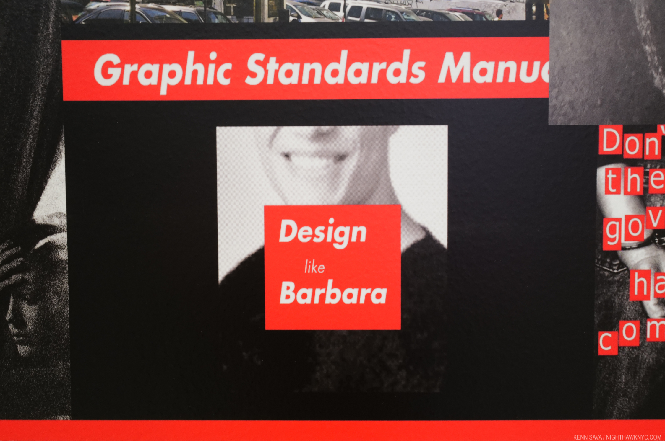
Over the past 50 years Barbara Kruger’s style has become iconic to the point where now A LOT of people either wish they could design like Barbara. Detail from Untitled (That’s the way we do it), 2011/2020 Digital print on vinyl wallpaper, seen at David Zwirner, July 12, 2022.

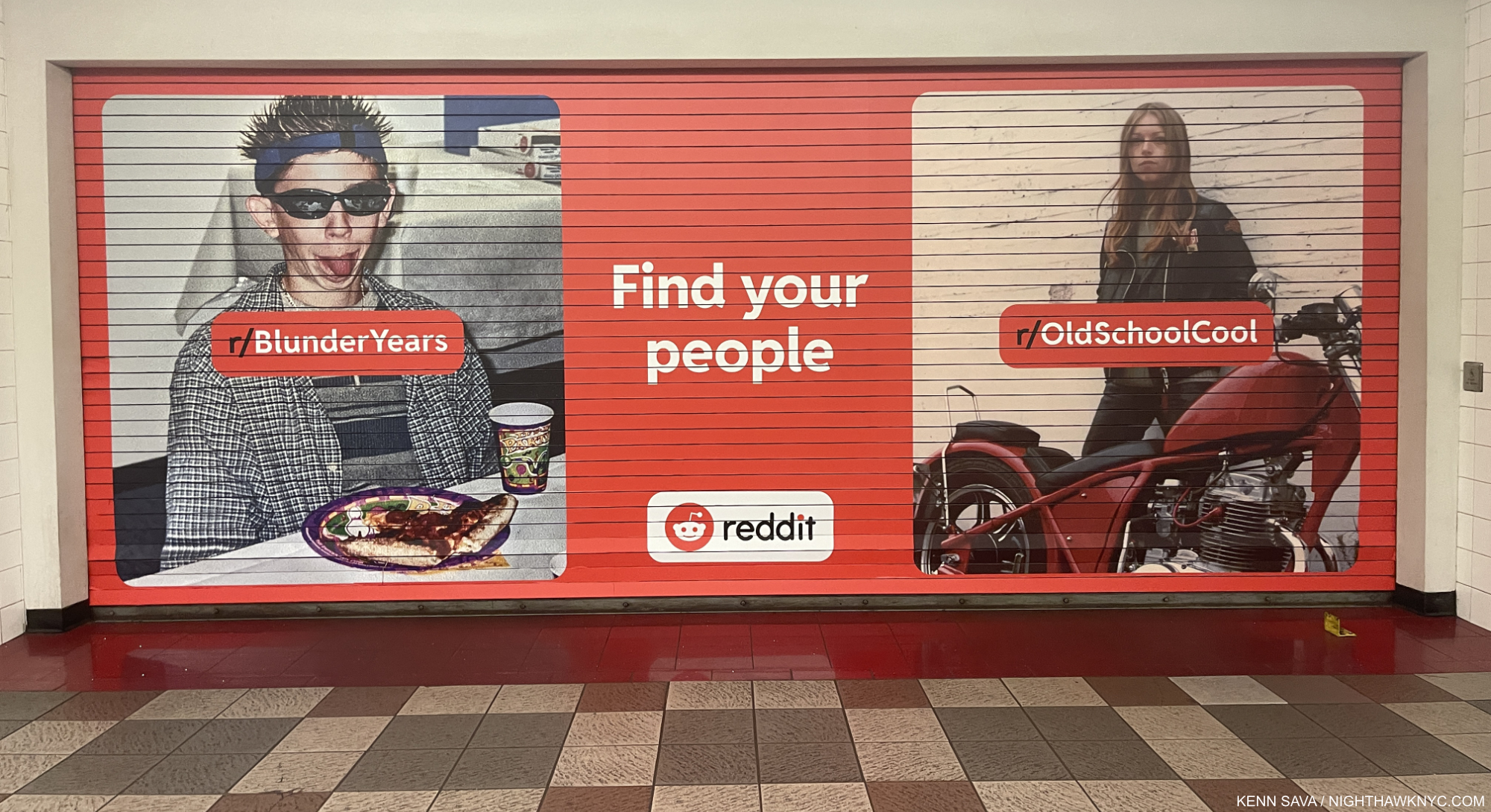
A lot of others simply rip off her style, including countless advertisers, most notoriously, possibly Supreme, according to StockX. This is NOT by Barbara Kruger. NYC Subway, August 28, 2022.

49 years later, Barbara Kruger is one of the most powerful voices in Art. Moreover, she is an Artist who is a powerful voice in the world beyond Art.

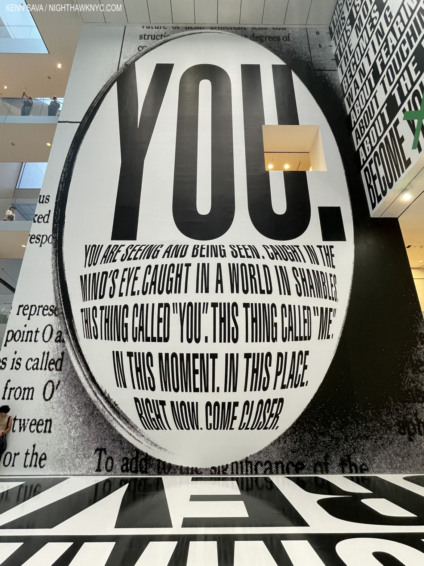
Detail of Thinking of You. I Mean Me. I Mean You., which fills the 5 stories of MoMA’s Atrium. September 2, 2022.

Year 49 brings two formidable shows of new Barbara Kruger pieces and new versions of older work to NYC- one, Thinking of You. I Mean Me. I Mean You. fills the MoMA Atrium with the new site-specific titular work this fall/winter. Barbara Kruger, a show of new versions of classic work, filled 3 of David Zwirner’s West 19th Street galleries this summer. Thinking of You. I Mean Me. I Mean You. was a traveling retrospective in its prior stops at LACMA and the Art Institute of Chicago. Sadly, the retrospective segment of the show, announced to be mounted at MoMA PS1 (site of a 1980 BK solo show) was cancelled due to pandemic scheduling issues2. Darn! New Yorkers will have to make due with the main building’s Atrium and the show’s excellent catalog, which includes 40 of the 60 pieces we could have/would have seen. 

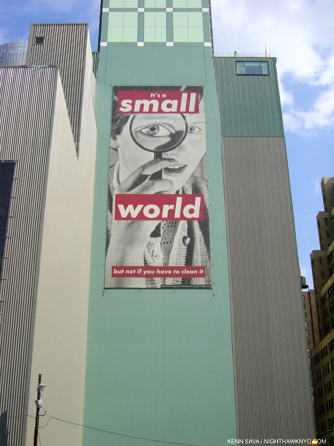
Untitled, 1989, Public Art Fund installation, West 41st Street & 8th Avenue, April 3, 2001. A huge office building now occupies this space. Good luck cleaning it!

In spite of missing the retrospective part of Thinking of You. , New Yorkers have, probably, seen more of Ms. Kruger’s work over time than anyone, being she began here and has maintained a place here all along. While we missed another look-see at the depth of her work and the historical overview the retrospective provides, the impressive (and sad) thing about Ms. Kruger’s oeuvre is that her themes haven’t changed over these past 50 years. The retrospective would have shown her dedication to addressing these issues over time, and for all this time. 

“Issues about power, value, unfortunately do not grow old,” she told Art21.

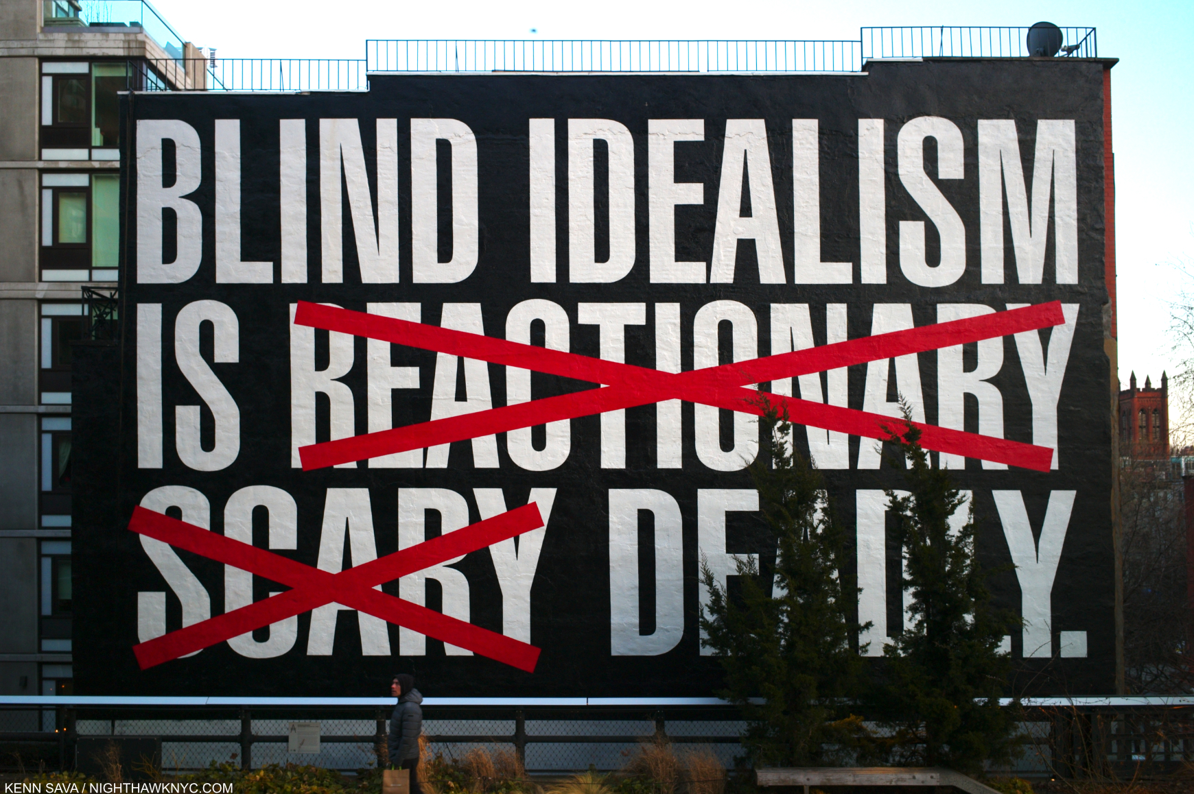
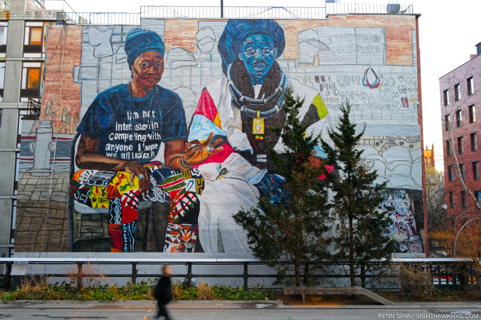
Blind Idealism Is…, Paint on wall, the High Line Mural for 2016-17, seen February 5, 2017. An adaptation of a quote from Frantz Fanon. That’s “DEADLY” behind the trees, which I guess cannot be moved. Installed in summer, 2016, it eerily foreshadowed what was to come. Seen on February 5, 2017.

Barbara Kruger was born in Newark in early 1945 to a working class family. Her dad was a chemical technician, her mom a legal secretary3. After 1 year at Syracuse U, she took some classes at the Parsons School of Design with graphic designer/art director Marvin Israel and legendary Photographer Diane Arbus4. Though she never earned a degree, she credits her studies with Arbus & Israel with influencing her, and it was through her connection with Mr. Israel that she began her professional life at Condé Nast in the design department of Mademoiselle Magazine5. She became chief designer at 22,  before becoming a freelance picture editor and designer for magazines and books, including at stint at the Aperture Foundation.

“You know, it always gets me when people say I worked in advertising. I never did. I never had that experience of selling a particular product. When you work in magazines, it’s a serial process, it’s about seriality- and so is photography. Or Painting,” Barbara Kruger, Interview Magazine, 2013.

Instead, Barbara Kruger uses advertising’s methods and means including billboards, posters, pieces mounted on buildings, and short videos, while also being regularly featured in public spaces of all kinds all around the world. In her work, she lays bear the methods advertisers uses to manipulate viewers (as does Sara Cwynar more recently). The major difference is in her work Barbara Kruger isn’t “selling” anything. She wants her viewers to think.

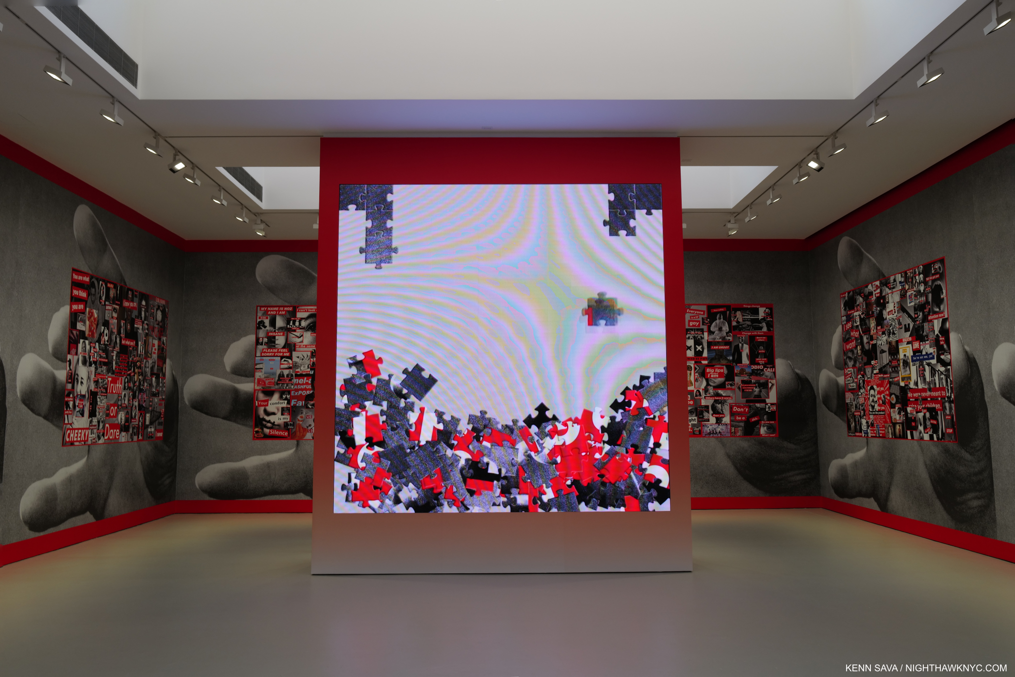
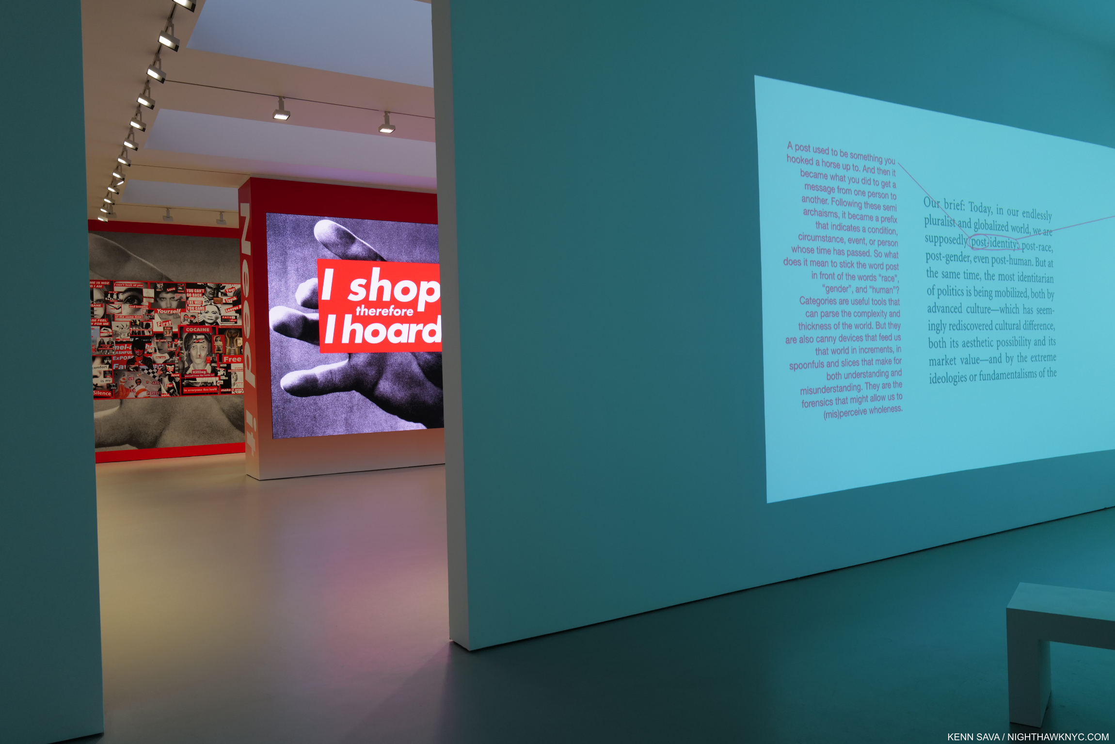
Barbara Kruger’s David Zwirner show featured a number of older works that the Artist has reincarnated as short videos. In I Shop Therefore I Am, the work comes together on the screen as a jigsaw puzzle gradually falling into place. Untitled (I shop therefore I am), 1987/2019 Single-channel video on LED panel, sound, 57 sec. David Zwirner, July 12, 2022.

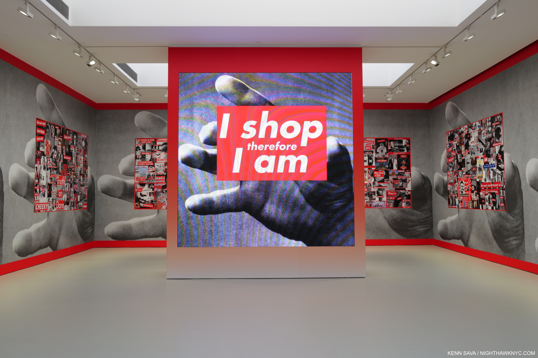
After forming “I shop there fore I am,”, the “I Shop” is replaced with other words making new phrases.

“These are just ideas in the air and questions that we ask sometimes- and questions that we don’t ask but should ask.” she told Art21.

In the 1970s, she began showing her work, then took a year off late in the decade to consider what she was doing and what she wanted to do with her Art. Now, her 1970s work has all but disappeared- I can find no trace of it anywhere. In the 2010 Rizzoli Barbara Kruger monograph, the largest and most comprehensive book on her work so far, the earliest pieces included date from the 1980s. During her break, her time with the Artists Meeting for Social Change proved critical in helping her focus her ideas, which she combined with her graphic design expertise to develop the unique text & image style that has become instantly identifiable as hers. In the 1980s, a steady string of gallery shows began, continuing right up to this summer with Barbara Kruger, her first show with David Zwirner. The museums came on board with the 1999-2000 MoCA, Los Angeles, mid-career retrospective. Her work has since been on view in numerous museums around the world (with the text in her work in the local language), up to Thinking of You I Mean Me I Mean Thinking of You. I Mean Me. I Mean You. now at MoMA after prior stops at the Art Institute of Chicago (Sept, 2021- Jan, 2022) and LACMA (March – July, 2022). Such has been the demand for her work, her Zwirner CV runs 31 pages.

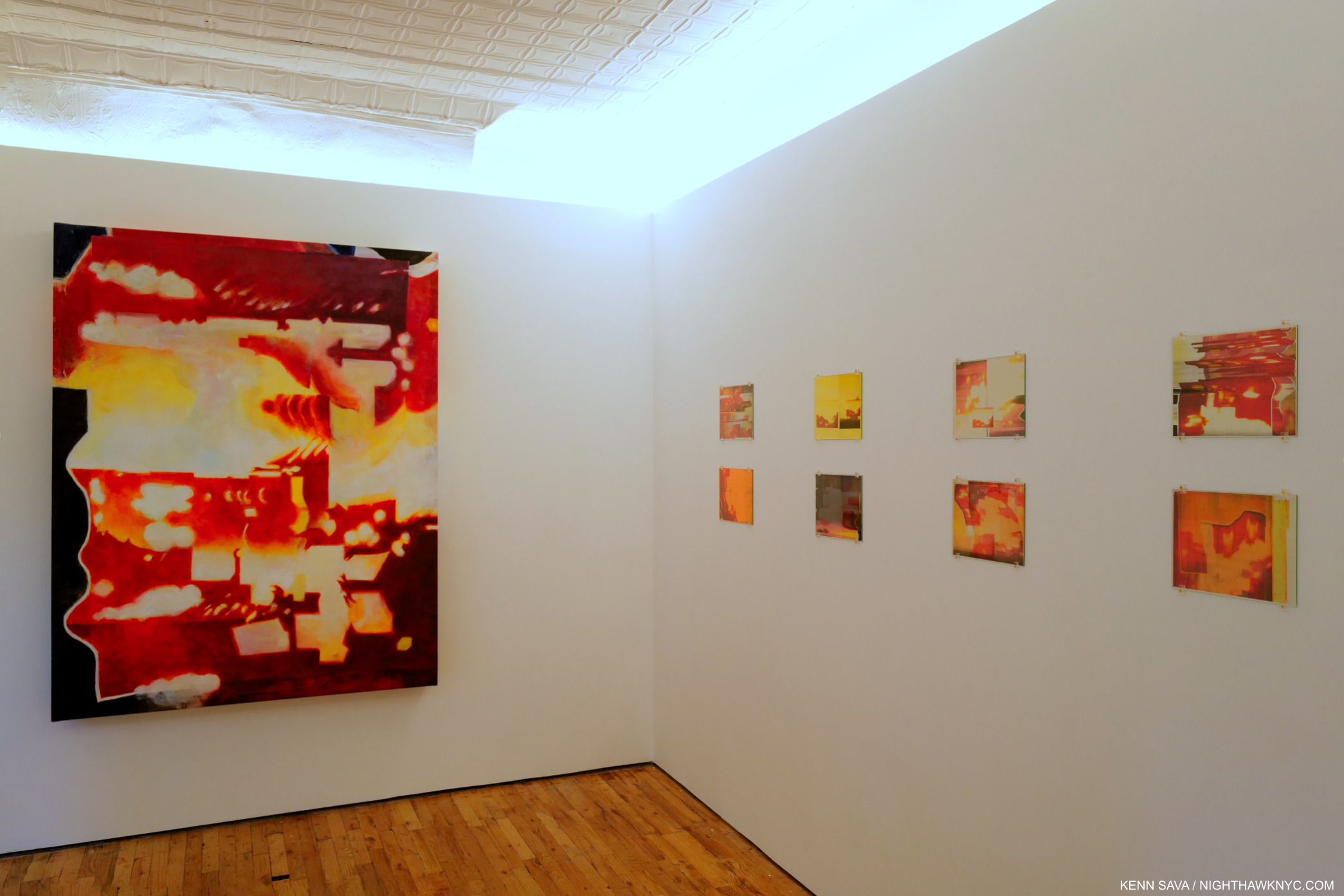
Partial installation view of one of the three Zwirner galleries, July 12, 2022.

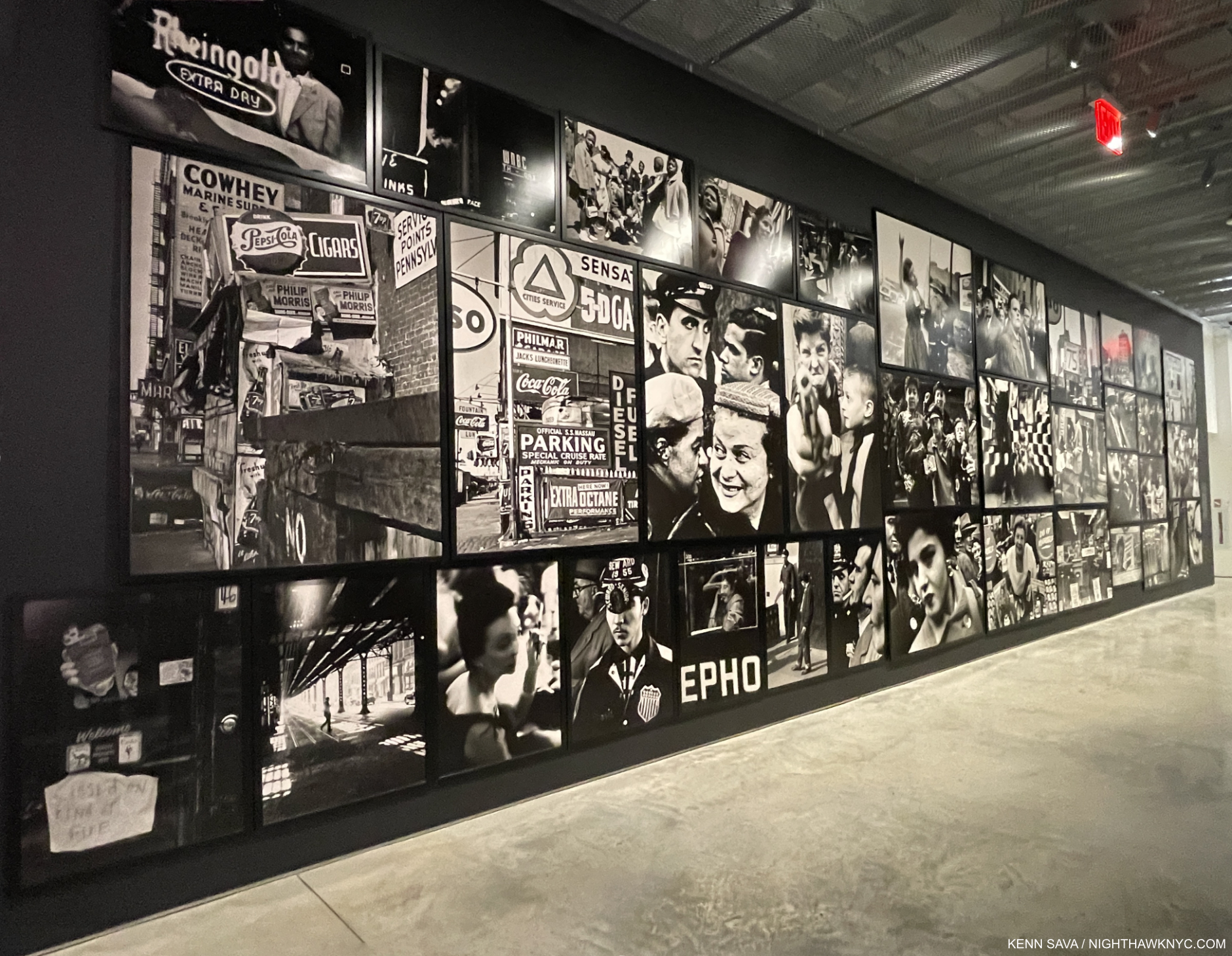
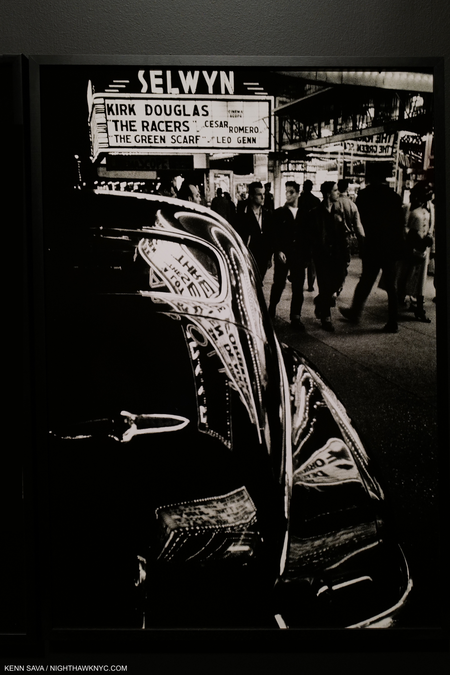
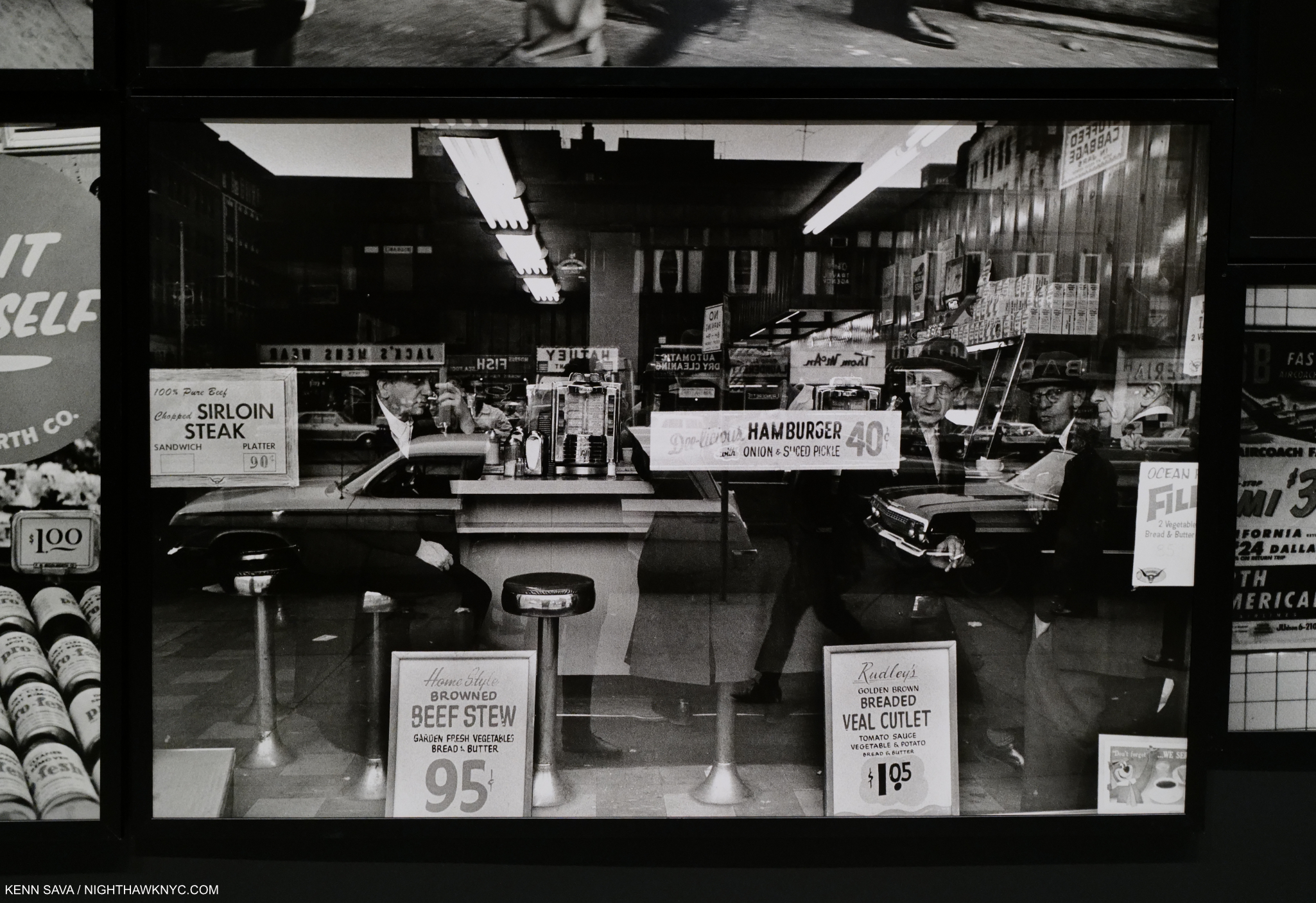
The images that appear in her work are often sourced from mid-century catalogs6. But, Barbara Kruger has issues with Photography- particularly Street Photography and Photo-Journalism.

“There can be an abusive power to photography,” she said7.

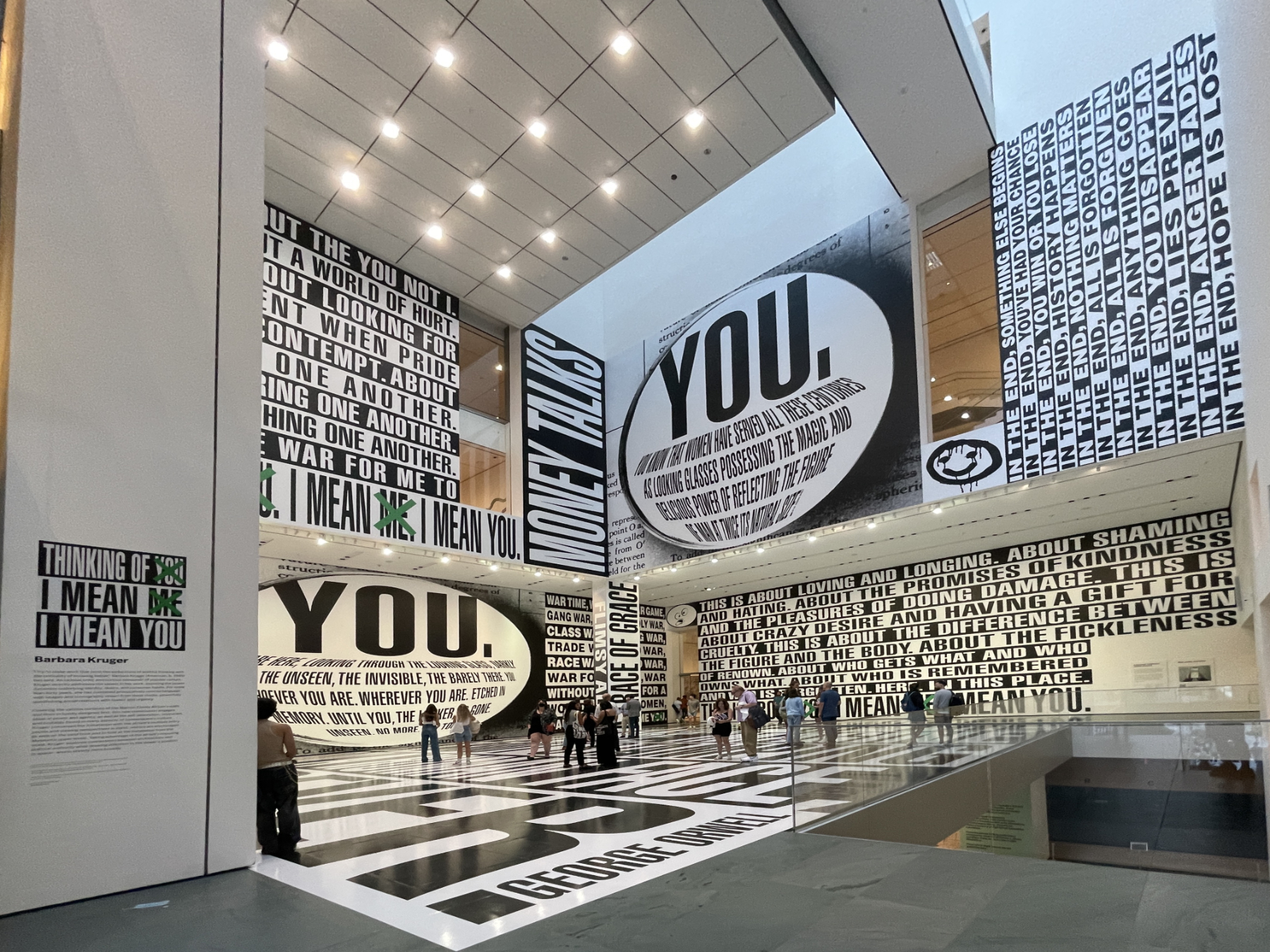
Thinking of You. I Mean Me. I Mean You., MoMA Atrium, September 2, 2022. It won’t, but I think it should stay right here permanently. In the now 16 years this space has been here, this, and Adam Pendleton’s recent piece, are the best use of almost all of it I have seen. Unlike much of her earlier work, there is no Photography in this piece.

Her signature red on white pieces, which suddenly became black on white pieces, often pose tough questions that put the viewer on the spot. “You talking to me?,” as DeNiro said. Christopher Bolen walked readers through what happens next in Interview Magazine-

“The direct address is disarmingly direct. Certainly, the “you” implicates the reader—a shopper, a consumer, a part of the capitalist enterprise, guilty of impulsive buying habits. But the “you” is also a general composite—that annoying, far more guilty everyperson-and the reader sides with the artist in condemning this sector of the population who is greedy, wasteful, and irresponsible. So already—and almost always in a graphic Kruger text piece—a haunting repositioning occurs in the mind of the viewer: judged and also judging; agreeing with the charges even as she or he is charging others.” Christopher Bolen, Interview Magazine, 2013. 

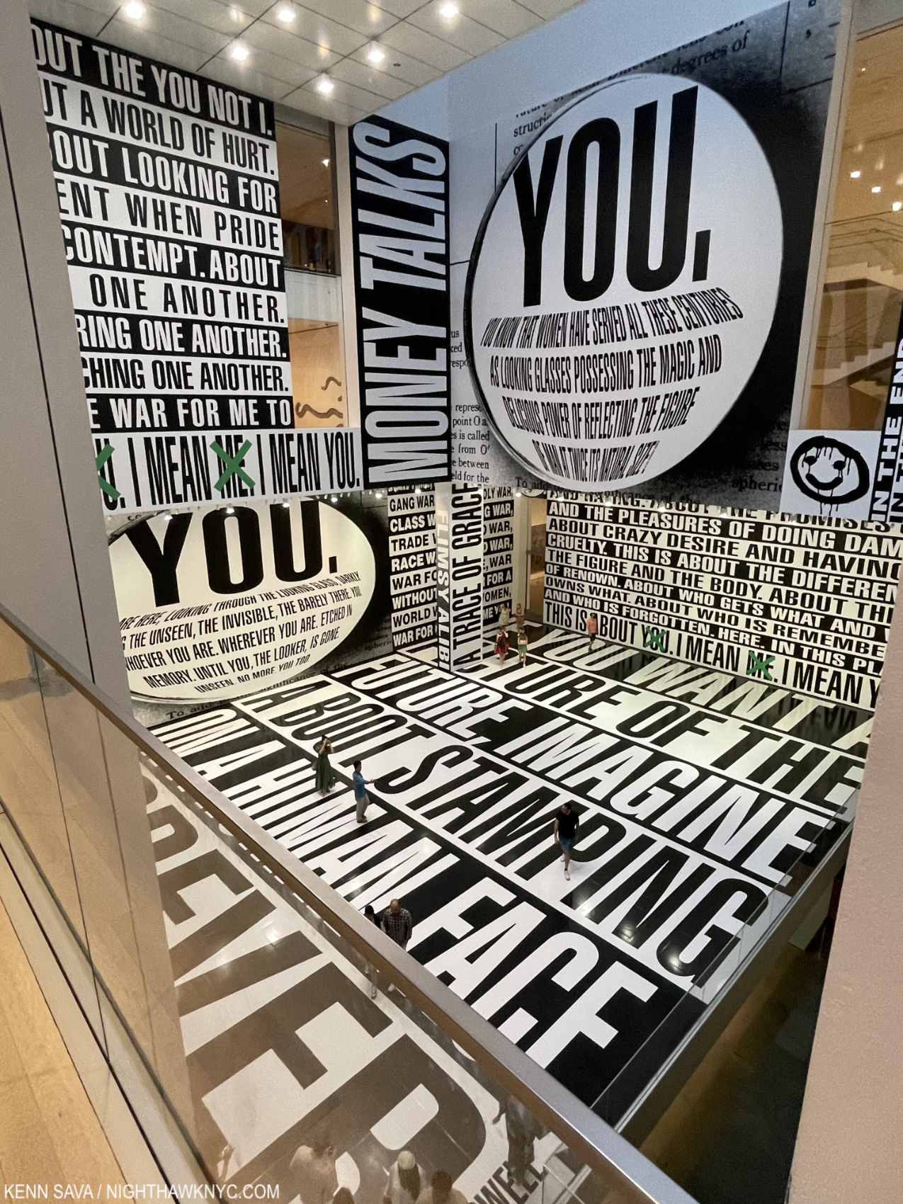
The view of MoMA’s Atrium from the 5th floor, September 2, 2022.

If anything, her newer black on white style without Photographs is even more direct. There is nothing to distract the viewer from her text. Not even color.

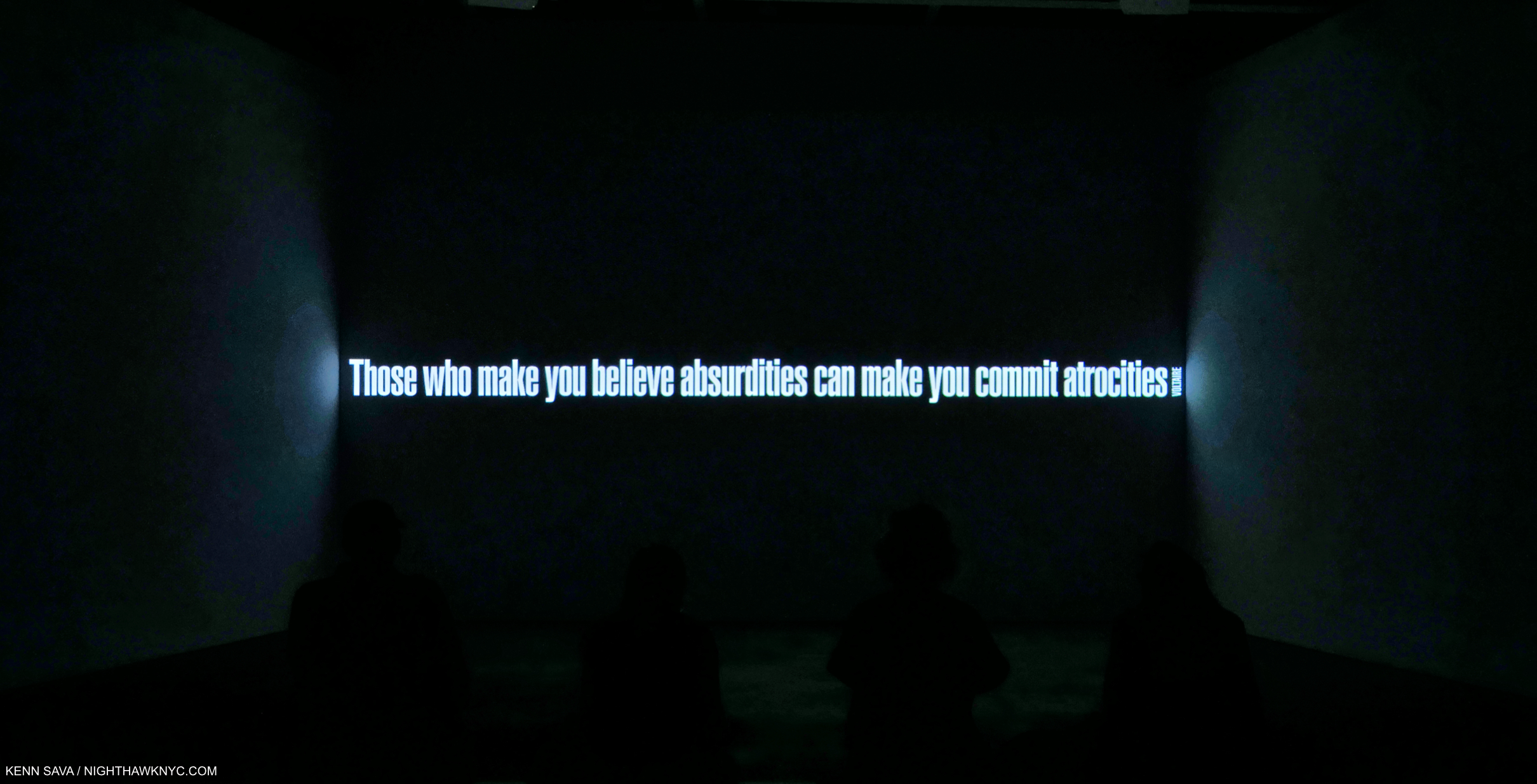
Detail of Untitled (No Comment), 2020, Three-channel video installation, sound, 9:25 min. As she has used found Photography, Barbara Kruger may also use texts from others. “Those who make you believe absurdities can make you commit atrocities” is a quote from Voltaire. At David Zwirner, July 12, 2022.

“I want my work to create commentary,” the Artist told Art 21.

In doing so, she turns the methods of advertising on their heads, “to teach us how to the two languages of persuasion, photographs, and words, influence us. Believing that no message is neutral, Kruger would have us be critical interpreters, rather than passive consumers, of the media8.” In doing so, she allows the viewer to see how advertising works- how it manipulates and persuades, while helping the viewer understand the power of the media.

David Zwirner, June 30, 2022

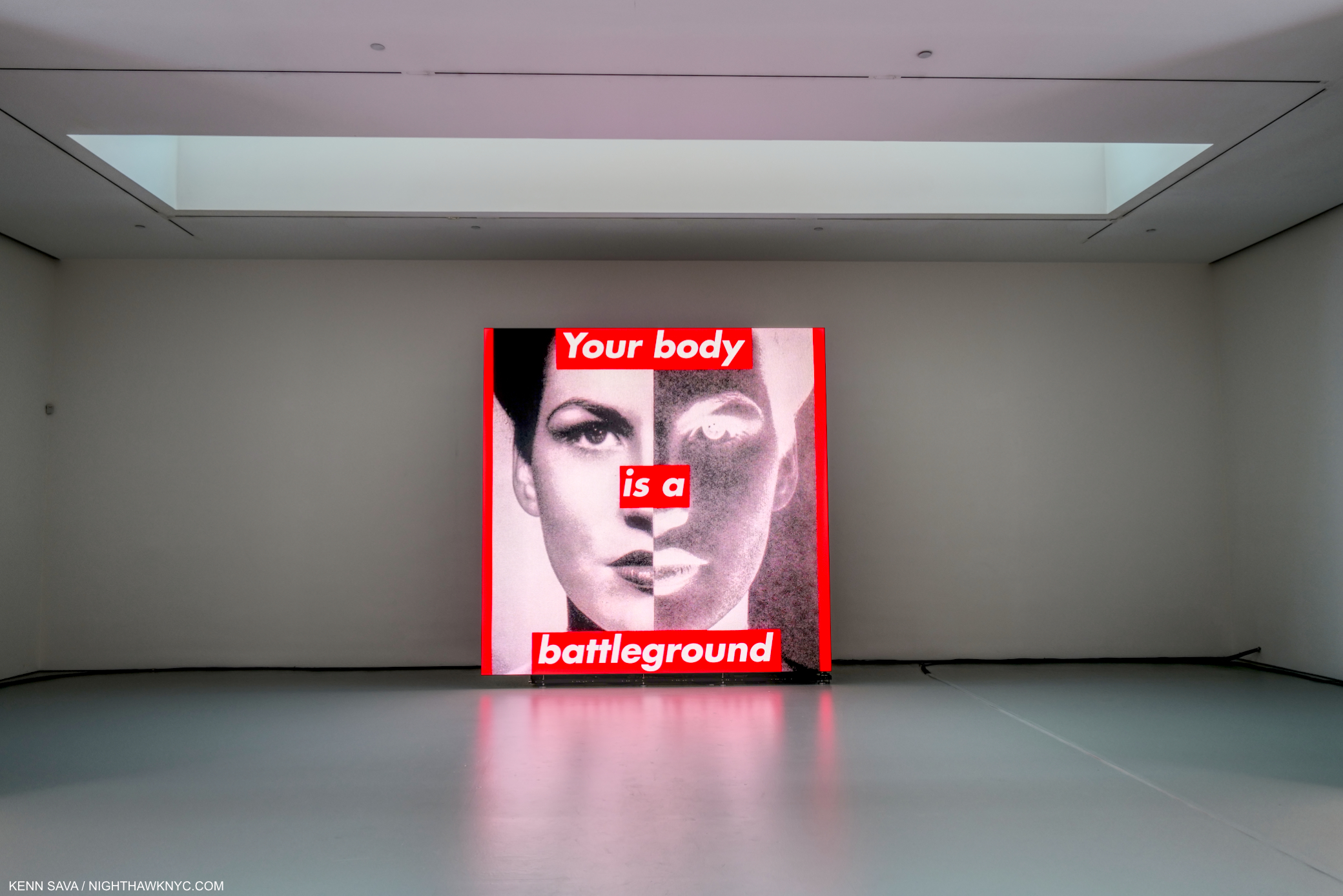
At David Zwirner, some of the Artist’s most well-known pieces, including Untitled (Your Body Is A Battleground), 1989/2019, have been given new life as single channel videos on LCD panels. Originally created to support women’s reproductive rights for the 1989 Women’s March on Washington, it’s just one example of the unfortunate timelessness of Barbara Kruger’s work. Your body is a battleground is already 33 years old. I shop therefore I am, is 35 years old.

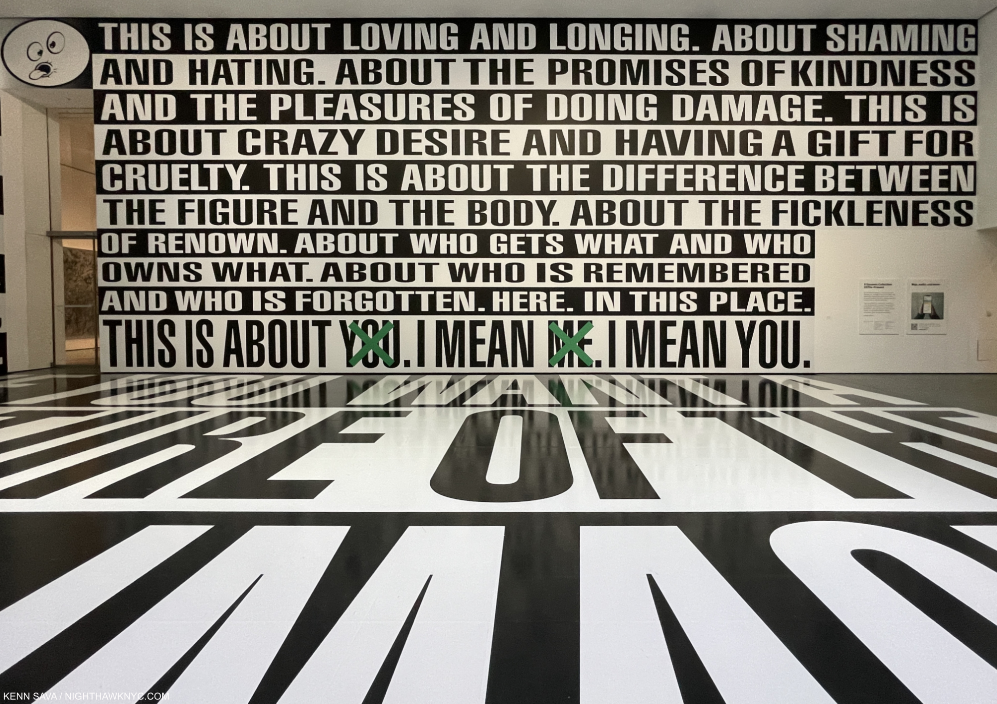
Detail of Thinking of You. I Mean Me. I Mean You., MoMA Atrium, September 2, 2022.

As she prepares to enter the second half-century of her work, she finds herself in a world that is substantially more open to her voice, and that of female Artists, than it was when she began to show her work in the early 1970s. Barbara Kruger has been a substantial catalyst of that change. I’m not sure she’s gotten enough credit for it. Of course, there is still much to be done. Though her methods have evolved over time, the effect she’s had, already, is incalculable- in so many ways. Purely as Art, 50 years on, her work has more than held its own.

Detail of Untitled (That’s the way we do it), 2011/2020 Digital print on vinyl wallpaper at David Zwirner, July 12, 2022.

Based on all of this, leaving aside how her work will be viewed aesthetically, it seems to me that 100 years hence, her work will remain every bit as relevant as it is right now.

For better. Or for worse.

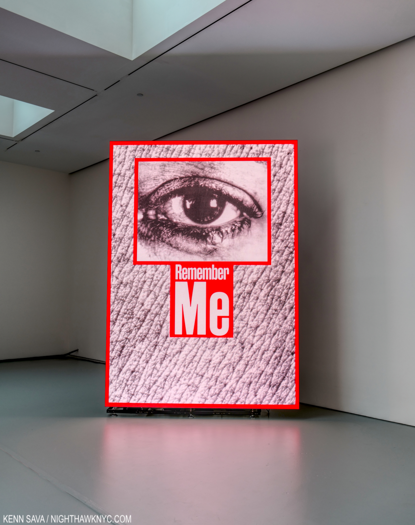
Untitled (Remember me), 1988/2020 Single-channel video on LED panel, sound, 23 sec. David Zwirner Gallery, June 30, 2022.

*- Soundtrack for this piece is “Color Synesthesia,” by Nik Bates, with the classic line, “And without Barbara Kruger, there would be no Supreme,” from his album Goodbye, San Diego, 2010.

Also- I’m pleased to announce I’m curating a selection of Art, ArtBooks & PhotoBooks for sale! All items are from my collection or selected by me in my travels through the Art world. The complete selection of over 370 items is here.

NighthawkNYC.com has been entirely self-funded & ad-free for over 7 years, during which over 275 full length pieces have been published!
If you’ve found it worthwhile, PLEASE donate to keep it online & ad-free below.
Thank you, Kenn.

Written & photographed by Kenn Sava for nighthawknyc.com unless otherwise credited.
To send comments, thoughts, feedback or propositions click here.
Click the white box on the upper right for the archives or to search them.
Subscribe to be notified of new Posts below. Your information will be used for no other purpose.

  1. Barbara Kruger, Rizzoli, 2010, p.305
  2. This isn’t mentioned until the next to last page of the exhibition catalog’s text.
  3. https://jwa.org/encyclopedia/article/kruger-barbara
  4. A life learner, the Artist has gone on to teach at a number of schools since her short period of formal study, herself. She has been a professor at UCLA since 2005.
  5. https://www.interviewmagazine.com/art/barbara-kruger
  6. Thinking of You exhibition catalog, P.153.
  7. Interview Magazine, 2013
  8. https://jwa.org/encyclopedia/article/kruger-barbara

Jordan Casteel: Surviving The Buzz

This site is Free & Ad-Free! If you find this piece worthwhile, please donate to support it & independent Art writing. Thank you. 

Written & Photographed by Kenn Sava

Jordan Casteel, Yvonne and James II, 2021, Oil on canvas, 90 x 78 inches. Seen at The Met, June 18, 2022.

You’re a Painter. You’re 32. Your Yvonne and James II was bought by The Metropolitan Museum of Art. It’s now hanging directly opposite Kerry James Marshall’s Untitled (Studio), 2014, one of the show-stoppers in the blockbuster Kerry James Marshall: Mastry in 2017, in The Met’s largest Modern & Contemporary Art Gallery, #915. If that’s not a “Wow!,” what is?

The Baayfalls, 2017, Oil on canvas, 6’6 x 7′ 6, seen at MoMA, August 27, 2022.

Not enough? Your Painting, The Baayfalls, 2017, Oil on canvas, 6’6 x 7′ 6, Painted at about age 27, has a wall to itself on the 2nd floor lobby at MoMA, where it is part of their permanent collection.

The Baayfalls, Paint on wall, the High Line Mural for 2019-20. Yes, the trees have gotten bigger since I showed them in my Barbara Kruger piece. I LOVE trees, but move them, please.

Then, there’s this- in 2019, The Baayfalls became the High Line Mural. Ed Ruscha, Kerry James Marshall, Henry Taylor and Barbara Kruger have had Murals up on this wall before Ms. Casteel, who was all of 30 at the time. Originally scheduled to be up for a year, due to covid, it’s still there as I write.

A very rare copy of the sold out catalog for Jordan Casteel: Within Reach is now impossible to find in any condition for less than $300.00.

A year after her Mural went up, her New Museum “Retrospective” (I’m not sure you can call a show of work by a 30 year old living Artist a Retrospective, but ok), Jordan Casteel: Within Reach took NYC by storm, although not many actually got to see it because it was closed for much of its run while the pandemic devastated the City and the world. Be it through the show’s terrific catalog or its online presence, viewers got the point. The word was out.

Can you say, PHEW!? Not since the day of Jean-Michel Basquiat has a young Painter risen so far so fast. And, Jean-Michel never had a Painting of his acquired by The Met or MoMA (let alone both) during his lifetime before he died at 27. Ms. Casteel’s work was acquired by both when she was about 31.

Jennifer Packer, Jordan, 2014, Oil on canvas, 36 by 48 inches. Seen in Jennifer Packer: The Eye Is Not Satisfied With Seeing at the Whitney Museum, December, 2021.

Hold on- I’m not done with her C.V. yet! Buzz builds upon buzz. International shows followed. Last year, Jordan Casteel appeared in a Portrait of her done by her friend, Jennifer Packer, in one of the shows of the year, the Whitney Museum’s Jennifer Packer: The Eye Is Not Satisfied With Seeing. Ms. Packer Painted Jordan in her studio while they were both students at Yale in 2014. Then late last year, Jordan Casteel was named a MacArthur Fellow. She received what is called a “genius grant.”

I’m not sure anyone can imagine what experiencing ALL of this has been like for her. It’s unprecedented. Luckily, Ms. Casteel seems to have a great head on her shoulders. She decided to assess ALL of this then reassess her life and her direction. Horror of horrors, she decided to leave NYC and move to rural New York. NYC is such a big part of the Denver-born Artist’s Portraits, it’s helped her to already create one of the strongest bodies of them since Alice Neel. Like Ms. Neel, many of her subjects were found on the streets of Harlem. I wondered what direction they would now take.

Marisa, Isabel and Sage, 2022, Oil on canvas, 94 x 80 inches.

At Casey Kaplan on September 8th, I found out. In Jordan Casteel: In bloom, Ms. Casteel unveiled 9 new Paintings, each dated 2022 and each created since she relocated from NYC to “rural New York,” as the press release says. 

Morgan, 2022, Oil on canvas, 90 x 78 inches.

The group consists of some Portraits, the genre she’s, perhaps, most associated with (Within Reach was exclusively portraits), and adds some Still Lifes and Landscapes to her range. Through them all, Ms. Casteel’s work is characterized by strength. Her line, her brushstrokes, and the character of her subjects, all exude strength. I continue to be captivated by the way she renders skin.

Sunset, 2022, Oil on canvas, 50 x 40 inches

Charles White, who had a way of making his figures larger than life- monumental, comes to mind. While Ms. Casteel’s figures often have a “monumental” quality to them, she has developed entirely her own way with rendering.skin.  All the while, rendering the Black men she Paints non-sexually.

In bloom, 2022, Oil on canvas, 78 x 90 1/4 inches.

There’s also a “there/not-there” element in her work, how she leaves certain parts outlined and not detailed, going back to The Baayfalls, seen above. It takes some adjustment of the eyes on the part of the viewer to see the scene the way the Artist does, and it’s not something I can say I’ve seen many other Artists do regularly. Jennifer Packer uses it, too. Sometimes it occurs in Ms. Casteel’s backgrounds. In the landscape in bloom, above, it’s also seen in the middle ground.

Greg Tate said Jordan Casteel captures the soul of her subject. When I look at her work I see Painting that is “old beyond its years,” and I don’t mean “early maturity.” The Artist is able to recognize subjects who make compelling Portraits, then uses her skills to reflect the appearance they present to the world and the essence, the strength, of their inner selves. The end result is pretty remarkable. Even her domestic scenes have a quiet power and self-assuredness. It’s a testament, I feel, to her subjects, and herself. At Casey Jordan, the 9 Paintings on view don’t seem to miss the City at all.

Damani and Shola, 2022, Oil on canvas, 90 x 78 inches. I haven’t measured, but the large size Ms. Casteel favors in her Portraits make her subjects pretty near life-size.

It’s waaayyyy too early in Jordan Casteel’s life and career to make predictions as to where she, or her Art, are going. So far, her work has struck a nerve with the Art-going public and an ever-increasing number of curators, which will lead, I believe, to her work finding a home in most of the major museums around the world that show Contemporary Art in short order. The bigger picture is only just starting to come into focus. Over and over, the name of Alice Need comes to mind when I think about Ms. Casteel’s Portraits. The first part of her post-graduate career saw her following Ms. Neel’s footsteps in a way in Harlem creating Portraits that feel ripped from life. Now, the Artist has moved on, perhaps wanting to separate herself from those comparisons? She’s her own woman and her own Artist, as her Casey Kaplan show reminds us. It will be utterly fascinating to see how she handles the attention, the pressure, the expectations and the demand for her work going forward.

Field Balm, 2022, Oil on canvas, 36 x 30 inches.

I don’t see any of that ending any time soon.

*- Soundtrack for this piece is “Hold On” by Alabama Shakes, the debut single from Boys & Girls, 2012.

NighthawkNYC.com has been entirely self-funded & ad-free for over 7 years, during which over 275 full length pieces have been published!
If you’ve found it worthwhile, PLEASE donate to allow me to continue below.
Thank you, Kenn.

Written & photographed by Kenn Sava for nighthawknyc.com unless otherwise credited.
To send comments, thoughts, feedback or propositions click here.
Click the white box on the upper right for the archives or to search them.
Subscribe to be notified of new Posts below. Your information will be used for no other purpose.

Hughie Lee-Smith- Leaving History Behind

This site is Free & Ad-Free! If you find it worthwhile, please donate to support it & independent Art writing. Thank you. 

Written & Photographed by Kenn Sava

Show seen- Hughie Lee-Smith @Karma

Who?

That’s probably the first thought coming to the minds of most reading the name Hughie Lee-Smith. I’ll admit his name was new to me, too, when I came across a thumbnail sized repro of one of his Paintings in a listing for a new show of his work. That was enough to draw me down to Karma’s East 2nd Street space to see Hughie Lee-Smith. Having seen said show, the mystery is now how Hughie Lee-Smith has remained such a well-kept secret during his lifetime (1915-1999), and still, 23 years after his passing.

Hughie Lee-Smith, Self-Portrait, 1964, Oil on canvas, 24 x 20 inches.

Beginning to think over what I saw, I felt his work springs from a solid base of influences. For example, his 1964 Self-Portrait vaguely echoed that of another, at least for me.

Edward Hopper, Self-Portrait, 1925-30, Oil on canvas. Seen at the Whitney Museum.

Both Artists strike a 3/4 pose, though their bodies are positioned differently, both wear a jacket, shirt and tie, and both look out at the viewer- Mr. Hopper directly. Mr. Lee-Smith looks somewhat through the viewer it seems to me.

The Birds, 1955, Oil on canvas, 20 x 24 inches.

I’ll admit I have a weakness for Painters who evoke feelings similar to those I get when I look at Hopper, Balthus or Giorgio de Chirico, and I get them when I look at Mr. Lee-Smith’s work, but it’s more than that. Mr. Lee-Smith uses some of their devices- de Chirico’s buildings, banners, deserted spaces, Hopper’s lone figures, Balthus’s female poetry, to the point that the visual evidence says they were influences. Then, he takes them someplace else. He makes these elements part of his own visual vocabulary, not the end point. Mr. Lee-Smith’s end results are different and resolutely his own. His work stands on its own considerable merits.

Aftermath, 1960, Oil on linen canvas, 30 x 46 inches. Mr. Lee-Smith is a master of scenes like this in my view. There’s so much about this that intrigues, from the encroaching shadow to the globes and ribbon, which add somewhat incongruous “celebratory elements,” to the still-standing buildings in the background. And mostly, “Aftermath” of what? A portrait of urban decay? A meditation on death? Or…?

At Karma, the 34 Paintings on display make the case for him as a real omission from the canon of 20th century American Painting. Painting after Painting draws the viewer in, then holds his or her gaze indefinitely. Each work is open-ended. Each feels like a moment frozen in time, a snapshot of a dream, or a memory. Like a dream or a memory, images from one place or time often collide with others creating a scene that’s not “real.” For me, at least, I don’t consider them “surreal.” They manage to hold on to too much that is all to real in the world- crumbling walls, signs of decay, and elements that were the New Topographic Photography movement’s meat.

Untitled (Urban Landscape), 1975, Oil on linen, 32 x 26 inches.

I suspect that a number of museums who don’t own his work will be looking to acquire it.

Festive Vista, 1980, Oil on canvas, 15 x 13 inches. Already in a museum- The Studio Museum of Harlerm’s Permanent Collection. The arched windows and streamers are similar to those seen in de Chirico, the view reminiscent of Hopper, but what Mr. Lee-Smith does with this makes it his own. Targets and streamers recur in his work, as already has been seen.

Currently, his work is in the Smithsonian American Art Museum, The Studio Museum of Harlerm and SFMoMA, among others. He is, also, in The Metropolitan Museum of Art (they own a Watercolor, acquired in 1994, and 3 Lithographs, acquired in 1943 and 1999), though he is not in MoMA or the Whitney. So, it comes as no surprise that the Karma show is the first substantial show of Hughie Lee-Smith here in 20 years. Not a surprise but unfortunate.

Pumping Station, 1960, Oil on canvas, 20 x 24 inches.

It shows convincingly that his work speaks fluently to today’s viewer, particularly at a time of recent forced isolation. 

Outing, c.1970, Oil on canvas, 26 x 36 inches. The woman on the right strikes a pose similar to those seen on more than a few mast heads. I wonder if the male figure is  a “Self-Portait” or a surrogate.

Whereas Mr. de Chirico used mannequins and creatures of his own invention as surrogates, Mr. Lee-Smith uses people. Usually alone, or alone together in groups, in a number of these works which serves to neutralize the metaphysical air that surrounds Mr. de Chirico’s early work to 1920 or so. This humanizing shows man (or woman) caught between nature and the world he’s constructed, which is often seen in disrepair in spite of the festive balloons and streamers the Artist often includes. Perhaps they are remnants of better times? That’s easy to relate to now, too.

Portrait of a Boy, 1938, Oil on canvas, 25 x 17 inches.

Mr. Lee-Smith was not to be confined to working in one genre. The show also included a few Portraits and Still-Lifes.

Cliff Grass, 1950, Oil on canvas, 26 x 32 inches. The geometry (not the light or color) brings my mind to later Cézanne when I see this.

Mr. Lee-Smith loves to juxtapose and include surprising elements that serve to up-end any easy “interpretation” of the composition.

Quandry, 1995, Oil on linen canvas, 50 x 46 inches. A late work.

Still there is nothing here that is not part of the world- natural or man-made. He seems to feel no need to delve into the supernatural, like the Surrealists.

The Platform, 1984, Oil on canvas, 22 x 32 inches.

Still, every element, wether seemingly major or minor, deserves attention. As I worked my way through the inventory of things included in his work- partially those that recur, one element that particularly caught my eye was Mr. Lee-Smith’s recurring brickwork. Each stone is very carefully rendered- whether in the foreground or background. In The Platform, the entire middle ground of a table, earth and grass is out of focus, yet each brick in the back is in sharp detail. Bricks are useful elements because they can be rendered in a number of ways- as a solid wall, or as a crumbling wall, for instance. Both are seen in the show, and both carry their own connotations with them, leaving the viewer to sort out what is what. That is the case for me after seeing this show. I’ll be weighing all the elements and thinking about these works until the next time I see Mr. Lee-Smith’s Art.

Untitled (Maypole), 1955, Oil on masonite, 19 x 13 1/2 inches.

Art history seems to have skipped over Hughie Lee-Smith during his lifetime in its rush to judgement. That’s another confirmation that it’s still too early to write the history of 20th century Art. Time will be the ultimate judge of all Art. More time needs to pass for it all to sit and see how it speaks to people over some time- at least 100 years.

I have a feeling time is going to be kind to Hughie Lee-Smith’s work, and a number of his pieces are going to continue to speak to viewers indefinitely. Hughie Lee-Smith at Karma is the first indication of this. It won’t be the last.

*-Soundtrack for this piece is “Red House” by the Jimi Hendrix Experience from Are You Experienced?

NighthawkNYC.com has been entirely self-funded & ad-free for over 7 years, during which over 275 full length pieces have been published!
I can no longer fund it myself. More on why here.
If you’ve found it worthwhile, PLEASE donate to keep it online & ad-free below.
Thank you, Kenn.

Written & photographed by Kenn Sava for nighthawknyc.com unless otherwise credited.
To send comments, thoughts, feedback or propositions click here.
Click the white box on the upper right for the archives or to search them.
Subscribe to be notified of new Posts below. Your information will be used for no other purpose.

William Klein- A Thousand Times YES

This site is Free & Ad-Free! If you find this piece worthwhile, please donate to support it & independent Art writing. Thank you. 

Written & Photographed by Kenn Sava

Show Seen- William Klein: YES @ ICP

William Klein, who passed away at 94 on September 10th, was a big name for so long, creating legendary and hugely influential PhotoBooks, Films, Fashion Photography, Paintings, Photograms, and on and on, that it seemed to me he was somewhat taken for granted over what turned out to be the last decade of his life. Case in point- I can’t remember the last big William Klein show in NYC. So, the International Center of Photography’s career retrospective, William Klein: YES, June 3rd to September 15th, was not to be missed. Due to circumstances out of my control (i.e. my new life), I managed to see it on its closing night, day 5 after the Artist passed.

Untitled (Blurred White Squares on Black and Orange Gel Sheet), c. 1952, Gelatin silver print with transparent orange filter, top, and Untitled (White and Yellow Moving Lines), c. 1952, Gelatin silver print with yellow paint.

Paintings, Collage, Photograms, bodies of b&w Street Photographs in NYC, Paris, Rome, Moscow and Tokyo, Fashion Photography, Film, color Photography, Painted contact sheets filled both gallery floors of the International Center of Photography’s fairly new Essex Street building. The show felt like it was the work of 6 or 7 Artists. Perhaps that’s why they named the show William Klein: YES Photographs, Paintings, Films, 1948-2013- as a reminder that ALL of this sprang from one unique Artist.

The earliest works on view. Untitled (Gymnasts), c. 1949, Untitled (Still life, lamp, and vase), c. 1949, Oil on wood- the others are all oil on canvas, Untitled (Gymnasts), c. 1949, and Untitled c. 1952, from left to right.

After studies with Fernand Léger, William Klein temporarily ignored his advice to get into Photography, Film and publishing, instead embarking on a career as an Abstract Painter during the height of the first wave of Abstract Expressionists. He managed to carve out a style that had elements of Mondrian but also showed an affinity for multi-layered compositions that would also be seen in his later Photography. It’s interesting that the two Gymnast Paintings, above, feature monochrome figures, also presaging his b&w Street Photography.

In 1952, an architect saw William Klein’s Paintings and asked him to adapt them to a room divider made of rotating panels. While Photographing the panels, Klein’s wife spun them. Fascinated with the effect, hep down his camera,  went into the darkroom and began experimenting with Photograms, like Man Ray before him, holding cards with cut out shapes over photo paper during long exposures.

While Photographing a piece he’d been asked to paint, William Klein was inspired to put his camera down and experiment in the darkroom with light on photo paper using long exposures. Man Ray had been among the first to explore Photograms, and Robert Rauschenberg would a few years later, but neither’s look like Mr. Klein’s. They found admirers among graphic designers, who featured them on magazine covers and record covers.

William Klein’s Photograms on the covers of Domus Magazine from 1955, 1959, and 1952, left to right.

His Painting turned out to open a door to his future when Alexander Lieberman, art director of Vogue saw a show of them in Paris and, impressed with his strong vision, saw a Fashion Photographer in him. William Klein, who was born in NYC before moving to Paris in 1946 to become a Painter came back to the City to work for Vogue. Along the way William Klein became Klein, and he broke as many rules shooting fashion as he did in his Art. He took models out of the studio and on to the streets and collaborated with them on shoots. Possibly as a result of this, Mr. Lieberman also funded William Klein’s desire to shoot the streets of NYC. The body of work that became Life is Good came into being, as did the Photographer being christened, “the angry young man of photography1.”

A wall of prints from the classic Life is Good & Good for You in New York, 1956, taken between 1954 and 1956. Almost all of the work in the show was from the William Klein Studio, and the prints were spectacular.

Filling two floors, almost all of the work on view was provided by the Artist, himself, most likely marking the final time he would be directly involved in a show of his work. The quality of the prints on view, many “printed later,” were of the highest order. The black & white prints were unforgettable- black could never be blacker, and many of the color Fashion Photos were printed at a large, even huge size, which made them even more stunning.

A timeless image of NYC, Selwyn, 42nd Street, New York, 1955 (printed 2016), Gelatin silver print. The play of light and shade in this incredible print is a subject all its own. I’m not sure black can be blacker than this.

The late Robert Frank is, possibly, the most influential Photographer of the past 60 years, but a very strong case can be made that William Klein is in that discussion. His Life is Good & Good for You in New York: Trance Witness Reveals, was published in 1956, 2 years BEFORE Mr. Frank’s seminal The Americans. Seen alongside the Frank book, Life is Good is a fascinating counterpoint, showing a different America than that seen in The Americans. Mr. Frank got a lot of grief for showing America as he saw it. Mr. Klein’s Life is Good shows gritty NYC as the melting pot it has long been where anything could happen at any moment. But it is his style and technique that ruffled many feathers. Rough, raw, out of focus, as dark as night, off kilter, lacking coherent compositions, grainy…were among the criticisms of those who were perhaps thinking that Henri Cartier-Bresson had discovered the only “true way” to take Street Photographs. But, there was method to his madness, and his methods resounded with many viewers right up to today.

The avant-garde William Klein. Another multi-layered composition. Atget, then Walker Evans took Photos of similar scenes before William Klein, and Richard Estes has spent a good deal of his career Painting them, as I showed a few months back.

Looking through Life is Good is always surprising, even when you’ve seen it before. Quite a few people smile, indicating life was, indeed, good for them, in spite of the rough and tumble settings. A number of others (upwards of 50% of his subjects?) look at the camera and many of those seem to be in cahoots with the Photographer. Many images work in multiple layers from foreground to back. Many show fleeting moments that in Mr. Klein’s hands become intriguing, if not “decisive.” There is a section of urban landscapes in the middle that show a bit of the influence of Walker Evans, but mostly serve to give the book a decidedly avant-garde feel that it retains today. His Photographs down through the years from the b&w shots of NYC of the mid-1950s up to his color work in Brooklyn in 2013 show the universality of modern human existence. Whereas Mr. Frank observes masterfully, Klein often interacts.

Flat Plan for Life is Good & Good for You in New York, 1955, Ink, pencil and colored pencil on paper.

Whereas The Americans remains hugely influential here in the US, and perhaps not as much in the rest of the world, Life is Good & Good for You in New York: Trance Witness Reveals, has been hugely influential around the world. It singlehandedly rewrote the possibilities of Street Photography. Perhaps its influence was felt nowhere more than it was in Japan. Daido Moriyama, a great Street Photographer in his own right, has created an important career exploring some of the ideas & techniques William Klein used in Life is Good, which served as an influence and a catalyst2particularly his high contrast, motion blur and unusual angles. So have any number of other important Japanese Photographers from the late 1950s, on, not to mention numerous others everywhere else. Nakahara Takuma, with Mr. Moriyama one of the Photographers who produced the legendary Provoke Magazine beginning in 1968, wrote a lengthy article on William Klein in 1967. In it, he said about the reaction to Life is Good, “…its impact was unprecedented. The reaction could even be called panic.” And, “…(a number of) photographers…thought of Klein’s photography as an ‘impudent ‘ amateur game, as mere technical experiment. Immediately after New York was published, critical opinion was polarized; rather than photography, it was advocates for the other related genres, such as painting and film, who supported it most positively3.” A case could be made that a good deal of Japanese Photography since its publication bears its influence. “It is not so surprising, therefore, that his photography, as something so new, became extremely popular, especially among the young,” Nakahara Takuma said in the same piece. Pretty remarkable for the first PhotoBook by an untrained Photographer. 

Atomic Bomb Sky, New York, 1955 (printed 2012), Gelatin silver print. Of the millions of images I’ve seen of NYC in my life, I’ve never seen one like this.

It should also be noted that Life is Good & Good for You in New York: Trance Witness Reveals has never been published in the USA4! Early on, every publisher rejected it. The first edition was published by Editions du Seuil in Paris in 1956. William Klein followed Life is Good with books on Paris (2002), Rome (1959), Moscow (1964) & Tokyo (1964. It was reported that Klein took 50,000 Photos for it5.), each of which got a section in the show, each of which remains out of print and highly sought after. 

Antonia and Yellow Taxi, New York, 1962 (printed 2016), from Vogue, Pigment print. When I saw this shot at AIPAD in 2017, I realized I needed to do a deep dive into William Klein. I’m still exploring his huge oeuvre. A bit reminicient of Saul Leiter, perhaps?

Meanwhile, Klein had become a top Fashion Photographer.

Installation view. Paris, 1964-83, in the lower foreground and to the right, Life is Good/NYC behind, Painted Contact Sheets above, and a sliver of the large video projection screen, left. I remain no fan of “holes” in museums, including this one which spans the width of the entire floor, except for 2 narrow walkways on the sides. For me they are just expensive wasted exhibition space. I’m not sure they add anything to the show-going experience. In William Klein’s case, quite a bit more work could have been shown.

The second floor was largely devoted to Mr. Klein’s Film work, which is equally revered and important.

Filmstrip montage from Muhammad Ali: The Greatest, 1964-74, Directed by William Klein.

I will leave that for others who have studied it closer than I have to cover. One thing about them that stands out is that Klein repeatedly focused on important Black figures of the time- Little Richard, Muhammad Ali and Eldridge Cleaver among them. 

Tramway, Capellona, Rome, 1956, (printed 2013), Gelatin silver print. It’s just me, but my mind juxtaposes this with Robert Frank’s Trolley-New Orleans, 1955, when I see this work.

In the end, William Klein proves impossible to pin down. Each time I look through Life is Good, I pick up on a different thread and see things I didn’t notice previously. That’s true of much of his work.

Kiev Railroad Station, Moscow, 1959 (printed 1997), Gelatin silver print.

Breaking the rules was easier for him because he didn’t know all of them. William Klein shows that, even without training, an Artist’s creativity and vision can be enough to create important, lasting and influential Art.

6 Gelatin silver prints from Tokyo, 1961, including Tokyo Stock Market and Yoyogi Hairdressing School, Tokyo, upper far right and lower far right, printed later.

WK:YES will serve as a testament to his accomplishment over his sixty-five year career and a benchmark for all future William Klein shows. Most likely its soon-to-be-published 400 page catalog will serve as a beacon to influence still more people and aspiring Artists, adding to the incalculable number Klein already has. 

R.I.P.

*-Soundtrack for this piece is “All Blues” by the Miles Davis Sextet from Miles’ immortal Kind of Blue, 1959

NighthawkNYC.com has been entirely self-funded & ad-free for over 7 years, during which over 275 full length pieces have been published!
I can no longer fund it myself. More on why here.
If you’ve found it worthwhile, PLEASE donate to keep it online & ad-free below.
Thank you!

Written & photographed by Kenn Sava for nighthawknyc.com unless otherwise credited.
To send comments, thoughts, feedback or propositions click here.
Click the white box on the upper right for the archives or to search them.
Subscribe to be notified of new Posts below. Your information will be used for no other purpose.

  1. Gernsheim, A Concise History of Photography, 1986, p.131
  2. https://time.com/3792413/william-klein-daido-moriyama-double-feature/
  3. Nakahara Takuma, “William Klein,” 1967, reprinted in Provoke, Art Institute of Chicago, 2016, p.362
  4. A facsimile version with every page Photographically reproduced, some reduced, in a smaller size book was published by Errata Editions, NYC in 2010. When I bought a signed copy of it, the seller reported that Mr. Klein looked at it curiously before signing it having not seen it previously. An indication that it was not an “official” edition of Life is Good.
  5. Nakahara Takuma, “William Klein,” 1967, reprinted in Provoke, Art Institute of Chicago, 2016.

Not Your Father’s Winslow Homer

Winslow Homer: Crosscurrents is now over. If you missed it, one of the few places you can still see a bit of it is here! If you appreciate that, please donate to keep this site alive. I can no longer create it AND fund it myself. Thank you.

Written & Photographed by Kenn Sava (*-unless otherwise credited)

Ahhh….The summer blockbuster. What would Art life be without one? In spite of covid, we’ve been blessed here in NYC with big and memorable shows the past two summers, though of course, remaining careful is the only way to see one. So, I donned my double masks and went to see this year’s summer-fest, Winslow Homer: Crosscurrents, at The Met.

Winslow & chill…Detail of Lady of Santiago (Girl With a Fan), 1885, Watercolor on paper. Less than one quarter of the whole 8 7/8 by 11 1/2 inch piece is shown. How this is Painted is just stunning. Look at her face! Look at those Palm tree leaves! Not bad for not having any lessons, right? His mother was an accomplished Artist and gave Winslow some help early on, later he took a few lessons in Oils, beyond that, he was self-taught.

Interestingly, and probably purely coincidentally, Winslow Homer turns out to be almost an exact contemporary of the Artist who enthralled me last summer, Paul Cézanne, he of Cézanne Drawing at MoMA: Cézanne, 1839-1906; Homer, 1836-1910! Cézanne was, and remains, one of the most influential Artists of his time. Winslow Homer, though continually popular since he began creating, has not enjoyed the same reputation as a ground-breaker as the French master. To this point.

You’d need a telescope to see The Gulf Stream, center, from the show’s entrance, which announces it as the centerpiece for the entire show. There are a lot of very good Paintings before and after you get to it.

That sound you heard might be the tides beginning to turn after Winslow Homer: Crosscurrents.

The Surgeon at Work at the Rear During an Engagement, from Harper’s Weekly, July 12, 1862, Wood engraving on paper. A number of Homer’s War pieces compile different scenes he may have witnessed on one of his trips to the front of the Civil War into one composition. I wonder if this is the case here. Homer was about 26 at the time he created this Drawing which was sent back, and then engraved by someone else. (* Not included in Crosscurrents. Smithsonian Museum of American Art Photo)

After early work as a free-lance illustrator covering the genteel life around him, Winslow Homer moved to NYC in 1859, where he took a few lessons in Oil Painting at the National Academy of Design with Frederic Rondel. He took a job as an illustrator for Harper’s Weekly right after the Civil War started in April, 1861, and much to his surprise, quickly found himself at the front in Virginia! It was there that he would come into his own, creating a body of War Illustrations that was important, historic, and ground-breaking, becoming, along with renowned Photographers Matthew Brady and Alexander Gardner, America’s first visual War reporters.

Crosscurrents begins at this point, in 1863. With 88 Oils and Watercolors, covering the full range of subjects the Artist rendered after he found himself and his direction during the War, and tracing the rest of his long career, the show is centered around The Met’s masterpiece, The Gulf Stream, 1900,1906. Work after work shows the lie to the out-dated standing perception and in its stead reveals how shockingly contemporary Winslow Homer is, 112 years after his death. The feeling one leaves the show with is akin to “How could we have missed so much in Winslow Homer?”

The Veteran in a New Field, 1865, Oil on canvas. As time went on, he felt he needed a different medium to express the depth of what he wanted to communicate. So, in 1863, he turned to Oil Painting, a medium he had only briefly studied. The soldier’s jacket lies to the right in this powerful image from the end of the War and the beginning of the Reconstruction. Originally, the scythe’s blade was even longer.

Part of the reason opinions on Winslow Homer haven’t changed is there’s been a lack of big Homer shows, and even Crosscurrents isn’t a full blown retrospective. The Met and National Gallery of Art in Washington had a Homer Retrospective in 1959, which the catalog shows to have had around 130 works. The Whitney had a Homer show in 1974 that had 200 works (per its catalog). For perspective, Winslow Homer created 300 Oil Paintings and 685 Watercolors, plus Prints and Drawings over the course of his career1. 2022 is proving to be a fortuitous time to see 88 Homers. 

Prisoners from the Front, 1866, Oil on canvas. The work that made Winslow Homer’s name, reputation and career. It was then quickly acquired by the young Metropolitan Museum.

Before the War ended, Winslow wound up making multiple trips to the Virginia front. Of one, his mother wrote-

“Winslow went to the war front of Yorktown and camped out about two months. He suffered much, was without food 3 days at a time & all in camp either died or were carried away with typhoid fever- plug tobacco & coffee was the staples…He came home so changed that his best friends did not know him, but is well & all right now2.”

The War forever changed Homer, and his Art. The genteel subjects were gone. To go deeper, he finally turned to Oil Painting in 1863 at the age of 27, fairly old to begin.

Sharpshooter, 1863, Oil on canvas. Not bad for a first Oil Painting, right?

“He was painting by eye, not by tradition; painting what he saw, not what he had been taught to see.” Lloyd Goodrich3

Sharpshooters were, perhaps, the most deadly branch of the Army in the Civil War. The series The Civil War: Brothers Divided, credits sharpshooters with winning the Battle of Gettysburg, and by extension the Civil War4. In Sharpshooter, we see one taking aim. In 1896, Homer recalled-

“I looked through one of their rifles once when they were in a peach orchard in front of Yorktown in April, 1862. The impression struck me as being as near murder as anything I ever think of in connection with the army & I always had a horror of that branch of the service5.“ He included this sketch in his letter-

His very first Oil Painting, Sharpshooter, 1863, opens the show in attention- grabbing fashion. When I look at it, I feel for whoever may be on the other end of the telescope. After seeing the Drawing, I believe that’s what Homer intended.

There it is: right from the very first work, and then time and again, as I walked through the 40+ years of his career covered in Crosscurrents, what stands out for me is his empathy. This is what makes Winslow Homer special in his time, and timely today.

His strikes me as being on the level of the empathy I see in Rembrandt, Vincent Van Gogh, and especially in Goya. All his life he traveled, and many of his pieces reflect things he actually witnessed (some were based on newspaper reports). This combination of observation with his inherent empathy brings an uncanny “realism” to his work, even allowing that some pieces are based on the accounts of others, and some are compilations of events. And so, taking his Paintings as “documentary” is a bit problematic. I prefer to focus on the empathy.

Defiance: Inviting a Shot before Petersburg, 1864, Oil on panel. A Confederate soldier about to get what he’s asking for- two small puffs of smoke are seen at the middle left would seem to indicate the dare accepted, the shots on their way. And so, this is the flip-side of Sharpshooter.

On an adjacent wall, the very next Painting would seem to indicate the Artist may have been thinking similarly. Perhaps, he felt he wanted to be clearer about his intentions, and create a “more direct” work? Here, he shows us the opposite viewpoint. Brilliantly paired in the show. Defiance is utterly remarkable. It’s not like the sharpshooters needed a lot of help.

A Visit from the Old Mistress, 1876, Oil on canvas. Seeing this work from 11 years after the end of the War and the middle of the Reconstruction made me wonder if I’ve seen a more powerful 19th century American Painting. Who else Painted anything like this before 1900?

Then, in the period after the War, the Reconstruction, Winslow Homer did something no other Artist I know of did- He made Paintings showing the life of the newly freed Black men and women, and in the process created a unique record of part of their experience, and race relations in the country, at the time. This is another thing that makes him a ground-breaking Artist and gives hm much relevance, today. In A Visit From the Old Mistress, 1876, volumes are said in the eyes and body language. Early on, the Mistress held a red flower in her right hand, which the Artist Painted over after changing his mind. Over time, a hint of the red has become visible near her shoulder. Given that much (but not all) of what he shows us are scenes he witnessed, I’m left to wonder if he saw this scene and the one below. If not, how could he have Painted them so convincingly? His empathy powerfully comes through, yet as strong as it is, here and in all his work, he never hits the viewer over the head with it, and it is his subtlety that I believe has caused the appreciation of his empathy, power and brilliance to be somewhat under-appreciated for so long.

Dressing for the Carnival, 1877, Oil on canvas. A tour de force in so many ways beginning with color and ending up in a timeless meditation on so many things. Who else Painted anything like this?

In 1873, Winslow Homer produced his first Watercolor (at about 37 years of age!). They would become both rightly revered for their virtuosity among any done during his lifetime and extremely popular, helping the Artist survive. No small thing since after Prisoners from the Front, he struggled to regain the same level of success with his Oils, which continually disturbed him, no matter how popular his Watercolors became. Along the way, his focus changed. He turned to the sea. First, in Cullercoats, England, than in New England, and finally in the Gulf Stream- the Bahamas, Bermuda, Cuba and Florida. Based in Prouts Neck, Maine, he regularly traveled south to avoid the harsh northern winters. That might  be why there was only one Winslow Homer snow scene in the show!

Eight Bells, 1886, Oil on canvas, struck me as endemic of Homer’s work on man & the sea. Here, two sailors take measurements. Man trying to understand the sea.

Of course, Winslow Homer is rightly revered for his sea pictures. Along with the intense, timeless drama in many of these pieces, what has always stood out for me is his mastery of rendering the sea itself. Crosscurrents includes quite a few highlights, including some daring sea rescues Homer witnessed or read about. Regarded so at the time, Winslow Homer remains one of the real masters of sea Paintings. No mean feat in a country about 100 years old at the time in view of the long history of sea Art in many other countries.

Oranges on a Branch, 1885, Watercolor on paper. Hypnotically beautiful, during one visit, another visitor nearby railed against the inclusion of the building on the lower right in this rare Homer Still Life. Oranges were something of a delicacy at the time, and a treat as a staple at meals in the Bahamas, they would seem exotic to many contemporary American viewers.

As darkly hued as many of his Oil Paintings are, as a result of his yearly winter trips south, all of a sudden come his Watercolors that just explode with light and color.

Native Hut at Nassau, 1885, Watercolor on paper. During his trips, Homer kept a close eye on the local population and had a gift for capturing their lives in extraordinary works like this, a scene he may have seen on a walk from his luxury hotel. While picturesque elements of the piece would appeal to American viewers, the condition of the local’s lives is front and center. Again, something not many were doing in 1885.

Homer’s Watercolors were extremely popular with collectors, and even he seemed to get caught up in it. He’s quoted in the show saying-

“You will see, in the future I will live by my watercolors.”

At The Met, they indeed glisten with the beautiful light he found in the Bahamas and elsewhere on the Gulf Stream. But, for me, it’s his Oils that are the revelation, and which largely serve to rewrite our perception of him. Homer followed sales of his Oils closely, and took the results personally, particularly when they were misunderstood. His Watercolors cast his subjects in a different light, no pun intended, and seem to me to be more meditative, while his Oils bring the power.

A Garden in Nassau, 1885, Watercolor on paper. Another poignant example shows a child outside a walled private garden. A small detail- Homer’s watercolor palm leaves are always amazing, and offset the sparseness of the wall.

Still, a number of those on view, like these two above, get to the same power, empathy and subtlety, seen in his Oils.

Shark Fishing, 1885, Watercolor on paper. Ummm…I think they’re going to need a bigger boat. The shark is similar to one seen in The Gulf Stream, 15 years later.

In 1885, while in the Gulf Stream, Winslow Homer may have seen and recorded a boat in distress in a sketchbook. The sketch was in the show, as were a number of fascinating Watercolors that seem to reveal something of the development of The Gulf Stream Oil Painting over the next 21 years. Not all of the pieces I’m showing here were in the show’s Gulf Stream section. I’m including Shark Fishing, above, (which is not a disaster work like the others), due to the similarities between the shark in The Gulf Stream. It also includes two Black sailors.

Sharks (The Derelict), 1885, Watercolor on paper. It would seem that this was a work that informed The Gulf Stream, with many of its familiar compositional elements, minus the sailor.

The Gulf Stream Oil was displayed in 1900, then Homer reworked it in 1906. (Possibly in response to criticism?) The Met quickly acquired it the same year.

The Gulf Stream, c.1889, Watercolor on paper. What would be the final composition is taking shape.

In this version, there is no sign of rescue, which is closer to the Oil as it was originally displayed. No water spout to the right. The sailor looks down in the direction of the sharks.

The Gulf Stream, 1900, 1906, Oil on canvas. It was praised and condemned early on. From The Met’s Audio Guide- “When the Worchester Art Museum was considering its purchase, two women Trustees objected to the unpleasantness of the subject. Homer wrote to his agent- “The boat and sharks are of very little consequence. You can tell these ladies that the unfortunate negro who is by now so dazed and parboiled will be rescued and return to his friends and home and ever after live happily.” In 1906 he added the ship on the upper left horizon. 

Not many images exist of The Gulf Stream before his 1906 modifications of it, most noticeably adding the ship on the horizon in the upper left in 1906. A print displayed nearby shows the work as it originally was displayed in 1900 without it. Was it added in response to the worry for the lone sailor expressed to him by viewers? In a letter to his dealer the Artist vehemently expressed that “the subject of this piece is its title.” It’s hard for me to see one subject in it. I’m puzzled by how the man is Painted, and why he is looking off to our right. Perhaps, Homer felt that looking straight ahead, as he does in the Watercolor above, was too obvious. Some see the Painting as being inspired by the recent death of Homer’s father. Yet, he had produced Watercolors of this subject 15 years before. Whatever the case is, it again features a Black man. Perhaps the most iconic American Painting to do so from its time, or earlier. Or, from substantially later, for that matter.

Natural Bridge, Bermuda, 1901, Watercolor on paper. It’s hard for me to look at this and not think of Cézanne’s rock formations I showed in my Cézanne Drawing piece his last year that were done at almost the same time.

“If a man wants to be an artist, he should never look at pictures.” Winslow Homer quoted in Lloyd Goodrich’s Winslow Homer, P.21.

Winslow Homer kept to himself. His life is in his work. He refused to cooperate with his biographer and so very little is known about his possible influences. Writers and critics have been left to wonder about them, and I do, too. He spent 10 months living in Paris when much was going on in the Art world there. Yet, almost nothing is known about how he felt about what he saw. I see bits of Manet, Monet, Cézanne and Goya in his work. Is it coincidental?

Near Andersonville, 1865-66, Oil on canvas. The wall card speaks of the “Black woman emerging from a darkened interior, standing on a threshold and contemplating an uncertain future” near Andersonville, the site of an horrific Confederate prison.

Strong women are also featured in Homer’s work. The Black woman in the stunning early Oil, Near Andersonville, above, and women he encountered in the seaside communities he lived in in Cullercoats, England, and New England, like this one-

The Gale, 1883-93, Oil on canvas.

Again, something not many other Artists were doing at the time.

Right and Left, 1909, Oil on canvas. Homer’s next to last Oil Painting.

Late in his life, he turned his attention to mortality and the struggle of life and death, animal versus animal and man versus animal, as here, and of course earlier, he had depicted the struggle of man versus man, in the Civil War, and man versus the sea. It takes an effort to find the hunters in the piece, since the work is designed to show us the scene from the victim’s viewpoint, like Defiance, shown earlier. This is something unique in my experience to Homer in Art.

As if ALL of that isn’t enough, Winslow Homer’s compositions continually surprise me with their originality. Right and Left being one classic example among many. Something he is not generally appreciated for.

Winslow Homer with The Gulf Stream and his palette in his Prouts Neck, Maine Studio, c. 1899-1900

Francis Bacon said whether something was art or not wouldn’t be known for 75 to 100 years. I’ve always felt it took longer. Still, at about 100 years since his passing, it seems to me that Winslow Homer’s stock is beginning to rise to about mark twain (2 fathoms, or 12 feet, the depth the river must be for a riverboat to pass safely), also the pen name of almost an EXACT contemporary of Winslow Homer- Samuel Langhorne Clemens, 1835-1910, being 1 year older, and passing in the same year! Like Mark Twain is, for many among American Novelists, in my book, Winslow Homer is just about at the top of innovative and important 19th century American Painters, for his Paintings, his mastery of Watercolor, and his illustrations.

Regardless of how the future looks at him, it seem to me that he’s certainly an Artist with a lot to say to us today. His technique catches the eye, then his subtlety and empathy hold the mind, and the heart.

*- Soundtrack for this Piece is- (“I ain’t gonna work on) Maggie’s Farm (no more),” by Bob Dylan from Bringing it All Back Home, 1965.

This Piece is dedicated to Amy Harding (who made a long trip to see this show, particularly admiring Dressing for the Carnival), for her help in getting this piece published and her long-time support!

NighthawkNYC.com has been entirely self-funded and ad-free for over 7 years, during which over 275 full length pieces have been published. I can no longer fund it myself. (More here.) If you’ve found it worthwhile, please donate to keep it online & ad-free below. Thank you!

Written & photographed by Kenn Sava for nighthawknyc.com unless otherwise credited.
To send comments, thoughts, feedback or propositions click here.
Click the white box on the upper right for the archives or to search them.
For “short takes” and additional pictures, follow @nighthawk_nyc on Instagram.

Subscribe to be notified of new Posts below. Your information will be used for no other purpose.

  1. According to Helen A. Cooper, Winslow Homer Watercolors, P.16
  2. Winslow Homer: The Nature of Observation, P.34
  3. Lloyd Goodrich, Winslow Homer, 1973, P.17
  4. https://www.imdb.com/title/tt5427912/
  5. https://americanart.si.edu/artwork/army-potomac-sharp-shooter-picket-duty-10711

Learning To Think Like David Byrne

Show Seen: David Byrne: How I Learned About Non-Rational Logic at Pace Gallery

David Byrne has never been bashful about stepping out. First, as the the very strange, gangly, guy you couldn’t take your eyes off of with the legendary band Talking Heads, then by himself as a solo, or in collaborations with Brian Eno, Twyla Tharp, and St. Vincent, among others; in Films along the way (as an actor, director, or Oscar-winning composer), as a Photographer in his overlooked PhotoBook, Strange Ritual, and most recently in an acclaimed & successful one-man Broadway show, American Utopia.

Phew!

Me too. I spent a decade drawing every day and going to The Met to draw 3 times a week, even though I had a full-time job nowhere close to The Museum. It’s solitary, but rewarding in more ways than one.

As if that’s not enough, while American Utopia was still running on Broadway, came something else- a “mini retrospective” of his Drawings titled David Byrne: How I Learned About Non-Rational Logic, that ran from Feb 2 through March 19th, already his 8th show at Pace. The show included a selection of work dating back about 20 years, including a group of his Tree Drawings from the early 2000s, as seen in his book Arboretum, a group of Chair Drawings from 2004-7, and a group of Dingbat Drawings Mr. Byrne did during the pandemic. Some of his Dingbats were shown in a 2020 online show of that title. Always interested in what Mr. Byrne is doing, and what I can learn from it, and an eternal lover of the Art & essential skill that is Drawing, I took the elevator to the top floor of Pace’s new mega gallery on West 25th to take a look.

The show coincided with the release of his latest book, the astonishingly popular A History of the World (In Dingbats); a collection of 100 Drawings. Not to be confused stylistically with his earlier Drawings, the Dingbats are more “traditional” Drawings that range across a wide variety of subjects, IF you can call ANYTHING David Byrne does “traditional.”

Swim Inside My Head, 2020, Ink on paper.

The show’s title, How I Learned About Non-Rational Logic, sounds like an open invitation to learn how to think like Mr. Byrne. The range of styles on view gave the viewer the chance to approach that from a few directions that ranged from the apparently quite accessible to obtuse. I guess that’s saying there was something for everyone. On a wall near the entrance was something of an Artist’s Statement, quoted in part-

Installation view.

Cloud Chair, 2006, Ink on paper.

Installation view of 3/4 of the show.

I Dreamed of the Art Trap, 2007, Ink on paper.

A series of “Chair” Drawings from 2006, Ink on paper. The piece on the far right, Cloud Chair, is shown earlier.

A fascinating way to think. If you’re intrigued by it, check out Arboretum.

“I’m an ordinary guy
Burning down the house1

After all he’s done to this point, it appears that David Byrne is David Byrne’s greatest creation. So, how to think like he does? I think you start by taking the essence of yourself, then throw out everything that’s too derivative of what someone else has done (“Stop Making Sense?”), and then emphasize what makes you unique. Along the way you can put down in Music, Film, on stage or on paper, things you see that no one else does. At least not in your own unique way!

Like these-

The Evolution of Eating Utensils, 2003, Pencil on paper.

Consensual Absurdities, 2003, Pencil on paper

Between his Music, his Films, his Photography, his stage work, and now his Art, as time has gone on, we’re continuing to see there is more…much more, to David Byrne than anyone could ever imagine when that very strange, gangly guy walked on stage with Talking Heads at CBGB in 1977. I hope he continues to amaze and puzzle us for decades to come.

BookMarks-

The most succinct thing to say about David Byrne is that I can think of nothing he has done to not recommend. Some may not be as big fans of The Catherine Wheel, or his album The Forest, but that’s splitting hairs. As the late, great Jaco Pastorius once told me when I told him I liked his work with Joni Mitchell “better” than her earlier work- “Hey man. You either like an Artist or you don’t.” The man has had an important career and written innumerable great songs. Since the surprise hit show American Utopia is introducing him to many new fans, I’ll just give a quick rundown here-

The 8 Talking Heads studio albums chronologically.

Starting from the beginning, ALL the Talking Heads albums are classics in my book. I gave it some thought and really couldn’t pick one to start with. Remain in Light? Fear of Music? The Dual Disc reissues with added tracks are particularly recommended, if you can find them reasonably priced. The complete Dual Brick of all 8 studio Lps on CD/DVD Dual Disc currently goes for $200 to $250 being out of print. Though you’ll gain more Music, the sanctity of the original album should be kept firmly in mind (which is included on the DVD in 5.1 Surround Sound, overseen by Jerry Harrison), though it’s hard to replicate the impact it had when each were released, now. In the midst of punk, Talking Heads seamlessly walked the line between punk and New Wave, if they did not singlehandedly define the latter. I remember it well. I wound up in a New Wave band the year after Talking Heads ’77 came out!

Stop Making Sense is a must-see concert Film. True Stories…I haven’t seen in a while, but it’s on my list to see again.

His work with Brian Eno has many fans.

I thought his collaboration with St. Vincent, Love This Giant. was wonderful. After they got it out on the road with punchy arrangements (I started out as a horn player, and there’s still nothing like the sound of live horns for me!), it sounds even better-

And then there are his countless solo albums. I’m still working my way through them. One thing I can say is those I’ve heard don’t sound dated.

Personally, I really like his PhotoBook Strange Ritual, though I advise you to take a look through it before deciding to buy. It’s not for everyone.

Arboretum is Artistic while showing a different way of thinking. I think the concept, a sample shown above and in other works in the show, works very well throughout. I think it’s a book that’s going to remain sought after.

How Music Works is a uniquely down to earth look at Music & the business of. As much a “field guide” for the working Musician as it is a book for listeners and his fans. Most books like it are written by Music business people or lawyers. Uggh. This one is written from the REAL inside by someone who counts- a Musician who’s done it all AND succeeded at all of it!

It includes sketches of CBGB’s, a club that Mr. Byrne helped make immortal, seen here before, left, & after its remodeling, right. I spent many, many a night on the right, a few on the left..In the mid-1990s, I booked Music into CB’s Gallery, another Music club CBGB later opened in the space to the right where the Drawing is labelled “CBGB” and “CBGB “Remodeled'”

A History of the World (In Dingbats) is one of those Art Books that may seem easy to write off at first, but then keeps surprising & intriguing you. I’ve been amazed watching it sell out everywhere. Say what you will about it- it’s speaking to a wide range of folks. Almost ANY book of Drawings that reaches people these days is probably going to be a book I am fond on. This one counts.

*-Soundtrack for this Post is “Born Under Punches” by David Byrne & Talking Heads from their album Remain in Light, 1980.

NighthawkNYC.com has been entirely self-funded and ad-free for over 6 years, during which over 250 full length pieces have been published. As I face high expenses to keep it going, if you’ve found it worthwhile, please donate to keep it up & ad-free below. Thank you!

Written & photographed by Kenn Sava for nighthawknyc.com unless otherwise credited.
To send comments, thoughts, feedback or propositions click here.
Click the white box on the upper right for the archives or to search them.
For “short takes” and additional pictures, follow @nighthawk_nyc on Instagram.

Subscribe to be notified of new Posts below. Your information will be used for no other purpose.

  1. “Burning Down The House,” Speaking in Tongues, 1983

Richard Estes: Two “Manifestos”

This site is Free & Ad-Free! If you find this piece worthwhile, please donate via PayPal to support it & independent Art writing. You can also support it by buying Art & books! Details at the end. Thank you.

Written & Photographed by Kenn Sava (*unless otherwise credited)

This is Part 3, the final part, of my look at the work of Richard Estes on his 90th Birthday, May 23, 2022. Part 1. Part 2.

As I look through the work of Richard Estes, two Paintings stand apart for me. Both are “Self-Portraits.” Though those words are in their titles, I put it in quotes though because you can’t really see the Artist in either one, only his shadow or ghost, and so they’re not typical Self-Portraits. Yet, that’s what the Artist has titled each. First, some context-

This ISN’T one of them. Double Self-Portrait, 1967, Oil on canvas, 24 x 36 inches. When I think of how Richard Estes taught me how to see, this is a prime example of it.  *Smithsonian Photo

Richard Estes has been given us a few Self-Portraits and de facto Self-Portraits dating back to 1967’s Double Self-Portrait, which is now in MoMA. In other Paintings, we see his shadow on the landscape, though these are not titled “Self-Portraits.” In 2015, at the Museum of Art & Designs, Richard Estes: Painting New York City show, which I wrote about here, I was taken by a Self-Portrait, dated 2013, one of the most recent Paintings in the show, hung near the end of it. I can’t say I’d seen anything like it in Richard Estes’s oeuvre to that point.

Self-Portrait, 2013, Oil.on board, 15 x 13 inches. The Artist “seen” on the Staten Island Ferry. Another work that further effected how I see the world. Seen in Richard Estes: Painting New York City at the Museum of Art & Design in 2015.

I put a picture of it up and I’ve looked at it often these past 7 years since I first saw it. In it, the body of the ferry is rendered in crystal clear and vibrantly colored detail. You can clearly see the texture of the paint on the ship, a Painting of paint by the Artist! The eye makes out the shape of a torso and we are to assume that this is the titular “Self-Portrait.” Apparently, the Artist is holding a camera, though the center of Mr. Estes’s head and upper chest, where the camera would be, is missing or hidden by reflections. It’s as if Mr. Estes has disappeared into his work.

Detail of the “Painting inside the Painting.” The “abstract” Richard Estes in full effect- in the real world!

The window acts as a sort of frame for the main part of the composition. Inside that “frame” things are completely different. Nothing is in sharp detail, though everything is sublimely Painted. Silvery lines lead the eye further and further back to the NYC skyline lining what may be the “background,” though it’s hard to tell. It, too, is out of focus and indistinguishable to the point that I can’t identify any of the buildings. Richard Estes: Abstractionist? His work DOESN’T need another box!

What to make of this?

My personal view is that this may be something of a “manifesto.” In it, Mr. Estes shows that he is perfectly capable of Painting wonderfully in multiple styles, and he, represented by the mysterious partial shadow, won’t be “defined” by one, i.e. a sharply detailed Portrait, like we see in Double Self-Portrait up top. HOW can this be called so-called photorealism when you can’t even clearly see the “Self-Portrait” in a work titled just that? Yes, he can paint crystal clearly- when it suits him and his purpose, but he’s perfectly able, and apt, to Paint however he needs to to achieve his purpose.

Thinking about this further, Painting up until the beginning of the 20th century was strictly “representational.” Around the turn of the century, Artist like Hilma af Klint, Kandinsky, Monet and others, began exploring abstraction. Abstraction became the 2nd great type of Art in Art history. In Self-Portrait, 2013, I see both, side by side, as they appear in the real world.

In summing up the Art of Richard Estes, in my opinion, Richard Estes’s represents nothing less than a kind of culmination of the history of Painting in a way. He is among the first to combine representational and abstraction in his Art, even if he has done it unintentionally. This is what I see it when I look at his Art. In my view, THIS is something that should be receiving a lot more attention than it has gotten (i.e. almost none). It hasn’t because people are too busy being limited by what his work is “supposed” to be, as decreed by the box makers. They think that is all his Art is, as I said in Part 1! That’s because they’ve stopped looking at it. To wit-

In July, 2021, at Richard Estes: Voyages, I was stopped by another recent Self-Portrait, this one strategically installed half way through the show.

Self-Portrait in Copenhagen, 2019, Oil on panel, 16 x 20 inches. The Artist seen 52 years after Double Self-Portrait!

Again, this piece has been on my mind from the moment I first saw it. It shares some elements with the Ferry Self-Portrait, like the row of lines leading the eye further and further in, and the central titular dark shape with the “head” missing. This time, the “frame” of the outside world, that served to “ground” the Ferry Self-Portrait, to prepare the viewer (in a way) for the abstraction, has been removed. That means NOTHING in this piece is sharply rendered! EVERYTHING in it is nebulous. In that regard, it strikes as an “evolution” from the 2013 Ferry Self-Portrait- now, the whole Painting is that “Painting in a Painting” I showed earlier inside the Ferry Self-Portait(!). It is, perhaps, its logical culmination. It is also another instance, with his Ferry Self-Portrait, of Mr. Estes’s head and face “disappearing” into the work.

Detail of the center.

NOTHING in focus is downright shocking to see in a finished Painting by Richard Estes (which I assume it is since it was in his shows in NYC, London and Florida). To top it off, parts of it appear to be unfinished! Obviously, given its exhibition history, this is intentional. As a result, it’s hard for me to not see it as an extension of the “manifesto” of the 2013 Ferry Self-Portrait. Mr. Estes is showing us he will Paint as he pleases- without the expectations of anyone.

Detail of the right section. Note the figure exiting to the right. This section looks to me more like something by Neo Rauch than Richard Estes.

Look! That figure on the far right is only half Painted! His or her torso is only outlined! There is nothing like this in Richard Estes’s oeuvre since 1967!

A Self-Portrait is a Portrait created by an Artist of his or herself. If I read these last two Self-Portraits literally, they are how the Artist sees himself, and in my view, how he sees his Painting. In the 2013 Ferry Self-Portrait, he shows us his mastery of multiple styles and uses them to present representation and abstraction in the same piece (as I see it). In his 2019 Self-Portrait in Copenhagen we see the Artist completely comfortable in showing us only a “looser,” FREER (a keyword about this piece for me), uninhibited, and perhaps MORE PAINTERLY style than we have seen in an entire Painting since 1967.

This says to me “THIS is how I see myself, and my Painting.”

Many more, Mr. Estes!

*-Soundtrack for this Post is a wonderful, surprise, blending of Beethoven’s Eroica with Happy Birthday for Sir Roger Norrington on his 84th as performed by the SWR Symphonieorchester borrowed for the 90th of this fan of Classical Music-

NighthawkNYC.com has been entirely self-funded & ad-free for over 8 1/2 years, during which 320 full-length pieces have been published! If you’ve found it worthwhile, PLEASE donate by PayPal to allow me to continue below. Thank you, Kenn.

You can also support it by buying Art, Art & Photography books, and Music from my collection! Art & Books may be found here. Music here and here.

Written & photographed by Kenn Sava for nighthawknyc.com unless otherwise credited. To send comments, thoughts, feedback or propositions click here. Click the white box on the upper right for the archives or to search them. Subscribe to be notified of new Posts below. Your information will be used for no other purpose.

Caslon Bevington’s Counterfeit Weather

This site is Free & Ad-Free! If you find this piece worthwhile, please donate securely by PayPal so I can continue writing. You can also support it by buying Art & books! Details at the end. Thank you.

Written & Photographed by Kenn Sava (*unless otherwise credited)

Installation view, Caslon Bevington: Duping False Landscapes, Ki Smith Gallery, East 4th Street section.

“I can hear the nation cry
You will set the world babe
You will set the world on fire
You will set it on fire”*

Sunstorm II, 2022, Acrylic on canvas, 16 by 20 inches.

The late David Bowie was, along with everything else he was, a passionate Art collector. As far as I know, he never got to see the work of Caslon Bevington, so I am willfully borrowing his words in speaking about her Art, and her startling new show, Caslon Bevington: Duping False Landscapes, at both of Ki Smith Gallery’s new East Village locations. In it, she has set the world on fire. More about that in a bit.

Flashback: Installation view of Caslon’s 2017 show at Mana Contemporary. 4 pieces from her Translations series.  *Photo by Roman Dean.

I, however, am not a stranger to Caslon’s Art. Having met her earlier in 2017 at a Raymond Pettibon show, that September 20th, I actually left Manhattan to see her show at Mana Contemporary in Jersey City. Finding my way out there, I was stunned by what I saw, and proceeded to write about it here. It’s a show that has stayed with me; in these intervening five years, my appreciation of it has continued to grow. At that point in early Fall, 2017, eternally a “Painting guy,” I was 2 months away from beginning my “deep dive” into Modern & Contemporary Photography (i.e. the period from the publication of Robert Frank’s The Americans in 1958-59, to date) which has continued to the present moment. When I saw what Caslon was doing with her Photo-based pieces, I was coming at it from Painting and Print making. Now, I also see it through the lens of the past 5 years, the x-thousand PhotoBooks and hundreds of Photo shows that have passed in front of my eyes, and what those Photographers have been doing these past 60+ years. (Of course, there is some overlap: many Painters are/were, also, Photographers, and vice versa.) As I wrote, I believed she was on the edge of what Artists were doing with Photography, or Photo-based work. Five years later, I can’t say I’ve seen anyone else doing quite what she was doing then especially with her small, rectangular back & whiteTranslations series. Caslon was making what struck me as ground-breaking work.

Think about that for a moment.

Caslon Bevington seen with Translations #10, 11, 12, 13 and 14, 2017, left to right, at Apostrophe NYC’s gallery at Mana Contemporary, Jersey City, September 20, 2017.

In 2017, Caslon Bevington was about 25 years old! I just referenced “60+ years” of the history of Photography, and after seeing all those books and all those shows- a number of which I have written about in these epages, before saying “I can’t say I’ve seen anyone else doing quite what she was doing then.” That’s pretty remarkable.

Yet, does that make it Art with a capital “A,” as I write it with when speaking about great Artists? No. It doesn’t. And Art, for me, is all that matters. I want to see, and write about, Art with a capital “A;” the stuff that has a chance to hang on museum walls one day. The stuff with staying power, that keeps people looking at it again and again, finding something new in it each time, or having it “say” something different to them each time they look at it.

But, it’s made her an Artist to keep an eye on. Since that day in 2017, I’ve done just that. Now, here I am five years later, driven to write about her work, again…

Installation view of Caslon’s 2019 show, unused, undone, ect., perhaps, at Ki Smith Gallery, 2019. *-Photo by Roman Dean for Ki Smith Gallery.

It turns out I missed her 2019 show, Caslon Bevington: unused, undone, ect., perhaps, her first for Ki Smith Gallery, and my impressions of it comes from a few installation shots and one or two pieces I’ve seen first-hand. My impression was that she took one of digital media’s essential innovations, the layer, and brought it into the analog world of matter using one of the natural world’s most essential agents: light. From what I’ve seen, the results were wonderfully effective. It’s perhaps due to the difficulty involved in making these pieces that few, if any, other Artists have tried to make them.

She crafted hanging Photo-based polyurethane objects that were varying degrees of transparent, translucent and opaque that created luminous experiences, somewhat akin to 21st century analog/digital stained glass windows, that transported the viewer through a portal into another realm. In their press materials, the gallery revealed that one collector ingeniously installed a group of them leading up a stairway to wonderful effect.

A page from her extraordinary book, unused, undone, ect., perhaps, which collects her Photo archive, published by Ki Smith Gallery in 2019 in conjunction with with Handle With Care Books in an edition of just 25 copies.

Sorry I missed the show since hearing about it after it was over, I was very fortunate to get a copy of the book Caslon published with Ki Smith Gallery for the show that collected the Artist’s Photo archive that evoked a bit of what these pieces must be like. When I saw the book, in the vacuum of having missed the show, I was so captivated by it, I told the Artist and Mr. Smith that if I had seen the book in 2019 it would have been my NoteWorthy PhotoBook of the Year! Remarkable when you consider that Caslon does not call herself a Photographer.

Three years on, it still would have been.

As I’ve seen in so much of her work, and one of its defining characteristics, the book speaks to the Artist’s ability to take digital artifacts (pictures and texts) and translate them into “the analog world” in a wide range other hands-on mediums, including books. Published in an edition of just 25 copies, it’s virtually impossible to find now, which is a shame. I believe that had it been more widely seen, it’s a book that would have made Caslon much better known.

Duping False Landscapes, Ki Smith Gallery, East 4th Street, Installation view.

Fast forward to April Fool’s Day, 2022,  her new show, Duping False Landscapes, is installed at both Ki Smith Gallery East Village locations. Stopping in to their East 4th Street space first, Ki Smith mentioned to me that Caslon was a Painter when he met her circa 2015, before moving away from it to explore other mediums! Being a “Painting guy,” I was pleasantly shocked to hear this. Only one Painting was shown across both her 2017 and 2019 shows (shown in my 2017 piece on her), and the number of works in other mediums would give a different impression. It struck me that here I was already taken with her work, having written about her 2017 show, and I’d only seen one of her Paintings!

That revelation also gave me a new appreciation for her 2019 pieces. Now I see them as quite daring explorations that look quite successful to my eyes. I digressed…

Her new show proved a deja-vu experience all over again. The wall facing the front door was lined with 8 striking image or Photo-based prints, seen to the right above, that brought me right back to her 2017 show. Robert Rauschenberg, Wade Guyton, Jeff Elrod, Nico Krijno, Chris Dorland, and others crossed my mind, but I immediately stopped myself when I realized these were an evolution from what I saw in her own work in 2017, now in color, and in a single image, each. (The 2017 show featured a few pairs of images in one piece as you can see earlier.)

These were new, fresh, exciting pieces, that seemed to me to be downright “painterly,” vibrantly colored & printed. I stopped caring how the images were manipulated and just enjoyed looking at them. Most of all, they are just beautiful- a word seldomly, if ever, applied to such work. Some look like snap shots in a family album that has been thumbed through so often the prints have faded from light and time, but it all just works and holds together remarkably as a group (though they are not a series). These new prints provided me with a bit of continuity with what I had seen in 2017, and they set the stage for the rest of the show.

Sunset from Moving Cars (Revisited), n.d., Acrylic on canvas, 70 by 53 inches.

On the left wall was the show stopper of both shows. The endlessly mysterious “Sunset from Moving Cars (Revisited),” 70 by 53 inches, Acrylic on canvas, with about another 6 inches of Painted canvas exposed on the sides. It turned out to be a bit of a harbinger of what I would see in Part 2 of the show on East 3rd Street. The Artist seems to be drawn to fleeting images taken on the fly, like from a moving car, here. By title, it was also the first “weather-related” and the first sun-related piece in the show.

Between the two new installations, I counted 15 Paintings ranging in size from 4 by 6 inches, to 70 by 53 inches that mark her return to Painting in a big way! There are also about a dozen prints and 2 works on Terracotta also on view that continued her exploration of mediums. (In 2017, she gave me a tour of her studio at Mana and showed me a large work made out of a king-size box spring (shown in my 2017 piece)!)

Counterfeit Weather, 2022, Acrylic on canvas, 29.5 inches square, left, and Untitled, 2022, Inkjet on archival vellum, 8.5 by 11 inches, right.

Moving over to the East 3rd Street space, there were more Prints on view, to the same effect. However, at the far end of south wall was something else. On the corner wall was a large Painting, Counterfeit Weather, 2022, that was seemingly influenced by the Print, Untitled, 2022, Inkjet on archival vellum, hanging just to its right. Here was a Painting that may be inspired or based on  a work in another medium. It’s utterly fascinating to contemplate the one and then the other; and their genesis. Paintings have been translated into Prints going back to the invention of printing in an effort to get them more widely seen. It’s rarer to see a Print translated into a Painting- if that is indeed the case here. In fact, I can’t recall one.

Three Untitled pieces, each from 2022, each Acrylic on canvas, seen in the windows of Ki Smith Gallery’s East 3rd Street location.

As I moved through both shows, one thing that became apparent to me is that Caslon has an exceptionally unique eye, and when all is said and done, I realized THAT is what has drawn me to her work since 2017- even before seeing her Paintings.

A sub-theme of Duping False Landscapes is the Artist revealing the Art in source images that most people would discard; images that are distorted, (intentionally or not), so small as to make detail almost impossible to make out, or of inferior quality born of, what is considered now, “low-tech” devices. Three prime examples of this are featured hanging in the East 3rd Street Gallery’s windows, and that may be why they are there. In them, the Artist has taken 3 blurred photos and renders them in paint! The net effect is the viewer ifs finally forced to stop and consider these images they would, and probably have, ignored. Thinking back through the history of Painting for precedents, Kerry James Marshall’s 7am Sunday Morning, 2003 (as seen in my 2017 piece on Kerry James Marshall: Mastry at The Met Breuer) and Georgia O’Keeffe’s The Shelton with Sonspots, 1926, came to mind. In his, Mr. Marshall has devoted almost half the 120 by 216 inch canvas to depicting the lens flare from his camera pointed at the morning Sun. Georgia confines hers mostly to the upper right quadrant. Still, I can’t really think of another instance where an Artist has done this, and certainly not one where the Artist has made it the subject of an entire piece, in this case at least the 3 pieces seen above.

Sunstorm II, 2022, Acrylic on panel, Frictions (Variation B), 2022, Acrylic on Panel and Frictions (Variation A), 2022, Acrylic on panel, left to right, seen during a tea party held at the gallery on April 9th.

There. I said it again. Meanwhile, David Bowie returns.

There are those who believe that Mr. Bowie may have been referring to the great singer Odetta (1930-2008) in his song, “You Will Set the World on Fire.” We’ll never know. Over on the far walls of Ki Smith’s 3rd Street Gallery, Caslon proceeds to set the world on fire. In paint. A series of four Sunstorm Paintings, each dated 2022, and two that appear to be somewhat related, titled Frictions, seem to literally burn up their panels, canvasses and the walls around them. Apparently, they are based on an old, small Photo, which doesn’t lend itself to enlargement, and hence allows the imagination (her, then ours) to complete their details.

Sunstorm (Expanded), 2022, Acrylic on canvas, 39 x 49 inches, the largest of the series. There is so much in this that stands out: The surreal way the “fence,” or whatever it is on the right, and the trees on the left, are Painted. The whole bottom edge seems to take us into another dimension, creating an  effect like wearing two pairs of glasses, until you realize the whole composition consists of layers! Layers in Painting goes back to Cubism, Kandinsky, and Hilma af Klnt. Still, I can’t say I’ve seen them used like they are in Caslon’s Sunstorm series, and in other works of hers. Also, consider perspective in this, or any of her Paintings in this series. Just when you think you see a vanishing point by following the “fence,” you have to consider the fact that this section of the work is just one layer! Instead of giving us one vanishing point, the Artist makes our eyes move all over the canvas, as much of David Hockney’s work this century does. Making all of this hang together, and hang together so well, is impressive in my book.

“A good painting has real ambiguities which you never get to grips with, and that’s what is so tantalizing.” David Hockney1.

Exactly what is going on in these works is a mystery. I, for one, don’t want to know much more about them lest it evaporates. Anchored by the ground, and the “fence” in a few, almost all of the rest of each work consists of a huge ball of flame, ostensibly, given the titles, from a sun looming all too large in the sky, at once fascinating and horrifying.

Sunstorm, 2022, Acrylic on canvas. 11 by 14.5 inches. Here, the trees and the “fence” are rendered in a somewhat  different way but achieve the same mystery we see in Sunstorm (Expanded), above. Here, the work seems to consist of fewer layers, but again, the question of perspective is, indeed, a question. What might have started out as a distorted or “lesser” quality source image has become something entirely different, and in my view, stunning.

This series adds an ominous atmosphere for the first time (that I’ve seen) in her work. In the two Sunstorms, above, the storms appear to be tornadic. Then she adds something else. Something “more.” What really stands out for me are the multiple layers each Painting features. Multiple Paintings, or part-Paintings, superimposed on the one picture plane. This is a continuation and expansion of the idea the work in her 2019 show presented, and at least one earlier Painting, and again (stop me if you’ve heard this one before) is something I can’t recall seeing in Paintings before (Frank Stella used layers to marvelous effect in Paintings that were collage-like and the layers extended from the surface, imposing on what had been the viewer’s space previously). It’s also remarkable that these and so many other pieces on view date from 2022, a year that was exactly 3 months old when they were hung here.

On the gallery’s right hand wall, shown earlier during a tea party held at the gallery, elements of the striking  Frictions series remind me of Clyfford Still, as in Frictions (Variations A), below. Still (sorry), as I’ve learned, looking for influences and precedents in Caslon’s work is both missing the point, and pointless. If there are any influences, she has more than made them her own.

Frictions (Variations A), 2022, Acrylic on panel, 16 x 20 inches. Some might look at this and think “Clyfford Still.”

On a personal level, the fire she depicts has come to represent the passion and energy I see in so much of what Caslon does, both qualities I find lacking in much of the Contemporary Art I see. It’s something that characterizes her work to this point, and along with her eye, is another thing that sets it apart.

Having created further innovations that blur the lines between, and show new possibilities of, the image/the Photograph, the relationship between Photography & Painting, and Painting itself,  she’s already broken quite a bit of new ground in her work- something very few Artists, of any age, can say. In 2017, I left her show believing that she was on to something. In 2022, it’s apparent to me that Caslon is now on her way to establishing herself as one of the more interesting Artists working today.

*-Soundtrack for this Post is “(You Will) Set the World on Fire,” by David Bowie, from his 2015 album The Next Day.

NighthawkNYC.com has been entirely self-funded & ad-free for over 8 years, during which 300 full-length pieces have been published! If you’ve found it worthwhile, PLEASE donate to allow me to continue below. Thank you, Kenn.

You can also support it by buying Art, Art & Photography books, and Music from my collection! Art & Books may be found here. Music here and here.

Written & photographed by Kenn Sava for nighthawknyc.com unless otherwise credited. To send comments, thoughts, feedback or propositions click here. Click the white box on the upper right for the archives or to search them. Subscribe to be notified of new Posts below. Your information will be used for no other purpose.

  1. Hockney on Photography, P. 18

Highlights of the 2022 Whitney Biennial: Matt Connors

Written & Photographed by Kenn Sava

There I was, wandering the 5th Floor of the Whitney Museum on my first visit to the 2022 Biennial edition, filled with my usual trepidation, when about 10 minutes in I discovered Matt Connors. I was immediately captivated.

Ahhh…That rarest of rare things: Great Painting on view in the Whitney Biennial. Six works by the amazing Matt Connors line one of two walls given to him on the 5th floor of the Whitney Biennial. After Scriabin (Red), 2020, Untitled, 2021, Body Forth, 2021, I / Fell / Off (After M.S.), 2021, Number Covered, 2021, Fourth Body Study, 2021, left to right.

He was generously given parts of 2 walls and I came away feeling that every one of his works displayed was strong. A feeling I only had one other time on the floor- that for the Paintings on view by Jane Dickson. Ms. Dickson has been working somewhat under the radar of many documenting a time and place in Paintings & Photographs, that no one else has- the Times Square area, before its Disneyfication (which makes it as loathed by locals today as the area was before. No small feat!). When I left, I stopped into the bookstore, as I usually do on my way out, and discovered this huge Matt Connors monograph with the cryptic title, GUI(L)D E. (Hmmmm…If the means the “L” is silent, it becomes GUID E.?) I looked through it to see if my intrigue would grow into more, and I couldn’t put it down. But I had to when they closed.

Body Forth, 2021, Oil and acrylic on canvas

That night, I did some research and discovered that Mr. Connors is not new by any means, but he’s not even in mid-career yet. In fact, his most recent show just closed days before the Biennial opened. Drat! I would have loved to have seen it.
Not only is he not new, he is, apparently, exceptionally prolific. GUI(L)D E is, apparently, part 2 of a retrospective of his work to date, following 2012’s A Bell Is Not A Cup, reprinted in 2016. GUI(L)D E covers his work since in almost 500 pages! His auction prices put him in the “established” category. 30 to 50 grand, or more, for his Paintings were the prices I saw. Even considering what I’m about to say next, my feeling is those prices are likely to hold for the time being. Being so prolific might work against him in this regard. Fewer, of anything, equals more expensive.

Though his work to date is abstract, these two works only hint at Matt Connors’s range. First Fixed, 2021, and How I Made Certain of My Paintings, 2021, left to right. I stood in front of How I Made for quite a while, getting increasingly drawn in to the composition’s unique geometry…

I have seen enough to call Matt Connors one of the “stars” of this Biennial. 

Let’s get lost. About to dig into my copy of Matt Connors GUI(L)D E, published by Karma in 2019, for the first time…

Not being able to get it, or his work off my mind, I went back to the Whitney just to buy GUI(L)D E the following night. After its 464 pages, plus the dozen works I saw the day before, my intrigue solidified into love, as in: “I love his work!” What? So fast? Why? First, I am extremely impressed with his color sense. In my view, Matt Connors is a true master of color. His choices are just gorgeous, rich, ripe, and work together brilliantly (not meant as a pun, but I’ll take it). Proof of this can be found in the Special Edition of GUI(L)D E, which comes with a Limited Edition print that seems to be based on his 2019 Painting Bird Through a Tunnel, or After Scriabin (Red), 2020 (seen in the first image in this piece) in any one of TWENTY-FOUR color ways! I’ve spent hours arguing with myself over which one I like best! Then, his compositions are unique and run the gamut from, apparently, completely free, perhaps improvised, to based on more representational scenarios. Then, there’s the way he manages, and reimagines, shapes. Fond of basic shapes, and multiples of them, “perfect” geometry is not always what he aims for, and that helps to leave his pieces fresh, in my view. His work continually surprises. At times I think he’s another Mondrian, on the next page another Matisse. All the while, he is as prolific as Jasper Johns, and as creative with paint as Paul Klee, as his work shape shifts from one to the next. Though some, many, all, or none, may be influences, he resolutely follows his own sense. In the end, that’s what I admire most, along with there being real variety in his strokes and mark making that is stunning.

Good luck(!) to those “isms” lovers trying to “box” Matt Connors! His work proves the folly in that. Why bother? Just sit back and enjoy looking for a change.

I / Fell / Off (after M.S.), 2021

Though he works in what most would call “abstraction,” his work strikes me as being accessible to virtually anyone. Accessible, perhaps. Understandable is another matter. His work is (almost) fiendishly inventive, leaving the viewer to ponder “what it all means,” while his color sense, which can be breathtaking, is going to seduce many an eye and surprise even those who think they’ve seen every palette an Artist ever invented.

One Wants to Insist Very Strongly, 2020

It’s nice to see Matt Connors, and Jane Dickson (along with what may still lie ahead on the 4th floor, yet unseen), like Jennifer Packer in the 2019 Biennial, holding the Painting flag high in these two Biennials, which have far too much video and installation work for my taste (not meant to disrespect these mediums or the Artists who work in them- I’m forever a Painting guy, who also has a passion for Modern & Contemporary Photography), and way too little Painting and Photography. Painting (especially Painting by Americans) has made a grand resurgence this century, but you wouldn’t know it from looking at the past few Biennials. You’d have to go up to the 8th floor to see the landmark Jennifer Packer: The Eye Isn’t Satisfied With Seeing (until April 17th) for living proof of that. And, hey wait- Isn’t Photography now the most popular medium in the world? WHY are there so few Photographers represented, again, at a time when virtually EVERYone is a Photographer? A good number of those I see are doing excellent, even ground-breaking, work.

First Fixed, 2021

A terrific, and large, Biennial could be mounted just from these overlooked American Painters and Photographers. Someone should do one! Message me if you want my suggestions.

As with Jennifer Packer, I’m sorry I missed the boat on Matt Connors’s work when I may have been able to afford it. Those days are likely gone forever. So, I will continue to explore & enjoy his work on the printed page, and just be happy I got a copy of GUI(L)D E before it went out of print and sells for $500.00 per, like the 2012 edition of A Bell Is Not A Cup does.

*-Soundtrack for this post is “Sister I’m a Poet,” by Morrissey from Beethoven Was Deaf and My Early Burglary Years.

NighthawkNYC.com has been entirely self-funded and ad-free for over 6 years, during which over 250 full length pieces have been published. If you’ve found it worthwhile, you can donate to keep it going & ad-free below. Thank you!

Written & photographed by Kenn Sava for nighthawknyc.com unless otherwise credited.
To send comments, thoughts, feedback or propositions click here.
Click the white box on the upper right for the archives or to search them.
For “short takes” and additional pictures, follow @nighthawk_nyc on Instagram.

Subscribe to be notified of new Posts below. Your information will be used for no other purpose.

Jennifer Packer Arrives

Written & Photographed by Kenn Sava

Art in NYC, 2021, Part 2-

David Hammons, Day’s End, 2021, a permanent installation, which opened in May, 2021 on the Hudson River on the former site of Pier 52, which the great de-constructivist Artist Gordon Matta-Clark once “modified” into a work also called Days End in 1975. Appropriately seen here at day’s end, December 23, 2021.

In spite of everything that happened in 2021, particularly the “return to normal” that wasn’t, there were some extremely good shows up here last year. I’ve written about a number of them- Alice Neel: People Come First, Goya’s Graphic Imagination, Cezanne Drawing, and shows of Tyler Mitchell, John Chamberlain, and some others. Having just featured the monumental NYC half of Jasper Johns: Mind/Mirror in Part 1 of this look at Art in NYC, 2021, there was another NoteWorthy show of 2021 going on at the Whitney at the same time.

Of all the shows I saw last year, Jennifer Packer: The Eye Is Not Satisfied With Seeing, was the biggest revelation.

Jennifer Packer gets top billing. That might be reflective of the fact her show is on 8 while Jasper Johns is on the 5th floor?, or her name is longer? 7 years later, I still haven’t warmed up to the architecture of the new Whitney, the east end of it seen here from the High Line. But the shows have dramatically improved, in my opinion. That’s the High Line Admin building to the lower foreground, also designed by Renzo Piano, who designed the Whitney.

The Johns and Jennifer Packer shows are a fitting cap to 2021 for the Whitney Museum, which has had a steady string of excellent shows beginning with Vida Americana in 2020 (which I wrote about here) that continued throughout 2021. The stellar Julie Mehretru and overdue Dawoud Bey shows up from spring through the summer, 2021, continued Vida’s momentum, with Jasper Johns and Jennifer Packer now setting the stage for the next Whitney Biennial in the spring. The Whitney also collaborated with Hudson River Park (which lies across the West Side Highway to its west) on legendary Artist David Hammon’s Day’s End, which opened in May, 2021 directly opposite the Museum. A permanent installation right next to the site of a large public park (to the right in the picture up top) currently under construction (where the Department of Sanitation complex was when I looked at the “new” Whitney Museum Building, here, in 2016). It’s something of a major coup in my view, that with the new park when it opens and the Little Island a few blocks away should bring more people to the area and the Whitney. As hard as I was on them during their early years on Gansevoort Street, in spite of everything, the Whitney had a great year in 2021, and they deserve a lot of credit for it.

Flashback- May 25, 2019. Two of the four works by Jennifer Packer in the 2019 Whitney Biennial, each in a different size that ranged from letter size (right), to small mural size.

On October 29th, after my 4th visit to Jasper Johns: Mind/Mirror at the Whitney, I headed up to the 8th floor to see the member’s preview of Jennifer Packer: The Eye Is Not Satisfied With Seeing. I had seen 4 of Ms. Packer’s Paintings in the 2019 Whitney Biennial, where they gave me pause. Painting has increasingly become a minor medium in each succeeding Biennial, much to my dismay, and this was true, again, in 2019, so I opted not to write about it, after having written about the 2017 edition. Whereas 2017’s installment was memorable for the marvelous “dialogue” between Henry Taylor, who was already quite established, and Deana Lawson, who was just making her name, it was hard to get a full sense of what Jennifer Packer was about from this selection. I filed her name and the impression. Before that, she had been Artist-in-Residence at the Studio Museum from 2012-13, with a show there, her work was then shown at Sikkema Jenkins in Breathing Room in 2015 and Quality of Life, 2018, the Renaissance Society in Chicago in 2017 in a show titled Tenderheaded. But, it was the debut of Jennifer Packer: The Eye Is Not Satisfied With Seeing at its first stop at the Serpentine Gallery, London, in May through August, 2021, that began the buzz that’s now taking on a life of its own at the Whitney. Simultaneously, there is Jennifer Packer: Every Shut Eye Ain’t Sleep at MOCA, L.A., her first West Coast show. 

The opening gallery during the early days of the show’s run. Blessed Are Those Who Mourn (Breonna! Breonna!), 2020, Oil on canvas, 118 by 172 inches, her largest Painting to date.

Still, it turns out I had no idea what I was in for when I stepped off that elevator in late October. An hour and a half later, I left awestruck.

Mourning is a central theme of this stunning, meditative, work, and others in the show. Here, in a work that also includes 3 fans, the 2020 violent death of Breonna Taylor is echoed in this reminder that the mourning continues as does the search for justice. I don’t know if Ms. Packer knew Ms. Taylor or not, but the sense of loss here fits right in with the intimacy of her Portraits of her friends and those she does know.

I can’t remember the last time I was in a show of work by an Artist largely unknown to me that left me with the undeniable feeling that I was in the presence of true greatness.

Fire Next Time, 2012, Oil on canvas, 72 x 156 inches. The presence of fans (2), a recurring motif, doesn’t keep this  remarkable large work from literally burning off the canvas. The stairs offering the only way out for the figure slumped to the left.

I did not writing that last sentence lightly. I’ve spent two months thinking about it and letting the dust begin to settle before writing this piece. I started going to Art shows in 1980. The very first show I saw was the 1980 Picasso Retrospective at MoMA. I was on the road with a band and flew back to NYC, twice, just to see it. I could have stopped looking at Art right then. I’ve never seen anything like it- still. In the intervening 41 years I’ve seen thousands of shows, hundreds each year, and I count 1,700+ visits to The Metropolitan Museum among them. I’ve been thinking back trying to recall having had this feeling before… When I first saw a Sarah Sze show in the 1990s that had a similar effect, though, given the large size of the work, there were only a few pieces in the show. Most of the great shows I’ve seen have been of work by Artists very well known to me. It takes years, decades, for an Artist to create a body of truly great work. Jennifer Packer has managed to put together an extremely impressive, even revolutionary, body of work at at the ripe old age of about 37. It’s even more remarkable to consider that some of the major pieces in this show are 10 years old (Fire Next Time, 2012 or Lost In Translation, 2013), or close to it!

Lost In Translation, 2013, Oil on canvas. One of the most remarkable Paintings I’ve seen in years. One of Ms. Packer’s “trademarks” is the there/not-thereness of her Portrait subjects. Here, in this double Portrait, things get taken to an entirely different level. I under exposed this shot to try to show the gorgeous, subtle, range of tones that are easily lost under bright light.

Revolutionary? How?

In the space of 35 works, Ms. Packer manages to “reinvent,” in a sense, both the Portrait and the Still Life. Portraits have been around for thousands of years, going at least as far back as the Ancient Egyptians. Yet, I can’t recall ever seeing anything like Lost In Translation before. The figures melt into each other in a way that Abstraction overplays and Representational Painting doesn’t attempt. Here, we have something “in between,” leaving it up to the viewers to try and decipher. Well, yes, Picasso managed to reinvent the Portrait any number of times (no comparison of the two Artists is intended). He was about 26 when he Painted Les Demoiselles d’Avignon in 1907, perhaps the beginning of his continual reinvention of the Portrait (though in a group ). Jennifer Packer was about 27 when she Painted Lost In Translation.

The renowned Painter Jordan Casteel sits in her studio at Yale where Jennifer Painted her in 2014. Jordan, 2014, Oil on canvas, 36 by 48 inches.

More Art in NYC, in 2021. The same Jordan Casteel was commissioned to Paint this Mural, The Baayfalls,  on the High Line. It should be up until March.

She favors friends, loved ones and those in her circle as subjects, so this there/not-thereness of her subjects in her Paintings is partially a way of “protecting” them she has said. This is achieved through a very wide range of mark-making that magically coalesce into images that are remarkable for both their “thereness” and their nebulosity.

Her use of color is another bombshell. When was the last time you saw a Portrait done in red as she does here (in the face not the hoodie)? The Body Has Memory, 2018, Oil on canvas, 60 x 48 inches, a Portrait of the Artist’s friend Eric N. Mack, a fellow-2019 Whitney Biennal Artist.

The power in her work, for me, lies in her uncanny way of combining opposites- intimacy and nebulosity, presence and absence, color and emptiness, created and enhanced with that extremely wide range of mark making techniques I mentioned that all flow together magically. I haven’t seen anything like her intimacy and nebulosity since Francis Bacon, while other elements, like her settings, echo Kerry James Marshall for me. Jennifer Packer seems to prefer to place her subjects in their surroundings, reminiscent of Mr. Marshall’s marvelous, and intimate, home settings. Her poses have an amazing “comfortable in their own skin”-ness that are a hallmark of Alice Neel’s Portraits. In the end, all of this leaves much for the viewer to ponder for his or herself, and, at least in my case, brings me back again and again to look further.

A wall of her Still Lifes in the third gallery.

How has she revolutionized the Still Life?

Say Her Name, 2017, Oil on canvas. Ms. Packer memorialized Sandra Bland, two years after her death in police custody at age 28.

Those on view at the Whitney are freed from their usual setting in a vase or a bowl on a table. In Jennifer Packer’s, the plants seem to float in thin air. Have you ever seen any like them1? Doing this allows her to control the context. All of a sudden, these pieces are not “about” place. They are about something else. They are about what the Artist has on her mind while she’s Painting them, and that’s what the viewer is left to ponder.

Oh, and to those obsessed with putting Artists in boxes, for reasons that continue to escape me (besides laziness), Good Luck boxing Jennifer Packer in anything besides the Jennifer Packer “box!”

In case you’re wondering, she Draws as uniquely as she Paints.

The Mind Is Its Own Place, 2020, Charcoal and pastel on paper.

The Mind Is Its Own Place strikes me as something of a counterpart to Lost In Translation from seven years before, retaining much of the power of the earlier Painting. Her lines carry much of the weight of the color in her Paintings. The Drawings on view here are every bit as mysterious and nebulous as her Paintings, though in different ways, particularly without the colors. And every bit as stunning, which is no mean feat.

The word is out. The crowds are beginning to show up, the catalog is sold out. December 28, 2021. By the time this show ends in April, I expect there to be a line to see it. And not only because of the virus.

After six visits, two and a half months in as I write this, it astounds me to write that I’m left with the inexorable feeling that we are watching the arrival of an important, major Artist. That’s “major” as in the major Artists who line the galleries of our greatest museums.

Important how?

First, reinventing the Portrait and the Still Life puts her in that discussion. That’s more than a lot of all Painters living or dead have done. Second, as she’s said, “My inclination to paint, especially from life, is a completely political one. We belong here. We deserve to be seen and acknowledged in real time. We deserve to be heard and to be imaged with shameless generosity and accuracy.” Looking at her work, though, one thing that strikes me hard is that in her efforts to imagine “with shameless generosity and accuracy,” many, if not most, of her Portraits have an other world quality that is fresh and haunting. She brings “negative space” into the physical body! Parts of her subject’s bodies are left blank in a different way they are in Egon Schiele’s work, or anyone else’s. It’s almost like she doesn’t want to reveal, or share, too much of the sitter, who are often those close to her. For me, at least, that feels endearing and heightens their intimacy. Those are the qualities I respond to. She accomplishes this using an extremely wide range of mark making. Not since so-called Abstract Expressionism have I seen a Painter who is so free in her technique, but it always just works. It always looks “right.” When I look at her Portraits, they  look to me exactly like what it really is- A sitter who might have been there (i.e. sitting in front of Ms. Packer) once. A temporary state. “It’s not figures, not bodies, but humans I am painting,” she said.

Equally astounding for me is to say that, all of one show in, Jennifer Packer’s name is at the top of my list of important Painters to arrive in the 21st century. Yes, I know. I’m the guy who doesn’t believe “best” exists in the Arts. It doesn’t. Let’s just say that if the conversation turned to “Who are the important Painters to arrive in the 21st century?” She’d be the first one I’d name. It’s a symptom of how much her work is on my mind.

Besides, someone has to be first. ; )

BookMarks-

Going…going…gone….

The catalog accompanying the London & Whitney installations of Jennifer Packer: The Eye Is Not Satisfied with Seeing: Serpentine Gallery, London is exceptionally well-done. One of the most beautiful Painting books I’ve seen, it carries over Ms. Packer’s unique color sense to varying colored paper for the text sections. It was easily one of my NoteWorthy Art Books of 2021 among most highly recommended Art Books I saw last year. If you buy it from the link in the book title in this paragraph (only), NHNYC will receive a small commission, with my thanks. 

*Soundtrack for this Post is “Hidden Place” by Björk, the first track on her album Verpertine, 2001, performed here (at 23:04) in 2001 in her extraordinary concert at Riverside Church.

NighthawkNYC.com has been entirely self-funded & ad-free for over 7 years, during which over 275 full length pieces have been published! If you’ve found it worthwhile, PLEASE donate to allow me to continue below. Thank you, Kenn.

You can also support it by buying Art, Art & Photography books, and Music from my collection! Books may be found here. Music here and here

Written & photographed by Kenn Sava for nighthawknyc.com unless otherwise credited. To send comments, thoughts, feedback or propositions click here. Click the white box on the upper right for the archives or to search them. Subscribe to be notified of new Posts below. Your information will be used for no other purpose.

  1. There have been isolated instances, like Fantin-Latour’s White Lilies, 1877, but I have not seen a body of them, and certainly not with Mr. Packer’s intent.