Written & Photographed by Kenn Sava
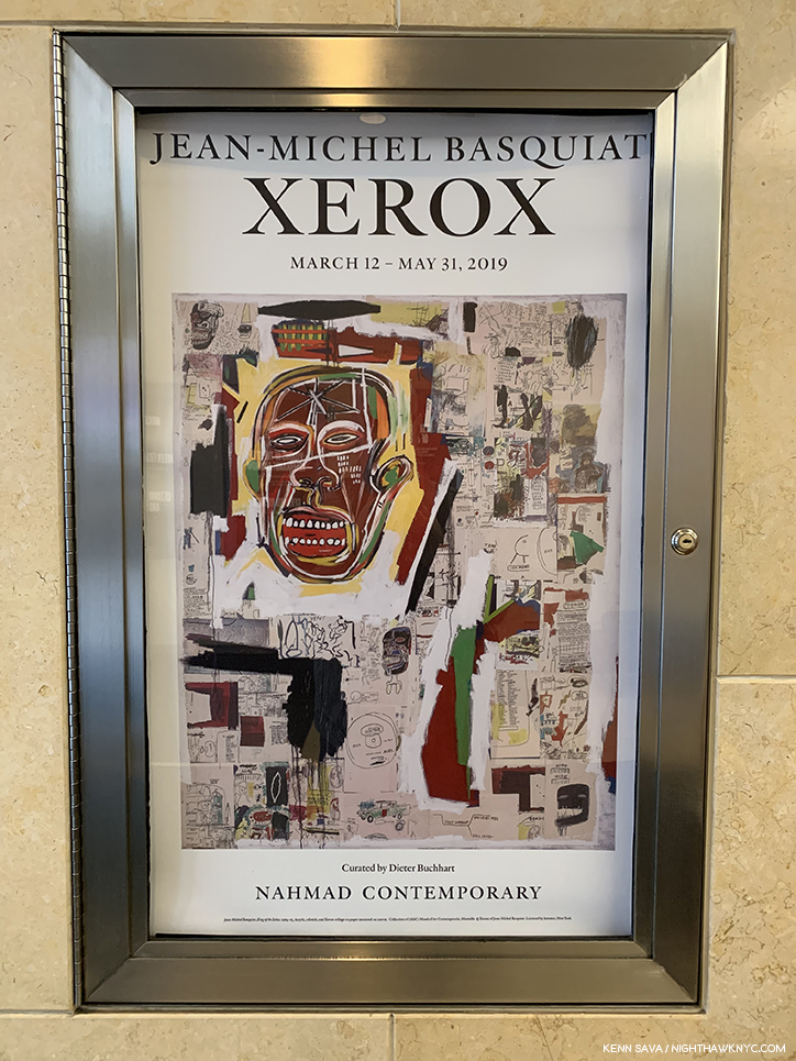
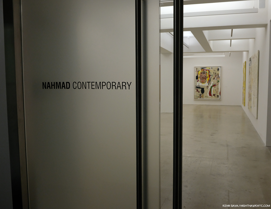
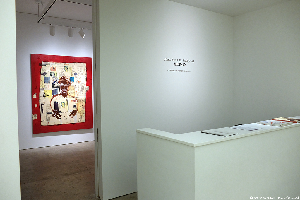
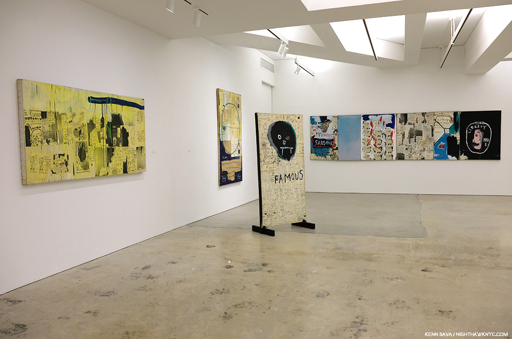
This is Part 2 of my series on the five Jean-Michel Basquiat related shows going on in NYC in 2019. Part 1 is below, or here.
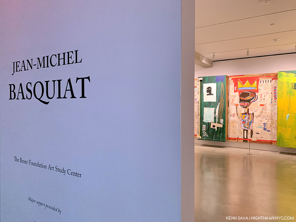
Show seen: Jean-Michel Basquiat at the Brant Foundation, 2019
Outside looking in. The most important show in NYC known to me thus far this year was a show I would be extremely fortunate to see.
Jean-Michel Basquiat, the first exhibition at The Brant Foundation’s new East Village location is a NoteWorthy show because it is a major, museum-quality show mounted at a private institution of the work of a single major Artist with more Paintings on view than all the major NYC institutions, combined, could mount- multiplied twelve-fold. This led me to wonder- What other major Artist-Contemporary, Modern, or Old Master- has so much of their work, and so many of their major pieces in private hands?
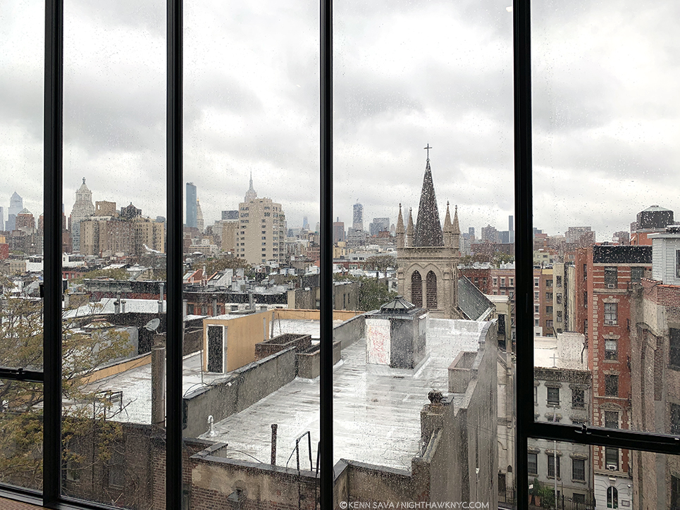
The East Village, NYC, May 13, 2019. Looking towards the Empire State Building (rear, left of center). Bad weather, no ticket for the show, no sleep, no umbrella. It was going to take more than that to keep me from seeing this show, AND something close to a miracle to allow me to do so.
It’s easy to have mixed feelings about this. I’ve read some complain that it’s another case of the 1% at its worst; that this show is a case of the very rich showing off. On the other hand, it seems to me that there is a stronger case to be made admiring the vision, and the guts, of the collectors who stepped up and bought much of the work of Jean-Michel Basquiat (J-MB henceforth) when he needed it most, not to mention go through the trouble of sharing it with the public, who, in the case of Jean-Michel Basquiat’s Art, are largely dependent on them doing so to be able to see it. Showing off? Yeah. I guess.
Almost every Artist in the early stages of their career needs the support of buyers and collectors to survive and to continue to create. Yet, it’s also easy to forget that most of these collectors possibly also bought Art by Artists that have long since been forgotten, (which is one reason I strongly believe in only buying Art you love– if it becomes worth less- even substantially less- than you paid for it? You can always display it and enjoy it.) And? As I wrote in part 1 of this series, the NYC museums, except the Whitney, collectively passed on his work at the time- and continue to do so. The only way they’re likely to fix that now is by gift or donation. The affordability train has long ago left the station for anyone else besides that 1%. The Big 41 had their chance. In the case of some institutions- chanceS, as I outlined.
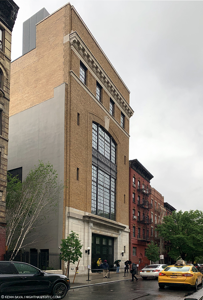
Unnamed on the exterior, in classic East Village cool, The Brant Foundation, 421 East 6th Street, 10am, Monday, May 13, 2019. If I’m up at 10am, and not STILL up, you know there’s a special reason why. That cab exiting stage right is leaving with my umbrella. See ya.
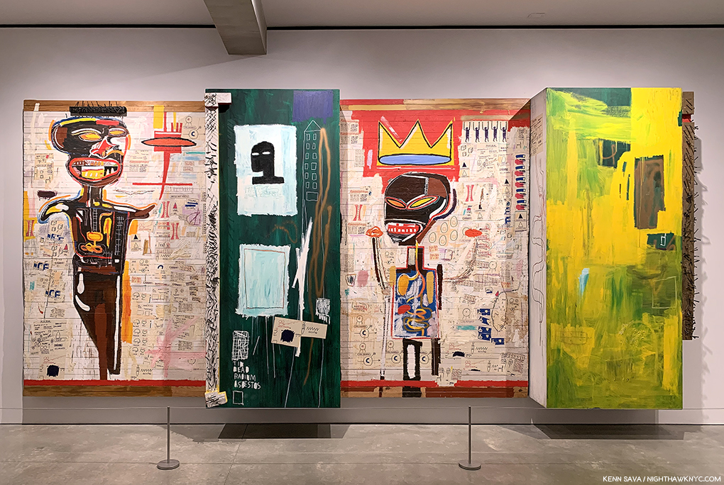
At The Brant Foundation, a show of 70 Paintings and 1 Sculpture was on view, making it the largest show of Basquiat’s Paintings in NYC since the Brooklyn Museum’s Basquiat Retrospective in 2005, which I saw. Combined with the Basquiat work in the other five 2019 shows, the total approximately equals how many were shown in Brooklyn in 2005. The Brant show largely includes work in the collections of Stephanie and Peter Brant, alongside pieces on loan from the Broad Museum, (a private museum of the collection of another early collector, Eli Broad, who own at least of 13 of J-MB’s Paintings), among other significant loans. Since so much of his work is in private hands who knows how long it will be before we see a bigger or similar number of J-MB’s work here again. So, the six Jean-Michel Basquiat related shows in NYC and vicinity this year (counting the Warhol x Basquiat show going on in Kinderhook, NY, which proved too far for me to get to) might be the best chance I’m going to get to reassess and reconsider his work that it’s barely been 40 years since he began creating it.
The first order of business was getting in to The Brant show and actually seeing it. After all my efforts to get a ticket failed, I resorted to drastic measures. I took the unprecedented step of getting up with 3 hours sleep at 9am and going down to The Brant on May 13th, the last day the show was open, or the day before it closed- I’m still not sure. As I got there at 10am, right as it opened and visitors for the the first timed slots were arriving, I quickly realized this was going to take an act of fate. Compounding things, it was raining and I’d left my umbrella in the cab. I decided to take a Zen approach and stand off to the side, where that tree is to the left, above, and see what happened.
About 30 minutes later, Jessie, the on-top of everything Brant staff person manning the entrance, who knew I was casting my lot to fate, called me over from the door. A lady had arrived and told him she had an extra ticket. Really? A real-life Angel of Providence had appeared when I SERIOUSLY needed one. I walked over and met Lisa, and yes, she had an extra ticket that she was willing to let me use. Miracles really do happen. The fact this piece exists is solely due to her generosity. Seeing it over the 3 and a half hours I spent in it allowed me to flesh out the portrait of Jean-Michel Basquiat’s accomplishment that began for me at Xerox, adding the best look at his most important work I’m likely to get. Any assessment of J-MB’s work and achievement begins with his Paintings. I’d seen 100 works in 2005 at the Brooklyn Retrospective, but I hadn’t prepared to see them. Now IS the time. Lisa’s generosity not only enabled me to create this piece, it also permits me to create the multi-part series on 5 of the 6 Basquiat-related shows I wanted to do, now that she made it possible for me to see the “centerpiece” show of the group. I’m also grateful to Jessie for thinking of me. Due to both of their kindness and consideration, I am thrilled to be able to share what I saw with you.
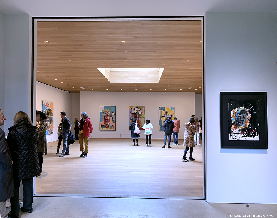
For a while, it looked like I wasn’t going to get to see this. Standing at the entrance to the show- the lobby of the 4th floor, just after exiting the elevator 90 degrees to the right. You can see the variance in the lighting in the main gallery from here. Outside, to the right of center is Untitled (Self-Portrait), 1982.
The elevator took us to the 4th floor, where everyone starts and then walks down to the floors below, the show being installed on all 4 floors. It should be said that the group of new visitors getting off the elevator each time on 4 was surprisingly small. The galleries were pretty sparsely filled- incredibly so for a major show on either it’s last day or next to last day. Well, there was well over 1 billion dollars of Art on display, so they opted to keep the crowd manageable.
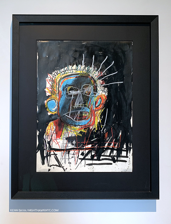
Untitled (Self-Portrait), 1982, Oilstick and ink on paper, 30 x 22 inches. The first work in the show.
Though the urge might have been to hurry into the large, main gallery shown above, I was stopped in my tracks by the work hanging to the right just outside. There was Untitled (Self-Portrait), 1982, one of the most unique Self Portraits I’ve ever seen. I wondered what Picasso would have thought of it. The colors, and then particularly the black background fascinates me as I ponder at what stage J-MB added it. And then I wondered what Clyfford Still would think of it. Like a number of J-MB’s “heads” from 1981-2, he flattens everything to the picture plane, something not seen all that often in Art. 4 floors of J-MB still to go. What an auspicious start!
A real-life Angel of Providence. Lisa studying Self-Portrait with Suzanne, 1982, in the main gallery on 4.
It turns out that Lisa is a school teacher and an Art lover with superb, wide-ranging, taste that runs from Brancusi through Morton Feldman as I found out as we chatted while going in.
Self-Portrait with Suzanne, 1982. The compelling work Lisa studies above shows the artist with Suzanne Mallouk, the subject of Widow Basquiat, in 2010. It’s the only work known to me created by J-MB showing the Artist with one of his lovers. Beyond this, it’s fascinating to study the way he’s rendered himself here compared with the other “heads” and Self-Portraits from 1981-2.
Before I get too far into the show, I’ll say the building looked brand new, the restoration of the former Con Ed Substation being first class from top to bottom. I have mixed feeling about it’s suitability for the display of Art, but honestly, I get some of those feelings almost everywhere I see Art. In my experience, the #1 problem in seeing art is lighting, combined with the scarcity of truly non-glare glass or acrylic. As my friend, Corinne, co-owner of NYC’s legendary City Frame, tells me- currently, it’s expensive. Then again, not all Painting is glazed. Increasingly, Artists, including Raymond Pettibon and Kara Walker, and Photographers, including Gregory Halpern, have shown their work without frames, often just tacking it to the walls at the corners. Still, glazed or not, lighting- artificial or natural, is a problem that rears its head in almost every show I see. The same was the case at The Brant.
I don’t care how rich I was, I don’t think I’d install a pool over irreplaceable Art.
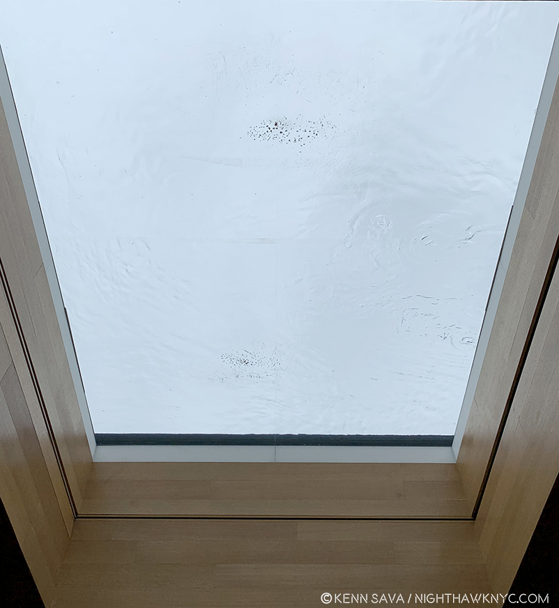
The fourth floor is the top floor and features a skylight, apparently, filled with water- unless this had collected from the rain? I don’t know. They must either have Lloyd’s of London insurance, 8 million tons of confidence in whoever installed it, or both, to hang a few hundred million dollars worth of one of a kind Art underneath it, including more than one of J-MB’s greatest works, in my opinion. But, beyond this, being a cloudy, rainy, day, the large skylight wasn’t letting in as much light as it might have at other times.
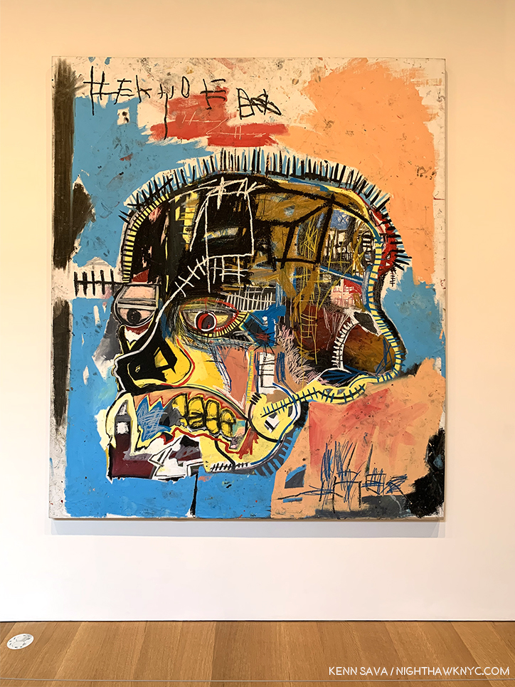
Hanging a few feet from the skylight/pool (as you can see in the installation view earlier) is Untitled, 1981, acrylic and oil stick on canvas, 81 x 69 1/4 inches, from The Broad, L.A., the upper half of which was in a shadow during my visit.
Typical of all the works on view in this room, the upper half of Untitled, 1981, on loan from The Broad in LA was in a shadow. Still, the power of seeing this work in person was staggering. I took all of it in from a distance when I first saw it, then walked over to see the other works in the room. Finally, I walked back over to look closely at it at length.
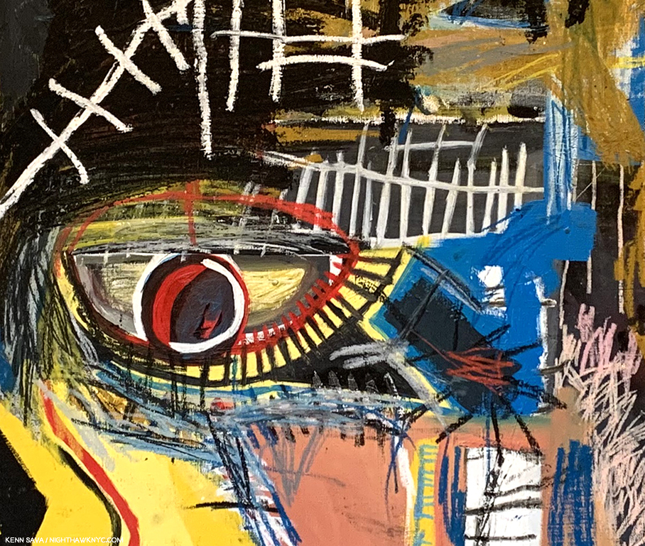
Detail of Untitled, 1981.
The difference in the experiences is remarkable, as you can see. But, no matter how closely I looked, minding the security rope you can see at the very bottom of the picture above, it was still drawing me closer. Like a Rembrandt, or Van Gogh, where I’d like to study each brushstroke for it’s content, here I was being drawn in to look at each detail. The feeling I got was that each small part of it was a world unto itself, yet irrevocably part of the whole. What, exactly, are we seeing? It’s not a skull because there are eyes and there is hair, at least part of a beard, and some teeth, though others are missing. And there are what appear to be stitches and possibly some letters over all of it- a cryptic message, like the figure, in a language no one had ever seen before. (Compare this to the work on view in Xerox that I looked at in the first Part! There, the details were, largely, words.) This is 1981- a year after the first show the work of J-MB appeared in. It’s a work from near the beginning of his post-SAMO© career as an Artist. And, it’s one of the most remarkable shots across the bow in Art history, possibly since Picasso’s Les Damoiselles or Duchamp’s Bride Stripped Bare. When I’ve seen it in books, I haven’t been able to stop looking at it. Seeing it in person it felt like I’d never really seen it. But, even saying that? There’s literally nothing like this in Western Art history to 1981. In his book, The Art of J-MB, Fred Hoffman makes a case for this being among J-MB’s “key” works. I don’t have a list, but I won’t argue with that. I just keep wondering if Francis Bacon, who outlived J-MB, passing away in 1992, saw it and what he thought, or would think, of it.
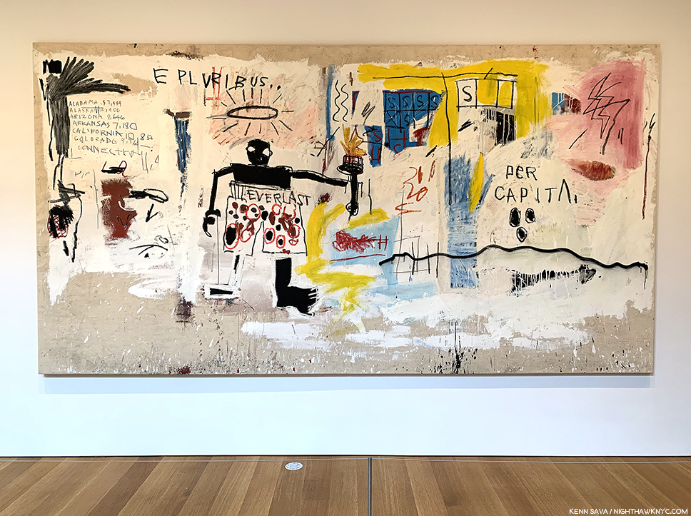
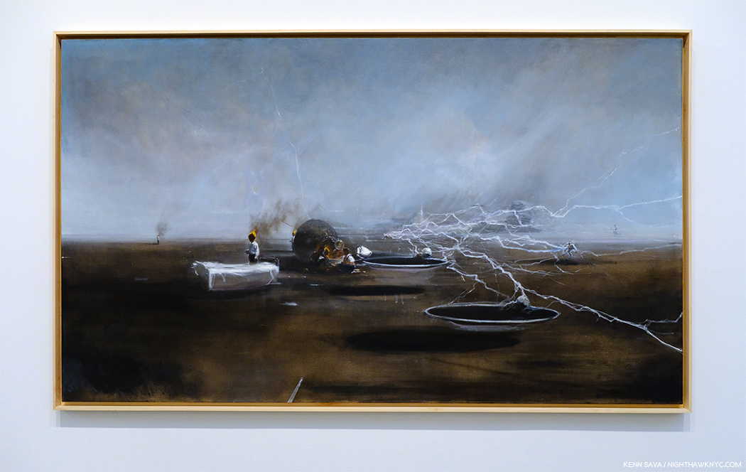
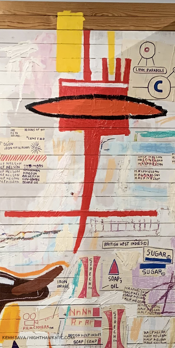
Per Capita, 1981
Across from Untitled was the incredible Per Capita, also from 1981, with it’s central figure in Everlast boxing trunks, a halo over his head and his outstretched left arm holding a torch that sure looks to me like that of the Statue of Liberty. Over the halo are the words, “E PLURIBUS…,” or, “out of many,” leaving out the equally famous, “UNUM,” or “one.” The title (which may or may not be the Artist’s title- I simply don’t know), “Per Capita,” means, “per unit of population; per person,” in one definition, per American Heritage Dictionary, and “equally to each individual,” in another. Along the left side appears to be the beginning of an alphabetical list of states with the per capita income of its citizen next to them. Even on a partial list, that manages to include states in 3 of the 4 corners of the country, the variance is striking. Fred Hoffman wrote at length about this piece in his essay in the catalog for the 2005 Brooklyn Museum Retrospective, where he also listed it among J-MB’s key works, where he says the central figure is Cassius Clay, as Muhammad Ali was known when he won the gold medal at the 1960 Olympics (The Art of J-MB, P.129.), which could also make that an Olympic torch.
As I looked at this fascinating work, I couldn’t help wonder if the “UNUM,” or “one” E PLURIBUS was seeking with its … was the solitary figure, as in “Out of many, THIS one.” J-MB’s love of boxers is well known and was to be seen in most of an entire gallery on the 2nd floor, as well as in his portrait (in which he wears Everlast boxing trunks) in the famous Warhol*Basquiat poster for their joint show a few years later in 1985 at Tony Shafrazi Gallery, which could also make this a Self-Portrait.
It’s hard to write about this show and not include every work in it- many are major, many others important for any one of a number of reasons, and they all deserve mention.
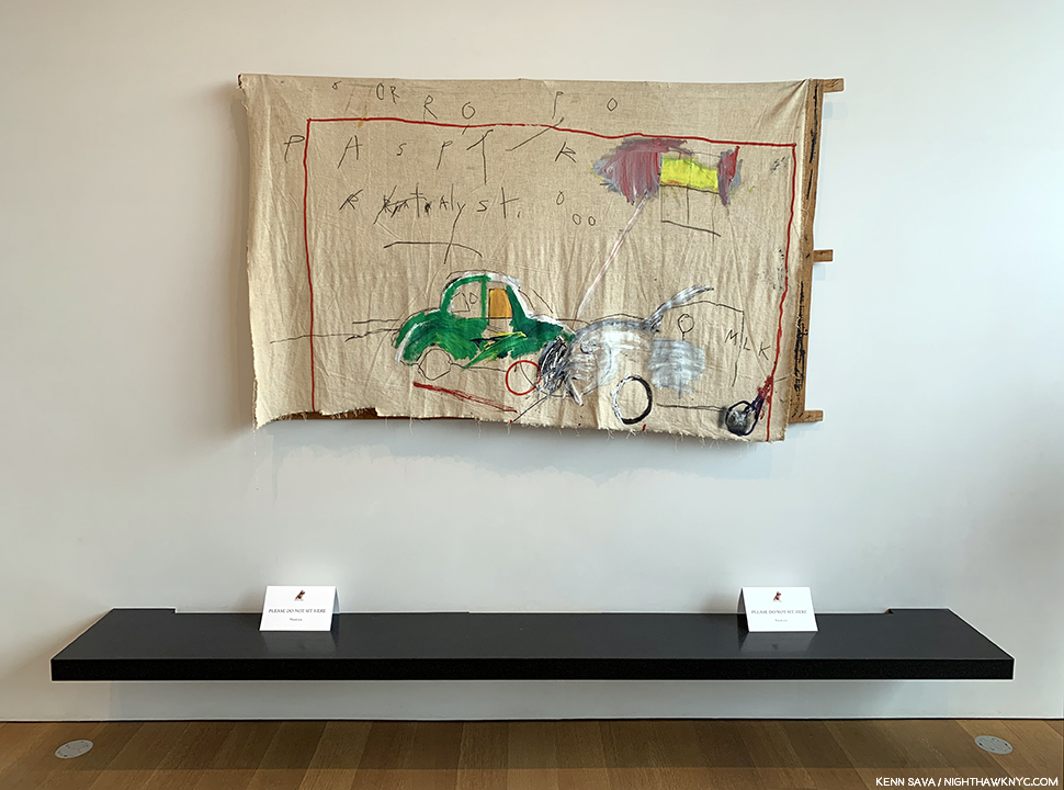
Untitled (Car Crash), 1980, Acrylic and lipstick on canvas with exposed wood supports. So much of J-MB’s story and his Painting begins in this work where he recreates the accident where he was hit by a car at age 6 that hospitalized him for a month and caused the loss of his spleen. Seen in the small rear gallery on 4.
On 4, there was also a small rear gallery along the rear of the building. Here, too, lighting was a question. The far wall was lined with a floor to ceiling window, which, you guessed it, let in a lot of light- even on this dreary day. I have no idea if they cover it/partially cover it in full sun.
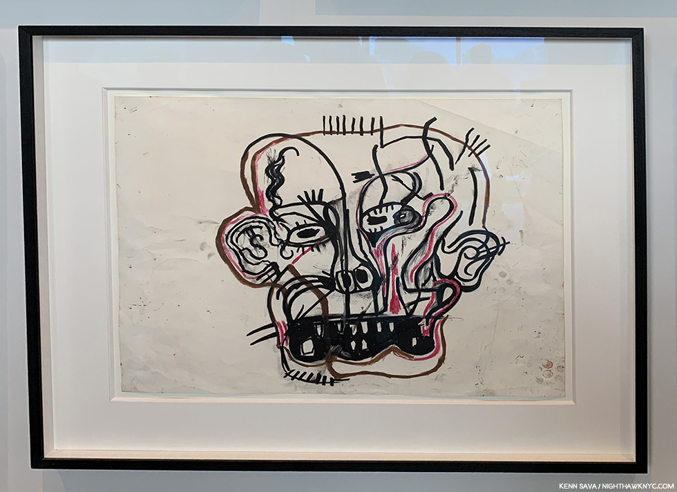
Untitled, 1981, Oilstick on paper. Seen in the small, gallery in the back of the 4th floor. There’s so much that’s revolutionary in this extraordinary work, and at the same time it gives us another take on the two Untitled (Head) Paintings in the show, this time the “head” is seen from the front and not from an angle and has been flattened, like the picture plane. The right side is almost Cubist.
Down on 3, the lighting was better.
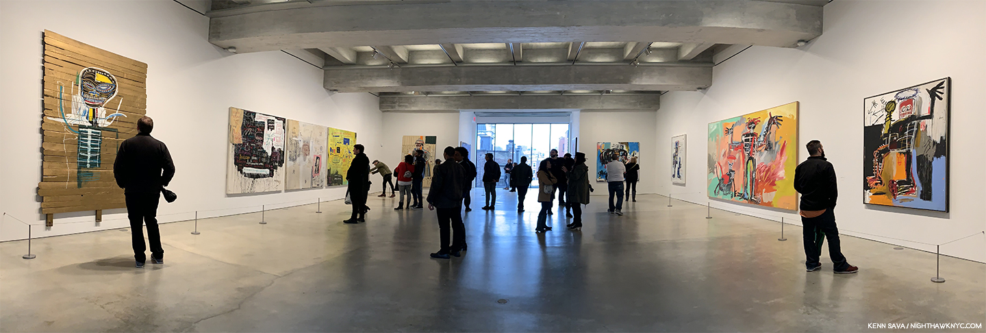
3rd floor. Installation view.
The main source of natural light being another picture window, but this time it was at the end of a large rectangular space and didn’t interfere with the most of the large works on view, including this one-
Untitled, 1982, now in the collection of Yusaku Maezawa, while on loan to the Jean-Michel Basquiat exhibition at The Brant Foundation, May 13, 2019.
In May, 2017, this Painting, Untitled, 1982, by Jean-Michel Basquiat sold at Sotheby’s for 110.5 million dollars. As someone who prefers to consider Art for what it is without the shadow of dollars, as much as possible, this fact gives even me pause for thought. Here it was, on a corner wall of the third floor, appearing as another work in the show as opposed to something “special.” I applaud this decision.
Do I think it’s “worth” 110.5 million dollars? Anything is worth only what someone is willing to pay for it (And, there were multiple bidders for it). Given that the question of whether something is, or isn’t “Art” won’t be settled during any of our lifetimes, only hundreds of years hence if the work continues to speak to people, the question of commerce- supply and demand, is what is rearing its head in Contemporary Art auctions, in my view. Jean-Michel Basquiat’s public career as an Artist only lasted a few months over 8 years, from June, 1980 to his death on August 12, 1988. Though he was extraordinarily prolific during that time, creating 1,000 Paintings and 2,000 Drawings2, included in it are only so many major works (a number that I personally feel is larger than some others seem to think), and Untitled, 1982, happens to be one, in my view. Looking at the lists of the highest prices paid at auction for Art reveals that many, if not most, of them are the best works available as most of the major work by established Artists of, say, Picasso’s time or earlier (considering he passed away in 1973), are in museums which are not likely to part with them. The works auctioned are certainly not the most important works by any of the Artists on the list, as I’m sure most would agree (perhaps not the purchasers), though it’s subjective. The $110.5 million for Basquiat’s Untitled, 1982, is for a major Basquiat, in my opinion.
But, the more astonishing thing for me to realize (Hey? It’s not my money) is that at the time of the auction, in May, 2017, Jean-Michel Basquiat would have been 56 years old! Untitled, 1982, is a work he Painted when he was 21 or 22 years old. People talk about this sale marking the highest price ever paid for a work by an African-American Artist. Others mention the highest price ever paid for a work by any American Artist.
They never mention that this sale makes Jean-Michel Basquiat the YOUNGEST Artist in HISTORY to have a work sell for over 100 million dollars- either by age at the time of the sale (56), or age when he created the work(21-22)!
At 56 in 2017, he would be considered to be in “mid-career” as the museums call it. At 58, right now(!), he should still be every bit the vibrant, revolutionary force in Art he was for the 8 short years of his career. That he already feels like such a part of history is indicative of it being already thirty-one years, this August 12th, since his passing.
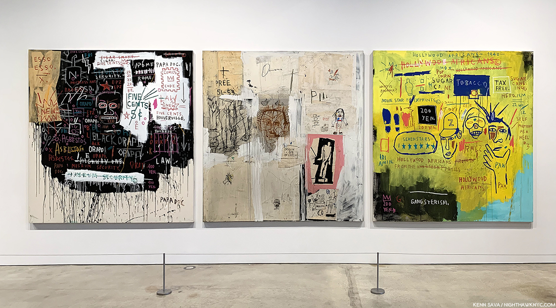
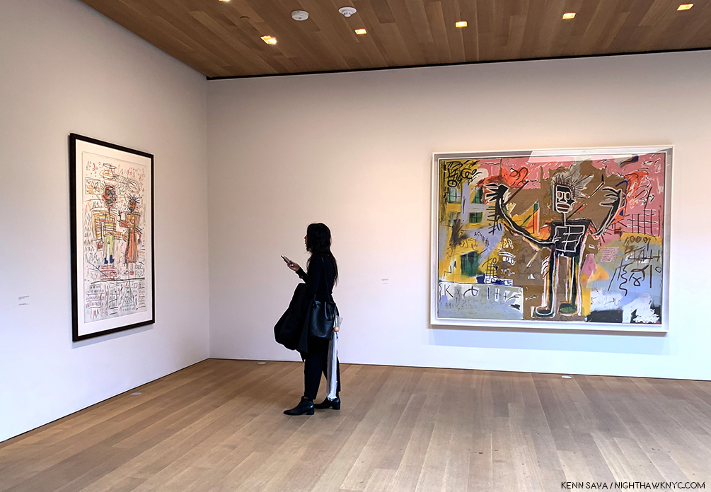
Museum Security (Broadway Meltdown), 1983, left, Big Shoes, 1983, Hollywood Africans, 1983, right, a work on loan from the Whitney Museum. The two to the left are in private collections. In 1983, after they were created, these three works hung on the same wall (with other works) at Larry Gagosian Gallery, LA, as is shown in the Whitney Retrospective catalog, P.251
Also on 3 was this striking group of three works, each from 1982, which included a work from an NYC museum!- Hollywood Africans, from the Whitney. These were fascinating contrasts to the collaged work on view at Xerox, Museum Security and Hollywood Africans both featuring words more than image, but were done exclusively in paint, as far as I could tell.
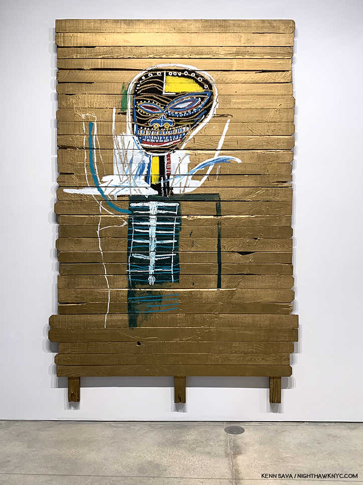
Gold Griot, 1984, Acrylic and oilstick on wood, 117 x 73 inches. You can get a sense of how big it is in the installation view, above.
The somewhat monumental Gold Griot is a very well known work and is memorably recalled in Fred Hoffman’s The Art of J-MB (P.63) as having originated from slat fencing (possibly that referred to in Phoebe Hoban’s book, P.140, that his assistant Matt Dike had acquired from a fence behind Larry Gagosian’s LA house). Mr. Hoffman’s book includes a picture of J-MB creating the work where we see the Painted head looks to be about 8 times larger than his own. Mr. Hoffman references Andy Warhol’s Gold Marilyn, 1962, in speaking of the work’s “pop” influence, with the figure isolated from the gold background, before saying, “The figure is as much a divine apparition as a living human being. With its ethereal gold background surface, the figure of Gold Griot pays homage to sculptural representations of the divine in various sub-Saharan African cultures.3.”
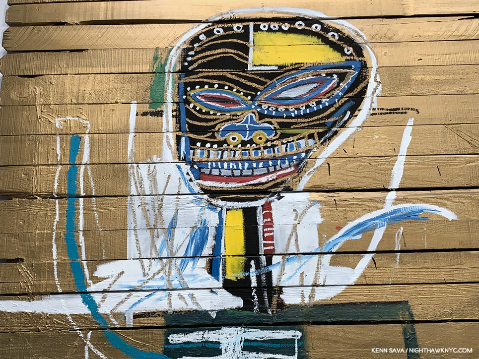
Detail of Gold Griot, 1984.
Looking closer, it’s fascinating to see how J-MB’s depiction of the head has evolved in 2 or 3 years. Gold Griot reminds me of the innovations of Robert Rauschenberg and Jasper Johns, when it comes to Painting surfaces, though it’s resolutely its own work.
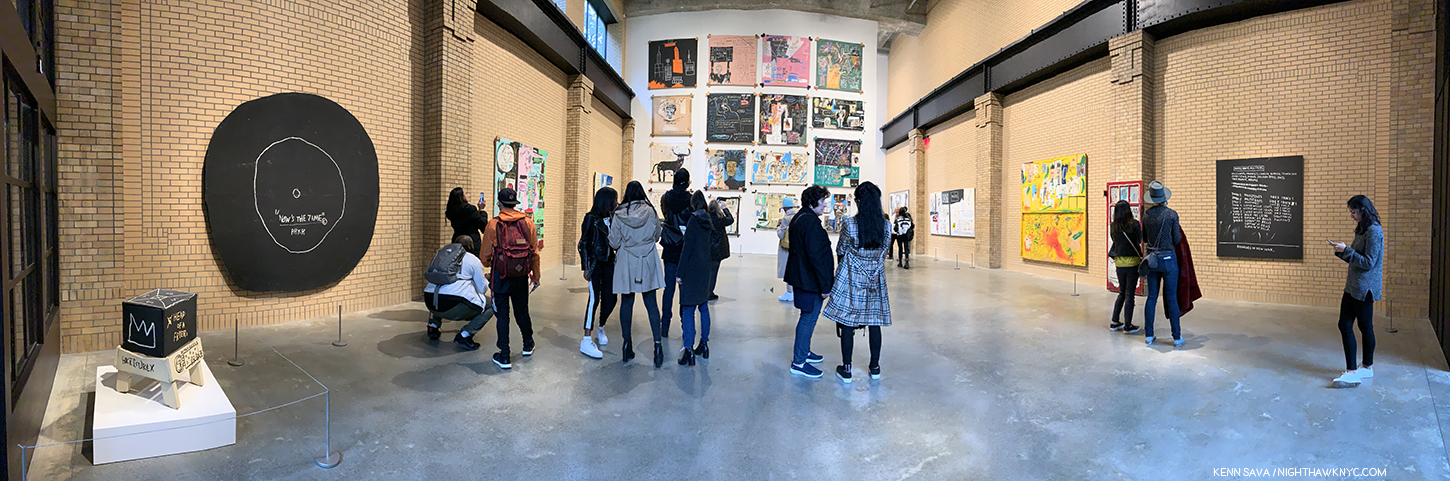
2nd floor. Installation view. The work on the immediate left is See Plate 3, 1982, Sculpture in two parts, Acrylic and oilstick on wood, canvas, mounted on wood, the only Sculpture displayed in the show.
The second floor is a bit of a strange space for displaying Paintings. A very tall space, which at first it seems more conducive to the work of monumental Sculptures, like Richard Serra’s, and lined with brick walls. The curators made it work, choosing to install the Paintings in a single row on the two side walls, then salon style on the third wall. While this made seeing the works in the top two rows challenging, it did allow for the maximum number of Paintings to be shown. As a result, I learned to live with it. In hindsight, I’d say they made the best use of the available space throughout the building, though I feel the building was less than ideal for this show because of the uneven lighting and the very high walls on the 2nd floor.
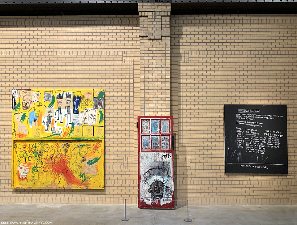
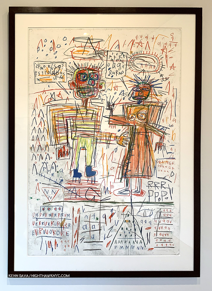
Untitled (Yellow Tar & Feathers), 1982, Pork, 1981, Discography II, 1983, left to right.
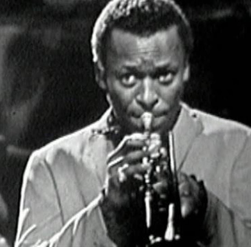
Along the sides, important works like Untitled (Yellow Tar & Feathers), 1982, were joined by others not as well known. Discography II contains a list of the details of a Miles Davis Allstars recording session which is historically noteworthy because Charlie Parker performed as a sideman for Miles for one of the only times in his career. To that point, Miles was exclusively a sideman for Bird.
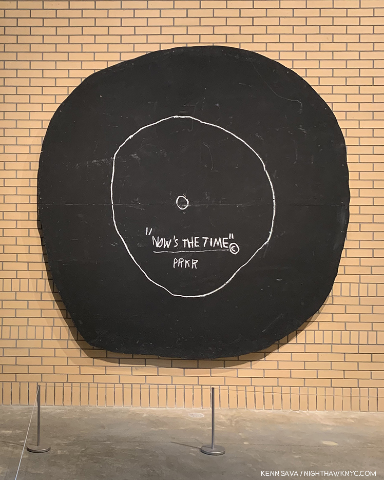
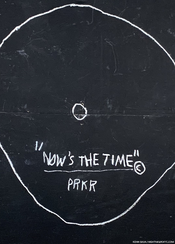
Now’s The Time, 1985, Oilstick and acrylic on plywood, 92 1/2 inches in diameter.
While on the opposite wall, the work referencing Jazz continued with the very cool Now’s The Time, 1985, an homage to the 1945 Charlie Parker record hangs. It also compliments the work on the large wall hung salon style, being they all have unique, experimental stretchers holding their canvases.
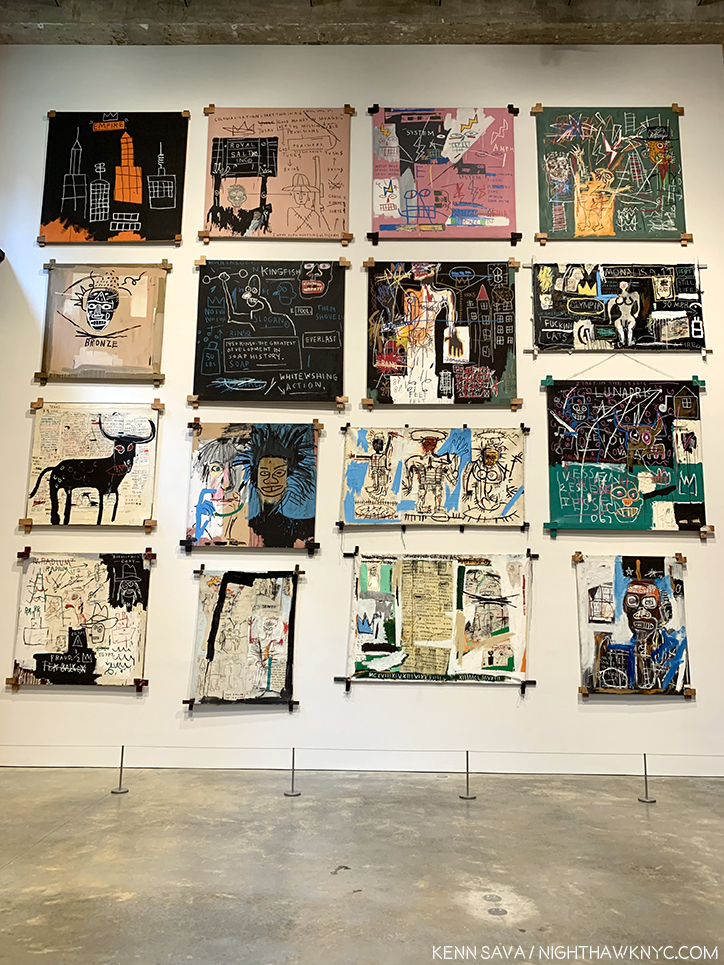
On the salon style wall, one thing each of its 16 works share are the unusual stretchers. One thing about J-MB’s Paintings that you don’t hear much about today are his unusual mounts. Constructed for J-MB by his assistants, including Stephen Torton and Matt Dike, there were other examples on the upper floors, and they are another thing that makes his work unique.
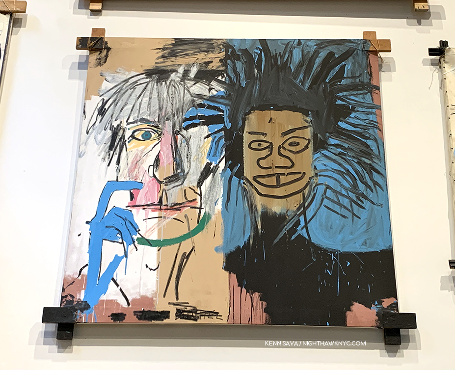
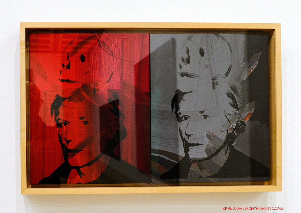
Jean-Michel Basquiat, Dos Cabezas, 1982, a portrait of Andy Warhol and a Self-Portrait that presaged the Warhol- Basquiat collaborations in 1985.
The 2nd floor also included a rear gallery, which featured 4 portraits of boxers and 3 other very power portraits.
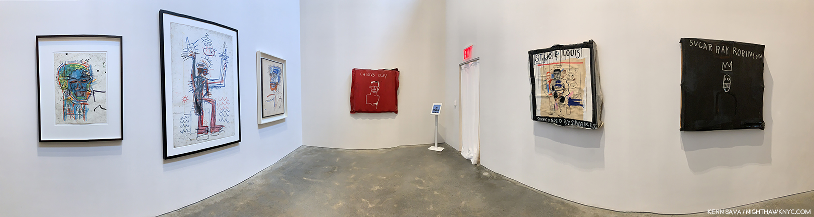
Rear gallery on the 2nd floor installation view.
J-MB had a deep fascination with boxers, and they appear both as Self-Portraits and as homages. Sometimes both. Sometimes it’s hard to tell which.
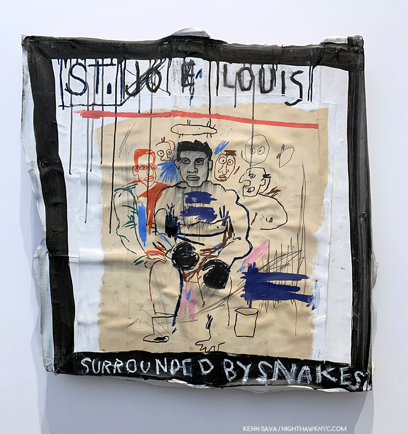
“St. Joe Louis Surrounded by Snakes showed the boxer, one of Basquiat’s heroes, encircled by sharkish white managers. ‘That was Jean-Michel,’ said Suzanne Mallouk.” Phoebe Hoban. Basquiat, P.113. Early on, Paul Simon attempted to buy it for $8,000., but was thwarted by Rene Ricard. According to the iPad next to it, seen in the installation view, which served in lieu of wall cards, it now belongs to the Brants. (ibid, P.114).
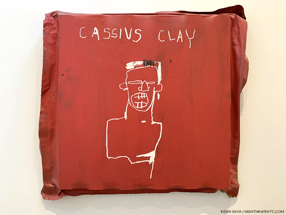
Muhammad Ali changed his name from Cassius Clay in 1964. As Cassius Clay, he won the gold medal at the 1960 Olympics, becoming a hero to many, including J-MB, who references it, here, by using his name at the time, in this work from 1982.
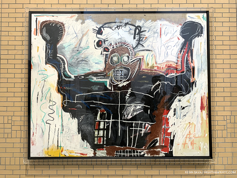
Untitled (Boxer), 1982, Acrylic and oilstick on canvas, 76 x 94 inches. Fred Hoffman calls this immensely powerful work, “… the expression of the black man’s physical and spiritual attributes.” (The Art of J-MB, P.133)
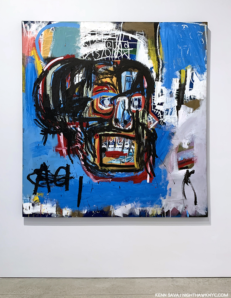
I almost missed the works installed on the first floor. Luckily, I spotted the small sign pointing to them right as I was beginning to look for the exit. Thank goodness I didn’t as it included some of his largest and at least one of his most important works.
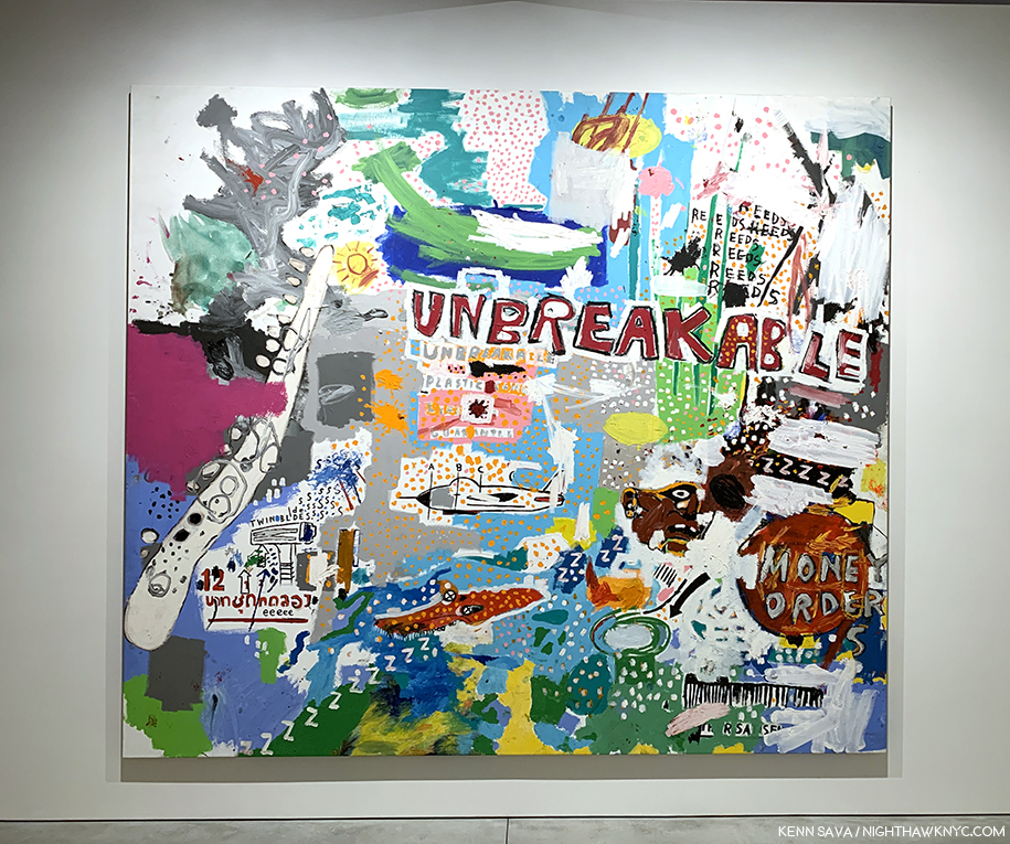
Unbreakable, 1987, Acrylic on canvas, 98 x 111 3/4 inches.
I’d never seen a J-MB work like Unbreakable prior to seeing it. Given it’s dated 1987, perhaps this is a glimpse into where his work was heading. In it, he synthesizes everything he’s been using- images, words, and color.
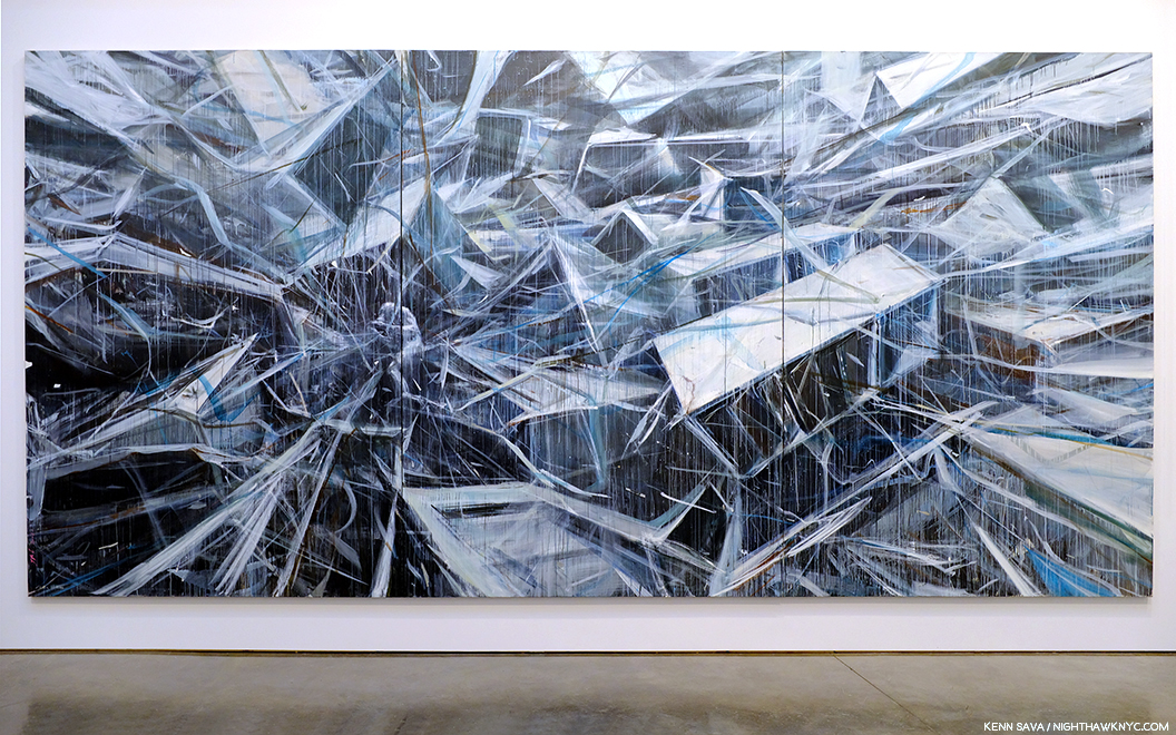
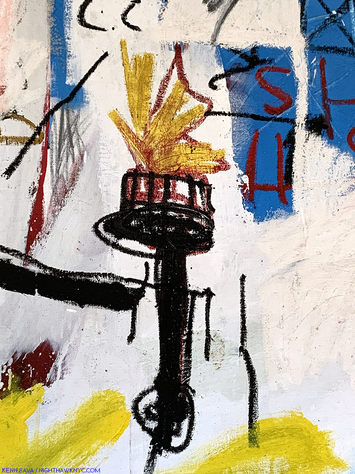
Grillo, 1984, Acrylic, oil, paper collage, oilstick and nails on wood, 96 x 211 1/2 inches- close to 20 feet by 8 feet!
What a powerful, stunning, incredible work Grillo is! It’s taken Robert Rauschenberg’s Combine Paintings in an entirely new direction. I love the juxtaposition of the two panels with figures (one left, one right of center) with the panels immediately to each of their right. I do wonder if this piece was meant to sit on the floor or be raised a foot as it is here.
Detail of the right of center panel.
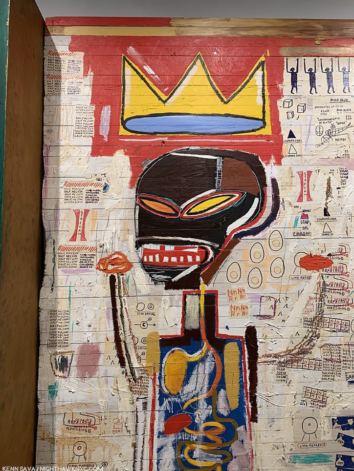
As I looked closer at Grillo, I noticed a good many color Xeroxes collaged on. Yet, the two figures hold the key to it, I think. On the left is a figure holding a torch. Over his head there’s a pice of wood with nails sticking out of it. That sure could be interpreted as a “crown of thorns.” Around him are various repeated words, including- “Soap,” “Oil,””Butter,” Carbon,” and “Stretch,” along with at least two Bebop song titles- “Well You Needn’t,” by Thelonious Monk and “Half-Nelson,” recorded by Bird. What this figure represents I don’t know, but there are elements of the martyr and the heroic included. The other figure, apparently a king, wears a large crown, accompanied by small attendants to its right, and has his hands raised, like the boxers seen upstairs. He appears to be looking towards the left side figure, and both figures have their internal organs shown, perhaps yet another reference to Gray’s Anatomy.
And, there’s this- The left hand figure, how has a board with nails over his/her head, possibly a crown of thorns?, holds a torch…
The work speaks volumes about how J-MB’s Art has evolved in 7 short years, and the unlimited potential the future held for it, and for him.
…which reminds me of the one seen 3 floors up in Per Capita, 1981.
A few days later, Lisa shared her thoughts on the show. “I thought the Basquiat show was quite spectacular. There were so many works that I had never seen before. In particular, I was struck by the great thick black oil slicks. There is something about this sheen, like shoe polish, that you can’t truly appreciate unless you see the paintings in person. They give the works a lot of dimension and texture. They also remind me of Franz Kline – totally dynamic and emotive in gesture. The oil slicks are bold and grimy, like New York. His compositions tend to mimic graffiti on the street – throw ups, wheatpaste posters, and tags on a wall/single canvas.”
There was a bit of the feel that the show was something of an afterthought to the just completed Louis Vuitton show. A “Hey, we’ve got all this work assembled, why don’t we just put it up in NYC?,” kind of thing. I quickly moved past it, the lighting and other questions with the space I’ve mentioned. Nothing dulled the effect of seeing so much work that STILL looks fresh, vital, and contemporary, in spite of countless imitators, commercial “appropriations” of his symbols and the passage of over 30 years since he left. What I saw at The Brant was the work that has defined the legacy of J-MB- in quite a few of his more well known Paintings, works characterized by his characters, in which his words take much more of a back seat than they did over at Xerox. Thinking about J-MB at The Brant four months later, the show has become more monumental in my eyes.
While Peter Brant may represent what many call “the 1%,” so does Jean-Michel Basquiat. For me, J-MB represents that extraordinary, and extraordinarily rare, group of people who are able to overcome unfathomable difficulties- racially, socially, financially, educationally and, apparently, familial, and some difficulties that appear on the outside to have been self-inflicted (though quite possibly resulting from the others- I’m not a doctor or a therapist), then somehow surmount ALL of that and go on to rewrite Art history in about a decade. How many people can this be said of?
How ever many you choose to include? I’m not sure it would even equal 1%.
This Post is dedicated to Lisa, with my undying thanks. My gratitude is due to Jessie for his consideration. Anyone reading this owes them their thanks as well.
*- Soundtrack for this Post is “Bold As Love,” by another brilliant Artist who died at just 27, Jimi Hendrix, which concludes the timeless Axis: Bold As Love.
“Anger he smiles towering in shiny metallic purple armor…
My red is so confident that he flashes
Trophies of war and ribbons of euphoria
Orange is young, full of daring
But very unsteady for the first go around
My yellow in this case is not so mellow
In fact I’m trying to say it’s frightened like me
And all these emotions of mine keep holding me from
Giving my life to a rainbow like you
[Chorus]
But they’re all bold as love
Yeah, they’re all bold as love”
In lieu of the immortal Hendrix original recording here’s a cover to inspire you to seek out the original-
This is Part 2 of my series on the five Jean-Michel Basquiat related shows going on in NYC in 2019. Part 1 is below, or here.
My prior pieces on Painting are here.
NighthawkNYC.com has been entirely self-funded and ad-free for over 6 years, during which over 250 full length pieces have been published. If you’ve found it worthwhile, you can donate to keep it going & ad-free below. Thank you!
Written & photographed by Kenn Sava for nighthawknyc.com unless otherwise credited.
To send comments, thoughts, feedback or propositions click here.
Click the white box on the upper right for the archives or to search them.
For “short takes” and additional pictures, follow @nighthawk_nyc on Instagram.
Subscribe to be notified of new Posts below. Your information will be used for no other purpose.