This site is Free & Ad-Free! If you find this piece worthwhile, please donate via PayPal to support it & independent Art writing. You can also support it by buying Art & books! Details at the end. Thank you.
Written & Photographed by Kenn Sava (*- unless otherwise credited)
“American Tune”
“We come on the ship they call the Mayflower
We come on the ship that sailed the moon
We come in the age’s most uncertain hour
and sing an American tune”*
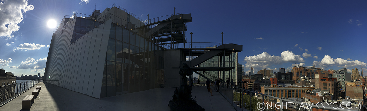
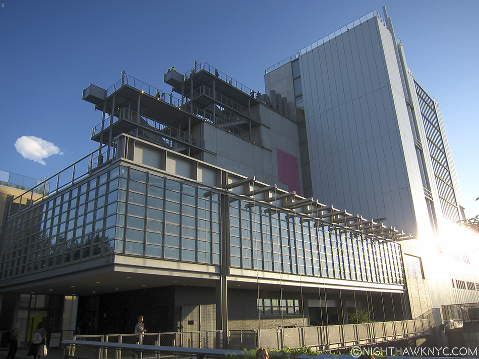
Looking west on the 6th Floor Roof deck, Spring, 2016.
Part 1- The New Whitney Museum…And I
We actually go way back…
All the way back to June, 1987 when I had a letter published in the New York Times in opposition to the proposed expansion plans of the Guggenheim & Whitney Museums, after it was announced that both Museums wanted to modify & expand their existing buildings. I was outraged. How could you change these two singular masterworks without ruining them? I closed saying that “branch museums were the obvious answer” to modifying these Artworks of Architecture, in the Guggenheim’s case, Frank Lloyd Wright’s masterpiece was, perhaps, the greatest work of Art it owns. I went to the Community Board Meetings, but wasn’t directly involved beyond this letter. Mine was apparently chosen over the head of the opposition committee’s letter, much to his displeasure, I heard.
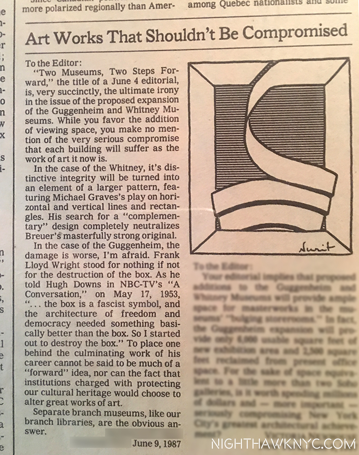
My letter in the NY Times Op-Ed page opposing the & Guggenheim & Whitney modifications, June, 1987. I love the very fitting drawing they added.
Almost 30 years later (wow…really?), how did “we” do?
Well, BOTH Museums took my “advice” and opened branch museums. The Whitney had a few around town, one across from Grand Central, another in Soho, while the Guggenheim opened what is, perhaps, the greatest Museum building since Wright’s enduring 5th Avenue masterpiece…by Frank Gehry in Bilbao, Spain of all places. It’s a “place” now, a true destination for culture vultures. They showed a model of another Gehry masterpiece they wanted to build downtown in the East River at the Guggenheim Gehry Retrospective in 2000. I bought a poster of it but, after 9/11, it was never mentioned again. ? They went ahead and remodeled Wright’s masterpiece, anyway, which I will never accept, AND continue to open branch Museums around the world as we speak. The Whitney, on the other hand, did not renovate Breuer’s unique original. Instead, we got something I never saw coming- They moved out and built an entirely new Museum.
Wow!
So? On my scorecard? I am one and a half out of 2.
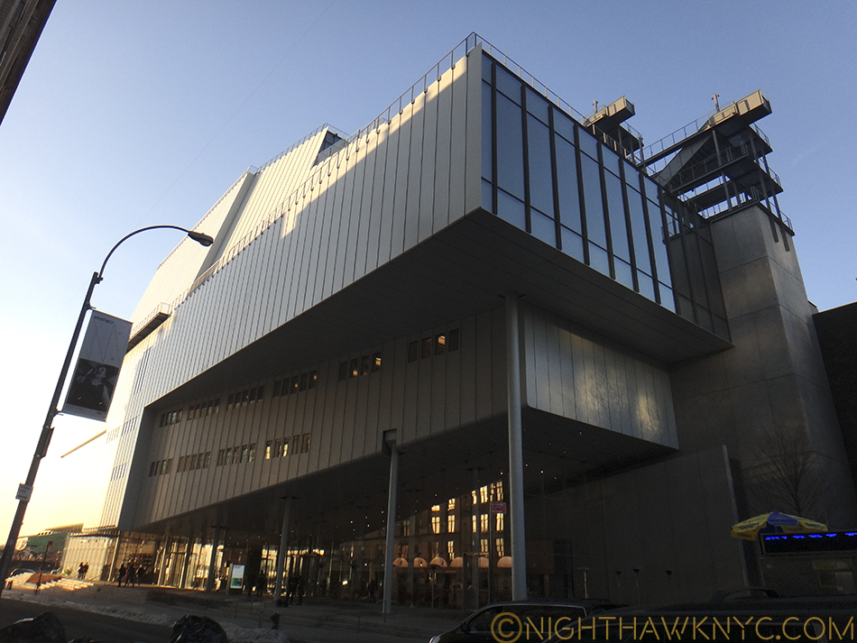
The New Whitney opened in May, 2015 in the Meatpacking District, right at the southern end of the High Line. I’ve made frequent trips there so far studying the building from every angle I could, at night, and yes, even in day light. (Oh, the sacrifices I will make in the pursuit of Art.) The inaugural, and as I’ve said very good, show, in the new Renzo Piano building, “American Is Hard To See,” came and went. I also wrote about both the Frank Stella Retrospective and a show by filmmaker Laura Poitras that came and went, too, along with quite a few smaller shows. So, a few months after the 1 year Anniversary, I think I’ve finally had enough time and experience with the new place, over 45 visits, to have some thoughts coalesce. As always, I have not read any reviews of either the building or the shows mentioned.
Part 2- Renzo Piano’s Whitney Museum Building
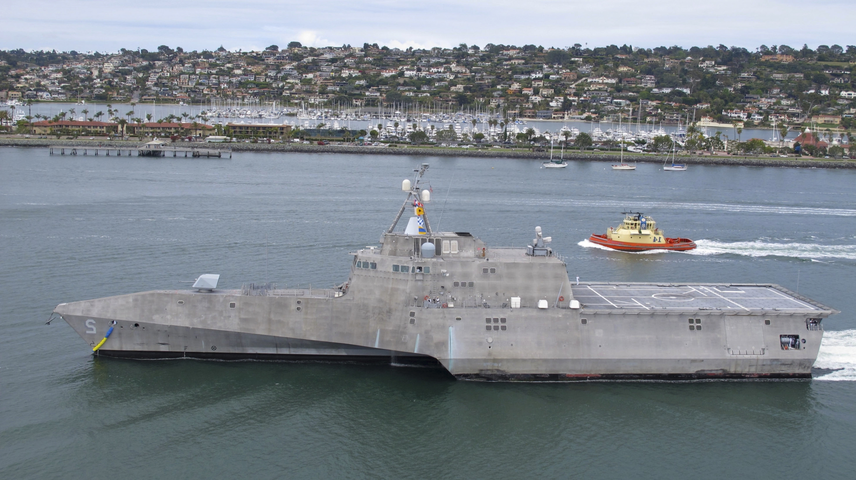
The U.S.S. Indianapolis, Why is this picture here? Stay tuned. (U.S. Navy Photo.)
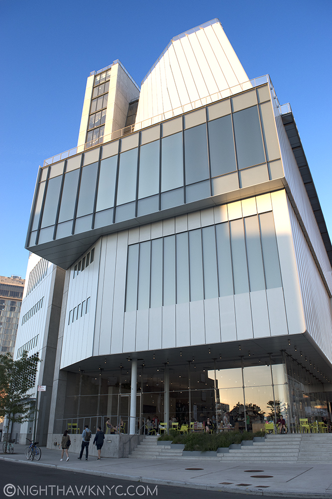
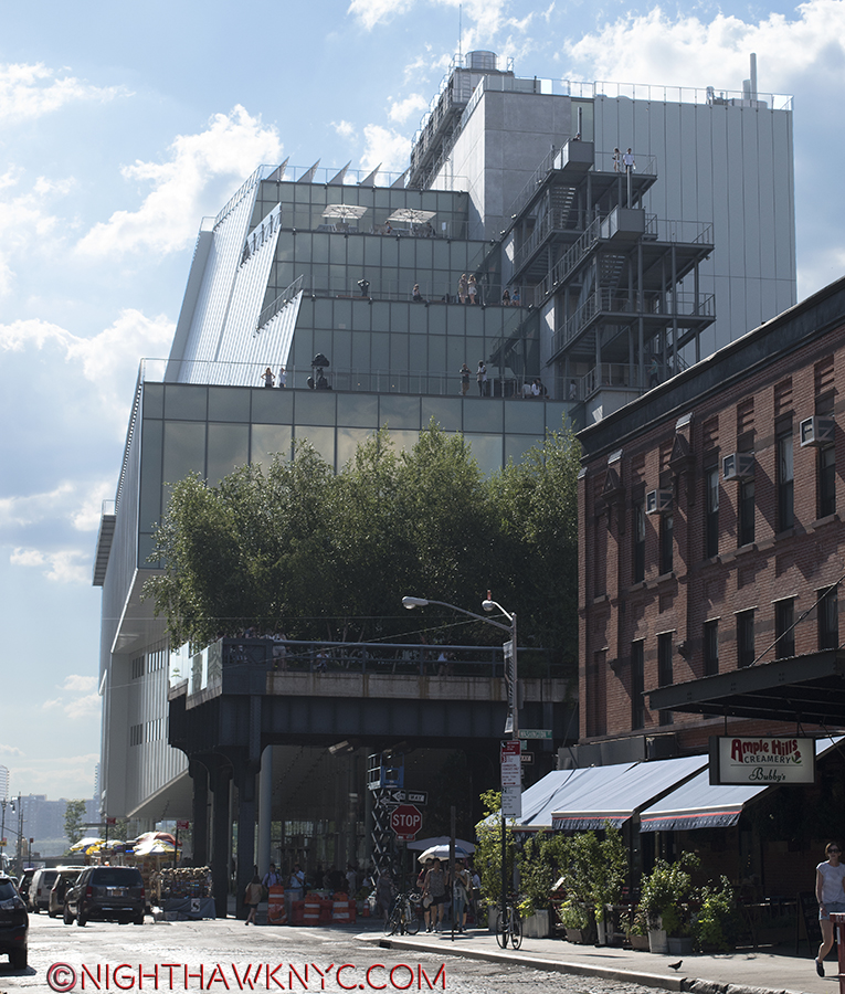
It’s only a year or so old, but I don’t think many will fall in love with the exterior of the building. I must say that in all my trips there so far, I have yet to see anyone else take a picture of it. Maybe (more) time will tell. In this City where location isn’t everything, it’s the ONLY thing, the new Whitney sits on a rather unique lot. How many places in Manhattan can you think of that have BOTH a River view AND a Park view? Situated directly across the West Side Highway from the Hudson River, to the west, and the southern end of the High Line to the immediate east, the Museum hit on a very rare Daily Double. Unfortunately for long time Whitney architect Piano, who came on board during the Museum’s “expansion” days, this lot has 4 sides. To the north, the rest of the block is occupied by one of the few remaining Meat Packing businesses that actually pack meat in what really was The Meatpacking District. Yes, trucks of raw meat park within inches of the Museum’s north wall every weekday.
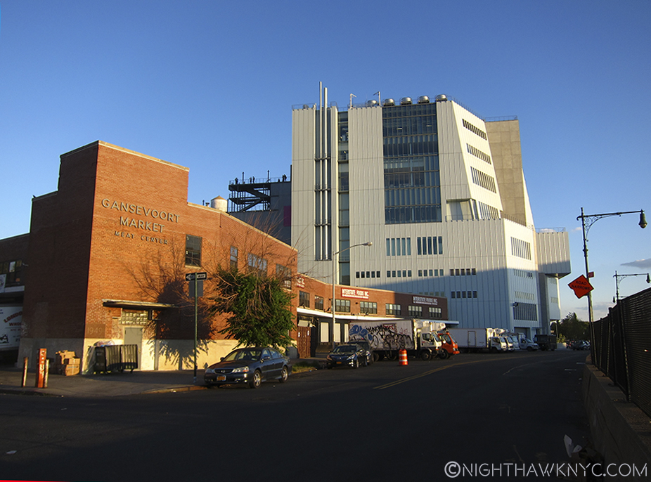
Yes, meat is still packed in the “Meatpacking District.” Whitney’s north side seen from West Street.
And, seen from the High Line.
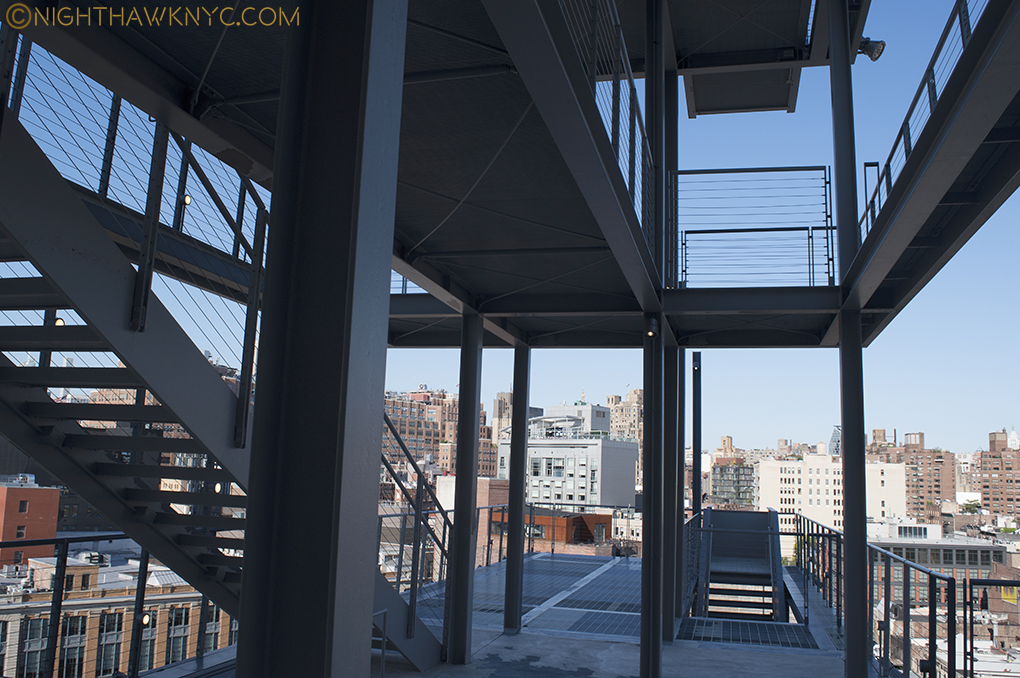
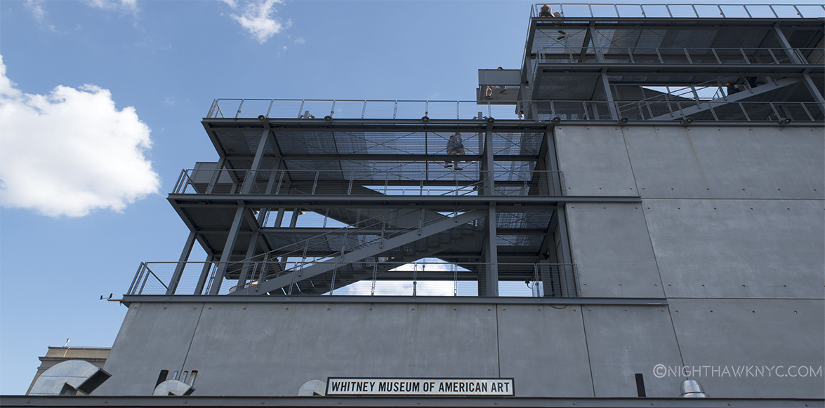
The two story meat complex provides a nearly unobstructed view of most of the north face of the Museum, from West Street or the High Line. I wonder what people who don’t know it’s the Museum think it is. I wonder how many of them will look at it and say, “Ah. A Museum.” My guess is not many. Maybe it’s an office building with not enough windows and a couple of long smoke stacks? A prison? It’s pretty non-descrip, making the stair cases that protrude from the rear of the building seem, well, odd. For myself, and probably countless others approaching the New Whit from the north, this is the first view they’ll get of it. The one defining feature of this side of the building is the exterior staircases. A cascade of them.
Outdoor stairs as seen on the 7th Floor
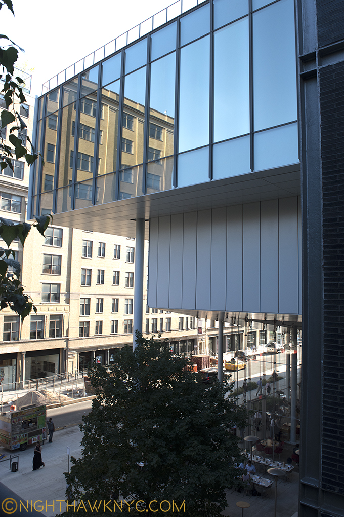
To the south, across Gansevoort Street is a large, renovated apartment building, that also has Hudson River views on it’s western side. To put it mildly, this is a classic “high rent” district. Facing Gansevoort Street, the Museum presents visitors with an almost unbroken face of grey steel. Upon closer inspection, it also includes the Museum’s almost hidden entrance, which, until a sign was added recently, was only marked “Whitney Museum” on a glass window. Still, I can’t help wonder how the residents of that building across Gansevoort feel about paying those very high rents to look out their windows and see-
This, is their view.
In fact, seen from the south, the building is so large that none of my cameras were able to get the whole thing in a shot from Gansevoort, including using an iPhone in Panorama mode. I had to go out into West Street to get one, which I don’t advise doing due to traffic coming randomly from 3 directions, not to mention my back being literally on the flimsy chain link fence bordering the West Side Highway with cars & trucks zipping around the bend at 60mph. Not a smart place to be standing with a camera. But this points out something interesting- there is no place where one can easily stand to get a good shot of the Museum- except, possibly, from a substantial distance. In fact, most of the shots of the building on the Whitney www site were taken from the rooftops of adjacent buildings. Maybe this is why no one takes pictures of it. Or? Maybe they don’t like it. ?
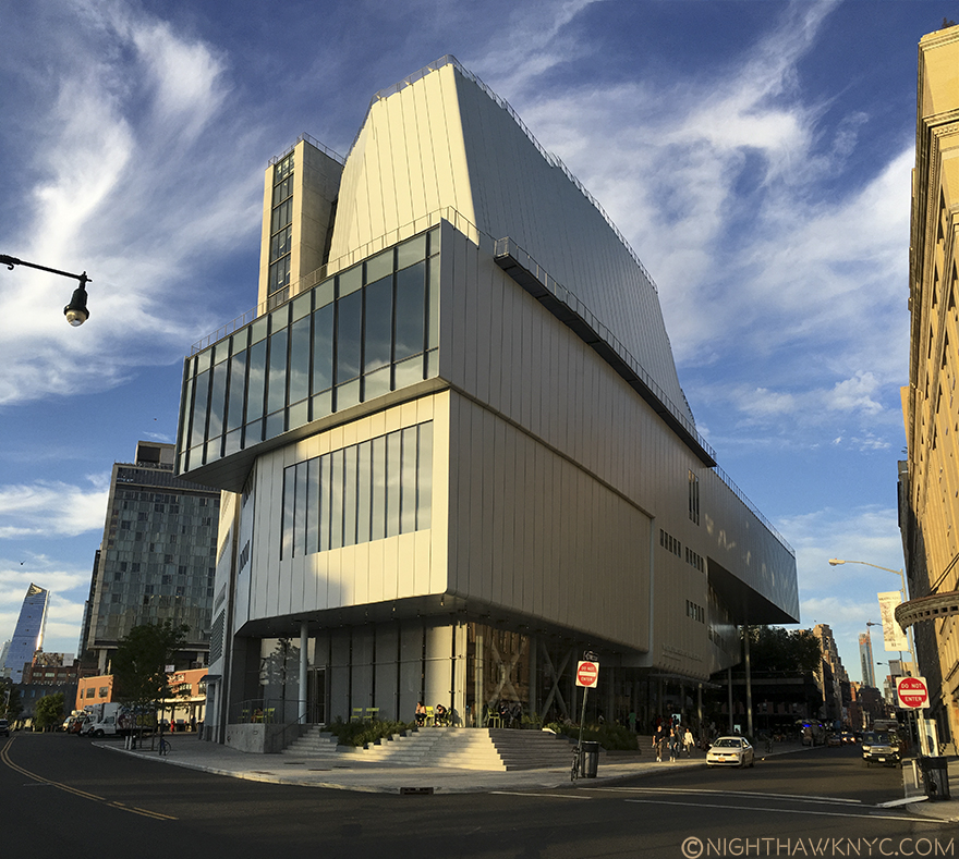
NOT to die for. I risked my life getting this shot. Southwest corner.
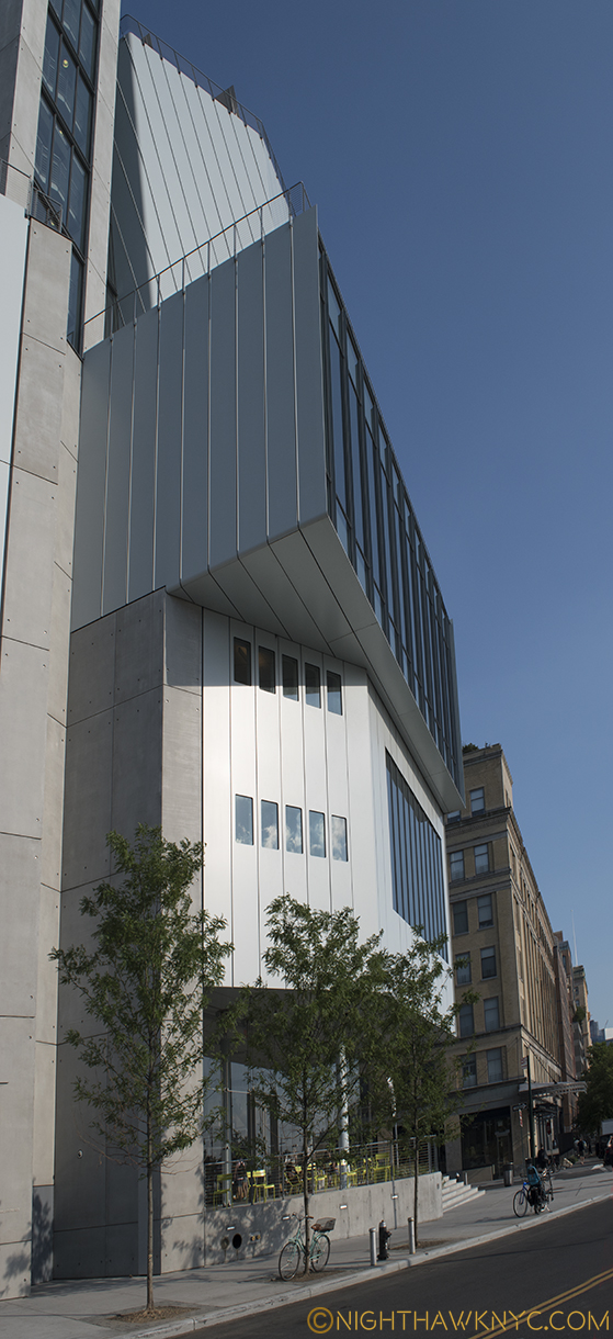
As we move to the western facade, with the large windows seen above (which reminds me of Zaha Hadid’s Library in Vienna), the upper one juts out at an angle seen from the north that vaguely reminds of the Breuer building’s Madison Avenue upper window.
But more problematically, is a large Department of Sanitation complex smack dab right in front of it! “Holy Refuse Pile, Artman!” Garbage trucks coming and going all day and evening are not exactly what gives a “Riv View” it’s cache. (Feel free to insert your own wry joke about contemporary art here. I’ll wait…)
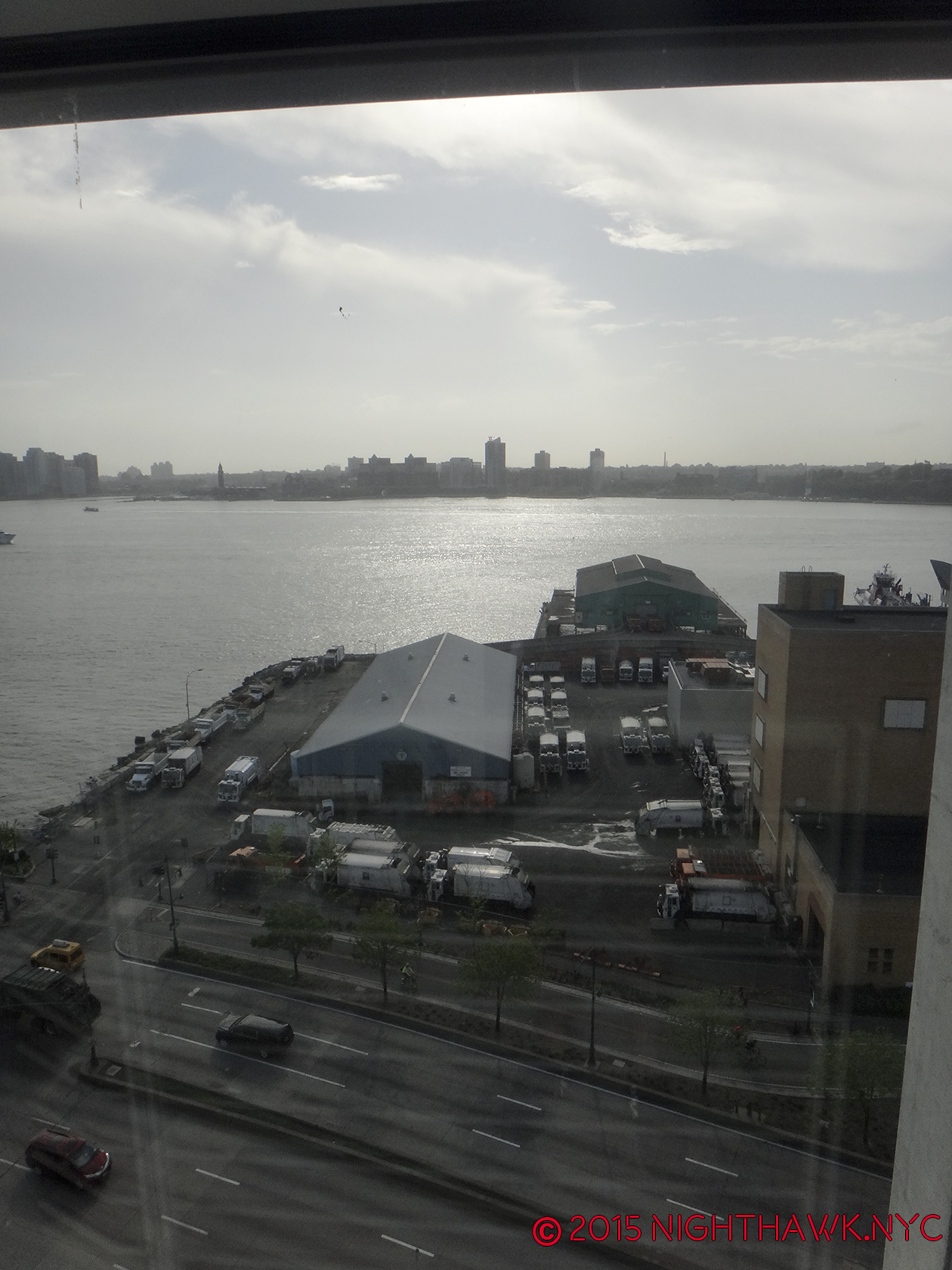
Riv View. Looking out at the Department of Sanitation from the 7th Floor stairs, 2015.
Mr. Piano has done his best to “minimize” the damage from the “offending” Department of Sanitation, and eternally busy West Side Highway, by opting to minimize the exposure of the western facade leaving a very narrow patio where, typically, only a few chairs usually are to be seen. It sits a few scant feet from the West Side Highway, after all, so it’s hard to imagine many people wanting to sit there for long. 3 trees have been planted along the curb in hope that one day they will provide some camouflage.
View from in front of the western facade, July, 2016, Being a tree in NYC is one helluva hard job.
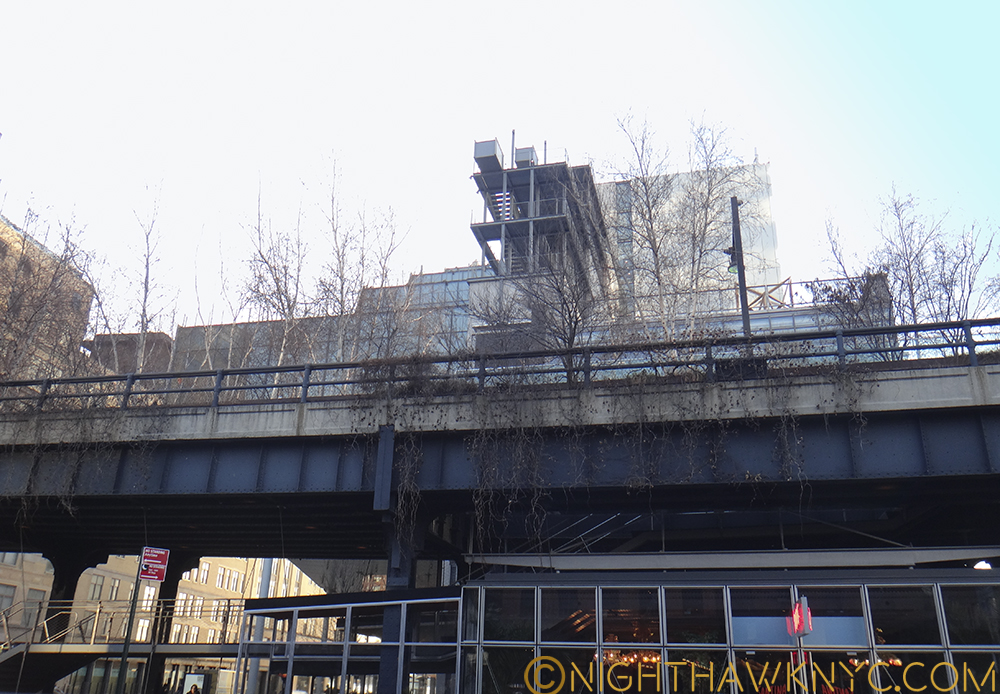
Regardless of the difficulties in seeing the building close up, it can be seen, for many blocks, both, to the north and south along the West Side Highway, and from across the Hudson River in New Jersey. Thanks(?) to the High Line there has been a boon in building in the area, with some very big name Starchitects (including, as I’ve written, the late Zaha Hadid’s only NYC Building going up at 520 West 28th Street, among many others) having new or recent projects in the area- some successful, some eyesores already. No less than Frank Gehry, the greatest architect of his time, in my book, himself, has a fairly new building about 6 blocks to the north of the New Whitney along the Highway, the gorgeous IAC Headquarters at 18th Street.
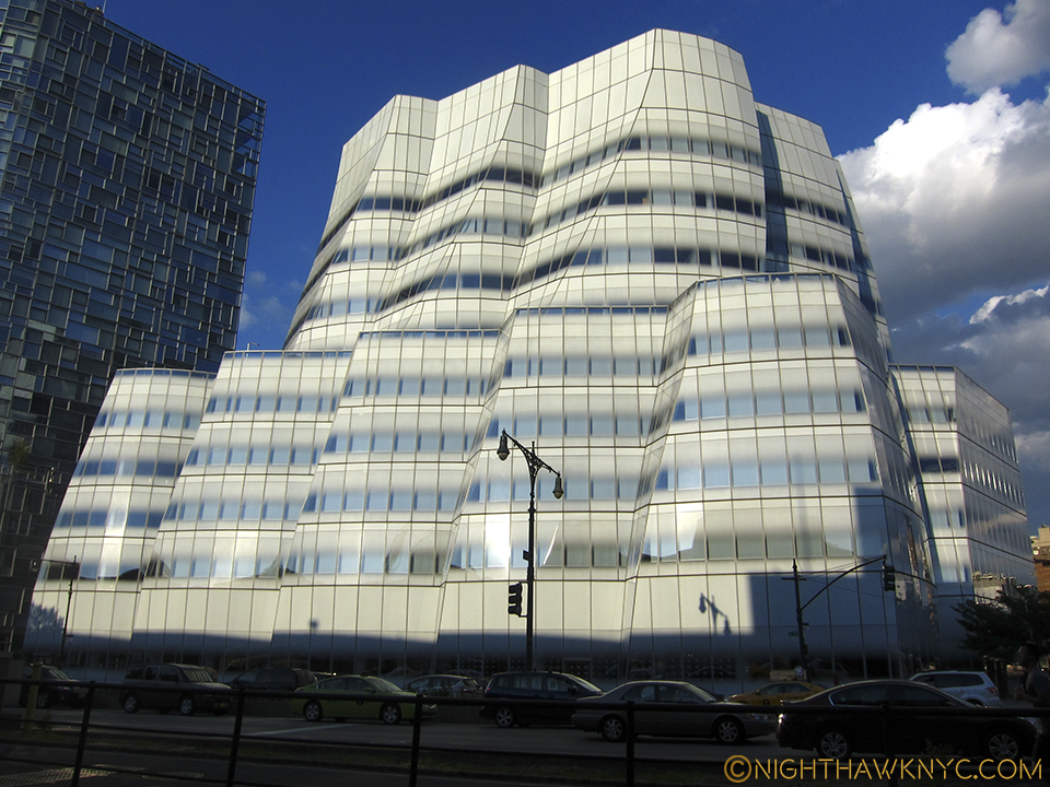
Like a sailboat on the Hudson it faces, Frank Gehry’s IAC Building is a shining example of the visionary architecture NYC needs more of, IMHO.
But, say what you want about this new Museum (don’t worry…I will), one thing that must be said is that the building isn’t obsessed with competing with it’s spectacular neighbor. Well? Not that spectacular neighbor, anyway. If anything, it sure feels to me like it’s competing with it’s OTHER “spectacular neighbor”- the High Line.
Southern terminus of the High Line, circa 2010, early in the construction of the new Whitney directly behind on the left side. And today, and tonite…
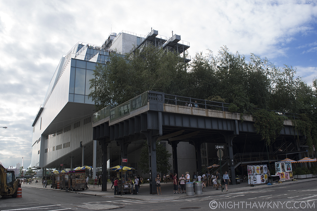
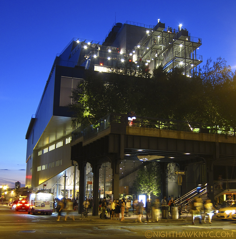
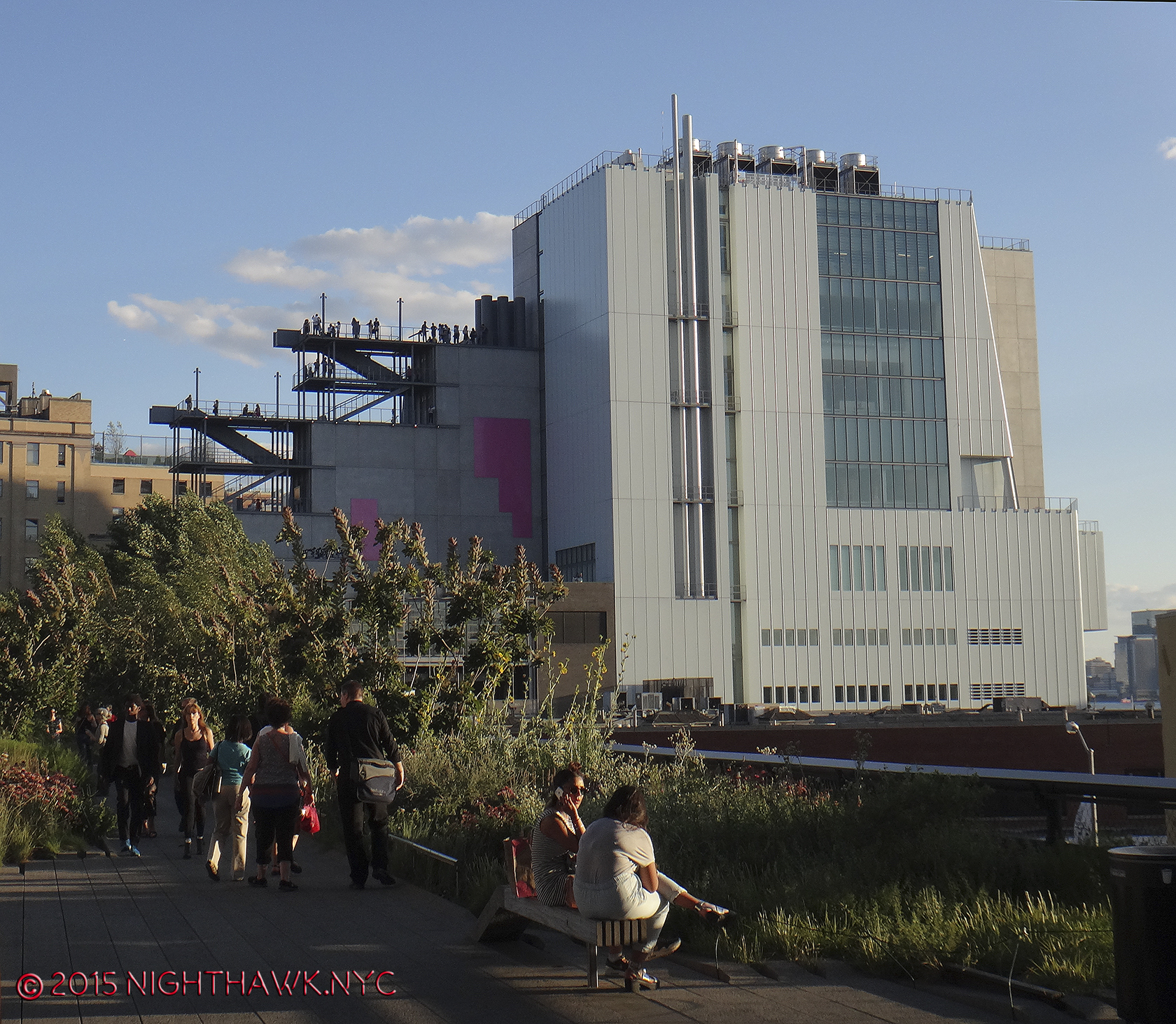
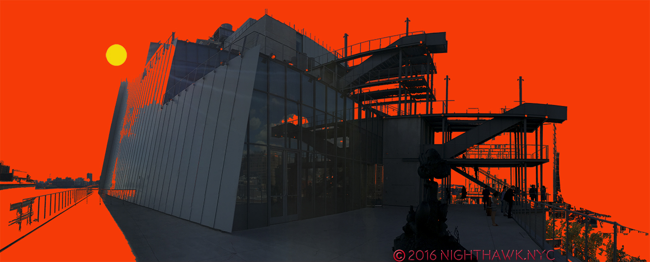
That brings us to the east side of the building, the side that abuts the High Line. Renzo Piano also designed the High Line Maintenance & Operations Building,
High Line Maintenance & Operations Building on the lot’s northeast corner.
which looks like it’s part of the Whitney, occupying the north eastern corner of the lot. Next to that are a rectangular bank of windows of the 5th Floor Galleries. The lowest rectangle is cleverly cantilevered over the lower floors in a way that vaguely reminds of Wright’s Fallingwater. Above it are more rectangular rows of windows on the other gallery floors, which are accompanied by roof decks and outdoor stairs between floors.
Cantilevered lower eastern face with 1st floor restaurant seen from the High Line.
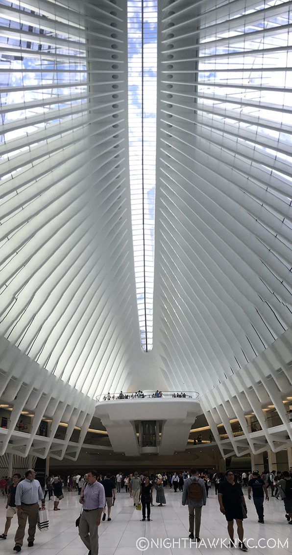
And, these are what raise my suspicion about purpose. So much outdoor space, and outdoor stairs in a place with the climate of Manhattan could be seen as highly questionable design. They are going to be unusable a good part of the year, so why do them? Aesthetically, to my eyes, the stairs look uncannily similar to the High Line’s access stairs. I wondered- Is this a case of “art snobbery” by an expensive to build, expensive to enter Museum trying to “upstage” a free & public park- a poorly thought out game of oneupmanship? An attempt to “blend in” with the High Line? Or?
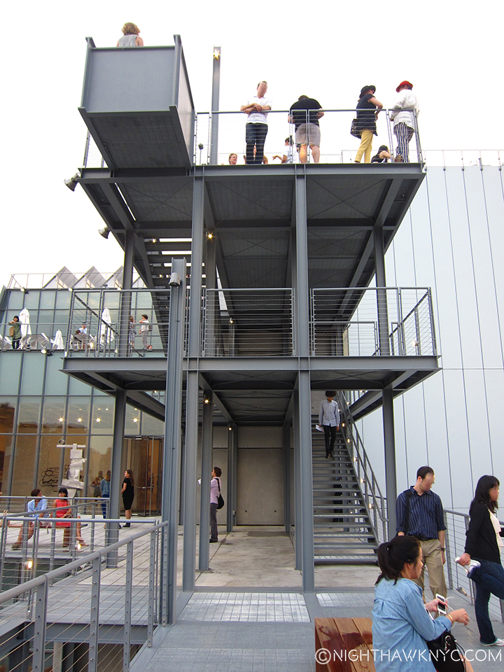
Whitney Museum Eastern Facade Exterior Stairs close up

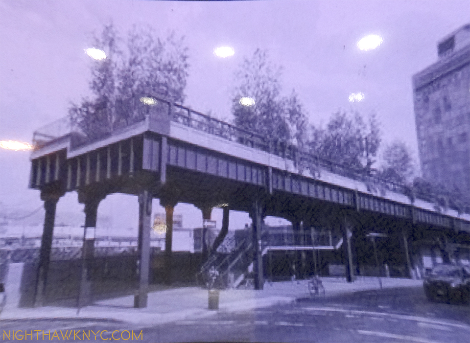
High Line Stairs at West 20th Street
Other questions festered. Back along the south face. I spent a long time trying to think of what the shape of this building reminded me of. Hmmmm…Then one day, it hit me- From the south it looks like one of the US Navy’s newest ships- the USS Independence. From this side, it looks like it’s ready to go out to sea, well, out to the Hudson River. This feeling is hard to shake when you are looking at the few windows that look a bit like portholes, the “military—like” grey coloring, and the slightly sloping (i.e. “stealthy”) look of the upper floors. Add the rear decks and stairs to the Independence and the effect is so similar, it’s down right eerie.
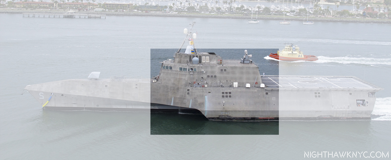
U.S.S. Indianapolis, again, with my highlighting. Ok, flip the cantilever to the rear, and…? Eerily uncanny, no?
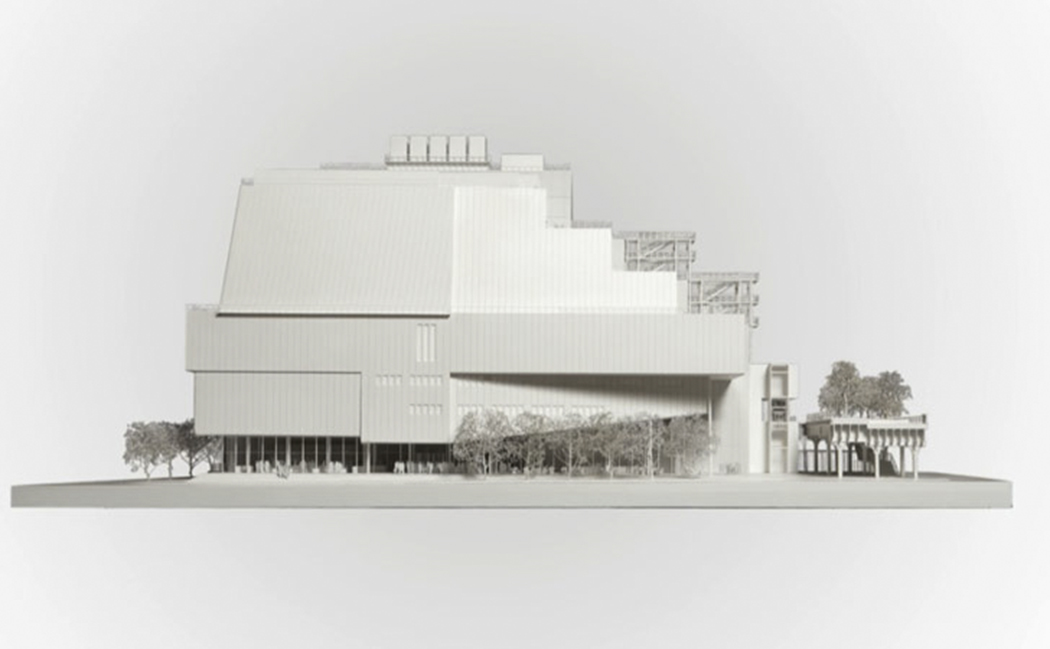
Photo from Renzo Piano Building Workshop website. Note that all of the “neighbors” have been removed, except for the High Line.
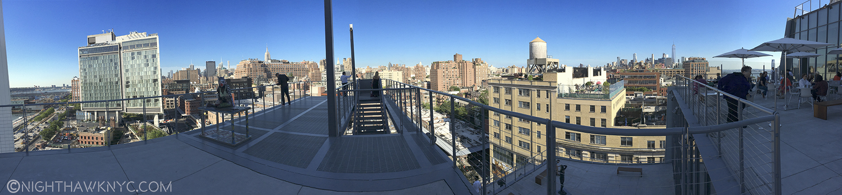
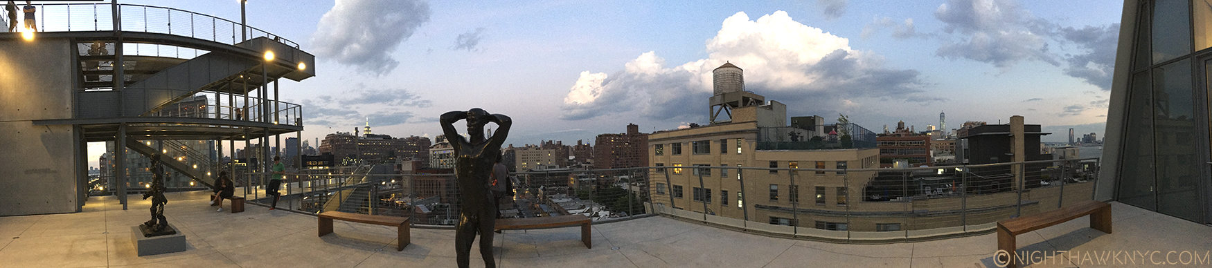
Part 3- The Roofdeck of American Art
Want a tan with your art? 6th Floor deck, Spring, 2016.
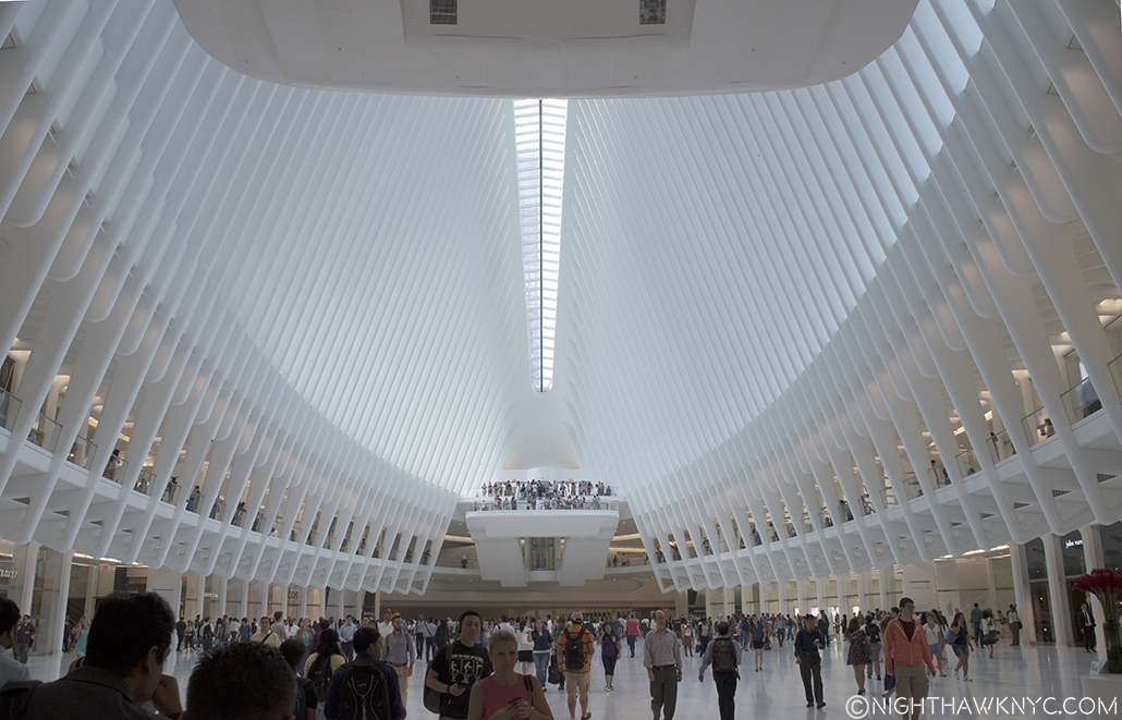
Yes, that is what I’m calling the New Whitney- “The Roofdeck of American Art.” I think the decks are what people will remember most about the building. I only hope it’s not what they remember most about their visit. That will be up to the Museum’s curators and staff. But? As I will get to, I think other forces are at work, too.
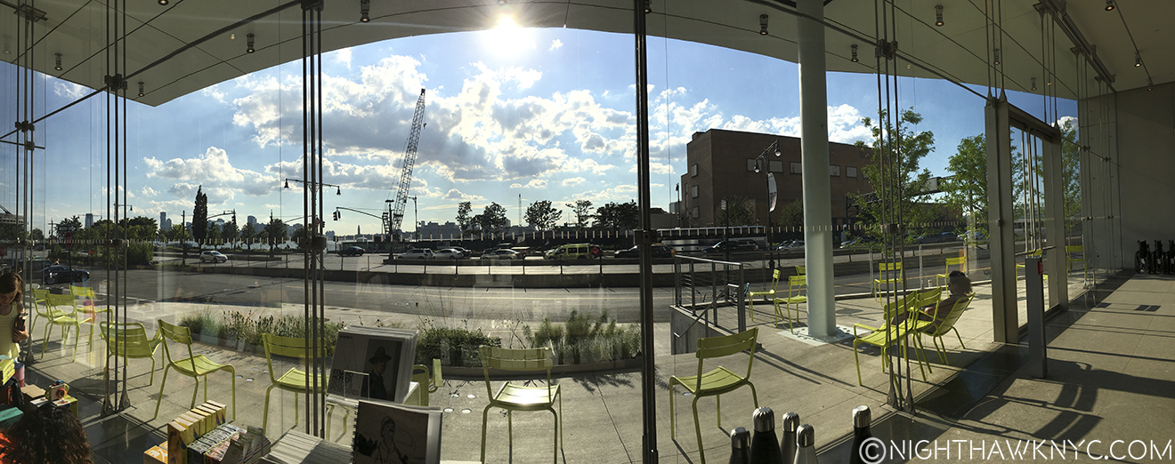
With 4 roof decks, I bet some will come only to enjoy the view and get some sun. The Museum turns the face the vast majority of visitors will experience most to it’s “rear,” to it’s east side facing the High Line. Doing so gives Mr. Piano a very convenient out of his Sanitation Department dilemma, “Riv View” notwithstanding, and allows a wonderful panorama of Manhattan, from Chelsea Piers to the north, the Empire State in the center and the Statue of Liberty, distantly, to the south. The decks allow space for dining (8th floor), sculpture (5th floor and the others), seating, and that 21st Century phenomenon- selfie sticks.
8th Floor Deck.
It’s very nice. You’ll like it. Bring sunscreen.
I promise that top ramp won’t be bent when you visit the 7th Floor Deck.
Part 4- Inside. “Hey look! They have art here…too!”
Inside, the first floor is the lobby, the most unsuccessful part of the entire interior- it’s an open space. The message here is “keep moving.” It’s about as unwelcoming a space as Moma’s lobby. (Actually, ALL of Moma, which for me stands for what it feels like- the “Mall of Modern Art,” feels unwelcoming!)
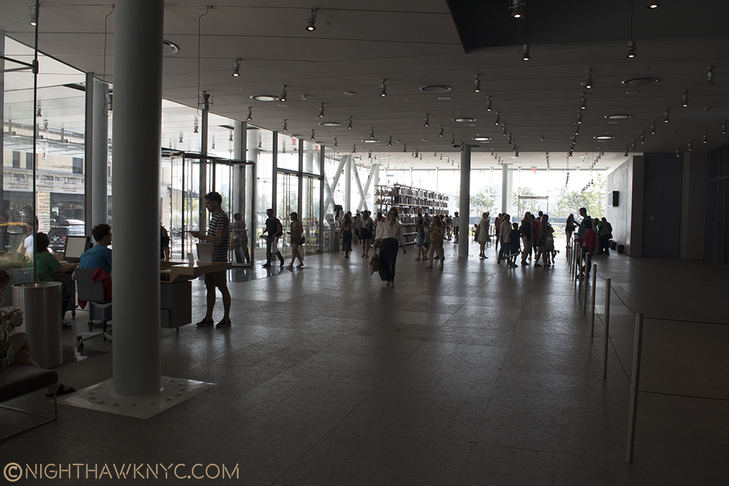
Welcome? No one will ever mistake the lobby for the Great Hall at The Met. Front door is to the right of the nearest exposed column. Engineering made visible abounds. The free 1st floor gallery is to the immediate right, outside of the rope fence, which denotes you are in the Museum.
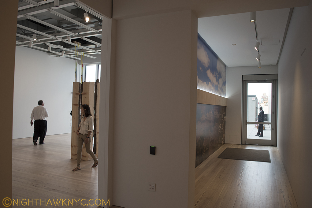
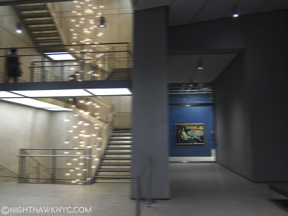
Once inside, here’s the routine I’ve settled upon, which probably sounds confusing- After entering as quickly as possible to minimize the time spent in the “lobby,” a short trip downstairs (don’t take the elevators- the wait is too long) brings you to the coatroom and the rest rooms (there are others restrooms on 3, 5, 7 and 8). The feeling here is 180 degrees from the lobby. This is completely designed. It makes you wonder what the hell happened upstairs. Take the stairs back to 1 and walk out past the rope line (keep your admission ticket handy) and visit the first floor gallery, which is free all the time. (Or, yes, you could visit the 1st floor gallery before paying to get in. I prefer to get my admission ticket first, which means I have to show it twice.) After that, show your ticket and get back in the Museum proper then take an elevator to the whatever floor you wish to see first- 3 (where the theater is for concerts, dance performances, etc), 5,6,7 or 8 (where the galleries are). Bear in mind there is no 2nd or 4th floor- they didn’t pay enough money to get those. No, at 422 million dollars, they did, but those floors are reserved for Museum staff and functions, so they’ve disappeared from the public elevator buttons.
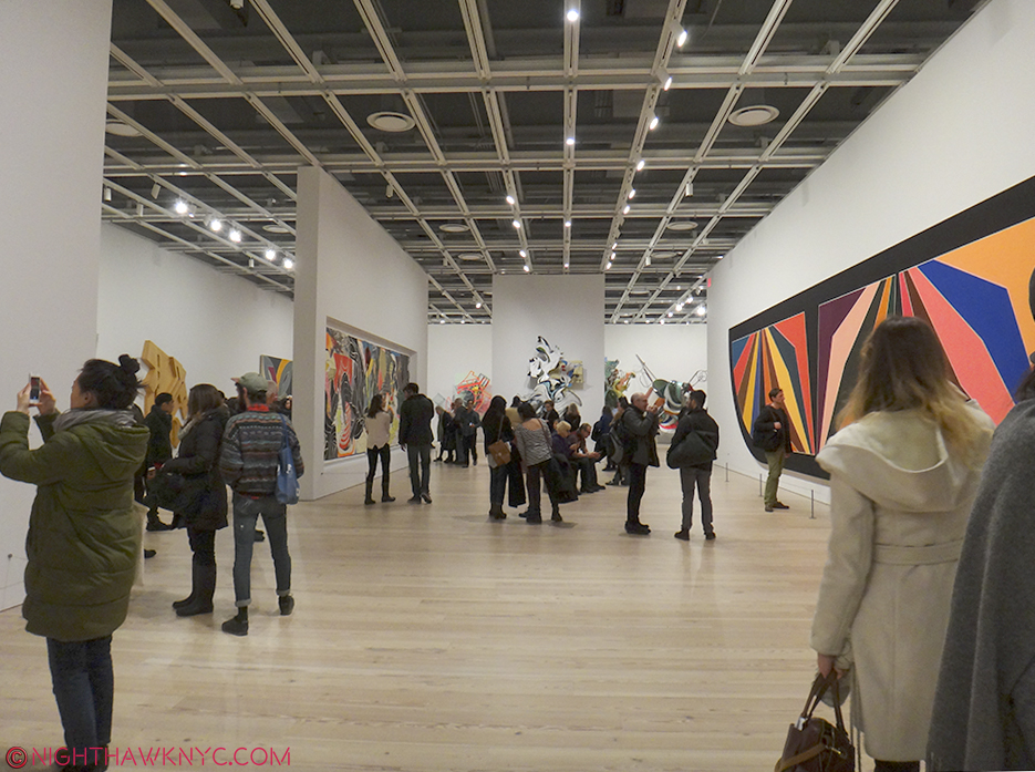
5th Floor seen during the Frank Stella Retrospective, Feb, 2016. The smaller walls can be moved to provide countless configuration possibilities.
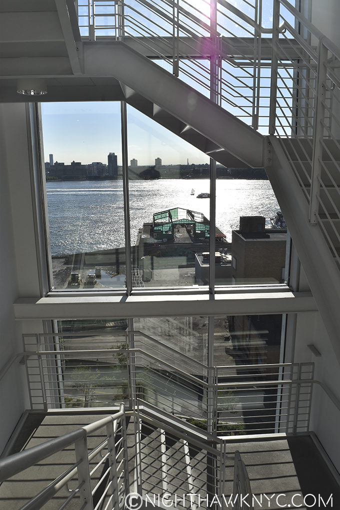
Inside, the building is very sharp, clean and neat with natural wood floors and new, white walls all around. As the rectangular shape belies, form mostly follows function, and 4 of the floors are given over to large, rectangular galleries. The open space allows for movable walls can be easily repositioned to allow an extremely wide range of configurations. Each floor is very well lit, (something that is continually a problem at The Met). With 3 sets of stair cases, there are plenty of stairs . None go all the way from 1-8, however. On the western wall, as seen below, stairs go from the 3rd floor to the 8th. To the east of the elevators, stairs run from 5 to the 1st floor. And, there are the exterior stairs on 6,7 and 8. The stairs are good to familiarize yourself with, since there is almost always a wait, the elevators are best used for going from 1 to 8 or from 5 to 1. The entire building, inside and out, is wheelchair accessible.
Western stairs, Spring, 2016. They seem to be dismantling the Sanitation complex. The Whit might be hoping a tower doesn’t go up in it’s stead.
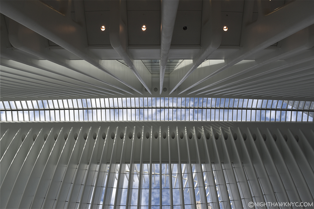
Renzo Piano strikes me as a Master Engineer more than as a brilliant Architect. I got that feeling when I first saw the Pompidou Centre in Paris, with it’s engineering on the outside, and again with his New York Times Building (which he inherited from Gehry). Yes, he has done some beautiful buildings, but I repeatedly get the feeling of Piano, the Engineer, when I look at his work, and that shouldn’t be the primary feeling I’m left with. There is quite a bit of engineering being shown off, here too, much of it on the first floor, some in the exposed gallery ceilings, and some on the roof decks.
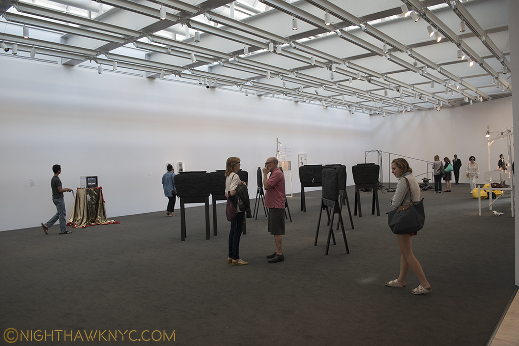
The 8th floor gallery lets in ambient sky light.
Now for the “nitty gritty.”
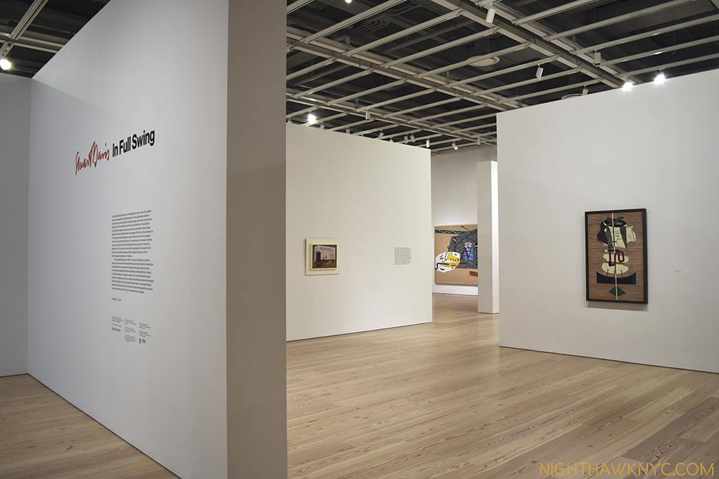
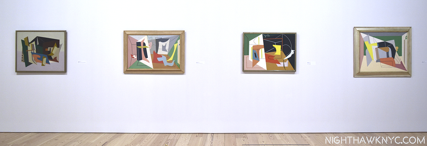
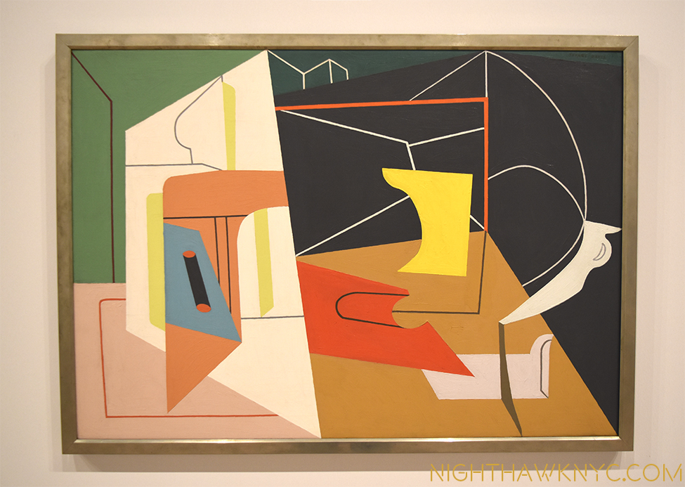
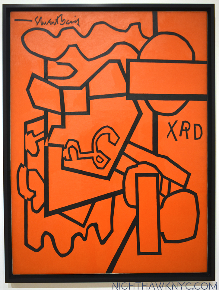
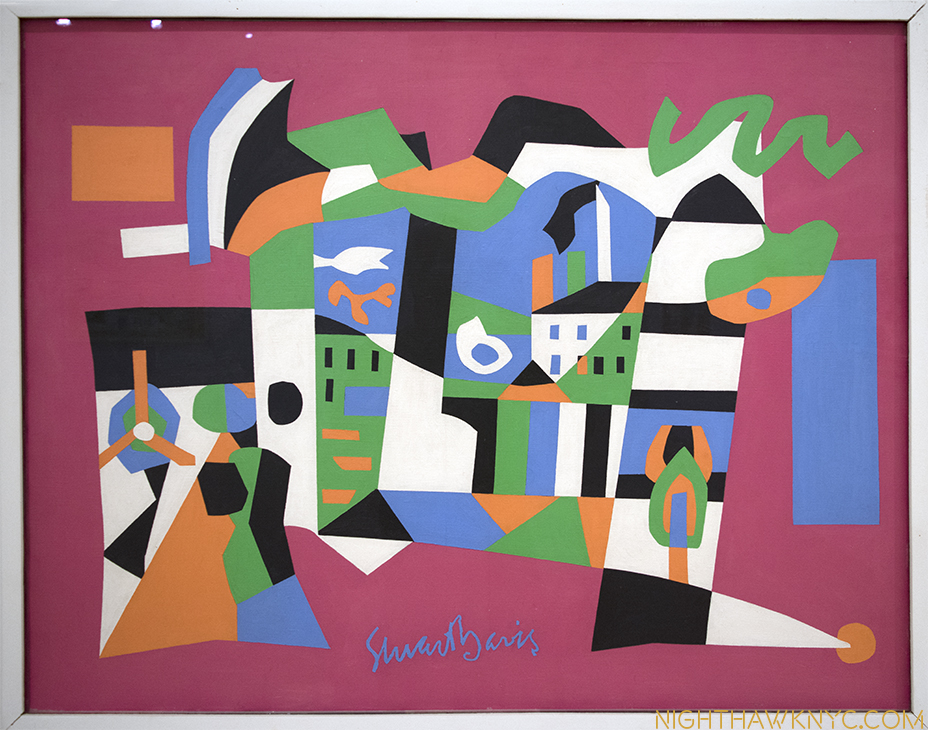
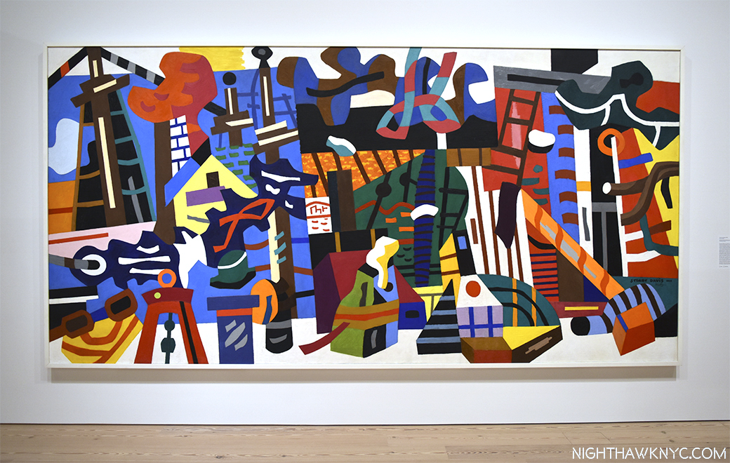
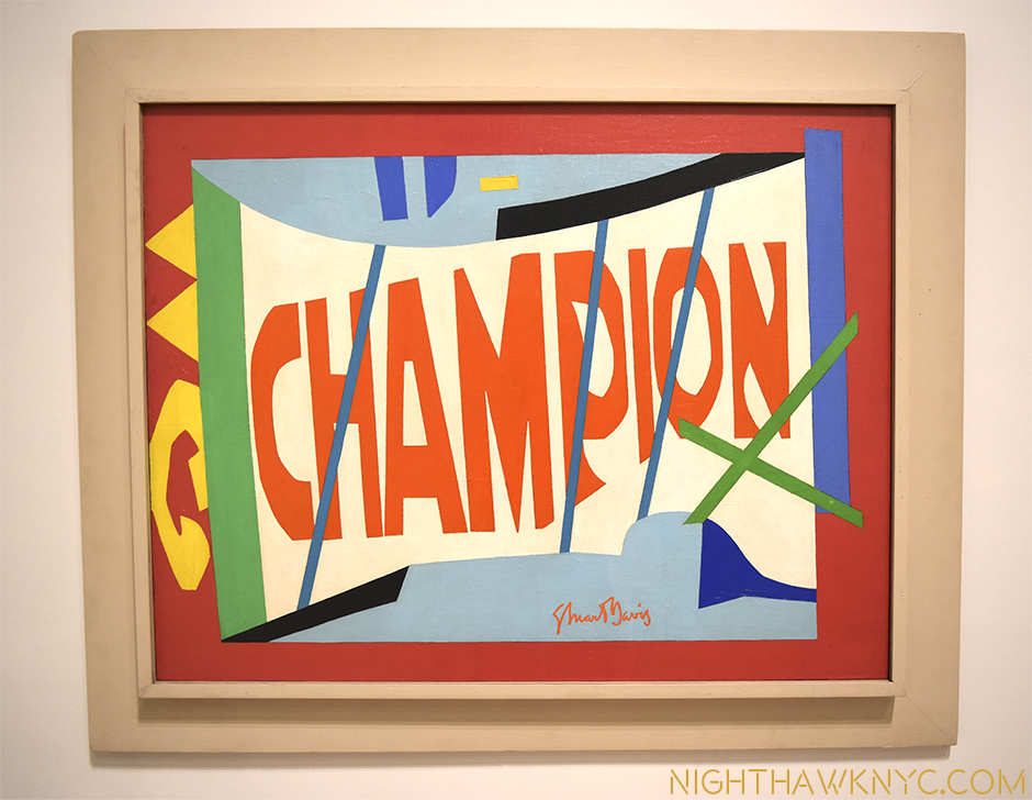
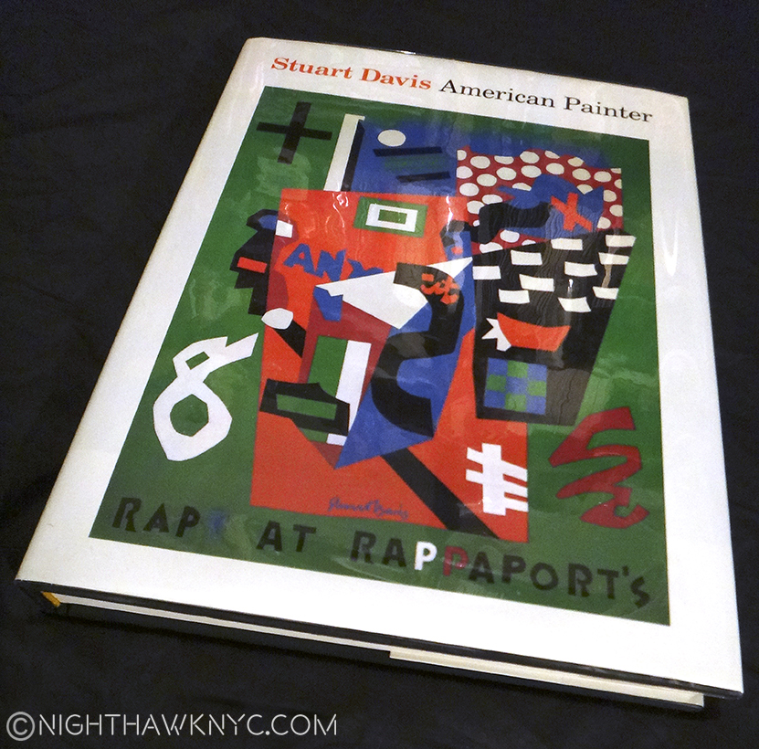
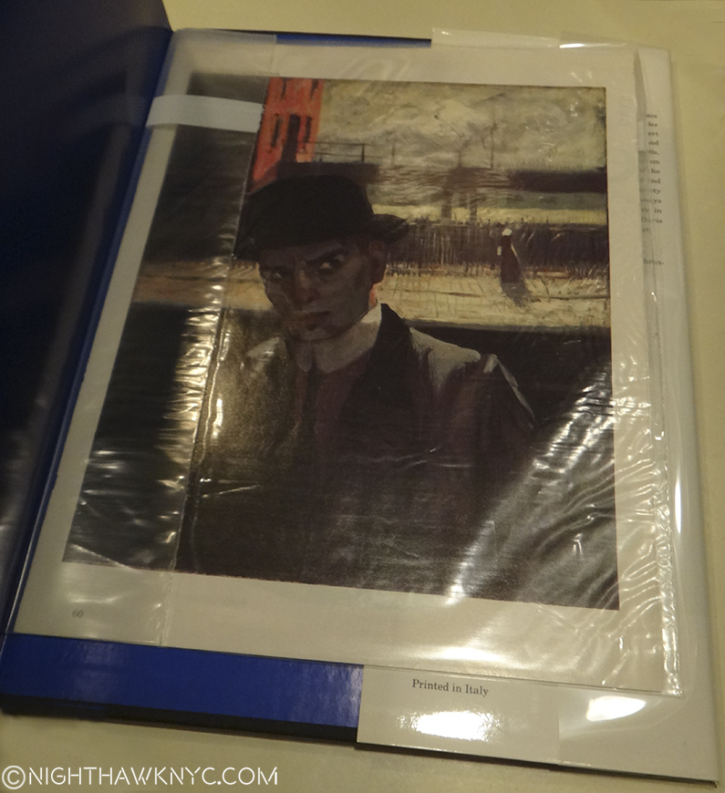
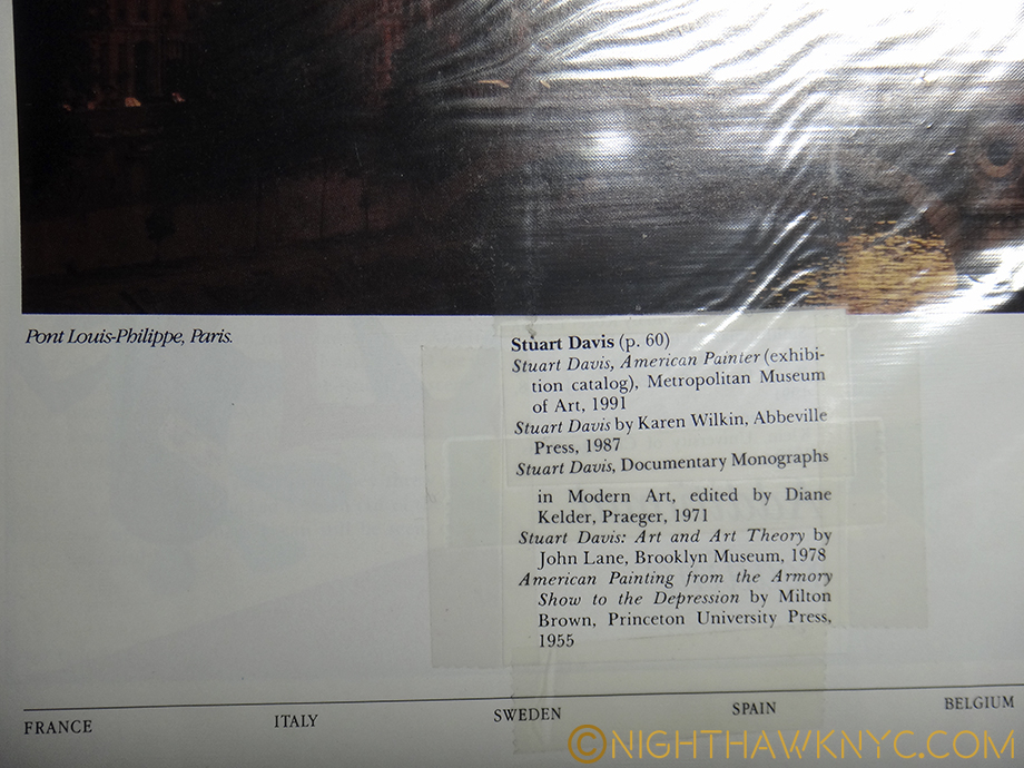
Given the luxury of having over a year to assess it, I’ve begun to wonder about the adequacy of the 50,000 square feet of indoor exhibition space, as nice as it is. “America Is Hard To See,” fit the whole Museum well, and showed it off to fine effect. Then, while the Frank Stella Retrospective was excellent, it only included 5 of his prints, and only 1 of his “Moby Dick” works. Was this because of hard decisions due to a prolific, 50+ year career, or due to a lack of space on the 5th floor? Currently, the otherwise excellent “Stuart Davis: In Full Swing” show feels unmistakably truncated. It shares the 5th floor with the “Danny Lyon: Message To The Future” show, (which may be overambitious). By comparison, The Met’s Stuart Davis show in 1991-92 had almost twice as many works, including over 30 that dated before the earliest work in the Whit’s show, like some from his “Van Gogh” period. While these have been going on indoors, I’ve been underwhelmed by what’s been installed thus far on the outdoor 5th Floor exhibition space. As time goes on, I’m starting to feel the 5th Floor may turn out to be a design mistake. Part of it is cut off to allow an entrance and exit corridor for the outdoor space, which is generally in shadow, and results in leaving a small indoor gallery on the other side of the outdoor gallery access corridor, which feels lost, and most importantly cuts down the size of the congruent 5th floor space. The other floors with outdoor decks run right up to the door leading outside with no corridor, etc.
The eastern end of the 5th Floor gallery is cut to allow this exit corridor to the Roof Deck, which leaves the small gallery to the left that feels lost.
The Whitney says there is 13,000 square feet of outdoor space, over 25% of the amount of indoor space. I’m left to ask the age old question…”Did they create enough INDOOR space to display Art?,” the prime purpose of a Museum. Time will tell, BUT? If they didn’t? This will be a disaster reminiscent of Moma’s inexcusably horrible current/new building, where they somehow managed to create a massive multistory hole right in the middle of some of THE most expensive real estate on Earth, then claim they “need more space,” 10 years later!
You can’t make this stuff up!!!
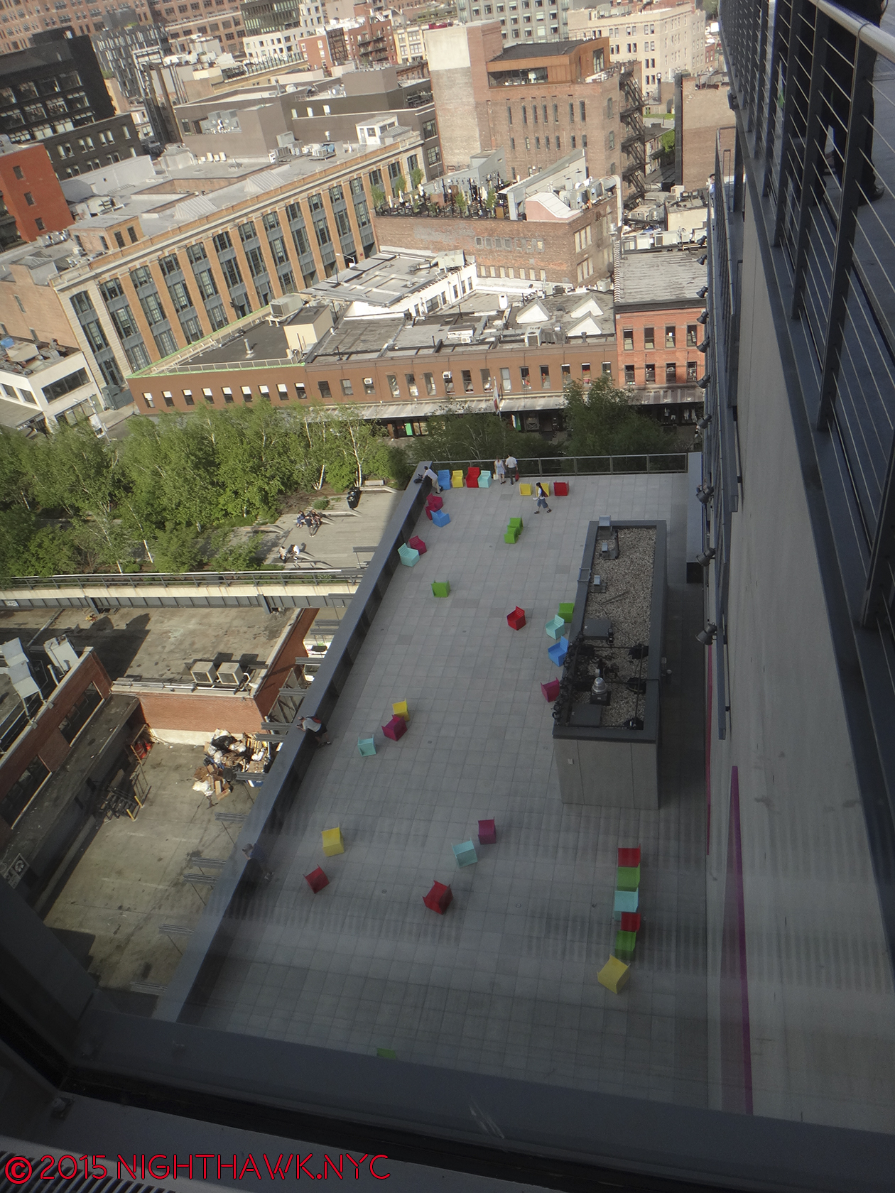
5th Floor Deck with installation. Yes, the colored seats are the Art work.
If the Whit needs more indoor space, well, the roof decks seem easy to enclose, and voila, 13,000 square feet more gallery space.
Or? PLEASE don’t tell me they’d have to expand this new building north, or up. I’m done writing letters. Besides, as much as I admire and respect Mrs. Gertrude V. Whitney and the collection built on hers, I have no attachment to this building.
And that brings me to this- Through it all, one thought stayed on my mind more than any other. I wonder what she would have thought of the place…
Part 5 – Gertrude Vanderbilt Whitney
“And I dreamed I was flying
And high up above my eyes could clearly see
The Statue of Liberty
Sailing away to sea
And I dreamed I was flying”*
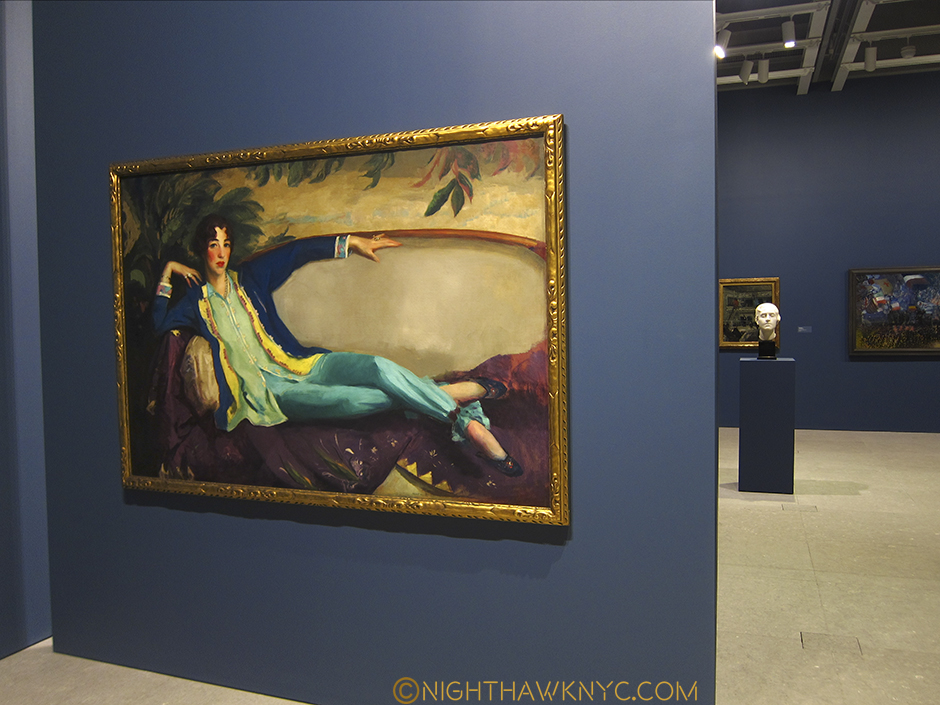
Portrait of Gertrude V. Whitney, 1917 by Robert Henri. Study for a Head for the Titanic Memorial by Mrs. Gertrude V. Whitney, in the right background from “America Is Hard To See,” 2015
The founder of the Whitney Museum, as was beautifully demonstrated, remembered and honored in the first floor free to enter at all times gallery, where “America Is Hard To See” began was, also, a very accomplished sculptor, in addition to being the greatest champion of American Art, perhaps ever. Immediately upon entering the first floor gallery, the first thing you saw was, fittingly, the wonderful portrait of her by Robert Henri that was perfectly placed facing the door, which also enabled it to be seen from outside the building, the only artwork that was. I wish it had been left right there. It wasn’t. As I write this, it’s upstairs as part of the “Human Interest: Portraits from the Whitney’s Collection” show. One of my pet peeves in Museum re-designs is how often they fail to answer this, seemingly basic, question- “Where are we going to put such and such major masterpiece?” Moma failed this miserably- How many times have they moved Monet’s “Waterlillies”, or Van Gogh’s “Starry Night”, in a vain attempt to find the right spot for each? This is unforgivable. While the Whitney has found a great spot for Calder’s Circus,
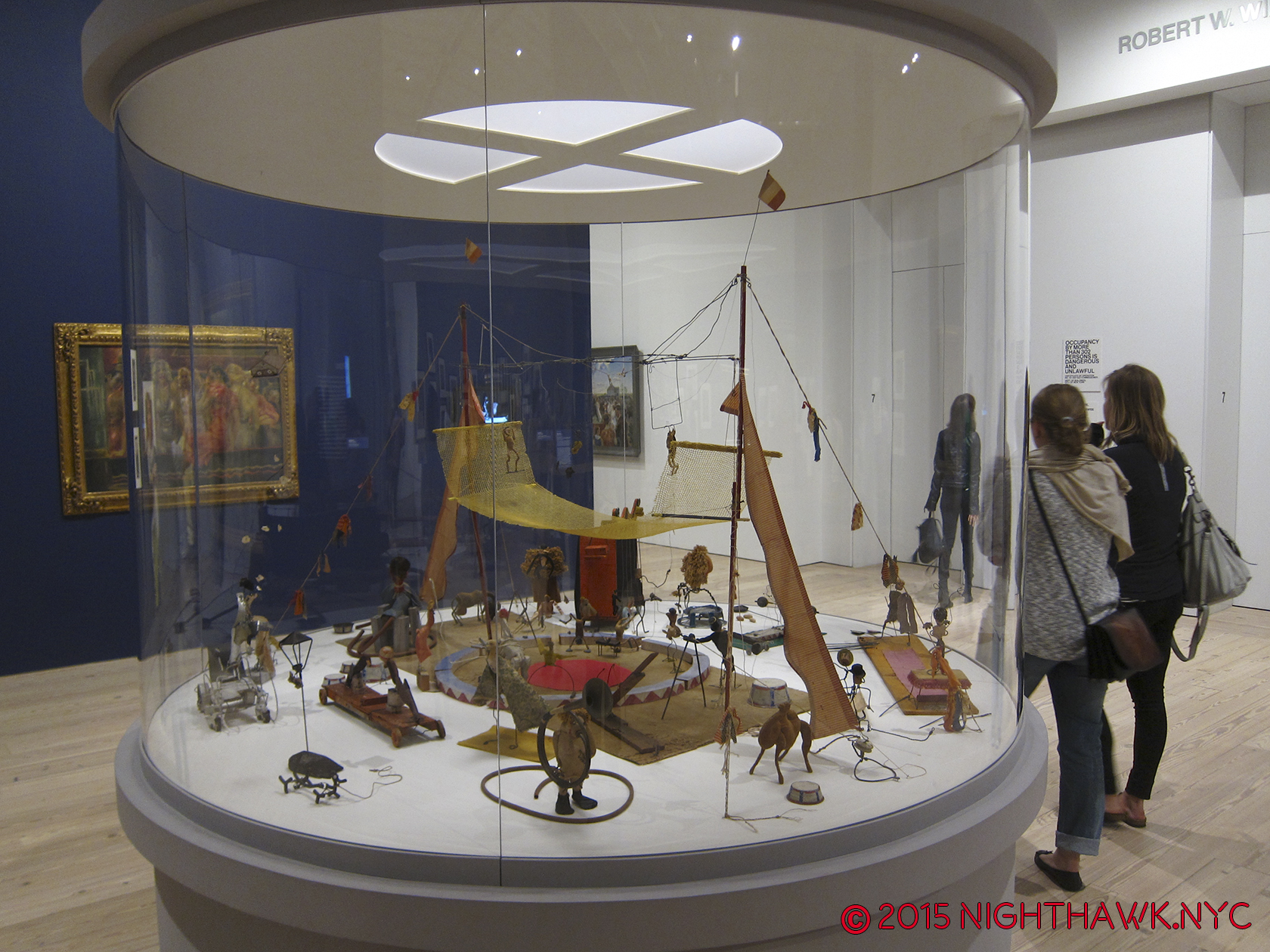
Home… at last. Calder’s ingenious “Circus.” When you go, be sure to see the accompanying video.
which was lost in the Breuer Building’s mezzanine, I’m left to wonder about Mrs. Whitney’s Portrait. Will it become their Waterlillies?
One of the greatest figures in American Art History looks out on her domain. 1st Floor Gallery, during “America is Hard to See,” 2015. After? They should have left it right there.
Beyond her portrait’s place in the Museum, I wonder what she’d think of it. It’s still “her” Museum. They even, recently, put the name “Whitney Museum of American Art” on the southern facade. The new place is located a stone’s throw from the site of the first Whitney Museum that she opened in 1931 at 8 West 8th Street, and equally close to where Edward Hopper lived and worked on Washington Square. Edward & Josephine Hopper left their artistic estate to the Whitney, in honor of their long relationship with Mrs. Whitney. When the new Museum opened, there was a selection of Edward Hopper drawings from 1925 that he did at the Whitney Studio Club, which preceded the founding of the Museum, in the first floor gallery, adjacent to Henri’s Portrait of Mrs. Whitney, seen above. As time goes on, I think this gift will be seen as one of the greatest Art gifts of the 20th Century, even though it didn’t consist of many of Edward’s paintings. That’s when I try and forget the fact that the Whitney, tragically and unforgivably, discarded almost all of Josephine Hopper’s work that was included with it!
While we’ll never know what Mrs. Whitney would think of the new home of her collection, I know what I think.
Oneupsmanship? “Hey you down there on the High Line- You think you’re high up? Ha!”
I’ve spent a year wondering- Why put 13,000 square feet of outdoor space in a building in a place with a climate like NYC?

5th Floor roof deck with a Frank Stella Sculpture & reflection, in the snow, Feb, 2016
Part 6- 5,000,000 Reasons
As I said, real estate in NYC is all about location. That applies to the Art world, too. The Met & The Guggenheim are in, or near, Central Park, and there is now talk of The Met creating a Central Park entrance as part of their Contemporary Art Galleries reconstruction. Moma has the heart of midtown, and now the Whitney has the High Line. In my opinion, the location was selected, and the New Whitney is designed, to be a destination for High Line visitors- It’s roof decks are meant to beckon High Liners with an even better view since they are higher. That’s one explanation for the stair designs looking similar- imitation that’s designed to make High Liners feel the Museum is part of the High Line. And so? Location also pays off by providing a potential mass audience delivered right to your door. How much is that worth to a Museum? Given that the High Line currently draws over 5,000,000 visitors a year, it’s hard not to see this as a conscious decision designed to attract visitors for an even better view, and oh yeah, some Art. Once inside? I’ve already come to feel that the gallery size is limiting. As the collection grows (do Museum collections ever shrink?), I am left to wonder how quickly they’re going to wish they had some of that 13,000 square feet that’s sitting outside, inside.
But? If I’m correct about their motivation, the outdoors stairs & decks exist to beckon people from the High Line, which, is open year round, come rain, snow, or shine.
“We come on the ship they call the Mayflower
We come on the ship that sailed the moon
We come in the age’s most uncertain hour
and sing an American tune
But it’s all right, it’s all right
You can’t be forever blessed”*
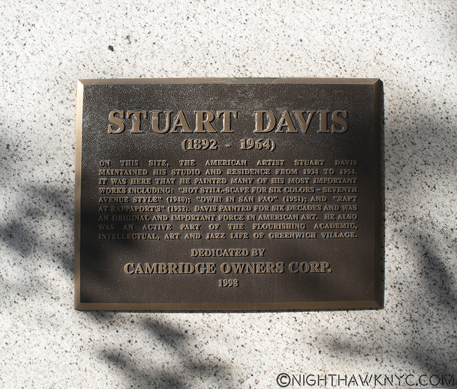
Overall? I’m displeased by the outward appearance of the new Whitney. Over a year of trying to warm to it, of giving it yet another chance to speak to me later, I still find it downright strange. As an Art Museum, the inside is nice, with the above caveats. As far as the Art is concerned? I’m glad to have the Whitney’s pre-eminient collection of American Art back, and “America Is Hard To See” was a wonderful “Welcome Back” celebration of it’s return after the move Downtown. The Whitney is, also, to be congratulated for the guts they’e displayed in the choices of their early shows- giving Laura Poitras her first Museum show, featuring the great Cecil Taylor for a week, and having the retrospectives of modern master Frank Stella and the vastly underrated Stuart Davis (who Mrs. Whitney, herself, believed in and financially supported early on), among others, all have made the first year of the New Whitney Museum’s exhibitions quite memorable, and yes, very Artistically successful.
Yet? How long will the waters stay calm for the U.S.S. New Whitney Museum? The big question of long term success and long term viability remain to be answered.
Epilogue – The Whitney’s 422 Million Dollar Gamble
The Whitney’s move downtown isn’t about moving nearer the “New” Art neighborhood of Chelsea or the “Older” Art neighborhood of Soho. It strikes me as being a a case of seeing an opportunity and taking it. They found a lot at one of the 2 ends of the High Line and saw their opportunity to move to a potential audience- the 5,000,000 current visitors to the High Line, and they took it. I believe that’s why their stairs look like the High Line’s, as I said.
For the Whitney, this is a $430,000,000.00 (the cost of the new building) gamble that the High Line is not a flash in the pan and it’s popularity is here to stay. If the High Line fails? Well? The City was about to tear it down anyway before it was turned into a Park.
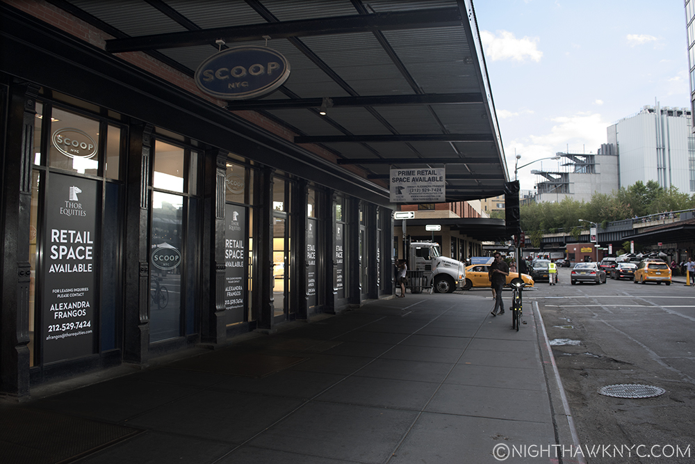
But, if the High Line does fail (which seems unlikely at the moment), or visitors come in substantially lower numbers (much more likely), the Whitney may find themselves stranded, with an out of the way Museum that is not easily accessible by either bus or subway in a neighborhood that has a history of being “the wild west,” home to meat packing, prostitution, cutting edge music, and sex clubs (Madonna’s notorious book “Sex” was photographed almost 25 years ago at one 3 blocks away) not all that long ago, that has been remade with extra glitz and top of the market rents. And what about that neighborhood? What if the new glitz doesn’t stick? What if it all turns out to be wishful thinking on the part of landlords looking to make a killing after years of squalor? Walking around the past few months, the area seems to be having a bit of trouble supporting many of it’s ritzy new tenants at these prices. And? This is over a year after the Whitney added even more oomph to the now completed High Line being here.
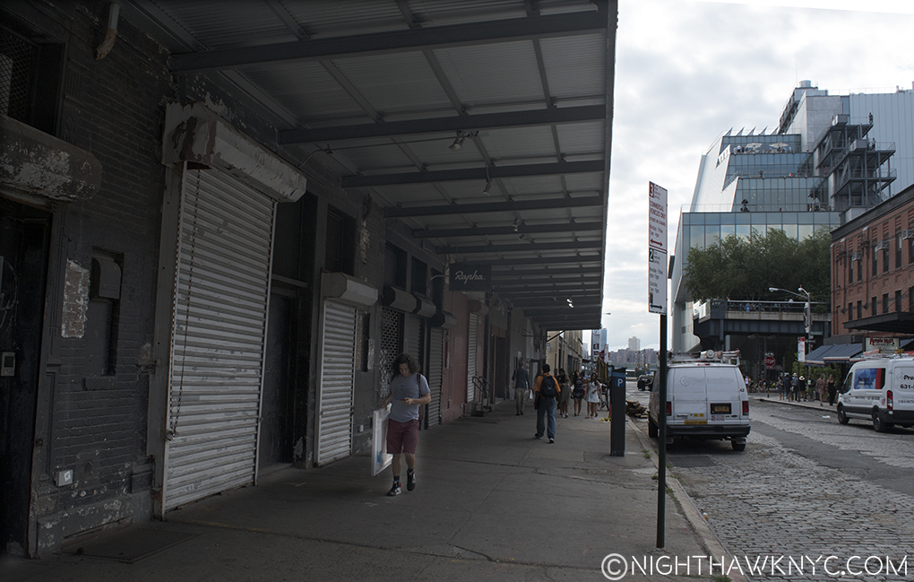
Empty storefronts on Gansevoort fill 3/4 of the block, one block east of the Whitney, August, 2016
Is the “Meatpacking District” a fad destination that is about to fade? If so, what effect will this have on the new Whitney? Can it survive in a “not so fab” neighborhood?
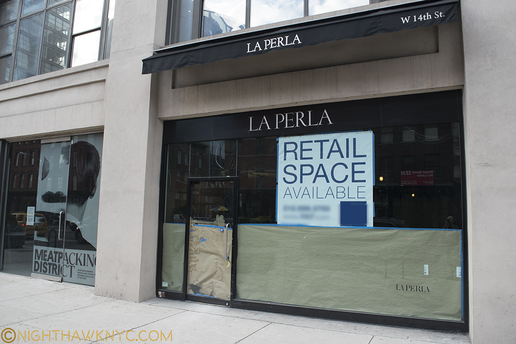
Is the buzz over? La Perla joins Alexander McQueen & Stella McCartney as former tenants of the Meatpacking District who have moved elsewhere.
While collectors and investors throw unheard of sums at Contemporary Art these days (which strike me as “bets” given the largely unproven nature of the Art itself), here is a case of one of NYC’s “Big 4 Museums” placing an even bigger bet on a Park, that while it certainly is Contemporary Urban Art, hasn’t even been fully opened for TWO YEARS yet,. The Whitney placed their bet when the High Line was in it’s first of 3 phases. Phase 3, the final part, of the now completed High Line opened on September 20, 2014. This is not to mention that they bought in at the top of the market in a real estate market that (like the Art market) hasn’t seen a correction in over 25 years. Both will see corrections one of these days.
But when? This, is the 422 million dollar question.
“Still, tomorrow’s going to be another working day
And I’m trying to get some rest
That’s all I’m trying to get some rest”*
In the Whitney’s shadow. Around the corner on Washington Street, 4 now empty storefronts in a row, one of which was the notorious Hogs & Heifers Saloon (where the white sign hangs). August, 2016
Well? If all of this goes south? They still stand a very good chance of being able to move back uptown in 8 years when The Met’s lease of the Breuer, their former home, is up. Given The Met’s own problems, it seems highly unlikely they’ll be extending that lease.
If the Whitney then wants to renovate it? It’ll be someone else’s problem.
*-Soundtrack for this Post is “American Tune” by Paul Simon. Published by Universal Music Publishing Group.
NighthawkNYC.com has been entirely self-funded & ad-free for over 8 years, during which 300 full-length pieces have been published! If you’ve found it worthwhile, PLEASE donate to allow me to continue below. Thank you, Kenn.
You can also support it by buying Art, Art & Photography books, and Music from my collection! Art & Books may be found here. Music here and here.
Written & photographed by Kenn Sava for nighthawknyc.com unless otherwise credited. To send comments, thoughts, feedback or propositions click here. Click the white box on the upper right for the archives or to search them. Subscribe to be notified of new Posts below. Your information will be used for no other purpose.