My Search For Edward Hopper’s Nighthawks Diner

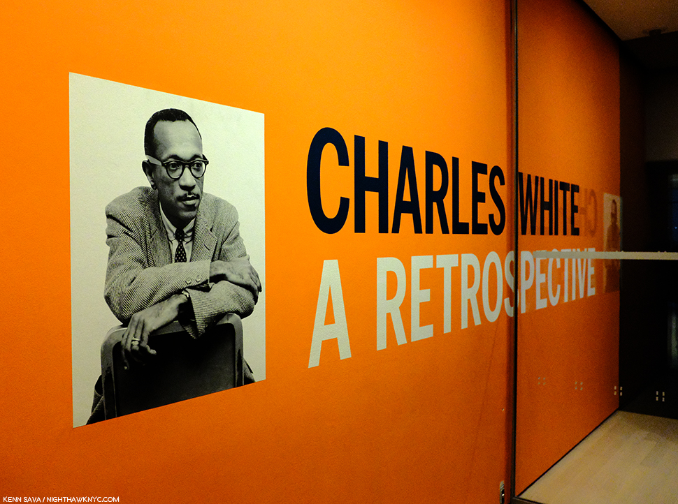
Written & Photographed by Kenn Sava (*unless otherwise credited).

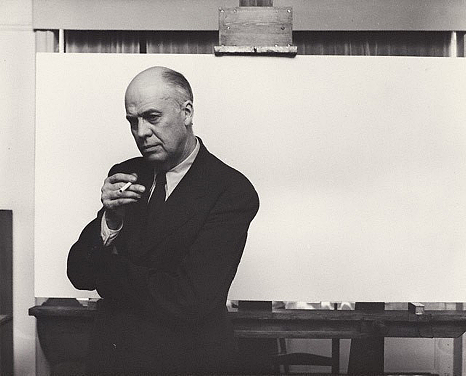
Arnold Newman, Edward Hopper in his New York studio, November 1, 1941, Gelatin silver print, *Arnold Newman Collection/Getty Images.

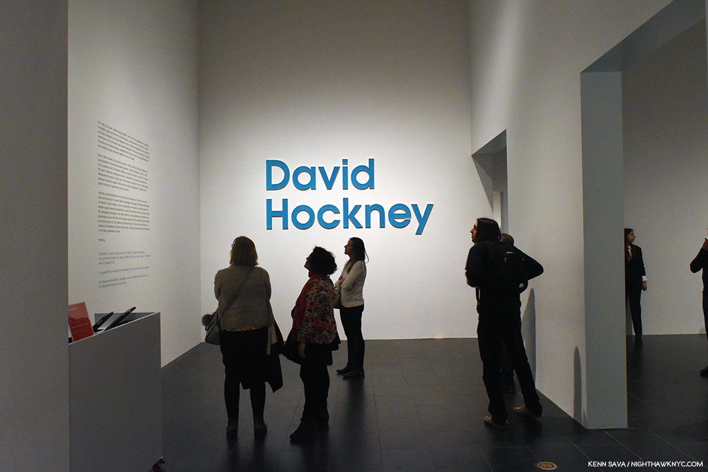
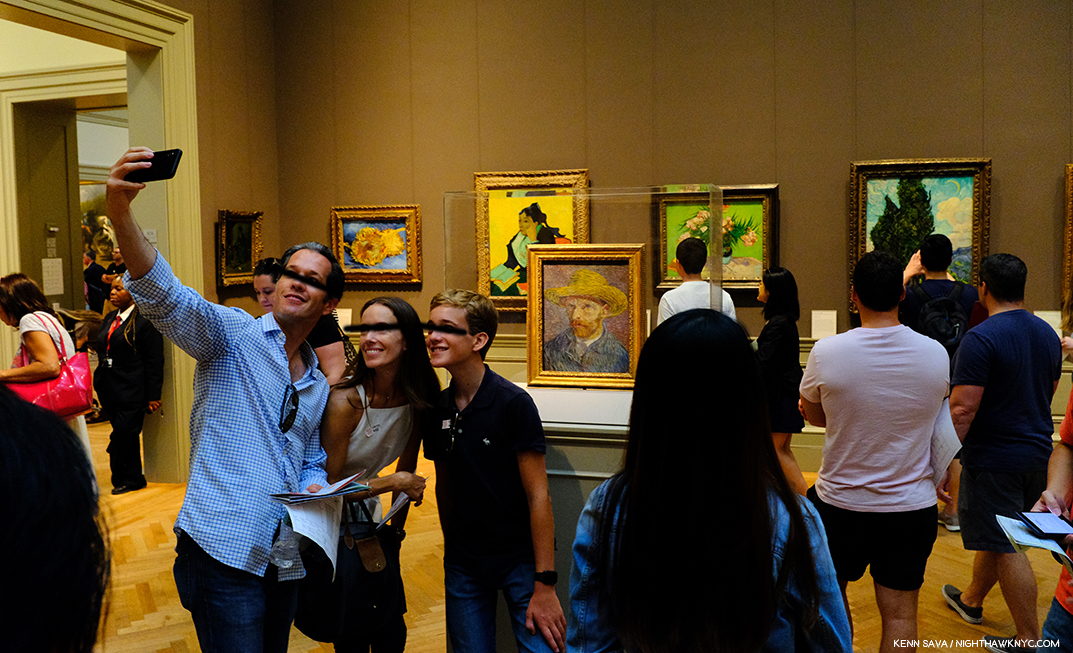
You’re looking at Art history.

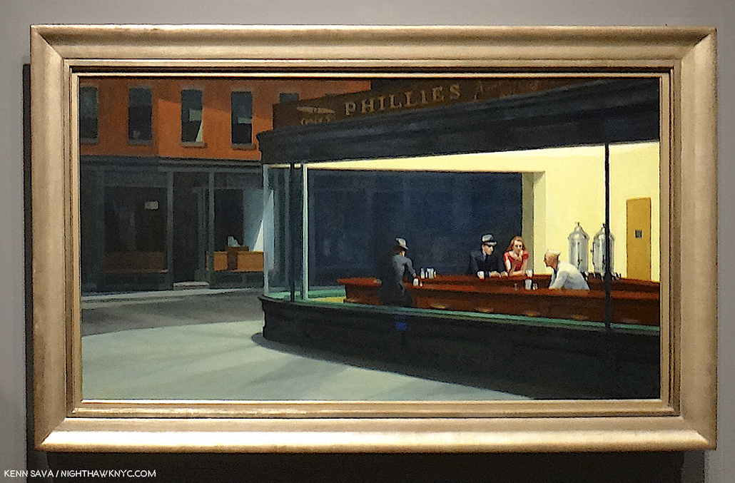
After the fact, this may be one of the most historic Photographs in American Art. I’m not only talking about it being a wonderful portrait of Edward Hopper. It’s much more. The date is November 1, 1941. On January 21, 1942, the Artist’s wife, Jo Hopper, would record the completion of the work her husband created on that blank canvas he is posing in front of in the Artist’s Ledger of his work.

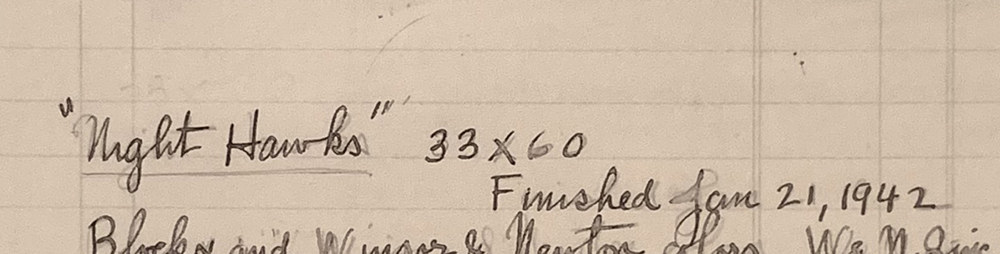
A section of Edward Hopper’s Ledger page for Nighthawks, from the book, Edward Hopper: Paintings and Ledger Book Drawings. It wound up in the Art Institute of Chicago almost immediately. Its sale netted Edward Hopper about $1,700.00.

In the intervening 81 days, Edward Hopper Painted the incomparable Nighthawks on that very canvas. We don’t know if Arnold Newman had any clue as to what Edward Hopper’s intentions were for that canvas. But we know now. The odds are that he had finished his preliminary work- the inspiration, the sketches, the reference Drawings, the sizing calculations he usually did, and ordered the stretcher and canvas we see behind him on his famous easel. Most likely? At this very moment, this masterpiece was all in his mind, and possibly on it, as Arnold Newman pressed his shutter release.

Click.

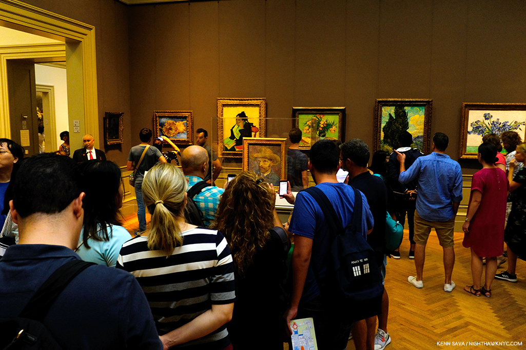
For the following 77 1/2 years (exactly, as I write this), and counting, the world has been fascinated by Nighthawks like they have few other Paintings created in the 20th Century. Some of us, including myself, are borderline obsessed by it.

Written on my soul. The last time I stood in front of Nighthawks. August 28, 2013, at Hopper Drawing at the old Whitney Museum.

I’ve stood in front of it twice in my life. The first time at The Art Institute of Chicago in 2005, the second at the old Whitney Museum in 2013. In July, 2015, I named this site after it and wrote about why in the very first piece I Posted here, “Welcome To The Night,” To commemorate the 4th anniversary of NighthawkNYC.com, I present My Search for the Nighthawks Diner.

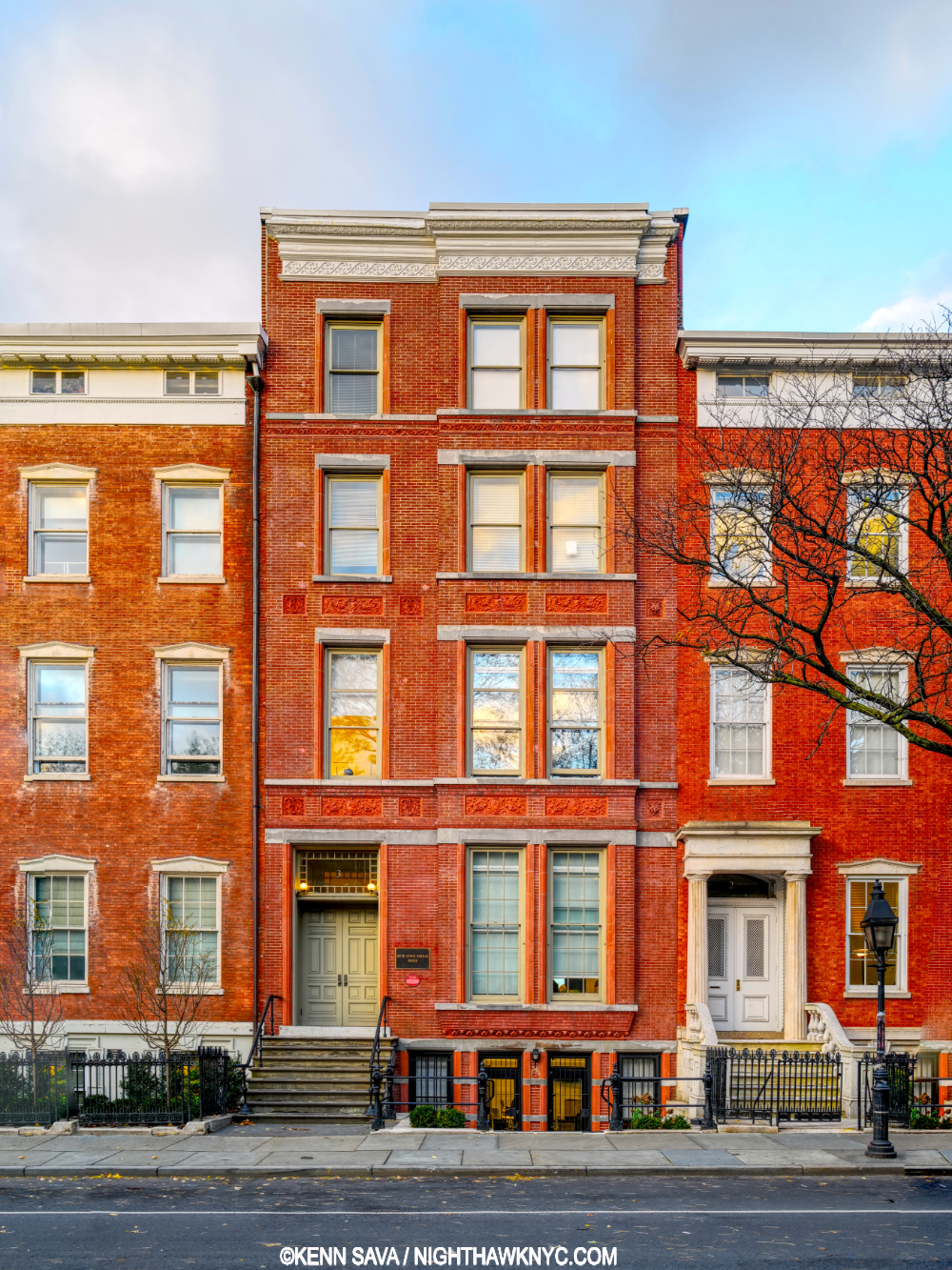
The beating heart of Edward Hopper’s world. Edward Hopper posed for Arnold Newman, and Painted Nighthawks here, on the top floor of 3 Washington Square North, just east of the Arch in Washington Square Park, in Greenwich Village, that it looks out on, where the Hoppers lived for over 50 years, from 1913 until the Artist’s death in 1967. This is a key point for a variety of reasons, and an intriguing one because Edward Hopper was the furthest thing from “bohemian” one could imagine. Yet, living here he, like most New Yorkers, walked regularly, probably daily, and so the areas he was able to walk to may have become the sites of, or the inspirations for, his Paintings. And so, for almost all of the past 77 years viewers have been asking the question-

“WHERE is the diner Edward Hopper Painted in Nighthawks?”

I’ve been trying to find it for the better part of my life. Having lived in the area for 28 years and having frequented it before I lived here, the Village is an area I’m as familiar with as I am any anywhere. During that time, as during the Hopper’s time here, change has been the only constant. Change has also been a constant enemy in the attempts to locate, for once and for all, the diner we see in Nighthawks. My search has been carried out using only a few tools. First, the extensive Hopper literature. Though very little of it is directly relevant to this search, much of it is indirectly relevant, providing a framework for how, when and where he created his extensive oeuvre of Paintings, Watercolors and Drawings. The books by Gail Levin, (the Hopper’s biographer and the author of numerous other books on the Artist and his work, including the 4 volume Catalog Raisonne), particularly her Hopper’s Places, Second edition and the catalog for the 2013 Whitney Hopper Drawing show have been the most referred to for this quest. Outside of this, I have relied on my own two feet, my cameras and, yes, my gut.

Once that “Could this be IT?” bell goes off, I research the possibility, beginning with “What did this place look like around 1940?” Is any of that here to be seen now (i.e. when I was standing there)? What does common sense tell me? In the case of Edward Hopper, “common sense” comes from studying his work. Hopper’s Places provides part of the basis for some of that “common sense.” In it, Ms. Levin shows us contemporary Photographs she, herself, has taken at various sites Edward Hopper Painted around the world- though not Nighthawks, “…to show how he both recorded and transformed” these places, she says in her “Preface to the Second Edition,” P.vii. On P. x, she adds, “Research for the biography also revealed that in his later years Hopper relied upon observing specific sites more often than anyone had previously realized.” Even though much has changed over time, I still get a bit of a sense of Hopper’s approaches to rendering actual places. Much is, also, to be learned by looking at and studying historic and contemporary pictures of places under consideration. In the case of Nighthawks, I used all of these tools in my search.

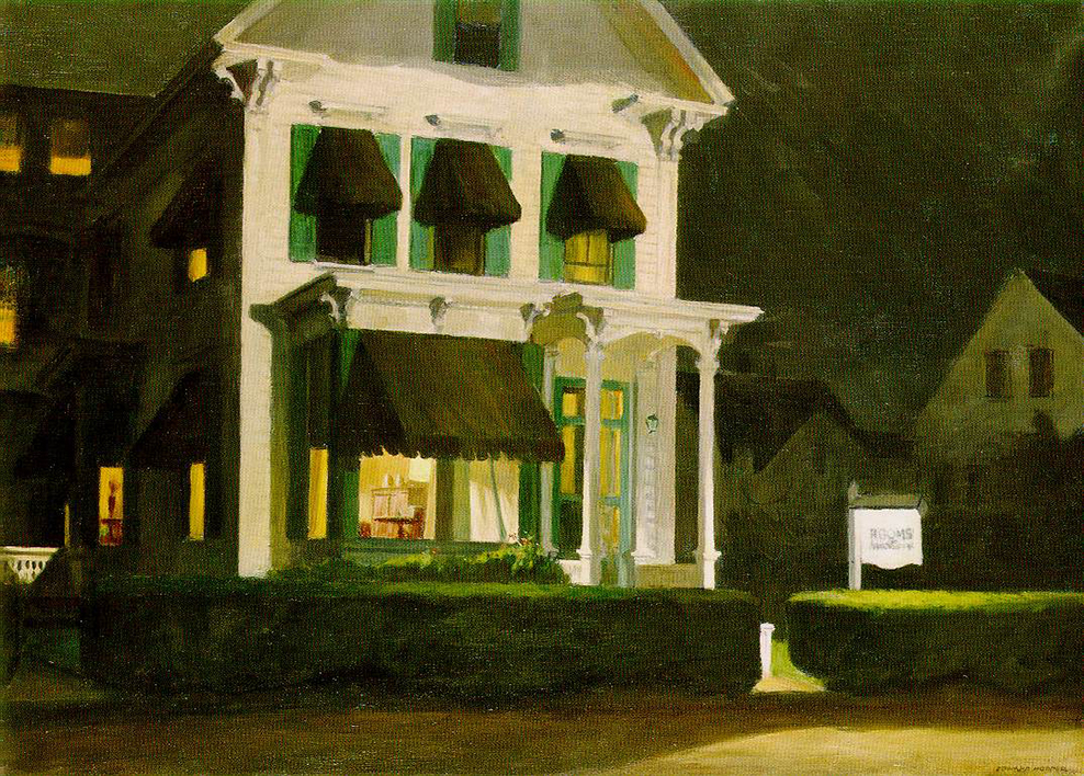
Rooms for Tourists, 1945. About 40 years later, I found this actual Rooming House this Painting is based on in Cape Cod, Mass., and stayed there. *Photographer unknown.

My gut has already helped me find one of “Hopper’s Places.” In the 1980s, I was traveling through Cape Cod and looking for a place to stay in Provincetown, Mass. I came upon a small Rooming House and instantly recognized it from the Hopper Painting, Rooms for Tourists, and so I just had to stay there. Part of my belief that Edward Hopper based Nighthawks on a real diner was finding that actual Rooming House in the 1980s when I visited Cape Cod.

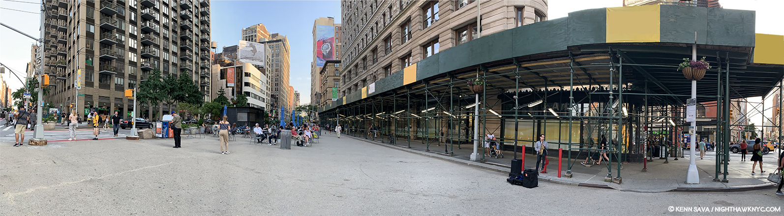
I’ve spent most of my time searching in the West Village. For two primary reasons. First, this was the neighborhood Edward Hopper lived in and walked through regularly and most often. Second, as soon as one walks south of West 14th Street (the Village’s northern border) on 7th Avenue South, you’re faced with this-

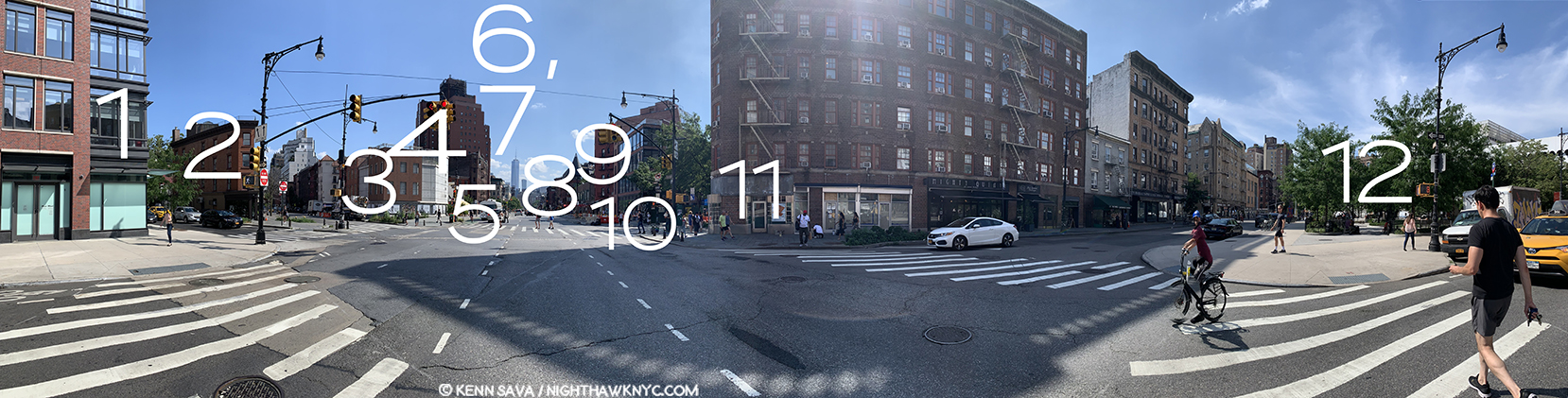
Standing in 7th Avenue South at the intersection of Greenwich Avenue and West 11th Street, facing south, July, 2019. It HAS to be somewhere in this picture, right? No. There are countless triangular corners in the West Village, but this view is the most likely to contain it, I think. Click for full size.

As I stood in the middle of 7th Avenue South (NOT recommended), looking into the heart of what was Edward Hopper’s New York (turn left at #3 and it’s a mere one Avenue and 4 blocks from his home, shown above), there were no fewer than TWELVE triangular corners around me! Edward Hopper knew each and every one of them well. Those familiar with Manhattan know that almost all of it north of 14th Street is a grid made up almost exclusively of rectangles. Below 14th Street, “old Manhattan” streets wind seemingly with minds of their own, interrupted here and there with a semblance of uptown’s rectangular regularity. The triangular corners we see in Nighthawks are everywhere. WHERE to begin?

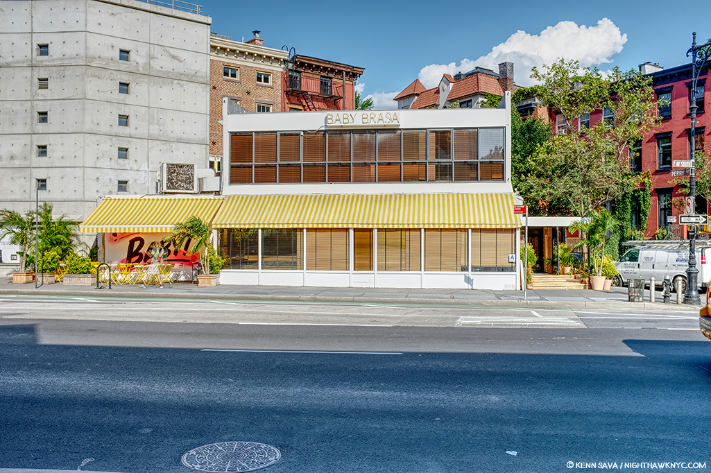
The former Two Boots Pizzeria, #11 in the picture above, is from the right period, but its building goes straight up, so I ruled it out quickly. Nothing feels “right” to me about it.

Mulry Square (in the foreground), #3 in the picture.

Perhaps no site has gotten more “hype” about it over time in regards to Nighthawks than Mulry Square, #3 in the picture. In spite of what many have said, I have seen nothing to indicate to me that this was the site of the Nighthawks Diner.

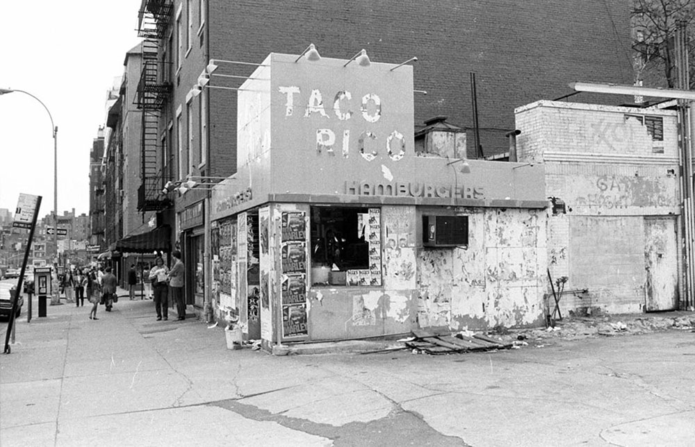
I would guess this would be  the early 1980s from the Rita Marley ads and Miles Davis ads, on the remnants of the hamburger place, which may be the remnants of the actual hamburger place that stood here in the 1940’s, which I show later on. Miles Davis came out of retirement in 1981. Is that a covered window along the left side? I haven’t been able to find out. *Photographer unknown.

The historical archives show a gas station with a small burger place at the time, but it looks more like a White Castle precursor to me than anything resembling the Painting’s diner. If anything, it may have been an inspiration for the “fishbowl effect”- where we are looking in through the glass at the customers. More on this later.

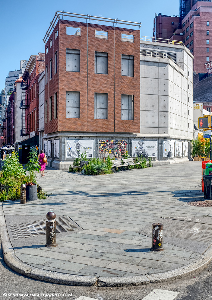
This is seen on the other end of Mulry Square, #4 in the picture, on another triangular corner, today. No viable candidates have been reported on this, also triangular, side of the Square, which is occupied by this too modern edifice today. I’ve also ruled it out.

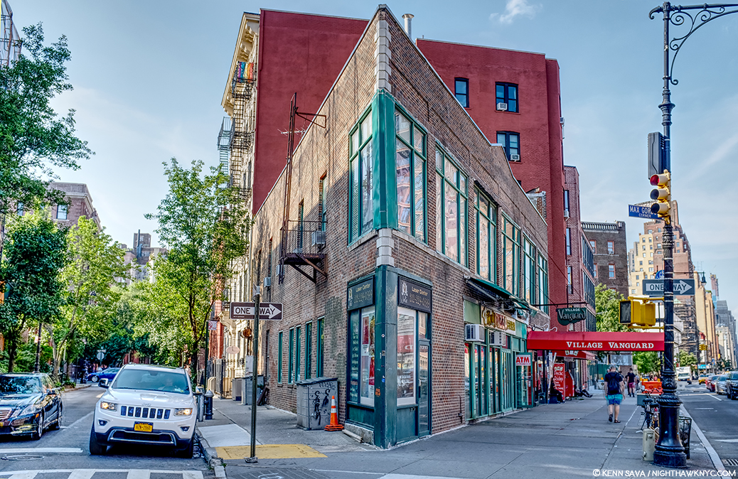
#9. Max Gordon Corner, named in honor of the long time owner of the Village Vanguard.

Directly across the street from #4 is this building, #9 in the picture, which has been home to the world’s greatest Music club, in my opinion, the Village Vanguard since 1927. There is a pizza place on the corner and the windows go through to the back street, but at 2 stories, I’ve long ago ruled it out. However, Art history will remember this spot because another great Painter, Richard Estes, wonderfully Painted it. (Which reminds me- In 2016, I visited the known site of one of Richard Estes’ latest Paintings in a piece I ironically called “Richard Estes’ Dayhawks At The Corner Cafe.”)

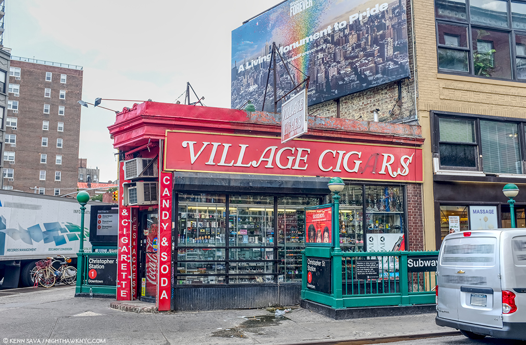
Village Cigars, 7th Avenue South and Christopher Street, Greenwich Village, NYC, June, 2019.

The site of Village Cigars is not numbered in the picture, being further down 7th Avenue on the right past #8. It’s garnered surprisingly little to no attention in the Nighthawks searches I’ve seen to this point. It has some things going for it- the shape and the cigar sign (Nighthawks has a Phillies cigar ad over the diner) but in speaking with the manager, I was told it’s been here for over 100 years, but it’s been a cigar store the whole time. Also, it doesn’t have the curved front window, those dual subway entrances were most likely also there in 1940 and are not in the Painting, and the buildings behind it are too far away. I’ve ruled it out. The Stonewall Inn is a few hundred feet to the left.

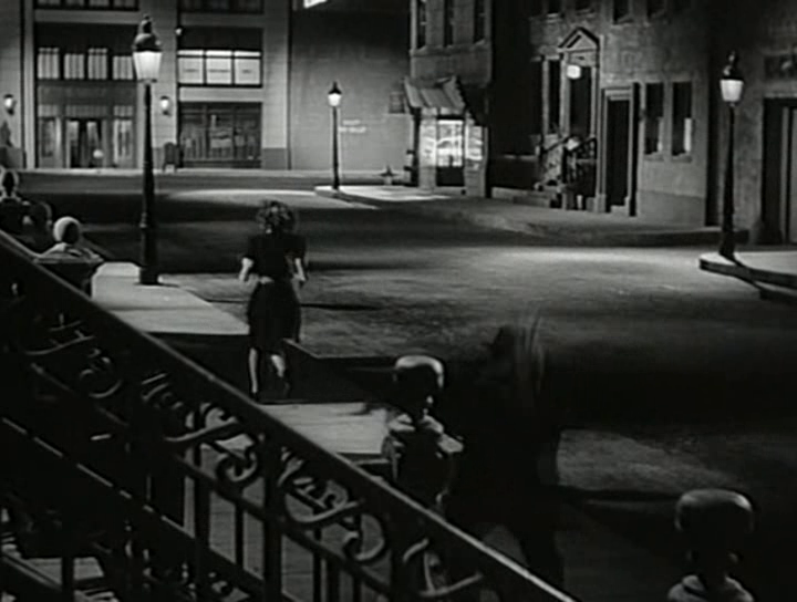
Some believe the inspiration lay in movies of the period, like this one, Stranger on the Third Floor, 1940. The suggested diner down the street on the right looks nothing like it, in my opinion. Possibly another “fishbowl effect” inspiration.

I remain completely unconvinced by any and all suggestions of movies I’ve seen. Yes, Edward Hopper was taken by a short story, “The Killers,” written by Ernest Hemingway in 1929, but I, for one, have not seen the evidence of that in the setting in the Painting. In the figures and the mood? Much more likely. “The Killers” was also made into a film, but, in 1946, too late to be considered. Maybe the Painting influenced it, as it has countless movies since.

That leaves the contenders. Speaking of movies, Edward Hopper reportedly frequented the Lowe’s Sheridan Movie Theater (which stood where #12 is in the picture earlier, and is seen further below), and based a Painting inside of it. His walk to and from it is interesting to me and it has been suggested that a few locations along this route are candidates for the Nighthawks diner. I looked closely at these.

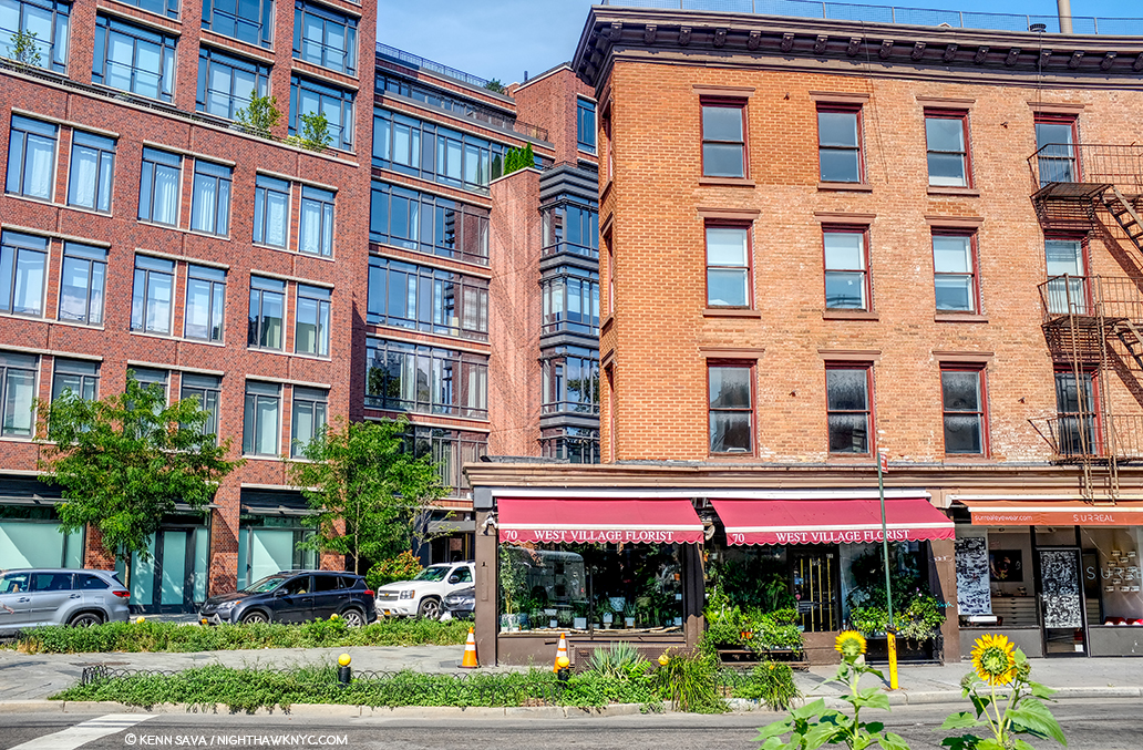
Yes, West Village Florist at 70 Greenwich Avenue is sort of triangular. The picture above was taken standing on the northern edge of Mulry Square, seen earlier. Yes, it was along one of Edward Hopper’s possible routes from his apartment to the Lowe’s Sheridan Theater, which was directly across 7th Avenue to the left of the picture.

This picture came to me dated 1938 and that would appear correct. Looking toward Mulry Square on the right shows the side of the White Castle-ish hamburger place seen earlier under the Esso sign. The place on the triangular corner, center, at the intersection of 7th Avenue South, Greenwich Avenue and West 11th Street, is now West Village Florist, shown here when it was a cigar/cigarette store. Whoever told this picture is standing on the curb outside of what was Too Boots Pizza, #11 in the panorama posted earlier, with the Lowe’s Sheridan Movie Theater directly to his or her left. Photographer unknown to me.

Yes, it housed a deli 20 years ago before becoming a flower shop the manager told me, and my research added a cleaner/tailor shop circa 1914, and a cigar store in the period of Nighthawks as seen in historical pictures (including in 1938, above), but it’s too small inside, the prow is also too small, and the corner lot too big in my reading of the Painting. Nowhere have I seen reference to it being a diner or coffee shop at any point. The buildings in the background are wrong now, and were wrong then, according to historical pictures.

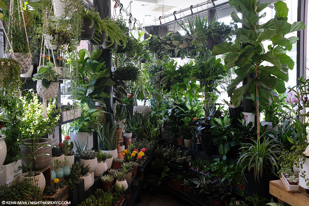
Inside West Village Florist, standing just inside the door. I had room to stretch my arms out, with maybe an extra foot on each side, but the space quickly narrows, as you can see. It’s just too small. Stop by and see what you think. They are very nice people who have a beautiful assortment of plants and flowers.

There is little doubt he saw it, but as I showed earlier, there are countless triangular corners in the area that could have been a partial inspiration. At best, that’s all this is, and I doubt it was a big influence. I’ve ruled it out.

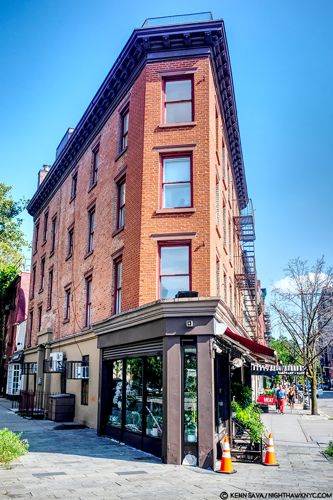
West Village Florist’s building has this unique, strange, angled shape to it seen from head on, July, 2019.

The serious contenders.

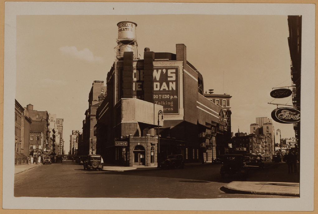
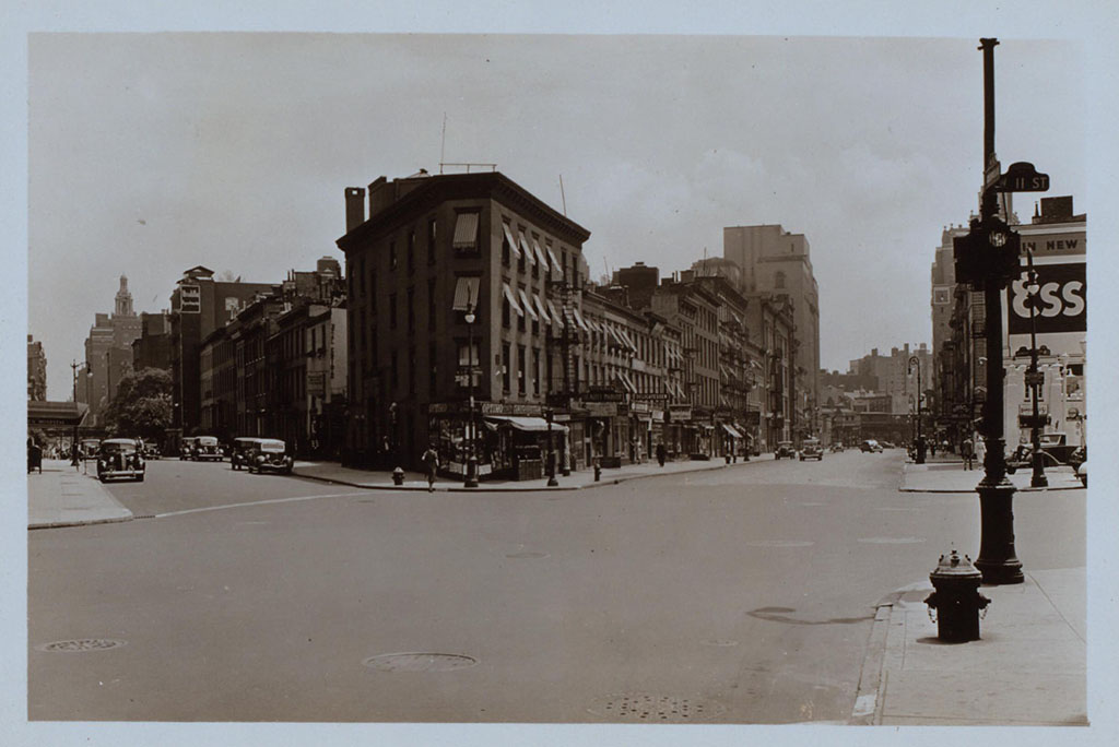
The intersections of Greenwich Avenue and West 12th Street with the Loew’s Sheridan Square Movie Theater, rear. Photograph by Percy Loomis Sperr (1890-1964), Manhattan: 12th Street – Greenwich Avenue, 1932, *NYPL Digital Archives.

In this 1932 picture of the intersection of Greenwich Avenue and West 12th Street, the low, triangular shaped building in front of the west side (the back) of the Lowe’s Sheridan Movie Theater is Crawford Lunch. There are historic pictures taken from Greenwich (on the right) that show customers in Crawford Lunch with West 12th Street seen behind them- which I reproduce further below. I think it is entirely plausible that Edward Hopper saw this, too, and this inspired his conception of a sort of “fishbowl” like setting. Here was an actual working diner/restaurant of the time. Today’s West Village Florist building is about 3/4 of the way down to the right of this picture.

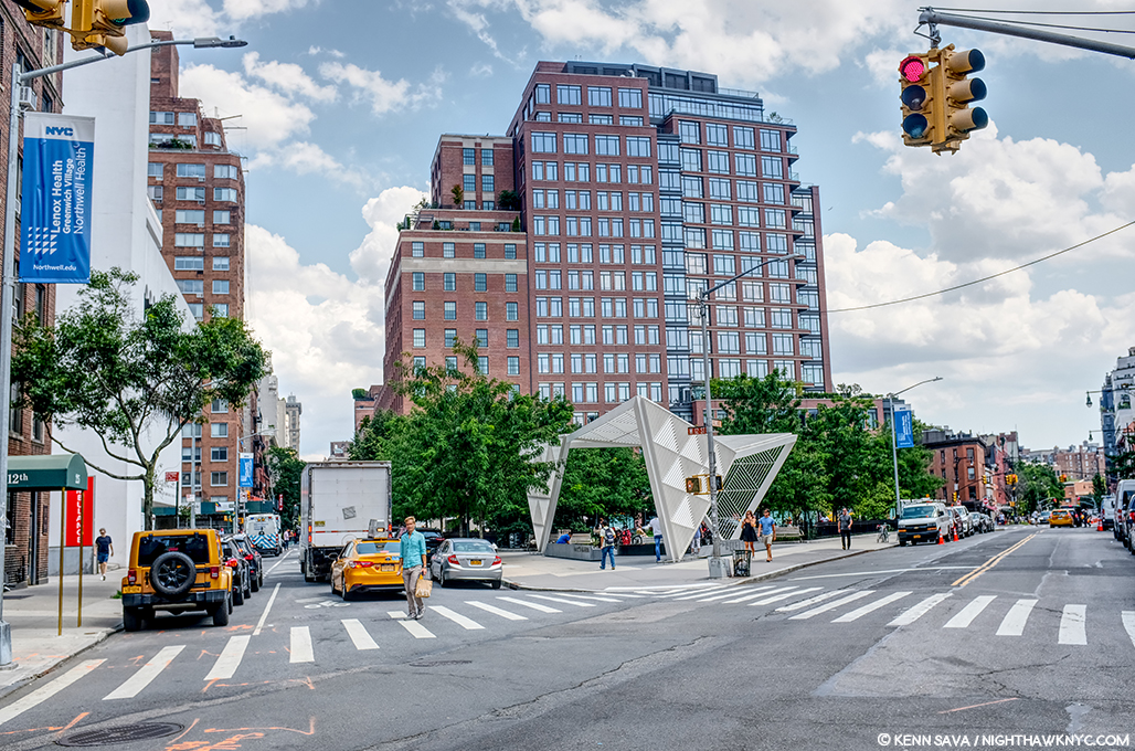
Change is the only constant in New York. The same scene, today! I stood as close as I could to the spot the 1932 picture above was taken to take this in July, 2019- 87 years later!

It’s so different, 87 years later, as to defy anyone to guess this site had anything to do with Nighthawks. Therein lies a good deal of the problem finding its sources. It’s now The NYC AIDS Memorial Park at St. Vincent’s Triangle. Note- the brown building on the very far left. It does not look like what’s in the background of the Painting. More on this follows. The Whitney’s Hopper Drawing catalog suggests that Edward Hopper may have looked through Crawford Lunch and seen the “fishbowl effect” we see in the Painting.

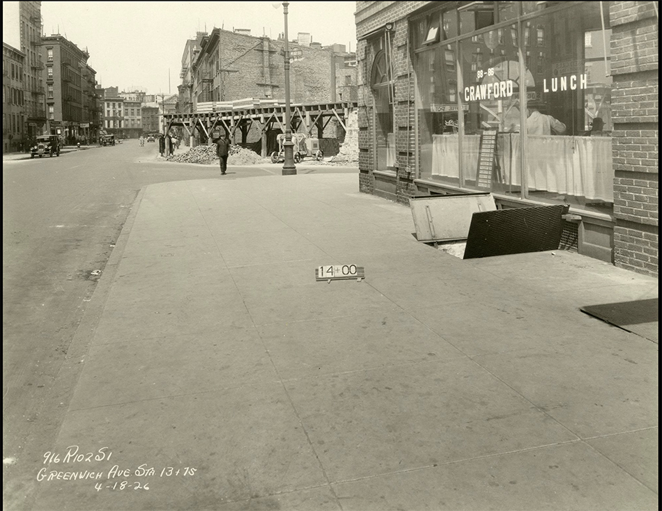
Subway construction photograph of 88-86 Greenwich Avenue and West 12th Street, New York City, April 18, 1926. Identifier- 86446d_GreenwichAve_SubConst958. *Collection of the New York Historical Society.

Here, we see a revealing example of this “fishbowl effect” seen at Crawford Lunch in a picture taken on April 18, 1926. Notice how you can see into and through the restaurant, on the right, to West 12th Street behind the man in the dark hat under the word LUNCH on the window. The brown apartment building seen in the far left in the prior picture is about to be built seen straight ahead just across the 12th Street past Crawford. Note, also, the word “LUNCH” on the window for later. I believe this is the possible source of the effect given how close it is to the Lowe’s Sheridan Theater (next door). However, it could have as easily been something he saw somewhere else on his walks, in a place they, or anyone else I’ve come across has not considered. But, unlike most of the locations suggested to date, Crawford Lunch was an actual restaurant at the right time and in the, possibly, right place.

The almost identical view in the previous picture today at the former site of Crawford Lunch also approximates the view seen in Nighthawks. That brown brick apartment building, seen early in its construction above, has been here since the late 1920s, and hence, at the time of Nighthawks, making it wrong for the Painting. Seen in July, 2019.

That Crawford Lunch was an influence would seem to be confirmed by this-

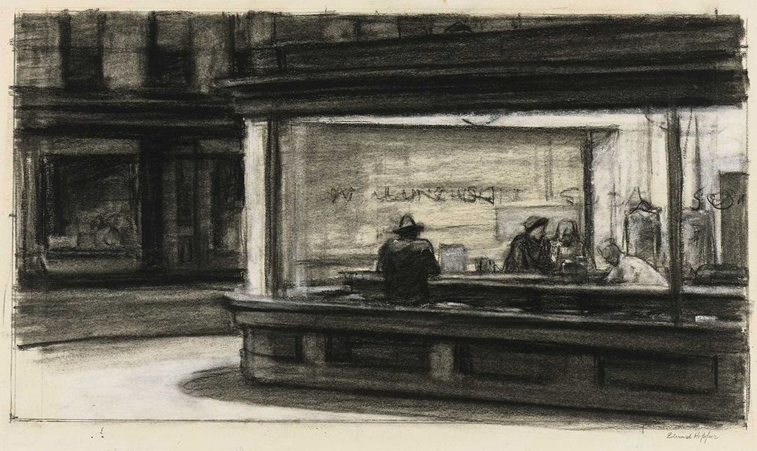
Study for Nighthawks, 1941 or 1942. Fabricated chalk and charcoal on paper; 11 1/8 × 15 in. Given he finished Nighthawks on January 21, 1942, I doubt this was done in 1942. It seems he was still finalizing his ideas when this was done. *Whitney Museum collection & photo.

I can barely make out the word “LUNCH” on the widow above the man with his back to us in this study for the Painting. As we know, Edward Hopper did not include this in the final Painting, among other changes he made to what we see in this incredible and endlessly fascinating Drawing. It sure reminds me of the Crawford Lunch window and may be a give away of its source and, possibly, the source, once and for all, of this “fishbowl effect.”

Edward Hopper said little about the inspiration for Nighthawks and, frankly, I don’t know what to make of what he is reported to have said. In Katherine Kuh’s The Artist’s Voice, P.134, he says, the Painting “was suggested by a restaurant on Greenwich Avenue where two streets meet.” He adds, “I simplified the scene a great deal, and made the restaurant bigger.” Um, Ed? Could you be a bit more obtuse? “Greenwich Avenue where two street meet,” is said to mean West 12th Street & 7th Avenue South by Gail Levin (Hopper’s Places). Couldn’t “two streets meet” mean Greenwich & West 12th Street, where Crawford Lunch was? If it means Greenwich and two other streets, it has to be the triangles where West Village Florist and Mulry Square are. In any event, “…suggested…” I believe means a scene he saw at one of these places, the “fishbowl effect,” which I think he saw at Crawford Lunch, a confirmed restaurant at the time. But, Crawford Lunch doesn’t look like the diner in the Painting- even if he “…made the restaurant bigger.” Neither does the hamburger place on Mulry Square or West Village Florist. And that comment doesn’t specify it’s the same restaurant he mentions on Greenwich Avenue. It could mean “the restaurant we see in the Painting.” Intensely frustrated by this, I finally decided to continue on my own path. This meant looking a little further afield from the Greenwich Avenue vicinity. It turns out I didn’t have far to look.

Further down 7th Avenue South, not as far as Village Cigars, and still well within Edward Hopper’s walking neighborhood, I came across this-

“Oh. My. Gosh.”

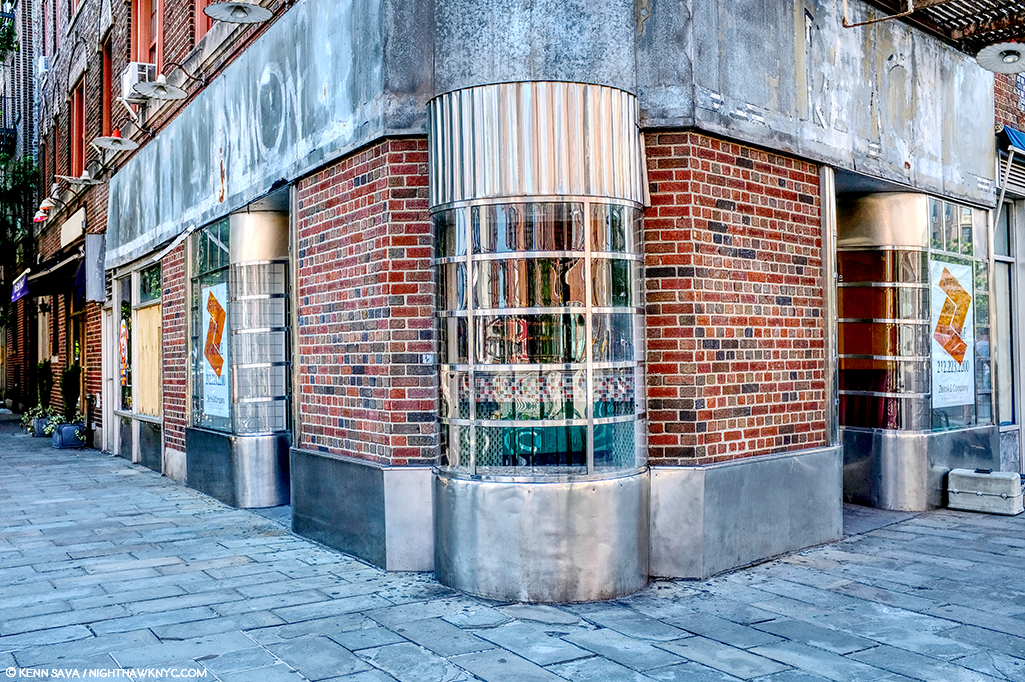
The site of the now sadly defunct Riviera Cafe, which was open here for 48 years, from 1969 until August 31, 2017.

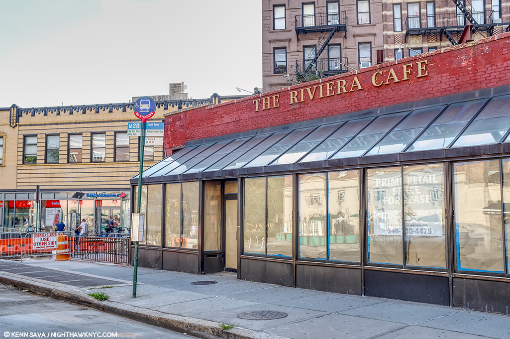
The former Riviera Cafe at 225 West 4th Street at 7th Avenue South.

When I came across this site, I had an “Oh. My. Gosh.” moment. Picture it without the modern “greenhouse” addition and it becomes much more like the diner in Nighthawks. Back in the day, I spent a few nights in this place, as I’m sure many reading this have, too, since it was centrally located right at the heart of the West Village. The building behind it to the left, while not exactly what we see in the Painting (I believe they are the same buildings that were standing on this site in 1940), at two stories, which fits all we can see in the Painting (they may go higher in Nighthawks, or they may be cut at two- we can’t tell), and they’re the right distance, though at a slightly different angle, from what we see in the Painting. If this is the location Edward Hopper used, why didn’t he use the buildings we see in the background? I believe it was because of the color. That long building which takes up a good portion of the back is too brightly colored to fit the mood he wanted in Nighthawks. So, possibly, he replaced them. More on this in a minute. I measured the depth of the greenhouse at 90 inches- 7.5 feet. If it were not there, it would have allowed me to stand closer to the building taking this shot. Thinking back to my visits here, there was a bar along the back wall then, and I believe there were tables behind the seats/stools facing the bar, approximately under where that brick wall would come down with the greenhouse gone. Would a horseshoe counter have fit here?

As I looked closer, I discovered this-

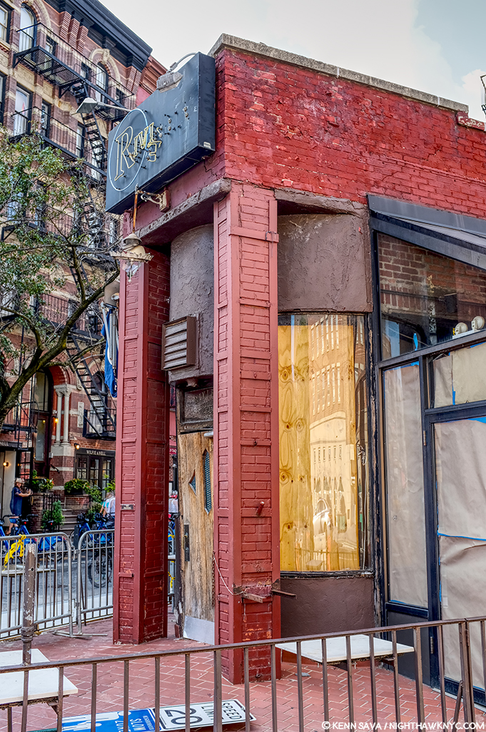
The front of The Riviera Cafe facing West 4th Street and giving it its address, 225 West 4th Street.

Lo and behold, there was something none of the other candidates I’ve discussed thus far have- a curved front window! And, it’s the same on both sides of that door! But, that door. Was it always there, or was the curve complete at one point, which would make The Riviera, minus the modern greenhouse addition, an almost perfect match for Nighthawks Diner?

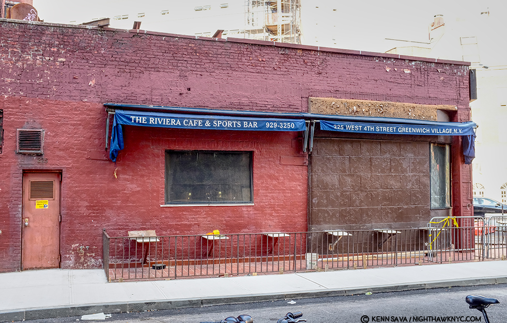
The back of The Riviera Cafe on West 4th Street.

Stepping around to the back of The Riviera- more intrigue. What’s up with the right half of the wall, and what was there before they replaced it? A window? Also, that door to the left looks earily similar to the door in the Painting on the inside of the Nighthaks Diner. As I said, when I was here, I remember a long bar inside that wall and along it, meaning you’d probably be able to see the necks of liquor bottles in that rectangular window that’s still there, center. But, that’s now/more recently. What about in the past?

Intrigued, to say the least, searching further, I uncovered this-

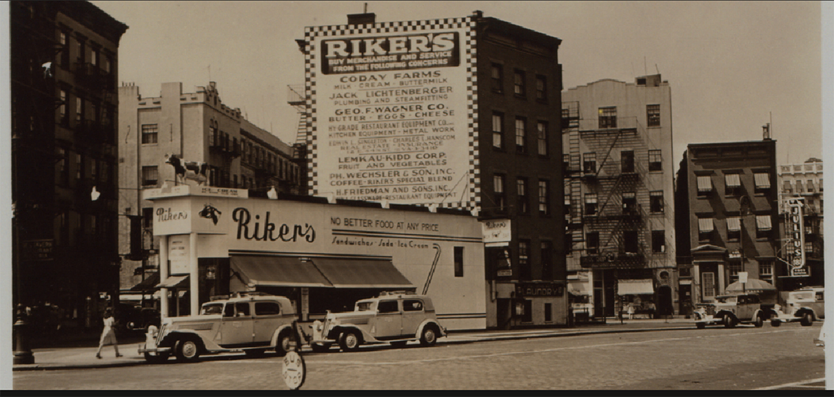
1941! The year Nighthawks was Painted. Percy Loomis Sperr (1890-1964), Manhattan: 7th Avenue South – 4th Street (West), 1941, *NYPL Digital Archives.

In 1941, The Riviera was called Riker’s and it was a restaurant! It looks pretty new and shiny, too. Some encouraging things in this picture- there are retractable awnings instead of the permanent greenhouse, for one, but that troublesome front door is still there to the left, and it looks to be the same structure, with the curved windows on either side of it.

The Riviera Cafe occupies the biggest triangular space in this part of the West Village. It’s very accessible to the Hopper’s apartment (a few blocks to the east). Why has it never been properly considered as a candidate?

In 2013, during the Hopper Drawing show, the Whitney Museum came out and said the following-

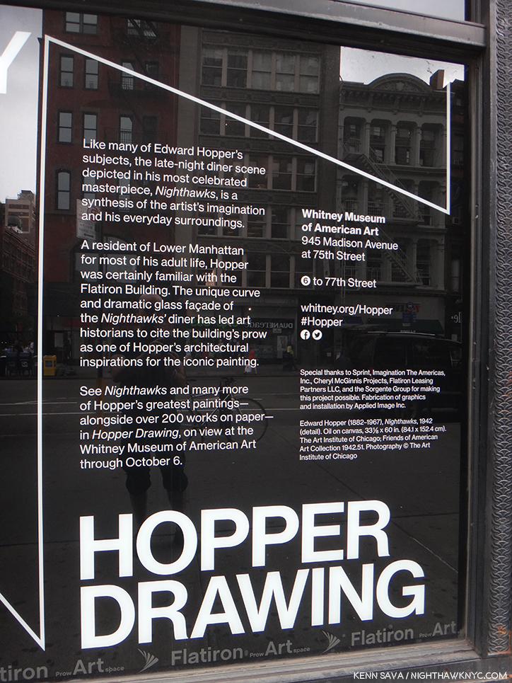
“…has led art historians to cite the building’s prow as one of the influences…” What are the others? Seen in 2013.

They’re talking about the Flatiron Building, which is on West 23rd Street at the intersections of Broadway and 5th Avenue- no where near Greenwich Avenue, where that quote has caused most to look, and it’s not even in Greenwich Village! So, the museum has taken the same approach I did in this sense. Also, in the Hopper Drawing catalog they fail to publish the Kuh Hopper quote (above), only footnoting the page in her book it’s on (P.118, footnote 2)! Perhaps, they, too, find it as frustrating as I do? (I realized this only this past week, after my quest had been completed.) They state the Flatiron was “one of the influences,” but fails to name any others!?? “One of” means “more than one.” Well? I’m naming names here.

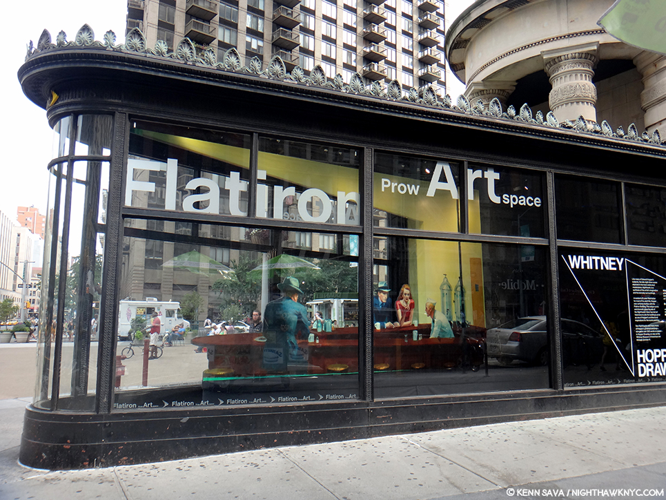
An installation of “Nighthawks” in the prow of the Flatiron Building by the Whitney Museum in 2013. The installation is 2D and only a few inches deep, as I show below. I shot it at this angle to show the problematic lining up of the buildings in the back on Broadway, across the plaza, which is not at all like what we see in the Painting. Seen on September 1, 2013.

Assessing the Flatiron’s candidacy, I discovered that at one point it was a cigar store (again, the Painting has a Phillies cigar ad on the top of the diner), but I did not find evidence of it having been a diner. Looking closer at the interior space, I discovered it ostensibly measures 10 feet wide, at its widest, to the right in the picture above, by 30 feet long. I’m no restauranteur, but that seems pretty narrow to me to get a horseshoe shaped counter inside, room for seating around it, room to navigate around those seats and room for the counterperson to work. Glare notwithstanding, here’s what the space looks like pressed against the front curved window-

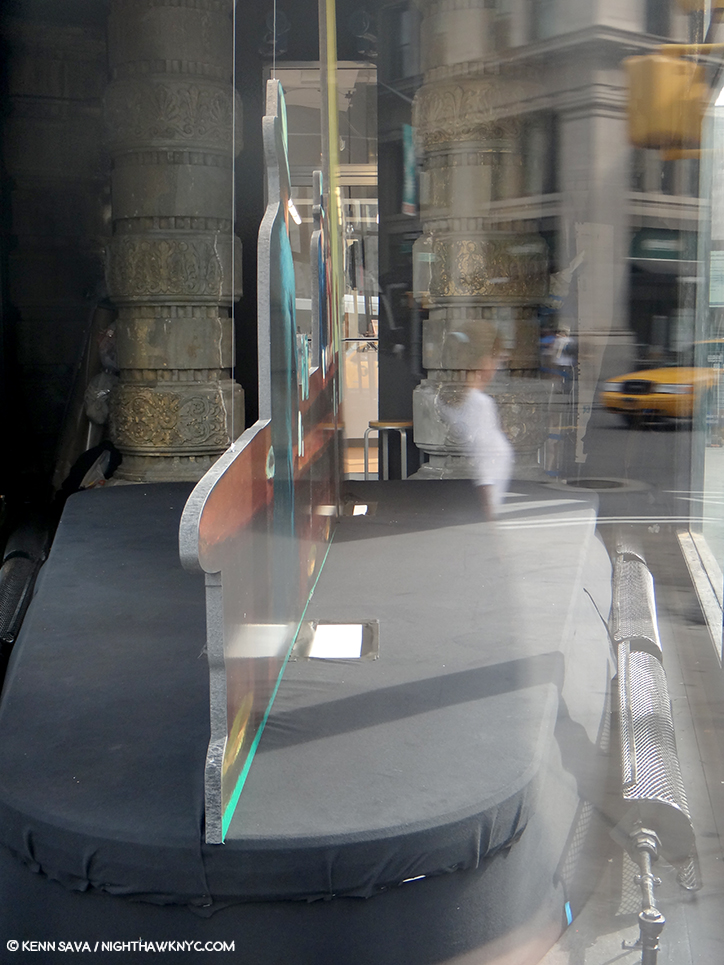
A look at the installation of “Nighthawks” in the prow of the Flatiron Building on September 1, 2013.

Notice the radiator on the right, and how far it is from the window. There’s another one on the left which is hard to see in this picture. Both, and the room around them they require for safety and comfort, considerably cut into the amount of usable space here. Also notice the large column to the left rear of the photo, which serve to partially support the gigantic mass of the building above them, which also has a counterpart that’s hard to see because of the glare on the right side (see the picture of the whole prow, above it). The opening between them appears to be tight. How are people supposed to come and go here?

Then, there’s the site itself. It doesn’t feel to me like what we see in the Painting.

A panorama shows the distance between what would be the far side of the prow in the Painting and the buildings across the plaza and Broadway.

The buildings that would be in the background of the Painting are too far away and angled incorrectly- 23rd Street angles to the south east relative to the Flatiron at this point making the buildings begin too far back to be seen as they are in Nighthawks, in addition to being not at all like those seen in the Painting in the many existing historical pictures. Therefore, I believe the Flatiron’s prow isn’t what we see as the diner in the Painting, and this wasn’t the scene shown in the Painting. Of course, any Artist is completely free to do whatever they want, to make anything into anything else, whether it would fit in the “real” place, or not. (There is no such thing as “photorealism” in Painting, in my opinion, but that’s a battle for another day.) Edward Hopper, as per that quote, could have made West Village Florist or the Fatiron’s prow bigger, but their settings are still wrong, in my opinion, so I don’t believe he used either. However, like the Whitney, I believe the Flatiron’s prow was an influence.

Currently under renovation? Cleaning? Diner installation? Maybe I should wait and see what emerges before reaching a conclusion. (Just kidding.) July, 2019.

Looking at the Painting, one thing is undeniable- that curved window Edward Hopper includes. I’ve found it nowhere else besides on the Flatiron- either on existing buildings or in historical pictures. And, some of the ribs we see on the window in the Painting are present on the Flatiron’s prow today. In 1939, Edward Hopper exhibited at the World’s Fair1, and so he may have seen the Fair, but was certainly aware of it.

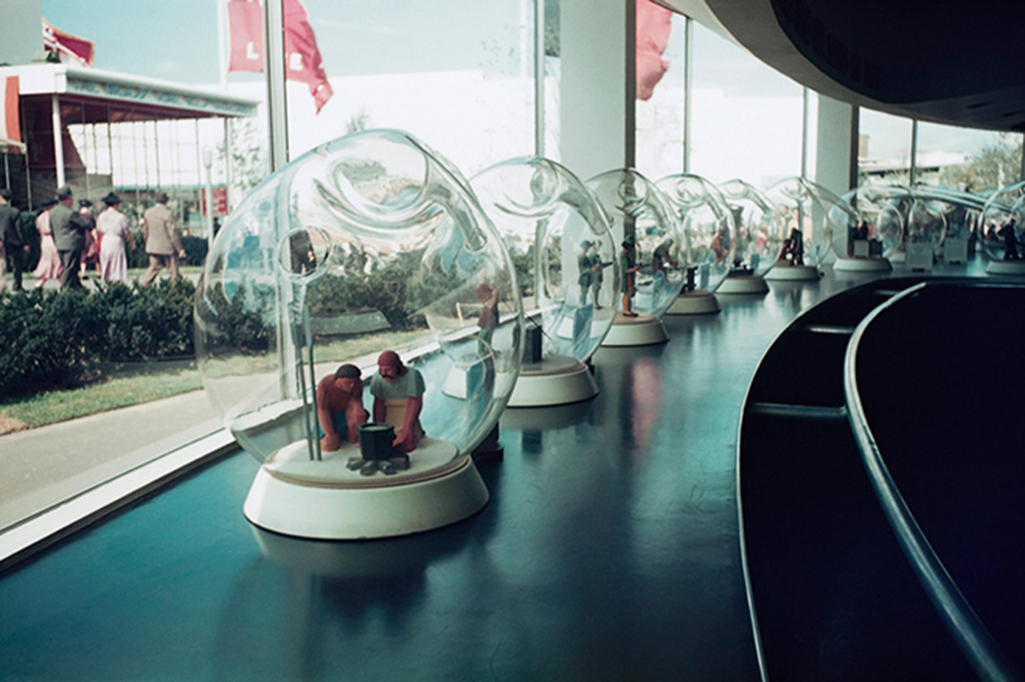
“Fishbowl effect” indeed. The history of glass making through the ages seen in glass bubbles at the Glass Incorporated Pavilion at 1939 World’s Fair, Queens, New York, New York, USA. Coincidence? Or influence? *Image by Peter Campbell/CORBIS

It was an Art Deco marvel. The Nighthawks diner has a decidedly Deco/Streamlined/Moderne feel to it. Though the Flatiron is a Beaux Arts building, the curved window of the prow has a decidedly Art Deco, streamlined, feel to it.

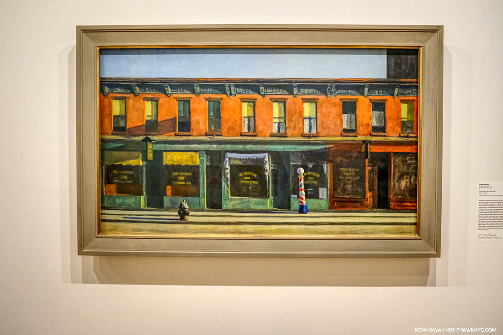
Early Sunday Morning, 1930, seen at the Whitney Museum, July, 2019. This looks uncannily similar to the background of Nighthawks to me.

Yet, what he depicts in the background of Nighthawks looks curiously not dissimilar to his Early Sunday Morning, 1930. It’s almost like he dropped those buildings into the background. But, 10 years after the earlier work a good many of those buildings were no doubt still everywhere around town, so they may as easily be generic. Whatever their origin, in this way he juxtaposes the old New York with the new world just seen in the 1939 World’s Fair, which showcased “modern” streamlining and the new flourescent lighting.

Early Sunday Morning is something of a “pendant” to Nighthawks as Carter E. Foster points out in the Hopper Drawing catalog (P.99). It’s the same size and shape and the two are bookends in some ways.

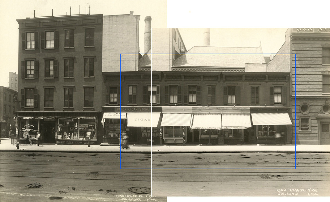
7th Avenue between Fifteenth and Sixteenth Streets, June 10, 1914. I’ve indicated the scene depicted in Early Sunday Morning, with a blue bounding line centering around 88 7th Avenue, seen in these two photos taken on June 10, 1914- 16 years before the Painting. The shutters on the windows are gone in 1930, so are the awnings, and there was only one barber pole. The hydrant was either to the left, or around the corner to the left. The center white line are the borders of the two photographs shown. All the buildings in these pictures have long ago been replaced. Subway Construction Photos modified from the Whitney Hopper Drawing website.

Interestingly, the inspiration for Early Sunday Morning were shops on 7th Avenue, but not in Greenwich Village. They have been located as being between 15th and 16th Streets in Chelsea, just north of the Village. Comparing the Painting to period pictures is fascinating. While it’s unlikely that Edward Hopper stood with a sketchbook and drew the scene, he did capture any number of correct details. But, he changed others- most notably the sunlight. The sun never shines on 7th Avenue at the angle he Paints it shining!

Mid-Sunday Afternoon. The site of Early Sunday Morning, seen in July, 2019. The original buildings have long ago been replaced. Notice how the shadows go in the opposite direction of those in the Painting.

7th Avenue runs North/South, not East/West, like the sun. In reality, the sun would be directly behind the viewer! So? Here’s a case of a found actual site and how Edward Hopper used creative license to mould it to his vision- even if that meant changing nature! What’s moving a curved window 20 blocks south compared to moving the sun?

My Conclusion-

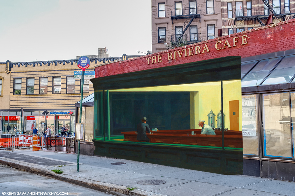
I currently believe that Edward Hopper saw Riker’s about 1941 and those 2 curved windows in its front. I believe he, too, may have been frustrated by that front door and decided to “remodel” it. With a a paintbrush. So, he morphed the Flatiron’s prow’s curved window onto it and then created his own (though somewhat similar to the real) background on West 4th Street in the Painting.

Unless and until I find better candidates, THIS is what I believe Edward Hopper did.

Yes, I’ve used the original, 2015, NighthawkNYC.com banner, which removed the famous couple, leaving that figure I relate to in honor of NHNYC’s 4th Anniversary. On the same page she dated Nighthawks on in the Hopper Ledger, Jo Hopper refers to him as “sinister.” I love her, anyway. Before she died the year following Edward, she bestowed one of the greatest American Artistic Estates to the Whitney Museum (who promptly “rewarded” her incredible generosity by throwing out virtually all of her work, thereby denying Art historians and Art lovers a chance to assess her work on its own- forever2). And I used the banner because, yes- I once sat at The Riviera Cafe’s bar by myself, too.

But, beyond ALL of this, for me? Nighthawks is the first truly modern American Painting. It marks the beginning of all that came after. It captures the essence, the FEELING of living in a City- here, in New York, or anywhere, but even more, it captures the feeling of modern life, which has become more and more about isolation, and fleeting moments of connection- or not, since January, 1942. I always try and remember that Nighthawks, like many of Edward Hopper’s other works, is a voyeuristic moment seen by a pedestrian, who more than likely kept moving on, past this fleeting moment and this scene, wherever it was, and didn’t pause to ponder it indefinitely, like so many have since.

Moments exist as flashes of time.

Click.

Here right now, gone forever. Unless, you’re one of the great geniuses in American Art history, who has the vision, the power and the talent to make it last, and speak to us, indefinitely.

But, for me, at least, Nighthawks isn’t about capturing a fleeting moment magically, though it does.

The other reality that common sense dictates be mentioned is that 78 years later, a better explanation than mine, or a better real life candidate for the Nighthawks Diner may never be found. It may have existed only in his imagination, with a few pieces of real life thrown in- like the Flatiron prow’s window. And that, too, may be part of his point. Nighthawks, in one reading, may not be about place as much as it is the psychological, the inter-personal, and? 

Loneliness.  

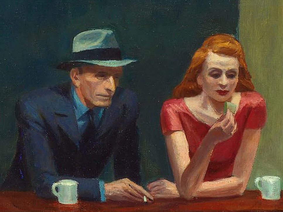
Have two people in Art ever been closer together, yet further apart?

The woman in red is all dressed up to go HERE?, I can hear her mentally screaming. Her “companion” sits physically next to her, close to her, but, in my reading of it, their hands don’t quite seem to touch. Maybe you see it differently. For me? I can’t look at this and not think of God and Adam in Michelangelo’s Sistine Chapel Ceiling. There is no life giving, or love giving touch here. He has a cigarette in his hand- not her (left) hand, which remains empty. There is a distance that belies how close together they sit. All of this is, somewhat humorously, mimicked by the twin silver coffee urns to the right of them, that are, also, immobilized and frozen in time. At least they’re together for a common purpose! The same can’t be said of the immortal duo sitting at the counter. 

The gent, who’s nose Jo Hopper called a “Night Hawk” after the beak of the bird seems to be in a conversation with the counterman. About what? Here, he has this lady dressed to kill next to him and he’s ignoring her? Every time I’ve seen this happen in a bar or nightclub, instantly my antennae went up. Something’s not right here. If she’s not getting attention? Something’s wrong. But this is December, 1941. Pearl Harbor happened right in the middle of work on this Painting! 36 days after Arnold Newman took that Photo of Edward Hopper up top. It’s very hard not to think about that when looking at it, though it’s probably easier for many now that World War II was over 75 years ago. Are they discussing the War? Being drafted? Enlisting? A friend who has already been killed? Possibly another denizen of the diner? There are all those empty stools at the counter, after all. “Where is he?” “Oh. You haven’t heard?…” 

The War brought many things. It also brought separation, life without love, life without women, for men, and without men for women, or partners for the LGBT communities. 

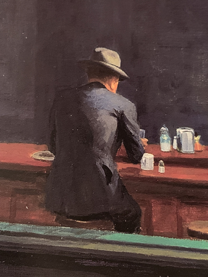
Then? There’s my alter-ego. Frozen in paint. Immobilized. Alone forever. Perhaps the most isolated figure in Western Art. What appears to be a rolled up newspaper is under his left elbow. No doubt he knows the score. At least he’s possibly not leaving anyone behind. 

But, for a moment? Let’s forget World War II is getting off to a raging start around the world at this very moment, if we can. Edward Hopper probably conceived this work before Pearl Harbor. What’s striking to me is that of all the loneliness I’ve just mentioned, there’s still more of it I haven’t. 

Let me ask you this- Who is more lonely in the scene in this Painting? 

Any of those 4 people in the diner?
Or?
The person viewing this scene from outside the diner?

For me? Nighthawks remains the ultimate parable of loneliness.  

Maybe then, I shouldn’t be on such a mission to find the “real” place it depicts. Maybe then, it doesn’t need a real place to inhabit. It exists as a permanent condition of being alive inside each one of us, as it did inside of Edward Hopper. Maybe I look for it in the hope of finding the end of it.

*- Soundtrack for this Post is “I Saw You In A Dream” by Japanese House….

“I saw you in a dream
You had stayed the same
You were beckoning me
Said that I had changed”

NighthawkNYC.com has been entirely self-funded & ad-free for 10 years, during which more than 350 full-length pieces have been published! If you’ve found it worthwhile, PLEASE donate by PayPal below to allow me to continue. Thank you, Kenn.

You can also support it by buying Art, Art & Photography books, and Music from my collection! Art & Books may be found here. Music here and here.

Written & photographed by Kenn Sava for nighthawknyc.com unless otherwise credited. To send comments, thoughts, feedback or propositions click here. Click the white box on the upper right for the archives or to search them. Subscribe to be notified of new Posts below. Your information will be used for no other purpose.

For “short takes,” my ongoing “Visual Diary” series, and outtakes from my pieces, be sure to follow @nighthawk_nyc on Instagram!

  1. Hopper Drawing footnote 33, P.119
  2. Gail Levin, Edward Hopper: An Intimate Biography, P. xv-xvii

Andy Warhol: Business Artist

Written & Photographed by Kenn Sava (*unless otherwise credited)

“So you should always have a product that’s not just ‘you.’ An actress should count up her plays and movies and a model should count up her photographs and a writer should count up his words and an artist should count up his pictures so you always know exactly what you’re worth, and you don’t get stuck thinking your product is you and your fame, and your aura.” Andy Warhol1.

Andy shopping for products. *Bob Adelman, Andy Warhol at Gristede’s Market near 47th Street. New York City, 1965, near where he lived with his mother. Countless millions went shopping in American grocery stores in the 1960s. Very few made Art out of it before he did. Click any picture for full size. 

That being said, leaving the Whitney Museum’s Andy Warhol- From A to B and Back Again, the first Retrospective in NYC since MoMA’s in 1989, I was left believing Andy Warhol’s greatest creation was himself.

The use of gold here, and on the exhibition catalog’s cover, is interesting. It mimics Gold Marilyn, at MoMA, and also reminds of the background color of icons from the Eastern Orthodox and other churches. And? It’s a color often associated with money and “value,” so could it be a veiled reference to the high prices paid for his Art? Which of these is the intended meaning?

But, no matter how I feel about his Art, even I can’t deny that today, it can be said that we are living in his world to a greater extent than we realize. Look around you. His influence is everywhere. His innovations are now used by countless other Artists and businesses.

“A friend of mine named Ingrid from New Jersey came up with a new last name, just right for her new, loosely defined show-business career. She called herself ‘Ingrid Superstar.’ I’m positive Ingrid invented that word2.”

The everyday people he made into “superstars” presaged today’s television “reality stars.” His square portraits are now instantly recognizable as the Instagram standard. Andy Warhol came to define the Contemporary Artist working with a team of assistants at his Factory and his example is to be seen being followed by Artists all over the world today. How often do you see one of his color variated group of (4) portraits or flowers emulated by someone else? And on and on. These are only a few examples. Andy Warhol’s influence is incalculable. If it could be totaled, it might well rival that of Steve Jobs among THE most influential people of the past 75 years on our lives today.

Commodore Amiga computer equipment used by Andy Warhol in 1985-86. Andy’s interesting computer Art was extracted from this machine by a team led by the Andy Warhol Museum in 2014! *Photo by The Andy Warhol Museum.

But, it was Andy Warhol, not Steve, who said,  “A computer would be a very qualified boss3 decades before the time when many people’s lives seem to be run by their devices. A-hem. Sometimes I wonder if the internet is nothing but a cyber projection of Andy Warhol’s brain.

Artistically, I respect him as an Artist who was continually innovative in so many mediums during his surprisingly short career. Yes, short. It feels like he was around forever, but he was just 58 when he passed away on February 22, 1987. This insatiable creativity now strikes me as a function of his innate ability to see the world in his own way, which led him, continually, in different directions, to try new things, and explore new ways of doing old things.

It seems to me, however, that THIS may be the peak moment of Andy Warhol’s influence- the influence of Warhol, the Artist and his Art.

Warhol books, and ONLY Warhol books, seen in the Whitney Shop, March 27, 2019.

I wonder if the level of his fame may, in fact, work against its longevity from here. Virtually everything he did has been shown, written about, analyzed and assimilated. If you don’t think that’s true, take a look at this picture I took of part of the book shelves in the Whitney Museum’s Shop during the run on Andy Warhol- From A to B. I used a 28mm lens and even though I stood more than 20 feet away, backing into the middle of the admissions cue, I still wasn’t able to get ALL the Andy Warhol books on sale in the shot. There are books on his pre-Pop work, his newspaper-like work, his portraits, his posters, his prints, his record covers, his career as a publisher, his films, books on the Factory (including one of Photos taken by a teenaged Stephen Shore), a few about his Photography and polaroids, including a collection of Photos of him in drag, AND a multi-volume Catalogue Raisonne of his Paintings (on the far left of the bottom shelf). Oh, and Andy Warhol: Knives. ? This is not to mention all the books, by the Artist, and others, about his life, including the infamous, The Philosophy of Andy Warhol (From A to B and Back Again), published in 1977, which seems to have inspired the name of this show. My copy, bought from the display, is the 46th printing of the paperback. In all my many years of looking at Art books, I have to say the only other Artist who has as many books written about him and his Art is Picasso. 

Start here. In the first gallery, which contains early Pop work, like Dance Steps, 1961, and a wall of Campbell’s Soup Cans in the back.

As I headed to the 5th floor for the main part of the show, I wondered- What’s left for the future to learn about Andy Warhol’s Art? Given his popularity, I’m sure people will find things for yet more books.

Andy’s mother fixed him Campbell’s Soup everyday for lunch, including after he became famous, until she passed. The family was poor. Beyond the comfort of the warmth of soup, having a lot of food around represents something of an ideal, a dream, even cheap food, like this soup was at the time, at 15 cents a can. Originally, these Paintings sold for $100 a piece at his first show at Ferus Gallery in LA, where Dennis Hopper bought one.

As I looked at his Art, it also raised questions. Questions that the passage of time has only intensified.

Brillo Boxes, 1969 (version of the 1964 original). Yes, a copy of a copy. The interesting thing about this work for me is that this “Art is everywhere around us” work of so-called “Pop Art,” which helped to mark the end of Abstract Art’s hold on the Art world, is based on the Brillo Box design of James Harvey, a moonlighting Abstract Expressionist Painter! Beyond that, and wondering if  Sol LeWitt was influenced by it, it’s lost on me.

First, and most importantly, Andy Warhol’s Art is accessible. This has been the most important factor in his achieving success and fame and it may be the most important factor in the longevity of both. Popularity doesn’t necessarily equate with quality. Since the future is unwritten, as Joe Strummer reminded us, it’s impossible to know what posterity will value, if anything. To this point quality has definitely been a factor. I wonder- Where does that leave Andy Warhol’s Art?

Arising at a time (the late 1950s) when the Art world had been fed a steady diet of extreme abstraction by the Abstract Expressionists, Andy Warhol’s Art burst on the world with images featuring things, yes, things, that everyone living in the country recognized. Brillo boxes, Campbell’sl soup cans, dollar bills. His work was instantly accessible in an Art world dominated by Art that was becoming more and more obtuse and remote. I’m not saying Andy Warhol’s work was “understandable,” or even “more understandable” than that of the Abstractionists, only relatable. Even in today’s world where fewer and fewer living beings remember S&H Green Stamps, walking through this show, this seems to still be the case.

Marilyn & Elvis. Andy Warhol was always drawn to stars, and beautiful men. Personally, and in his Art.

But, the world has changed in the, now, 60 years since Andy Warhol’s career first took off. A lot of Artists have grown up with what he did and it’s become part of their work, even if it’s only unconsciously.

129 Dollar Bills, 1962, among the very first uses of silkscreening in Modern & Contemporary Art.

How many Artists have created with silkscreens since Andy Warhol introduced the possibilities of the ancient technique to the modern world in 1962? Even one of the other innovators and endlessly creative pillars of American Art in the late 1950s and 1960s (and after), Robert Rauschenberg, picked up the technique from Warhol. Since, silkscreening went from creating edgy Art to being used to create the large majority of the world’s T-Shirts, among countless other uses.

“I had by that time decided that ‘business’ was the best art. Business art is the step that comes after Art. I started as a commercial artist, and I want to finish as a business artist. After I did the thing called ‘art’ or whatever it’s called, I went into business art. I wanted to be an Art Businessman or a Business Artist. Being good in business is the most fascinating kind of art. During the hippie era people put down the idea of business—they’d say, ‘Money is bad,’ and ‘Working is bad,’ but making money is art and working is art and good business is the best art,” Andy Warhol. (Note- Not to be confused with my capitalization, caps and lowercase usage are Warhol’s own, reproduced exactly as the quote appears in TPoAW P.92.)

Ethel Scull 36 Times, 1963, jointly owned by The Whitney & The Met, was the first work commissioned from Andy Warhol. It’s a work that, in my view, has outlived its cachet as “Art,” and one that I don’t think posterity will look kindly upon.

Looking at the show, a takeaway for me was the distinct feeling I got was that there was his work, and then there is the work he did on commission (i.e. “Business Art,” a term he mentions in The Philosophy of, quoted above, but doesn’t define). After a while, I thought I could tell even before reading the card or researching the work, which was which- which were the work he did “for himself,” which were the works he did on commission, and I came away feeling there is a world of difference between the two. Wait! There’s a subject for a book I don’t think anyone’s written yet! For Andy Warhol, the business of Art was an Art in itself. Few before (maybe Rembrandt, Picasso and Dali in their ways) understood this and used it, but no one before him mastered it to the degree that Andy Warhol did. Its testament to how well he did it that a good many of his commissions, which detract from his other work when seen along side them as Ethel Scull 36 Times does in my opinion, hang in museums around the world, at least for now.

The American Man (Portrait of Watson Powell), 1964, a pseudo-companion piece to the Ethel Scull piece, above, and another commission, has aged better and still manages to speak to 2019 viewers.

To be fair, looking at some of his commissions now, we might well see in them a “commentary” by the Artist on matters beyond the mere representation of a given subject. The American Man, 1964, commissioned after seeing Warhol’s Ethel Scull piece, struck me that way. I’m still looking for that in a good many others, though.

After a couple visits, I was able to choose a few works in the great guessing game I like to play, and encourage everyone else to play- “Which works will be considered Art in the future- if any?” I came up with eight including the Campbell’s Soupcans and the 129 Dollar Bills already shown. 8 out of the 350 works the Museum says were on view. Personally, I don’t believe the passage of the centuries is going to be kind to most of Andy Warhol’s Art. Part of the reason for that is his pervasive influence. History doesn’t often look back favorably on who was first, particularly in Art. (Quick- Who “invented” oil painting? When I was growing up, I believed what Vasari wrote in The Lives of the Most Excellent Artists, 1550,  that it was the great van Eyck brothers, Jan and Hubert, who happened to be my first favorite Artists.) More recently there is no consensus and evidence of oil paint may have been found going back to 650AD.) Given the overheated state of his prices (still, in spite of a recent leveling off), his Art is definitely not where I’d put my money now. That ship has sailed. NOTHING goes up forever! Look elsewhere in 2019. (See my Post On Buying Art for additional considerations, all of which apply to the Art of Andy Warhol.)

Marilyn Diptych, 1962

Let’s look at numbers 3 to 7 on my list for the ages (in no particular order). Next, Marilyn Diptych, 1962 – The duality of this work painted shortly after Marilyn Monroe’s suicide is revolutionary. On the one hand, Warhol shows Marilyn the idealized, beautiful, glamorous movie star, repeated radiantly in a sea of gold not unlike that of the religious icons of the Eastern Orthodox and other churches. On the right hand, the work seems to reference the darker side of both Marilyn’s life and death. This work is striking when one also considers that Andy was someone who sought autographs of movie stars as a child. Here, all the illusions of the silver screen are gone.

Thirty Are Better Than One, 1963

Thirty Are Better Than One, 1963, The multiple Mona Lisa as a commentary on the original’s visit to the USA at the time present an interesting counterpoint to the da Vinci- even in black & white. This one barely made my list, but given the precedent of other Artist’s commenting on or reinterpreting the Mona Lisa, like Duchamp, I think it will be of interest indefinitely.

Nine Jackies, 1964

Nine Jackies, 1964. Something revolutionary in portraiture, the Artist captures the beauty of the Kennedy “Camelot,” and the horror and disbelief of what took place on November 22, 1963, as I remember it. A work that relies on the power of the Photograph, it’s one of the strongest uses of it in a medium outside of its own.

Mao, 1972

Mao, 1972- Created during the year of Nixon’s breakthrough visit to China, Andy Warhol’s image takes the portrait of Mao from the infamous Little Red Book of sayings and statements by the Chairman, which may have been the most reproduced image in the world at the time. Here, over 14 feet high, it symbolizes the Charman’s looming over all things in China, a different kind of manifestation of fame. Andy would make a brief trip, himself, to China in 1982, where he posed for a few pictures looking very stiff and uncomfortable.

Mustard Race Riot, 1963.

Mustard Race Riot, 1963- Without a doubt, the most powerful work in the show, in my opinion, it sold for only $15,127,500.00 in 2004. “Only,” when you consider the current record price for a Warhol is $100 million (Eight Elvises), and when you consider another Warhol Race Riot, one that had been owned by Sam Wagstaff and Robert Mapplethorpe, sold for almost $63 million in 2014. As Artist Hank Willis Thomas, and others, have pointed out, this work looks as prescient as almost anything else in the show. Standing in front of it (which means standing a ways distant since it’s  114 by 82 inches), pondering it over multiple visits, I came away feeling that it may be one of the most important works of the 1960s, and for 1963, certainly gave those putting Andy Warhol in the “Pop Art” box pause for thought,  pointing out yet again the pointlessness of such terms.

Then? Something occurred to me to sleep top me dead in my tracks. ALL FIVE of these works involve the use of appropriated Photographs taken by others. Did Andy Warhol pay the Photographers for using them?

Gene Kornman, Photograph (Marilyn Monroe ), 1953. *Publicity Photo of Marilyn Monroe for the Film, Niagara.

This subject was not brought up anywhere that I saw in the show. They did mention (and exhibit) the Gene Kornman Photo Andy Warhol used, perhaps more than any other, was originally a publicity shot of Marilyn from her classic 1953 Film, Niagara. Also exhibited were the source Photos he used in Nine Jackies, which I subsequently learned Andy Warhol was sued over his use of. Charles Moore’s 1963 Life Magazine Photos were the source for Warhol’s Race Riot works, including Mustard Race Riot. Frankly? For an Artist who was so endlessly creative? That he did this, and did it for so long and so often surprises me. It took lawsuits for Andy and Robert Rauschenberg, who was also doing it, to decide to exclusively use their own Photographs henceforth, which, I think, improved the results for both. Yes, at the time, this was new territory for Artists. Copyright infringement was not a term that was not as common in Art in the late 1950s and early 1960s, and he had made his name using copyrighted names and trademarks for Campbell’s Soup, Brillo, etc., without issue- the companies involved, no doubt, relished the free advertising and attention, so giving his restless creativity the benefit of the doubt might apply here, I think (easy for me to say, I’m not Gene Kornman, who’s Photo of Marilyn wound up in Art that’s, no doubt, worth hundreds of millions of dollars, if not more, today).

I still think these are powerful works, among the best Warhols I’ve seen, but this does tarnish them a bit. It’s hard to ignore today. But, let’s move on.

Self-Portrait, 1950s

I’m always interested to see any Artist’s Drawings, and I made a point of spending a considerable amount of time with the Drawings, mostly early, of Andy Warhol displayed here. It’s interesting that they reveal a wonderful sense of, and control of, line, which I’ve long thought to be the most technically difficult part of Drawing. So confident is the young Artist in his line that he dispenses with almost everything else- even parts of the composition! Shading is only hinted at once in a while. Throughout, it’s his line that carries the work. This style is reminiscent of one Picasso used in the early 1900s to create works like this. In addition, he shows an economy that makes it fascinating to consider what he’s left out, a uniqe way of using what Artists call “negative space.” This Drawing is markedly different from the “scratchy” drawings with halting lines seen in some of his commercial work of the period. He changed his style to fit the subject, and it always worked. He was a very successful illustrator and store window designer. But? Shoes and shoe design held a special place in his heart.

A wall of shoes. In each of the works in gold, Andy created a shoe as a caricature of a person.

It turns out that Andy Warhol had a shoe fetish. A real one, that surpasses the most shoe obsessed of my female friends, which John Giorno describes in graphic detail in the Documentary Andy Warhol: The Complete Picture! At 24:30, Mr. Giorno says, “There was Andy Warhol on his hands and knees kissing my shoes…”

Andy’s Truman Capote Shoe, with calligraphy by his mom, is seen over his The B.J. Shoe. Given his shoe obsession, it’s interesting that there are no works after this period that feature shoes, as far as I know. Also interesting is that Andy, himself, wore the same pair of paint splattered shoes for 25 years, which are also shown in The Complete Picture.

Even in the midst of his intensive period of Drawing for his commercial illustration clients, he was always looking for ways to create multiples of his Drawings. This led to his use of silkscreens. But yes, he Painted. This early Painting is the one work in included that would meet the definition of a Painting for most of Art History- prior to Warhol.

The charming Living Room, 1948.

From there, his Painting skills were used to modify and enhance works in other medium, like silkscreens, in works that were multi-media Paintings.

Self-Portrait, 1966, Acrylic, silkscreen ink, and graphite on linen.

It seemed to me walking through the show that Warhol’s Self-Portraits are stronger than just about any of his other portraits. Downstairs on the first floor, an entire gallery was devoted to his square portraits, which alternated between the famous and the already forgotten with a fascinating portrait of his mom almost hidden among them.

Julia Warhola, 1974, upper right, a year or so after she passed away in 1972. Interestingly, it’s in the collection of Roy Lichtenstein, and that’s Dorothy Lichtenstein, Roy’s wife, below her. To her left is Met Curator Henry Geldzhaler, who was also painted by David Hockney.

Along with fame, Andy Warhol’s other big theme was death. It’s a subject that makes an appearance early on in his Fine Art career, in works like 129 Die in Jet, 1962

129 Die in Jet, 1962

It carries on in his Electric Chair Paintings, and is an element in his Marilyn and Jackie pieces, both created shortly after deaths- Marilyn’s and JFK’s. The hold death has on visitors struck me on one visit while I was considering Mustard Race Riot. Given its large size, I had to stand a good distance away from it to take it all in.

I couldn’t help noticing a steady stream of visitors who entered the gallery and stood in front of me, facing to my left. They were looking at this-


Lavender Disaster, 1963.

I heard someone say, it takes away the power of the electric chair as an image of fear. I don’t get that. I, for one, don’t get the point of multiplying the electric chair. I prefer these, individually-

Both, Big Electric Chair, 1967-8, top, 1967, bottom.

And, of course, there were the car wrecks, also featuring repeated Photos, which led into the next gallery, where the equally death-soaked Nine Jackies awaited, facing a wall of Most Wanted Men, 1964, Andy Warhol’s works based on wanted posters that hung at the New York Pavillion at the 1964 World’s Fair, and works from Flash-November 22, 1963, also about the JFK Assassination. But, of all the works related to death in this show, the eighth and final work on my “Art” list is Self-Portrait with Skull, 1978, in which the Artist brings his obsession with death home.

Self-Portrait with Skull, 1978

On the left, the red is hard to miss as the color of blood, and therefore, of life, while the grey/black image on the right recalls those in the Marilyn Diptych, which speaks to her demise and death. This work is based on one of Warhol’s own Photographs.

Andy Warhol- From A to B and Back Again was a good, but not a landmark show, in my opinion. In NYC, MoMA’s Warhol: A Retrospective remains the benchmark Warhol show. Part of the reason it’s not better is possibly due to the popularity and value of his work making loans very hard to get. After the silkscreen gallery with Mustard Race Riot, I felt the rest of the show continually declined, with isolated examples of better work. In much of the rest of it, I felt lost, adrift in galleries of work that either hadn’t held up to the passage of time (if they ever did stand out) or that contained ideas manifested on a gigantic scale, like the “piss paintings,” that were probably either left in the studio or done on a smaller scale. At this late date in his life and career, to suddenly go fully abstract smacked of running out of ideas, which is something that seems impossible for Andy Warhol.

A camouflaged visitor scrutizies the left half of Camouflage Last Supper.

The culminating gallery with the also gigantic Camouflage Last Supper also struck me as a poor choice. Here, Warhol reprises the idea of the multiple Leonardo da Vinci’s, this time with 2 huge Last Supper reproductions side by side, which makes a point that escapes me, and then covers them with camouflage, perhaps to try and add some interest to his idea. Camouflage is, in keeping with Andy Warhol’s instantly recognizable images, a military artifact and symbol. What that has to do with the Last Supper is, also, lost on me.

Andy famously collaborated with Jean Michel Basquiat, as seen here in Third Eye, 1985.

And then there were two of his collaborations with Jean Michel Basquiat. Though extremely colorful, looking at them I have as yet to see them as more than each bringing what they do to the work. The feeling of a true collaboration bringing the work to someplace else escapes me…so far, but I know people who love them.

If these walls could talk. The site of Andy Warhol’s Factory when it was on Union Square, seen in Winter, 2018. Ironically, the scaffolding seems to be making an “A” for Andy.

Andy Warhol opened the doors to whole worlds of possibilities in the world of Art, and, indeed, the world. In doing so, he taught all of us how to see new possibilities in our work, and our lives. (And I am not speaking about his life or lifestyle in any of this.) There are very few Artists who even open one new door. For this, the world owes him a debt. A debt that might be best repaid by following his example of seeking new possibilities. He sought out, encouraged, and worked with, young, even beginning Artists, and so played a role in the creation of world renowned Artists including Stephen Shore, Robert Mapplethorpe, and  Jean Michel Basquiat, and treated them every bit the same as he did established Artists.

Regardless of what the world comes to think of his Art, these are the contributions of Andy Warhol I choose to remember and celebrate.


BookMarks-

As I showed earlier, a list of books written on and about Andy Warhol could fill a book itself. I have only seen a minuscule number of this vast library. Of those, a few stand out to me, particularly for those looking to keep from having a wall of Andy Warhol books that rivals that in the Whitney’s Shop!

The best overviews of his Art I’ve seen are these two-

Andy Warhol “Giant” Size: Gift Format has been issued in a few sizes over the years since it’s first release 10 years ago. Whatever size works for you, this “visual biography,”which includes over 2,000 images, remains the best one-volume survey of Andy Warhol’s Life & Work.

Andy Warhol: A Retrospective The catalog for MoMA’s 1989 Retrospective. Out of print, it’s reasonably priced in hard or softcover on the aftermarket. It remains the most comprehensive overview of his Art, and serves as the catalog for the most exhaustive show of his work yet mounted.

Factory: Andy Warhol by Stephen Shore is a fascinating book for Photography lovers. It preserves, both, the earliest body of work yet published by one of the most important American Photographers of his generation, and the most comprehensive look at Andy Warhol’s legendary Factory we have. Wasn’t it Andy who said, “It’s like an auto wreck you can’t take your eyes off of”? If not, he should have.

Finally, The Philosophy of Andy Warhol (From A to B and Back Again) is a must read, as much for its entertainment value as for its life experience advice, which is given on almost every page, though it’s light on Art and technique for Artists looking for a “how I did it.” Rumor has it a team “helped” Andy write it, but it’s hard to tell from the distant outside if that’s true or who did what. It’s something of a classic among pseudo-autobiographies, and plays a seminal role in the creation of Andy Warhol, as a work of Art in himself.

*- Soundtrack for this Post is, what else? “Andy Warhol” by David Bowie, who memorably played Andy in Julian Schnabel’s Film, Basquiat, looking for all the world like he was having a blast doing it.

Oh! PS- Andy? 4,627 words.

NighthawkNYC.com has been entirely self-funded and ad-free for over 6 years, during which over 250 full length pieces have been published. If you’ve found it worthwhile, you can donate to keep it going & ad-free below. Thank you!

Written & photographed by Kenn Sava for nighthawknyc.com unless otherwise credited.
To send comments, thoughts, feedback or propositions click here.
Click the white box on the upper right for the archives or to search them.
For “short takes” and additional pictures, follow @nighthawk_nyc on Instagram.

Subscribe to be notified of new Posts below. Your information will be used for no other purpose.


  1. The Philosophy of Andy Warhol, henceforth TPoAW, P.86
  2.  TPoAW, P.26
  3. TPoAW, P.96

Charles White- Now

Written & Photographed by Kenn Sava

“Drawing is [a] particularly exciting medium for me. I just like the feel of it. My whole body is into it when I draw and I think black and white is as effective a medium [as any].” Charles White1

Charles White, Detail of Study for Nat Turner, Yesterday, Today, Tomorrow, 1968, Charcoal and oil wash over pencil on board. Click any Photo for full size.

Ah…the majesty of excellent draftsmanship… Just when you thought it was dead as a doornail, with Photography destroying all previous Artforms in its world dominating wake, along comes a Retrospective of one of the Masters of the craft of Drawing in the 20th Century, the late Charles White (1918-1979), who’s centenary is celebrated in the first major museum survey devoted to his Art in over 30 years. Charles White: A Retrospective, made its second stop at MoMA after debuting at the Art Institute of Chicago and now heads to LACMA beginning February 16th, thus tracing the 3 cities Mr. White lived in- in order. Its magisterial, full of wonders, and long overdue. The only possible caveat could be- MORE!…even bigger, please.

The entrance, divided by a sliding glass door, of one of the great shows of recent years.

By no means a small show, clocking in at 114 items (many of them quite large), over 13 section, the takeaway is that, henceforth, it will be impossible to deny Charles White his place in the pantheon of great Artists of the century. Again.

Charles White was a very successful Artist during his lifetime. He had gallery representation in each city he lived in and his work was collected by museums, nationally and internationally. He was also sought out as a teacher, particularly at Otis College of Art & Design in Los Angeles, from 1965 until his passing in 1979 at only 61. After his death, he fell into something of an eclipse. But, his influence has lived on through the work of his students including Richard Wyatt, Jr, Kent Twitchell (both muralists), and most prominently, Kerry James Marshall (a “representational” Painter) and David Hammons (who has worked in a wide range of media). Mr. Marshall never seems to miss an opportunity to laud Charles White- as a teacher and as an Artist, frequently speaking of him in the highest terms, as he has, again, writing the preface for the excellent Exhibition Catalog. He led me to take a deeper look at Charles White a few years ago. Mr. Hammons paid tribute to Charles White in October, 2017 when he curated the remarkable Leonardo da Vinci-Charles White show at MoMA, that I wrote about here. Judging by the crowds that attended this show, as the MoMA stop of the Charles White Retrospective “tour” ends and Los Angeles prepares to welcome it, I think it’s already safe to say, the Charles White “eclipse” is over.  The other take away, for me, is that Charles White’s influence deserves to be even greater than it already is. With all due respect to his students, Charles White’s Art more than speaks for itself.

Study for Nat Turner, Yesterday, Today, Tomorrow, 1968, Charcoal and oil wash over pencil on board.

When I was a kid, everyone drew. Some, eventually, took lessons and studied Drawing seriously, which is something you can devote your life to and learn something new each and every day. Even for those that didn’t study it, Drawing became a part of many of their lives, whether making doodles, notes, caricatures, or, what have you. That seems to be changing and I think it’s tragic. Drawing is another language, one that is every bit as effective at communicating as writing. I think it’s an essential life skill. Unfortunately, it’s one that I don’t see as many doing as they were 15 or 20 years ago. One look at the work of Charles White will show you what’s possible with Drawing. 

The final Drawing.Nat Turner, Yesterday, Today, Tomorrow, 1968, Drybrush and ink on board, 51 x 78 inches.

As beautiful and technically masterful as it is, Charles White’s work is about expressing ideas. “An artist must bear a social responsibility. He must be accountable for the content of his work. And that work should reflect a deep, abiding concern for humanity. He has that responsibility whether he wants it or not because he’s dealing with ideas. And ideas are power. They must be used one way or the other,” Charles White2. He was speaking in 1978. He could have been speaking yesterday.

Back cover of the Exhibition Catalog.

Those ideas revolved, largely, around his efforts to set the record straight on black history in America in response to the way it was taught when he was growing up. He did this through depicting both the famous and those not so famous in powerful and unique ways that seen over the course of my 4 visits seemed to resonate with visitors in ways I don’t often see. Time and again, I encountered whole families moving slowly from work to work, with the parents patiently explaining fine details of a subject’s life, or very little known cultural details Mr. White had depicted, from what I could gather when they were next to me.

Charles White hit the ground running. He received a scholarship to the School of the Art Institute of Chicago at 13. He drew this at 17-

Self-Portrait, 1935, Black crayon on cardboard.

He then began exploring a wide range of styles over the next few decades, some showing the influence of abstraction, cubism and mannerism, but, remarkably, always remaining his. I found it interesting to trace them in his early murals, for which only studies remain. The first one, Five Great American Negroes was done 4 years after the Self-Portrait, when Charles White was 21.

Charles White, Five Great Americans Negroes, 1939, Oil on canvas. From left to right- Sojourner Truth, Booker T. Washington, Frederick Douglass, George Washington Carver, and Marian Anderson

Here we see Charles White depicting famous figures- living and dead (these were selected by the readers of the newspaper who sponsored the mural), something he would do for much of the rest of his career. The enlarged arms and hands that begin to be seen here remind me of passages in Michelangelo and the Mannerists, like Hendrick Goltzius.  The Mexican Muralists- Diego Rivera, José Clemente Orozco and David Alfaro Siqueiros, who he met on a later trip to Mexico, were an obvious big influence. Artistically and philosophically.

Study for Struggle for Liberation (Chaotic Stage of the Negro, Past and Present), 1940, Tempera on illustration board.

One year later, his Struggle for Liberation (Chaotic Stage of the Negro, Past and Present), a 1940 project for a Chicago Library that was never completed, is known today only through this study and some Photographs taken by Gordon Parks. In this incredibly complex composition, the left side speaks to the past, the right to the present. Both scenes appear to be filled with everyday people, except for John Brown, apparently holding a gun,  in the lower left. According to curator Sarah Kelly Oehler in the Exhibition Catalog, this work can be seen as indication that his ideas were leaning left and towards putting more faith in everyday people to bring change. In the right side, “He depicted capitalism, politics, institutional power, and violence as responsible for the ongoing injustices faced by African Americans as they demanded their rights3.” The work was deemed “inappropriate” for a library, even one that served a black community. Charles White, apparently, finished the left side of it, then moved to New York.

Study for The Contribution of the Negro to Democracy in America, 1943. Tempera on board. Note the row of Civil War soldiers, near the center. Painted during World War II, these were possibly included in support of a campaign to gain equal rights at home and abroad for African American soldiers as a reminder of their contributions during the Civil War.

In the last of Charles White’s three early murals, The Contribution of the Negro to Democracy in America, 1943, the Artist includes at least 14 identified historical figures, in a circular composition. His style, again, is unique and fascinating. Note the hands of the guitar player, possibly Lead Belly (playing a guitar with no strings), in the lower right and the planar nature of the portraits. Again, there seems to be the influence of Diego Rivera, with the machinery in the center echoing his Detroit Industry Murals.

Five portraits, in five styles. Clockwise from top left- Worker, 1944, John Brown, 1949, Gideon, 1951, Untitled (Bearded Man), c. 1949, and Frederick Douglas, 1950.

This wall shows 5 portraits, each in a different style, that includes at least one study for a mural portrait.


Worker, 1944, Linocut on paper. From the Exhibition Catalog. .

When I look at these, and in particular the portraits of the Worker, John Brown, Untitled (Bearded Man) and Frederick Douglas, I’m reminded of the prints of the German Expressionist, Kathe Kollwitz (1967-1945), an Artist who was, also, passionately involved in social causes, increasingly after losing her son, Peter, in World War 1 in 1914. Kathe Kollwitz was influenced by Expressionist Ernst Barlach’s prints, but further stripped them down to their essentials, in stark works like this Frontal Self-Portrait, 1922-23.

Kathe Kollwitz, Frontal Self-Portrait, 1922-23, Woodcut. MoMA Photograph.

Charles White was both an avid Photographer and a collector of Photographs in books and in the media (like Francis Bacon). Charles White’s own Photography is only touched on in the show with this case of 17 Photographs. It’s a subject that warrants closer study.

A selection of Photographs taken by Charles White range from portraits to street scenes to shots of a protest in NYC.

Both his Photos and his collection of media provided him with reference material that he created many of his works from (also like Mr. Bacon). I find this interesting since Charles White was a master of life drawing which he also taught.

As his career went on, and his mature style appeared, particularly in his work after his move to California to help with the lingering side effects of the tuberculosis he got in the Army in 1944, his images are more and more open to interpretation.

Birmingham Totem, 1964, Ink and charcoal on paper, 71 x 40 inches.

Birmingham Totem, 1964, is an amazing work on many levels. First, it stands one inch shy of 6 feet tall, unheard of for a Drawing, except in this show. Second, it’s an “elegy” (per the wall card) to the four girls (one, aged 11, three age 14) that were killed in a KKK bombing of the 16th Street Baptist Church in Birmingham, Alabama on September 15, 1963. In it, a young man sits atop of pile of rubble, rendered in incredible detail. Even more remarkable, the young man holds a plumb line in his right hand, the weight of which is seen about half way down. He would appear to symbolize rebuilding.

J’Accuse #1, 1965, Charcoal and Wolff crayon on illustration board. This series marks the debut of Charles White’s mature style, based in realism. The hands and arms are no longer exaggerated. While the style is more direct, the composition is more open to interpretation, and so, more abstract, which would continue for the rest of his career. According to Ilene Susan Fort in the Exhibition Catalog, the 12 powerful and stunning works in the J’Accuse series “constitute a thematic indictment of the systemic, ongoing disenfranchisement of African Americans4.”

Charles White, master of Drawing, master of depicting the black form (per Kerry James Marshall- “Nobody else has drawn the black body with more elegance and authority.” Exhibition Catalog P.15), is someone who had a strong agenda he manifested in his work. He championed the struggle of African Americans, women (witness his 1951 solo show, Negro Women, where all 15 works on view included a woman), and workers, in Artworks that included both historical figures and every day people. Along the way, he created a body of work that adds another powerful voice telling another side of African American history with unique compositions featuring exquisite execution. Charles White’s compositions were always complex. From the earliest work shown, Kitchenette Debutantes, 1939,

General Moses (Harriet Tubman), 1965, Ink on paper.

Among the women that reappear in Charles White’s work, none is his subject more often than the activist and abolitionist Harriet Tubman (1822-1913). This later work, General Moses (Harriet Tubman), is a striking portrait of her. Then, so is this-

Harriet, 1972, Oil on board.

In what is, perhaps, his finest series, in my eyes, the late Wanted Poster Series, Charles White reimagines “Wanted” posters issued for runaway slaves.

Wanted Poster Series #17, 1971, Oil and pencil on poster board.

A series of 14 works he began in 1969, the images are powerfully direct, yet still retain a fascinating mystery as one ponders the details. The background textures and the stenciled text remind me of Contemporary Art techniques found in the work of, say, Jasper Johns.

Banner for Willie J., 1976, Oil on canvas, memorializes Charles White’s cousin, Willie J., an innocent bystander who was killed in a bar robbery.

Black Pope is the already classic example of late Charles White. Featured in the 2 piece MoMA show in 2017 opposite a Drawing by Leonardo da Vinci, it was also the subject of a fine MoMA book released at the time. It perfectly sums up the experience of looking at it, and late Charles White when it concludes on its final page, “If we today find the work difficult to define, the drawing demands that we try5.” It is this enigmatic approach to realism that may be of lasting influence to those who have come after Charles White, particularly Kerry James Marshall, though it seems to me it may be there in the work of Abstract Artists Jack Whitten and Mark Bradford as well.

Black Pope (Sandwich Board Man), 1973, Oil wash on board.

” I find, in tracing the course of the portrayal  of the Negro subject in art, a plague of distortions, stereotyped and superficial caricatures of ‘uncles’ ‘mammies,’ , and pickaninnies’,” he said6. Charles White is an important Artist because his work accomplished exactly what he set out to do. It does so most artfully, it seems to me. It’s full of life, depth and mystery. Yet, his work has an immediate directness that speaks to everyone as soon as they see it.

Now. And forever. Detail of just one part of the enigma of this endlessly fascinating work.

When I look at that “NOW” in Black Pope, I, too, wonder what the Artist was trying to tell us. Then, I quickly begin wondering what his reaction would be to living in this “NOW” and finding so little has changed. It’s terribly sad on one hand. On the other? It makes Charles White’s Art as relevant as its ever been.

UPDATE- My look at the two satellite Charles White shows concurrently at David Zwirner is here. One show is centered on the mural for Mary McLeod Bethune, Charles White’s last major work.


BookMarks- If you like what you find on NighthawkNYC, I hope you’ll consider supporting it so that I can continue to spend the countless hours and pay the expenses it takes to keep it going these past 3+ years-without ads.  To do so, you can make a donation through PayPal by clicking on the box to the right of the banner at the top of the page that will take you to the Donation button. Your support is VERY much appreciated. Thank you!

Charles White, A Retrospective, 2018

Charles White: A Retrospective, by Sarah Kelly Oehler, Esther Adler and with a preface by Kerry James Marshall, published in 2018 by the Art Institute of Chicago, is the finest book yet published on Charles White and easily the best one in print. It’s a terrific introduction to the Artist that will also serve as a go-to reference for years to come thanks to the depth it goes into on such little-known areas like Charles White’s Photography as well as the inclusion of a full and detailed chronology and exhibition history. The reproductions are gorgeous. Easily recommended.

Fun fact- The inside of the dust jacket folds out to reveal this beautiful detail from Wanted Poster #12, 1970, suitable for hanging.

Charles White: Black Pope by Esther Adler and published by MoMA in 2017, is the other recommended, in print, Charles White book. MoMA curator Esther Adler does a very good job of analyzing Black Pope and relating it’s history, in the process looking at a number of other works from Mr. White’s career. While A Retrospective is the first choice for an introduction, for those looking to go deeper into one of Charles White’s greatest and most mysterious works, this book has the most information we are likely to get anytime soon.

Charles White, Black Pope, MoMA, 2018

* -Soundtrack for this Post is this video of Lead Belly, frequent subject of Charles White, performing. Purportedly the only film ever made of him-

My thanks to Stephanie Katsias of MoMA. 

NighthawkNYC.com has been entirely self-funded and ad-free for over 6 years, during which over 250 full length pieces have been published. If you’ve found it worthwhile, you can donate to keep it going & ad-free below. Thank you!

Written & photographed by Kenn Sava for nighthawknyc.com unless otherwise credited.
To send comments, thoughts, feedback or propositions click here.
Click the white box on the upper right for the archives or to search them.
For “short takes” and additional pictures, follow @nighthawk_nyc on Instagram.

Subscribe to be notified of new Posts below. Your information will be used for no other purpose.


  1. Exhibition Catalog, P.39
  2. Black Pope Exhibition Catalog P.8
  3. Sarah Kelly Oehler, Exhibition Catalog, P. 32
  4. Exhibition Catalog, P. 131
  5. P.51
  6. Exhibition Catalog P.24

2018: The Year In Art Seen, And Met

Written & Photographed by Kenn Sava

Will Art ever be more popular than it is now? On January 4th, 2019,  The Met announced another attendance record was set in 2018 when almost 7.4 million visited The Met Fifth Avenue, The Met Breuer or The Cloisters1.

On this late summer day, I’ll be lucky if I can figure out a way to get up the stairs to get in! Click any Photo for full size.

Simply put, when I think back on 2018, I’ll remember the extraordinary number of truly great shows I saw at The Met and The Met Breuer this past year, among those 7.4 million. While I certainly spent quality time at the other Museums and saw wonderful shows at each of them (not to mention countless galleries and a few Art & Book fairs), it’s almost impossible to top the list of shows The Met, collectively, mounted this year- especially when you consider that I didn’t even see the biggest show of them all- biggest by attendance that is, the show that drew 1,659,647 visitors- Heavenly Bodies: Fashion and the Catholic Imagination (I saw the parts of it that were installed outside of the show proper).

Heavenly Bodies: Fashion and the Catholic Imagination– A view of part of the show installed to the south of the Great Staircase.

I chose to skip it. My friend, the fashion Blogger extraordinaire, Magda, saw it and did a terrific piece on it, here.  As for the Art I saw in 2018? I’ll remember most standing on this spot near the south west corner of the 2nd floor of The Met, and marveling at the sight in front of me in a 270 degree range.

I’ve never seen the likes of this before. A 270 degree panorama from “the spot.” 2nd Floor, Metropolitan Museum.

Before my eyes, there were no less that 4 major and/or historic shows going on within yards of each other AT THE SAME TIME!

A fortnight of heaven. From right to left- 1- Rodin At The Met, 2- Michelangelo: Divine Draftsman & Designer, 3- David Hockney 80th Birthday Retrospective, 4- Birds of a Feather: Joseph Cornell’s Homage to Juan Gris. This photo was taken on February 4th, 2018. The last day all four of these shows were open at the same time.

Behind me, to the far right in the panorama, above, was Rodin At The Met (1, above), which I had just walked through to get to this spot.

Rodin, The Tempest, before 1910, Marble, seen in Rodin In The Met.

Just to my right was the once in a lifetime Michelangelo: Divine Draftsman & Designer (2), containing 133 of the Master’s Drawings and 3 Sculptures. Just to the left of that was the David Hockney 80th Birthday Retrospective (3). Down the hall to the left, Birds of a Feather: Joseph Cornell’s Homage to Juan Gris (4) recently opened. The run of all four overlapped from January 23rd to February 4th, when I took the above, just 13 days.

Had enough? C’mon. This is NYC!

Thomas Cole, The Course of Empire, Oil on canvas, 1833-36, on loan from the New York Historical Society. Installation view of Thomas Cole’s Journey: Atlantic Crossings. 170 years later, they would inspire Ed Ruscha to create a contemporary version that was shown in conjunction with the National Gallery, London, incarnation of this show.

ALSO going on at that very moment down in the American Wing, Thomas Cole’s Journey: Atlantic Crossings was a quite pleasant surprise, AND, over at The Met Breuer, the revelatory Edvard Munch: Between The Clock And The Bed was closing that very day! The Met, typically, has up to 25 shows up at any one given time. But, SIX MAJOR Shows up at the same time is extraordinary. WHERE else in the world does that happen?

Edvard Munch, Self-Portrait: Between the Clock and the Bed, 1940-43, Oil on canvas. His last significant “self-scrutiny” as he referred to his self-portraits, he stands before the faceless clock and bed, in front of his Paintings.

Thus far, I’ve written about 3 of them-

Michelangelo: Divine Draftsman & Designer

Thomas Cole’s Journey: Atlantic Crossings

Edvard Munch: Between The Clock And The Bed

Given all of this, even before January, 2018 was over, I knew nothing was going to top The Met in Art in NYC this year. But? Keep an open mind, right? Let em try! Well, now that the year is over, and I take stock at all that happened, nothing changed my mind. In fact, there were more great shows at The Met as the year unfolded. So much happened that in spite of all of my coverage, there are other shows and Artists I feel the need to show and talk about. I’ve decided to focus on 3 Artists here I encountered or discovered in Met shows in 2018- one, very famous, another, who recently passed without receiving as much acclaim as I feel he deserves, and a third who, I feel, is one of the most important Artists of our time.

First, a spot quiz- Before you read the caption, who is this by?

Tyger Painting No 2, by David Hockney, 1960, when the Artist was about 22, Oil and mixed media on board.

When I saw that David Hockney was installed right next door to all the treasures by no less than Michelangelo, the Artist called “Il Divno,” I couldn’t help but wonder what that initial phone call was like…a Met executive reaching out to Mr. Hockney by phone, saying something like, “David, this is _______ from The Met. We have some good news for you, and, maybe, some not as good news for you. The good news is The Metropolitan is giving you an 80th Birthday Retrospective! Congratulations! The not as good news is it’s being mounted right next to a once in a lifetime Michelangelo show containing 133 of the master’s Drawings and 3 of his Sculptures…” And you say you want to be a famous Artist? Stay humble. Fame is relative, possibly fleeting.

The Met reported 702,516 people visited the Michelangelo show, and 363,877 attended David Hockney.

I haven’t spent much time looking at the Art of David Hockney, but I have with his exceptional books, particularly the now classic, Secret Knowledge, and the fascinating History of Pictures: From the Cave to the Computer Screen. Secret Knowledge, which has made a real contribution to Art History, was nothing less than a bombshell when it was released in 2001. His, and physicist Charles Falco’s, theory that the Old Masters (including Jan van Eyck, my first personal God of Painting) used optics, recently developed in Van Eyck’s time, to get the incredible realism they achieved was deemed heresy. Until you looked at the “evidence” they presented, including a huge wall Hockney created of postcards of Paintings created before 1400 and up to modern times that showed a sudden sharpening of their realism occurring about the beginning of the fifteenth century.

Upon closer look, their theory made perfect sense. I wished it had come years earlier when I was struggling to learn how to draw by “eyeballing” my subjects, which, of course, continues to have its place. Secret Knowledge became a superb BBC TV Documentary, and then a television series, and its impact is being felt to this day. The 2016 Film Tim’s Vermeer shows inventor Tim Jenison using these techniques to “re-create” how Vermeer might have done his Paintings. Of course, Secret Knowledge is a theory, not history, though as I said, it’s one that makes sense. Perusing it and A History of Pictures, released in late 2016, I was led to Cameraworks and his interviews on Photography, which I’ve found equally compelling. So, the David Hockney Retrospective gave me a long-delayed chance to consider his long, prolific and restless Art career. Afterall, since the passing of Lucian Freud and Francis Bacon, he is oft referred to as “England’s foremost living Painter.” 

Arizona, 1964, left, Portrait Surrounded by Artistic Devices, 1965, right.

Though his popularity would be a while coming, requiring a move half way around the world to California, David Hockney showed a remarkable tenacity early on, Painting in styles that were, well, “different” from that of any other Painter of the time. He moved from abstraction to works that were somewhere between abstract and figurative, generally including a figure, before landing on a style that retained his use of color while becoming even more representational.

A Bigger Splash, 1967, Acrylic on canvas. Without the unseen swimmer, the splash becomes a passage out of Abstract Expressionism, jarring the all too peaceful scene.

Moving to LA, his style exploded into color, a sudden taste for representationalism in a style that came to epitomize upper class California living to the point that its now sparked something of a “response,” from Ramiro Gomez, who focuses on the workers maintaining these places-

Ramiro Gomez, No Splash, 2013, 96 x 96 inches, after David Hockney’s A Bigger Splash, 1967, focuses on the pool workers instead of the residents. Photo: Osceola Refetoff for Charlie James Gallery

David Hockney could have continued to paint these ad infinitum and, no doubt, sell every single one he produced. But, he’s far too restless, and curious, to stand in any one spot for too long.

The Twenty-Sixth Very New Painting, 1992. Picasso and Cubism have never been very far from David Hockney’s mind- to this day.

He then revealed his own take on portraiture in single subjects and couples before exploring, and breaking the boundaries of, Photographic perception with his “joiners,” which explored his belief that we don’t see the way the camera sees- with a fixed, single, viewpoint.

In Pearblossom Highway, 11-18th April, 1986, #1, 47 x 64 inches, a “joiner” composed of hundreds of Photographs, David Hockney explores his belief that a camera has a fixed viewpoint and a single vanishing point. So, putting hundreds of Photos together creates many. He’s said he considers this work “a panoramic assault on Renaissance one-point perspective2.”

All along he drew, and he drew and he drew. There were times when I admit looking at his work and wondering how well he could draw but being well acquainted with the difficulties involved in mastering the line, as the show moved through his Drawings, its seminal and central place in his practice becomes clear as he relentlessly forged ahead. As the Drawing section ended, he seemed to me to have finally made peace with Drawing, having taken it from graphite on paper to the use of the Camera Lucida and more recently, to the iPhone and the iPad.

Three iPad Drawings, shown in-progress side by side in the final room.

His painting, too, continually evolved over the years and decades.

A Closer Winter Tunnel, February-March, 2006.

He left LA to return to the home his late mother had lived in and turned his attention to a little known area called the Yorkshire Wolds and created a remarkable series of landscapes, including some multi-panel monumental works, along with multi-channel videos that show this area that no Artist had previously “discovered” to be full of picturesque wonders.

Mr and Mrs Clark and Percy, 1971. The “coolness” here can be partially explained by the fact that this was a rare commission the Artist accepted and so, he didn’t have a personal relationship with them.

Mr and Mrs Ossie Clark, 1970, Photograph. Not mentioned anywhere in the show, and not very well known, is that David Hockney used Photographs, usually his own, as source material for years. Later, he finally created Photographs as stand-alone works. It’s fascinating to see what’s changed in the finished Painting. (From David Hockney on Art, Conversations with Paul Joyce, P.14, hence the curve.)

Personally, I find a cool distance in most of David Hockney’s work (felt most clearly in his double portraits, but present in everything from his landscapes to his single portraits) that the bright colors and the often undeniable beauty do not hide. This works to his advantage during the period he spent immortalizing the Yorkshire Wolds, beginning in 2005, until about 2013, near where he grew up, seen before. It’s hard for me to look at these beautiful works without being a little bit reminded of the work of another of his long time influences, Vincent van Gogh. Particularly because Mr. Hockney chose to largely create these works on the spot, en plein air, during all four seasons, late winter seen above. The passage of time looms large in this series of works, as it has in the intervening years since Mr. Hockney worked in these fields as a  young man. Yet, in them we see everything change- the seasons, the weather, individual trees, everything except the Artist. That we can only see through surveying his work through the years.

Ordinary versus Reverse Perspective.

David Hockney revealed an Artist who doesn’t get enough credit for his progressiveness, the resistance of his work to current fads, and its individuality. From the beginning he turned a deaf ear to trends and norms, rejecting both Abstract Expressionism and Pop while somewhat brazenly, and frankly, featuring homosexuality (which was illegal in England until 1967). After the tragic death of an assistant, Mr. Hockney sold the Yorkshire house in 2015 and returned to L.A. “Reverse perspective,” as he refers to it, has taken full hold in his most recent work, as seen in the final gallery at The Met, and at Pace on West 25th Street in David Hockney: Something New in Painting (and Photography) (and even Printing), in April and May.

Here, in David Hockney: Something New in Painting (and Photography) (and even Printing) at Pace, spring, 2018, Mr. Hockney cleverly manages to include all the works on the surrounding walls in the Pace show in this Photographic Drawing, as he calls it, which forces the eye to move around the work, each stop becoming a new perspective.

Taken to another level, I think, he’s also comparing Photography to Painting. In addition to his fascinating thoughts on perspective and how cameras see versus how humans see, I found he had already put down in print quite a few things I was feeling about Painting versus Photography a year and a half into my deep dive into “post-The Americans” Photography. I’ll save those for another piece.

Mr. Hockney has been first a number of times, so far, in a rage of realms, including Photography. Being first is not something history often rewards. David Hockney’s popularity seems to know no bounds, and his influence is there to be seen in the work of any number of Artists. Yet, as with every other Artist, posterity will decide where David Hockney’s Art belongs, and time will tell if it will be as popular in hundreds of years as it is now, or not. In the meantime? I’m interested to see what this Artist who lives to create does next.

Coincidentally, and fortuitously, 10 days after I took that panorama from “the spot,” The Met’s William Eggleston: Los Alamos opened, giving me a chance to revisit the work of the Artist who’s show at David Zwirner in December, 2016 led to my deep dive into the world of Contemporary Photography. I wrote about Los Alamos here.

Exit/Entrance installation view of History Refused to Die, showing the recto of the titular work, the recto  is seen below, center.

After the six major shows ended, I returned to The Met to see History Refused to Die, a sleeper of a show publicity-wise, that honored the recent gift to The Museum by the Souls Grown Deep Foundation by featuring a selection of 30 Paintings, Sculptures, Drawings and Quilts from it by self-taught contemporary African American Artists, highlighted by a number of truly amazing works by the late Thornton Dial (1928-2016).

Thonton Dial, History Refused to Die, 2004, Okra stalks and roots, clothing, collaged drawings, tin, wire, steel, Masonite, steel chain, enamel and spray paint, front, center. Verso of the work seen above.

Mr. Dial created a body of work after having watched the events of 9/11 on television. It, and the subsequent war were the subjects of a few works seen here, among others.

Thornton Dial, 9/11: Interrupting the Morning News, 2002, Graphite, charcoal, and watercolor on paper.

Thornton Dial, Victory in Iraq, 2004, Mannequin head, barbed wire, steel, clothing, tin, electrical wire, wheels, stuffed animals, toy cars and figurines, plastic spoons, wood, basket, oil, enamel, spray paint and two-part epoxy putty on canvas and wood.

Thonton Dial, The End of November: The Birds That Didn’t Learn How to Fly, 2007, Quilt, wire, fabric, and enamel on canvas on wood.

While I returned a few times to see Mr. Dial’s work again, I was also impressed with that of Ronald Lockett (1965-1995), a cousin of Thornton Dial.

Ronald Lockett, The Enemy Amongst Us, 1995, Commercial paint, pine needles, metal and nails on plywood.

One of the great things about this show was the complete freedom the Artists worked with. It’s hard for me not to believe that that was one of the benefits of being self-taught in their case. Yes, even today, you can be a self-taught Artist and still get in to The Met’s Permanent Collection.

Over my 1,500+ visits to The Met, I’ve spent countless hours sitting there in front of Jackson Pollock’s Autumn Rhythm (Number 30), 1950, Enamel on canvas, 105 x 207 inches, dating back to before I started counting my visits. Seen here on August 31st, at the entrance to what was then the Abstract Expressionist galleries.

Just to the left of one of the two entrances/exits to History Refused to Die, I paused to revisit an old friend.  Almost 30 years ago, I sat on those benches for hours on end staring at and contemplating one of the most remarkable and revolutionary Paintings in Western Art, Jackson Pollock’s Autumn Rhythm (Number 30), 1950, at the time my favorite Painting in The Met (“favorite” does not mean “the best.” I don’t believe in that), and, perhaps, the crown jewel of The Met’s Abstract Expressionism collection. In my opinion, this is a key wall in The Met. Its the entrance to the Abstract Expressionist galleries behind it, and it looks out to visitors passing the “corridor” I’m standing in going to the stairs. Over all these intervening decades, its never been moved from this spot. Little did I know when I took this Photograph on August 31st, it would be the last time I would see it here.

Fall brought the revelation that was Odyssey: Jack Whitten Sculpture 1963-2017, which opened at The Met Breuer just before History Refused to Die closed. Finally, and currently, back at 1000 Fifth Avenue, while the very good Delacroix show was going on down the hall, Epic Abstraction, opened on December 17th, a show I also find somewhat remarkable. It’s an “ongoing” show, meaning it has no end date at this point, largely because it and Reimagining Modernism, downstairs on the first floor, are reinstallations of works from The Met’s Permanent Collection, along with a few loans (in the case of Epic Abstraction).

Immediately adjacent to the sign, mere steps into the show, lookie here! It’s my old friend Autumn Rhythm! 

When I walked in the first time, I was startled to see that the show begins with Autumn Rhythm! Wow. They moved it! While I admired it at the beginning of this “epic” show, questions immediately flooded into my mind. An Abstraction show that BEGINS with Autumn Rhythm? That’s incredibly bold. Talk about throwing down a gauntlet for all that’s come after. Well, the subtitle of the show is Pollock to Herrera, so, chronologically, this is the beginning. That Sheena Wagstaff, Randall Griffey (credited with organizing Epic Abstraction & Reimagining Modernism- kudos) and the Modern & Contemporary Staff chose to move Autumn Rhythm and give it pride of place in this show I take as a “sign” they may agree with me about its importance. While I wondered what is going to maintain this level in the rest of the show to come, my mind then turned to the inevitable question- WHAT did they choose to hang in that prime spot where Autumn Rhythm hung for the past few decades?

Epic. Jackson Pollock, 3 Drawings, each, Untitled, 1938-41, Colored pencils and graphite on paper.

The first room is entirely devoted to the work of Jackson Pollock, except for one work- Kazuo Shiraga’s Untitled, 1958! Highlights, besides the reinstalled Autumn Rhythm include 3 spectacular colored pencil Drawings that should permanently quiet anyone who thinks that Jackson Pollock couldn’t draw. As remarkable as this start was, the second gallery is entirely devoted to Mark Rothko, save for a central sculpture by Isamu Noguchi! This is sure to stagger any long time Met goer. For decades, only 2 or 3 Rothkos have been on view at any given time. What museum on earth, besides the National Gallery in Washington, has enough Mark Rothkos sitting in storage to fill an entire gallery? Talk about an embarrassment of riches. I couldn’t believe it. Instantly, my fears about how they were going to keep the pace of this show going disappeared. Of course. They topped themselves.

Finally, making it through the first two galleries, still in shock, I turned the corner to finally see what was now in the spot Autumn Rhythm occupied. A sharp right turn, and my eyes alighted on this-

Mark Bradford, Duck Walk, 2016, Mixed media on canvas. Taking its title from Chuck Berry’s strut across the stage strumming his guitar, now hangs where Jackson Pollock’s Autumn Rhythm (Number 30) hung for decades.

If you don’t think a lot of thought went into this, Untitled, 1950, by Clyfford Still, one of Mark Bradford’s influences, hangs directly adjacent to it on the wall to the right, with the Sculpture, Raw Attraction, 2001, by Chakaia Booker, Rubber tire, steel, and wood, between them, behind the lady in red, and Tanktotem II by David Smith, barely seen at the far left.

Mark Bradford’s Duck Walk, 2016, a Mixed media on canvas diptych floored me the minute I saw it. It’s every bit as daring as Autumn Rhythm, in my opinion, done in a completely unique way, as Pollock’s was 66 years earlier in 1950. Mark Bradford uses layers of colored paper that he cuts through using a very wide range of techniques. Of course, Mr. Bradford didn’t do it in a vacuum. He’s had influences, including David Joseph Martinez and Clyfford Still, who’s been somewhat overlooked it seems to me among Abstract Expressionists. But not by Mark Bradford.

Detail of the center where the two canvases meet. Interestingly, the two pieces are shown in the opposite configuration on The Met’s website.

“Abstraction for me, I get it-you go internal, you turn off the world, you’re hermetic, you channel something. No. I’m not interested in that type of abstraction. I’m interested in the type of abstraction where you look out at the world, see the horror-sometimes it is horror-and you drag that horror kicking and screaming into your studio and you wrestle with it and you find something beautiful in it. That’s what I was always determined to do. I have never turned away.” Mark Bradford3.

Mrs. N’s Palace, 1964-77, by Louise Nevelson. Notice the black line on the floor going off to the left. That was left by a wall The Met took down to install this monumental work, the back of which is to the left. I’ve never seen this space, the room behind the Mark Bradfordls Duck Walk open like this before.

Now? Four visits in to Epic Abstraction, I can think of no other work in the show that deserves to be hung in this spot more. It not only holds its own with anything else in the show, which is a who’s who of Modern & Contemporary Abstractionists that includes de Kooning, Motherwell, Louise Nevelson, Franz Kline, Carmen Herrera, Cy Twombly, Dan Flavin, Alexander Calder, Joan Mitchell (including some pieces I’ve never seen on view), along with Pollock, Rothko and Noguchi. I was also very pleased to see that The Met managed to get a great work by a great contemporary Artist before the Artist’s prices made it possible only by donation. (Recently, tennis star John McEnroe sold a Painting by Mr. Bradford for over 12 million dollars at auction-to the Eli Broad Museum, in LA). It now joins single Paintings by Kerry James Marshall4 and Jack Whitten in The Met’s Modern & Contemporary Art collection, a collection that, unfortunately, can’t compare with the collections of museums in Chicago, L.A. or San Francisco in works by these Artists, at this point, due to…? I don’t know why. The Met owns 2 Paintings and a set of 6 prints, which are currently on display in the Drawings & Print Gallery, by Mark Bradford, seen below, with the accompanying card-

On the heels of Tomorrow is Another Day (named for the last spoken lines in Gone With The Wind), the show he mounted at the 2017 Venice Biennale after being chosen to represent the USA5, and his current installation, Pickett’s Charge, his largest work to date, currently on view at the Hirshhorn Museum in Washington (well, if and when the government re-opens, through 2021), I believe Mark Bradford is one of the world’s most important living Artists. He is an Artist who has been speaking truth about the reality of the world and the issues it faces from early on in his career and doing so in his own ways, developing unique techniques in a variety of medium. “The world is on fire,” he said in a 2017 interview in the catalog accompanying Pickett’s Charge, “whether we like it or not.” “I do feel there are moments in history when the intensity of the world in which you live comes to your door. We are at that moment now. There’s no way around it. Politically and socially we are at the edge of another precipice. I’m standing in the middle of a question about where we are as a nation6.”

Anselm Kiefer, Bohemia Lies By The Sea, 1996, 75 1/4 inches x 18 feet 5 inches, left, Kerry James Marshall, Untitled (Studio), 2014, Acrylic on PVC panels, 85 5/16 x 119 1/4 inches, right.

It’s also hard for me to not look at the choice of installing Duck Walk in this spot as a statement. Has the baton been passed to the next generation? Mark Bradford was born in 1961, 5 years after Jackson Pollock’s tragic early death. This baton passing might have also be happening downstairs in the Modern & Contemporary Mezzanine, Gallery 915, The Met’s large Anselm Kiefer, Bohemia Lies by the Sea, which for many, many years has occupied an end wall, has been moved to a side wall, and its former spot is now occupied by Kerry James Marshall’s Untitled (Studio). (Note- Anselm Kiefer was the subject of Provocations: Anselm Kiefer at The Met Breuer in early 2018).

If you continue further down the stairs to the first floor, you’ll discover the early Modern Art galleries have, also, been completely reinstalled, as Reimagining Modernism 1900-1950. It’s endlessly fascinating to me to see which pieces have come on display and which have gone into storage, (or loan?)

The signs they are a-changin’

Times are changing at The Met, in the Modern & Contemporary Galleries, and in the rest of the Museum, as new Director Max Hollein now takes charge (though I imagine Epic Abstraction & Reimagining Modernism were being planned prior). Along with The Met as a whole, the Modern & Contempoaray Department had another remarkable year. The list of memorable and/or important shows that have already appeared at The Met Breuer continues to grow. This is the second time in three years I’ve singled out Sheena Wagstaff and her Modern & Contemporary Department for having great years in NYC Art. Yes, the New Museum, who I singled out last year, continue to impress and grow, and yes MoMA had a number of memorable shows this year, including Stephen Shore  and two featuring the work of Charles White, the Guggenheim impressed with Danh Vo and Hilma af Klint, but none of them had the year The Met had, in my view, particularly in Modern & Contemporary Art.

They started from so far behind compared to the other Museums. I wonder how many others are now noticing.


BookMarks- I only list items in BookMarks that I strongly believe in and personally recommend. If you like what you see here, you can make a donation to help keep NHNYC.com ad-free through PayPal by clicking on the box to the right of the banner at the top of the page that will take you to the Donation button. Your support is VERY much appreciated. Thank you!

David Hockney’s Secret Knowledge (New and Expanded Edition): Rediscovering the Lost Techniques of the Old Masters is one of the most revelatory Art History books of the century thus far and is recommended to the Art History buff and the Art student. The Expanded Edition is only available in paperback, but it is the version I recommend. Keep an eye out for the excellent 2 part BBC Documentary, too.

His A History of Pictures: From the Cave to the Computer Screen, is a wider look at Art History, seen from an Artist’s perspective, which makes it somewhat unique, and is recommended for the general Art History student and buff. There is also a version for children.

Hockney’s Cameraworks is a remarkable book, unlike any other Photography monograph I know of. It includes a look at his Photography through 1984, along side a fascinating interview. Currently out of print, it’s highly recommended to Photographers, Hockney fans, and those interested in this sticky debate about perspective in Art, and definitely worth looking for. Copies in very good condition (minimal wear to the book or dust jacket, without marks of any kind or writing) may still be found for less than 100.00.

The best overview of Thornton Dial’s work, currently, is Thornton Dial in the 21st Century published by Tinwood Books in 2006. The time has come for a complete, comprehensive monograph on his life and work, and this, the best we currently have, is recommended until it arrives.

Mark Bradford (Phaidon Contemporary Artist Series) is the best and most current introduction to Mr. Bradford career. After that, it’s a toss up between 2010’s Mark Bradford published by Yale U. Press or Tomorrow Is Another Day, one of Michelle Obama’s “personal favorites.”  The Yale book is the most comprehensive book on his work to 2010, with the best images of his work to that date, while Tomorrow is an in-depth look at the work Mr. Bradford created for the US Pavillion at the 2017 Venice Biennale.

*- Soundtrack for this Post is “Coming Up” by Paul McCartney fromMcCartney II, 1980, seen here performing it with Wings, and Linda McCartney, Live in Kampuchea, 1979-

NighthawkNYC.com has been entirely self-funded and ad-free for over 6 years, during which over 250 full length pieces have been published. If you’ve found it worthwhile, you can donate to keep it going & ad-free below. Thank you!

Written & photographed by Kenn Sava for nighthawknyc.com unless otherwise credited.
To send comments, thoughts, feedback or propositions click here.
Click the white box on the upper right for the archives or to search them.
For “short takes” and additional pictures, follow @nighthawk_nyc on Instagram.

Subscribe to be notified of new Posts below. Your information will be used for no other purpose.


  1. Met attendance numbers quoted in this piece are from this press release.
  2. //www.getty.edu/art/collection/objects/106006/david-hockney-pearblossom-hwy-11-18th-april-1986-1-british-1986/
  3. Mark Bradford: Phaidon Contemporary Artists Series, Interview with Anita Hill, P.18
  4. The Met also owns a woodcut (a print) by Mr. Marshall
  5. Containing work that is now on view at the Baltimore Museum, under its Director, Christopher Bedford, long one of the leading Mark Bradford champions
  6.  //hirshhorn.si.edu/exhibitions/mark-bradford-picketts-charge/

R.I.P. Sister Wendy

Written by Kenn Sava

Terribly sad news reached me that Sister Wendy Beckett passed away earlier today at 88. As one of the countless millions who watched her religiously on TV and video, I loved the new style of Art criticism she brought based on her surprisingly open-minded insights and decades of study. As one got to know a little about her, her life as a cloistered nun made it seem incongruent that she would be able to discuss earthly Art so openly. But, she did, and in the process enthralled countless viewers, and readers, with her insights and passion. She was so dedicated to living a life of denial she didn’t go to museums! She learned about Art through books.

Sister Wendy outside the trailer she lived in on the grounds of the Carmelite Monastery in East Haring, England. Photographer unknown.

To know the works only through books where even in the best ones you’ll see a given work from one, maybe two Photos, and then to finally SEE all of them in person?

Sister Wendy in New York harbor circa the late 1990’s with the World Trade Center in the background. The opening shot of PBS’ Sister Wendy’s American Collection- The Metropolitan Museum.

Think how incredible it must have been for her to finally go to The Met, for example, having suddenly become a most unexpected television star, first for the BBC and then for PBS, when she made the terrific documentary about it for Sister Wendy’s American Collection. It makes me feel a bit guilty for having been to The Met a thousand and a half or so times since 2002.

Sister Wendy seeing Rembrandt’s Aristotle with a  Bust of Homer, 1653,  in one of the European Paintings galleries on the 2nd floor from Sister Wendy’s American Collection- The Metropolitan Museum. Before it was moved, I stood there many times looking at it and thinking about what it was like for her to stand here and see it in person.

Isn’t it ironic, and strangely fitting, that for someone who discovered and learned so much about Art through books, so many others have discovered her and learned so much about Art through her books and videos?

It was a huge learning experience for her, too. I first discovered Sister Wendy through her articles in Modern Painters magazine. The name “Sister Wendy Beckett” at the top stopped me. Who? Her articles there are different than her books and magazine. They are text with few illustrations, but her “magic” shines through. Yet, as good as they are, these pieces were a drop in the bucket of Sister Wendy’s vast knowledge of Art and Art history, as we were to soon find out. Whoever chose her to be on television was brilliant. Becoming the host of video series on the BBC and PBS here in the US, she found herself having to explore Art in realms outside of her favorites. She said of this, “…one also has to remember that if I’m to do encyclopedic museums and give a fair idea of what’s in them, I have to move outside medieval art, Oriental art, ceramics, and the Old Masters. If I had stuck just to what I myself love best, every program would have been exactly the same, because each of these museums has superb holdings in my four favorite areas. But nobly, self-sacrificingly, thinking only of the good of others, I forced myself to investigate areas of art into which perhaps I had up to now taken little interest. As always happens with self-sacrifice, I was blissfully rewarded.” This is something I always keep in mind when I come across something new that doesn’t speak to me right away. I’ve learned to keep looking.

Sister Wendy, seen in the Egyptian Galleries at The Met around 1999, with Fragmentary Head of a Queen, 18th Dynasty, c1352 BC, a personal favorite of hers in all of The Met’s collection. I was astounded when I found that out- It’s such a small work, usually displayed in a small room, off the court leading to the famous Temple of Dundur that I’m sure most visitors to The Met miss it. Yet, Sister Wendy, somehow, found it, and spoke about the beauty and tragedy of this work and what it means in our time, 3300 years later, brilliantly. Just remarkable.

To this day, I can’t look at it without thinking about her. These two Photos are stills from Sister Wendy’s American Collection- The Metropolitan Museum.

As you watch, it’s hard to tell which areas are new to her and which aren’t, she speaks so passionately about all of them.

On the grounds of the Monastery. Photographer unknown.

After she completed the televisions series and wrote a number of books she retired from Art History and went back to the seclusion she lived in ever since. To her trailer, seeing or speaking with no one, save the nun who brings her meals and collects her laundry.

Though I’m not religious, Sister Wendy has been a huge influence on me, and I’m sure many, many others. She, and Lana Hattan, are the two reasons NighthawkNYC exists. While I begged her in these pages almost three years ago to come back to us, it was not to be. Now, I’m eternally grateful to her for creating the large body of videos and books she did, which is extraordinary given her beliefs and dedication to living a cloistered life.  It’s endlessly interesting to me that she chose to venture into the world this publicly for these few short years, but she gave the world a blessing that I hope will live on and inspire others for as long as Art does.

When you take it all into consideration? It’s remarkable we had her at all. Today, I give thanks that we did.

Her legacy will live on in the sheer joy of discovering Art that she inspired in others, and as a result, through all of those who’s lives she touched. Including countless people she never even met.

Sister Wendy gave a huge gift to all of us. 


BookMarks-

This is not a posed photo.

Without doubt, my favorite Sister Wendy book is Sister Wendy’s The Story of Painting. In my opinion it is the place to begin a Western Art History library. Book #1. The first one to get. Though out of print, copies are still to be found at reasonable prices. If you are getting it to be a cornerstone of your Art History library, get the hardcover version, since it will hold up much better than the paperback, which is too big for its binding in my experience. She covers the entire canon, through all it’s periods, in all its many styles. Right up to the fairly recent past. It’s surprisingly thorough for an overview. And? Her choices can be, well, eccentric, but almost no one can make a case for ANY work of Art like Sister Wendy. If a work spoke to her? She shows it. It doesn’t matter if the Artist is a household name, or not. That’s something that has been at the forefront of my mind ever since- Let the Art speak to you and pay attention to what does. All these years later? There’s no greater lesson to be learned in studying, or enjoying, Art than that. 

Sister Wendy’s 1000 Masterpieces  is every bit as good though it doesn’t follow the trail of time that Story of Painting does chronologically. Masterpieces is arranged alphabetically by Artist, so it moves all over time and periods as you turn the page. I recommend it for those who want to read her thoughts about works not included in Story of, which anyone taken by her will want to, and to those who can’t find Story of It’s done in almost exactly the same style as Story of Painting, but? If it ain’t broke…

Sister Wendy’s Story of Painting is also my favorite Sister Wendy video series. Luckily, it’s still available as part of Sister Wendy – The Complete Collection (Story of Painting / Grand Tour / Odyssey / Pains of Glass)For me as an Art lover? Sister Wendy’s Story of Painting is among the best things I’ve ever seen on television. It deserves to be as popular as Seinfeld. For a while there when it was originally on, it got to be about as close to it as might be possible for an Art History show. It’s still the best series of its kind there is. 

After that,Sister Wendy’s American Collection is an extraordinary chance to visit six of the greatest American museums with Sister Wendy. Virtually every moment of them is a wonder, the revelations are constant, thought-provoking and timeless. As I wrote three years ago, I was flabbergasted that she was able to visit “my Museum” and point out things that almost no one would know. She made it seem “new” to me and that’s something I found shocking from someone who had never been there, and I still do. 

I long felt that I would have given anything to have gone to a museum with her. This was as close as I got. Here’s your chance- to go to six of them with her. As with any Art she spoke or wrote about? You’ll learn something new- every single time. 

*- Soundtrack for this Post is “Grace,” written and performed by Jeff Buckley on Grace. About it, Jeff said, “It’s about not feeling so bad about your own mortality when you have true love.” I chose this because though she was a cloistered nun who lived as a hermit, Sister Wendy well knew of and felt deeply about the trouble, the “fire” in the world, which she said is “not what it should be. It’s an aggressive, unloving world,” in her comments about the Fragmentary Head of a Queen, 18th Dynasty, c1352 BC, seen earlier, which had been broken by forces or people unknown to us. And? Because she had true love…

NighthawkNYC.com has been entirely self-funded and ad-free for over 6 years, during which over 250 full length pieces have been published. If you’ve found it worthwhile, you can donate to keep it going & ad-free below. Thank you!

Written & photographed by Kenn Sava for nighthawknyc.com unless otherwise credited.
To send comments, thoughts, feedback or propositions click here.
Click the white box on the upper right for the archives or to search them.
For “short takes” and additional pictures, follow @nighthawk_nyc on Instagram.

Subscribe to be notified of new Posts below. Your information will be used for no other purpose.


R.I.P Ricky Jay: Art Collector Extraordinaire

Written & Photographed by Kenn Sava

When I learned that Ricky Jay had passed on November 24th at 72, I found myself revisiting his remarkable show Wordplay: Matthias Buchinger’s Drawings from the Collection of Ricky Jay that appeared at The Met spring, 2016. I’ve never been into magic but I have to admit being completely under the spell of Ricky Jay when I’ve seen him on TV, video and even the movies he appeared in. Even being an outsider to his world, he struck me as being remarkable. As I watched, it seemed he was a throwback, someone who learned his craft like Musicians and Artists learn theirs, through direct experience with their predecessors and through long and careful study of them. I admired most the respect he had for those who had mastered his craft before him. I soon discovered there was much more to Ricky Jay. How to characterize him?

“Oh what a thrill
Fascinations galore
How you tease
How you leave me to burn”*

Well, the bio on his site says, “While Ricky Jay has long been considered one of the world’s great sleight-of-hand artists, his career is further distinguished by the remarkable variety of his accomplishments as an author, actor, historian and consultant.” Ricky Jay was a wonder in many, many ways. As it turns out, even that wide-ranging description leaves out his accomplishments as a collector. 

Installation view of Wordplay: Matthias Buchinger’s Drawings from the Collection of Ricky Jay at The Met, March 18, 2016.

Wordplay was a unique opportunity to take a look at part of the one-of-a-kind collection Ricky Jay amassed, and it also revealed how much he knew about the amazing Artists, and people, it included.

Elias Back, Portrait of Matthias Buchinger Surrounded by Thirteen Vignettes, 1710, when Mr. Buchinger would have been about 36, showing him surrounded by 13 scenes of him displaying some of his remarkable skills. The bottom part of the sheet was left blank, Mr. Jay surmises so the Artist could inscribe and dedicate it. This work is “a promised and partial gift by Ricky Jay to The Met” in 2015.

Chief among them was Matthias Buchinger, one of the most astounding figures in the history of Western Art. Born in 1674 in Ansbach, Germany, without hands or lower legs, he stood all of 29 INCHES tall. Nonetheless, he went on to master an incredible range of skills. Surrounding a 1710 portrait of Matthias Buchinger by Elias Back, when he would have been about 36, are vignettes depicting him displaying some of his remarkable skills including shaving himself, making a quill pen, performing cups and balls, drawing, threading a needle, playing musical instruments, playing cards, and a form of bowling.

Matthias Buchinger, Self-portrait, London, 1724, 7 1/2 x 11 5/8 inches. Collection of Ricky Jay. Photo by The Met.

In the realm of Art, Matthias Buchinger became a master draftsman, a master calligraphy.

Detail showing Mr. Buchinger’s amazing micrography, the miniature writing embedded in the hair. Photo by The Met.

This he also demonstrated (or showed off) through micrography, the art of writing in minute characters that he often embedded in his Drawings, even complete Psalms(!).

Matthias Buchinger, Ten Commandments, London, December 3, 1730, 14 1/2 x 21 inches, A “promised and partial gift of Ricky Jay” to The Met.

Being a long-time aficionado, and student of the Art of Drawing, I had never seen anything like it. And haven’t. To this day.

Detail of the lower panel bearing the Artist’s inscription and dating of the work.

Ricky Jay brought to wider attention one of the most remarkable figures in Western Art History (as it is known to me), while bringing that figure into the world of Fine Art in one of the world’s greatest museums, where his work stood alongside the most renowned Artists in history. Yet, the show was remarkable not only for showing Matthias Buchinger but for including other Artists who were born without limbs, all in works from Ricky Jay’s collection amassed over 30 years.

Unknown Artist, Portrait of Johanna Sophia Liebschern, 1780-90, states that “she has no arms but is able to use knife, fork, snd spoon with her left foot and feed herself, [and] is able to prettily write, sew, draw, cut a quill pen, load and shoot a pistol.” Collection of Ricky Jay.

So, in honor of the late Mr. Jay, I pay my respects by revisiting the piece I Posted on April 5, 2016 about this remarkable show, The Greatest German Reality Show Star, Circa 1700. I’ll be most interested to see what happens to Mr. Jay’s remarkable collection. Personally? Of course, I hope it goes to The Met, to whom he already generously partially donated some of the Artworks shown here.

*- Soundtrack for this Post is Tomorrow Never Dies, by Sheryl Crow, the theme from the James Bond movie of the same name, one of the 39 or so films Ricky Jay appeared in.

NighthawkNYC.com has been entirely self-funded and ad-free for over 6 years, during which over 250 full length pieces have been published. If you’ve found it worthwhile, you can donate to keep it going & ad-free below. Thank you!

Written & photographed by Kenn Sava for nighthawknyc.com unless otherwise credited.
To send comments, thoughts, feedback or propositions click here.
Click the white box on the upper right for the archives or to search them.
For “short takes” and additional pictures, follow @nighthawk_nyc on Instagram.

Subscribe to be notified of new Posts below. Your information will be used for no other purpose.


Jack Whitten- Secrets From The Woodshed

Written & Photographed by Kenn Sava (*unless otherwise credited)

Dead Reckoning I, 1980, Acrylic on canvas, 73 x 73 inches. Click any Photo for full size.

When Jack Whitten left us, far too soon, this past January 20th, his hard earned, long-time-coming place among the most important and innovative Painters of his time was assured. This was most recently brought home for me in Spring, 2017 with the excellent Jack Whitten at Hauser & Wirth, where I was completely enthralled by the selection of 19 Paintings, all from 2016, save one each from 2015 and 2017.

Quantum Wall (A Gift for Prince), 2016, Acrylic on canvas with tivar. 190 x 84 inches(!), seen at  Jack Whitten, at Hauser & Wirth, February 7, 2017.

Jack Whitten often said his Paintings were “made,” not “Painted1.” In creating these Paintings, he worked with what he called “tesserae,” a chunk of acrylic that had been cut from a large slab of acrylic poured into a mould that were then applied to the canvas like mosaics. Walking through Jack Whitten last year, each Painting was so meticulously “made,” I couldn’t believe he could make so many of them in one year, in his late 70s.

Installation view of the first gallery of Jack Whitten at Hauser & Wirth, February 7, 2017. Quantum Wall (A Gift for Prince), seen above is on the back wall.

Standing front and center in the main gallery, the Paintings were accompanied by something I never saw before- a Jack Whitten Sculpture(!)- Quantum Man (The Sixth Portal), 2016. I wasn’t sure what to make of it. Surrounded by the Paintings, I came away struck by how different it seemed from them. During the run of the show, the Art documentarians, Art21, created this short piece on Jack Whitten. It serves as a wonderful introduction-

Earlier this year, the collected journals, essays and public talks of the Artist were published in the massive 500+ page book, Jack Whitten: Notes from the Woodshed (see BookMarks at the end). But, there was more…MUCH more hidden in that woodshed. It turned out the Artist had been creating a body of Sculpture going back to 1963 that he kept to himself, only having shown them twice in Crete, where he had a home and where he created many of his Sculptures. Except for that one work included in his last Hauser & Wirth show in 2017, he had never shown his Sculpture in this country (as far as I know).

Until now.

I’ve never seen the likes of this before. Lichnos, 2008, named after a somewhat dangerous Greek fish, at the entrance at The Met Breuer, November 23, 2018.

A few years ago he finally decided to show them. Unfortunately, he didn’t live to see the resulting show, Odyssey: Jack Whitten Sculpture 1963-2017 (henceforth, Odyssey), when it opened at the Baltimore Museum of Art on April 22nd, before moving to The Met Breuer on September 6th.

To say it’s a revelation is a huge understatement. Odyssey isn’t “A” revelation- It’s a revelation in so many ways, I can’t count them.

The meaning of my life- in one Photo. Installation view of the first gallery shows Jack Whitten’s earlier Sculpture surrounded by five of his Paintings. I was filled with wonder each and every time I entered this space.

When I entered the 3rd Floor at The Met Breuer to see it for the first time on October 5th, I had walked no more than 100 feet into the first gallery, when I realized, “THIS is why I go to Art shows.” Meaning, I live for the chance to discover something new and great. Standing in a spot where I could take in the whole room, I felt like I was, truly, in a different world- a world that, somehow, had managed to synthesize the past and the present in a completely unique and fresh way that pointed straight ahead. That visit, I never made it out of the first room shown above. So transfixed was I by every work it contained, it took me 3 subsequent visits to see all of the show. Each of my eventual eight visits left me filled with wonder at this wider view of the sheer scope and range of Jack Whitten’s creativity and talent. I felt that I was standing in a space that was somehow sacred. Each work reverberated with a deeper essence greater than the sum of its parts or its stunning design. Each has a spirit of its own.

As I moved through the show, at the pace of a frozen glacier (remember them?), I was struck by the feeling that it’s so sad that having overcome so much in his life Jack Whitten didn’t live to see this utter triumph- a show mounted by two of this country’s great Museums that once and for all establishes him as a Master Artist of our time.

And then, another revelation hit me, in the form of a question- WHEN was the last time a great Artist who had worked his entire life creating a major body of work in one medium (in this case, Painting) passed away and then ANOTHER major body of his work, in a completely different medium (Sculpture) was discovered? If you can think of one, let me know.

While Jack Whitten’s Sculpture feature wood, that’s not all they consist of. His brilliance extended to his taste, evidenced in the materials he carefully selected for these works. A partial list includes lead, copper, a wide range of wood (see this list-2), fishing line, various bones, and Gorilla Glue & saw dust are combined with any number of more common objects. Yes, those “blades” seen in the 3 striking works in the foreground are marble.

Moving through the show, it became apparent that the style of Jack Whitten’s Sculpture evolved every bit as much as his style of Painting did. New materials came into the mix, creating a vocabulary that extended dramatically beyond wood, but the essence of their spirit remained consistent.

The White House, September 22, 2016. *Photo by Cheriss May arts.gov

Jack Whitten was born (in 1939) and raised in Alabama before becoming discouraged by the racial turmoil he had encountered and seen first hand, particularly in the demonstrations he took part in3. He moved to NYC in 1960 to study at Cooper Union. Here, he was able to learn from “both sides,” he put it, encountering some of the most well known white and black Artists of the time, including Mark Rothko, Willem de Kooning, Jacob Lawrence, Philip Guston, Romare Bearden, Franz Kline, Andy Warhol and many others4. In fact, throughout his life, Jack Whitten met many of the great figures of his time, from Dr. Martin Luther King to John Coltrane to President Obama, seen above awarding him a National Medal of Arts for 2015. More importantly, he felt he learned from each one. He also saw some of the great cultural and societal events of our times- including Dr. King’s “I have a dream” speech, after having met him a few years earlier. Jack Whitten was, also, an eyewitness to the first plane flying into the World Trade Center on 9/11 from 14 blocks away! Incredibly, his voice is heard on the only video there is of that plane impacting the North Tower, by the Naudet brothers who were making a documentary on the New York Fire Department. Following them around, that morning they answered a call about a gas leak at the building Jack Whitten owned on Lispenard Street. The Naudets happened to be filming the firemen who were trying to find it when the plane flew right over their heads! Jack Whitten’s voice is the one heard making the expletive as it crashes into the North Tower5. He subsequently made one of his most powerful and important Paintings, in my opinion, 9.11.01, in 2006.

9.11.01, Acrylic on canvas, 20 x 240 inches. Not included in Odyssey. Photo- Hauser & Wirth

I’m not the only one who thinks so. Earlier this year, the Baltimore Museum of Art, who had sold works by Andy Warhol and Franz Kline (both of whom Jack Whitten knew) to fund new acquisitions astutely used some of that money to buy 9.11.01. The Museum’s Director, Christopher Bedford called it, “the most significant acquisition I’ll ever make for a museum.” He went on to say that he feels that “in 100 years it will be regarded as highly as Matisse’s Blue Nude, 1907, currently considered the crown jewel of the Museum’s holding6.”

All throughout his life, he followed his own path. Shortly after arriving in NYC, he visited the City’s Museums, where he saw the work of African Artists in The Met and the Brooklyn Museum that had the biggest and longest lasting influence7 on his Art, especially his Sculpture, which he began about 1963.

Power Figure: Male (Nkisi), 19th century, Angola or Democratic Republic of the Congo.

“All of this stuff was inspired by those figures. All of it. That’s the source,” Jack Whitten said of his Sculpture and these early African figures he saw in NYC museums (per the Audio Guide).

Homage to Malcolm, 1965, front, Homage to the Kri-Kri, 1985, left, the Painting, Black Monolith III For Barbara Jordan, 1998, rear center and Power Figure: Male (Nkisi) 19th century from Angola, via The Met’s permanent collection, right, one of the possible influences on Jack Whitten’s Sculpture, who visited The Met after moving to NYC in 1960, to study its collection of African Art.

Finding inspiration, (Odyssey includes some of the African, early American and Mycenaean Art from The Met’s permanent collection that may have influenced him), he also honored the purpose of many of these older works. And so, we see works that are “Power Figures,” “Guardians” (including one for wife, his daughter as well as himself), “Totems,” or “Reliquaries,” while others reference animals, including Owls, Scorpions, Orfos, Lichnos and Sharks. Two reference contemporary figures (something his Paintings do more often)- the then recently deceased Malcolm X, created in 1965, above, and the fascinating John Lennon Altarpiece created in 1968 (seen further below). In discussing his Homage to Malcolm, I was struck by the Artist’s comment on the Audio Guide regarding the “rough to smooth” character of the work, explaining, “The man had many stages to his personality. It’s another example of white folks trying to squeeze black people into one dimensional people. But, we’re not that.”

The Afro-American Thunderbolt, 1983-84

It then became apparent that a number of other Sculptures in this show also move from “rough to smooth,” each with exquisite craftsmanship.

Detail.

One of the reasons I think Mr. Whitten may have kept his Sculpture to himself is that many of the works are personal. He created a series of Guardian figures for his family, and this one for himself. As he said on the Audio Guide, “Growing up in the South, we had no protectors, so I built that one for myself, and it has served me well.”

The Guardian III, For Jack, 1986. Notice the blue section underneath, made from coiled fishing line. These “hidden” colors appear in a number of his Sculptures, where they seem to glow from underneath.

With, apparently, only those closest to him knowing, Jack Whitten managed to rewrite Sculptural history for the 20th and 21st centuries, beginning by forging his own way with African Art that by-steps the influence of the European modernists and Cubism, (including no less than Picasso, who’s own monumental 2015 Sculpture show at MoMA I wrote about here) of the early 20th century8.

Even though he studied at Cooper Union, looking at his career, it becomes obvious he learned every bit as much, if not more, from his conversations with other Artists, his observations and through discovering his own techniques- in both Sculpture and Painting.

Black Monolith II (For Ralph Ellison), 1994, Acrylic, molasses, copper, salt, coal, ash, chocolate, onion, herbs, rust, eggshell, razor blade on canvas, 58 x 52 inches.

Detail of the center of the “head.”

If Odyssey only consisted of Jack Whitten’s Sculpture, it would still be a major show. That it ALSO contains 16 major Paintings provides an unprecedented opportunity to see works from the same periods in different medium side by side. The whole is brilliantly installed, bringing different combinations of work into view at the same time as the visitor moves around. The sum of its parts takes Odyssey to an entirely different level into the realm of historic, in my opinion, where it now joins the list of truly great shows to have appeared at The Met Breuer. It’s becoming a formidable list, possibly unequalled in NYC since it opened on March 15, 2016. Imagine that.

Bush Woman, 1974-5, in front of Delta Group II, 1975, the only work by the Artist in The Met’s collection, as far as I know. The superb installation of Odyssey is apparent in the juxtaposition of these two works, where the similarities and the differences are apparent and striking. Given both, it’s endlessly fascinating to me that Jack Whitten finished these two pieces in the same year.

“My inspiration for painting comes from the wood. All of my ideas in painting come from the wood. My head is bursting!” he said, referring to his Sculpture9.

John Lennon Altarpiece, 1968, seen in front of Black Monolith VIII (For Maya Angelou), 2015, 84 x 63 inches, left and The Guardian I, For Mary, 1983, right.

I bore those words in the front of my mind as I looked closer. During the last 3 of my 8 visits, I tried hard to see what he meant, and, truth be told, I am still trying to connect his Sculpture to his Painting. Then again, that’s the nature of the mystery of inspiration.

This is NOT by Gerhard Richter. Its Slberian Salt Grinder, 1974, Synthetic polymer paint on canvas, 72 x 50 inches, by Jack Whitten that predates the German Painter’s “Squeegee Paintings” by about 15 years! Displayed “In Memoriam – Jack Whitten” at MoMA, seen on October 26, 2018.

He’s said this connection begins with his Slab series of Paintings, like Slberian Salt Grinder (on view at MoMA at the moment, “In Memoriam – Jack Whitten,” and so not included in Odyssey), above. “Painters use paint. I am a painter. My years of carving wood have been the single most important influence on my painting. The Slab paintings from the 1970s are elementary form derived directly from my sculptures10.” These works may have been a visual “response” to Jazz immortal John Coltrane’s famous “sheets of sound.” Jack Whitten created these “planes of light,” as he called them11. Interestingly, Jack Whitten’s Slab works pre-date Gerhard Richter’s work in a not dissimilar style, done with a squeegee, by over a decade12, something he has rarely been given credit for. Whitten created a 12 foot long tool he called the “developer,” that looked like a long wooden rake, to create the Paintings in this period, as he spoke about in the Art21 piece earlier.

The Saddle, 1977. A title with a few interpretations, including sexual.

Regardless how they directly influenced his Sculpture, as he didn’t in his Paintings, it quickly became obvious that Jack Whitten wasn’t going to stand still here, either. The sizes and shapes continued to be completely unpredictable and, taken as a whole, often without recognizable precedent. Still, the craftsmanship is always masterful, the combination of elements surprising and fresh, and the result unique. Added to all of this, over my visits, I found they don’t give up all their secrets quickly, or easily.

Detail revealing the tiny women’s portraits among the metal work, possibly referencing the sexual interpretation of the work’s title? As I took this Photo, a visitor next to me said, “The woodwork is beautiful…it’s insane.”

The visitor was right, of course. In fact, Jack Whitten earned his living for years using his masterful woodworking skills, until he was finally able to support himself through his Art. His feelings about his struggles and lack of greater acceptance and recognition are poignantly revealed in Notes From The Woodshed.

Anthorpos #1-3, 1972-4, three of the earlier Sculptures in Odyssey flanked by two of his Black Monolith Series of Paintings- VII Du Bois Legacy: For W.E. Burghardt, 2014, left, and VI Mask (Updated Version for Terry Adkins), 2014 right. (That’s a covered Breuer window in the back)

In August, 2017, the Artist said- “Wood is elemental matter; it is alive, organic and waiting for someone to release its spirit…that’s my job. When I find an interesting log, I study it and wait for the subject to reveal itself. I have logs that have been resting in my storage space for more than forty years. I do not impose the subject, it is within the log13.”

Memory Container, 1972-3, left, with Black Monolith, V Full Circle: For LeRoi Jones A.K.A. Amiri Baraka, 2014, Acrylic on canvas, 84 x 63 inches. Jack Whitten and LeRoi Jones (at the time) used to go and hear Jazz together at The 5 Spot Cafe (which I wrote about recently). About him, Jack Whitten said, “He made this full circle in life. He had a strong center anchor. It was very important for me to meet a black person who could be that outspoken.” (Audio Guide)

Mr. Whitten may have been influenced by Ancient Art and African Art but he took his own approach to it- “Whitten’s private logbooks show him pointing to the need to relate to African objects without the interfering filter of earlier modernisms (“Picasso’s European interruptions,” he called them14.”) He proceeded to do this in any number of ways, from creating his own forms, to adding a plethora of personal and found items to a number of these works, including Memory Container, 1972-3.

Detail of the right side of container of Memory Container as seen in the prior Photo.

All the while, he was Painting. “The point I want to make with painting is that abstraction, as we know it, can be directed towards the specifics of subject- a person, a thing, an experience. My goal is to use painting to build abstraction as symbol15.” His Black Monolith series of Paintings, dating back to the 1980’s are stunning examples of what he was speaking about.

Black Monolith, IX (Open Circle For Ornette Coleman), 2015, Acrylic on canvas, 84×63 inches. Mr. Coleman, who Jack Whitten met at the 5 Spot Cafe decades earlier,  is the only Artist Mr. Whitten memorialized who I met. He was extraordinarily nice and unforgettably generous to me.

As remarkable as seeing the previously unknown body of Sculpture is, perhaps equally remarkablly ALL 11 Black Monliths are included in Odyssey! In my view, they may be his supreme achievement in Painting.

Black Monolith IV For Jacob Lawrence, 2001, Acrylic on canvas, 96 x 96 inches.

Detail.

There are worlds in each work.

Gray Matter, 2010, stands in front of Atopolis: For Edouard Glissant, 2014, Acrylic on 8 canvas panels, 124 x 248 inches, on loan from MoMA.

Just when I was convinced of the abstract nature of Jack Whitten’s Sculpture, I happened on this Photo hanging on a wall in the Chelsea Restaurant, The Dish!

Taken as a whole, Odyssey presents a body of work that is so wondrous, so singular, so strong, so endlessly creative that it continually astounds.

Technological Totem Pole, 2013. Jack Whitten refers to the marble base as “the charger,” and he spoke about seeing totems from Alaska and elsewhere at the Brooklyn Museum. “Later on I began to think of them as computer based. Information is stored in them, about the tribe, the history of the people…When I use modern technology, it’s a way of connecting the present to the past.” (Audio Guide). And yes…the clock is telling the correct time.

Take the final Sculpture in the show for example, Technological Totem Pole, 2013. In place of all the items Jack Whitten had included on his earlier work that may be seen as having been influenced by work from the past, here he adds artifacts of the current time to a pole in a work that can be seen as a “tribute” to our time, or maybe a statement about what we will leave behind- it’s up for each viewer to decide.

Detail.

For me, like every piece that proceeds it, it’s another example of Jack Whitten’s endlessly creative mind, as well as being a testament to how far his Sculpture came in 50 years.

On a personal level, Jack Whitten’s work moves me greatly. When I first realized it, I wasn’t quite sure why. Is it his story of staying true to his vision and constantly creating fresh, unique, and innovative work? That’s part of it, I’m sure. So is that he didn’t live to see the wide acclaim this Odyssey has received. The other part is that his Painting, and now his Sculpture, both comprise bodies of work that embody our time, I feel, witnessed in the range of people he tributed as much as by how. Even more than that, having never had the chance to meet Jack Whitten, when I listen to him speak and see him on video, I’m always taken by what a “regular guy” he was, yet he was someone who responded to many of the things that speak to me- from his taste in Jazz (including Thelonious Monk and John Coltrane- neither of who I got to see perform live as he did), to his feelings about life and the world around him. Then, there’s the other side of Jack Whitten- a mystical, spiritual side combined with a visionary. In that sense he reminds me of Jazz’ Sun Ra or Ornette Coleman- you’ve never heard anything like them before. At first listen you might think they’re nuts, but closer inspection reveals an extraordinary rigor to every single note the write or play. While countless Musicians pick up an instrument, very very few can play it like no one else can.

In an Art age dominated by “movements” from Abstract Expressionism to Pop to Minimalism and beyond, Jack Whitten’s Art looks like no one else’s. He is his own movement. An Artist who literally “made” his own way, and kept going, kept moving ahead, no matter what. Even through serious illness towards the end.

“That painting came out of a lot of pain,” Jack Whitten said in the Art21 piece earlier. Black Monolith XI (Six Kinky Strings: For Chuck Berry), 2017. Jack Whitten speaks about the “battle” he fought with illness to create this amazing work, one of his final pieces, in the Art21 video Posted earlier.

With Odyssey, we get to finally see one of the great “secrets” in Modern and Contemporary Art. It’s almost as if there is suddenly now a “second act” to Jack Whitten’s career- over 50 years in the making. But, being able to finally see his Sculpture in concert with his Painting, we also get a bit of a sense of his full accomplishment- for the first time. The result is it’s going to demand a complete rewriting of Mr. Whitten’s achievement and accomplishment in the Art history books. They will now begin with the words-  “Jack Whitten was one of the most important Painters and Sculptors of his time.” EITHER one of those would be more than enough to make him a major figure in Art. Both? That brings to mind the names of Duchamp, Man Ray, Barnett Newman, Burgoyne Diller, Cy Twombly, Louise Bourgeois, Ellsworth Kelly, Eva Hesse, Sol LeWitt, Lee Bontecou, Jasper Johns, Robert Rauschenberg, Andy Warhol, fellow Alabamian Thornton Dial, and Picasso, among contemporaries. Rarified air.

In February, 2017 the Brooklyn Rail published an interview with Jack Whitten which ended with interviewer Jarrett Earnest asking him “What do you see as  the role of art today?”

He replied- “I use the word antidote. There is so much shit going on in society that I don’t believe in—the only thing I believe in is art. I have nothing else. Art is the only thing I’ve got to go on, and I see it as being able to provide an antidote to all this evil shit that is going on. And it is evil—I cannot stress that enough. Obviously, it’s going to get much worse too. We haven’t seen nothing yet. All of us will be tested—that I can promise you.”

Phoenix for the Youth of Greece, 1983

Detail. In the circular compartment, Jack Whitten placed an artificially aged handwritten note that reads- “Using the bones from the past, we can understand the present and foresee the future.”

It’s always sad for me when a truly great Art show ends. As Odyssey closed, I consoled myself by looking forward to the opening of another (as yet, unannounced) show- the long overdue, full scale, Jack Whitten Retrospective. Because, If Odyssey: Jack Whitten Sculpture 1963-2017  doesn’t make the case that NOW is finally the time for it? Nothing will.


BookMarks-

2 books. About as big a selection of Jack Whitten books as you are likely to find these days.

Jack Whitten: Odyssey: Sculpture 1963–2017 – With the closing of Odyssey, the real work of studying, appreciating and learning from this newly discovered body of work can begin. It’s gotten off to a great start with the exceptional catalog for the show. Given how few books are in print about Jack Whitten, it’s easily the best place to start exploring his Art and learning about him. I first saw it at the NYABF in September, before the show opened. I knew right then this would be a major, unforgettable show. Highly recommended.

As I mentioned earlier, Jack Whitten: Notes from the Woodshed, released earlier this year, is over 500 pages of journals and other writings by the Artist that have an effect not unlike that of reading a diary. While it includes technical detail regarding his work  in progress at whatever time, already completed, or to come, the Artist’s writings are also full of feelings, anecdotes, realizations and exhortations. As such, it’s a fascinating glimpse into both the Art world of his time and a record of his journey, and often, his struggle. Particularly recommended to Artists, it’s very readable for the general reader (it does not include any illustrations of his Art) and will serve as an invaluable reference book and exceedingly valuable historical document going forward.

If you can find it, Jack Whitten: Five Decades of Painting, published in 2015 by the Museum of Contemporary Art, San Diego, is the catalog for the last, great Jack Whitten traveling museum show of the same name, the largest show of his Paintings to date. Now out of print and becoming harder to find, it’s very well done, with both valuable essays and a decade by decade selection of the Paintings, the only overview of his Paintings published to date.

It’s my hope that the study and appreciation of Jack Whitten’s work is only beginning, which should be the case for an Artist I feel will be one of the more influential figures in Painting & Sculpture going forward. There are, fortunately, some excellent video interviews with him currently up online. As good as the available books are, there’s nothing like hearing him speak.

My thanks to Leah Straub of the Museum of Contemporary Art, San Diego, for her assistance.

*-Soundtrack for this Post is Lonely Woman by Ornette Coleman, from the prophetically titled The Shape of Jazz to Come, recorded in 1959, around the time Jack Whitten met him at the 5 Spot Cafe, which I recently wrote about.

NighthawkNYC.com has been entirely self-funded and ad-free for over 7 years, during which over 250 full length pieces have been published. If you’ve found it worthwhile, you can donate to keep it going & ad-free below. Thank you!

Written & photographed by Kenn Sava for nighthawknyc.com unless otherwise credited.
To send comments, thoughts, feedback or propositions click here.
Click the white box on the upper right for the archives or to search them.
For “short takes” and additional pictures, follow @nighthawk_nyc on Instagram.

Subscribe to be notified of new Posts below. Your information will be used for no other purpose.


  1. Odyssey: Jack Whitten Sculpture 1963-2017 Exhibition Catalog (henceforth Odyssey Catalog), P.39
  2. Woods used by Jack Whitten in his Sculpture include-American white oak
    Black mulberry (a staple throughout his Sculptural career)
    and white mulberry
    Cretan walnut
    Olive wood
    Wild cypress
    Carob wood
    Serbian oak
  3. Graphically described in this 2017 interview.
  4. Jack Whitten: Five Decades of Painting, P.19
  5. Jack Whitten: Five Decades of Painting, P.43-4.
  6. //news.artnet.com/art-world/baltimore-deaccessioning-proceeds-1309481
  7. //brooklynrail.org/2017/02/art/JACK-WHITTEN-with-Jarrett-Earnest
  8. See the discussion beginning on p.20 of the Odyssey catalog.
  9. Jack Whitten: Notes from the Woodshed, P.395.
  10. Odyssey Catalog, P. 38
  11. //prod-images.exhibit-e.com/www_alexandergray_com/Whitten_Walker_Blog_9_22_20150.pdf
  12. //www.tate.org.uk/art/artworks/richter-abstract-painting-809-3-ar00027
  13. Odyssey catalog, P.38
  14.  Odyssey catalog, P.21
  15. Jack Whitten, Alexander Gray Associates Exhibition Catalog, 2013, P. 3.

Vincent van Gogh- Home, At Last

Written & Photographed by Kenn Sava

Vincent van Gogh spent his life looking…for things he never found. Detail of his  Self-Portrait with a Straw Hat, 1887. All works shown were seen at The Met and are oil on canvas. Click any Photo for full size.

While a reported 1,000,000 visitors have been busy seeing Heavenly Bodies: Fashion and the Catholic Imagination on The Met’s 1st floor, downstairs in the Costume Institute, and uptown at The Cloisters1, many visitors may have missed the fact that there is big news upstairs at 1000 Fifth Avenue. I’m not talking about the skylight renovation project, which is ongoing, and which has thrown the European Paintings galleries into a bit of temporary chaos. I’m talking about the fact that happy times have again returned to Gallery 825 near the southern wall of the Museum in the European Paintings galleries on the second floor, where The Met has reunited, what for me, has long been one of the glories of it’s collection, 10 of its Paintings by Vincent van Gogh, now that all of their Paintings by the beloved Artist have returned from loans.

HOW great is it to be able to walk into a room and see THIS? For me, it’s one of the great joys of life in NYC. One part of the newly reinstalled Gallery 825 showing 9 of the 10 Van Goghs in this room. #10 is on the other side of the Self-Portrait with Straw Hat in the vitrine. This shot was available for literally one second over 3 visits and the 3 hours I spent here recently.

A further 6 are adjacent to them in Gallery 822, making 16 of the 18 oil on canvas Paintings they own by my count on view at the moment.

1,500+ visits in I rarely pay attention to gallery # signs. You really can’t go wrong in The Museum. I always just wander and enjoy being surprised. For those with limited time, yes, it might be best to have a plan. Or? Just wander.

Of the 6 or 7 million folks who visit The Museum from all over the world, I’m sure seeing these works is on the lists of many. I made a visit to see their reinstallation, which puzzles me is some regards, and I had a revelation that caused me to make 2 return trips solely to further study what I found.

Also in Gallery 825, opposite the Van Goghs seen above, is a beautiful selection of work by his friend, Paul Gauguin, with works by Pointillists, including George Seurat, and a Rousseau, filling out the room. Seeing the Gauguin, I was struck by the thought that they have, and will, spend much more time together in this room than he and Vincent did in real life, a bit of a poignant reminder of the temporary nature of all of Vincent’s relationships and friendships, besides that with his younger brother, Theo (which did have some lapses, due to disagreements).

Across from Vincent in Gallery 825, is a corner of Paintings, an amazing sculpture(!) and a wood carving(!) by his friend, Paul Gauguin.

Regarding the installation of the Van Goghs in Gallery 825, two caveats. First, the works at each end of the wall are a bit difficult to see due to the placing of the guard rope. It’s worse for the smaller work on the left, Peasant Woman Cooking by a Fireplace, 1885, than it is for the larger work, First Steps, after Millet, 1890 at the other end.

Peasant Woman Cooking by a Fireplace, 1885, left, Sunflowers, 1887, right.

Regardless? My rule of thumb is this- “If THIS was your ONLY Painting by Vincent van Gogh- Would you hang it like THIS?”

First Steps, after Millet, 1890, quite popular with visitors, is a bit hard to see. When you stand near that post, you’ll understand what I mean. Rousseau’s The Repast of the Lion, 1907, is hung on the wall, right. It may have been interesting for visitors if The Met hung one of the 6 oil Paintings they own by Van Gogh’s cousin Anton Mauve (1838-1888), his only teacher (for a short time), here. Rousseau is far more popular.

This may, or may not, be a function of the fact that gallery space in the European Paintings Galleries is a bit scarce right now due to the skylight renovations. It pains me to no end there are only THREE Rembrandts on view at the moment!, so it’s great timing that at least the Van Goghs have been reunited.

The other caveat is in seeing the work on the front of Self-Portrait with a Straw Hat, 1887, The Potato Peeler, 1885. It’s a work from his earlier, “dark,” period and due to the glare from the lights, is very hard to see due to the reflections on the vitrine they’re in. It probably needs a vitrine with self-contained lighting on each side, which may not be practical due to conservation issues. It’s so darkly Painted it makes me wonder how popular Vincent would be now if he had continued Painting with this palette for the rest of his career.

The Potato Peeler, 1885, with Self-Portrait with a Straw Hat, 1887, on it’s back. Yes, Vincent was so poor, he had to use the other, unprimed, raw side of his canvases, in this case to Paint the astonishing Self-Portrait. Admittedly, a very difficult piece to light, particularly in a vitrine. A better view is here.

Coincidentally to the return of the Van Goghs, I’ve been absolutely lost in Steven Naifeh and Gregory White Smith’s, 2011 Van Gogh: The Life, as riveting a 976 page biography as I’ve ever read. Messers Naifeh and Smith, coming off the Pulitzer Prize for their Jackson Pollock biography, spent ten years in painstaking international research, with the full cooperation of the Van Gogh Museum, Amsterdam, tapping into 100 years of Van Gogh research, a wealth of previously unmined sources (including hundreds of unpublished family correspondences), and of course, Vincent’s justly famous letters, themselves fresh off the completion of the 15 year Van Gogh Letters Project, which, with the Van Gogh Museum, revisited every existing letter written by or received by Vincent. The results were published in 2014 in a 6 volume profusely illustrated (Vincent’s letters contain many drawings and illustrations) and completely annotated hardcover set, Vincent van Gogh: The Complete Letters, that clocks in at 33 pounds (only a few left- hurry! See BookMarks at the end), or the entire corpus is now available for free online!! Van Gogh: The Life, is so big, Naifeh and Smith have created a website to contain the full versions of the book’s extensive footnotes, picture galleries and an extensive bibliography. Their book has been called, “The definitive biography for decades to come,” by Leo Jansen, curator, the Van Gogh Museum, and co-editor of Vincent van Gogh: The Complete Letters.

It’s about time! It’s hard to think of any other Artist born after 1850 who’s life (and death) is shrouded in myth, fantasy and fiction more than Vincent van Gogh’s has been.

Cypresses, June, 1889

Vincent van Gogh was born on March 30, 1853, exactly a year after Vincent van Gogh died. His parents had a son, who they named Vincent, who was stillborn in 1852, and laid to rest under a marker inscribed “Vincent van Gogh.” His mother, Anna Carbentus, “never understood her eldest son…As time passed, she liked him less and less. Incomprehension gave way to impatience, impatience to shame, and shame to anger. By the time he was an adult, she had all but given up hope for him. She dismissed his religious and artistic ambitions as ‘futureless wanderings’ and compared his errant life to a death in the family. She accused him of intentionally inflicting ‘pain and misery’ on his parents. She systematically discarded any Paintings and Drawings that he left at home as if disposing of rubbish…She outlived Vincent by 17 years. Even after his death, when fame belatedly found him, she never regretted or amended her verdict that his art was ‘ridiculous2.'”

Yikes! WHAT can you possibly say to that? Still? As late as 1888, 2 years before he died, THIS is how he longed to see her- with an approving smile for him. Something he probably had to imagine. His father, Dorus, a Parson, was left to try and intermediate, but more often then not, having his own passionately held ideas and beliefs, that rarely seemed to coincide with his eldest son’s, met with little success.

Vincent van Gogh, First Steps, after Millet, Oil on canvas, 1890. It’s hard not to see Vincent’s yearning for family in this scene. Here, the subjects are, ironically and fittingly, frozen in time- forever apart. Painted after an original chalk and pastel Drawing by Jean-Francois Millet (1814-1875, one of Vincent’s biggest influences), because, he said, Millet “had no time to Paint them in oils3.” The compositional changes he made to the original are fascinating.

To say that Vincent wound up pining for the love of his family his entire life, that he never received to the extent it was “enough” for him, would be a huge understatement. At 11, they dropped him off on the steps of a boarding school 13 miles away from the home he longed to be in and said goodbye to him. It was an “abandonment,” his term, he never got over. At one point, he wrote about his parents, “(They) cannot feel for or sympathize with me.””(They) completely lack warm, live sympathy.” “They are creating a desert around themselves.””(They) have hardened their hearts.””(They) are harder than stone.””When I’m at home, I have a lonesome, empty feeling4.” For the rest of his life, which would largely be lived away from home, he valued nothing more than trying to win back their love, or, failing this, to find a surrogate family to fill this need, which he never did for long. Vincent’s two attempts at a relationship (the word “romantic” doesn’t seem appropriate), first to a widowed cousin, the second to a prostitute pregnant with someone else’s child, that he hoped would lead to marriage and thereby family stability, ended in humiliation. The closest he ever got to having a lasting friendship was, mostly at a distance, with his younger brother Theo.

While living this loveless, largely friendless life he went from one utter failed attempt at a job or career to another, until, finally, in August, 1880, he turned to becoming an Artist as a last resort. A month short of ten years later, in July, 1890, he would be dead. He was just 37 years old. In August, 1882, he wrote about having a feeling that he would not live long-

“I would like to leave some memento in the form of Drawings and Paintings…I have to accomplish in a few years something full of heart and love, and do it with a will. Should I live longer, so much better, but I put that out of my mind. Something must be accomplished in these few years5.”


Sunflowers, 1887. About as “alive” as still life gets. It positively bursts with so much energy you might think it was on fire if it wasn’t titled.

In his short Artistic career, he would leave about 2,100 Artworks, including an astonishing 860 oil Paintings, and those letters. His contemporary, Claude Monet, was born 13 years before him, in 1840, and died 36 years after him, in 1926, outliving him by almost 50 years to age 86. If Vincent had lived to be 86, he would have passed in 1939. IF he had been as productive for those 50 years as he was in his first 10? He would have left us 10,500 Artworks, including 4,300 oil Paintings! But, given how hard his life was to that point and the wear and tear it took on him, and that he had what were, possibly, both diagnosed and undiagnosed illnesses6, it was probably a very long shot, at best, he ever had a realistic chance of making it to 86.

Irises, 1890, the last year of Vincent’s life. The “pale” background seems very unusual for Vincent, though it offsets the Irises wonderfully.

I was one of the millions who grew up with Irving Stone’s Lust for Life. Reading it as a teenager, I naively took it as fact, not realizing there was such a thing as a “fictionalized biography.” Irving Stone set out to make biography as exciting as dime store novels. He did this to Michelangelo, too, with The Agony and the Ecstasy. In both instances, Art lovers are left to dig on their own in the historical record for the facts. Often overlooked by those who think Lust is a “biography” is the section of “Notes” warning the reader that he had to concoct scenes. Writing 40 years after Vincent passed, he never knew him. Making matters worse, he seems to have relied on people who weren’t there for “information” on key scenes, like his death. The resulting Film of the same name brought all of this to countless millions more. After reading Lust, I was compelled to dig deeper, to get “closer” to Vincent. I was given a 3 volume older edition of his Complete Letters, which is way more compelling than any novel (even one, like Mr. Stone’s that draws on them), and now with Van Gogh: The Life, the background has been filled in with 100 years of verifiable research. There’s no longer any need for fiction-  The real story is a way better page turner! If you love his work, dig deeper into his life and you’ll be rewarded by getting closer to the Artist. Reading Vincent’s letters, and now The Life, what comes consistently across to me is his LOVE for Life. When I look at his Art, I see an Artist who loves what he sees and wants to preserve it with pen or paint. Even during his earlier period when he Painted very poor farmers and others in a very dark palette. He Paints them to honor their work and their lives.

Peasant Woman Cooking by a Fireplace, 1885. The Photo is distorted because, as I said, it must be seen at an angle.

At The Met, seeing these works together again, I was struck by how very different they are. Though they were Painted over less than 8 full years, they’re different one from the next. They’re different from virtually everything else of their time.

Vincent desperately wanted to be a portraitist. He (over)spent much of his limited budget on models, but, as in so many other things, he was his own worst enemy in that he began Painting from life before he finished his studies, according to his Cousin Mauve, and others. The results are often a bit “rough,” but just as often surprisingly poignant and unique, particularly in his Self-Portraits, which he did so many of when he lacked for other sitters. It’s hard for me to look at any of Vincent’s portraits and not think that he was really Painting himself, particularly when he Paints people he barely knows. Here, it’s hard not to see another instance of his longing for family and domesticity. La Berceuse (Woman Rocking A Cradle; Augustine-Alex Pellicot Roulin), 1889 (who he knew better than most), It’s an image of home and family he Painted to hang in the famous Yellow House he briefly shared with Gauguin. If that string she’s holding wasn’t tethered to the cradle, she might be floating away like the flowers in the background almost appear to be.

His portraits look like no one else’s. Ditto his landscapes7, his interiors and still lifes. The same can be said for his Drawings, which were unforgettably seen in The Met’s landmark Vincent van Gogh: The Drawings show in 2005. And, they’re different from what’s come since. His work set the stage for what is called Expressionism, though no one else seems to have directly pursued his stylistic innovations, like his use of wavy lines to depict nature.

Meanwhile, Wheatfield with Cypresses, 1889, gets it’s own wall in Gallery 822.

Who else Paints like this?

This is all the more remarkable when you consider how little training in Drawing & Painting Vincent received, which, beyond his own studies of Charles Bargue’s legendary Drawing Course,and other texts, amounted to a month with his cousin, Painter Anton Mauve, and some classes, including a short-lived enrollment in Paris classes that were also attended by Henri Toulouse-Lautrec. Much of the rest can be attributed to talent, though part of the individuality in his Art can be attributed to isolation, I think. He worked most of his entire 10 year career by himself, with only occasional company or interaction with other Artists, though he voraciously and passionately looked at Art for most of his life, even long before he was an Artist. He assimilated all that he saw, felt it deeply and thought about it continually, yet he was able to create Art in his own style that, while partially based in Millet, he continually evolved. So much so that no two of these 16 works (in both galleries) are really in the same style, there are differences between each and every one of them. Most unique of all, to my eyes, is the Self-Portrait with a Straw Hat. Though at first glance it looks to be “classically pointillistic,” it’s not. Only Vincent achieves a somewhat similar effect with lines instead of dots. The results are something else entirely.

Self-Portrait with a Straw Hat, 1887, one of my personal favorite works in entirety of The Met, Painted on the raw, unprimed side of the canvas, (as you can see in the detail posted at the beginning), which adds to the unique texture of the work. Painting on this side can cause conservation problems, though it looks good for 131 years old. I’ve looked at it countless times over a few decades now and every time I see it, I marvel at it’s unique way of seeing the world.

Apparently, I’m not the only one who thinks so.

Midway through my visit, I stood away from the Van Goghs taking in the whole group. As I stood there, I noticed people posing for pictures with Vincent’s Self-Portrait with a Straw Hat.

People from who knows where.

That day, I was in the middle of the section of his biography where he desperately tries to see the object of his love, his widowed cousin, 35 year old mother of one, Kee Vos, who had adamantly rejected his proposal of marriage in August, 1881, with the infamous words, “Never, no, never!” (Vincent was 28). Not one to give up, EVER, he relentlessly pursued the matter, finally traveling to see her that November, only to find her absent. “At one point, he put his hand over a gas-lamp flame and demanded, ‘Let me see her for as long as I can keep my hand in this flame.’ Someone eventually blew out the lamp, but weeks later his burned flesh was visible from a distance8.” The longing and the emotional scars remianed for the rest of his life.

In the long, beautiful, letter he wrote to Theo after this event (Letter #193, December 23, 1881), showing every ounce of his talent as a writer, after a long summary of the event, he said, “I can’t live without love, without a woman. I wouldn’t care a fig for life if there wasn’t something infinite, something deep, something real. I will not, I may not live without love. I’m only human, and a human with passions at that, I need a woman or I’ll freeze or turn to stone, or anyway be overwhelmed.”

128 years after his death on July 29, 1890, I couldn’t help but notice that there were no shortage of women who wanted a picture with him. Many of them had, no doubt, traveled quite long distances, themselves, to get one.

Then, I started to notice whole families posing with his Self-portrait.

Hmmm…

I did a quick mental scan of the building. I can’t think of another work in the entire Museum that families pose in front of for a group self-portrait (feel free to let me know if you can).

Vincent, calmly looking out at us for all time behind glass, while I wonder, “What would you be feeling right now?”

Maybe it doesn’t happen often? I decided to go back 2 more times to see. Each time, the same thing happened- more families from all over the world, convened in front of one of my very favorite Paintings in The Museum, Vincent’s Self-Portrait with a Straw Hat.

Why?

I didn’t ask, so I still don’t know.

Standing there during one visit the thought suddenly occurred to me- IF I was somehow permitted to be allowed to bring back any one person from the dead, that person would be Vincent van Gogh. (Hey, in your imagination, you’re free to do whatever you want, too.)

Why Vincent?

Smiling, while I had a tear in my eye.

Because for his entire life, Vincent wanted little else more than to be loved by his family. Failing to get that, he started looking for surrogate families that would accept him, but these situations didn’t last long. Here, 128 years after he passed away, all these families have come who knows how far, and in the midst of the The Met’s 4 NYC blocks full of the greatest Art created by man and womankind, they feel compelled to gather as a group for a picture, AND INCLUDE HIM. Realizing this, I came close to being overcome.

I would just love to be able to stand there next to him and watch his reaction.

As close as I’ll ever get to knowing what it felt like to sit next to Vincent van Gogh. Henri de Toulouse-Lautrec, Vincent van Gogh, Paris, 1887, Colored chalk on cardboard. Vincent and Toulouse-Lautrec were friends for a time while taking classes. They routinely ended their day in a bar. Here, in this marvelous, and incredibly rare side view of the Artist, no doubt Drawn from life, he shows Vincent with an absinthe glass in front of him. Van Gogh Museum, Amsterdam (Vincent van Gogh Foundation).

Today, Vincent van Gogh is, very probably, the world’s most beloved Artist. For this almost entirely self-taught Artist, who was a virtual beginner at 28 years old, to create what he did in 10 years, in almost total isolation and become what he is now, is possibly the most astounding story in Western Art. The fact that his life was lived with so much hardship, suffering, loneliness and lack of acceptance serves to add even more layers to a hard to believe story. So, I would love to travel the world with him as he sees how millions of people around the world react to his Art today.

Would he be completely overwhelmed by all of this if he were to see it now? More than likely, it would be too much for him to grasp all at once. It would be for anyone.

I’ll never know.

There’s another question this “revelation” raised. Why? As in “WHY does his work speak to so many people?”

I think it’s because Van Gogh, throughout his life, in each different path he tried, what he sought, along with trying to win the love of his family, was to be consoled. This word comes up so often in Van Gogh: The Life that I started noting each instance. It’s continual and central to things that were important to him. He sought it in his efforts to become a Preacher. In his attempts at love. But, throughout his life he made Drawings and he collected prints (at one time, his collection of prints numbered over 1,000) that he continually rotated on his walls- before and during his Art career. He went to see Art in museums and galleries. Though they found his Paintings “unsaleable,” his extended family were part owners of one of the biggest Art Galleries in Europe9, where he worked for a few years. Looking back, one can see that throughout his life, even before he became a Painter, he had a passion for Art. He found consolation in Art.

“In Vincent’s reality, images evoked emotions. Born into a family and an era awash in sentimentality, Vincent looked to images not just to be instructed and inspired, but, most of all, to be moved.
Art should be ‘personal and intimate,’ he said, and concern itself with ‘what touches us as human beings10.'”

I think it’s, perhaps, the main reason he became an Artist- because Art offered consolation, and as Naifeh and Smith say, “No one needed consolation more than Vincent did.”

128 years later, his Art has consoled countless millions of Art lovers and continues to every day.

Vincent has found a loving family. At long last.


BookMarks-

The Van Gogh monograph section at the legendary Strand Bookstore.

Steven Naifeh and Gregory White Smith’s, 2011 Van Gogh: The Life is compelling reading for anyone interested in Vincent van Gogh, or Art history. It’s written in a way that seems to have an Art audience in mind, with frequent digressions into matters like Art he was looking at, thinking about, hanging on his walls, what he was reading, as well as details about the materials he was using. The book is, perhaps, most widely known for it’s “Appendix A: A Note on Vincent’s Fatal Wounding,” separate from their main narrative, in which the authors make their case for believing that Vincent DID NOT commit suicide!, but rather was the victim of a homicide, accidental homicide, or an accident! As I said in the piece, the Appendix aside, the reason to read Van Gogh: The Life is that it’s built on extensive research bringing to bear the fruits of 100 years of Van Gogh scholarship that ends the need to rely on fictionalized accounts.

Vincent van Gogh: The Letters: The Complete Illustrated and Annotated Edition (Vol. 1-6), in 6 volumes that weighs 33 pounds is the current “definitive” edition. Published for the USA by Thames & Hudson, the hardcover box set currently lists at $650.00. As I mentioned in the piece, the entire corpus of Vincent’s Letter has been made available, for FREE, online. While the books look like they would be easier to use in some ways, the internet site is easier to use in others. For those wanting something a bit more shelf and wallet friendly, Ever Yours: The Essential Letters, by the same team and published by Yale University Press in 2014, contains 265 letters over 784 pages, a concise version that is far less expensive. Older editions of Vincent’s Letters are far cheaper in printed editions than the new, 6 volume edition, though not as complete, lacking the 4,300 illustrations, annotations, supplementary texts and newly discovered letters the new complete edition has.

Taschen’s Van Gogh: The Complete Paintings by Metzger & Walther has been released in a few sizes over the years, including a “small” version (5.5 x 8 by 2 inches and 2.8 pounds) that has sat on my night table for a good while. Generally, I prefer the largest size of Taschen’s Paintings books (because they give as close to a life size reproduction as possible, sometimes larger), but since they’ve never issued an XL size of this (probably because it would be XXL), I use this small one to explore his work, then look elsewhere for larger images of pieces I want to study closer. It’s very good for getting an overview and for seeing his progression during each period. At 19.95 list, with 774 pages and countless color illustrations, it’s one of the better deals in current Art books. Just remember- this current edition is small. It does exist in larger versions (including a few that are 2 volumes in a slip case) that are now out of print, but not expensive. With continued controversy about real and fake Van Goghs (akin to his countryman, Rembrandt), I hope the Van Gogh Museum will issue a definitive (for the moment) Catalogue Raisonne of his all of Paintings & Drawings, but nothing has been announced as far as I know11. So, in the meantime, the Taschen book remains the best place to start looking at Vincent’s work, in my view. The Van Gogh Museum has digitized much of it’s world leading collection of the works Vincent sent to Theo, who died a skance 6 months after Vincent, that were preserved by Theo’s wife, Johanna van Gogh-Bonger (who the world of Van Gogh lovers owe an incalculable debt to for saving and promoting his work, and for preserving, compiling and first publishing their letters, and to their son Vincent Willem van Gogh, who established the foundation which led to the creation of the Museum), so those works, including their 200 Paintings, may be seen and studied there.

Out of print, but not expensive, is Vincent Van Gogh: The Drawings (Metropolitan Museum of Art Series), the catalog for The Met’s 2005 show of the same name mounted in conjunction with the Van Gogh Museum. The Met has made it available as a pdf for free here. I recommend it for Artists and Art Students interested in Drawing. Largely a self-taught draftsman (he studied Charles Bargue’s legendary Drawing Course on his own), Van Gogh’s Drawings reveal the limitations of his education (as do his Paintings), but do not get enough credit for their uniqueness and daring, in my view. The Charles Bargue: Drawing Course is something anyone interested in studying a “traditional/classical” method of Drawing, largely from casts, should check out, particularly if you, like Vincent, lack a teacher. Naifeh and Smith recount that Vincent didn’t complete his studies of Bargue due to an impatience to begin Drawing from life, which others told him he was not ready for. They may have had a point, but it’s also another reason his work looks like no one else’s.

*- Soundtrack for this Post is “I’ve Been Waiting For You,” by another iconic individualist, Neil Young. It was memorably covered by yet another one- David Bowie, on Heathen in 2002. Yes, I resisted the obvious “Home At Last,” by Steely Dan.

NighthawkNYC.com has been entirely self-funded and ad-free for over 6 years, during which over 250 full length pieces have been published. If you’ve found it worthwhile, you can donate to keep it going & ad-free below. Thank you!

Written & photographed by Kenn Sava for nighthawknyc.com unless otherwise credited.
To send comments, thoughts, feedback or propositions click here.
Click the white box on the upper right for the archives or to search them.
For “short takes” and additional pictures, follow @nighthawk_nyc on Instagram.

Subscribe to be notified of new Posts below. Your information will be used for no other purpose.


  1. My friend, the fashion guru extraordinaire, Magda, wrote an excellent piece on the Cloisters part of the show, here.
  2. Van Gogh: The Life, P32. Page numbers refer to the eBook edition, which has 1574 pages.
  3. Van Gogh in Saint-Remy and Auvers, Met Museum, P.173
  4. Van Gogh: The Life, P.409 eBook edition
  5. Van Gogh: The Life, P.569 eBook edition
  6. //ajp.psychiatryonline.org/doi/10.1176/appi.ajp.159.4.519
  7. Personally, I don’t see Vincent in the work of Edvard Munch (1863-1944), even in The Scream, as some do.
  8.  Van Gogh: The Life, P.415 eBook Edition.
  9. His uncle Cor, one of the officers of the firm did commission 19 Drawings from him, in two purchases. By the way, Vincent did sell more than one Painting during his lifetime. The exact number he sold is not known.
  10. Van Gogh: The Life, P.475 eBook edition
  11. The Van Gogh Museum has been producing catalogs of the Paintings & Drawings in it’s collection. At the moment the complete Drawings have been published in 4 volumes and 2 of the 3 volumes of the complete Paintings in it’s collection have been published.

The Met To Close The Met Breuer In 2020

Written & Photographed by Kenn Sava

Outside The Met Breuer. Click any Photo for full size.

This, today, from Met Museum President and CEO, Daniel Weiss-

The Met
Dear Member:

I am writing to bring you up to date on a new series of developments related to The Met Breuer and, more generally, on our long-term goals for modern and contemporary art at The Met.

We are in the process of creating an arrangement between The Met and The Frick Collection through which the Frick will use the Breuer building while its own building undergoes a substantial upgrade and renovation. This collaboration would ensure that the public continues to have access to the Frick’s collections, exhibitions, library resources, and education programs.

Although final details are still under review, as currently envisioned the Frick would begin its programming at the Breuer building in late 2020, after obtaining the necessary public approvals for its renovation project. The Met will continue operations at the Breuer until the summer of 2020.

In the last few years, under the outstanding leadership of Sheena Wagstaff, the Leonard A. Lauder Chairman of Modern and Contemporary Art, The Met Breuer has received critical and public acclaim for its exhibition program, which has been devoted to telling multiple histories of modernism from across the world.

Most of all, we have enjoyed sharing the building with Members like you. Together, we have examined modern and contemporary art through unparalleled exhibitions such as Like Life: Sculpture, Color, and the Body (1300-Now) and Unfinished: Thoughts Left Visible, and important displays of artists who were overdue for recognition, such as Nasreen Mohamedi, Marisa Merz, Lygia Pape, Kerry James Marshall, and, now on view, Jack Whitten.

In the coming months, we have several major exhibitions planned for the current Modern and Contemporary galleries at The Met Fifth Avenue, including Epic Abstraction: Pollock to Herrera later this fall, and our special exhibition galleries in the main building, as well as a number of large photography exhibitions. Finally, our programming at Breuer will continue until summer 2020, with a very exciting and diverse exhibition schedule ahead.

Our long-term commitment remains with the main building, and, of course, the Cloisters. We are actively working to reinvigorate and reimagine the role of modern art in the Fifth Avenue building, guided by the leadership of The Met’s new Director, Max Hollein, and in partnership with Sheena and the Modern and Contemporary team.

We are extraordinarily proud of our work at The Met Breuer. Over the last three years, we have accomplished exactly what we set out to do, namely, present modern and contemporary art within the context of our broader mission and encyclopedic collection. Building on that success, we are now able to realize an even more ambitious program at The Met Fifth Avenue.

I am excited about the collaboration with The Frick, and the opportunity to unify and expand modern and contemporary initiatives at The Met Fifth Avenue.

Dan
The Met
Fifth Avenue 1000 Fifth Avenue
New York, NY 10028
The Met
Cloisters 99 Margaret Corbin Drive
Fort Tryon Park
New York, NY 10040
The Met
Breuer945 Madison Avenue
New York, NY 10021
metmuseum.org

According to Mr. Weiss, the new arrangement will save The Met about 45 million dollars over 4 years1. That The Met would try and exit their lease on the Breuer building early is not totally unexpected, but that they were able to execute it so soon (two and a half years after the Met Breuer opened in March, 2016, and a year and seven months after the resignation of Director, Thomas P. Campbell, under who’s regime, the Museum had taken on the Breuer), seems quite fortuitous for their bottom line beginning in a few years, and so will probably be seen as a coup for the Museum. Part of the reason The Met wanted the Breuer was to display Modern & Contemporary Art while those galleries at 1000 Fifth Avenue were being renovated. With that plan shelved in 2017, and the existing galleries continuing to serve, today’s announcement makes me wonder what effect, if any, there is to the April, 2013 gift of Leonard Lauder’s superb collection of 78 Cubist paintings, drawings, and sculptures, among them 33 Picassos, 17 Braques, and 14 Légers valued at more than $1 billion, which was seen as part of The Met leasing the Breuer, and which were to be housed in part of the new Modern & Contemporary Wing. Nothing about it is mentioned in Mr. Weiss’ letter.

Thornton Dial, History Refused to Die, 2004, verso, seen in the excellent show of the same name that just ended at The Met 5th Avenue,, put on by Sheena Wagstaff and her team.

On the Art front, I am pleased to see that Sheena Wagstaff will, apparently, continue as Chairperson of Modern & Contemporary Art. As I’ve said, in my view, she has done a terrific job.

UPDATE- To be clear, The Met will still hold the lease on the Breuer building. They will be “subleasing” it to The Frick Collection for the final 4 years of The Met’s lease on it. This wasn’t made clear at the time of Mr. Weiss’ letter.

*-Soundtrack for this Post is “One Too Many Mornings” by Bob Dylan from The Times They Are A-Changin’. Lyrics, here

NighthawkNYC.com has been entirely self-funded and ad-free for over 6 years, during which over 250 full length pieces have been published. If you’ve found it worthwhile, you can donate to keep it going & ad-free below. Thank you!

Written & photographed by Kenn Sava for nighthawknyc.com unless otherwise credited.
To send comments, thoughts, feedback or propositions click here.
Click the white box on the upper right for the archives or to search them.
For “short takes” and additional pictures, follow @nighthawk_nyc on Instagram.

Subscribe to be notified of new Posts below. Your information will be used for no other purpose.


  1. New York Times, March 5, 2016

Thomas Cole- Ahead of His Time. And Ours

Written & Photographed by Kenn Sava (*unless otherwise credited)

And then? There is beauty… 

The entrance. Not seen to the right, an intro video narrated by none other than Sting. Click any Photo for full size.

With all the recent talk about the Art world loving “ugly” Art, including Painting1, along came The Met’s Thomas Cole’s Journey: Atlantic Crossings. It’s an homage to “beautiful” Painting- to American Landscape Painting, to the birth of the Hudson River School that Mr. Cole is often credited with being a co-founder of (the first Art movement to form in America), and, it’s a testament to some very great Painters who expressed their passionate love of nature and it’s beauty on canvas and paper. Tucked away in galleries in the back of the first floor of the renovated American Wing, it was fitting that it was installed as close to the (man-made) natural glory of Central Park as is possible in American Wing. After closing at The Met on May 13th, it’s now been reinstalled, and added to, at London’s National Gallery, where it’s called Thomas Cole: Eden to Empire.

A hard act to follow. This is how the show begins- with a text intro accompanied by TWO amazing works by no less than JMW Turner.

The beauty it contains is (at least) three fold. First, there is the beauty of Thomas Cole’s Painting. We get to watch the Artist develop over time and travels, from his native England (where he was born in 1801), to America after his family emigrates here in 1818, to return trips to England and on to Italy, until he finds his voice, a voice that resonates as powerfully today as it ever has. Proof of that can be seen in expected and unexpected places, ranging from his direct disciples to contemporary masters, like Ed Ruscha and Rod Penner. Since influence is a continuum, we also get to see work by other Artists who influenced Thomas Cole, and who he learned from. This second kind of beauty, in the form of beautiful works by these influences and contemporaries, who’s presence caught me completely by surprise in the show. In fact, as soon as I entered, I was immediately bowled over by not one but two masterpieces by no less than the man many consider to be THE supreme landscapist, JMW Turner. And? There would be more!

Talk about setting the bar high.

J.M.W. Turner, Leeds, 1816, Watercolor, scraping out, pen and ink on paper. “One of the earliest and most sophisticated depictions of an industrial city, ‘Leeds’ was painted when Cole was 15 years old and living 60 miles away in Chorley, another center of textile production. Turner…chronicles the pollution and chaos of the growing city,” paraphrasing the wall card.

J.M.W. Turner, Dudley, Worcestershire, 1832, Watercolor and body color on paper. “Dudley lies in ‘the Black Country,’ an area characterized by smoke and soot from hundreds of forges, furnaces and hearths. Topographical features present a sharp contrast of ancient and modern: on top of the hill, the ruins of Dudley Castle, echoed by the recently rebuilt neo-Gothic tower of Saint Thomas’s Church, allude to the town’s history, while industrial mills vent dark smoke into the air in the foreground. The scene offered Turner the opportunity for a meditation on change over time, and for a solemn commentary on the industrial sublime.” Per the wall card, paraphrased.

Staggered, but not felled, by these bodyblows, my head cleared long enough to think about how Turner brilliantly uses two different styles sixteen years apart to convey similar messages. Whereas his later works strike us now as almost “impressionistic,” here he’s showing us real scenes. Already a lot to take in, I was ready to go home. Ah, but fear not. The “star” of our show would not be eclipsed. Thomas Cole hit the ground running.

View of Round-Top in the Catskill Mountains, 1827, Oil on panel. Cole discovered the Catskills in 1825, and he was about 26 when he Painted this masterful mix of landscape, realism and the sublime, as it was called at the time, in an American setting. This breathtaking vista was  one of his favorite spots.

The third kind of beauty on view is the beauty of nature that all of the works on view- by Cole, Turner, John Trumbull, Claude Lorrain, John Constable, John Martin, and the others included depict. The works included focus on natural beauty, what man has done with and to that natural beauty, and the possible ramifications of that.

The Garden of Eden, 1828, Oil on Canvas. Thomas Cole, the “romantic” is on view here, though in the service of the “message,” or “warning,” of paradise about to be lost. A theme that will recur.

The Hudson River School spent decades in eclipse in the 20th century as abstraction took center stage, but they’ve never failed to influence Artists, and their “popularity” has seemed to be on the upturn over the past 20 years. Upstairs in the American Wing, The Met’s Hudson River School permanent galleries are one of the lesser known glories of The Museum, judging by the fact that I’ve yet to see them crowded. While Art history has moved on, giving us countless styles, schools and movements since, no where else can the glories of original America be seen (pre-landscape Photography). Though the names of many of the places they Painted are familiar we longer can largely not recognize them. Beyond that, the Hudson River School includes some of the great Artists in 19th Century Painting. While they have enjoyed a “cult” following lo these many years, it’s high time they gain the wider acceptance and appreciation their work deserves. There’s no better place to start that than with a closer look at Thomas Cole.

View on the Catskill- Early Autumn, 1836-37, Oil on canvas.

Thomas Cole, who was born in England and emigrated to the U.S. in 1818, was 28 when he met JMW Turner on a return visit to London after a decade here. He visited Turner’s Gallery2. There, he saw, and was deeply impressed by, Turner’s Snow Storm: Hannibal and His Army Crossing the Alps. The Met’s wall card tells us Thomas Cole was not taken with Turner’s later work.

JMW Turner, Snow Storm: Hannibal and His Army Crossing the Alps, 1812, Oil on canvas.

At London’s newly opened National Gallery, he discovered Claude Lorrain and John Constable’s Hadleigh Castle, which haunted him for the rest of his life. He and Constable became friends.

John Constable, Hadleigh Castle, The Mouth of the Thames-Morning after a Stormy Night, 1829, Oil on canvas

In 1831, he went to Italy, where he painted this-

Aqueduct near Rome, 1832, Oil on canvas. Intriguingly, both of these work show ruins, in this case, that left by a great empire.

In Aqueduct near Rome, 1832, we see the ruins of a once great civilization, seen by Cole during his Italian trip and Painted from sketches he made of it. Among the ruins, we see a shepherd and his flock, a human skull, reminders of the passing of time and life going on. Looking at it in hindsight, it’s hard not to see it as something of a precursor for his masterwork, the 5 Painting series, The Course of Empire, 1934-36, the inclusion of which, on loan from the New York Historical Society, is one of the highlights of the show. Originally intended to hang over and around a fireplace by the gent who commissioned them, they seem much better hung as they are here, in a semi circular row where the endless detail in each can be better considered and appreciated. Interestingly, the largest of the five, designed to go in the center directly over the fireplace surrounded by the other four in vertical rows of 2 on each side, may well be the least “important.” At least, that’s a Met curator who spoke about the show in the galleries said.

Course of Empire, 1834-36, The rise and fall of civilization as seen from the same place. Notice the same distinctive mountain peak appearing in each Painting.

From The Course of Empire – The Savage State, 1834

From The Course of Empire – The Arcadian or Pastoral State, 1934.

Detail. In the center foreground, the Artist has included a Self-Portrait as a young man, Drawing, also showing the place of Art in this “ideal” world.

From The Course of Empire – The Consumation of Empire, 1836.

From The Course of Empire – Destruction, 1836.

From The Course of Empire – Desolation, 1836.

After Thomas Cole died in 1848, he was remembered by a number of Artists, including Frederic Church and Asher Durand, but his influence is ongoing. The London reinstallation of this show, at the National Gallery, is accompanied by a show of the work of the American Artist, Ed Ruscha, one of the most influential Artists of our time, who personally installed his own renowned Course of Empire series in a dialogue with one of his great influences. Mr. Ruscha traveled to NYC to speak about Thomas Cole at The Met on April 8th, and that fascinating conversation may be seen and heard here. In it, he speaks about visiting the New York Historical Society (“and not MoMA”) during his visits to the City because he wanted to see Cole’s The Course of Empire, who own the series, repeatedly.

Ed Ruscha, Jet Baby, 2011, lithograph. *Photo by Hamilton Press.

Many of Mr. Ruscha’s recent Paintings and prints have featured a mountain peak, often in snow, a constant reminder of the beauty and wonder of nature that was so close to Thomas Cole’s heart, and possibly a reference to the peak that recurs in each work of Cole’s The Course of Empire series. At The Met, Mr. Ruscha spoke about his love of nature in terms reminiscent of Thomas Cole. It speaks volumes that Mr. Ruscha would go to such lengths to bring Thomas Cole to a wider audience. But, he’s not alone. The string of Artists who’s work would seem to bear at least some debt to Thomas Cole is a very long one. Then there’s the line of Artist’s who’s work contrasts with Thomas Cole’s as they show us what man has done to the landscape in the years since, as he saw this beginning to happen in View from Mount Holyoke, 1836, below.

View from Mount Holyoke, Northampton, Massachusetts, after a Thunderstorm- The Oxbow, 1836, Oil on canvas.

Landscape Painting was joined by Landscape Photography, from about the 1850’s culminating in the work of Ansel Adams and Edward Weston in the first half of the 20th century. They were followed by Stephen Shore3, Lewis Baltz, Robert Adams, Joe Deal and others who were given a landmark show in 1975-76 at the George Eastman House, Rochester, called New Topographics: Photographs of a Man-Altered Landscape. The show’s theme was that the American landscape was no longer what it once was in the days of Ansel Adams,  Weston and Cole, that industrialization, commercialization and development had changed the landscape, and so, this new generation of Artists were bent on depicting the American Landscape they saw all around them.

Sketch for View from Mount Holyoke, Northampton, Massachusetts, after a Thunderstorm (The Oxbow), 1936. Thomas Cole masterfully lays out his conception of the composition with a remarkable sparseness of brushstrokes, which only seems to lack the self portrait he included in the final masterpiece seen above. Instead, there is what appears to be a female figure to the lower right. Though in it’s permanent collection, I’ve never seen this remarkable 5 1/2 by 9 1 /2 inch Sketch on display in The Met before.

Painters, too, were hard at work doing the same thing- Painting the world they saw around them. Thomas Eakins painted the encroachment of the industrial world in The Champion Single Sculls (Max Schmitt in a Single Scull, 1871. In the 20th Century, the Regionalists, including Thomas Hart Benton and Grant Wood did their best to focus on the beauty of nature and the American Landscape, but even in their work, the modern world is encroaching. This was all presaged in Thomas Cole’s View from Mount Holyoke, Northampton, Massachusetts, after a Thunderstorm- The Oxbow, 1836, in which the Artist shows us undeveloped land, left, developed land to the right, as he, himself, looks back at the viewer from a crevice right in the lower center, a man caught between the past, the present and the future. In this work he gives us at least the first two installments of The Course of Empire, and, with his turned look at the viewer seems to be directly asking us “Whither to from here?”

“Nature has spread for us a rich and delightful banquet.
Shall we turn from it?
We are still in Eden;
the wall that shuts us out of the garden is our own ignorance and folly.”
(Quotes by Thomas Cole from the introductory video.)

Thomas Cole’s Sketch Box, with added Italianate landscape, perhaps used for the Sketch, above.

The “Ash Can” School painted the harsh reality of American urban life as it rapidly expanded. Meanwhile, Georgia O’Keefe and Charles Sheeler were two Artists who walked the line between the traditionalists and the modern world, with the former gradually disappearing in Sheeler’s work (as both a Photographer and a Painter) as time went on, while Ms. O’Keefe added abstraction to her images of the natural world, while also Painting the city. Edward Hopper lived in both worlds for most of his life, splitting time between Manhattan and Maine. Hopper has been followed by Richard Estes, who also splits his time between Manhattan and Maine, and like Hopper, paints works that show the beauty of nature, in one thread, and the extremes of human development in his Paintings and “Urban Landscape” print series. 

John Salt, Red Mailbox #2, 2015, Casein on linen, seen at Meisel Gallery, 2018.

Along with Mr. Estes, other Painters, including John Salt and Rod Penner, like Thomas Cole, were born elsewhere, yet give us landscape Paintings of contemporary American scenes, as do many Photographers, including Catherine Opie, below, while others, including Emmet Gowin, Edward Burtynsky and David Maisel, have taken to the air to create works based on some of the most extreme uses man has made of the earth…so far.

Catherine Opie, Untitled #7 (1999), 1999, C-print, seen at Lehmann Maupin, 2018.

David Maisel, Termiinal Mirage 2, 2003, seen at Yancey Richardson Gallery. An aerial shot taken at the Great Salt Lake. The Artist calls the appeal of works like this “the apocalyptic sublime.”

Whether they have been influenced by Thomas Cole, or their work stands in contrast to his, somewhere in all of it lies a message (intentional or not) that is not all that dissimilar to that of Thomas Cole in one of the stages of The Course of Empire. The overriding question becomes- Which stage are we in?

*- Soundtrack for this Post is “Message in a Bottle,” by Sting and the Police.

NighthawkNYC.com has been entirely self-funded and ad-free for over 6 years, during which over 250 full length pieces have been published. If you’ve found it worthwhile, you can donate to keep it going & ad-free below. Thank you!

Written & photographed by Kenn Sava for nighthawknyc.com unless otherwise credited.
To send comments, thoughts, feedback or propositions click here.
Click the white box on the upper right for the archives or to search them.
For “short takes” and additional pictures, follow @nighthawk_nyc on Instagram.

Subscribe to be notified of new Posts below. Your information will be used for no other purpose.


  1. Like this piece in the New York Times
  2. George Jones Interior of Turner’s Gallery: The Artist Showing His Works, 1852, Oil on millboard, is here in this show on loan from the Ashmolean. My Photo of it appears in my Post on Ellen Harvey’s recent shows since her wonderful work, Arcadia is somewhat based on it. It may be seen here.
  3. The only one to show color work.