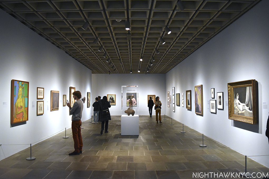
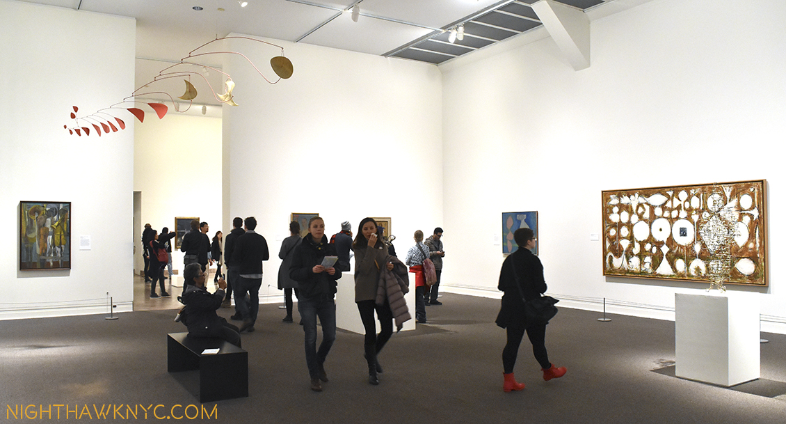
It was a year of discovery. A year where I discovered some great Artists I previously hadn’t known, finally caught up with some I knew about but hadn’t gotten to see much of their work, and got lost exploring some remarkable Retrospectives- for Raymond Pettibon and Robert Rauschenberg, both accompanied by memorable satellite shows. Most of these are represented in my monthly NoteWorthy Show selections throughout the year. But? There was more! So, I’m going to take this moment to pause and look back at the revelations of 2017, look at some memorable shows I didn’t write about at the time, and finally, highlight a pair of men who, I feel, had an exceptional 2017 in Manhattan Art.
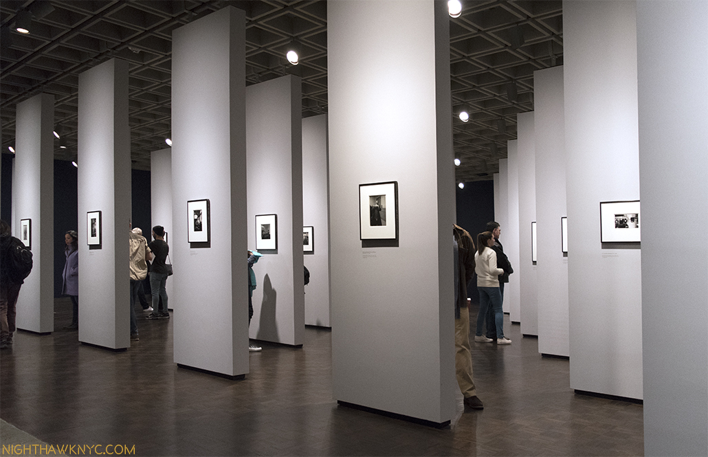
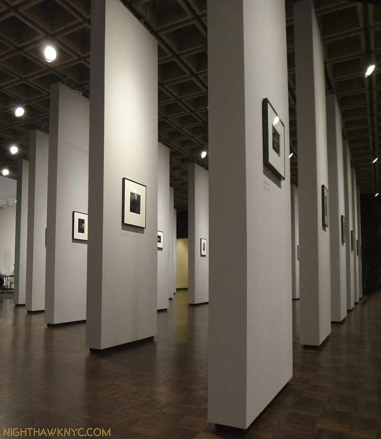
No doubt about it- the biggest discovery this year was a long overdue deep dive into the world of Contemporary Photography. From seeing well over 100 Photography shows, to spending five long days at “AIPAD: The Photography Show” (with well over 120 galleries from all over the world showing work), to going through hundreds of PhotoBooks, and meeting many Photographers, legendary, famous, or not quite yet, along with the staffs of two of the world’s leading Photography organizations- Aperture and Magnum, both celebrating major anniversaries this year. Rarely did a week pass when Photography wasn’t in the the picture. Of course, in a world were there are now more cameras than people it’s impossible to get to see everyone who’s doing great work. As happens each year, NO matter WHAT I do to prevent it, this year too, there were shows I didn’t find out about until they closed. UGGGH!!!! Along the way, there were quite a few revelations, and a good many other things solidified…at least for the moment.
First, the revelations. In Photography, particularly among those younger than 50 (I say 50 only because I seem to know/have heard of many of those over) and unknown to me, Gregory Halpern was the biggest revelation I had this year. His book “Zzyzx” won the prestigious Aperture Best Book Award for 2016, but I didn’t know that when I discovered his work at Aperture’s booth at AIPAD. I had never heard of him.
Gregory Halpern, “Untitled,” 2016, from his “Buffalo” series. Click any Photo for full size.
The work, “Untitled,” was a Photograph Aperture had run in the Spring, 2017 issues of it’s excellent quarterly magazine, in a pictorial by Mr. Halpern, titled “Buffalo.” I didn’t know that then, either. I simply saw the work, and then couldn’t get it out of my mind. It now hangs a few feet away. Out of everything I saw at AIPAD, particularly by those younger than 50 and unknown to me, this work grabbed me and didn’t let go. I went home that night with one thought on my mind- “WHO is Gregory Halpern?” After researching him most of the night, (including finding his incredibly honest and insightful answer to one very important question), serendipitously, I got to meet him the next day, and spoke to him about his book. It turned out to be a classic case where some things are better left unexamined. Gregory was so forthcoming in his answers about specific images I came too close for comfort to losing some of their mystery.
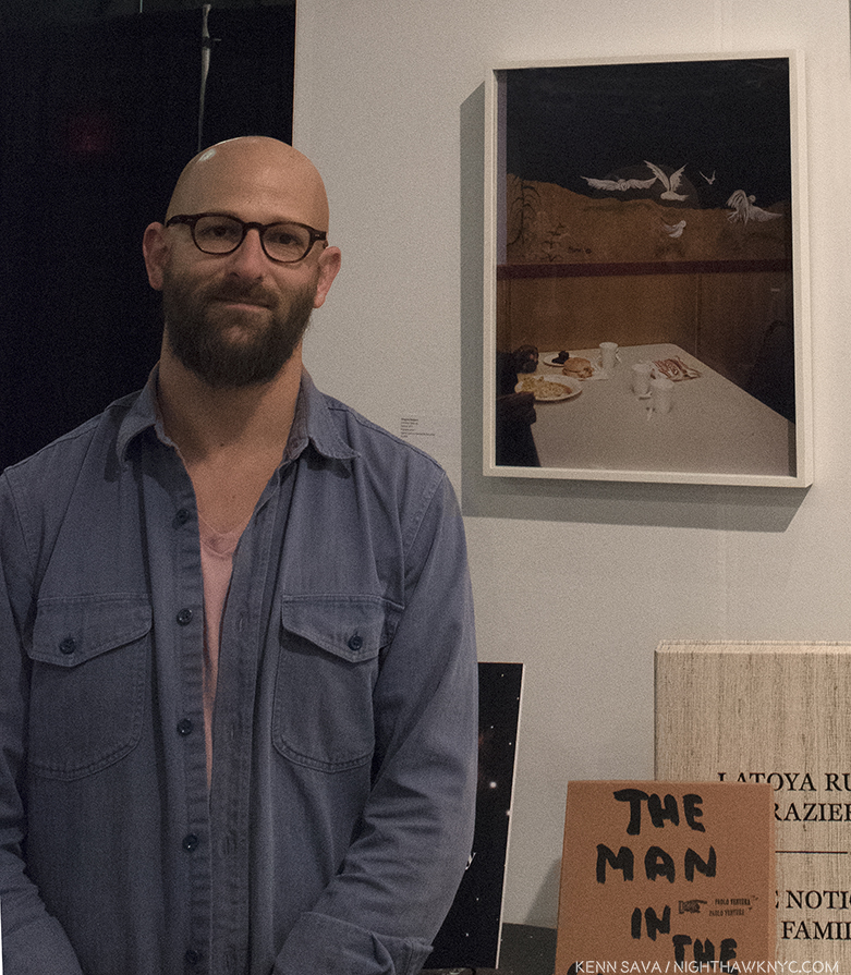
Gregory Halpern standing next “Untitled,” at Aperture’s Booth at AIPAD, March 31st.
In addition to being, in my eyes, one of the most talented Photographers of his generation, he is, also, one of it’s best writers. He’s the co-author of one of the most popular and respected Photography Manuals of 2017, “The Photographer’s Playbook,” and his occasionally published articles always enlighten and leave me wanting more. A Harvard grad, he’s now a professor in the College of Imaging Arts and Sciences at Rochester Institute of Technology for some very lucky students. As if all of that isn’t enough, his wife, Ahndraya Parlato is, also, one of the revelations of the year as a Photographer. Her Photographs “glow”- in one way or another. Her most recent book, “A Spectacle and Nothing Strange,” is ethereal…mesmerizing…magical.
Leaving aside age or era, the work of Fred Herzog was, also, unknown to me. Early pioneers of color Photography have taken decades coming to the attention they deserve, such was the disdain color held among the Photographic cognoscenti for color Photography. With the publication of “Fred Herzog: Modern Color,” in February, 2017, an Artist who was fairly well-known, and appreciated, in his native Canada finally began becoming wider known in the USA. His work was memorably shown by Equinox Gallery of Vancouver at AIPAD this spring, where, I felt, it stood out.
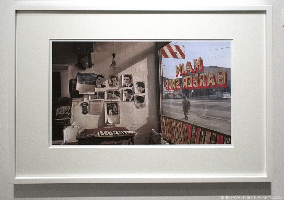
Fred Herzog, “Main Barber,” 1968, seen at Equinox Gallery’s AIPAD booth.
Fred Herzog considers Saul Leiter THE master of early color Photography, and even with a giant like William Eggleston to consider (who’s 1976 MoMA show, “Photographs by William Eggleston,” which can be “visited” here, is widely credited with making color Photography “acceptable” in the world of “Fine Art”), it’s hard to argue with him. No Photographer new to me, regardless of age or period, had a bigger impact on me this year than Saul Leiter.
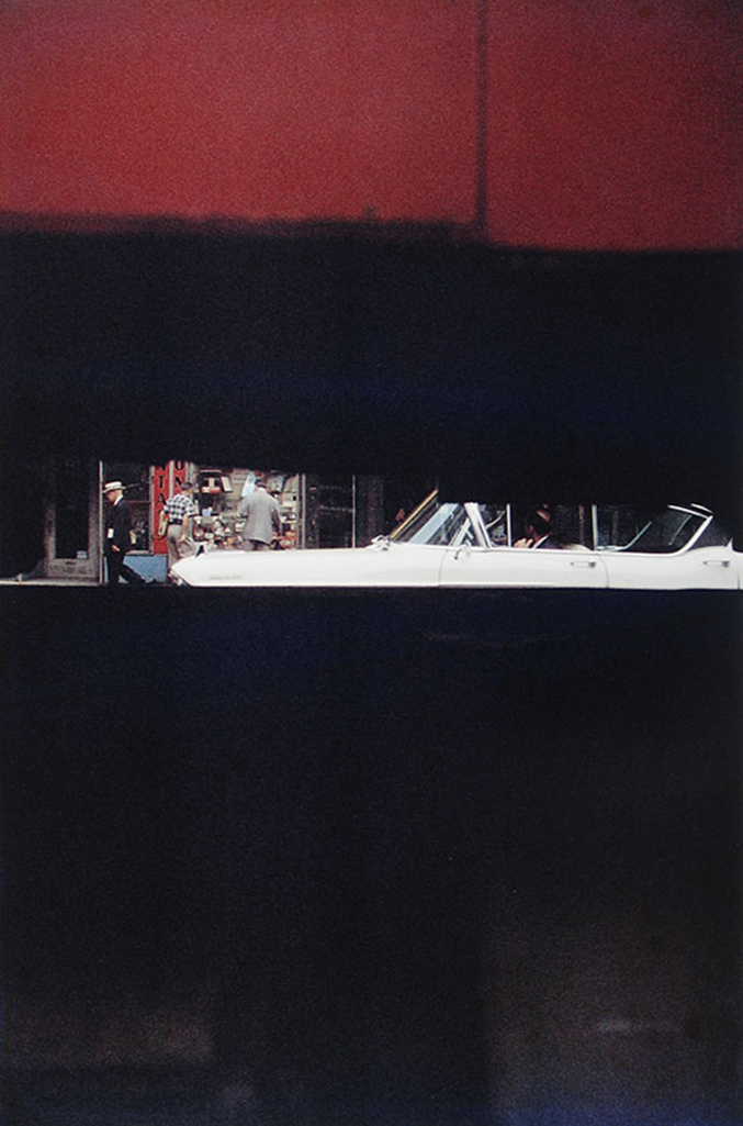
Saul Leiter, “Through Boards,” Circa 1957. This image appears (cropped) on the cover of the now classic book, “Saul Leiter: Early Color,” 2006, which launched the “Saul Leiter Renaissance.” It’s, perhaps, my very favorite Photobook. Sadly, now out of print, it would take real diligence to find a very good copy for less than $100. But, there are many worse uses of time. Photo by the Saul Leiter Foundation.
It took until 2006 for Saul Leiter to be recognized- FIFTY EIGHT years after he started taking color photographs. As with William Eggleston, Mr. Leiter was, also, a devoted Painter. I can see it in both of their work, and I believe it’s part of the reason their work speaks to me, perhaps, more than the work of any other Photographer of any period. It was his friend, no less than the great Artist Richard Pousette-Dart (who’s also an under appreciated Photographer), to encouraged him to pursue Photography.
“Walk with Soames,” 1958, This was 20 YEARS before William Eggleston’s ground breaking MoMA show “legitimized” color Photography in the Art world! Photo by Howard Greenberg Gallery.
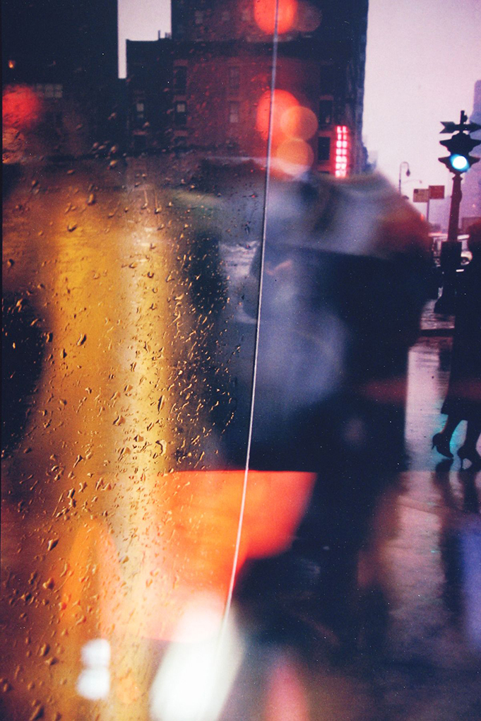
Mr. Leiter saw and used color in his Photography in ways no one else has, achieving effects that today’s finest digital manipulators can only dream of. Saul Leiter didn’t need Photoshop to get his results. As very good as his Black & White work is, like Turner or Van Gogh, Saul Leiter was a true Poet of color, perhaps the greatest Master of Color in Photography, though it’s, of course, impossible and pointless to qualitatively compare.
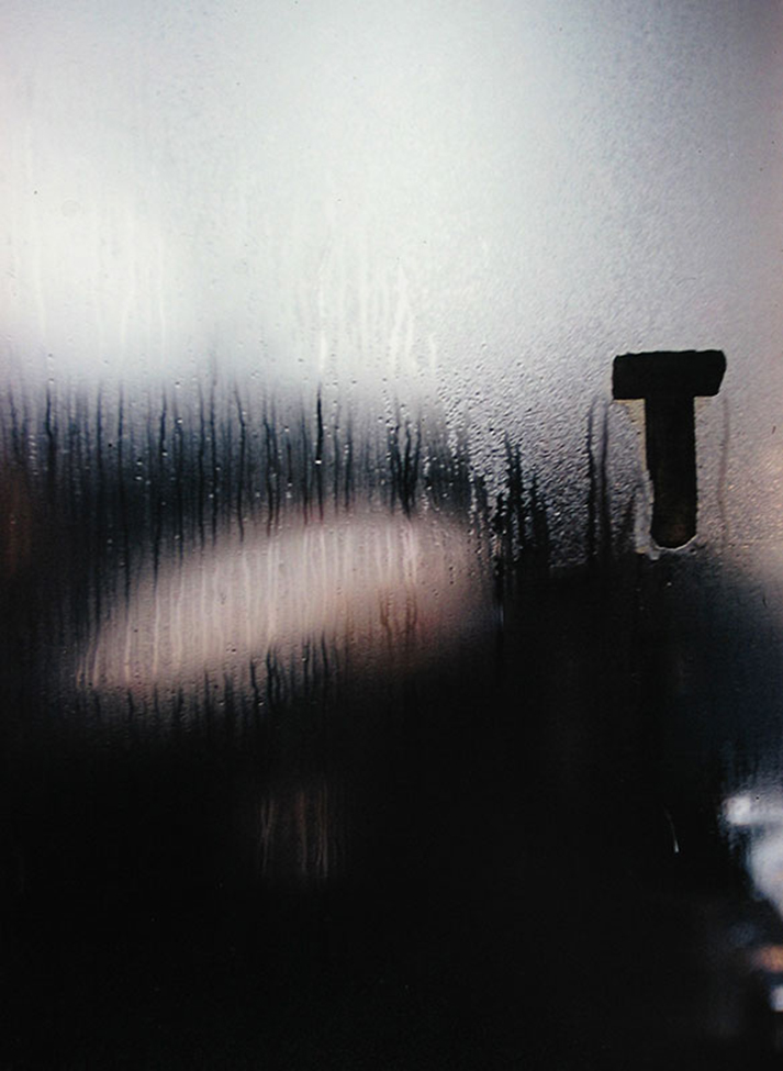
“T,” Circa 1950(!).Photo by the Saul Leiter Foundation. Daring. Gorgeous.
A number of established Photographers had terrific shows in NYC in 2017 that I didn’t get to write about here. Among them are Mark Steinmetz, Mike Mandel, Raghubir Singh (though marked by controversy), Richard Avedon, Herman Leonard, Michael Kenna, and Edward Burtynsky. But, I’m going to address one I simply can’t let pass, because I continue to think about it.
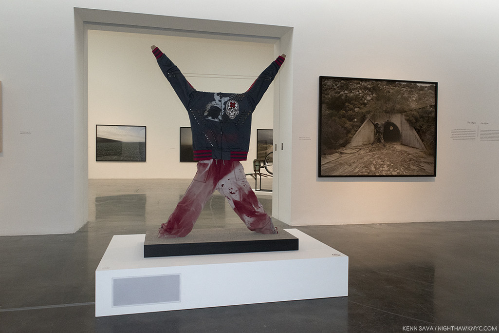
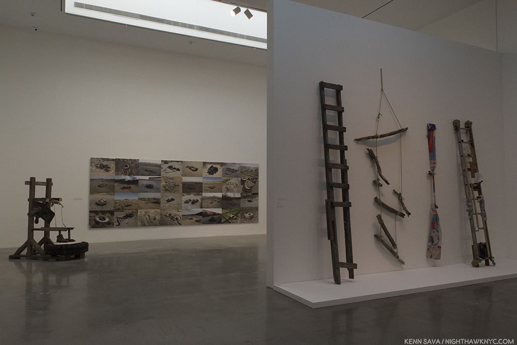
Richard Misrach’s Photo, “Effigy #3, near Jacumba, California,” 2009, Pigment print mounted to Dibond, right rear, with Guillermo Galindo’s Musical Instrumet/Sculpure “Effigy,” 2014, center2014. Barely visible are two strings between the forearms. The grey rectangle on the lower left side of the pedestal is where a speaker is mounted.
“Richard Misrach: Border Cantos,” (at Pace, 510 West 25th Street), was an utterly remarkable and serendipitous collaboration between renowned Photographer Richard Misrach & Composer/Sculptor Guillermo Galindo on the subject of our southern border, those protecting it, and those trying to cross it. To accompany Mr. Misrach’s large, atmospheric Photographs, Mr. Galindo created a whole orchestra of Musical Instruments out of objects found along the border, and proceeded to compose and record a 4 hour score that was looped in the show’s back room to meditative effect, ingeniously installed so that the music being played was coming from speakers mounted inside the display of the specific instruments that were playing at any given moment. (The Artists have an excellent website for this show where you can, also, hear these remarkable instruments.)
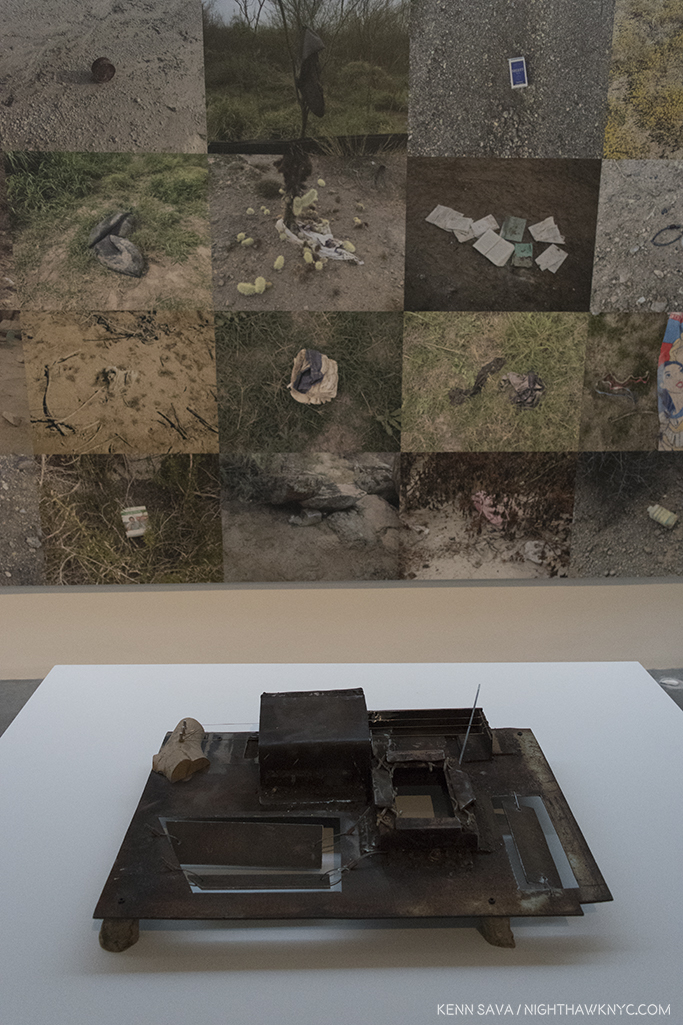
Instruments, like this. Guillermo Galindo, “Tortillafono/Wall Vibraphone,” 2014, Metal. The discarded metal cap of an electrical box from the failed SBInet (Secure Border Initiative) surveillance program was turned into a mallet and string instrument sits in front of Richard Misrach’s “Artifacts fround from California to Texas between 2013 and 2015,” 2013-5, 86 x 57 inches, Pigment prints mounted to Dibond. Photos of items found along the border.
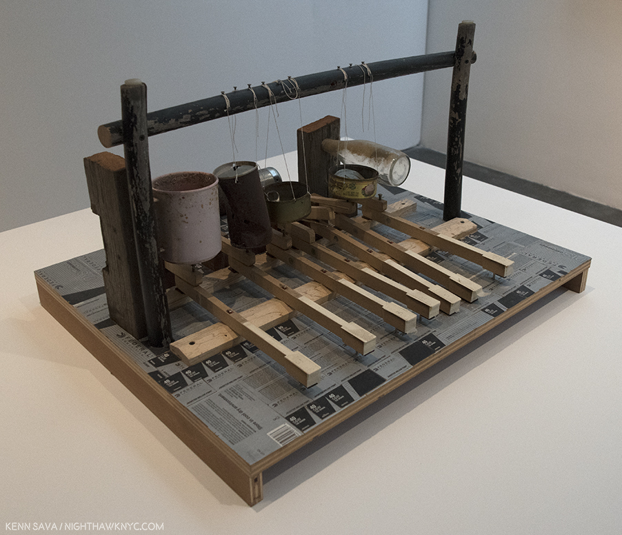
And this- Guillermo Galindo, “Teclata,” His description- “On this keyboard, empty cans, bottles, and a plastic cup act as piano strings. The surface of the instrument is decorated with Border Patrol ammunition boxes.”
The surround sound effect was like sitting in the middle of a small chamber music group. The instruments, themselves, were beautiful as sculpture, and the music, which sounded to me like a cross between Harry Partch (who, also, made his own instruments) and John Cage, on instruments that looked like Rauschenbergs, had me asking if it had been released on CD. Why not?
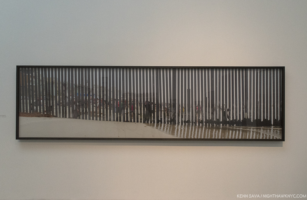
Richard Misrach, “Playas de Tijuana #1, San Diego,” 2013, Pigment print mounted to Dibond, 42 x 160 inches.
Mr. Misrach, who has spent forty years working in the American Desert on his renown “Desert Cantos” project, showed a remarkable selection of images taken since 2004, but more intensely since 2009 (the collaboration with Mr. Galindo dates back to 2012), that told the story in slices. The effect of the music, the images and the sculptures (musical and non) was hypnotic, and ultimately meditative on the situation, the people protecting the border, and the refugees, while at the same time, even for those directly untouched by this story, the show spoke to a larger sense of walls, borders and refugees, and resilience. The Artists found, or created, beauty in this situation, reflecting the very perseverance that is at the essence of survival.
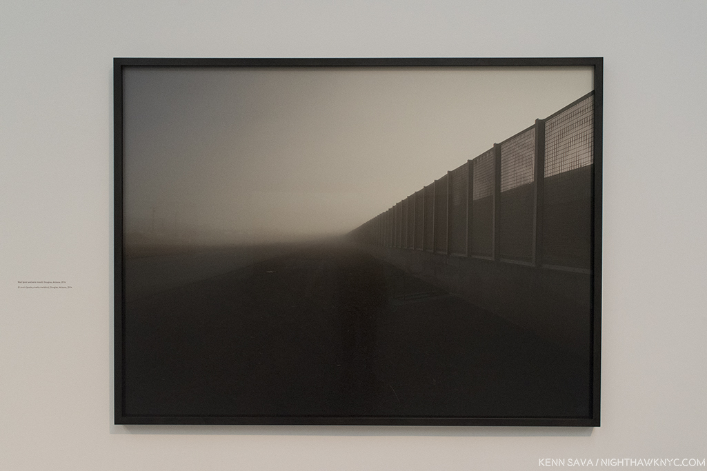
Richard Misrach, “Wall, east of Nogales, Arizona,” 2014, 68 x 84 inches, Pigment print mounted to Dibond
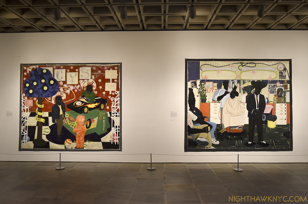
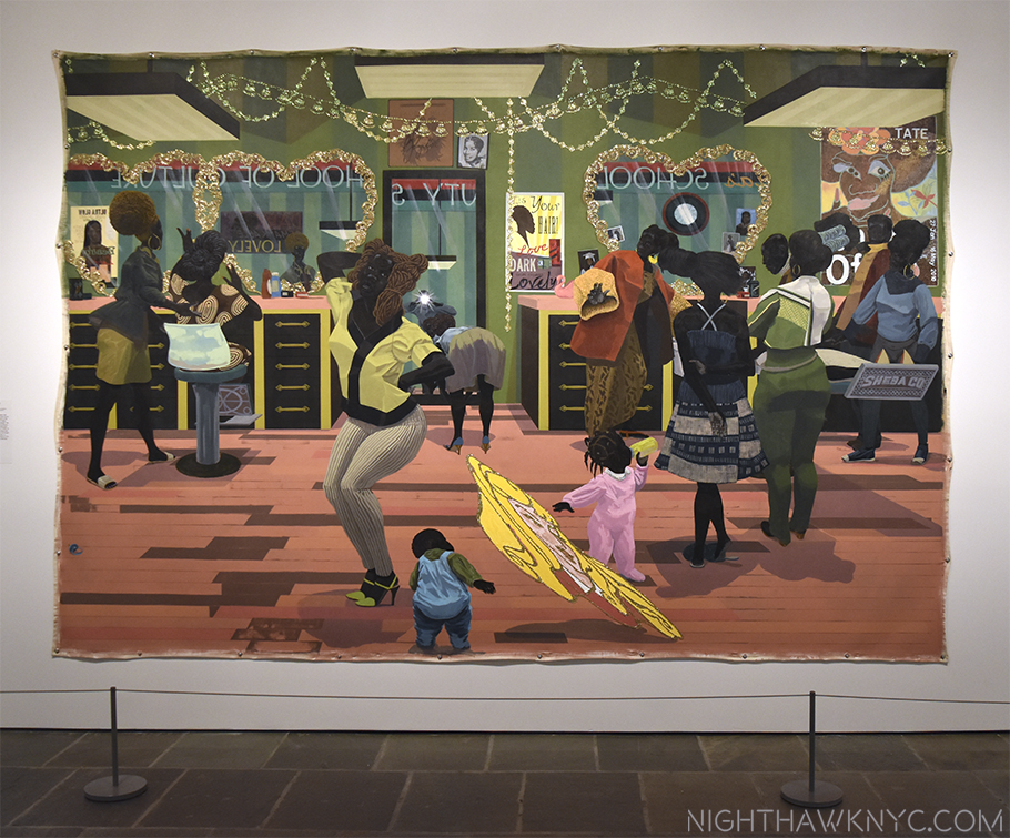
On the Painting & Drawing front, the most important Painting/Drawing gallery show I haven’t addressed was Kara Walker (at Sikkema Jenkins and Co.). Before it opened the buildup was downright intense. First, these posters began appearing, which certainly raised eyebrows until you notice (along the lower left side) that the text was written by the Artist. The show was also featured in a cover article in one of the last print issues of the Village Voice. I can’t remember the last time an Art show made the Voice’s cover, but this was the last time one did.
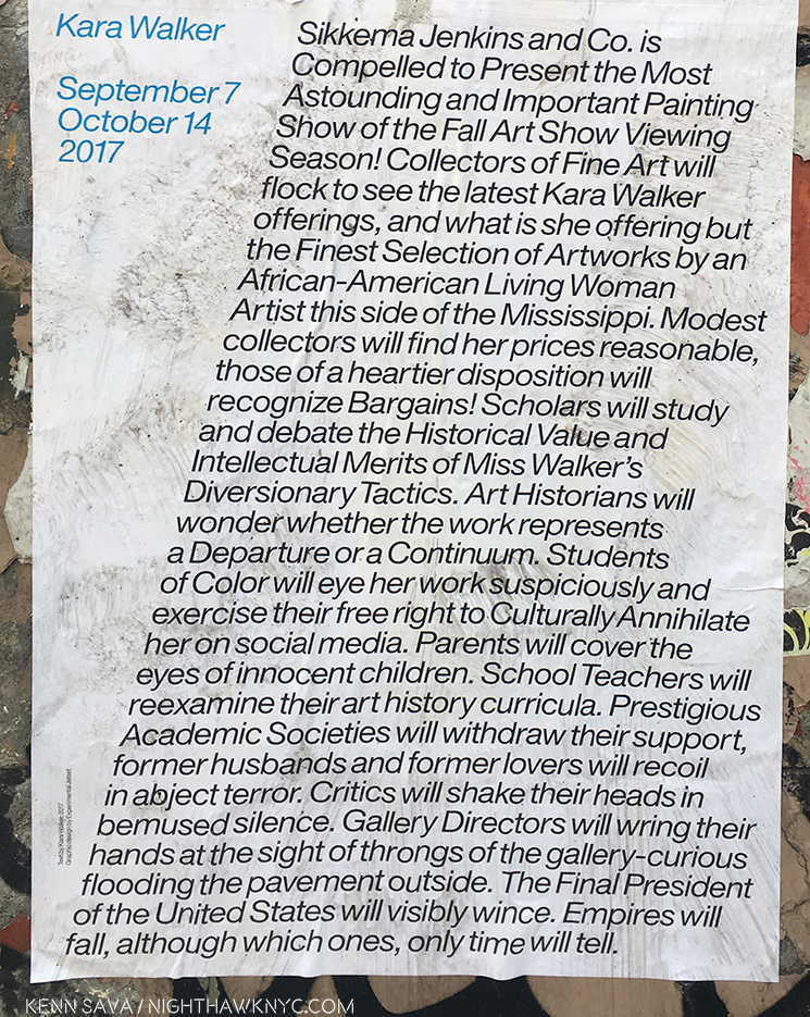 Kara Walker sounds a bit weary in the poster, and particularly in the “Artist’s Statement” that appears on the show’s page on the Sikkema website.
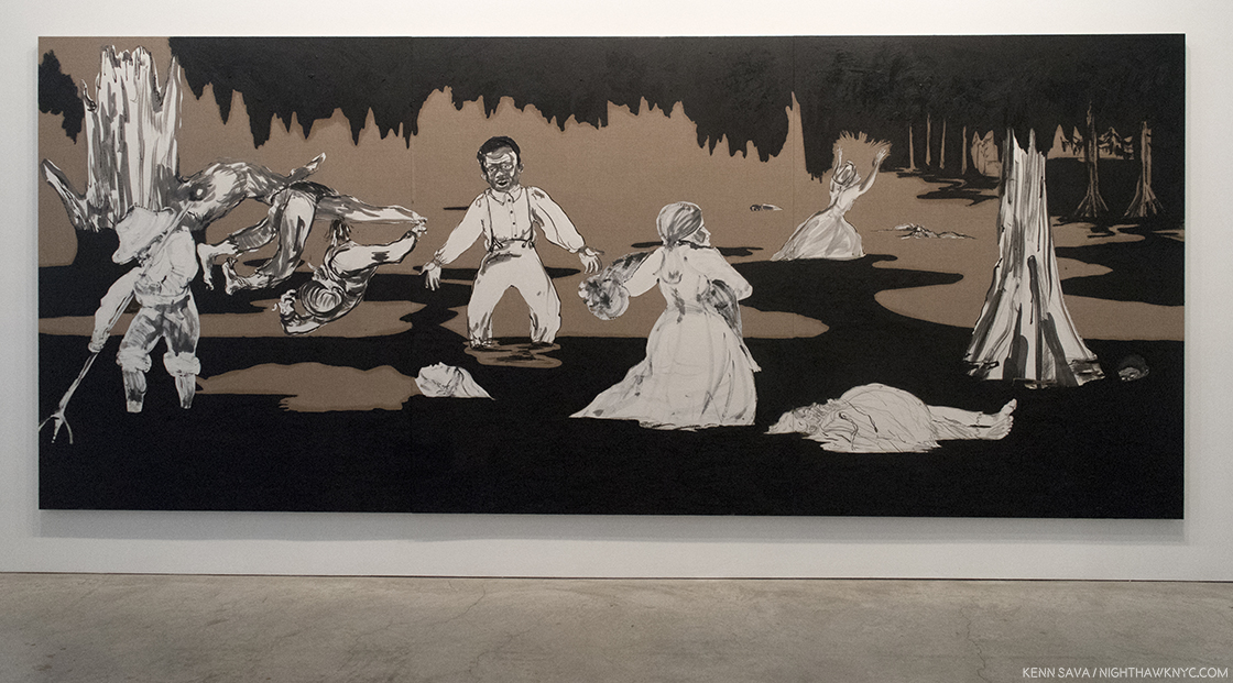
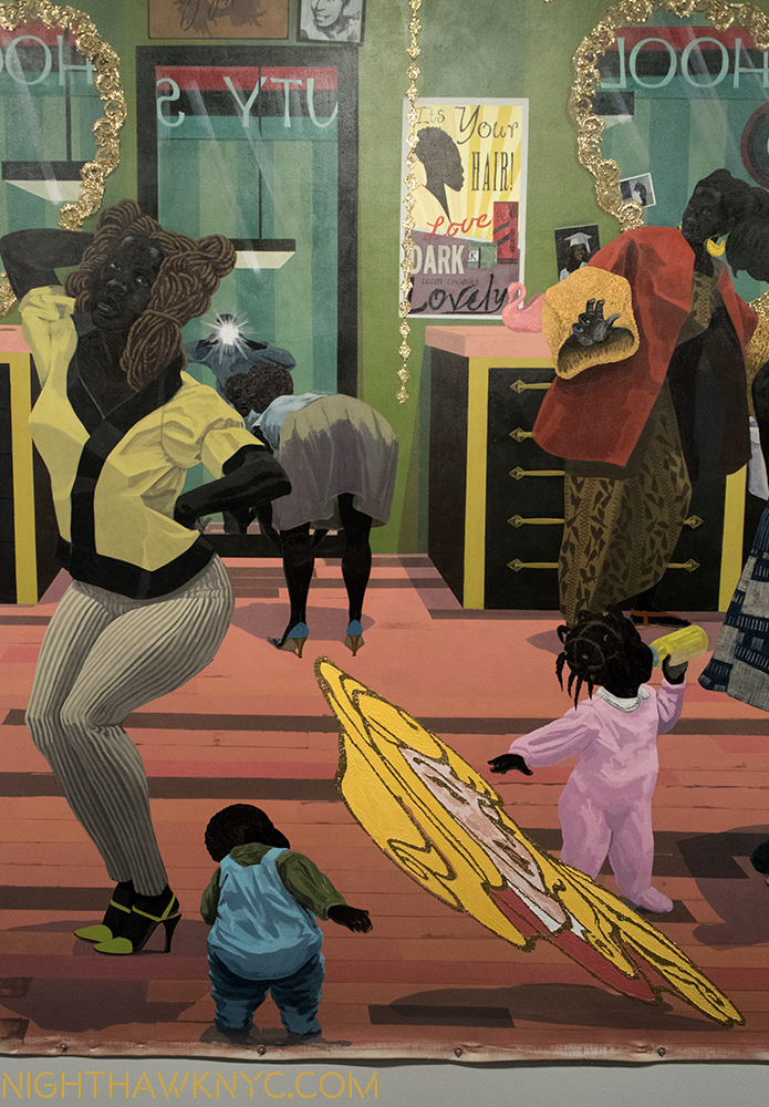
“Dredging the Quagmire (Bottomless Pit),” 2017 Oil stick and Sumi ink on paper collaged on linen, 18 feet long, seen in the show’s first room. A “bottomless quagmire” is what the history of and current state of race and gender relations does feel like at this moment in time.
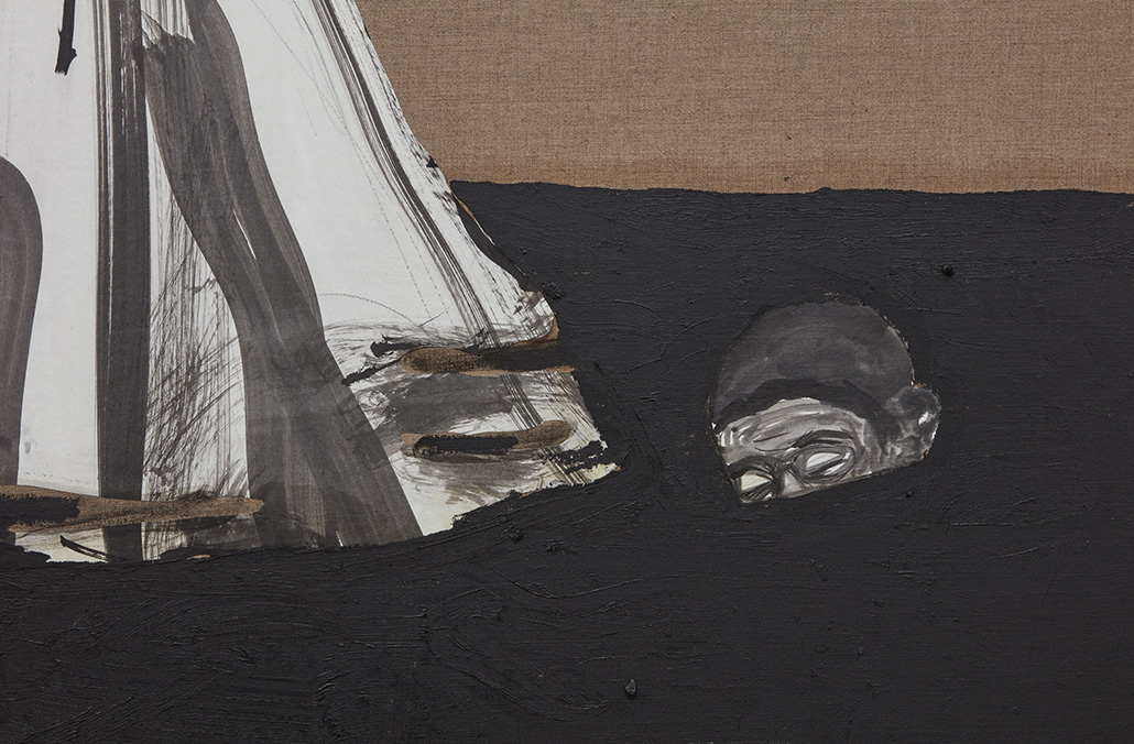
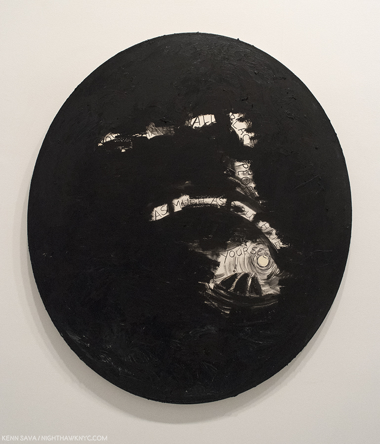
In the lower right side, this almost submerged head seemed to echo Ms. Walker’s weariness in her Artist’s Statement. “But frankly I am tired, tired of standing up, being counted, tired of ‘having a voice’ or worse ‘being a role model.'”
After all the anticipation and buildup, at the packed opening, Ms. Walker, herself, was only to be seen for a little while, at least while I was there.
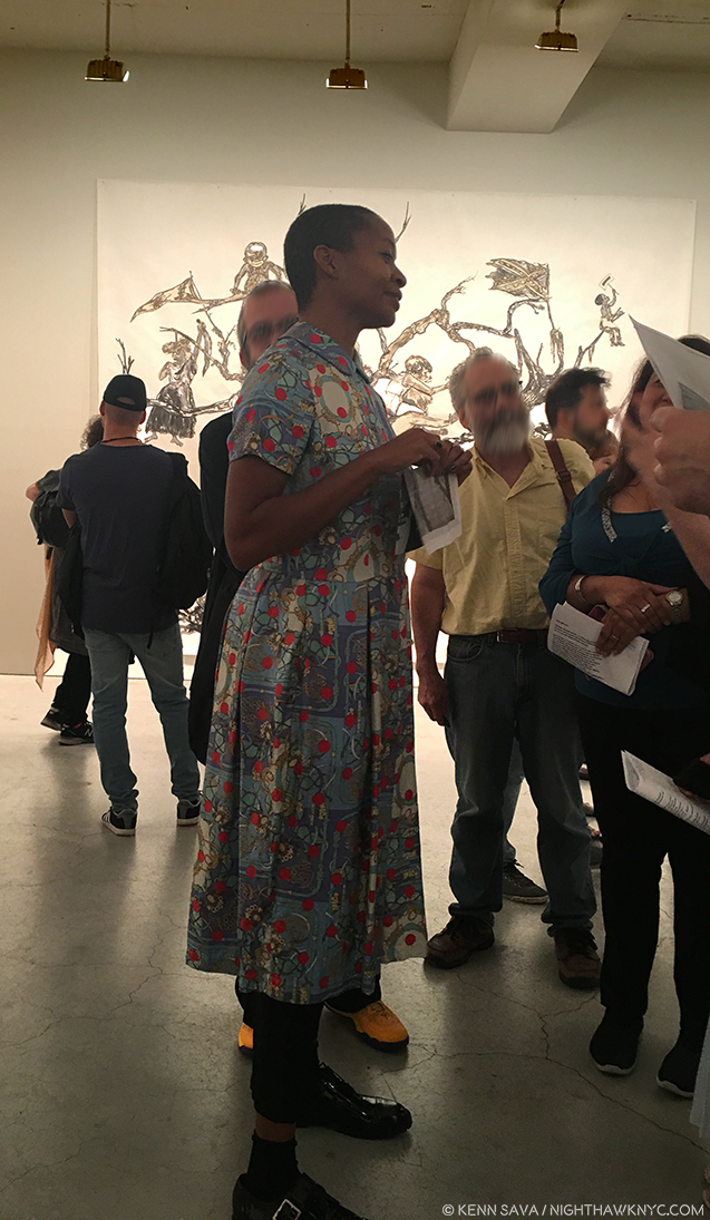
Kara Walker at the opening, September 7, 2017, with part of “U.S.A. Idioms,” 2017, Sumi ink and collage on paper, almost 15 by 12 feet, in the background.
While she continues to create her signature Silhouettes, showing a gorgeous 2017 work titled “Slaughter of the Innocents (They Might be Guilty of Something),” that’s almost 18 1/2 feet long, the bulk of the show consists on her ink and collage works, that have increasingly come to the forefront of her shows as time has gone on, most recently in her Cleveland Museum show, “The Ecstasy of St. Kara,” 2016, and at MoMA’s “Unfinished Conversations: New Work from the Collection,” which closed on July 30, 2017, where her “40 Acres of Mules,” a Charcoal Drawing on 3 sheets totaling almost 18 feet long that was acquired by the Museum the year before, was on view in what was something of a one-work preview for her Sikkema show.
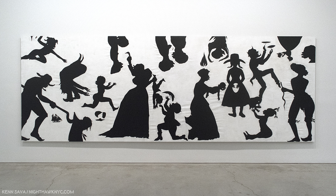
“Slaughter of the Innocents (They Might be Guilty of Something),” 2017, Cut paper on canvas. For me, one thing Ms. Walker’s Silhouettes all seem to ask is “Why do you see, what you see?”
Whereas it’s hard for me to imagine the care, patience and deliberation it must take for Ms. Walker to create one of her silhouettes, her Drawing & Collages look like they are done in bursts of raw energy and passion. At times the images approach the quality of a caricature of an event. No matter the differences in creation, when you see her Silhouettes and Drawings side by side they’re unmistakably by the same Artist.
While the Silhouettes, mostly, seem to leave quite a bit to the imagination, including the race of each character, her Drawings & Collages do not, especially when it comes to violence. Nothing is held back, hinted at or hidden. In the Drawings and collages, she has taken away the curtain inherent in Silhouettes in depicting racism and gender crimes. We see the faces, skin color, eyes, and what each one is involved in doing. You can choose to look away, but otherwise, it’s pretty hard to “miss” what’s going on. The results are shocking, though they have precedent going back to Goya’s “Los Caprichos,” and “The Disasters of War,” and Daumier through Warhol, as well as in the work of Photojournalists and “Conflict Photographers” from all over the world. In Kara Walker’s work, though, the time is centered between 1788, when slavery was legalized in the US, through post Civil War “Reconstruction.” Where the Silhouettes present a shadow of the figure, and the actions, the Drawings shine direct light. In fact, there are almost no shadows in her drawings- there’s no where for the perpetrators to hide.
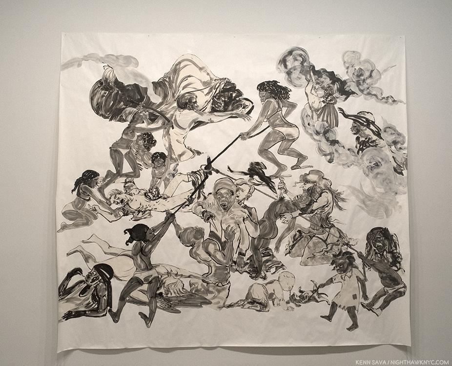
“The Pool Party of Sardanapalus (after Delacroix, Kienholz,” 2017, Sumi ink and collage on paper, Almost 12 feet long.
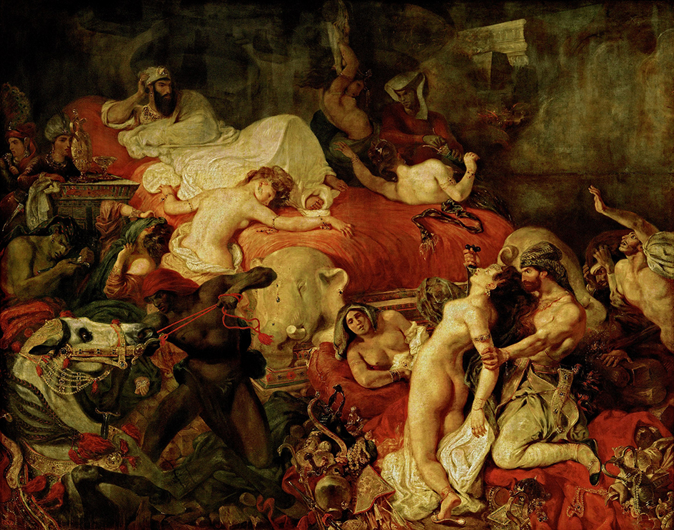
Eugene Delacroix, “The Death of Sardanapalus,” 1844, Oil on canvas, Louvre, Paris. Kara Walker is, also, an astute student of Art History. In her work, Sardanapalus lies horizontally near the upper left corner, apparently, taking no interest in the orgy of death going on, as he does, lying arm on elbow on a huge red bed in Delacroix’. Her Ed Kienholz reference is a bit harder to track down, but it might be this one.
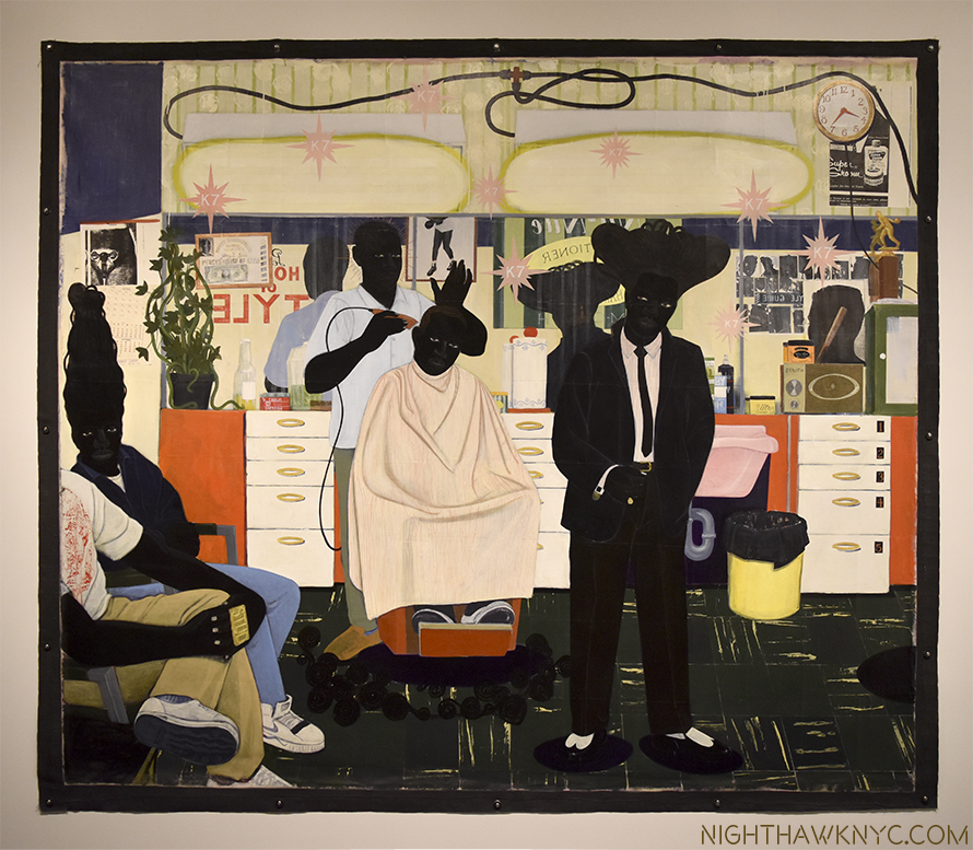
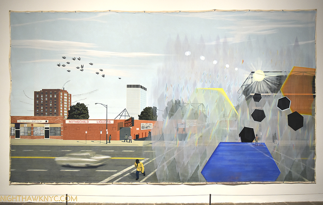
In “Christ’s Entry into Journalism,” 2017, the ground is, also, gone. The figures hang in the space of the paper, though some sense of perspective remains- as you get closer to the top of the sheet, they get smaller.
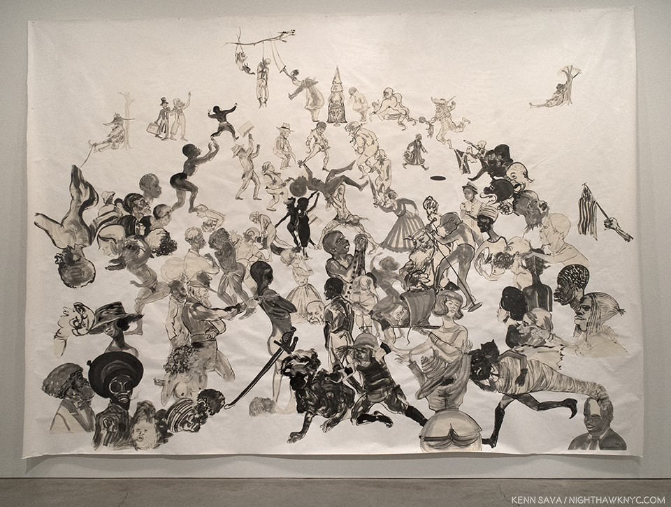
“Christ’s Entry into Journalism,” 2017, Sumi ink and collage on paper, 140 x 196 inches.
In this work, Ms. Walker’s figures cut across time, with some appearing to be contemporary. To the right of center, a figure “rocks the mic.” In the lower center is a figure that appears to be a modern riot trooper, in a helmet with face shield and body armor. He appears to have clubs in each hand. Right next to his left hand is what appears to be a black head, in a hoodie, on a platter, being carried by a woman, who looks away, while others nearby watch, some with shock on their face, some pointing to the scene. Just behind them, an extended arm holds and American flag, while above them a figure gives a Nazi salute with one hand while holding a Rebel flag with the other. Up top, a lynched figure hangs from a tree branch while women on either side of him perform acrobatics, with Klansmen standing next to them. In front of that naked black women are attacked by a group of men, while, again, others see what is going on. In the center of the work, the decapitated hoodied head looks straight across at a Civil War soldier pointing a gun at him, across time. Is this 1863? Or 2016?
“Storm Ryder (You Must Hate Black People as Much as You Hate Yourself),” 2017, Oil stick and Sumi ink on paper collaged on linen.
The primacy of Drawing in her work was reinforced with the recent release of one of Ms Walker’s Sketchbooks from 1999, when the Artist was 29, as a book appropriately titled, “MCMXCIX.” It contains Drawings that, in style and subject, visitors to the Sikkema show will immediatley recognize. Interestingly, as Raymond Pettibon does in his shows (the latest concluding on June 24th, shortly before Ms. Walker’s opened), she prefers her larger works be tacked to the walls.
“Future Looks Bright,” 2017, Oil stick and Sumi ink on paper collaged on linen.
Kara Walker may be growing tired of being a “role model,” of being “a featured member of my racial group and/or my gender niche,” (as she says in her Artist’s Statement referenced above). Of course, I can’t imagine being Kara Walker, but I can understand that it gets to be “too much.” I’m not sure, however, what her other choice is. I mean, I’m sure she COULD do something else if she REALLY wanted to. After seeing all the work and passion she put into this show? I guess I’m just not convinced that she really DOES want to do something else. Yet.
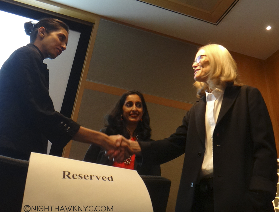
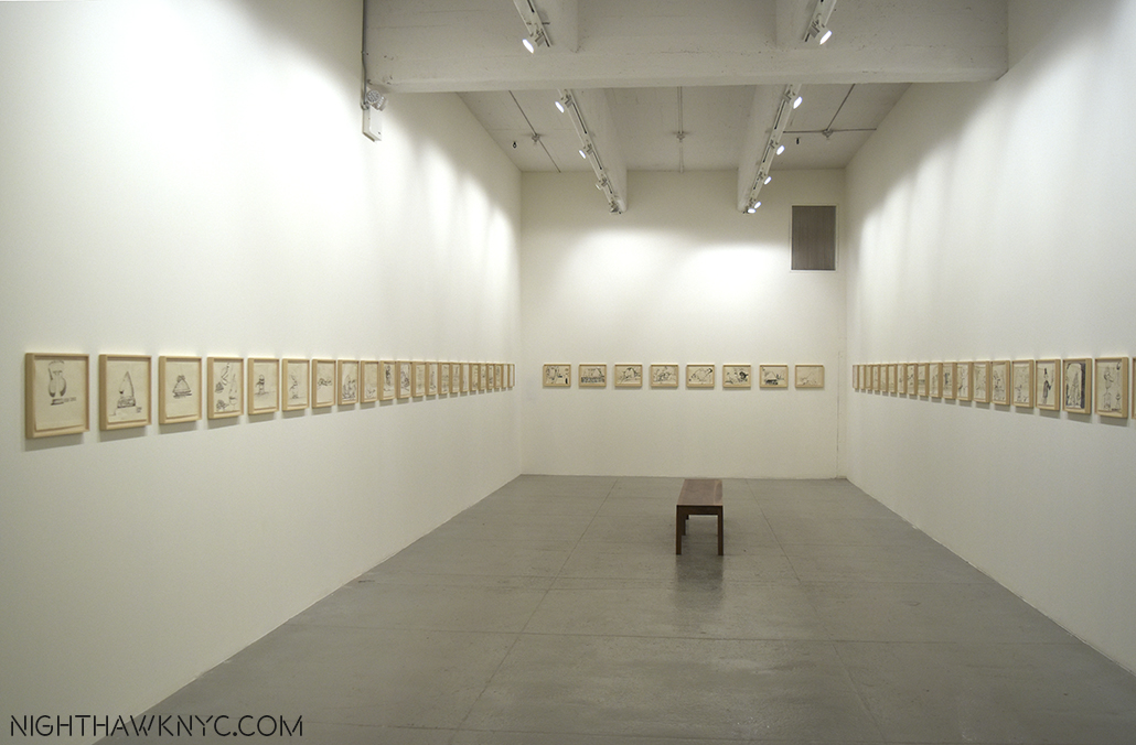
Finally…Looking back on 2017… Last year I wrote that I felt Sheena Wagstaff had the best year in NYC Art. She’s had a very good 2017, too. But, this year, I think that The New Museum’s Massimiliano Gioni & Gary Carrion-Murayari. had special years, highlighted by the truly exemplary, and revolutionary, “Raymond Pettibon: A Pen of All Work” retrospective, which they then remounted simultaneously in Maastricht and Moscow. I feel it was “revolutionary” because totaling an unheard of 800 works, including brand new works created by the Artist for this show (some on the very walls of the New Museum), they gave an exhaustive look at Pettibon’s career, yet the show never slowed, never failed to keep and even raise interest. It even included work Pettibon did as a small child that he has now ammended in his own, unique style. Word has recently come that Gary Carrion-Murayari, who kindly answered my questions on the Pettibon Moscow show he co-curated, has also been named as a co-curator for the New Museum’s 2018 Triennial, so he could be ready to have another “big” year. Stay tuned!
The end result is that Massimiliano Gioni, Gary Carrion-Murayari, and the New Museum have served to put the “Big Four”1 Manhattan Museums on notice that, on their 40th anniversary, we are going to have to get used to saying the “Big Five.”
———————————–
A Special “Thank You!” to all the Artists who gave me their time and shared their thoughts with me in 2017, and to David White & Gina Guy of the Robert Rauschenberg Foundation and Gary Carrion-Murayari and Paul Jackson of the New Museum.
“Thank you!” to the Hattan Group and Kitty for research assistance, and to The Strand Bookstore for being open until 10:30pm seven nights a week. R.I.P. Owner, Fred Bass this week.
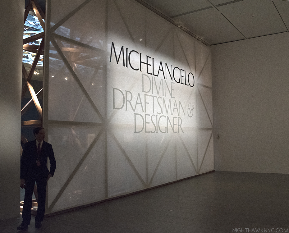
*- Soundtrack for this Post is “Heroic Elegy, Op. 36,” (1918), by Ernest Farrar, in honor of the 100th Anniversary of WW1, which was featured in another memorable show, “World War 1 & The Visual Arts” at The Met this year, as a way of honoring it, and all the Artists, and Musicians, lost during it. Shortly after “Heroic Elegy’s” premiere, Second Lieutenant Farrar was ordered to the Western Front. Two days after he arrived there, he was killed at the Battle of Epehy. He was 33. I first heard it while I was driving in Florida on September 11, 2002. The classical station there played it in honor of the first anniversary of 9/11. So taken with it was I that I pulled over and listened to it with my eyes closed, then immediately set about researching it’s composer. Though he wrote other fine works, “Heroic Elegy,” is special. It’s lightning in an 8 minute bottle. As beautiful as it is, there’s a quality, a confidence, in it that seems to promise so much more to come that he, tragically, never got the chance to give us, like the other Artists & Musicians lost far too early in this most senseless of wars.
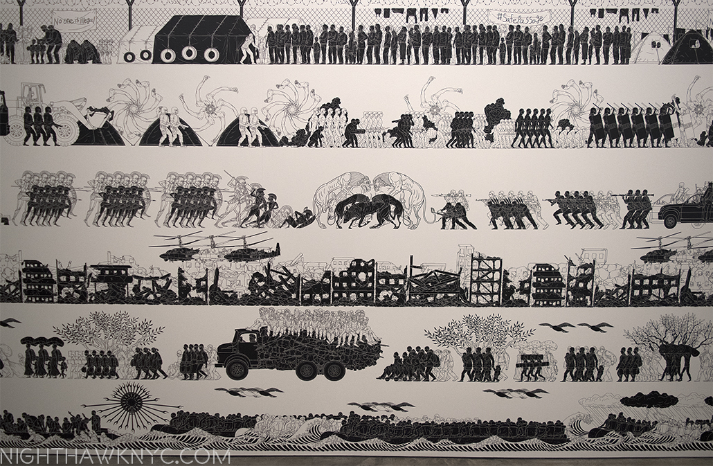
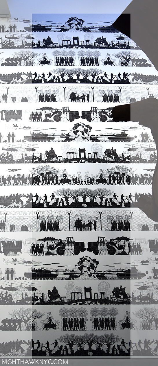
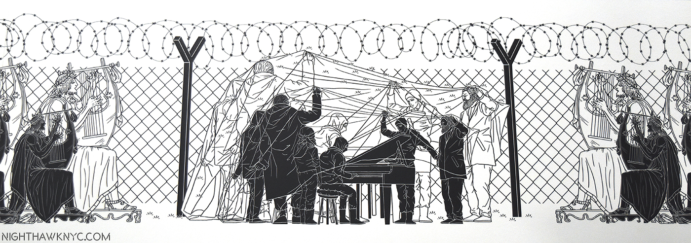
“On The Fence, #17, The Good Riddance” Edition.
NighthawkNYC.com has been entirely self-funded & ad-free for over 7 years, during which over 275 full length pieces have been published! If you’ve found it worthwhile, PLEASE donate to allow me to continue below. Thank you, Kenn.
You can also support it by buying Art, Art & Photography books, and Music from my collection! Books may be found here. Music here and here.
Written & photographed by Kenn Sava for nighthawknyc.com unless otherwise credited. To send comments, thoughts, feedback or propositions click here. Click the white box on the upper right for the archives or to search them. Subscribe to be notified of new Posts below. Your information will be used for no other purpose.
- With all due respect to The Frick Collection, who the powers that be that came up with “the Big Four” left out. ↩