Written & Photographed by Kenn Sava (*unless otherwise credited)
If you love PhotoBooks, the name Michelle Dunn Marsh is either known to you or lurking somewhere in your home on the colophon of one, or more, of the books you own.

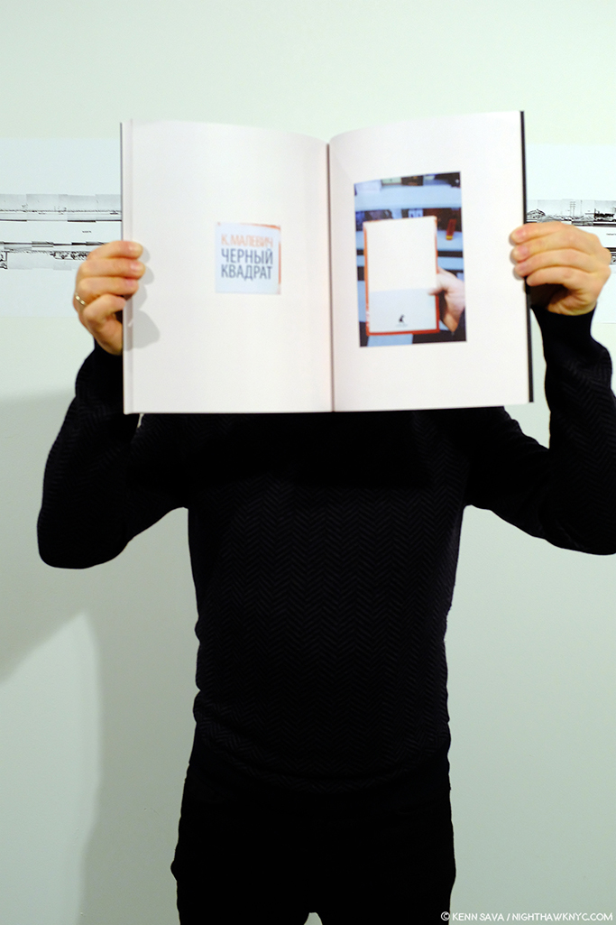
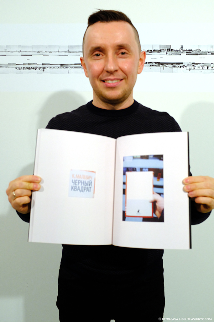
Click any picture for full size.
Michelle is one of the brightest lights in the world of Modern & Contemporary PhotoBooks, a curator of terrific, thought provoking and eye-opening Photo shows, and a self-described “picture slinger,” that is, one of the leading independent PhotoBook publishers in the world with the company she founded, Minor Matters. It’s a status she’s earned through relentless hard work over more than two decades. That’s the short list. For the bigger picture, here’s one summary of her career-
“Michelle Dunn Marsh has served in executive and creative roles for the last 25 years. As Executive Director at PCNW (Photographic Center Northwest) from 2013–2019, she also curated significant exhibitions including Terminal: On Mortality and Beauty, and Eugene Richards: ‘Enduring Freedom’, among others. She co-founded Minor Matters, a community publishing platform for contemporary art, and has published 14 books to date. Dunn Marsh spent fifteen years with Aperture Foundation in New York City, was senior editor of art+design at Chronicle Books in San Francisco; and was a tenured professor in graphic design at Seattle Central Community College among other professional endeavors. She has lectured nationally about visual literacy, publishing, and the history of photography. She holds a BFA from Bard College, where she serves on the Board of Governors, and an MS in Publishing from Pace University1.”
And on the day after tomorrow? She rested.
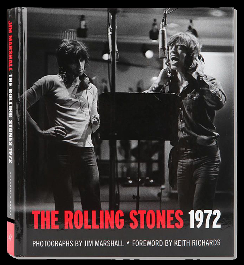
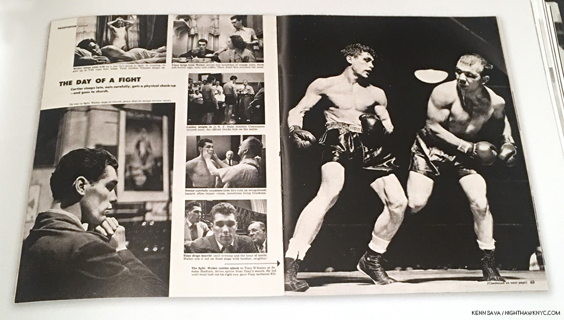
Chronicle Books published The Rolling Stones 1972, a 2012 best seller with a foreword by Keith Richards, and Photos by legendary Music Photographer Jim Marshall. It was edited and designed by Michelle Dunn Marsh, one of two test cases for her eventual launch of Minor Matters, she told me. *Chronicle Books Photo.
When I first read about her, she struck me as someone who was a classic New Yorker: She works endlessly in more roles than you’d think one person could manage, let alone excel at, yet everything she touches is permanently marked by the passion she brings to it. It turns out I wasn’t far off. She splits her time between Seattle and NYC. Or, more likely? I think there may be two of her. But, I’ll leave that for future researchers to determine.
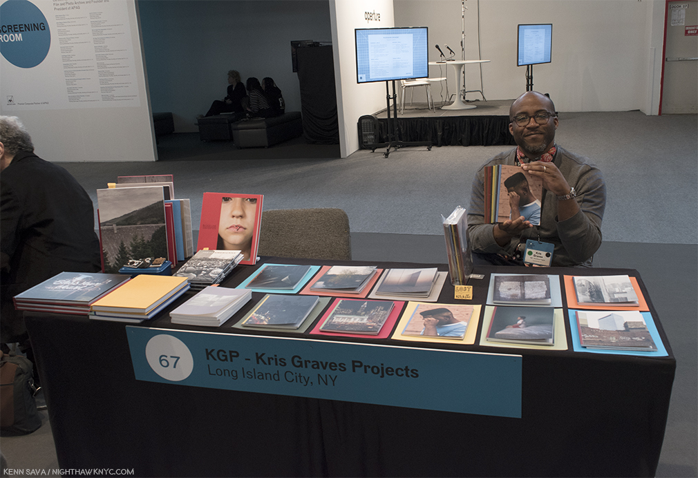
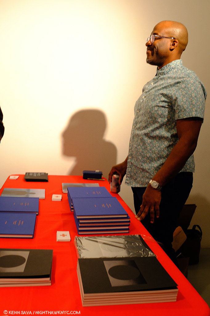
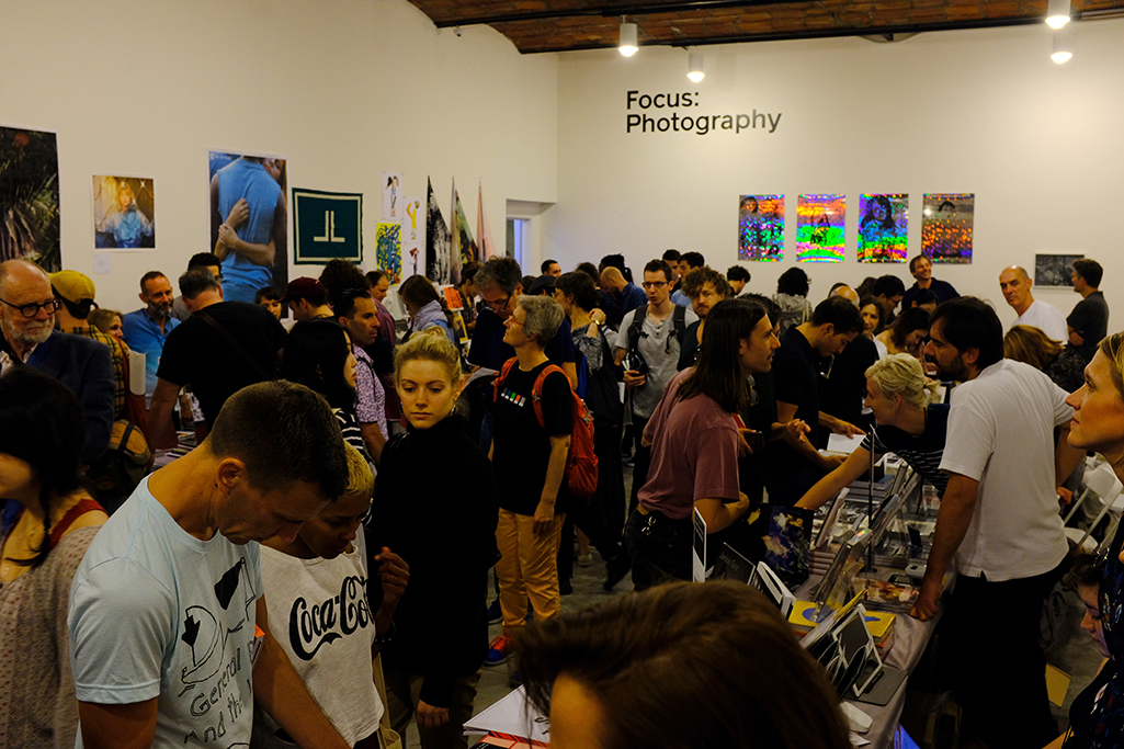
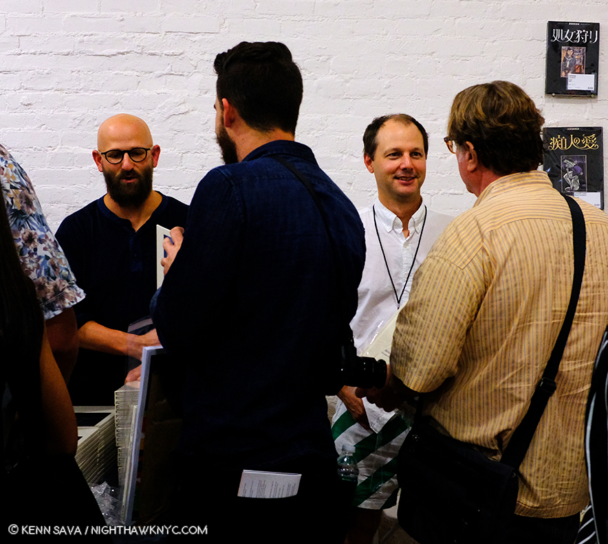
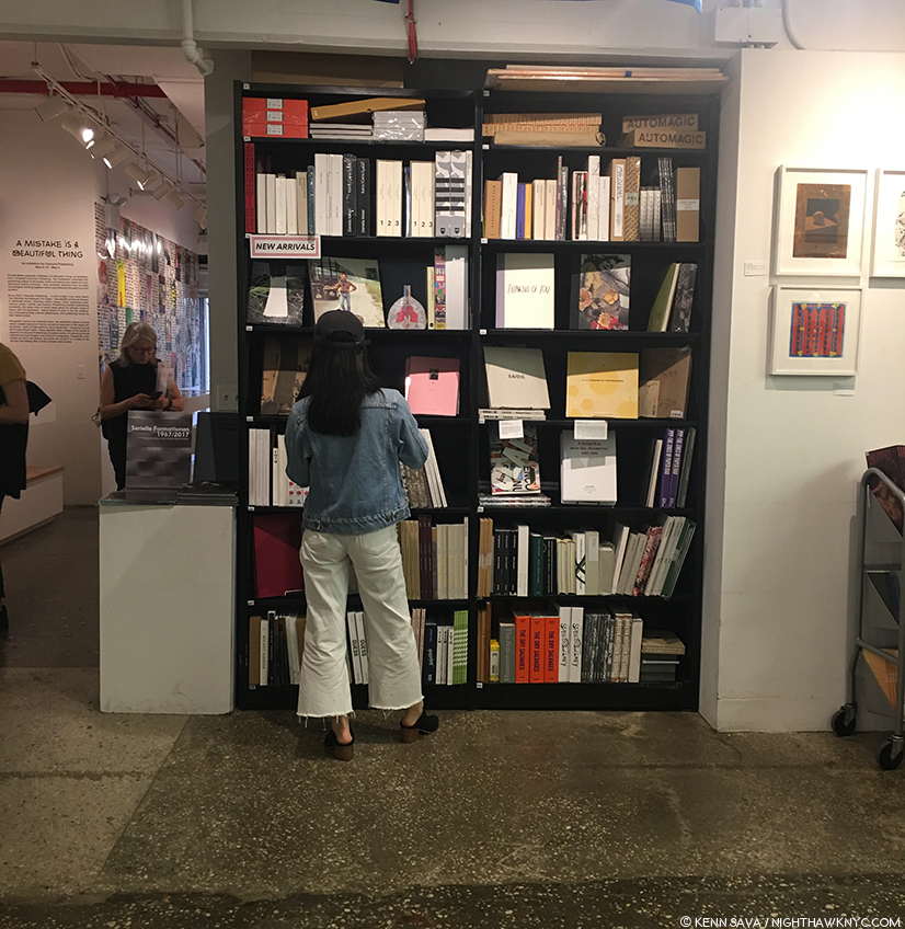
What I do know is that last year, she curated the special exhibition All Power: Visual Legacies of the Black Panther Party, honoring the 50th anniversary of the Seattle chapter’s founding, at The Photography Show/AIPAD 2018, where I discovered her. She was back this year behind Minor Matters’ table for all five days of the show, where, after having communicated by email, I finally had the pleasure of meeting her. There she was, proudly showing off some of the fruits of her, her team’s and her Artist’s labor. with a fine and typically diverse collection of PhotoBooks. The respect and esteem the world of Photography has for her was evidenced by the fact that she was continually joined by a steady stream of Photographers, and Photofolks every time I stopped by Minor Matters’ table, causing me to give up on getting a picture of her, alone!
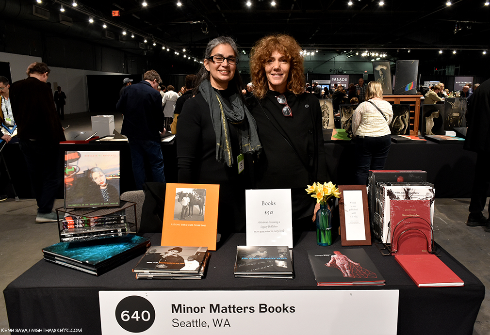
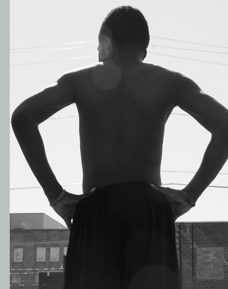
So, I opted for this photo-op. Michelle Dunn Marsh, left, with the multi-dimensional Artist, Marina Font, who’s unique talents are on full display in her auspicious first book, Anatomy is Destiny, seen in the front, second from the right, on April 6, 2019.
However, I’m thrilled to say Michelle somehow found time to answer some questions for me, providing a rare opportunity to get some insights from one of the true movers and shakers in the world of PhotoBooks, and to learn more about this unique lady and her impressive career to date. Without further ado, I am proud to present the subject of my 2019 AIPAD Focus, Michelle Dunn Marsh!
Kenn Sava (KS)- First, I think of you as one of the busiest people I can imagine, a lady who wears many hats. You told me at AIPAD you’re making an effort to cut back. So, could you tell us what roles you’ve decided to focus on these days?
Michelle Dunn Marsh (MDM)- Over the last 15 or so years I have been in many roles highlighting many people in my effort to serve the medium of photography. While I am proud of so much of that work, I reached a point last year where instead of wonder and awe I mostly felt relief at the completion of any given activity (exhibition, publication, lecture, panel) and resignation at what still awaited me on the to-do list. That is not how I want to show up for the work.
So I gave up a fair amount of authority, power, platform, and countless responsibilities in the role I had at PCNW as Executive Director & Curator to take on a new role, Chief Strategist. I am focusing on potential real estate development of our property to secure longterm financial stability, providing oversight to the staff managing our re-accreditation process that happens every 10 years, and implementing new visual literacy programs focused on our mission to teach people how to see.
My activities and responsibilities for Minor Matters haven’t really changed—I have freed up more time to dedicate to them, and to myself. The last few years under the current president have been traumatic; I need to keep myself strong to continue to publish books, lecture, and teach.
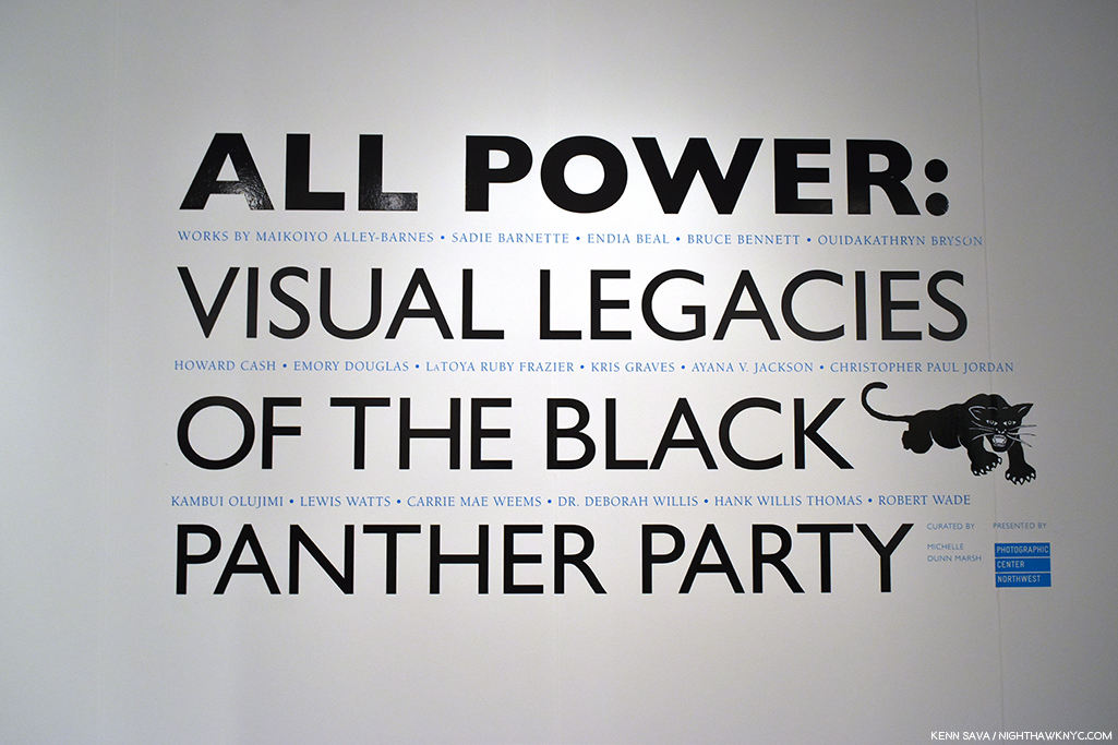
Flashback: AIPAD, April, 2018. Michelle curated the special exhibition- All Power: Visual Legacies of the Black Panther Party, which was my introduction to her. In this piece, I’m going to revisit her show in pictures as our Q&A progresses for those who missed it.
KS- Speaking of your Executive Director & Curator time at PCNW, I discovered you last year at AIPAD where the terrific show you curated, All Power: Visual Legacies of the Black Panther Party, honoring the 50th anniversary of the Seattle chapter’s founding, debuted (I believe) before moving to Seattle. That’s quite a feather in your cap, curating a show at AIPAD. How did the show come about, and what was the experience like for you?
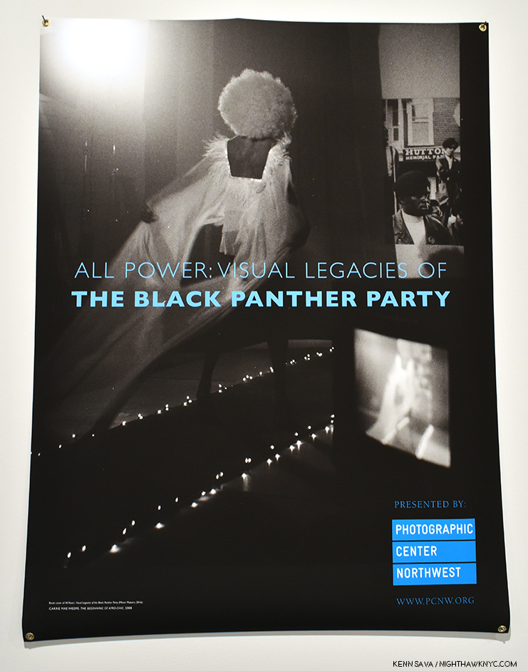
Carrie Mae Weems’s The Beginning of Afro-Chic, 2008 (Detail), appears on both the exhibition poster and the cover for the show’s Minor Matters catalog.
MDM- Minor Matters published the book in 2016 to coincide with the 50th anniversary of the founding of the Black Panther Party; the book served as a complement to the tremendous anniversary exhibit Rene deGuzman curated at the Oakland Museum of California. It was an emotional and exhausting and important project, given all else that was happening in the U.S the summer and fall of 2016. My friend and colleague Negarra A. Kudumu ended up co-editing the book with me, and I could not have completed it without her, and without the support of all the artists and contributors.
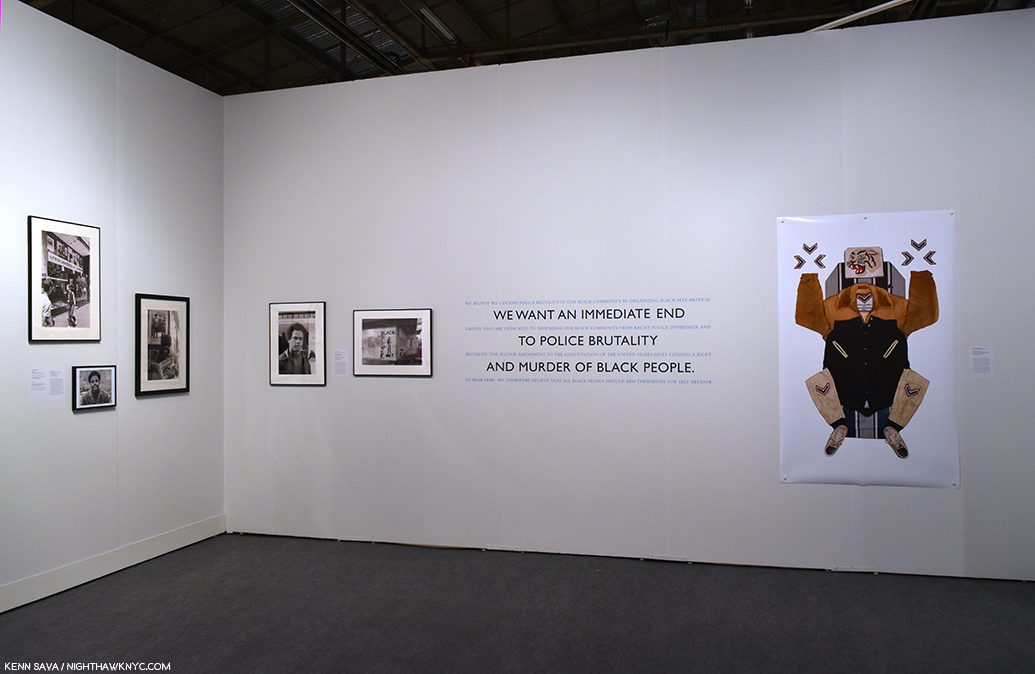
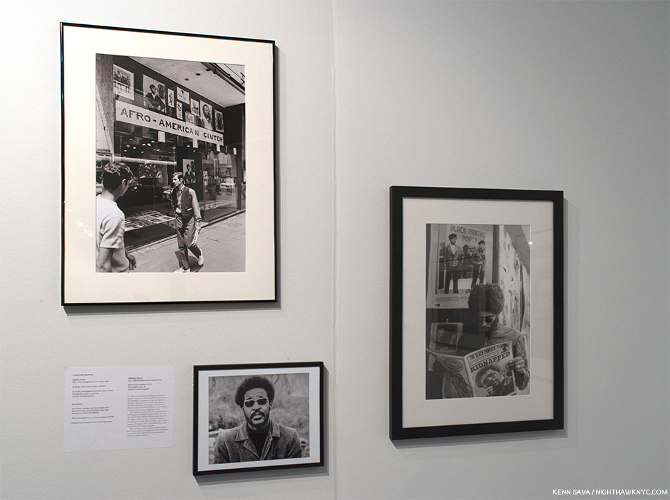
All Power Installation view. Work by Robert Wade, Gill Baker, Deborah Willis on the left wall, Unknown Photographer, Lewis Watts, and Maikoyo Alley-Barnes, right of quotes from the Black Panther Party Platform and Program.
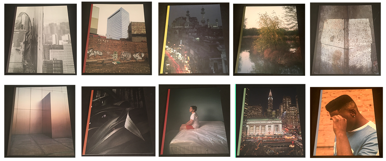
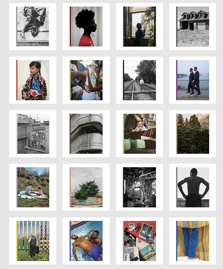
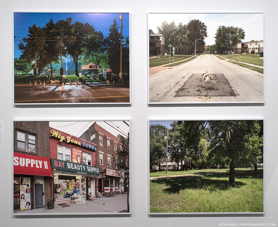
I knew the Seattle chapter’s anniversary would be coming up in 2018, and that PCNW, located in what was once the Central District (the historically black neighborhood of Seattle) needed to engage in some way. I am very sensitive to conflicts of interest between my roles at PCNW, a 501 (c) 3 organization, and Minor Matters. So I went to the board and said that I could work with the nationally-oriented content I had already developed for the book, or we could develop a Seattle-specific exhibition or program for 2018, but that given the circumstances the decision should come from them so it could not be perceived that I was using my position at PCNW to promote Minor Matters. The board unanimously decided that I should develop an exhibition from the All Power book, which gave me an opportunity to add some artists I either didn’t know or wasn’t able to include in the book, including LaToya Ruby Frazier, Sadie Barnette, Ouida Bryson, Christopher Paul Jordan, Jasmine Brown, and someone you’ve gotten to know well, Kris Graves.
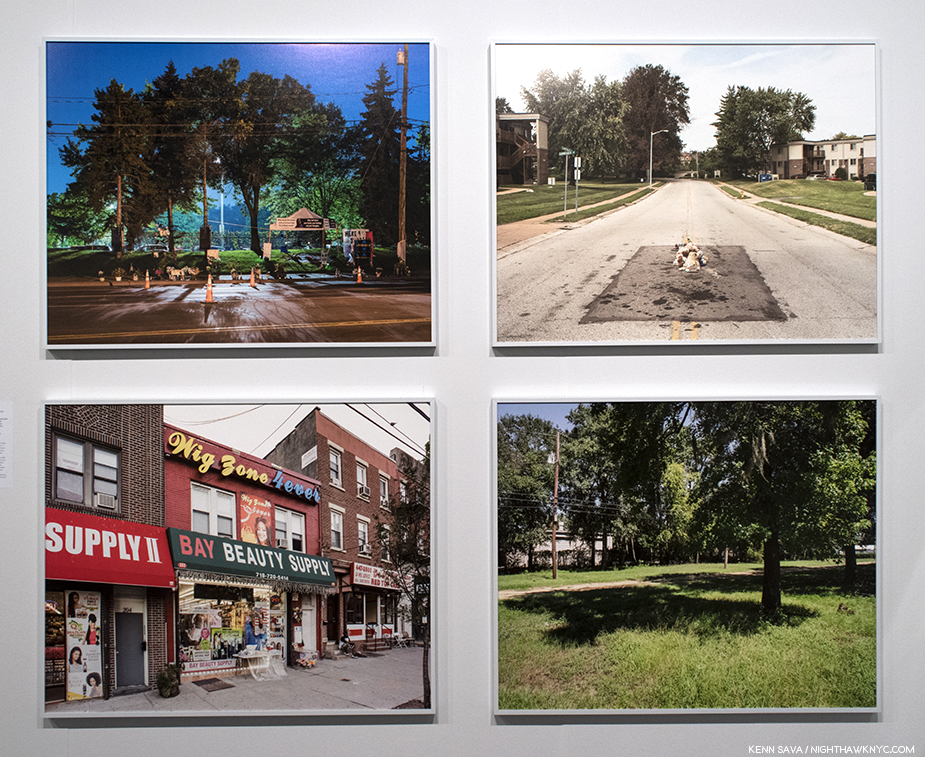
The “legacy” of All Power. I discovered Kris Graves, who I’ve written about since, when I saw these 4 pieces from his series, A Bleak Reality, 2016, revisiting the places where black men were murdered by police, stopped me cold. The so-called “New Topographics” ends here. Installation view, April 7, 2018.
Simultaneous with the show’s development, I gave a copy of the book to my friend and colleague Steven Kasher (then of Kasher Gallery, now with David Zwirner). Steve has a wonderful history of exhibiting and publishing work related to the civil rights movement and other social justice issues, and I thought he would appreciate the book. He immediately said, “this needs to be seen in New York; would you want to show it at my gallery?” It was such an immediate and generous response. Many of the people in the book have representation through other New York galleries, so I wasn’t sure how that would work out, and said so. And then Steve thought of AIPAD, and asked that I send him the exhibit checklist. The special exhibitions had already been determined, but there was a possibility that one of them was not going to work out.

All Power Installation view of works seen elsewhere in this piece.
I sent him the information, and put the possibility out of my mind. And then in January 2018, I got an email from AIPAD saying they’d like to premiere the exhibition. We had just completed a very complex show in Seattle, Notions of Home, and were opening Jun Ahn: On The Verge. I’d told the exhibit coordinator that All Power would be a simple, straightforward undertaking. Instead in three months we were figuring out how to get the show to New York then back to Seattle with artists spread across the United States, what would be produced and framed where, how it could be crated, for the very small budget allocated. It was insane. And extraordinary.
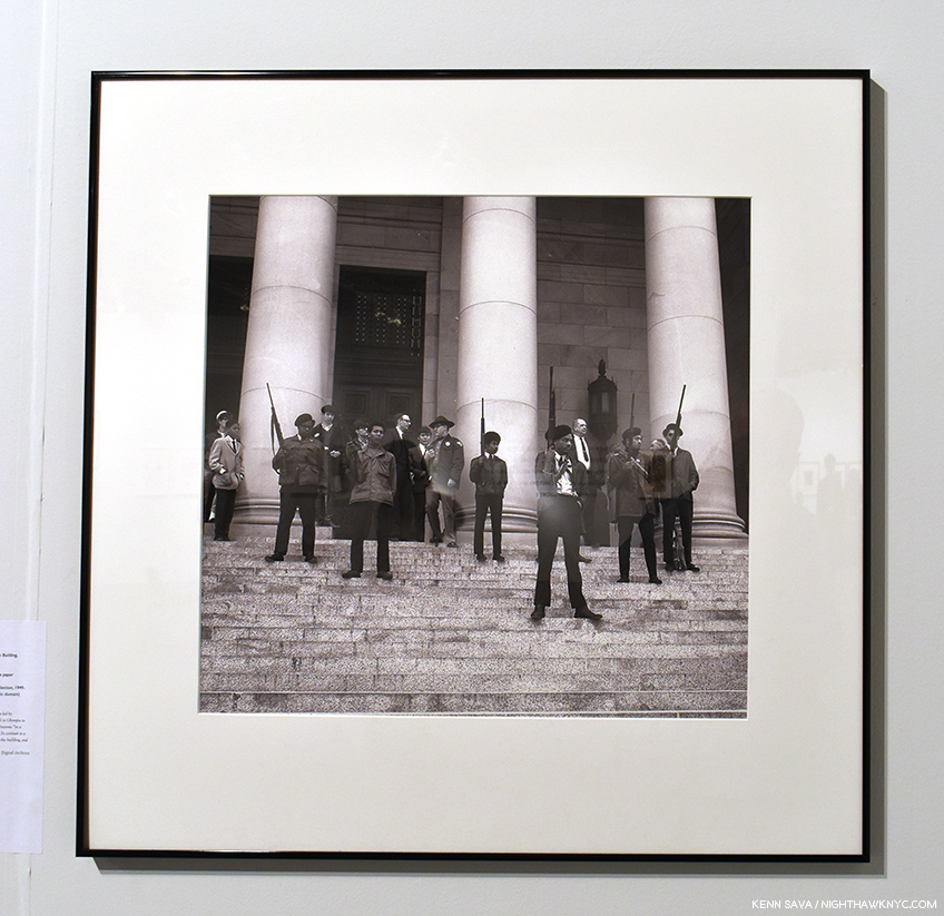
“Extraordinary” is a word I use to describe the results- the show- one of the more memorable, thought provoking, shows I saw anywhere in 2018, which was full of amazing work- like this, Photographer Unknown, Black Panthers on the steps of the Legislative Building, Olympia, WA, February 28, 1969/2018, printed by Steve Gilbert of PCNW.
Not one to miss a perfect opportunity for a segue, when one is offered, to get another perspective on the show, I asked one of the Artists included in All Power, Kris Graves, Photographer and head of Kris Graves Projects, what the experience of being in All Power was like for him. From Portland, Kris said, “I am honored to have been part of the All Power exhibition. It is an important show that traveled a bit but deserved more air time. The world is not kind to artists of color.” A fellow publisher, in a statement that would seem to speak to why so many well known Artists (like Carrie Mae Weems, Hank Willis Thomas, and LaToya Ruby Frazier) along with a number of historic and newer Artists deserving wider attention (like Emory Douglas and Maikoiyo Alley-Barnes) appear in All Power, Mr. Graves added, “I wish Michelle lived in New York but I’m glad she’s doing good work in Seattle. She is what the art world needs more of. Caring individuals that understand issues of agency in our society. She makes strong projects and I’m inspired by her. One of her new books is with Eirik Johnson and it comes with a vinyl record filled with new music from him and his friends. That shit is awesome. I hope Michelle and I collaborate sooner than later. I’d do whatever she asked.”

Emory Douglas, Free the G.I.’s, 1973, as seen in All Power.
KS- Michelle, before all of this, as you mentioned, you’ve had many roles. I see you were involved with the Aperture Foundation, one of the most important Photography orgs in the world. What did you take from that experience?
MDM- I will spend much of my future continuing to explore what I gained from Bard College, and from Aperture. Both were incredibly formative institutions for me. When my tenure there ended perhaps my greatest fear was that that would be the conclusion of my life in photography; thankfully it was not.
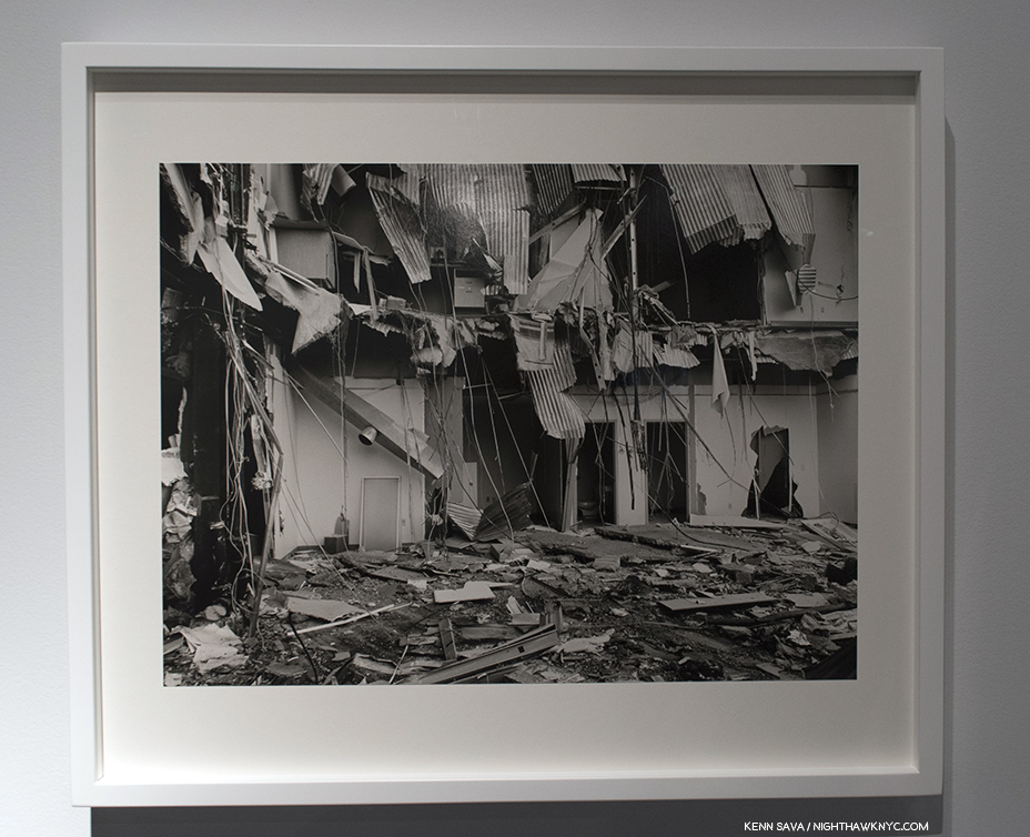
LaToya Ruby Frazier’s UPMC Professional Building Doctor’s Offices, 2011, from the series, “The Grey Area,” which documents the demolition of Braddock Hospital in her Pennsylvania home town, which she had been involved in trying to save, as seen in All Power. Ms. Frazier’s work in All Power were leant to the exhibition by Gavin Brown’s Enterprise.
I started working freelance for Aperture in the fall of 1996, and went on staff six months later, which began a 15-year pattern of full-time, part-time, and freelance employment as a designer, project manager, Co-Publisher of the magazine, Deputy Director of the foundation, and some titles I probably don’t even remember. I launched Aperture’s first website, in 1997, built with my graduate-school roommate Paula J. Freedman. I worked on its first in-house Macintosh computer to review files in the burgeoning transition to digital mechanicals and typesetting. I sequenced books on the floor of the Burden Gallery with exhibition prints that I later measured top and bottom, left and right, to calculate percentages for how the print needed to be squared and sized for reproduction. I learned from and argued with Michael E. Hoffman, Aperture’s impresario executive director, who once handed me a petal of a dahlia to convey what he wanted the jacket design of a book to feel like. I covered his office with an Amy Arbus photograph of a baby that I desperately wanted to be the cover of an issue of Aperture I was designing (he laughed, which was rare, but did not approve my cover).
I was most closely mentored by Stevan A. Baron, my thesis advisor in grad school and the head of production at Aperture. He took the reproduction of gelatin silver and platinum photographs as seriously as most great photographers took the photographs themselves. I learned about the past history of photography, and the history in the making through work we were publishing or exhibiting. I learned about, and felt, images that hurt to be seen and needed to be seen anyway. I learned the craft of fine bookmaking, from paper to binding to typography to physical size and how the photographs sit most comfortably on the pages. I learned that photography is a vehicle by which we explore the lives we live. Aperture’s mission and founders established strong ideals that still influence me, and my affiliation there opened many doors.
This will be an endless interview if I continue answering this question. I hope that the work I do today continues to illuminate what I gave to and gained from those years at Aperture.
All Power Installation view. LaToya Ruby Frazier, left, and immediately right of the corner and Emory Douglas, right.
KS- How did you get into the world of PhotoBooks? Where did your love of them come from?
MDM- I was raised Catholic. “In the beginning was the Word, and the Word was with God, and the Word was God.” Book of John. Gorgeous notion, even thousands of years later through who-knows-how-many translations. The Word was God. So, my love was first for books, because as I saw it books were manifestations of the divine. In college I learned that in ancient Irish culture poets had great power; I felt connected to that lineage as well through my father’s people. I was also concerned from a young age with the relationship between photography and memory. Did I love the photograph of my third birthday because it reminded me of that amazing experience? Or was that birthday my favorite memory because I often looked at a photograph of it? I was skeptical of the seductive nature of photography, while also drawn to it.
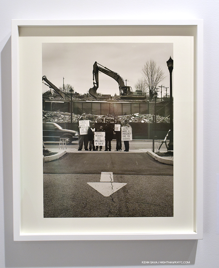
LaToya Ruby Frazier’s UPMC Global Corporation, 2011, from the series, “The Grey Area.” To get a sense of what it was like to live in Braddock, PA, at the time, check this out. As seen in All Power.
I was introduced to significant photography through the Publications office at Bard, largely due to its director, Ginger Shore. She published portfolios by William Wegman, Thomas Struth, Cindy Sherman, not because they had any connection to Bard but because she wanted people to see their work. She used Wynn Bullock photographs to illustrate science articles. She had only two reactions to a proposed design for a poster or brochure or whatever else I was empowered to work on—”it looks great,” or “it looks like sh*t.” Elena Erber, the art director, slowly taught me about design, about letting a great photograph do the heavy lifting, about color theory and typography. Soon those women were advising me on what classes to take to further my knowledge—color theory, basic painting, history of photography, tutorials on the origins of modern type.
Andy Grundberg’s book Brodovitch triggered an awareness of design, printing, content—elements resulting in a whole greater than its parts. It is the only book I’ve ever contemplated stealing (I didn’t; it should still be in Bard’s library). And then Larry Fink’s Social Graces truly registered with me—the mysterious richness and tonality of the photographs, the warmth of the paper, the placement of the type. I was sitting on the floor of the college bookstore, and remember seeing “Design by Wendy Byrne” on the copyright page. The concept of “design” was still new to me, but I knew then that books could manifest from more than words alone, and whole new worlds opened.
KS- For a publisher making important and beautiful books, why the name Minor Matters?
MDM- There are two primary origin points to our name. The first is Minor White, and yes, I believe that Minor matters. He is a lesser-known figure in our pantheon, and that is unfortunate—his teaching, writing, editing, and photographs deserve greater attention in my opinion.
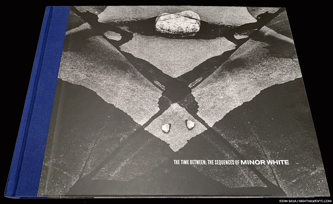
Given her history at Aperture, which Minor White was a cofounder of, I should have realized Minor Matters was a reference to Minor White. This gorgeously produced volume is one of my favorite Minor White books, and I share her feeling that he is unduly overlooked today.
The second is that as a tri-cultural mixed race individual in America, I occupy an insider/outsider space, and from my privileged position I want to honor and lift up my and others’ fringe viewpoints.
I developed my expertise under the auspices of a very respected institution in the history of American photography, working with some of the most acclaimed practitioners. That has granted me great privilege. Yet within that space I have also been at various times a minority—because I am from the west coast; because I am a woman; because I am Caucasian; because I am brown; because I am confident; because I am smart; and mostly because I am polyvalent in a world that struggles to genuinely value multiplicity.
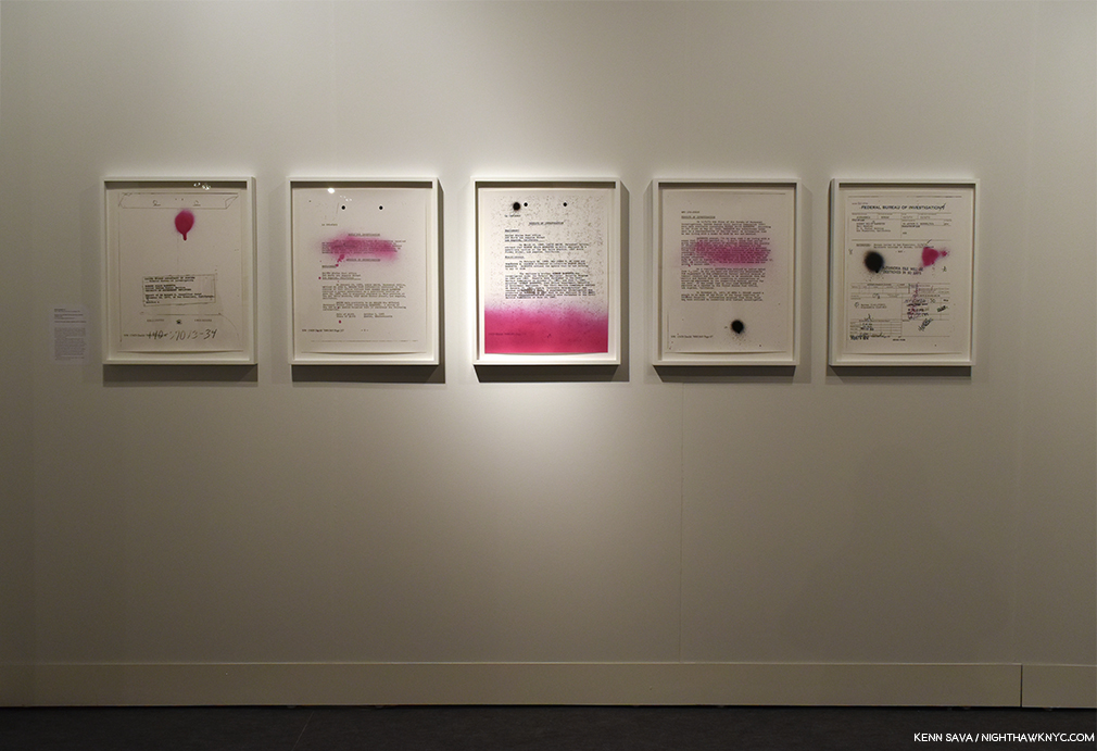
All Power Installation view of Sadie Barnette, Selections from My Father’s FBI File, Government Employees Installation, 2017
KS- Your pre-sale model of requiring 500 copies to sell at 50. plus 9.95 shipping before it goes into production would seem to serve a number of purposes. In this day of too many books and too much Art in the world, it helps to save our precious trees by making sure there’s a demand and desire for the work on the part of the public, while remunerating the Artist with 100 copies of a beautiful, well-produced book. What went into Minor Matters settling on this formula?
MDM- It evolved over 20 years in publishing—observing the joys and challenges at Aperture, at Chronicle, drawing from my graduate degree in the business side of the industry, talking to photographers, and honoring what Steve Baron taught me about manufacturing beautiful books for future generations to enjoy.
KS- The process retains a feel of a personal investment on the part of its audience. The first 500 get their names published in the book, and you consider them to be “co-publishers” of the book. That’s pretty cool! Once the book is finished, the “direct” feeling remains—you don’t sell on Amazon, preferring to “privilege and highlight the good taste of independent bookstores,” as it says on your site. I’m in bookstores almost every day and that’s where I discovered your books, after word of mouth told me to look out for them. Being able to physically hold and see a book is priceless, and the only way to fully appreciate all that’s gone into it, in my opinion. How have you managed to survive without depending on the biggest internet platform? What are the benefits you’ve discovered of doing it this way?
All Power Installation view. Robert Wade, upper left, Gill Baker, lower left and Deborah Willis, right.
MDM- When we launched in 2013 we kept getting asked what our “exit strategy” was. Steve comes from the start-up world, so he knew this was code for “when do you think you are successful enough to sell,” or “when do you think you have to pull the plug on your idea?” I had no idea why people kept asking us that. We knew we were not building something to sell! But we agreed that if we launched ten books and none of them made it into print, then maybe our concept wasn’t feasible. We published three of the first five titles we launched.
I am fortunate to have interacted with people like Leon Botstein, president of Bard College, Michael Hoffman at Aperture, Aaron Dixon captain of the Seattle chapter of the Black Panther Party, and so many incredible photographers, so my idealism does not feel isolated or out of keeping with the people around me I admire. I have also learned from all of them that you have to be willing to put in the time, and do the work.
Selling to bookstores it’s like any other sales situation. We have to establish relationships, keep in touch, follow through, be professional. Thankfully our books do a lot of the work for us—people value them. And I have two decades of experience in publishing, which helps a lot. I know what terms I will offer, what is fair to the bookstores, what is mutually beneficial to them and to us.
Probably the greatest advantage to not being on Amazon is that our price stays the same wherever someone buys our books. That is important to me. We strive to over-deliver at our set $50 price point. I don’t want to see the book somewhere for $4.99 when we’ve collectively invested that many times over in resources of time, materials, and cash to create it. I think our audiences understand that, and likely appreciate that we take their purchase price seriously and don’t want to undercut it.
Taste, style, beauty, range and the unexpected…always. Those are qualities that define Michelle’s and Minor Matters books, for me. That steady stream of visitors continues in the background.
KS- You’ve seen and continue to see as many PhotoBooks in all stages of development for the last 2 decades as almost anyone else on earth. In that time, digital cameras, the increased use of computers and digital technology have brought about the biggest changes in the world of Photography. Has all of this led to better books in terms of a finished product in your view?
MDM- I respond to work that has clarity, a sense of craft of whatever the medium is being explored, and vision—the tools used rarely matter to me. There is a lot more work being produced in this digitized age, but I see a lot of work by people who are not necessarily curious about the history or future of the medium, and no, the photography, and the books resulting, are not necessarily better.
I think the advances in print-on-demand quality are extraordinary—anyone who wants to see their photographs in book form can do so. That’s such a gift to so many creative people! And yet I find that many people who could take great joy in utilizing these advancements are not satisfied by it. It’s too bad.
I am turning toward teaching the history of publishing as much as the history of photography, as my world embraces both, and publishing as an industry is still vague to many, or assumed to be “easy,” when it fact it long predates photography itself!
At this point, I reached out to the aforepictured multi-talented Artist, Marina Font, to learn more about what the experience of working with Michelle and Minor Matters was like for an Artist they published.

Marina Font, Anatomy is Dentiny, published by Minor Matters. *Marina Font Photo.
KS- How did you come to know Michelle and how did your project get on her radar?
Marina Font (MF)- Michelle and my gallerist, Dina Mitrani, met in 2013 at the Photolucida portfolio review and became fast friends. Because her involvement with Young Arts, Michelle would come often to Miami and was able to see my last two solo shows at the gallery.
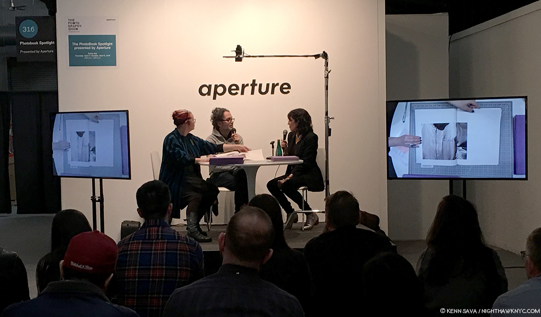
We met for the first time in 2017 at AIPAD, and as the three of us sat over coffee, Michelle proposed the idea of collaborating on the publication of my first monograph. I could not believe it! A year later the book went to print and I am very honored to share that Aperture selected Anatomy is Destiny to be on Aperture’s Photobook’s Spotlight at AIPAD.
KS- What was working with her making Anatomy is Destiny like for you?
MF- Working with Michelle on the realization of this book has been a dream. Her knowledge and professionalism are impeccable, as well as her openness and respect for the artist’s voice.
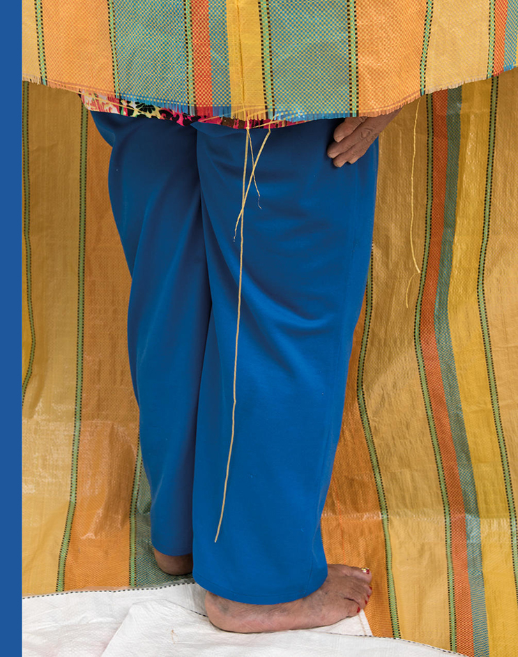
Marina Font, from Anatomy is Destiny. The Artist told me this about her background- “Back in Argentina (where she was born), I attended a Design School where I took multi-disciplinary classes, like sculpture, painting and design, and was introduced for the first time to photography. We started making photograms, and since that “magic moment” when I saw an image come to life in the developer tray, I fell in love with the medium. I later joined a local “Foto-Club” and continued to learn there. Once in Miami I completed my Master of Fine Arts in Photography at Barry University in 2009.” *Marina Font Photo.
The realization of this book presented a couple of challenges: the works presented in the book are a selection of works from two consecutive series that challenge Freudian views of womanhood, and at the same time they challenge the notion of photography. Here are a few reasons why:
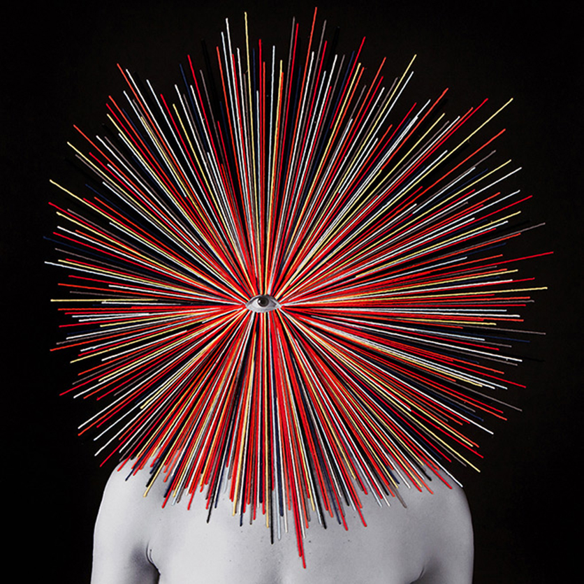
– The entire book is made up of 75 works that depart from one single photograph. What makes each work unique is the manual intervention of each photograph with paint, thread and textiles. We really wanted the “materiality” of the work to be properly reproduced in the book.
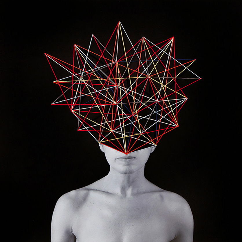
Marina Font, from Anatomy is Destiny. Marina told me this about her process- “In my latest series, I begin with a printed photograph, and then apply paint, textiles and embroidery to the surface of the image.” *Marina Font Photo.
– The size of the works range from 8 x 6 inch pieces to works where the body is printed in real scale, so we wanted that to be easily read in the book as well.

Marina Font, from Anatomy is Destiny. *Marina Font Photo.
-The title of the book needed to represent both series, “Dark Continents” and “Mental Maps” so we chose one of Freud’s quotes on gender, “Anatomy is Destiny” to open the conversation.
KS- Michelle, more people than ever before are taking pictures and, by extension, I’m sure that more people than ever before are dreaming of making a PhotoBook, as you touched on. What are the things you wished more people knew before they contacted Minor Matters in hopes of making a book with you?
MDM- I would suggest they take a look at who we’ve published (there are bios for the authors as part of each book description) and run their own resume or CV against one to three of our authors. Are you at a similar point in your career? Do you have multiple developed bodies of work? Is this your first book or the first in some time? Does your work reflect “the surface of life” today? How would you describe it in terms of that?
And why do you want to be published by us? That’s a good question to answer for any publisher you approach.
KS- What’s the percentage of books MM publishes versus the total number submitted to you? Has the number submitted been going up the past few years?
MDM- We read what is affectionately known as the “slush pile” monthly when I was at Chronicle; Aperture had two portfolio drop-off periods when I first started there, then one, and now it is a portfolio prize you apply for.
We actually don’t take submissions, though I am contemplating an annual opportunity to submit (and people send proposals anyway, but Steve fields most of that).
We do often get recommendations for projects through our authors, other photographers, or colleagues such as curators and gallerists.
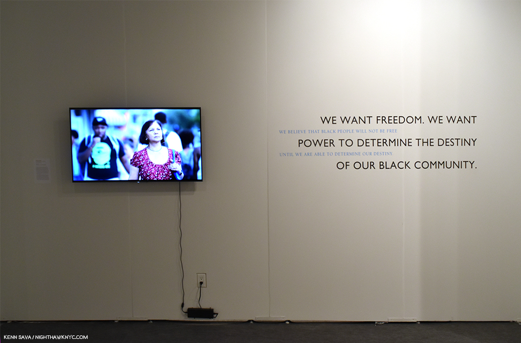
All Power Installation view with Carrie Mae Weems, People of a Darker Hue, video, left, quotes from the Black Panther Party Platform and Program, right.
KS- At the risk of asking you to choose among your children, which books that you’ve published are you particularly fond of, or wish more people knew about?
MDM- Oh, I love them all, so much! You knew I wouldn’t answer that. I’ve been very verbose elsewhere so it’s good to be silent here.
KS- Since you mentioned freeing up some time for yourself, what “else” do you enjoy?
MDM- That’s a work in progress—The Highline Heritage Museum, nearby where I live, has asked to do an exhibition about me through the photographs I live with, which is stirring up all sorts of challenges. How do I sum up the last 25 years in 10–15 photographs? The exhibit is scheduled to open in June so I won’t be struggling with that too much longer.
In New York, I like to walk, to see the light bounce off buildings, to eat at my favorite haunts, see my friends, and take in the energy. In Seattle, I am caretaker to two old cars (the 1950 is mine, the 1968 is my sister’s) that I drive as often as possible in the summertime. I am also trying to bring the next generation into contact with those old beasts so they can learn to love them, too.
I still read books with words instead of photographs, and would like to do some writing about my family’s histories, which I find fascinating (though I might be an audience of one). What else? Music, good food. If I write much longer I’ll be back to talking about books or photographs…..
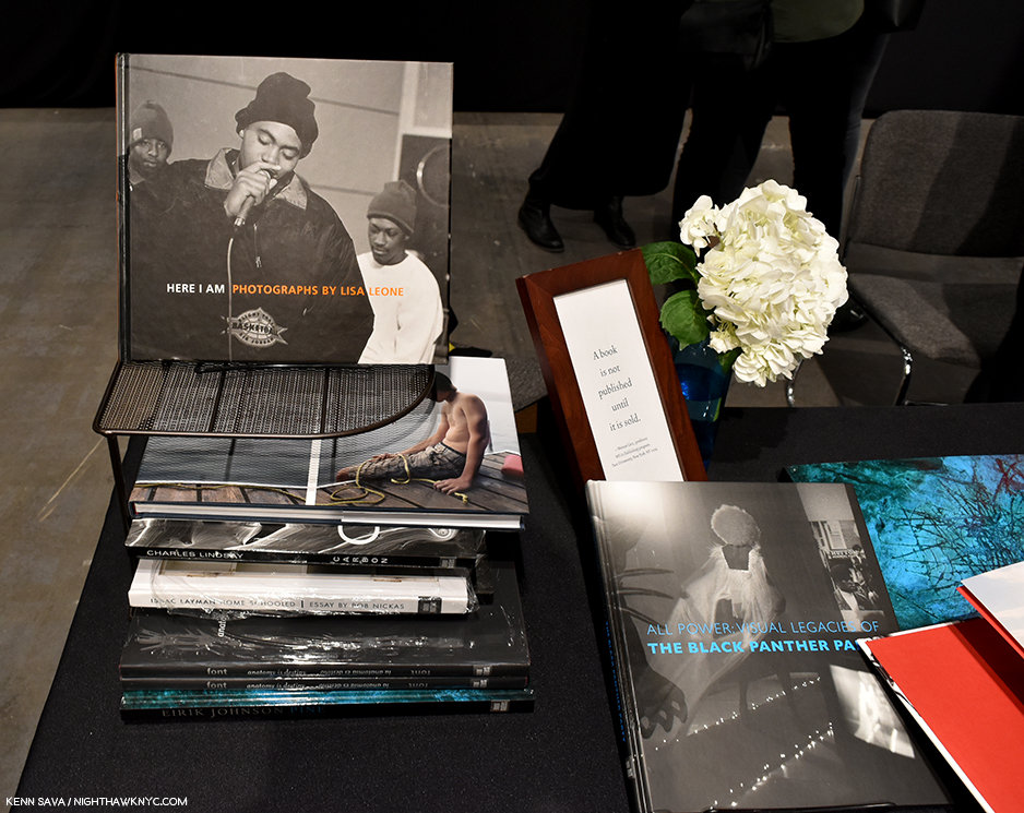
The sign reads “A book is not published until it is sold,” a quote from Professor Werner Linz of Pace University,
——–Q&A Ends——-
Minor Matters represents a breakthrough in a publishing business model that I think we will see more and more companies copying (as some have already in the six years since it she founded it). Emulating a business plan is one thing others can do, benefitting from the experience and hard-earned wisdom of PhotoBook veterans, like Michelle Dun Marsh, who have been doing it for multiple decades. But, to be successful, it seems to me, requires an element that cannot be copied- the taste, vision and eye of a leader who knows, who sees a project in its formative stages and has the experience, the skills, and the talent to see it through to becoming the best book it can be.
The companies consistently producing the best PhotoBooks each have one. Minor Matters has Michelle Dunn Marsh.
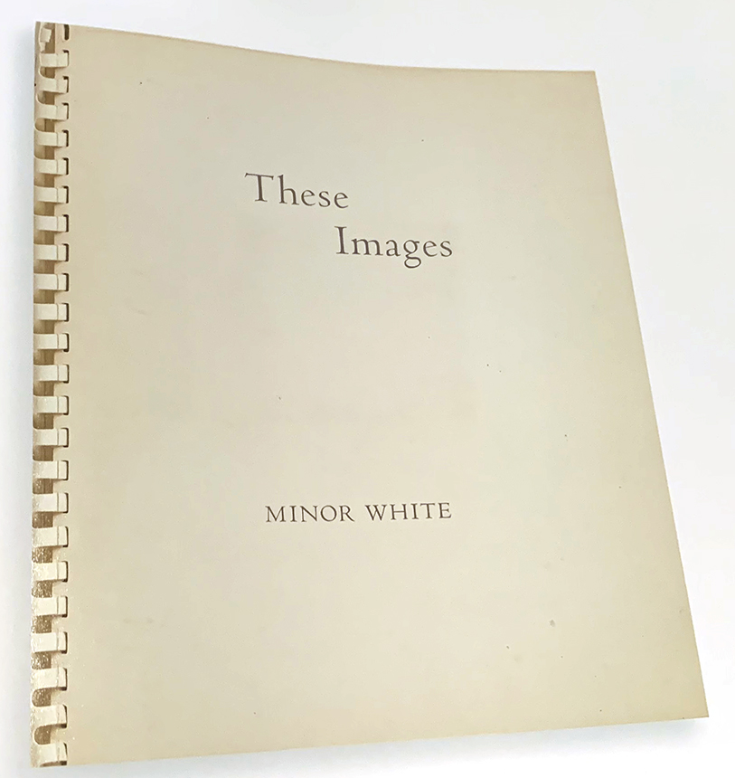
Influence casts an endless shadow. Minor White, These Images, 1950, from The Time Between: The Sequences of Minor White.
The next time Michelle and Minor Matters “sling pictures” your way, don’t duck- take them in. In the meantime, she’s building quite a legacy that’s becoming major, one that might make even Minor White, smile with pride.
BookMarks-
It’s hard to go wrong choosing among Minor Matters releases. Their catalog is full of quality, and the unexpected, showing a range that might make you wonder if one company published ALL of these books. Right there, in a nutshell, is why Minor Matters is a company to keep your eye on, pay attention to, and consider each one of their releases, like I do.
While you’re at it, why not become a co-publisher of one yourself? In addition to getting a copy, if you pre-order your name will be printed as a co-publisher in the book! What better way is there of showing that your support matters? More information on doing just that is here.

A spread from Rolling Stones, 1972, *courtesy of Minor Matters.
*- Soundtrack for this Post is “How Can I Stop,” by the Rolling Stones. “How could I stop once I start.”
My thanks to Marina Font, Kris Graves, Margery Newman, and Michelle Dunn Marsh.
NighthawkNYC.com has been entirely self-funded and ad-free for over 6 years, during which over 250 full length pieces have been published. If you’ve found it worthwhile, you can donate to keep it going & ad-free below. Thank you!
Written & photographed by Kenn Sava for nighthawknyc.com unless otherwise credited.
To send comments, thoughts, feedback or propositions click here.
Click the white box on the upper right for the archives or to search them.
For “short takes” and additional pictures, follow @nighthawk_nyc on Instagram.
Subscribe to be notified of new Posts below. Your information will be used for no other purpose.
- //pcnw.org/about-us/who-we-are/ ↩