The Jonas Wood Phenomenon

Written & Photographed by Kenn Sava (* unless otherwise credited)

Japanese Garden 3, 2019, Oil and acrylic on canvas, 88 x 98 inches. *Christie’s photo.

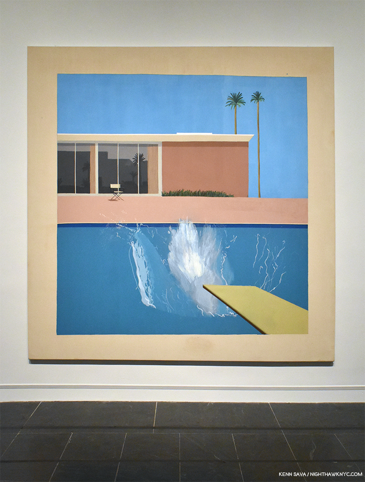
A few weeks ago, on May 17th, Jonas Wood’s Japanese Garden 3, 2019, (i.e. a very recently completed work), sold in a benefit “to conserve one of the wettest tropical forests in the Americas” for $4,928,500.00- almost 10 times the low estimate of $500,000.00! The high estimate of $700,000. would, also, seem absurd given the past few years of Jonas Wood’s market history. My estimates would have been $1,500,000. to 2,500,000., which would put him in the price range of some of the biggest names in Art and Art history. I don’t read too much into the prices paid for Art since people buy it (like they do everything else) for any number of reasons (and it was for the benefit of a good cause). Still, the price realized for Japanese Garden 3 is remarkable when one considers that Jonas Wood’s first one man gallery shows were at the Shane Campbell Gallery, Chicago, and at Anton Kern Gallery, here, in 2007.

Jonas Wood at the opening of his latest show at Gagosian, West 24th Street, April 24, 2019.

Already, Jonas Wood’s work is nothing less than a popular phenomenon in the world of Contemporary Painting. While I can understand his work being popular, how popular it is surprises me very much. I began to wonder what I’m missing.

And so, I have gone to each of Jonas Wood’s NYC shows since 2016 to see more and to gain a better understanding.

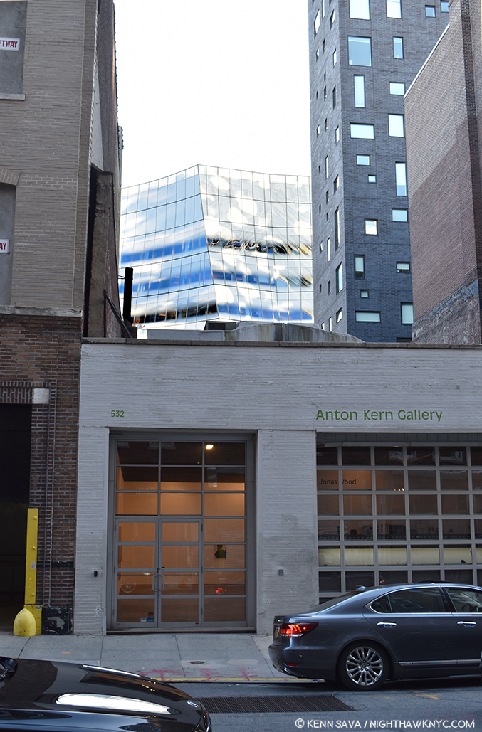
Anton Kern Gallery’s former West 20th Street, Chelsea location seen on October, 2016, during the run of Jonas Wood Portraits, with Frank Gehry’s gorgeous ICP Building looming in the back. The former Kern Gallery building has since been demolished, this view lost.

Jonas Wood first came to public attention, and may be still most renowned for his “Sports” series, a selection of which was collected in his first monograph, the extremely popular Sports Book in 2009 (See BookMarks following the piece for my List of Jonas Wood monographs & catalogues). In it, he gave us his version of sports cards and created portraits of athletes and venues, mining one of the world’s most popular subjects, which, surprisingly, very few Artists have, Raymond Pettibon being to my eye, the most compelling. Born in Boston, Mr. Wood features a number of Celtics and Boston Garden, though his selection ranges from the famous (Shaquille O’Neal and Yao Ming) to names only die-hard fans have even heard of, let alone are familiar with (Buddy Solomon…? Sherman Corbett?). His inclusion of the unfamiliar reminds me of Mr. Pettibon’s subjects.


To this day, a basketball doodle often accompanies Mr. Wood’s signature on books and posters as something of a personal trademark. Sports as a subject may have been the “hook” that got the attention of the Art loving public beyond those who saw his gallery shows, but his work covers a variety of subjects, with an emphasis on domestic scenes and portraits.

After solo shows at Anton Kern in 2008, 2011, and 2013 (and elsewhere in the US and Europe) followed that first 2007 show, Portraits, opened in September, 2016. By then, the buzz around Jonas Wood, and the show, was substantial.

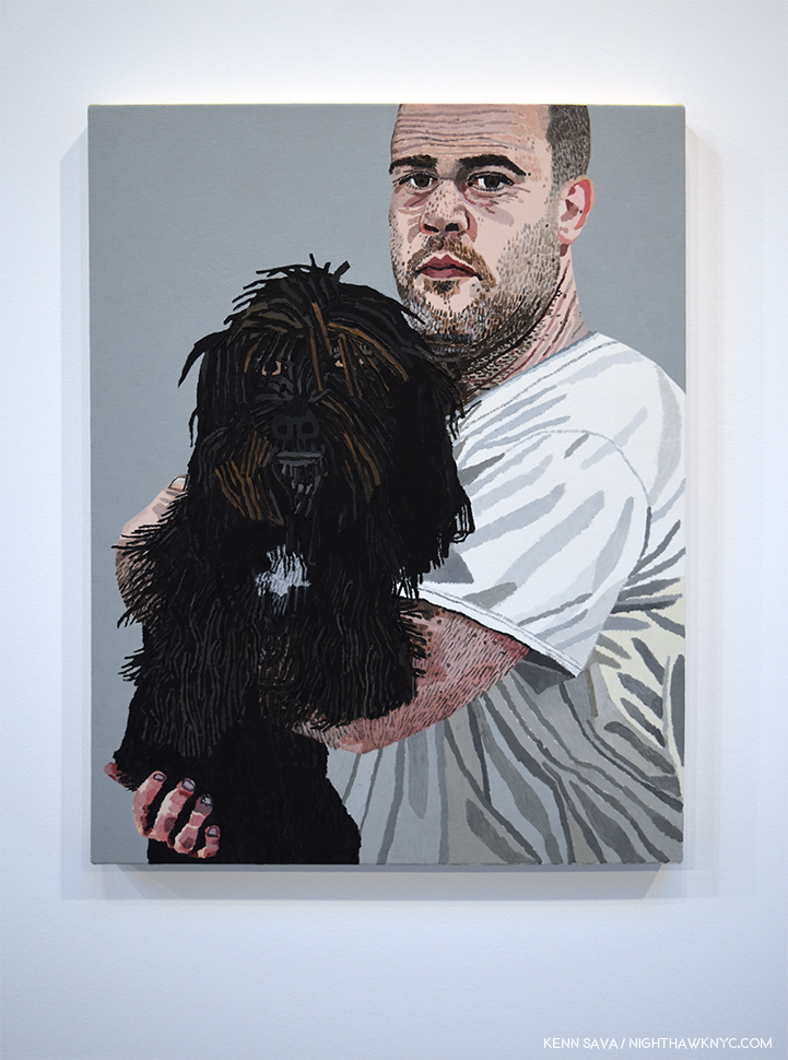
Robot (Self Portrait), 2013/16, Oil and acrylic on linen, 29 x 22 inches, seen at Portraits in 2016.

On October 19, 2016, I went to see what it was all about. I found a Painter who’s work seemed was not shy in revealing its influences (Alex Katz, David Hockney, Picasso, Matisse), in Paintings with a homey feel- these were works that were as much about place, possibly his home, as portraits of people.

Rosy In My Room With His Cat, 2016, 68 x 68 inches, seen at Portraits in 2016.

They had a decidedly personal and intimate feel to them. They were “portraits” of a lifestyle. Perhaps, that’s what resonates most with his fans. (Perhaps the same can be said of Alex Katz’s and David Hockney’s work as well.) 

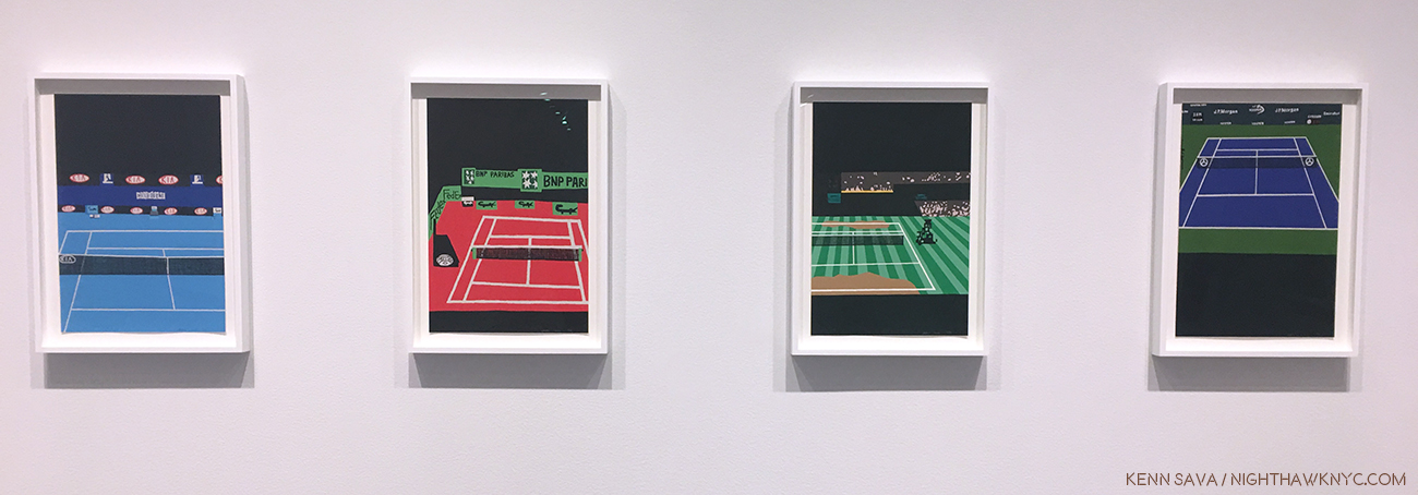
The series Four Majors, 2018, Multicolor screen print on Coventry rag paper, each 19 x 13 inches, seen at Prints in 2018.

From there, the buzz around Jonas Wood has only continued to increase. On April 19, 2018, I saw his Prints show at Gagosian, who has continued to represent the Artist.

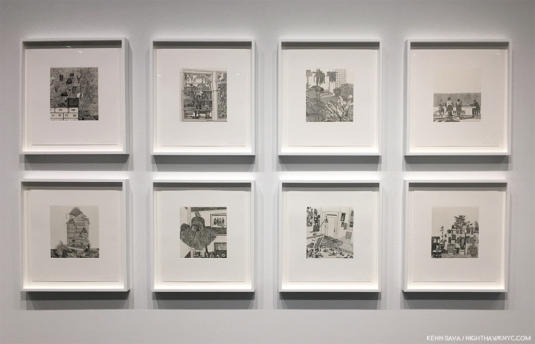
8 Etchings, 2014, Ink on Japanese paper, each 16 x 14 inches, seen at Prints. One set, of the edition of 10, is in the collection of MoMA, who own 3 Drawings but no Jonas Wood Paintings. The Whitney owns two Paintings and two Drawings. The Met owns none of his work. Sseen at Prints in 2018.

Determined to get a better understanding on what is happening here, on April 24, 2019, I went to the opening of Jonas Wood, his current show at Gagosian, West 24th Street, since I rarely go to openings, primarily to see who his fans are and what I could learn from seeing how they interacted with his Art. I missed some of the “interaction.” Each and every work on view was sold before the show opened.

Jonas Wood was on hand, followed at every turn by a film crew.

A few days later, at the opening of Gagosian’s Jeff Wall show, I met and spoke with Mr. Wood about Drawing in his practice. And, I watched with fascination over multiple visits while others stood and pondered the work wondering, “What is it about Jonas Wood that everything he touches sells, and sells for BIG prices these days-even signed books and posters?”

My guess is that there’s a peace and a quiet in his work that looks good on the walls of his buyers. These days, with so much contention, stress, upheaval and ugliness in the world, Art that reflects peace, calm, beauty, color, harmony and exudes a sense of home, contentment and even happiness, would certainly find a big audience. His work reflects, apparently, his life, interests and people he knows- as legions of Painters have been doing for centuries. The vast majority of them never found buyers for their work.

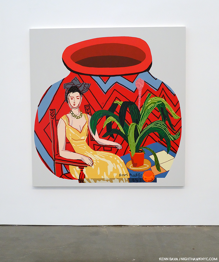
Red Portrait Pot, 2015, 76 x 74, complete with faux Matisse signature en homage. Pots have been a recurring subject in Jonas Wood’s work. His wife, Shio Kusaka, is a porcelain Artist, who he has collaborated with.

While Jonas Wood’s work bears the influences of David Hockney as well as Alex Katz, as I mentioned, but perhaps no other Artist is more to be seen in it than Henri Matisse.

Detail of Matisse Landscape Pot, 2018, 118 x 76 inches.

Yet, once you look past them, he has developed his own style. His work featured views with unexpected planes (seemingly more often in his earlier work than in the new) that makes it both quirky and fresh. I can’t quite put my finger on a predecessor for this, though Cubism, Stuart Davis and (the incredibly overlooked) Ralston Crawford come to mind.

Kitchen on Palms, 2008, 70 x 72 inches, *Anton Kern Gallery Photo

He loves to play with perspective- removing shadow or any sense of depth, and will add layers that jar the viewer into looking closer to try and understand what’s really being shown (as in the almost Richard Estes-like Ovitz’ Library, 2013).

Ovitz’ Library, 2013, 100 x 132 inches, *Anton Kern Gallery Photo

Closer looking also reveals how much work goes into many of these works, many of which feature an almost obsessive amount of detail, as do their size. Finally, it is his choice of subjects that branches his work out from that of Alex Katz. Even David Hockney, who shares Jonas Wood’s love of color and domesticity hasn’t shown us the scenes Mr. Wood chooses, some of which feel like “interior still lifes.” It’s a bit miraculous, I think, that Jonas Wood has been able to balance so many influences so well and managed to produce work that is instantly recognizable as his own.

A mural seen at Starbucks on 8th Avenue and West 22nd Street, April, 2019.

In fact, that it does so so well makes it susceptible to being ripped off by advertisers and corporations, and I expect we will see it all over soon- if we’re not already.

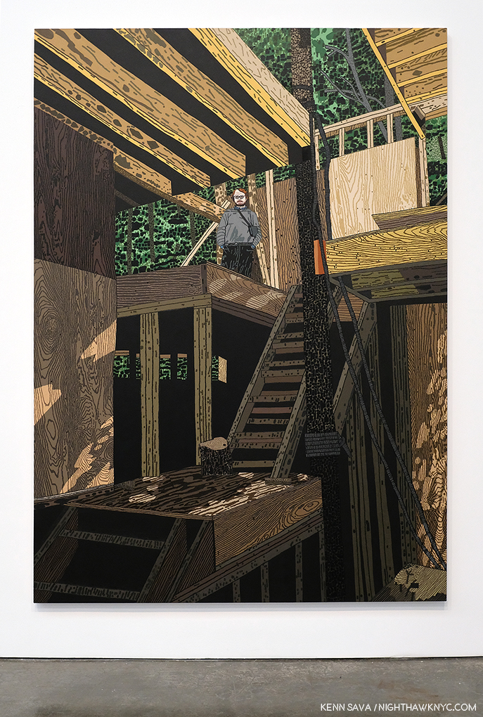
On top of the (Art) world. Young Architect, 2019, 110 x 78 inches, seen in his current show, in a room “dedicated to a series of new paintings of architectural interiors and exteriors,” to quote the press release, that includes the next work as well.

Yet, the big question, at least in my mind, remains- What does it all “mean?”

Jersey City Apartment, 2019, 104 x 142 inches,

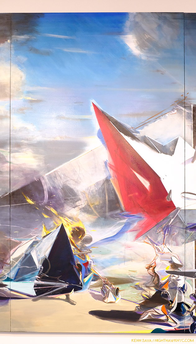
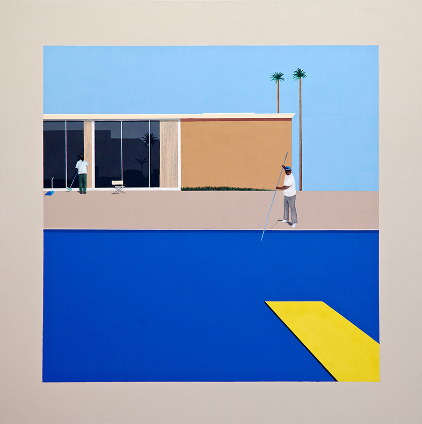
Jonas Wood’s Paintings often play with the existence of space. In some works, there is no perspective- everything is squashed right up against the picture plane (as in Japanese Garden 3), which, frankly, sometimes I find oppressive. In other pieces, there is perspective, but no shadows. This gives those pieces a surreal look. Most interestingly in his current show is Jersey City Apartment, 2019, Oil and acrylic on canvas, 104 x 142 inches, the work selected for the show’s poster. In it we see both perspective and shadows, yet no life, beyond plant life, in spite of the Art on the wall proclaiming “LIFE NEW LIFE” with the Sun over it. The apartment depicted empty, as is the landscape beyond the huge picture window (minus the Sun). On the impossibly balanced coffee table, with dual glass tops, rest seven globular “heads” with varying strange faces and expressions. The work depicts what I imagine to be the setting for a good many of Jonas Wood’s Paintings in the homes of their owners. It’s an interesting work when one considers that almost every other Jonas Wood landscape I’ve seen (partial landscape, here) takes place, apparently, in California. Perhaps? It shows the “life” of Art in the space where it has come to “live” when, possibly, its owners/residents are out working to pay the rent, the mortgage, or? The Art bill. Or, perhaps it’s a commentary of what passes for “life” today- a lonely space in the sky surrounded by steel, concrete and glass. Whatever it is, the Art in this space- the Painting, the sculptural objects on the coffee table, and the table itself, are stuck in this space, like the plants are. Together, they provide the only sign of “life” gong on here.

Jersey City Apartment, Gouache, ink, collage and collored pencil on paper, 24 x 31 inches

The show’s third gallery is full of “corresponding small-scale works on paper,” the press release informs us, one of each work shown in the rest of the show. Jersey City Apartment, for one, is fascinating to compare with the large Painting. In the small work, among other very slight differences, Jonas Wood has included an imitation Roy Lichtenstein portrait of a blonde on the column on the left, which is not included in the large work. Why not? It calls to mind what Richard Estes and Edward Hopper, among others, have said about the inclusion of people in a scene automatically drawing the viewer’s attention to them seeking a narrative reading.

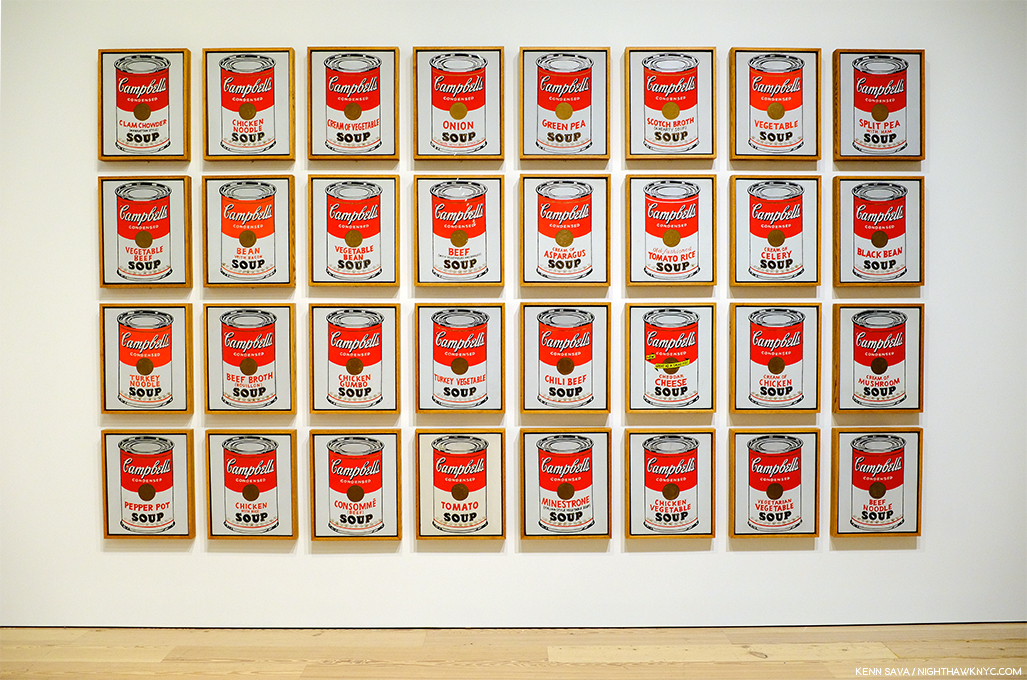
In one sense, Jonas Wood is doing what Andy Warhol and the other so-called “Pop” Artists did- turning the everyday, the things that are parts of Art viewer’s every day lives, into Fine Art. He did this with sports, and he’s continued to do this, expanding into depicting a home life that, apparently, many viewers can relate to, it seems to me, in the process, elevating it to the status of “Fine Art,” as Andy Warhol, et al, did with soup cans, soap pad boxes and celebrities. And so? His is a different kind of “pop” Art. It’s Art based on what’s a part of the (equally familiar) everyday lives of his viewers. Of course, many other Artists do this. With his technique that has a rough, unfinished edge to it, bright colors, and a focus on the essential he picked up from Alex Katz, David Hockney and especially Mattisse, Jonas Wood struck a nerve. To the point that I now believe his work is here to stay. I’m not sure his market is going to stay at the 5 million dollar level (maybe he’ll surprise me), but I don’t see his popularity ending any time soon.

All of that said, how do I feel about the Art of Jonas Wood? It doesn’t speak to me, though I will keep looking. However, I am thrilled to see the work of a Painter being as popular as Jonas Wood’s is in this age of Photography and digital media seemingly taking over the world of Art. I can live with it. And maybe that’s why people buy everything the man Paints- as soon as he does. They can live with it.


BookMarks-

Jonas Wood- A List of Monographs and Catalogues

A few of Jonas Wood’s monographs and catalogues.

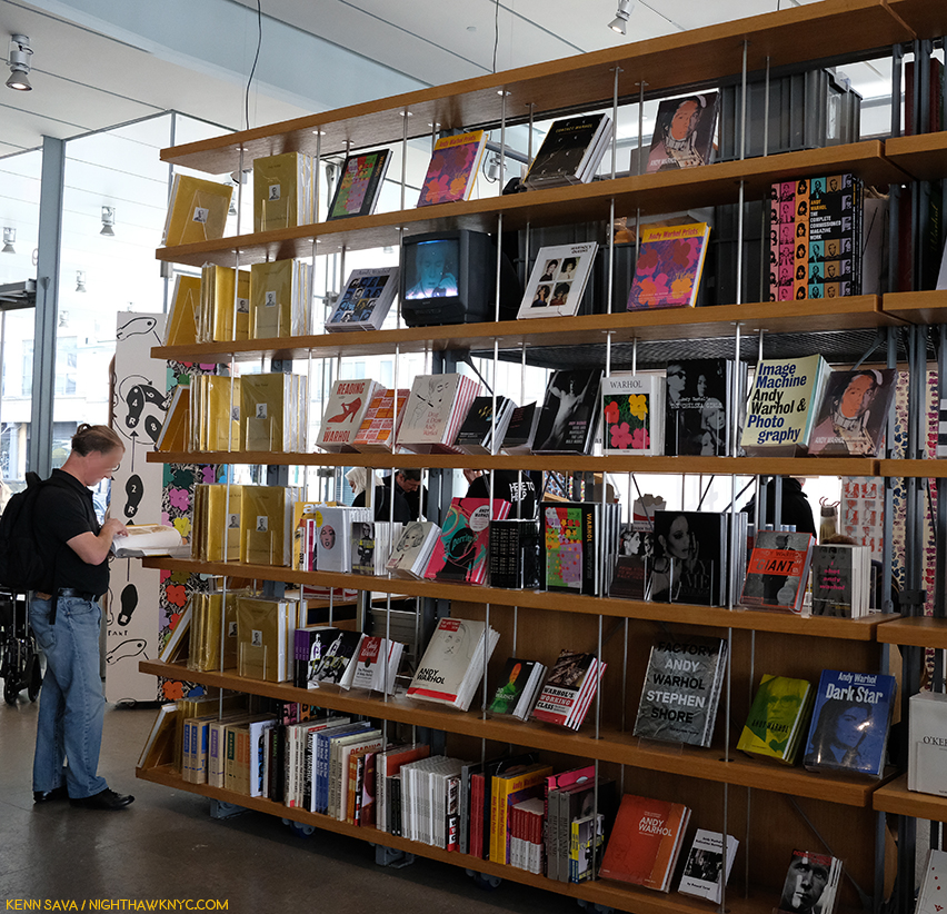
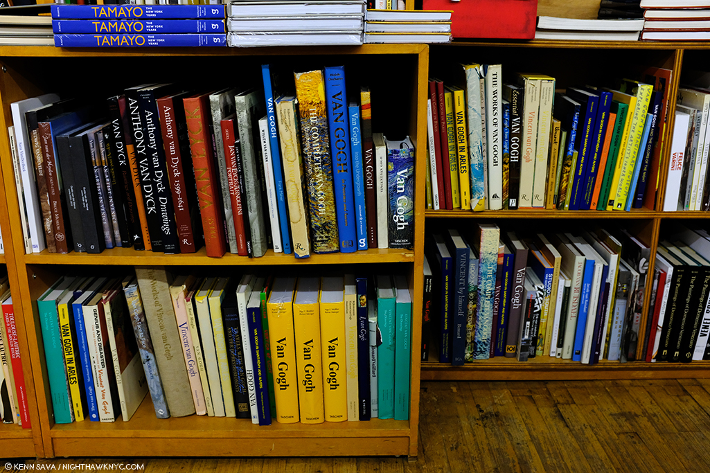
Jonas Wood’s books are, also, something of a phenomenon. They remind me of PhotoBooks in some ways- many are focused (sorry) on a specific body of work, they are highly collectible and eagerly sought after on the primary and secondary markets. A few are out of print and most are printed in relatively small numbers given his popularity today. So? It’s hard to calculate the impact they’ve had on the Jonas Wood phenomenon- a good many of those interested in Jonas Wood’s Art may have trouble finding some of these at reasonable prices. Most of these books have 48 pages, succinctly covering the title topic in a thin size, but the only book that could be considered an “overview” to date is one of the most recent- the catalog accompanying his retrospective at the Dallas Museum of Art, which is still “only” 108 pages and only includes 33 works. Into this void will step the ever interpret publishers Phaidon, who will release the first full length volume on Jonas Wood as part of their fine Contemporary Artists Series around Halloween.

Here is an overview of the monographs released thus far, listed chronologically from the date of the first edition. Title, followed by year of publication, followed by publisher, followed by information on subsequent editions. If you know of any details I’ve omitted, please let me know.

Sports Book, 2009, published by PictureBox, 2nd Edition- 2016, published by Anton Kern and David Kordansky Galleries. 

New Plants Los Angeles, 2010, Anton Kern, published for his first one man museums show at the Hammer Museum

A History of the Met: Vol 1, 2010, Paper Chase Press. 2nd Edition- 2013, Jonas Wood and Anton Kern. In speaking with Mr. Wood, he indicated to me there will be a Volume 2.

Pots, 2015, Gagosian

Paintings and Drawings, 2015, David Kordansky

Portraits, 2016, Anton Kern and David Kordansky

Interiors, 2012, PictureBox, 2nd Edition- 2016, Anton Kern and David Kordansky

Paintings & Drawings, 2015. Out of print and rarely seen.

Paintings & Drawings, 2015, David Kordansky (Out of print)

Blackwelder (with Shio Kusaka), 2015, published by Rizzoli and Gagosian. First edition printed by The Avery Group at Shapco Printing, Minneapolis, 2nd Edition- 2017, printed by C&C Offset Printing Co, Ltd, China

Clippings,  2017, Karma (Out of print)

Prints, 2018, Rizzoli and Gagosian

Jonas Wood, 2019, Gagosian Exhibition Catalog for the current show

Shio Kusaka & Jonas Wood, 1st Edition- date & details unknown, 2019, 2nd Edition published by Stichting Voorlinden & Gagosian

Jonas Wood, 2019, Dallas Museum of Art (the catalog accompanying his first museum retrospective)

Prices on all of these range from $40. to about 150.00, with first editions of Sports Book and A History of the Met costing more- unsigned. Of these, I find Portraits and Interiors the two I turn to most. There is a little overlap between them, and the 2nd edition of Interiors seems to suffer from being reproduced. For those looking for an introduction to Jonas Wood, I would recommend they start there, at least until the Phaidon book comes out. Of course, sports fans may find the Sports Book the most interesting. However, it can be a bit harder to find, and more expensive, than the others.

NighthawkNYC.com has been entirely self-funded and ad-free for over 6 years, during which over 250 full length pieces have been published. If you’ve found it worthwhile, you can donate to keep it going & ad-free below. Thank you!

Written & photographed by Kenn Sava for nighthawknyc.com unless otherwise credited.
To send comments, thoughts, feedback or propositions click here.
Click the white box on the upper right for the archives or to search them.
For “short takes” and additional pictures, follow @nighthawk_nyc on Instagram.

Subscribe to be notified of new Posts below. Your information will be used for no other purpose.

Jia Aili’s Transcendental Vision

Written & Photographed by Kenn Sava (*unless otherwise credited)

T-minus two months to 50 years ago human beings first set foot on the moon. I well remember following the trip on TV (though I have a friend who, though alive at the time, doesn’t believe it actually happened). With all the hoopla about to begin commemorating mankind’s greatest scientific achievement, I saw this relatively small Painting hanging on the wall at Gagosian, West 21st Street, and was suddenly struck by a different feeling. A feeling of what life, on earth, is like today.

Jia Aili, Astronaut, 2018. Oil on canvas, 23 1/2 x 19 11/16 inches.

Buckle up!

Watch your step!

Keep an eye on the sky and the other on where you’re about to put you next footstep.

And off you go into the great adventure called life in these increasingly challenging times. Heaven only knows where any of us will wind up. Back safely “home,” or…

But, this isn’t Neil Armstrong, Buzz Aldrin or John Glenn. The uniform is the wrong color. My associate, Lana Hattan, informs me it’s early Soviet space pioneer cosmonaut Yuri Gagarin, 1934-1968, the first human being to go into outer space, and so, ideology aside, a man who has earned his place among the bravest men who ever lived.

Yuri Gagarin in a possible source image. *Photographer unknown. 

Seeing this now, almost exactly 58 years after his flight (April, 1961), I was gripped by the metaphysical aspects of it- as a response to the twin questions of “What is there? What is it like?” Living in an age when technology is ever so gradually pushing us into “brave new worlds,” it takes courage on all of our parts to respond to what’s there and what it’s like, to take the leap of faith life today requires simply to survive. Oh, and make sure you have your pressure suit, gloves and helmet fully secured to survive the increased traffic of all kinds coming at you from all directions on the streets and even the sidewalks!

Untitled, 2012-14, 52 x 37 1/2 inches.

Protection suits…technology…nuclear explosions…lightning storms…apocalypse…desolation. All of these things loom as large in the Paintings of Chinese Contemporary Painter Jia Aili as seen in Jia Aili: Combustion at Gagosian, West 21st Street, as they do in the modern world- all over the world.

And? In the middle of all of this, there are a number of “humanoid” beings with their heads on fire.

Detail from Jia Aili’s Untitled, 2013, Oil on canvas, 47 1/2 x 81 inches.

A Painter at the peak of his or her talent can seem like someone with their head on fire. The wonderful canvases just seem to flow like a molten stream from their hand to the walls of galleries, museums or their collectors. That’s how I felt seeing this show spanning about a decade of Jia Aili’s Paintings. Completely enthralled, as I looked closer, there were so many passages in his Paintings that looked like they could be a work of their own. Combined, it seems to me, these passages create an entirely fresh style of composition. Take a look at this-

The gigantic Sonatine, 2019, 196 x 393 inches- 33 feet long!

Since there is so much to see in any one of these works, I’m going to focus on one in this piece. The huge, new, Sonatine, 2019, strikes me as the Artist’s most compelling work among the pieces I’ve seen on view here or in the monograph Jia Aili: Stardust Hermit, 2019. A sonatine  in Music, is a shorter sonata, both are musical compositions for one or two instruments in three, maybe four, movements, each in a different style, the whole may last about 40 minutes, more or less. Sonatine was also a 1993 Japanese gangster film. Which one of these is referred to here? Your guess is as good as mine, but I’m going with the musical composition definition, particularly because it has four panels and the mood seems to change between them.

“I almost never have a narrative in mind when I’m beginning a work, I start out from pure intuition. But quite a few viewers discover narratives, particularly in the larger-scaled pieces. That made me realize that narrative is about a way of reading-a visual narrative is produced by the order of vision,” Jia Aili1.

Sonatine begins, in my reading, in an unsettling, ominous, quiet in the far left of its four large panels, progressing to otherworldly utter chaos on the right. Along the way, there’s a fascinating mix of styles, references, shapes, images and partial images that take the mind in an any number of directions. First, regarding the huge scale, I’m reminded that Jia Aili studied billboard painting, like another great Painter who worked marvelously in huge scale, James Rosenquist, before changes in advertising in northeastern China brought the end of jobs for them. Yet, the motifs here have more to do with a kind of “personal language” than they do with anything that could be called “pop.”

Detail of Sonatine, its left hand panel.

Nothing I have read indicates Sonatine’s four panels should be considered individually. Yet, the more I looked at it, the more each took on a life of its own in my mind. Your results may differ. (Keep that in front of your mind throughout this.) In the left panel, I get the sense of being in a deserted or abandoned shopping center or commercial parking lot, but the odd triangular shape on the far left, almost seems to be sucking the atmosphere up and out of the Painting’s upper left corner. Looking very closely, I noticed that the line that extends down to the right, looking like a wall in perspective, faintly continues under the triangular shape. Well, whatever this white shape is, it reminds me of a wall. It leads the eye to a mysterious, distant horizon that contains a signpost or totem of sorts, under a threatening dark sky.

Sonatine, detail of the left hand panel.

Two figures appear, one shadowy about half way down the “wall” on the left, the other a dark shape, both possibly mounted on bikes, otherwise disconnected and at purposes unknown. The dark figure in the rear is being struck by lightning, a recurring meteorlogical motif in the skies of Jia Aili’s work. As I walked through the show, and noted more recurring motifs, I came to feel that these elements make up his dramatis personae. In Jia Aili’s case, the way he uses them almost seems like a sort of “code.”

From Jia Aili: Stardust Hermit

Back in the left center panel, another wall comes in diagonally from the right, serving to move the eye to the left panel’s background and then leading the viewer towards the center of the massive work, where things get extremely complicated. Still, i found myself repeatedly drawn back to the mysterious far left panel. I don’t know why,

*Curran Hatleberg, Waiting, 2012, Photograph.

The left hand panel eerily reminds me of this Photograph by Curran Hatleberg, who was selected to appear in the 2019 Whitney Biennial, taken in 2012, seven years before Jia Aili painted Sonatine.

Detail of Sonatine, its center left panel.

The sky suddenly clears at the top of the center left panel. Two figures, at least one who’s head is on fire, appear, shrouded in a triangular shape that almost entirely covers them. It almost looks like a black hole, possibly to another dimension. Is the second figure, which is grey and appears to be wrapping the flaming figure with a boney arm, a skeleton?

Sonatine, Detail of the far left and center left panels.

It’s hard to tell, yet in my reading of the work it is2. From looking at the works in this show featuring flaming figures, I came to regard them as living human beings- the flame represneting life, being alive, like that in a lit candle. From the direction of the flames, I believe the figure on fire is moving towards the center, though it’s main struggle appears to me to be with death, who’s desperately clinging to him, as again, a pair of shapes, this time jagged triangles, frame the two figures.

Sonatine, the center right panel.

In the center right panel things get sticky. It’s hard to tell exactly who is involved or what is going on. A white figure strains in the very center. Why and against what is nebulous at best- at least to me. Just behind him or her, is the figure of a woman holding a large bowl over her head, another recurring motif in the works on view here. Is the figure in white, who appears to be wearing a black helmet with, possibly, a horn protruding from the right top, a threat to her? Immediately to its left is the torso of another figure with a white hat or hood pointed in the same direction, towards the woman with the bowl. What is the woman carrying in the bowl? Life giving water, or food? There’s no way of knowing. She appears to be turned slightly to the left, though there’s no obvious way for her to move there. This makes me feel she’s not an actual “figure,” but a symbol- a piece of Jia Aili’s “code.” These three figures stand on another angled plane, this one seemingly beginning in mid air near the foreground and ending at a point in the mid background. All around them is a cacophony of shapes, colors and partial figures, at least one upside-down, which climaxes in the far right panel.

Sontaine, the right panel.

Dominating the far right panel is a large figure near the top with a naked torso and a mask. he’s sitting on a large white sphere with two horns at each side of the top. This sphere figure also recurs in quite a few places, in varying sizes, throughout the show. It looks to have two nostrils and a mouth with two large teeth extending down. They both appear to be watching what’s going on in the three left hand panels.

Sonatine, detail of the right panel reveals a quote from Edward Hopper’s Girlie Show, 1941.

Hiding near the center of the right panel is a small nude figure. On closer inspection, I realized it’s a quote from Edward Hopper’s Girlie Show, 1941. Why is it here in the midst of all of this chaos? There’s no way of knowing from the evidence before us. But, I wasn’t able to get it out of my mind for a number of reasons. It’s the most literal of any number of influences of other Western Painters that are hinted at in Jia Aili’s work.

Sonatine. Detail of upper center right panel.

The symphony of darkness and chaos reaches Sistine Chapel levels with ominous figures on the right looking down on the seemingly insignificant figures below. Except for one element. Taking flight in the middle of the center right panel, a lone balloon rises into the reappearing sunlight. The only person or thing that appears to be escaping, or having hope of doing so.

As I walked through the show, along with all the recurring motifs, I noticed the theme of “escape” recurring as well. It appears in a variety of means. There’s Astronaut, 2018, which Ms. Hattan believes is Yuri Gagarin. Then, there’s this-

The Engine, 2018. 118 x 157 1/2 inches. The means to escape, landlocked on a cart that needs some other means of moving. Seen from the show’s entrance.

And this angelic being leaving the scene of cataclizmic chaos to the left in Frozen Light, 2017-

Frozen Light, 2017, 125 1//4 by 100 3/4 inches.

Looking at Sonatine, or any work of Art is purely subjective and likely to change the very next time I look at it. See what it says to you.

What do you see? Producer and Art researcher, Lana Hattan, the person responsible for NighthawkNYC existing, pondering Hermit From The Planet, 2015-16, 157 1/2 by 236 1/4 inches on 3 panels, on March 15, 2019.

Part of the joy in looking at the work of Jia Aili is his sheer creativity and how much there is to see in each of his pieces.

Jia Aili, Blues, No. 49, 2018, Acrylic on canvas in 2 parts, 106 1/2 x 165 1/2 inches. The torso in red at the very center reminds me a bit of the anamorphic skull in Hans Holbein the Younger’s The Ambassadors, 1533.

In Sonatine and in Blues, No. 49, I’m continually drawn to thinking they’re autobiographical, “about” being an Artist working with the whole of Art History and dealing with the current condition of humanity. The light skies and bright colors, (which almost look like a Pantone chart in the right side of Blues, No. 49), alternate with dark, desolate landscapes populated sparsely.

This, and the following two stills below, are from the video produced for * Christie’s Shanghai 2015 Spring Auctions: The Art of Jia Aili.

Jia Aili grew up in Dandong, a city in the northeastern Chinese province of Liaoning, which directly borders, and faces, Sinuiju, North Korea(!) across the Yalu River.

Untitled, 2013, 63 x 47 inches. The entire, incredible, work, I showed a detail of early on.

The more I looked at it, I wondered if Untitled, 2013 was a pseudo- “Portrait of the Artist as a Young Man.” At least, that’s the image I have from reading about his upbringing. Frankly, it’s now hard for me not to think of it when I look at his work. But, it doesn’t end there, which is a good thing for someone who has never been to China. Jia Aili has gone to school on Art History as well and as thoroughly as almost any other Contemporary Artist I’ve come across recently. The more I looked at this show, which I returned to numerous times, drawn to its unearthly beauty, it’s universal imagery, and it’s subtle and not so subtle references to a whole plethora of Artists, it became hard not to feel that Jia Aili is “speaking” to, and possibly for, many, many human beings who are living in a nuclear world that’s becoming overwhelmed by technology that is just about beyond the ability of anyone to control. This is interesting because though many of the items he shows are familiar, their reality isn’t. Everything is slightly different, as in an alternate reality.

Of all the influences I saw and continue to see in Jia Aili’s work, perhaps none seems to be more present to me than that of the great Francis Bacon. How else to feel about this-

The earliest work in the show. Jia Aili was about 29 when he painted this. Untitled, 2008, Oil, acrylic, mirror, artist’s tape on canvas in 3 parts, 118 x 236 inches.

Jia Aili was new to me when I walked into Gagosian on March 5th. By the time I had finished the second room, and seen a total of 9 works, I was enthralled. I left kicking myself for having missed the Artist in town from Beijing at the opening the night before. Looking into him further, I discovered that Contemporary Chinese Art specialist, gallerist Eli Klein, of Eli Klein Gallery, was the first to show Jia Ailia in this country. I asked Mr. Klein how he discovered Jia Aili. He said, “I first heard about Jia Aili in speaking with a curator named Eli Zagury. I have a habit of picking the brains (and eyes) of those whom are working in contemporary Chinese art so I asked him which artists he was into. I can’t remember when and where this conversation took place, it must have been sometime in 2008. He may have mentioned a number of artists, but in my subsequent research Jia Aili was the only one who garnered my significant interest. I made it a point to set up a studio visit with Jia Aili the next time I was in Beijing. I met with him there for close to half a day, visiting two of his studios, including one airplane hanger-sized space containing a massive work he was painting which was acquired by the DSL Collection. The visit stuck with me and I kept a dialog open, finally inviting him to exhibit with my gallery in Miami the next December (2009).”

These early works, like Untitled, 2008, above, are particularly fascinating to me now, both to trace the evolution of Jia Aili’s work, to look for continuities, and to place it in his continuum. Much has changed, but not everything. Some of the motifs remain.

Jia Aili, who turns 40 this year, is now high on my list of Contemporary Painters anywhere in the world. I will be keeping an eye on where he and his Art goes from here. He’s already been receiving the attention of others. His Nameless Days 2 sold for 1.3 million dollars in 2015, though as I’ve said many times, auction results are meaningless to me when talking about Art- People buy Art for a lot of reasons. I will say, in his case, I think his work is going to be around. For a while. His work shows just what Painting can still achieve in the face of onslaughts from other Artforms and from technology.

Dust, 2016, 177 1/4 x 315 inches. Exactly what it looks like. From a destroyed world? Note the glass ball hanging near the upper left corner just in front of the canvas.

“What a painting expresses depends on more than its image alone. I don’t think my paintings are born out of the emotion or feeling of a certain moment; I hope their meaning emerges from a more complete level. For me, the action of painting involves facing specific, delicate matters. I rarely make overall cultural assumptions, I prefer to focus on the relativity and absoluteness of painting, on using color, shape, and structure to create transcendental vision.” Jia Aili3

Though Jia Aili comes from a place, and has grown up in an environment, so different from my experience that I can’t even begin to imagine them, his vision and talent is such that they enable the Artist, aided by his extensive knowledge of Western & Eastern Art History & techniques, to cut across space and place to speak to humanity- wherever it is. Jia Aili has achieved a universality that is rare in Contemporary Painting. While we live in a time when so much feels unsettled, contentious and downright terrifying. Jia Aili expresses all of this, while staying true to his roots, his influences and his experience.

It’s hard for me to think of a more exciting, more accomplished and more promising Painter aged 40 or under anywhere.

*- Soundtrack for this Post is “Bob Dylan’s Dream” by Bob Dylan from FreewheelinBob Dylan. When Jia Aili was in town for his show, he spoke to Gagosian Quarterly of being “in New York again, where Bob Dylan, F. Scott Fitzgerald and J.D. Salinger have all lived,” while telling a story of his life in 2007 when he moved to Beijing that reminded me of its lyrics-

[Verse 1]
While riding on a train going west
I fell asleep for to take my rest
I dreamed a dream that made me sad
Concerning myself and the first few friends I had
[Verse 2]
With half-damp eyes I stared to the room
Where my friends and I spent many an afternoon
Where we together weathered many a storm
Laughin and singin till the early hours of the morn
[Verse 3]
By the old wooden stove where our hats was hung
Our words was told, our songs was sung
Where we longed for nothing and were satisfied
Jokin and talkin about the world outside
[Verse 4]
With hungry hearts through the heat and cold
We never much thought we could get very old
We thought we could sit forever in fun
And our chances really was a million to one
[Verse 5]
As easy it was to tell black from white
It was all that easy to tell wrong from right
And our choices, they were few and the thought never hit
That the one road we traveled would ever shatter or split
[Verse 6]
How many a year has passed and gone
Many a gamble has been lost and won
And many a road taken by many a first friend
And each one I’ve never seen again
[Verse 7]
I wish, I wish, I wish in vain
That we could sit simply in that room again
Ten thousand dollars at the drop of a hat
I’d give it all gladly if our lives could be like that

*- My thanks to Lana Hattan, and to Phil Cai and Eli Klein of Eli Klein Gallery. 

NighthawkNYC.com has been entirely self-funded and ad-free for over 6 years, during which over 250 full length pieces have been published. If you’ve found it worthwhile, you can donate to keep it going & ad-free below. Thank you!

Written & photographed by Kenn Sava for nighthawknyc.com unless otherwise credited.
To send comments, thoughts, feedback or propositions click here.
Click the white box on the upper right for the archives or to search them.
For “short takes” and additional pictures, follow @nighthawk_nyc on Instagram.

Subscribe to be notified of new Posts below. Your information will be used for no other purpose.


  1. Interview in Gagosian Quarterly, Spring, 2019, P.138.
  2. This couple is repeated in what may be a study for Sonatine (my conjecture) included in the show, titled Angry Practice, 2018.
  3. Gagosian Quarterly, Spring, 2019, P.138.

Andy Warhol: Business Artist

Written & Photographed by Kenn Sava (*unless otherwise credited)

“So you should always have a product that’s not just ‘you.’ An actress should count up her plays and movies and a model should count up her photographs and a writer should count up his words and an artist should count up his pictures so you always know exactly what you’re worth, and you don’t get stuck thinking your product is you and your fame, and your aura.” Andy Warhol1.

Andy shopping for products. *Bob Adelman, Andy Warhol at Gristede’s Market near 47th Street. New York City, 1965, near where he lived with his mother. Countless millions went shopping in American grocery stores in the 1960s. Very few made Art out of it before he did. Click any picture for full size. 

That being said, leaving the Whitney Museum’s Andy Warhol- From A to B and Back Again, the first Retrospective in NYC since MoMA’s in 1989, I was left believing Andy Warhol’s greatest creation was himself.

The use of gold here, and on the exhibition catalog’s cover, is interesting. It mimics Gold Marilyn, at MoMA, and also reminds of the background color of icons from the Eastern Orthodox and other churches. And? It’s a color often associated with money and “value,” so could it be a veiled reference to the high prices paid for his Art? Which of these is the intended meaning?

But, no matter how I feel about his Art, even I can’t deny that today, it can be said that we are living in his world to a greater extent than we realize. Look around you. His influence is everywhere. His innovations are now used by countless other Artists and businesses.

“A friend of mine named Ingrid from New Jersey came up with a new last name, just right for her new, loosely defined show-business career. She called herself ‘Ingrid Superstar.’ I’m positive Ingrid invented that word2.”

The everyday people he made into “superstars” presaged today’s television “reality stars.” His square portraits are now instantly recognizable as the Instagram standard. Andy Warhol came to define the Contemporary Artist working with a team of assistants at his Factory and his example is to be seen being followed by Artists all over the world today. How often do you see one of his color variated group of (4) portraits or flowers emulated by someone else? And on and on. These are only a few examples. Andy Warhol’s influence is incalculable. If it could be totaled, it might well rival that of Steve Jobs among THE most influential people of the past 75 years on our lives today.

Commodore Amiga computer equipment used by Andy Warhol in 1985-86. Andy’s interesting computer Art was extracted from this machine by a team led by the Andy Warhol Museum in 2014! *Photo by The Andy Warhol Museum.

But, it was Andy Warhol, not Steve, who said,  “A computer would be a very qualified boss3 decades before the time when many people’s lives seem to be run by their devices. A-hem. Sometimes I wonder if the internet is nothing but a cyber projection of Andy Warhol’s brain.

Artistically, I respect him as an Artist who was continually innovative in so many mediums during his surprisingly short career. Yes, short. It feels like he was around forever, but he was just 58 when he passed away on February 22, 1987. This insatiable creativity now strikes me as a function of his innate ability to see the world in his own way, which led him, continually, in different directions, to try new things, and explore new ways of doing old things.

It seems to me, however, that THIS may be the peak moment of Andy Warhol’s influence- the influence of Warhol, the Artist and his Art.

Warhol books, and ONLY Warhol books, seen in the Whitney Shop, March 27, 2019.

I wonder if the level of his fame may, in fact, work against its longevity from here. Virtually everything he did has been shown, written about, analyzed and assimilated. If you don’t think that’s true, take a look at this picture I took of part of the book shelves in the Whitney Museum’s Shop during the run on Andy Warhol- From A to B. I used a 28mm lens and even though I stood more than 20 feet away, backing into the middle of the admissions cue, I still wasn’t able to get ALL the Andy Warhol books on sale in the shot. There are books on his pre-Pop work, his newspaper-like work, his portraits, his posters, his prints, his record covers, his career as a publisher, his films, books on the Factory (including one of Photos taken by a teenaged Stephen Shore), a few about his Photography and polaroids, including a collection of Photos of him in drag, AND a multi-volume Catalogue Raisonne of his Paintings (on the far left of the bottom shelf). Oh, and Andy Warhol: Knives. ? This is not to mention all the books, by the Artist, and others, about his life, including the infamous, The Philosophy of Andy Warhol (From A to B and Back Again), published in 1977, which seems to have inspired the name of this show. My copy, bought from the display, is the 46th printing of the paperback. In all my many years of looking at Art books, I have to say the only other Artist who has as many books written about him and his Art is Picasso. 

Start here. In the first gallery, which contains early Pop work, like Dance Steps, 1961, and a wall of Campbell’s Soup Cans in the back.

As I headed to the 5th floor for the main part of the show, I wondered- What’s left for the future to learn about Andy Warhol’s Art? Given his popularity, I’m sure people will find things for yet more books.

Andy’s mother fixed him Campbell’s Soup everyday for lunch, including after he became famous, until she passed. The family was poor. Beyond the comfort of the warmth of soup, having a lot of food around represents something of an ideal, a dream, even cheap food, like this soup was at the time, at 15 cents a can. Originally, these Paintings sold for $100 a piece at his first show at Ferus Gallery in LA, where Dennis Hopper bought one.

As I looked at his Art, it also raised questions. Questions that the passage of time has only intensified.

Brillo Boxes, 1969 (version of the 1964 original). Yes, a copy of a copy. The interesting thing about this work for me is that this “Art is everywhere around us” work of so-called “Pop Art,” which helped to mark the end of Abstract Art’s hold on the Art world, is based on the Brillo Box design of James Harvey, a moonlighting Abstract Expressionist Painter! Beyond that, and wondering if  Sol LeWitt was influenced by it, it’s lost on me.

First, and most importantly, Andy Warhol’s Art is accessible. This has been the most important factor in his achieving success and fame and it may be the most important factor in the longevity of both. Popularity doesn’t necessarily equate with quality. Since the future is unwritten, as Joe Strummer reminded us, it’s impossible to know what posterity will value, if anything. To this point quality has definitely been a factor. I wonder- Where does that leave Andy Warhol’s Art?

Arising at a time (the late 1950s) when the Art world had been fed a steady diet of extreme abstraction by the Abstract Expressionists, Andy Warhol’s Art burst on the world with images featuring things, yes, things, that everyone living in the country recognized. Brillo boxes, Campbell’sl soup cans, dollar bills. His work was instantly accessible in an Art world dominated by Art that was becoming more and more obtuse and remote. I’m not saying Andy Warhol’s work was “understandable,” or even “more understandable” than that of the Abstractionists, only relatable. Even in today’s world where fewer and fewer living beings remember S&H Green Stamps, walking through this show, this seems to still be the case.

Marilyn & Elvis. Andy Warhol was always drawn to stars, and beautiful men. Personally, and in his Art.

But, the world has changed in the, now, 60 years since Andy Warhol’s career first took off. A lot of Artists have grown up with what he did and it’s become part of their work, even if it’s only unconsciously.

129 Dollar Bills, 1962, among the very first uses of silkscreening in Modern & Contemporary Art.

How many Artists have created with silkscreens since Andy Warhol introduced the possibilities of the ancient technique to the modern world in 1962? Even one of the other innovators and endlessly creative pillars of American Art in the late 1950s and 1960s (and after), Robert Rauschenberg, picked up the technique from Warhol. Since, silkscreening went from creating edgy Art to being used to create the large majority of the world’s T-Shirts, among countless other uses.

“I had by that time decided that ‘business’ was the best art. Business art is the step that comes after Art. I started as a commercial artist, and I want to finish as a business artist. After I did the thing called ‘art’ or whatever it’s called, I went into business art. I wanted to be an Art Businessman or a Business Artist. Being good in business is the most fascinating kind of art. During the hippie era people put down the idea of business—they’d say, ‘Money is bad,’ and ‘Working is bad,’ but making money is art and working is art and good business is the best art,” Andy Warhol. (Note- Not to be confused with my capitalization, caps and lowercase usage are Warhol’s own, reproduced exactly as the quote appears in TPoAW P.92.)

Ethel Scull 36 Times, 1963, jointly owned by The Whitney & The Met, was the first work commissioned from Andy Warhol. It’s a work that, in my view, has outlived its cachet as “Art,” and one that I don’t think posterity will look kindly upon.

Looking at the show, a takeaway for me was the distinct feeling I got was that there was his work, and then there is the work he did on commission (i.e. “Business Art,” a term he mentions in The Philosophy of, quoted above, but doesn’t define). After a while, I thought I could tell even before reading the card or researching the work, which was which- which were the work he did “for himself,” which were the works he did on commission, and I came away feeling there is a world of difference between the two. Wait! There’s a subject for a book I don’t think anyone’s written yet! For Andy Warhol, the business of Art was an Art in itself. Few before (maybe Rembrandt, Picasso and Dali in their ways) understood this and used it, but no one before him mastered it to the degree that Andy Warhol did. Its testament to how well he did it that a good many of his commissions, which detract from his other work when seen along side them as Ethel Scull 36 Times does in my opinion, hang in museums around the world, at least for now.

The American Man (Portrait of Watson Powell), 1964, a pseudo-companion piece to the Ethel Scull piece, above, and another commission, has aged better and still manages to speak to 2019 viewers.

To be fair, looking at some of his commissions now, we might well see in them a “commentary” by the Artist on matters beyond the mere representation of a given subject. The American Man, 1964, commissioned after seeing Warhol’s Ethel Scull piece, struck me that way. I’m still looking for that in a good many others, though.

After a couple visits, I was able to choose a few works in the great guessing game I like to play, and encourage everyone else to play- “Which works will be considered Art in the future- if any?” I came up with eight including the Campbell’s Soupcans and the 129 Dollar Bills already shown. 8 out of the 350 works the Museum says were on view. Personally, I don’t believe the passage of the centuries is going to be kind to most of Andy Warhol’s Art. Part of the reason for that is his pervasive influence. History doesn’t often look back favorably on who was first, particularly in Art. (Quick- Who “invented” oil painting? When I was growing up, I believed what Vasari wrote in The Lives of the Most Excellent Artists, 1550,  that it was the great van Eyck brothers, Jan and Hubert, who happened to be my first favorite Artists.) More recently there is no consensus and evidence of oil paint may have been found going back to 650AD.) Given the overheated state of his prices (still, in spite of a recent leveling off), his Art is definitely not where I’d put my money now. That ship has sailed. NOTHING goes up forever! Look elsewhere in 2019. (See my Post On Buying Art for additional considerations, all of which apply to the Art of Andy Warhol.)

Marilyn Diptych, 1962

Let’s look at numbers 3 to 7 on my list for the ages (in no particular order). Next, Marilyn Diptych, 1962 – The duality of this work painted shortly after Marilyn Monroe’s suicide is revolutionary. On the one hand, Warhol shows Marilyn the idealized, beautiful, glamorous movie star, repeated radiantly in a sea of gold not unlike that of the religious icons of the Eastern Orthodox and other churches. On the right hand, the work seems to reference the darker side of both Marilyn’s life and death. This work is striking when one also considers that Andy was someone who sought autographs of movie stars as a child. Here, all the illusions of the silver screen are gone.

Thirty Are Better Than One, 1963

Thirty Are Better Than One, 1963, The multiple Mona Lisa as a commentary on the original’s visit to the USA at the time present an interesting counterpoint to the da Vinci- even in black & white. This one barely made my list, but given the precedent of other Artist’s commenting on or reinterpreting the Mona Lisa, like Duchamp, I think it will be of interest indefinitely.

Nine Jackies, 1964

Nine Jackies, 1964. Something revolutionary in portraiture, the Artist captures the beauty of the Kennedy “Camelot,” and the horror and disbelief of what took place on November 22, 1963, as I remember it. A work that relies on the power of the Photograph, it’s one of the strongest uses of it in a medium outside of its own.

Mao, 1972

Mao, 1972- Created during the year of Nixon’s breakthrough visit to China, Andy Warhol’s image takes the portrait of Mao from the infamous Little Red Book of sayings and statements by the Chairman, which may have been the most reproduced image in the world at the time. Here, over 14 feet high, it symbolizes the Charman’s looming over all things in China, a different kind of manifestation of fame. Andy would make a brief trip, himself, to China in 1982, where he posed for a few pictures looking very stiff and uncomfortable.

Mustard Race Riot, 1963.

Mustard Race Riot, 1963- Without a doubt, the most powerful work in the show, in my opinion, it sold for only $15,127,500.00 in 2004. “Only,” when you consider the current record price for a Warhol is $100 million (Eight Elvises), and when you consider another Warhol Race Riot, one that had been owned by Sam Wagstaff and Robert Mapplethorpe, sold for almost $63 million in 2014. As Artist Hank Willis Thomas, and others, have pointed out, this work looks as prescient as almost anything else in the show. Standing in front of it (which means standing a ways distant since it’s  114 by 82 inches), pondering it over multiple visits, I came away feeling that it may be one of the most important works of the 1960s, and for 1963, certainly gave those putting Andy Warhol in the “Pop Art” box pause for thought,  pointing out yet again the pointlessness of such terms.

Then? Something occurred to me to sleep top me dead in my tracks. ALL FIVE of these works involve the use of appropriated Photographs taken by others. Did Andy Warhol pay the Photographers for using them?

Gene Kornman, Photograph (Marilyn Monroe ), 1953. *Publicity Photo of Marilyn Monroe for the Film, Niagara.

This subject was not brought up anywhere that I saw in the show. They did mention (and exhibit) the Gene Kornman Photo Andy Warhol used, perhaps more than any other, was originally a publicity shot of Marilyn from her classic 1953 Film, Niagara. Also exhibited were the source Photos he used in Nine Jackies, which I subsequently learned Andy Warhol was sued over his use of. Charles Moore’s 1963 Life Magazine Photos were the source for Warhol’s Race Riot works, including Mustard Race Riot. Frankly? For an Artist who was so endlessly creative? That he did this, and did it for so long and so often surprises me. It took lawsuits for Andy and Robert Rauschenberg, who was also doing it, to decide to exclusively use their own Photographs henceforth, which, I think, improved the results for both. Yes, at the time, this was new territory for Artists. Copyright infringement was not a term that was not as common in Art in the late 1950s and early 1960s, and he had made his name using copyrighted names and trademarks for Campbell’s Soup, Brillo, etc., without issue- the companies involved, no doubt, relished the free advertising and attention, so giving his restless creativity the benefit of the doubt might apply here, I think (easy for me to say, I’m not Gene Kornman, who’s Photo of Marilyn wound up in Art that’s, no doubt, worth hundreds of millions of dollars, if not more, today).

I still think these are powerful works, among the best Warhols I’ve seen, but this does tarnish them a bit. It’s hard to ignore today. But, let’s move on.

Self-Portrait, 1950s

I’m always interested to see any Artist’s Drawings, and I made a point of spending a considerable amount of time with the Drawings, mostly early, of Andy Warhol displayed here. It’s interesting that they reveal a wonderful sense of, and control of, line, which I’ve long thought to be the most technically difficult part of Drawing. So confident is the young Artist in his line that he dispenses with almost everything else- even parts of the composition! Shading is only hinted at once in a while. Throughout, it’s his line that carries the work. This style is reminiscent of one Picasso used in the early 1900s to create works like this. In addition, he shows an economy that makes it fascinating to consider what he’s left out, a uniqe way of using what Artists call “negative space.” This Drawing is markedly different from the “scratchy” drawings with halting lines seen in some of his commercial work of the period. He changed his style to fit the subject, and it always worked. He was a very successful illustrator and store window designer. But? Shoes and shoe design held a special place in his heart.

A wall of shoes. In each of the works in gold, Andy created a shoe as a caricature of a person.

It turns out that Andy Warhol had a shoe fetish. A real one, that surpasses the most shoe obsessed of my female friends, which John Giorno describes in graphic detail in the Documentary Andy Warhol: The Complete Picture! At 24:30, Mr. Giorno says, “There was Andy Warhol on his hands and knees kissing my shoes…”

Andy’s Truman Capote Shoe, with calligraphy by his mom, is seen over his The B.J. Shoe. Given his shoe obsession, it’s interesting that there are no works after this period that feature shoes, as far as I know. Also interesting is that Andy, himself, wore the same pair of paint splattered shoes for 25 years, which are also shown in The Complete Picture.

Even in the midst of his intensive period of Drawing for his commercial illustration clients, he was always looking for ways to create multiples of his Drawings. This led to his use of silkscreens. But yes, he Painted. This early Painting is the one work in included that would meet the definition of a Painting for most of Art History- prior to Warhol.

The charming Living Room, 1948.

From there, his Painting skills were used to modify and enhance works in other medium, like silkscreens, in works that were multi-media Paintings.

Self-Portrait, 1966, Acrylic, silkscreen ink, and graphite on linen.

It seemed to me walking through the show that Warhol’s Self-Portraits are stronger than just about any of his other portraits. Downstairs on the first floor, an entire gallery was devoted to his square portraits, which alternated between the famous and the already forgotten with a fascinating portrait of his mom almost hidden among them.

Julia Warhola, 1974, upper right, a year or so after she passed away in 1972. Interestingly, it’s in the collection of Roy Lichtenstein, and that’s Dorothy Lichtenstein, Roy’s wife, below her. To her left is Met Curator Henry Geldzhaler, who was also painted by David Hockney.

Along with fame, Andy Warhol’s other big theme was death. It’s a subject that makes an appearance early on in his Fine Art career, in works like 129 Die in Jet, 1962

129 Die in Jet, 1962

It carries on in his Electric Chair Paintings, and is an element in his Marilyn and Jackie pieces, both created shortly after deaths- Marilyn’s and JFK’s. The hold death has on visitors struck me on one visit while I was considering Mustard Race Riot. Given its large size, I had to stand a good distance away from it to take it all in.

I couldn’t help noticing a steady stream of visitors who entered the gallery and stood in front of me, facing to my left. They were looking at this-


Lavender Disaster, 1963.

I heard someone say, it takes away the power of the electric chair as an image of fear. I don’t get that. I, for one, don’t get the point of multiplying the electric chair. I prefer these, individually-

Both, Big Electric Chair, 1967-8, top, 1967, bottom.

And, of course, there were the car wrecks, also featuring repeated Photos, which led into the next gallery, where the equally death-soaked Nine Jackies awaited, facing a wall of Most Wanted Men, 1964, Andy Warhol’s works based on wanted posters that hung at the New York Pavillion at the 1964 World’s Fair, and works from Flash-November 22, 1963, also about the JFK Assassination. But, of all the works related to death in this show, the eighth and final work on my “Art” list is Self-Portrait with Skull, 1978, in which the Artist brings his obsession with death home.

Self-Portrait with Skull, 1978

On the left, the red is hard to miss as the color of blood, and therefore, of life, while the grey/black image on the right recalls those in the Marilyn Diptych, which speaks to her demise and death. This work is based on one of Warhol’s own Photographs.

Andy Warhol- From A to B and Back Again was a good, but not a landmark show, in my opinion. In NYC, MoMA’s Warhol: A Retrospective remains the benchmark Warhol show. Part of the reason it’s not better is possibly due to the popularity and value of his work making loans very hard to get. After the silkscreen gallery with Mustard Race Riot, I felt the rest of the show continually declined, with isolated examples of better work. In much of the rest of it, I felt lost, adrift in galleries of work that either hadn’t held up to the passage of time (if they ever did stand out) or that contained ideas manifested on a gigantic scale, like the “piss paintings,” that were probably either left in the studio or done on a smaller scale. At this late date in his life and career, to suddenly go fully abstract smacked of running out of ideas, which is something that seems impossible for Andy Warhol.

A camouflaged visitor scrutizies the left half of Camouflage Last Supper.

The culminating gallery with the also gigantic Camouflage Last Supper also struck me as a poor choice. Here, Warhol reprises the idea of the multiple Leonardo da Vinci’s, this time with 2 huge Last Supper reproductions side by side, which makes a point that escapes me, and then covers them with camouflage, perhaps to try and add some interest to his idea. Camouflage is, in keeping with Andy Warhol’s instantly recognizable images, a military artifact and symbol. What that has to do with the Last Supper is, also, lost on me.

Andy famously collaborated with Jean Michel Basquiat, as seen here in Third Eye, 1985.

And then there were two of his collaborations with Jean Michel Basquiat. Though extremely colorful, looking at them I have as yet to see them as more than each bringing what they do to the work. The feeling of a true collaboration bringing the work to someplace else escapes me…so far, but I know people who love them.

If these walls could talk. The site of Andy Warhol’s Factory when it was on Union Square, seen in Winter, 2018. Ironically, the scaffolding seems to be making an “A” for Andy.

Andy Warhol opened the doors to whole worlds of possibilities in the world of Art, and, indeed, the world. In doing so, he taught all of us how to see new possibilities in our work, and our lives. (And I am not speaking about his life or lifestyle in any of this.) There are very few Artists who even open one new door. For this, the world owes him a debt. A debt that might be best repaid by following his example of seeking new possibilities. He sought out, encouraged, and worked with, young, even beginning Artists, and so played a role in the creation of world renowned Artists including Stephen Shore, Robert Mapplethorpe, and  Jean Michel Basquiat, and treated them every bit the same as he did established Artists.

Regardless of what the world comes to think of his Art, these are the contributions of Andy Warhol I choose to remember and celebrate.


BookMarks-

As I showed earlier, a list of books written on and about Andy Warhol could fill a book itself. I have only seen a minuscule number of this vast library. Of those, a few stand out to me, particularly for those looking to keep from having a wall of Andy Warhol books that rivals that in the Whitney’s Shop!

The best overviews of his Art I’ve seen are these two-

Andy Warhol “Giant” Size: Gift Format has been issued in a few sizes over the years since it’s first release 10 years ago. Whatever size works for you, this “visual biography,”which includes over 2,000 images, remains the best one-volume survey of Andy Warhol’s Life & Work.

Andy Warhol: A Retrospective The catalog for MoMA’s 1989 Retrospective. Out of print, it’s reasonably priced in hard or softcover on the aftermarket. It remains the most comprehensive overview of his Art, and serves as the catalog for the most exhaustive show of his work yet mounted.

Factory: Andy Warhol by Stephen Shore is a fascinating book for Photography lovers. It preserves, both, the earliest body of work yet published by one of the most important American Photographers of his generation, and the most comprehensive look at Andy Warhol’s legendary Factory we have. Wasn’t it Andy who said, “It’s like an auto wreck you can’t take your eyes off of”? If not, he should have.

Finally, The Philosophy of Andy Warhol (From A to B and Back Again) is a must read, as much for its entertainment value as for its life experience advice, which is given on almost every page, though it’s light on Art and technique for Artists looking for a “how I did it.” Rumor has it a team “helped” Andy write it, but it’s hard to tell from the distant outside if that’s true or who did what. It’s something of a classic among pseudo-autobiographies, and plays a seminal role in the creation of Andy Warhol, as a work of Art in himself.

*- Soundtrack for this Post is, what else? “Andy Warhol” by David Bowie, who memorably played Andy in Julian Schnabel’s Film, Basquiat, looking for all the world like he was having a blast doing it.

Oh! PS- Andy? 4,627 words.

NighthawkNYC.com has been entirely self-funded and ad-free for over 6 years, during which over 250 full length pieces have been published. If you’ve found it worthwhile, you can donate to keep it going & ad-free below. Thank you!

Written & photographed by Kenn Sava for nighthawknyc.com unless otherwise credited.
To send comments, thoughts, feedback or propositions click here.
Click the white box on the upper right for the archives or to search them.
For “short takes” and additional pictures, follow @nighthawk_nyc on Instagram.

Subscribe to be notified of new Posts below. Your information will be used for no other purpose.


  1. The Philosophy of Andy Warhol, henceforth TPoAW, P.86
  2.  TPoAW, P.26
  3. TPoAW, P.96

Dana Schutz- Painting in an Earthquake

Written & Photographed by Kenn Sava

Dana Schutz, right, at her opening on January 10th.

When I last saw work by Dana Schutz it was in the 2017 Whitney Biennial, where her Painting, Open Casket, was met with controversy, a boycott, and calls that the work a) be taken down, even b) destroyed.

Painting in an Earthquake, 2019, 94 x 88 inches, seen in the Atrium gallery visible from 18th Street. It sets the stage while standing apart from the rest of the show. Though it’s seen 10 days into the New Year, it’s dated 2019. Every other work is dated 2018. (I thought I could detect the smell of drying paint in the galleries.)

Neither happened, and after the show ended, the Artist found refuge from the controversy by returning to Painting.

Installation view of the Sculpture in the first gallery.

On January 10th, 2019, she opened Dana Schutz: Imagine Me and You, at Petzel Gallery, 456 West 18th Street, her first NYC solo show since the ’17 Biennial, and surprised me by including 5 Sculptures for the first time. While I immediately thought of the late, great Jack Whitten and his “second career” as a Sculptor that almost no one knew about during his lifetime, these are all dated 2018, and there was no indication if she had made any before. The Sculptures, which were molded in clay and then cast in bronze (per the press release), are shown in the first gallery, which means they are definitely not an “afterthought.”

Washing Monsters, 2018, All Paintings are Oil on canvas, 94 x 87 inches.

With the 2019 Whitney Biennial scheduled to open on May 17th, the show provides an opportunity  to see what an alumnus has been up to since 2017.

Mountain Group, 2018, Oil on canvas, 120 x 156 inches.

On the one hand, there’s much in her new Paintings that would seem to come right out of late Philip Guston, but overall, it seems to me, in the end, she moves past it to achieve a fresh daring of her own, particularly in Washing Monsters, shown above, Beat Out The Sun and Treadmill, shown further on.

Strangers, 2018, 88×84. Almost everything about this screams “late Philip Guston,” though the longer I looked at it, I moved past it.

Almost nothing feels still. Everything’s in motion.

Treadmill, 2018, 90 x 96 inches One thing I particularly like about these Paintings is her palette.

Even the Sculpture.

Head in the Wind, 2018, Bronze, 22x14x22 inches.

The paint is often applied thickly,

Here, the paint even casts its own shadows on the lower part. Touched, 2018, 30 x 26 inches.

which makes the inclusion of Sculpture in the show even more appropriate.

The Visible World, 2018, 108 x 140 inches.

The Sculpture both compliments and echoes the Paintings and the two combine for a show that is not overly large, in terms of the number of works, but feels unified.

Presenter, 2018, 88 x 88 inches

It’s hard not to look at this work for signs of the effect of the controversy on it, and there are a number of passages that would seem to lend themselves to such an interpretation. But, overall, these works reward extended, and repeat, looking. In the brand new day of 2019, Dana Schutz’ Art is alive and well.

Beat Out the Sun, 2018, 94 x 87 inches

While this show runs through February 23rd, I’ll be curious to hear who has been chosen to be in this year’s Biennial– particularly among Painters and Photographers. Stay tuned.

*- Soundtrack for this Post is “Brand New Day,” by Van Morrison from Moondance, 1970.

NighthawkNYC.com has been entirely self-funded and ad-free for over 6 years, during which over 250 full length pieces have been published. If you’ve found it worthwhile, you can donate to keep it going & ad-free below. Thank you!

Written & photographed by Kenn Sava for nighthawknyc.com unless otherwise credited.
To send comments, thoughts, feedback or propositions click here.
Click the white box on the upper right for the archives or to search them.
For “short takes” and additional pictures, follow @nighthawk_nyc on Instagram.

Subscribe to be notified of new Posts below. Your information will be used for no other purpose.


Charles White’s Final Mural

Written & Photographed by Kenn Sava (*unless otherwise credited)

Charles White at work on the mural, Mary McLeod Bethune, in 1978, the year before his passing. *Photo by Frank J. Thomas. Click any photo for full size.

A pendant to the Charles White Retrospective recently at MoMA, David Zwirner mounted Charles White: Monumental Practice and Charles White: Selected Works, both on the 2nd floor of 537 West 20th Street. The former featured studies for Charles White’s Mary McLeod Bethune Mural, the last mural and major work the Artist would complete in his lifetime, honoring a great teacher who believed in “uplifting people through learning1.” The Presentation Study, and 4 monumental ink and chalk Drawings that range between 87 and 96 inches (8 feet!) tall, each, were accompanied by other preparatory Drawings and ephemera. Together, they reveal the course of Charles White’s final major work, and add more pieces to the picture of Charles White’s extraordinary accomplishment.

The Presentation Study, 1977-8, without the text, squared up for transfer, shows a child with an open book.

Taking a closer look at his final major work offers a rare look at his working method. Each of the Studies is lined with a grid and diagonals to help transfer the composition to the mural. The Presentation Study offers a  rare chance to see Charles White’s late style in full color. (Most of the late works in the MoMA Retrospective were monochrome.)

Study for Mary McLeod Bethune’s portrait

The mural shares the same grid pattern background overlaid with text seen in Charles White’s Wanted Poster series from 1969 through the early 1970s, and a strong woman as the central figure. The text, in this case, being Mary McLeod Bethune’s Last Will and Testament.

Studies for Mary McLeod Bethune Mural (Guitar Player, Seated Child with Book, and Seated Woman), 1977, Ink on charcoal on paper in 3 parts. The Seated Child is particularly interesting as the figure is off-center. Perhaps the rest of the sheet wss lost, but when seen close up, it still contains the grid and the diagonals to allow it to be properly placed in the larger composition.

In fact these huge Drawings need to be seen close up. Only then can you get a full appreciation of, and marvel at,  Charles White’s mastery of Drawing and Draftsmanship, and the amount of work each of these contains.

Detail of Study for Mary McLeod Behune showing Charles White’s mastery of the age old technique of cross-hatching. Particularly noteworthy for me in this are the hands. Notoriously difficult to render, I always pay attention to how an Artist renders hands. Charles White’s hands changed dramatically over his career, as I pointed out in my Post on the Retrospective, before he settled on this realistic style. Her hands are rendered here with particular strength and beauty. They are a focal point for the entire mural.

The second gallery contains additional studies and ephemera including Photos of the work in progress and documents regarding the project reveling the road Charles White had to traverse to do this project.

Installation view of the second gallery with ephemera in the vitrines.

It concludes with this picture of the finished Mural installed in the Dr. Mary McLeod Bethune Regional Library, Exposition Park, Los Angeles. Charles White was paid just $3,000.00 for it2!

The mural which measures approximately 5 by 7 feet, installed in the Dr. Mary McLeod Bethune Regional Libray as it looks today.

In the third gallery, where Charles White: Selected Works was on view, showing a variety of works from the 1930s through the 1950s, two works stood out to me. First, is the fascinating Landscape, ca. 1957-9. It was hard for me to look at this and not be reminded of Cezanne’s planar style in the mountains, with a more flattened geometric landscape in the foreground, and a sky that has as many colors as some bodies of water. It’s a fascinating look at a rare landscape done while Charles White was exploring some of the many styles he had at his fingertips.

Landscape, c.1957-59, Oil on board, 36 x 24 inches.

Directly across from it is the powerfully haunting Homage to Attica, one of the few watercolors by Charles White I’ve seen. Unlike the mysterious figure in his masterpiece, Black Pope, who’s eyes are hidden by sunglaasses, here, we get to the shrouded subject’s eyes, and only his eyes.

Homage to Attica, 1972, Watercolor on paper, 11 x 54 inches.

While the Retrospective closed at MoMA on January 13th, and now moves to LACMA in Charles White’s last home town, L.A., where it will open on February 17th and run through June 9th, the David Zwirner shows are up until February 16th.

*- Soundtrack for this Post is “Ol’ Man River,” by Jerome Kern & Oscar Hammerstein from Showboat as sung by Paul Robeson, one of Charles White’s frequent subjects, in 1937-

NighthawkNYC.com has been entirely self-funded and ad-free for over 6 years, during which over 250 full length pieces have been published. If you’ve found it worthwhile, you can donate to keep it going & ad-free below. Thank you!

Written & photographed by Kenn Sava for nighthawknyc.com unless otherwise credited.
To send comments, thoughts, feedback or propositions click here.
Click the white box on the upper right for the archives or to search them.
For “short takes” and additional pictures, follow @nighthawk_nyc on Instagram.

Subscribe to be notified of new Posts below. Your information will be used for no other purpose.


  1. Charles White: A Retrospective Exhibition Catalog, P.136
  2. http://www.publicartinla.com/LA_murals/USC/charles_white_mural.html

Charles White- Now

Written & Photographed by Kenn Sava

“Drawing is [a] particularly exciting medium for me. I just like the feel of it. My whole body is into it when I draw and I think black and white is as effective a medium [as any].” Charles White1

Charles White, Detail of Study for Nat Turner, Yesterday, Today, Tomorrow, 1968, Charcoal and oil wash over pencil on board. Click any Photo for full size.

Ah…the majesty of excellent draftsmanship… Just when you thought it was dead as a doornail, with Photography destroying all previous Artforms in its world dominating wake, along comes a Retrospective of one of the Masters of the craft of Drawing in the 20th Century, the late Charles White (1918-1979), who’s centenary is celebrated in the first major museum survey devoted to his Art in over 30 years. Charles White: A Retrospective, made its second stop at MoMA after debuting at the Art Institute of Chicago and now heads to LACMA beginning February 16th, thus tracing the 3 cities Mr. White lived in- in order. Its magisterial, full of wonders, and long overdue. The only possible caveat could be- MORE!…even bigger, please.

The entrance, divided by a sliding glass door, of one of the great shows of recent years.

By no means a small show, clocking in at 114 items (many of them quite large), over 13 section, the takeaway is that, henceforth, it will be impossible to deny Charles White his place in the pantheon of great Artists of the century. Again.

Charles White was a very successful Artist during his lifetime. He had gallery representation in each city he lived in and his work was collected by museums, nationally and internationally. He was also sought out as a teacher, particularly at Otis College of Art & Design in Los Angeles, from 1965 until his passing in 1979 at only 61. After his death, he fell into something of an eclipse. But, his influence has lived on through the work of his students including Richard Wyatt, Jr, Kent Twitchell (both muralists), and most prominently, Kerry James Marshall (a “representational” Painter) and David Hammons (who has worked in a wide range of media). Mr. Marshall never seems to miss an opportunity to laud Charles White- as a teacher and as an Artist, frequently speaking of him in the highest terms, as he has, again, writing the preface for the excellent Exhibition Catalog. He led me to take a deeper look at Charles White a few years ago. Mr. Hammons paid tribute to Charles White in October, 2017 when he curated the remarkable Leonardo da Vinci-Charles White show at MoMA, that I wrote about here. Judging by the crowds that attended this show, as the MoMA stop of the Charles White Retrospective “tour” ends and Los Angeles prepares to welcome it, I think it’s already safe to say, the Charles White “eclipse” is over.  The other take away, for me, is that Charles White’s influence deserves to be even greater than it already is. With all due respect to his students, Charles White’s Art more than speaks for itself.

Study for Nat Turner, Yesterday, Today, Tomorrow, 1968, Charcoal and oil wash over pencil on board.

When I was a kid, everyone drew. Some, eventually, took lessons and studied Drawing seriously, which is something you can devote your life to and learn something new each and every day. Even for those that didn’t study it, Drawing became a part of many of their lives, whether making doodles, notes, caricatures, or, what have you. That seems to be changing and I think it’s tragic. Drawing is another language, one that is every bit as effective at communicating as writing. I think it’s an essential life skill. Unfortunately, it’s one that I don’t see as many doing as they were 15 or 20 years ago. One look at the work of Charles White will show you what’s possible with Drawing. 

The final Drawing.Nat Turner, Yesterday, Today, Tomorrow, 1968, Drybrush and ink on board, 51 x 78 inches.

As beautiful and technically masterful as it is, Charles White’s work is about expressing ideas. “An artist must bear a social responsibility. He must be accountable for the content of his work. And that work should reflect a deep, abiding concern for humanity. He has that responsibility whether he wants it or not because he’s dealing with ideas. And ideas are power. They must be used one way or the other,” Charles White2. He was speaking in 1978. He could have been speaking yesterday.

Back cover of the Exhibition Catalog.

Those ideas revolved, largely, around his efforts to set the record straight on black history in America in response to the way it was taught when he was growing up. He did this through depicting both the famous and those not so famous in powerful and unique ways that seen over the course of my 4 visits seemed to resonate with visitors in ways I don’t often see. Time and again, I encountered whole families moving slowly from work to work, with the parents patiently explaining fine details of a subject’s life, or very little known cultural details Mr. White had depicted, from what I could gather when they were next to me.

Charles White hit the ground running. He received a scholarship to the School of the Art Institute of Chicago at 13. He drew this at 17-

Self-Portrait, 1935, Black crayon on cardboard.

He then began exploring a wide range of styles over the next few decades, some showing the influence of abstraction, cubism and mannerism, but, remarkably, always remaining his. I found it interesting to trace them in his early murals, for which only studies remain. The first one, Five Great American Negroes was done 4 years after the Self-Portrait, when Charles White was 21.

Charles White, Five Great Americans Negroes, 1939, Oil on canvas. From left to right- Sojourner Truth, Booker T. Washington, Frederick Douglass, George Washington Carver, and Marian Anderson

Here we see Charles White depicting famous figures- living and dead (these were selected by the readers of the newspaper who sponsored the mural), something he would do for much of the rest of his career. The enlarged arms and hands that begin to be seen here remind me of passages in Michelangelo and the Mannerists, like Hendrick Goltzius.  The Mexican Muralists- Diego Rivera, José Clemente Orozco and David Alfaro Siqueiros, who he met on a later trip to Mexico, were an obvious big influence. Artistically and philosophically.

Study for Struggle for Liberation (Chaotic Stage of the Negro, Past and Present), 1940, Tempera on illustration board.

One year later, his Struggle for Liberation (Chaotic Stage of the Negro, Past and Present), a 1940 project for a Chicago Library that was never completed, is known today only through this study and some Photographs taken by Gordon Parks. In this incredibly complex composition, the left side speaks to the past, the right to the present. Both scenes appear to be filled with everyday people, except for John Brown, apparently holding a gun,  in the lower left. According to curator Sarah Kelly Oehler in the Exhibition Catalog, this work can be seen as indication that his ideas were leaning left and towards putting more faith in everyday people to bring change. In the right side, “He depicted capitalism, politics, institutional power, and violence as responsible for the ongoing injustices faced by African Americans as they demanded their rights3.” The work was deemed “inappropriate” for a library, even one that served a black community. Charles White, apparently, finished the left side of it, then moved to New York.

Study for The Contribution of the Negro to Democracy in America, 1943. Tempera on board. Note the row of Civil War soldiers, near the center. Painted during World War II, these were possibly included in support of a campaign to gain equal rights at home and abroad for African American soldiers as a reminder of their contributions during the Civil War.

In the last of Charles White’s three early murals, The Contribution of the Negro to Democracy in America, 1943, the Artist includes at least 14 identified historical figures, in a circular composition. His style, again, is unique and fascinating. Note the hands of the guitar player, possibly Lead Belly (playing a guitar with no strings), in the lower right and the planar nature of the portraits. Again, there seems to be the influence of Diego Rivera, with the machinery in the center echoing his Detroit Industry Murals.

Five portraits, in five styles. Clockwise from top left- Worker, 1944, John Brown, 1949, Gideon, 1951, Untitled (Bearded Man), c. 1949, and Frederick Douglas, 1950.

This wall shows 5 portraits, each in a different style, that includes at least one study for a mural portrait.


Worker, 1944, Linocut on paper. From the Exhibition Catalog. .

When I look at these, and in particular the portraits of the Worker, John Brown, Untitled (Bearded Man) and Frederick Douglas, I’m reminded of the prints of the German Expressionist, Kathe Kollwitz (1967-1945), an Artist who was, also, passionately involved in social causes, increasingly after losing her son, Peter, in World War 1 in 1914. Kathe Kollwitz was influenced by Expressionist Ernst Barlach’s prints, but further stripped them down to their essentials, in stark works like this Frontal Self-Portrait, 1922-23.

Kathe Kollwitz, Frontal Self-Portrait, 1922-23, Woodcut. MoMA Photograph.

Charles White was both an avid Photographer and a collector of Photographs in books and in the media (like Francis Bacon). Charles White’s own Photography is only touched on in the show with this case of 17 Photographs. It’s a subject that warrants closer study.

A selection of Photographs taken by Charles White range from portraits to street scenes to shots of a protest in NYC.

Both his Photos and his collection of media provided him with reference material that he created many of his works from (also like Mr. Bacon). I find this interesting since Charles White was a master of life drawing which he also taught.

As his career went on, and his mature style appeared, particularly in his work after his move to California to help with the lingering side effects of the tuberculosis he got in the Army in 1944, his images are more and more open to interpretation.

Birmingham Totem, 1964, Ink and charcoal on paper, 71 x 40 inches.

Birmingham Totem, 1964, is an amazing work on many levels. First, it stands one inch shy of 6 feet tall, unheard of for a Drawing, except in this show. Second, it’s an “elegy” (per the wall card) to the four girls (one, aged 11, three age 14) that were killed in a KKK bombing of the 16th Street Baptist Church in Birmingham, Alabama on September 15, 1963. In it, a young man sits atop of pile of rubble, rendered in incredible detail. Even more remarkable, the young man holds a plumb line in his right hand, the weight of which is seen about half way down. He would appear to symbolize rebuilding.

J’Accuse #1, 1965, Charcoal and Wolff crayon on illustration board. This series marks the debut of Charles White’s mature style, based in realism. The hands and arms are no longer exaggerated. While the style is more direct, the composition is more open to interpretation, and so, more abstract, which would continue for the rest of his career. According to Ilene Susan Fort in the Exhibition Catalog, the 12 powerful and stunning works in the J’Accuse series “constitute a thematic indictment of the systemic, ongoing disenfranchisement of African Americans4.”

Charles White, master of Drawing, master of depicting the black form (per Kerry James Marshall- “Nobody else has drawn the black body with more elegance and authority.” Exhibition Catalog P.15), is someone who had a strong agenda he manifested in his work. He championed the struggle of African Americans, women (witness his 1951 solo show, Negro Women, where all 15 works on view included a woman), and workers, in Artworks that included both historical figures and every day people. Along the way, he created a body of work that adds another powerful voice telling another side of African American history with unique compositions featuring exquisite execution. Charles White’s compositions were always complex. From the earliest work shown, Kitchenette Debutantes, 1939,

General Moses (Harriet Tubman), 1965, Ink on paper.

Among the women that reappear in Charles White’s work, none is his subject more often than the activist and abolitionist Harriet Tubman (1822-1913). This later work, General Moses (Harriet Tubman), is a striking portrait of her. Then, so is this-

Harriet, 1972, Oil on board.

In what is, perhaps, his finest series, in my eyes, the late Wanted Poster Series, Charles White reimagines “Wanted” posters issued for runaway slaves.

Wanted Poster Series #17, 1971, Oil and pencil on poster board.

A series of 14 works he began in 1969, the images are powerfully direct, yet still retain a fascinating mystery as one ponders the details. The background textures and the stenciled text remind me of Contemporary Art techniques found in the work of, say, Jasper Johns.

Banner for Willie J., 1976, Oil on canvas, memorializes Charles White’s cousin, Willie J., an innocent bystander who was killed in a bar robbery.

Black Pope is the already classic example of late Charles White. Featured in the 2 piece MoMA show in 2017 opposite a Drawing by Leonardo da Vinci, it was also the subject of a fine MoMA book released at the time. It perfectly sums up the experience of looking at it, and late Charles White when it concludes on its final page, “If we today find the work difficult to define, the drawing demands that we try5.” It is this enigmatic approach to realism that may be of lasting influence to those who have come after Charles White, particularly Kerry James Marshall, though it seems to me it may be there in the work of Abstract Artists Jack Whitten and Mark Bradford as well.

Black Pope (Sandwich Board Man), 1973, Oil wash on board.

” I find, in tracing the course of the portrayal  of the Negro subject in art, a plague of distortions, stereotyped and superficial caricatures of ‘uncles’ ‘mammies,’ , and pickaninnies’,” he said6. Charles White is an important Artist because his work accomplished exactly what he set out to do. It does so most artfully, it seems to me. It’s full of life, depth and mystery. Yet, his work has an immediate directness that speaks to everyone as soon as they see it.

Now. And forever. Detail of just one part of the enigma of this endlessly fascinating work.

When I look at that “NOW” in Black Pope, I, too, wonder what the Artist was trying to tell us. Then, I quickly begin wondering what his reaction would be to living in this “NOW” and finding so little has changed. It’s terribly sad on one hand. On the other? It makes Charles White’s Art as relevant as its ever been.

UPDATE- My look at the two satellite Charles White shows concurrently at David Zwirner is here. One show is centered on the mural for Mary McLeod Bethune, Charles White’s last major work.


BookMarks- If you like what you find on NighthawkNYC, I hope you’ll consider supporting it so that I can continue to spend the countless hours and pay the expenses it takes to keep it going these past 3+ years-without ads.  To do so, you can make a donation through PayPal by clicking on the box to the right of the banner at the top of the page that will take you to the Donation button. Your support is VERY much appreciated. Thank you!

Charles White, A Retrospective, 2018

Charles White: A Retrospective, by Sarah Kelly Oehler, Esther Adler and with a preface by Kerry James Marshall, published in 2018 by the Art Institute of Chicago, is the finest book yet published on Charles White and easily the best one in print. It’s a terrific introduction to the Artist that will also serve as a go-to reference for years to come thanks to the depth it goes into on such little-known areas like Charles White’s Photography as well as the inclusion of a full and detailed chronology and exhibition history. The reproductions are gorgeous. Easily recommended.

Fun fact- The inside of the dust jacket folds out to reveal this beautiful detail from Wanted Poster #12, 1970, suitable for hanging.

Charles White: Black Pope by Esther Adler and published by MoMA in 2017, is the other recommended, in print, Charles White book. MoMA curator Esther Adler does a very good job of analyzing Black Pope and relating it’s history, in the process looking at a number of other works from Mr. White’s career. While A Retrospective is the first choice for an introduction, for those looking to go deeper into one of Charles White’s greatest and most mysterious works, this book has the most information we are likely to get anytime soon.

Charles White, Black Pope, MoMA, 2018

* -Soundtrack for this Post is this video of Lead Belly, frequent subject of Charles White, performing. Purportedly the only film ever made of him-

My thanks to Stephanie Katsias of MoMA. 

NighthawkNYC.com has been entirely self-funded and ad-free for over 6 years, during which over 250 full length pieces have been published. If you’ve found it worthwhile, you can donate to keep it going & ad-free below. Thank you!

Written & photographed by Kenn Sava for nighthawknyc.com unless otherwise credited.
To send comments, thoughts, feedback or propositions click here.
Click the white box on the upper right for the archives or to search them.
For “short takes” and additional pictures, follow @nighthawk_nyc on Instagram.

Subscribe to be notified of new Posts below. Your information will be used for no other purpose.


  1. Exhibition Catalog, P.39
  2. Black Pope Exhibition Catalog P.8
  3. Sarah Kelly Oehler, Exhibition Catalog, P. 32
  4. Exhibition Catalog, P. 131
  5. P.51
  6. Exhibition Catalog P.24

2018: The Year In Art Seen, And Met

Written & Photographed by Kenn Sava

Will Art ever be more popular than it is now? On January 4th, 2019,  The Met announced another attendance record was set in 2018 when almost 7.4 million visited The Met Fifth Avenue, The Met Breuer or The Cloisters1.

On this late summer day, I’ll be lucky if I can figure out a way to get up the stairs to get in! Click any Photo for full size.

Simply put, when I think back on 2018, I’ll remember the extraordinary number of truly great shows I saw at The Met and The Met Breuer this past year, among those 7.4 million. While I certainly spent quality time at the other Museums and saw wonderful shows at each of them (not to mention countless galleries and a few Art & Book fairs), it’s almost impossible to top the list of shows The Met, collectively, mounted this year- especially when you consider that I didn’t even see the biggest show of them all- biggest by attendance that is, the show that drew 1,659,647 visitors- Heavenly Bodies: Fashion and the Catholic Imagination (I saw the parts of it that were installed outside of the show proper).

Heavenly Bodies: Fashion and the Catholic Imagination– A view of part of the show installed to the south of the Great Staircase.

I chose to skip it. My friend, the fashion Blogger extraordinaire, Magda, saw it and did a terrific piece on it, here.  As for the Art I saw in 2018? I’ll remember most standing on this spot near the south west corner of the 2nd floor of The Met, and marveling at the sight in front of me in a 270 degree range.

I’ve never seen the likes of this before. A 270 degree panorama from “the spot.” 2nd Floor, Metropolitan Museum.

Before my eyes, there were no less that 4 major and/or historic shows going on within yards of each other AT THE SAME TIME!

A fortnight of heaven. From right to left- 1- Rodin At The Met, 2- Michelangelo: Divine Draftsman & Designer, 3- David Hockney 80th Birthday Retrospective, 4- Birds of a Feather: Joseph Cornell’s Homage to Juan Gris. This photo was taken on February 4th, 2018. The last day all four of these shows were open at the same time.

Behind me, to the far right in the panorama, above, was Rodin At The Met (1, above), which I had just walked through to get to this spot.

Rodin, The Tempest, before 1910, Marble, seen in Rodin In The Met.

Just to my right was the once in a lifetime Michelangelo: Divine Draftsman & Designer (2), containing 133 of the Master’s Drawings and 3 Sculptures. Just to the left of that was the David Hockney 80th Birthday Retrospective (3). Down the hall to the left, Birds of a Feather: Joseph Cornell’s Homage to Juan Gris (4) recently opened. The run of all four overlapped from January 23rd to February 4th, when I took the above, just 13 days.

Had enough? C’mon. This is NYC!

Thomas Cole, The Course of Empire, Oil on canvas, 1833-36, on loan from the New York Historical Society. Installation view of Thomas Cole’s Journey: Atlantic Crossings. 170 years later, they would inspire Ed Ruscha to create a contemporary version that was shown in conjunction with the National Gallery, London, incarnation of this show.

ALSO going on at that very moment down in the American Wing, Thomas Cole’s Journey: Atlantic Crossings was a quite pleasant surprise, AND, over at The Met Breuer, the revelatory Edvard Munch: Between The Clock And The Bed was closing that very day! The Met, typically, has up to 25 shows up at any one given time. But, SIX MAJOR Shows up at the same time is extraordinary. WHERE else in the world does that happen?

Edvard Munch, Self-Portrait: Between the Clock and the Bed, 1940-43, Oil on canvas. His last significant “self-scrutiny” as he referred to his self-portraits, he stands before the faceless clock and bed, in front of his Paintings.

Thus far, I’ve written about 3 of them-

Michelangelo: Divine Draftsman & Designer

Thomas Cole’s Journey: Atlantic Crossings

Edvard Munch: Between The Clock And The Bed

Given all of this, even before January, 2018 was over, I knew nothing was going to top The Met in Art in NYC this year. But? Keep an open mind, right? Let em try! Well, now that the year is over, and I take stock at all that happened, nothing changed my mind. In fact, there were more great shows at The Met as the year unfolded. So much happened that in spite of all of my coverage, there are other shows and Artists I feel the need to show and talk about. I’ve decided to focus on 3 Artists here I encountered or discovered in Met shows in 2018- one, very famous, another, who recently passed without receiving as much acclaim as I feel he deserves, and a third who, I feel, is one of the most important Artists of our time.

First, a spot quiz- Before you read the caption, who is this by?

Tyger Painting No 2, by David Hockney, 1960, when the Artist was about 22, Oil and mixed media on board.

When I saw that David Hockney was installed right next door to all the treasures by no less than Michelangelo, the Artist called “Il Divno,” I couldn’t help but wonder what that initial phone call was like…a Met executive reaching out to Mr. Hockney by phone, saying something like, “David, this is _______ from The Met. We have some good news for you, and, maybe, some not as good news for you. The good news is The Metropolitan is giving you an 80th Birthday Retrospective! Congratulations! The not as good news is it’s being mounted right next to a once in a lifetime Michelangelo show containing 133 of the master’s Drawings and 3 of his Sculptures…” And you say you want to be a famous Artist? Stay humble. Fame is relative, possibly fleeting.

The Met reported 702,516 people visited the Michelangelo show, and 363,877 attended David Hockney.

I haven’t spent much time looking at the Art of David Hockney, but I have with his exceptional books, particularly the now classic, Secret Knowledge, and the fascinating History of Pictures: From the Cave to the Computer Screen. Secret Knowledge, which has made a real contribution to Art History, was nothing less than a bombshell when it was released in 2001. His, and physicist Charles Falco’s, theory that the Old Masters (including Jan van Eyck, my first personal God of Painting) used optics, recently developed in Van Eyck’s time, to get the incredible realism they achieved was deemed heresy. Until you looked at the “evidence” they presented, including a huge wall Hockney created of postcards of Paintings created before 1400 and up to modern times that showed a sudden sharpening of their realism occurring about the beginning of the fifteenth century.

Upon closer look, their theory made perfect sense. I wished it had come years earlier when I was struggling to learn how to draw by “eyeballing” my subjects, which, of course, continues to have its place. Secret Knowledge became a superb BBC TV Documentary, and then a television series, and its impact is being felt to this day. The 2016 Film Tim’s Vermeer shows inventor Tim Jenison using these techniques to “re-create” how Vermeer might have done his Paintings. Of course, Secret Knowledge is a theory, not history, though as I said, it’s one that makes sense. Perusing it and A History of Pictures, released in late 2016, I was led to Cameraworks and his interviews on Photography, which I’ve found equally compelling. So, the David Hockney Retrospective gave me a long-delayed chance to consider his long, prolific and restless Art career. Afterall, since the passing of Lucian Freud and Francis Bacon, he is oft referred to as “England’s foremost living Painter.” 

Arizona, 1964, left, Portrait Surrounded by Artistic Devices, 1965, right.

Though his popularity would be a while coming, requiring a move half way around the world to California, David Hockney showed a remarkable tenacity early on, Painting in styles that were, well, “different” from that of any other Painter of the time. He moved from abstraction to works that were somewhere between abstract and figurative, generally including a figure, before landing on a style that retained his use of color while becoming even more representational.

A Bigger Splash, 1967, Acrylic on canvas. Without the unseen swimmer, the splash becomes a passage out of Abstract Expressionism, jarring the all too peaceful scene.

Moving to LA, his style exploded into color, a sudden taste for representationalism in a style that came to epitomize upper class California living to the point that its now sparked something of a “response,” from Ramiro Gomez, who focuses on the workers maintaining these places-

Ramiro Gomez, No Splash, 2013, 96 x 96 inches, after David Hockney’s A Bigger Splash, 1967, focuses on the pool workers instead of the residents. Photo: Osceola Refetoff for Charlie James Gallery

David Hockney could have continued to paint these ad infinitum and, no doubt, sell every single one he produced. But, he’s far too restless, and curious, to stand in any one spot for too long.

The Twenty-Sixth Very New Painting, 1992. Picasso and Cubism have never been very far from David Hockney’s mind- to this day.

He then revealed his own take on portraiture in single subjects and couples before exploring, and breaking the boundaries of, Photographic perception with his “joiners,” which explored his belief that we don’t see the way the camera sees- with a fixed, single, viewpoint.

In Pearblossom Highway, 11-18th April, 1986, #1, 47 x 64 inches, a “joiner” composed of hundreds of Photographs, David Hockney explores his belief that a camera has a fixed viewpoint and a single vanishing point. So, putting hundreds of Photos together creates many. He’s said he considers this work “a panoramic assault on Renaissance one-point perspective2.”

All along he drew, and he drew and he drew. There were times when I admit looking at his work and wondering how well he could draw but being well acquainted with the difficulties involved in mastering the line, as the show moved through his Drawings, its seminal and central place in his practice becomes clear as he relentlessly forged ahead. As the Drawing section ended, he seemed to me to have finally made peace with Drawing, having taken it from graphite on paper to the use of the Camera Lucida and more recently, to the iPhone and the iPad.

Three iPad Drawings, shown in-progress side by side in the final room.

His painting, too, continually evolved over the years and decades.

A Closer Winter Tunnel, February-March, 2006.

He left LA to return to the home his late mother had lived in and turned his attention to a little known area called the Yorkshire Wolds and created a remarkable series of landscapes, including some multi-panel monumental works, along with multi-channel videos that show this area that no Artist had previously “discovered” to be full of picturesque wonders.

Mr and Mrs Clark and Percy, 1971. The “coolness” here can be partially explained by the fact that this was a rare commission the Artist accepted and so, he didn’t have a personal relationship with them.

Mr and Mrs Ossie Clark, 1970, Photograph. Not mentioned anywhere in the show, and not very well known, is that David Hockney used Photographs, usually his own, as source material for years. Later, he finally created Photographs as stand-alone works. It’s fascinating to see what’s changed in the finished Painting. (From David Hockney on Art, Conversations with Paul Joyce, P.14, hence the curve.)

Personally, I find a cool distance in most of David Hockney’s work (felt most clearly in his double portraits, but present in everything from his landscapes to his single portraits) that the bright colors and the often undeniable beauty do not hide. This works to his advantage during the period he spent immortalizing the Yorkshire Wolds, beginning in 2005, until about 2013, near where he grew up, seen before. It’s hard for me to look at these beautiful works without being a little bit reminded of the work of another of his long time influences, Vincent van Gogh. Particularly because Mr. Hockney chose to largely create these works on the spot, en plein air, during all four seasons, late winter seen above. The passage of time looms large in this series of works, as it has in the intervening years since Mr. Hockney worked in these fields as a  young man. Yet, in them we see everything change- the seasons, the weather, individual trees, everything except the Artist. That we can only see through surveying his work through the years.

Ordinary versus Reverse Perspective.

David Hockney revealed an Artist who doesn’t get enough credit for his progressiveness, the resistance of his work to current fads, and its individuality. From the beginning he turned a deaf ear to trends and norms, rejecting both Abstract Expressionism and Pop while somewhat brazenly, and frankly, featuring homosexuality (which was illegal in England until 1967). After the tragic death of an assistant, Mr. Hockney sold the Yorkshire house in 2015 and returned to L.A. “Reverse perspective,” as he refers to it, has taken full hold in his most recent work, as seen in the final gallery at The Met, and at Pace on West 25th Street in David Hockney: Something New in Painting (and Photography) (and even Printing), in April and May.

Here, in David Hockney: Something New in Painting (and Photography) (and even Printing) at Pace, spring, 2018, Mr. Hockney cleverly manages to include all the works on the surrounding walls in the Pace show in this Photographic Drawing, as he calls it, which forces the eye to move around the work, each stop becoming a new perspective.

Taken to another level, I think, he’s also comparing Photography to Painting. In addition to his fascinating thoughts on perspective and how cameras see versus how humans see, I found he had already put down in print quite a few things I was feeling about Painting versus Photography a year and a half into my deep dive into “post-The Americans” Photography. I’ll save those for another piece.

Mr. Hockney has been first a number of times, so far, in a rage of realms, including Photography. Being first is not something history often rewards. David Hockney’s popularity seems to know no bounds, and his influence is there to be seen in the work of any number of Artists. Yet, as with every other Artist, posterity will decide where David Hockney’s Art belongs, and time will tell if it will be as popular in hundreds of years as it is now, or not. In the meantime? I’m interested to see what this Artist who lives to create does next.

Coincidentally, and fortuitously, 10 days after I took that panorama from “the spot,” The Met’s William Eggleston: Los Alamos opened, giving me a chance to revisit the work of the Artist who’s show at David Zwirner in December, 2016 led to my deep dive into the world of Contemporary Photography. I wrote about Los Alamos here.

Exit/Entrance installation view of History Refused to Die, showing the recto of the titular work, the recto  is seen below, center.

After the six major shows ended, I returned to The Met to see History Refused to Die, a sleeper of a show publicity-wise, that honored the recent gift to The Museum by the Souls Grown Deep Foundation by featuring a selection of 30 Paintings, Sculptures, Drawings and Quilts from it by self-taught contemporary African American Artists, highlighted by a number of truly amazing works by the late Thornton Dial (1928-2016).

Thonton Dial, History Refused to Die, 2004, Okra stalks and roots, clothing, collaged drawings, tin, wire, steel, Masonite, steel chain, enamel and spray paint, front, center. Verso of the work seen above.

Mr. Dial created a body of work after having watched the events of 9/11 on television. It, and the subsequent war were the subjects of a few works seen here, among others.

Thornton Dial, 9/11: Interrupting the Morning News, 2002, Graphite, charcoal, and watercolor on paper.

Thornton Dial, Victory in Iraq, 2004, Mannequin head, barbed wire, steel, clothing, tin, electrical wire, wheels, stuffed animals, toy cars and figurines, plastic spoons, wood, basket, oil, enamel, spray paint and two-part epoxy putty on canvas and wood.

Thonton Dial, The End of November: The Birds That Didn’t Learn How to Fly, 2007, Quilt, wire, fabric, and enamel on canvas on wood.

While I returned a few times to see Mr. Dial’s work again, I was also impressed with that of Ronald Lockett (1965-1995), a cousin of Thornton Dial.

Ronald Lockett, The Enemy Amongst Us, 1995, Commercial paint, pine needles, metal and nails on plywood.

One of the great things about this show was the complete freedom the Artists worked with. It’s hard for me not to believe that that was one of the benefits of being self-taught in their case. Yes, even today, you can be a self-taught Artist and still get in to The Met’s Permanent Collection.

Over my 1,500+ visits to The Met, I’ve spent countless hours sitting there in front of Jackson Pollock’s Autumn Rhythm (Number 30), 1950, Enamel on canvas, 105 x 207 inches, dating back to before I started counting my visits. Seen here on August 31st, at the entrance to what was then the Abstract Expressionist galleries.

Just to the left of one of the two entrances/exits to History Refused to Die, I paused to revisit an old friend.  Almost 30 years ago, I sat on those benches for hours on end staring at and contemplating one of the most remarkable and revolutionary Paintings in Western Art, Jackson Pollock’s Autumn Rhythm (Number 30), 1950, at the time my favorite Painting in The Met (“favorite” does not mean “the best.” I don’t believe in that), and, perhaps, the crown jewel of The Met’s Abstract Expressionism collection. In my opinion, this is a key wall in The Met. Its the entrance to the Abstract Expressionist galleries behind it, and it looks out to visitors passing the “corridor” I’m standing in going to the stairs. Over all these intervening decades, its never been moved from this spot. Little did I know when I took this Photograph on August 31st, it would be the last time I would see it here.

Fall brought the revelation that was Odyssey: Jack Whitten Sculpture 1963-2017, which opened at The Met Breuer just before History Refused to Die closed. Finally, and currently, back at 1000 Fifth Avenue, while the very good Delacroix show was going on down the hall, Epic Abstraction, opened on December 17th, a show I also find somewhat remarkable. It’s an “ongoing” show, meaning it has no end date at this point, largely because it and Reimagining Modernism, downstairs on the first floor, are reinstallations of works from The Met’s Permanent Collection, along with a few loans (in the case of Epic Abstraction).

Immediately adjacent to the sign, mere steps into the show, lookie here! It’s my old friend Autumn Rhythm! 

When I walked in the first time, I was startled to see that the show begins with Autumn Rhythm! Wow. They moved it! While I admired it at the beginning of this “epic” show, questions immediately flooded into my mind. An Abstraction show that BEGINS with Autumn Rhythm? That’s incredibly bold. Talk about throwing down a gauntlet for all that’s come after. Well, the subtitle of the show is Pollock to Herrera, so, chronologically, this is the beginning. That Sheena Wagstaff, Randall Griffey (credited with organizing Epic Abstraction & Reimagining Modernism- kudos) and the Modern & Contemporary Staff chose to move Autumn Rhythm and give it pride of place in this show I take as a “sign” they may agree with me about its importance. While I wondered what is going to maintain this level in the rest of the show to come, my mind then turned to the inevitable question- WHAT did they choose to hang in that prime spot where Autumn Rhythm hung for the past few decades?

Epic. Jackson Pollock, 3 Drawings, each, Untitled, 1938-41, Colored pencils and graphite on paper.

The first room is entirely devoted to the work of Jackson Pollock, except for one work- Kazuo Shiraga’s Untitled, 1958! Highlights, besides the reinstalled Autumn Rhythm include 3 spectacular colored pencil Drawings that should permanently quiet anyone who thinks that Jackson Pollock couldn’t draw. As remarkable as this start was, the second gallery is entirely devoted to Mark Rothko, save for a central sculpture by Isamu Noguchi! This is sure to stagger any long time Met goer. For decades, only 2 or 3 Rothkos have been on view at any given time. What museum on earth, besides the National Gallery in Washington, has enough Mark Rothkos sitting in storage to fill an entire gallery? Talk about an embarrassment of riches. I couldn’t believe it. Instantly, my fears about how they were going to keep the pace of this show going disappeared. Of course. They topped themselves.

Finally, making it through the first two galleries, still in shock, I turned the corner to finally see what was now in the spot Autumn Rhythm occupied. A sharp right turn, and my eyes alighted on this-

Mark Bradford, Duck Walk, 2016, Mixed media on canvas. Taking its title from Chuck Berry’s strut across the stage strumming his guitar, now hangs where Jackson Pollock’s Autumn Rhythm (Number 30) hung for decades.

If you don’t think a lot of thought went into this, Untitled, 1950, by Clyfford Still, one of Mark Bradford’s influences, hangs directly adjacent to it on the wall to the right, with the Sculpture, Raw Attraction, 2001, by Chakaia Booker, Rubber tire, steel, and wood, between them, behind the lady in red, and Tanktotem II by David Smith, barely seen at the far left.

Mark Bradford’s Duck Walk, 2016, a Mixed media on canvas diptych floored me the minute I saw it. It’s every bit as daring as Autumn Rhythm, in my opinion, done in a completely unique way, as Pollock’s was 66 years earlier in 1950. Mark Bradford uses layers of colored paper that he cuts through using a very wide range of techniques. Of course, Mr. Bradford didn’t do it in a vacuum. He’s had influences, including David Joseph Martinez and Clyfford Still, who’s been somewhat overlooked it seems to me among Abstract Expressionists. But not by Mark Bradford.

Detail of the center where the two canvases meet. Interestingly, the two pieces are shown in the opposite configuration on The Met’s website.

“Abstraction for me, I get it-you go internal, you turn off the world, you’re hermetic, you channel something. No. I’m not interested in that type of abstraction. I’m interested in the type of abstraction where you look out at the world, see the horror-sometimes it is horror-and you drag that horror kicking and screaming into your studio and you wrestle with it and you find something beautiful in it. That’s what I was always determined to do. I have never turned away.” Mark Bradford3.

Mrs. N’s Palace, 1964-77, by Louise Nevelson. Notice the black line on the floor going off to the left. That was left by a wall The Met took down to install this monumental work, the back of which is to the left. I’ve never seen this space, the room behind the Mark Bradfordls Duck Walk open like this before.

Now? Four visits in to Epic Abstraction, I can think of no other work in the show that deserves to be hung in this spot more. It not only holds its own with anything else in the show, which is a who’s who of Modern & Contemporary Abstractionists that includes de Kooning, Motherwell, Louise Nevelson, Franz Kline, Carmen Herrera, Cy Twombly, Dan Flavin, Alexander Calder, Joan Mitchell (including some pieces I’ve never seen on view), along with Pollock, Rothko and Noguchi. I was also very pleased to see that The Met managed to get a great work by a great contemporary Artist before the Artist’s prices made it possible only by donation. (Recently, tennis star John McEnroe sold a Painting by Mr. Bradford for over 12 million dollars at auction-to the Eli Broad Museum, in LA). It now joins single Paintings by Kerry James Marshall4 and Jack Whitten in The Met’s Modern & Contemporary Art collection, a collection that, unfortunately, can’t compare with the collections of museums in Chicago, L.A. or San Francisco in works by these Artists, at this point, due to…? I don’t know why. The Met owns 2 Paintings and a set of 6 prints, which are currently on display in the Drawings & Print Gallery, by Mark Bradford, seen below, with the accompanying card-

On the heels of Tomorrow is Another Day (named for the last spoken lines in Gone With The Wind), the show he mounted at the 2017 Venice Biennale after being chosen to represent the USA5, and his current installation, Pickett’s Charge, his largest work to date, currently on view at the Hirshhorn Museum in Washington (well, if and when the government re-opens, through 2021), I believe Mark Bradford is one of the world’s most important living Artists. He is an Artist who has been speaking truth about the reality of the world and the issues it faces from early on in his career and doing so in his own ways, developing unique techniques in a variety of medium. “The world is on fire,” he said in a 2017 interview in the catalog accompanying Pickett’s Charge, “whether we like it or not.” “I do feel there are moments in history when the intensity of the world in which you live comes to your door. We are at that moment now. There’s no way around it. Politically and socially we are at the edge of another precipice. I’m standing in the middle of a question about where we are as a nation6.”

Anselm Kiefer, Bohemia Lies By The Sea, 1996, 75 1/4 inches x 18 feet 5 inches, left, Kerry James Marshall, Untitled (Studio), 2014, Acrylic on PVC panels, 85 5/16 x 119 1/4 inches, right.

It’s also hard for me to not look at the choice of installing Duck Walk in this spot as a statement. Has the baton been passed to the next generation? Mark Bradford was born in 1961, 5 years after Jackson Pollock’s tragic early death. This baton passing might have also be happening downstairs in the Modern & Contemporary Mezzanine, Gallery 915, The Met’s large Anselm Kiefer, Bohemia Lies by the Sea, which for many, many years has occupied an end wall, has been moved to a side wall, and its former spot is now occupied by Kerry James Marshall’s Untitled (Studio). (Note- Anselm Kiefer was the subject of Provocations: Anselm Kiefer at The Met Breuer in early 2018).

If you continue further down the stairs to the first floor, you’ll discover the early Modern Art galleries have, also, been completely reinstalled, as Reimagining Modernism 1900-1950. It’s endlessly fascinating to me to see which pieces have come on display and which have gone into storage, (or loan?)

The signs they are a-changin’

Times are changing at The Met, in the Modern & Contemporary Galleries, and in the rest of the Museum, as new Director Max Hollein now takes charge (though I imagine Epic Abstraction & Reimagining Modernism were being planned prior). Along with The Met as a whole, the Modern & Contempoaray Department had another remarkable year. The list of memorable and/or important shows that have already appeared at The Met Breuer continues to grow. This is the second time in three years I’ve singled out Sheena Wagstaff and her Modern & Contemporary Department for having great years in NYC Art. Yes, the New Museum, who I singled out last year, continue to impress and grow, and yes MoMA had a number of memorable shows this year, including Stephen Shore  and two featuring the work of Charles White, the Guggenheim impressed with Danh Vo and Hilma af Klint, but none of them had the year The Met had, in my view, particularly in Modern & Contemporary Art.

They started from so far behind compared to the other Museums. I wonder how many others are now noticing.


BookMarks- I only list items in BookMarks that I strongly believe in and personally recommend. If you like what you see here, you can make a donation to help keep NHNYC.com ad-free through PayPal by clicking on the box to the right of the banner at the top of the page that will take you to the Donation button. Your support is VERY much appreciated. Thank you!

David Hockney’s Secret Knowledge (New and Expanded Edition): Rediscovering the Lost Techniques of the Old Masters is one of the most revelatory Art History books of the century thus far and is recommended to the Art History buff and the Art student. The Expanded Edition is only available in paperback, but it is the version I recommend. Keep an eye out for the excellent 2 part BBC Documentary, too.

His A History of Pictures: From the Cave to the Computer Screen, is a wider look at Art History, seen from an Artist’s perspective, which makes it somewhat unique, and is recommended for the general Art History student and buff. There is also a version for children.

Hockney’s Cameraworks is a remarkable book, unlike any other Photography monograph I know of. It includes a look at his Photography through 1984, along side a fascinating interview. Currently out of print, it’s highly recommended to Photographers, Hockney fans, and those interested in this sticky debate about perspective in Art, and definitely worth looking for. Copies in very good condition (minimal wear to the book or dust jacket, without marks of any kind or writing) may still be found for less than 100.00.

The best overview of Thornton Dial’s work, currently, is Thornton Dial in the 21st Century published by Tinwood Books in 2006. The time has come for a complete, comprehensive monograph on his life and work, and this, the best we currently have, is recommended until it arrives.

Mark Bradford (Phaidon Contemporary Artist Series) is the best and most current introduction to Mr. Bradford career. After that, it’s a toss up between 2010’s Mark Bradford published by Yale U. Press or Tomorrow Is Another Day, one of Michelle Obama’s “personal favorites.”  The Yale book is the most comprehensive book on his work to 2010, with the best images of his work to that date, while Tomorrow is an in-depth look at the work Mr. Bradford created for the US Pavillion at the 2017 Venice Biennale.

*- Soundtrack for this Post is “Coming Up” by Paul McCartney fromMcCartney II, 1980, seen here performing it with Wings, and Linda McCartney, Live in Kampuchea, 1979-

NighthawkNYC.com has been entirely self-funded and ad-free for over 6 years, during which over 250 full length pieces have been published. If you’ve found it worthwhile, you can donate to keep it going & ad-free below. Thank you!

Written & photographed by Kenn Sava for nighthawknyc.com unless otherwise credited.
To send comments, thoughts, feedback or propositions click here.
Click the white box on the upper right for the archives or to search them.
For “short takes” and additional pictures, follow @nighthawk_nyc on Instagram.

Subscribe to be notified of new Posts below. Your information will be used for no other purpose.


  1. Met attendance numbers quoted in this piece are from this press release.
  2. //www.getty.edu/art/collection/objects/106006/david-hockney-pearblossom-hwy-11-18th-april-1986-1-british-1986/
  3. Mark Bradford: Phaidon Contemporary Artists Series, Interview with Anita Hill, P.18
  4. The Met also owns a woodcut (a print) by Mr. Marshall
  5. Containing work that is now on view at the Baltimore Museum, under its Director, Christopher Bedford, long one of the leading Mark Bradford champions
  6.  //hirshhorn.si.edu/exhibitions/mark-bradford-picketts-charge/

Jack Whitten- Secrets From The Woodshed

Written & Photographed by Kenn Sava (*unless otherwise credited)

Dead Reckoning I, 1980, Acrylic on canvas, 73 x 73 inches. Click any Photo for full size.

When Jack Whitten left us, far too soon, this past January 20th, his hard earned, long-time-coming place among the most important and innovative Painters of his time was assured. This was most recently brought home for me in Spring, 2017 with the excellent Jack Whitten at Hauser & Wirth, where I was completely enthralled by the selection of 19 Paintings, all from 2016, save one each from 2015 and 2017.

Quantum Wall (A Gift for Prince), 2016, Acrylic on canvas with tivar. 190 x 84 inches(!), seen at  Jack Whitten, at Hauser & Wirth, February 7, 2017.

Jack Whitten often said his Paintings were “made,” not “Painted1.” In creating these Paintings, he worked with what he called “tesserae,” a chunk of acrylic that had been cut from a large slab of acrylic poured into a mould that were then applied to the canvas like mosaics. Walking through Jack Whitten last year, each Painting was so meticulously “made,” I couldn’t believe he could make so many of them in one year, in his late 70s.

Installation view of the first gallery of Jack Whitten at Hauser & Wirth, February 7, 2017. Quantum Wall (A Gift for Prince), seen above is on the back wall.

Standing front and center in the main gallery, the Paintings were accompanied by something I never saw before- a Jack Whitten Sculpture(!)- Quantum Man (The Sixth Portal), 2016. I wasn’t sure what to make of it. Surrounded by the Paintings, I came away struck by how different it seemed from them. During the run of the show, the Art documentarians, Art21, created this short piece on Jack Whitten. It serves as a wonderful introduction-

Earlier this year, the collected journals, essays and public talks of the Artist were published in the massive 500+ page book, Jack Whitten: Notes from the Woodshed (see BookMarks at the end). But, there was more…MUCH more hidden in that woodshed. It turned out the Artist had been creating a body of Sculpture going back to 1963 that he kept to himself, only having shown them twice in Crete, where he had a home and where he created many of his Sculptures. Except for that one work included in his last Hauser & Wirth show in 2017, he had never shown his Sculpture in this country (as far as I know).

Until now.

I’ve never seen the likes of this before. Lichnos, 2008, named after a somewhat dangerous Greek fish, at the entrance at The Met Breuer, November 23, 2018.

A few years ago he finally decided to show them. Unfortunately, he didn’t live to see the resulting show, Odyssey: Jack Whitten Sculpture 1963-2017 (henceforth, Odyssey), when it opened at the Baltimore Museum of Art on April 22nd, before moving to The Met Breuer on September 6th.

To say it’s a revelation is a huge understatement. Odyssey isn’t “A” revelation- It’s a revelation in so many ways, I can’t count them.

The meaning of my life- in one Photo. Installation view of the first gallery shows Jack Whitten’s earlier Sculpture surrounded by five of his Paintings. I was filled with wonder each and every time I entered this space.

When I entered the 3rd Floor at The Met Breuer to see it for the first time on October 5th, I had walked no more than 100 feet into the first gallery, when I realized, “THIS is why I go to Art shows.” Meaning, I live for the chance to discover something new and great. Standing in a spot where I could take in the whole room, I felt like I was, truly, in a different world- a world that, somehow, had managed to synthesize the past and the present in a completely unique and fresh way that pointed straight ahead. That visit, I never made it out of the first room shown above. So transfixed was I by every work it contained, it took me 3 subsequent visits to see all of the show. Each of my eventual eight visits left me filled with wonder at this wider view of the sheer scope and range of Jack Whitten’s creativity and talent. I felt that I was standing in a space that was somehow sacred. Each work reverberated with a deeper essence greater than the sum of its parts or its stunning design. Each has a spirit of its own.

As I moved through the show, at the pace of a frozen glacier (remember them?), I was struck by the feeling that it’s so sad that having overcome so much in his life Jack Whitten didn’t live to see this utter triumph- a show mounted by two of this country’s great Museums that once and for all establishes him as a Master Artist of our time.

And then, another revelation hit me, in the form of a question- WHEN was the last time a great Artist who had worked his entire life creating a major body of work in one medium (in this case, Painting) passed away and then ANOTHER major body of his work, in a completely different medium (Sculpture) was discovered? If you can think of one, let me know.

While Jack Whitten’s Sculpture feature wood, that’s not all they consist of. His brilliance extended to his taste, evidenced in the materials he carefully selected for these works. A partial list includes lead, copper, a wide range of wood (see this list-2), fishing line, various bones, and Gorilla Glue & saw dust are combined with any number of more common objects. Yes, those “blades” seen in the 3 striking works in the foreground are marble.

Moving through the show, it became apparent that the style of Jack Whitten’s Sculpture evolved every bit as much as his style of Painting did. New materials came into the mix, creating a vocabulary that extended dramatically beyond wood, but the essence of their spirit remained consistent.

The White House, September 22, 2016. *Photo by Cheriss May arts.gov

Jack Whitten was born (in 1939) and raised in Alabama before becoming discouraged by the racial turmoil he had encountered and seen first hand, particularly in the demonstrations he took part in3. He moved to NYC in 1960 to study at Cooper Union. Here, he was able to learn from “both sides,” he put it, encountering some of the most well known white and black Artists of the time, including Mark Rothko, Willem de Kooning, Jacob Lawrence, Philip Guston, Romare Bearden, Franz Kline, Andy Warhol and many others4. In fact, throughout his life, Jack Whitten met many of the great figures of his time, from Dr. Martin Luther King to John Coltrane to President Obama, seen above awarding him a National Medal of Arts for 2015. More importantly, he felt he learned from each one. He also saw some of the great cultural and societal events of our times- including Dr. King’s “I have a dream” speech, after having met him a few years earlier. Jack Whitten was, also, an eyewitness to the first plane flying into the World Trade Center on 9/11 from 14 blocks away! Incredibly, his voice is heard on the only video there is of that plane impacting the North Tower, by the Naudet brothers who were making a documentary on the New York Fire Department. Following them around, that morning they answered a call about a gas leak at the building Jack Whitten owned on Lispenard Street. The Naudets happened to be filming the firemen who were trying to find it when the plane flew right over their heads! Jack Whitten’s voice is the one heard making the expletive as it crashes into the North Tower5. He subsequently made one of his most powerful and important Paintings, in my opinion, 9.11.01, in 2006.

9.11.01, Acrylic on canvas, 20 x 240 inches. Not included in Odyssey. Photo- Hauser & Wirth

I’m not the only one who thinks so. Earlier this year, the Baltimore Museum of Art, who had sold works by Andy Warhol and Franz Kline (both of whom Jack Whitten knew) to fund new acquisitions astutely used some of that money to buy 9.11.01. The Museum’s Director, Christopher Bedford called it, “the most significant acquisition I’ll ever make for a museum.” He went on to say that he feels that “in 100 years it will be regarded as highly as Matisse’s Blue Nude, 1907, currently considered the crown jewel of the Museum’s holding6.”

All throughout his life, he followed his own path. Shortly after arriving in NYC, he visited the City’s Museums, where he saw the work of African Artists in The Met and the Brooklyn Museum that had the biggest and longest lasting influence7 on his Art, especially his Sculpture, which he began about 1963.

Power Figure: Male (Nkisi), 19th century, Angola or Democratic Republic of the Congo.

“All of this stuff was inspired by those figures. All of it. That’s the source,” Jack Whitten said of his Sculpture and these early African figures he saw in NYC museums (per the Audio Guide).

Homage to Malcolm, 1965, front, Homage to the Kri-Kri, 1985, left, the Painting, Black Monolith III For Barbara Jordan, 1998, rear center and Power Figure: Male (Nkisi) 19th century from Angola, via The Met’s permanent collection, right, one of the possible influences on Jack Whitten’s Sculpture, who visited The Met after moving to NYC in 1960, to study its collection of African Art.

Finding inspiration, (Odyssey includes some of the African, early American and Mycenaean Art from The Met’s permanent collection that may have influenced him), he also honored the purpose of many of these older works. And so, we see works that are “Power Figures,” “Guardians” (including one for wife, his daughter as well as himself), “Totems,” or “Reliquaries,” while others reference animals, including Owls, Scorpions, Orfos, Lichnos and Sharks. Two reference contemporary figures (something his Paintings do more often)- the then recently deceased Malcolm X, created in 1965, above, and the fascinating John Lennon Altarpiece created in 1968 (seen further below). In discussing his Homage to Malcolm, I was struck by the Artist’s comment on the Audio Guide regarding the “rough to smooth” character of the work, explaining, “The man had many stages to his personality. It’s another example of white folks trying to squeeze black people into one dimensional people. But, we’re not that.”

The Afro-American Thunderbolt, 1983-84

It then became apparent that a number of other Sculptures in this show also move from “rough to smooth,” each with exquisite craftsmanship.

Detail.

One of the reasons I think Mr. Whitten may have kept his Sculpture to himself is that many of the works are personal. He created a series of Guardian figures for his family, and this one for himself. As he said on the Audio Guide, “Growing up in the South, we had no protectors, so I built that one for myself, and it has served me well.”

The Guardian III, For Jack, 1986. Notice the blue section underneath, made from coiled fishing line. These “hidden” colors appear in a number of his Sculptures, where they seem to glow from underneath.

With, apparently, only those closest to him knowing, Jack Whitten managed to rewrite Sculptural history for the 20th and 21st centuries, beginning by forging his own way with African Art that by-steps the influence of the European modernists and Cubism, (including no less than Picasso, who’s own monumental 2015 Sculpture show at MoMA I wrote about here) of the early 20th century8.

Even though he studied at Cooper Union, looking at his career, it becomes obvious he learned every bit as much, if not more, from his conversations with other Artists, his observations and through discovering his own techniques- in both Sculpture and Painting.

Black Monolith II (For Ralph Ellison), 1994, Acrylic, molasses, copper, salt, coal, ash, chocolate, onion, herbs, rust, eggshell, razor blade on canvas, 58 x 52 inches.

Detail of the center of the “head.”

If Odyssey only consisted of Jack Whitten’s Sculpture, it would still be a major show. That it ALSO contains 16 major Paintings provides an unprecedented opportunity to see works from the same periods in different medium side by side. The whole is brilliantly installed, bringing different combinations of work into view at the same time as the visitor moves around. The sum of its parts takes Odyssey to an entirely different level into the realm of historic, in my opinion, where it now joins the list of truly great shows to have appeared at The Met Breuer. It’s becoming a formidable list, possibly unequalled in NYC since it opened on March 15, 2016. Imagine that.

Bush Woman, 1974-5, in front of Delta Group II, 1975, the only work by the Artist in The Met’s collection, as far as I know. The superb installation of Odyssey is apparent in the juxtaposition of these two works, where the similarities and the differences are apparent and striking. Given both, it’s endlessly fascinating to me that Jack Whitten finished these two pieces in the same year.

“My inspiration for painting comes from the wood. All of my ideas in painting come from the wood. My head is bursting!” he said, referring to his Sculpture9.

John Lennon Altarpiece, 1968, seen in front of Black Monolith VIII (For Maya Angelou), 2015, 84 x 63 inches, left and The Guardian I, For Mary, 1983, right.

I bore those words in the front of my mind as I looked closer. During the last 3 of my 8 visits, I tried hard to see what he meant, and, truth be told, I am still trying to connect his Sculpture to his Painting. Then again, that’s the nature of the mystery of inspiration.

This is NOT by Gerhard Richter. Its Slberian Salt Grinder, 1974, Synthetic polymer paint on canvas, 72 x 50 inches, by Jack Whitten that predates the German Painter’s “Squeegee Paintings” by about 15 years! Displayed “In Memoriam – Jack Whitten” at MoMA, seen on October 26, 2018.

He’s said this connection begins with his Slab series of Paintings, like Slberian Salt Grinder (on view at MoMA at the moment, “In Memoriam – Jack Whitten,” and so not included in Odyssey), above. “Painters use paint. I am a painter. My years of carving wood have been the single most important influence on my painting. The Slab paintings from the 1970s are elementary form derived directly from my sculptures10.” These works may have been a visual “response” to Jazz immortal John Coltrane’s famous “sheets of sound.” Jack Whitten created these “planes of light,” as he called them11. Interestingly, Jack Whitten’s Slab works pre-date Gerhard Richter’s work in a not dissimilar style, done with a squeegee, by over a decade12, something he has rarely been given credit for. Whitten created a 12 foot long tool he called the “developer,” that looked like a long wooden rake, to create the Paintings in this period, as he spoke about in the Art21 piece earlier.

The Saddle, 1977. A title with a few interpretations, including sexual.

Regardless how they directly influenced his Sculpture, as he didn’t in his Paintings, it quickly became obvious that Jack Whitten wasn’t going to stand still here, either. The sizes and shapes continued to be completely unpredictable and, taken as a whole, often without recognizable precedent. Still, the craftsmanship is always masterful, the combination of elements surprising and fresh, and the result unique. Added to all of this, over my visits, I found they don’t give up all their secrets quickly, or easily.

Detail revealing the tiny women’s portraits among the metal work, possibly referencing the sexual interpretation of the work’s title? As I took this Photo, a visitor next to me said, “The woodwork is beautiful…it’s insane.”

The visitor was right, of course. In fact, Jack Whitten earned his living for years using his masterful woodworking skills, until he was finally able to support himself through his Art. His feelings about his struggles and lack of greater acceptance and recognition are poignantly revealed in Notes From The Woodshed.

Anthorpos #1-3, 1972-4, three of the earlier Sculptures in Odyssey flanked by two of his Black Monolith Series of Paintings- VII Du Bois Legacy: For W.E. Burghardt, 2014, left, and VI Mask (Updated Version for Terry Adkins), 2014 right. (That’s a covered Breuer window in the back)

In August, 2017, the Artist said- “Wood is elemental matter; it is alive, organic and waiting for someone to release its spirit…that’s my job. When I find an interesting log, I study it and wait for the subject to reveal itself. I have logs that have been resting in my storage space for more than forty years. I do not impose the subject, it is within the log13.”

Memory Container, 1972-3, left, with Black Monolith, V Full Circle: For LeRoi Jones A.K.A. Amiri Baraka, 2014, Acrylic on canvas, 84 x 63 inches. Jack Whitten and LeRoi Jones (at the time) used to go and hear Jazz together at The 5 Spot Cafe (which I wrote about recently). About him, Jack Whitten said, “He made this full circle in life. He had a strong center anchor. It was very important for me to meet a black person who could be that outspoken.” (Audio Guide)

Mr. Whitten may have been influenced by Ancient Art and African Art but he took his own approach to it- “Whitten’s private logbooks show him pointing to the need to relate to African objects without the interfering filter of earlier modernisms (“Picasso’s European interruptions,” he called them14.”) He proceeded to do this in any number of ways, from creating his own forms, to adding a plethora of personal and found items to a number of these works, including Memory Container, 1972-3.

Detail of the right side of container of Memory Container as seen in the prior Photo.

All the while, he was Painting. “The point I want to make with painting is that abstraction, as we know it, can be directed towards the specifics of subject- a person, a thing, an experience. My goal is to use painting to build abstraction as symbol15.” His Black Monolith series of Paintings, dating back to the 1980’s are stunning examples of what he was speaking about.

Black Monolith, IX (Open Circle For Ornette Coleman), 2015, Acrylic on canvas, 84×63 inches. Mr. Coleman, who Jack Whitten met at the 5 Spot Cafe decades earlier,  is the only Artist Mr. Whitten memorialized who I met. He was extraordinarily nice and unforgettably generous to me.

As remarkable as seeing the previously unknown body of Sculpture is, perhaps equally remarkablly ALL 11 Black Monliths are included in Odyssey! In my view, they may be his supreme achievement in Painting.

Black Monolith IV For Jacob Lawrence, 2001, Acrylic on canvas, 96 x 96 inches.

Detail.

There are worlds in each work.

Gray Matter, 2010, stands in front of Atopolis: For Edouard Glissant, 2014, Acrylic on 8 canvas panels, 124 x 248 inches, on loan from MoMA.

Just when I was convinced of the abstract nature of Jack Whitten’s Sculpture, I happened on this Photo hanging on a wall in the Chelsea Restaurant, The Dish!

Taken as a whole, Odyssey presents a body of work that is so wondrous, so singular, so strong, so endlessly creative that it continually astounds.

Technological Totem Pole, 2013. Jack Whitten refers to the marble base as “the charger,” and he spoke about seeing totems from Alaska and elsewhere at the Brooklyn Museum. “Later on I began to think of them as computer based. Information is stored in them, about the tribe, the history of the people…When I use modern technology, it’s a way of connecting the present to the past.” (Audio Guide). And yes…the clock is telling the correct time.

Take the final Sculpture in the show for example, Technological Totem Pole, 2013. In place of all the items Jack Whitten had included on his earlier work that may be seen as having been influenced by work from the past, here he adds artifacts of the current time to a pole in a work that can be seen as a “tribute” to our time, or maybe a statement about what we will leave behind- it’s up for each viewer to decide.

Detail.

For me, like every piece that proceeds it, it’s another example of Jack Whitten’s endlessly creative mind, as well as being a testament to how far his Sculpture came in 50 years.

On a personal level, Jack Whitten’s work moves me greatly. When I first realized it, I wasn’t quite sure why. Is it his story of staying true to his vision and constantly creating fresh, unique, and innovative work? That’s part of it, I’m sure. So is that he didn’t live to see the wide acclaim this Odyssey has received. The other part is that his Painting, and now his Sculpture, both comprise bodies of work that embody our time, I feel, witnessed in the range of people he tributed as much as by how. Even more than that, having never had the chance to meet Jack Whitten, when I listen to him speak and see him on video, I’m always taken by what a “regular guy” he was, yet he was someone who responded to many of the things that speak to me- from his taste in Jazz (including Thelonious Monk and John Coltrane- neither of who I got to see perform live as he did), to his feelings about life and the world around him. Then, there’s the other side of Jack Whitten- a mystical, spiritual side combined with a visionary. In that sense he reminds me of Jazz’ Sun Ra or Ornette Coleman- you’ve never heard anything like them before. At first listen you might think they’re nuts, but closer inspection reveals an extraordinary rigor to every single note the write or play. While countless Musicians pick up an instrument, very very few can play it like no one else can.

In an Art age dominated by “movements” from Abstract Expressionism to Pop to Minimalism and beyond, Jack Whitten’s Art looks like no one else’s. He is his own movement. An Artist who literally “made” his own way, and kept going, kept moving ahead, no matter what. Even through serious illness towards the end.

“That painting came out of a lot of pain,” Jack Whitten said in the Art21 piece earlier. Black Monolith XI (Six Kinky Strings: For Chuck Berry), 2017. Jack Whitten speaks about the “battle” he fought with illness to create this amazing work, one of his final pieces, in the Art21 video Posted earlier.

With Odyssey, we get to finally see one of the great “secrets” in Modern and Contemporary Art. It’s almost as if there is suddenly now a “second act” to Jack Whitten’s career- over 50 years in the making. But, being able to finally see his Sculpture in concert with his Painting, we also get a bit of a sense of his full accomplishment- for the first time. The result is it’s going to demand a complete rewriting of Mr. Whitten’s achievement and accomplishment in the Art history books. They will now begin with the words-  “Jack Whitten was one of the most important Painters and Sculptors of his time.” EITHER one of those would be more than enough to make him a major figure in Art. Both? That brings to mind the names of Duchamp, Man Ray, Barnett Newman, Burgoyne Diller, Cy Twombly, Louise Bourgeois, Ellsworth Kelly, Eva Hesse, Sol LeWitt, Lee Bontecou, Jasper Johns, Robert Rauschenberg, Andy Warhol, fellow Alabamian Thornton Dial, and Picasso, among contemporaries. Rarified air.

In February, 2017 the Brooklyn Rail published an interview with Jack Whitten which ended with interviewer Jarrett Earnest asking him “What do you see as  the role of art today?”

He replied- “I use the word antidote. There is so much shit going on in society that I don’t believe in—the only thing I believe in is art. I have nothing else. Art is the only thing I’ve got to go on, and I see it as being able to provide an antidote to all this evil shit that is going on. And it is evil—I cannot stress that enough. Obviously, it’s going to get much worse too. We haven’t seen nothing yet. All of us will be tested—that I can promise you.”

Phoenix for the Youth of Greece, 1983

Detail. In the circular compartment, Jack Whitten placed an artificially aged handwritten note that reads- “Using the bones from the past, we can understand the present and foresee the future.”

It’s always sad for me when a truly great Art show ends. As Odyssey closed, I consoled myself by looking forward to the opening of another (as yet, unannounced) show- the long overdue, full scale, Jack Whitten Retrospective. Because, If Odyssey: Jack Whitten Sculpture 1963-2017  doesn’t make the case that NOW is finally the time for it? Nothing will.


BookMarks-

2 books. About as big a selection of Jack Whitten books as you are likely to find these days.

Jack Whitten: Odyssey: Sculpture 1963–2017 – With the closing of Odyssey, the real work of studying, appreciating and learning from this newly discovered body of work can begin. It’s gotten off to a great start with the exceptional catalog for the show. Given how few books are in print about Jack Whitten, it’s easily the best place to start exploring his Art and learning about him. I first saw it at the NYABF in September, before the show opened. I knew right then this would be a major, unforgettable show. Highly recommended.

As I mentioned earlier, Jack Whitten: Notes from the Woodshed, released earlier this year, is over 500 pages of journals and other writings by the Artist that have an effect not unlike that of reading a diary. While it includes technical detail regarding his work  in progress at whatever time, already completed, or to come, the Artist’s writings are also full of feelings, anecdotes, realizations and exhortations. As such, it’s a fascinating glimpse into both the Art world of his time and a record of his journey, and often, his struggle. Particularly recommended to Artists, it’s very readable for the general reader (it does not include any illustrations of his Art) and will serve as an invaluable reference book and exceedingly valuable historical document going forward.

If you can find it, Jack Whitten: Five Decades of Painting, published in 2015 by the Museum of Contemporary Art, San Diego, is the catalog for the last, great Jack Whitten traveling museum show of the same name, the largest show of his Paintings to date. Now out of print and becoming harder to find, it’s very well done, with both valuable essays and a decade by decade selection of the Paintings, the only overview of his Paintings published to date.

It’s my hope that the study and appreciation of Jack Whitten’s work is only beginning, which should be the case for an Artist I feel will be one of the more influential figures in Painting & Sculpture going forward. There are, fortunately, some excellent video interviews with him currently up online. As good as the available books are, there’s nothing like hearing him speak.

My thanks to Leah Straub of the Museum of Contemporary Art, San Diego, for her assistance.

*-Soundtrack for this Post is Lonely Woman by Ornette Coleman, from the prophetically titled The Shape of Jazz to Come, recorded in 1959, around the time Jack Whitten met him at the 5 Spot Cafe, which I recently wrote about.

NighthawkNYC.com has been entirely self-funded and ad-free for over 7 years, during which over 250 full length pieces have been published. If you’ve found it worthwhile, you can donate to keep it going & ad-free below. Thank you!

Written & photographed by Kenn Sava for nighthawknyc.com unless otherwise credited.
To send comments, thoughts, feedback or propositions click here.
Click the white box on the upper right for the archives or to search them.
For “short takes” and additional pictures, follow @nighthawk_nyc on Instagram.

Subscribe to be notified of new Posts below. Your information will be used for no other purpose.


  1. Odyssey: Jack Whitten Sculpture 1963-2017 Exhibition Catalog (henceforth Odyssey Catalog), P.39
  2. Woods used by Jack Whitten in his Sculpture include-American white oak
    Black mulberry (a staple throughout his Sculptural career)
    and white mulberry
    Cretan walnut
    Olive wood
    Wild cypress
    Carob wood
    Serbian oak
  3. Graphically described in this 2017 interview.
  4. Jack Whitten: Five Decades of Painting, P.19
  5. Jack Whitten: Five Decades of Painting, P.43-4.
  6. //news.artnet.com/art-world/baltimore-deaccessioning-proceeds-1309481
  7. //brooklynrail.org/2017/02/art/JACK-WHITTEN-with-Jarrett-Earnest
  8. See the discussion beginning on p.20 of the Odyssey catalog.
  9. Jack Whitten: Notes from the Woodshed, P.395.
  10. Odyssey Catalog, P. 38
  11. //prod-images.exhibit-e.com/www_alexandergray_com/Whitten_Walker_Blog_9_22_20150.pdf
  12. //www.tate.org.uk/art/artworks/richter-abstract-painting-809-3-ar00027
  13. Odyssey catalog, P.38
  14.  Odyssey catalog, P.21
  15. Jack Whitten, Alexander Gray Associates Exhibition Catalog, 2013, P. 3.

Take a Tour of The Legendary People’s Art School, Vitebsk

Written by Kenn Sava. Video by Lana Hattan.

2018 marks the 100th Anniversary of the founding of one of the most important Art Schools in Modern Art, in one of the most remarkable small buildings in modern Art History- the People’s Art School, 10 Bukharin Street in Vitebsk, Belarus. In September, 1918, Marc Chagall was appointed Commissar of Arts for the Vitebsk Region by the new Communist government of the USSR. He then brought Kazamir Malevich, El Lissitzky, Yehuda Pen and others, in to be teachers in the school. Malevich, who had developed Suprematism around 1915, founded UNOVIS, or Followers of the New Art, in the building on February 14, 1920, to spread Suprematism throughout society and the world, which it proceeded to do well into the 1920s. Today, Suprematism’s influence is global and can be seen in the work of William Kentridge, Nasreen Mohamedi and the late Zaha Hadid, among others.

Somehow, the School building survived the biggest battle in history when the Nazis invaded Belarus in World War II, though virtually the entire city of Vitebsk around it was destroyed. Now, it has been beautifully restored and rededicated as the Museum Dedicated to the People’s Art School. 

To honor this, International Art Researcher Lana Hattan spent the summer in Vitebsk producing an introductory video tour of the beautiful building and some of the special exhibitions going on under its director Andrey Duhovnikov. Nastya Kunashko worked with Ms. Hattan on the video, and I was brought in to create the English captions. 

100 years later, Suprematism remains a highly influential movement, and the 100th Anniversary of the School has been marked by exhibitions all around the world including one at MoMA I wrote about earlier this year (which included a number of historic and contemporary Photos), a show at the Royal Academy of Art, London, another at the Centre Pompidou, Paris. Currently, there is an exhibition honoring all that went on 100 years ago in Vitebsk by Chagall, Malevich and the others is at the Jewish Museum, NYC. 

A most remarkable story from one remarkable small building.

*- Soundtrack for this Post is Vitebsk by Aaron Copland.

My thanks to Lana Hattan.

NighthawkNYC.com has been entirely self-funded and ad-free for over 6 years, during which over 250 full length pieces have been published. If you’ve found it worthwhile, you can donate to keep it going & ad-free below. Thank you!

Written & photographed by Kenn Sava for nighthawknyc.com unless otherwise credited.
To send comments, thoughts, feedback or propositions click here.
Click the white box on the upper right for the archives or to search them.

Subscribe to be notified of new Posts below. Your information will be used for no other purpose.


Vincent van Gogh- Home, At Last

Written & Photographed by Kenn Sava

Vincent van Gogh spent his life looking…for things he never found. Detail of his  Self-Portrait with a Straw Hat, 1887. All works shown were seen at The Met and are oil on canvas. Click any Photo for full size.

While a reported 1,000,000 visitors have been busy seeing Heavenly Bodies: Fashion and the Catholic Imagination on The Met’s 1st floor, downstairs in the Costume Institute, and uptown at The Cloisters1, many visitors may have missed the fact that there is big news upstairs at 1000 Fifth Avenue. I’m not talking about the skylight renovation project, which is ongoing, and which has thrown the European Paintings galleries into a bit of temporary chaos. I’m talking about the fact that happy times have again returned to Gallery 825 near the southern wall of the Museum in the European Paintings galleries on the second floor, where The Met has reunited, what for me, has long been one of the glories of it’s collection, 10 of its Paintings by Vincent van Gogh, now that all of their Paintings by the beloved Artist have returned from loans.

HOW great is it to be able to walk into a room and see THIS? For me, it’s one of the great joys of life in NYC. One part of the newly reinstalled Gallery 825 showing 9 of the 10 Van Goghs in this room. #10 is on the other side of the Self-Portrait with Straw Hat in the vitrine. This shot was available for literally one second over 3 visits and the 3 hours I spent here recently.

A further 6 are adjacent to them in Gallery 822, making 16 of the 18 oil on canvas Paintings they own by my count on view at the moment.

1,500+ visits in I rarely pay attention to gallery # signs. You really can’t go wrong in The Museum. I always just wander and enjoy being surprised. For those with limited time, yes, it might be best to have a plan. Or? Just wander.

Of the 6 or 7 million folks who visit The Museum from all over the world, I’m sure seeing these works is on the lists of many. I made a visit to see their reinstallation, which puzzles me is some regards, and I had a revelation that caused me to make 2 return trips solely to further study what I found.

Also in Gallery 825, opposite the Van Goghs seen above, is a beautiful selection of work by his friend, Paul Gauguin, with works by Pointillists, including George Seurat, and a Rousseau, filling out the room. Seeing the Gauguin, I was struck by the thought that they have, and will, spend much more time together in this room than he and Vincent did in real life, a bit of a poignant reminder of the temporary nature of all of Vincent’s relationships and friendships, besides that with his younger brother, Theo (which did have some lapses, due to disagreements).

Across from Vincent in Gallery 825, is a corner of Paintings, an amazing sculpture(!) and a wood carving(!) by his friend, Paul Gauguin.

Regarding the installation of the Van Goghs in Gallery 825, two caveats. First, the works at each end of the wall are a bit difficult to see due to the placing of the guard rope. It’s worse for the smaller work on the left, Peasant Woman Cooking by a Fireplace, 1885, than it is for the larger work, First Steps, after Millet, 1890 at the other end.

Peasant Woman Cooking by a Fireplace, 1885, left, Sunflowers, 1887, right.

Regardless? My rule of thumb is this- “If THIS was your ONLY Painting by Vincent van Gogh- Would you hang it like THIS?”

First Steps, after Millet, 1890, quite popular with visitors, is a bit hard to see. When you stand near that post, you’ll understand what I mean. Rousseau’s The Repast of the Lion, 1907, is hung on the wall, right. It may have been interesting for visitors if The Met hung one of the 6 oil Paintings they own by Van Gogh’s cousin Anton Mauve (1838-1888), his only teacher (for a short time), here. Rousseau is far more popular.

This may, or may not, be a function of the fact that gallery space in the European Paintings Galleries is a bit scarce right now due to the skylight renovations. It pains me to no end there are only THREE Rembrandts on view at the moment!, so it’s great timing that at least the Van Goghs have been reunited.

The other caveat is in seeing the work on the front of Self-Portrait with a Straw Hat, 1887, The Potato Peeler, 1885. It’s a work from his earlier, “dark,” period and due to the glare from the lights, is very hard to see due to the reflections on the vitrine they’re in. It probably needs a vitrine with self-contained lighting on each side, which may not be practical due to conservation issues. It’s so darkly Painted it makes me wonder how popular Vincent would be now if he had continued Painting with this palette for the rest of his career.

The Potato Peeler, 1885, with Self-Portrait with a Straw Hat, 1887, on it’s back. Yes, Vincent was so poor, he had to use the other, unprimed, raw side of his canvases, in this case to Paint the astonishing Self-Portrait. Admittedly, a very difficult piece to light, particularly in a vitrine. A better view is here.

Coincidentally to the return of the Van Goghs, I’ve been absolutely lost in Steven Naifeh and Gregory White Smith’s, 2011 Van Gogh: The Life, as riveting a 976 page biography as I’ve ever read. Messers Naifeh and Smith, coming off the Pulitzer Prize for their Jackson Pollock biography, spent ten years in painstaking international research, with the full cooperation of the Van Gogh Museum, Amsterdam, tapping into 100 years of Van Gogh research, a wealth of previously unmined sources (including hundreds of unpublished family correspondences), and of course, Vincent’s justly famous letters, themselves fresh off the completion of the 15 year Van Gogh Letters Project, which, with the Van Gogh Museum, revisited every existing letter written by or received by Vincent. The results were published in 2014 in a 6 volume profusely illustrated (Vincent’s letters contain many drawings and illustrations) and completely annotated hardcover set, Vincent van Gogh: The Complete Letters, that clocks in at 33 pounds (only a few left- hurry! See BookMarks at the end), or the entire corpus is now available for free online!! Van Gogh: The Life, is so big, Naifeh and Smith have created a website to contain the full versions of the book’s extensive footnotes, picture galleries and an extensive bibliography. Their book has been called, “The definitive biography for decades to come,” by Leo Jansen, curator, the Van Gogh Museum, and co-editor of Vincent van Gogh: The Complete Letters.

It’s about time! It’s hard to think of any other Artist born after 1850 who’s life (and death) is shrouded in myth, fantasy and fiction more than Vincent van Gogh’s has been.

Cypresses, June, 1889

Vincent van Gogh was born on March 30, 1853, exactly a year after Vincent van Gogh died. His parents had a son, who they named Vincent, who was stillborn in 1852, and laid to rest under a marker inscribed “Vincent van Gogh.” His mother, Anna Carbentus, “never understood her eldest son…As time passed, she liked him less and less. Incomprehension gave way to impatience, impatience to shame, and shame to anger. By the time he was an adult, she had all but given up hope for him. She dismissed his religious and artistic ambitions as ‘futureless wanderings’ and compared his errant life to a death in the family. She accused him of intentionally inflicting ‘pain and misery’ on his parents. She systematically discarded any Paintings and Drawings that he left at home as if disposing of rubbish…She outlived Vincent by 17 years. Even after his death, when fame belatedly found him, she never regretted or amended her verdict that his art was ‘ridiculous2.'”

Yikes! WHAT can you possibly say to that? Still? As late as 1888, 2 years before he died, THIS is how he longed to see her- with an approving smile for him. Something he probably had to imagine. His father, Dorus, a Parson, was left to try and intermediate, but more often then not, having his own passionately held ideas and beliefs, that rarely seemed to coincide with his eldest son’s, met with little success.

Vincent van Gogh, First Steps, after Millet, Oil on canvas, 1890. It’s hard not to see Vincent’s yearning for family in this scene. Here, the subjects are, ironically and fittingly, frozen in time- forever apart. Painted after an original chalk and pastel Drawing by Jean-Francois Millet (1814-1875, one of Vincent’s biggest influences), because, he said, Millet “had no time to Paint them in oils3.” The compositional changes he made to the original are fascinating.

To say that Vincent wound up pining for the love of his family his entire life, that he never received to the extent it was “enough” for him, would be a huge understatement. At 11, they dropped him off on the steps of a boarding school 13 miles away from the home he longed to be in and said goodbye to him. It was an “abandonment,” his term, he never got over. At one point, he wrote about his parents, “(They) cannot feel for or sympathize with me.””(They) completely lack warm, live sympathy.” “They are creating a desert around themselves.””(They) have hardened their hearts.””(They) are harder than stone.””When I’m at home, I have a lonesome, empty feeling4.” For the rest of his life, which would largely be lived away from home, he valued nothing more than trying to win back their love, or, failing this, to find a surrogate family to fill this need, which he never did for long. Vincent’s two attempts at a relationship (the word “romantic” doesn’t seem appropriate), first to a widowed cousin, the second to a prostitute pregnant with someone else’s child, that he hoped would lead to marriage and thereby family stability, ended in humiliation. The closest he ever got to having a lasting friendship was, mostly at a distance, with his younger brother Theo.

While living this loveless, largely friendless life he went from one utter failed attempt at a job or career to another, until, finally, in August, 1880, he turned to becoming an Artist as a last resort. A month short of ten years later, in July, 1890, he would be dead. He was just 37 years old. In August, 1882, he wrote about having a feeling that he would not live long-

“I would like to leave some memento in the form of Drawings and Paintings…I have to accomplish in a few years something full of heart and love, and do it with a will. Should I live longer, so much better, but I put that out of my mind. Something must be accomplished in these few years5.”


Sunflowers, 1887. About as “alive” as still life gets. It positively bursts with so much energy you might think it was on fire if it wasn’t titled.

In his short Artistic career, he would leave about 2,100 Artworks, including an astonishing 860 oil Paintings, and those letters. His contemporary, Claude Monet, was born 13 years before him, in 1840, and died 36 years after him, in 1926, outliving him by almost 50 years to age 86. If Vincent had lived to be 86, he would have passed in 1939. IF he had been as productive for those 50 years as he was in his first 10? He would have left us 10,500 Artworks, including 4,300 oil Paintings! But, given how hard his life was to that point and the wear and tear it took on him, and that he had what were, possibly, both diagnosed and undiagnosed illnesses6, it was probably a very long shot, at best, he ever had a realistic chance of making it to 86.

Irises, 1890, the last year of Vincent’s life. The “pale” background seems very unusual for Vincent, though it offsets the Irises wonderfully.

I was one of the millions who grew up with Irving Stone’s Lust for Life. Reading it as a teenager, I naively took it as fact, not realizing there was such a thing as a “fictionalized biography.” Irving Stone set out to make biography as exciting as dime store novels. He did this to Michelangelo, too, with The Agony and the Ecstasy. In both instances, Art lovers are left to dig on their own in the historical record for the facts. Often overlooked by those who think Lust is a “biography” is the section of “Notes” warning the reader that he had to concoct scenes. Writing 40 years after Vincent passed, he never knew him. Making matters worse, he seems to have relied on people who weren’t there for “information” on key scenes, like his death. The resulting Film of the same name brought all of this to countless millions more. After reading Lust, I was compelled to dig deeper, to get “closer” to Vincent. I was given a 3 volume older edition of his Complete Letters, which is way more compelling than any novel (even one, like Mr. Stone’s that draws on them), and now with Van Gogh: The Life, the background has been filled in with 100 years of verifiable research. There’s no longer any need for fiction-  The real story is a way better page turner! If you love his work, dig deeper into his life and you’ll be rewarded by getting closer to the Artist. Reading Vincent’s letters, and now The Life, what comes consistently across to me is his LOVE for Life. When I look at his Art, I see an Artist who loves what he sees and wants to preserve it with pen or paint. Even during his earlier period when he Painted very poor farmers and others in a very dark palette. He Paints them to honor their work and their lives.

Peasant Woman Cooking by a Fireplace, 1885. The Photo is distorted because, as I said, it must be seen at an angle.

At The Met, seeing these works together again, I was struck by how very different they are. Though they were Painted over less than 8 full years, they’re different one from the next. They’re different from virtually everything else of their time.

Vincent desperately wanted to be a portraitist. He (over)spent much of his limited budget on models, but, as in so many other things, he was his own worst enemy in that he began Painting from life before he finished his studies, according to his Cousin Mauve, and others. The results are often a bit “rough,” but just as often surprisingly poignant and unique, particularly in his Self-Portraits, which he did so many of when he lacked for other sitters. It’s hard for me to look at any of Vincent’s portraits and not think that he was really Painting himself, particularly when he Paints people he barely knows. Here, it’s hard not to see another instance of his longing for family and domesticity. La Berceuse (Woman Rocking A Cradle; Augustine-Alex Pellicot Roulin), 1889 (who he knew better than most), It’s an image of home and family he Painted to hang in the famous Yellow House he briefly shared with Gauguin. If that string she’s holding wasn’t tethered to the cradle, she might be floating away like the flowers in the background almost appear to be.

His portraits look like no one else’s. Ditto his landscapes7, his interiors and still lifes. The same can be said for his Drawings, which were unforgettably seen in The Met’s landmark Vincent van Gogh: The Drawings show in 2005. And, they’re different from what’s come since. His work set the stage for what is called Expressionism, though no one else seems to have directly pursued his stylistic innovations, like his use of wavy lines to depict nature.

Meanwhile, Wheatfield with Cypresses, 1889, gets it’s own wall in Gallery 822.

Who else Paints like this?

This is all the more remarkable when you consider how little training in Drawing & Painting Vincent received, which, beyond his own studies of Charles Bargue’s legendary Drawing Course,and other texts, amounted to a month with his cousin, Painter Anton Mauve, and some classes, including a short-lived enrollment in Paris classes that were also attended by Henri Toulouse-Lautrec. Much of the rest can be attributed to talent, though part of the individuality in his Art can be attributed to isolation, I think. He worked most of his entire 10 year career by himself, with only occasional company or interaction with other Artists, though he voraciously and passionately looked at Art for most of his life, even long before he was an Artist. He assimilated all that he saw, felt it deeply and thought about it continually, yet he was able to create Art in his own style that, while partially based in Millet, he continually evolved. So much so that no two of these 16 works (in both galleries) are really in the same style, there are differences between each and every one of them. Most unique of all, to my eyes, is the Self-Portrait with a Straw Hat. Though at first glance it looks to be “classically pointillistic,” it’s not. Only Vincent achieves a somewhat similar effect with lines instead of dots. The results are something else entirely.

Self-Portrait with a Straw Hat, 1887, one of my personal favorite works in entirety of The Met, Painted on the raw, unprimed side of the canvas, (as you can see in the detail posted at the beginning), which adds to the unique texture of the work. Painting on this side can cause conservation problems, though it looks good for 131 years old. I’ve looked at it countless times over a few decades now and every time I see it, I marvel at it’s unique way of seeing the world.

Apparently, I’m not the only one who thinks so.

Midway through my visit, I stood away from the Van Goghs taking in the whole group. As I stood there, I noticed people posing for pictures with Vincent’s Self-Portrait with a Straw Hat.

People from who knows where.

That day, I was in the middle of the section of his biography where he desperately tries to see the object of his love, his widowed cousin, 35 year old mother of one, Kee Vos, who had adamantly rejected his proposal of marriage in August, 1881, with the infamous words, “Never, no, never!” (Vincent was 28). Not one to give up, EVER, he relentlessly pursued the matter, finally traveling to see her that November, only to find her absent. “At one point, he put his hand over a gas-lamp flame and demanded, ‘Let me see her for as long as I can keep my hand in this flame.’ Someone eventually blew out the lamp, but weeks later his burned flesh was visible from a distance8.” The longing and the emotional scars remianed for the rest of his life.

In the long, beautiful, letter he wrote to Theo after this event (Letter #193, December 23, 1881), showing every ounce of his talent as a writer, after a long summary of the event, he said, “I can’t live without love, without a woman. I wouldn’t care a fig for life if there wasn’t something infinite, something deep, something real. I will not, I may not live without love. I’m only human, and a human with passions at that, I need a woman or I’ll freeze or turn to stone, or anyway be overwhelmed.”

128 years after his death on July 29, 1890, I couldn’t help but notice that there were no shortage of women who wanted a picture with him. Many of them had, no doubt, traveled quite long distances, themselves, to get one.

Then, I started to notice whole families posing with his Self-portrait.

Hmmm…

I did a quick mental scan of the building. I can’t think of another work in the entire Museum that families pose in front of for a group self-portrait (feel free to let me know if you can).

Vincent, calmly looking out at us for all time behind glass, while I wonder, “What would you be feeling right now?”

Maybe it doesn’t happen often? I decided to go back 2 more times to see. Each time, the same thing happened- more families from all over the world, convened in front of one of my very favorite Paintings in The Museum, Vincent’s Self-Portrait with a Straw Hat.

Why?

I didn’t ask, so I still don’t know.

Standing there during one visit the thought suddenly occurred to me- IF I was somehow permitted to be allowed to bring back any one person from the dead, that person would be Vincent van Gogh. (Hey, in your imagination, you’re free to do whatever you want, too.)

Why Vincent?

Smiling, while I had a tear in my eye.

Because for his entire life, Vincent wanted little else more than to be loved by his family. Failing to get that, he started looking for surrogate families that would accept him, but these situations didn’t last long. Here, 128 years after he passed away, all these families have come who knows how far, and in the midst of the The Met’s 4 NYC blocks full of the greatest Art created by man and womankind, they feel compelled to gather as a group for a picture, AND INCLUDE HIM. Realizing this, I came close to being overcome.

I would just love to be able to stand there next to him and watch his reaction.

As close as I’ll ever get to knowing what it felt like to sit next to Vincent van Gogh. Henri de Toulouse-Lautrec, Vincent van Gogh, Paris, 1887, Colored chalk on cardboard. Vincent and Toulouse-Lautrec were friends for a time while taking classes. They routinely ended their day in a bar. Here, in this marvelous, and incredibly rare side view of the Artist, no doubt Drawn from life, he shows Vincent with an absinthe glass in front of him. Van Gogh Museum, Amsterdam (Vincent van Gogh Foundation).

Today, Vincent van Gogh is, very probably, the world’s most beloved Artist. For this almost entirely self-taught Artist, who was a virtual beginner at 28 years old, to create what he did in 10 years, in almost total isolation and become what he is now, is possibly the most astounding story in Western Art. The fact that his life was lived with so much hardship, suffering, loneliness and lack of acceptance serves to add even more layers to a hard to believe story. So, I would love to travel the world with him as he sees how millions of people around the world react to his Art today.

Would he be completely overwhelmed by all of this if he were to see it now? More than likely, it would be too much for him to grasp all at once. It would be for anyone.

I’ll never know.

There’s another question this “revelation” raised. Why? As in “WHY does his work speak to so many people?”

I think it’s because Van Gogh, throughout his life, in each different path he tried, what he sought, along with trying to win the love of his family, was to be consoled. This word comes up so often in Van Gogh: The Life that I started noting each instance. It’s continual and central to things that were important to him. He sought it in his efforts to become a Preacher. In his attempts at love. But, throughout his life he made Drawings and he collected prints (at one time, his collection of prints numbered over 1,000) that he continually rotated on his walls- before and during his Art career. He went to see Art in museums and galleries. Though they found his Paintings “unsaleable,” his extended family were part owners of one of the biggest Art Galleries in Europe9, where he worked for a few years. Looking back, one can see that throughout his life, even before he became a Painter, he had a passion for Art. He found consolation in Art.

“In Vincent’s reality, images evoked emotions. Born into a family and an era awash in sentimentality, Vincent looked to images not just to be instructed and inspired, but, most of all, to be moved.
Art should be ‘personal and intimate,’ he said, and concern itself with ‘what touches us as human beings10.'”

I think it’s, perhaps, the main reason he became an Artist- because Art offered consolation, and as Naifeh and Smith say, “No one needed consolation more than Vincent did.”

128 years later, his Art has consoled countless millions of Art lovers and continues to every day.

Vincent has found a loving family. At long last.


BookMarks-

The Van Gogh monograph section at the legendary Strand Bookstore.

Steven Naifeh and Gregory White Smith’s, 2011 Van Gogh: The Life is compelling reading for anyone interested in Vincent van Gogh, or Art history. It’s written in a way that seems to have an Art audience in mind, with frequent digressions into matters like Art he was looking at, thinking about, hanging on his walls, what he was reading, as well as details about the materials he was using. The book is, perhaps, most widely known for it’s “Appendix A: A Note on Vincent’s Fatal Wounding,” separate from their main narrative, in which the authors make their case for believing that Vincent DID NOT commit suicide!, but rather was the victim of a homicide, accidental homicide, or an accident! As I said in the piece, the Appendix aside, the reason to read Van Gogh: The Life is that it’s built on extensive research bringing to bear the fruits of 100 years of Van Gogh scholarship that ends the need to rely on fictionalized accounts.

Vincent van Gogh: The Letters: The Complete Illustrated and Annotated Edition (Vol. 1-6), in 6 volumes that weighs 33 pounds is the current “definitive” edition. Published for the USA by Thames & Hudson, the hardcover box set currently lists at $650.00. As I mentioned in the piece, the entire corpus of Vincent’s Letter has been made available, for FREE, online. While the books look like they would be easier to use in some ways, the internet site is easier to use in others. For those wanting something a bit more shelf and wallet friendly, Ever Yours: The Essential Letters, by the same team and published by Yale University Press in 2014, contains 265 letters over 784 pages, a concise version that is far less expensive. Older editions of Vincent’s Letters are far cheaper in printed editions than the new, 6 volume edition, though not as complete, lacking the 4,300 illustrations, annotations, supplementary texts and newly discovered letters the new complete edition has.

Taschen’s Van Gogh: The Complete Paintings by Metzger & Walther has been released in a few sizes over the years, including a “small” version (5.5 x 8 by 2 inches and 2.8 pounds) that has sat on my night table for a good while. Generally, I prefer the largest size of Taschen’s Paintings books (because they give as close to a life size reproduction as possible, sometimes larger), but since they’ve never issued an XL size of this (probably because it would be XXL), I use this small one to explore his work, then look elsewhere for larger images of pieces I want to study closer. It’s very good for getting an overview and for seeing his progression during each period. At 19.95 list, with 774 pages and countless color illustrations, it’s one of the better deals in current Art books. Just remember- this current edition is small. It does exist in larger versions (including a few that are 2 volumes in a slip case) that are now out of print, but not expensive. With continued controversy about real and fake Van Goghs (akin to his countryman, Rembrandt), I hope the Van Gogh Museum will issue a definitive (for the moment) Catalogue Raisonne of his all of Paintings & Drawings, but nothing has been announced as far as I know11. So, in the meantime, the Taschen book remains the best place to start looking at Vincent’s work, in my view. The Van Gogh Museum has digitized much of it’s world leading collection of the works Vincent sent to Theo, who died a skance 6 months after Vincent, that were preserved by Theo’s wife, Johanna van Gogh-Bonger (who the world of Van Gogh lovers owe an incalculable debt to for saving and promoting his work, and for preserving, compiling and first publishing their letters, and to their son Vincent Willem van Gogh, who established the foundation which led to the creation of the Museum), so those works, including their 200 Paintings, may be seen and studied there.

Out of print, but not expensive, is Vincent Van Gogh: The Drawings (Metropolitan Museum of Art Series), the catalog for The Met’s 2005 show of the same name mounted in conjunction with the Van Gogh Museum. The Met has made it available as a pdf for free here. I recommend it for Artists and Art Students interested in Drawing. Largely a self-taught draftsman (he studied Charles Bargue’s legendary Drawing Course on his own), Van Gogh’s Drawings reveal the limitations of his education (as do his Paintings), but do not get enough credit for their uniqueness and daring, in my view. The Charles Bargue: Drawing Course is something anyone interested in studying a “traditional/classical” method of Drawing, largely from casts, should check out, particularly if you, like Vincent, lack a teacher. Naifeh and Smith recount that Vincent didn’t complete his studies of Bargue due to an impatience to begin Drawing from life, which others told him he was not ready for. They may have had a point, but it’s also another reason his work looks like no one else’s.

*- Soundtrack for this Post is “I’ve Been Waiting For You,” by another iconic individualist, Neil Young. It was memorably covered by yet another one- David Bowie, on Heathen in 2002. Yes, I resisted the obvious “Home At Last,” by Steely Dan.

NighthawkNYC.com has been entirely self-funded and ad-free for over 6 years, during which over 250 full length pieces have been published. If you’ve found it worthwhile, you can donate to keep it going & ad-free below. Thank you!

Written & photographed by Kenn Sava for nighthawknyc.com unless otherwise credited.
To send comments, thoughts, feedback or propositions click here.
Click the white box on the upper right for the archives or to search them.
For “short takes” and additional pictures, follow @nighthawk_nyc on Instagram.

Subscribe to be notified of new Posts below. Your information will be used for no other purpose.


  1. My friend, the fashion guru extraordinaire, Magda, wrote an excellent piece on the Cloisters part of the show, here.
  2. Van Gogh: The Life, P32. Page numbers refer to the eBook edition, which has 1574 pages.
  3. Van Gogh in Saint-Remy and Auvers, Met Museum, P.173
  4. Van Gogh: The Life, P.409 eBook edition
  5. Van Gogh: The Life, P.569 eBook edition
  6. //ajp.psychiatryonline.org/doi/10.1176/appi.ajp.159.4.519
  7. Personally, I don’t see Vincent in the work of Edvard Munch (1863-1944), even in The Scream, as some do.
  8.  Van Gogh: The Life, P.415 eBook Edition.
  9. His uncle Cor, one of the officers of the firm did commission 19 Drawings from him, in two purchases. By the way, Vincent did sell more than one Painting during his lifetime. The exact number he sold is not known.
  10. Van Gogh: The Life, P.475 eBook edition
  11. The Van Gogh Museum has been producing catalogs of the Paintings & Drawings in it’s collection. At the moment the complete Drawings have been published in 4 volumes and 2 of the 3 volumes of the complete Paintings in it’s collection have been published.