The Vermeer of Marble Falls, Texas

“Warm winds blowin’
Heat ‘n’ blue sky
And a road that goes
Forever…
I’m goin’ to Texas.”*

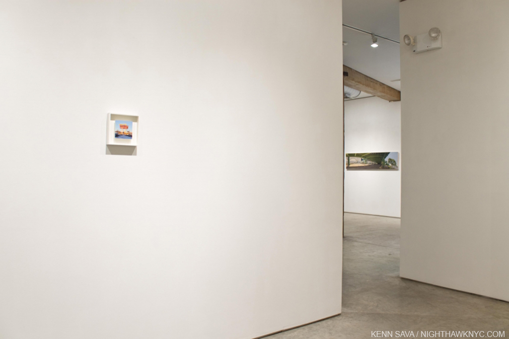
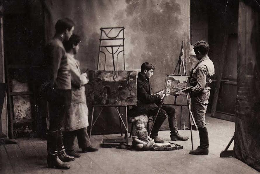
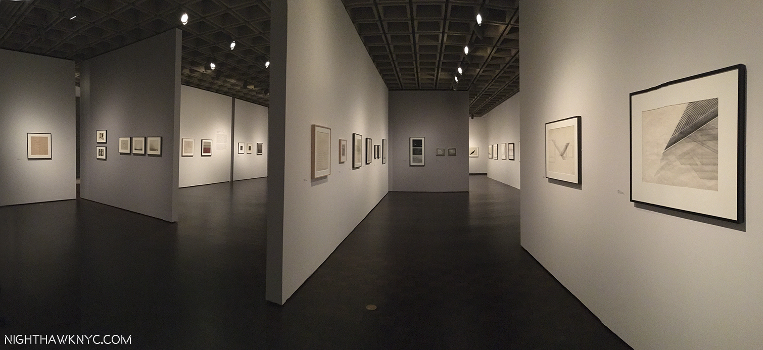
See the little square on the left? That’s Rod Penner’s Ranch View Motel, seen in an Installation View of a group show at George Adams Gallery in April, 2016.

Here, in the Big Apple, where there is ALWAYS too much Art for any one person to see, Rod Penner hasn’t been part of that problem. That’s because his work is almost never seen, or offered for sale, here. As a result, I only discovered him a year ago at the George Adams Gallery when I saw a tiny little painting that was smaller than a paperback book of a large hotel sign.


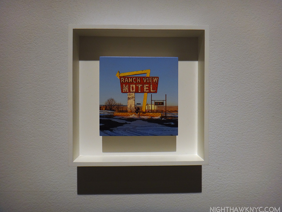
Rod Penner, Ranch View Motel, 6 x 6 INCHES!, 2013.

Right away I was enthralled by it. I enquired. But? It was not for sale. Once I saw it? I had to know more. It turned out that this little work is the veritable tip of a sizable iceberg of equally excellent paintings he’s done going back to 1992 (as can be seen here.) Rod Penner became mythic to me. I waited like the Titanic adrift on the Gallery seas of Manhattan to run into more of his ‘berg.

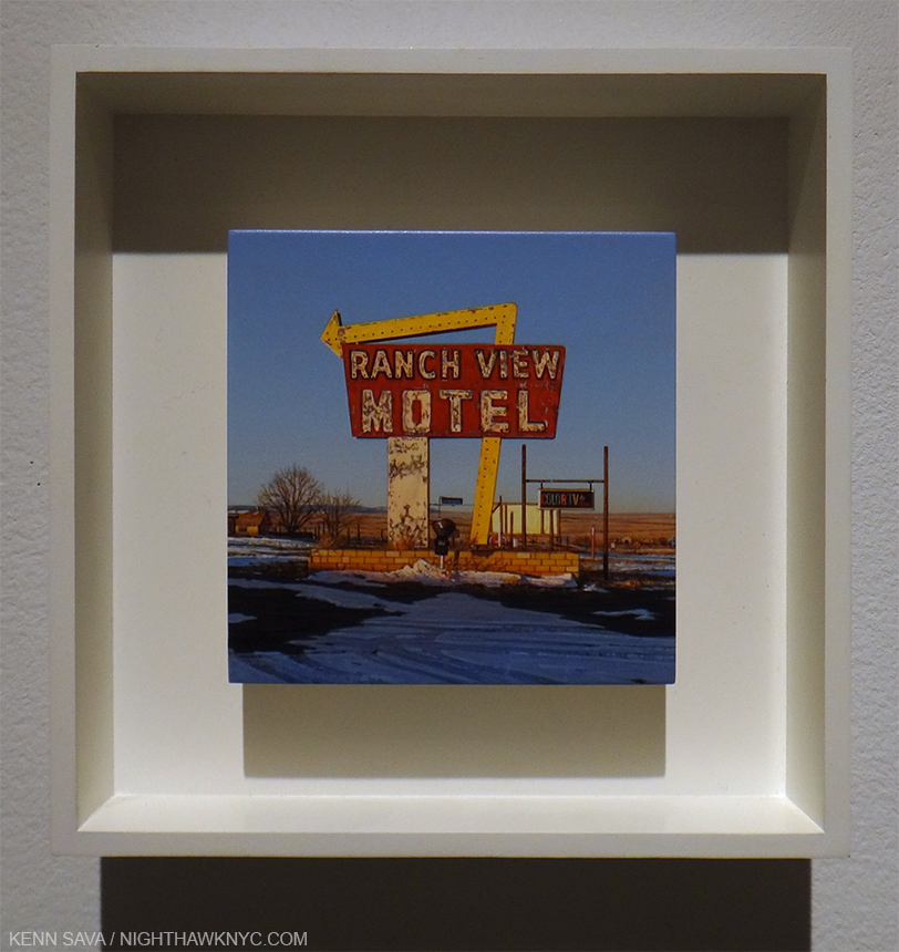
Seen a little closer still.

Tonite, a year later, under clear skies, completely by chance, I accidentally crashed into it. I happened to walk in to Ameringer McEnery Yohe in Chelsea just as a solo show of his work, Rod Penner,  was opening, without knowing it was there. Women & children, first! Too late. 8 of the 9 works on view had been sold before the opening bell.

What?

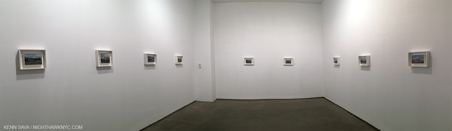
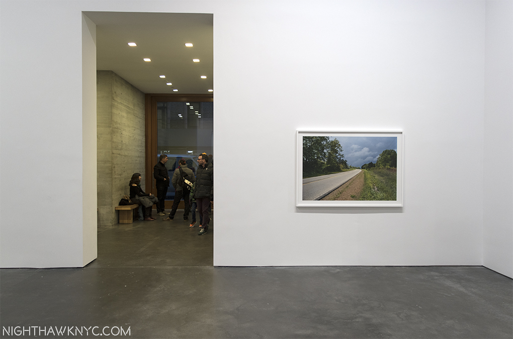
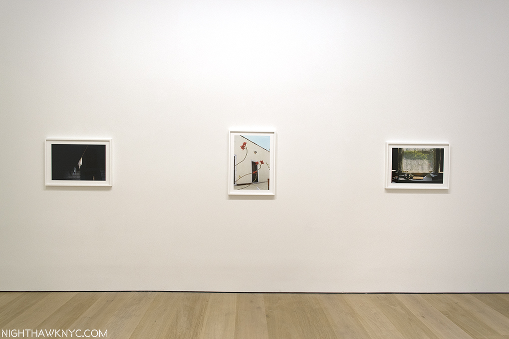
Small wonders. Installation View of all of Rod Penner at Ameringer, McEnery, Yohe, tonite. ALL of it! The “larger” works are 5 x 7 1/2 inches. The square ones are only 6 x 6 inches!

The only one available was a work he had just finished and had to overnight to the gallery so it could be framed in time for the opening. No doubt it’s been sold, too, by now. Ok, let me get this straight- Here’s an Artist, who lives and works in Marble Falls, Texas (pop. 7,154 in 2016), that very few seem to have even heard of. There were no books about him until the gallery released one today for this show. There’s very little about him online. His work is so rarely shown, that his last NYC solo show was in 2013! Still? His new work is virtually pre-sold. What’s going on?

Looking for insight, I stood watching visitors to the opening come in and listened to their reactions. Most responded like I did, with astonishment, and only a few seemed to know his work previously. Two or three asked out loud about the prices and availability of the paintings, something I just don’t see happening at shows (where business is generally conducted quietly), even though there was a printed price list at the desk. Hmmm…

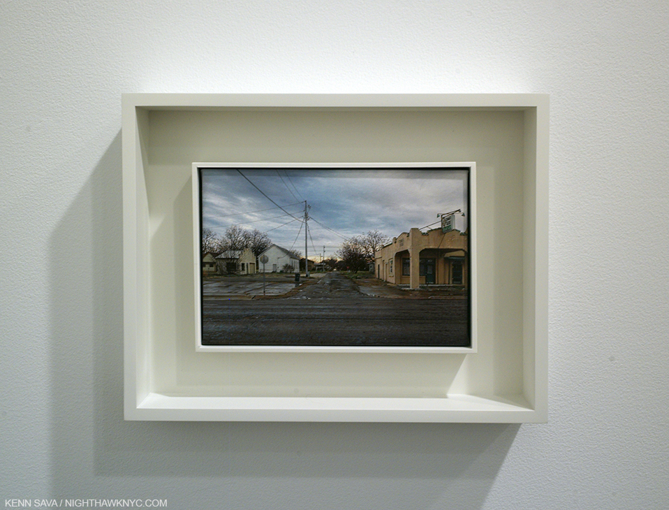
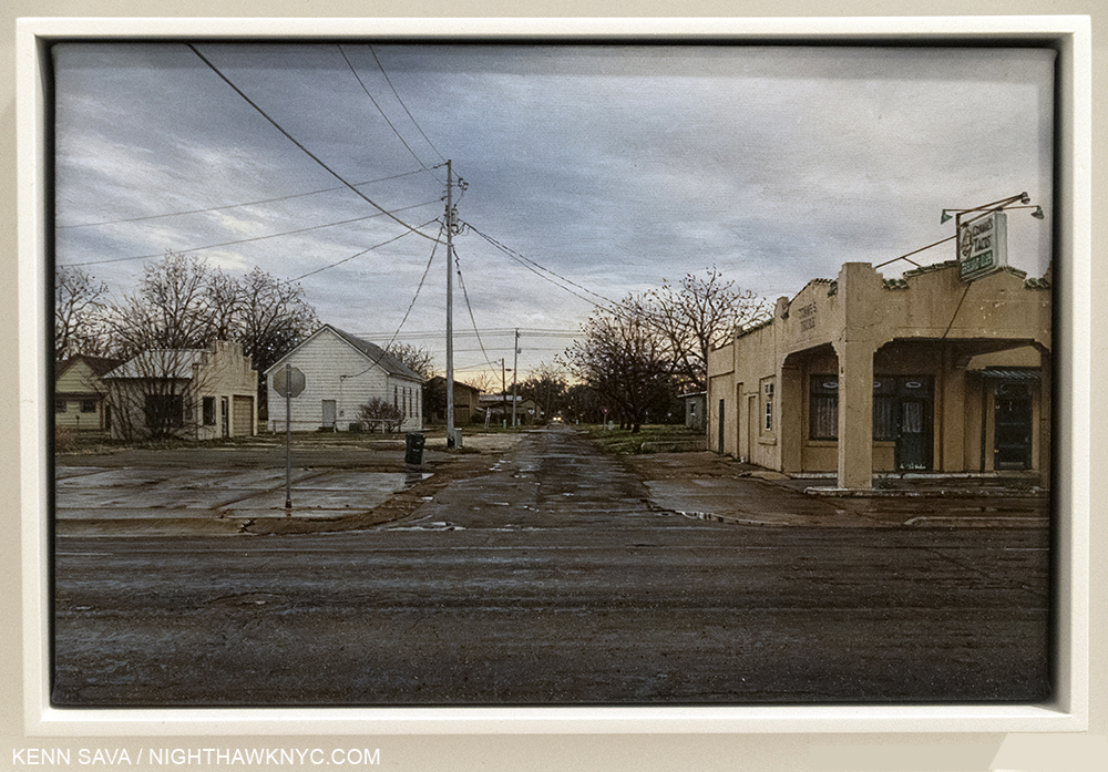
Commie’s Tacos, 2017, all of 5 x 7 1/2 inches of it. Seen from afar, its streets and buildings.

Full of desolation, empty streets, crumbling, or abandoned buildings, or oddly decorated houses, all under grey skies and fronted by cracking pavement, these latest works all depict scenes the Artist observed in San Saba, Texas (the erst-while “Pecan Capital of the World,” which is a bit north of Marble Falls, which, in turn, is north of San Antonio). It’s a bit odd to find this work speaking to New Yorkers. I, for one, have never been anywhere near Texas, yet it speaks to me.

Close-up. Like peering through the looking glass, more and more details emerge, allowing the viewer to imagine a narrative.

Is it the isolation that’s an inherent part of modern living? The foreboding of our times? The nostalgia for small town life, or times gone by, many transplanted urban dwellers retain? Or? Is it they just appreciate amazingly good painting? I still can’t say. I probably fall into all of those groups. From my earliest days looking at Art Books when the uncanny micro-imagery of Jan Van Eyck astounded me (and still does), to Durer, Goltzius, Richard Estes and on and on, I’ve looked at a lot of work that has a level of technique some would label super-human. No one can deny that his “Oh my gosh” astonishment inducing level of technique is part of the charm of Rod Penner’s work. But, it goes much deeper.

The size of his work, which he speaks of being a response to large works he sees proliferating, is also a way of putting the world around us, and by extension even our own worlds, in perspective. Seen from a distance? The abandonment of some of the failed businesses is undiscernible, and hence, it’s impersonal, a bit like passing through a town in a moving car. Move closer and all of a sudden detail after detail after even more detail comes into focus. From then on, it’s up to you to decide. The effect of looking closely at such small paintings is not unlike looking closely through old family albums, where the photos are small, what’s in them looks “old,” even though, Mr. Penner is painting scenes that may still exist. It’s work that stands up to, and demands, repeated viewings. Up close viewing.

The gallery handout speaks of the “hope” in these works. I never see construction or new building going on. The skies look ominous to me. There is virtually no activity to be seen in any of these works, save for a lone car in the distance in a few of them. It’s hard to tell if people are even home in the house depicted below, with its two huge inflatables out among its Christmas decorations. Yes, humor, usually a little subtler, is in these works, too. Yet, the peeling paint on the house’s walls gives the feeling of “times are hard, but we’re celebrating Christmas anyways.” I don’t know if that’s hope, but it’s at least perseverance.

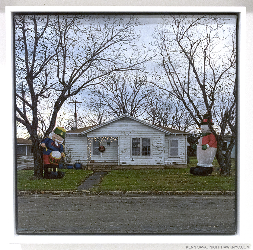
Yard Inflatables, 2016, 6 x 6 inches. Mr. Penner includes  humor surprisingly often. You can see “in-progress” shots of this work, here.

While William Eggleston shows details of southern scenes that grab him, Rod Penner takes a step back. Or 50 steps back, usually half way into the street. He casts a wide angled lens (figuratively, not photographically) on a tiny canvas. Many hundreds of years ago works this size by Duccio and others were meditation objects. In works like these, they still are.

Ok. But, Vermeer, Nighthawk? Perhaps THE most desired, and one of the most revered Artists in Art History? Seriously? Well, I don’t believe in comparing Artists qualitatively, but I see some similarities. Mr. Penner speaks in interviews about being into the Hudson River School and the early Flemish Masters, himself,  but consider this- Though Vermeer is famous to us, mostly, for his interior scenes, there are two outdoor works of his that we have- View of Delft, which is thought to have been painted when  the Artist was 28 or 29, relatively early in his short career, his last outdoor work known to us, now in Mauritshuis, The Hague, and his The Little Street, which is in the Rijksmuseum, painted a year or two before. Both, but especially the latter, remind me of Rod Penner.

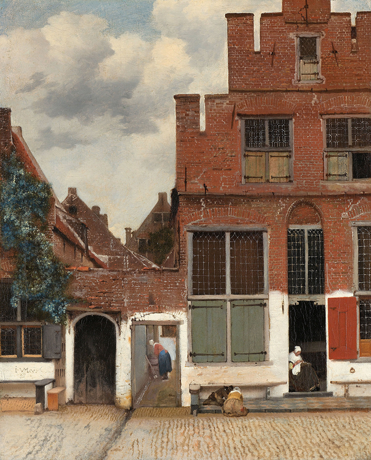
Vermeer, The Little Street, 1657-58, Rijksmuseum, Amsterdam. It looks like Vermeer liked to stand in the middle of the street, too. Rijksmuseum Photo

The Little Street shows us what seems to be a typical doorway scene of daily life, with one door and one passage way open to show us the inside, turning this into a classic Vermeer “tease,” among another closed door and 19 windows that are either boarded up or dark preventing our seeing inside. Removing the two women leaves the cloudy (“Penneresque,” to copyright a term) sky, the similar state of the well lived-in buildings, and the cobblestone streets (roughly equivalent to Mr. Penner’s ever-present cracked pavement, which, as seen below, resembles cobblestone), are among the similarities I find between this Vermeer and Rod Penner’s new works at Ameringer, McEnery, Yohe. They’re an echo, let’s say, across 350 years and thousands of miles. Here’s one example, but I see elements in the other works by Mr. Penner on view here.

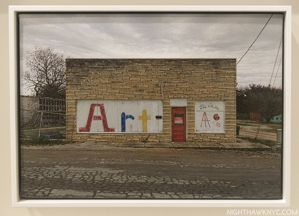
On another “little street.” Boarded up windows, a closed door (with “For Lease” sign), an “aged” brick building, the cracked street resembling cobblestones, under a “Penneresque Sky,” all rendered with exquisite skill. Rod Penner’s, The Studio, 2017, 5 x 7 1/2 inches, also speaks to hard times for the Arts everywhere.

But yes, there are no people in any of these Penners. In that sense, he may be part of another part of Art History, that of American 20th Century Artists Edward Hopper, Charles Sheeler, Ralston Crawford and Richard Estes, who painted many scenes without people, though, of course, Hopper painted many with them as well.

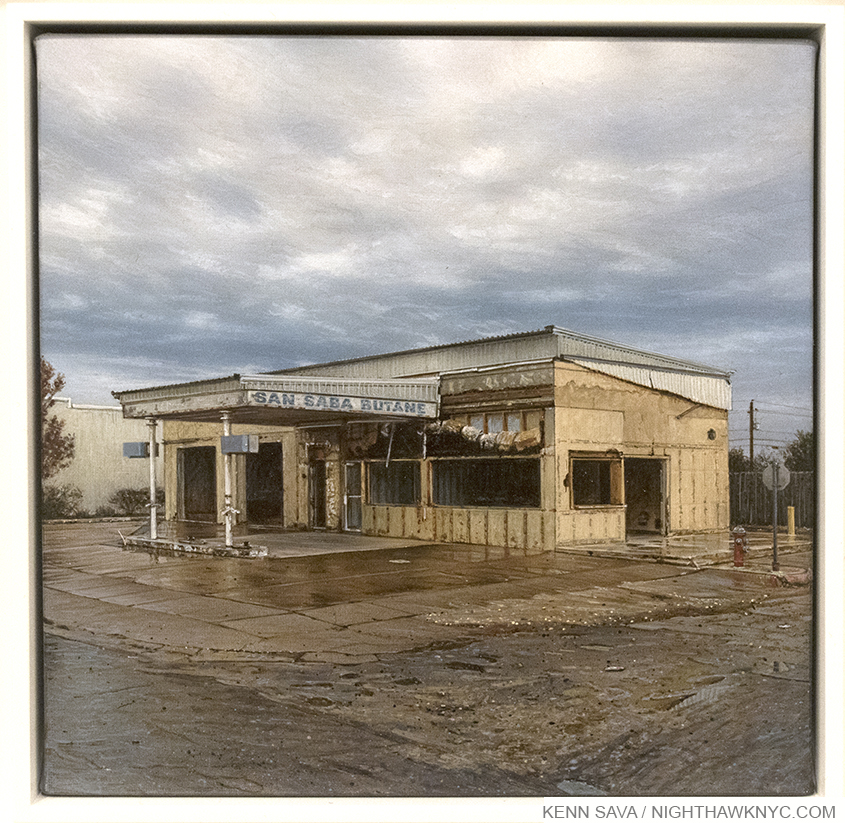
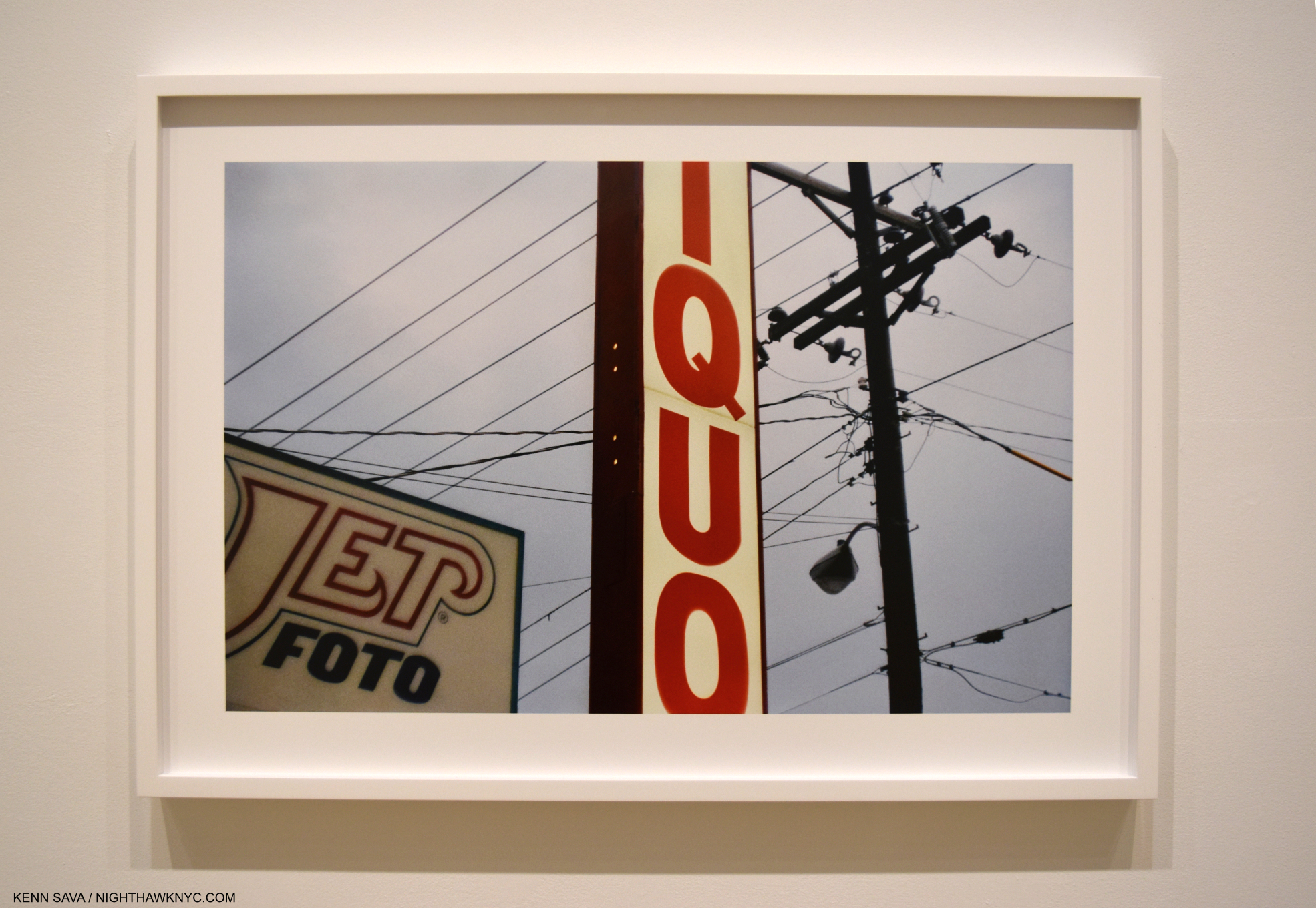
Who knew butane was ever that popular? Or? Is he pulling our leg? Rod Penner, San Saba Butane, 2017 6 x 6 inches

Another thing that Mr. Penner has in common with Vermeer is that his amazing technique is always painterly, it’s always put in the service of his message, and that message is NOT to replicate a photo. In addition to seeing more of the “iceberg,” I also had the equally unexpected privilege of spending a few moments speaking with the mythical Artist, himself, at the show’s opening tonite, and he spoke of waking a few weeks ago and feeling unhappy with the foreground pavement in his most recent work, View of San Saba, seen below, and so he changed it- In ways that had nothing to do with the reference photos he had of it. Then he mentioned that he also uses sketches, video and other mediums to capture his thoughts of his subject, though he doesn’t paint “en plain air,” or paint on the spot.

I hope not. These works take him weeks to complete, and that’s part of why there are so few of them being offered. This show represents this year’s work. The other part is that current owners are holding on to them.

I also asked him how he felt about the term “photorealism,” which gets applied to him, and others, like Richard Estes. He said he doesn’t like it, which I was happy to hear. He prefers “Photo-influenced.” There’s only one term to apply to Rod Penner’s work- Art. His work is masterful. It speaks to so much going on right now in our country, and in our world, yet it, also, speaks every bit as much to the past, and it’s all done in ways that are uniquely his own, though many people seem to relate to.


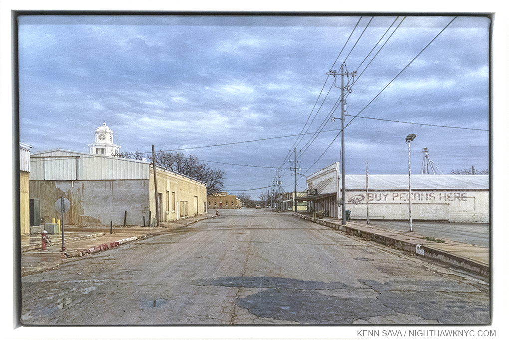
Rod Penner’s just completed View of San Saba, 2017, 5 x 7 1/2 inches, with its new foreground.

“He says he’s been to Texas
And that’s the only place to be
Big steaks, big cars, no trouble here
That’s the place for me.
I’m going to Texas (yeah, yeah)
I’m going to Texas”*

It’s interesting to me that Mr. Penner is a transplant to Marble Falls, Texas from Vancouver, (which must be as different as Marble Falls seems to a Manhattanite), because that reminds me of the work of another Vancouverite- Photographer Fred Herzog‘s, which I just saw at AIPAD. Is it a coincidence that both of these past & present (Herzog) Vancouver resident’s work has a universality that surmounts the place it depicts, and where it is seen?

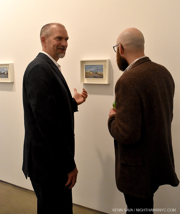
He’s real! Rod Penner, in person, left, introduces his most recent work, View of San Saba, 2017, 5 x 7 1/2 inches, at Ameringer tonite.

Though the world is a very big place, Rod Penner’s work shows us that it’s really made up of a lot of small places.

My subsequent Q&A with Rod Penner is here. Further thoughts about this show are here.

*- Soundtrack for this Post is “Texas,” by Chris Rea, published by Warner/Chappell Music, Inc.

NighthawkNYC.com has been entirely self-funded and ad-free for over 6 years, during which over 250 full length pieces have been published. As I face high expenses to keep it going, if you’ve found it worthwhile, please donate to keep it up & ad-free below. Thank you!

Written & photographed by Kenn Sava for nighthawknyc.com unless otherwise credited.
To send comments, thoughts, feedback or propositions click here.
Click the white box on the upper right for the archives or to search them.
For “short takes” and additional pictures, follow @nighthawk_nyc on Instagram.

Subscribe to be notified of new Posts below. Your information will be used for no other purpose.


The “Other” Russian Revolution

This site is Free & Ad-Free! If you find this piece worthwhile, please donate via PayPal to support it & independent Art writing. You can also support it by buying Art & books! Details at the end. Thank you.

Written & Photographed by Kenn Sava (*- unless otherwise credited)

“I’m back in the USSR
You don’t know how lucky you are, boy
Back in the USSR”*

There was that “big” one…you know…the one that was in all the papers over here one hundred years ago, in 1917 – The “October Revolution,” or the “Russian Revolution.” Whatever you call it, 9 million people died in 5 years, and it resulted in the loss of freedom for countless more millions over the next 74 years, I’m no historian or political writer, but I hear it’s been fading in importance for quite a while now. While that one caused a big stir, meanwhile, off in what was then a quiet, small town (a city of 350,000 today) in the eastern U.S.S.R. (Belarus today), the seeds of another revolution were beginning to sprout. No one was killed in that one, as far as I know. The instigator of a good deal of it is a world famous Artist now, who, though a pioneer of modernism, is not often thought of as a revolutionary.

Today, he’s famous for flying lovers.

Marc Chagall is the most famous native son of that small town- Vitebsk, Belarus. In the early days after the “October Revolution” he accepted the Post of “Commissar of Visual Arts” for Vitebsk. He then founded the Vitebsk Arts College, and in 1919 invited a number of Artists to be its teachers. Among them were Kazimir Malevich, El Lissitzky and Yehuda Pen. Kazimir Malevich would soon become the fountainhead of a movement that crystalized in a group named “UNOVIS” ( or “Exponents of the New Art”), who, in the spirit of the larger revolution, shared credit for the works they created. At the core of this movement was Malevich’s “Suprematism,” a style of work that focused on basic geometric forms and colors, in the service of “pure artistic feeling.” This put him (stylistically) directly at odds with Chagall, who was, at heart, a classicist…

“On The Fence, #2: El We-sit-ski.” Click any image to enlarge, if you dare..

and when Lissitzky, who was on the fence between both camps (sorry!), sided with Malevich, Chagall soon left the school to continue his career elsewhere. 100 years later, Suprematism and the Russian Avant-Garde is still growing in importance and appreciation, as was plain to see in MoMA’s recent exhibition, “A Revolutionary Impulse: The Rise of the Russian Avant-Garde,” 1915-1932,  which featured, and grew out of, Malevich’s “Suprematism” movement. MoMA’s show, consisting exclusively of works from its own collection, is NOT to be confused with a show of a very similar title, “Revolution: Russian Art 1917-1932,” running concurrently at the Royal Academy, London, which included quite a few loans from Russia. While the show, and the movement, includes filmmakers, poets and other visual Artists, I’m focusing on the Painters, Photographers and Graphic Artists included. Many are, surprisingly, multi-threats (i.e. multi-talented). To quote MoMA about these Artists, they were “a group who was fed up with form, the way the “other” revolutionaries were fed up with 300 years of Czarist rule and decided to throw it all out, so to speak, and start over from the basics, giving a new hierarchy to basic forms, and basic (or non) colors, like black and white. (i.e. Suprematism. )1” Stalin’s 1933 decree led to the banishment of the Avant-Garde, in favor of “socialist realism,” which has already been forgotten, as we approach the 100th anniversary of the “Russian Revolution.”

While Chagall, himself, was not included in MoMA’s show (though he was in the Royal Academy’s), the headline highlight was an extremely rare opportunity to see so many works from MoMA’s incomparable (in the West) collection of Kazimir Malevich, the brilliant visionary who died only a few years after the period this show covers ends, 1932, passing in 1935 at 57. That New Yorkers are lucky enough to enjoy this superb collection is due to the foresight of another legend, Alfred H. Barr, Jr, MoMA’s first Director, who in 1929 had the prescience to secure many of Malevich’s works.

Shots across the bow of painting. An entire wall of rarely seen works by Kazimir Malevich, that are at the crux of the Revolution, featuring  “Suprematist Composition: White on White,” 1918, considered his masterpiece, center.

Close-up with Malevich’s “Suprematist Composition: White on White,” 1918.

At 26, in 1927-28, Mr. Barr went to Moscow, where he wrote in his diary, “Apparently, there is is no place where talent of artistic or literary sort is so carefully nurtured as in Moscow. Would rather be here than any place on earth.” This trip stayed with Barr when a year later he became the founding director of MoMA, as part of his vision of MoMA as a lab of critical inquiry analysis and communication1. MoMA went on to compile one of the most outstanding collections of Russian Modern Art outside of Russia under his stewardship, which lasted until 1969, part of which is on view in the 8+ galleries of this surprisingly large, and excellent, show. While I am showing selected highlights, you can see Installation Views and get a different idea of the experience towards the bottom of MoMA’s page for the show, here. To get an idea of the ongoing importance of Mr. Barr’s choices, while I was standing in front of what many consider Malevich’s Masterpiece, “White on White,“ 1918, complete strangers to each other had a moment after each posed for pictures in what they both announced was their “very favorite painting,” 99 years after its creation.

Two total strangers explain to each other why this Malevich is their “very favorite painting of all time.”

A case of early books by Malevich, including “Suprematism: 34 Drawings,” 1920, published by UNOVIS, Vitebsk, left.

Remarkable insights to genius. 4 charts Malevich made as visual aids for his European “Introductions to Suprematism” Lectures.

This blows my mind, so I’m showing a closer view of it. In this chart, we get an incredibly rare insight into how a founder of an Artistic movement (how many of them are there?) sees Art. We get to look over his shoulder as he recaps the development of Modern Art through Cubism and Futurism to Suprematism.

As impressive as Malevich’s works are, which is equalled by the ongoing importance of his ideas, for me the show’s biggest revelation came in two words- El Lissitzky. A student of Yehuda Pen’s at age 13, he then studied to become an Architect, before Chagall’s call summoned him to Vitebsk. There, he became convinced by Malevich (who he had known previously), and this led him to create “Suprematist” works that remain both fresh and incredibly inventive today.

Visionary, and then some. In 1920, UNOVIS staged a utopian opera in Vitebsk titled “Victory Over the Sun.” El Lissiztky created these designs for abstract, electromechanical dolls for it, which were never realized. Seen are 5 Lithographs from a set of 11 he did titled “Figurines: 3 Dimensional Design of the Electro-Mechanical Show ‘Victory Over the Sun,'” 1921.

MoMA owns the only complete copy known of what may be Lissitzky’s masterpiece, “Proun,” from 1920, a Portfolio of 11 lithographs, published in Vitebsk. MoMA’s curator called it a “project for the affirmation of the new.1” The exact definition of “Proun” is not known, or lost to us, but the work itself explores the creative possibilities of Malevich’s theories in startling, and beautiful, (yes, beautiful) ways.

3 photos above- El Lissiztky, “Proun,” 1920, a Portfolio of 11 lithographs, who’s title is untranslatable now. A masterpiece of invention & design, seen in the only complete set that includes the covers (top), detail of 4 prints, center, and the translation of its manifesto, bottom.

While his work is, strangely & unfortunately, absent from MoMA’s fine and surprisingly large show, behind the scenes looms the over-looked Artist, Yehuda Pen. Teacher of both Marc Chagall and El Lissitzky, his work is brilliant in its own right, to my eyes, though different from that of either of his students. Pen went on to teach at Chagall’s School, alongside Malevich, and Lissitzky.

The great Artist & Teacher Yehuda Pen, center, with friends in 1922.

Yehuda Pen’s studio in 1917, a few years after he taught El Lissitzky.

“Portrait of Marc Chagall,” circa 1915, by Yehuda Pen. More of his work is here.

Along with El Lissitzky, Aleksandr Rodchenko, impresses, on a number of fronts, including his attitude- ”I reduced painting to its logical conclusion,” he said, speaking of his three monochrome paintings- “Pure Red Color, Pure Yellow Color, and Pure Blue Color” in 1921, “I affirmed: it’s all over. Basic Colors. Every plane is a plane and there is to be no more representation4.”

Oh yeah? Rodchenko “Non-Objective Painting no. 80 (Black on Black),” 1918, his “answer” to Malevich’s square “White on White.”

Wow. Luckily, 96 years later, painting, itself can quote Mark Twain: “The rumors of my death have been greatly exaggerated,” thank goodness! I’m left to wonder what was in Rodchenko’s Borscht. Having buried his paintbrush, he got into Photography after buying a camera in Paris in 1925, four years after declaring the death of painting. He turned out to be a naturally gifted Photographer, a medium he never formally “studied.” His photography has, also, remained influential ever since.

Avant-Realism? Rodchenko “Pro eto. Ei i men (About This. To Her and to Me),” 1923, showing off his unique approach to photography, and graphic design.

There was a lot to see over 8+ galleries, in spite of the fact there was only one work by Kandinsky on view. It would have been most welcome to see more, but I never missed them, thanks to the many works by Rodchenko, and Lissitzky, who’s Photography was also shown, proving that he was, like Rodchenko, a very gifted (and underrated) Artist in that medium, too.

Remember my name (well, it’s there over the “XYZ”). El Lissiztky was, also, a naturally gifted Photographer. This amazing “Self Portrait,” 1924, Gelatin silver print, was made using SIX exposures.

Other Artists impressed, too (Lyubov Popova, Vladimir Tatlin and Olga Rozanova among them), yet regardless of how impressive this show was, more importantly, the names of many of the Artists on view have been increasingly coming from the lips of today’s important Artists, including Nasreen Mohamedi, hereWilliam Kentridge, and the late, great Architect, Zaha Hadid, who speaks about Malevich, here. Also, amazingly, the legacy lives on in Vitebsk, Belarus, something that astounds me given that the biggest battle of World War II, and possibly EVER fought, was fought in Belarus, with monumental horrific fighting in Vitebsk. Chagall’s former School, after somehow miraculously surviving, has been renovated and is to reopen as the Museum of the History of the Vitebsk People’s Art School later this year. Below is a photo of the restored building, courtesy of myrecentdiscoveries.com, the International Marc Chagall researchers, who visited the building, and wrote about its new life, here. A photo of its new lobby, which appears to pays homage to Malevich, can be seen here.

The Revolution Happened Here. Miraculously, Chagall’s School in Vitebsk, Belarus, survived the biggest battle ever fought, while everything around it was destroyed. Malevich, Lissitzky, Pen & Chagall taught here. UNOVIS was founded here. its being remodeled and reopened as the Museum of the History of the Vitebsk People’s Art School! Photo by, and courtesy of myrecentdiscoveries.com

They were kind enough to also put me in contact with the Director of the Vitebsk Modern Art Center, Andrey Duhovnikov, which includes the new Museum, above, and who is also an Artist in his own right. I asked Mr. Duhovnikov about whether UNOVIS will be represented in the new Museum of the History of the Vitebsk People’s Art School. He told me, “There will be 12 thematic sections, two of which will be dedicated to UNOVIS, where archival documents will be presented.” I’m not surprised by this. Chagall and Malevich’s influence & memory live on in Vitebsk, a city that continues to hold celebrations to mark anniversaries of milestone events, like the 100th Anniversary of Chagall’s wedding in 2015. In response to my question about whether Yehuda Pen is being forgotten, Mr. Duhovnikov explained that Yehuda Pens’ work is too fragile to travel, which prevents it from being better known outside of Belarus, however over 180 works by Pen can be seen today at the Vitebsk Art Museum, and a Museum dedicated to Pen is being discussed. Good news, indeed.

The process whereby Art goes from “Contemporary,” or “Modern,” to “Art” is endlessly fascinating to me as I look at what Artists are creating now, and wonder- “What, if ANY of this, will be considered Art one day?” Certainly influencing major Artists who come after (like Nasreen Mohamedi, William Kentridge, and Zaha Hadid) plays a part in that, so do visionaries, like Alfred Barr, who had the foresight to hand pick 21 works from Malevich’s 1927 Retrospective for MoMA, thereby giving countless future generations, including mine, the chance to see these works in shows like this one, (which is MoMA “showing off,” a bit, like The Met did with “Unfinished“). But, also, in there quietly working away are others, like Mr. Duhovnikov, and his associates, who feel and recognize the value & importance of the work, and are dedicated to sharing it, and making sure this legacy endures to influence more generations.

That’s how “Revolution” becomes evolution, and “Art History.”

My thanks to myrecentdiscoveries.com and Andrey Duhovnikov for their assistance.

*-Soundtrack for this Post is “Back in the USSR,” by John Lennon & Paul McCartney, published by Sony/ATV Music Publishing.

NighthawkNYC.com has been entirely self-funded & ad-free for over 8 years, during which 300 full length pieces have been published! If you’ve found it worthwhile, PLEASE donate to allow me to continue below. Thank you, Kenn.

You can also support it by buying Art, Art & Photography books, and Music from my collection! Art & Books may be found here. Music here and here

Written & photographed by Kenn Sava for nighthawknyc.com unless otherwise credited. To send comments, thoughts, feedback or propositions click here. Click the white box on the upper right for the archives or to search them. Subscribe to be notified of new Posts below. Your information will be used for no other purpose.

  1. From the MoMA LIVE Video- “The Russian Avant-Garde: Scholars Respond”, which can be seen here.
  2. From the MoMA LIVE Video- “The Russian Avant-Garde: Scholars Respond”, which can be seen here.
  3. From the MoMA LIVE Video- “The Russian Avant-Garde: Scholars Respond”, which can be seen here.
  4. //www.moma.org/interactives/exhibitions/1998/rodchenko/texts/death_of_painting.html

Henry Taylor Is Having A New York Moment

This site is Free & Ad-Free! If you find this piece worthwhile, please donate via PayPal to support it & independent Art writing. You can also support it by buying Art & books! Details at the end. Thank you.

Written & Photographed by Kenn Sava (*- unless otherwise credited)

Either the Artist has a great representative, the Force is strong with him, or the powers that be in the Art World have magically combined as they rarely seem to, and at the same moment, to give us something unusual here- Multiple high-profile venues simultaneously featuring the work of the same (deserving) Artist. Or? Maybe it’s a coincidence. Or? Maybe they just agree- his time is now.

Wish you were here. Henry Taylor, wearing shades underwater, in his The Floaters, 2017 the  latest High Line Mural Commission just after it’s completion in mid-March. Click to enlarge.

Whichever one it is, “his time” came on March 17, when on the same day, Henry Taylor’sThe Floaters, was unveiled as the latest High Line Mural Commission, at West 22nd Street, AND multiple paintings by Mr. Taylor were debuting as the Whitney Biennial opened, the largest, right out in front of the 6th Floor elevator, where it leads to an entire gallery of his work, in dialogue with the wonderful photographer, Deana Lawson, both of whom shine in this Biennial, to my eyes.

Almost ready for his close-up. The Floaters seen with rigging used to paint it as it nears completion last month.

Mr. Taylor’s piece strikes me as, possibly, “one upping” the High Line by showing himself doing something none of the the High Line’s 5 million visitors can do- submerging themselves in a swimming pool. Very L.A. Well? L.A. is where he lives. Touche. His summery The Floaters, the first sign of the coming of spring in Manhattan, couldn’t be more in contrast to Barbara Kruger’s Untitled (Blind Idealism…), 2016, which occupied the same wall for the past year.

Barbara Kruger’sUntitled (Blind Idealism…), 2016,” seen in March, where it followed no less than Kerry James Marshall’s Mural (which you can watch actually being painted, here).

If you walk down the High Line to it’s southern terminus, you’ve arrived at the Whitney Museum, where Mr. Taylor’s Ancestors of Ghenghis Khan with Black Man on Horse, 2015-17, greets you as you step off the elevator on 6.

The elevator doors open on the 6th Floor at the Whitney Biennial. Seen in full below.

“Welcome to the 2017 Whitney Biennial,” indeed.

Ancestors of Ghenghis Khan with Black Man on Horse, 2015-17, at the 2017 Whitney Biennial.

Originally, the Whitney Biennial was a painting show, so I’m glad to see exciting, recent work by Henry Taylor, Dana Schutz, Kaya, Aliza Nisenbaum,  Celeste Dupuy-Spencer, Frances Stark, and Jo Baer included among a plethora of video and only a handful of Photographers. Painting has a long history of expressing the inexpressible, as well as capturing the moment, and there’s been a lot going on in these recent moments, to be sure. Following in the footsteps of Goya’s The Third of May 1808, on down, Mr. Taylor’s THE TIMES THEY AIN’T A CHANGING, FAST ENOUGH!, 2017 is one of the most powerful paintings (seen here with it’s accompanying card) I’ve seen at this Biennial, along with Open Casket, by Ms. Schutz and Censorship Now, by Ms. Stark.


THE TIMES THEY AIN’T is based on a video, and is an image we are, perhaps, more used to seeing from PhotoJournalists, than in a painting, yet, it’s precedent is right there in Art History, in Goya, and countless others. Though there are similarities between the two Paintings, Mr. Taylor’s work is uniquely his own, especially as he depicts an inner space (a recurring theme, in this case, the back seat of a car), being intruded upon and violated, fatally. Portraiture is what he seems to be most known for, and he brings this extensive knowledge of Art History (as Kerry James Marshall does) to his portraits as well, sometimes playfully, sometimes as a jumping off point, as in his 2007 portrait of Eldridge Clever, which takes Whistler’s Mother, of all things, as it’s basis.

Mr. Taylor is an Artist who’s work has a range (from the humor of The Floaters, to the life & death of THE TIMES THEY AIN’T, to scenes from home life, below), which prevent him from being slotted as being any one thing beyond “Artist.” His work, even his portraits, often seems to have a landscape feel to it- there’s an element of space- inside, outside (or both, in The Floaters,), or personal space, in many of his works, and, of course, race is an overriding theme. His is, also, a shining example of the relevance of Painting in Contemporary Art (as is the work of the Painters I mentioned above, among others), a medium that some question the value of every so often. As Kerry James Marshall has, Henry Taylor is another Artist who is putting black faces onto Museum walls, and possibly, bringing new audiences to them to see their work.

The 4th, 2012-17, by Henry Taylor. It’s interesting to compare this with Kerry James Marshall’s painting of the same subject seen a few months ago.

While his “15 Minutes of Fame,” will come to an end when the Biennial closes on June 11 and The Floaters gives way to the next High Line Commission in March, 2018, his work isn’t going anywhere. As in- anywhere away from public view, any time soon. Even here, in “tar beach.”

*- Soundtrack for this Post is “I Love L.A.,” by Randy Newman.

NighthawkNYC.com has been entirely self-funded & ad-free for over 8 years, during which 300 full length pieces have been published! If you’ve found it worthwhile, PLEASE donate to allow me to continue below. Thank you, Kenn.

You can also support it by buying Art, Art & Photography books, and Music from my collection! Art & Books may be found here. Music here and here

Written & photographed by Kenn Sava for nighthawknyc.com unless otherwise credited. To send comments, thoughts, feedback or propositions click here. Click the white box on the upper right for the archives or to search them. Subscribe to be notified of new Posts below. Your information will be used for no other purpose.

R.I.P. James Rosenquist- American Master

This site is Free & Ad-Free! If you find this piece worthwhile, please donate via PayPal to support it & independent Art writing. You can also support it by buying Art & books! Details at the end. Thank you.

Written & Photographed by Kenn Sava (*- unless otherwise credited)

I was saddened to learn of the passing of the great James Rosenquist today at age 83. One of the greatest American Painters of the Post World War II era, he began as an outdoor Billboard painter (from 1957-1960). Ever since I first learned that, I’ve paid attention to the few that are still hand painted. I always stop and take a photo of them when a new ad is in progress, partly out of fascination at the death defying skill involved, and because they are wonderfully abstract before they’re finished. I actually took this photo on West 34th Street earlier this afternoon, before I learned of his passing, of one of the few outdoor billboards that are still hand-painted. Fittingly, it was unfinished. I post it in homage.

I shot this unfinished, hand painted Billboard at West 34th & 8th Avenue this afternoon, before I heard James Rosenquist, who began as a billboard painter, had passed. Fittingly abstract. Click any image to enlarge.

Mr. Rosenquist’s Retrosective at the Guggenheim in 2004 was a spectacle that overwhelmed the eyes and the senses. I lived with this on a smaller scale, (though too large for my small space), after I bought a set of 7 prints by Mr. Rosenquist, another example of which was in the Guggenheim extravaganza. The title of the series, “High Technology and Mysticism: A Meeting Point,” proved tantalizing and inspired endless speculation. Typicaly, they  were so large, (each 34 x 33 inches) that I could only hang one at a time.

“The” by James Rosenquist, 1981, limited edition print (set of 7) based on his photography.

Each print is titled by hand with a one word title. Together the 7 titles form the “poem,” or haiku,- “Somewhere Above The Sky Silverbirds Fly Somewhere.” In the Rosenquist Print Catalog by Glenn, Mr. Rosenquist says of them- “It was the first thing I had ever done that was solely photographic. I went to unusual lengths to take photographs. I was specifically trying to sandwich negatives together to bring about a certain look, a certain thing that I wanted through this photo process…I went to study where technology was illustrated, in libraries and other places. I went to hospitals to see how it all related to the human being. I went all over the place to see the sources of imagery from technology and find out what it had to do with so-called art. So, I came up with these strange shapes, DNA symbols, electrical circuits.”

“Fly,” From the same series, 1981.

When you look at these works, bear in mind that Adobe Photoshop was first released in 1990- nine years after Mr. Rosenquist created these remarkable images. Yes, he created these works that reference “high technology,” without actually USING high technology. How fitting to Post, and revisit, these now when they serve as, both, my personal remembrance of this great Artist, and because my head has been buried in Contemporary Photography.

And “Somewhere,” ditto. Where have you seen anything similar? Even Mr. Rosenquist never worked in this style again.

James Rosenquist hasn’t received as much attention (it seems to me) as his contemporaries Andy Warhol, Roy Lichtenstein or Robert Rauschenberg (who’s Retrospective is set to open at MoMA next month and sure to be a blockbuster). He was an Artist who never stopped growing, and neither did the size of his work. I loved that about it, almost as much as I marveled at his powers of invention. Originally dubbed a “pop artist,” by those who need some sort of crutch (bear that in mind when you read his Obituaries that try to put him in that box), Mr. Rosenquist’s work quickly grew beyond categories. And stayed there. One only had to see the final huge gallery of his most recent work at the Guggenheim show to feel overwhelmed at the size and scale of his vision, and marvel at them. It’s something very, very few Artists, especially Painters have matched.

That scale, and the daring of his vision are what I will miss most. “Sail on, Silverbird…”*

I think I’ll remember James Rosenquist as he is seen in the front of the Guggenheim Retrospective Catalog, in my signed copy.

*-Soundtrack for this Post is “Bridge Over Troubled Water,” by Paul Simon, published by Universal Music Publishing Group.

NighthawkNYC.com has been entirely self-funded & ad-free for over 8 years, during which 300 full length pieces have been published! If you’ve found it worthwhile, PLEASE donate to allow me to continue below. Thank you, Kenn.

You can also support it by buying Art, Art & Photography books, and Music from my collection! Art & Books may be found here. Music here and here

Written & photographed by Kenn Sava for nighthawknyc.com unless otherwise credited. To send comments, thoughts, feedback or propositions click here. Click the white box on the upper right for the archives or to search them. Subscribe to be notified of new Posts below. Your information will be used for no other purpose.

R. Crumb Meets His Match

This site is Free & Ad-Free! If you find this piece worthwhile, please donate via PayPal to support it & independent Art writing. You can also support it by buying Art & books! Details at the end. Thank you.

Written & Photographed by Kenn Sava (*- unless otherwise credited)

(This is, also, my NoteWorthy Show for January, 2017.)

I’ve been looking at R. Crumb for a very long time. At least 20 years. Of course, his work predates that by a further 35 years, and today I still find all of it compelling. Unfortunately, the chances to see a number of original works by R. Crumb remains all too rare. The chance to see the Artist himself, rarer still. So rare, I never have. I tried in vain to find out if he would be appearing at the opening for the show co-starring his wife of FORTY YEARS (in 2018), Aline Kominsky-Crumb, “Drawn Together,” on January 12, then decided to take a chance and swing by David Zwirner Gallery (most recently the scene of “William Eggleston- The Democratic Forest,” which pretty much turned my entire life upside down, launching my free-fall into a bottomless pit of research into Contemporary Photography. In fact, If I’m not careful, this will become a Photography Blog very soon!) and have a look see, anyway. I’m not one to attend Art Openings unless an Artist I’m interested in is making an appearance.

The Nighthawk At The Opening (Artist’s conception, cause I generally don’t attend them). Adapted from The New Yorker’s March 13, 2017 cover called “Opening Night.” I couldn’t resist. My Apologies to Artist Carter Goodrich, and the great editor Francoise Mouly (a friend of R. & Aline Crumb).

R. Crumb’s work occupies a unique place somewhere between what’s been traditionally the so-called “low-brow” world of comics and “Fine Art,” that’s been hard won. Bursting on the world’s awareness like a supernova in 1967, when he was there are the genesis (sorry) of what would come to be called “Underground Comics,” a genre of which he soon became the de-facto figurehead of, and, for many, it’s most important Artist. Over the years, his work has begun to be more fully appreciated beyond the world of Comics. The late Art Critic Robert Hughes called him “the Brueghel of our time.” Even that lofty observation barely scratches the surface of R. Crumb’s impact and influence. While I was walking the streets of Chelsea to the opening of this show, admittedly with Crumb on my mind, I found it quite hard not to see his influence in the work of a number of shows I passed by Artists who’s work has nothing to do with comics or graphic novels and even in the flared pants snd chunky shoes women seem fond of these days. While Crumb’s work remains under-appreciated by the Fine Art world, in my opinion1, his influence has barely begun to be seriously considered2.

Arriving, I walked in to a good sized crowd…and live music. As I made my way through the gallery to the rear, large room. Low and behold…

R. Crumb, himself.

Art, and Artist. R. Crumb on left-handed mandolin(!), appropriately on the far left, performing with the East River String Band, at the Opening, David Zwirner Gallery, West 19th Street, January 12, 2017.

…looking just like a comic of R. Crumb, himself. He was seated wearing a cap and playing a mandolin with a group, the “East River String Band,” who’s blonde singer and one of the musicians I immediately recognized from covers R. has drawn for the band’s albums. The music was lively and pleasant, but, frankly, it went right past me. I couldn’t get over the fact that here he was, a few feet in front of me. Every little move he made fascinated me- he plays left handed!? (he writes & draws lefty, too), how he interacted with the other musicians (he seemed to mostly follow), how he held his instrument, how he sat while playing it (slightly folding himself around it)…Partly, the former Musician in me was interested. Mostly, it was because R. is someone who seems to do everything he does deliberately, so this might reveal some small key to the Artist.

The set ended, and I moved a bit closer as the equipment was torn down. R., his instrument put away, remained in his chair. Carefully approached by a few (the legend of his not being a fan of his fans well-known to his, um, fans), only one, who he appeared to know, actually dared speak to him. He presented a book. It may have been one they collaborated on.

Alone in a crowd. R. Crumb after the set.

I watched the Artist reach into his inside jacket pocket and produce a white pen to sign it. I immediately recognized it as a Rapidograph pen, the pen he’s made famous, at least for me, because they are what he’s drawn with for lord knows how long now. I had never heard of them until I found out he used them a decade ago, and immediately bought a set for like 120 bucks. Then, I realized that drawing in ink is not for those squeamish at the site of their own blood. So? Back to graphite and my trusty eraser it was for me, leaving ink to Master Draughtsmen, like R. Crumb. To this day, It’s always funn to look at a Crumb original and see if there is any use of White Out Correction Fluid on it or not. He will do the most intricate cross hatching and there will be no White Out to be seen, anywhere. I don’t think I’ve drawn in ink since.

Happy Early 40th R. & Aline! HOW did you do it?? Maybe the gent in the back is wondering, too.

He looked a bit older than the last time I’d seen him on video, a bit frailer, perhaps, then he stood up, and with Aline alongside, made his way through the throng to the gallery’s offices, not to be seen again (at least while I was there). Due to the Opening Night crowd, I returned a number of other times to see the actual show.

What I saw was shocking.

As shocked as those at the opening may have been by the unannounced (as far as I know) appearance by the Artist, more may have been shocked by the excellence of the “other Artist” who shared the bill with R. Crumb, his wife of 40 years (next year. Sorry. I can’t stop saying that because it blows my mind), Aline Kominsky-Crumb.

Yes, excellence.

Anyone who can go toe to toe (not to mention parts more intimate, but no less appropriate to this show), with R. Crumb over the course of most of a show (and ALL those years of marriage) is someone who deserves an award. Well, at least recognition. It’s high time Aline Kominsky-Crumb be acknowledged, and accepted, and her considerable body of work be appreciated. “Drawn Together” made the case for that as well as it’s likely to be made.

The standard “knock” against her has to do with her draughtsmanship. Even she mentions it in a panel here. There are many cartoonists, graphic novelists, even Artists hanging in The Met, who’s draughtsmanship is “suspect,” (to be kind). It’s missing the point. The point of Art is to express and communicate, (even if the latter is “only” a byproduct). Those just happen to be Aline Kominsky-Crumb’s strongest suits.

But, yes, there are masterpieces by the Master of Underground Comics to be seen here, too. The ten page story, “Walkin’ The Streets,” wherein we witness a conversation between R. and his late brother, Charles, strikes me as one of his great(est) works.

R. Crumb’s “Walking The Streets,” with his dear brother, Charles.

Charles(left)? I was just saying the same thing, here, a few weeks back.

In fact, on the subject of draughtsmanship, it’s actually arguable who among the three Crumb Brothers, was/is the greatest. R. has spoke glowingly of Charles’ talents. He passed at age 50 from an OD of his prescribed drugs.

A page from an extremely rare surviving sketchbook by Charles Crumb reveals his obsession with “Long John Silver.” See Terry Zwigoff’s superb documentary “Crumb” for more, and seldom seen video of Charles and Maxon.

The other brother, Maxon’s, work is ingeniously intricate, and brilliantly executed, though both of those are matched by his penchance for obfuscation and symbolism. If you can fight through that, you will find an Artist who doesn’t fit into the “comic book,” or even graphic novel genre, but an Artist, who’s path is closer to that of a Fine Artist. While R.’s originals sell for up to six figures (before the decimal point), Maxon’s drawings sell for hundreds, maybe a thousand dollars, his scarcer paintings for maybe 10 to 15 grand. In my opinion, he is very unfairly overlooked, (a bit like Charles Pollock is to his brother, Jackson Pollock.) Look at this-

Maxon Crumb’s “Take Thy Beak From Out My Heart,” Ink. The intricacy of this work is just staggering. (This was not in the show).

Speaking of being overlooked, R. Crumb has been ever so gradually finding acceptance as a Fine Artist on his way to being recognized as a “great Artist.” Beyond his draftsmanship, the honesty in his work is something that might seem common now, in this age of so-called “reality” shows. R. Crumb is the original reality star in the sense of honesty depicting himself- “good,” and “bad.” This turned off many, and it, too, hasn’t “mellowed” much over time. Though things like his sexual preferences (and appetites) remain controversial, and retain the ability to shock, as does how nakedly he discusses his inner feelings and thoughts. His wife is no shrinking violet, either. She never hides what she’s thinking or feeling, about herself, or anyone else, either. As a result, she is, perhaps, the ideal collaborator and foil for R..

R. & Aline Crumb, “Should Oddball Types…,” ink. Just one example.

The results present countless fascinating insights into their lives and their long standing open marriage. Making it a family affair, daughter Sophie, now an adult Artist with children of her own, makes an appearance, too. Want to hear what the Crumbs think about having kids? How Aline knows that R. hasn’t left her? (Hint- It has to do with vinyl.) How much R.’s “Book of Genesis” was sold for by Zwirner? How sobriety has been going for Aline? The joys of owning a “vintage” refrigerator,” or, you just want to watch R & A get “50 Shades”-style kinky? It’s all here. In fact, what’s here, and unspoken, is that the two of them have quietly amassed a major body of work. Appearing, variously, under titles including “Self-Loathing Comics,” or “Dirty Laundry Comics” (what could be more appropriate?) it’s now, finally, collected in the 184 page catalog for the Cartoonmuseum Basel version of this show, entitled “Drawn Together.”

R., Aline & Sophie Crumb, “Dirty Laundry” Cover Art, Ink.

R. & Aline Crumb, “Self-Loathing Comics,” Cover. Ink. After the age of “superheroes,” R. ushered in the “reality” based Artist as anti-hero age, we’re still in the midst of. And, Aline will keep drawing her hair to prove it!

Highlights? For me? Aline’s “My Very Own Dream House,” which takes up almost the entire front gallery, and holds rapt attention over 33 pages.

Aline Kominsky-Crumb’s “My Own Dream House,” Ink, beginning.

Installation view of (almost) all of it.

Her “Goldie in Fanatic Female Frustration” in the main room, in a different drawing style, is sparser, but none the less engrossing.

Aline Kominsky-Crumb’s “Goldie,” ink. Even at a distance, the unique style of this terrific work grabs you, and perfectly conveys the fanatic frustration within.

Along with these, we get a case of R.’s classic underground comics, ranging from “Zap” #0 to “Fritz The Cat” to “Weirdo,” a case of early drawings and sketchbooks, including the very rare sketchbook of Charles’ shown above, and a collection of family photos.3

A Hall of Fame of Underground Comic Classics.

If Aline was the star of this show, if not a revelation for me, R.’s star now shines all over the world, as we see in their collaboration about their visit to Belgrade, where they were treated like “superstars,” Aline writes. At Zwirner, the range of folks coming in to see this show was striking. It was, literally, every kind of person imaginable. Young, old, male, female, black, white, hipster, hippie, businessman, writers, photographers and yes, Artists.

One thing that surprised me was how many of them took the time to read the works. It’s one thing to read a comic book or graphic novel in a book, it’s another to read a 10 or 20 page story hanging on a wall, especially when half of it is hung higher than eye level. Yet, I watched person after person read each panel before moving a foot to their right to read the next. Since comic Art or Graphic Novels aren’t often seen in galleries or museums, I found this an unusual, interesting and refreshing thing. Most people seem to spend 1/4 the amount of time in front of paintings.

Crumb shows are way too infrequent. The last NYC show, “The Book of Genesis,” was also at Zwirner in 2010! While I expect, and welcome, future Crumb gallery shows, the time has come for a Crumb show in an NYC Museum.

Any bets on who will be the first to step up? My guess is MoMA. I think it’s a matter of when, not if. It’s hard to imagine it not being a blockbuster show.

It would be nice if it happened while he’s still around to see it. That is, IF he decides to actually show up to see it.

*- Soundtrack for this Post is “Ball and Chain,” as recorded by Janis Joplin and Big Brother & The Holding Company (what else?), as recorded on “Cheap Thrills,” 1968(! FIFTY years ago next August), with an R. Crumb cover, one of the most classic album covers ever done, which might have made him as famous as anything else, and written by Big Mama Thornton.

NighthawkNYC.com has been entirely self-funded & ad-free for over 8 years, during which 300 full length pieces have been published! If you’ve found it worthwhile, PLEASE donate to allow me to continue below. Thank you, Kenn.

You can also support it by buying Art, Art & Photography books, and Music from my collection! Art & Books may be found here. Music here and here

Written & photographed by Kenn Sava for nighthawknyc.com unless otherwise credited. To send comments, thoughts, feedback or propositions click here. Click the white box on the upper right for the archives or to search them. Subscribe to be notified of new Posts below. Your information will be used for no other purpose.


  1. Though collectors paid large sums paid for his work at auction last fall.
  2. I have wondered if even the great Philip Guston’s late work may have been…?
  3. For those so inclined, The Strand somehow STILL has signed copies of Aline’s gorgeous, unique Autobiography/ScrapBook/Graphic Novel entitled “Need More Love,” which has long been out of print for all of TEN DOLLARS! Word.

Kerry James Marshall: The Revolution Was NOT Televised

Written & photographed by Kenn Sava

“The revolution will not be televised, will not be televised
The revolution will be no re-run, brothers;
The revolution will be live.”*

Gil Scott-Heron was right. The revolution wasn’t televised. It was painted. Well, one revolution…so far, was.

Kerry James Marshall: Mastry,” was live, on the walls of the 3rd and 4th Floors of The Met Breuer (TMB), where it was nothing less than a revolution, bringing black figures to Art in Museums, for the first time, in the form of a Retrospective of 35 years of Marshall’s work. While that might be the lead, in my book, it also established it’s subject, KJM for short, as a modern Master, and proves his work belongs in our greatest Museums, and well, any Museum.

Life, and Remembrance. Mastry’s opening gallery @TMB presents two of his major themes. In “De Style,” 1993, right, one of his most iconic works, KJM’s barbershop is full of life, culture, individuality and invention- painted and coiffed. On the left, his “The Lost Boys,” also 1993, a title borrowed from Peter Pan, is an homage to two children lost to gun violence, and all the boys who were “lost” to a variety of causes.

The revolution takes place…in a barbershop. “De Style’s” title seems a coy play on the name of the Dutch Art Movement “De Stijl,” brought to “Percy’s House of Style,” though the painted style of this work is purely his own. A very wise purchase by the L.A. Museum of Contemporary Art in 1993, the year it was completed, 22 years before The Met acquired one.

In bringing the black figure to Museum(s), KJM seems determined to fill as many of the “slots” they’ve been overlooked in heretofore as he can. We see boy scouts, girl scouts, lovers, monsters (“Frankenstein,” and his “Bride,”), models, Self Portraits, murderers, (imagined) Self Portraits of other Artists, portraits of historical figures, as well as scenes from family life, in the suburbs, the inner city and in recreation, as well as daily life, and home life, in the Artist’s studio, at the barber shop & hair salon, which are becoming his most famous works. Along with these, we see memorials to slain children and cultural leaders, the questioning of the aesthetics of beauty & desirability, and the Artist’s own graphic novel, “Rythm Mastr,” (which left me longing to see much more of it). And, yes, there are even revolutionaries.

Early works. “Portrait of the Artist & A Vacuum Cleaner,” 1981, age 26. Cleaning up Art History.

“So This Is What You Want?,” 1992, tells a story in a different way that would soon coalesce and lose the “collage” feel. The image of the uterus (left of center) appears in a number of his works, including “De Style.”

Art History runs strong in the work of KJM. While many Artists study the past, copy the great Masters, and “borrow,” even steal some of their styles, etc., it’s unusual to see an Artist who is as familiar with the range and breath of Art History as KJM is. Charles Wilbert White, in particular, was an early idol, then a teacher and friend, so it’s not surprising that something of his style does seem to have echoes in KJM’s, especially in his portraits, Marshall’s fluency with Art History is something that reveals the long hours of study he spent in Museums and studying Art Books. The way he will use bits of a style, seemingly out of nowhere is thrilling,  makes the old “modern,” while seamlessly making it a part of his own style, often to the end of adding mystery. Abstract Expressionism seems to be a particular favorite, given how often passages of it occur in the works here. Then, there is the anamorphosis portrait of “Sleeping Beauty,” painted oblong right smack dab in the center in “School of Beauty, School of Culture,” 2012 (below), who can only be properly seen from the side. An homage to Hans Holbein the Younger, who used this technique in his masterpiece, “The Ambassadors,” 479 years earlier in 1533, where a skull appears that’s visible only looking at it from the painting’s side. In both works, it’s an optical tour de force, the sheer brilliance of it lies both in the audacity of using it in this work, as much as it appears directly under a coy “Self Portrait” of the Painter, himself, shown behind the flash of his camera. That this was hanging in The Met Breuer, part of a Museum that owns no less than 5 Hans Holbein the Younger’s paintings (though not “The Ambassadors”), was as much of a statement as anything else in this show.

“School of Beauty, School of Culture,” 2012, 13 feet long, pays homage to Art History, and Hans Holbein in the center, in a work that is wholly unique, fresh, exciting and endless fun to look at.

A child looks at Sleeping Beauty, while the Artist takes a step back to shoot the whole scene (in the rear, with flash).

Elsewhere there are echoes of Winslow Homer, Breughel, and, there is also a spectacular homage to Edward Hopper’s “Early Sunday Morning.” Marshall’s is, like Hopper’s, a tale of urban reality, and like the original, it finds it’s own way to make magic with the early morning sunlight.

“7am Sunday Morning,” 2003, 18 feet long. KJM’s take on Edward Hopper’s “Early Sunday Morning,” 1930, an urban work that reflects the Great Depression, Marshall’s features Chicago’s South Side, with one remaining high rise from the Robert Taylor Homes, the rest having been raised, with music coming from it, and includes a painted interpretation of a camera’s lens flare, in the right half.

As work after work goes by, it becomes plain that more than paying homage to Art History, KJM has added his name to the list of Masters- Old, and “New,” and, in the process, he brings the Art of Painting kicking and screaming into the 21st Century, along with him.

“Rythm Mastr,” 1999-on, is his endlessly inventive graphic novel. Sometimes broadsheet handouts, sometimes lightboxes, as here. I traveled to a satellite show at IPCNY just to see more of it. I’ve never seen anything like it. Publish it all, please!

Along with all of this, 1/3 of the way through, there is, also, a large gallery full of works chosen from The Met’s permanent collection by the Artist, for a “show within a show,” called “Kerry James Marshall Selects.” Which reminds me, that though The Met has had a “tempestuous” past when it comes to the work of Modern & Contemporary Art & Artists, as the world’s greatest depository of 5,000 years of man’s creativity, it is uniquely suited to “highlight Mashall’s deep connection to history,” as Met Director Thomas P. Campbell said in their October press release, and dialogue with it, as the show within a show does.

“Kerry James Marshall Selects,” Installation view. In my dream, I get to do this…Of course, in the same dream, I’m also a genius painter, so The Met will let me.

Charles Wilbert White, “John Brown,” 1949, idol of, later teacher and friend of KJM.

Among the pieces chosen by KJM were works by Ingres, Batlhus, Ad Reinhardt, Gerhard Richter, Durer, Paul Cadmus, DeKooning, Bonnard, Seurat, the aforementioned Charles Wilbert White, Toulouse-Lautrec, Yoshitoshi, Utagawa, Andrew Wyeth, the Bamana and Senufo Peoples, Jacob Lawrence, Horace Pippin, George Tooker, Matisse, John Graham, Romare Bearden, Roy DeCarava, Walker Evans, Aaron Douglas, and yes, Holbein The Younger. I list them here for those interested because the only place they appear in on page 265 of the show’s excellent exhibition catalog, which quickly went out of print, halfway through it’s run at TMB, and before it even opens at LA’s MOCA in March!1 KJM lived in LA, and works remembering those days are some of the most complex in the show. He currently lives in Chicago, where the show originated in April, 2016 at the MCA.

“Untitled,” 2009, an imaginary portrait of a female Artist that deftly melds a number of styles, including Abstract Expressionism and “paint by numbers” that leave you wondering what the imaginary Artist’s work looks like.

An analysis of Marshall’s mastery of At History, as seen in the works in “Mastry,” alone, would be a book of it’s own. I don’t know if he anticipated that the end result of his study would be his carrying on dialogues with his influences for the rest of time on the very same walls. But? That is most likely what will happen now.

Mastr-piece. “Untitled (Studio),” 2014. The only work in the show that belongs to an NYC Museum. The Met acquired this in 2015. They started late, but very well.

In October, the New York Times called him, and I quote, “an immortal man,” in a profile in their “The Greats” issue. That click you heard was the sound of a very deserving Artist “making it.”

“Untitled (Blot),” 2015, the most recent work in the show, ends it. Bruce Conner was famous for these, but in ink.

Welcome to forever, Kerry James Marshall.

*-Soundtrack for this Post is “The Revolution Will Not Be Televised,” by Gil Scott-Heron, from the classic live album of the same name. Published by Carlin America Inc.

NighthawkNYC.com has been entirely self-funded and ad-free for over 7 years, during which over 250 full length pieces have been published. As I face high expenses to keep it going, if you’ve found it worthwhile, please donate to keep it up & ad-free below. Thank you!

Written & photographed by Kenn Sava for nighthawknyc.com unless otherwise credited.
To send comments, thoughts, feedback or propositions click here.
Click the white box on the upper right for the archives or to search them.
For “short takes” and additional pictures, follow @nighthawk_nyc on Instagram.

Subscribe to be notified of new Posts below. Your information will be used for no other purpose.

  1. If you want one, don’t pay the 200-300. being asked online for the few copies for sale there. I’d say wait. There MUST be a 2nd printing coming…right? In the meantime, The Met has an excellent website for the show that features images of the pieces and it’s audio guide, here. That there were no copies for the hundreds of people who wanted one during the second half of the show’s run at TMB astounds me. This cost The Met thousands of much needed dollars in revenue. Also, during it’s run at TMB, limited edition signed & numbered prints by KJM went from 2,700.00 each at the show’s opening to 4,000.00 each at The Met’s store currently. A 50% increase.

Winterlude: Homage To “The Gates”

This site is Free & Ad-Free! If you find this piece worthwhile, please donate via PayPal to support it & independent Art writing. You can also support it by buying Art & books! Details at the end. Thank you.

Written & Photographed by Kenn Sava (*- unless otherwise credited)

Note- This Post is also be my “NoteWorthy Art Shows, February, 2017” Post. The most “NoteWorthy” Show I saw this month just happened to be outdoors. (Yes, NoteWorth January is coming.) What follows is, also, something “different” for this site. 

This month marks the 12th Anniversary of the Art Installation “The Gates,” by the Artists Christo & Jeanne-Claude, in Central Park in February, 2005.

February 12, 2005, Opening Day of “The Gates,” Central Park, NYC

February 21, 2005

I took those two week off so I could try to see all  23 miles of it. It culminated with my being very fortunate to stumble upon the Artists, on a hilltop, on the very last night of it as they watched it’s final sunset, together. I wondered what they were thinking watching the climax of the gigantic project they had begun in 1979. For me, it was an unforgettable moment capping a once in a lifetime experience.

“Time, time, time
See what’s become of me…”*

The High Line, February, 2017. Click to enlarge any photo on this site.

Walking around a different NYC Park, The High Line, this February, twelve years later, often with no one else in sight, I couldn’t help remember what Christo & Jeanne-Claude said about why they chose February to hold “The Gates.” They mentioned that “their free hanging saffron colored fabric panels seemed like a golden river appearing through the bare branches of the trees.”

“Look around
Leaves are brown
And the sky
Is a Hazy Shade of Winter”*

The photos I present here are meant to be taken individually, as what they are- isolated scenes from a large landscape, and so as individual works themselves (please click on the image to see it full size), and also to be taken as a group that tries to give a sense of the larger experience. They were all taken in February, 2017.


“Look around
Grass is high
Fields are ripe
It’s the springtime of my life”*

While there was no saffron to be seen, there was, indeed, “a golden river,” a natural one, utterly magnificent to be seen. It was as if nature, herself, was remembering…


The High Line is, of course, one of NYC’s newer Parks, and, a public work of Art in itself- Even in the dead of winter. Frankly? I can’t recall ever seeing it as beautiful.

“Seasons change with their scenery
Weaving time in a tapestry
Won’t you stop and remember me?”*


Since nature seemed to be doing it without prompting, I have no choice but to take the hint and dedicate this Post to Christo, and the memory of the late Jeanne Claude, both of whom I had the honor to meet once, before “The Gates,” as my way of saying “Thank you,” for them, and the 25 years of effort & dedication it took to get “The Gates” to happen.

After all, Art doesn’t just happen. Unless, it does.

*-The Soundtrack for this Post is “Hazy Shade of Winter,” by Paul Simon and recorded by Simon & Garfunkel on “Bookends.” Lyrics published by Universal Music Publishing Group.

NighthawkNYC.com has been entirely self-funded & ad-free for over 8 years, during which 300 full length pieces have been published! If you’ve found it worthwhile, PLEASE donate to allow me to continue below. Thank you, Kenn.

You can also support it by buying Art, Art & Photography books, and Music from my collection! Art & Books may be found here. Music here and here

Written & photographed by Kenn Sava for nighthawknyc.com unless otherwise credited. To send comments, thoughts, feedback or propositions click here. Click the white box on the upper right for the archives or to search them. Subscribe to be notified of new Posts below. Your information will be used for no other purpose.

NYC Art Shows 2016- Sheena Wagstaff Rules The Waves

This year past, Manhattan Art was largely dominated by two themes. There was a seemingly continual string of shows by many of the bigger names in Abstract Expressionism (i.e. AbEx), one after the other, and I wrote about every one of them, beginning with Jackson Pollock @MoMA, Lee Krasner, Philip Guston (two- here and here), Richard Pousette-Dart, Joan Mitchell and Mark Rothko, along with a few excellent satellite compilation shows, each in a different venue, which, apparently is continuing into 2017 with Jackson Pollock set to open at the Guggenheim, completing the circle, for now. It was also a year of Women Artists getting important shows. Patti Smith, Nasreen Mohamedi, Diane Arbus, Cindy Sherman, Marilyn Minter1, June Leaf, Carmen Herrera, Nan Goldin, Mary Bauermeister, Carrie Mae Weems, Latoya Ruby Frazier, Krasner and Mitchell were only some of the highlights. Still? Artists weren’t the only women making a big impact on the NYC Art Scene in 2016. In fact, for my money, the biggest impact of all was made by another woman, The Met’s Chairwoman of Modern & Contemporary (M&C) Art, Sheena Wagstaff.

As far as I’m concerned, no other single person had the impact on NYC Art, all year long, that Ms. Wagstaff and her department did.

Sheena Wagstaff was named Chairwoman of TM’s M&C Department on January 20, 2012. Four years later, her 2016 began with putting finishing touches on TM’s new “branch Museum,” The Met Breuer (TMB), the first “branch” The Met has opened since The Cloisters in 1926! No pressure there. As it was about to open, ostensibly as the showcase for The Met’s “new” M&C Art iniatative, The Times’ Roberta Smith put the situation perfectly into perspective, speaking about the task Ms. Wagstaff faced/faces-

“But the Met is huge and old, with a history of treating contemporary art as an afterthought. Getting it to change is like turning around an ocean liner.” Roberta Smith, NYT, March 3, 2016.

It sailed into it’s mid- March opening with 2 shows- Unifnished: Thoughts Left Visible, a veritable Museum in itself covering 2 full floors (the third and fourth), and, easy to overlook, tucked away on the second floor, Nasreen Mohamedi, the first American Retrospective of the Indian woman artist who passed away in 1990, aged 53. Wait…Who? Yeah. Me, too.

Met Breuer, Opening Lineup, March 8, 2016. 11 months on? The 5th Floor is now gallery space, the 1st Floor Gallery is now the Gift Shop. Those 2 shows? They live on, indelibly. Notice that for all of Art History that’s represented in Unfinished, the signature image chosen is by Alice Neel, a woman, of James Hunter Black Draftee.

Vijay Iyer (piano, left) performs with his trio. Met Breuer, Member’s Opening Day, March 8, 2016.

The first members of the public get to see Unfinished on March 8, 2016. That tiny drawing on the far opposite wall is by Michelangelo.

After over 15 visits later, to my eyes, “Nasreen Mohamedi” was nothing less than 1) an epiphany. Here was an Artist who was a Major figure in Art in the 20th Century who’s name exists in not one Art History survey that I know of.

I now haunt these galleries, in my memory.

2) Therefore, it was easily one of the best shows of the year, and 3) the more I think about it, for many reasons, it was one of the best shows I’ve seen in years.

Most Memorable Art Work of the Year. Nasreen Mohamedi Untitled, circa 1970. When I first saw it, I thought it was a piece of fabric. Nope. This is a DRAWING.

Detail (about 10″ x 6″). Two amazing things about this- 1- The superhuman focus & manual skill on display. 2- The disease that would kill her would take these incomparable motor skills first, and shortly.

The subtlety, uniqueness and micro/macro impact of Nasreen Mohamedi’s drawings is seemingly without precedent. They speak to the “grand design” of the universe, while also giving the feeling that they are somehow familiar, though they are not.

Some call this work The Seven Planes of Existence. All her works were left untitled and undated, only 5 here were signed. Many were given to friends as gifts. She created most while dealing with an illness that would kill her family members, then rob her of her skills, and eventually kill her, as well.

Also an accomplished photographer, I find her photos every bit as wondrous as her work in other mediums. Each Untitled, ca. 1970

Closeup of the photo on the right. What exactly are we looking at?

I spent an hour sitting right next to Sheena Wagstaff at a “Nasreen Mohamedi Symposium,” at The Met 5th Avenue in June. After it was over, I had the chance to speak to her. All I could say to her was “Thank you,” for Nasreen Mohamedi, which gave me the chance to discover her. Then, I told her she had made “the perfect choice” to begin M&C Art at TMB.

Sheena Wagstaff, right, Met curator Brinda Kumar, center, and an Artist who’s name I didn’t get, left, at the Nasreen Mohamedi Symposium, June 3 at The Met. Ms. Wagstaff then sat down immediately to my left.

Six month later, I stand by those words.

Think about how much guts it took to make that call. How daring it was. TMB famously costs The Met 15 million dollars a year to operate. The Met, reportedly, ran a deficiet in 2016, costing jobs.  To say “a lot” was, and is, riding on the success of TMB would be an understatement. Not to mention TM’s world leading prestige. Nasreen Mohamedi was followed by diane arbus: in the beginning. Perhaps it would have been “safer” to have run Diane Arbus first. Maybe. Probably. I’m glad it was Sheena Wagstaff’s call (along with the rest of TM’s powers that be), and they chose Nasreen Mohamedi.

A page from one of her diaries. She blotted out much of what she had written. I wonder why. They left these patterns, reminiscent of her drawings.

The show was, apparently, a labor of love for Ms. Wagstaff. Hidden away in the very last gallery, in an iPad on the tables where visitors could peruse the now out of print and rare catalog, were some of the few extant photos from Ms. Mohamedi’s life. One of the last photos was a photo of Nasreen Mohamedi’s unmarked grave. I marvelled that someone had found it and photographed it. I looked for the credit to see who the photographer was. Sheena Wagstaff.

Nasreen Mohamedi was more than a terrific show. It was a statement. What was as easy to miss as the show itself was, as visitors made a bee line to see the copious treasures upstairs, it was more. It was the “answer” to the question about where Ms. Wagstaff was likely to steer The Met’s “new M&C initiative” going forward. As such, it was a shot over the bow of the future.

The future of M&C Art at The Met, and The Met Breuer, appears to be international, and inclusive. I expect more of the unexpected, more of the unknown and under-known. Bring it on. MoMA is running on all cylinders, putting on shows that are spectacular. It’s good for them, the Whitney, The Guggenhim, et al, to have some competition in M&C Art from The Met, and for us.

While Nasreen Mohamedi was blowing my mind on the 2nd floor, upstairs on 3 & 4, Unfinished was blowing everyone’s who saw it. Right off the elevator on 3, you make a right and in a small gallery you’re confronted by Leonardo da Vinci AND Michelangelo (all too rarely seen together in this hemisphere), AND Jan Van Eyck, and a few other works I can’t even remember because my mind was already overloaded. Oh yeah, some guy named Dürer did one. This was TM “showing off,” as I read Ms. Wagstaff say in an interview. Boy, did they. The rest of the show had a roster that would make 90% of all other whole Museums in the USA jealous.

For a New York Minute, Michelangelo, left, and two Leonardos were on display in “Unfinished,” as the show opened. The triumvirate was soon broken up, no doubt due to the fragility of the works.

So? Ok. This was a “fail safe” show. Ms. Wagstaff was by no means finished.

Rembrandt & Velazquez- the two greatest Painters who ever lived, according to many, very rarely seen side by side.

After Nasreen closed, diane arbus: in the beginning came in on 2, with an installation unique in art & photography shows in my experience. Every piece got it’s own wall. Yup. You read that right. Over 100 pieces. Over 100 walls. Amazing. No beginning. No ending. The point being that it was all her beginning.

A rare shot of Tatsuo Miyajima’s Arrow of Time, on view in TMB’s first floor gallery. The only show to take place there before it became the gift shop.

After “Unfinished,” the year at TMB ended with another blockbuster success- Kerry James Marshall: Mastry. This is the kind of show that makes you wonder WHY it took so long for Mr. Marshall to be so recognized. He’s been creating at a very high level for a long time. It was only 3 years ago that he was showing at the always excellent Jack Shainman Gallery in Chelsea. But? Not everyone was sleeping on KJM. Walking through this show it’s a sad feeling for a New Yorker to read the tags and see great work after great work that belongs to Chicago or Los Angeles. Not even MoMA has stepped up to a large degree with Kerry James Marshall. TM FINALLY got a major work of his last year.

The beginning of Kerry James Marshall: Mastry. In many ways, this was the show of the year.

Now? It’s probably too late.

This, unfortunately, highlights one area where much work remains to be done. The Met’s collection is sorely lacking the work of M&C Masters. As I recently pointed out, as far as I know, they own no work by Ai Weiwei. no work by Nasreen Mohamedi, and only one work (albeit a very, very good one) by Kerry James Marshall (and this was only acquired in 2015), to name but 3 cases. Frankly? I find this shameful. TM recently elected three new trustees, two of which are M&C specialists, so hope springs eternal for a little more wind to be added to those sails.

New York had until January 29 to enjoy seeing a lot of KJM in one place. (My piece is coming soon.) Now? It’s going to be a long wait. Los Angeles? You get your chance beginning March 12.

So? By my scorecard, that’s 4 shows in 9 months that will be remembered and talked about for a very long time, including no less than TWO that were major breakthroughs for the Artists- Nasreen Mohamedi and Kerry James Marshall2, putting both in the pantheon of the Artists who belong in our greatest Museums.

But? Ms. Wagstaff, who struck me as having so much energy, downtown NYC could have used her during the Hurricane Sandy Blackout, still wasn’t finished. Over at 1000 Fifth Avenue…(remember The Met’s Main Building?), she and her staff have also rehung TM’s M&C Galleries there, and done an amazing job.

While at sea, mind the lighthouse! Edward Hopper’s iconic The Lighthouse at Two Lights, 1929, receives pride of place in TM’s newly rehung M&C Galleries. Which reminds me- Sheena Wagstaff edited the Tate’s 2004 Edward Hopper Show catalog.

Works have come out of storage that haven’t been seen there in…?, and some, thankfully, have gone there in their stead. The arrangements are new, too. Themes take the place of chronological arrangements in many rooms, while the AbEx Galleries still remain largely together, but subtly ammended. We get to see, what I consider to be, a major work by Philip Guston that I never knew TM owned! Other works are given new prominence, notably Edward Hopper’s famous The Lighthouse at Two Lights, and Richard Pousette- Dart’s Symphony No. 1- The Transcendental, (photo, here, further down the page.)

In this one gallery, I was shocked to discover works by Pousette-Dart (Path of the Hero, 1950, right) and Philip Guston (left, and below) that I didn’t even know The Met owned because they haven’t shown them!

Philip Guston, Performers, 1947. WHERE has this been? With one foot in his past, and one in his future, for my money, this is one of the most important periods of Guston’s career, and very few works from it exist, after he destroyed most. A major Guston.

The result is a veritable breath, no, wind of fresh air throughout. More wind for the sails of that S.S. Met Roberta Smith wrote about.

Sheena Wagstaff had a great year, in my book. Here’s to her. May the wind be at her back. That sound you heard in January was my giving a major sigh of relief at the news that we didn’t lose her when the Tate Museums chose a new Director (Ms. Wagstaff was Chief Curator at Tate Modern before she joined The Met).

P H E W…

Elsewhere, in the big City…

Other Museums and Galleries, of course, put on shows that linger in the memory, and I would be remiss in not including them. In addition to Nasreen Mohamedi’s, another Retrospective tried to make the case for it’s Artist’s place in the canon on 20th Century Art History, and wildly succeeded, in my opinion- Bruce Conner: It’s All True @ MoMA  Though he spent some time early in his career in NYC3, he, and his work, were rarely seen here after, and as a result, seeing this broad & in-depth look at his accomplishment over a mind-bending number of mediums was nothing less than a bombshell in it’s impact on myself, and I suspect many other New Yorkers. The depth, the staggering detail in the work (most famously in his films, but we see here it was carried over in most of his other work in other genres.), the mediums he probably invented, (like the music video), techniques he created or mastered, and on and on. This show was a capstone on a great year for shows at MoMA. Picasso Sculpture, Edgar Degas: A Strange New Beauty, were must see/won’t soon forget in their own right. Bravo, MoMA. Now? About that building and the new one on the way…

Picasso, Owl, seen in Picasso Sculpture. One sure way to make this list? Include an Owl in your show. ; – )

In the galleries, what lingers with me were Ai Weiwei’s return to NYC at long last with 4 concurrent shows, Mark Rothko: Dark Passage, Patti Smith: 18Stations, Philip Guston: Laughter in the Dark, Stuart Davis: In Full Swing, at the Whitney, and William Eggleston: The Democratic Forest (mostly for the chance to study his work at length, which only made me want to look again). And, I always enjoy the chance to be captivated by someone I previously didn’t know, like the amazing Sydney Cash at Heller Gallery, or the up and coming Robert Currie at Bryce Walkowitz- both of who share a fascinating ability to make you see things that aren’t really there.

Sydney Cash’s Split Selfie, 2016, oversees two of his other works that no photo can “capture,” at Heller Gallery. See them better here. When you watch, remember all that’s happening is the viewer moves slightly side to side.

And finally, personally, the chance to meet Patti Smith and Sheena Wagstaff, or run into Chuck Close, were things that remain rich, as much for the opportunity to speak with them as for what I learned from each encounter.

All of these experiences reminds me that in the final analysis? Art is personal. For every one of us.

*-Soundtrack for this Post is “Andy Warhol” by David Bowie (who we lost this year, and who is Ms. Wagstaff’s fellow countryman, and an Art collector), from his classic album Hunky Dory.

NighthawkNYC.com has been entirely self-funded and ad-free for over 6 years, during which over 250 full length pieces have been published. As I face high expenses to keep it going, if you’ve found it worthwhile, please donate to keep it up & ad-free below. Thank you!

Written & photographed by Kenn Sava for nighthawknyc.com unless otherwise credited.
To send comments, thoughts, feedback or propositions click here.
Click the white box on the upper right for the archives or to search them.
For “short takes” and additional pictures, follow @nighthawk_nyc on Instagram.

Subscribe to be notified of new Posts below. Your information will be used for no other purpose.

  1. in 3 shows- 2 in Manhattan, 1 at the Brooklyn Museum, as part of their “Reimagining Feminism” Series
  2. It must be noted that KJM: Mastry is a show organized by The Museum of Contemporary Art, L.A. the Museum of Contemporary Art, Chicago, and The Met.
  3. when legend has it he was denied entrance to MoMA for the opening of a show that included one of his works.

Noteworthy Shows, December, 2016 (Updated)

This site is Free & Ad-Free! If you find this piece worthwhile, please donate to support it & independent Art writing. Thank you. 

Written & Photographed by Kenn Sava

William Eggleston- The Democratic Forest @ David Zwirner. It’s impossible for us to “see” Eggleston’s work now the way the way it was seen in 1976 when 69 images were presented at MoMA in the legendary show, Photographs by William Eggleston (which you can relive, here, in glorious black & white). In that black & white world, it was received as “shocking,” and widely panned (famously by The Times). If anything, today, there are “too many cameras and not enough food,” as Sting sang, and too many pictures in the world, so, perhaps I shouldn’t be surprised to read a number of comments on Eggleston’s books, shows and works where commenters say they don’t see what’s special about it, or, that, as has often been said about Jackson Pollock, they could do it. Hmmm…Many, many have tried, and are still trying. What’s lost in translation in seeing Eggleston in 2016 is how many photographers have “gone to school” on his work, over the past 40 years, learned from it, and yes, copied it 1, so that much of what he is famous for is now omnipresent. Yet, it’s barely 40 years since his breakthrough at MoMA.

Depth of Field. Untitled, 1983-86, as each work here is so named and dated. Leica can’t buy advertising like this, and the rest of what is on the walls of this show. Note the endless mirror Self Portraits, that mimic all the bottles, jars and cans.

Countless professionals and amateurs shoot “the everyday,” the seemingly mundane now. Who’s to say what’s good, what’s bad, and what’s “Art?”

The road less traveled…It doesn’t exist in Manhattan.

As always? Time will. In the meantime, what about the work of William Eggleston in 2016?

On the left, a classic shot of the so-called “mundane.” On the right, possibly a color Homage to Robert Frank’s The Americans, an early influence.

William Eggleston, now 77, has been making photographs since his college days, closing in on 60 years ago. He’s often called “the father of color photography,” which puzzles me. He was not close to being the first Photographer to shoot in color, nor the first to create a substantial body of work in color. Nor was he, as has often been reported, the first Artist to have a solo show of color Photography at MoMA. Ernst Haas beat him to that honor by 14 years with Ernst Haas: Color Photography at MoMA in fall, 1962! It can be seen here. Still, it’s enough passage of time for some things to be known. For one thing, his work still seems to be gaining in popularity. For another, it still garners a lot of respect from both his fellow Photographers, and Museums, judging how widely they hold and show his work. William Eggleston Portraits at the National Portrait Gallery, London this fall, drew raves. Millions of dollars are being spent on his work at auction. He, and his Eggleston Artistic Trust2, left the Gagosian Gallery this past June and signed with the equally prestigious David Zwirner Gallery for representation, (this being their first show), and this century has already seen a steady stream of stunning books and huge box sets by Steidl, which have the look and feel of monuments, that sell out and some then command a thousand dollars a copy, and more, on the aftermarket.

Famous for his very vivid colors, I found the shot on the left, with it’s pastel colors, equally effective.

In October, The New York Times featured him as one of their six “Greats,” along with superstar (my term) Artist, Kerry James Marshall, and Michelle Obama. William Eggleston is big time. Ok. So, back at David Zwirner on West 20th Street, how’s the show?

The shot on the left (who’s  location is unknown to me) makes me yearn to see shots of his taken in NYC.

30-odd years after these works were created they retain a surprising freshness and resonance that’s not easy to explain. I’m not sure it’s entirely the famous(ly) bright colors that are solely responsible for this, either. They’re undoubtedly a hook, but there’s far more going on, and there are works that don’t feature “knock your eyeballs out” colors that are equally compelling. Following in the tradition of Cartier-Bresson and Robert Frank, he has taken their ideas someplace else. Someplace subtle, or very subtle, mundane, often easily overlooked. A place decidedly “American” (in these works), that American viewers instinctively recognize, and one that must look like Mars to the foreign eye. Heck, in a few more years, it’s going to look like Mars to ANY eyes. Yes, so many others have tread this ground since Eggleston’s work became widely seen. They shoot similar subjects, using the same camera. But, in the hands of a visionary master of the medium, the results are truly unique. Seeing 40 works together reinforces all of this, and reveals intimacies about his approach and style. Seen in isolation this sense is harder to glean. His work has a feeling of spontaneity that is, also, often copied, perhaps, increasingly. Watching him at work in documentaries, we see this spontaneity is not contrived. Frankly? I marvel at it. What is going on in his mind as he approaches his spot? As he composes and frames? Untold millions walk around with cameras, raise them and take a photo. None are these. How is this possible? Also an Artist (his book Paris featured his Art alongside his photos), as well as a musician, it should be no surprise that he has one hell of an eye for composition (which can be seen in even his earliest black and white work), and which I feel is under-appreciated given how rarely I hear anyone mention it. It may be as big a part of his impact as color. His is, also, a painter’s eye, which also sets him apart as a photographer. Perhaps it is this that gives him his eye for the “secret life” of what most overlook in the world. All of these things work together to make a composition of random “things” a personal statement, even without people present in most of his photographs, and they seemingly come together in the instant the exposure takes. With a master technician of photography who’s also an Artist behind the shutter, I think his results are going to intrigue viewers for a very long time no matter how many try to copy and imitate him.

A wall of the smaller, 20 3/4 x 28 3/4 inch, prints for comparison. The work in the center is also in the Whitney, though smaller.

Eggleston said he has over a million and a half images in his archives. They ALL can’t be classics, can they? According to the press release, the show includes 40 works, “the majority of which have not been exhibited previously.” The “Democratic” in the show’s title speaks to the camera’s ability to “render equally what is in front of the lens.” What is rendered in these 40 works includes very few people.


Each work here bears the same title and dating- Untitled, 1983-86. Very democratic, indeed. Not mentioned is that these works are recent prints in a larger size, somewhat controversially, (about 65 x 45 inches, though a few are 20 x 28) Digital Pigment Prints, instead of the  Dye Transfer Prints that Eggleston is renowned for, which his works in the collections of MoMA, The Met, and many other places are. For me, the larger size (the original sizes were of the order of 16 x 20 inches), seem to reach for a “painterly” impression. This struck me as soon as I walked in, not surprising, perhaps, since I have looked at mostly Painting in my life. Some succeeded larger, some didn’t. Interestingly, I found images I’ve long struggled with to be among those I am still struggling with larger.

One I’ve struggled with.

This one continues to haunt me with it’s unique blend of a photograph that “borrows” much from painting, then takes it somewhere else.

Another thing that most impresses me…no…blows my mind, is that Eggleston does it taking only a single shot. While he would, no doubt, prefer his work remind me more often of Degas (who, among many other things, was a photographer, as well as a master print maker and immortal Painter), I found myself thinking of him as being somewhere between Edward Hopper/Charles Sheeler and Ed Ruscha/Richard Estes. To study the individual photos in this show closer, check out the exhibition’s catalog. I’ve mostly opted to show the very interesting combinations in which they were hung, which I assume Mr. Eggleston, himself (who was in NYC for the opening, also making rare appearances at The Strand and at Aperture), was involved with, since those won’t be widely documented.

“Well I hope you’re happy with what you’ve made
(Puzzling evidence)
In the land of the free and the home of the brave
(Puzzling evidence)”*

William Eggleston’s worldwide reputation as an important American Artist of our times increases seemingly daily. While his Artistic Trust, which his sons are involved in, seems to have it’s own ideas about the future of his work, it seems assured that his work is going to be seen far and wide for a very long time. With that 1.5 million photos he guesstimated are in his archives, he must have taken some in NYC, as he memorably did of Paris, right? Maybe those will be in a future show called “The Democratic City.”

Francis Picabia @ MoMA- (Note- March 3, 2017. I went back to see this show, again, before it ends March 19, and so I update my Post on it, in hopes of doing it more justice.) Picabia first got me into Abstract Art as a teenager with this work-

Let’s Get Lost. Picabia’s masterpiece I See Again in Memory My Dear Udnie, 1914. Worth the price of admission by itself.

I bought the postcard of it, which I still have. It sucked me into it- almost literally, it’s grip on my mind, and my eyes, was so intense. It’s a work that looks like you could walk inside and climb around in and explore it’s unprecedented landscape. But, it was it’s title that hooked me…”I See Again in Memory My Dear Udnie.” When I finally climbed back out of it and got around to pondering the name of the work…Well? I’m still pondering it. Most of the other Abstractionists (Pollock, Rothko, Duchamp, even Kandinsky) didn’t usually title their works. This proved a vital “way in” for me. From this, and Picabia’s other works of this period, I discovered Pollock, Kandinsky, Miro, then the Surrealists, Dada, and the Abstract Expressionists. Seeing it, again, in this very well done retrospective brought all of that back to me. I was, initially, startled because I’d forgotten how large it is- over 8 feet high by 6 and a half feet wide. Talk about making a statement. It’s presence, and impact, is still every bit as strong. For me, at least, it’s a central work in his oeuvre. His early abstractions are, still, breathtaking, unique and just gorgeous.

Front row seat to genius. Ecclesiastic, left and Udnie, Young American Girl, both 1913, right. The now immortal Udnie was a dancer named Stacia Napierkowska, who’s on-ship performances Picabia was taken with on his voyage to NYC for the famous 1913 Armory show, a triumph for him. Meanwhile Stacia/Udnie was arrested by the NYPD for “indecent” performances. (Here in the NY Times.).

While Cubism was all the rage at the time (c.1914), I think it’s a shame that other Artists didn’t follow Picablia down this road. Then again? Where else was there left to take it? Perhaps this is why, Picabia, himself, turned his back on this style and adapted others. The man is one of the ultimate chameleons of his time.

It’s not “Cubism,” or “Futurism,” or “Geometric Abstraction.” So? What do you call The Spring, 1912? How about beautiful?

This is a long overdue show, and a big one. It surprised me with Picabia’s endless evolution throughout his career, much of which, post-1925 seems to be a bit in the shadows compared to his early, seemingly endless inventions.

Down in front. The Animal Trainer, 1923, (inscribed “1937”). Fear not- I’ve been assured by MoMA that no Owls were harmed in the making of this Retrospective. Actually? I’m not sure just who is being trained in this work.

It points out that there remains much to see and study in the long career of this defiantly original, prolific and continually surprising individualist. I found myself a bit lost by what came after 1925, but he called me back with his somewhat surprising evolutions during WW2.

Moving on. The Lovers (After The Rain), 1925. Picabia painted over an earlier, abstract work in creating this. I’d love to see an x-ray and see what he chose to paint over.

Good luck trying to stick Francis Picabia in a style hole. He didn’t stand still, as we see here in The Wandering Jew, interestingly, from 1941. A period that features quite a few nudes.

In the end, Picabia is, like I See Again in Memory… one of those Artists who’s work demands, and rewards, repeated viewing. His formidable technique, and endlessly creative & inventive mind gave us an Artist who wasn’t content to stay with one style for very long. When you have that kind of talent? Why would you want to? He was, as he famously said, “a monster.” A monster talent.

Portrait of the Artist, 1934, a collaboration with Bruno Eggert. A bit of Christian Schad, perhaps? Schad was 40 in 1934, though pretty obscure.

Paths To The Absolute: Kandinsky, Malevich, Mondrian, Newman, Pollock, Rothko and Still @ Di Donna Galleries- A small wonder. All of those big names in one gallery show. Beautifully hung, in fascinating combinations that created wonderful inner dialogues, and one that offered a nice different perspective on Rothko from that going on in the “big” show, concurrently, at Pace, Chelsea. A show I almost missed and long will be grateful I did not.

Pollock and Malevich. I don’t believe I’ve ever see them together! Why not?

Franz Kline, Malevich, Barnett Newman and Mondrian. And, that bench!

As good as that show was, one Artist was not included…

Richard Pousette-Dart: The Centennial @Pace Gallery, East 57th Street, and Altered States: The Etchings of Richard Pousette-Dart @Del Deo & Barzune. This past June 8th would have been the 100th Birthday of Richard Pousette-Dart (RP-D for short), who died in 1992 at 76. An Artist who, I feel, has not yet been fully appreciated. June 8, 2016 would slip quietly by, but it turned out his 100th had not been forgotten. Pace Gallery 57th Street, opened a Centennial Show on September 6, (with RP-D’s wife and well known son, the musician, Jon Pousette-Dart in attendance). A symposium was held at the Whitney a few weeks later, a restored public work was unveiled downtown, and a revelatory show of his etchings at Del Deo & Barzune in the Flatiron District opened on October 6.

RP-D: The Centennial @ Pace, Uptown

Phew…My fears he’d be forgotten were assuaged. RP-D has become something of a “cause” for me. The more I see of his work, the more I’m baffled that he’s not (often) spoken of with his long time compatriots Jackson Pollock, Mark Rothko, Willem de Kooning, et al. I just don’t get it. For my money (and I have none personally invested), he’s every bit as good, and important, as any of them.

Altered States: The Etchings of RP-D @ Del Deo & Barzune

The show at Pace Uptown was nicely concise, giving a taste of the range of his stylistic development, which, for me, were a feast for the eyes. There is something wonderful about his work that allows it to work just as well in a small space (as the etchings prove), or in a large gallery at The Met’s newly rehung M&C Galleries. It’s so easy to get endlessly lost in either close study of his work, or at a distance. His compositions are among the most complex of the AbEx Artists, and his attention to detail borders on the staggering. You wonder how he ever finished one work, let alone as many as he did.

White Silence, 1974, 14 feet long, above. Hurry up and grab a seat before I sit there until they close.

Detail. “…it’s full of stars.”

Astoundingly, RP-D was, also, one of Ai Weiwei’s teachers at The Art Student’s League (on West 57th Street, down the street from where Pace is now) from 1983-86. I have yet to hear, or read, him (AWW) speak about the experience.

Installation view- Pace Gallery

Visiting the wonderful satellite show, with the prefect name, Altered States: The Etchings of Richard Pousette-Dart at Del De & Barzune in the Flatiron, the impression (sorry) is amended (as it always seems to be when one sees a work by RP-D he previously hadn’t seen), enhanced and refined. Here, his attention to detail is in just as full effect, and the results are even more (and even more sadly) unknown. The work on view is uniformly marvelous. They give the same effect as his larger painted masterpieces- ponder them from afar, or get lost in them up close. These are works you will look at for an entire lifetime and still see something new in them.  Long live Richard Pousette-Dart.

Just in time for RP-D, 100- Symphony No. 1, The Transcendental, 1942-42, now on view in the newly rehung Modern Galleries at The Met, 5th Avenue.

And, finally…a show I planned to write more about but haven’t, and just can’t let get away- Rembrandt’s First Masterpiece @ The Morgan Library. Worth the price of admission to see the figure of Judas in the 1629 painting, Judas Returning the Thirty Pieces of Silver, The Master did at age 23(!), the work that sealed his status as a “Master,” and which I haven’t as yet found an antecedent for in the prior history of Painting3

While you were waiting for a slight opening in the throng surrounding it, you were blessed with the rest of this one, large, room being chocked full of some of the greatest impressions of Rembrandt’s prints to be seen in this hemisphere.!

One half of the show.

I could think of worse ways of spending my time “waiting.” Like doing anything else, short of making love. So overwhelming were they that you were 3/4 of the way home before you realized you saw “only” one painting.

Murderer’s Row. If I could only have one work of Art for the rest of time? I’d take a Rembrandt painted Self-Portrait. So, I was floored to walk into this show and see no less than FIVE Rembrandt Self-Portrait etchings.

And then? The seas parted and lo and behold? THERE IT WAS! QUICK! SHOOT!!!

Judas Returning The 30 Pieces of Silver, 1629. Private collection. (i.e. Someone has this hanging on their wall. I felt a twinge typing that.)

Where was I? Oh yeah…”only” one painting here…That was immediately followed by the realization that with Rembrandt? The medium is not the message- The message is the message. it matters not which medium he chooses to work in. He created timeless Art in many mediums, Painting, drawing and prints, here. From what is called his “First Masterpiece,” (I didn’t say that)4, he lets it be known that he is someone that is, and will be, unprecedented in Art History, and earned the admiration of the diplomat, poet and great Art connoisseur Constantijn Huygens, who’s original diary, containing Huygens’ now immortal words about Rembrandt and “Judas,” which put the young Artist on the map, is here as well. Remarkable! Of “Judas,” Huygens writes in THIS very book(!)-

The Legend of Rembrandt begins here.

his Autobiography, written between 1629-31-

“Compare this with all Italy, indeed, with everything beautiful and admirable that has been preserved from the earliest antiquity. The singular gesture of the despairing Judas-leaving aside the many fascinating figures in this one painting-that one furious Judas, howling, praying for mercy, but devoid of hope, all traces of hope erased from his countenance, his appearance frightening, his hair torn, his garment rent, his limbs twisted, his hands clenched bloodlessly tight, fallen prostrate on his knees on a blind impulse, his whole body contorted in wretched hideousness. Such I place against all the elegance that has been produced throughout the ages.”

One of the most auspicious, calling cards in Art History…even 388 years later.

This “such” retains every bit of it’s power to awe onlookers nearly 400 years later as it did Mr. Huygens shortly after he created it, to the extent that it’s possible to see so much of what’s come after in this one figure, right up to Lucian Freud and Francis Bacon.

I give this show my award for the exhibition that went the furthest beyond above and beyond delivering on the advertised expectations. Any show that elicits an “Oh My God,” from it’s doorway as I first entered and it dawned on me what awaited and how undersold this show was has to be, at least, NoteWorthy, and at most, unforgettable.

As the new year begins? To any show with designs on winning that award this year, I say  “Bring It On!”

*- Soundtrack for this Post is “Puzzling Evidence” by David Byrne and recorded by Talking Heads on True Stories, which was accompanied by a movie and a book of the same name. The book contained photographs by William Eggleston, among others.

NighthawkNYC.com has been entirely self-funded & ad-free for over 7 years, during which over 275 full length pieces have been published!
I can no longer fund it myself. More on why here.
If you’ve found it worthwhile, PLEASE donate to keep it online & ad-free below.
Thank you, Kenn.

Written & photographed by Kenn Sava for nighthawknyc.com unless otherwise credited.
To send comments, thoughts, feedback or propositions click here.
Click the white box on the upper right for the archives or to search them.
Subscribe to be notified of new Posts below. Your information will be used for no other purpose.

  1. Continuing the continuum. Eggleston learned from Cartier-Bresson and Robert Frank, among others.
  2. holders of all of his copyrights
  3. “Agony” seems to be something avoided in Painting. To this time, Christ on the Cross was depicted “transcending” the physical agony, and Paintings of the so-called “Agony In The Garden,” invariably show Christ lost in meditation, prayer and deep, though possibly, pained, thought. If you know of an ancestor or influencer, please let me know.
  4. His early work is pretty darn stellar in my book. I’ve long had a love of this one in Boston, from 1628, one year before “Judas”, that is only 9 inches by 12 inches. Don’t be fooled by it’s apparently “simplicity.” Much is going on.

Ai Weiwei’s Mute Witnesses

This is the second of two Posts about Ai Weiwei’s 4 recent concurrent NYC shows. Part One, about Ai Weiwei: Laundromat, at Deitch Projects, may be found here. This piece is on the other 3 shows. 

Written & Photographed by Kenn Sava.

Show Seen: Ai Weiwei: 2016: Roots and Branches, Lisson Gallery, Chelsea

If there’s one thing I think NYC needs many more of, it’s trees. Given the extremely high rate of tree deaths here1, it’s always great when new ones show up. Even transiently. Ai Weiwei temporarily added to our tree population in 2 of his 4 shows, as only he could. Though it’s been over for nearly a month as I write this, I continue to think about this show every day, only partially due to the meditative properties of trees.

Lisson Gallery, December, 2016, nicely nestled under the High Line. Click any photo to see it full size.

Walking into the long rectangular space of Lisson Gallery on West 24th Street in Chelsea during “Ai Weiwei: 2016 Roots and Branches,” you’re confronted by a “forest” of 9 massive tree parts (3 measure almost 16 feet each) situated among 4 newly exposed and equally massive columns for the High Line, which runs directly above the gallery’s ceiling. Along the seemingly endless right hand (western) wall, 16 rows of black and white graphic images fill it’s wallpaper. The other 2 walls remains stark white (the 4th wall being the doors). Natural light streams in from both sides of the long ceiling as if there really were a canopy of leaves and branches above the “trees” allowing only some sunlight in.

A “Zen Garden” of the beauty, and horror, man can create. 7 of the 9 sculptures are seen, or partially seen, along with a partial view of the wallpaper, right.

But, these tree parts show no signs of life, the ones that “stand” only do so due to placement. Or, is it dis-placement?

Though their arrangement invites walking around them and viewing them from all sides, a relevatory experience in itself…

9 views of the same piece- Iron Root, 2015. Seen larger, below-

it is viewing them from one angle in particular- directly behind, that one gains a unique perspective. Standing behind them (to their east, that is) you see them with the wallpaper behind them. The effect struck me as making them “mute witnesses” to the seemingly endless spectacle unfolding on the wall. The saga unfolding therein is about war and displacement. The displacement of countless thousands of refugees due to the war in Syria.

A view of just about all of the 200 x 25 feet (my estimate) of wallpaper.

The wallpaper is also designed to be looked at every bit as closely as the tree parts are.

A close-up. You’re not alone if you think you’re looking at real tree bark. Then again? I never get out of Manhattan. This is cast iron.

So encouraged, I returned again and again, continually seeing something “else” so often that after 15 visits, I stopped counting. The first thing that’s striking is it’s all in black and white. Looking a bit closer you note the poses, the lack of detail, and even some of the outfits call to mind the Ancient Greek Vases I’ve seen often at The Met, which is fitting since Idomeni, home of the camp in Ai Weiwei’s Laundromat, is in Greece.

About a third of the wallpaper. Each row seems to have it’s own theme.

There’s a lot to see. A detail of 12 of 16 rows in this section.

From bottom- 2 rows of the refugees in flight- by boat, by foot, by vehicle, while the third row depicts the reasons why. In the 4th row from the bottom, Ancient Greek soldiers march on the left, while their modern counterparts march to the right of the fighting animals. Directly above them in Row 5, Ai Weiwei’s iconic extended arm and middle finger looms as a repeating circular motif, which will appear again. To the left in Row 5, a backhoe picks up the clothes left by the refugees in the Idomeni Camp that would become the clothes in Ai Weiwei’s show, Laundromat.

Looking even closer, I realized that some of the motifs recur, except in the very middle! There, in what musicians call “the golden section,” some fascinating images appear. They include Michelangelo’s Vatican Pieta, and a variant of the image of Nour Al Khzam, the 24 year old Syrian woman refugee who Ai Weiwei had a piano brought to the Idomeni Camp for, (as I wrote about, and Posted a photo of, in Part 1)! We see her playing the piano, while others (including Ai Weiwei himself, seen from the back) hold up a plastic sheet to protect her from the rain that day. Yet, in the wallpaper, we don’t see rain. So? Perhaps they are protecting her from everything else that’s going on. Is this Ai Weiwei’s way of speaking about the value of protecting your creativity, no matter what’s going on around you? Or, protecting what’s most important to you? Or, does it speak to overcoming all over this and having a life after, like Ai Weiwei, himself did?

The wallpaper’s “Golden Section,” (the darkened center section) features Nour Al Khzam right smack dab in the middle of the entire 200 foot piece (rows 6 & 12). Also notice Michelangelo’s Vatican Pieta, just to the left of center in rows 3, 9 and 15. Elsewhere we see a huge explosion (rows 4, 10, 16) and a baby, perhaps abandoned, under trees (rows 1, 7 and 13).

A singular image. A close-up of the image of 24 year old Nour Al Khzam playing piano as Ai Weiwei (right) and others hold a plastic sheet over her. A photo of the event is here.

I was left to ask my friends, the trees.

If you were careful, you could stand inside the semi-circular Iron Tree Trunk, 2015. It felt like a hug.

I felt a terrible pang when this show ended on December 23, and I’ve missed it daily since.

Outside Lisson Gallery on December 26, “Iron Tree Trunk,” 2015, and a piece of the wallpaper still barely visible on the right. My tears are not shown.

Why?

Partially, it’s the beauty of these “trees.” They are contemporary sculpture at it’s finest, in my opinion. I could look at them endlessly. Partially it’s the wallpaper has sucked me in to trying to understand it’s every detail. Real trees spend their entire lives in one place. Something humans can’t imagine doing. Trees have been meditative objects for a thousand years in Zen Buddhism and elsewhere. They are that, here, as well. These “tree parts” were created from parts of dead trees brought down from the mountains of southern China and sold in the markets of Jingdezhen, Jiangxi province, where Ai Weiwei found them and brought them to his studio.

Maybe the show reminds me of life in NYC, where the few trees we have stand alone as all the chaos and activity of this insanely busy City happens around them. Perhaps, Ai Weiwei, who lived here for 10 years, intends this. Perhaps not. But this is no story of City life unfolding up there, with each of those 16 bands telling a different part of it simultaneously, perhaps symbolizing that these events were happening to so many people simultaneously, each making their own journey, and each with their own experiences and story. It’s a story that begins with the horrors of war and it’s various instruments (including Ai’s trademark surveillance cameras), followed by the long, treacherous journeys, of (too) many refugees, to lands unknown, their lives in the camps, a story that, unfortunately, continues for who knows how many. Here we come face to face with man- at his best, as when he is creating Art, and at his worst, when he is killing and ruining the lives of countless innocents, who have no one to turn to for help. Taken as a whole, Ai Weiwei has created one of the most unique Zen-like “Gardens” ever seen. One that offers almost as much to ponder as a “real” Zen Garden.

Ai Weiwei: 2016: Roots and Branches, Mary Boone Gallery, Chelsea

The new LEGO triple self portrait, Dropping a Han Dynasty Urn, a LEGO version of his well-known work of the same name from 1995, is seen in the background. Better view and details below-

Ai “was so much older then, he’s younger than that now.” And, “playing” with toys. Sorry, Bob. Ai Weiwei as seen in his recent LEGO version of his work, Dropping a Han Dynasty Urn, 1995

Besides Laundromat (the only show of the 4 with a different title), Ai Weiwei’s three other NYC shows, Ai Weiwei 2016: Roots and Branches, eshewed the use of his most renowned media- the internet, photography and words (seen to devastating effect in “Laundromat”) to focus on two other of his “signature” mediums- natural elements and ancient artifacts along with one newer medium- LEGO portraits, originally inspired by his son, who constantly plays with them. His LEGO works were previously seen in, perhaps, his most political show to date- Ai Weiwei: @Large, which took place at none other than the former site of one of the world’s most notorious prisons, Alcatraz. Ironically, Ai Weiwei, himself, was not able to attend that show as he was still living out the rest of his sentence following his 81 days of imprisonment, that saw him unable to travel internationally (because his passport was still held). At Alcratraz, the work, Trace, consisted of LEGO portraits of 176 people from around the world who have been imprisoned or exiled because of their beliefs or affiliations,” according to the show’s press release. This time, the LEGO Portraits on view at Mary Boone Gallery, Chelsea (a few hundred feet west of the Lisson Gallery show), were confined to Self Portraits. These were juxtaposed with two works in wood- both “sculptural,” and both “puzzles” in their own way, while, again, one wall was lined with gorgeous, fascinating wallpaper, this time in gold.

Tree at Mary Boone Gallery, Chelsea

In the main room, facing the LEGO triple self portrait seen above, a Tree was, again, the centerpiece, This time it’s one, monumental Tree, 25 feet tall, that is constructed of actual weathered sections of dead trees that, according to the press release, “may be seen as a comment on the strength of modern China built from many ancient ethnic groups, or a determined attempt to create something new and vital from what is irrevocably lost.” In China, dead trees are venerated as important counterparts to the dead on earth, the realm between heaven and the underworld.2 It stands in front of another monumental wallpaper piece, this one I believe titled “Golden Age,” another graphic tour de force. This work is based on images from AWW’s life- from the ever present surveillance cameras, police chains and handcuffs, to cats- all depicted in a lustrous 3-D gold. For me, it stands for overcoming oppression and turning it’s artifacts into beautiful objects that are, now, just another part of his life, like his beloved cats.

Golden Age, detail, and reflection.

Situated on center stage, here, Tree, is, seemingly, another work that speaks to modern China being a blend of many ethnic groups, like Map of China is, see further down. That the parts making it are dead, as is the whole construction, of course, is something I cannot offer a comment about. I can say that I find it a compelling idea, and object, and one that some of it’s base parts seemed to bear a resemblance to the Iron Roots seen at Lisson.

Also on view here was the amazing Treasure Box, a sculptural piece of furniture made of ancient reclaimed huali wood, which is actually an intricate puzzle box of sliding and locking components3

Ancient & Contemporary puzzles. Treasure Box, sits in front of Self-Portrait, made of LEGO bricks.

This is, surely, an aspect of Weiwei’s work that, while not by any means new, deserves more attention and study. The Mary Boone, Chelsea show struck me as being “about” things not being what they seem. Being “more,” perhaps, and being “other.” There’s still one more show left to see…

Ai Weiwei: 2016: Roots and Branches, Mary Boone Gallery, Uptown

40,000 spouts broken from antique Chinese porcelain teapots are surrounded by Finger Wallpaper.

The final show, at Mary Boone’s Uptown Gallery may be his comment on all of this.

Detail of the spouts

Finger Wallpaper, and detail-

Yes, a variant of this wallpaper, too, is available, here.

As the world has seen these past 6+ years since his “Sunflower Seeds” Show at Tate Modern, London, brought him to international renown in 2010, Ai Weiwei is a man with a strong conscience. He’s not shy to share it with the world, whenever, and wherever he sees things that bother him. While it’s tempting to say that he’s turning his attention away from China after his arrest and 81 day imprisonment in 2011, he said to the Council on Foreign Relations in November

“When I fight human rights in China, I never think that’s human rights in China. I think that’s human rights everywhere. That’s first. And also, when I’m dealing with situation outside of China, I don’t even think that it’s not going to help China, you know? Human rights is the value which I believe is universal, it relate to everybody.”

Garbage Container, an elegy to five homeless boys who suffocated in a dumpster while trying to stay warm.

Summing up…

The meditative effect of all four shows was the common takeaway for me, vastly different from the meditative effect of Mark Rothko: Dark Palette, a few hundred feet away from Ai Weiwei’s 2 Chelsea shows. While Rothko’s meditative impact is almost otherworldly, akin to standing in a door way open to…?, Ai Weiwei has us meditate on life, presence and absence, having roots and being rootless, what it is to be human, and what it should be to be human.

Speaking of “being human,” it almost looks like a hand. Or, maybe an extended arm and extended…hmmm…

For me, the shows seemed to flow into each other from south to north, beginning with Laundromat, the southern most, in Soho, to Lisson on West 24th, to Mary Boone, Chelsea, further west on 24th, and finally up to Mary Boone uptown. I have no idea if this was the intention, or not.  The Lisson show carries pieces of Laundromat, while the Mary Boone, Chelsea, shares the “tree” motif of Lisson, and Mary Boone uptown shares Ai Weiwei’s trademark extended arm and extended middle finger motif with Mary Boone, Chelsea, though it now is the overriding motif. It’s hard, for me, not to see this as Ai Weiwei extending his middle finger (and that of 39,999 refugees), now, to the “powers that be,” that have created and largely ignored this refugee crisis, while seemingly having little solution for the crisis to come. But? Your results may differ. Everyone is free to take from it what they will, or leave without taking anything from it. In this case, that would be a shame, and might be shortsighted. If it’s not “personal” for you now, it might be one day. There…but by grace, go I.

Golden Age, Detail. You, too, can hang (a variant) of this on your wall, here.

Of course, Ai Weiwei is not the only Artist who was a refugee. The 20th Century, for instance, is full of them. Some of them, like Marc Chagall, and the great composer Bela Bartok, created works of nostalgia for their homelands, not documentary works about being exiled. Then, there is Picasso, who created “Guernica,” in 1937, about the tragic bombing of that small Spanish town in his homeland, while he was living in Paris, where he would remain throughout the Nazi occupation that began a few years later, through the end of the Second World War, and after, in continuing exile from Spain. Perhaps the greatest artistic record of exile we have was created by a “young girl,”- Annelies, better known as Anne, Frank, the brilliant young writer who’s life ended at 15 at the hands of the Nazis, but who managed to write for the ages about her exile in her own country before she was discovered, and arrested in her “Diary of a Young Girl,” which has sold 30 million copies to date. While Ai Weiwei depicts, and documents, the Syrian Refugee crisis, he has only, as yet (as far as I know), documented his own exile in words. He’s spoken about it in interviews, and written about it in Ai Weiwei’s Blog. His words are chilling, unforgettable, and impossible for me to get out of my mind when I visited these shows. About the “earthen pit” his family lived in when he was 8 years old he said –

“…when pigs would run overhead, their bottoms would fall through our roof, making us all too familiar with the sight of swine nether regions….on one occasion, because there was no light in our earthen pit, my father was descending into our home and smashed his head on a roof beam. He fell immediately to the earth on his knees with a bleeding forehead. Because of this, we dug out a shovel’s depth of dirt, an equivalent to raising our roof twenty centimeters (about 8 inches).”4

While his mediums keep expanding (LEGO portraits), others, especially his sculpture and “furniture,” continue to evolve in wonderful ways. Yet no matter what he does, or what he creates with, his heart, mind, passion, and humanity- his core values, come through loud and clear. Not being one who’s given to compare creative beings, I still find it hard to think that this decade, that still has 3 years to go, is the decade of any other Artist. This is Ai Weiwei’s decade.

Like son, like father. Ai Weiwei says he was inspired by his son’s passion for LEGO to try them himself.

As this decade has unfolded, I find he reminds me of someone else. Another man from the East, who has lived in exile for a very long time. A man with a deep knowledge of the West, a man of compassion, wisdom and humanity. The Dalai Lama. One has written a book called The Art of Happiness, the other has done more than most others to bring compassion to those suffering, through Art. I make no comparison of them. I am simply saying that one brings the other to mind. In any event, there is no doubt that Ai Weiwei has gone from being an exile to being an unknown Artist and Art Student in New York for a decade to now having the eye, and ear, of a good part of the world. In doing so, am I alone in feeling that what he espouses about human rights and freedom sounds a good deal like what passed for “traditional American values” for most of my life?

A detail of the above. LEGO refused a bulk order from Ai Weiwei last year, which resulted in a furor that led to the company reversing themselves.

Artistically, these shows raised another question for me.

Even now, very rarely do I see his work on view in the museums here. Right now, The Met lists zero works of his in their online database of over 700,000 items (about 1/3 of their total holdings)! I do recall seeing 5 works of his displayed during the Ink Art: Past as Present in Contemporary China. Show there in 2014., including the one I photographed, below. It turns out that all five were lent to The Met. MoMA lists 12 of his works out of their 73,000 items currently online. Of those 12, 7 are photographs with his extended middle finger at various locations, 4 are books, and one is a magazine! I have to say I find it shameful that there is no major work of his in either The Met or MoMA! I would love for either, or both, to tell me why not.

Ai Weiwei at The Met! Map of China, 2006, a work that speaks to the mosaic of fragments that is China today, made from wood salvaged from destroyed temples, as seen (on loan) in the Ink Art in China Show in 2014.

While we see the results of uprooting in both it’s natural and unnatural ways, at Lisson, Ai Weiwei turns uprooting into creative acts in using the felled tree parts as the basis for his sculptures and the travails of the refugees who’s journeys he shows us in “Laundromat” into what he depicts so beautifully on Lisson’s western wall, in trying to give them a voice, and make their experiences known. During my daily visits, I, and many of my fellow visitors, stood looking at, and contemplating, the complex images that seemed to stretch out endlessly before us on that wall. Like the lines of refugees must have looked like in transit. When I was alone in the gallery, I was like the the cast iron trees before me standing as “mute witnesses” to what was going on in front of us on the wallpaper.

Now that this unique show that was equal parts horror show, and equal parts astonishingly beautiful- depicting the best, and worst of what man is capable of, is over, it’s up to all of those who saw it to not remain mute.

Since Ai Weiwei lived in New York for 10 years? In my book, he will always be a New Yorker.

Welcome home, Ai Weiwei. Come back soon.

*-Soundtrack for this Post is “Subterranean Homesick Alien,” by Thom Yorke, Jonny Greenwood, Phil Selway, Ed O’Brien and Colin Greeenwood of Radiohead, as performed on OK Computer.

NighthawkNYC.com has been entirely self-funded and ad-free for over 7 years, during which over 275 full length pieces have been published. If you’ve found it worthwhile, PLEASE donate to keep it up & ad-free below. Thank you!

Or-
I’M PLEASED TO ANNOUNCE I’M CURATING A SELECTION OF ART, ARTBOOKS & PHOTOBOOKS FOR SALE! All items are from my collection or specially selected in my travels through the Art world for my readers. The initial selection of over 400 items is here. Either way, all proceed go to support the site. With my thanks.

Written & photographed by Kenn Sava for nighthawknyc.com unless otherwise credited.
To send comments, thoughts, feedback or propositions click here.
Click the white box on the upper right for the archives or to search them.
For “short takes” and additional pictures, follow @nighthawk_nyc on Instagram.

Subscribe to be notified of new Posts below. Your information will be used for no other purpose.

  1. In my 25 years of living here, I’ve come to believe this is part of the reason for so many tree deaths. Not all of it. Part.
  2. https://www.royalacademy.org.uk/article/ai-weiwei-6
  3. It can be seen opened in the Royal Academy, London’s Ai Weiwei Exhibition catalog.
  4. Ai Weiwei’s Blog, P. 53