Nick Cave: Beauty Deeper Than Skin

This site is Free & Ad-Free! If you find this piece worthwhile, please donate via PayPal to support it & independent Art writing. You can also support it by buying Art & books! Details at the end. Thank you.

Written & Photographed by Kenn Sava

Show Seen- Nick Cave: Forothermore @ the Guggenheim Museum

No. Not THAT Nick Cave.

THIS Nick Cave. The Artist standing in front of Tondo, 2018, Mixed media including wire, bugle beads, sequined fabric and wood at the opening of Nick Cave: Weather or Not at Jack Shainman May 17, 2018 . Tondo was also on view in Fororthermore.

Nice Cave, the multi-dimensional Artist, that is, who deserves every bit as much notoriety as the other, rightly very well-known Nick Cave, whose work I also admire. This Nick was born in 1959 in Fulton, Missouri, and now lives & works in Chicago, where he has been creating beautiful heart-rending Art for over 30 years. Art, largely created as his response to the world around him marked by racism, profiling and the murders of unarmed Black men and women.

Arm Peace, 2018, Cast bronze, sunburst and vintage tole flowers 85 × 39 × 12 inches. (One of two pieces in the show named Arm Peace.) In my book, this deserves to be “iconic,” as do a number of other pieces in Forothermore.

Even though I had seen a number of his shows at Jack Shainman, his books, and I have been in his presence twice, I was completely unprepared for Nice Cave: Forothermore his mid-career Retrospective at the Guggenheim. I went in believing Mr. Cave is one of the more important Artists working today. I left speechless.

Rescue, 2013, Mixed media including ceramic birds, metal flowers, ceramic Pug, vintage settee, and light fixture 91 × 78 × 54 1/2 inches, front, Nick Cave in collaboration with Bob Faust Wallpaper Near Rescue Works (New Work), 2021, TBC, Dimensions variable, on the back wall.

As a result, I’ve decided to let Mr. Cave, who has a gift for expressing himself in words, to go with his extraordinary gifts for visual expression, do much of the talking in this piece. In Forothermore, a number of the pieces I’d seen over the years, and many others, came together as a startling whole of 49 pieces over three sections: What It Was, What It Is, and What It Shall Be, in 3 locations in the museum. I must admit that I am not a fan of the side galleries the Guggenheim added during their expansion of Frank Lloyd Wright’s masterpiece (which I fought at the time they announced them, and my argument was published in The New York Times, my first published writing). The newer galleries are oddly shaped, because Wright didn’t design these spaces to be galleries. In my view, they detract and distract from Wright’s original intention and design of Art in the Rotunda. That being said, Nick Cave: Forothermore was one of the more important shows in NYC so far this young decade, if not THE most important show I’ve seen. The Guggenheim deserves kudos for bringing it here.

Untitled, 2018, Mixed media including a bronze head and 13 American flag shirts, 23 3/4 × 15 3/4 × 12 inches

At first glance, much of Nick Cave’s Art, particularly his famous Soundsuits, look otherworldly until a close look reveals virtually all of it consists of everyday or found items used in incredibly imaginative ways. Part Sculpture, part Music, part furniture, part Collage, part fashion, and partially created using textile production and jewelry-making techniques, there seems to be no limit to what Mr. Cave’s pieces are or fixed rules about how they’re made. Still, all of what we see now is part of his extraordinary response to the reality of his life and that of other Black men and women.

It started early…

Penny Catcher, 2009, Mixed media including vintage coin toss, suit, and shoes 74 × 23 × 14 inches

“My mother told me when I was, like, eight years old, the complexity of what I would have to deal with. So knowing made me think, ‘I’ve got to build a thick skin. I’ve got to be able to operate in a world…that could work against me as opposed to for me. What do I do with that?'”1

Sea Sick, 2014. Mixed media including oil paintings, ceramic container, cast hands, and plastic ship 96 × 72 × 10 1/2 inches. At 8 feet tall, with 11 Paintings of the kind of 17th century ships slavers used mounted salon-style, each shown in full sails, almost looking to be going back and forth, at angles to inspire sea sickness among those on board, with a striking head and hands in the center, as if screaming “ENOUGH!” The head was a tobacco holder that was later sold as a spittoon!

“I have been racially profiled. I’m walking home with my portfolio from teaching. I am pulled…surrounded by undercover cops saying, ‘Lie down on the floor’– because the convenience store was robbed down the street. That has been my reality. Get it together up here (points to his head). Psychologically, I have to really get it together. And I just have to get quiet–to put it in perspective and to not lash out into rage. And if I do, lashing out for me is creating this (a Soundsuit). All of that becomes the impulse to create.”2

Soundsuit 2012 Mixed media including embroidery, fabric, vintage toys, rug, and mannequin Soundsuit: 127 × 98 × 93 inches

Best known to this point for his ongoing series of Soundsuits– works that combine all the processes listed earlier in an ultimate manifestation of that “thick skin” he referred to, that a performer then wears as one of many in  one of Mr. Cave’s joyous and bombastic performances. For display, the performer is replaced with a mannequin. The range of materials they have included over the years would fill a Sears Roebuck catalog. In spite of the long history of both fashion and theater, I have seen virtually nothing like them3. The Soundsuits brought him immediate fame. Their origin may be lesser known-

“The first Soundsuit was in ’92 in response to the Rodney King incident, the L.A. riots. I was sitting in the park one day  and just sort of thinking about, What does it feel like to be  discarded, dismissed, profiled?
There was this twig on the ground. And I looked at that twig as something discarded. And then I proceeded to just start collecting the twigs in the park. And I brought them all back to the studio. And then I started to build this sculpture. I started to realize that the moment I started to move in it, it made sound. Then it just literally put everything in perspective. I was building this suit of armor, something that I could shield myself from the world and society. And so out of that came this sculpture-performative kind of work.”4

Detail of a Soundsuit made largely from twigs. Soundsuit, 2011, Twigs, wire, upholstery, basket, and metal armature, 83 × 27 × 40 inches. Seen in full from the side in the next picture.

That “discarded” and “forgotten” twig set a precedent for the materials he’s used in his Art since, a collection of objects and materials that seems encyclopedic, some of which speak to Mr. Cave of his childhood, when objects like figurines were cherished family possessions. This creates a duality whereby even though a number of the objects he incorporates are offensive, even disgusting (like the spittoon in Sea Sick), it’s very hard not to see “beauty” and “Art” in Nick Cave’s work, particularly in how masterfully he combines everything in ways that are reminiscent of Duchamp, Rauschenberg and Betye Saar, among others, though in entirely his own way. In so doing, he’s forged a style without having one style. Along with the beauty, there’s an undeniable joy in a good deal of his work, which reaches its zenith, perhaps, in his live performances with dancers performing in his Soundsuits in a communal celebration.

Soundsuits. From left, Soundsuit, 2022 with vintage bunny, Soundsuit, 2015 with synthetic hair, Soundsuit 9:29, 2021-2022, Soundsuit, 2011 shown in the prior picture, Nick Cave, Soundsuit 9:29, 2021, Soundsuit, 2019, and Soundsuit 8:46, 2021, far right.

Yet, in spite of their outward appearance, all is not joy with his Soundsuits. Mr. Cave reveals how he sees them-

“I don’t ever see the “Soundsuits” as fun. They really are coming from a very dark place. The “Soundsuits” hide gender, race, class. And they force you to look at the work without judgment. You know, we tend to want to categorize everything. We tend to want to find its place. How do we, sort of, be one on one with something that is unfamiliar?”5

“I think after the first Soundsuit, I had a different approach to art making. And I realized that I was an artist with a conscience. The moment I did was the moment that  my life literally turned upside-down. I think it’s just me kind of experimenting. It’s like, you know, a scientist  exploring alternative ideas.”6

TM13, 2015. Mixed media including vintage blow molds, pony beads, pipe cleaners, mannequin, and garments, 89 × 48 × 49 inches. The Trayvon Martin Soundsuit.

Trayvon Martin is a new work  that was shown at Cranbrook. It’s made up of a Black mannequin dressed  in a hoodie and sneakers and jeans. And then surrounding its body  is these plastic blow molds. Which are, like sometimes at Halloween, there are these plastic forms  that are set out in yards. And so they are surrounding this  sort of figure almost as guardians. But then over top of the entire structure is  this web that’s constructed out of pony beads. So from a distance, it looks like this amazing sort of gold  sculptural form until you get up close and you realize that there  is someone trapped inside.” 7

Wall Relief, 2013, Mixed media including ceramic birds, metal flowers, afghans, strung beads, crystals and antique gramophone
4 panels: 97 × 74 × 21 in., each. Perhaps the most complex work on view among many very complex pieces.

“The title (“Forothermore”) is a neologism, a new word that reflects the artist’s lifelong commitment to creating space for those who feel marginalized by dominant society and culture—especially working-class communities and queer people of color. The show both highlighted the development of Cave’s singular art practice and interrogated the promises, fulfilled or broken, that the late 20th and early 21st centuries offered to the ‘other,'” the Guggenheim said.

Untitled, 2018, Mixed media including round table, clay head, piano bench, carved head with vintage tole flowers, child pink chair, 19 carved heads, 1 carved eagle, cast polyurethane hands, 52 1/8 × 52 1/8 × 61 inches

“You know, I think at the end of the day,  it’s me giving back to the community  and being this sort of change agent. I want to change our way of  engaging with one another. I want to use art as a form of diplomacy. That’s why I’m in this state of urgency right now. And I don’t know. I just feel so unsettled. I’m doing what I’m doing, but I’m not sure if it’s happening fast enough.”8

Detail of Tondo, 2022, Metal mesh, hardware cloth, bugle beads, wire, sequin fabric and wood.

Nick Cave is rewriting the power of Art, to paraphrase Simon Schama. He’s doing it by channeling horror and pain- both experienced by others, and by himself, into “lashing out” by creating. And, he’s doing so in ways never before seen. I see a lot of Art, and I see a lot of shows. It’s not often that I am awestruck by an Artist’s creativity, but I am by Nick Cave’s. Still, it’s hard to really get a full sense of Mr. Cave’s extraordinary gifts. If Nick Cave can produce such beautiful and powerful work in a world like this, I can’t help but wonder what he’d create in a world without racism.

*- Soundtrack for this piece is “Peace,” by Gil Scott-Heron, a Bonus track from the 2014 reissue of his 1971 album Pieces of a Man.

Thank you, Maddie.

SPECIAL ADDENDUM- The NYC MTA recently completed the installation of Nick Cave’s monumental, 4,600 square feet, 3-part, permanent Public Art piece, Each One, Every One, Equal All, in the subway under Times Square, the latest in their absolutely stellar on-going series of Public Art projects for the NYC subway. It rivals Sarah Sze’s entire subway station installation (which I showed here) for the largest Art work in the NYC subway system. It took multiple trips to fully see the whole thing, and my look at it can be seen here.

NighthawkNYC.com has been entirely self-funded & ad-free for over 8 years, during which 300 full-length pieces have been published! If you’ve found it worthwhile, PLEASE donate to allow me to continue below. Thank you, Kenn.

You can also support it by buying Art, Art & Photography books, and Music from my collection! Art & Books may be found here. Music here and here.

Written & photographed by Kenn Sava for nighthawknyc.com unless otherwise credited. To send comments, thoughts, feedback or propositions click here. Click the white box on the upper right for the archives or to search them. Subscribe to be notified of new Posts below. Your information will be used for no other purpose.

NoteWorthy Art Books, 2020

Written & Photographed by Kenn Sava

While PhotoBooks have been an all-encompassing passion of mine these past four+ years (though of course I had some earlier), Art Books have been a passion ever since I first saw one, or, for over half a century. Before I could go to a gallery or museum, here was a way to see all, or a selection of, the work of an Artist or a group of Artists- in one portable package. I was instantly fascinated by that, and I still am. Yes, physical books because Art, or Photo, eBooks are few and far between- still. The quality of the physically printed Photo, or Photo of a Painting, is still unsurpassed. In 2020, museums and galleries were closed for much of the year all over the world. For me, and perhaps innumerable others, Art Books were there, 24/7, to provide a means of exploring, seeing and studying Art. Fittingly, as they were for me before I was able to go to shows in person, this year, in my world entirely without any other people for 11 months, Art & PhotoBooks were my sole companions.

Having presented my NoteWorthy PhotoBooks, 2020, (as well as in 2019, and 2018), this year,  I’ve decided to also present my thoughts on the Art Books I’ve seen in 2020 that I most highly recommend for the first time. All of these books, I highly recommend, so I’m not picking one out of them as “most highly recommended.” Here they are-

NoteWorthy Art Books of the Year, 2020

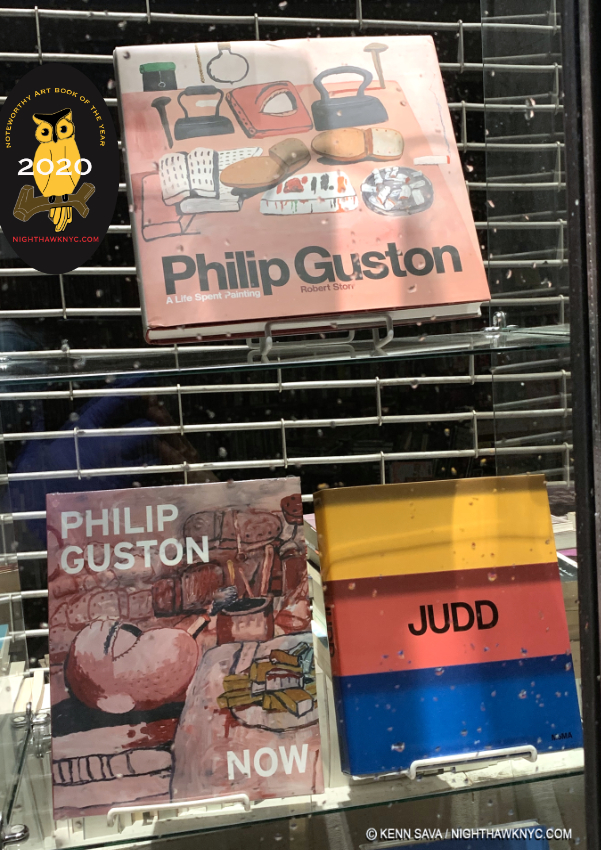
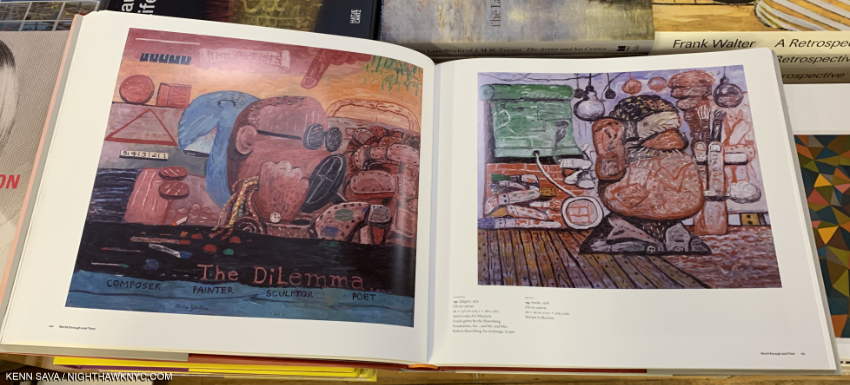
Philip Guston Now, DAP/National Gallery of Art, and
Philip Guston: A Life Spent Painting

After a gap of 15 years between retrospectives of his work, two excellent overviews of Philip Guston’s remarkable oeuvre are published in one year. Deciding which one to get is hard. Both have a lot going for them. For someone looking for one book with the most images in the largest size, along with one of the finest texts of Robert Storr’s career, Philip Guston: A Life Spent Painting is the choice. For someone looking for the only place to see the most controversial show of 2020, now postponed to 2024, along with an equally excellent text, Philip Guston Now is an excellent choice. For the serious Guston aficionado, the only choice is to buy both. For someone already familiar with Philip Guston’s work who wants to learn more about his work, either book will provide countless fresh insights.

Philip Guston: A Life Spent Painting may be the finest achievement in the long career of author Robert Storr. Yet, I give special credit to Philip Guston Now for being one of the most remarkable exhibition catalogs I’ve ever seen. Personally, I find its text by co-curators Mark Godfrey, Alison de Lima Greene and Kate Nesin, to be nothing short of brilliant both in its content and how it flows seamlessly from period to period through the Artist’s long career, treating the whole in a fresh way. This, alone, would be enough for a high recommendation, but the book is taken to another level by the addition along the way of pieces by 10 Contemporary Artists- William Kentridge, Glenn Ligon, Tacita Dean, Peter Fischli, Trenton Doyle Hancock, David Reed, Dana Schutz, Amy Sillman, Art Spiegelman and Rirkrit Tiravanija. Most provide unique insights into specific works by Philip Guston and a number of them directly address the “hooded”/klan works, the focus of the controversy around the show the book was published to accompany.

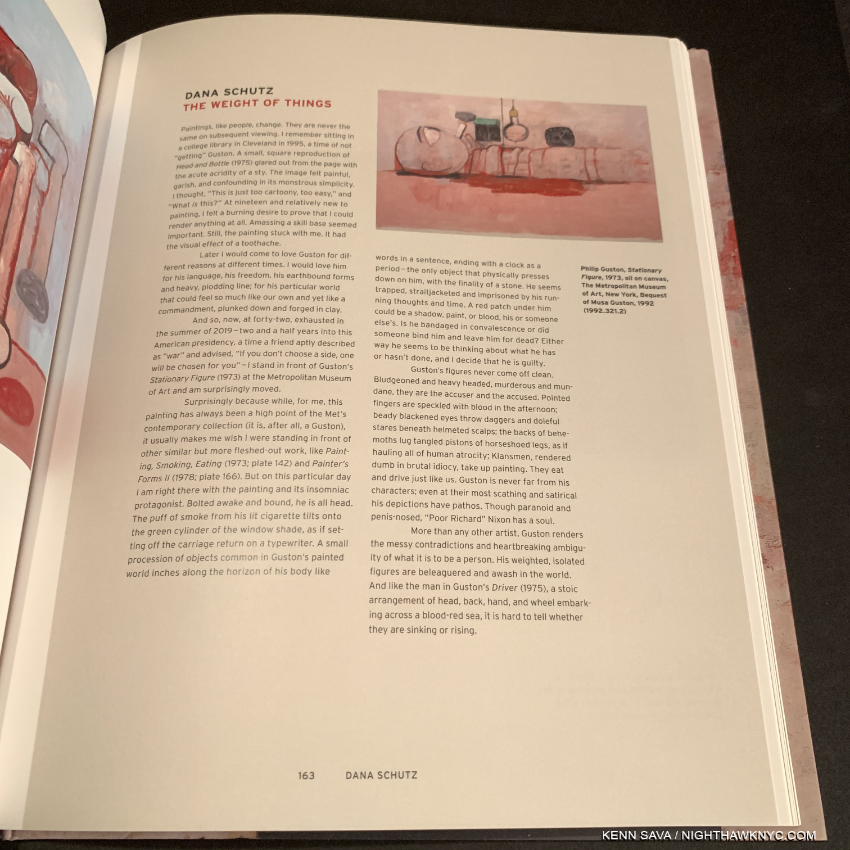
Dana Schutz’ Essay in Philip Guston Now.

The show, also titled Philip Guston Now, was first postponed due to covid to July, 2021, then  controversially postponed, again, to 2024 by the National Gallery of Art, Washington; the Museum of Fine Arts, Boston; the Museum of Fine Arts, Houston; and Tate Modern, London, where it is scheduled to be mounted. “We are postponing the exhibition until a time at which we think that the powerful message of social and racial justice that is at the center of Philip Guston’s work can be more clearly interpreted.1.” Like many others, I am at a loss to understand that statement. On the one hand, it denigrates the intelligence of visitors. On the other, what if 2024, isn’t that nebulous “time” the message speaks of under whatever unmentioned criteria they’re using to determine it? However, the show’s catalog did come out this year in anticipation of the originally scheduled opening. Its inclusion of the featured pieces by those 10 Contemporary Artists is exactly the kind of thing Art monographs need more of, in my view, as they struggle to remain relevant- given how many other books already exist on most Artists, and the large expense involved in creating them in what may be increasingly challenging times for museums who, largely, publish these books.

The reproductions of the Art in Philip Guston Now only adequate in terms of quality, in my opinion, are best used for reference to the points large and small being made throughout the text. Some of the Art is reproduced one image on a page with a copious border, others are 4 to a page. It does include new Photos taken in Philip Guston’s studio, which appears to be largely as he left it. The other big reason for getting this book is to see the works in, and to have a record of,  this important show, so you can prepare yourself to see it, IF it ever opens. Also important to note- many works will not appear in each of the four scheduled stops the show will make. So, the catalog is the only place to “see” the whole show.

The large 13.35 by 11.5 inch pages create an almost 27 inch spread making the images in Philip Guston: A Life Spent Painting the largest in any Guston book to date, and with over 850, the most images in any Guston book as well. This will make it a slam dunk choice for many, but take a look at both.

The illustrations are better and more numerous (850) in Philip Guston: A Life Spent Painting, whose 13 1/2 by 11 1/2 inch size is more accommodating close study. Get that book for the best current overview of the Art. As for its text, Robert Storr contributes one of his finest efforts, apparently the results of many years of work. As good as the text in Philip Guston Now is, Mr. Storr’s doesn’t take a back seat to any Guston book I’ve seen to date, which is why a recommendation for both books is the only one I can give at this point. They join Philip Guston: Retrospective, published by the Modern Art Museum of Fort Worth in 2003, to accompany the last major retrospective of his work and now out of print, my go-to Guston book to this point, as standard references to the work of this enduringly contemporary Master.

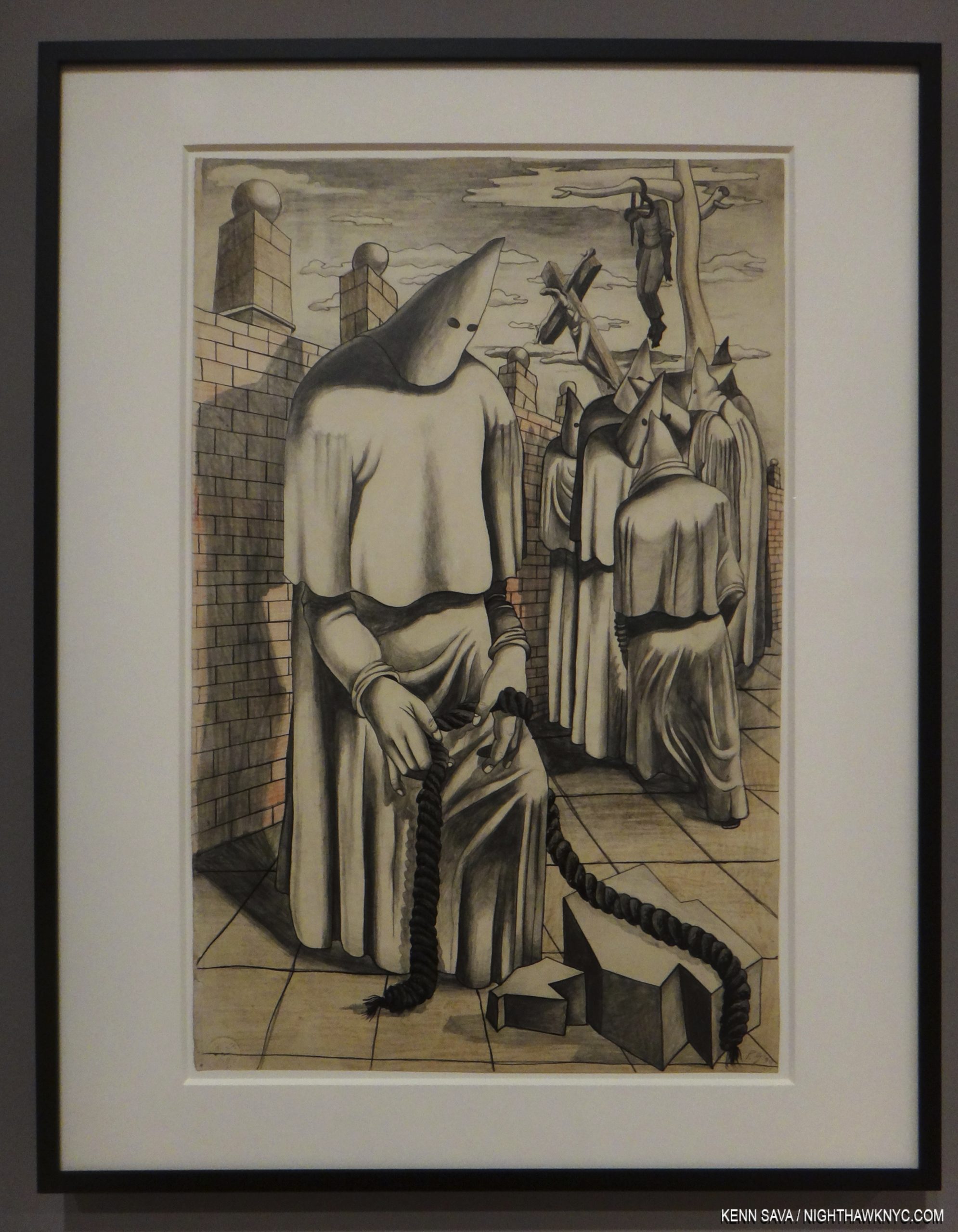
Drawing for Conspirators, 1930, Graphite pencil, pen and ink, colored pencil, and wax crayon on paper, seen at the Whiney Museum in July, 2015, in America Is Hard To See, the most recent showing of this work. A number of the essays in Philip Guston Now reference this work.

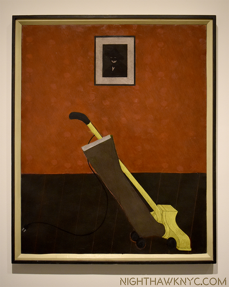
Before continuing, I feel I must briefly address the controversy centered around the show’s inclusion of Philip Guston’s klan Paintings. I’ve been somewhat surprised that the attention seems to focus on his late klan pieces. I think it’s important to remember that they go back to when the Painter was about 18. In Philip Guston Retrospective, the backstory is relayed on pages 16 & 17. It begins by quoting Mr. Guston-

I was working at a factory and became involved in a strike. The KKK helped in strike breaking so I did a whole series of paintings on the KKK. In fact I had a show of them in a bookshop in Hollywood, where I was working at that time. Some members of the klan walked in, took the paintings off the wall and slashed them. Two were mutilated. That was the beginning.”

(The text then continues) “The Ku Klux Klan, also known as the Invisible Empire, had a significant membership in California in the 1930s and 1940s, and Los Angeles County was its most active Klavern. Guston and several other of his friends also painted portable murals for the John Reed Club on the theme of ‘The American Negro.’ Guston’s submission was particularly volitile. Based on the Scottsboro case, in which nine black men were sentenced (many said on false and circumstantial evidence) to life in prison for raping a white girl. Guston’s mural depicted a group of hooded figures whipping a black man. The murals were eventually attacked and defaced by a band of ‘unidentified’ vandals. The experience of seeing the effect of art on life and life on art never left Guston, and the unsettling image of the hooded figure was branded into his visual imagination.”

In the 1930s, in addition to strike breaking, the klan also targeted Jews. Philip Guston, originally Philip Goldstein, was Jewish. Of course, their main target were Blacks.

Artists don’t live in the nebulous times those 4 museum directors speak of in their postponement statement. They live, work, and often respond to, the times of their lives. Philip Guston lived long enough to see that racism was deeply embedded in the fabric of American life, possibly even in his own life. I believe those are things that may have influenced his later hooded figure/klan works, though they are for each viewer to interpret for his or herself. If this ins’t the time for all of us to look inside at ourselves and see how we can be better, how do we know 2024 will be a better time to do so?

NoteWorthy Art Book of the Year, 2020

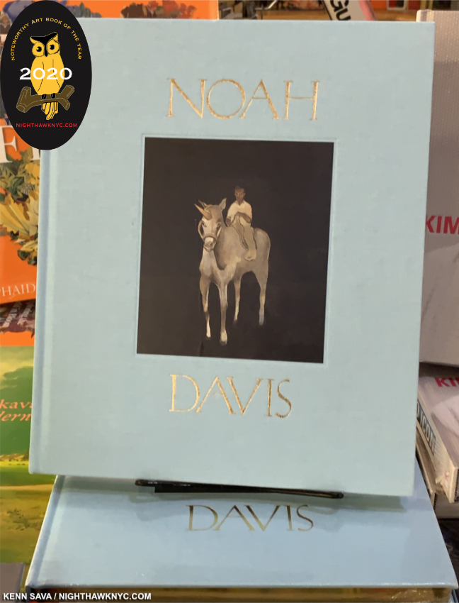
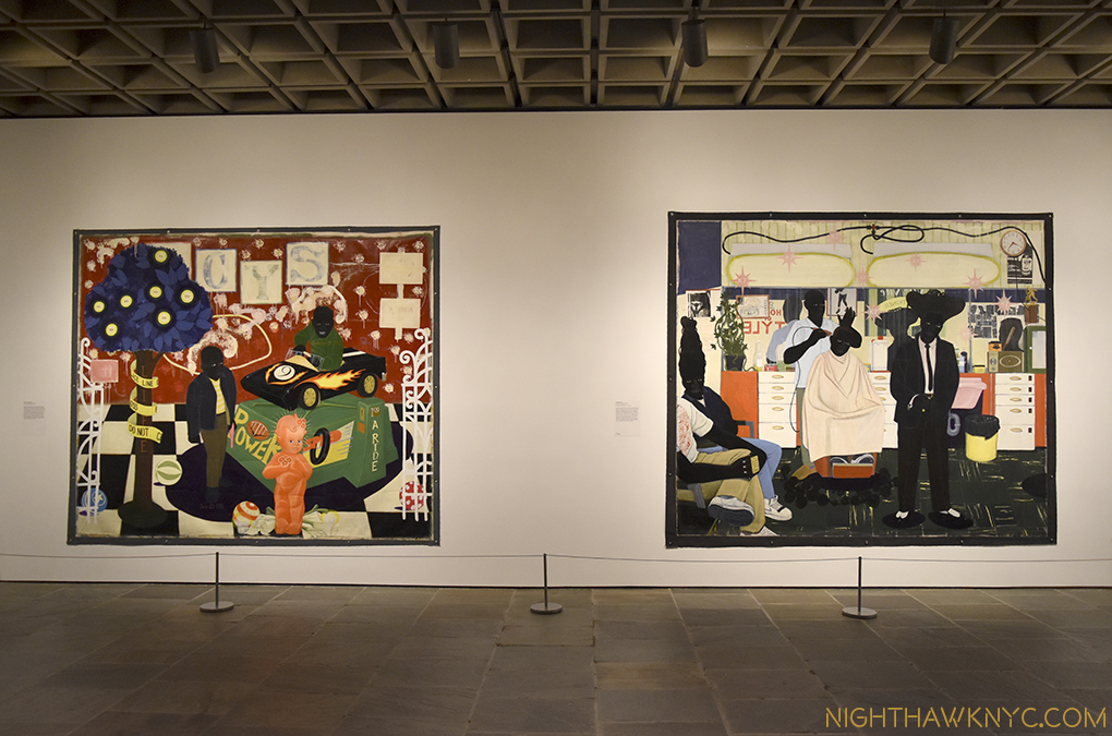
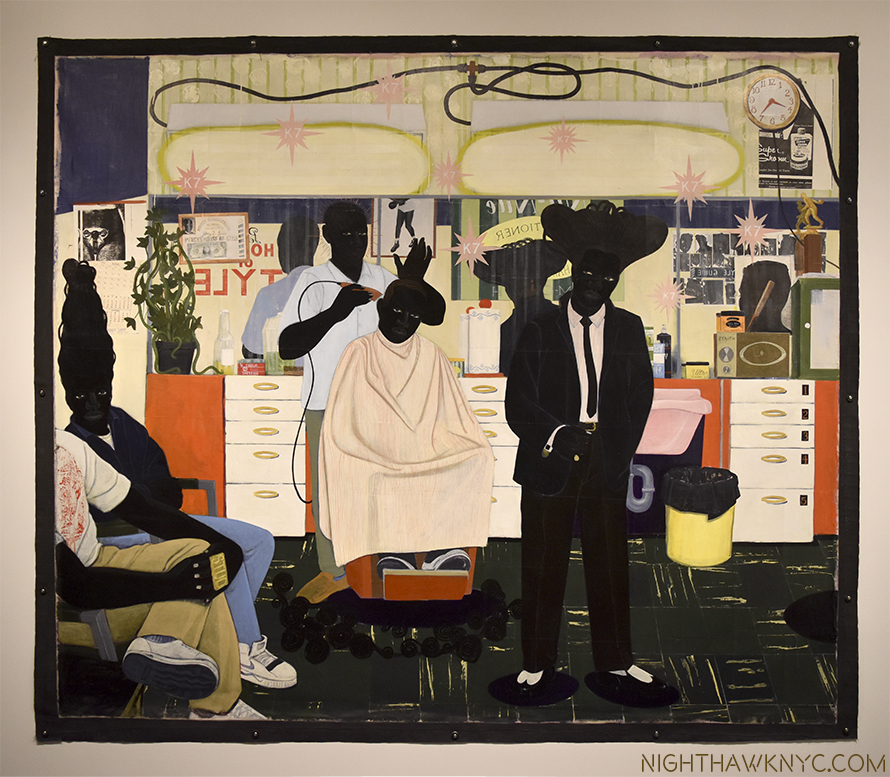
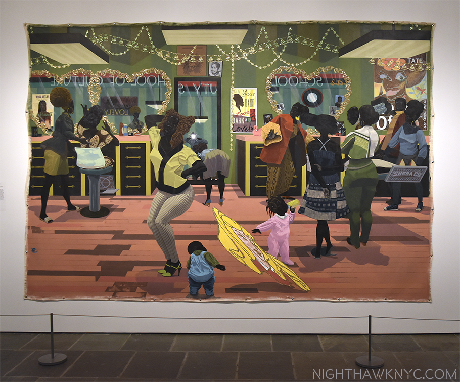
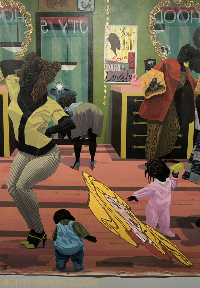
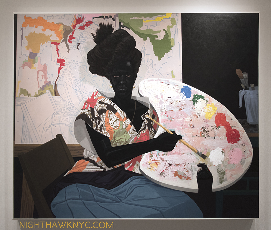
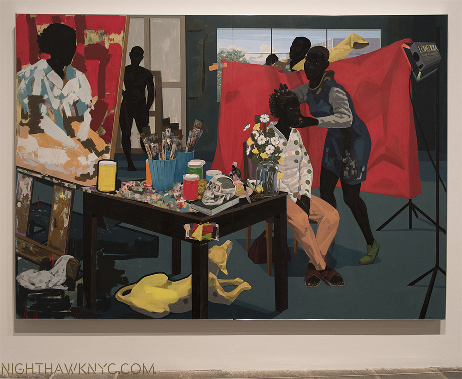
Noah Davis, David Zwirner Books. An early candidate for the most important new Art monograph of the new decade might be hard to top for that title in the next 9 years. Noah Davis passed away of cancer at the very young age of 32 on August 29, 2015. Still, the amount he accomplished and the work he created in such a short life will live on indefinitely. Editor Helen Molesworth was Mr. Davis’ personally chosen curator, and she curated the show that opened earlier this year in NYC, which  I wrote about before it moved to The Underground Museum, L.A.., which Noah Davis founded with his wife, the Artist Karon Davis. The text includes interviews with those who knew Mr. Davis, including legendary Painter Henry Taylor, Deana LawsonLindsay Charlwood, Dagny Corcoran, Daniel DeSure, Thomas Houseago, and Venus X by Ms. Molesworth. Only the second book on his work thus far, it will remain the standard reference for the time being, and a standard reference regardless of what else comes out on one of the most important Artists of  our time. It’s only too bad Mr. Davis didn’t live to see it. Noah Davis was not only an extraordinary Painter, he was one of the Artistic visionaries of our time. He showed it was possible to succeed as an Artist without gallery representation, and then he audaciously founded his own museum to serve audiences he felt were being left out by the existing museums. Generations to come will be influenced and inspired by his Art. Generations of Artists will be, also, influenced by his example. 

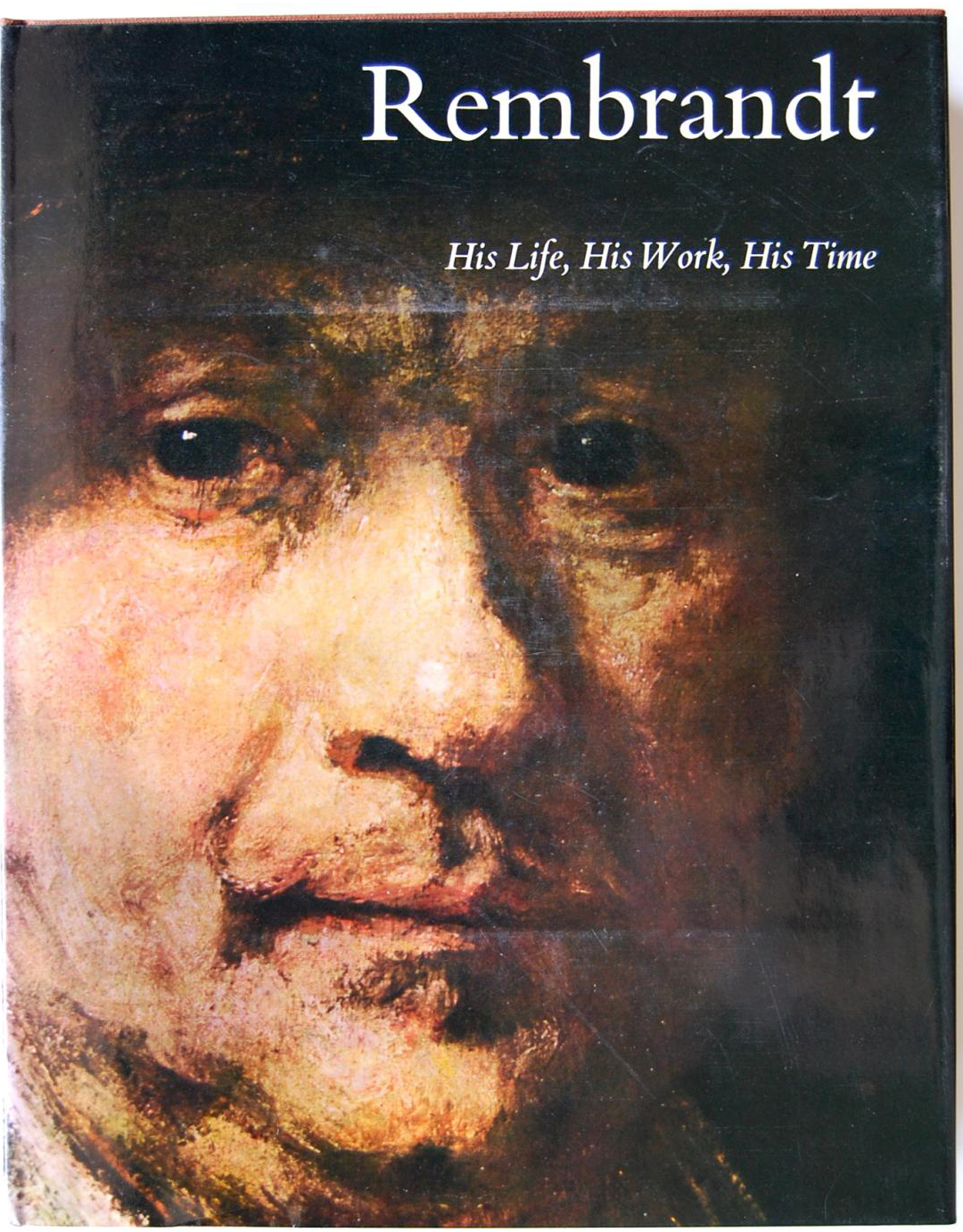
From 2020, let’s set the wayyyyy back machine back to the very first Art Book to captivate me when I was a kid was Rembrandt: His Life, His Work, His Time, by Bob Haak, published by Abrams in 1969. A large (13.5 by 11 inch), 348 page hardcover, with 612 illustrations including 109 hand-tipped color plates, it had these words on the front flap-

“There emerges, in this book, a Rembrandt who is human, fallible, majestic- a man who went through all the common vicissitudes of life and yet was determined to remain true to himself as an artist.”

I’d never seen anything like it. Here was an entire world, the entire life and work of an Artist that just exploded in front of me, singeing my mind as I turned each page, as Rembrandt’s wondrous turned painfully sad life went on, accompanied by the Artist turning his hand from Painting to Drawing to Prints, and back, each among the supreme works done in the medium by anyone, before or since. Most of all, it was the incredible humanity in his Art that has stayed with me to this day. He rendered everyone, from beggars to the exalted, babies and the very old, and foremost among them, he rendered himself, continually throughout his career, from early on, until near the end, creating a body of Self-Portraits, the like of which the world had never seen. Those words on the flap turned out to be the key! As the years went by, I began to understand where that unequalled humanity in Rembrandt’s work came from. Such is the power of a truly great Art Book.

Fast forward a half century to 2020 and the release of 3 great books on the Master, each one of my NoteWorthy Art Books, 2020…

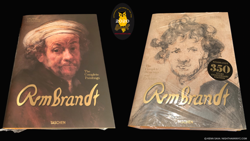
The heavyweight champions. The Complete Paintings weighs in at 17.78 pounds, The Complete Drawings & Etchings at 14.99 pounds.

Rembrandt. The Complete Paintings, Taschen XXL Series
Rembrandt. The Complete Drawings & Etchings, Taschen XXL Series
Rembrandt. The Self-Portraits. Taschen XL Series. Nothing more needs to be said- These will remain THE standard visual reference books for Art lovers on the work of the foremost Painter of humanity in this house for the foreseeable future or until the experts change their minds, yet again, on what is, and what is not, from the hand of the Master and deserves to be included. And you know they will (though not the last WORD, for that Gary Schwartz’ amazing books on Rembrandt will retain their prominence in this household). Again. In the meantime, bliss out in peace. Even Mr. Schwartz approves in an Amazon review2. With all due respect to the esteemed authors, in my opinion, these books would be closer to “perfect” if they had his contributions. Photography, paper, binding, finish are first rate all around. 

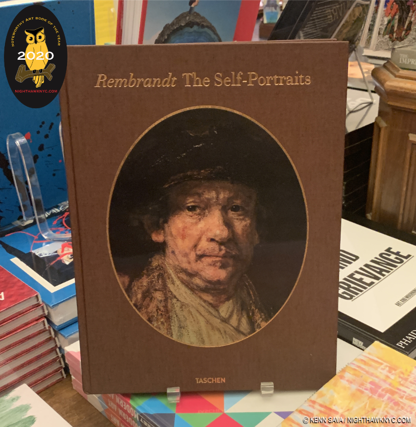
After all these years, well into the age of the selfie, this first body of Self-Portraits still remain at the top of my list of favorite Art works.

It’s a bit bold of Taschen to publish these books given the still in-flux state of what exactly is a Rembrandt, and given that the esteemed publishers have not yet issued a revised version of any of the XXL books. My guess is they felt the completion of the Rembrandt Research Project’s work, published in a six volume set, the last in 2014, provided an opportunity for a collection. I’ve recently heard of at least one change to the accepted canon, but for better or worse, anyone wanting to see the most Rembrandt in a large size will be left with these three books as the best option for the foreseeable future.

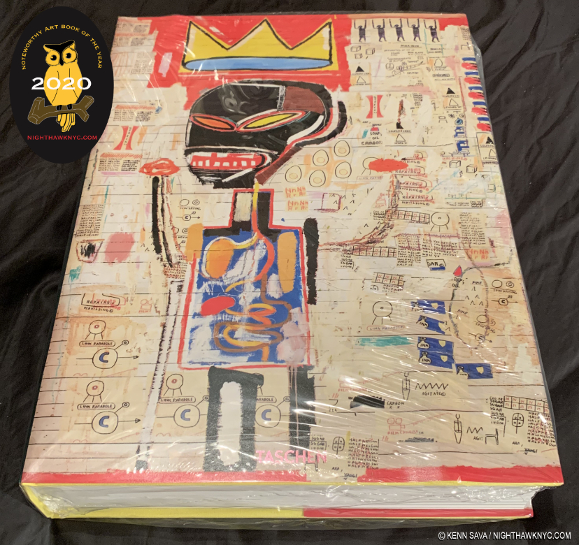
Jean-Michel Basquiat, Taschen XXL Series
As I just got through saying about the original Dutch Master, if you want to see as much of the work of the late New York Master, Jean-Michel Basquiat as possible in one volume, as LARGE as possible, Taschen’s XXL Jean-Michel Basquiat is the only book for you. Yes, another Taschen XXL on this list this year. Look at the $200. list price (for this and for each of the Rembrandt Paintings and Drawings books) this way- You’d have to spend a large fortune to travel to the world to see all the Art contained in one of these, IF the work happened to be on view. Even then, you won’t get to see it this close up in what is usually, very good to excellent Art Photography. And consider that much of the key work of Jean-Michel Basquiat is in private hands because the museums were slow to accept and buy his work. They missed the boat. Private collections rarely show or lend their work making the chances to see more than 5 Basquiat Paintings anywhere at any time extremely rare! That’s exactly why I spent so much time running around seeing the 5 Basquiat shows mounted here in NYC last year. My pieces on them are here. In all that effort, I still only saw about 130 or so pieces!

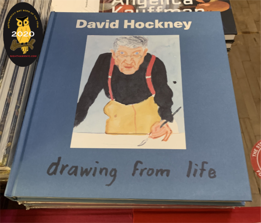
David Hockney: Drawing From Life, National Portrait Gallery, London
The incredibly prolific Mr. Hockney has had a life long obsession with Drawing. That alone makes him a man after my own heart. I’ve followed along with his Drawing evolution with empathy. He’s often spoken of the challenges of Drawing and man, could I relate to them, as I spent 3 days every week Drawing at The Met for about a decade. Sometimes, I’d look at his Drawings and I could see my own efforts. But, most times I looked, he was light years beyond me. His use of an incredibly wide range of Drawing tools and media is unprecedented among major Artists 0in Art History- everything from chalk to graphite to the iPhone and iPad. With each new tool he found his own way, and achieved remarkable results (like his huge, multi page iPad Yosemite Drawings) that are all the more remarkable for being instantly recognizable as David Hockneys. He’s also been proflic in the number of books published on his Art. Yet here is the first collection of part of his Drawing oeuvre this century (the David Hockney: A Drawing Retrospective, 1996, the last overview I can recall). It’s wonderfully done and ingeniously designed, with chapters following the Artist’s evolution of a single subject each, culminating in his Self-Portraits. Published to accompany the show of the same name at the National Portrait Gallery, London, it’s a remarkable book that due to its ingenious concept has an unexpectedly personal feel to it- as you turn the pages, you begin to feel you know each subject. It’s particularly recommended to Drawing students and lovers of the endangered Art of Drawing.

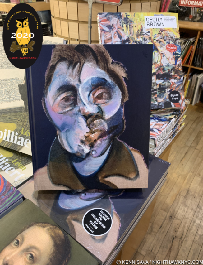
Francis Bacon or The Measure of Excess by Yves Peyre, a friend of Mr. Bacon’s, stands in front of the new monograph on Cecily Brown. Cecily’s father, David Sylvester, was also a long time friend of Bacon’s and gave us the enduring classic Interviews with Francis Bacon.

Francis Bacon or the Measure of Excess, Yves Peyre, ACC Art Books.
Slowly, steadily and continually, the late, great British Artist has now established himself in the upper echelon of Artists I am absolutely obsessed with. To the point that the LAST thing I need is ANOTHER Francis Bacon book. I’d never heard of Yves Peyre, though the cover says he “was a close friend of the artist.” He’s also a poet and has authored a book on Henri Michaux. Well, some of Mr. Bacon’s other friends have already given us books on Mr. Bacon, from David Sylvester (Cecily Brown’s dad, who’s Interviews with Francis Bacon remains most essential) and Michael Peppiatt, down, including another poet, Michel Leiris, and most of them are quite good and have held up for a few decades already. Some of them also offer quite good collections of reproductions of Mr. Bacon’s Art (something EVERY Francis Bacon books seems to need to give us). Yet, as a one volume overview of Francis Bacon’s career with excellent, full 11.73 by 9.83 inch page reproduction, Francis Bacon or the Measure of Excess is my current recommendation and personal choice as a one volume visual reference. The texts of the earlier books remain important, and recommended, summing in a nutshell why it’s VERY hard to have only one Francis Bacon book. Even if you have other books, Mr. Peyre shines the new light of a fresh approach to Bacon, which is somewhat remarkable given how many others have chimed in on his work already, during his life and since his passing in 1992. Of course, if you want THE Francis Bacon publication, the 5 volume Catalog Raisonne is still in print at 1,000 British Pounds a copy, plus shipping. I’ve seen it, and it is exceptionally, even remarkably well done, with Martin Harrison, the foremost authority on Bacon today, astoundingly uncovering 100 previously unseen works (Oh! To find just ONE in a flea market…). The Bacon Estate says it will never be reprinted, and so likely will never be “cheaper.”

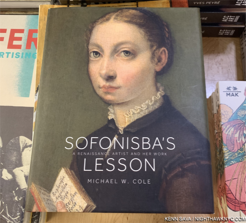
Sofonisba’s Lesson, Michael Cole, Princeton University.
Wait. What? Who? Sofonisba Anguissola, 1532-1635, was a female Painter & educator in the Renaissance. Believe it or not, a female Painter in the Renaissance. And a great one, in my view. To say her work has been in eclipse since would be an understatement. I, for one, was unfamiliar with her or her work until I saw this incredible, irresistible face staring out at me from the cover. I doubt I’m alone in that. The Met appears to have nothing by her. Neither does The Frick. Ah, but one person who immediately saw her talent was Il Divino himself, Michelangelo, who informally gave her advice! Nuff said. There is no possible higher recommendation in the Art world than that. Into the gap of knowledge for the rest of us mere mortals steps Michael Cole’s beautifully done, concise, monograph that goes a very long way towards putting her back on all of our maps, where she belongs to stay, in my view, henceforth, as the true Master Artist she was.

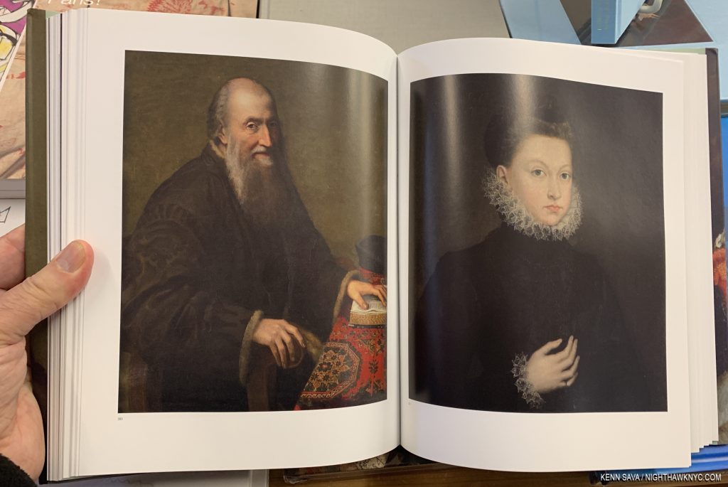
As you can see both of these Portraits are first rate, but look at the table covering, left, and the collars and cuffs on the right. For me, there are number of different techniques, even styles, on views in each work and that speaks volumes about the depth of her skill.

At 2.5 pounds, it’s not as big in size or as weighty as the Rembrandt or Basquiat XXLs on this list, yet I admire this book so much that if it weren’t for Noah Davis being released this year, it might well be my NoteWorthy Art Book for 2020. A lesson for all those Artists struggling for recognition today- Sofonisba’s Lesson comes 12 years before the 500th Anniversary of her birth in Lombardy in 1532. Better late, than never.

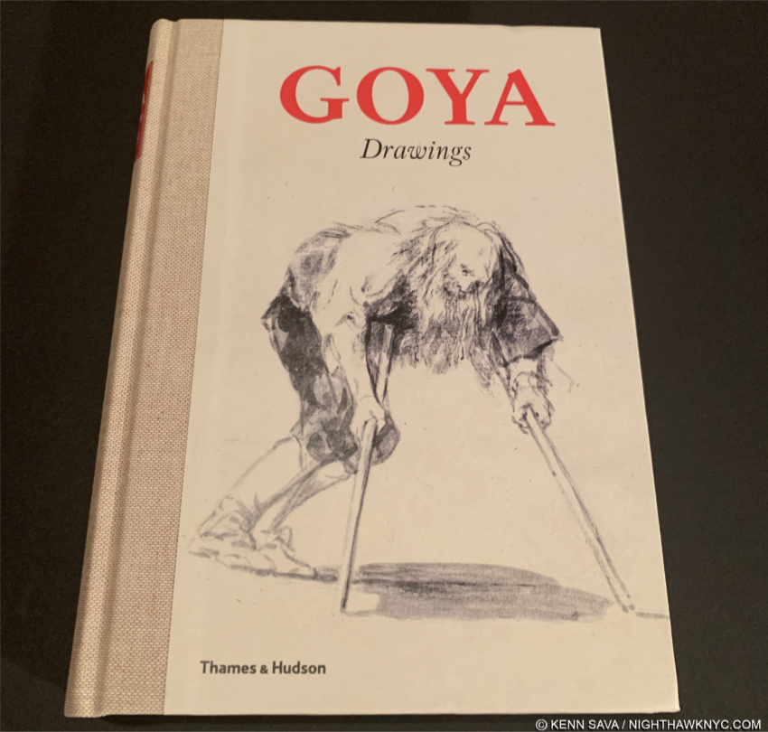
Goya Drawings, Thames & Hudson/Prado Museum.
Back in the day before Photography with chemicals ruled the world, Drawing & Painting were the primary means by which events of the day were recorded or, along with those past, recreated. Primary among the great Artists who recorded the events of their day remains Francisco Goya. While his The 3rd of May, 1808, is perhaps, his most well-known such work, though we have no way of knowing if the Artist actually witnessed this scene personally. He also created a large body of Drawings the scope of which, and the humanity of which, only Rembrandt’s can equal in my mind. Like the original Dutch Master, Goya’s Drawings magically capture a pose or an expression in an almost impossible economy of line, while looking for all the world like they were done quickly, without second thought. Ahh…Drawing at its most sublime. 

2020 saw the release (or at least the availability in this country) of two excellent Goya Drawings monographs, both of which are published by no less than the Prado Museum, home of the world’s finest & most comprehensive Goya collection, one of which is a NoteWorthy Art Book for 2020. Goya Drawings immediately becomes the choice resource for the lay reader, the Drawing or Painting student or Artist, and for the serious Goya student. A remarkable overview that does not scrimp on detail, insights, or the number of color images, in manages to stay concise and succinct. I picked it and didn’t know what to make of it from very generic front cover. “Goya Drawings”? That’s a huge subject for such a small book. Once I opened it I could not put it down. Sure enough, his Drawings over his entire career are covered, period by period in depth, and while not each and every one is covered, the overview is broad enough to convey the big picture  but can be dipped in to at any point for a closer study of any one work, which is written about on the page with its illustration- quite rare in a comprehensive book like this, and an indication of its superb design.

Finally, along with the other Goya Drawings book they published this year, Francisco de Goya: Cuaderno C (or Sketchbook C), which reproduces in facsimile one of his sketchbooks, both books are part of the Prado’s continued effort to make its Goya riches available to the public, online for free, and in these two modestly priced and superb books, Goya Drawings was released in honor of it’s 200th Anniversary in November, 2019. Bravo!

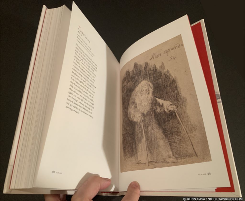
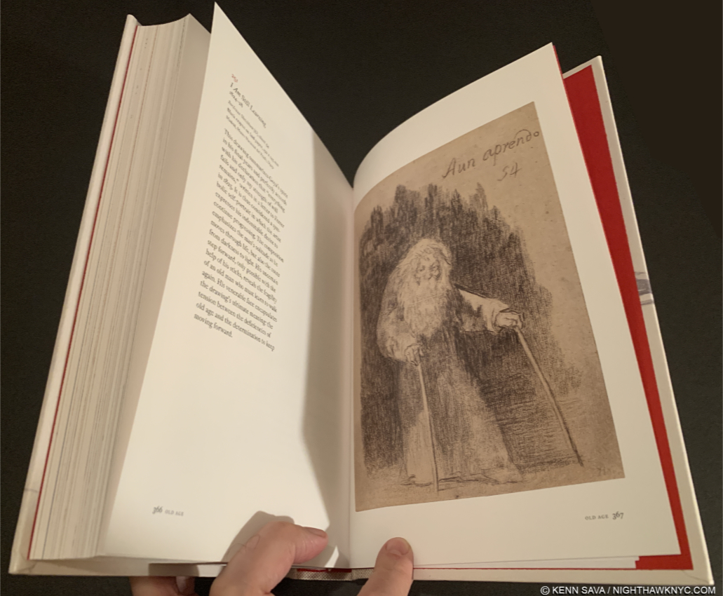
I Am Still Learning, c.1825-8, Lithographic crayon on grey laid paper,  on the next to final page. Goya was about 80 when he Drew this symbolic Self-Portrait. A fitting culmination to an immortal career, …and to this piece as words to live by.

Afterword/Forward to 2021

We’re not out of the pandemic woods yet. It might be a while before we are. I hope and pray not a long while. We shall see. Still, many smaller businesses have permanently left us. Many others are hanging on. I have been staying to myself this year, which means living in complete isolation for all of 2020. Yup. You read that right. I will only go into an enclosed space if I have to. Still, I have made very brief journeys into local bookstores, and peered in the window from the street of others, to see how busy they were. Frankly, what I’ve seen is very scary. Throughout the week, you could roll a bowling ball down the aisle of almost any bookstore here and hit no one. On the weekends, they’ve been closer to normal. Part of that is, no doubt, early holiday shopping. Still, the big takeaway for me is that the time is now- today and 2021, to support independent bookstores if you want them to survive. Many of the books and Artists I discover each year (and have my entire life) I’ve discovered browsing books in bookstores- including Rembrandt: His Life, His Work, His Time, by Bob Haak, shown earlier, 40 years ago. You can’t do that online. I’ve been waiting for eBooks to begin to replace physical Art & PhotoBooks for many years now. As 2020 closes, it doesn’t seem that we’re any closer to that than we were 5 or 10 years ago. A high quality eBook could replace most Art books published today- IF the image quality was comparable. They’re not. Screen image quality is nowhere near that of printed image quality. Then, there are Artist’s Books and PhotoBooks. Many of both are painstakingly crafted in every single detail, down to each material used, which no cyber experience can match. These books are often works of Art in themselves, and for many Artists & Photographers who don’t have gallery representation, they provide a primary focus for having their work seen on their terms, the way they intend it to be seen. Physical books in general have a charm and provide a tactile experience no eBook can match. If you value books, like I do, consider supporting your favorite local indie bookstore in person or online. While you can.

*-Soundtrack for this Post is “Better Days Ahead,” by Gil Scott-Heron & Brian Jackson from the album Secrets, 1978…

NighthawkNYC.com has been entirely self-funded and ad-free for over 6 years, during which over 250 full length pieces have been published. If you’ve found it worthwhile, you can donate to keep it going & ad-free below. Thank you!

Written & photographed by Kenn Sava for nighthawknyc.com unless otherwise credited.
To send comments, thoughts, feedback or propositions click here.
Click the white box on the upper right for the archives or to search them.
For “short takes” and additional pictures, follow @nighthawk_nyc on Instagram.

Subscribe to be notified of new Posts below. Your information will be used for no other purpose.


  1. Here.
  2. With a caveat on the Drawings volume, so he went ahead and created a concordance to ease referencing the new Schatborn reference numbers Taschen’s behemoth uses to refer to the work to the standard Benesch numbers, available here!

Kerry James Marshall: The Revolution Was NOT Televised

Written & photographed by Kenn Sava

“The revolution will not be televised, will not be televised
The revolution will be no re-run, brothers;
The revolution will be live.”*

Gil Scott-Heron was right. The revolution wasn’t televised. It was painted. Well, one revolution…so far, was.

Kerry James Marshall: Mastry,” was live, on the walls of the 3rd and 4th Floors of The Met Breuer (TMB), where it was nothing less than a revolution, bringing black figures to Art in Museums, for the first time, in the form of a Retrospective of 35 years of Marshall’s work. While that might be the lead, in my book, it also established it’s subject, KJM for short, as a modern Master, and proves his work belongs in our greatest Museums, and well, any Museum.

Life, and Remembrance. Mastry’s opening gallery @TMB presents two of his major themes. In “De Style,” 1993, right, one of his most iconic works, KJM’s barbershop is full of life, culture, individuality and invention- painted and coiffed. On the left, his “The Lost Boys,” also 1993, a title borrowed from Peter Pan, is an homage to two children lost to gun violence, and all the boys who were “lost” to a variety of causes.

The revolution takes place…in a barbershop. “De Style’s” title seems a coy play on the name of the Dutch Art Movement “De Stijl,” brought to “Percy’s House of Style,” though the painted style of this work is purely his own. A very wise purchase by the L.A. Museum of Contemporary Art in 1993, the year it was completed, 22 years before The Met acquired one.

In bringing the black figure to Museum(s), KJM seems determined to fill as many of the “slots” they’ve been overlooked in heretofore as he can. We see boy scouts, girl scouts, lovers, monsters (“Frankenstein,” and his “Bride,”), models, Self Portraits, murderers, (imagined) Self Portraits of other Artists, portraits of historical figures, as well as scenes from family life, in the suburbs, the inner city and in recreation, as well as daily life, and home life, in the Artist’s studio, at the barber shop & hair salon, which are becoming his most famous works. Along with these, we see memorials to slain children and cultural leaders, the questioning of the aesthetics of beauty & desirability, and the Artist’s own graphic novel, “Rythm Mastr,” (which left me longing to see much more of it). And, yes, there are even revolutionaries.

Early works. “Portrait of the Artist & A Vacuum Cleaner,” 1981, age 26. Cleaning up Art History.

“So This Is What You Want?,” 1992, tells a story in a different way that would soon coalesce and lose the “collage” feel. The image of the uterus (left of center) appears in a number of his works, including “De Style.”

Art History runs strong in the work of KJM. While many Artists study the past, copy the great Masters, and “borrow,” even steal some of their styles, etc., it’s unusual to see an Artist who is as familiar with the range and breath of Art History as KJM is. Charles Wilbert White, in particular, was an early idol, then a teacher and friend, so it’s not surprising that something of his style does seem to have echoes in KJM’s, especially in his portraits, Marshall’s fluency with Art History is something that reveals the long hours of study he spent in Museums and studying Art Books. The way he will use bits of a style, seemingly out of nowhere is thrilling,  makes the old “modern,” while seamlessly making it a part of his own style, often to the end of adding mystery. Abstract Expressionism seems to be a particular favorite, given how often passages of it occur in the works here. Then, there is the anamorphosis portrait of “Sleeping Beauty,” painted oblong right smack dab in the center in “School of Beauty, School of Culture,” 2012 (below), who can only be properly seen from the side. An homage to Hans Holbein the Younger, who used this technique in his masterpiece, “The Ambassadors,” 479 years earlier in 1533, where a skull appears that’s visible only looking at it from the painting’s side. In both works, it’s an optical tour de force, the sheer brilliance of it lies both in the audacity of using it in this work, as much as it appears directly under a coy “Self Portrait” of the Painter, himself, shown behind the flash of his camera. That this was hanging in The Met Breuer, part of a Museum that owns no less than 5 Hans Holbein the Younger’s paintings (though not “The Ambassadors”), was as much of a statement as anything else in this show.

“School of Beauty, School of Culture,” 2012, 13 feet long, pays homage to Art History, and Hans Holbein in the center, in a work that is wholly unique, fresh, exciting and endless fun to look at.

A child looks at Sleeping Beauty, while the Artist takes a step back to shoot the whole scene (in the rear, with flash).

Elsewhere there are echoes of Winslow Homer, Breughel, and, there is also a spectacular homage to Edward Hopper’s “Early Sunday Morning.” Marshall’s is, like Hopper’s, a tale of urban reality, and like the original, it finds it’s own way to make magic with the early morning sunlight.

“7am Sunday Morning,” 2003, 18 feet long. KJM’s take on Edward Hopper’s “Early Sunday Morning,” 1930, an urban work that reflects the Great Depression, Marshall’s features Chicago’s South Side, with one remaining high rise from the Robert Taylor Homes, the rest having been raised, with music coming from it, and includes a painted interpretation of a camera’s lens flare, in the right half.

As work after work goes by, it becomes plain that more than paying homage to Art History, KJM has added his name to the list of Masters- Old, and “New,” and, in the process, he brings the Art of Painting kicking and screaming into the 21st Century, along with him.

“Rythm Mastr,” 1999-on, is his endlessly inventive graphic novel. Sometimes broadsheet handouts, sometimes lightboxes, as here. I traveled to a satellite show at IPCNY just to see more of it. I’ve never seen anything like it. Publish it all, please!

Along with all of this, 1/3 of the way through, there is, also, a large gallery full of works chosen from The Met’s permanent collection by the Artist, for a “show within a show,” called “Kerry James Marshall Selects.” Which reminds me, that though The Met has had a “tempestuous” past when it comes to the work of Modern & Contemporary Art & Artists, as the world’s greatest depository of 5,000 years of man’s creativity, it is uniquely suited to “highlight Mashall’s deep connection to history,” as Met Director Thomas P. Campbell said in their October press release, and dialogue with it, as the show within a show does.

“Kerry James Marshall Selects,” Installation view. In my dream, I get to do this…Of course, in the same dream, I’m also a genius painter, so The Met will let me.

Charles Wilbert White, “John Brown,” 1949, idol of, later teacher and friend of KJM.

Among the pieces chosen by KJM were works by Ingres, Batlhus, Ad Reinhardt, Gerhard Richter, Durer, Paul Cadmus, DeKooning, Bonnard, Seurat, the aforementioned Charles Wilbert White, Toulouse-Lautrec, Yoshitoshi, Utagawa, Andrew Wyeth, the Bamana and Senufo Peoples, Jacob Lawrence, Horace Pippin, George Tooker, Matisse, John Graham, Romare Bearden, Roy DeCarava, Walker Evans, Aaron Douglas, and yes, Holbein The Younger. I list them here for those interested because the only place they appear in on page 265 of the show’s excellent exhibition catalog, which quickly went out of print, halfway through it’s run at TMB, and before it even opens at LA’s MOCA in March!1 KJM lived in LA, and works remembering those days are some of the most complex in the show. He currently lives in Chicago, where the show originated in April, 2016 at the MCA.

“Untitled,” 2009, an imaginary portrait of a female Artist that deftly melds a number of styles, including Abstract Expressionism and “paint by numbers” that leave you wondering what the imaginary Artist’s work looks like.

An analysis of Marshall’s mastery of At History, as seen in the works in “Mastry,” alone, would be a book of it’s own. I don’t know if he anticipated that the end result of his study would be his carrying on dialogues with his influences for the rest of time on the very same walls. But? That is most likely what will happen now.

Mastr-piece. “Untitled (Studio),” 2014. The only work in the show that belongs to an NYC Museum. The Met acquired this in 2015. They started late, but very well.

In October, the New York Times called him, and I quote, “an immortal man,” in a profile in their “The Greats” issue. That click you heard was the sound of a very deserving Artist “making it.”

“Untitled (Blot),” 2015, the most recent work in the show, ends it. Bruce Conner was famous for these, but in ink.

Welcome to forever, Kerry James Marshall.

*-Soundtrack for this Post is “The Revolution Will Not Be Televised,” by Gil Scott-Heron, from the classic live album of the same name. Published by Carlin America Inc.

NighthawkNYC.com has been entirely self-funded and ad-free for over 7 years, during which over 250 full length pieces have been published. As I face high expenses to keep it going, if you’ve found it worthwhile, please donate to keep it up & ad-free below. Thank you!

Written & photographed by Kenn Sava for nighthawknyc.com unless otherwise credited.
To send comments, thoughts, feedback or propositions click here.
Click the white box on the upper right for the archives or to search them.
For “short takes” and additional pictures, follow @nighthawk_nyc on Instagram.

Subscribe to be notified of new Posts below. Your information will be used for no other purpose.

  1. If you want one, don’t pay the 200-300. being asked online for the few copies for sale there. I’d say wait. There MUST be a 2nd printing coming…right? In the meantime, The Met has an excellent website for the show that features images of the pieces and it’s audio guide, here. That there were no copies for the hundreds of people who wanted one during the second half of the show’s run at TMB astounds me. This cost The Met thousands of much needed dollars in revenue. Also, during it’s run at TMB, limited edition signed & numbered prints by KJM went from 2,700.00 each at the show’s opening to 4,000.00 each at The Met’s store currently. A 50% increase.

A Tribe Called Quest- From Linden Boulevard To…Forever

This site is Free & Ad-Free! If you find this piece worthwhile, please donate via PayPal to support it & independent Art writing. You can also support it by buying Art & books! Details at the end. Thank you.

Written by Kenn Sava.

When Q-Tip suddenly announced there would be a new, and final, album from A Tribe Called Quest coming out on November 11, you could have knocked me over with a cotton swab. Even after reading his hand written note a few times I still couldn’t believe it.

Did ANYONE see this coming? What would it be like? Afterall, one of it’s core members, Phife Dawg, passed away on March 22, as I mourned.

But, there I was November 15th, when I was finally able to get my hands on a download, and the experience was surreal. It reminded me of seeing Eyes Wide Shut, Stanley Kubrick’s unexpected last film, finished just before he died, on the day it opened, July 16, 1999. I was in the first row, and I’ll never forget the opening- on the huge black screen, big white letters appeared-

TOM CRUISE

then

NICOLE KIDMAN

and, finally

A Film By STANLEY KUBRICK

A chill ran up my spine. Oh My God…Another Stanley Kubrick movie, TWELVE YEARS after Full Metal Jacket in 1987! Forever my personal favorite director, I NEVER expected to see another film by him ever again, and here it was…

I’m not making any comparisons here between Stanley Kubrick and ATCQ other than to say they both occupy large places in my heart, and to say these unexpected final works had a similar shocking effect on me. What would they add to the canon they’ve already created? What new would we learn? For me, Tribe had more “Jazz” going on than any other group I’d heard that wasn’t an actual “Jazz Group,” even though Q-Tip, himself, played this down after people started calling them “Hip-Hop Jazz.” It’s in there. Yes, they had a lot of a lot of things going on, it was the way their lyrics flowed like a solo, with the same freedom, the same unexpected, thrilling turns, the interplay, and, Q-Tip’s voice has a “Jazz” edge to it. I hear bits of singers like Eddie Jefferson,  and even Billie Holiday in Q-Tip’s style. Beyond this, in terms of production, lyrical content and their approach, Tribe stood apart and alone, as far as I was concerned. While they addressed serious topics, like date rape, drug dealing on “Everything Is Fair,” and even the music biz tell-all, “Show Business,” on the sublime “The Low End Theory,” nothing interrupts their flow, and the music overcomes all. If there was an overriding “message” I took from A Tribe Called Quest? That was it.

From Low End Theory on, I followed each one up with seeing them live. I even drove to Asbury Park, NJ to see them in a small bar. There were so many people there, people were standing on the seats of the booths that ran along the wall. I was among the row of people standing on the narrow curved shoulder of those booths, with my head inches from the ceiling. I also saw them on New Year’s Eve at the Palladium, with Leaders of the New School and DeLa Soul. The amazing thing about that gig for me was that Tribe performed with a live band! I had always dreamed of hearing Tribe with a live band of improvisors.

“My pops used to say it reminded him of be-bop.”

Yeah. That’s it. That’s what I mean.

“I said, well daddy don’t you know that things go in cycles”1

Yeah.

Seeing their name on a new album, again? It’s on 5 previous albums that are seminal to quite a few people’s lives. Each one was an event, a cause for marathon listenings and discussions, about the lyrics, the style, the tracks, the cover…all of it.

Here it is- We got it from Here…Thank You for Your service. Available direct.

And now, EIGHTEEN YEARS after The Love Movement came out in 1998 (which isn’t considered their best album in anyone’s estimation that I know of), that same Eyes Wide Shut feeling returned. I put it on, shut my wide eyes and listened….

First up? “The Space Program.” It starts with a sample from a pretty obscure “blaxploitation” film called “Willie Dynamite,” from 1974, that says-

“I’mma deal with a bigger insult,man
It’s comin’ down hard
We’ve got to get our sh*t together”

Hmmm….Auspiciously setting the stage right away. This sure isn’t The Love Movement. Then, Q-Tip AND Phife take over-

“It’s time to go left and not right
Gotta get it together forever
Gotta get it together for brother
Gotta get it together for sisters”*

I was in shock. I didn’t realize that Phife had lived to work on this. It was downright eerie hearing him, especially singing that verse, and then solo, with the line

“Gotta get it together for dead niggas…”*

Whoa…

Yeah. But now they’re talking about ‘forever.” As in “Gotta get it together forever.” Has anyone in any form of “popular music” said that since Bob Marley’s “Redemption Song“? That’s pretty serious. Between “The Space Program,” and especially on the following, “We The People,” I’ve never heard Q-Tip sound more serious. But wait. This is just getting started. After verses by Q-Tip & Jarobi, here’s the chorus, with Q-Tip rapping the lines not in parenthesis, which are sung by a chorus-

“(Move on to the stars)
There ain’t a space program for niggas
Yeah, you stuck here, nigga
(Move on to the stars)
There ain’t a space program for niggas
Yeah, you stuck here, nigga
(Move on to the stars)
There ain’t a space program for niggas
Yeah, you stuck here, nigga
(Move on to the stars)
There ain’t a space program for niggas
Yeah, you stuck, stuck, stuck
(Move on to the stars)”*

As I said, Tribe hasn’t been heard from since 1989, though Q-Tip has on his excellent solo albums (The Renaissance is especially highly recommended.), as has Phife on his (and word came down this week that his second solo album will be released posthumously!). But someone who has been heard from during their absence was the great Gil Scott-Heron, who died on May 28, 2011, and who some call a founding father of rap. He released the amazing I’m New Here in 2010, which was remixed by Jamie xx as We’re New Here and the posthumous Nothing New, in 2014. But, back in 1970, Gil Scott released a record called Small Talk at 125th and Lenox, that included the track, “Whitey On The Moon.” This was during the Apollo moon landings that began in July, 1969. Here are it’s lyrics-

“A rat done bit my sister Nell.
(with Whitey on the moon)
Her face and arms began to swell.
(and Whitey’s on the moon)
I can’t pay no doctor bill.
(but Whitey’s on the moon)
Ten years from now I’ll be payin’ still.
(with Whitey on the moon)
The man jus’ upped my rent las’ night.
(’cause Whitey’s on the moon)
No hot water, no toilets, no lights.
(but Whitey’s on the moon)
I wonder why he’s uppi’ me?
(’cause Whitey’s on the moon?)
I was already payin’ ‘im fifty a week.
(with Whitey on the moon)
Taxes takin’ my whole damn check,
Junkies makin’ me a nervous wreck,
The price of food is goin’ up,
An’ as if all that shit wasn’t enough”

Lyrics by Gil Scott-Heron and Published by Carlin America Inc.

It’s hard for me, anyway, not to think that Q-Tip and Tribe have heard it2, but they’ve taken the possible influence of Gil Scott’s classic into a galaxy far away. With all the talk by Elon Musk, and others, about going to Mars, Tribe have a point. A cynic would respond that those who don’t have the money to fund their trip to space will get there the same way those who didn’t in the past did- by taking the jobs those with the money don’t want to do. Still? It’s a song I can hear becoming an anthem years down the road. Along with “Whitey On The Moon,” it’s the second blues song of the space age (“Space Oddity,” “Rocket Man,” or “Subterranean Homesick Alien” notwithstanding.).

It’s also quite a “statement.” And? It isn’t the last one here. The song ends with another movie sample, this one from “Willy Wonka,” featuring the voice of the late Gene Wilder saying-

“A small step for mankind
But a giant step for us
Oompa, loompa, doopa dee doo
I’ve got another puzzle for you.”*

The “A small step…” line is of course the first line uttered by Neil Armstrong on the moon, and as for Oompa, loompa, Urban Dictionary’s #10 definition of this references Donald Trump, who has also been referred to by this name by Jimmy Kimmel, Stephen Colbert & SNL…This goes right into the second track, “We the people…,” which brings the emphasis back to earth, and right up to the moment.

“We don’t believe you ‘cause we the people
Are still here in the rear, ayo, we don’t need you.”*

And it gets more intense from there, culminating in a chorus that led the Village Voice in their cover article on Tribe to call this the “Soundtrack for the Trump-ocalypse.”

Village Voice, November 22, 2016 cover. Q-Tip, Busta Rhymes, Consequence, and Jarobi clockwise from upper left

Damn.

Here’s their official music video for it, which is sitting right at 2 million views as I write this-

Along the way, right in the middle of it, don’t miss this instant classic verse from Phife, that contains respect for women that Hip Hop rarely gets credit of showing-

“”Dreaming of a world that’s equal for women with no division
Boy, I tell you that’s vision
Like Tony Romo when he hitting Witten
The Tribe be the best in they division
Shaheed Muhammad cut it with precision
Who can come back years later, still hit the shot?”*

 It’s obvious, at least to me, that Tribe weren’t happy with the way The Love Movement stood as their final work. Phife is quoted on wikipedia as saying, circa 2007, about a possible Tribe reumion-
“Man, we was only 18–19 when we first got started. [When] We broke up we were still like 28. Now we are 35–36. It’d be real different being in the studio. It would be real interesting to see where Q-Tip is. It would all be on a much higher level. But we are all into such different stuff from way back then.”

Different in almost every way it is. Whereas previously they left grand political and cultural statements to Public Enemy (“Fight The Power,” etc),  and others. Not here. They’re saying it all for the record, on a record that is going to stand alongside their other albums and show anyone who listens what they were really all about.

Forever.

Then again, there could be something else at work here. It could be “maturity,” that being 18 years older brings, as Phife said. It could be that it is, indeed, “comin’ down hard” now, perhaps as hard as it ever has. Or, it could be the influence of that other “D” word.

No. Not him.

Death.

The loss of, and respect for Phife is all over this record. On genius, Jarobi White was quoted as saying of him- “Doing this album killed him. And he was very happy to go out like that.”

What more could possibly be said?

“Lost Somebody” is one attempt to put some of it into words. Jarobi in Verse 2-

“Never thought that I would be ever writing this song.
Hold friends tight, never know when those people are gone.”*

Before the chorus comes in-

“Have you ever loved somebody?
Way befoe you got to dream?
No more crying, he’s in sunshine
He’s alright now, see his wings”*

Respect, and love, for Phife is constant and endlessly a part of this record, even when his voice isn’t heard. I’m not going to do a track by track of the whole album. We’d be here a very long time. Check it out for yourself. I will say that other highlights for me include guest spots by Andre 3000 on “Kids…,” a no pulled punches, straight up dispelling of the the imagined hip hop (or “star’s”) life, which includes the already famous line, “Kids, don’t you know how all this sh*t is fantasy?”*) is just amazing on a track that is already garnered significant buzz. Elton John, a sample of who’s “Benny & The Jets” forms the basis for “Solid Wall of Sound,” a unique, sonic marvel, which also includes Jack White’s guitar, before Elton winds it up with a new verse written for this record, and Abbey Smith on the addiction ode “Melatonin.” Like Tribe at it’s best, these tracks get under your skin and stay there.

It’s under my skin. That play count, on the right, is mounting a month in.

There are riches galore. It’s always an unexpected joy to hear Phife here, especially when paired with Q-Tip, his childhood friend, as it is to hear Busta Rhymes, who Tribe made famous. Another surprise- Q-Tip’s playing (on keyboards, bass, and/or drums!)  and fresh production carry the day throughout, pushing the production envelope the way classic Tribe did, which, as Questlove once said, we expect from Tribe.

Finally, there’s the title. We got it from Here…Thank You 4 Your service, which Phife, apparently, came up with. The band says they don’t know what he meant by it. The best guess I’ve heard so far(*) is that it’s a dedication to President Obama. Then again? The album’s release date, November 11 is, also, Veteran’s Day! Then, again? That’s one of the things I’ve missed so much these past EIGHTEEN years. Discussing every detail of this record and hearing all the different interpretations there are about it.

PostScript- On Saturday, November 19th, Phife was honored with having the intersection of Linden Blvd and 192 Street in Queens, NY named in his honor, which you can watch here.. R.I.P., Phife. Linden Boulevard, which Tribe immortalized, may never be better represent, represent-ed.

Thank YOU, A Tribe Called Quest. For YOUR Service.

*-All Lyrics, and starred insights are from “We got it from Here…Thank You 4 Your service” by A Tribe Called Quest are quoted from genius.com, with nary a publishing credit anywhere to be found.

You can now follow @nighthawk_nyc on Instagram for news and additional Photos!

NighthawkNYC.com has been entirely self-funded and ad-free for over 6 years, during which over 250 full length pieces have been published. If you’ve found it worthwhile, you can donate to keep it going & ad-free below. Thank you!

NighthawkNYC.com has been entirely self-funded & ad-free for over 8 years, during which 300 full length pieces have been published! If you’ve found it worthwhile, PLEASE donate to allow me to continue below. Thank you, Kenn.

You can also support it by buying Art, Art & Photography books, and Music from my collection! Art & Books may be found here. Music here and here

Written & photographed by Kenn Sava for nighthawknyc.com unless otherwise credited. To send comments, thoughts, feedback or propositions click here. Click the white box on the upper right for the archives or to search them. Subscribe to be notified of new Posts below. Your information will be used for no other purpose.

  1. Both quotes from “Excursions” by Ali Shaheed Jones-Muhammad, Malik Izaak Taylor, Kamaal Ibn John Fareed of A Tribe Called Quest,  Lyrics Published by Universal Music Publishing Group.
  2. Check out Q-Tip’s excellent vinyl collection here. I’ll bet $1. Small Talk is in it.