How Jackson Became “POLLOCK” 

This site is Free & Ad-Free! If you find this piece worthwhile, please donate via PayPal to support it & independent Art writing. You can also support it by buying Art & books! Details at the end. Thank you.

Written & Photographed by Kenn Sava (*- unless otherwise credited)

Jackson Pollock’s most famous works are so well known that many people think he painted using what’s (inaccurately) known as his “drip technique” his whole career. It seems there is always one of these radical, unprecedented works he created between 1947 through 1952 on display in about every large American Museum, works that garner as strong a reaction today as they did in the 1950’s. More recently, many probably came to him from the 2000 film, “POLLOCK”(all CAPS in red) with Ed Harris and Marcia Gay Harden, a personal labor of love for Mr. Harris that is quite well done, though it won’t give you a real sense of the road Jackson Pollock’s work traversed on the way to becoming “POLLOCK,” the one-name Icon the film takes for granted you know going in is JACKSON Pollock. The film’s poster (an homage to Hans Nemuth’s and Martha Holmes’ classic photos of the real Jackson Pollock at work in those later years) so memorably depicts the Artist hard at work, revolutionarily, on the floor and not at an easel, possibly in the act of creating one of those famous later works, that I often hear referred to as “Pollocks.” If you think that “Pollock” was “Jack The Dripper,” as Life Magazine called him, like most labels applied to Artists, it doesn’t tell the whole story about even those works, let alone what came before, and after.

A Postcard from the film’s release shows it’s poster. From my collection.

To see beyond the Icon, at MoMA’s Jackson Pollock: A Collection Survey, 1934-54, up through May 1, one is able to follow the outline, if not the detail, of his development in the space of only 3 galleries1, and see illuminating works before he achieved worldwide fame when Life Magazine famously asked- “Jackson Pollock: Is he the greatest living painter in the United States?” on August 8, 1949.

He began out west, hanging around with and taking classes with another late 20th Century American Master, Philip Guston2. After Pollock’s brother, Charles, also an aspiring Artist (and later an accomplished Artist in his own right), came to NYC and was studying at the New York Art Student’s League, still on West 57th Street, with no less than Thomas Hart Benton, he told Jackson about it which led to his moving here and joining him with Benton3 at the ripe age of 18.

Untitled (Western Scene), 1930-33. It almost could be by Benton.


Breaking out. Untitled, 1938-41. Still don’t think he could draw?

Benton went from being a fairly well known artist during his life to being eclipsed for most of the past 40 years or so (as was realism in Art in the age of Abstraction and Pop, thanks, in part, to his former student). Recently, Benton seems to be enjoying increased attention, helped by the return to view of his New School Murals after their donation to The Met, where they are now beautifully on display.

Yes, It’s 18 year old Jackson Pollock posing for his teacher, Thomas Hart Benton’s mural, America Today, now at The Met.

Benton was a resolutely figurative painter (I have seen one or two “abstractions” he did that may have been studies, and there are definitely elements of his “stretching” forms the way El Greco did that border on the fantastic if not the abstract. Some of these elements can be seen in the early Pollocks on display here). Pollock became, perhaps, the furthest thing from a Realist, Abstraction being the polar opposite of Realism4. Yet, early on, you can see fascinating traces of Benton’s influence in the developing student as he experiments with both mainstream and  “fantastic” elements of Benton’s work. The two share an interest in the West (JP was born in Cody, Wyoming) and Midwest, themes which occupy many of the early work seen here in the first room. Contrary, also, to the “Pollock myth,” Jackson Pollock was not always a New York City Proto-Beat (if he ever was one) dreamer/visionary. Gradually, the “known world” disintegrates and the figure soon follows. By the time of The She Wolf, from 1943, the last piece in the first room, “representational” Art is on the run to point that very close looking is required to see her.

The She Wolf, 1943.

What’s apparent to me, even early on, is that Pollock had the most amazing, even with Picasso notwithstanding, unprecedented freedom in his approach, and this skill(?), vision(?) became the center of all his future developments. As he broke free from the influence of Benton, he learned to trust his gut more and more, and this extended to virtually reinventing the technique of painting, sometimes from work to work, as he needed to, culminating in the sublime works from 1947-52, where he dripped paint from the can along with a wide range of other techniques- whatever it took to get his desired end.

“Oh I am a lonely painter
I live in a box of paints
I’m frightened by the devil
And I’m drawn to those ones that ain’t afraid”*

Having made so many trips to the New Whitney Museum, I’ve been face to face with the incalculably large debt Art lovers owe to, at least, two women there- founder (and overlooked Sculptor) Mrs. Gertrude V. Whitney, of course, and to Josephine Hopper, Edward’s spouse and widow, who facilitated her husband’s wish that his archives go to the Whitney (she also included hers of her own work). Here, at Moma, I’m struck, again, by a similar feeling- look closely at the tags and you’ll see that many of the works here are “The Gift of,” or from the “Bequest of” another woman, spouse and widow- Lee Krasner.

Thank you, Lee Krasner. Your day better be coming.

All 3 women were artists in their own right. Jo Hopper and to a large extent, Lee Krasner put their own creative lives on hold for their husband’s. Oddly, a wonderful Krasner is on view UPSTAIRS on 5. It’s from 1949, right in the time period of  many of these works.

Lee Krasner, Untitled, 1949. NOT in this show! It’s on view on the 5th Floor. I’m putting it where it belongs.

So? Why isn’t it in this show? Possibly because of space, but they might have mentioned it being on view. At least it hasn’t suffered the fate of (possibly) all of Josephine Hopper’s work that she gave to the Whitney, with Edward’s estate- It was discarded BY THE WHITNEY as being subpar!5 A search for her on the Whitney’s website turns up none of her Art. That’s an incalculably stupid move! Gone is the chance to gain the insights into their relationship they may hold, let alone any ongoing appreciation of her own accomplishment! That’s gratitude for you. Coincidentally, there is a biography of Krasner by Hopper’s biographer, Gail Levin.

I bring this all up because I feel that Lee Krasner is the hidden star of the show. In addition to all the work that’s here largely because of her, it’s tempting to see the effect of Jackson Pollock’s having met her (in 1942) in his work. Turning the corner into Room 2 of the show you see something surprising, even shocking, yet apparent, at least to me- joy, light, happiness, even, even though Pollock’s work has become fully abstract. It’s Pollock’s Shimmering Substance from 1946-

“I met a woman
She had a mouth like yours
She knew your life
She knew your devils and your deeds
And she said
“Go to him, stay with him if you can
But be prepared to bleed”*

After they married in 1945 the two moved to Springs, near East Hampton, Long Island, to get away from the City. Having visited Pollock’s house and studio (an indelible experience) while walking the grounds, I was taken by something I’ve never heard mentioned regarding 1947-1952 Pollock, the so-called “drip” years. When you walk down along the water there and look at the sand, you’ll see the seaweed that’s been washed up on the shore form these black lines. Against the yellow/golden sand, they look uncannily like the “black poles” you see in many of these pieces. And when you walk through the tall grasses in the area, all sorts of seeds, bugs, dust, and who knows what gets disturbed and becomes airborne. To this day, I can’t look at these classic Pollocks and not see something very similar- all those dots and spots in the works so remind me of that experience and what it really looked like.

Being in that studio, about 50 year later, was an experience I can only characterize as spiritual. Oh! And there’s a Lee Krasner sighting! (At the show’s entrance)

What does this remind you of? It’s Pollock’s Studio Floor, as it appeared when I was there in 1999. They provided these plastic booties, but there was no way I was going to walk on it- it’s a work of Art unto itself. Even in this picture (from a postcard I bought there), I think you can feel the aura of the place.

Jackson Pollock, looking Iconic, in his Studio by Arnold Newman, 1949. From a Postcard I got at the big Pollock Retrospective at Moma in 1998, the excellent website for  which is still up..

“I remember that time you told me you said
“Love is touching souls”
Surely you touched mine
‘Cause part of you pours out of me
In these lines from time to time
Oh, you’re in my blood like holy wine
You taste so bitter and so sweet

Oh I could drink a case of you darling
And I would still be on my feet
I would still be on my feet”*

So, for me at least, these Jackson Pollock classics have more of a sense of “realism” than they may for some.

One: Number 31, 1950

“Just before our love got lost you said
“I am as constant as a northern star”
And I said “Constantly in the darkness
Where’s that at?
If you want me I’ll be in the bar”*

Unfortunately, the happiness and tranquility of their new life together wasn’t destined to last. Whatever the demons were (and they will probably be argued about for as long as Van Gogh’s have been), they manifested in his life, and in his work. Selden Rodman is quoted in the Pollock Anthology, Such Desperate Joy, talking about this period and the Artist’s struggles- “He had been trying to freshen up or diversify his style by reintroducing figures, or at least figurative patterns, in the maze of paint.6.” Though represented here with only a few pieces, it seems to me that Pollock “lost his fastball” after 1952. While the most common reaction to his classic period was famously “My 5 year old can do that,” (Really? Try it. It’s not THAT easy), after 1952, even Jackson Pollock seemed not to be able to do them any more. Or? He wanted to move on…but to what?

Easter And The Totem, 1953. Yes, this is also by Jackson Pollock.

Yes, his life ended tragically and far too early. I’m not interested in a tell-all about his demons, or scandals or the nights drinking at the Cedar Tavern, where I’ve spent a few myself. I’m interested in that incredible freedom you can see in almost all of his work. How was he able to make a composition hold together while continually creating new styles and using new techniques? Where did that come from?

“Oh but you are in my blood
You’re my holy wine
You’re so bitter, bitter and so sweet

Oh, I could drink a case of you darling
Still I’d be on my feet
I would still be on my feet”*

In the end, Jackson Pollock strikes me as one of the “most” American of painters in the 20th Century, if not ever. I’m not speaking of patriotism or anything nationalistic. I’m speaking about organically American. His work was born in the freedom of the wide open spaces of the west and midwest, but most importantly speaks to the freedom each of us has…


if we choose not to repress it, but to acknowledge it, nurture it, develop it and use it.

Interesting timing for such a show.

*-Soundtrack for this Post is “Case of You,” by Joni Mitchell, (who is also a Painter- FOR 69 YEARS, according to her website!), from her timeless album, Blue, 1971. Published by Sony/ATV Music Publishing.

NighthawkNYC.com has been entirely self-funded & ad-free for over 8 years, during which 300 full-length pieces have been published! If you’ve found it worthwhile, PLEASE donate to allow me to continue below. Thank you, Kenn.

You can also support it by buying Art, Art & Photography books, and Music from my collection! Art & Books may be found here. Music here and here.

Written & photographed by Kenn Sava for nighthawknyc.com unless otherwise credited. To send comments, thoughts, feedback or propositions click here. Click the white box on the upper right for the archives or to search them. Subscribe to be notified of new Posts below. Your information will be used for no other purpose.

  1. MoMA owns many more Pollocks not on view here.
  2. Their adventures are chronicled in Guston’s daughter’s, the Breast Cancer Activist, Musa Meyer’s book, Night Studio.
  3. For more on Charles & Jackson’s relationship and to see some of Charles’ work, check out American Letters: 1927-47, a collections of letters among the Pollock family. It’s a revealing document of trying to survive as an Artist in the Depression and on.
  4. Which reminds me that I heard Richard Estes say at MAD that “in abstract art there are no mistakes”
  5. “They arranged for some of her paintings to be given away; they simply discarded the rest.” Edward Hopper; An Intimate Biography by Gail Levin p. xvi
  6. p. 49

Richard Estes’ Dayhawks At The “Corner Cafe” (Revised)

This site is Free & Ad-Free! If you find this piece worthwhile, please donate via PayPal to support it & independent Art writing. You can also support it by buying Art & books! Details at the end. Thank you.

Written & Photographed by Kenn Sava (*- unless otherwise credited)

Update- 5/14/2022- In an interview with the Artist in the just-released book Richard Estes: Voyages, Mr. Estes says that he is now destroying his reference Photos because he does not want people to compare them with the finished Painting. As a result, and to respect his wishes, I have revised this piece to remove the Mr. Estes’s reference Photos I originally showed. It must be said that he included them in his Richard Estes: Painting New York City Museum of Art & Design show in 2015 . I cannot unsee what I saw in the show, but I have decided to remove them so that others won’t be influenced by them. The text of this piece remains unchanged. It is, simply, what I see. As always, I encourage everyone to look for themselves and let the Art speak to them. 

Appearing at the very end of the excellent Richard Estes: Painting New York City show at the Museum of Art & Design, which I looked at in my look at NYC Art Shows in 2015, the first-ever Estes show in an NYC  Museum, was a work depicting one of those all too common places to be found all over New York, and indeed much of the world, making it easy to overlook, to look through, or to see-but-not-really-see. Mr. Estes titled it Corner Cafe. It’s dated “2014-15.” Given that the Artist was born on May 14, 1932, that means that he was 82 or 83 years old depending on when he actually finished it. Situated as the show’s conclusion, Corner Cafe could be a make or break work for the entire show.

How VERY Daring.

Richard Estes, Corner Cafe, 2014-15. Oil on Canvas. I only hope I can still get out of bed when I’m 83.

To end a show that covers over 40 years of work with a piece created at 83 is certainly making a statement. Especially a show that is, among other things, a showcase of his amazing craft & technique and how it has evolved over time. In fact, his craft is such that this was the first ever solo show by a Painter at the Museum of Art & Design, who specialize in “craft.” A very close look reveals he has signed and dated it right under the very small Statue of Liberty near the lower right corner. An appropriate conclusion for a show entitled “Painting New York City.”

To my eyes, it’s every bit as good as anything he’s ever done- In this show or not. Technically, it’s flawless. Mr. Estes remains at the peak of his considerable powers in his 80’s. Remarkable! Compositionally it’s subtly fascinating,

In spite of the fact that the show was a first chance for me to see paintings by Mr. Estes that I’ve loved for 30 years and never seen in person before, since I first saw Corner Cafe at the show’s opening in March, 2015, I haven’t been able to get it out of my head.

Here’s what the “Real” Corner Cafe looked like in December, 2015. Mr. Estes hasn’t eaten here1, so why did he choose to paint it?

I’ve actually made a number of trips to the corner of West 94th Street and Broadway to ponder the “real” Cafe in situ, both to experience it for myself (I did not go in), to see if it screams out “PAINT ME!” and to see what, exactly Mr. Estes has altered, even though no less than 3 of his Reference Photographs hung very close by in the show. These Photos should serve once and for all to clear up many of the myths and fallacies about Mr. Estes work. Like-

He does not project Photographs onto his canvas and then Draw or Paint them2.

He does not paint his reference Photographs verbatim (as the evidence in the show proves).

He does not, apparently, even rely on a single Photograph when he feels it doesn’t contain all he wants.

This brings up my biggest pet peeve about the perception of Richard Estes work. That he is ENDLESSLY called a “photorealist” or “hyperrealist.” “Photorealism” is a term popularized by an Art dealer as a means of selling the work of a group of his artists, and then perpetuated in a series of now 4 books, each including Estes work. I’ve never heard what Mr. Estes, himself, feels about this term. As I’ve said, I believe that labelling artists by a one word term that is supposed to enable viewers or readers to pigeonhole them and their work for easy consumption is something that must end. Artists are unique beings. If their work looks like that of someone else (like Picasso’s Cubism did Braque’s Cubism), it’s by their choice, but it’s not necessarily indicative of the sum of their Artistic being. In Picasso’s case he went on to another style as soon as his last one was “named.” In the end? He is simply, “Picasso.” Artists, like Chuck Close, also included in the book series, have made no secret of not wanting to be considered a “photorealist.”

“The reason I never liked the word “realist” or “new realist” or “photorealist” was I was always as interested in the artificial as I was the real.  I’m as interested in the distribution of color on a flat surface as I am in the image it ends up making.  So it’s that tension as it works back and forth between marks on a flat surface and the image that it’s making that has always interested me.” Chuck Close

And, for the most part, he haven’t been since. This wanting to put Artists in a box is something that only serves to provide a “crutch” that may serve to make viewers feel they already “know” what a given Artist does and so they don’t need to actually look at their work for themselves. I feel it’s better to forget what anyone (besides the Artist) calls it, and just look at the work.

As I began to do that with Corner Cafe, I was quickly faced with two overriding questions-

Why This Scene?

What is this “about?”

First, I will say that what follows is entirely my opinion based on the feelings I get looking at it. That’s all. While the endless details Mr. Estes has so incredibly faithfully recorded are delicious to enjoy on their own- the reflections in the metal framing, the sample meals in the window, the latticework of the furniture, the surrounding buildings, the inside of the cafe and on and on. As wonderful as it is to enjoy these details (as it is in almost any of his work), as time has gone on, I’ve found myself considering it as a whole. Visiting the actual site a few times, something most viewers may not be able to do, one thing strikes me- Mr. Estes has chosen to leave out what is, perhaps, the most noticeable thing about the real Corner Cafe- its sign. Why? Many (most?) other Artists Painting this site would no doubt include it. But, whatever his reason is, it puts the focus of his Painting elsewhere. I think he did it because he didn’t want viewers to be distracted by it.

Over and over again, in thinking about the feeling I get from Corner Cafe, I was inescapably drawn back to something very familiar. And familiar to anyone reading this site. Look up above. That’s right. I’m reminded of Edward Hopper’s Nighthawks.

There are two people visible through the large front window (and parts of others inside on the left), and a woman in a red jacket disappearing stage left around the corner onto 94th Street. There’s a woman who appears to be a customer, a counter man, an employee of the cafe, and between them sits a white bag, its handles pointing up. Interestingly, these two appear quite a bit brighter in the Painting than in the Reference Photo, especially the female customer, who has gone from being completely in the shadows to being completely sunlit. They’re not looking at each other, though their mouths may both be open. Perhaps they’re speaking to each other. The woman is looking slightly to her right, whereas in the Photo she looks almost straight ahead. The woman in red walking down 94th Street appears in a different reference photo than the one with two people inside.

The real thing in December, 2015.

Mr. Estes has said that he consciously chose to omit people early on in his career to avoid the narrative element that comes with them. That is, no doubt, why most of his work feature people who are,  at best, “incidental.” Sometimes, however, my attention has been drawn to these “bystanders,” and I find it hard to believe that that is not intentional. The customer in line in Lunch Specials who gives us a look over his shoulder, for example, as if seeing what is going on when most others (ourselves?) do not. And, there are the guys on the payphone outside. A metaphor for talking to people who are not there, while those who are there stand in line not talking to each other? He’s right. It’s hard not to read into them when people are present.

What we’re seeing here is one of the countless, brief encounters we all have every day, encounters that are the hallmark of the modern world. A world that is clad is shiny surfaces, with neon signs and images and examples of what is to be found inside. (Things that have changed since the 1942 world of Nighthawks, which is almost distraction free, somewhere, possibly imaginary, possibly real, in the Flatiron or the West Village neighborhoods. My search for the real Nighthawks cafe is here.) Tables and chairs fill the right foreground, in case you want to bring what’s inside out, but no one has. Yes, it’s winter, given the snow seen on the left, but it’s a sunny day.

Like the woman in red disappearing3, these two will, most likely, probably end their encounter very soon, and move on with the rest of their days.

Am I making too much out of the “similarities” with Nighthawks? Maybe, maybe not. I’m responding to what I see. To quote Frank Stella in his recent Whitney Museum Retrospective, “What you see is what you see.”

Detail of the Painting.

I’m not saying that Mr. Estes was thinking of  Nighthawks when he painted Corner Cafe. I’m saying that I was reminded of it as I’ve looked at it. There is the same isolation. The same counter person-customer interaction. The same other random (single) person included. And both feature cafes that are located on a corner. For Mr. Estes, this scene may be reminiscent of everyday scenes of Venice rendered by Canaletto.

Interestingly, one detail Mr. Estes has omitted might seem to reinforce that Nighthawks connection- on top of the awning is a sort of logo that has the words “corner” and “cafe” at right angles to each other (which does appear, smaller, on the divider in front between the Brooklyn Bidge and NYC Skyline. My guess is the one over the awning was too large to not be “read,” or it would appear as a meaningless distorted mess given the angle of the scene), not all that much different from the somewhat sharper angles of Nighthawks cafe. Unlike the Hopper, the door is obvious and central. Are we being invited inside? It’s hard to say. There’s a tall, evergreen like plant (since replaced) “guarding” the front door, with an ATM machine looming right inside. It almost looks like the way into a different business. But, we known better. The overhead awning tells us it’s all the same place.

Inside, given too much choice, perhaps the customer is having trouble deciding on something else. Her eyes (which in the Reference Photo that she appears in- the only one of the 3- I almost thought she was wearing sunglasses), appear to be looking down at the items on the counter.

Mr. Estes has omitted the large “Corner Cafe” sign, with its preceding coffee cup, above the awning, which serves to focus our attention on the windows. We can barely see the bottom of the cup over the “2518” sign. Puzzlingly, he has added what appears to be a drop shadow for this sign above the rest of the awning, much larger than I saw it in real life.

Scrunched into the phone booth seen further below to take it all in on August 21, 2015. With the umbrellas open, it’s not nearly as interesting.

Almost everything else is there! The level of detail makes my head spin. You can get easily lost in it. When people talk about “pure Painting,” THIS is what I think they mean. Yet, every single detail has meaning and purpose here. They are all the means to an end.

The chairs are different now. They have square backs and don’t have that marvelous lattice work he masterfully shows. The signs in front of them are different, too. Gone are the NYC sights, two of which, the Brooklyn Bridge and the Lower Manhattan skyline, happen to be subjects of large, earlier Estes.

It just screams “Paint Me,” right? It took a bit of work to find a place to stand to even shoot it, Here, I’m standing in the middle of Broadway! August 21, 2015.

Also interesting, the apparent spot where Mr. Estes likely stood to capture this view of the cafe is a bit hard to get to. Now, there are 3 large circular recycling cans on the spot. I had to stand on the curb to shoot it. There is also a large telephone booth (remember them?) immediately to the right. So, even getting the photos he wanted may not have been exactly easy. The outdoor seating is closer to the front wall and neatly squared thanks to an additional divider on the left, and he’s cropped the lower part of the image to the very base of the outdoor divider.

The sun is high enough in the sky to the south to pass through all the intervening buildings along Broadway. There is only the woman exiting to be seen, along with the two large evergreen plants as outdoor signs of life.

Perhaps that is the point.

Unless you are “stuck” there, like the employee or the two potted plants, everyone is destined to come and go, like those who presumably once sat outdoors have already done, the woman in red is doing, and the female customer appears about to do.

Life, itself, is an endless series of comings and goings, too, with encounters of varying lengths in between.

Until it ends.

“Stop the rush and relax,” reads the sign below.

*-Soundtrack for this post is “Hello/Goodbye” by The Beatles and written by Lennon & McCartney, from their album “Magical Mystery Tour.”

NighthawkNYC.com has been entirely self-funded & ad-free for over 8 years, during which 300 full-length pieces have been published! If you’ve found it worthwhile, PLEASE donate to allow me to continue below. Thank you, Kenn.

You can also support it by buying Art, Art & Photography books, and Music from my collection! Art & Books may be found here. Music here and here.

Written & photographed by Kenn Sava for nighthawknyc.com unless otherwise credited. To send comments, thoughts, feedback or propositions click here. Click the white box on the upper right for the archives or to search them. Subscribe to be notified of new Posts below. Your information will be used for no other purpose.

  1. As was stated on the description card for the painting.
  2. As I heard him say in the interview he gave at the MAD opening.
  3. She may be there to distract the eye with her blonde hair and red coat, or to emphasize the “corner” element of the title, or as a means of visually breaking up the reflection to her right with the street scene to the left

The Next Penn Station

This site is Free & Ad-Free! If you find this piece worthwhile, please donate via PayPal to support it & independent Art writing. You can also support it by buying Art & books! Details at the end. Thank you.

Written & Photographed by Kenn Sava (*- unless otherwise credited)

“The past is gone
It went by, like dusk to dawn
Isn’t that the way
Everybody’s got the dues in life to pay”*

Madison Square Garden. Believe it or not, concerts are held & the Rangers and Knicks play on the 5th Floor, Penn Station is in the basement.

I’m a lifelong NY Rangers fan. I was at Games 1 and 5 of the 1994 Stanley Cup Finals at MSG, and yes, I also was at the unforgettable Game 7, June 14, 1994, when the Rangers won the Cup for the first time in those forgettable 54 years, the first time they ever won it at home. My seat was right above the guy with the famous “NOW I CAN DIE IN PEACE” sign. Oh, I know how he felt- Having been a Rangers fan for more than half of those 54 years to that point, It may have been the greatest experience of my entire lifetime.

I convinced the company I worked for to get Ranger Season Tickets for a few years after that.

MSG does not pay to advertise on Nighthawk.NYC, so I had to replace their ads. I think it looks much better now, right?

I was also a Knicks fan during the Frazier-Willis Reed years, and saw one playoff game by that Championship Team at MSG, still, the greatest basketball team I’ve ever seen. Additionally, I’ve seen many many concerts at MSG by Prince, Elvis Costello, Radiohead, the Rolling Stones, Yes, Miles Davis, Lady GaGa, Blondie and Morrissey, himself.

Morrissey @MSG June 27, 2015. One of the most recent unforgettable moments I’ve had there.

The Garden has been a big part of my life.

All of that, the fact that the Knicks are headed back up (which will result in more popularity & attention), and the billion dollars the Dolans spent to renovate the Garden1(while somehow paying $0 to the City in Property Taxes) stand on one side.

“Sing with me, sing for the years
Sing for the laughter, sing for the tears
Sing with me, just for today
Maybe tomorrow, the good Lord will take you away”*

MSG Renovations, in progress here, included new periphery lighting and huge new advertising billboards, only partly installed here. Renovations to Penn Station? $0

The countless thousands of others who commute or travel through Penn Station every single day stand on the other.

For me? This is a no brainer.

As NYC debates what to do about that pathetic transit hub called “Penn Station,” which used to be the name of one of the glories of American Architecture (on the same location), before some genius decided to tear it all down, let’s not be shortsighted, again, or yield to big money.

“Half my life
Is books, written pages
Live and learn from fools and
From sages”*

There is only ONE choice here-

Do What Is Best for the commuters and travelers, FIRST and Last. That’s an investment in helping to keep NYC great, as well as a step towards bringing transportation here into the 21st Century. Then, when the best plan for that has been determined? Put MSG on the next best option.

The Farley Post Office (right), across 8th Avenue from the current MSG, could be where the “next” MSG goes, though it’s landmark status may be a problem.

Sorry, Dolans- MSG is an AFTERTHOUGHT in this discussion, NOT the priority.

End of story.

Right now, there seems to be no clear vision. Some steps are in progress, however, with the construction currently underway of Moynihan Station in part of said Farley Post Office, as seen today-

“Raise the curtain and show them what they’ve won!” It’s the entrance to the New Moynihan Station, the new Amtrak Station, at the Farley Post Office, across the street from MSG, Jan 28, 2016.

But there remains no concrete overriding plan that “solves” the bigger problem. Governor Cuomo’s proposal doesn’t sound like “it” to me.

First, we need to make that choice I just outlined to fix mass transit. Period. Then, create the best urban design plan that facilitates it. THEN put MSG on the next best location 2. Penn Station needs to be a focus, not an afterthought “shoehorned” into MSG as the Governor’s plan tries to do. They are two separate structures on two different sites in my opinion. The chance exists to do something defining & wonderful here. A chance we had and failed to seize at Ground Zero, and more recently in Brooklyn. It is another chance to define NYC for the 21st Century. Yes, whatever we build will “define” the City going forward. Why not build something GREAT for the “Greatest City In The World,” (to quote Lin-Manuel Miranda)?

Will we seize that chance and do something Great with it? I’m not holding my breath. I don’t see the leader with the guts to overrule the special interests and push something magical AND every bit as functional as we desperately need through.

So? I’m left to Dream On….

While I’m dreaming…If we were going to build something new AND Great? I STRONGLY suggest we beg 3 Frank Gehry to design it, then leave him alone to do it. Gehry, America’s greatest living architect, who’s father lived in Hell’s Kitchen, in the very shadow of MSG & the Farley Post Office, has created masterpieces that have helped put even Bilbao, Spain on the map. If he’s creating this in Las Vegas, isn’t it about time we got a masterpiece from him to help define NYC for the 21st Century?

Gehry’s Lou Ruvo Center, Las Vegas. Not a train station, though it’s located on “Grand Central Pkwy.” Check out their site to see it at night. Exterior & Interior photos courtesy of Jane In Las Vegas. Thanks, Jane!

“Dream on
Dream on
Dream on
Dream until your dreams come true”*

Ok…next problem. Do I hear anyone say-

“What about that other transit disaster, and monstrosity, a few blocks north known as the Port Authority Bus Terminal?”

Maybe we could get a “deal” on both from Mr. Gehry? My brain glosses over orgasmically thinking about how amazing that could be.4

Remember to thank me later. After I wake up.

*-Soundtrack for this post is “Dream On” by Steven Tyler and recorded by Aerosmith on their 1973 self-titled debut album. Published by BMG Rights Management US.

NighthawkNYC.com has been entirely self-funded & ad-free for over 8 years, during which 300 full-length pieces have been published! If you’ve found it worthwhile, PLEASE donate to allow me to continue below. Thank you, Kenn.

You can also support it by buying Art, Art & Photography books, and Music from my collection! Art & Books may be found here. Music here and here.

Written & photographed by Kenn Sava for nighthawknyc.com unless otherwise credited. To send comments, thoughts, feedback or propositions click here. Click the white box on the upper right for the archives or to search them. Subscribe to be notified of new Posts below. Your information will be used for no other purpose.

  1. MSG looks great inside. The exterior is now a mess, in my opinion.
  2. The Voice makes mention of the $300 Million in tax breaks MSG has received the past 30 years, thanks to Ed Koch…and counting. Well? Since they no doubt invested that money well they could possibly build the new MSG from the proceeds, and given the bull market the past 8 years, might be able to build it without even touching the principle! If ANY public official turns around and gives them MORE tax breaks now? SERIOUSLY?
  3. which we may have to after he got jerked around so badly in Brooklyn. That turned out so well, hasn’t it?
  4. Keep in mind the NY Times building, across from the Port Authority, came THIS close to being a Gehry. I shed a tear every time I walk past it.

Art Shows, 2015 – Who Keeps Your Flame?

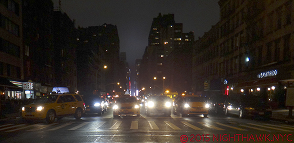
“But when you’re gone,
Who remembers your name?
Who keeps your flame?”*

IMG_7838PNH

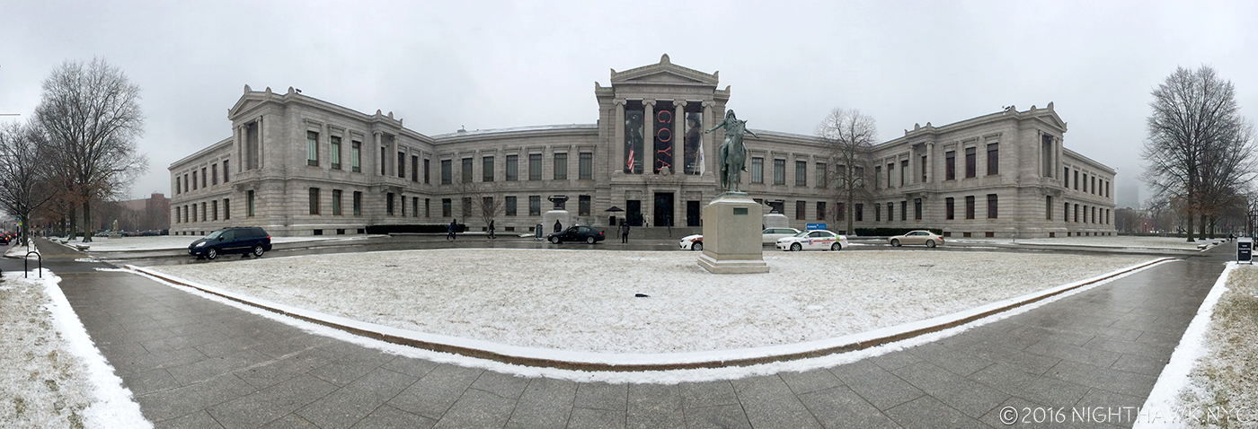
January, 2015. Goya: Order and Disorder @The Museum of Fine Arts, Boston. Neither snow, nor 5 hours on a train kept the Nighthawk from the Front Door of Great Art.

Since I don’t believe in comparing creative work or creative people, AND I believe that “awards” for “Best” whatever among the Arts (and Sports) are absurd 1, I thought I’d do a “List In No Particular Order” of 2015 Art Shows I saw (some opened in 2014) that may or may not have closed for good, but still continue to open doors in my mind, and that’s more important than any award I could bestow.

“Oh can I show you what I’m proudest of?”*

Goya: Order and Disorder (Museum of Fine Arts, Boston, MA. No photos permitted.) AND Goya:Los Caprichos (National Arts Club, Gramercy Park, NYC)- Two concurrent, excellent shows, 250 miles apart, one huge, the other “small” showing two views of  Goya- one all encompassing, filling the whole lower level of the MFA, one narrowly focused on a rare, complete set of his landmark 80 print, Los Caprichos,(once owned by Robert Henri, who reappears below) combined to show the enduring power, importance, relevance and eternal influence of the Spanish Master. Many saw the former, far fewer saw the latter, tucked away in a dining? lecture? room on the second floor of the NAC (Behind hundreds of chairs on one of my visits!). An artist of nightmares, both surreal and all-too-real, the likes of which perhaps only Bosch can equal, who can then turn around and paint with the utmost lyricism, Goya was all about what it is to be human. Take your pick- portraits, historical pieces, landscapes, the otherworldly or the underworldly, children, tapestries, or his graphic works that hold their own with dare-I-say-Rembrandt, he’ll blow your mind.

DSC07316PNH

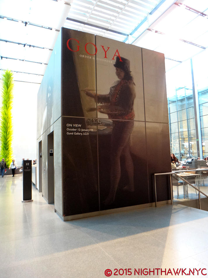
Goya/MFA on the show’s elevator entrance, overlooking Dale Chihuly’s Tree.

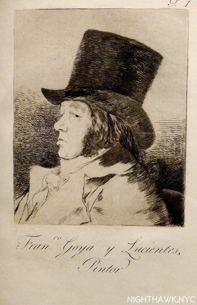
Remember My Name. Goya’s Self Portrait casts his all-seeing eye on us 215 years later.

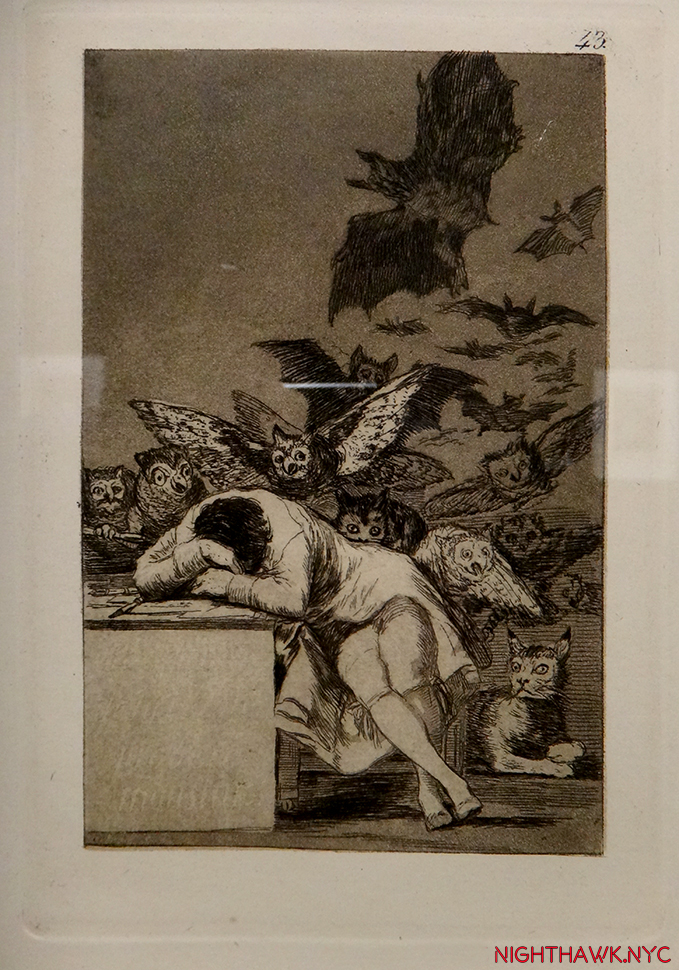
The Sleep of Reason Produces Monsters from The Caprichos” So? Stay up!

DSC07711PNH

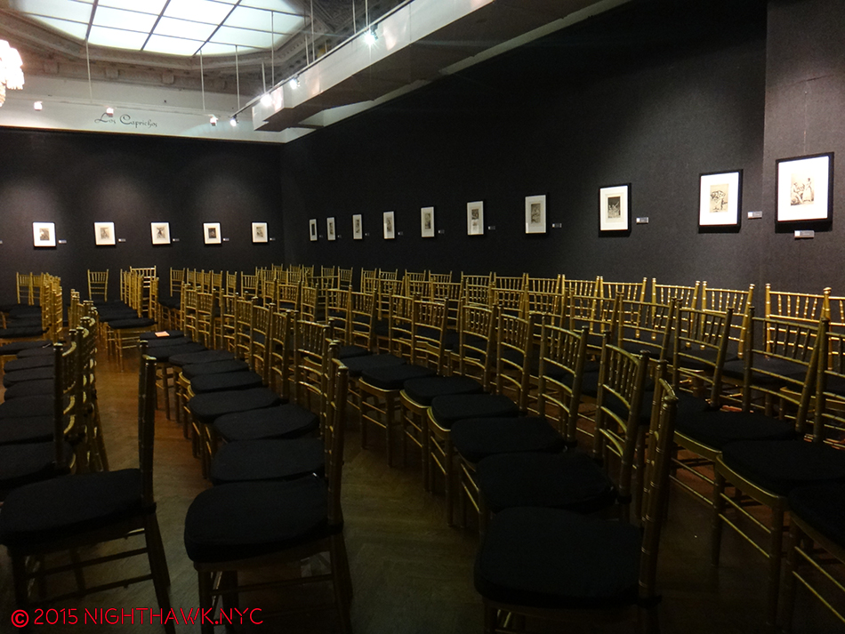
Neither blizzard, nor the furniture(!), kept the Nighthawk from seeing all of Goya’s incredible Los Caprichos at the National Arts Club, but I think they tried to.

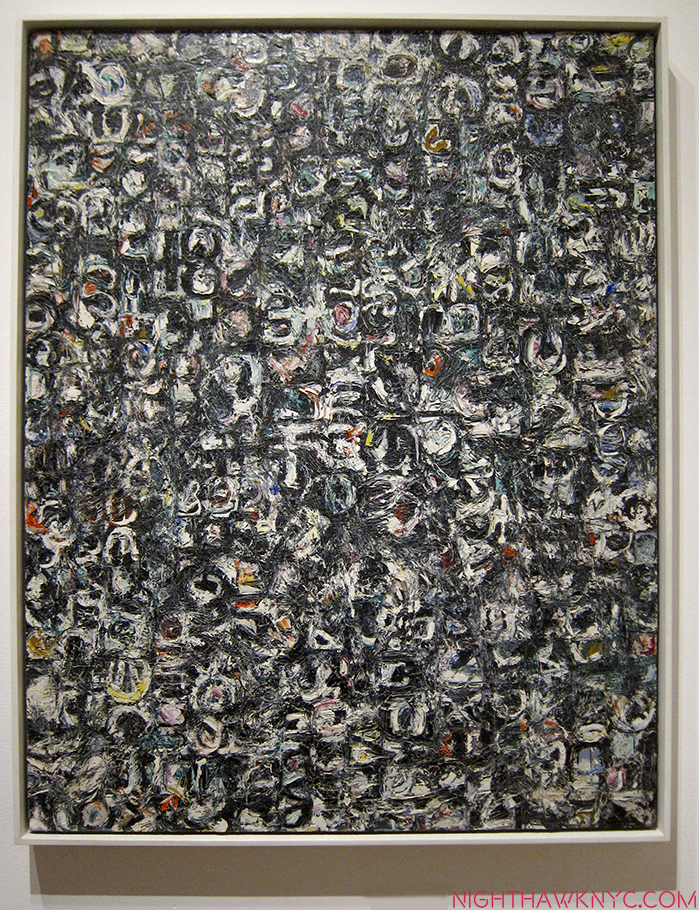
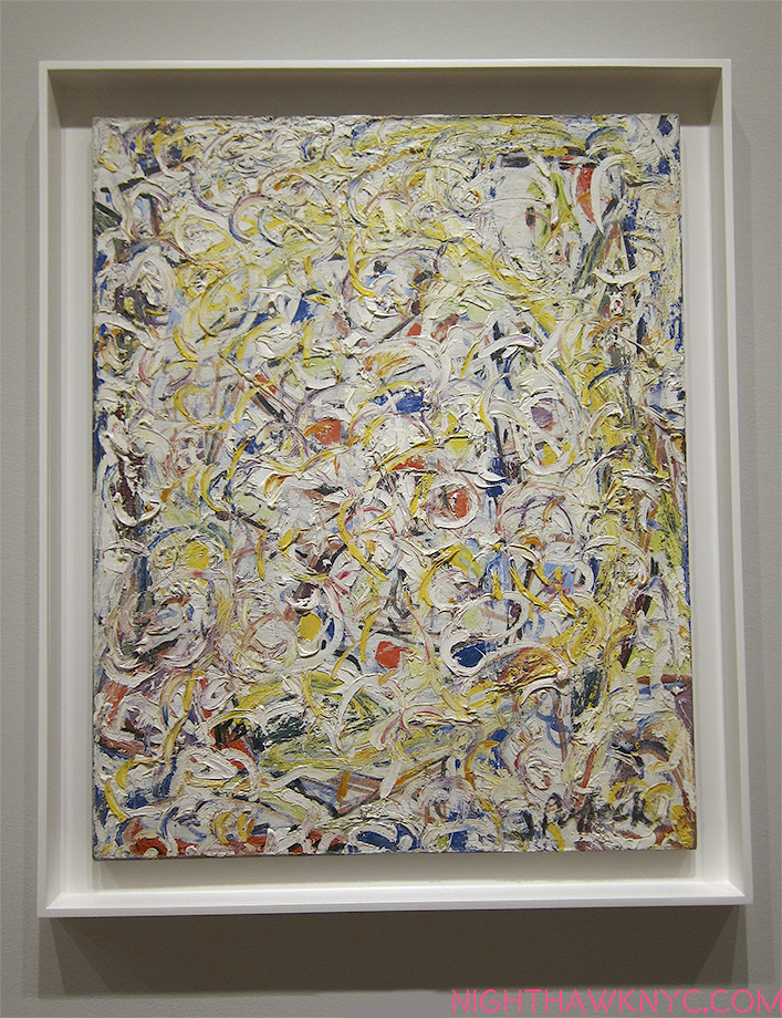
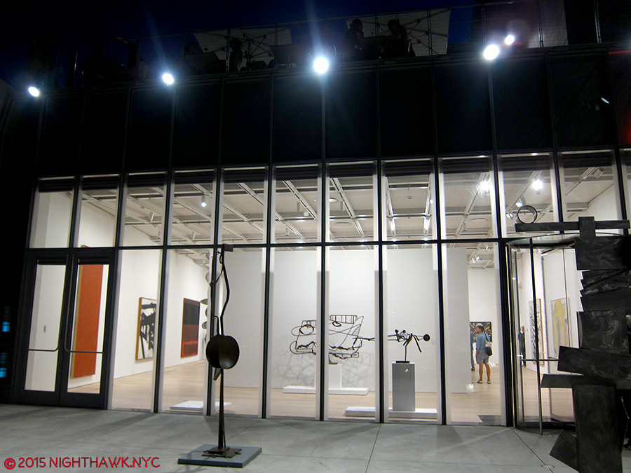
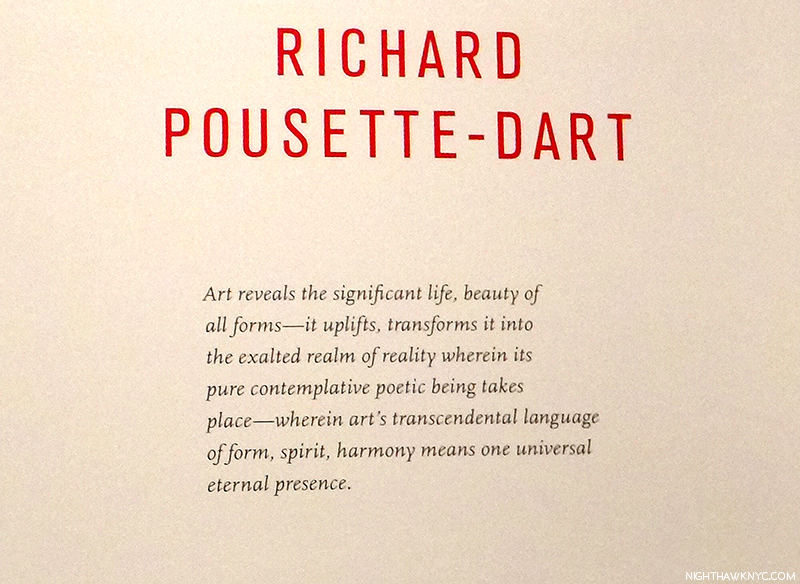
Richard Pousette-Dart (Pace 510 West 25th, Chelsea)- I walked in and was completely captivated by “abstract” Art the way I haven’t been since the Mark Rothko Show at the “Old” Whitney in 1998, which was one of the greatest shows I’ve ever seen. (That’s not comparing.) Don’t be fooled by the apparent geometric simplicity, there is an astounding subtlety to these works that at once feel microscopically considered, often freely rendered, yet globally cohesive. Pousette-Dart had a number of styles, and this show represented one, geometric style, from the 1970’s in both large oils and smaller drawings. For any of those who think that Abstract Expressionism is “easy” to do, go ahead and try creating one of these, the largest is almost 8 foot square, and then see if it has the “Presence” of Dart’s. The amount of work that went into each piece belies their seemingly “simple” composition, is matched by an extraordinary primacy of order, and second only to their transcendent impact. Here, we see Richard Pousette-Dart as the great, “under known” abstract artist. While Pollock & Rothko have grown larger in stature, Pousette -Dart’s name deserves to be right there with theirs. There is only one word to describe this show’s effect- Magical.

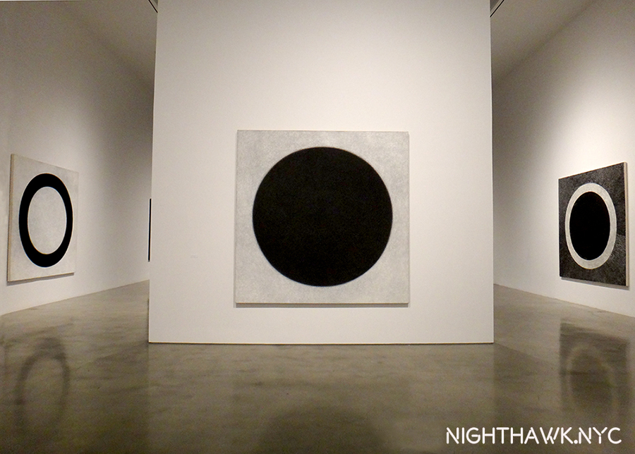
Then? There’s never a chair around when you want one. Pousette-Dart @Pace- Presence, Circle of Night, 1975-6, center, Black Circle Time, 1980, left and White Circle Time, 1980, 90″ square each.

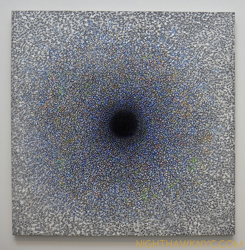
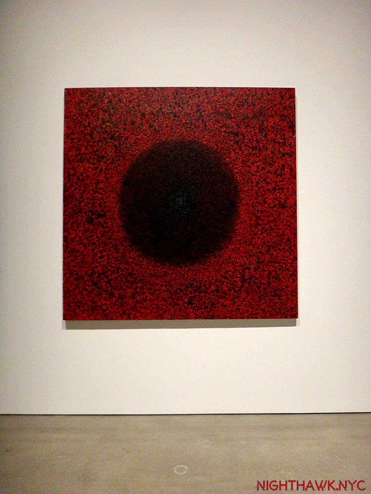
Imploding Black, 1975, six feet square. Transcendent,

Detail.

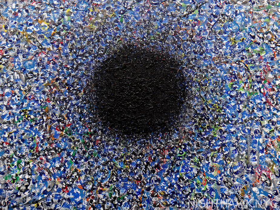
Cerchio di Dante, 1986, six foot square

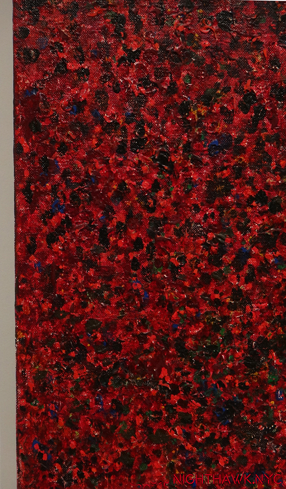
Detail of the left side.

“Let me tell you what I wish I’d known
When I was young and dreamed of glory
You have no control
Who lives
Who dies
Who tells your story?”*

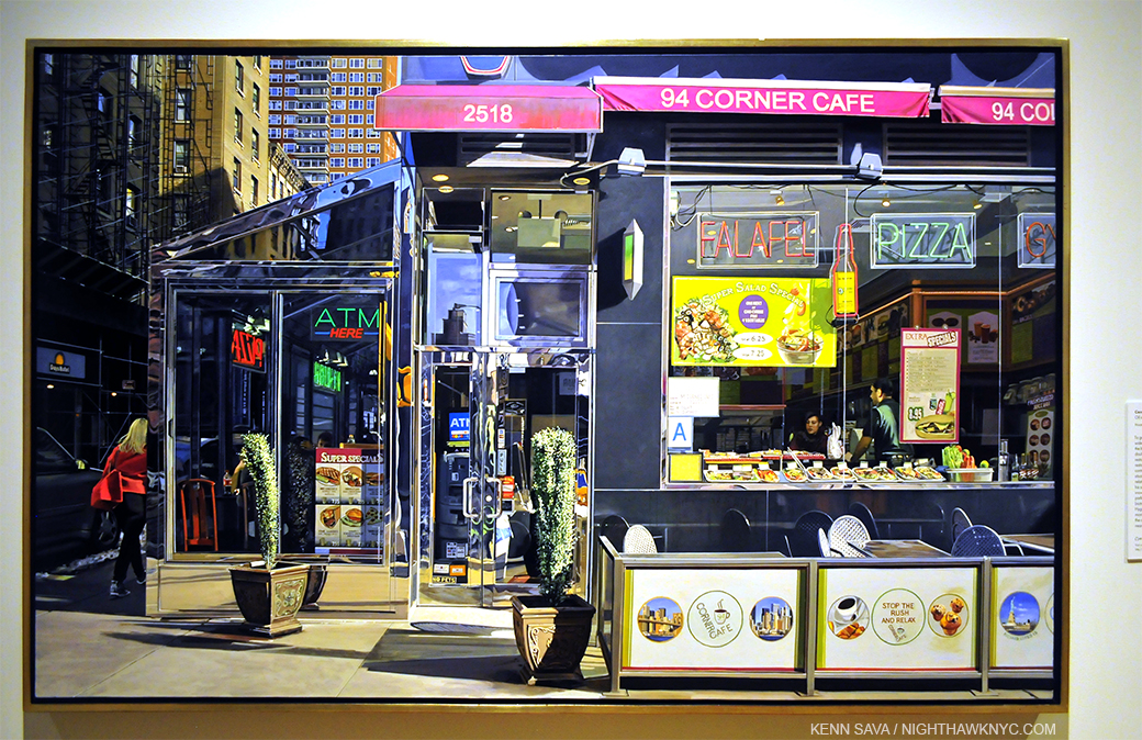
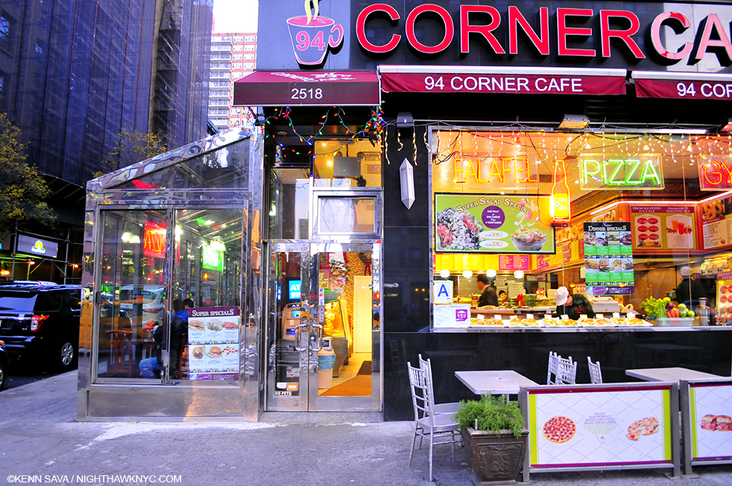
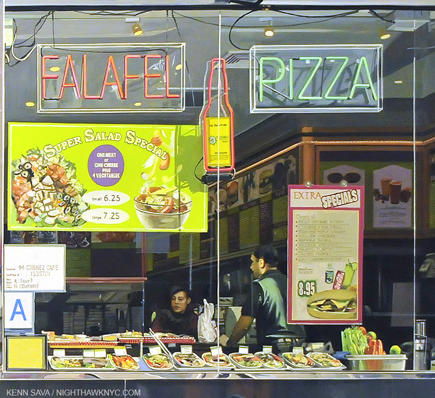
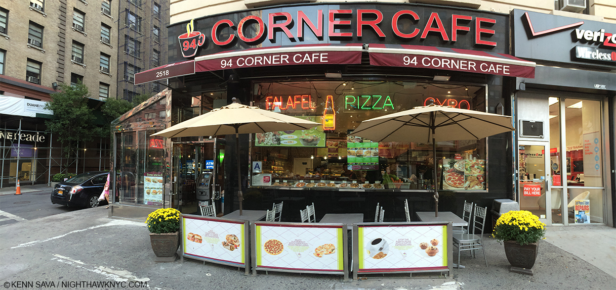
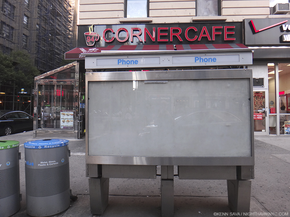
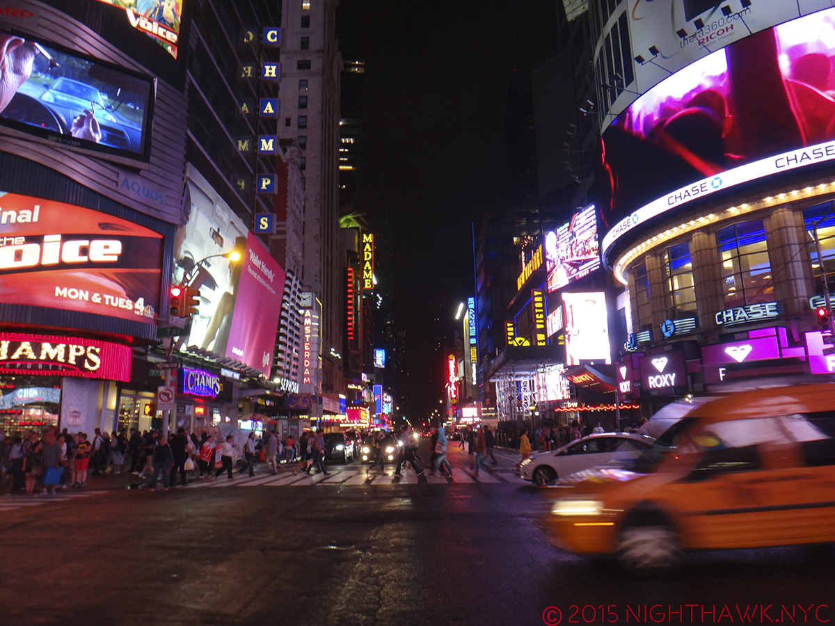
Richard Estes: Painting New York City (Museum of Art & Design, NYC)- My favorite contemporary artist, and one of the greatest living realists, FINALLY gets an NYC Museum show, and it was worth the wait. A virtual time capsule of NYC from the mid 1960’s to 2015’s astounding Corner Cafe, showing the 83 year old Master is still at the height of his considerable power. Oh…Do NOT call him a “photorealist” in my presence! Estes shows us the world we live in as we do not see it, (more on this soon) and so follows in the footsteps of Edward Hopper and Charles Sheeler in advancing American realism while, perhaps, being the first to include the abstraction that is also a part of the real world. A misunderstood painter, in my eyes, who is only just beginning to be really seen, finally.

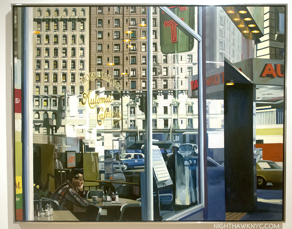
Horn & Hardart Automat, 1967. Not since Hopper has a work spoken to me of life in the City like this does.

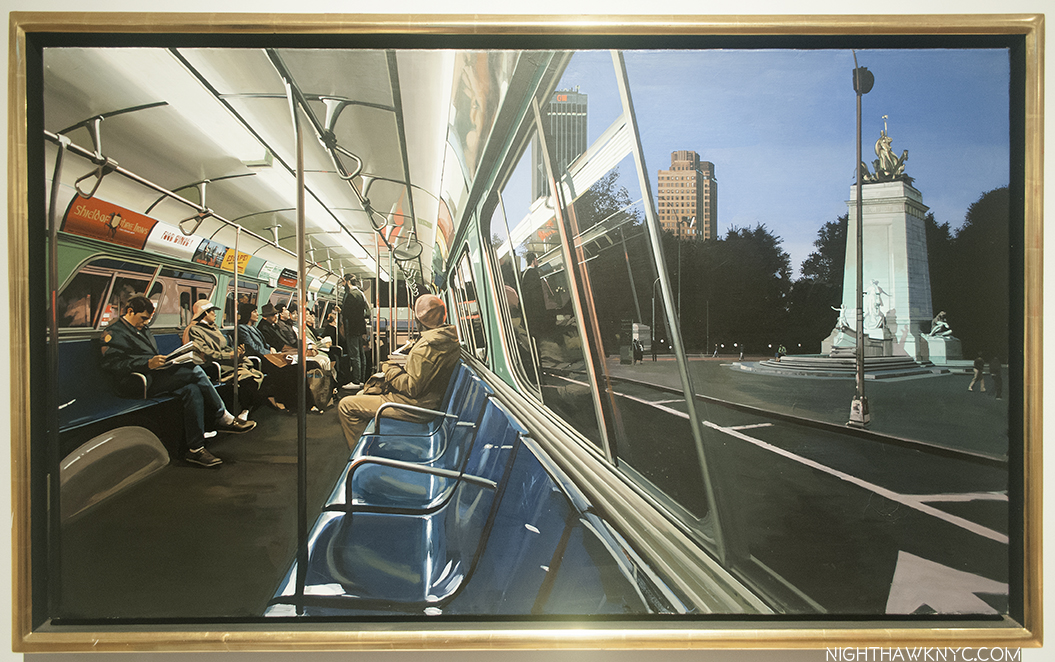
Columbus Circle, Maine Monument, 1989. 500 years ago, or 100, they came by ship. Now? They come by bus. Frozen in time, side by side.

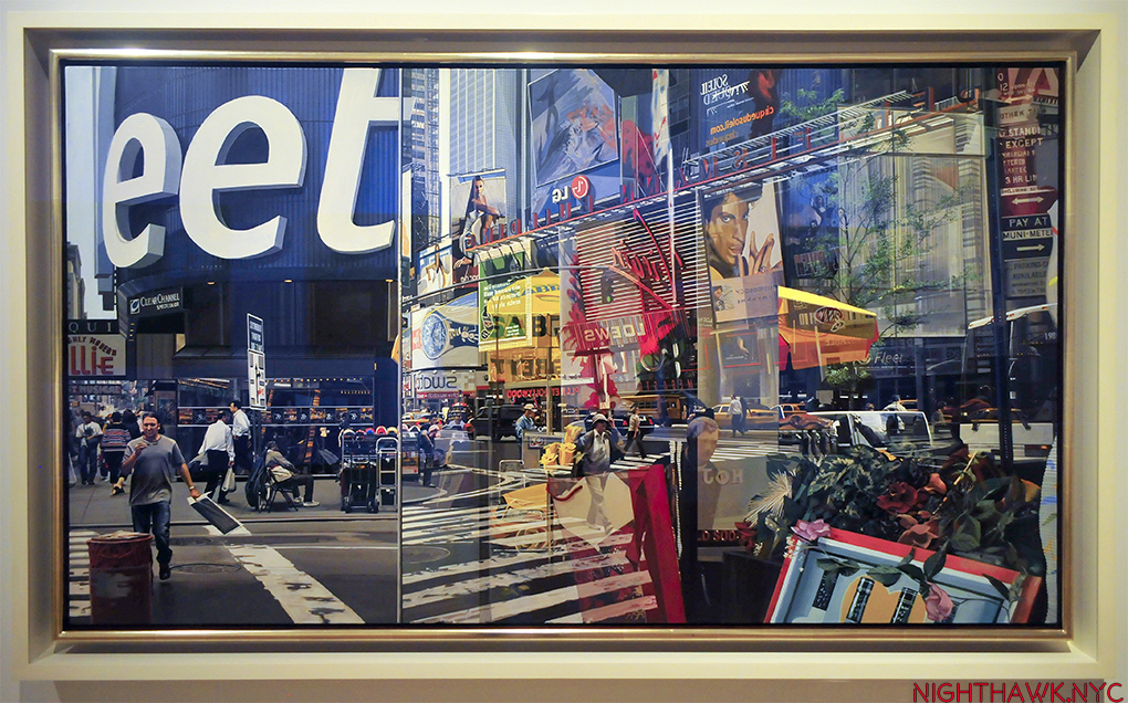
Times Square, 2004. Nothing captures the experience of the place better than this, though Robert Rauschenberg is capable of giving me a similar feeling (See below).

“I try to make sense of your thousands of pages of writings
You really do write like you’re running out of time.”*

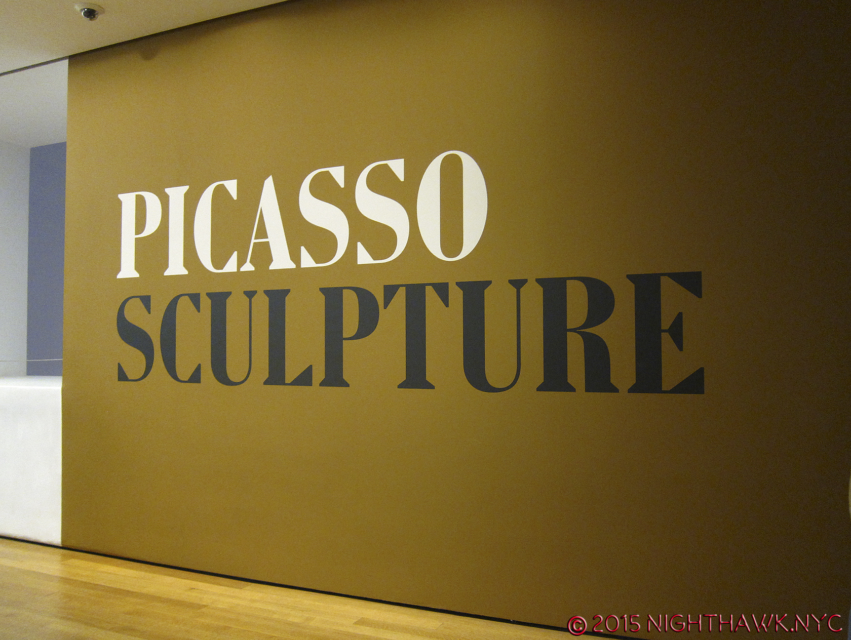
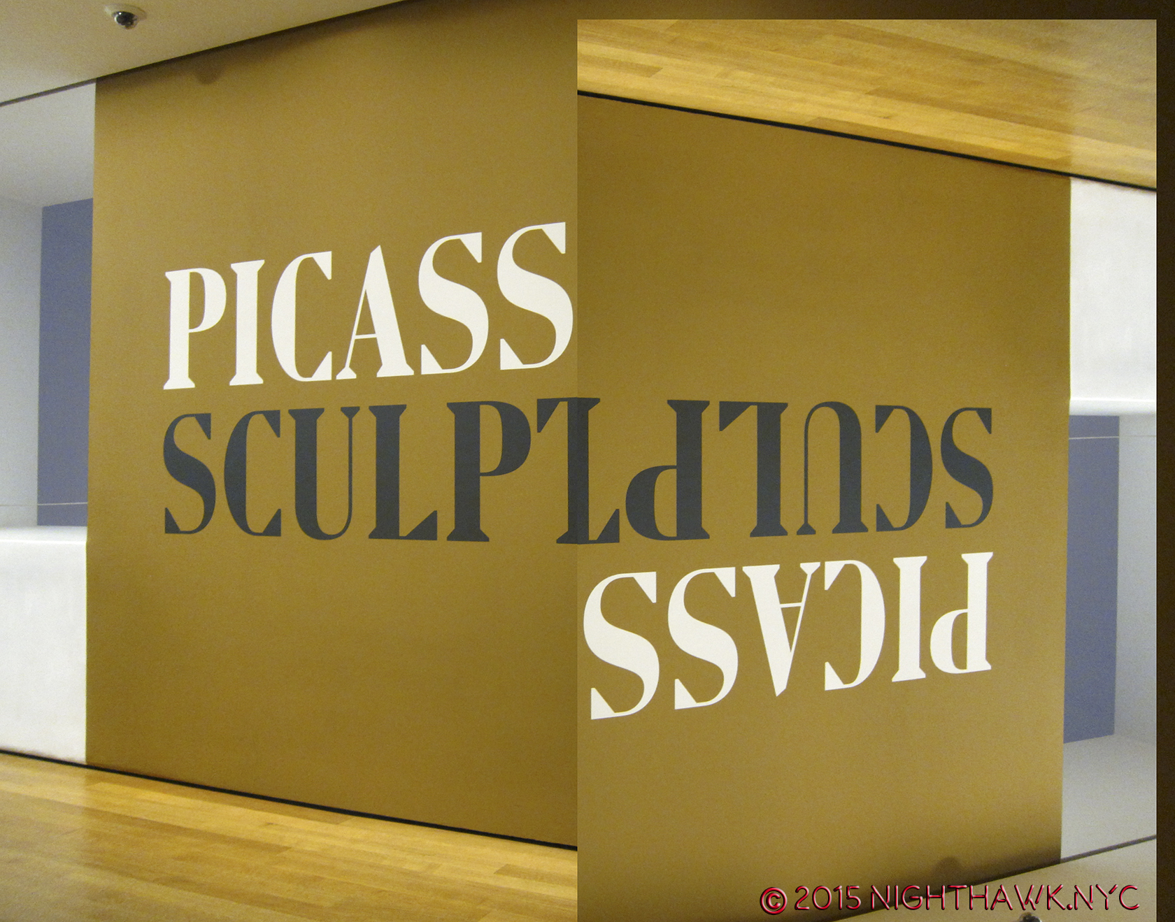
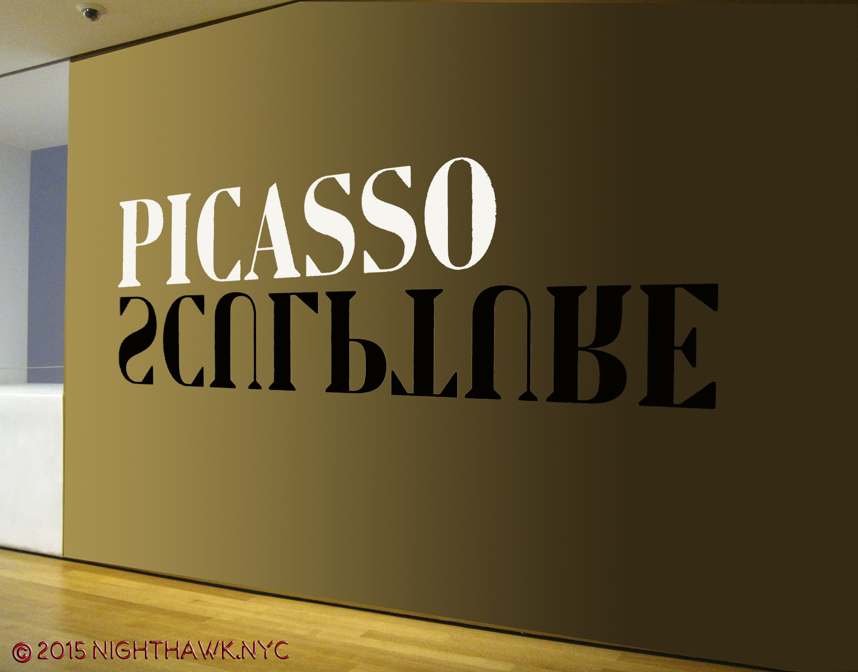
Picasso: Sculpture (MoMA)- If he had never done anything besides paint, Picasso would be considered among the all time Masters. But, noooooooooooo… Picasso was, perhaps, the most unique genius in (known) art history in that his genius was among the most restless. He almost never stopped creating, and he never stopped seeking new outlets for his creative vision. Consider- PICASSO HAD NO TRAINING AS A SCULPTOR! NONE. Yet, that didn’t stop him from becoming, perhaps, THE most revolutionary sculptor up to his time. There is so much great work to see in this show, I don’t even know where to start talking about it. “Picasso: Sculpture” shows us the naked face of endlessly creative genius the like the world has never seen. I’ll sum it up by saying virtually all of it is wonderfully selected, though some of the Cubist works here don’t stand up to his paintings, in my opinion, and wonder- When will we see his like, again? The “other” takeaway, for me, is- Oh…MoMA. I miss you. About as much as I miss your “old” building.

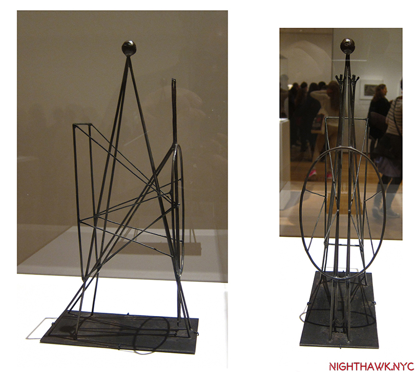
Standing Figure in Wire, 1928. Unprecedented. Astounding.

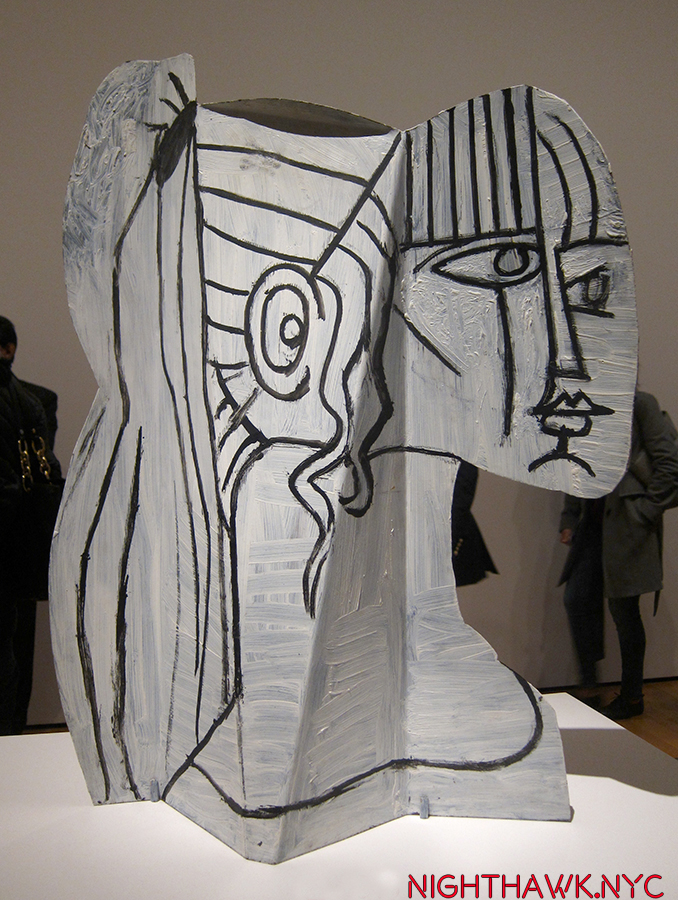
Sylvette, 1954. “I see you slightly folded…in steel, my dear.” Picasso must have said.

America Is Hard To See (Whitney Museum)- I’m saving my thoughts on the “New Whitney” Building (UPDATE- They may be seen here.), but the opening show in the new place was a wonderful “Welcome Back” to one of the first 3 of NYC”s Big Four Museums and a reminder of its world class (and first anywhere) collection of American Art. My personal highlight? The first floor gallery featuring a selection of Hopper Drawings done at the Whitney Studio which predated the Museum, and the absolutely mesmerizing portrait of Museum founder, the indomitable Mrs. Gertrude V. Whitney (also an overlooked sculptor) that looked out at Gansevoort Street, and for my money? SHOULD HAVE BEEN LEFT RIGHT THERE- PERMANENTLY! It wasn’t.

IMG_0992PNH

Frozen in time. Mrs Gertrude Vanderbilt Whitney looks out on the new home of the collection she started.

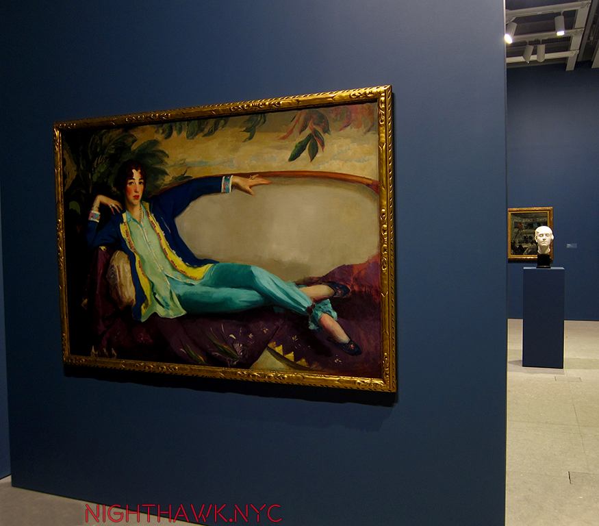
Mrs. Gertrude Vanderbilt Whitney by Robert Henri, 1917, with her Study for the Head of her Titanic Memorial from 1922, right. Yes. She was a sculptor, too.

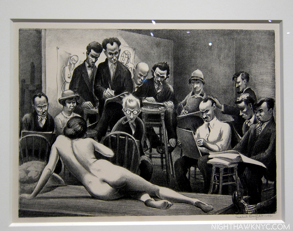
Before the First Whitney Museum opened in 1931, there was the Whitney Studio Club, where artists came to draw from the model. See that guy to the left of center rear with the light shining on his bald head? That’s Edward Hopper, a regular. That’s why his estate was left to The Whitney. Litho by Mabel Dwight, 1931.

America is hard to change. Excellent, rarely seen, works by Grant Wood, Study for Breaking the Prairie, 1939,…

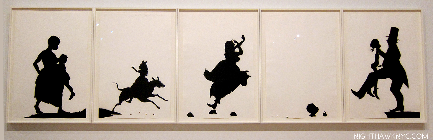
…And Kara Walker, A Means To An End, 1995, struck me as serendipitous.

IMG_0967PNH

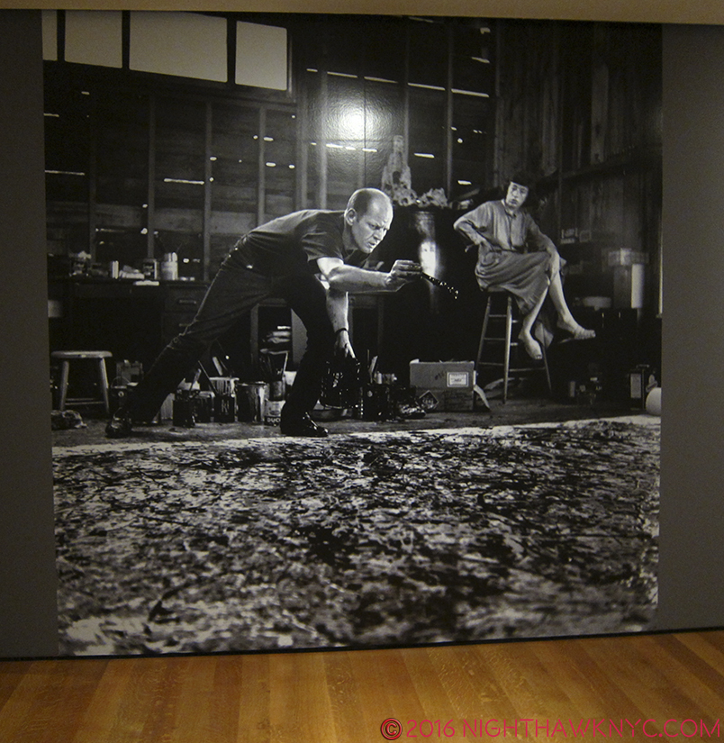
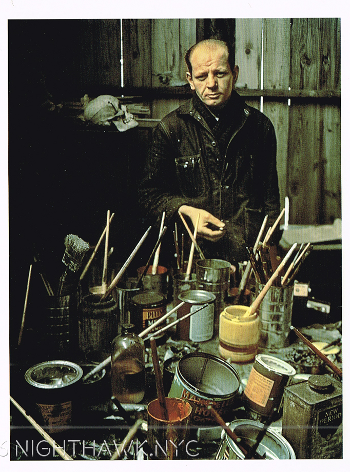
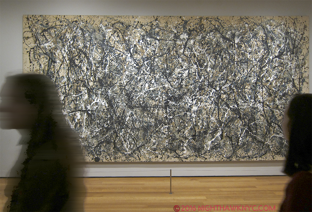
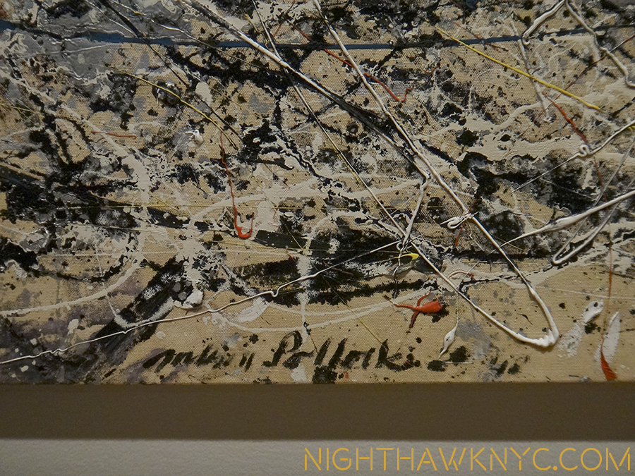
America: Seen everywhere. Inside- Rothko’s Four Darks in Red, 1958, Pollock’s Number 27, 1950, Chamberlain, Jim, 1962 & Guston’s Dial, 1956…

IMG_0940PNH

…And, Outside- sculpture from one of the countless roof decks.

“And I’m still not trough I ask myself,
what would you do if you had more time
The Lord, in his kindness
He gives me what you always wanted
He gives me more time.”*

I end this section honoring two endlessly creative American “painters,” featured in very very good shows. Like Richard Estes, these two artists also put that “more” time of a long life to superb use. Yes, despite evidence to the contrary, they both consider themselves to be painters. To me, the “lessons” of their lives, how they were able to survive following their star in this country for so long, may prove to be as important as their considerable artistic legacies.

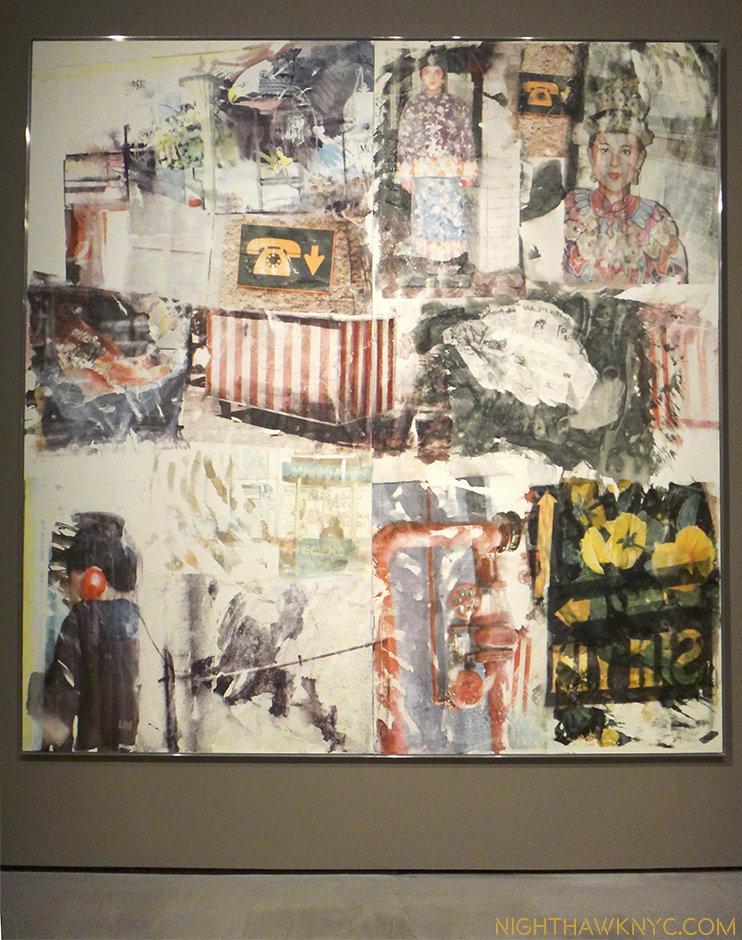
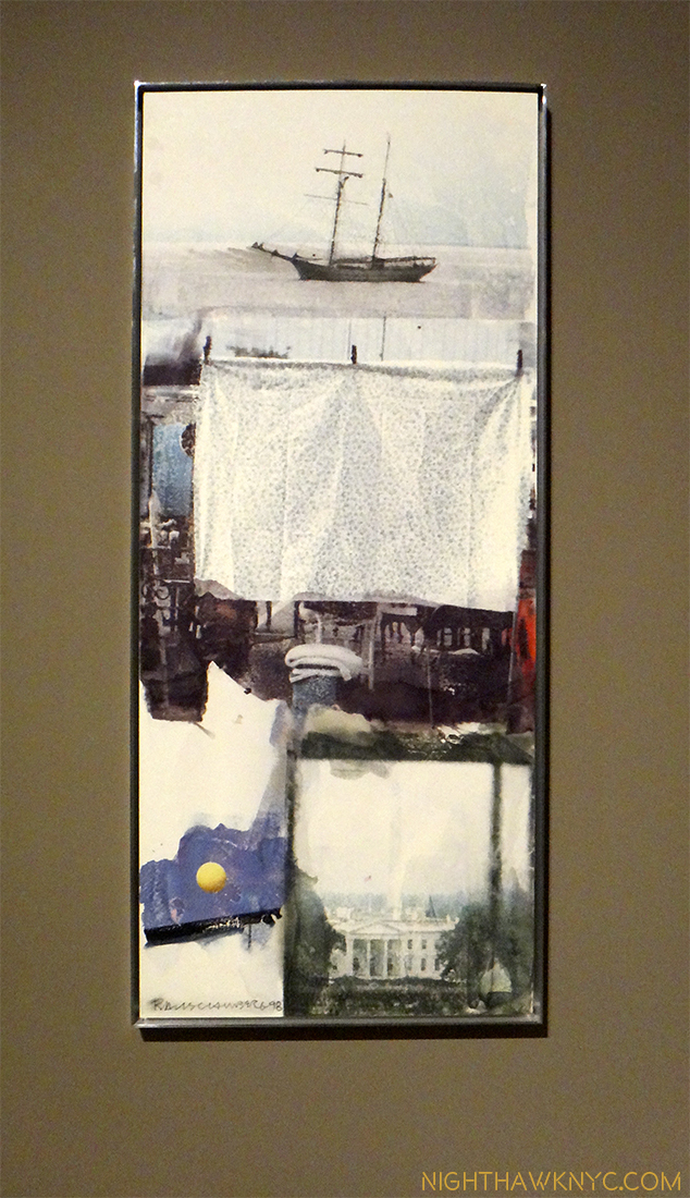
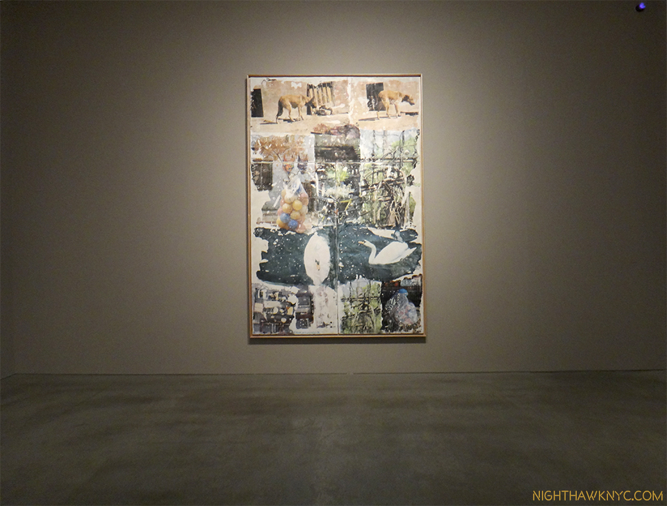
Robert Rauschenberg- Anagrams, Arcadian Retreats, Anagrams:A Pun (Pace 534 West 25th, Chelsea)- Presaging Photoshop, the late, great Mr. Rauchenberg continues to speak to our times though he, unfortunately, left us almost 7 years ago. Light years ahead of his times, throughout his life,  Anagrams…, a show of Mr. Rauschenberg’s final development, shows that once again, his work will look “contemporary” for years to come, and more amazingly, I think it will be as relevant as what anyone else is doing at the moment! As I just said, he represents something of an American miracle- an artist who was able to spend virtually his entire life creating EXACTLY what he wanted to, answering to no one but himself. That sure must seem miraculous to today’s American artists. Interestingly, like Mr. Estes, the works here are based on Mr. Rauschenberg’s own photography, to very different results. Unlike Mr. Estes, Mr. Rauschenberg’s are directly transferred to the piece, though with such skill and subtlety they have the effect of melting into the others they’re surrounded by. A surprisingly fresh, visually rich, often beautiful show who’s spell will call me a few more times before it ends on January 16. And then, I will miss it, but it will have changed the way I see the world, like Richard Estes has.

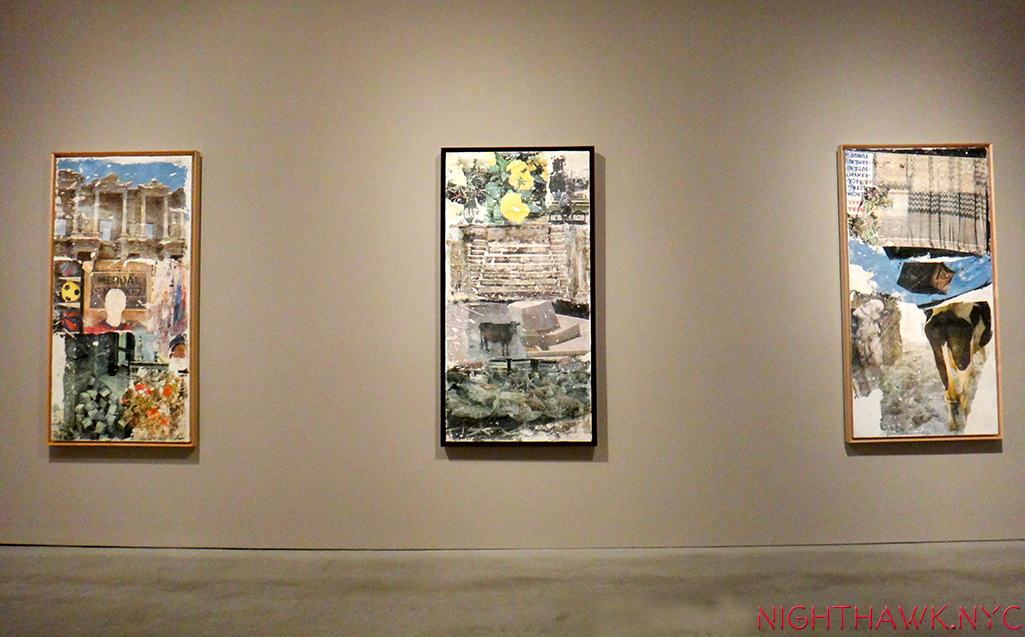
Rauschenberg @ PACE. I just loved this show.

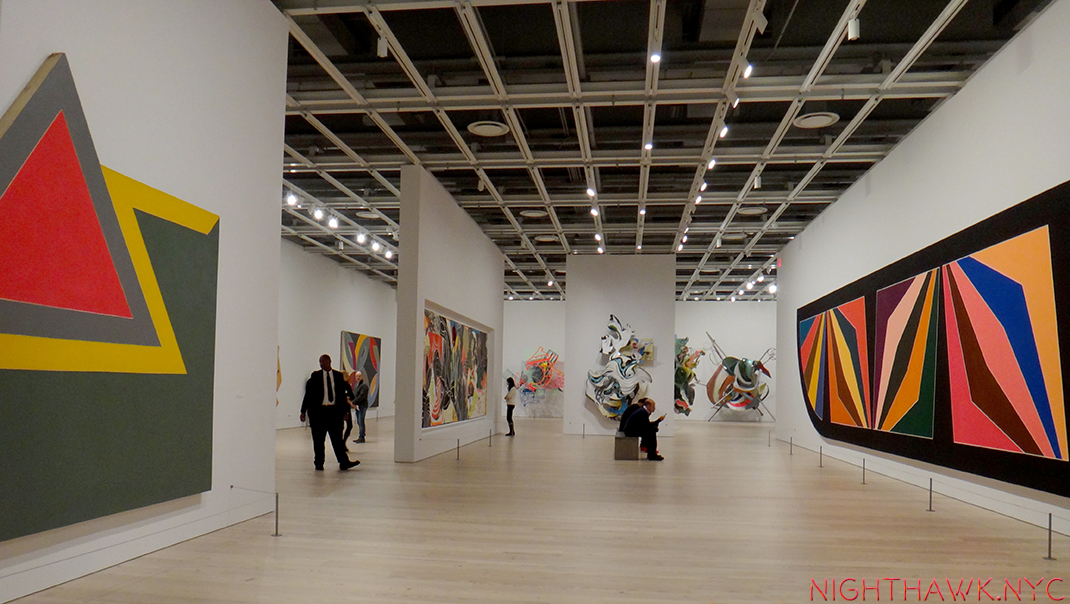
Frank Stella (Whitney)- An art mover’s nightmare of a show, the Artist’s helpful hand notated directional markings seen on some of the pieces notwithstanding, it must have been hard for Mr Stella, himself, to narrow his 50-some year career down to one floor at the New Whitney, handsomely displayed in the still-new space. With only one Moby Dick piece in sight, the take away for me is that here is a Triumphant overview of another rare American artist who continues to explore and evolve, fickle times and the “harpoons” of even more fickle critics & collectors be damned. Mr. Stella has devoted his career to the eternal pursuit of finding new possibilities, “new spacial complexities” 2, for the Art Form of painting. Some of these sure look like sculpture, but I’ll bow to what he says on one of the show’s signs- “Q- You still call these paintings? A- Yes. They are, in fact, paintings.” Remarkably, as he closes in on 80 this May 12, Mr. Stella continues to “start over,” as Richard Meier says on the audio guide, eternally following his muse, breaking painting out of 2 dimensions, to lord-only-knows-where-next. In this show’s case? The Journey IS The Destination. Mr. Stella strikes me as a master conceptualist with an endless font of making the unlikely, and especially the unthought-of, real. Forget this show’s afterthought of a catalog, for me, his value, “message” and influence lie in the sheer physical experience of his work- they simply must be seen, and often, walked around like sculpture to be fully appreciated. Who else “paints” like this? If you go, and you should, check out the great quotes from Mr. Stella on the wall signage- “What you see is what you see.” And then some. What I saw was a show to fire your creativity, and inspire you to see new possibilities in anything, if there ever was one. You still have a few days left to see it before it closes after February 7. Then, the art movers get to pack it up and move it out. I would pay to watch that.

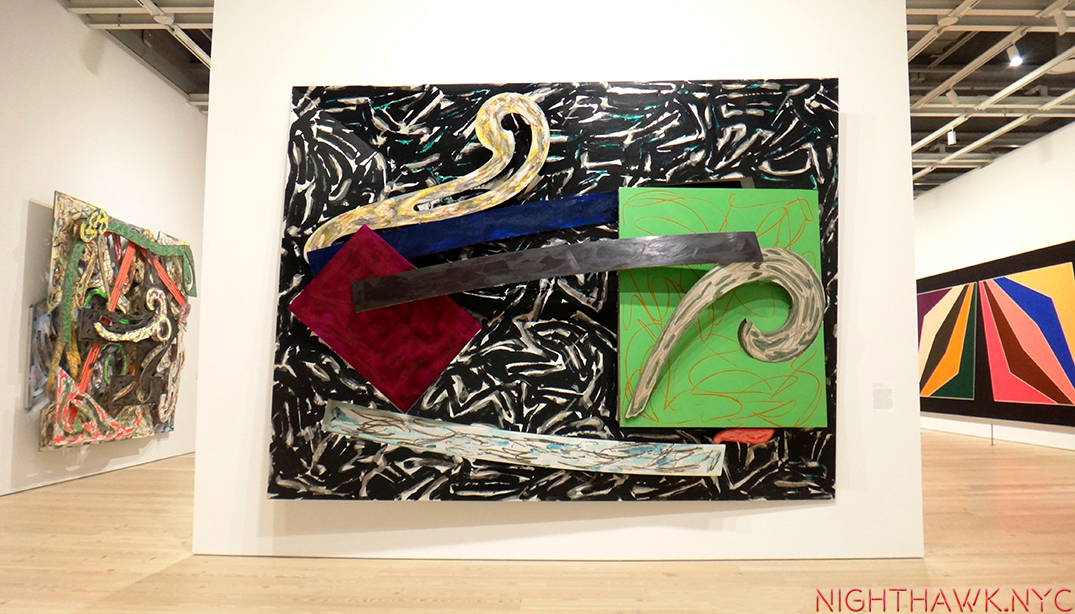
50+ years of “starting over.”

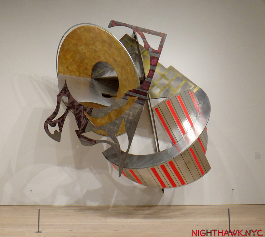
“Toto, We’re Not On Canvas, Anymore.” Stella Busts Painting Out.

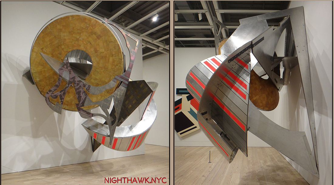
“Um..A Little Higher On The Right?”

And lest I forget…

Cubism (The Met No photos permitted.)- TM is on a mission to shore up its Modern & Contemporary Art holdings, as we will soon see at The Met, Breuer, but this show featuring works of a promised gift goes a very long way to solidifying TM’s Cubists holdings, and then some. So many strong works by the Masters of Cubism, Picasso, Braque, the underrated Juan Gris, and Leger abound, they made me wonder where TM is going to install them all when they finally get them!

Madame Cezanne (TM No photos permitted.)- Portraits are not the first thing most think of when they think of Cezanne. Many think of his groundbreaking landscapes and genius with color, but this show of his, no doubt long-suffering wife, says as much about this under known muse as it does about Cezanne. The hours she spent posing for him reminds me of “The Man in The Blue Shirt,” by Martin Gayford about sitting for Lucian Freud. The show is a striking look at another side of this master of impressionism, and gives us rare opportunities to see 4 versions of a painting reunited, and Cezanne’s actual sketchbooks. A rare treat for the lover of Impressionism, portraiture and great Art.

China Through The Looking Glass (TM)- Except for Picasso: Sculpture and Goya’s Los Caprichos, the above shows are painting shows, my true love, but CTTLG is in a category all its own. ANY show that can get TM to stay open till Midnight has to make the Nighthawk’s list. After setting the bar high with “Alexander McQueen: Savage Beauty,” TM’s Costume Institute topped themselves with a spectacle that the 800,000 who saw it will remember almost as long, and which will prove quite a challenge for 2016’s “manus x machina,” or MxM, as I’m calling it to equal, let alone top. I predicted 1 Million will attend it, so GO EARLY (or don’t say I didn’t warn you) & Stay tuned!

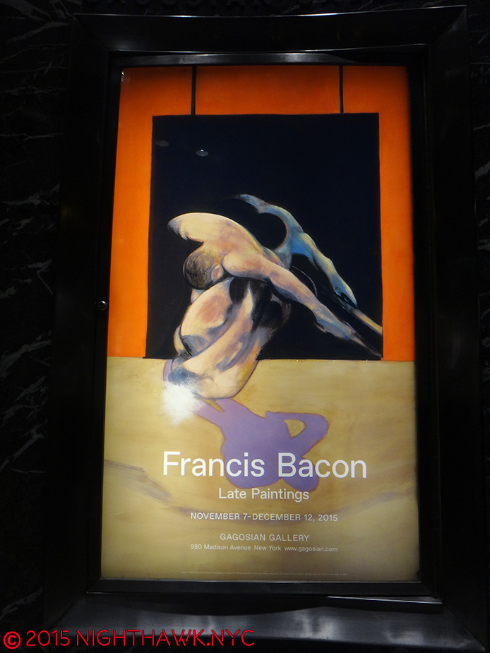
Francis Bacon- Late Paintings – (Gagosian No photos permitted.) – with one work, a triptych selling for 142 million, I can’t fathom how much 28 are worth, but here was a chance to see that many in one show, focused on the seemingly contemplative, other-worldly “late” Bacon,

DSC07520PNH

especially after seeing the following (Rembrandt show) on the same day, which brought to mind subtle, fascinating convergences- self-portraits, multiple views, or states, for Rembrandt, diptychs & triptychs for Bacon, among them.

Rembrandt’s Changing Impressions (Columbia U.)- In lieu of the “big one” I missed (see below), this was a closer-to-home chance to see 50 or so prints by the Master and a rare chance to see various “states” (versions) of works side by side. A bit light on the most well known of Rembrandt’s etchings, but very worth 4 visits none the less.

Not a triptych. Rembrandt creates 3 masterpieces from one composition.

Chuck Close Recent Paintings (Pace 534, Chelsea)- I met Mr. Close, briefly, but in spite of the fact that he is one of the greatest portraitists of the 2nd half of the 20th Century+, I know he won’t remember my face. He has Prosopagnosia. He’s ALSO paralyzed and in a wheel chair. I never cease to be absolutely astounded at what he achieves and what new ground he breaks. Already a Master before his brain aneurysm, which would have stopped 99.5% of anyone not named Chuck Close, he’s gone on to create ever new works that continue his life long exploration of his famous “grid technique.” These works add even new elements- new palettes, a new approach to focus and depth of field, and more.

Linda & Mary McCartney (Gagosian Books)- If they had taken down all the title cards, removed the iconic shots among Linda’s, and you walked in without knowing which work was by who- Linda McCartney, or her and Paul’s daughter, Mary, you’d never know. That’s how amazingly symbiotic the eyes of the two photographers are. They see as one. Walking out, and I say this with nothing but respect, it really felt like Linda had never passed away. That her work continues. I’ve never seen anything quite like it.

DSC07609PNH

The daughter reflects well on her famous mother.

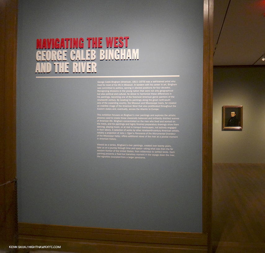
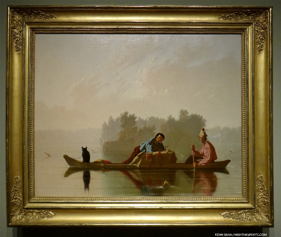
George Caleb Bingham (TM)- The year’s “sleeper” pick. I don’t know if he ever met Mark Twain, but if Mr. T. ever wanted an artist to illustrate “Huck” or “Tom Sawyer?” G.C.B. would get my vote. His work captured what it was to live on the River the way only Twain, himself, has, and makes a contribution to laying the ground work towards defining a truly “American” style of painting, and by the Mid-Nineteenth Century? It was about time! TM’s show reveals him to be something of a predecessor for that other great American 19th C. portraitist, Thomas Eakins, but with a style and a power of his own that still holds up.

Araki (Anton Kern, NYC)- He lost his wife…he gets prostate cancer…he says he no longer has sex…Nothing stops the indefatigable, legendary Araki. Don’t let the “casual” taping of the photos to the wall fool you- I found this show striking, poignant, meditative and moving. The images flowed one to the next, sometimes in harmony, sometimes in dissonance, but all of them speak with that sense that only Araki has. Some will say he’s a misogynist. I’m not a woman but I disagree. I see beauty and poetry in his shots of women. Reading some of the press materials on hand, I was struck by his comment that he had sex with most of his models. I couldn’t help wonder- Does that include Bjork? Live long, and much health, Araki.

Also lingering in my mind, tormenting me with what I missed, are the ones that got away-

Late Rembrandt (Rikjsmuseum, Amsterdam)- I agonized about going. For months. Like I agonize about Frank Gehry at LACMA right now! (Hello, Sponsorship?)

Bjork (Moma)- Sold out when I went. Bad reviews be damned, I love Bjork.

Overall, it was a good, but not great year. Still, these 17 shows had real staying power and lasting influence. I’m grateful that in NYC, we still have so much to see. As I said a few posts back, I live in mortal fear of missing a great show- Like all those I missed this year because I never knew about them, and still don’t.

As I look back on 2015, the Idea of great Art is what lingers in the mind, inspires, even instructs. The experience, talent and creativity of a great Artist speaks to the highest & best of mankind, in ways the rest of us can, perhaps, relate to, learn from, and even aspire to. As Mr. Pousette-Dart cosmically said-


In these times of so much senseless hatred, violence and the worst of human kind on display, we need this more than ever.

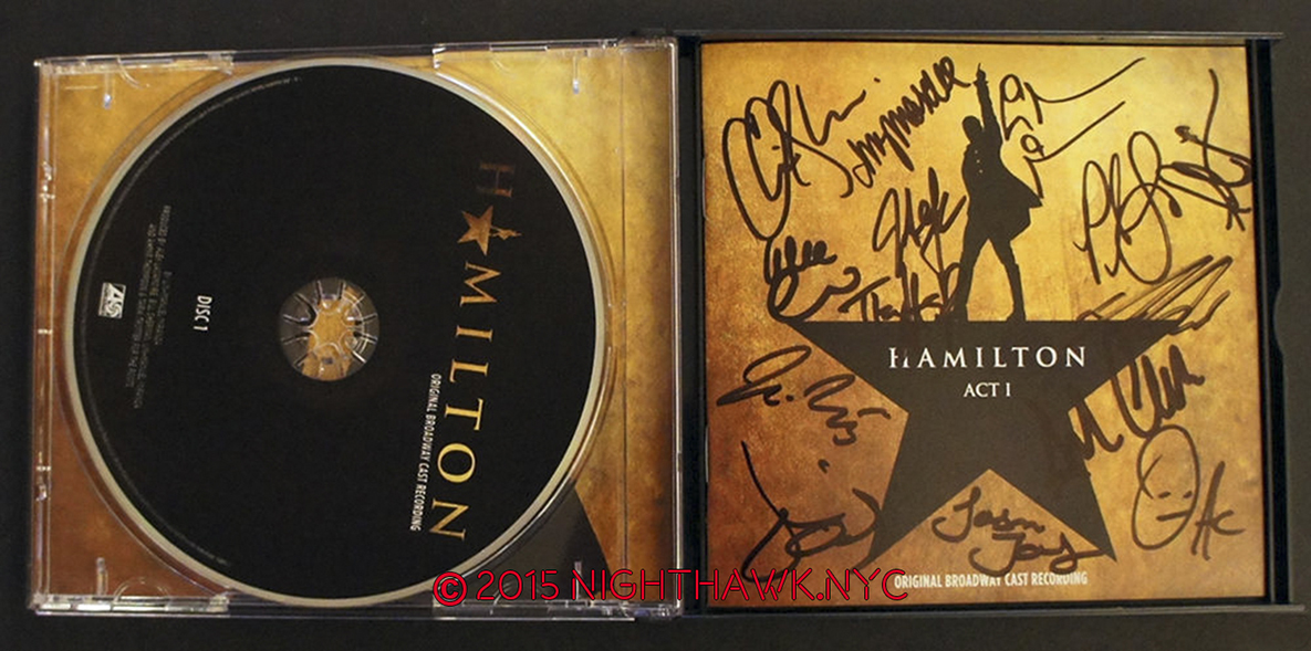
*Soundtrack for this post is “Who Lives, Who Dies, Who Tells  Your Story?” from the 2015 album I listened to the most, “Hamilton– Original Broadway Cast Recording, by Lin-Manuel Miranda.

NighthawkNYC.com has been entirely self-funded and ad-free for over 7 years, during which over 275 full length pieces have been published. As I face high expenses to keep it going, if you’ve found it worthwhile, please donate to keep it up & ad-free below. Thank you!

Written & photographed by Kenn Sava for nighthawknyc.com unless otherwise credited.
To send comments, thoughts, feedback or propositions click here.
Click the white box on the upper right for the archives or to search them.
For “short takes” and additional pictures, follow @nighthawk_nyc on Instagram.

Subscribe to be notified of new Posts below. Your information will be used for no other purpose.

  1. Remember- Charlie Chaplin, Hitchcock, Fellini, Orson Welles, Akira Kurosawa, Ingmar Bergman or Stanley Kubrick, among others, never won an Oscar for Best Director! I rest my case.
  2. as is said on the audio tour, #508

“Give Me The Hamilton Lottery, Or Give Me Death!”

This site is Free & Ad-Free! If you find this piece worthwhile, please donate via PayPal to support it & independent Art writing. You can also support it by buying Art & books! Details at the end. Thank you.

Written & Photographed by Kenn Sava (*- unless otherwise credited)

It’s 25 degrees, but I’m back. This is my fourth try to win the darn Hamilton Lottery. You know, the mew Broadway show that has become and instant phenomenon? As I said here, one I don’t see ending any time soon. Win, as in being one of 10 people who get a chance to buy two front row tickets for $10.00, each. Say what you say. What? The otherwise CHEAPEST ticket for tonite is $750.00.

IMG_3281PNH

I’m standing at the very end of this line. It stretches some 500 people long two-thirds of the way east down West 46th Street. See that Scientology sign way down the street on the left? The Richard Rogers Theater is directly across the street from it. That’s where I have to get to to get that little piece of paper.

That’s what all these people are freezing their butts off for. A little slip of paper about 2 inches square.

On it, you put your name. Then, you put it in the famous bucket on the famous table and you wait.

IMG_2356PNH

Give Me Lottery, Or Give Me Death! “Watch out for that van, people. We’re STANDING IN THE MIDDLE OF WEST 46th STREET!”

And you freeze your butt off some more, WHILE STANDING IN THE STREET (“Keep the sidewalks clear,” they continuously bull-horn.) before they announce the 10 winners two hours before curtain.

I’ve never seen anything like this. This is as New York as New York gets right now.

Then, you don’t hear your name called, so you walk home unable to feel your fingers. Two pairs of gloves be damned.

and come back and try yet again. Attempt #5. (Later, you will also lose the $1.5 BILLION Powerball.) Cheer up!- “How lucky we are to be alive right now, in the Greatest City in the World!”* remember?

All… to be “in the room where it happens. The room where it happens.”*

Oh…what I go through for Art.

They say “Winning the Hamilton lottery is a spiritual experience.”

Some say the same thing about Scientology.

I may never know that firsthand about either.

*-Soundtrack for this post is “The Room Where It Happens” from, oh, you know….by Lin-Manuel Miranda

NighthawkNYC.com has been entirely self-funded & ad-free for over 8 years, during which 300 full-length pieces have been published! If you’ve found it worthwhile, PLEASE donate to allow me to continue below. Thank you, Kenn.

You can also support it by buying Art, Art & Photography books, and Music from my collection! Art & Books may be found here. Music here and here.

Written & photographed by Kenn Sava for nighthawknyc.com unless otherwise credited. To send comments, thoughts, feedback or propositions click here. Click the white box on the upper right for the archives or to search them. Subscribe to be notified of new Posts below. Your information will be used for no other purpose.

13 Years At The Metropolitan Museum – Part Two – The Light

This site is Free & Ad-Free! If you find this piece worthwhile, please donate via PayPal to support it & independent Art writing. You can also support it by buying Art & books! Details at the end. Thank you.

Written & Photographed by Kenn Sava

This is Part Two of my ongoing series, “Thirteen Years At The Metropolitan Museum.” Part One is here.

Her Aim Is True. With an arrow to my heart, Saint-Gaudens’ Diana points the way to the undiscovered land.

It happens more than I’d like.

I stop into the bookshop every time I go to The Met (TM), either on my way in, or out. As these 13 years have gone on, unfortunately, it’s become one of the few decent art book stores left. They have a good stock of current and new art books and, of course, a very good supply of Met Museum Publications. Nothing old or out of print, still, I always find something of interest, either about whatever artist I’m currently fixated on (there’s always at least one), or someone I’m only discovering through a show, or right there on their shelves.

My apartment. Almost. No, it’s The Met’s Bookstore.

Then, it happened.

I picked up this heavy hardcover called Portraits By Ingres. Ingres. Yes. There are a few of his portraits upstairs in the European Paintings Gallery and an amazing one, which has become my very favorite painting in The Museum, in the Robert Lehman Collection Galleries. I start looking through the book. There, on page after page after page are THE most incredible drawings I may have ever seen! What? I’m amazed. Astounded. The line! The delicacy. He knows exactly what to leave out and still, somehow, capture the essence of his subject’s face, like in Chinese or Japanese painting, but more so. He’s using graphite. No washes, no ink, no nothing. The most amazingly beautiful lines I’ve ever seen on paper.

How did I not know about this?

Since the book is old, it’s on sale. How old is it? I look at the publishing data. “Published on the occasion of Portraits by Ingres at the Metropolitan Museum October 5, 1999 through January 2, 2000” (You can actually download it now, direct from TM(!), here, for free.)

UGGGGGHHHHHHHHHHHHH! You mean, this was A SHOW?

AND? I MISSED IT?????

Oh my god… ….. ………….

And, that’s how I discovered THE WORST feeling I ever get when I to go TM. While Portraits By Ingres is the “big one that got away,” unfortunately, it’s happened more than once. And that’s only in the recent past.

Portraits By Ingres NYT 1999P

And? Look what I found recently on the back of an article I saved in the NY Times from 1999. History tugged my sleeve…and now mocks me.

Since then, I live with a terrible fear of missing a great show. Why? When a show is over? It’s gone…forever. It “lives on”, but to a much lesser extent in exhibition catalogs (thank goodness!) and through websites, online videos, maybe an app or two, but that’s it. The catalogs may or may not have all the works that were in the show and almost certainly won’t have them in their original sizes (maybe, one day, e-catalogs will, but the resolution of art e-books today is nowhere near there). Almost never are shows documented with a film or documentary, the way Leonardo: da Vinci: Painter At The Court Of Milan was.

In fact, I only discovered “the show of the Century,” Leonardo da Vinci: Painter @ CoM 3 days before it ended at the National Gallery, London. (It was put together by Luke Tyson, who I wrote about in Part One of this series, who is now working at TM.) I jumped on an over night flight and went straight to the National Gallery, without a ticket for the sold-out show, minutes before doors opened on its very last day. I got in (a story unto itself. The NY Giants won the Super Bowl that same night. Something crazy to watch in London). It’s the first and last time 9 of Leonard’s incomparable 17 (or so) paintings were being shown in one place. And, possibly, the first time ever both version of the “Virgin of the Rocks” were being shown together- in the same room (I had to take a step aside and pinch myself in utter amazement when I walked in to that gallery), and so much more as you can see on the checklist, here, including, astonishingly, a full size copy of The Last Supper done in 1520, shortly after the original had been painted! To think…If I hadn’t happened to accidentally stumble on that documentary at 3am on PBS, I would have missed it!

So, impelled by this fear, I have since designed each visit to TM around their exhibition calendar- I go and see whatever’s closing soonest, if I haven’t seen it already.

This has paid off, for me, in uncountable and undreamt of ways.

I have discovered countless artists I never knew about, who have enriched my life and my knowledge of art history in so many ways I can’t even count including Sanford Gifford (besides being a brilliant underknown member of the Hudson River School, he was also a Met Museum Founder in 1880), Henrick Goltzius (who overcame a fall into a fire that disfigured his drawing hand but turned that to his advantage becoming a graphic artist, perhaps, only equalled in the north by Durer), Thomas Eakins, Alexander McQueen, Christo & Jeanne-Claude (who I got to meet right before The Gates), Philip Guston, Bernini, Louis Comfort Tiffany, Chasseriau, Ellsworth Kelly, Girodet, Sean Kelly, Degas, Thomas Hart Benton, Jean-Baptiste Carpeaux, Cezanne, Antonio Canova, Liu Dan in the revelatory Ink Art in China show, Faberge, William Kentridge, Balthus, Paul Klee, Neo Rauch, among individual artists I “discovered” at Special Exhibitions at TM since 2002! Some I had heard of or knew a little about but I “discovered” them here.

As someone obsessed with Art History who draws a little bit, these artists had/have a huge and ongoing influence on me. I learned so much from all of them. They have helped me refine my focus. Before 1999 I was solely interested in modern and contemporary art. After seeing the Mark Rothko Show at the Whitney in 1998, I started to draw. Then, I realized I needed to go back through the entire history of art and learn from the masters who could draw. That led me to TM. TM led me to “the Light.”

This is not to mention artists I’ve discovered by wandering the galleries, like Ingres, Stuart Davis, Tiepolo, Remington, Caravaggio, Goya, Yves Tanguay and Juan Gris among them.

I’ve seen the light.

Even now, today, September 18, 2015, I returned from TM after spending a large part of last weekend there for the last few days of China, with a fresh revelation- George Caleb Bingham. Bingham. Hmm… I know of him though the one intriguing painting that’s been continually on display in the American Wing. It’s a work you walk by and always draws you closer. You ponder it and are left thinking. “It’s interesting…different…powerful and real. Bingham, huh? I don’t know him.” There’s no other by him work on view to reinforce the feeling that “I really need to look into him.” Well, maybe he was a one hit wonder.

23 year old Bingham’s Self Portrait beckons us in to “discover” his unique light.

It turns out, he was far from it. After seeing his about to close show, Navigating the West featuring his River paintings and drawings, I came away struck by an artist that seems to be something of a missing link. Someone who fills in a gap before Thomas Eakins. He’s a master of the natural pose,while making that pose always seem uniquely American, a powerful draughtsman, with a real gift for setting the stage in his compositions, which often feature beautifully out of focus backgrounds years before cameras showed such things, and in ways I haven’t seen many other artists do this well. Ever since Leonardo artists have put in very realistic backgrounds, often consisting of modern towns or locations regardless of the time period being depicted (which no doubt charmed contemporaries, but always struck me as being weird and bizarrely out of place in the story). Bingham’s rarely depict a recognizable location (according to the catalog), but they add to the air of authenticity that he is trying to present more convincingly than some of his Renaissance predecessors. Interestingly, Bingham was influenced by the Hudson River School after his first trip east, and his early landscapes show their trademarked lush and thickly detailed flora and fauna. As time went on, he paid more and more attention to the focus of his work- his characters. Carefully working and reworking them in masterful preparatory drawings, he was able to simply transfer them to his canvas and then make sure that everything else supported them, or they got left out. He became an editor as much as he was a draughtsman. The Met has prepared a fascinating short analysis of the process Bingham used in creating his masterpiece, “Fur Traders Descending The Missouri,” The Met’s painting that first caught my eye. He was downright ruthless in his editing, down to the smallest detail, creating a work of sublime economy that I wonder if it in turn influenced another masterpiece of American River art, Thomas Eakins’  Max Schmitt In A Single Scull, which happens to call TM its home, too.

His light runs the full range from soft to hard, and is never more masterful than in Fur Traders. The foreground water, in particular. Then there is a pair of masterful, yet entirely different, self portraits, one, early, of the artist in his 20’s, the other done 2 years before his passing. They speak volumes about his growth and the evolution of his technique and style. The early one is a marvel of seamlessly smooth skin coloring and belies a style of its own. It actually reminds me of early Ingres in this regard. The face just pops from the canvas 180 years later, and I found myself marveling at how few colors he accomplished this with. Ah, but then a closer look reveals his mastery of economical blending. The overall effect is both brilliant and unforgettable. All we see is his torso. No arms. No hands. Its all in back, except for the collar of his white shirt, and his face. He looks out at us with an expression that says “Yes, I may be young, but I’m already THIS good, and I’m taking no prisoners from here on.” And? he didn’t. The late self portrait was done by an entirely different artist, one who had learned nuance, who’s craft had vastly deepened and who wasn’t afraid of truth or age. Interestingly, he paints himself in the act of drawing. After seeing the many drawings on view, it’s a tribute well earned. His drawings hold every bit of their own even when viewed right next to the paintings they preceded, including his masterpieces, like TM’s own “Fur Traders Descending The Missouri” from about 1845, the work I had seen before in the American Wing-

Bingham’s Fur Traders Descending The Missouri. The work that drew me to his light.

Everything about Bingham’s river paintings (and the drawings/studies that led to their creation) says “American,” in exactly the same way as Mark Twain’s writing does. From the attire to the attitude, all done with masterful attention to detail and shadow, THIS is American art for the people. The show is devoid of portraits of the well-to-do, the famous, or the powerful and is, instead, populated by the people who were trying to survive in a new land while helping their new country survive in the process. Is it any wonder that the school children of Missouri took up a state wide collection to help the State buy (and thereby preserve) a collection of Bingham’s masterful, iconic drawings? While being an act they all can be eternally proud of, it shows those kids had better taste in art than some of the dealers in Chelsea do today.

While not a big show, it’s a very deep show, and since its doors are closing for good on Sunday at 5:15pm, I’m going to be scrambling to see it one or two more times before it does.

Afterall? I well know what happens then.

These wonderful work will go back to where they belong, possibly never to be seen together again.

The light will go off in those galleries Sunday night.

But, it will remain “on” inside me for the rest of my life.

The second best thing I’ve gotten out of going to The Met so often for 13 years is Discovery.

Hark! A Met Angel Beckons me to the Light. To not hear it is my loss.

*-Soundtrack for this post is “The Shape Of Jazz To Come” by Ornette Coleman, 1959. I chose this to honor Ornette, who led us into many new frontiers of music, like TM has with Art, since he recently passed. He was exceedingly nice to me, a complete stranger to him, the one time I had the privilege of meeting him.

NighthawkNYC.com has been entirely self-funded & ad-free for over 8 years, during which 300 full-length pieces have been published! If you’ve found it worthwhile, PLEASE donate to allow me to continue below. Thank you, Kenn.

You can also support it by buying Art, Art & Photography books, and Music from my collection! Art & Books may be found here. Music here and here.

Written & photographed by Kenn Sava for nighthawknyc.com unless otherwise credited. To send comments, thoughts, feedback or propositions click here. Click the white box on the upper right for the archives or to search them. Subscribe to be notified of new Posts below. Your information will be used for no other purpose.

“Look around. Look at how lucky we are to be alive right now.”*

This site is Free & Ad-Free! If you find this piece worthwhile, please donate via PayPal to support it & independent Art writing. You can also support it by buying Art & books! Details at the end. Thank you.

Written  by Kenn Sava

“Hats off, Gentlemen…A Genius,” the composer Robert Schumann famously said after hearing Frederic Chopin for the first time.

A “Genius.”

In Chopin’s case? Schumann nailed it. More often? It’s a word that is savagely abused in most of the realms of life it’s used in. I HATE throwing that word around. Life has shown me that, unfortunately, there are very, very, VERY few geniuses. Personally, out of all the musicians I’ve known and worked with, all the artists and heck, the people I’ve known, only 3 were geniuses, I think, and one was my dad. Jaco Pastorius and Thomas Chapin were the other two. 1

Lin Manuel Miranda is someone I’ve never met, but I’ve had my ear on him since he stopped me cold when I first heard him perform at the White House Poetry Jam in 2009. I was tuned in to hear Esperanza Spalding, and then, out of the blue…WHAM!

WHO is Lin-Manuel Miranda??

Looking at his classic performance, again, I can see I wasn’t alone in being surprised and delighted. Over a million have watched it since. Accompanied only by a piano, it’s fresh, new, and brilliant on every level. In his introduction, Mr Miranda says that he “is working on a hip-hop album, a concept album about someone I think embodies hip-hop, Treasury Secretary Alexander Hamilton.”

Seriously? Alexander “Face-of-the-10-Dollar-Bill” Hamilton? The man who’s grave I’ve walked right past countless times Downtown at Trinity Church, and was right in the shadow of the World Trade Center? I’ve always respected him as much as any Founding Father, but, I admit, I didn’t know his whole story. Well? It turns out he lived Uptown- in Harlem. Who knew?

“Revolution’s happening in New York”*

Little did I suspect that 6 years later this “concept album” would be the phenomenon, Hamilton which is not only taking Broadway, (after opening at the Public Theater in February), by storm (It’s currently sold out for a year- if you hurry, you can get tickets for September 16, 2016, and take your chances Mr. Miranda will still be starring in it then), it has revolutionized music, theater and musical theater in the process. In spite of the fact that Mr. Miranda and his team had already won a Tony Award for Best Musical for “In The Heights,” I don’t think many saw this coming.

“History is happening in Manhattan
and we just happen to be
in the greatest city in the world.”*

True to history (being based on Ron Chernow’s biography of Hamilton), and full of fresh poetry that bursts with the cleverness of the finest hip-hop and wonderful songwriting, it’s both relatable and educational while bringing Hamilton’s story full force into the 21st Century. The shock of melding the life of a Founding Father from some 240 years ago with that most urban of contemporary music, hip-hop, is something that sounds like a recipe for disaster worthy of The Producers Bialystok & Bloom. That the results will win almost anyone over immediately is the secret of its charm, and belies one facet of Mr. Miranda’s talent- He’s a visionary who also happens to be one very talented writer, songwriter and performer. This vision has succeeded on Broadway, no less, and now? Hamilton is poised to be a cultural phenomenon the likes of which the theater hasn’t seen since “West Side Story.” It’s both a piece of American culture and American history, in more ways than one that results in an irresistible piece of Americana that I could see being produced all over the country, internationally, in schools, and eventually, on film. If you don’t know about it yet, you will. 60 Minutes just featured it. It’s the kind of work that not only pulls audiences out of their seats, it’s the kind that will inspire countless young people to act, sing, write, create, and maybe even get into politics. (Gulp.)

“Look at where you started
the fact that you’re alive is a miracle.”*

In September, Mr. Miranda was named a MacArthur Foundation fellow, receiving one of 24 “genius grants” for 2015. I’ve wondered about some of their choices in the past. I’ve wished they’d chosen up and coming talent who are in there fighting to survive and hold onto their integrity in the process. (I’ve been secretly voting for the brilliant pianist/composer Craig Taborn for the past 10 years. Check out his “Junk Magic.”) Mr. Miranda is 35, and he’s already “made it.” It’s terribly hard being an artist of any kind in this country, so far be it of me to have a problem with him getting some extra help. He’s “giving back”/donating part of his “genius grant” to Graham Windham, which helps children in need, and was founded by Hamilton’s wife, Elizabeth in 1806.

I’m not ready to call him a “genius” yet. If he keeps it up, he may prove himself to be one. But now? He’s got my full attention, and at the very least, I recommend you check out the Hamilton cast album, in lieu of paying a scalper $400. for the cheapest seats on Broadway.

Taking my own advice, but getting a cast signed copy. Well? It’s history, after all.

We could sure use someone to come along and be that “next one” after Sondheim to pick up the mantel and write great, creative musicals that take musical theater further, (with all due respect to Matt Stone & Trey Parker and Book of Mormon. It remains to be seen if that’s a one shot deal, or not). Maybe it will be Lin-Manuel Miranda. Right now, it’s important and groundbreaking that with Hamilton, he’s taking hip-hop somewhere it’s never been- into “legit” musical theater, and showing the world that it has arrived as a serious musical style in American (and world) culture, as well as broadening its possibilities.

“Who lives, who dies, who tells  your story”* (The closing words)

I can only imagine what Robert Schumann experienced when he heard Chopin, but he expressed it in words for the Ages. There can be no doubt that Alexander Hamilton could never have imagined it, but Mr. Miranda has now, finally, told his story for the Ages. For me, I rejoice in the fact that there are new artists making great work NOW- “geniuses,” or not, time will tell. This minute, as his song says, “How lucky we are to be alive right now.” In “The greatest City in the world.”*

That’s what matters.

*-Soundtrack for this post  “The Schuyler Sisters,” “That Would Be Enough”  and “Who Lives, Who Dies, Who Tells Your Story,” by Lin-Manuel Miranda from Hamilton.

This post is dedicated to Kitty, Jane, their Mom and Family.

NighthawkNYC.com has been entirely self-funded & ad-free for over 8 years, during which 300 full-length pieces have been published! If you’ve found it worthwhile, PLEASE donate to allow me to continue below. Thank you, Kenn.

You can also support it by buying Art, Art & Photography books, and Music from my collection! Art & Books may be found here. Music here and here.

Written & photographed by Kenn Sava for nighthawknyc.com unless otherwise credited. To send comments, thoughts, feedback or propositions click here. Click the white box on the upper right for the archives or to search them. Subscribe to be notified of new Posts below. Your information will be used for no other purpose.

  1. I called Wayne Shorter one, here, but I’ve never had the privilege of knowing him.

Robert Rauschenberg: Anagrams (A Pun)- But No Joke

This site is Free & Ad-Free! If you find this piece worthwhile, please donate via PayPal to support it & independent Art writing. You can also support it by buying Art & books! Details at the end. Thank you.

Written & Photographed by Kenn Sava

11 days after being here for the final day of the Chuck Close: Recent Works, I returned to Pace’s 534 West 25th Street Gallery to see Robert Rauschenberg: Anagrams, Arcadian Retreats, Anagrams (A Pun), on view until January 16, 2016. Up a few steps to the back office area where the show continues, a short video of Rauschenberg at work in on view. As the camera looks down from slightly above, I noticed that surrounding him all over his studio were numerous works consisting of seemingly chaotic collages of images. I couldn’t help wondering about the effect on a visitor’s brain of spending 8 hours in that studio, and what it would  feel like to then walk outside. I wondered what they said about the images playing inside of Rauschenberg’s mind all the time. Day in. Day out, for the 82 years he lived. It might be why there’s so much to see in even one of his works. This new show makes clear that it may be a long time yet until everything that brain, and he, created in his professional life from the 1950’s until he passed in 2008 is seen, fully appreciated and assimilated.

These works are dated 1996 and 97. Visually, his work presaged the visual chaos of the internet age, and the graphic print style of David Carson and others. Seen in 2015 it fits right in with the everyday chaos of NYC, both on the physical level, where pedestrians have to face a never ending life, death or injury battle with bikes, cars, buses, trucks and lord knows whatever else, simply to get from point A to point B, while being bombarded with every square inch plastered with ads, images or graffiti on the visual level.

The modern world makes me try to make sense out of its visual chaos- like Rauschenberg did so masterfully.

Visual chaos, 2015. Without the “Art.” By the way? Times Square was better before

Anagrams, Arcadian Retreats, Anagrams (A Pun) is a bit different from any Rauschenberg show I’ve yet seen. It’s concise yet catholic, coherent and sharply focused on these three series of works, which share working methods, making it very hard to tell which work is from which series. As such, it’s a rare opportunity to see a selection of late works. Pace’s release states the images are from Rauschenberg’s own photos, which continues a trend in recent shows of artists using, or basing their work on their own photographs (Richard Estes, Chuck Close). Rauschenberg appears to have been at the forefront of image manipulation, made possible by software like Photoshop, while adding “painterly elements.” Regarding exactly what these pieces are and how they were made, Pace’s press release says- to create these works, “he developed and perfected a powerful new technique combing dye transfer with novel supports including plaster, large-scale paper and polylaminate panels…The process produced an aqueous and fluid appearance, blurring the crisp edges of his photographs…The inkjet dye process also liberated Rauschenberg from the mechanical production of printing screens, allowing him to produce sheets exclusively from his own photography on an in-studio printer. In addition to a more painterly effect, these works reflect a more nimble and freer approach to image-making than earlier works which were bound by the limitations of the mechanical process.”


It’s tempting to “read into” the resulting images, some of which are repeated verbatim in other works, and take them as a visual language, to be deciphered for “messages,” even hidden meanings. That will take a lot of looking to compile. Though “anagram” is a word about words, I don’t think I’ll be taking it that literally. I prefer to let the images speak, and this show is an orgy for the eye.

The works range from very large to large and a few of medium size. Two, including the largest, (one, I felt to be the most impactful piece in the show), are owned by the Whitney. Most of the others are not titled, detailed or described. Many feature images from different cultures around the world from the Sphinx and the Pyramids to traditional costumes, apparently from trips he had taken shortly before, which are juxtaposed with images from the western world, like construction equipment, firefighters, store fronts, junked cars, bicycles and soda bottles. Despite being combined, layered, even processed, the results don’t look like images produced in Photoshop. They look more like paintings, which I find somewhat remarkable, probably because I am so used to seeing Photoshopped Photographs. While he anticipated digital image processing and manipulation in works gong back to the late 1950’s, he continued doing things entirely his own way, and only selectively using technology when it suited his aims.

I previously saw some works from these series in the 1977 Guggenheim Rauschenberg Retrospective, but these were new to me. Seeing only works from these series brought home how wonderful they are. They’re different from what he had done earlier in his career, yet they have that undeniable “Rauschenberg” feel. In spite of being Photo based, they retain a “painterly” look, which I think is remarkable, and one of the things that sets his work apart from all those doing these types of works today. For me, Rauschenberg is kind of an American Picasso of the 2nd half of the 20th Century- his creativity and inventiveness knew no bounds. Like Picasso, he never stopped innovating and trying new things and techniques. Even 7 years after his passing, we continue to discover new facets of this work, which seems as fresh and contemporary as anything else around today. That will, no doubt, continue at the first full scale retrospective of his work since the Guggenheim’s 1997 blockbuster to be held next year at the Tate Modern, London.

These are wonderful works that reward repeated looks from a period of the Artist’s career that strikes me as being under appreciated. They seem so of the moment, it’s hard to think they’re going on 20 years old. In that sense, like their creator, they are ahead of their time, even now. I’m continuing to try and get the modern world to look like a Rauschenberg to me, to make that kind of sense, possibly even find the “Art” in it…that is when I’m not dodging bikes, cars, and the rest to actually feel safe enough in it to look around. That danger is what’s missing in these Rauschenbergs. Probably because he seems to be focused on the bigger picture, the dangers of the modern world to ancient cultures and ancient creatures. Including man.

On a bigger scale, like that bike I don’t see coming the wrong way on a one way street, the modern world is obliterating all that came before.

DSC02584PNH

*-Soundtrack for this post is “Crosstown Traffic,” by Jimi Hendrix.

NighthawkNYC.com has been entirely self-funded & ad-free for over 8 years, during which 300 full-length pieces have been published! If you’ve found it worthwhile, PLEASE donate to allow me to continue below. Thank you, Kenn.

You can also support it by buying Art, Art & Photography books, and Music from my collection! Art & Books may be found here. Music here and here.

Written & photographed by Kenn Sava for nighthawknyc.com unless otherwise credited. To send comments, thoughts, feedback or propositions click here. Click the white box on the upper right for the archives or to search them. Subscribe to be notified of new Posts below. Your information will be used for no other purpose.

Picasso Sculpts The Next Dimension

This site is Free & Ad-Free! If you find this piece worthwhile, please donate via PayPal to support it & independent Art writing. You can also support it by buying Art & books! Details at the end. Thank you.

Written & Photographed by Kenn Sava (*- unless otherwise credited)

In the summer of 1980 I made 2 trips to New York specifically to see the Picasso Retrospective at Moma. Consisting of over 350 works (including the masterpiece “Guernica” in its farewell before being returned to Spain as Picasso requested in his will), it filled the entire building. I remember walking around the show in a daze. After the first floor, my brain had glossed over the way it does during mind-blowing sex. I staggered back out into the sunlight utterly overwhelmed…

Here it ALL was. ALL of what “Modern Art” was, and is. What else did you need to see?

Being a working musician at the time, I didn’t give any thought to what it must have been like to have been an artist seeing it. It must have felt like I did the first time I heard Jaco Pastorius a few years before. As a bassist, I almost threw my Rickenbacker 4001 electric bass into Miami’s Biscayne Bay that night (for real)- there was almost nothing left to play on the bass. I sold my Rick and started playing the upright bass, double bass or bass violin as it’s variously known. Can you imagine being an artist and seeing this show? You must have left it feeling like I did after hearing Jaco-

“Now what? What’s left to do that he didn’t do?”

I was reminded of all of this while attending another Picasso blockbuster show at Moma today, 35 years after that one- Picasso Sculpture.

IMG_2666PNH

“Do not attempt to adjust the horizontal…the vertical…” or, your Absinthe Spoon.

Like many artists in all realms of the arts, and many “other” people (I’ll be there, too), Picasso may not be high on the list awaiting canonization as a saint. Yet, as an artist, his legacy is likely to astound and influence artists and art lovers alike for centuries to come. Had he “only” been a sculptor people would be talking about him being among the greatest, both in terms of his work and how many unique styles he invented or co-invented.

Hmmm…kinda like that Spanish painter. What’s his name? Oh yeah. Picasso.

It’s the name that stands like the gigantic monolith in “2001” in the middle of the road to the future of art, where everything that is or will be is built on the shoulders of what was.

IMG_2666P2NH

“Open the Pod Bay Doors, Pablo Ruiz.”

I feel for the artists of today, or tomorrow, who’s life and work lie along that road. What’s left? Indeed.

Even only viewing his work in one medium (if you can call it one)- sculpture, his achievement is almost beyond comparison. Amazingly, though his dad was an artist (a painter) AND an art teacher, Picasso had no training in sculpture. Perhaps this is why, after he found his footing in it, his work quickly achieved a freedom that had never been seen before. He had nothing to “unlearn.”

Then, he began his journey towards freeing his vision. That is what we see here.

Whether working in “traditional” materials (especially bronze- more on that in a moment), or using things that had never been used in sculpture before, what’s now called “found” materials, his endless creativity, often in this show in interpreting the human form, astounds. In spite of the fact that there may be more monographs on Picasso than any other artist of the 20th Century much of what’s on view was new to my eye. Unlike any art monograph yet published (Coco Rocha’s app “Study of Pose” possibly excepted), you can get a full 360 degree view by walking around almost all of the pieces on display on Moma’s 5th Floor. As much as anything else it is, sculpture is a 360 degree medium.

Scale makes no difference to the impact these works have, either. Some are a few inches tall, moquettes (models) for what became very large/monumental public sculptures, like the one in the Daley Center, Chicago. Thought startlingly tiny for those who have seen the monumental versions, they have a different effect, yet one that is every bit as compelling. They reminded me of the amazing show of Bernini’s original small clay models of many of his monumental masterpieces at TM a couple years ago. Like architects creating architectural models (and there happens to be an interesting show of them on the 2nd Floor in the drawings galleries), Picasso, also, proves to be a master of scale.

What would Michelangelo think?

The first thing Picasso changed was the definition of the word “sculpture.” Truth be told, a number of these pieces are not “sculpture,” in the traditional sense. Some are collages (an art form he co-invented), multi-media works, a few are constructions, plastic arts, and yes, some are traditional sculptures. But, as they are 3 dimensional works, they are being called sculpture under a broader than traditional definition.

IMG_2666PNH3

Click, to enter another dimension.

The second thing he changed was the materials that could be used (including every day things like gloves, sand, upholstery fringe, absinthe spoons, nails, tin plate, and wire – all by 1930).

Most compelling for me among the traditional materials were the bronzes Picasso made while living in Paris during the Nazi occupation. They constricted bronze to military use only, but Picasso brazenly managed to get enough of it to  continue to work in it during the occupation. He, and his collaborators, no doubt risked death making these works in, of course, a style of art the Nazis had already branded “degenerate.” For me, the examples displayed are among the highlights of the show. (Since my posts to this point have been about shows that have ended, or were about to, and this one recently opened and runs until February 7, 2016, I’m not posting pics of the work to allow you to see it for yourself, which you should. Photos are allowed, and I’ll probably post some later.)

But, of course, the changes Picasso made didn’t end there. His creativity knew no bounds, and no one “style” could hold him for long.

IMG_2666PNH4


Cubism, which he co-founded, the style of painting that plays with dimensional perception, in 2 dimensions, has to rely on different techniques as sculpture. This may be why this section of the show is more interesting than it is filled with his best work. In the case of the work on view, it’s more an appendage to the paintings.

As we move to the next chronological gallery, it seems that as Picasso moved ahead from Cubism, he moved past dimension to dismantling the human body in ways no one- not even the surrealists had considered. In these works, starting with his wire figures, a whole nother world suddenly opens.

It’s as if Picasso had finally achieved the goal he was after when he (Braque, Gris and Leger) started Cubism- to achieve an entirely new way of seeing that existed beyond the 3 dimensions he was “bending” with Cubism, one that existed only in the dimension of his imagination.

After this breakthrough, Picasso was finally free. He then proceeded to dip in and out of the styles he had created, or elements of them, as parts of the larger language he had compiled over all these years by the time of his oft misunderstood later works, and often in the service of depicting his current muse in ways that only he could see her.

And then? We could, too.

IMG_2666P5

Soundtrack for this post- “Kind Of Blue” by Miles Davis- the whole album, released in August, 1959. I’ve often called Miles “the Picasso of Jazz.” The similarities in their careers, personalities, bodies of work are fascinating and compelling.

NighthawkNYC.com has been entirely self-funded & ad-free for over 8 years, during which 300 full-length pieces have been published! If you’ve found it worthwhile, PLEASE donate to allow me to continue below. Thank you, Kenn.

You can also support it by buying Art, Art & Photography books, and Music from my collection! Art & Books may be found here. Music here and here.

Written & photographed by Kenn Sava for nighthawknyc.com unless otherwise credited. To send comments, thoughts, feedback or propositions click here. Click the white box on the upper right for the archives or to search them. Subscribe to be notified of new Posts below. Your information will be used for no other purpose.

Welcome To New York, Pope Francis!

This site is Free & Ad-Free! If you find this piece worthwhile, please donate via PayPal to support it & independent Art writing. You can also support it by buying Art & books! Details at the end. Thank you.

Written & Photographed by Kenn Sava

“See me,
feel me,
touch me,
heal me”*

10 foot high security fencing lined both sides of Fifth Avenue for blocks leading to St Patrick’s for the Pope’s visit tonite, seen here from the corner of West 53rd & 5th-

Pope’s eye view. Standing in 5th Avenue, looking towards the sidewalk, approximating the view the Pope will have when he passes here. Of course, the public will be on the other side of the fence.


5th Avenue at West 53td Street. MoMA is 1,000 or so feet to the left.

When did it come to THIS?

*-Soundtrack for this post- “See Me, Feel Me” By The Who written by Peter Townshend, published by Spirit One Music OBO Towser Tunes.

NighthawkNYC.com has been entirely self-funded & ad-free for over 8 years, during which 300 full-length pieces have been published! If you’ve found it worthwhile, PLEASE donate to allow me to continue below. Thank you, Kenn.

You can also support it by buying Art, Art & Photography books, and Music from my collection! Art & Books may be found here. Music here and here.

Written & photographed by Kenn Sava for nighthawknyc.com unless otherwise credited. To send comments, thoughts, feedback or propositions click here. Click the white box on the upper right for the archives or to search them. Subscribe to be notified of new Posts below. Your information will be used for no other purpose.