“I am a traveler of both time and space
To be where I have been
And sit with elders of the gentle race
This world has seldom seen
Who talk of days for which they sit and wait
When all will be revealed”*
In all the years I’ve been going to MoMA, which pre-dates the 1980 Picasso Retrospective, this is one of the most unusual shows I’ve seen there. Charles White-Leonardo da Vinci. Curated by David Hammons consisted of two works. Well? Four works if you count the two Vedic astrological charts included. Two works of Art…both masterpieces, separated by more than four and a half centuries.
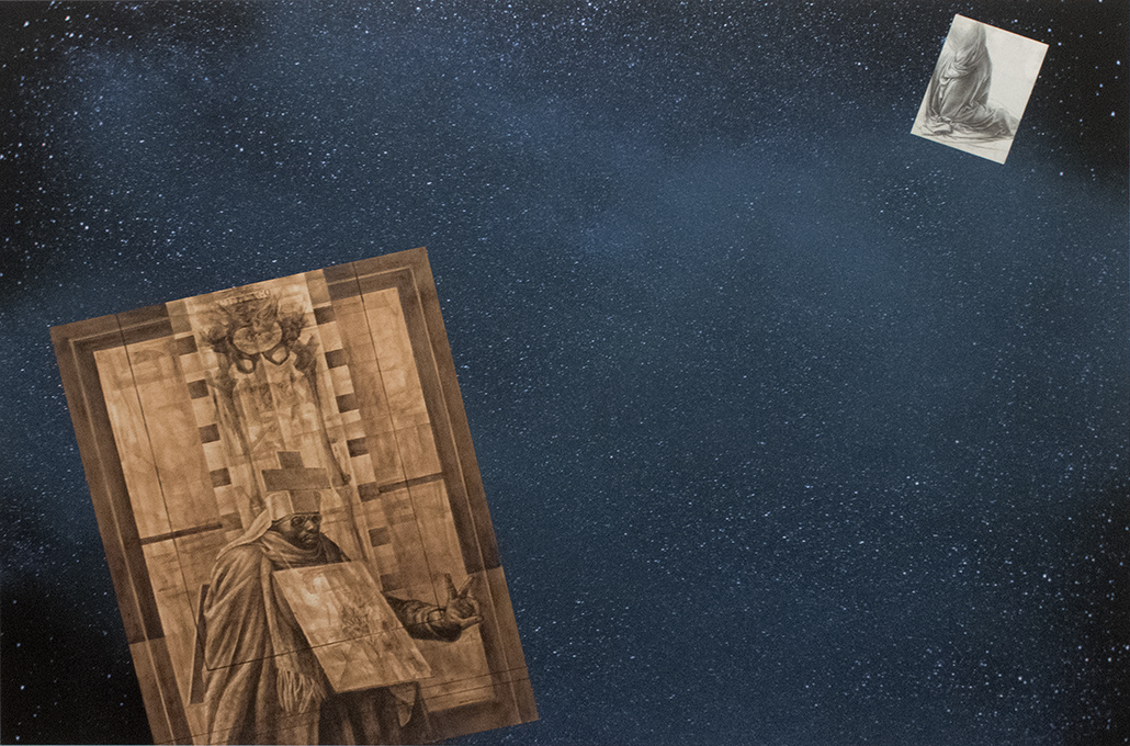
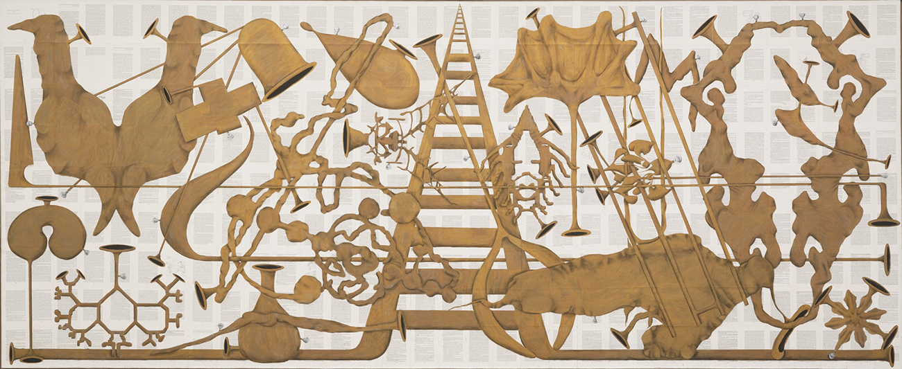
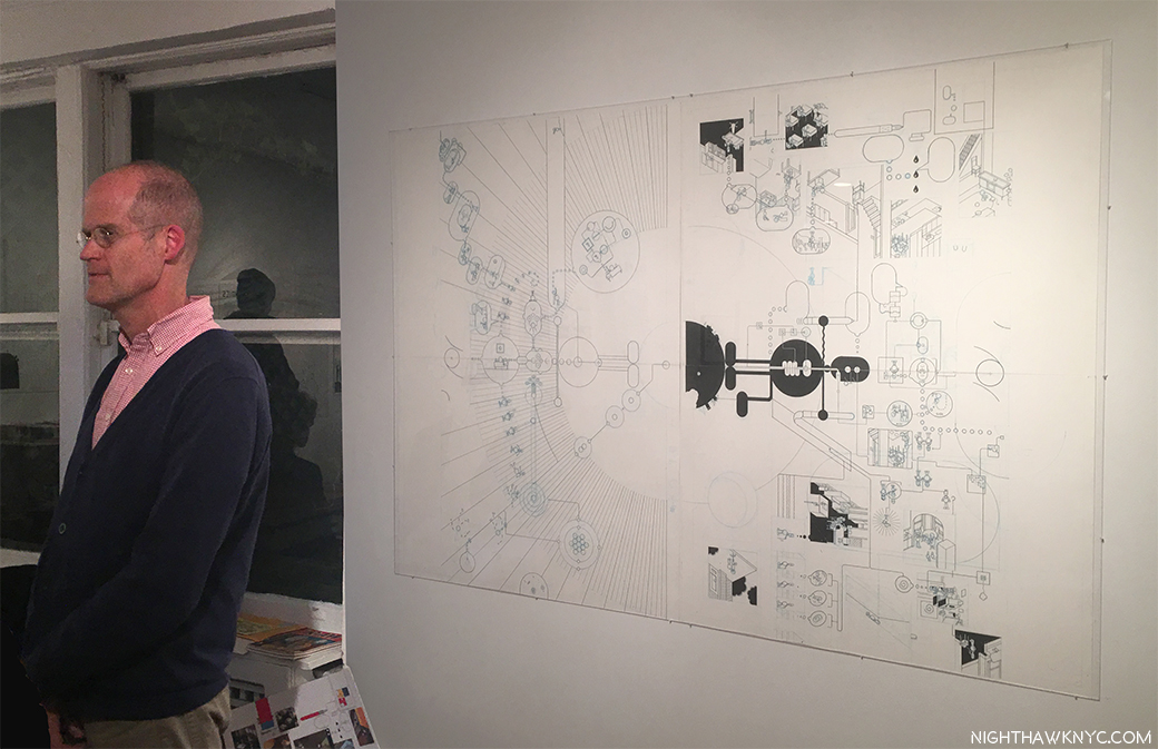
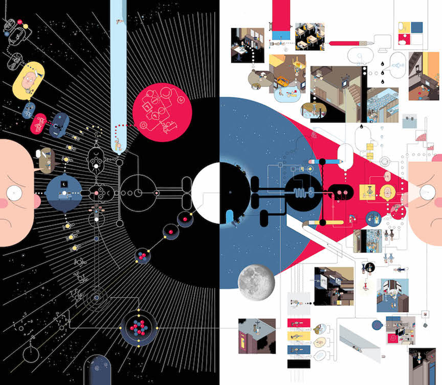
The Exhibition Brochure folds out into this cosmic poster. Click any Photo for full size.
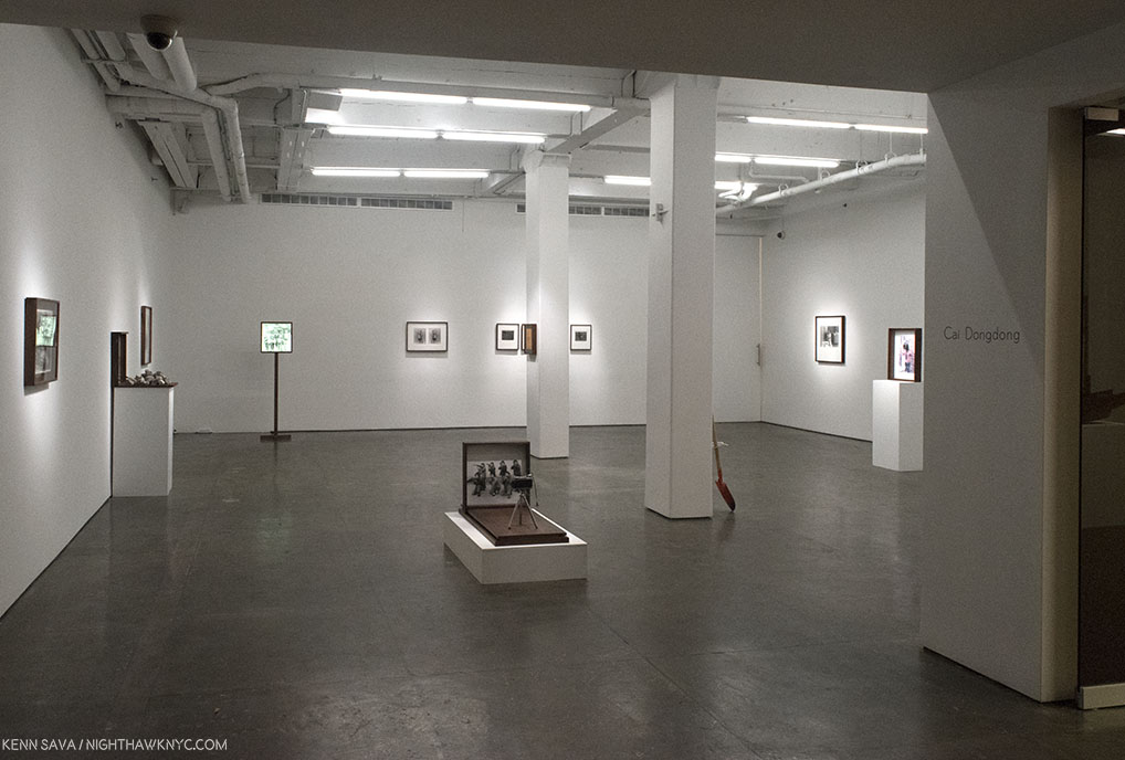
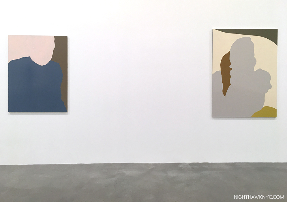
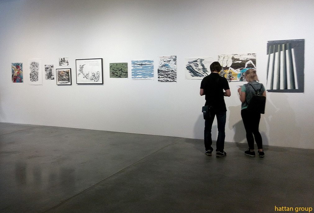
Here each was separated by only tens of feet, installed facing each other across the gallery.
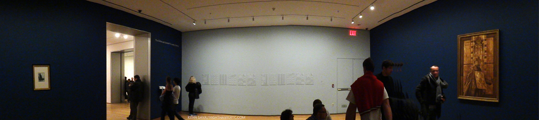
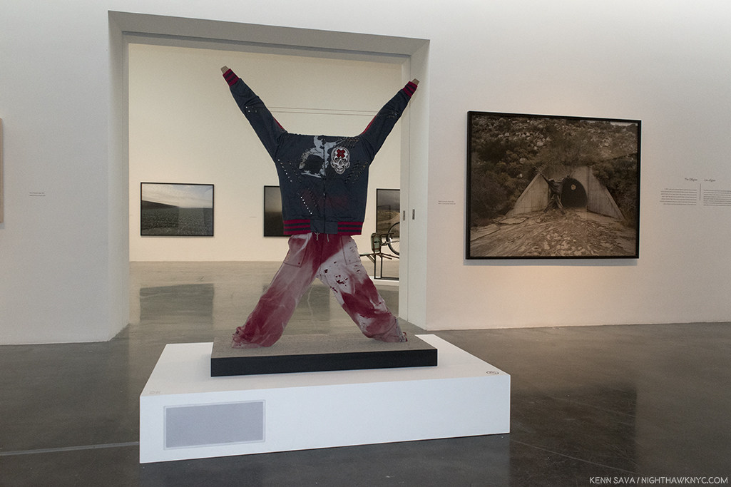
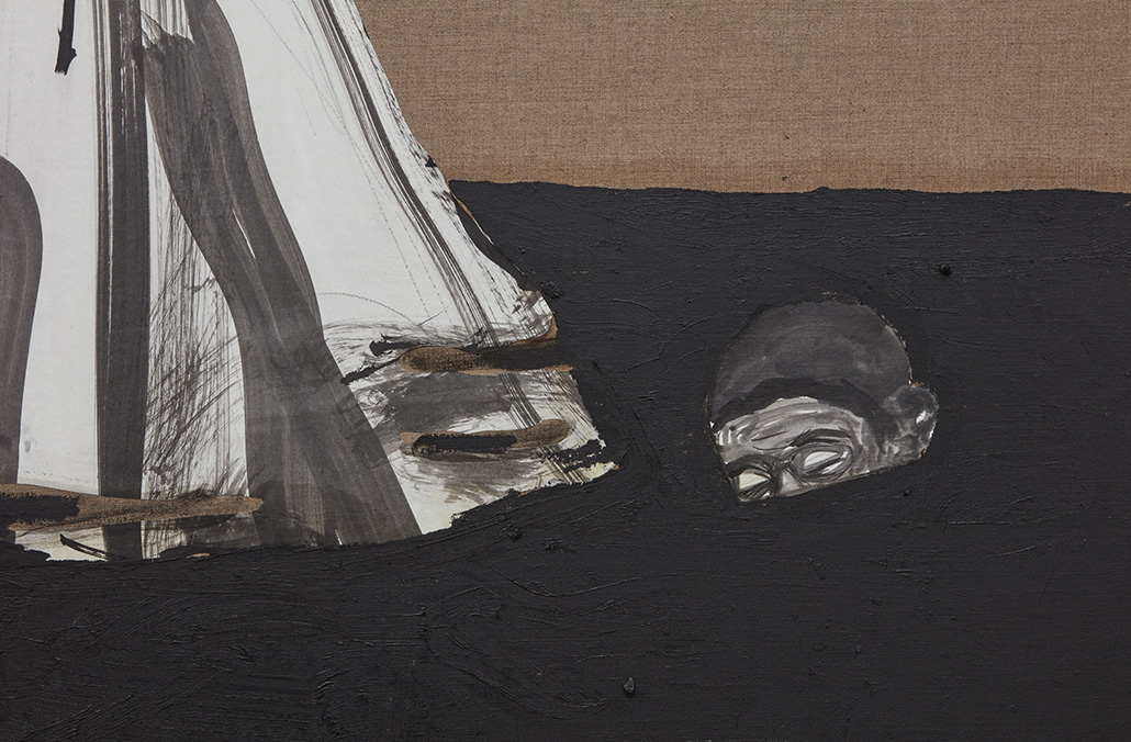
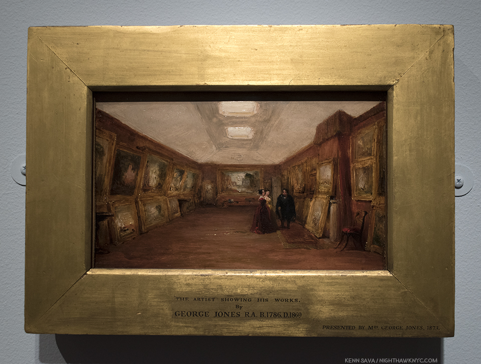
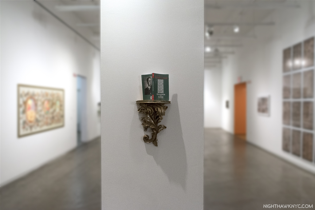
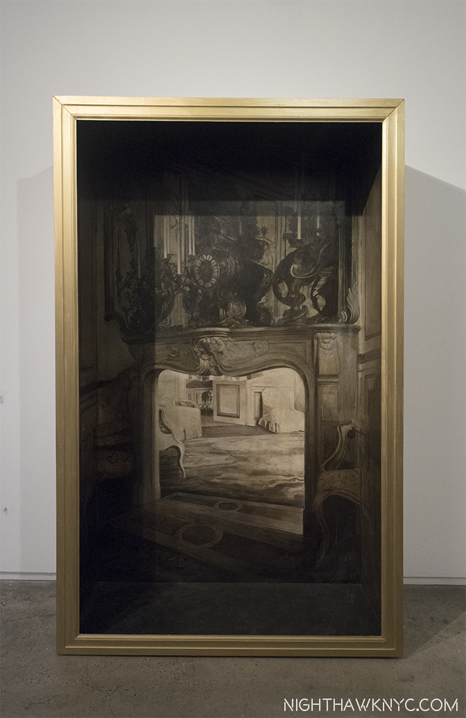
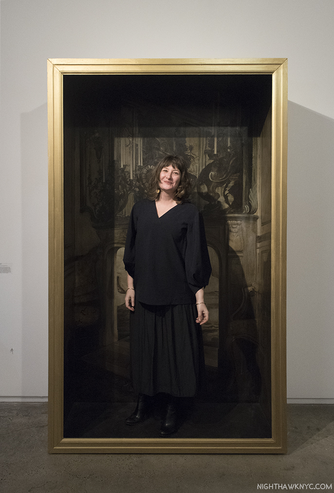
Installation view…of the whole show. Leonardo da Vinci, Drapery of a kneeling figure, c.1491-4, Brush and black ink with white heightening on pale blue prepared paper, left, Charles White’s Black Pope (Sandwich Board Man), 1973, right. Vedic astrological charts for both Artists center.
They were brought together by one man- the curator of this show, Artist David Hammons, who also commissioned Vedic astrological charts for both Artists, seeking connections that extend beyond what’s on the walls. What’s on the walls are Charles White’s lack Pope (Sandwich Board Man), 1973, Oil wash on board, from MoMA’s Permanent Collection, right, and Leonardo da Vinci’s Drapery of a kneeling figure, c.1491-4, Brush and black ink with white heightening on pale blue prepared paper, here on loan from Queen Elizabeth’s collection. It’s a study for the kneeling angel in his The Virgin of the Rocks, in the National Gallery, London, that I had a once-in-a-lifetime experience with in February, 2012.
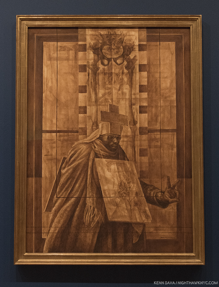
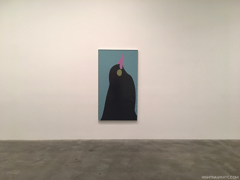
Charles White, Black Pope (Sandwich Board Man), 1973, Oil wash on board.
Wait. Leonardo da Vinci in The Museum of Modern Art? That, alone, made this something to see. It’s only the 3rd time a da Vinci has been shown at MoMA.
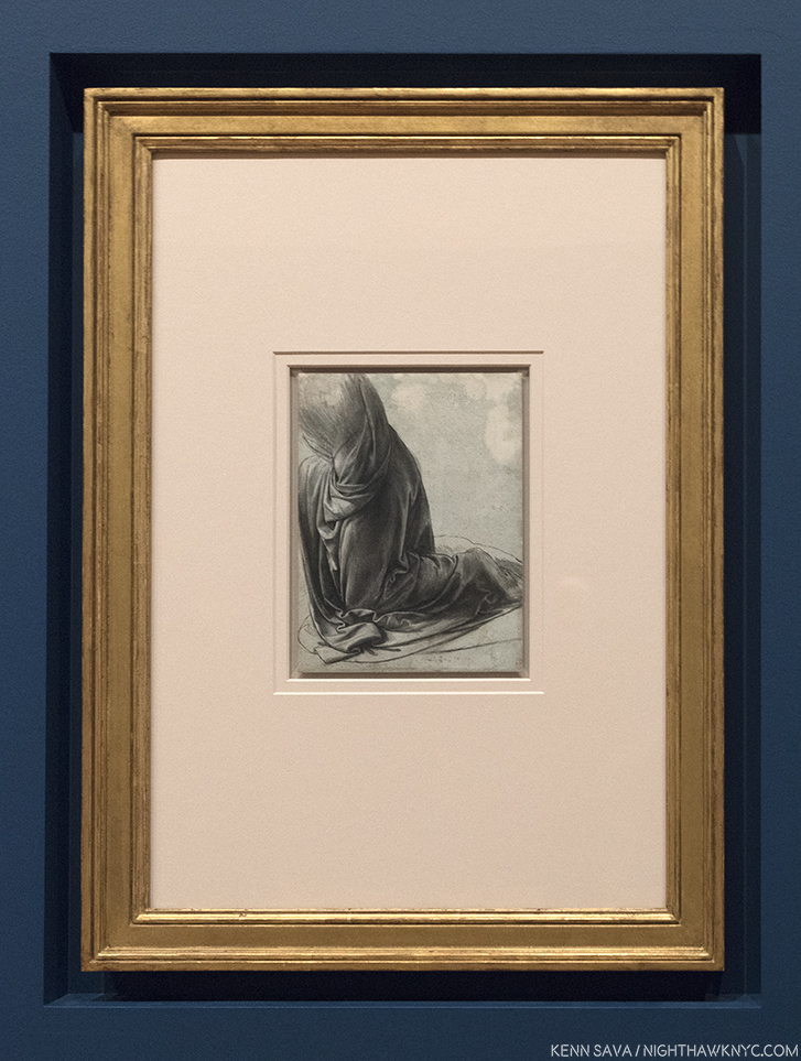
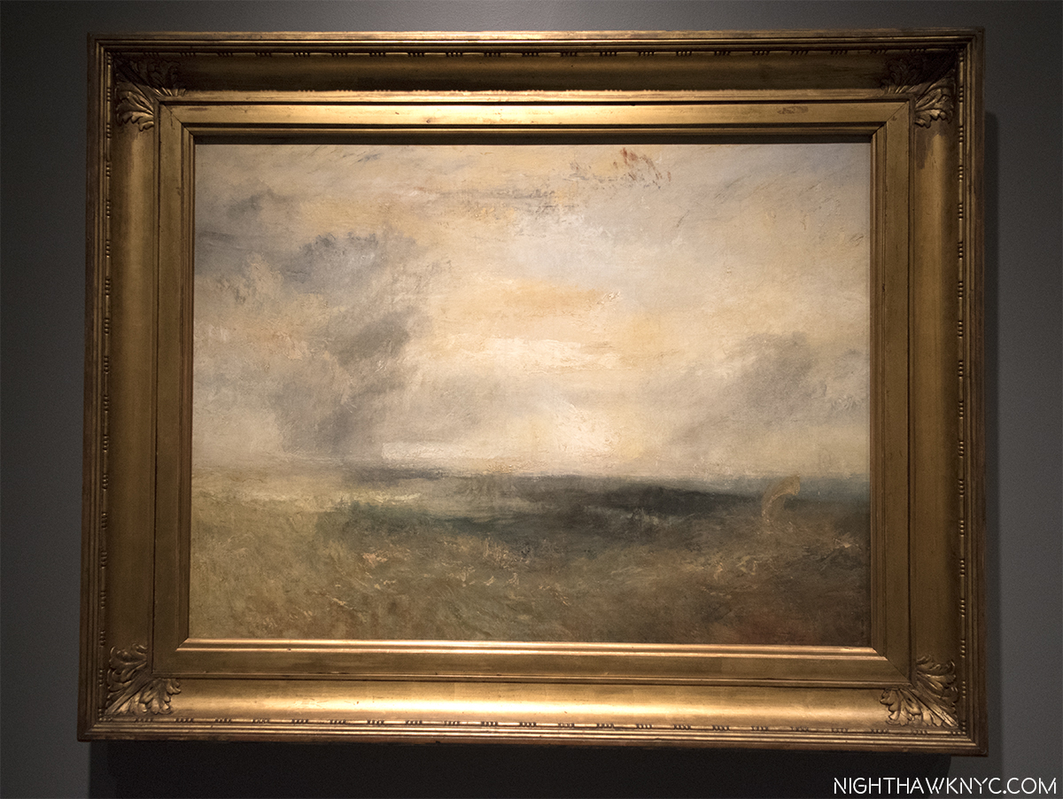
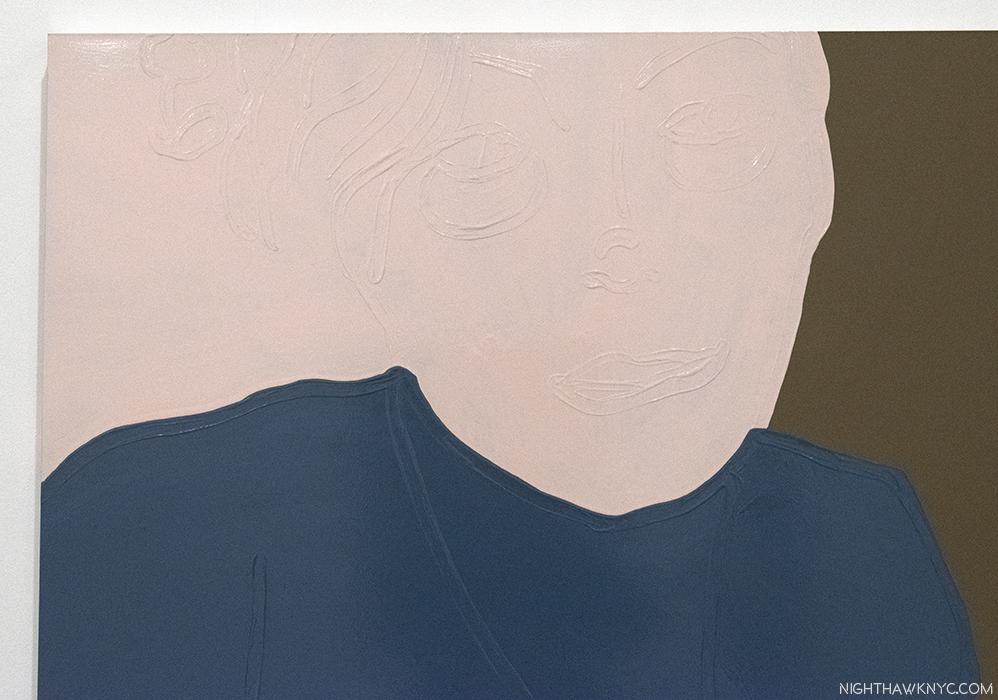
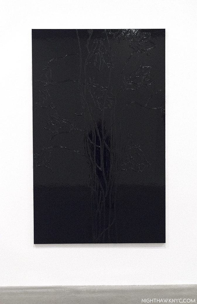
Leonardo da Vinci, Drapery of a kneeling figure, c.1491-4, Brush and black ink with white heightening on pale blue prepared paper
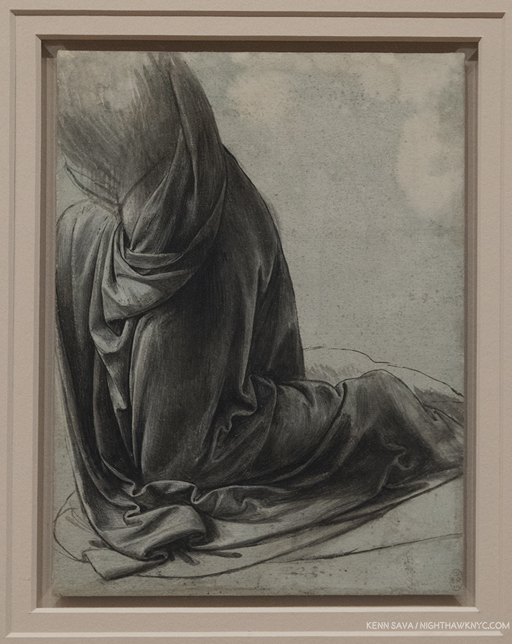
Closer. Who was the genius that decided to mark THIS with the “E R” tag on the lower right corner? Seriously? Isn’t the notation on the accompanying card that it’s in Queen Elizabeth’s collection sufficient?
But, don’t sleep on Charles White. His is a name that’s increasingly being brought up by Artists, acknowledging his influence, and/or his direct instruction. I have a feeling that as time goes on, his Art, too, will be increasingly part of the conversation. Black Pope, 1973 is considered one of his masterpieces. It’s haunting presence and mysterious message- his left hand giving the “Peace Sign,” the sandwich board reads, simply, “NOW,” as the figure moves under the word “Chicago,” emblazoned on the lower half of a skeleton, wonderfully executed, is a work that immediately impresses as “important.” The first thought turns to the war in Vietnam, which would not end for another 2 years, in 1975. Somehow, I don’t think it’s that simple. As it continues to haunt me, it also serves to make me want to see much more of his work.
The mercurial and elusive David Hammons was one of Charles White’s students. Though he chose a different stylistic path from his teacher’s realism (like, infamously, selling snowballs one winter’s day), he retained the latter’s activist stance, and has steadfastly held on to his “outsider” position. As a result, it’s somewhat surprising to see his name as the curator for this museum show. Another reason this was a must see show. Mr. Hammons has come up with a fascinating idea. In trying to understand his concept and intentions, I looked at MoMA’s recently published book on Charles White’s Black Pope, written by Esther Adler, Assistant Curator of Drawings and Prints at MoMA. In it, David Hammons, who sought Charles White out in 1968 as a teacher, is only quoted once. He says that “He (Charles White) is the only Artist I really related to1.”
Then, there’s this, in the exhibition’s brochure-
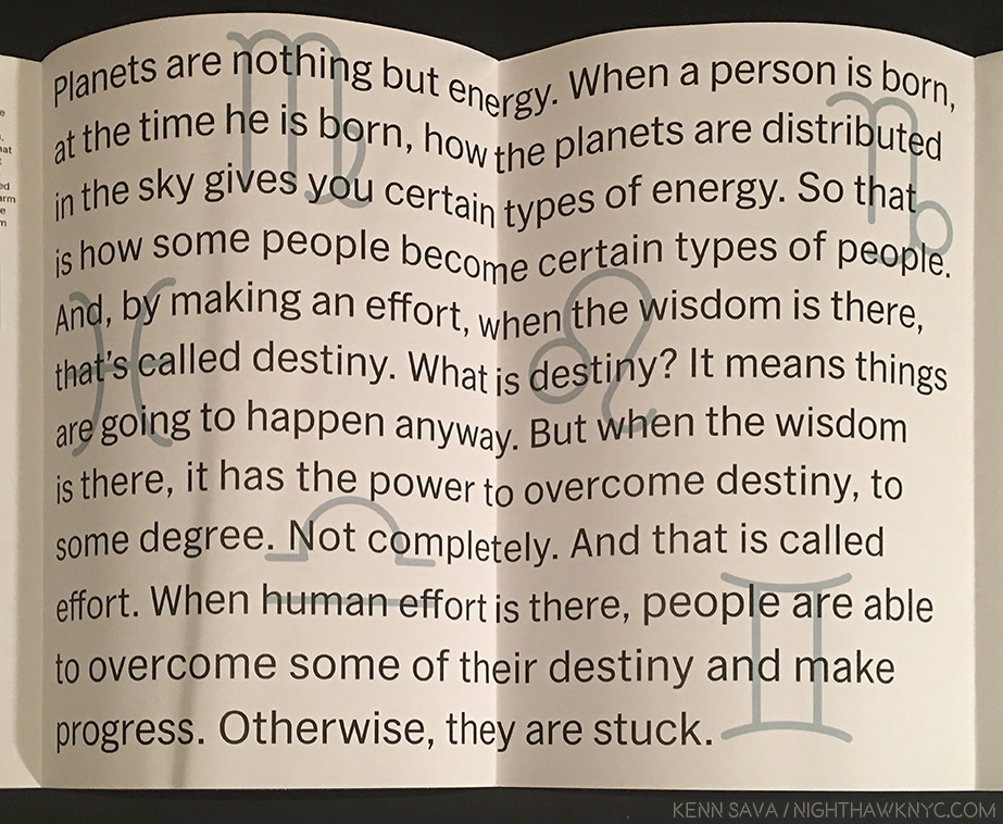
Inside of the exhibition brochure. Written by David Hammons..? No one is credited.
Beyond that, the wall tag reads, in part, “Hammons…asks us to consider commonalities between these two artists.” Ok. Let’s see…
On the surface the two Artists couldn’t seem to be more different.
Born 460, or so, years apart. Half a world apart. Leonardo was illegitimate (“a social disadvantage that was nearly impossible to overcome…2” at the time). Charles White was a black man, born the son of a steel worker who was a Creek Indian- not exactly “favored” social standing. One fantasized about manned flight and his Drawings of it are still studied today. The other, born in 1918, grew up in the early days of real manned flight, and died in 1979, 10 years after man first set foot on the moon. One spoke Italian and wrote backwards, the other’s major concern was “to be accepted as a spokesman for my people3.” But, there are similarities that become more apparent as you look, and, yes, even more.
The first thing that becomes obvious, at least to me, is that they are both Masters. Fear not, Charles White holds his own, a remarkable achievement for any Artist. The second is that they are not at all at odds with each other, nor do they look jarring alongside each other, at least to my eyes. Obviously, they both valued the craft and Art of Drawing. Going further, they were both born in the first half of April. Leonardo on April 15, 1452, Charles White on April 2, 1918. Hence the idea of commissioning Vedic Astrologer Chakrapani Ullal to create charts for each.
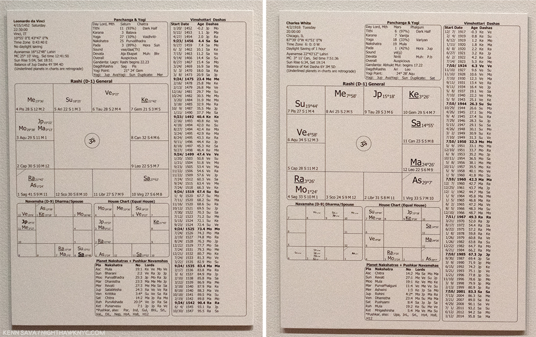
Ahhh…It was all written in the stars. The first page of da Vinci’s Vedic astrology chart, left, and Charles White’s right. If only I could read them. I do note that “Ke” is in the upper right quadrant of both.
“Talk and song from tongues of lilting grace
Whose sounds caress my ear
But not a word I heard could I relate
The story was quite clear”*
Both Artists “taught” Drawing- Leonardo’s dedication to the technique of Art has been exceeded by few, if any Artists before or after him. He “taught” drawing, directly, to his apprentices and ever since his death, his voluminous Notebooks have been excerpted into a number of texts on technique, that, along with his few Paintings and many Drawings have served to inform and inspire countless Artists down through the centuries. As Leonardo is a “tree” from which countless Artists have become branches, Charles White now has his own tree. He taught directly, in person, with numerous students over the years, at Dillard University, then most notably later in his life at Otis Art Institute, from 1965-79. It was while he was at Otis Art Institute , that David Hammons sought him out to study with in 1968. Kerry James Marshall closely studied Charles White’s work from a distance during his formative years, finally deciding in 7th grade that he would take his class and study under him. “In high school, Marshall sneaked into Otis and sat at the back of Charles White’s evening art class, hoping to remain unnoticed. “I didn’t have any business being in there in the first place, and then there was a naked person in there, so that was even more of a factor, you know,’ Marshall recalls, laughing. White noticed the youngster and approached him, saying, ‘You can’t see nothing from back here.’ He moved Marshall to the front and taught him how to draw a head in profile. He could come back anytime, White said4.” Marshall, fresh off his monumental, traveling retrospective is, at the moment, the most prominent member of Charles White’s influence tree, and he has continually spoken of his debt to Charles White.
Looking further, both Artist’s work is “representational,” though Charles White does touch on realms considered abstract. Still, standing in front of the Leonardo, and looking towards the very next gallery, filled with Surrealism, I wondered what he would think of this, which was in it’s direct sightline-
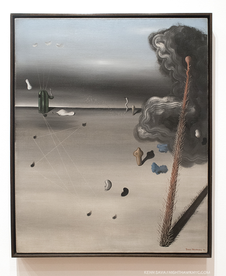
Yves Tanguy, “Mama, Papa Is Wounded!,” 1927, Oil on canvas
Interestingly, in Charles White’s “Black Pope (Sandwich Board Man),” 1973, we see the figure from, apparently, right above his knees (though the skeleton of a lower body looms above him5). In Leonardo’s Drawing, we see the figure’s lower body. Between the two works of Art, we’d have one whole human body (half female, half male). Looking at it another way, it’s as if Leonardo’s is providing the foundation-figuratively and literally. Both have a fair amount of beautiful drawn “drapery,” or clothing, the folds and nuances of shading is something that Artists have long prided themselves on mastering- Leonardo, a supreme Master of it, gives us a classic example of one such exercise here.
Leonardo’s work is a study for the Virgin of the Rocks, a work that seems to focus on Saint John the Baptist, a prophet. Charles White’s Black Pope, also appears to be something of a prophet, but “saying,” or “foretelling” exactly what, is not clear. Both works are surrounded in mystery as to exactly what is happening.
“Oh, father of the four winds, fill my sails
Across the sea of years
With no provision but an open face
Along the straits of fear.”*
Perhaps, Mr. Hammons has some personal insight from Charles White about Leonardo and his influence on him, but that is not shared here. Leonardo is one of the most respected and revered Artists in Western Art History. Is Mr. Hammons putting him, alone, in the same room with Charles White his way of saying that Charles White, “the only Artist he related to,” is comparable for him to how Leonardo is held by the larger, and largely white, Art world?
I think Kerry James Marshall may have summed it up best- “When I looked at his (Charles White’s) work it seemed as good as something anyone else ever made, and better than a lot of things other people made, but how come he’s invisible to Art history?” 6
Getting back to Black Pope, the Artwork, MoMA’s new book on the piece does an excellent job of tracking down some of Charles White’s possible visual references. Though they located newsphotos that appear to be closer to Charles White’s composition, I was, also, struck that among them is the fold out cover for Isaac Hayes album Black Moses, released by Stax Enterprise Records, 1971.
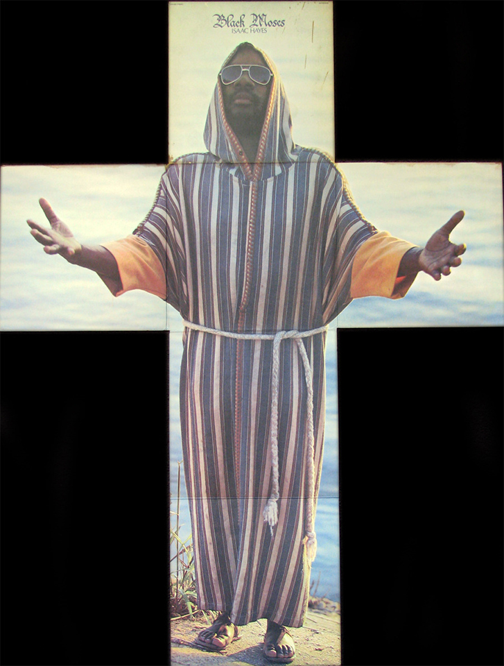
Isaac Hayes, Black Moses, Foldout Lp Cover, Stax Enterprise Records, 1971.
Charles White’s influence is already well-established through his illustrious and important students. Art history may, also, be slowly beginning to catch up. It turns out that this show is something of an “appetizer” for MoMA’s Charles White: A Retrospective which opens next year (Update, January, 2019- which I’ve written about, here). It’s an overdue show that could go a long ways in finally solidifying Charles White’s place as an important Artist.
*- Soundtrack for this Post is “Kashmir” by John Bonham, Jimmy Page & Robert Plant of Led Zeppelin, and which was recorded on Physical Graffiti, 1975, 2 years after Charles White created Black Pope. A great performance of it is here.
NighthawkNYC.com has been entirely self-funded & ad-free for over 7 years, during which over 275 full length pieces have been published! If you’ve found it worthwhile, PLEASE donate to allow me to continue below. Thank you, Kenn.
You can also support it by buying Art, Art & Photography books, and Music from my collection! Books may be found here. Music here and here.
Written & photographed by Kenn Sava for nighthawknyc.com unless otherwise credited. To send comments, thoughts, feedback or propositions click here. Click the white box on the upper right for the archives or to search them. Subscribe to be notified of new Posts below. Your information will be used for no other purpose.
- This Charles White-Leonardo show, upcoming at the time, is mentioned in a footnote. ↩
- https://www.press.umich.edu/17155/illegitimacy_in_renaissance_florence ↩
- charles white-imagesofdignity.org ↩
- Sam Worley, Chicago Mag, 3/29.2016 ↩
- Remarkably reminiscent of Robert Rauschenberg’s X Ray in his 196 7work, Booster, created at Gemini G.E.L., where Charles White was also working at the time. ↩
- https://www.independent.co.uk/news/people/kerry-james-marshall-interview-putting-black-artists-into-the-textbooks-9801055.html ↩