Winterlude: Homage To “The Gates”

This site is Free & Ad-Free! If you find this piece worthwhile, please donate via PayPal to support it & independent Art writing. You can also support it by buying Art & books! Details at the end. Thank you.

Written & Photographed by Kenn Sava (*- unless otherwise credited)

Note- This Post is also be my “NoteWorthy Art Shows, February, 2017” Post. The most “NoteWorthy” Show I saw this month just happened to be outdoors. (Yes, NoteWorth January is coming.) What follows is, also, something “different” for this site. 

This month marks the 12th Anniversary of the Art Installation “The Gates,” by the Artists Christo & Jeanne-Claude, in Central Park in February, 2005.

February 12, 2005, Opening Day of “The Gates,” Central Park, NYC

February 21, 2005

I took those two week off so I could try to see all  23 miles of it. It culminated with my being very fortunate to stumble upon the Artists, on a hilltop, on the very last night of it as they watched it’s final sunset, together. I wondered what they were thinking watching the climax of the gigantic project they had begun in 1979. For me, it was an unforgettable moment capping a once in a lifetime experience.

“Time, time, time
See what’s become of me…”*

The High Line, February, 2017. Click to enlarge any photo on this site.

Walking around a different NYC Park, The High Line, this February, twelve years later, often with no one else in sight, I couldn’t help remember what Christo & Jeanne-Claude said about why they chose February to hold “The Gates.” They mentioned that “their free hanging saffron colored fabric panels seemed like a golden river appearing through the bare branches of the trees.”

“Look around
Leaves are brown
And the sky
Is a Hazy Shade of Winter”*

The photos I present here are meant to be taken individually, as what they are- isolated scenes from a large landscape, and so as individual works themselves (please click on the image to see it full size), and also to be taken as a group that tries to give a sense of the larger experience. They were all taken in February, 2017.


“Look around
Grass is high
Fields are ripe
It’s the springtime of my life”*

While there was no saffron to be seen, there was, indeed, “a golden river,” a natural one, utterly magnificent to be seen. It was as if nature, herself, was remembering…


The High Line is, of course, one of NYC’s newer Parks, and, a public work of Art in itself- Even in the dead of winter. Frankly? I can’t recall ever seeing it as beautiful.

“Seasons change with their scenery
Weaving time in a tapestry
Won’t you stop and remember me?”*


Since nature seemed to be doing it without prompting, I have no choice but to take the hint and dedicate this Post to Christo, and the memory of the late Jeanne Claude, both of whom I had the honor to meet once, before “The Gates,” as my way of saying “Thank you,” for them, and the 25 years of effort & dedication it took to get “The Gates” to happen.

After all, Art doesn’t just happen. Unless, it does.

*-The Soundtrack for this Post is “Hazy Shade of Winter,” by Paul Simon and recorded by Simon & Garfunkel on “Bookends.” Lyrics published by Universal Music Publishing Group.

NighthawkNYC.com has been entirely self-funded & ad-free for over 8 years, during which 300 full length pieces have been published! If you’ve found it worthwhile, PLEASE donate to allow me to continue below. Thank you, Kenn.

You can also support it by buying Art, Art & Photography books, and Music from my collection! Art & Books may be found here. Music here and here

Written & photographed by Kenn Sava for nighthawknyc.com unless otherwise credited. To send comments, thoughts, feedback or propositions click here. Click the white box on the upper right for the archives or to search them. Subscribe to be notified of new Posts below. Your information will be used for no other purpose.

Noteworthy Shows, December, 2016 (Updated)

This site is Free & Ad-Free! If you find this piece worthwhile, please donate to support it & independent Art writing. Thank you. 

Written & Photographed by Kenn Sava

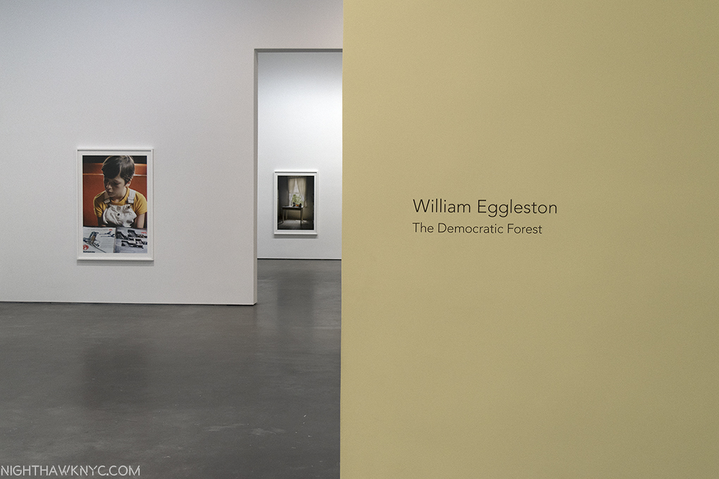
William Eggleston- The Democratic Forest @ David Zwirner. It’s impossible for us to “see” Eggleston’s work now the way the way it was seen in 1976 when 69 images were presented at MoMA in the legendary show, Photographs by William Eggleston (which you can relive, here, in glorious black & white). In that black & white world, it was received as “shocking,” and widely panned (famously by The Times). If anything, today, there are “too many cameras and not enough food,” as Sting sang, and too many pictures in the world, so, perhaps I shouldn’t be surprised to read a number of comments on Eggleston’s books, shows and works where commenters say they don’t see what’s special about it, or, that, as has often been said about Jackson Pollock, they could do it. Hmmm…Many, many have tried, and are still trying. What’s lost in translation in seeing Eggleston in 2016 is how many photographers have “gone to school” on his work, over the past 40 years, learned from it, and yes, copied it 1, so that much of what he is famous for is now omnipresent. Yet, it’s barely 40 years since his breakthrough at MoMA.

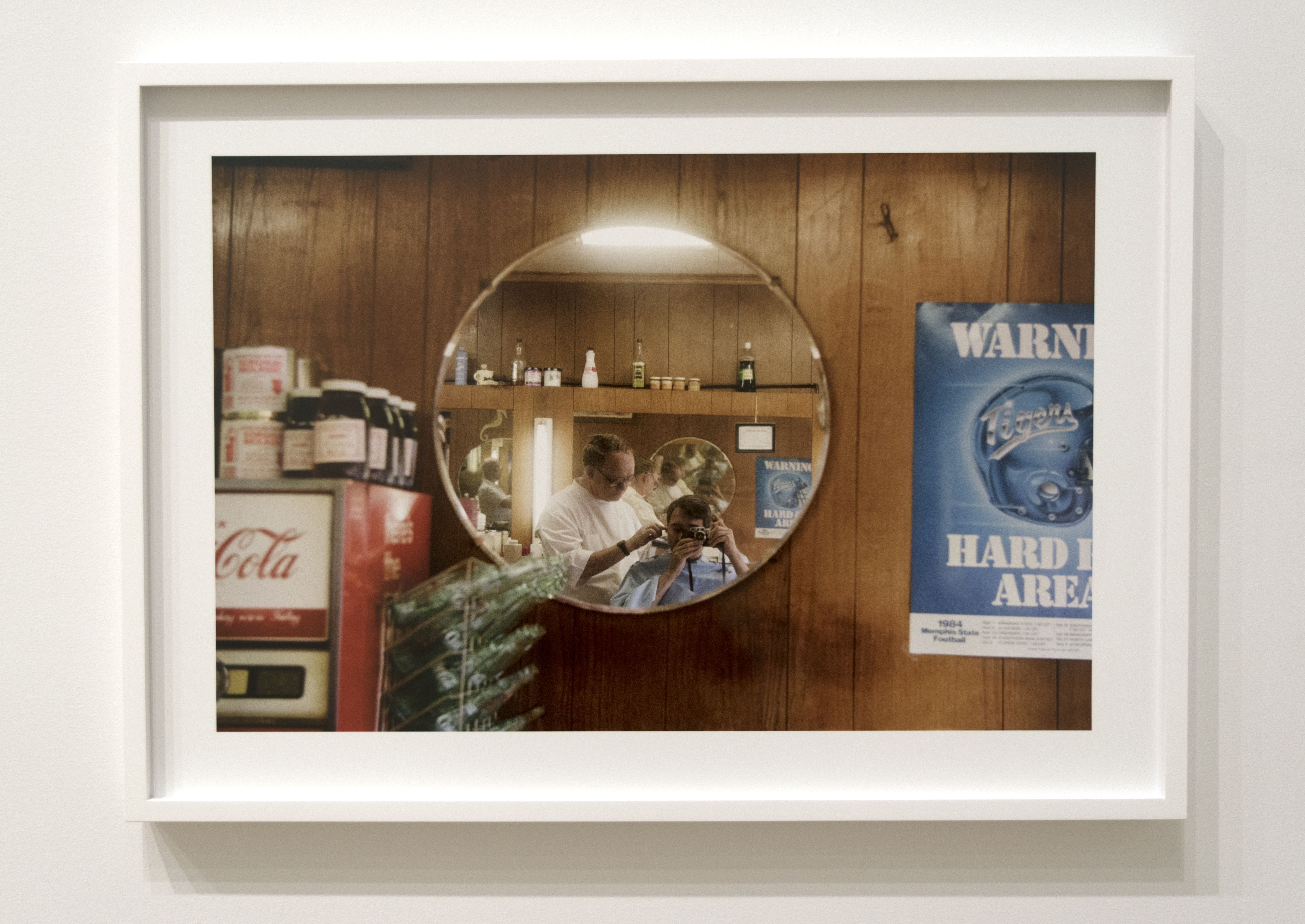
Depth of Field. Untitled, 1983-86, as each work here is so named and dated. Leica can’t buy advertising like this, and the rest of what is on the walls of this show. Note the endless mirror Self Portraits, that mimic all the bottles, jars and cans.

Countless professionals and amateurs shoot “the everyday,” the seemingly mundane now. Who’s to say what’s good, what’s bad, and what’s “Art?”

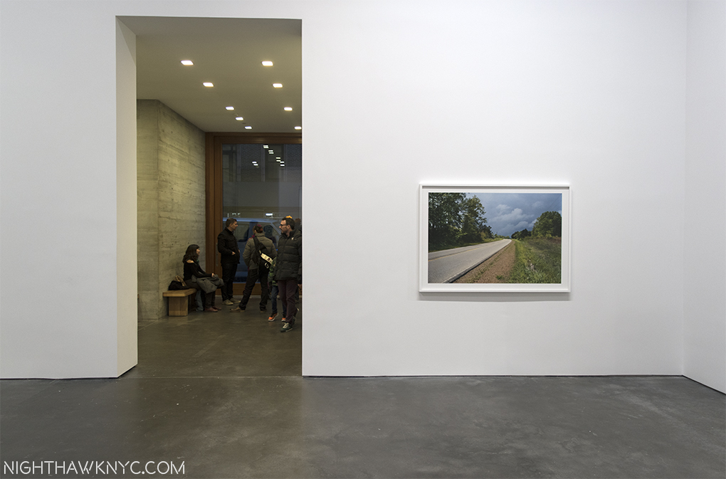
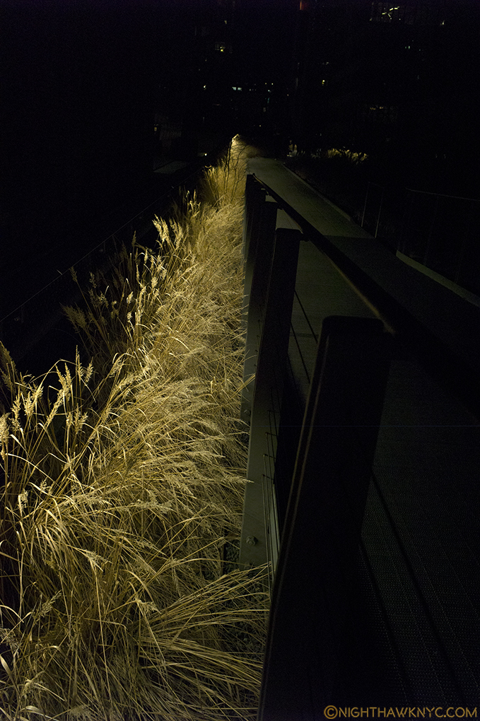
The road less traveled…It doesn’t exist in Manhattan.

As always? Time will. In the meantime, what about the work of William Eggleston in 2016?

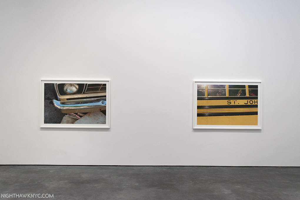
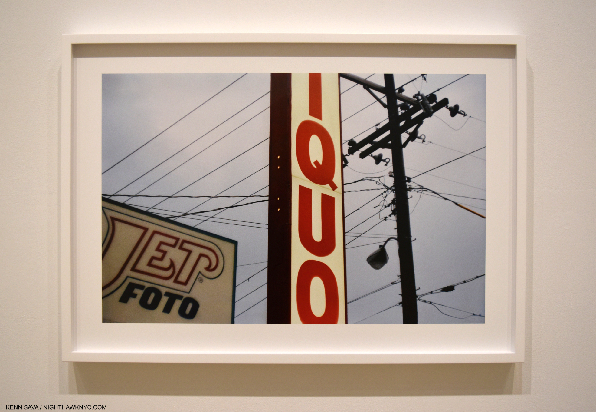
On the left, a classic shot of the so-called “mundane.” On the right, possibly a color Homage to Robert Frank’s The Americans, an early influence.

William Eggleston, now 77, has been making photographs since his college days, closing in on 60 years ago. He’s often called “the father of color photography,” which puzzles me. He was not close to being the first Photographer to shoot in color, nor the first to create a substantial body of work in color. Nor was he, as has often been reported, the first Artist to have a solo show of color Photography at MoMA. Ernst Haas beat him to that honor by 14 years with Ernst Haas: Color Photography at MoMA in fall, 1962! It can be seen here. Still, it’s enough passage of time for some things to be known. For one thing, his work still seems to be gaining in popularity. For another, it still garners a lot of respect from both his fellow Photographers, and Museums, judging how widely they hold and show his work. William Eggleston Portraits at the National Portrait Gallery, London this fall, drew raves. Millions of dollars are being spent on his work at auction. He, and his Eggleston Artistic Trust2, left the Gagosian Gallery this past June and signed with the equally prestigious David Zwirner Gallery for representation, (this being their first show), and this century has already seen a steady stream of stunning books and huge box sets by Steidl, which have the look and feel of monuments, that sell out and some then command a thousand dollars a copy, and more, on the aftermarket.

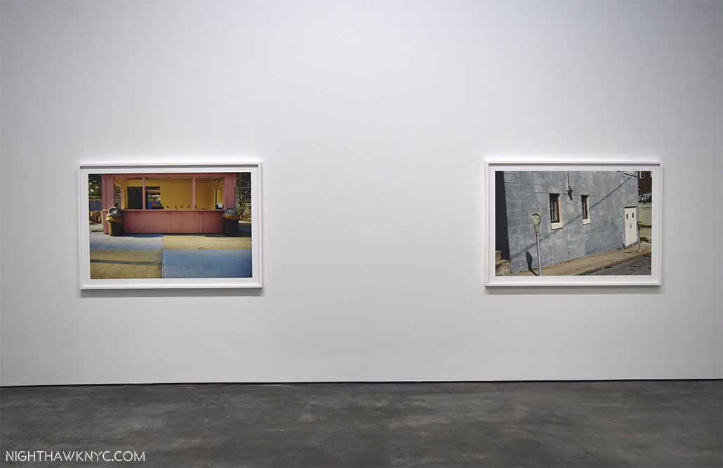
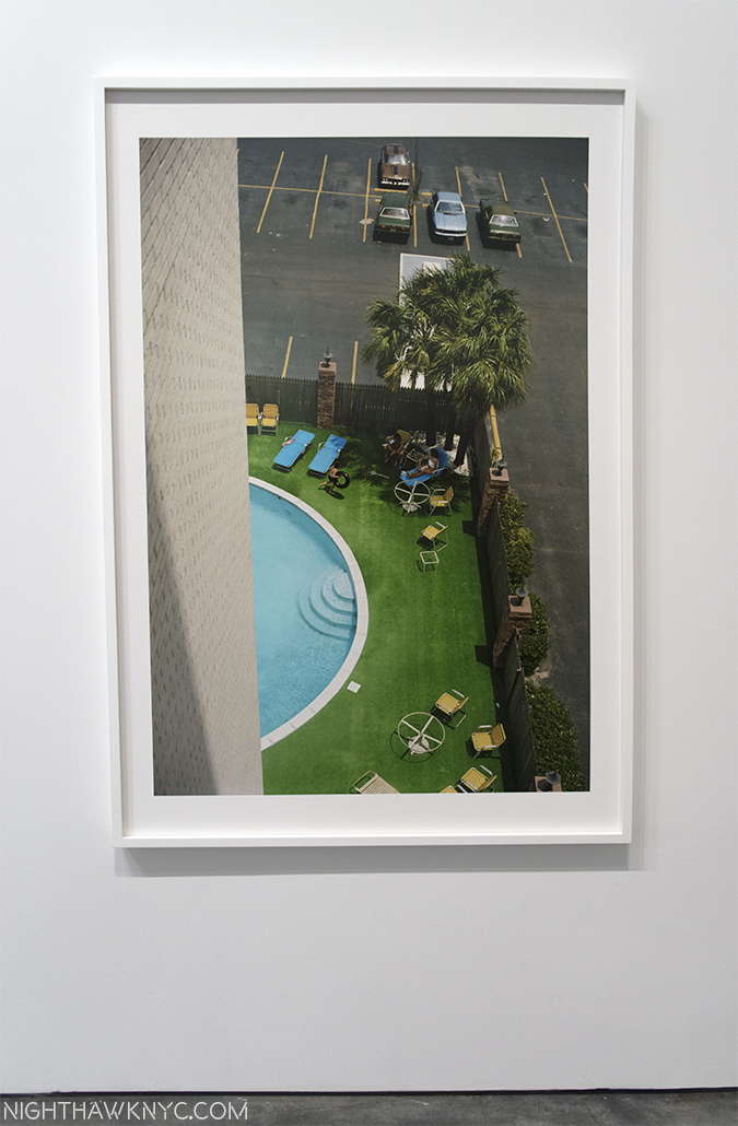
Famous for his very vivid colors, I found the shot on the left, with it’s pastel colors, equally effective.

In October, The New York Times featured him as one of their six “Greats,” along with superstar (my term) Artist, Kerry James Marshall, and Michelle Obama. William Eggleston is big time. Ok. So, back at David Zwirner on West 20th Street, how’s the show?

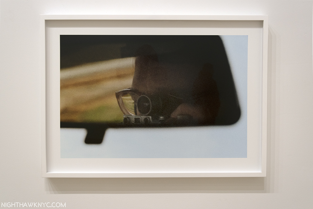
The shot on the left (who’s  location is unknown to me) makes me yearn to see shots of his taken in NYC.

30-odd years after these works were created they retain a surprising freshness and resonance that’s not easy to explain. I’m not sure it’s entirely the famous(ly) bright colors that are solely responsible for this, either. They’re undoubtedly a hook, but there’s far more going on, and there are works that don’t feature “knock your eyeballs out” colors that are equally compelling. Following in the tradition of Cartier-Bresson and Robert Frank, he has taken their ideas someplace else. Someplace subtle, or very subtle, mundane, often easily overlooked. A place decidedly “American” (in these works), that American viewers instinctively recognize, and one that must look like Mars to the foreign eye. Heck, in a few more years, it’s going to look like Mars to ANY eyes. Yes, so many others have tread this ground since Eggleston’s work became widely seen. They shoot similar subjects, using the same camera. But, in the hands of a visionary master of the medium, the results are truly unique. Seeing 40 works together reinforces all of this, and reveals intimacies about his approach and style. Seen in isolation this sense is harder to glean. His work has a feeling of spontaneity that is, also, often copied, perhaps, increasingly. Watching him at work in documentaries, we see this spontaneity is not contrived. Frankly? I marvel at it. What is going on in his mind as he approaches his spot? As he composes and frames? Untold millions walk around with cameras, raise them and take a photo. None are these. How is this possible? Also an Artist (his book Paris featured his Art alongside his photos), as well as a musician, it should be no surprise that he has one hell of an eye for composition (which can be seen in even his earliest black and white work), and which I feel is under-appreciated given how rarely I hear anyone mention it. It may be as big a part of his impact as color. His is, also, a painter’s eye, which also sets him apart as a photographer. Perhaps it is this that gives him his eye for the “secret life” of what most overlook in the world. All of these things work together to make a composition of random “things” a personal statement, even without people present in most of his photographs, and they seemingly come together in the instant the exposure takes. With a master technician of photography who’s also an Artist behind the shutter, I think his results are going to intrigue viewers for a very long time no matter how many try to copy and imitate him.

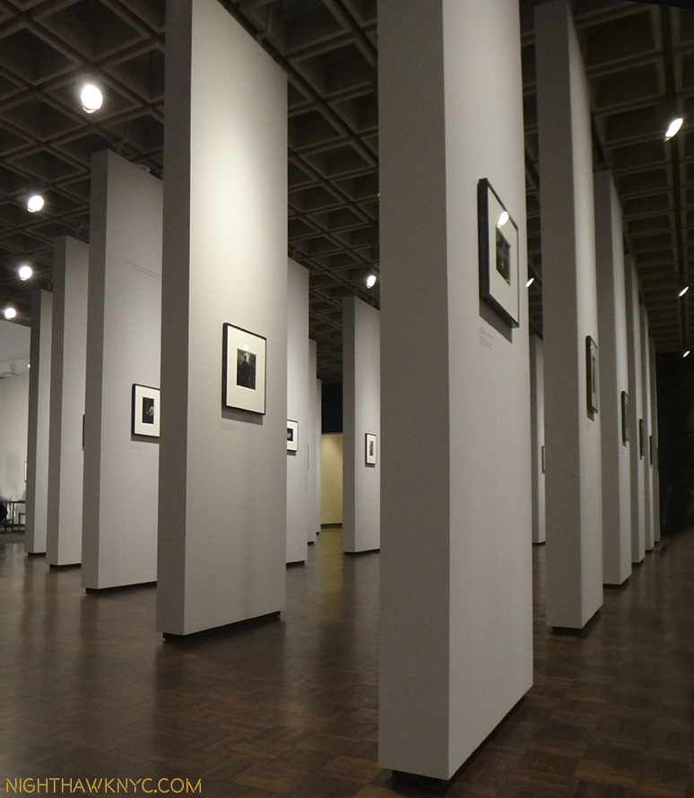
A wall of the smaller, 20 3/4 x 28 3/4 inch, prints for comparison. The work in the center is also in the Whitney, though smaller.

Eggleston said he has over a million and a half images in his archives. They ALL can’t be classics, can they? According to the press release, the show includes 40 works, “the majority of which have not been exhibited previously.” The “Democratic” in the show’s title speaks to the camera’s ability to “render equally what is in front of the lens.” What is rendered in these 40 works includes very few people.


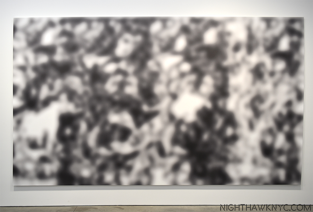
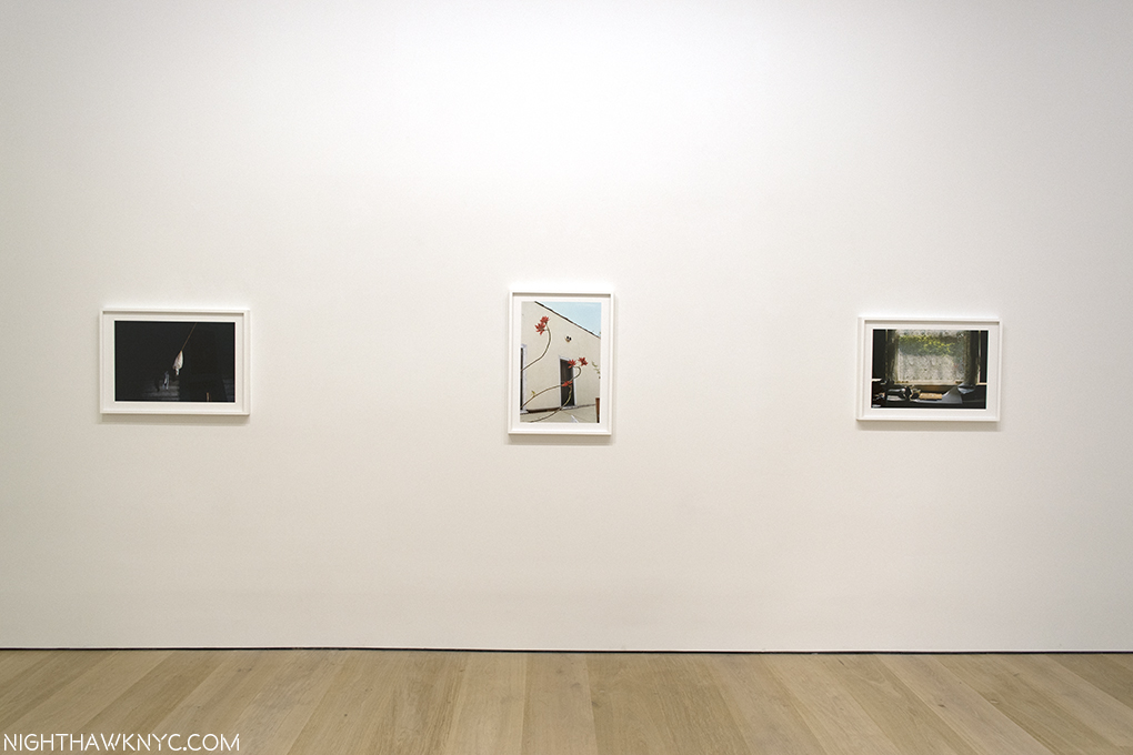
Each work here bears the same title and dating- Untitled, 1983-86. Very democratic, indeed. Not mentioned is that these works are recent prints in a larger size, somewhat controversially, (about 65 x 45 inches, though a few are 20 x 28) Digital Pigment Prints, instead of the  Dye Transfer Prints that Eggleston is renowned for, which his works in the collections of MoMA, The Met, and many other places are. For me, the larger size (the original sizes were of the order of 16 x 20 inches), seem to reach for a “painterly” impression. This struck me as soon as I walked in, not surprising, perhaps, since I have looked at mostly Painting in my life. Some succeeded larger, some didn’t. Interestingly, I found images I’ve long struggled with to be among those I am still struggling with larger.

One I’ve struggled with.

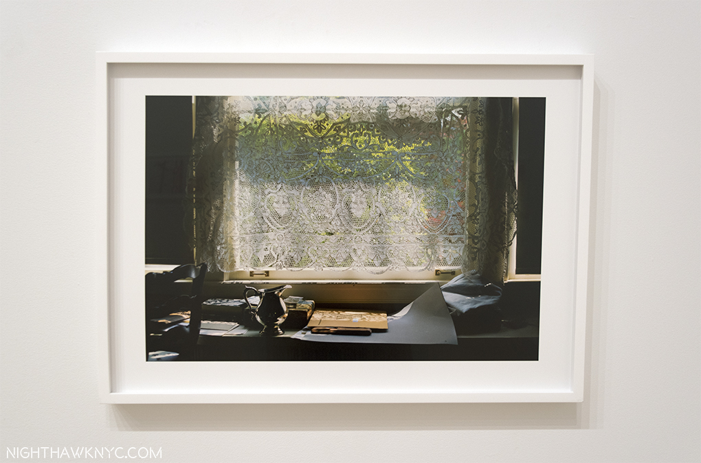
This one continues to haunt me with it’s unique blend of a photograph that “borrows” much from painting, then takes it somewhere else.

Another thing that most impresses me…no…blows my mind, is that Eggleston does it taking only a single shot. While he would, no doubt, prefer his work remind me more often of Degas (who, among many other things, was a photographer, as well as a master print maker and immortal Painter), I found myself thinking of him as being somewhere between Edward Hopper/Charles Sheeler and Ed Ruscha/Richard Estes. To study the individual photos in this show closer, check out the exhibition’s catalog. I’ve mostly opted to show the very interesting combinations in which they were hung, which I assume Mr. Eggleston, himself (who was in NYC for the opening, also making rare appearances at The Strand and at Aperture), was involved with, since those won’t be widely documented.

“Well I hope you’re happy with what you’ve made
(Puzzling evidence)
In the land of the free and the home of the brave
(Puzzling evidence)”*

William Eggleston’s worldwide reputation as an important American Artist of our times increases seemingly daily. While his Artistic Trust, which his sons are involved in, seems to have it’s own ideas about the future of his work, it seems assured that his work is going to be seen far and wide for a very long time. With that 1.5 million photos he guesstimated are in his archives, he must have taken some in NYC, as he memorably did of Paris, right? Maybe those will be in a future show called “The Democratic City.”

Francis Picabia @ MoMA- (Note- March 3, 2017. I went back to see this show, again, before it ends March 19, and so I update my Post on it, in hopes of doing it more justice.) Picabia first got me into Abstract Art as a teenager with this work-

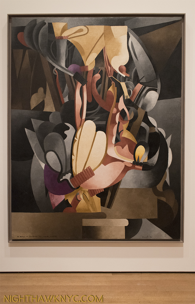
Let’s Get Lost. Picabia’s masterpiece I See Again in Memory My Dear Udnie, 1914. Worth the price of admission by itself.

I bought the postcard of it, which I still have. It sucked me into it- almost literally, it’s grip on my mind, and my eyes, was so intense. It’s a work that looks like you could walk inside and climb around in and explore it’s unprecedented landscape. But, it was it’s title that hooked me…”I See Again in Memory My Dear Udnie.” When I finally climbed back out of it and got around to pondering the name of the work…Well? I’m still pondering it. Most of the other Abstractionists (Pollock, Rothko, Duchamp, even Kandinsky) didn’t usually title their works. This proved a vital “way in” for me. From this, and Picabia’s other works of this period, I discovered Pollock, Kandinsky, Miro, then the Surrealists, Dada, and the Abstract Expressionists. Seeing it, again, in this very well done retrospective brought all of that back to me. I was, initially, startled because I’d forgotten how large it is- over 8 feet high by 6 and a half feet wide. Talk about making a statement. It’s presence, and impact, is still every bit as strong. For me, at least, it’s a central work in his oeuvre. His early abstractions are, still, breathtaking, unique and just gorgeous.

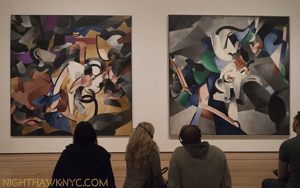
Front row seat to genius. Ecclesiastic, left and Udnie, Young American Girl, both 1913, right. The now immortal Udnie was a dancer named Stacia Napierkowska, who’s on-ship performances Picabia was taken with on his voyage to NYC for the famous 1913 Armory show, a triumph for him. Meanwhile Stacia/Udnie was arrested by the NYPD for “indecent” performances. (Here in the NY Times.).

While Cubism was all the rage at the time (c.1914), I think it’s a shame that other Artists didn’t follow Picablia down this road. Then again? Where else was there left to take it? Perhaps this is why, Picabia, himself, turned his back on this style and adapted others. The man is one of the ultimate chameleons of his time.

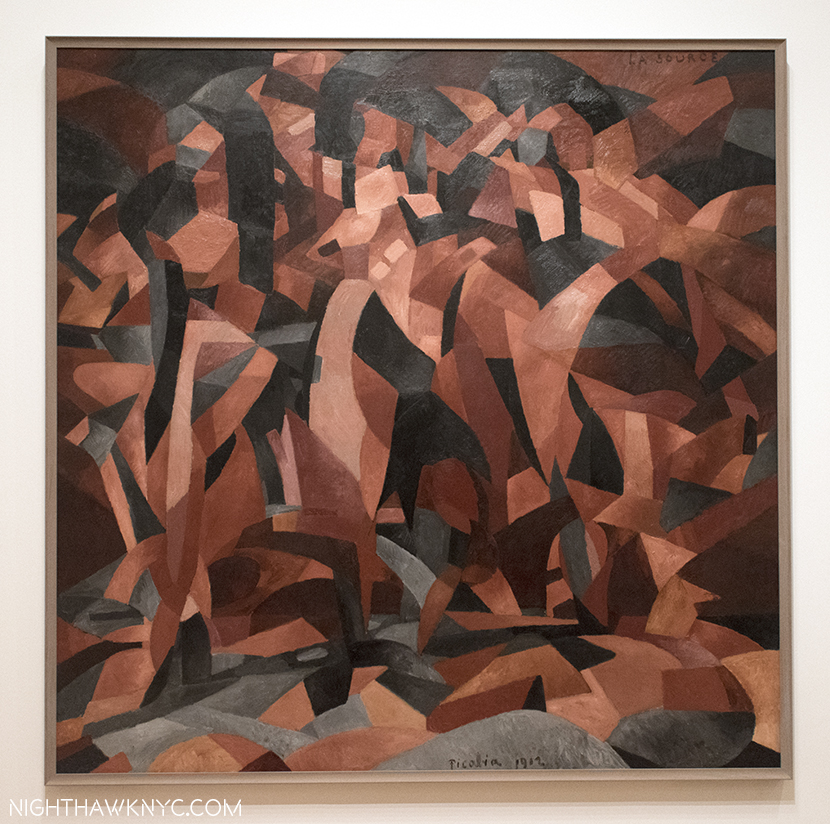
It’s not “Cubism,” or “Futurism,” or “Geometric Abstraction.” So? What do you call The Spring, 1912? How about beautiful?

This is a long overdue show, and a big one. It surprised me with Picabia’s endless evolution throughout his career, much of which, post-1925 seems to be a bit in the shadows compared to his early, seemingly endless inventions.

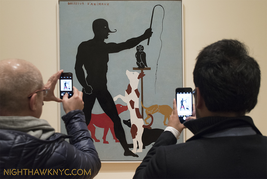
Down in front. The Animal Trainer, 1923, (inscribed “1937”). Fear not- I’ve been assured by MoMA that no Owls were harmed in the making of this Retrospective. Actually? I’m not sure just who is being trained in this work.

It points out that there remains much to see and study in the long career of this defiantly original, prolific and continually surprising individualist. I found myself a bit lost by what came after 1925, but he called me back with his somewhat surprising evolutions during WW2.

Moving on. The Lovers (After The Rain), 1925. Picabia painted over an earlier, abstract work in creating this. I’d love to see an x-ray and see what he chose to paint over.

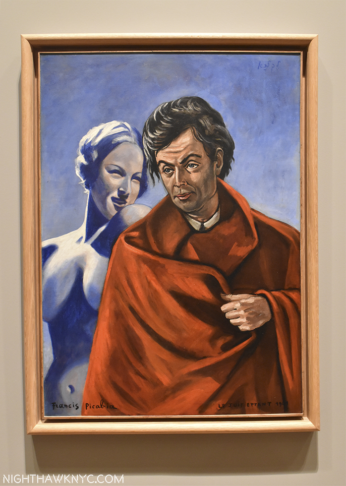
Good luck trying to stick Francis Picabia in a style hole. He didn’t stand still, as we see here in The Wandering Jew, interestingly, from 1941. A period that features quite a few nudes.

In the end, Picabia is, like I See Again in Memory… one of those Artists who’s work demands, and rewards, repeated viewing. His formidable technique, and endlessly creative & inventive mind gave us an Artist who wasn’t content to stay with one style for very long. When you have that kind of talent? Why would you want to? He was, as he famously said, “a monster.” A monster talent.

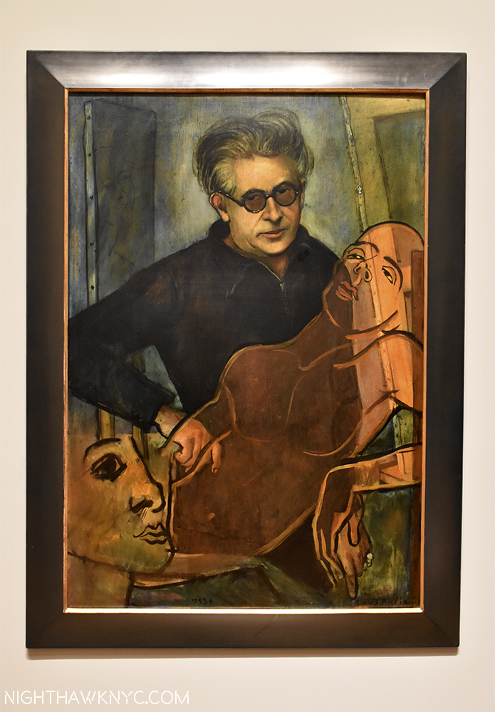
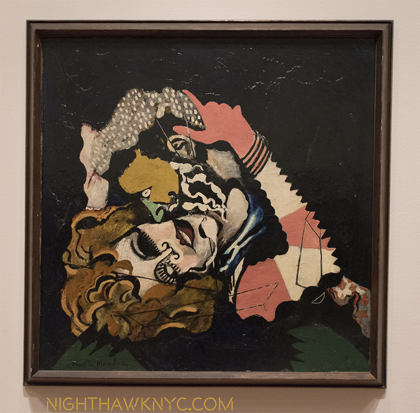
Portrait of the Artist, 1934, a collaboration with Bruno Eggert. A bit of Christian Schad, perhaps? Schad was 40 in 1934, though pretty obscure.

Paths To The Absolute: Kandinsky, Malevich, Mondrian, Newman, Pollock, Rothko and Still @ Di Donna Galleries- A small wonder. All of those big names in one gallery show. Beautifully hung, in fascinating combinations that created wonderful inner dialogues, and one that offered a nice different perspective on Rothko from that going on in the “big” show, concurrently, at Pace, Chelsea. A show I almost missed and long will be grateful I did not.

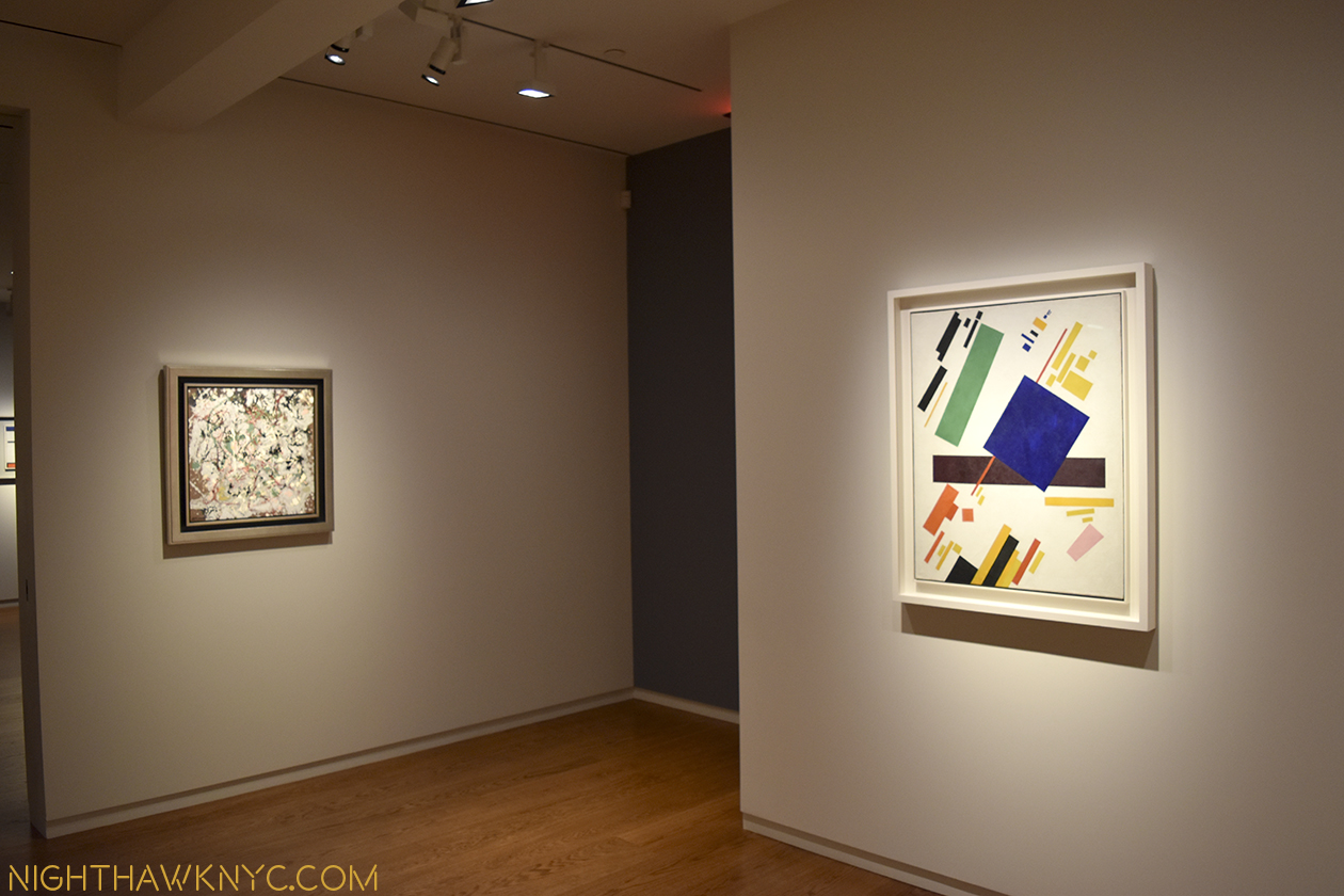
Pollock and Malevich. I don’t believe I’ve ever see them together! Why not?

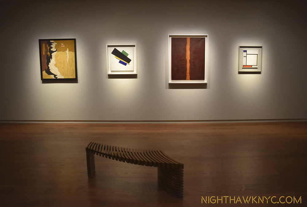
Franz Kline, Malevich, Barnett Newman and Mondrian. And, that bench!

As good as that show was, one Artist was not included…

Richard Pousette-Dart: The Centennial @Pace Gallery, East 57th Street, and Altered States: The Etchings of Richard Pousette-Dart @Del Deo & Barzune. This past June 8th would have been the 100th Birthday of Richard Pousette-Dart (RP-D for short), who died in 1992 at 76. An Artist who, I feel, has not yet been fully appreciated. June 8, 2016 would slip quietly by, but it turned out his 100th had not been forgotten. Pace Gallery 57th Street, opened a Centennial Show on September 6, (with RP-D’s wife and well known son, the musician, Jon Pousette-Dart in attendance). A symposium was held at the Whitney a few weeks later, a restored public work was unveiled downtown, and a revelatory show of his etchings at Del Deo & Barzune in the Flatiron District opened on October 6.

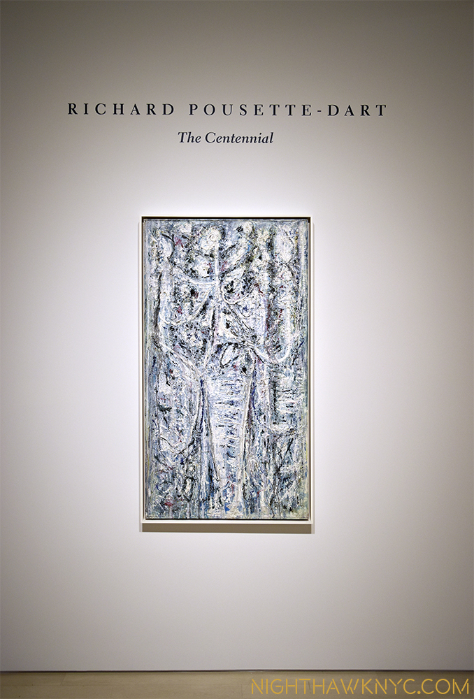
RP-D: The Centennial @ Pace, Uptown

Phew…My fears he’d be forgotten were assuaged. RP-D has become something of a “cause” for me. The more I see of his work, the more I’m baffled that he’s not (often) spoken of with his long time compatriots Jackson Pollock, Mark Rothko, Willem de Kooning, et al. I just don’t get it. For my money (and I have none personally invested), he’s every bit as good, and important, as any of them.

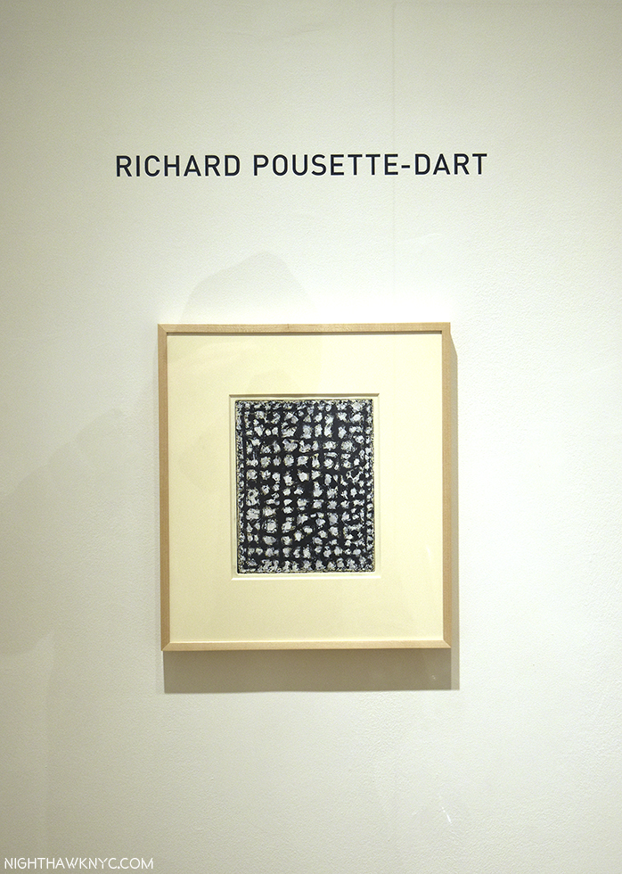
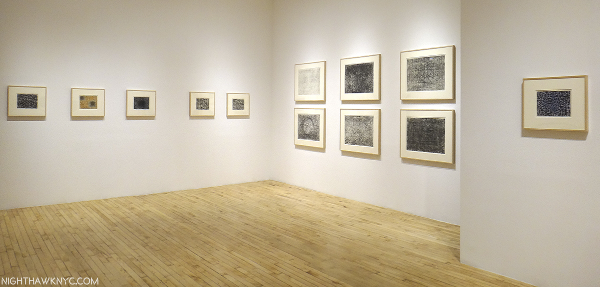
Altered States: The Etchings of RP-D @ Del Deo & Barzune

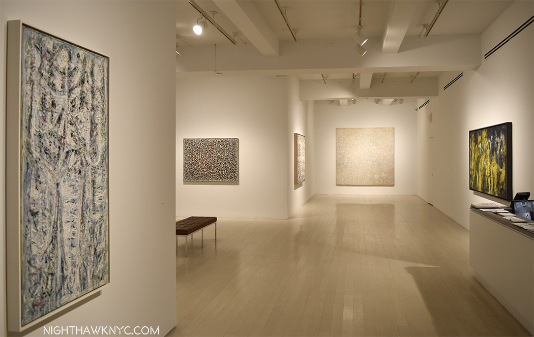
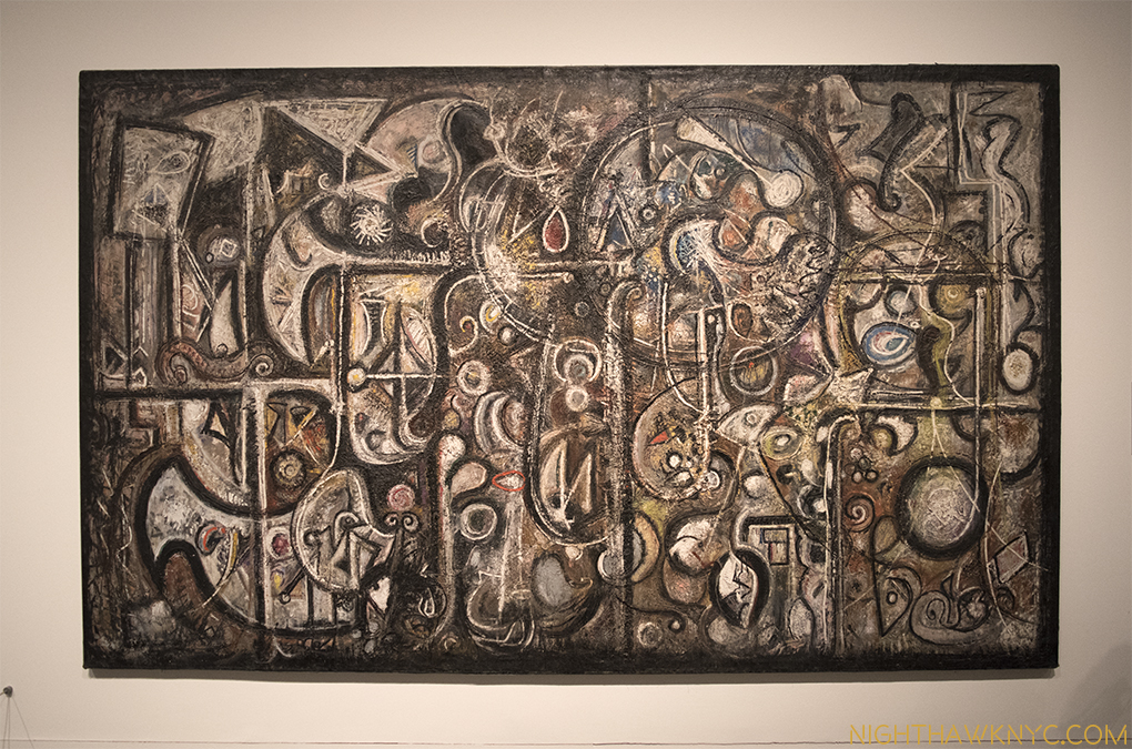
The show at Pace Uptown was nicely concise, giving a taste of the range of his stylistic development, which, for me, were a feast for the eyes. There is something wonderful about his work that allows it to work just as well in a small space (as the etchings prove), or in a large gallery at The Met’s newly rehung M&C Galleries. It’s so easy to get endlessly lost in either close study of his work, or at a distance. His compositions are among the most complex of the AbEx Artists, and his attention to detail borders on the staggering. You wonder how he ever finished one work, let alone as many as he did.

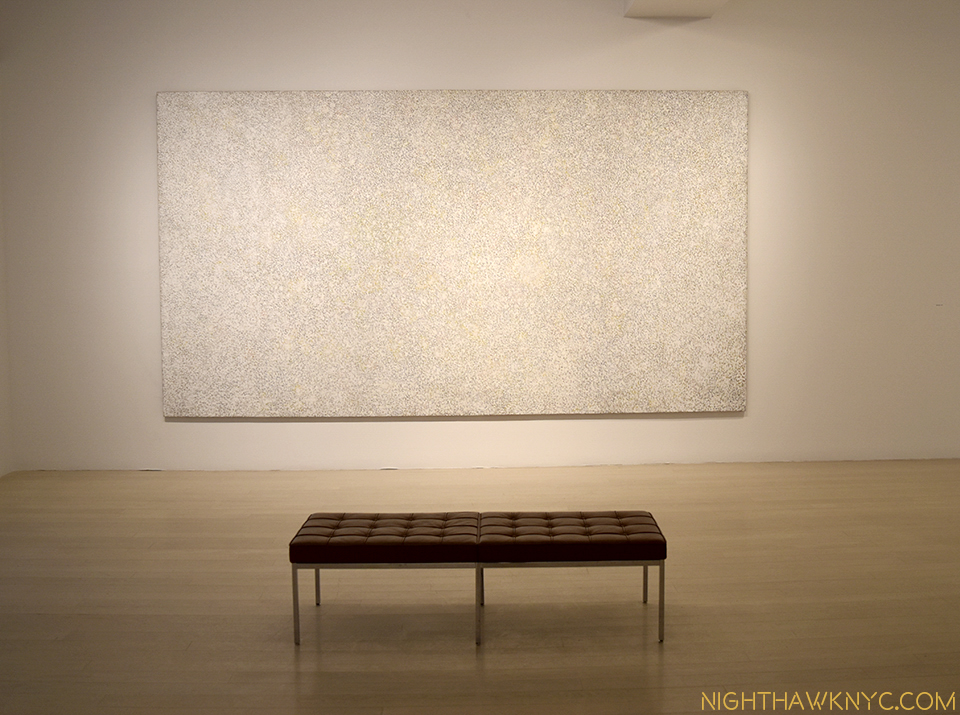
White Silence, 1974, 14 feet long, above. Hurry up and grab a seat before I sit there until they close.

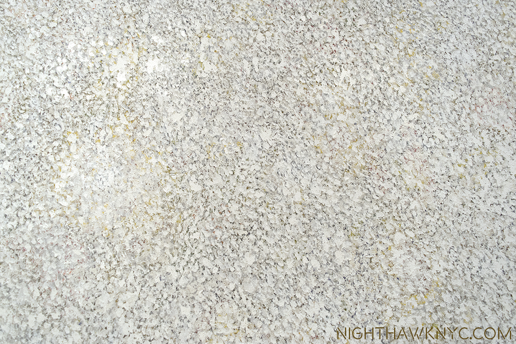
Detail. “…it’s full of stars.”

Astoundingly, RP-D was, also, one of Ai Weiwei’s teachers at The Art Student’s League (on West 57th Street, down the street from where Pace is now) from 1983-86. I have yet to hear, or read, him (AWW) speak about the experience.

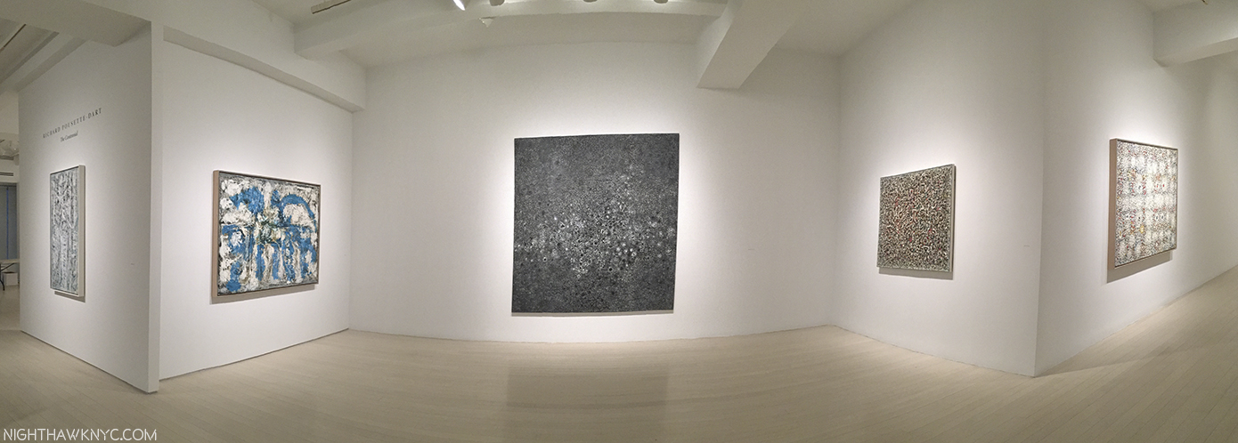
Installation view- Pace Gallery

Visiting the wonderful satellite show, with the prefect name, Altered States: The Etchings of Richard Pousette-Dart at Del De & Barzune in the Flatiron, the impression (sorry) is amended (as it always seems to be when one sees a work by RP-D he previously hadn’t seen), enhanced and refined. Here, his attention to detail is in just as full effect, and the results are even more (and even more sadly) unknown. The work on view is uniformly marvelous. They give the same effect as his larger painted masterpieces- ponder them from afar, or get lost in them up close. These are works you will look at for an entire lifetime and still see something new in them.  Long live Richard Pousette-Dart.

Just in time for RP-D, 100- Symphony No. 1, The Transcendental, 1942-42, now on view in the newly rehung Modern Galleries at The Met, 5th Avenue.

And, finally…a show I planned to write more about but haven’t, and just can’t let get away- Rembrandt’s First Masterpiece @ The Morgan Library. Worth the price of admission to see the figure of Judas in the 1629 painting, Judas Returning the Thirty Pieces of Silver, The Master did at age 23(!), the work that sealed his status as a “Master,” and which I haven’t as yet found an antecedent for in the prior history of Painting3

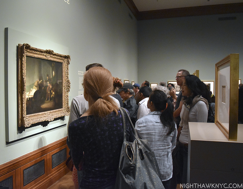
While you were waiting for a slight opening in the throng surrounding it, you were blessed with the rest of this one, large, room being chocked full of some of the greatest impressions of Rembrandt’s prints to be seen in this hemisphere.!

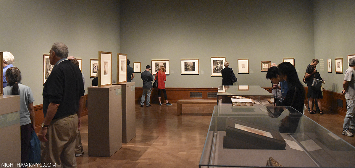
One half of the show.

I could think of worse ways of spending my time “waiting.” Like doing anything else, short of making love. So overwhelming were they that you were 3/4 of the way home before you realized you saw “only” one painting.

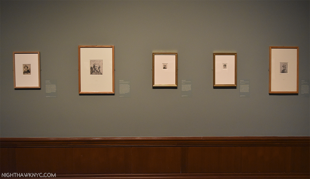
Murderer’s Row. If I could only have one work of Art for the rest of time? I’d take a Rembrandt painted Self-Portrait. So, I was floored to walk into this show and see no less than FIVE Rembrandt Self-Portrait etchings.

And then? The seas parted and lo and behold? THERE IT WAS! QUICK! SHOOT!!!

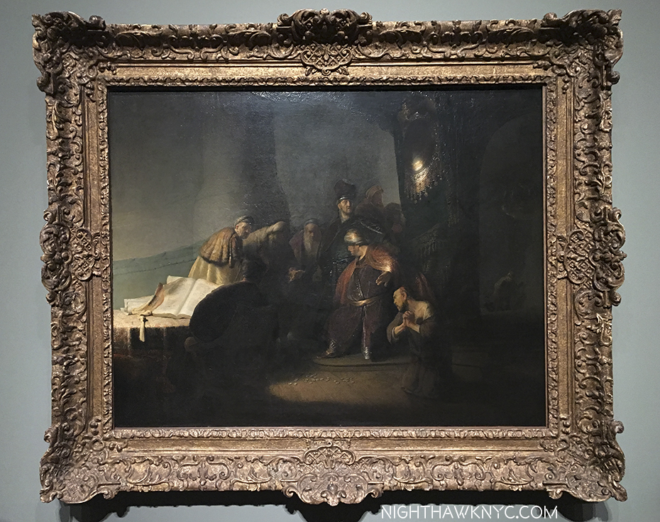
Judas Returning The 30 Pieces of Silver, 1629. Private collection. (i.e. Someone has this hanging on their wall. I felt a twinge typing that.)

Where was I? Oh yeah…”only” one painting here…That was immediately followed by the realization that with Rembrandt? The medium is not the message- The message is the message. it matters not which medium he chooses to work in. He created timeless Art in many mediums, Painting, drawing and prints, here. From what is called his “First Masterpiece,” (I didn’t say that)4, he lets it be known that he is someone that is, and will be, unprecedented in Art History, and earned the admiration of the diplomat, poet and great Art connoisseur Constantijn Huygens, who’s original diary, containing Huygens’ now immortal words about Rembrandt and “Judas,” which put the young Artist on the map, is here as well. Remarkable! Of “Judas,” Huygens writes in THIS very book(!)-

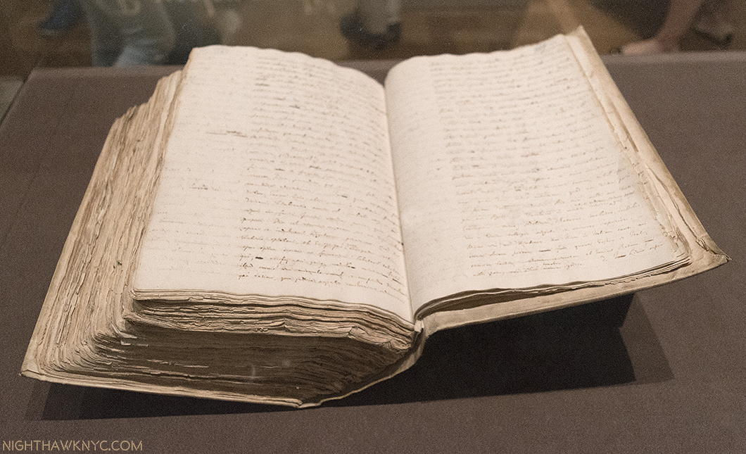
The Legend of Rembrandt begins here.

his Autobiography, written between 1629-31-

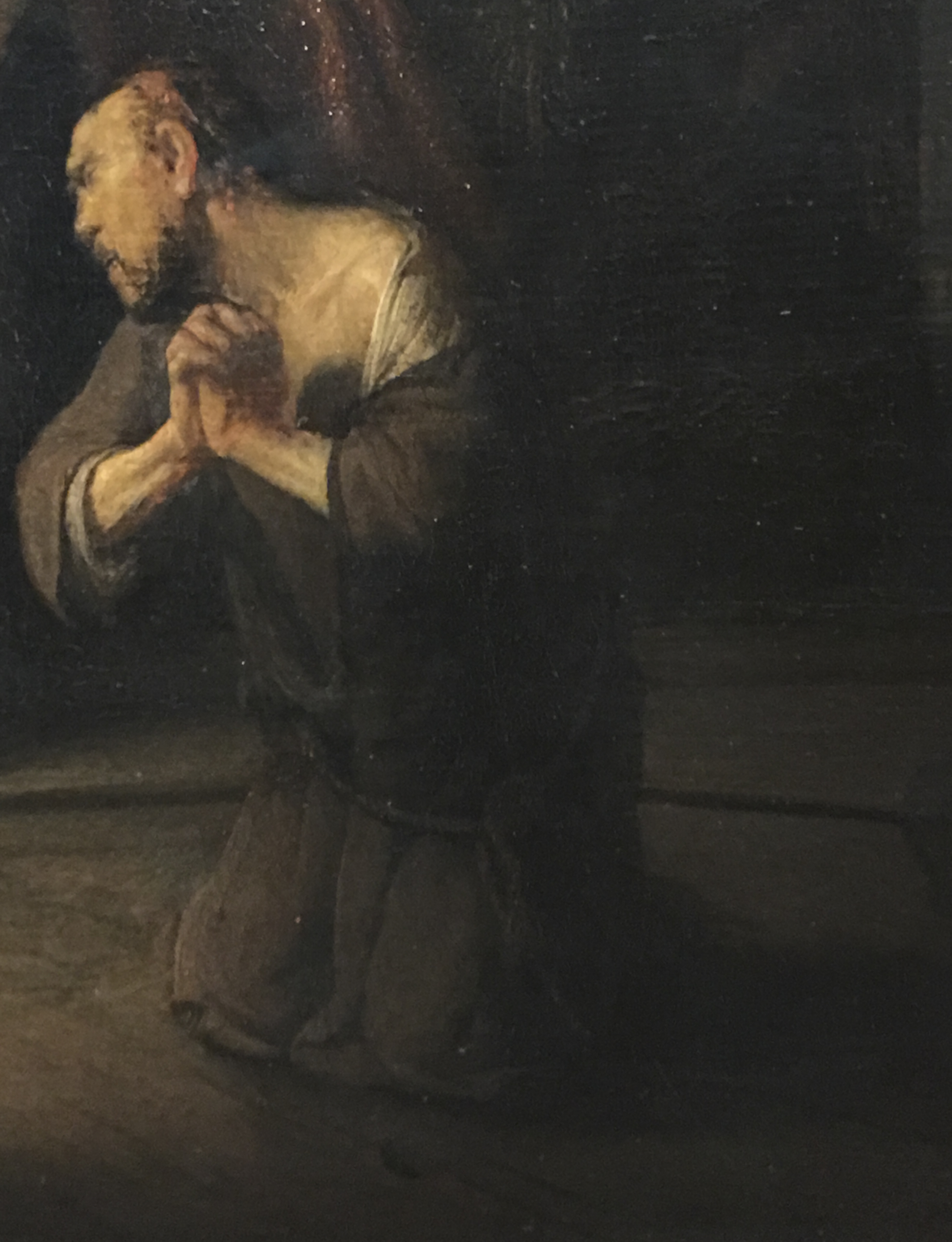
“Compare this with all Italy, indeed, with everything beautiful and admirable that has been preserved from the earliest antiquity. The singular gesture of the despairing Judas-leaving aside the many fascinating figures in this one painting-that one furious Judas, howling, praying for mercy, but devoid of hope, all traces of hope erased from his countenance, his appearance frightening, his hair torn, his garment rent, his limbs twisted, his hands clenched bloodlessly tight, fallen prostrate on his knees on a blind impulse, his whole body contorted in wretched hideousness. Such I place against all the elegance that has been produced throughout the ages.”

One of the most auspicious, calling cards in Art History…even 388 years later.

This “such” retains every bit of it’s power to awe onlookers nearly 400 years later as it did Mr. Huygens shortly after he created it, to the extent that it’s possible to see so much of what’s come after in this one figure, right up to Lucian Freud and Francis Bacon.

I give this show my award for the exhibition that went the furthest beyond above and beyond delivering on the advertised expectations. Any show that elicits an “Oh My God,” from it’s doorway as I first entered and it dawned on me what awaited and how undersold this show was has to be, at least, NoteWorthy, and at most, unforgettable.

As the new year begins? To any show with designs on winning that award this year, I say  “Bring It On!”

*- Soundtrack for this Post is “Puzzling Evidence” by David Byrne and recorded by Talking Heads on True Stories, which was accompanied by a movie and a book of the same name. The book contained photographs by William Eggleston, among others.

NighthawkNYC.com has been entirely self-funded & ad-free for over 7 years, during which over 275 full length pieces have been published!
I can no longer fund it myself. More on why here.
If you’ve found it worthwhile, PLEASE donate to keep it online & ad-free below.
Thank you, Kenn.

Written & photographed by Kenn Sava for nighthawknyc.com unless otherwise credited.
To send comments, thoughts, feedback or propositions click here.
Click the white box on the upper right for the archives or to search them.
Subscribe to be notified of new Posts below. Your information will be used for no other purpose.

  1. Continuing the continuum. Eggleston learned from Cartier-Bresson and Robert Frank, among others.
  2. holders of all of his copyrights
  3. “Agony” seems to be something avoided in Painting. To this time, Christ on the Cross was depicted “transcending” the physical agony, and Paintings of the so-called “Agony In The Garden,” invariably show Christ lost in meditation, prayer and deep, though possibly, pained, thought. If you know of an ancestor or influencer, please let me know.
  4. His early work is pretty darn stellar in my book. I’ve long had a love of this one in Boston, from 1628, one year before “Judas”, that is only 9 inches by 12 inches. Don’t be fooled by it’s apparently “simplicity.” Much is going on.

NoteWorthy Shows- November, 2016

This site is Free & Ad-Free! If you find this piece worthwhile, please donate via PayPal to support it & independent Art writing. You can also support it by buying Art & books! Details at the end. Thank you.

Written & Photographed by Kenn Sava (*- unless otherwise credited)

Things are reaching a fever pitch in the Galleries as the year end approaches, with nary a Black Friday Gallery sale in sight, allowing me to sleep in this year. Still, there was plenty to see and be Thankful for, along with the usual smattering of turkeys, but let’s get right to dessert, shall we? As in October, here’s my list, in no particular order, of what I found NoteWorthy in November. Once again, each one of these deserves a longer, in depth piece that I’m not going to have time to do, but I would be remiss in not mentioning them at all. November, also, marked the end of the world as we know it, so…

The world looks different…Brian Dettmer’s Western Civilizations 3, 2016. A “Book Sculpture.” More below.

Faberge from the Matilda Geddings Gray Foundation Collection @ The Met- Will the artist in modern history who is a greater craftsman than Carl Faberge please stand up and make yourself known to me? Thank you. While I’m waiting on that, this is the first show of the work of Faberge in New York since 2004. As small as one of the details on his timeless (and priceless) masterpieces, this show in a hallway at The Met is easy to miss (countless thousands do just that as they wait in line for the elevator to the roof, right in front of this very show). Ms Gray began collecting Faberge in 1933, when prices for his work were cheaper than they will ever be again. Money aside, Faberge combines the equally rare gifts of ingenuity, vision, craftsmanship and delight in works that are a century old but have lost none of their grace, beauty or charm. Scheduled to end on November 27, this show has been extended until 2021, giving you plenty of time to see it.

Imperial Lillies of the Fields Basket, 1896, Yellow & green gold, silver, nephrite, pearl, rose-cut diamond. This is considered THE most important Faberge piece in the USA. It was presented to the wife of Czar Nicholas at her visit to the Pan-Russian Exposition in 1896. This is only 7 1/2  x 8 1/2 inches!

Imperial Napoleonic Egg, 1912, gold, enamel, rose-cut diamond, platinum, ivory, gouache, velvet, silk. One of the infamous “Faberge Eggs,” this was presented by the Czar to his wife for Easter, 1912. Designed to commemorate the 100th Anniv of victory over Napoleon. This is 4 5/8 inches tall! The inside is solid gold, and holds…

a six-panel screen depicting paintings of six regiments she was an honorary colonel in.

Description in next photo. Click any photo in this Blog to see it larger.

Imperial Caucasus Egg, for Easter, 1893. This is 3 1/2 inches high!

Easy to miss, this is the whole show!

Joan Mitchell: Drawing Into Painting @ Cheim Read- Yet another good sized show of an Abstract Expressionist, “second generation” this time, and the most renowned female (Lee Krasner may be gaining on her) AbEx painter, right down the street from the blockbuster Mark Rothko: Dark Passage Show, it makes the perfect before or after bookend to it. I owned a Joan Mitchell print until a few years ago, so I lived with the energy and lyricism her work is known for. Looking around, her work is in most major museums, though it’s been 12 years since an American museum gave her a show. So, it’s been left to Cheim & Read to fill the gaps, and they’ve mounted Joan Mitchell shows every two years, or so, going back to the late 1990’s. This one does make for fascinating pairing with the Rothko show- they couldn’t be more different, while sharing what the scholars call Abstract Expressionism, I’ve heard some of the Artists, including Philip Guston, say they prefer the term “New York School.”

UNTITLED, 1958, oil on canvas

LA GRANDE VALLEE XVI POUR IVA, 1983, oil on canvas

UNTITLED, 1982. oil on canvas

Man Ray: Continued and Noticed @ Francis Naumann- It’s been too long between Man Ray shows. Readers already know my fondness for Man Ray. Francis Naumann Gallery opened 15 years ago with a Man Ray show, so they revisited him for this anniversary show and they did it in style. Man Ray was so prolific, and so prolifically diverse he can be hard to “sum up” in a gallery show, but this one was an out and out winner, a must see, especially for anyone who thinks of Ray as “only” a ground breaking photographer. While featuring a wonderful selection of his photos, portraits and “Ray-o-grams,” it also included his drawing, painting, sculpture, writing, and even no less than 2 Ray designed chess sets.

Paletteable, 1969

The great Man (Ray). Self-Portrait, 1948. A card under speaks of his concerns in his early work- “1) a defiance of artistic convention replaced by steadfast commitment to absolute freedom in the arts.” That says it all.

…and seen again. Autoportrait, 1917/70, Screen print on plexiglass. Really? Hmmm…

…and again. Self Portrait, 1914

Yes, that’s one of the chess sets Man Ray designed to the left of the chair.

Lampshade, center, surrounded by an astounding range of creativity.

Philip Guston: Laughter in the Dark, Drawings from 1971  & 1975 @ Hauser & Wirth- There was no more auspiciously timed show than this one which not only brings us the 73 drawings Philip Guston selected for his Poor Richard series but 100 additional drawings that didn’t make the cut and 3 wonderful paintings that are related or have relevance to them. Opening exactly 4 months after Hauser’s last Guston show, it would be very very hard to find work more different than those in seen in Philip Guston Painter, 1957-67, which I wrote about here, perhaps the “darkest” of his career, in many ways. Though the show’s title refers to the presence of “laughter” here, make no mistake it is more than tinged with darkness, especially because viewing them now, we know how things turned out for Nixon. These were dark times for the country, and many of these drawings were Guston’s “at the moment” reaction to unfolding events. Even before Watergate, the Nixon Presidency was not without a sizable opposition, for more reasons than the seemingly endless war in Vietnam. Everything about Nixon rubbed many people the wrong way, and provided a brilliant Artist ample fodder for “political satire” of the highest order. Most interestingly, for me, these are works in which Guston turns his focus outwards for, perhaps, the only time in his post 1940’s career. Poor Richard was published in 2001 and is still in print. You can see it here.

The 73 drawings that Guston selected for Poor Richard are shown, here (and below), together.

Title Page. Guston Depicts Nixon with VP Spiro Agnew (triangular skull), Attorney General John Mitchell (with his pipe) and Advisor Henry Kissenger (as glasses) as the cast of characters

Guston’s series begins with young Richard Nixon.

Jeff Elrod: This Brutal World @ Luhring Augustine- Chelsea & Brooklyn Galleries. It pains me not to write a longer piece on this. Jeff Elrod has been at the cusp of reinventing painting by combining digital drawing and computers with the end result of that stage outputted to canvas.where it may, or may not be combined with analog, old fashioned painting (at least those on display here). Dealing with blurriness from my recent eye treatment, my initial reaction was, “Hmmmm…If I close my right eye, my good eye, this is how the world looks to me these days.” But, I was drawn back repeatedly, even compelled to make the (unheard of for me) trip to Brooklyn to see the Bushwick segment of this show. In both locations, the effect was the same- I couldn’t get them out of my mind. They’re like something you see when you’re not really looking, or when you’re not fully awake after dreaming, or about to fall asleep…My initial reaction was “This looks easy to do on a computer. Take a photo, blur the heck out of part of it in Photoshop. Add a layer of a frenzied drawing and output to canvas. Then, I remember people say the same thing about Pollock and Rothko, yet no one else has done them. Some works remind me of passages of Monet, some of Yves Tanguay. But not really. They weren’t created like those were and so they don’t look like anything else. Mr. Elrod’s work commands some fancy prices. Ah well…They’re much too big for my place, anyways. If there’s a “cutting edge” in painting in 2016, Jeff Elrod’s work is the closest I’ve seen to being on it. I’m very much looking forward to seeing where this is going.

Auto-Focus, 2016 UV Ink on Canvas 9064 inches. Mystifyingly alluring.

Rubber-Miro, 2015 Acrylic and UV Ink on canvas. His uniquely shaped canvases give the work a different feel from most square/rectangular paintings.

Rake-Adaptable, 2016 UV Ink on FIscher canvas. The ghost of Robert Motherwell? “Haunting” is a word his work brings to my mind most often.

Under The Skin, 2016 UV Ink on canvas, 108 x 84 inches.

Plume, 2016 as seen in Bushwick, Brooklyn. 16 1/4 feet long by 9 1/2 feet tall.

After countless visits, I began to “see” “Jeff Elrods” everywhere I went. Like here-

Life Mirrors Art.

Brian Dettmer: Dodo Data Dada @ P.P.O.W. Mr. Dettmer creates “Book Sculptures,” something new to me. As far as I can tell, he takes a scalpel to a book, or books, and carves away all but what he wants to remain. I’ve never seen anything quite like it.

Funk and Wag, 2016. As in, the whole encyclopedia.

Ew Ass, 2016

PostScript.- And meanwhile, over at Gagosian, Richard Serra’s MASSIVE Every Which Way, 2015, all 16 slabs of it was coming down, making way for the next show there…

Richard Serra, Every Which Way, 2015 @ Gagosian

*-Soundtrack for this Post is “It’s The End Of The World (As We Know It)” by Michael Stipe, Mike Mills, Peter Buck and Bill Berry of R.E.M. and published by Warner/Chappell Music, Inc and Universal Music Publishing Group, from their 1987 album “Document.”

NighthawkNYC.com has been entirely self-funded & ad-free for over 8 years, during which 300 full length pieces have been published! If you’ve found it worthwhile, PLEASE donate to allow me to continue below. Thank you, Kenn.

You can also support it by buying Art, Art & Photography books, and Music from my collection! Art & Books may be found here. Music here and here

Written & photographed by Kenn Sava for nighthawknyc.com unless otherwise credited. To send comments, thoughts, feedback or propositions click here. Click the white box on the upper right for the archives or to search them. Subscribe to be notified of new Posts below. Your information will be used for no other purpose.

NoteWorthy Shows-October, 2016

As a counterpoint to my longer pieces on big shows, here’s something else-  shorter looks at some especially Noteworthy Shows that I’m not going to have the time to do the full pieces on that they each deserve, but that I want to bring to your attention.

Post-Labor Day has seen things quiet down on the NYC Museum show scene, after an insanely busy summer. The action has turned to the galleries. Here are some shows I saw recently that I was especially impressed with, in no particular order-

Ethan Murrow: Water Almanac” @Winston Wachter. A show of very large drawings(!) about the folly of man trying to control nature, many featuring water, shown in a space that was partially submerged almost 3 years ago after Hurricane Sandy, destroying some of Mr. Murrow’s work. When I pointed out the irony of it to him, he responded, “At least they weren’t people,” he said referring to his lost work. When I asked him why he draws instead of paints he spoke of the minimal amount of materials necessary. His work has wonderful elements of the Surrealism of Max Ernst and Bruce Conner that he makes seem everyday real world.

"Deluge Estimator," 2016, graphite on paper

Ready for the next Sandy? Hmmm… “Deluge Estimator,” 2016, graphite on paper

Ethan Murrow (in orange shirt) at his opening.

Ethan Murrow (just to the left in orange shirt) at his opening.”Hail Cannon Rainmaker,” 2016, graphite on paper, 60 x 48 inches, right.

"To Redirect the Tempest," 2016, graphite on paper

“To Redirect the Tempest,” 2016, graphite on paper, 52 x 72 inches

Meleko Mokgosi: Democratic Intuition” @ Jack Shainman Gallery. I’d write something about this, if I could ever finish looking at it and thinking about it.

img_6684pnh4

“Democratic Intuition- Comrades II,” a very large work

And seen at the show's 2nd location.

And as seen at the show’s 2nd location.

Sol LeWitt” at 3 Paul Cooper Gallery Locations, Pace Prints, and The Met. Yes, no less than 5 simultaneous shows featuring Lewitt’s drawings, scultpture, photography, collages, prints and, suddenly ubiquitous wall drawings (not to mention the permanent one on view in the NYC Subway at 57th Street & Columbus Circle!).

"Complex Form #65," 1989, painted wood, 59 x 38 x 40 inches, in front of "Wall Drawing #368" @ Paula Cooper.

“Complex Form #65,” 1989, painted wood, 59 x 38 x 40 inches, in front of “Wall Drawing #368” @ Paula Cooper.

Detail

Detail

"Wall Drawing #370" as seen at The Met

“Wall Drawing #370” as seen at The Met

“Alexi Torres: Sun Light” @ UNIX Gallery. No mere photo-realistic interpretations of source photos here. Visions- exquisitely executed.

"Sun Light-Ernesto," 2016, oil on canvas

“Sun Light-Ernesto,” 2016, oil on canvas, 72 x 68 inches

"Sun Light-Miguel," 2016, 84 x 80 inches, oil on canvas

“Sun Light-Miguel,” 2016, , oil on canvas, 84 x 80 inches

dsc_8734pnh

Detail

Miguel- Source Photo

Miguel- Source Photo

Robert Currie in “Mind Storm” @ Bryce Wolkowitz. A name new to me. As close as I can gather, Robert Currie applies paint to monofilament thread in rows, which can be seen from the side, or in their reflections, below the works. The image can only really be seen from directly in front. Somehow, they still manage to evoke the sense of the place as well as the sense of a bygone era.

Installation View

Installation View

"17,820cm of nylon monofilament and acrylic," 2016. That's 590 feet.

Entitled- “17,820cm of nylon monofilament and acrylic,” 2016. That’s 590 feet of it in a work that’s 12 x 16 x 5 inches.

dsc_8790pnh

Side view

Fahamu Pecou: #BlackMatterLives” @Lyons Wier Gallery. Prolific and multi-talented, this could be a breakthrough show for him. Powerful. Gorgeous rawness. Present tense.

dsc_9124pnh

“Even In Darkness,” 2016, acrylic, spray paint, gold leaf on canvas, 60 x 48 inches

"Ultimate Yello Brick," drawing

“Ultimate Yello Brick,” 2016, graphite and iridescent ink on paper

And- “diane arbus: in the beginning” @ The Met Breuer. Memorable as much for the show’s content as for it’s innovative display, Ms. Arbus’ beginnings show the Artist’s eye fully formed. Each of the 100 plus images on view is given it’s own wall- a side of a “mini-pillar” that allows the viewer to move through the show any which way they want to. Ingenious and ground-breaking, it’s more a case of The Met showing off it’s construction capabilities and resources more than “why didn’t anyone else think of this before?”

There is no "recommended" way to see this show.

There is no “recommended” way to see this show.

Especially noteworthy for me was a photo of my late friend, the legendary Stormé DeLarverie,, titled Miss Stormé DeLarverie,The Lady Who Appears to be a Gentleman, NYC, 1961. I knew Storme during the final decade of her life, and she had told me that Diane Arbus had photographed her, though I had not previously seen it. I took it with a grain of salt, given to tall tales as she was on occasion (will we ever know if she really was the “cause of,” or started, the Stonewall Uprising, not “Riot”, which I heard her claim she was?). But, there she is, sitting elegantly on a park bench in 1961, immortalized for all time, in the permanent collection of the Metropolitan Museum of Art, and on view as part of this very good show at The Met Breuer. Diane Arbus had one of the greatest eyes in photography.

Storme, in full effect in 1961. 45 years before I would meet her.

Stormé, in full effect in 1961. 45 years before I would meet her.

Some of these shows are still up, some have just closed. And somewhere the singer is saying…

“’cause no one knows about a good thing
Until a good thing is gone.”

R.I.P- Stormé DeLarverie,. Get home safe, my friend.
*- Soundtrack for this Post is “No One Knows About A Good Thing” by Curtis Mayfield and Daryl Simmons, from Mayfield’s album “New World Order,” and published by Warner- Tamerlane Publishing Corp.

NighthawkNYC.com has been entirely self-funded & ad-free for over 7 years, during which over 275 full length pieces have been published!
I can no longer fund it myself. More on why here.
If you’ve found it worthwhile, PLEASE donate to keep it online & ad-free below.
Thank you, Kenn.

Written & photographed by Kenn Sava for nighthawknyc.com unless otherwise credited.
To send comments, thoughts, feedback or propositions click here.
Click the white box on the upper right for the archives or to search them.
Subscribe to be notified of new Posts below. Your information will be used for no other purpose.