NYC’s Museums Are “Temporarily Closed”- UPDATED

Written & Photographed by Kenn Sava

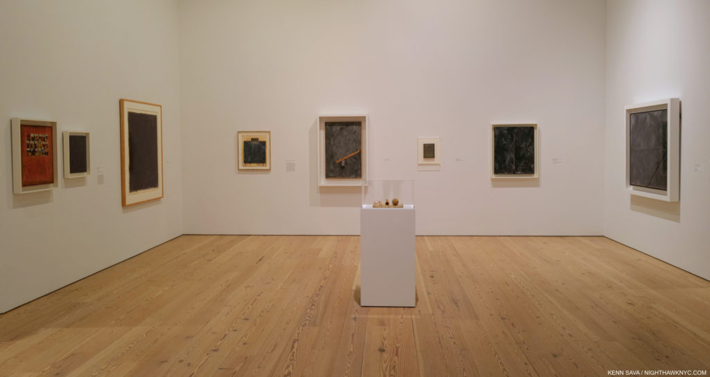
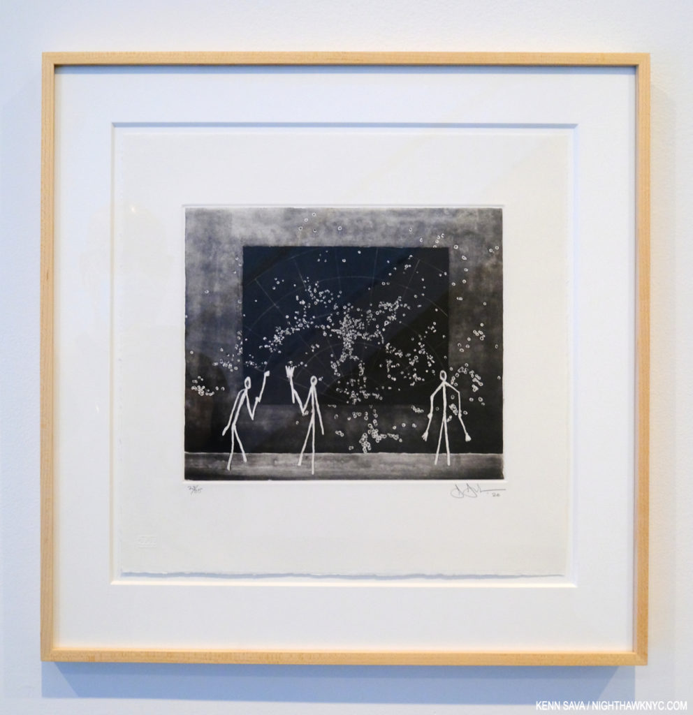
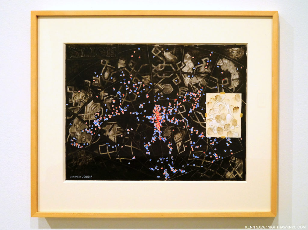
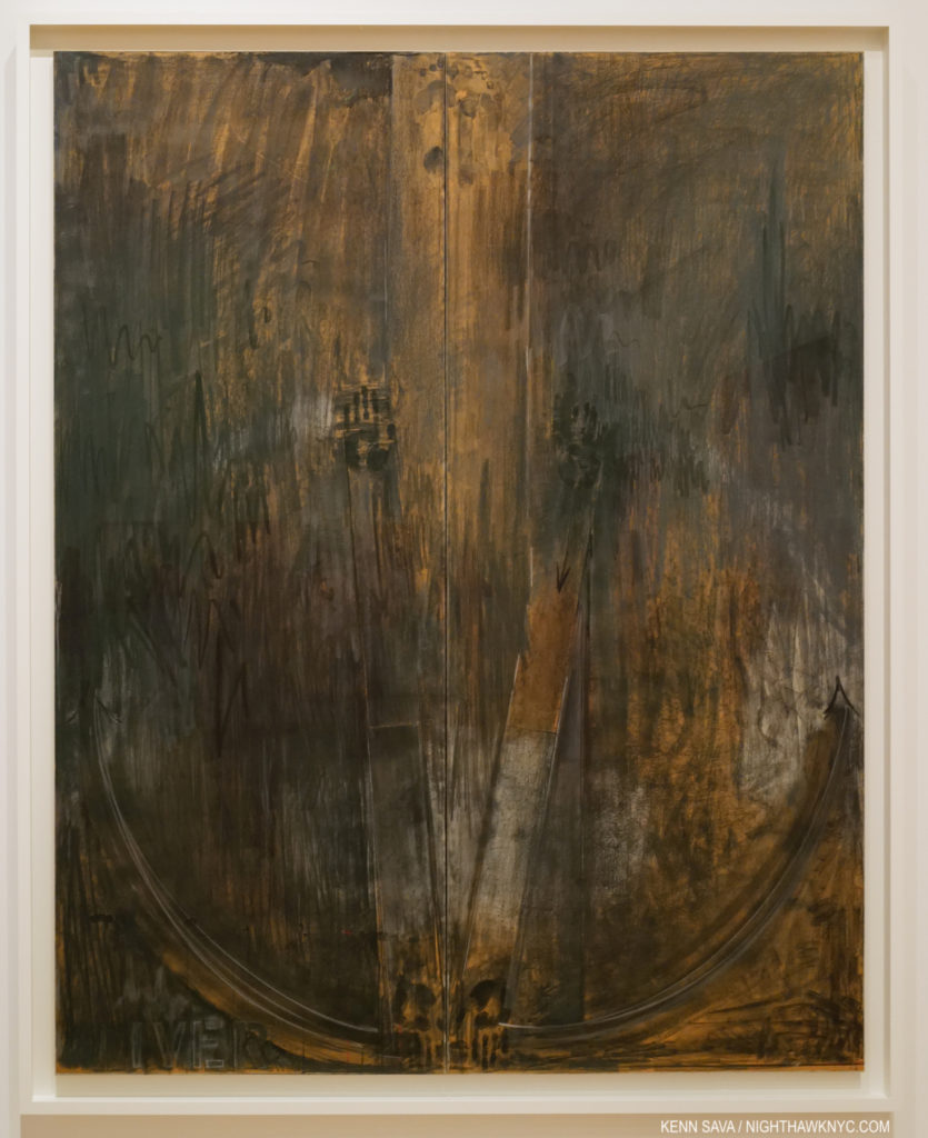
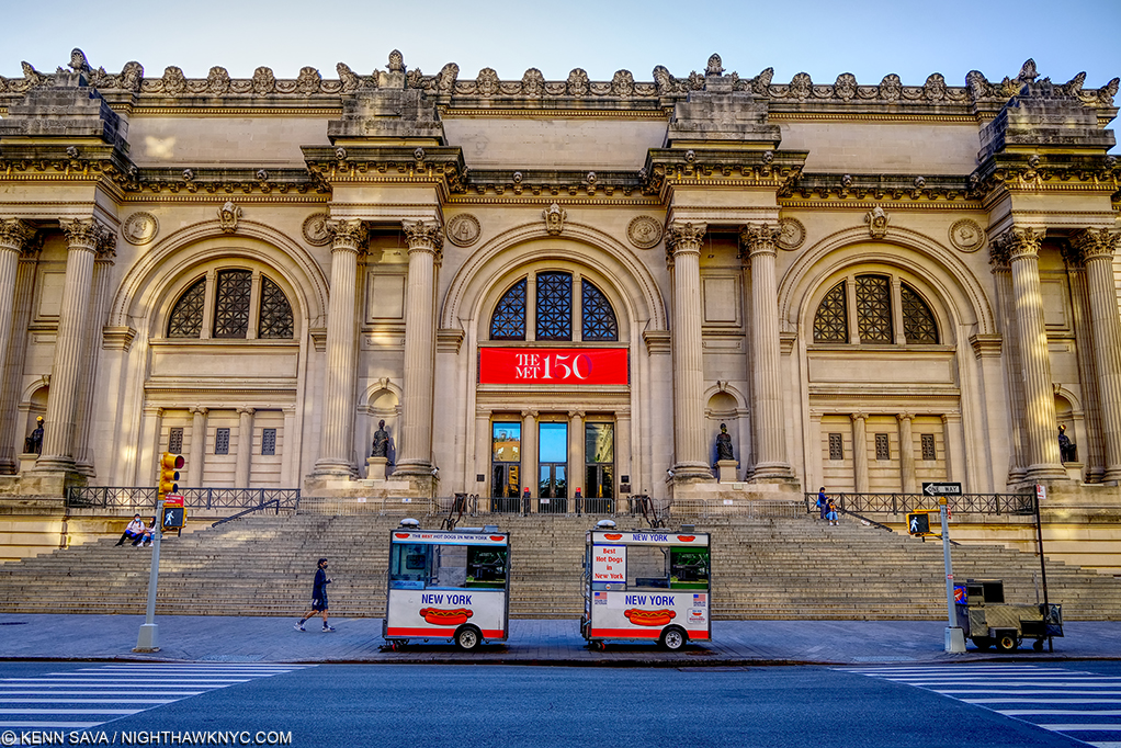
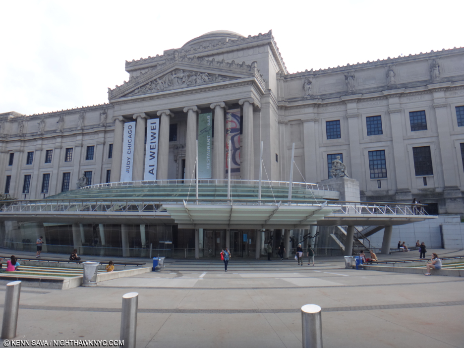
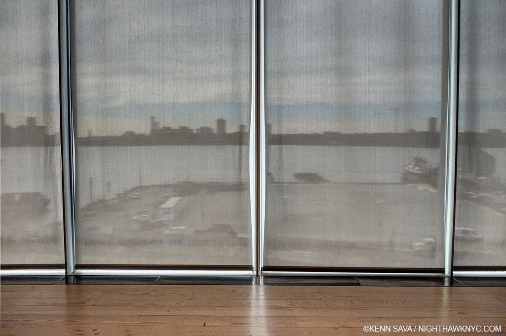
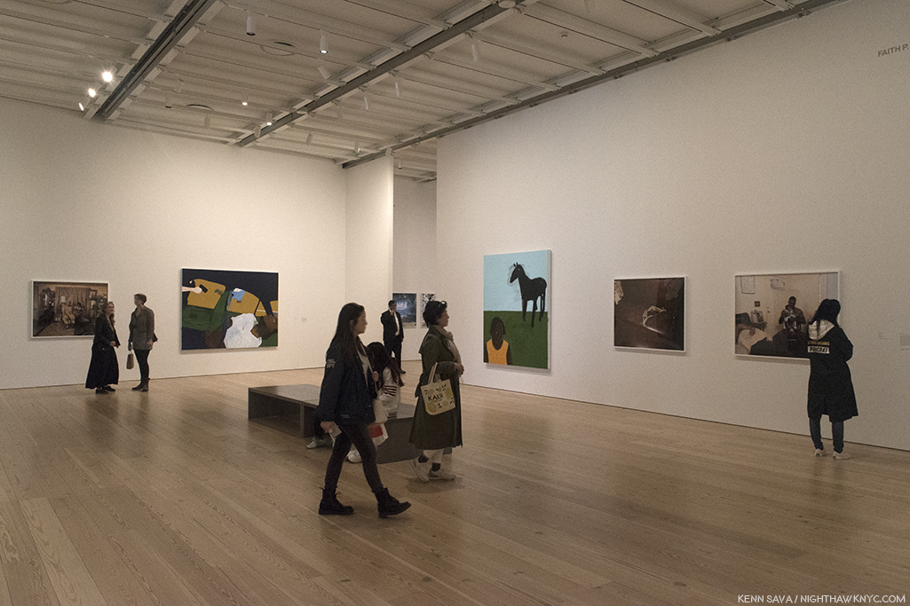
Tonite, as I write, all of Manhattan’s “Big Five” Art Museums and the Brooklyn Museum are “temporarily closed” due to concerns over the coronavirus, marking the first time this has happened since 9/11.

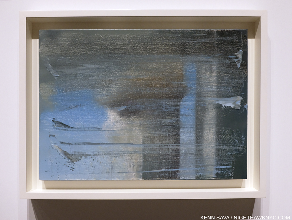
Gerhard Richter, September, 2005, Oil on canvas. The Artist created this four years after 9/11. Seen at Gerhard Richter: Painting After All on March 12, 2020, the final day The Met Breuer was open before its “temporary closing.”

Extraordinary measures for extraordinary times. 

Unfortunately, this comes at a moment when there are a number of important shows going on including-

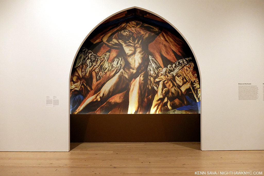
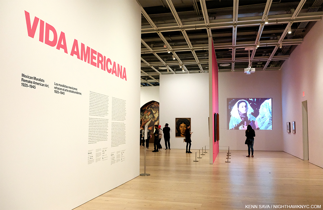
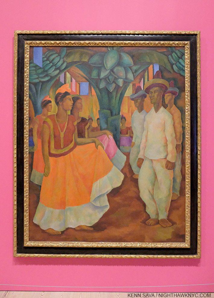
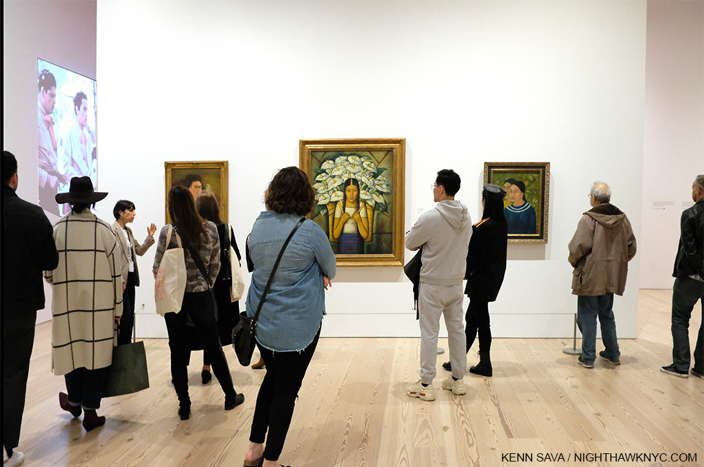
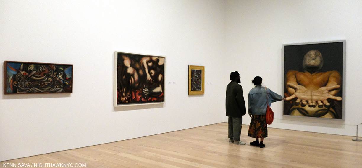
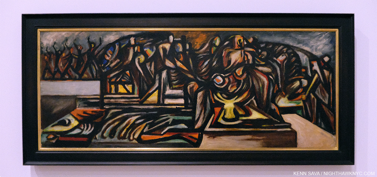
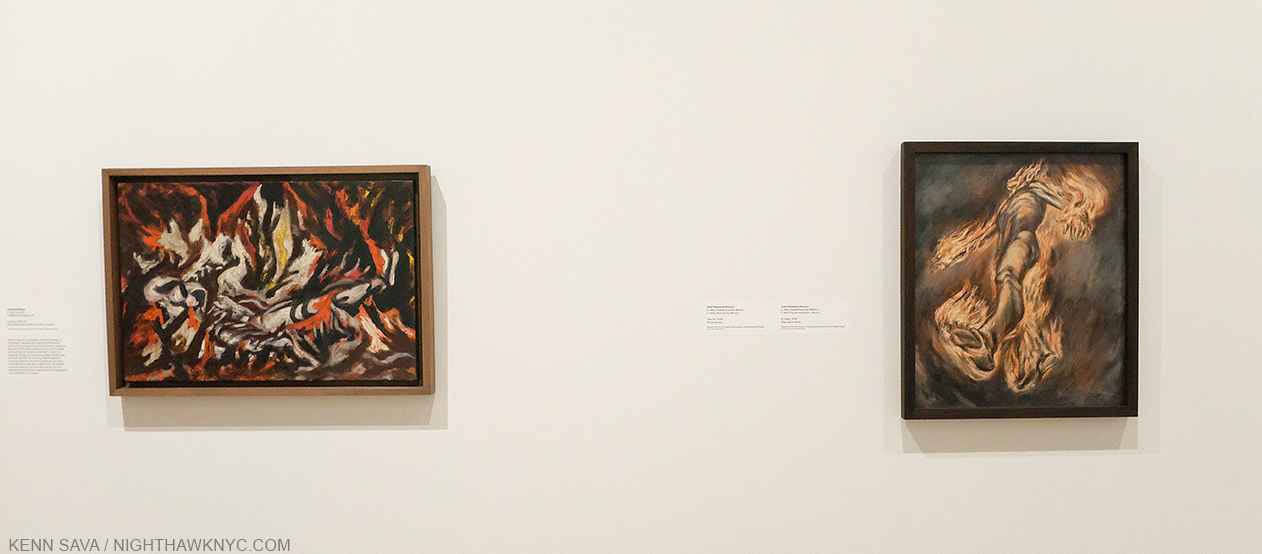
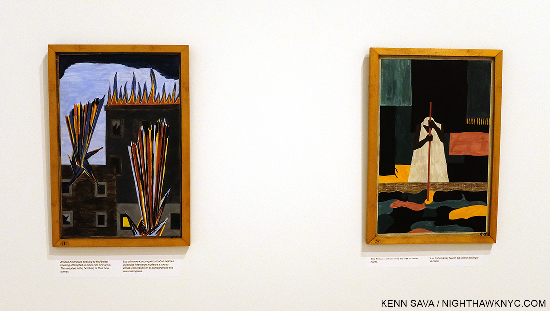
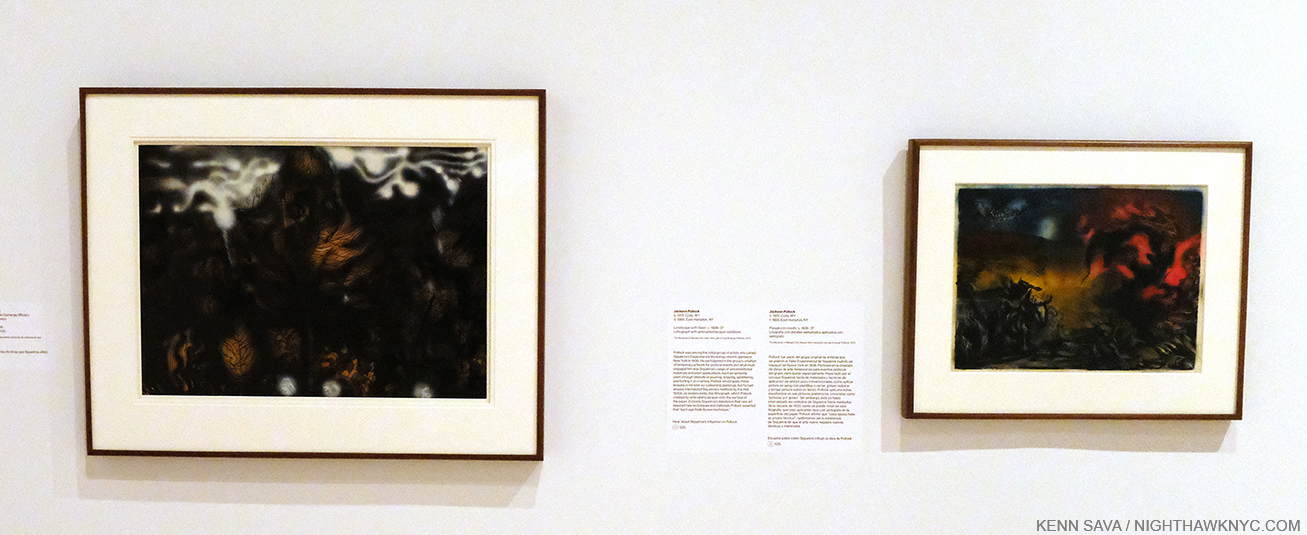
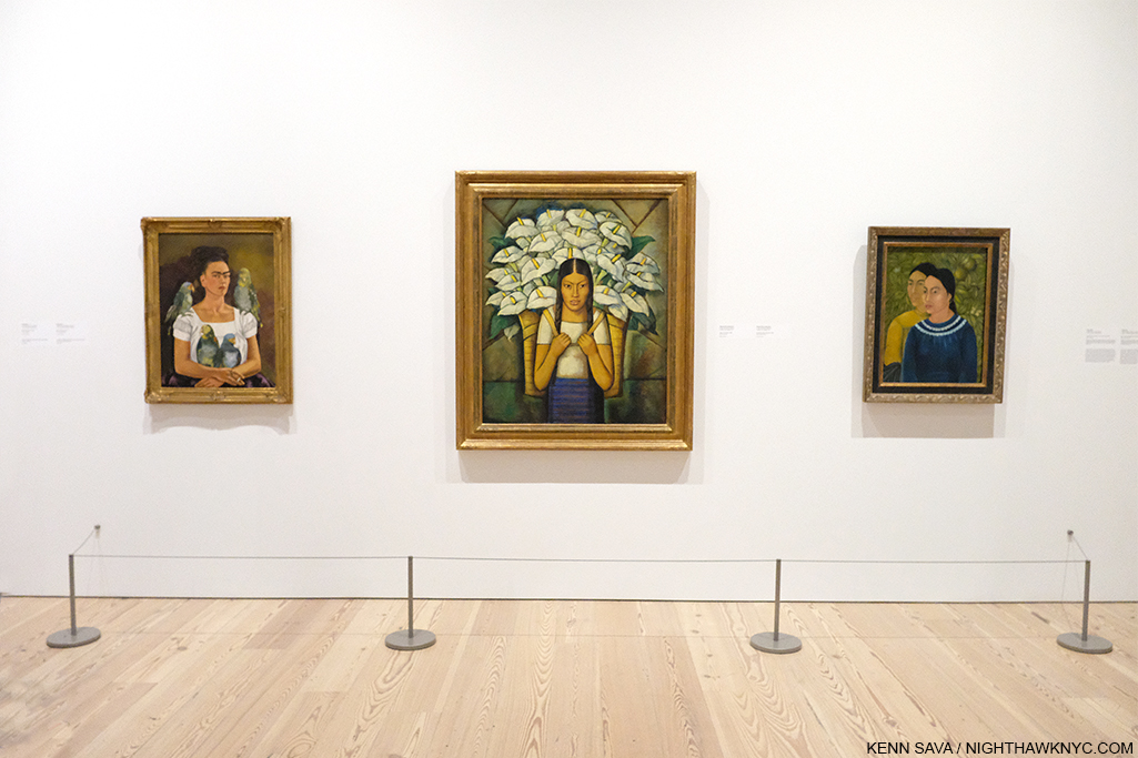
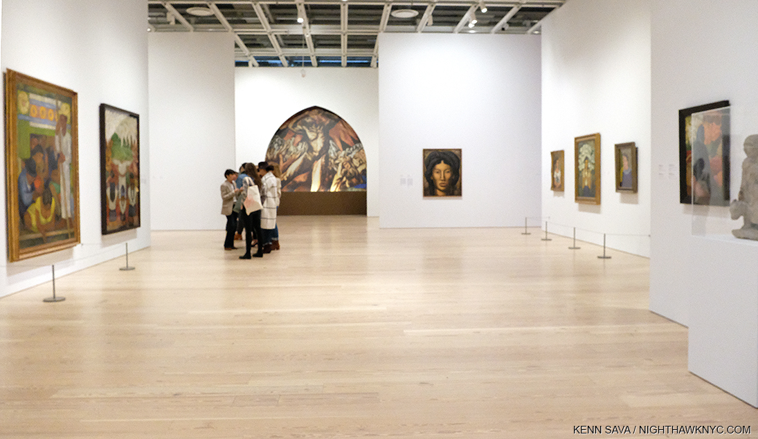
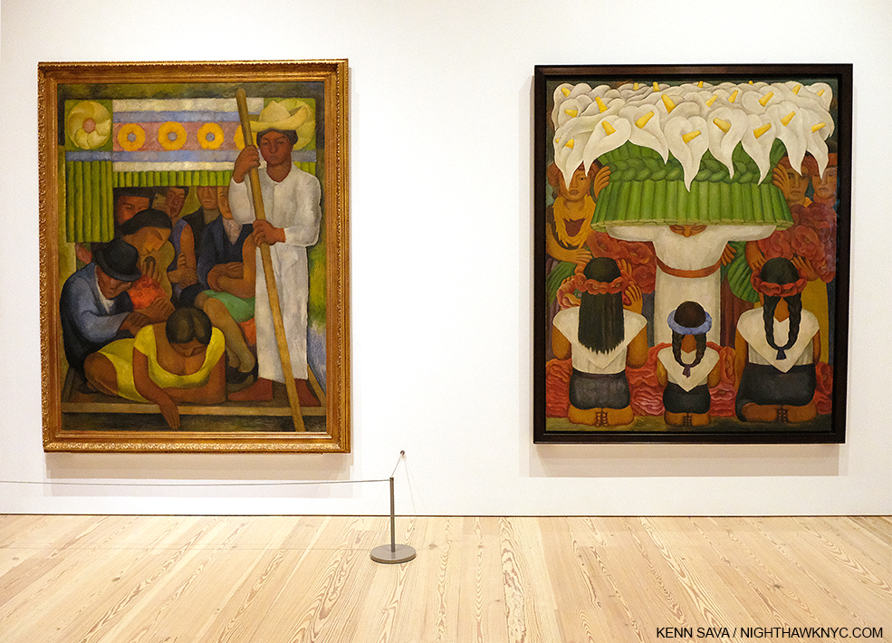
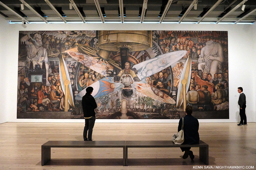
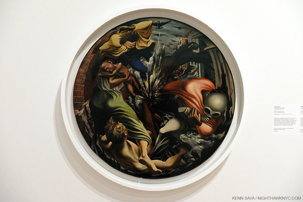
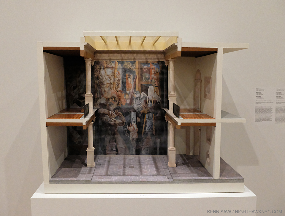
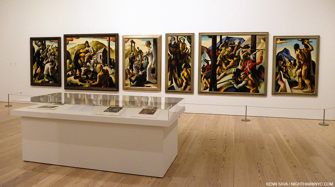
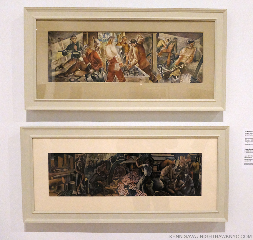
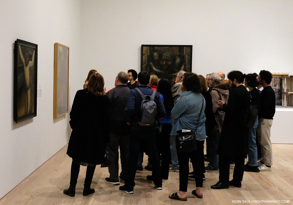
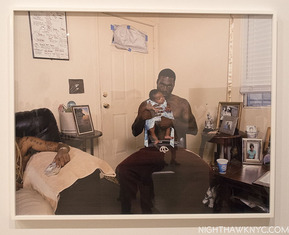
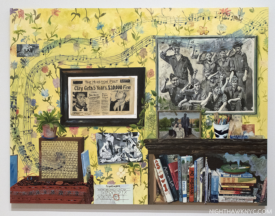
Vida Americana: Mexican Muralists Remake American Art, 1925-1945 at the Whitney Museum

Dorothea Lange and Donald Judd at MoMA

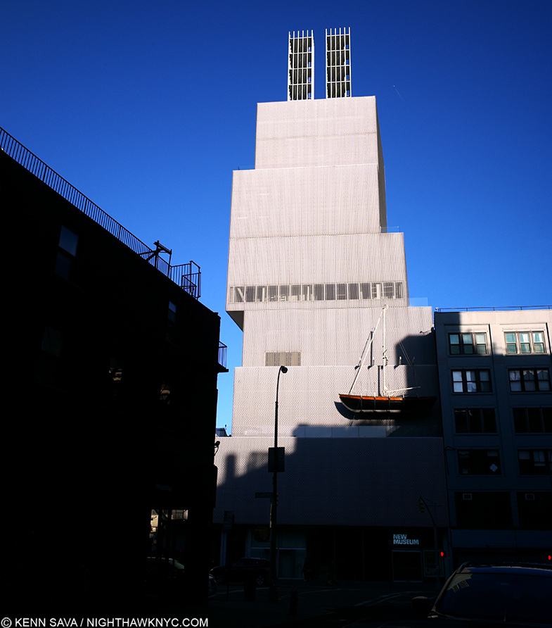
Jordan Casteel and Peter Saul at the New Museum

Gerhard Richter: Painting After All at The Met Breuer

each of which only recently opened. 

I was able to see both Vida Americana and the Gerhard Richter this week before their sudden closings, which came without notice, and while I mull them over, I will say it would be a real shame if the closures turn out to be extended and prevent more people from seeing both of these shows, though of course, the health and wellbeing of visitors and staff must come first. In particular, Vida Americana is, perhaps, the most important Painting show I’ve seen in an NYC museum since Kerry James Marshall: Mastry graced The Met Breuer in late 2016 to 2017. 

The Gerhard Richter show, while a terrific feat of curating by Sheena Wagstaff and her team in bringing in major works from all over which are very handsomely hung, offers an opportunity to see his work through the eyes of our time and in light of both what has come since, as well as what has been discovered about what was done before and during his time by Artists who were in eclipse for too long. In my opinion, Mr. Richter, perhaps a bit like Andy Warhol, winds up with quite a few works that don’t seem to have aged all that well and it will be interesting to see if the future finds these works speak to them. There are other works who’s gravitas is plain- like the exceptional Birkenau series, (unforgettably installed adjacent to 4 incredibly rare surviving Photos taking inside Auschwitz II Birkenau by a member of the Sonderkommandos), the beautiful Forest series, and a number of fine works that seem to have been overlooked thus far. This show is a great opportunity for each viewer to assess, or reassess, for themself.

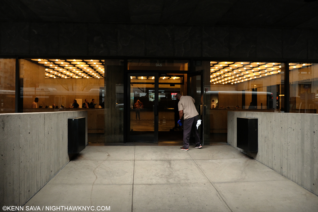
5pm, March 12, 2020. Minutes before closing at The Met Breuer, a staff member is still busy cleaning the doors. When they’ll get opened again to the public is anyone’s guess. I heard one guard say to another, “See you May 1st.” Was that his guess? The Gerhard Richter show is scheduled to open at MOCA, L.A. on August 15th, making it unlikely to be extended in NYC.

Here’s hoping the closings will be brief. But, if they are not, and, with the postponing of a number of Art & Photography shows this past week around the country, how long will it be before the galleries follow suit? In addition to any and all of the other effects it may have, all of this makes me wonder what the effect of the coronavirus may wind up being on the Art world, and the Art market, which has seen an unabated, meteoric, rise over the past three decades. 

In the meantime, stay healthy out there.

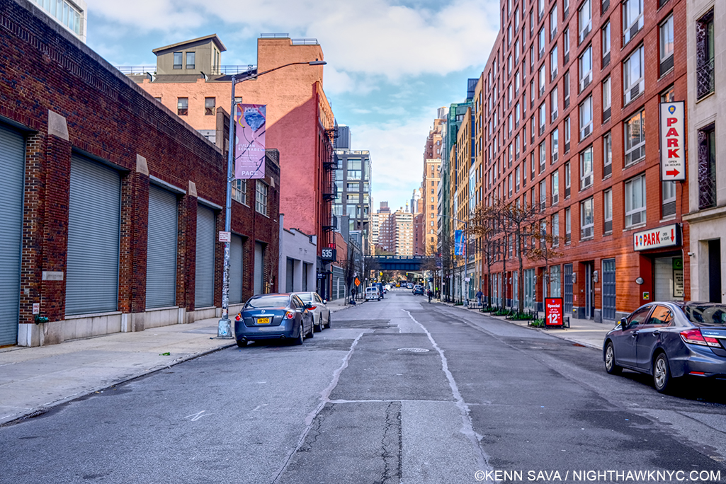
Mid Tuesday afternoon, March 17, 2020. Normally, West 24th Street in the gallery district of Chelsea would see a steady stream of foot and vehicular traffic going to the galleries lining both sides of the street from end to end. Today? I could have safely laid down to take this shot.

UPDATE- March 13th, one day later. Many, even most, of the NYC galleries have announced either closures or “open by appointment only.”

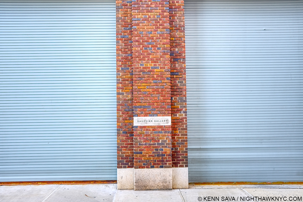
Gagosian on West 24th Street, scene of Jonas Wood’s latest NYC show, would normally be open.

While I expect many other non-Art businesses to close temporarily in the near future, a good many, especially smaller, businesses would be in extreme financial peril if they were to close for an extended time, particularly in the never more expensive NYC business environment.

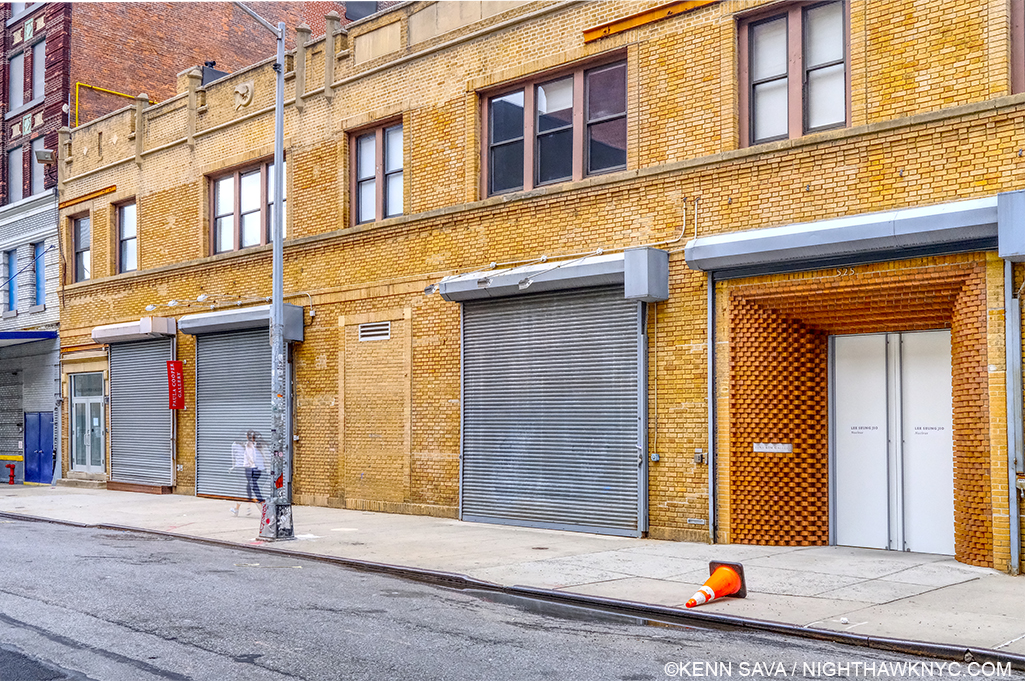
The scene over on West 21st Street. The terrific Sarah Sze show was here late last year. Today, that jogger doesn’t have to worry about running into anyone, and the street looks like it did before the galleries came here.

It’s hard not to think about how that reflects on the “Art business.” It also makes me wonder how these “appointment only” galleries know the health status of whoever they are choosing to let in, among other things.

NighthawkNYC.com has been entirely self-funded and ad-free for over 6 years, during which over 250 full length pieces have been published. If you’ve found it worthwhile, you can donate to keep it going & ad-free below. Thank you!

Written & photographed by Kenn Sava for nighthawknyc.com unless otherwise credited.
To send comments, thoughts, feedback or propositions click here.
Click the white box on the upper right for the archives or to search them.
For “short takes” and additional pictures, follow @nighthawk_nyc on Instagram.

Subscribe to be notified of new Posts below. Your information will be used for no other purpose.


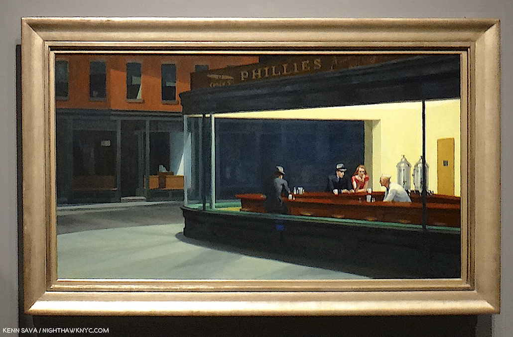
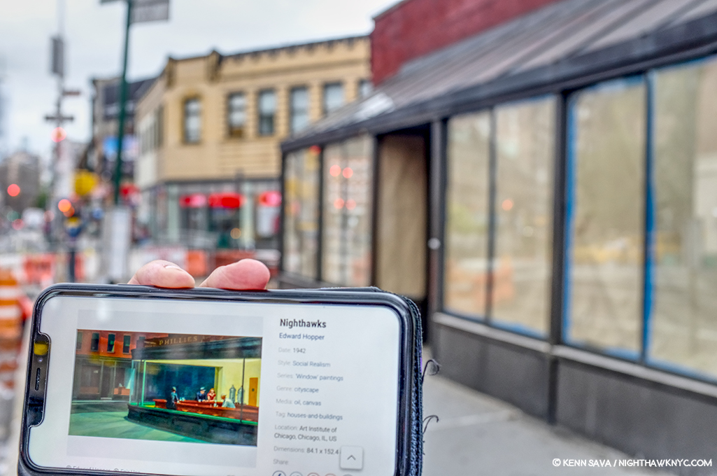
My Search For Edward Hopper’s Nighthawks Diner

Written & Photographed by Kenn Sava (*unless otherwise credited).

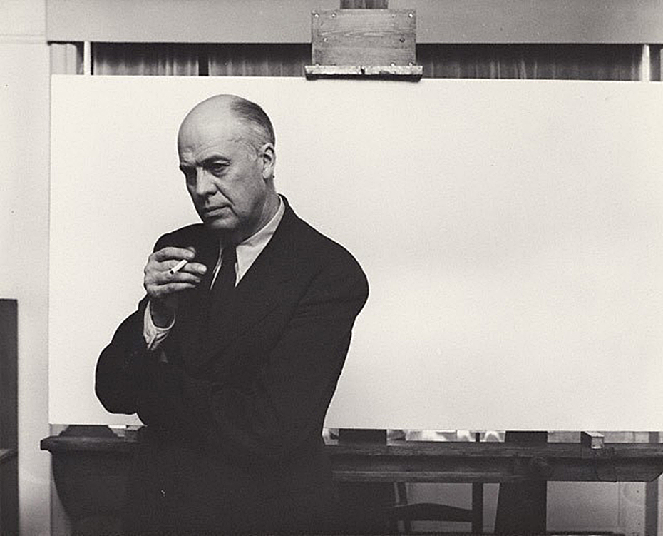
Arnold Newman, Edward Hopper in his New York studio, November 1, 1941, Gelatin silver print, *Arnold Newman Collection/Getty Images.

You’re looking at Art history.

After the fact, this may be one of the most historic Photographs in American Art. I’m not only talking about it being a wonderful portrait of Edward Hopper. It’s much more. The date is November 1, 1941. On January 21, 1942, the Artist’s wife, Jo Hopper, would record the completion of the work her husband created on that blank canvas he is posing in front of in the Artist’s Ledger of his work.

A section of Edward Hopper’s Ledger page for Nighthawks, from the book, Edward Hopper: Paintings and Ledger Book Drawings. It wound up in the Art Institute of Chicago almost immediately. Its sale netted Edward Hopper about $1,700.00.

In the intervening 81 days, Edward Hopper Painted the incomparable Nighthawks on that very canvas. We don’t know if Arnold Newman had any clue as to what Edward Hopper’s intentions were for that canvas. But we know now. The odds are that he had finished his preliminary work- the inspiration, the sketches, the reference Drawings, the sizing calculations he usually did, and ordered the stretcher and canvas we see behind him on his famous easel. Most likely? At this very moment, this masterpiece was all in his mind, and possibly on it, as Arnold Newman pressed his shutter release.

Click.

For the following 77 1/2 years (exactly, as I write this), and counting, the world has been fascinated by Nighthawks like they have few other Paintings created in the 20th Century. Some of us, including myself, are borderline obsessed by it.

Written on my soul. The last time I stood in front of Nighthawks. August 28, 2013, at Hopper Drawing at the old Whitney Museum.

I’ve stood in front of it twice in my life. The first time at The Art Institute of Chicago in 2005, the second at the old Whitney Museum in 2013. In July, 2015, I named this site after it and wrote about why in the very first piece I Posted here, “Welcome To The Night,” To commemorate the 4th anniversary of NighthawkNYC.com, I present My Search for the Nighthawks Diner.

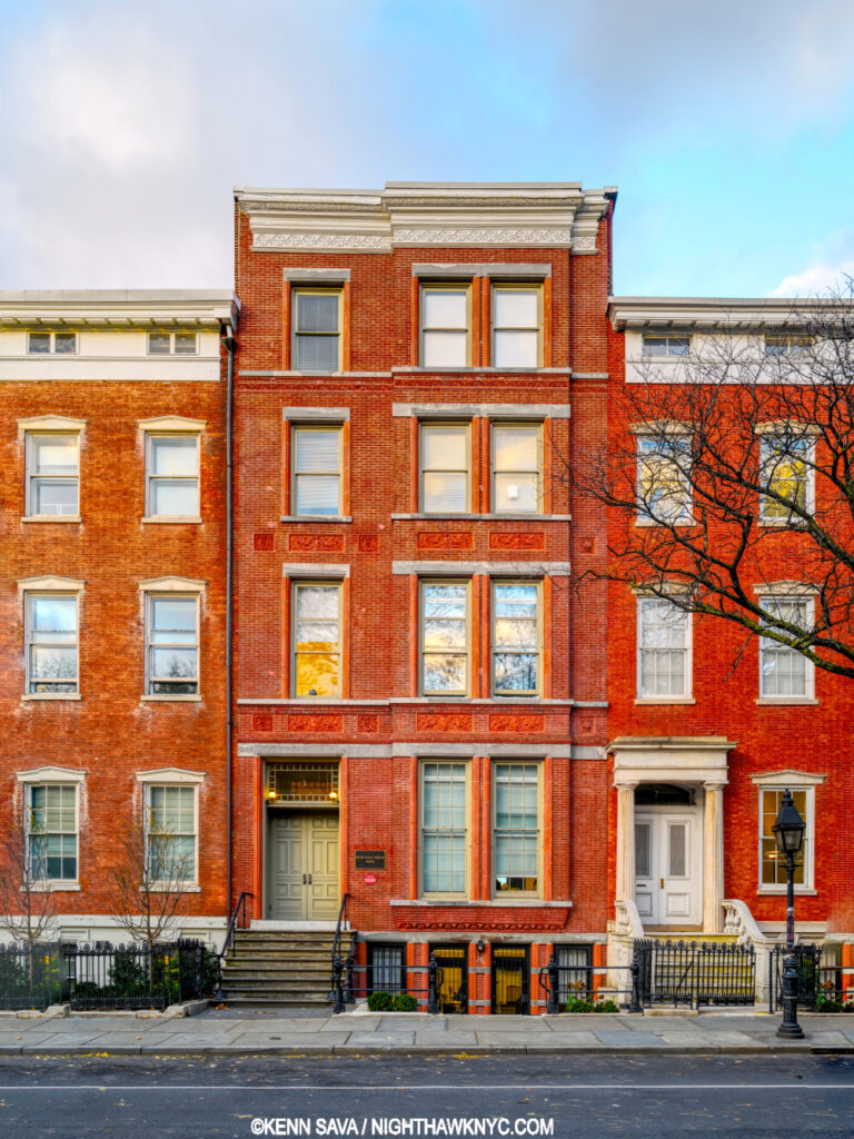
Edward Hopper posed for Arnold Newman, and Painted Nighthawks here, on the top floor of 3 Washington Square North, just east of the Arch in Washington Square Park, in Greenwich Village, that it looks out on, where the Hoppers lived for over 50 years, from 1913 until the Artist’s death in 1967. This is a key point for a variety of reasons, and an intriguing one because Edward Hopper was the furthest thing from “bohemian” one could imagine. Yet, living here he, like most New Yorkers, walked regularly, probably daily, and so the areas he was able to walk to may have become the sites of, or the inspirations for, his Paintings. And so, for almost all of the past 77 years viewers have been asking the question-

“WHERE is the diner Edward Hopper Painted in Nighthawks?”

I’ve been trying to find it for the better part of my life. Having lived in the area for 28 years and having frequented it before I lived here, the Village is an area I’m as familiar with as I am any anywhere. During that time, as during the Hopper’s time here, change has been the only constant. Change has also been a constant enemy in the attempts to locate, for once and for all, the diner we see in Nighthawks. My search has been carried out using only a few tools. First, the extensive Hopper literature. Though very little of it is directly relevant to this search, much of it is indirectly relevant, providing a framework for how, when and where he created his extensive oeuvre of Paintings, Watercolors and Drawings. The books by Gail Levin, (the Hopper’s biographer and the author of numerous other books on the Artist and his work, including the 4 volume Catalog Raisonne), particularly her Hopper’s Places, Second edition and the catalog for the 2013 Whitney Hopper Drawing show have been the most referred to for this quest. Outside of this, I have relied on my own two feet, my cameras and, yes, my gut.

Once that “Could this be IT?” bell goes off, I research the possibility, beginning with “What did this place look like around 1940?” Is any of that here to be seen now (i.e. when I was standing there)? What does common sense tell me? In the case of Edward Hopper, “common sense” comes from studying his work. Hopper’s Places provides part of the basis for some of that “common sense.” In it, Ms. Levin shows us contemporary Photographs she, herself, has taken at various sites Edward Hopper Painted around the world- though not Nighthawks, “…to show how he both recorded and transformed” these places, she says in her “Preface to the Second Edition,” P.vii. On P. x, she adds, “Research for the biography also revealed that in his later years Hopper relied upon observing specific sites more often than anyone had previously realized.” Even though much has changed over time, I still get a bit of a sense of Hopper’s approaches to rendering actual places. Much is, also, to be learned by looking at and studying historic and contemporary pictures of places under consideration. In the case of Nighthawks, I used all of these tools in my search.

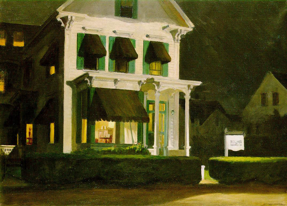
Rooms for Tourists, 1945. About 40 years later, I found this actual Rooming House this Painting is based on in Cape Cod, Mass., and stayed there. *Photographer unknown.

My gut has already helped me find one of “Hopper’s Places.” In the 1980s, I was traveling through Cape Cod and looking for a place to stay in Provincetown, Mass. I came upon a small Rooming House and instantly recognized it from the Hopper Painting, Rooms for Tourists, and so I just had to stay there. Part of my belief that Edward Hopper based Nighthawks on a real diner was finding that actual Rooming House in the 1980s when I visited Cape Cod.

I’ve spent most of my time searching in the West Village. For two primary reasons. First, this was the neighborhood Edward Hopper lived in and walked through regularly and most often. Second, as soon as one walks south of West 14th Street (the Village’s northern border) on 7th Avenue South, you’re faced with this-

Standing in 7th Avenue South at the intersection of Greenwich Avenue and West 11th Street, facing south, July, 2019. It HAS to be somewhere in this picture, right? No. There are countless triangular corners in the West Village, but this view is the most likely to contain it, I think. Click for full size.

As I stood in the middle of 7th Avenue South (NOT recommended) there were no fewer than TWELVE triangular corners around me! Those familiar with Manhattan know that almost all of it north of 14th Street is a grid made up almost exclusively of rectangles. Below 14th Street, “old Manhattan” streets wind seemingly with minds of their own, interrupted here and there with a semblance of uptown’s rectangular regularity. The triangular corners we see in Nighthawks are everywhere. WHERE to begin?

The former Two Boots Pizzeria, #11 in the picture above, is from the right period, but its building goes straight up, so I ruled it out quickly. Nothing feels “right” to me about it.

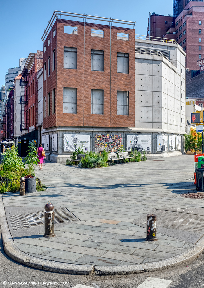
Mulry Square (in the foreground), #3 in the picture.

Perhaps no site has gotten more “hype” about it over time in regards to Nighthawks than Mulry Square, #3 in the picture. In spite of what many have said, I have seen nothing to indicate to me that this was the site of the Nighthawks Diner.

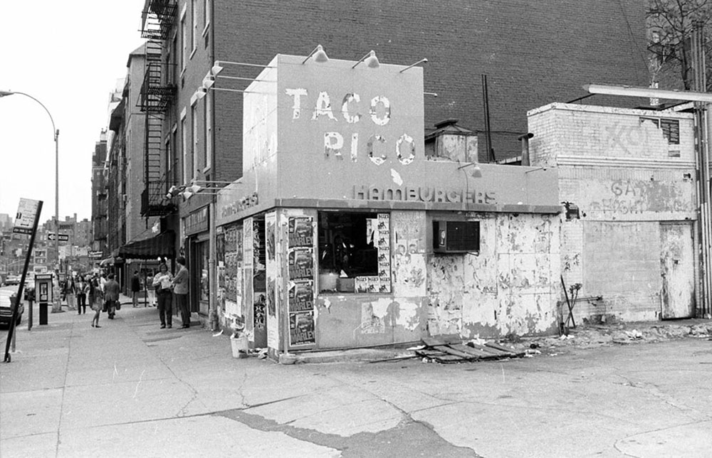
I would guess this would be  the early 1980s from the Rita Marley ads and Miles Davis ads, on the remnants of the hamburger place, which may be the remnants of the actual hamburger place that stood here in the 1940’s, which I show later on. Miles Davis came out of retirement in 1981. Is that a covered window along the left side? I haven’t been able to find out. *Photographer unknown.

The historical archives show a gas station with a small burger place at the time, but it looks more like a White Castle precursor to me than anything resembling the Painting’s diner. If anything, it may have been an inspiration for the “fishbowl effect”- where we are looking in through the glass at the customers. More on this later.

This is seen on the other end of Mulry Square, #4 in the picture, on another triangular corner, today. No viable candidates have been reported on this, also triangular, side of the Square, which is occupied by this too modern edifice today. I’ve also ruled it out.

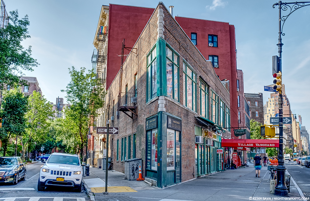
#9. Max Gordon Corner, named in honor of the long time owner of the Village Vanguard.

Directly across the street from #4 is this building, #9 in the picture, which has been home to the world’s greatest Music club, in my opinion, the Village Vanguard since 1927. There is a pizza place on the corner and the windows go through to the back street, but at 2 stories, I’ve long ago ruled it out. However, Art history will remember this spot because another great Painter, Richard Estes, wonderfully Painted it. (Which reminds me- In 2016, I visited the known site of one of Richard Estes’ latest Paintings in a piece I ironically called “Richard Estes’ Dayhawks At The Corner Cafe.”)

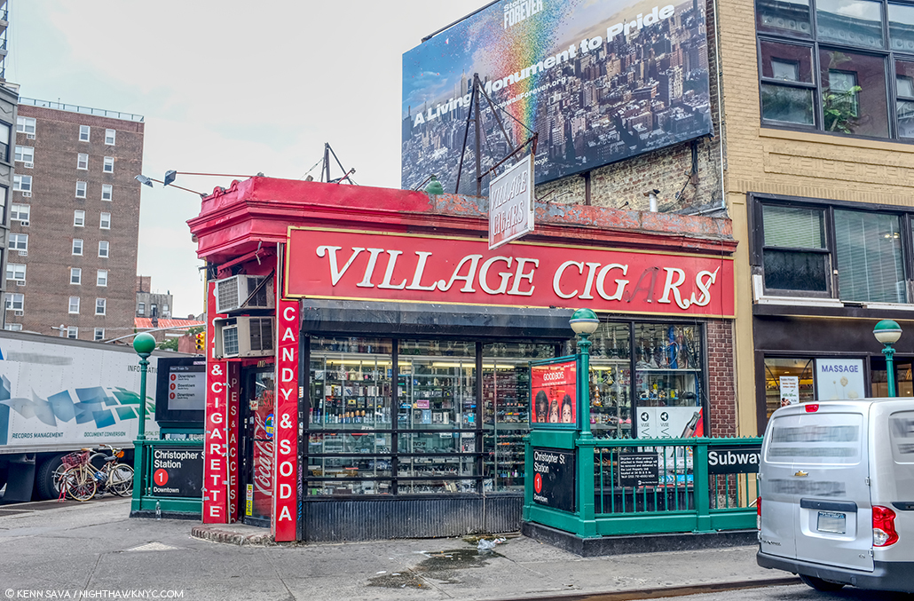
Village Cigars, 7th Avenue South and Christopher Street, Greenwich Village, NYC, June, 2019.

The site of Village Cigars is not numbered in the picture, being further down 7th Avenue on the right past #8. It’s garnered surprisingly little to no attention in the Nighthawks searches I’ve seen to this point. It has some things going for it- the shape and the cigar sign (Nighthawks has a Phillies cigar ad over the diner) but in speaking with the manager, I was told it’s been here for over 100 years, but it’s been a cigar store the whole time. Also, it doesn’t have the curved front window, those dual subway entrances were most likely also there in 1940 and are not in the Painting, and the buildings behind it are too far away. I’ve ruled it out. The Stonewall Inn is a few hundred feet to the left.

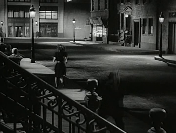
Some believe the inspiration lay in movies of the period, like this one, Stranger on the Third Floor, 1940. The suggested diner down the street on the right looks nothing like it, in my opinion. Possibly another “fishbowl effect” inspiration.

I remain completely unconvinced by any and all suggestions of movies I’ve seen. Yes, Edward Hopper was taken by a short story, “The Killers,” written by Ernest Hemingway in 1929, but I, for one, have not seen the evidence of that in the setting in the Painting. In the figures and the mood? Much more likely. “The Killers” was also made into a film, but, in 1946, too late to be considered. Maybe the Painting influenced it, as it has countless movies since.

That leaves the contenders. Speaking of movies, Edward Hopper reportedly frequented the Lowe’s Sheridan Movie Theater (which stood where #12 is in the picture earlier, and is seen further below), and based a Painting inside of it. His walk to and from it is interesting to me and it has been suggested that a few locations along this route are candidates for the Nighthawks diner. I looked closely at these.

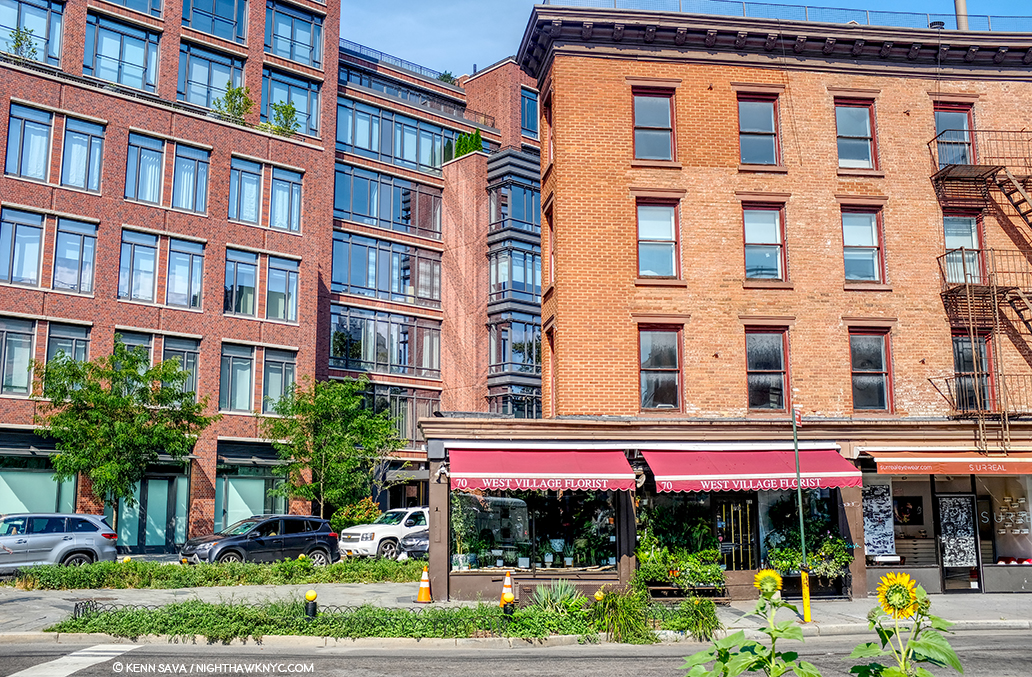
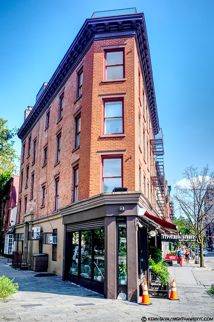
Yes, West Village Florist at 70 Greenwich Avenue is sort of triangular. The picture above was taken standing on the northern edge of Mulry Square, seen earlier. Yes, it was along one of Edward Hopper’s possible routes from his apartment to the Lowe’s Sheridan Theater, which was directly across 7th Avenue to the left of the picture.

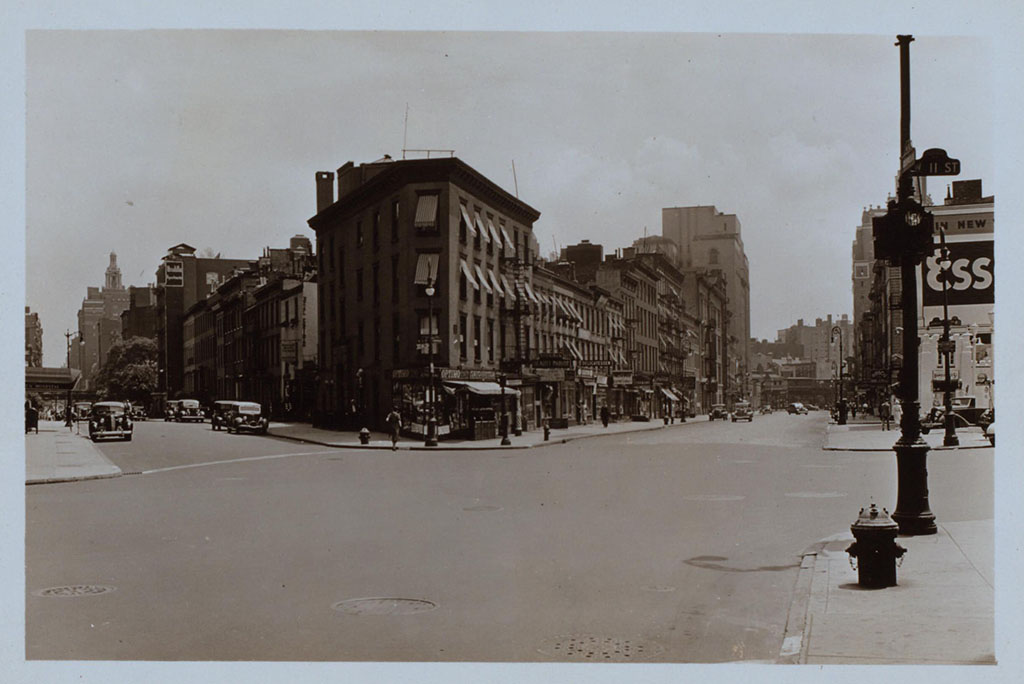
This picture came to me dated 1938 and that would appear correct. Looking toward Mulry Square on the right shows the side of the White Castle-ish hamburger place seen earlier under the Esso sign. The place on the triangular corner, center, at the intersection of 7th Avenue South, Greenwich Avenue and West 11th Street, is now West Village Florist, shown here when it was a cigar/cigarette store. Whoever told this picture is standing on the curb outside of what was Too Boots Pizza, #11 in the panorama posted earlier, with the Lowe’s Sheridan Movie Theater directly to his or her left. Photographer unknown to me.

Yes, it housed a deli 20 years ago before becoming a flower shop the manager told me, and my research added a cleaner/tailor shop circa 1914, and a cigar store in the period of Nighthawks as seen in historical pictures (including in 1938, above), but it’s too small inside, the prow is also too small, and the corner lot too big in my reading of the Painting. Nowhere have I seen reference to it being a diner or coffee shop at any point. The buildings in the background are wrong now, and were wrong then, according to historical pictures.

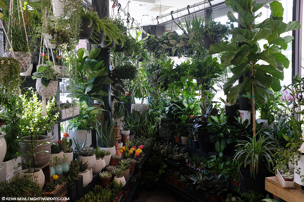
Inside West Village Florist, standing just inside the door. I had room to stretch my arms out, with maybe an extra foot on each side, but the space quickly narrows, as you can see. It’s just too small. Stop by and see what you think. They are very nice people who have a beautiful assortment of plants and flowers.

There is little doubt he saw it, but as I showed earlier, there are countless triangular corners in the area that could have been a partial inspiration. At best, that’s all this is, and I doubt it was a big influence. I’ve ruled it out.

West Village Florist’s building has this unique, strange, angled shape to it seen from head on, July, 2019.

The serious contenders.

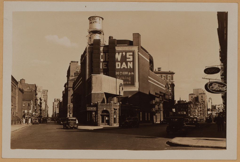
The intersections of Greenwich Avenue and West 12th Street with the Loew’s Sheridan Square Movie Theater, rear. Photograph by Percy Loomis Sperr (1890-1964), Manhattan: 12th Street – Greenwich Avenue, 1932, *NYPL Digital Archives.

In this 1932 picture of the intersection of Greenwich Avenue and West 12th Street, the low, triangular shaped building in front of the west side (the back) of the Lowe’s Sheridan Movie Theater is Crawford Lunch. There are historic pictures taken from Greenwich (on the right) that show customers in Crawford Lunch with West 12th Street seen behind them- which I reproduce further below. I think it is entirely plausible that Edward Hopper saw this, too, and this inspired his conception of a sort of “fishbowl” like setting. Here was an actual working diner/restaurant of the time. Today’s West Village Florist building is about 3/4 of the way down to the right of this picture.

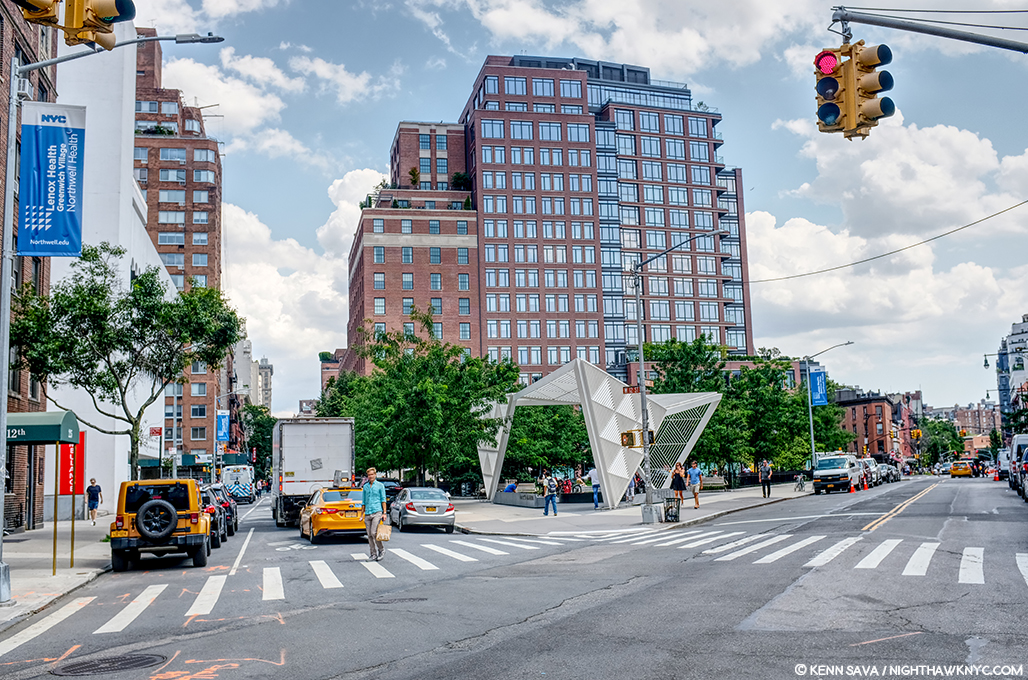
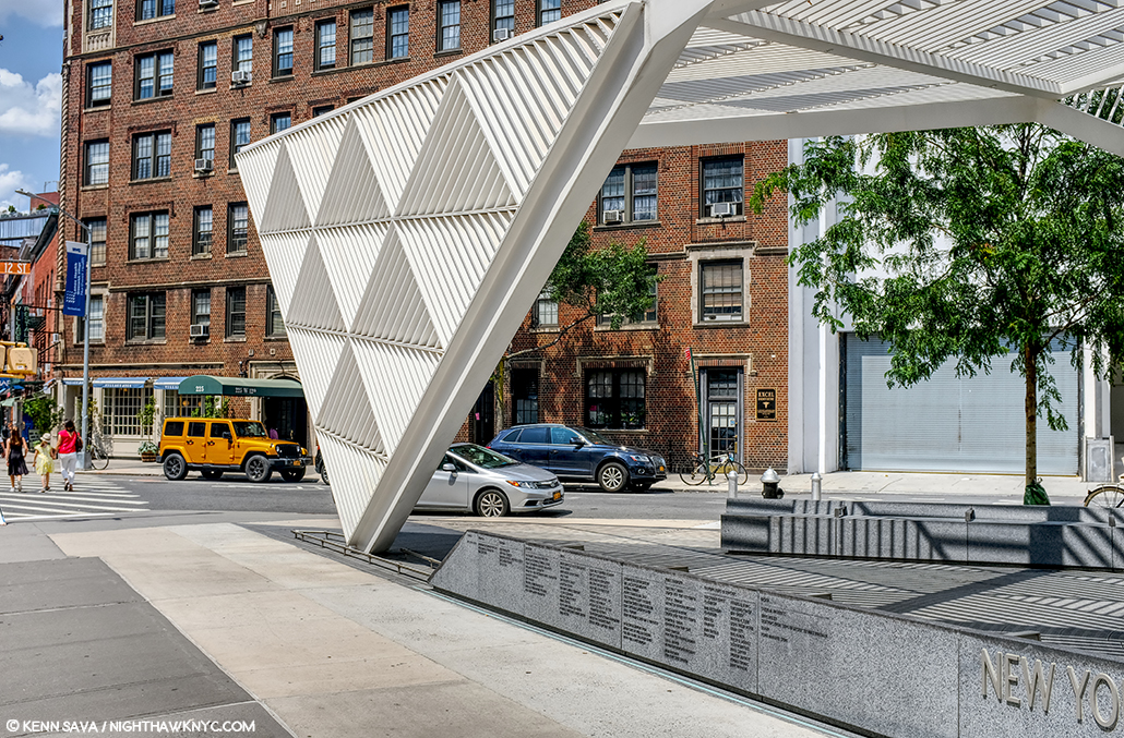
Change is the only constant in New York. The same scene, today! I stood as close as I could to the spot the 1932 picture above was taken to take this in July, 2019- 87 years later!

It’s so different, 87 years later, as to defy anyone to guess this site had anything to do with Nighthawks. Therein lies a good deal of the problem finding its sources. It’s now The NYC AIDS Memorial Park at St. Vincent’s Triangle. Note- the brown building on the very far left. It does not look like what’s in the background of the Painting. More on this follows. The Whitney’s Hopper Drawing catalog suggests that Edward Hopper may have looked through Crawford Lunch and seen the “fishbowl effect” we see in the Painting.

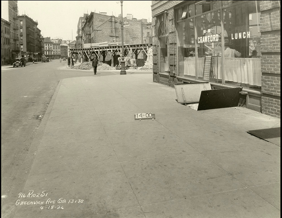
Subway construction photograph of 88-86 Greenwich Avenue and West 12th Street, New York City, April 18, 1926. Identifier- 86446d_GreenwichAve_SubConst958. *Collection of the New York Historical Society.

Here, we see a revealing example of this “fishbowl effect” seen at Crawford Lunch in a picture taken on April 18, 1926. Notice how you can see into and through the restaurant, on the right, to West 12th Street behind the man in the dark hat under the word LUNCH on the window. The brown apartment building seen in the far left in the prior picture is about to be built seen straight ahead just across the 12th Street past Crawford. Note, also, the word “LUNCH” on the window for later. I believe this is the possible source of the effect given how close it is to the Lowe’s Sheridan Theater (next door). However, it could have as easily been something he saw somewhere else on his walks, in a place they, or anyone else I’ve come across has not considered. But, unlike most of the locations suggested to date, Crawford Lunch was an actual restaurant at the right time and in the, possibly, right place.

The almost identical view in the previous picture today at the former site of Crawford Lunch also approximates the view seen in Nighthawks. That brown brick apartment building, seen early in its construction above, has been here since the late 1920s, and hence, at the time of Nighthawks, making it wrong for the Painting. Seen in July, 2019.

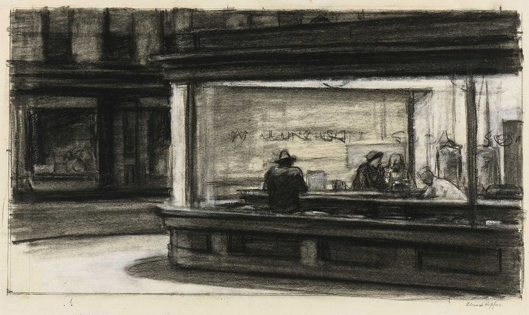
That Crawford Lunch was an influence would seem to be confirmed by this-

Study for Nighthawks, 1941 or 1942. Fabricated chalk and charcoal on paper; 11 1/8 × 15 in. Given he finished Nighthawks on January 21, 1942, I doubt this was done in 1942. It seems he was still finalizing his ideas when this was done. *Whitney Museum collection & photo.

I can barely make out the word “LUNCH” on the widow above the man with his back to us in this study for the Painting. As we know, Edward Hopper did not include this in the final Painting, among other changes he made to what we see in this incredible and endlessly fascinating Drawing. It sure reminds me of the Crawford Lunch window and may be a give away of its source and, possibly, the source, once and for all, of this “fishbowl effect.”

Edward Hopper said little about the inspiration for Nighthawks and, frankly, I don’t know what to make of what he is reported to have said. In Katherine Kuh’s The Artist’s Voice, P.134, he says, the Painting “was suggested by a restaurant on Greenwich Avenue where two streets meet.” He adds, “I simplified the scene a great deal, and made the restaurant bigger.” Um, Ed? Could you be a bit more obtuse? “Greenwich Avenue where two street meet,” is said to mean West 12th Street & 7th Avenue South by Gail Levin (Hopper’s Places). Couldn’t “two streets meet” mean Greenwich & West 12th Street, where Crawford Lunch was? If it means Greenwich and two other streets, it has to be the triangles where West Village Florist and Mulry Square are. In any event, “…suggested…” I believe means a scene he saw at one of these places, the “fishbowl effect,” which I think he saw at Crawford Lunch, a confirmed restaurant at the time. But, Crawford Lunch doesn’t look like the diner in the Painting- even if he “…made the restaurant bigger.” Neither does the hamburger place on Mulry Square or West Village Florist. And that comment doesn’t specify it’s the same restaurant he mentions on Greenwich Avenue. It could mean “the restaurant we see in the Painting.” Intensely frustrated by this, I finally decided to continue on my own path. This meant looking a little further afield from the Greenwich Avenue vicinity. It turns out I didn’t have far to look.

Further down 7th Avenue South, not as far as Village Cigars, and still well within Edward Hopper’s walking neighborhood, I came across this-

“Oh. My. Gosh.”

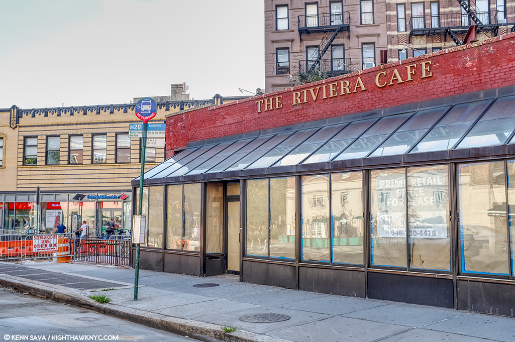
The site of the now sadly defunct Riviera Cafe, which was open here for 48 years, from 1969 until August 31, 2017.

The former Riviera Cafe at 225 West 4th Street at 7th Avenue South.

When I came across this site, I had an “Oh. My. Gosh.” moment. Picture it without the modern “greenhouse” addition and it becomes much more like the diner in Nighthawks. Back in the day, I spent a few nights in this place, as I’m sure many reading this have, too, since it was centrally located right at the heart of the West Village. The building behind it to the left, while not exactly what we see in the Painting (I believe they are the same buildings that were standing on this site in 1940), at two stories, which fits all we can see in the Painting (they may go higher in Nighthawks, or they may be cut at two- we can’t tell), and they’re the right distance, though at a slightly different angle, from what we see in the Painting. If this is the location Edward Hopper used, why didn’t he use the buildings we see in the background? I believe it was because of the color. That long building which takes up a good portion of the back is too brightly colored to fit the mood he wanted in Nighthawks. So, possibly, he replaced them. More on this in a minute. I measured the depth of the greenhouse at 90 inches- 7.5 feet. If it were not there, it would have allowed me to stand closer to the building taking this shot. Thinking back to my visits here, there was a bar along the back wall then, and I believe there were tables behind the seats/stools facing the bar, approximately under where that brick wall would come down with the greenhouse gone. Would a horseshoe counter have fit here?

As I looked closer, I discovered this-

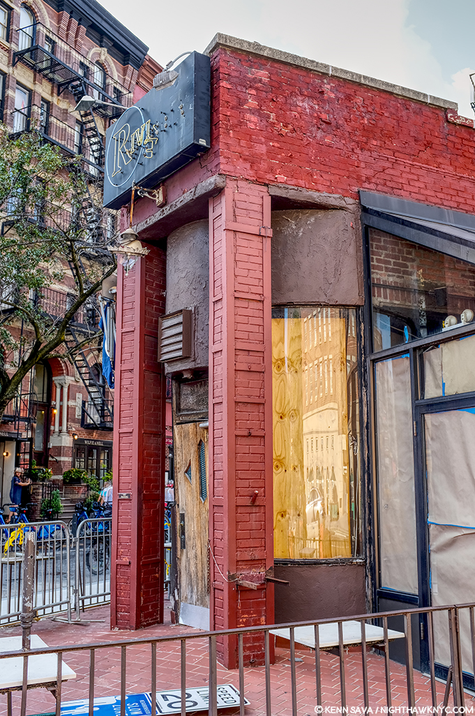
The front of The Riviera Cafe facing West 4th Street and giving it its address, 225 West 4th Street.

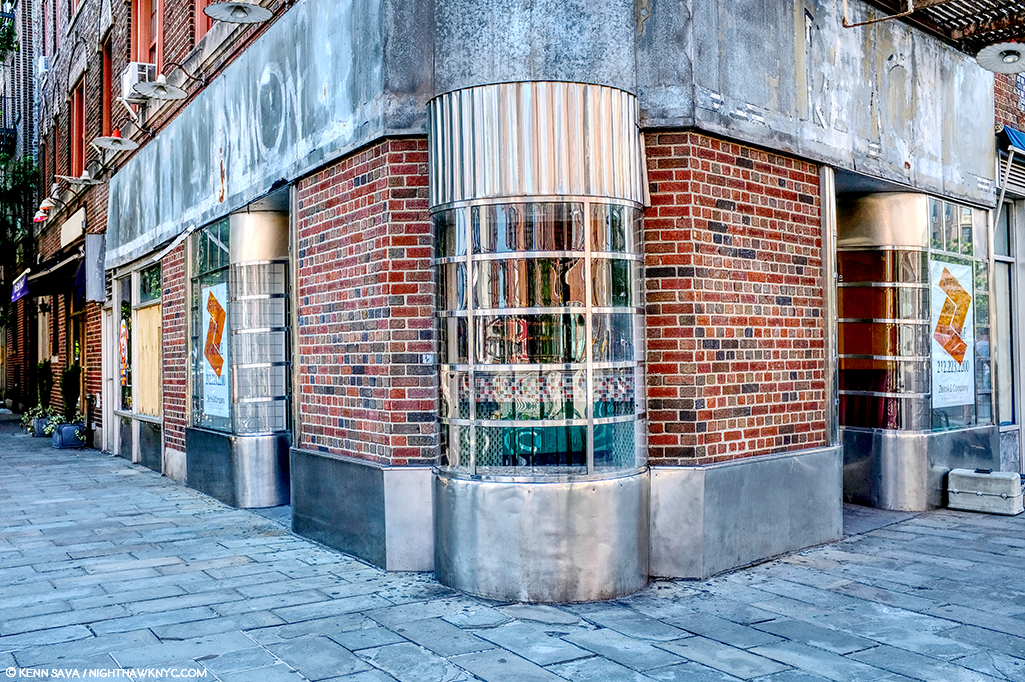
Lo and behold, there was something none of the other candidates I’ve discussed thus far have- a curved front window! And, it’s the same on both sides of that door! But, that door. Was it always there, or was the curve complete at one point, which would make The Riviera, minus the modern greenhouse addition, an almost perfect match for Nighthawks Diner?

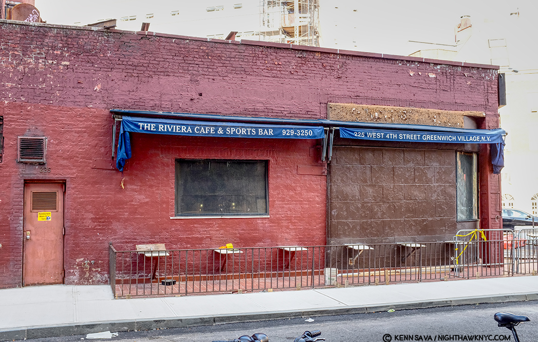
The back of The Riviera Cafe on West 4th Street.

Stepping around to the back of The Riviera- more intrigue. What’s up with the right half of the wall, and what was there before they replaced it? A window? Also, that door to the left looks earily similar to the door in the Painting on the inside of the Nighthaks Diner. As I said, when I was here, I remember a long bar inside that wall and along it, meaning you’d probably be able to see the necks of liquor bottles in that rectangular window that’s still there, center. But, that’s now/more recently. What about in the past?

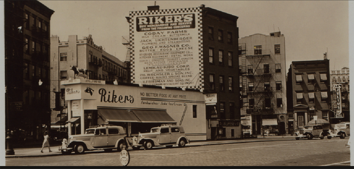
Intrigued, to say the least, searching further, I uncovered this-

1941! The year Nighthawks was Painted. Percy Loomis Sperr (1890-1964), Manhattan: 7th Avenue South – 4th Street (West), 1941, *NYPL Digital Archives.

In 1941, The Riviera was called Riker’s and it was a restaurant! It looks pretty new and shiny, too. Some encouraging things in this picture- there are retractable awnings instead of the permanent greenhouse, for one, but that troublesome front door is still there to the left, and it looks to be the same structure, with the curved windows on either side of it.

The Riviera Cafe occupies the biggest triangular space in this part of the West Village. It’s very accessible to the Hopper’s apartment (a few blocks to the east). Why has it never been properly considered as a candidate?

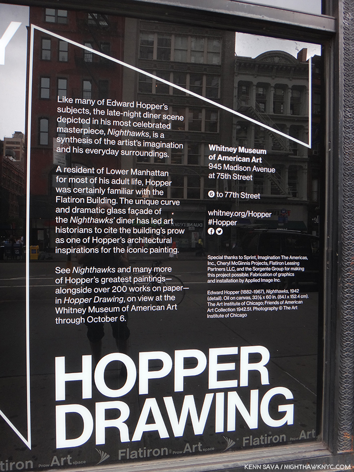
In 2013, during the Hopper Drawing show, the Whitney Museum came out and said the following-

“…has led art historians to cite the building’s prow as one of the influences…” What are the others? Seen in 2013.

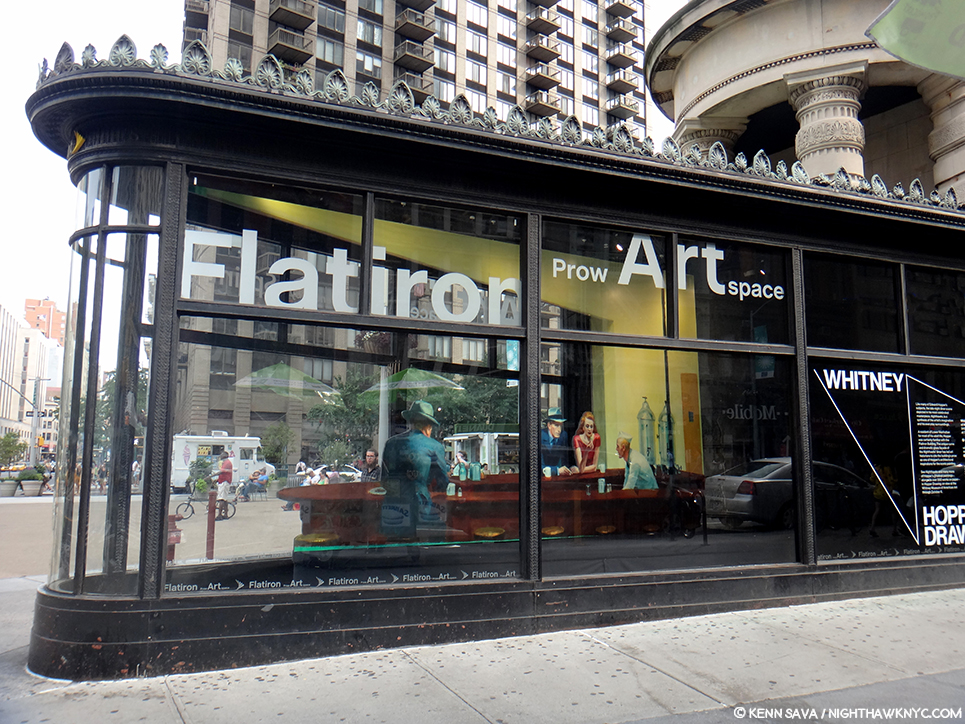
They’re talking about the Flatiron Building, which is on West 23rd Street at the intersections of Broadway and 5th Avenue- no where near Greenwich Avenue, where that quote has caused most to look, and it’s not even in Greenwich Village! So, the museum has taken the same approach I did in this sense. Also, in the Hopper Drawing catalog they fail to publish the Kuh Hopper quote (above), only footnoting the page in her book it’s on (P.118, footnote 2)! Perhaps, they, too, find it as frustrating as I do? (I realized this only this past week, after my quest had been completed.) They state the Flatiron was “one of the influences,” but fails to name any others!?? “One of” means “more than one.” Well? I’m naming names here.

An installation of “Nighthawks” in the prow of the Flatiron Building by the Whitney Museum in 2013. The installation is 2D and only a few inches deep, as I show below. I shot it at this angle to show the problematic lining up of the buildings in the back on Broadway, across the plaza, which is not at all like what we see in the Painting. Seen on September 1, 2013.

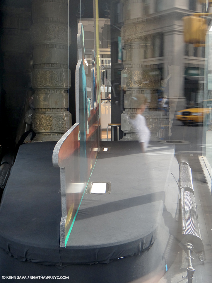
Assessing the Flatiron’s candidacy, I discovered that at one point it was a cigar store (again, the Painting has a Phillies cigar ad on the top of the diner), but I did not find evidence of it having been a diner. Looking closer at the interior space, I discovered it ostensibly measures 10 feet wide, at its widest, to the right in the picture above, by 30 feet long. I’m no restauranteur, but that seems pretty narrow to me to get a horseshoe shaped counter inside, room for seating around it, room to navigate around those seats and room for the counterperson to work. Glare notwithstanding, here’s what the space looks like pressed against the front curved window-

A look at the installation of “Nighthawks” in the prow of the Flatiron Building on September 1, 2013.

Notice the radiator on the right, and how far it is from the window. There’s another one on the left which is hard to see in this picture. Both, and the room around them they require for safety and comfort, considerably cut into the amount of usable space here. Also notice the large column to the left rear of the photo, which serve to partially support the gigantic mass of the building above them, which also has a counterpart that’s hard to see because of the glare on the right side (see the picture of the whole prow, above it). The opening between them appears to be tight. How are people supposed to come and go here?

Then, there’s the site itself. It doesn’t feel to me like what we see in the Painting.

A panorama shows the distance between what would be the far side of the prow in the Painting and the buildings across the plaza and Broadway.

The buildings that would be in the background of the Painting are too far away and angled incorrectly- 23rd Street angles to the south east relative to the Flatiron at this point making the buildings begin too far back to be seen as they are in Nighthawks, in addition to being not at all like those seen in the Painting in the many existing historical pictures. Therefore, I believe the Flatiron’s prow isn’t what we see as the diner in the Painting, and this wasn’t the scene shown in the Painting. Of course, any Artist is completely free to do whatever they want, to make anything into anything else, whether it would fit in the “real” place, or not. (There is no such thing as “photorealism” in Painting, in my opinion, but that’s a battle for another day.) Edward Hopper, as per that quote, could have made West Village Florist or the Fatiron’s prow bigger, but their settings are still wrong, in my opinion, so I don’t believe he used either. However, like the Whitney, I believe the Flatiron’s prow was an influence.

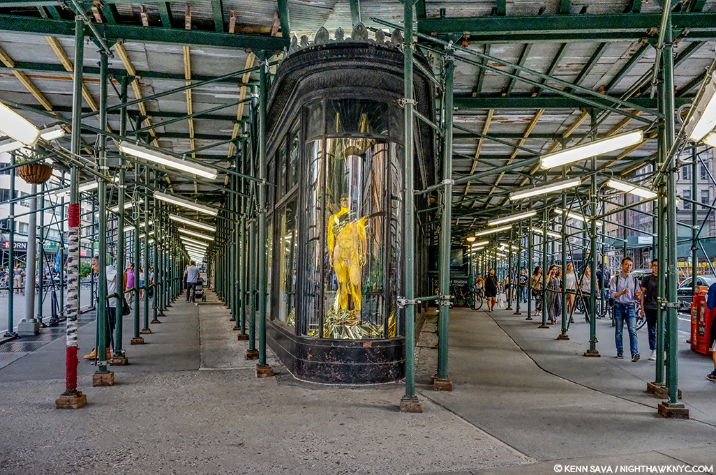
Currently under renovation? Cleaning? Diner installation? Maybe I should wait and see what emerges before reaching a conclusion. (Just kidding.) July, 2019.

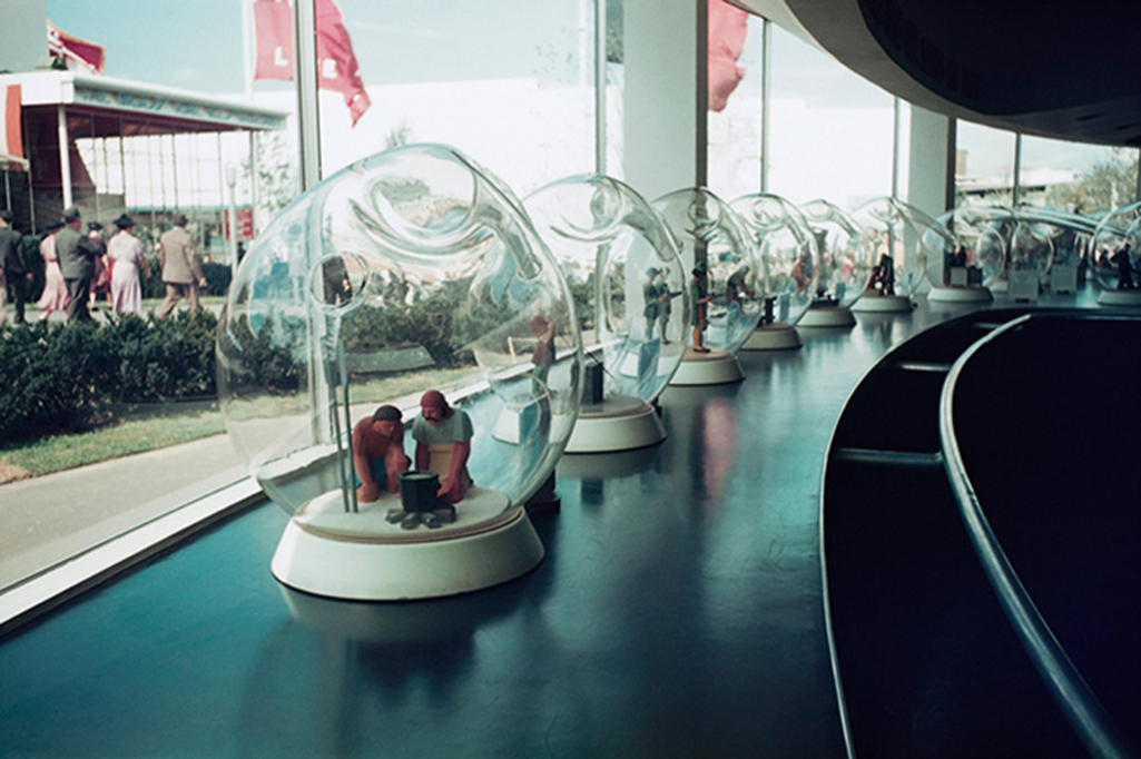
Looking at the Painting, one thing is undeniable- that curved window Edward Hopper includes. I’ve found it nowhere else besides on the Flatiron- either on existing buildings or in historical pictures. And, some of the ribs we see on the window in the Painting are present on the Flatiron’s prow today. In 1939, Edward Hopper exhibited at the World’s Fair1, and so he may have seen the Fair, but was certainly aware of it.

“Fishbowl effect” indeed. The history of glass making through the ages seen in glass bubbles at the Glass Incorporated Pavilion at 1939 World’s Fair, Queens, New York, New York, USA. Coincidence? Or influence? *Image by Peter Campbell/CORBIS

It was an Art Deco marvel. The Nighthawks diner has a decidedly Deco/Streamlined/Moderne feel to it. Though the Flatiron is a Beaux Arts building, the curved window of the prow has a decidedly Art Deco, streamlined, feel to it.

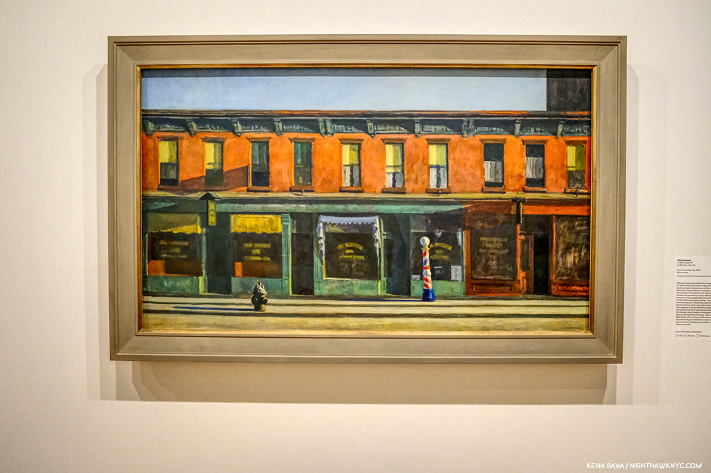
Early Sunday Morning, 1930, seen at the Whitney Museum, July, 2019. This looks uncannily similar to the background of Nighthawks to me.

Yet, what he depicts in the background of Nighthawks looks curiously not dissimilar to his Early Sunday Morning, 1930. It’s almost like he dropped those buildings into the background. But, 10 years after the earlier work a good many of those buildings were no doubt still everywhere around town, so they may as easily be generic. Whatever their origin, in this way he juxtaposes the old New York with the new world just seen in the 1939 World’s Fair, which showcased “modern” streamlining and the new flourescent lighting.

Early Sunday Morning is something of a “pendant” to Nighthawks as Carter E. Foster points out in the Hopper Drawing catalog (P.99). It’s the same size and shape and the two are bookends in some ways.

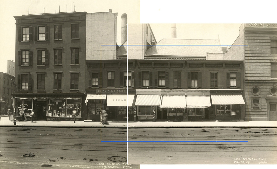
7th Avenue between Fifteenth and Sixteenth Streets, June 10, 1914. I’ve indicated the scene depicted in Early Sunday Morning, with a blue bounding line centering around 88 7th Avenue, seen in these two photos taken on June 10, 1914- 16 years before the Painting. The shutters on the windows are gone in 1930, so are the awnings, and there was only one barber pole. The hydrant was either to the left, or around the corner to the left. The center white line are the borders of the two photographs shown. All the buildings in these pictures have long ago been replaced. Subway Construction Photos modified from the Whitney Hopper Drawing website.

Interestingly, the inspiration for Early Sunday Morning were shops on 7th Avenue, but not in Greenwich Village. They have been located as being between 15th and 16th Streets in Chelsea, just north of the Village. Comparing the Painting to period pictures is fascinating. While it’s unlikely that Edward Hopper stood with a sketchbook and drew the scene, he did capture any number of correct details. But, he changed others- most notably the sunlight. The sun never shines on 7th Avenue at the angle he Paints it shining!

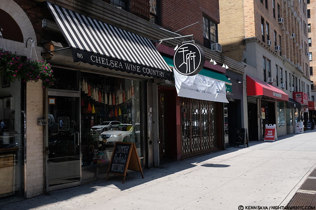
Mid-Sunday Afternoon. The site of Early Sunday Morning, seen in July, 2019. The original buildings have long ago been replaced. Notice how the shadows go in the opposite direction of those in the Painting.

7th Avenue runs North/South, not East/West, like the sun. In reality, the sun would be directly behind the viewer! So? Here’s a case of a found actual site and how Edward Hopper used creative license to mould it to his vision- even if that meant changing nature! What’s moving a curved window 20 blocks south compared to moving the sun?

My Conclusion-

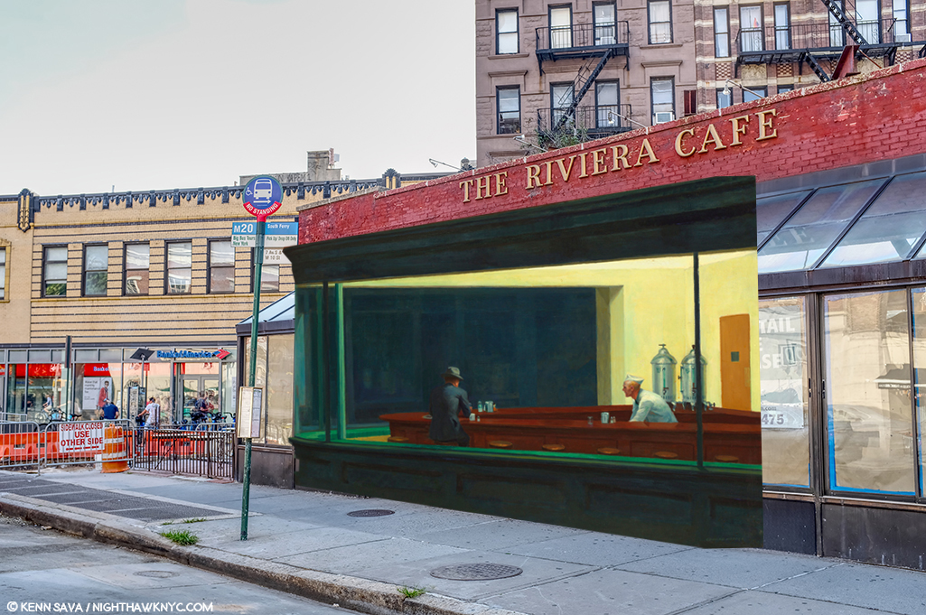
I currently believe that Edward Hopper saw Riker’s about 1941 and those 2 curved windows in its front. I believe he, too, may have been frustrated by that front door and decided to “remodel” it. With a a paintbrush. So, he morphed the Flatiron’s prow’s curved window onto it and then created his own (though somewhat similar to the real) background on West 4th Street in the Painting.

Unless and until I find better candidates, THIS is what I believe Edward Hopper did.

Yes, I’ve used the original, 2015, NighthawkNYC.com banner, which removed the famous couple, leaving that figure I relate to in honor of NHNYC’s 4th Anniversary. On the same page she dated Nighthawks on in the Hopper Ledger, Jo Hopper refers to him as “sinister.” I love her, anyway. Before she died the year following Edward, she bestowed one of the greatest American Artistic Estates to the Whitney Museum (who promptly “rewarded” her incredible generosity by throwing out virtually all of her work, thereby denying Art historians and Art lovers a chance to assess her work on its own- forever2). And I used the banner because, yes- I once sat at The Riviera Cafe’s bar by myself, too.

But, beyond ALL of this, for me? Nighthawks is the first truly modern American Painting. It marks the beginning of all that came after. It captures the essence, the FEELING of living in a City- here, in New York, or anywhere, but even more, it captures the feeling of modern life, which has become more and more about isolation, and fleeting moments of connection- or not, since January, 1942. I always try and remember that Nighthawks, like many of Edward Hopper’s other works, is a voyeuristic moment seen by a pedestrian, who more than likely kept moving on, past this fleeting moment and this scene, wherever it was, and didn’t pause to ponder it indefinitely, like so many have since.

Moments exist as flashes of time.

Click.

Here right now, gone forever. Unless, you’re one of the great geniuses in American Art history, who has the vision, the power and the talent to make it last, and speak to us, indefinitely.

But, for me, at least, Nighthawks isn’t about capturing a fleeting moment magically, though it does.

The other reality that common sense dictates be mentioned is that 78 years later, a better explanation than mine, or a better real life candidate for the Nighthawks Diner may never be found. It may have existed only in his imagination, with a few pieces of real life thrown in- like the Flatiron prow’s window. And that, too, may be part of his point. Nighthawks, in one reading, may not be about place as much as it is the psychological, the inter-personal, and? 

Loneliness.  

Have two people in Art ever been closer together, yet further apart?

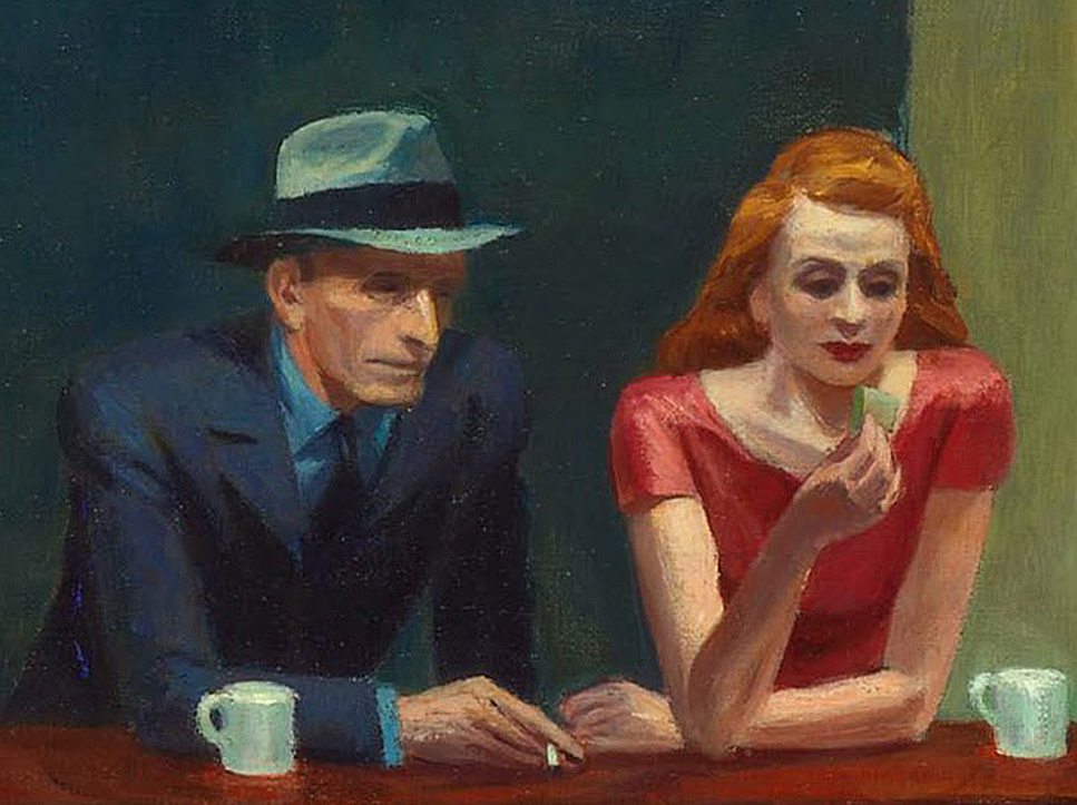
The woman in red is all dressed up to go HERE?, I can hear her mentally screaming. Her “companion” sits physically next to her, close to her, but, in my reading of it, their hands don’t quite seem to touch. Maybe you see it differently. For me? I can’t look at this and not think of God and Adam in Michelangelo’s Sistine Chapel Ceiling. There is no life giving, or love giving touch here. He has a cigarette in his hand- not her (left) hand, which remains empty. There is a distance that belies how close together they sit. All of this is, somewhat humorously, mimicked by the twin silver coffee urns to the right of them, that are, also, immobilized and frozen in time. At least they’re together for a common purpose! The same can’t be said of the immortal duo sitting at the counter. 

The gent, who’s nose Jo Hopper called a “Night Hawk” after the beak of the bird seems to be in a conversation with the counterman. About what? Here, he has this lady dressed to kill next to him and he’s ignoring her? Every time I’ve seen this happen in a bar or nightclub, instantly my antennae went up. Something’s not right here. If she’s not getting attention? Something’s wrong. But this is December, 1941. Pearl Harbor happened right in the middle of work on this Painting! 36 days after Arnold Newman took that Photo of Edward Hopper up top. It’s very hard not to think about that when looking at it, though it’s probably easier for many now that World War II was over 75 years ago. Are they discussing the War? Being drafted? Enlisting? A friend who has already been killed? Possibly another denizen of the diner? There are all those empty stools at the counter, after all. “Where is he?” “Oh. You haven’t heard?…” 

The War brought many things. It also brought separation, life without love, life without women, for men, and without men for women, or partners for the LGBT communities. 

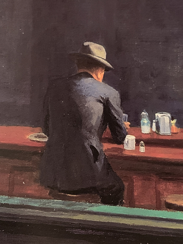
Then? There’s my alter-ego. Frozen in paint. Immobilized. Alone forever. Perhaps the most isolated figure in Western Art. What appears to be a rolled up newspaper is under his left elbow. No doubt he knows the score. At least he’s possibly not leaving anyone behind. 

But, for a moment? Let’s forget World War II is getting off to a raging start around the world at this very moment, if we can. Edward Hopper probably conceived this work before Pearl Harbor. What’s striking to me is that of all the loneliness I’ve just mentioned, there’s still more of it I haven’t. 

Let me ask you this- Who is more lonely in the scene in this Painting? 

Any of those 4 people in the diner?
Or?
The person viewing this scene from outside the diner?

For me? Nighthawks remains the ultimate parable of loneliness.  

Maybe then, I shouldn’t be on such a mission to find the “real” place it depicts. Maybe then, it doesn’t need a real place to inhabit. It exists as a permanent condition of being alive inside each one of us, as it did inside of Edward Hopper. Maybe I look for it in the hope of finding the end of it.

*- Soundtrack for this Post is “I Saw You In A Dream” by Japanese House….

“I saw you in a dream
You had stayed the same
You were beckoning me
Said that I had changed”

NighthawkNYC.com has been entirely self-funded & ad-free for over 8 years, during which 300 full length pieces have been published! If you’ve found it worthwhile, PLEASE donate to allow me to continue below. Thank you, Kenn.

You can also support it by buying Art, Art & Photography books, and Music from my collection! Art & Books may be found here. Music here and here

Written & photographed by Kenn Sava for nighthawknyc.com unless otherwise credited. To send comments, thoughts, feedback or propositions click here. Click the white box on the upper right for the archives or to search them. Subscribe to be notified of new Posts below. Your information will be used for no other purpose.

  1. Hopper Drawing footnote 33, P.119
  2. Gail Levin, Edward Hopper: An Intimate Biography, P. xv-xvii

Andy Warhol: Business Artist

Written & Photographed by Kenn Sava (*unless otherwise credited)

“So you should always have a product that’s not just ‘you.’ An actress should count up her plays and movies and a model should count up her photographs and a writer should count up his words and an artist should count up his pictures so you always know exactly what you’re worth, and you don’t get stuck thinking your product is you and your fame, and your aura.” Andy Warhol1.

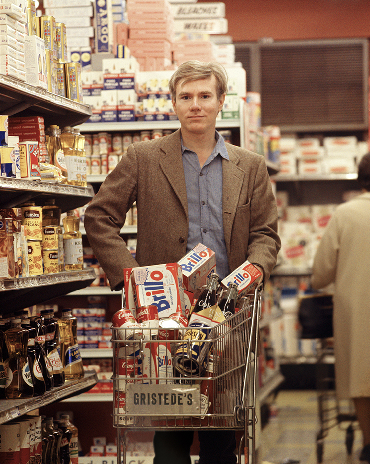
Andy shopping for products. *Bob Adelman, Andy Warhol at Gristede’s Market near 47th Street. New York City, 1965, near where he lived with his mother. Countless millions went shopping in American grocery stores in the 1960s. Very few made Art out of it before he did. Click any picture for full size. 

That being said, leaving the Whitney Museum’s Andy Warhol- From A to B and Back Again, the first Retrospective in NYC since MoMA’s in 1989, I was left believing Andy Warhol’s greatest creation was himself.

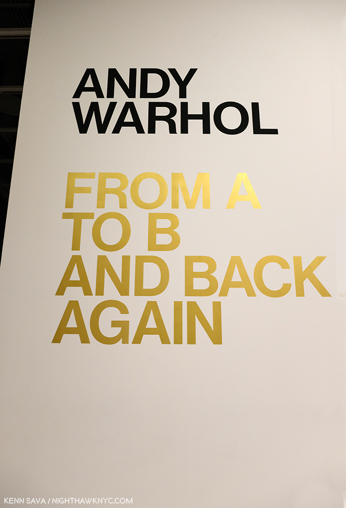
The use of gold here, and on the exhibition catalog’s cover, is interesting. It mimics Gold Marilyn, at MoMA, and also reminds of the background color of icons from the Eastern Orthodox and other churches. And? It’s a color often associated with money and “value,” so could it be a veiled reference to the high prices paid for his Art? Which of these is the intended meaning?

But, no matter how I feel about his Art, even I can’t deny that today, it can be said that we are living in his world to a greater extent than we realize. Look around you. His influence is everywhere. His innovations are now used by countless other Artists and businesses.

“A friend of mine named Ingrid from New Jersey came up with a new last name, just right for her new, loosely defined show-business career. She called herself ‘Ingrid Superstar.’ I’m positive Ingrid invented that word2.”

The everyday people he made into “superstars” presaged today’s television “reality stars.” His square portraits are now instantly recognizable as the Instagram standard. Andy Warhol came to define the Contemporary Artist working with a team of assistants at his Factory and his example is to be seen being followed by Artists all over the world today. How often do you see one of his color variated group of (4) portraits or flowers emulated by someone else? And on and on. These are only a few examples. Andy Warhol’s influence is incalculable. If it could be totaled, it might well rival that of Steve Jobs among THE most influential people of the past 75 years on our lives today.

Commodore Amiga computer equipment used by Andy Warhol in 1985-86. Andy’s interesting computer Art was extracted from this machine by a team led by the Andy Warhol Museum in 2014! *Photo by The Andy Warhol Museum.

But, it was Andy Warhol, not Steve, who said,  “A computer would be a very qualified boss3 decades before the time when many people’s lives seem to be run by their devices. A-hem. Sometimes I wonder if the internet is nothing but a cyber projection of Andy Warhol’s brain.

Artistically, I respect him as an Artist who was continually innovative in so many mediums during his surprisingly short career. Yes, short. It feels like he was around forever, but he was just 58 when he passed away on February 22, 1987. This insatiable creativity now strikes me as a function of his innate ability to see the world in his own way, which led him, continually, in different directions, to try new things, and explore new ways of doing old things.

It seems to me, however, that THIS may be the peak moment of Andy Warhol’s influence- the influence of Warhol, the Artist and his Art.

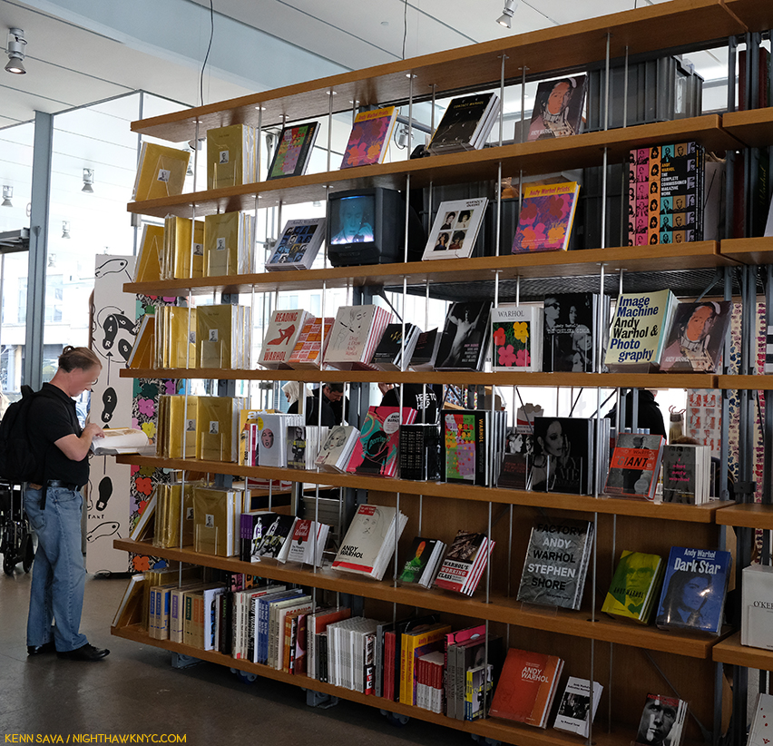
Warhol books, and ONLY Warhol books, seen in the Whitney Shop, March 27, 2019.

I wonder if the level of his fame may, in fact, work against its longevity from here. Virtually everything he did has been shown, written about, analyzed and assimilated. If you don’t think that’s true, take a look at this picture I took of part of the book shelves in the Whitney Museum’s Shop during the run on Andy Warhol- From A to B. I used a 28mm lens and even though I stood more than 20 feet away, backing into the middle of the admissions cue, I still wasn’t able to get ALL the Andy Warhol books on sale in the shot. There are books on his pre-Pop work, his newspaper-like work, his portraits, his posters, his prints, his record covers, his career as a publisher, his films, books on the Factory (including one of Photos taken by a teenaged Stephen Shore), a few about his Photography and polaroids, including a collection of Photos of him in drag, AND a multi-volume Catalogue Raisonne of his Paintings (on the far left of the bottom shelf). Oh, and Andy Warhol: Knives. ? This is not to mention all the books, by the Artist, and others, about his life, including the infamous, The Philosophy of Andy Warhol (From A to B and Back Again), published in 1977, which seems to have inspired the name of this show. My copy, bought from the display, is the 46th printing of the paperback. In all my many years of looking at Art books, I have to say the only other Artist who has as many books written about him and his Art is Picasso. 

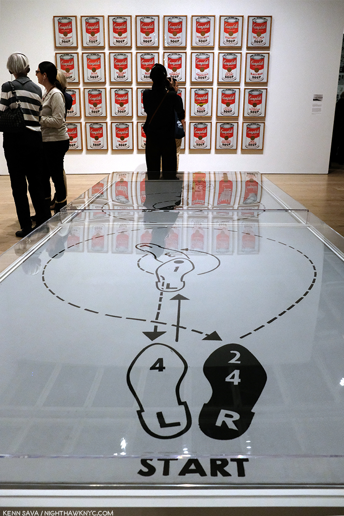
Start here. In the first gallery, which contains early Pop work, like Dance Steps, 1961, and a wall of Campbell’s Soup Cans in the back.

As I headed to the 5th floor for the main part of the show, I wondered- What’s left for the future to learn about Andy Warhol’s Art? Given his popularity, I’m sure people will find things for yet more books.

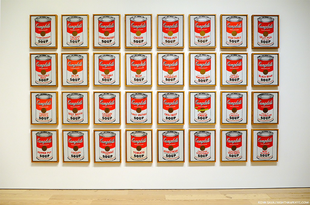
Andy’s mother fixed him Campbell’s Soup everyday for lunch, including after he became famous, until she passed. The family was poor. Beyond the comfort of the warmth of soup, having a lot of food around represents something of an ideal, a dream, even cheap food, like this soup was at the time, at 15 cents a can. Originally, these Paintings sold for $100 a piece at his first show at Ferus Gallery in LA, where Dennis Hopper bought one.

As I looked at his Art, it also raised questions. Questions that the passage of time has only intensified.

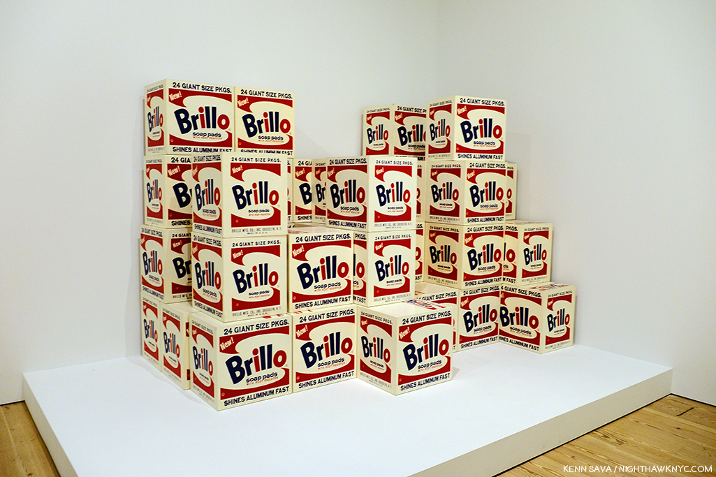
Brillo Boxes, 1969 (version of the 1964 original). Yes, a copy of a copy. The interesting thing about this work for me is that this “Art is everywhere around us” work of so-called “Pop Art,” which helped to mark the end of Abstract Art’s hold on the Art world, is based on the Brillo Box design of James Harvey, a moonlighting Abstract Expressionist Painter! Beyond that, and wondering if  Sol LeWitt was influenced by it, it’s lost on me.

First, and most importantly, Andy Warhol’s Art is accessible. This has been the most important factor in his achieving success and fame and it may be the most important factor in the longevity of both. Popularity doesn’t necessarily equate with quality. Since the future is unwritten, as Joe Strummer reminded us, it’s impossible to know what posterity will value, if anything. To this point quality has definitely been a factor. I wonder- Where does that leave Andy Warhol’s Art?

Arising at a time (the late 1950s) when the Art world had been fed a steady diet of extreme abstraction by the Abstract Expressionists, Andy Warhol’s Art burst on the world with images featuring things, yes, things, that everyone living in the country recognized. Brillo boxes, Campbell’sl soup cans, dollar bills. His work was instantly accessible in an Art world dominated by Art that was becoming more and more obtuse and remote. I’m not saying Andy Warhol’s work was “understandable,” or even “more understandable” than that of the Abstractionists, only relatable. Even in today’s world where fewer and fewer living beings remember S&H Green Stamps, walking through this show, this seems to still be the case.

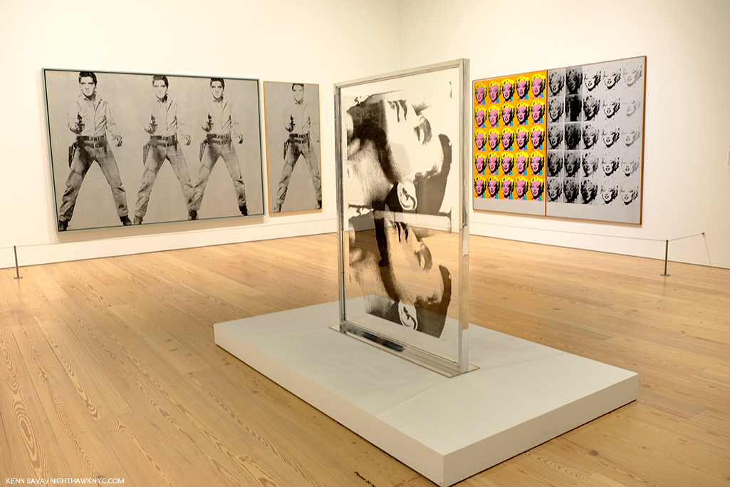
Marilyn & Elvis. Andy Warhol was always drawn to stars, and beautiful men. Personally, and in his Art.

But, the world has changed in the, now, 60 years since Andy Warhol’s career first took off. A lot of Artists have grown up with what he did and it’s become part of their work, even if it’s only unconsciously.

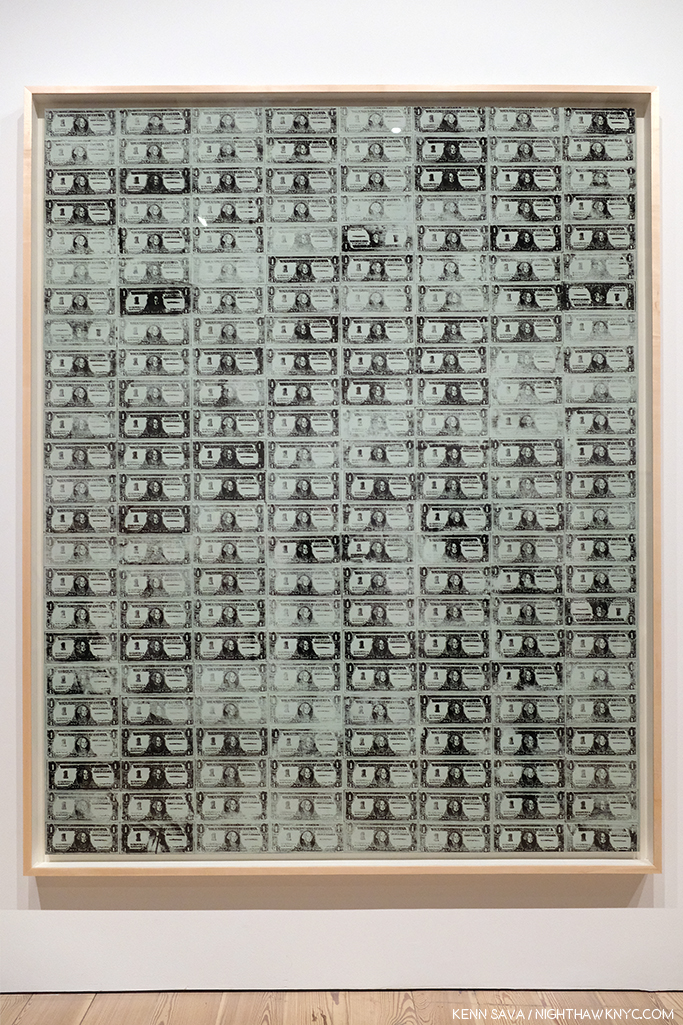
129 Dollar Bills, 1962, among the very first uses of silkscreening in Modern & Contemporary Art.

How many Artists have created with silkscreens since Andy Warhol introduced the possibilities of the ancient technique to the modern world in 1962? Even one of the other innovators and endlessly creative pillars of American Art in the late 1950s and 1960s (and after), Robert Rauschenberg, picked up the technique from Warhol. Since, silkscreening went from creating edgy Art to being used to create the large majority of the world’s T-Shirts, among countless other uses.

“I had by that time decided that ‘business’ was the best art. Business art is the step that comes after Art. I started as a commercial artist, and I want to finish as a business artist. After I did the thing called ‘art’ or whatever it’s called, I went into business art. I wanted to be an Art Businessman or a Business Artist. Being good in business is the most fascinating kind of art. During the hippie era people put down the idea of business—they’d say, ‘Money is bad,’ and ‘Working is bad,’ but making money is art and working is art and good business is the best art,” Andy Warhol. (Note- Not to be confused with my capitalization, caps and lowercase usage are Warhol’s own, reproduced exactly as the quote appears in TPoAW P.92.)

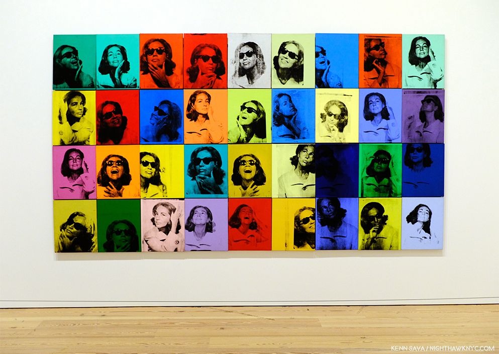
Ethel Scull 36 Times, 1963, jointly owned by The Whitney & The Met, was the first work commissioned from Andy Warhol. It’s a work that, in my view, has outlived its cachet as “Art,” and one that I don’t think posterity will look kindly upon.

Looking at the show, a takeaway for me was the distinct feeling I got was that there was his work, and then there is the work he did on commission (i.e. “Business Art,” a term he mentions in The Philosophy of, quoted above, but doesn’t define). After a while, I thought I could tell even before reading the card or researching the work, which was which- which were the work he did “for himself,” which were the works he did on commission, and I came away feeling there is a world of difference between the two. Wait! There’s a subject for a book I don’t think anyone’s written yet! For Andy Warhol, the business of Art was an Art in itself. Few before (maybe Rembrandt, Picasso and Dali in their ways) understood this and used it, but no one before him mastered it to the degree that Andy Warhol did. Its testament to how well he did it that a good many of his commissions, which detract from his other work when seen along side them as Ethel Scull 36 Times does in my opinion, hang in museums around the world, at least for now.

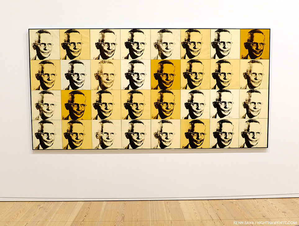
The American Man (Portrait of Watson Powell), 1964, a pseudo-companion piece to the Ethel Scull piece, above, and another commission, has aged better and still manages to speak to 2019 viewers.

To be fair, looking at some of his commissions now, we might well see in them a “commentary” by the Artist on matters beyond the mere representation of a given subject. The American Man, 1964, commissioned after seeing Warhol’s Ethel Scull piece, struck me that way. I’m still looking for that in a good many others, though.

After a couple visits, I was able to choose a few works in the great guessing game I like to play, and encourage everyone else to play- “Which works will be considered Art in the future- if any?” I came up with eight including the Campbell’s Soupcans and the 129 Dollar Bills already shown. 8 out of the 350 works the Museum says were on view. Personally, I don’t believe the passage of the centuries is going to be kind to most of Andy Warhol’s Art. Part of the reason for that is his pervasive influence. History doesn’t often look back favorably on who was first, particularly in Art. (Quick- Who “invented” oil painting? When I was growing up, I believed what Vasari wrote in The Lives of the Most Excellent Artists, 1550,  that it was the great van Eyck brothers, Jan and Hubert, who happened to be my first favorite Artists.) More recently there is no consensus and evidence of oil paint may have been found going back to 650AD.) Given the overheated state of his prices (still, in spite of a recent leveling off), his Art is definitely not where I’d put my money now. That ship has sailed. NOTHING goes up forever! Look elsewhere in 2019. (See my Post On Buying Art for additional considerations, all of which apply to the Art of Andy Warhol.)

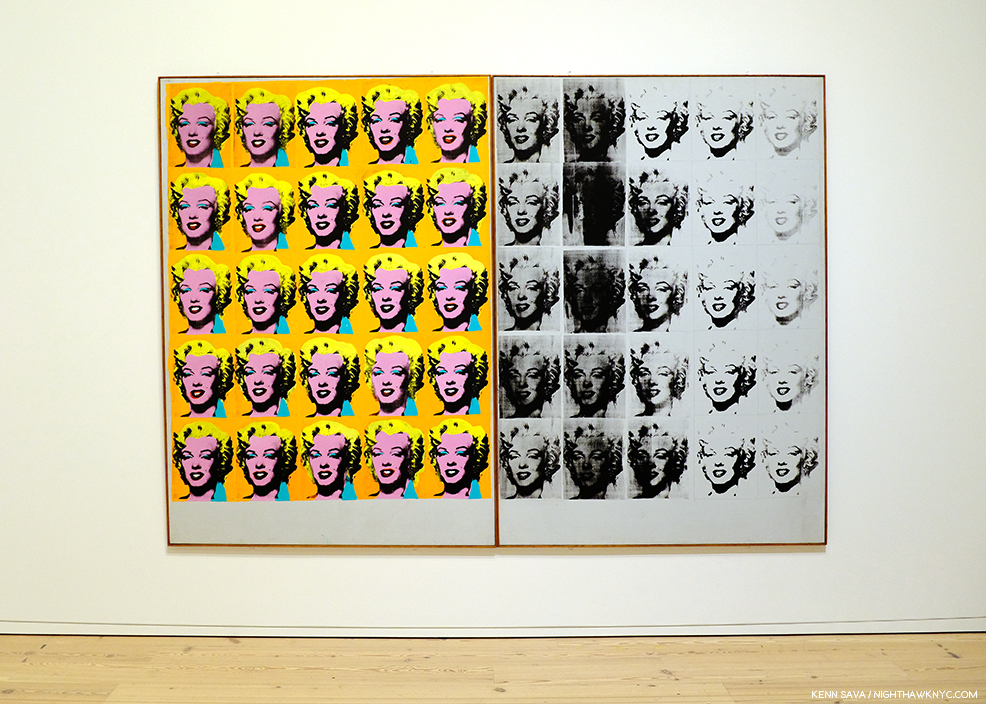
Marilyn Diptych, 1962

Let’s look at numbers 3 to 7 on my list for the ages (in no particular order). Next, Marilyn Diptych, 1962 – The duality of this work painted shortly after Marilyn Monroe’s suicide is revolutionary. On the one hand, Warhol shows Marilyn the idealized, beautiful, glamorous movie star, repeated radiantly in a sea of gold not unlike that of the religious icons of the Eastern Orthodox and other churches. On the right hand, the work seems to reference the darker side of both Marilyn’s life and death. This work is striking when one also considers that Andy was someone who sought autographs of movie stars as a child. Here, all the illusions of the silver screen are gone.

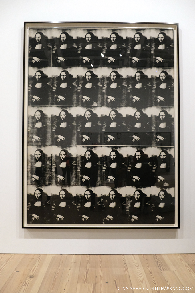
Thirty Are Better Than One, 1963

Thirty Are Better Than One, 1963, The multiple Mona Lisa as a commentary on the original’s visit to the USA at the time present an interesting counterpoint to the da Vinci- even in black & white. This one barely made my list, but given the precedent of other Artist’s commenting on or reinterpreting the Mona Lisa, like Duchamp, I think it will be of interest indefinitely.

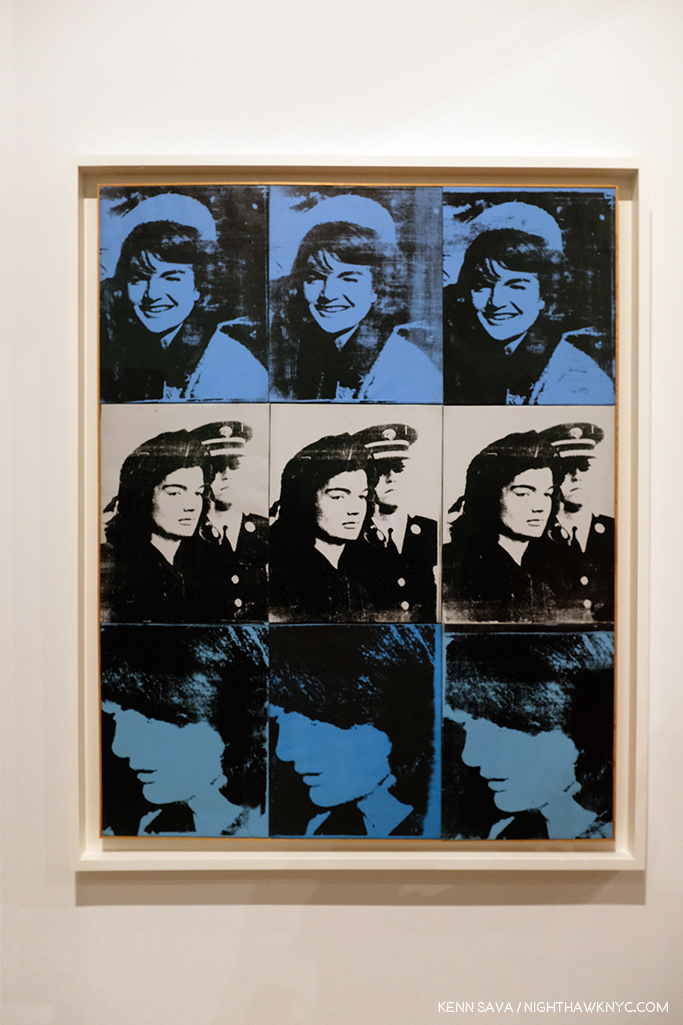
Nine Jackies, 1964

Nine Jackies, 1964. Something revolutionary in portraiture, the Artist captures the beauty of the Kennedy “Camelot,” and the horror and disbelief of what took place on November 22, 1963, as I remember it. A work that relies on the power of the Photograph, it’s one of the strongest uses of it in a medium outside of its own.

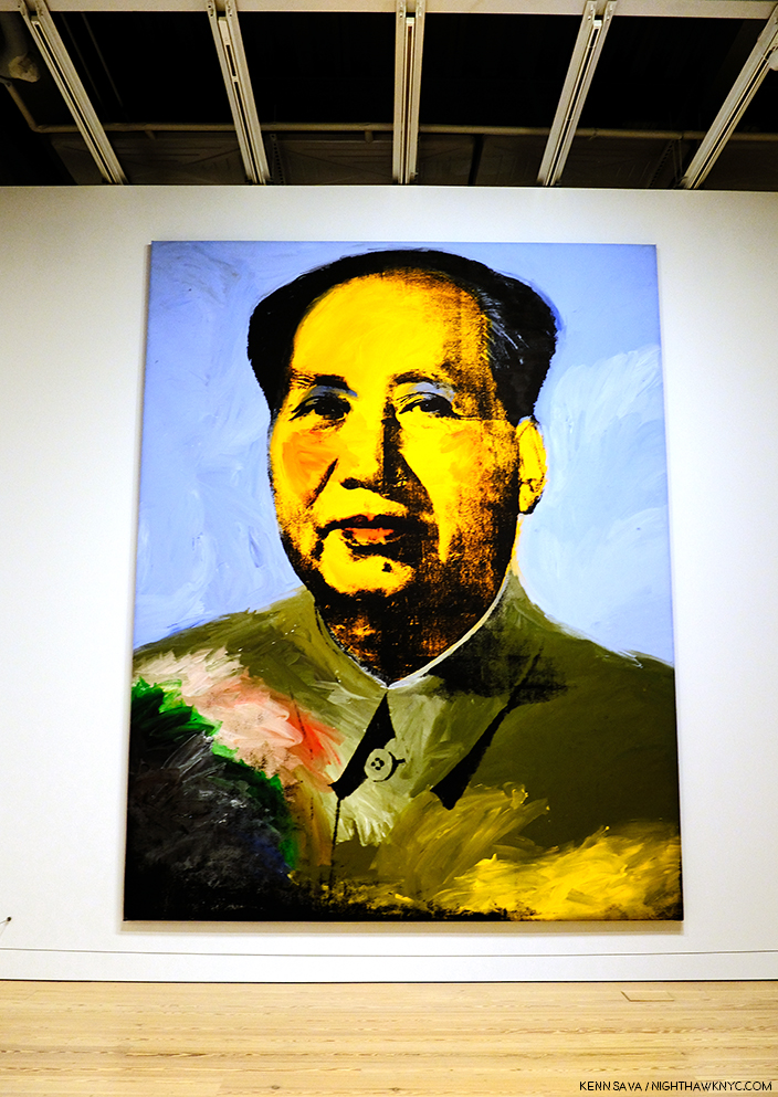
Mao, 1972

Mao, 1972- Created during the year of Nixon’s breakthrough visit to China, Andy Warhol’s image takes the portrait of Mao from the infamous Little Red Book of sayings and statements by the Chairman, which may have been the most reproduced image in the world at the time. Here, over 14 feet high, it symbolizes the Charman’s looming over all things in China, a different kind of manifestation of fame. Andy would make a brief trip, himself, to China in 1982, where he posed for a few pictures looking very stiff and uncomfortable.

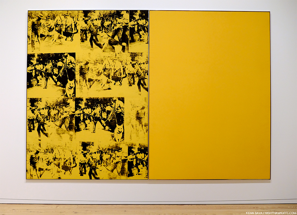
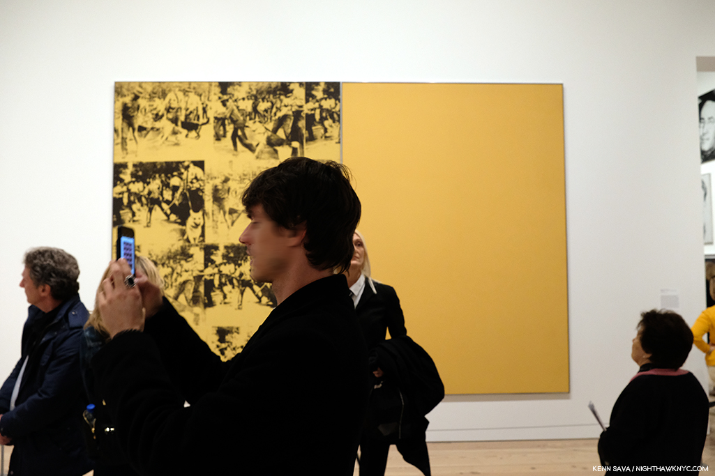
Mustard Race Riot, 1963.

Mustard Race Riot, 1963- Without a doubt, the most powerful work in the show, in my opinion, it sold for only $15,127,500.00 in 2004. “Only,” when you consider the current record price for a Warhol is $100 million (Eight Elvises), and when you consider another Warhol Race Riot, one that had been owned by Sam Wagstaff and Robert Mapplethorpe, sold for almost $63 million in 2014. As Artist Hank Willis Thomas, and others, have pointed out, this work looks as prescient as almost anything else in the show. Standing in front of it (which means standing a ways distant since it’s  114 by 82 inches), pondering it over multiple visits, I came away feeling that it may be one of the most important works of the 1960s, and for 1963, certainly gave those putting Andy Warhol in the “Pop Art” box pause for thought,  pointing out yet again the pointlessness of such terms.

Then? Something occurred to me to sleep top me dead in my tracks. ALL FIVE of these works involve the use of appropriated Photographs taken by others. Did Andy Warhol pay the Photographers for using them?

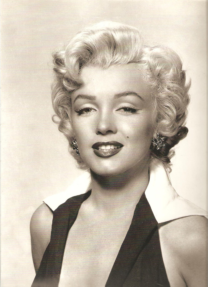
Gene Kornman, Photograph (Marilyn Monroe ), 1953. *Publicity Photo of Marilyn Monroe for the Film, Niagara.

This subject was not brought up anywhere that I saw in the show. They did mention (and exhibit) the Gene Kornman Photo Andy Warhol used, perhaps more than any other, was originally a publicity shot of Marilyn from her classic 1953 Film, Niagara. Also exhibited were the source Photos he used in Nine Jackies, which I subsequently learned Andy Warhol was sued over his use of. Charles Moore’s 1963 Life Magazine Photos were the source for Warhol’s Race Riot works, including Mustard Race Riot. Frankly? For an Artist who was so endlessly creative? That he did this, and did it for so long and so often surprises me. It took lawsuits for Andy and Robert Rauschenberg, who was also doing it, to decide to exclusively use their own Photographs henceforth, which, I think, improved the results for both. Yes, at the time, this was new territory for Artists. Copyright infringement was not a term that was not as common in Art in the late 1950s and early 1960s, and he had made his name using copyrighted names and trademarks for Campbell’s Soup, Brillo, etc., without issue- the companies involved, no doubt, relished the free advertising and attention, so giving his restless creativity the benefit of the doubt might apply here, I think (easy for me to say, I’m not Gene Kornman, who’s Photo of Marilyn wound up in Art that’s, no doubt, worth hundreds of millions of dollars, if not more, today).

I still think these are powerful works, among the best Warhols I’ve seen, but this does tarnish them a bit. It’s hard to ignore today. But, let’s move on.

Self-Portrait, 1950s

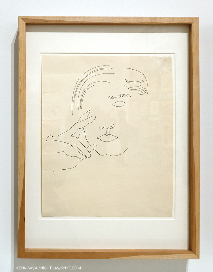
I’m always interested to see any Artist’s Drawings, and I made a point of spending a considerable amount of time with the Drawings, mostly early, of Andy Warhol displayed here. It’s interesting that they reveal a wonderful sense of, and control of, line, which I’ve long thought to be the most technically difficult part of Drawing. So confident is the young Artist in his line that he dispenses with almost everything else- even parts of the composition! Shading is only hinted at once in a while. Throughout, it’s his line that carries the work. This style is reminiscent of one Picasso used in the early 1900s to create works like this. In addition, he shows an economy that makes it fascinating to consider what he’s left out, a uniqe way of using what Artists call “negative space.” This Drawing is markedly different from the “scratchy” drawings with halting lines seen in some of his commercial work of the period. He changed his style to fit the subject, and it always worked. He was a very successful illustrator and store window designer. But? Shoes and shoe design held a special place in his heart.

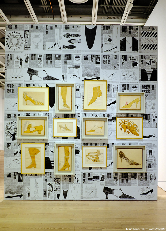
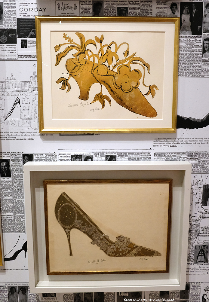
A wall of shoes. In each of the works in gold, Andy created a shoe as a caricature of a person.

It turns out that Andy Warhol had a shoe fetish. A real one, that surpasses the most shoe obsessed of my female friends, which John Giorno describes in graphic detail in the Documentary Andy Warhol: The Complete Picture! At 24:30, Mr. Giorno says, “There was Andy Warhol on his hands and knees kissing my shoes…”

Andy’s Truman Capote Shoe, with calligraphy by his mom, is seen over his The B.J. Shoe. Given his shoe obsession, it’s interesting that there are no works after this period that feature shoes, as far as I know. Also interesting is that Andy, himself, wore the same pair of paint splattered shoes for 25 years, which are also shown in The Complete Picture.

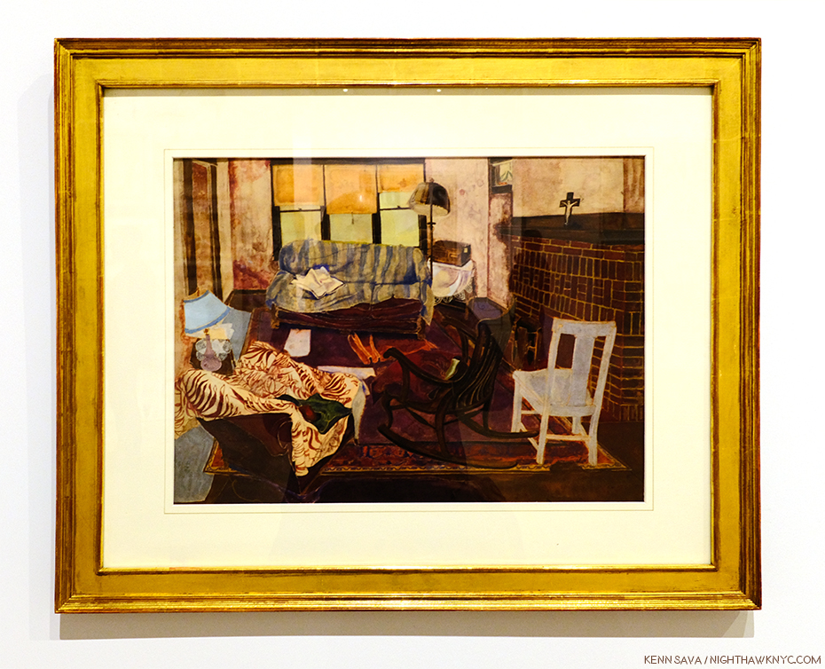
Even in the midst of his intensive period of Drawing for his commercial illustration clients, he was always looking for ways to create multiples of his Drawings. This led to his use of silkscreens. But yes, he Painted. This early Painting is the one work in included that would meet the definition of a Painting for most of Art History- prior to Warhol.

The charming Living Room, 1948.

From there, his Painting skills were used to modify and enhance works in other medium, like silkscreens, in works that were multi-media Paintings.

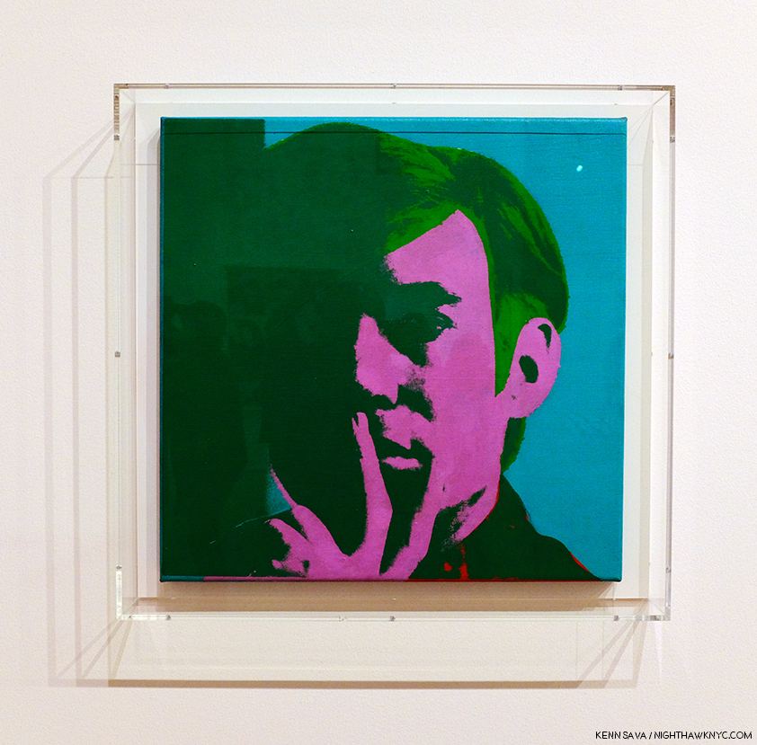
Self-Portrait, 1966, Acrylic, silkscreen ink, and graphite on linen.

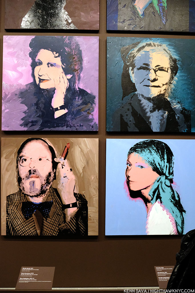
It seemed to me walking through the show that Warhol’s Self-Portraits are stronger than just about any of his other portraits. Downstairs on the first floor, an entire gallery was devoted to his square portraits, which alternated between the famous and the already forgotten with a fascinating portrait of his mom almost hidden among them.

Julia Warhola, 1974, upper right, a year or so after she passed away in 1972. Interestingly, it’s in the collection of Roy Lichtenstein, and that’s Dorothy Lichtenstein, Roy’s wife, below her. To her left is Met Curator Henry Geldzhaler, who was also painted by David Hockney.

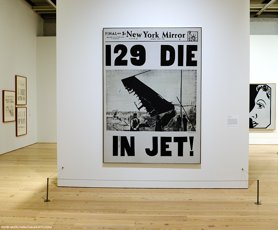
Along with fame, Andy Warhol’s other big theme was death. It’s a subject that makes an appearance early on in his Fine Art career, in works like 129 Die in Jet, 1962

129 Die in Jet, 1962

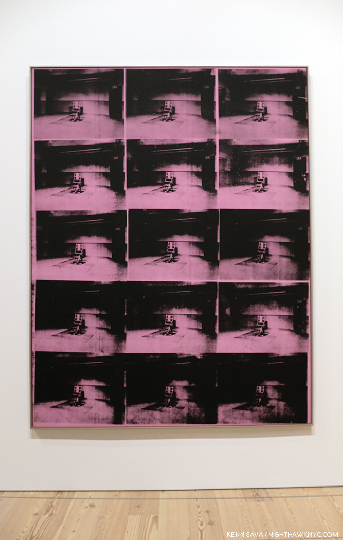
It carries on in his Electric Chair Paintings, and is an element in his Marilyn and Jackie pieces, both created shortly after deaths- Marilyn’s and JFK’s. The hold death has on visitors struck me on one visit while I was considering Mustard Race Riot. Given its large size, I had to stand a good distance away from it to take it all in.

I couldn’t help noticing a steady stream of visitors who entered the gallery and stood in front of me, facing to my left. They were looking at this-


Lavender Disaster, 1963.

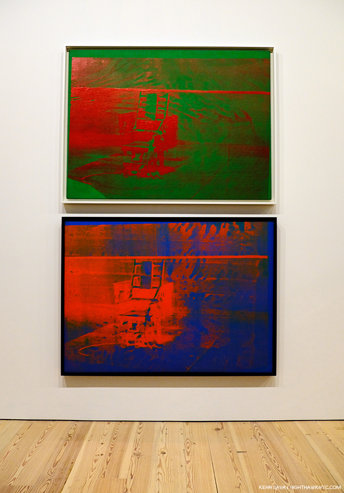
I heard someone say, it takes away the power of the electric chair as an image of fear. I don’t get that. I, for one, don’t get the point of multiplying the electric chair. I prefer these, individually-

Both, Big Electric Chair, 1967-8, top, 1967, bottom.

And, of course, there were the car wrecks, also featuring repeated Photos, which led into the next gallery, where the equally death-soaked Nine Jackies awaited, facing a wall of Most Wanted Men, 1964, Andy Warhol’s works based on wanted posters that hung at the New York Pavillion at the 1964 World’s Fair, and works from Flash-November 22, 1963, also about the JFK Assassination. But, of all the works related to death in this show, the eighth and final work on my “Art” list is Self-Portrait with Skull, 1978, in which the Artist brings his obsession with death home.

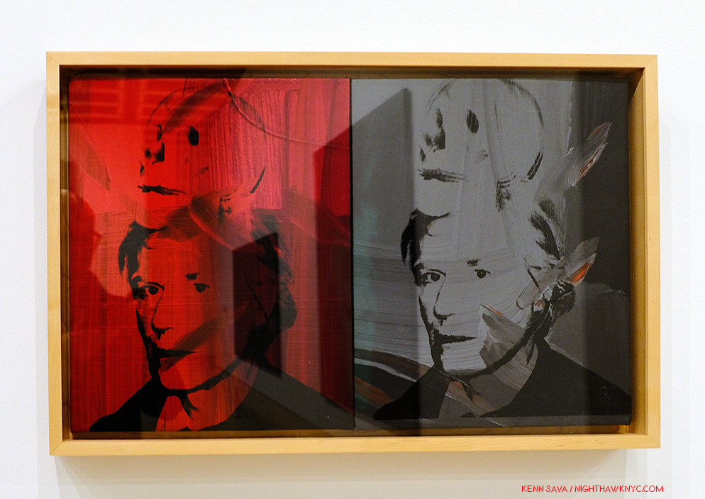
Self-Portrait with Skull, 1978

On the left, the red is hard to miss as the color of blood, and therefore, of life, while the grey/black image on the right recalls those in the Marilyn Diptych, which speaks to her demise and death. This work is based on one of Warhol’s own Photographs.

Andy Warhol- From A to B and Back Again was a good, but not a landmark show, in my opinion. In NYC, MoMA’s Warhol: A Retrospective remains the benchmark Warhol show. Part of the reason it’s not better is possibly due to the popularity and value of his work making loans very hard to get. After the silkscreen gallery with Mustard Race Riot, I felt the rest of the show continually declined, with isolated examples of better work. In much of the rest of it, I felt lost, adrift in galleries of work that either hadn’t held up to the passage of time (if they ever did stand out) or that contained ideas manifested on a gigantic scale, like the “piss paintings,” that were probably either left in the studio or done on a smaller scale. At this late date in his life and career, to suddenly go fully abstract smacked of running out of ideas, which is something that seems impossible for Andy Warhol.

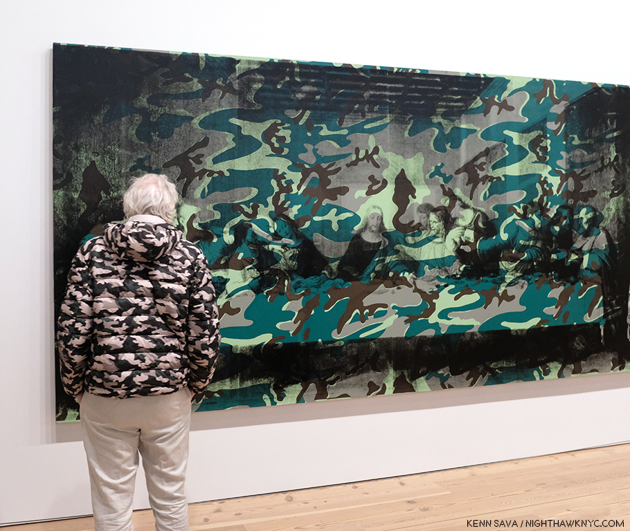
A camouflaged visitor scrutizies the left half of Camouflage Last Supper.

The culminating gallery with the also gigantic Camouflage Last Supper also struck me as a poor choice. Here, Warhol reprises the idea of the multiple Leonardo da Vinci’s, this time with 2 huge Last Supper reproductions side by side, which makes a point that escapes me, and then covers them with camouflage, perhaps to try and add some interest to his idea. Camouflage is, in keeping with Andy Warhol’s instantly recognizable images, a military artifact and symbol. What that has to do with the Last Supper is, also, lost on me.

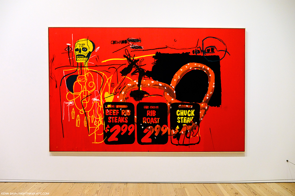
Andy famously collaborated with Jean Michel Basquiat, as seen here in Third Eye, 1985.

And then there were two of his collaborations with Jean Michel Basquiat. Though extremely colorful, looking at them I have as yet to see them as more than each bringing what they do to the work. The feeling of a true collaboration bringing the work to someplace else escapes me…so far, but I know people who love them.

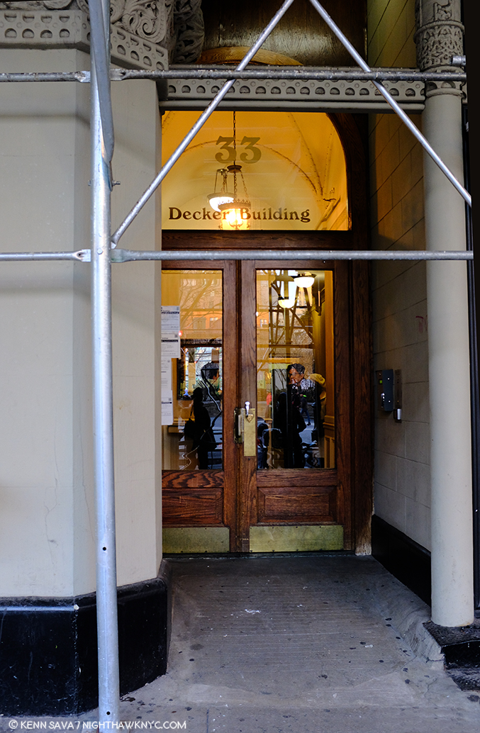
If these walls could talk. The site of Andy Warhol’s Factory when it was on Union Square, seen in Winter, 2018. Ironically, the scaffolding seems to be making an “A” for Andy.

Andy Warhol opened the doors to whole worlds of possibilities in the world of Art, and, indeed, the world. In doing so, he taught all of us how to see new possibilities in our work, and our lives. (And I am not speaking about his life or lifestyle in any of this.) There are very few Artists who even open one new door. For this, the world owes him a debt. A debt that might be best repaid by following his example of seeking new possibilities. He sought out, encouraged, and worked with, young, even beginning Artists, and so played a role in the creation of world renowned Artists including Stephen Shore, Robert Mapplethorpe, and  Jean Michel Basquiat, and treated them every bit the same as he did established Artists.

Regardless of what the world comes to think of his Art, these are the contributions of Andy Warhol I choose to remember and celebrate.


BookMarks-

As I showed earlier, a list of books written on and about Andy Warhol could fill a book itself. I have only seen a minuscule number of this vast library. Of those, a few stand out to me, particularly for those looking to keep from having a wall of Andy Warhol books that rivals that in the Whitney’s Shop!

The best overviews of his Art I’ve seen are these two-

Andy Warhol “Giant” Size: Gift Format has been issued in a few sizes over the years since it’s first release 10 years ago. Whatever size works for you, this “visual biography,”which includes over 2,000 images, remains the best one-volume survey of Andy Warhol’s Life & Work.

Andy Warhol: A Retrospective The catalog for MoMA’s 1989 Retrospective. Out of print, it’s reasonably priced in hard or softcover on the aftermarket. It remains the most comprehensive overview of his Art, and serves as the catalog for the most exhaustive show of his work yet mounted.

Factory: Andy Warhol by Stephen Shore is a fascinating book for Photography lovers. It preserves, both, the earliest body of work yet published by one of the most important American Photographers of his generation, and the most comprehensive look at Andy Warhol’s legendary Factory we have. Wasn’t it Andy who said, “It’s like an auto wreck you can’t take your eyes off of”? If not, he should have.

Finally, The Philosophy of Andy Warhol (From A to B and Back Again) is a must read, as much for its entertainment value as for its life experience advice, which is given on almost every page, though it’s light on Art and technique for Artists looking for a “how I did it.” Rumor has it a team “helped” Andy write it, but it’s hard to tell from the distant outside if that’s true or who did what. It’s something of a classic among pseudo-autobiographies, and plays a seminal role in the creation of Andy Warhol, as a work of Art in himself.

*- Soundtrack for this Post is, what else? “Andy Warhol” by David Bowie, who memorably played Andy in Julian Schnabel’s Film, Basquiat, looking for all the world like he was having a blast doing it.

Oh! PS- Andy? 4,627 words.

NighthawkNYC.com has been entirely self-funded and ad-free for over 6 years, during which over 250 full length pieces have been published. If you’ve found it worthwhile, you can donate to keep it going & ad-free below. Thank you!

Written & photographed by Kenn Sava for nighthawknyc.com unless otherwise credited.
To send comments, thoughts, feedback or propositions click here.
Click the white box on the upper right for the archives or to search them.
For “short takes” and additional pictures, follow @nighthawk_nyc on Instagram.

Subscribe to be notified of new Posts below. Your information will be used for no other purpose.


  1. The Philosophy of Andy Warhol, henceforth TPoAW, P.86
  2.  TPoAW, P.26
  3. TPoAW, P.96

Grant Wood: The Wheat From The Chaff

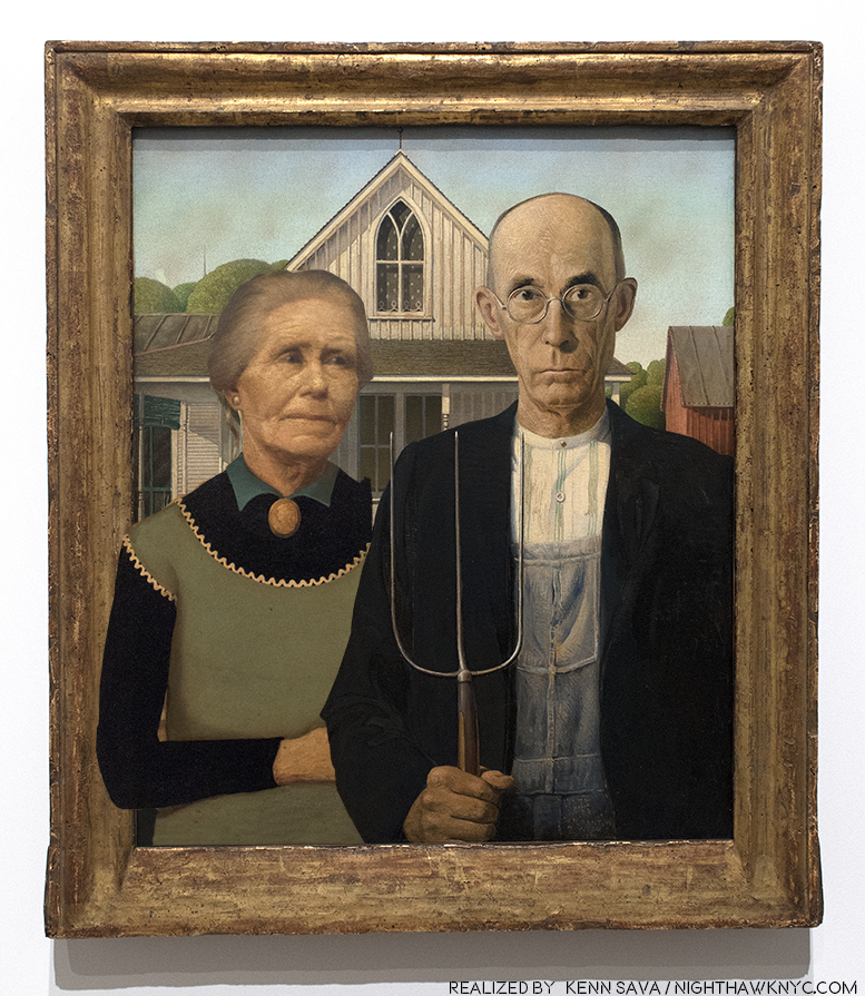
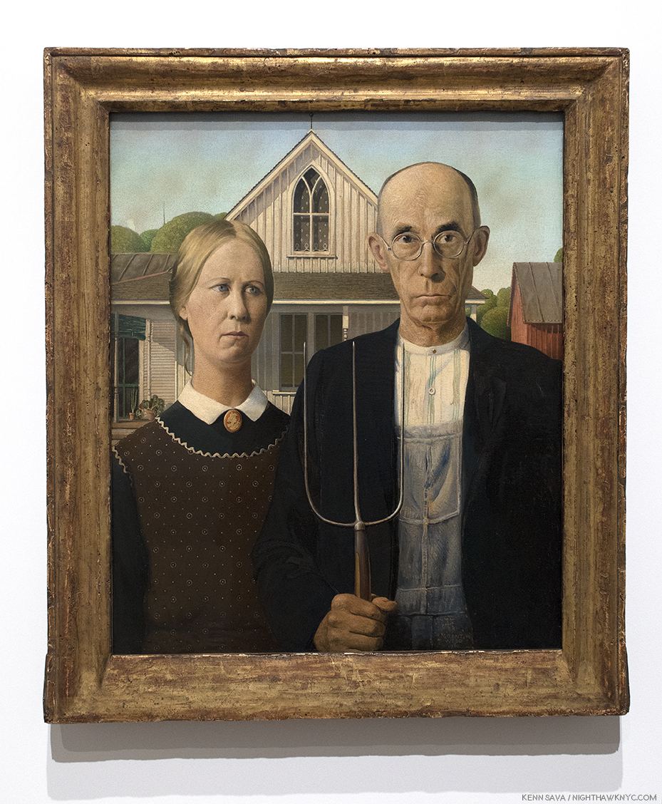
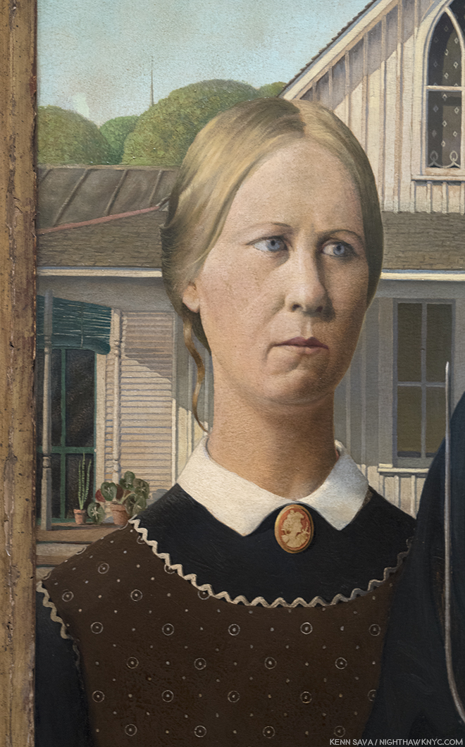
Wait. What? My rough realization of what Grant Wood may have REALLY wanted “American Gothic” to look like. I’ll explain shortly. Click any Photo for full size.

There is no denying Grant Wood’s contribution to what is now called “American Art.” He was one of the staunchest advocates for this country developing it’s own style of Art. He did as much as anyone else from the late 1920’s on, towards making it a reality. He spoke, taught, and formed Artist’s communities. and created Art that received wide acclaim as being American. Yet, seventy-five years after his death, the image we have of Grant Wood, the man, as well as the common perception of his work, is not the whole picture.

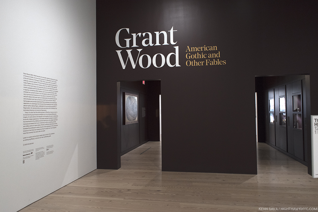
Behind the show’s entrance, the first gallery is ominously dark, ostensibly to show off the work in the next Photo. It did “set a tone,” at least for this viewer.

Like Michelangelo, he carefully monitored his public image, and like Il Divino, this was no easy task given the unprecedented level of popularity “American Gothic”, um…the real one… received, literally overnight, when it debuted at the Art Institute of Chicago’s Annual Exhibition of Painting & Sculpture in October, 1930. It  pretty much never waned the rest of his life. Along the way, he carefully monitored his public image to keep out any inkling of homosexuality, which was, apparently his preference, though he married, once. Critics, and the public, have looked long and hard at his Art for “telltale” signs of it. I find very few passages that are even “suggestive.” That doesn’t mean he wasn’t homosexual1. That only tells me he was careful. Looking at the work, I find far more that would belie his image as the “Painter of Middle American values.”

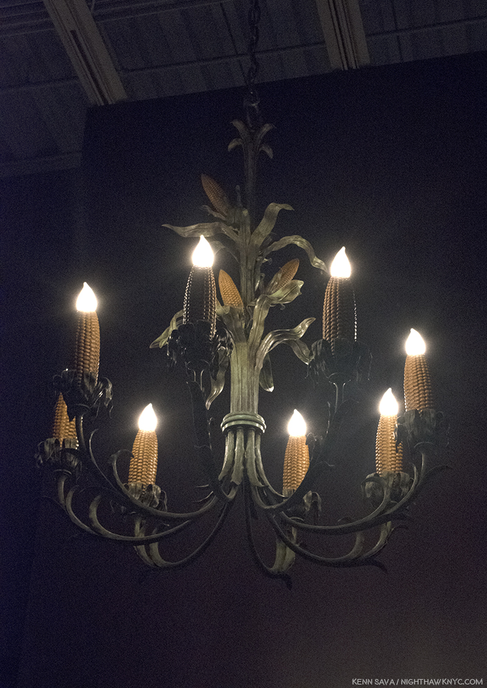
Grant Wood, yes. Grant Wood, “Corn Cob Chandelier,” 1925, Copper, iron, paint. I can just hear Frank Lloyd Wright and Louis Comfort Tiffany, the two geniuses of American Design and Ornamentation of the time saying, “Now WHY didn’t I think of that??”

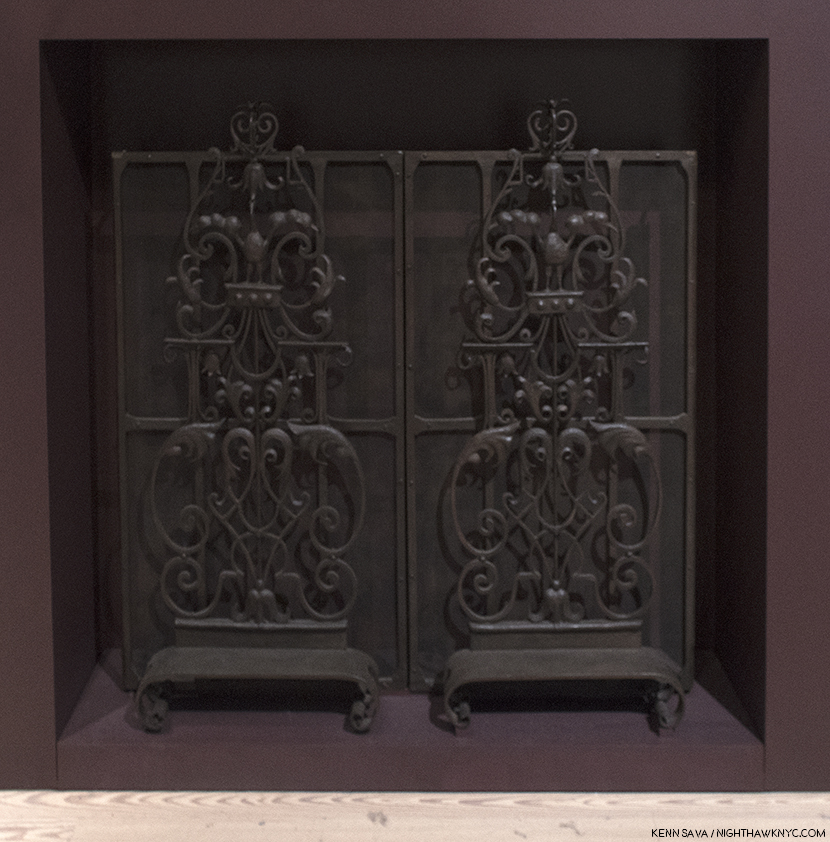
“Fire Screen Ornament,” 1929-30, Wrought iron. Grant Wood was accomplished at a wide range of things, including iron working, as here, jewelry making and he even designed and constructed a few houses. As seen here, he had his own style in these materials, that was different from the ornament created by Wright, Sullivan or the Europeans.

My initial walk through of the entire “Grant Wood: American Gothic & Other Fables’” 9 galleries over 3 visits to the Whitney Museum, left me with one overriding feeling. Though his mature period lasted barely 11 years, from 1930 to his death at age 50 in 1941, I found much of this work unsettling. Over my subsequent re-visits, I searched for why.

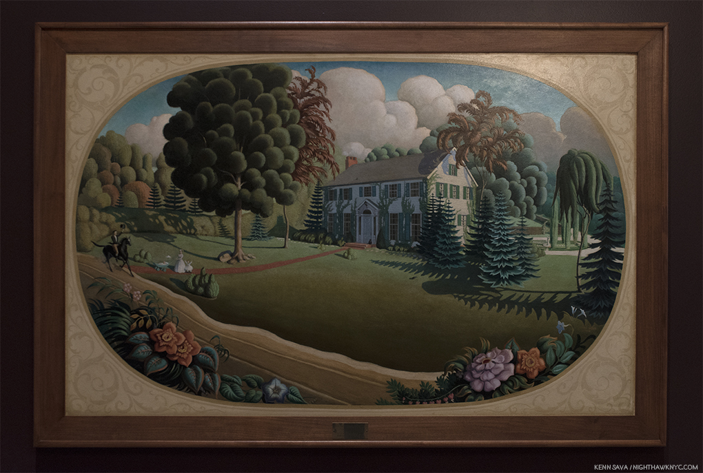
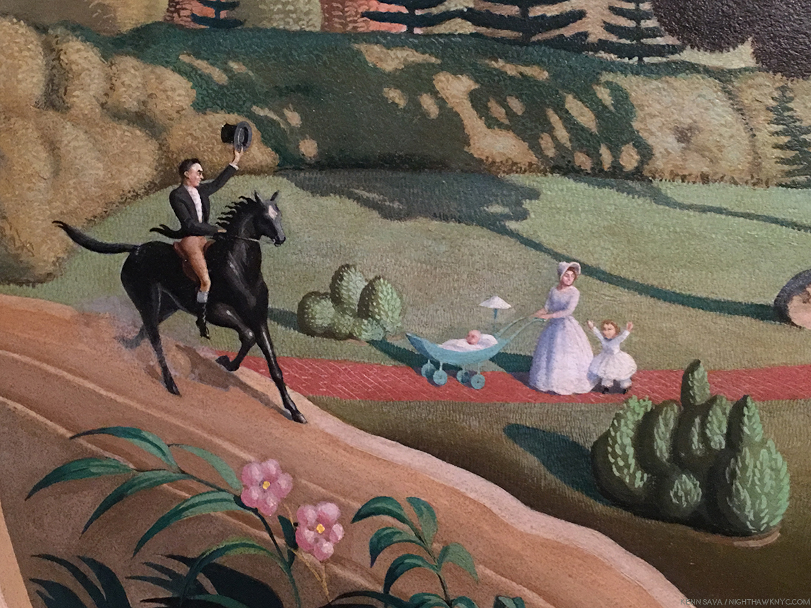
Overmantel Decoration,” 1930, Oil on composition board. Also displayed in the first, darkened gallery. Painted the same year as “American Gothic,” to go over the mantel of a couple’s new home, this “idyllic” scene bothers me to no end. Notice, half of the front lawn is covered by an ominous shadow (or a dying lawn2, the trees on the right look more like circular saws (not exactly welcoming), and the mother looks away from the man on horseback, who is going past her and what we assume are her children, given his horse’s leading hoof is already past the path they’re standing on. The tall tree to the right is brown- is it dead? In the background 2 dark clouds loom. The house is already being covered in vines. What, exactly, is going on here, and why are we “spying” on this scene from behind the plants across the road?

“Overmantel Decoration,” 1930, ostensibly fills it’s commission- Art to hang over the mantel of a family’s new home. Yet, I can’t help wonder if it’s “more.” The scene depicted, an almost ideal middle class life circa the late 1890’s, would be something almost impossible for an Arist to attain. Especially one in the mid-west, far away from where Art was trading hands for serious money at the time. Grant Wood well knew this. I can’t help but wonder if that’s why the scene is almost being evesdropped on. Most people would want to show their house from directly in front of it. Yet, we “spy” it from a 45 degree angle at a time when the front facade is in shadows. It’s as if the Artist is evesdropping on a life he’ll never know choosing to follow his creative star. Of course, any life is fraught with dangers, and maybe that’s why there’s so much of it, apparently, in this work, where one would expect the kind of bliss Currier & Ives made famous.

Detail. A strange “Welcome home” from the woman, IF this is her husband.

Grant Wood was born to a farmer and his wife in Anamosa, Iowa in February, 1891. His father was a very strict, my-way-or-the-highway kind of man, who wouldn’t hesitate to discipline if things weren’t done his way. He was a man’s man, and to his son Grant, more a God than a man, as he said in his autobiography. Plump and not blessed with physical strength, Grant (who was named after that paragon of manliness, U.S. Grant), was not cut out to follow in his father’s footsteps. His sense of inadequacy and his sense of striving to put forth a “manly” persona remained with him for the rest of his short life. (He died 2 hours short of turning 51 in 1941.) His father suddenly died when Grant was 10, forcing his mother to sell the family farm, and leaving Grant with issues that stayed with him the rest of his life, and I feel, are quite visible in his work. Yes, right there alongside the “wholesome,” American values so many see in his work.

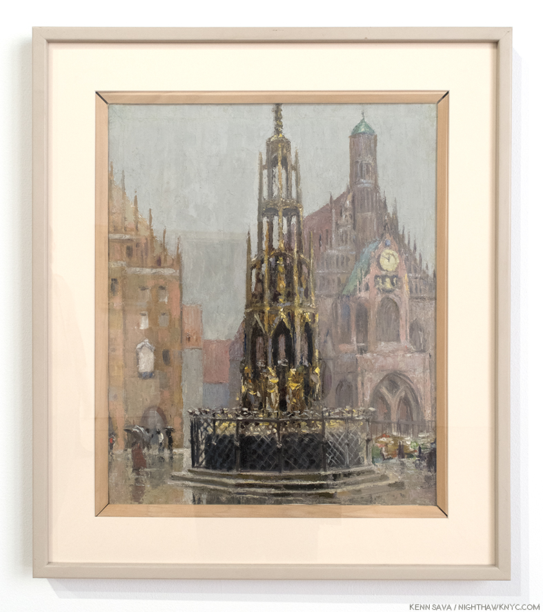
“Market Place, Nuremberg,” 1928, Oil on canvas.

In 1920, he sailed to Europe on the first of 4 visits. In 1940, he explained, “when I told my friends in Cedar Rapids, Iowa that I was going ‘there’ to Paint, I immediately became an outcast. It wasn’t considered manly to be an Artist. Then I read H.L. Mencken’s articles, and decided I must leave the Bible Belt at once and go to Paris for freedom3.” During his 4th trip, in 1928, Grant Wood suddenly had an “epiphany” as he called it during a visit to Munich, Germany’s Alte Pinakothek, when he came upon works by the Northern Renaissance masters, particularly Hans Memling and Albrecht Durer. Virtually instantaneously, he abandoned the “Impressionistic” style he had been using (as seen above) in his non-commissioned work, for most of the 1920’s.

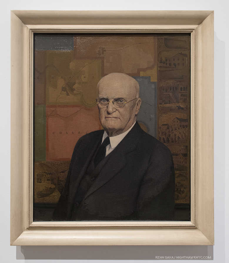
“Portrait of John B. Turner, Pioneer,” 1928/30, Oil on canvas. Almost on a dime, his work changed to this, sharply realistic style, that harkens back to Memling and Van Eyck, in a work that marks the beginning of his “mature” period. A number of portraits followed, this prize-winning work.

Returning home, almost immediately, his mature style debuted in the portrait of the father of the Artist’s patron, David Turner. Grant Wood was obsessed with the appearance of “manliness” throughout his life. David Garwood, who wrote the first biography of Grant Wood, said his father, Maryville (pronounced “Mervil”), “looked at Grant now and then and wondered how he happened to bring such a son into the world4.” For the rest of his life, Grant Wood would be so mindful of the impression he made he even adopted overalls when he worked and often when he was Photographed so as to not look like the stereotypical “Artist” of the day, which was associated with “unmanliness,” since Art making wasn’t considered “real work”. In “Portrait of John B. Turner, Pioneer,” the subject looks out at us as if to say, “I have secured my place in Iowa history. Can you measure up?” “The sitter appears to know” the answer, R. Tripp Evans, says. He also sees it as a “down payment on his debt to Maryville, whose death had freed him to become an Artist. Safely contained behind the mask of ‘Daddy’ Turner, as John Turner was familiarly known, Maryville sits before the map that will lead Wood back to his past- and to a new approach5.”

Continually using his family and friends as models, a series of portraits of them followed, Most notably this one-

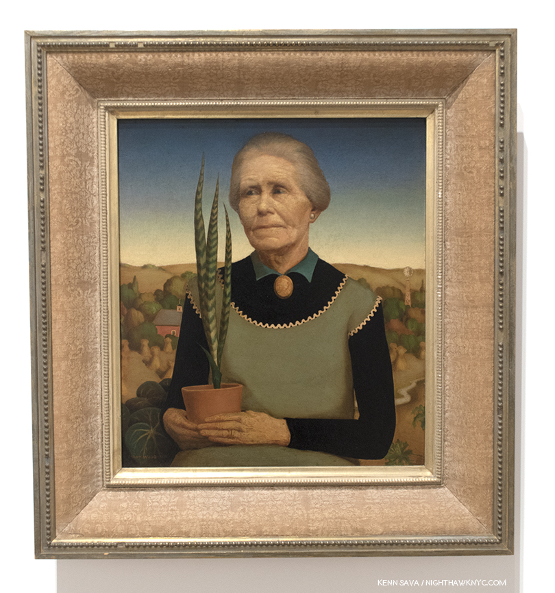
“Woman with Plants,” 1931, Oil on composition board. The Artist’s mother in what was Grant Wood’s favorite of his own works.

It’s a portrait of his mother, Hattie Deette Weaver Wood, who Grant Wood lived with for the rest of her life after Maryville’s death in 1900, until her own death in October, 1935, partially perhaps, to shield him from the scrutiny and gossip surrounding him being a “bachelor Artist.” In it he depicts her as he remembered her looking on the day of her husband’s death. She wears an apron over a black long sleeve top, possibly in reference to the Artist’s comment regarding his change of styles, ” I spent twenty years wander around the wold hunting ‘arty’ subjects to Paint. I came back to Cedar Rapids, my home town, and the first thing I noticed was the cross-stitched embroidery of my mother’s kitchen apron6.” His eyes opened to the potential subjects all around him, the change would last the rest of his life. After the fact, he tried to alter the dating of these two works to make it appear that “Woman with Plants” had come first, and before “Portrait of John B. Turner, Pioneer,” but it had not. Though he dearly loved it, Hattie insisted he sell it. Sorrowfully, he did, but intended to do another portrait to replace it. When the idea for “American Gothic” came to him, after seeing the now famous small house with the upstairs Gothic window in Eldon, Iowa, he had an idea. His sister Nan, who posed for the young lady in the Painting, said this in an interview soon after-

“As he put together his composition for the house and two people while he was at the breakfast table that morning in 1930, he said he had models in mind—a man and a woman who would be just perfect. However, he was afraid to ask the woman, fearing she would be angry at the idea of being made something less than beautiful … Grant never told me whose place I took as the model, but I’m sure it was a spinster who had hounded him7.”

So, finally, he arrived at this-

The “real” “American Gothic,” 1930, Oil on composition board. On loan from the Art Institute of Chicago, who bought it for the outrageous sum of…three HUNDRED dollars!

How can ANYone stand in front of this and not feel uneasy? I, for one, don’t like having the business end of a pitchfork pointed at my eyes.

The Artist happened to drive by the house one day and was taken by the gothic window on the second floor, which reminded him of the Cathedrals he’d recently seen in Europe. Dr. Byron McKeeby, Grant Wood’s dentist, 62, by accounts an affable man, posed as the farmer. His sister, Nan, 30 at the time, posed as the lady who has been identified as either the farmer’s wife, or his daughter (Grant Wood is quoted calling her either at least once, though, like Michelangelo, he appears not to be above saying things for his own reasons, on occasion). The uneasiness this work invokes, along with a “Mona Lisa”-like enduring mystery about it’s “meaning,” hasn’t stopped it from becoming one of the most famous works of American Art of the 20th Century. My reading of it is that it has to do with the Artist’s feelings of confronting his father about his being an Artist and not a farmer.  That it’s his devoted sister, Nan, standing besides the father figure, says to me that she wants him to show him some understanding. It also expresses the Artist’s sense of feeling like an outsider in his native state. Those feelings may have been sharpened into irony (if not outright scorn of his neighbors) by his reading of H.L. Mencken8.

No, Grant Wood wasn’t a farmer. The closest he got to it was tending a garden. He was, originally, a Decorative Artist. He studied and worked at making silver jewelry and coffee and tea sets, he worked in iron, as seen earlier, and he did stage design. None of these were considered “manly” and most weren’t considered actual “work” by his father and others at the time in Iowa. Right up until the 1930’s, years after he had settled on being a Painter, he was still supporting himself designing, building and furnishing homes. He spent his whole life striving to overcome what he perceived was a lack of manliness in the perception of him by others, ingrained on him by Maryville.

Over 6 visits I made a point of carving out a few minutes each time to stand alongside viewers looking at “American Gothic.” I stood to the side so I could watch their expressions. Yes, quite a few posed for selfies with it, and in those cases, I looked at their faces, too. No one smiled. It seemed to me that the mood of the work was imparting something beyond the hype the work has received for 80 years as being an icon of the American Mid-west and it’s core values. I detected uneasiness in my fellow viewers as well. The power of the work begins in the eyes. R. Tripp Evans says the farmer’s eyes don’t make eye contact with the viewer, they look just past him/her. They bored right through me.

So…? What’s up with the image I posted up top?

The same R. Tripp Evans makes a strong case that the “woman who would be just perfect” was the Artist’s mother, Hattie. But, asking her to pose alongside another stern farmer other than her late hubsand would have been too close to home for her, and too painful. She would never had agreed. So, he posed Nan in her stead. Somewhat revealingly, Nan wears the same cameo (of Persephone) that Hattie wears in “Woman with Plants,” She wears long black sleeves under her apron, like Hattie does, both with pointed fringe and collar poking out up top, and, both women wear their hair back. Also, the potted sansevieria, which Hattie grasps with both hands on her lap in “Woman with Plants,” now appears on the porch over Nan’s right shoulder. Grant Wood never reused items that had appeared in one of his works in any other work ever again. Where there’s smoke? There’s fire. There’s quite a bit of “Hattie smoke” in Nan’s portrait here.

Is this the farmer’s wife, or daughter? She’s both. She’s made to look like Hattie, but she’s Grant Wood’s devoted sister, Nan, here taking his side, as usual. Note the sansevieria plant on the porch.

His father having passed away, his mother not being ammenable to posing, he did the next best thing. He asked his sister, Nan, to pose, and asked his dentist, Dr. Byron McKeeby to pose as the farmer. In his unfinished autobiography, “Return from Bohemia,” Grant Wood describes Maryville as “Tall and gaunt,” with a “solemn, stern, angular face9.” The affable Dr. McKeeby was able to capture the grim look Grant Wood wanted, aided in no small part by the fact that he is wearing Maryville Wood’s eyeglasses! The only item belonging to his father that Grant Wood kept. He liked them so much, he had a duplicate pair made for himself. All these things point to the Artist’s original intention to depict his mother and father in “American Gothic.” The  Artist, himself, is represented, I believe, by the European Gothic window- quite out of place in 1930’s Iowa, like Grant Wood felt he was, fittingly, with it’s curtain down, hiding what’s inside.

So? I’ve created a very rough idea of what “American Gothic” might have looked like if he had asked Hattie to pose and she agreed.  Taking her portrait from “Woman with Plants,” my job was made easier because there are so many similarities with Nan’s appearance in “American Gothic,” and her mother’s in “Woman with Plants,” as I’ve listed. The main visual difference being the disparity of their ages.

What this exercise showed me is the difference in the effect in switching Nan for her mother would be major. Of course, we have no idea how Grant Wood would have rendered Hattie had she agreed, and enabled the Artist to follow through on his yearning to replace “Woman with Plants.” If this had happened, it is interesting to ponder if the public would have responded to it the way they have to the “American Gothic” we have. That circles the question back as to why they have.

It’s ironic that it was his mother, who’s protective presence shielded him from unwanted public scrutiny, who inadvertently led to more of it than either of them could have ever imagined. Perhaps, only the Artist would have preferred it with his intended “perfect models,” and if he had gotten them, would he have remained a strictly local favorite Artist- a while longer, or permanently, as so many others have?

“Dinner for Threshers,” 1934, Oil on board, nearly 7 feet long. Ostensibly, a communal meal on “threshing day,” the day when the edible part of the grain was loosened from the husks and stalks (i.e.-the chaff). For Grant Wood, threshing day was “the big event of the year10.”

While most people who see “Dinner for Threshers” will take it at face value, as a meal after working in the fields, it harbors quite another level. Set in an open house, his childhood farmhouse near Anamosa, like a stage show, what we are seeing is nothing less than the Artist’s reimagining of his father’s last meal before he suddenly “dropped dead,” as the local newspaper headline read, in 1900 at the window in the center- the vanishing point of the work, in multiple ways, as Mr. Evans points out. It’s design is an apparent homage to Leonardo da Vinci’s “Last Supper,” complete with untanned foreheads instead of halos, 13 workers instead of 12 disciples, and features what might be the Artist, himself, three times on the far left, outside, and again at the table looking up at the woman, who may be Hattie, who appears as the other three women, to the right, according to Mr. Evans11. Since Wood said that “It includes my family…,” that leaves me wondering where Nan is. Maryville, appears in the center, taller than everyone else, with his back to the viewer, in the light shirt, in what would be the only time his son Painted him. So, what we are seeing here is nothing less than the end of one life, and the beginning of another- Grant Wood’s career as an Artist. In that sense, too, “wheat has been separated from the chaff.” Treshing day, indeed.

“Parson Weem’s Fable,” 1939, Oil on canvas.

In “Parson Weem’s Fable,” 1939, the fictitious fable about George Washington it depicts is not the only “fable” being told. Here, also, as late as 2 years before his death, Grant Wood is having it out with his father. By not wanting to become a farmer, he is ostensibly killing the cherry tree, i.e. his farm, which was sold after his sudden death in 1900. He refuses to return the axe, that is go back on his choice of an Artistic career. Grant Wood acknowledged that Washington’s attitude is his own[Ibid P.409]. The house in the back is his and his wife, Sara’s house, and the house where his mother would die. The red curtain the Parson opens is his mother’s curtain used in their prior Turner Alley sleeping quarters for a decade. Those would would classify Grant Wood’s work as Magic Realism, including Emily Braun in the show’s catalog (P.67), need to look no further, as what I believe they mean is seen in full effect here. No less than Gilbert Stuart’s portrait of the mature George Washington12, the one seen on the dollar bill, is morphed on to young George’s body, because, as he said, no portraits of the young Washington exist. Intriguingly, in the back of the scene a black woman and man tend to another cherry tree. Are they a couple? Mother and son? They do serve to remind us that both George Washington and Washington’s father owned slaves. They are the only African Americans to appear in Grant Wood’s work (as far as I know).

“Fall Plowing,” 1931, Oil on canvas

“Fall Plowing,” 1931, is an example of what others call “Magic Realism” (a term that Edward Hopper gets lumped into and I will never understand why), with it’s classic, surreal, Grant Wood  background. What strikes me is the unattended plow. While others (R. Trip Evans, “Grant Wood,” P. 204) see a sexual metaphor, there is no other way for me to “read” this work than to think it’s a very poignant homage to his father, Maryville and his sudden passing. He may well have left some farm implement right where he was working and using it. The plowed and planted fields rolling off into the distance speak of work accomplished, while the unplowed land in the immediate foreground speak of work to come and now left undone. I can picture the Artist coming across such a scene after his father died, so for me, this strikes closest to home among all of Grant Wood’s landscapes. It’s interesting how the only sign of other human life is way off in the distance, heightening the sense of isolation. In the most recent biography of Grant Woods, by R. Tripp Evans, which is full over very interesting biographical detail, the author goes to great length to sexualize this work, as he does too many times, in my opinion. Frankly, I just don’t get that at all standing in front of “Fall Plowing.” I also note that in the same year, he painted Portraits of his sister, Nan (“Portrait of Nan”), and his great-aunt, Matilda Peet, (“Victorian Survival”).,

“Victorian Survival,” 1931, Oil on composition board. Grant Wood’s maternal great-aunt, Matilda Peet, rendered, in a different style, from a 19th century family tin-type…with the addition of a “modern” telephone on the left.

Here there is, also, the overriding distance that is seen in most of Grant Wood’s mature landscapes. The scenes are seen from far away, leaving the viewer isolated, as in “The Midnight Ride of Paul Revere,” 1931, for one example. The feeling is not all that different from that in the work of Edward Hopper at about the same time.

The loneliness seen throughout Grant Wood’s work may be rooted in the isolation he and his family lived during his first decade, isolated on a farm near Anamosa, a village of less than 2,000, “as if we had been on an island in the ocean,” he said. “If the unique circumstances of Wood’s childhood- it’s profoundly rural setting, his father’s strict expectations, and his own emotional makeup- established early self-doubts concerning his masculinity, then the cultural context of his youth only compounded the problem…the most compelling element of his mature work- his selective reorganization of past experience-was present in his art from an early age, and appears to have served a deeply cathartic function13.”

“Death on the Ridge Road,” 1935, Oil on composition board. The only appearance of multiple motorized vehicles in this show.

Death is, obviously, an undertone that accompanies many of Grant Wood’s works, and a theme in his life. Even beyond his father’s death, Grant Wood, appears to almost be obsessed with it. He took walks in graveyards, he worked for at least two funeral homes, including his first job as a night watchman. He took various roles at David Turner’s Funeral Home, including designing casket biers, and after being given a studio directly behind it, he used a coffin lid as it’s front door. In this work, “Death on the Ridge Road,” 1935, he Paints it. Inspired, Nan says, by a close call a friend had but survived, here, the long sedan has no way out. At this time, Grant Wood was facing the eminent demise of his “we three” family unit he had been nurtured by for the past 25 years. Nan moved to Albuquerque and his mother, Hattie, was starting to go. She would die in October. Startlingly, on March 2nd Grant Wood, 44, finally married. Of course, some surmised, at the time and since, that his marriage was a “cover,” necessitated by Hattie’s demise. I have no idea. It ended in divorce some 3 and a half years later.

“Spring in Town,” 1941, Oil on Wood.

As the Nazis blitzkrieged across Europe, Grant Wood embarked on a series of works designed to show Americans what they stood to lose. “Spring in Town,” 1941, is one of the two he lived to finish before he died of pancreatic cancer on February 12, 1942. In the midst of the townspeople busy with their daily chores, I can’t help but notice the gent planting in the foreground. For me, this symbolizes much of Grant Wood’s Art. His work speaks for  him, and they do so on a number of levels, not all of them obvious. As this increasingly comes to light, the reassessment of Grant Wood is continuing. Just what is he really sowing in that ground, and in these Paintings? He had quite mixed feelings for Iowa, it’s citizens and their lifestyle, and some of his most famous works, including “American Gothic” were born out of his desire to poke fun at them in response to the way he felt he was treated as an Artist then and there. But more than that, seeing this many of his works together, it becomes obvious that Grant Wood was painting his childhood of the 1890’s, and not the mid-west of the 1930’s. He was painting what he lost, not what was disappearing as he grew older, and he was working out that most significant relationship of his life, that failed relationship with his father.

With 117 works on view by my count,  the show is larger than the Stuart Davis show. It does feel light on his early work (I saw one Painting from the decade of the 1910s, three dated 1920-25), which misses a chance to trace his development from nearer his beginnings. I doubt the overall impression would be much different. “Grant Wood: American Gothic & Other Fables” provides New York with a rare chance to see so many of the Artist’s works in one show (the last time, if I recall correctly, was also at the Whitney in 1983), given the overwhelming number of them permanently reside in Iowa, and most importantly, a rare chance to assess his work in light of all that has come after it, and to see what it has to offer to us today.

“The Return from Bohemia,” 1935, Pastel, gouache and pencil on paper. The cover for his unfinished autobiography shows the Artist surrounded by Nan, his early dealer, Ed Rowan, his patron, funeral home owner, David Turner, Hattie, and his younger self, left to right, looking over his shoulder. Mysteriously, each of their eyes are hidden from us.

When you begin to piece it all together, Grant Wood comes across as more of a “contemporary” American, who’s complex, had issues with his family and neighbors, and was a member of a sexual minority. He looked forward to, and did all he could to help establish, an American style of Art, while at the same time, his own Art seems fixed in time- the 1890s. In that sense he was “old-fashioned,” too. Having dealt with rejection from his childhood, by the time he achieved his breakthrough, Grant Wood was an expert at managing what he revealed to others. He edited his work relentlessly to make sure it presented the image he intended, and he destroyed what he thought didn’t. Therefore, it should be no surprise that looking for “proof” of his homosexuality (in things like the gent in “Spring in Town,” above, working without a shirt on, or in “Fall Plowing”) is a waste of time, in my opinion. He didn’t want it to be found because the results would have been disastrous, personally and professionally, and he knew his work better than anyone else ever will. Looking, instead, at his work for messages and intentions that lie beneath the surface may be a bit more fruitful, but, again, it seems to me that so much of what he did was known only to himself. We can find elements of it through a study of his biography, his interviews, the memoirs of his sister, Nan, and the unfinished autobiography he left. But, it seems to me, that the still un-tilled, “deeper” levels in Grant Wood’s work, (reminiscent of the planting going on in “Spring in Town”), which I believe are there, are purposely buried so deeply under it’s topsoil that only he knew where they are.

*- Soundtrack for this Post is “I Shall Be Released” by Bob Dylan, lyrics here, as performed with The Band and a cast of thousands in “The Last Waltz.”

References-

“Grant Wood: American Gothic & Other Fables,” by Barbara Haskell, Glenn Adamson, et al, Whitney Museum, 2018- Ms. Haskell and her team have done an excellent job with this 272 page catalog. The quality of the reproductions are excellent (180 color, 30 B&W), and include works not seen in the show, and different views of some that are, though some suffer loss of detail due to being across two pages. The essays are interesting, informative and even unusual, especially an entire essay about Grant Wood’s Homosexuality by Richard Meyer. Also included is a thorough Chronicle by Ms. Haskell, which includes a number of texts and additional Photos. Throughout rarely seen Photos add much to the book, which is now, the standard in Grant Wood monographs, admittedly a small field.

“My Brother, Grant Wood,” by Nan Wood Graham. I haven’t found an actual copy of this book, which is still in print, but the fact that she burned her brother’s letters after he passed would seem to indicate a protective slant. That being said, from the excerpts I’ve read of it, and interviews with her published elsewhere, I have no doubt it’s an essential resource.

“Grant Wood,” by R. Tripp Evans. Though marred by, what I consider to be, oversexualized interpretations of the Artist’s work, it is extremely well researched and adds countless key insights and details to his biography and background on his work.

My thanks to Danielle Bias and Veronica Brown of the Whitney Museum.
NighthawkNYC.com has been entirely self-funded & ad-free for over 7 years, during which over 275 full length pieces have been published! If you’ve found it worthwhile, PLEASE donate to allow me to continue below. Thank you, Kenn.

You can also support it by buying Art, Art & Photography books, and Music from my collection! Books may be found here. Music here and here.

Written & photographed by Kenn Sava for nighthawknyc.com unless otherwise credited. To send comments, thoughts, feedback or propositions click here. Click the white box on the upper right for the archives or to search them. Subscribe to be notified of new Posts below. Your information will be used for no other purpose.

  1. Writers, including R. Tripp Evans in the most recent biography of Grant Wood, provide details, and there is an entire chapter devoted to the subject, by Stanford Art History Professor, Richard Meyer, in the show’s catalog.
  2. Interestingly, “The Birthplace of Herbert Hoover, West Branch, Iowa,” 1931, also has a brown/dying lawn.
  3. R. Tripp Evans, “Grant Wood,” P.72
  4. Ibid P.33
  5. Ibid, P.103
  6. Ibid, P.122
  7. Ibid, P.144
  8. Ibid P.140
  9. Ibid P.146
  10. Ibid, P.249
  11. Ibid, P.255-6
  12. Throughout his work, Grant Wood, an astute student of Art History, quotes from the masters, often with humorous effect. See “Daughters of Revolution,” 1932
  13. Ibid, P.34

About Banner #8

Banner 8. Looking east across Madison Square Park from West 24th Street & 5th Avenue. Click any Photo for full size.

“WHERE was Edward Hopper’s “Nighthawks” set?”

Edward Hopper, “Nighthawk,” 1942, Oil on canvas

For many years, that question has been lingering somewhere in the back of my mind. Every day, as I walk around the City, any time I see a triangular corner, I wonder, “Could THIS be it?” The excellent website, Jeremiah’s Vanishing New York did a 4 part series analyzing each and every possible location they could find, which is, still, the most thorough search I know of. Part one is here.

It could well be a place Hopper imagined. It could be based on a few different locations. Or, it could be a place that is now long gone. But? Many other Hoppers were painted in places well known, even all these years later. Some years ago, I spent the night in a small hotel in Cape Cod solely because Hopper had Painted it in a work called “Rooms for Tourists.” Being one, and looking for a place to stay, I immediately recognized it- it still looked exactly like the Painting. Gail Levin’s book, “Hopper’s Places,” revisits many of these places, and so, makes me feel that the locale of “Nighthawks” MUST exist.

In 2013, at the time of  their excellent “Hopper Drawing” show, (which included the original “Nighthawks”) the Whitney Museum said the following on a wall card-

“A resident of Lower Manhattan for most of his adult life, Hopper was certainly familiar with the Flatiron Building. The unique curve and dramatic glass facade of the “Nighthawks” diner has led art historians to cite the building’s prow as one of Hopper’s architectural inspirations for the iconic building.”

“Well I don’t really care
If it’s wrong or if it’s right
But until my ship comes in
I’ll live night by night.”*

So, for Banner #8, I chose this scene because it’s one block north of the “Prow” of the Flatiron Building (speaking of “ships”), at the corners of 23rd Street and Broadway and 5th Avenue. I’ve opted to move “Eddie’s Cafe,” to just off of Madison Square Park, looking east across it from 5th Avenue at West 24th Street. You can see the New York Life Building, at 51 Madison Avenue, with it’s famous gold pyramid, left, the Metropolitan Life North Building, a very cool 30 story Art Deco geometric abstraction at 11 Madison Avenue, center, and the Met Life Tower, right, the world’s tallest building from 1909 to 1913.

If they’re right about the Flatiron, this scene would have been just out of the frame of the Painting to the left. I picked it because all of these buildings were standing when Hopper painted “Nighthawks” in 1941-2 (except that rectangular, mostly dark, building immediately behind my head to the left.) The buildings behind the cafe in the Painting are long gone and what’s there now appears to have been moved further back from where they are in the Painting.

So? It’s as close as I could get to setting “Nighthawks,” now, with buildings that were standing when Edward Hopper Painted “Nighthawks,” a block away…IF he was using the Flatiron’s Prow as the scene. It becomes a window back to that time.

Personally, I remain to be convinced about the Flatiron. The “Prow” is too small to have housed an actual cafe, so that means it would have been one of his inspirations. So, I remain hopeful that an actual place will be discovered at long last, though I’m not expectant. Until that ship comes in, I’ll do what I always do- live night by night…

*- Soundtrack for this Post is “Night By Night,” by Donald Fagen and the late Walter Becker (R.I.P. September 3, 2017) of Steely Dan and recorded on “Pretzel Logic,” 1974.

NighthawkNYC.com has been entirely self-funded & ad-free for over 7 years, during which over 275 full length pieces have been published! If you’ve found it worthwhile, PLEASE donate to allow me to continue below. Thank you, Kenn.

You can also support it by buying Art, Art & Photography books, and Music from my collection! Books may be found here. Music here and here.

Written & photographed by Kenn Sava for nighthawknyc.com unless otherwise credited. To send comments, thoughts, feedback or propositions click here. Click the white box on the upper right for the archives or to search them. Subscribe to be notified of new Posts below. Your information will be used for no other purpose.

On Buying Art

This site is Free & Ad-Free! If you find this piece worthwhile, please donate via PayPal to support it & independent Art writing. You can also support it by buying Art & books! Details at the end. Thank you.

Written & Photographed by Kenn Sava (*- unless otherwise credited)

For NighthawkNYC’s 2nd Anniversary, I decided to share some thoughts based on my experiences buying Art over 3+ decades. I hope they’re useful. My thank yous for year 2 appear at the end.

Everyone should have something that speaks to them on their walls or in their space.

It could be something personal, something from your past, or, it could be a piece of Art. If you find both lacking in your space(s), I hope you’ll think about changing that and seeing what it adds to your life. If you choose something personal? You’re on your own. If you would like to try a piece of Art? I’d like to share my experiences and thoughts about it with you, for whatever they’re worth.

Todd Hido Untitled #7910, from House Hunting, 2012, seen at AIPAD, as I mentioned, here. It only took me 2 trips to see it to buy it. It’s me, right? Click to enlarge.

Of course, you could make something yourself. Most people take photos, so it might be worthwhile to get them all together and go through them and see if you have one you’d like to print and display. Or, you could create something from scratch- a Drawing, a Painting, a Sculpture, or…? While almost no one is a brilliant Artist right away, if you’re determined to create something that speaks to you and you feel proud enough of to display? With a bit of work, you might surprise yourself with the results. But, if you decide to buy something, there are some things to consider. Since I don’t know how much readers might be looking to spend on Art, I’m going to take the big picture view of it, to include as many cases as possible. If you haven’t bought Art before, it’s probably something you don’t want to rush right in to. While there could be a virtually endless amount to learn if you want to do this on a “serious” level, there are some essential things to keep in mind when you’re starting out that I think also apply to those with experience buying Art.

Of course, setting an amount you’re comfortable spending of your budget is essential. It’s too easy to spend over your means on Art and that might well mean having to sell it quickly, usually at a loss. I’ll call this budgeted amount “$X” since it varies by person. Once that amount has been determined, over many years, there’s one thing I’ve learned that, as far as I’m concerned, comes closest to being THE #1 “Rule” for buying Art-

ONLY BUY WHAT YOU LOVE.

Buying only what you love establishes your philosophical approach to buying Art. There’s a number of reasons I recommend this approach, most importantly the long term satisfaction with your purchase. If you love something, you’re going to enjoy it more than something you don’t, right?

Should I buy it? Umm…What is it? Is it Art? I think it’s actually an air vent for the 8th Ave Subway under it until some clever fellow decided to try to sell it for a cool 1.2 million. Maybe he was kidding? Well? I’ve been known to laugh at asking prices, too.

Of course, any time you spend more than a few hundred dollars on something, the investment aspect of it comes into play. Before you buy, look at comparable examples of the Artist’s work and see what they have sold for and when. After you buy the work, you should continue to do this- how often is up to you. But, in terms of buying Art purely because of what its value may be in the future? That’s an unknown. NO ONE knows what’s going to happen to Art prices in 5 years, or 50 years, or 200 years. Therefore, this can’t be your main reason for buying Art. Plain and simply, buying Art primarily for investment purposes is nothing but a crap shoot. The Art market has gone up and down during my lifetime, something that those who have only been in it for the past decade of rising prices can’t imagine. IF, heavens forbid, the Art market tanks, again…No. Not “IF.” WHEN the Art market tanks, again, and the piece you own becomes worth less than you paid for it, you can still get real value from it by enjoying it, IF you love it.

“Cos I don’t care too much for money
Money can’t buy me love.”*

They’re a bit more “bullish” on the “Art market” than I am.

I say “When the Art market tanks, again,” because the historical data shows that it’s VERY likely to happen. Sooner, rather than later. NOTHING goes up for ever- not even NYC real estate. Across the board, Art prices are as high right now as they’ve ever been. I look long, hard and generally fruitlessly to find any Artist who is “undervalued” today, and that includes many Artists who are not even in major museum collections yet. Is this sustainable? Very possibly not. Will prices go higher? Maybe. Will they go A LOT higher? I’m not convinced. I’ll put it this way- Right now, in my opinion, in general, there is far more risk that prices will go down than there is the chance they will go a lot higher (an increase of 40%, or more).

As strange as this might sound to say, I also believe that the Art market going through a substantial downturn might not be a bad thing all the way around. Yes, there will be a ton of pain. Many Art galleries and some institutions will no longer be with us, and many jobs will be lost. Many Artists will turn to other fields of endeavors. I may not have anything left to write about. None of these things are good, and I don’t want any of them to happen. Yet, it might also return some semblance of sanity to the Art market. If the investors are out of Art, only Art lovers will be left.

Ok. So now that I’ve gotten the negativity out of the way (i.e. the risk), let’s get back to why you want to buy Art- because you love Art. In the end? I think that people will always love Art. Some/many/most of them will want to have some in their spaces. Those are the people I’m talking to here. If you buy Art you love? Your risk is less than someone who buys it as an investment. As an Art lover, the good news is that even now you don’t have to spend a fortune to buy Art. There is Art for sale at every price imaginable. Set a budget and you’re good to go.

Whether you should, or shouldn’t buy something will rarely be this easy to know.

If you’re buying Art today, or in the future, here are a few things to keep in mind-

First, educate yourself as much as you can about the Artist, the piece, the medium it’s created in (Is it a Painting? A Drawing? A Limited Edition Print? Or…what?). Does it appear in any book on the Artist? If so, what does the author say about it (description, dimensions, year created, size, etc.). Does all of this match the piece you’re considering? If so, this is good, but it may not completely close the question of authenticity, forgery, or being “right” I’ll get to in a moment. The second part is to educate yourself on the Artist’s “market”- what is their work selling for. Selling for. Not what people are asking for it. What are people actually paying for it. People are free to ask whatever they want for it (like our friend with the air vent, above). But? ANYthing is ONLY worth what someone is willing to pay for it. How do you find all of this, and more, out? You have to dig.

Going up to dig. Once a week I climb these stairs to The Strand’s Art Book Dept on the 2nd floor. More often if I’m really stumped.

Second, is it genuine? This is a very sticky question that, unfortunately, rears its head in almost every Art transaction- or, it should. I will say that it seems to me that forgers seem to focus on Artists who have a certain status, and a well-paying market, but you never know. Pieces that are “not right” in some meaningful way (they’re damaged, repaired, mis-identified, stolen, “sketchy” is some other way, etc.) are more common in my experience, but it varies by Artist. You want to know you’re getting what you paid for. What does the Artist’s genuine signature look like? What are the telltale signs of his or her style, and on and on. Is it an original (one of a kind) piece, or is it a limited edition? If it’s a one of a kind- is it signed, dated or titled? Does it appear in the Artist’s Catalogue Raisonne, or other authoritative guide? If so, does it match the work in the picture of it? If it’s a Limited Edition- How many copies are in the edition, how many “Artist’s Proofs” are there, and what was the Artist’s involvement in making the print, are some of what I’d need to know. You may never get to be expert enough to replace the opinion of a real expert but it’s your money and you should know as much as you can about what you’re buying. I stay away from pieces that are not signed by the Artist. Why? Though they are, generally, (much) cheaper, I want to have that connection, and it means less chance of a forgery or an unauthorized edition. I also stay away from prints that are “open editions,” because, in theory, additional prints can be created indefinitely, and the larger number there is of anything out there, the less valuable it generally is1.

I KNOW this Raymond Pettibon Owl sketch & signature are genuine because he drew them right in front of me. “Obtained directly from the Artist,” is, also, the best provenance there is, though the hardest to get.

Third- What condition is it in? You may need an expert’s opinion on this, and you should get one if the work is over 50 years old or you’re spending substantial money on it, but you should look it, and whatever supporting documentation the seller has for it, over carefully yourself. If he doesn’t have it? That’s likely a deal breaker. I think you want to get in the habit of getting complete documentation for the Art you buy which may include a receipt, the provenance, a letter of authenticity from an expert or someone personally involved with the Artist, a condition report, and an appraisal for insurance purposes. Learning the terms of, and some of the ins and outs of the various mediums (Oil Painting, Acrylic Painting, Watercolor Painting, Drawing, etc) will help you and help you understand what the experts tell you. Old paintings may have been subject to restoration, cleaning, or even additional painting added to it by others, and these are very sticky waters for any Art buyer- even museums2. If you’re buying a piece that is already framed, it is possible the frame is hiding damage that could materially effect the value. At some price level, it becomes imperative the work be examined unframed, and the seller may, or may not, be willing to do this.

Pettibon, again. Very rare among Artists, his work is pretty easy to examine unframed at his shows, but any buyer of it should immediately take it to a framer. A view of part of the final room of A Pen of All Works, at the New Museum, includes work he created right on the wall itself!

Fourth- Who am I buying this from? What is their background and area of specialty & expertise, and is this Artist in that area? What is their connection to this piece, and to the Artist? Do they represent the Artist, or their estate? What is the provenance of the piece? I will not buy a piece without a known provenance, and ask it be spelled out in writing by the seller. Why? Whoever buys this piece from you will ask you for it, and it helps assure me the work is not stolen, and lessens the chance it’s a forgery (even knowledgable and reputable dealers, as well as museums, have been duped by forgers). How knowledgable is the seller about this specific work, and its condition? Anyone who knowingly withholds information about damage or something “not right” with a piece is not ethical, and shouldn’t be in business. But? They’re out there. It’s happened to me. They’ll claim they “missed it,” so? Buyer beware. What’s the return policy if something turns out to not be “right?” Ideally. you want to buy from someone who stands behind what they’re selling and what they’re saying about it. There are an unlimited number of people and places selling Art these days. I’m not going to recommend any one. (Oh, and for the record, no one sponsors me). However, I will say that I think if you’re buying Art for the first time, go and look at it in person. Buying Art online that you’ve never seen in person is hard for an experienced Art buyer, very hard for an inexperienced one, and something I highly recommend you avoid. For one thing you can’t get the full effect of the piece, in my opinion, from a photo, and you can’t assess things like condition and damage anywhere near properly enough from one. Terms vary by seller. Look over them closely before you commit to buying anything from anyone. Learn to develop your own terms- what you require and what you won’t accept regarding payment, paperwork, returns & refunds, authenticity, condition, etc. If you see something that doesn’t sound reasonable, or is against your terms, walk away. Keep in mind that where limited edition prints are concerned there’s a chance you can find the same item being sold by someone else, especially if it’s less than 10-15 years old.

Almost every window in this Photo is of an Art gallery on West 26th Street, which is full of them from 10th to 11th Avenues, as are many of the adjoining Chelsea streets.

It’s vital to get out there and look. Books and the internet can provide information, but there’s still no substitute for seeing Art in person, as I said, especially when you are forming your tates. Even if nothing is being offered for sale (as in a museum show), you’ll learn something every time you look. See what’s being shown and how your feel about it. Gradually, your tastes will come into focus. Wait until you get “that feeling.” You know- like when you fell in love. If you don’t? Keep looking, enjoy what you see, and learn about it. Another thing that’s become apparent to me is that I like Art that says something different to me every time I look at it (as I’ve mentioned in prior Posts). This has become an essential element I need to have in anything I actually buy because I’m going to be looking at it a lot for, hopefully, a long time. While I have never bought a piece I didn’t love, as in other types of “love,” I find it’s the piece you can’t live without that may be the piece to buy. Keyword- may be. Obviously, many other things are more important to life than Art- Shelter, food, health, and those things effecting survival come way before one gets to the point of considering buying Art. Art adds to and enhances life. But, no one ever died from not having Art, as far as I know. (Though, some people who live without Art may not be living!) So? Wait until you find a work that gets inside of you and won’t let go.

Looking is hard work. Quick- What do you see? A rabbit facing right, or a duck facing left? From Wittgenstein’s “Philosophical Investigations,” as reprinted in Errol Morris‘ superb Believing Is Seeing, which I recommend to everyone who looks at Art.

Fifth- What other expenses am I going to incur buying this piece? Tax, shipping, framing and insurance are the most usual ones. Packing and appraisal (which you may need for insurance if the value rises above what you paid) may be others.

Professional Art handlers and movers may be needed to handle large, heavy, delicate or unusually sized pieces, like these seen here during an installation earlier this year at Metro Pictures. Doing it yourself may risk damaging it. Damage= lower value.

Deinstalling Richard Serra’s For John Cage series at Gagosian last year. Hopefully your needs won’t be this involved.

Also, once you buy a work, you are then responsible for “curating” it- keeping it in as good condition as you bought it to maintain its value. If you are considering having a work framed? Go to an established pro who regularly does work for museum and gallery shows. I only use City Frame, in NYC. I have used many other framers and since I don’t believe in being negative here, I’ll simply say, call Corinne Takasaki at City Frame if you want something framed. They’re the best I’ve found. No. I don’t get a cut from them for saying that. If you’re buying a work on paper that is from before the days of acid-free paper be aware that you’re going to have yellowing to deal with over time going forward. Consult an expert about what this might entail before buying it.

The first stage of framing at City Frame. A photo about to be measured.

Sixth- So, if you’ve bought what you love? Hang it and enjoy looking at it each time it comes into your view. If, after time has passed, you’ve decided to part with it? Selling is a subject for a whole other Post (or 10). I will say this, though- In general, it takes time to sell Art for what it’s worth. I mention it now because it’s something to keep in mind. BEFORE you buy something. You should ask yourself- IF, and when I decide to sell this, what are my options? One thing many people fail to realize is that new & largely unknown Artists have one market- the dealer who represents them. Most likely, you are buying their work from them. When it’s time to sell it? They may well be your only option. They know the Artist’s market and his/her existing collectors. They’re going to take a piece of the sale price to do so. How much varies by dealer, but it’s something to keep in mind. Auction houses may not accept the work of Artists who don’t have a proven track record of sales. You can search for this online and it’s something you should do before you buy a work that costs more than $X (unless you’re prepared to lose this money). I applaud people who buy the work of “under-known” Artists because they love their work. You are helping that Artist survive, and make more Art. I’ve been able to actually buy Art directly from the Artist, which you might be able to do before they sign with a gallery to represent them and handle their sales. It adds a personal element that’s hard to forget, and hard to equal.

Christie’s, Rockefeller Center. The big auction houses rarely sell the work of Artists who aren’t “established.” On the other hand, living Artists don’t get a percentage of re-sales of their work at auction (though most auction houses get paid by both the buyer and the seller). Look! They have their own flag (center)!

ALL of this being said, you don’t need to spend a fortune on a piece of Art! Art is available at almost any price you can mention. Just remember everything I’ve said above still applies, and that buying even relatively inexpensive Art may require some of the additional expenses I mentioned earlier, or others I didn’t. Everything I’ve said is based on my own experiences over the past 30 some years. I make no “warranty.” This is by no means meant to be “advice” or a “complete guide.” In my opinion, there is no such thing.

It’s a good thing I don’t have one of those stencils.

Another thing I’ve learned from looking at a lot of Art is that I will never own 99.99% of all the Art out there in the world. I’ve come to terms with that. Sure, I want to take Hopper’s “Nighthawks” home and hang it here, though that’s incredibly selfish. Yes, I see things every time I look that I think about buying (with varying degrees of seriousness). But? That’s ok. I’ve learned to use shows as another room in my home. It’s like if I go to a show often it’s a bit like living with the work on display, which is kind of fun-and? It’s as close as I’ll ever get to really doing that.

I still walk around this show in my mind. Nasreen Mohamedi at The Met Breuer, 2016

25 visits was easier than getting one of these home. Ai Weiwei at Lisson Gallery, 2016

Another important consideration in buying Art that you love is timing. As I’ve mentioned, I believe the Art Market is (at, or) near a peak in value. As a result it becomes extremely hard to find Art that is “undervalued.” Far more Art is “overvalued,” in my opinion. Of course, there is no way for anyone to really know what Art is going to speak to, and be valued by, future generations. We can only make assumptions. One of those is- “If it’s spoken to people for x hundred years, why won’t it continue to do so?” Another is, “They’re not making any more Vermeer’s.” So, yes, supply and demand is always the key element. And that brings me to a final point. While “Contemporary Art” has a certain “sex appeal” that comes with being new, as I touched on earlier, most new Artists don’t have an established market. This is very, very risky, in my opinion for anyone buying their work for more than $X, which, apparently, many people are doing. It seems to me that most people, especially those new to buying Art, would be better off buying the work of Artists with (long) track records, which also allow a wider ranger of selling avenues, if/when the need arrises.

Henry Taylor & Deana Lawson shown together at this year’s Whitney Biennial, where they were among the “stars.” Being included, means it’s too late now to “get in at the bottom,” on either, but it’s still no guarantee either will “make it,” and their prices will rise substantially the next 20 years, since both are still in “mid-career.” Therein lies the rub, and the risk, in buying the work of good Artists who are beginning to “make it.” Are you now paying for the quality of their work, or its future price potential? At least the Artists get paid.

Going back to the Master of Delft, it’s hard for us to realize that Vermeer lived in obscurity after his death for many, many decades (like Van Gogh lived during his entire life).

Yes, that really is Van Gogh’s The Starry Night at MoMA, or as close as I could get to it. I often wonder what Vincent would have made of his incredible popularity now.

It’s quite possible “another Vermeer” is out there waiting to be discovered right now. Carmen Herrera, who’s now 102 years young(!), had only one major show (in 1984) before being given a solo show at the Whitney Museum LAST YEAR (2016)!

Carmen Herrera: Lines of Sight at the Whitney Museum, January, 2016.

With all the Art that’s been created in just the past, say, 300 years, I think it’s a virtual certainty that someone major has gone over looked. So? If you get good at this, you go to see enough Art, know what to look for, and you have your eyes open? Who knows what you might find!

But? Don’t buy it if you don’t love it.

*- Soundtrack for this Post is “Can’t Buy Me Love,” by John Lennon & Paul McCartney, of The Beatles, published by Sony/ATV Music Publishing LLC.

Two Years! This Post marks the Second Anniversary of NighthawkNYC.com. I can’t let it pass without saying “Thanks!,” first to Sv for pushing me to start it, to Kitty for research assistance above and beyond the beyond this past year, to all the fine people I’ve met who work in the galleries and museums I haunt who have answered questions, shared insights, helped, and especially for putting up with “him, again,” to all the Artists who have spoken with me this year, and everyone who has taken the time to check out the 150 Posts I’ve done so far. Thank you! Oh! And I almost forgot- to my two fine feathered friends, aka “The Birdies” of “On The Fence.” For those who have wondered “What the heck?”  They represent the random voices I hear commenting at shows, though, unfortunately, only I am to blame for what comes out of their mouths. Don’t worry- No actual Birdies were harmed in the making of that series. But? Their Photo has sure taken a beating!

NighthawkNYC.com has been entirely self-funded & ad-free for over 8 years, during which 300 full-length pieces have been published! If you’ve found it worthwhile, PLEASE donate to allow me to continue below. Thank you, Kenn.

You can also support it by buying Art, Art & Photography books, and Music from my collection! Art & Books may be found here. Music here and here.

Written & photographed by Kenn Sava for nighthawknyc.com unless otherwise credited. To send comments, thoughts, feedback or propositions click here. Click the white box on the upper right for the archives or to search them. Subscribe to be notified of new Posts below. Your information will be used for no other purpose.

  1. I’m not speaking further about buying Photographs in this Post. From what I’ve seen, and learned, this year, that is a whole other topic.
  2. If you want to get an idea of HOW sticky it can get, or you want to see how world-class experts work, check out the Rembrandt Research Project’s controversial findings on all of the Master’s Paintings, here. Well, the ones they accept as being by the Master, himself.

The Whitney Biennial Turns The World Upside Down

There’s more than “one way” to select a Biennial, and therein lies my rub…Click any photo to enlarge.

Ahh…The Whitney Biennial. That semi-annual whipping post, “they don’t make Art like they used to” kind of a show of Contemporary American Art by “young and lesser known Artists” that, frankly, I gave up on and stopped going to, missing the last one at the “old” Whitney (now The Met Breuer) in 2014. This new one, the first in their new building, ends on June 11.

Liberty by Puppies Puppies, 2017. “Give me your tired tourists, yearning for a selfie moment, rife with sociopolitical comment,” with an incomparable background. At various times, it’s a real performer, at others, it’s a mannequin. At no time will the Nighthawk go out on that deck.

Oh! What I do in the name of “Art!” Ummm…You need some gel or something for those spikes. That Torch seems to be slipping. And? Where is that big book? Whatever you do? DON’T look down!

If you have any interest in Contemporary American Art you should see it if you can. Is it a “must see?” My initial impression, which I Posted here on March 31 (which this Post replaces) left me feeling there was much to see and impressed by some of what I’d seen. Having made 10 visits thus far, however, my answer is “No.” Unfortunately, though there are a number of memorable pieces on view, and I think it’s highly likely you’ll discover some new names you’ll put on your list that you’ll want to explore further, overall, it’s not a must see, in my opinion. Let’s face it- there are so many really, really good shows going on here now. If you’d ask me what to see that’s up at the moment? I would say about the Biennial, “See it if you have time,” after seeing the others.

As always, it wouldn’t be the Biennial without some hair-pulling, teeth-gnashing, and “Wtf moments.” In this edition’s case they are there, and fairly serious negatives, in my opinion, mostly regarding the choices of what is included and what has been omitted.

True, but I’d at least like to survive this show. In the Wake, 2017, 2 of 16 Banners by Cauleen Smith.

As for my lists, after two visits, the name Samara Golden made mine of Modern & Contemporary Artists- of any age, to keep an eye on. After 10 visits? She’s still there. During each one, my wonder never ceased every time I experienced her work…ummm…installation….ummm….ok…creation, The Meat Grinder’s Iron Clothes, 2017. It is, literally, one of the most astonishing Art works I have seen since…? I honestly don’t know. Maybe, ever.

Check your expectations at whichever side door you choose to go in to enter Samara Golden’s work.

It’s so big with so much to see it may well be un-photographable. Hmmm…where have I heard that before?

“Your looks are laughable
Unphotographable
yet your my favorite work of Art”*

It, literally, turns your world upside down it’s so disorienting. Like I said about the unforgettable Bruce Conner Retrospective when it was at MoMA, “Htf?,” substituting “How” for “What,” this work takes that “How” to the “nth” degree. Unfortunately for me, it’s a work that uses height as a key element, (as does “Liberty,” above). Being deathly afraid of heights I was unable during either visit to get close enough to the preferred viewing areas to really even see most of it and get the full effect. This is as close as I’ve managed to get (thanks to the Whitney staff for nailing me to the floor)-

One little bit of Samara Golden working her magic. Ok. I’m looking down at the sky, and up at the street. Whatever is going on? I’m not sitting in that chair.

During one visit, a viewer turned away and said, “It’s an optical illusion.” I didn’t reply, but thought to myself- “Yeah? So is the Mona Lisa. There’s no real woman up there on that canvas. There’s only oil paint, and whatever Leonardo Da Vinci put under it, and what’s been put over it up there. It’s what the Artist does with his or her materials that makes the miraculous thing called “Art.” I don’t understand exactly how that translation occurs, but I’m always glad when I it does, as with Samara Golden’s “The Meat Grinder’s Iron Clothes.”

Taken as a whole, I heartily applaud the up to the minute, very politically and socially aware bend to the show, which leaves plenty to think about, which both honors, and continues, the Whitney’s long-standing tradition of being involved.

Occupy Museum’s piece, Debtfair, recounts the historic rise of the mounting debt Artist face, as shown in this graph, trying to survive & create.

Samara Golden’s work does this, too, except she gives you very different things to think about. The feeling that came to my mind was the so-called “trip” section of Stanley Kubrick’s 2001: A Space Odyssey, forever my favorite film. I don’t want to say more about it to give readers a chance to experience it for themselves without anyone else’s words in their head (and that’s also why I’m including only one of the photos I attempted at this time). Ok, and also because I still don’t know what to make of it myself. To help me, I bought the brand new MoMA PS1 book for her The Flat Side Of The Knife, 2014 show there (of the same title) for background. After 10 visits, I’m not sure the book, interviews with the Artist, or ANYthing will help me better understand this work. (Note to self- You haven’t even read the information card for this piece. In fact? You don’t even know where it is!) You’re on your own to make of it as you will, and frankly? I prefer it that way. I wish more Contemporary Art “needed” less explaining.

Elsewhere, the other highlights, for me, are- the brilliant choice of having Henry Taylor and Photographer Deana Lawson (who share a real life working dialogue) share a gallery (Mr. Taylor’s biggest work is in the lobby area just off the elevator on the 6th floor, as I wrote about, and pictured, in my Post on Henry Taylor). Deana Lawson is, undoubtedly, one of the stars of this Biennial. For weeks after the show opened,  I heard her name on people’s lips just about every where I went. Amazingly, you can still buy an original work of hers, in a signed and numbered limited edition of 50 on Light Work’s excellent site, here, for $300.00! They also have an excellent edition of Contact Sheet dedicated to her, which was available there for $12.00. Neither will last long.

Installation view of the Deana Lawson-Henry Taylor gallery.

Deana Lawson, Sons of Kush, 2016. Apologies for the glare.

The Artists, KAYA (Painter Kerstin Bratsch and Sculptor Debo Eilers), impressed me with their unique works, as Artists striving to bend boundaries between mediums, possibly following the path of Frank Stella, and they succeed to memorable effect in the works shown here.

SERENE, Processione (ALIMA), Processione (JAKE), Processione (TIN), all 2017, by KAYA (Painter Kerstin Bratsch and Sculptor Debo Eilers)

Painters Jo Baer, Aliza Nisenbaum, Celeste Dupuy-Spencer, and Dana Schulz stood out, for different reasons, but perhaps most importantly as far as I’m concerned, they show the ongoing vitality of Painting in 2017.

Veteran’s Day, 2016, Celeste Dupuy-Spencer, “looks at figures who engaged in meaningful resistance. These include the Abraham Lincoln Brigade, the international volunteers who fought against Franco in the Spanish Civil War, Muhammad Ali, and Karl Marx and Engels,” per the info card.

Paintings outdoors? At night? One of an interesting series of work by Ulrike Muller, yes, seen outside on the 5th Floor, at night.


Jo Baer, Dusk (Bands and End-Points), 2012

The Whitney & the Biennial’s curators have taken a fair amount of heat for the inclusion of Dana Schulz’ Open Casket. Further on the controversy front, an entire gallery was devoted to Frances Stark’s series Censorship NOW, which consisted of a series of huge, painted, double page reproductions (with underscores in blood red paint) from the 2015 book of the same name by musician, writer, D.J., etc. Ian F. Svenonius. While her/their point is fascinating, I was left wondering if she/they chose the right targets. As with the other works I’ve shown thus far, it’s worth seeing for yourself and making your own mind up.

Frances Stark, Censorship NOW, 2017, large, painted reproductions, with notations, of the book of the same name by musician Ian F. Svenonius.

I will say that a good deal of the Biennial I most likely won’t see because I’m not particularly drawn to film & video. As for the negative aspects of this Biennial. I’m quite puzzled by a good deal of what’s installed on the 5th floor. This wouldn’t be so frustrating for me except for the fact that I can’t understand why so many deserving Artists, who I feel should be here, are not.

Yes, there was snow on the ground as the Biennial opened as seen on the 5th floor roof deck. I have nothing to say about anything else in this photo.

In line with my ongoing policy against being negative about Art or Artists, I’m not going to get specific about the latter. With regards to the former, there is a long list of Painters and Photographers, especially, who I feel are serious omissions. Here’s a short list-

Painters (in no particular order)- Where is Andy PiedilatoJeff Elrod? Fahamu Pecou? Hope Gangloff? (Heck, Rod Penner is only 2-3 years older than Henry Taylor.)

Drawings-Ethan Murrow? Emil Ferris?

Photographers (By my count, there are only SIX in the show! Not counting, Artists, like Oto Gillen, who display stills from video. I don’t consider that Photography.)- Where is Gregory Halpern? Mike Brodie? (He’s 32, and though he says he’s “retired,” he deserves to be here.) Matt BlackAhndraya Parlato?

In closing there is one thing I will say about Samara Golden’s “Meat Grinder’s Iron Clothes.” Already, it’s apparent that no matter how many times in the years to come I visit the western end of the Whitney’s 5th floor I will think back to this work having been there, and marvel at how she did it…

“Hey,” I’ll say to no one in particular nearby in the future. “Did you see THAT?”

“Yeah,” someone I haven’t yet met will say. “They don’t make Biennials like they used to.”

On The Fence,” #4- Samara Golden Edition.

*- Soundtrack for this Post is “My Funny Valentine,” written by Rogers & Hart and published by Warner/Chappell Music, Inc.

NighthawkNYC.com has been entirely self-funded & ad-free for over 7 years, during which over 275 full length pieces have been published! If you’ve found it worthwhile, PLEASE donate to allow me to continue below. Thank you, Kenn.

You can also support it by buying Art, Art & Photography books, and Music from my collection! Books may be found here. Music here and here.

Written & photographed by Kenn Sava for nighthawknyc.com unless otherwise credited. To send comments, thoughts, feedback or propositions click here. Click the white box on the upper right for the archives or to search them. Subscribe to be notified of new Posts below. Your information will be used for no other purpose.

Henry Taylor Is Having A New York Moment

This site is Free & Ad-Free! If you find this piece worthwhile, please donate via PayPal to support it & independent Art writing. You can also support it by buying Art & books! Details at the end. Thank you.

Written & Photographed by Kenn Sava (*- unless otherwise credited)

Either the Artist has a great representative, the Force is strong with him, or the powers that be in the Art World have magically combined as they rarely seem to, and at the same moment, to give us something unusual here- Multiple high-profile venues simultaneously featuring the work of the same (deserving) Artist. Or? Maybe it’s a coincidence. Or? Maybe they just agree- his time is now.

Wish you were here. Henry Taylor, wearing shades underwater, in his The Floaters, 2017 the  latest High Line Mural Commission just after it’s completion in mid-March. Click to enlarge.

Whichever one it is, “his time” came on March 17, when on the same day, Henry Taylor’sThe Floaters, was unveiled as the latest High Line Mural Commission, at West 22nd Street, AND multiple paintings by Mr. Taylor were debuting as the Whitney Biennial opened, the largest, right out in front of the 6th Floor elevator, where it leads to an entire gallery of his work, in dialogue with the wonderful photographer, Deana Lawson, both of whom shine in this Biennial, to my eyes.

Almost ready for his close-up. The Floaters seen with rigging used to paint it as it nears completion last month.

Mr. Taylor’s piece strikes me as, possibly, “one upping” the High Line by showing himself doing something none of the the High Line’s 5 million visitors can do- submerging themselves in a swimming pool. Very L.A. Well? L.A. is where he lives. Touche. His summery The Floaters, the first sign of the coming of spring in Manhattan, couldn’t be more in contrast to Barbara Kruger’s Untitled (Blind Idealism…), 2016, which occupied the same wall for the past year.

Barbara Kruger’sUntitled (Blind Idealism…), 2016,” seen in March, where it followed no less than Kerry James Marshall’s Mural (which you can watch actually being painted, here).

If you walk down the High Line to it’s southern terminus, you’ve arrived at the Whitney Museum, where Mr. Taylor’s Ancestors of Ghenghis Khan with Black Man on Horse, 2015-17, greets you as you step off the elevator on 6.

The elevator doors open on the 6th Floor at the Whitney Biennial. Seen in full below.

“Welcome to the 2017 Whitney Biennial,” indeed.

Ancestors of Ghenghis Khan with Black Man on Horse, 2015-17, at the 2017 Whitney Biennial.

Originally, the Whitney Biennial was a painting show, so I’m glad to see exciting, recent work by Henry Taylor, Dana Schutz, Kaya, Aliza Nisenbaum,  Celeste Dupuy-Spencer, Frances Stark, and Jo Baer included among a plethora of video and only a handful of Photographers. Painting has a long history of expressing the inexpressible, as well as capturing the moment, and there’s been a lot going on in these recent moments, to be sure. Following in the footsteps of Goya’s The Third of May 1808, on down, Mr. Taylor’s THE TIMES THEY AIN’T A CHANGING, FAST ENOUGH!, 2017 is one of the most powerful paintings (seen here with it’s accompanying card) I’ve seen at this Biennial, along with Open Casket, by Ms. Schutz and Censorship Now, by Ms. Stark.


THE TIMES THEY AIN’T is based on a video, and is an image we are, perhaps, more used to seeing from PhotoJournalists, than in a painting, yet, it’s precedent is right there in Art History, in Goya, and countless others. Though there are similarities between the two Paintings, Mr. Taylor’s work is uniquely his own, especially as he depicts an inner space (a recurring theme, in this case, the back seat of a car), being intruded upon and violated, fatally. Portraiture is what he seems to be most known for, and he brings this extensive knowledge of Art History (as Kerry James Marshall does) to his portraits as well, sometimes playfully, sometimes as a jumping off point, as in his 2007 portrait of Eldridge Clever, which takes Whistler’s Mother, of all things, as it’s basis.

Mr. Taylor is an Artist who’s work has a range (from the humor of The Floaters, to the life & death of THE TIMES THEY AIN’T, to scenes from home life, below), which prevent him from being slotted as being any one thing beyond “Artist.” His work, even his portraits, often seems to have a landscape feel to it- there’s an element of space- inside, outside (or both, in The Floaters,), or personal space, in many of his works, and, of course, race is an overriding theme. His is, also, a shining example of the relevance of Painting in Contemporary Art (as is the work of the Painters I mentioned above, among others), a medium that some question the value of every so often. As Kerry James Marshall has, Henry Taylor is another Artist who is putting black faces onto Museum walls, and possibly, bringing new audiences to them to see their work.

The 4th, 2012-17, by Henry Taylor. It’s interesting to compare this with Kerry James Marshall’s painting of the same subject seen a few months ago.

While his “15 Minutes of Fame,” will come to an end when the Biennial closes on June 11 and The Floaters gives way to the next High Line Commission in March, 2018, his work isn’t going anywhere. As in- anywhere away from public view, any time soon. Even here, in “tar beach.”

*- Soundtrack for this Post is “I Love L.A.,” by Randy Newman.

NighthawkNYC.com has been entirely self-funded & ad-free for over 8 years, during which 300 full length pieces have been published! If you’ve found it worthwhile, PLEASE donate to allow me to continue below. Thank you, Kenn.

You can also support it by buying Art, Art & Photography books, and Music from my collection! Art & Books may be found here. Music here and here

Written & photographed by Kenn Sava for nighthawknyc.com unless otherwise credited. To send comments, thoughts, feedback or propositions click here. Click the white box on the upper right for the archives or to search them. Subscribe to be notified of new Posts below. Your information will be used for no other purpose.

Stuart Davis- The King of Swing

This site is Free & Ad-Free! If you find this piece worthwhile, please donate via PayPal to support it & independent Art writing. You can also support it by buying Art & books! Details at the end. Thank you.

Written & Photographed by Kenn Sava (*- unless otherwise credited)

Try it yourself.

Walk into your local Art Museum and look for Stuart Davis. I bet they own at least one, and I also bet it’s on display. I’m making this wager based on my experience that every American Museum I’ve been to, including many smaller ones, owns at least one work by Stuart Davis, and that work seems to always be on view1. This is a testament to his wide, and ongoing, appeal. Stuart Davis’ Art still has a contemporary look and feel to it. Maybe that’s because so many Artists who have come after him, like much of “Pop Art,” have been influenced by him. Somehow, Davis is also an Artist who is rarely given a show. The last big one I know of was “Stuart Davis: American Painter” at The Met in 1991. It’s left me with years of longing to see more than one or two of his works at a time, so I was very excited when I heard about “Stuart Davis: In Full Swing,” June 10-September 25 at the Whitney.

dsc_6043pnh

It turns out to have been worth the wait. With 75 works ranging from 1923 until his final work left unfinished on his easel the night he died in 1964, we get to see much, if not all, of his accomplishment. The 1991 Met show featured 175 works, 31 before the earliest work in this show. While I’m a bit disappointed the show is missing the first decade of his work, (the title “Stuart Davis: In Full Swing” refers to his career being in full swing during the period of his work displayed), what’s included has been marvelously hung adding much insight into Davis’ process and development.

Davis' seminal 4 "Egg Beater" Paintings, 19__, rarely united

Davis’ seminal 4 “Egg Beater” Paintings, 1927-28, rarely united.

…I nailed an electric fan, a rubber glove and an eggbeater to a table and used it as my exclusive subject matter for a year.” Egg Beater No. 4," 1928

Breakthrough. “I nailed an electric fan, a rubber glove and an eggbeater to a table and used it as my exclusive subject matter for a year.2” Egg Beater No. 4,” 1928

Beyond this, it’s simply gorgeous to behold. Davis, the colorist, is  something not often  spoken about, and for me, is under-appreciated. His work needs to be seen in person, where his color makes a vibrant, stunning, often shocking first impression- even in 2016. Looking closer, it becomes apparent that though he uses relatively few colors and repeats them from piece to piece he is a master of color schemes. Has any American Artist used Yellows or Oranges the way Davis has?

"Cliche," 1955

“Cliche,” 1955

Having come out of the end of the era of  “Ashcan School,” Davis’s early work, often depicting street scenes of the greater New York area, shared their darker palette. Here and there he’d inject very bright passages of color, as in “Bleecker Street,” 1912. Soon, they would dominate as the influence of the Europeans, the Cubists 3, and Joan Miro took hold, his palette brightened. Matisse was also an early influence, and  even in the 1950s, Davis’ work features shapes that echo those found in Matisse’s late Cut-Outs.

dsc_2983nefpnh

“Midi,” 1954

The title “Stuart Davis: In Full Swing” is a double entendre, also referring to his love of Jazz- “swing” being the most popular form of the music in the 1920’s and 1930’s. Stuart Davis loved Jazz. As I wrote not all that long ago upon accidentally discovering where he lived for 20 years in Greenwich Village, it was, coincidentally or not, around the corner from some of the greatest jazz clubs in the world4.

DSC_7025P2NH

The plaque outside Davis’ home of 20 years where he created works that have “come home” to the nearby Whitney.

Looking at his work, it’s clear that he “gets” what it’s like to play Jazz, what goes on in the mind of the musician or singer, and it comes out of his hands, like it does for musicians, too.

Davis In Full Swing. "Swing Landscape," 1937

In Full Swing. “Swing Landscape,” 1938, over 14 feet long, the largest work here, originally intended for a Brooklyn Apartment Building.

Walking around, I spent quite a bit of time trying to associate Davis’ work with specific Jazz Artists. While I found there were many who came to mind for specific works, I came to feel that Davis’ work was ahead of it’s time, musically, as well as visually/Artistically. His shapes seem to anticipate the angular developments of Musicians like Thelonious Monk and Andrew Hill. Standing in front of a work like “Swing Landscape,” 1938, an endlessly fascinating blend of nautical visual motifs in a riot of color, the feeling is like listening to a great Big Band. Take Duke Ellington’s or Count Basie’s classic Big Bands that were chock full of unique soloists. each one with a recognizable solo voice. When Lester Young soloed on Tenor Sax for Basie, there was no doubt who was playing. Same for Johnny Hodges, “Tricky” Sam Nanton, Ben Webster, or Bubber Miley with Duke, not to mention Duke and the Count, themselves. Looking at “Swing Landscape,” is like hearing a big band to me, a band comprised of unique voices (colors on shapes), each playing their own part, but still a part of the whole. There is an overriding feeling of joy, and life. But, there were other works that looked to me more like the music of non-swing Masters Art Blakey’s Jazz Messengers and even early Ornette Coleman. Though I mixed them in, and many others, I found myself repeatedly returning to Duke Ellington, one of the greatest composers of the century, in any style of music, who also continually pushed and evolved his style, taking the Big Band to many other places musically, like Davis did with Cubism, as the soundtrack for my visits.

Stuart Davis with Duke Ellington, 1943, from the show's catalog.

Let’s talk about Jazz. Stuart Davis with Duke Ellington at a Davis show, 1943, from this show’s catalog.

Also like a Jazz Artist, Davis returned again and again to earlier compositions and “riffed” on them, as Patricia Hills said 5. Davis re-interpreted his earlier compositions the way Jazz Artists reinterpret standards- using his original theme as a jumping off point to create something entirely new.

Progress in the Process. All 3 of these works are based on the center work from 192_. Left, 195_ and 19__, right

Riffin’ on a Theme. All 3 of these works are based on “Landscape, Goucester,” center, as follows.

dsc_3001pnh

“Landscape, Goucester,” 1922…

"Colonial Cubism," 1954

Became this- “Colonial Cubism,” 1954

dsc_2996pnh

And then, this- “Memo, #2,” 1956

In terms of Jazz in Art, I can’t think of another Artist who has a similar effect on me. Other Artists listened to Jazz, during the same time and later, but Stuart Davis’ work looks like Jazz to me. I get that feeling from isolated works by other Artists, especially that of Romare Bearden, who Davis told to visualize the relationships between jazz and art in 1940, though his works are primarily collages, not paintings, but Davis’s whole body of work, with rare exception, gives me that feeling6.

Blue Note. "The Woodshed," 1969, collage by Romare Bearden. The "Woodshed," or "Shed" is where musicians hone their craft.

Blue Note. “The Woodshed,” 1969, collage by Romare Bearden, at The Met Breuer.. The “Woodshed,” or “Shed” is where musicians hone their craft.

Yet, there’s more going on here than Jazz.

Revolutionizing the still life. “Super Table,” 1924. For me, the earliest masterpiece in this show.

We watch Davis breaking through and coming into his own in works like “Super Table,” 1924, and the “Egg Beater” series of 1927-28, which were revolutionary takes on the Cubist “still life,” that proved to be the jumping off points for all his future work that would see him develop his own approach to Cubism, becoming one of the very few outside of the inventors of the style to do so. While he built upon the influences of others, he was very influenced by place and environment as well. His 1928 trip to Paris crops up again and again in his later work. His summers along the water in Gloucester, Mass supplied a life long reservoir of nautical imagery, as did, NYC, while Jazz provided inspiration. Products appear in Davis’ work, possibly evolving out of the still life works of the Cubists, but quickly becoming his own. He then takes words, first seen in ads and on products, and uses them in new ways, sometimes referencing the “hip” jargon of the time, sometimes cryptically, that only he really understands.

"Odol," 1924, a bottle of mouthwash, presaging Warhol by 35 years.

“Odol,” 1924, a bottle of mouthwash, presaging Warhol by 35 years.

A walk through the show reveals that Pop Art, and a number of it’s leading lights were creating work that featured elements Stuart Davis began using way back in the 1920’s. In fact, after seeing it, you may never look at Andy Warhol, Roy Lichtenstein, Jasper Johns or James Rosenquist quite the same again. Beyond his use of products, his use of words is something that many Artists since Davis, right up to Ed Ruscha, Jenny Holzer and Wayne White, have continued, some basing their entire Artistic output on them. While his influence is huge, it’s also interesting to me how different his work is from the work of the other Abstract Artists of his time, especially the Abstract Expressionists, who were then working right around him every day in NYC and it’s suburbs. Philip Guston speaks of knowing him 7. What about Jackson Pollock, (who was born, lived and work, then died during the time Davis was alive)? Did Davis know him? It would seem to me they must have met, especially since they both worked for the WPA (Works Progress Administration). It’s hard to imagine two more different Abstract Artists.

The end. "Fin," 1962-64, as it was left on his easel when he died.

The end. “Fin,” 1962-64, as it was left on his easel when he died. The yellow-ish lines are masking tape Davis used as guides.

dsc_2690pnh

“Arboretum by Flashbulb,” 1942

It must also be mentioned that Mrs. Gertrude V. Whitney was a substantial, and early, supporter of Davis, in a number of ways, both financially (buying his Art and advancing him funds) and through the Whitney Studio Club, the precursor of the Whitney Museum, where he got his “big break,” 8 with a 2 week retrospective exhibit in December, 1926. 90 years later, Davis returns to the latest incarnation of the Whitney Museum, a few minutes walk from where he once lived, something of a “champion” of American 20th Century Art, himself. His influence is ongoing. His achievement is still being considered. Yet? All in Stuart Davis’ Legacy is not painted in the bright colors he used so masterfully in his work.

"Little Giant Still Life," 1950, a box of "Champion" matches

“Little Giant Still Life,” 1950, a box of “Champion” matches.

While the joy, beauty and insights this show provides will stay with me for a very long time, it’s impossible not to also be reminded of the fact that 90 works by Stuart Davis were discovered to have been “looted” 9 from the Artist’s Estate by Laurence Salander of Salander-O’Reilly Gallery, the long time dealer for Stuart Davis’ Estate, in 2007. The court ruled that Salander owes Earl Davis and the Estate $114.9 million dollars, but being as Salander is behind bars on Riker’s Island no one knows if and when any of that money will be repaid. As bad as that is, perhaps even more tragically, to this day, I’m not sure that all of Davis’ works have been accounted for. The case led to the creation of new laws pertaining to Artist/Gallery dealings. That is the saddest part of what is otherwise the great and ongoing influence that is the legacy of Stuart Davis, one of America’s greatest, and most influential, Artists.

Even his beautiful signature, boldly featured in many of his works, has the peaks and valleys, the ebbs and flow, of a Jazz solo.

*-Soundtrack for this Post is “It Don’t Mean A Thing (If It Ain’t Got That Swing)” by Edward Kennedy “Duke” Ellington, the title of which appears on Davis’ painting “Tropes de Teens,” 1956.

NighthawkNYC.com has been entirely self-funded & ad-free for over 8 years, during which 300 full length pieces have been published! If you’ve found it worthwhile, PLEASE donate to allow me to continue below. Thank you, Kenn.

You can also support it by buying Art, Art & Photography books, and Music from my collection! Art & Books may be found here. Music here and here

Written & photographed by Kenn Sava for nighthawknyc.com unless otherwise credited. To send comments, thoughts, feedback or propositions click here. Click the white box on the upper right for the archives or to search them. Subscribe to be notified of new Posts below. Your information will be used for no other purpose.

  1. I’m not wagering “anything” on this, so if you find one that doesn’t have a Stuart Davis, write me and let me know and I’ll send this Post to them to hopefully influence their future purchases!
  2. Stuart Davis “Autobiography” in “Stuart Davis” edited by Diane Kelder, P.26
  3. Davis, 21, was the youngest artist to be included in the legendary Armory Show of 1913, the first modern art show in America, which marked the arrival of Cubism in New York.
  4. His parents had lived in the Hotel Chelsea, 11 blocks north.
  5. “Stuart Davis,” by Patricia Hills, P. 19
  6. I am only talking about Artists who were/are Painters first, so I am leaving out Musician/Artists like Miles Davis, Art Blakey, Tony Bennett, Muhal Richard Abrams, Anthony Braxton, Roscoe Mitchell, et al..
  7. Guston “Collected Writings” P.40
  8. according to Patricia Hills “Stuart Davis” P.73
  9. Artnews April 18, 2014

To- Whoever Owned This Book Before Me

This site is Free & Ad-Free! If you find this piece worthwhile, please donate via PayPal to support it & independent Art writing. You can also support it by buying Art & books! Details at the end. Thank you.

Written & Photographed by Kenn Sava (*- unless otherwise credited)

I don’t know who you are, but this Post is for you.

“This book” is an out of print exhibition catalog from the Stuart Davis show at The Metropolitan Museum in 1991. Another of the shows I missed and will forever be sorry I did. Thank goodness it lived on in this superb catalog. Show catalogs are an interesting thing. Widely available while the show is on, they soon go out of print and then become sought after by Artists, specialists and die-hard fans as time passes.  Though The Met said they were going to make all their older publications available as .pdf files online, some, like this one, have been skipped no doubt because it was co-published by a big commercial publishing house, who has a say in that, in this case Abrams.

12 years ago I bought a used paperback copy of it at the now defunct Academy Books and had worn it out. I’ve had my eye out for another copy, one in good condition at a reasonable price for a while. I need it now because I’m in the middle of a Post on the “Stuart Davis: In Full Swing” Show at the new Whitney Museum. My go-to (often) bookstore, The Strand, had one recently, but it wasn’t much better than the one I had, so I passed. A few days later, it was gone. So, I was driven to look online, and finally found this copy.

The Book. The catalog for The Met's 1991 Stuart Davis show, long out of print. Notice the cover Art.

The Book. The catalog for The Met’s 1991 Stuart Davis show, long out of print. Notice the cover Art.

I bought it online from a bookstore. When it arrived, unlike some of my recent experiences buying books online, I found it to be in better condition than I had hoped. People seem to want to upsell the condition of books, which is so shortsighted. Most buyers are going to notice an obvious flaw in something so why try and get over on someone and have it sent back to you and probably get some, deservedly, bad feedback in the process? To help keep it this way, I decided to put a book jacket on it. I’ve been looking through it, but I hadn’t looked inside the back cover. When I removed the dust jacket to wrap it, I did. I found Stuart Davis, himself, looking out at me from a 1912 Self Portrait he painted, apparently in New York, given the background, while he was living in Hoboken, NJ, at age 20. It was in an archival envelope. I opened it up to discover it was the first page of an article about Davis and the 1991 Met Show, carefully removed from an unknown magazine (circa 1991-2) and placed in this envelope to protect it, and so it wouldn’t discolor the book.

Stuart Davis, in his 1912 Self Portrait, looks out at us, 104 years later.

Haunting our City. Stuart Davis, age 20, in his 1912 Self Portrait (with NYC’s old Elevated Subway in the background) looks out at us, 104 years later, from inside the back cover. The original painting is here.

On the back of the last page of the article, someone had cut out and carefully taped the bibliography for the article. Impressive!

DSC00537PNH

This was something similar to what I’ve done for many years, myself. If you have eclectic taste and/or like Artists or Musicians that aren’t very popular it may be a long time before you find something in print about them. When I did? I’d read it over a few times, then cut it out and save it. I’d stick it inside a book about them (if there was one), inside a record jacket, or later, a CD jewel case.

I buy used books often, since many books I’m interested in are now out of print. Sometimes, the unpleasant aroma of old cigarette smoke hits you, making you wonder if that finally led to this book being here. They don’t make the cut. Sometimes, they come with a previous owner’s name written inside. I usually don’t like anything written in a book. But this one time? I wish the owner had written their name in it.

One day all too soon, physical Art Books will be a thing of the past, as soon as image quality in eBooks catches up with their printed counterpart in a reasonable file size. That might be a while yet. For me? It would be a mixed blessing. Mostly? I have too many large books, as I’m often reminded, so freeing up some space would make a big difference in my life. Beyond that, though, there is something beautiful about a physical Art Book, something that hooked me since I bought my first one, on Rembrandt by Bob Haak as a teenager, and still does. I suspect they will then trade among collectors, like Lp’s do now. No one will ever open an eBook and have this happen to them.

Finding this today? Here was a kindred spirit- someone like me. Someone I’ll never know who feels about Stuart Davis’ work the way I do. Though he didn’t write his name in it, it was personalized in a non-destructive way. Making it one’s own, but not like tattooing it with writing. There’s no need for that in this case- I get it.

That same afternoon, I went back to to see “Stuart Davis: In Full Swing” yet again, as my work continues. I had an errand to do first, so I wound up walking over to the Whitney a different way than I usually do. As I neared the corner of 7th Avenue on West 13th Street, I was stopped in my tracks, when I saw this on the wall.

DSC_7025P2NH

“…it was here that he painted many of his most important works including…”

What? Wow!

I have lived in and around NYC almost all of my life, and been in this neighborhood countless times. Yet, I’d never known he lived here! Around the corner is the Village Vanguard, for my money the world’s greatest Jazz Club, where it occupies the same basement it has since 1935. Being a lifelong Jazz lover, I bet he spent quite a few evenings there, as I have, as well. The original Whitney Museum was a short walk away on 8th Street, when he lived here (from 1934-54), as the new one is now in a different direction.

Reading the plaque, I could still feel Stuart Davis’s “Self Portrait” from inside the back cover of the book looking at me. Inside in the lobby hung a large, beautifully framed Stuart Davis Poster. Impressive considering he died 52 years ago, and it’s 62 since he lived here. Looking at the building, it looks like thousands of other buildings in New York, and, probably, the rest of the world. I stood outside pondering it. It wasn’t like the old Bowery that reeked of cheap booze and romantic Artist’s loft studio spaces, the long time homes of Allen Ginsberg, John Cage and othes from the same period, Keith Haring, Joey Ramone, among others, after. It was a nice, modern, kinda faceless apartment building. Nothing about it said that one of the greatest American Artists who has yet lived lived here, except it’s smack-dab in the middle of The Village location.

Then, I continued on, completing the short walk to the Whitney. Inside the show, I lingered in front of “Rapt At Rappaport’s,” from 1952, in it’s interesting frame.

Davis' "Rapt At Rappaport's," 1952, on view at The Whitney, now in the Smithsonian

Look familiar? Davis’ REAL “Rapt At Rappaport’s,” 1952, now on view at The Whitney, from the collection of the Smithsonian.

Davis painted it in the building I had just walked past, as the plaque confirms by name! I never knew that. I’ve seen it before, but now? I’m seeing it anew. It doesn’t depict the neighborhood (Greenwich Village) per se, in fact, it’s an “homage” to “Rappaport’s Toy Bazar,” a store his parents used to take him to as a child many years earlier. The store used polka-dotted paper to wrap gifts, hence, the polka-dots in the upper right, and the work’s title is also a pun on “wrapped.” But, on a different level, now everything about this says “Greenwich Village in the 1950’s.” The child became a man, and that man was an Artist. It drips of the Jazz he heard all around as The Village headed into it’s Jazz & Beat Glory Days. Even the title (using “Rapt” in place of “Wrapped,” for the wrapping paper) is a “Jazz-pun,” as in raptly listening. In addition to being a “souvenir” of his childhood, it’s also a little reminder, a little piece, of that more recent time, and place, The Village- from his then home there on 13th & 7th.

It also happens to be the painting chosen to be the cover Art for my new/old book.

Is this all a bunch of strange coincidences, neatly “Rapt” together with a bow on top? Covering (“wrapping”) the Davis book and being startled to see him looking out at me unexpectedly, as the prior owner had left him, lovingly curated…then accidentally discovering (uncovering?) the very place he painted it’s cover Art… and finally, seeing the original painting shown on the book’s cover. Hmmm…It feels like someone is sending me a message.

Now? Someone else lives in that apartment. Someone else owns this book.

Still? Parts of both live on from before. Very good parts.

Thank you.

*-Soundtrack for this Post is “You Can’t Judge A Book By It’s Cover,” written by Stevie Wonder, Sylvia Moy and Henry Cosby, and preformed by Bo Diddley.

NighthawkNYC.com has been entirely self-funded & ad-free for over 8 years, during which 300 full-length pieces have been published! If you’ve found it worthwhile, PLEASE donate to allow me to continue below. Thank you, Kenn.

You can also support it by buying Art, Art & Photography books, and Music from my collection! Art & Books may be found here. Music here and here.

Written & photographed by Kenn Sava for nighthawknyc.com unless otherwise credited. To send comments, thoughts, feedback or propositions click here. Click the white box on the upper right for the archives or to search them. Subscribe to be notified of new Posts below. Your information will be used for no other purpose.