What’s Left Unsaid About Remixed Classic Albums

This site is Free & Ad-Free! If you find this piece worthwhile, please donate via PayPal to support it & independent Art writing. You can also support it by buying Lps & CDs, Art & Art books from my collection! Details at the end. Thank you.

Written & Photographed by Kenn Sava.

It’s 2023. Do You Know What Your Remix Is?

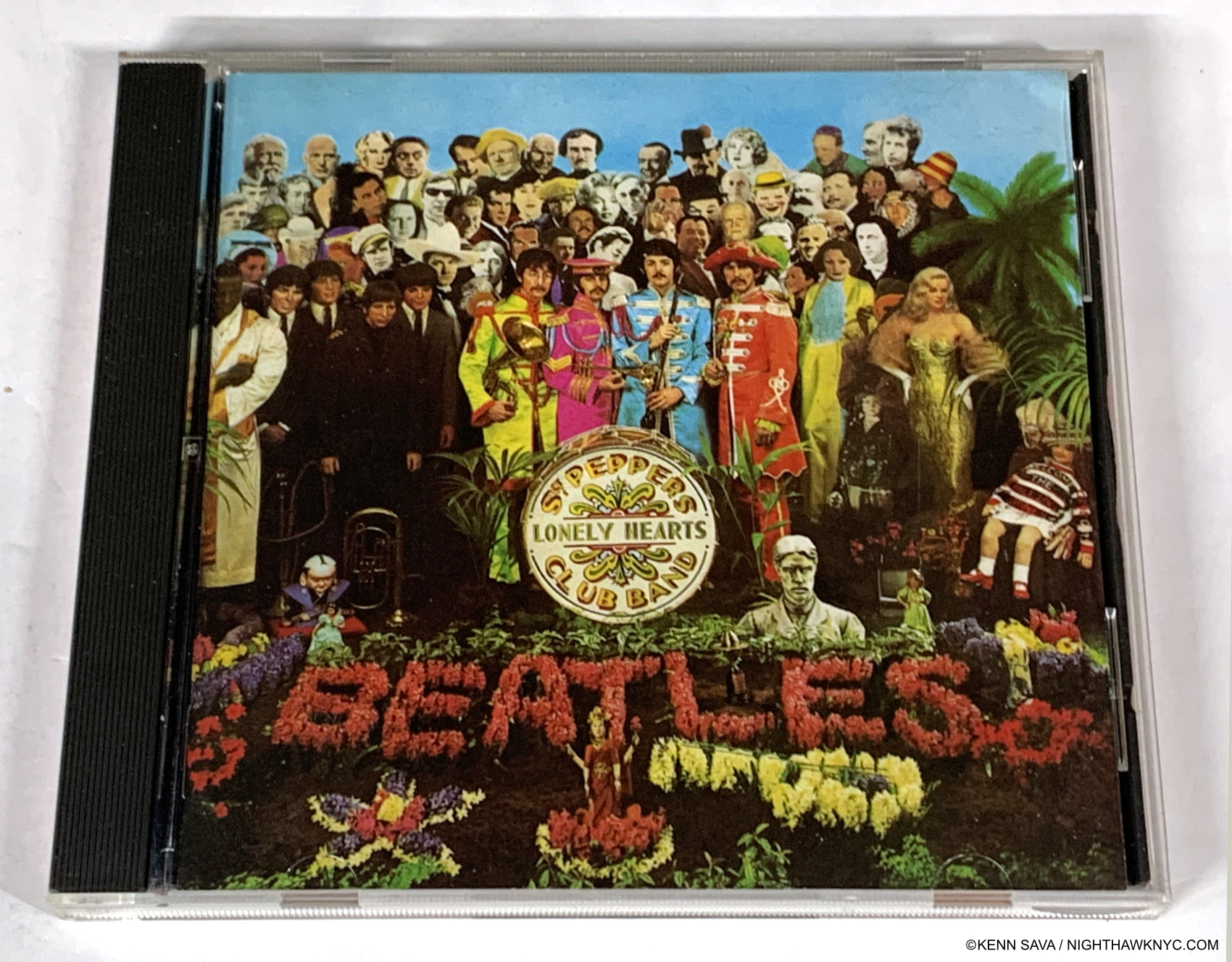
One of the monuments of modern western culture. An early Parlophone CD release (1987) of The Beatles Sgt. Pepper’s. At the moment, there are 1,099 DIFFERENT versions of Sgt. Pepper’s listed on Discogs. This one sells for about $5. If I wanted a CD version, this might be one I’d recommend. Why? Read on. Lps, CDs & DVDs shown are from my collection.

In my prior life as a musician and Music producer, as now, I have always respected the wishes of the Artist across whatever medium he, she or they worked in in the visual or aural Arts. Yet Artists, being human, have finite lives. Art, doesn’t.  As time has gone on, a lot of Music has outlived its creators. But, new listeners, even new generations of them, are continually discovering Music of the recent or distant past. The record companies are then faced with a dilemma. Do they keep reissuing the exact recordings that were originally issued?  Or, do they “update” the original recordings using the latest technology?  This has turned out to be an age-old question over most of the past 100+ years of sound recordings. It’s big business for those who own the recordings and/or the rights to them. Imagine making a product once, then being able to re-sell it to people over, and over, and over, and over again. 

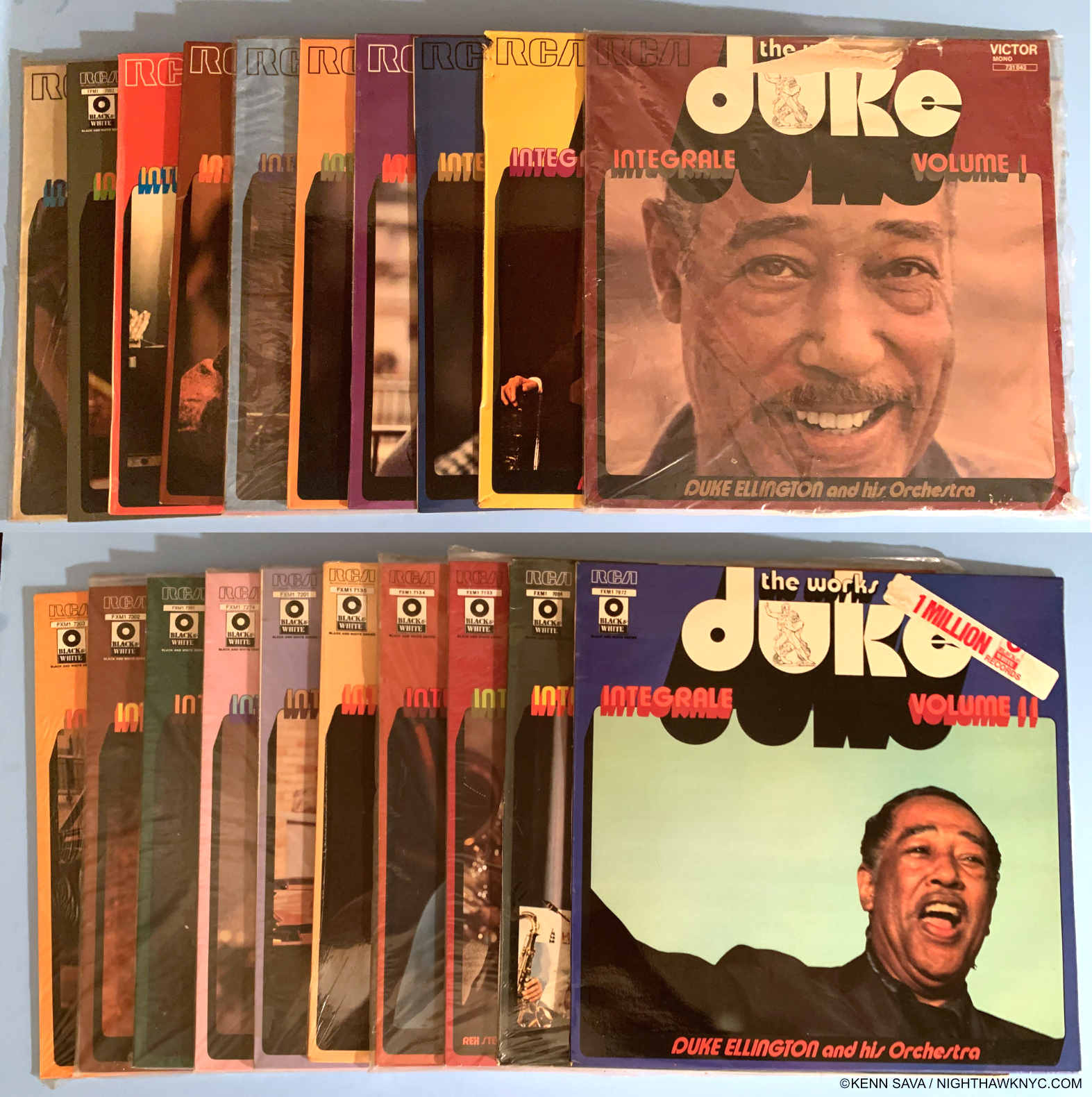
The immortal Duke Ellington began recording in the 1920s in mono, of course, stereo being invented in 1931, but adapted slowly after. RCA, Decca and Columbia recorded him early on. Here in the first 20 volumes of their The Complete Works of Duke Ellington Lps, RCA has reissued their recordings from 1927-1943 in mono pretty much untouched except for the covers and the Lp format. Leaving aside the dated cover art, I believe this is the right way to do it.

After the Artist hands in the master recording on whatever format (i.e. tape or audio file), the label then takes that, packages it and releases it. After an indefinite while, the label decides to repress or rerelease the record. Then, the questions begin. Represses of vinyl or compact disc albums usually involve minor changes- a different pressing plant, perhaps, etc. These changes that no one except the dedicated fan or collector would notice are usually only documented on Discogs.com and on fan and collector sites.

Up to 1948, all sound recordings were mono, meaning everything was recorded on one track. In 1949, guitarist Les Paul invented multi-track tape recording, “sound on sound,” he called it1. This opened up a gigantic world of possibilities that was brilliantly explored by The Beatles and their Producer, Sir George Martin, among others. The amount of tracks you had to record on grew from 1 to 2 to 4 to 8 to 16, and on and on, and so did the possibilities.

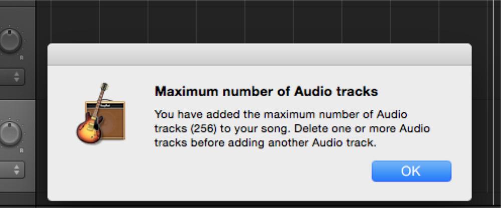
If you see this message in GarageBand, it’s time to mix down some tracks to make room for more!

Today, everyone with Apple’s GarageBand app can have a whopping 256 tracks right at home! 48 tracks was the most I ever recorded on in my studio days, and even back in the early-mid 1990s, very few NYC recording studios had equipment to handle that many. After recording all the parts on to however many tracks, the Musician/Artist and their producer and engineer would “mix” the tracks together, adding equalization and effects, and placing each instrument within the aural space, to create the final sound of the piece. They would do this for every piece of Music to be released on an album. They would then make a 2-track stereo master tape of the finished album from start to end and hand that in to the record company as the finished, final product, to be manufactured and released to the public.

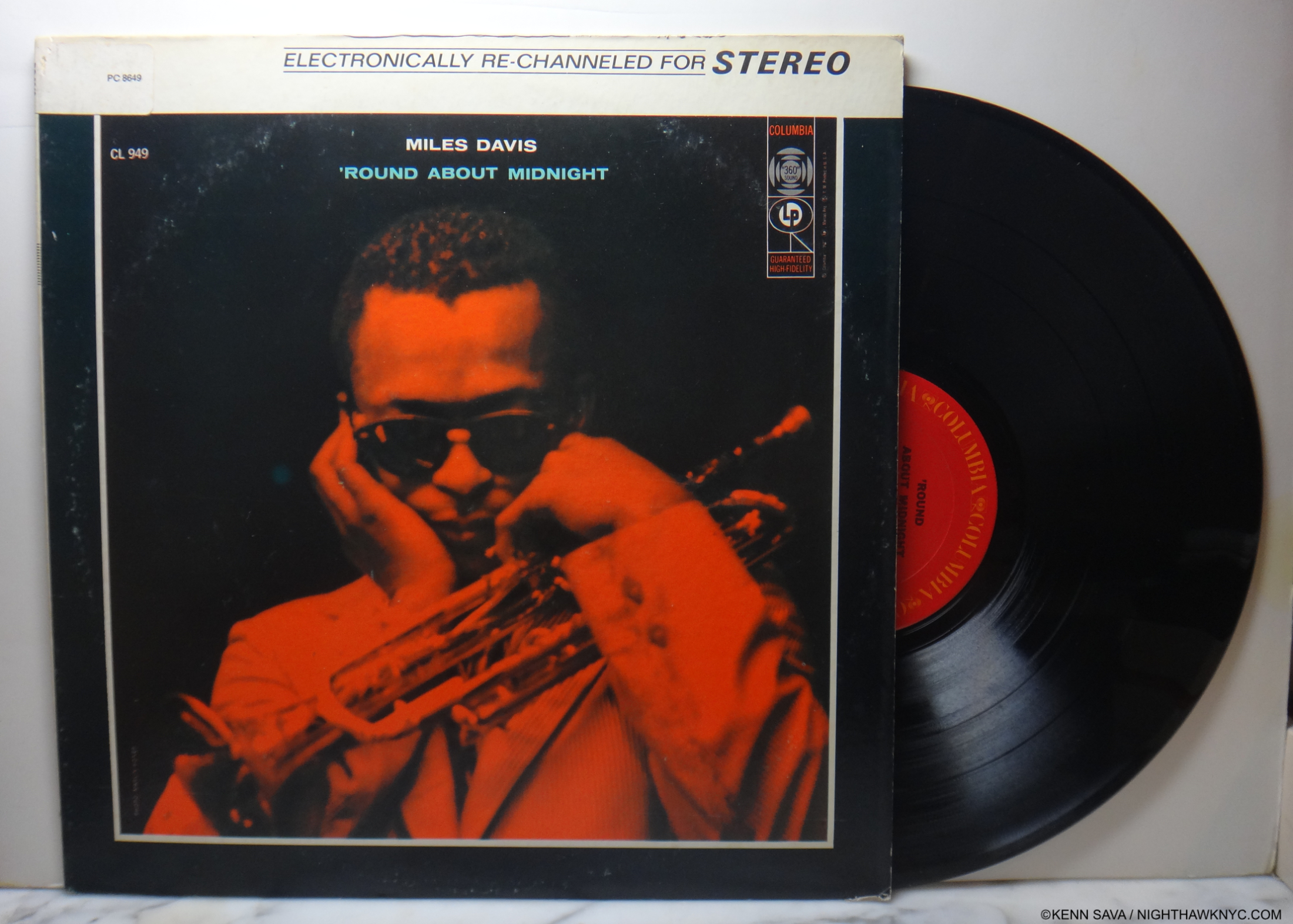
My copy of Miles Davis, Round About Midnight, Columbia CKS 8649, originally released in 1957, in the 1977 “Re-channeled for Stereo” reissue. More recently, Sony has begun to remix his immortal 1960s, and 70s albums that were originally recorded in stereo and produced by the legendary Teo Macero. Buyer beware!

When a record company decided to reissue an album, the changes to it may be small, or extensive. Some companies opted to reissue the original recordings, more or less the same, though there were caveats to that. Were they using the original materials- i.e. the original master tapes (in the tape era)? Or, were they working with a second, third, or fourth generation copy of the original?

As you move further and further away from the date of the original recording, tape begins to disintegrate. Copies had to be made. Uh oh! You’re then relying on the expertise of those making the copies doing a good job2  Later on, as stereo became all the rage, many earlier mono recordings were “electronically rechannelled” to mimic stereo, with varying results.

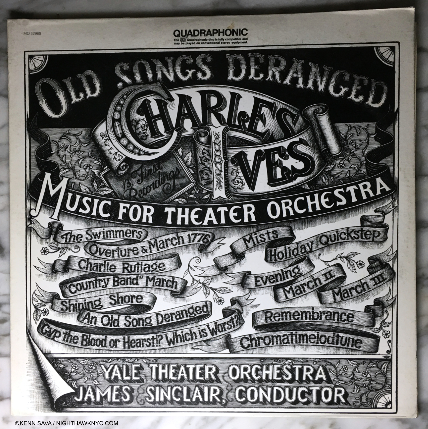
Charles Ives in Quad??? Wow, I’ve got to hear this! it turns out there are two types of Quadrophonic sound- both using 4 speakers arranged around the listener- Discreet, which featured different instruments coming from each speaker, and SQ, which this is, which artificially mixed the sound to mimic Quad, and “better suited” to be played on regular stereo equipment.

Next, it was quadrophonic sound, and some older recordings were, once again, processed to imitate quad, though they were originally recorded in stereo. More recently, there has been no shortage of technical innovations for the enterprising record companies to use as a reason (or excuse) to reissue older recordings. It’s gotten to the point that, according to Discogs.com, to date there are 1,099 versions of The Beatles’ Sgt. Pepper’s Lonely Hearts Club Band!

Roll over Beethoven. Tell Peter Ilich Tchaikovsky the news.

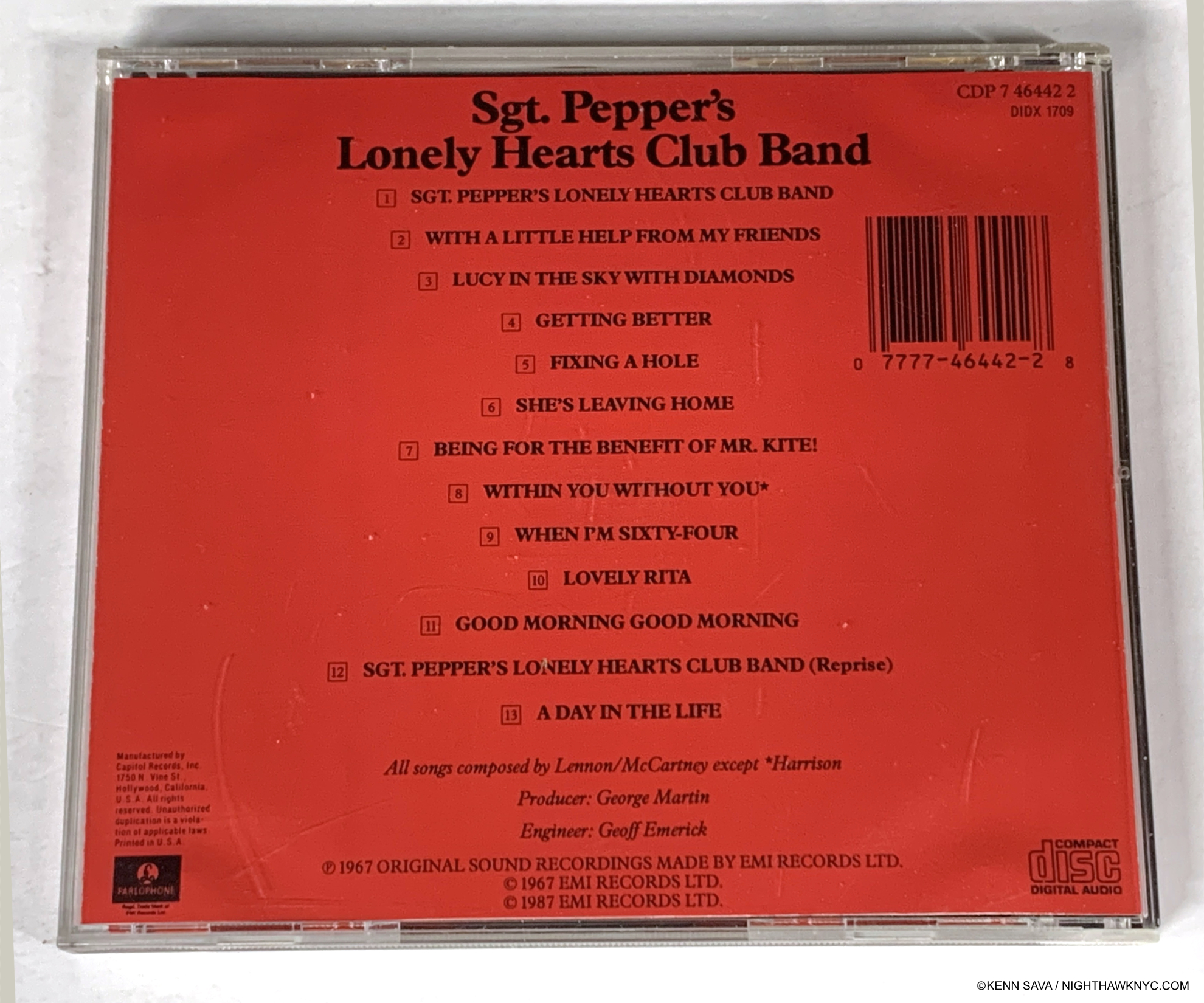
In my opinion, if you want to hear The Beatles records as THEY intended their Music to be heard go to the source. Get the original releases. Seen here on the verso of the Parlophone CD I showed up top the key information is lower center. Only Producer George Martin (who died in 2016) & Engineer Geoff Emerick (deceased in 2018) are listed in the technical credits. Meaning this CD was made from the master tape without someone else, who wasn’t involved in the original recording sessions, remixing them.

How many copies of it do you have? Why did you buy each of them? There are a heck of a lot of people out there who own more than one copy of Sgt. Pepper’s. And, probably, a heck of a lot of people who own more than one copy of other albums. Extra tracks, on many albums, and/or added documentation are a draw, in addition to so-called “technical improvements.”

What’s rarely mentioned in the rush to market the latest reissue is respecting the Artist’s wishes!

Recently, the record companies have started going back to the original multi-track master tapes and remixing them! Sometimes, reiusses are done under the direction, involvement, or at least the approval of the Artists. Other times, it’s hard to tell if that’s the case or not. As time goes on, fewer and fewer Artists or members of a group, may be living. Eventually, no one who was directly involved in the recording is left. Then what? There is big money at stake in the issuance of product by countless name Musicians or groups for the record companies. Of course, few bring in as much money as The Beatles, and given their enduring popularity, I used them as an example, but my thoughts apply to every recording Artist. Having been a musician, an independent record producer and a record aficionado for over a half century, a few things are clear to me- First, ONLY THE ARTIST knows what they want their Music to sound like. Everybody else who wasn’t involved in the original recording is guessing!

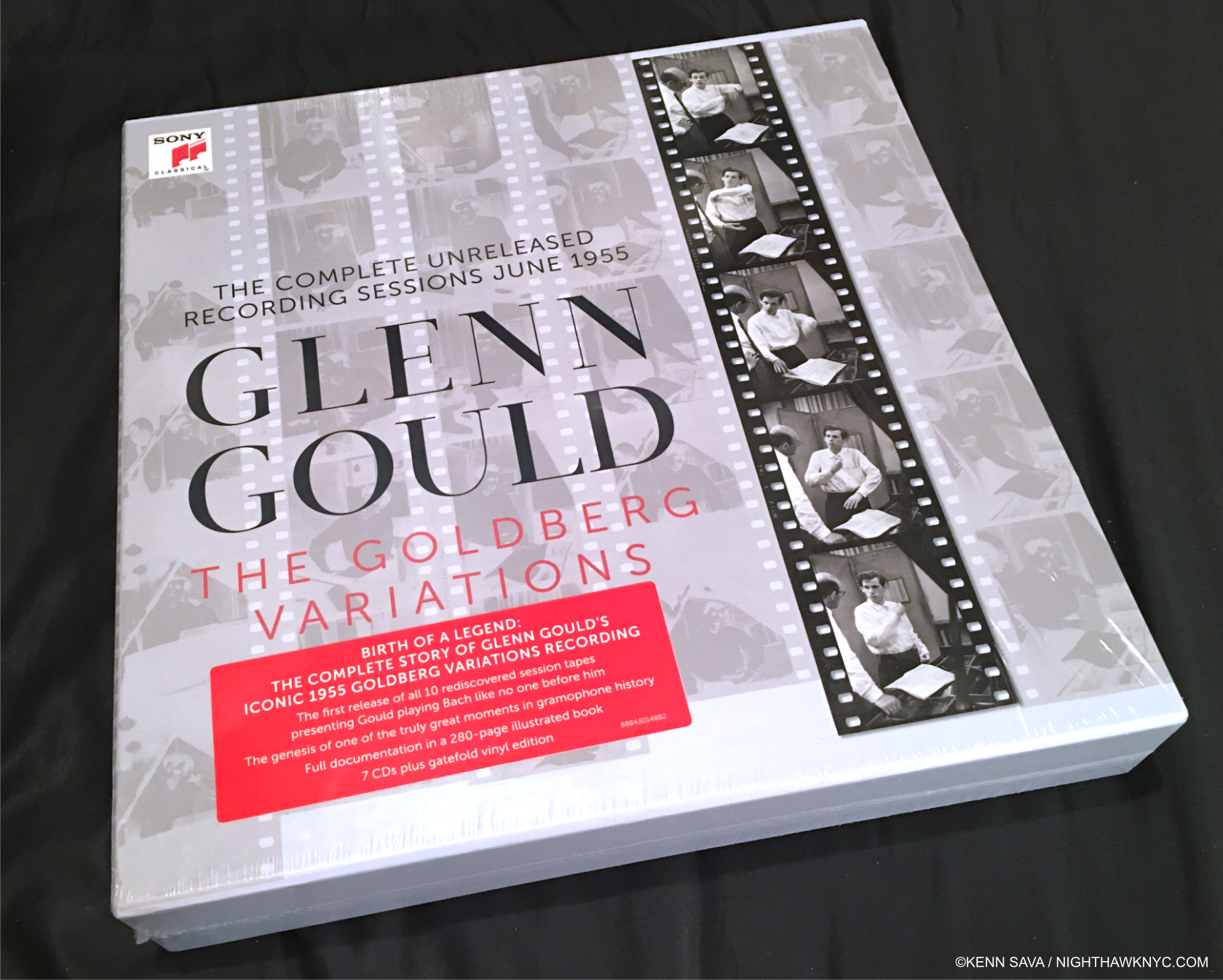
Rock and Jazz aren’t the only Music being rereleased of course. Here is a reissue one of the towering monuments of recorded Music- Glenn Gould’s 1955 recording of Bach’s The Goldberg Variations. His very first album. The 1955 recording was in mono, so much less to mess up here. Ironically, his final album was also Bach’s Goldberg Variations in 1981. The two performances are night and day different! If I could only have one album with me on a dessert island, it would be his 1981 recording. (Last year, Sony rereleased that album with all existing unreleased recordings in a box set to pair this with one, which I have not seen as yet.)

They may be making educated guesses, but they are guessing none the less. Artist’s ideas often evolve over time. Listen to both recordings of Glenn Gould performing Bach’s Goldberg Variations, for example, for proof. They are completely different. Who’s to say what Artist X would do in remixing an album he/she or they made 20 or more years ago? Basing a remix on what someone did before ignores this fact because NO ONE who is not the Artist knows for sure.

Second, when an Artist approves a Musicial “product,” that’s it. It’s finished. Done. The end of the story. It’s not subject to modification at some later date. How many Painters go back and alter a Painting years later? A few. maybe. Not most of them. But, someone else modifying a Painting greatly affects what it is, and opinions about it. It lessens that work in the eyes of Art historians! WHY isn’t that the case with Music remixed by others?

Glenn Gould was a perfectionist, in addition to being eccentric & unique. I’m left to wonder how he would have handled these reissues of his Goldberg Variations recordings, and IF he would have permitted the extra material, which was rejected in the first place, to be released at all! Surrounding his original masterpiece with 6 other CDs of rejected material may serve to diminish the effect and impression of the final album. The material should be preserved for historians, but releasing it to the public is highly questionable in my opinion.

Third, If someone who wasn’t part of the original recording remixes an album, it’s their vision of the Music, in my view. Their interpretation. If I want to hear The Beatles, I go to the original recordings they themselves made and were involved with producing and mixing (with Sir George Martin). Period.  

I bet no Musical Artist working in the 1960s, say, was ever approached with the following questions- “Is it ok with you if, at some later date, we remix your Music?” “Is it ok with you if, at some later date, we “electronically modify” your Music?”

What do you think the answers would have been?  “IF I’m involved in it, and personally approve the results,” might be the answer I would expect to hear most often. A LOT of time, work & care went onto getting things just right in making that original final mix and final master. To let someone else change it later? In my opinion, it’s outrageous. 

The reasons that these questions aren’t foremost on the minds of most Music listeners is, first, the Artist’s name is on it. It’s easy to assume the Artist approved anything with their name on it. That’s increasingly becoming up for debate! Then, in my view, some are too busy worrying about things that, frankly, are not as important! Be it CD vs Vinyl, or the new 40th anniversary edition with extra tracks and a 200 page book, with new mixes by the son of someone who was involved on the original record. Even how “good” something recorded in 2022 sounds compared to something recorded in 1999, 1969, 1959 or 1929. (Yes. I don’t think that’s as important.) Meanwhile, the original version, the one the Artist’s created & approved slips into oblivion, only to be found in the hands of astute collectors who spend time and money seeking out the original version.

IS THIS WHAT IT’S COME TO?

Terry Gilliam’s masterpiece, Brazil, in the Director Approved Special Edition DVD set from the Criterion Collection.

In books, 1st editions are the copies most valued. In Film, companies are issuing “Director Approved” versions and they receive the highest respect. This doesn’t always happen in Music. Why?

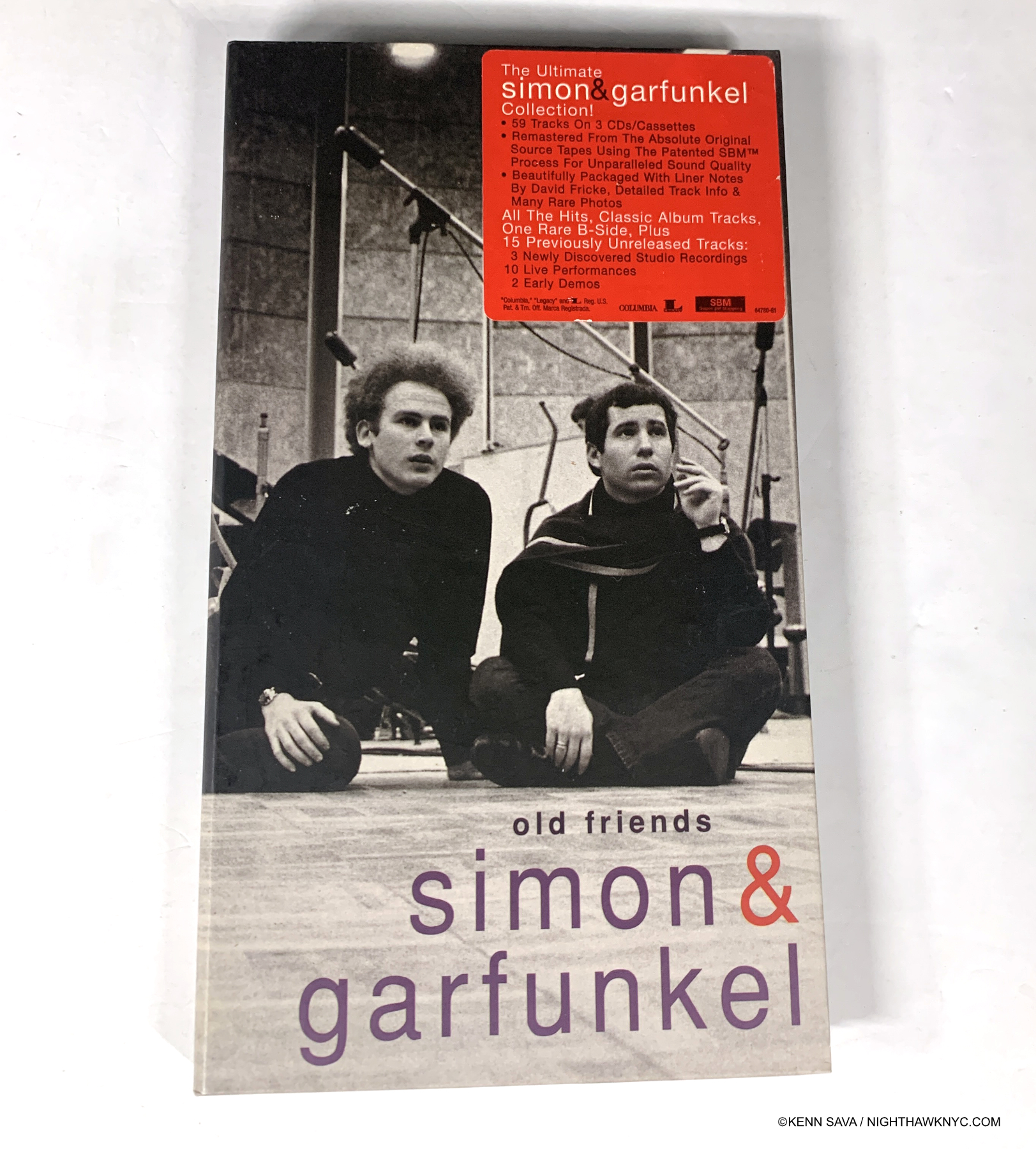
Simon & Garfunkel, Old Friends compilation and rerelease with extra tracks. I’m showing this without condemning or recommending it as an example of the difficulty the buyer faces in trying to understand just exactly what they’re buying.

When you buy an album, CD or digital album, look carefully at the fine print. You often have to look VERY long and hard to find out exactly who created the copy you hold in your hands. The Artist’s name may be on the front of it, but it’s the “other names” on the back, or inside who produced it and mixed it that are important, too, in my view. In 1995, I recorded a live Jazz quartet: alto sax doubling on flute, piano, bass and drums. When I shopped it to record labels, one very respected Jazz label (run by a Musician) offered me a considerable sum for it. On one condition. They wanted to replace the drummer. The drummer happened to be a “name” in Contemporary Jazz who won a Playboy Poll a few years earlier and had 11 solo albums out under his name. The Music was recorded in, basically, a one room studio with baffles set up to allow separation in the recording. The album was recorded live in the studio! The sax was in a separate booth, but there was still bleed from each instrument into the mics of the others. HOW was this label going to extract the existing drum track and substitute heaven knows whatever they had in mind? I refused out of hand. Frankly, it was the most ridiculous thing I ever heard! Their wanting to put “their stamp” on it was the only reason I could ever come up with. In the end, the label the drummer had been recording for subsequently picked up and released the album.

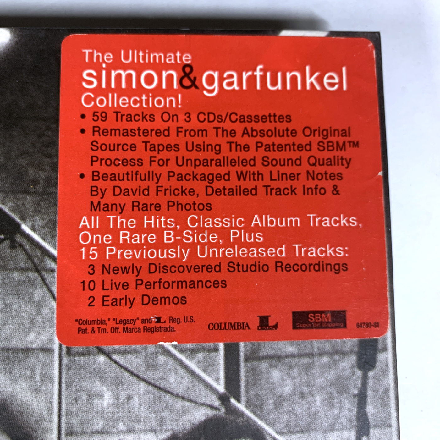
Detail of the hype sticker on the upper right of Old Friends. Read it carefully.

Now, I wonder…What will the record companies be re-releasing in 50 years? “New mixes by the son of the son of someone who knew a guy who was next door when they made the record?”

All the while, the most important thing is being lost. As time goes on, it becomes harder and harder to find those original mixes- the mixes the Artist’s created and/or personally approved.  Pick an Artist. Now, look for their original recordings, on whatever format you prefer. If you are into “vintage vinyl,” it’s easier to find them. Most pop/rock records in the 1950s, 60s, 70s, and 1980s were initially released on vinyl. Look for the first release and you’re gold.  If you listen to CDs, it begins to get tricky.

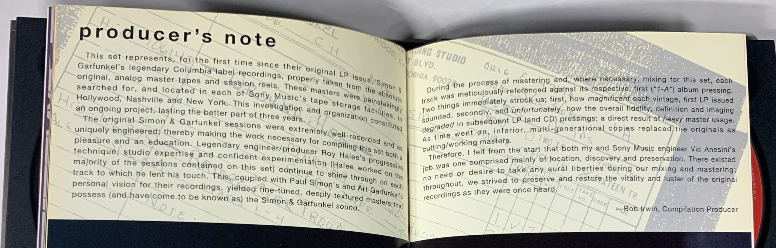
Notes from the Old Friends reissue producer who wasn’t involved in the original recordings.

There was an initial outrage when CDs came out because many of them sounded inferior to the original vinyl release. They usually retained the original mixes because the remix fetish hadn’t taken hold yet, but they often used 2nd, 3rd, or 4th generation 2 track master tapes to produce the CD with, resulting in inferior products. Whatever format you’re buying, spend a moment to look for the technical credits. It should be spelled out somewhere in the liner notes or credits. You have to compare the credits side by side (or listen to them A-B) to know for sure. 

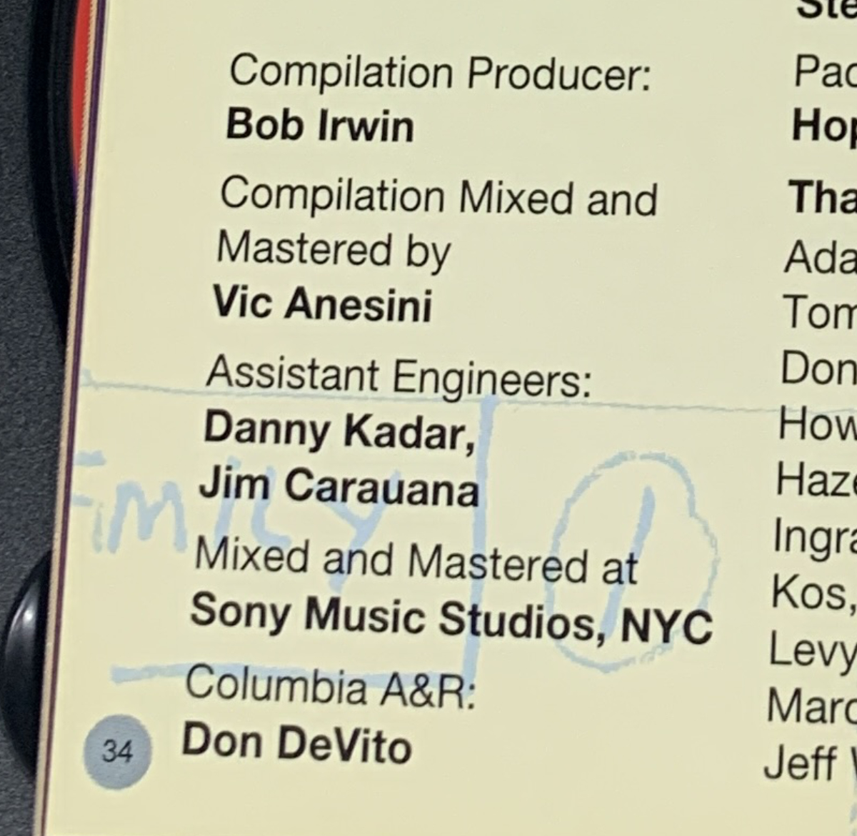
The fine print. Rerelease credits on Page 34 of the Old Friends Booklet. According to Discogs, Vic Anesini has been at Columbia Records since 1988. Simon & Garfunkel’s last studio album, Bridge Over Troubled Water, was released in 1970.

In my view, there is a lot to be said for finding the original mixes. Most importantly, THEY ARE WHAT THE ARTIST INTENDED WE HEAR! If you love that Artist, in my opinion, you should respect their wishes and seek out what they created.

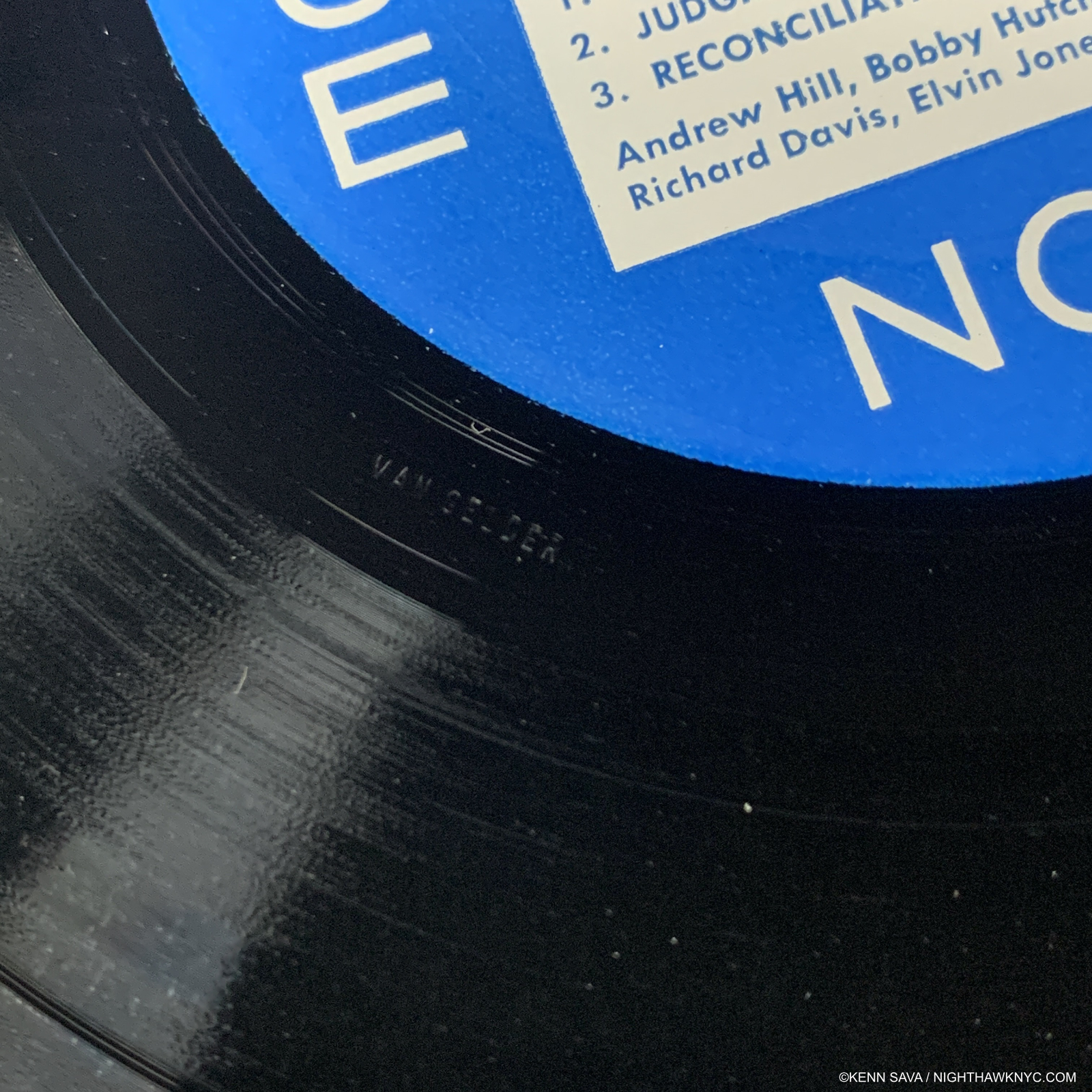
Legendary Blue Note Recording Engineer Rudy van Gelder was so involved in all steps of a record he often inscribed his name in the dead wax of Blue Note Lps as evidence of his involvement. He has done so here, on a copy of Andrew Hills’s classic album, Judgement. Many years ago I wrote to Mr. Van Gelder to see if I could work for him. He never replied.

Age is a fact of life. Every one and every thing gets older. Nothing stays new forever. Sooner or later every piece of Music ever recorded is going to sound “old” compared to the latest technology. The record companies are selling “new” in the face of this. With each passing day, every record ever made gets older. There’s nothing anyone can do about that. Listener priorities need to change. Technical limitations are not the point. Expensive audio equipment will make these recordings sound as good as possible, but they may pale alongside recordings made in 2023. Of course, recordings made today should sound “better,” but in all honesty, due to the mastery of the brilliant producers and engineers of the past, like Sir George Martin, Rudy van Gelder, or my Grammy Award winning friend, Engineer Benjamin J. Arrindell, they often don’t, at least to me.

Three version of an etching by Rembrandt. Over time, he was fond of changing his Prints, as you can see here, particularly in the backgrounds. This also highlights an Artist’s changing view of his work over time! Rembrandt’s etching plates survived him and some are now in private hands, 350+ years after his death in 1669! Suffice it to say that prints made now from Rembrandt’s plates are not taken seriously by Art historians. I believe that once the dust settles and people assess what’s going on, the same will be true of remixed albums made by folks who had nothing to do with the original recording. Seen here shown in a darkened gallery to protect the light-sensitive Prints at Rembrandt’s Changing Impressions, in 2015 at Columbia University.

My concern is that these changes will start to erode the cultural legacy these Artists have created. How many pieces can you add to, say, Michelangelo’s David, before you diminish what it was? Even adding a fig leaf did that. Record companies are playing to the desire for “new releases” by Artists who may be long dead. I remember the day Jimi Hendrix died and, along with the towering loss of the man and his genius in his prime,  the incredible sadness that there would be no more new Hendrix to go with the 3 studio albums he recorded and released by the time of his death. You wouldn’t know that from looking at his catalog now! A steady stream of releases have come out under his name ever since, and no doubt will for Prince, too. Personally, I’m not sure any of them have added to his stature. In my opinion, the release of material possibly already rejected for release by an Artist can serve to diminish their overall accomplishment.

It also brings up a bigger question- DID JIMI HENDRIX, or any Artist this has happened to, WANT THIS MATERIAL RELEASED TO THE PUBLIC?

So, LET THE BUYER BEWARE! There are many albums reissued each year. Every case is different and needs to be carefully assessed. For me, I’ll listen to the Artist approved recordings & mixes on the best equipment I can, and I’ll be perfectly happy with it because I’m listening for the Music. Everyone else can decide what their priorities are and make educated decisions accordingly.

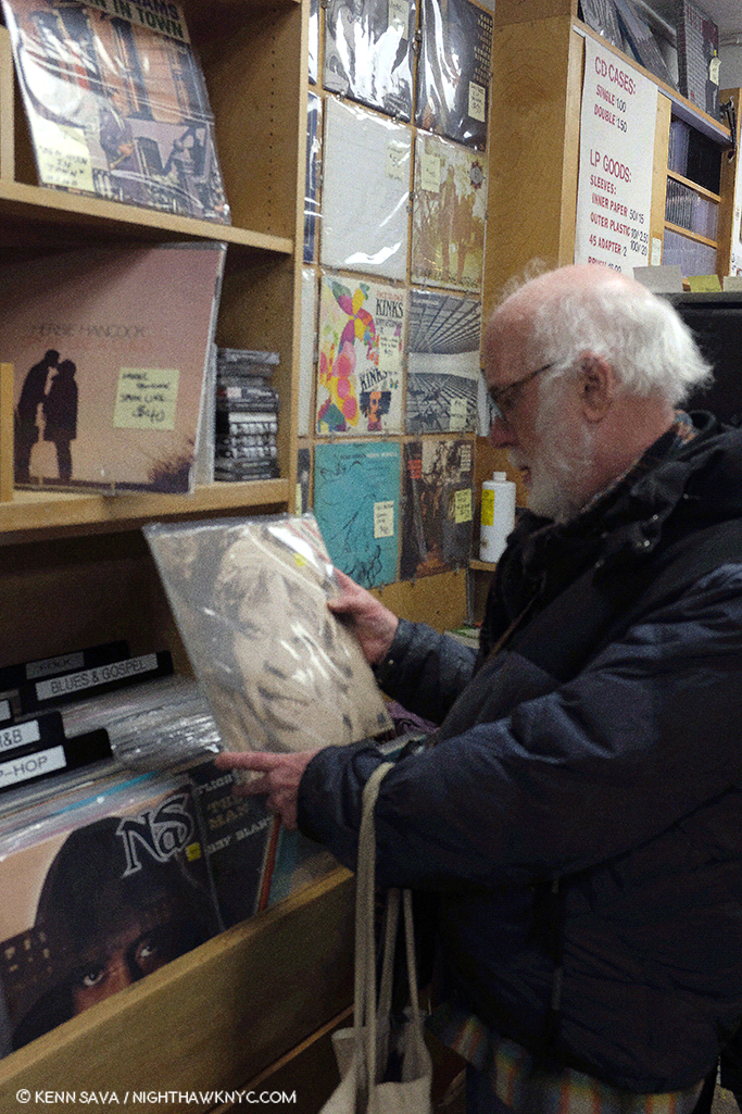
Business, as usual. A local record and book store in action, 2023.

“Industry rule number four-thousand-and-eighty; Record company people are shady So kids, watch your back ‘cause I think they smoke crack I don’t doubt it, look at how they act.”*

*- Soundtrack for this piece is “Check the Rhyme,” byPfife Dawg, Ali Shaheed Muhammad & Q-Tip of A Tribe Called Quest from their classic album, The Low End Theory, 1991.

I’m pleased to announce that you can support NighthawkNYC by buying Lps and CDs from my personal collection 40 years in the making! Mostly Jazz Lps are listed here. Mostly CDs of all types of Music are listed here. Art books & Fine Art from my collection may be seen hereNighthawkNYC.com has been entirely self-funded & ad-free for over 7 years, during which over 275 full length pieces have been published! If you’ve found it worthwhile, PLEASE donate to allow me to continue below. Thank you, Kenn.

Written & photographed by Kenn Sava for nighthawknyc.com unless otherwise credited. To send comments, thoughts, feedback or propositions click here. Click the white box on the upper right for the archives or to search them. Subscribe to be notified of new Posts below. Your information will be used for no other purpose.

  1. He had been experimenting with multi-track recording using discs in the 1930s.
  2. More recently, in the digital era, this is less of an issue, but it still is one. Digital copies are supposed to be exact copies. People assume the digital master copy, which won’t disintegrate but it is subject to shortcomings of its own, was made from the original master tape. In many cases in the CD era, it has come to light later that in the rush to market it wasn’t.

December 8th, 1980-2020

Written & Photographed by Kenn Sava

Tales from Isolation. Day #322

Two Days In My Life

After my early young adulthood as an Art lover, and before I focused on Art, again, I spent about 15 years in Music. Early on, I was on the road with a band, based out of Miami, Florida, for five years. Towards the end of 1980, things were getting really bad in South Florida, inspiring the TV show “Miami Vice,” which after having lived through the reality, I found hysterical. It got so bad, the word was that there so many murders the only cases that were being investigated were when a cop was killed.

My Axe. My blonde 1976 Fender Jazz Bass. The color darkened from 4 years of playing in smoke-filled clubs, rests on my way worn Gig Bag.

Around this time, we took a gig playing a party in Coconut Grove. Not something we ever did- before or after, but it was for a friend of a friend who loved the band, and we liked the idea. “Hey, I’m having a big party and it would be so great if you guys came and played” kind of thing. He made it worth our while to take our gear off the stage of the club we were house band at on Miracle Mile, so what the heck. It was an afternoon outdoor job, and we were up on a hill looking down over the large lawn on a road between us and a row of houses lining the water. Suddenly, a group of police cars descended on the scene across that road. It was a raid. A drug bust. Then the host/our boss for this gig, came over and said “Keep playing.” When trouble starts in a club or a bar, the boss ALWAYS comes over and says “Keep playing,” (like I imagine the boss did on the Titanic) while everyone else is falling all over themselves rushing to get to the exit. “Keep playing.” Like when a riot broke out in a biker bar we were playing in. But that’s a different story.

My blonde 1978 Fender Fretless Precision Bass. I went Fretless after I met the late, great Jaco Pastorius, the genius of the Bass, and a Fretless player, in 1977.

It’s funny how the guys from the union, the AF of M, are never around at those times- only when someone playing was not a member. We looked at each other, the girls dancing in bikinis in front of us, glanced at our cars parked behind us, and then at the unfolding drama going on across the street in front of us. Don Johnson’s got nothing on me. I’m living vice in Miami. 

If gunplay broke out, we might well be in the innocent line of fire, like too many others, before or since. 

Luckily, it proceeded without bullets, a line of cops escorting suspects emerged, and that was the final scene on a long and eventful road trip, full of  unexpected turns, on my journey into full adulthood. Time to go. It so happens that Paul, a friend in another band I had worked with, called to say he was leaving and moving to NYC. He offered to take my stuff with him if I wanted to get out.  

Hmmmm…After some thought, and discussion with my then girlfriend, a local, I decided to take him up on it and move back. Paul and his girlfriend, who went from being a waitress a few years earlier, to being a member of an internationally known band (not her boyfriend’s) a few years later, pulled up with a large trailer hooked to their car and the three of us loaded all of my belongings into it, and off they went. 

A few days later, I got into my Porsche 914 and drove it from Miami to Orlando and we both got on the AutoTrain. I had made the complete 27 hour nonstop Miami to NYC drive too many times to do it once more. The ride was pleasant enough, though I didn’t get much, if any, sleep, and woke early on Monday, December 8th, 1980. After detraining near Washington, DC, I drove the rest of the 5+ hours to NYC, where the rest of my life would begin.

Shortly after I arrived at my parent’s house I heard the news that John Lennon had just been shot and killed in Manhattan, outside his home at The Dakota. 

WHAT??????!

Bob Gruen, John Lennon- Statue of Liberty, 1974, Magnum Photos.

It was just unfathomable. It still is. Even for someone who lived through JFK’s assassination, and saw Oswald get killed, live, on television. Someone who had heard RFK’s assassination live on the radio. Someone who had lived through the assassination of Martin Luther King. Someone who remembers Malcolm X getting murdered. Murder is not something you ever “get used to.” Murder of such great men, each cut down in their prime, is a crime against humanity.

And murder was exactly why I left Miami!

So began the rest of my life…

December 8th, 2020

I took the C train uptown and got off at West 72nd Street to go The Dakota to pay my respects. Arriving, I was greeted on the platform by Yoko Ono’s transformative Sky mosaic mural. The north side of the station, ironically, is directly underneath The Dakota, where Yoko still lives, I believe1.

Yoko Ono, Detail from Sky, Tile mosaic, West 72nd Street B,C Station, underneath The Dakota, December 8, 2020.

After admiring it and its “Imagine Peace” section, and thinking, “Gee, countless millennia of war hasn’t worked out so well, maybe it IS time to give peace a chance…?,” I headed up the stairs and was greeted by a sky that looked remarkably like the mural.

“…above us only sky…” Exiting the 72nd Street Station at Central Park West, with The Dakota looming on the left, December 8, 2020.

I turned the corner onto West 72nd Street and was greeted by no one. The sidewalk was empty. Down the block, in front of The Dakota, where it happened, stood two uniformed building employees, as usual. I stood for a few minutes on the sidewalk, taking in the scene, and thinking about what had happened 40 years ago today.

The Dakota, West 72nd Street, December 8, 2020.

It almost seemed like I was there on the wrong day. Then, I spotted one small bouquet left by a family.

Across Central Park West, looking into Central Park, I could see a long line of visitors waiting to enter the Strawberry Fields section of the Park, but no one else was here, allowing me a private moment in a place where many people live, but which has always reminded me of this day 40 years ago whenever I’ve passed it.

I walked down the street until I came to the spot. I stood there, briefly, alone with the 2 Dakota staff members.

The Dakota, West 72nd Street, December 8, 2020.

In NYC, particularly in Manhattan, everywhere you look and everywhere you walk, you’re walking on history. And the place is not nearly as old as any city in Europe or many other cities elsewhere. Here is one such spot. Passing it now, you’d have absolutely no idea something horrible and world changing happened right here, because it happened 40 years ago. 40 Years. John Lennon was born on October 9, 1940, during the Nazi Blitz of Liverpool. He had just turned 40 when he died. He’s now been dead for almost as long as he was alive.

My thoughts turned to another fact, as what had happened in all that time raced through my mind. Each and every time something’s happened, like 9/11, and all the rest, sooner or later, I wondered- “What would John Lennon say right now?” In addition to everything else he was, Liverpool’s John Lennon was one of our most prominent, and proud, New Yorkers, and a citizen of the world.

Bob Gruen, John Lennon, NYC, 1974. Magnum Photos. NYC in 1974 is light years from the NYC of 2020. It speaks volumes to me that he was so proud to live here then. This t shirt has been on sale here to this day, probably because of this Photo.

On December 8th, 1980, we were all denied knowing

for the rest of time. 

Now, as I sit here after getting back from West 72nd Street, I’m left to wonder- How would the world have been different? 

If you think that’s a questionable question, consider this- There are some who believe that The Beatles played a roll, perhaps the KEY role, in the collapse of the USSR2, in spite of all the countless billions spent to do it by other means, as seen in the PBS Documentary, “How the Beatles Rocked the Kremlin,” from 2009. A grainy video of Part 1, is below (Part 2. Part 3. Part 4. Part 5)-

If that’s not helping “give peace a chance,”  I’m not sure we’ve seen much else that is. It’s something that needs to be more closely studied, I think. If it’s true, then we’ve VASTLY underestimated the achievement of the Beatles, already the most revolutionary cultural force of my lifetime. And, we’ve completely ignored the lesson.

Even still, there are hundreds of millions who would have been very interested in what John Lennon had to say on any topic had he lived. Like there would have been to hear what JFK, RFK, MLK or Malcolm X would have said had they lived. 

If all of them had lived, I think this world would be quite a different place today. Along with John’s loss, today I mourn that. Again. 

Yoko Ono, Another detail from Sky, Mosaic, West 72nd Street B,C Station, underneath The Dakota, December 8, 2020.

December 8th, 1980 was a day my life, and the world, changed. Neither have been the same since. It’s up to those who remember those we’ve lost to keep their memory & their messages alive.

*- Soundtrack for this Post is “Imagine” by John Lennon.

You can now follow @nighthawk_nyc on Instagram for news and additional Photos!

NighthawkNYC.com has been entirely self-funded and ad-free for over 6 years, during which over 250 full length pieces have been published. If you’ve found it worthwhile, you can donate to keep it going & ad-free below. Thank you!

Written & photographed by Kenn Sava for nighthawknyc.com unless otherwise credited.
To send comments, thoughts, feedback or propositions click here.
Click the white box on the upper right for the archives or to search them.
For “short takes” and additional pictures, follow @nighthawk_nyc on Instagram.

Subscribe to be notified of new Posts below. Your information will be used for no other purpose.


  1. I greatly admire Yoko Ono, for many reasons, not the least of which is the supreme grace with which she handled John’s passing publicly. As an Artist, I believe she is still under-appreciated. My pieces on her work to date are here and here.
  2. Here,

Robert Dunn’s Revolver

Written by Kenn Sava with Photographs by Kenn Sava & Robert Dunn

When I visited the Manhattan studio of the multi-dimensional Robert Dunn, I was struck by the large poster of The Beatles 1966 classic, Revolver, on his wall. Every Artist has influences. When I’m researching one, it’s always interesting to find out who their influences are, and what they reveal about that Artist’s work, their roots and development-if anything. I learned that Robert Dunn is an aficionado of Bob Dylan, classic Jazz, Blues, The Stones and The Beatles. Does it mean his work is influenced by them? That’s not for me to say. Still, Revolver is an album that shows off an extraordinarily wide range of The Beatles many sides. Hmmm….I asked him if I could snap a Photo of it.

Luckily, he didn’t ask me “Why?”

Robert’s Revolver poster (a copy of the rare original), hangs over a colorful selection of his business cards for Coral Press that feature his Photographs. Seen in his studio, February, 2019. Click any Photo for full size.

Like a six shooter, himself, Robert Dunn’s talent comes at you from all sides, in many media. In his life, thus far, he’s been or currently is-

-A Musician & Songwriter

-A published Author

-A  copy editor at Sports Illustrated for 3 decades, and a typist at The New Yorker, who published one of his Poems(!)

-A Photographer

-A Publisher of PhotoBooks AND Novels

-A Teacher, currently of 2 courses at The New School

BANG!, indeed. Looking at the homepage for his site, RobertDunn.net, I felt like I was in a Department Store!

*Homepage of RobertDunn.net. Enough creativity for any 6 people, and there’s still room left for whatever he turns his talent to next!

Shot dead by too much talent to pack into one Post, I realized I needed to switch my brain from auto to manual to adjust the focus of this piece. So, I opted to narrow the depth of field for closeups on two of those 6 barrels- Robert Dunn: Photographer & Robert Dunn: PhotoBook Publisher. Before you think I’m letting myself off the hook easy, consider this- over the past year I’ve seen a number of Robert Dunn’s PhotoBooks, all of which are published by his own publishing company, Coral Press. Each contained work in a different style! I had to turn back to the cover to make sure the Artist’s name was Robert Dunn, and I was more and more impressed each time I found it was. The man is so positively bursting with creativity you literally need to keep your mind on a swivel to keep up with it.

Robert Dunn’s Author’s page on Amazon where you can buy his novels, many of which are music-related in some way, echoes of his days in his band, Thin Wild Mercury.

Approaching his long, varied and accomplished career from the present, it wasn’t long after I discovered his Photography that I found out he’s also a published Novelist with no fewer than SEVEN Novels currently available on Amazon! AND, in whatever spare time he doesn’t possibly have, he teaches Writing AND Writing the Photobook at The New School1.

I asked Robert to select a group of Photos for this piece as examples of his work in each of his many styles, thinking that together, they would show his range. Unbeknownst to him until he sees this, I was, also, testing a secret hunch I had, born out of that opening Photo. Shhhh….Don’t tell him this, Ok? Before I asked him for the Photographs I had a feeling that whatever images he sent me would connect with The Beatles’ album Revolver.

(Off stage, background. Chime…chime…incoming email chime…”CANCEL MY EMAIL SUBSCRIPTION! I now KNOW you’re certifiable!”) I didn’t know exactly how. I just had a hunch they would. He sent me the batch of Photos you see below. There was no back and forth. No second guessing. And of course, no discussion about “matching” Photo with Song. The rhyme and reasons are purely my own- The blame lies here. I want to emphasize- At no time has Robert told me Revolver had anything to do with his work!

Why did I come up with this crazy concept?

As my long time readers know, every single one of the 200+ Posts I’ve done here on NHNYC.com over the 3 1/2 years of its existence has had its own soundtrack listed at the end- a piece of Music I’ve selected to accompany it, and that seems to fit that particular Post. Never have I selected more than one piece of Music to be the soundtrack of a Post. Until now. Robert’s multiple sides, and countless styles, call for it.

So, here are the Photos Mr. Dunn sent, with a caption listing which of the 34 PhotoBooks the Artist has released to date it appears in, along with a song from Revolver as its soundtrack. I’ve also included a link to the book the Photo appears in on the Coral Press site where you can see more of its contents. Each and every one of his books is well worth exploring. Every one of the 14 songs on The Beatles’ album is here and only appears once. The Beatles video for the track follows each Photo so you can listen to it as you look (all are audio only, except for “Yellow Submarine”). Robert may see this and say “What the heck?” and never speak to me again. I hope not, but here goes!

Please take the time to listen to each track while you look at Robert’s Photo it accompanies and see if you find a connection. (Lyrics for each song may be found here.)

From OWS, Robert Dunn’s very first PhotoBook on the Occupy Wall Street protest. Fittingly, it gets “Taxman,”  the first track on Revolver.

Also from OWS. Its soundtrack is “I’m Only Sleeping”


From New York Street. Its soundtrack is “Tomorrow Never Knows”

From Shibuya Time. Its soundtrack is “Love You To”

From Shibuya Time. Its soundtrack is “She Said She Said”

From Angel Parade 5. Its soundtrack is “For No One”

From New York Street. Its soundtrack is “Yellow Submarine”

From Carnival of Souls. Its soundtrack is”Good Day Sunshine”

From Star of Light. Its soundtrack is “Got to Get You into My Life.”

From Star of Light. Its soundtrack is”Eleanor Rigby”

From All That Is Solid Melts Into Air. (To be published) Its soundtrack is “Dr. Robert”

From New York Street. Its soundtrack is “And Your Bird Can Sing”

From Electrick Spirits. Its soundtrack is “I Want to Tell You”

From Electrick Spirits. Its soundtrack is “Here, There and Everywhere”

Ok…ok…So? Why did I REALLY do this- match up Revolver with these Robert Dunn Photographs? When I look at Robert Dunn’s work and the range of styles he has created in thus far, I see an Artist who’s constantly exploring and reinventing himself, like The Beatles did (as you can hear in a micocosm on Revolver)– even if it takes venturing into an entirely new medium or Artform for him to do so! I find that exciting and, personally, inspiring. And? There aren’t a heck of a lot of other popular Musicians who have as many styles as Bob does- except The Beatles.

Robert Dunn, ALSO, a serious vinyl collector, considers a classic Blues Lp at NYC’s legendary Academy Records, February 16, 2019.

When I lived in Miami, the old cliche was, “If you don’t like the weather, wait 20 minutes. It’ll change.” Robert Dunn’s work only seems to change that often. But, somehow, no matter how much it changes, the “Sunshine” of his creativity always shines through, making it a “Good Day…”

The Photography of Robert Dunn may be explored in full at ecstaticlightphoto.com.

I’ve had my say, so now, it’s only fair to give the Artist a chance. I’m pleased to say that Robert was kind enough to answer some questions for me. These appear in the piece, Tomorrow Never Knows: Q&A With Robert Dunn, below this one. 

My thanks to Robert Dunn, and to Jackson Charles for the introduction.


BookMarks-

A used box set of Robert’s Angel Parade series for sale at The Strand in 2018. Its prior owner looks to have perused it a fair amount. The next time I looked, it was gone, off to a new home. My experience is they don’t last long in stores, but you can still buy them online.

Robert Dunn’s PhotoBooks are available as follows-

-By mail order, or in store, at Dashwood Books.

-By mail order, or in store, at Printed Matter.

or

Directly by mail order from Coral Press.

If you have any questions about obtaining them, feel free to write to Coral Press directly, or contact me and I will forward them for you.

NighthawkNYC.com has been entirely self-funded and ad-free for over 6 years, during which over 250 full length pieces have been published. If you’ve found it worthwhile, you can donate to keep it going & ad-free below. Thank you!

Written & photographed by Kenn Sava for nighthawknyc.com unless otherwise credited.
To send comments, thoughts, feedback or propositions click here.
Click the white box on the upper right for the archives or to search them.
For “short takes” and additional pictures, follow @nighthawk_nyc on Instagram.

Subscribe to be notified of new Posts below. Your information will be used for no other purpose.


  1. During the course of working on this piece, Professor Robert asked me why I capitalize Art, Music, and Photographer. I’ve been expecting this question every day since July, 2015, but he is the first person to ask! The short answer is, as I’ve mentioned in passing previously, that Art is my Religion. Many people create “art.” A select few create “Art.” For me, the work of someone like Michelangelo, and the other Artists I’ve written about here, deserves the respect of capitalization. Frankly? I don’t understand why it is not the norm. He then asked why I write photobook as PhotoBook, etc. The answer is- They’re part of my eccentric style, (like NoteWorthy or BookMarks). For me, a “photobook” like Robert Frank’s The Americans, also, deserves to be referred to differently than a book of photos (i.e. a “photobook”) of snapshots. I’ll get into this more in a future Post. But since among his many talents and extensive accomplishments, Mr. Dunn has 30 years experience as a Copy Editor at Sports Illustrated, I thought I’d better give the short answer now! We both agreed that consistency is key. I’ve been doing it this way since Day 1 of NHNYC.

Cai Dongdong: Guns & Shutters

Cai Dongdong “Aiming at the Camera,” 2017, Gelatin silver print, Russian camera(!), wood. Photo courtesy Cai Dongdong and Klein Sun Gallery. Click any Photo for full size.

On October 6th the NYC Art world was permanently changed with the opening of the monumental “Art and China after 1989: Theater of the World” at the Guggenheim. Filling all 6 floors of Frank Lloyd Wright’s Rotunda and spilling over into two of the side galleries, it was as close to encyclopedic as any show of it’s kind could ever hope to be. Having closed on January 7, I’m still processing my thoughts about it. (Update- My piece on it is here.)This much I can say- In it’s wake, the training wheels are now off. The flood gate of what’s been going on in Contemporary Art in China has opened and we’re officially in the deep water.

And it’s about time.

The 71 “key Artists and groups” as the show’s site calls them were remarkably well chosen, in my opinion, divided between historically important Artists and works, and those of the moment. Still? In a country of 1.4 Billion people, it’s impossible to include everyone. Many deserving Artists were missed, especially with only 9 women represented. (My Post on it is here.) While big on video & installations, almost completely missing was Photography, Ai Weiwei’s famous “Dropping a Han Dynasty Urn,” 1995, being one of the few works included.

Cai Dongdong, “Splashing Woman,” 2016, Handmade color photo, knitting, in Artist’s frame. I can’t say I’ve ever seen anything quite like this.

If you are among those left wanting to see more, see what other Contemporary Chinese Artists are doing, or see what Contemporary Chinese Photography Artists are doing, I strongly encourage you to check out some of the fine and daring galleries around town that specialize in Contemporary Chinese Art. With a 10 year history of representing and showing Chinese Artists who are, largely, in the process of becoming better known in the USA, Klein Sun Gallery on West 22nd Street is among the leading galleries in the field. Gallerist Eli Klein speaks with both passion and experience about the Artists he, and his gallery, represent, but, also about “the difficult concepts and social commentary portrayed by some of our artists,” as he told me.

The latter is exactly what makes Klein Sun a must visit gallery on my rounds. Mr. Klein comes by his passion naturally. He is the son the late, extraordinary, women’s champion, Janet Benshoof, who passed away on December 18th.

Installation view of the first gallery.

In all the years that I’ve been going to Klein Sun, this is a particularly good time to go. Their current show, “Cai Dongdong: Photography Autocracy,” through January 18, is an eye-opener, full of pushing-the-envelope creativity, in works that will linger with you after they upend your preconceptions. Mr. Dongdong’s work, which is centered on Photography, is rife with commentary, divided between themes including the military, the act of seeing and being seen, and Henri Cartier-Bresson’s famous “Decisive Moment.” But it’s the universality and humanity of his work as a whole that impresses me the most. Though the faces are Chinese, they could be anyone. For western eyes, there are echoes of Man Ray, Max Ernst, Marcel Duchamp and Joseph Cornell in works that are “Photo-Sculptures,”as he calls them, but decidedly different from Robert Rauschenberg’s “Combines.” Unique among all the Photographers I spent last year seeing, Cai Dongdong, also, constructs the beautiful stands and frames he uses himself, ala Joseph Cornell or Holly Lane, creating an all in one experience in which the Photograph plays one part. The Artist, who turns 40 this year, has a bit of a unique background. He joined the People’s Liberation Army- as a portrait Photographer, a post he remained in for about a decade. This served to have a lasting influence on him, as one might suspect, as one side of his subsequent Art incorporates these Photos, while another side uses found images, (selected from an archive that Phil Cai, Mr. Klein’s Associate at Klein Sun, told me numbers over 600,000 images), but in all his work, he combines Photographs in ways that defy the “Autocracy” of the image to force it to say “something else,” always unexpected.

Cai Dongdong, “The Photographer II,” 2015, Handmade color photo, photographic lens in Artist’s frame. The lens goes right through the work.

Going beyond Photographs with his passion for Photography, a number of these works contain camera lenses inserted right into the piece, making the viewer the subject. Many others contain mirrors or reflective surfaces, and one, seen at the beginning, and below, puts you at the place of the Photographer- if you dare.

Cai Dongdong “Aiming at the Camera,” 2017,

Through mirrors and lenses, he also puts the viewer in the work, reminding us of our complicity by looking and seeing, most poignantly they’re included in a number of nudes on view, including one that replaces the model’s head with a round mirror, all ready for your face.

Cai Dongdong, “Back from Target Practice,” 2017, Gelatin silver print, LCD Light box. These harmless looking smiling armed ladies are returning from target practice. Or? Are they coming for us? Interestingly, the piece is mounted about head high for many viewers, making it personal.

The central element, for me, in his work is the humanity that runs through it. In “Aiming at the Camera,” 2017, the Artist, literally, puts you in his shoes when he took this Photo. In “The Association of the Cannon,” 2016, a cannon goes off expelling a harmless and lovely nude. Right next to it, in “Back from Target Practice,” 2017, a group of armed young women walk towards the viewer, making you feel that even women, the givers of life, when armed, can pose a real danger to you-particularly when they’re coming your way. These Photos have a “journalistic” feel that’s turned into something else in the whole, something the Photo may, or may not have originally intended. Hence, the Photo’s “Autocracy” in the show’s title is subject to Artist’s intervention. The Artist is the one with the unlimited power to control what it says.

Detail.

The role of guns (rifles and cannons) is a recurrant theme in the Artist’s work that was also a memorable part of his last Klein Sun show, “Fountain,” 2015. Here, guns alternate between being a threat and being “defused.” The two shows mirror each other beautifully, down to their success, with “Fountain” selling out, and “Photography Autocracy” getting very close to it. (A word to book collectors-  The Artist created an extraordinary book for “Fountain,” in a limited edition of 500 signed & numbered copies, the stack of available copies at the gallery dwindled each time I visited, partially my fault. For someone who has been buried, literally up to his neck in Art & PhotoBooks, as anyone who has seen my apartment this year could swear to in court, I was shocked to see the intricate details that have been painstakingly included in this book. It’s gorgeous. Another example of the extreme care and craftsmanship that goes into Cai Dongdong’s Art.)

Cai Dongdong, “The Guerrilla on Hunghu Lake,” 2017, Gelatin silver print, wood. This is just an extraordinarily beautiful Photograph, in addition to being a powerful image. The background is ravishing, which serves to bring another level of meaning to the “action” of the approaching guerrillas in front of it. The idea of setting this in a hand made boat is just brilliant, in my opinion.

It’s fascinating to look for evidence of his experiences in the Army in these works, but it’s unknown (to me) which Photo Mr. Dongdong took and which he found. In the end, it matters not. Some of the end results, however, have a “day dream” effect, where I picture the Artist in his Army job, armed with his camera, fantasizing about whatever scene is going on in front of him. “Wouldn’t it be great if a beautiful lady came out of this cannon right now instead of a shell?”

Cai Dongdong, “The Association of the Cannon,” 2016, Gelatin silver print in Artist’s frame. Right out of Max Ernst, a work I might have expected from John & Yoko, seems to sum up this show.

I think it’s exactly that that makes this show so successful and so popular- it’s very easy to relate to the humanity in the work, regardless of your culture or background.

“Road,” 2016, Gelatin silver print in Artist’s frame. The Photo of the “road” in the upper right is collaged on and extends out from the surface, curved on the side nearest the lady.

Regarding his background, I asked the Artist a few questions, through the gallery since he lives and works in Beijing-

Frist- What inspired you to become an Artist?

Cai replied, “A rain when I was born.”

And- Who influenced your Art?

Cai- “My kids.”

Cai Dongdong, “Obstacle,” Gelatin silver print in Artist’s frame. Notice the ridge where the print is folded about 2/3 to the right. Photo courtesy of Cai Dongdong and Klein Sun Gallery.

As Phil Cai pointed out to me, looking at it from the right, the lecturer is cut off by the ridge made by the folded print…as the solders are cut off from him on the lefl.

I also asked Mr. Klein how he discovered Cai Dongdong. He said, “I first saw his work on a chance Studio visit in Beijing. His studio was close to one of another artist I was visiting and was told I shouldn’t miss it. Quite frankly I was blown away. It was such pure art, no bullshit, no trying too hard, not showing off. It was just Real. Cameras and parts all over the place, wood that he was using to make his own frames. A unique mix of installation, old and new photography, mixed media, collage, sculpture and compelling cultural commentary. I had to pursue representing him and knew that very quickly. His demeaner and dedication were also very clearly defined which is indicative of a better potential for a long and successful career.”

Cai Dongdong, “Big Harvest,” 2017, Silver gelatin print in Artist’s frame. Phil Cai spoke to me of the influence of China’s “Collectivsim,” in this work, that they are “gathering themselves.” When I see it, I see the succeeding smaller figures representing future generations.

Mr. Dongdong’s work speaks to the larger “cultural commentary” than to one that’s specifically Chinese, in my opinion.  These are works that end up expressing the universal experience of being human- even in a “collective.” People can be “trained” to move and operate together, but it’s harder to control their thoughts, imaginations, fantasies, and Artistic impulses. Yes, guns can be dangerous. Yes, nations are continually preparing for war. But, these nations are made up of human beings who are living their daily lives, too. Here are works about the experience of being human- from basic events like being seen naked, being seen at work, being seen serving your country, that every human being experiences. In Cai Dongdong’s Art, the world becomes a little smaller, and that’s one of the best things Art can accomplish. It also looks like he has fun creating it, and that comes through, too.

Time will tell if Cai Dongdong achieves the stature of Gu Dexin, Alec Soth or Ai Weiwei, but in the meantime he’s creating beautifully made objects with their own point of view, a decidedly unique way of seeing the world, each one overflowing with humanity. That’s certainly a recipe that’s stood the test of time, for a long time.

*-Soundtrack for this Post is “Happiness is a Warm Gun,” by John Lennon & Paul McCartney, and recorded by The Beatles on “The White Album.” (No, It’s not a drug song, as you can hear John say, here.) In lieu of their version, Gavin DeGraw does it here-

This Post is dedicated to the memory of Janet Benshoof. 

NighthawkNYC.com has been entirely self-funded & ad-free for over 7 years, during which over 275 full length pieces have been published! If you’ve found it worthwhile, PLEASE donate to allow me to continue below. Thank you, Kenn.

You can also support it by buying Art, Art & Photography books, and Music from my collection! Books may be found here. Music here and here.

Written & photographed by Kenn Sava for nighthawknyc.com unless otherwise credited. To send comments, thoughts, feedback or propositions click here. Click the white box on the upper right for the archives or to search them. Subscribe to be notified of new Posts below. Your information will be used for no other purpose.

Highlights From Rauschenberg At MoMA

Written & Photographed by Kenn Sava (*unless otherwise credited)

They flew in from all over for this one. Click any image for full size.

With upwards of 300 works by Robert Rauschenberg on view over 4 shows of his work, and a show of work by early collaborator and ex-wife, Susan Weil, there was too much that lingers in the mind to fit into one Post. My overview of MoMA’s Among Friends is above (here). Part 3, below (or here), looks at the 4 “satellite” shows going on around town. This Post will feature some works that struck me as important, both in terms of Art, and in terms of Rauschenberg’s Art, at Robert Rauschenberg: Among Friends, at MoMA.

Helado Negro,” with Roberto Carlos Lange, and…? outside in MoMA’s Sculpture Garden on August 31 are hoping there’s no lightning. No, Rauschenberg didn’t design those costumes. I headed upstairs to see what he did create after taking this.

Even on my 17th trip to the show, as with most great Art, I saw something new, and wondered how I missed it before. I’ll explain below. Apparently, I’m not the only one this happens to. In 1961, John Cage wrote this about looking at Rauschenberg. “Over and over again I’ve found it impossible to memorize Rauschenberg’s paintings. I keep asking, “Have you changed it?’ And then noticing while I’m looking it changes1.” His friend, Marcel Duchamp, once said about Paintings- “A painting had an active life of about 30 years; after that it died- visually, emotionally and spiritually2.” Try as I might, I don’t see that at all in Rauschenberg’s work. While I do see an evolution of styles, over the years,  a good deal of it looks like it could have been made this past month. Also, Mr. Rauschenberg’s career not only lasted over 60 years, he was one of the most prolific Artists of our time. Not having seen everything he did, it’s a given that some/many works I previously hadn’t known will seem revelatory. I can’t remember ever feeling, “That’s dated.” Discovery was the joy of these 5 shows for me (and, in looking at Art, in general). And, it was also a very rare chance to see works housed in distant collections, galleries and museums. Still, it was very hard to narrow down the works to those in this Post.

Sue, ca.1950, with Susan Weil, Exposed blueprint paper.

Sue, ca.1950, with Susan Weil, the first work in the show, continuously captivated viewers, as it has for over 65 years. Created with his first collaborator, later his wife and mother of his son, Christopher, and eventually his ex-wife. Early on, they used blueprint paper to create one of a kind works, where the subject would lie on the paper, while the Artist moved over them with a lamp exposing the paper and recording the image. The pair then moved to the bathroom they shared with others to fix the image in the shower. Unique and beautiful, it’s an early example of Rauschenberg’s love of found objects, as they got the paper for free because it came from rolls that had been partially exposed. The works quickly found an audience, being the subject of a 1951 Life magazine photo spread detailing their process, and even resulting in their inclusion in a 1951 MoMA show called Abstraction in Photography. Rauschenberg went on to passionately explore Photography, and Painting, before deciding to be a Painter. Susan Weil is still creating and her show at Sundaram Tagore Gallery this summer will be part of the next Post.

Monogram, 1955-59, Multi-media. Fascinating. From any angle.

Monogram, 1955-59, seen at MoMA, from the Moderna Museet, Stockholm. Ok. It’s famous. Everyone’s seen Photos of it. Seeing it in person is an entirely different animal. An animal that’s rarely seen on this side of the pond. It was last seen here 12 years ago at The Met’s excellent 2005 Rauschenberg Combines show. What made it even more special was it being displayed at MoMA near two survivors of the earlier “states” of the work, as Rauschenberg tried to find the ideal composition in which to incorporate the Angora goat he bought from a second hand store for 35 dollars. He put 15 dollars down on it, and according to Calvin Tomkins, intended “to go back and pay the balance, one day3.” The chance to imagine Rhyme, 1956, and the central panel of Summerstorm, 1959, as part of the work shows he made the right choice, though both are interesting on their own- particularly the inclusion of an image of animals at pasture near the top of that center panel of Summerstorm.

Rhyme, 1956, Combine Painting. In the first state of Monogram,”the goat was mounted right above the red circle. At that point, there was another part of it that extended higher from there.

Summerstorm, 1959. Originally, in the second state of Monogram, its center panel stood in back of the Goat. Later, it was reworked and became a part of this. Yes, that’s a zipper in the middle of the right side.

On my 17th visit I finally noticed this! Near the top of Summerstorm’s central panel, there’s a small image of animals grazing. Rauschenberg went from grazing animals in the second state of Monogram, to his Angora goat “grazing” on Art in the final work.

Then, I used this rare opportunity to study the Combine Painting the goat is mounted on, which is hard to do from photos of it in most books. Each angle of the base reveals new details- the sleeve of a white shirt, to the left of the Goat’s head, a heel from a shoe, part of signs that just can’t quite be pieced together into a word, images of a man looking up, astronauts (a new thing in the world beyond science fiction in 1959), and three small human footprints.

So, how does it feel to be an icon of Modern & Contemporary art? Rauschenberg added the paint on the face to cover damage.

Rolling down his sleeves and walking the high wire of Art. The view of the left front corner as seen from the left side.

View of the center back. Interesting placement of that tennis ball, right under the rump of the Goat, where it can be “read” as leaving a comment on Art. Also notice the two helmeted figures to the right that could possibly be astronauts.

Another thing about seeing Monogram in MoMA- It’s hard not to wonder about the possible influence Picasso’s famous She-Goat may have had on it. Created in 1950, out of found materials, it appeared in the May, 1953 Magazine of Art, which makes it possible Rauschenberg could have seen it. Also coincidentally, one of the two bronze casts Picasso subsequently made of it were acquired by MoMA in 1959, the year Rauschenberg decided to mount his on top of the Combine Painting it rests on to this day.

Pregnant with possibilities. Picasso’s (expectant) She-Goat, 1950, cast 1952 as seen outside in MoMA’s Sculpture Garden. Picasso’s original, coincidentally, was made of found objects, and now grazes in the Musee Picasso.

Ok. What does it “mean?” The goat was worshipped by the Ancient Egyptians, where the horns represented Gods & Goddesses, while also symbolizing fertility. In mythology the he-goat was Pan. The goat became the symbol of satanism. Take your pick there. “Animal energy” people say that the goat represents independence, stubbornness, a wild nature, and sexuality4. This last resonates with me. While I don’t know what was on Rauschenberg’s mind when he created it, reading what I have about his personality, journey and perseverance, the “independence” and “stubbornness” parts fit. The “wild nature” fits Rauschenberg’s work to this point as he broke every law of Painting, Sculpture, and Art he could. Beyond that, the best comments on Monogram I’ve seen thus far comes from critic Jerry Saltz who said, “Allegorically, Rauschenberg is a bull in the china shop of art history, a satyr squeezing through the eye of an esthetic/erotic needle. In early Christian art goats symbolized the damned. This is exactly what Rauschenberg was as a gay/bisexual man and an artist, at the time. “Monogram” is Rauschenberg’s credo, a line drawn in the psychic sands of American sexual and cultural values. It is a love letter, a death threat, and a ransom note. It is Rauschenberg carving his monogram into art history5.” As for that “eye of the needle,” the famous tire, Mary Lynn Kotz, a Rauschenberg biographer, points out that the tire is made of rubber, which is made from crude oil, which Port Arthur, Texas, where Rauschenberg was born and raised, was known for6. (If you’re wondering about Rauschenberg’s use of taxidermied animals in his work, he speaks about it here.) Finally, on page 17 of Rauschenberg’s book Photos In +  Out City Limits New York C. there’s a photo of what could be an East Village, or Lower East Side bar (given the beer sign in the window). Gina Guy of the Rauschenberg Foundation told me that “Bob didn’t title Photographs, he simply located them,” so this one is “titled”  New York City, and was taken in 1981. Intriguingly, it includes a fire hydrant with a tire wrapped around it.

New York City, 1981

34 Illustrations for Dante’s Inferno, 1958-60, seen at MoMA. For me, these are the key works in his Artistic evolution. Besides the new ground they break on their own, I believe it’s possible to see in them much of what came after in his work. Though Dante’s “Divine Comedy” has been illustrated by many Artists down through the centuries (including William Blake, Gustave Dore, Botticelli and Salvador Dali), Rauschenberg was the first to stage the 14th century classic in modern times. Here, he begins to incorporate Photographs culled from magazines and newspapers, not in collage, but by using the “Transfer Drawing” technique he had developed a few years earlier on a trip to Cuba. It’s a technique where an image is soaked with lighter fluid, placed face down on a piece of Strathmore 14.5 x 11.5 inch Drawing paper, and then rubbed with an empty ballpoint pen, which enabled him to get a shadowy copy of the Photo on to his paper, that he then enhanced using a variety of techniques. Rauschenberg described the end results as “Combine Drawings7.”He created them because he was feeling “increasingly troubled by those who saw his work as a joke8.” “The problem when I started the Dante illustrations was to see if I was working abstractly (previously) because I couldn’t work any other way or whether I was doing it by choice,” the artist explained to Dorothy Gees Seckler. “So I insisted on the challenge of being restricted by a particular subject where it meant that I’ve have to be involved in symbolism… Well, I spent 2 1/2 years deciding that, yes, I could do that9.”

Rauschenberg’s 34 Illustrations for Dante’s Inferno, 1958-60, Transfer drawing on paper, foreshadow much of what was to come. They are rarely seen as a group.

What he created was a way of bringing Dante’s tale of a man “midway in the journey of our life,” into the 20th century, using images he found in newspapers and magazines. They include contemporary figures, (including JFK and Adlai Stevenson), current events, and possibly, gay love. Rauschenberg cloistered himself for the better part of 3 years studying John Ciardi’s “Inferno” translation, communing with the muse, and crafting his remarkable, unique “Illustrations.” The entire set being on view was a highlight of Among Friends10. In the gallery where they were displayed, as I showed in the last Post, they were accompanied by other works with mythological references, including Canyon.

The narrator, Dante himself, is represented by a man with just a towel wrapped around his waist, which Rauschenberg found in an ad in Sports Illustrated for golf clubs. The narrator was 35. Rauschenberg turned 35 on October 22, 1960.

34 Illustrations for Dante’s Inferno, Canto II: The Descent, 1958, Transfer drawing on paper. Our hero, Dante, is at the top, slightly to the right, with a towel around his waist. Interestingly, many of the Illustrations are done in three sections, giving a feeling of being on a journey, and a reminder of the three levels of the afterlife, each given a volume in Dante’s Divine Comedy, The Inferno, being Volume 1..

Halfway through, he began to struggle with certain aspects of Dante’s narration. He decided he needed to work away from the distractions of NYC in the isolation he found in a storage room on Treasure Island, Florida, where he spent 6 months completing the set. “I was so irritated by his morality-the self-righteousness, the self-appointed conscience imposing guilt on old friends. He was the hero and the author….I wanted to show Dante the character in the story, and that forced me into isolation11.” Particularly troublesome for the Artist was reading Cantos XIV and XV, where Dante and his guide, the ancient Roman poet Virgil, encounter the Sodomites in Hell. Among them was an old teacher of Virgil. Virgil responds by taking it personally. “His (Dante’s) morality I treat objectively- the self-righteousness, the self appointed conscience imposing guilt on old friends. He was the author, the hero, and the man who made the world described. He ran into his teacher, and couldn’t imagine what he was doing in hell: It might not have bothered Dante, but it bothered me12.” Rauschenberg found a powerful way of expressing his feelings about this in his Illustration for Canto XIV.

34 Illustrations for Dante’s Inferno, Canto XIV That’s Rauschenberg’s foot traced in red, possibly indicating solidarity with the Sodomites who are condemned to wander hell eternally on burning sands.

In December, 1960, the set debuted at Leo Castelli Gallery, and their reaction served to, finally, establish Rauschenberg’s reputation as a serious Artist. Subsequently, Alfred Barr steered their acquisition by MoMA through an “anonymous” donation, that Calvin Tomkins says came from an architect undergoing a divorce in 1963. Seeing them now, their effect is akin to looking at glimpses of events unfolding through a misty glass, which perfectly fits the distance of 600+ years from the original. Rauschenberg makes the story contemporary, and it’s hard not to think that he might have identified with the central character being “midway in the journey of our life,” though the search for “autobiographical references” in it would be, it seems to me, largely conjecture. Subsequently, he continued to search for new and better ways to get these Photographs, and then his own Photographs, on to canvas, beginning with his Silkscreen Paintings in 1962, and through much of his subsequent career, eventually leading to his use of digital processing of images with computers in his series, Anagrams, through his final works.

Ace, 1962, Combine Painting. There are some objects attached to the painting, but, unlike in the Combines, they don’t dominate it.

Ace, 1962, Combine painting. After doing Combines for 8 years, Rauschenberg, not surprisingly, felt the urge to move on. As Calvin Tomkins put it, “his methods had become too familiar to him13.” On loan from Albright-Knox Gallery in Buffalo, Ace may be his Painted masterpiece. It’s certainly his most painterly work in the show, it also stands apart, first, for its size (108 x 240 inches, or 20 feet long), and because it was done right before the Silkscreen Paintings took him in a completely different direction. It, apparently, relates to the dancer Steve Paxton, his partner at the time, Ace being Mr. Paxton’s nickname. Though, it also includes some collaged elements, most notably cardboard, here he largely leaves the elements of Combine Painting behind.

The far left panel feels all about motion, told with Abstract Expressionistic/action brushstrokes and drips. That “R” on the bottom is a long way from the “auschenberg,” the rest of his signature, in the far right panel.

Still, almost all of the left-hand 4 panels have the feel of motion, yes, like a dancer in any one of a variety of movements, before we reach the 5th and right hand panel, which seems entirely without motion. Interestingly, it does feature a torso-like cardboard box, a material that would become more prominent in his work. That’s one interpretation. Take from it, as with everything else he created, what you will. In spite of the fact that as Roy Lichtenstein said, “the Combines marked the end of Abstract Expressionism and the return to the subject14,” Rauschenberg continued to use AbEx techniques throughout his career, consistent with his physical, “action” based manner of working.

Mirthday Man, (Anagram, A Pun), 1997, features an x-ray of Rauschenberg done 30 years before, which he called a “self-portrait of inner man.”

“I was the ‘charlatan’ of the art world. Then, when I had enough work amassed,
I became a ‘satirist’ – a tricky word – of the art world, then ‘fine artist’,
but who could live with it? And now, ‘We like your old things better’.”  Robert Rauschenberg, 197215

Not me.

Mirthday Man, (Anagram, A Pun), 1997, Inkjet dye and pigment transfer on polylaminate. (There’s that “transfer” word, again.) Rauschenberg’s later works are the most overlooked part of his career, in my opinion. Maybe it’s because he was so prolific (Calvin Tomkins estimated he had created 6,000 works by 2005, not including multiples16), or maybe it’s because some critics seemed to feel he ran out of ideas earlier on and stopped paying attention. Whatever the reason, the feeling seems to reach into Museums. In New York, it’s rare to see a later Rauschenberg on view in a museum. I think this will all change. To my eyes, his later works are among his most beautiful. While he still loves to finesse an image, and modify it in countless ways, he’s finally perfected getting Photographs into his works in excellent color & resolution-when he wants them that way. He began using Apple Macintosh computers circa 1991 or 1992, back in the day when they were still called “Macintosh.” He was an early adaptor of using digital technology with photographs, though the results of his earlier processes shows that he was getting some of the same layering and modification effects that many Artists now achieve in Photoshop, etc. back in the late 1950’s. In fact, what many Artists do today in Photoshop, etc. looks to me like what Rauschenberg was doing years before digital Photo manipulation. It’s interesting that in his very late work (like the series Scenarios,(an example from which I showed last time, and Runts, 2005-08) the photos are left entirely on their own to dialogue with each other. Mirthday Man, from his Anagram, A Pun series, (which I wrote about here), is a masterpiece of his later period. Created on a single day, the Artist’s 72 birthday in 1997, its images occupy their own spaces and are not layered. While he “modifies” them, the clarity of the base image still shines through. Because they seem scraped or cut up and used in sections, they have a collaged look. Slightly to the left of center is a full x-ray of Rauschenberg’s body from 30 years earlier. (It’s the common denominator with Booster, 1967, which hangs adjacent to it in the large later works gallery.) The images seem impossibly random, and white space is also beginning to come in. The front of an NYC Firetruck (taken near his studio on Lafayette Street), a spoked wheel and an umbrellas (images he’s used frequently), sports jerseys (with a lot of 9’s, 2’s, and 1’s. I looked long and hard, but I couldn’t make out his birthday out of these numbers- 10/22), Botticelli’s Birth of Venus (near the upper right corner. Strangely faded here, it’s an image he also used in Rebus, 1955. The Botticelli is as close as I got to a “birth day” reference…so far! Since most of them are Photographs he took, perhaps the work is a bit of a personal scrapbook, looking back on an extraordinarily eventful & productive 71 years in a way that looks like the way memory often works- in fragments. Whereas he called the x-ray a “self-portrait of inner man,” the rest of the composition is something akin to a portrait of where that man has been, seen in seemingly random moments in dream-like fragments.

He would still have 10 more birthdays to show us the inner man, and everything he saw outside of himself.

*- Soundtrack for this Post is “I’m Looking Through You,” by John Lennon & Paul McCartney of The Beatles.

Thanks to Gina Guy & David White, of the Robert Rauschenberg Foundation, for their assistance.

Oh! One final work…by request. It was in the show, but it’s not by Rauschenberg…

Bob Rauschenberg in Birdo, 1973, by Oyvind Fahlstrom. Per MoMA- “In this work, Fahlstrom affectionately reimagined Rauschenberg’s name in “Birdo,” a language he invented based on American bird sounds….”

I wonder who could have requested it…

On the Fence #11, Among (Feathered) Friends” Edition

This is Part 2 of my 3 Part series on the shows in this “Summer of Rauschenberg.” Part 1 is above this Part (or here). Part 3, which looks at the 4 “satellite” shows going on around town is below this one, here

NighthawkNYC.com has been entirely self-funded and ad-free for over 6 years, during which over 250 full length pieces have been published. If you’ve found it worthwhile, you can donate to keep it going & ad-free below. Thank you!

Written & photographed by Kenn Sava for nighthawknyc.com unless otherwise credited.
To send comments, thoughts, feedback or propositions click here.
Click the white box on the upper right for the archives or to search them.
For “short takes” and additional pictures, follow @nighthawk_nyc on Instagram.

Subscribe to be notified of new Posts below. Your information will be used for no other purpose.

  1. John Cage, “On Robert Rauschenberg,” in Silence. You can hear him read it here.
  2. Calvin Tomkins Off The Wall, P. 116
  3. Calvin Tomkins Off the Wall, P.124
  4. http://wildspeak.com/animalenergies/goat.html
  5. http://www.artnet.com/magazineus/features/saltz/saltz1-11-06.asp
  6.  https://www.nga.gov/content/ngaweb/audio-video/audio/rausch-ritch2.html
  7. Glenn Lowry in Robert Rauschenberg: 34 Illustrations for Dante’s Inferno, MoMA P.7
  8. Off the Wall, P.143
  9. Quoted in “Robert Rauschenberg: 34 Illustrations for Dante’s Inferno,” MoMA P.9
  10. It’s, apparently, a big deal even to MoMA, itself, who released a limited edition complete set of prints of them in 500 copies for as many dollars, in honor. Unfortunately, as nice as the limited edition is, comparing its prints to the real thing reveals the extremely subtle colors of the originals to be slightly off in the prints to my eyes.
  11. Off the Wall, P.146
  12. Calvin Tomkins Archives at MoMA.
  13. Off the Wall, P. 181
  14. https://www.villagevoice.com/2006/01/03/still-rabble-rousing/
  15. Independent Obituary, 5/14/2008.
  16. “Off the Wall,” P.283

On Buying Art

This site is Free & Ad-Free! If you find this piece worthwhile, please donate via PayPal to support it & independent Art writing. You can also support it by buying Art & books! Details at the end. Thank you.

Written & Photographed by Kenn Sava (*- unless otherwise credited)

For NighthawkNYC’s 2nd Anniversary, I decided to share some thoughts based on my experiences buying Art over 3+ decades. I hope they’re useful. My thank yous for year 2 appear at the end.

Everyone should have something that speaks to them on their walls or in their space.

It could be something personal, something from your past, or, it could be a piece of Art. If you find both lacking in your space(s), I hope you’ll think about changing that and seeing what it adds to your life. If you choose something personal? You’re on your own. If you would like to try a piece of Art? I’d like to share my experiences and thoughts about it with you, for whatever they’re worth.

Todd Hido Untitled #7910, from House Hunting, 2012, seen at AIPAD, as I mentioned, here. It only took me 2 trips to see it to buy it. It’s me, right? Click to enlarge.

Of course, you could make something yourself. Most people take photos, so it might be worthwhile to get them all together and go through them and see if you have one you’d like to print and display. Or, you could create something from scratch- a Drawing, a Painting, a Sculpture, or…? While almost no one is a brilliant Artist right away, if you’re determined to create something that speaks to you and you feel proud enough of to display? With a bit of work, you might surprise yourself with the results. But, if you decide to buy something, there are some things to consider. Since I don’t know how much readers might be looking to spend on Art, I’m going to take the big picture view of it, to include as many cases as possible. If you haven’t bought Art before, it’s probably something you don’t want to rush right in to. While there could be a virtually endless amount to learn if you want to do this on a “serious” level, there are some essential things to keep in mind when you’re starting out that I think also apply to those with experience buying Art.

Of course, setting an amount you’re comfortable spending of your budget is essential. It’s too easy to spend over your means on Art and that might well mean having to sell it quickly, usually at a loss. I’ll call this budgeted amount “$X” since it varies by person. Once that amount has been determined, over many years, there’s one thing I’ve learned that, as far as I’m concerned, comes closest to being THE #1 “Rule” for buying Art-

ONLY BUY WHAT YOU LOVE.

Buying only what you love establishes your philosophical approach to buying Art. There’s a number of reasons I recommend this approach, most importantly the long term satisfaction with your purchase. If you love something, you’re going to enjoy it more than something you don’t, right?

Should I buy it? Umm…What is it? Is it Art? I think it’s actually an air vent for the 8th Ave Subway under it until some clever fellow decided to try to sell it for a cool 1.2 million. Maybe he was kidding? Well? I’ve been known to laugh at asking prices, too.

Of course, any time you spend more than a few hundred dollars on something, the investment aspect of it comes into play. Before you buy, look at comparable examples of the Artist’s work and see what they have sold for and when. After you buy the work, you should continue to do this- how often is up to you. But, in terms of buying Art purely because of what its value may be in the future? That’s an unknown. NO ONE knows what’s going to happen to Art prices in 5 years, or 50 years, or 200 years. Therefore, this can’t be your main reason for buying Art. Plain and simply, buying Art primarily for investment purposes is nothing but a crap shoot. The Art market has gone up and down during my lifetime, something that those who have only been in it for the past decade of rising prices can’t imagine. IF, heavens forbid, the Art market tanks, again…No. Not “IF.” WHEN the Art market tanks, again, and the piece you own becomes worth less than you paid for it, you can still get real value from it by enjoying it, IF you love it.

“Cos I don’t care too much for money
Money can’t buy me love.”*

They’re a bit more “bullish” on the “Art market” than I am.

I say “When the Art market tanks, again,” because the historical data shows that it’s VERY likely to happen. Sooner, rather than later. NOTHING goes up for ever- not even NYC real estate. Across the board, Art prices are as high right now as they’ve ever been. I look long, hard and generally fruitlessly to find any Artist who is “undervalued” today, and that includes many Artists who are not even in major museum collections yet. Is this sustainable? Very possibly not. Will prices go higher? Maybe. Will they go A LOT higher? I’m not convinced. I’ll put it this way- Right now, in my opinion, in general, there is far more risk that prices will go down than there is the chance they will go a lot higher (an increase of 40%, or more).

As strange as this might sound to say, I also believe that the Art market going through a substantial downturn might not be a bad thing all the way around. Yes, there will be a ton of pain. Many Art galleries and some institutions will no longer be with us, and many jobs will be lost. Many Artists will turn to other fields of endeavors. I may not have anything left to write about. None of these things are good, and I don’t want any of them to happen. Yet, it might also return some semblance of sanity to the Art market. If the investors are out of Art, only Art lovers will be left.

Ok. So now that I’ve gotten the negativity out of the way (i.e. the risk), let’s get back to why you want to buy Art- because you love Art. In the end? I think that people will always love Art. Some/many/most of them will want to have some in their spaces. Those are the people I’m talking to here. If you buy Art you love? Your risk is less than someone who buys it as an investment. As an Art lover, the good news is that even now you don’t have to spend a fortune to buy Art. There is Art for sale at every price imaginable. Set a budget and you’re good to go.

Whether you should, or shouldn’t buy something will rarely be this easy to know.

If you’re buying Art today, or in the future, here are a few things to keep in mind-

First, educate yourself as much as you can about the Artist, the piece, the medium it’s created in (Is it a Painting? A Drawing? A Limited Edition Print? Or…what?). Does it appear in any book on the Artist? If so, what does the author say about it (description, dimensions, year created, size, etc.). Does all of this match the piece you’re considering? If so, this is good, but it may not completely close the question of authenticity, forgery, or being “right” I’ll get to in a moment. The second part is to educate yourself on the Artist’s “market”- what is their work selling for. Selling for. Not what people are asking for it. What are people actually paying for it. People are free to ask whatever they want for it (like our friend with the air vent, above). But? ANYthing is ONLY worth what someone is willing to pay for it. How do you find all of this, and more, out? You have to dig.

Going up to dig. Once a week I climb these stairs to The Strand’s Art Book Dept on the 2nd floor. More often if I’m really stumped.

Second, is it genuine? This is a very sticky question that, unfortunately, rears its head in almost every Art transaction- or, it should. I will say that it seems to me that forgers seem to focus on Artists who have a certain status, and a well-paying market, but you never know. Pieces that are “not right” in some meaningful way (they’re damaged, repaired, mis-identified, stolen, “sketchy” is some other way, etc.) are more common in my experience, but it varies by Artist. You want to know you’re getting what you paid for. What does the Artist’s genuine signature look like? What are the telltale signs of his or her style, and on and on. Is it an original (one of a kind) piece, or is it a limited edition? If it’s a one of a kind- is it signed, dated or titled? Does it appear in the Artist’s Catalogue Raisonne, or other authoritative guide? If so, does it match the work in the picture of it? If it’s a Limited Edition- How many copies are in the edition, how many “Artist’s Proofs” are there, and what was the Artist’s involvement in making the print, are some of what I’d need to know. You may never get to be expert enough to replace the opinion of a real expert but it’s your money and you should know as much as you can about what you’re buying. I stay away from pieces that are not signed by the Artist. Why? Though they are, generally, (much) cheaper, I want to have that connection, and it means less chance of a forgery or an unauthorized edition. I also stay away from prints that are “open editions,” because, in theory, additional prints can be created indefinitely, and the larger number there is of anything out there, the less valuable it generally is1.

I KNOW this Raymond Pettibon Owl sketch & signature are genuine because he drew them right in front of me. “Obtained directly from the Artist,” is, also, the best provenance there is, though the hardest to get.

Third- What condition is it in? You may need an expert’s opinion on this, and you should get one if the work is over 50 years old or you’re spending substantial money on it, but you should look it, and whatever supporting documentation the seller has for it, over carefully yourself. If he doesn’t have it? That’s likely a deal breaker. I think you want to get in the habit of getting complete documentation for the Art you buy which may include a receipt, the provenance, a letter of authenticity from an expert or someone personally involved with the Artist, a condition report, and an appraisal for insurance purposes. Learning the terms of, and some of the ins and outs of the various mediums (Oil Painting, Acrylic Painting, Watercolor Painting, Drawing, etc) will help you and help you understand what the experts tell you. Old paintings may have been subject to restoration, cleaning, or even additional painting added to it by others, and these are very sticky waters for any Art buyer- even museums2. If you’re buying a piece that is already framed, it is possible the frame is hiding damage that could materially effect the value. At some price level, it becomes imperative the work be examined unframed, and the seller may, or may not, be willing to do this.

Pettibon, again. Very rare among Artists, his work is pretty easy to examine unframed at his shows, but any buyer of it should immediately take it to a framer. A view of part of the final room of A Pen of All Works, at the New Museum, includes work he created right on the wall itself!

Fourth- Who am I buying this from? What is their background and area of specialty & expertise, and is this Artist in that area? What is their connection to this piece, and to the Artist? Do they represent the Artist, or their estate? What is the provenance of the piece? I will not buy a piece without a known provenance, and ask it be spelled out in writing by the seller. Why? Whoever buys this piece from you will ask you for it, and it helps assure me the work is not stolen, and lessens the chance it’s a forgery (even knowledgable and reputable dealers, as well as museums, have been duped by forgers). How knowledgable is the seller about this specific work, and its condition? Anyone who knowingly withholds information about damage or something “not right” with a piece is not ethical, and shouldn’t be in business. But? They’re out there. It’s happened to me. They’ll claim they “missed it,” so? Buyer beware. What’s the return policy if something turns out to not be “right?” Ideally. you want to buy from someone who stands behind what they’re selling and what they’re saying about it. There are an unlimited number of people and places selling Art these days. I’m not going to recommend any one. (Oh, and for the record, no one sponsors me). However, I will say that I think if you’re buying Art for the first time, go and look at it in person. Buying Art online that you’ve never seen in person is hard for an experienced Art buyer, very hard for an inexperienced one, and something I highly recommend you avoid. For one thing you can’t get the full effect of the piece, in my opinion, from a photo, and you can’t assess things like condition and damage anywhere near properly enough from one. Terms vary by seller. Look over them closely before you commit to buying anything from anyone. Learn to develop your own terms- what you require and what you won’t accept regarding payment, paperwork, returns & refunds, authenticity, condition, etc. If you see something that doesn’t sound reasonable, or is against your terms, walk away. Keep in mind that where limited edition prints are concerned there’s a chance you can find the same item being sold by someone else, especially if it’s less than 10-15 years old.

Almost every window in this Photo is of an Art gallery on West 26th Street, which is full of them from 10th to 11th Avenues, as are many of the adjoining Chelsea streets.

It’s vital to get out there and look. Books and the internet can provide information, but there’s still no substitute for seeing Art in person, as I said, especially when you are forming your tates. Even if nothing is being offered for sale (as in a museum show), you’ll learn something every time you look. See what’s being shown and how your feel about it. Gradually, your tastes will come into focus. Wait until you get “that feeling.” You know- like when you fell in love. If you don’t? Keep looking, enjoy what you see, and learn about it. Another thing that’s become apparent to me is that I like Art that says something different to me every time I look at it (as I’ve mentioned in prior Posts). This has become an essential element I need to have in anything I actually buy because I’m going to be looking at it a lot for, hopefully, a long time. While I have never bought a piece I didn’t love, as in other types of “love,” I find it’s the piece you can’t live without that may be the piece to buy. Keyword- may be. Obviously, many other things are more important to life than Art- Shelter, food, health, and those things effecting survival come way before one gets to the point of considering buying Art. Art adds to and enhances life. But, no one ever died from not having Art, as far as I know. (Though, some people who live without Art may not be living!) So? Wait until you find a work that gets inside of you and won’t let go.

Looking is hard work. Quick- What do you see? A rabbit facing right, or a duck facing left? From Wittgenstein’s “Philosophical Investigations,” as reprinted in Errol Morris‘ superb Believing Is Seeing, which I recommend to everyone who looks at Art.

Fifth- What other expenses am I going to incur buying this piece? Tax, shipping, framing and insurance are the most usual ones. Packing and appraisal (which you may need for insurance if the value rises above what you paid) may be others.

Professional Art handlers and movers may be needed to handle large, heavy, delicate or unusually sized pieces, like these seen here during an installation earlier this year at Metro Pictures. Doing it yourself may risk damaging it. Damage= lower value.

Deinstalling Richard Serra’s For John Cage series at Gagosian last year. Hopefully your needs won’t be this involved.

Also, once you buy a work, you are then responsible for “curating” it- keeping it in as good condition as you bought it to maintain its value. If you are considering having a work framed? Go to an established pro who regularly does work for museum and gallery shows. I only use City Frame, in NYC. I have used many other framers and since I don’t believe in being negative here, I’ll simply say, call Corinne Takasaki at City Frame if you want something framed. They’re the best I’ve found. No. I don’t get a cut from them for saying that. If you’re buying a work on paper that is from before the days of acid-free paper be aware that you’re going to have yellowing to deal with over time going forward. Consult an expert about what this might entail before buying it.

The first stage of framing at City Frame. A photo about to be measured.

Sixth- So, if you’ve bought what you love? Hang it and enjoy looking at it each time it comes into your view. If, after time has passed, you’ve decided to part with it? Selling is a subject for a whole other Post (or 10). I will say this, though- In general, it takes time to sell Art for what it’s worth. I mention it now because it’s something to keep in mind. BEFORE you buy something. You should ask yourself- IF, and when I decide to sell this, what are my options? One thing many people fail to realize is that new & largely unknown Artists have one market- the dealer who represents them. Most likely, you are buying their work from them. When it’s time to sell it? They may well be your only option. They know the Artist’s market and his/her existing collectors. They’re going to take a piece of the sale price to do so. How much varies by dealer, but it’s something to keep in mind. Auction houses may not accept the work of Artists who don’t have a proven track record of sales. You can search for this online and it’s something you should do before you buy a work that costs more than $X (unless you’re prepared to lose this money). I applaud people who buy the work of “under-known” Artists because they love their work. You are helping that Artist survive, and make more Art. I’ve been able to actually buy Art directly from the Artist, which you might be able to do before they sign with a gallery to represent them and handle their sales. It adds a personal element that’s hard to forget, and hard to equal.

Christie’s, Rockefeller Center. The big auction houses rarely sell the work of Artists who aren’t “established.” On the other hand, living Artists don’t get a percentage of re-sales of their work at auction (though most auction houses get paid by both the buyer and the seller). Look! They have their own flag (center)!

ALL of this being said, you don’t need to spend a fortune on a piece of Art! Art is available at almost any price you can mention. Just remember everything I’ve said above still applies, and that buying even relatively inexpensive Art may require some of the additional expenses I mentioned earlier, or others I didn’t. Everything I’ve said is based on my own experiences over the past 30 some years. I make no “warranty.” This is by no means meant to be “advice” or a “complete guide.” In my opinion, there is no such thing.

It’s a good thing I don’t have one of those stencils.

Another thing I’ve learned from looking at a lot of Art is that I will never own 99.99% of all the Art out there in the world. I’ve come to terms with that. Sure, I want to take Hopper’s “Nighthawks” home and hang it here, though that’s incredibly selfish. Yes, I see things every time I look that I think about buying (with varying degrees of seriousness). But? That’s ok. I’ve learned to use shows as another room in my home. It’s like if I go to a show often it’s a bit like living with the work on display, which is kind of fun-and? It’s as close as I’ll ever get to really doing that.

I still walk around this show in my mind. Nasreen Mohamedi at The Met Breuer, 2016

25 visits was easier than getting one of these home. Ai Weiwei at Lisson Gallery, 2016

Another important consideration in buying Art that you love is timing. As I’ve mentioned, I believe the Art Market is (at, or) near a peak in value. As a result it becomes extremely hard to find Art that is “undervalued.” Far more Art is “overvalued,” in my opinion. Of course, there is no way for anyone to really know what Art is going to speak to, and be valued by, future generations. We can only make assumptions. One of those is- “If it’s spoken to people for x hundred years, why won’t it continue to do so?” Another is, “They’re not making any more Vermeer’s.” So, yes, supply and demand is always the key element. And that brings me to a final point. While “Contemporary Art” has a certain “sex appeal” that comes with being new, as I touched on earlier, most new Artists don’t have an established market. This is very, very risky, in my opinion for anyone buying their work for more than $X, which, apparently, many people are doing. It seems to me that most people, especially those new to buying Art, would be better off buying the work of Artists with (long) track records, which also allow a wider ranger of selling avenues, if/when the need arrises.

Henry Taylor & Deana Lawson shown together at this year’s Whitney Biennial, where they were among the “stars.” Being included, means it’s too late now to “get in at the bottom,” on either, but it’s still no guarantee either will “make it,” and their prices will rise substantially the next 20 years, since both are still in “mid-career.” Therein lies the rub, and the risk, in buying the work of good Artists who are beginning to “make it.” Are you now paying for the quality of their work, or its future price potential? At least the Artists get paid.

Going back to the Master of Delft, it’s hard for us to realize that Vermeer lived in obscurity after his death for many, many decades (like Van Gogh lived during his entire life).

Yes, that really is Van Gogh’s The Starry Night at MoMA, or as close as I could get to it. I often wonder what Vincent would have made of his incredible popularity now.

It’s quite possible “another Vermeer” is out there waiting to be discovered right now. Carmen Herrera, who’s now 102 years young(!), had only one major show (in 1984) before being given a solo show at the Whitney Museum LAST YEAR (2016)!

Carmen Herrera: Lines of Sight at the Whitney Museum, January, 2016.

With all the Art that’s been created in just the past, say, 300 years, I think it’s a virtual certainty that someone major has gone over looked. So? If you get good at this, you go to see enough Art, know what to look for, and you have your eyes open? Who knows what you might find!

But? Don’t buy it if you don’t love it.

*- Soundtrack for this Post is “Can’t Buy Me Love,” by John Lennon & Paul McCartney, of The Beatles, published by Sony/ATV Music Publishing LLC.

Two Years! This Post marks the Second Anniversary of NighthawkNYC.com. I can’t let it pass without saying “Thanks!,” first to Sv for pushing me to start it, to Kitty for research assistance above and beyond the beyond this past year, to all the fine people I’ve met who work in the galleries and museums I haunt who have answered questions, shared insights, helped, and especially for putting up with “him, again,” to all the Artists who have spoken with me this year, and everyone who has taken the time to check out the 150 Posts I’ve done so far. Thank you! Oh! And I almost forgot- to my two fine feathered friends, aka “The Birdies” of “On The Fence.” For those who have wondered “What the heck?”  They represent the random voices I hear commenting at shows, though, unfortunately, only I am to blame for what comes out of their mouths. Don’t worry- No actual Birdies were harmed in the making of that series. But? Their Photo has sure taken a beating!

NighthawkNYC.com has been entirely self-funded & ad-free for over 8 years, during which 300 full-length pieces have been published! If you’ve found it worthwhile, PLEASE donate to allow me to continue below. Thank you, Kenn.

You can also support it by buying Art, Art & Photography books, and Music from my collection! Art & Books may be found here. Music here and here.

Written & photographed by Kenn Sava for nighthawknyc.com unless otherwise credited. To send comments, thoughts, feedback or propositions click here. Click the white box on the upper right for the archives or to search them. Subscribe to be notified of new Posts below. Your information will be used for no other purpose.

  1. I’m not speaking further about buying Photographs in this Post. From what I’ve seen, and learned, this year, that is a whole other topic.
  2. If you want to get an idea of HOW sticky it can get, or you want to see how world-class experts work, check out the Rembrandt Research Project’s controversial findings on all of the Master’s Paintings, here. Well, the ones they accept as being by the Master, himself.

On The Beatles…and Sgt. Pepper’s 50th

This site is Free & Ad-Free! If you find this piece worthwhile, please donate via PayPal to support it & independent Art writing. You can also support it by buying Art & books! Details at the end. Thank you.

Written & Photographed by Kenn Sava.

Today, June 18th, is Sir Paul McCartney’s 75th Birthday. Happy Birthday, Sir Paul, and many more!

When it came out 50 years ago, on June 1, 1967, “Sgt. Pepper’s Lonely Hearts Club Band” was nothing less than the biggest tsunami in popular Music since, well…”Meet The Beatles.” A defining moment in modern music, splitting musical time into before, and after, it’s aftershocks have been so all-encompassing, it’s hard to listen to most of what’s come after and not hear some of it’s influence.

Though Traffic, the Beach Boys, The Who and the Jimi Hendrix Experience (who’s seismic “Are You Experienced?,” the first album I ever bought, was released on May 12, some 19 days before “Sgt. Pepper’s”) were doing wonderously creative things with expanding the boundaries of rock, nothing else sounded anything like it, really. It cut across genres and audiences. No matter what they had listened to before, everyone listened to it when it came out1. When you think about that, it’s downright amazing given how experimental, even avant garde, quite a bit of it was. “Avant garde” and “experimental” is almost always a ticket to popular failure. Producer Sir George Martin was behind some of it- both technically (managing the recording, and facilitating the Beatles’ ideas ), and musically (doing the string and brass arrangements). Drugs, the expansive cultural, spiritual and musical explorations of The Beatles, themselves, were the rest of it. Still, in spite of all the changes going on, personally, and in the music, the whole thing hung together perfectly- from the opening background noises to the final backward voices, ending the unprecedented, all too real/all too surreal “A Day In The Life.”

It was a product of the moment, becoming the soundtrack for the “Summer of Love,” one that, also, took music a big step forward, and showed us the future.

Sir Paul McCartney performing at Yankee Stadium, July 2011, on his original Hofner “Beatle Bass,” one of the most historic musical instruments in the world. He actually remains under-appreciated as a musician, as are some of his projects, like “The Fireman.” Click any image to see it full sized.

The “concept album” had truly arrived (with all due respect to “In the Wee Small Hours,” by Frank Sinatra, 1955, a staple over here at the NHNYC.com offices, “Pet Sounds” by the Beach Boys, released May, 1966, and a few others). As a result, to this day, when you put it on, I think it should be listened to it all the way through.

Now, with the release of the new 50th Anniversary “Deluxe Edition” Box Set, things are getting complicated. So, I need to specify what I mean by “it”- Listen to the 13 songs on the original album all the way through. Which brings me to what I feel is a little bit of a problem. The new “Deluxe Edition” is NOT (I feel) the best way to experience Sgt. Pepper’s for the first time. With all due respect to Giles Martin, who has (partially) remixed Sgt. Pepper’s for the Deluxe Edition, mixing his version from the original 4 track tapes. See footnote 2 for more details on this2 After a listen to the new mix, I prefer to stick with the original mix.

Giles’ Dad, Sir George Martin, was one of the greatest Producers in the history of recorded Music. You could make a very strong case and say he’s The Greatest, but I don’t believe comparing creativity, or creative people. In any event, his mix ain’t broke. Don’t “fix” it. I don’t think the “sonic upgrade” of the new stereo mix is that big to sacrifice something that was an integral part of the finished album, like this part of George Martin’s contribution was3. It was something he created WITH The Beatles. You’re dealing with master tapes that were recorded in 1967. There’s only so much that can be done to “improve them” sonically, and those come with tradeoffs-

Questionably “better” sound quality vs. losing some of the original experience, and, most importantly, the Artist’s intentions.

Sir Paul performs “Something,” on a Ukulele given to him by George Harrison.

Frankly, for those reasons, I prefer to stick with original mixes of just about every album ever made, and as reissues pile up, they get harder to find- you have to know what you’re looking for4. As a producer? I wouldn’t want anyone else messing around with my mix, and I was no Sir George Martin. “Technological advances” are a mixed blessing, bringing good and bad. Just ask anyone who prefers Lp’s to CD’s. (I’m not saying I do.)

Finally, the Deluxe Edition comes with a lot of extras. There are a seemingly infinite number of Beatles’ outtakes that have circulated among fans and traders over the years, and while many of them are fascinating, if you haven’t heard the original album, wait until you have it memorized before listening to them. The “Making of” Doc, included with the Deluxe Edition, sounds fascinating. I’m sure the book is good, too. All in all? It sounds like a supplement to having the original recording. NOT a replacement for it.

“Hey, Sir Paul! What do you think of the new Sgt. Pepper’s Mix?”

In all of this, I have not seen any mention of the involvement of Sir Paul and Ringo (who were directly involved with the original, of course, with due respect to Yoko and the Harrisons) in it. And, I haven’t been able to find out what Sir Paul thinks about the new mix. His website has him only commenting on the passage of time re: “Sgt. Pepper’s” 50th, but I found this comment critical-

“It’s crazy to think that 50 years later we are looking back on this project with such fondness and a little bit of amazement at how four guys, a great producer and his engineers could make such a lasting piece of art.”

I think that tells you all you need to know. He includes Sir George Martin and engineer Geoff Emerick, as part of the creative team5.

“I’m fixing a hole where the rain gets in,
And stops my mind from wandering
Where it will go.”*

I believe the integrity of all of their work should be respected, and preserved.

But? With the passing of time, there’s no way I’m going to win that fight. There’s too much money aligned on the other side in reissuing records- just beware of anyone who tells you it’s “new & improved.” This, unfortunately, goes on in Art, too. After Artists pass away, increasingly their estates are continuing to issue/reissue their work. I have very mixed feelings about this. I’ll go to Photo shows and see “recent prints” that just aren’t up to the level of the quality of prints made by the Artist during their lifetime. This hurts the Artist’s reputation, in my opinion. In music, we now stand at the precipice of whatever will be done regarding Prince’s unreleased Mt. Everest of material. If you don’t think that’s going to materially impact his legacy, think again. Quick- How many albums did Jimi Hendrix release during his lifetime6? I feel for any new listener to his music faced with the dauntless task of looking through the list of COUNTLESS albums with his name on them, which are STILL being released 47 years after his death, and trying to find them.

The message in all of this? Buyer beware. Luckily? After 50 years? Most people already have “Sgt. Pepper’s.” So? On the 50th Anniversary (month) of it’s release put it on and give it a listen. All the way through. It’s an Album. Remember them?

Many since have tried. There’s still nothing like it.

Finally? When all else has been said…Think about this for one minute…

How HARD is it to connect with even one person who becomes special in your life? I still marvel that The Beatles FOUND each other!

Never in the whole history of Western Music (1200 a.d. to 1900) have two musical Geniuses collaborated before (as far as I know).

J.S. Bach was too busy raising 10 sons (each of whom became a noted, or great, composer), writing, rehearsing AND performing a new cantata each week, performing his regular church duties, and writing the rest of his incomparable music to collaborate with Handel. Mozart and Beethoven? Never happened. Brahms and Schumann? Nope. Brahms and MRS. Clara Schumann…? Romance doesn’t count. This is a 20th Century phenomenon. George & Ira Gershwin…Bernstein & Sondheim…Miles Davis & John Coltrane…Miles & Wayne Shorter…My list may be different than your’s. Here you have John Lennon & Paul McCartney, two of the very greatest songwriters in the history of Music. Alongside them? George Harrison, no slouch (and continually under-rated) himself. Heck…Who WOULDN’T be “under-rated” next to those two? I often wonder what George must have felt (from time to time? often?). On the one hand he had people wanting a “better lead guitarist,” his friend, Eric Clapton, perhaps, to replace him in The Beatles. On the other hand, he was lucky to get 1 or 2 songs on each Beatles album, NO MATTER how good his songs were! (Witness the then unheard of THREE Lp set he released soon after The Beatles split, “All Things Must Pass.” Talk about being “pent up!” “Within You, Without You,” was his song on “Sgt. Pepper’s.”) But? He was the “perfect” guitarist for The Beatles, as Ringo was the “perfect” drummer for them. That the four of them found each other?

It’s miraculous, in my book.

If you don’t think so? Point out to me the LAST time this happened in any of the Arts.

The Beatles were a gift from the Universe.

*- Soundtrack for this is “Fixing A Hole,” by Lennon & McCartney, from “Sgt. Pepper’s Lonely Hearts Club Band,” and published by Sony/ATV Music Publishing LLC.

On The Fence,#8, The Birds & The Bees-tles” Edition.

NighthawkNYC.com has been entirely self-funded & ad-free for over 8 years, during which 300 full length pieces have been published! If you’ve found it worthwhile, PLEASE donate to allow me to continue below. Thank you, Kenn.

You can also support it by buying Art, Art & Photography books, and Music from my collection! Art & Books may be found here. Music here and here

Written & photographed by Kenn Sava for nighthawknyc.com unless otherwise credited. To send comments, thoughts, feedback or propositions click here. Click the white box on the upper right for the archives or to search them. Subscribe to be notified of new Posts below. Your information will be used for no other purpose.

  1. Myself included, and I wasn’t into The Beatles until “Strawberry Fields Forever” was released, on February 13, 1967, as a single, presaging “Sgt. Pepper’s”
  2. Sgt. Pepper’s was recorded on 4 tracks, which is astounding when you think about that today. In 1995, my version of “Strawberry Fields Forever” was recorded on 48 tracks. The Beatles would fill up 3 of the 4 tracks, then mix those down to the open 4th track. Then they’d repeat the process until they had filled all four tracks (I’m simplifying. There was more “bouncing” of tracks to open up other tracks involved.), the resulting tape was then mixed down to a final, stereo two track Master, which is what the records were made from- both in Stereo, and yes, in Mono. Both of those have been reissued, in the “Complete” Stereo and Mono Boxsets, and I prefer them, at the moment, among the recent incarnations of The Beatles albums.
  3. Giles Martin also did a 5.1 mix. You’re on you’re own there, since his dad didn’t do one, as far as I know. I have not heard it as yet.
  4. For example- Try finding the original mixes of Miles Davis’ Columbia albums, some of the greatest and most important music of the century, on CD. It’s hard. Early, now rare, Japanese import CD’s had them. Most likely you have to go back to the Lp’s for them, but make sure they’re vintage.
  5.  They did a Q&A with him about Sgt. Pepper’s BEFORE the Deluxe Edition was announced, here. Also, Pepper’s recording engineer Geoff Emerick said he “hadn’t heard it”, the new mix, in an interview
  6. The answer is 3 studio Lp’s- “Are You Experienced?,””Axis:Bold as Love”, and “Electric Ladyland,” and 3 live albums- the other 2 of which, besides “Band of Gypsys,” I’m not sure how much he had to do with.

Rod Penner: Brilliance, Under Cloudy Skies

“Rod Penner” at Ameringer McEnery Yohe is my NoteWorthy Show for May.

“Little darling, it seems like years since it’s been clear”*

It turns out to have been more than worth the wait. The chance discovery of Rod Penner’s rarely seen work in April, 2016, left me eager to see more of it for the past year. Finally, that chance came. Yes, I wrote about this show’s opening, and my first impressions of it, a while back, when I was also lucky to meet Mr. Penner. Having returned to see the 9 remarkable Paintings that made up “Rod Penner” at Ameringer McEnery Yohe through May 26 (his first NYC show since 2013) a number of times after the April 27 opening, I realized I needed to also revisit it here because these are works that do not reveal all their secrets at first glance, and also because so little has been written about the work of Rod Penner, basically, three pieces by John Seed. Given the amazing & consistently high quality of his work, and the fact that he’s been a successful Painter for over 25 years, who’s shows routinely sell out (8 of these 9 were sold before the show opened), that’s hard to believe. This show is a great chance to get a closer look, as it represents most of the work he’s created in the past year, and because the works are related, they form a “series.” When I asked the Artist about this, he told me-

“This show is a first for me in the sense that it is a series of paintings based on photos taken on a single morning of a single town. Most of the locations are in and around the town square of San Saba, TX, and when viewed together they form a more comprehensive “portrait”, both of the town itself, and my personal experiences in this place. That being said, each painting is also meant to stand on its own.”

San Saba is about an hour north of Austin, almost smack dab in the middle of Texas. The resulting works are at once intricate and sublte, so deep, so brilliantly conceived and almost miraculously executed, I now have a feeling they will be revealing their “secrets” indefinitely.

View of San Saba, also 5 x 7 1/2 INCHES. The “center” of Rod Penner’s painted “neighborhood.”All works by Rod Penner, 2017, Acrylic on canvas, unless specified, seen at Rod Penner at Ameringer McEnery Yohe.

When I met Mr. Penner, he spoke about the newest work in the show, View of San Saba. So new, it wasn’t completed in time to appear in the show’s catalog, the first book ever published on Rod Penner (and available from Ameringer McEnery Yohe, as I write this). It’s a work that a quick glance fails. I wondered about the empty spaces in the foreground, left and right. Why is there so much of it in a work that’s supposed to be a “view” of a town? It scrunches the actual town into a narrow band that accounts for maybe one third of the Painting. These empty spaces along the sides give us a sense of perspective, a sense of space that is, after all, a trade mark of Texas, I hear, which would be missing if Rod Penner had cropped the view closer to the “BUY PECANS HERE” sign, and which would also give the sign an importance he, apparently, didn’t want it to have. The feeling would be completely different. Also, doing this “sets a stage” for the rest of the composition, something Mr. Penner seems fond of doing.

And? It turns out the foreground is an extraordinarily interesting part of the work. Ok, that’s coming from a die hard Manhattanite, a true connoisseur of pavement, street, curbs, and sidewalks, someone who never sees grass. Mr. Penner told me that as the work neared completion, he became unhappy with the pavement to the front left, so he redid it. Take that, everyone who thinks he’s a so-called “photorealist,” or “hyper-realist,” someone who paints exactly and only what’s in a reference photo. First, there’s a very unusual (in real life) crack that runs directly down the very middle of the street, which serves to draw us further and further into the painting.

Detail of the pavement in the foreground, larger than actual size, reveals almost endless details, down to the reflection of the back of the Stop sign in the puddle. Interestingly, every Stop sign in these works is seen from the back. Even in reflection.

It’s an old street. The curbs are worn, where they are still there. The pavement has been patched. Well, some of it has. Water pools in holes that still need to be. Yet, for the most part, the concrete is holding together. After all these years. After all these cars, trucks, people, and whatever else travels on the roads of San Saba, Texas have passed over them. Yes. You can still get there from here.

Beyond the technical tour de force of skill on view in this, and in everything in this show, more importantly, every centimeter of it drips with character.

The skies always seem to be ominous. Sometimes a small patch of sun is fighting to make its way through. Maybe it will. Maybe rain is on the way. (I call theses skies “Penneresque” now when I see one). Just as long as it’s not a tornado, right? The old County Court is still standing. You can see its tower to the left, in the first Photo up top. Interestingly, it’s not quite as tall as the phone pole1

When I look at the finished work, the feeling of isolation, life lived, the present time, and time past (as in the patched pavement to the right in the front), and the feeling of being an outsider is reminiscent of that in works by Edward Hopper or Charles Sheeler, but not specific works. Though he has a foot in Art History, Rod Penner is an original.

But we aren’t in San Saba. We aren’t in Texas. We’re 1,744 miles away by car or 1,513 miles as the crow flies at Ameringer McEnery Yohe Gallery on West 22nd Street in Manhattan, NYC. An entirely different world, right? We’re not even looking at Photographs, which seems to be a reaction of some who only see these works online in, yes, Photographs, and have trouble believing someone can really paint THIS well. We’re looking at Paintings. VERY small Paintings that are either 5 by 7 1/2 inches, or 6 by 6 inches each! Acrylics on canvas. In creating these works at paperback book size, I don’t believe the purpose was to show off his extraordinary skill (which happens as a byproduct). The size brings an intimacy that makes the viewer look closely to see, and once you start looking, you’ll see more and more, which can turn the experience into something of a meditation.

View of San Saba is installed on one of 3 walls where the paintings look out, and on to each other. Therein lies an additional element that becomes apparent when seen together. As Mr. Penner said, each work stands alone. Yet being at this show one can’t help noticing that there’s, also, a “little world” in these 9 Paintings that comes together in View of San Saba. Taken as a whole, this gives a feeling of walking around a small neighborhood (typically New York comment, right?), and based on View of San Saba, it is walkable. No less than 5 of the buildings featured in the 8 other works here reappear in it, making it something of a centerpiece of this “series” for me.  I constructed these maps to show what I mean,

Installation View of Rod Penner at Ameringer, McEnery & Yohe shows it’s a small neighborhood. The lines connect 5 individual works with View of San Saba, far right, where the same buildings are seen, again.

“Map” of View of San Saba showing the location of the 5 Buildings also shown in their own Paintings, which follows. The numbers are from the order they appear in the show, as seen in the prior Photo.

So, yes, as I said, “you can still get there from here,” if you walk straight down the street, following that center crack. Along the right, first, Buy Pecans Here, is the subject (and title) of a closer view of the same structure, below. Then, on its corner, and across the street on the right is G&R Grocery, which is seen in no less than two other works here- G & R Grocery, and Armadillo Country. And finally, a few blocks almost dead ahead (slightly left) is the building in The Station. Here are the five Paintings in question. There could be much to be said about each.

#1 in the “Map” above, G & R Grocery, 2016, 5 x 7 1/2 inches. That reminds me. G&R is also the home of Texas’ famous “Bill’s Season All,” as the sign says. I have to remember that when I need to reorder it.

NYC’s & Texas’ finest in the NighthawkNYC kitchen.

#2- Buy Pecans Here, 5 x 7 1/2 inches

#3 The Station, 6 x 6 inches. The foreground pavement endlessly enthralls me.

#5 Armadillo Country, 5 x 7 1/2 inches

#4 does get a section to itself. My personal favorite among all of these works (not an easy call) is one I find endlessly fascinating, on a number of levels- “San Saba Butane.” All 6 by 6 inches of it. The right rear side of it is, also, #4 in the Map, above.

#4- San Saba Butane, 6 x 6 inches. Depending on the device you’re using, this photo may be close to the actual size of the Painting.

On one level, you could look at it and think about hard times, about a business that stood for a long time, carrying the hopes and dreams of its owner, until it finally moved elsewhere, or went under. There’s no indication of which here. What there is, it seems to me, is a masterpiece of realism in which abstract and realistic elements are weaved together so seamlessly, they achieve an almost perfect balance, each supporting the other. After all, when we see the world, our eyes see things that are abstract as well as “real” (be they reflections in windows or water, and on and on- they are everywhere once you look for them). It’a all based on a rectangular box seen at an angle that provides the basis of everything else that Mr Penner hangs on it or adds to it, and around it. One time I looked at this and thought “It’s a Robert Rauschenberg meets Anselm Kiefer structure under a “Penneresque” sky, as I named them last time, maybe with a hint of John Zurier in it, and with Lucian Freud pavement. Another time, I fancied that the historic “Battle of San Saba Butane” had been fought here, leaving Texas another monument, akin to the Alamo. But, alas, history records no such battle (as far as I know). There is, instead, a completely peaceful stillness to the building, though it’s surrounded by turbulent skies and pavement that appears almost liquified in places. To get to its door, you have to cross the rough, wet road in the foreground before arriving on the slightly surer footing of the (wet) pavement, and then to the “safety” of the awning, only to find the building it’s attached to is just an empty shell, and not a real “destination.” This “having to cross questionable or unstable ground in the foreground to get to the heart of the work” is present in many of Rod Penner’s works. It takes the eye on a journey, and makes it work to get to the core of the composition.

This section is about 3 inches tall by 6 inches wide in the Painting, shown here larger than actual size. Even the wear and tear on the sign’s lettering is brilliantly rendered.

Whatever struggle took place here, even the struggle of day to day business survival is over, and all is quiet in the building. In all its brilliantly rendered dilapidated glory, it’s still standing. Though it says “San Saba” on it, if you took the lettering off (but please don’t) this is another scene that can be seen in any state in the USA. Part of the lifecycle of a business- the part where one has ended and a new one may begin. In that sense, it could also stand for life & death, a tombstone for the business that was once here, and all the memories and history that went with it. Now, it’s a space where something new can begin. It’s real and surreal, intimate and repelling, liquid, solid and air, a place that it wouldn’t seem could possibly exist, somehow, except for that sign- “San Saba Butane” anchors the scene to earthen reality. I wondered about that sign at first, in my first Post, then thought- “No. It’s probably a real name. No one could make that up, right?”

One look at San Saba Butane in comparison to how it appears on the extreme left of “View of San Saba” and you realize that there’s no building behind it now! The Artist, himself, pointed this out to me. The whole right side of San Saba Butane shows a different view than what’s behind it in View of San Saba.

Detail of the right side of San Saba Butane.

Detail of the left side of View of San Saba.

Mr. Penner said, “In San Saba Butane, I removed the building you see in View of San Saba. The area right of the station needed to be opened up some… too claustrophobic… in order to allow the eye more room to wander. The stop sign and hydrant are the same ones you see in “View of San Saba.” That sound you heard was a hammer putting the final nail in the coffin of “photorealism” in regards to the work of Rod Penner.

Well? If this is a real place? I don’t care one bit what it “really” looks like. I don’t want to know. Well, I do know this- As much as I dislike qualitatively comparing creative work. I can’t put it any other way- I can’t think of a better Painting I’ve seen in the past year than San Saba Butane.

The next one is right up there, too.

Commie’s Tacos, 5 x 7 1/2 inches.

“Why did we stop here?,” I can hear someone in the backseat saying.

After all, we’re stopped in the middle of the road. “The light’s red up ahead,” might be one reply. “Not much to see here,” might be the new complaint. Hmmm…..The longer I look at this, the more I disagree.

First, there’s the skill involved in depicting this in all of 5 by 7 1/2 inches of canvas.

The same Painting, Commie’s Taco’s, seen from only 6 feet away.

When I looked closely at this one, I marveled at the detail on the two buildings to the left of center. The more I looked at this, the more I see. Every last clapboard is perfectly rendered, but all of it has character. Check out the bands on the back of the Stop sign, and on and on…

Detail of about 2 and 1/2 inches of the left side seen with a zoom lens.

To the right is a tan building, with a Spanish Tile roof, which would be fitting for a business with the name of Commie’s Tacos, the work’s name-sake, which is painted at an angle, and cut off making me wonder if Commie would ever want to buy this work and display it in his/her’s fine establishment, since it’s not even showing the whole restaurant. In fact, we wouldn’t know what the name of it was if it wasn’t the work’s title!

Commie’s, itself, in about 2 inches, with incredibly detailed concrete.

Then, I stared straight ahead, down that beckoning road you see in the first photo, which is what the composition seems to want. The looming street seems a bit more uneven, a bit rougher, than the fairly level ground we’re on now, judging from the masterfully rendered pavement.

Detail of about 4 inches of the foreground. Mr. Penner frequently puts pavement right in the front of his work, which is both daring and serves to set the stage. It’s a stage so well executed it looks real, and used. Notice the wide variety of surfaces.

We’ll pass trash cans, Yield signs and the ever present telephone poles. Further on, past the white house, it’s hard to say what we’ll encounter, well, before that vehicle with its headlights on. If we were standing on either of those corners, maybe we’d think that vehicle was coming for us. But, in the middle of the intersection? All bets are off. It’s hard to tell if Commie’s is even open for business. As in every work here, no one else is around.

As a result? There are none of the distractions people in a painting bring. None of the drama. Uh oh. Speaking of drama…

On the Fence, #6- Crow-No-Lisa

Same with Commie’s. It’s painted at an angle and chopped off which serves to reduce its power and importance. The import, seems to me, to be in the feeling of place- of being here, now. Imagine for a moment what it must feel like to be a new resident to this street, seeing it for the first time, (as most viewers of this work are), and seeing the place you’ll now call home? What would living here be like? The residents are already connected to each other by wires, but you’re not. Would you be welcome? There’s rain on the ground, as there is in a number of these works, but the skies seem to be clearing. Keywords- seem to be. It looks to be a very typical street in a small town in Texas, in or near San Saba, but it could be almost anywhere. This scene could be in just about any one of the 49 states not named Hawaii.

Robert Frost talked about taking the road less traveled, “and that made all the difference.” What would he make of this road? Would he take it? Situated here, as we are, the answer isn’t clear, but if we are going down that side street, we’re in the wrong lane of traffic. Unless, we’re across the street at the other corner, waiting at a Stop sign there. Or, maybe it’s a scene seen in passing, or while stuck at a light to the left or right. One of those things we see for a minute, just long enough to wonder what’s down there? What it like down that street?

Seen from a normal distance, Commie’s Tacos, in its double frame.

Or? You could consider it a mediation on what once was on the corner, perhaps a house you grew up, that’s now gone. The level of detail enhances the “realism” of the work, and so, enhances the viewer’s ability to “experience” whatever he or she thinks and feels when they see it. Beyond the date the painting was done, we don’t know when this scene takes place (as we don’t in any of the works on view). It could be today, last year or 30 years ago. As such, it, and all the works here, are “portraits” of a place that’s beyond time and place. A place frozen in time that portrays an equally frozen moment that, the closer you look at it, you see “more” in. It raises more and more questions, or maybe even reminds you of a place and time, and brings back its feelings. Seeing this on the wall at Ameringer, in its interesting double frame, it’s a portal into a distant place that somehow doesn’t feel all that far away. A place somehow “known.”

Ameringer McEnery Yohe, 525 West 22nd Street, NYC, seen during the run of the show, appropriately, from the middle of the street, with wet pavement, under “Penneresque” skies, that I hear came all the way from Texas.

I don’t know how the 2,783 residents of San Saba (in 2014) feel about these paintings, if they’ve seen them. More than likely, they prefer Mr. Penner paint other locations in their fine community. As someone who’s never been to Texas, when I look at them, as I’ve said, except for a sign here or there, I see places that could exist elsewhere. So, while they’re based on actual places in and around San Saba, as Mr. Penner said, they strike me as much as depicting America- places and things that could be seen anywhere in the country. I’m sure San Saba is a very different place than NYC is in a lot of ways. When I look at these Paintings? Not entirely different.

(My subsequent Q&A with Rod Penner is hereMy experience at this show’s opening and my initial impressions of it are here.)

*- Soundtrack for this Post is “Here Comes The Sun,” by George Harrison from Abbey Road by The Beatles.

NighthawkNYC.com has been entirely self-funded and ad-free for over 6 years, during which over 250 full length pieces have been published. As I face high expenses to keep it going, if you’ve found it worthwhile, please donate to keep it up & ad-free below. Thank you!

Written & photographed by Kenn Sava for nighthawknyc.com unless otherwise credited.
To send comments, thoughts, feedback or propositions click here.
Click the white box on the upper right for the archives or to search them.
For “short takes” and additional pictures, follow @nighthawk_nyc on Instagram.

Subscribe to be notified of new Posts below. Your information will be used for no other purpose.


  1.  Old Mother Pecan, one of the most unique trees in the world (I love trees), is still standing, too (thought not seen), not all that far away, 200 years later! Important for a place that calls itself the “Pecan capital of the world.”

The “Other” Russian Revolution

This site is Free & Ad-Free! If you find this piece worthwhile, please donate via PayPal to support it & independent Art writing. You can also support it by buying Art & books! Details at the end. Thank you.

Written & Photographed by Kenn Sava (*- unless otherwise credited)

“I’m back in the USSR
You don’t know how lucky you are, boy
Back in the USSR”*

There was that “big” one…you know…the one that was in all the papers over here one hundred years ago, in 1917 – The “October Revolution,” or the “Russian Revolution.” Whatever you call it, 9 million people died in 5 years, and it resulted in the loss of freedom for countless more millions over the next 74 years, I’m no historian or political writer, but I hear it’s been fading in importance for quite a while now. While that one caused a big stir, meanwhile, off in what was then a quiet, small town (a city of 350,000 today) in the eastern U.S.S.R. (Belarus today), the seeds of another revolution were beginning to sprout. No one was killed in that one, as far as I know. The instigator of a good deal of it is a world famous Artist now, who, though a pioneer of modernism, is not often thought of as a revolutionary.

Today, he’s famous for flying lovers.

Marc Chagall is the most famous native son of that small town- Vitebsk, Belarus. In the early days after the “October Revolution” he accepted the Post of “Commissar of Visual Arts” for Vitebsk. He then founded the Vitebsk Arts College, and in 1919 invited a number of Artists to be its teachers. Among them were Kazimir Malevich, El Lissitzky and Yehuda Pen. Kazimir Malevich would soon become the fountainhead of a movement that crystalized in a group named “UNOVIS” ( or “Exponents of the New Art”), who, in the spirit of the larger revolution, shared credit for the works they created. At the core of this movement was Malevich’s “Suprematism,” a style of work that focused on basic geometric forms and colors, in the service of “pure artistic feeling.” This put him (stylistically) directly at odds with Chagall, who was, at heart, a classicist…

“On The Fence, #2: El We-sit-ski.” Click any image to enlarge, if you dare..

and when Lissitzky, who was on the fence between both camps (sorry!), sided with Malevich, Chagall soon left the school to continue his career elsewhere. 100 years later, Suprematism and the Russian Avant-Garde is still growing in importance and appreciation, as was plain to see in MoMA’s recent exhibition, “A Revolutionary Impulse: The Rise of the Russian Avant-Garde,” 1915-1932,  which featured, and grew out of, Malevich’s “Suprematism” movement. MoMA’s show, consisting exclusively of works from its own collection, is NOT to be confused with a show of a very similar title, “Revolution: Russian Art 1917-1932,” running concurrently at the Royal Academy, London, which included quite a few loans from Russia. While the show, and the movement, includes filmmakers, poets and other visual Artists, I’m focusing on the Painters, Photographers and Graphic Artists included. Many are, surprisingly, multi-threats (i.e. multi-talented). To quote MoMA about these Artists, they were “a group who was fed up with form, the way the “other” revolutionaries were fed up with 300 years of Czarist rule and decided to throw it all out, so to speak, and start over from the basics, giving a new hierarchy to basic forms, and basic (or non) colors, like black and white. (i.e. Suprematism. )1” Stalin’s 1933 decree led to the banishment of the Avant-Garde, in favor of “socialist realism,” which has already been forgotten, as we approach the 100th anniversary of the “Russian Revolution.”

While Chagall, himself, was not included in MoMA’s show (though he was in the Royal Academy’s), the headline highlight was an extremely rare opportunity to see so many works from MoMA’s incomparable (in the West) collection of Kazimir Malevich, the brilliant visionary who died only a few years after the period this show covers ends, 1932, passing in 1935 at 57. That New Yorkers are lucky enough to enjoy this superb collection is due to the foresight of another legend, Alfred H. Barr, Jr, MoMA’s first Director, who in 1929 had the prescience to secure many of Malevich’s works.

Shots across the bow of painting. An entire wall of rarely seen works by Kazimir Malevich, that are at the crux of the Revolution, featuring  “Suprematist Composition: White on White,” 1918, considered his masterpiece, center.

Close-up with Malevich’s “Suprematist Composition: White on White,” 1918.

At 26, in 1927-28, Mr. Barr went to Moscow, where he wrote in his diary, “Apparently, there is is no place where talent of artistic or literary sort is so carefully nurtured as in Moscow. Would rather be here than any place on earth.” This trip stayed with Barr when a year later he became the founding director of MoMA, as part of his vision of MoMA as a lab of critical inquiry analysis and communication1. MoMA went on to compile one of the most outstanding collections of Russian Modern Art outside of Russia under his stewardship, which lasted until 1969, part of which is on view in the 8+ galleries of this surprisingly large, and excellent, show. While I am showing selected highlights, you can see Installation Views and get a different idea of the experience towards the bottom of MoMA’s page for the show, here. To get an idea of the ongoing importance of Mr. Barr’s choices, while I was standing in front of what many consider Malevich’s Masterpiece, “White on White,“ 1918, complete strangers to each other had a moment after each posed for pictures in what they both announced was their “very favorite painting,” 99 years after its creation.

Two total strangers explain to each other why this Malevich is their “very favorite painting of all time.”

A case of early books by Malevich, including “Suprematism: 34 Drawings,” 1920, published by UNOVIS, Vitebsk, left.

Remarkable insights to genius. 4 charts Malevich made as visual aids for his European “Introductions to Suprematism” Lectures.

This blows my mind, so I’m showing a closer view of it. In this chart, we get an incredibly rare insight into how a founder of an Artistic movement (how many of them are there?) sees Art. We get to look over his shoulder as he recaps the development of Modern Art through Cubism and Futurism to Suprematism.

As impressive as Malevich’s works are, which is equalled by the ongoing importance of his ideas, for me the show’s biggest revelation came in two words- El Lissitzky. A student of Yehuda Pen’s at age 13, he then studied to become an Architect, before Chagall’s call summoned him to Vitebsk. There, he became convinced by Malevich (who he had known previously), and this led him to create “Suprematist” works that remain both fresh and incredibly inventive today.

Visionary, and then some. In 1920, UNOVIS staged a utopian opera in Vitebsk titled “Victory Over the Sun.” El Lissiztky created these designs for abstract, electromechanical dolls for it, which were never realized. Seen are 5 Lithographs from a set of 11 he did titled “Figurines: 3 Dimensional Design of the Electro-Mechanical Show ‘Victory Over the Sun,'” 1921.

MoMA owns the only complete copy known of what may be Lissitzky’s masterpiece, “Proun,” from 1920, a Portfolio of 11 lithographs, published in Vitebsk. MoMA’s curator called it a “project for the affirmation of the new.1” The exact definition of “Proun” is not known, or lost to us, but the work itself explores the creative possibilities of Malevich’s theories in startling, and beautiful, (yes, beautiful) ways.

3 photos above- El Lissiztky, “Proun,” 1920, a Portfolio of 11 lithographs, who’s title is untranslatable now. A masterpiece of invention & design, seen in the only complete set that includes the covers (top), detail of 4 prints, center, and the translation of its manifesto, bottom.

While his work is, strangely & unfortunately, absent from MoMA’s fine and surprisingly large show, behind the scenes looms the over-looked Artist, Yehuda Pen. Teacher of both Marc Chagall and El Lissitzky, his work is brilliant in its own right, to my eyes, though different from that of either of his students. Pen went on to teach at Chagall’s School, alongside Malevich, and Lissitzky.

The great Artist & Teacher Yehuda Pen, center, with friends in 1922.

Yehuda Pen’s studio in 1917, a few years after he taught El Lissitzky.

“Portrait of Marc Chagall,” circa 1915, by Yehuda Pen. More of his work is here.

Along with El Lissitzky, Aleksandr Rodchenko, impresses, on a number of fronts, including his attitude- ”I reduced painting to its logical conclusion,” he said, speaking of his three monochrome paintings- “Pure Red Color, Pure Yellow Color, and Pure Blue Color” in 1921, “I affirmed: it’s all over. Basic Colors. Every plane is a plane and there is to be no more representation4.”

Oh yeah? Rodchenko “Non-Objective Painting no. 80 (Black on Black),” 1918, his “answer” to Malevich’s square “White on White.”

Wow. Luckily, 96 years later, painting, itself can quote Mark Twain: “The rumors of my death have been greatly exaggerated,” thank goodness! I’m left to wonder what was in Rodchenko’s Borscht. Having buried his paintbrush, he got into Photography after buying a camera in Paris in 1925, four years after declaring the death of painting. He turned out to be a naturally gifted Photographer, a medium he never formally “studied.” His photography has, also, remained influential ever since.

Avant-Realism? Rodchenko “Pro eto. Ei i men (About This. To Her and to Me),” 1923, showing off his unique approach to photography, and graphic design.

There was a lot to see over 8+ galleries, in spite of the fact there was only one work by Kandinsky on view. It would have been most welcome to see more, but I never missed them, thanks to the many works by Rodchenko, and Lissitzky, who’s Photography was also shown, proving that he was, like Rodchenko, a very gifted (and underrated) Artist in that medium, too.

Remember my name (well, it’s there over the “XYZ”). El Lissiztky was, also, a naturally gifted Photographer. This amazing “Self Portrait,” 1924, Gelatin silver print, was made using SIX exposures.

Other Artists impressed, too (Lyubov Popova, Vladimir Tatlin and Olga Rozanova among them), yet regardless of how impressive this show was, more importantly, the names of many of the Artists on view have been increasingly coming from the lips of today’s important Artists, including Nasreen Mohamedi, hereWilliam Kentridge, and the late, great Architect, Zaha Hadid, who speaks about Malevich, here. Also, amazingly, the legacy lives on in Vitebsk, Belarus, something that astounds me given that the biggest battle of World War II, and possibly EVER fought, was fought in Belarus, with monumental horrific fighting in Vitebsk. Chagall’s former School, after somehow miraculously surviving, has been renovated and is to reopen as the Museum of the History of the Vitebsk People’s Art School later this year. Below is a photo of the restored building, courtesy of myrecentdiscoveries.com, the International Marc Chagall researchers, who visited the building, and wrote about its new life, here. A photo of its new lobby, which appears to pays homage to Malevich, can be seen here.

The Revolution Happened Here. Miraculously, Chagall’s School in Vitebsk, Belarus, survived the biggest battle ever fought, while everything around it was destroyed. Malevich, Lissitzky, Pen & Chagall taught here. UNOVIS was founded here. its being remodeled and reopened as the Museum of the History of the Vitebsk People’s Art School! Photo by, and courtesy of myrecentdiscoveries.com

They were kind enough to also put me in contact with the Director of the Vitebsk Modern Art Center, Andrey Duhovnikov, which includes the new Museum, above, and who is also an Artist in his own right. I asked Mr. Duhovnikov about whether UNOVIS will be represented in the new Museum of the History of the Vitebsk People’s Art School. He told me, “There will be 12 thematic sections, two of which will be dedicated to UNOVIS, where archival documents will be presented.” I’m not surprised by this. Chagall and Malevich’s influence & memory live on in Vitebsk, a city that continues to hold celebrations to mark anniversaries of milestone events, like the 100th Anniversary of Chagall’s wedding in 2015. In response to my question about whether Yehuda Pen is being forgotten, Mr. Duhovnikov explained that Yehuda Pens’ work is too fragile to travel, which prevents it from being better known outside of Belarus, however over 180 works by Pen can be seen today at the Vitebsk Art Museum, and a Museum dedicated to Pen is being discussed. Good news, indeed.

The process whereby Art goes from “Contemporary,” or “Modern,” to “Art” is endlessly fascinating to me as I look at what Artists are creating now, and wonder- “What, if ANY of this, will be considered Art one day?” Certainly influencing major Artists who come after (like Nasreen Mohamedi, William Kentridge, and Zaha Hadid) plays a part in that, so do visionaries, like Alfred Barr, who had the foresight to hand pick 21 works from Malevich’s 1927 Retrospective for MoMA, thereby giving countless future generations, including mine, the chance to see these works in shows like this one, (which is MoMA “showing off,” a bit, like The Met did with “Unfinished“). But, also, in there quietly working away are others, like Mr. Duhovnikov, and his associates, who feel and recognize the value & importance of the work, and are dedicated to sharing it, and making sure this legacy endures to influence more generations.

That’s how “Revolution” becomes evolution, and “Art History.”

My thanks to myrecentdiscoveries.com and Andrey Duhovnikov for their assistance.

*-Soundtrack for this Post is “Back in the USSR,” by John Lennon & Paul McCartney, published by Sony/ATV Music Publishing.

NighthawkNYC.com has been entirely self-funded & ad-free for over 8 years, during which 300 full length pieces have been published! If you’ve found it worthwhile, PLEASE donate to allow me to continue below. Thank you, Kenn.

You can also support it by buying Art, Art & Photography books, and Music from my collection! Art & Books may be found here. Music here and here

Written & photographed by Kenn Sava for nighthawknyc.com unless otherwise credited. To send comments, thoughts, feedback or propositions click here. Click the white box on the upper right for the archives or to search them. Subscribe to be notified of new Posts below. Your information will be used for no other purpose.

  1. From the MoMA LIVE Video- “The Russian Avant-Garde: Scholars Respond”, which can be seen here.
  2. From the MoMA LIVE Video- “The Russian Avant-Garde: Scholars Respond”, which can be seen here.
  3. From the MoMA LIVE Video- “The Russian Avant-Garde: Scholars Respond”, which can be seen here.
  4. //www.moma.org/interactives/exhibitions/1998/rodchenko/texts/death_of_painting.html

Happy Anniversary To Me- Looking Back On Year One of NighthawkNYC.com

This site is Free & Ad-Free! If you find this piece worthwhile, please donate via PayPal to support it & independent Art writing. You can also support it by buying Art & books! Details at the end. Thank you.

Written & Photographed by Kenn Sava

Today, July 15, is the first Anniversary of my first Post! It remains a good introduction to me, this site, and what has come after. Approximately 80 Posts have followed so far- about one and a half per week. One year is a good time to take a breath, look back and celebrate getting this far. So? Join me and raise a glass!

East River, NYC. July 4, 2016

CHEERS! Fourth of July Fireworks, 2016, East River, NYC

First, and last, THANK YOU! one and all for taking the time to stop in and read what I’ve written this past year! Thank you, especially, to Lana, who pushed me and pushed me until I started this Blog. I hope you’re happy now! I appreciate all the comments, corrections, suggestions and emails I’ve received very much as well. After all? Without you? I’m talking to myself. And, frankly, I get tired of doing that.

Looking back, this Blog has been quite a bit more work than I anticipated (though Magda tried to warn me), which surprises me because I’ve done this before- This is my 4th Blog (the other 3 are past tense).

"That shape is my shade, there where I used to stand." Steely Dan, from "Deacon Blues" quoted in my first post. The Nighthawk- hard at work.

“That shape is my shade, there where I used to stand.” Steely Dan, from “Deacon Blues” quoted in my first post. Hard at Work at “Nasreen Mohamedi,” The Met Breuer.

One post required 100 versions before I was happy enough with it to put it up, and a few others have been revised over 80 times prior. Believe it or not, NighthawkNYC has become close to a full time pursuit at this point. That wasn’t part of my initial plan for it, so how did this happen?

“Woke up, fell out of bed
Dragged a comb across my head
Found my way downstairs and drank a cup
And looking up I noticed I was late
Found my coat and grabbed my hat
Made the bus in seconds flat
Somebody spoke and I went into a dream”*

While I’ve spent quite a bit of time looking at Art these past 15 years especially, I spent triple that time this past year. I should reiterate that while I usually do quite a bit of research on whatever topic or show I’m writing about,

This shot was not staged.

This shot was not staged. Don’t try this at home, lest your house looks like mine.

I don’t read what anyone else has said about the show, sometimes even after I’ve finished writing about it. I’m aware that many writers see a show once, maybe twice and write about it. Most of them have deadlines to meet. I’m lucky. I don’t. I can spend as long as I need until I feel happy with a piece (My Post on the New Whitney Museum has been over a year in the works. I just hope I finish it before they go and build a newer one!) As I’ve hinted, I have a habit of basically moving in at a show I’m taken with. I’ve hit a dozen visits a number of times and this is for a show that may run 8-12 weeks. My thanks to all the security guards and employees who were at first like, “Him? Again??”, of these shows I’ve haunted. I like to “live” with the work so to speak and this is the only way I’ll ever be able to do that. Also, most good sized shows contain 100 to 200 works. They take time to study on any than a more than cursory level. Let’s face it, Good Art doesn’t yield all of it’s secrets in one viewing. And I, for one, especially value Art that says something different to me, or that I see something else (or new) in it with each viewing. IMHO, THAT is the Art you want to hang on your wall! Be it an original, for which we should all be so lucky, especially at today’s record prices, or a reproduction.

DSC_4150NEFPNH

As far as your mail goes, my Music Posts consistently generate more of it than my Art Posts, something that caught me by surprise, especially given the record numbers of people going to see Art. My Post on Patti Smith’s show “18 Stations” garnered the most interest. (Meeting Patti Smith, The Met’s Sheena Wagstaff, Artist Richard Estes, and others, were unexpected personal highlights of this past year. Another reason to ALWAYS have a camera on you.) I also got suggestions of shows or topics. While I always appreciate suggestions, it’s harder to answer if I will or won’t write about them. A certain amount of what I write about is dependent on the reaction I have to it. Most of the shows I see, frankly, leave me cold, and so you will never see them here. So, a show, musician, etc. that hits me and really speaks to me is where I begin. Yes, there have been other things besides Art & Music, here, too. What I call “Life.” They will continue. Along with “Life,” unfortunately, there have been WAY too many R.I.P. Posts this year, something I hope we are finished with for a long time. Beyond all of this, yes, there is a lot of freedom in being able to address people and/or things that I’d like to be able to talk about that I feel strongly need to be heard or seen. Ahhhh…such are the joys of paying all the bills, and having total freedom, even down to, finally, being your own editor. Also, it seems there is ALWAYS something unexpected going on that pulls me in it’s direction. Well? This is why I live in NYC, after all, right? Still, I am going to make a conscious effort to address Artists & Musicians I’ve been lucky enough to know, as well as more overlooked Artists (when I say Artists, I mean The “Arts,” not only the visual Arts, that are within my interest and experience). We shall see if the world of NYC Culture allows me to do that, or not. (I say this knowing that Moma is planning a B I G 2017.)

It goes without saying to anyone at all familiar with NYC that NO ONE could ever hope to see, hear or experience EVERYTHING that goes on here, even after so many irreplaceable cultural venues (especially live music clubs) have been lost over the past 20 years. Still? Even today, if I did nothing else but constantly go from one thing to the next, slept on the subway and buses and ate on the go 24/7, and wrote and shot this on my iPhone, It would still be impossible. It’s literally going on here from 9am until 4am seven days a week, at points in all 5 Boroughs, and beyond. Even if I were only to focus on The Met, which now also includes The Met Breuer, as well as the Cloisters way uptown (which I could get to via mass transit if I needed to, but it’s really a half-day trip all told), and focused on all their shows (about 25-30 at any given time), their concerts, lectures, special events, and on and on…it would be close to impossible for me. So? I have to be selective and choose things that speak to me and that I think more people should know about, or already have an interest in, and that I have some connection with, if possible. All of that being said, I have no immediate plans to leave Manhattan. Crazy, right? (Yes, I will probably hit Brooklyn, again at some point to be determined.) But leave the City? I’ll never say never- I almost went to Amsterdam for “Late Rembrandt,” and had a thought of going to Holland for the Jheronimus Bosch 500th Anniversary Show. But, after all the thinking about it, I realized that I am not a fan of travel. My life’s dream was to live in Manhattan and even though I know the world is full of great Art and Music, I’m content staying right here. Heck, It bugs me more that I still miss great things going on right here every single year!

On the other hand? We shall see how long this goes before I run out of things to say, or things to photograph. Hopefully, that won’t happen soon.

DSC_4116PNEFPNH

July 4, 2016 Fireworks Photos taken at Kitty’s Party. Thanks, Kitty, for the Party & your support!

And now for some news for Year 2-

I have been photographing Musicians since the 1970’s, including quite a few all-time greats, and recently I have begun looking through those shots and finding out that some have survived, and some have not. I stored most of my early digital photos from 1998-2000 on removable media- remember Zip and Syquest Drives?- that have since became obsolete, and so the cartridges they were on wound up in recycling because I no longer had any way to read them! The lesson in that is that no computer file format is likely to last for long, so be careful how you store your files less this happens to you. Some of my photos taken on film have been found, so I’m hoping I can share some “vintage” photos as time goes on, in addition to digital shots taken recently. Beyond this, progress is being made towards the re-release of my music projects. I hope to have more news on this, too, soon.

In the meantime, please keep those comments, suggestions, feedback, and especically, those propositions coming! As those who have written to me know- you’ll hear back from me.

And, again, Thanks for reading this, or anything I’ve Posted here.

“I saw a film today oh boy
The English army had just won the war
A crowd of people turned away
But I just had to look
Having read the book
I’d love to turn you on”*

Have a great Night,
Kenn.

cropped-cropped-NH-Banner-V2.0-FullPFINAL-1.jpg

NighthawkNYC Version 2.0, with my alter ego, “Oof.”

*-Soundtrack for this Post is “A Day In The Life,” by John Lennon & Paul McCartney, from  The Beatles “Sgt. Pepper’s,” published by Sony/ATV Music Publishing, LLC, Universal Music Publishing Group.

NighthawkNYC.com has been entirely self-funded & ad-free for over 8 years, during which 300 full-length pieces have been published! If you’ve found it worthwhile, PLEASE donate to allow me to continue below. Thank you, Kenn.

You can also support it by buying Art, Art & Photography books, and Music from my collection! Art & Books may be found here. Music here and here.

Written & photographed by Kenn Sava for nighthawknyc.com unless otherwise credited. To send comments, thoughts, feedback or propositions click here. Click the white box on the upper right for the archives or to search them. Subscribe to be notified of new Posts below. Your information will be used for no other purpose.